If you’re craving that relaxed boho vibe without stressing over perfect realism, you’re in the right headspace. These easy painting ideas are all about earthy color, organic shapes, and simple steps that still look intentionally styled.
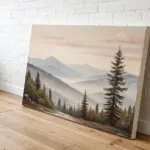
Abstract Arches in Earth Tones
Embrace the calming, organic feel of bohemian décor with this simple abstract painting featuring mirrored arch motifs. Using a muted earth-tone palette, this project creates a serene focal point perfect for a desk or shelf vignette.
Step-by-Step
Materials
- Small rectangular stretched canvas (approx. 5×7 or 6×8 inches)
- Acrylic paints (muted colors: terracotta, sage green, cream/beige, peach)
- Medium flat paintbrush (size 6 or 8)
- Small round paintbrush (size 2 or 4) for refined edges
- Palette or paper plate
- Pencil for light sketching
- Cup of water and paper towels
Step 1: Preparation & Sketching
-
Prepare the canvas:
Start with a clean, stretched canvas. If your canvas isn’t pre-primed, apply a coat of gesso and let it dry completely. For this specific look, leaving the background white or painting it a very soft off-white cream creates the best contrast for the arches. -
Visualize the composition:
This design features two opposing clusters of arches. Imagine a diagonal line splitting the canvas; one set of arches sits in the bottom left corner, and the other mirrors it in the top right. -
Sketch the first arch:
Using a pencil very lightly, draw the outermost curve of the bottom-left arch. This doesn’t need to be geometrically perfect; a slightly organic, hand-drawn curve adds to the boho charm. -
Complete the sketch:
Sketch the inner curves for the bottom set, spacing them evenly. Then, rotate your canvas or simply sketch the mirroring set in the top-right corner, ensuring they flow in the opposite direction.
Steady Hand Trick
Rest your pinky finger on a dry part of the canvas to stabilize your hand while painting curved lines. This acts as a pivot point for smoother arches.
Step 2: Painting the Arches
-
Mix your palette:
Prepare your acrylics. You’ll need four distinct earth tones. I like to mix a little white into my terracotta and sage green to soften them slightly, ensuring they aren’t too harsh against the white background. -
Paint the first terracotta arch:
Starting with the bottom-left cluster, identify which band will be your darkest terracotta/rust color. Load your flat brush and paint this stripe in a smooth, continuous motion if possible. -
Add the sage green band:
Clean your brush thoroughly. Beside the terracotta band, paint the sage green curve. Leave a tiny sliver of white space between the colors if you want distinct separation, or let them touch slightly for a more cohesive look. -
Apply the peach tone:
Switch to your lighter peach or mute orange shade. Paint the next interior curve, keeping your brush pressure consistent to maintain a relatively even width. -
Fill the smallest arch:
For the smallest, innermost arch, you might find the round brush easier to control. Paint this in your lightest beige or cream tone. -
Refine the edges:
Go back over the edges of your first painted cluster with the small round brush to smooth out any wobbly lines or fill in patchiness.
Add Texture
Mix a teaspoon of baking soda into your acrylic paint before applying. This creates a grainy, terracotta-like texture that enhances the organic boho vibe.
Step 3: Mirroring the Design
-
Start the top cluster:
Move to the top-right corner. To keep the painting balanced, invert the color order or mix it up. In the reference, the large outer arch is a warm ochre or dark beige. -
Paint the second striped curve:
Paint the next band in the sage green color. Try to mimic the curve of the bottom cluster so they feel like they are interacting with each other. -
Add the third band:
Apply the terracotta color as the third inward stripe. Keep the paint texture matte and flat; multiple thin coats are better than one thick, gloopy coat. -
Finish the final curve:
Complete the top cluster with the smallest inner arch in a reddish-brown or dark rust tone to anchor the design. -
Touch up:
Inspect the canvas for any pencil marks still showing. If the paint didn’t cover them, gently erase them once the paint is 100% dry, or carefully paint over them. -
Paint the sides:
Don’t forget the edges of the canvas! Extend the white background color onto the sides for a clean, gallery-wrapped finish. -
Allow to cure:
Let the painting sit flat to dry completely for at least an hour before displaying it vertically. -
Seal (Optional):
If you want to protect the painting from dust, apply a layer of matte varnish. Avoid glossy varnish, as the boho style typically favors matte, natural finishes.
Place your new artwork on a wooden tray or lean it against a stack of books to enjoy your handiwork


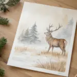
Minimal Sun and Moon Duo
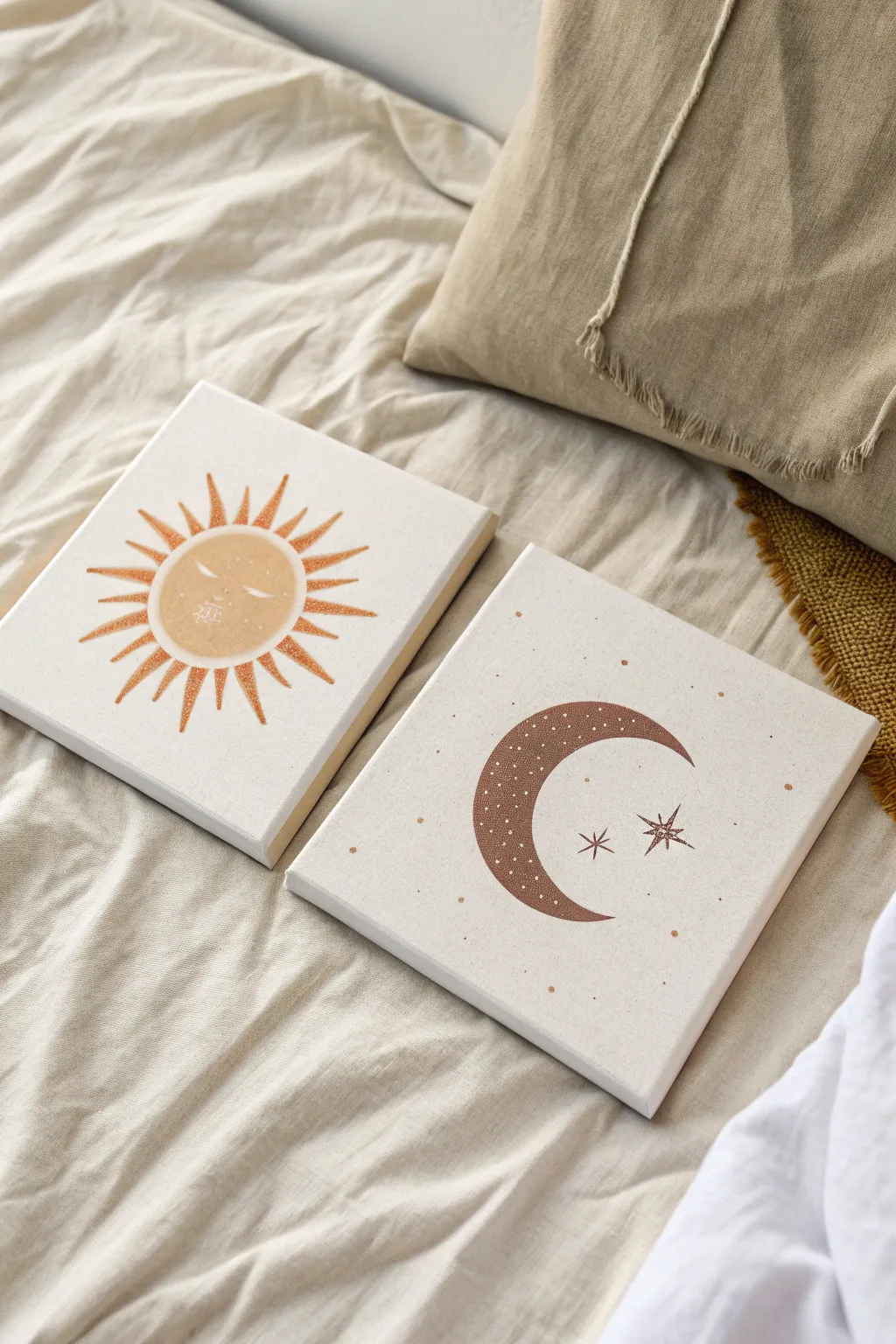
Bring a touch of cosmic slumber to your space with this serene sun and moon diptych. The muted earth tones and subtle sparkle create a dreamy, boho aesthetic that is surprisingly simple to freehand or stencil onto blank canvases.
Detailed Instructions
Materials
- Two 8×8 or 10×10 inch stretched canvases
- Gesso (optional, for priming)
- Acrylic paint: Muted mustard yellow, rust orange, chocolate brown, and creamy white
- Gold or bronze glitter paint (fine texture)
- Flat shader brush (size 6 or 8)
- Small round detail brush (size 0 or 1)
- Old toothbrush (optional for spatter)
- Pencil and eraser
- Compass or roll of tape (for tracing circles)
- Palette or paper plate
- Cup of water and paper towels
Step 1: Preparation & Sketching
-
Prime the surface:
If your canvases are raw, give them a quick coat of white gesso to ensure a smooth painting surface. If they are pre-primed, you can skip straight to sketching. -
Outline the sun:
On the first canvas, use a compass or trace a roll of tape to draw a perfect circle in the center. Sketch triangular rays radiating outward around the entire circumference. Varying their lengths slightly adds a nice organic feel. -
Add solar details:
Lightly pencil in a sleepy face on the sun: two curved lines for closed eyes, a small nose line, and a subtle mouth. You can also sketch some small abstract shapes or sparkle marks on the cheeks. -
Outline the moon:
On the second canvas, trace a large circle, then shift your tracing object slightly to the right and trace again to create a crescent shape. Erase the unwanted outer lines so you are left with just the crescent moon. -
Add lunar details:
To the right of the moon crescent, sketch two simple stars—one slightly larger than the other—using intersecting lines to create an eight-pointed effect.
Wobbly Lines?
If painting thin lines for the stars or sun face feels shaky, try a minimal paint marker or a white gel pen instead. It offers way more control than a brush for fine details.
Step 2: Painting the Sun
-
Mix the sun color:
Combine your mustard yellow with a tiny drop of rust orange and white. You want a warm, dusty ochre tone rather than a bright primary yellow. -
Fill the sun body:
Use your flat shader brush to paint the central circle. Apply two thin coats rather than one thick one for the smoothest finish, letting the first coat dry for about 10 minutes. -
Paint the rays:
Using the same ochre mix, carefully fill in the radiating triangles. To get sharp points, start your brush stroke at the base of the triangle near the circle and lift pressure as you pull outward. -
Add dimension:
While the paint is still slightly tacky, I like to brush a very thin layer of gold glitter paint over just the bottom half of the circle and the tips of the rays for a subtle shimmer. -
Detail the face:
Switch to your smallest detail brush and pure white paint. Carefully go over your pencil lines for the eyes, nose, and mouth. Add small white dots or ‘sparkles’ on the cheek area.
Add Texture
Mix a teaspoon of baking soda into your acrylic paint before applying the sun and moon. This creates a plaster-like, matte texture that looks very high-end and bohemian.
Step 3: Painting the Moon
-
Mix the moon color:
Create a rich, earthy brown by mixing chocolate brown with a touch of rust. It should be darker than the sun to create contrast. -
Fill the crescent:
Paint the crescent shape with your flat brush. Be careful around the sharp points of the moon—switch to the smaller round brush for those tips if needed. -
Paint the stars:
Using the dark brown mixture and your detail brush, carefully paint the thin lines of the two stars next to the moon. -
Add texture:
Once the brown base is dry, use the tip of your smallest brush or a toothpick dipped in white paint to add tiny dots all over the crescent moon. -
Create background atmosphere:
Dip an old toothbrush into watered-down brown paint. Hold it over the canvas and run your thumb across the bristles to flick tiny speckles across the white background, creating a starry effect. Repeat this sparingly on the sun canvas for continuity.
Let your canvases dry completely overnight before hanging them side-by-side for a peaceful vibe


Soft Color Blocking With Rounded Shapes
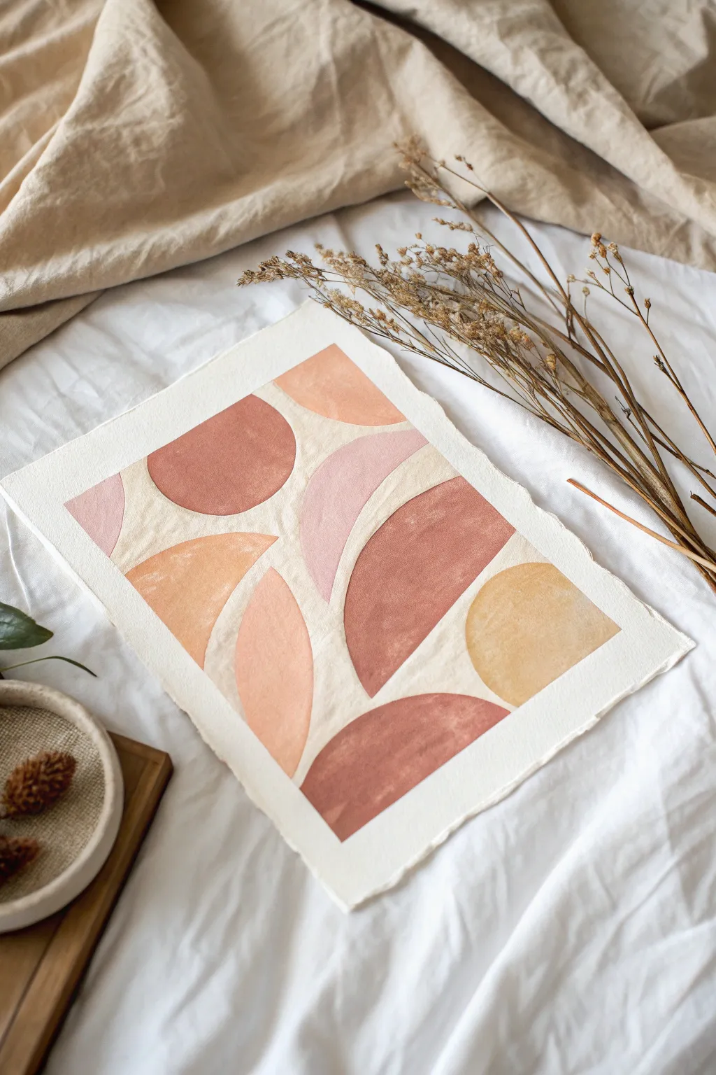
Embrace the soothing essence of bohemian art with this study in soft, rounded geometry. Using warm earth tones and negative space, you’ll create a composition that feels organic, balanced, and effortlessly chic on deckle-edged paper.
Step-by-Step Tutorial
Materials
- Thick watercolor paper (300gsm cold press recommended)
- Watercolor or gouache paints
- Palette for mixing tones
- Round brushes (sizes 6 and 10)
- Pencil (HB or H)
- Kneaded eraser
- Ruler for tearing edges
- Paper towels
- Jar of clean water
Step 1: Preparing the Canvas
-
Create the deckled edge:
If your paper came with straight cut edges, you can create that rustic look yourself. Place a ruler firmly on top of the paper where you want the edge to be. -
Tear the paper:
Gently pull the paper upward and toward the ruler to tear it. Slow and steady movements create the best feathery texture. Do this on all four sides if desired. -
Plan the margin:
Visualize an even border around your painting area. You don’t need to tape this off with masking tape unless you want a crisp line, but for this organic look, painting freehand within an imaginary border often looks softer.
Uneven Coverage?
If using watercolor, accept the blooming texture as part of the charm. For gouache, wait for the first layer to dry completely before adding a second to avoid lifting the paint.
Step 2: Sketching the Composition
-
Outline the shapes:
Using a very light hand, pencil in your shapes. The design relies on varying sizes of semicircles and quarter-circles. -
Balance the layout:
Ensure the shapes aren’t touching each other. Leave generous channels of ‘white space’ (channels of unpainted paper) between every single shape. This negative space acts as the grout lines of your mosaic. -
Refine the curves:
Go over your sketch to ensure the curves are smooth. If a line looks wobbly, correct it now rather than trying to fix it with paint later. -
Lighten the guidelines:
Roll your kneaded eraser gently over the entire sketch. You want the graphite to be barely visible so it doesn’t dirty your light paint colors.
Step 3: Mixing the Palette
-
Create the base tones:
Prepare four distinct shades: a deep terracotta (burnt sienna with a touch of red), a soft peach (orange mixed with plenty of white), a muted pink (red with white and a tiny dot of brown), and a mustard yellow (yellow ochre). -
Test opacity:
Test your colors on a scrap piece of paper. Gouache will be opaque and matte; watercolor will show more paper texture. Choose whichever finish you prefer, but keep the consistency creamy like melted ice cream.
Pro Tip: Masking Fluid
For perfectly crisp white channels between shapes, paint thin lines of masking fluid where the gaps should be. Paint freely over them, then peel off the rubbery fluid when dry.
Step 4: Painting the Shapes
-
Paint the first terracotta shape:
Load your size 10 brush with the deep terracotta mix. Pick a large semicircle (like the one in the top left or bottom center) and fill it in carefully. -
Mind the edges:
Use the tip of the brush to trace the curved edge precisely against your invisible border. Keep your hand steady to maintain that smooth arc. -
Add the mustard accents:
Switch to your mustard yellow mix. Paint one or two semicircles, such as the bottom right shape, ensuring the color is flat and even. -
Fill the pink sections:
Using the muted pink, fill in the central curved shapes. I like to rotate the paper physically while I paint; it helps my hand follow the natural curve of the wrist for smoother lines. -
Complete with peach:
Fill the remaining shapes with your soft peach tone. This lighter color helps bridge the gap between the darker terracotta and the white background. -
Refine the edges:
Switch to your smaller size 6 brush. If any edges look ragged or uneven, carefully smooth them out with a tiny amount of paint.
Step 5: Finishing Touches
-
Check for consistency:
Look at your shapes once the first layer is dry. If the paint looks streaky or uneven, apply a second thin coat to create a solid block of color. -
Let it dry completely:
Allow the paper to dry flat for at least an hour. If the paper buckles slightly, you can place it under a heavy book once it is 100% bone dry. -
Final erase:
If any pencil lines are still visible in the white gaps between shapes, very gently dab them away with a clean eraser.
Display your new abstract piece on a simple wooden clipboard or float mount it in a frame to show off those beautiful torn edges

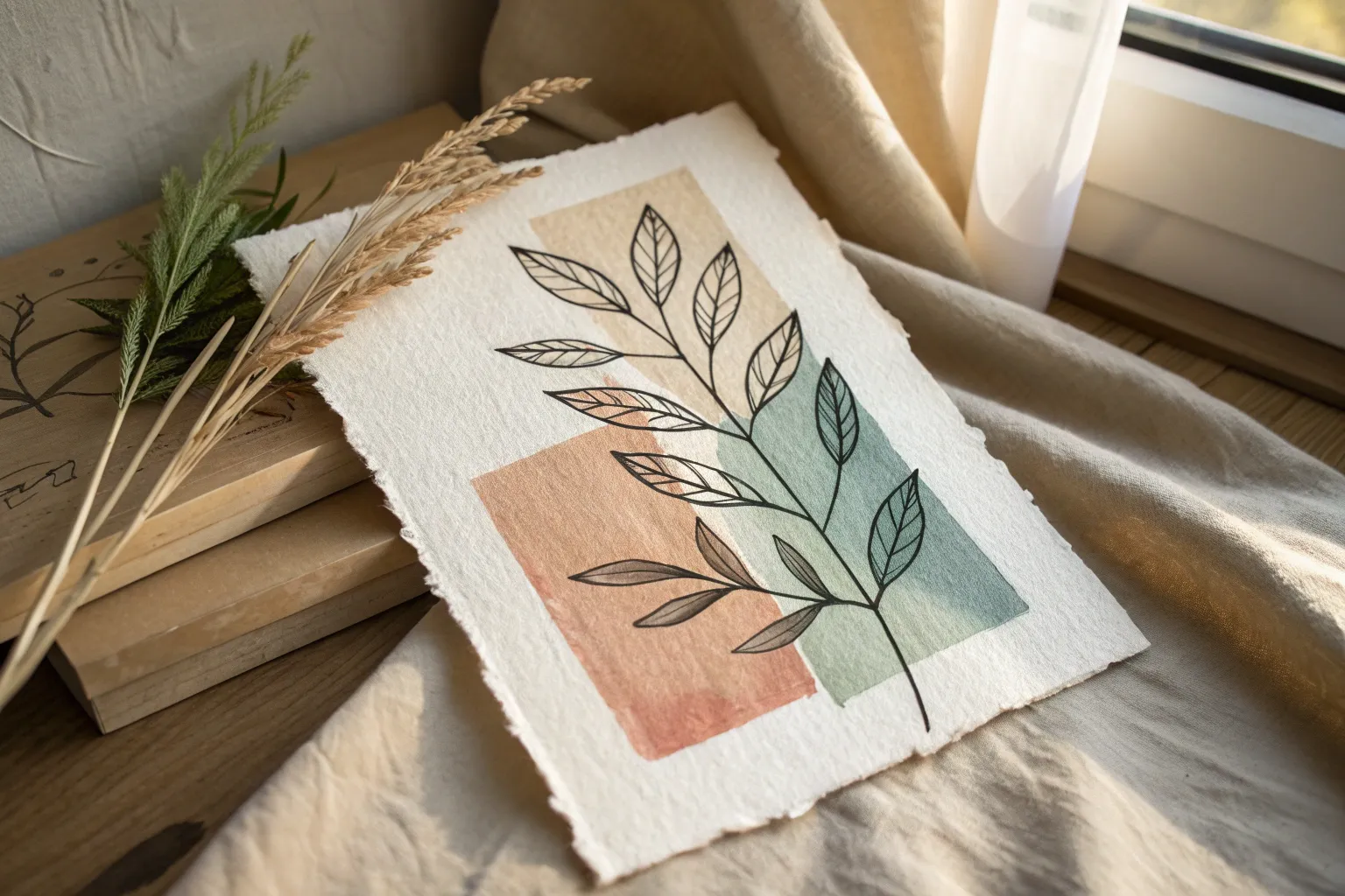
Botanical Silhouette Over a Blush Wash
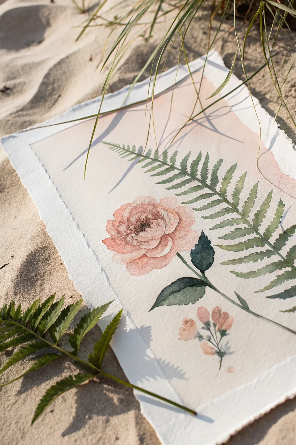
Capture the serene beauty of coastal flora with this delicate watercolor composition, featuring a soft blush wash backdrop perfect for a bohemian aesthetic. The combination of a structured fern and organic, loose petals creates a lovely balance on textured paper.
Detailed Instructions
Materials
- Deckle-edge watercolor paper (300 gsm or heavier)
- Watercolor paints (Alizarin Crimson, Sap Green, Burnt Umber, Payne’s Gray, Yellow Ochre)
- Large flat wash brush
- Medium round brush (size 6 or 8)
- Fine detail brush (size 0 or 2)
- Jar of clean water
- Paper towels
- Pencil (HB or H for light lines)
- Art masking tape (optional)
Step 1: Preparing the Blush Background
-
Mix the wash:
Begin by creating a very watery, pale wash on your palette. Mix a tiny amount of Alizarin Crimson with plenty of water to get a barely-there pink. -
Add warmth:
To make the pink feel more natural and ‘boho,’ touch in the smallest bit of Yellow Ochre or Burnt Umber. You want a dusty blush, not a bright candy pink. -
Apply the wash:
Using your large flat brush, paint a rectangular area in the center of your paper, leaving a generous white border around the jagged deckle edges. -
Soften edges:
While the paint is still wet, rinse your brush and run damp bristles along the outer edges of the pink rectangle to let it fade softly into the white paper rather than ending in a hard line. -
Full dry:
Let this background layer dry completely. The paper must be bone-dry before you pencil in your sketch, or the graphite will dig in and smudge.
Muddy colors?
If your blush background looks muddy, your water jar is likely dirty. Change your water often, especially when switching between the green fern and the delicate pink wash.
Step 2: Sketching the Composition
-
Placement lines:
Lightly sketch a long diagonal line for the fern stem, stretching from bottom-right to top-left. It should curve gently. -
Flower positioning:
Draw a loose circle slightly to the left of the fern stem’s lower section to mark where the main bloom will sit. -
Leaves and buds:
Mark positions for the two dark leaves attached to the flower stem and the small cluster of buds near the bottom right.
Level Up: Gold Accent
Once the painting is dry, add tiny dots of metallic gold watercolor to the center of the main flower or the tips of the fern for a bit of glimmer.
Step 3: Painting the Main Floral
-
Base petals:
Mix a stronger version of your blush color (Alizarin Crimson plus a touch of Burnt Umber). Using the medium round brush, paint the outer petals of the large flower using wet-on-dry strokes to keep the edges crisp. -
Layering depth:
While the first petals are damp, drop slightly darker pigment into the base of each petal where it meets the center. This creates natural dimension. -
Center details:
Once the petals are dry, mix a dark brownish-black using Burnt Umber and Payne’s Gray. Use the fine detail brush to stipple small dots and short lines in the flower’s center. -
Bud clusters:
Paint the small buds at the bottom using the same pink mix, keeping them simple and slightly oval-shaped.
Step 4: The Fern and Foliage
-
Mixing greens:
Create a muted, earthy green. Mix Sap Green with a touch of red or brown to desaturate it. Avoid using bright, artificial greens. -
Main stem:
Using the detail brush, paint the thin main stem of the fern along your pencil line. I find it helps to pull the brush toward you for a steadier line. -
Fern fronds:
Switch to the medium round brush. Paint the individual leaflets of the fern, starting from the stem and lifting the brush as you move outward to create a tapered point. -
Varying tone:
As you move up the fern, water down your green slightly so the tip of the fern looks distant and lighter than the base. -
Dark leaves:
Mix a deeper, darker green (adding more Payne’s Gray) for the two broad leaves under the main flower. These should anchor the composition. -
Connecting stems:
Connect the darker leaves and the pink buds to the main composition with thin, delicate green stems. -
Final touches:
Erase any visible pencil lines gently once the painting is completely dry, and check if the flower center needs any more dark definition.
Allow your botanical masterpiece to dry flat overnight to prevent the paper from buckling further
BRUSH GUIDE
The Right Brush for Every Stroke
From clean lines to bold texture — master brush choice, stroke control, and essential techniques.
Explore the Full Guide
One-Line Boho Face on a Neutral Background
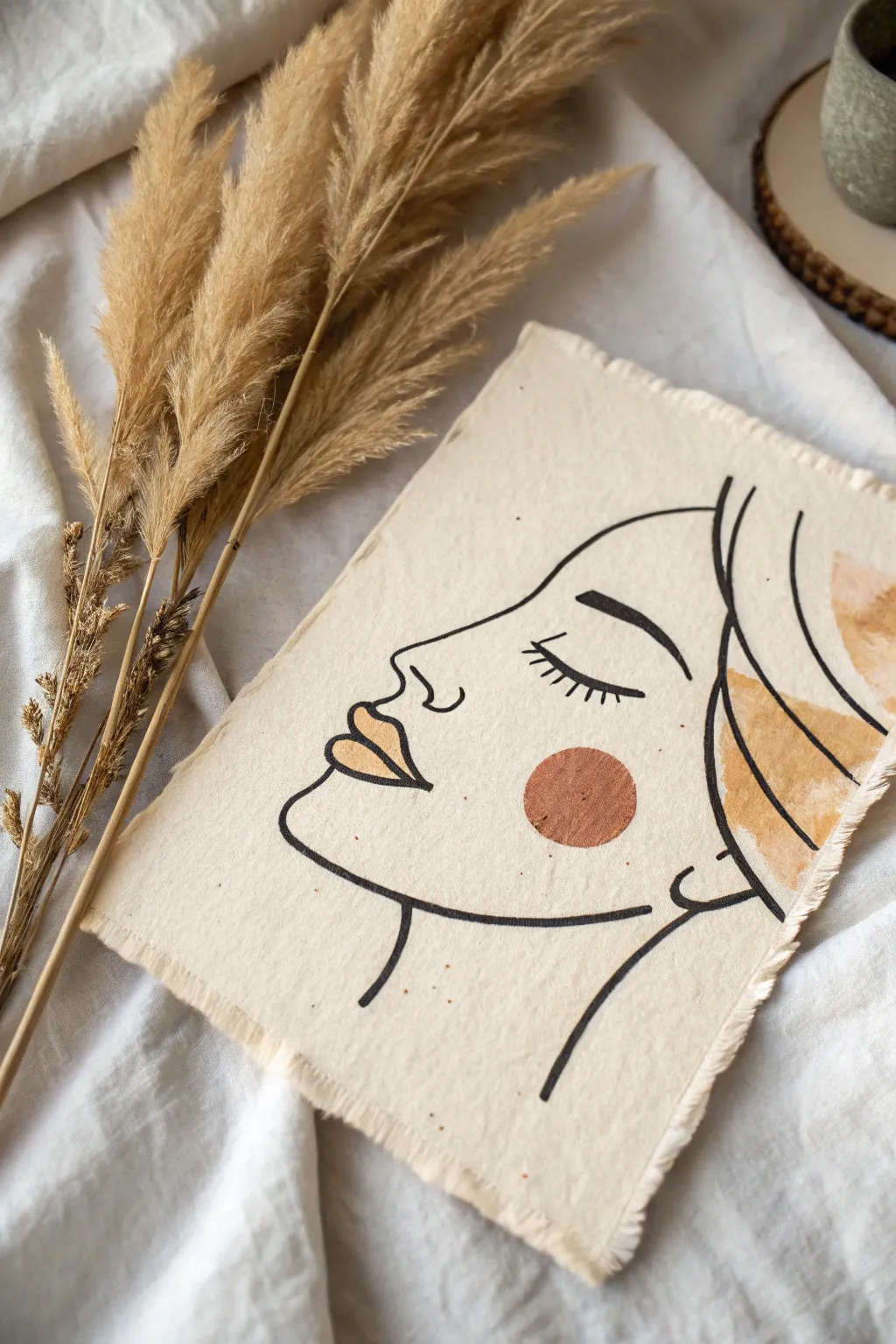
Capture the essence of modern bohemian style with this serene, one-line inspired portrait on raw canvas. Using simple strokes and earthy accents, you can create a piece of art that feels both effortless and intentionally designed.
Step-by-Step
Materials
- Unprimed cotton canvas or heavy linen fabric (approx. 8×10 inches)
- Black acrylic paint or black fabric marker
- Terracotta or burnt orange acrylic paint
- Mustard yellow or ochre acrylic paint
- Beige or tan acrylic paint
- Fine liner brush (size 0 or 1)
- Small flat brush (size 4 or 6)
- Pencil and eraser
- Scissors
Step 1: Preparation & Sketching
-
Prepare the fabric:
Cut your piece of unprimed canvas or linen to your desired size. Don’t worry about perfect edges; the frayed look is part of the charm. -
Create the fringe:
Gently pull a few loose threads from each of the four sides of the fabric to create a soft, distressed fringe border about a quarter-inch deep. -
Outline the profile:
Using a pencil, lightly sketch the profile of the face. Start with the forehead, curving down into the bridge of the nose, then the lips, and finally the chin and jawline. Keep the line continuous and fluid. -
Add facial details:
Sketch a simple curved line for the closed eye with small dashes for lashes. Add the eyebrow arch above it and define the lips slightly more. -
Sketch the hair:
Draw flowing, curved lines on the right side to suggest hair volume without drawing every strand. Let these lines flow off the edge or stop abruptly for an abstract feel.
Smooth Operator
If using a brush feels too shaky for the fine lines, swap the black paint for a waterproof archival ink pen or a fabric marker for total control.
Step 2: Painting the Line Art
-
Prepare black paint:
Mix a small amount of water into your black acrylic paint to make it ink-like. This helps it flow smoothly off the brush for long lines. -
Paint the main profile:
Dip your fine liner brush into the thinned black paint. Starting from the forehead, trace your pencil sketch with a confident, steady hand. I find that exhaling slowly while pulling the brush helps steady my hand. -
Detail the eye:
Carefully paint the curved eyelid line. Then, use the very tip of the brush to flick outwards for the eyelashes. -
Refine the brow and nose:
Paint the eyebrow, making the stroke slightly thicker than the other lines for emphasis. Add the small nostril hook. -
Outline the hair:
Go over your hair lines with the black paint. Vary the pressure on your brush to make some parts of the line thick and others thin for dynamic movement. -
Line the neck:
Add the two simple sweeping lines for the neck, ensuring they connect visually with the jawline.
Step 3: Adding Color Accents
-
Paint the cheek:
Load a small flat brush or a round brush with terracotta paint. Paint a perfect circle just below the eye to represent a rosy cheek. Make this opaque and bold. -
Color the lips:
Using the mustard yellow or ochre paint, carefully fill in the lips. Stay within your black outlines or intentionally overlap them slightly for an artistic touch. -
Add abstract hair shapes:
With the beige or tan paint, fill in the negative spaces between the black hair lines. You don’t need to fill every gap; random patches of color look best. -
Create painterly texture:
For the tan sections, you can use a slightly dry brush to let the texture of the canvas show through the paint. -
Erase pencil marks:
Once the black paint is completely dry (give it at least 20 minutes), gently erase any visible pencil sketch lines. -
Add speckles (optional):
If you want a more weathered look, flick a tiny bit of watered-down brown paint onto the canvas using an old toothbrush or stiff brush.
Display It
For a rustic finish, attach the top of the canvas to a wooden dowel with jute twine, or secure it to a backing board with antique brass clips.
Now you have a stunning piece of textured art ready to bring warmth to your walls
Simple Desert Horizon With Sun Disk
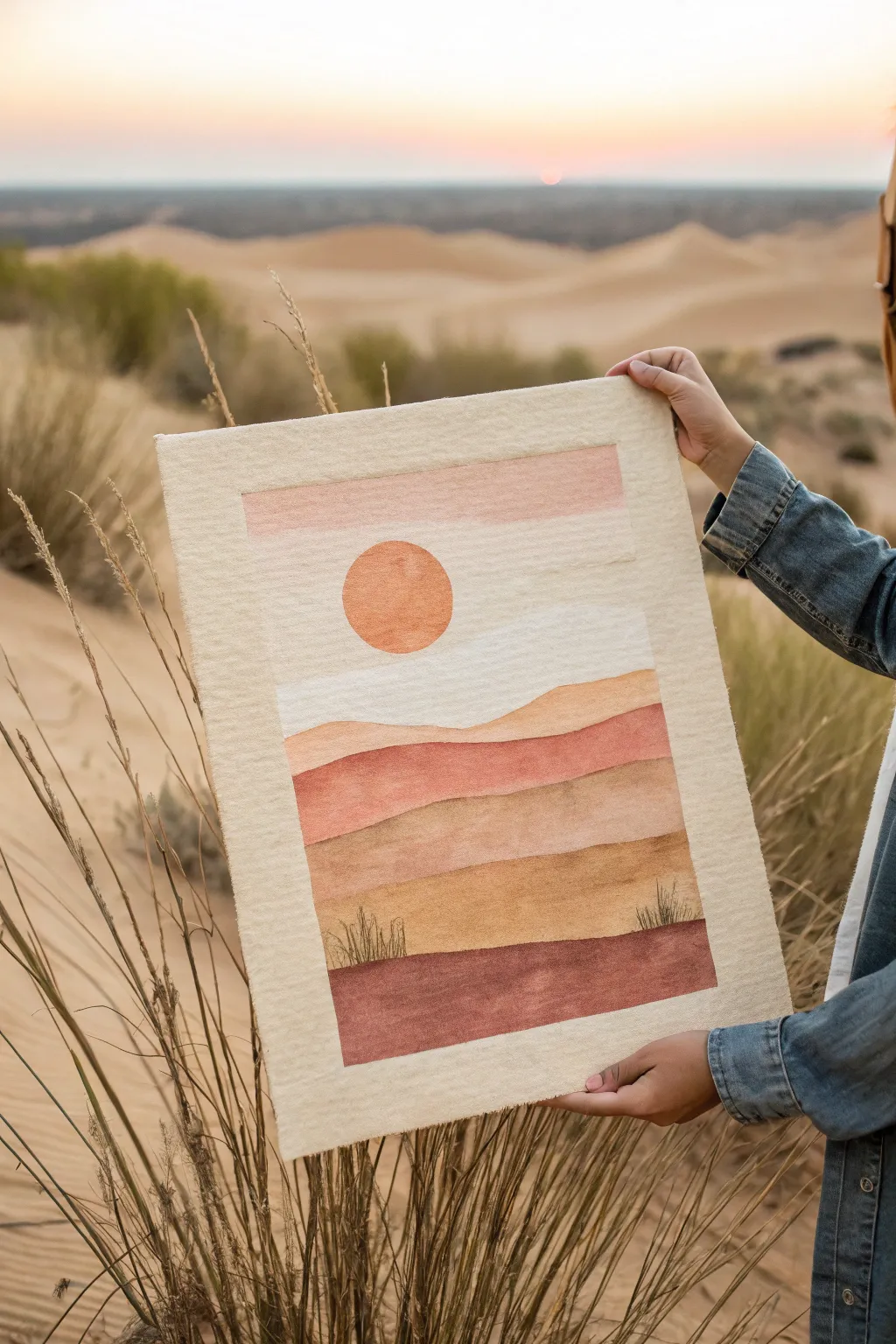
Capture the warmth of a desert sunset with this textured, mixed-media project that mimics the softness of watercolor on a unique felt canvas. The layered earth tones and simple geometric sun create a calming, boho-minimalist aesthetic perfect for neutral interiors.
How-To Guide
Materials
- Thick, cream-colored wool felt sheet (approx. 11×14 inches)
- Fabric dyes or diluted acrylic paints (terracotta, burnt sienna, ochre, blush pink, deep burgundy)
- Spray bottle with water
- Wide, flat paintbrush (1-2 inch)
- Round detail brush (size 4 or 6)
- Painter’s tape or stencil film
- Circular object for tracing (like a lid) or a circle stencil
- Cardboard or plastic sheet (to protect work surface)
- Paper towels for blotting
- Scissors (for trimming edges provided you want a raw look)
Step 1: Preparation & Base Layout
-
Prepare your canvas:
Begin by laying down your protective cardboard or plastic sheet. Place your cream wool felt sheet on top. If the felt has any creases, gently steam them out with an iron on a low setting before starting. -
Define the border:
Since we want a clean, framed look within the felt, use painter’s tape to mark off a rectangular border inside your felt sheet. Leave about a 1.5-inch margin of raw cream felt all around the edges. -
Sketch the horizon:
Lightly sketch your landscape design directly onto the felt using a pencil. Draw three to four rolling hill shapes for the sand dunes, starting from the bottom third and moving upward. Keep the lines soft and wavy. -
Position the sun:
Place your circular object or stencil in the upper left section of the sky area. Trace a perfect circle lightly with pencil to define where your sun will go.
Pro Tip: Fiber Saturation
For a truly dyed look, lightly mist the felt surface with water before painting. This helps the pigment soak deep into the wool rather than sitting on top like a crust.
Step 2: Creating the Sky & Sun
-
Mix the sky wash:
In a small cup, dilute a small amount of blush pink paint with water until it has the consistency of tea. We want a stain, not a thick coat of paint. -
Paint the upper sky:
Using the wide flat brush, apply a horizontal band of the blush pink wash at the very top of your taped-off area. Let the bottom edge of this stripe stay incredibly vague and soft. -
Soften the transition:
Before the pink dries completely, use a clean, damp brush to drag the color downward slightly, fading it into the cream of the felt. This creates that hazy, atmospheric look. -
Paint the sun:
For the sun disk, mix a vibrant terracotta orange. Using your round brush, carefully fill in the pencil circle. I like to blot this gently with a paper towel immediately after painting to press the pigment into the felt fibers and keep the texture consistent.
Level Up: Embroidery
Add texture by using embroidery floss to stitch over the grass outlines or to add a French knot border around the sun for a tactile 3D element.
Step 3: Layering the Dunes
-
First dune layer:
The dune furthest in the distance (just below the ‘sky’ area) should be the lightest. Mix a pale ochre or sand color. Paint this section carefully, following the wavy line you sketched. -
Mid-ground dunes:
For the next dune down, mix a slightly darker, warmer tone—like a soft rust or muted coral. Apply this band of color, ensuring it touches the previous layer but doesn’t bleed too much. -
Deepening the palette:
As you move downward, make your colors richer. The next section should be a golden brown or caramel color. Use the flat brush to sweep the color across, allowing the natural texture of the felt to show through slightly. -
Foreground foundation:
The bottom-most strip of ground needs to anchor the piece. Use your darkest color here, such as a deep burgundy or chocolate brown mixed with a touch of red. Fill this area completely down to the bottom tape line. -
Blending check:
If any lines between the dunes look too harsh, you can lightly mist them with your spray bottle and dab with a dry brush to encourage a tiny bit of bleed, mimicking watercolor.
Step 4: Details & Finishing Touches
-
Dry thoroughly:
Let the felt sit flat and dry completely. Because felt is absorbent, this might take a few hours. Don’t rush this step, or the tape removal might stain the border. -
Add vegetation:
Once the paint is dry, use a fine-tip round brush and dark brown or black paint (scarcely diluted) to add tiny tufts of desert grass. Use quick, upward flickering strokes on top of the lowest foreground dune. -
Variation in grasses:
Make some grass tufts slightly taller and others shorter to create a natural, organic variety. Group them in small clusters rather than spreading them evenly. -
Remove the border:
Very slowly peel back the painter’s tape. Pull it away from the painted area at a 45-degree angle to ensure a crisp, clean line. -
Fray the edges:
To give the piece a rustic, handmade finish, use the tip of your scissors or a needle to gently tease out the fibers along the very outer perimeter of the cream felt sheet.
Hang your new textile art using wooden poster rails or mounting putty to enjoy the serene desert vibes

PENCIL GUIDE
Understanding Pencil Grades from H to B
From first sketch to finished drawing — learn pencil grades, line control, and shading techniques.
Explore the Full Guide
Mandala-Inspired Corner Details
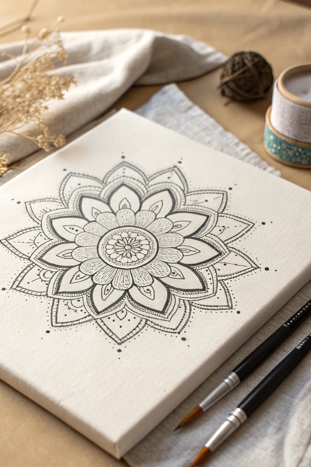
This project creates a stunningly intricate black-and-white mandala that serves as a perfect focal point for any boho-inspired space. The crisp black lines against the textured white canvas offer a meditative drawing experience with a high-contrast, professional-looking finish.
Detailed Instructions
Materials
- Small square stretched canvas (approx. 8×8 or 10×10 inches)
- Pencil (HB or lighter)
- Eraser
- Compass
- Ruler
- Fine-point black permanent markers (sizes 0.1, 0.3, and 0.5mm)
- Brush-tip black marker (for filling thicker areas)
- Acrylic matte varnish (optional, for sealing)
Step 1: Setting the Foundation
-
Pinpoint the Center:
Begin by using your ruler to draw a very faint ‘X’ from corner to corner on your canvas. The intersection is your exact center point. -
Draft the Guide Circles:
Place the point of your compass on the center mark. Draw a series of faint concentric circles radiating outward. You’ll want a very small inner circle (about 1 inch diameter), a medium circle (about 3 inches), and a larger outer boundary circle (about 6 inches). -
Create Section Lines:
Using your ruler, lightly draw straight lines through the center to divide your circle into equal pie slices like a pizza. Start with vertical and horizontal lines, then bisect those to create 8 or 16 equal sections depending on how detailed you want your petals to be.
Step 2: Drawing the Core
-
Sketch the Inner Flower:
In the smallest center circle, sketch a tiny multi-petaled flower shape with your pencil. Aim for about 8 round petals. -
Add the First Band:
Around that initial flower, draw a double ring. Inside this ring, sketch small, repeating circles or distinct dots to create a textured border. -
Draw the Primary Petals:
Moving to the next guide circle, sketch a row of larger, pointed petals. Use your section lines to ensure each petal peak hits the center of a guide line, keeping everything symmetrical. -
Detail the Primary Petals:
Inside each of these larger petals, draw a smaller, similar petal shape. This creates a layered look and provides a ‘frame’ you will fill later.
Steady Hand Trick
Rest your pinky finger on a dry part of the canvas while drawing. It acts as a pivot point and stabilizer for smooth curves.
Step 3: Expanding the Pattern
-
Draft the Secondary Petals:
sketch a second tier of petals emerging from behind the first set. These should be larger and wider, filling the space out to your next guide circle. -
Add Internal Patterns:
Within this second tier of petals, lightly sketch vertical lines or veins running from the base of the petal toward the tip. This adds that shading texture seen in the reference. -
Create the Outer Border:
Draw the final, largest set of pointed petals extending almost to the canvas edge. Give these a double-line create a thick border effect. -
Place Decorative Dots:
Mark spots for floating dots outside the main design. Place single dots at the very tips of the outermost petals to lead the eye outward.
Go Metallic
Once the black ink is dry, use a gold or silver gel pen to trace strictly the innermost flower petals for a subtle flash of luxury.
Step 4: Inking the Design
-
Outline the Center:
Switch to your 0.3mm fine-point marker. Carefully trace over your pencil lines starting from the very center flower and working your way outward to avoid smudging. -
Thicken Main Lines:
Go back over the major structural lines of the petals with a 0.5mm marker or do a second pass with the 0.3mm to make them bolder. -
Add Fine Texture:
Use your ultra-fine 0.1mm pen for the delicate shading lines inside the petals. Use quick, light flicks of the wrist to create hatching that doesn’t look too heavy. -
Stipple the Details:
Use the 0.3mm pen to ink the small circles in the center ring. I find stippling (lots of tiny dots) adds great depth to the innermost flower center without turning it into a solid black blob. -
Fill High-Contrast Areas:
Identify areas that need to be solid black, such as the small gaps between the petal bases. Use the brush-tip marker to fill these in completely for dramatic contrast. -
Erase Guidelines:
Wait at least 15-20 minutes to ensure the ink is totally dry. Gently erase all your pencil guide circles and section lines. -
Final Dot Work:
Using the 0.5mm pen, firmly press down to create the floating dots around the perimeter and the accent dots between petal tips.
Step back and admire the calm symmetry of your finished piece
Dreamcatcher Shapes Made Super Simple
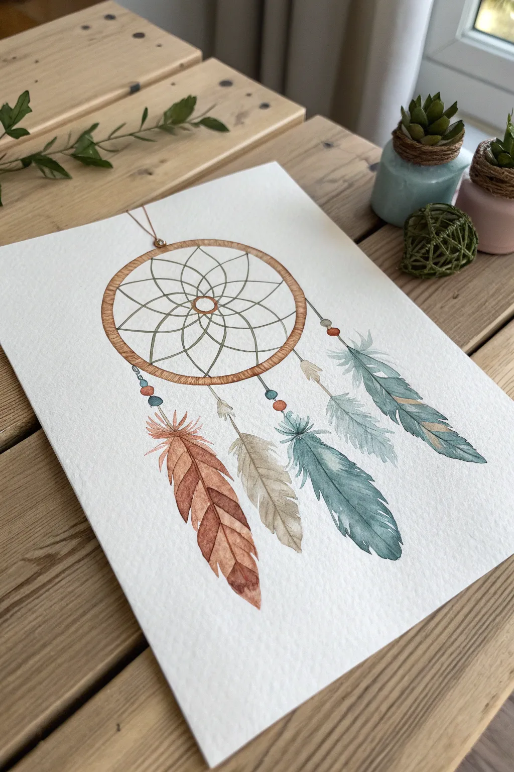
Capture the ethereal beauty of a dreamcatcher with this beginner-friendly watercolor tutorial. Using soft, earthy tones and precise pen work, you’ll create a piece that feels both organic and structured, perfect for modern boho decor.
Step-by-Step Guide
Materials
- Cold press watercolor paper (300 gsm)
- Watercolor paints (Rust/Burnt Sienna, Teal/Viridian, Beige/Yellow Ochre, Burnt Umber)
- Fine liner pen (Black or Dark Brown, waterproof, sizes 0.1 and 0.3)
- Round watercolor brushes (Size 2 and 4)
- Compass or round object for tracing
- Pencil (HB or lighter)
- Eraser
- Ruler
- Jar of clean water
- Paper towels
Step 1: Drafting the Design
-
Draw the hoop:
Start by using a compass or tracing a round object (like a masking tape roll) to draw a perfect circle in the upper center of your paper. Draw a second, slightly smaller circle inside it to create the thickness of the hoop. -
Sketch the web:
Inside the inner circle, sketch a small central ring. Evenly space eight points around this center ring, then draw petals extending out to reach the hoop’s edge, creating a flower-like geometric pattern. -
Add hanging strings:
Draw four vertical, slightly swaying lines dropping down from the bottom of the hoop. Vary their lengths slightly for a natural look. -
Draft the feathers:
At the end of each string, lightly sketch the outline of a feather. Make the leftmost one largest, flanked by shorter ones, with a long teal feather on the far right. Include small circles for beads at the connection points.
Wet-on-Wet Magic
For fluffier feathers, wet the paper shape first with clean water, then touch your loaded brush to the center. The paint will bleed outward, creating soft edges.
Step 2: Painting the Elements
-
Paint the wooden hoop:
Mix a warm light brown using Burnt Sienna effectively diluted with water. Paint the space between the two hoop circles. While wet, drop in tiny touches of darker brown to simulate wood grain texture. -
Base layer for the rust feather:
For the large left feather, mix a watery Burnt Sienna or Rust color. Paint the feather shape, keeping the edges slightly jagged to look realistic. Leave a thin strip of white paper down the center for the quill. -
Paint the neutral feathers:
Using a mix of Yellow Ochre and a tiny bit of brown (heavily diluted), paint the smaller middle feather and the small accent feather hanging higher up. Keep these very pale and translucent. -
Paint the teal feathers:
Mix a beautiful Teal or Viridian green. Paint the two right-side feathers. I suggest adding more water near the tips to create a lovely gradient effect where the color fades out. -
Color the beads:
Using a small size 2 brush, carefully dab paint into the bead sketches. Alternate colors between teal, rust, and brown to tie the color palette together. -
Deepen the feather details:
Once the first feather layers are completely bone dry, mix slightly more concentrated versions of your original colors. Paint varied strokes starting from the center quill outward to suggest individual barbs and texture.
Fixing Wobbly Lines
If your circle or web lines look too shaky, go over them again loosely with the pen. A ‘sketchy’ double-line style looks intentional and artistically boho.
Step 3: Inking and Definition
-
Outline the hoop:
Switch to your 0.3 waterproof fine liner. Carefully trace over the outer and inner circles of the wooden hoop. Add small diagonal hatch marks along the wood to look like wrapping cord. -
Ink the web:
Use the finer 0.1 pen to trace the geometric web pattern inside. Keep your hand light; if the lines are slightly shaky, it adds to the organic, thread-like appearance. -
Define the feathers:
With the 0.1 pen, outline the feathers. Instead of a solid continuous line, use broken, sketchy strokes to mimic the soft, fluffy edges of bird feathers. -
Draw the quills:
Draw a confident line down the center of each feather for the quill (rachis), extending it up to connect with the beads. -
Connect the strings:
Draw the hanging strings connecting the beads to the hoop, and the beads to the feathers. Don’t use a ruler here; a freehand line looks more like natural string. -
Final bead details:
Outline the beads with the pen. You can leave tiny gaps or add small dots to give them a bit of highlight and dimension. -
Clean up:
Wait at least 10 minutes to ensure the ink is totally set. Gently erase any visible pencil marks to reveal a clean, crisp illustration.
Now you have a serene piece of art ready to frame or gift to a dreamer


Feather Study With Two-Tone Brushstrokes
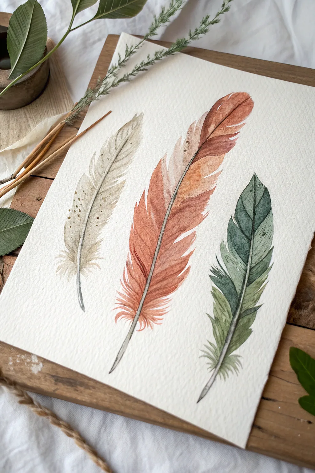
Capture the delicate, organic beauty of nature with this study of three distinct feathers in an earthy color palette. Using simple watercolor techniques on textured paper, you will learn to build up layers to create realistic vanes with a soft, bohemian feel.
Step-by-Step Tutorial
Materials
- Cold press watercolor paper (300 gsm or heavier for texture)
- Watercolor paints (Burnt Sienna, Yellow Ochre, Sap Green, Payne’s Gray, Sepia)
- Round brushes (sizes 2, 4, and 6)
- Fine liner brush (size 0 or 00)
- Pencil (HB or lighter) and kneaded eraser
- Two jars of water
- Paper towels
- Palette for mixing
Step 1: Sketching the Shapes
-
Light Outline:
Begin by lightly sketching the central spine (rachis) of three feathers. Curve them slightly in the same direction to create a sense of movement. -
Defining the Vanes:
Draw the outer contours of each feather. Don’t make the edges perfect; add jagged notches and separations where the barbs would naturally split. -
Refining the Base:
Very lightly erase your sketch with a kneaded eraser so the graphite is barely visible, ensuring the pencil marks won’t show through the transparent watercolor.
Step 2: Painting the Left Feather (Beige)
-
Base Wash:
Mix a very dilute wash of Yellow Ochre with a touch of Sepia. Using a size 4 brush, paint the left side of the feather vane, leaving small gaps of white paper near the bottom for fluffiness. -
Adding Speckles:
While the wash is still slightly damp but not soaking wet, drop in tiny specks of a darker brown mix to create texture on the upper vane. -
Defining the Spine:
Once the base is dry, use a fine liner brush and the darker Sepia mix to paint the thin central spine, letting it fade out near the top. -
Textural Details:
Use the liner brush with a slightly drier pigment to flick tiny lines outward from the spine, mimicking the individual barbs.
Blooms & Cauliflowers?
If weird textures appear in your wash, you added water while the paint was half-dry. Embrace it for feathers—it adds organic texture!
Step 3: Painting the Center Feather (Terracotta)
-
Gradient Wash:
Mix Burnt Sienna with a red iron oxide tone. Start painting the top of the middle feather, keeping the color saturated. -
Fading Out:
As you move down the feather, add more water to your brush to make the color lighter and softer near the base. -
Two-Tone Effect:
While wet, drop a hint of darker brown on the right side of the spine to create a shadow and depth, giving it that two-tone look. -
Separating the Barbs:
Once dry, use a size 2 brush to paint darker, thin strokes following the direction of the feather growth, emphasizing the splits in the vane. -
Fluffy Base:
Use a damp brush to soften the very bottom edges, pulling the pigment out slightly to create the look of downy afterfeathers.
Gold Highlighting
Use a metallic gold watercolor paint or a gold gel pen to trace over the central spines for a chic, shimmering boho finish.
Step 4: Painting the Right Feather (Sage Green)
-
Green Mix:
Create an earthy green by mixing Sap Green with a touch of Payne’s Gray and Burnt Sienna to desaturate it. -
Wet-on-Dry Texture:
Apply the green paint to the rightmost feather using a wet-on-dry technique, which allows for crisper edges and control over the jagged silhouette. -
Layering Shadows:
Wait for the first layer to dry completely. I like to glaze a second, darker layer of green over the left half of the feather to suggest curvature. -
Final Fine Lines:
Switch back to your liner brush and painting the dark spine. Add fine, swift directional lines radiating from the center to the edge.
Step 5: Finishing Touches
-
Anchoring the Stems:
Ensure the quill (the bottom of the spine) for each feather is clearly defined and painted with a solid, opaque mix of Sepia. -
Review and Refine:
Step back and check your work. If any areas look too flat, add a few extremely fine, dark lines to increase contrast.
Frame your feather trio in rough wood to complete the natural aesthetic
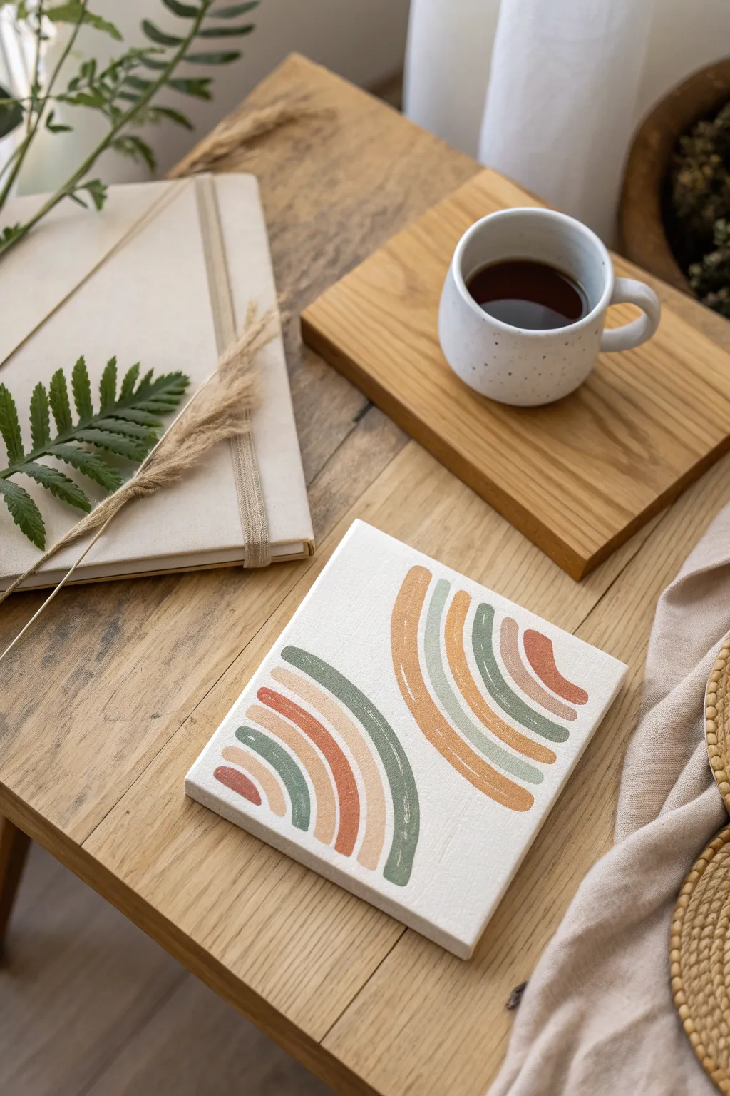
Geometric Pattern Bands in a Warm Palette
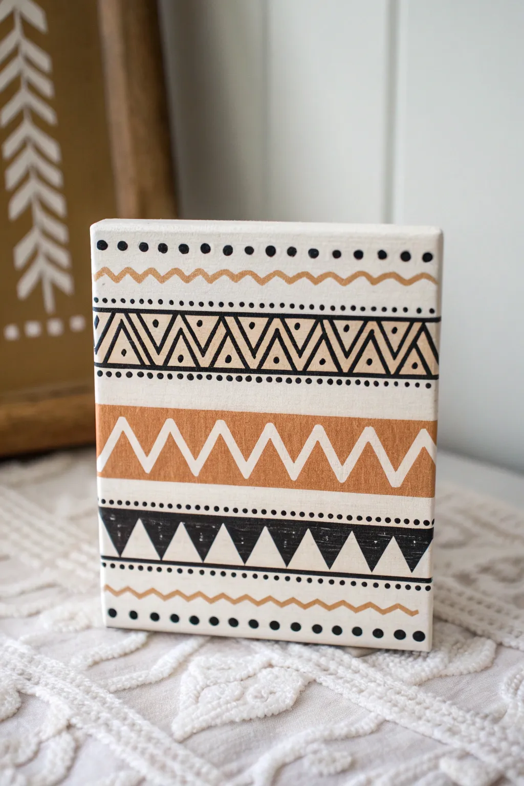
This charming project features a series of geometric bands in a warm, earthy palette, creating a modern bohemian accent piece perfect for shelves or mantels. Using steady hand-painted lines and simple shapes, you’ll build up layers of pattern that look intricate but come together quite easily.
How-To Guide
Materials
- Small square canvas (e.g., 6×6 inch) or wood block
- Off-white or cream acrylic paint (base coat)
- Black acrylic paint
- Metallic gold or warm tan acrylic paint
- Flat paintbrushes (various sizes)
- Fine liner or detail paintbrush
- Ruler or straight edge
- Pencil for sketching
- Painters tape (optional but helpful)
Step 1: Base and Planning
-
Prepare the Surface:
Begin by painting your entire canvas or wood block with the off-white or cream paint. Apply two coats if necessary for full coverage, allowing the first to specific to dry completely before adding the second. -
Mark the Bands:
Once the base is bonedry, use a ruler and a light pencil to mark horizontal guidelines across the surface. You haven’t got to measure perfectly equal sections; spacing them organically creates the charm. Allow roughly one inch for the larger bands and half an inch for the dividers. -
Sketch the Pattern:
Lightly sketch the repeating motifs within your guidelines. Draw the zig-zags, the bands of triangles, and the wavy lines so you have a roadmap to follow when painting.
Use a toothpick
For the tiniest dots in the detailed bands, dip the end of a toothpick or the handle end of a paintbrush into the paint instead of using bristles.
Step 2: Painting the Major Bands
-
Paint the Tan Zig-Zag Band:
Locate the wide central band intended for the large white zig-zag. Paint this entire horizontal strip with your gold or warm tan color first. We will paint the white zig-zag on top later, or paint around it if you prefer negative space. -
Create the Black Triangle Row:
Moving to the lower section, paint the row of solid black downward-pointing triangles. Use a flat brush to get crisp top edges and a detail brush to sharpen the points. -
Add the Upper Geometric Band:
For the complex band near the top, use a fine liner brush and black paint to carefully outline the row of double-triangles and zig-zag lines as shown in your sketch. -
Refine the Middle Band:
Return to the dried tan/gold band. With your cream base color and a medium flat brush, carefully paint the large white zig-zag line over the tan background. Alternatively, if you sketched the zig-zag first, just fill in the tan triangles around it.
Add texture
Mix a small amount of baking soda into your tan paint to give the central zig-zag band a raised, terracotta-like texture for more depth.
Step 3: Detailing and Lines
-
Paint Dotted Borders:
Using the tip of a small round brush or a dotting tool, dab small black dots in rows to separate the major design sections. Keep your spacing consistent for a polished look. -
Add the Wavy Lines:
Use your gold or tan paint and a fine liner brush to paint the single wavy lines at the very top and very bottom of the canvas. Try to keep your hand relaxed to achieve a fluid curve. -
Detail the Upper Triangles:
Go back to the intricate upper black band. Add a small black dot inside each of the upper triangles using the very tip of your detail brush. -
Clean Up Edges:
Check the sides of your canvas. You can either wrap the design around the edges for a gallery finish or paint the sides a solid coordinating color like black or cream. -
Touch Ups:
Look closely for any smudges or uneven lines. Use the cream base paint to clean up the edges of your black geometric shapes, acting like an eraser. -
Final Dots:
Add the larger row of black dots at the very top and very bottom edges of the canvas to frame the entire composition. -
Seal the Work:
Once all paint is completely dry, apply a matte clear varnish to protect the artwork and eliminate any sheen difference between the colors.
Place your finished piece near a succulent or wooden frame to highlight its earthy tones
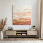
Layered Terracotta Circles With Negative Space
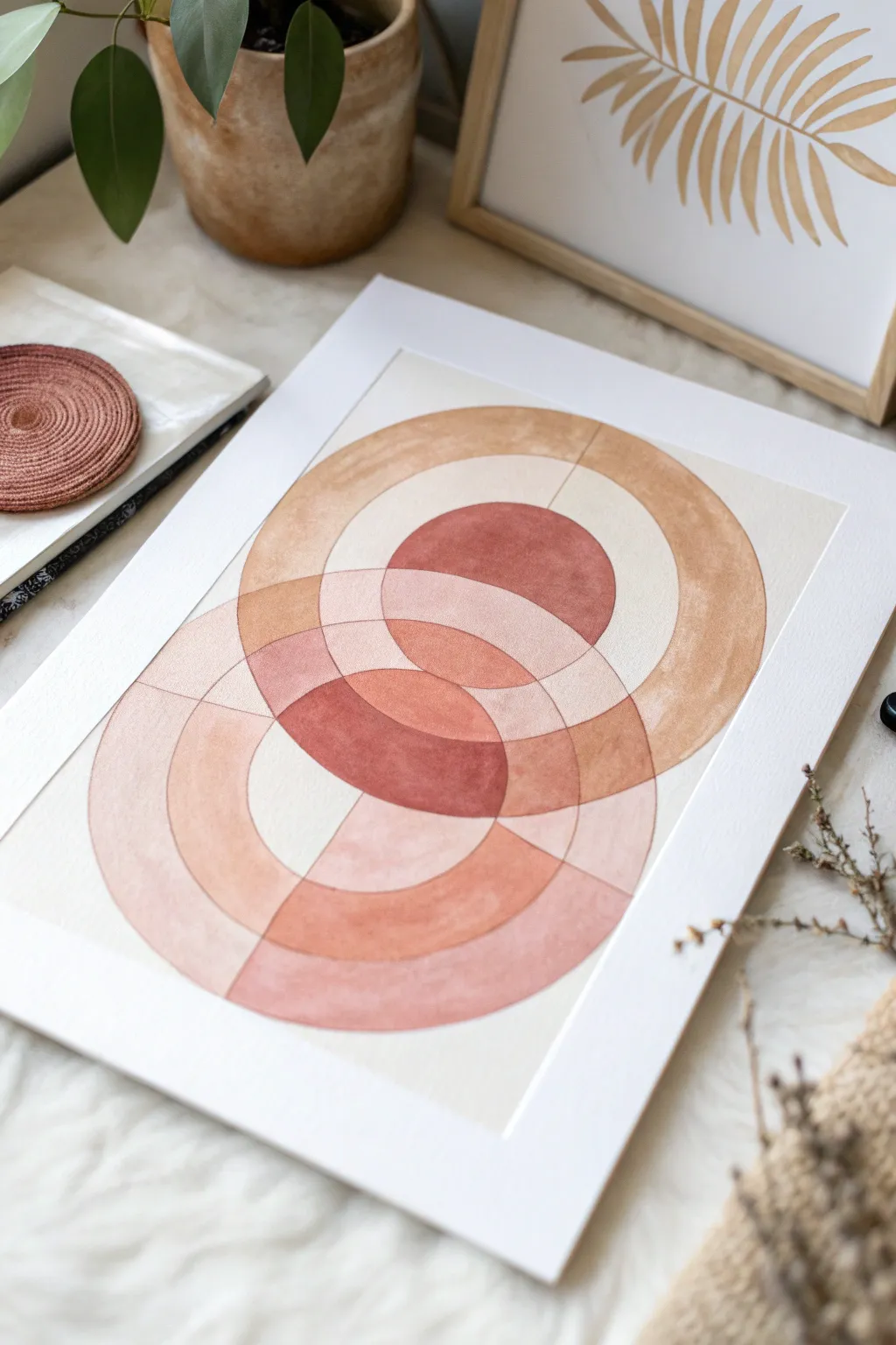
Capture the essence of modern bohemian style with this intersecting circle study, utilizing warm earth tones to create transparency and depth. The geometric precision combined with the organic texture of watercolor creates a soothing, balanced focal point for any wall.
Step-by-Step Guide
Materials
- Cold press watercolor paper (A3 or A4 size)
- Watercolor paints (burnt sienna, yellow ochre, terracotta, burnt umber)
- Compass with an extension arm
- HB Pencil
- Ruler
- Kneaded eraser
- Round watercolor brushes (size 4 and 8)
- Clean water jar and palette
- Artist tape or painter’s tape
- Pre-cut mat board (for framing)
Step 1: Drafting the Geometry
-
Find the center:
Measure your paper carefully and mark the vertical center line lightly with a pencil. This axis will be the anchor for your intersecting circles. -
Establish center points:
Mark two points on your vertical line about 3 to 4 inches apart. The top point will be the center for the upper circles, and the bottom point for the lower set. -
Draw the inner circles:
Set your compass to a radius of roughly 1.5 inches. Place the needle on your top mark and draw a circle. Repeat this exact size on the bottom mark so they overlap significantly in the middle. -
Draw the outer rings:
Widen your compass by another 1.5 inches (creating a 3-inch radius) and draw concentric circles around your first two. Repeat this process two more times, widening the compass equally each time, until you have four concentric rings radiating from each center point. -
Clean up the lines:
Inspect your pencil lines. If they are too dark, gently roll a kneaded eraser over the entire drawing to lift the graphite until it is barely visible. This ensures the pencil won’t show through your transparent watercolor.
Wet-on-Dry Confidence
For crisp geometric edges, always use the ‘wet-on-dry’ technique. Ensure one shape is fully dry before painting its neighbor to prevent bleeding.
Step 2: Mixing the Palette
-
Create the base wash:
Mix a large puddle of watered-down yellow ochre with a touch of burnt sienna. You want a very pale, sandy beige tone. This needs to be transparent enough to act as the lightest value. -
Mix the mid-tone:
In a separate well, mix terracotta vertically with a bit of burnt orange. Test it on a scrap piece of paper; it should be distinctly darker and warmer than your sand color. -
Prepare the darkest shade:
Create your deepest rust color by mixing burnt sienna with a tiny dot of burnt umber or violet to deepen it without making it muddy. This will be for the focal overlaps.
Step 3: Painting the Layers
-
Paint the lightest sections:
Using your size 8 brush, fill in the outermost large arcs and the segmented ‘negative space’ areas using your palest sand mixture. Keep the edges wet to avoid hard lines where you don’t want them. -
Allow to dry completely:
This is crucial for geometric watercolor. Let the first sections bone dry before touching adjacent shapes, or the colors will bleed across the pencil lines. -
Apply the mid-tones:
Identify the medium-sized rings and the areas where the lightest circles overlap. Paint these with your terracotta mix. Be very careful to paint ‘inside the lines’ to maintain that sharp geometric look. -
Add warmth to the overlap:
While a section is still slightly damp, I sometimes like to drop a tiny bit of concentrated pigment into the corner of the shape to create a subtle gradient. -
Paint the core overlaps:
Use your darkest rust mixture to paint the central almond shapes created where the circles intersect. The deeper value here creates the illusion of transparency and draws the eye to the center. -
Wait and assess:
Let the entire piece dry. Look for any areas that feel too light compared to the reference. You can carefully glaze a second layer of the same color over a dried shape to darken it. -
Refine the edges:
If any edges look ragged, use a barely damp size 4 brush (stiff bristles help) to gently ‘scrub’ and lift excess paint, or use a fine liner brush with pigment to sharpen the curve.
Metallic Accent Upgrade
Mix bronze metallic watercolor or gouache into your darkest rust color for the center overlap to give the piece a subtle, shimmering focal point.
Step 4: Finishing Touches
-
Erase guidelines:
Once the paper is 100% dry (cool to the touch), use your eraser to remove any remaining visible pencil marks outside the painted areas. -
Mounting the art:
Position your pre-cut mat board over the painting. Use artist tape on the back of the painting to secure it to the mat board, ensuring the geometric design is perfectly centered in the window.
Now you have a stunning piece of geometric abstraction that brings warmth to your space
Textured Plaster-Look Painting With Simple Shapes
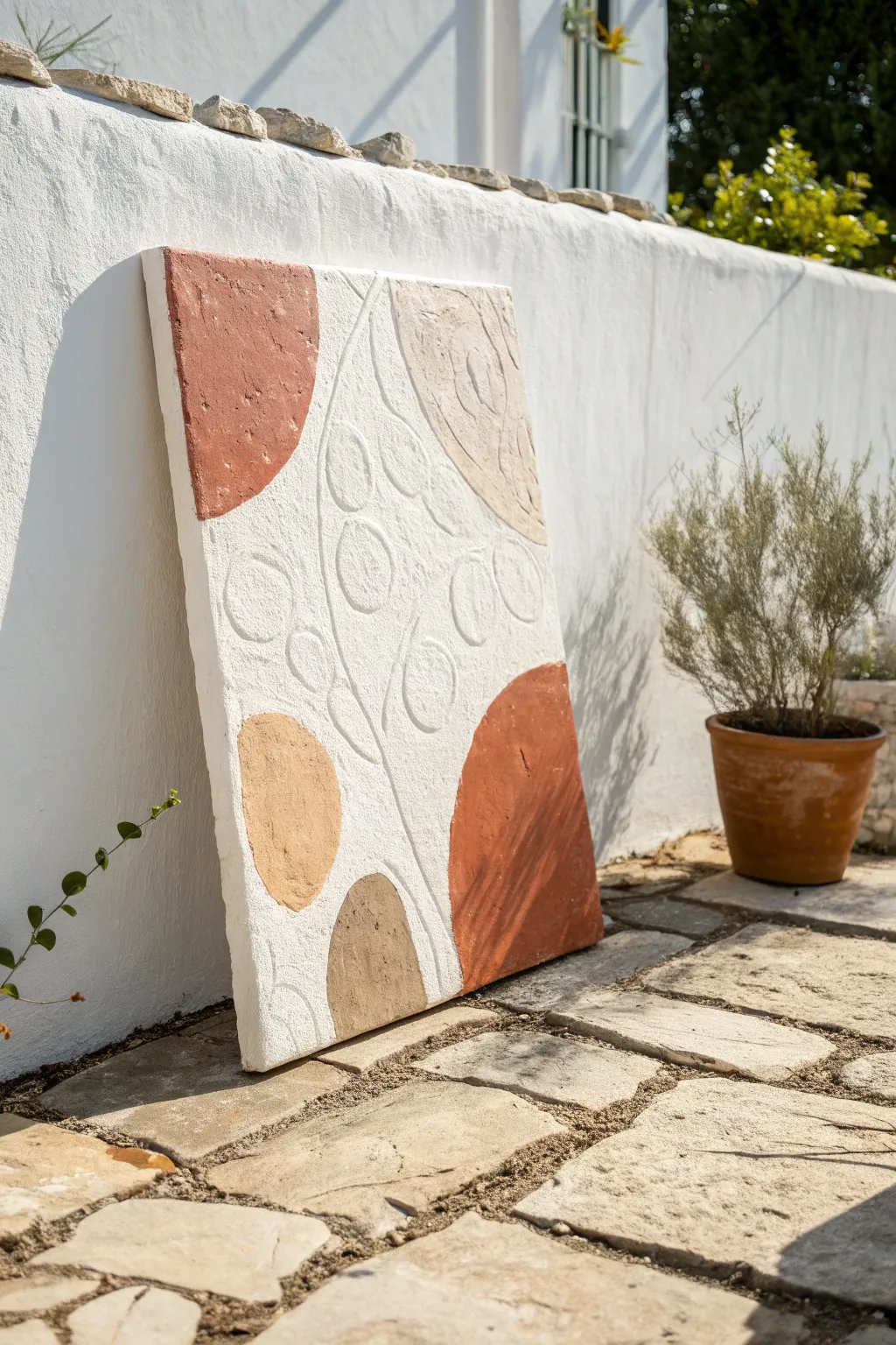
This project captures the sun-baked elegance of Mediterranean design with a textured, plaster-style finish. By combining raised relief patterns with warm, earthy terracotta and beige tones, you’ll create a sophisticated statement piece that looks like it came straight from an artisanal gallery.
How-To Guide
Materials
- Large sturdy canvas (stretched or wood panel)
- Joint compound or modeling paste
- Heavy-body acrylic paints (Rust/Terracotta, Beige, Tan, Mocha)
- White gesso or chalk paint (for base)
- Palette knives (assorted sizes)
- Piping bag with round tip (or plastic bag with corner snipped)
- Pencil
- Sandpaper (fine grit)
- Sponge brush or wide flat bristled brush
- Matte varnish spray
Step 1: Planning and Texture Base
-
Prepare the workspace:
Lay down a drop cloth or old newspapers. This project uses joint compound, which acts like wet plaster and can get messy, so ensure your surface is protected. -
Draft the design:
Lightly sketch your composition onto the canvas using a pencil. For this specific look, draw large organic semi-circles and blobs in the corners, leaving a central channel for the botanical pattern. -
Mix the relief medium:
Scoop some joint compound into a mixing container. Ensure it is smooth and free of dried clumps. If it feels too stiff, add a tiny drop of water to make it more pliable for piping. -
Fill the piping bag:
Spoon the joint compound into a piping bag fitted with a medium-sized round tip. If you don’t have a professional tip, simply snip the corner off a sturdy freezer bag to create an opening about the width of a pencil.
Master the Mixture
Mix white acrylic paint directly into your wet joint compound before applying. This tints the plaster base, so if you accidentally chip it later, white won’t show through the color.
Step 2: Creating the Relief Pattern
-
Pipe the central stems:
In the central negative space of your design, gently squeeze the bag to pipe long, curved lines representing stems. Move slowly to keep the line thickness consistent. -
Add the relief leaves:
Along the piped stems, pipe oval or circular shapes to mimic abstract leaves. Fill these shapes in slightly with the compound so they aren’t just outlines. -
Smoothen the relief:
Before the compound dries, dip a palette knife or your finger in water and very gently flatten the tops of your piped leaves and stems. They should remain raised but look fused to the canvas rather than like icing on a cake. -
Texture the background:
Use a palette knife to spread a thin, uneven layer of joint compound over the remaining blank areas of the canvas. Don’t worry about being perfect; the rough, stucco-like texture is exactly what we want. -
Dry completely:
Let the canvas sit undisturbed for at least 24 hours. The thick areas of compound need significant time to cure fully, or they might crack if painted too soon.
Add Natural grit
For an even more authentic stone look, mix a tablespoon of fine clean sand or coffee grounds into your paint for the darker terracotta sections to create physical grit.
Step 3: Painting and Finishing
-
Sand rough peaks:
Once fully dry, run your hand over the surface. Use fine-grit sandpaper to knock down any overly sharp spikes or unwanted rough patches in the dried compound. -
Apply the base coat:
Paint the entire canvas, including the relief pattern, with white gesso or a warm white chalk paint. This creates a unified matte surface and mimics the look of authentic limestone or plaster. -
Mix your earth tones:
Prepare your palette with distinct boho shades: a deep terracotta rust, a soft sandy beige, a warm tan, and a darker mocha brown. I find mixing a little white into the rust color softens it perfectly. -
Paint the large color blocks:
Using a sponge brush, fill in the large organic shapes you sketched earlier in the corners. Use the rust color for the top left and bottom right shapes to balance the composition. -
Add secondary tones:
Paint the remaining large background shapes with your beige and tan colors. Leave the central relief section (the vines and leaves) mostly white or very lightly washed with beige. -
Distress for aged effect:
Once the color blocks are dry, take a dry brush with a tiny amount of white paint and lightly scuff it over the colored areas. This highlights the texture of the joint compound underneath. -
Detail the relief:
If you want the raised leaves to pop more, mix a very watery wash of beige paint and trace the edges of the raised stems, instantly wiping it back with a rag to leave shadow in the crevices. -
Seal the artwork:
Finish with a spray of matte varnish. This seals the porous joint compound and protects the colors from fading without adding an unnatural glossy shine.
Place your new textured masterpiece in a sunny spot to let the natural shadows highlight the relief work
Ink Doodles Over Dry Paint Blobs
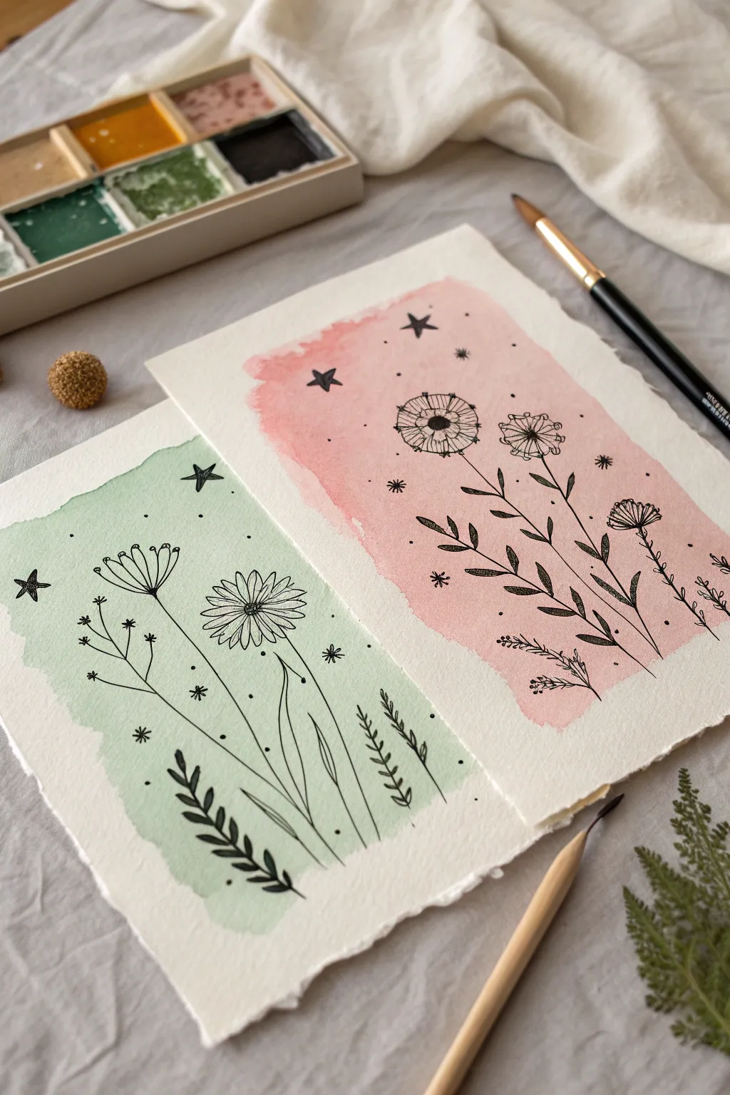
Embrace the effortless charm of boho art by combining loose, abstract watercolor shapes with crisp, detailed linework. This project creates two complementary pieces featuring dreamy pastel washes overlaid with dainty wildflowers and celestial accents.
Step-by-Step Tutorial
Materials
- Cold press watercolor paper (300gsm suggested)
- Watercolor paints (pastel pink and sage green)
- Soft round watercolor brush (size 8 or 10)
- Fine liner pens (black, sizes 03 and 05)
- Clean water jar
- Paper towel
- Ruler (optional for tearing paper)
Step 1: Preparing the Paper Canvas
-
Create the rough edges:
To achieve that handcrafted, deckled look seen in the photo, don’t use scissors. Instead, fold your watercolor paper to the desired size (roughly 5×7 inches works well) and carefully tear along the fold. You can use a ruler held firmly against the paper as a guide to keep the tear relatively straight but textured. -
Prepare your palette:
Mix your colors on a palette. You want a very watery consistency for this background. Dilute a sap green or sage pigment heavily with water for the first sheet, and do the same with a rose or blush pink for the second.
Ink Bleeding?
If your fine liner starts feathering or spreading, the paper is still damp inside. Stop immediately and wait another 15 minutes or use a hair dryer on low heat.
Step 2: Painting the Watercolor Wash
-
Apply the green wash:
Load your round brush with the watery green mix. Paint a loose, irregular rectangular shape in the center of the first paper sheet. Don’t worry about clean edges—let the brush marks show and allow the edges to be organic and uneven. -
Apply the pink wash:
Repeat the process on the second sheet of paper using your diluted pink mixture. Aim for a similar size and placement to the green one so they look like a matching set. -
Soften the edges:
While the paint is still wet, you can dab a clean, slightly damp brush along some of the edges to create a gentle fade-out effect, enhancing the boho vibe. -
Wait for complete drying:
This is crucial: let the paint dry completely. The paper must be bone dry before you touch it with a pen, otherwise the ink will bleed and ruin the crisp lines. I usually give it at least 30 minutes, or you can speed it up with a hair dryer.
Step 3: Inking the Green Botanical
-
Draw the main stems:
Using a 05 fine liner, draw three or four curved lines rising from the bottom of the green paint patch. Vary their heights to create visual interest. -
Add the daisy bloom:
On the tallest stem on the right, draw a small oval center. Surround it with long, thin loops for petals to create a daisy-like flower. -
Sketch the seed head:
On the left stem, draw a semi-circle shape facing upwards. Add small lines radiating out from the flat top, capping each line with a tiny dot to mimic a dried seed pod or dandelion. -
Fill in the foliage:
Add leaves to the base of the stems. For the bottom left, draw a fern-like leaf with small, repetitive oval shapes climbing a short stem. For the tall grass blades, draw long, sweeping lines. -
Sprinkle the magic:
Using a thinner 03 pen, fill the empty green space with tiny dots, small asterisks, and a few five-pointed stars. This adds the celestial, whimsical touch.
Salt Texture Pro Tip
While the watercolor wash is still wet, sprinkle a tiny pinch of table salt on it. Brush it off once dry for a beautiful, speckled galaxy effect.
Step 4: Inking the Pink Botanical
-
Outline the dandelion puffs:
On the pink sheet, start by drawing two circles near the top center. Inside these circles, draw a small dark center and radiate lines outward to the edge of the circle to create stylized dandelion heads. -
Draw the stems downward:
Connect your flower heads to the bottom of the painted area with straight, confident lines. Add a third shorter stem on the right side. -
Add pointed leaves:
Along the main stems, draw pairs of small, pointed leaves. Keep them simple and slightly filled in with texture if you like, or leave them open. -
Create the bottom sprig:
At the very bottom right, add a small, delicate branch with tiny needle-like leaves, similar to rosemary or lavender. -
Final celestial details:
Just like the green piece, scatter small stars (some filled in black, some open), dots, and starbursts around the flowers. Focus the larger stars near the top of the pink wash.
Frame these lovely little artworks side-by-side to bring a touch of gentle nature into your creative space
Mini Boho Gallery Set of Three
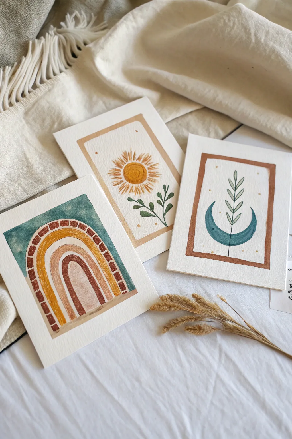
Create a stunning miniature gallery wall with this set of three harmonious watercolor illustrations featuring a rainbow arch, a radiant sun, and a lunar leaf motif. Using a palette of moody teal, burnt sienna, mustard yellow, and sage green, these simple designs bring a calming, bohemian vibe to any space.
Step-by-Step
Materials
- Cold press watercolor paper (300 gsm), cut into three equal 5×7 inch rectangles
- Watercolor paints (Teal, Burnt Sienna/Rust, Yellow Ochre/Mustard, Sage Green)
- Round brushes (sizes 2 and 6)
- Pencil (HB or H for light lines)
- Ruler
- Eraser (kneaded is best)
- Masking tape (optional, for securing paper)
- Jar of clean water
- Paper towels
Step 1: Preparation & Sketching
-
Prep your paper:
Begin by cutting your watercolor sheet into three matching sizes, approximately 5×7 inches each. Tape them down to your workspace if you want to prevent warping, though for these smaller, centered designs, loose paper works fine too. -
Lightly sketch the frames:
On the ‘Sun’ and ‘Moon’ pages, use your ruler to lightly mark a rectangular border about 1 inch from the edge. Draw these lines very faintly so they don’t show through the final paint. -
Sketch the motifs:
In the first rectangle, sketch a large arch shape filling the bottom two-thirds. For the second, draw a central circle for the sun with stem lines below. For the third, sketch a crescent moon shape cupping a central vertical stem.
Step 2: Painting the Rainbow Arch
-
Block in the background:
Mix a watery teal color. Carefully paint the negative space around the outside of your arch shape, creating a rectangular boundary. Keep the edges relatively crisp but allow the paint to pool naturally for texture. -
Paint the outer bricks:
Once the teal is dry, use a rust or burnt sienna shade to paint small rectangular dashes along the outer curve of the arch. Leave tiny white gaps between them to resemble brickwork. -
Add the yellow band:
Moving inward, paint a thick, solid band of yellow ochre or gold following the curve of the bricks. Maintain a steady hand, but don’t worry if the edges have a handmade wobble. -
Complete the inner arch:
Paint the innermost arch section with a mix of rust and a touch of brown for a deeper tone. While painting, I sometimes lift a little color with a thirst brush to create a weathered look on this central piece.
Color Harmony Tip
Pre-mix all four colors in your palette before starting. Reusing the exact same teal and rust mixes across all three paintings ensures they look like a cohesive set.
Step 3: Painting the Radiant Sun
-
Paint the border frame:
Using a diluted wash of beige or light ochre, paint a thick, somewhat uneven border along your pencil guide lines. The irregular, wavy edge gives it that charming boho character. -
Create the sun center:
With your size 6 brush, fill the central circle with vibrant mustard yellow. While wet, drop in a tiny bit of darker orange in the center to create a subtle gradient. -
Add the rays:
Using the smaller size 2 brush and the same mustard yellow, paint thin, scratchy lines radiating outward. Vary their lengths—short, long, short—to create a dynamic burst effect. -
Paint the foliage:
Mix a dark sage green. Paint two stems crisscrossing at the base of the sun, adding small, simple leaf shapes that curve gently upwards.
Wobbly Lines?
Don’t stress over ruler-straight edges. The ‘hand-painted’ look is key to the boho aesthetic. If a line is too shaky, thicken it slightly to smooth out the jitter.
Step 4: Painting the Lunar Leaf
-
Paint the rust frame:
Create a border frame similar to the sun painting, but use your rust or burnt sienna paint. Keep the lines roughly the same thickness as the previous frame for consistency across the series. -
Fill the crescent moon:
Use the same teal color from the first painting to fill in the crescent moon shape. Aim for an opaque, flat wash here to contrast with the delicate leaves. -
Add the central stem:
Once the moon is completely bone dry, use your small brush and the sage green mixture to paint a thin vertical line straight up through the center of the moon. -
Detail the leaves:
Add pairs of leaves growing upward from the stem. Paint the leaves so they sit ‘behind’ the moon visually, or if your teal is light enough, layer them right on top for transparency. -
Final decorative touches:
Using the tip of your smallest brush and mustard paint, add tiny dots scattered inside the frames of the Sun and Moon paintings. This stardust effect ties all three pieces together.
Let your trio dry flat overnight before displaying them together in simple wooden frames or using washi tape for a casual look


Have a question or want to share your own experience? I'd love to hear from you in the comments below!