
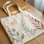
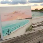
Designing a book cover with your own drawing is one of my favorite ways to turn a plain manuscript or sketchbook into something that feels truly yours. Here are 21 book cover drawing ideas—from classic, reader-friendly layouts to delightfully unusual experiments—so you can start sketching with confidence.
Minimal Line Art Center Icon
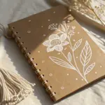
Transform a plain fabric-bound notebook into a personalized journal with this minimalist mountain design. Using simple line art and fabric-safe ink, you will create a crisp, modern cover that celebrates the spirit of adventure.
Step-by-Step Tutorial
Materials
- Hardcover fabric-bound notebook (cream or beige)
- Pencil (HB or lighter)
- Ruler
- Mars eraser or kneading eraser
- Fine-tip permanent fabric marker (black) or archival ink pen (0.5mm)
- Scrap paper for sketching
- Paper tape or masking tape (optional)
Step 1: Planning and Sketching
-
Analyze the Composition:
Before marking the book, study the design. It consists of three overlapping triangles forming a mountain range. The central peak is the tallest, flanked by a slightly smaller peak on the left and a much smaller one on the right, creating a balanced asymmetry. -
Create a Template:
Draw your mountain design on a piece of scrap paper first to finalize the scale. I find a width of about 2-3 inches works best for an A5 notebook. Cut this paper template out so you can position it on the cover. -
Find the Center:
Use a ruler to lightly measure the width and height of your book cover. Mark the true center point with a tiny pencil dot that can be easily erased later. -
Position the Design:
Place your paper template over the center dot. Adjust it until it looks visually balanced to your eye—sometimes the optical center feels slightly higher than the mathematical center. -
Outline the Main Triangles:
Using a sharp pencil and very light pressure, draw the three main triangle shapes directly onto the fabric cover. Start with the large central triangle, then add the overlapping triangle on the left, and finally the small one on the right. -
Refine the Peaks:
Lightly sketch the jagged lines near the top of each triangle that will separate the snowy cap from the base of the mountain. These lines shouldn’t be straight; give them some zig-zag character.
Bleeding Lines?
If ink starts feathering, stop immediately. Switch to a finer nib pen which releases less ink, or hairspray the area lightly before drawing to seal fibers.
Step 2: Inking the Design
-
Test Your Pen:
Test your fabric marker or pen on a hidden part of the book (like the inside back cover edge) or a similar fabric scraps. You want to ensure the ink doesn’t bleed or feather into the fabric weave too aggressively. -
Inking the Base Lines:
Begin inking with the bottom horizontal line of the mountain range. Use your ruler if you want a perfectly straight edge, or freehand it for a more organic feel. Move the pen slowly to allow the ink to saturate the fabric without spreading. -
Outline the Mountains:
Carefully trace over your pencil lines for the outer slopes of the mountains. Start from the base and stroke upward toward the peaks to keep the points sharp. -
Detailing the Snow Caps:
Ink the jagged ‘snow line’ you sketched earlier. Below the very tip of each peak, draw vertical hatching lines closer together to create dark shading, leaving the area above the jagged line empty (white) to represent snow. -
Adding Texture:
Add a few vertical lines extending down from the snow line into the body of the mountain. These lines should vary in length to suggest rocky terrain and depth. -
Thicken the Lines:
Go over the main outline one more time if needed to make the exterior bold and distinct. This helps the design pop against the textured fabric background.
Step 3: Finishing Touches
-
Let it Dry:
Allow the ink to dry completely. Fabric tends to absorb ink deeply, so give it at least 15-20 minutes to ensure it won’t smudge. -
Erase Pencil Marks:
Once the ink is fully set, gently erase any visible pencil guidelines. Be extremely gentle with the eraser to avoid pilling the fabric cover. -
Inspect and Refine:
Look closely at your lines. If the fabric weave caused any skipped spots, touch them up with the very tip of your pen for a solid black finish.
Level Up
Use gold or white fabric paint for the ‘snow’ caps instead of leaving them blank. It adds a subtle shimmer and texture to the peaks.
Your custom journal is now ready to accompany you on your next journey


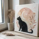
Silhouette With a Bold Spotlight
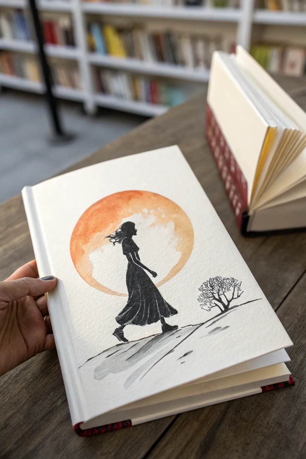
This striking book cover design pairs a bold, warm geometric element against the stark elegance of a black ink silhouette. By combining loose watercolor washes with precise pen work, you’ll create a moody and atmospheric illustration that feels both classic and contemporary.
How-To Guide
Materials
- Blank hardcover sketchbook or heavy mixed-media paper
- Pencil (HB or H)
- Eraser
- Circular object for tracing (bowl or compass)
- Black waterproof ink or fine liner pens (0.5mm and brush tip)
- Watercolor paints (Orange, Yellow Ochre, Burnt Sienna)
- Round watercolor brush (size 6 or 8)
- Small detail brush
- Paper towel
- Masking tape (optional)
Step 1: Planning and Sketching
-
Position the sun:
Begin by deciding where your focal point should be. Place your circular object or compass near the upper center of the cover, slightly offset to the left for a dynamic composition, and trace a light circle. -
Sketch the figure:
Lightly sketch the silhouette of the woman walking. Start with a simple stick figure to get the proportions right—ensure her head overlaps with the circle while her feet wander off towards the bottom right. -
Refine the outline:
Flesh out the figure’s form. Draw the flowing dress, hair blowing back, and the position of her arms. Keep the details focused on the outline shape since the inside will be solid black. -
Add the landscape:
Sketch a sloping horizon line beneath her feet. Off to the right side, lightly draw the twisted branches of a small, gnarled tree or bush to balance the composition.
Step 2: Painting the Backdrop
-
Prepare your palette:
Mix a warm, rusty orange color using your watercolors. You want a variation in tone, so prepare a watery orange and a slightly denser, reddish-brown mix. -
Wet the circle:
Using clean water, carefully wet the inside of your traced circle. Don’t worry if you go over the girl’s sketch slightly, as black ink will cover it, but try to stay within the circle’s outer edge. -
Drop in color:
Load your round brush with the orange mix and touch it to the wet paper. I like to dab color unevenly—letting it bloom naturally creates that lovely textured, moon-like surface. -
Create texture:
While the paint is still damp, lift out a few clouds or lighter spots using a crumpled paper towel or a thirsty dry brush. Let this wash dry completely before moving on.
Bleeding Lines?
If ink bleeds into the orange sun, the paper wasn’t dry enough. Wait longer or use a hairdryer. If it happens, thicken the silhouette slightly to hide the bleed
Step 3: Inking the Silhouette
-
Outline the figure:
Once the watercolor is bone dry, take your fine liner pen and carefully trace the final outline of the woman over the painted background. -
Fill in the block black:
Switch to a brush pen or a larger marker to fill in the body of the silhouette. Work slowly near the edges to keep them crisp. -
Detail the hair:
Switch back to your finest pen to flick out loose strands of hair catching the wind. These tiny, irregular lines add movement and life to the static silhouette. -
Define the dress folds:
Although it’s a silhouette, you can leave infinitesimal white gaps or use white gel pen later to suggest the folds of the skirt, but a solid shape usually works best for high contrast.
Metallic Magic
Once dry, add gold leaf or metallic gold paint to the edge of the sun circle or the woman’s jewelry for a luxurious, light-catching detail
Step 4: Ground and Details
-
Draw the ground:
Use sweeping overlapping lines to create the uneven terrain she is walking on. Vary your line weight—thicker for shadows, thinner for highlights. -
Add ground shadows:
Dilute a tiny drop of black ink or grey watercolor to create a soft, cast shadow on the ground beneath her feet and the slope, anchoring the figure to the earth. -
Ink the tree:
Draw the small tree on the right using jagged, nervous lines. Keep the branches bare and intricate to contrast with the solid mass of the woman’s dress. -
Final touches:
Erase any remaining pencil marks that show through. Assess the balance and thicken any lines on the ground that feel too faint.
Enjoy the dramatic contrast of your new hand-illustrated cover
Watercolor Wash Under Ink Drawing
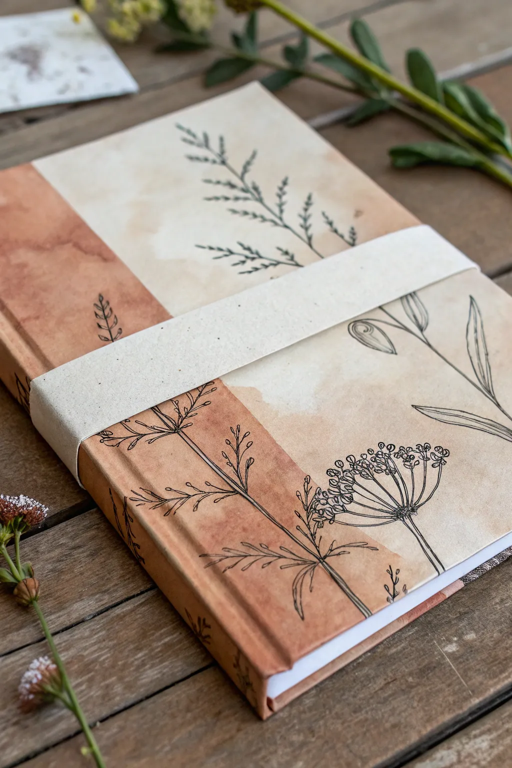
This custom book cover merges the unpredictability of watercolors with the precision of fine-line ink drawing. The result is a warm, rustic design featuring a split-tone background and delicate wild carrot illustrations that wrap around the spine.
Step-by-Step Tutorial
Materials
- Hardcover sketchbook or blank cover journal
- Watercolor paper (if not painting directly on cover)
- PVA glue or bookbinding adhesive
- Watercolor paints (burnt sienna, yellow ochre, raw umber)
- Wide flat wash brush
- Fine liner pens (Black, archival waterproof, sizes 01 to 05)
- Pencil and eraser
- Ruler
- Scrap paper strip (for the belly band)
- Spray bottle with water (optional)
Step 1: Creating the Surface
-
Assess your base:
Check if your sketchbook cover is suitable for watercolor. If it is absorbent cardstock or fabric, you can paint directly. If it is slick or coated, you will need to paint a separate sheet of watercolor paper to size and glue it down later. -
Plan the split:
Decide where the color division will happen. This design features a vertical split about a third of the way across the front, creating a distinct ‘spine zone’ and a ‘cover zone’. -
Mix the rust tone:
Prepare a watery wash of Burnt Sienna mixed with a tiny bit of Raw Umber to create that warm, reddish-brown terracotta color. You want plenty of liquid on your palette. -
Paint the spine section:
Apply the rust wash to the spine area and the left third of the cover. Don’t worry about perfect evenness; the ‘blooming’ texture creates the vintage look. Let the edge of this section dry slightly rough or uneven for an organic feel. -
Mix the cream tone:
Dilute Yellow Ochre with a lot of water until it is very pale, almost tea-stained in color. -
Paint the remaining area:
Fill the rest of the cover with this pale cream wash. Allow the wet edges of the rust and cream sections to touch lightly; they might bleed into each other, which adds beautiful character. -
Dry partially:
Let the paint settle. If you want those distinct hard edges (watermarks) seen in the reference, don’t blot the puddles. Let them air dry naturally.
Uneven Drying?
Don’t panic if the watercolor pools. These ‘backruns’ or cauliflower edges actually enhance the rustic aesthetic. Just let it dry flat without touching it.
Step 2: Adding the Ink Work
-
Sketch the layout:
Once the paper is bone dry, lightly sketch your botanical stems with a pencil. I usually plan for one main stem to cross the color boundary, tying the two zones together. -
Draw the main stems:
Using a 03 or 05 fineliner, trace your main vertical lines. This design features Queen Anne’s Lace (wild carrot), so use straight, sturdy lines for the primary stalks. -
Add detail stems:
Switch to a finer 01 or 02 pen. Draw the smaller stems branching off. Notice how the leaves in the reference are fern-like; draw a central vein and add tiny, feathery strokes outward. -
Create the flower heads:
Draw the umbrella-shaped flower clusters. Start with a central point and draw radiating spokes outward. Top each spoke with small, bumpy circles to represent the tiny florets. -
Vary the line weight:
Go back over the bottom of the main stems and thicken the lines slightly to ground the drawing visually. -
Erase guidelines:
Wait at least 15 minutes to ensure the ink is totally set, then gently erase your pencil marks.
Step 3: Finishing Touches
-
Mount the paper (if separate):
If you painted on a separate sheet, carefully measure your book cover and trim the painting to size. Apply PVA glue evenly to the back and smooth it onto the book’s hard casing. -
Create the belly band:
Cut a strip of cream-colored textured paper or cardstock, about 1.5 inches wide. Wrap it horizontally around the book to get the length right. -
Secure the band:
Fold the ends of the strip inside the front cover or tape them together at the back, sliding it snugly over your new artwork. -
Speckle effect (optional):
For a final aged look, you can flick a toothbrush with very diluted brown paint over the cover to add tiny speckles, though the reference relies mostly on the watercolor texture itself.
Pro Tip: Waterproof Ink
Test your pen on scrap paper first! If your ink isn’t truly waterproof, a stray drop of moisture later could ruin the drawing. Microns or Uni Pins are reliable choices.
Now you have a stunning, personalized sketchbook that invites you to fill its pages with more creativity

Pattern Background With Title Block
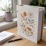
Transform a plain sketchbook into a personalized forest treasure with this simple yet elegant repeating pattern. Using a limited color palette of earthy tones and simple brushstrokes, you can achieve this clean, illustrated look that feels both cozy and artistic.
Step-by-Step Guide
Materials
- Hardcover sketchbook with plain paper cover (cream or white)
- Acrylic paints or Gouache (Rust Orange, Slate Blue, Tan/Ochre, Black)
- Round synthetic brushes (sizes 0/1 for fine details and size 2/4 for leaves)
- Pencil (HB or H)
- Palette for mixing
- Water cup and paper towels
- Matte finish spray sealant (optional)
Step 1: Planning and Preparation
-
Surface Prep:
Before you begin, wipe down the cover of your sketchbook with a clean, dry cloth to remove any dust or oils. If your sketchbook has a glossy finish, you might want to give it a very light sanding with fine-grit sandpaper to help the paint adhere, though a paper-cover sketchbook works best. -
Palette Setup:
Prepare your colors. You’ll need three main shades: a warm rust orange, a muted slate blue (mix blue with a tiny dot of black and orange to desaturate it), and a soft tan or ochre. You’ll also want a pure black or very dark navy for the small stars.
Practice First
Before painting the cover, test your leaf “flick” motion on a piece of scrap paper to get confident with the brush tension.
Step 2: Painting the Leafy Elements
-
The Rust Leaves:
Start with your rust orange paint. Using your medium round brush (size 2 or 4), paint a central stem line that curves slightly. From this stem, pull small, teardrop-shaped brushstrokes outward to create leaves. I find it helpful to vary the direction of these stems—some pointing up, some angled left or right. -
Spacing the Rust Elements:
Scatter these rust-colored branches randomly across the cover. Aim for an uneven but balanced distribution, leaving plenty of empty space between them for the other colors. Let them dry completely. -
The Tan Branches:
Switch to your tan or ochre paint. Repeat the same leaf-painting process, placing these lighter branches in the larger gaps left between the orange ones. These leaves can be slightly more elongated or just different in orientation to create visual interest. -
The Slate Blue Foliage:
Now, bring in the contrast with your slate blue paint. Paint these branches similarly, but perhaps make the leaves slightly smaller or clearer in shape. Look for any large white spaces and fill them with these blue elements. Let everything dry for at least 15 minutes.
Step 3: Adding Fine Details
-
Berry Sprigs:
Using your smallest detail brush (size 0 or 1) and black or very dark navy paint, draw thin, delicate dividing stems. At the end of these fine lines, switch back to your Rust Orange or Tan paint to add tiny dots for berries. -
Mixing Media:
Instead of full leaves, these berry sprigs should be wispy. The black lines act as the skeleton, while the colored dots add a festive pop. Place these in the remaining open areas. -
Adding the Stars:
Using the dark slate or black paint, add small five-pointed stars into the negative spaces. Don’t overthink the shape; imperfect, hand-drawn stars add to the charm. -
Tiny Dots:
To fill the very smallest gaps and tie the pattern together, dip the very tip of your brush (or even a toothpick) into the black paint. Add simple, single dots sporadically around the leaves and stars.
Add Metallic Flair
Swap the tan paint for gold gouache or metallic acrylic to give the lighter leaves a subtle shimmer that catches the light.
Step 4: Finishing Touches
-
Edge Work:
Don’t forget the spine and the edges! Continue a few leaves or star patterns wrapping around the spine of the book to make the design feel continuous and professional. -
Cleaning Up:
Check for any accidental smudges. If you used acrylics, you might be able to gently scrape away a mistake once dry, or paint over it with a color matching the book cover background. -
Sealing:
Once the entire cover is bone dry (give it an hour just to be safe), take the book to a well-ventilated area. Apply a light, even coat of matte spray sealant. This protects your handiwork from moisture and handling over time.
Your sketchbook now acts as a piece of art itself, ready to inspire whatever you choose to draw inside

PENCIL GUIDE
Understanding Pencil Grades from H to B
From first sketch to finished drawing — learn pencil grades, line control, and shading techniques.
Explore the Full Guide
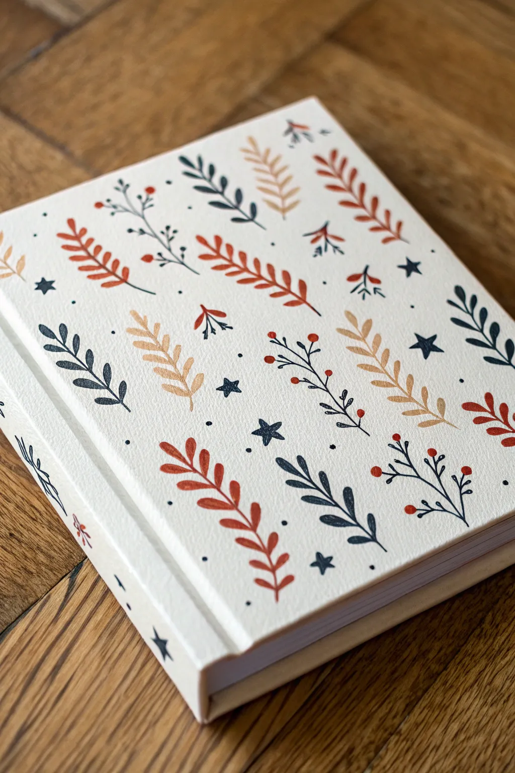
Crosshatch Engraving Style Illustration
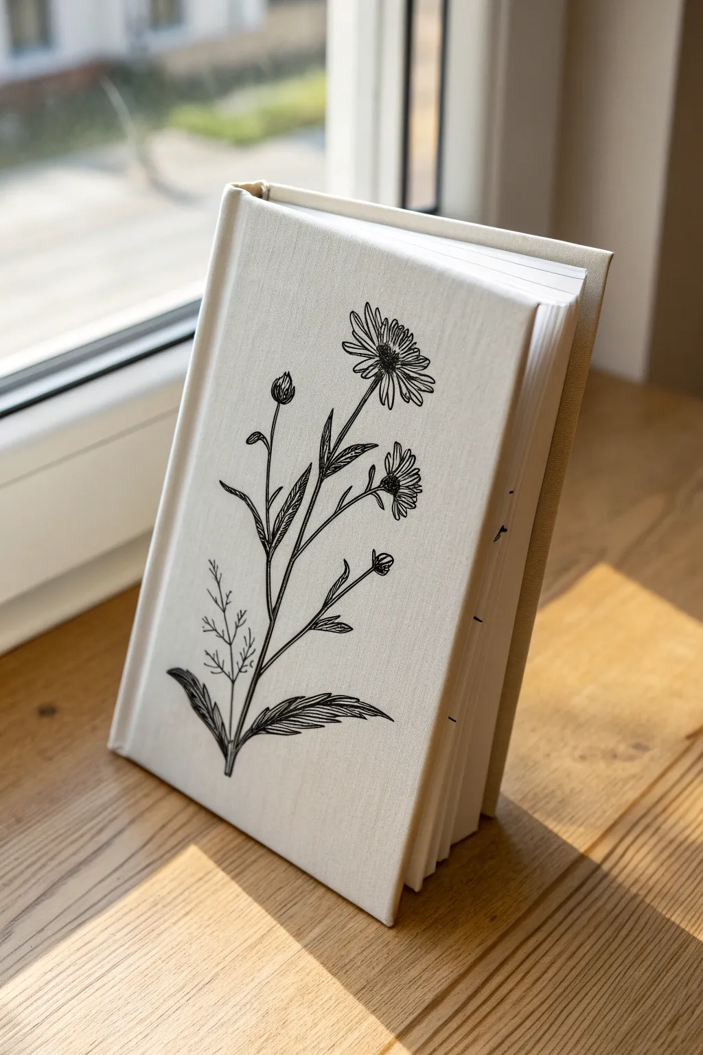
Transform a plain journal into a vintage-inspired keepsake with this elegant fabric cover project. The fine-line botanical illustration mimics the look of old engraved plates, creating a timeless aesthetic perfect for a nature journal or diary.
Step-by-Step Tutorial
Materials
- Hardcover sketchbook (plain or existing cover removed)
- Cream or natural linen fabric (tight weave)
- Fabric glue or PVA bookbinding glue
- Fine-tip permanent fabric marker (black, 0.3mm or 0.5mm)
- Graphite transfer paper
- Pencil (HB or H)
- Masking tape
- Bone folder
- Sharp scissors
- Ruler
- Paintbrush for glue application
Step 1: Preparing the Fabric Cover
-
Measure and cut:
Lay your open sketchbook onto the linen fabric. Measure smoothly around the covers and spine, leaving a generous 1-inch (2.5 cm) margin on all sides. Cut the fabric to size. -
Apply adhesive:
Using a flat brush, apply an even, thin layer of fabric glue or PVA to the front cover of your book. Start from the center and brush outwards to avoid pooling. -
Smooth the front:
Carefully place the fabric onto the glue-coated cover. Use a bone folder to smooth it down, working from the center out to remove any air bubbles or wrinkles. -
Wrap the spine and back:
Repeat the gluing process for the spine and back cover. Pay special attention to the spine hinges, pressing the fabric firmly into the grooves with the edge of your bone folder for a crisp finish. -
Miter the corners:
Open the book covers. At each corner, trim the excess fabric at a 45-degree angle, leaving just a sliver of fabric (about 2mm) away from the actual cardboard corner to ensure full coverage when folded. -
Secure the edges:
Apply glue to the fabric margins and fold them tightly over the edges to the inside of the covers. I prefer to do the top and bottom edges first, then the sides. -
Finish the interior:
Glue down your endpapers (the first and last pages of the book block) over the raw fabric edges on the inside cover to hide them and create a seamless look.
Fabric Marker Tip
Test your marker on a scrap piece of the same linen first. If the ink bleeds into the fibers, lightly mist the fabric with hairspray or spray starch before drawing to seal it.
Step 2: Drafting the Botanical Design
-
Select your reference:
Choose a botanical line drawing or engraving to replicate. Look for images with strong vertical composition, like wildflowers or daisies with long stems. -
Create a guide:
Print your chosen design to the size of your book cover. If drawing freehand, sketch your design on a separate piece of paper first to finalize the layout. -
Position the transfer:
Place a sheet of graphite transfer paper (dark side down) onto the center of your dry fabric cover. Tape your printed design or sketch securely on top using masking tape. -
Trace the outline:
Using a sharp pencil and firm pressure, trace the main lines of the flower, stem, and leaves. Don’t worry about the tiny shading lines yet; just get the skeleton of the drawing transferred. -
Check the transfer:
Lift one corner carefully to ensure the lines are visible on the fabric. If they are faint, go over them again with more pressure before removing the template entirely.
Step 3: Inking the Engraving Style
-
Outline the stem:
Switch to your fine-tip fabric marker. Start at the bottom of the stem, drawing a confident, solid line upward. The texture of the linen might catch the nib slightly, so move slowly. -
Define the leaves:
Outline the leaves and flower petals. Keep your hand steady, but allow for slight organic wobbles—this adds to the hand-drawn charm. -
Add texture to leaves:
In the engraving style, shading is done with lines, not smudging. Add thin, parallel diagonal lines inside the leaves to suggest veins and shadows. -
Detail the flowers:
Move to the flower heads. Draw short, flicking strokes radiating from the center of the flower to define the petals. Use dots or tiny circles to create texture in the flower centers. -
Deepen the contrast:
Identify where the shadows would fall (typically under leaves or where stems overlap). Add cross-hatching—a second set of diagonal lines intersecting the first—to darken these areas. -
Final touches:
Step back and look at the composition. If the drawing feels too light, thicken the main outline slightly on the ‘shadow side’ (usually the right or bottom) to give the drawing weight.
Fixing Wobbly Lines
Did your hand slip? Don’t panic. Simply thicken the line slightly in that area or add a small ‘bud’ or extra leaf to camouflage the mistake into the organic design.
Allow the ink to dry completely for at least 24 hours before sliding your new notebook onto the shelf


Have a question or want to share your own experience? I'd love to hear from you in the comments below!