
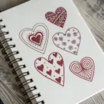
Whenever I feel creatively stuck, I love leaning into broken drawing ideas because they’re instantly emotional and weirdly soothing to sketch. Let’s play with cracks, splits, shards, and repairs so you can turn that “broken” vibe into drawings that actually feel alive.
The Classic Jagged-Crack Heart
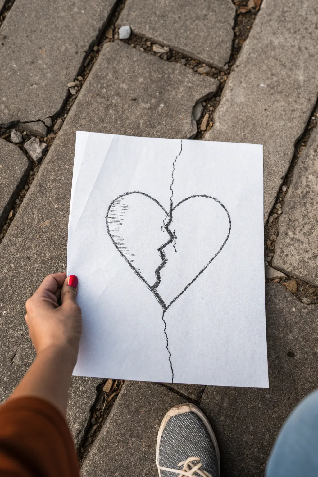
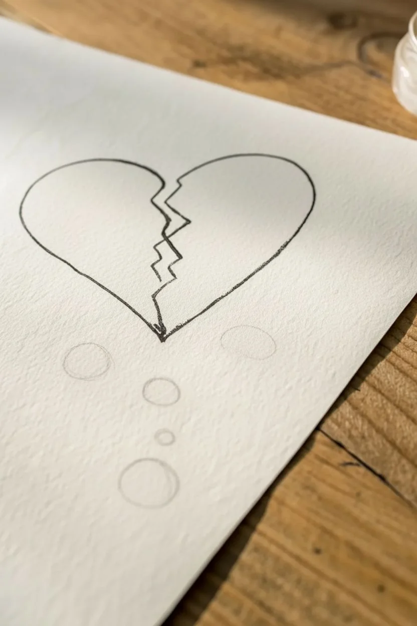
This simple yet emotive sketch perfectly captures the feeling of heartbreak with bold, fragmented lines and minimal shading. Achievable with basic supplies, this project focuses on creating contrast and texture to give the drawing a raw, expressive quality.
Detailed Instructions
Materials
- White drawing paper (printer paper works fine, heavily textured paper adds character)
- Black charcoal stick, charcoal pencil, or a soft graphite pencil (6B or darker)
- Hard surface or clipboard for drawing
- Eraser (kneaded eraser is ideal for charcoal)
- Fixative spray (optional, to prevent smudging)
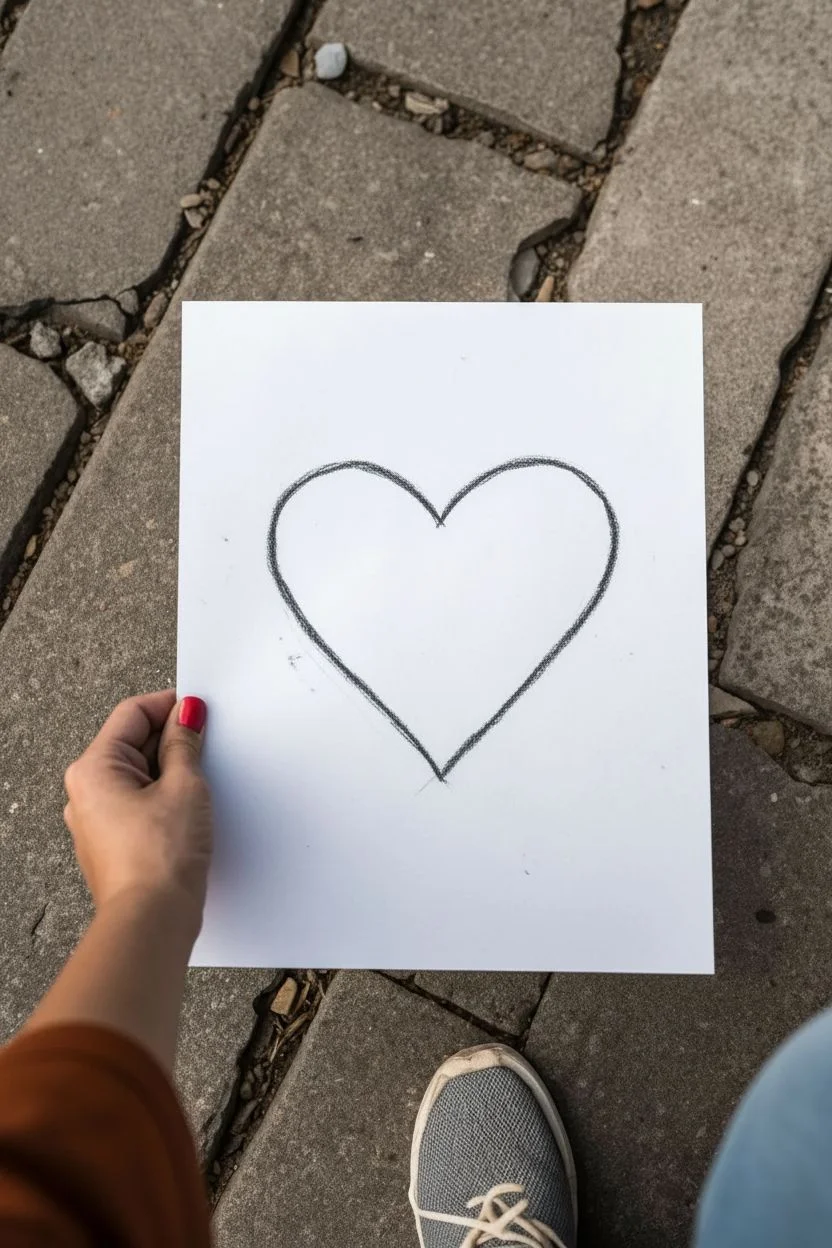
Step 1: Drafting the Outline
-
Position your paper:
Start by placing your white paper on a flat, hard surface. In the reference image, the paper is held vertically, which fits the elongated nature of the crack well. -
Visualize the center:
Imagine a vertical line running straight down the middle of your page. This imaginary axis will guide where the main fracture occurs. -
Draw the left hump:
Using a light touch initially, sketch the curve of the left side of the heart. Start from the center, arching up and out, then curving back down toward the bottom center point. -
Draw the right hump:
Sketch the right side to match the left, creating a mirror image. Don’t worry about perfect symmetry; a slightly uneven shape adds to the hand-drawn, emotional feel. -
Darken the outline:
Once you are happy with the shape, go over your outline with your charcoal or dark pencil. Press firmly to create a rough, textured line rather than a perfect, sterile stroke.
Charcoal Pro Tip
If you are using vine charcoal, don’t blow the dust off with your breath; it can stain the paper with moisture. Tap the paper vertically against a table instead.
Step 2: Creating the Fracture
-
Start the top crack:
Begin your jagged line at the very top edge of the paper, well above the heart. Draw a wiggly, tremulous line coming down toward the divot between the heart’s arches. -
Enter the heart:
As the line enters the top of the heart, make the zig-zags sharper and more pronounced. This is the point of impact. -
Draw the internal break:
Continue the jagged line down through the center of the heart. Instead of a straight line, zig and zag aggressively left and right to separate the two halves visually. -
Thicken the gap:
To make the break look like a true separation, retrace the jagged line through the heart, adding a second line parallel to the first in wider spots. Fill in the gap between these lines with solid black to simulate a hole or deep shadow. -
Exit the bottom:
Continue the crack out the bottom tip of the heart, letting the line wiggle down toward the bottom edge of the paper. This connects the entire page into one fractured scene.
Step 3: Shading and Texture
-
Identify the light source:
For this drawing, we are creating a stylized shadow on the left side, as seen in the reference photo. -
Start cross-hatching:
On the inner curve of the left heart half, begin drawing short, horizontal lines. Keep them relatively loose and spaced out. -
Build the density:
I find it helpful to layer these hatch marks more densely near the outline and fade them out as you move toward the center of the shape. -
Add vertical texture:
Cross over your horizontal lines with a few light vertical strokes or scribbles on that left side to create a rough, ‘sketched’ texture. -
Reinforce the outline:
The charcoal may have faded while your hand moved across the paper. Go back and heavily darken the main heart outline one last time to make it pop against the white background. -
Check the crack density:
Ensure the central crack is the darkest part of the drawing. Add extra pressure here if needed to make it look deep and final. -
Clean up stray marks:
Use your eraser to lift any accidental smudges around the outside of the heart, keeping the background stark white for contrast.
Avoiding Smudges
Charcoal loves to smear. Place a scrap piece of paper under your drawing hand as a guard sheet while you work on the details to keep the white space pristine.
You now have a powerful, high-contrast sketch that speaks volumes with just a few simple lines


Crying Heart With Falling Tears
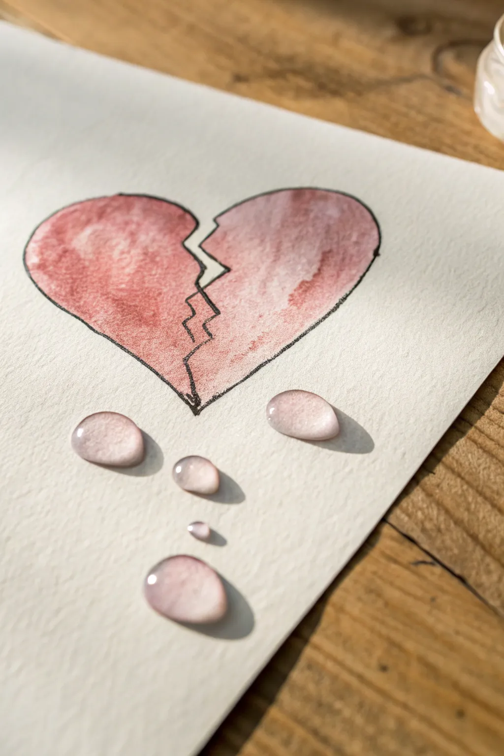
This emotive watercolor project contrasts the simple graphic of a broken heart with the hyper-realistic illusion of 3D water droplets. It’s a wonderful study in shadows and highlights that creates a striking visual popping right off the page.
How-To Guide
Materials
- Cold press watercolor paper (300 gsm)
- Pencil (HB or H)
- Fine liner pen (black, waterproof, 0.3mm or 0.5mm)
- Watercolor paints (Alizarin Crimson, Burnt Sienna, Payne’s Gray, White Gouache or Acrylic)
- Round watercolor brushes (size 4 and size 0/detail brush)
- Palette for mixing
- Paper towel
- Jar of clean water
Step 1: Sketching and Lining
-
Draw the outline:
Begin by lightly sketching a classic heart shape in the center of your watercolor paper using an HB pencil. -
Create the break:
Draw a jagged, zigzag line down the center of the heart to represent the crack. Make sure the two halves are separated by a small gap, giving it that shattered appearance. -
Map the tears:
Lightly sketch three or four tear shapes below the heart. Make them irregular ovals or slightly flattened circles rather than perfect teardrops to look like they have landed on a surface. -
Line the heart:
Go over your heart pencil lines with a waterproof black fine liner pen. Do not ink the teardrops; those must remain pencil-only for now to keep them realistic. -
Erase guidelines:
Once the ink is completely dry, gently erase the pencil marks on the heart, leaving only the faint pencil sketches of the water droplets.
Droplets look flat?
Make sure your cast shadow (under the drop) is darker than the drop itself. Also, ensure the white highlight is pure opaque white, thick enough to sit on top of the paper grain.
Step 2: Painting the Heart
-
Mix the base color:
Mix a muted red using Alizarin Crimson with a tiny touch of Burnt Sienna to get that slightly dried, antique rose color shown in the reference. -
First wash:
Using your size 4 brush, apply a loose, watery wash of this pinkish-red to the inside of the heart. -
Add variance:
While the paint is still wet, drop in slightly more saturated pigment near the edges and the crack line to create texture and depth, keeping the center slightly lighter. -
Dry completely:
Let this layer dry fully before moving on. You want the heart to be flat matte so it contrasts with the shiny tears later.
Pro Tip: Soft edges
When shading the inside of the water droplet, keep a damp clean brush handy. Use it to soften the edge of the grey paint so it fades smoothly into the white paper, avoiding hard lines.
Step 3: Creating Realistic Water Droplets
-
Base shadow layer:
For the tears, you aren’t painting them ‘blue’ or ‘clear’, but rather painting the shadow they cast. Mix a very watery grey using Payne’s Gray and a lot of water. -
Apply the graduation:
Paint the top inside edge of each droplet with this faint grey, fading it out to white as you move toward the bottom of the drop. -
Cast shadow:
Using a slightly darker mix of the grey, paint a crescent-shaped shadow underneath each droplet on the paper. This grounding shadow is crucial for the 3D effect. -
Reflected color:
I like to take a tiny amount of the watery red mix from the heart and glaze it lightly over the bottom third of the droplet. This mimics the water reflecting the red heart above it. -
Darken outlines:
With a very fine brush and dark grey, carefully outline just the shadow sides of the droplet (usually the top arc and bottom shadow) to define the shape without making hard outlines. -
Add the highlights:
This is the ‘magic’ step. Using white gouache or white acrylic paint on your smallest brush, paint a crisp highlight dot and a small curve on the darkest part of the droplet (usually the top). -
Secondary highlights:
Add a faint, smaller dab of white on the opposite bottom side to show light passing through the water. -
Final assessment:
Step back and look at your work. If the drops don’t look wet enough, your white highlights might need to be brighter or sharper.
With those crisp white highlights applied, your drawing now carries a beautiful depth that captures both sadness and artistic skill


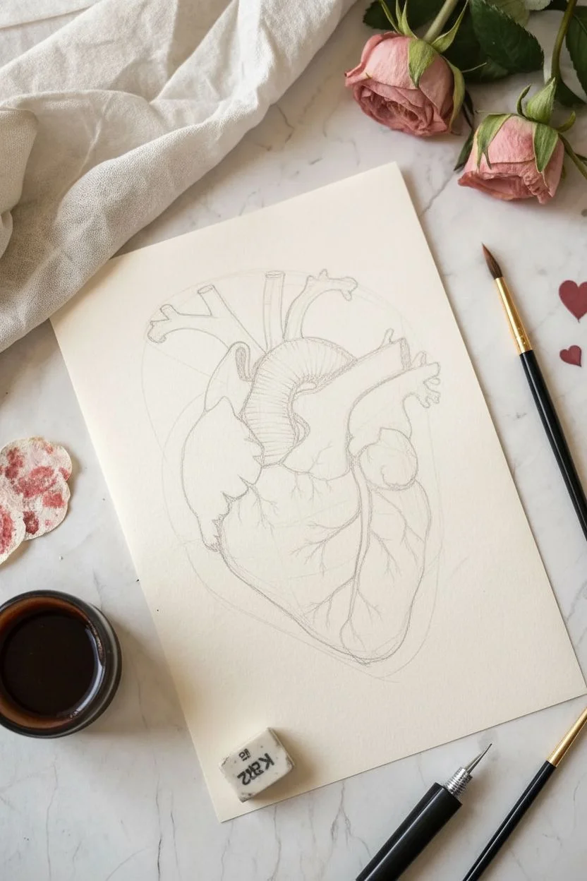
Anatomical Heart With Ink Drips
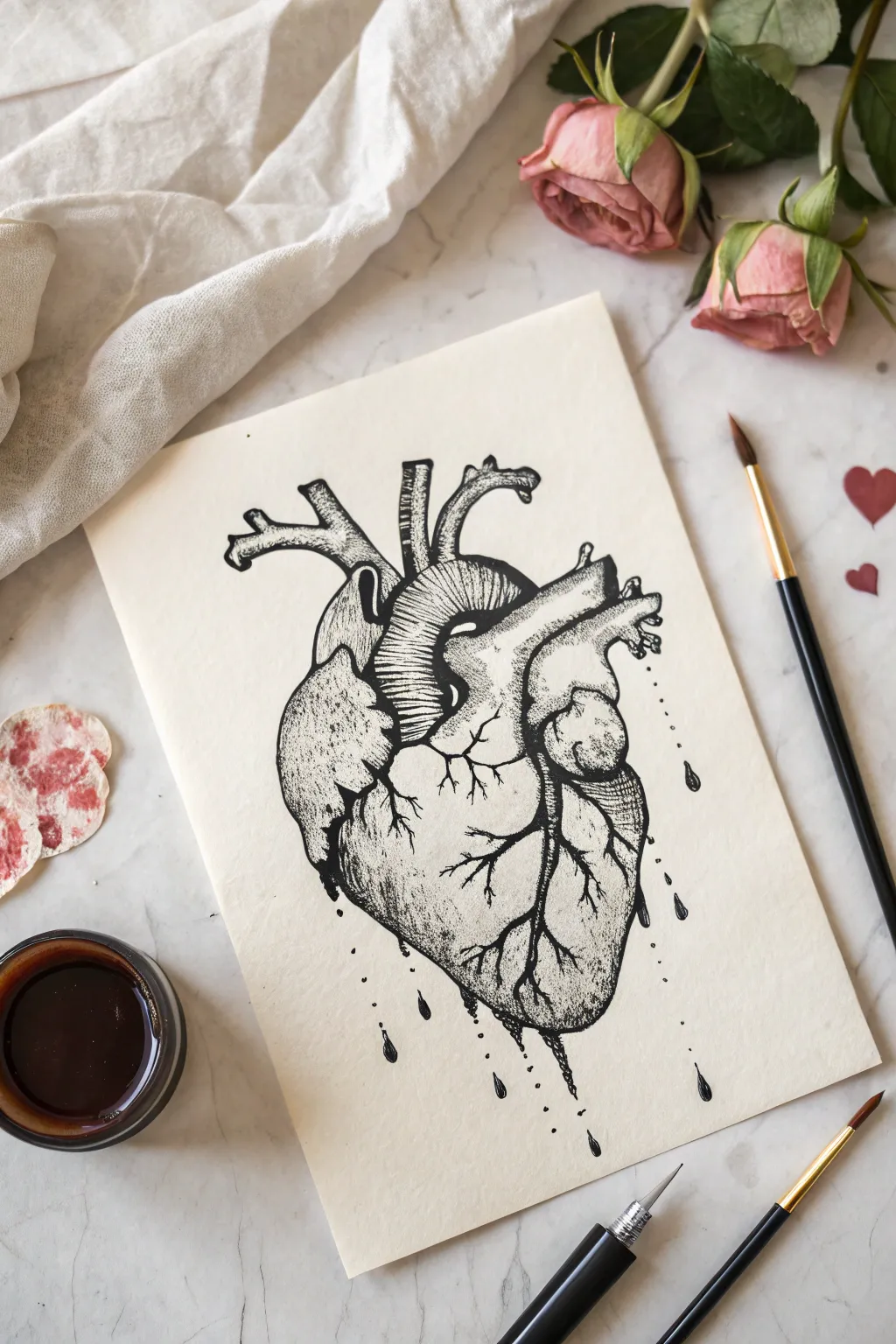
Capture the raw emotion of a broken heart with this stunning anatomical ink illustration. Using fine liners and stippling techniques, you’ll create a textured, realistic heart that seems to bleed onto the page.
Step-by-Step Tutorial
Materials
- High-quality mixed media or Bristol paper (cream or off-white)
- Pencil (HB or 2B)
- Kneaded eraser
- Fine liner pens (sizes 0.05, 0.1, 0.3, and 0.5)
- Black India ink or brush pen (optional, for darker areas)
- Small round paintbrush (optional)
- Reference image of an anatomical heart
Step 1: Sketching the Anatomy
-
Basic Shapes:
Start by lightly sketching a large, rounded inverted triangle shape in the center of your paper to represent the main mass of the heart. Keep your pencil pressure very light so these lines can be erased later. -
Define the Chambers:
Divide the main shape into the ventricles and atria. Sketch the curving line that separates the left and right sides of the heart, running diagonally from the top right to the bottom left. -
Add Arteries and Veins:
Draw the aorta arching over the top, along with the superior vena cava and pulmonary arteries branching out. These should look like organic, tubular structures emerging from the top of the heart. -
Surface Details:
Sketch the squiggly, lightning-like paths of the coronary arteries across the surface of the heart. These will be crucial for adding texture later. -
Refining the Outline:
Go over your sketch to firm up the jagged, organic outline of the heart muscle. Once you are happy with the proportions, gently roll a kneaded eraser over the page to lift the darkest graphite, leaving just a faint guide.
Ink Smearing?
Place a scrap piece of paper under your drawing hand. This acts as a shield, preventing oils from your skin from warping the paper and stops your hand from smudging fresh ink.
Step 2: Inking outlines and Textures
-
Initial Outline:
Using a 0.3 fine liner, carefully trace the main outer contours of the heart and the major arteries. Use a slightly broken or shaky line in some areas to give it an organic, fleshy feel rather than a rigid diagram look. -
Artery Texturing:
Switch to a 0.1 pen. On the large aorta and upper vessels, draw closely spaced curved lines (hatching) that follow the rounded form of the tube. This creates volume and shadow. -
Vein Branching:
Ink the surface veins you sketched earlier using a 0.5 pen for the thickest parts, tapering off to a 0.1 or 0.05 as the veins branch out into tiny capillaries. -
Creates the Separated Look:
Focus on the left side of the heart where the muscle looks torn or segmented. Use jagged, uneven lines to separate this section, suggesting layers of muscle tissue.
Step 3: Shading and Drips
-
Stippling Shadows:
This is the most time-consuming but rewarding part. Using your 0.1 pen, start adding dots (stippling) to the areas that need shadow—under the aorta, along the side of the ventricles, and in the crevices between muscle sections. -
Building Gradient:
Make the dots very dense in the deepest shadows, almost merging into solid black. As you move toward the highlighted areas, space the dots further apart to create a smooth gradient. -
Adding texture to the Muscle:
On the main body of the heart, I like to use short, frantic directional scratches or tiny dashes with a 0.05 pen to simulate the fibrous texture of the heart muscle. -
Deepening Contrast:
Use a 0.5 pen or a small brush with India ink to fill in the absolute darkest recesses, particularly under the overhanging arteries and in the ‘broken’ crevices. -
Creating the Drips:
Draw droplets falling from the bottom tip of the heart and from the side arteries. Make sure they are teardrop-shaped, with the heavier, rounded part at the bottom. -
Connecting the flow:
Draw thin, vertical ink trails leading from the heart muscle down to the droplets, so it looks like the ink is physically running off the drawing. -
Adding Splatter (Optional):
For a looser look, gently tap your pen against a finger to create tiny, accidental-looking specks of ink around the bottom drips. -
Final Cleanup:
Wait at least 15 minutes for the ink to fully dry. Then, use your eraser to remove any remaining pencil marks to leave a crisp, high-contrast illustration.
Pro Tip: Volume Control
When hatching curved arteries, ensure your lines curve with the shape of the tube, not against it. Think of wrapping a string around a cylinder; the lines should mimic that roundness.
Frame this emotive piece in a simple black frame or gift it to someone special to hang in their study
Winged Heart With a Torn Wing
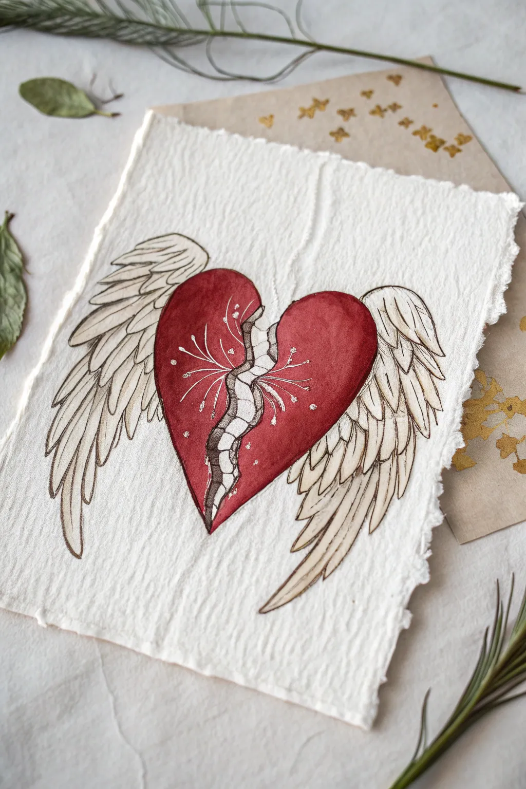
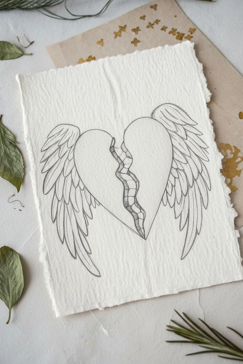
This ethereal watercolor and ink illustration features a deep red heart split down the center to reveal a raw, organic texture, yet supported by majestic, feathered wings. The contrast between the vibrant red and the delicate linework creates a poignant symbol of resilience and healing.
Step-by-Step Guide
Materials
- Heavyweight deckle-edge watercolor paper (300 gsm)
- Watercolor paints (Alizarin Crimson, Burnt Sienna, Payne’s Gray)
- Fine liner pens (Black, 0.1mm and 0.3mm)
- White gel pen or gouache with a fine brush
- Round watercolor brushes (Size 4 and 0)
- Pencil (HB or 2H)
- Kneaded eraser
Step 1: Sketching the Foundations
-
Outline the Heart:
Begin by lightly sketching the central heart shape in the middle of your paper. Instead of a smooth curve on the inner edges, draw a jagged, tearing line down the center, leaving a gap about a half-inch wide between the two halves. -
Add the Spinal Crack:
Within that central gap, sketch a segmented column that connects the two halves. Think of it like vertebras or puzzle pieces fitting loosely together; this is the ‘broken’ exposure. -
Draft the Wings:
Extend a large, curved wing shape from the top outer edge of each heart half. The wings should sweep downwards, extending past the bottom of the heart tip. Sketch the primary long feathers at the bottom and smaller overlapping feathers near the top attachment point.
Step 2: Painting the Heart
-
Base Red Layer:
Mix a deep, rich red using Alizarin Crimson with a tiny touch of Burnt Sienna to warm it up. Paint the two main halves of the heart, carefully avoiding the central ‘spinal’ column. Keep the edges crisp. -
Adding Volume:
While the red paint is still damp, drop in a slightly more concentrated red or a touch of violet near the outer edges and the bottom tip to create a rounded, 3D effect. Let this dry completely. -
The Exposed Center:
For the segmented strip down the middle, use a very watery wash of Payne’s Gray or a diluted brown. You want this area to look pale and bone-like, distinct from the vibrant red.
Clean Edges Pro-Tip
To get that specific textured paper look without buying expensive sheets, tear the edges of regular watercolor paper against a ruler, then rough them up with your fingernail.
Step 3: Wing Details & Ink Work
-
Wing Wash:
Apply a barely-there wash of warm beige or diluted ochre to the wings. You don’t want them fully colored, just slightly aged or off-white to distinguish them from the bright white paper. -
Inking the Heart:
Once all paint is bone dry, use a 0.3mm black fineliner to outline the heart halves. Use a slightly shaky or organic line for the inner torn edges to emphasize the rupture. -
Detailing the Spine:
Outline the central segmented column with the 0.1mm pen. Add small hash marks or stippling on one side of each ‘vertebra’ to suggest shadow and depth. -
Feather Definition:
Outline the wings with the 0.3mm pen. Draw the rachis (center shaft) of each feather, but keep the lines delicate. I like to break the lines occasionally so the wings don’t look too heavy or cartoonish. -
Feather Texture:
Use the 0.1mm pen to add fine, directional strokes inside the feathers to mimic the barbs. Focus these strokes near the base of each feather where shadows would naturally fall.
Level Up: Gold Leaf
Apply real gold leaf to the central ‘spine’ crack instead of grey paint. This references Kintsugi, the Japanese art of repairing broken pottery with gold to honor its history.
Step 4: Final Flourishes
-
White Veins:
Using a white gel pen or fine brush with white gouache, draw delicate, thread-like lines radiating from the central tear outward onto the red heart. These should look like exposed nerves or fine roots connecting the broken pieces. -
Highlight Accents:
Add small white dots at the tips of these white roots and a subtle highlight curve on the upper rounded part of the heart to make it look smooth and wet. -
Clean Up:
Wait for the ink to finish setting, then gently erase any visible pencil sketch lines with your kneaded eraser to leave the artwork crisp and clean.
Now you have a beautifully symbolic piece of art that celebrates finding beauty in imperfection

PENCIL GUIDE
Understanding Pencil Grades from H to B
From first sketch to finished drawing — learn pencil grades, line control, and shading techniques.
Explore the Full Guide
Crumbling Stone Heart With Dust

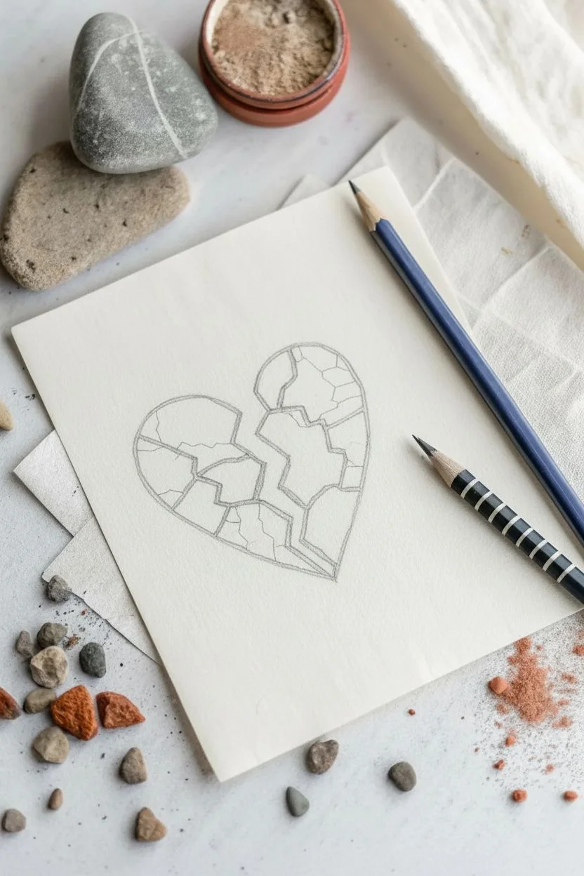
Capture the fragile beauty of erosion with this textured drawing that reimagines a broken heart as cracking terracotta. This project combines precise linework with soft shading to create an illusion of depth and decay on simple cream paper.
Step-by-Step
Materials
- Heavyweight cream or off-white drawing paper
- Blue graphite pencil or colored pencil (indigo or navy)
- Reddish-brown pastel pencil or soft colored pencil (terracotta)
- Graphite pencil (HB or 2B) for initial sketch
- Kneaded eraser
- Small piece of sandpaper or a craft knife (to create dust)
- Blending stump or cotton swab
Step 1: Drafting the Broken Shape
-
Outline the Heart:
Start by lightly sketching a standard heart shape in the center of your paper using a graphite pencil. Don’t worry about perfection; this is just a guide for the overall volume. -
Draw the Fissure:
Create the main crack running down the center. Instead of a straight line, draw a jagged, zigzagging path that separates the heart into two distinct halves with unequal jagged edges. -
Map the Fragments:
Within the main heart shape, draw irregular geometric lines to suggest smaller cracks and separated tectonic plates. Imagine how dry earth cracks in the sun—create a mix of large and small connected shapes. -
Refine the Gaps:
Widen the space between certain fragments to emphasize that the object is falling apart. Erase your initial smooth balloon-like outline so only the jagged, fragmented edges remain.
Step 2: Adding Stone Texture
-
Inking the Blue Contours:
Switch to your indigo blue pencil. Trace over your graphite lines with firm pressure to create a bold, definitive outline for each stone fragment. -
Thicken the Edges:
Go back over the blue lines, thickening them slightly on the shadow sides (usually the bottom and right edges of each fragment). This simple line-weight variation instantly adds 3D dimension. -
Base Color Application:
Using the terracotta-colored pencil, gently fill in the interior of each stone segment. Use a circular motion to build up an even, grainy texture rather than a solid blocks of color. -
Layering the Texture:
Apply a second layer of reddish-brown, pressing harder near the blue outlines and fading toward the center of each chunk. This creates a slightly rounded, pillowy effect for the stone pieces. -
Highlighting:
Use your kneaded eraser to dab the center unique fragments to lift a little pigment. This creates a subtle highlight, making the stone look sun-baked and matte.
Stone Effect Secret
Use textured paper (like cold-press watercolor paper/cardstock). The paper’s ‘tooth’ will break up your pencil strokes naturally for a stony look.
Step 3: Creating Debris and Dust
-
Scattered Particles:
Take the blue pencil and make tiny, deliberate dots and small irregular marks floating around the main heart. Focus these ‘crumbs’ near the biggest cracks and the bottom of the drawing. -
Adding Larger Debris:
Draw three or four slightly larger, irregular pentagon shapes falling away from the heart to represent significant chunks breaking off. -
Coloring the Debris:
Fill these falling chunks with the terracotta pencil, ensuring they match the texture of the main heart. -
Creating Real Dust:
Here I like to take a piece of sandpaper and rub the tip of the terracotta pencil against it directly over the drawing. Let the fine dust settle onto the paper randomly. -
Smudging the Dust:
Use your finger or a dry blending stump to press some of this loose dust into the paper’s surface, creating a hazy, atmospheric effect around the bottom of the heart. -
Final Contrast Check:
Strengthen any blue outlines that may have been dulled by the dust application. The contrast between the cool blue outline and warm interior is key to this look.
Add Metallic Gold
Inspired by Kintsugi? Instead of leaving the cracks empty, fill the gaps between the stone fragments with fine lines of gold ink or metallic paint.
Step back and admire how simple lines and texture can evoke such a powerful feeling of fragility


Have a question or want to share your own experience? I'd love to hear from you in the comments below!