Brown is one of my favorite colors to paint with because it can feel cozy, dramatic, and surprisingly modern all at once. If you’ve ever worried that brown tones might look flat, these canvas ideas will show you how much depth you can get from sepia shades, texture, and a few smart contrasts.
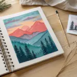
Sepia Mountain Layers
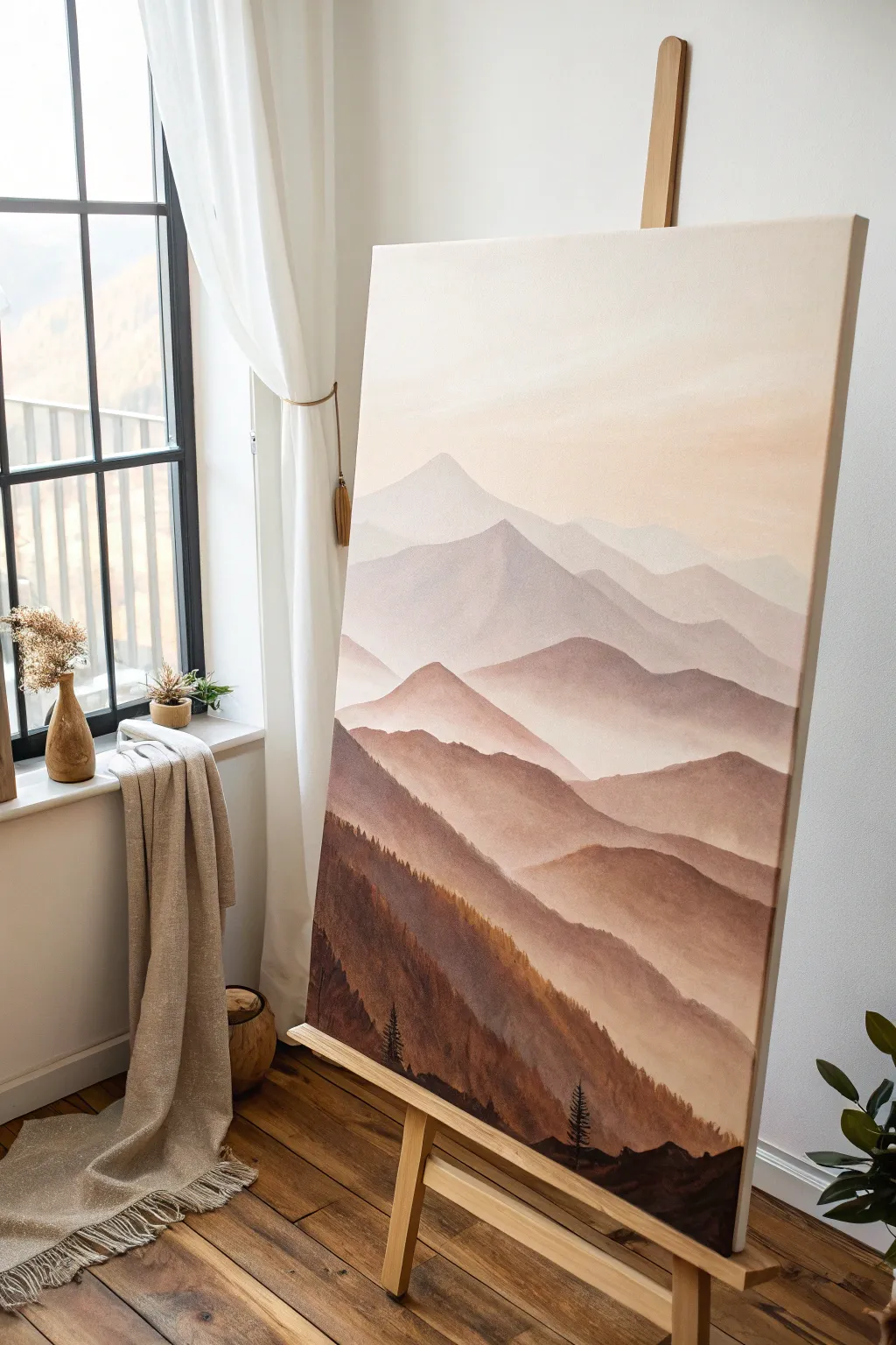
This serene landscape painting captures the effortless beauty of atmospheric perspective, using a monochromatic range of browns and creams to create depth. By layering misty mountain ridges from faint beige to deep umber, you’ll achieve a calming, dreamy effect perfect for any modern space.
Step-by-Step Tutorial
Materials
- Large stretched canvas (at least 24×36 inches)
- Acrylic paints: Burnt Umber, Raw Sienna, Titanium White, Mars Black, Yellow Ochre
- Large flat brush (2-inch width)
- Medium flat brush (1-inch width)
- Small round detail brush (size 1 or 2)
- Fan brush (optional, for trees)
- Palette or mixing tray
- Water cups
- Paper towels
- Pencil (HB or lighter)
- Easel
Step 1: Preparation and Sketching
-
Prepare the workspace:
Set up your canvas on the easel in a well-lit area. Because this painting relies on subtle gradients, natural light is best for judging your color values. -
Sketch the horizon lines:
Using a light pencil, very faintly sketch out the contour lines of your mountain ranges. Start about one-third of the way down the canvas for the furthest peak. -
Map out the layers:
Continue drawing zig-zagging, overlapping mountain shapes moving toward the bottom. You want about 5-6 distinct layers, with the shapes becoming larger and taller as they get closer to the bottom edge. -
Prime the sky:
Mix a large amount of Titanium White with a tiny dot of Raw Sienna to create a warm, creamy off-white. Paint the entire sky area, blending downwards into where the first mountain will start.
Hard Lines?
If your mist looks too stripey, use a clean, dry makeup sponge or soft brush to dab the paint while it’s still wet. This softens the transition between the mountain base and the layer behind it.
Step 2: Painting the Distant Layers
-
Mix the lightest mountain color:
Take your sky color mixture and add just a touch more Raw Sienna and the smallest bit of Burnt Umber. It should be barely darker than the sky. -
Paint the furthest peak:
Fill in the shape of the most distant mountain peak. Keep the edges soft; if they look too sharp, swiftly run a clean, dry brush over the top edge to blur it slightly into the sky. -
Create the second layer:
Add a little more Burnt Umber to your previous mix. Paint the second mountain range. Ensure this wet paint overlaps the bottom of the previous layer slightly to eliminate any white gaps. -
Create the mist effect:
While the paint is still damp on this second layer, mix a watery glaze of white. Lightly brush this at the very base of the mountain shape to create the illusion of settling mist or fog.
Pro Tip: Atmospheric Drop
Add a literal drop of blue or purple to your brown mix for the distant mountains. Cool colors recede visually, making the farthest peaks look miles away compared to the warm foreground.
Step 3: Mid-Ground and Foreground
-
Deepen the tones:
For the middle mountain ranges, begin introducing more Burnt Umber relative to the white. The value jump should be more noticeable here. This creates the ‘steps’ of depth. -
Add warmth:
Mix a touch of Yellow Ochre into your brown mix for the fourth layer down. I like to add this warmth here to prevent the painting from looking too flat or grey. -
Paint the valley floors:
As you fill in these mid-ground mountains, ensure the bottom of each section is slightly lighter than the top ridge. You can achieve this by dipping your dirty brush into a little white and blending upward from the bottom of the shape. -
Prepare the darkest shade:
For the closest foreground mountain (the bottom-most layer), mix Burnt Umber with a small amount of Mars Black. Do not add white. -
Establish the foreground base:
Paint the entire bottom section with this dark mixture. The silhouette should be sharp against the lighter mountain behind it.
Step 4: Detailing and Texturing
-
Start the tree textures:
Using the dark foreground mix, switch to a small round brush or a fan brush turned vertically. Tap the brush along the ridge of the foreground mountain to create tiny, jagged spikes resembling treetops. -
Add individual pines:
Select a few spots along the foreground ridge to paint defined pine trees. Use the tip of your small brush to draw a vertical line, then zigzag outward to create branches. -
Texture the slopes:
Mix a slightly lighter brown (add a touch of Raw Sienna to your dark mix). Dry brush this color diagonally down the slopes of the foreground mountain to suggest uneven terrain and heavy forest cover. -
Refine the edges:
Check the ridges of the upper mountains. If you want more definition, use a small brush with a slightly lighter version of that mountain’s color to highlight the very top edge where the ‘sun’ might hit. -
Final mist glaze:
Once everything is completely dry, you can apply a very thin wash of water and white paint in the valleys between the darker mountains if you feel the separation is too harsh.
Step back and admire how simple gradients can create such a vast sense of space in your room
Monochrome Forest Silhouette
Capture the quiet majesty of a forest at dusk with this monochrome landscape study. By limiting your palette to warm browns and soft creams, you will create a high-contrast piece that feels both vintage and timeless.
How-To Guide
Materials
- Tall rectangular canvas (e.g., 12×24 or 18×36 inches)
- Acrylic paints: Burnt Umber, Raw Sienna, Yellow Ochre, Titanium White, Mars Black
- Large flat brush (for blending)
- Medium round brush
- Small liner brush or rigger brush
- Natural sea sponge (optional)
- Slow-drying medium or retarder
- Palette knife and palette
- Water cup and paper towels
Step 1: Setting the Atmosphere
-
Prepare the Gradient Palette:
Mix three main sky colors on your palette: a light cream (White + tiny dot of Yellow Ochre), a medium golden tan (White + Raw Sienna), and a deeper amber (Raw Sienna + touch of Burnt Umber). Add a drop of slow-drying medium to keep them workable. -
Paint the Sky Base:
Start at the top of the canvas with your lightest cream color. Use horizontal strokes with a large flat brush to cover the upper third. -
Create the Transition:
While the top is still wet, introduce the medium golden tan in the middle section. Blend upwards into the cream using long, sweeping horizontal strokes to create a seamless fade. -
Deepen the Horizon:
Apply the deeper amber color to the bottom third of the canvas, blending it upwards into the golden tan. The goal represents a glowing sunset haze, so softness is key. -
Add Cloud Wisps:
Wipe your brush clean and pick up a tiny amount of the deeper amber mix. Gently drag faint, horizontal streaks across the lower middle section to suggest thin cloud layers. I like to feather these edges with a dry brush for a smoky look.
Pro Tip: The Rigger Advantage
Use a ‘rigger’ or ‘script’ brush for the branches. Its long bristles hold more paint and absorb hand tremors, creating naturally erratic, realistic twig lines.
Step 2: Establishing the Distance
-
Mix the Distant Color:
Create a muted brown for the distant tree line by mixing Burnt Umber with a little Titanium White to push it back atmospherically. It should be darker than the sky but lighter than pure black. -
Block in the Horizon Line:
Using a medium round brush, tap in the distant tree shapes along the very bottom edge of the canvas. Keep the tops uneven to mimic pine tops, but don’t worry about perfect detail yet. -
Refine the Distant Trees:
Switch to a smaller brush to add tiny vertical lines sticking up from your blocked-in area, representing distant tree trunks and tops. Vary the heights to keep it organic. -
Ground the Scene:
Paint the immediate foreground ground area using a mix of Burnt Umber and Raw Sienna. Use upward flicking strokes with an old, splayed brush to simulate tall, dry grasses in the shadows.
Step 3: The Majestic Silhouettes
-
Mix the Silhouette Color:
Mix a very dark brown using Burnt Umber and a touch of Mars Black. This needs to be the darkest value on the canvas to pop against the glowing sky. -
Map the Main Trunks:
Decide on the placement of your tall pine trees. Using a medium brush, paint thin, vertical lines spanning nearly the full height of the canvas. Let them wobble slightly; nature rarely makes straight lines. -
Thicken and Taper:
Go back over your trunk lines, making them slightly thicker at the base and extremely thin at the very top. Add a second, slightly shorter tree next to the main one for balance. -
Start the Branches:
Switch to your liner or rigger brush. Starting from the top of the tree, paint branches extending outward. Pine branches often angle slightly upward near the top and droop downward lower on the trunk. -
Form the Pine Needles:
Using a stippling motion (tapping the brush tip), add clusters of needles along the branches. Keep the clusters dense near the trunk and sparser at the tips to let the sky peek through. -
Detail the Bark Textures:
On the lower parts of the thick trunks, add tiny, jagged strokes coming off the sides to suggest rough bark texture. This prevents the silhouette from looking like a smooth pipe. -
Add the Secondary Group:
Repeat the tree creation process on the right side of the canvas with a different grouping of trees. Make these slightly different heights or widths to avoid perfect symmetry. -
Connect to the Ground:
Blend the base of your silhouette trees into the grassy foreground using dark, upward strokes. This roots the trees into the landscape. -
Final Tweaks:
Step back and look for balance. Use your liner brush to add a few stray, dead branches sticking out lower on the trunks or tiny saplings in the background for extra realism.
Level Up: Morning Mist
Glaze a very thin layer of watered-down Titanium White over the bottom 2 inches of the painting once dry. This creates a realistic low-hanging fog effect.
Allow your painting to dry completely before hanging this serene slice of nature on your wall.
Desert Dunes in Warm Browns
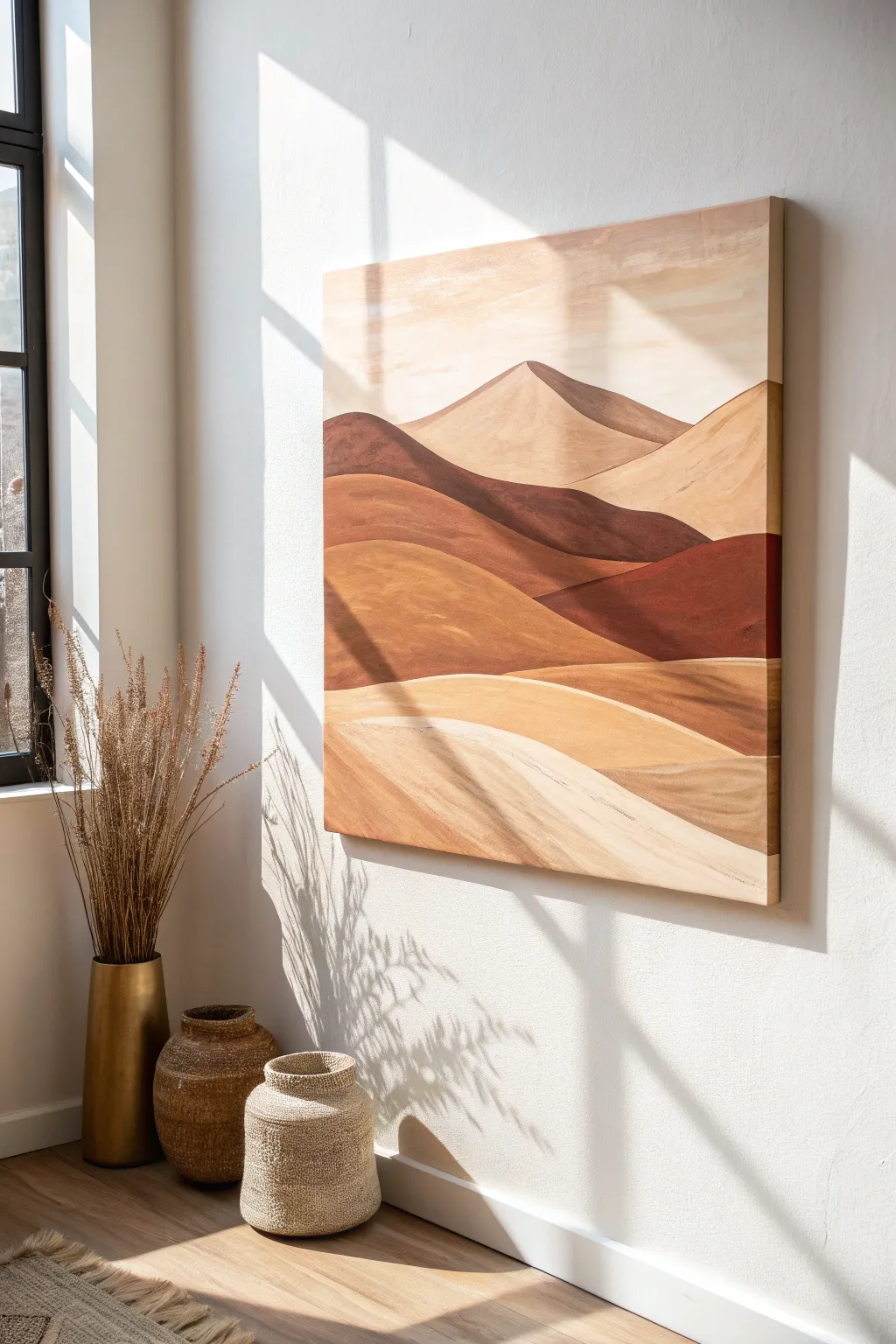
Capture the serene warmth of sweeping desert dunes with this earth-toned acrylic landscape. This large-scale project focuses on soft gradients and distinct, organic layers to create depth and movement using a monochromatic brown palette.
Step-by-Step Tutorial
Materials
- Large square canvas (e.g., 36”x36” or 40”x40”)
- Acrylic paints: Burnt Sienna, Raw Umber, Yellow Ochre, Titanium White, and Unbleached Titanium
- Large flat brush (2-3 inch)
- Medium filbert brush
- Small round brush for edges
- Pencil
- Palette knife or mixing tray
- Cup of water and paper towels
- Matte varnish (optional)
Step 1: Planning and Sketching
-
Prepare the canvas:
Ensure your canvas is clean and taut. Even if pre-primed, you might check for any rough spots and sand them lightly for a smoother finish. -
Sketch the horizon line:
Using a pencil, draw a gentle, sloping line roughly two-thirds of the way up the canvas. This will define the furthest row of dunes. -
Outline the mid-ground dunes:
Below your horizon, sketch two to three overlapping wavy lines. Let them dip and rise asymmetrically to create a natural, organic feel rather than perfect arches. -
Define the foreground:
Sketch the bottom-most dunes, making these shapes larger and wider to suggest they are closer to the viewer. These lines should curve towards the bottom corners.
Smooth Gradients
To get that soft transition on curved dunes, use a retarder medium in your acrylics. It slows drying time, allowing you to blend the shadow and light sides seamlessly.
Step 2: Mixing the Palette
-
Create a base dark mix:
On your palette, mix a generous amount of Raw Umber with a touch of Burnt Sienna. This deep chocolate brown will serve as your darkest shadow color. -
Mix mid-tone terra cotta:
Prepare a warm reddish-brown by mixing Burnt Sienna with a little Yellow Ochre. This will be the body color for the middle dunes. -
Prepare sandy highlights:
Mix a large batch of Unbleached Titanium with Titanium White and a tiny dot of Yellow Ochre. You need plenty of this for the sky and the lightest foreground sand.
Textured Finish
Mix a fine sand texture gel or modeling paste into your foreground paint colors to give the closest dunes a tactile, gritty finish that catches the light.
Step 3: Painting the Sky and Background
-
Fill the sky:
Using your large flat brush, paint the sky area with your lightest cream mix. Use horizontal strokes that span the width of the canvas. -
Add subtle sky variation:
While the sky paint is still wet, blend in a very small amount of watered-down Yellow Ochre near the top edge to create a soft, sun-baked gradient. -
Paint the furthest peak:
Fill in the distant mountain shape. I like to use a mix of Unbleached Titanium and a tiny bit of Raw Umber here so it looks hazy and far away, lighter than the foreground elements.
Step 4: Layering the Dunes
-
Block in the darkest shadows:
Identify the shadowed sides of your mid-ground dunes (usually the right or left slope) and paint them with your dark chocolate mix. Don’t worry about perfect blending yet; just get the color down. -
Paint the mid-tone slopes:
Apply the terra cotta mix to the sun-facing sides of the middle dunes. Where this color meets the dark shadow, use a clean, slightly damp brush to soften the edge for a rounded look. -
Create the lower mid-ground:
Move lower down the canvas, painting the next layer of dunes with a mix of Yellow Ochre and Burnt Sienna. This creates a golden-brown hue distinct from the reddish layer above. -
Establish the foreground base:
Fill the large bottom/foreground shapes with a sandy beige color (Unbleached Titanium mixed with a little Yellow Ochre). This anchors the painting.
Step 5: Refining and detailing
-
Clean up the ridge lines:
Switch to your medium filbert brush. Carefully repaint the top edges of each dune with opaque paint to ensure crisp, clean lines where one hill overlaps another. -
Add texture to the foreground:
Using a dry brush technique with slightly lighter cream paint, sweep loosely across the bottom foreground dune to simulate wind-swept sand texture. -
Enhance the depth:
If any layers look too flat, glaze a thin wash of Burnt Sienna over the shadowed areas to deepen the contrast without losing the underlying color. -
Lighten the peaks:
Mix pure Titanium White with a tiny bit of water. Highlight the very tips or crests of the dunes where the sun would hit hardest. -
Final smooth check:
Step back and look for brushstrokes that stand out too much. Smooth them out with a soft brush if necessary to maintain that velvety, minimal look. -
Seal the work:
Once fully dry (give it 24 hours), apply a matte varnish to protect the surface and unify the sheen of the different paint mixes.
Hang your new landscape in a spot with natural light to let those warm earth tones truly glow
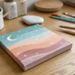
Cozy Brown Sunset Glow
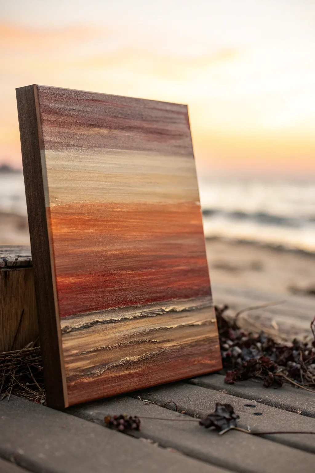
Capture the serene warmth of a coastal sunset with this textured abstract painting, where layers of rich browns and coppers meet a luminous sky. The piece combines smooth blending techniques with heavy impasto textures to create a stunning tactile foreground that mimics the shore.
Detailed Instructions
Materials
- Rectangular stretched canvas (e.g., 12×16 inches)
- Wide flat paintbrush (2-inch)
- Medium flat paintbrush
- Palette knife
- Modeling paste or heavy structure gel
- Acrylic paints: Titanium White, Burnt Sienna, Burnt Umber, Yellow Ochre, metallic Copper
- Palette for mixing
- Water cup and paper towels
Step 1: Sky Gradient
-
Prime the sky:
Begin by dampening your wide flat brush slightly. Mix Titanium White with a tiny touch of Burnt Sienna to create a creamy off-white. Apply this to the top third of the canvas using long, horizontal strokes for a smooth base. -
Introduce warmth:
While the white is still wet, pick up a small amount of Yellow Ochre on the same brush. Blend this into the lower part of the sky section, working your way down towards the middle of the canvas to create a soft, glowing horizon. -
Deepen the upper sky:
Clean your brush, then mix Burnt Sienna with a little Burnt Umber. Apply this darker mix to the very top edge of the canvas, blending it downward into the creamy white area to suggest the fading light of dusk.
Step 2: The Horizon Line
-
Establish the horizon:
Switch to your medium flat brush. Mix a vibrant orange-brown using Burnt Sienna and a touch of Yellow Ochre. Paint a decisive band across the center of the canvas where the sky meets the water. -
Blend the transition:
Using clean, dry horizontal strokes, gently feather the top edge of this orange band into the pale yellow sky above. The goal is a soft, hazy transition rather than a hard line. -
Darken the water:
As you move lower from the horizon, gradually mix more Burnt Sienna and a hint of Burnt Umber into your paint. Apply these darker tones in horizontal streaks, layering them to build depth in the middle section. -
Add red undertones:
To enhance the sunset feel, glaze a thin layer of pure Burnt Sienna over the middle section once the previous layer is tacky. This creates a rich, reddish glow that anchors the composition.
Cracking Paste?
If your texture paste cracks while drying, it was likely applied too thick at once. apply it in thinner layers, letting each dry, to build volume safely.
Step 3: Textured Foreground
-
Prepare the texture:
On your palette, mix modeling paste with Burnt Umber and a little Yellow Ochre until you have a thick, sandy-colored mixture. -
Apply base texture:
Use a palette knife to spread this mixture across the bottom third of the canvas. Don’t smooth it out; instead, let the knife skip and drag to create ridges and valleys mimicking sand dunes or choppy waves. -
Carve the waves:
Turn your palette knife on its edge and press into the wet paste horizontally. Drag it sideways to carve distinct ‘crests’ or wave lines that protrude from the canvas surface. -
Let it cure:
This is crucial: allow the modeling paste to dry completely. Depending on the thickness, this might take several hours or overnight. It must be rock hard before painting over it.
Metallic Magic
Mix a tiny drop of copper paint into the sky area while blending. It creates a subtle shimmer that ties the sky to the glistening foreground textures.
Step 4: Highlighting Details
-
Base coat the texture:
Once dry, paint over the textured area with a wash of Burnt Umber to ensure all crevices are filled with shadow. I like to keep this layer fairly watery so it sinks into the deep grooves. -
Dry brush highlights:
Load a dry flat brush with a mix of Yellow Ochre and Titanium White. Remove most of the paint on a paper towel, then lightly drag the brush over the raised ridges of texture to catch only the high points. -
Add copper accents:
Take your metallic Copper paint and lightly brush it onto select ridges of the textured foreground. This catches the light and mimics the reflection of the sunset on wet sand. -
Final blending:
Use a soft brush to add a final glaze of Burnt Sienna between the smooth water section and the textured foreground, ensuring the two distinct styles feel connected. -
Paint the edges:
Don’t forget the sides of your canvas. Paint them a solid Burnt Umber or continue the image around the edge for a polished, gallery-ready look.
Hang your finished piece where the evening light can catch those metallic textures and bring the sunset to life
BRUSH GUIDE
The Right Brush for Every Stroke
From clean lines to bold texture — master brush choice, stroke control, and essential techniques.
Explore the Full Guide
Minimal Boho Arches
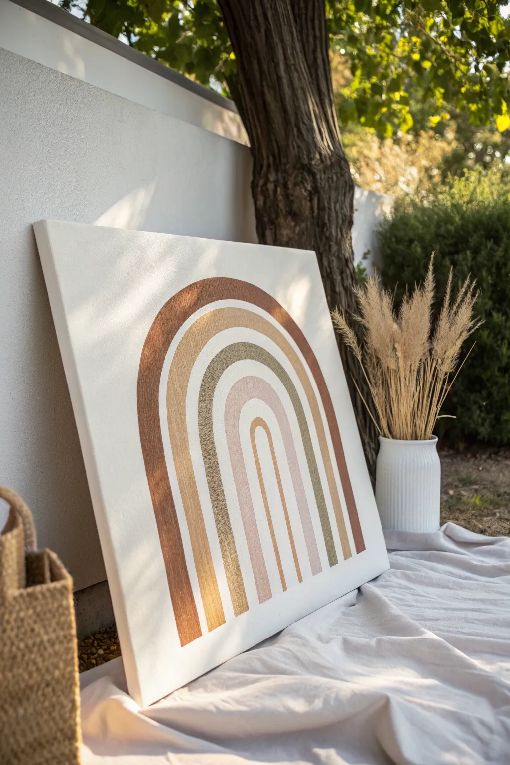
Embrace the soothing tones of nature with this minimalist arch painting featuring a spectrum of warm browns, sage, and blush. The clean lines and earthy palette create a modern bohemian piece that feels both grounded and airy.
Step-by-Step Guide
Materials
- Large square stretched canvas (e.g., 24×24 inches)
- White acrylic paint or gesso (for the background)
- Acrylic paints: Rust brown, camel/tan, sage green, blush pink, mustard/ochre
- Wide flat brush (2-inch)
- Medium flat brush (1-inch or 3/4-inch)
- Pencil
- String
- Push pin or thumbtack
- Ruler or yardstick
- Palette or paper plate
- Paper towels and water cup
Step 1: Preparing the Canvas
-
Prime the surface:
Even if your canvas is pre-primed, apply two coats of white acrylic paint or gesso to ensure a crisp, bright white background. Use your wide flat brush for this, painting cross-hatch strokes for even coverage. -
Let it dry completely:
Allow the base coat to dry thoroughly. This is crucial because any dampness will cause your pencil marks to smudge or dig into the paint later. -
Mark the center baseline:
Find the horizontal center of the bottom edge of your canvas. Place a small mark about 2 inches up from the bottom edge; this will be the anchor point for your arches.
Wobbly Lines?
If freehand painting is difficult, use flexible masking tape specifically designed for curves. Press edges down firmly to prevent bleed-through, paint, and remove while slightly damp.
Step 2: Drafting the Arches
-
Create a compass tool:
Cut a piece of non-stretchy string slightly longer than the width of your canvas. Tie one end securely around a pencil near the tip. -
Anchor the compass:
Push a thumbtack through the string at your measured anchor point on the canvas. This creates a pivot point for drawing perfect semicircles. -
Draw the smallest arch:
Pull the string taut with the pencil at your desired starting height for the smallest inner arch. lightly swing the pencil in a half-circle motion to draw the curved top. -
Define the arch width:
Adjust the string length to be about 1.5 inches longer and draw a second parallel arc. This creates the ‘track’ for your first color stripe. -
Continue creating bands:
Repeat this process, lengthening the string by uniform increments (about 1.5 to 2 inches) to create five distinct arched bands. Leave a small gap of negative space between each band. -
Extend lines to base:
Once the curved tops are drawn, use a ruler to extend straight vertical lines from the ends of the curves down to the bottom edge of the canvas.
Step 3: Painting the Colors
-
Mix your palette:
Prepare your colors on the palette. You’ll need a distinct shade for each of the five arches: rust brown, camel/tan, sage green, blush pink, and a light mustard/ochre. -
Start with the outer arch:
Dip your medium flat brush into the rust brown paint. I like to load the brush fully but wipe off the excess to keep the edges sharp. Paint the outermost arch, carefully following your pencil guides. -
Maintain clean edges:
Use the flat edge of the brush to drag paint along the pencil line. If you have shaky hands, you can steady your painting hand with your pinky finger against a dry part of the canvas. -
Paint the second arch:
Clean your brush thoroughly or switch to a fresh one. Paint the second arch in the camel or tan shade, ensuring you leave a crisp white gap between this arch and the rust one. -
Apply the sage green:
Move to the third arch (the middle one) and fill it with your sage green paint. This cool tone balances the warmth of the browns. -
Add the blush tone:
Paint the fourth arch with the soft blush pink. Apply a second coat if the paint looks streaky, as lighter colors often have less opacity. -
Fill the center arch:
Finish with the smallest, innermost arch using the mustard or light ochre shade. Ensure the vertical legs go all the way to the canvas bottom. -
Refine the gaps:
Once the colors are dry, inspect the white gaps between arches. If any paint crossed the line, use a small detail brush with white paint to touch up and re-establish the negative space. -
Erase visible marks:
If any pencil lines are still visible through the white gaps or light paint, gently erase them with a clean, soft eraser, careful not to smudge the paint.
Add Texture
Mix a tablespoon of baking soda into your acrylic paints before applying. This creates a matte, terracotta-like texture that enhances the earthy boho vibe.
Now step back and admire how these simple shapes create a calming focal point for your room
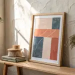
Abstract Color-Block Neutrals
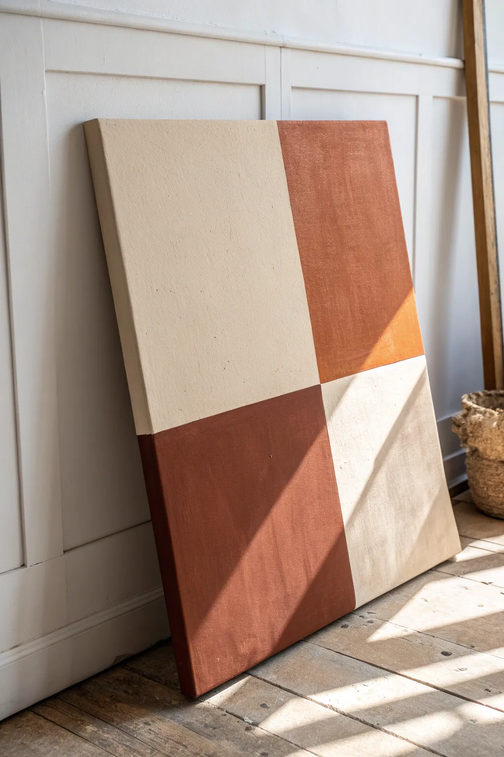
Embrace minimalism with this warm, large-scale checkerboard painting that balances earthy terracotta tones with soft cream neutrals. The result is a bold but grounding piece of abstract art that adds architectural structure and warmth to any room.
Step-by-Step Tutorial
Materials
- Large rectangular stretched canvas (e.g., 24×36 inches)
- Acrylic paint in ‘Burnt Sienna’ or ‘Terracotta’
- Acrylic paint in ‘Titanium White’ and ‘Unbleached Titanium’ (cream)
- Wide flat synthetic brush (2-3 inches)
- Painter’s tape or masking tape
- Ruler or measuring tape
- Pencil
- Gesso (optional but recommended)
- Palette or paper plate
- Drop cloth
Step 1: Preparation & Mapping
-
Prime the Surface:
Begin by applying an even coat of white gesso to your canvas if it isn’t pre-primed. This ensures your colors will apply smoothly and won’t soak too much into the fabric. -
Find the Center:
Using your measuring tape, measure the total width of the canvas and mark the exact center point at the top and bottom edges. -
Mark the Vertical Axis:
Lightly draw a straight vertical line connecting your top and bottom center marks using a straightedge or ruler. -
Measure the Horizontal Axis:
Measure the total height of the canvas. Mark the exact center point on the left and right edges. -
create the Quadrants:
Connect these side marks with a horizontal line, creating a perfect cross that divides your canvas into four equal rectangles.
Step 2: Painting the Base
-
Mix the Cream Tone:
On your palette, mix Titanium White with a small amount of Unbleached Titanium to create a warm, sandy cream color. You want a shade that feels natural, not stark white. -
Apply the First Cream Layers:
Using the wide flat brush, paint the top-left and bottom-right quadrants with your cream mixture. Don’t worry about perfect edges near the center lines yet. -
Extend to the Sides:
Make sure to carry the paint around the outer edges of the canvas frame for a finished, professional gallery wrap look. -
Layer for Opacity:
Let the first coat dry completely. Apply a second or third coat of the cream paint until you cannot see the canvas weave pattern showing through unevenly. -
Texture the Cream:
For the final cream layer, use long, vertical brushstrokes to create a subtle, consistent texture that catches the light.
Crisp Line Secret
Use a clear matte gel medium to seal the edge of your painter’s tape before applying the second color. It creates an invisible barrier for razor-sharp lines to form.
Step 3: Adding the Terracotta
-
Tape the Boundaries:
Once the cream paint is 100% dry (this is critical), apply painters tape strictly along your pencil lines, covering the cream side to protect it. Press the tape down firmly to prevent bleeding. -
Seal the Tape Edge:
I like to quickly brush a tiny amount of the cream paint over the tape edge first. This seals any gaps; if paint bleeds under, it will be the cream color and thus invisible. -
Mix the Earth Tone:
Squeeze out your Burnt Sienna or Terracotta acrylic. If it feels too bright, mix in a tiny drop of brown or black to mute it down to a clay-like hue. -
Paint the Top Right:
Apply the terracotta paint to the top-right quadrant, using confident strokes. Ensure the paint is thick enough to look rich and velvety. -
Paint the Bottom Left:
Repeat the process for the bottom-left quadrant. Keep your brush strokes running in the same direction as the cream sections to maintain visual harmony. -
Finish the Edges:
Paint the sides of the canvas corresponding to the terracotta sections, creating a seamless transition from the front face to the wall. -
The Reveal:
While the terracotta paint is still slightly tacky (not fully cured, but set), carefully peel back the painter’s tape at a 45-degree angle to reveal crisp lines. -
Final Touch-Ups:
Inspect the center intersection. If there are any rugged spots, use a small detail brush to carefully sharpen the meeting point of the four squares.
Uneven Texture?
If brushstrokes look too messy, switch to a small foam roller for the final coat. This gives a smooth, uniform finish typically found on modern color-block art.
Hang your new geometric masterpiece in a spot with good natural light to highlight the gentle texture of the canvas.

PENCIL GUIDE
Understanding Pencil Grades from H to B
From first sketch to finished drawing — learn pencil grades, line control, and shading techniques.
Explore the Full Guide
White Botanicals on Chocolate
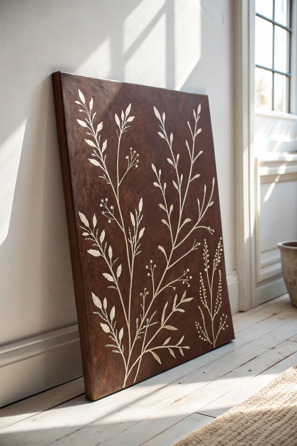
Embrace the warmth of deep earth tones with this striking canvas art that pairs a rich, chocolate-brown background with delicate white line work. The contrast creates a sophisticated, organic focal point perfect for cozying up any corner of your home.
Detailed Instructions
Materials
- Large stretched canvas (e.g., 24×36 inches)
- Burnt Umber acrylic paint
- Raw Sienna acrylic paint (optional for warmth)
- Titanium White acrylic paint
- Large flat brush or foam brush
- Medium round brush (size 4 or 6)
- Fine liner brush (size 0 or 1)
- Palette or paper plate
- Towel or rag
- Cup of water
- Chalk or pastel pencil (white)
- Medium-grit sandpaper (optional)
Step 1: Creating the Chocolate Foundation
-
Prepare the workspace:
Lay down a drop cloth or old newspaper to protect your floor or table, ensuring you have plenty of space to maneuver around the large canvas. -
Mix the base color:
Squeeze a generous amount of Burnt Umber onto your palette. If you want a slightly warmer, more nuanced brown, I like to mix in a touch of Raw Sienna or a tiny drop of red, but straight Burnt Umber works beautifully too. -
Apply the first coat:
Using a large flat brush, apply a layer of the brown paint across the entire canvas. Use long, horizontal strokes to ensure even coverage. -
Let it dry completely:
Allow this first layer to dry for at least 20-30 minutes. The canvas should be cool to the touch but not tacky before you proceed. -
Add texture with a second coat:
Apply a second layer of brown paint. This time, use crisscross brushstrokes or a slightly dry brush technique to create subtle texture and depth, preventing the background from looking too flat. -
Paint the edges:
Don’t forget to paint the sides of the canvas with the same brown mixture for a finished, gallery-wrap look. -
Dry thoroughly:
Let the background cure completely, ideally for an hour or two, so the white paint won’t pick up any underlying brown pigment.
Step 2: Drafting the Design
-
Plan the composition:
Visualize three main stems originating from the bottom center. The central stem should be the tallest, with the two side stems curving gently outward to fill the negative space. -
Lightly sketch the structure:
Use a piece of white chalk to very faintly draw the main lines of your stems. Keep these lines loose and flowing; chalk is easy to wipe away if you need to adjust the placement. -
Mark leaf placement:
Add small tick marks along the stems where you want your leaves to attach, varying the spacing to keep it looking natural and organic.
Smooth Flow
If your fine lines are breaking or looking jagged, your paint is too thick. Add water one drop at a time until the paint flows like heavy cream.
Step 3: Painting the Botanicals
-
Prepare your white paint:
Put a dollop of Titanium White on your palette. Add a few drops of water to thin it slightly until it has an ink-like consistency, which helps it flow smoothly off a fine brush. -
Paint the main stems:
Using your medium round brush and the thinned white paint, trace over your chalk stem lines. Start from the bottom and lift pressure as you reach the top for a tapered effect. -
Create the larger leaves:
Switch to the smaller round brush for the leaves. Press down at the base of the leaf to widen the stroke, then pull and lift the brush towards the tip to create a point. -
Add varied leaf shapes:
Mix up the leaf styles. Some can be solid white shapes, while others can be simple outlines or slender willow-like leaves to add visual interest. -
Detail the finer branches:
Use the fine liner brush to add delicate, thin offshoot branches near the bottom of the composition. -
Add berries or buds:
Paint tiny clusters of dots or small circles at the ends of the finer branches using the tip of your liner brush. These represent small buds or berries. -
Refine the opacity:
Once the white paint dries, you might notice some brown showing through. Go over the main stems and larger leaves with a second coat of white to make them pop against the dark background. -
Clean up sketch lines:
Take a damp cloth and gently wipe away any visible chalk marks once the painting is completely dry. -
Protect the surface:
Finish by applying a clear matte or satin varnish to seal the paint and unify the sheen of the canvas.
Vintage Patina
For an aged look, lightly sand the dried background before painting the botanicals, or scuff large white leaves gently after drying for a distressed vibe.
Now step back and admire how the crisp white flora dances elegantly against that moody backdrop, ready to anchor your room
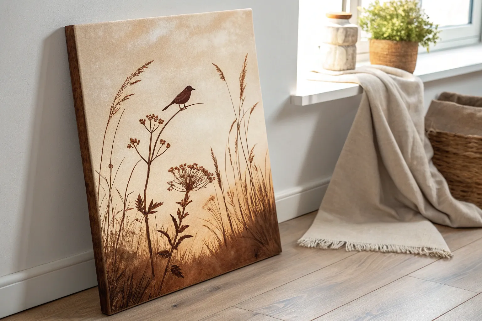
Brown Floral Line Art Bouquet
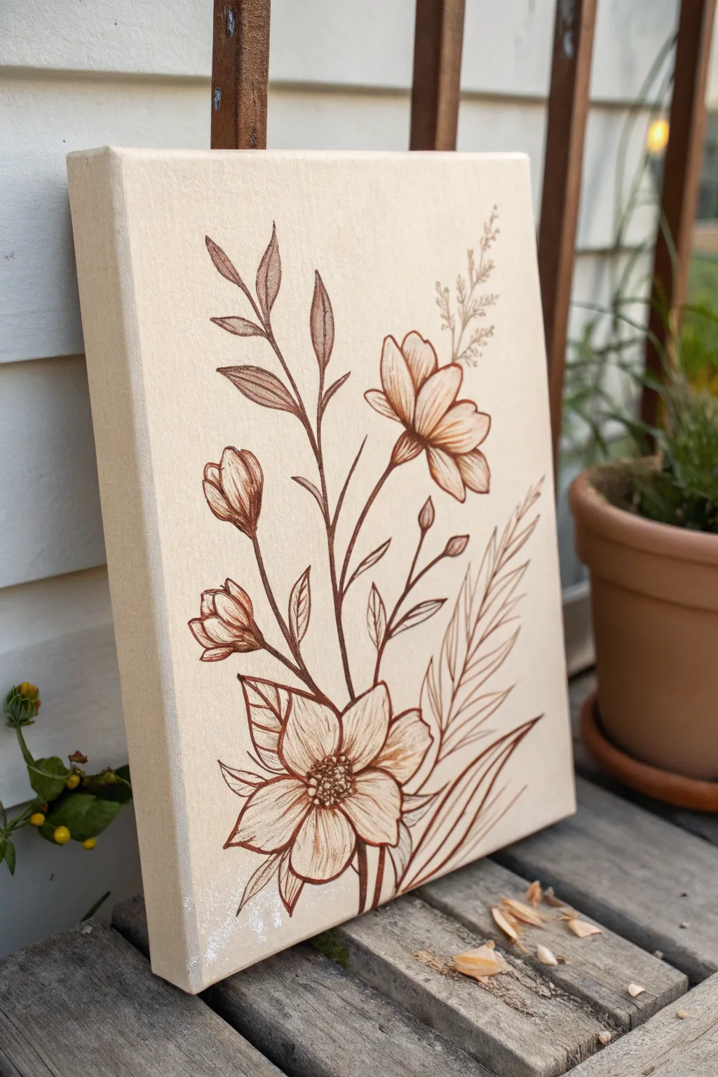
Embrace the elegance of minimalism with this monochrome botanical study, featuring delicate wildflowers rendered in warm sepia tones. Using just a single color palette on a natural canvas creates a vintage, scientific illustration aesthetic that brings a calming, organic touch to any room.
Step-by-Step Guide
Materials
- Stretched canvas (8×10 or 11×14 inch)
- Light brown acrylic paint (tan/beige) or gesso
- Dark brown fine-tip acrylic paint pens (medium and fine)
- Dark brown acrylic paint (burnt umber/sepia)
- Fine round paintbrush (size 0 or 1)
- Pencil (HB or H)
- Kneaded eraser
- Reference photo of wildflowers
Step 1: Preparation & Background
-
Prime the canvas:
Begin by applying a base coat to your canvas. Mix a very light tan or off-white acrylic paint—or use tinted gesso—to cover the stark white of the store-bought canvas. This warms up the background and helps your ink flow more smoothly later. -
Smooth the surface:
Once the base coat is completely dry, you might notice the texture is still quite rough. If you want ultra-crisp lines, lightly sand the surface with fine-grit sandpaper, then wipe away the dust with a damp cloth.
Uneven Ink Flow?
If using paint pens on canvas, the nib can snag on the texture. Pump the pen on a scrap paper frequently, or switch to a high-flow fluid acrylic paint with a liner brush for smoother glide.
Step 2: Sketching the Composition
-
Establish the main stem:
Using a pencil with a light hand, draw a long, slightly curved central stem starting from the bottom center and reaching toward the upper third of the canvas. This acts as the spine of your bouquet. -
Place the primary blooms:
Sketch the largest flower at the bottom left, facing slightly upward and outward. Add a secondary, slightly smaller open bloom higher up on the right side of the main stem. -
Add buds and foliage:
Draw slender stems branching off to hold closed buds on the left side. Then, sketch in the leaf shapes—some pointing straight up with pointed tips, others curving gently outward. -
Sketch filler elements:
To balance the composition, lightly sketch the feathery, fern-like fronds on the bottom right and the delicate, wispy textures at the very top right. Keep these lines faint as they are just guides.
Step 3: Inking the Foundation
-
Outline the main stems:
Switch to your medium-tip dark brown paint pen or a brush loaded with fluid burnt umber paint. Trace the central stem first, pressing slightly harder at the base to thicken the line and lifting pressure as you move upward for a tapered look. -
Define the large petals:
Outline the petals of the bottom-left flower. Use confident, sweeping strokes for the outer edges. Don’t worry if your hand shakes slightly; organic lines look more natural for botanicals. -
Outline the leaves:
Trace the leaves, ensuring the tips end in sharp points. I like to make one side of the leaf line slightly thicker than the other to suggest shadow and depth. -
Draw the fern fronds:
For the fern-like leaves on the right, use quick, flicking motions outward from the central vein to create that airy, spiky texture.
Vintage Patina
Before sealing, dilute a drop of coffee or tea with water and splatter tiny droplets across the background. This subtle staining adds an authentic aged parchment look.
Step 4: Adding Detail & Texture
-
Detail the flower centers:
Using your finest tool (a 00 brush or extra-fine pen), stipple small dots in the center of the main flowers to create the pollen area (stamen). Cluster them tightly in the middle and spread them out slightly toward the edges. -
shade the petals:
Add fine, parallel lines (hatching) inside the petals, starting from the center and flicking outward. These lines should curve with the form of the petal to make it look cupped rather than flat. -
Enhance leaf veins:
Draw single, central veins down the middle of your larger leaves. For the closed buds, add vertical contour lines that follow the round shape of the bud to give it volume. -
Create the delicate top texture:
For the wispy plant at the very top, use extremely light pressure. Create tiny ‘Y’ shapes and dots to mimic seeds or pollen, keeping the ink application sparse.
Step 5: Refining & Finishing
-
Deepen the shadows:
Look at where stems cross or where petals overlap. Go back in with your darker brown fluid paint or marker and thicken these intersections slightly to create deep contrast/shadows. -
Clean up sketch lines:
Wait until the ink or paint is 100% dry—dampness will ruin the canvas surface. Gently erase any visible pencil marks with your kneaded eraser. -
Add final variation:
Review the thickness of your lines. If everything looks too uniform, go back and thicken the shadowed side of the main stems to add visual weight and stability to the bouquet. -
Seal the artwork:
Protect your delicate line work with a spray varnish. A matte finish works best here to maintain that vintage, sketchbook appearance without unwanted glare.
Hang your botanical study in a spot with soft light to emphasize the warm, earthy tones of your creation


Textured Brown Plaster Look
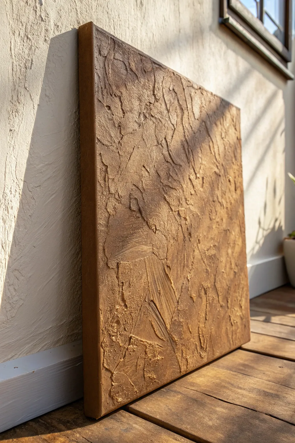
This striking textured canvas mimics the rugged beauty of time-worn plaster or desert earth, finished with a luxurious bronze sheen. Using common modeling paste and metallic acrylics, you can create depths and peaks that catch the light beautifully.
Step-by-Step
Materials
- Stretched canvas (rectangular)
- Modeling paste (heavy body or regular)
- Palette knives (assorted sizes, particularly wide ones)
- Brown acrylic paint (burnt umber or raw sienna)
- Bronze metallic acrylic paint
- Gold metallic acrylic paint
- Dark brown or black acrylic paint (for antiquing)
- Gesso (optional base)
- Wide flat synthetic brush
- Soft cloth or sponge
Step 1: Base Preparation
-
Prime the Surface:
Even though most canvases come primed, applying a fresh coat of gesso ensures a toothy grip for the heavy texture paste. Let this base layer dry completely before moving on. -
Mix Your Base Color:
Squeeze a generous amount of burnt umber acrylic paint directly into your modeling paste. Mixing the color into the medium ensures that no white patches show through if the top layers crack or chip later. -
Incorporate the Base:
Stir the paint and paste mixture thoroughly with a palette knife until you have a consistent, muddy brown color. Don’t worry if it’s slightly streaky; variation adds depth.
Step 2: Building Texture
-
Initial Application:
Scoop a large amount of the tinted modeling paste onto the center of the canvas. Using your widest palette knife, spread it outward towards the edges. -
Create High Points:
Instead of smoothing the paste perfectly flat, deliberately leave thicker ridges. Press the flat side of the knife into the wet paste and pull it straight up to create rough peaks. -
Knock Down the Peaks:
Once you have sharp peaks, gently drag the knife horizontally over the top to flatten them slightly. This creates that ‘troweled plaster’ look seen in the reference. -
Add Scratch Marks:
Turn your palette knife on its edge and carve random, shallow lines or cracks into thicker areas of the paste to mimic natural fissures. -
Texture the Edges:
Ensure the texture wraps around the sides of the canvas for a professional finish. I like to run the knife along the edges so the artwork looks complete from every angle. -
Deep Drying Phase:
This step requires patience. Let the canvas sit flat for at least 24 hours. The thick paste must be completely hard all the way through before painting.
Cracks not showing?
If your texture looks too smooth, wait for the paste to firm up slightly (about 30 mins) and then firmly press crumpled foil into the surface before peeling it away.
Step 3: Layering Color
-
Apply Dark Lowlights:
Mix a watery wash of dark brown or black acrylic. -
Wash the Texture:
Brush this dark wash over the entire textured surface, ensuring it seeps into the cracks and crevices you created. Wipe away the excess from the raised areas with a damp cloth immediately, leaving shadows only in the deep grooves. -
Base Metallic Coat:
Once the wash is dry, brush a coat of deep bronze paint over the entire canvas. Use a dry-brush technique, keeping little paint on the brush, so you don’t completely cover the dark recesses. -
Highlighting:
Switch to a brighter gold or light bronze metallic paint.
Antique Dust
For an aged look, lightly dust talcum powder or rottenstone over the dried metallic paint and buff it into the crevices before sealing.
Step 4: Finishing and Sealing
-
Dry Brushing Highlights:
Dip a wide, dry brush into the gold paint and wipe most of it off on a paper towel. Very lightly skim the brush over only the highest ridges of the texture. This catches the light and defines the plaster shapes. -
Accentuate the Cracks:
If you lost some definition, use a fine detail brush to re-establish deep shadows in the largest cracks with pure burnt umber. -
Final Polish:
Check the edges one last time to ensure the metallic finish continues around the sides. -
Varnish:
Apply a spray varnish—satin or gloss works best to enhance the metallic shimmer—to seal the work and protect the textured peaks from dust.
Hang your textured masterpiece in a spot where natural light can play across the rugged surface throughout the day
Drippy Espresso Ombre
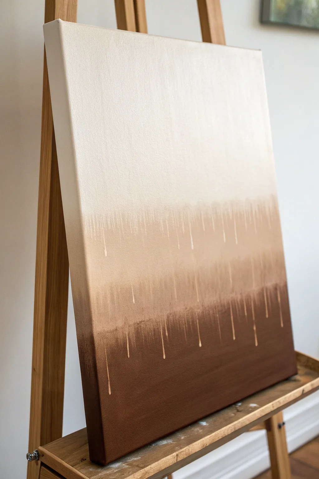
Embrace the beauty of imperfection with this striking ombre canvas that mimics the rich, cascading tones of a perfectly poured espresso. The rough, dripping transitions add a modern, organic texture to the classic gradient, making it a sophisticated yet achievable piece for any skill level.
Detailed Instructions
Materials
- Stretched canvas (16×20 or larger recommended)
- Acrylic paints: Titanium White, Unbleached Titanium (Cream), Raw Sienna, Burnt Umber
- Large flat paintbrush (2-3 inch)
- Medium round brush
- Spray bottle with water
- Cup of water
- Paper towels
- Easel or propped surface (vertical orientation is crucial)
- Drop cloth or old newspapers
Step 1: Base Layers
-
Prepare the workspace:
Since this project involves deliberate dripping, ensure your canvas is set vertically on an easel or propped up securely. Lay down a drop cloth underneath to catch any runoff. -
Paint the bottom section:
Squeeze a generous amount of Burnt Umber onto your palette. Using the large flat brush, paint the bottom third of the canvas in a solid, dark layer. Don’t worry about a perfect top edge yet; just ensure the bottom and sides are covered. -
Paint the middle section:
Mix Burnt Umber with some Raw Sienna and Unbleached Titanium to create a medium mocha color. Paint the middle third of the canvas, slightly overlapping the dark bottom section. -
Paint the top section:
Clean your large brush thoroughly. Use pure Unbleached Titanium (or mix with a little White) to paint the top third of the canvas, bringing it down to meet the middle tone. -
Initial blending:
While the paint is still wet, use horizontal strokes to roughly blend the meeting points of the three colors. The goal isn’t a smooth gradient but rather a soft transition where the colors meet.
Gravity Guide
Control drip speed by tilting the canvas. Vertical encourages fast, long drips; tilting back slows them down for shorter lines.
Step 2: Creating the Drips
-
Prepare the drip consistency:
Dilute a small amount of your lightest cream color with water in a separate cup or palette well. You want it to be the consistency of heavy cream or ink—fluid enough to run, but opaque enough to show up. -
Apply the first drip line:
Load your medium round brush with the watery cream paint. Press the brush against the canvas right where the cream top section meets the medium brown section. -
Encourage the run:
Let the paint naturally slide down. If it sticks, lightly mist the specific area with your spray bottle, or touch the bead of paint with a wet brush to guide it downward. -
Vary the lengths:
Continue across the transition line, adding drips at irregular intervals. I find it looks most natural if you let some drip all the way into the dark brown, while others stop shorter. -
Mix the middle drip color:
Create a watered-down version of your middle mocha tone (Raw Sienna mixed with a touch of White). This will be used for the transition into the darkest bottom layer. -
Apply the lower drips:
Repeat the dripping process at the line where the middle tone meets the dark bottom tone. These drips should be subtle, adding texture to the deep brown section. -
Enhance opacity:
Some drips might dry too transparent. Go back over a few key drips with slightly thicker paint to make them pop against the darker background.
Gold Rush
Mix metallic gold paint into your medium brown tone or add a few pure gold drips for a luxurious, shimmering accent.
Step 3: Refining & Finishing
-
Clean up the top:
If the top cream section looks streaks or thin, apply a fresh coat of the solid cream paint, carefully working around the start of your drips. -
Paint the edges:
Don’t forget the sides of your canvas to give it a finished, gallery-wrapped look. Carry the corresponding color bands around the edges. -
Add highlights:
For extra dimension, mix a tiny bit of pure Titanium White into your cream drip mixture. Add a few very thin, high-contrast drips starting from the very top section. -
Let it dry:
Allow the painting to dry completely in its vertical position. If you lay it flat too soon, the drips might pool or flatten out. -
Final assessment:
Step back and look at the balance. If a section looks too empty, add a small, controlled drip using a liner brush to fill the gap.
Hang your new artwork in a well-lit spot to highlight the subtle texture and warm gradients you have created
Woodgrain Illusion Canvas
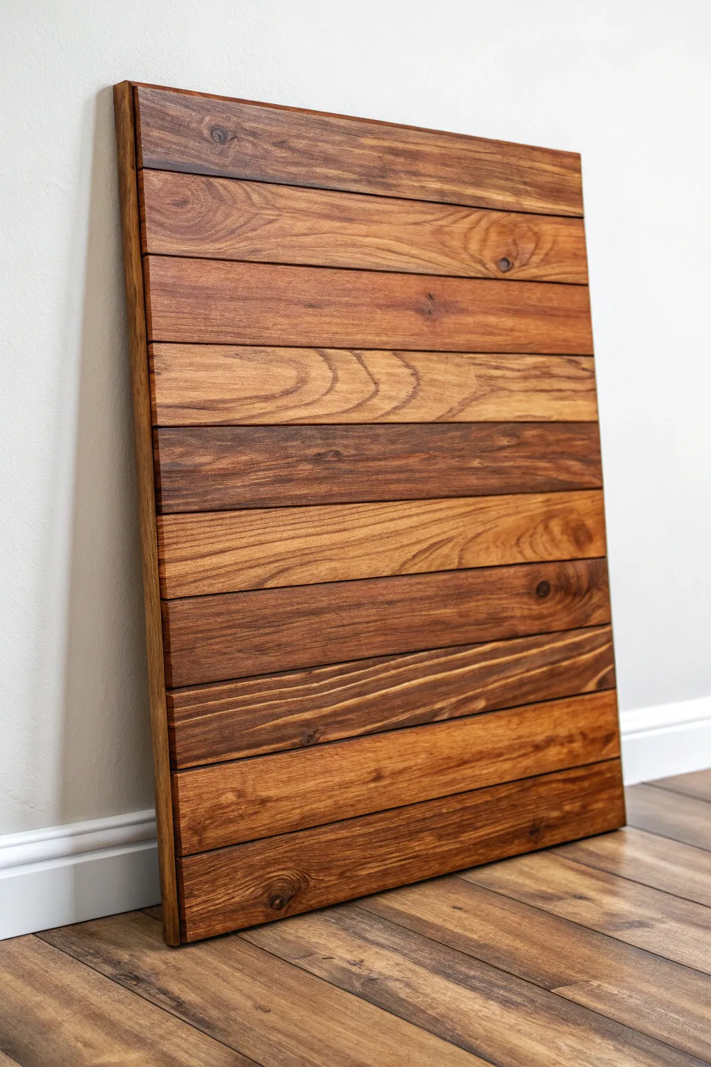
Transform a plain canvas into a stunningly realistic rustic wooden panel using just acrylic paints and clever texturing techniques. This project creates a warm, dimensional piece that mimics the visual weight and intricate grain of actual stained timber.
Step-by-Step Guide
Materials
- Large stretched canvas (rectangular shape works best)
- Acrylic paints (Raw Umber, Burnt Sienna, Yellow Ochre, Titanium White, Carbon Black)
- Wide flat brush (2-3 inch)
- Medium flat brush (1 inch)
- Fine liner brush
- Painter’s tape (1/4 inch width)
- Acrylic glazing medium
- Fan brush (optional)
- Ruler or straight edge
- Pencil
- Matte or satin varnish
Step 1: Preparation and Layout
-
Base Coat:
Begin by painting your entire canvas with a solid coat of a neutral mid-tone brown. I usually mix Yellow Ochre with a touch of Burnt Sienna and White to create a raw wood color. Look out for any white spots and ensure full coverage. -
Dry Time:
Let this base layer dry completely. It must be bone dry before you apply tape, or you risk peeling the paint off later. -
Drafting Planks:
Using a ruler and a light pencil, mark horizontal lines across the canvas to define your planks. Vary the widths slightly if you want a more reclaimed look, or keep them uniform for a modern finish. -
Masking Gaps:
Apply the narrow painter’s tape directly over your pencil lines. These taped areas will eventually become the shadowed gaps between the boards, creating that crucial physical visual separation.
Pro Tip
Work on non-adjacent planks first (e.g., plank 1, 3, and 5). Let them dry before doing the evens. This prevents wet paint from bleeding across the tape lines.
Step 2: Painting the Grain
-
Color Variation:
Prepare three distinct mixes of brown glaze: a light honey tone, a medium reddish-brown, and a deep espresso. You want each “plank” to have a slightly different dominant hue to mimic natural lumber variation. -
Initial Plank Blocking:
Working on one plank at a time, apply a layer of glazing medium mixed with your chosen color. Keep the paint wet and workable. -
Creating the Grain:
While the glaze is wet, drag a dry, stiff-bristled brush or a graining tool through the paint horizontally. Wiggle your hand slightly to create waves and imperfections rather than perfectly straight lines. -
Adding Knots:
With a smaller round brush, drop a dark blob of Raw Umber into the wet glaze where you want a knot. Use a fine liner brush to swirl the surrounding paint around this dark spot, mimicking how wood grain flows around knots. -
Refining Texture:
Move to the next plank and switch your color mix. Alternating between lighter and darker planks adds depth. I find that leaving some brush strokes visible enhances the fiber-like texture of the wood. -
Cathedral Grains:
On a few central planks, use your liner brush to paint elongated ‘V’ shapes or arches (cathedral grain) in a darker brown tone. Feather the edges of these shapes into the background color so they don’t look like cartoons.
Step 3: Detailing and Shadows
-
The Reveal:
Once all planks are painted and fully dry, carefully peel away the painter’s tape. You should see crisp, light-colored lines between your wood boards. -
Shadowing:
Mix a transparent glaze of Raw Umber and a tiny bit of Black. Paint a very thin line along the top edge of each gap (the bottom of the upper plank) to cast a shadow downward. -
Deepening the Gaps:
Fill the rest of the gap line with a dark brown, almost black mix. This simulates the dark crevice between boards. Keep this line steady but not perfectly machine-straight. -
Edge Painting:
Don’t forget the sides of the canvas. Continue the plank lines and colors over the edges to make the artwork look like a solid slab of heavy wood. -
Highlighting Edges:
Using a very light tan and a dry brush, gently hit the top edge of each plank (just above the dark gap). This subtle highlight makes the boards look like they have a beveled or worn edge. -
Final Varnish:
Finish with a coat of satin or matte varnish. Avoid high gloss, as real rustic wood absorbs light rather than reflecting it.
Level Up
Add ‘nail holes’ at the ends of each plank. Use a dark dot of paint followed by a tiny crescent of highlight underneath to make the nails look embedded.
Hang your faux-wood masterpiece in a well-lit spot where the grain texture can really shine.
Muddy Water Ripple Texture
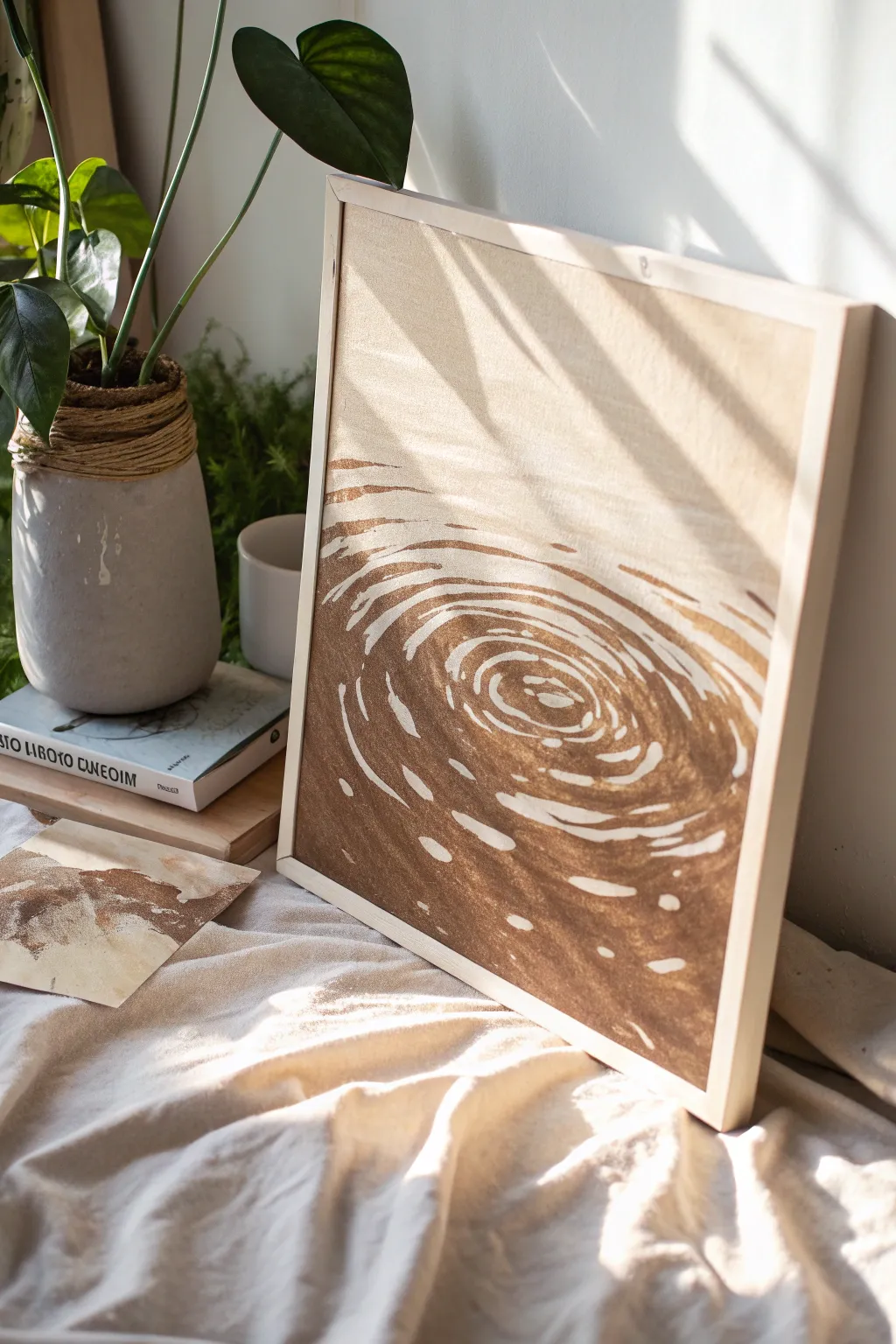
Capture the serene, mesmerizing movement of a water drop with this monochromatic study in brown. Using a simplified palette and negative space techniques, you’ll create a graphic yet organic piece that brings a warm, earthy calmness to any corner of your home.
Step-by-Step
Materials
- Square stretched canvas (approx. 16×16 inches) or canvas board
- Light wood floating frame (optional, for finishing)
- Heavy body acrylic paint: Burnt Umber or Raw Umber
- Heavy body acrylic paint: Titanium White (or unbleached titanium for a warmer look)
- Synthetic flat brush (1-inch width)
- Synthetic filbert brush (size 6 or 8)
- Round detail brush (size 2)
- Pencil (HB or 2B)
- Palette or mixing plate
- Cup of water and paper towels
- Easel or flat work surface
Step 1: Preparation and Sketching
-
Prime the surface:
If your canvas is bright white, you might want to tone it down first. Mix a large amount of white with a tiny dot of brown to create a creamy off-white base. Apply this evenly across the entire canvas and let it dry completely. -
Find the center:
Locate the approximate center of your canvas where the main ripple will originate. It doesn’t need to be perfectly geometric; slightly off-center looks more natural. -
Sketch the primary rings:
Using your pencil very lightly, draw a small, slightly irregular oval in the center. Draw concentric ovals radiating outward from this point, spacing them wider apart as they move toward the edges. -
Add distortion:
Water isn’t perfect. Wobbly your pencil lines slightly as you move outward to mimic the fluid distortion of ripples. The outer rings should break apart and not complete fully connections.
Step 2: Painting the Ripples
-
Mix your main color:
Squeeze out a generous amount of your dark brown paint. If you want a softer look, mix in a very small touch of white to make it opaque but slightly lighter than pure brown straight from the tube. -
Start from the center:
Load your filbert brush with the brown paint. Paint the dark space *between* your pencil lines in the very center. Rememebr, you are painting the shadows of the water, leaving value for the light. -
Define the first ring:
Move to the first ring surrounding the center. Paint a sweeping, curved stroke that follows the oval shape. The filbert brush’s rounded tip is perfect for creating soft, tapered ends to your strokes. -
Create variation in thickness:
As you paint the expanding rings, vary your pressure. Press down harder to make the line thick, and lift up gradually to taper it off. This mimics how light hits the crest and trough of a wave. -
Leaving the light:
Crucially, leave the pencil lines (and the space immediately around them) unpainted. This raw canvas or cream base color acts as the ‘highlight’ on the water surface. -
Expanding outward:
Switch to your larger flat brush for the wider, outer ripples. Use long, confident sweeping motions. Don’t worry if the edges are a bit dry-brushed; that texture adds to the organic feel. -
Breaking the rings:
As you reach the outer edges of the composition, stop painting continuous ovals. Instead, paint broken, dashed segments that suggest the ripple is fading away into the calm water.
Uneven Highlights?
If your unpainted lines look messy, don’t stress. Mix a ‘corrector color’ matching your canvas background and use a thin liner brush to paint back over the brown edges, sharpening the highlights.
Step 3: Refining and Framing
-
Adding small reflections:
Using your small round detail brush, add tiny, isolated islands of brown paint within the larger light areas. These look like smaller disturbances or reflections caught in the wave. -
Cleaning up edges:
If your negative space (the light lines) became too thin in places, you can correct this now. Mix a paint color that matches your background exactly and carefully cut back into the brown shapes to widen the highlights. -
Smooth the gradient:
If the outer edges feel too abrupt, use a dry brush with a tiny amount of paint to feather the ends of the large brown strokes, letting them fade gently into the unpainted canvas. -
Check the balance:
Step back about five feet from your easel. Look for areas that feel too heavy or too empty. I find this perspective shift often reveals where a quick extra dash of brown is needed for balance. -
Allow to cure:
Let the painting dry completely, preferably overnight. The thick acrylic layers need to harden fully before framing. -
Erase guidelines:
Once fully dry, check if any distracting pencil lines are visible in the light areas. Gently erase them with a kneaded eraser. -
Frame the piece:
Place the finished canvas into a light wood floating frame. This creates a shadow gap around the artwork that complements depth of the painted ripples.
Keep it Fluid
Add a drop of flow improver or water to your brown paint. This helps the brush glide smoothly for long, uninterrupted curves without the brush dragging or skipping on the canvas texture.
Hang your new ripple study in a well-lit spot to enjoy how the simple forms create a sense of deep movement
Vintage Map Tones and Washes
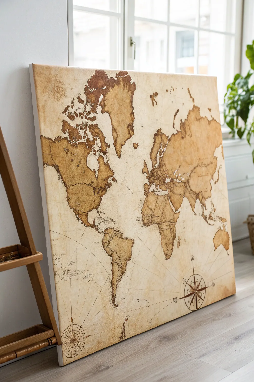
Transport your space back in time with this large-scale vintage world map painting, featuring aged parchment effects and rich, earthy tones. By layering translucent washes over crisp linework, you’ll create an artwork that looks like a well-traveled relic straight from an explorer’s cabin.
Step-by-Step Guide
Materials
- Large stretched canvas (at least 24×36 inches)
- Acrylic paints (Raw Umber, Burnt Sienna, Yellow Ochre, Titanium White)
- Strong brewed coffee or tea (cooled)
- Graphite transfer paper
- World map stencil or printed template
- Fine liner brushes (00 and 1)
- Large mottler or wash brush
- Natural sea sponge
- Ruler or straight edge
- Masking tape
- Matte medium or varnish
- Hair dryer (optional for speeding up drying)
Step 1: Creating the Parchment Base
-
Prime the Surface:
Begin by coating your large canvas with a layer of Titanium White mixed with a tiny drop of Yellow Ochre to kill the stark brightness. This provides a warm undertaking for your subsequent washes. -
Brew the Wash:
Prepare a very strong cup of coffee or dark tea and let it cool completely. Mix this liquid with a small amount of acrylic binder or matte medium to ensure it adheres permanently to the canvas without flaking off later. -
Apply the Aging Layer:
Using a large wash brush, apply the coffee/tea mixture across the entire canvas. Don’t aim for perfection; allow pools of liquid to form in corners or random spots to simulate water damage and age stains. -
Sponge Texture:
While the wash is still wet, dab a natural sea sponge into a watered-down mix of Burnt Sienna. Lightly press this into random areas, particularly near the edges, to create a mottled, uneven leather-like textures. -
Dry Thoroughly:
Let this background layer dry completely, preferably overnight. If you are impatient like me, you can use a hair dryer on a low cool setting to speed this up, but natural drying creates better organic rings.
Old World Edges
Darken the outer 1-inch perimeter of the entire canvas with undiluted Raw Umber. Blend it inward with a damp sponge for a seamless vignette effect.
Step 2: Mapping the Continents
-
Prepare the Template:
Print out a world map template scaled to your canvas size. You may need to print this on multiple sheets of paper and tape them together to form the full image. -
Transfer the Outline:
Slide graphite transfer paper between your template and the dry canvas. Secure everything with masking tape so it doesn’t shift, then carefully trace the coastlines of all continents with a pencil. -
Initial Blocking:
Mix a glaze using Raw Umber and a significant amount of water or glazing medium. Paint the interior of the continents with this translucent brown, intentionally leaving some areas lighter than others to mimic topographical wear. -
Darkening the Edges:
Once the first layer is dry, go back with a slightly less diluted Burnt Sienna. Outline the inner coastlines of the continents to create a ‘burned’ edge look, which adds definition and pop to the landmasses. -
Adding Land Markings:
Use a small round brush to dab darker spots of undiluted Raw Umber within the continents to suggest mountain ranges or dense terrain, keeping the strokes loose and impressionistic.
Bleeding Lines?
If your fine lines bleed into the background, the surface is too porous. Seal the background with clear matte medium before doing line work.
Step 3: Navigational Details
-
Drafting Grid Lines:
Using a long ruler, lightly pencil in the grid of latitude and longitude lines. These don’t need to be perfectly scientifically accurate, but they should curve slightly to suggest the globe’s shape. -
Inking the Lines:
Take a fine liner brush and thinned dark brown paint (almost ink consistency). Carefully paint over your pencil grid lines. Keep the pressure light; broken lines often look more authentic than solid, thick ones. -
Drawing the Compass Rose:
Choose a spot in the lower right corner (usually the ocean area) for your compass rose. Use a geometric compass or circle template to draw the outer ring, then sketch the points of the star inside. -
Painting the Compass:
Fill in the compass design using alternating shades of dark Raw Umber and the lighter parchment background tone. Sharp, crisp points are key here, so steady your hand. -
Script and Text:
If you wish to label oceans or continents, use a very fine brush or a brown permanent marker to write in a cursive, old-world script. Keep the text small and unobtrusive. -
Splatter Effect:
Load an old toothbrush with watery dark brown paint. Run your thumb over the bristles to flick tiny speckles across the canvas, concentrating on the corners, to simulate dust and age spots. -
Final Seal:
Once absolutely everything is dry, seal the painting with a matte varnish. This protects the coffee wash from fading and unifies the sheen of the different paint layers.
Hang your masterpiece in a study or living room to inspire your next great adventure.
Brown Ink Wash Portrait Study
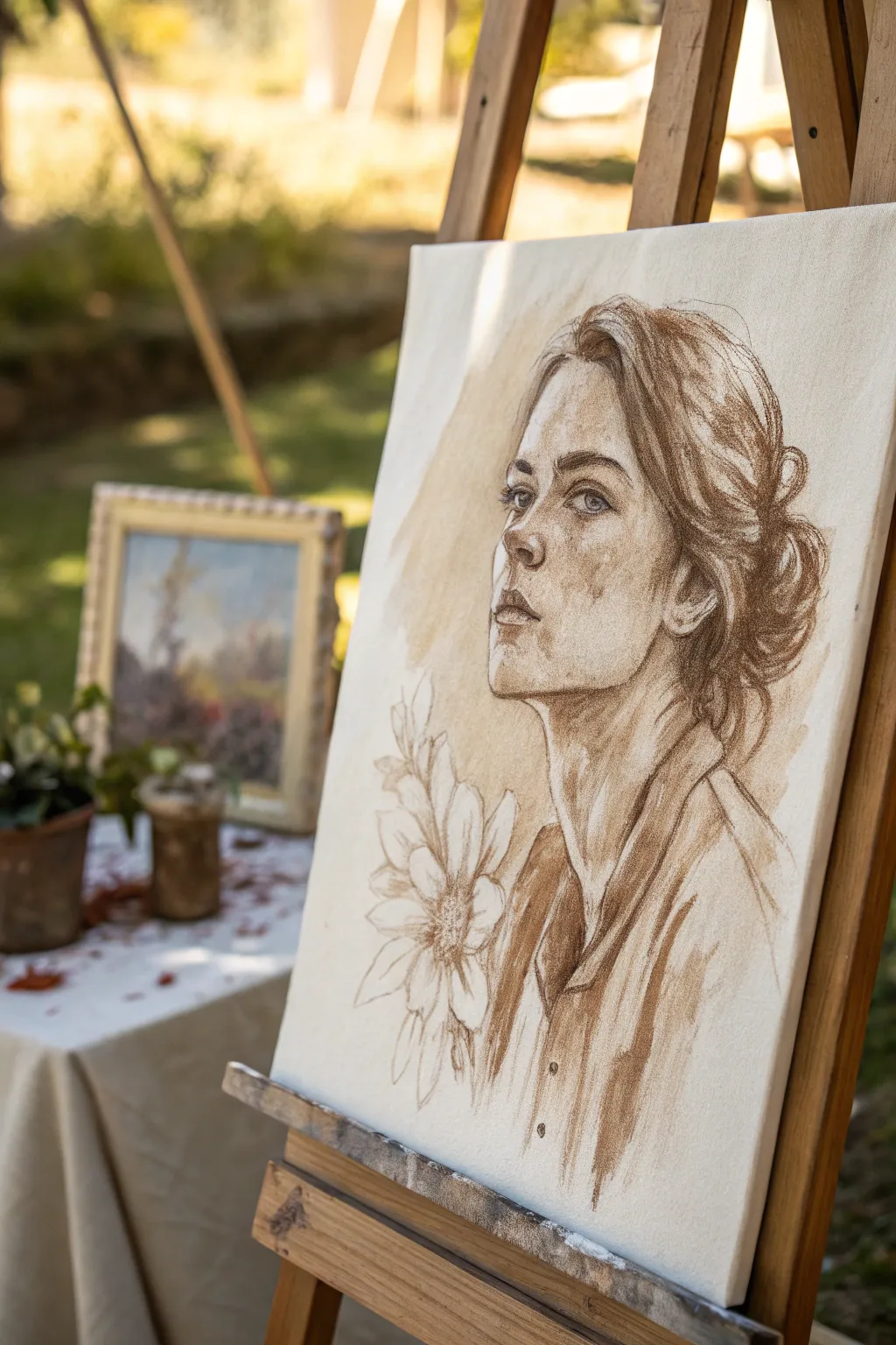
Capture the timeless beauty of a classical study using warm brown tones on canvas. This project mimics the look of an old master’s sketchbook page but scales it up for a striking piece of wall art that blends drawing and painting techniques.
Step-by-Step Tutorial
Materials
- Stretched canvas (rectangular portrait format)
- Brown acrylic ink or fluid acrylic paint (Burnt Umber or Sepia)
- Mixing palette or small cups
- Water container
- Synthetic round brushes (sizes 2, 6, and 10)
- Soft graphite pencil (HB or 2B)
- Kneadable eraser
- Paper towels or rag
- Easel (optional but recommended)
Step 1: Sketching the Foundation
-
Compose the subject:
Begin by lightly sketching the placement of the head on your canvas using your HB pencil. Position the face slightly off-center to the right, leaving negative space on the left for the floral element. Keep your pencil pressure very light so the graphite doesn’t smear into the paint later. -
Map facial proportions:
Draw the basic guidelines for the facial features. Mark the eye line, nose base, and mouth line. The subject is looking upward and to the left, so ensure the perspective of the features aligns with this three-quarter angle. -
Refine the features:
Flesh out the shapes of the eyes, nose, and lips. Focus on the contour of the jawline and the neck muscles. Sketch the mass of the hair loosely, indicating the bun at the back and loose strands framing the face. -
Add floral details:
In the lower left corner, sketch the outlines of the large flower and leaves. These should be looser and less detailed than the face, serving as a decorative anchor for the composition.
Step 2: Establishing Values
-
Prepare your washes:
Create three distinct puddles of ink on your palette: one very watery (light tea color), one medium tone (coffee color), and one concentrated dark (straight from the bottle). I find testing these on a scrap paper first helps avoid surprises. -
Apply the first wash:
Using the size 10 brush and your lightest wash, block in the general shadow areas of the face—under the chin, the eye sockets, and the side of the cheek. This establishes the initial volume without committing to harsh lines. -
Background tint:
Take a broad, damp brush with the lightest wash and create a loose, patchy background around the head. Let the edges be rough and organic; this isn’t about filling the whole canvas, but rather creating a vignette effect. -
Deepen the shadows:
Once the first layer is touch-dry, switch to the medium tone wash. Paint into the darker recesses: inside the ear, the nostrils, the detailed shadows of the hair, and the folds of the clothing.
Control Your Dry Time
Acrylic ink dries fast. Keep a spray bottle of water handy to mist your palette or canvas if you need to keep an edge wet for blending soft shadows on the face.
Step 3: Developing the Portrait
-
Define the eyes:
Switch to your size 2 brush and the dark ink concentration. Carefully paint the pupils, the upper lash line, and the crease of the eyelid. Leave the white of the canvas for the highlight in the eye to bring it to life. -
Sculpt the nose and lips:
Use the size 6 brush with medium ink to softly model the nose. Use the darkest ink for the line between the lips and the corners of the mouth, blending it out with a damp brush to soften the transition. -
Texturize the hair:
Rather than painting every strand, use the brush to follow the flow of the hair clumps. Use quick, sweeping strokes with the dark ink to suggest movement and volume in the bun and the loose tendrils. -
Outline the shirt:
Use fluid, confident strokes to define the collar and shoulders. Keep the clothing sketchier than the face to direct focus upward. Allow the brush to run dry occasionally for a textured, charcoal-like look.
Add Warmth
For a richer, more antique look, mix a tiny drop of red oxide or burnt sienna into your brown ink. This subtle warmth mimics the look of authentic Renaissance sanguines.
Step 4: Final Details
-
Paint the flowers:
Return to the floral sketch at the bottom left. Use a very light wash to outline the petals and leaves. Keep this area airy and almost transparent, essentially just drawing with the brush rather than filling it in. -
Enhance contrast:
Step back and look at the whole image. Add your darkest darks now to the deepest shadows in the hair and the core shadow of the neck to increase the dramatic contrast. -
Add spatter texture:
Dip an old toothbrush or stiff brush into watery ink and lightly flick it onto the background areas. This adds an aged, organic feel to the canvas. -
Clean up highlights:
If you lost any crucial highlights (like on the nose bridge or cheekbone), you can reclaim them by using a tiny amount of white acrylic paint dry-brushed over the dried ink, though preserving the canvas white is preferred.
Allow the canvas to dry completely before sealing your beautiful study with a spray varnish.
Mocha Galaxy With Speckles
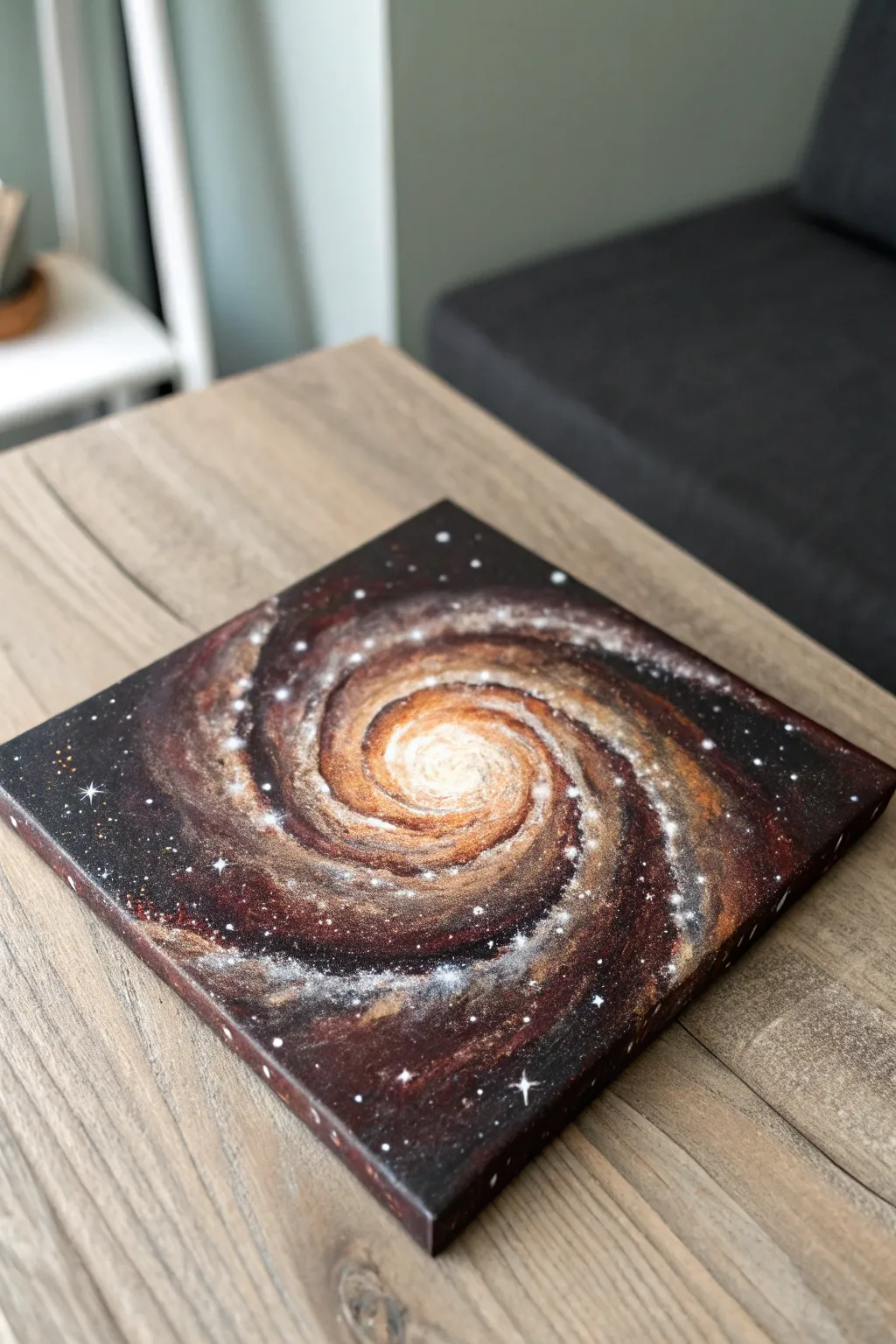
This cosmic painting moves beyond traditional cool-toned space art by embracing a warm, inviting palette of espresso, caramel, and cream tones. The spiral galaxy design creates a mesmerizing focal point that feels both expansive and cozy, perfect for neutral-toned interiors.
Step-by-Step
Materials
- Square stretched canvas (e.g., 10×10 or 12×12 inch)
- Acrylic paints: Burnt Umber, Mars Black, Titanium White, Copper (metallic), Bronze (metallic), Unbleached Titanium (buff)
- Medium flat brush (3/4 inch)
- Small filbert brush
- Fine liner brush
- Old toothbrush (for spattering)
- Cup of water
- Paper towels
- Mixing palette
Step 1: Setting the Abyss
-
Base coat:
Begin by covering the entire canvas with a mix of Mars Black and a touch of Burnt Umber. Don’t forget to paint the sides of the canvas for a finished look. -
Deepen the corners:
While the base is still slightly wet, blend pure Mars Black into the four corners, leaving the center slightly lighter to prepare for the galaxy glow. -
Dry completely:
Let this dark background dry fully. A hairdryer on a cool setting can speed up this process.
Muddy colors?
If your spiral arms look muddy, let the paint dry completely between layers. Acrylics darken as they dry, and wet-on-wet blending can sometimes turn brown tones gray.
Step 2: Forming the Spiral
-
Sketch the motion:
Using a slightly watered-down Unbleached Titanium and a filbert brush, gently sketch the spiral shape. Start from the center and paint loose, curved arms extending outward. -
Base glow:
Fill in the central core with Unbleached Titanium, blending it outward into the first loops of the spiral. The edges should be soft and hazy, not hard lines. -
Adding warmth:
Mix Burnt Umber with a little Copper paint. Apply this along the ‘spines’ of the spiral arms, letting the metallic sheen sit on top of the lighter sketch. -
Layering dimensions:
Use the Bronze metallic paint next. Apply it in short, dabbing strokes along the outer edges of the spiral arms to create texture and depth. -
Deepening the gaps:
Take your Mars Black again and gently redefine the negative space between the spiral arms. This high contrast makes the galaxy arms pop forward.
Add texture
Mix a bit of clean sand or modeling paste into your white core paint before applying. This creates physical texture that makes the center of the galaxy literally stand out.
Step 3: Creating Texture and Light
-
Brighten the core:
Paint a small, solid circle of Titanium White right in the center. While wet, blend the edges into the surrounding beige tones so it looks like a glowing orb. -
Dusty pathways:
Mix a very pale mocha color (White + Burnt Umber). Using a dry brush technique, drag this color lightly over the spiral arms to simulate cosmic dust lanes. -
Metallic highlights:
Add pure Copper highlights to the thickest parts of the galaxy arms. The metallic paint catches the light beautifully when viewed from different angles. -
Developing the fade:
At the very tips of the spiral arms where they disappear into the black background, use a dry brush with very little paint to fade the color into nothingness.
Step 4: The Starfield
-
Prepare splatter:
Dilute a small mount of Titanium White with water until it has the consistency of ink or heavy cream. -
Create distant stars:
Dip an old toothbrush into the thinned white paint. Test it on paper first, then flick the bristles with your thumb to spray fine mist over the canvas, concentrating somewhat on the galaxy bands. -
Adding major stars:
Use your fine liner brush to dot specific, larger stars. Place a few of these randomly in the dark corners and along the galaxy arms. -
The cross-flare:
Select 3 or 4 of your brightest white dots. Carefully paint a tiny cross (+) shape over them to create a twinkling ‘lens flare’ effect. -
Final warm specks:
I like to repeat the splatter step using thinned Copper paint, but very sparingly. This adds a subtle, warm glitter that ties the stars to the galaxy colors.
Step back and admire how the metallic paints catch the light, bringing your deep space creation to life
High-Contrast Animal Silhouette
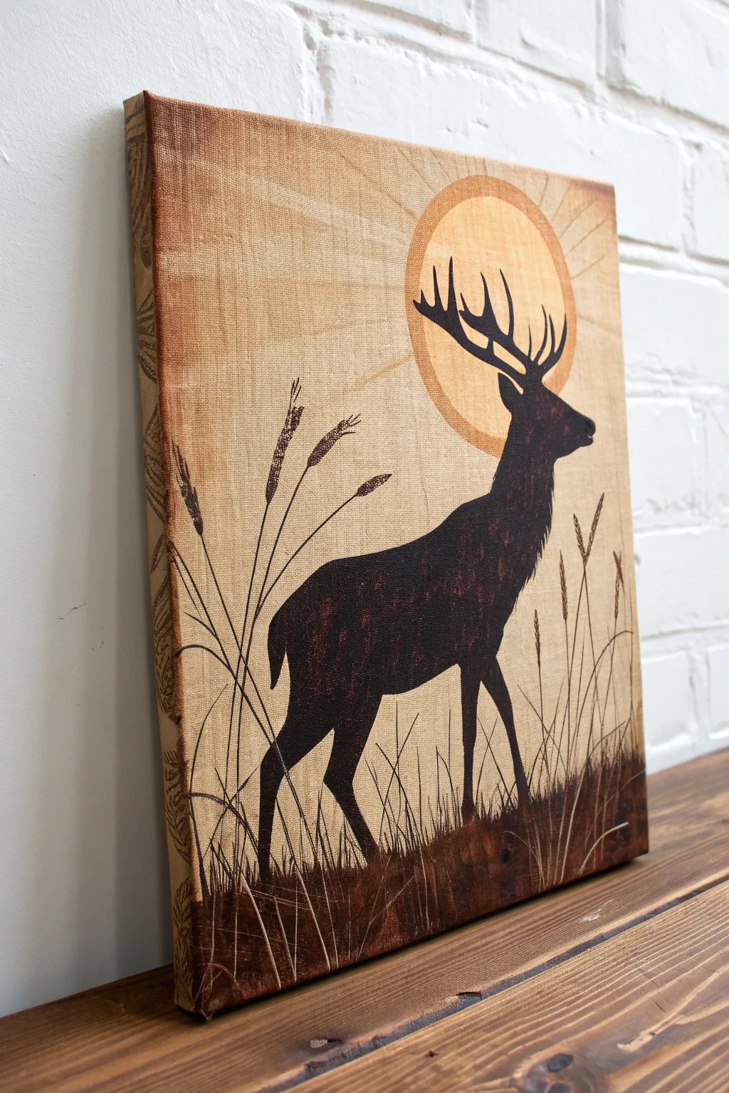
This rustic canvas art captures the quiet majesty of a stag against a warm, stylized sun, using a limited palette of sepia, browns, and blacks. The high-contrast silhouette technique creates a striking visual impact that fits perfectly with earthy decor themes.
Step-by-Step Tutorial
Materials
- Stretched canvas (e.g., 11×14 or 16×20 inches)
- Acrylic paints: Burnt Sienna, Raw Umber, Yellow Ochre, Black
- Large flat brush (1-2 inch) for background
- Medium round brush
- Fine liner brush for details
- Pencil and eraser
- Mixing palette or plate
- Compass or large circular object (like a bowl) for tracing
- Water cup and paper towels
Step 1: Preparing the Earthy Background
-
Create the base wash:
Mix Yellow Ochre with a generous amount of water to create a thin, translucent wash. Apply this freely across the entire canvas using your large flat brush. -
Add texture and variation:
While the base is still slightly damp, introduce small amounts of Burnt Sienna into the wet paint, streaking it horizontally to give the background a weathered, parchment-like look. -
Paint the edges:
Extend your colors around the sides of the canvas. To mimic the example, I like to create a slightly darker, patterned border on the sides, almost like a frame, though painting it solid brown works well too. -
Let it dry completely:
Allow the background to dry fully before moving on. This prevents your crisp shapes from bleeding into the wash.
Uneven Sun Ring?
If your sun’s border looks shaky, don’t worry. Use a slightly larger bowl to trace a new line over the dried paint and carefully fill the gap to correct it.
Step 2: Designing the Composition
-
Outline the sun:
Decide on the placement of your sun. Position it slightly off-center near the top right. Use a compass or trace a large bowl lightly with a pencil. -
Sketch the stag silhouette:
Lightly sketch the outline of the stag. Focus on the graceful curve of the neck and the prominent antlers. If you aren’t confident in free-handing, print a silhouette reference and use transfer paper. -
Mark the horizon line:
Sketch a rough, uneven line near the bottom third of the canvas where the tall grass will emerge.
Level Up: Gold Leaf
For a stunning accent, apply gold leaf to the sun disk instead of paint. The metallic shine will catch the light and contrast beautifully with the matte black silhouette.
Step 3: Painting the Sun and Sky
-
Fill the sun shape:
Mix Yellow Ochre with a tiny touch of white if needed for opacity. Paint the inside of your circle. It should be distinct but harmonize with the background. -
Create the sun’s border:
Mix a slightly darker shade using Burnt Sienna and Ochre. Carefully paint a thick ring around your sun circle to define it clearly against the sky. -
Add the sunbeams:
Using a very diluted mix of Burnt Sienna or a darker beige, paint faint, straight lines radiating outward from the sun disk to the edges of the canvas.
Step 4: Creating the Stag Silhouette
-
Block in the stag’s body:
Using black paint mixed with a little Raw Umber (to soften the harshness), fill in the main body of the deer with your medium round brush. -
Detail the antlers:
Switch to your fine liner brush. Carefully paint the antlers, ensuring the points are sharp. The contrast of the dark antlers against the lighter sun is the focal point, so take your time here. -
Add texture to the silhouette:
The example image isn’t solid flat black. Once the base black is tacky, dab a little dark brown (Raw Umber) onto the body to give it a dappled, furry texture.
Step 5: Foreground and Final Touches
-
Establish the ground:
Paint the bottom section of the canvas with a dark mix of Burnt Sienna and Black. Use upward strokes to create a grassy, uneven edge. -
Paint tall grass stems:
Using the liner brush and thinned black paint, pull long, confident lines upward from the bottom. Let them cross over the stag’s legs slightly to ground the figure. -
Add wheat heads:
At the top of your tallest grass stems, paint small, textured oblong shapes to resemble wheat or reeds. Use a stippling motion for texture. -
Layer lighter grasses:
Mix a lighter brown shade. Paint a few thin blades of grass in front of the dark ground layers to add depth and dimension to the foreground. -
Scratch in details (optional):
For a rustic finish, you can use the back of your brush handle to gently scratch into the wet foreground paint, revealing the lighter canvas underneath.
Hang your new rustic masterpiece in a spot where it can add warmth and woodland charm to the room
Coffee-Stain Ring Abstract
Embrace the accidental beauty of spills with this minimalist abstract piece that mimics overlapping coffee stains on canvas. The varying shades of brown create a warm, organic rhythm that turns everyday messes into intentional art.
Detailed Instructions
Materials
- Stretched canvas (rectangular or square)
- Instant coffee granules
- Hot water
- Several small cups or bowls for mixing
- Round cups, jars, or lids of various sizes (to use as stamps)
- Watercolor paper or scrap canvas for testing
- Paper towels
- Small paintbrush (for splatters)
Step 1: Preparation and Mixing
-
Prepare your workspace:
Lay down plastic or newspaper to protect your surface from inevitable drips. Place your canvas flat on the table, as this technique requires gravity to help settle the pigment. -
Mix the coffee ‘paint’:
Create three distinct concentrations of coffee in separate cups. For the lightest shade, mix a small spoon of granules with plenty of water. For the medium tone, double the granules. -
Create the darkest concentrate:
For the darkest rings, mix a very small amount of hot water with a large pile of coffee granules. You want a thick, syrup-like consistency that is almost opaque. -
Gather your stamping tools:
Collect household items with round rims—mugs, mason jars, plastic lids, or even small bowls. Different diameters will add visual interest to the composition.
Too Pale?
If your rings dry too light, simply re-stamp directly over the faint ones using a more concentrated coffee paste. The layers build up beautifully.
Step 2: Stamping the Rings
-
Test your stamps:
Dip the rim of a cup into your medium coffee mixture and press it onto your scrap paper. Get a feel for how much liquid transfers and how hard to press. -
Start with light, large rings:
Begin the composition on the canvas using the largest diameter object and the lightest coffee mixture. Dip the rim and press it gently onto the canvas, placing a few random circles. -
Allow initial pooling:
When you lift the object, you should see a puddle of liquid in a ring shape. Don’t wipe it up. The ‘coffee ring effect’ happens naturally as the edges dry faster than the center. -
Layer medium tones:
Switch to your medium-strength coffee mix and a slightly smaller object. Stamp a few rings that overlap the first set. I find overlapping creates a lovely transparency effect once dry. -
Add the dark accents:
Using the dark, syrupy mixture and your smallest or medium-sized rims, add high-contrast rings. These will serve as the focal points and add depth to the piece. -
Create imperfect connections:
Deliberately let some rings run off the edge of the canvas. You can also tilt the canvas slightly if you want a drip, though keeping it flat preserves the perfect circle shape best. -
Enhance weak spots:
If a ring didn’t transfer well, you can carefully re-dip and stamp over it, or use a small brush to guide the wet coffee liquid around the circle’s edge to reinforce it. -
Let the layers breathe:
Pause for about 10–15 minutes to let the first set of rings settle. They don’t need to be bone dry, but they shouldn’t be swimming pools before you add the final touches.
Level Up
Mix a tiny bit of metallic gold watercolor into your darkest coffee blend for rings that catch the light with a subtle, elegant shimmer.
Step 3: Details and Drying
-
Touch up overlapping areas:
Where a dark ring crosses a light one, the colors will bleed. This is desirable, but ensure the dark pigment doesn’t completely wash out the lighter shape. -
Add energetic splatters:
Dip a small paintbrush into the medium or dark coffee mixture. Hold it over the canvas and tap the handle with another brush to send fine droplets across the composition. -
Create larger droplets:
Load a brush heavily with the dark syrup and let a few single, deliberate drops fall onto empty white spaces or inside the rings for variety. -
Patience is key:
This is the hardest part: leave the canvas perfectly flat to dry overnight. If you move it too soon, the beautiful pooled edges will run and ruin the distinct ring effect. -
Seal the artwork:
once the canvas is completely dry (give it 24 hours to be safe), spray it lightly with a workable fixative or clear acrylic sealer to prevent the coffee from rehydrating with humidity.
Hang your new aromatic artwork in a kitchen or breakfast nook to set a cozy, welcoming mood
Triptych Brown Horizon Set
This stunning three-panel landscape captures a serene, abstract horizon using a monochromatic palette of coffee browns, ochres, and gentle creams. The continuous lines flowing across the separated canvases create a cohesive and modern window into a desert or coastal scene.
Step-by-Step Tutorial
Materials
- 3 equal-sized stretched canvases (e.g., 12×24 or 16×32 inches)
- Acrylic paints: Burnt Umber, Raw Sienna, Titanium White, Unbleached Titanium (or Cream), and a heavy body Black
- Large flat brush (2-3 inch width)
- Medium flat brush (1 inch width)
- Palette knife
- Water and spray bottle
- Easel or large flat workspace
- Painter’s tape or scrap wood (for spacing)
- Acrylic glazing medium (optional)
Step 1: Preparation and Sky
-
Align the canvases:
Place your three canvases side-by-side on your workspace or easel. Leave a small gap (about 1 inch) between them to mimic how they will hang, but ensure they are level with each other so your horizon line stays straight. -
Mix the sky gradient:
Prepare a large amount of Unbleached Titanium and mix in a tiny touch of Burnt Umber to create a sandy beige. You want enough paint to cover the top two-thirds of all three canvases. -
Apply the base sky:
Using your large flat brush, apply horizontal strokes across the top two-thirds of the triptych. Don’t stop at the edges—paint right off the side of one canvas and onto the next to maintain flow. -
Add sky variation:
While the base is wet, dip your brush into slightly more white for the lower sky and slightly more Raw Sienna for the upper sky. Blend these horizontally to create a soft, ombre effect that mimics atmospheric distance. -
Soften the transition:
Use a dry, clean brush to feather the strokes back and forth across the sky area. This softens any harsh lines and gives that hazy, dreamlike quality. I like to keep a misting bottle handy to keep the acrylics workable during this step.
Uneven Horizon?
If your horizon line jumps awkwardly between canvases, verify your floor or easel is level. You can use a long ruler or stick of wood across all three canvases as a guide while painting the main line.
Step 2: The Horizon and Ground
-
Establish the horizon line:
Mix Raw Sienna with a small amount of Burnt Umber. With the medium flat brush, paint a distinct horizontal band roughly one-third up from the bottom. Make the top edge of this band slightly uneven to suggest distant hills or dunes. -
Deepen the foreground:
For the bottom section, mix Burnt Umber with a touch of Black to create a deep, rich chocolate color. Apply this heavily to the bottom 15-20% of the canvases. -
Blend the mid-ground:
Between the deep brown bottom and the ochre horizon, blend the two colors together. Use horizontal sweeping motions. You want the dark bottom to fade gradually into the lighter horizon band. -
Paint the canvas edges:
Don’t forget the sides! For a professional gallery wrap look, extend your horizontal bands of color around the deep edges of the canvas frames.
Step 3: Texture and Details
-
Create the foam line:
Mix Titanium White with a very small amount of the beige sky color so it isn’t stark white. Load a palette knife with this mixture. -
Apply the texture:
Drag the palette knife horizontally across the transition area where the dark ground meets the mid-ground. Use a skipping motion to create a broken, organic line that resembles a crashing wave or salt flat. -
Refine the horizon:
Clean your palette knife and pick up some thick Raw Sienna. dragging it lightly over the horizon line to add texture and definition to the distant landmass. -
Add atmospheric washes:
Once the main layers are dry, creates a thin glaze (paint mixed with water or glazing medium) of Burnt Umber. Lightly brush this over parts of the dark foreground to add depth and richness. -
Final dry brush highlights:
Take a dry brush with a tiny bit of Unbleached Titanium and lightly dust the very top of the horizon line to catch the imaginary light.
Add Metallic Warmth
Mix a small amount of metallic copper or bronze paint into the ‘ground’ section of the painting. It will catch the light subtly and add a beautiful, warm glow to the deeper brown tones.
Hang your new masterpiece with about 2 inches of space between panels to fully enjoy the continuous flow of the landscape
Metallic Gold Pops on Brown
Transform a blank canvas into a stunning statement of earthy elegance with this textured brown and gold abstract piece. The deep, chocolatey tones provide a warm foundation for striking metallic veins that catch the light beautifully.
Detailed Instructions
Materials
- Large stretched canvas (24″x36″ or larger recommended)
- Acrylic paints: Dark Walnut, Burnt Umber, and Mars Black
- Liquid gold leaf or high-pigment metallic gold acrylic paint
- Fine liner brush
- Large flat brush or foam brush
- Natural sea sponge or scrunched plastic bag
- Palette knife
- Matte finish spray varnish
Step 1: Building the Foundation
-
Prepare the workspace:
Lay down a drop cloth or old newspapers to protect your floor. Since this involves a large canvas, you might find it easier to work with the canvas propped against a wall or easel, though laying it flat helps prevent drips later. -
Mix the base colors:
Squeeze out generous amounts of Dark Walnut and Burnt Umber onto your palette. I like to keep them slightly separated rather than fully mixing them, which allows for natural color variation on the canvas. -
Apply the first layer:
Using a large flat brush, cover the entire canvas with the Burnt Umber. Don’t worry about perfect smoothness; brushstrokes add to the final texture. Ensure you paint the sides of the canvas for a finished look. -
Create depth with darkness:
While the first layer is still tacky, mix a little Mars Black into the Dark Walnut. Apply this darker mixture in random patches across the canvas, focusing slightly more on the corners to create a subtle vignette effect. -
Add organic texture:
Take a natural sea sponge (or a scrunched-up plastic bag), dip it lightly into the dark paint mix, and dab it across the wet surface. This breaks up the brushstrokes and gives that stone-like, slightly mottled appearance visible in the background. -
Blend and soften:
Use a clean, dry brush to lightly sweep over the sponged areas. This softens the texture so it looks like weathered leather or stone rather than a distinct sponge pattern. -
Let it cure:
Allow this base layer to dry completely. Depending on the thickness of your paint, this could take 2-4 hours. It must be bone dry before you apply the gold detailing to prevent smudging.
Step 2: Adding the Gilded Veins
-
Plan your composition:
Look at the canvas and decide where your main veins will flow. The inspiration image uses diagonal lines that intersect; you might want to lightly sketch these paths with a soft pencil or chalk. -
Prepare the gold:
Shake your liquid gold leaf or high-pigment metallic paint vigorously. Pour a small amount into a small cup or palette well. -
Paint the primary veins:
Load a fine liner brush with the gold. Starting from one edge, drag the brush across the canvas in a swift, confident motion on a diagonal. Let the line break and skip naturally; you don’t want a perfect ruler line. -
Vary the line weight:
Go back over certain sections of your main lines to thicken them slightly. The variation between thick and thin creates visual interest and mimics natural veins in marble or stone. -
Create intersections:
Paint secondary lines that cross over or branch off your main veins. Think of how lightning strikes or how cracks form in pavement—angular and sharp rather than curvy. -
Add detail splinters:
Look for empty spaces that feel unbalanced. Add very small, detached lines or ‘floating’ gold marks near the main intersections to add complexity. -
Highlight with the knife:
Dip the very edge of a palette knife into the gold. Gently drag it sideways across a few dominant lines to ‘smeer’ the gold slightly, creating a raw, distressed metallic look in select spots. -
Check the balance:
Step back five feet from the canvas. Ensure the gold isn’t clustered too heavily in one area. If a spot looks too brown, add a thin whisper of a gold line. -
Adding starburst accents:
If you look closely at the inspiration, there are tiny star-like clusters. Use the very tip of your smallest brush to create a few centralized dots with tiny rays coming off them for extra sparkle.
Natural Lines Tip
For shakier, more natural-looking veins, hold your paintbrush at the very end of the handle. This reduces your control just enough to create organic, uncalculated lines.
Step 3: Finishing Touches
-
Dry the metallic application:
Liquid gold leaf dries quickly, often within 15-30 minutes, but metallic acrylics might take longer. Give it an hour to be safe. -
Seal the artwork:
Take the canvas to a well-ventilated area. Apply a light coat of matte spray varnish. This unifies the sheen of the brown background while letting the metallic gold pop without being overwhelmed by a glossy finish.
Troubleshooting Blobs
If a paint blob drips, don’t wipe it! Let it dry slightly, then use the edge of a clean palette knife to scrape it off. Wiping wet paint will smear it into the background.
Hang your new masterpiece in a well-lit area where the gold can shimmer and bring warmth to the room
Negative-Space Leaves in Browns
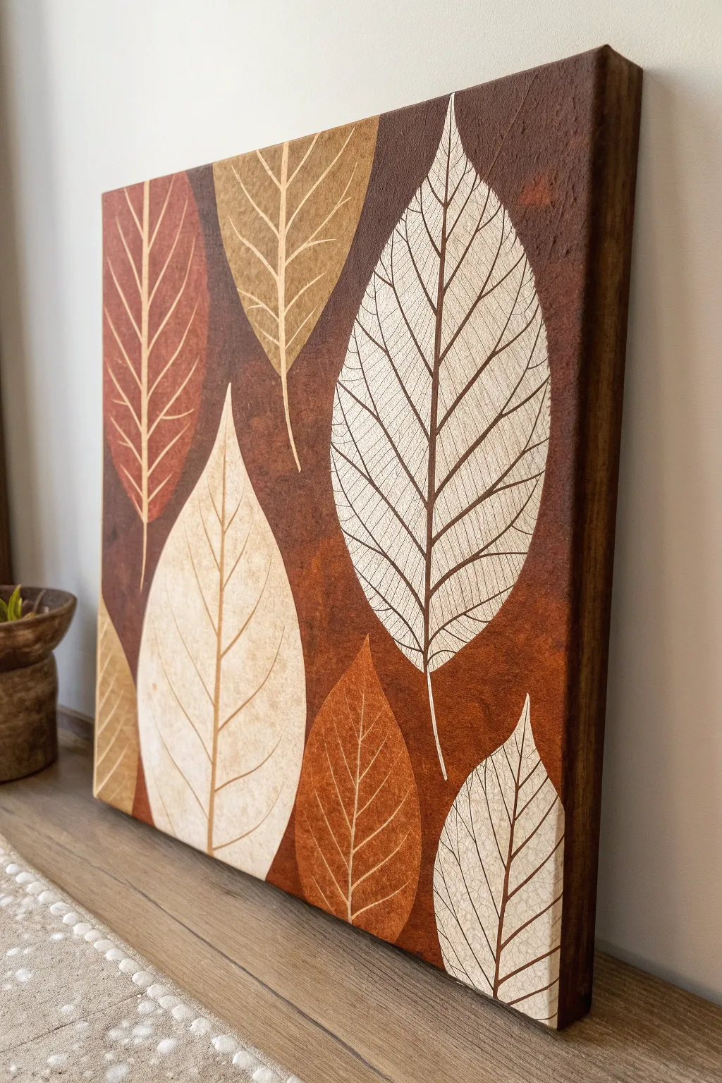
Capture the essence of autumn with this warm, textured canvas art featuring overlapping skeletal leaves. By combining earthy oxide backgrounds with crisp leaf silhouettes, you’ll create a sophisticated piece that celebrates the beauty of negative space.
Step-by-Step Guide
Materials
- Stretched canvas (square format, e.g., 16×16 or 20×20 inches)
- Acrylic paints: Burnt Umber, Burnt Sienna, Raw Sienna, Yellow Ochre, Titanium White, Cream/Buff
- Gesso (white)
- Wide flat brush (2-3 inch) for background
- Medium filbert brush
- Fine liner brush (size 0 or 00) for veining
- Assorted real leaves or leaf stencils/templates
- Painter’s tape or stencil adhesive (optional)
- Mixing palette
- Water cup and paper towels
- Graphite paper or chalk for tracing (if not freehanding)
Step 1: Setting the Atmospheric Background
-
Prepare the canvas:
Begin by ensuring your canvas surface is clean. If it isn’t pre-primed, apply one or two coats of white gesso and let it dry completely to create a smooth, workable surface. -
Mix your base tones:
On your palette, prepare puddles of Burnt Umber, Burnt Sienna, and a touch of Raw Sienna. You want a range of warm, chocolatey browns and rusty reds. -
Block in the background color:
Using your wide flat brush, paint the entire canvas with a mix of Burnt Umber and Burnt Sienna. Don’t aim for a perfectly flat color; allow the brushstrokes to show texture. -
Add depth with sponging:
While the base layer is still slightly tacky or just dry, use a scrunched-up paper towel or a sea sponge dipped in a darker brown (Burnt Umber) to dab random areas, creating a mottled, organic look. -
Incorporate rusty highlights:
Clean your sponge or brush, then dab touches of Burnt Sienna or a rust color into the background. This creates that oxidized, weathered metal appearance seen in the reference. -
Paint the sides:
Don’t forget to extend your dark brown background mixture around the edges of the canvas for a gallery-wrapped finish. -
Dry thoroughly:
Let the background layer dry completely before moving on. This is crucial because you will be tracing or painting lighter colors on top.
Step 2: Constructing the Leaf Silhouettes
-
Plan your composition:
Lightly sketch large, lance-shaped leaves onto the background using chalk. Arrange them so they overlap slightly and point in different directions, varying their sizes for interest. -
Mix leaf base colors:
Prepare three distinct lighter colors for the leaves: a pure Cream/White mix, a light Tan (White + Raw Sienna), and a reddish-brown (White + Burnt Sienna). -
Fill the large white leaf:
Start with the focal point leaf (the large white one on the right). Use your filbert brush to paint the entire leaf shape with the Cream mixture. You may need two coats to ensure the dark background doesn’t show through. -
Paint secondary leaves:
Move to the other leaf shapes. Paint the bottom-left leaf in your pale Tan mix, and the top-left leaf in the reddish-brown tone. Keep the edges crisp. -
Add earthy accent leaves:
Paint the smaller accent leaves at the bottom using a darker Ochre or Burnt Orange mix. These should be less opaque than the white leaf to help them recede slightly. -
Refine the edges:
Once filled, use a smaller brush to clean up the perimeter of each leaf, making sure the points are sharp and the curves are smooth.
Flow & Glide
If your fine lines are breaking or looking scratchy, add a drop of water or flow improver to your paint. It should have the consistency of heavy cream.
Step 3: Detailing the Skeletal Veins
-
Prepare the liner brush:
Switch to your fine liner brush. Thin your paint slightly with water so it flows like ink—this is the secret to getting long, smooth lines. -
Paint the central midribs:
For each leaf, paint the central vein (midrib) first. For the light leaves, match the paint color to the dark brown background; this creates the ‘negative space’ illusion. -
Add primary veins:
Starting from the midrib, paint the main diagonal veins extending outward to the leaf edges. Keep your hand loose to allow for natural, slight variations. -
Create the network:
Here I prefer to work from the center outward, connecting the primary veins with smaller, intersecting lines to mimic the intricate skeletal structure of a dried leaf. -
Vary line thickness:
Ensure the veins are thicker near the stem and become hair-thin near the leaf edges. This adds realism and dimension. -
Detail the colored leaves:
For the darker orange/brown leaves, use a lighter paint (like Cream or Tan) for the veins, reversing the contrast used on the white leaves. -
Final touches:
Step back and check your composition. If any background areas look too flat, you can carefully dry-brush a little extra texture around the leaves, but avoid touching your fresh leaf work.
Corrections
Accidentally painted a vein too thick? Wait for it to dry completely, then use your leaf’s base color (e.g., Cream) to ‘erase’ or thin the line from the outside in.
Allow the entire canvas to cure for 24 hours before hanging or varnishing to protect those delicate vein details

Have a question or want to share your own experience? I'd love to hear from you in the comments below!