If you’ve ever wanted that layered, outdoorsy camouflage look in your art, it’s way more approachable than it seems. These ideas are the kind you can try on a tiny canvas today and scale up to bigger decor pieces when you’re feeling brave.
Sponge-Dab Camo Texture
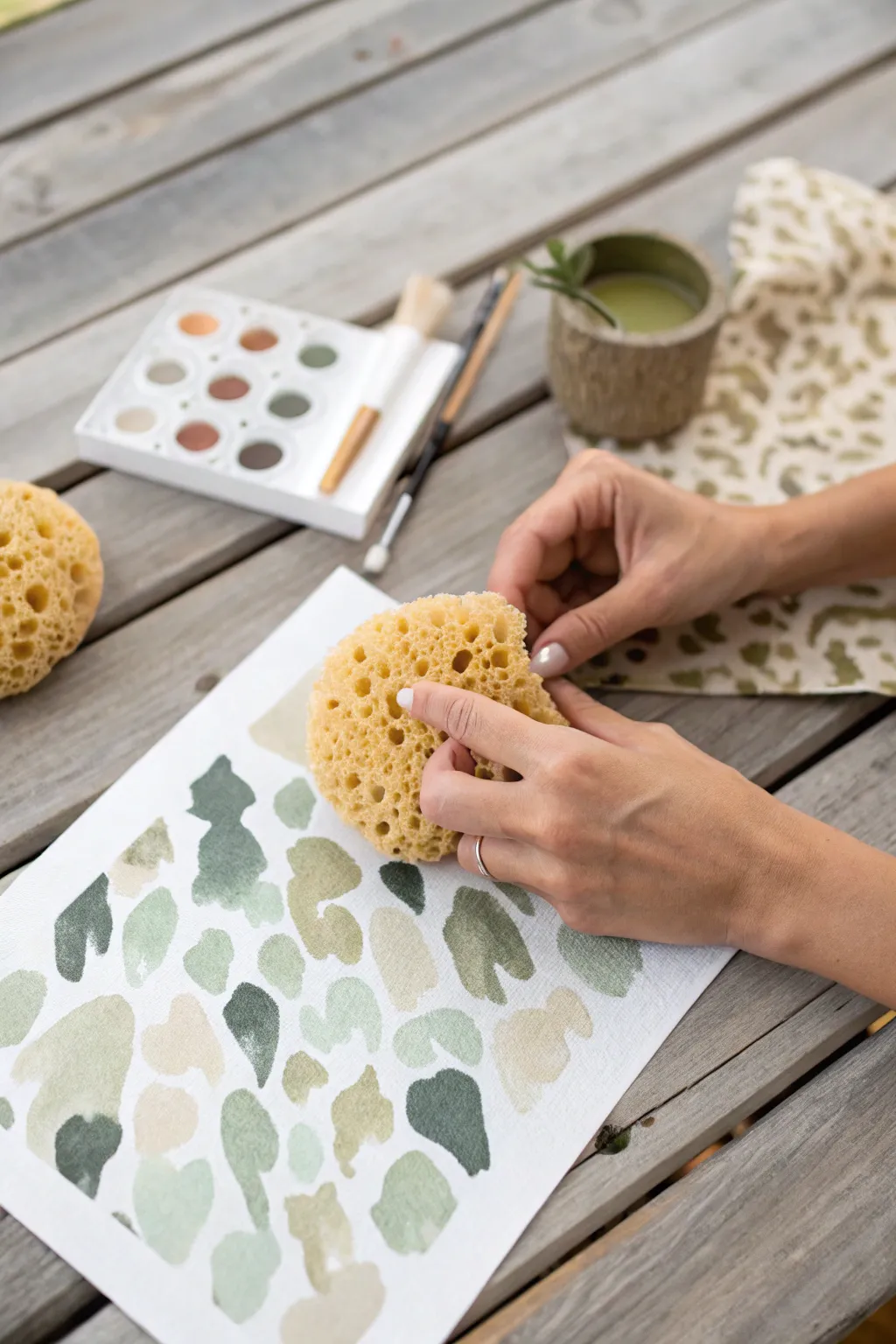
Create a soft, organic camouflage pattern without ever picking up a paintbrush for the main shapes. By using the natural irregular texture of a sea sponge, you can achieve authentic, unpredictable blotches that mimic classic military or nature-inspired prints with beautiful watercolor transparency.
Step-by-Step Guide
Materials
- Heavyweight watercolor paper (300gsm recommended)
- Natural sea sponge (synthetic sponges won’t yield the same organic texture)
- Watercolor paints (pan set preferred for easy mixing)
- Palette colors: Titanium White, Olive Green, Burnt Umber, Yellow Ochre, Lamp Black
- Small mixing tray (or the lid of your paint set)
- Cup of clean water
- Paper towels for blotting
- Small round brush (for touch-ups only)
Step 1: Preparation & Color Mixing
-
Prepare your workspace:
Lay your watercolor paper on a flat, waterproof surface, such as a wooden table or a craft mat. Ensure your water cup and paper towels are within easy reach. -
Dampen the sponge:
Soak your natural sea sponge in water until it is fully expanded and soft. Squeeze out almost all the water—it should be barely damp to the touch, not dripping. -
Mix an olive green:
Activate your watercolor pans with a drop of water. In your mixing area, create a medium-toned olive green by mixing Sap Green with a touch of Burnt Umber. -
Create a beige tone:
Mix a sandy beige color using Yellow Ochre significantly watered down, perhaps with a tiny dot of brown to desaturate it. -
Prepare a darker shade:
Mix a deep forest green or charcoal grey. This will serve as the high-contrast accent color in your pattern. -
Test transparency:
Swipe each color on a scrap piece of paper. You want them to be fluid but pigmented enough to hold their shape when sponged.
Natural Texture Tip
Use a natural sea sponge, not a synthetic kitchen sponge. The irregular holes and organic surface of a sea sponge are essential for getting those authentic, gritty camo edges.
Step 2: Sponging the Pattern
-
Load the sponge:
Dip a specific section of your sponge into the lightest color (the beige). Don’t cover the whole sponge; isolate a small ‘lobe’ of the sponge to act as your stamp. -
Blot excess paint:
Tap the painted sponge onto a paper towel once. This prevents puddles and ensures the unique porous texture transfers clearly to the paper. -
Apply the first layer:
Press the sponge onto the paper firmly but quickly. Lift it straight up without dragging. Repeat this randomly across the page, leaving plenty of white space between shapes. -
Rotate for variety:
As you work, rotate the sponge in your hand so you aren’t repeating the exact same shape over and over. This creates a more natural, non-repeating pattern. -
Switch to mid-tones:
Rinse your sponge thoroughly and squeeze it out. Now load it with your medium olive green mix. -
Overlap carefully:
Stamp the green shapes onto the paper. Aim to fill the white gaps, but also allow some of the green to slightly overlap the dry beige shapes for a layered look. -
Check density:
Step back and look at the distribution. You generally want a balance of 40% light colors, 40% medium colors, and 20% dark accents. -
Add the darkest accents:
Using a smaller section of the sponge (or pinching it to make it smaller), dip into your darkest green-grey mix. -
Final stamping:
Apply these dark marks sparsely. These should be the smallest shapes on the page, used to break up large areas of lighter color. -
Refine edges:
If any shapes look too faint or lack definition, use a slightly damp small brush to nudge a little pigment into the area while it’s still settling, or sharpen an edge. -
Allow to dry:
Let the paper sit undisturbed until completely dry. The watercolor will lighten slightly as the water evaporates.
Muddy Colors?
If your shapes are bleeding into a brown mess, let each color layer dry almost completely before stamping the next color on top. Patience keeps the layers distinct.
Once dry, this patterned paper makes gorgeous custom wrapping paper or a unique background for calligraphy


Oversized Camo Accent Wall Sketch
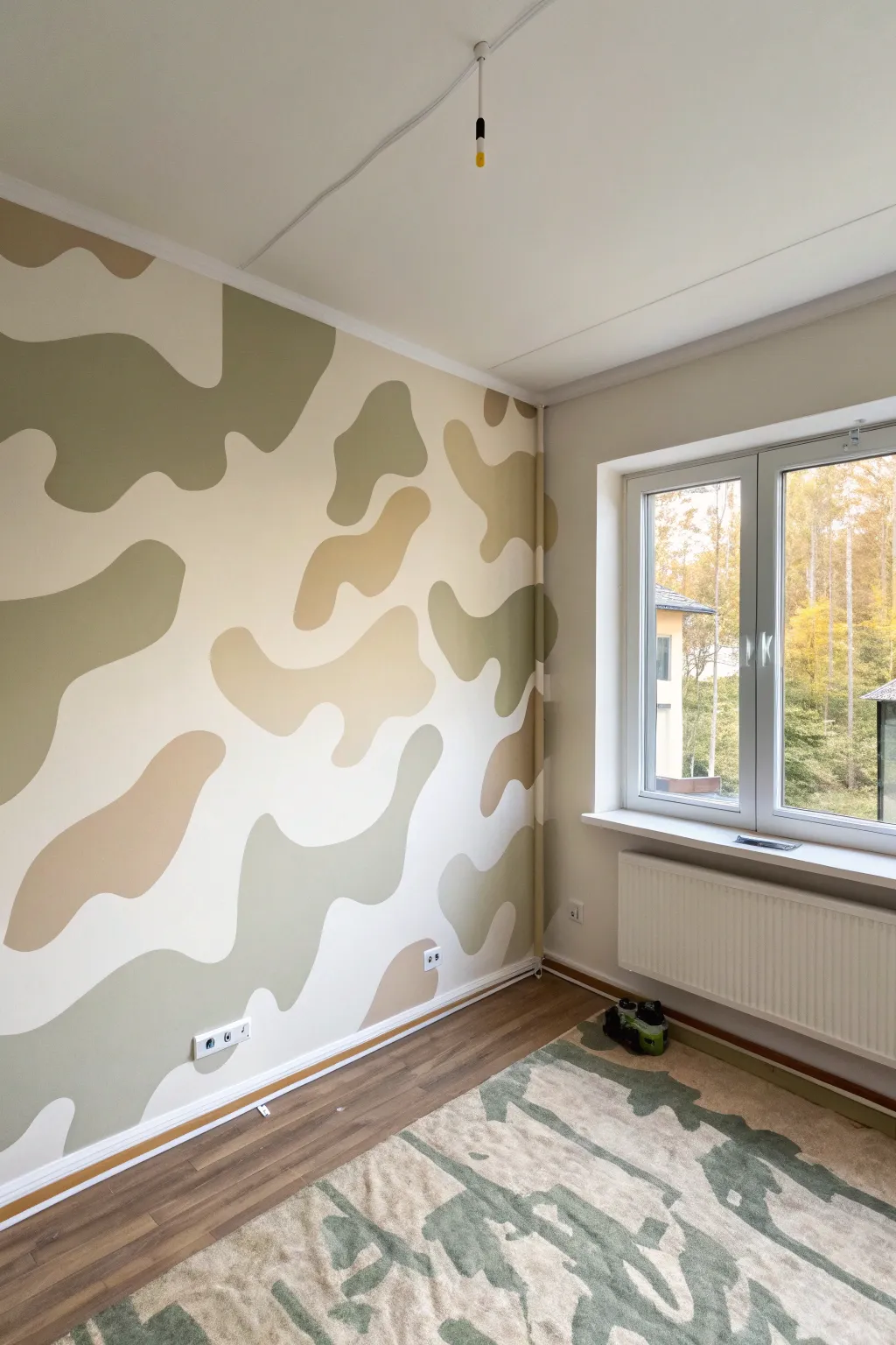
Transform a plain white room into a cozy, nature-inspired haven with this large-scale camouflage accent wall. Using a soft palette of olive greens and warm beiges, this mural creates a playful yet sophisticated backdrop that avoids feeling too military or rigid.
How-To Guide
Materials
- Interior latex paint (Eggshell or Satin finish): Creamy White (Base), Light Olive Green, Deep Sage Green, Warm Beige/Tan
- Painter’s tape (blue or delicate surface)
- Drop cloths
- Pencil or white chalk
- Small foam roller (4-inch)
- Small roller tray
- Angled sash brush (2-inch)
- Artist’s brush (for touch-ups)
- Extension pole (optional for high spots)
- Ladder
Step 1: Preparation and Base Coat
-
Clear and protect:
Begin by moving furniture away from the wall you intend to paint. Lay down drop cloths to protect the flooring, as painting large shapes can sometimes lead to drips. -
Tape the edges:
Apply painter’s tape along the ceiling line, the adjacent walls, baseboards, and around any outlets or window frames. Press the tape down firmly to ensure a clean seal. -
Apply the background color:
Roll on your base color, which should be the lightest shade in your palette—a creamy off-white works perfectly here. If the wall is already white, give it a fresh coat to ensure even sheen and coverage. Let this dry completely, ideally overnight.
Step 2: Sketching the Pattern
-
Map out the blobs:
Using a pencil, lightly sketch the outlines of your camouflage shapes directly onto the wall. Aim for large, organic, amoeba-like forms rather than small, tight patterns. -
Check the spacing:
Step back frequently to assess the balance. I like to leave plenty of ‘negative space’ (the base wall color) showing between the shapes to keep the room feeling airy. -
Vary the sizes:
Ensure you have a mix of massive, wall-spanning shapes and slightly smaller connector shapes. Avoid making them all perfectly round; give them wobbly, undulating edges. -
Designate colors:
Inside each sketched outline, place a tiny mark (like ‘G1’ for light green, ‘G2’ for dark sage, ‘B’ for beige) to remind yourself which color goes where. Distribute the colors evenly so no two similar shades are clustered together.
Smooth Curves Tip
When painting curves with a brush, use your whole arm rather than just your wrist. This creates fluid, natural-looking organic lines instead of shaky, disjointed ones.
Step 3: Painting the Shapes
-
Outline the first color:
Start with your Light Olive Green. Pour a small amount into your tray. Use the 2-inch angled brush to carefully cut in the edges of the shapes marked for this color, following your pencil lines. -
Fill in the centers:
Once the outline is wet, use the 4-inch foam roller to fill in the body of the shape. The small roller gives you better control on curves than a standard large roller. -
Repeat for color one:
Continue across the wall, finishing all the Light Olive Green shapes first. This minimizes the time spent washing brushes and trays. -
Switch to Deep Sage:
Clean your tools or grab a fresh set. Repeat the process for your darkest green shade (Deep Sage). These darker spots add depth and anchor the design visually. -
Apply the Beige:
Finally, move on to the Warm Beige/Tan shapes. These act as a bridge between the stark white background and the green tones, softening the overall look. -
Apply second coats:
Depending on your paint quality, the dark sage and beige might need a second coat for full opacity. Wait about 2 to 4 hours before re-rolling these areas.
Pencil Marks Showing?
If your pencil sketch lines are still visible after painting, gently erase them with a Magic Eraser/melamine sponge, or touch up the edge with your base wall color.
Step 4: Finishing Touches
-
Refine the edges:
Inspect your work up close. If any pencil lines are still visible or if edges look ragged, use a small artist’s brush with the appropriate paint color to smooth them out. -
Remove tape:
Carefully peel off the painter’s tape while the final coat is still slightly tacky to prevent peeling dry paint. Pull the tape away from the painted edge at a 45-degree angle. -
Clean up outlets:
Reattach your outlet covers. If paint got onto the metal brackets, wipe it off before screwing the plastic plates back on. -
Final inspection:
Step back to the far side of the room. If any shape feels too isolated, you can always paint a small additional ‘blob’ to connect the composition better.
Enjoy your customized, tranquil space where the outdoors meets modern design

Desert Camo in Warm Neutrals
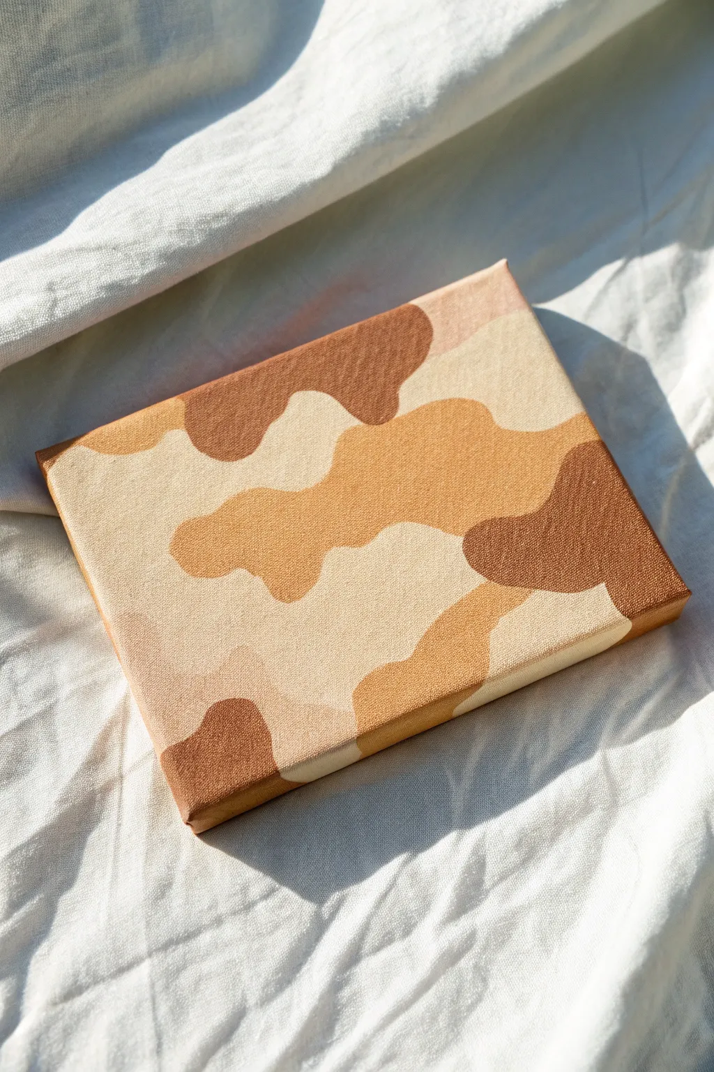
Bring the warmth of the dunes into your home with this modern take on desert camouflage. This project features fluid, organic shapes in a soft, monochromatic palette ranging from deep cocoa to creamy beige.
Step-by-Step Tutorial
Materials
- Small square stretched canvas (approx. 6×6 or 8×8 inches)
- Acrylic paints: Dark brown, terracotta/rust, tan/ochre, creamy beige, and titanium white
- Flat shader brushes (medium and small sizes)
- Pencil (HB or lighter)
- Palette or mixing plate
- Cup of water and paper towels
- Matte varnish (optional)
Step 1: Planning and Sketching
-
Prime the Surface:
Even if your canvas is pre-primed, applying a coat of your lightest color—the creamy beige—provides a solid base. Cover the entire face and all four sides of the canvas uniformly. Let this base coat dry completely. -
Map the Shapes:
Using a light pencil, gently sketch organic, cloud-like blobs across the canvas. Avoid sharp corners; aim for undulating, curvy lines that mimic natural terrain. -
Create Overlaps:
Ensure your blobs vary in size. Draw some large shapes that dominate a section and smaller ‘island’ shapes floating in between. Let some shapes run off the edge of the canvas for a continuous look. -
Label by Color:
To avoid getting confused later, lightly mark inside each shape with a letter code (e.g., D for Dark, M for Medium, L for Light) to plan your balanced composition.
Clean Curves Secret
Slightly wet your flat brush before loading paint. This thins the acrylic just enough to help it glide, creating smoother curves without drag marks.
Step 2: Painting the Values
-
Mix Your Palette:
Prepare four distinct shades of neutral brown. You’ll need a deep cocoa, a warm terracotta or camel tone, a sandy tan, and your lightest cream. If you only have one brown, mix varying amounts of white for the lighter shades. -
Start with the Darkest Tone:
Load a medium flat brush with your darkest brown acrylic. Identify the ‘D’ marked sections and carefully fill them in. Use the edge of the flat brush to carve out smooth, crisp curves. -
Extend to the Sides:
Don’t forget the edges! If a dark shape touches the side of the canvas, continue painting that color down the side of the frame. This creates a professional, gallery-wrapped finish. -
Apply the Mid-tones:
Switch to the terracotta or warm camel shade. Paint in the next set of shapes, ensuring the edges butt up cleanly against any dried dark brown sections without leaving white gaps. -
Establish the Sand Color:
Fill the remaining sketched areas with your tan or ochre tone. I find it helpful to rotate the canvas while painting to maintain a comfortable angle for my hand. -
Refine the Background:
Use the lightest cream color to clean up the negative space between your coloured shapes. Even though you primed with this color, a fresh top coat ensures the texture matches the other painted areas.
Step 3: Refinement and Finishing
-
Check for Opacity:
Once the first layer is dry, hold the canvas up to a light source. If you see streaks or canvas texture showing through the darker colors, apply a second coat for solid, opaque coverage. -
Crisp Up the Lines:
Use a small shader brush or a liner brush with slightly thinned paint to tidy up any wobbly edges where colors meet. The success of this look relies on very clean, sharp transitions. -
Erase Visible Marks:
Inspect the canvas for any stray pencil lines that weren’t covered by paint. Gently erase them, or dab a little matching paint over the top to conceal them. -
Unified Finish:
Allow the painting to dry for at least 24 hours. If desired, apply a coat of matte spray varnish to protect the surface and give all the colors a uniform, low-sheen finish.
Metallic Accent
Swap the ‘tan’ color for a metallic gold or bronze acrylic paint. This adds unexpected shimmer and elevates the desert camo into chic decor.
Place your finished canvas on a shelf or wall to add a touch of earthy calm to your space
Urban Camo in Grays and Black
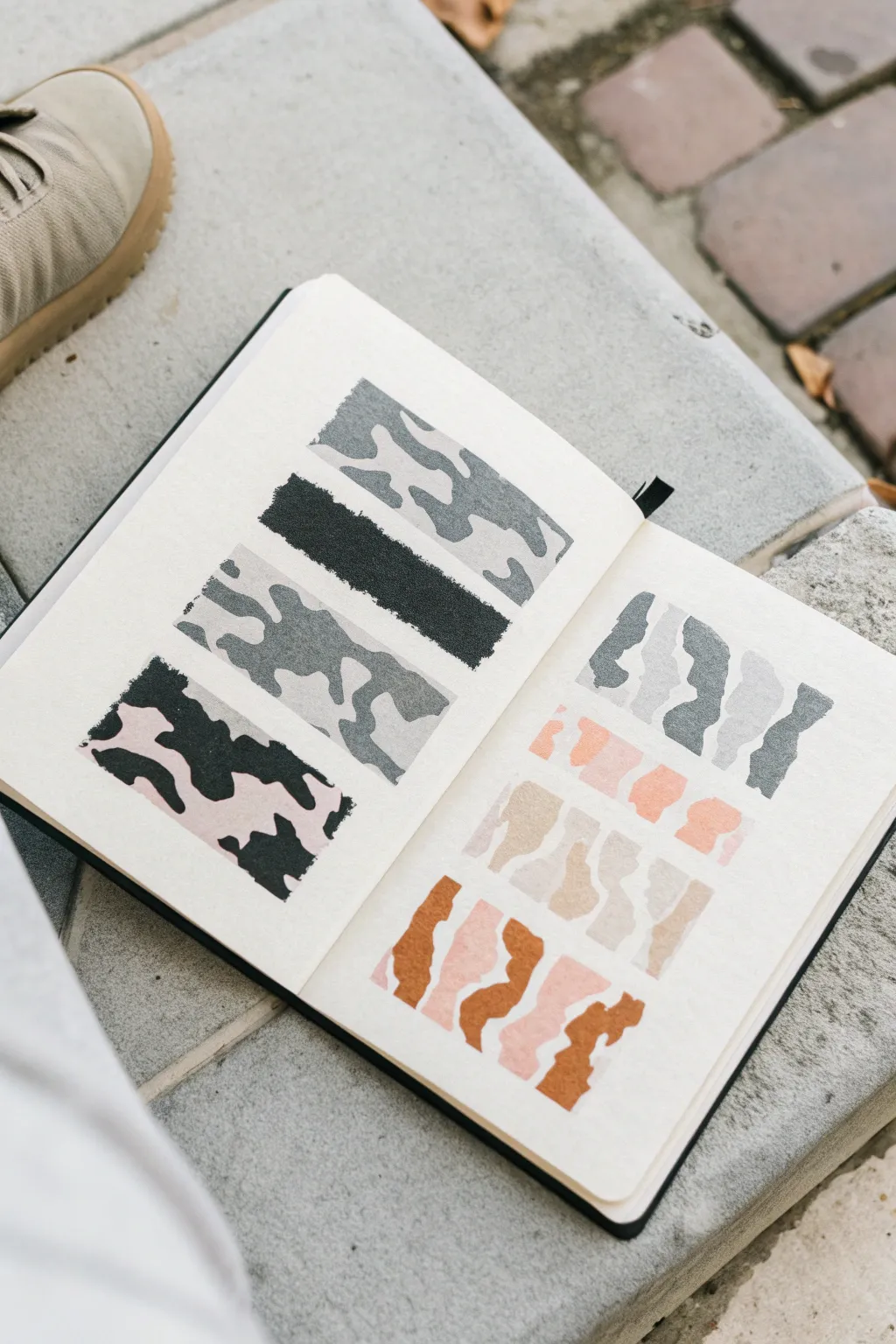
This project explores the deconstructed elements of urban camouflage through a series of satisfying, structured swatches. By isolating the shapes into clean rectangles and vertical strips, you can practice color layering and pattern balance in your favorite sketchbook.
Step-by-Step
Materials
- Sketchbook with heavy painting paper
- Washi tape or low-tack artist tape
- Gouache or acrylic paints (Black, White, Gray, Pink, Tan, Burnt Sienna)
- Flat shader brushes (sizes 4-6)
- Palette for mixing
- Water cup and paper towel
- Clean eraser
Step 1: Left Page: Horizontal Stacks
-
Tape the boundaries:
Begin on the left page by applying strips of washi tape horizontally to create four distinct rectangular painting areas. Press the edges down firmly to prevent paint bleed. -
First swatch: Classic grey:
For the top rectangle, mix a medium cool grey. Paint organic, blob-like shapes that interconnect but leave plenty of white space. Let these shapes drift off the edges of the tape. -
Add dark grey accents:
While the first grey is still slightly damp or just dry, mix a darker charcoal grey. Add smaller, accent blobs inside the larger grey shapes to create depth. -
Second swatch: Solid texture:
For the second rectangle down, paint it entirely solid black. This acts as a ‘grounding’ element in the composition. To mimic the photo’s texture, dab the paint with a dry brush or sponge rather than smooth strokes. -
Third swatch: Traditional forms:
In the third section, use two shades of grey. Paint large, sprawling amoeba shapes in light grey first. Once dry, overlap them with medium grey shapes, ensuring they interlock like puzzle pieces. -
Fourth swatch: The pop of pink:
For the bottom rectangle, change your palette. Paint a soft, pale pink background or large pink blobs first. -
Deconstruct the cow print:
Over the pink, paint high-contrast black shapes. Instead of military camo, think of this one as a stylized, jagged cow print. Make the edges rougher and less rounded than previous swatches.
Step 2: Right Page: Vertical Stripes
-
Tape vertical channels:
On the right page, switch the orientation. Tape off two wide, horizontal bands, but within those bands, visualize or lightly sketch vertical columns. -
Mix the cool palette:
Prepare a gradient of greys on your palette. You need a dark slate, a medium grey, and a very light grey. -
Paint the top row wavy shapes:
In the top band, paint vertical, wavy columns. These shouldn’t be straight lines; imagine them as torn strips of paper or wavy ribbons standing up. Alternate the colors: dark, light, dark, medium. -
Keep edges irregular:
As you paint these vertical strips, keep the edges slightly ragged or ‘torn’ looking to maintain the organic camouflage feel. -
Mix the warm palette:
For the two rows below, mix warm earth tones: a dusty rose, a sandy beige, and a burnt orange/terracotta. -
Layer the warm waves:
Paint the bottom section with similar wavy vertical forms using your warm colors. I find it helpful to paint the lightest sand color first to establish the spacing. -
Add the final contrast:
Finish the bottom right with the bold terracotta orange shapes, letting them curve and interlock with the lighter pinks and beiges next to them. -
The reveal:
Wait until every swatch is completely bone-dry. Slowly peel your washi tape away at a 45-degree angle to reveal the crisp, clean edges that make these chaotic patterns look orderly.
Crisp Edge Secret
Before painting, paint a thin layer of clear matte medium or white over your tape edges. This seals the tape so no color seeps underneath.
Level Up: Mixed Media
Try using posca pens or fine-liners to outline specific blobs in white or black after the paint dries for a pop-art comic book style.
Now you have a structured study of urban camouflage ready to inspire future designs
BRUSH GUIDE
The Right Brush for Every Stroke
From clean lines to bold texture — master brush choice, stroke control, and essential techniques.
Explore the Full Guide
Digital Camo Pixel Pattern
Recreate the distinctive, blocky look of digital camouflage with this surprisingly meditative painting project. Using a grid-based approach, you’ll blend earthy greens and tans to create a structured yet organic pixelated pattern.
Detailed Instructions
Materials
- Heavyweight watercolor paper or mixed media paper
- Pencil (HB or lighter)
- Ruler
- Gouache or acrylic paints (forest green, olive green, tan/beige, dark grey)
- Flat shader brushes (sizes 2 and 4)
- Small round detail brush
- Water cup and paper towels
- Palette or mixing tray
Step 1: Grid Preparation
-
Define the boundaries:
Start by lightly drawing a large rectangle in the center of your paper to serve as the border for your pattern. Leave a generous white margin around the edges to frame the artwork. -
Measure the grid:
Using your ruler, mark off even increments along the top and side of your rectangle. For the scale shown in the reference, 0.5-centimeter or quarter-inch marks work perfectly. -
Draw the grid lines:
Connect your marks to create a faint, comprehensive grid of squares across the entire rectangle. Keep your pencil pressure extremely light so the graphite doesn’t smudge into the lighter paint colors later.
Wobbly Lines?
If you struggle to paint perfect squares freehand, use narrow masking tape or washi tape to block off rows. It takes longer but guarantees razor-sharp pixel edges.
Step 2: Establishing the Pattern
-
Mix your base tan:
Prepare a light tan or beige color on your palette. This will be your lightest tone and should cover about 30-40% of the grid. -
Paint the light blocks:
Using a small flat brush that matches your grid size if possible, fill in random clusters of squares with the tan paint. Create irregular shapes—some L-shapes, some blocks of four, and some single pixels. -
Cluster the colors:
Digital camo relies on ‘clumping’ rather than total randomness. Ensure your tan shapes touch each other occasionally to form larger, jagged islands of light color. -
Mix a medium olive:
Create an olive green shade that bridges the gap between your light tan and your darkest green.
Step 3: Building Contrast
-
Apply the olive layer:
Fill in sections adjacent to your tan blocks with the olive green. I find it helpful to let these green sections ‘wrap’ around the tan areas slightly. -
Maintain sharp edges:
As you paint, rely on the flat edge of your brush to keep the sides of the squares straight. If you go over lines, you can correct them when painting the neighboring dark squares. -
Mix the forest green:
Prepare your darkest color, a deep forest green or a near-black grey-green. This color provides the necessary depth and contrast. -
Add the dark depths:
Paint the remaining empty grid squares with this dark shade. Focus on creating small, scattered clusters that look like shadows falling across the pattern. -
Check for balance:
Step back and look at the overall composition. If one color feels too dominant, careful paint over a few dried squares with a different shade to even out the distribution.
Go Digital Blue
Switch the palette to slate grey, navy blue, and sky blue to create a ‘naval’ digital camo variant, or use greys and neon orange for an urban streetwear vibe.
Step 4: Finishing Touches
-
Refine the edges:
Once the main paint is dry, use your smallest detail brush and the appropriate color to sharpen any corners that look rounded or sloppy. -
Erase visible guides:
Wait until the paint is bone dry—completely dry to the touch—and gently erase any visible pencil grid lines that extend past the painted area into the white border. -
Optional texture wash:
For a more weathered look like the reference, you can lightly dry-brush a tiny amount of the tan color over the dark green sections to create a subtle fabric-like texture.
Frame your geometric masterpiece to add a structured, modern touch to your wall decor
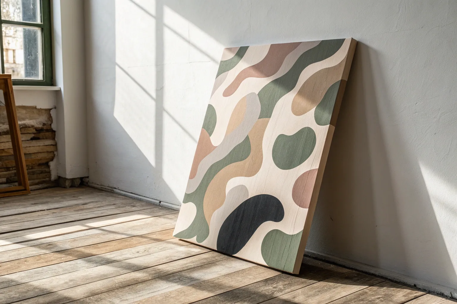
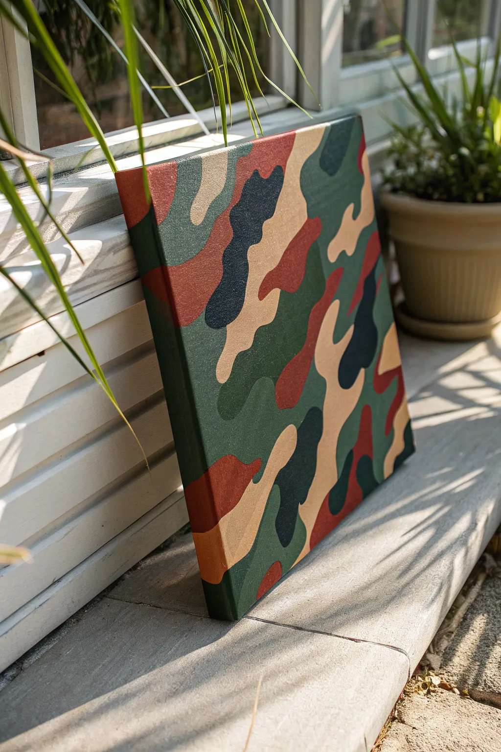
Camo Gradient Ombre Blend
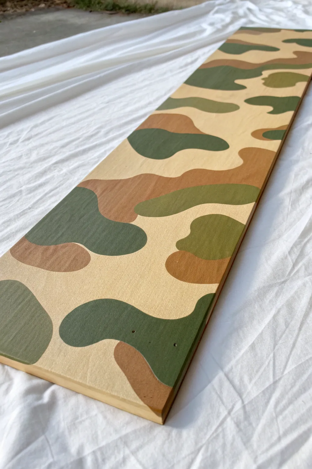
Transform a plain wooden board into a striking piece of decor with this crisp, classic camouflage design. The pattern uses earthy tones of tan, brown, and green to create a bold, graphic look perfect for shelves or wall art.
Step-by-Step
Materials
- Long wooden board (pine or similar)
- Sandpaper (120 and 220 grit)
- Tack cloth or damp rag
- Acrylic craft paints: Cream/Sand, Medium Brown, Olive Green, Forest Green
- Medium flat synthetic paintbrush
- Small round detail brush
- Pencil
- Palette or paper plate
- Painters tape (optional for edges)
- Clear matte sealer spray
Step 1: Preparation and Base Coat
-
Prepping the surface:
Begin by sanding your wooden board thoroughly. Start with 120 grit to remove any rough patches, then follow up with 220 grit for a smooth finish suitable for painting. Wipe away all dust using a tack cloth. -
Applying the background color:
Pour your Cream or Sand colored paint onto the palette. Using the medium flat brush, apply a generous, even coat across the entire top surface of the board. -
Ensuring solid coverage:
Let the first coat dry completely, which usually takes about 20 minutes. Apply a second coat to ensure the wood grain doesn’t show through too strongly, creating a solid, opaque canvas for your pattern. -
Smoothing the base:
Once fully dry, run your hand over the board. If the paint raised the grain slightly, give it a very light scuff sand with 220 grit paper, then wipe clean again.
Step 2: Sketching the Pattern
-
Planning the shapes:
Visualize fluid, organic blobs. Camouflage isn’t geometric; the shapes should look like puddles or amoebas. I like to keep a reference image of woodland camo nearby to check the density of the shapes. -
Drawing the outline:
Lightly sketch your pattern directly onto the painted board with a pencil. Draw large, curving islands that interlock but don’t necessarily touch everywhere. Leave plenty of the cream background visible to act as the lightest color in your camo scheme. -
Balancing the composition:
Step back and look at your pencil sketching. Make sure you don’t have all the small shapes on one side and large ones on the other. Add a few small ‘dots’ or smaller islands to fill any awkward empty spaces.
Wobbly Lines?
If your hand is shaking, rest your pinky finger on a dry part of the board while painting. This anchors your hand and gives you much better control for smooth curves.
Step 3: Painting the Camo Layers
-
Starting with brown:
Select about one-third of your drawn shapes to be brown. Mix your Medium Brown paint to a creamy consistency. Use the flat brush to fill in the larger areas of these shapes, keeping your edges crisp. -
Refining brown edges:
Switch to your small round brush to trace the edges of the brown shapes precisely. This ensures the curves look smooth rather than jagged. Let the brown paint dry. -
Adding the olive tones:
Choose another set of shapes for the Olive Green. These should act as a mid-tone between the light background and the darker forest green coming later. Paint these shapes carefully, perhaps letting one or two overlap slightly with a brown shape for depth. -
Applying the dark accents:
Use the Forest Green for the remaining shapes. These will be your darkest accents. I prefer to place these near the lighter cream areas to create high contrast, which makes the pattern pop. -
Touching up opacity:
Acrylics can be translucent. Check your green and brown shapes after they dry. If they look streaky, apply a second thin coat just to those specific colored islands. -
Cleaning up the lines:
Use a very small brush dipped in your original Cream base color to tidy up any mistakes where a darker color might have strayed outside its pencil line. Crisp edges are the secret to this look.
Add Texture
Sponge the wet paint lightly before it dries to create a fabric-like texture, or distress the dry finish with sandpaper for a rugged military-surplus vibe.
Step 4: Finishing Touches
-
Addressing the sides:
Decide if you want the pattern to wrap around the edges. For a cleaner look like the example image, paint the sides the solid Cream base color, or simply continue the camo pattern over the edge. -
Final inspection:
Erase any visible pencil marks that weren’t covered by paint. Be gentle so you don’t mar the base coat. -
Sealing the work:
Take the board to a well-ventilated area. Spray a thin, even layer of clear matte sealer over the entire piece. This protects the paint from scratches and gives it a uniform sheen. -
Adding hardware:
If you plan to hang this, install simple D-ring hangers on the back once the sealer is fully cured.
Hang your new camo board proudly or use it as a rugged shelf for your favorite gear

PENCIL GUIDE
Understanding Pencil Grades from H to B
From first sketch to finished drawing — learn pencil grades, line control, and shading techniques.
Explore the Full Guide
Negative-Space Camo Silhouettes
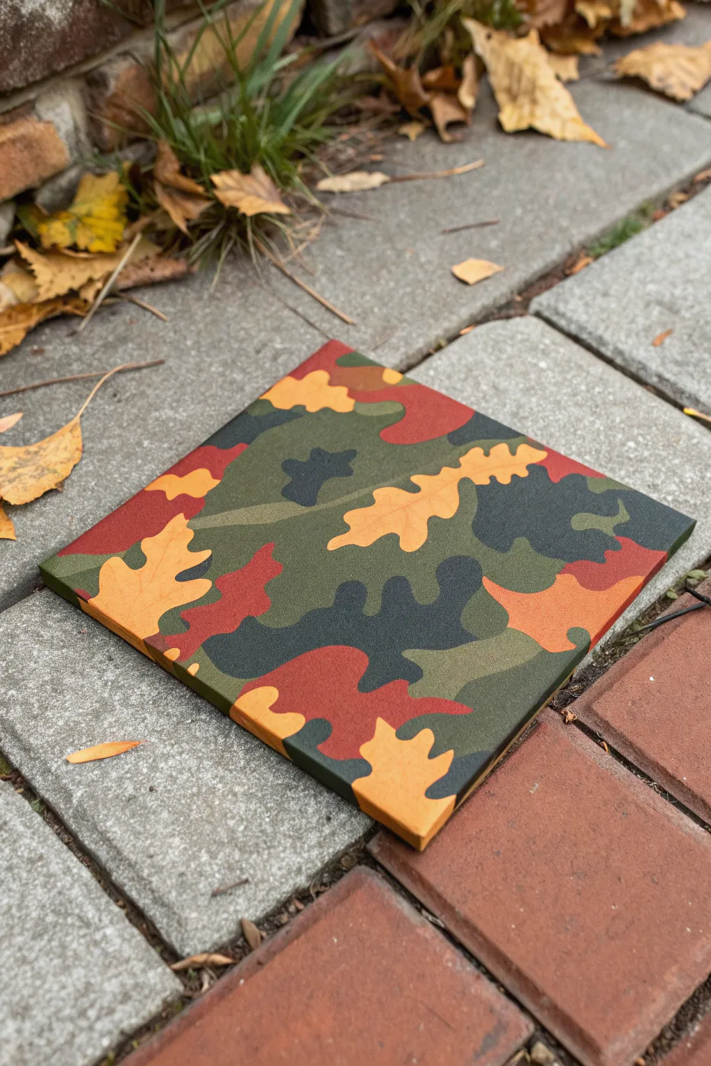
Blend the outdoors with modern art by creating this striking camouflage canvas that utilizes leaf silhouettes as negative space. The unique twist involves painting distinct oak leaf shapes in warm autumn tones, then layering traditional camo patches around them for a crisp, layered effect.
Step-by-Step Guide
Materials
- Square stretched canvas (e.g., 10×10 or 12×12 inches)
- Acrylic paints: olive green, dark forest green, black, burnt sienna (reddish-brown), and golden ochre (tan/yellow)
- Flat shader brushes (medium and large sizes)
- Small round detail brush
- Pencil
- Oak leaf stencil or real oak leaves for tracing
- Palette for mixing
- Cup of water
- Paper towels
Step 1: Planning the Pattern
-
Base Color Selection:
Begin by selecting your color palette. You will need a distinct ‘leaf’ color (the golden ochre mixed with a touch of burnt sienna for warmth) and your background camo colors (greens, dark browns, and black). -
Trace the Leaves:
Using a pencil and your stencil or real leaves, lightly trace scattered oak leaf shapes across the white canvas. Place them randomly, ensuring some run off the edges to create a sense of continuity. Don’t overlap these shapes. -
Sketch Camo Patches:
Around the leaf outlined shapes, lightly sketch traditional blobbish camouflage zones. These should be organic, wavy shapes that interlock like puzzle pieces but don’t touch the pencil lines of the leaves yet.
Step 2: Leaf Layer
-
Paint the Leaves:
Mix your golden ochre with just a drop of white to make it opaque. Fill in the traced leaf shapes carefully using a medium flat brush. -
Add Subtle Variation:
While the leaf paint is still slightly wet, pick up a tiny amount of burnt sienna on your brush and blend it into the tips or bases of the leaves. This creates that natural autumn transition look. -
Clean Edges:
Use your small round brush to neaten the jagged edges of the oak leaves. The distinct lobes need to be sharp for the silhouette effect to work well. -
Let it Cure:
Allow these leaf shapes to dry completely. Since the next colors will butt right up against them, you don’t want any smearing.
Clean Lines Hack
Use liquid frisket or masking fluid on the yellow leaf shapes before painting the darker background. Rub it off at the end for perfectly sharp edges.
Step 3: Camouflage Background
-
Start with Olive Green:
Identify the largest sketched patches on your canvas background. Fill these areas with a medium olive green. Paint carefully around the existing leaf shapes. -
Paint Red-Brown Zones:
Using the burnt sienna, fill in the next set of patches. I find it helpful to place these reddish-brown areas adjacent to the olive green but distinct from the yellow leaves to manage contrast. -
Add Dark Forest Green:
Fill remaining medium-sized gaps with the dark forest green. This creates the deep shadow tones required for effective camouflage patterns. -
Fill the Gaps:
Check for any remaining white canvas spots between your colored patches. Fill these tiny areas with the color that makes the most sense compositionally. -
Wrap the Sides:
Don’t forget the edges of the canvas. Extend whatever color is touching the edge around the side and onto the back stapled area for a professional, frameless finish.
Pattern looking flat?
If the camo looks 2D, mix a tiny drop of white into your lighter greens and a drop of black into your browns to create more tonal variety and depth.
Step 4: Detailing and Finishing
-
Apply Black Accents:
The pattern needs contrast to pop. Paint smaller, irregular black blobs over the dried green and brown layers. These often mimic deep shadows in foliage. -
Cross the Boundaries:
Allow some of the camouflage colors (especially the black or dark green) to slightly overlap the edges of other background colors, but try to keep the golden leaf edges crisp and untouched. -
Second Coat Check:
Acrylics can sometimes dry translucent. Hold your canvas up to a light source; if you see light coming through the paint, apply a second coat to those specific patchy areas. -
Refine Leaf Edges:
If you accidentally got green paint on your yellow leaves, now is the time to fix it. Use the small brush and the original leaf color to touch up the silhouette borders. -
Final Inspection:
Step back and look at the overall balance. If one area looks too green or too brown, add a small blob of a contrasting color to break it up. -
Protective Coat:
Once fully dry (give it at least 24 hours), apply a matte clear varnish. A matte finish is crucial here because real camouflage fabric isn’t glossy.
Hang your new artwork on a neutral wall to bring a touch of the forest indoors
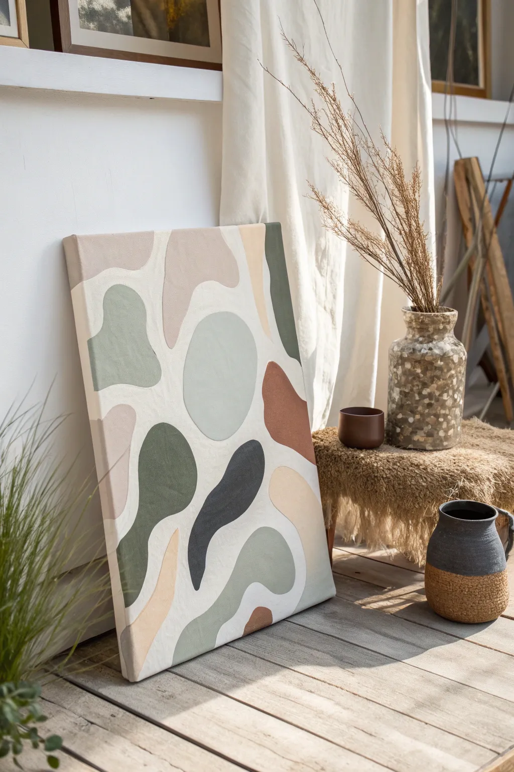
Textured Camo With Raised Paint
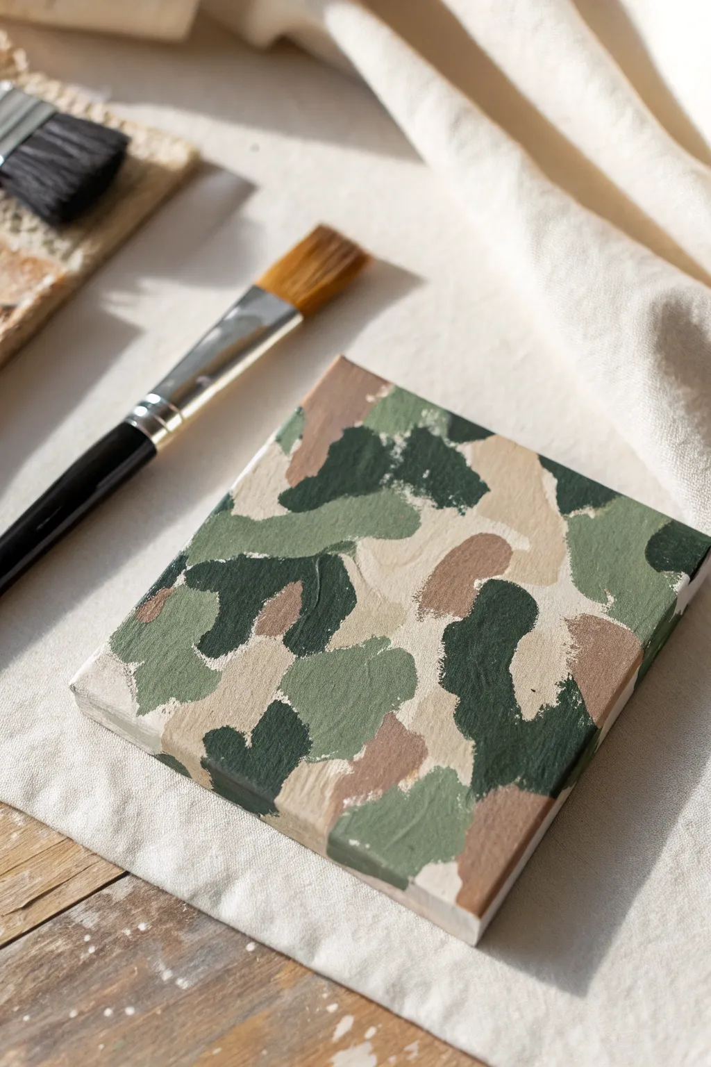
This project transforms the classic camouflage pattern into a tactile art piece by using thick, raised paint application. The result is a sophisticated, gallery-worthy miniature that emphasizes texture and organic shapes over perfectly rigid military prints.
Step-by-Step Tutorial
Materials
- Small square wrapped canvas (e.g., 6×6 inch)
- Heavy body acrylic paints or matte acrylics mixed with texture medium
- Paint colors: Olive green, deep forest green, tan/beige, terracotta brown, and cream
- Flat shader brush (size 6 or 8)
- Palette knife (optional, for mixing texture)
- Paper plate or palette
- Drop cloth or canvas scrap for workspace protection
Step 1: Preparation and Base
-
Prepare your palette:
Squeeze out generous amounts of your olive green, forest green, tan, brown, and cream paints. Because we want a raised texture, don’t skimp on the volume. If your acrylics are fluid, mix in a texture gel or modeling paste now to thicken them to a peanut butter consistency. -
Prime the surface:
Apply a thin, even coat of the cream or lightest tan color across the entire canvas face and sides. This ensures that no raw white canvas shows through the gaps in your camo pattern later. -
Wait for the base to set:
Let this initial base coat dry completely to the touch, which usually takes about 15-20 minutes, so your subsequent thick layers don’t pull it up.
Textural Boost
Mix a teaspoon of baking soda into your acrylic paint. This creates a gritty, stone-like texture that holds its shape perfectly without needing expensive gels.
Step 2: Layering the Pattern
-
Map out the tan shapes:
Begin with your tan or beige color. Using the flat brush, lay down irregular, organic blobs. Focus on keeping the edges soft and slightly undulating rather than jagged. -
Build thickness early:
Instead of brushing the paint flat, dab it on thickly so brushstrokes are visible. I like to leave ridges of paint standing up to create that tactile surface immediately. -
Introduce the olive green:
While the tan is still wet (or semi-dry depending on preference), add patches of olive green. Allow some shapes to touch the tan areas, but keep others distinct. -
Add the brown accents:
In the negative spaces remaining, paint smaller splotches of the terracotta brown. These act as transitional colors between the greens and lighter neutrals. -
Apply the dark contrast:
Now, take the deep forest green. This is your contrast color. Paint defined, curvy shapes that overlap the edges of the lighter colors slightly. This creates depth. -
Refine the edges:
Look at the spaces between your colored blobs. If the gaps are too wide, expand the shapes until they nearly nestle together, leaving only tiny slivers of the cream base showing through. -
Check the sides:
Don’t forget to wrap the pattern around the edges of the canvas for a finished, professional look. Continue the shapes over the side as if the pattern is printed on fabric.
Step 3: Texturing and Finishing
-
Enhance the brushstrokes:
Go back over specific areas with a clean, loaded brush to add a second layer of thick paint where the texture looks too flat. -
Create directional variety:
Ensure your brushstrokes aren’t all going the same way. Scumble the paint in different directions to mimic the chaotic nature of foliage. -
Add impasto highlights:
Dip just the tip of your brush into the cream paint and dab it onto the centers of the lightest camo shapes to raise the profile further. -
Dry properly:
Because the paint is applied thickly, standard drying times won’t apply. Set the canvas in a safe, dust-free area and let it cure for at least 24 hours. -
Assess the finish:
Once fully dry, the paint should feel solid and raised. If you prefer a unified sheen, you can brush on a matte varnish, though leaving it raw preserves the rugged texture best.
Muddy colors?
Avoid over-brushing wet edges. If colors start blending into gray mush, stop and let the current layer dry for 10 minutes before adding adjacent shapes.
Display your textured canvas on a mini easel or grouped on a shelf to bring a touch of the outdoors inside


Metallic Accent Camo Highlights
Elevate the classic woodland camouflage pattern by incorporating a surprising twist of metallic sheen and deep, rich tones. This painting project transforms a standard utilitarian design into a piece of modern art perfect for adding texture and interest to any room.
Detailed Instructions
Materials
- Square stretched canvas (12×12 or 16×16 inches recommended)
- Acrylic paints: Olive Green, Tan (Sand/Beige), Rust Red (Terracotta), and Metallic Black or very dark Navy
- Assorted flat synthetic brushes (sizes 4, 8, and 12)
- Pencil for sketching
- Eraser
- Palette or paper plate
- Cup of water
- Paper towels
- Clear matte or satin varnish (optional for finishing)
Step 1: Planning the Pattern
-
Prep the canvas:
Ensure your canvas is clean and free of dust. If it’s not pre-primed, apply a coat of gesso and let it dry completely before starting. -
Sketch the primary shapes:
Using a light pencil, draw large, irregular amoeba-like shapes across the canvas. Avoid perfect circles or squares; think of wandering, fluid blobs that interlock like puzzle pieces. -
Create overlaps:
Draw smaller shapes overlapping the larger ones. These will eventually be your accent colors. Make sure some shapes extend off the edge of the canvas to create a sense of continuity. -
Balance the composition:
Step back and look at your sketch. You want a relatively even distribution of large and small shapes so no single area feels too empty or too cluttered. -
Map your colors:
Lightly mark inside each shape with a letter code (G for Green, T for Tan, R for Rust, B for Black) to plan your color distribution. Ensure that no two shapes of the same color touch each other directly.
Flowing Forms
Keep your wrist loose when sketching. Authentic camo has very few straight lines; natural, organic curves look best.
Step 2: Painting the Base Tones
-
Start with the lightest color:
Pour your Tan acrylic paint onto the palette. Using a medium-sized flat brush (size 8), fil in all the shapes marked for Tan. Apply two thin coats rather than one thick one for smoother coverage. -
Let it dry:
Allow the tan sections to dry to the touch before moving on. This prevents colors from muddying where the shapes meet. -
Apply the olive green:
Switch to a clean brush and fill in the Green sections. Following the curves of your pencil lines with the edge of the flat brush helps keep the edges crisp. -
Paint the edges:
Don’t forget to wrap the design around the sides of the canvas canvas. As you paint a shape that touches the edge, continue that color onto the side panel for a professional, gallery-wrapped look.
Step 3: Adding Depth and Metallic Accents
-
Introduce the rust tones:
Load your brush with the Rust Red paint. Fill in the designated reddish-brown areas. This warm color provides a crucial contrast to the cooler greens and neutrals. -
Refine the edges:
I like to use a smaller size 4 brush here to tidy up any borders where the tan, green, and rust meet, ensuring there are no white gaps of canvas showing through between shapes. -
Add the metallic darks:
Now for the special touch: use the Metallic Black or dark Navy paint for the final shapes. The metallic quality will catch the light differently than the matte colors, adding a unique shimmer. -
Check for opacity:
Metallic paints can sometimes be semi-transparent. If the white canvas is peeking through the dark shimmer sections, apply a second coat once the first is dry. -
Touch up lines:
Look over the entire painting. If any pencil marks are still visible, carefully paint over them with the appropriate color. -
Protect your work:
Once the entire painting has cured for at least 24 hours, you can apply a clear varnish to seal the paint and unify the sheen of the matte and metallic areas.
Too much texture?
If your paint ridges are too visible, add a tiny drop of water or flow improver to your paint for a self-leveling finish.
Hang your stunning new artwork in a well-lit spot to watch the metallic accents shift throughout the day.
Unexpected Color Pop Camo
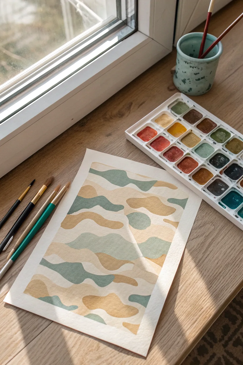
Move beyond traditional army greens with this soft, nature-inspired take on camouflage. Using a palette of warm ochre, soft beige, and muted teal, you’ll create gentle, organic waves that feel more like a tranquil landscape than tactical gear.
Step-by-Step
Materials
- Cold press watercolor paper (approx. 140lb/300gsm)
- Watercolor pan set
- Synthetic round brushes (sizes 4 and 6)
- Jar of clean water
- Paper towels
- Masking tape (optional for edges)
- Pencil (HB or H)
Step 1: Preparation and Sketching
-
Prepare the paper:
Begin by securing your watercolor paper to your work surface if you prefer a bordered look, though painting freely on a loose sheet works just as well for this relaxed style. Ensure the paper is clean and free of oils. -
Establish the boundaries:
Lightly mark out a rectangular border about an inch from the edge of the paper using a pencil. This frame will contain your pattern and create a crisp white margin that elevates the final look. -
Draft the organic shapes:
Using a very light hand, sketch wavy, horizontal blobs across the page. Think of these as rolling hills or drifting clouds rather than rigid puzzle pieces. -
Create separation:
Instead of drawing shapes that touch perfectly, leave a tiny sliver of space between each outlined section. This ‘river’ of white paper will act as natural separation and keep your colors from bleeding into one another.
Bleeding Lines?
If paint bridges the white gaps, wait for it to dry fully. Then, use opaque white gouache or a white gel pen to redraw the separation line over the mistake.
Step 2: Mixing the Palette
-
Mix the warm ochre:
Load your brush with water and activate a yellow ochre or raw sienna pigment. Test it on a scrap piece of paper; you want a warm, golden-brown tone that isn’t too saturated. -
Create the muted teal:
Combine a viridian or emerald green with a touch of blue and a tiny bit of brown or grey to desaturate it. This should result in a soft, dusty teal color. -
Prepare the beige tone:
Dilute a light brown or buff titanium heavily with water. This shade should be quite transparent, acting as the neutral backbone of your camouflage pattern.
Metallic Touch
Once dry, trace the thin white separation lines with metallic gold watercolor paint or a gold ink pen for a luxurious, shimmering finish.
Step 3: Painting the Pattern
-
Start with the lightest tone:
Begin filling in about a third of your sketched shapes with the beige wash. Choose spots randomly across the paper to ensure an even distribution of the lightest color. -
Control the edges:
As you paint, carefully outline the shape’s edge first with the tip of your round brush, then fill the center. This helps maintain that crisp white gap between neighboring shapes. -
Apply the ochre waves:
Once you’ve placed your beige spots, switch to the warm ochre mix. Fill in another third of the shapes, looking for opportunities to place this warmth next to the cooler beige areas for contrast. -
Add the teal accents:
Finally, fill the remaining shapes with your muted teal mixture. This cool tone will bring depth to the composition and balance the warmth of the ochre. -
Check for consistency:
Scan your painting for any pools of water or uneven drying. If a section looks too pale while still wet, you can carefully drop in a little more pigment to deepen the color. -
Refine the gaps:
If you accidentally painted over one of your white separating lines, don’t worry. You can lift a bit of color with a clean, damp brush or simply let the organic imperfection be part of the artwork. -
Let it dry completely:
Allow the painting to sit undisturbed until the paper is cool to the touch and matte. Patience here prevents smudging your crisp edges. -
Erase guidelines:
Once the paint is bone dry, take a clean eraser and gently remove any visible pencil marks from the white gaps, leaving only the pure painted shapes.
Now you have a serene, modern art piece that proves camouflage can be beautiful and calming instead of purely functional
Hidden Message Inside the Camo
Learn how to hide words or names within a trendy, earth-toned abstract painting. By using fluid, organic shapes that mimic camouflage patterns, you can obscure lettering so artfully that only those in the know will spot the secret message.
Detailed Instructions
Materials
- Stretched canvas (16×20 inches or larger)
- Acrylic paints (Cream, Sage Green, Charcoal Grey, Terracotta/Rust, Beige, Sand)
- Modeling paste or texture medium
- Palette knife
- Pencil and eraser
- Round synthetic brushes (sizes 4 and 8)
- Flat shader brush (size 10)
- Mixing palette
- Masking tape (optional)
Step 1: Planning the Hidden Message
-
Drafting the text:
Begin by lightly sketching your chosen word or name onto the canvas using a pencil. To make it camouflage-like, draw the letters large and bubble-style, letting them touch and overlap slightly. -
Distorting the shapes:
Soften the edges of your letters. Erase any sharp corners and turn them into wobbly, organic blobs. Extend parts of the letters so they look more like random puddles or stones than distinct characters. -
Filling the negative space:
Sketch additional organic shapes in the empty background areas. These “decoy” shapes should look similar in style to your distorted letters to help blend the message into the overall pattern. -
Checking the flow:
Step back and look at your sketch. The composition should look balanced, with shapes interlocking like puzzle pieces but separated by small channels of negative space.
Lines look messy?
If your textured lines are uneven, sand them gently with fine-grit sandpaper after they dry but before you start painting colors.
Step 2: Adding Texture and Definition
-
Creating the mixture:
Mix a dollop of modeling paste with a small amount of white or cream acrylic paint. Aim for a consistency similar to frosting. -
Applying texture:
Using a palette knife, apply this textured mixture strictly to the channels *between* your shapes. This creates a raised, tactile outline that separates your color blocks. -
Smoothing the lines:
While the paste is wet, you can use a damp finger or a clean brush to smooth down any peaks that are too high, ensuring the lines are relatively uniform in width. -
Drying time:
Allow the texture paste to dry completely. This usually takes 2-4 hours depending on thickness, or you can speed it up carefully with a hair dryer.
Step 3: Painting the Organic Shapes
-
Pre-mixing the palette:
Prepare your earth tones on the palette. You want a cohesive look, so mix varying amounts of cream into your green, rust, and grey to soften them. -
Mapping the colors:
Decide which shapes get which color. To keep the message hidden, don’t paint a whole letter in one color. Break up the letters by painting different segments in alternating shades. -
Painting the first layer:
Use your flat shader brush to fill in the large areas of the shapes. Work carefully up to the edges of your textured lines. -
Handling the texture contrast:
Using a smaller round brush, refine the edges where the paint meets the textured paste lines. You want the color to sit inside the ‘cells’ and not bleed over onto the raised texture. -
Opacity check:
I usually let the first coat dry for about 20 minutes before assessing if a second coat is needed. Lighter colors like sand and beige often need a second pass for full coverage.
Disguise the text
Paint adjacent shapes (one part of a letter + a background shape) in similar colors to trick the eye and break the letter’s form.
Step 4: Refining and Sealing
-
Touching up the lines:
If any paint strayed onto your textured lines, use a small detail brush with your cream/white paint to clean them up. -
Adding depth (optional):
For a more 3D look, you can mix a slightly darker version of each color and paint a thin shadow on just one side of the shapes, mimicking a light source. -
Final observation:
Prop the painting up and step away. squint your eyes to see if the colors are balanced across the canvas. -
Varnishing:
Once fully dry (give it 24 hours), apply a matte varnish to protect the surface without adding unwanted gloss, keeping that natural, earthy aesthetic.
Hang your new artwork and see how long it takes for guests to realize there is a word hidden in the pattern

Have a question or want to share your own experience? I'd love to hear from you in the comments below!