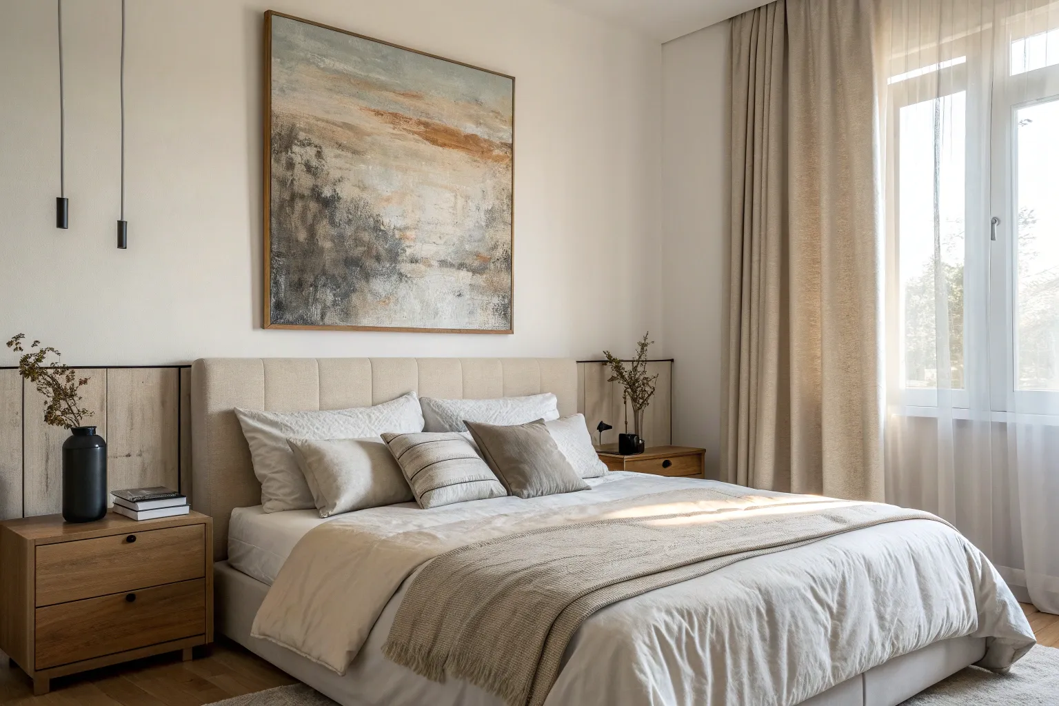
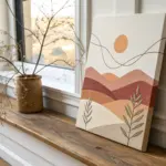
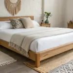
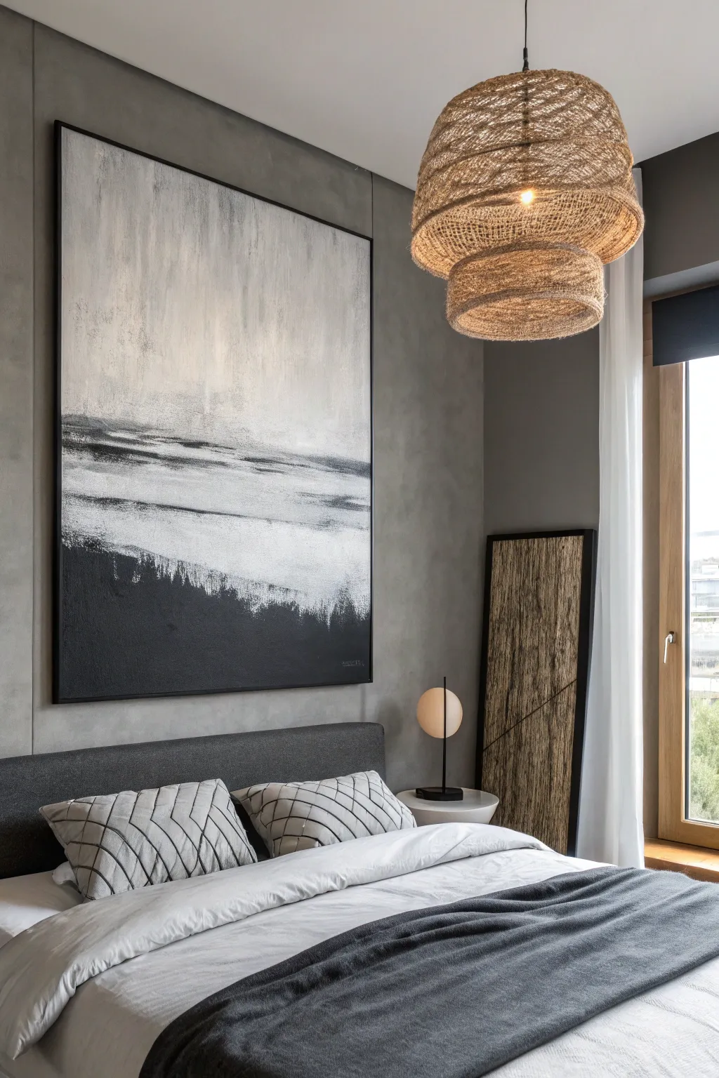
Your bedroom art should feel like a deep breath at the end of the day—soft, personal, and totally you. Here are my favorite canvas painting ideas for bedroom walls that help you build a cozy mood, tie in your colors, and make the space feel finished.
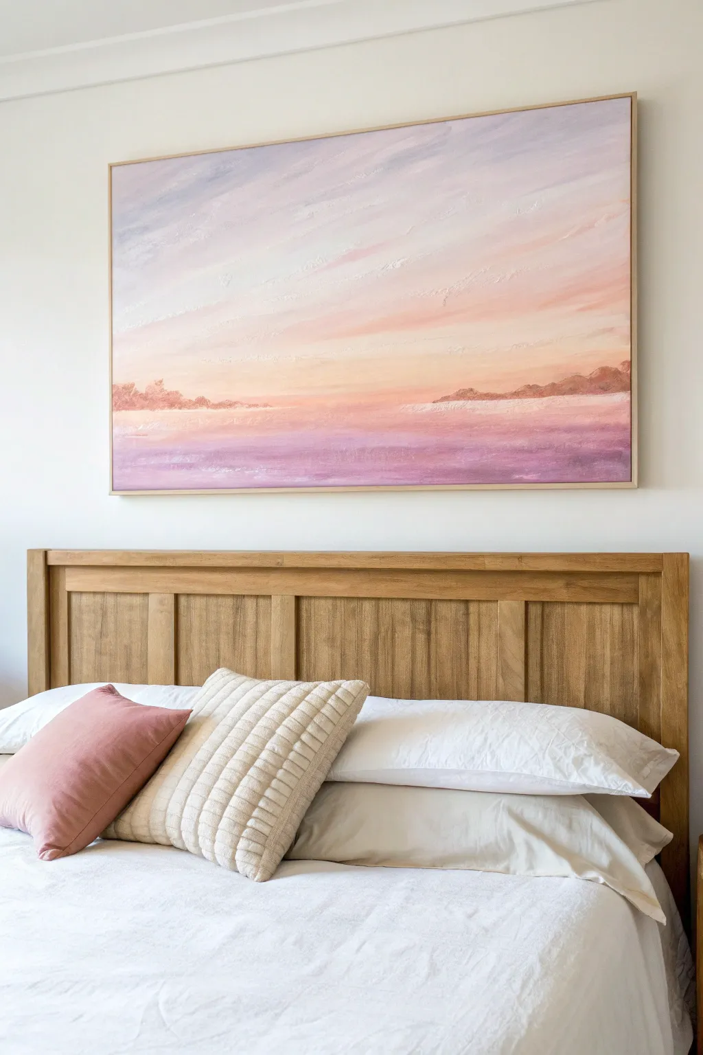
Soft Ombre Sky Above the Bed
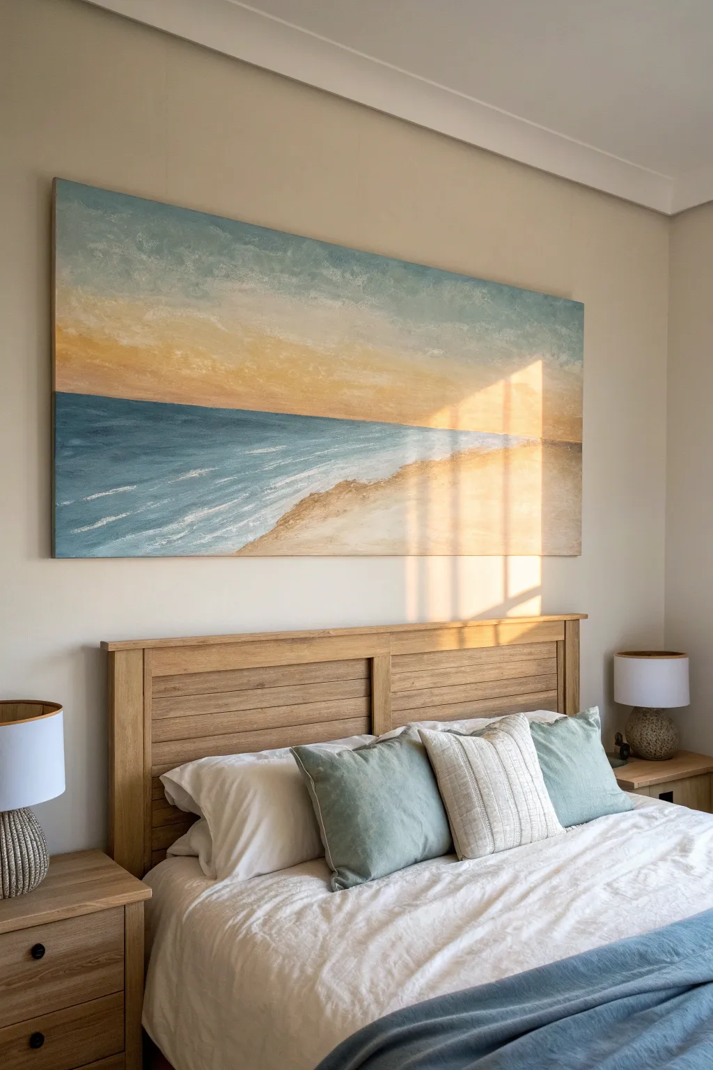
Bring the calming influence of the ocean into your bedroom with this large-scale abstract landscape. Using soft blending techniques and a minimal palette of ochre, teal, and cream, you’ll create a serene horizon that mimics the golden hour light hitting the shore.
Step-by-Step Tutorial
Materials
- Large rectangular canvas (approx. 60″ x 40″ or size to fit your headboard)
- Acrylic paints: Titanium White, Ultramarine Blue, Teal or Turquoise, Yellow Ochre, Burnt Sienna
- Large flat painters brush (2-3 inch)
- Medium round brush
- Palette knife
- Water spray bottle
- Mixing palette or large paper plate
- Rags or paper towels
Step 1: Setting the Sky
-
Prime and prep:
Ensure your large canvas is clean and ready. If it’s raw canvas, apply a coat of gesso. Squeeze out generous amounts of Titanium White, a touch of Teal, and Yellow Ochre onto your palette. You will need a lot of white for this soft look. -
Paint the upper sky:
Start at the very top of the canvas. Mix Titanium White with a tiny hint of Teal to create a very pale, cloudy blue. Use your large flat brush to apply this mixture using long, horizontal strokes, covering the top quarter of the canvas. -
Transition to warmth:
As you move down, stop adding blue and instead mix a little more white into your brush to lighten the previous color as you descend. Before that dries, mix a pale butter-yellow using White and a drop of Yellow Ochre. -
Create the golden glow:
Apply the pale ochre mix horizontally across the middle section of the sky area. Use the large brush to gently blend the wet edge where the pale blue meets the yellow. A light mist from your spray bottle can help these acrylics stay wet long enough to blur the transition smoothly. -
Deepen the horizon line:
Just above where your water line will be, mix a slightly stronger version of the Yellow Ochre with a tiny touch of Burnt Sienna for warmth. Paint this band horizontally to establish a sunset feeling. Blend it upwards into the lighter yellow.
Blending Blues
If your horizon line looks too sharp or stuck, mist it lightly with water and use a clean, dry house-painting brush to feather the colors together while wet.
Step 2: Establishing the Ocean
-
Block in the deep water:
Clean your large brush thoroughly. Mix a deep turquoise using Teal, Ultramarine Blue, and a little White. Paint a solid horizontal band across the canvas, directly below your yellow horizon line. This sharp contrast creates the horizon. -
Lighten the shallows:
As you paint downwards toward the bottom left, gradually add more White to your turquoise mix. The water should get paler and more transparent-looking as it approaches the imaginary shoreline. -
Create movement:
Switch to a medium brush. While the blue paint is still tacky, drag pure white paint horizontally through the lighter blue areas to suggest movement and current. Don’t over-blend; let the streaks sit on top. -
Simulate waves:
Using the palette knife and pure Titanium White, gently scrape thin, broken lines diagonally across the bottom left blue section. This texture mimics the foam of waves rolling in.
Heavy Texture
Mix acrylic modeling paste into your white paint for the sea foam. This builds 3D texture, making the waves actually stand out from the canvas surface.
Step 3: The Sandy Shore
-
Mix the sand tones:
On your palette, mix a base sand color using Titanium White and Yellow Ochre. Create a second, darker shade by adding a small amount of Burnt Sienna to that mix. -
Paint the beach shape:
Fill the bottom right corner of the canvas with the lighter sand mix, curving it upwards to meet the water in a gentle diagonal slope. -
Add shoreline depth:
Use the darker Burnt Sienna mix to paint along the bottom edge and the far right side of the sand area. This adds weight and shadow to the beach. -
Blend the water’s edge:
Where the pale blue water meets the sand, don’t make a hard line. Instead, dry-brush a little of the sand color over the blue, and a little of the blue over the sand. This creates that wet-sand look. -
Add final highlights:
I like to take a clean palette knife with a heavy load of Thick Titanium White and drag it right along the edge where the water meets the sand. This creates the physical texture of sea foam crashing on the shore. -
Soften the sky:
Step back and look at the sky. If it looks too flat, dry-brush some wispy white clouds over the blue upper section to add dimension. -
Seal your work:
Once the painting is completely dry (give it at least 24 hours due to the thick palette knife areas), apply a matte or satin varnish to protect the surface from dust and UV light.
Hang your new masterpiece low above the headboard to ground the room in coastal tranquility
Calm Abstract Waves in Bedroom Blues
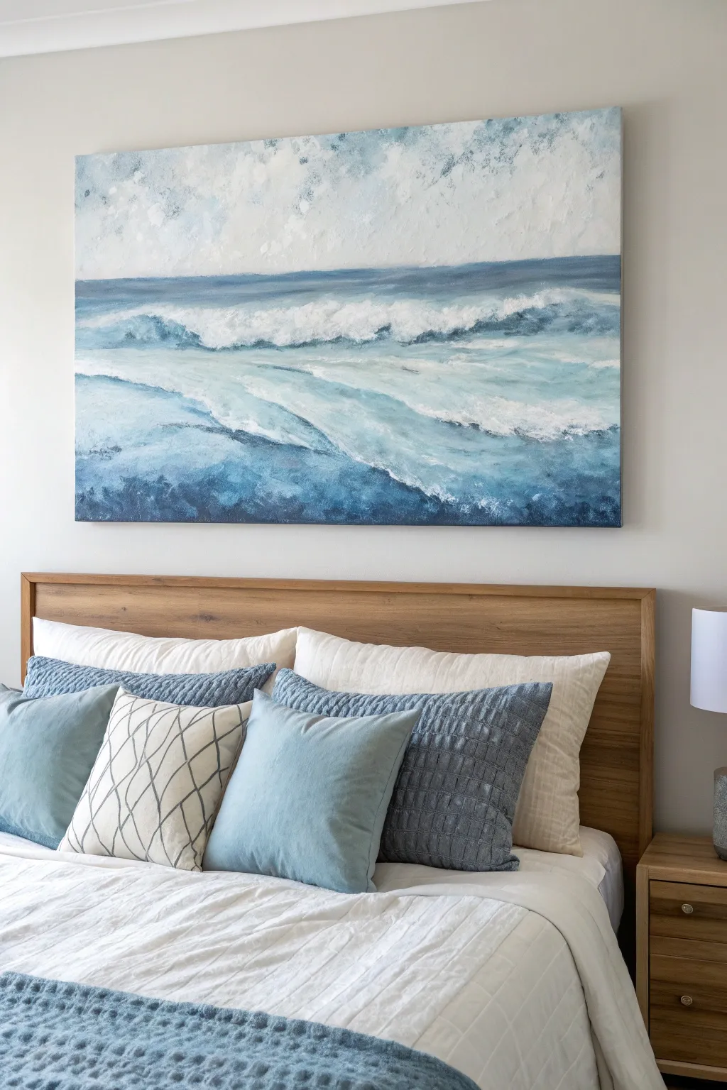
Bring the calming energy of the ocean into your bedroom with this expansive, textured canvas painting. By layering shades of blue and white with thick acrylics, you’ll create a serene seascape where rolling waves seem to tumble right off the wall.
How-To Guide
Materials
- Large rectangular stretched canvas (e.g., 36” x 48”)
- Heavy body acrylic paints (Ultramarine Blue, Phthalo Blue, Prussian Blue, Titanium White, Raw Umber, Paynes Grey)
- Modeling paste or texture gel
- Large flat paintbrush (2-3 inch)
- Medium filbert brush
- Palette knife (large trowel shape)
- Palette knit (small diamond shape)
- Spray bottle with water
- Disposable palette or large plastic tray
- Paper towels
Step 1: Texturing and Sky Foundation
-
Prepare the texture:
Before adding any color, apply a generous layer of modeling paste to the upper third of the canvas using your palette knife. Use random, sweeping strokes to create ridges and valleys that will mimic churning clouds later. -
Create wave definition:
Apply modeling paste to the lower two-thirds in horizontal undulating lines. Let these ridges follow the natural curve of waves, creating distinct zones for the rolling water. Allow this texture layer to dry completely, preferably overnight. -
Paint the sky base:
Mix Titanium White with a tiny touch of Ultramarine Blue and a speck of Raw Umber to create a muted off-white/greyish sky tone. Brush this over the entire sky section, working it into the dry texture crevices. -
Add sky shadows:
While the sky base is wet, blend small amounts of light blue into the corners and random patches. Use a dry brush to soften the edges so there are no harsh lines, just drifting atmospheric movement.
Palette Knife Mastery
Don’t overmix paints on the palette. Leave streaks of white and blue unmixed on your knife; when applied, this creates natural variegation in the water stripes.
Step 2: Building the Deep Ocean
-
Establish the horizon:
Mix a dark, moody blue using Prussian Blue and Paynes Grey. With your large flat brush, paint a straight, distinct horizon line across the canvas where the sky meets the water. -
Block in the darkest depths:
Use that same dark navy mixture to fill in the bottom-most section of the canvas. This represents the deep, churning water closest to the viewer. -
Create the mid-tone water:
Mix Phthalo Blue with white to create a vibrant teal-blue. Apply this to the middle section of the water, intentionally leaving gaps where the white foam will go later. -
Blend the transition:
Using a slightly damp clean brush, lightly blend the seam where the dark blue bottom meets the mid-tone teal water. We want a gradient feel, but keep some brushstrokes visible for energy.
Gloss It Up
Once fully cured (wait 72 hours), apply a high-gloss varnish to just the ‘wet’ water areas, leaving the sky matte. This contrast mimics real water reflection.
Step 3: Forming the Waves
-
Draft the major wave forms:
Load your medium filbert brush with pure white. Sketch out the primary crashing foam line horizontally across the center, following the textured ridges you made earlier. -
Add the rolling motion:
Add curved, sweeping strokes of white coming from the main wave down toward the bottom left, mimicking the water retreating or pulling back. -
Mix a shadow color:
Combine white with a touch of the dark navy mix to create a cool, light grey-blue. Paint this underneath the white foam ridges to give the waves volume and 3D height. -
Highlight the crests:
Apply thick, pure Titanium White to the very tops of the waves. I like to dab this on rather than brush it, as it mimics the chaotic spray of the ocean. -
Soften the distance:
For the water closer to the horizon, use a paler, more muted blue. Make your brushstrokes smaller and horizontal to simulate distant ripples that recede into the background.
Step 4: Final Details and Texture
-
Enhance the foreground texture:
Use your palette knife to scrape a mix of dark blue and teal over the bottom section. The knife will skip over the dried texture ridges, leaving dark color in the valleys and exposing previous layers on the peaks. -
Create sea spray:
Dilute some white paint with water until it’s milky. Load an old brush or toothbrush and lightly flick droplets over the crashing wave areas to create a mist effect. -
Refine the foam edges:
Take a small brush with white paint and scratchy, scribbling motions to break up any solid white lines. This makes the foam look airy and organic rather than stiff. -
Deepen contrast:
Look for areas that feel flat. Glaze a transparent wash of Prussian Blue over the shadow areas of the water to make the white foam pop even more. -
Final dry brush:
Once the main paint is tacky or dry, lightly drag a dry brush with pure white over the highest texture points of the painting to catch the light.
Hang your masterpiece above the bed to anchor the room with a sense of peaceful movement and depth
Misty Mountain Range for a Relaxed Mood
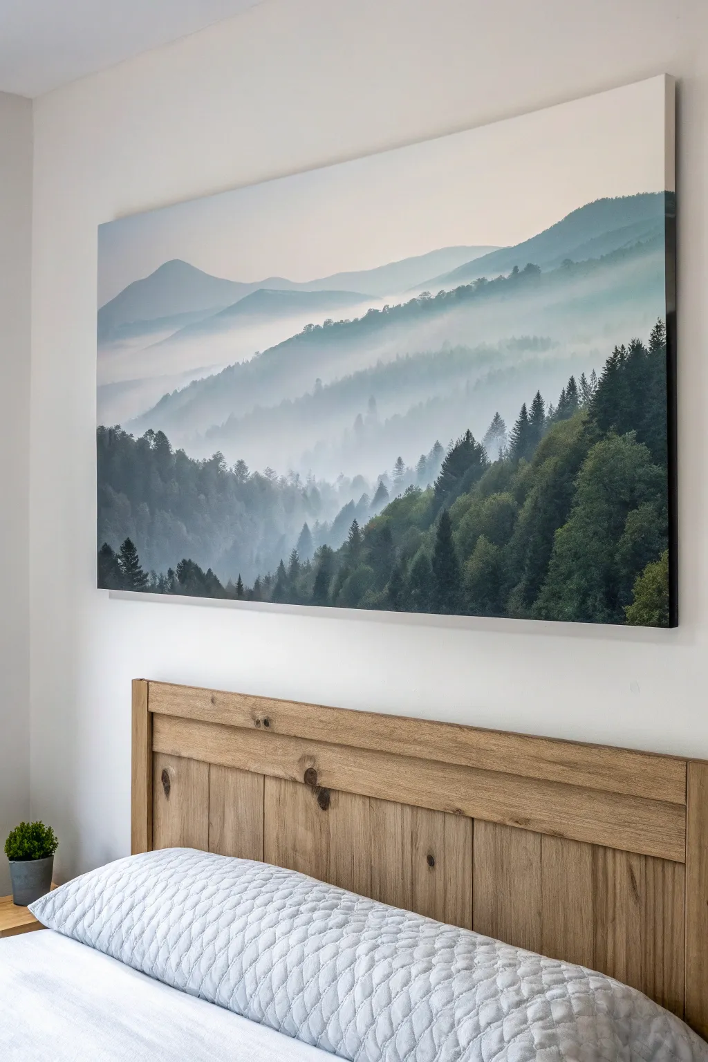
Bring the tranquility of nature into your bedroom with this large-scale acrylic landscape featuring atmospheric perspective and rolling hills. The soft, fading layers create a sense of depth and calm perfect for a relaxing retreat.
Step-by-Step
Materials
- Large stretched canvas (at least 36×24 inches)
- Acrylic paints (Phthalo Green, Mars Black, Titanium White, Ultramarine Blue, Dioxazine Purple)
- Large flat brush (2-3 inch)
- Medium flat brush (1 inch)
- Fan brush or stippling brush
- Small round brush for details
- Palette or paper plates
- Water container and spray bottle
- Paper towels
Step 1: Setting the Sky and Background
-
Prepare the Sky Gradient:
Mix a very pale wash of Ultramarine Blue, a tiny dot of Purple, and a generous amount of Titanium White. The goal is a soft, barely-there lavender-grey. -
Apply the Sky:
Using your largest flat brush, paint the top third of the canvas with horizontal strokes. Keep the mix very light, almost white, at the horizon line where the mountains will start. -
Paint the Furthest Range:
Mix a slightly darker version of your sky color, adding just a touch more blue. Using the medium flat brush, paint a smooth, undulating silhouette for the distant mountain peaks about one-third down from the top. -
Fade the Bottom Edge:
While the paint is still wet, use a clean, slightly damp brush to blur the bottom edge of this mountain shape downwards into the white canvas to create a misty effect.
Step 2: Building the Middle Layers
-
Mix Mid-Tone Colors:
Create a cool teal-grey by mixing Phthalo Green, a touch of Black, White, and a hint of Blue. This needs to be darker than the distant mountains but much lighter than pure forest green. -
Create the Second Ridgeline:
Paint the next layer of hills, overlapping the faded bottom of the previous layer. Make the top edge distinct but not too sharp. -
Create Texture:
While the paint is wet, lightly dab the top edge with a dry brush or paper towel to suggest distant tree tops without painting individual trees. -
Add the Mist:
Again, drag the paint downwards and blend it into white or a very light grey as you move toward the bottom of this layer. I like to spritz a little water here to help the paint flow and haze out naturally. -
Third Layer Definition:
Mix a darker version of your teal-grey. Paint a third ridge lower down, starting to suggest more specific tree shapes along the crest using a stippling motion.
Paint drying too fast?
Acrylics dry quickly. Keep a spray bottle of water handy to mist your canvas and palette lightly. This keeps layers workable for blending that essential misty look.
Step 3: Refining the Foreground
-
Mix the Darkest Green:
Combine Phthalo Green and Mars Black to create a deep, rich forest green. Do not add white to this mix. -
Start the Foreground Slope:
Paint the large, diagonal slope in the bottom right corner. Use upward, vertical strokes with a fan brush or an old, splayed flat brush to mimic the vertical growth of pine trees. -
Paint Individual Pines:
Using a small round brush or the edge of a flat brush, paint small vertical lines for tree trunks along the top edge of this dark slope. -
Add Pine Foliage:
Use a fan brush to tap on the branches of these individual trees. Start narrow at the top and widen as you go down, leaving gaps for the background mist to peek through. -
Layering the Left Side:
Repeat the previous step for the dark tree line on the bottom left, ensuring it sits visually ‘behind’ the right-side slope by making the color slightly lighter or greyer. -
Mist Integration:
Mix a thin glaze of Titanium White and water. Lightly brush this over the bases of the dark trees where they meet the lighter hills to simulate rolling fog trapped in the valley.
Add dimensional texture
Mix a heavy body gel medium into your foreground dark green paint. Use a palette knife to apply it, creating physical ridges on the nearest trees for a tactile finish.
Step 4: Final Touches
-
Highlighting:
Mix a lighter olive green and gently dry-brush the tips of the nearest pine trees on the right to simulate sunlight catching the canopy. -
Softening Edges:
Step back and look for any hard lines in the background layers. If found, glaze over them with a very watery white wash to push them back into the distance.
Now you have a breathtaking vista that invites deep breaths and peaceful dreams

Neutral Beige Abstract for a Cozy Bedroom
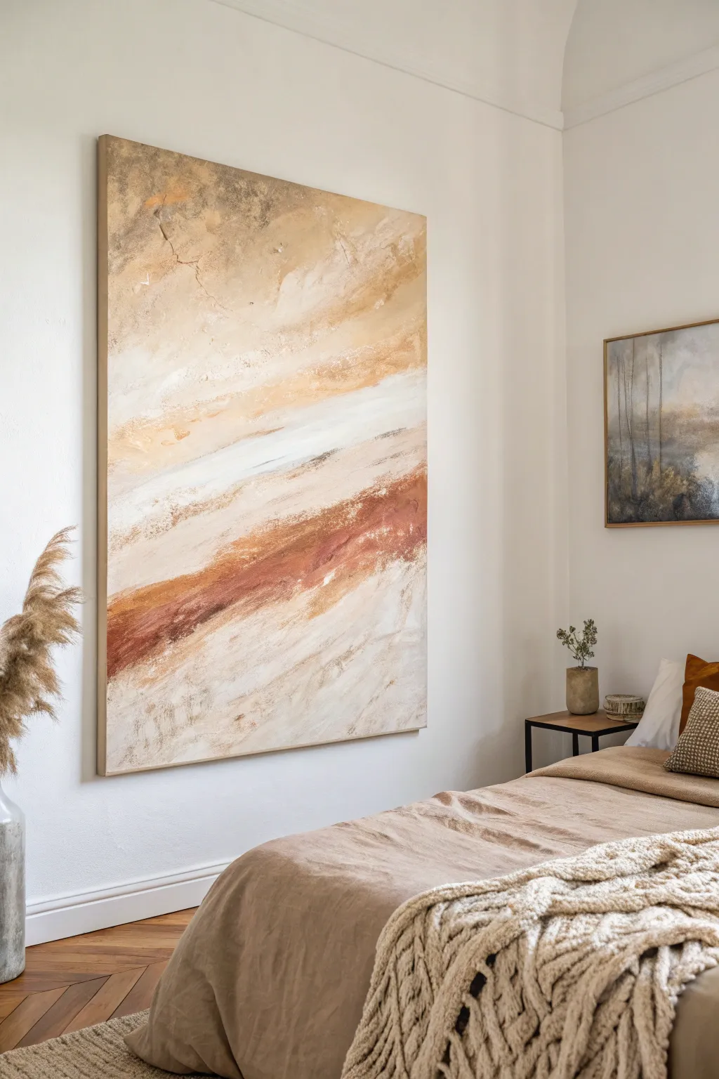
This large-scale abstract piece brings warmth and tranquility to any bedroom with its soothing palette of desert hues. By layering creams, beiges, and deep rust tones in sweeping, atmospheric blending, you can create a statement artwork that feels organic and grounding.
Detailed Instructions
Materials
- Large stretched canvas (e.g., 36” x 48” or larger)
- Heavy body acrylic paints: Titanium White, Unbleached Titanium, Raw Sienna, Burnt Sienna, Mars Black
- Modeling paste or texture medium
- Large palette knives (assorted sizes)
- Wide flat paintbrush (2-3 inch)
- Spray bottle with water
- Soft rags or paper towels
- Mixing palette or paper plates
Step 1: Setting the Textured Foundation
-
Prepare the workspace:
Since this is a large canvas, lay a drop cloth down or prop the canvas securely on an easel. Ensure you have plenty of room to move your arm freely for large gestural strokes. -
Apply texture medium:
Using a large palette knife, scoop out a generous amount of modeling paste. Spread it sporadically across the canvas, focusing on the upper corners and creating a subtle diagonal ridge where your main rust-colored band will eventually go. -
Distress the texture:
Before the paste dries, press the flat side of the knife into the paste and pull up quickly to create uneven peaks, or scrape it back down for a rough, stucco-like finish. Let this dry completely (usually 2-4 hours). -
Mix base colors:
On your palette, mix a large volume of ‘Sand’ color by combining Titanium White with a touch of Unbleached Titanium and a tiny dot of Raw Sienna.
Pro Tip: The “Skipping” Technique
Hold your palette knife loosely at a low angle. Drag it quickly across the canvas surface. This ensures paint only catches on the raised texture, leaving recesses empty for a natural, eroded look.
Step 2: Layering the Background
-
Apply the light wash:
Using your wide flat brush, paint the entire canvas with your ‘Sand’ mixture. Don’t aim for perfect opacity; let the texture underneath capture the paint unevenly. -
Add warmth to the top:
While the base is still slightly tacky, mix Raw Sienna with a lot of white to make a warm beige. Apply this to the top third of the canvas using horizontal, sweeping strokes. -
Integrate the bottom:
Repeat the previous step on the bottom third of the canvas using a slightly paler version of the beige, keeping the middle section open for your darker focal band. -
Soften the transitions:
Use a clean, damp rag to gently rub the edges where the beige meets the lighter background, creating a soft, misty gradient rather than hard lines.
Step 3: Creating the Rusty Horizon
-
Mix the focal color:
Combine Burnt Sienna with a small amount of Mars Black to create a deep, rich rust color. Keep a separate blob of pure Burnt Sienna ready for variation. -
Apply the main band:
Load a large palette knife with the dark rust mixture. Starting from the left side, about two-thirds down the canvas, drag the paint diagonally upward toward the right edge. -
Break the coverage:
Apply inconsistent pressure as you drag the knife. Allow the paint to ‘skip’ over the dried texture paste you applied earlier, creating that weathered, organic look. -
Add tonal variety:
Wipe your knife and pick up the lighter, pure Burnt Sienna. Scrape this into the wet dark rust band, blending them partially but leaving streaks of individual color visible.
Level Up: Framing
Build a simple floating frame from light oak or pine lath boards. The natural wood tone complements the rust and beige palette perfectly and gives the canvas a high-end gallery finish.
Step 4: Adding Atmosphere and Highlights
-
Introduce the white accent:
Mix Titanium White with just a drop of water to make it fluid. Apply a streak of this bright white directly above your rust band using a clean palette knife to create high contrast. -
Blend the white edge:
Before the white dries, use a dry wide brush to lightly feather the top edge of the white streak upward into the beige background, simulating clouds or shifting sands. -
Splatter and distress:
Flick a tiny bit of water onto the drying rust area, wait thirty seconds, and then lift it with a paper towel. This creates subtle watermarks and enhances the aged aesthetic. -
Detail with fine lines:
Use the very edge of your palette knife with a dark brown mix to etch thin, erratic ‘cracks’ or lines into the paint, mimicking the veins found in natural stone.
Step 5: Final Touches
-
Deepen shadows:
I like to step back at this point to check the balance. If the rust band feels too flat, add small touches of the Burnt Sienna/Black mix to the underneath edge of the band for depth. -
Brighten highlights:
Add final touches of pure, thick Titanium White to the highest points of texture on the canvas using the palette knife, barely skimming the surface. -
Final cure:
Allow the painting to dry undisturbed for at least 24 hours due to the thick layers of paste and paint.
Hang your masterpiece in a spot where it can catch natural light to emphasize those beautiful textures you created
BRUSH GUIDE
The Right Brush for Every Stroke
From clean lines to bold texture — master brush choice, stroke control, and essential techniques.
Explore the Full Guide
Sunrise or Sunset Gradient for Warmth
Using soft blending and textured strokes, this project captures the serene glow of a pastel sunset over distant waters. The result is a calming, large-scale statement piece perfect for bringing warmth and tranquility into your bedroom sanctuary.
Step-by-Step Tutorial
Materials
- Large rectangular stretched canvas (approx. 36×48 inches)
- Acrylic paints (Titanium White, Naples Yellow, Soft Pink, Lavender/Light Violet, Cerulean Blue, Burnt Sienna)
- Acrylic modeling paste or gel medium
- Large flat paintbrush (2-3 inch)
- Medium filbert brush
- Palette knife
- Mixing palette
- Water cup and paper towels
- Easel or flat drop-cloth covered surface
Step 1: Setting the Sky Foundation
-
Prime the sky:
Begin by squeezing a generous amount of Titanium White onto your palette. Using your large flat brush, coat the upper two-thirds of the canvas with a thin, even layer of white to help the subsequent colors blend smoothly. -
Introduce the blue:
Mix a tiny touch of Cerulean Blue with a lot of white to create a very pale, airy blue. Apply this to the top left corner, sweeping diagonally downwards towards the center, keeping the strokes loose and horizontal. -
Blend in the lavender:
While the blue is still wet, mix a soft Lavender shade. Brush this into the top right corner and blend it gently where it meets the blue, creating a hazy transition between cool tones. -
Warm up the horizon:
Mix Naples Yellow with a touch of Soft Pink and white. Apply this warmer tone horizontally across the middle of the canvas, just above where your horizon line will be, blending it upward into the cooler sky colors.
Master the Haze
Keep a misting spray bottle of water nearby. A light spritz on the canvas keeps acrylics wet longer, allowing for smoother, dreamier gradients without harsh lines.
Step 2: Creating Texture and Clouds
-
Prepare textured mix:
On your palette, mix your white paint with a scoop of modeling paste. This thick mixture will allow you to build physical texture for the clouds. -
Lay down cloud shapes:
Using a palette knife or a stiff brush, apply the textured white mix in sweeping, diagonal motions across the sky section. Varry the pressure to leave ridges of paint. -
Add pink highlights:
Mix a small amount of Soft Pink into your textured white. Gently overlay this onto the bottom edges of your cloud forms to mimic the sun catching the underside of the clouds. -
Soften the edges:
Before the texture dries completely, take a clean, dry filbert brush and very lightly feather the edges of the clouds so they don’t look too rigid against the background sky.
Framing for Impact
Finish the look by building a simple floating frame from light oak lattice strips. The natural wood tone complements the warm pinks and grounds the ethereal artwork.
Step 3: Painting the Water and Land
-
Establish the horizon line:
Determine your horizon line about one-third of the way up from the bottom. Paint a straight, soft line using a mix of Lavender and Pink to mark the separation between sky and sea. -
Block in the water:
Fill the bottom third of the canvas with horizontal strokes of Lavender and Soft Pink. I like to keep these strokes long and continuous to mimic the calm surface of water. -
Deepen the water color:
Mix a slightly darker purple by adding a dot of Burnt Sienna to your Lavender. Paint horizontal streaks near the bottom edge of the canvas and intermittently through the water area to create depth and ripples. -
Form the distant land:
Mix Burnt Sienna with a little Soft Pink to create a dusty rose-brown. Using the edge of a medium brush, dab in the shapes of distant hills or land masses just above the horizon line on the left and right sides. -
Texture the land:
Add a bit of modeling paste to your land color. Use the palette knife to gently scrape this mixture over the land shapes, giving them a rugged, earthy texture.
Step 4: Final Details and Glazing
-
Highlight the water:
Clean your palette knife and pick up pure Titanium White. Drag the knife horizontally across the water area, particularly near the center, to create shimmering light reflections. -
Add shore mist:
Mix a very watery glaze of white and pink. Lightly scumble this over the base of the land masses where they meet the water to create a misty, atmospheric effect. -
Enhance sky drift:
Return to the sky with a dry brush and a tiny amount of pale yellow. Wisps of this color can be dragged through the upper clouds to reinforce the directional flow of the wind. -
Checking balance:
Step back several feet from the canvas. Look for any areas where the blending feels too harsh and soften them with a dry brush while the paint is tacky. -
Final white touches:
Add a few final, deliberate strokes of thick white texture on the most prominent clouds and the brightest water reflections to make the painting pop.
Allow the painting to dry fully for at least 24 hours before hanging your new serene masterpiece
Eucalyptus Stems for a Spa-Like Bedroom
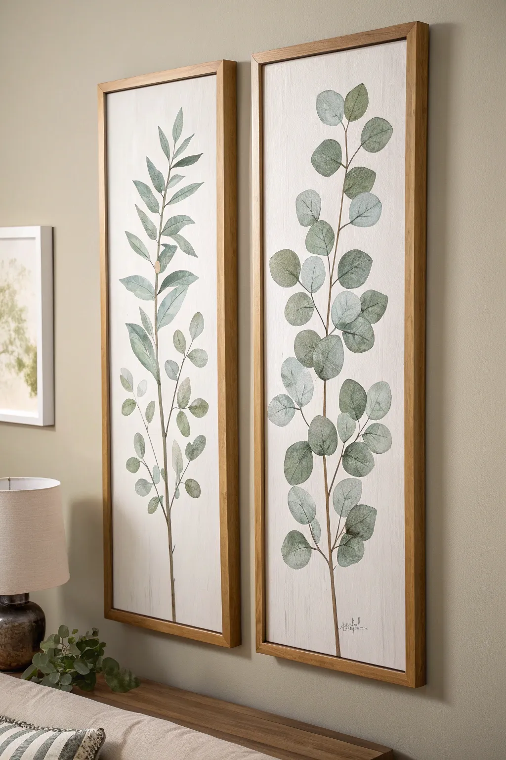
Bring the calming atmosphere of a spa into your bedroom with this set of tall, tranquil botanical panels. Using soft watercolor techniques on canvas or wood, you’ll capture the delicate, silvery-green hues of eucalyptus leaves in a beautifully framed diptych.
Step-by-Step
Materials
- Two tall rectangular canvases or wood panels (approx. 12×36 inches)
- Acrylic paint (Titanium White, Raw Umber, Hooker’s Green, Sap Green, Paines Grey)
- Matte medium or glazing liquid
- Assorted brushes: 1-inch flat wash, #6 round, #2 liner brush
- Pencil (HB or 2H)
- Palette for mixing
- Jar of water
- Paper towels
- Two floating wood frames (natural oak finish) to fit panels
Step 1: Preparing the Background
-
Prime the Surface:
Begin by applying a base coat of Titanium White to both canvases. Even if they are pre-primed, a fresh coat ensures a smooth, consistent texture for your painting. -
Add Subtle Texture:
While the white paint is still slightly wet, use a dry, clean brush to drag vertical strokes from top to bottom. This mimics a faint wood grain texture, adding depth to the background without overpowering the design. -
Create a Wash:
Mix a tiny drop of Raw Umber with plenty of water and a touch of matte medium to create a very sheer, off-white glaze. -
Apply the Background Glaze:
Wash this off-white glaze over the entire surface of both panels. This knocks back the brightness of the pure white, giving the piece a softer, vintage parchment look. -
Let it Cure:
Allow the background to dry completely before moving on. I usually give this at least an hour to ensure the next layers don’t lift the base.
Step 2: Sketching the Composition
-
Mark the Center Line:
Lightly trace a faint vertical line down the center of each canvas with your pencil to act as a guide for the main stem. -
Sketch the Stems:
Draw the main stem lines over your guide, adding a gentle S-curve or slight wobble to keep them looking organic rather than rigid. -
Outline the Leaves:
Sketch the leaf shapes attached to the stem. For the left panel, draw longer, willow-like leaves pointing upward. For the right panel, draw rounded, coin-shaped leaves typical of silver dollar eucalyptus. -
Vary the Placement:
Ensure some leaves overlap the stem while others extend outward. Group them in pairs or alternating patterns to mimic natural growth.
Fixing Heavy Paint
If your leaf paint looks too heavy or opaque, dampen a clean brush with water and gently lift some pigment off the center of the leaf to restore translucency.
Step 3: Painting the Botanicals
-
Mix the Stem Color:
Combine Raw Umber with a touch of Titanium White and water to create a soft, milky brown. Use your liner brush to carefully paint the main stems and tiny petioles connecting the leaves. -
Create Green Palette:
Mix three shades of green on your palette: a light silvery-green (Green + White + trace of Grey), a mid-tone sage, and a deeper forest green for shadows. -
Base Fill the Leaves:
Using the round brush and the lightest silvery-green mix, fill in all the leaf shapes. Keep the paint thin and semi-transparent to achieve a watercolor effect. -
Add Mid-Tones:
While the base layer is damp, dab the mid-tone sage color into the center or base of each leaf, blending it gently outward. -
Define the Shadows:
Once the previous layers are dry, use the deepest green mix on one side of each leaf and where leaves overlap the stem. This establishes a light source and dimensional volume. -
Add Veining Details:
Switch back to your fine liner brush. With a very watery mix of the dark green or grey, paint delicate central veins on the willowy leaves of the left panel. -
Highlighting:
Mix a very pale mint-white shade. Dry brush this onto the upper edges of the rounded leaves on the right panel to make them look like they are catching the light. -
Final Assessment:
Step back and look at both panels together. Add small touches of color where needed to balance the visual weight between the two paintings.
Add Metallic Shimmer
Mix a tiny amount of iridescent mixing medium into your lightest green highlight color for a subtle, dew-kissed shimmer that catches the light.
Step 4: Finishing Touches
-
Protect the Art:
Apply a clear matte varnish over the completely dry paintings. This seals the acrylics and protects the white background from dust. -
Frame the Panels:
Place your canvases into the floating wood frames. Secure them from the back according to the frame instructions, ensuring an even gap around the edges for that professional gallery look.
Now you have a stunning botanical focal point that makes your bedroom feel like a peaceful retreat

PENCIL GUIDE
Understanding Pencil Grades from H to B
From first sketch to finished drawing — learn pencil grades, line control, and shading techniques.
Explore the Full Guide
Dreamy Wildflower Field in Pastels
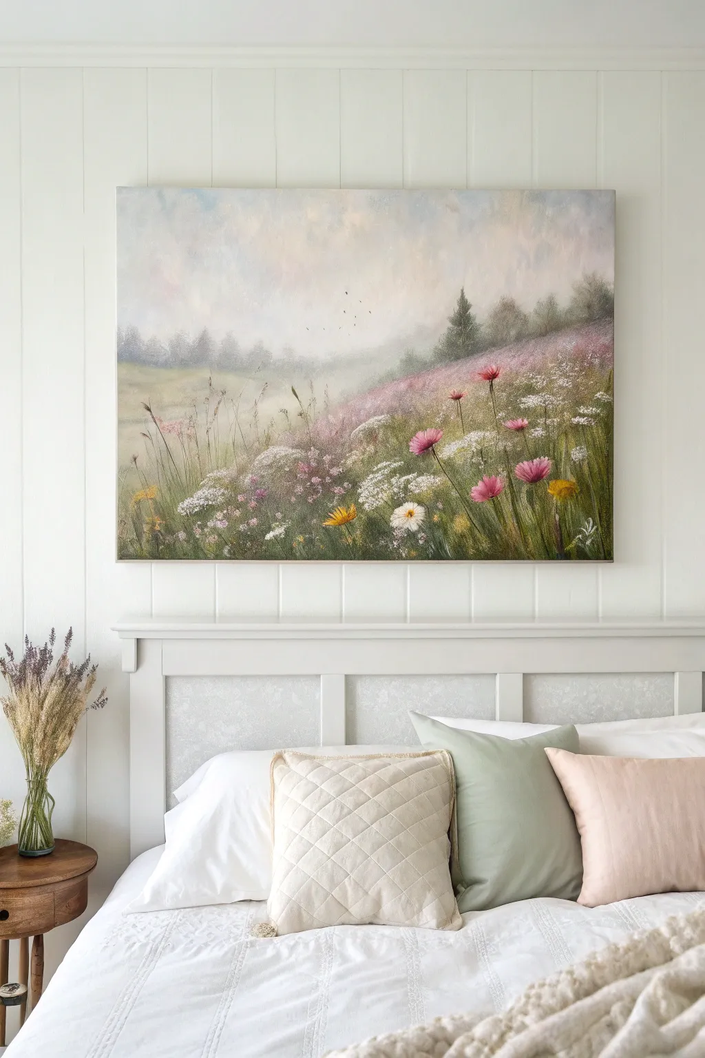
Capture the serene beauty of a foggy hillside with this layered acrylic landscape, featuring soft, atmospheric depth and vibrant pops of wildflower color. This project uses blending techniques to create a dreamy, ethereal effect that perfectly complements a calming bedroom sanctuary.
Detailed Instructions
Materials
- Large stretched canvas (e.g., 24×36 inches)
- Acrylic paints: Titanium White, Payne’s Grey, Sap Green, Alizarin Crimson, Yellow Ochre, Burnt Umber, Violet
- Large flat wash brush (2 inch)
- Medium filbert brush (size 8 or 10)
- Small round brush (size 2)
- Fan brush
- Palette knife
- Bucket of water and paper towels
- Slow-drying medium or retarder (optional)
Step 1: Setting the Atmosphere
-
Prime the sky:
Begin by covering the top two-thirds of the canvas with a mix of Titanium White and the tiniest touching of Payne’s Grey and Alizarin Crimson. You want a very pale, warm purplish-grey suitable for a cloudy sky. -
Create soft clouds:
While the base is still wet, scumble in pure White and hints of pale blue using a circular motion with your large brush. Keep the edges extremely soft to mimic mist. -
Establish the horizon:
Mix a muted grey-green using Sap Green, White, and a touch of Violet. Paint a horizontal band across the middle where the hills meet the sky, blending the top edge upward into the wet sky to create a foggy, distant look. -
Paint the distant tree line:
Using the same grey-green mix but slightly darker, tap in a row of distant trees along the horizon line. Keep these shapes vague and fuzzy; sharp details here will ruin the illusion of depth. -
Add floating birds:
With a very fine round brush and watered-down Payne’s Grey, add a few tiny V-shapes in the center sky area to suggest birds in the distance.
Muddy colors?
If your greens and pinks are turning brown where they meet, let the green grass layer dry completely before painting the flower heads on top.
Step 2: Building the Landscape
-
Block in the hillside:
Mix Sap Green with Burnt Umber and a little Violet to create a deep, earthy shadow color. Paint the sloping hill shape, starting from the bottom right and sweeping upwards towards the middle left. -
Layer the grassy mid-ground:
Lighten your green mix with Yellow Ochre and White. Using vertical, flicking strokes with a medium filbert brush, layer lighter grasses over the dark hill base, leaving the darkest areas visible at the bottom for shadow. -
Create the pink field patches:
Mix White with Alizarin Crimson and a touch of Violet to make a dusty pink. Heavily stipple this color onto the upper slope of the hill to suggest a dense field of distant flowers. -
Add the pine tree:
Using the dark green-black mix and the edge of a flat brush or a fan brush, tap in the silhouette of a small pine tree on the ridge line, keeping it slightly muted to push it back in space. -
Refine the mist:
Take a clean, dry brush with a tiny amount of white paint and lightly glaze over the transition area between the field and the distant trees to enhance the foggy atmosphere.
Textured Touch
Mix a flexible modeling paste into your white paint for the foreground flowers. This raises the petals off the canvas for a real 3D effect.
Step 3: Detailed Wildflowers
-
Paint tall stems:
Switch to your small round brush or a liner brush. Mix a fluid Sap Green and paint long, thin, waving stems rising from the foreground, varying their heights and angles. -
Add white umbels:
For the Queen Anne’s Lace shapes, load a brush with thick Titanium White. Tap small clusters of dots in flat, umbrella-like shapes atop some of the stems. -
Create pink blooms:
Mix a vibrant pink using Alizarin Crimson and White. Paint loose, upward-facing petals on several stems in the foreground, making them larger and more distinct than the background flowers. -
Insert yellow accents:
Use pure Yellow Ochre or a bright yellow to add small, dandelion-like flowers low in the grass to break up the greens and pinks. -
Detail the foreground:
I like to use a palette knife here to scrape a few thin lines through the wet paint or add thick texture to the closest flower petals, giving the painting a tactile, finished quality.
Step back and enjoy the peaceful morning view you have created right in your own room
Quiet Beach Horizon for Instant Calm
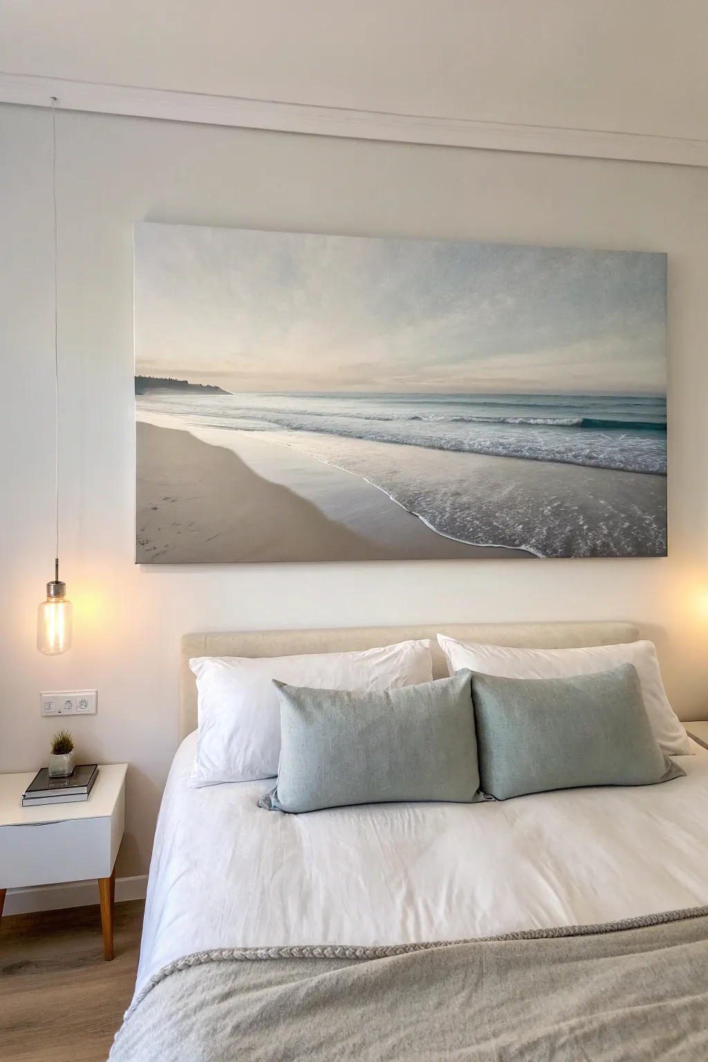
Transform your bedroom into a tranquil retreat with this large-scale landscape painting that captures the gentle hush of a morning beach. Using soft blending techniques and a muted palette, you’ll recreate the soothing transition from sandy shore to an endless, hazy horizon.
Step-by-Step
Materials
- Large rectangular canvas (approx. 30×40 inches or larger)
- Acrylic paints: Titanium White, Payne’s Gray, Burnt Umber, Yellow Ochre, Cerulean Blue, Ultramarine Blue
- Large flat brush (2-3 inch) for sky and water
- Medium filbert brush for waves
- Small round brush for details
- Slow-drying medium or retarder
- Palette knife
- Water container and paper towels
- Easel or large flat workspace
Step 1: Setting the Horizon and Sky
-
Define the Horizon Line:
Measure about one-third of the way up from the bottom of your canvas. Ideally, use a long ruler or a level to draw a very light pencil line straight across. This will separate your endless sky from the ocean. -
Mix the Sky Gradient:
Prepare a large volume of white paint mixed with a tiny speck of Cerulean Blue and a touch of Yellow Ochre to create a warm, creamy off-white. This will be the base for the lower sky. -
Paint the Upper Sky:
Mix a slightly cooler, pale blue-gray using White, a hint of Payne’s Gray, and Cerulean. Apply this to the top third of the canvas using your large flat brush with long, horizontal strokes. -
Blend Toward the Horizon:
While the top section is still wet, introduce your creamy off-white mixture below it. Use back-and-forth horizontal strokes to seamlessly blend the cool upper sky into the warm, hazy horizon line. -
Add Cloud Textures:
Dip a dry brush into a slightly darker gray-blue mix. Lightly scumble—using a scrubbing motion—across the upper sky to create wispy, indistinct cloud formations. Keep them soft and blurry.
Blending Blues
If your ocean gradations look too striped and distinct, mist the canvas lightly with water and use a clean, dry brush to gently sweep horizontal strokes across the transition zones.
Step 2: Creating the Ocean Depth
-
Block in the Distant Water:
Mix Ultramarine Blue with a little Payne’s Gray and plenty of White to get a muted teal-blue. Paint a strip directly under the horizon line, keeping the edge crisp against the sky. -
Paint the Mid-Ocean:
As you move closer to the foreground (down the canvas), lighten your blue mix with more White. The water should get paler as it approaches the shore. -
Add Wave Movement:
Using a medium filbert brush and a mix of White with a drop of blue, paint horizontal streaks in the water section. Vary the length of these lines to suggest rolling swells. -
Form the Breaking Wave:
Identify where the main wave breaks. Paint a thick, messy line of pure Titanium White here. Use a tapping motion with your brush to create the texture of sea foam tumbling over.
Step 3: Painting the Sand and Shore
-
Mix the Sand Color:
Combine White, Yellow Ochre, and a small amount of Burnt Umber. You want a neutral, beige tone. Adjust with more Umber for wet sand areas. -
Paint the Dry Sand:
Fill the bottom left triangle of the canvas with your lighter beige mix. This represents the dry beach area that hasn’t been touched by the tide. -
Create the Wet Sand Reflection:
Where the water meets the sand, mix your sand color with a little of the sky gray/blue. Paint this band smoothly to mimic the reflective quality of wet sand. -
Refine the Shoreline Edge:
Paint a gentle, curving line of white foam where the water slides onto the sand. Feather the top edge of this foam back into the water to show movement. -
Add Footprints or Texture:
Use a small brush with a dark umber mix to add tiny indentations or texture in the foreground sand perfectly mimicking footsteps or natural divots.
Add Sparkle
For a magical touch, use an old toothbrush to flick tiny speckles of watered-down white paint onto the breaking wave foam, mimicking delicate sea spray.
Step 4: Final Details
-
Paint the Distant Headland:
On the far left horizon, paint a small, dark silhouette using Payne’s Gray and Umber to represent a distant cliff or hill. Keep the edges slightly soft to suggest atmospheric distance. -
Highlight the Foam:
Take pure, thick Titanium White on a palette knife or small brush and add bright highlights to the tops of the breaking waves for extra dimension. -
Glaze for Atmosphere:
Once everything is dry, I sometimes mix a very watery glaze of Yellow Ochre and wash it over the horizon line to enhance the warm, morning glow effect.
Step back and admire the peaceful atmosphere you have brought into your room with this coastal masterpiece


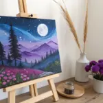
Moon Phases for a Sleepy Bedroom Theme
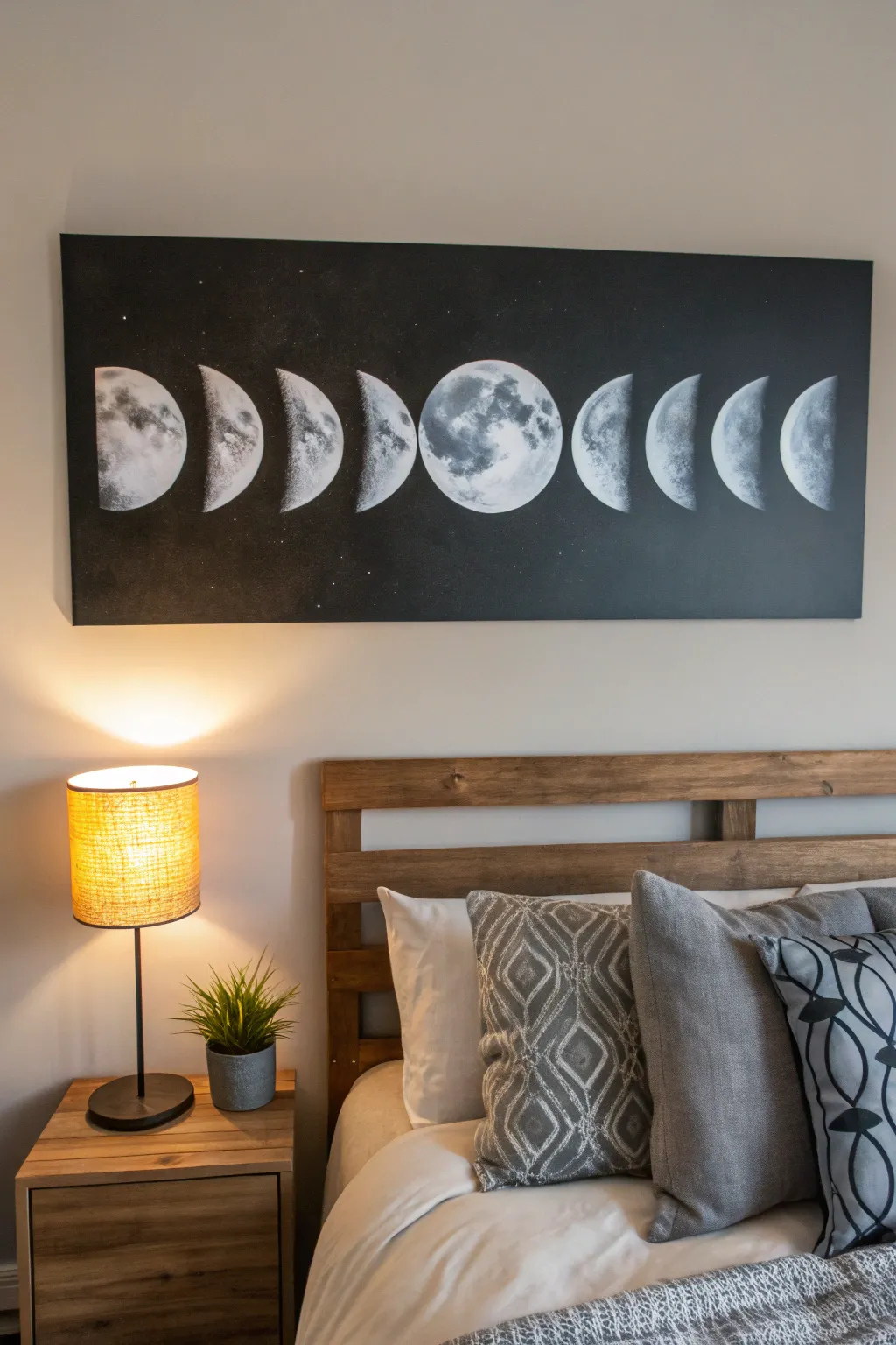
Transform your bedroom into a dreamy sanctuary with this striking monochromatic moon phase canvas. By blending stark blacks with textured greys and whites, you’ll create a sophisticated piece that captures the mystical cycle of the moon. This large-scale wall art serves as a perfect focal point above a headboard.
Detailed Instructions
Materials
- Large rectangular canvas (approx. 24×60 inches)
- Black acrylic paint (matte finish)
- Titanium white acrylic paint
- Grey acrylic paint (or mix black and white)
- Large flat brush or foam roller
- Natural sea sponges (varied sizes)
- Round stipple brush or circular foam pouncers
- Paper plates for palettes
- Masking tape or painter’s tape
- Chalk or a white charcoal pencil
- Circular stencils or household round objects (bowls, lids) for tracing
- Old toothbrush (optional for stars)
Step 1: Setting the Night Sky
-
Prepare the canvas:
Begin by laying your canvas on a flat, protected surface. Wipe it down quickly with a dry cloth to remove any dust that might interfere with paint adhesion. -
Apply the base coat:
Pour a generous amount of matte black acrylic paint onto your palette. Using a large flat brush or a foam roller, cover the entire canvas. Ensure the edges are painted as well for a finished gallery-wrap look. -
Second coat:
To get that deep, infinite space effect, let the first coat dry completely and apply a second coat of black. I like to brush in a cross-hatch pattern for the second layer to hide any roller marks. -
Map the phases:
Once the black background is fully dry, find the center of your canvas. This is where the full moon will go. Use a white charcoal pencil or chalk to lightly mark a horizontal center line to keep everything aligned.
Uneven Craters?
If your texture looks too uniform, rotate your wrist and the sponge constantly while dabbing. Never stamp the sponge in the same orientation twice in a row.
Step 2: Drafting the Moons
-
Trace the full moon:
Place your circular object (like a large bowl or lid) in the exact center mark and lightly trace the full circle with chalk. This anchors your composition. -
Outline the phases:
Working outward from the center, trace circles to the left and right. Space them evenly—about 2-3 inches apart depending on your canvas length. You should aim for three circles on each side of the center moon. -
Define the crescents:
Now, turn those circles into phases. For the moons closest to the center, draw a slightly convex line inside the circle to create a gibbous shape. For the outer moons, draw concave lines to create crescents. Remember, the ‘light’ side should always face the center full moon. -
Paint the base shapes:
Mix a dark grey paint. Using a medium rounded brush, fill in the moon shapes you just outlined. This doesn’t need to be perfect; it’s just an underlayer to build texture upon.
Pro Tip: Glowing Edges
Mix a tiny drop of glazing medium or water into your white paint for the final highlight layer. This transparency makes the moon’s surface look luminescent rather than chalky.
Step 3: Creating Lunar Texture
-
Prepare the sponge:
Dampen a natural sea sponge and wring it out completely so it’s just barely moist. Dip it into a mix of light grey paint. -
Blotting technique:
Practice dabbing the sponge on a paper towel first to remove excess paint. Then, gently blot the sponge over your dark grey moon shapes. Build this texture slowly to create the look of varied elevation. -
Adding craters:
While the grey is tacky, mix a slightly darker charcoal shade. Use the corner of the sponge or a small stipple brush to press darker distinct ‘craters’ or ‘mares’ (seas) into the surface, particularly on the full moon. -
Highlighting the bright side:
Load a clean area of your sponge with pure titanium white. Focus this bright white heavily on the edge of the moon that is facing the imaginary sun source (the side facing the center generally, or consistent with the phase). -
Softening edges:
The line between the light and dark side of the moon (the terminator line) shouldn’t be a sharp razor edge. Use a dry brush to gently feather the white paint into the black background space slightly, creating a soft, glowing transition. -
Detailing the full moon:
The center moon needs the most detail. Layer multiple shades of grey and white with distinct blotches. Look at a reference photo of the real moon to place the major craters realistically.
Step 4: Final Atmosphere
-
Clean up boundaries:
If your sponge got a little too wild and went outside the circle shapes, use a small angled brush with black paint to carefully tidy up the outer edges of the moons. -
Create the stars:
Dilute a small amount of white paint with water until it’s milky. Dip an old toothbrush into this mixture. -
Splatter technique:
Hold the toothbrush about a foot away from the canvas and run your thumb across the bristles to flick tiny specks of white across the black areas. Cover the moons with paper scraps if you don’t want stars ‘in front’ of them. -
Final drying:
Allow the entire piece to dry overnight before erasing any visible chalk lines with a damp cotton swab.
Hang your lunar masterpiece high and enjoy the serene atmosphere it brings to your room
Floating Clouds for a Light, Airy Wall
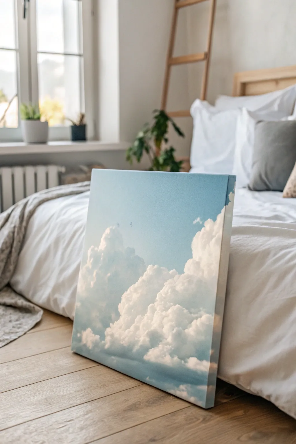
Bring the calming expanse of the sky indoors with this serene cloud painting, featuring layers of white cumulus clouds drifting across a gradient blue backdrop. This project focuses on soft blending and distinct highlights to create depth and volume for a piece that truly breathes.
Step-by-Step Guide
Materials
- Square stretched canvas (approx. 20×20 inches or similar)
- Acrylic paints: Titanium White, Ultramarine Blue, Phthalo Blue, and a touch of Cerulean Blue
- Large flat brush (2-inch)
- Medium filbert brush (size 8 or 10)
- Small round brush for details
- Old scruffy blending brush or a small natural sea sponge
- Palette and water cup
- Paper towels
Step 1: Setting the Sky Gradation
-
Prepare your blues:
Squeeze out generous amounts of Titanium White, Ultramarine Blue, and Phthalo Blue onto your palette. You want enough paint to cover the canvas without having to stop and remix halfway. -
Start the gradient top:
Using your large flat brush, mix a deep sky blue using mostly Phthalo Blue with a touch of Ultramarine. Apply this horizontal stroke across the very top fourth of the canvas. -
Lighten the mid-sky:
Without cleaning the brush perfectly, pick up some Titanium White and mix it into your blue pile. Paint the middle section of the canvas, blending upward into the darker blue while both are still wet. -
Fade to the horizon:
Add significantly more white to your mixture, creating a very pale, almost white-blue. Apply this to the bottom third of the canvas, blending upward into the mid-tone for a seamless ombre effect. -
Smooth the transitions:
Take a clean, slightly damp large brush and run it horizontally across the entire canvas from top to bottom to smooth out any harsh ridges. Let this background layer dry completely.
Step 2: Building the Cloud Base
-
Map the shapes:
Using a diluted mixture of grey-blue (mix white with a tiny dot of Ultramarine), sketch the rough outline of your main cloud formation. Focus on a large mass rising from the bottom right toward the center. -
Block in shadow areas:
Mix a soft shadow color using white and a very small amount of Ultramarine Blue and a tiny touch of grey or purple if available. Paint the ‘undersides’ and shadowed pockets of the clouds using a filbert brush. -
Create the mid-tones:
Mix a standard white (not pure highlight yet) and begin filling in the main body of the clouds. Use a circular, scrubbing motion with your brush to create a fluffy texture rather than smooth strokes. -
Blend the edges:
I like to use a dry, scruffy brush to gently soften the edges of the paint where the clouds meet the sky. Some edges should be soft and misty, while top edges can remain sharper. -
Layering the mass:
Add a second layer of the mid-tone white to build opacity, ensuring distinct ‘billows’ or rounded sections are visible within the larger cloud mass.
Softness Secret
Keep a separate, dry makeup sponge handy. Dab it gently on wet cloud edges to lift paint and create an instant, perfect misty effect.
Step 3: Highlights and Volume
-
Mix the brightest white:
Clean your palette area or find a fresh spot for pure Titanium White. Do not dilute this paint; you want a thick, heavy body for texture. -
Apply top-down highlights:
Imagine the sun is coming from above. Dab this pure white onto the very tops of the cloud billows using a loaded filbert brush or even your fingertip. -
Scumble for texture:
Using a ‘scumbling’ technique—rubbing a brush with very little paint on it—drag the bright white highlights slightly downward into the shadow areas to create a soft transition. -
Define the small puffs:
Switch to your small round brush. Add tiny, detached puffs of white floating away from the main cloud body to add realism and movement. -
Refine the shadows:
If you lost some depth, go back with a glaze of your shadow blue-grey. Apply it thinly in the deepest crevices between the cloud billows. -
Final dry brush details:
Take a clean, dry brush and very lightly sweep over areas that look too ‘painty’ to mist them out, giving that ethereal, vaporous look.
Golden Hour Glow
Once the painting is dry, glaze the highlighted tops of the clouds with a very watered-down yellow ochre or pale pink for a sunset vibe.
Step back and enjoy the peaceful atmosphere your new artwork brings to the room
Mandala Circles for a Cozy Focal Point
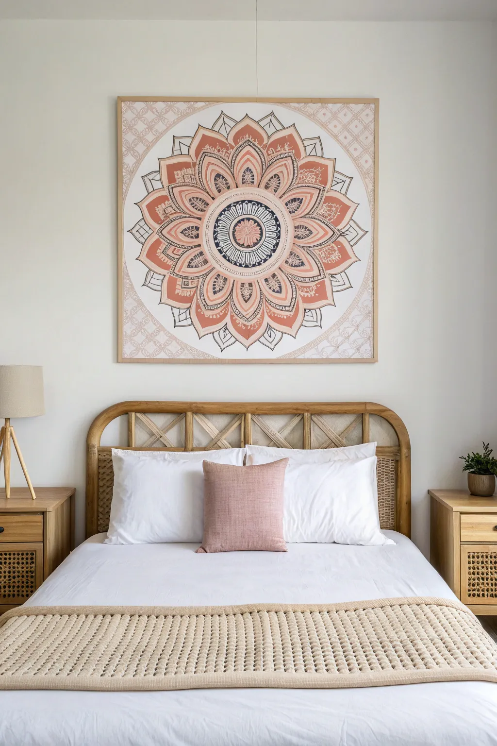
Transform your bedroom into a serene sanctuary with this large-scale mandala canvas. Featuring soothing tones of terra cotta, dusty pink, and crisp white, this symmetrical design creates an instant, cozy focal point above your headboard.
Step-by-Step
Materials
- Large square canvas (36×36 inches or larger recommended)
- Acrylic paints (Terra Cotta/Burnt Sienna, Dusty Pink, Titanium White, Carbon Black)
- Flow improver or fabric medium (optional, for smoother lines)
- Large compass or string and pushpin method
- Ruler or yardstick
- Pencil and eraser
- Assorted brushes (1-inch flat, medium filbert, fine liner)
- Painter’s tape
- Wooden frame moulding (optional, for framing)
Step 1: Planning and Structure
-
Find the Center:
Begin by measuring your canvas to find the exact center point. Make a distinct mark with your pencil here, as every concentric circle will radiate from this single dot. -
Create Guide Circles:
Using a large compass (or a string tied to a pencil and pinned to the center mark), draw a series of faint concentric circles. Start small for the inner medallion and work your way out to the canvas edges. These don’t need to be evenly spaced; vary the widths to create interest. -
Mark Radial Lines:
Use your yardstick to draw radial lines slicing through the center point like a pizza. Mark 8 or 16 evenly spaced slices to ensure your mandala petals will be symmetrical. -
Sketch the Petals:
Within the larger outer bands, lightly sketch large, lotus-style petal shapes. Use the radial lines as guides for the peaks of the petals so they stay aligned.
Step 2: Painting the Base Layers
-
Mix Your Palette:
Prepare your colors. Mix a soft terra cotta by adding a touch of white to burnt sienna. Prepare a separate puddle of dusty pink and pure titanium white. -
Fill Large Petals:
Using a medium filbert brush, paint the interior of the large outer petals with the terra cotta shade. I find it helps to work on opposite petals (top then bottom, left then right) to maintain color balance. -
Paint Secondary Details:
Fill in the smaller, inner floral shapes with the dusty pink shade. Apply two coats if necessary to ensure the canvas weave is fully covered and the color looks solid. -
Background Washes:
For the negative space outside the main mandala, create a very watery wash of dusty pink or beige. Apply this loosely to the corners to give it an aged, tapestry-like feel without drawing focus away from the center. -
Let it Dry:
Allow the base blocks of color to dry completely. If the paint is slightly tacky, your fine lines in the next phase won’t glide smoothly.
Wobbly Lines?
If painting circles by hand is tough, trace household items like plates or pot lids lightly with pencil before painting to get perfect curves.
Step 3: Adding Intricate Detail
-
Outline in Black:
Load a fine liner brush with slightly thinned black paint. Trace the outlines of your large petals and circles. Variate your line weight—some lines should be bold, while others are whisper-thin. -
Create Patterns:
Inside the terra cotta bands, paint small repetitive geometric patterns. Think triangles, dots, or tiny arches using white or black paint. -
The Center Medallion:
Focus on the bulls-eye of the mandala. Paint a dark circle with white radial stripes, or a flower motif. This high-contrast center draws the eye inward. -
Add Texture Details:
Using a very dry brush with white paint, add subtle hatching or ‘block print’ textures inside the colored petals to mimic the look of printed fabric. -
Corner Accents:
Don’t forget the extreme corners. If your circle doesn’t touch the edge, add faint geometric lattice patterns in the corners using a watered-down white for a subtle background effect.
Textured Touch
Mix a little baking soda or modeling paste into your terra cotta paint to give the petals a raised, relief-like texture resembling embroidery.
Step 4: Framing and Finishing
-
Erase Guidelines:
Once the paint is cured (wait at least 24 hours), gently erase any remaining visible pencil marks from the unpainted areas. -
Seal the Artwork:
Apply a coat of matte varnish. This unifies the sheen of the different paints and protects your hard work from dust. -
Build the Frame:
Cut thin wooden corner moulding to fit the outer edge of your canvas. Miter the corners at 45 degrees for a clean join. -
Attach the Frame:
Stain or leave the wood natural for a raw look. Use wood glue and small finish nails to attach the trim directly to the side of the canvas stretcher bars.
Step back and admire how this centering artwork brings a sense of calm and structure to your room
Soft Metallic Accents for Evening Glow
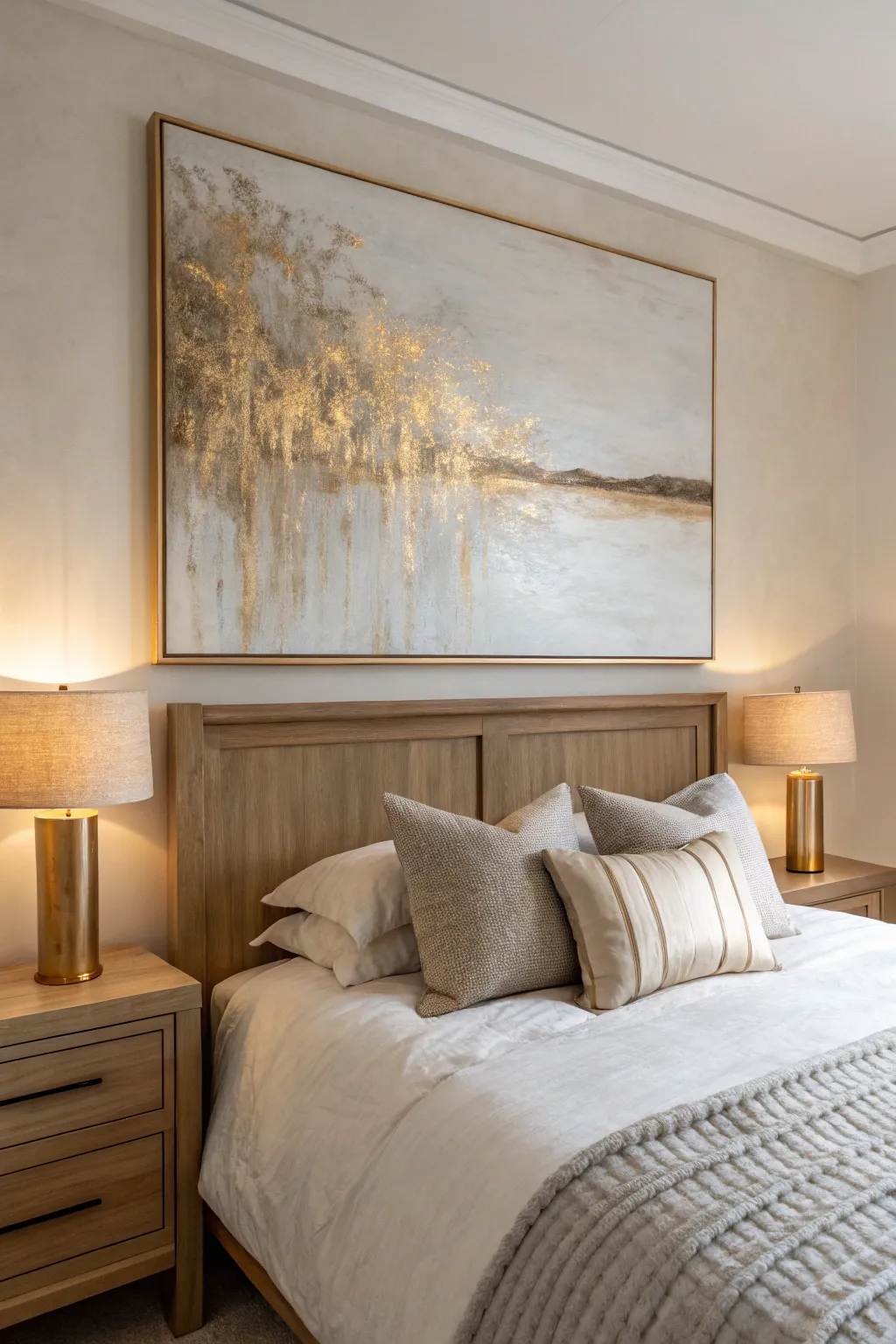
This sophisticated, large-scale abstract painting brings warmth into the bedroom through cascading gold textures against a serene, neutral backdrop. The piece mimics the organic feel of rain or weeping branches catching the light, creating a luxurious yet calming focal point.
Step-by-Step Tutorial
Materials
- Large canvas (36×48 inches or larger)
- White gesso
- Heavy body acrylic paints (Titanium White, Unbleached Titanium, Raw Umber, Paynes Grey)
- Modeling paste or texture medium
- Gold leaf sheets (imitation or real)
- Gold leaf adhesive size
- Gold acrylic paint (metallic)
- Palette knives (assorted sizes, including a large straight-edge)
- Wide flat bristle brushes (2-3 inch)
- Soft synthetic brush for gold leaf
- Sealant spray or varnish (gloss or satin)
- Spray bottle with water
- Clean rags or paper towels
Step 1: Creating the Textured Foundation
-
Prime the Surface:
Begin by applying a generous coat of white gesso over the entire canvas to ensure a smooth, receptive surface. Let this dry completely before moving forward. -
Mix the Base Tones:
On your palette, mix a large amount of Titanium White with a touch of Unbleached Titanium and a tiny dot of Raw Umber to create a warm, off-white cream color. -
Apply the Background:
Using a wide flat brush, cover the entire canvas with your mixed cream color. Don’t worry about perfect smoothness; slight brushstrokes add character. -
Build the Horizon:
Mix a soft, light grey using White and a speck of Paynes Grey. With a palette knife, apply this horizontally across the middle-lower third of the canvas to suggest a vague horizon line or water reflection. -
Add Vertical Texture:
Mix modeling paste with a little white paint. Using a palette knife, spread this mixture primarily in the top left quadrant, dragging the knife downward to create vertical ridges. -
Soften the Ridges:
Before the paste dries, lightly drag a clean, dry brush over the vertical ridges to soften the harsh edges, blending them slightly into the background. -
Create the ‘Ground’ Texture:
Apply a thicker band of modeling paste horizontally where your ‘horizon’ line is, creating a rougher texture to mimic earth or distant land. Let all texture mediums dry for at least 24 hours.
Step 2: Layering Color and Depth
-
Deepen the Shadows:
Mix a glaze using water and Raw Umber. Lightly wash this over the textured areas, allowing the darker paint to settle into the crevices of the modeling paste. -
Wipe Back Excess:
Immediately use a damp rag to wipe the surface of the texture, leaving the dark paint only in the deep grooves. This highlights the vertical dimension. -
Painting the Metallic Base:
Apply metallic gold acrylic paint over the areas where you plan to add the gold leaf—focus heavily on the top left corner and let it trickle down in streaks. -
Enhancing the Horizon:
Use a mix of Raw Umber and Gold paint to darken the horizontal ground line, giving it weight and separation from the sky and reflection areas. -
Blending the Sky:
Using a dry brush technique with pure Titanium White, feather the edges of the colorful areas into the blank background to create a misty, ethereal transition.
Gold Preservation
Always seal imitation gold leaf. Real gold won’t tarnish, but copper-based imitation leaf will turn green or brown over time if exposed to air without a varnish topcoat.
Step 3: Gilding and Finishing
-
Apply Adhesive Size:
Brush the gold leaf adhesive size onto the high points of your textured areas, specifically clustered in the top left and dragging down in thin vertical lines. -
Wait for Tackiness:
Wait for the adhesive to turn clear and become tacky (usually 15-30 minutes, depending on the brand). It should feel sticky but not wet. -
Lay the Gold Leaf:
Gently press sheets of gold leaf over the sticky areas. Don’t aim for perfect coverage; cracks and breaks in the leaf look organic and beautiful. -
Brush Off Excess:
I usually wait an hour, then use a soft, dry brush to vigorously rub the gold leaf areas. The non-adhered flakes will fall away, revealing the stunning texture underneath. -
Refine the Drips:
If the gold looks too solid, use a small brush with your background cream color to paint thin lines cutting through the gold, reinforcing the ‘raining’ effect. -
Seal the Artwork:
Once fully cured (allow 2-3 days for heavy textures), apply a final coat of gloss or satin varnish to protect the gold leaf from tarnishing and unify the sheen.
Add a Floating Frame
Install a thin wooden floating frame around the finished canvas. Leave a small gap between the canvas edge and the frame to create a shadow line that elevates the professional look.
Hang your new masterpiece under warm lighting to watch the gold textures sparkle and shift throughout the evening
Monochrome Charcoal Abstract for a Moody Bedroom
This striking, large-scale piece captures the moody essence of a seascape or winter field using a high-contrast palette of black, charcoal, and white. The resulting artwork balances raw, textured strokes with soft atmospheric blends, making a perfect focal point for a modern bedroom.
How-To Guide
Materials
- Large stretched canvas (e.g., 40×50 inches)
- Black acrylic paint (heavy body)
- White acrylic paint (heavy body)
- Titanium white acrylic paint (fluid or high flow)
- Large flat paintbrush (3-4 inch)
- Medium round brush
- Palette knife or plastic scraper
- Mist spray bottle filled with water
- Charcoal powder or soft vine charcoal stick
- High-gloss varnish (optional for finish)
- Matte black spray paint (optional for frame)
- Floating frame molding
Step 1: Setting the Background
-
Prepare the canvas:
Start by ensuring your large canvas is clean and taut. Place it on a drop cloth or easel. If you want a smoother surface, apply a coat of gesso first and let it dry, though the raw texture works well for this rugged style. -
Establish the horizon line:
Visualize where you want your horizon. In this piece, it sits slightly below the vertical center. Use a pencil or a piece of tape to lightly mark this line across the canvas. -
Apply the base gray wash:
Mix a small amount of black acrylic with a lot of white to create a very pale, cool gray. Using your large flat brush, cover the entire upper half of the canvas (the sky area) with broad vertical strokes. -
Add initial texture:
While the gray wash is still wet, spritz it lightly with water. Drag a dry brush vertically through the paint to create streaks that mimic falling rain or distant atmosphere.
Uneven Blending?
If acrylics dry too fast to blend, keep a mist bottle handy. A light mist of water keeps paint workable longer for those smoky transitions.
Step 2: Building the Dark Foreground
-
Paint the deep black block:
Squeeze heavy body black acrylic directly onto the bottom visual third of the canvas. Use a wide brush or a scraper to spread this paint horizontally, filling the bottom area solidly. -
Create the rough transition:
Where the black meets the future middle ground, don’t make a straight line. Use a dry brush to pull the black paint upward slightly in jagged, uneven spikes to mimic grass or rough terrain. -
Layering the charcoal tones:
Mix black and white to create a medium charcoal gray. Paint a horizontal band just above your solid black section. Blend the bottom edge into the black while it’s wet for a seamless fade. -
Scraping technique:
I find using a palette knife here adds great dimension. Take some pure black paint on the knife and scrape it horizontally across the transition zone to create distinct, sharp lines of darkness.
Step 3: The Middle Ground & Highlights
-
Establish the white expanse:
Load a clean large brush with titanium white. Paint the area between your charcoal transition and the sky. Use long, horizontal strokes. -
Blend the horizon:
Carefully blend the top edge of this white section into the gray sky wash. You want a soft, misty line, not a hard separation. Use a damp brush to soften the boundary. -
Add charcoal powder effects:
Sprinkle a pinch of charcoal powder or rub a vine charcoal stick along the wet white paint in the middle ground. Smudge it horizontally to create shadowy drifts. -
Create horizontal striations:
Dip a smaller stiff brush into black paint, then wipe most of it off. Drag this ‘dry brush’ horizontally across the white section to create the thin, dark scratchy lines seen in the original. -
Define the water line:
Paint a bolder, dark horizontal stroke right where the ‘water’ meets the ‘sky.’ This anchors the composition and gives the eye a resting place.
Level Up: Texture
Mix sand or modeling paste into your black paint for the bottom section. This creates physical grit that catches the light beautifully.
Step 4: Finishing Touches & Framing
-
Enhance vertical drips:
Mix a very watery gray wash. Apply it at the very top edge of the canvas and let a few drops run down into the sky area naturally, creating that weathered, rainy look. -
Final heavy white highlights:
Use a palette knife with thick heavy body white paint. Scrape it right above the dark foreground to create intense, textured bright spots that look like crashing waves or snow drifts. -
Assess and dry:
Stand back 10 feet to check the balance of light and dark. Once satisfied, let the painting dry completely for at least 24 hours. -
Varnishing:
Apply a coat of varnish to seal the charcoal and protect the acrylics, evening out the sheen. -
Framing the piece:
Measure your finished canvas. Cut thin wood molding to size, paint it matte black, and attach it to the sides of the canvas (or use a floating frame kit) to replicate the thin black border shown.
Hang your new masterpiece and enjoy the serene, stormy atmosphere it brings to your room
Triptych Headboard Set for a Finished Look
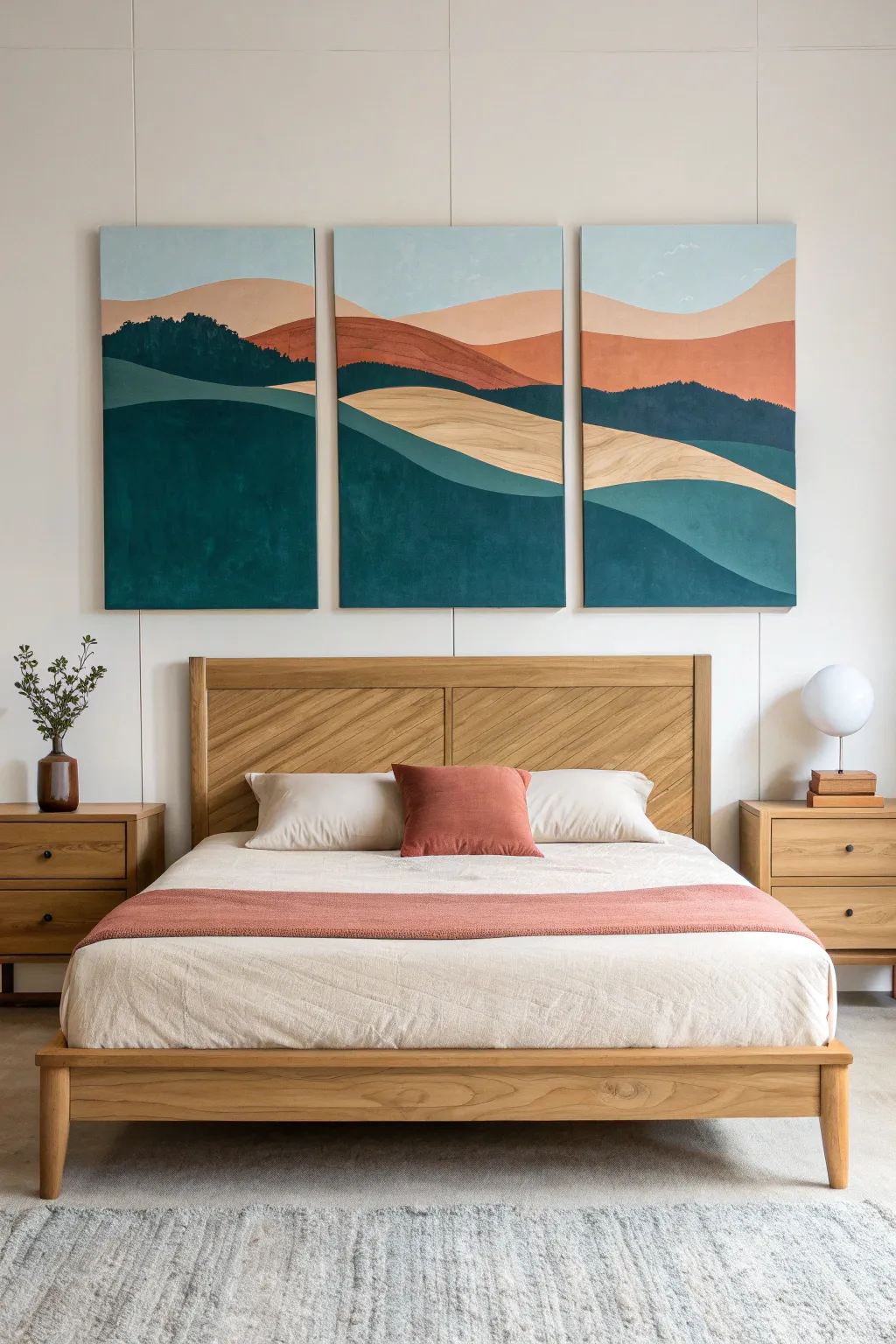
Bring the calming influence of nature into your bedroom with this three-piece canvas set that spans across your wall. This semi-abstract landscape uses soothing earth tones and flowing curves to create a seamless horizon that connects all three panels.
Step-by-Step Tutorial
Materials
- 3 large stretched canvases (e.g., 24×36 inches each)
- Acrylic paints: Hooker’s Green, Phthalo Blue, Burnt Sienna, Yellow Ochre, Titanium White, and Mars Black
- Large flat brushes (2-inch and 1-inch)
- Medium round brush for details
- Pencil and large eraser
- Ruler or yardstick
- Palette or paper plates for mixing
- Cup of water and paper towels
- Drop cloth or easel
Step 1: Preparation and Sketching
-
Arrange the canvases:
Lay your three canvases side-by-side on the floor or prop them up on your workspace with about 2-3 inches of space between them. This gap mimics how they will hang on the wall, helping you align the horizon lines correctly. -
Draft the horizon line:
Using your pencil and yardstick, lightly sketch a flowing, continuous line across all three canvases near the top third. This will be the separation between the sky and the distant hills. -
Sketch the rolling hills:
Draw large, sweeping curves that start on one canvas and flow into the next to create the foreground hills. Vary the heights and angles to mimic natural terrain, ensuring the lines meet up visually across the gaps. -
Define color zones:
Lightly mark which sections will be which color—bottom for deep teal, middle for sandy beige, upper middle for rust, and top for sky—so you don’t get lost while painting.
Step 2: Blocking in the Base Colors
-
Mix the deep teal:
Combine a large amount of Hooker’s Green with a touch of Phthalo Blue and a tiny dot of Mars Black to create a rich, deep forest green-teal. -
Paint the foreground:
Using your largest flat brush, apply this deep teal mixture to the bottom-most hill shapes on all three canvases. Use long, smooth horizontal strokes for a clean finish. -
Create the mid-tone teal:
Take your leftover deep teal mix and add Titanium White and a little more Phthalo Blue to lighten it significantly. Paint the secondary hill shapes, usually sitting just above the darkest foreground hills. -
Mix the sandy beige:
Clean your brush thoroughly. Mix Yellow Ochre with plenty of Titanium White and a tiny pinprick of Burnt Sienna to warm it up. Apply this to the sweeping curves in the center of the composition. -
Apply the rust tone:
Mix Burnt Sienna with a little Yellow Ochre and a touch of white to create a soft terra-cotta or rust color. Fill in the distant mountains or hills just below the sky. -
Paint the sky:
Mix a large batch of Titanium White with a very small amount of Phthalo Blue for a pale, airy sky blue. Paint the remaining top section of all three canvases.
Clean Lines Hack
For ultra-crisp edges between hill colors, let the first color dry completely, then apply painter’s tape along the curve before painting the adjacent section.
Step 3: Adding Depth and Texture
-
Add texture to the rust hills:
While the rust paint is dry, mix a slightly darker version of that color. Dry brush this along the bottom edges of the rust hills to create a sense of shadow and volume. -
Stipple the distant trees:
Using a medium round brush and a dark teal-black mix, gently stipple small textured shapes along the top ridge of the rust-colored hills on the left and right canvases to suggest a distant tree line. -
Refine the beige curves:
I like to take a clean brush with a slightly lighter beige value and add a few sweeping strokes following the curve of the hill. This gives the ‘sand’ section a bit of movement like grain in wood or wind on grass. -
Deepen the foreground shadows:
Mix a very dark green (almost black) and glaze the very bottom edges of the large foreground shapes. This grounds the painting. -
Clean up the edges:
Go back with a smaller brush and sharpen the lines where different colors meet. The crispness of the lines is key to this graphic, modern style. -
Paint the canvas sides:
Don’t forget the edges of the canvas frame. Paint the sides to match the adjacent color on the front so the art looks professional from every angle in the room.
Add Gold Accents
For a luxe touch, trace thin lines of gold leaf or metallic gold paint along the ridges where the deep teal meets the sandy beige sections.
Step 4: Finishing Touches
-
Evaluate adjacent lines:
Stand back and look at the canvases as a group. If any lines don’t quite match up ‘visually’ across the gap, adjust them slightly now. -
Varnish the set:
Once fully dry (give it at least 24 hours), apply a coat of matte or satin varnish to protect the paint and unify the sheen across all three pieces.
Now you have a stunning, cohesive landscape ready to mount above your bed for an instant room transformation
Have a question or want to share your own experience? I'd love to hear from you in the comments below!