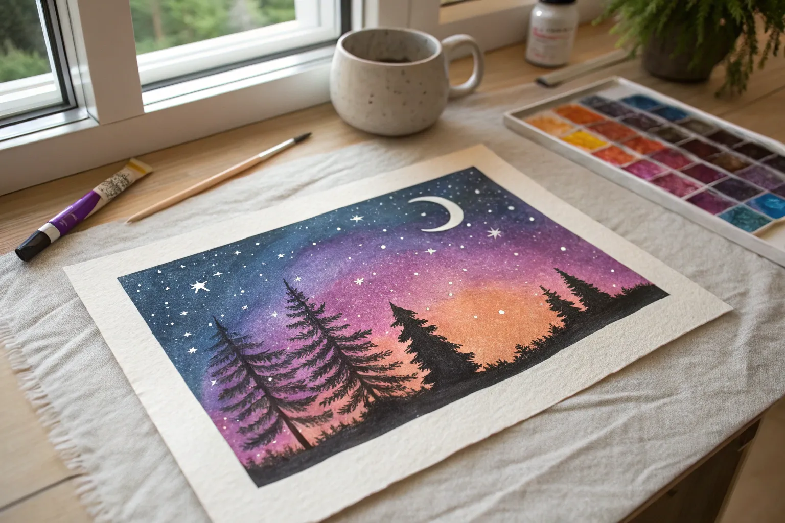
Chalk pastels are basically instant color magic—bold, soft, and ridiculously satisfying to blend with your fingers. If you’re craving projects that look high-impact without a ton of complicated drawing, these chalk pastel ideas will keep you happily smudging for hours.
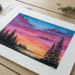
Starry Night Sky on Black Paper
Create a mesmerizing celestial scene featuring a glowing full moon and vibrant aurora streaks against a dark backdrop. The contrast of bright pastels on black paper makes the colors pop instantly, bringing the starry night to life.
Step-by-Step Tutorial
Materials
- Black construction paper or pastel paper
- Soft chalk pastels (white, purple, teal, light blue, dark blue, black)
- White gel pen or fine white paint pen
- Blending stump or tissue
- Ruler
- Pencil
- Fixative spray (optional)
Step 1: Setting the Composition
-
Create the frame:
Begin by using a ruler and pencil to draw a rectangular border in the center of your black paper. This creates a neat, built-in matte effect for your artwork. -
Map out the moon:
Draw a light circle in the upper left quadrant of your frame to represent the full moon. Don’t press too hard with the pencil, as you want the line to be subtle.
Clean Lines
Apply masking tape or washi tape around your rectangular border before coloring. Peel it off at the end for perfectly sharp, crisp edges without needing to erase.
Step 2: Creating the Aurora
-
Lay down the purple base:
Take a purple chalk pastel and draw a diagonal, wavy band stretching from the middle left towards the upper right. Apply the chalk thickly. -
Add the teal transition:
Right next to and slightly overlapping the purple band, apply a layer of teal or aqua blue pastel. Let this color curve downwards towards the bottom right of the page. -
Deepen the sky:
Use a darker blue pastel to fill in the remaining sky area below the teal band, fading it out as you reach the bottom edge where the trees will be. -
Blend for softness:
Using your finger or a blending stump, gently smudge the colors together. Blend in the direction of the streaks (diagonally) to maintain the sense of movement, letting the purple and teal merge seamlessly.
Dust Control
If pastel dust is muddying your black silhouettes, blow the loose dust away frequently rather than wiping it, which can streak the colors into your dark trees.
Step 3: Painting the Moon
-
Fill the moon shape:
Use a white pastel to fill in your circle. Apply it solidly but leave a few tiny, uneven patches slightly less opaque to start suggesting craters. -
Add crater details:
Lightly dab a grey or light blue pastel in small, random circular motions over the white moon surface to create texture and shadow. -
Create the glow:
Take your white pastel and very lightly trace around the outside edge of the moon. Smudge this line outward with a clean finger to create a soft, glowing halo effect against the black paper.
Step 4: Adding the Silhouettes
-
Draw the tree trunks:
Switch to a black pastel or charcoal pencil. Draw vertical lines of varying heights along the bottom edge of your frame, making them taller on the right side. -
Add detail to the branches:
Use short, downward-angled strokes to create the pine branches. Start narrow at the top of each trunk and get wider as you move down to the base. -
Fill the treeline:
Continue adding trees until the bottom of the picture is a dense, dark forest silhouette that contrasts sharply against the bright aurora sky.
Step 5: Stars and Highlights
-
Dot the primary stars:
Use a white gel pen or paint pen to dot stars throughout the black and colored sky areas. Make some dots larger than others for variety. -
Draw twinkling accents:
Select a few larger stars and draw small crossed lines or eight-pointed star shapes to make them look like they are twinkling brightly. -
Finishing touches:
If any black paper dust has smudged onto your clean border during the process, carefully erase it or wipe it away to keep the edges crisp.
Hang your stunning nightscape and enjoy the glow of your handmade galaxy
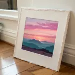
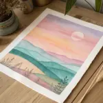
Simple Sunset Gradient Landscape
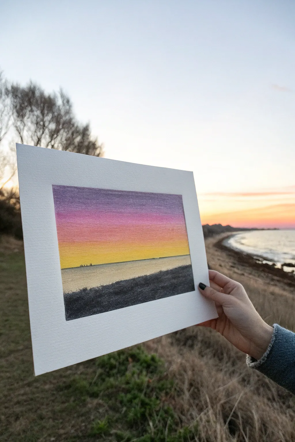
Capture the serene beauty of dusk with this vibrant, layered chalk pastel landscape. Featuring a seamless gradient sky melting into calm waters, this piece focuses on smooth blending and striking silhouettes.
Detailed Instructions
Materials
- High-quality pastel paper (white or light cream, fine tooth)
- Soft chalk pastels (Dark Purple, Magenta, Salmon Pink, Bright Orange, Golden Yellow, Cool Blue, White, Black/Dark Charcoal)
- Pastel mat or backing board for framing
- Blending tools (fingers, soft tissue, or pastel blenders)
- Masking tape
- Workable fixative spray
Step 1: Setting the Scene
-
Prepare your canvas:
Cut your pastel paper to your desired size (e.g., 5×7 inches) and tape the edges down to your work surface. This creates a clean, crisp border which mimics the matting shown in the photo. -
Establish the horizon:
Lightly sketch a straight horizontal line about one-third of the way up from the bottom of the paper. This separates the sky from the water.
Muddy colors?
Clean your fingers or blending tool between every single color band. If you drag purple down into yellow, the sky will turn brown and dull.
Step 2: Building the Sky Gradient
-
Top layer: Deep Purple:
Begin at the very top edge of the paper with a dark purple pastel. Apply it horizontally with even pressure, covering the top inch or so. -
Transition layer: Magenta:
Directly below the purple, apply a band of magenta or deep pink. Overlap the purple slightly to make blending easier later. -
Middle layer: Salmon Pink:
Add a strip of salmon pink or a lighter rose color below the magenta, continuing that slight overlap technique. -
Lower sky: Bright Orange:
Lay down a vibrant orange tone next, softening the intensity as you move closer to the horizon line. -
Horizon glow: Golden Yellow:
Fill the remaining strip of sky just above the horizon line with a bright golden yellow. Ensure this yellow is clean and bright to create that sunset glow. -
Initial blending:
Using a clean finger or soft tissue, gently blend the colors where they meet. Use horizontal strokes only. I prefer to start with the yellow and work upward into the darker colors to keep the yellow pure.
Step 3: Creating the Sea
-
Base water color:
Below the horizon line, apply a very light coat of cool greyish-blue or a mix of white and pale blue. -
Reflecting the sky:
Lightly skate some of your yellow pastel over the water area nearest the horizon to mimic the reflection of the sunset. -
Smooth the water:
Blend the water area horizontally. You want this to be much smoother and paler than the sky to create a sense of distance and calm. -
Define the horizon:
Use the edge of a pastel stick or a pastel pencil to make the horizon line sharp and distinct. A crisp line is crucial for realism here.
Pro Tip: Pure Yellow
Keep the yellow horizon strip entirely free of darker pigments. This contrast creates the glowing ‘light source’ effect.
Step 4: Foreground and Details
-
Sketch the shoreline:
Draw an angled line starting from the bottom left corner, rising slightly toward the mid-right side. This creates the dark grassy bank. -
Fill the foreground:
Fill this bottom section solidly with black or very dark charcoal gray depending on how stark you want the silhouette. -
Texture the grass:
Don’t blend this area perfectly smooth. Use tiny, upward flicking motions along the top edge of the black area to suggest grass blades. -
Add distant boats:
With a very sharp black pastel piece or pencil, make tiny, almost microscopic dots on the horizon line to represent distant ships or islands. -
Final touches:
Check your gradient transitions. If any band looks too distinct, lightly add a transitional color and re-blend horizontally.
Mount your finished piece in a wide white mat to emphasize the vibrant colors

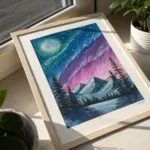
Moonlit Mountain Silhouette
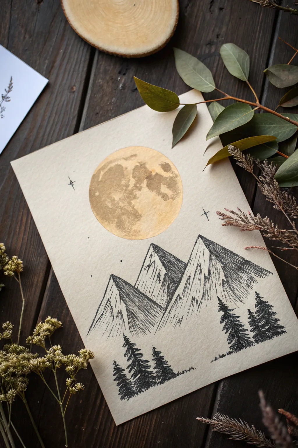
Capture the serene beauty of a mountain night with this striking contrast of gold and black on toned paper. This project combines the soft, cratered texture of a pastel moon with crisp ink linework for a unique mixed-media effect.
Step-by-Step
Materials
- Light tan or beige mixed-media paper (smooth texture preferred)
- Gold metallic watercolor or pigment powder mixed with binder
- Yellow ochre and white soft chalk pastels
- Black fineliner pens (various sizes like 0.1, 0.3, and 0.5)
- Black brush pen or marker
- Round object for tracing (like a roll of tape or wide cup)
- Pencil and eraser
- Small round paintbrush
Step 1: Planning the Composition
-
Set the scene:
Begin with a sheet of tan or beige mixed-media paper. The toned background is crucial as it acts as your mid-tone for the mountains and sky. -
Position the celestial body:
Place your round object in the upper center of the page. Lightly trace a circle with a pencil to define the moon’s shape. -
Sketch the peaks:
Below the moon, sketch two large, jagged mountain triangles overlapping each other. Keep the lines faint so they can be easily adjusted or erased later. -
Outline the treeline:
Lightly mark where your foreground trees will stand at the bottom of the page, ensuring they don’t crowd the mountains too much.
Step 2: Creating the Golden Moon
-
Base layer:
Using your gold metallic watercolor or a gold pigment paint, fill in the circle you traced. Aim for a solid, opaque layer and let it dry completely. -
Adding craters:
Once the base is dry, mix a slightly thicker or darker concentration of the gold paint (or a touch of brown watercolor). Dab this unevenly across the moon surface to create crater-like textures. -
Pastel highlights:
Take a white soft pastel and gently smudge highlight areas on the upper left curve of the moon to suggest light direction. -
Depth and shadow:
Lightly rub a yellow ochre pastel into the darker crater areas to enhance the texture and make the surface look uneven and ancient.
Smudge Alert
Hand oils can resist watercolor. If the gold paint pulls away from the paper, lightly erase over the area first to remove oils, then repaint.
Step 3: Inking the Mountains
-
Define the ridges:
Switch to a 0.5 fineliner. Trace the outline of your mountains, making the lines jagged and irregular to mimic rock formations. -
Establish light source:
Decide that the light is coming from the moon above. This means one side of each peak will be brighter, and the other in shadow. -
Hatching technique:
On the shadowed side of the mountain peaks (the right side in this example), start drawing tight, diagonal parallel lines. Keep them close together where the shadow is deepest. -
Cross-hatching details:
For the darkest crevices, cross-hatch by drawing a second set of diagonal lines perpendicular to the first layer. -
Light side texture:
On the illuminated side of the peaks, use very sparse, broken vertical lines. You want to show texture without darkening the paper too much, letting the tan background show through.
Level Up: Glowing Ridge
Run a very thin line of white gel pen or white pastel along the topmost ridgeline of the mountains to capture crisp moonlight.
Step 4: The Forest Foreground
-
Structural trunks:
Using a thicker pen or marker, draw straight vertical lines for the tree trunks at the bottom of the page. Vary their heights for a natural look. -
Pine branches:
With a fine brush pen or marker, start at the top of a trunk and create zig-zag strokes moving downward. Make the strokes wider as you reach the bottom of the tree. -
Dense foliage:
Fill in the trees until they are solid black silhouettes. Allow the branches to look slightly messy and organic rather than perfect triangles. -
Grounding the scene:
Add tiny, scribbled grass textures along the bottom baseline where the trees are planted to ground them.
Step 5: Final Touches
-
Starry sky:
Using a very fine distinct black pen, draw two or three small four-pointed stars in the sky area. -
Distant stardust:
Add a few tiny dots randomly around the moon to represent distant stars. -
Cleanup:
Once you are certain all ink and paint is 100% dry, gently erase any visible pencil sketch lines.
Now you have a tranquil mountain scene that glows beautifully against the rustic paper background


Ocean Waves With Foam Highlights
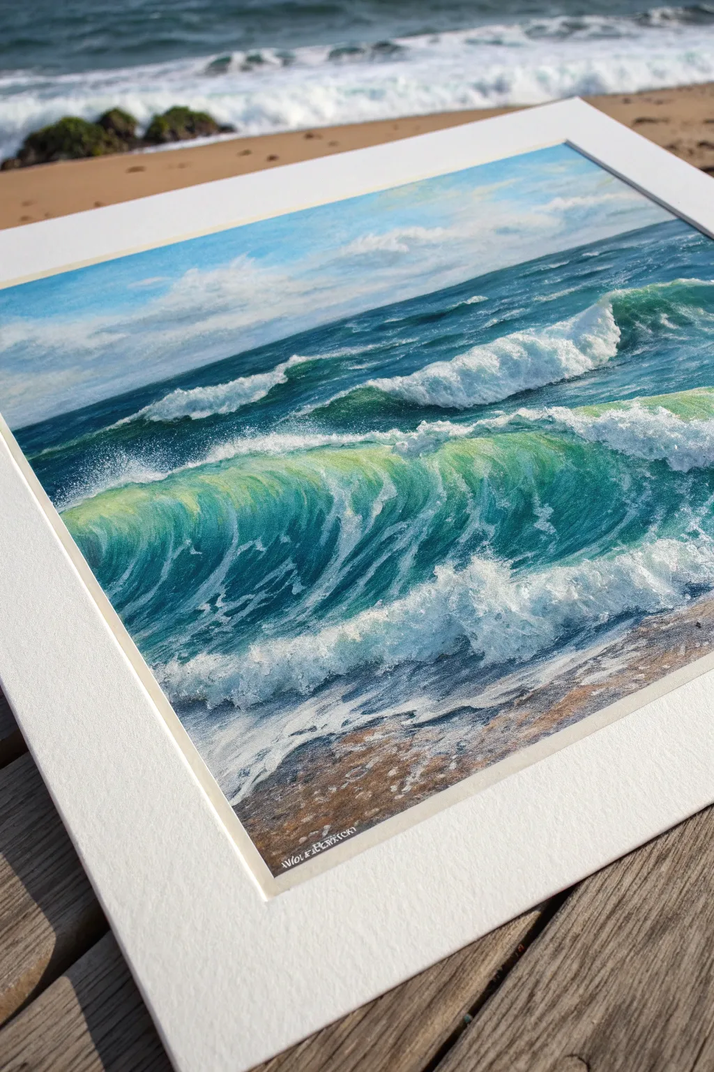
Capture the translucent energy of the ocean with this vibrant pastel study, focusing on the interplay of deep blues and illuminated sea-foam greens. You’ll layer rich pigments to create depth before adding crisp highlights that make the water look wet and dynamic.
Detailed Instructions
Materials
- Textured pastel paper (e.g., sanded paper or pastel card, light grey or beige tone)
- Soft chalk pastels (set including phthalo blue, ultramarine, turquoise, viridian, seafoam green, lemon yellow, white, grey, ochre, burnt sienna)
- Hard pastel sticks or pastel pencils (white, dark blue) for details
- Paper towels or blending stumps
- Workable fixative (optional)
- Masking tape (for creating clean borders)
Step 1: Setting the Horizon & Sky
-
Prepare the surface:
Begin by taping down the edges of your paper to a hard board. This not only keeps the paper flat but creates that crisp, professional white border seen in the reference image. -
Establish the horizon:
Lightly sketch a horizontal line about one-third down from the top. Use a light blue hard pastel to map out the shape of the main crashing wave in the foreground and the secondary wave behind it. -
Base layer for the sky:
Apply a gradient of pale cerulean blue at the top, fading into white near the horizon. Use the flat side of a pastel stick to cover large areas quickly. -
Cloud details:
Scumble in soft white clouds using circular motions. Soften the edges with your finger or a paper towel so they look distant and hazy compared to the sharp waves.
Step 2: Deep Waters & Background Waves
-
Darkest values first:
Lay down deep ultramarine and phthalo blue for the distant ocean water. The darkest areas should be right under the crest of the waves where the shadow is strongest. -
Background wave form:
For the wave in the middle ground, blend a mix of teal and darker blue. Create the rolling shape, leaving the top edge irregular for the foam. -
Painting distant foam:
Use a white pastel to tap in the foam on the distant wave. Keep these marks smaller and less defined than the foreground to maintain perspective.
Muddy Colors?
If colors look dull, you may be over-blending. Apply a fixative spray to seal the layer, let it dry completely, and apply fresh, unblended strokes of pure pigment on top.
Step 3: The Translucent Wave
-
Underpainting the big wave:
Block in the large foreground wave shape with a medium turquoise. -
Creating translucency:
This is the magic step. In the upper curve of the wave where sunlight hits, overlay lemon yellow and light viridian green. Blend this gently into the darker blue base to create that glowing, ‘stained glass’ effect. -
Shadows and depth:
Deepen the trough of the wave—the area just below the crash—with distinct strokes of dark Prussian blue. I find following the curve of the water with your strokes creates a better sense of movement. -
Adding sea foam texture:
Take a hard white pastel or pastel pencil. Draw the intricate, web-like patterns of foam sliding up the face of the wave. These lines should follow the water’s curve.
Make It Sparkle
For a magical touch, spatter tiny droplets of white gouache or liquid watercolor over the crashing foam area using a toothbrush. It mimics real sea spray perfectly.
Step 4: Foreground & Finishing Touches
-
Crashing whitewater:
Use your softest, brightest white pastel to build up the thick foam at the base of the wave. Use a stippling motion (tapping the pastel) to mimic the chaotic spray. -
Spray and mist:
Lightly smudge the top edge of the crashing foam upward into the dark water behind it. This creates the illusion of fine mist blowing off the wave crest. -
Wet sand base:
For the foreground beach, apply horizontal strokes of burnt sienna, grey, and ochre. Blend them smoothly to look like packed, wet sand. -
Reflections on sand:
Add streaks of light blue and white over any dark sand areas to represent the thin sheet of water receding back into the ocean. -
Final highlights:
Add the absolute brightest specks of white on the thickest foam and the sunlit top edge of the wave. These tiny dots make the painting sparkle. -
Clean up:
Peel away the masking tape slowly to reveal your clean edges. Sign your masterpiece in the bottom corner with a contrasting color like white or light grey.
Step back and admire the rhythmic motion and refreshing colors of your seascape.
BRUSH GUIDE
The Right Brush for Every Stroke
From clean lines to bold texture — master brush choice, stroke control, and essential techniques.
Explore the Full Guide
Cozy Winter Cabin Glow Scene
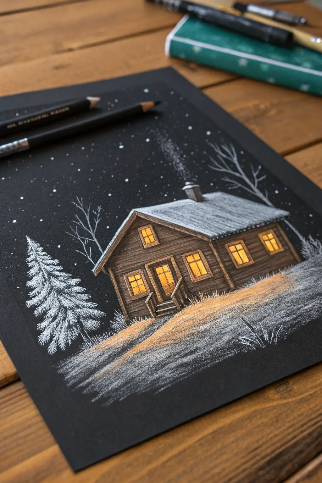
Capture the serene silence of a winter night with this stunning chalk pastel project on black paper. The dark background naturally creates the night sky, making the snowy white details and warm yellow window light pop exceptionally well with minimal effort.
Detailed Instructions
Materials
- Black drawing paper or pastel card stock (approx. A4 size)
- White charcoal pencil or white pastel pencil
- Pastel pencils (warm yellow, orange, dark brown, tan/ochre, grey)
- Soft white pastel stick (optional, for broader snow areas)
- Blending stump or tortillon
- Ruler (optional)
- Kneaded eraser
Step 1: Drafting the Cabin
-
Establish the horizon:
Begin by lightly sketching a sloping line about one-third of the way up from the bottom of your black paper using your white pastel pencil. This will separate the snowy foreground from the sky. -
Outline the basic shape:
Draw the main rectangular body of the cabin. Add a triangle atop the left side for the gable end and extend a long parallelogram to the right for the roof. Light pressure is key here so you can erase mistakes easily. -
Add architectural details:
Sketch in the windows—one small one in the gable, a door below it with side windows, and two larger rectangular windows on the long side. Don’t forget the small chimney on the roof and the simple stairs leading to the door.
Step 2: Adding Warmth and Structure
-
Fill the windows:
Using a bright warm yellow pastel pencil, color in the glass panes of all the windows. Press firmly in the center of each pane to create a glowing ‘hot spot’. -
Intensify the glow:
Layer a touch of orange around the edges of the yellow window panes. This gradient simulates the cozy warmth of firelight inside. -
Color the siding:
Take a dark brown pastel pencil and fill in the exterior walls. Use horizontal strokes to mimic wooden siding boards, leaving tiny gaps of black paper showing through to suggest grooves. -
Add wood highlights:
With a tan or ochre pencil, lightly skim over the brown siding and the window frames. This catches the texture of the paper and makes the wood look weathered and illuminated.
Keep it clean
Work from the top down (roof to ground) or place a piece of scrap paper under your drawing hand. This prevents your palm from smearing the black paper or muddying your bright colors.
Step 3: Creating the Winter Atmosphere
-
Roof snow base:
Use a grey pastel pencil to color the entire roof area first. This acts as the shadow layer for the snow. -
Brighten the roof:
Layer immense white strokes over the grey roof, focusing on the top ridges and the very edges where snow piles up. Leave some grey visible near the chimney and under the eaves for depth. -
Draw the main tree:
On the left side of the cabin, use your sharpened white pencil to draw a pine tree. Start with a vertical line, then add jagged, downward-sloping zigzag strokes that get wider toward the bottom. -
Add distant trees:
Sketch bare, spindly branches behind the cabin and on the right side using a light grey or faint white line. These should be less detailed to push them into the background.
Make it festive
To turn this into a holiday scene, add tiny dots of red and green on the pine tree. You can also drape a small curved line of yellow dots along the roofline to mimic string lights.
Step 4: Illuminating the Ground
-
Cast the light:
I like to visualize where the light spills out. Using your ochre or light orange pencil, shade the snowy ground directly in front of the window and door, tapering it out into the darkness. -
Texture the snow:
Use the white pencil (or a soft pastel stick on its side) to create the snowy foreground. Use sweeping, horizontal strokes that skip over the paper’s tooth, creating a gritty, realistic snow texture. -
Blend the path:
Where the yellow light meets the white snow, lightly blend them with your finger or a stump so the transition is soft and natural. -
Foreground grasses:
Add a few sharp, quick upward strokes in white at the very bottom right corner to represent frosted grass poking through the snow.
Step 5: Final Magical Touches
-
Chimney smoke:
Gently smudge a small amount of white pastel rising from the chimney. Tap it with your finger to make it look puffy and dissipating. -
Stars:
Dot the black sky with your sharpest white pencil. Vary the pressure to create stars of different brightness. -
Snow on surfaces:
Add tiny lines of white on the top edges of the window frames, the railing, and the stairs to show settled snow.
Now step back and admire the cozy winter retreat you have built with nothing but light and shadow
Leaf Silhouettes With Color Burst
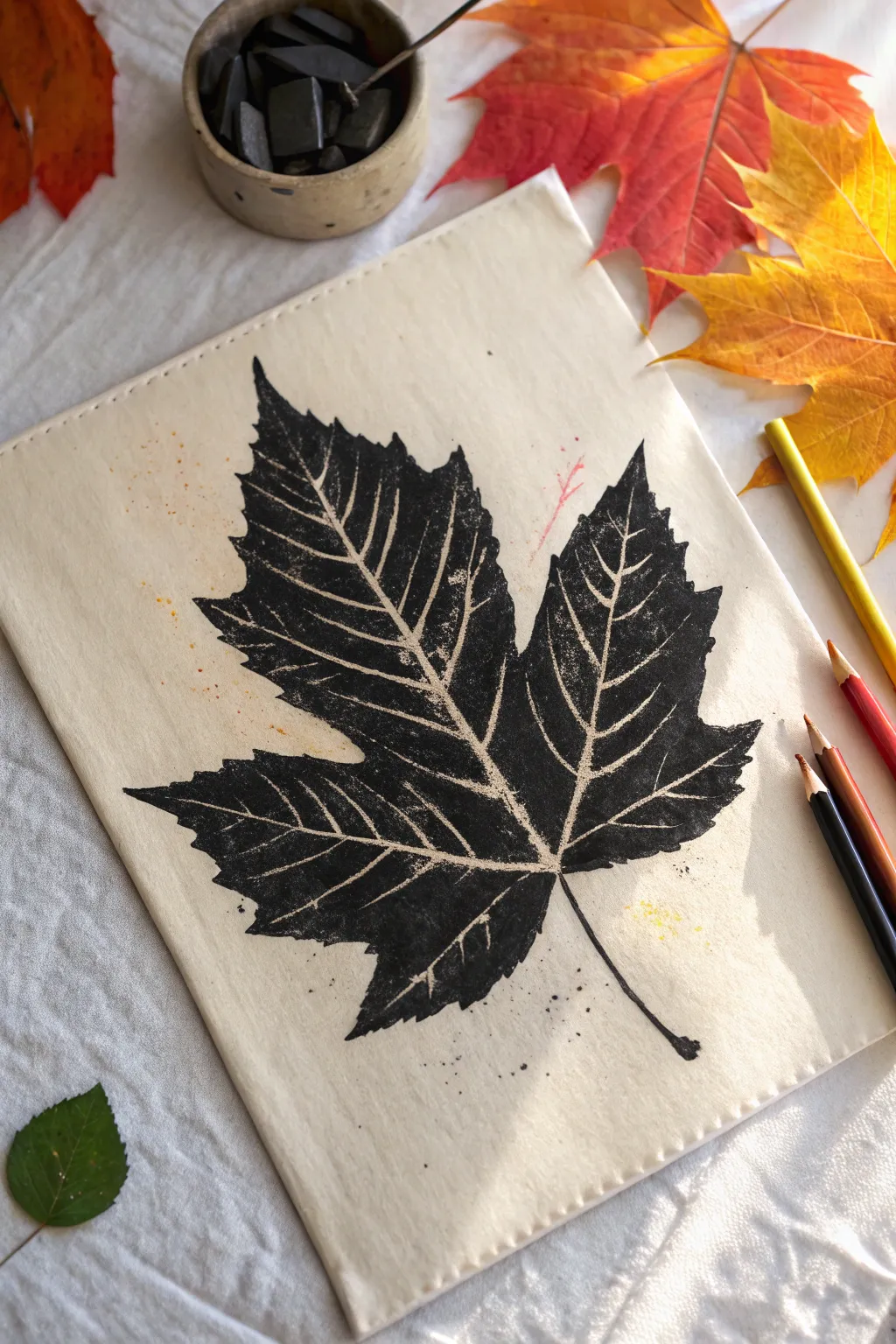
Capture the stark beauty of autumn with this high-contrast leaf print technique. Using a simple masking method, you’ll create a striking black silhouette that highlights the delicate, natural vein structure of a maple leaf.
Step-by-Step
Materials
- Heavyweight cream paper or unbleached cotton fabric
- Large, fresh maple leaf (flat, not dried)
- Soft charcoal stick or black chalk pastel
- Fixative spray (workable or final)
- Scrap paper
- Soft paper towel or charcoal blending stump
- Kneaded eraser (optional)
- Colored pencils (red, yellow, orange) for accents
Step 1: Preparation & Composition
-
Select your leaf:
Finding the perfect specimen is key. Look for a maple leaf that is structurally sound but pliable. Avoid leaves that are already dry and crunchy, as they will crumble under the pressure of the charcoal. -
Prepare your surface:
Cut your cream paper or fabric to size. If using fabric, iron it flat first to ensure a smooth transfer surface. Place a piece of scrap paper underneath to catch any charcoal dust that might stray. -
Position the leaf:
Place your maple leaf directly onto the center of your paper or fabric. Decide on the angle—a slight tilt often looks more dynamic than perfect vertical placement. Tape the stem down very lightly with masking tape if needed to hold it still.
Keep it Clean
Keep a damp cloth nearby to wipe your hands between steps so you don’t smudge fingerprints onto the borders of your clean cream paper.
Step 2: Creating the Silhouette
-
Apply the charcoal base:
Take your soft charcoal stick or black chalk pastel. Instead of drawing on the paper, heavily coat the *top* surface of the leaf itself. Focus on the areas between the veins, applying a thick, dense layer of black pigment. -
Enhance the veins:
I like to ensure the veins remain prominent by avoiding colouring directly over the thickest ridges. The goal is for the charcoal to sit on the flat parts of the leaf, leaving the veins relatively clean. -
Flip and place:
Carefully pick up the charcoal-coated leaf. Flip it over so the charcoal side faces down onto your main project paper. Double-check your alignment before letting it drop, as you can’t move it once it touches. -
Transfer the image:
Place a clean sheet of scrap paper over the leaf. Using the flat of your hand or a brayer, press down firmly and evenly. Rub over the entire surface area of the leaf to transfer the charcoal pigment onto the paper below.
Step 3: Refining & Detailing
-
Reveal the print:
Lift the scrap paper, then slowly peel back the leaf by its stem. You should see a ghostly, textured impression of the leaf where the charcoal transferred, with light spaces where the veins were. -
Define the edges:
The transfer might be faint initially. Use your charcoal stick or a sharp black pastel pencil to trace the outer edge of the leaf shape. Don’t make it a rigid line; let it mimic the serrated, organic edge of a real leaf. -
Fill the positive space:
Work inside your outline now. Fill in the leaf sections with deep, solid black charcoal, being extremely careful to leave the vein lines empty. This negative space technique is what makes the structure pop. -
Texturing:
Don’t aim for a perfectly flat black. Allow the texture of the paper or fabric to show through in spots to give it an organic feel. -
Clarify the veins:
If you accidentally covered a vein line with black, use a kneaded eraser to gently lift the pigment and restore the light line. -
Add the stem:
Draw the stem as a thin, slightly curved line extending from the base of the leaf. Keep it delicate.
Try Embossing
For more dimension, place the leaf under the paper and rub charcoal over the top first, then darken the negative spaces to create a raised rubbing effect.
Step 4: Finishing Touches
-
Adding atmospheric details:
Sharpen a red or orange pencil. Very lightly add a few tiny marks or ‘spatters’ near the edges of the paper to suggest pollen or distant autumn colours. -
Create scattered dust:
Tap your charcoal stick over the paper to drop a few tiny black specks around the bottom of the leaf, grounding the image and adding artistic grit. -
Seal the work:
Charcoal smudges incredibly easily. Take your artwork outside and spray it with a workable fixative. Apply two light coats rather than one heavy one to prevent the pigment from running.
Now you have a striking botanical print that perfectly preserves the mood of the season

PENCIL GUIDE
Understanding Pencil Grades from H to B
From first sketch to finished drawing — learn pencil grades, line control, and shading techniques.
Explore the Full Guide
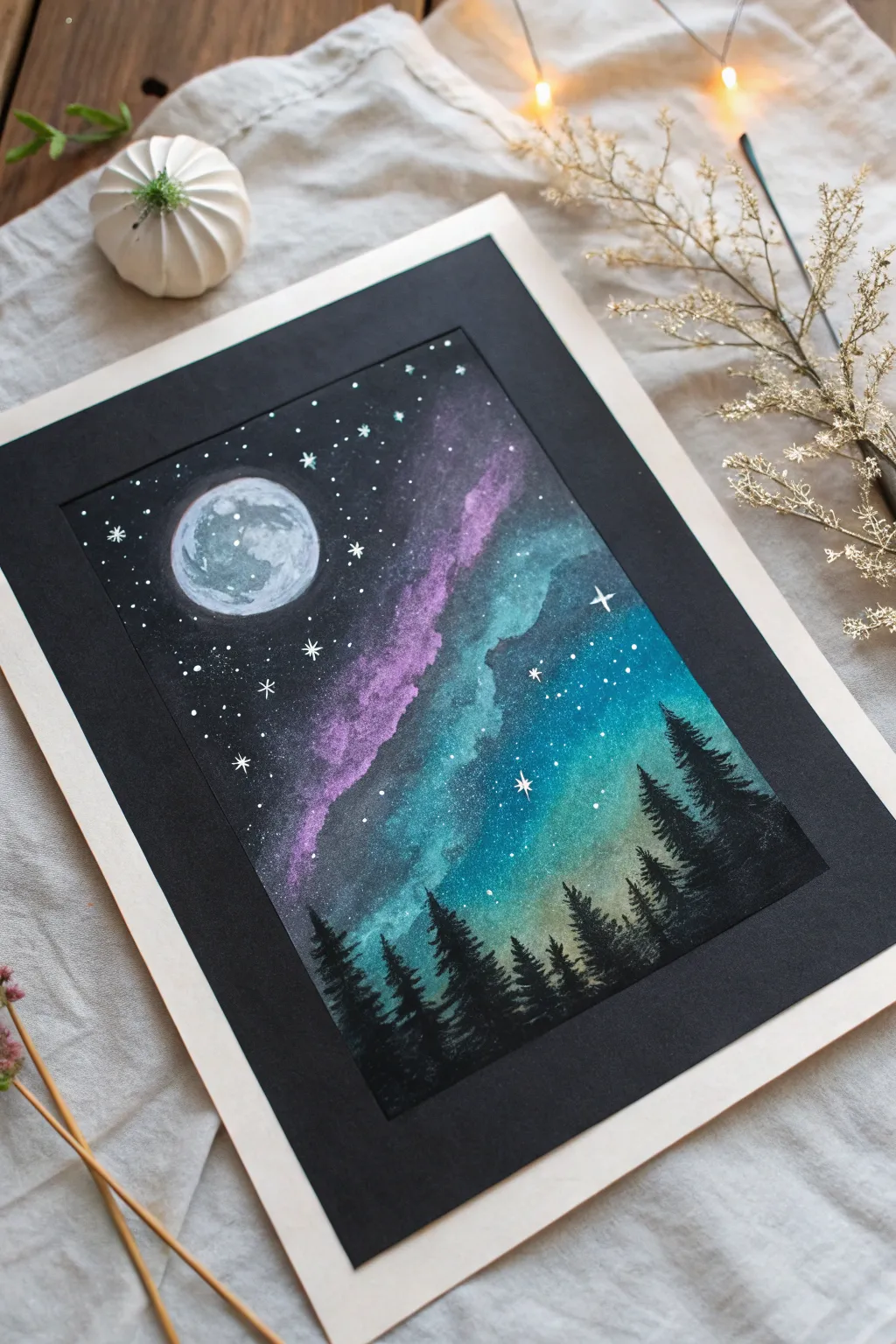
Glowing Jellyfish Underwater Study
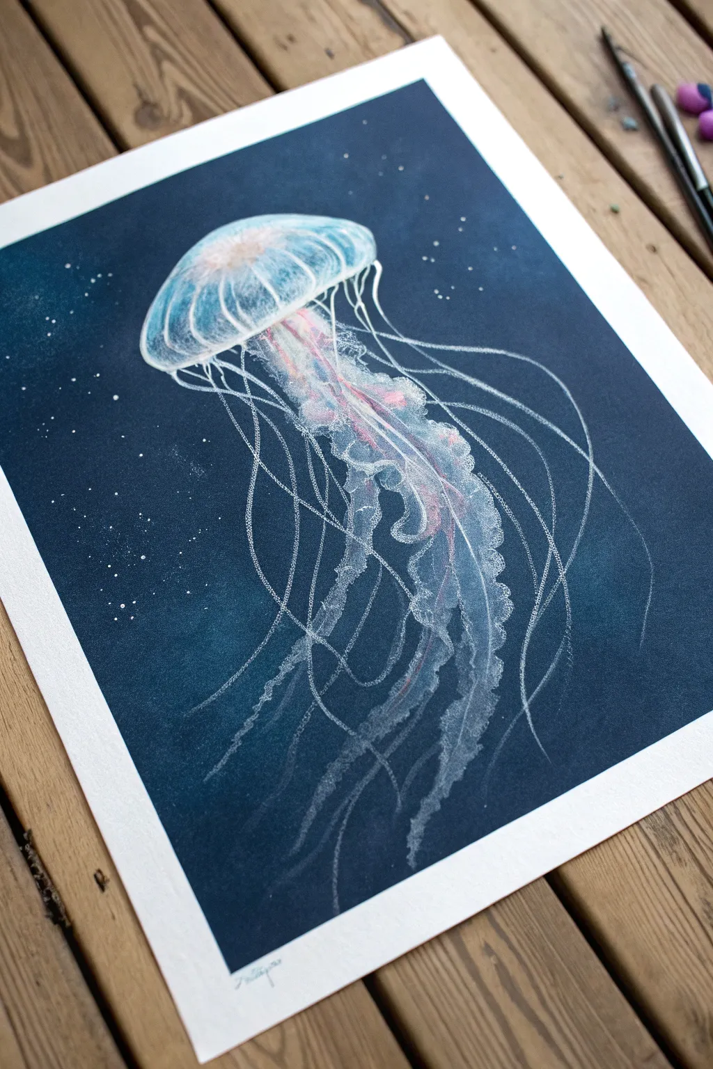
Capture the ethereal glow of deep-sea life with this striking chalk pastel project. By layering translucent white and pink pigments over a deep indigo background, you’ll create a jellyfish that appears to drift effortlessly through the abyss.
Step-by-Step Tutorial
Materials
- Deep blue or navy pastel paper (Strathmore Artagain or Canson Mi-Teintes)
- Soft pastel sticks (white, light pink, dark blue/black)
- Pastel pencils (white, light blue, pink, grey)
- Blending stump or tortillon
- Kneaded eraser
- Workable fixative (optional)
- Soft tissue or chamois cloth
Step 1: Setting the Depths
-
Prepare the Background:
Begin with a sheet of deep navy or indigo paper. This dark ground is crucial for making the bioluminescence pop. If your paper isn’t dark enough, lightly rub a layer of dark blue or black soft pastel over the entire surface and blend it smooth with a tissue for a velvety finish. -
Sketch the Bell:
Using a white pastel pencil with a very light touch, outline the basic mushroom-cap shape of the jellyfish bell near the top third of the paper. Keep the lines faint so they can be easily corrected. -
Define the Oral Arms:
Sketch a flowing, central mass descending from the center of the bell. These ‘oral arms’ should look like ruffled fabric or ribbon, twisting slightly as they go down.
Pro Tip: The Ghost Hand
For the finest, most delicate tentacles, hold the pencil at the very end of the handle. This reduces pressure and allows your hand to wobble slightly, creating natural, organic drifting lines.
Step 2: Creating Luminosity
-
Base Layer for the Bell:
Take a white soft pastel stick and gently scumble (lightly scrub) color into the top curve of the bell. Leave the bottom edge of the bell mostly transparent for now. -
Blending for Translucency:
Use your finger or a soft chamois to smudge the white pastel. I find that rubbing in circular motions helps create that gelatinous, organic texture, fading the white out as you move toward the bell’s lower rim. -
Adding Inner Color:
Introduce a touch of soft pink pastel into the center ‘core’ of the jellyfish body, right where the tentacles begin. Blend this into the surrounding white to suggest internal organs glowing from within. -
Highlighting the Ribs:
Switch to a sharp white pastel pencil. Draw distinct, curved lines radiating from the top center of the bell down to the rim, mimicking the structural ribs of the creature. -
Rim Details:
Use the white pencil to define the bottom edge of the bell, making it slightly irregular and wavy rather than a perfect arc.
Step 3: Tentacles and Texture
-
Building the Oral Arms:
Return to the central ruffled mass. Use the side of a white pastel pencil to block in the shapes, pressing harder on the ‘folds’ of the ruffles to create bright white highlights. -
Shadows and Depth:
Use a light grey or pale blue pencil to shade the recessed areas of the ruffled arms. This contrast is what gives the center mass its three-dimensional volume. -
Pink Accents:
Trace along the edges of the central ribbons with a pink pastel pencil to echo the internal color, making the creature look unified. -
Drawing the Long Tentacles:
Take a deep breath and use confident, fluid strokes with your white pencil to draw the long, thin tentacles trailing from the rim. Vary the pressure—press hard for brightness, then lift up for a ghostly, fading line. -
Varying Line Weight:
Ensure not all tentacles are the same thickness. Some should be barely visible threads, while others are more defined strands. -
Adding the Dotted Texture:
Create the stinging texture on the oral arms by stippling small dots of bright white over the ruffled areas. This mimics the granular look of real jellyfish tissue.
Troubleshooting: Muddy Colors?
If your white looks grey against the blue paper, spray a light layer of workable fixative. let it dry, and then apply a fresh, heavy layer of white on top. The barrier prevents mixing.
Step 4: Atmosphere and Finish
-
Environmental Particles:
To place the jellyfish in the ocean, dot the background with random specks of white and light blue. Cluster a few together to look like plankton or bubbles caught in the light. -
Enhancing the Glow:
Lightly graze a soft blue pastel around the immediate exterior of the bell and blend it outward into the darkness. This creates a halo effect suggesting bioluminescence. -
Final Highlights:
Review the artwork and hit the brightest points—the top of the bell and the edges of the ruffles—with a sharp, pristine white pastel for maximum contrast. -
Clean Up:
Use your kneaded eraser to lift any stray dust from the dark background, keeping the deep ocean void clean and mysterious.
Step back and admire how your simple pastel strokes have transformed into a living light in the darkness
Symmetrical Butterfly Blend
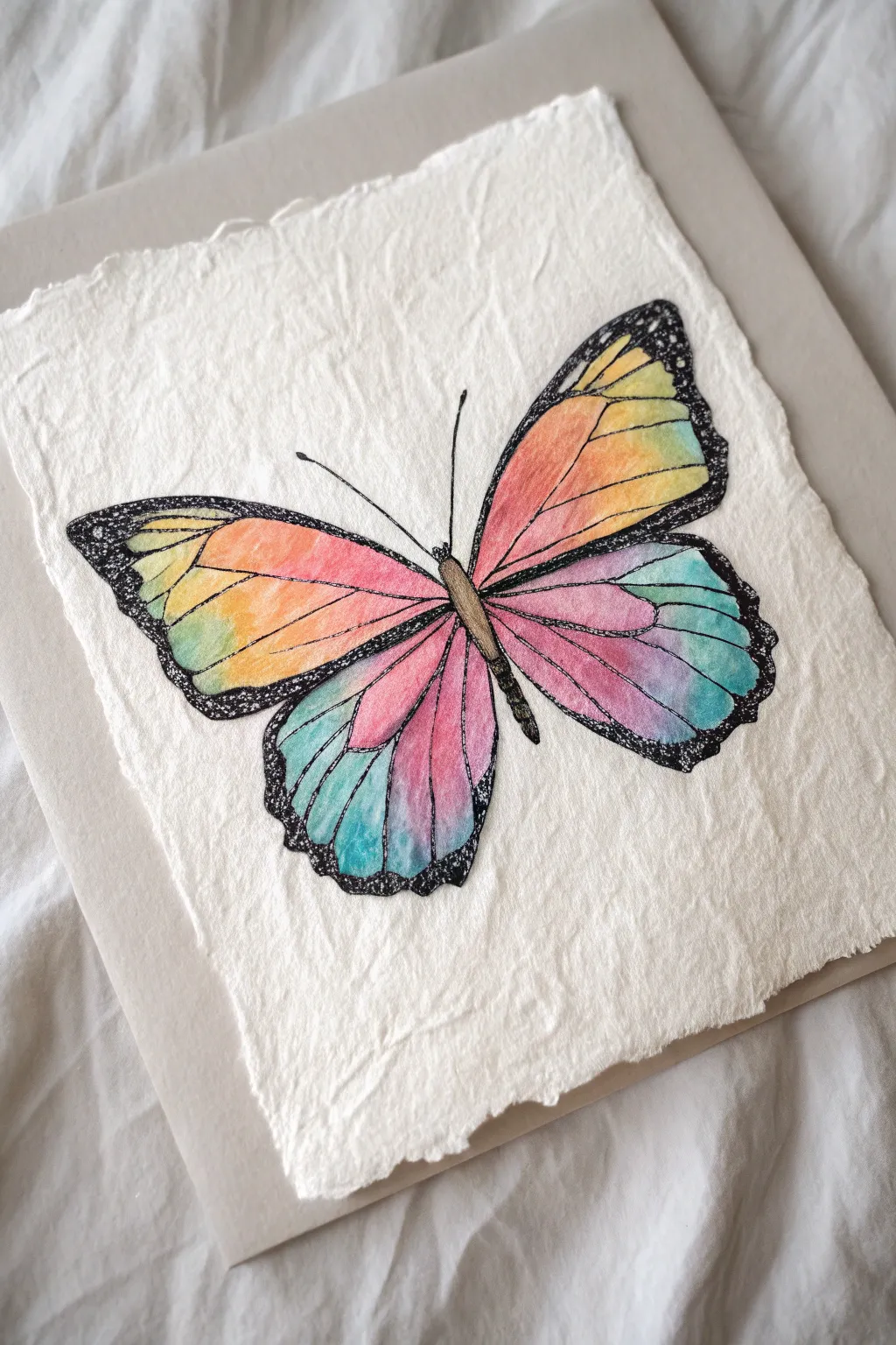
This stunning butterfly project captures the soft, blended transitions of summer colors against the raw, organic texture of handmade cotton paper. It combines the precise lines of ink with the dreamy, diffused nature of chalk pastels for a piece that feels both scientific and magical.
How-To Guide
Materials
- Heavyweight, rough-edged handmade cotton paper (white or cream)
- Soft chalk pastels (yellow, orange, red, pink, purple, teal/turquoise)
- Black fine-liner pen (0.5mm or similar)
- Black charcoal pencil or very soft black pastel pencil
- Blending stump (tortillon) or cotton swabs
- Pencil (HB for sketching)
- Kneaded eraser
- Workable fixative spray
Step 1: Sketching the Framework
-
Center the Body:
Begin lightly with your HB pencil. Draw a slender, elongated oval for the butterfly’s body in the center of your paper, tilting it slightly to the right for a dynamic feel. -
Draft the Upper Wings:
Sketch two large, triangular shapes extending outward from the upper thorax. Keep the edges soft and rounded, ensuring the right wing mirrors the left in size and angle. -
Add Lower Wings:
Below the top wings, draw two slightly smaller, rounded teardrop shapes for the hindwings. These should tuck slightly under the upper wings near the body. -
Define the Scalloped Edges:
Refine the outer edges of all four wings by adding a gentle scalloped or wavy line. This creates the natural, fluttery edge typical of butterfly wings.
Smudge Patrol
Pastel dust everywhere? Keep a damp cloth handy to wipe fingers between color changes so you don’t accidentally turn your bright yellow into a muddy green.
Step 2: Applying the Rainbow Gradient
-
Start with Sunlit Yellows:
On the upper wings, apply a stripe of bright yellow pastel near the top outer edge. Use the side of the stick to catch the glorious texture of the handmade paper. -
Transition to Orange:
Directly below the yellow, lay down a band of vibrant orange. Allow the colors to overlap slightly where they meet. -
Blend the Red Zone:
Moving inward towards the body on the upper wings, apply a reddish-pink tone. Use your finger or a blending stump to smudge the yellow into the orange, and the orange into the pink for a seamless sunset gradient. -
Cool Down the Lower Wings:
For the hindwings, start near the body with a deep pink or magenta. As you move outward, switch to purple, and finally end with a cool teal or turquoise at the bottom tips. -
Smooth the Transitions:
Using a clean finger or fresh blending tool, gently rub the pastel into the paper’s tooth. I find a circular motion helps push the pigment deep into the fibers for a rich, stained-glass look. -
Saturate the Colors:
Go back over any pale areas with a second layer of pastel to ensure the color is vibrant and opaque.
Step 3: Inking and Detailing
-
Outline the Wings:
Take your black fine-liner pen or a sharp charcoal pencil. Carefully trace over your initial pencil outline, creating a definitive border for the wings. -
Draw the Veins:
From the body, draw thin, radiating lines outward to the edge of the wings. These veins should follow the curve of the wing shapes naturally. -
Fill the Wing Margins:
Use the charcoal pencil or black pastel to color in the thick black borders commonly seen on monarchs or swallowtails. Leave the scalloped edges rough and textured. -
Texture the Border:
Press harder with the charcoal pencil on the outer rims to create a deep, velvety black contrast against the bright pastels. -
Detail the Body:
Fill in the central body with a mix of brown and black pastel. Add two long, delicate antennae curving outward from the head. -
Add White Specs:
If you have a white gel pen or white pastel pencil, add tiny dots inside the black border areas for extra realism. -
Clean Up:
Use a kneaded eraser to lift any stray pastel dust from the white background paper, keeping the negative space pristine. -
Seal the Work:
Lightly mist the entire drawing with a workable fixative spray to prevent the rich chalk pigment from smudging or transferring.
Make it Pop
For a 3D effect, add a very faint gray shadow under the bottom wings using a whisper of charcoal dust, making the butterfly look like it’s resting on the paper.
Step back and admire how the colors glow against the textured paper surface


Abstract Color Circles and Halos
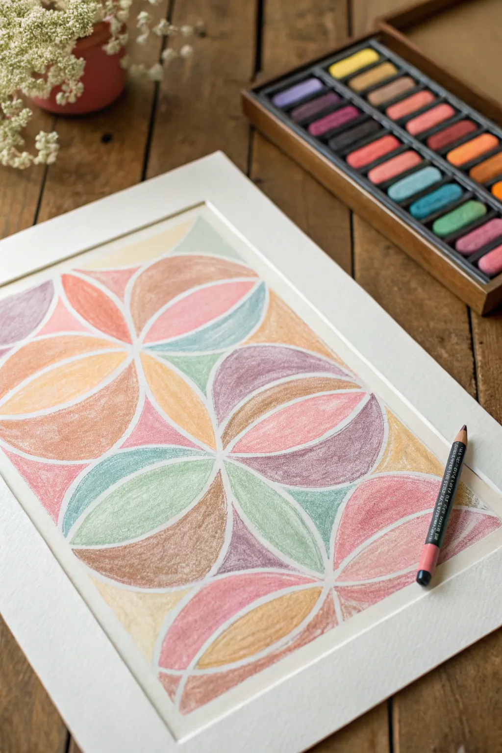
Explore the harmony of geometry and soft texture with this interlocking circle design. By breaking down complex curves into simple segments, you can create a stained-glass effect filled with muted, earthy pastel tones.
Detailed Instructions
Materials
- High-quality white pastel paper (A4 or similar size)
- Set of soft chalk pastels (muted earth tones, pinks, blues, greens)
- Compass for drawing circles
- HB pencil
- White eraser
- Ruler
- Workable fixative spray (optional)
- White or cream mat board for framing
Step 1: Drafting the Grid
-
Set your boundaries:
Begin by deciding the size of your drawing area. Use your ruler to mark the center of your paper, ensuring you have equal margins on all sides where the mat board will eventually sit. -
Draw the first circle:
Set your compass radius to approximately 2.5 to 3 inches. Place the metal point exactly on your center mark and lightly draw a complete circle. -
Create the interlock:
Without changing the compass radius, move the point to any spot on the circumference of your first circle. Draw a second circle that overlaps the first. -
Continue the pattern:
Place your compass point at the intersection where the two previous circles meet. Draw another circle. Repeat this process, moving around the center until you have a ‘flower’ shape formed by the overlapping arcs. -
Expand the grid:
Work outwards from the center flower, placing your compass point on new intersections to create adjacent circle clusters. Continue until your drawing area is filled with this geometric lattice. -
Clean up the lines:
Once your grid is full, use a white eraser to gently lift away any graphite lines that extend beyond your intended rectangular border, creating a clean, contained composition.
Keep it Clean
Keep a damp cloth nearby to wipe your fingers between every color change. Pastel pigment transfers easily, and muddy fingerprints can ruin the crisp white separation lines.
Step 2: Applying Color
-
Select your palette:
Choose about 6-8 colors that harmonize well. I prefer muted tones like dusty rose, sage green, ochre, lilac, and terracotta rather than neon brights for this vintage look. -
Fill the first shape:
Start with a petal-shaped segment near the center. Use the edge of a pastel stick to fill the shape with a dusty pink, applying medium pressure to get good coverage without crushing the tooth of the paper. -
Smudge lightly:
Using your pinky finger or a paper tortillon, gently rub the pigment into the paper. This pushes the chalk into the fibers and creates that signature velvety texture. -
Rotate colors:
Move to an adjacent segment and switch to a contrasting color, such as teal or sage green. The goal is to ensure no two touching segments are the exact same color. -
Maintain the white lines:
As you color, be very careful to leave the original pencil lines (or the tiny gap between shapes) uncolored. This negative white space acts as the ‘grout’ in your mosaic and defines the geometry. -
Layering for depth:
For the larger circular sections, try layering a secondary color lightly over the first. For example, scumble a little ochre over a brown section to add warmth, then blend them together. -
Balancing the composition:
Step back occasionally to look at the color distribution. Try to balance the ‘heavy’ dark colors with the lighter pastel shades so the artwork doesn’t feel weighted to one side. -
Refining edges:
If you accidentally colored over a white dividing line, use a precision eraser or a sharpened white contour pastel to re-establish the bright boundary between shapes. -
Final dust off:
Take the artwork outside or over a bin and give it a sharp tap on the back to dislodge loose pastel dust. Avoid blowing on it, as moisture droplets can spot the paper. -
Fix and frame:
Lightly mist with workable fixative if desired. Finally, place a clean white mat board over the piece to crop the rough edges and highlight the crisp geometric center.
Metallic Accent
Trace the negative white space lines with a fine gold or silver paint pen after the pastel work is done to turn the ‘grout’ lines into shimmering metallic borders.
Enjoy the calming rhythm of filling closer shapes and seeing your mosaic come to life
Tape-Resist Frame for Crisp Edges
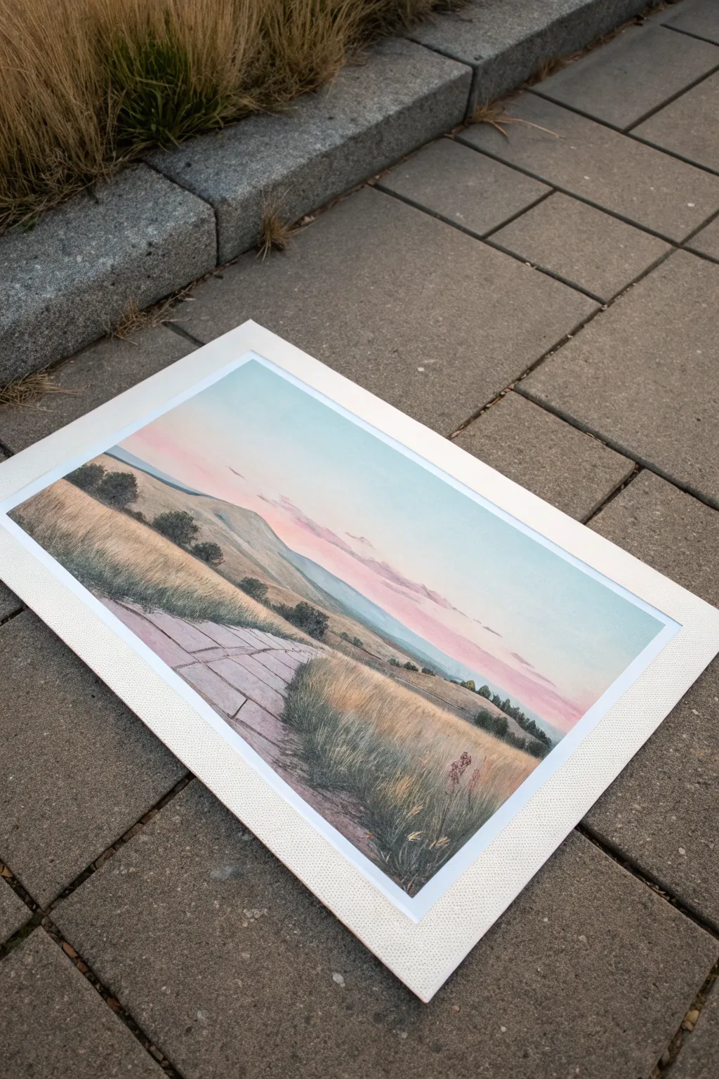
Capture the serenity of an evening landscape with this soft, atmospheric chalk pastel drawing. By utilizing tape to create a crisp white border, you’ll transform a simple sketch into a professionally mounted-looking piece of art without needing a physical mat.
Step-by-Step
Materials
- Textured pastel paper (white or light grey)
- Painter’s tape or artist’s masking tape (1-inch width)
- Soft chalk pastels (greens, browns, pinks, blues, purples)
- Hard pastels or pastel pencils (for details)
- Blending stumps or soft cloth
- Fixative spray
- Ruler
Step 1: Preparation & Sky Gradient
-
Tape the borders:
Begin by placing a strip of masking tape along all four edges of your paper. For that perfect gallery look, ensure the tape is straight and pressed down firmly to prevent pastel dust from creeping underneath. -
Establish the horizon:
Lightly sketch a horizontal line about two-thirds down the page. This high horizon line emphasizes the grassy foreground. -
Apply the blue sky:
Starting at the very top edge inside your taped area, apply a soft layer of cyan or light blue pastel. Fade this color as you move downward. -
Blend the sunset hues:
Below the blue, introduce streaks of pale pink and light lavender. I like to use my fingers to gently smudge these colors into the blue above, creating a seamless transition. -
Add distant clouds:
Using a light purple or grey hard pastel, sketch faint, elongated cloud shapes near the horizon to suggest distance and depth.
Sticky Tape Troubleshooting
If your tape is tearing the paper upon removal, stick it to your clothing once or twice before applying it to the paper. This reduces tackiness for a safer removal
Step 2: Middle Ground & Foreground
-
Block in distant hills:
Using a muted green and grey-blue, block in the furthest hills. Keep detail low here; atmospheric perspective means these shapes should be softer and lighter than the foreground. -
Create the rolling mid-ground:
Move closer to the viewer with warmer, golden-green tones. Use long, sweeping horizontal strokes to mimic the curvature of the land. -
Define the stone path:
Sketch the outline of a path winding from the bottom center toward the left middle ground. Use a grey pastel to fill in the uneven flagstones, leaving thin gaps between them. -
Suggest stone texture:
Add subtle variation to the stones with touches of brown and darker grey. Keep the edges slightly rough so they look natural rather than manufactured. -
Lay the foreground base:
Fill the bottom right corner with a rich mix of ochre, burnt sienna, and olive green. This serves as the soil and shadow layer for the tall grass.
Step 3: Details & Final Reveal
-
Draw foreground grasses:
Switch to a sharp pastel pencil or the edge of a hard pastel. Flick quick, upward strokes in varying shades of green and tan to create individual blades of grass in the foreground. -
Add shadows and highlights:
Deepen the shadows at the base of the grass clumps with dark green or charcoal. Add bright yellow or cream highlights to the tips of the grass where the light hits. -
Insert small shrubs:
Dot the middle distance with small, dark green rounded shapes to represent bushes or small trees. This helps break up the rolling hills. -
Refine the path edges:
Allow some grass strokes to overlap the edges of your stone path. This integrates the man-made element into the natural environment. -
Final fixative layer:
Take the drawing to a well-ventilated area and apply a light coat of workable fixative to set the layers. -
The peel reveal:
This is the best part: slowly and carefully peel away the masking tape. Pull the tape away from the drawing at a 45-degree angle to reveal clean, crisp white edges.
Level Up: Golden Hour
Swap the cool blues for warm oranges and yellows in the sky, and add long, horizontal shadows across the grass to simulate a dramatic sunset scene
Enjoy the clean, professional finish of your new landscape artwork
Glue-Resist Doodles for Bright Lines
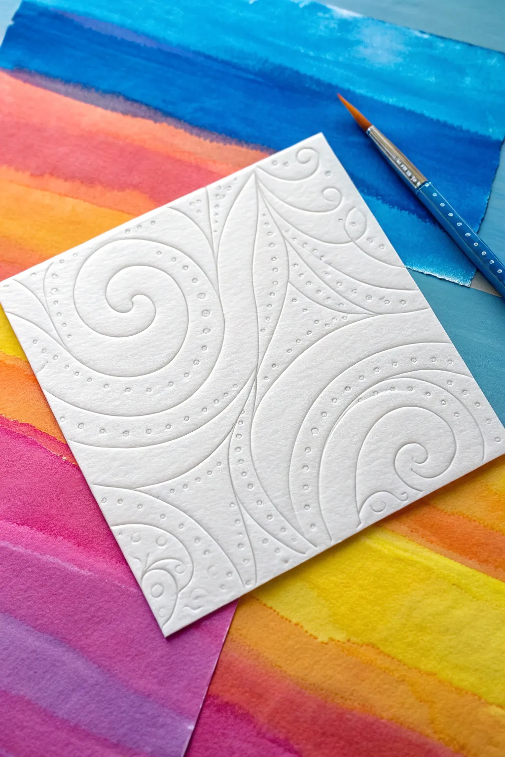
Transform a simple sheet of watercolor paper into a textured masterpiece using nothing but glue and patience. This technique creates stunning, raised white lines that resist color, allowing your vibrant background washes to pop against clean, swirling patterns.
How-To Guide
Materials
- Heavyweight watercolor paper (300gsm recommended)
- White liquid school glue (PVA) with a fine-tip nozzle
- Watercolor paints or fluid chalk pastels
- Soft round paintbrush (size 6 or 8)
- Pencil (optional)
- Masking tape
- Board or hard surface for taping
Step 1: Creating the Glue Design
-
Prepare your paper:
Cut your watercolor paper into a square shape, similar to the one shown. Tape the edges down to a board to prevent warping later. -
Plan the swirls:
If you’re nervous about freehanding, lightly sketch a flowing, organic design with a pencil. Focus on large S-curves and distinct sections. -
Test glue flow:
On a scrap piece of paper, squeeze the glue bottle gently. You want a consistent, thin bead of glue, not globby puddles. -
Outline the main shapes:
Using steady pressure, trace your main swirling lines with the glue. Keep the nozzle slightly above the paper surface for smoother curves. -
Add detail lines:
Draw interior lines that echo the shape of your main swirls. These parallel lines create the distinct sections seen in the spiral patterns. -
Dot the details:
carefully add small dots of glue within the channels created by your parallel lines. Space them evenly for a rhythmic, decorative look. -
Let it dry completely:
This is the most crucial step. The glue must be 100% dry and clear before painting. I prefer to leave this overnight to ensure it is rock hard.
Sticky Situation?
If your glue lines are flattening out, your paper might be too thin or the glue too watery. Use heavyweight paper and let the bottle sit upside down before starting for better flow.
Step 2: Painting the Background
-
Prepare background surface:
While your glue art dries, prepare a separate sheet of paper for the colorful background beneath the square. -
Mix vibrant washes:
Prepare pots of fluid watercolor or dissolved chalk pastel in blue, orange, yellow, and magenta. -
Paint stripes:
Paint broad, horizontal bands of color across the background sheet. Let the colors bleed slightly into each other at the edges for a soft gradient. -
Dry the background:
Allow this colorful base sheet to dry completely.
Pastel Pop
Rub soft chalk pastels gently over the raised dried glue lines. The texture will catch the pigment, highlighting the relief pattern without coloring the valleys deep in the paper.
Step 3: The Reveal (Optional Variation)
-
Understanding the image style:
The image shows the white, embossed card *resting* on the colorful background. However, the ‘glue resist’ technique usually involves painting *over* the glue. -
If you want the white-on-white look:
Simply leave your dried glue design as is. The raised texture interacts with light and shadow beautifully on its own, just like the photo. -
If you want the ‘resist’ look:
Paint bright watercolors directly over your glue design. The glue will repel the water, staying white while the paper absorbs the color. -
Final assembly:
Place your embossed white square on top of your colorful striped background to complete the artistic arrangement shown.
Now you have a striking textural piece that invites touch and plays beautifully with light and shadow
Pastel Dust Haze for Dreamy Backgrounds
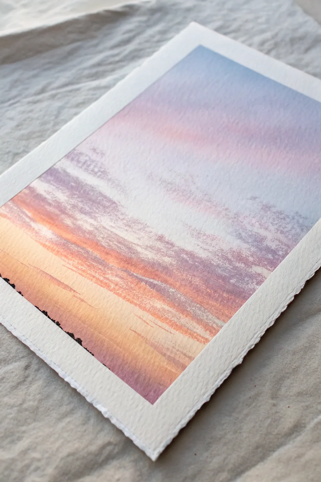
Capture the fleeting beauty of twilight by layering chalk pastels into a seamless, hazy gradient. This project creates a glowing sunset effect on textured paper, where deep purples melt into fiery oranges and soft blues.
Step-by-Step Guide
Materials
- Heavyweight textured paper with deckled edges (e.g., watercolor paper or printmaking paper)
- Soft chalk pastels (Indigo, Violet, Magenta, Peach, Pale Yellow, White, Pale Blue)
- Micro-knife or sandpaper block (for creating dust)
- Soft blending tool (chamois cloth, sponge applicator, or fingers)
- Workable fixative spray
- Masking tape (low tack)
- Clean scrap paper
Step 1: Setting the Scene
-
Prepare the surface:
Begin by securing your textured paper to a flat surface. Using low-tack masking tape, create a clean border on the back or adhere just the corners so the beautiful deckled edges remain free and untouched. -
Establish the horizon:
Lightly visualize where your horizon line falls—about one-third up from the bottom. You don’t need to draw a hard line; implied placement keeps the artwork feeling airy and ethereal.
Clean Fingers, Clear Colors
Keep a damp towel and a dry cloth nearby. Clean your fingers immediately after blending dark colors (like indigo) before touching the yellow areas to avoid accidental muddy smudges.
Step 2: Creating the Haze
-
Shave the base color:
Start with the sky’s lightest point. Take your pale yellow pastel and, using a micro-knife, gently scrape fine dust onto the lower-middle section relative to where the sun would be setting. -
Add first warmth:
Scrape an orange or peach pastel dust directly above and slightly overlapping the yellow dust piles. The loose powder is key to achieving that soft, hazy look mentioned in the intro. -
Introduce cool tones:
Moving upward, shave violet and then indigo pastel dust near the very top of the paper. Keep the piles separated initially to control where the colors land. -
The initial blend:
Using a soft chamois cloth or dry sponge, gently rub the yellow dust horizontally. Working from light to dark prevents the deep blues from muddying your sunny glow. -
Merge the gradients:
Blend the peach tone down into the yellow and up into the white space. Then, bring the purple down to meet the peach, using a circular buffing motion to soften the transition.
Use the Tooth
Don’t press too hard! Let the rough texture of the paper do the work. Lightly skimming the pastel over the bumps creates distinct white speckles that mimic light filtering through atmosphere.
Step 3: Building Intensity
-
Apply direct strokes:
Once the dusty base layer is smooth, take the pastel sticks directly to the paper for more pigment. Use the side of a violet pastels to skim across the texture in the upper sky area. -
Define the cloud banks:
With a magenta or deep rose pastel, create horizontal streaks across the middle section. Use a light touch so the paper’s tooth breaks up the stroke naturally. -
Layering the sunset core:
Intensify the sunset glow by adding direct strokes of bright orange right at the horizon line area. This should be the most saturated part of your piece. -
Softening the textures:
Use your finger to smudge the new cloud layers. Instead of fully blending them away, just soften the bottom edges of the clouds, leaving the top edges slightly more defined to suggest volume.
Step 4: Refining the Atmosphere
-
Add sky highlights:
Take a white or very pale blue pastel and gently scumble it over the top right corner of the blue sky. This adds atmosphere and breaks up any solid blocks of color. -
Create the reflective surface:
For the water or ground below the horizon, mirror the sky colors in reverse but with vertical strokes this time. Pull peach and violet downward to simulate reflection. -
Add the distant silhouette:
Using a sharp corner of a dark charcoal or indigo pastel, tap in a tiny, uneven line along the left-hand horizon to suggest distant trees or a shoreline. Keep it very minimal. -
Final balancing act:
Step back and assess your gradient. If the transition between blue and orange feels too green or muddy, add a buffer layer of pink or violet in between to bridge the temperatures. -
Protect the fragile surface:
Finish by taking the artwork outside and giving it a light coat of workable fixative. This stops the fine dust from shifting while maintaining the matte, velvety texture.
Display your ethereal landscape in a floating frame to show off those lovely deckled edges
Wet-on-Dry Pastel Wash Effects
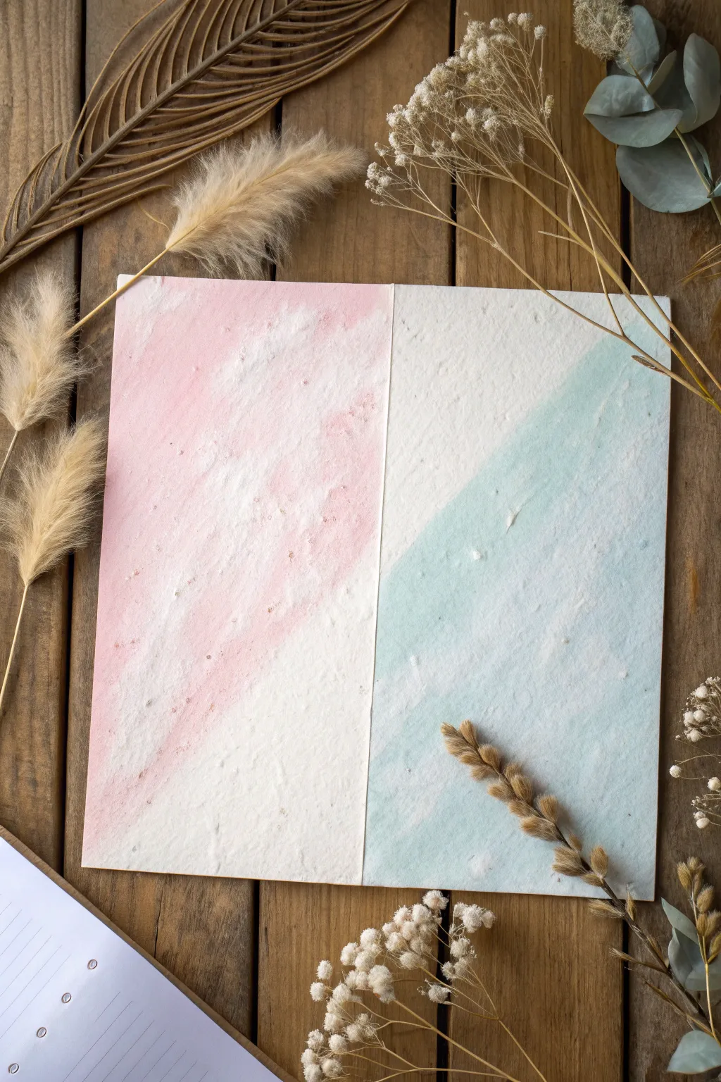
Capture the soft, ethereal beauty of blended color with this simple wet-on-dry pastel wash technique. By combining the texture of handmade paper with diluted chalk pastels, you can create a stunning two-toned backdrop perfect for stationery or art journaling.
Step-by-Step
Materials
- Heavyweight textured paper (cold press watercolor or handmade cotton rag)
- Soft chalk pastels (pale pink and seafoam green)
- Small craft knife or sandpaper
- Clean water
- Flat synthetic watercolor brush (approx. 1 inch)
- Paper towel
- Masking tape (optional)
Step 1: Preparation
-
Select your paper:
Choose a paper with significant tooth or texture. Handmade cotton rag paper works beautifully for this look because the fibers grasp the pigment unevenly, creating that lovely speckled effect. -
Prepare the surface:
Cut your paper into two equal rectangular panels, or simply fold a larger sheet in half if you are making a greeting card. Place this on a flat, water-resistant surface. -
Create pastel powder:
Take your pale pink chalk pastel and use a craft knife or sandpaper to scrape a generous amount of fine dust into a small container or palette well. -
Repeat for the second color:
Clean your blade or sandpaper, then repeat the process with the seafoam green pastel in a separate container. -
Mix the wash:
Add a small amount of water to each powder pile. Aim for a ratio that creates a milky, translucent liquid rather than a thick paint. Stir well to dissolve most of the larger chunks.
Saving the Texture
A true “wet-on-dry” look relies on the paper staying dry beforehand. Resist the urge to pre-wet the paper, or you’ll lose the distinctive grainy texture shown in the image.
Step 2: Applying the Pink Wash
-
Load the brush:
Dip your flat brush into the pink mixture. Ensure the brush is fully saturated but not dripping excessively. -
Apply the first stroke:
On the left panel (or left side of the fold), start at the top left corner and pull the brush diagonally down towards the center. -
Create texture:
Don’t aim for perfect opacity. Allow the brush to skip slightly over the paper’s texture. This skip is crucial for the vintage, weathered look. -
Fade out:
As you move towards the bottom right of the pink section, dip your brush in clean water to dilute the mix further, letting the color fade naturally into the white of the paper. -
Dry completely:
Let this pink section dry fully before moving on. I find patience here prevents the colors from accidentally bleeding into muddy tones.
Too Much Powder?
If your wash dries looking chalky or rubs off on your finger, you used too much pastel and not enough water. Lightly spray with fixative to seal it.
Step 3: Applying the Blue Wash
-
Clean your tools:
Thoroughly rinse your brush to remove any pink pigment. -
Start the opposing angle:
Load your brush with the blue-green wash. On the right-hand panel, start applying color from the bottom right corner, moving diagonally upward toward the center. -
Mimic the texture:
Use the same dry-brush technique as before, letting the paper’s grain peek through the blue wash. This creates visual symmetry with the pink side. -
Blend limits:
Stop the paint just before it touches the pink section (if working on a single sheet) or simply fill the right panel (if working on two separate sheets) to maintain a clean duality. -
Add variance:
If the wash looks too flat, dab a tiny bit of darker, less diluted pastel liquid onto random wet spots to create subtle concentrations of color. -
Final dry:
Allow the entire project to air dry flat. If the paper buckles slightly, you can press it under heavy books once it is bone dry.
Once dry, arrange your beautiful dual-tone paper with dried botanicals for a serene and artistic display
Chalk Pastel Over Collage Texture
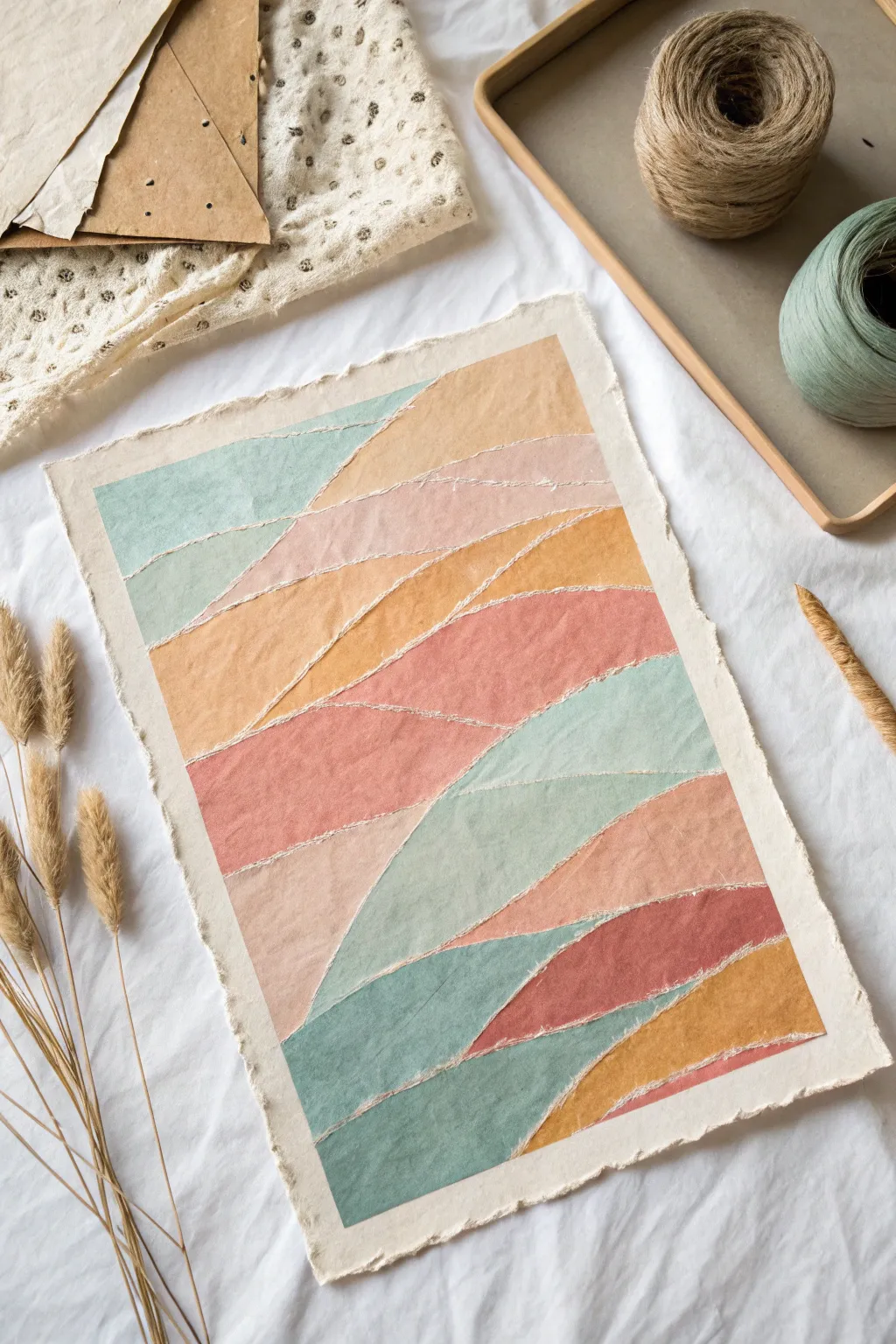
This project combines the tactile beauty of torn paper collage with the soft, blendable hues of chalk pastels. By layering shaped paper scraps and coloring over them, you create a dimensional, rolling landscape that feels organic and handcrafted.
Step-by-Step Guide
Materials
- Heavyweight watercolor paper or mixed-media paper (for the base)
- Assorted scraps of drawing paper or cardstock (for the layers)
- Chalk pastels (soft pastels) in analogous colors: teal, mint, peach, terracotta, ochre
- Matte gel medium or craft glue stick
- Soft blending sponge or chamois cloth
- Fixative spray (workable matte)
- Flat paintbrush (if using gel medium)
- Ruler or bone folder (optional)
Step 1: Preparing the Textured Base
-
Select your paper:
Choose a sturdy piece of heavyweight paper for your substrate. A slightly rough texture, like cold-press watercolor paper, catches the pastel pigment beautifully. -
Tear the strips:
Take your scrap drawing paper and tear it into long strips. Aim for organic, uneven tears rather than straight lines to mimic rolling hills or waves. -
Arrange the composition:
Lay out the torn strips on your base paper without gluing yet. Start from the top and work your way down, overlapping the torn edges to create depth. -
Plan the flow:
Adjust the angles of your strips. Let some curve upwards and others dip down to create a dynamic, interwoven landscape effect. -
Glue the first layer:
Once satisfied with the arrangement, lift the strips. Apply a thin, even layer of matte gel medium or glue stick to the back of the top-most strip. -
Secure the collage:
Press the strip onto the base paper. Continue gluing each subsequent strip, ensuring the torn edge of the new strip overlaps the bottom straight edge of the one above it. -
Seal edges (optional):
If you want a very flat surface, run a bone folder along the glued edges. However, I sometimes leave the very tips of the torn paper unglued to catch more pastel dust later. -
Dry thoroughly:
Let the glue dry completely before moving to pastels. Any moisture will cause the chalk to streak or tear the paper.
Step 2: Applying Chalk Pastel
-
Start with light tones:
Select your lightest color, such as a pale mint or peach. Gently color the top section of your collage using the side of the pastel stick for broad coverage. -
Define the ridges:
Use the edge of the pastel stick to apply slightly heavier pigment right along the torn paper ridges. This highlights the physical texture of the collage. -
Blend the first layer:
Use a soft blending sponge or your finger to smooth the pigment into the paper tooth. Be gentle near the torn edges so you don’t rip them up. -
Add warmth:
Move to the next section and apply a warmer tone, like ochre or terracotta. Allow this color to slightly overlap the section above it for a natural transition. -
Create distinct zones:
Continue filling each paper strip with a different color. Alternating between cool teals and warm earthy pinks creates a lovely visual rhythm. -
Deepen the shadows:
Go back in with darker shades of your main colors (like a deep rust or slate blue) and apply them at the very bottom of each strip, just before the next overlapped edge begins. -
Highlight the tears:
Take a white or very pale cream pastel and run it lightly along the very top edge of the torn paper strips to make that white core of the paper pop. -
Final blending check:
Assess the overall look. If any areas look too scratchy, lightly buff them with a clean part of your chamois, blending the colors just enough to soften the transitions. -
Clean up edges:
Use a kneaded eraser to clean up the borders of the base paper if any pastel dust migrated outside the image area. -
Set the artwork:
Take the artwork to a well-ventilated area and spray it with a workable fixative. This prevents the chalk from smudging while preserving the matte texture.
Fixing Muddy Colors
If colors look muddy from over-blending, spray a layer of workable fixative. Let it dry, then apply fresh, vibrant pastel on top. The spray creates a barrier that stops mixing.
Add Metallic Touches
Trace the torn paper edges with a fine-tip gold paint pen or use gold leaf sizing. A thin metallic line highlights the distinctive texture of the collage layers.
Frame your textured landscape behind glass with a spacer to keep the lovely pastel dust intact and the layers visible
Have a question or want to share your own experience? I'd love to hear from you in the comments below!