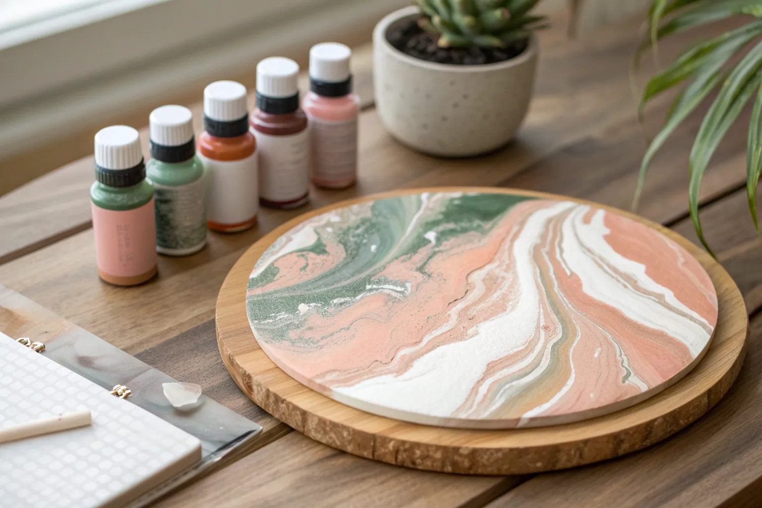
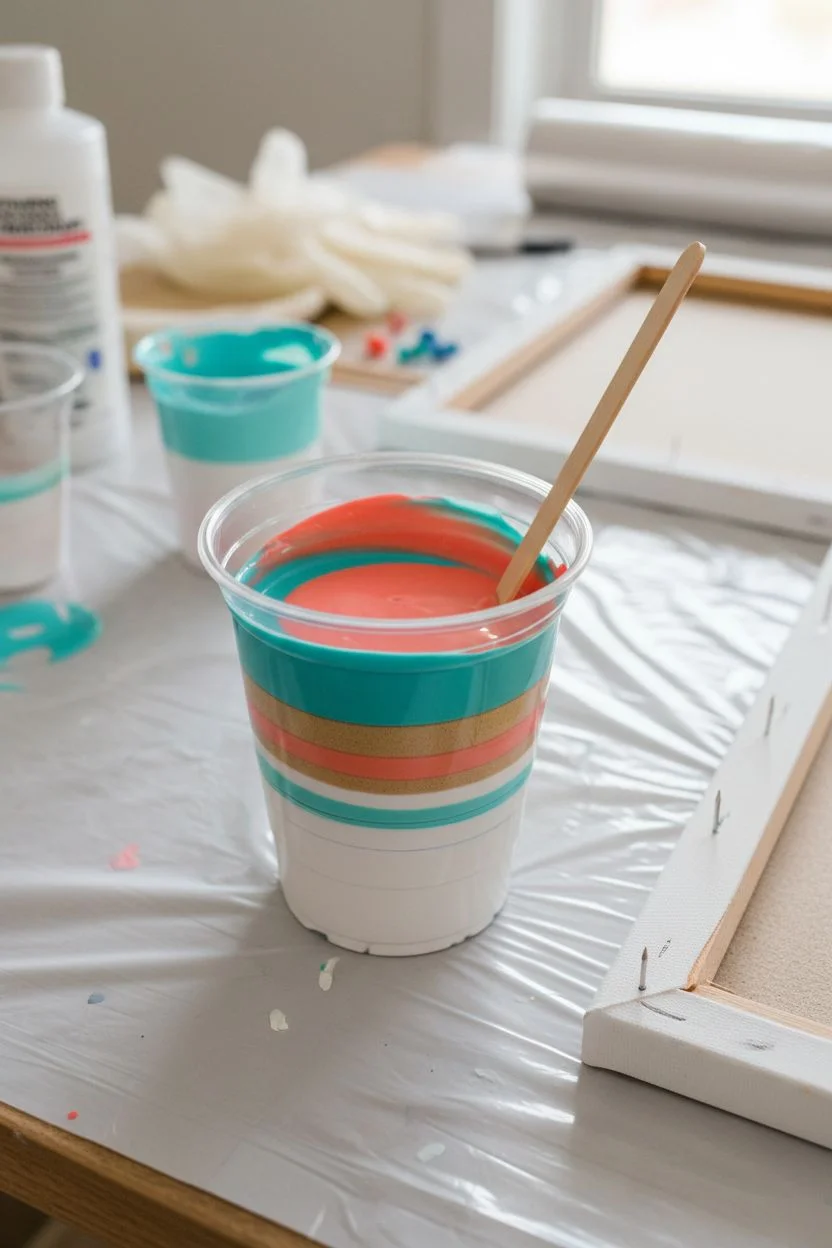
When I’m planning a pour painting, the color combo is the part that makes everything either sing or turn into mystery sludge. Here are my favorite color combos and pour painting color ideas—starting with the classic crowd-pleasers and ending with the weirder, wow-factor palettes I reach for when I want surprises.
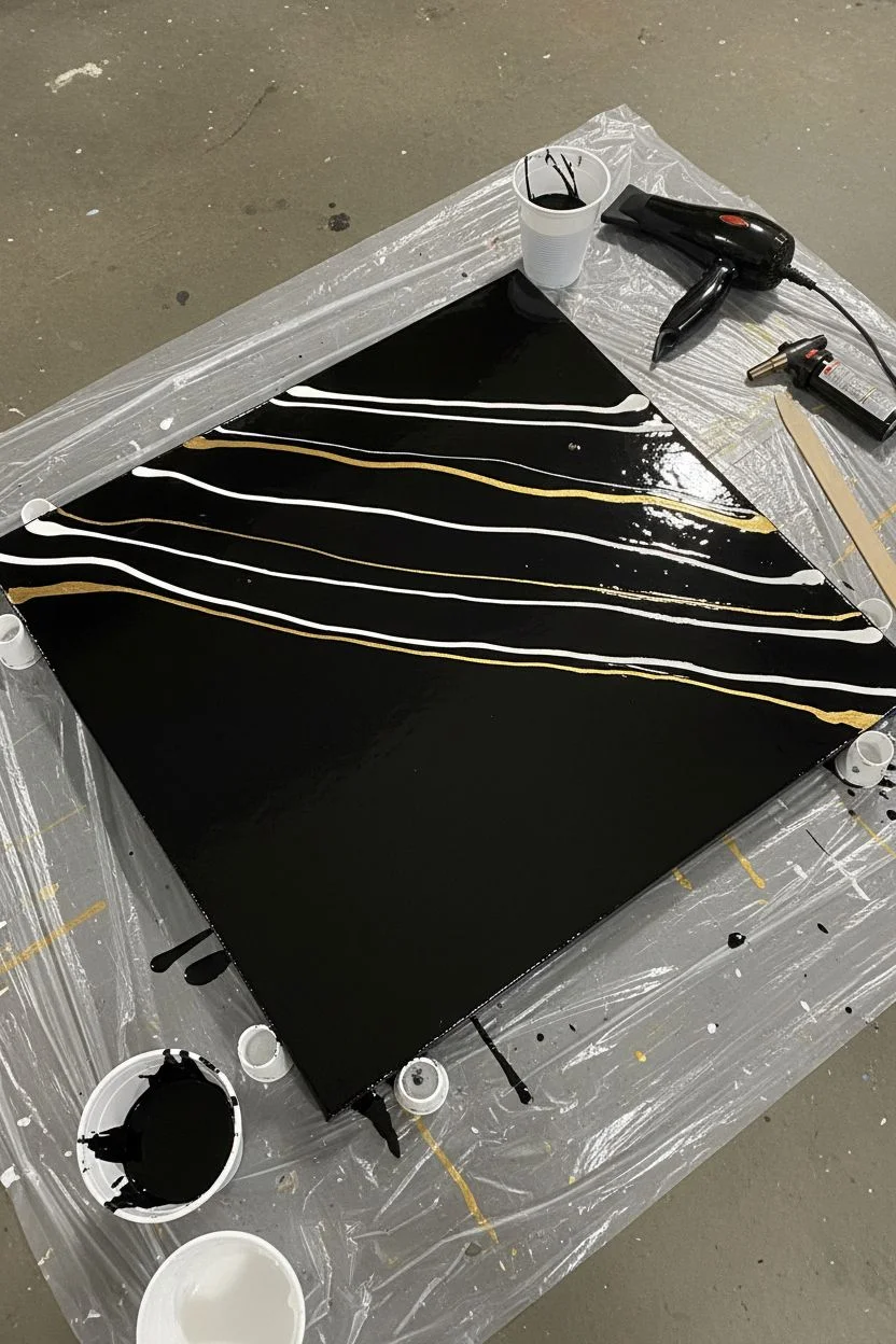
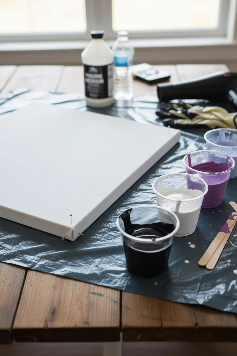
Pour Painting Palette: Black + White + Gold
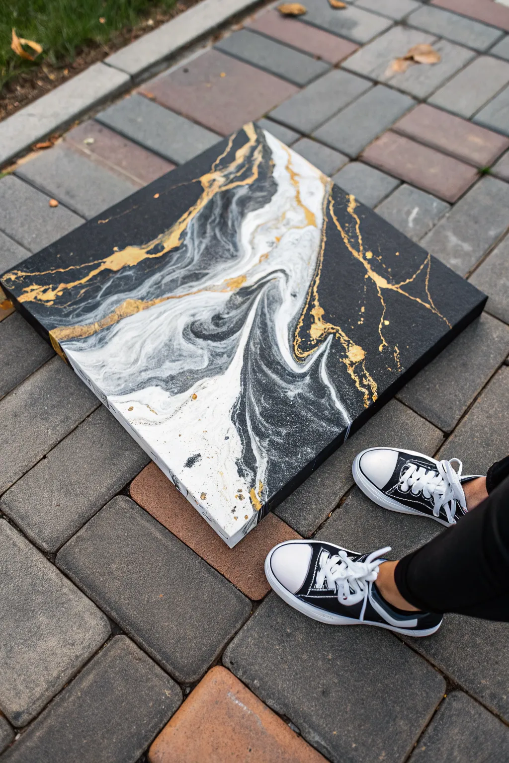
Achieve a sophisticated faux-marble look with this striking high-contrast pour painting. The deep black negative space perfectly frames wispy white clouds and electric veins of gold for a piece that feels both modern and timeless.
Detailed Instructions
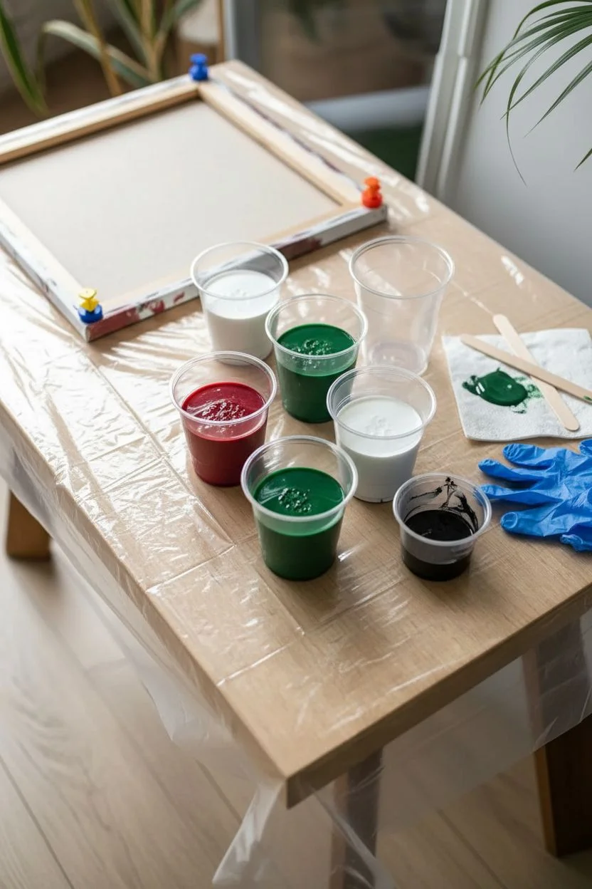
Materials
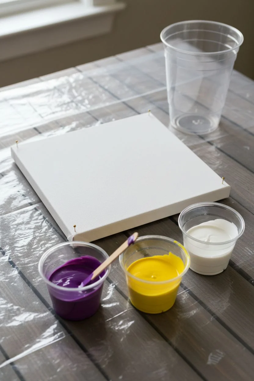
- Square stretched canvas (24×24 or similar)
- Black acrylic paint (heavy body or soft body)
- White acrylic paint
- Gold metallic acrylic paint
- Pouring medium (Floetrol or Liquitex)
- Silicone oil (optional, for cells)
- Loose gold mica powder (optional)
- Hairdryer with concentrator nozzle
- Plastic cups and stir sticks
- Drop cloth or plastic sheeting
- Gloves
- Level
- Torch or heat gun
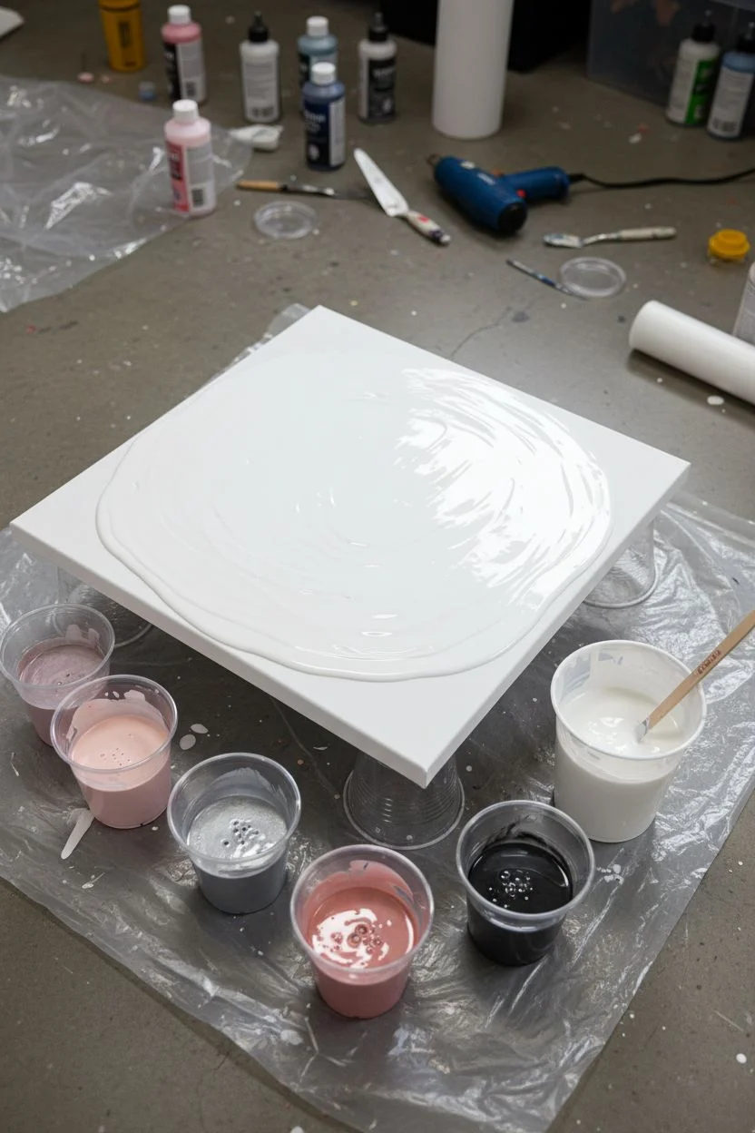
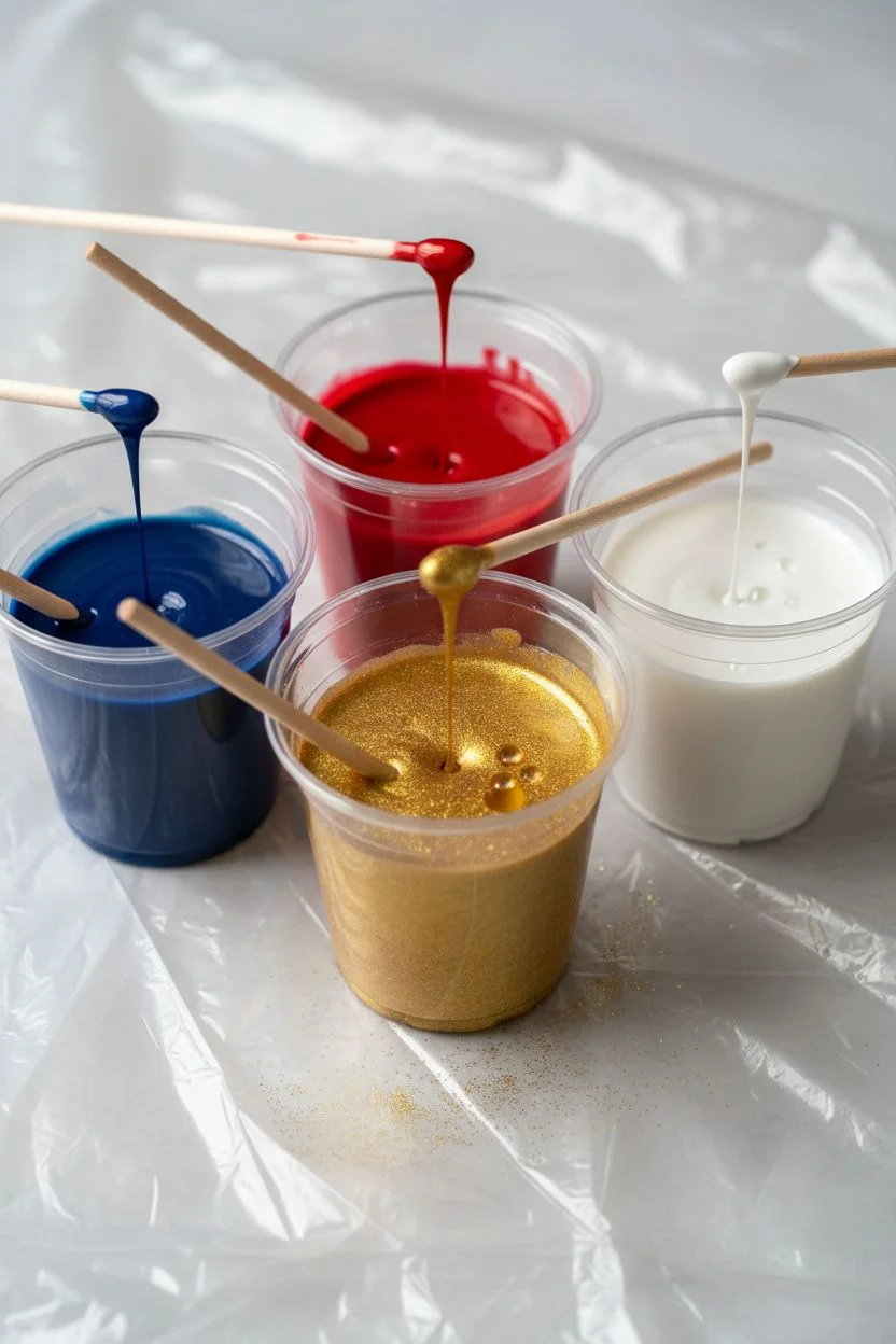
Step 1: Preparation & Mixing
-
Prepare the workspace:
Lay down your plastic sheeting to protect the floor or table. Ensure your canvas is raised on push pins or cups so paint can drip freely off the edges. -
Level the surface:
This is crucial for this specific design; use a level to ensure your canvas is perfectly flat. If it tilts, your negative space will vanish as the paint slides off. -
Mix the base black:
Mix a large amount of black acrylic paint with your pouring medium. You want a consistency similar to warm honey—fluid enough to move but thick enough to cover the canvas opaquely. -
Mix accent colors:
Mix the white and gold paints in separate cups with medium. For the gold, I like to add a pinch of mica powder to the metallic paint to make it really shimmer when it dries. -
Adjust consistency:
Ensure the white and gold mixtures are slightly thinner than your black base. This helps them float over the black rather than sinking underneath it.
Muddy Colors?
If your white turns gray, you blew too hard or mixed the black base too thin. Try blowing more horizontally across the surface rather than aiming straight down.
Step 2: Creating the Composition
-
Flood the canvas:
Pour the black paint generously over the entire canvas. Use a palette knife or the back of your hand to spread it to the corners, ensuring full coverage including the sides. -
Pop bubbles:
Quickly run a torch or heat gun over the black surface to pop any air bubbles immediately, creating a glass-smooth base layer. -
Lay the color stripe:
Pour a line of white paint diagonally across the canvas. It shouldn’t be a straight line; let it wander slightly. Follow this immediately with thinner ribbons of gold alongside and on top of the white. -
Add floating black:
Pour a small amount of fresh black paint specifically around the edges of your white and gold stripe. This extra ‘lubricant’ paint helps the colors blow over the base layer smoothly.
Pro Tip: Metal Leaf
For sharper gold lines, paint the blow-out first. Once dry, use gold leaf size and foil sheets to add veins manually on top of the dried acrylic.
Step 3: The Blow Technique (Dutch Pour)
-
Blow over:
Using your hairdryer on the ‘cool’ and ‘low’ setting, gently blow the black paint *over* the white and gold stream first. You want to partially submerge the colors. -
Blow out:
Now, blow the paint *outward*. Direct the air from the center of the color line out towards the black negative space. Chase the white paint so it feathers out into wispy, smoke-like tendrils. -
Create gold veins:
Focus on the gold sections. Use quick bursts of air to stretch the gold into thin, lightning-like cracks rather than large blobs. -
Refine the composition:
Stop while you are ahead. Use a wet finger or a clean palette knife to clean up any areas where splashes landed on your pristine black negative space. -
Detail work:
If you want finer details, use a straw to gently blow specific areas of gold to branch them out further, creating delicate fractals.
Step 4: Finishing Touches
-
Check the sides:
Look at the edges of the canvas. Use your gloved finger to dab wet dripping paint onto any bare spots on the canvas corners or sides. -
Final torching:
Give the piece one final, quick pass with the torch to pop bubbles that may have risen during the blowing process. -
Controlled drying:
Let the painting dry in a dust-free area for at least 72 hours. Do not use heat to speed this up, or the black paint may crack. -
Varnish:
Once fully cured (after 2-3 weeks), apply a high-gloss varnish to make the black deepen and the gold pop.
Hang your stunning marble-effect piece and enjoy the dramatic flair it brings to your space.
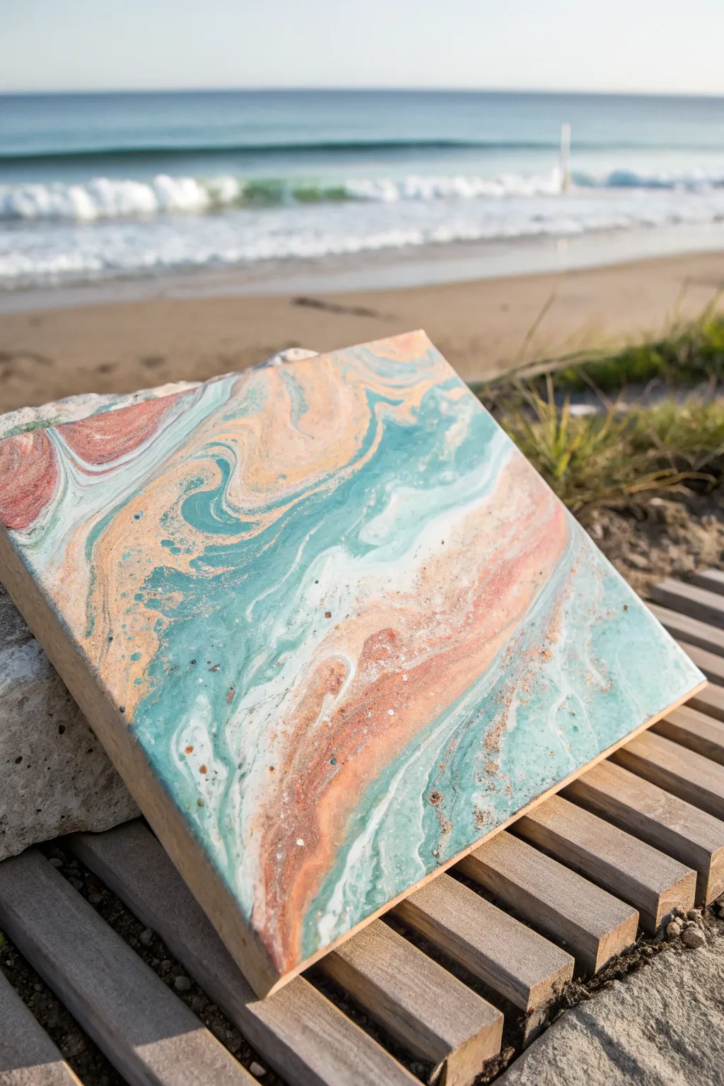
Pour Painting Palette: Blue + Orange Contrast
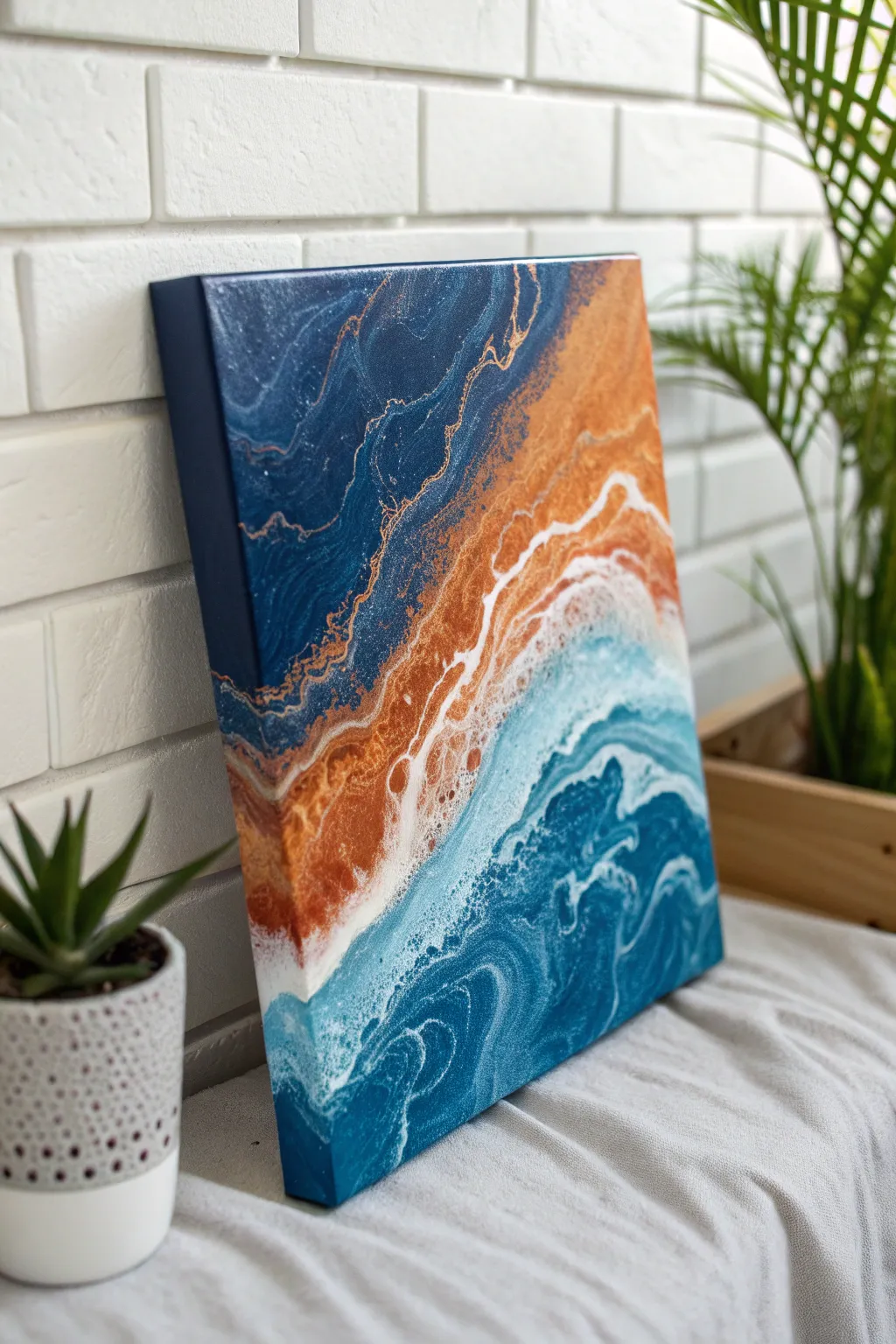
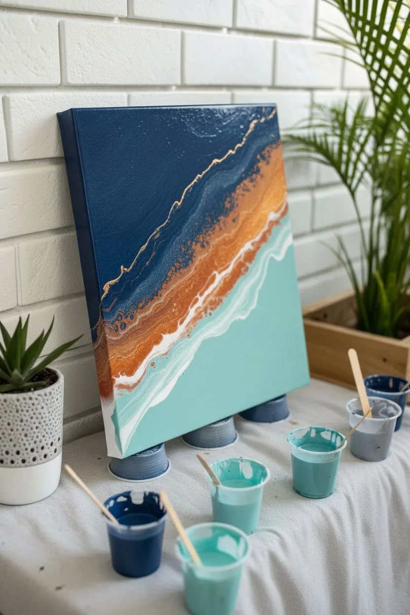
This striking pour painting captures the dynamic energy of an abstract shoreline, blending deep ocean blues with shimmering copper sands. The high-contrast palette of navy and metallic orange creates a sophisticated, modern look perfect for brightening any room.
Step-by-Step Guide
Materials
- Gallery-wrapped canvas (approx. 12×16 inches or square)
- Acrylic paints: Navy Blue, Teal/Light Aqua, Metallic Copper, Metallic Gold, Titanium White
- Pouring medium (Floetrol or Liquitex)
- Silicone oil (optional, for cells)
- Plastic cups and stir sticks
- Hair dryer with a concentrator nozzle
- Straw (for detail work)
- Gloves and drop cloth
Step 1: Preparation & Mixing
-
Prepare your workspace:
Fluid art is messy, so lay down a generous drop cloth or plastic sheet. Raise your canvas off the table using four overturned cups or pushpins in the corners so the paint can flow freely over the edges. -
Mix your paints:
In individual cups, mix each paint color with your pouring medium. A standard ratio is 1 part paint to 2-3 parts medium, but check your specific brand’s instructions. -
Check consistency:
Stir until the mixture resembles warm liquid honey. When you lift the stick, the paint should flow in a solid stream and leave a small mound that disappears within seconds. -
Add silicone (optional):
If you want distinct ‘cells’ or lacing, add 1-2 drops of silicone oil to the Copper and Teal mixtures. Stir gently just a few times; over-stirring can break up the oil too much.
Muddy Colors?
If your blue and orange turn brown where they meet, you are over-mixing. Use less movement with the hair dryer and ensure your base layer is wet enough for colors to glide, not mix.
Step 2: The Pour
-
Apply the base coat:
Start by flooding the canvas with your Navy Blue. You don’t need to cover the entire thing thickly, but create a wet surface for the other colors to glide on. -
Create the diagonal:
Pour a thick band of Copper diagonally across the center of the canvas. This will separate your deep ocean from the lighter waves. -
Layer the lighter colors:
On one side of the copper line (the ‘water’ side), pour a line of Titanium White followed by the Teal/Light Aqua. -
Enhance the shore:
On the other side of the copper line (the ‘deep sea’ side), add a thin drizzle of Metallic Gold to add complexity to the darker section. -
Add white for lacing:
Pour a final thin ribbon of Titanium White right along the borders where the colors meet. This white often helps create sea foam effects when blown out.
Step 3: Blowing & Styling
-
First blow: The Ocean Side:
Using your hair dryer on the ‘cool’ and ‘low’ setting (with concentrator nozzle), gently push the White and Teal paints outward, away from the copper line. -
Second blow: The Deep Side:
Gently push the dark blue and gold slightly, just to blend the edges, but keep this area darker and calmer than the wave side. -
Creating the crash:
Now, use the dryer to push the white and lighter blue *over* parts of the copper. This overlapping motion creates the beautiful lacing and ‘crashing wave’ effect seen in the photo. -
Refine with a straw:
Turn off the dryer. Use a drinking straw to blow on specific areas where you want softer tendrils or to break up a large blobs of color. -
Tilt for composition:
Gently tilt the canvas just a few degrees in different directions to stretch out any cells that have formed and to ensure corners are covered. -
Torch for cells:
Quickly pass a culinary torch or heat gun over the surface—keep it moving constantly—to pop air bubbles and encourage more cells to surface.
Add Texture
Before the paint dries completely, sprinkle fine gold glitter or crushed glass into the copper ‘sand’ section for a 3D texture that sparkles in the light.
Step 4: Finishing Up
-
Check the edges:
Use your finger to dab matching paint onto any bare spots on the sides of the canvas canvas for a professional, gallery-wrapped finish. -
Clean the underside:
Run a palette knife or stick along the underside edge of the frame to scrape off dripping paint. This prevents bumps from forming as it dries. -
Protect while drying:
Cover the painting with a large box or tented foil to prevent dust from settling on the wet surface. -
Let it cure:
Allow the painting to dry on a perfectly level surface for at least 3-4 weeks before varnishing, as thick acrylic pours take time to cure fully.
Enjoy the soothing process of watching your abstract seascape settle into its final form


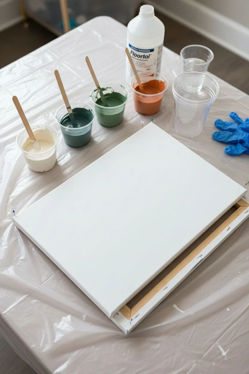
Pour Painting Palette: Red + Green Drama
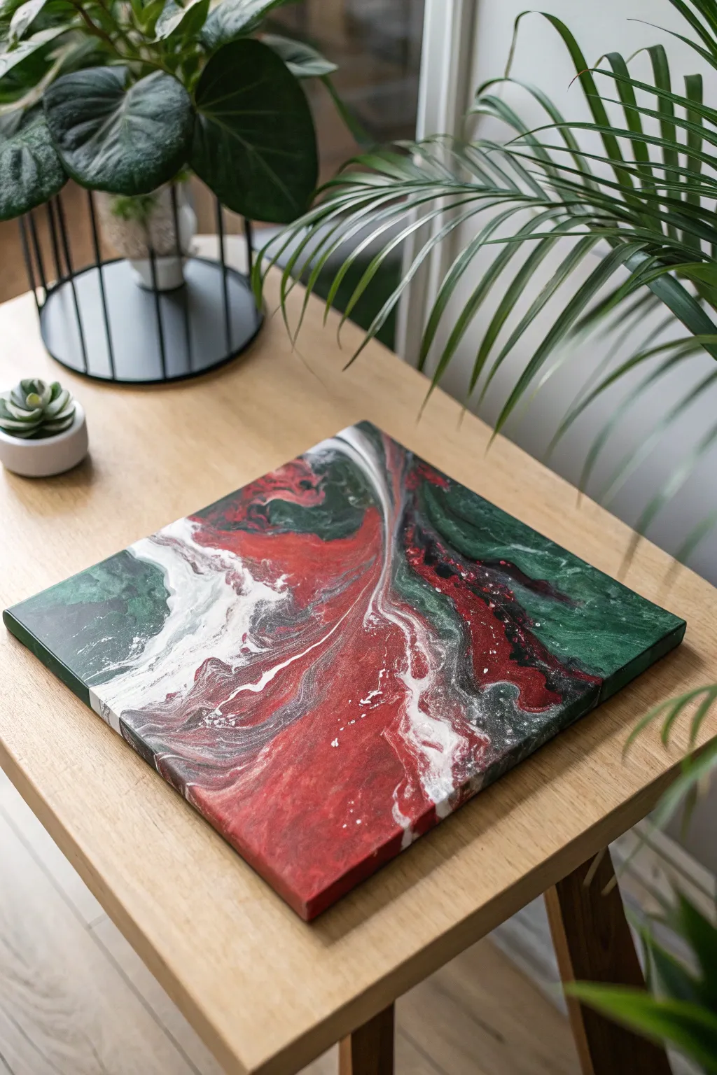
This striking pour painting balances the intensity of deep crimson against cool, shadowy forest greens, creating a dramatic marble effect perfect for modern decor. The addition of bright white veins breaks up the darker tones, adding movement and light to the rich, moody palette.
Detailed Instructions
Materials
- Square stretched canvas (10×10 or 12×12 inches)
- Acrylic paints (Deep Red/Crimson, Forest Green, Titanium White, Black)
- Pouring medium (Floetrol or Liquitex)
- Silicone oil (optional, for cells)
- Plastic cups (4 small for colors, 1 medium for the dirty pour)
- Stirring sticks
- Jumbo push pins (to elevate canvas)
- Plastic drop cloth or garbage bag
- Gloves
- Kitchen torch (optional)
Step 1: Preparation & Mixing
-
Prepare your workspace:
Cover your table completely with the plastic drop cloth. Acrylic pouring is messy, so ensure you have a wide area protected. -
Elevate the canvas:
Insert four jumbo push pins into the wooden frame corners on the back of your canvas. This lifts the painting off the table, allowing paint to drip freely off the edges without sticking. -
Mix your base ratios:
In separate small cups, mix your acrylic paints with the pouring medium. A standard ratio is 1 part paint to 2 parts medium, but check your specific medium’s instructions. -
Check consistency:
Stir each color thoroughly. The consistency should resemble warm honey—it should flow off the stick in a steady stream but not be as thin as water. -
Add silicone (optional):
If you want small cells or bubbles in your design, add 1-2 drops of silicone oil to the red and green cups only. Stir very gently just once or twice to avoid breaking the oil up too much.
Don’t Over-Tilt
If you tilt the canvas too aggressively or for too long, the distinctive bands of color will muddy together into brown. Stop once the canvas is covered.
Step 2: Creating the Pour
-
Layer the dirty pour cup:
Take your empty medium-sized cup. Start by pouring a small amount of white into the bottom to help the paint flow. -
Build the color stack:
Pour the other colors into this main cup in layers. I like to alternate dark and light: pour some forest green, then a splash of white, followed by deep red, and a touch of black. -
Repeat the layering:
Continue layering the paints down the side of the cup rather than splashing them into the center. This keeps the colors distinct. Do not stir this cup. -
Perform the flip cup:
Place the canvas face down on top of your cup. Hold both the cup and canvas tightly together and quickly flip them over so the canvas is right-side up with the cup upside down on the surface. -
Let it settle:
Wait about 30 seconds to let all the paint drain down to the canvas surface inside the cup. -
Lift and release:
Gently lift the cup straight up. The paint will puddle onto the canvas. You can drag the lip of the cup slightly through the puddle to create initial movement.
Color Clarity
Red and green are complementary colors that make brown when mixed. Use distinct layers of white between them in the cup to keep the hues pure.
Step 3: Tilting & Finishing
-
Begin tilting:
Gently tilt the canvas to one side, letting the paint roll toward the corner. Don’t let it run off just yet; move it back toward the center. -
Cover the corners:
Continue tilting in a circular motion to guide the paint to all four corners. Use your finger to dab paint onto any dry corners if the flow misses them slightly. -
Refine the composition:
Look at your pattern. Tilt the canvas to stretch out areas you like—such as those white veins separating the red and green—or to dump off muddied sections you don’t like. -
Check the edges:
Ensure the sides of the canvas are fully covered. Run a finger along the underside edge to catch any heavy drips, which stops the paint from pulling the design off the top as it dries. -
Pop air bubbles:
If you see tiny bubbles, quickly pass a kitchen torch over the surface (keep it moving constantly) or blow gently on them with a straw to pop them. -
Allow to cure:
Leave the painting to dry in a dust-free area for at least 24-48 hours. The paint must be perfectly flat while drying to prevent shifting.
Once fully cured and possibly varnished, hang your artwork to bring a bold splash of contrasting color to your room


Pour Painting Palette: Yellow + Purple Punch
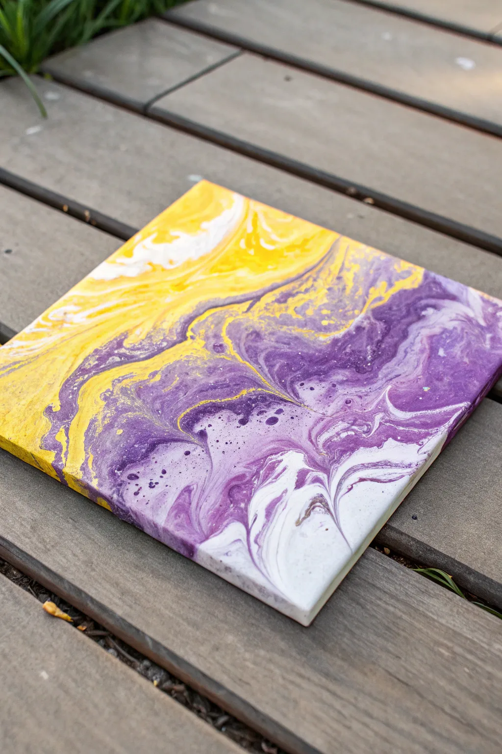
Embrace the bold contrast of complementary colors with this vibrant fluid art piece. The striking interplay between rich violet, bright lemon yellow, and crisp white creates a dynamic, marble-like effect that feels energetic yet balanced.
Step-by-Step
Materials
- 8×8 inch square stretched canvas
- Purple acrylic paint (deep violet)
- Yellow acrylic paint (bright lemon)
- White acrylic paint (titanium white)
- Pouring medium (Floetrol or Liquitex)
- Silicone oil (optional for cells)
- 3 plastic cups for mixing
- 1 large ‘dirty pour’ cup
- Craft sticks for stirring
- Push pins or giant thumbtacks (to elevate canvas)
- Drop cloth or plastic sheet
- Gloves
Step 1: Preparation and Mixing
-
Workspace Setup:
Begin by covering your working surface thoroughly with a plastic sheet or drop cloth, as fluid art can get messy. Ensure your table is perfectly level to prevent the paint from sliding off one side as it dries. -
Elevate the Canvas:
Insert push pins into the four corners on the back of your canvas. This lifts the canvas off the table, allowing the paint to drip freely over the edges without pooling underneath. -
Mix Paints:
In separate cups, mix each paint color with your pouring medium. A standard ratio is 1 part paint to 2 parts medium, but adjust until the consistency resembles warm honey. -
Check Consistency:
Lift your stir stick out of the paint; the stream should flow continuously without breaking and create a small mound that disappears into the cup within a second. Adjust with small drops of water if too thick. -
Add Silicone (Optional):
If you want the small cellular details seen in the purple sections of the example, add 1-2 drops of silicone oil to the purple and yellow cups only. Stir just slightly—over-stirring will break up the oil too much.
Muddy Colors?
Yellow and purple are opposites and make brown when mixed. If your colors look muddy, your paint might be too thin, or you tilted too aggressively, forcing them to blend rather than flow.
Step 2: Creating the Dirty Pour
-
Layering the Cup:
Take your large empty cup and begin creating layers. Start with a splash of white at the bottom to help flow. -
Adding Color:
Pour a layer of purple gently down the side of the cup, followed by a layer of yellow. Pouring down the side prevents the colors from mixing prematurely and becoming muddy. -
Repeating Layers:
Continue alternating white, purple, and yellow. I like to vary the thickness of the layers to create more interesting patterns. Don’t fill the cup to the brim; just enough to cover your canvas comfortably. -
The Flip:
Place your canvas face-down on top of the cup. firmly hold the cup against the canvas and flip them over together so the cup is now upside down on the canvas. -
Release:
Wait a moment for the paint to settle, then gently lift the cup straight up. The paint will spill out in a puddle. Detailed ribbons of color should already be visible.
Step 3: Tilting and Composition
-
Initial Spread:
Let the paint sit for 30 seconds to allow any air bubbles to pop and cells to start forming. -
Tilt Slowly:
Gently tilt the canvas to one corner, letting the paint roll over the edge. Bring the weight of the paint back to the center before moving to the next corner. -
Manage Contrast:
Be mindful generally when tilting yellow and purple near each other; try not to let them overlap excessively as they can mix into brown. Keep the movement fluid to maintain distinct bands. -
Corner Coverage:
Ensure all four corners and sides are fully covered. You can use a finger to touch up any bare spots on the corners with paint that has dripped onto the table. -
Final Composition:
Once covered, give the canvas one last gentle tilt to orient the pattern diagonally, creating that sweeping motion seen in the reference image. -
Drying:
Leave the painting to establish its surface skin in a dust-free area for at least 24 hours without moving it.
Add Metallic Flare
Swap the standard yellow for a metallic gold paint. It pairs beautifully with purple and adds a shimmering, luxurious vein through the artwork when the light hits it.
Once fully cured, your bold abstract piece is ready to brighten up any room
BRUSH GUIDE
The Right Brush for Every Stroke
From clean lines to bold texture — master brush choice, stroke control, and essential techniques.
Explore the Full Guide
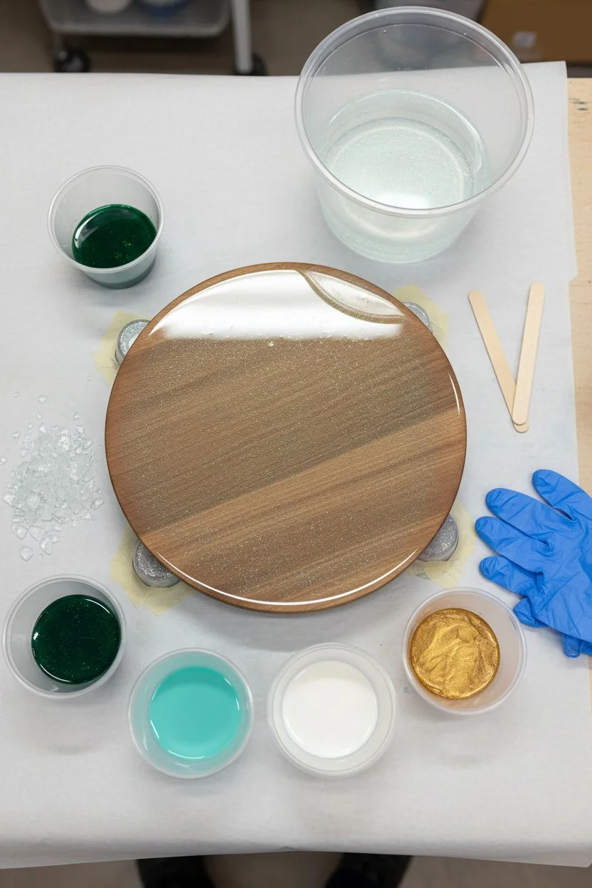
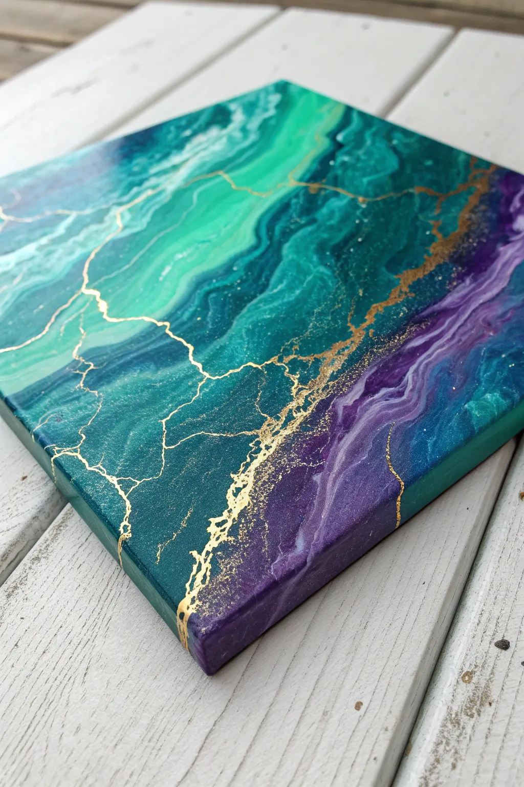
Pour Painting Palette: Teal + White + Gold Geode
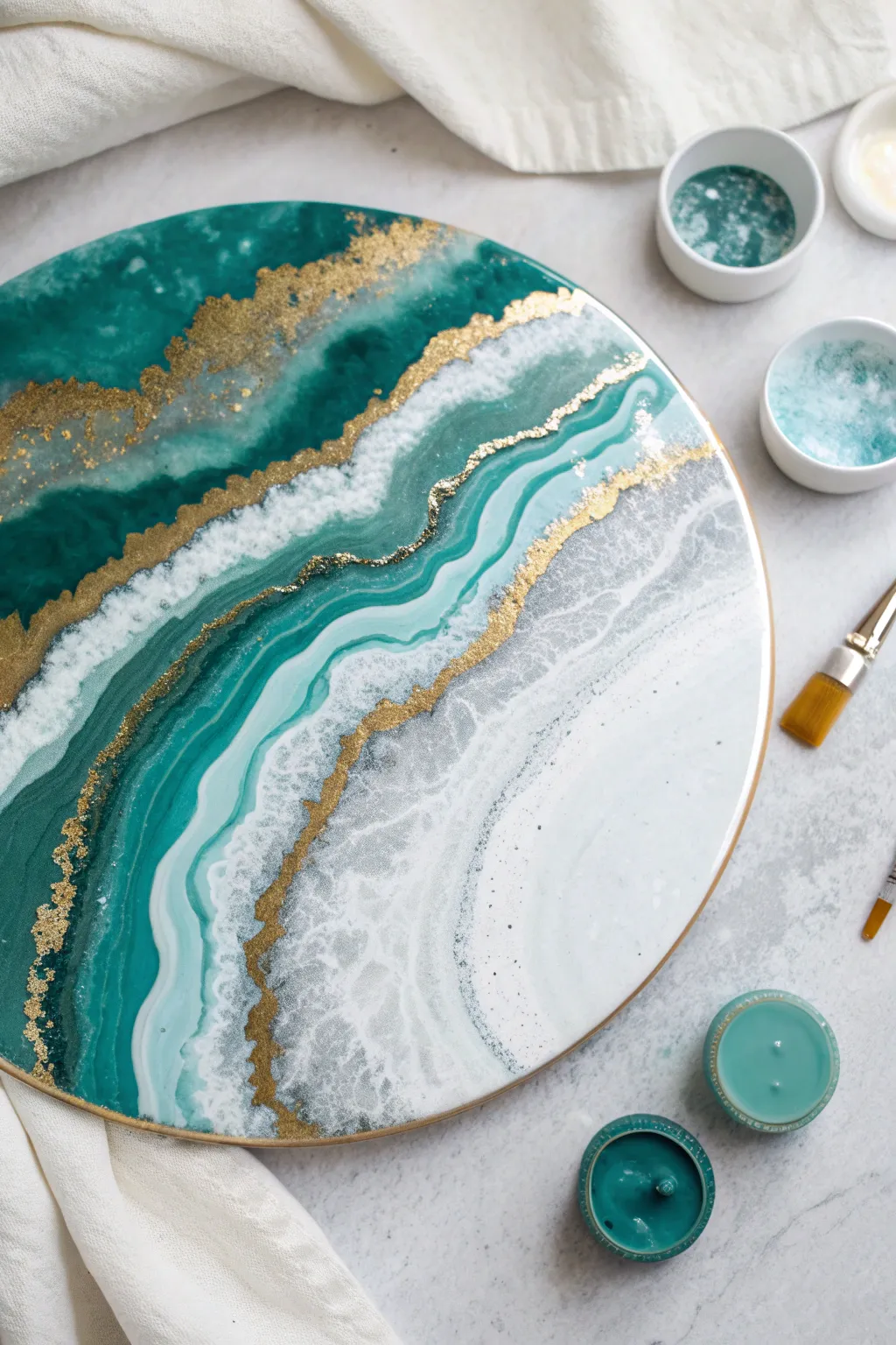
This stunning geode-inspired pour creates a sophisticated focal point with its deep emerald currents, frothy white waves, and striking veins of gold. The layered resin technique captures the organic beauty of agate stone, offering a depth and shine that looks incredibly high-end.
Step-by-Step Tutorial
Materials
- Round wooden art board or canvas (approx. 12-16 inches)
- Art resin (part A and part B epoxy resin)
- Deep teal or emerald mica powder or pigment paste
- Light turquoise or aqua pigment
- Opaque white pigment paste
- Gold metallic pigment powder or gold leaf flakes
- Clear or silver glitter (fine)
- Crushed glass or decorative stones (clear/white)
- Gold paint pen or liquid gilding
- Heat gun or torch
- Mixing cups and stir sticks
- Gloves and protective surface covering
Step 1: Preparation & Base Mixing
-
Surface Prep:
Ensure your round board is level and elevated on cups to allow drips to fall freely. Tape the underside edges if you want a clean back. -
Mix Resin:
Combine your resin and hardener according to the manufacturer’s instructions (usually a 1:1 ratio). Stir slowly for at least 3 minutes to minimize bubbles. -
Color Separation:
Divide the mixed resin into four small cups and one larger cup. Leave the largest portion clear. -
Tinting:
Mix your pigments: deep teal in one cup, light turquoise in another, opaque white in the third, and gold powder in the fourth. Keep the final cup clear, perhaps adding a pinch of fine glitter for sparkle.
Cloudy Resin?
If your clear sections look milky, it’s often humidity or over-torching. Avoid pouring on rainy days and only torch quickly.
Step 2: Pouring the Geode Layers
-
The Dark Core:
Start by pouring the deep teal resin on one side of the board, creating an irregular, wavy shape that will serve as the darkest band of the geode. -
Adding Texture:
While the resin is wet, carefully place crushed glass or stones along the edge of the dark teal section. This adds that crucial crystalline geode texture. -
The Gold Vein:
Pour a thin line of the gold resin right next to the dark teal. Use a stir stick to guide it into a thin, jagged line rather than a thick blob. -
Lighter Layers:
Pour the light turquoise mix next, following the curves of the previous bands. Allow some space between bands for the clear resin. -
Clear Separation:
Pour the clear/glitter resin between colored bands. This creates negative space that gives the piece depth and makes it look like real stone.
Dimension Boost
Add 3D texture by mixing heavy texture gel with your gold paint and piping it onto the dried resin for raised, tactile veins.
Step 3: Creating Cells & Finishing
-
White Waves:
Pour the opaque white resin near the lighter turquoise sections. This will become the foamy edge of the geode layers. -
blending:
Use your heat gun on a low setting to gently blow the white resin over the clear or turquoise sections. This creates a lacing effect. -
Gold Leaf Accents:
If using flaked gold leaf instead of just powder, carefully place small bits along the transition lines between colors while the resin is still tacky. -
Pop Bubbles:
Pass a torch or heat gun quickly over the entire surface to pop any rising air bubbles. Don’t linger in one spot to avoid burning the resin. -
Curing:
Cover the piece with a large box to prevent dust from settling on it and let it cure for 24 hours. -
Defining Lines:
Once fully hard, use a gold paint pen or liquid gilding to trace over the existing gold lines or add new intricate veins to sharpen the separation between colors. -
Top Coat (Optional):
For a glass-like finish, mix a small batch of clear resin and pour a final clear top coat over the entire piece, sealing in the gold paint lines.
Hang your geode masterpiece in a well-lit area to watch the metallic gold catch the light throughout the day
Pour Painting Palette: Turquoise + Navy + Seafoam
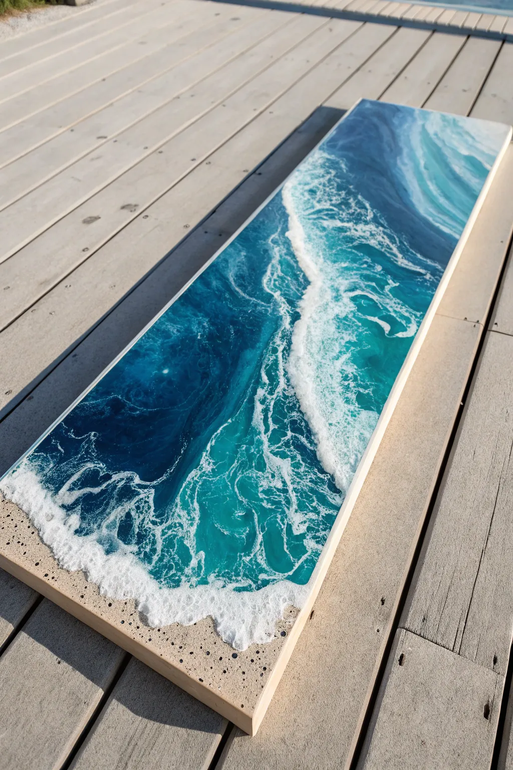
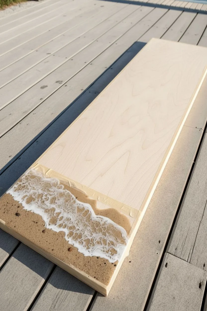
Capture the breathtaking movement of the ocean with this resin pour project, blending deep blues and bright foaming whites on a long canvas. The glassy finish and realistic sandy texture make this piece a stunning focal point for any coastal-inspired space.
Step-by-Step
Materials
- Long, rectangular wooden panel or gallery-wrapped canvas
- Art resin (epoxy resin kit)
- Acrylic paints (Navy Blue, Turquoise, Seafoam Green, Titanium White, Sand/Beige)
- Real sand or beige textured paste
- White alcohol ink (optional, for cell creation)
- Heat gun or torch
- Hair dryer (optional, for blowing waves)
- Plastic cups and stir sticks
- Level
- Painter’s tape (for backing)
- Gloves and protective sheet
Step 1: Preparation & Sand Base
-
Prep the workspace:
Ensure your work surface is perfectly level using a spirit level; resin will pool unevenly if it’s slightly off. Cover your table with a plastic sheet to catch drips. -
Tape the back:
Apply painter’s tape to the underside of your wooden panel or canvas edges. This catches drips and makes cleanup much easier later. -
Create the sand mixture:
In a small cup, mix a small amount of resin with your beige acrylic paint. Stir in real sand until you have a gritty, textured paste that resembles wet beach sand. -
Apply the shoreline:
Pour the sand mixture onto the bottom quarter of the canvas. Use a stir stick or gloved finger to spread it out, creating an organic, slightly uneven shoreline edge. -
Add detail dots:
For extra realism, sprinkle a few larger grains of sand or tiny pebbles into the wet resin near the bottom edge to mimic beach debris.
Step 2: Pouring the Ocean Gradient
-
Mix the ocean colors:
Prepare three separate cups of resin mixed with your acrylic paints: Navy Blue, Turquoise, and Seafoam Green. Keep the pigment load translucent enough to retain depth. -
Pour the deep water:
Pour the Navy Blue resin onto the top third of the canvas. This represents the deepest part of the ocean. -
Pour the transition zone:
Pour the Turquoise resin in the middle section, overlapping slightly with the Navy Blue. -
Pour the shallow water:
Pour the Seafoam Green near the sand line, blending it lightly where it meets the Turquoise. -
Blend the gradient:
Gently tilt the canvas or use a gloved finger to blur the lines between the blue sections, creating a smooth ombre transition from deep to shallow water.
Heat Control Pro Tip
Don’t overheat the resin when blowing waves! Excessive heat makes the resin too thin and runny, causing your beautiful white cells to dissolve into a blurry mess.
Step 3: Creating the Waves
-
Mix the white wave resin:
In a fresh cup, mix resin with Titanium White acrylic paint. To encourage cells (lacing), you can add a few drops of white alcohol ink or special cell creator fluid. -
Lay the wave lines:
Pour a thin line of white resin right at the border where the blue water meets the sand. Add a second, thinner line further back in the turquoise section for a cresting wave. -
Blow the waves:
Using a heat gun or hair dryer on a low setting, blow the white resin line back towards the blue water. Only push the white part; try to glide it over the blue rather than mixing it in. -
Create lacing:
Use a torch quickly over the blown white areas. The heat pops bubbles and helps the white breaks apart into that classic foamy ‘lacing’ pattern. -
Refine the shoreline:
I find it helpful to use a toothpick or small stick to drag tiny wisps of white foam onto the sand texture, making it look like the water is receding. -
Cure:
Cover the piece with a clean box to prevent dust from settling and let it cure for at least 24 hours.
Level Up: Glossy Finish
For a glass-like finish, pour a final clear ‘flood coat’ of resin over the entire dried piece. It smooths out the texture of the sand and makes the colors pop.
Step 4: Second Layer & Finish
-
Assess the depth:
Once dry, look at your waves. If you want more dimension, mix a small fresh batch of clear resin and white resin. -
Add a second wave (Optional):
Pour a thin layer of clear resin over the water area, then add another white line slightly behind your first wave. Blow it out again to create a 3D layered effect. -
Final cure:
Let the final layer cure completely for 24-72 hours in a dust-free environment. -
Remove tape:
Flip the canvas over and heat the painter’s tape slightly with a heat gun to peel it off cleanly, taking the resin drips with it.
Hang your finished seascape vertically or horizontally to bring a permanent sense of calm to your room

PENCIL GUIDE
Understanding Pencil Grades from H to B
From first sketch to finished drawing — learn pencil grades, line control, and shading techniques.
Explore the Full Guide
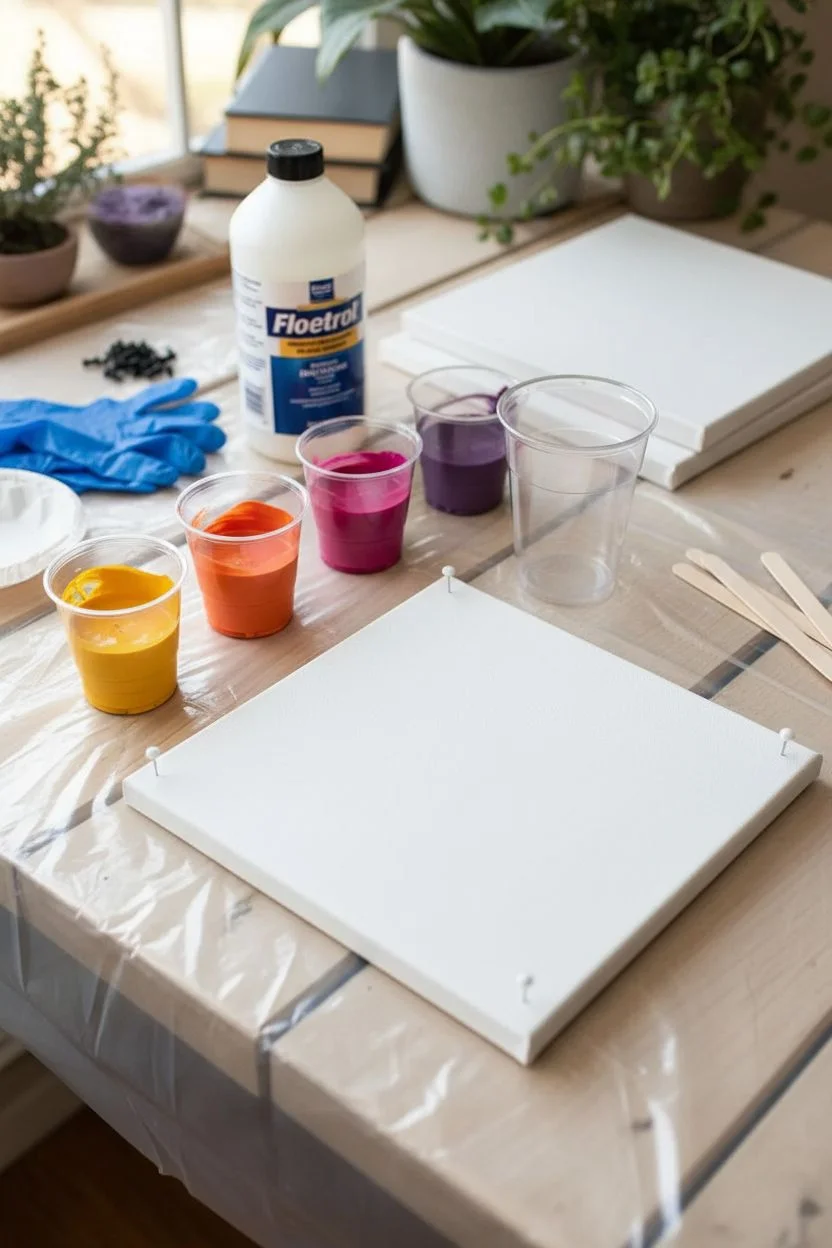
Pour Painting Palette: Sunset Magenta + Orange + Yellow
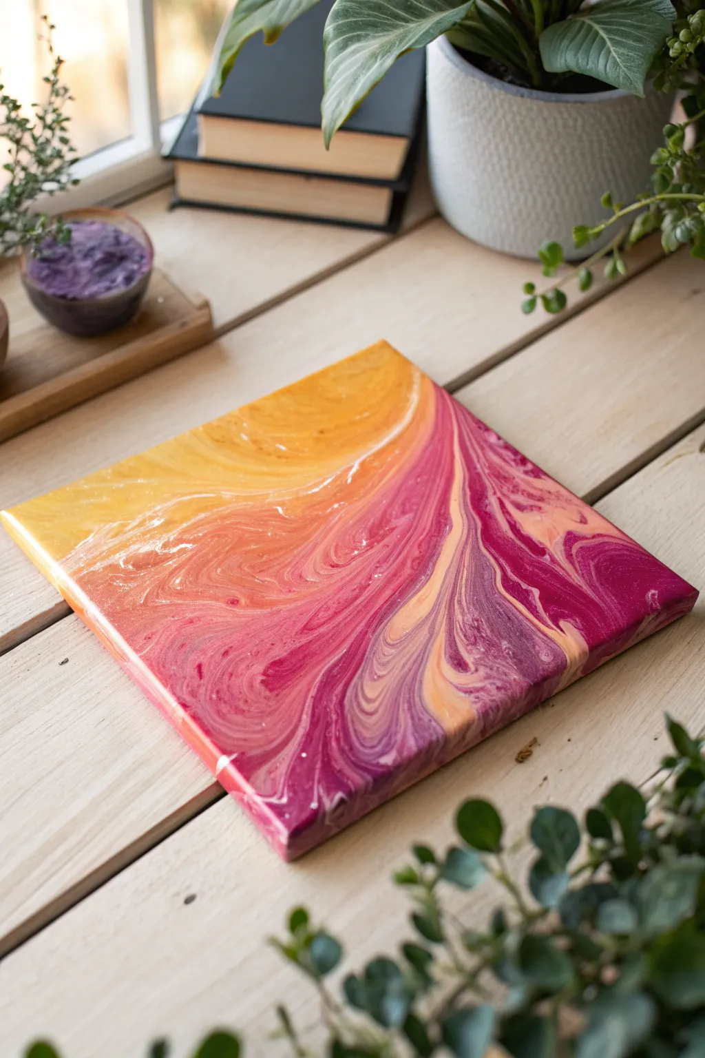
Capture the warmth of a setting sun with this vibrant acrylic pour project featuring a stunning gradient from golden yellow to deep magenta. The fluid motion of the paint creates organic, marble-like patterns that make every single canvas unique.
Step-by-Step Tutorial
Materials
- Square canvas (8×8 or 10×10 inch)
- Acrylic paints (Titanium White, Cadmium Yellow, Orange, Magenta, Deep Violet)
- Pouring medium (Floetrol or similar)
- 4 small mixing cups
- 1 large pouring cup
- Wooden craft sticks for stirring
- Water (distilled is best)
- Plastic drop cloth or tablecloth
- Disposable gloves
- Push pins (for elevating canvas)
- Kitchen torch (optional)
Step 1: Preparation
-
Set up your workspace:
Cover your entire work surface with a plastic drop cloth. Acrylic pouring is messy, and you need a flat, level surface for the paint to dry evenly without shifting. -
Prep the canvas:
Insert four push pins into the corners of the back of the canvas frame. This elevates the canvas off the table, allowing excess paint to drip off cleanly. -
Mix your base paints:
In separate small cups, mix each paint color with pouring medium. A standard ratio is 1 part paint to 2 parts medium, but check your specific brand instructions. -
Adjust consistency:
Stir the mixtures thoroughly. Slowly add drops of water to each cup until the paint flows like warm honey off the stick. If it creates a mound that disappears within 1-2 seconds, it’s perfect.
Step 2: Layering and Pouring
-
Create the pour cup:
For this sunset gradient, we want to layer colors strategically. I like to start by pouring a small amount of white into the bottom of your large pouring cup to help things move. -
Layer the sunset colors:
Gently pour the Cadmium Yellow into the main cup, followed by the Orange. Try to pour them down the side of the cup slightly so they rest on top of each other rather than mixing immediately. -
Add the cool tones:
Continue layering by adding the Magenta and finally the Deep Violet. If you have paint left over, repeat the layers: Yellow, Orange, Magenta, Violet. -
Perform the pour:
Position your large cup near the top-left corner of the canvas. Generally, you can do a ‘traveling ring pour’ here: pour slowly in small circular motions while moving diagonally across the canvas toward the bottom right. -
Empty the cup:
Continue pouring until the cup is empty. You should see distinct bands of color sitting on the canvas surface.
Muddy colors?
If your colors mix into brown instead of staying distinct, your paint was likely too thin or you tilted too aggressively. Aim for a thicker honey consistency next time.
Step 3: Tilting and Finishing
-
Initial tilt:
Gently lift the canvas and tilt it slightly to the left to stretch the yellow section. Don’t let the paint run off the edge just yet. -
Flow toward the corners:
Slowly tilt the canvas diagonally to guide the paint toward the bottom right corner, letting the violet and magenta expand. -
Cover the edges:
Systematically tilt the canvas to each corner and edge, ensuring the entire face is covered. The paint will naturally wrap around the sides of the canvas. -
Check the composition:
Look at the flow. If you want more diagonal movement, tilt the canvas back and forth specifically along that diagonal axis to elongate the cells and striations. -
Touch up sides:
Use a gloved finger to catch drips from underneath the canvas and dab them onto any bare spots on the corners or sides. -
Remove air bubbles:
If you have a kitchen torch, wave it quickly over the surface (6 inches away) to pop trapped air bubbles. If not, you can blow gently through a straw on specific spots. -
Let it cure:
Leave the canvas on the push pins in a dust-free area. Allow it to dry for at least 24-48 hours. The surface must remain completely level during this time.
Add sparkle
Mix a tiny amount of metallic gold paint or iridescent medium into your yellow cup. When dried, the ‘sun’ portion of your painting will shimmer in the light.
Once fully dry, you can seal your sunset masterpiece with a gloss varnish to make those warm colors truly pop
Pour Painting Palette: Soft Pastel Rainbow
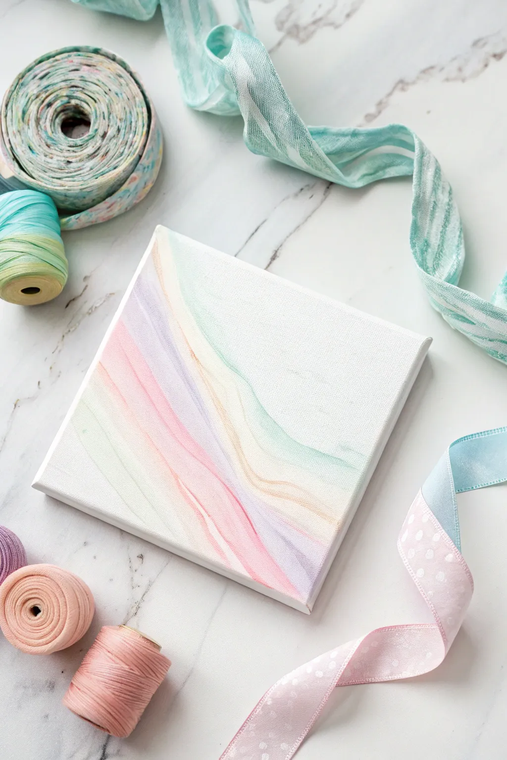
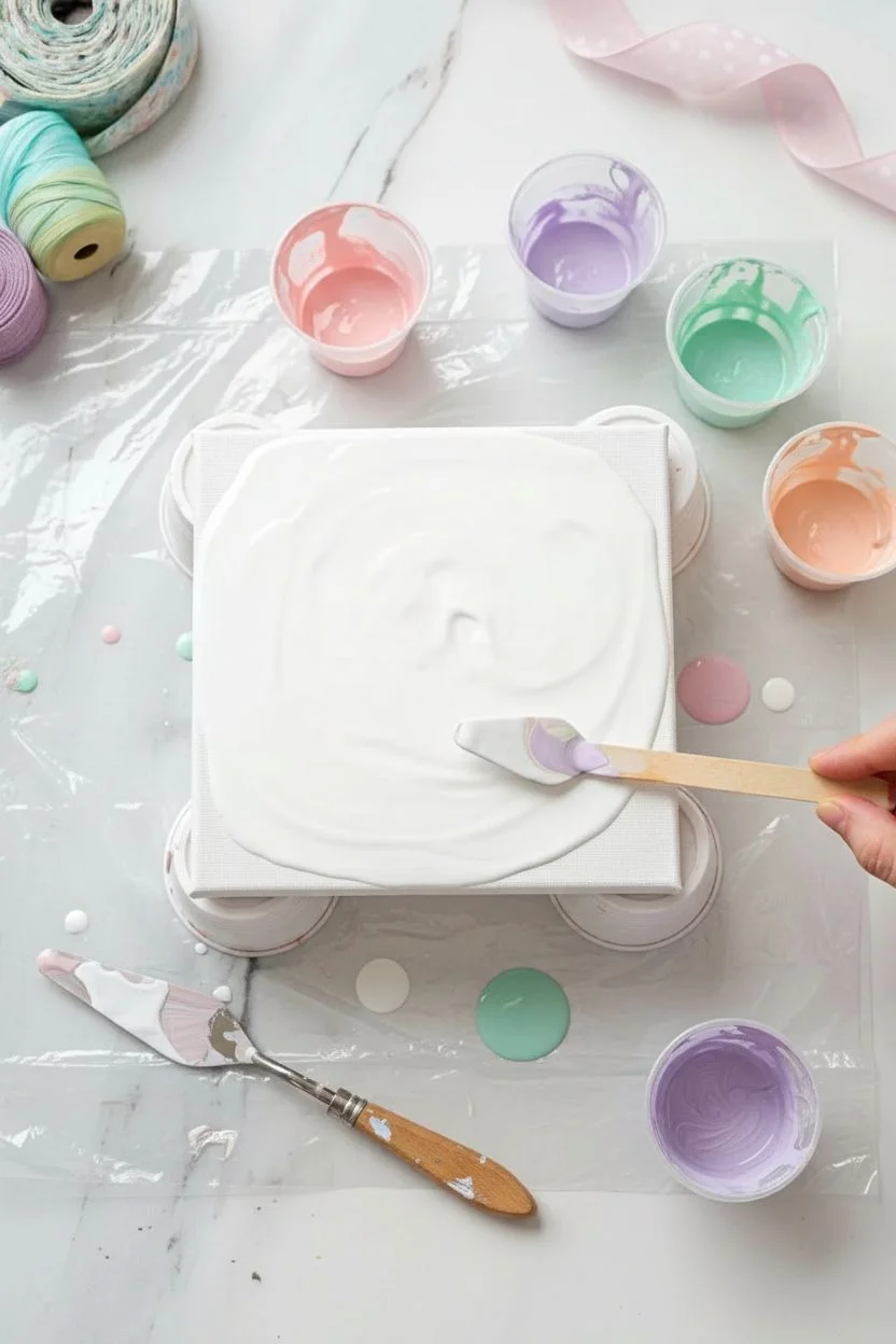
Capture the delicate beauty of a sunrise with this understated fluid art project. Using a restrained palette of soft pinks, lavenders, and mints against negative space, you creates a gentle, sweeping ribbon effect that feels airy and modern.
Step-by-Step
Materials
- Small square stretched canvas (6×6 or 8×8 inches)
- White acrylic paint (heavy body or soft body)
- Pastel acrylic paints: Baby Pink, Lavender, Peach, Mint Green
- Pouring medium (Floetrol or Liquitex)
- Plastic cups for mixing
- Wooden craft sticks for stirring
- Hairdryer (optional, for moving paint)
- Straw (optional, for blowing paint)
- Water
- Drop cloth or plastic sheet
Step 1: Preparation & Mixing
-
Prepare your workspace:
Cover your table with a plastic sheet or drop cloth to catch drips. Elevate your small canvas on four upside-down cups to allow paint to flow off the edges, ensuring it is level. -
Mix the white base:
In a larger cup, mix a generous amount of white acrylic paint with your pouring medium. Aim for a ratio of about 1 part paint to 2 parts medium. Add water drop by drop until it pours like warm honey. -
Mix pastel colors:
In smaller individual cups, mix your pastel shades (Pink, Lavender, Peach, Mint) with pouring medium. These should have the same consistency as your white base—not too watery, but fluid enough to move. -
Test consistency:
Dip a stick into your paint and lift it; the stream should flow smoothly without breaking, creating a small mound that disappears into the cup detailedly within a second or two.
Step 2: The Pouring Process
-
Flood the canvas:
Pour your white mixture generously over the entire canvas. Use a palette knife or a clean craft stick to spread it to the corners and over the edges. -
Smooth the base:
Ensure the white base coat is even and smooth. This wet surface, or ‘pillow,’ is crucial for allowing the colored paints to glide gracefully across the canvas. -
Layer the colors:
Starting at the bottom left quadrant, pour a thin line of Mint paint. Just above it, pour a line of Peach, followed by Lavender, and finally Pink. -
Create the wave:
You don’t need to cover the canvas. Keep your poured lines grouped together in a diagonal formation, roughly following a curve from lower-left toward the center-right. -
Add white buffer:
Pour a little more white paint along the outer edges of your colored lines. This helps ‘push’ the colors without muddying them when we start manipulating the paint.
Muddy Colors?
If your pastels are turning gray or brown, you likely over-manipulated the paint. Limit your blowing or tilting; stop as soon as the wave looks pleasing.
Step 3: Creating the Design
-
Blow the paint:
Using a straw or your breath (or a hairdryer on the lowest, cool setting), gently push the white paint over the colored lines, and then push the colors back out. -
Shape the ribbon:
Guide the air to stretch the colors diagonally across the canvas. Try to maintain distinct bands of color rather than mixing them all together. -
Refine the edges:
Use a straw to gently blow out feathery edges or to soften distinct lines where the color meets the white background. I find that short, soft puffs of air work best here. -
Tilt if necessary:
If the paint looks too pooled in one spot, gently pick up the canvas and tilt it slightly to encourage a natural flow, then return it to the cups. -
Check composition:
Step back and look at the negative space. The white area is just as important as the color. Ensure roughly half the canvas remains white for that clean, minimal look. -
Pop bubbles:
Use a torch lightly or a toothpick to pop any air bubbles that have risen to the surface. -
Clean the edges:
Run your finger or a tool along the underside edge of the canvas to remove dripping paint, which prevents the design from being pulled off the surface as it dries. -
Dry properly:
Let the painting dry in a dust-free area for at least 24-48 hours. Do not move it while it is drying to keep the lines crisp. -
Seal (optional):
Once fully cured (usually 2-3 weeks), apply a gloss varnish to protect the surface and make the pastel colors pop.
Add Some Sparkle
Mix a tiny pinch of iridescent pearl medium or fine silver glitter into your white base paint. It adds a hidden shimmer that only catches the light at certain angles.
Now you have a serene piece of abstract art that brings a breath of fresh air to any room


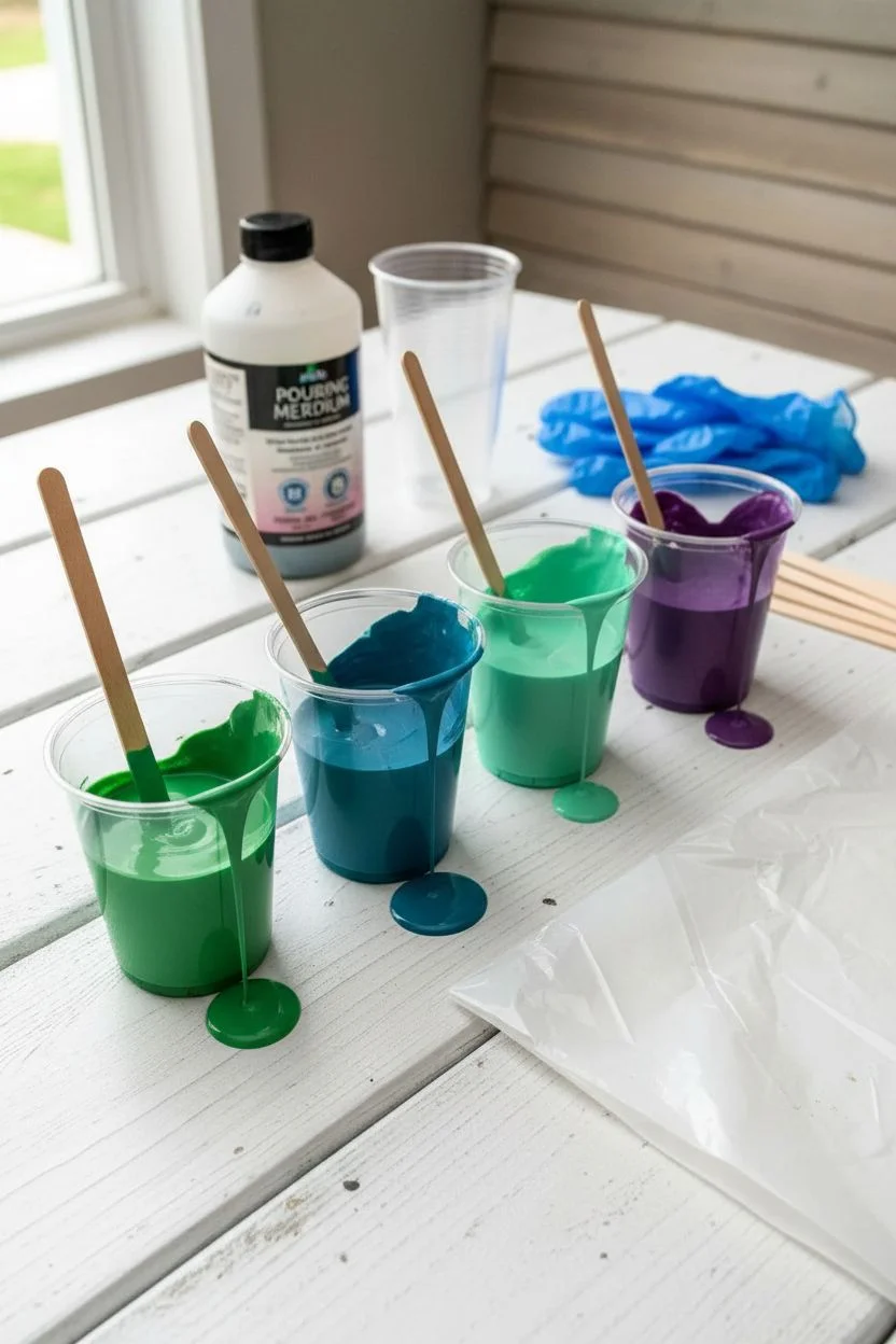
Pour Painting Palette: Monochrome Blues With Value Shifts
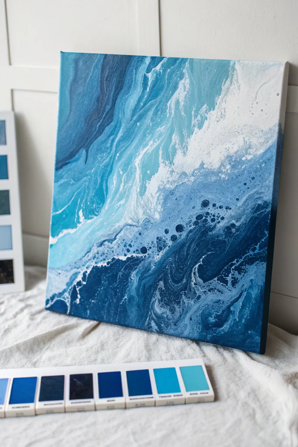
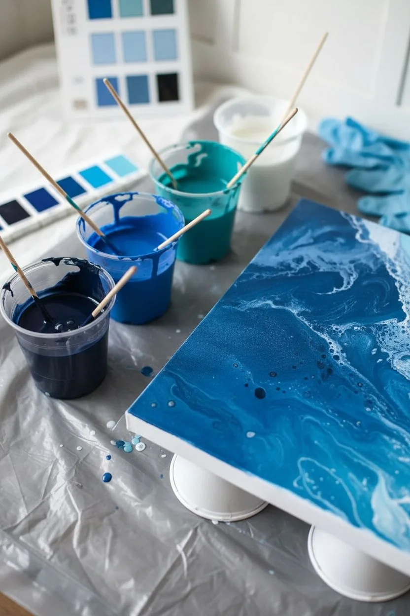
Capture the depth and power of the sea with this stunning monochromatic fluid art piece. By restricting your palette to a range of blues and white, you’ll create a sophisticated artwork that relies on value shifts and negative space to mimic crashing waves.
How-To Guide
Materials
- Square stretched canvas (12×12 or 16×16 inches)
- Acrylic fluid paints (Navy Blue, Royal Blue, Teal, Sky Blue, White)
- Pouring medium (Floetrol or commercial medium)
- Silicone oil (treadmill lubricant works well)
- Plastic cups for mixing
- Stir sticks
- Hair dryer or heat gun
- Palette knife or large spreading tool
- Plastic drop cloth
- Gloves
Step 1: Preparation and Mixing
-
Set up your workspace:
Fluid art is messy, so ensure you have a level surface covered with a plastic drop cloth. Place your canvas on top of raised cups (like overturned yogurt cups) so the paint can drip freely off the edges. -
Mix your base paints:
Prepare five separate cups. Mix each acrylic color with pouring medium at a ratio typically around 1:2 (paint to medium), though check your specific medium’s instructions. You want a consistency resembling warm honey. -
Create the value range:
It is crucial to have distinct lightness steps. Ensure your Navy is very dark (add a drop of black if needed) and your Sky Blue is quite light (add a touch of white). This contrast creates visual drama. -
Add cell activator:
Add 2-3 drops of silicone oil specifically to the Navy and Teal mixtures. Stir them just a couple of times; over-stirring can break the oil down too much. Leave the White and Sky Blue silicone-free to preserve large patches of smooth color.
Step 2: The Pouring Technique
-
Flood the canvas:
Pour a generous amount of plain White paint (mixed with medium) across the top right diagonal half of the canvas. Spread it gently with a palette knife to cover the dry canvas thinly. This acts as a lubricant for the colored paints. -
Layer the darks:
Start applying your darkest Navy Blue in the bottom left corner, pouring it in a wavy, organic shape that moves toward the center. Don’t be afraid to let it drip off the bottom edge. -
Build the transition zones:
Next to the navy, pour the Royal Blue followed by the Teal. Pour these in parallel, wavy lines that echo the shape of your dark corner. Allow the colors to overlap slightly. -
Add the crest:
Pour the Sky Blue next to the Teal, followed by a thick line of White right at the boundary where the blues meet the negative space. This white line is essential for creating the ‘sea foam’ effect. -
The Dutch Pour method:
Using a hair dryer on a cool/low setting, blow the white paint *over* the blue paints first. This submerges the colors momentarily. I like to do this just slightly to soften the harsh edges. -
Blow out the wave:
Change direction and blow the paint from the dark corner upwards and outwards towards the white negative space. Chase the paint across the canvas to create wispy, wave-like tendrils.
Muddy Colors?
If your blues are turning grey or muddy where they meet, you likely over-manipulated the paint. Stop blowing or tilting sooner. The beauty of a pour is in the organic blending, less is often more.
Step 3: Refining and Drying
-
Activate the cells:
Use a torch or heat gun lightly over the darker areas where you added silicone. Do this quickly to pop air bubbles and allow the silicone to rise, creating those netted ‘cells’ that look like churning water. -
enhance composition:
If the composition looks too unbalanced, gently tilt the canvas to stretch the cells and move the paint. Be careful not to tilt too much, or the distinctive bands of color will muddy together. -
Add detailed lacing:
Dip a straw into the white mixture and blow very gently onto specific blue areas to create small, deliberate veins of white foam or to break up large blocks of dark color. -
Clean the edges:
Run a finger or a craft stick along the underside edges of the canvas to remove dripping paint. This stops the paint on top from continuing to be pulled off by gravity as it dries. -
Check for foreign objects:
Inspect the wet surface closely for any stray hairs or dust particles and lift them out carefully with tweezers. -
Controlled drying:
Let the painting dry in a dust-free area for at least 24-48 hours. Do not use fans or heat to speed this up, as it can cause the surface to crack or craze.
Metallics Level Up
Mix a stripe of metallic silver or iridescent pearl medium into the transition zone between the blue and white. It mimics the glint of sunlight hitting the ocean spray.
Once fully cured, varnish your seascape to make those deep blues truly pop
Pour Painting Palette: Lavender + Plum + Black
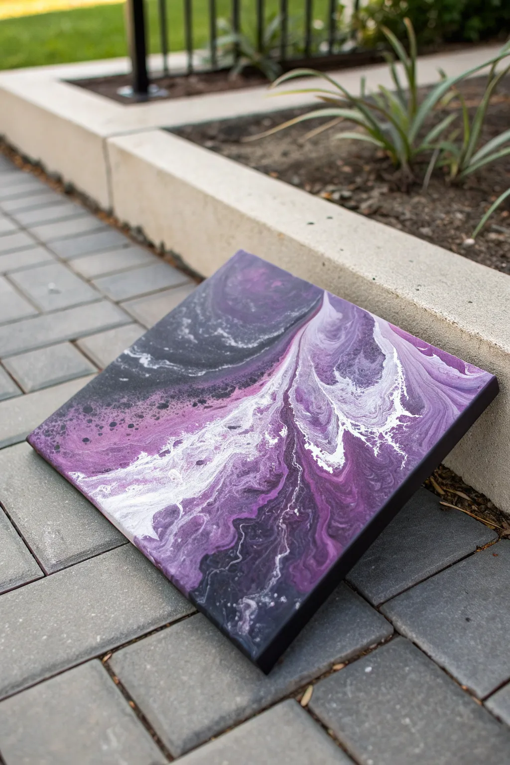
This dramatic acrylic pour captures the eerie beauty of a storm at twilight, blending moody blacks with striking flashes of white and rich plums. The flowing composition creates a striking contrast that looks sophisticated yet is surprisingly achievable for beginners.
Detailed Instructions
Materials
- Square stretched canvas (12×12 inches suggested)
- Acrylic paints: Black (heavy body), White (titanium), Lavender/Light Purple, Deep Plum/Eggplant
- Pouring medium (Floetrol or similar brand)
- Water (distilled is best)
- Plastic cups for mixing
- Stir sticks
- Hair dryer (with concentrator nozzle) or a straw
- Butane torch (optional, for popping bubbles)
- Push pins (for elevating canvas)
- Drop cloth or plastic sheet
Step 1: Preparation & Mixing
-
Prepare your workspace:
Lay down your plastic sheeting to protect your surface. Insert push pins into the four corners on the back of your canvas to elevate it off the table, allowing the paint to flow freely over the edges. -
Mix the pouring medium:
In separate cups, mix each paint color with your pouring medium. A standard ratio is 1 part paint to 2 parts medium, but check your specific brand’s instructions. -
Adjust consistency:
Stir the mixtures thoroughly. Add water very slowly, a few drops at a time, until the paint flows like warm honey off the stir stick. It should leave a small mound that disappears within one or two seconds. -
Check density:
Ensure your white and black paints are slightly thinner fluid consistency than the purples. This helps the colors glide over each other and creates better cell reactions without getting muddy.
Muddy Colors?
If your purples are turning grey, you likely over-mixed or blew too hard. Only blow the colors out once; avoid going back over areas repeatedly with the dryer.
Step 2: The Pouring Process
-
Flood the canvas:
Pour a generous amount of the black paint mixture over almost the entire canvas. Reserve a little for later touch-ups. -
Spread the base:
Use a palette knife or the back of a spoon to spread the black paint out to the edges and corners, ensuring the canvas is fully covered in a wet layer. -
Pop air bubbles:
Quickly run a butane torch (or use a heat gun on low) over the surface to pop any air bubbles trapped in the base coat. This prevents pinholes later. -
Lay the color stripe:
Pour a diagonal line of color across the canvas. Start with the deep plum, layering the lavender directly on top of it. Don’t worry about being perfectly straight; a slight wave adds character. -
Add the white highlight:
Pour a thinner line of white paint right down the center of your purple stripe. The white acts as a reactant and will help create those lacy edges seen in the photo. -
Surround with negative space:
Pour a fresh line of black paint on both sides of your color stripe. This ‘locks’ the colors in and gives you fresh paint to blow over the colors.
Step 3: Creating the Flow
-
Initial blowout:
Using your hair dryer on the ‘cool’ and ‘low’ setting, gently blow the wet black paint *over* the colored stripe from both sides, essentially burying the colors for a moment. -
Reveal the color:
Change the angle of the dryer and blow the paint *outward* from the center of the stripe toward the corners. Watch as the purple and white resurface through the black. -
Refine with breath:
Put the dryer down. For the detailed, feathery edges (like the white tendrils in the photo), use a straw or just your mouth to blow specific areas gently. This separation creates the intricate lacing. -
Tilt if necessary:
If the composition looks too centered, gently tilt the canvas slightly to stretch the design toward one corner, but be careful not to over-stretch the cells. -
Final torch:
Give the painting one last quick pass with the torch to bring up any final small cells within the purple and white sections. -
Clean the edges:
Run a finger under the bottom edge of the canvas to scrape off drips. I usually check back every 10 minutes for the first half-hour to prevent paint drag. -
Drying:
Let the painting dry undisturbed for at least 24 to 48 hours in a dust-free area. Ensure the surface is perfectly level so the paint doesn’t shift while drying.
Add Subtle Sparkle
Mix a tiny amount of iridescent medium or pearl white into your lavender paint. It won’t show much when wet, but it creates a stunning shimmer once dry.
Once fully cured and varnished, you’ll have a stunning abstract piece that brings a modern elegance to any wall
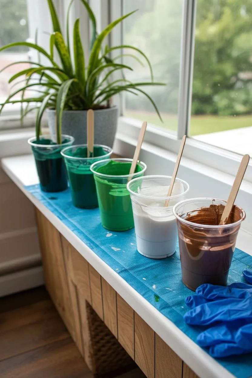
Pour Painting Palette: Sage + Terracotta + Cream
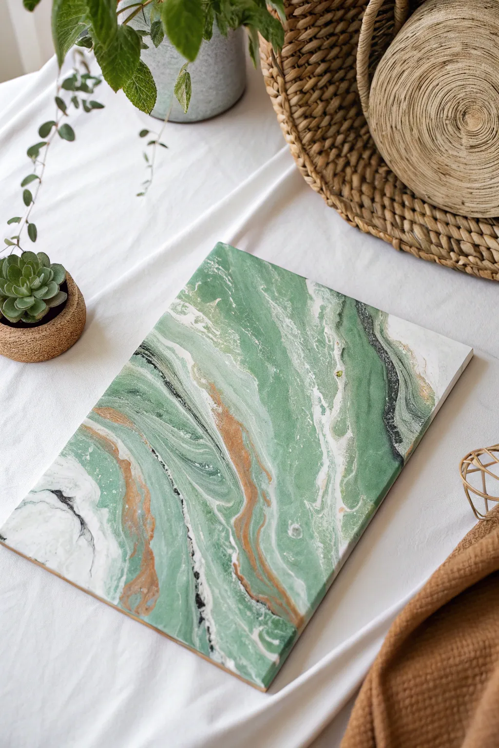
This fluid art project captures the soothing essence of nature with a sophisticated palette of sage green, warm terracotta, and creamy white. The resulting marbled effect mimics polished stone, making it a perfect, modern accent piece for any neutral-toned room.
Step-by-Step Tutorial
Materials
- Rectangular stretched canvas (e.g., 11×14 inches)
- Acrylic paints: Sage Green, Terracotta (or Burnt Sienna mixed with Orange), Cream/Off-White, Black
- Pouring medium (Floetrol or Liquitex)
- Small plastic cups for mixing
- One larger ‘dirty pour’ cup
- Craft sticks for stirring
- Water (distilled is best) for thinning
- Plastic drop cloth or garbage bags
- Gloves
- Push pins (for canvas elevation)
- Torch or heat gun (optional, for removing bubbles)
Step 1: Preparation & Mixing
-
Workspace Setup:
Cover your entire work surface with a plastic drop cloth or garbage bags. This process gets messy, so ensure you have plenty of room to move. -
Prepare the Canvas:
Insert push pins into the four corners of the back of your canvas wood frame. This elevates the canvas off the table, allowing paint to drip freely over the edges without sticking. -
Mix the Paints:
In individual small cups, mix one part acrylic paint with roughly one part pouring medium for each color: Sage, Terracotta, Cream, and Black. -
Check Consistency:
Stir thoroughly until there are no clumps. The consistency should resemble warm honey. If the paint heaps up before disappearing, add tiny drops of water until it flows smoothly. -
Definite the Ratios:
I recommend mixing more Sage and Cream than the other colors, as these will form the bulk of your background composition.
Layering Pro Tip
Pour the Black paint from high up when layering your cup. This causes it to sink to the bottom, creating unexpected, intricate veining when you finally pour it out.
Step 2: The Layering Process
-
Base Layering:
Take your larger empty cup. Pour a generous amount of Cream into the bottom to start. -
Add the Sage:
Pour a layer of Sage Green slowly down the side of the cup so it sits on top of the cream rather than mixing instantly. -
Introduce Contrast:
Add a thinner layer of Terracotta. This color is strong, so you don’t need as much to make an impact. -
Add Definition:
Drizzle a very small amount of Black. This will create the striking veins you see in the final piece. -
Repeat Layers:
Repeat the layering process (Cream, Sage, Terracotta, Black) until the cup is about three-quarters full. Do not stir this cup.
Step 3: Pouring & Tilting
-
The Pour:
Start pouring the contents of the cup onto the center of the canvas in a slow, circular motion (a ring pour) or a straight line across the canvas (a ribbon pour), depending on the pattern you prefer. -
Empty the Cup:
Continue until the cup is empty. You should see concentric circles or distinct bands of color sitting on the canvas. -
Initial Tilt:
Gently lift the canvas and slowly tilt it to one side. Watch how the paint moves—don’t rush this part. -
Corner Coverage:
Guide the paint toward one corner until it just flows over the edge, then bring the weight of the paint back to the center. -
Opposite Corners:
Repeat the tilting process for the opposite corners. The goal is to stretch those bands of color without muddying them together. -
Refining the Composition:
Look at your pattern. If you want more white negative space, you can pour a little extra plain Cream paint around the edges to help the design slide. -
Check the Edges:
Run a gloved finger lightly under the edges of the canvas to catch drips and ensure the sides represent the painting well. -
Remove Bubbles:
If you see tiny air bubbles, quickly pass a torch or heat gun roughly 6 inches above the surface to pop them.
Muddy Colors?
If your sage and terracotta are turning gray or brown, you likely tilted too aggressively or over-manipulated the paint. Stop tilting sooner next time.
Step 4: Drying
-
Setting to Dry:
Place the artwork in a dust-free area where it won’t be disturbed. Ensure the surface is perfectly level so the paint doesn’t shift while drying. -
Wait Patiently:
Allow the painting to cure for at least 24 to 48 hours. Acrylic pours dry slowly due to the thickness of the paint.
Once fully cured, your stone-effect canvas is ready to bring a touch of earthy calm to your space
Pour Painting Palette: Blush + Gray + White Minimal
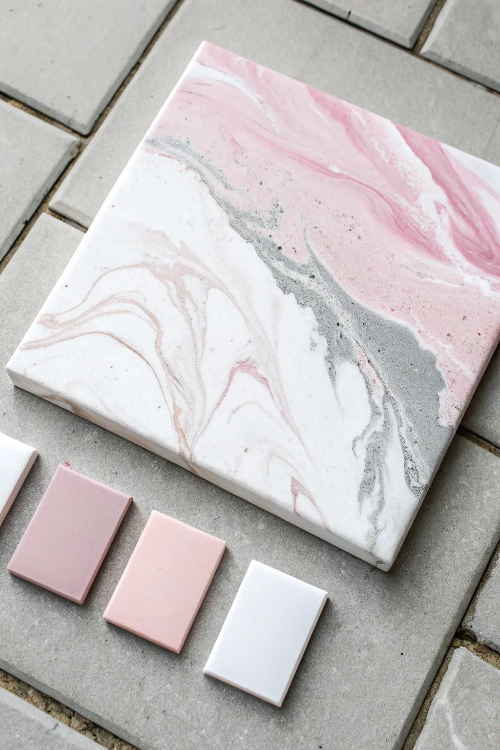
This elegant pour painting combines soft blush tones with stark white and industrial gray for a sophisticated, faux-marble effect. The result is a minimalistic yet striking piece that mimics the natural veins of stone.
Step-by-Step
Materials
- Square stretched canvas (10×10 or 12×12 inch)
- Acrylic pouring paints (Titanium White, Blush Pink, Rose Pink, Silver, Charcoal Gray)
- Pouring medium (like Floetrol or Liquitex)
- Silicone oil (optional, for cells)
- Plastic cups for mixing
- Stirring sticks
- Palette knife or plastic spreader
- Hairdryer or heat gun (optional)
- Drop cloth or plastic sheet
- Gloves
Step 1: Preparation & Mixing
-
Protect your workspace:
Fluid art is messy, so ensure you lay down a substantial drop cloth or plastic sheet. Elevate your canvas on four inverted cups to allow paint to drip off the edges freely. -
Mix the base white:
In a large cup, mix distinct proportions of Titanium White acrylic paint with your pouring medium. You want a consistency similar to warm honey—fluid but not watery. Prepare more white than other colors as it acts as the primary negative space. -
Prepare the color palette:
In separate, smaller cups, mix the Blush Pink, Rose Pink, Silver, and Charcoal Gray with pouring medium. Aim for the same fluid consistency as your white base to ensure they move together smoothly. -
Add silicone (optional):
If you want small ‘cells’ or bubble-like effects in the gray or pink veins, add 1-2 drops of silicone oil to the Gray and Rose cups only. Stir very gently just once or twice; over-mixing breaks the oil too much.
Muddy Colors?
If your pinks and grays are turning brown where they meet, you are over-tilting. Stop tilting as soon as the paint covers the edges to keep the separation crisp.
Step 2: The Pouring Process
-
Flood the canvas:
Pour a generous amount of the White mixture directly onto the center of the canvas. Use a palette knife or spreader to push the white paint all the way to the edges and corners, creating a wet bed for the colors to glide on. -
Layer the dirty pour:
In a fresh, clean cup, layer your colors. Start with a bit of White, then pour in a splash of Gray, followed by Blush, then Silver, and finally the darker Rose. Do not stir this cup. -
Pour the vein line:
Instead of flipping the cup, pour the contents in a diagonal line across the canvas, moving from one corner to the opposite. This creates the main composition line or ‘river’ of color. -
Add accent streams:
If you want more complexity, drizzle thin lines of the remaining Gray or Silver mixture directly from their original cups alongside the main diagonal pour.
Step 3: Manipulation & Drying
-
Tilt the canvas:
Gently lift the canvas and tilt it slowly. Let the colored diagonal band stretch and distort. I prefer to tilt primarily side-to-side rather than corner-to-corner to maintain that strong diagonal composition. -
Define the marble veins:
If the colors look too blocky, use a hairdryer on a low, cool setting to blow the white base paint over edge of the colored line. This creates a wispy, submerged effect. -
Refine the edges:
Check the sides of the canvas. Use your finger to touch up any spots where the canvas is showing through, using the paint drippings from the table to match the color flow. -
Remove air bubbles:
Quickly pass a heat gun or torch over the surface (keep it moving constantly) to pop air bubbles. If you used silicone, this step will also bring those cells to the surface. -
Let it cure:
Leave the painting to dry in a dust-free area for at least 24 to 48 hours. Ensure the surface remains perfectly level so the design doesn’t slide off while drying. -
Seal the artwork:
Once fully cured (wait 2-3 weeks for absolute surety), apply a coat of gloss varnish or resin to protect the paint and make the marble colors pop.
Gilded Veins
Mix metallic gold powder with a tiny bit of varnish and paint thin fissures into the dry painting with a fine liner brush for a Kintsugi-style luxury look.
Now you have a stunning, modern piece of faux-stone art ready to display
Pour Painting Palette: Aqua + Sand + Coral Beachy
Capture the serene essence of the shoreline with this calming acrylic pour that mimics the movement of tides over sandy banks. The blend of soft coral, gritty sand, and ocean aqua creates a stunning, marble-like organic pattern perfect for coastal decor.
Step-by-Step Guide
Materials
- Square stretched canvas (10×10 or 12×12 inches)
- Acrylic fluid paints: Aqua/Turquoise, Sand/Beige, Coral/Salmon, White
- Pouring medium (Floetrol or dedicated brand)
- Silicone oil (optional for cells)
- Plastic cups (one for each color + one pour cup)
- Stir sticks
- Disposable gloves
- Drop cloth or large plastic sheet
- Push pins (for elevating the canvas)
- Kitchen torch (optional)
Step 1: Preparation & Mixing
-
Workspace Setup:
Begin by covering your entire work surface with a drop cloth or plastic sheet, as pouring can get messy. Ensure the surface is perfectly level to prevent the paint from sliding off unintentionally. -
Canvas Prep:
Insert push pins into the four corners of the back of your canvas. This elevates it off the table, allowing excess paint to drip freely without gluing the canvas to your work surface. -
Mix the Paints:
In separate cups, mix each paint color with your pouring medium. A standard ratio is 1 part paint to 2 parts medium, but check your specific brand’s instructions. -
Check Consistency:
Stir until the mixture has the consistency of warm honey. If you lift the stir stick, the paint should flow off in a continuous stream without breaking. -
Add Texture (Optional):
To mimic the sandy texture seen in the photo, you can add a tiny pinch of fine sand or baking soda to your beige cup, though the swirling effect alone often implies texture visually.
Pro Tip: Sandy Reality
Mix a tiny amount of actual fine craft sand into your beige paint cup. It creates genuine texture that contrasts beautifully with the smooth aqua.
Step 2: The Pour Techniques
-
Layering the Cup:
Take a clean, empty cup. Start layering your colors. I generally verify my order first: White, then Aqua, Sand, and finally Coral. -
Repeat Layers:
Pour small amounts of each color on top of one another. Pour down the side of the cup slightly to keep layers distinct, or straight down the middle for more mixing. -
Dirty Pour Flip (Option A):
Place the canvas face down on top of the cup. firmly hold both together and flip them over so the cup is now upside down on the canvas. Wait 30 seconds for paint to settle. -
Tree Ring Pour (Option B):
Alternatively, slowly pour the contents of the cup into the center of the canvas in a tight, circular motion. This creates rings that look like geode strata. -
Release the Paint:
If you used the flip method, gently lift the cup and let the paint flood onto the canvas.
Troubleshooting: Muddy Colors
If your coral and aqua are mixing into brown, your paint might be too thin. Thicken the mixture slightly or add white between these colors as a barrier.
Step 3: Tilting & Finishing
-
Initial Tilt:
Gently tilt the canvas in a circular motion. The goal is to stretch the paint towards the corners without losing the definition of your color bands. -
Guide the Flow:
Watch how the aqua and sand interact. You want to create wide, sweeping ribbons of color rather than muddled gray areas. -
Cover Corners:
Ensure the paint runs over the edges and corners. You can use a gloved finger to touch up any bare spots on the sides with the runoff paint. -
Torch Application:
If you see air bubbles, quickly pass a kitchen torch over the surface. This pops bubbles and can bring up small ‘cells’ of color from underneath. -
Refining the Composition:
Take a final look. If one color dominates too much, tilt slightly to run some of it off. Aim for a balance where the aqua streams through the sand and coral like water. -
Drying Process:
Leave the painting to cure in a dust-free area. It needs to remain perfectly level for at least 24-48 hours. The paint will self-level as it dries. -
Sealing:
Once fully cured (usually 2-3 weeks), apply a gloss varnish to give it that wet, sea-glass finish seen in the inspiration image.
Now you have a slice of the beach preserved in paint to hang on your wall
Pour Painting Palette: Forest Greens + Bronze
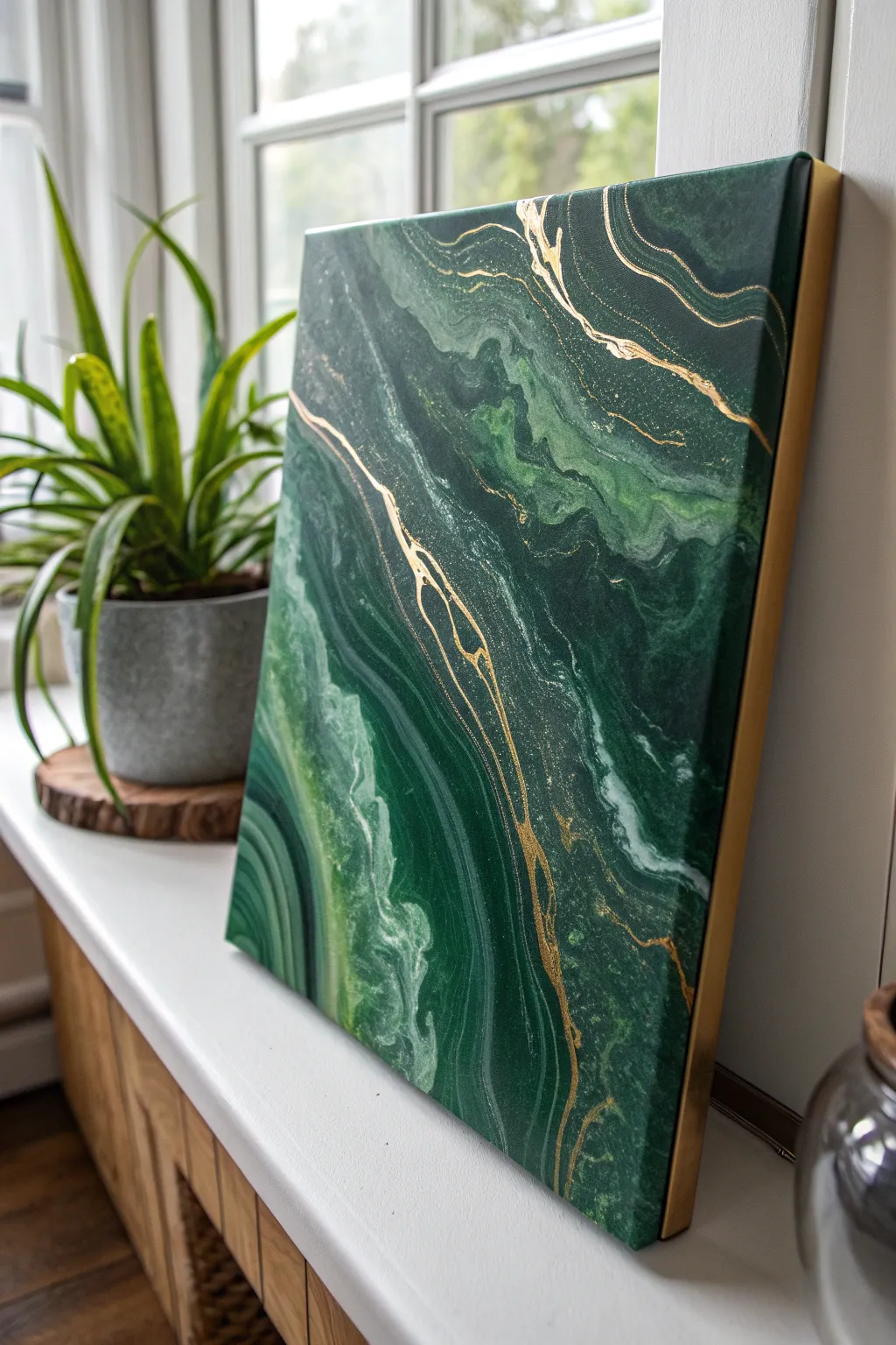
This elegant pour painting captures the serene, mysterious vibes of deep forest moss and malachite stone. By swirling rich emeralds with metallic bronze veins, you’ll create a sophisticated abstract piece that brings nature indoors.
Detailed Instructions
Materials
- Stretched canvas (rectangular or square)
- Acrylic paints: Phthalo Green, Viridian Hue, Sap Green, Titanium White, Metallic Bronze/Gold
- Pouring medium (Floetrol or Liquitex)
- Silicone oil (optional for cells)
- Plastic cups for mixing
- Wooden craft sticks for stirring
- Straw or hair dryer (for blowing paint)
- Small fine-line brush or gold leaf pen (for detailing)
- High-gloss varnish
- Drop cloth and gloves
Step 1: Preparation & Mixing
-
Protect your space:
Cover your entire work surface with a drop cloth. This process gets messy, so ensure you have a level surface where the canvas can sit undisturbed for at least 24 hours. -
Mix your greens:
Prepare three separate cups of green. In the first, mix Phthalo Green with a tiny drop of black for a deep shadow color. In the second, use Viridian Hue pure. In the third, mix Sap Green with a little White for a lighter, mossy tone. -
Create the white and bronze:
Mix a cup of pure Titanium White and a separate cup of Metallic Bronze. The bronze needs to be highly pigmented, so don’t dilute it too much. -
Add pouring medium:
Add your pouring medium to each cup. Aim for a ratio of about 1 part paint to 2 parts medium. Stir gently to avoid creating too many air bubbles. -
Check consistency:
Test the consistency by lifting your stick. The paint should flow like warm honey—fluid but not watery. If it leaves a mound that disappears after a second, you’re good.
Step 2: The Pouring Technique
-
Apply the base coat:
Pour a generous amount of your darkest Phthalo Green mixture over the entire canvas. Tilt the canvas until the surface is fully covered, including the sides. -
Layer the lighter greens:
Drizzle ribbons of the Viridian and the lighter Sap Green mixture diagonally across the canvas. Think about creating a flow like a river or the grain of wood. -
Add white highlights:
Sparingly add thin lines of Titanium White next to your lighter green ribbons. This will create separation and contrast within the dark background. -
Incorporate the metallic:
Pour thin, deliberate veins of the Metallic Bronze through the center of your green ribbons. This acts as the precious metal vein in the stone look. -
Tilt and stretch:
Gently tilt the canvas back and forth. Watch how the colors interact. Don’t over-tilt, or your colors will turn muddy; just stretch the lines to look natural and organic.
Mix it Up
Mix your metallic paint slightly thicker than the other colors. This prevents it from sinking and helps it sit on top of the greens.
Step 3: Refining the Details
-
Blow out edges:
Use a straw to gently blow on specific areas where colors meet. This creates soft, feathery transitions that mimic natural stone patterns, like agate banding. -
Define the veins:
If your bronze lines got lost during tilting, I like to use a small stick or the back of a brush to drag fresh bronze paint through the wet surface to re-establish those sharp lines. -
Create marbling:
Take a clean toothpick and gently drag it through sections of white and green to swirl them slightly, creating that intricate marble effect seen in the reference. -
Check the sides:
Ensure the paint has flowed over the edges for a gallery-wrapped look. Use your gloved finger to dab paint onto any bald spots on the canvas corners. -
Pop air bubbles:
Briefly pass a chef’s torch or heat gun over the surface. This pops trapped air bubbles and can bring up tiny cells if you used silicone.
Resin Finish
Instead of varnish, use a clear epoxy resin topcoat. This creates a glass-like surface that amplifies the stone effect dramatically.
Step 4: Finishing Touches
-
Initial drying:
Let the painting dry for at least 48 hours. Do not move it. Acrylic pours dry from the outside in, so be patient. -
Enhance the gold (optional):
Once fully dry, if you want more shimmer, use a fine brush with gold leaf paint or a gold leaf pen to trace over the existing bronze veins. -
Varnish for depth:
Apply two coats of high-gloss varnish. This protects the piece and makes the dark greens look deeper and the metallics shine brighter. -
Clean the back:
If any paint drips dried on the back of the canvas frame, use sandpaper or a craft knife to remove them so the artwork hangs flush against the wall. -
Frame it:
For the exact look in the photo, place your canvas into a gold or natural wood floating frame to complement the metallic accents.
Hang your new masterpiece near a window where natural light can catch those shimmering bronze details
Pour Painting Palette: Jewel Tones With Gold Veins
Mimic the luxurious depths of a sliced gemstone with this stunning fluid art project. By combining rich jewel tones with delicate, shining gold veins, you’ll create a piece that looks more like a polished mineral than paint on canvas.
How-To Guide
Materials
- Square stretched canvas (e.g., 8×8 or 10×10 inches)
- Acrylic fluid paints: Emerald Green, Deep Teal, Mint/Seafoam Green, Deep Violet/Purple
- Liquid Gold Leaf or Metallic Gold Alcohol Ink
- Pouring medium (like Floetrol or Liquitex)
- Small plastic cups for mixing
- Stir sticks
- Fine liner brush (size 0 or 00)
- Hairdryer (optional, for moving paint)
- Gloves and workspace cover
Step 1: Mixing the Jewel Tones
-
Prepare the Colors:
Set out four plastic cups. Pour a small amount of Emerald Green, Deep Teal, Mint Green, and Deep Violet into separate cups. -
Add Pouring Medium:
Add your pouring medium to each cup. A standard ratio is about 2 parts medium to 1 part paint, but check your brand’s instructions. You want a consistency similar to warm honey. -
Stir Thoroughly:
Mix each color slowly and thoroughly with a stir stick. Stirring too vigorously creates unwanted air bubbles, so take your time until the mixture is completely smooth. -
Check Consistency:
Lift a stir stick from the paint. The stream should flow continuously without breaking. If it’s too thick, add a few drops of water; if too thin, add a touch more paint.
Don’t Over-mix Colors
When tilting the canvas, stop moving the paint before the colors blend into a muddy grey. Distinct bands of color look more like real stone layers.
Step 2: Creating the Composition
-
Apply the Base Colors:
Start by pouring the Deep Teal across the top left section of the canvas and the Deep Violet across the bottom right corner. Let them meet naturally in the middle. -
Introduce Lighter Tones:
Pour ribbons of the Mint Green and Emerald Green within the Deep Teal section to create depth. These lighter shades simulate the banding found in natural agate stones. -
Tilt the Canvas:
Gently pick up the canvas and tilt it slowly from side to side. Allow the paints to slide over each other, creating soft, marble-like transitions between the greens and purples. -
Soften the Edges:
If the line between the purple and green feels too harsh, use a hairdryer on a low, cool setting to gently blow the colors into one another, creating a wispy transition zone. -
Cover the Sides:
Ensure the paint flows over the edges of the canvas for a professional, gallery-wrapped look. You can use a gloved finger to touch up any bare spots on the corners. -
Pop Bubbles:
Let the painting sit for a minute, then look for any air bubbles rising to the surface. Pop them gently with a toothpick or a quick pass of a culinary torch. -
Let it Dry Completely:
Place the canvas on cups to elevate it and let it dry undisturbed. This step is crucial; wait at least 24 to 48 hours until the surface is completely hard to the touch.
Add Crystal Texture
Before the resin or varnish step, glue crushed glass or clear glitter along the gold veins for actual 3D texture and extra sparkle.
Step 3: Gilding the Veins
-
Analyze the Pattern:
Once dry, look at the natural breaks and color shifts in your pour. Identify where the colors separate or swirl—these are the perfect paths for your gold veins. -
Load the Liner Brush:
Shake your liquid gold leaf or metallic ink well. Dip your fine liner brush into the gold, ensuring you don’t overload it to prevent dripping. -
Trace the Fissures:
With a shaky hand—literally, a slight tremble helps—drag the brush along the boundaries between color zones. This creates jagged, organic-looking cracks rather than straight lines. -
Add Minor Branching:
Extend small, lightning-bolt style branches off the main gold lines into the solid color areas. I find this helps the gold look integrated rather than just painted on top. -
Detail the Transition Zone:
Pay special attention to the border where the purple meets the green. Add a slightly thicker, fragmented gold line here to emphasize the clash of ‘minerals’. -
Shattered Effect:
Use the very tip of the brush to tap tiny specks or dots of gold near the larger veins, mimicking crumbled rock dust. -
Seal the Work:
Allow the gold to dry fully (usually 1-2 hours). Finally, apply a coat of gloss varnish or a clear resin topcoat to protect the piece and give it that high-gloss, gemstone shine.
Hang your finished piece in a well-lit spot to catch the shimmer of the gold veins
Pour Painting Palette: Navy + Gold + Crimson Royal
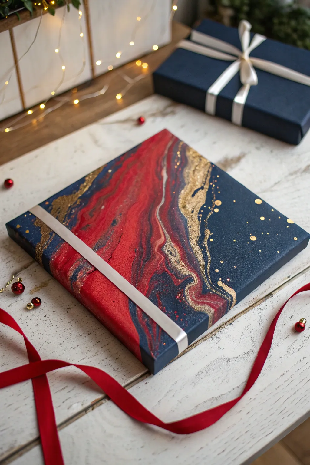
Capture the elegance of the season with this sophisticated fluid art canvas featuring deep navy, vibrant crimson, and shimmering gold. The resulting pattern mimics the luxurious look of marble or agate, making it a perfect handmade gift or festive decor piece.
Step-by-Step Tutorial
Materials
- Square stretched canvas (10×10 or 12×12 inches)
- Acrylic pouring paints: Navy Blue, Crimson Red, Metallic Gold
- White acrylic paint (for negative space or base)
- Pouring medium (like Floetrol or Liquitex)
- Water (distilled is best)
- Plastic cups and stir sticks
- Hair dryer with a concentrator nozzle
- Silicone oil (optional, for cells)
- Gold glitter (fine)
- Gloves and workspace cover (plastic sheeting)
- Wide white satin ribbon (for finishing)
Step 1: Mixture Preparation
-
Protect your space:
Before opening any paint, cover your entire work surface with plastic sheeting or a large garbage bag. Tape down the edges so it doesn’t shift while you claim your creative space. -
Mix the medium:
In separate cups, mix your acrylic paints with your pouring medium. A standard ratio is often 1 part paint to 2 parts medium, but follow the specific instructions on your medium’s bottle. -
Check consistency:
Stir slowly to avoid bubbles. You are looking for the consistency of warm honey—the paint should flow off the stick in a continuous stream without breaking immediately. -
Add glitter to gold:
To enhance the metallic gold paint, stir in a pinch of fine gold glitter directly into the cup. This adds that extra festive sparkle you see in the reference image. -
Add silicone (optional):
If you want distinct ‘cells’ or circles like in the golden sections of the photo, add 1-2 drops of silicone oil to the Gold and Crimson cups only. Stir just once or twice.
Clean Edges Pro-Tip
Tape the underside of your canvas with painter’s tape before pouring. Once dry, peel the tape off to remove messy dried drips for a professional finish.
Step 2: The Pour
-
Lay the navy base:
Pour a generous amount of the Royal Navy mixture over the majority of the canvas. You don’t need to cover every corner yet, but ensure the center and sides have a good pool of paint. -
Create the crimson river:
Pour a wide, diagonal band of the Crimson Red across the canvas. It doesn’t have to be a straight line; let it wave slightly as you pour. -
Add metallic accents:
Pour thinner ribbons of the Gold mixture along the edges of the red band. This will act as a shimmering border between the distinct blue and red zones. -
Sprinkle dry glitter:
While the paint is wet, take a tiny pinch of dry gold glitter and sprinkle it specifically over the navy blue sections for a starry night effect.
Level Up: Resin Finish
Instead of varnish, finish the piece with a clear coat of Art Resin. It creates a glass-like surface that magnifies the depth of the metallic gold.
Step 3: Manipulation & Drying
-
Blow out the design:
Using your hair dryer on the ‘cool’ and ‘low’ setting, gently push the gold paint over the navy and red. Aim the airflow at an angle to stretch the colors without muddying them. -
Tilt the canvas:
Pick up the canvas and slowly tilt it in circular motions to cover the corners and edges. I like to let the paint run over the sides to give the artwork a finished, gallery-wrapped look. -
Fine-tune the gold:
If the gold looks too subtle, use a straw to blow specifically on the gold lines to fan them out and create lacing effects. -
Pop bubbles:
Check the surface for air bubbles. You can pop them with a toothpick or by quickly passing a chef’s torch over the surface (keep it moving constantly). -
Let it cure:
Place the canvas on cups (to keep it elevated) in a dust-free area. Allow it to dry undisturbed for at least 24-48 hours. The paint will settle and flatten as it dries. -
Seal the art:
Once fully cured (wait 2-3 weeks for total cure), apply a gloss varnish. This will make the dark navy pop and protect the gold luster. -
Wrap for gifting:
To mimic the featured image, wrap a simple band of white satin ribbon diagonally across the bottom corner, securing it on the back with tape or glue.
Now you have a stunning piece of abstract art ready to hang or wrap for a special recipient
Pour Painting Palette: Neon Lime + Hot Pink Pop
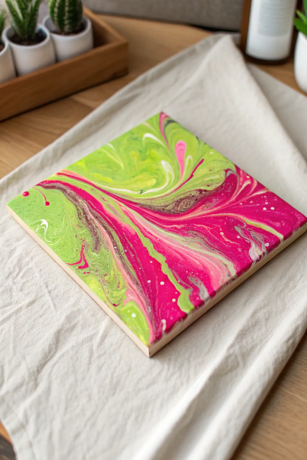
Brighten up any room with this electrifying pour painting that clashes neon lime green against deep hot pink. The swirling, marble-like patterns create a dynamic sense of movement on a square canvas, perfect for a modern pop-art aesthetic.
Detailed Instructions
Materials
- Small square canvas (e.g., 8×8 or 10×10 inches)
- Acrylic paint: Neon Lime Green
- Acrylic paint: Hot Pink (Magenta)
- Acrylic paint: Titanium White
- Acrylic paint: Metallic Silver (optional for shimmer)
- Pouring medium (Floetrol or Liquitex)
- Silicone oil (optional for cells)
- Disposable plastic cups
- Stir sticks
- Water (for thinning)
- Gloves and apron
- Drop cloth or plastic sheeting
Step 1: Preparation & Mixing
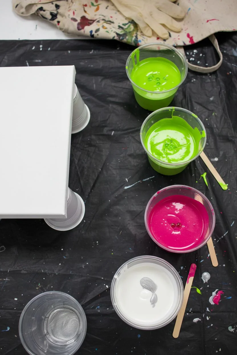
-
Set up your workspace:
Cover your entire work surface with a drop cloth or heavy plastic sheeting. Pour painting is messy, so ensure you have plenty of room. Elevate your canvas on four upside-down cups to allow paint to drip off the edges freely. -
Mix your paints:
In separate cups, mix each acrylic paint color with pouring medium. A standard ratio is 1 part paint to 2 parts medium, but check your specific medium’s instructions. Stir thoroughly until smooth. -
Adjust consistency:
Check the thickness of your mixtures. The paint should flow like warm honey—running off the stick in a steady stream without breaking immediately. If it’s too thick, add water a few drops at a time and stir well. -
Add silicone (optional):
If you want the small cellular details seen in the reference image, add 1-2 drops of silicone oil to the lime green and pink cups. Stir just once or twice to barely incorporate it; over-stirring can break the oil down too much.
Neon Brightness Tip
Add a tiny drop of white to your neon paints before mixing. Neons are often translucent, and the white body helps them remain opaque and vibrant on the canvas.
Step 2: The Pouring Process
-
Layer the pour cup:
Take a clean, larger cup. We will do a ‘dirty pour’ technique. Start by pouring a small amount of white into the bottom to help things flow. -
Add the main colors:
Pour a generous layer of Neon Lime Green into the cup. Follow this immediately with the Hot Pink. Do not stir them in the cup. -
Repeat layers:
Continue layering the paints. Add a thin ribbon of Metallic Silver if using, followed by more white, then back to green and pink. Repeat until the cup is about half to three-quarters full, depending on your canvas size. -
Pour onto canvas:
Pour the contents of the cup onto the center of the canvas. You can do a straight pour or move your hand in small circular motions to create initial swirls.
Step 3: Tilting & Designing
-
Flood the corners:
If there is any leftover white paint, pour a little around the edges of the paint puddle and near the corners of the canvas. This acts as a lubricant to help the colors stretch. -
Begin tilting:
Gently lift the canvas and slowly tilt it in one direction. Watch how the paint moves. The goal is to stretch the puddle toward one corner without pouring it all off just yet. -
Cover the surface:
Bring the paint back to the center, then tilt toward the opposite corner. Repeat this process until the entire face of the canvas is covered. I find taking my time here preserves the distinct bands of color better than rushing. -
Refine the composition:
Look at the pattern. In the reference, there is a strong diagonal flow. Tilt the canvas diagonally to urge the pink and green veins to streak across from corner to corner. -
Check the edges:
Ensure the sides of the canvas are fully coated. You can use a finger to dab paint onto any bald spots on the sides, using drippings from the table. -
Pop air bubbles:
If you see small bubbles, you can lightly pass a heat gun or torch over the surface (keep it moving swiftly!). This also helps bring up small cells if you used silicone.
Muddy Colors?
If your pink and green turn brown, you over-tilted or mixed too much. Green and pink are opposites; keep layers distinct and tilt slowly to avoid blending them.
Step 4: Drying & Finishing
-
Let it settle:
Place the canvas back on the elevated cups. Ensure it is perfectly level so the paint doesn’t slide off one side while drying. -
Protect the drying art:
Cover the painting with a large cardboard box or plastic tub (propped up to allow airflow) to protect it from dust and pet hair. -
Wait patiently:
Allow the painting to dry for at least 24-48 hours. The surface might look dry sooner, but heavy pours take time to cure underneath. -
Clean (if silicone used):
Once fully cured (wait 2-3 weeks), gently wipe the surface with a little rubbing alcohol to remove any oily residue from the silicone. -
Varnish:
Apply a coat of gloss varnish to make those neon colors really pop and protect the finish.
Hang this vibrant square on your wall to add an instant energetic focal point to your space
Pour Painting Palette: Copper + Teal + Deep Plum
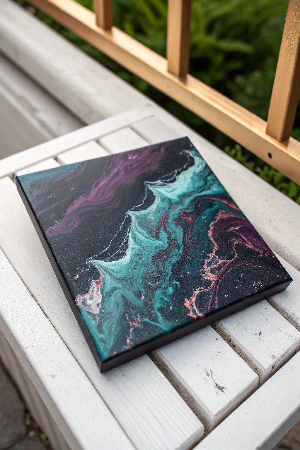
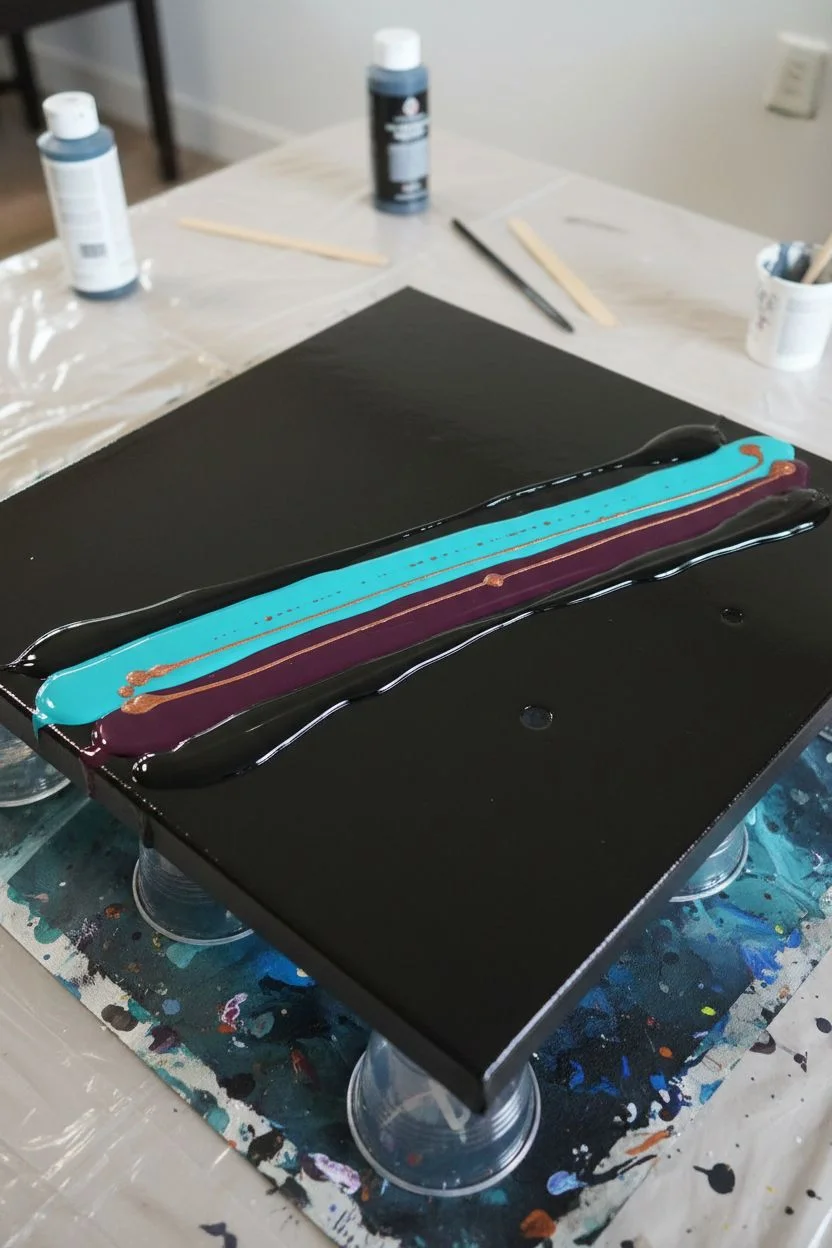
This stunning acrylic pour captures the ethereal beauty of a nebula with its deep, dark background and vibrant, metallic swirls. The contrasting dance of bright teal and moody plum, accented by shimmering copper, creates a sophisticated piece that looks incredible from any angle.
Step-by-Step Guide
Materials
- Square stretched canvas (10×10 or 12×12 inch)
- Black acrylic paint (heavy body or flow acrylic)
- Teal or Turquoise acrylic paint
- Deep Plum or Magenta acrylic paint
- Metallic Copper acrylic paint
- Pouring medium (Floetrol or Liquitex)
- Water (for thinning)
- Hair dryer with concentrator nozzle
- Small plastic cups and stirring sticks
- Kitchen torch (optional)
- Drop cloth or plastic sheet
- Gloves
Step 1: Preparation and Mixing
-
Workspace Setup:
Protect your working surface thoroughly with a drop cloth or plastic sheet. Elevate your canvas on four upside-down cups to allow the paint to drip freely off the edges without sticking the canvas to the table. -
Mix the Base Color:
Prepare a large amount of black paint. Mix one part paint with roughly two parts pouring medium. Add water slowly, stir, and test until it flows like warm honey. This will be your negative space. -
Mix the Colors:
Repeat the mixing process for your Teal, Deep Plum, and Metallic Copper. Aim for the same fluid consistency as the black; if one color is too thick, it might sink or clump. -
Check Consistency:
Lift your stirring stick out of the cup. The paint should create a small mound on the surface that disappears within one to two seconds. Adjust with water or medium as needed.
Step 2: Creating the Pour
-
Flood the Canvas:
Pour the black paint generously over the entire canvas. Use a palette knife or the back of a spoon to spread it to the corners and ensure the sides are fully covered. -
Pop Bubbles:
Quickly pass a kitchen torch over the surface of the wet black paint to pop any air bubbles. If you don’t have a torch, you can blow gently through a straw. -
Lay the Color Stripe:
Pour a diagonal line of Teal across the canvas. It doesn’t need to be straight; a slight wave is nice. -
Add the Plum:
Pour a line of Deep Plum right next to, or slightly overlapping, the Teal. I like to let them touch so they can blend naturally later. -
Add the Metallic Accents:
Drizzle the Metallic Copper sparingly over the top of the teal and plum lines. The metallic paint is heavier, so a little goes a long way for creating that shimmer. -
Encase the Colors:
Pour a little more fresh black paint on the outer edges of your color stripe. This helps the colors glide over the base coat when you start blowing.
Torch Safety
Keep the torch moving constantly and hold it about 6 inches away. If you hover too long, you can burn the paint or create a plastic-like skin on top.
Step 3: Blowing and Drying
-
Blow Over: Part 1:
Use your hair dryer on the ‘low’ fan setting and ‘cool’ heat setting. Blow the extra black paint slightly over the colored stripe to essentially bury the colors. -
Blow Out: Part 2:
Now, change direction. Blow the colors outward from the center line toward the edges of the canvas. Move the dryer back and forth steadily to fan the paint out. -
Create Wisps:
Focus the air on the edges of the blown-out paint to create wispy, lacy effects where the color meets the black background. Don’t overwork it, or the colors will turn precise brown gray. -
Detail Work:
If there are areas that look too blocky, use a straw to mouth-blow specific sections for finer control and delicate swirls. -
Final Torch:
Pass the torch over the painting one last time. This brings out ‘cells’ (small circular patterns) particularly in the metallic copper areas. -
Drying:
Let the painting sit undisturbed in a dust-free area for at least 24 to 48 hours. Ensure the surface is level so the paint doesn’t slide off while drying.
Glossy Finish
Once fully cured (after 3-4 weeks), apply a coat of resin or high-gloss varnish. This will make the black background look like glass and make the copper pop.
Hang your finished cosmic masterpiece in a well-lit spot where the copper can catch the daylight
Pour Painting Palette: Storm Gray + Steel Blue + Silver
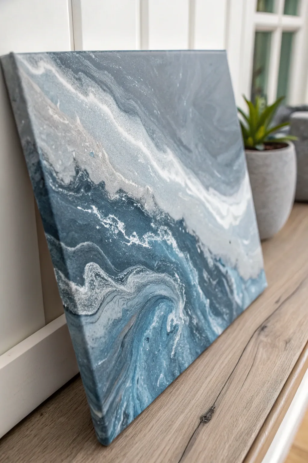
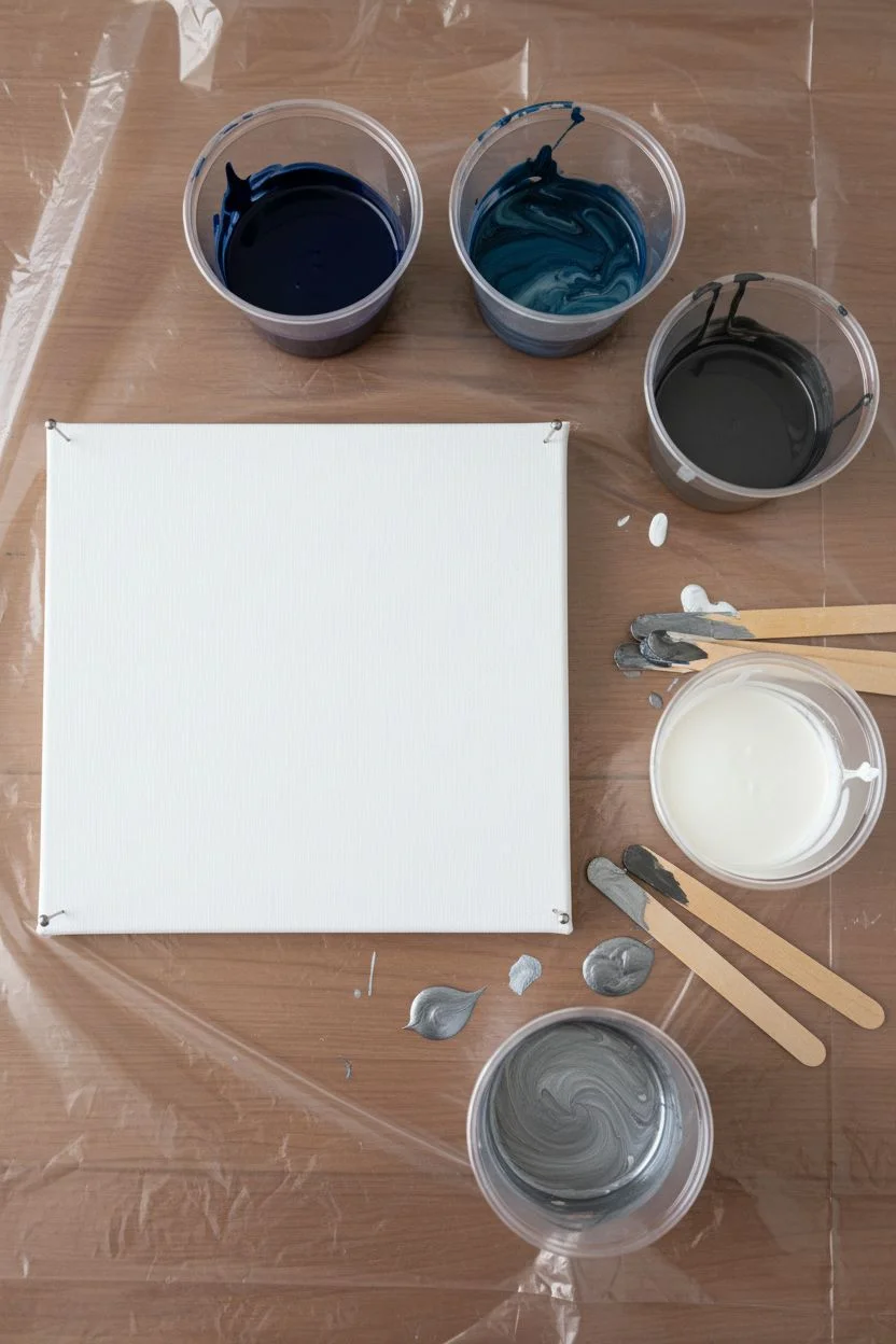
Capture the moody elegance of a stormy ocean with this fluid art project. Using a blend of deep steel blues, grays, and shimmering silver, you’ll create a captivating abstract piece that mimics crashing waves and turbulent skies.
Detailed Instructions
Materials
- Stretched canvas (e.g., 12×12 or 11×14 inches)
- Acrylic paints: Navy Blue, Phthalo Blue, Dark Gray, Titanium White, Metallic Silver
- Pouring medium (Liquitex or Floetrol)
- Silicone oil (optional for cells)
- Plastic cups (one for each color)
- Wooden craft sticks for stirring
- Plastic drop cloth or garbage bags
- Gloves
- Push pins (for elevating the canvas)
- Kitchen torch (optional)
Step 1: Setting the Stage
-
Prepare your workspace:
Cover your work surface completely with a plastic drop cloth or garbage bags to catch drips. This process gets messy, so ensure you have plenty of room. -
Elevate the canvas:
Insert four push pins into the back corners of your canvas frame. This lifts the painting off the table, allowing the paint to drip freely over the edges without pooling underneath. -
Mix your base colors:
Set out five plastic cups. In separate cups, add your acrylic paints: Navy Blue, a mix of Phthalo Blue and Gray for a ‘Steel Blue’, Dark Gray, Titanium White, and Metallic Silver. -
Add pouring medium:
Pour pouring medium into each cup. A standard ratio is 1 part paint to 2 parts pouring medium, but check your specific medium’s bottle. Stir each thoroughly until smooth and consistent. -
Check consistency:
The paint should flow like warm honey. If it’s too thick, add a tiny splash of water (drops at a time) until it runs off the stick in a steady, thin stream. I like to test this by ensuring the paint mounds slightly before disappearing into the cup.
Step 2: Creating the Pour
-
Add silicone (optional):
If you want circular ‘cells’ in your painting, add 1-2 drops of silicone oil to the Steel Blue and Dark Gray cups. stir just once or twice; over-stirring will break the cells up too much. -
Layer the dirty pour cup:
Take a larger, clean empty cup. Start layering your colors. Begin with white at the bottom, then layer Navy Blue, Silver, Steel Blue, and Gray. Repeat the layers until the cup is about three-quarters full. -
Pour the ribbon:
Slowly pour the paint from your layered cup onto the center of the canvas in a diagonal or ‘S’ motion. Don’t empty the cup in one spot; move your hand to distribute the paint across the canvas. -
Tilt the canvas:
Gently lift the canvas and begin tilting it. Guide the paint toward one corner, then back toward the center, then to another corner. The goal is to stretch the paint over the edges while maintaining the interesting marble patterns. -
Guide the flow:
Watch how the blues and silvers interact. If you see a pattern you love—like a wave crashing—tilt slowly to preserve it while letting excess paint run off the sides. -
Check the edges:
Ensure all four sides and corners are fully covered. You can use your finger to dab paint from the drip tray onto any bare spots on the edges.
Muddy Colors?
If your blues and silvers turn into a murky gray, you likely over-tilted or stirred the dirty pour cup too much. Layer gently and tilt slowly to keep separation.
Step 3: Finishing Touches
-
Torch for cells:
If you added silicone or see air bubbles, quickly pass a kitchen torch over the surface. Keep the flame moving and about 3-4 inches away to pop bubbles and bring up small cells. -
Refine the composition:
If the composition feels unbalanced, you can do one final small tilt. Be careful not to over-tilt at this stage, or the colors may become muddy. -
Let it dry:
Leave the painting on the push pins to dry in a dust-free area. It will take at least 24-48 hours to cure completely. Do not touch it or move it during this time. -
Varnish (optional):
Once fully cured (after a few weeks), apply a gloss varnish to seal the painting and make the metallic silver and deep blues really pop.
Make it Sparkle
Sprinkle fine silver glitter into the wet white paint or along the ‘wave’ crest lines immediately after pouring for extra texture and shimmer.
Hang your stormy abstract piece on a well-lit wall to watch the metallic silver catch the light throughout the day
Pour Painting Palette: Galaxy Black + Violet + Starry White
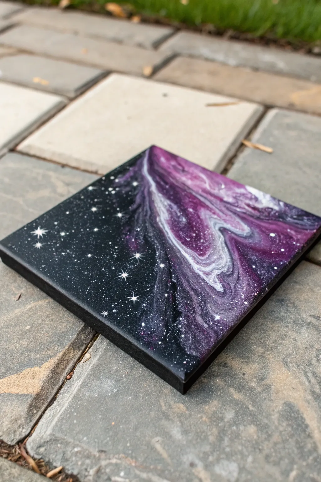
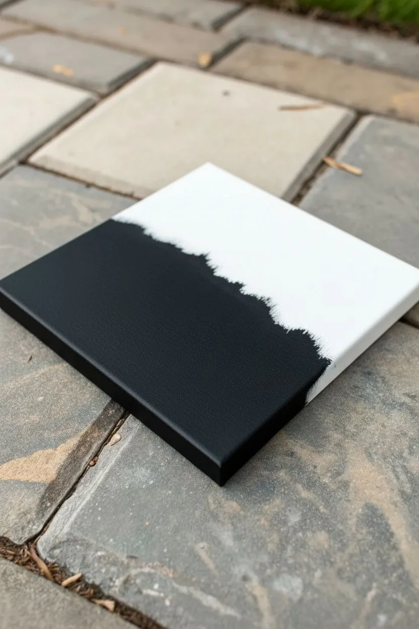
This stunning cosmic project captures the vast beauty of deep space on a small canvas, blending the fluidity of pour painting with precise hand-painted details. You’ll create a striking contrast between a stillness of a star field and dense, swirling violet nebula clouds.
Step-by-Step Guide
Materials
- Small square gallery-wrapped canvas (6×6 or 8×8 inches)
- Black acrylic paint (heavy body)
- Violet/Purple fluid acrylic paint (and/or mixing medium)
- White fluid acrylic paint (and/or mixing medium)
- Small round detail brush (size 0 or 00)
- Pouring medium (like Floetrol or Liquitex)
- Plastic cups for mixing
- Wooden stir sticks
- Straw (plastic or reusable metal)
- Hairdryer (optional, for moving paint)
- Protective workspace covering
Step 1: Setting the Void
-
Prepare the base:
Begin by laying down a protective sheet on your work surface. Since we are working with pouring medium, things can get messy. Ensure your canvas is level so the paint doesn’t slide off uncontrollably. -
Apply the black background:
Using your heavy body black acrylic paint, cover the left half of the canvas entirely. I like to use a wide brush or palette knife to smooth this out. -
Feather the edge:
Don’t create a hard line in the center. Instead, where the black paint will meet your nebula, gently feather the paint outward so it’s a bit thinner and irregular. This helps the pour integrate naturally. -
Paint the edges:
Make sure to paint the sides of the canvas black as well, especially on the ‘star’ side, to give it a finished, gallery-ready look.
Don’t Over-tilt!
When tilting the canvas to move the pour, go slow. If you tilt too aggressively, your beautiful bands of white and purple will muddify into a dull gray blob.
Step 2: Creating the Nebula
-
Mix your pouring colors:
In separate cups, mix your violet, white, and a small amount of black with your pouring medium. You want a consistency like warm honey—fluid enough to flow but thick enough to hold distinct bands of color. -
Layer the dirty cup:
Take a clean cup and pour a small amount of violet, then a splash of white, then a drop of black. Repeat this layering without stirring. The white acts as the bright highlight within the gases. -
The pour:
Pour your mixed ‘dirty cup’ onto the unpainted right side of the canvas. Start near the feathered black edge and move diagonally toward the opposite corner. -
Manipulate the flow:
Gently tilt the canvas to stretch the paint. You want the nebula to curve and flow organically. Let some of the purple mixture overlap slightly onto the dry black base. -
Blow out the details:
Using a drinking straw, blow softly on the edges of the white and violet paint. Push the colors into each other to create those wispy, smoke-like tendrils typical of a galaxy. -
Create cells (optional):
If you want more organic bubbles, you can quickly pass a torch over the wet paint to pop air bubbles, though this specific look relies more on smooth, marble-like swirls. -
Check the corner:
Ensure the paint flows over the corner and sides of the nebula section. Use a finger to dab paint onto any bald spots on the canvas edges. -
Let it cure:
This is the hardest part—waiting. Allow the pour to dry completely, which usually takes 24 to 48 hours. The surface must be hard to the touch before adding stars.
Step 3: Igniting the Stars
-
Prepare the star paint:
Put a small dab of white heavy body acrylic on a palette. You can thin it very slightly with water to make it flow off the brush easier, but keep it opaque. -
Splatter method:
Dip a stiff brush or an old toothbrush into the white paint. Using your thumb, flick the bristles over the black section of the canvas to create a field of tiny, distant stars. -
Masking tip:
If you’re worried about getting splatter on your beautiful purple nebula, hold a piece of cardboard over that section while flipping the paint. -
Painting the major stars:
Switch to your size 0 or 00 detail brush. Select a few spots on the black background to place larger, brighter stars. Paint a small solid white dot. -
Adding diffractions:
For the twinkling effect, carefully paint a thin vertical line through your largest dots, followed by a shorter horizontal crossing line. Taper the lines so they are sharp at the ends. -
Nebula stars:
Don’t forget to add a few tiny white dots directly on top of the dried purple pour. This creates depth, making it look like stars are floating in front of the gas clouds. -
Final varnish:
Once the star work is fully dry, apply a coat of gloss varnish to the entire canvas. This unifies the sheen between the poured section and the hand-painted black section.
Interstellar Shimmer
Mix a pinch of iridescent pearl powder or silver glitter into your violet pouring mixture. It adds a secret sparkle that only shows up when the light hits the nebula.
Hang this piece in a spot that catches the light to let your personal galaxy really shine

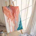
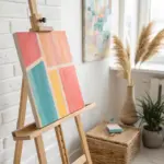
Have a question or want to share your own experience? I'd love to hear from you in the comments below!