
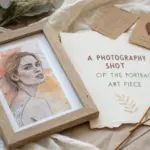
When I’m building a new piece, I usually start by choosing a color palette that nails the mood before I even think about details. A handful of harmonious hues can make your art feel intentional, cohesive, and way more you.
Warm Earth Tones
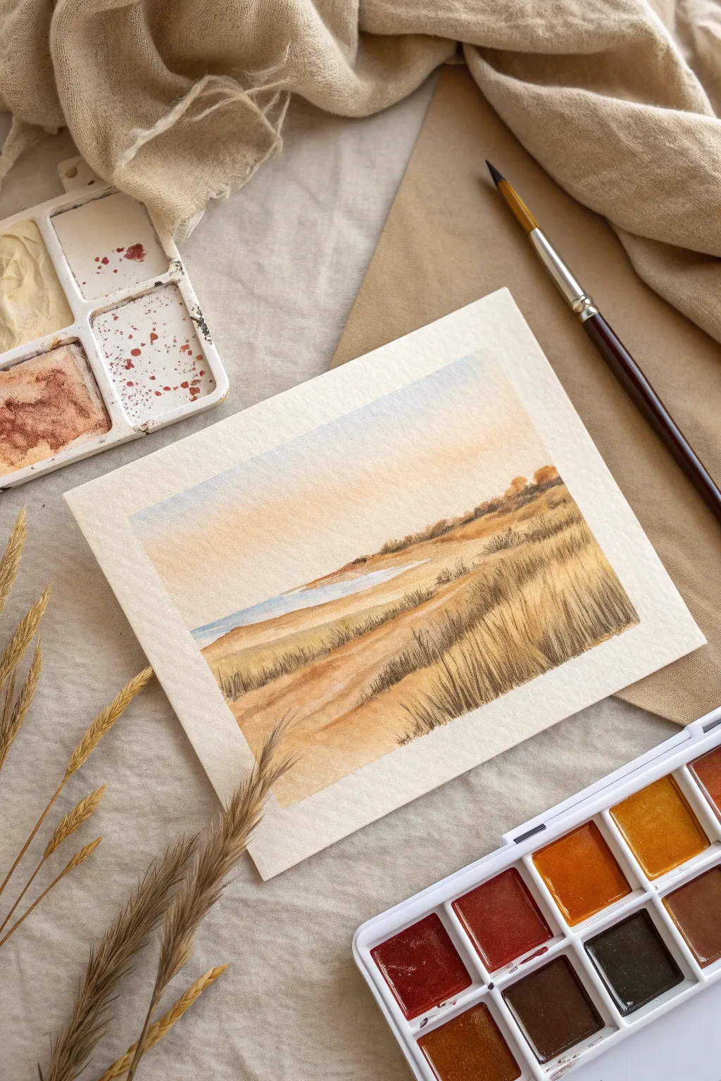
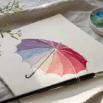
Capture the serene warmth of a coastal afternoon with this watercolor landscape featuring rolling dunes and tall grasses. Using a limited palette of earth tones, you’ll learn to layer washes and dry brush textures to create depth and movement.
Step-by-Step
Materials
- Cold press watercolor paper (140lb/300gsm)
- Watercolor paints (Yellow Ochre, Burnt Sienna, Burnt Umber, Cerulean Blue, Sepia, a hint of white gouache or opaque watercolor)
- Round brushes (Size 8 for washes, Size 2 or liner brush for details)
- Masking tape
- Clean water and paper towels
- Mixing palette
Step 1: Setting the Scene
-
Tape and Prep:
Secure your watercolor paper to a board using masking tape on all four sides. This creates a crisp white border and prevents the paper from buckling when wet. -
Light Sketch:
Using a pencil, lightly sketch the horizon line about two-thirds down the page. Add gentle, sloping curves to indicate the sand dunes in the foreground and middle ground.
Step 2: Sky and Base Layers
-
Wet-on-Wet Sky:
Brush clean water across the sky area. Load your brush with a very dilute mix of Cerulean Blue and a touch of Burnt Sienna to gray it down. Apply this near the top edge, letting it fade into white as you move down toward the horizon. -
Horizon Warmth:
While the sky area is still slightly damp near the bottom, introduce a pale wash of Yellow Ochre just above the horizon line to suggest a warm, glowing sunset haze. -
Distant Water:
Mix a watery steel blue using Cerulean and a tiny dot of Sepia. Paint a thin strip representing the water just below the horizon, but above the dunes. Leave a few tiny white gaps for sparkles on the water if possible. -
Sand Undertones:
For the dunes, mix a generous puddle of Yellow Ochre and a touch of Burnt Sienna. Apply a light, uneven wash over the entire sand area, leaving the paper white in a few spots to act as highlights on the dune crests. -
Dry Time:
Allow this initial layer to dry completely. If the paper feels cool to the touch, it is still wet.
Muddy colors?
If your earth tones look dull or muddy, you likely over-blended them on the paper. Let layers dry completely between glazes to keep the ochres and browns distinct and luminous.
Step 3: Building Earthy Depth
-
Shadow Mapping:
Mix Burnt Sienna with a little Burnt Umber to create a medium tone. Paint the shadows on the leeward side of the dunes (the side facing away from the light) to sculpt the terrain. -
Softening Edges:
Before the shadow paint dries, use a clean, slightly damp brush to soften the bottom edges of these shapes, blending them into the lighter sand color. -
Middle Ground Texture:
Use a visible brushstroke technique with a mix of Burnt Umber and Yellow Ochre to create a rough, sandy texture on the middle hill. I prefer to use the side of my brush here for a scumbled effect. -
Distant Foliage:
Along the top ridge of the furthest dune, dab small dots of thick Burnt Sienna and Sepia to suggest distant bushes and shrubs.
Scratch it out
For ultra-fine highlights in the grass, wait until the paint is semi-dry and use the sharp edge of a palette knife or an old credit card to scratch out thin white lines.
Step 4: Grasses and Details
-
Foreground Detail:
Switch to your smallest round brush or a liner brush. Mix a dark, rich brown using Sepia and Burnt Umber. Ensure the paint consistency is creamy, not too watery. -
Painting Grass Clumps:
Start painting individual blades of grass in the foreground. Use quick, flicking motions upward, lifting the brush at the end of the stroke to create a tapered point. -
Varying Direction:
Make sure the grass blades lean in slightly different directions to look natural, rather than like a picket fence. Group them in tufts. -
Color Variation:
While the grass paint is wet, drop in tiny touches of pure Burnt Sienna or even a dull yellow to add variety to the dried vegetation. -
Adding Highlights:
If you have white gouache, mix it with a little Yellow Ochre. Paint a few thin, light blades of grass over the darker patches to create depth and catch the light. -
Final Contrast:
Assess the painting. If the foreground needs more weight, add a few touches of nearly black Sepia to the base of the thickest grass clumps. -
The Reveal:
Once the paper is bone dry, carefully peel away the masking tape at a 45-degree angle to reveal your clean edges.
Frame your piece in natural wood to complement the warm palette and enjoy your serene landscape

Airy Neutrals

Embrace the tranquility of soft earth tones with this two-tone ceramic mug project, which perfectly captures the essence of airy neutrals. The finished piece features a lovely speckled cream glaze over a raw stoneware base, creating a tactile and visual delight for your morning coffee.
Step-by-Step Tutorial
Materials
- Stoneware clay (buff or speckled)
- Pottery wheel
- Throwing tools (sponge, wire cutter, ribs)
- Trimming tools
- Loop tool for handle pulling
- Serrated rib or scoring tool
- Slip (liquid clay)
- Speckled oatmeal or cream glaze (stoneware temperature)
- Damp sponge
- Wax resist (optional)
- Kiln
Step 1: Throwing and Trimming
-
Prepare the Clay:
Begin by wedging about 1 to 1.5 lbs of stoneware clay to remove any air bubbles. Pat the clay into a ball and center it firmly on the wheel head. -
Open and Pull:
Open the centered clay and compress the floor. Begin pulling the walls up, aiming for a straight-sided cylinder with a slight curvature at the bottom. -
Shape the Form:
Use a rib tool on the inside and outside to smooth the walls and define the shape. For this specific look, keep the walls relatively straight but soften the rim for comfortable sipping. -
Wire Off:
Run a wire cutter under the base of the mug to separate it from the wheel, then carefully lift it off and set it aside to dry to leather-hard. -
Trim the Foot:
Once leather-hard, center the mug upside down on the wheel. Trim the bottom to create a clean, defined foot ring, removing excess weight from the base.
Step 2: Handle Attachment
-
Pull the Handle:
Using a separate lump of clay and plenty of water, pull a strap of clay. Smooth it until it’s uniform in thickness and has a pleasing curve. -
Cut to Size:
Allow the pulled handle to stiffen slightly until it can hold its arch without collapsing. Cut it to the appropriate length for your mug size. -
Score and Slip:
Determine the placement of the handle. Use a serrated tool to score the attachment points on both the mug body and the handle ends. Apply a generous dab of slip to the scored areas. -
Secure the joint:
Firmly press the handle onto the mug body. Wiggle it slightly to ensure a strong bond. Use a damp sponge or your finger to smooth the seams where the clay meets, blending the handle seamlessly into the mug. -
Define the Grip:
Check the alignment of the handle to ensure it looks straight. I like to run a damp sponge carefully down the handle one last time to ensure it feels smooth to the touch. -
Bisque Fire:
Allow the mug to dry completely to the bone-dry stage. Load it into the kiln for a bisque firing (usually around Cone 04) to prepare it for glazing.
Smooth Rim Tip
Compress the rim with a small piece of chamois leather or plastic wrap while the wheel is spinning slowly during the throwing phase for an ultra-smooth lip.
Step 3: Glazing and Finishing
-
Clean the Bisque:
Wipe the bisque-fired mug with a damp sponge to remove any dust that might interfere with glaze adhesion. -
Wax the Base:
Apply wax resist to the bottom foot and about 1/2 inch up the side of the mug. This will create the raw clay band seen in the bottom of the project image. -
Prepare the Glaze:
Stir your speckled oatmeal or cream glaze thoroughly. Ensure it is the consistency of heavy cream for an even application. -
Dip the Mug:
Holding the mug by the foot (or using glazing tongs), dip the entire mug into the glaze bucket, stopping just where the wax resist begins. Hold for 3 seconds and lift out. -
Clean the Line:
Once the glaze is dry to the touch, use a damp sponge to wipe away any glaze drips that may have beaded up on the wax resist, ensuring a crisp, clean line between glaze and raw clay. -
Glaze Firing:
Place the mug in the kiln for the final glaze firing (often Cone 5 or 6 depending on your clay and glaze choice). Ensure no glaze touches the kiln shelf. -
Final Sanding:
After the kiln has cooled and the piece is removed, check the unglazed bottom. If the raw clay feels rough, wet-sand the foot lightly with sandpaper to make it smooth for furniture surfaces.
Make it a Set
Create a matching pour-over cone or a small creamer jug using the same clay body and glaze line height for a cohesive breakfast set.
Enjoy your morning coffee surrounded by the peaceful, airy vibes of your new handmade mug

High-Contrast Black and Ivory
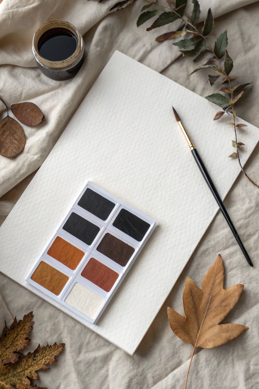
This tutorial guides you through assembling a moody, artistically curated flat lay scene that celebrates the interplay of deep blacks, warm ambers, and soft ivory textures. You’ll arrange organic elements alongside art supplies to create a photo-ready composition perfect for showcasing color palettes or artistic intent.
How-To Guide
Materials
- Textured linen or cotton fabric (beige or off-white)
- Cold-press watercolor paper (300 gsm)
- Watercolor palette set (pan style)
- Round watercolor brush (size 6 or 8)
- Small glass jar with dark liquid (ink or heavily diluted paint)
- Dried botanical elements (leaves, twigs)
- Camera or smartphone
- Natural window light
Step 1: Setting the Stage
-
Prepare the foundation:
Begin by laying down your textured fabric on a flat surface. Choose a spot near a window to utilize soft, directional natural light, which adds depth to the folds. -
Create organic texture:
Don’t smooth the fabric perfectly. Instead, pinch and gather the material gently to create soft peaks and valleys. These shadows will add dimension to your final image. -
Position the focal point:
Place your sheet of cold-press watercolor paper in the center of the frame, angled slightly diagonally. This breaks the monotony of straight lines and draws the eye inward.
Lighting Pro Tip
Side-lighting is crucial for texture. Position your setup so window light hits the paper from the side, not the top, to make the ‘tooth’ of the watercolor paper pop.
Step 2: Arranging the Tools
-
Place the palette:
Set the watercolor pan palette on the bottom left corner of the paper. Ensure the colors—specifically the ochres, siennas, and blacks—are clean and visible to establish the color story. -
Add the brush:
Lay the watercolor brush across the right side of the paper. Angle it to lead the viewer’s eye back towards the center of the composition. -
Position the ink jar:
Place the small glass jar filled with dark liquid in the upper left corner, just off the paper on the fabric. The dark circle creates a visual anchor that balances the palette.
Fixing Flat Photos
If the image looks too flat, prop up the corners of the watercolor paper with small coins or erasers underneath. The slight lift creates a drop shadow that adds depth.
Step 3: Adding Organic Elements
-
Introduce vertical movement:
Place a long, slender twig with dried leaves along the right edge of the setup. Let it curve naturally, mirroring the angle of the brush to create a sense of flow. -
Anchor the bottom right:
Position a large, dried maple or sycamore leaf in the bottom right corner. Its warm brown tones should compliment the amber hues in the paint palette. -
Balance the left side:
Scatter a few smaller dried leaves near the left edge, partially under paper or fabric folds. I find this creates a ‘frame’ effect without feeling too rigid. -
Fine-tune the intersections:
Adjust where the leaves touch the paper. Slight overlaps break the harsh edge of the white rectangle and integrate the items into a cohesive scene.
Step 4: Capturing the Image
-
Check your lighting:
Observe how the light hits the paper texture. If the light is too harsh, use a sheer curtain to diffuse it; you want soft shadows, not hard lines. -
Align the camera:
Hold your camera directly overhead for a true ‘flat lay’ perspective. Ensure the lens is parallel to the table surface to avoid distorting the rectangular paper. -
Compose and crop:
Look through the viewfinder and adjust the framing. Leave some ‘negative space’ around the edges so the image feels breathable and not cluttered. -
Focus and shoot:
Tap to focus on the texture of the watercolor paper or the paint pans. Take several shots, slightly adjusting the rotation of the leaves or brush between each one.
Step back and admire how a few simple objects can create a mood of quiet creativity

Sweet Pastels
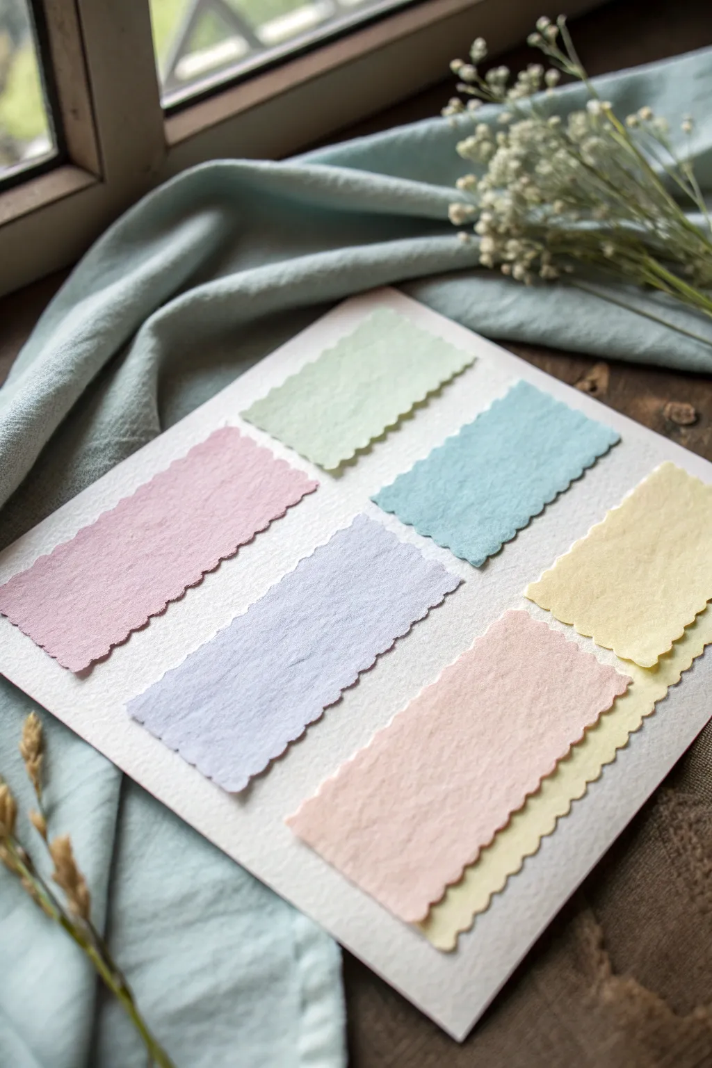
This delightful papercraft project arranges soft, handmade-style paper swatches into a harmonious grid, perfect for color study or as a charming mood board. The textured edges and muted candy-colored tones create an aesthetic that is both vintage and refreshingly modern.
Detailed Instructions
Materials
- Heavyweight white cardstock or watercolor paper (A4 or letter size)
- Assorted handmade or textured papers in pastel shades (mint green, baby pink, powder blue, lavender, peach, pale yellow)
- Pinking shears or scalloped decorative edge scissors
- Ruler
- Pencil
- Craft glue stick or double-sided craft tape
- Bone folder (optional)
- Cutting mat
Step 1: Preparing the Base
-
Select your foundation:
Begin by choosing a high-quality, heavyweight white cardstock for your background. A paper with a slight tooth or texture, like cold-press watercolor paper, adds a nice tactile feel that complements the swatches. -
Measure the layout area:
Decide on the final size of your display board. If you want a uniform look, lightly mark a rectangular boundary in pencil where your swatches will sit, leaving a generous white margin around the edges to frame the colors
Clean Cuts Every Time
When using decorative scissors, use long, continuous cuts rather than short snips. This prevents jagged interruptions in the scallop pattern.
Step 2: Creating the Swatches
-
Select your palette:
Gather your colored textured papers. For this specific look, you need a soft mint green, a dusty rose pink, a sky blue, a gentle lavender, a warm peach, and a butter yellow. I prefer using paper with visible fibers to enhance the handmade aesthetic. -
Measure the strips:
Using your ruler and pencil, lightly mark out rectangles on the back of your colored papers. Dimensions of approximately 2 inches by 3.5 inches tend to work well for a standard layout, but you can adjust based on your base size. -
Rough cut the shapes:
Before doing the detailed edge work, use regular scissors to cut out the rectangles slightly larger than your measured lines. This gives you room for error when using the decorative scissors. -
Create the scalloped edges:
Take your pinking shears or scalloped decorative scissors. Carefully trim all four sides of each colored rectangle to create that distinctive wavy, postage-stamp style edge. -
Refine the corners:
Pay special attention to the corners where the scalloped cuts meet. Snip away any sharp or awkward points so the undulation flows continuously around the shape. -
Check consistency:
Lay all six cut swatches side-by-side to ensure they are relatively uniform in size. Slight variations add character to this handmade style, so don’t worry about absolute perfection.
Wrinkled Paper?
If your glue makes the paper ripple, switch to high-quality double-sided tape or a ‘dry’ glue runner. Wet glues are often too heavy for thin handmade papers.
Step 3: Assembling the Composition
-
Dry run arrangement:
Place your cut swatches onto the white background board without glue. Arrange them in two columns of three. To match the image, place the green top right, pink top left, blue mid-right, lavender mid-left, yellow bottom right, and peach bottom left. -
Spacing the grid:
Adjust the spacing between the swatches. Aim for equal gaps between the columns and the rows. Using a ruler here helps keep the ‘gutters’ straight and even. -
Create the layered effect:
Notice the bottom right corner has a layered look. Place a second yellow swatch underneath the peach swatch slightly offset, or layer two colors to add dimension. In the image, the yellow is tucked under the peach on the bottom row. -
Mark position lightly:
Once satisfied with the placement, make tiny, faint pencil marks at the corners of where each swatch sits to guide your gluing process.
Step 4: Final Adhesion
-
Apply adhesive:
Flip over the first swatch (I usually start from the top left) and apply a thin, even layer of glue or a strip of double-sided tape. Avoid over-gluing near the scalloped edges to prevent oozing. -
Place carefully:
Align the swatch with your pencil guides and press down gently. Start from the center of the paper and smooth outwards to prevent air bubbles. -
Burnish for flatness:
If you have a bone folder, gently run it over the surface (using a clean scrap paper on top to protect the color) to ensure a strong, flat bond. -
Complete the grid:
Repeat the gluing process for the remaining rectangles, working your way down the columns. Remember to glue the under-layer of the yellow/peach corner first before placing the top layer. -
Erase guides:
Once the glue is fully dry, gently erase any visible pencil marks from your layout phase. -
Flatten the project:
Place the finished board under a heavy book for about an hour. This prevents the moisture in the glue from curling the base cardstock.
This serene arrangement of soft pastels is now ready to frame or hang on your inspiration board for a touch of tranquility
BRUSH GUIDE
The Right Brush for Every Stroke
From clean lines to bold texture — master brush choice, stroke control, and essential techniques.
Explore the Full Guide
Coastal Cool Blues
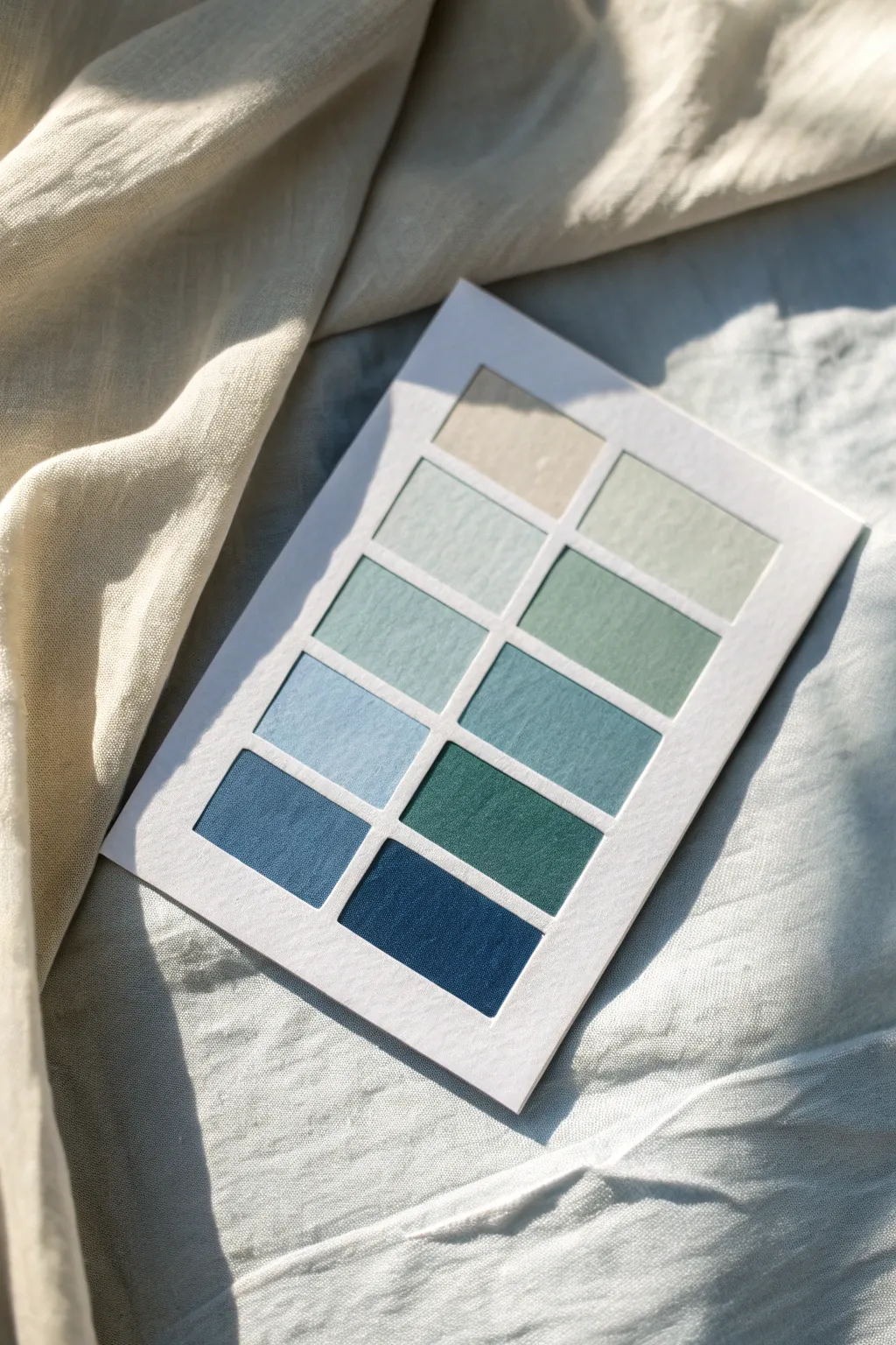
Capture the essence of a breezy shoreline with this tactile color palette card, featuring a gradient of linen swatches from sandy beige to deep ocean navy. This project transforms simple fabric scraps and cardstock into a professional-looking mood board perfect for interior design planning or artistic inspiration.
Step-by-Step Tutorial
Materials
- Heavyweight white cardstock or watercolor paper (approx. A5 size)
- Fabric scraps (linen or cotton) in coastal shades: beige, sage green, teal, sky blue, navy
- Sharp fabric scissors or rotary cutter
- Self-healing cutting mat
- Metal ruler
- Pencil
- Double-sided tape or heavy-duty spray mount
- Bone folder (optional)
- X-Acto knife
Step 1: Planning the Layout
-
Prepare the Base:
Cut your heavyweight cardstock into a clean rectangle, roughly 5×7 inches. This will serve as the sturdy foundation for your swatches. -
Grid Measurement:
Using your pencil and metal ruler, lightly mark out a grid for your swatches. You will need spaces for 9 rectangles total. -
Define Spacing:
Ensure you leave a consistent white border—about 1/4 inch—between each swatch and around the outer edge. Precision here is key for that clean, professional look.
Clean Cuts Pro Tip
For perfectly straight fabric edges that don’t fray, use a rotary cutter against a metal ruler rather than scissors.
Step 2: Creating the Swatches
-
Select Fabrics:
Gather your linen or cotton scraps. Organize them by color to visualize the gradient from light (sand) to dark (deep water). -
Stiffen the Fabric:
If your fabric represents a challenge because it is too flimsy, I find that ironing a light fusible interfacing to the back before cutting makes everything much easier to handle. -
Measure and Cut:
Using the rotary cutter and metal ruler on your cutting mat for the sharpest lines, cut 9 rectangular pieces of fabric. -
Check Sizes:
Aim for rectangles that are approximately 1.5 x 1 inch, varying slightly depending on your total card size. All rectangles should be identical in size. -
Arrange the Gradient:
Lay the cut fabric pieces onto your grid without gluing yet. Arrange them to flow naturally: start with the sandy beige at the top left. -
Flow to Blue:
Move into pale sage and light blue for the middle section, creating a soft transition. -
Deepen the Tones:
Place the teal, denim blue, and deep navy swatches at the bottom to anchor the palette with visual weight.
Texture Level Up
Mix materials! Try combining smooth cottons with rougher linens or even a piece of velvet for tactile variety.
Step 3: Assembly
-
Apply Adhesives:
Apply a strip of strong double-sided tape to the back of your first fabric swatch. Avoid liquid glue as it can seep through the fabric weave and leave dark spots. -
Position the First Swatch:
Carefully place the top-left beige swatch into its pencil-marked box. Press down firmly to secure it. -
Continue Placement:
Work your way across and down the grid, adhering each fabric rectangle one by one. Check your alignment with the ruler frequently. -
Smooth Edges:
Run a bone folder or the back of a spoon over the edges of the fabric pieces to ensure they are crisp and fully adhered to the cardstock. -
Clean Up:
Once all swatches are mounted, use a clean eraser to gently remove any visible pencil grid lines from the white borders. -
Final Trim:
If there are any frayed threads hanging off the edges of your fabric rectangles, carefully snip them away with small detail scissors for a polished finish.
Display your finished palette on your mood board or desk to keep your coastal inspiration close at hand
Rich Jewel Tones
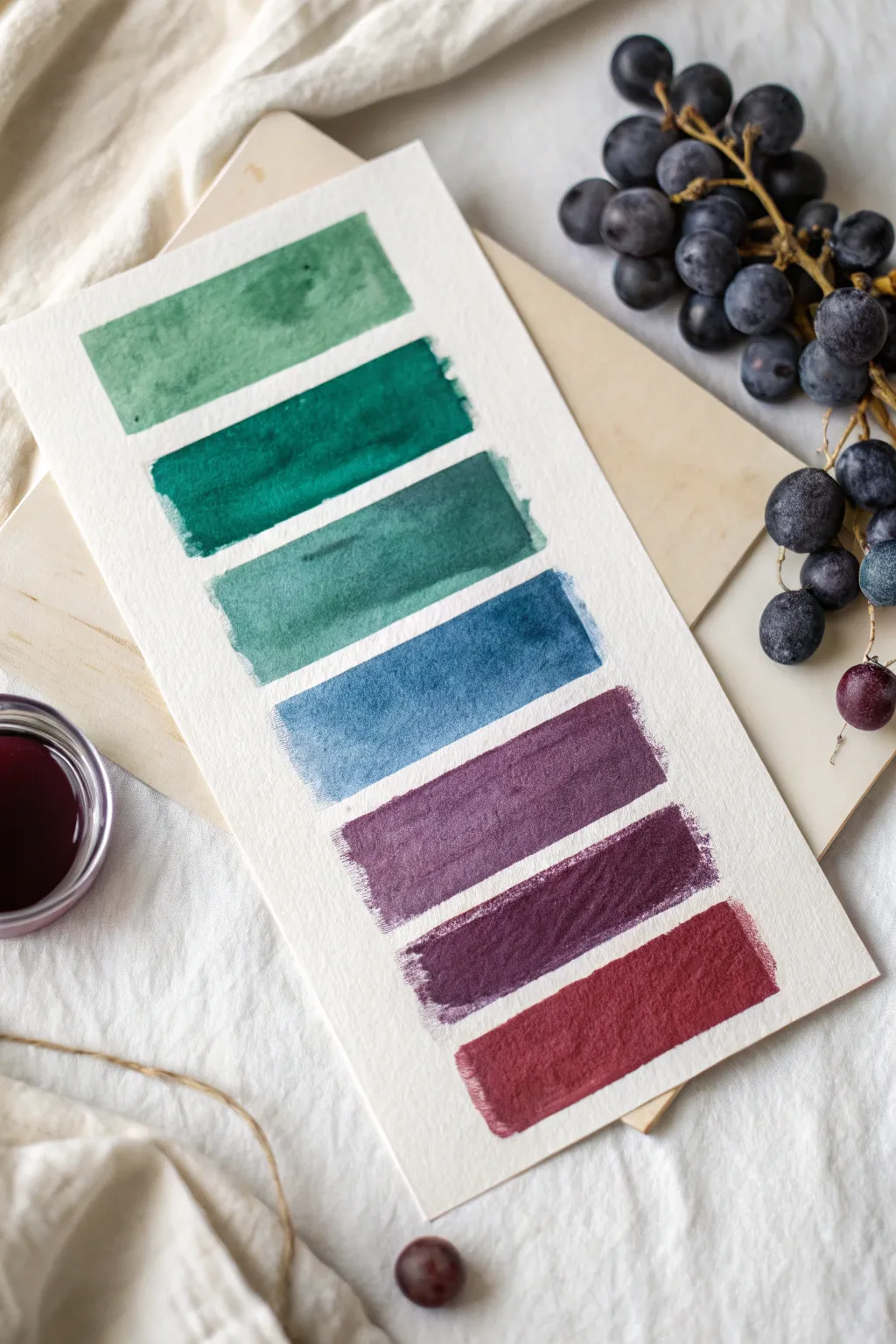
Capture the moody elegance of deep jewel tones with this simple yet satisfying watercolor swatch study. Perfect for testing color combinations or creating a minimalist piece of abstract art, this project explores the transition from forest greens to regal bourdeaux.
Step-by-Step Guide
Materials
- Cold press watercolor paper (300 gsm or heavier)
- High-quality watercolor paints (pan or tube)
- Flat shader brush (size 1/2 inch or 3/4 inch)
- Clean water for rinsing
- Mixing palette
- Painter’s tape or washi tape (optional for edges)
- Paper towel or rag
Step 1: Preparation & Color Mixing
-
Paper Setup:
Cut a strip of cold press watercolor paper to approximately 4×8 inches. I prefer leaving the edges raw or slightly torn for a more organic feel, but you can trim them sharp if you prefer. Lay this on a flat surface, perhaps backed by a wooden board for support. -
Identify the Palette:
Observe the target gradient. You will need seven distinct shades: a muted sage green, deep emerald, teal-slated green, denim blue, muted plum, deep violet, and a rich cranberry red. -
Pre-mix the Greens:
On your palette, mix a Sap Green with a touch of Payne’s Gray to create the top sage color. For the second swatch, mix Phthalo Green with a tiny drop of Alizarin Crimson to deepen it into a rich emerald. -
Pre-mix the Blues:
Create the third teal shade by mixing Viridian Green with Prussian Blue. For the fourth denim shade, dilute Indigo or mix Ultramarine with a touch of Burnt Sienna to desaturate it slightly. -
Pre-mix the Purples:
Prepare the plum shades. Mix Alizarin Crimson with Ultramarine for a classic purple. Add a touch of black or neutral tint to the second purple mix to get that deep, moody violet. -
Prepare the Red:
For the final bottom swatch, prepare a concentrated Alizarin Crimson or Carmine mixture. Keep this one quite saturated to achieve that heavy, wine-like appearance.
Fixing “Cauliflowers”
If you see uneven blooms or watermarks as it dries, your brush may have had too much water. Dab excess water gently with a dry brush while wet.
Step 2: Painting the Swatches
-
Load the Brush:
Saturate your flat shader brush with the first sage green mixture. Ensure the brush is fully loaded but not dripping uncontrollably. -
First Swatch:
Place the brush near the top of the paper well-aligned horizontally.在此 Pull the brush across from left to right in one or two confident strokes to create a rectangular block. Let the natural texture of the paper show through. -
Spacing:
Leave a gap of about 1/4 to 1/2 inch of white space below the first block. Visualizing this consistent spacing is key to the clean look. -
Emerald Layer:
Rinse your brush thoroughly and load it with the deep emerald mix. Paint the second rectangle directly below the first, trying to match the width and height of the previous block. -
Teal Transition:
Move to the teal-slated green paint. Apply this as the third block. If the paint pools slightly at the edges, let it serve as a natural watercolor effect, adding character to the swatch. -
Testing Saturation:
As you move down, ensure your paint consistency remains creamy rather than too watery. We want these jewel tones to look opaque and rich, not washed out. -
The Blue Block:
Paint the fourth swatch using the denim blue mix. This serves as the cool bridge between the greens above and the warm purples below. -
Purple Segment:
Apply the muted plum color for the fifth block. Watch how the texture of the cold press paper catches the pigment, creating tiny white speckles within the color. -
Deep Violet:
Apply the darkest violet mix for the sixth block. This should be the moodiest color on the card. -
Final Cranberry Stroke:
Finish with the rich cranberry red at the bottom. This warm tone anchors the entire gradient. -
Drying:
Let the swatch card dry completely flat. Do not tilt it, or the wet paint might run into the white spaces and ruin the clean separation.
Metallic Edge
Once fully dry, outline just the corners of each swatch with a fine gold gel pen or metallic watercolor for a luxurious, framed finish.
Display your finished color study on a mood board or frame it for a minimalist art piece

PENCIL GUIDE
Understanding Pencil Grades from H to B
From first sketch to finished drawing — learn pencil grades, line control, and shading techniques.
Explore the Full Guide
Desert Chic Neutrals
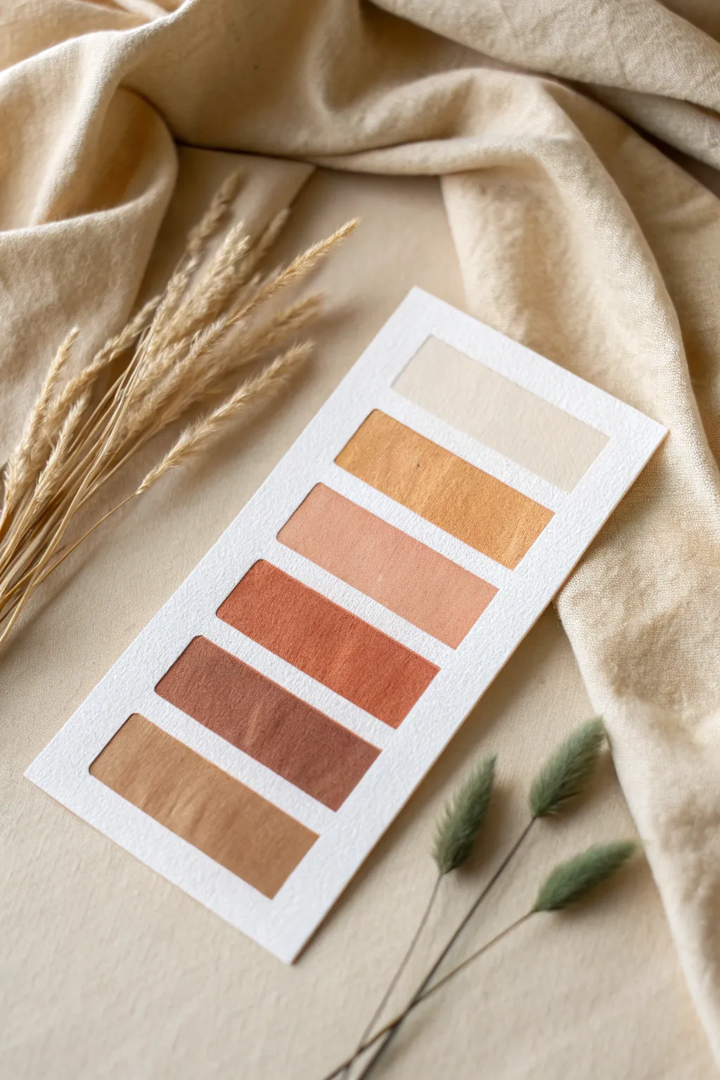
Capture the warmth of desert landscapes with this elegant, minimalist color swatch guide. Using high-quality watercolor paper creates a textured, artisanal feel perfect for planning your next design project or simply practicing color mixing.
Detailed Instructions
Materials
- Cold press watercolor paper (300 gsm)
- Watercolor paints (Yellow Ochre, Burnt Sienna, Burnt Umber, Alizarin Crimson, White)
- Flat shader brush (size 6 or 8)
- Ruler
- Pencil (HB or H)
- Painter’s tape or washi tape
- Palette for mixing
- Jar of water
- Paper towels
Step 1: Preparation & Layout
-
Cut the Paper:
Begin by cutting a strip of cold press watercolor paper. A size of approximately 4 inches wide by 8 inches tall works beautifully for this layout. Ensure the edges are clean and straight. -
Mark the Margins:
Using your ruler and a light pencil touch, measure a uniform border around the edges of the card. A half-inch margin usually provides a nice frame for the colors. -
Grid the Swatches:
Divide the central area vertically into six equal rectangular sections. Leave a small gap, about 1/8th of an inch, between each rectangle to keep definitions crisp. These will be your paint zones. -
Tape the Boundaries:
Carefully apply painter’s tape or washi tape over the pencil lines separating the rectangles, as well as the outer border. Press the edges of the tape down firmly with your fingernail to prevent paint bleeding.
Crisp Edge Secret
Before painting, paint a layer of clear water or white matte medium over the tape edges to seal them perfectly against leaks.
Step 2: Mixing & Painting
-
Mix Color 1: Sand Beige:
For the top swatch, create a very dilute wash. Mix a tiny dot of Yellow Ochre with plenty of water and a touch of white gouache or unbleached titanium if you want opacity. It should look like warm sand. -
Apply the First Layer:
Load your flat brush and apply the beige mixture to the top rectangle. Use horizontal strokes for a uniform look. I like to let the water pool slightly to encourage natural texture as it dries. -
Mix Color 2: Golden Canyon:
For the second swatch, increase the intensity. Use Yellow Ochre as your base and add a tiny speck of Burnt Sienna. This should be a rich, golden mustard hue. -
Paint the Second Block:
Paint the second rectangular space. Ensure you are getting good coverage near the tape edges without soaking the paper too much. -
Mix Color 3: Dusty Peach:
Create a bridge between yellow and red. Mix White, Yellow Ochre, and a very small amount of Alizarin Crimson. You want a soft, muted terracotta pink. -
Apply the Peach Tone:
Fill in the third block. If the color looks too bright, dull it down with a microscopic amount of green or brown on your palette before applying. -
Mix Color 4: Rust Red:
Deepen your previous peach mixture by adding Burnt Sienna and a bit more Alizarin Crimson. This is your boldest, warmth-anchoring color. -
Paint the Rust Layer:
Apply this rust color to the fourth rectangle. Watch the saturation; it should be significantly darker than the peach tone above it. -
Mix Color 5: Earthy Cocoa:
Transition into the browns. Start with Burnt Umber and warm it up with a touch of the Rust mixture you just used. It should resemble milk chocolate. -
Apply the Cocoa Shade:
Paint the fifth block. Keep your brush strokes consistent and flat to mimic the smoothness seen in the reference image. -
Mix Color 6: Deep Bronze:
For the final bottom swatch, use pure Burnt Umber mixed with a hint of Yellow Ochre to keep it in the golden family, rather than a cool brown. -
Finish the Painting:
Fill the final bottom rectangle. Check that the gradient from top (light) to bottom (dark) feels balanced.
Add Metallic Flair
Once dry, overlay a sheer wash of iridescent gold watercolor on the ‘Golden Canyon’ strip for a subtle, shimmering desert sun effect.
Step 3: Finishing Touches
-
Allow to Dry:
Let the paper sit completely undisturbed until the paint is bone dry. Patience is key here to keep lines sharp. -
Peel the Tape:
Slowly peel the tape away at a 45-degree angle. Pulling away from the paint area helps prevent the paper from tearing. -
Clean Up Edges:
If any pencil lines are still visible in the white gaps, gently erase them with a kneaded eraser.
Now you have a serene color reference card ready to inspire your decor or design work
Golden Hour Glow
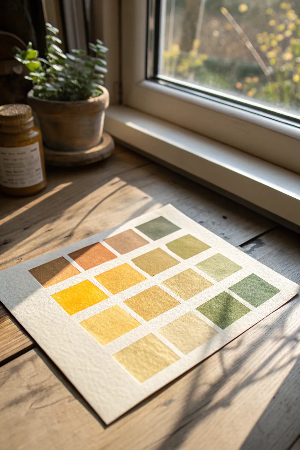
Capture the fleeting warmth of late afternoon light with this soothing watercolor study. This project focuses on mixing a cohesive palette of honeyed yellows, soft ochres, and muted mossy greens to create a grid of harmonious swatches.
Step-by-Step
Materials
- Cold press watercolor paper (300 gsm)
- Watercolor paints (Yellow Ochre, Burnt Sienna, Sap Green, Cadmium Yellow, Raw Umber)
- Flat shader brush (size 6 or 8)
- Pencil (HB)
- Ruler
- Painter’s tape or masking tape
- Two jars of water
- Palette for mixing
Step 1: Preparation
-
Paper Setup:
Begin by taping down your watercolor paper to a flat, sturdy board. This prevents the paper from buckling when it gets wet and ensures you have a crisp, clean border around your final piece. -
Grid Layout:
Using your ruler and a light pencil touch, measure out a grid of squares. Aim for about 16 squares (4×4 arrangement), leaving a small, consistent gap of about 5mm between each square to clearly separate the colors.
Step 2: Color Mixing
-
Base Yellows:
Start by preparing your main ‘light’ colors. Squeeze out some Cadmium Yellow and tone it down with a tiny touch of Yellow Ochre to create a warm, sunny base that isn’t too electric. -
Earthy Tones:
Mix a separate puddle of Yellow Ochre with a hint of Burnt Sienna. This creates that classic ‘golden hour’ toasted brownish-yellow seen in the top left area of the grid. -
Muted Greens:
For the nature-inspired tones, take Sap Green and dull it slightly by mixing in a small amount of Burnt Sienna or Raw Umber. You want a mossy, dried-grass green rather than a bright spring green. -
Creating Variation:
I always prepare a watered-down wash of just Raw Umber and another extremely pale wash of Yellow Ochre. These will serve as your neutral, transition shades for the lighter swatches.
Wet Edge Control
Work one square at a time and let adjacent squares dry before painting their neighbors. This prevents wet paint from bleeding across the gaps.
Step 3: Painting the Swatches
-
First Application:
Load your flat brush with the brightest yellow mixture. Paint one of the squares in the second row, keeping your strokes horizontal and even to minimize streaking. -
Building Warmth:
Clean your brush and switch to the toasted ochre mix. Paint a square diagonally adjacent to your yellow one. The goal is to scatter the colors so no two identical shades are right next to each other. -
Adding Greens:
Introduce your mossy green mixture. Paint the corners or outer edges of the grid first. This helps frame the warmer, glowing center colors. -
The Darkest Values:
Mix a slightly more concentrated Burnt Sienna or Raw Umber to create a darker brown swatch. Place this strategically on the left side to anchor the composition visually. -
Mid-Tones:
Blend your existing green mix with a little more yellow to create a chartreuse or olive tone. Fill in a few empty squares with this bridge color. -
Pale Washes:
For the very light, almost white squares, simply dip your dirty brush into clean water. The residual pigment is often enough to create those delicate, whisper-light tints at the bottom of the grid. -
Wet-on-Dry Texture:
Allow the paint to settle into the paper’s texture. Because we are using cold press paper, you’ll naturally get that lovely granulated ‘tooth’ effect as the pigment dries. -
Refining Edges:
If any square looks uneven, you can carefully re-wet the edge with a damp brush to straighten it, but be careful not to lift the color completely.
Unwanted Blooms?
If you see ‘cauliflower’ blooms, you likely added water to a drying wash. Try to lay down the pigment in one go and leave it alone until dry.
Step 4: Finishing Touches
-
Drying:
Let the entire sheet dry completely. The colors will lighten slightly as the water evaporates, settling into their final matte finish. -
Erasing Guides:
Once the paper is bone dry, gently erase the visible pencil lines between the squares. Use a soft eraser to avoid damaging the painted surface. -
Tape Removal:
Peel off the masking tape slowly, pulling it away from the painting at a 45-degree angle to ensure a perfect, tear-free border.
Now you have a serene color study that reflects the peace of a quiet afternoon.


Historical Romance Hues
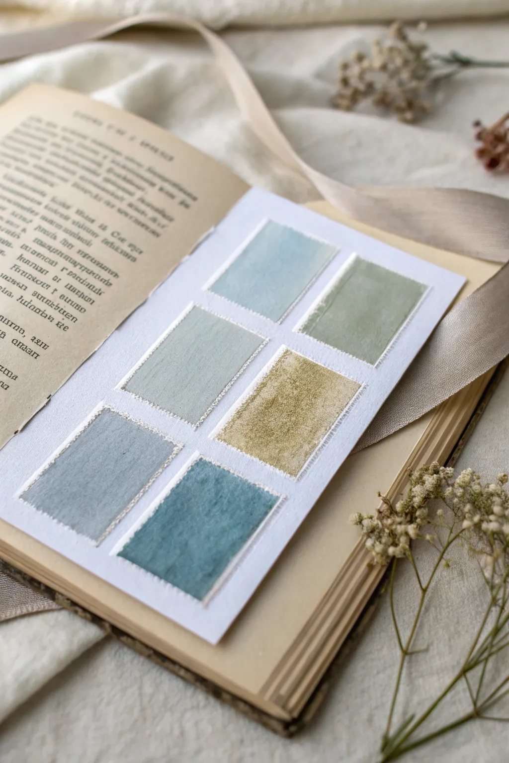
Capture the essence of a bygone era with this delicate watercolor swatch sampler that evokes the romance of historical novels. Featuring muted tones and soft, deckled edges, this project serves as a beautiful bookmark or a standalone piece of art for your journal.
How-To Guide
Materials
- Cold press watercolor paper (300 gsm)
- Old vintage book (for staging/gluing into)
- Watercolor paints (Payne’s Grey, Sap Green, Yellow Ochre, Indigo, Burnt Umber)
- Small flat brush (size 4 or 6)
- Washi tape or masking tape (low tack)
- Pencil and ruler
- Container of water
- Paper towels
- Detail brush (size 0 or 1)
- White gouache (optional, for mixing pastel tints)
Step 1: Preparation & Layout
-
Size the paper:
Cut your cold press watercolor paper into a rectangle that fits comfortably within the margins of your vintage book page, leaving about an inch of border on all sides. -
Mark the grid:
Using a pencil and ruler, lightly mark out six equal rectangles in a 2×3 grid formation. Allow about 1/4 inch of white space between each swatch to let the colors breathe. -
Mask the edges:
Carefully place strips of washi tape along your pencil lines to define the borders of your six rectangles. Press down firmly to prevent paint bleed. -
Creating the rough edge:
To mimic the textured edges seen in the image, tear the masking tape strips vertically down the center before applying them, placing the torn ‘raw’ edge facing inward toward the swatch area.
Step 2: Mixing the Palette
-
Muted Sage:
Mix Sap Green with a tiny touch of Burnt Umber and plenty of water to create a soft, desaturated sage green for the top right swatch. -
Dusty Blue:
Combine Indigo with a wash of white gouache or heavy water dilution to achieve the airy, pale blue for the top left swatch. -
Antique Gold:
Take Yellow Ochre and dull it slightly with a pinpoint of purple or brown; this creates the sophisticated gold tone for the middle right swatch. -
Sea Glass:
Blend a cool green with a touch of blue to create the middle left swatch, keeping the application sheer to show the paper texture. -
Slate Grey:
Dilute Payne’s Grey heavily for the bottom left swatch, aiming for a cloudy, atmospheric storm color. -
Deep Teal:
Mix Indigo and Sap Green in equal parts for the bottom right swatch, keeping this one slightly more saturated than the others.
Tearing Trick
Don’t have deckled-edge tape? Place a metal ruler where you want your paint line to stop, and gently tear masking tape against the ruler’s edge for a perfect ‘rough’ look.
Step 3: Painting & Finishing
-
Apply the washes:
Using your flat brush, paint each rectangle with its designated color. Use a ‘wet-on-dry’ technique to keep the pigment controlled. -
Create texture:
While the paint is still damp, dab a corner of a paper towel lightly onto the center of the ‘Antique Gold’ and ‘Slate Grey’ swatches to lift pigment and create a worn, velvet-like texture. -
Let it dry completely:
Wait for the paint to be bone dry. I cannot stress this enough—peeling tape too early will ruin your crisp lines. -
The reveal:
Slowly peel back the masking tape at a 45-degree angle. Because you used the torn edge of the tape, the borders should look slightly organic and deckled. -
Simulated stitching:
Using your smallest detail brush and a slightly darker mix of each swatch’s color, paint tiny, short vertical dashes along the very edge of the paint to simulate a fabric edge or stitching. -
Soften the stitches:
If the dashes look too harsh, tap them gently with a clean, damp finger to blend them into the paper texture. -
Final assembly:
Place your finished sampler onto the vintage book page. You can use a small dab of glue to secure it, or simply leave it loose as a bookmark.
Fabric Feel
Once the paint is dry, gently rub a fine-grit sandpaper over the painted areas. This scuffs the paper fibers, making the watercolor swatches look like real worn velvet.
Now you have a timeless color reference that whispers of old libraries and romantic afternoons
Classic Primary Plus Neutrals
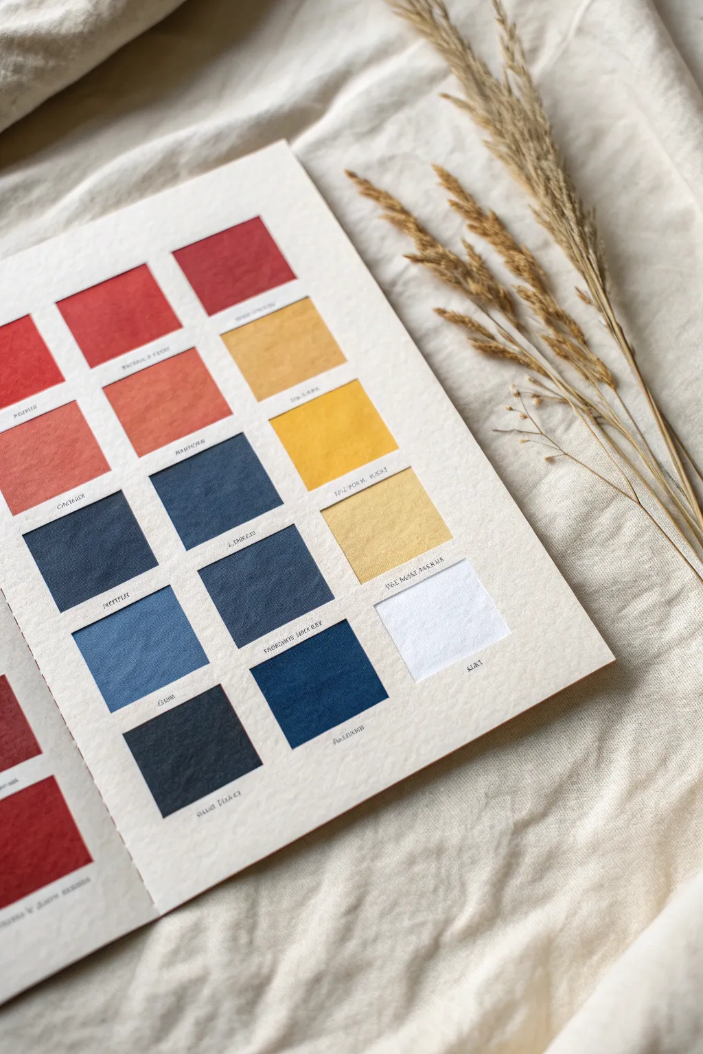
This elegant color study folio brings the tactile beauty of classic primary colors and neutrals into a structured format. By mounting textured fabric or paper swatches behind a cut-out mat, you create a professional-looking reference guide that feels both archival and artistic.
Step-by-Step
Materials
- Heavyweight cream cardstock or mat board (approx. 300gsm)
- Textured linen fabric scraps or handmade paper (reds, blues, yellows, white)
- Craft knife or scalpel
- Metal ruler
- Cutting mat
- Pencil
- Double-sided tape or acid-free glue stick
- Fine-tip archival ink pen (black)
- Bone folder
Step 1: Planning and Cutting the Grid
-
Measure the layout:
Begin by deciding the dimensions of your folio page. On the backside of your heavyweight cream cardstock, lightly map out a grid of 12 squares. Leave generous margins around the edges and consistent spacing between the squares. -
Mark the windows:
Draw the exact 1.5-inch (or desired size) squares that will become your windows. Ensure the vertical and horizontal gaps are perfectly even, as symmetry is key to this clean aesthetic. -
Cut the windows:
Place your cardstock on a cutting mat. -
Slice clean edges:
Using a fresh blade in your craft knife and a metal ruler as a guide, carefully cut out each square window. I find it best to overcut the corners by a hair’s breadth to ensure the square pops out cleanly without tearing. -
Erase guidelines:
Once all windows are removed, gently erase any remaining visible pencil marks on the front face of the cardstock. -
Score the fold:
If you are creating a folded folio, score the center line vertically using a bone folder and ruler to ensure a crisp, professional fold later on.
Clean Cuts Only
If corners are tearing, your blade is dull. Snap off the segment or replace the blade immediately. Rotate the paper, not the knife, for better control.
Step 2: Preparing and Mounting Colors
-
Select your palette:
Gather your materials. For this classic look, choose deep reds and terracottas, a range of indigo and slate blues, and earthy ochres fading into cream. -
Cut the swatches:
Cut your fabric or texture paper into squares that are slightly larger than your window openings (about 0.25 inches larger on all sides). -
Check the arrangement:
Lay your colored squares on the table and place the window mat over them to preview the arrangement. The left column should feature the reds, the center the blues, and the right the yellows. -
Apply adhesive:
Flip the window cardstock over to the back. Apply strips of double-sided tape around the perimeter of every window cutout. -
Mount the swatches:
Press each fabric square face-down onto the tape, ensuring the fabric is taut and covers the opening completely without wrinkling. -
Seal the back:
Once all swatches are attached, cut a second piece of cardstock to the same size as your front face.
Step 3: Finishing Details
-
Hide the mechanics:
Apply adhesive to the back of the window layer (over the backs of the fabric swatches) and press the backing sheet firmly in place. This sandwiches the swatches and hides the raw edges. -
Press flat:
Place the folio under a heavy book for an hour to ensure the layers bond flat without warping. -
Add labels:
Using a fine-tip archival pen, carefully write the color names or codes directly under each window. Keep the handwriting small and centered for a minimal, scientific look. -
Final texture check:
Gently brush the fabric surfaces through the windows to fluff up the linen texture slightly, enhancing the tactile quality.
Add Depth
For a ‘shadow box’ effect, add foam tape between the front mat and the backing layer. This creates physical depth for thicker fabric samples.
Display your finished color chart on a desk or shelf as a sophisticated reference tool for your next design project
Analogous Color Flow
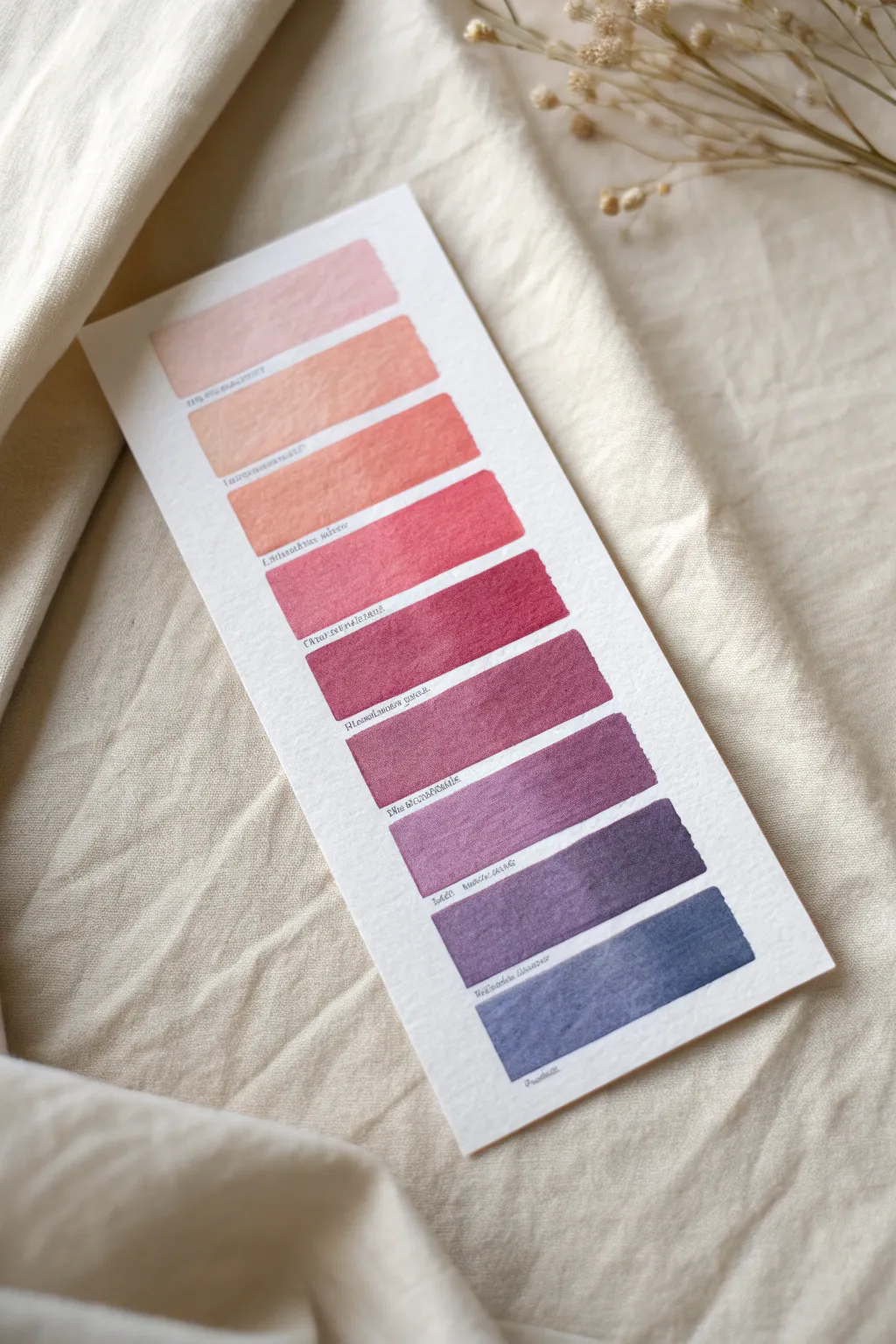
Learn to paint a serene, vertically transitioning color story that moves elegantly from soft peach to deep twilight blue. This study in analogous color flow isn’t just a practical reference tool; it makes for a beautiful, minimalist piece of art suitable for framing or journaling.
Step-by-Step Guide
Materials
- Cold press watercolor paper (300 gsm)
- Watercolor paints (Alizarin Crimson, Burnt Sienna, Ultramarine Blue, Yellow Ochre)
- Flat shader brush (size 6 or 8)
- Ruler
- Pencil (HB or lighter)
- Fine-liner pen (grey or sepia)
- Mixing palette
- Water jars
- Paper towels
Step 1: Preparing the Paper
-
Cut the paper:
Trim your watercolor paper into a tall, narrow rectangle. A size of roughly 4 inches by 8 inches works beautifully for this scale. -
Mark width guidelines:
Using your ruler, lightly measure the width you want for your color bars. Aim for bars that span almost the full width of the paper, leaving a small, uniform margin on the left and right. -
Mark height guidelines:
Mark out 9 evenly spaced sections vertically. Each bar should be about 0.75 inches tall with a very small gap (about 1/8th inch) between them. -
Sketch the boxes:
Lightly draw the horizontal lines to define the top and bottom of each swatch. Keep your pencil pressure minimal so the graphite doesn’t smudge into the wet paint later.
Step 2: Mixing the Gradient
-
Establish the base red:
On your palette, create a generous puddle of a dusty rose color. Mix Alizarin Crimson with a touch of Burnt Sienna and plenty of water to dilute it. -
Prepare the warm end:
In a separate well, mix a small amount of Yellow Ochre. This will be used to warm up the top colors. -
Prepare the cool end:
In another well, have pre-wet Ultramarine Blue ready to introduce cool tones for the lower swatches.
Paint Pooling?
If you get ‘cauliflower’ edges or backruns, your brush was too wet when retouching. Let the layer dry completely, then glaze over with a slightly damp brush to smooth it out.
Step 3: Painting the Gradient
-
Paint the first swatch:
Take your watered-down rose mix and add just a hint of the Yellow Ochre. Paint the top rectangle. The goal is a very pale, warm blush tone. -
Slightly darken the mix:
For the second bar, add a tiny bit more pigment to your blush mix to increase the saturation slightly, keeping it warm. -
Transition to coral:
Paint the third bar. I like to add a touch more crimson here to start moving away from the pale peach tones into a stronger coral. -
Deepen to rose:
For the fourth bar, reduce the water content slightly to get a richer, more vibrant pink that acts as the bridge between the light top and the dark bottom. -
Introduce the cool tone:
For the fifth bar (the middle), add the tiniest speck of blue to your red mix. It should look like a deep berry color. -
purple transition:
For the sixth bar, increase the blue ratio. You are aiming for a muted plum shade. -
Move to violet:
Paint the seventh bar with a mix that feels more purple than red. Keep the paint fluid to allow for soft granulating textures. -
Deepen to indigo:
For the eighth bar, dominate the mix with blue and perhaps a touch of burnt sienna to desaturate it, creating a deep stormy purple. -
The final swatch:
Paint the last bar at the bottom with a dusky blue-grey. This anchors the gradient and completes the analogous flow.
Make it a Bookmark
Use heavier 300lb paper and paint both sides (letting the first side dry fully!). Punch a hole at the top and add a silk ribbon in a matching rose tone.
Step 4: Finishing Touches
-
Check edges:
While paint is damp but not soaking, you can gently tidy up any ragged edges with a clean, slightly damp brush, though a little irregularity adds charm. -
Let it dry completely:
Wait until the paper is bone dry. This is crucial before adding any text to avoid bleeding ink. -
Add labels:
Using a fine-liner pen, write small, illegible or stylized text underneath the left side of each bar. This mimics the look of scientific or artistic color swatches. -
Erase guidelines:
Gently erase any visible pencil marks remaining around the paint edges to clean up the presentation.
Display your finished swatch card near a window to let natural light reveal the subtle shifts in your analogous hues
Monochrome Value Ladder
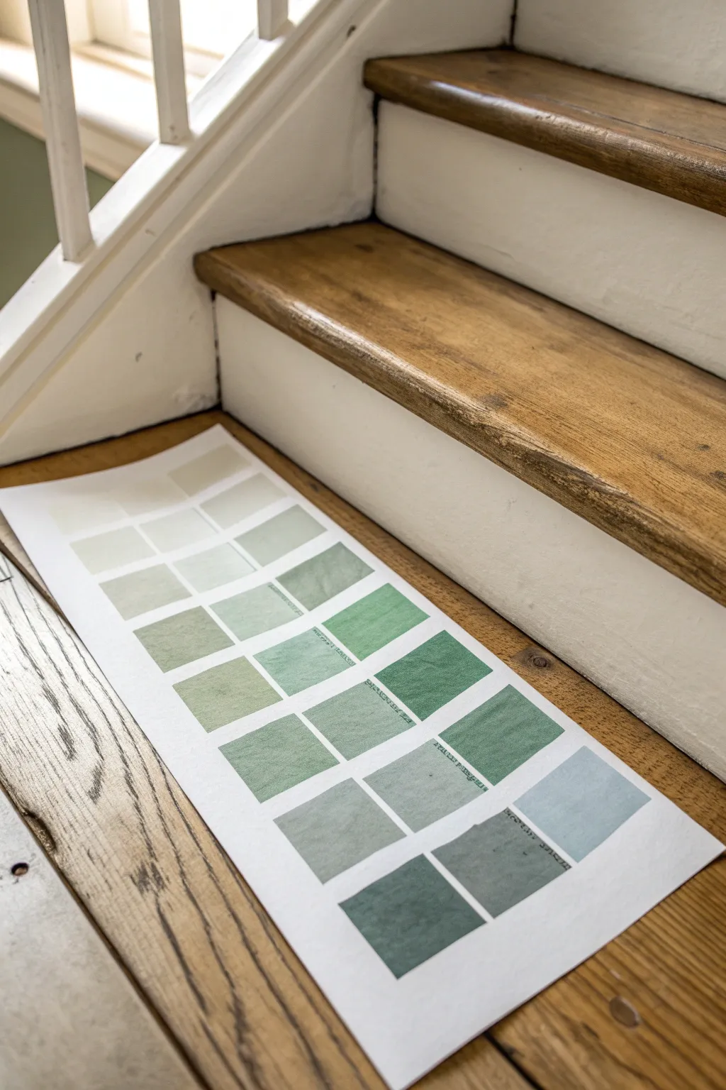
Explore the subtle shifts of a single hue with this structured monochrome study. By creating a grid of squares that transition from faint whisper-greens to deep forest shadow, you’ll gain a deeper understanding of color value and saturation.
How-To Guide
Materials
- Heavyweight watercolor or mixed media paper (approx. 9×12 inches)
- Artist’s tape or low-tack masking tape
- Ruler
- Pencil (HB or lighter)
- Green acrylic or gouache paint (e.g., Sap Green or Viridian)
- White acrylic or gouache paint
- Small flat synthetic brush
- Palette for mixing
- Water container
- Paper towels
Step 1: Setting the Grid
-
Prepare your paper:
Start with a clean sheet of heavyweight paper. Since we are creating a long, narrow chart, you might want to trim your paper to a rectangular portrait format, roughly 8 inches wide by 14 inches tall, or whatever fits your space best. -
Mark the margins:
Use your ruler to measure a consistent border around the edges of the paper. A 1-inch reveal looks professional and gives you space to handle the sheet without touching the wet paint later. -
Draft the columns:
Lightly draw three vertical columns using your pencil. Ensure they are evenly spaced. The gaps between the columns should be about a quarter-inch wide to keep the colors distinct. -
Draft the rows:
Measure and draw horizontal lines to create six or seven rows. This will give you a grid of roughly 18-21 squares total. Don’t press too hard with the pencil, as you want these lines to disappear under the paint.
Uneven Coverage?
If your paint looks streaky, it’s likely too thin. Let the first layer dry completely, then apply a second coat of the same mix for a solid, opaque look.
Step 2: Mixing and Painting
-
Set up your palette:
Squeeze out a generous amount of white paint and a moderate dollop of your chosen green hue. Keep them separate on your palette initially. -
Create the base tint:
For the top row, mix a large amount of white with just the tiniest speck of green. You want a color that is almost off-white, barely hinting at the hue. -
Paint the first squares:
Using your flat brush, carefully fill in the top row squares. Keep your strokes horizontal and smooth. I find that slightly dampening the brush helps the paint flow better into the paper’s texture. -
Deepen the mix:
Add a little more green to your existing mixture on the palette. You are aiming for a step up in saturation—clearly green, but still very pastel. -
Paint the second row:
Fill in the next row down. Work carefully up to the pencil lines to keep the squares crisp. Let the squares dry slightly as you mix the next shade. -
Progress down the ladder:
Continue this process, adding progressively more green paint to your mixture for each subsequent row. As you reach the middle rows, the color should be a balanced, medium-value green. -
Introduce pure pigment:
For the second-to-last row, use the green paint almost straight from the tube, perhaps with just a touch of white to keep it opaque and creamy. -
Create the darkest shade:
For the final bottom row, use your pure green. If you want it even darker than the tube color, you can mix in a tiny dot of black or dark blue to create a deep shadow tone. -
Fill the final squares:
Paint the bottom squares with this richest, darkest mixture. Ensure full coverage so the density of the color really stands out against the white paper.
Hue Variation
Make the chart more dynamic by shifting the hue horizontally. Add a drop of yellow to the left column mix and a drop of blue to the right column mix.
Step 3: Finishing Touches
-
Allow to dry:
Let the entire sheet dry completely flat. If the paper starts to buckle, you can weigh down the corners with clean objects once the paint is touch-dry. -
Texturize (Optional):
If you want the weathered look seen in the reference, you can lightly scuff the surface of the dry paint with a very fine-grit sandpaper, or gently crumple and flatten the paper. -
Erase guidelines:
Once the paint is bone dry, carefully erase any visible pencil marks between the squares to clean up the presentation.
Display your finished value ladder as a handy reference tool or a minimalist piece of wall art
Photo-to-Palette Under-Bar Layout
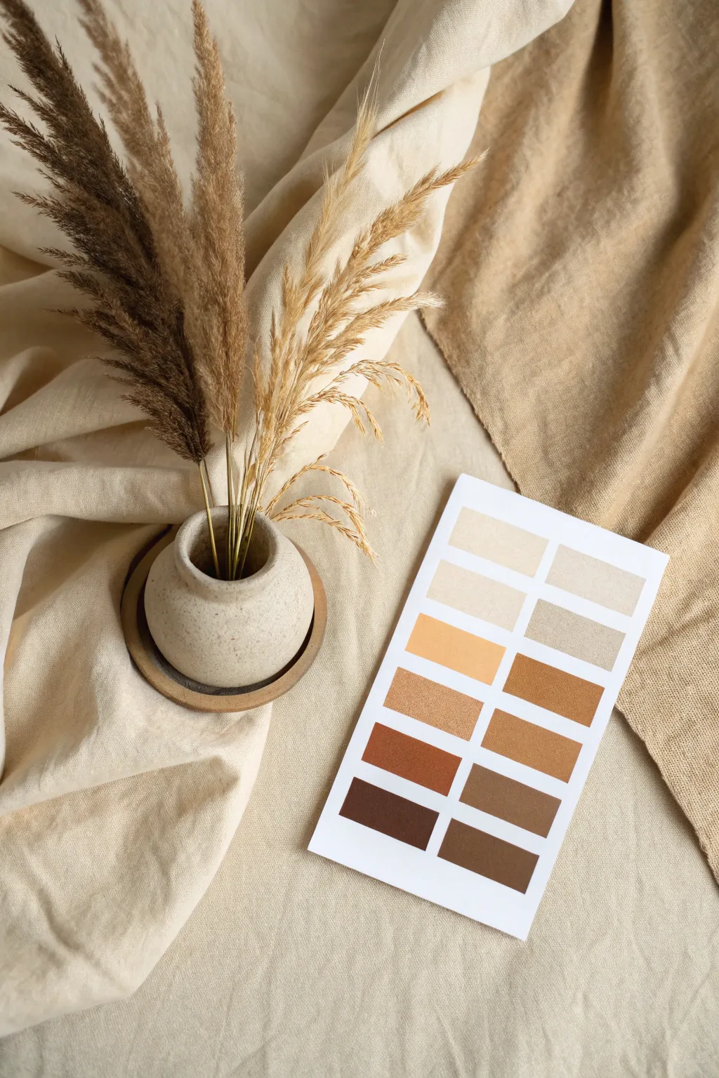
Capture the warmth and serenity of natural aesthetics with this beautifully curated color palette layout. This project focuses on arranging textures and tones to create a cohesive visual story that celebrates the spectrum between soft cream and deep chestnut.
Step-by-Step
Materials
- Digital camera or smartphone
- Large styling surface (table or floor)
- Cream-colored linen fabric (lightweight)
- Tan/caramel textured fabric (heavyweight)
- Small round ceramic vase (stone finish)
- Dried pampas grass stems (dark brown)
- Dried wild grass or wheat stems (golden)
- White cardstock
- Printer (color)
- Scissors or paper cutter
- Adhesive (optional)
- Reflector or white foam board
Step 1: Planning the Palette
-
Select your source colors:
Begin by identifying the key hues in your fabrics and dried botanicals. Look for a gradient that starts at a pale oatmeal, moves through warm beige and golden wheat, and ends in a dark chocolate brown. -
Design the palette card:
Using graphic design software or a simple online tool, create a layout with two columns of rectangles. Input 10-12 distinct colors that mimic the tones of your materials. -
Print the reference card:
Print your design onto high-quality white cardstock. Ensure your printer settings are set to ‘photo quality’ so the browns don’t appear muddy. -
Trim to size:
Cut the paper into a neat rectangle, leaving a generous white border around the colored swatches to help them pop against the fabric background.
Swatch Precision
When printing the palette, use matte photo paper rather than standard copy paper. The texture absorbs the ink better, creating richer, truer earthy tones.
Step 2: Setting the Scene
-
Establish the base layer:
Lay down your lighter cream linen fabric. Don’t pull it tight; instead, create soft intentional wrinkles and folds to add depth and shadow. -
Add the contrast layer:
Drape the heavier tan or caramel-colored fabric on the right side of your frame. Let it flow diagonally to lead the eye into the composition. -
Position the vessel:
Place your small stone-textured vase in the lower-left quadrant where the fabrics meet. A small coaster or saucer underneath creates a nice grounding effect. -
Arrange the botanicals:
Insert the dark brown pampas grass first to establish height. I find it helps to trim the stems to varying lengths so they fan out naturally rather than bunching up. -
Layer in light grasses:
Add the golden wheat-colored stems in front of the darker grass. This overlap creates a visual connection between the vase and the lighter tones in your palette card.
Step 3: Final Styling & Photography
-
Place the palette card:
Position your printed card on the right side, tilted slightly to match the angle of the fabric drape. It should sit relatively flat but respect the texture of the cloth underneath. -
Adjust the lighting:
Set up near a natural light source like a large window. You want soft, diffuse light coming from the left to cast gentle shadows to the right. -
Refining shadows:
If the shadows on the right are too harsh, use a white reflector card to bounce a little soft light back into the folds of the tan fabric. -
Check your framing:
Look through your viewfinder. Ensure the vertical lines of the grass don’t lead the eye out of the frame, but rather point back toward the center. -
Capture the shot:
Take your photo from a top-down perspective (flat lay), keeping the camera sensor parallel to the table. Take multiple shots with slight variations in the card’s angle.
Texture Play
Swap the paper palette for real painted elements. Paint the color swatches onto a scrap piece of canvas or wood for an even more organic, tactile final look.
This serene arrangement creates a perfect reference for interior design moods or branding inspiration
Texture-Driven Micro-Palettes
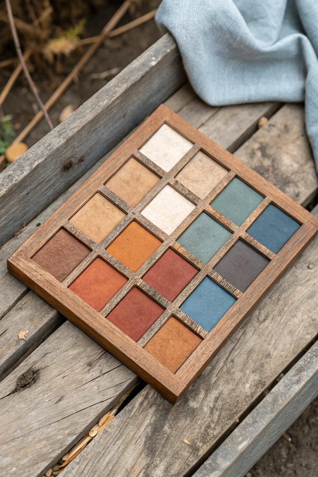
This project centers on creating a tactile, visually soothing display of earth tones within a bespoke wooden grid. The finished piece serves as a beautiful micro-palette study, combining the warmth of natural wood with textured color swatches ranging from deep terracotta to cool slate blue.
Step-by-Step Tutorial
Materials
- Unfinished wood square dowels (1/4 inch thick)
- Small wooden shallow tray or balsa wood sheet for backing
- Wood glue
- Medium grit sandpaper
- Dark walnut wood stain
- Clean rags or foam brush
- Textured watercolor paper or heavy cardstock
- Matte acrylic paints (terracotta, burnt sienna, ochre, slate blue, teal, cream, charcoal)
- Matte medium or texture paste
- Palette knife
- Scissors or craft knife
- Ruler and pencil
Step 1: Constructing the Wooden Grid
-
Measure the base:
Start by measuring the interior dimensions of your wooden tray. If you are building the tray from scratch using balsa wood, cut a square base approximately 6×6 inches. -
Cut frame pieces:
Cut your square dowels to create the outer frame first. Miter the corners at 45 degrees for a professional look, or simple butt joints work well for a rustic feel. -
Plan the grid:
Calculate the spacing for a 4×4 grid. You will need three horizontal dividers and three vertical dividers. Measure and mark these positions lightly with a pencil on the frame. -
Cut internal dividers:
Cut the internal dowels to fit snugly inside the frame. For the intersecting points, you can cut small notches (half-lap joints) if you feel ambitious, or simply cut the vertical pieces into smaller segments to fit between the long horizontal ones. -
Assemble the structure:
Glue the outer frame to your base first. Then, systematically glue in your grid pieces. Use a ruler to ensure the squares remain even as the glue sets. -
Sand and smooth:
Once the glue is completely dry, sand the entire structure. Pay special attention to the top edges of the grid to ensure they are level and free of splinters. -
Apply wood stain:
Using a rag or foam brush, apply a coat of dark walnut stain. Wipe away excess stain immediately to let the wood grain show through, then let it dry fully.
Pro Tip: Velvet Finish
To get that ultra-matte, powdery look shown in the darker squares, sift a tiny pinch of cornstarch over the wet paint and tap off the excess once dry.
Step 2: Creating Textured Swatches
-
Cut paper squares:
Measure the varying inner openings of your grid cells. Cut your watercolor paper or cardstock into squares that fit perfectly inside each cell. -
Prepare the texture mix:
I find that mixing a bit of texture paste or baking soda into acrylic paint creates that lovely, powdery suede look seen in the reference. Prepare your palette with earth tones. -
Paint the warm tones:
Start with your warm colors. Paint several squares in gradients of terracotta, burnt orange, and deep rusty red. Use a palette knife to stipple the paint, creating surface noise. -
Paint the neutral tones:
Next, move to the neutrals. Create swatches of cream, beige, and soft tan. Keep the application matte and slightly uneven to mimic natural stone or fabric. -
Paint the cool tones:
Finish with the cool spectrum. Mix slate blues, teal, and a dark charcoal grey. Ensure these are opaque and velvety in appearance. -
Dry and assess:
Let all the painted swatches dry completely. Arrange them on a table first to find a pleasing balance of warm versus cool before committing them to the grid. -
Secure the swatches:
Apply a small dab of wood glue or strong craft glue to the back of each painted square. -
Final assembly:
Press each swatch gently into its designated cell in the wooden grid. Use a clean cloth to press down so you don’t transfer oils from your fingers to the matte paint.
Level Up: Real Fabric
Instead of painting paper, wrap small cardstock squares in actual linen, suede, or velvet scraps for a truly touchable, high-texture experience.
Place your finished texture palette on a desk or shelf as a source of daily color inspiration
Have a question or want to share your own experience? I'd love to hear from you in the comments below!