Color wheels don’t have to be stiff little diagrams that live in the corner of your sketchbook. Here are my favorite color wheel ideas that turn color theory into something you actually want to make (and keep).
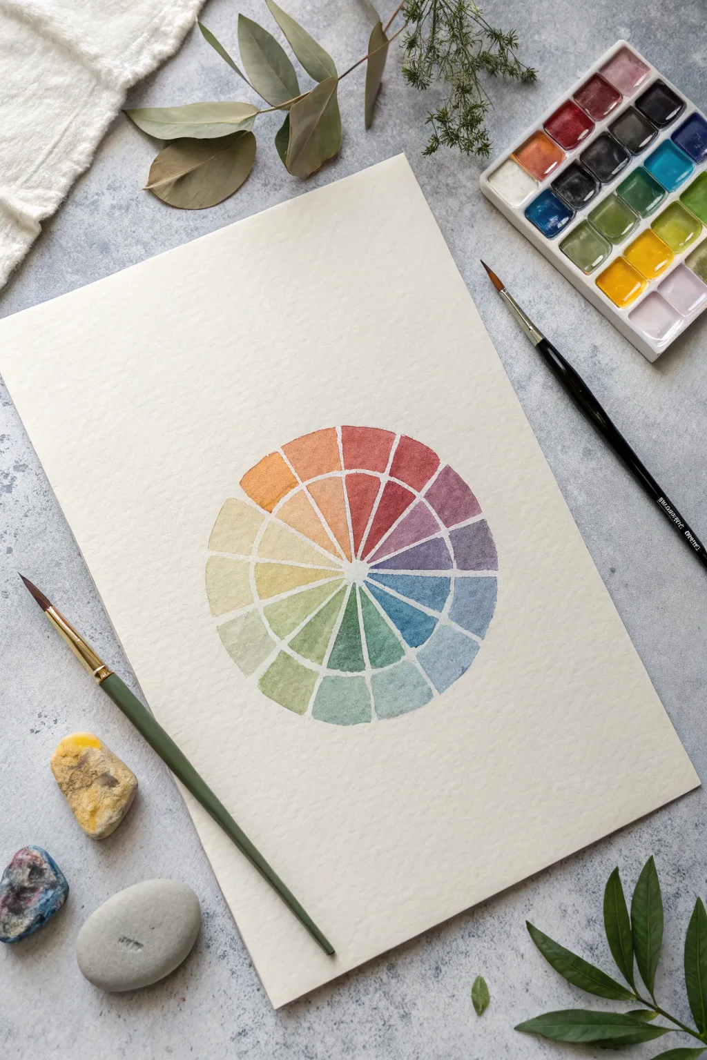
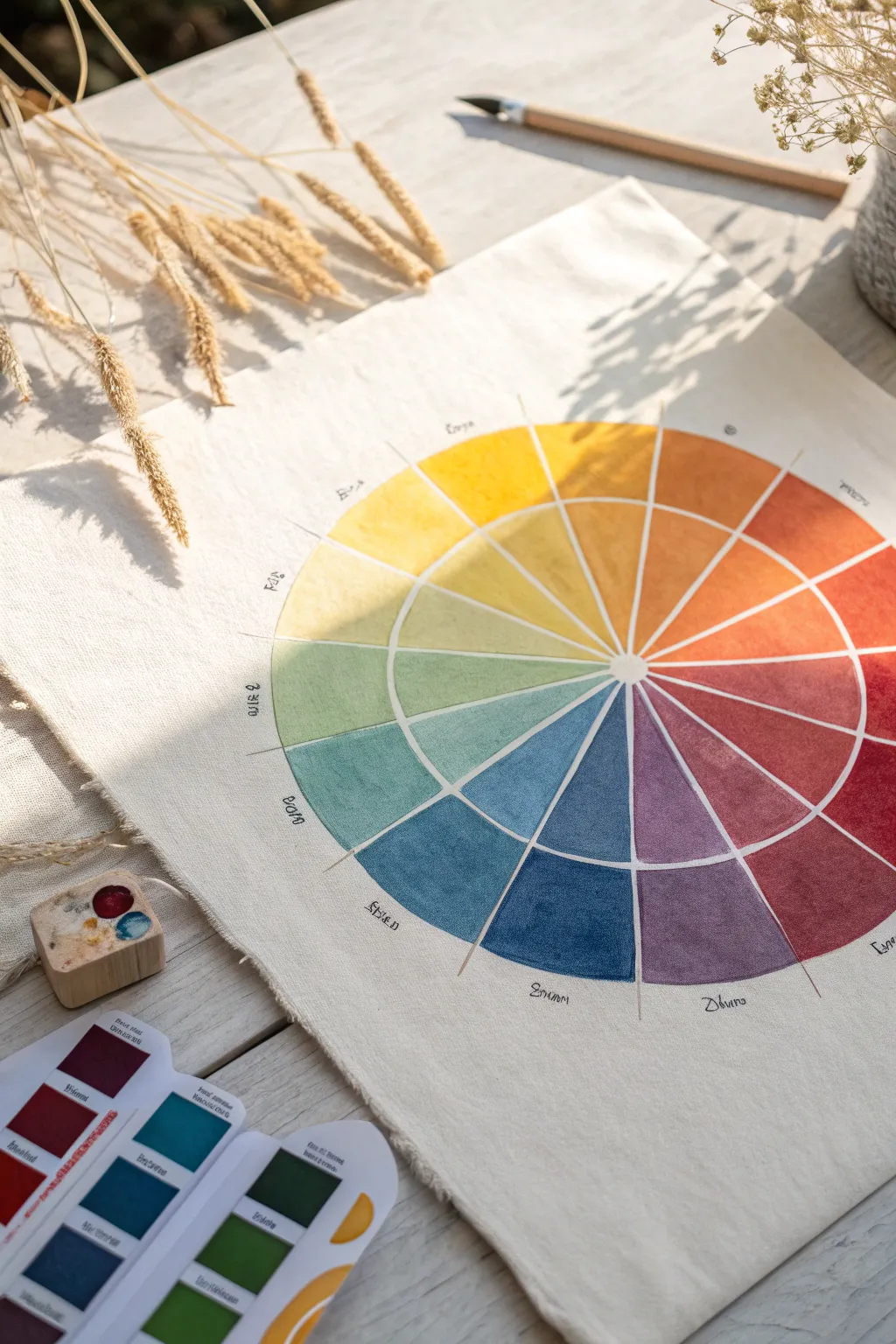
Classic 12-Hue Color Wheel With Blended Transitions
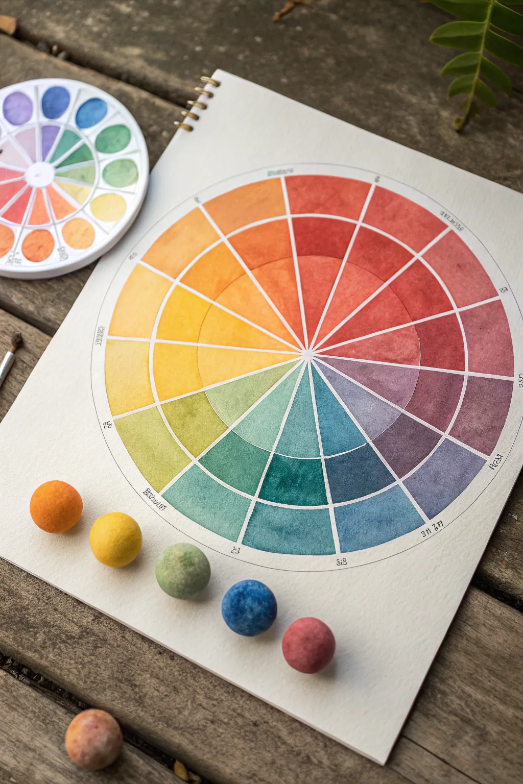
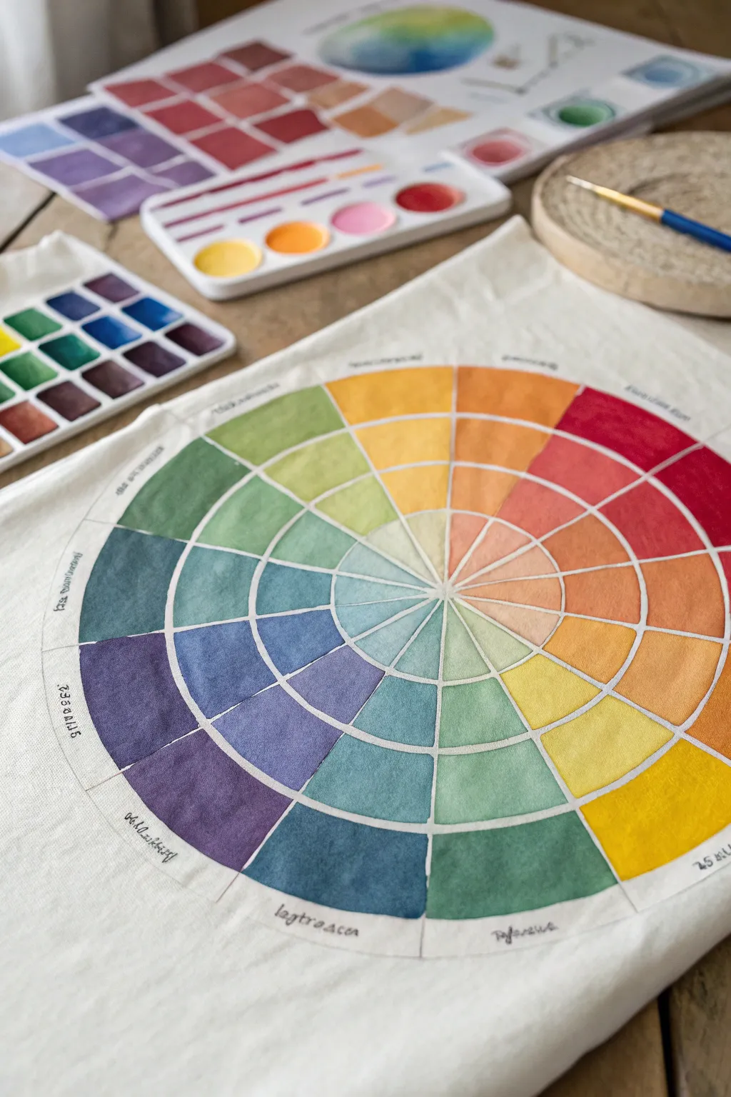
Master the art of color theory with this beautifully structured 12-hue color wheel featuring distinct saturation levels. This project moves beyond simple swatches, teaching you to create seamless transitions from vibrant outer pigments to delicate, water-diluted centers.
Step-by-Step
Materials
- High-quality watercolor paper (cold press, 300gsm suggested)
- Watercolor paints (pan set preferred for easy access)
- Compass with a pencil hold
- Ruler
- Pencil (HB or H for light lines)
- Waterproof fine-liner pen (black, 0.1mm or 0.3mm)
- Round watercolor brushes (sizes 4 and 6)
- Mixing palette with multiple wells
- Two jars of water (one for clean, one for dirty)
- Paper towels
Step 1: Drafting the Structure
-
Find the center:
Begin by finding the exact center of your watercolor paper. Place the needle of your compass there. -
Draw the circles:
Draw three concentric circles. Start with a small inner circle (about 1 inch diameter), then a middle circle (about 3 inches diameter), and finally a large outer circle (about 5-6 inches diameter). -
Divide into quarters:
Using a ruler, lightly draw a vertical line and a horizontal line through the center point to divide your circles into four equal quadrants. -
Create twelve segments:
Divide each quadrant into three equal slices. You can use a protractor to mark every 30 degrees, or visually estimate thirds within each quarter section. Extend these lines from the center point to the outer edge. -
Define the grid:
Go over your pencil grid with a very fine waterproof pen if you want crisp boundaries like the example, or leave it as pencil for a softer look. Use a ruler for the straight lines and retrace the circles carefully. Erase any stray marks once the ink is totally dry.
Muddy colors?
Clean your water often! If your yellow-green looks brown, your water is likely dirty from the red/violet mixing. Use two jars: one for rinsing, one for clean blending.
Step 2: Base Colors: The Outer Ring
-
Prepare your primaries:
Activate your primary colors (Red, Yellow, Blue) on your palette. Aim for a rich, creamy consistency—this outer ring needs the most saturated pigment. -
Paint the yellow segment:
Start at the top (12 o’clock position) with your pure yellow. Fill only the outermost segment of that slice, keeping the edges clean. I like to rotate the paper so my hand doesn’t smudge wet paint. -
Paint red and blue:
Count four segments clockwise and paint your pure red in the outer ring. Count another four segments and paint your pure blue. You now have an equilateral triangle of primary colors. -
Mix the secondaries:
Mix equal parts yellow and red to make orange. Place this directly between yellow and red. Do the same for violet (red + blue) and green (blue + yellow), placing them in their respective gaps on the outer ring. -
Fill the tertiaries:
Mix your adjacent colors to fill the remaining slots in the outer ring (yellow-orange, red-orange, red-violet, blue-violet, blue-green, yellow-green). Ensure these are fully opaque and vibrant.
Add Texture
Sprinkle a tiny pinch of salt onto the wet paint of the outer segments. As it dries, the salt absorbs pigment, creating unique starburst textures within the solid blocks.
Step 3: Creating Gradients: Inner Rings
-
Dilute for the middle ring:
For the second tier, you aren’t changing the hue, just the value. Take your original mix for each segment and add clean water to it on your palette until it is roughly 50% lighter. -
Apply the mid-tones:
Paint the middle section of each slice with this diluted mix. Try to do this while the outer ring is dry to prevent bleeding across the black lines. -
Water down for the center:
For the innermost ring, dilute your paint significantly. You want a very pale, whisper-light version of the hue—mostly water with just a drop of pigment. -
Paint the pastel centers:
Fill the smallest segments closest to the center circle. These should look like delicate pastels compared to the bold outer ring. -
Refine the edges:
Once all paint is completely dry, use a clean, slightly damp stiff brush to tidy up any paint that might have slightly overlapped your ink lines, or touch up the black lines with your pen if the paint obscured them.
Step back and admire how the relationship between saturation and value creates a harmonious spectrum on your page
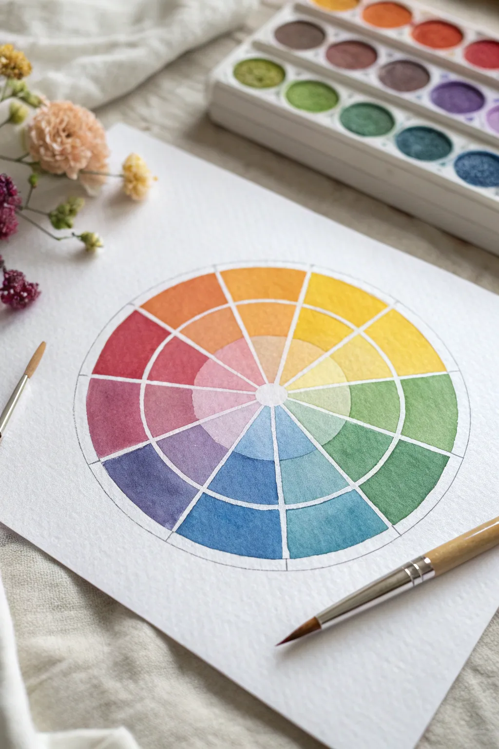
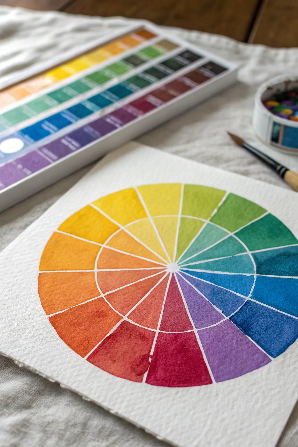
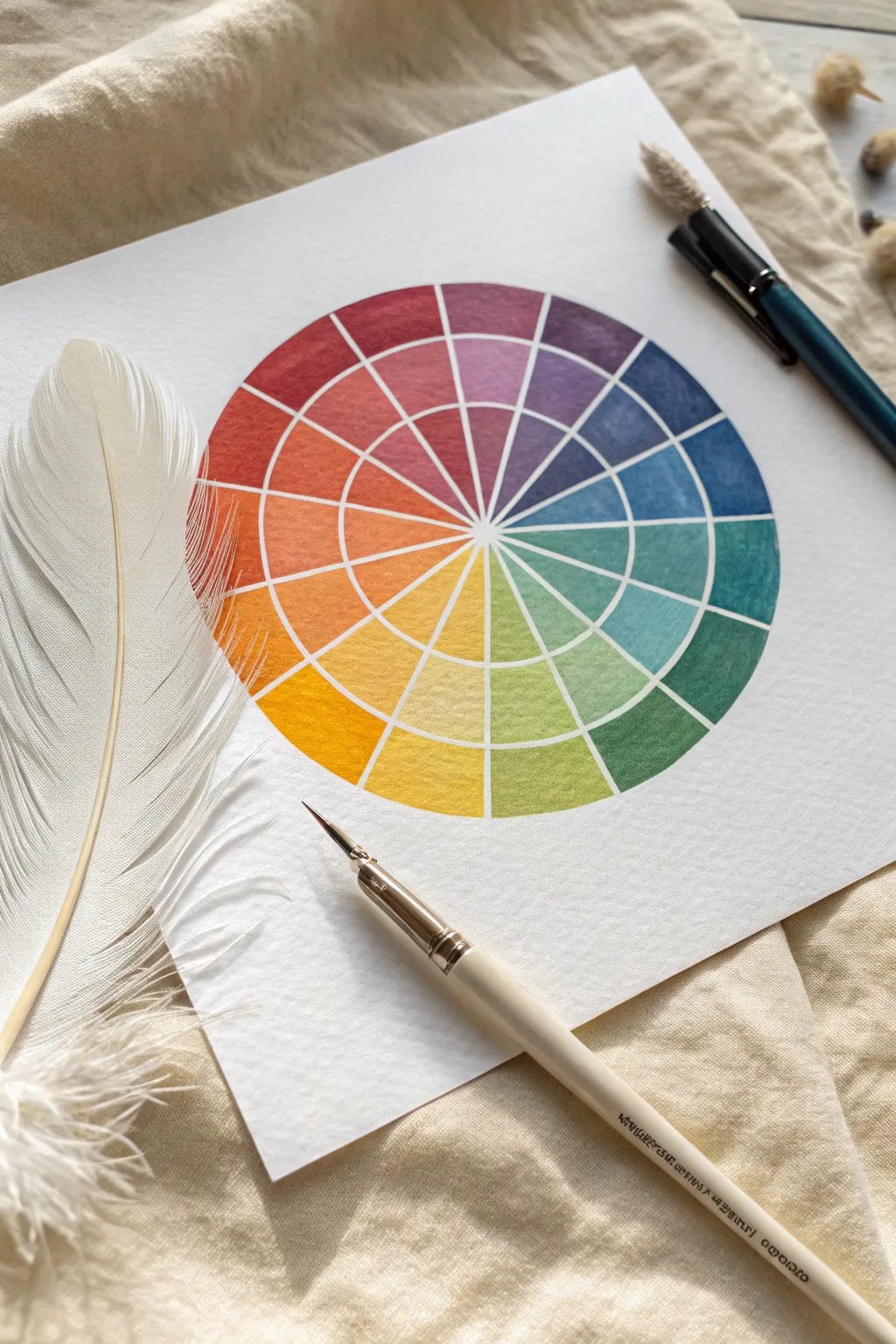
Warm vs. Cool Split Color Wheel
This project creates a stunning, professional-grade watercolor color wheel that serves as both a reference tool and a piece of art. You will learn to mix precise gradients and cleanly separate warm and cool tones within a geometric layout.
Detailed Instructions
Materials
- High-quality cold press watercolor paper (sketchbook or loose sheet)
- Watercolor paint set (pan or tube)
- Compass for drawing circles
- Ruler
- 2H pencil (hard lead for light lines)
- Fine round watercolor brush (size 2 or 4)
- Mixing palette with ample wells
- Water jar and paper towels
- Micron pen or fine liner (optional for labeling)
Step 1: Drafting the Framework
-
Find the center:
Locate the center of your paper and mark it lightly with your pencil. This anchor point is crucial for keeping your circles concentric. -
Draw concentric circles:
Using your compass, draw three concentric circles. Start with a small inner circle (about 1 inch diameter), then a medium one, and finally the large outer boundary. Keep your pencil pressure extremely light so the graphite doesn’t smudge later. -
Divide into twelve:
Divide the circle into 12 equal wedge segments. A protractor is helpful here—each segment should be exactly 30 degrees. Draw straight lines from the center point extending to the outer edge. -
Create the split boundary:
Identify the dividing line between your cool colors (usually between yellow-green and green) and warm colors (usually between red-violet and violet). You can thicken this geometric line slightly to emphasize the ‘split’ nature of this wheel. -
Erase inner clutter:
Erase the lines inside the very center hub if you want that white starburst effect shown in the example. Clean up any graphite dust with a soft brush or breath.
Step 2: Painting the Primary Triad
-
Mix your yellow:
Start with a pure Lemon Yellow or Cadmium Yellow. Load your brush with a pigment-rich mixture that isn’t too watery. -
Paint the yellow wedge:
Apply the pure yellow to the outer ring of the top-left wedge. For the middle ring, dilute the paint slightly with water for a tint. For the inner ring, you might add a touch more water or a tiny dot of orange for variation. -
Apply the red:
Count four wedges clockwise. Mix a bright, neutral Red (like Cadmium Red or Alizarin Crimson). Paint the three concentric sections of this wedge, varying the saturation as you move inward. -
Apply the blue:
Count another four wedges. Mix a pure Blue (Cobalt or Ultramarine). Fill in this wedge carefully, staying inside your pencil guidelines. I prefer to rotate the sketchbook so my hand never crosses wet paint.
Bleeding Lines?
Work non-adjacently. Paint one wedge, then skip the one next to it. Let the first one dry completely before painting its neighbor to prevent colors from bleeding across the line.
Step 3: Completing the Spectrum
-
Mix secondary orange:
Combine your red and yellow on the palette to create a vibrant orange. Paint the wedge exactly halfway between the red and yellow sections. -
Mix secondary violet:
Mix blue and red to create violet. If it looks muddy, your red might have too much yellow bias; aim for a cool red if possible. Fill the wedge between red and blue. -
Mix secondary green:
Combine blue and yellow for a grassy green. Fill the wedge between yellow and blue. -
Create tertiary colors:
Now fill the remaining gaps. Mix your primary and secondary colors together (e.g., yellow + orange = yellow-orange) to fill the six remaining wedges. -
Refine edges:
Once a section is dry, use a slightly damp, clean brush to tidy up any ragged edges, or carefully re-wet an edge to lift excess pigment if it bloomed.
Level Up: Hue Shifting
Instead of just tinting with water for inner rings, mix in a tiny bit of the complementary color (opposite on the wheel) to dull the saturation for a ‘chromatic grey’ inner ring.
Step 4: Finishing Touches
-
Paint the reference spheres:
At the bottom of the page, lightly sketch five small circles. Paint them as 3D spheres using the main hues from your wheel (orange, yellow, green, blue, red/violet). -
Add shading to spheres:
While the sphere paint is wet, drop in a darker version of the color on the bottom right to create a shadow side, leaving a highlight on the top left. -
Label the sectors:
Using a fine micron pen or a very sharp pencil, write the color names or scientific codes (like ‘5Y’ or ’10R’) lightly around the outer perimeter. -
Final erase:
Wait until the paper is bone dry—warm to the touch—before erasing any remaining visible pencil lines to avoid smearing pigment.
Your completed color wheel is now ready to guide your future mixing decisions


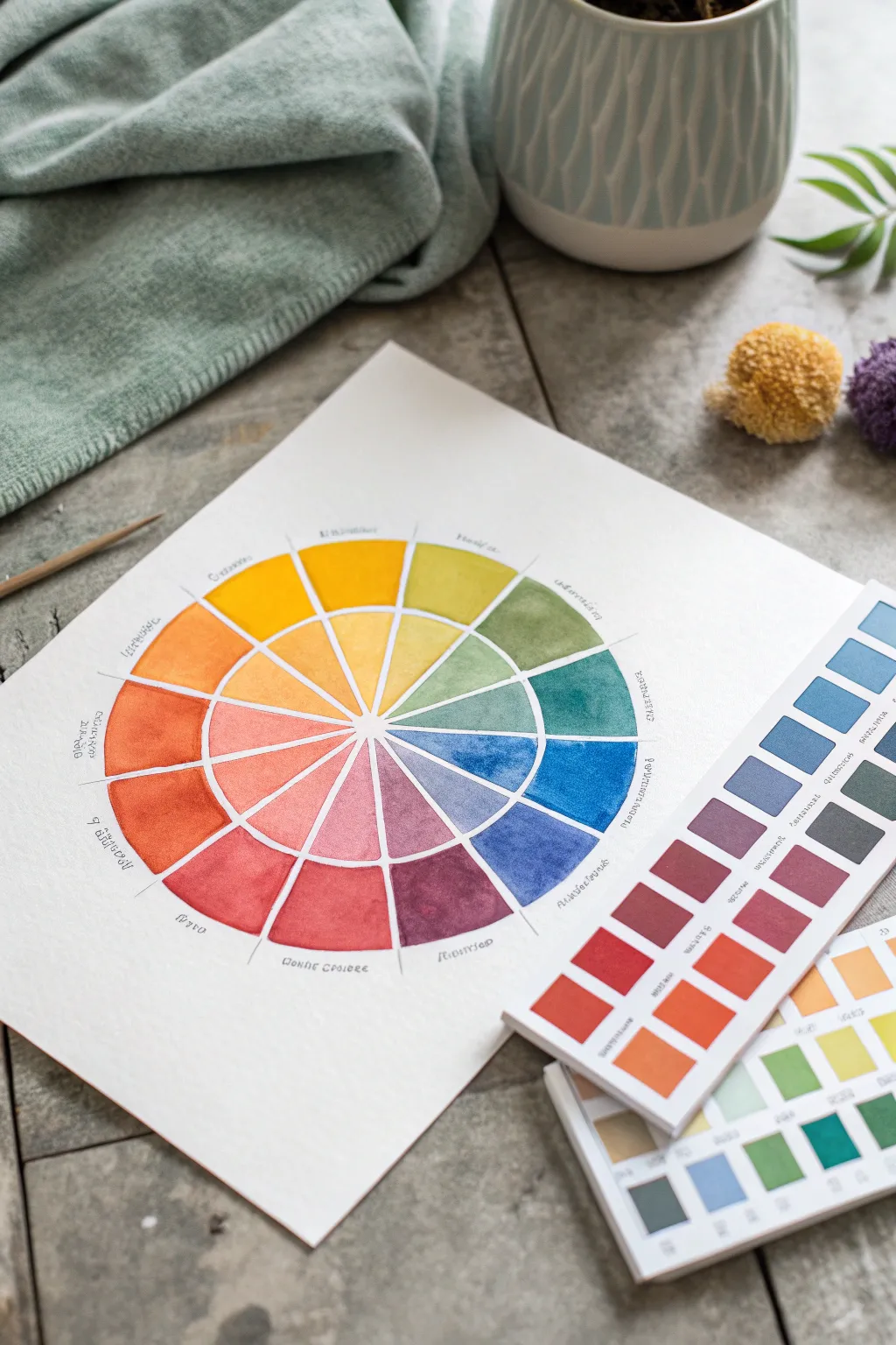
Tints and Shades Ring Color Wheel
Transform a simple piece of cotton or canvas into a functional art tool with this stunning gradient color wheel. By painting concentric rings of tints and shades directly onto fabric, you create a durable reference guide that highlights the subtle transitions of color mixing.
Step-by-Step
Materials
- White cotton fabric or canvas tote bag
- Waterproof fabric marker (fine tip, black)
- Ruler
- Compass with extension or round objects in varying sizes
- Watercolor paints or fabric paints (diluted)
- Round paintbrushes (sizes 4 and 8)
- Palette for mixing
- Jar of clean water
- Paper towels
- Cardboard insert (if painting a bag)
Step 1: Preparation & Drawing
-
Prepare the surface:
Lay your fabric flat on a smooth surface. If you are painting on a tote bag or a double-layered cloth, insert a piece of thick cardboard inside to prevent the paint and ink from bleeding through to the other side. -
Find the center:
Measure the width and height of your working area to locate the exact center point. Mark this lightly with a pencil. -
Draw concentric circles:
Using a compass anchored at your center mark, draw a series of four or five concentric circles. Space them evenly, perhaps an inch or an inch and a half apart depending on your artwork’s total size. -
Divide into wedges:
Use a protractor to divide the circle into 12 equal sections (30 degrees each) for the primary, secondary, and tertiary colors. Mark these points on the outer edge. -
Ink the lines:
With a ruler and your fine-tip waterproof fabric marker, trace the straight lines dividing the wedges. Then, carefully trace over your pencil circles, leaving small white gaps where the lines intersect if you want that segmented look shown in the photo.
Bleeding Lines?
If paint bleeds under your black lines, your mix is too wet. Use less water on the brush and blot it on paper towel before touching the fabric.
Step 2: Painting the Hues
-
Establish the primaries:
Start with the outermost ring. Identify the wedges for Red, Blue, and Yellow. Paint these sections with your pure saturated color. I find it safest to outline the shape with the brush tip first, then fill in the center. -
Mix secondary colors:
Mix your primary colors to create Orange, Green, and Purple. Paint these in the appropriate wedges on the outer ring, exactly halfway between the primary colors. -
Complete the outer ring:
Mix and fill in the tertiary colors (like yellow-orange, blue-green) to complete the full spectrum of the largest, outermost ring.
Clean Edges
Leave a tiny 1mm gap between the paint and the black ink lines. This intentional white space prevents smudging and gives the artwork a crisp, professional illustration style.
Step 3: Creating Tints
-
Mix the first tint level:
For the second ring (moving inward), you need to lighten your colors. If using watercolor, dilute the pigment with more water. If using acrylic or fabric paint, mix in a small amount of white paint. -
Paint the second ring:
Apply these slightly lighter versions of each hue into the ring directly adjacent to the saturation ring. Work one color family at a time so your paint mixture doesn’t dry out. -
Lighten further:
Add even more water (or white paint) to your mixture for the third ring. The color should be distinctly paler than the previous ring but still identifiable. -
Paint the inner rings:
Continue this process for the remaining inner rings. The innermost circle segments should be very faint, appearing almost like a whisper of the original color. -
Let it cure:
Allow the fabric to dry completely flat for at least 24 hours. If you used heat-set fabric paints, iron the reverse side according to the manufacturer’s instructions to seal the design. -
Label the colors:
Finally, use your fine-tip pen to write the color names (or poetic descriptions) along the outer edge of the wheel for a finished, scientific look.
Hang your finished fabric color wheel in your studio as a beautiful and practical reference guide for future mixing


Monochromatic Slice Color Wheel Study
Move your color theory practice off the page and onto textured fabric for a rustic, tactile twist on the classic wheel. This project creates a beautiful reference piece using watercolor or fabric paints on unprimed canvas, resulting in soft, diffused edges and a charmingly organic aesthetic.
Detailed Instructions
Materials
- Heavyweight unprimed cotton canvas or linen fabric (cut to approx. 12×16 inches)
- Watercolor paints or fluid acrylics
- Round watercolor brush (size 6 or 8)
- Compass for drawing circles
- Ruler
- Pencil (H or HB)
- Water container
- Board or cardboard to tape the fabric down
- Masking tape
- Fine-tip waterproof pen or marker
Step 1: Preparation & Layout
-
Prepare the surface:
Cut your canvas or linen to size. Since fabric shifts more than paper, tape the edges securely to a rigid board or piece of cardboard to keep it flat and taut while you work. -
Draw the outer circle:
Using a compass, draw a large circle in the center of your fabric. This will be the outer boundary of your wheel. -
Add inner rings:
Without moving the compass needle from the center point, reduce the radius to draw two smaller concentric circles inside the main one. This creates the three bands of color saturation. -
Mark the segments:
Use a protractor or the standard geometry trick to divide your circle into 12 equal wedge segments (every 30 degrees). Use a ruler to draw straight lines from the center point out to the edge of the largest circle. -
Label the sections:
Lightly write the names of your colors (yellow, yellow-orange, orange, etc.) around the outside perimeter in pencil so you don’t lose your place while painting.
Step 2: Painting the Colors
-
Start with Primaries:
Load your brush with pure Yellow. Paint the middle ring of the 12 o’clock wedge. This ‘middle ring’ will house your pure hues. -
Complete primary triad:
Skip three wedges and paint the middle ring Red. Skip another three and paint the middle ring Blue. You now have your anchor points. -
Mix Secondaries:
Mix yellow and red to create orange. Paint this in the middle ring exactly halfway between yellow and red. I like to test the mix on a scrap piece of fabric first since canvas absorbs pigment differently than paper. -
Finish Secondary hues:
Repeat the mixing process for Green (blue + yellow) and Violet (blue + red), placing them in their respective middle ring slots. -
Fill the Terttiary hues:
Mix the remaining six tertiary colors (like yellow-green or red-violet) and fill in the remaining empty slots in the middle ring.
Fabric Primer Tip
If your paint bleeds too much into the fabric weave, prime the area first with a clear watercolor ground or a very watered-down layer of clear gesso.
Step 3: Tints and Shades
-
Create the outer tints:
For the outer ring, you want lighter versions of each color. Dilute your paint with more water (if using watercolor) or mix with a tiny bit of white. Paint the corresponding outer segments for every color. -
Control the bleed:
When painting adjacent sections on fabric, leave a hairline gap between wet areas or wait for one section to dry completely to prevent the colors from bleeding into each other unwantedly. -
Create the inner shades:
For the innermost ring, you need a desaturated or darker version. Add a tiny touch of the complementary color (the color opposite on the wheel) or a speck of black/brown to your mix. -
Paint the center:
Carefully fill in the smallest inner ring segments with these muted, shady tones. This creates a lovely depth in the center of the wheel.
Stitch It Up
Instead of drawing white lines to separate the colors, embroider over the pencil lines with white or metallic embroidery floss for texture.
Step 4: Finishing Touches
-
Define the lines:
Once the paint is completely dry to the touch, use a white gel pen or thin white acrylic paint with a liner brush to re-trace the circular and dividing lines. This cleans up any fuzzy fabric edges and makes the grid pop. -
Add text labels:
Using a fine-tip waterproof pen, hand-letter the color names or notes around the perimeter of the wheel where you made your pencil marks earlier. -
Fray the edges:
Remove the tape from your board. Gently pull at the loose threads on the edges of your canvas to create a soft, frayed fringe for that authentic studio look.
Hang your finished fabric study on a clipboard or pin board for everyday inspiration
BRUSH GUIDE
The Right Brush for Every Stroke
From clean lines to bold texture — master brush choice, stroke control, and essential techniques.
Explore the Full Guide
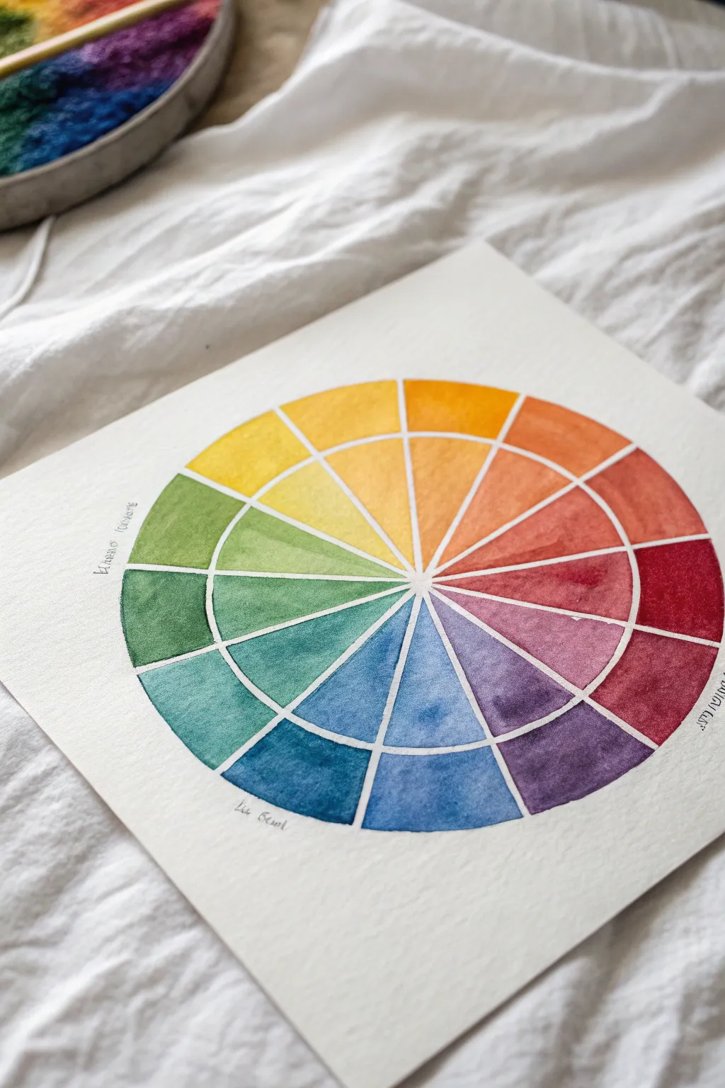
Analogous Harmony Color Wheel Highlight
This elegant watercolor project explores color theory through a beautifully structured wheel featuring both vivid hues and delicate tints. The result is a vibrant, professional-looking reference tool painted on high-quality textured paper, perfect for deepening your understanding of analogous harmonies.
Step-by-Step Guide
Materials
- High-quality cold press watercolor paper (300 gsm or heavier)
- Watercolor paint set (tubes or pans)
- Round watercolor brush (size 6 or 8)
- Compass for drawing circles
- Ruler
- Pencil (HB or lighter)
- Masking fluid (optional) or white gel pen (optional for lines)
- Palette for mixing paint
- Two jars of water (one for rinsing, one for clean water)
- Paper towels
Step 1: Preparation and Drafting
-
Paper Setup:
Begin by taping down your cold press watercolor paper to a board or table to prevent buckling as you paint. The heavy texture of the paper is key to the final look, so choose a thicker sheet. -
Draw the Inner Circle:
Using a compass, draw a small circle in the exact center of your paper. This will be the central hub where all the wedges meet. -
Draw the Outer Circles:
Keep the compass point in the same center spot and draw two larger concentric circles. The gap between the inner hub and the middle circle defines your tint ring, while the gap between the middle and outer circle defines your saturated hue ring. -
Divide into Wedges:
Using a ruler and pencil, lightly draw lines dividing the circle into 12 equal wedges, like a clock face. Ensure the lines pass perfectly through the center point. -
Preserve the Lines:
To achieve the crisp white lines seen in the example, you have two options. You can carefully paint around your pencil lines leaving a tiny gap, or apply a very thin line of masking fluid over your pencil marks and let it dry completely.
Muddy colors?
Clean your water often! If your rinse water gets brown or grey, it will dull your bright yellows and oranges. Use two jars: one for dirty rinse water and one for clean mixing water.
Step 2: Painting the Primary Triad
-
Select Your Yellow:
Start at the top position (number 12 on a clock). Load your brush with a clean, saturated yellow (like Lemon Yellow or Cadmium Yellow) and paint the outer ring segment. -
Create the Yellow Tint:
Before cleaning your brush entirely, dip it into clean water to dilute the remaining yellow paint. Apply this lighter, watery wash to the inner segment of the same wedge. -
Paint the Red:
Skip three segments clockwise to the 4 o’clock position. Paint the outer segment with a bold red (like Alizarin Crimson or Cadmium Red) and paint its corresponding inner tint immediately after. -
Paint the Blue:
Skip three more segments to the 8 o’clock position. Apply a rich blue (like Ultramarine or Cobalt Blue) to the outer ring and a diluted wash to the inner ring. I find it helpful to rotate the paper rather than my hand to keep the angles comfortable.
Step 3: Painting Secondaries and Tertiaries
-
Mix Orange:
Combine your red and yellow on the palette to create a vibrant orange. Paint the wedge exactly halfway between the red and yellow sections, filling both the outer hue and inner tint areas. -
Mix Green:
Mix yellow and blue to find a balanced green. Apply this to the wedge halfway between the yellow and blue sections. -
Mix Violet:
Mix red and blue to create violet. Paint the wedge situated directly between the red and blue sections. -
Fill the Tertiary Gaps:
Now you have six empty wedges remaining. For each gap, mix the two colors on either side of it. For example, mix yellow and orange to make yellow-orange. -
Complete the Circle:
Continue freely mixing and painting the remaining tertiary colors (red-orange, red-violet, blue-violet, blue-green, yellow-green) until the wheel is full. Remember to always dilute with water for the inner ring.
Go Geometric
Instead of a circle, try drawing a large hexagon or dodecagon (12-sided shape). The straight edges give the color wheel a modern, graphic design feel while teaching the same principles.
Step 4: Finishing Touches
-
Check for Blooms:
Look closely at the drying paint. If pools of water are forming ‘blooms’ or cauliflower edges, lightly dab the excess moisture with the corner of a paper towel, but be gentle. -
Dry Completely:
Allow the entire piece to dry naturally. Resist the urge to use a hairdryer if you have pooled water, as the air might push the pigment around too much. -
Reveal Lines:
If you used masking fluid, gently rub it away with a clean finger or rubber cement pickup once the paper is bone dry. If you painted freehand, check if any white gaps need tidying up with a white gel pen. -
Erase Draft Marks:
Gently erase any visible pencil marks remaining in the white gaps to keep the presentation crisp and professional.
Display your finished wheel near your workspace as a beautiful and practical reference for future color mixing projects
Complementary Pairs Color Wheel With Pop Contrast
Master the art of color theory with this beautifully divided watercolor wheel that separates hues into inner and outer rings for easier comparison. This project offers a fantastic visual reference for your studio while practicing precision brushwork and color mixing.
Step-by-Step Tutorial
Materials
- Cold press watercolor paper (300 gsm)
- Watercolor paint set (tubes or pans)
- Round watercolor brushes (sizes 2 and 6)
- Pencil (HB or lighter)
- Compass
- Ruler
- Water container
- Paper towels
- Protractor
Step 1: Drafting the Wheel
-
Find drawing center:
Locate the center of your watercolor paper. It is crucial to have enough white space around the edges, so measure carefully to ensure your wheel will be perfectly centered. -
Draw concentric circles:
Using your compass, draw three concentric circles from that center point. Create a small central hub, a middle ring boundary, and the large outer perimeter. Keep your pencil lines very faint so they don’t show through the transparent paint later. -
Divide into segments:
With a protractor, mark every 30 degrees around the circle to create 12 equal sections. Draw straight lines connecting opposite marks, passing through the center, to divide the wheel like a pie. -
Create the split:
To achieve the distinct ‘split-ring’ look shown in the image, carefully erase the pencil lines in the small gap between the inner and outer rings. This negative space is essential for the clean, graphic look.
Uneven Watermarks?
If you see ‘cauliflowers’ or blooms in your paint, you are adding water while the layer is semi-dry. Wait for it to dry completely before touching up
Step 2: Painting Primary Colors
-
Mix primary yellow:
Load your brush with a bright, clean yellow. Paint the top-most segment of the outer ring first, ensuring you stay neatly within the lines. -
Fill the inner wedge:
Without cleaning your brush, paint the corresponding inner wedge slice directly below the outer yellow ring. I find that painting pairs like this ensures the hue consistency is perfect. -
Paint primary red:
Skip three segments clockwise and paint the primary red section (outer ring and inner wedge). Aim for a neutral red like Alizarin Crimson or Cadmium Red Medium. -
Paint primary blue:
Skip another three segments and paint your primary blue sections. Ultramarine or Cobalt Blue works beautifully here.
Add Shade & Tint
Expand the wheel! Draw two more outer rings. Add black to your mix for the outermost ring (shades) and extra water for the next ring in (tints)
Step 3: Mixing Secondary Colors
-
Create orange:
Mix your yellow and red on the palette to create a vibrant orange. Paint the segment exactly halfway between the yellow and red sections. -
Mix purple:
Combine blue and red to make a rich violet. Fill in the segment halfway between the red and blue primaries on your wheel. -
Mix green:
Blend yellow and blue to create a fresh green hue. Paint the segment nestled between the blue and yellow sections.
Step 4: Completing the Tertiary Hues
-
Mix yellow-orange and red-orange:
Adjust your orange mix by adding more yellow for the yellow-orange segment, and more red for the red-orange segment. -
Mix red-purple and blue-purple:
Create the tertiary purples. The red-purple should lean towards magenta, while the blue-purple should look like indigo. -
Mix blue-green and yellow-green:
Finish the wheel by mixing a teal-like blue-green and a bright, lime-colored yellow-green to fill the remaining empty slots. -
Label the colors:
Once the paint is completely dry, use a very fine drawing pen or sharp pencil to write the color names or properties around the outer edge in a delicate script.
Step 5: Bonus: Color Reference Strip
-
Prepare the strip:
Take a scrap strip of watercolor paper and roughly grid it out with your pencil to create small squares. -
Create gradient swatches:
Use your leftover paint mixes to fill these squares. Create gradients by painting a saturated square, then adding water to paint a lighter version next to it.
You now have a functional and artistic tool for selecting color palettes in future work

PENCIL GUIDE
Understanding Pencil Grades from H to B
From first sketch to finished drawing — learn pencil grades, line control, and shading techniques.
Explore the Full Guide
Triadic Triangle Color Wheel Layout
This elegant watercolor study transforms a standard color theory exercise into a beautiful piece of art by separating hues into two distinct intensity zones. The finished piece features twelve equal segments radiating from the center, showcasing a delicate gradient from pastel washes in the inner ring to vibrant saturation at the outer edge.
Step-by-Step Guide
Materials
- Cold press watercolor paper (minimum 140lb/300gsm)
- Compass with pencil attachment
- Ruler or straight edge
- HB pencil
- Watercolor paints (primary red, yellow, and blue)
- Round watercolor brush (size 6 or 8)
- Clean water jar
- Palette for mixing
- Masking tape (optional for securing paper)
Step 1: Drafting the Structure
-
Establish the center:
Begin with a square sheet of high-quality watercolor paper. Use your ruler to lightly mark the exact center point of the page with your pencil. -
Draw the outer ring:
Set your compass to a radius of about 3-4 inches (depending on paper size). Place the point on the center mark and draw a complete circle. -
Draw the inner ring:
Without moving the center point, tighten your compass radius to exactly half of your first circle (about 1.5-2 inches). Draw this smaller concentric circle inside the first. -
mark degrees:
To divide the circle into 12 equal wedges, act as if you are marking a clock face. Mark 12, 3, 6, and 9 o’clock first. -
Complete the segments:
Place two evenly spaced marks between each of your ‘clock’ points. Use your ruler to draw straight lines connecting these marks through the center point, creating 12 distinct slices. -
Create the white gap:
For that crisp definition seen in the example, you want a tiny gap between colors. I like to carefully go over my pencil lines with a white wax resist crayon, or simply paint very carefully leaving a hairline of dry paper between segments.
Bleeding Lines?
If colors bleed into neighbors, paint non-adjacent sections first (e.g., every other wedge). Let them dry completely before painting the sections in between.
Step 2: Mixing and Painting
-
Prepare primary colors:
On your palette, prepare puddles of your three primary colors: Red, Yellow, and Blue. Ensure they are saturated and vibrant. -
Paint outer primaries:
Identify the 12 o’clock (Yellow), 4 o’clock (Red), and 8 o’clock (Blue) segments. Paint the *outer* ring of these three segments with your full-strength primary mix. -
Paint inner primaries:
Dilute your remaining primary puddles with plenty of water to create a pastel tint. Paint the corresponding *inner* ring sections for yellow, red, and blue. -
Mix secondary colors:
Combine equal parts of primaries to create Orange (Red+Yellow), Green (Blue+Yellow), and Purple (Blue+Red). Paint these into the outer ring segments exactly halfway between the primaries. -
Paint inner secondaries:
Just like before, water down these secondary mixes significantly and paint the inner ring sections corresponding to the orange, green, and purple wedges. -
Mix tertiary colors:
Mix a primary with its neighbor secondary to get the six tertiary shades (like yellow-orange or blue-green). These will fill the remaining empty slots in the outer ring. -
Complete inner ring:
Dilute these tertiary mixes to a light wash and fill in the final empty spaces in the inner circle. -
Dry thoroughly:
Allow the paint to dry completely. Do not touch the damp paper, as watercolor can smudge easily at this stage.
Step 3: Labeling and Finishing
-
Add labels:
Once bone dry, take your pencil and write tiny, handwritten labels near specific color families (e.g., ‘Warm Colors’ or specific pigment names) as seen in the inspiration image. -
Refine lines:
If you want sharper boundaries and didn’t use resist, you can gently erase visible graphite marks that strayed outside the paint, leaving the structure clean.
Make it Pop
After drying, define the grid by going over the negative space lines with a very fine white gel pen or opaque gouache for crisp, bright separation.
Now you have a functional reference tool that doubles as a minimalist piece of wall art
Watercolor Bloom Color Wheel Blending Exercise
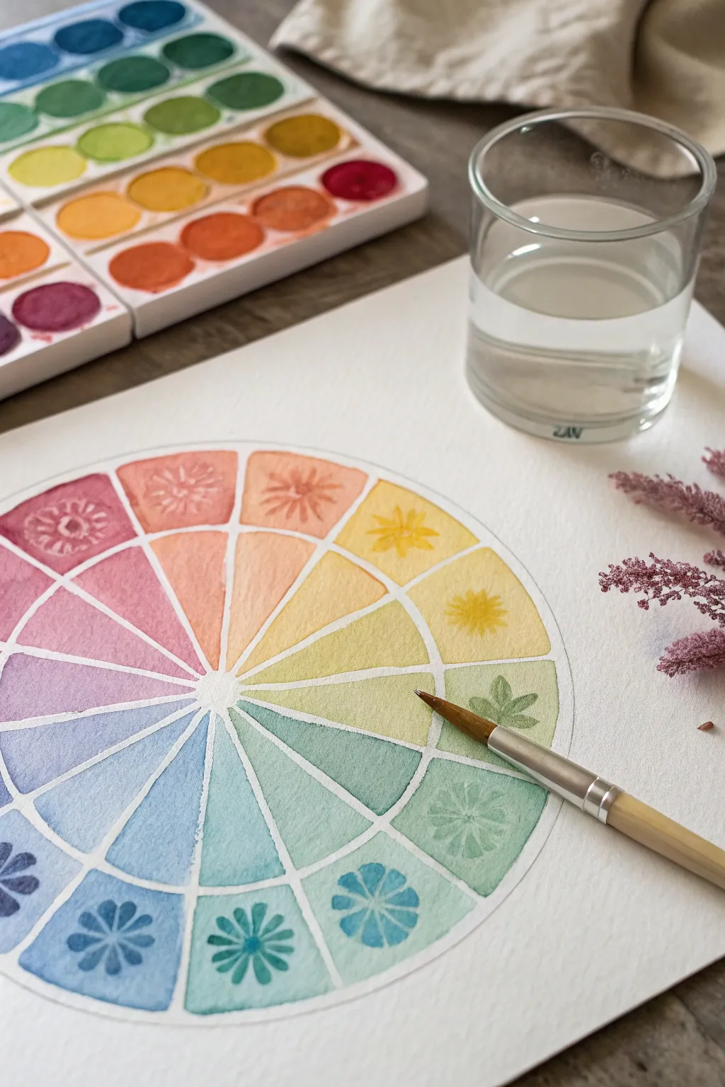
This charming twist on the classic color theory exercise combines soft gradient blending with delicate botanical motifs. It serves as both a functional reference guide for mixing hues and a beautiful piece of framed art for your studio.
How-To Guide
Materials
- Cold press watercolor paper (300 gsm)
- Watercolor pan set (including primary warm/cools)
- Round watercolor brush (size 6 or 8)
- Compass or two round objects of different sizes
- Pencil and eraser
- Ruler
- Clean water jar
- Paper towels or cloth
Step 1: Drafting the Wheel
-
Draw the boundaries:
Begin by finding the center of your paper. Using a compass, lightly draw a large circle (about 6-8 inches in diameter). Then, drawing from the same center point, create a smaller inner circle, leaving about a 1.5-inch gap between the two lines to form an outer ring. -
Mark the center:
Draw one more tiny circle in the very center, about the size of a dime. This will remain unpainted later to keep the middle clean. -
Divide the segments:
Use a ruler to draw straight lines dividing your circle into 12 equal ‘pie slices.’ These lines should radiate from the center point all the way to the outer edge. -
Lighten lines:
Gently roll a kneaded eraser over your pencil sketch. You want the lines faint enough to guide you but light enough not to show through transparent watercolor paint.
Step 2: Painting the Base Gradients
-
Prepare your palette:
Pre-wet your watercolor pans to get the pigments flowing. You will need 12 distinct hues: yellow, yellow-orange, orange, red-orange, red, red-violet, violet, blue-violet, blue, blue-green, green, and yellow-green. -
Start with yellow:
Mix a clean, bright yellow on your palette with a good amount of water. Paint the inner wedge of the yellow segment first, starting saturated at the top and fading slightly toward the center. -
Paint the outer ring:
While you have the yellow mix ready, paint the corresponding outer ring segment. Keep the wash flat and even here. -
Skip to primaries:
To avoid wet paint bleeding into neighbors, skip three spaces and paint the Red segment next, following the same inner-wedge and outer-ring process. Then skip three more spaces and paint the Blue segment. -
Mix secondary colors:
While the primaries dry, mix your secondary colors (orange, green, violet). I like to test the mix on a scrap paper first to ensure the hue is balanced. -
Fill the gaps:
Once dry, paint the secondary segments in between the primaries. Finally, once those are dry, mix and paint the tertiary colors (like yellow-green or red-orange) in the remaining gaps. -
Create separation lines:
As you paint adjacent sections, leave a hair-thin line of white paper between the wedges. This ‘negative space’ acts as a barrier and adds a professional, crisp finish to the wheel.
Muddy colors?
If your tertiary mixes (like yellow-green) look brown, your water is likely dirty. Change your rinse water jar frequently, ideally between every color family.
Step 3: Adding Floral Motifs
-
wait for total dryness:
Ensure the entire wheel is bone-dry before proceeding. If the paper is cool to the touch, it is still wet. -
Mix saturated tones:
Go back to your yellow paint, but use much less water this time to create a concentrated, darker consistency. -
Paint the motif:
On the dry outer ring of the yellow section, use the tip of your brush to paint a simple flower or star shape. The darker pigment on top of the lighter wash creates a subtle tone-on-tone effect. -
Repeat around the wheel:
Continue this process for each color. Mix a concentrated version of the base color and paint a unique botanical design—leaves, petals, or geometric stars—in the outer ring section. -
Vary the designs:
Try alternating designs, perhaps using a leafy branch for the greens and petal shapes for the warm reds and oranges. -
Final dry:
Let the decorative top layer dry completely. Erase any remaining visible pencil marks gently.
Pro Tip: Bloom Effect
For extra texture, drop a tiny splash of clean water into the drying ‘pie slices.’ This pushes pigment to the edges, creating those lovely watercolor ‘blooms.’
Now you have a stunning reference tool that brightens up your workspace


Marker Gradient Color Wheel for Smooth Transitions
Master the art of seamless transitions with this stunning gradient color wheel project. By blending markers layer by layer, you will create a vibrant spectrum that teaches you about tints and shades while resulting in a beautiful piece of art.
Step-by-Step Guide
Materials
- Heavyweight mixed media paper or watercolor paper
- Compass
- Ruler
- Pencil (H or HB)
- Fine-point waterproof pigment liner
- Alcohol-based markers or water-based brush markers (in primary and secondary colors)
- Blending marker or a water brush (depending on marker type)
- Eraser
Step 1: Drafting the Structure
-
Set your center point:
Find the middle of your paper and mark it lightly with a pencil. Place the sharp point of your compass here. -
Draw the concentric circles:
Draw four concentric circles. Start with a small inner circle, then create three progressively larger rings around it. Spacing them evenly creates a balanced look, though varying the width can add interest. -
Divide the wheel:
Using your ruler and pencil, draw a vertical line straight through the center. Then, draw a horizontal line to create a cross. -
Create twelve sections:
Divide each of the four quadrants into three equal wedges. You should end up with twelve slice-shaped segments total, resembling a clock face. -
Outline in ink:
Trace over your pencil lines carefully using a waterproof fine liner. Wait a moment for the ink to set completely before proceeding. -
Clean up the sketch:
Gently erase all pencil marks to leave a clean, crisp black skeleton for your color wheel.
Step 2: Filing the Inner Ring (Tints)
-
Start with yellow:
Locate the wedge at the top (or where you want yellow to begin) and color the innermost segment. Since this is the highlighting ring, keep the color light. -
Apply primary colors:
Skip three wedges and fill the innermost red segment. Skip another three and fill the blue. These base colors anchor your wheel. -
Fill secondary colors:
Mix or select your secondary colors (orange, green, purple) and fill the segments exactly halfway between your primaries on that inner ring. -
Complete the tertiary colors:
Fill the remaining gaps in the inner ring with tertiary shades like yellow-orange or blue-green. For this inner ring, I like to dilute the marker slightly or use a blender pen to keep these segments the palest version of each hue.
Bleeding Lines?
If ink bleeds through the lines, use a white gel pen to tidy up the black dividers. For future projects, switch to a smoother, marker-friendly cardstock.
Step 3: Building Intensity and Shades
-
Saturate the middle ring:
Moving to the second ring from the center, fill each segment with the pure, fully saturated version of the corresponding color. Ensure the ink coverage is solid and even. -
Deepen the third ring:
For the third ring, you need a slightly darker tone. If you are using alcohol markers, layer the same color twice or add a touch of cool gray underneath to deepen it. -
Create the darkest outer ring:
The outermost ring should be your darkest shade. Layer your colors heavily here, or mix in a complimentary color (e.g., add a tiny bit of purple to yellow) to desaturate and darken the hue significantly. -
Blend the boundaries:
If you want a smoother look, use your blender marker to slightly soften the hard lines between the rings, dragging the darker ink slightly into the lighter zones. -
Clean edges:
Check the perimeter of your circle. If any marker bled outside the lines, thicken the outer black ink border slightly to conceal it.
Add Texture
Once dry, use colored pencils to shade lightly over the marker segments. The grain from the paper adds a lovely organic texture to the flat color.
Now you have a practical reference tool that doubles as a vibrant piece of wall art for your studio
Nature Palette Color Wheel Inspired by Leaves and Sky

Capture the grounded beauty of the natural world with this segmented watercolor color wheel. By focusing on muted, organic hues rather than primary brightness, you’ll create a soothing study of how colors shift across a landscape.
Step-by-Step Tutorial
Materials
- Cold-press watercolor paper (300 gsm)
- Watercolor palette set (pan paints preferred)
- Round watercolor brushes (size 4 and size 0 or 1 for details)
- Compass
- Ruler
- Pencil (HB or H)
- Eraser
- Clean water jar
- Paper towel
Step 1: Preparation & Drawing
-
Paper placement:
Begin by securing your sheet of cold-press watercolor paper to your workspace or a board. This paper has a lovely texture visible in the photo, and taping it down prevents buckling when wet. -
Draw the inner circle:
Locate the center of your paper. Using your compass, draw a small circle about 2 inches in diameter. Keep your pencil pressure extremely light so the graphite doesn’t smudge into your paint later. -
Draw the outer ring:
Widen your compass and draw a second, larger circle around the first, creating a band that is roughly 0.75 inches thick. This creates the space for the outer color blocks. -
Mark the segments:
To create the 12 distinct sections, lightly draw a vertical line through the center, then a horizontal one. Divide each of the four resulting quadrants into three equal wedges using your ruler to ensure straight lines radiating from the center point. -
Create separation gaps:
The charm of this wheel lies in the negative white space. Carefully erase the pencil lines and redraw them slightly apart, or simply keep a steady hand while painting to leave a tiny, unpainted gap between every single shape. This ‘breathing room’ prevents colors from bleeding into each other.
Step 2: Painting the Inner Wheel
-
Mix your starting red:
Begin with a muted, rusty red tone. Unlike a neon fire-engine red, this should feel like red clay. Load your size 4 brush and paint the top-most wedge in the inner circle. -
Move to orange:
Mix a soft, sunny orange—think apricot or fallen leaves. Paint the wedge directly to the left of your red. Remember to leave that hairline sliver of white paper between them. -
Continue the gradient:
Work your way counter-clockwise into the yellows. Choose a muted ochre or straw yellow rather than a bright lemon yellow to maintain the nature theme. -
Transition to greens:
Mix a sap green or olive tone for the next wedge. I find that adding a tiny touch of the previous yellow helps harmonize the transition. -
Cool tones:
Proceed into the blues. Aim for a dusty slate blue or denim shade, followed by a deeper indigo. These represent the ‘sky’ portion of your nature palette. -
Completing the circle:
Finish the inner wheel with purples and violets, leaning towards mauve or grape, until you meet back at the red. Let this inner section dry completely before moving to the outer ring.
Bleeding Edges?
If paint bridges the gap between segments, stop immediately. Do not wipe. Let it dry completely, then use a damp, clean brush to gently ‘lift’ the excess paint away to restore the white line.
Step 3: The Outer Ring
-
Understanding the outer layer:
The outer ring segments correspond to the inner wedges but act as a variation—either a lighter tint (more water) or a slightly shifted hue. -
Paint the red pairing:
Above your inner red wedge, paint the corresponding outer block. Try diluting the same red with water to make it more translucent. -
Yellow and Orange blocks:
Continue counter-clockwise. For the yellow and orange sections, distinct brush strokes can add texture. Don’t worry if the wash isn’t perfectly flat; the pooling pigment adds character. -
Green variations:
When you reach the greens, try cooling them down slightly for the outer ring, perhaps mixing in a speck of blue to create a sage tone. -
Blue sky blocks:
For the blue sections, use plenty of water. The goal is a watery, airy look that contrasts with the denser color in the center. -
Finishing touches:
Complete the violet and purple outer blocks. Once all paint is applied, check your white gaps. If any graphite lines are still visible and distracting, gently erase them only after the paint is 100% bone dry.
Pro Choice: Brush Control
Use the belly of the brush for the center of the wedges, but switch to the very tip for the corners. Rotate your paper as you work so your hand never rests in wet paint.
Now you have a serene reference tool that captures the subtle beauty of natural light and landscapes

Have a question or want to share your own experience? I'd love to hear from you in the comments below!