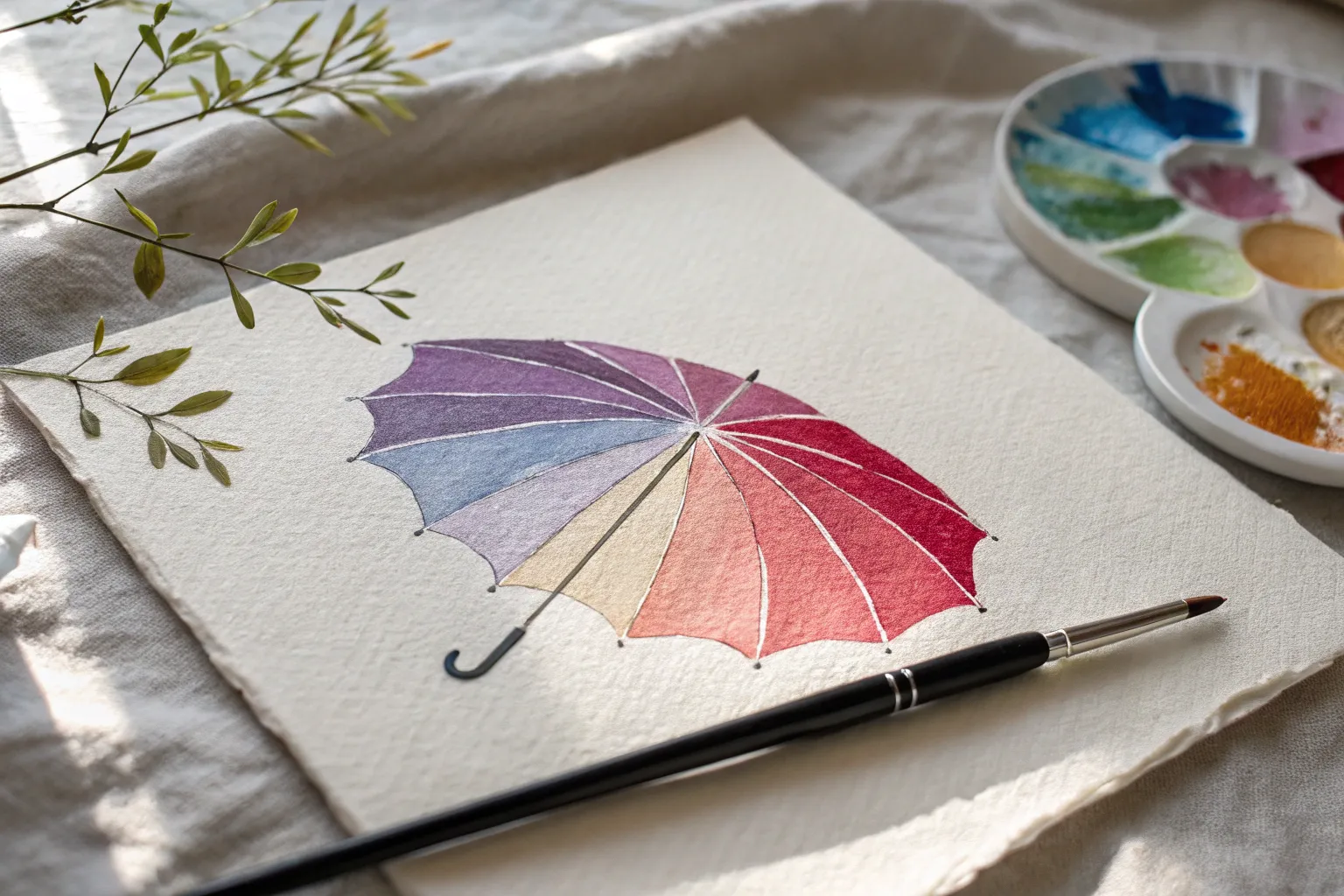
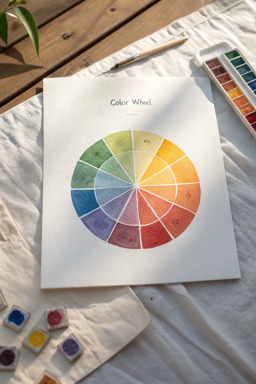
Whenever I’m stuck on what to paint, I come back to the color wheel—it’s like a creative reset button that also levels up your color mixing. Here are my favorite color wheel painting ideas, starting with the classics and drifting into the fun, quirky stuff that makes your sketchbook feel alive again.
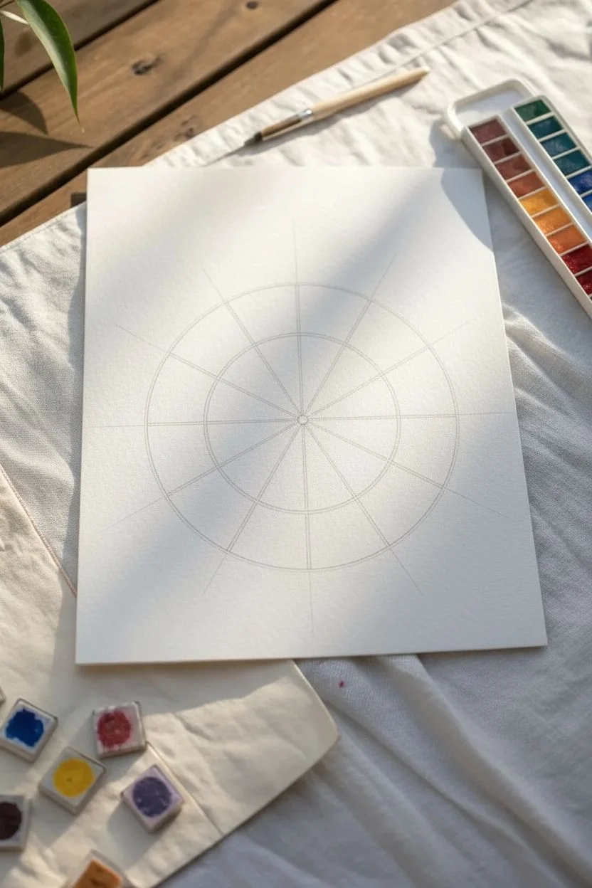
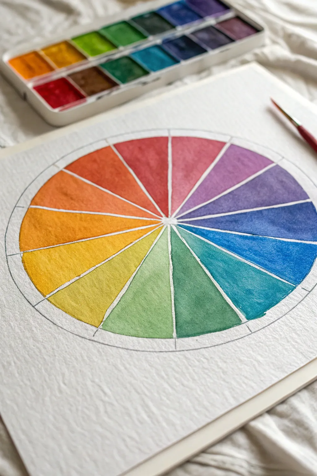
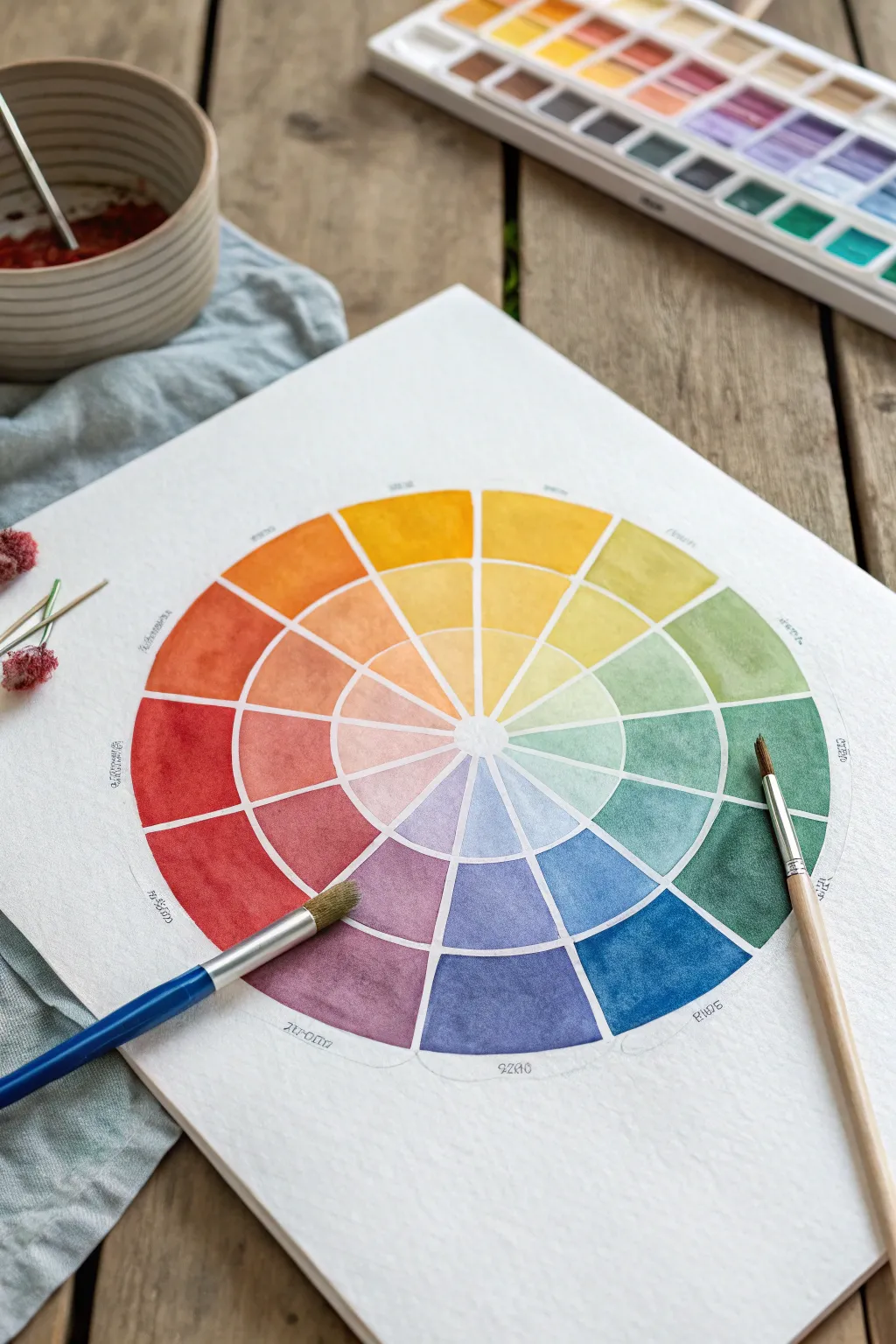
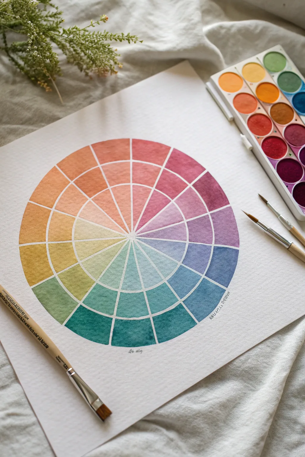
Classic 12-Slice Blended Color Wheel
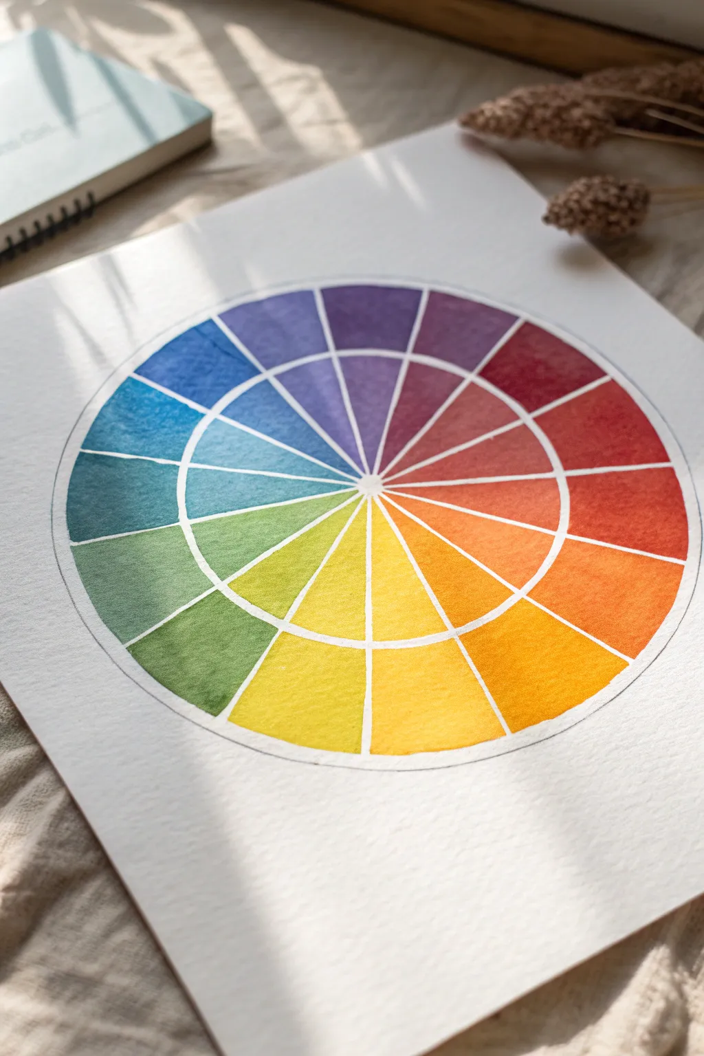
This classic color wheel exercise takes a beautiful turn with a structured two-ring layout, perfect for exploring gradients and saturation. The resulting piece is not just a learning tool but a vibrant, harmonious artwork that glows with transparency.
Detailed Instructions
Materials
- Cold press watercolor paper (300 gsm recommended)
- Watercolor paints (Primary Yellow, Primary Red/Magenta, Primary Blue/Cyan)
- Compass
- Ruler
- Pencil (HB or lighter)
- Round watercolor brush (size 4 or 6)
- Palette for mixing
- Jar of clean water
- Paper towel
- Masking tape (optional)
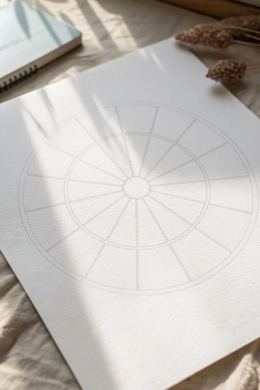
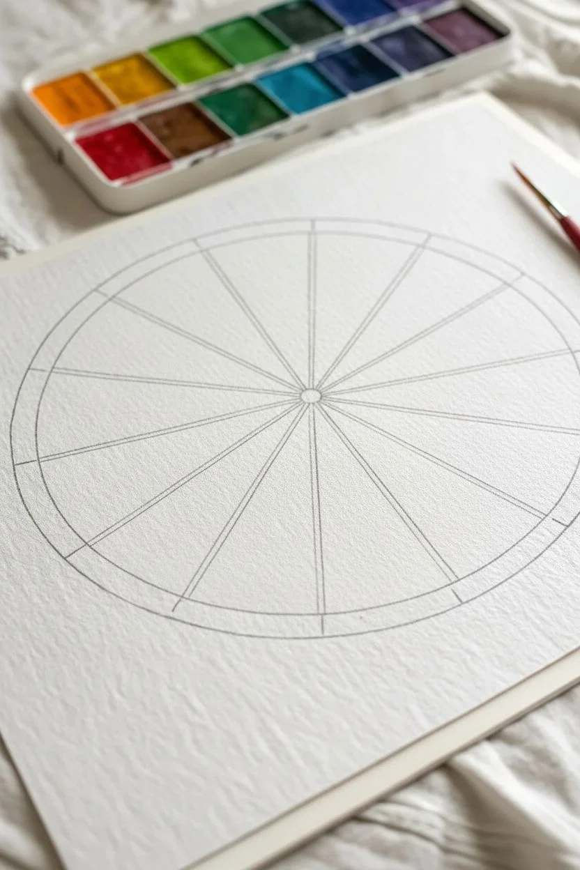
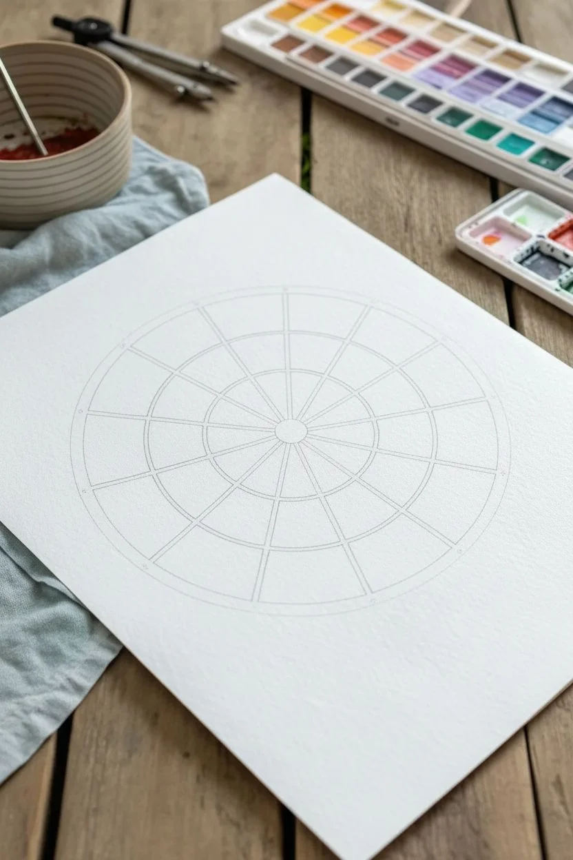
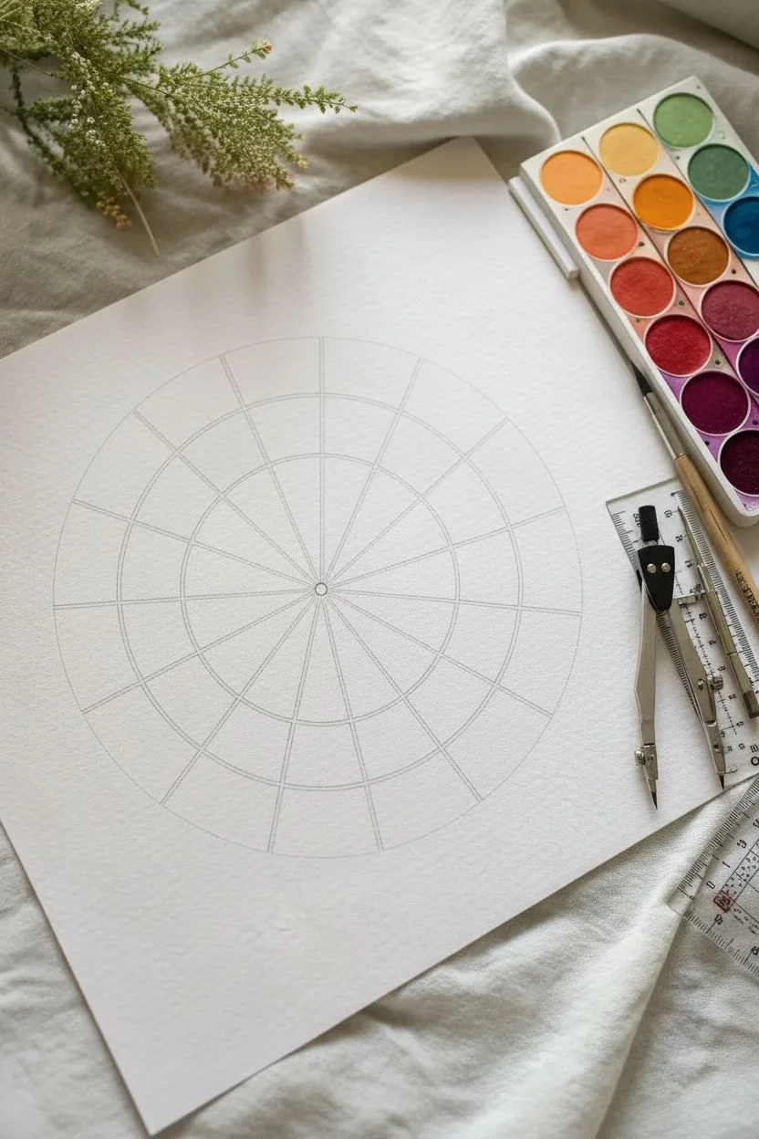
Step 1: Drafting the Structure
-
Establish the center:
Find the center of your watercolor paper and mark it lightly with a pencil point. This will be the anchor for your entire wheel. -
Draw the circles:
Using your compass, draw a small central circle (about 1 inch radius). Keep the compass point in the same spot and draw a larger outer circle (about 3-4 inches radius). Keep your pencil lines very faint so they won’t show through the translucent paint later. -
Divide into quarters:
Use a ruler to draw a vertical line straight through the center point, extending to the outer circle’s edge. Then, draw a horizontal line perpendicular to the vertical one, creating a cross that divides the circle into four equal quadrants. -
Create twelve sections:
To get 12 even slices, you need two additional lines within each quadrant. You can estimate this visually by marking thirds within each 90-degree section, or use a protractor to mark every 30 degrees. Draw these lines from the center point out to the edge. -
Clean up the lines:
Erase the pencil lines inside the very small central hub if you want it white, or leave them if you plan to paint right to the center. I prefer to leave a tiny white gap between slices for a neat, stained-glass effect.
Leaving the Gap
Don’t let wet sections touch! Leave a tiny hairline of dry white paper between slices. This acts as a barrier to prevent colors from bleeding into each other.
Step 2: Mixing and Painting Primaries
-
Prepare your palette:
Squeeze out your three primary colors: Yellow, Red, and Blue. Ensure you have plenty of mixing space between them. -
Paint the Yellow slice:
Choose the top slice for your Yellow. Load your brush with pure pigment and water. Carefully fill the outer ring section first, then the inner wedge. To add depth, you can make the inner wedge slightly more diluted or saturated than the outer ring. -
Paint the Red slice:
Count four slices clockwise from yellow. This 5th slice is your Red. Paint it with pure red pigment, keeping those edges crisp. Leaving a hair’s breadth of white paper between the paint and the pencil line helps keep colors from bleeding. -
Paint the Blue slice:
Count another four slices clockwise from red. This 9th slice is your Blue. Paint it in the same manner, filling both inner and outer sections.
Muddy Colors?
If your mixes look dull or brown, clean your water jar immediately and rinse your brush thoroughly. Dirty water is the #1 cause of muddy watercolor mixes.
Step 3: Creating Secondaries and Tertiaries
-
Mix the Orange:
Mix yellow and red to create a vibrant orange. Paint the slice exactly halfway between yellow and red. This serves as your secondary color anchor. -
Fill the Yellow-Orange:
Now, mix more yellow into your orange pile. Paint the slice between yellow and orange. It should look distinct from its neighbors. -
Fill the Red-Orange:
Add more red to your orange mix until it shifts towards a vermilion hue. Paint the remaining slice between orange and red. -
Mix the Purple:
Combine red and blue to make a deep purple. Paint the secondary slice halfway between your red and blue primaries. -
Complete the Blue-Red sector:
Adjust your purple mix with more red for the Red-Purple slice, and more blue for the Blue-Purple slice. Paint them into their respective slots. -
Mix the Green:
Finally, mix yellow and blue to create a balanced green. Place this in the secondary slot halfway between blue and yellow. -
Finish the wheel:
Create a Blue-Green (teal) and a Yellow-Green (lime) by adjusting your green mixture. Fill the last two remaining slices to complete the circle.
Step 4: Final Touches
-
Check for consistency:
Look over your wheel. If any inner wedges dried too light, you can add a second glaze of the same color to deepen them, creating a subtle value shift from the outer ring. -
Dry completely:
Let the painting sit flat until it is bone dry. Watercolor will buckle if moved too soon. Once dry, you can gently erase any visible pencil marks that aren’t covered by paint.
Display your completed wheel near your workspace as a handy reference for future color mixing projects
Primary, Secondary, and Tertiary Wheel With Labels
This project creates a soothing, divided color wheel that not only teaches color theory but results in a beautiful piece of wall art. The watercolor technique is soft and layered, featuring an inner circle of lighter tints surrounded by a saturated outer ring for distinct contrast.
Step-by-Step
Materials
- Cold press watercolor paper (block or taped sheet)
- Watercolor paints (pan set preferred for easy mixing)
- Round watercolor brush (size 4 or 6)
- Pencil (HB or lighter)
- Compass
- Ruler
- Fine tip dark blue or black pen
- Jar of clean water
- Paper towels
Step 1: Drafting the Structure
-
Establish the center:
Find the center of your watercolor paper by lightly measuring from the edges. Make a tiny dot with your pencil to anchor your compass. -
Draw the inner circle:
Set your compass to a radius of about 1.5 to 2 inches. Place the point on your center dot and lightly draw the first circle; keep the pressure light so the graphite doesn’t smudge later. -
Draw the outer circle:
Extend the compass arm further, adding about 1.5 inches to the radius. Draw a second, larger circle concentric to the first one. -
Mark the segments:
Using your protractor or simply visually dividing, mark 12 even sections around the outer edge (like a clock face). Draw straight lines from these marks through the center point, creating 12 pie slices. -
Create the white gaps:
This specific design features negative space between segments. Carefully re-trace your pencil lines, or just keep them clearly visible, remembering that you will need to leave a tiny sliver of dry white paper between every single color patch.
Step 2: Painting the Primary Triad
-
Mix your yellow:
Start with a clean palette. Load your brush with a bright, warm yellow. Paint the outer segment at the ‘1 o’clock’ position with full saturation. -
Tint the yellow:
Should you want the inner circle lighter, dip your brush in water to dilute the pigment on the brush. Paint the inner wedge connected to your yellow segment, ensuring you leave that thin white gap between the inner and outer shapes. -
Paint the red:
Count four spaces clockwise. Load up a vibrant cool red (like Alizarin Crimson). Paint the outer segment, then rinse slightly and paint the inner segment with a wash of the same hue. -
Paint the blue:
Count another four spaces. Apply a rich blue (like Ultramarine) to the outer ring. Dilute with water and paint the corresponding inner wedge. You now have your primary triangle established.
Clean Edges Trick
Struggling to keep the white gaps even? Use masking fluid or thin graphic tape on the lines before painting. Rub it off only after the paint is 100% dry.
Step 3: Mixing Secondaries and Tertiaries
-
Create orange:
Mix your yellow and red on the palette. Paint the wedge exactly halfway between them. Remember to paint the outer ring saturated and the inner ring more diluted. -
Create green:
Mix yellow and blue to find a balanced green. Apply this to the wedge halfway between yellow and blue. -
Create violet:
Combine your red and blue for a deep violet. Fill in the segment halfway between red and blue. I find violet can get muddy quickly, so clean your water jar if the water looks too brown. -
Fill the Tertiary gaps:
You now have six empty wedges. For each gap, mix the two colors on either side of it. For example, between yellow and orange, mix a yellow-orange. -
Complete the circle:
Continue strictly following this mixing pattern: Red-Orange, Red-Violet, Blue-Violet, Blue-Green, and Yellow-Green until all 12 outer and inner segments are filled. -
Let it cure:
Allow the paint to dry completely. If the paper is cold to the touch, it’s still damp. Wait until it is room temperature.
Level Up: Labeling
Instead of a plain title, use a fine micron pen to label the color names along the outer edge, contouring the letters to follow the curve of the circle.
Step 4: Finishing Touches
-
Erase guidelines:
Once absolutely dry, gently run a clean eraser over the white gaps to remove visible pencil lines, leaving crisp white channels. -
Add the title:
Using a fine tip pen and your best handwriting, write ‘Color Wheel’ centered above the circle. You can add a small decorative line underneath for balance.
Hang your finished guide near your workspace for a handy and beautiful reference tool

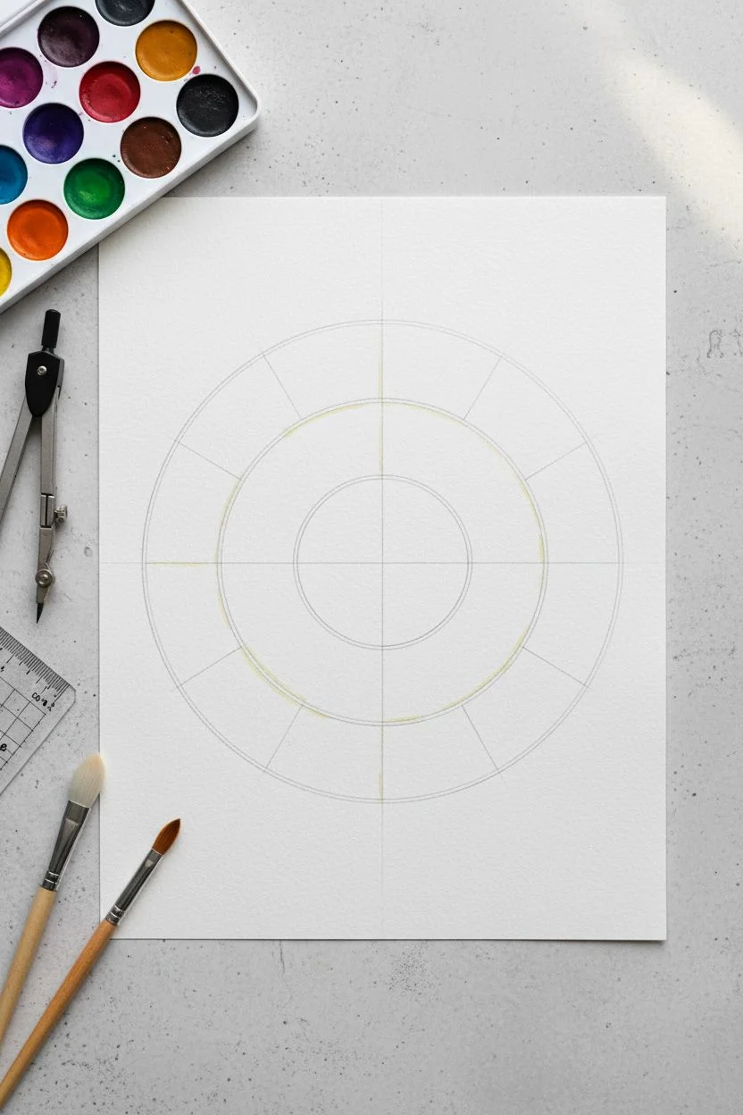
Warm vs Cool Split Color Wheel
Learn to mix and paint a beautifully balanced 12-section color wheel that clearly demonstrates the relationship between warm and cool tones. This foundational watercolor exercise results in a vibrant reference tool that is as pleasing to look at as it is educational.
How-To Guide
Materials
- Cold press watercolor paper (approx. 140lb/300gsm)
- Watercolor paint set (pan set shown)
- Round watercolor brush (size 6 or 8)
- Compass or circular object (approx. 6 inches diameter)
- Ruler or straight edge
- HB pencil
- Water container
- Paper towels
- Palette or mixing tray
Step 1: Drafting the Wheel
-
Draw the main circle:
Start by finding the center of your watercolor paper. Use a compass to draw a circle about 6 inches in diameter. If you don’t have a compass, trace a large bowl or plate lightly with an HB pencil. -
Add the inner ring:
Carefully draw a second, slightly smaller concentric circle inside the first one, leaving about a half-inch border. This outer ring creates a nice visual frame, though we will only be painting the wedges inside the smaller circle. -
Mark the center:
Ensure your center point is clearly marked with a small dot. This creates the hub where all your color wedges will meet. -
Divide into quarters:
Using your ruler, draw a vertical line straight through the center, then a horizontal line to divide the circle into four equal quadrants. -
Create twelve sections:
Divide each of the four quadrants into three equal wedges. You can estimate this visually or use a protractor (each wedge is 30 degrees). Verify that you have exactly 12 sections before putting your pencil down.
Leave a Tiny Gap
Don’t bring the wet paint from one wedge to touch the neighboring wedge. Leave a hairline of white paper between sections to prevent the colors from bleeding.
Step 2: Painting Primary Colors
-
Prepare your primaries:
Activate your primary red, yellow, and blue watercolor pans with a drop of clean water. For this specific wheel, use a cool red (like Alizarin Crimson), a warm yellow (like Cadmium Yellow), and a clear blue (like Phthalo or Ultramarine). -
Paint the yellow wedge:
Select the wedge at the 9 o’clock position (left). Load your brush with pure yellow pigment and carefully fill this wedge. Paint right up to the pencil lines but try not to cross them. -
Paint the red wedge:
Skip three wedges clockwise. At the 1 o’clock position, paint your pure red wedge. Keep the pigment juicy and saturated so it dries bright. -
Paint the blue wedge:
Skip another three wedges clockwise. At the 5 o’clock position, fill the wedge with your pure blue. You now have a triangle of primary colors established.
Step 3: Mixing Secondary Colors
-
Mix the orange:
On your mixing palette, combine equal parts of your red and yellow to create a vibrant orange. Paint this directly into the wedge halfway between the red and yellow sections. -
Create the green:
Clean your brush thoroughly. Mix equal parts yellow and blue to create a standard secondary green. Paint the wedge located exactly halfway between the yellow and blue sections. -
Blend the violet:
Combine your red and blue to make violet. This color can sometimes look muddy if the red is too warm, so create a test swatch first. Paint this in the remaining empty spot halfway between red and blue.
Muddy Colors?
If your purples or greens look brown, your primary choice is the culprit. Ensure you use a ‘cool’ red (like rose) for purples and a ‘cool’ yellow (lemon) for greens.
Step 4: Filling the Tertiaries
-
Mix yellow-orange:
Now, tackle the tertiary colors. Add a bit more yellow to your orange mixture to create yellow-orange. Fill the wedge between yellow and orange. -
Mix red-orange:
Add more red to your orange puddle to get a reddish-orange hue. Use this to fill the wedge between red and orange. -
Mix red-violet:
Shift to the violet side. Add more red to your violet mix for a rich magenta or plum tone, placing it between red and violet. -
Mix blue-violet:
Add more blue to your violet mixture to create a deep indigo type shade. Paint the wedge nestled between blue and violet. -
Mix blue-green:
I like to mix a fresh green for this one. Add extra blue to create a teal or turquoise tone. Apply this to the section between blue and green. -
Mix yellow-green:
Finally, add a significant amount of yellow to your green mixture for a bright chartreuse or lime color. Fill the final empty wedge.
Let your wheel dry completely flat to ensure the pigments settle evenly into the paper’s texture


Tint-and-Shade Color Wheel Ring
This elegant watercolor study moves beyond the basic primary colors to explore the rich depth of tints and shades. By dividing the wheel into concentric rings, you will create a harmonious gradient that fades from deep, saturated hues on the outer edge to delicate, watery pastels in the center.
Step-by-Step
Materials
- High-quality watercolor paper (cold press, at least 300gsm)
- Watercolor paint set (pan or tube)
- Compass or round objects for tracing
- Ruler
- HB Pencil
- Kneaded eraser
- Round watercolor brushes (size 4 and size 8)
- Mixing palette with multiple wells
- Two jars of water (one for rinsing, one for clean water)
- Paper towels
Step 1: Drafting the Structure
-
Find the center:
Begin by lightly marking the exact center of your watercolor paper to ensure your wheel is perfectly symmetrical. -
Draw concentric circles:
Using a compass, draw four concentric circles. The outermost circle defines the wheel’s size, while the inner three create the bands for your shades, mid-tones, and pastel tints. -
Leave a center gap:
Draw the smallest inner circle carefully; this will be the white negative space in the very center, so keep your pencil lines light. -
Divide into wedges:
Use a ruler to divide the circle into 12 equal wedges. Start with a vertical and horizontal line to make quarters, then divide each quarter into three equal sections. -
Create separating channels:
To achieve the clean white gaps seen in the example, carefully draw double lines around each wedge and ring segment, creating a thin ‘gutter’ of negative space between every block of color.
Step 2: Mixing the Hues
-
Prepare the primary palette:
Activate your primary red, yellow, and blue paints with a few drops of clean water. Having vibrant, saturated primaries is crucial for the outer ring. -
Mix secondary colors:
Combine your primaries to create orange, green, and violet. Test these on a scrap piece of paper to ensure they sit perfectly between their parent colors in visual weight. -
Develop tertiary colors:
Mix the remaining six intermediate hues (like red-orange or blue-green) by adjusting your secondary mixtures. You now have the 12 base colors needed for the outer ring.
Bleeding Lines?
If colors bleed across the white gaps, your brush is too wet. Blot the brush on a paper towel before painting near edges, or let adjacent sections dry fully first.
Step 3: Painting the Gradient Rings
-
Start with the outer ring:
Begin painting the outermost wedges with your most saturated, pure pigment mixtures. I prefer to paint non-adjacent sections first (like every other color) to prevent wet edges from bleeding into one another. -
Complete the saturated circle:
Fill in the remaining wedges of the outer ring. Once done, let this layer dry completely before moving inward. -
Dilute for the middle ring:
For the second ring, take your clean brush and dilute your original color mixtures with a significant amount of water. You are aiming for a mid-tone transparency here. -
Paint the mid-tones:
Apply these lighter washes to the corresponding wedges in the middle ring. Ensure the transition looks softer than the outer ring. -
Create the pastel inner ring:
For the innermost ring, add even more water to your mix until the pigment is barely there—almost a whisper of color. -
Apply the final tints:
Paint the small inner trapezoids. These should be very pale, creating a glowing effect near the center of the wheel. -
Clean up edges:
Once the paint is bone dry, gently erase visible pencil lines in the white gutters to make the colors pop.
Go Digital
Scan your finished wheel at high resolution. You can use the eyedropper tool in design software to create a custom digital color palette based on your physical mix.
Step 4: Final Details
-
Label the colors (optional):
If you wish to replicate the scientific look, use a very fine pencil or grey waterproof fine-liner to write the color names in cursive along the outer edge of the wheel. -
Assess contrast:
Step back and check your work. If any sections of the tint rings look too similar to the shade rings, you can carefully glaze a second layer over the darker sections to increase the contrast.
Enjoy using this beautiful reference tool for your future color mixing adventures
BRUSH GUIDE
The Right Brush for Every Stroke
From clean lines to bold texture — master brush choice, stroke control, and essential techniques.
Explore the Full Guide
Complementary Pairs Color Wheel With Bold Contrast
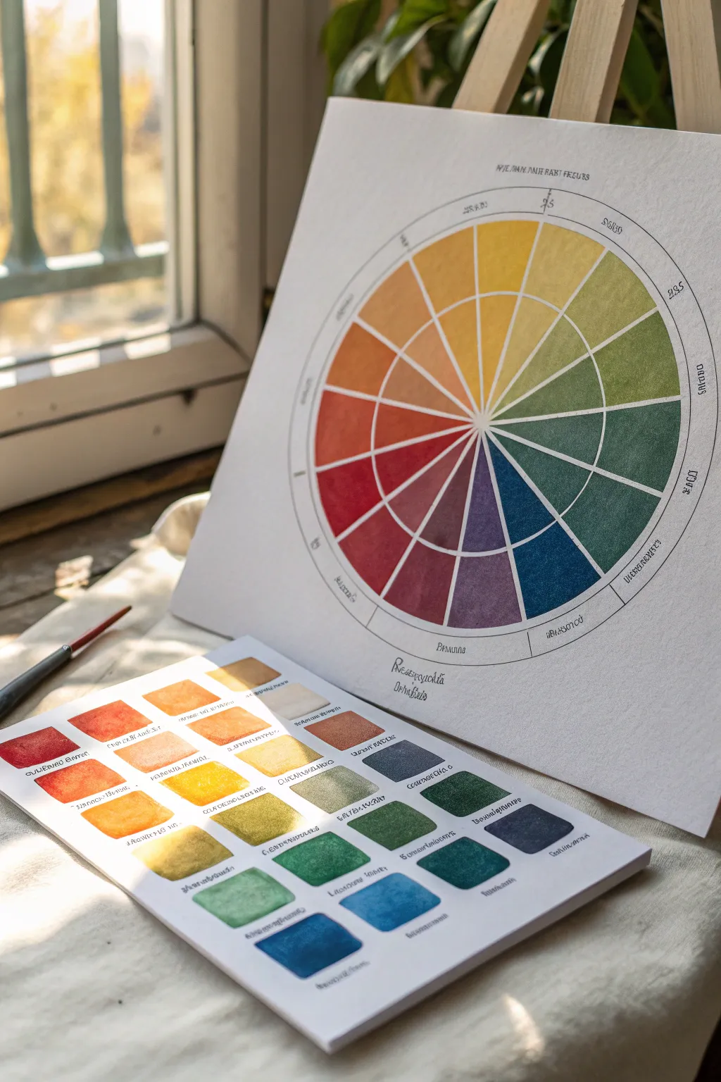
This elegant project combines geometric precision with the fluid beauty of watercolor to create a sophisticated color reference tool. You’ll craft a double-ringed color wheel alongside a matching swatch chart to explore color relationships and tonal values in depth.
How-To Guide
Materials
- High-quality watercolor paper (cold press, 300gsm)
- Watercolor paints (primary colors: Red, Yellow, Blue)
- Circular compass
- Protractor
- Ruler
- Pencil (HB or H for light lines)
- Fine liner pen (waterproof, black or dark grey)
- Round watercolor brushes (size 4 and size 0 or 1 for details)
- Mixing palette
- Two jars of water
- Paper towels
- Masking tape
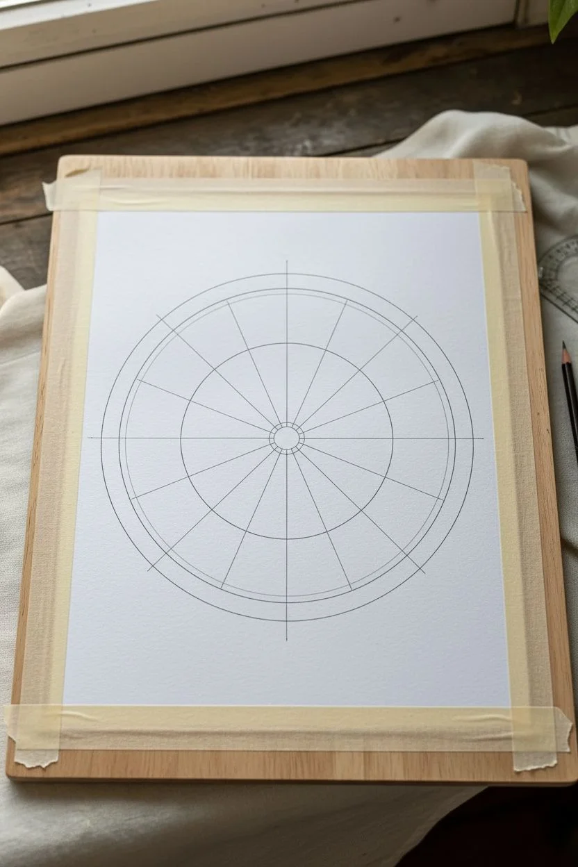
Step 1: Drafting the Wheel
-
Prepare the workspace:
Begin by taping down your watercolor paper to a hard board. This prevents the paper from buckling when you apply washes later, ensuring your geometric shapes stay crisp. -
Draw the circles:
Using your compass, draw a small central circle (about 1 inch diameter) which will remain empty. Draw two larger concentric circles around it to create two distinct bands for your colors. -
Add the outer rim:
Draft one final, thin outer ring encompassing the whole wheel. This narrow band will act as a border for labeling your colors later. -
Divide into segments:
Use a protractor to divide your circle into 12 equal sections (every 30 degrees). Lightly draw lines from the center outward to create the wedges. -
Ink the lines:
Carefully trace your pencil lines with a waterproof fine liner. I find a steady hand is easier if you rotate the paper rather than your arm. Let the ink dry completely before erasing any stray pencil marks.
Clean Edges Tip
For ultra-crisp lines between color wedges, let each section dry completely before painting its neighbor. This prevents wet paint from bleeding across the ink lines.
Step 2: Painting the Color Wheel
-
Mix your primaries:
On your palette, prepare puddles of your pure primary red, yellow, and blue. Ensure they are saturated but fluid enough to glide on the paper. -
Paint primary wedges:
Fill in the primary segments on the wheel corresponding to the 12 o’clock (yellow), 4 o’clock (red), and 8 o’clock (blue) positions. Paint the inner ring with the pure hue. -
Create the outer ring tone:
For the outer ring of these primary segments, slightly dilute the paint with more water or add a tiny touch of complementary color to create a muted version. -
Mix secondary colors:
Combine your primaries to create orange, violet, and green. Apply these to the segments exactly halfway between the primaries. -
Mix tertiary colors:
Mix the remaining six intermediate shades (like yellow-orange or blue-green) and fill in the remaining wedges, maintaining the pattern of saturated inner rings and softer outer rings. -
Refine edges:
Use your smallest brush to tidy up any edges where colors meet. If you accidentally go over a line, lift the pigment gently with a clean, damp brush.
Try Granulation
Use granulating paints (like Ultramarine Blue or Potter’s Pink) to add texture. The pigment particles will settle into the paper grain for a vintage look.
Step 3: Creating the Swatch Chart
-
Grid the chart:
On a separate sheet of paper, lightly draw a grid of small squares. You’ll need enough squares for every color mix you created, plus variations. -
Apply pure swatches:
Paint a square for each Pure Hue used in your wheel. Aim for a gradient within the square—saturated at the top, fading to water at the bottom. -
Explore mixing variations:
Use the remaining squares to test how your specific paints granulate or mix. This is where I like to experiment with different water ratios to see the full personality of the pigments. -
Label everything:
Once the paint is bone dry, use your fine liner to write the color names in the outer rim of the wheel and underneath each square on your swatch chart.
Display your finished wheel and chart together near your workspace for a constant source of color inspiration
Analogous Gradient Color Wheel for Smooth Transitions
Move beyond basic primary colors with this sophisticated gradient color wheel that explores values and analogous transitions. By dividing each hue into concentric rings of varying intensity, you’ll create a mesmerizing, gem-like tool that is as beautiful as it is educational.
Detailed Instructions
Materials
- High-quality watercolor paper (cold press, at least 300gsm)
- Watercolor paint set (pan set shown, or tubes)
- Round watercolor brushes (sizes 4 and 6)
- Small flat brush (optional, for lifting)
- Compass
- Protractor
- HB Pencil
- Ruler
- Fine liner pen (optional, for labeling)
- Two jars of water (one for rinsing, one for clean water)
- Paper towels
- Palette for mixing
Step 1: Drafting the Structure
-
Center constraints:
Begin by finding the exact center of your watercolor paper. Make a tiny mark, as this will be the anchor for your entire structure. -
Draw the rings:
Using a compass, draw four concentric circles. Start with a small inner circle (about 1 inch diameter), then add three increasingly larger circles around it to create four distinct bands. -
Divide the circle:
Use a protractor to mark every 30 degrees around the outermost circle. This will give you the 12 distinct wedges needed for a standard color wheel. -
Connect the wedges:
Use a ruler and pencil to connect opposite 30-degree marks through the center point. Draw lightly so the graphite doesn’t smudge into your yellow paints later. -
Masking (Optional):
If you want the crisp white lines shown in the reference image without needing steady hands, you can apply thin masking fluid or masking tape along the pencil lines now. Let it dry completely.
Clean Water Is Key
Change your rinse water religiously. Dirty water will turn your vibrant yellow washes muddy and ruin the delicate inner pastel values.
Step 2: Painting the Values
-
Starting with Yellow:
Begin at the ’12 o’clock’ position with yellow. Mix a pure, saturated yellow for the outermost ring segment. -
Diluting for values:
For the segment immediately inwards, add a touch of water to your yellow mix to lighten the value slightly. -
Fading to center:
Continue painting the inner two rings of the wedge, adding progressively more water each time. The center-most piece should be a very pale, whisper-thin wash of yellow. -
Moving to Red-Orange:
Skip to the red section (90 degrees away) or work analogously. I prefer working sequentially. Mix a yellow-orange for the next wedge and repeat the four-value process from dark outer ring to pale inner ring. -
Red and Magenta:
Continue around the wheel to the reds and magentas. Ensure your outer ring is always fully saturated pigment. -
Violet and Blue:
As you move into cool colors, be careful with water control; blues can dry lighter than they appear wet. -
Teal and Green:
Complete the circle with your greens. Notice how the teal wedge opposite the red creates a beautiful complementary contrast. -
Drying strategy:
To prevent wet paint from bleeding into neighbors, paint non-adjacent wedges first (e.g., Yellow, then Blue, then Red) and fill in the gaps once those are dry.
Shape Shift
Instead of a circle, try drawing a hexagon or dodecahedron grid. The value gradient technique works wonderfully with geometric angular shapes too.
Step 3: Clean Up and Details
-
Erase guidelines:
Once the paint is bone-dry—give it extra time just to be safe—gently erase your pencil lines. If you used masking fluid, rub it away carefully. -
Touch-ups:
If any edges look jagged, use a slightly damp, stiff brush to gently scrub and lift the excess paint, straightening the line. -
Labeling:
Use a very fine pen or a small brush to add subtle labels at the bottom or along the curve if you wish to document the pigments used.
Now you have a stunning reference tool that perfectly visualizes how color intensity shifts with dilution

PENCIL GUIDE
Understanding Pencil Grades from H to B
From first sketch to finished drawing — learn pencil grades, line control, and shading techniques.
Explore the Full Guide
Triadic Color Wheel With Three “Hero” Triangles
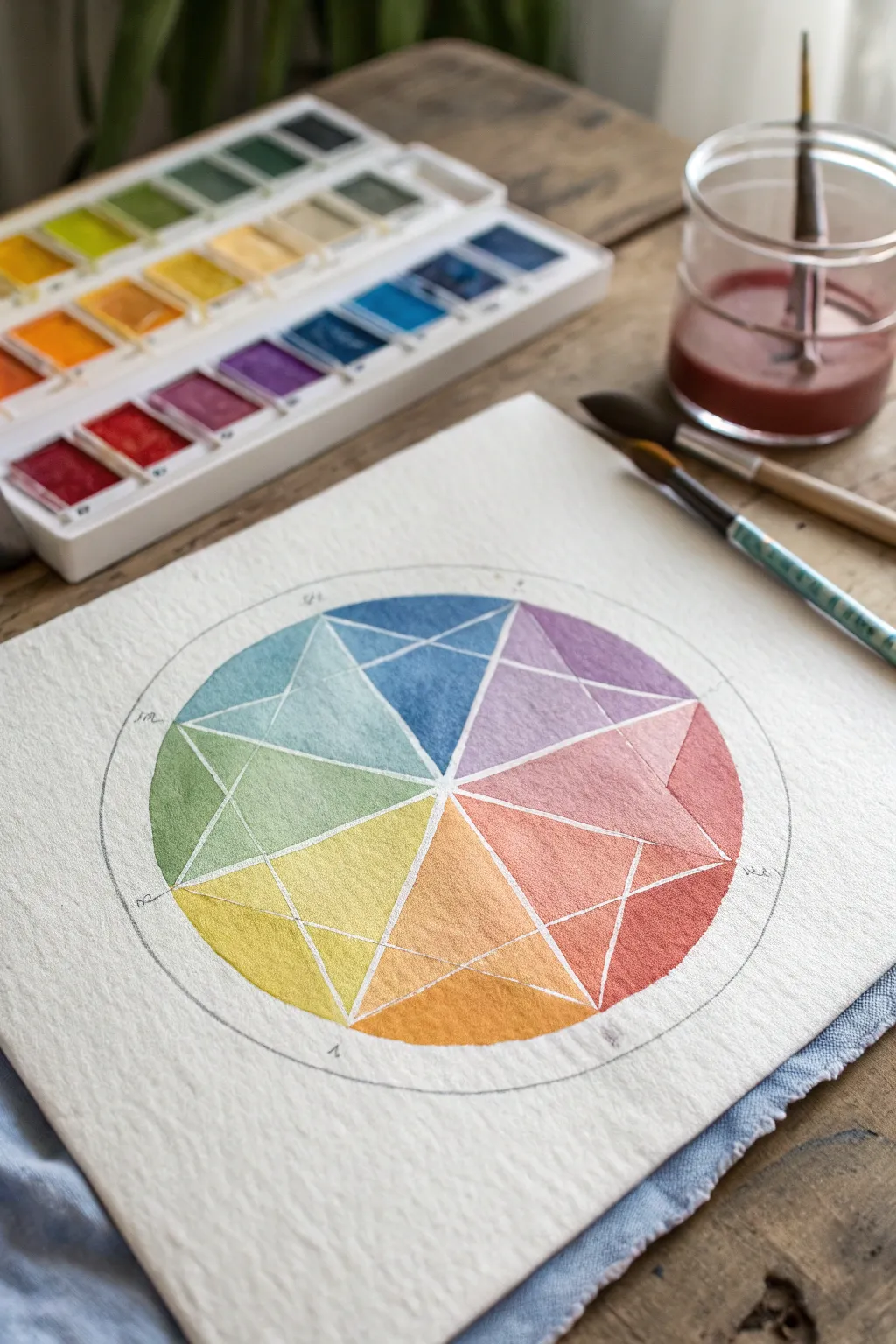
This project transforms a standard color mixing exercise into a striking piece of geometric art using watercolors. By fracturing the classic wheel into triangular shards, you create a complex, jewel-like diagram where primary ‘hero’ triangles anchor the composition.
Step-by-Step Guide
Materials
- Cold press watercolor paper (approx 140lb/300gsm)
- Watercolor paint set (pan set shown)
- Round synthetic brushes (sizes 4 and 8)
- Compass for drawing circles
- Ruler or straightedge
- HB Pencil
- White gel pen (optional) or masking fluid
- Water jar and paper towels
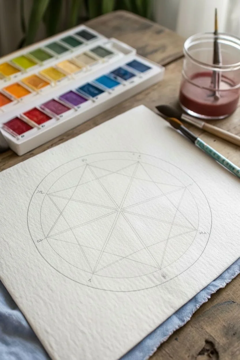
Step 1: Drafting the Geometry
-
Draw the outer ring:
Begin by finding the center of your paper. Use your compass to draw a large circle, leaving a comfortable margin around the edges of the page. -
Add the inner boundary:
Keep the compass pivot point in the exact same spot but reduce the radius by about 1/4 inch. Draw a second, smaller circle inside the first to create the rim of your wheel. -
Mark the twelve points:
Divide your circle into 12 equal segments. You can do this by using a protractor to mark every 30 degrees, or by keeping your compass set to the original radius and using it to walk marks around the circumference. -
Connect the primary triangles:
Select three points equidistant from each other (positions 12, 4, and 8 on a clock face). Use a ruler to connect these points to the center, creating three large wedge shapes. -
Create the star overlay:
This is the complex part: instead of just drawing 12 wedges, draw lines connecting every other point on your circle’s edge. This will create overlapping triangles and a star-like geometry inside the wheel structure. -
Define the shards:
Review your pencil lines. You should see a pattern where each main color section is split into smaller triangular facets. Darken these lines very lightly if needed, but keep them faint enough to paint over.
Muddy colors?
Wait for each section to dry before painting its neighbor. If wet red touches wet green, they will bleed into brown. Use a hairdryer to speed up drying between adjacent shapes.
Step 2: Painting the Heroes
-
Mix your primary red:
Activate a warm red pigment with a wet brush. Paint the large, central triangular facet in the ‘Red’ position of your wheel. This is your first ‘hero’ triangle. -
Paint the primary blue:
Clean your brush thoroughly. Mix a pure, cool blue and fill the central triangle facet located four steps away from the red. -
Add the primary yellow:
Complete the primary triad by painting the central facet of the yellow section with pure yellow pigment. Let these three key triangles dry completely before moving on.
Add metallic flair
Instead of leaving the dividing lines white, trace over them with metallic gold ink or paint after the colors are dry. It creates a stunning cloisonné enamel effect.
Step 3: Filling the Spectrum
-
Mix secondary orange:
Combine your red and yellow on a palette. Aim for a vibrant orange and fill the central triangle facet halfway between the red and yellow sections. -
Mix secondary green:
Mix yellow and blue to create a grassy green. Paint the main facet between yellow and blue. -
Mix secondary violet:
Combine red and blue for a violet hue. Fill the corresponding facet between the red and blue sections. -
Paint the tertiary facets:
Now, locate the smaller triangular ‘shards’ adjacent to your main colors. For a Red-Orange section, mix a little more red into your orange mix and paint the specific geometric fragment that sits between the main red and orange sections. -
Complete the tertiary ring:
Continue around the wheel, mixing the intermediate colors (yellow-orange, yellow-green, blue-green, blue-violet, red-violet) and filling their respective geometric zones. -
Vary the saturation:
To make the geometry pop, I like to slightly dilute the paint with more water for the outer rim sections versus the inner shards. This subtle value change emphasizes the fractured look. -
Let it dry fully:
Allow the entire piece to dry completely. The paper should feel cool to the touch if it is still damp.
Step 4: Defining Lines
-
Identify the white lines:
The image shows distinct white lines separating the colors. This is the negative space of the paper shining through. -
Enhance separation (Optional):
If you struggle to leave gaps while painting, you can use a white gel pen or white gouache and a fine liner brush to re-draw the geometric lines over the dry watercolor. -
Add outer markings:
With a fine pencil or a very fineliner pen, add tiny tick marks and possibly label abbreviations (like ‘R’, ‘Y’, ‘B’) on the pencil circle surrounding your distinct painted wheel.
Hang your finished geometric wheel near your workspace as a beautiful and practical color mixing reference
Split-Complementary Color Wheel With Accent Marks
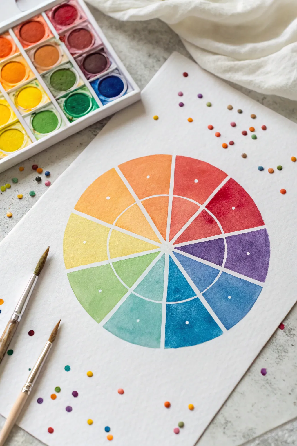
This refreshing take on the classic color wheel combines precise geometry with playful, confetti-like accents. Using watercolor, you’ll create a segmented wheel that explores color relationships while adding a whimsical touch with scattered paint dots.
Step-by-Step Tutorial
Materials
- Cold-pressed watercolor paper (140lb/300gsm)
- Watercolor paints (pan or tube set)
- Round watercolor brushes (sizes 4 and 6)
- Compass
- Ruler
- Pencil (HB or H)
- White gel pen or white gouache
- Jar of clean water
- Paper towels
- Masking fluid (optional)
Step 1: Planning and Sketching
-
Find your center:
Begin by finding the center of your watercolor paper. Lightly mark this spot with a pencil, as it will be the anchor for your entire wheel. -
Draw the inner circle:
Set your compass to a radius of about 1.5 to 2 inches. Place the point on your center mark and draw a light circle. This will form the inner tier of your color wheel. -
Draw the outer circle:
Widen your compass by extending the radius another 1.5 to 2 inches. Draw a larger circle around the first one using the same center point. Keep your pencil pressure very light so the graphite doesn’t smudge later. -
Divide into segments:
To create the 12 classic sections of a color wheel, start by drawing a vertical line through the center, then a horizontal one to make a focused cross. Use a protractor to divide each quadrant into three equal 30-degree sections, extending the lines from the center point to the outer edge. -
Create separation channels:
To achieve the white negative space seen in the example, you need to thicken your pencil lines. You can either carefully freehand a small gap around your initial pencil lines or use masking fluid to block out these thin channels now.
Clean Edges Trick
Struggling with shaky hands? Use thin artist’s tape or washi tape to block off the white separation lines. Peel the tape away only after the paint is completely dry for crisp lines.
Step 2: Painting the Wheel
-
Start with primary colors:
Load your brush with pure Red, Yellow, and Blue. Paint the outer ring segments for these three colors first. Space them equally apart—leaving three empty segments between each primary color. -
Mix and apply secondary colors:
Mix your primaries to create Orange, Green, and Violet. Paint these into the segments exactly halfway between the primary colors on the outer ring. Ensure your wash is even and saturated. -
Fill the tertiary colors:
Mix the remaining six tertiary colors (like red-orange, yellow-green, etc.) by combining a primary with its adjacent secondary color. Fill in the remaining empty segments on the outer ring. -
Paint the inner ring:
For the inner circle segments, you want a lighter value. Dilute your existing mixtures with more water to create a tint of the same hue. Paint the corresponding inner wedge for each color, ensuring precise edges. -
Let it dry completely:
Allow the wheel to dry fully. If the paper feels cool to the touch, it’s still damp. Patience here is key to preventing colors from bleeding into one another.
Level Up: Gradient Shift
make the inner ring a ‘shade’ instead of a ‘tint’. Add a tiny touch of black or complementary color to darken the inner segments for a moodier, deeper look.
Step 3: Adding Accents
-
Add white center dots:
Once the paint is bone dry, use a white gel pen or a small brush dipped in white gouache to place a single, crisp dot in the center of each outer ring segment. This helps visually center the saturation. -
Prepare accent colors:
Choose 3-4 distinct colors from your palette to use for the confetti background. I find that picking colors from opposite sides of the wheel creates staggering contrast. -
Scatter the confetti dots:
Dip a small round brush (size 4 is great) into thick, creamy paint. Gently press the tip onto the white paper around the wheel to create circular dots. vary the pressure slightly for different sizes. -
Arrange the composition:
Ideally, cluster more dots near the corners or edges of the paper and disperse them as they get closer to the wheel, creating a movement effect. -
Clean up:
If you used masking fluid for the white lines, gently rub it away with a clean finger or rubber cement pickup once everything is 100% dry. Erase any visible pencil marks lightly.
Display your vibrant study in your workspace as a handy reference tool for future color mixing projects


Citrus Slice Color Wheel Still Life
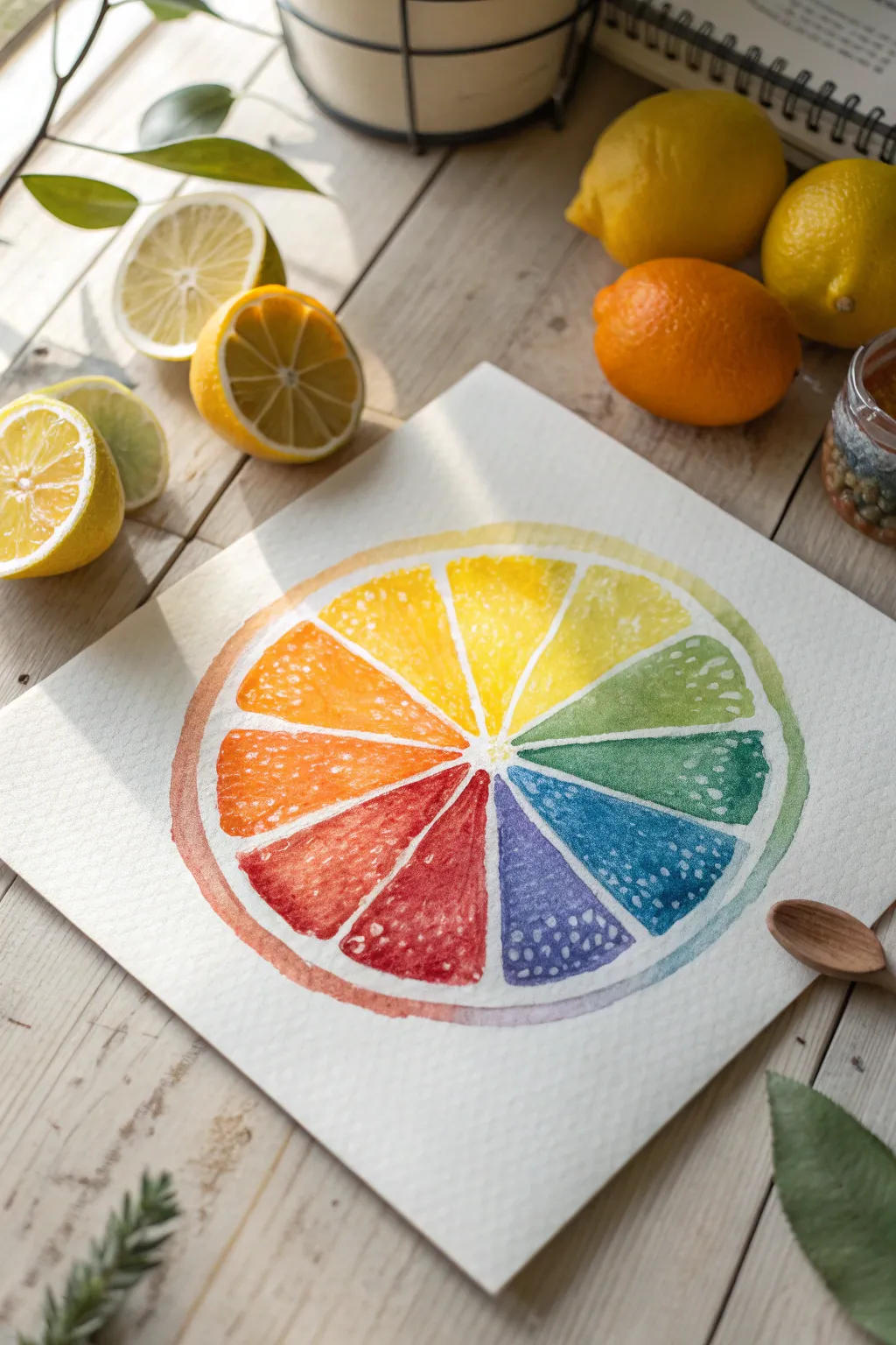
Capture the fresh vibrancy of citrus fruit while exploring the full spectrum of the rainbow with this juicy watercolor project. By framing the traditional color wheel within the natural segments of a fruit slice, you create a playful and educational piece of art that looks good enough to eat.
Step-by-Step Guide
Materials
- Cold-pressed watercolor paper (140lb/300gsm)
- Watercolor paints (pan or tube set)
- Round watercolor brushes (size 4 and 8)
- Pencil (HB or H)
- Compass or circular object for tracing
- Ruler
- Eraser (kneaded preferred)
- Clean water jar
- Paper towels
- White gel pen or gouache (optional for highlights)
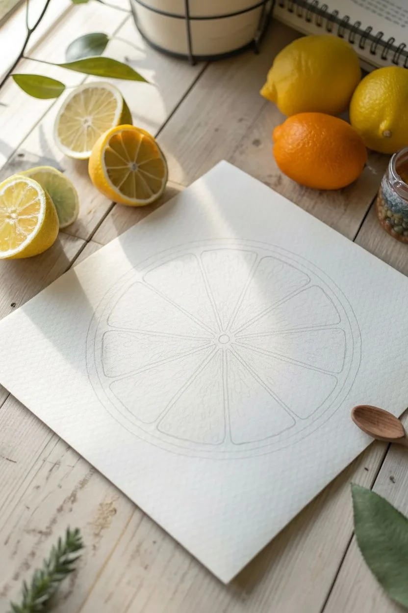
Step 1: Sketching the Framework
-
Draw the outer ring:
Begin by using a compass or tracing a medium-sized bowl to draw a perfect circle in the center of your watercolor paper. Keep your pencil pressure very light so the graphite doesn’t show through the transparent paint later. -
Create the rind thickness:
Draw a slightly smaller circle inside the first one, leaving about a half-inch gap to represent the pith and rind of the citrus fruit. -
Mark the center point:
Locate the exact center of your circle. If you used a compass, this point is already marked by the pinhole. -
Divide into segments:
Using a ruler, lightly draw lines from the center point to the inner circle’s edge to create eight equal pie-shaped segments. These will become your juicy fruit sections. -
Round the corners:
Inside each triangular segment, sketch the actual fruit pulp shape by rounding off the corners. Leave a small channel of white space between each segment and the center point to mimic the membrane that separates the fruit pieces.
Bleeding edges?
If colors are bleeding into the white pith area, your paint is too watery or you are painting too close to the edge too quickly. Let adjacent sections dry completely before moving on.
Step 2: Painting the Spectrum
-
Prepare your palette:
Activate your watercolor paints with a drop of water on each color you intend to use. You will need a primary yellow, orange, red, violet, blue, teal/blue-green, green, and yellow-green. -
Start with yellow:
Identify the top segment (12 o’clock position) and paint it with a bright, clean lemon yellow. Use your Round 8 brush to fill the shape, being careful to stay within your rounded pencil lines. -
Paint the yellow-orange:
Moving clockwise to the next segment, mix a yellow-orange hue or use a pre-mixed gamboge. Apply this next to the yellow segment. -
Continue the warm transition:
Paint the third segment a vibrant orange. For the fourth segment (roughly at the 4 or 5 o’clock position), transition into a warm red-orange or vermilion. -
Anchor the cool side:
I like to skip ahead sometimes to balance the wheel. Paint the segment directly opposite your orange with a cool blue to establish your complementary pairs, or simply continue clockwise into the reds and violets: Red, Red-Violet, Violet/Indigo. -
Complete the circle:
Finish the remaining segments with blue, blue-green (teal), and finally a fresh lime green to close the loop back to your starting yellow. -
Add texture while wet:
While the paint in each segment is still damp (not soaking wet), drop in tiny dots of slightly more concentrated pigment or clean water. This creates ‘blooms’ that mimic the texture of juice vesicles.
Step 3: Adding the Rind & Details
-
Paint the outer rind:
Once the inner segments are dry to the touch, mix a watery wash corresponding to the adjacent fruit color. Paint the outer ring in a gradient that matches the inner wheel—yellow outer ring next to the yellow segment, turning orange as it moves next to the orange segment, and so on. -
Soften the rind edge:
While the rind wash is wet, soften the outer edge slightly with a clean, damp brush if you want a looser look, or keep it crisp for a graphic style. -
Leave the pith white:
Ensure you leave the gap between the colored segments and the colored outer rind completely unpainted. The stark white of the paper represents the bitter white pith. -
Enhance the texture:
After the main segments are bone dry, use your smaller size 4 brush to stipple small dots of white gouache or a white gel pen over the colored areas. Focus these highlights near the outer edges of the segments to suggest glistening juice sacs. -
Erase guide lines:
Gently erase any remaining visible pencil marks from the white pith areas, ensuring the paint is completely dry to avoid smudging.
Pro Tip: Salt Texture
Sprinkle a tiny pinch of table salt onto a wet segment and let it dry naturally. Brush it off later to create incredible, organic textures that look just like citrus pulp.
Display your finished slice to brighten up your workspace with a splash of permanent summer sunshine
Color Wheel Landscape in 12 Mini Panels
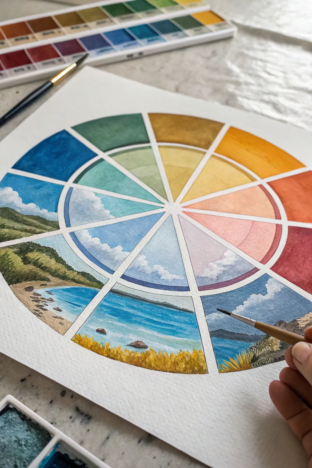
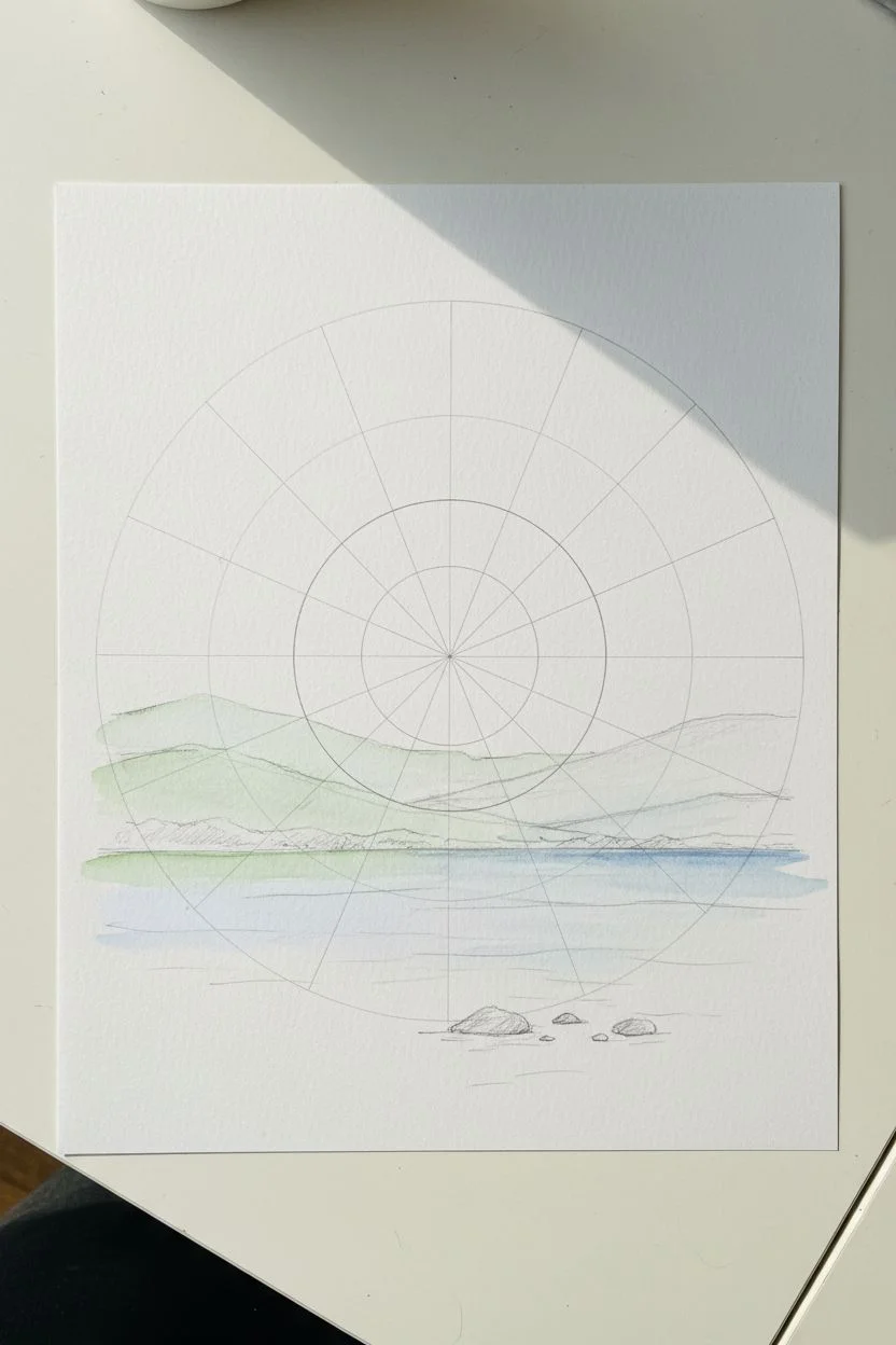
Transform a standard color theory exercise into a stunning panoramic view with this unique landscape color wheel. By painting a continuous scene broken into twelve segments, you’ll explore how light and atmosphere shift across the color spectrum while creating a cohesive piece of art.
Detailed Instructions
Materials
- High-quality watercolor paper (cold press, 300gsm)
- Watercolor paint set (pan or tube)
- Round watercolor brushes (sizes 2, 4, and 6)
- Compass or circular object for tracing
- Ruler and protractor
- Pencil (H or HB)
- Masking tape or painter’s tape
- Water cups and paper towels
- White gouache or white gel pen (optional for highlights)
Step 1: Drafting the Structure
-
Draw the main circles:
Begin by finding the center of your paper. Using a compass, draw a large circle (about 8-10 inches in diameter). Then, draw a smaller inner circle (about 4 inches in diameter) centered within the first one. -
Create the segments:
Use a protractor to divide your circle into 12 equal 30-degree sections. Draw straight lines from the center point to the outer edge of the large circle. These lines will separate your color segments. -
Sketch the landscape flow:
Lightly sketch a continuous horizon line across the lower half of the wheel. Plan for the bottom segments (greens and blues) to be land and water, while the upper segments (yellows, oranges, reds) will serve as the sky and atmosphere. Keep the pencil lines barely visible.
Uneven Washes?
If your sky segments look too streaky, try wetting the paper with clean water first (wet-on-wet technique) before dropping in the pigment for smoother blends.
Step 2: Painting the Inner Ring (Atmosphere)
-
Start with the sky segments:
The inner circle represents the sky and light. Start at the top with yellow. Mix a very dilute wash of yellow ochre or lemon yellow and fill the top segment of the inner circle. -
Transition through the spectrum:
Move clockwise to orange, then red, then purple. Keep these washes light and airy, suggesting clouds or atmospheric perspective rather than solid blocks of color. I like to leave small patches of white paper here to suggest bright clouds. -
Complete the inner circle:
Continue painting the inner segments through blue and green. For the lower segments (which align with the land/water), paint the sky reflection or distant horizon colors, keeping them lighter than the outer ring will be. -
Refine the cloud edges:
While the paint is still damp but not soaking, drop in tiny amounts of darker pigment at the edges of your ‘clouds’ to give them volume, ensuring the color corresponds to that specific segment’s hue.
Seasonal Shift
Make the landscape reflect the seasons alongside colors! Paint the green segments as spring, yellows as summer, reds as autumn, and blues as winter snow.
Step 3: Painting the Outer Ring (Landscape)
-
Paint the solid upper segments:
For the top segments (yellows/oranges/reds) that don’t contain land, fill the outer ring with more saturated versions of the inner colors. Treat these as abstract atmospheric bands or intense sunset skies. -
block in the landmasses:
Moving to the green segments on the left, paint the rolling hills. Use varying shades of sap green and olive. Ensure the hill contours line up visually across the white divider lines. -
Paint the water sections:
For the blue segments at the bottom, paint the water. Use distinct horizontal strokes to suggest ripples. Darken the water as it gets closer to the bottom edge of the paper to show depth. -
Add the foreground details:
In the bottom yellow/green segments, paint the grassy foreground. Use a small size 2 brush to flick upward strokes, mimicking tall grass blades catching the light.
Step 4: Unifying the Scene
-
Enhance the continuity:
Step back and check if your horizon line looks continuous behind the white dividers. If a hill ends abruptly at a line, extend its angel into the next segment slightly so the eye bridges the gap. -
Deepen shadows and contrast:
Go back into the land and water segments with a drier brush. Add dark blue shadows to the waves and deep forest green to the valleys of the hills to make the landscape pop. -
Clean up the dividers:
If any paint has bled across your pencil lines, carefully lift it with a clean, damp brush or cover it with opaque white gouache once dry to maintain crisp separation between wedges.
Once the paint is fully dry, erase any remaining pencil marks to reveal your beautiful, cohesive chromatic landscape

Have a question or want to share your own experience? I'd love to hear from you in the comments below!