
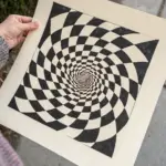
Black paper is basically instant drama—your colored pencil marks can look like little beams of light when you let the darkness do the heavy lifting. Here are my favorite colored pencil on black paper ideas for subjects that glow, shimmer, and pop without you having to color in a whole background.
Neon Flower Bloom
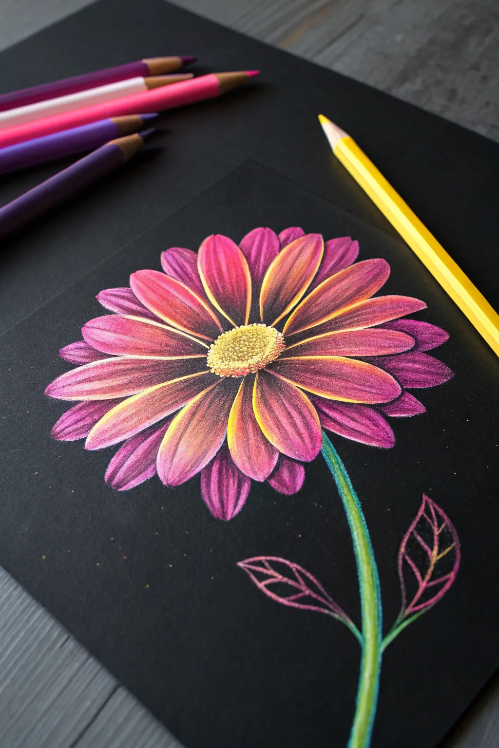
Capture the electrifying beauty of a neon-lit garden with this vibrant floral study on black paper. The dark background makes the fuchsia, orange, and electric yellow petals pop with an almost three-dimensional luminescence.
Step-by-Step Tutorial
Materials
- Black heavyweight drawing paper or cardstock
- Soft-core colored pencils (Prismacolor Premier or similar)
- Specific colors: White, bright yellow, cadmium orange, magenta/hot pink, violet/purple, lilac, neon green, dark green
- Pencil sharpener
- Kneaded eraser
Step 1: Base Sketch & Center
-
Preliminary Outline:
Using a very light or white colored pencil, gently sketch a small oval for the flower’s center. Radiate about 16-20 petal shapes outward from this center. Keep your pressure extremely light so lines can be covered later. -
Texture the Center:
Fill the oval center with tiny, tight circular motions using a bright yellow pencil. Leave small gaps of black paper showing through to simulate texture. -
Add Depth:
Dot in some pale orange or ochre on the lower edges of the center disk to give it a rounded form. Add a few tiny white highlights on the upper left side of the disk.
Glow Factor
Always lay down white pencil first where you want the color to be brightest. Neon colors over black paper can look dull without a white base layer.
Step 2: Petal Layering
-
Base White Layer:
Select the petals that will be the brightest (usually the top layer). Lightly shade the center spine of these petals with white pencil. This underlayer is crucial for making the neon colors pop against the black paper. -
Apply Bright Yellow:
Go over the white areas on the petals with your bright yellow pencil, extending the color slightly further toward the petal edges. -
Introduce Orange:
Blend cadmium orange from the yellow spine outward, transitioning into the pink areas. Use a feathery stroke to mix the colors smoothly. -
Main Petal Color:
Fill the majority of the petal shape with magenta or hot pink. Press firmly (burnish) where the light hits the petal most directly. -
Shadows & Depth:
Use a deep violet or purple pencil to shade the very tips of the petals and the areas where petals overlap. This contrast against the bright pink creates the glowing effect. -
Back Layer Petals:
For the petals tucked behind the main ones, use darker tones immediately. Skip the white underlayer and go straight to magenta and purple to make them recede into the shadows.
Make it a Bouquet
Draw three flowers at different sizes. Use cool tones like electric blue and teal for the second flower to create a stunning contrast.
Step 3: Stem & Leaves
-
Draw the Stem:
Draw the stem stroke using a bright neon green pencil. Press harder on the left side to indicate a light source. -
Add Stem Shadow:
Run a dark green or even a touch of blue along the right side of the stem to give it cylindrical volume. -
Leaf Outlines:
Sketch two simple leaf shapes near the bottom of the stem using a sharp magenta pencil. Keep the lines thin and stylized. -
Leaf Veigning:
Draw the internal veins of the leaves with yellow or orange, blending slightly into the pink outlines. Keep the interior of the leaves mostly black for a skeletal, neon-sign look.
Step 4: Final Touches
-
Enhance Highlights:
Take your white pencil again and add very sharp, crisp lines along the brightest edges of the top petals. -
Clean Up:
Use a black pencil to tidy up the edges of your petals if you went outside the lines, reshaping them to be crisp against the background. -
Scatter Dust Effects:
If desired, gently tap your yellow pencil tip against the paper to leave tiny specks of ‘pollen’ around the flower for atmosphere.
Step back and admire how the colors seem to vibrate off the page against the dark void


Galaxy Spiral Sky
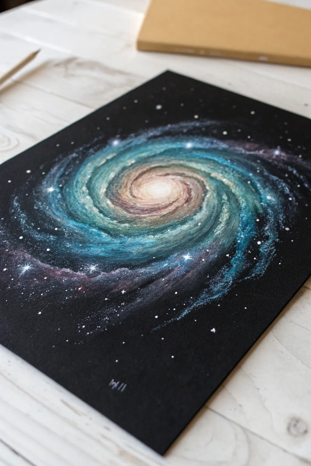
Capture the ethereal beauty of a spiral galaxy with this vibrant colored pencil project on black paper. The dark background makes the luminous blues, glowing whites, and dusty pinks pop with incredible intensity.
How-To Guide
Materials
- Black drawing paper or cardstock (heavyweight)
- White charcoal pencil or white pastel pencil
- Prismacolor Premier or similar soft-core colored pencils (White, Light Aqua, True Blue, Violet, Peach, Cream)
- Electric eraser or fine-point tomboy eraser
- Gelly Roll white gel pen (for stars)
- Blending stump or cotton swab
- Workable fixative (optional)
Step 1: Laying the Foundation
-
Establish the Core:
Begin in the visual center of your paper. Using white charcoal or a white pastel pencil, lightly sketch a small, flattened oval. This will be the bright, glowing nucleus of your galaxy. -
Draft the Spiral Arms:
From opposite ends of your central oval, lightly drag your white pencil outward in a curving motion. Imagine water swirling down a drain; create two to three main arms that wrap loosely around the center, fading as they reach the edges. -
Initial Coloring – The Glow:
Take a cream or very pale peach colored pencil. Heavy-handedly color the very center of the nucleus, pressing firmly to get opaque coverage. As you move slightly outward, ease up on the pressure to create a soft gradient. -
Adding the First Blue Tone:
Switch to a light aqua or teal pencil. Lightly shade over the white sketch lines of the spiral arms. Don’t worry about being neat; galaxies are made of gas and dust, so a fuzzy, textured edge is actually perfect here.
Starry Splatter Tip
For a natural star field, flick white acrylic paint or diluted gouache off an old toothbrush. Mask off the main galaxy first with a paper towel so you only get stars in the background.
Step 2: Building Depth and Color
-
Deepening the Blues:
Use a richer true blue or cerulean pencil to darken the spaces just *outside* the bright teal arms. This creates negative space within the spiral, defining the glowing arms against the black paper. -
Layering the Arms:
Go back into the spiral arms with your white pencil. Add streaks of brightness right down the middle of the teal sections. This layering technique—white, then color, then white again—is key for high contrast on black paper. -
Introducing Warmth:
Near the center core, blend a small amount of light pink or violet into the transition between the cream center and the first blue arm. This subtle temperature shift adds realism to the galactic structure. -
Creating Galactic Dust:
Using a violet or dark purple pencil, very lightly scribble in the dark gaps between the arms. You aren’t trying to cover the black paper entirely; just tint it slightly to suggest unseen nebulae. -
Softening the Edges:
Take a blending stump or cotton swab and gently smudge the outer edges of the spiral arms. You want the light to appear as if it is dissipating into the dark void of space.
Step 3: Details and Starlight
-
Texture with Stippling:
Using your sharpest white and light aqua pencils, add tiny dots (stippling) over the main arms. This mimic millions of individual stars clustered together. -
Highlighting the Core:
Return to the very center nucleus with your brightest white pencil. Press hard to create a blindingly white focal point that fades rapidly into the cream and peach tones surrounding it. -
Adding Distant Stars:
Scatter small white dots around the outer edges of the paper using a sharp white pencil. Vary the pressure so some stars look faint and distant while others appear closer. -
The Gel Pen Pop:
For the brightest stars, switch to a white gel pen. Place specific, intentional dots in the foreground—some overlaying the galaxy arms and some in the black space. -
Creating Diffraction Spikes:
Choose 3-5 of your largest gel pen stars. Carefully draw a tiny cross or ‘plus sign’ through them to create a twinkling starburst effect. -
Final Adjustments:
Step back and look at the overall contrast. If the black paper shows through too much in your bright arms, add another layer of light aqua to increase opacity.
Level Up: Color Shift
Make it a nebula cloud! Swap blues for magentas and oranges. Use the same technique of lighter centers and darker edges, but experiment with a warm ‘fire’ palette instead of cool blues.
Now you have a stunning piece of cosmic art that looks as though it’s glowing right off the page

Glowing Lightbulb Study
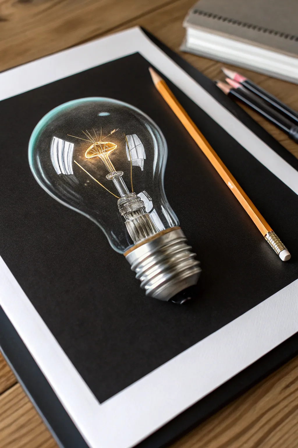
Capture the magic of illumination with this striking study of a lightbulb on black paper. The dark background naturally enhances the glow effect, making the filament pop with incredible warmth and brightness.
Step-by-Step
Materials
- Black drawing paper or cardstock (smooth or vellum finish)
- White colored pencil (wax or oil-based)
- Grey colored pencils (cool grey 10%, 30%, 50%, 70%)
- Warm yellow and orange colored pencils (lemon yellow, goldenrod, burnt ochre)
- Graphite pencil (H or HB) for initial sketch
- White gel pen (optional for brightest highlights)
- Kneaded eraser
- Pencil sharpener
Step 1: Drafting the Structure
-
Outline the shape:
Begin by lightly sketching the bulb’s contour using a white charcoal pencil or a very light pressure white colored pencil. Start with a circle for the main globe, then taper downwards into the neck and screw base. -
Map internal components:
Draw the central stem and the support wires inside the globe. Pay attention to perspective; since the bulb is lying flat, the internal glass stem will have distinct cylindrical distortion. -
Sketch the screw base:
lightly mark the horizontal ridges of the metal screw cap. Don’t worry about perfect metallic texture yet; just get the geometry of the threads correct. -
Define the filament:
Sketch the delicate coil of the filament connecting the support wires. This will be the focal point of the light, so position it carefully near the center of the globe.
Step 2: Creating the Glow
-
Ignite the filament:
With a bright lemon yellow pencil, trace the filament coil. Press firmly to establish a solid core of light. Layer a touch of white directly in the center of the wire to represent the hottest point. -
Radiate warmth:
Using a goldenrod or orange pencil, softly shade a hazy aura around the filament. Keep your strokes light and circular to create a diffuse glow that fades into the black paper. -
Illuminate the stem:
The glass stem holding the filament reflects the light. Use white and light yellow to draw sharp vertical highlights on the glass rod, leaving gaps of black to show transparency.
Smudgy paper?
Black paper shows oil from hands easily. Place a clean sheet of scrap paper under your drawing hand to prevent smudging your work or leaving handprints on the background.
Step 3: Glass and Reflections
-
Establish the rim:
Using a sharpened white pencil, draw the outer edge of the glass bulb. Vary your line weight—some areas should be crisp and bright, while others should be faint or broken to suggest roundness. -
Add major reflections:
Look for the large, distorted rectangular reflections on the left and right sides of the glass (often reflecting windows). Fill these shapes with white, applying heavy pressure for opacity. -
Detail the reflection gradients:
Inside those large white reflection shapes, feather the edges with a cool grey pencil. This softens the transition and makes the glass look polished rather than flat. -
Create ghosting effects:
I like to lightly graze the paper with a white pencil in empty areas of the glass to create a slight ‘milky’ look, indicative of the glass thickness, while keeping the center mostly black.
Add a Setting
Instead of a floating bulb, draw a faint cast shadow underneath using dark grey. This grounds the object, making it look like it’s resting on a surface.
Step 4: The Metallic Base
-
Base layer for metal:
Fill the metal screw threads with a mid-tone cool grey. Use curved strokes that follow the round form of cylinder. -
Add high contrast shine:
Using your white pencil, add intense, sharp highlights to the top ridges of each thread. Metal is defined by high contrast, so place these bright whites directly next to the dark paper. -
Deepen the shadows:
Use a dark grey or even a black pencil to reinforce the shadows between the threads. This pushes the ridges forward and deepens the grooves. -
Color reflection:
Add a tiny hint of your yellow pencil to the metal closest to the glass. The metal reflects the glowing filament above it. -
Final brighter highlights:
Review the entire drawing. Use a white gel pen or a freshly sharpened white pencil to add the tiniest, brightest sparkles on the glass and the hottest part of the filament.
Step back and admire how the contrast brings your lightbulb to life on the page
Goldfish In Deep Water
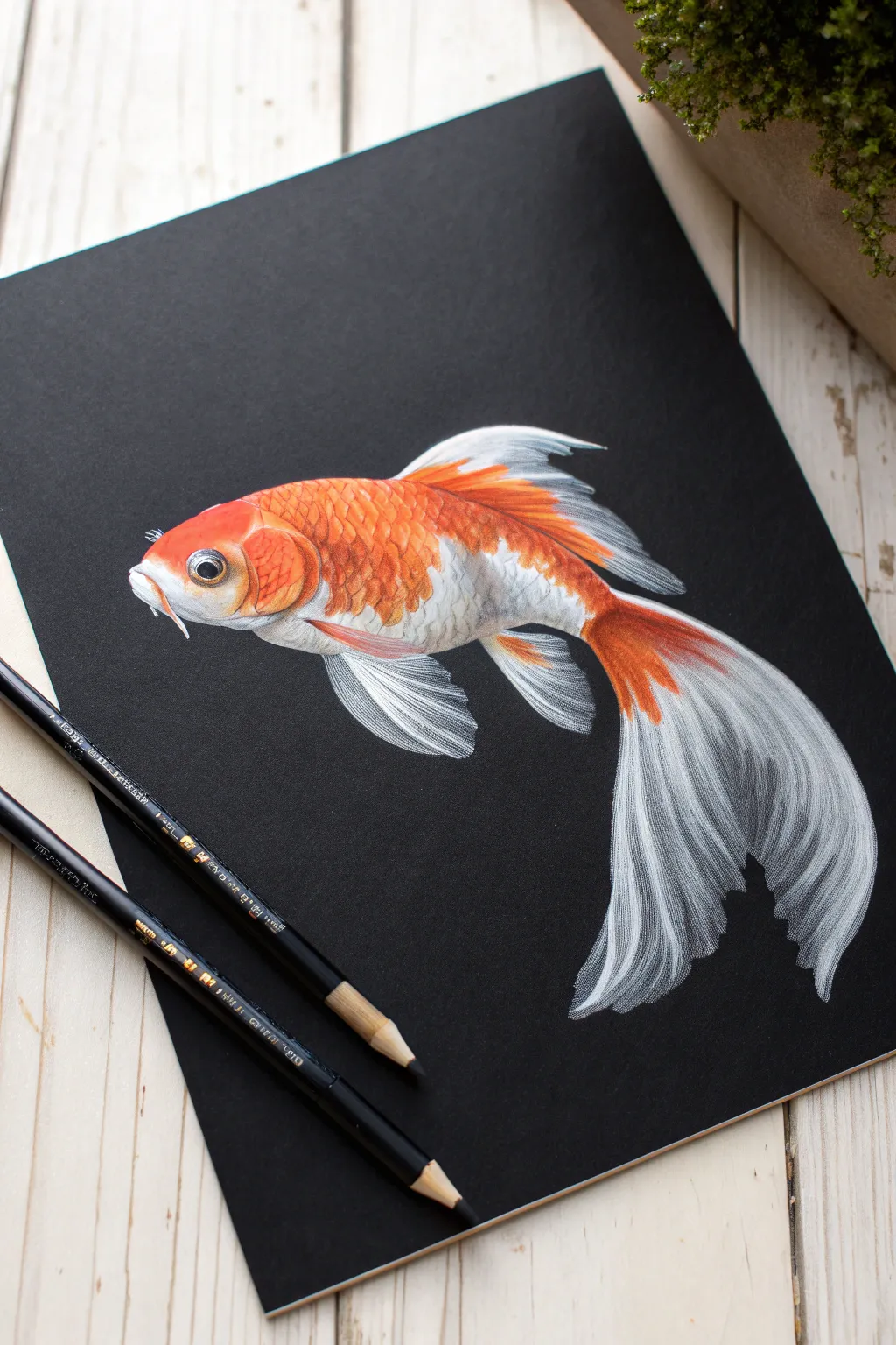
Capture the ethereal beauty of a goldfish glowing against a deep, dark background in this strikingly simple yet detailed colored pencil study. Working on black paper allows you to focus purely on the light and vibrancy of the fish, making the white translucent fins and orange scales pop with incredible intensity.
How-To Guide
Materials
- Black heavyweight drawing paper or cardstock (smooth or vellum finish)
- White Prismacolor Premier or similar opaque white colored pencil
- Orange, red-orange, and yellow colored pencils (e.g., Faber-Castell Polychromos)
- Light grey colored pencil for shading
- Pencil sharpener with a very sharp blade
- Graphite pencil (H or HB) for initial sketch
- Soft brush or drafting brush for sweeping away crumbs
Step 1: Sketching the Form
-
Outline lightly:
Begin by lightly sketching the outline of the goldfish using a white pencil or a hard graphite pencil. Keep your pressure extremely light so you don’t groove the paper or leave visible grey lines. Focus on the main oval shape of the body and the sweeping, flowy curves of the tail and fins. -
Refine the anatomy:
Define the eye placement, the gill curve, and the distinct separation between the head and the scaled body. Pay attention to how the dorsal fin rests on the back and how the pelvic fins tuck underneath.
Keep It Sharp
On black paper, dull pencils create fuzzy, blurry lines. Keep a sharpener handy and sharpen every few minutes, especially when drawing the fine, hair-like rays of the fins.
Step 2: Establishing the White Base
-
Map the lightest areas:
Using a sharp white colored pencil, start filling in the brightest white areas of the fish. This includes the lower belly, the face around the eye, and the tips of the fins. Use light, circular motions to build up opacity gradually rather than pressing hard immediately. -
Create the underlayer:
Apply a faint layer of white under where the orange scales will go. This ‘underpainting’ technique is crucial on black paper; without it, your orange pencils will look dull and muddy against the dark background. -
Detail the fins:
For the tail and fins, draw long, sweeping lines following the direction of the fin rays. Leave small gaps of black paper showing through these lines to create texture and transparency. The fins should look wispy, not solid blocks of color.
Step 3: Adding Vibrant Color
-
Apply the base orange:
Take a medium orange pencil and start coloring over the white base on the upper body. Use short, curved strokes to mimic the shape of individual scales. I find that layering the orange over the white immediately makes it glow. -
Deepen the hues:
Introduce a reddish-orange pencil to the top of the back and the darker areas of the head. Add this color to the base of the dorsal fin and the center of the tail where it connects to the body, blending it out towards the white tips. -
Add yellow highlights:
Use a bright yellow pencil to hit the top edges of the orange scales where the light would catch. This adds dimension and makes the fish look wet and shiny. -
Define the eye:
Draw the eye carefully. The pupil should remain purely black (the paper color). Outline the iris with a mix of gold and orange, and add a tiny, sharp dot of white for the reflection highlight to bring the fish to life.
Add Some Bubbles
To give the illusion of water movement, draw three or four tiny ascending bubbles above the fish using white circles with a small black center and a tiny highlight dot.
Step 4: Refining Texture and Details
-
Scale definition:
Sharpen your white pencil to a fine point. Go back over the orange body and lightly outline the bottom edge of individual scales. This ‘scalloped’ pattern creates the texture of the fish skin. -
Enhance the fins:
Return to the tail and fins with your sharp white pencil. Strengthen the brightest rays, pressing harder to make them opaque. Add very subtle touches of orange into the veins of the tail to connect it visually to the body. -
Shadowing:
Use a light grey pencil to add subtle shadows to the white belly area. Add shading underneath the pectoral fin (the side fin) to show that it is lifting away from the body. -
Whiskers and mouth:
Draw the small barbels (whiskers) near the mouth with a single confident stroke of white. Define the mouth shape with a touch of orange and dark grey. -
Final highlights:
Review your drawing for contrast. If the white parts look a bit grey, add a final heavy layer of white pigment. Ensure the black paper showing through the fin rays is clean and crisp. -
Clean up:
Use a clean brush to sweep away any pencil dust or crumbs. Avoid wiping with your hand, as this can smear the pigment into the black paper grain.
Step back and admire how the dark background transforms simple pencil strokes into a luminous underwater scene

PENCIL GUIDE
Understanding Pencil Grades from H to B
From first sketch to finished drawing — learn pencil grades, line control, and shading techniques.
Explore the Full Guide
Betta Fish Flowing Fins
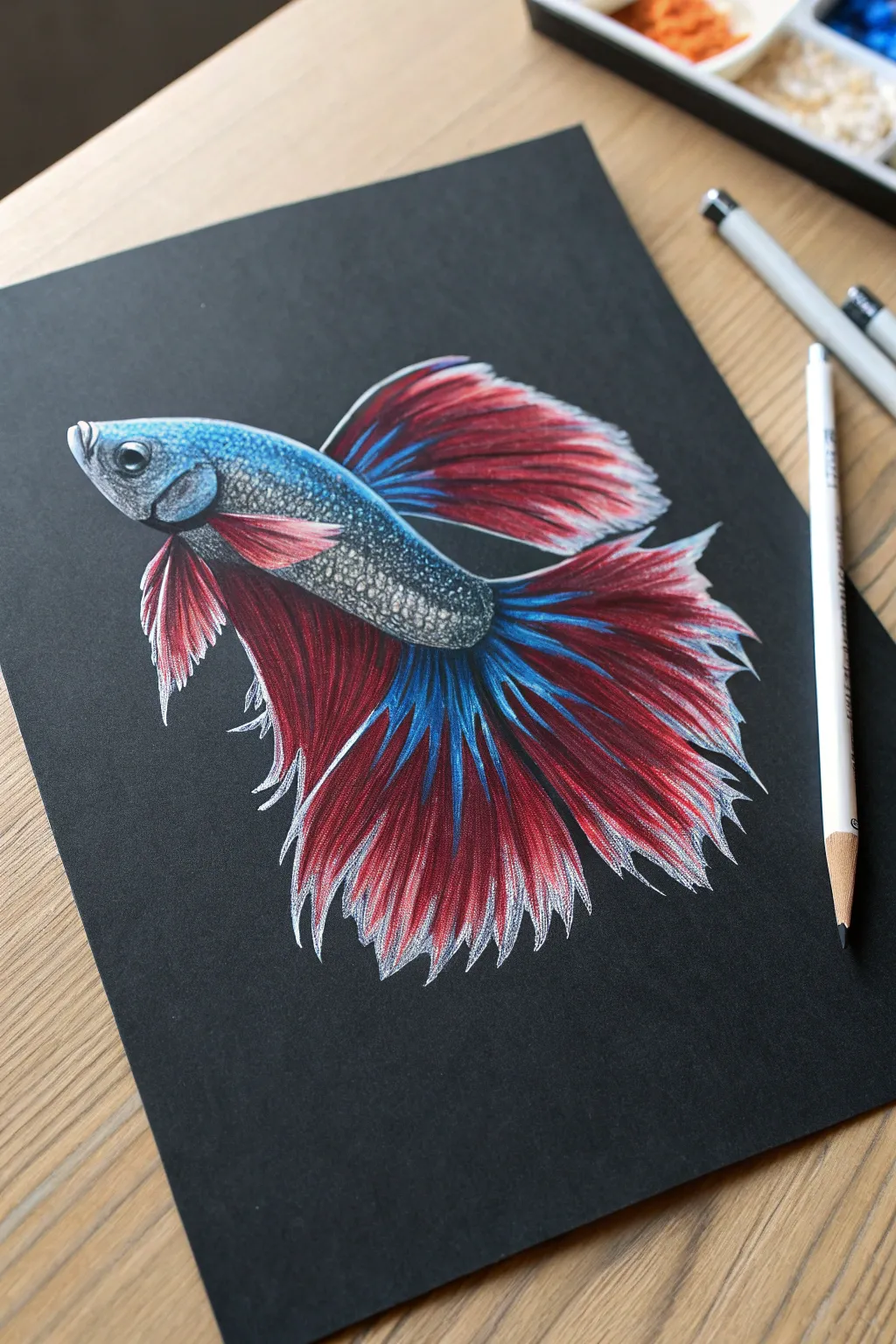
Capture the graceful movement and iridescent scales of a Siamese fighting fish emerging from the darkness. By using the black paper as your shadow tone, you’ll learn how to layer electric blues and deep reds to create a stunning, glowing effect that requires no background work.
Step-by-Step Tutorial
Materials
- Black drawing paper (heavyweight, vellum surface preferred)
- High-quality colored pencils (wax or oil-based for opacity)
- White gel pen (optional, for highlights)
- White or light grey colored pencil (for sketching)
- Pencil sharpener
- Soft eraser
Step 1: The Silent Skeleton
-
Light scaffolding:
Begin with a very light touch using a white or light grey pencil to outline the basic shape of the betta fish. Start with an elongated oval for the body and larger sweeping curves to indicate where the dorsal, caudal, and anal fins will flow. -
Refine the anatomy:
Sharpen your sketch by defining the curve of the mouth, the placement of the gill cover, and the large, round eye. Ensure the lines for the fin rays are loose and organic, mimicking twisting fabric. -
Mark color zones:
Before coloring, lightly map out where your color transitions will happen—where the blue metallic scales on the body stop and the red fins begin. This prevents you from overworking the dark paper later.
Keep it Sharp
For fine details like fin rays, I constantly rotate my pencil as I draw to maintain a sharp point. A dull point will crush the paper tooth and look fuzzy.
Step 2: Scales of Sapphire
-
Base layer blue:
Using a medium blue pencil, fill in the top half of the fish’s body. Use small, circular strokes to build coverage without flattening the tooth of the paper too quickly. -
Deepen the shadows:
Take a black or dark indigo pencil and darken the areas between the scales, particularly near the gill cover and the lower belly. This negative drawing technique makes the lighter scales pop. -
Metallic highlights:
Layer a bright, electric blue or teal over the top of the body. Press firmer here to burnish the pigment, making the scales look shiny and wet against the black background. -
The eye detail:
Fill the eye with black, leaving a tiny circle for a highlight. Add a rim of light blue around the pupil to give it depth and a lifelike glassiness.
Step 3: Flowing Crimson Fins
-
Establishing the red base:
For the fins, stroke outward from the body using a deep crimson or dark red. Follow the direction of the fin rays, lifting your pencil at the end of the stroke to create a feathered, tapered look. -
Adding the blue rays:
In the center of the tail and anal fins, introduce streaks of your electric blue. These should look like veins running through the red fin tissue. Let the blue fade into the red rather than stopping abruptly. -
Building opacity:
Go back over your red areas with a brighter, scarlet red. Leave some of the black paper showing through between the fin rays; this natural shadow adds incredible volume without extra work. -
Shadowing the folds:
Where the fins fold over themselves, use a dark purple or maroon pencil to deepen the shade. This suggests distinct layers of overlapping membrane.
Level Up: Ghostly Glow
Add a faint halo of white or pale blue powdered pastel around the outer edges of the fins to make the fish look like it’s glowing bioluminescently in deep water.
Step 4: Luminous Detail
-
Frosted tips:
The very edges of a betta’s fins often appear translucent or white. Use a white pencil to carefully outline the jagged ends of the fins, flicking the pencil inward toward the body to blend it slightly. -
Scale texture:
Return to the body and add tiny ‘C’ shaped strokes with white or light blue on individual scales to simulate reflected light. Focus this on the top ridge of the fish’s back. -
Final burnishing:
Check your brightest areas—the blue body and the white fin tips. Apply heavy pressure to fully saturate the paper, ensuring no black specks show through the pigment in these highlight zones. -
Clean up:
Use a small brush or a puff of air to blow away any pigment dust. Avoid wiping with your hand, which can smear the wax across the pristine black paper.
Enjoy the dramatic contrast of your swimming jewel as it shines against the void
Full Moon With Craters
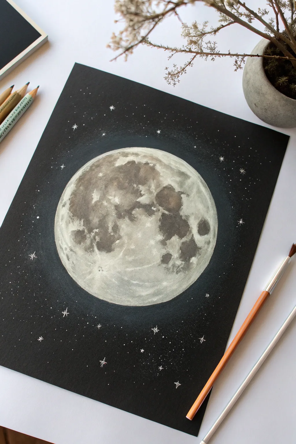
Capture the mesmerizing glow of a full moon against the deep void of space using the striking contrast of black paper. This project balances precise crater details with soft, atmospheric lighting to create a piece that looks ready to light up the night sky.
Detailed Instructions
Materials
- Black drawing paper or cardstock (smooth or slightly textured)
- White colored pencil (wax or oil-based for opacity)
- Grey colored pencils (warm grey and cool grey shades)
- Soft white pastel pencil or white charcoal (optional, for intense highlights)
- Compass or circular object for tracing
- White gel pen (for bright stars)
- Blending stump or cotton swab
- Soft brush (for sweeping away eraser crumbs)
Step 1: Setting the Stage
-
Trace the shape:
Begin by lightly tracing a perfect circle onto the center of your black paper using a compass or a circular object like a bowl. Use a grey pencil rather than white so the outline isn’t too stark. -
Map the maria:
Lightly sketch the shapes of the lunar ‘maria’—the dark, basaltic plains on the moon surface. These are the darker splotches that form the ‘man in the moon’ face; look at a reference photo or the image provided to get the general placement right. -
Establish the base layer:
With a white colored pencil, gently shade the entire moon surface, avoiding the dark maria shapes you just mapped out. Keep this layer translucent and wispy; you want the black paper to show through slightly to create depth.
Moon Mapping
Don’t stress about perfect crater placement. Focus on the main dark patches (maria) first. If those shapes are roughly correct, the moon will immediately look recognizable.
Step 2: Building Lunar Texture
-
Deepen the darks:
Using a dark grey or even a black pencil, gently define the edges of the maria. You don’t need to color them in filled-black, but rather smudge the edges to make them soft and organic. -
Layering mid-tones:
Take a medium grey pencil and start shading inside the maria areas, but leave some spots darker than others. This variation creates the illusion of uneven terrain. -
Brightening the highlands:
Switch back to your white pencil. Pressing slightly harder now, brighten the ‘highlands’—the areas between the dark patches. Use a stippling or small circular motion to mimic the rough, rocky texture of the surface. -
Adding distinct craters:
Identify a few major craters, like the Tycho crater (the bright spot with rays at the bottom). Draw a small intricate white circle, then add a tiny shadow inside distinct craters with dark grey to give them separate dimension. -
Creating ejecta rays:
From your major bright craters, draw faint white lines radiating outward. These represent the ‘ejecta rays’ or debris trails. I find that quick, confident flicks of the pencil work best here for a natural look.
Level Up: Color Tinting
Add subtle realism by lightly layering very pale blue or ochre over specific grey areas. The moon isn’t perfectly monochrome; these hints of color add professional depth.
Step 3: Refining and Glowing
-
Soft blending:
Use a blending stump or circular motions with a dry cotton swab to soften the transitions between the grey maria and white highlands. The moon shouldn’t look like a paint-by-number; the zones should flow into each other. -
Boosting contrast:
Go over the brightest brights one last time with a heavy hand using your white pencil or a white pastel pencil. Focus on the rims of craters and the very edge of the moon sphere. -
The atmospheric glow:
To make the moon glow, lightly shade just outside the circle’s edge onto the black background using the side of your white pencil. Fade this halo out gently into the darkness. -
Smudging the halo:
Take your finger or a clean tissue and smudge that outer halo ring outward. This creates a soft, hazy light effect that separates the moon from the harsh black background.
Step 4: The Starry Backdrop
-
Distant star field:
Using a sharpened white pencil, dot the background randomly. Vary your pressure to create faint, distant stars versus closer, brighter ones. -
Star clusters:
Concentrate a few tiny dots in loose groups. Space is rarely perfectly uniform, so clustering adds realism. -
Adding the twinkle:
For the brightest stars, switch to a white gel pen. Place distinct dots over your pencil marks for intense brightness. -
Drawing starbursts:
Select 5 to 7 larger stars and turn them into ‘glints.’ Draw a small cross or four-pointed star shape with the gel pen to simulate light diffraction. -
Final clean up:
Check for any stray pencil dust on the black background and blow it away or lightly sweep it with a soft brush.
Step back and admire how the stark contrast brings your celestial object to life
BRUSH GUIDE
The Right Brush for Every Stroke
From clean lines to bold texture — master brush choice, stroke control, and essential techniques.
Explore the Full Guide
Splash And Droplet Freeze-Frame
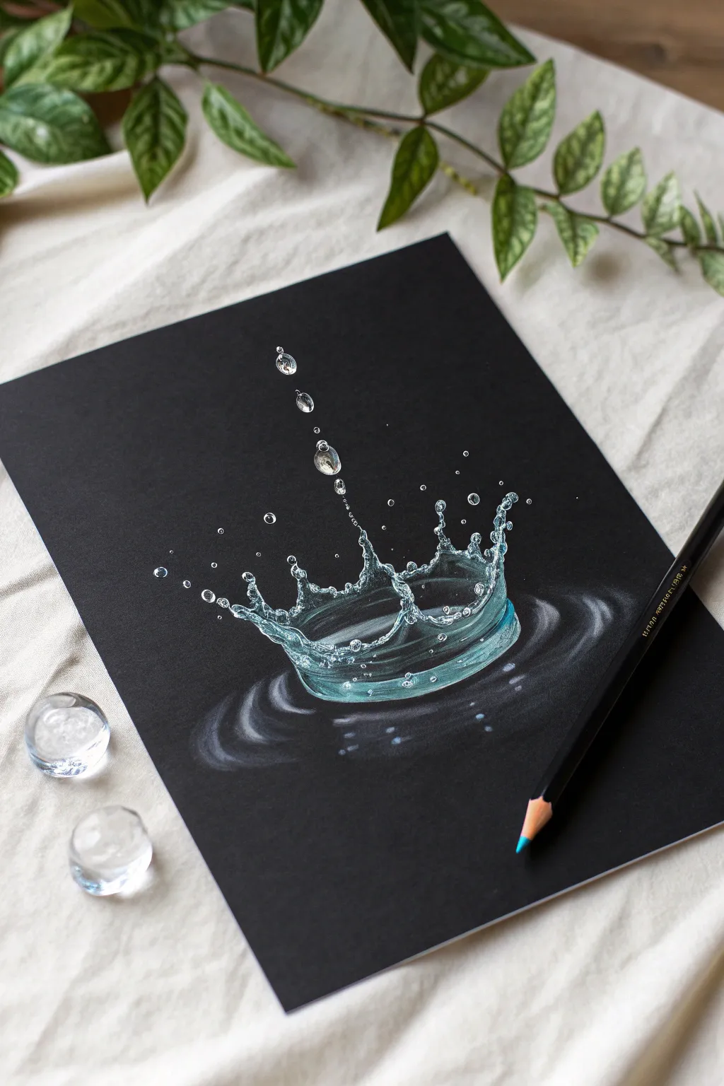
Capture the momentary beauty of a water crown splash with this striking colored pencil study. Using black paper as your base instantly provides contrast, allowing white and turquoise highlights to pop with liquid realism.
Detailed Instructions
Materials
- Black drawing paper or cardstock (smooth texture is best)
- White colored pencil (wax-based preferred for opacity)
- Light blue/turquoise colored pencil
- Dark blue/teal colored pencil
- White gel pen (optional, for ultra-bright highlights)
- Pencil sharpener
- Eraser (kneaded eraser works well)
- Reference photo of a water splash
Step 1: Sketching the Structure
-
Light Outline:
Begin by lightly sketching the outline of the splash shape using your white pencil. Press very gently so the lines are barely visible. Draw an oval for the base of the splash and extend jagged, crown-like spikes upward. -
Locate Droplets:
Map out where the suspended water droplets will hover. Place a few directly above the center spike to suggest a vertical drip path, and scatter smaller dots around the crown’s tips. -
Refine the Crown:
Go back over your crown shape and refine the curves. Water is fluid, so avoid perfectly straight lines; think in terms of stretched curves and little bulbs at the tips of the splashes.
Step 2: Establishing Transparency
-
Base Highlights:
Using the white pencil, start shading the tops of the rim and the tips of the splash. Keep your pressure medium-light. Water reflects light, so the brightest parts will be where the light hits directly. -
Adding Color:
Introduce the light blue or turquoise pencil. Shade the lower sections of the water crown walls. Because water is transparent, you want to leave significant areas of black paper showing through to represent the dark background seen through the water. -
The Water Line:
Draw the elliptical rings at the base where the splash meets the surface. Use soft, horizontal strokes that fade out at the edges to create a ripple effect. -
Layering Blues:
Blend a slightly darker blue or teal into the bottom curve of the splash ‘bowl’ to give it weight and depth. This shadow helps anchor the form.
Chalky or Dull?
If the white pencil looks dull on the black paper, you likely need a pencil with higher pigment content. Try a wax-based pencil specifically designed for opacity or layer it twice.
Step 3: Creating the Glassy Texture
-
Defining Edges:
Sharpen your white pencil to a fine point. Firmly trace the very top edges of the water walls and the droplets. This crisp line work is crucial for making the drawing look wet rather than smoky. -
Internal Reflections:
Inside the splash body, draw small, distorted shapes—little ovals, squiggles, and lines. These represent light refracting through the liquid. -
Highlighting Droplets:
For the hovering droplets, outline them in white, leaving the center mostly black. Add a tiny, hard dot of white on the top-left (or direction of light) and a small blue crescent on the bottom-right relative to the light. -
Ripple Reflections:
Enhance the ripples on the ‘water surface’ below. Add stronger white curved lines closest to the splash base, letting them become fainter as they move outward.
Keep it Sharp
Water requires crisp edges to look wet. Keep your pencil sharpener handy and use it every few minutes. A dull tip will make the water look like smoke or mist.
Step 4: Final Details
-
Contrasting Shadows:
Evaluate your drawing. If you’ve covered too much black, you might lose the transparency effect. Darken any areas that need it by carefully coloring over the blue with a black pencil or simply leaving the paper bare. -
The Brightest Whites:
Identify the absolute highlights—usually the tips of the splash spikes and the center of the ripples. Apply heavy pressure with your white pencil here. -
Gel Pen Pop:
If you have a white gel pen, I find it incredibly effective to place tiny dots on the very tips of the splashing droplets and the brightest refraction points. This mimics the intense specular highlight of flash photography. -
Softening the Ripples:
Use a clean finger or a cotton swab to gently smudge the outer edges of the surface ripples. This creates a motion blur effect, contrasting nicely with the sharp, frozen splash. -
Clean Up:
Inspect the black background for any wayward pencil dust. Clean it up with a kneaded eraser to ensure the darkness remains deep and immaculate.
Step back and admire the crystal-clear moment you have captured on the page
Night Skyline With Reflections
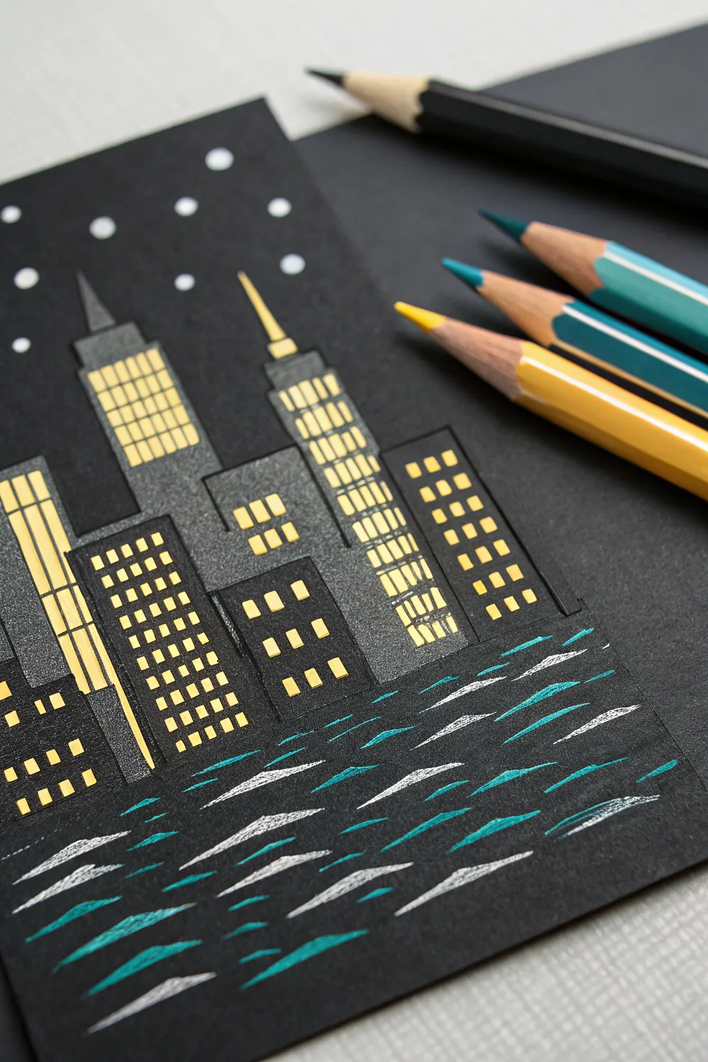
Capture the magic of a bustling metropolis after dark with this striking black paper project. Using the contrast of dark cardstock against vibrant yellows and cool teals creates an illuminated effect that makes the windows and water truly pop.
How-To Guide
Materials
- Black cardstock or heavy black mixed-media paper
- Ruler or straight edge
- Graphite pencil (hard, like 2H or 4H)
- Yellow colored pencil (opaque/creamy texture preferred)
- Teal or turquoise colored pencil
- White colored pencil or white gel pen
- Slate grey colored pencil
- Pencil sharpener
Step 1: Drafting the Skyline
-
Set the horizon:
Begin by deciding where your water line will be. Use your ruler to lightly mark a horizontal line across the lower third of your black paper with a hard graphite pencil. Keep this line very faint so it doesn’t show later. -
Map out the rectangles:
Using your ruler, draw vertical rectangles of varying heights and widths resting on the horizon line. These will be your buildings. Vary the spacing—cluster some together and leave others slightly apart to create depth. -
Add architectural details:
Give your skyline character by adding toppers to the buildings. Draw small triangles for spires, tiered rectangles for setbacks on skyscrapers, or simple flat roofs for smaller blocks. -
Grid the windows:
Lightly sketch grid lines inside each building shape to guide where your windows will go. You don’t need to draw every individual square yet, just vertical and horizontal guides to keep things straight.
Step 2: Illuminating the City
-
Fill the grey facades:
Select a slate grey pencil. Gently shade the background of the buildings, avoiding the areas where the yellow windows will go if possible, or shade lightly enough that yellow can cover it. This separates the buildings from the pitch-black sky. -
Light the first windows:
Take your sharp yellow pencil and begin filling in small square or rectangular windows. Press firmly to get opaque coverage. The bright yellow against the black paper is what creates the ‘lit up’ illusion. -
Vary the window patterns:
Don’t just make uniform grids. On some buildings, draw vertical stripes of yellow to suggest floor-to-ceiling glass. On others, use small dots or horizontal dashes. Leave some ‘rooms’ dark (black) to make it look realistic. -
Highlight the spires:
Use the yellow pencil to outline the decorative tops of the buildings or add a beacon light at the very tip of the tallest spire. -
Sharpen edges:
Go back with a black pencil or fine liner if needed to crisp up the edges between the yellow windows and the grey building structures so everything looks geometric and tidy.
Sharpness is Key
Keep your yellow pencil extremely sharp. Blunt tips will make the windows look fuzzy. A crisp, square edge is essential for that architectural look.
Step 3: Creating the Reflections
-
Start the teal ripples:
Switch to your teal or turquoise pencil. Below the horizon line, draw horizontal, elongated dashes. These should be wider near the bottom of the page and narrower/shorter as they get closer to the city. -
Establish a rhythm:
Group your teal strokes in a slightly staggered pattern. Imagine the water is gently moving, breaking up the reflection. -
Add white highlights:
In between the teal strokes, add sharp, thin dashes of white colored pencil. This mimics the moonlight or city lights catching the crests of the waves. -
Check the density:
Ensure the water area is mostly black paper with these floating strokes; don’t color it in solid. The darkness is crucial for the water effect.
Make it shimmer
Use a metallic silver or gold pencil for the greys of the buildings or the water reflections to add a subtle glint when the paper catches the light.
Step 4: Final Atmosphere
-
Dot the stars:
In the sky area above the buildings, add small, circular dots using your white pencil. I like to vary the pressure here—some bright and distinct, others faint and distant. -
Vary star sizes:
Make a few stars slightly larger than the others to create a sense of depth in the galaxy above the city. -
Clean up:
Use a clean eraser to remove any visible graphite guidelines that weren’t covered by colored pencil, being careful not to smudge your bright yellow windows.
Step back and admire how the simple contrast creates a vibrant cityscape right on your page


Aurora Over Dark Pines
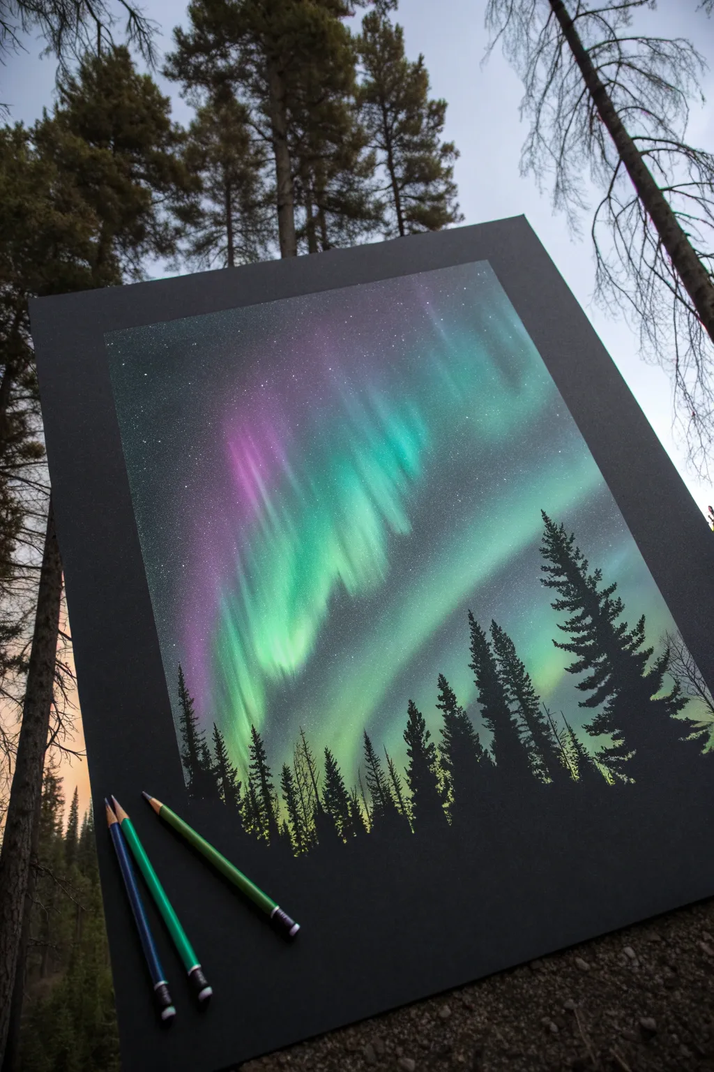
Capture the magic of an aurora borealis dancing across the night sky using the vibrant contrast of colored pencils on black paper. This project relies on soft blending and distinct silhouettes to create a luminous, ethereal effect against the dark background.
Detailed Instructions
Materials
- High-quality black artist paper or cardstock
- Soft core colored pencils (White, Light Blue, Teal, Emerald Green, Magenta/Purple)
- Black colored pencil or black marker (for touch-ups)
- Blending stump or cotton swab
- White gel pen (optional, for stars)
- Fixative spray (optional)
Step 1: Setting the Sky
-
Define the Horizon:
Lightly sketch a low horizon line about one-quarter of the way up from the bottom of your black paper. This area will eventually remain dark for the trees, so keep it free of heavy color. -
Base Glow:
Using a teal or light green pencil, start applying color in the sky area. Use the side of the pencil lead rather than the tip to create soft, wide strokes. Apply this base layer gently; you want a faint glow, not a solid block of color yet. -
Create Curtains:
Identify where you want your main aurora ‘curtains’ to fall. Strengthen the pressure in vertical swathes, pulling the color upwards from the middle of the sky towards the top edges. Vary the height of these strokes to mimic the natural waviness of the lights.
Boost the Glow
For an intensely bright center, lay down a base of white pencil first, then color your neon greens and teals directly on top of it. This prevents the black paper from absorbing the vibrancy.
Step 2: Building Intensity
-
Layering Greens:
Go over your teal base with a brighter emerald green. Focus this color in the center of your light curtains to create a core of brightness. Leave the edges softer and more diffused. -
Adding Contrast:
Introduce a deep magenta or purple pencil. Apply this color primarily on the left side or upper edges of the green curtains. The interaction between the purple and black paper creates a lovely deep atmospheric tone. -
Blending the Sky:
Take a white colored pencil and lightly glaze over the brightest parts of the green and teal sections. This acts as a blender, smoothing the grain of the paper and making the colors pop against the black darkness. -
Smooth Transitions:
Use a blending stump or a clean cotton swab to gently rub the colored areas. Work in circular motions to soften any harsh pencil strokes, pushing the pigment into the paper’s tooth for a misty/fog-like appearance. -
Highlighting Beams:
With a sharp white or very pale blue pencil, draw distinct vertical streaks within the colored bands. These represent the defined rays of light often seen in active auroras. These lines should be sharpest at the bottom and fade out as they go up.
Fixing Muddy Colors
If blending with purple and green creates a muddy grey, stop blending them directly. Let the black paper serve as the buffer zone between contrasting colors or use white as a neutral barrier.
Step 3: The Starry Night
-
Speckling Stars:
There are two ways to do this: either tap a sharp white pencil firmly to make small dots, or gently flick a toothbrush loaded with white gouache or acrylic measurement for a random spray. Ensure the stars are visible in the dark areas of the sky, not just the bright aurora. -
Varied Sizes:
Make a few stars slightly larger and brighter than the rest to create depth in your galaxy. I usually place these in the darkest corners of the composition for maximum contrast.
Step 4: Forest Silhouette
-
Tree Outlines:
Using a sharp black pencil (or a fine black marker for absolute darkness), begin sketching the vertical lines for the tree trunks along the bottom horizon. Vary their heights—make the trees on the right side significantly taller to frame the composition. -
Texture the Pines:
Start near the top of a trunk and use a zig-zag motion to create pine branches. Keep the top branches narrow and widen your strokes as you move down the tree. -
Filling the Forest:
Continue filling in the trees, ensuring they overlap. The density at the bottom should be solid black, completely obscuring the paper. Use the black pencil to color over any aurora haze that might have drifted into the tree line area. -
Detailing Tops:
Pay special attention to the very tops of the trees. Use a very sharp point to give them distinct, delicate tips that stand out clearly against the glowing green background. -
Final Contrast Check:
Step back and look at the image. If the aurora doesn’t look bright enough behind the trees, carefully add a little more white or light green between the tree tops to enhance the ‘backlit’ effect.
Frame your piece with a wide black mat to let the colors truly shine in the darkness
Campfire Sparks In Darkness
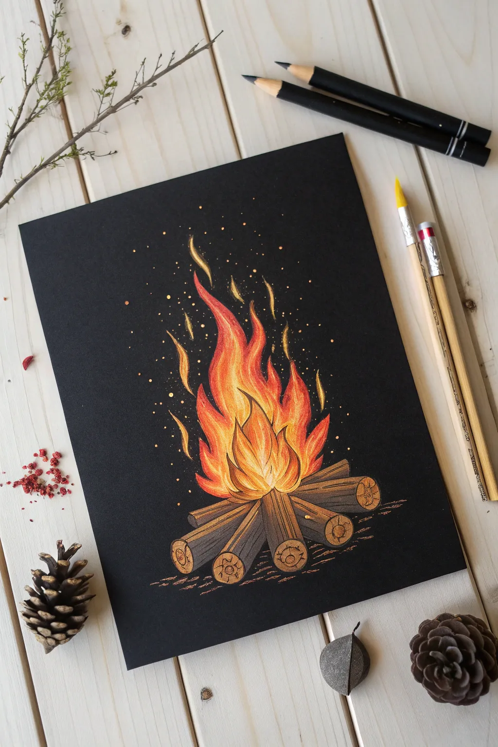
Capture the warmth and coziness of a crackling fire using the vibrant contrast of colored pencils on black paper. This project focuses on building up layers of light to make the flames appear to dance right off the page.
How-To Guide
Materials
- Black drawing paper or cardstock (smooth or vellum bristol)
- White colored pencil (for sketching and base layers)
- Yellow colored pencil (bright lemon and golden)
- Orange colored pencil (cadmium or pumpkin)
- Red colored pencil (scarlet or deep red)
- Brown colored pencils (dark umber, sienna)
- Pencil sharpener
- Soft eraser
Step 1: Sketching the Base
-
Outline the campfire structure:
Using a white colored pencil with a very light touch, gently sketch the layout of the logs at the bottom. Draw roughly five cylinder shapes arranged in a teepee or star formation. -
Draft the flame shape:
Lightly sketch the general shape of the fire rising from the center of the logs. Use flowing, wavy lines that taper into sharp points at the top to mimic flickering movement. -
Define log details:
Refine the shapes of the logs, adding circles at the ends to represent the cut wood. Sketch simple lines along the length of each log to indicate bark texture.
Keep it Sharp
A very sharp pencil is essential for black paper. Dull tips smudge the wax binder into the paper tooth too much, making colors look muddy instead of vibrant.
Step 2: Igniting the Flames
-
Base layer of white:
Fill in the sketched flame area with white pencil. Press moderately hard in the center (the hottest part) and fade out slightly towards the tips. This white underlayer is crucial for making the colors pop against the black paper. -
Apply the yellow heart:
Over the white base, apply a vibrant yellow pencil primarily in the lower center of the fire and the core of the larger flames. Blend it smoothly into the white. -
Transition to orange:
Layer orange pencil around the yellow sections and move upward into the middle of the flame tendrils. Use upward strokes to follow the direction of the fire. -
Add red tips:
Use your red pencil to color the very tips of the flames and the outer edges. Feather the red down into the orange to create a seamless gradient from hot center to cooler edges. -
Intensify the contrast:
Go back with your yellow and white pencils to re-highlight the brightest spots in the center. I find getting this core blindingly bright really sells the illusion of light. -
Create detached flames:
Draw small, detached wisps of flame floating above the main fire using yellow and orange. These should look like little commas or S-curves.
Step 3: Rendering the Wood
-
Base color for logs:
Color the logs using a medium brown pencil. Ensure you don’t press too hard yet, as you want the black paper to show through slightly to create shadow and texture. -
Detail the bark:
Use a dark umber or black pencil to draw definitive lines along the logs for bark striations. Darken the undersides of the logs where shadows would naturally fall. -
Highlight the grain:
On the circular ends of the logs, draw concentric rings or spirals with a lighter tan or yellow-brown pencil to simulate wood rings. Add small cracks for realism. -
Add reflected light:
This step brings the picture together: Use your orange and yellow pencils to lightly glaze the tops and inner edges of the logs. This simulates the fire casting a warm glow on the wood.
Make it Magical
For a magical touch, add tiny hints of blue or purple to the very bottom edges of the logs significantly darkening the shadows and making the fire feel hotter.
Step 4: Atmosphere and Sparks
-
Ground the fire:
Sketch rough, horizontal hatching lines beneath the logs using brown and faint orange to suggest the ground reflecting the firelight. -
Add primary sparks:
Press the tip of your yellow pencil firmly to create small, deliberate dots rising from the fire. Concentrate them closer to the flames and spread them out as they go higher. -
Add secondary sparks:
Use an orange pencil to add smaller, fainter dots further out. Varying the size and pressure of these dots adds depth to the rising embers. -
Final highlights:
Do one last pass with your sharpest white pencil to add tiny, intense highlights to the very center of the fire and the topmost edges of the lit logs.
Step back and admire how the colors seem to burn brightly against the dark background.
Fireflies In Tall Grass
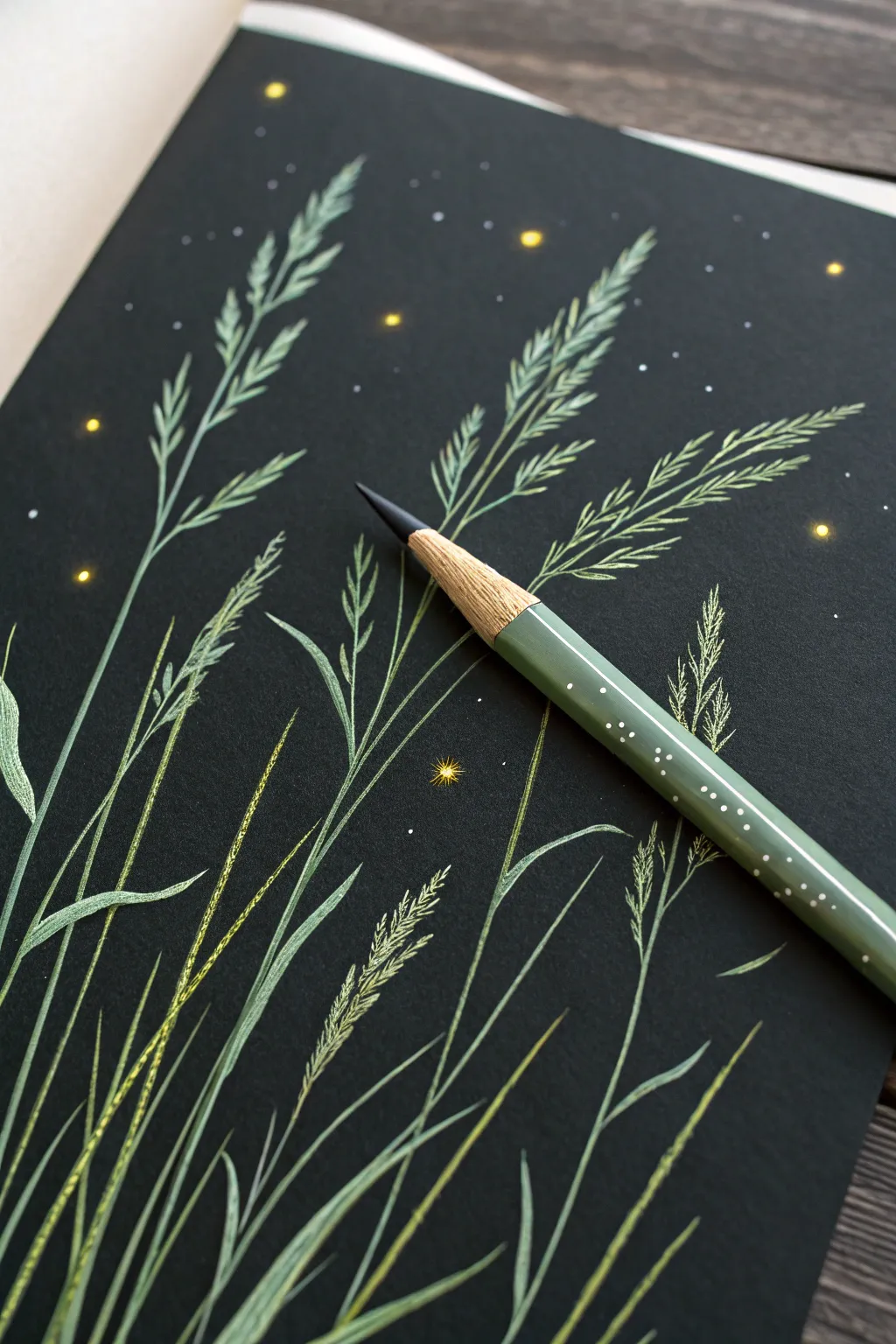
Capture the serene magic of a summer evening with this striking botanical illustration. Using the high contrast of black paper, you’ll learn to make simple grasses and glowing fireflies pop with vibrancy.
Step-by-Step
Materials
- Black drawing paper or cardstock (heavyweight)
- Colored pencils (Sage Green, Olive Green, Pale Yellow, Bright Yellow, White)
- Pencil sharpener
- Eraser (kneaded preferred)
Step 1: Setting the Scene
-
Plan your composition:
Visualize where your tallest grass blades will go. They should sweep diagonally across the page, mostly originating from the bottom left corner and reaching toward the top right to create a natural flow. -
Lightly sketch the main stems:
Using your Sage Green pencil with very light pressure, draw the primary lines for your grass stems. Keep these lines swift and slightly curved to mimic the bending of grass in a gentle breeze. -
Add secondary shoots:
From the base, sketch in shorter, secondary blades of grass that fill out the bottom left area. Vary the angles slightly so they don’t look like stiff soldiers.
Sharpen Often
Black paper eats up pencil pigment! Keep a sharpener handy and use it every few minutes. A needle-sharp point is crucial for those delicate grass tips.
Step 2: Building the Grasses
-
Define the stems:
Go back over your initial stem lines with the Sage Green, pressing slightly harder this time to establish a solid base color. Taper the lines so they are thicker at the bottom and whisper-thin at the tip. -
Create the seed heads:
At the top of your tallest stems, start drawing the seed heads. Use short, upward-angled dashes that branch off the main stem in an alternating pattern, resembling wheat or tall fescue. -
Layer with Olive Green:
Take your Olive Green pencil and trace along the shadowed side of the stems (pick a consistent side, like the right side) to add depth. Add a few darker blades low in the clump to create density. -
Highlight the blades:
Sharpen your White pencil to a fine point. Gently glaze over the lighted side of the grass blades (the left side) to make them stand out against the black background. Use a very light touch here; you want a tint, not a stark white line. -
Detail the seed textures:
Return to the seed heads at the top. Add tiny V-shapes or individual grains using the Pale Yellow pencil mixed with Sage Green. This suggests the texture of dried grasses caught in the moonlight. -
Refine the edges:
Look for areas where the grass blades overlap. Ensure the blade in front is clearly defined by adding a touch more highlight to its edge, separating it from the one behind.
Step 3: Adding the Bioluminescence
-
Position the fireflies:
Identify 5-7 spots around the upper half of the paper for your main fireflies. Place them randomly—some near the grass, others floating in the open black space. -
Draw the main glow:
With the Bright Yellow pencil, press firmly to draw small, solid circles at your chosen spots. These are the centers of the light. -
Create the diffuse halo:
Using the Pale Yellow pencil, color very softly in a blurry circle around the bright yellow centers. This creates the ‘glow’ effect around the insect. -
Add distant stars:
Take your White pencil and dot the background with tiny specks. Vary the pressure—some should be bright points, others just faint suggestions of stars in the distance. -
Enhance the sparkle:
Select one or two of the largest fireflies and draw tiny, radiating lines or a small ‘starburst’ shape using the White pencil to imply a twinkle. -
Final highlights:
Where a firefly is close to a blade of grass, add a touch of Bright Yellow to the grass itself. This reflection grounds the light source and makes the scene interactive.
Level Up: Dew Drops
Use a white gel pen to add tiny, precise dots on the grass blades. It creates a wet, morning-dew look that contrasts beautifully with the dry colored pencil texture.
Step back and admire how the dark background makes your illuminated meadow scene truly shine
Iridescent Butterfly Wings
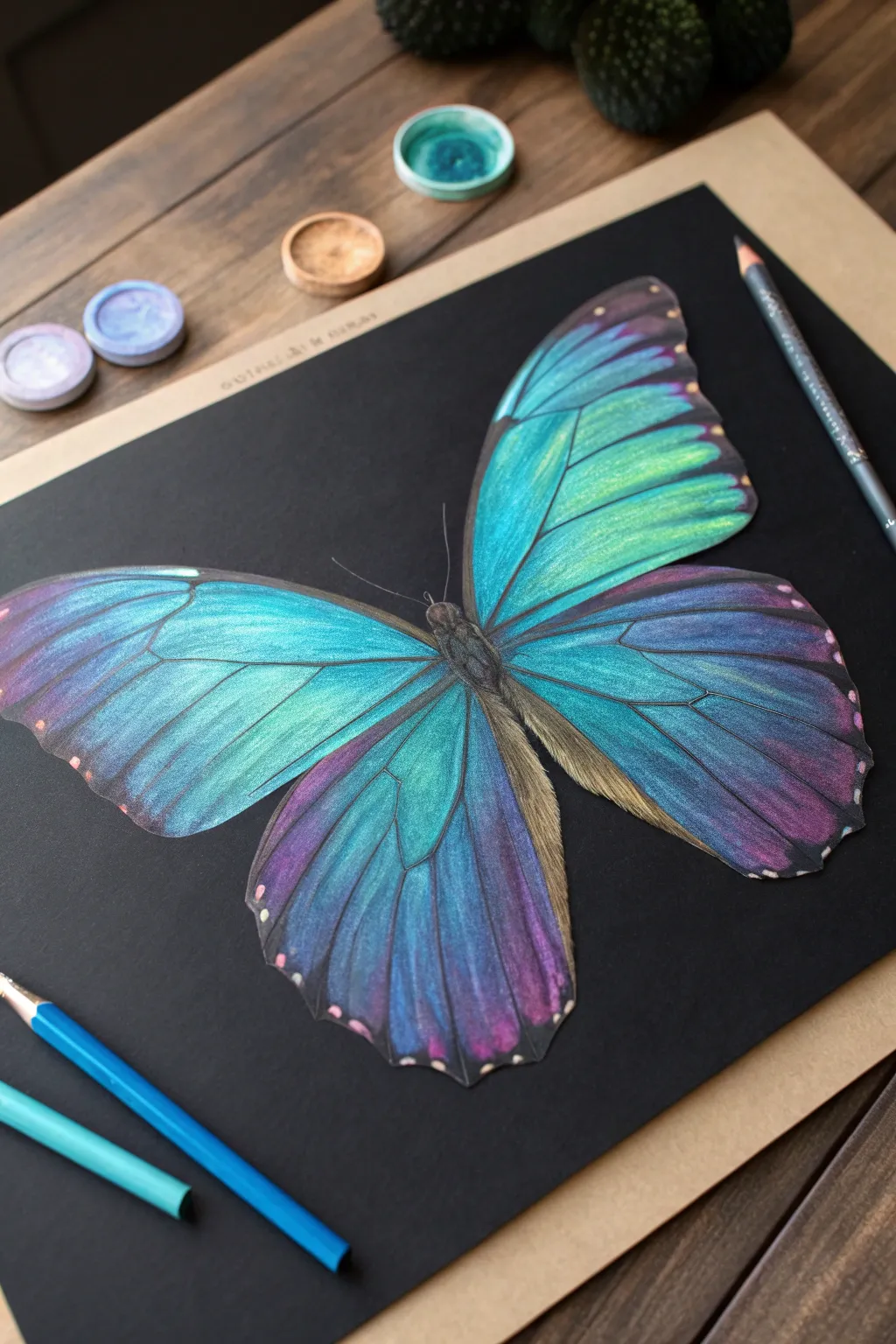
Capture the ethereal beauty of a butterfly using vibrant colored pencils on deep black paper. The dark background makes the teal, purple, and azure gradients pop with an almost glowing, metallic intensity.
Step-by-Step Guide
Materials
- Black drawing paper or cardstock (smooth or vellum finish)
- High-quality colored pencils (waxy or oil-based)
- Iridescent or metallic colored pencils (teal, purple, silver)
- White or light grey pencil for sketching
- Paper blending stump or cotton swab
- Pencil sharpener
- Reference photo of a Morpho butterfly
Step 1: Planning the Structure
-
Mark the center:
Begin by lightly finding the center of your black paper. Use a white or very light grey pencil to draw a faint vertical line that will serve as the body’s axis. -
Outline the wings:
Sketch the basic triangular shapes of the upper and lower wings. Keep your pressure extremely light so the graphite doesn’t indent the paper or become impossible to cover later. -
Refine the edges:
Go over your outline to add the scalloped edges typical of butterfly wings. Ensure the two sides are roughly symmetrical, though organic variations are natural. -
Draw the veins:
Lightly map out the main vein structure radiating from the body outward. These lines will guide your color gradients and gradients later.
Use a white underlayer
For super vibrant colors on black paper, lay down a layer of white pencil first, then color over it with your bright teals and purples.
Step 2: Layering the Base Colors
-
Start with the teals:
Select a bright turquoise or aqua pencil. Begin filling in the upper wings near the body, applying pigment in the direction of the veins. -
Introduce purples:
On the lower wings and the outer edges of the upper wings, lay down a base of violet or deep purple. Overlap this slightly with your teal areas. -
Build saturation:
Go back over your initial layers with firmer pressure. The black paper absorbs a lot of light, so you need heavy pigment application to make the colors stand out. -
Create the fade:
As you move toward the outer edges of the wings, let your pressure lighten slightly to allow the black paper to show through, creating a natural vignette effect.
Paper tooth issues
If the pencil stops sticking, you’ve burnished the paper too smooth. Lightly dab rubbing alcohol with a brush to break the wax seal.
Step 3: Creating Iridescence and Detail
-
Add metallic highlights:
Take a metallic blue or pearlescent white pencil and stroke it over the brightest parts of the teal sections. This mimics the structural coloration of real butterfly wings. -
Define the veins:
Sharpen a black or very dark indigo pencil to a fine point. Carefully re-trace the vein lines you sketched earlier, making them crisp against the colored background. -
Blend the transitions:
Where the teal meets the purple, use a clean blending stump or a light blue pencil to smooth the transition. I find barely touching the paper creates the smoothest gradients here. -
Whiten the spots:
Along the outer scalloped edges, add small, distinct dots using a bright white or light pink pencil. Press hard to ensure they are opaque. -
Detail the body:
Fill in the central body with dark browns and charcoal greys. Use short, flicking strokes to simulate a fuzzy, hairy texture.
Step 4: Final Touches
-
Deepen contrasts:
Identify areas that look flat and add a touch of black pencil to the shadows between veins to increase the 3D effect. -
Polish the brightest spots:
Do a final pass with your brightest metallic or neon blue pencil on the upper wing sections for maximum glow. -
Clean up:
Use a kneaded eraser to gently lift any stray pigment dust from the black background, keeping the negative space pure and dark.
Frame your glowing masterpiece or gift it to a nature lover to brighten their day
Black Cat With Rim Light
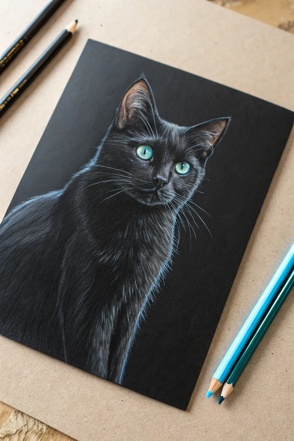
Capturing the sleek beauty of a black cat is best done on black paper, where the darkness does the heavy lifting for you. By focusing purely on the highlights and rim lighting, you’ll create a striking, three-dimensional portrait that seems to emerge from the shadows.
How-To Guide
Materials
- Black drawing paper or cardstock (smooth texture is preferred)
- White colored pencil (wax or oil-based)
- Sky blue or cyan colored pencil
- Emerald green colored pencil
- Dark indigo or navy blue colored pencil
- Soft white pastel pencil (optional, for intense highlights)
- Pencil sharpener
- Clean eraser
Step 1: Sketching the Form
-
Outline lightly:
Begin by sketching the basic outline of the cat’s head using a very light touch with your white pencil. Focus on the triangular ears, the rounded muzzle, and the curve of the chest. -
Mark features:
Place the almond shapes for the eyes carefully. If you press too hard here, it will be difficult to fix later, so keep your lines barely visible.
Keep it Sharp
Rotate your pencil in your fingers every few strokes. This keeps the lead point consistent, preventing thick, dull lines that ruin the illusion of fine fur.
Step 2: The Eyes
-
Base layer:
Fill the iris area with a light layer of emerald green, leaving the pupil pure black (the paper color). -
Adding dimension:
Blend a touch of sky blue into the center of the iris near the pupil to create depth. Use white to add tiny, sharp catchlights in the upper corners to make the eyes look wet and alive. -
Defining the rim:
Outline the eyes gently with the white pencil to simulate the waterline and tear duct area.
Step 3: Fur Texture – The Face
-
Directional strokes:
Start applying fur strokes around the nose and muzzle. Use short, sharp flicks that follow the direction of hair growth—outward from the nose bridge. -
Building the bridge:
Use the dark indigo pencil to create subtle, low-light variations on the bridge of the nose before adding white highlights on top. -
Forehead details:
Move up to the forehead. Keep your pencil extremely sharp to mimic fine hairs. These strokes should be shorter and more dense. -
Inside the ears:
Draw long, sweeping white hairs inside the ears. These should be wispy and less structured than the face fur.
Add a Color Pop
Instead of blue rim lighting, try a warm amber or purple tone. Changing the undertone changes the entire mood while keeping the technique identical.
Step 4: Rim Lighting Effect
-
Establish the light source:
Identify the left side of the cat as your primary light source. This is where your brightest ‘rim light’ will be. -
Blue undertones:
Before adding bright white, lay down a base of sky blue along the left edge of the head, neck, and shoulder. This cool tone mimics reflected light. -
Intensifying the edge:
Go over the blue layer with your white pencil, pressing firmer this time. I find layering white over blue gives that distinct ghostly glow seen in the reference. -
Contouring the shoulder:
Use long, curved strokes to define the cat’s shoulder. Allow the strokes to fade into the black paper as you move away from the light source.
Step 5: Refining and Whiskers
-
Chest fur:
Create the illusion of volume on the chest by concentrating highlights on the left side and fading them out toward the center. -
Blending edges:
Soften the transition between the highlighted fur and the deep shadows. Use the indigo pencil to glaze over areas that became too bright. -
Right side details:
Add very subtle, faint highlights on the right cheek and ear tip. These should be much dimmer than the left side to maintain the dramatic contrast. -
The whiskers:
For the whiskers, ensure your white pencil has a needle-sharp point. Commit to quick, confident strokes starting from the whisker pads and flicking outward. -
Final check:
Step back and assess the contrast. If the rim light isn’t popping enough, add a final layer of intense white or soft pastel to the very brightest edges.
Now you have a mysterious and elegant feline portrait that truly stands out on the page
Portrait With Spotlight Highlights
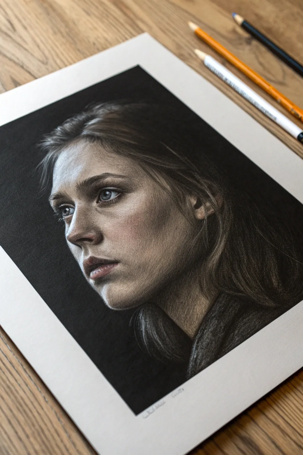
Capture the dramatic interplay of light and shadow with this striking colored pencil portrait on black paper. By letting the darkness of the paper serve as your deepest shadows, you’ll focus entirely on building up the illuminated planes of the face for a moody, cinematic effect.
Step-by-Step
Materials
- Black drawing paper or cardstock (smooth or vellum bristol)
- High-quality colored pencils (wax or oil-based)
- White or light grey pastel pencil (for initial sketch)
- Kneaded eraser
- Pencil sharpener
- Colors: White, Cream, Peach, Burnt Ochre, Dark Brown, Indigo Blue, Slate Grey, Terra Cotta
Step 1: Framework & Base Layers
-
Light Sketching:
Begin by lightly sketching the outline of the head and features using a white or light grey pastel pencil. Keep your pressure extremely light, barely grazing the paper tooth, so lines can be easily lifted with a kneaded eraser if corrected. -
Mapping Shadows:
Instead of outlining everything, focus on mapping the shapes where light meets shadow. The black paper will do the heavy lifting for the dark side of the face, so identify the ‘terminator line’ where the light fades into the darkness. -
Initial Tone Laydown:
Using a white pencil with light pressure, scumble a very thin, translucent layer over the brightest highlights: the forehead, bridge of the nose, upper cheekbone, and chin. This acts as an underpainting to make subsequent colors pop.
Step 2: Building Skin Tones around the Spotlight
-
Forehead Construction:
Layer a Cream or light Peach tone over your white base on the forehead. Use small circular motions to blend the pigment into the paper’s grain. The light source is coming from the upper left, so keep the top left forehead brightest. -
Defining the Eyes:
For the eyes, start with the whites (sclera). Don’t use pure white; mix Slate Grey and a touch of Blue, reserving pure white only for the tiny catchlight reflection. This makes the eyes look wet and alive. -
Iris Detail:
Fill the irises with a mix of Indigo and Slate Grey. Ensure the highlight cuts across the iris sharply. The contrast between the dark pupil and the pale iris is crucial for that piercing look. -
Cheek and Nose Planes:
Apply Peach and Terra Cotta specifically to the cheek and the side of the nose. Observe how the nose casts a shadow; let the black paper show through for the nostril and the shadow beneath the nose. -
Blending the Mid-tones:
Where the light transitions to shadow on the cheek, lightly layer a Burnt Ochre or Dark Brown. Feather this edge out gently so it disappears seamlessly into the black paper void. I like to use a lighter touch here to let the texture breathe.
Muddy colors?
If colors look dull on black paper, lay down a base of white pencil first. This ‘primer’ layer makes overlaying colors vibrant and prevents them from sinking into the dark page.
Step 3: Refining Features & Hair
-
Lips and Chin:
Sketch the lips using Terra Cotta for the main color and Dark Brown for the corners and separation line. Add a sharp stroke of White/Cream on the bottom lip to simulate moisture. -
Establishing Hair Flow:
For the hair, don’t draw individual strands initially. Block in ribbons of light using a dull Dark Brown or Grey pencil to establish the general direction and volume of the hair masses. -
Highlighting Hair Strands:
Sharpen your White or Cream pencil to a fine point. Draw confident, sweeping strokes over the brown base layers where the spotlight hits the crown and wisps near the temple. Vary your pressure to taper the lines. -
Shadowed Hair Areas:
In the darker areas of the hair (like behind the neck), use barely any pencil at all, perhaps just a few faint Indigo or Dark Grey strokes to suggest form without killing the deep black shadow.
Add Cinematic Color
Try tinting your light source! Instead of white highlights, use pale blue for a moonlight effect or warm yellow for candlelight to dramatically change the mood.
Step 4: Final Highlights & Texture
-
Reinforcing Brightest Points:
Go back to the face with your brightest White pencil. Apply heavy pressure (burnishing) on the highest points: the tip of the nose, the highest point of the cheekbone, and the center of the forehead. -
Texturing the Skin:
If the skin looks too waxy or smooth, gently stipple a little Terra Cotta or Peach over the highlight transition areas. This mimics the natural texture of skin pores. -
Clothing Suggestions:
Sketch the collar or clothing loosely using broad strokes of Grey and Charcoal tones. Keep this area rougher and less defined than the face to ensure the viewer’s focus remains on the eyes. -
Final Contrast Check:
Step back and view the drawing from a distance. If the transition into the black background feels too abrupt, use a clean Q-tip or blending stump to gently smudge the graphite edge into the paper.
Enjoy the dramatic atmosphere you have created with just a few pencils and negative space
White-Only Botanical Glow Sketch
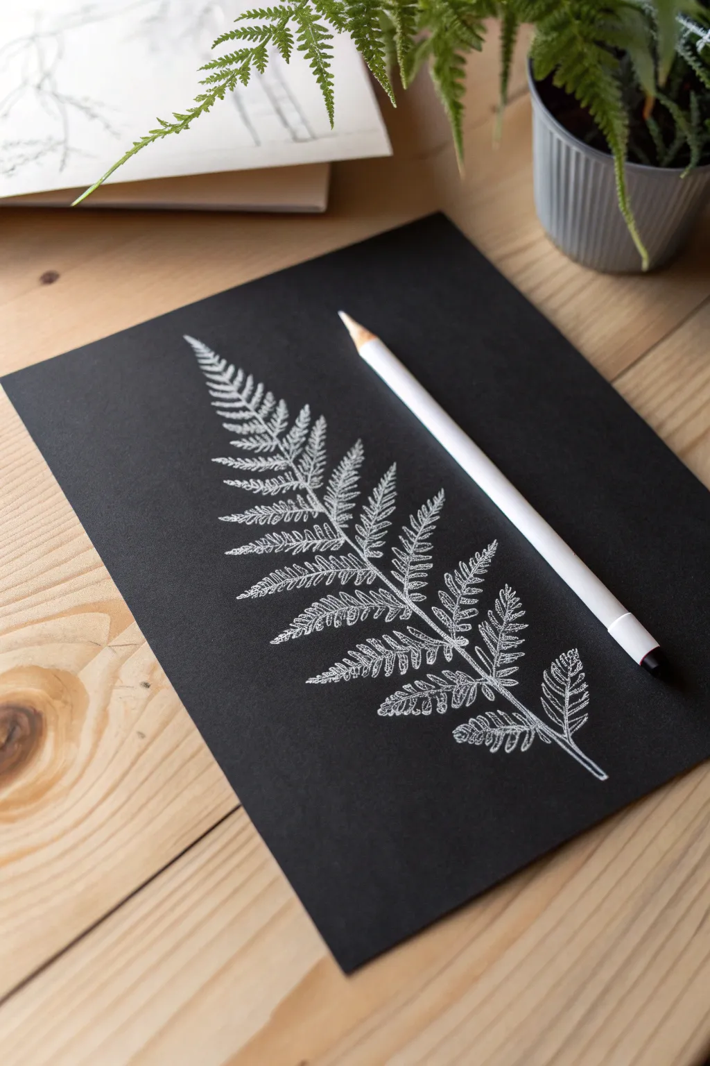
Capture the delicate beauty of a fern frond using the high-contrast drama of white colored pencil on black paper. This monochromatic study emphasizes texture and negative space, creating a botanical illustration that quite literally pops off the page.
Detailed Instructions
Materials
- High-quality black drawing paper or cardstock (smooth or vellum finish)
- White colored pencil (soft core wax or oil-based works best)
- Pencil sharpener (essential for fine details)
- Kneaded eraser
- Real fern leaf for reference or a reference photo
- Optional: White gel pen for extreme highlights
Step 1: Structuring the Frond
-
Establish the curve:
Begin by lightly sketching the central spine (rachis) of the fern. Draw a single, gently curving line from the bottom right corner extending diagonally toward the top left, giving it a natural, organic bend. -
Mark the width:
Visualize the overall triangular shape of the frond. Lightly mark the outer boundaries where the widest bottom leaves and the narrow top tip will end to ensure your drawing fits on the page. -
Place the pinnae stems:
Along your central spine, sketch short, faint lines extending outward on both sides to indicate where the main leaf branches (pinnae) will grow. Space them closely near the top and wider apart near the base.
Step 2: Drawing the Leaves
-
Start at the tip:
Begin drawing the actual leaves at the very top of the frond. These are the smallest and simplest shapes, often just tiny unified lobes rather than separated leaves. -
Define the first leaflets:
As you move down to the first true branches, draw the tiny individual leaflets (pinnules) attached to the branch stem. Keep your pencil sharp to execute these fine, feathery edges. -
Outline the shapes:
For the mid-section leaves, outline the jagged, toothed edges of each small leaflet. Don’t press hard yet; just establish the ghostly perimeter of the shapes. -
Build the bottom branches:
Move to the largest branches at the base. These are complex, so treat each sub-branch almost like a mini-fern itself, ensuring the leaflets point slightly forward toward the tip of the frond. -
Refine the central stem:
Go back over the main central spine. Thicken it slightly as it gets closer to the bottom, adding a double line to show it has cylindrical volume, not just a single wire line.
Smudge Alert
White pigment on black paper smudges instantly if your hand drags across it. Keep a scrap sheet of paper under your drawing hand at all times to protect your work.
Step 3: Shading and Texture
-
Fill with light pressure:
Gently shade inside your leaf outlines using a circular motion. On black paper, I find it helpful to start with a very sheer layer to act as a base, rather than pressing hard immediately. -
Create the veins:
Instead of drawing dark veins, you will draw the light *around* the veins. Leave a tiny, thin strip of the black paper showing down the center of each small leaflet to represent the midrib. -
Add brightness to tips:
Increase your pressure on the very tips and outer edges of the leaflets. This creates a ‘glowing’ effect where the light catches the thinnest part of the plant. -
Deepen the shadows:
Identify where one leaf overlaps another. Leave the black paper untouched in these shadow areas to create depth, or use very light pressure to show the leaf is in the background. -
Texture the stem:
Add tiny, stippled dots along the main stem and branch stems. Fern stems are often fuzzy or scaly, and this texture adds realism compared to a smooth white line.
Sharpen Often
Ferns have intricate, serrated edges that require precision. Use a manual sharpener every few minutes to maintain a needle-point tip for those crisp details.
Step 4: Final Highlights
-
Maximize contrast:
Review your drawing for the brightest spots. Press firmly with your white pencil to burnish the most illuminated areas, making them opaque white against the dark background. -
Clean up edges:
The tooth of the paper might leave fuzzy edges. Use a sharp pencil to crisp up the sawtooth margins of the leaves, ensuring they look sharp and distinct. -
Erase stray dust:
White pencil dust shows up clearly on black paper. Use a kneaded eraser to dab away—not rub—any smudges or stray pigment particles around the drawing.
Step back and admire how the simple contrast of white on black turns a common plant into a dramatic botanical portrait

Have a question or want to share your own experience? I'd love to hear from you in the comments below!