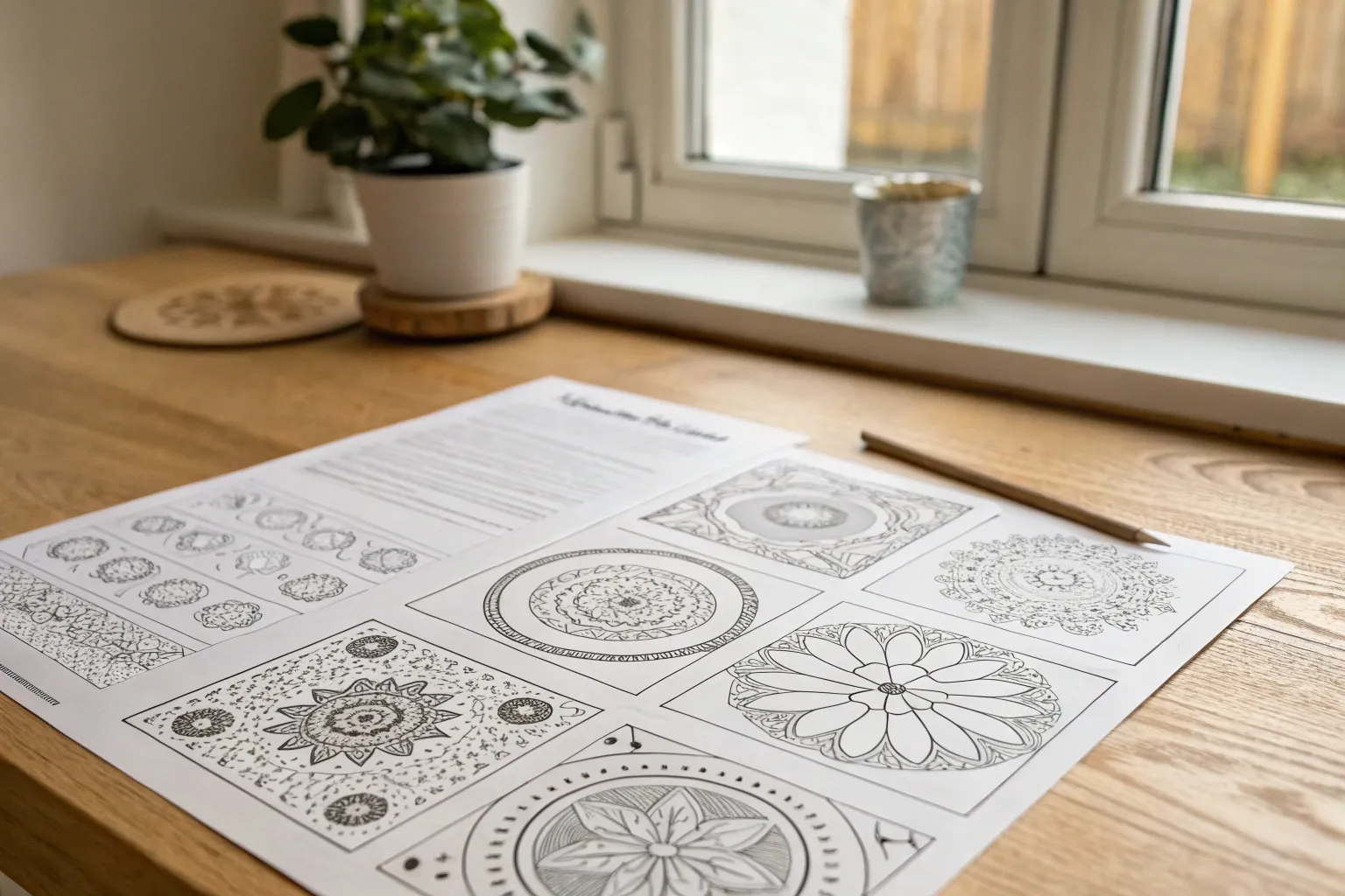
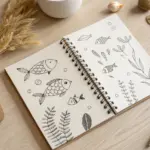
Whenever I need my brain to quiet down, I reach for clean line art and start layering color one shape at a time. These coloring ideas are my go-to mix of classic pages and playful technique challenges, so you can pick a mood and make it yours.
Floral Wreaths and Bouquets
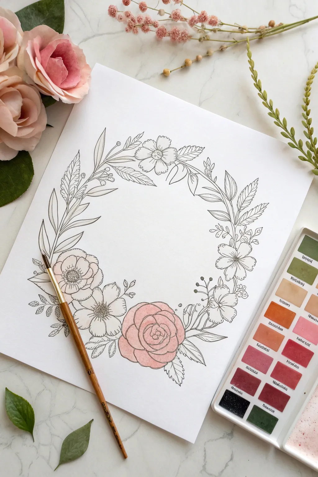
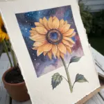
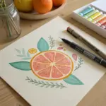
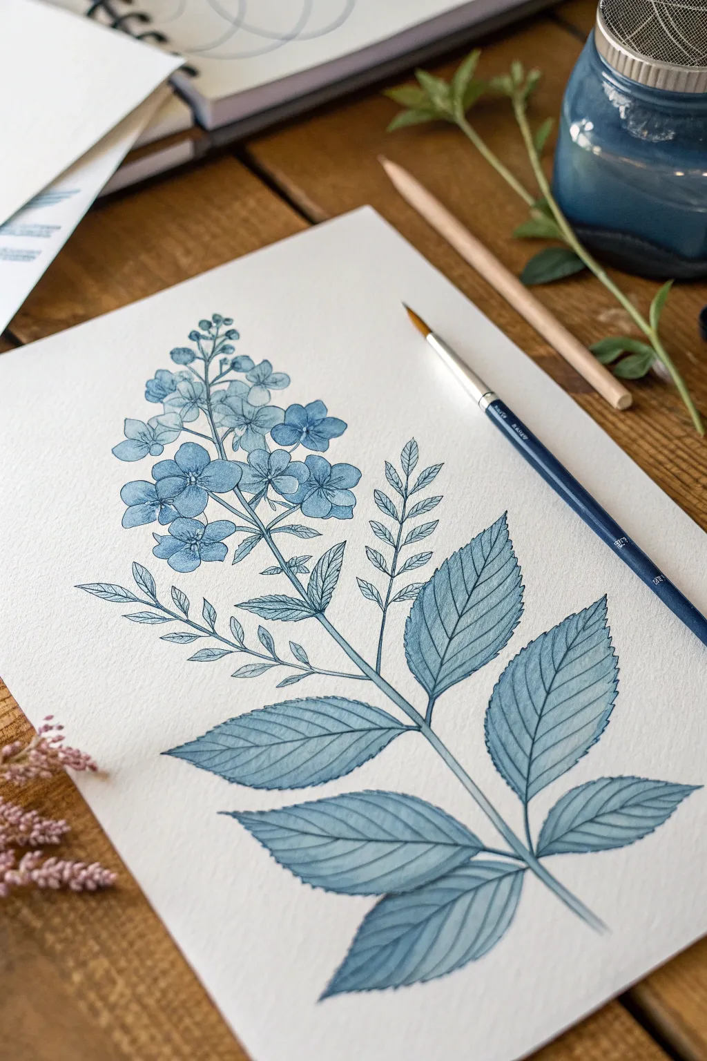
Capture the delicate beauty of spring with this elegant floral wreath project. Combining precise fineliner botanicals with soft, partially applied watercolor washes creates a sophisticated mixed-media look perfect for journals or wall art.
How-To Guide
Materials
- Heavyweight watercolor paper (hot press for smoother lines)
- Pencil (HB or 2H)
- Kneaded eraser
- Waterproof archival ink pen (0.1 or 0.3mm)
- Watercolor paints (pan set shown)
- Round watercolor brush (size 2 or 4)
- Water cup and paper towel
Step 1: Sketching the Layout
-
Establish the shape:
Begin by lightly drawing a large circle in the center of your paper using a pencil. This doesn’t need to be perfect; you can trace a dinner plate or bowl if you prefer a symmetrical guide. -
Place the focal point:
Sketch a rough circle for the main rose at the bottom center of your wreath guide. This will be the anchor flower for the entire composition. -
Add secondary blooms:
Draw simple circles to represent the placement of the smaller flowers—two on the left side and two on the right side, roughly evenly spaced but following the curve of the main circle. -
Draft the foliage:
Lightly sketch curved lines connecting your flower placements. Add varying leaf shapes—some pointed, some rounded—extending outward from these stems to fill the gaps between blooms.
Step 2: Inking the Botanicals
-
Outline the main rose:
Using your waterproof fine-liner pen, start inking the bottom center rose. Begin with a tight spiral in the center and work outward with overlapping petal shapes that get larger as they reach the edge. -
Ink the side flowers:
Move to the secondary flowers. Give the left-hand blooms ruffled edges for a poppy-like appearance, and draw five distinct petals for the simpler blossoms on the right. -
Define the leaves:
Carefully ink your leaf sketches. Add center veins or fine texture lines to some leaves for variety, but leave others simple to keep the design balanced. -
Add delicate fillers:
In the spaces between the main elements, draw tiny clusters of berries or small buds on thin stems. This adds intricacy and makes the wreath look lush. -
Clean up:
Wait at least 15 minutes for the ink to dry completely. Gently erase all visible pencil marks with the kneaded eraser so the drawing is crisp and clean.
Ink Confidence
Don’t worry about wobbles! Nature isn’t perfect. A slightly shaky line often adds organic character to floral drawings that a perfectly straight computer line lacks.
Step 3: Adding the Watercolor
-
Prepare the palette:
Activate a dusty pink or coral color in your watercolor pan by adding a few drops of water and swirling your brush until the pigment is fluid. -
First wash:
Apply a very diluted, pale wash of pink to the entire surface of the main bottom rose. The goal is a soft, pastel base rather than heavy saturation. -
Adding depth:
While the first layer is still slightly damp, dip your brush into a more concentrated mix of the same pink. Gently touch the center of the rose and the base of the petals to let the darker color bleed softly. -
Create separation:
Use the tip of your brush to deepen the shadows where petals overlap. I find this creates the illusion of volume without covering the black ink work. -
Tinting neighbors:
If you wish to color the rest, mix a very pale sage green. Paint the leaves adjacent to the pink rose, fading the color out to white as you move up the wreath for an artistic, ‘in-progress’ aesthetic. -
Final touches:
Allow the paint to dry completely. If stronger contrast is needed, you can go back over the very deepest crevices of the rose with a second layer of concentrated pink.
Go Metallic
For a magical finish, use metallic gold watercolor paint for the berry clusters or the stamens of the open flowers. It catches the light beautifully.
Now you have a timeless floral wreath that beautifully balances precise lines with fluid color


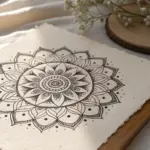
Mandalas for Mindful Coloring

This serene mandala project embraces a soothing palette of sage greens, muted peaches, and creamy beiges to create a botanical-inspired design. The structured layers mimic opening flower petals, offering a perfect opportunity to practice shading and color balance for a truly mindful coloring session.
Step-by-Step
Materials
- White cardstock or heavy drawing paper (A4 or square format)
- Fine liner pen (black, 0.3mm or 0.5mm)
- Compass and ruler
- Pencil and eraser
- Colored pencils (sage green, peach/terracotta, cream/beige, dark grey/black)
- Blending stump or tissue (optional)
Step 1: Designing the Mandala Structure
-
Establish the center:
Begin by marking the precise center of your paper. Using your compass, draw a series of concentric circles radiating outward. You will need a small inner circle (approx. 2cm diameter), followed by larger circles spacing out roughly 2-3cm apart until you fill the page. -
Divide the circle:
Use your protractor to divide the circle into 16 equal sections. Draw light pencil guidelines from the center to the edge for each section, which will help keep your petal symmetry consistent. -
Draw the central flower:
In the innermost circles, sketch a multi-petaled daisy shape. The petals should be long and slender with pointed tips, reaching out to the third concentric circle line. -
Create the middle layer:
Draw a band of intricate semi-circles or scallops around the central flower. Inside this band, add fine detail lines or small dots to create a texture that contrasts with the smooth petals. -
Add the leafy ring:
Sketch a layer of jagged, leaf-like shapes pointing outward. These should have a slight curve, mimicking succulent leaves or holly, filling the middle-distance ring of your guide circles. -
Form the outer petals:
For the largest rings, draw broad, sweeping lotus-style petals. Ensure the tips of these petals touch the outermost guideline circle, creating a clean, contained border. -
Inking the lines:
Once satisfied with the pencil sketch, trace over your lines with a black fine liner. Use steady, deliberate strokes. I find it helpful to rotate the paper rather than my hand to maintain smooth curves. -
Clean up:
Wait for the ink to dry completely to avoid smudging, then gently erase all remaining pencil guidelines.
Step 2: Coloring with Earthy Tones
-
Start with the center petals:
Select a soft peach or terracotta pencil. Color the central flower petals, pressing lightly for a base layer. Add slightly more pressure at the base of each petal to create a subtle gradient. -
Detail the texture band:
Leave the intricate scalloped band largely uncolored or use a very pale beige to highlight the texture without overwhelming the fine ink work. -
Color the green ring:
Use a sage green pencil for the jagged, leafy layer. Focus the color intensity on the outer tips of the green shapes, fading to white or very pale green towards the center of the mandala. -
Shade the large petals:
For the broad outer petals, apply a creamy beige or very light brown. Shade only the edges of these petals, leaving the centers white to create a dimensional, domed effect. -
Add contrast accents:
Take the peach pencil again and fill in the small triangular gaps between the large outer petals. This repetition of the center color helps balance the composition. -
Refine the outer border:
Color the thin rim bordering the entire design with the peach tone to frame the artwork. -
Deepen the shadows:
Return to the green sections and use a slightly darker green or light gray to add shadows where the leaves overlap or tuck under other layers. -
Final blending:
If your pencil strokes look too visible, use a blending stump or a clean tissue to gently soften the transitions, especially on the large cream petals.
Uneven Petals?
If symmetry is tricky, create a template of one petal shape on scrap paper. Cut it out and trace it around your circle guidelines to ensure every petal is identical.
Color Harmony Tip
Limit your palette to just 3 main colors plus white. Sticking to a strict ‘triad’ ensures the mandala looks cohesive and professional rather than chaotic.
Step back and enjoy the calming rhythm of your symmetrical, nature-inspired creation


Cute Animal Portraits
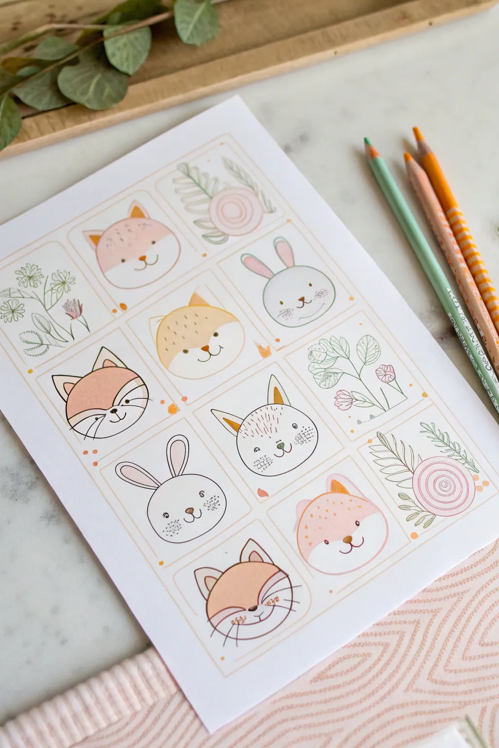
Create a charming grid of soft, illustrative animal faces and floral motifs using colored pencils and fine liners. This project combines simple line drawing with gentle pastel shading for a sweet, cohesive art print.
Detailed Instructions
Materials
- Heavyweight drawing paper or cardstock (A4 or Letter size)
- Pencil (HB for sketching)
- Fine liner pen (black or dark brown, approx. 0.3mm)
- Ruler
- Eraser
- Colored pencils (peach, orange, pink, sage green, gray)
- Optional: Markers for bolder outlines
Step 1: Setting the Grid
-
Prepare your canvas:
Start with a clean sheet of heavy white paper. Standard printer paper works, but a heavier weight adds a nicer finish to colored pencil work. -
Measure the margins:
Using your ruler, measure an even border around the entire page to center your artwork. -
Draw the grid lines:
Lightly sketch a 3×4 grid (three columns, four rows) to create twelve equal rectangular boxes. -
Round the corners:
Instead of leaving sharp right angles, sketch small curves inside each corner of your grid boxes to give them a softer, card-like appearance. -
Refine the frames:
Use a light orange or peach colored pencil to trace over your pencil grid lines, creating a subtle, warm border for each portrait.
Smudge Alert
Place a scrap piece of paper under your drawing hand while coloring. This prevents oils from your skin transferring and keeps you from smearing the ink.
Step 2: Sketching the Content
-
Plan the layout:
I like to alternate between animal faces and floral designs to keep the composition balanced. Pick 3-4 spots for flowers and the rest for animals. -
Sketch the shiba/fox faces:
For the fox-like faces, start with a simple circle or wide oval. Add triangular ears on top and sketch a curved line across the forehead to separate the colored fur from the white muzzle. -
Sketch the bunnies:
Draw round circles for the rabbit heads. Add long, oval ears pointing upwards. -
Add facial features:
Lightly pencil in wide-set dots for eyes and small ‘w’ shapes for mouths. Keep the features low on the face for extra cuteness. -
Sketch the florals:
In the remaining boxes, draw simple botanical elements like rose spirals, leafy stems, or small wildflowers.
Step 3: Inking and Coloring
-
Ink the outlines:
Go over your main pencil sketches with a fine liner. Use a steady hand, but don’t worry about perfection; slightly wavering lines add hand-drawn character. -
Erase pencil marks:
Wait a moment for the ink to dry completely, then gently erase the underlying graphite sketch lines. -
Base colors for animals:
Using a peach or light orange pencil, color the upper potion of the fox faces. Use a soft circular motion to avoid harsh streaks. -
Tint the bunnies:
For certain rabbits, use a very light gray or cream, leaving others white. Add pink inside the ears. -
Add rosy cheeks:
Take a pink pencil and draw small, soft circles on the cheeks of every animal. -
Color the florals:
Use sage green for leaves and stems, and soft pinks for the flower petals. -
Detail work:
Add tiny whiskers, freckles, or texture lines using your fine liner or a sharpened colored pencil. -
Embellish the spaces:
Fill any empty white space within the grid boxes with tiny dots or small circles in orange to tie the color palette together.
Sticker Sheet Style
Draw these on adhesive sticker paper instead of cardstock. Cut them out individually to create your own custom planner sticker set.
Now you have a gallery of adorable doodles ready to display or gift
Cozy Rooms and Reading Nooks
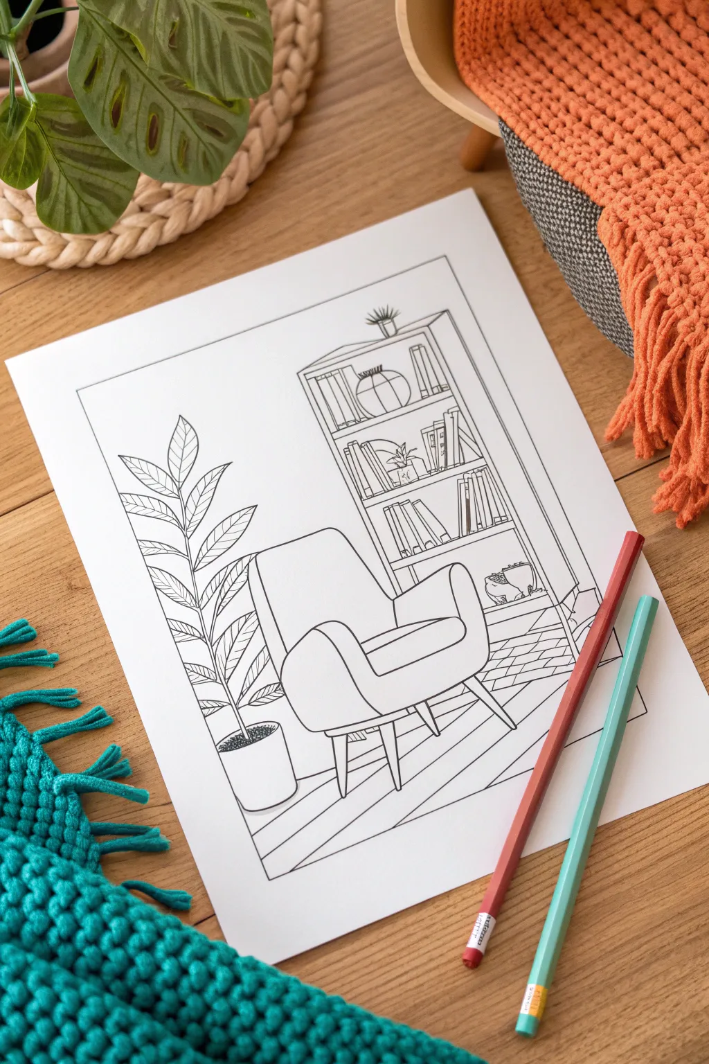
Design a relaxing coloring page featuring a mid-century modern reading corner, perfect for unwinding after a long day. This clean line-art style creates a welcoming canvas for pencils or markers, balancing detailed shelves with inviting open spaces.
How-To Guide
Materials
- Smooth white bristol board or heavyweight sketch paper
- Pencil (HB or H)
- Eraser
- Fine liner pens (0.3mm and 0.5mm)
- Ruler
- Reference images of armchairs and plants
Step 1: Setting the Scene
-
Frame the space:
Begin by drawing a large rectangle about one inch from the edge of your paper to create a border. This frames the composition and gives it a professional coloring book look. -
Block out the furniture:
Using your pencil lightly, sketch a simple cube shape for the armchair in the center foreground and a tall rectangle for the bookshelf in the background. -
Add floor perspective:
Draw a diagonal line near the bottom to suggest the edge of a rug. Add a horizon line behind the chair to distinguish the floor from the wall.
Step 2: Sketching Key Elements
-
Define the armchair:
Refine your cube sketch into a plush armchair. Round the corners for the backrest and arms, and add tapered wooden legs underneath for that retro style. -
Position the plant:
To the left of the chair, sketch a tall vertical line as a guide for the plant stem. Draw a cylindrical pot at the base. -
Structure the shelves:
Inside your bookshelf rectangle, mark horizontal lines for the shelves. I like to space them slightly unevenly to accommodate different book sizes.
Clean Lines Only
If your hand shakes while inking, try ‘ghosting’ the motion above the paper before touching the pen down. Pull lines towards you rather than pushing them away.
Step 3: Adding Details
-
Fill the bookshelf:
Sketch rows of vertical rectangles for book spines. Break up the monotony by leaning some books and adding decorative objects like a small vase or a round bowl. -
Draw the leaves:
Add large, veined leaves to your plant stem. Create a variety of angles, with some pointing up and others drooping slightly for realism. -
Detail the pot:
Draw tiny circles or stippling inside the top of the pot to represent soil texture. -
Add texture to the rug:
Sketch a simple herringbone or brick pattern on the rug area using diagonal lines. Keep the pattern fairly large so it’s fun to color later. -
Refine the floor:
Add a few horizontal lines on the floor area to suggest floorboards, ensuring they follow the perspective of the room.
Digital Variation
Scan your finished drawing and use image editing software to thicken the outer border line to a bold stroke. This makes the delicate interior details pop visually.
Step 4: Inking the Lines
-
Outline main objects:
Switch to your 0.5mm fine liner pen. Trace over the main outlines of the chair, bookshelf frame, and plant pot. -
Ink the details:
Use the thinner 0.3mm pen for the intricate details like book spines, leaf veins, and the rug pattern. This line weight variation adds depth. -
Clean up intersections:
Be careful where lines overlap, such as where the chair blocks the view of the bookshelf. Stop your pen line exactly at the foreground object’s edge. -
Erase pencil marks:
Wait for the ink to dry completely to avoid smudging. Gently erase all your underlying pencil sketches until the page is clean. -
Final touches:
Check for any gaps in your lines and close them up. Add a tiny plant on top of the bookshelf for extra coziness.
Now you have a custom coloring page ready to be brought to life with your favorite hues
BRUSH GUIDE
The Right Brush for Every Stroke
From clean lines to bold texture — master brush choice, stroke control, and essential techniques.
Explore the Full Guide
Whimsical Mushrooms and Forest Friends
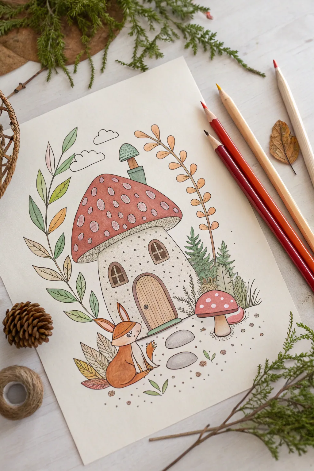
Step into a storybook world by illustrating this charming mushroom house inhabited by a friendly fox. Using soft colored pencils and fine liners, you’ll create a warm, whimsical scene filled with delicate textures and earthy tones.
Step-by-Step Guide
Materials
- Smooth white bristol or mixed media paper
- HB graphite pencil
- Black waterproof fine liner pen (0.1mm and 0.3mm)
- Colored pencils (reds, ochres, greens, browns, beige)
- Eraser (kneaded preferred)
- White gel pen (optional for highlights)
Step 1: Sketching the Foundations
-
Rough shapes:
Begin by lightly sketching the main mushroom house in the center. Draw a squat, slightly irregular rectangle for the base and a large, rounded triangle for the cap that overhangs the sides significantly. -
Adding the fox:
To the lower left of the house, sketch the basic form of the sitting fox. Use an oval for the body, a circle for the head, and two tall triangles for the ears. -
Architectural details:
Sketch an arched door at the bottom center of the mushroom stem. Add two small arched windows on either side, placed slightly higher than the door center. -
Chimney and spots:
Add a quirky, crooked chimney on the right side of the roof with a small mushroom cap on top. Lightly map out the large oval spots on the main mushroom roof. -
Foliage framework:
Draw the stems for the surrounding plants. Create a tall, curving vine on the left, a delicate leaf branch arching over the right, and small pine-like shrubbery tucked behind the house on the right.
Step 2: Inking the Lines
-
Main outlines:
Using your 0.3mm fine liner, carefully trace the main outlines of the mushroom house, the fox, and the larger mushroom on the right. Keep your hand relaxed to allow for slightly organic, imperfect lines. -
Detailed textures:
Switch to the 0.1mm pen to add wood grain texture to the door by drawing vertical lines. Add the window panes and the tiny gills underneath the mushroom cap. -
Fox fur and leaves:
Ink the fox, adding little tufts of fur on the chest and cheeks. Carefully outline the leaves on the left vine and the right branch, keeping the tips sharp. -
Ground elements:
Draw the two oval stepping stones leading to the door. Add scattered dots and tiny pebbles around the base to suggest a sandy or dirt ground. -
Erase and clean:
Once the ink is completely dry, gently erase all your pencil guides to leave a crisp black-and-white illustration.
Uneven Color Coverage?
Work in small circular motions rather than back-and-forth strokes. This technique helps push the pencil pigment into the paper tooth for a smoother, less scratchy finish.
Step 3: Adding Color
-
Mushroom cap base:
Start with a soft terracotta or muted red pencil for the mushroom roof. Color gently around the oval spots, leaving them uncolored (white) for now. Apply a little more pressure near the bottom edge for shading. -
Pale spots:
Lightly shade the inside of the roof spots with a very pale pink or cream tone so they aren’t stark white. -
House walls:
Use a warm beige or light grey for the mushroom stem walls. I like to add tiny stippled dots with the pencil to mimic a porous mushroom texture. -
Coloring the fox:
Fill the fox’s body with a rich ochre or orange-brown. Leave the tip of the tail, the chest, and the muzzle white or very pale cream for contrast. -
Leafy greens:
For the tall vine on the left, use a gradient of greens—starting with olive at the bottom and fading to mint green at the top. Color the pine sprigs on the right with a deeper forest green. -
Autumnal accents:
Color the arching branch on the right with an orange or amber hue to bring in some fall warmth to the palette. -
Wooden door:
Fill in the door with a light brown, pressing harder over the ink lines to emphasize the wood grain. -
Secondary mushroom:
Color the smaller mushroom on the right with a soft pinkish-red, leaving small white dots. Use a light tan for its stem. -
Finishing touches:
Lightly shade the stepping stones with cool grey. If desired, add tiny white gel pen highlights to the fox’s eyes or the mushroom roof for extra sparkle.
Make it Magical
Add a watercolor wash for the sky before you start drawing, or use glitter glue on the mushroom spots to give the house an enchanted, sparkling effect.
Enjoy displaying your adorable forest scene that captures the peaceful side of nature
Butterflies and Garden Insects
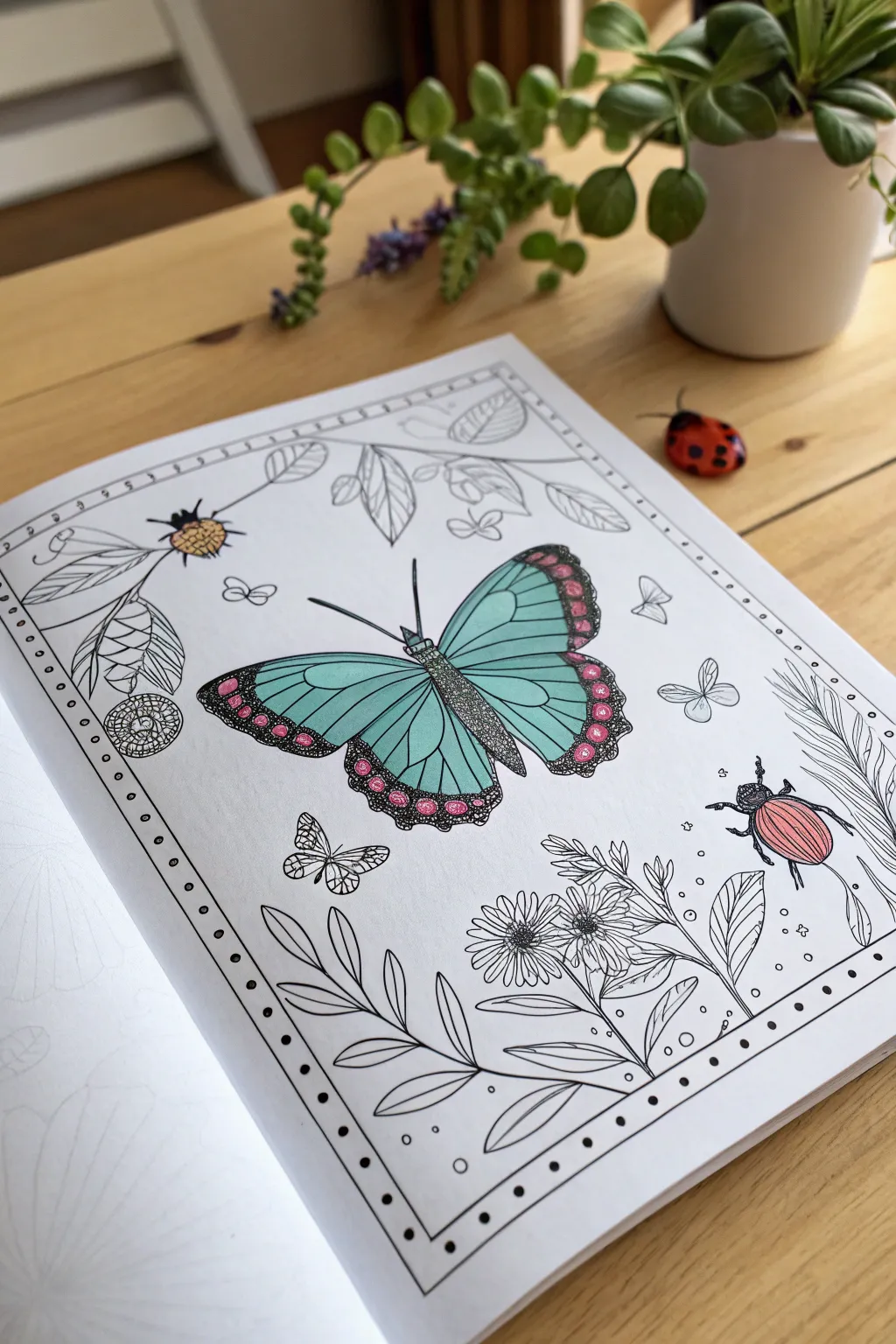
Transform a botanical coloring page into a vibrant display using a striking teal and magenta color palette. This project focuses on smooth shading with colored pencils and adding intricate details with fine liners to bring garden insects to life.
Step-by-Step
Materials
- Botanical style coloring page (butterfly and beetle theme)
- Teal/Aqua colored pencil (soft core preferred)
- Black fine liner pen (0.3mm or 0.5mm)
- Magenta/Hot Pink gel pen or marker
- Light pink colored pencil
- Colorless blender pencil (optional)
Step 1: The Centerpiece Butterfly
-
Base Wing Color:
Start with the large butterfly wings. Using your teal colored pencil, fill in the main panels of the upper and lower wings. Apply light, even pressure first to establish the color without saturating the paper tooth immediately. -
Deepening the Teal:
Go back over the teal sections, applying slightly more pressure near the veins and the body to create a gradient effect. This makes the wings look slightly curved rather than flat. -
Blending the Blue:
If I want a smoother look, I use a colorless blender pencil or a white pencil to burnish the center of the wing panels, merging the pencil strokes for a creamy finish. -
Adding the Border Spots:
Locate the circular patterns along the outer edges of the wings. Carefully fill these spots with your magenta or hot pink gel pen. The ink provides a bold, opaque pop of color that contrasts beautifully with the soft pencil. -
Darkening the borders:
Use a black colored pencil or a very fine black marker to color the background of the wing borders, carefully working around the pink spots you just created. This high contrast makes the pink glow. -
Texture on the Body:
For the butterfly’s body, use a fine tip black pen to add stippling (tiny dots). Densely pack the dots on the sides for shadow and leave the center lighter to give it a cylindrical form.
Step 2: The Beetle Companion
-
Beetle Shell Base:
Move to the beetle on the lower right. Determine the direction of the shell stripes. Use a light pink colored pencil to lay down a base layer on the bug’s back. -
Adding Definition:
Switch to a darker pink or magenta pencil. Shade the outer edges of the beetle’s shell to simulate a rounded, dome-like shape. -
Inking the Legs:
Using your fine liner, carefully trace or fill in the beetle’s legs and antennae. Keep your hand steady to ensure the lines remain crisp and insect-like. -
Detailed Head Work:
Use the stippling technique again on the beetle’s head using the black fine liner. This connects the style visually to the main butterfly.
Smudge Control
Place a scrap piece of paper under your coloring hand. This prevents oils from your skin transferring to the page and stops you from accidentally smudging the soft pencil pigment across the white areas.
Step 3: Surrounding Elements
-
Selecting Accents:
Identify a few small elements to highlight, like the tiny bug in the upper left. Add a touch of yellow or orange to its body to balance the cool tones of the butterfly. -
The Ladybug Accent:
If you have a 3D embellishment like the wooden ladybug shown, place it near the top right for a whimsical mixed-media touch, or simply color a drawn ladybug with bright red marker. -
Evaluating the White Space:
Take a step back and look at the composition. This style relies on the contrast between the vibrant colored insects and the stark black-and-white botanical line art. -
Leaving Leaves Blank:
Resist the urge to color the leaves and flowers. Leaving them as uncolored line art creates a modern, graphic look that forces the eye to focus solely on the colorful insects. -
Final Ink Touches:
Check your black lines. If the colored pencil has dulled any of the original printed outlines, carefully re-trace them with your black fine liner to restore crispness.
Pop the Pink
To make the magenta spots on the wings really shine, lay down a layer of white colored pencil first. This creates a barrier so the pink ink sits on top rather than soaking into the paper fibers.
Now you have a striking piece of art that balances intricate line work with bold splashes of color

PENCIL GUIDE
Understanding Pencil Grades from H to B
From first sketch to finished drawing — learn pencil grades, line control, and shading techniques.
Explore the Full Guide
Sweet Treats and Cozy Drinks
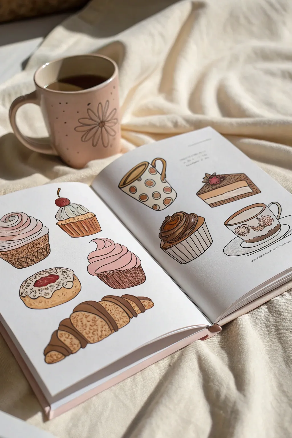
Capture the comforting vibes of a Sunday morning with this delightful sketchbook spread full of pastries and warm drinks. Using a mix of fine liners and brush markers, you’ll create a cozy collection of treats that look good enough to eat.
Step-by-Step Tutorial
Materials
- Sketchbook or mixed media paper (smooth texture preferred)
- HB pencil and eraser
- Waterproof fine liner pens (sizes 0.1, 0.3, and 0.5)
- Alcohol-based brush markers (warm browns, pinks, creams, ochre)
- White gel pen for highlights
Step 1: Drafting the Shapes
-
Map out the layout:
Begin by lightly sketching the placement of each item on your spread. On the left page, mark positions for three pastries vertically on the left and two larger ones centrally. On the right, map out a mug, a cake slice, a cupcake, and a delicate teacup. -
Sketch the cupcakes:
For the cupcakes, start with a trapezoid shape for the wrapper and add a fluffy, cloud-like mound on top for the frosting. Vary the designs—make one a swirl and another a simple dome with a cherry on top. -
Draw the croissant and donut:
Sketch the croissant as a crescent moon shape, segmented with curved lines to show the rolled dough layers. For the donut or cookie, draw a slightly flattened circle with an uneven, organic inner circle for the jam or glaze center. -
Add the drinkware:
On the right page, draw the mugs and cups. Sketch a cylinder slightly wider at the top for the polka-dot mug, and a wide, shallow bowl shape for the teacup. Don’t forget the handles; keep the curves smooth and proportionate to the cup bodies. -
Detail the cake slice:
Draw a triangular prism for the cheesecake slice. Add layers by drawing horizontal lines across the side profile to separate the crust, filling, and topping.
Marker Blending Tip
Work wet-on-wet for smoother gradients. Apply your darker shadow color while the base layer is still slightly damp to soften harsh edges.
Step 2: Inking the Outlines
-
Trace major outlines:
Using a 0.3 or 0.5 fine liner, carefully trace over your pencil lines. Focus on the outer edges of the pastries and cups first to establish the main forms. -
Add delicate details:
Switch to a thinner 0.1 pen for interior details, like the folds in the cupcake wrappers, the swirl of the frosting, and the decorative patterns on the teacup. Keep your hand loose to avoid shaky lines. -
Erase pencil marks:
Wait at least five minutes for the ink to dry completely to prevent smudging. Once dry, gently erase all underlying pencil sketches to leave a clean, crisp drawing.
Add a Recipe
Turn this spread into a functional art piece by hand-lettering your favorite cookie or latte recipe in the empty negative spaces around the drawings.
Step 3: Coloring the Pastries
-
Base layer for dough:
Use a light biscuit or cream-colored marker to fill in the dough parts of the croissant, donut, and cupcake bases. Apply the color quickly to ensure even coverage without streaks. -
Texturing the baked goods:
Layer a warm ochre or light brown marker over the dough areas to create a ‘baked’ effect. I like to stipple small dots on the donut to mimic a crumb texture. -
Frosting and fillings:
Color the cupcake frostings with soft pinks and creams. For the chocolate drizzle on the croissant, use a rich, dark brown marker, carefully following the curve of the pastry. -
Adding shadows:
To give the pastries volume, add a second layer of the same color to the sides and bottom edges, creating simple shading that suggests roundness.
Step 4: Coloring the Drinks & Final Touches
-
Fill the mugs:
Color the polka-dot mug in a creamy off-white, leaving the dots uncolored or filling them with a contrasting brown. Use a light tan for the tea or coffee liquid inside. -
Detail the cake and cupcake:
Color the chocolate cupcake wrapper in dark brown and swirl a caramel tone into the frosting. For the cake slice, use layers of tan for the crust and pale cream for the cheese filling. -
Floral teacup pattern:
Use very fine point markers or colored pencils to add the tiny floral details on the teacup. Keep the colors muted—dusty pinks and sages work best for that vintage look. -
Apply highlights:
Using your white gel pen, add small curved lines or dots to the shiniest parts of the frosting, the chocolate glaze, and the rims of the mugs. This makes the treats look moist and appetizing. -
Cast shadows:
Finally, use a very light cool grey marker to draw a flat oval shadow underneath each item. This grounds the illustrations so they don’t look like they are floating in space.
Now you have a charming spread of café favorites ready to admire
Color Wheel Palette Picks
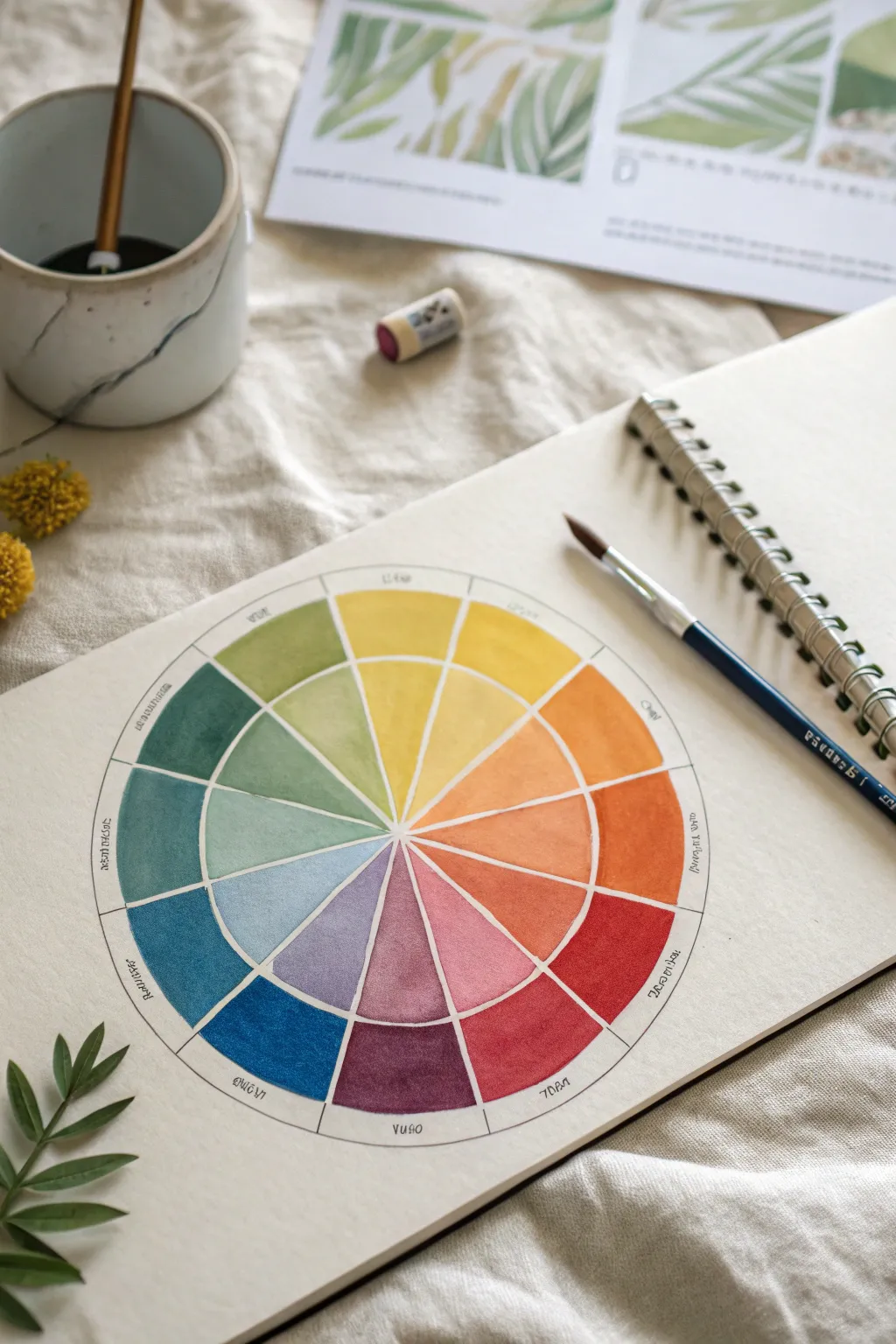
Master the art of color theory with this beautifully structured 12-hue color wheel, featuring both pure pigments and delicate tints. This project is not only a practical reference tool but an aesthetically pleasing exercise in precision and water control.
How-To Guide
Materials
- Watercolor paper sketchbook (heavyweight, cold press)
- Watercolor paints (a basic set of 12 or mixing primaries)
- Compass for drawing circles
- Ruler
- Pencil (HB or 2H)
- Fine liner pen (waterproof, optional)
- Round watercolor brush (size 4 or 6)
- Mixing palette
- Jar of clean water
- Paper towels
Step 1: Drafting the Structure
-
Establish the center:
Begin by finding the center of your sketchbook page. Mark this spot lightly with a pencil, as it will anchor your entire diagram. -
Draw the circles:
Using your compass, draw a small inner circle (about 1 inch radius) which will remain empty. Draw a second circle for the tint ring, and a third, larger circle for the pure hue ring. -
Divide into sections:
Lightly draw a vertical line through the center to create 12 equal wedge sections. I find it easiest to mark the main cross (vertical and horizontal) first, then divide each quarter into three equal parts. -
Label the segments:
Around the outermost rim, lightly pencil in the names of your colors or corresponding codes if you want a reference. This helps prevent mixing mistakes later when the paint is wet.
Step 2: Painting the Pure Hues
-
Prepare your primaries:
Squeeze out your primary yellow, red, and blue onto the palette. Ensure they are saturated; you want the outer ring to represent the pigment at its strongest strength. -
Paint the yellow segment:
Start at the top (12 o’clock) with pure yellow. Fill the outer ring segment carefully, keeping the edges crisp against the pencil lines. -
Paint red and blue:
Move clockwise. Skip three spaces and paint your primary red. Skip three more and paint the primary blue. These anchor your wheel. -
Mix secondary colors:
Mix yellow and red to create orange; yellow and blue for green; and blue and red for violet. Fill in the segments exactly halfway between the primaries on the outer ring. -
Mix tertiary colors:
Now fill the remaining gaps in the outer ring. Mix your primaries with the secondaries (e.g., yellow-orange, red-violet) to complete the 12-hue spectrum.
Muddy colors?
If your tertiary mixes (like yellow-green) look brown, your water is likely dirty. Change your water jar frequently, ideally after every major color group.
Step 3: Creating the Tints
-
Dilute the yellow:
Clean your brush thoroughly. Take your original yellow mixture and add significantly more water to create a pale transparent wash. -
Fill the inner yellow:
Paint the inner ring segment directly below the pure yellow. The goal is a seamless color family, just lighter in value. -
Proceed with tints:
Continue around the circle, watering down each specific color mixture you used for the outer ring to fill its corresponding inner partner. -
Watch for bleeding:
If a neighboring section is still very wet, leave a hair-thin gap of dry paper between them or wait for it to dry to prevent the colors from running together.
Crisp Edges
For ultra-sharp lines between wedges, paint every other section first (e.g., all odds). Let them fully dry, then go back and paint the even-numbered sections.
Step 4: Finishing Touches
-
Let it dry completely:
Allow the entire wheel to dry. Touch the paper gently with the back of a knuckle to ensure no dampness remains. -
Clean up lines:
Use your pencil or a very fine waterproof pen to re-outline the circles and spokes if the paint obscured them, giving the chart a scientific, polished look. -
Erase excess graphite:
Gently erase any stray pencil marks outside the wheel or textual labels if you prefer a clean, text-free aesthetic.
Now you have a personalized reference guide to help you choose harmonious color schemes for future paintings


One Color Family Challenge
Embrace the elegance of a single hue with this botanical watercolor study, proving that limitation breeds creativity. By using only varying concentrations of indigo blue, you will create a piece with depth, structure, and delicate organic beauty.
Detailed Instructions
Materials
- Cold-pressed watercolor paper (140lb/300gsm)
- H pencil (hard lead for light lines)
- Kneaded eraser
- Indigo or Prussian Blue watercolor paint
- Synthetic round brushes (Size 4 for washes, Size 0 or 00 for fine lines)
- Mixing palette with multiple wells
- Jar of clean water
- Paper towel
Step 1: Structural Sketching
-
Establish the spine:
Begin by lightly drawing a central curved line for the main stem. This should start from the bottom right and curve gently towards the upper left to give the plant movement. -
Map the leaf positions:
Along the lower two-thirds of the stem, sketch the outlines of the large, serrated leaves. Position them in pairs, with the largest leaves at the bottom and gradually getting smaller as you move up. -
Outline the floral cone:
At the top of the stem, lightly sketch a triangular or cone-like shape to guide the flower cluster. Within this area, draw small circles and four-petaled shapes to represent individual florets. -
Add secondary stems:
Draw the thinner, branching stems that connect the florets to the main stalk. Keep these lines very faint as they will be defined by paint later. -
Clean up the sketch:
Take your kneaded eraser and gently roll it over the entire drawing. You want the graphite to be barely visible, just enough to guide your brush without showing through the translucent watercolor.
Uneven Drying?
If you see ‘cauliflower’ edges in your washes, your brush had too much water. Dab it on a paper towel before painting, or wait for layers to dry fully before adding more.
Step 2: Layering the Washes
-
Prepare your palette:
Mix three puddles of your blue paint: a very watery, pale tea-consistency; a medium milk-consistency; and a thick, dark cream-consistency. -
Base wash for leaves:
Using the Size 4 brush and your palest mix, fill in the large leaves. Work one leaf at a time to ensure an even coat. -
Flower base tones:
While the leaves dry, apply the same pale wash to the flower petals at the top. Leave tiny slivers of white paper between petals to keep them distinct. -
Define the veins:
Once the leaf base layer is completely dry, switch to the Size 0 brush. Using the medium-strength blue, carefully paint the central vein and the side veins on each leaf. -
Shadowing the leaves:
paint a second layer of the pale wash on one half of each leaf (usually the lower or shadowed side of the vein) to create dimension. -
Mid-tones on flowers:
I like to dab small amounts of the medium blue into the centers of the flower petals while they are slightly damp to create a soft bloom effect.
Level Up: Gradient Washes
For more realism, drop a tiny bit of clear water into the wet pigment on the leaf tips. This pushes the heavier pigment back, creating a lovely natural fade.
Step 3: Detailing and Definition
-
Outline the florets:
Using your finest brush and the darkest paint mix, outline the individual petals of the flowers. Keep your hand steady and vary the line width slightly for an organic look. -
Stem structure:
Paint the main stem and the smaller leaf stems with the medium-dark mix. Add a thin line of the darkest blue along the shadowed side of the stem for volume. -
Connective branches:
Draw the very fine stems connecting the flower head to the main stalk. These should be crisp and dark to contrast with the softer petals. -
Serrated edges:
Go back to the leaves with your fine brush and the medium mix. Carefully trace the serrated (saw-tooth) edges of each leaf to give them a finished, botanical illustration look. -
Leaf texture:
Add very fine hatching or tiny lines within the leaf segments, following the direction of the veins. This adds the texture seen in the reference image. -
Final contrast check:
Assess the overall balance. If the flower centers need more pop, use the darkest pigment (almost straight from the tube) to add tiny dots or stamen details.
Step back and admire how a single color can create such a complete and detailed botanical portrait
Backgrounds That Set the Mood
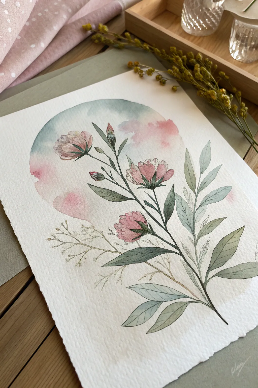
This project combines the ethereal softness of wet-on-wet watercolor backgrounds with the crisp elegance of botanical line art. You’ll create a soothing circular vignette that frames delicate pink blooms, perfect for a greeting card or framed wall art.
Step-by-Step Tutorial
Materials
- Cold press watercolor paper (300 gsm)
- Watercolors (Pink/Rose, Teal/Soft Blue, Sap Green, Olive Green)
- Round watercolor brushes (Size 4 and 8)
- Fine liner pen (Waterproof, 0.1 or 0.3, black or sepia)
- Compass or round object to trace
- Pencil (HB) and kneadable eraser
- Masking tape
- Clean water and paper towels
Step 1: Setting the Composition
-
Outline the circle:
Begin by lightly tracing a circle in the center of your paper using a compass or a small bowl. Keep the pencil line very faint so it won’t show through the paint later. -
Sketch the florals:
Lightly sketch the main stem rising diagonally across the circle. Add three main blooms: one near the top left, one in the center, and a bud lower down. Sketch long, lance-shaped leaves branching out, ensuring some leaves extend beyond the circle’s boundary for a dynamic look.
Clean Edges
If you struggle to paint a perfect circle freehand, apply masking fluid or low-tack tape to the outer edge of your circle before painting the background wash.
Step 2: The Mood Background
-
Wet the circle:
Using your larger size 8 brush and clean water, careful paint inside the circle shape. Avoid wetting the areas where the pink flowers are sketched, but you can paint over the stem and leaf areas. -
Drop in the blue:
Prepare a watery mix of teal or soft blue. While the paper is still wet, touch your brush to the upper left and bottom right areas of the circle, letting the pigment bloom naturally. -
Add soft pinks:
While the blue is still settling, drop a very dilute pink wash into the white spaces of the background circle to create a cloud-like effect. Tilt the paper slightly to encourage the colors to merge without getting muddy. -
Lift and refine:
If the background color has pooled too darkly, use a thirsty (clean, damp) brush to lift some pigment out, creating soft highlights. Let this background layer dry completely before moving on.
Step 3: Painting the Botanicals
-
Base layer for leaves:
Mix a muted olive green. Using the size 4 brush, paint the leaves. For the leaves inside the circle, use a slightly more transparent wash so the background hints through. For leaves extending outside, use a slightly more saturated mix. -
Painting the blooms:
Mix a rose pink color. Paint the petals of the flowers, keeping the color concentrated at the base of the petals and fading to water at the tips. I like to leave tiny slivers of white paper between petals to define them. -
Deepening the greenery:
Once the first green layer is dry, mix a darker cool green or add a touch of blue to your olive mix. Paint the stems and add a second layer to the shadowed sides of the leaves for dimension. -
Adding texture:
Use a very dry brush with pure pink pigment to add subtle texture or veins to the flower petals while they are dry.
Metallic Touch
For a magical finish, use metallic gold watercolor for the ‘ghost branch’ details or tiny specks in the background instead of plain ink.
Step 4: Inking and Details
-
Outline the main stem:
Using your waterproof fine liner, carefully trace the main stem. Use a broken line technique—lifting the pen occasionally—to keep the look organic rather than rigid. -
Define the leaves:
Outline the leaves with the pen. Add a central vein to each leaf. For the larger leaves, draw very fine diagonal hatching lines to suggest shading and texture on one side of the vein. -
Detail the flowers:
Ink the flower petals. Focus on the centers of the blooms, adding small stamen lines or dots. Keep the ink lines on the outer petal edges very thin and delicate. -
The ghost branch:
To create the delicate texture seen at the bottom left, draw a secondary branch structure using only the pen or a very faint beige paint. Do not fill these with color; leave them as skeletal line drawings to add visual interest without weight. -
Final assessment:
Erase any remaining pencil marks carefully. If the background circle edge feels too hard in places, you can soften it slightly with a damp brush, but the crisp edge usually frames the piece nicely.
Step back and admire how the circular background creates a focused, calm atmosphere for your botanical subject
Grayscale With One Pop Color
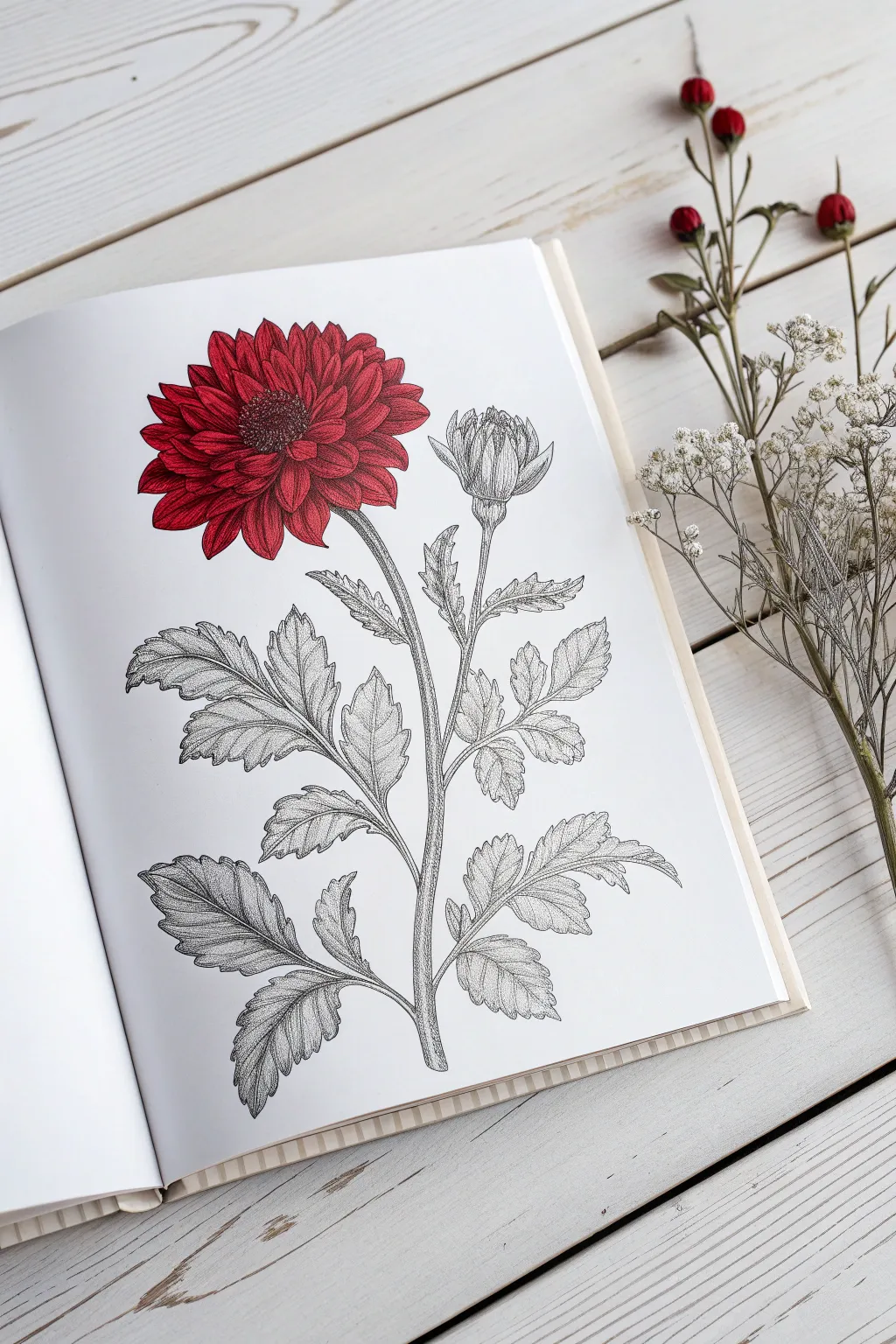
This elegant coloring project transforms a standard botanical line drawing into a piece of high-contrast art by selectively coloring only the flower head while leaving the foliage in sophisticated monochrome. The result is a striking visual anchor that highlights the intricate details of the petals against the graphite-toned leaves.
How-To Guide
Materials
- High-quality botanical coloring book or printed line art (smooth cardstock preferred)
- Alcohol markers (Deep Red, Cherry Red, and a Dark Burgundy/Maroon)
- Fine liner pens (Black: 005, 01, and 03 sizes)
- Graphite pencils (HB, 2B, and 4H)
- Blending stump or tortillon
- White gel pen (optional for highlights)
- Kneaded eraser
Step 1: Setting the Foundation
-
Select your page:
Choose a botanical illustration that has a clear focal point, like a large mum or dahlia, with distinct separation between the flower head and the stem. This technique works best on paper that can handle marker bleeding, or place a scrap sheet behind your page. -
Enhance the linework:
Before adding any color, examine the existing lines. If the printed lines are faint, go over the main contours of the stem and leaves with a 01 fine liner to ensure they are crisp black, distinct from the shading you will add later. -
Plan the light source:
Decide where your light is coming from—usually top-left or top-right. This decision will guide both your red marker shading and your graphite work on the leaves.
Step 2: The Pop of Red
-
Base layer application:
Start with your lightest red marker (Cherry Red). Fill in the entire flower head, petal by petal. Work quickly to keep the ink wet, which helps avoid streak marks. -
Mid-tone shading:
Switch to your Deep Red marker. Apply this color to the base of each petal where it meets the center, flicking the stroke outward toward the tip. This creates the first sense of depth. -
Deepening the shadows:
Using the Burgundy or Maroon marker, carefully darken the tightest crevices between overlapping petals and the very center of the bloom. This high-contrast shadow is crucial for the 3D effect. -
Blending the gradient:
Go back over the transition areas with your original Cherry Red marker. I like to barely touch the paper here, just enough to melt the dark and mid-tones together for a seamless gradient. -
Center details:
For the pollen center, stipple (dot) with the darkest red marker, then add tiny dots of black fine liner to mimic the texture of the flower’s eye.
Pro Tip: Contrast Check
Squint your eyes at the drawing. If the red flower blends too much with the grey leaves, darken the graphite shadows directly underneath the flower head to push it forward.
Step 3: Grayscale Foliage
-
Initial graphite wash:
Take your 4H pencil and lightly shade the leaves and stem. This hard lead creates a silvery, clean grey base that isn’t too dark or smudge-prone. -
Defining the veins:
Using a sharp HB pencil, trace the veins inside the leaves. Press moderately to make the veins stand out against the lighter background shading. -
Hatching for texture:
Create texture on the leaves using a cross-hatching technique with the HB pencil. Draw fine, intersecting lines in the shadowed areas of the leaves, following the curve of the foliage. -
Deepening leaf shadows:
Switch to the darker 2B pencil. Focus on the underside of the leaves and the areas where the stem branches off. Adding dark graphite here creates volume without introducing color. -
Stippling the stem:
To give the stem a woody or textured look, use the 005 fine liner to add tiny dots along the shadowed side of the stalk. This ink texture contrasts beautifully with the soft pencil shading. -
Shading the uncolored bud:
Treat the closed bud at the top right just like the leaves. Keep it grayscale to emphasize that only the fully bloomed flower is ‘alive’ with color. Use the 4H pencil for the petals of the bud to keep them lighter than the stem. -
Smoothing the graphite:
Take your blending stump and very gently smudge the graphite on the larger leaves. This softens the pencil strokes, making the grayscale look like a vintage photograph.
Level Up: Metallic Veins
Instead of graphite for the leaf veins, use a silver gel pen. It keeps the grayscale aesthetic but catches the light when the page turns, adding a magical quality.
Step 4: Final Touches
-
Refining the edges:
Use the 03 fine liner to re-outline the outer silhouette of the entire plant. A slightly thicker exterior line helps ‘pop’ the drawing off the white page. -
Adding highlights:
If the red flower feels too flat, use a white gel pen to add tiny dashes or dots on the very tips of the upper petals where the light hits. -
Clean up:
Use the kneaded eraser to lift any stray graphite smudges from the white background paper, ensuring the contrast remains stark and clean.
Enjoy the dramatic simplicity of your colored focal point against the intricate grayscale background
Doodle Pattern Fill With Tangles

This charming project turns a simple heart outline into a complex piece of art using easy repetitive patterns. The clean black lines against white paper create a striking, modern look that’s perfect for greeting cards or framed mini-art.
Step-by-Step Guide
Materials
- High-quality white cardstock or watercolor paper (A5 size)
- Black fine liner pen (0.3mm or 0.5mm)
- Pencil (HB)
- Eraser
- Ruler (optional)
Step 1: Planning and Outlining
-
Sketch the heart base:
Begin by lightly sketching a large heart shape in the center of your cardstock with a pencil. Aim for a symmetrical shape that fills a good portion of the page, leaving a generous white border. -
Divide into sections:
Using your pencil, draw curved lines horizontally across the heart. These lines should mimic the curve of the heart’s top lobes, creating bands of varying widths. I like to space them unevenly to allow for different complexity levels in the patterns. -
Ink the skeleton:
Trace over your main heart outline and the horizontal dividing lines with your black fine liner. Keep the pressure steady for a clean, consistent line weight.
Smudge Alert
Ink smear? If a line smudges, don’t restart. Turn the smudge into a solid black filled shape or thicken the line to cover the mistake seamlessly.
Step 2: Adding the Tangle Patterns
-
Top Left Triangle Band:
In the second band from the top on the left side, draw a zigzag line to create a row of triangles. Draw vertical lines inside each triangle to fill them with stripes. -
Top Right Circle Band:
Moving to the top right section, fill the area with small circles and random dots. This stippled texture contrasts nicely with the sharp geometric lines next to it. -
Hatching Detail:
Between the top sections and the middle, create a narrow band filled with dense vertical hatching. This darkens the area and acts as a visual separator. -
Middle Zigzag Band:
In the central wide band, draw a bold zigzag line all the way across. Inside the upper triangles formed by the zigzag, draw smaller nested triangles (chevrons) to create an echo effect. -
Cross-Hatch Section:
Below the zigzags, define a band filled with horizontal lines. Then, cross them with vertical lines to create a cross-hatch grid texture. -
Looped Chain Pattern:
Under the cross-hatching, draw a continuous loopy line or small chain-link pattern. Add tiny dots in the crests of the waves for extra detail. -
Love Hearts Band:
Create a distinct band near the bottom specifically for hearts. Draw small, alternating upright hearts. Fill every other heart with solid black ink to add visual weight and contrast. -
Geometric Bottom Tip:
For the very bottom tip of the heart, draw a vertical line splitting it in half. Add nested geometric shapes—squares or triangles—that get smaller as they reach the point.
Step 3: Finishing Touches
-
Refine the lines:
Go back over any major structural lines (the outside of the heart and the band dividers) to make them slightly thicker than the detailed patterns inside. -
Erase pencil marks:
Wait at least five minutes to ensure the ink is completely dry. Gently erase all visible pencil sketches underneath your ink work. -
Clean up:
Brush away the eraser dust carefully so you don’t smudge the vibrant black ink on the white paper.
Variation Idea
Try using different nib sizes (0.1mm for details, 0.8mm for outlines) to create incredible depth and make the patterns pop off the page.
Your intricate doodle creativity is now ready to be shared or displayed

Have a question or want to share your own experience? I'd love to hear from you in the comments below!