
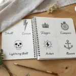
Sometimes you just want a drawing that looks seriously cool without needing a hundred hours of practice. These ideas are my favorite sweet spot: simple enough to start today, but striking enough to make you want to keep going.
Clean Line Mandala Fragments
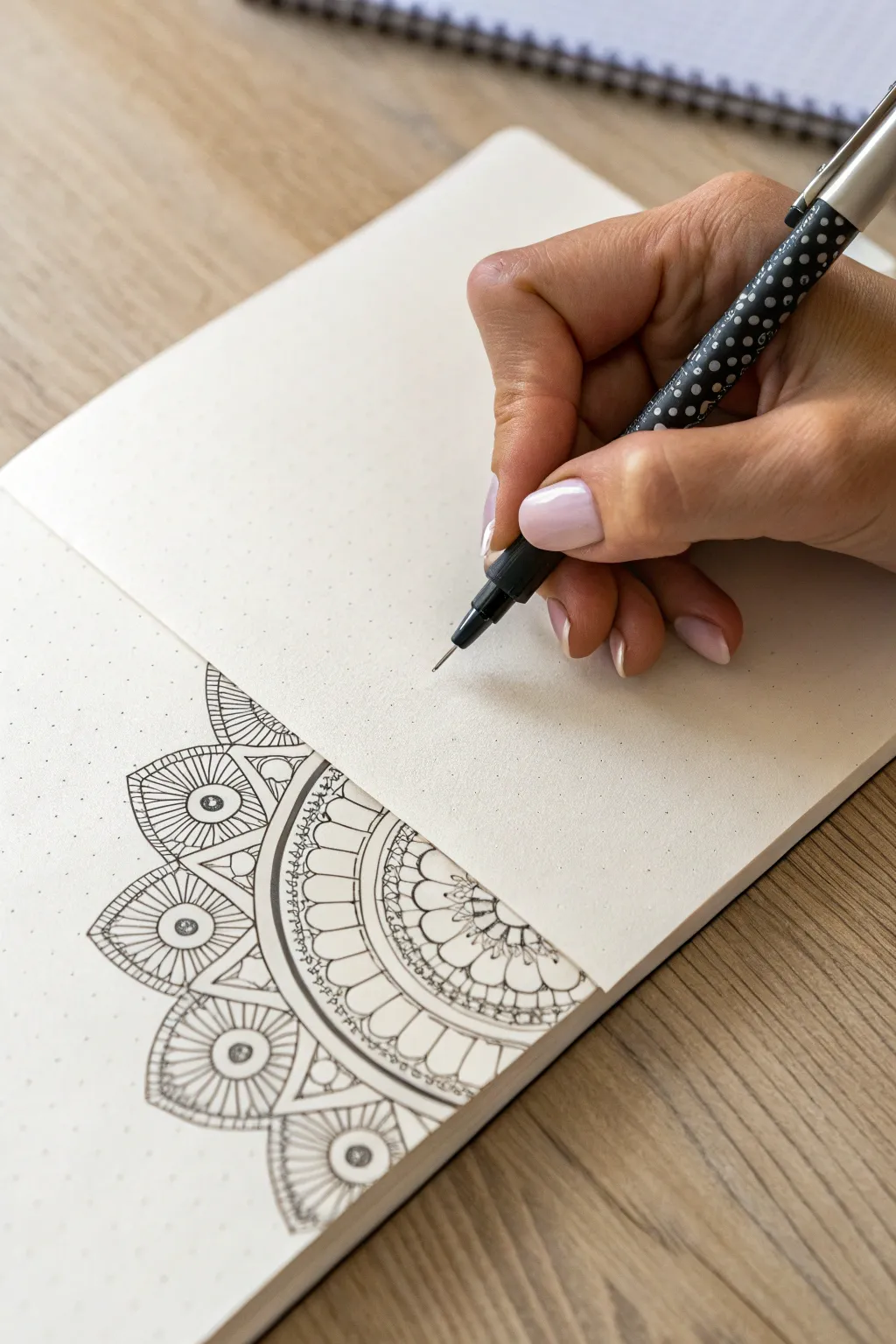
This project creates a stunning, half-mandala design that pops against the subtle structure of dot grid paper. It combines precise geometric lines with organic petal shapes for a crisp, detailed illustration that looks complex but is built from simple, repetitive strokes.
Step-by-Step
Materials
- A5 dot grid notebook or journal
- Fine tip black drawing pen (0.3mm or 0.5mm)
- Pencil (HB or 2H)
- Eraser
- Compass (optional but helpful)
- Ruler
Step 1: Setting the Framework
-
Establish the anchor:
Begin by selecting a central point near the bottom edge of your page. This will be the center of your semicircular mandala. -
Light pencil guides:
Using a pencil and ruler (or compass if you prefer perfect arcs), lightly sketch a series of concentric semi-circles radiating from your anchor point. Space them out variably—some close together for borders, others wider for pattern bands. -
Sectioning the arcs:
Draw faint radial lines extending from the center point outward, like rays of sunshine. Use the dots on your paper to keep these evenly spaced. This helps ensure your petals and patterns stay symmetrical.
Uneven Petals?
If your symmetry drifts, don’t panic. Thicken the outline of the uneven shape slightly to hide the discrepancy, or fill negative spaces with stippling to distract the eye.
Step 2: Drawing the Inner Layers
-
The central petals:
Switch to your fineliner. In the smallest semi-circle band near the center, draw a row of simple, rounded petal shapes. Keep the tops of the petals nestled against your first pencil arc line. -
Add detail lines:
Inside each of those small starting petals, add a tiny inner loop or a single vertical line to give them depth. -
Create a double border:
Moving outward, ink the next two concentric pencil arcs to create a narrow channel. Carefully fill this channel with small, evenly spaced circles or dots for a decorative border. -
The large petal tier:
In the next wide band, draw larger, U-shaped petals. Use your radial pencil lines to center each petal perfectly within its section. -
Inner shading lines:
To give these large petals volume, draw three to five thin lines radiating from the base of each petal upward, stopping about halfway up the shape.
Ink Stability
Work from the center outwards and, if you’re right-handed, try to work from left to right where possible to prevent your hand from resting on fresh ink.
Step 3: Outer Radiance
-
Geometric borders:
Draw a thick, solid black line on the next arc to create strong contrast. Follow this with a slightly wider band filled with a zig-zag or small triangle pattern. -
Drafting the fan blades:
For the largest, outermost layer shown in the reference, sketch large, trapezoidal or fan-blade shapes. These should be the widest elements of the design. -
Concentric filling:
Inside each of these large fan shapes, draw a smaller version of the same shape. Continue nesting these shapes inward until you reach the center of the segment. -
Focus points:
In the very center of these nested shapes, draw a bold circle with a heavy outline to act as an ‘eye’ or focal point for each segment. -
Connecting the tips:
At the very top outer edge of your fan blades, connect the corners with a gentle, curved line to seal the mandala’s edge cleanly.
Step 4: Finishing Touches
-
Weight variation:
Go back over your major structural lines—specifically the borders between distinct bands—and thicken them slightly. This line weight variation prevents the drawing from looking flat. -
Clean up:
Wait at least five to ten minutes to ensure the ink is completely dry. I find patience is key here to avoid smudging. -
Erase guides:
Gently erase all your pencil sketches and radial guide lines, leaving only the crisp ink work behind.
Now you have a marvellously precise geometric fragment that looks right at home in any journal layout


Spiral Waves and Op-Art Ribbons
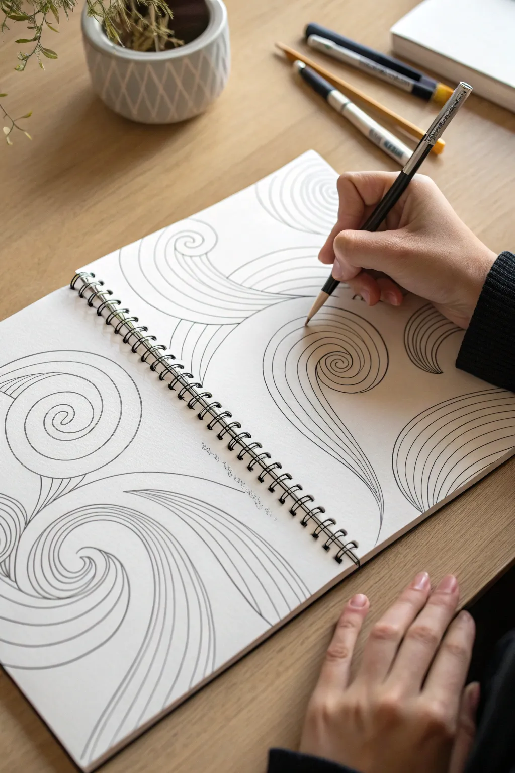
This mesmerizing drawing exercise transforms simple curved lines into flowing, three-dimensional ribbons that seem to dance across the page. Using repetitive strokes and clever spacing, you’ll create an op-art effect that is equal parts relaxing to draw and impressive to look at.
Step-by-Step Guide
Materials
- Spiral-bound sketchbook (heavyweight paper preferred)
- Graphite pencil (HB or 2B)
- Fine-liner pen (optional, for inking)
- Eraser
- Pencil sharpener
Step 1: Laying the Foundations
-
Start a spiral:
Begin anywhere on your blank page. Place your pencil point down and draw a tight, small curl that spirals outward slightly. This center point will act as the ‘eye’ of your first wave. -
Draw the first curve:
From that central spiral, extend a single, long wavy line outward. Let it flow naturally across the page, curving gently like a loose ribbon in the wind. -
Create the ribbon width:
Return to the spiral center. Start a second line right next to the first one, but as you move outward, gradually widen the gap between the two lines to define the width of your ribbon. -
Close the shape:
Bring the two lines back together at a distant point or let them run off the edge of the page to create an open-ended flow.
Wobbly Lines?
Don’t stress over shakes. Instead of trying to fix a bumpy line, just make the next parallel line mimic that bump exactly. The repetition hides the error and makes it look intentional.
Step 2: Building the Flow
-
Fill with parallel lines:
Return to the start of your ribbon shape. Draw a new line inside the shape that perfectly mimics the curve of the outer edge. -
Maintain consistent spacing:
Continue drawing these internal contour lines. Try to keep the spacing between each line relatively even, as this consistency is what creates the optical illusion of volume. -
Follow the form:
As the ribbon widens and narrows, your internal lines should spread out and converge accordingly. If the main shape twists, let your internal lines follow that twist faithfully. -
Add a second wave:
Pick a new spot on the page, perhaps near the curve of your first ribbon. Draw another spiral center and extend a new wavy shape that tucks behind or flows alongside the first one. -
Connect the flows:
Allow the lines of your second wave to abut exactly against the edge of the first wave. This creates a sense of depth, making it look like one ribbon is floating above the other.
Level Up: Shading
Add shading with a 2B pencil at the deepest curves and where ribbons overlap. This enhances the 3D effect, making the ribbons look like they are truly lifting off the paper.
Step 3: Refining the Illusion
-
Vary direction:
Don’t make all spirals spin the same way. Draw some clockwise and others counter-clockwise to keep the composition dynamic and unpredictable. -
Line weight variation:
I find that pressing slightly harder on the pencil during the ‘tucked in’ parts of the curves—where the ribbon bends inward—adds instant depth. -
Fill the negative space:
Identify large empty gaps between your major ribbons. In these spaces, start smaller, simpler wave shapes that seem to emerge from underneath the larger primary forms. -
Check the flow:
Step back and look at the overall movement. If a section looks too flat, add a new distinct curve that cuts across existing lines to break the visual monotony. -
Sharpness check:
Ensure your pencil tip remains relatively sharp. Fuzzy lines can ruin the crisp, graphic effect necessary for this style of op-art. -
Optional inking:
If you are happy with the pencil sketch, you can trace over the lines with a fine-liner pen for a bold, high-contrast look, or leave it soft graphite.
Enjoy the rhythmic nature of creating these flowing forms as your page fills with movement


Doodle Pattern Grid Challenge
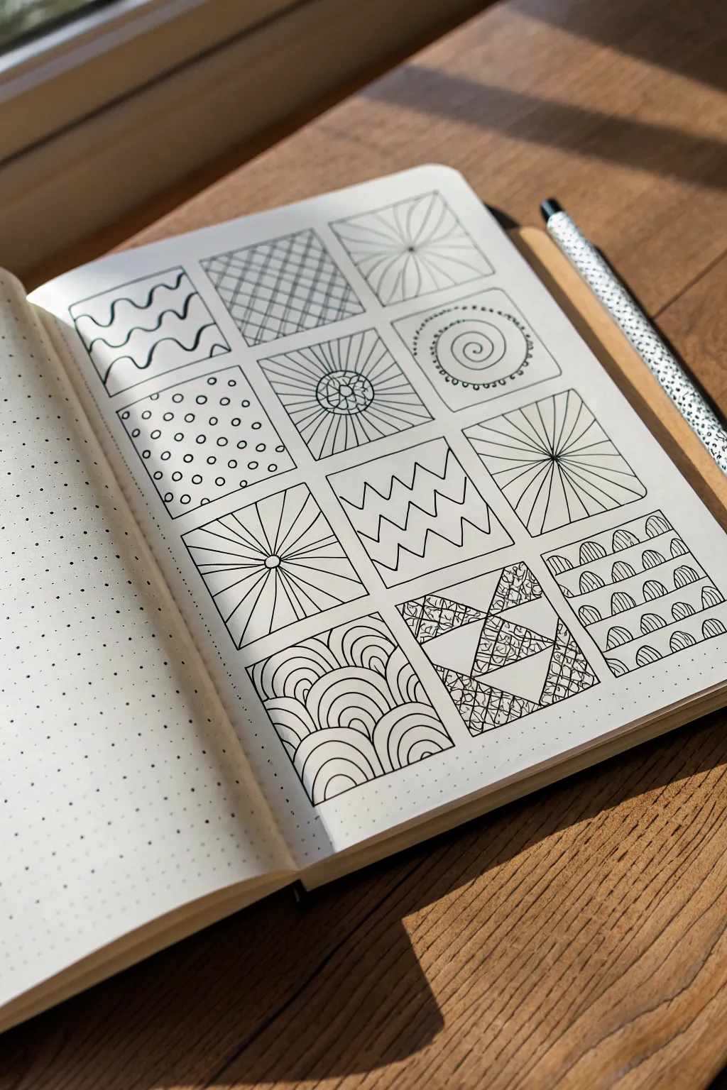
Transform a blank page into a mesmerizing sampler using nothing but simple lines and shapes. This project breaks down intricate-looking art into twelve manageable mini-squares, perfect for unwinding and practicing precision.
Step-by-Step
Materials
- Dot grid journal or dotted notebook paper
- Fine-liner pen (black, 0.3mm or 0.5mm)
- Ruler or straight edge
- Pencil (HB or H)
- Eraser
Step 1: Setting the Framework
-
Map out boundaries:
Begin by counting your grid dots to determine the size of your squares. For this layout, count out spaces that are roughly 6 dots wide and 6 dots tall. Use your pencil to lightly mark the corners of twelve squares arranged in a 3-column by 4-row grid. -
Draw the grid lines:
Using a ruler and your fine-liner pen, trace over your pencil marks to create permanent boxes. Ensure the lines are crisp and corners meet cleanly. Leave a small gap (about 1-2 dot grid spaces) between each square to give the patterns room to breathe.
Wobbly Lines?
If your straight lines look shaky, breathe out while drawing the stroke. Exhaling steadies your hand naturally. You can also ghost the motion above the paper before committing ink.
Step 2: Row 1: Waves, Hatches, and Bursts
-
Square 1: Wavy lines:
In the top-left box, draw horizontal wavy lines from edge to edge. Keep the spacing consistent, allowing the curves to nestle into each other slightly without touching. -
Square 2: Cross-hatching:
Move to the middle box. Draw diagonal lines from bottom-left to top-right, spaced evenly. Then, cross them with perpendicular diagonal lines to create a diamond grid pattern. -
Square 3: Corner burst:
For the top-right box, pick an off-center point near the middle-right. Draw straight lines radiating outward from this single point to the edges of the box.
Add Depth
Pick a single side of the shapes (like the right side of the fish scales) and thicken the line weight slightly. This simple trick adds faux shadows and makes the doodles pop.
Step 3: Row 2: Dots, Spirals, and Flowers
-
Square 4: Polka dots:
Fill the first box of the second row with small, open circles. Arrange them in offset rows rather than a straight grid to create a more dynamic, bubbly texture. -
Square 5: Geometric flower:
Draw a small circle in the center. Surround it with petal shapes. Then, extend straight lines from the petals to the outer edges of the box, creating a sunburst effect. -
Square 6: Spiral center:
Start in the center and draw a loose spiral outward. Once the spiral fills the center third, draw a circle around it. Decorate the outer ring of that circle with tiny semi-circles or loops.
Step 4: Row 3: Rays and Zigzags
-
Square 7: Centered sunburst:
Find the exact center of this box on the third row. Draw straight lines radiating out to the edges. Unlike the corner burst from Row 1, this should look symmetrical. -
Square 8: Zigzags:
Draw horizontal zigzag lines across the box. Vary the height of the peaks—make some rows sharp and tall, and others shallow and wide for visual interest. -
Square 9: Horizontal focus:
Place a dot slightly below the center. Draw straight lines radiating from this dot to the top, left, and right edges, but stop them at the bottom edge to create a fan-like perspective.
Step 5: Row 4: Patterns and Structures
-
Square 10: Fish scales:
Start at the bottom left with small semi-circle humps. Stack the next row of humps in the valleys of the first row, continuing upwards until the box is filled with arches. -
Square 11: Shattered glass:
Use your ruler to draw random intersecting triangles (like a tangram puzzle). Choose specific triangles to fill with a detailed texture, like tiny pebbles or stippling, while leaving others blank for contrast. -
Square 12: Striped hills:
Draw rows of semi-circles similar to the fish scales, but make them slightly flatter. Inside each semi-circle, draw vertical lines to fill the shape with stripes. -
Clean up:
Wait at least five minutes to ensure the ink is completely dry. Gently erase any visible pencil guidelines from step one to leave a stark, clean black-and-white finish.
Now you have a library of patterns ready to decorate future journal spreads or sketchbooks


Minimal Mountains With a Tiny Tent

This crisp, clean line art captures the essence of a peaceful camping trip using bold geometry and silhouette work. The stark contrast of black ink against a natural canvas texture creates a modern, calming piece perfect for any adventurer’s wall.
How-To Guide
Materials
- Canvas panel or thick textured paper (A3 or 11×14 size)
- Pencil (HB or lighter)
- Eraser
- Ruler
- Black fine liner pen (0.5mm)
- Black chisel tip marker or brush pen
- Compass or small circular object (for the sun)
Step 1: Setting the Scene
-
Map out the horizon:
Start by lightly sketching a loose, uneven horizon line with your pencil about one-third of the way up from the bottom of your canvas. This doesn’t need to be straight; a slight curve adds naturalism. -
Draft the peaks:
Using your ruler, lightly draw two large triangles for the mountains. Place the left one slightly higher and overlapping the front of the right one. Let the base of the triangles rest just behind where you plan to put the tree line. -
Add snow caps:
Sketch jagged, zigzagging lines across the upper portion of both triangles to define the snow caps. Ensure the zigzags are irregular so they look like organic rock formations rather than a perfect pattern. -
Placement of the sun:
Position your compass or circular object purely in the sky area, roughly centered above the valley between the two peaks. Lightly trace a perfect circle.
Smudge Prevention
Does the ink smear when you erase? Canvas dries slower than paper. Place a clean sheet of paper under your hand while drawing, and wait an extra hour before the final erasure.
Step 2: Inking the Mountains
-
Outline the slopes:
Switch to your thick chisel tip marker or brush pen. Trace the main triangular outlines of the mountains with a confident, steady hand. Using a ruler here can help keep the lines crisp and geometric. -
Define the snow line:
Carefully trace over your jagged snow cap lines. Connect these lines to the outer slopes, creating a distinct separation between the top of the mountain and the base. -
Detail the peaks:
Add a vertical line down the center of the left mountain, starting from the tip and stopping at the snow line. This simple addition gives the mountain dimension and a sense of a ridge. -
Clean up the geometry:
Once the ink is dry, erase any pencil marks that extend beyond your clean black lines to keep the geometric look sharp.
Step 3: The Forest & Foreground
-
Start the tree line:
At the base of your mountains, begin drawing the forest. Use your fine liner to draw small vertical lines for trunks, spaced closely together across the entire width of the mountains. -
Fill in the foliage:
create the pine trees by making scribbly, downward-sloping triangular shapes over your trunk lines. Vary the heights slightly, making some taller than others for a natural silhouette. -
Solidify the forest:
Go back over the bottom half of the trees with your thicker marker to create a dense, solid black mass at the bottom, fading into individual tree tops as you go up. This grounds the image. -
Sketch the tent:
In the lower right foreground, draw a simple triangular tent shape. Use a curved line for the opening and block in one side with solid black to show shadow and depth. -
Ground the campsite:
Draw very sparse, broken horizontal lines around the tent and to the left side of the foreground. These suggest uneven ground or snow drifts without needing full shading.
Add a Pop of Color
Make the artwork pop by painting the sun circle with gold leaf or metallic gold paint. It adds a luxurious texture that contrasts beautifully with the matte black ink.
Step 4: Final Details
-
Ink the sun:
Carefully trace your circular sun sketch with the fine liner. Take your time here; a steady hand is crucial for a smooth curve. -
Add nature’s finishing touch:
Draw two small, simple ‘M’ or ‘V’ shapes in the sky between the sun and the mountains to represent distant birds in flight. -
Final erase:
Wait at least 10 minutes to ensure all thick ink is completely dry. Then, vigorously erase all remaining graphite sketches to reveal the stark contrast.
Now you have a serene piece of modern art ready to bring a touch of the outdoors inside
BRUSH GUIDE
The Right Brush for Every Stroke
From clean lines to bold texture — master brush choice, stroke control, and essential techniques.
Explore the Full Guide
Paper Airplanes in Motion Trails

Bring your journal pages to life with this whimsical composition of hand-drawn paper airplanes darting across the page. The dynamic, looping dashed motion trails create a sense of breezy movement that invites the eye to wander through your sketchbook.
Step-by-Step Guide
Materials
- Dotted bullet journal or sketchbook
- Fine liner pen (01 or 03 size, black)
- Pencil (HB or 2B)
- Eraser (kneaded preferred)
- Ruler (optional)
Step 1: Drafting the Flight Plan
-
Start with the Main Plane:
Begin in the lower right quadrant of your page. Using your pencil, lightly sketch a large triangle pointing upwards and to the right. This will serve as the focal point airplane. -
Add Dimension:
Draw a line from the triangle’s tip down the center, stopping slightly short of the bottom edge. Connect the bottom corners to this center line to create the folded wings effect. -
Detail the Fuselage:
Sketch a small rectangle or narrow triangle at the very center bottom to represent the plane’s body where you would hold it. -
Plot Smaller Planes:
Scatter 4-5 smaller triangles across the upper left and center areas of the page. Vary their angles—some pointing up, some diving down—to create chaotic energy. -
Establish Motion Trails:
Lightly pencil in sweeping, curvy lines trailing behind each plane. I find it helpful to make these lines intersect and loop over each other to create a playful flight map.
Wobbly Lines?
If your dashed trails look uneven, don’t worry. Imperfection adds charm. If you really want precision, use a dot grid journal to guide your spacing invisibly.
Step 2: Inking the Aviation Art
-
Ink the Hero Plane:
Switch to your fine liner pen. Trace over your pencil lines for the large bottom-right airplane. Use confident, single strokes for crisp edges. -
Add Texture:
Inside the central folds of the large plane, add horizontal hatching lines. Keep them closely spaced to imply shadow and depth within the fold. -
Outline the Fleet:
Carefully ink the outlines of the smaller airplanes. Since they are further away, keep the details minimal—just the main triangular shape and a central fold line is often enough. -
Create the Dashed Lines:
Trace over your penciled motion trails using small, even dashes. Try to keep the spacing between dashes consistent for a neat, graphic look. -
Connect the Dots:
Ensure the dashed lines connect directly to the tail or back of each specific airplane so the path of travel is clear.
Step 3: Finishing Touches
-
Draw Tiny Accents:
In the negative spaces around the flight paths, draw tiny circle-and-cross motifs. These look like little compasses or stylized flowers and add texture to the white space. -
Add Micro-Details:
For the smallest plane at the very top, try using stippling (dots) instead of dashes for its trail to vary the texture slightly. -
Dry and Erase:
Wait at least 5-10 minutes for the ink to dry completely. Gently erase all underlying pencil sketch marks, being careful not to smear the ink. -
Assess Balance:
Look at the composition. If a corner feels too empty, add a very small, distant airplane sketch or another tiny compass motif to balance the page weight. -
Reinforce Lines:
If the main airplane needs to pop more, go over its outer perimeter one more time to thicken the line weight slightly compared to the background elements.
Add Pop of Color
Use a light blue highlighter or watercolor wash to trace just alongside the dashed lines. It creates a subtle ‘sky’ effect without coloring the whole page.
Now you have a dynamic page spread that captures the feeling of adventure and movement
Bold Skulls With Cross-Hatching
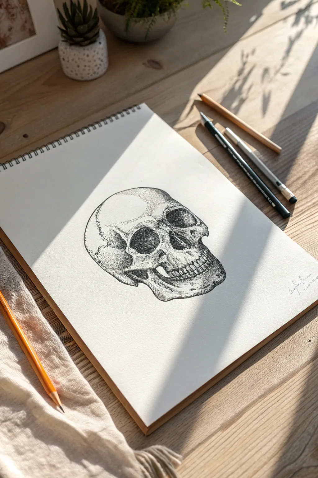
Master the art of patience with this detailed anatomical skull drawing that relies heavily on precision stippling and fine linework. This project creates a striking play of light and shadow, resulting in a realistic, textured illustration that jumps off the page.
How-To Guide
Materials
- Fine-tooth sketchbook paper (heavyweight helpful to prevent bleeding)
- HB or 2H graphite pencil (for sketching)
- Fine liner pens (0.05mm, 0.1mm, and 0.3mm)
- Soft kneadable eraser
- Reference image of a human skull (three-quarter view)
Step 1: Constructing the Framework
-
Establish the Cranium:
Start with your HB pencil, using very light pressure. Draw a large, slightly flattened circle to form the main cranium (brain case). Think of this as a balloon that’s slightly squashed. -
Map the Facial Plane:
Attach a jawline shape to the bottom front of your circle. Since this is a 3/4 view, the jaw should extend downward and slightly to the right. -
Locate Key Features:
Draw a faint vertical center line down the face to help with symmetry. Then, sketch horizontal guidelines for the eye sockets and the bottom of the nose cavity. -
Define the Orbits:
Sketch the eye sockets (orbits). They aren’t perfect circles; they are somewhat squared off with rounded corners. The socket further away will appear slightly narrower due to perspective. -
Nose and Jaw Details:
Draw the upside-down heart shape for the nasal cavity. Below that, sketch the maxilla (upper jaw) curve and the mandible (lower jaw). Lightly mark the position of the teeth, focusing on the curve of the dental arch.
Dot Control
Keep your pen vertical when stippling. Slanted strokes create tiny “tails” or commas instead of clean round dots, which ruins the texture effect.
Step 2: Inking the Outlines
-
Refine the Silhouette:
Switch to your 0.1mm fine liner. carefully trace the outer contour of the skull. Use a broken, organic line rather than a solid heavy outline to suggest bone texture. -
Detail the Sutures:
Add the squiggle-like crack lines (sutures) on the side of the cranium. These should be wiggly and irregular, mimicking the way skull plates fuse together. -
Structuring the Teeth:
Outline the individual teeth. Remember that teeth are not just rectangles; they have roots and varied shapes. Keep the lines near the gum line slightly lighter. -
Erase Graphite:
Once the ink is completely dry—give it a minute or two to be safe—gently erase all your pencil guidelines with the kneadable eraser so only the clean ink remains.
Step 3: Shading with Stipple and Hatching
-
Darkest Darks First:
Using a 0.3mm pen, fill in the deepest shadows. This includes the inside of the eye sockets (leaving faint rims for depth) and the nasal cavity. Don’t make it solid black immediately; build it up densely. -
Begin Stippling:
Switch to the 0.05mm pen. Start adding dots (stippling) around the edges of the eye sockets and the cheekbone (zygomatic arch). The dots should be closer together where the shadow is darkest and spread out as they move toward the light. -
Sculpting the Cranium:
Apply stippling to the rounded top of the skull. Concentrate the dots on the left side and bottom edge to create volume, fading out completely as you reach the highlighted top-right area. -
Undercut Shadows:
Add density under the cheekbones and beneath the jaw. I find it helpful to mix very tiny cross-hatching lines here alongside the dots to create a rougher bone texture. -
Defining the Teeth:
Add very minimal shading to the teeth themselves. Focus shading on the gums and the gaps between teeth to make them pop forward. -
Texture the Bone:
Add sparse, random dots across the lighter areas of the skull. Bone is porous and imperfect, so these stray marks prevent the drawing from looking like plastic. -
Final Polish:
Step back and assess your contrast. If the dark areas look too grey, go back in with the 0.1mm pen and add more dots to deepen those shadows.
Hand Cramp Alert
Stippling takes thousands of dots. If your hand gets tired, take breaks! Rushing leads to sloppy, uneven dot spacing and messy results.
Now you have a stunning anatomical study to anchor your sketchbook portfolio

PENCIL GUIDE
Understanding Pencil Grades from H to B
From first sketch to finished drawing — learn pencil grades, line control, and shading techniques.
Explore the Full Guide
Planets Orbiting Inside a Head
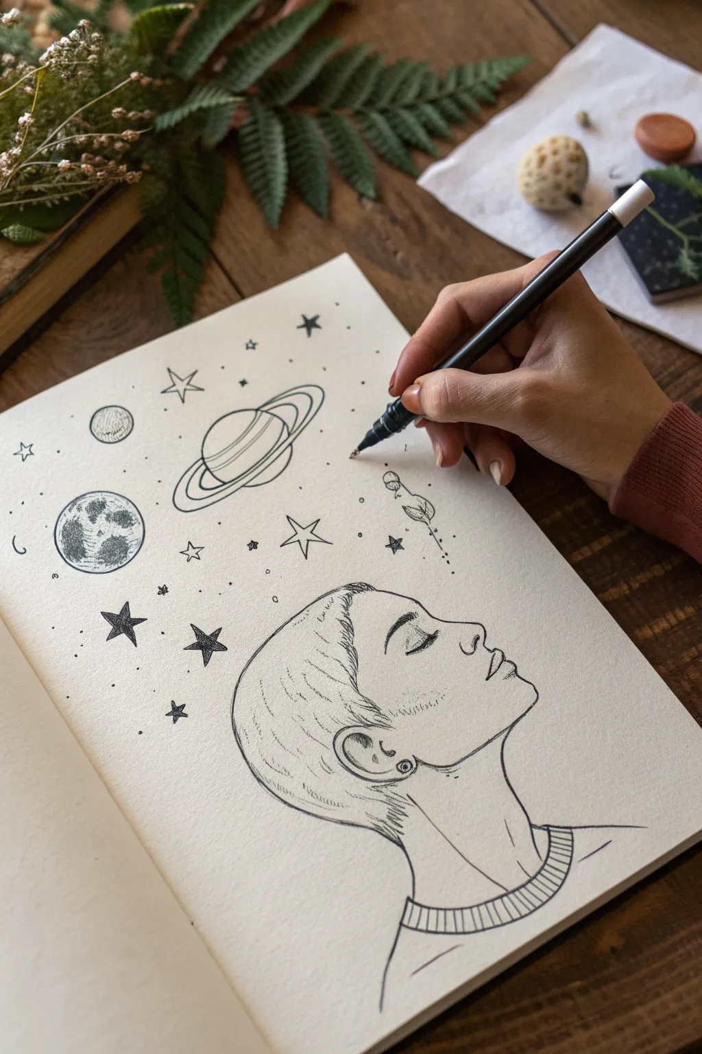
This evocative pen-and-ink drawing features a serene profile gazing upward, their thoughts manifesting as a swirling galaxy of planets and stars. Using fine liners and stippling techniques, you’ll create a surreal juxtaposition between human portraiture and celestial vastness.
Detailed Instructions
Materials
- Smooth heavyweight drawing paper or sketchbook
- HB graphite pencil
- Kneaded eraser
- Fine liner pens (0.1mm, 0.3mm, and 0.5mm)
- White gel pen (optional for highlights)
Step 1: Penciling the Foundation
-
Profile Outline:
Begin with a light pencil sketch of a side profile facing right. Draw a smooth forehead that dips into the nose bridge. Keep the nose slightly upturned and refined. -
Facial Features:
Mark the position of the eye just below the brow ridge. Draw a closed eyelid with a gentle curve to suggest a peaceful, meditative state. Sketch the lips slightly parted and a soft, rounded chin. -
Neck and Hair:
Extend a long, elegant line for the neck and indicate the collarbone area. Sketch a short, cropped hairstyle, keeping the lines loose around the ear and nape. -
Planning the Cosmos:
Above the forehead, lightly sketch the positions for the celestial bodies. Place a large ringed planet centrally, a textured moon to the left, and scatter smaller stars around them to create a balanced composition.
Step 2: Inking the Portrait
-
Refining the Profile:
Switch to a 0.3mm fine liner. Carefully trace over your pencil lines for the face profile, using a confident, continuous stroke for the nose and chin to keep it smooth. -
Detailing the Eye:
Use a thinner 0.1mm pen for the closed eye. Draw the lash line a bit thicker and add delicate, short strokes for individual eyelashes. -
Hair Texture:
For the short hair, use quick, flicking motions with the 0.1mm pen. Don’t outline every strand; instead, focus on the direction of growth near the ear and temple. -
Ear and earring:
ink the ear shape, adding a small circle on the earlobe for a stud earring. I like to fill the center of the stud with a spiral or tiny dot for detail. -
Clothing Detail:
Draw the ribbed collar of the sweater. Use parallel curved lines to define the neckband, and add small vertical hatches between them to suggest the knit texture.
Clean Circles Tip
Struggling with perfect planetary circles? Gently trace around a small coin or button with your pencil first, then ink over it for a crisp, geometric shape.
Step 3: Creating the Galaxy
-
Inking the Ringed Planet:
With the 0.3mm pen, outline the large central planet and its rings. Draw the rings as ellipses that wrap around the sphere, keeping the lines clean. -
Planet Texture:
Add simple curved bands across the body of the planet to suggest atmospheric layers. -
The Moon:
Outline the circle for the moon on the left. Use a stippling technique—tapping the pen repeatedly—to create craters and shadows. Densely cluster dots on one side for shading. -
Star Variations:
Draw several five-pointed stars of different sizes. For visual interest, fill some in with solid black ink (0.5mm pen) and leave others as simple outlines. -
Distant Planets:
Add a few small circles widely spaced apart to represent distant planets or moons. You can cross-hatch these lightly to distinguish them from empty space. -
Micro-Details:
Using your finest 0.05mm or 0.1mm pen, add tiny dots and specks of ‘dust’ between the larger elements. This connects the drawing and makes it look like a cohesive galaxy rather than floating icons.
Add Color Washes
Once the ink is waterproof, apply diluted watercolor washes in purple and blue over the stars for a dreamy, nebula-like background effect.
Step 4: Final Touches
-
Weight and Shadow:
Review the portrait lines. Thicken the line under the chin and jaw slightly to add weight and separate the head from the neck. -
Erase and Assess:
Wait at least 10 minutes for the ink to fully cure. Gently erase all underlying pencil sketch marks with the kneaded eraser to reveal the crisp black lines.
Now you have a poetic illustration that perfectly captures the feeling of getting lost in thought
Impossible Heart Optical Illusion
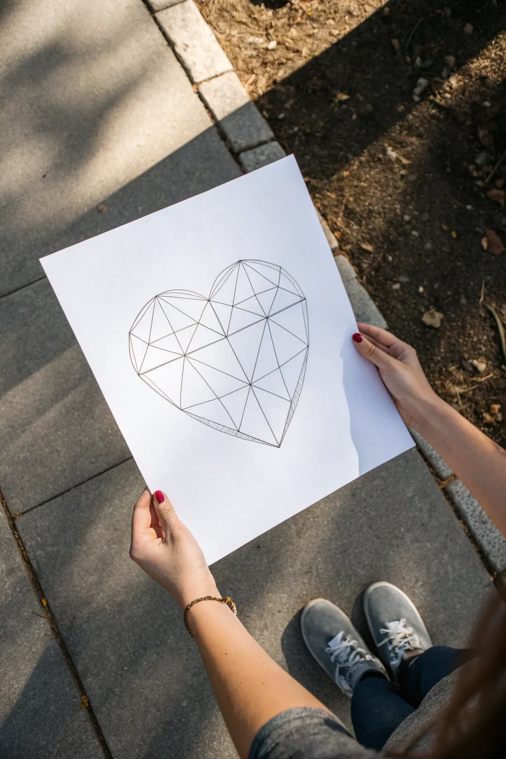
This striking optical illusion transforms a simple heart shape into a complex, faceted gem using nothing but straight lines. By carefully connecting focal points and adding subtle shading, you’ll create a 3D-effect crystal structure that pops right off the page.
Step-by-Step
Materials
- High-quality white drawing paper or cardstock
- Pencil (HB or lighter)
- Eraser
- Ruler or straight edge
- Fine-point black fineliner (0.3mm or 0.5mm)
- Thicker black marker (0.8mm) for the outline
Step 1: Constructing the Framework
-
Draw the main shape:
Start by sketching a large, standard heart shape in the center of your paper using a light pencil. Keep your lines faint so they can be easily erased later. -
Mark focal points:
Place a small dot roughly in the upper center of the heart, where the two lobes meet but slightly lower. Place two more dots along the outer edge curves, and one near the bottom point. -
Create the central divide:
Using your ruler, draw a vertical line connecting the top crease of the heart to the bottom point. -
Draw the primary facets:
Connect your central focal point to the outer edges of the heart with straight lines. These should radiate outward like spokes on a wheel, breaking the curved shape into large geometric sections. -
Subdivide the spaces:
Inside those large sections, draw smaller triangles. Connect the midpoint of one line to the corner of another. Don’t worry about perfect symmetry; the irregularity makes it look more like a natural crystal. -
Connect the perimeter:
Go around the outer curved edge of the heart and convert the curves into short, straight segments. Connect the ends of your internal spokes with straight lines to form a polygonal outline.
Smudge Alert
If you are using a gel pen or heavy ink, place a scrap piece of paper under your hand while drawing. This prevents the heel of your hand from smearing the fresh ink as you move across the drawing.
Step 2: Inking the Structure
-
Trace internal lines:
Switch to your fine-point black pen. Carefully trace over all the internal geometric lines you created with the ruler. Keep your hand steady to ensure crisp, sharp intersections. -
Outline the exterior:
Use the slightly thicker marker to trace the outer perimeter of the heart. A bolder exterior line helps contain the shape and emphasizes the faceted look. -
Check for gaps:
Inspect your intersections. Make sure all lines meet perfectly at the corners of the triangles without overshooting or leaving gaps. -
Erase pencil marks:
Wait a moment for the ink to dry completely, then gently erase all the underlying pencil sketches, leaving only the clean ink geometry.
Color Pop
Instead of black and white hatching, color the facets with pencils. Use three shades of one color (light, medium, dark) to enhance the 3D effect based on your light source.
Step 3: Adding Depth and Dimension
-
Choose a light source:
Decide where your imaginary light comes from (usually top-left or top-right). This will tell you which facets should be shadowed. -
Start hatching:
Identify a facet on the ‘shadow side’ of the heart. Draw a series of closely spaced parallel lines (hatching) inside that specific triangle. -
Vary the line weight:
For darker areas, like the bottom right or deep creases, draw your hatch lines closer together. For lighter areas, space them further apart. -
Add cross-hatching:
I like to add cross-hatching (lines going in the opposite direction) on the darkest facets to create deeper contrast and drama. -
Leave highlights blank:
Ensure the facets facing your imaginary light source are left completely white. This contrast is what creates the convincing 3D crystal effect. -
Refine the edges:
Add a second, very thin line parallel to the outer edge on the shadowed side to suggest thickness or a beveled edge.
Now you have a stunning geometric heart that looks complex but was built one simple line at a time


Double Exposure Silhouette Mashup

Capture the magic of nature within a portrait by blending a stark silhouette with a misty pine forest. This double-exposure effect relies on negative space and tonal values to seamlessly merge the human form with the wild outdoors.
Step-by-Step Guide
Materials
- Heavyweight drawing paper (smooth bristol or mixed media)
- HB graphite pencil (sketching)
- 2B and 4B graphite pencils (shading)
- Black ink fineliners (0.1mm and 0.5mm)
- Black watercolor or India ink (optional for deepest blacks)
- Small round brush (if using ink)
- Kneaded eraser
Step 1: Drafting the Silhouette
-
Outline the Profile:
Start with your HB pencil to lightly sketch the profile of the woman. Focus on capturing the curve of the forehead, the nose, lips, and chin. Don’t press too hard; these lines are just guides. -
Define the Hair Bun:
Complete the head shape by sketching a loose, messy bun at the back. Include a few stray strands falling down the neck to give it a natural, organic feel. -
Mark the Neckline:
Extend the line down the neck and shoulders, letting it fade out at the bottom where the ‘ground’ of the forest will eventually be. -
Ear Placement:
Sketch the ear carefully. This will remain a negative space element (white paper) inside the dark silhouette, so the shape needs to be accurate.
Step 2: Creating the Forest Upper Edge
-
Map the Tree Line:
Instead of drawing a solid top line for the head, you will create a jagged edge of treetops. Lightly pencil in where the hairline would be, but visualize it as a ridge of distant trees. -
Ink the Tiny Trees:
Using your 0.1mm fineliner, start drawing tiny pine trees along the crown of the head. These should be small and dense, creating the illusion of distance. -
Vary Height and Density:
Make sure the trees aren’t all the same height. Let some poke up higher than others to create a realistic canopy silhouette against the white background.
Uneven Shading?
If your pencil shading looks scratchy, use a paper blending stump (tortillon) or a soft tissue to gently smudge the graphite for that smooth, misty fog effect in the neck area.
Step 3: Filling the Dark Silhouette
-
Establish the Face Darkness:
Switch to a 4B pencil or a 0.5mm pen. Begin filling in the face area, keeping the tone fairly solid and dark. This anchors the image. -
Detailed Hair Strands:
For the bun and the back of the head, use sweeping strokes to mimic hair texture. I find that quick, confident flicks of the pen prevent the lines from looking stiff. -
Preserve the Ear:
Carefully draw around the ear sketch you made earlier. Leave the skin of the ear completely white, but outline it delicately so it pops against the dark hair and neck. -
Gradient Transition:
As you move down from the face into the neck and shoulder area, start to lighten your pressure. You want a transition from solid black/dark grey into a misty, lighter grey.
Pro Tip: Depth of Field
Make the trees at the top (the ‘hairline’) very sharp and black, but make the trees inside the neck softer and greyer. This atmospheric perspective adds massive depth.
Step 4: The Forest Interior
-
Draw the Tall Trunks:
Using a 2B pencil, draw vertical lines extending up from the bottom of the silhouette. These are the trunks of the foreground trees within the body. -
Add Texture to Trunks:
Thicken these trunks slightly and add rough texture. Make them darker at the bottom and let them fade as they reach the ‘neck’ area. -
Create Mid-Ground Foliage:
Sketch looser, softer pine branches around the base of the silhouette. Use graphite shading here rather than sharp ink lines to create a foggy, atmospheric look. -
Layering Darkness:
Deepen the blacks at the very bottom edge of the drawing. This weights the composition and suggests the deep forest floor. -
Blend the Worlds:
Gently shade the space between the tree trunks inside the neck. You want the dark silhouette of the face to dissolve seamlessly into the foggy spacing between the trees.
Step 5: Final Touches
-
Refine the Edges:
Go back to the profile outline (nose, lips, chin). Ensure this edge is crisp and sharp to contrast with the textured forest interior. -
Flyaway Hairs:
Add a few very fine, loose ink lines escaping the bun and the main silhouette to enhance the realism. -
Clean Up:
Use your kneaded eraser to lift up any stray pencil marks outside the silhouette, keeping the surrounding paper pristine white.
Now stepping back, you can see how the human form and the landscape have merged into one cohesive story
Tiny Monsters With Big Personalities

Unleash a whimsical cast of characters with this simple ink-drawing project. These tiny monsters are built from basic shapes and patterns, making them a perfect, relaxing exercise for filling a bullet journal page with personality.
Step-by-Step
Materials
- Dotted or blank journal (A5 size recommended)
- Fine-liner pen (0.3mm or 0.5mm, black ink)
- Pencil (HB or H)
- Eraser
Step 1: Planning and Layout
-
Lightly sketch positions:
Using your pencil, lightly map out where each monster will live on the page. Draw loose circles, ovals, and rectangles to reserve space so your layout feels balanced and not too crowded. -
Sketch the moon and plants:
Near the top left, sketch a small crescent moon and a simple leafy vine. Near the bottom center, add a fern leaf. These non-monster elements help frame the page.
Expression Trick
Vary eye sizes and pupil placement drastically. Making one eye huge and one tiny, or placing pupils cross-eyed, instantly makes monsters look sillier.
Step 2: Drawing the Monsters
-
First Monster: The Cyclops:
Start with the monster in the center-left (the one that looks like a ghost). Draw a rounded dome shape with a wavy bottom edge. Inside, draw two large circles for eyes—make one pupil huge and one small for a goofy look. -
Second Monster: The Tall Tooth:
Move to the top right. Draw a tall, narrow rectangle with rounded corners. Add a single big eye near the top, a smiling mouth full of teeth, and tiny feet at the bottom. Give it a small ear on the right side. -
Third Monster: The Furry Box:
In the middle area, sketch a square body. Add ‘fur’ by making the top of the head jagged. Give it a single large eye in the center and little V-shaped arms. -
Fourth Monster: The Leafy Friend:
To the right of the center, draw a tall oval. Give this monster a leafy crown and leafy hands. A wide, toothy grin and little bird-like feet complete the look. Add dots to the body for texture. -
Fifth Monster: The Reindeer Blob:
Below the furry box, draw a rounded body shape. Add large antlers on top. Inside the body, draw a smaller oval for the face with two eyes looking sideways. -
Sixth Monster: The Spotted Egg:
On the bottom left, draw an egg shape. Add a horizontal line across the middle like a belt. Fill the bottom half with small dots and the top half with a dotted cap pattern. -
Seventh Monster: The Happy Egg:
On the bottom right, draw a simple smooth egg shape. Place two large eyes near the top (one slightly higher than the other) and a simple curved smile. Add stick arms waving hello. -
Eighth Monster: The Horned Grump:
In the very bottom center, draw a thumb-shape. Add two sharp horns on top. Give it a ‘w’ shaped mouth to make it look grumpy but cute, and add vertical dashes on its belly for fur texture.
Step 3: Inking and Details
-
Outline with pen:
Take your fine-liner and carefully trace over your pencil lines. Don’t worry if the lines are slightly shaky; that adds to the hand-drawn monster charm. -
Fill in the eyes:
Color in the pupils of the eyes solid black. Leave a tiny white dot in each pupil as a highlight to make the characters look alive. -
Add textures:
Use stippling (tiny dots) to shade the bottoms of the monsters, like the Spotted Egg and the Leafy Friend. This gives them weight and dimension. -
Draw the filler elements:
Ink the crescent moon, the hanging flower pods on the left, and the fern leaf at the bottom. These small details tie the composition together. -
Erase pencil marks:
Wait at least 5 minutes for the ink to dry completely. Gently erase all visible pencil sketches to reveal a clean, crisp drawing.
Color Pop
After inking, use a mild highlighter or watercolor wash to add a single spot of color to each monster, like pink cheeks or a green body.
You now have a delightful page of creatures ready to guard your notes or simply make you smile


Have a question or want to share your own experience? I'd love to hear from you in the comments below!