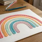
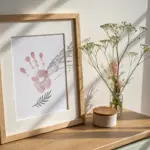
Whenever I’m craving a fresh creative spark, I go straight to print—because nothing beats that satisfying mix of ink, paper, and hands-on making. Here are my favorite creative printing ideas that turn your artwork into pieces people actually want to hold, flip, unfold, and keep.
Postcard-Size Art Prints
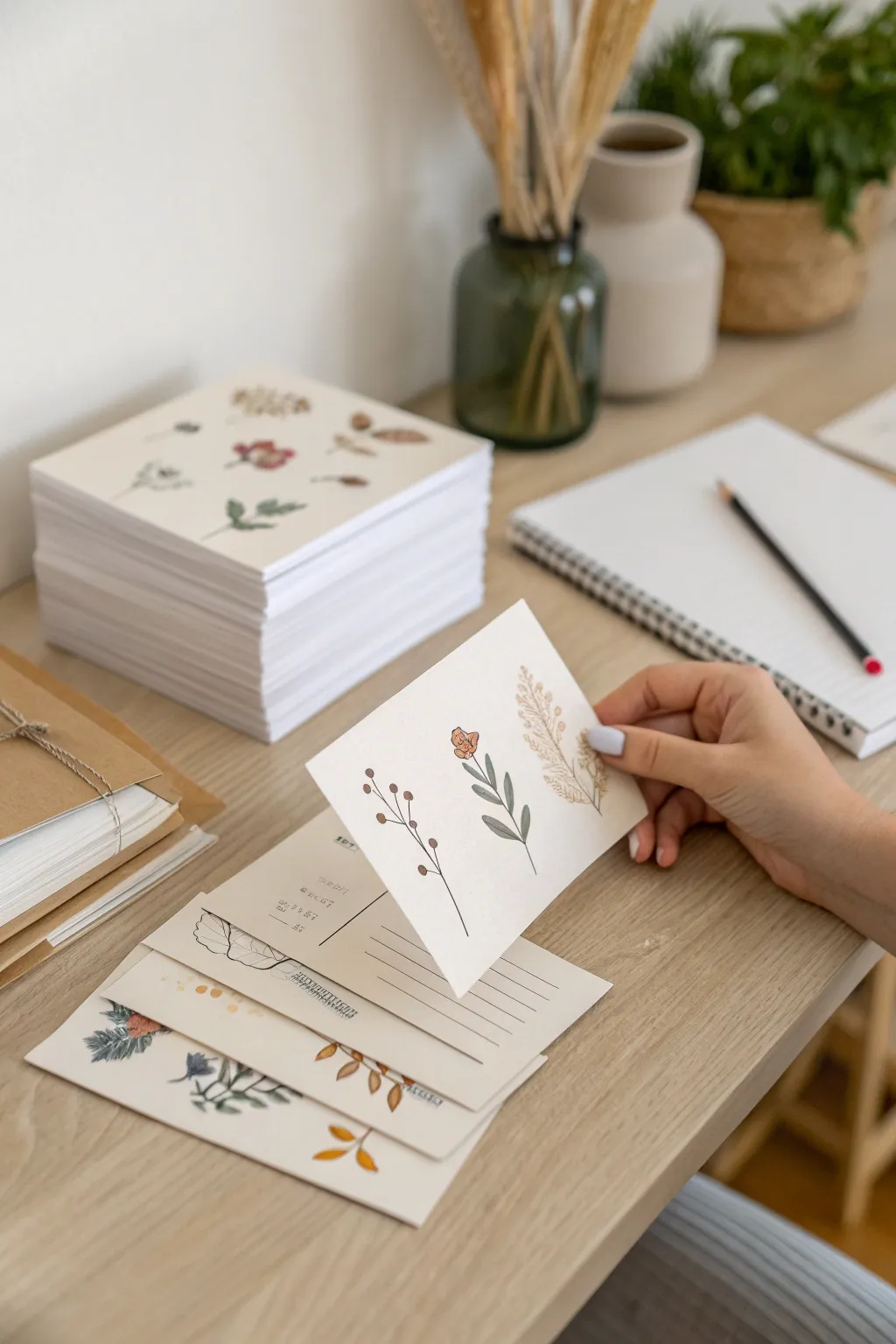
Transform simple botanical sketches into a charming set of personalized stationery that feels both artisanal and intimate. These postcard-sized art prints capture the delicate beauty of nature on crisp cardstock, perfect for thoughtful notes or mini gallery walls.
Step-by-Step
Materials
- Heavyweight matte cardstock (300gsm or greater)
- Watercolor paints or gouache (earth tones)
- Fine liner pens (black or sepia, sizes 0.1 and 0.3)
- Round watercolor brushes (sizes 2 and 4)
- Pencil (HB) and kneaded eraser
- Paper trimmer or craft knife and ruler
- Scanner and printer (optional for reproduction)
Step 1: Design & Preparation
-
Cut the base:
Begin by cutting your heavyweight cardstock into standard postcard dimensions, typically 4×6 inches (10×15 cm). Ensure your edges are perfectly crisp by using a sharp craft knife against a metal ruler rather than scissors. -
Sketch the layout:
Lightly sketch your botanical designs in pencil. For the focal card shown, plan three vertical stems evenly spaced across the card. Simplicity is key here, so aim for clean, separated silhouettes rather than a cluttered bouquet. -
Draft the berry stem:
On the left, sketch a thin, branching stem with small circles at the tips to represent berries or buds. Keep the lines slightly wavering to mimic natural growth. -
Draft the central flower:
In the center, draw a thicker, straighter stem with opposite pairs of leaves. Top it with a small, stylized tulip-like bloom or bud. -
Draft the grass stalk:
For the rightmost element, sketch a taller, feathery grass stalk. Use faint strokes to indicate the texture of the seed head without getting bogged down in detail yet.
Ink Smudging?
If your fine liner smears over the watercolor, the paper likely holds moisture longer than expected. Use a hairdryer on low heat for 30 seconds before inking.
Step 2: Painting the Botanicals
-
Mix your palette:
Prepare a muted, earthy palette. You will need a deep brownish-red for the berries, a sage green for the central leaves, a dusty orange for the flower, and a warm beige or wheat color for the grass. -
Paint the central stem:
Using a size 4 brush, paint the leaves of the central plant with your sage green. Use a single stroke for each leaf, pressing down and lifting up to create the leaf shape naturally. -
Add the flower accent:
While the green is drying, switch to a smaller brush to paint the small orange bud at the top. Let a tiny gap remain between the flower and the stem for a delicate, illustrated look. -
Paint the berry branches:
For the left plant, use a fine liner brush or a very steady hand with the size 2 brush. Paint the stems in dark brown. Once the stems are dry, dot the ends with brownish-red paint for the berries. -
Create the grass texture:
Load your brush with the wheat-colored paint for the rightmost plant. I prefer to use a slightly dry brush technique here, dabbing repeatedly to create the fluffy texture of the grass head without solid blobs of color. -
Let it dry completely:
Allow the watercolor to dry fully. The paper should feel room temperature to the touch, not cool.
Step 3: Inking & Finishing
-
Outline the berries:
Using a 0.1 fine liner, verify the paint is dry, then trace the thin stems of the left plant. Add tiny defining circles around the painted berries, perhaps leaving some lines broken for an artistic feel. -
Define the central leaves:
Add a central vein line to the sage green leaves using the fine liner. You don’t need to outline the entire leaf; a simple line down the middle often looks more elegant. -
Detail the flower:
Add small ink details to the orange flower bud to give it petals and form. -
Texture the grass:
For the beige grass on the right, use stippling (tiny dots) or short, feathery hatch marks with your pen to enhance the fuzzy texture over the dried paint. -
Erase pencil marks:
Gently gently run your kneaded eraser over the entire design to pick up any visible graphite lines, being careful not to smudge the ink if it isn’t waterproof. -
Add backside details:
Flip the card over. Using a ruler and a 0.3 pen, draw the standard postcard dividing line and three horizontal lines for the address on the right side. You can add a small ‘stamp’ box in the corner if desired.
Pro Tip: Consistent Series
For a cohesive look across different designs, stick to the same 3-4 paint colors for every card, even if the plant species changes.
Step 4: Creating a Set (Optional)
-
Digitizing:
If you wish to make the stack shown in the image, scan your finished artwork at 300 DPI or higher. -
Printing copies:
Print your design onto fresh sheets of cardstock. Ensure your printer settings are adjusted for heavy paper to prevent jams. -
Trimming the stack:
Cut your printed sheets down to size. Creating a large stack creates a satisfying, professional-looking inventory of your own artwork ready to send.
You now have a beautiful collection of hand-painted stationery ready to brighten someone’s mailbox
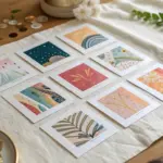
Mini Print Sets With Matching Borders
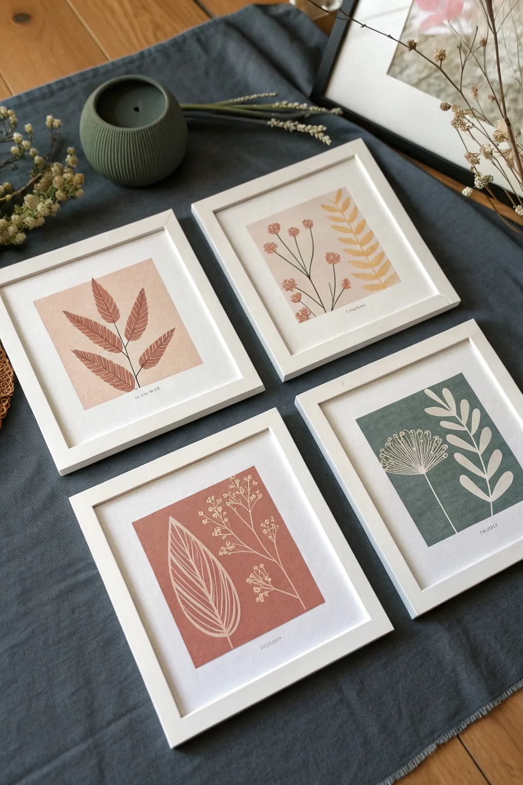
Capture the charm of nature with these elegant mini prints featuring botanical silhouettes against earthy, solid-color backgrounds. This project combines the clean aesthetic of block printing with the precision of masking to create a gallery-worthy set perfect for small spaces.
Detailed Instructions
Materials
- Heavyweight white drawing paper or cardstock (smooth finish)
- Acrylic paints (terracotta, sage green, blush pink, cream/mustard)
- Low-tack masking tape or painter’s tape
- Fine detail paintbrush (size 0 or 1)
- Flat shader brush (size 6 or 8)
- Pencil and eraser
- Ruler
- Square white frames (approx. 5×5″ or 6×6″)
- Scissors
Step 1: Preparing the Layout
-
Measure your frames:
Begin by removing the backing from your square frames to measure the exact opening size. Cut your heavyweight paper into squares that fit snugly inside the frames. -
Define the borders:
Using a ruler, lightly mark a consistent margin on your paper squares. A generous white border is key to this look, so measure about 1 to 1.5 inches in from each edge to create a smaller central square for your artwork. -
Tape the boundaries:
Apply low-tack masking tape precisely along your pencil lines to mask off the outer border. Press the edges of the tape down firmly with your thumbnail to prevent paint from bleeding underneath.
Bleeding Edges?
If paint seeps under your tape, let it dry fully. Then, take a white gel pen or a tiny brush with white acrylic paint to essentially ‘white-out’ the mistake and straighten the line.
Step 2: Creating the Backgrounds
-
Mix your palette:
Prepare your acrylic colors. Aim for earthy, muted tones like dusty rose, warm terracotta, dark sage, and a soft mustard yellow. If your colors are too bright, tone them down by mixing in a tiny dot of brown or gray. -
Apply the base coat:
With your flat shader brush, paint the exposed central square of your paper. Apply the paint smoothly and evenly. Because we want a flat, graphic look, try to minimize visible brushstrokes. -
Dry and peel:
Allow the paint to dry completely—this is crucial. Once dry to the touch, carefully peel away the masking tape at a 45-degree angle to reveal crisp, clean edges.
Texture Twist
For a true linocut effect, lightly sponge the background paint rather than brushing it. This creates a slightly mottled texture that looks like ink on paper.
Step 3: Painting the Botanicals
-
Sketch the designs:
Lightly sketch your botanical designs directly onto the painted squares using a pencil. Keep the shapes simple: a single fern leaf, a sprig of wildflowers, or a stylized branch. -
Paint the silhouettes:
Using a contrasting color (often a darker shade of the background or a deep reddish-brown), meticulously paint the positive shapes of your design. For example, on the blush pink background, paint a dark leafy branch. -
Negative space technique:
For the designs that look like white line drawings on a colored background (like the sage green or terracotta examples), use a very fine brush and opaque white or cream paint to draw the stems and veins over the colored block. -
Layering details:
Add subtle depth by mixing varying tones. On the mustard yellow background square, paint the stems black first, then layer the yellow/mustard leaf shapes over or near them for a multi-color print effect. -
Refining edges:
Use your smallest detail brush to sharpen the tips of leaves and petals. Clean lines mimic the look of a professional print.
Step 4: Final Assembly
-
Let it cure:
Allow all paint layers to dry for at least an hour. Acrylics dry fast, but you don’t want any tackiness when placing them against glass. -
Erase pencil marks:
Gently erase any lingering pencil sketches from the white border area. Be very careful near the painted edges. -
Sign your work:
For an authentic art-print feel, sign your name or initial in small, neat pencil script just below the colored square on the right side. -
Clean the glass:
Wipe the inside of your frame glass to remove any dust or fingerprints. Speckles behind the glass can be very distracting on such clean, white artwork. -
Frame and display:
Place your finished artwork into the frames and secure the backing. Arrange them in a 2×2 grid or a horizontal row to display your new botanical collection.
Now you have a cohesive set of botanical artworks that look effortlessly sophisticated on any wall

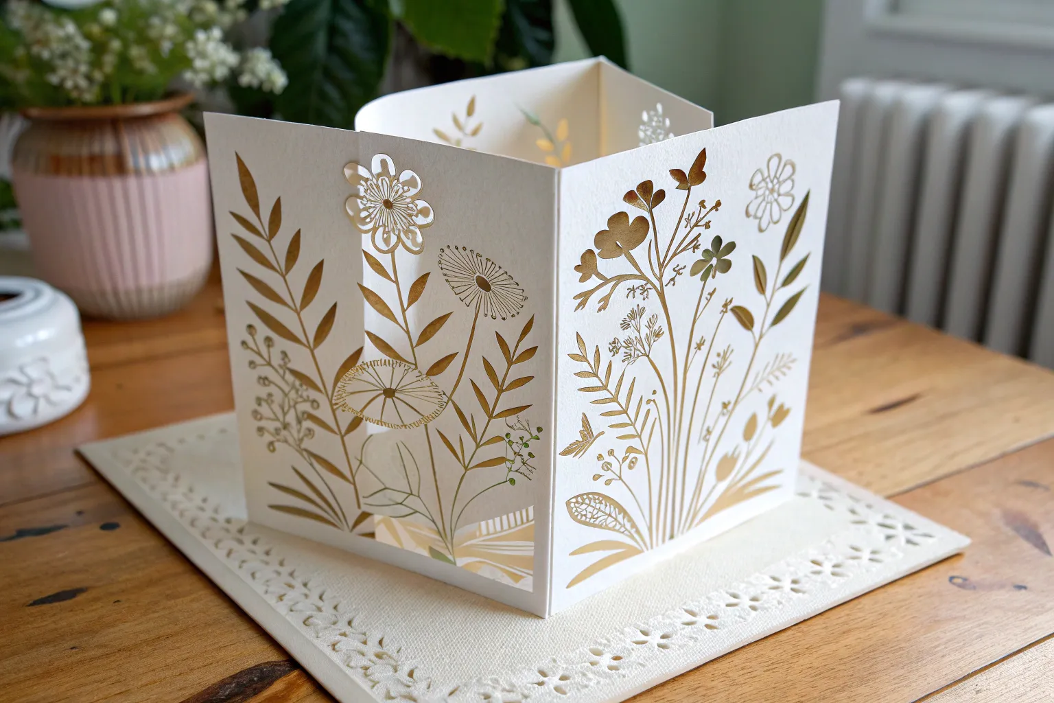
Folded Greeting Cards From Your Drawings
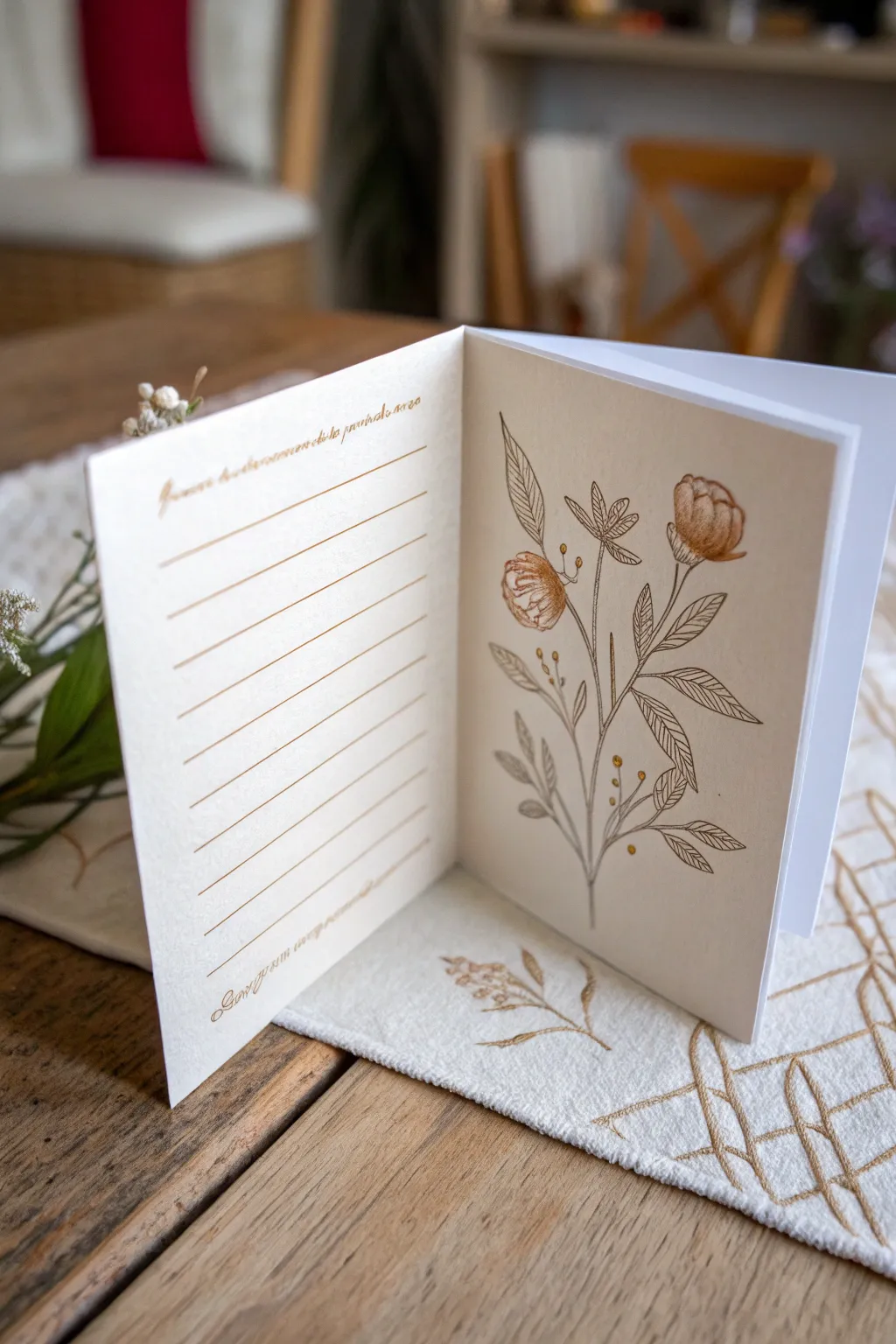
Transform a simple sheet of cardstock into a bespoke piece of stationery featuring a delicate botanical illustration and a customized interior writing space. This project combines classic pen-and-ink drawing styles with the elegance of letterpress-inspired layouts for a truly personal greeting card.
Step-by-Step
Materials
- High-quality heavyweight cream cardstock (8.5×11 or A4)
- Bone folder
- Ruler
- Pencil (HB)
- Fine-point pigment liner pens (0.1mm and 0.3mm, sepia or black)
- Gold or copper metallic gel pen or fine marker
- Eraser
- Scoring board (optional)
- Cutting mat and craft knife
Step 1: Preparing the Card Base
-
Cut to size:
Begin by trimming your cream cardstock to a standard landscape rectangle, approximately 10 inches by 7 inches, to create a final 5×7 folded card. Ensure your edges are perfectly straight using a ruler and craft knife. -
Score the center:
Measure exactly halfway across the long edge of the paper. Place your ruler along this center line and firmly run your bone folder down the invisible line to create a clean groove without tearing the fibers. -
Create the fold:
Gently fold the card along the score line. Run the bone folder over the folded edge again to sharpen the crease, ensuring the card lies flat.
Ink Smearing?
If your ruler causes ink smears when drawing lines, tape a penny to the underside of the ruler. This raises the edge slightly off the paper, preventing wet ink from dragging.
Step 2: Drafting the Layout
-
Sketch the botanical stem:
Open the card to lay it flat. On the right-hand interior panel, lightly sketch a central stem curving slightly upward using your HB pencil. -
Add floral shapes:
Pencil in two main blooms—one open cup-shaped flower near the top right and a tighter bud on the left. Keep the shapes loose and organic. -
Outline the leaves:
Draw elongated, pointed leaves branching off the main stem. Alternate their placement to keep the composition balanced but natural. -
Mark the writing lines:
Move to the left-hand interior panel. Using your ruler, lightly mark horizontal lines spaced about half an inch apart. Leave a generous margin at the top and bottom. -
Placement for text:
Sketch a very faint guideline at the top of the left panel for your introductory script, and a small line at the bottom for a signature or footer message.
Pro Tip: Paper Texture
Choose a cardstock with a slight ‘tooth’ or vellum finish rather than glossy. The texture helps the ink grip better and gives the sketched lines a more authentic, artistic quality.
Step 3: Inking the Illustration
-
Inking main lines:
Switch to your 0.3mm pigment liner (I prefer a sepia tone for a vintage look). Trace the main stem and the outlines of the flowers and leaves with a steady hand. -
Adding texture to petals:
Inside the flower heads, use the 0.1mm fine liner to draw tight, vertical hatching marks. This creates the illusion of curved petals and shadow depth. -
Veining the leaves:
Draw a central vein in each leaf, then add fine diagonal lines branching out to the edges. Don’t worry if lines break slightly; it adds character. -
Detailed shading:
Use stippling (small dots) or very fine hatching near the base of the leaves and where stems connect to add contrast and volume. -
Metallic accents:
Take your gold or copper metallic pen and add small circular berries or dots floating near the stems. You can also trace over the center of the flowers for a subtle shimmer.
Step 4: Finishing the Interior
-
Drawing the lines:
Using a ruler and the gold or sepia pen, trace over your horizontal pencil lines on the left panel. Keep the pressure light for a refined look. -
Adding script text:
At the top of the lined section, write a generic prompt phrase like ‘Dreams and memories’ or a date line in cursive. Add a small footer phrase at the bottom margin. -
Erase guidelines:
Allow the ink to dry completely—wait at least 15 minutes to prevent smudging. Gently erase all remaining pencil marks. -
Final inspection:
Check your fold one last time and smooth it down with the bone folder if needed to ensure the card feels crisp and professional.
Now you have a beautifully custom card ready for a heartfelt message or to be gifted as a set

Illustrated Bookmark Strips
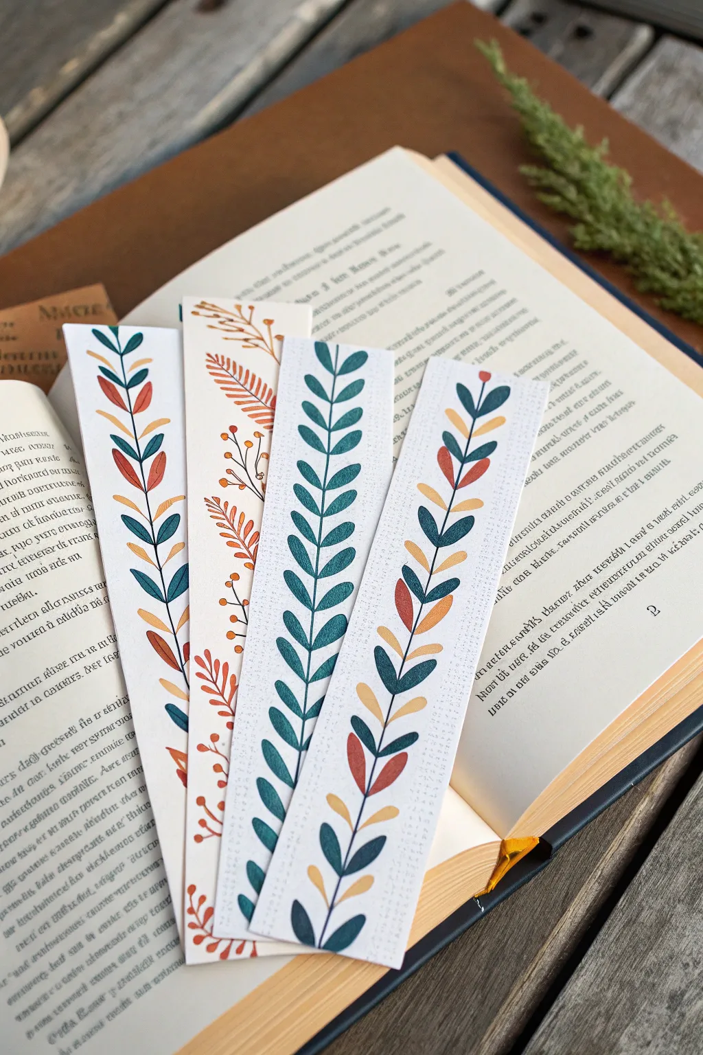
These elegant bookmark strips bring a touch of nature to your reading routine with their clean lines and earthy, autumnal color palettes. The project combines digital design or simple illustration techniques with high-quality cardstock printing to create durable, beautiful page markers that make perfect gifts for book lovers.
Step-by-Step Guide
Materials
- Heavyweight matte cardstock (100lb or similar, white or cream)
- Paper trimmer or guillotine (for precise straight cuts)
- Watercolor paints or markers (if painting by hand)
- Fine-liner pen (0.3mm or 0.5mm, black or dark brown)
- Digital design software or tablet (if printing)
- Ruler
- Pencil
- Eraser
- Corner rounder punch (optional)
- Textured paper (optional background layer)
Step 1: Design & Composition
-
Define the dimensions:
Begin by deciding on the size of your bookmarks. A standard, elegant strip size is typically 2 inches wide by 6-7 inches tall, which fits comfortably inside most paperback books. -
Sketch the central stem:
Using a light pencil, draw a gentle, singular vertical line up the center of your strip. This can be perfectly straight for a modern look or slightly curved for a more organic feel. -
Plan the leaf placement:
Mark small points along the central stem where your leaves will sprout. For the fern-style design, these should be staggered; for the vine style, you might want them paired symmetrically. -
Develop distinct botanical styles:
Sketch three or four different variations. Try one with simple oval leaves, another with more complex fern-like fronds, and perhaps a third featuring small berries or mixed hues.
Uneven Edges?
If your scissors leave jagged edges, switch to a metal ruler and a fresh X-Acto blade. Always pull the blade toward you in one continuous motion for the cleanest line.
Step 2: Illustration & Coloring
-
Select your color palette:
Choose an earthy, coherent palette. The example uses deep teal, burnt orange, mustard yellow, and sage green. Limiting yourself to 3-4 colors per bookmark keeps the design sophisticated. -
Apply the base color:
If painting by hand, use gouache or watercolor to fill in your leaf shapes. Keep the consistency fairly opaque to mimic the printed look. I like to let these dry completely before adding any details to avoid bleeding. -
Create digital vector assets:
If you are designing digitally for print, use the pen tool to create clean vector shapes for leaves. This ensures crisp edges when you eventually print them out. -
Add texture digitally:
To replicate the specific look in the image, overlay a subtle grain or watercolor paper texture onto your colored shapes in your software. This gives a hand-painted feel even to printed items. -
Inking the stems:
Go back over your central stem lines with a fine-liner or a dark stroke in your software. Connect the leaves to the main stem with thin, delicate lines.
Texture Trick
Print on watercolor paper! You may need to hand-feed it into your printer, but the rough tooth absorbs ink beautifully and makes digital art look like an original painting.
Step 3: Printing & Finishing
-
Set up the print layout:
Arrange your designs side-by-side on a standard letter-sized canvas in your software to maximize paper usage. Leave at least a 0.5-inch gap between each strip for cutting. -
Select the right paper:
Load your printer with heavyweight matte cardstock. Textured ‘linen’ cardstock works beautifully here to enhance the tactile quality of the bookmark. -
Print the sheet:
Run a test print on plain paper first to check colors. Once satisfied, print on your good cardstock using the ‘Best’ or ‘Photo’ quality setting. -
Allow ink to settle:
Let the printed sheet sit for at least 10 minutes. This prevents smudging while handling and allows the ink to fully bond with the paper fibers. -
Cut the strips:
Place your sheet on a cutting mat. Using a metal ruler and a sharp craft knife or a guillotine trimmer, slice clearly along the boundaries of your bookmarks. -
Check the edges:
Inspect the cut edges. If there are any white slivers from the background, carefully trim them away for a professional finish. -
Optional laminating:
For extra durability, you can apply a matte laminate sheet over the top before cutting, though the raw paper texture often feels nicer for this organic style.
Now slip these charming botanical strips into your current read and enjoy artistic organization
BRUSH GUIDE
The Right Brush for Every Stroke
From clean lines to bold texture — master brush choice, stroke control, and essential techniques.
Explore the Full Guide
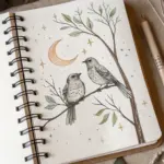
Sticker Sheets From Sketchbook Motifs
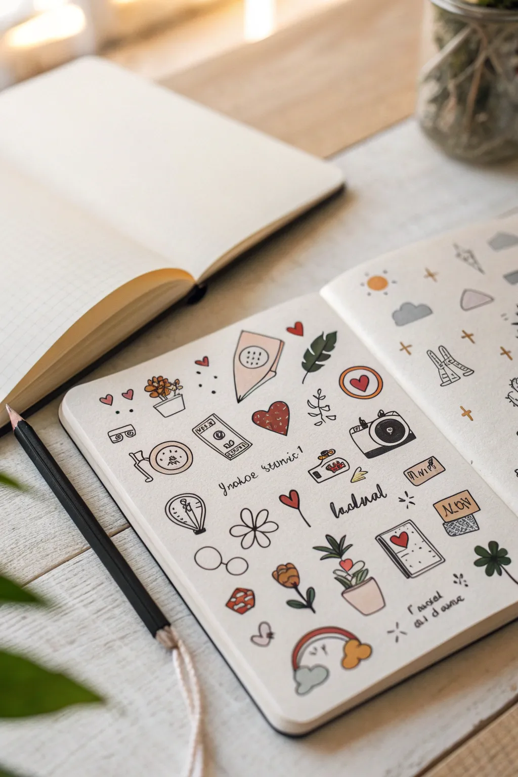
Turn a simple sketchbook spread into a playful collection of sticker-ready motifs with this hand-drawn illustration project. The result is a charming page filled with cozy, everyday objects rendered in clean ink lines and soft, muted colors.
Step-by-Step
Materials
- A5 dotted grid notebook or mixed media sketchbook
- Fine liner pen (0.3mm or 0.5mm, waterproof black ink)
- Alcohol markers or light watercolor paints (muted palette: pinks, ochres, sages)
- Pencil (HB)
- Eraser
- Adhesive sticker paper (optional, for the final step)
Step 1: Planning the Layout
-
Grid setup:
Begin with an open spread in your dotted grid notebook. The dots will help you keep your small illustrations aligned without needing ruler lines. -
Brainstorm motifs:
Lightly sketch out a variety of small, unconnected shapes using your pencil. Think of cozy themes: a coffee cup, a camera, a monstera leaf, envelopes, flowers, and geometric shapes. -
Space distribution:
Ensure distinct spacing between each doodle. You want them close enough to look cohesive but separate enough that they could eventually be cut out individually as stickers.
Step 2: Inking the Designs
-
First outlines:
Using your black fine liner, carefully trace over your pencil sketches. Start with the larger items like the camera and the slice of cake to anchor the page composition. -
Line weight:
Keep your pressure consistent for a uniform look, similar to a printed sticker sheet. Avoid sketching or feathery lines; aim for single, confident strokes. -
Adding details:
Once the main shapes are inked, add tiny interior details like the buttons on the camera, the veins on the leaves, and the dots on the mushroom cap. -
Text elements:
Intersperse a few hand-lettered words or phrases in a cursive style. Words like ‘journal’ or ‘notes’ work well to fill awkward gaps between drawings. -
Erasure:
Wait at least five to ten minutes for the ink to fully cure, then gently erase all visible pencil marks.
Smudge Alert
If your fine liner smears when you color over it, switch the order: color the shapes first with markers, let them dry, and then draw the black outlines on top.
Step 3: Adding Color
-
Choosing the palette:
Select 3-4 muted colors to keep the page cohesive. A soft dusty rose, mustard yellow, and sage green create the vintage aesthetic shown in the example. -
Spot coloring:
Begin with the dusty rose marker. Fill in specific elements like the heart shapes, the flower pot, and the cake slice frosting. Don’t color everything; leave some white space. -
Accenting:
Switch to your yellow or ochre shade. Use this for the sun, the camera lens rim, and center details of flowers. -
Greenery:
Use the sage green for the leaf motifs and the stem of the flower. If you are using alcohol markers, try not to saturate the paper too much to prevent bleeding. -
Offset effect:
For a stylized look, I sometimes intentionally color slightly outside the lines or leave a sliver of white inside the line to mimic a casual, hand-printed feel.
Creative Spark
Draw a thick gray ‘shadow’ line on just the right side of every object. This makes the sketches pop off the page 3D-style.
Step 4: Final Touches
-
Filler elements:
If there are still large empty white spaces, use your black pen to add tiny filler doodles like small plus signs, dots, or mini hearts. -
Digitizing (Optional):
To turn these into actual stickers, scan the page at 300 DPI, increase the contrast in editing software, and print onto adhesive paper.
Now you have a sketchbook page that looks just like a custom sticker sheet ready for scanning or admiring
Die-Cut Cards in Custom Shapes
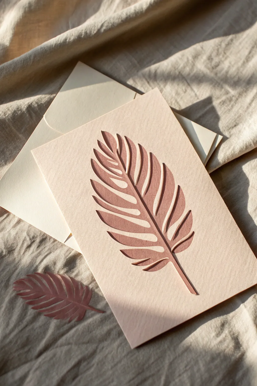
Elevate your stationery with this elegant die-cut card featuring a stylized feather leaf motif. The design uses negative space to reveal a contrasting envelope liner or simply casts beautiful shadows, while the reserved cut-out piece makes for a lovely matching confetti element.
Step-by-Step Tutorial
Materials
- Heavyweight cardstock (blush pink or light coral)
- Contrasting cardstock or envelope (cream or ivory)
- sharp craft knife (X-Acto) or digital cutting machine (Cricut/Silhouette)
- Self-healing cutting mat
- Digital vector file of a feather/leaf (or a hand-drawn sketch)
- Pencil and eraser
- Ruler
- Bone folder
- Double-sided tape or glue runner (optional for lining)
Step 1: Design Preparation
-
Select your paper:
Choose a high-quality, textured cardstock for the card base. A weight around 270-300 gsm works best to maintain structural integrity after cutting. -
Measure and cut the base:
Cut your cardstock to the desired finished size. A standard A5 folded to A6 is versatile, but ensure it fits your chosen envelope. -
Score the fold:
Using your ruler and bone folder, score the center line of the card. Do not fold it yet; keeping it flat makes the cutting process much easier. -
Draft the motif:
Lightly sketch a large feather or palm leaf shape onto the front face of the card. Ensure you leave a healthy border (at least 1 inch) around the edges. -
Define the veins:
Within your feather outline, draw the central spine and the individual barbs. Remember, you need to keep everything connected to the outer paper frame if you want a stencil look, or cut the whole shape out to replicate the image exactly.
Step 2: Cutting the Shape
-
Secure the paper:
Tape the corners of your cardstock to your self-healing cutting mat using low-tack tape to prevent slipping. -
Start with the details:
If hand-cutting, use a fresh, extremely sharp blade. I prefer to start with the smallest interior curves near the spine of the leaf first. -
Cut the leaf outline:
Carefully trace the outer edge of the feather shape with your knife. Apply steady pressure to cut through in one smooth pass. -
Handle curves gently:
Rotate the mat, not your hand, when navigating the curved tips of the feather to ensure fluid lines. -
Remove the positive shape:
Once the entire outline is cut, gently lift the feather shape out of the card. Save this piece! It serves as a beautiful decorative element as seen in the photo. -
Clean up edges:
Inspect the negative space left in the card. If there are any fuzzy edges or hanging paper fibers, carefully trim them away. -
Erase guidelines:
Gently erase any remaining pencil marks from your sketching phase.
Machine Cutting Tip
If using a Cricut, use a ‘light grip’ blue mat and set the material to ‘Cardstock for Intriciate Cuts’ to avoid tearing the delicate leaf tips.
Step 3: Final Assembly
-
Fold the card:
Now that the cutting is complete, fold along your pre-scored line. Use the bone folder to sharpen the crease. -
Prepare the insert:
Since the front has a large hole, you need a backing layer. Cut a piece of cream paper slightly smaller than the card front. -
Attach the liner:
Apply adhesive to the corners of the cream paper and adhere it to the inside front cover of the card. This provides a background color for your cut-out design. -
Alternative shadow look:
Alternatively, leave the background open (no liner) to allow the cut-out to cast dramatic shadows, exactly like the reference image. -
Style and serve:
Place the reserved cut-out feather next to the card or inside the envelope as a surprise gift for the recipient.
Level Up: 3D Effect
Adhere the cut-out feather back into its original hole using foam squares. This creates a floating, dimensional look where the leaf pops forward.
This sophisticated card proves that sometimes the paper itself is all the decoration you need

PENCIL GUIDE
Understanding Pencil Grades from H to B
From first sketch to finished drawing — learn pencil grades, line control, and shading techniques.
Explore the Full Guide
Transparent Overlay Prints for Layering
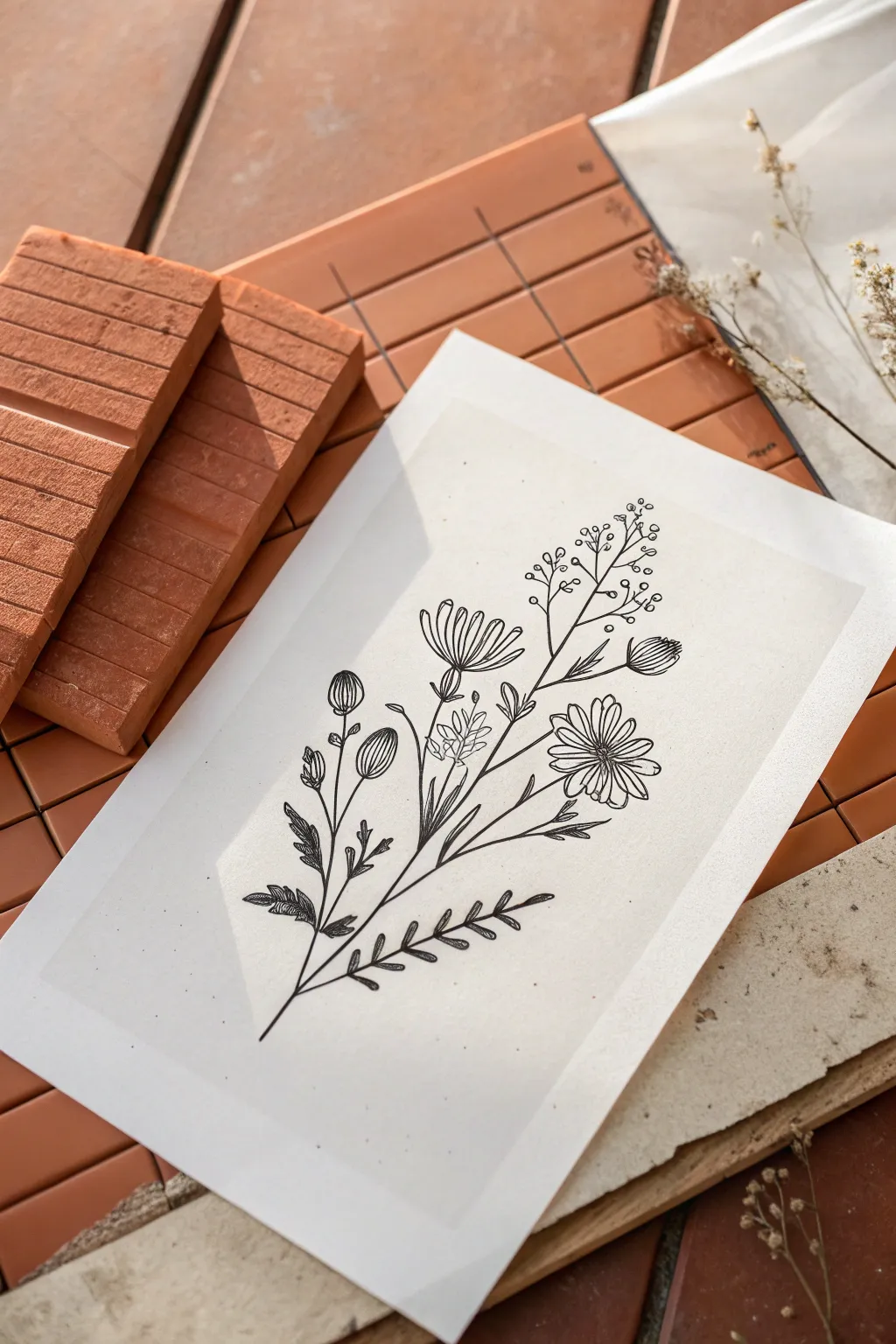
This elegant project plays with transparency and fine lines to create a delicate, modern botanical artwork. By printing a crisp black illustration onto translucent vellum, you add depth and a subtle shadow play that transforms a simple drawing into a dimensional piece.
Step-by-Step Guide
Materials
- Digital botanical illustration (high-resolution black line art)
- Printable vellum paper (translucent/semi-transparent, 8.5×11″ or A4)
- Inkjet or laser printer (check vellum compatibility)
- Textured heavy cardstock or handmade paper (cream or beige)
- Scissors or a paper trimmer
- Double-sided tape or invisible glue dots
- Computer with image editing software
- Terracotta tiles or wood blocks (for styling/display)
Step 1: Digital Preparation
-
Select your artwork:
Choose a high-contrast botanical line drawing. The image in the example features a wildflower bouquet with daisies, buds, and delicate stems. Ensure the background of your digital file is completely transparent or pure white. -
Adjust contrast:
Open your image editing software and boost the contrast. You want the black lines to be deep and solid, as ink can sometimes appear slightly lighter when printed on semi-transparent vellum. -
Size the canvas:
Set up your document size to match your final desired print size. Leave a generous margin of white space around the illustration to allow the transparency to breathe.
Ink Smearing?
If ink pools on the vellum, change printer settings to ‘draft’ or ‘transparency mode’ to reduce ink volume, or switch to a laser printer for dry toner application.
Step 2: Printing Process
-
Check printer settings:
Set your printer to ‘High Quality’ or ‘Photo’ mode. If your printer has a specific setting for transparency or heavy paper, select that to ensure the rollers feed the slippery vellum correctly. -
Load the vellum:
Load a single sheet of printable vellum into the manual feel tray if available. This reduces the curvature of the paper path and minimizes jamming. -
Print the overlay:
Send the file to print. Watch the output tray carefully; vellum ink stays wet longer than standard paper ink. I usually stand by to catch it gently so it doesn’t smear against other papers. -
Allow to dry:
Lay the printed vellum on a flat surface and let it dry completely for at least 15-30 minutes. Do not touch the ink, as it sits on top of the non-porous surface and will smudge instantly.
Step 3: Assembly and Styling
-
Trim the backing paper:
Take your textured heavy cardstock or handmade paper. Cut it to be slightly larger than your printed vellum sheet if you want a border, or the exact same size for a flush look. -
Trim the vellum:
Using a paper trimmer or sharp scissors, cut your printed vellum to your final dimensions. Clean cuts are essential for this minimalist look. -
Align the layers:
Place the vellum overlay on top of the textured backing paper. Shift it until the botanical illustration is centered or positioned exactly how you like it. -
Apply adhesive:
Apply very small pieces of double-sided tape or tiny dots of invisible glue to the very corners of the vellum. Keep the adhesive minimal, as it can sometimes show through the translucent paper. -
Press and seal:
Gently press the corners down to secure the vellum to the backing paper. Avoid rubbing the center of the image to protect the ink. -
Arrange the display:
To recreate the photo’s aesthetic, arrange terracotta tiles or wood blocks on a table. Create varying heights to add interest. -
Position the artwork:
Lay your layered artwork onto the surface. The natural light will pass through the vellum and cast a faint shadow of the lines onto the backing paper, creating a beautiful 3D effect.
Color Pop
Place a pressed dried flower or a watercolor splash on the backing paper *under* the vellum. The overlay will soften the color for a dreamy, hazy effect.
Now you have a sophisticated, layered botanical print ready for framing or flat-lay photography


Have a question or want to share your own experience? I'd love to hear from you in the comments below!