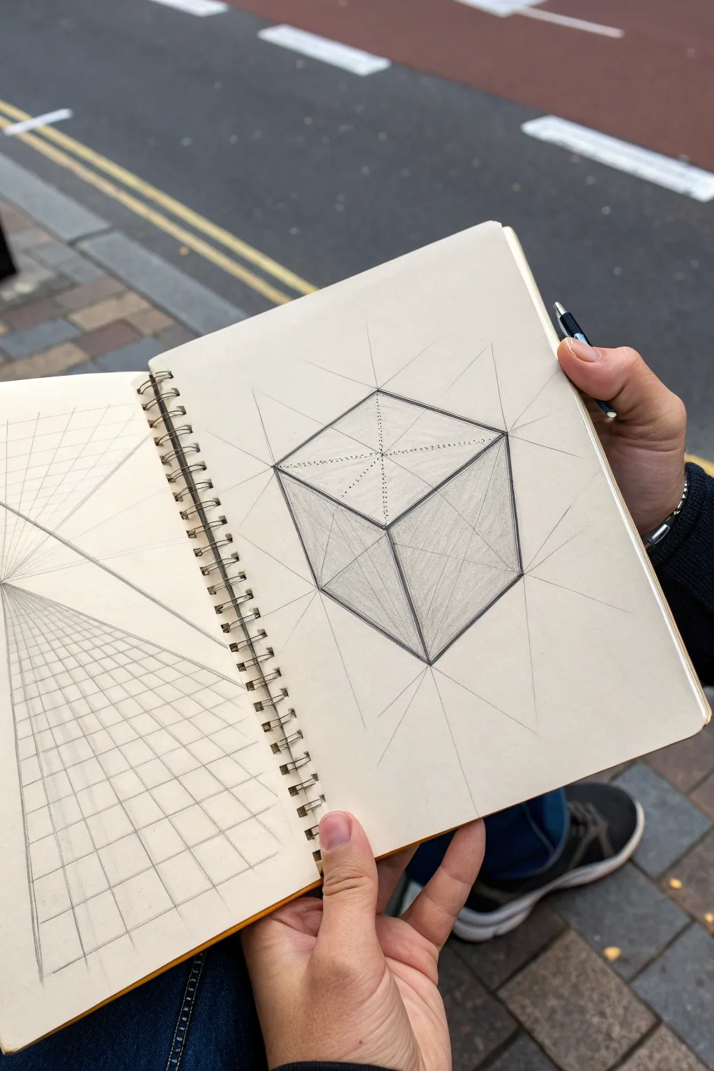
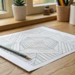
A humble cube can take you ridiculously far—into perspective, shading, pattern play, and even little character designs. When I’m stuck or warming up, these cube drawing ideas are my go-to ways to turn one simple shape into a whole page of momentum.
Classic Shaded 3D Cube
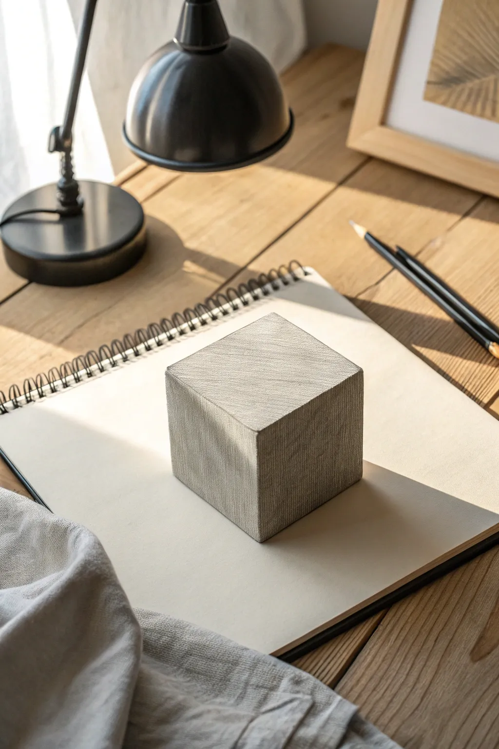
This tutorial guides you through drawing a hyper-realistic cube that focuses heavily on light, shadow, and surface texture. The finished piece features a convincing three-dimensional form with a unique cross-hatched finish that mimics a tactile material like stone or fabric.
Step-by-Step
Materials
- High-quality sketchbook or drawing paper (medium tooth)
- H or HB pencil for initial layout
- 2B and 4B graphite pencils for shading
- Ruler or straight edge
- Kneaded eraser
- Standard vinyl eraser
- Blending stump (optional)
Step 1: Constructing the Framework
-
Establish the horizon line:
Begin by lightly drawing a horizon line across your page. Even though you won’t see this in the final drawing, it helps establish where your vanishing points will live for a proper perspective. -
Draw the leading edge:
Using your H pencil and a clear straight edge, draw a vertical line near the center of your page. This represents the corner of the cube closest to the viewer. -
Form the ‘Y’ shape:
From the top and bottom of your vertical line, draw lines angling upwards and outwards to the left and right. This creates a Y shape that forms the two visible front faces of the cube. -
Complete the top diamond:
Connect the ends of your angled lines to form the top face of the cube. Ensure the parallel lines converge slightly if you want accurate perspective, or keep them perfectly parallel for an isometric look. -
Close the box:
Drop vertical lines down from the two side corners, matching the length of your center line. Connect the bottoms to complete the cube’s outline. Keep these lines faint so they can be easily covered or erased later.
Pro Tip: Edge Control
Keep your pencil extremely sharp for the outer edges but dull it slightly for the internal shading. This sharpness contrast tricks the eye into seeing more depth.
Step 2: Defining Light and Shadow
-
Identify the light source:
Decide on your light direction. For this project, the light comes from the upper left, meaning the top face will be brightest, the left face a medium tone, and the right face the darkest. -
Shade the darkest face:
Take your 2B pencil and fill in the right-hand vertical face. Instead of solid shading, use tight, diagonal hatching lines. This establishes the base tone for the shadow side. -
Deepen the contrast:
Switch to a 4B pencil and layer more graphite onto the right face, especially near the bottom corner where the form meets the paper. -
Tone the middle value:
Move to the left vertical face. Using the 2B pencil again, apply a lighter layer of hatching. I personally like to change the angle of my strokes here to differentiate the plane from the others. -
Highlight the top:
Leave the top face mostly the white of the paper. Use very faint H pencil strokes to add just a hint of texture, keeping it significantly brighter than the sides to show it reflects the most light.
Level Up: Material Change
Swap the cross-hatching for wood grain swirls or stippling dots. Using the same lighting rules with different marks changes the cube from stone to wood or concrete.
Step 3: Texturing and Casting Shadows
-
Create surface texture:
Rather than perfect smoothness, add character by overlaying fine, cross-hatched lines on all faces. Use a sharp tip to gently scratch in perpendicular lines, giving the cube a fibrous or stone-like appearance. -
Map the cast shadow:
Look at where the cube sits on the paper. Draw a long, angular shadow extending to the right, opposite your light source. The shadow should start at the base of the cube and stretch outwards. -
Fill the cast shadow:
Use your 4B pencil to fill this shadow shape dark and solid. The shadow should be darkest right where it touches the object and can fade slightly as it moves away. -
Soften the shadow edge:
Use a blending stump or your finger to slightly soften the far edge of the cast shadow, making the light feel more natural and diffused. -
Clean up edges:
Use your ruler and a vinyl eraser to clean up the outside perimeter of the cube. A crisp, sharp edge is essential for that separated, 3D effect. -
Refine the texture:
Review your hatching. Add a few random scuff marks or darker textural lines on the vertical faces to break up the uniformity and enhance realism. -
Final contrast check:
Step back and squint at your drawing. Deepen the core shadow on the right face one last time to ensure the cube truly pops off the page.
Now you have a solid geometric form that sits convincingly in space, ready for further experimentation shading techniques


Two-Point Perspective Street Cube
Master the fundamentals of spatial depth with this classic two-point perspective exercise. You will create a solid, dimensional cube that appears to float in space using precise vanishing points and construction lines.
Detailed Instructions
Materials
- Sketchbook with smooth, heavy paper
- HB or 2B graphite pencil (for initial lines)
- Ruler or straight edge
- Fine liner pen (optional, for final lines)
- Eraser
Step 1: Setting the Foundation
-
Establish the horizon line:
Begin by lightly drawing a horizontal line across your page. This is your eye level or horizon line, which is crucial for anchoring the perspective. -
Mark vanishing points:
Place two small dots on your horizon line, one on the far left and one on the far right. These are your Vanishing Points (VPs). Spacing them widely prevents the cube from looking distorted. -
Draw the leading edge:
Draw a vertical line somewhere between the two vanishing points. This represents the corner of the cube closest to the viewer. Keep it centered vertically relative to the horizon line for a balanced look.
Step 2: Constructing the Cube Shape
-
Connect the top and bottom:
From the top and bottom endpoints of your vertical line, draw light construction lines extending all the way to both the left and right vanishing points. -
Determine the width:
Decide how wide your cube faces should be. Draw two vertical lines on either side of the central edge, cutting through the converging lines you just drew. These define the side corners. -
Close the shape:
From the tops of these new vertical side lines, draw lines to the opposite vanishing points (left top corner to right VP, right top corner to left VP). Do the same for the bottom corners. -
Find the back corner:
Where these new diagonal lines intersect in the back, draw a final vertical line to connect them. This completes the wireframe of your transparent cube.
Distorted Cube?
If your cube looks stretched or unnatural, your vanishing points are likely too close together. Try moving them off the page onto your desk surface for a more realistic angle.
Step 3: Refining and Defining
-
Darken the outer edges:
Go over the visible contour lines of the cube with a heavier hand or a darker pencil. Make these lines bold and confident to bring the solid shape forward. -
Add internal construction detail:
Using a lighter touch or a dotted line style, trace the hidden edges of the cube (the back corner and lines leading to it). This ‘x-ray’ view adds technical sophistication. -
Find the centers:
Draw light diagonal lines connecting opposite corners on each face of the cube. Where they cross marks the exact perspective center of that face.
Go further
Transform the cube into a crate or building by adding details like wood grain, windows, or bricks, following the same perspective lines to keep them aligned.
Step 4: Shading and Final Touches
-
Identify the light source:
The image shows shading on the left and right faces, suggesting light coming from above. I find it easiest to pick a light direction before I start shading to keep it consistent. -
Apply base shading:
Use the side of your pencil to fill in the side faces of the cube. Keep the strokes relatively vertical to emphasize the height of the object. -
Differentiate values:
Make one side slightly darker than the other to create contrast. In the reference, the right face is slightly darker, adding dimension. -
Extend construction lines:
Don’t erase your initial guide lines completely. Let the lines connecting to the vanishing points extend outward past the cube’s corners, reinforcing the perspective grid aesthetic. -
Clean up:
Gently erase any accidental smudges, but leave the structural ‘scaffolding’ lines visible to preserve the architectural sketch look.
You now have a geometrically perfect cube that anchors firmly in three-dimensional space

Stacked Cube Tower Sketch
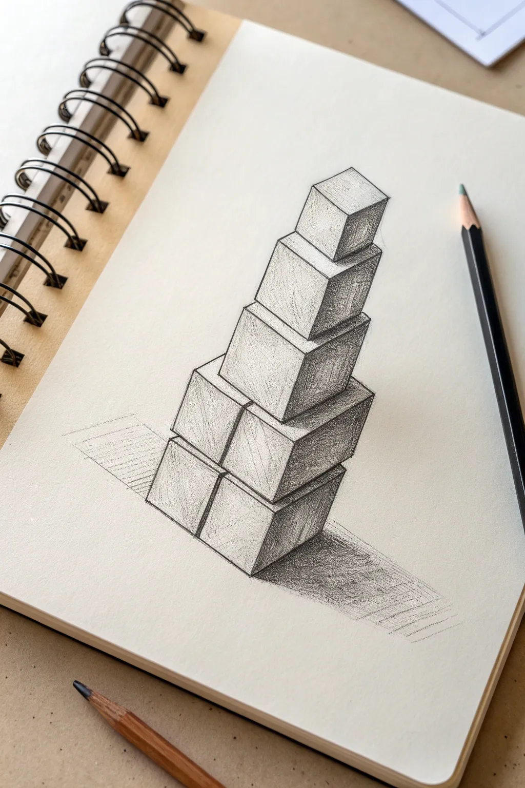
Master the art of perspective and shading with this striking pencil sketch of a towering cube structure. By combining sharp geometric lines with careful graphite gradients, you’ll create a 3D illusion that seems to pop right off the page.
Step-by-Step Guide
Materials
- Sketchbook or drawing paper (medium tooth)
- HB pencil (for initial outlines)
- 2B or 4B pencil (for shading)
- Ruler or straight edge
- Kneaded eraser
- Pencil sharpener
Step 1: Planning and Foundation
-
Map the central axis:
Start by drawing a very faint vertical line in the center of your page. This will act as the spine for your tower to ensure it doesn’t lean unintentionally to one side. -
Space out the levels:
Along this vertical line, mark the approximate height of each cube layer. The sketch features five levels, with the cubes getting slightly smaller as they ascend. -
Draft the bottom cubes:
Begin with the base layer. Draw two cubes side-by-side using the isometric method: start with a central vertical corner line, then angle lines upwards to the left and right at roughly 30 degrees. -
Stack the second tier:
Draw the next level directly on top of the first. This tier also consists of two cubes, slightly offset or aligned with the ones below, maintaining those same parallel angles for the sides. -
Create the middle transition:
For the third level up, draw a single, larger cube centered on the two below it. This breaks the pattern and adds visual interest to the structure. -
Add the upper tiers:
Continue upward with the fourth and fifth cubes, making each slightly smaller than the last. Ensure the top faces are diamond-shaped and flattened, respecting the perspective as the tower rises.
Clean Lines
Keep a piece of scrap paper under your drawing hand. This prevents your palm from smudging your fresh shading or transferring oils to the paper.
Step 2: Refining Structure
-
Clean up the lines:
Now, take your ruler and go over your initial sketch lines. Press slightly harder with your HB pencil to define the visible edges of the cubes. -
Erase guidelines:
Gently remove the central axis line and any internal lines that would be hidden behind the solid forms of the cubes. The structure should now look solid.
Go Surreal
Make the tower defy gravity by slightly separating the cubes vertically, drawing small cast shadows on the tops of the cubes below to show they are floating.
Step 3: Shading and Depth
-
Identify the light source:
Decide on your light direction. In this drawing, the light is coming from the top left, meaning the right sides of the cubes will be the darkest. -
Shade the darkest sides:
Using your 2B or 4B pencil, fill in the right-hand vertical faces of all cubes. Use a dense hatching technique—closely spaced parallel diagonal lines—to create a uniform dark tone. -
Shade the mid-tones:
For the left-hand faces, apply a much lighter layer of graphite. I like using a wider spacing on my hatching lines here to differentiate this face from the darker shadow side. -
Leave the highlights:
Leave the top faces of the cubes largely white or extremely faint. This contrast is what convinces the eye that these surfaces are facing the light. -
Deepen the crevices:
Where one cube sits on another, press firmly to create a thin, dark line of occlusion shadow. This separates the shapes and adds weight to the stack.
Step 4: Shadows and Finishing Touches
-
Map the cast shadow:
Draw the outline of the shadow cast on the ground, extending to the right of the tower base. The angle should match the direction of your imagined light source. -
Fill the cast shadow:
Fill this shadow area with dark, horizontal or cross-hatched strokes. Make the shadow darkest right next to the base of the cubes and let it fade slightly as it stretches outward. -
Add ground context:
Sketch a few faint, horizontal lines extending to the left of the base to suggest the ground plane, anchoring the tower so it doesn’t look like it’s floating. -
Final assessment:
Step back and look at the contrast. If the dark sides look too similar to the mid-tones, darken them further to make the geometry really pop.
Now you have a dynamic geometric sketch that demonstrates solid understanding of form and light


Interlocking Cubes Pattern
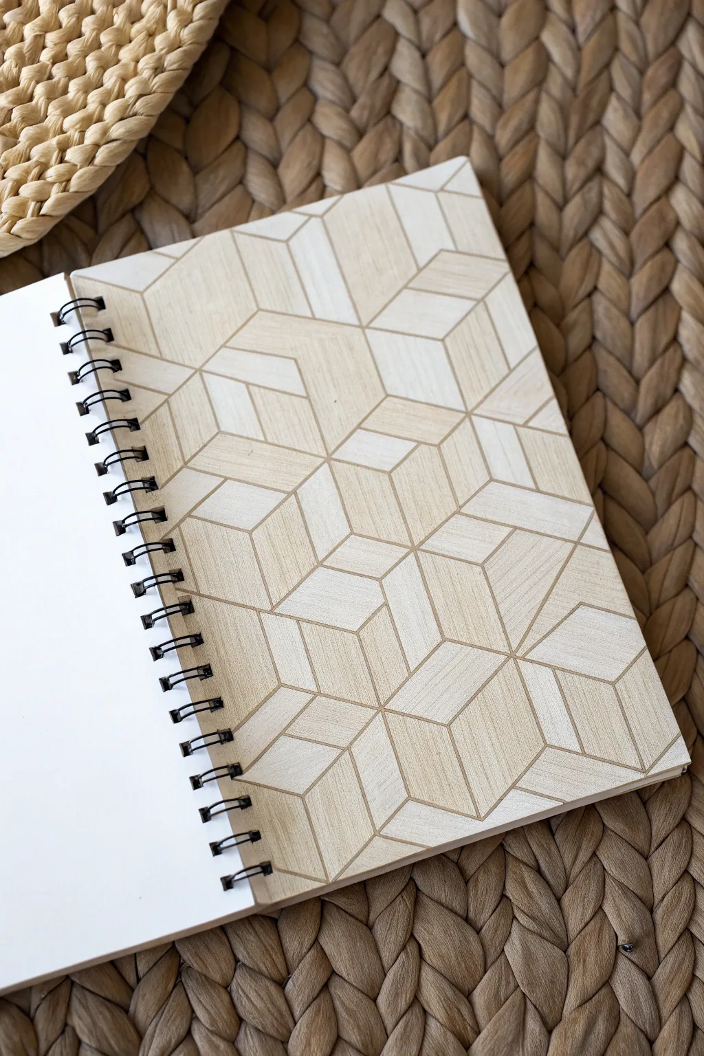
Transform a plain wooden notebook cover into a mesmerizing optical illusion with this interlocking cube pattern. The natural grain of the wood adds beautiful texture to the geometric design, creating a sophisticated and tactile finish.
Step-by-Step Tutorial
Materials
- Blank notebook with a wooden cover (spiral bound)
- Pencil (HB or lighter)
- Ruler
- Protractor or hexagon stencil
- Fine-point permanent marker or pyrography pen (wood burner)
- Eraser
- Sandpaper (fine grit)
- Clear spray sealant or wood varnish
Step 1: Planning and Layout
-
Prepare the surface:
Before starting your design, lightly sand the wooden cover with fine-grit sandpaper to ensure a smooth drawing surface. Wipe away any dust with a clean, dry cloth. -
Establish the grid:
Creating interlocked cubes relies on an isometric grid. Start by lightly marking a series of evenly spaced vertical lines across the cover using your ruler and pencil. -
Add diagonal guides:
Using a protractor, draw diagonal lines intersecting your vertical lines at 30 degrees. Repeat this in the opposite direction (150 degrees) to create a grid of small triangles. -
Define the first hexagon:
Locate a central point on your grid. Outline a hexagon shape by connecting six of the triangular grid points. This will form the outer perimeter of your first cube unit. -
Add the Y-shape:
Draw a ‘Y’ in the center of your hexagon, connecting the center point to three alternating corners. This instantly transforms the detailed 2D hexagon into a 3D isometric cube.
Grid Master Tip
Don’t want to draw a grid from scratch? Print isometric dot paper, lay it over the wood with transfer graphite paper underneath, and trace just the dots to guide your ruler.
Step 2: Building the Pattern
-
Expand the cluster:
Draw adjacent hexagons sharing sides with your first distinct cube. I prefer to work outwards from the center to keep the spacing symmetrical. -
Create the interlock:
To make the cubes look like they are sliding into each other, you won’t draw every line of every cube. Instead, ‘break’ the lines of a new cube where it would pass ‘behind’ an existing one. -
Establish depth:
Continue this alternating pattern across the cover. Imagine certain cubes are foreground and others are background to decide which lines to stop short. -
Fill to edges:
Extend the pattern all the way to the edges of the wood. Don’t worry about partial shapes; simply cut the geometric forms off wherever the notebook edge ends. -
Check the geometry:
Step back and look at your pencil sketch. Ensure all parallel lines run at the same angle and that the ‘Y’ shapes inside the hexagons are consistent.
Step 3: Inking and Finishing
-
Select your tool:
For the dark lines shown in the image, you can use a fine-tip black permanent marker for a high-contrast look, or a pyrography (wood burning) tool for a textured, engraved feel. -
Trace main outlines:
Carefully trace over your pencil lines. If using a pen, keep a steady hand and use a ruler for crisp straight edges. If burning, move at a consistent speed to avoid scorching spots. -
Add subtle texture:
The image shows a subtle difference in tone on the cube faces. You can achieve this by lightly stippling or hatching one side of each cube (e.g., always the right-facing side) with a very fine pen. -
Clean up:
Once the ink is completely dry (or the wood has cooled), use a quality eraser to gently remove any remaining graphite grid lines. Be careful not to smudge the ink. -
Seal the wood:
To protect your design from handling and moisture, apply a thin coat of clear spray sealant or matte wood varnish. -
Final dry:
Let the notebook sit open in a well-ventilated area until the sealant is fully cured and no longer tacky.
Level Up: Wood Stain
Use diluted wood stain or watercolor paints in neutral tones to shade just the ‘top’ faces of the cubes. This emphasizes the 3D effect without hiding the grain.
You now have a custom sketchbook that looks as creative on the outside as the ideas you’ll put inside

PENCIL GUIDE
Understanding Pencil Grades from H to B
From first sketch to finished drawing — learn pencil grades, line control, and shading techniques.
Explore the Full Guide
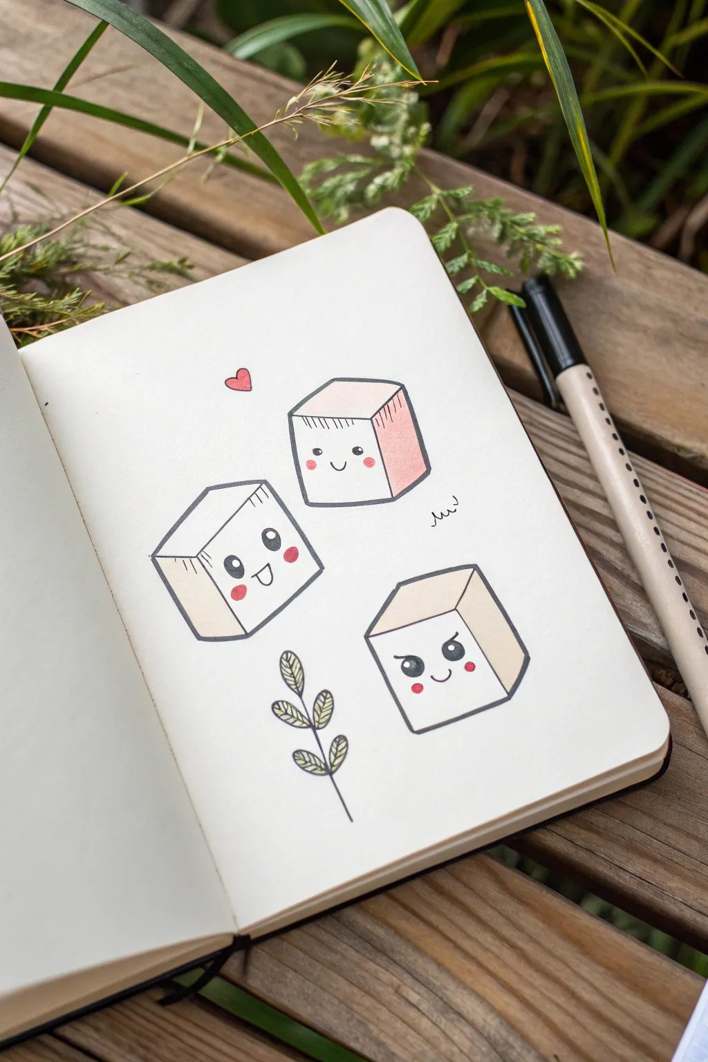
Cute Cube Character Expressions

Bring your sketchbook page to life with these adorable, expressive cube characters that are deceptively simple to draw. This project combines basic geometric sketching with cute “kawaii” facial features to create a charming trio full of personality.
Step-by-Step Guide
Materials
- Sketchbook or drawing paper (heavyweight preferred)
- Fine liner pen (black, 0.3mm or 0.5mm)
- Pencil (HB or similar for sketching)
- Eraser
- Colored markers or pencils (light beige/tan, soft pink for blush/accents)
- Red marker or pen (for the heart)
Step 1: Drafting the Shapes
-
Draw the first cube face:
Start with the top-center character. Using your pencil, sketch a square that is slightly tilted. This will be the front face of your first cube. -
Complete the isometric shape:
Draw lines extending back from the top corners and the bottom right corner of your square. Connect these lines to form the top and side panels, creating a 3D box effect. -
Position the second cube:
Move down and to the left. Sketch a second cube, but tilt this one slightly so it looks like it’s tumbling or leaning to the left. -
Position the third cube:
Sketch the final cube in the bottom right area. Orient this one upright but slightly rotated, pointing inward toward the center of the page. -
Add the botanical element:
Below the cubes, lightly sketch a simple vertical stem with pairs of oval leaves growing upwards to fill the negative space.
Eye Highlights
If you accidentally color the whole eye black, use a white gel pen to add the reflection dot back in after the ink dries.
Step 2: Adding Personality
-
Sketch the shy face:
On the top cube, lightly draw two small, wide-set eyes near the bottom edge. Add a tiny U-shaped smile right between them. -
Sketch the happy face:
For the left cube, draw larger, oval eyes. Add a big, open D-shaped mouth to make it look excited or laughing. -
Sketch the mischievous face:
On the bottom right cube, draw eyes with angled eyebrows pointing down and inward. Add a confident, side-smirk smile.
Step 3: Inking and Details
-
Outline the cubes:
Trace over your pencil lines with the black fine liner. Don’t worry about using a ruler; slightly wobbly lines add to the organic, hand-drawn charm. -
Ink the features:
Carefully ink the eyes and mouths. For the eyes, leave small white circles inside the black pupils to create a shiny reflection highlight. -
Ink the leafy branch:
Go over the stem and leaf outlines. Add little vein details inside the leaves with quick, light strokes. -
Add floating elements:
Draw a small heart floating to the left of the top cube and a little squiggly spring shape near its right side. -
Erase pencil marks:
Wait until the ink is completely dry to avoid smudging, then gently erase all your underlying graphite sketches.
Wonky Lines?
If your cube lines aren’t parallel, don’t restart. Thicken the outline slightly to mask the angle, or embrace the doodle style.
Step 4: Coloring
-
Shade the sides:
Using a light tan or beige marker, color only the side panels of the cubes (the right-face of the cubes) to give them depth and a “tofu” texture. -
Add pink accents:
Switch to a soft pink marker. Color the side panel of the top cube pink instead of tan for variety. Then, add round pink blush circles to the cheeks of all three characters. -
Color the leaf details:
Use a green pencil or very light marker to add subtle color to the leaves, or just leave them black and white for a minimal look as shown in the reference. -
Final pop of red:
Color in the floating heart with a bright red or pink marker to finish the piece.
Now you have a trio of expressive characters ready to brighten up your journal pages

Have a question or want to share your own experience? I'd love to hear from you in the comments below!