A cute sketchbook cover is like a tiny pep talk you give yourself before you even open the first page. I love turning plain covers into little pieces of art that feel personal, playful, and totally you.
Cute Sticker Collage With a Simple Color Theme
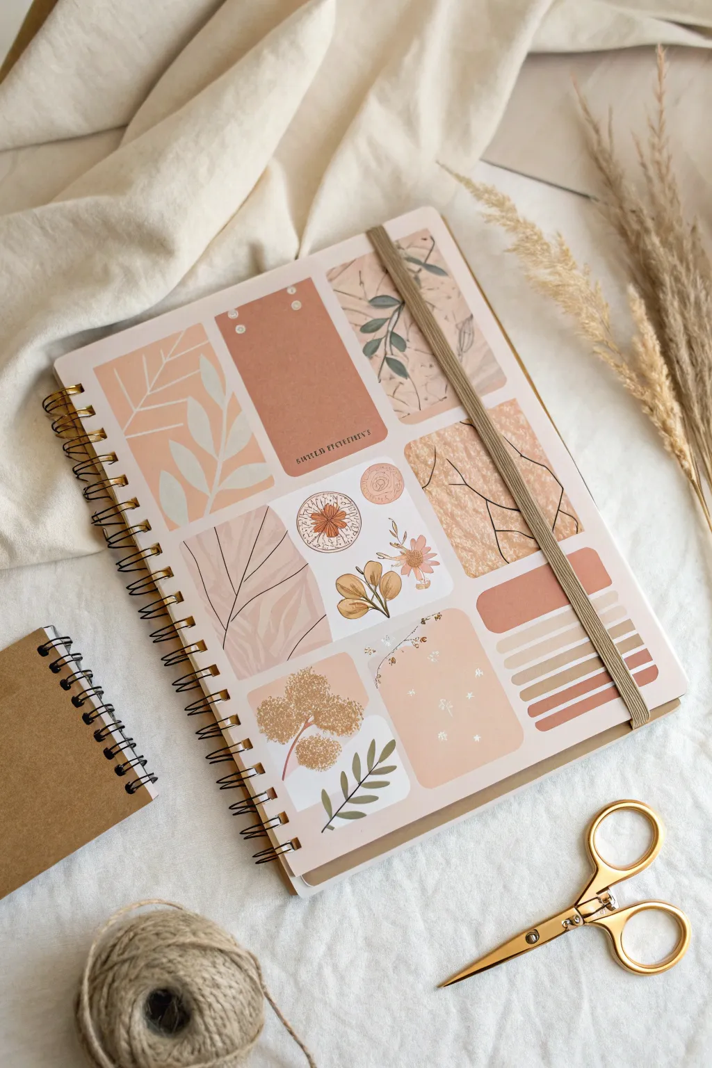
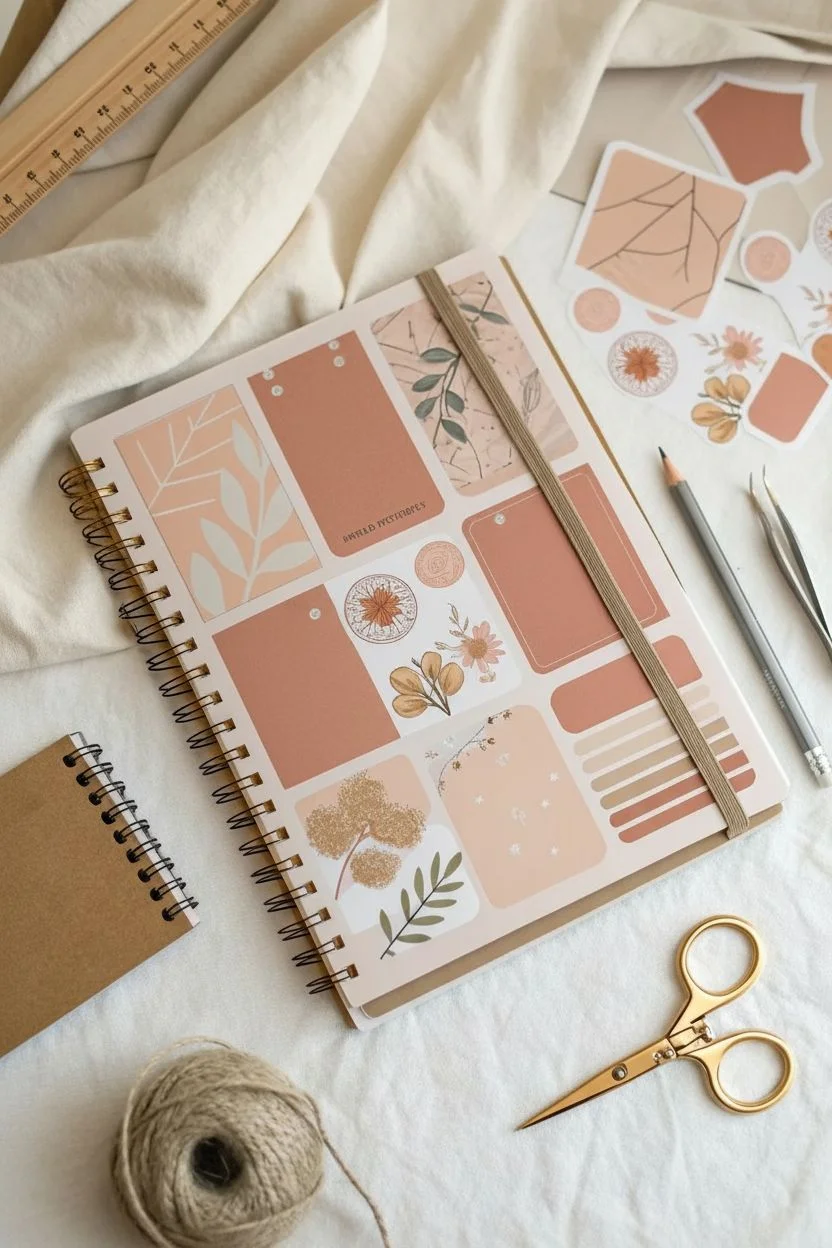
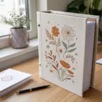
Transform a plain sketchbook into a piece of art using a cohesive palette of earth-toned stickers. This project uses a deliberate grid-like layout to showcase delicate floral illustrations and abstract shapes in warm terracotta, peach, and sage hues.
Step-by-Step
Materials
- Spiral-bound sketchbook (hardcover preferred)
- Earth-toned sticker pack (boho, botanical, and abstract themes)
- Washi tape in solid peach or cream
- Ruler
- Pencil
- Scissors or craft knife
- Tweezers
- Clear matte adhesive vinyl or mod podge (optional, for sealing)
Step 1: Planning the Layout
-
Clean surface:
Before you begin, wipe down the front cover of your sketchbook with a slightly damp cloth to remove any dust or oils. This ensures your stickers will adhere perfectly and last longer. -
Select your palette:
Sort through your sticker collection and pull out a cohesive set. Look for muted pinks, terracottas, creams, and soft sage greens. You want a mix of botanical drawings, abstract lines, and organic textures. -
Dry run arrangement:
Without peeling the backings, arrange your chosen stickers on the cover. Aim for a structured, almost quilted look where rectangular stickers sit side-by-side with minimal gaps. -
Balance the visuals:
Try to alternate between ‘busy’ stickers (like detailed patterns or text) and ‘quiet’ stickers (solid colors or simple line art) to keep the composition from feeling cluttered. -
Mark guidelines:
Once you are happy with the layout, I like to use a ruler and a pencil to lightly mark the center line or the edges of the main stickers. This acts as a roadmap when you start sticking.
Step 2: Applying the Collage
-
Start from a corner:
Peel the backing off your first corner sticker—preferably a large rectangular one—and place it carefully aligned with the edges of your sketchbook. -
Align the edges:
Place the next sticker directly adjacent to the first. Aim for a consistent gap of about 2-3mm between each sticker to create that organized, grid-like aesthetic shown in the photo. -
Use tweezers for precision:
For smaller stickers or to get the placement exactly right without your fingers getting in the way, use a pair of tweezers to hold and position the sticker before pressing it down. -
Smooth out bubbles:
After placing each sticker, rub it firmly from the center outwards with your thumb or a bone folder to ensure it is flat and free of air bubbles. -
Layering details:
If your design involves smaller accent stickers, like the round floral stamp or the single flower stem, layer these carefully. They can overlap slightly or fill in larger negative spaces within your grid. -
Trimming overhang:
If any stickers hang over the edge of the sketchbook cover, flip the book over and use scissors or a craft knife to trim the excess flush with the cardboard edge.
Sticky Situation?
If a sticker isn’t straight, use a hairdryer on low heat for a few seconds to soften the adhesive. Gently lift it with a craft knife to reposition without tearing.
Step 3: Finishing Touches
-
Erase guidelines:
Gently erase any visible pencil marks you made during the planning phase, being careful not to rub the edges of the stickers themselves which could cause peeling. -
Seal the deal (Optional):
To protect your artwork from wear and tear, you can apply a layer of clear matte adhesive vinyl over the entire cover. Alternatively, a thin coat of Mod Podge works well to seal the edges. -
Add an elastic band:
If your sketchbook didn’t come with a closure, you can attach a woven elastic band to the back cover, bringing it around to the front to keep your new beautiful journal closed and secure.
Make It Yours
Paint over the gaps between stickers with gold acrylic paint or use thin gold washi tape to create a gilded ‘grout’ effect that adds a touch of elegance.
Enjoy filling your beautifully customized sketchbook with new ideas and drawings


Washi Tape Borders and Layered Corners
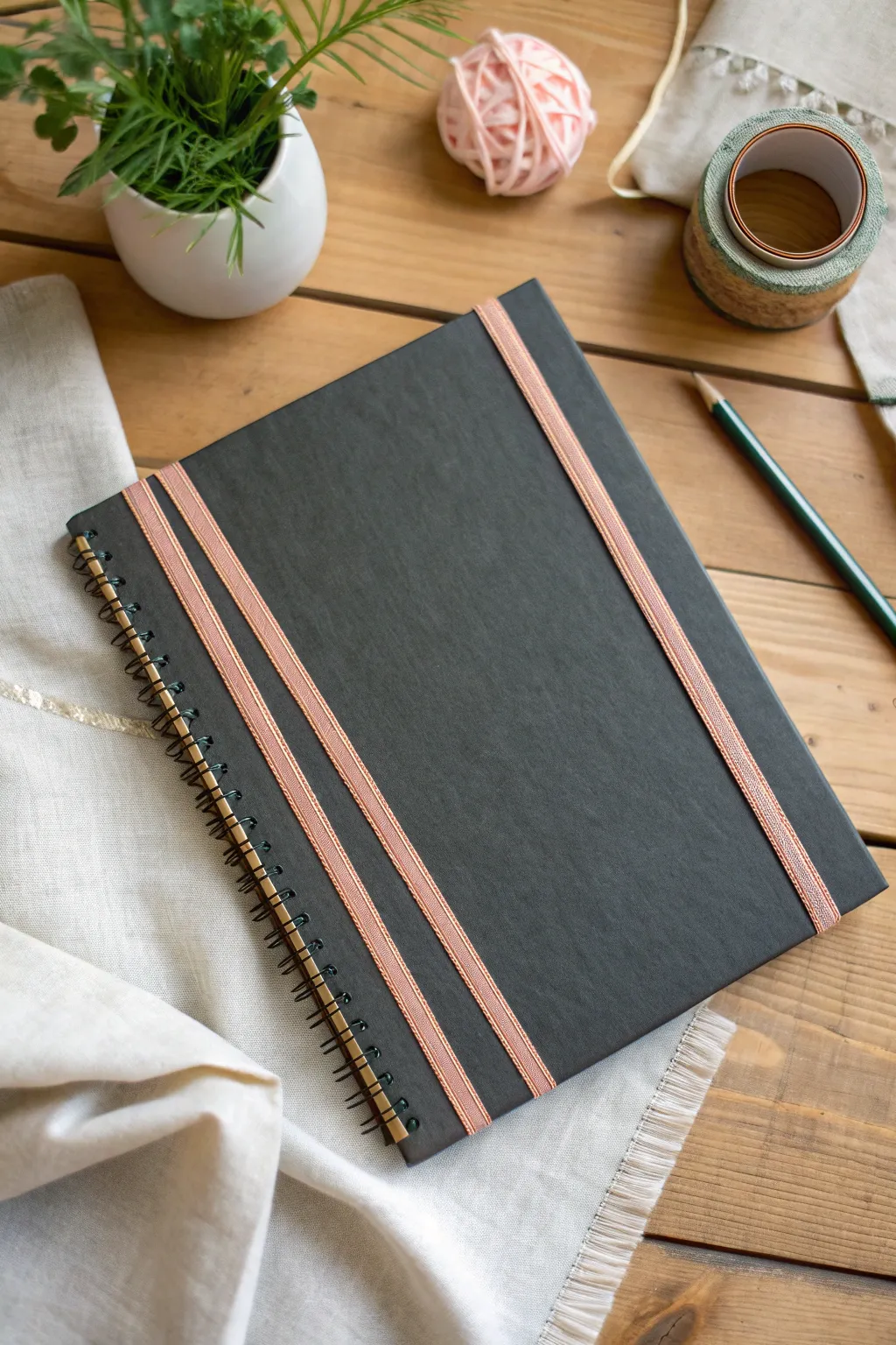
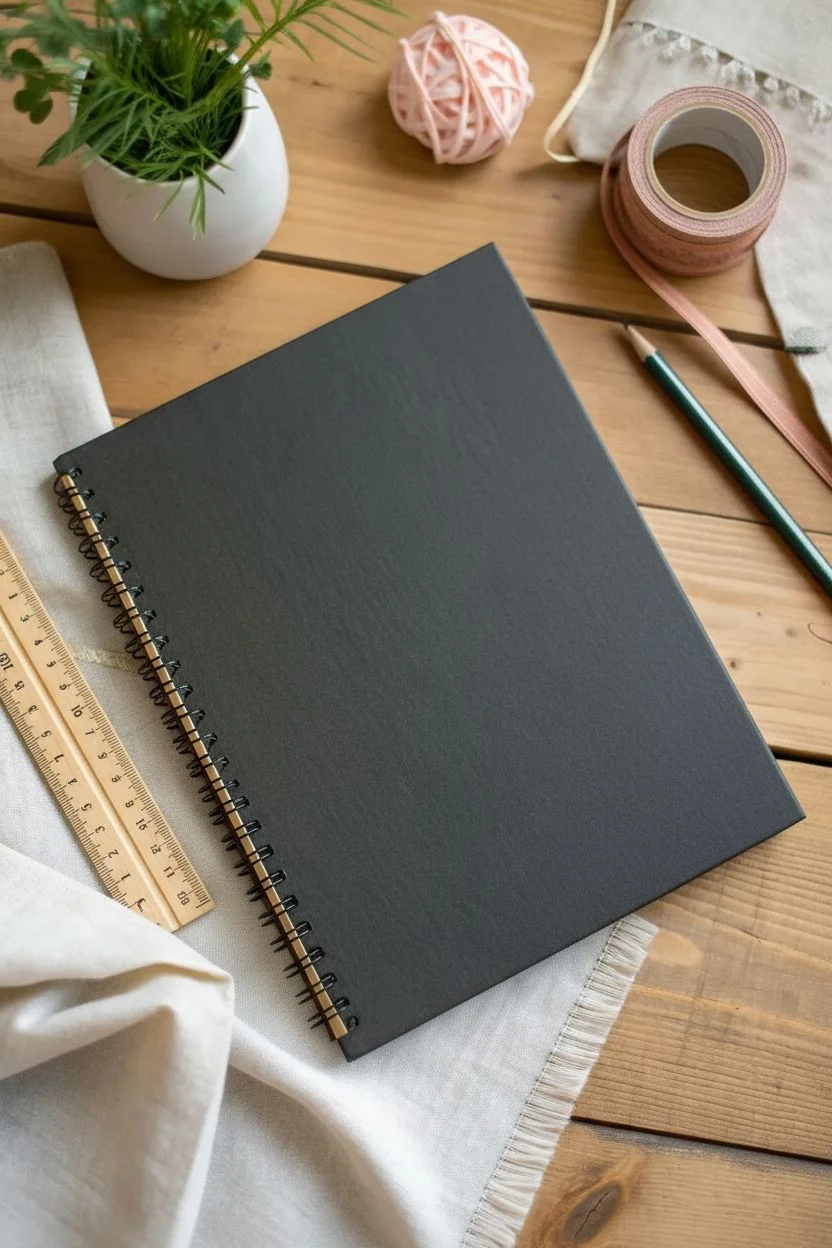
Transform a plain black sketchbook into a chic, minimalist accessory using just a few strips of metallic tape. This geometric design adds a touch of modern elegance without requiring any advanced crafting skills.
Step-by-Step Guide
Materials
- Hardcover spiral-bound sketchbook (black)
- Metallic pink or copper woven ribbon tape (or washi tape)
- Scissors
- Ruler
- Pencil (optional)
Step 1: Preparation
-
Clean the Surface:
Before applying any adhesive, wipe down the front cover of your sketchbook with a slightly damp cloth to remove dust or oils. Let it dry completely to ensure the tape sticks firmly. -
Plan the Layout:
Decide on the spacing for your stripes. In this design, there are two distinct zones: a pair of stripes near the spiral binding and a single accent stripe on the far right edge. A ruler helps visualize the balance.
Step 2: Applying the Spine Stripes
-
Measure the First Strip:
Unroll a length of your metallic tape. Hold it against the cover vertical to the spiral binding, leaving about an inch of excess at both the top and bottom. -
Place the First Strip:
Position this first strip approximately one inch away from the spiral coils. Press down the top edge first, pull it taut to avoid wrinkles across the cover, and then press down the bottom edge. -
Secure the First Strip:
Run your finger firmly along the entire length of the tape to adhere it to the cover texture. -
Align the Second Strip:
Prepare a second piece of tape of the same length. Position this one parallel to the first strip, leaving a narrow gap (about half an inch) between them to let the black cover show through. -
Adhere the Second Strip:
Just like the first, tack down the top, pull straight, and smooth it down to the bottom edge. Ensure the gap between the two strips remains consistent from top to bottom.
Tape Peeling Up?
If the tape ends won’t stay stuck to the inside cover, apply a tiny dot of craft glue or double-sided tape under the flap for extra security.
Step 3: Adding the Edge Accent
-
Measure the Outer Strip:
Cut a third length of tape for the right side of the cover. -
Position the Accent:
Place this strip roughly an inch or two in from the right-hand edge of the notebook. This asymmetry balances the design visually against the double stripe on the left. -
Smooth it Down:
Press the tape firmly into place, ensuring it runs perfectly parallel to the cover’s edge.
Texture Trick
Woven ribbon tape works best on textured covers as it flexes. If using standard paper washi, avoid stretching it or it might snap later.
Step 4: Finishing Touches
-
Wrap the Edges:
Open the sketchbook cover so you can access the inside. -
Fold Over Top:
Take the excess tape overhanging the top edge and fold it tightly around to the inside of the cover. Press firmly. -
Fold Over Bottom:
Repeat with the bottom overhangs. This wrapping technique prevents the tape from peeling up at the corners over time. -
Trim Excess (Optional):
If the folded tape feels too bulky on the inside or overlaps with the paper block, use your scissors to trim the inside flap to a neat, small tab. -
Final Seal:
Run a smooth, hard object (like the handle of your scissors or a bone folder) over all three strips to burnish them down for a long-lasting hold.
Now your sketchbook has a custom, refined look that is ready for your next creative session

Pastel Checkerboard for Instant Cute Energy
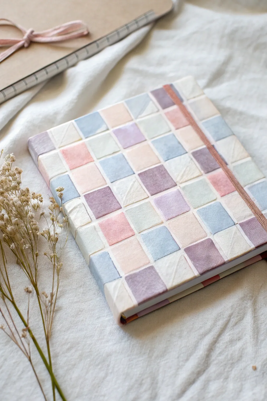
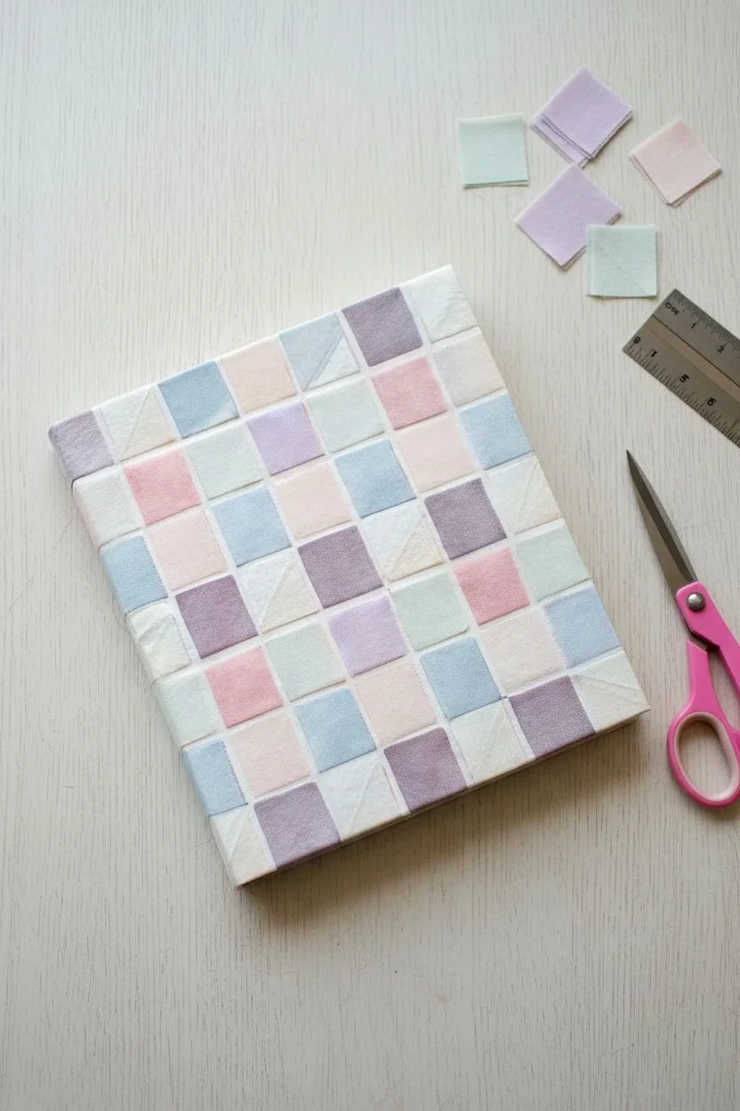
Give a plain notebook a soft, dreamy makeover with this textured checkerboard design. Using strips of fabric or washi tape creates a tactile, quilted effect that feels just as sweet as it looks.
Detailed Instructions
Materials
- Hardcover sketchbook or notebook
- Assorted fabric scraps (pastel violet, pink, blue, cream, mint)
- White or cream craft glue (like Mod Podge or PVA)
- Wide, flat paintbrush
- Fabric scissors or rotary cutter
- Ruler
- Cutting mat
- Pencil
- Elastic band (matching pastel color, optional)
- Heavy books (for pressing)
Step 1: Preparation
-
Measure your canvas:
Start by measuring the front cover of your sketchbook precisely. You need to decide on a grid size that fits evenly across the width and height, usually around 1-inch squares works best for a standard A5 notebook. -
Select your palette:
Gather your fabric scraps. Aim for a mix of textures—smooth cottons paired with a slightly rougher linen look lovely together. Ensure you have at least 4-5 different pastel shades to create that scattered mosaic effect. -
Cut the squares:
Using your ruler and rotary cutter on a mat, cut your fabric into precise squares based on your earlier measurements. You will need enough to cover the entire front, plus a few extras for mistakes. -
Plan the layout:
Before gluing, lay your squares out on a clean table in the grid pattern you want. Shuffle the colors around so no two identical shades are touching; this randomness is key to the charm.
Step 2: Creating the Grid
-
Prep the cover surface:
Wipe down the sketchbook cover to ensure it is dust-free. If the original cover is very dark or patterned, you might want to prime it with a quick coat of white gesso so the pastel colors stay true. -
Apply the first row of glue:
Brush a thin, even layer of craft glue along the top edge of the notebook cover, just wide enough for your first row of squares. Don’t glue the whole cover at once or it will dry too fast. -
Place the top row:
Carefully press your first row of fabric squares into the glue. Align the top edges perfectly with the top of the notebook. If the fabric frays slightly, that adds to the handmade aesthetic. -
Smooth it out:
Use your finger or a bone folder to gently smooth each square flat, pushing out any air bubbles or big wrinkles. -
Continue row by row:
Apply another strip of glue below the first row. Place your second row of squares, ensuring the corners touch the row above without overlapping too much. Creating tight seams is the secret here. -
Wrap the edges:
For the squares on the far left, right, top, and bottom edges, overhang the fabric slightly. Once the main face is done, open the cover and wrap these excess bits around the board, gluing them to the inside cover for a clean finish. -
Handle the spine:
When you reach the spine edge, use a sharp craft knife to trim the squares flush with the crease so the book can still open easily.
Fraying Too Much?
If your fabric squares are unraveling messily, dab a tiny amount of clear nail polish or Fray Check on the edges of each square before gluing them down.
Step 3: Sealing and Finishing
-
Apply a top coat:
Once the base layer is dry, brush a generous coat of Mod Podge or watered-down PVA glue over the entire fabric surface. This seals the threads and prevents peeling. -
Watch for texture:
As you apply the sealant, push the brush in different directions. I like to do this to enhance the ‘woven’ look rather than flattening everything completely. -
Press perfectly flat:
While the book is drying, place a sheet of wax paper over the cover and weigh it down with heavy books. This prevents the sketchbook cover from warping due to the moisture in the glue. -
Optional elastic addition:
If your sketchbook had an elastic band, you can glue a matching strip of pastel elastic to the back cover, bringing it around to the front to keep your new masterpiece closed. -
Cover the inside:
To hide the rough fabric edges you wrapped around to the inside, glue a sheet of cardstock or patterned paper inside the front cover. This creates a professional-looking endpaper.
Add Sparkle
Mix a small pinch of ultra-fine iridescent glitter into your final top coat of glue. It adds a magical shimmer that catches the light only at certain angles.
Now you have a sketchbook that is as inspiring on the outside as the drawings you’ll create on the inside


Tiny Doodle Pattern (Stars, Hearts, and Sparkles)
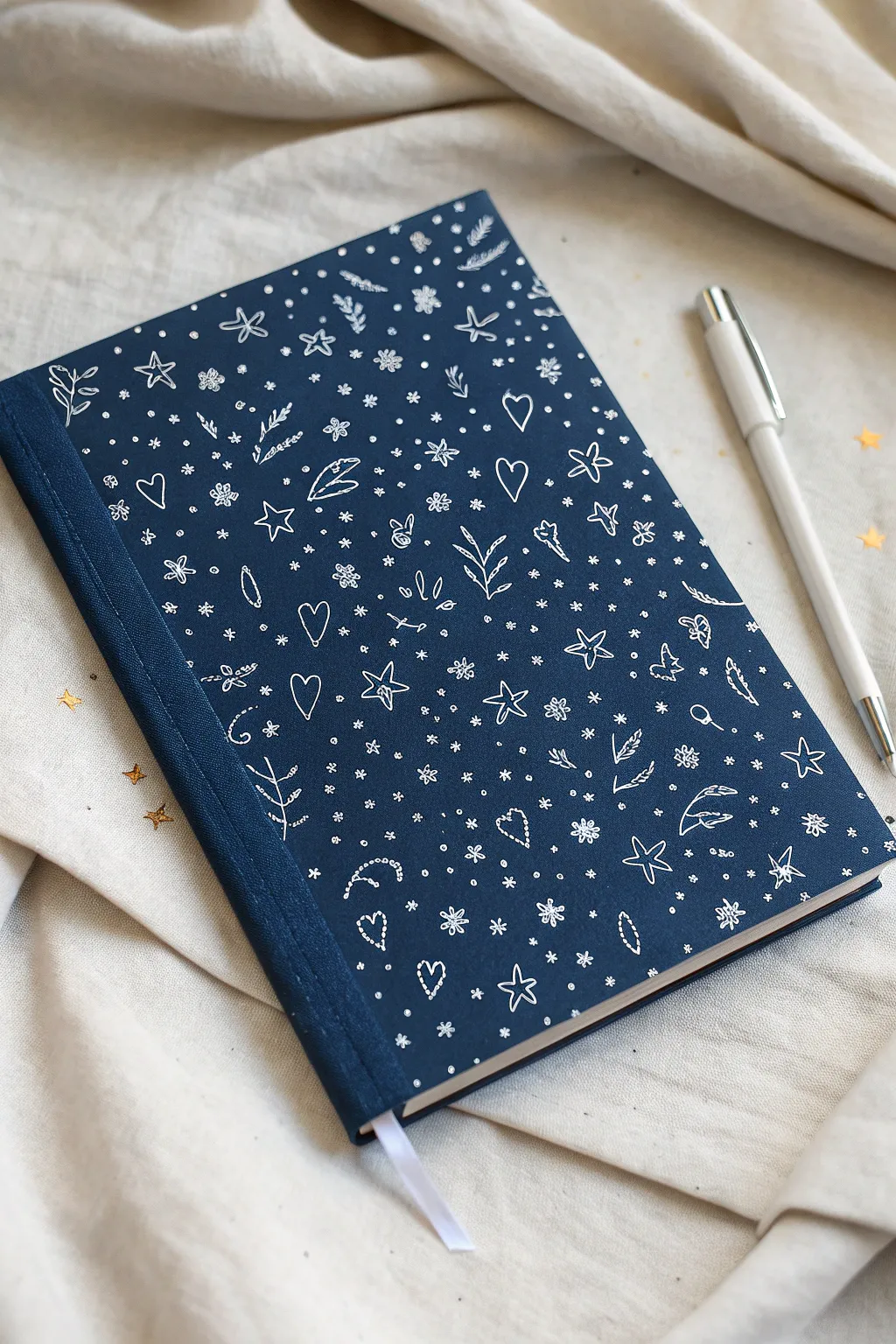
Transform a plain navy notebook into a whimsical galaxy of creativity with this simple yet stunning doodle pattern. Using just a white gel pen, you’ll create a charming scatter of hearts, stars, and tiny botanicals that pop beautifully against the dark background.
Step-by-Step Tutorial
Materials
- Hardcover sketchbook with a navy blue or dark denim fabric cover
- White gel pen (opaque, fine point, e.g., Sakura Gelly Roll 08 or 10)
- Scrap paper for testing ink flow
- Pencil (optional, for planning layout)
- Kneaded eraser (optional)
- Clear matte fixative spray (optional)
Step 1: Preparation and Planning
-
Clean the surface:
Ensure your sketchbook cover is free of dust or lint. If it’s a fabric cover, run a lint roller over it quickly. If it’s paper or leatherette, wipe it gently with a dry microfiber cloth. -
Test your pen opacity:
Before touching the final cover, scribble on a scrap piece of dark paper (or the inside back cover if it’s dark enough) to get the ink flowing smoothly. You want crisp, solid white lines, not scratchy gray ones. -
Visualize the spacing:
Look at the pattern as a whole. It’s an ‘all-over’ print style, meaning the doodles are scattered randomly but evenly. Avoid clustering too many large items together.
Ink Skipping?
If the gel pen skips on textured fabric covers, slow down your drawing speed significantly. Allow the ink to soak into the weave rather than skimming over the top.
Step 2: Drawing the Primary Motifs
-
Start with the stars:
Begin by drawing five-pointed outlines of stars scattered across the cover. Keep them open (don’t fill them in). Vary their rotation slightly so they don’t all look like soldiers in a row. -
Add simple hearts:
In the spaces between the stars, draw open heart outlines. Keep them roughly the same size as the stars to maintain balance. -
Introduce some foliage:
Draw simple sprigs or branches. A central stem with small leaves branching off on both sides works perfectly for this aesthetic. Curve the stems slightly to add movement. -
Sketch the flowers:
Add small, simple flowers. You can draw these as five-petal outlines or cute little pinwheel shapes. Scatter these sparingly to fill medium-sized gaps. -
Incorporate stitched elements:
For texture variety, draw a few shapes (like hearts or circles) using a dotted ‘stitch’ line instead of a solid line. This adds a lovely handcrafted feel to the pattern.
Pro Tip: Vary the sizes
Don’t make every star the same size. Mixing large outlines with tiny solid dots creates depth, making the pattern feel like a deep, layered galaxy.
Step 3: Filling the Negative Space
-
Fill gaps with tiny stars:
Now, look for the larger gaps between your main motifs. Fill these with tiny, solid asterisks or simple cross shapes to represent distant twinkling stars. -
Draw dot clusters:
Group 3-4 tiny dots together in tight clusters. I find this helps break up the line art and adds density to the pattern without looking cluttered. -
Add single dots as ‘snow’:
Sprinkle single dots universally across the entire cover. Imagine it’s snowing lightly; these dots should land everywhere there is empty blue space. -
Review the density:
Step back and look at the cover from a distance. If you see any large ‘holes’ of blue space, add a small asterisk or a tiny heart to balance it out.
Step 4: Finishing Touches
-
Let it dry completely:
Gel ink sits on top of the surface and can smear easily when wet. Give the cover at least 15-20 minutes to air dry completely before handling. -
Erase guidelines (if used):
If you sketched with pencil first, very gently dab—don’t rub—with a kneaded eraser to lift the graphite without smudging the white ink. -
Protect your work:
If your sketchbook will travel in a bag, a light mist of clear matte fixative can help potential chipping, though quality gel ink usually adheres well on its own.
Enjoy sketching your next masterpiece inside your beautifully personalized starry notebook

PENCIL GUIDE
Understanding Pencil Grades from H to B
From first sketch to finished drawing — learn pencil grades, line control, and shading techniques.
Explore the Full Guide
Minimal Botanical Line Art That Still Feels Sweet
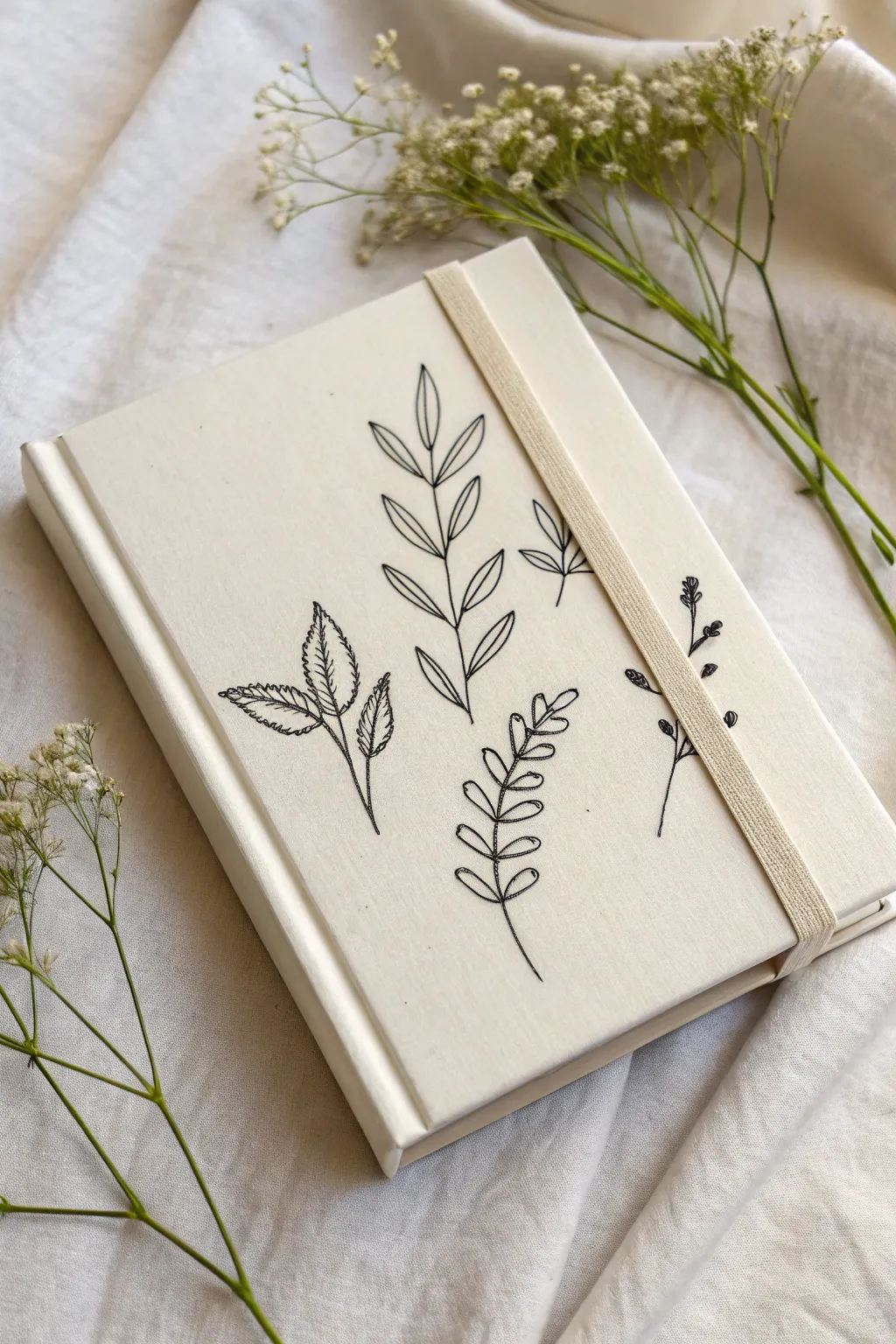
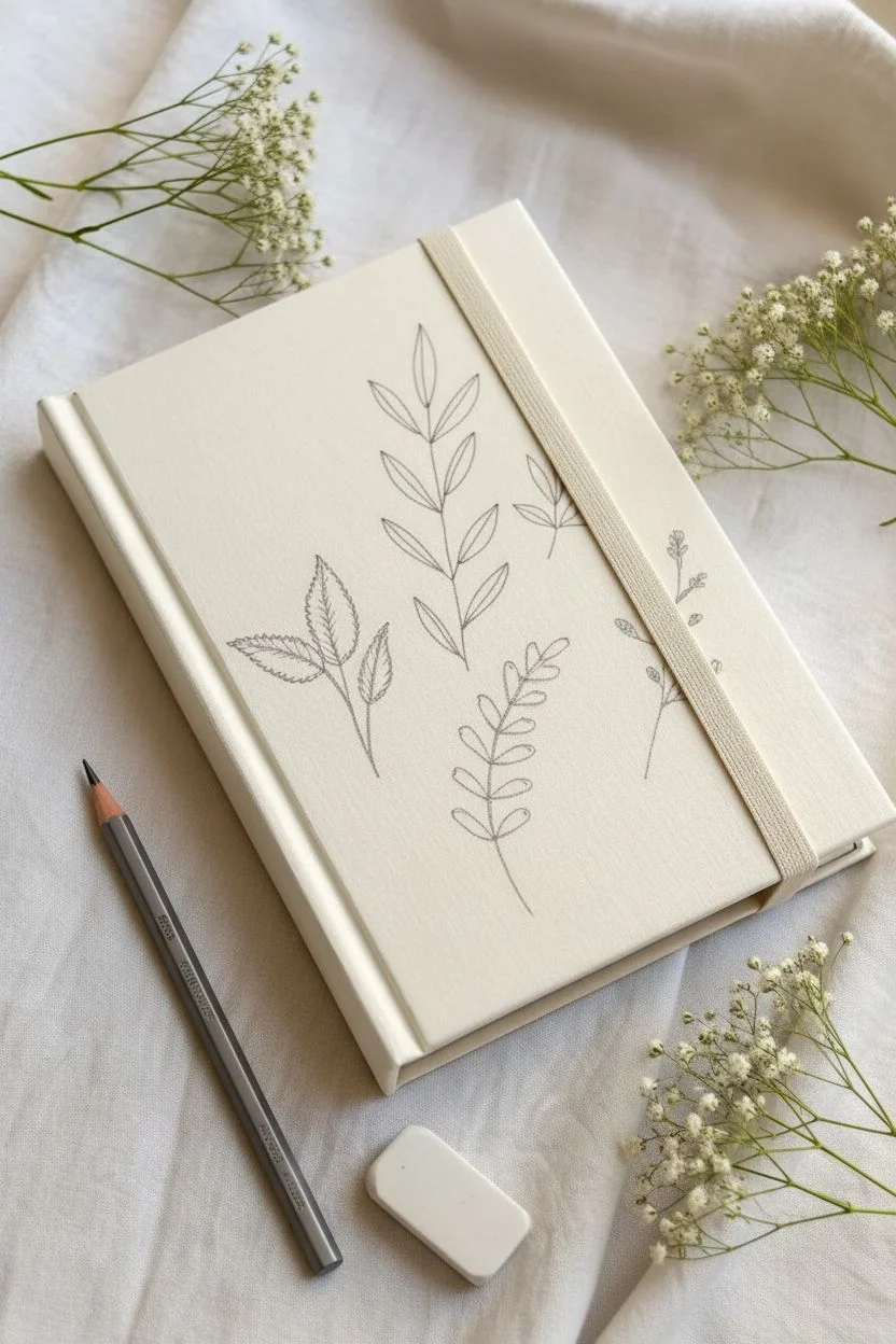
Transform a plain sketchbook into a piece of minimalist art with delicate, hand-drawn botanical illustrations. This project focuses on the sweet simplicity of black line work against a textured cream fabric cover, creating a timeless and peaceful aesthetic.
Step-by-Step Guide
Materials
- Hardcover sketchbook with a cream or off-white fabric/canvas cover
- Fine-point permanent fabric marker (black, 0.3mm or 0.5mm tip)
- Pencil (HB or lighter)
- Soft eraser
- Ruler (optional)
- Scrap paper for practice sketches
- Masking tape or painter’s tape
Step 1: Planning & Preparation
-
Identify the canvas:
Begin with a sketchbook that has a fabric or canvas-wrapped cover. If your sketchbook is plain paper, you can wrap it in cream cotton or linen fabric before starting, securing it with glue adhesive inside the cover. -
Protect the elastic:
If your notebook has an attached elastic band like the one shown, carefully pull it around to the back cover or tape it down so it stays completely out of your drawing zone. -
Map out the design space:
Lay the book flat on a clean surface. Mentally divide the cover into quadrants to ensure your four main botanical stems are spaced evenly without perfect symmetry, keeping that organic feel. -
Sketch first drafts:
On your scrap paper, practice drawing four distinct leaf types: a serrated leaf branch, a tall symmetrical stem with pointed leaves, a rounded creeping vine, and a delicate twig with tiny buds. I like to keep my wrist loose here to find the best flow.
Step 2: Drafting the Design
-
Light pencil outlines:
Using your pencil very lightly, draw the central curved line for each stem directly onto the fabric cover. Don’t press hard, as graphite can smudge into the fabric weave. -
Add leaf shapes:
Flesh out the stems with your leaf shapes. For the central tall plant, draw pairs of lance-shaped leaves climbing the stem. -
Place the side elements:
Sketch the serrated leaves on the bottom left, angling them slightly outward. Add the rounded, fern-like stem on the bottom right. -
Detail the background stems:
Add the smaller, finer details, like the tiny sprigs peeking out from behind the elastic band area (or where it would sit) to create depth. -
Check composition:
Step back and look at the spacing. The design should feel airy, with plenty of negative space between the illustrations.
Bleeding Lines?
If the ink starts feathering into the fabric weave, stop immediately. Switch to a Micron pen (Pigma) or a gel ink pen, as these often sit on top of the fiber better than liquid markers.
Step 3: Inking the Artwork
-
Test your marker:
Make a small dot with your fabric marker on the back cover or a hidden edge to check for bleeding. If it spreads too much, switch to a finer tip. -
Ink the main stems:
Starting with the central plant, trace over your pencil lines with the fabric marker. Move smoothly and steadily; pauses can create ink pools on fabric. -
Define the lance leaves:
Outline the pointed leaves on the central stem. Add a simple center vein to each leaf but don’t connect it fully to the tip for a lighter look. -
Texture the serrated leaves:
Move to the bottom left plant. Use short, jagged strokes to create the serrated edges of the leaves, and add quick, feathery lines inside for texture. -
Draw the rounded vine:
Ink the bottom right stem. Keep these leaves simple and oval-shaped, ensuring the stem line connects cleanly to the base of each leaf pair. -
Add delicate buds:
Ink the thin, wispy stems on the far right. Use tiny dots or small filled circles to represent little buds or berries. -
Refine lines:
Go back over any lines that look too faint, but avoid making them too thick. The charm lies in the delicate, single-line aesthetic.
Add Subtle Color
After the black ink dries fully, use diluted watercolor or fabric paint to add sheer, pale green washes inside the leaves. Keep the color slightly ‘messy’ and outside the lines.
Step 4: Finishing Touches
-
Let it set:
Allow the ink to dry completely. Fabric markers can take a bit longer to set than on paper, so give it at least 20-30 minutes to be safe. -
Erase guidelines:
Gently erase any visible pencil marks. Hold the fabric taut with one hand while erasing with the other to prevent the material from stretching or bunching. -
Final inspection:
Brush away all eraser crumbs and replace the elastic band. Your custom botanical journal is now ready for use.
Now you have a serene, nature-inspired notebook perfect for capturing your daily thoughts or sketches
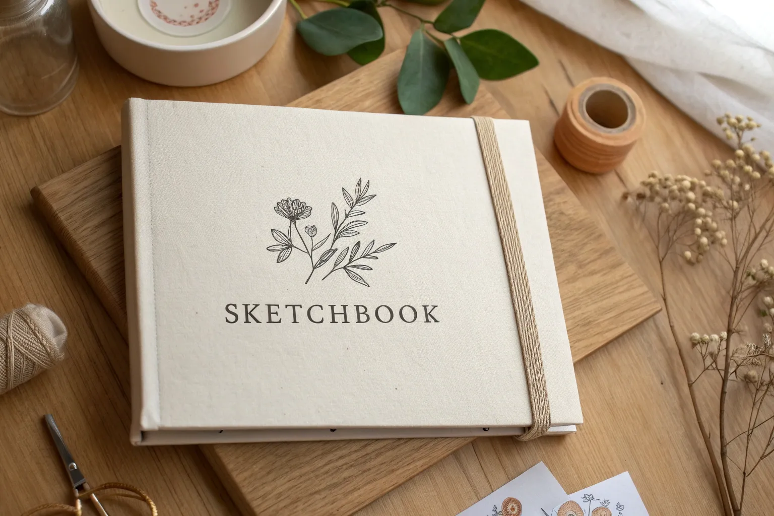
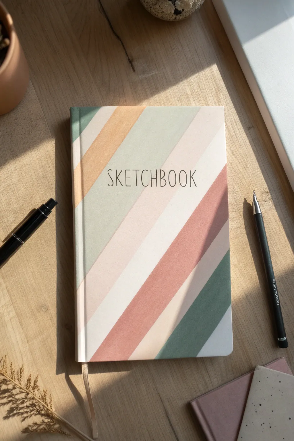
Big Bubble Letters Title With Cute Drop Shadows
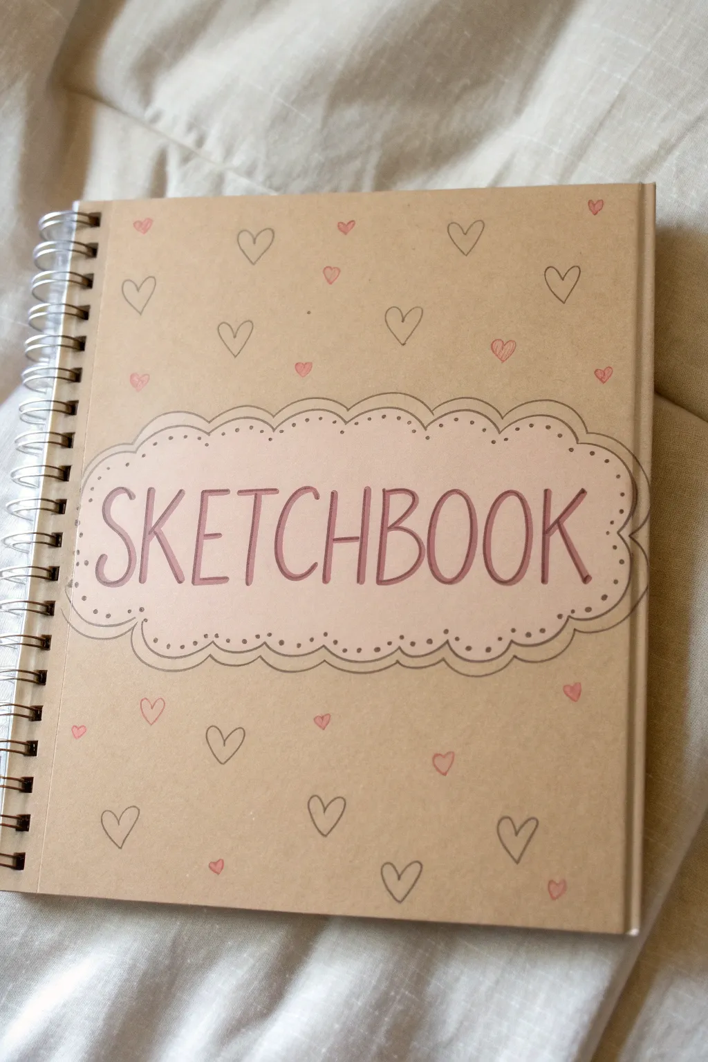
Transform a plain kraft paper sketchbook into a charming keepsake with this simple yet effective design. Using a combination of hand-lettering and delicate doodles, you’ll create a cover that feels personal, artistic, and inviting.
Detailed Instructions
Materials
- Spiral-bound kraft paper sketchbook
- Pencil (HB or lighter)
- Eraser
- Fine liner pen (Black, 0.3mm or 0.5mm)
- Pink colored pencil or pastel marker
- Mauve or dark pink marker (for lettering)
- Ruler
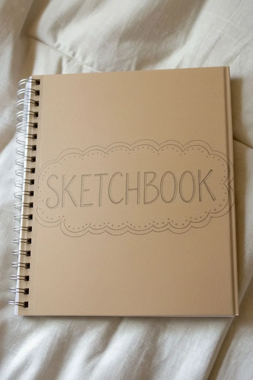
Step 1: Planning the Layout
-
Find the center:
Place your sketchbook on a flat surface. Using your ruler, lightly mark the horizontal center of the cover with a pencil to guide where your main title will sit. -
Sketch the cloud border:
Lightly sketch a long, oval-like shape in the center. Instead of a smooth line, draw a series of small, connected scallops or humps to create a decorative cloud or biscuit-edge shape. -
Sketch the inner border:
Draw a second scalloped line inside the first one, keeping a consistent distance of about 5-8mm. This creates a frame for your text. -
Draft the lettering:
Inside the frame, lightly pencil in the word ‘SKETCHBOOK’. Use tall, narrow capital letters. Center the word so there is equal space on the left and right sides.
Oops! Uneven letters?
Don’t panic! Thicken all the letters slightly to hide any wobbles, or turn the unevenness into a ‘bouncy’ font style by adding decorative dots to the end of the strokes.
Step 2: Inking the Title
-
Outline the frame:
Take your black fine liner and carefully trace over your pencil lines for the double scalloped border. Try to keep your hand steady for smooth curves. -
Add detail dots:
Within the space between the two scalloped lines, place a small black dot at the peak of each scallop curve. This adds a delicate, lace-like detail. -
Letter the title:
Switch to your mauve or dark pink marker. Trace over your penciled ‘SKETCHBOOK’ letters. I like to go over the downstrokes a second time to add just a hint of weight to the letters. -
Erase guidelines:
Wait a few minutes to ensure the ink is completely dry, then very creating erase all the pencil marks around the title area.
Level Up: Add Dimension
Use a white gel pen to add tiny highlights to the pink hearts and a shadow line to the right side of your title letters for a pop-out 3D effect.
Step 3: Creating the Background Pattern
-
Plan the heart placement:
Visualize a grid or a random scatter pattern around the central title. You want to fill the empty space without overcrowding it. -
Draw outline hearts:
Using the black fine liner, draw small, simple hearts scattered across the cover. Vary their angles slightly to make it look hand-drawn and organic. Leave plenty of space between them. -
Add colored hearts:
Select your pink colored pencil or pastel marker. Draw small, solid pink hearts in the empty spaces between the black outline hearts. Aim for an even distribution so color is sprinkled throughout. -
Fill the gaps:
Step back and look for any large empty spots. Add a few more tiny hearts (either outlined or colored) to balance the composition, making sure to get close to the spiral binding and the edges.
Step 4: Finishing Touches
-
Enhance the title background:
Use a light skin-tone or very pale pink pencil to gently shade the inside of the title cloud. This separates the title area from the rest of the kraft background. -
Final check:
Clean up any remaining stray pencil marks and check your black lines. If any lines look too thin or broken, re-trace them carefully to strengthen the look.
Now you have a custom sketchbook that’s ready to be filled with your creative ideas
BRUSH GUIDE
The Right Brush for Every Stroke
From clean lines to bold texture — master brush choice, stroke control, and essential techniques.
Explore the Full Guide
Sweet Little Animal Face in the Center Medallion
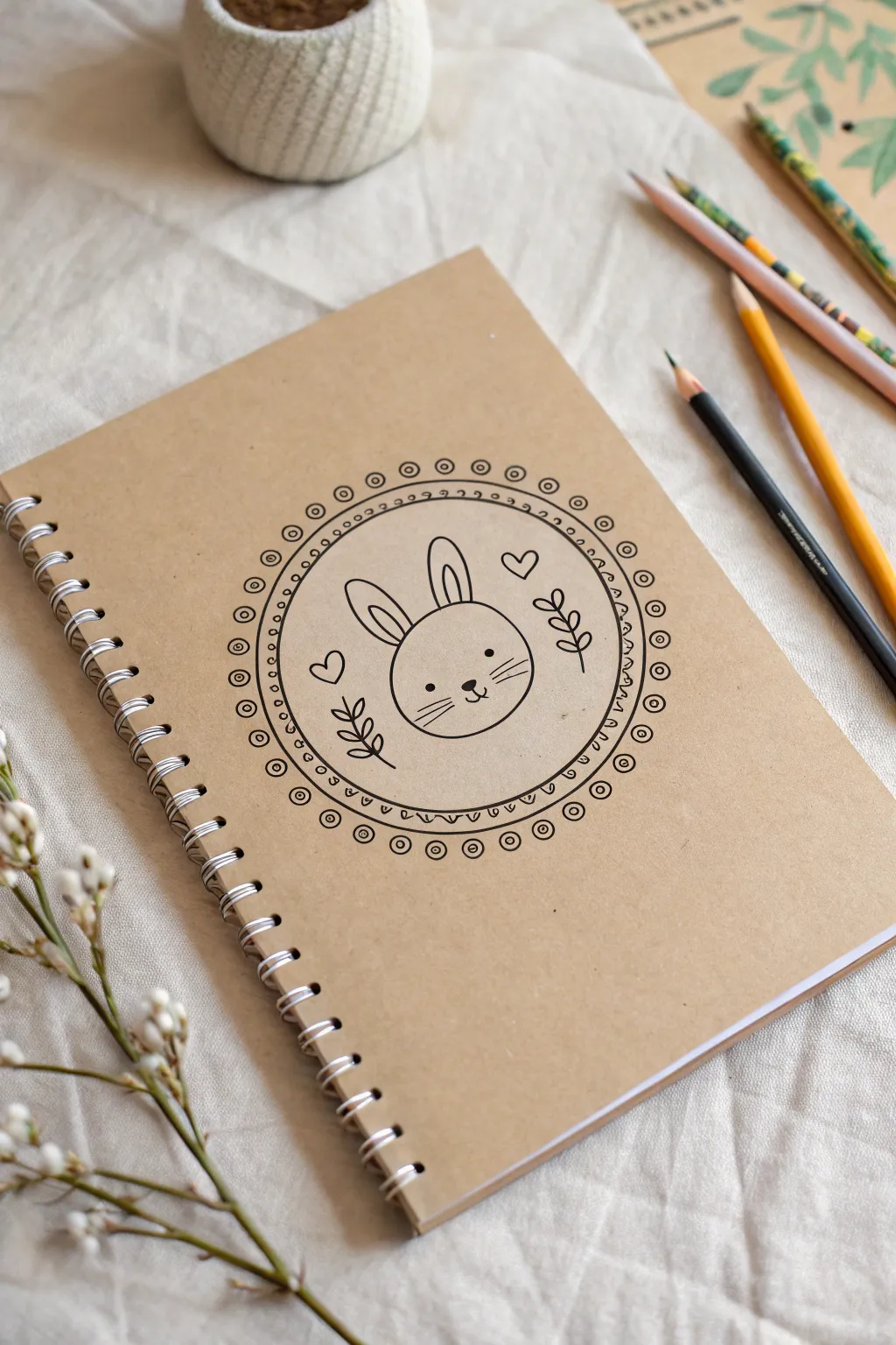
Transform a plain kraft sketchbook into a charming stationery piece with this sweet bunny design. The central motif features a minimalist rabbit face framed by a delicate, hand-drawn mandala-style border.
Step-by-Step Tutorial
Materials
- Plain kraft paper sketchbook (spiral bound)
- Black fineliner pen (0.5mm or 0.8mm)
- Fine-point black obsession marker or gel pen (for thicker lines)
- Small circular object (like a cup or lid) or a drawing compass
- Pencil (HB)
- Eraser
- Ruler
Step 1: Planning the Layout
-
Find the center:
Begin by lightly measuring the width and height of your sketchbook cover to locate the exact center point. Make a tiny mark with your pencil. -
Draw the inner circle:
Using a drawing compass set to a radius of about 1.5 inches (or tracing a small cup), draw a light pencil circle centered on your mark. This will house the bunny face. -
Create the border guides:
Draw a second, slightly larger circle around the first one, leaving about a 1/4 inch gap between them. This space will become your decorative border. -
Sketch the outer frame:
Add a final, third circle about another 1/4 inch outward from the previous one. You should now have a bullseye shape with three concentric circles.
Circle Perfection
If you don’t have a compass, trace jar lids or masking tape rolls. Use different sized household items to get perfectly concentric circles.
Step 2: Drawing the Bunny Motif
-
Start with the head:
Inside the innermost circle, sketch a wide, rounded oval for the bunny’s head. Place it slightly lower than center to leave room for the ears. -
Add the ears:
Draw two long, looping ovals rising from the top of the head. Inside each ear, add a smaller, similar shape to define the inner ear details. -
Create the face:
Place two small dots for eyes wide apart. Between them, draw a tiny triangle nose and a small ‘w’ shape for the mouth. Add three whiskers on each cheek for cuteness. -
Fill the space:
To balance the composition, sketch two small hearts floating near the ears. Add simple leafy sprigs on the left and right sides of the bunny’s head.
Step 3: Inking the Design
-
Outline the main circle:
Switch to your black fineliner. Carefully trace over the middle circle line you drew in pencil. This is the main frame for the illustration. -
Ink the bunny:
Go over your pencil sketches of the bunny, hearts, and leaves. Use steady, confident strokes. I find it helpful to rotate the sketchbook as I draw curves. -
Add the scalloped edge:
along the *inside* of your inked circle frame, draw tiny semi-circles (scallops) all the way around. Place a small dot inside each scallop. -
Draw the outer border:
Trace the outermost pencil circle with your pen. Between this line and the inner frame, draw small circles—like tiny bubbles—spaced evenly around the entire ring. -
Embellish the outer ring:
Inside each of those ‘bubble’ circles, add a tiny concentric dot. This creates that intricate mandala look without being overly complicated.
Smudge Alert
Kraft paper can be surprisingly absorbent or slick. Test your pen on the back cover first to see how long the ink truly takes to dry.
Step 4: Finishing Touches
-
Let the ink set:
Waiting is the hardest part, but give your ink at least 5-10 minutes to dry completely to prevent smudging. -
Erase pencil guides:
Gently erase all your original pencil marks. Hold the paper taut with one hand while erasing to keep the cover from buckling. -
Check line weight:
Inspect your drawing. If you want the main bunny outline to pop more, go over just the head shape one more time to thicken the line weight slightly.
Now you have a personalized sketchbook that inspires creativity before you even open the page
Kawaii Food Icons in a Scattered Sprinkle Layout
Transform a plain kraft paper sketchbook into a burst of fruity joy with this adorable doodle pattern. Using a simple limited color palette and charming kawaii faces, you’ll create a lively scattered print that looks professionally designed but is entirely hand-drawn.
Detailed Instructions
Materials
- Hardcover sketchbook with kraft/beige cover
- Paint markers (Red, Yellow, Green, White, Black fine-tip)
- Pencil (HB or lighter)
- Eraser
- Scrap paper for testing colors
Step 1: Planning the Layout
-
Mock up your icons:
Before touching the final cover, practice drawing your cute fruit icons on scrap paper. Focus on simple shapes: triangles for strawberries, circles for oranges or faces, and little wedges for watermelon slices. Keep them simplified and cartoony. -
Establish the spacing:
Lightly sketch the position of your larger fruit elements onto the sketchbook cover using a pencil. Aim for a ‘scattered’ look by rotating the fruits in different directions—some upright, some upside down, and some tilted. -
Fill the gaps:
Once the main fruits are placed, lightly pencil in smaller filler elements like tiny hearts, single dots, and small triangles to balance out the negative space. Ensure no area looks too empty or too crowded.
Placement Pro Tip
Work from the center outwards. Place your biggest fruit icons in the middle first, then radiate outward to the edges. This prevents running out of space or having awkward gaps at the borders.
Step 2: Drawing the Base Layers
-
Pint the strawberries:
Start with your red paint marker. Fill in the strawberry shapes with solid color. You might need two coats depending on the opacity of your marker against the kraft paper. -
Create the yellow fruits:
Using a yellow or ochre paint marker, color in the round shapes for the smiling citrus or pineapples. Also, fill in any lemon wedges or cheese-wedge shapes. -
Add secondary red details:
Use the red marker again to add details to non-strawberry items, such as the cherries or the inside of sliced fruits like the pomegranate or apple shapes. -
draw the greenery:
Switch to your green paint marker to add the leaves. Draw the tufts on top of the strawberries, the stems for the cherries, and the spiky tops for the little round pineapple faces. -
Let it dry completely:
It is crucial to let these base color layers dry fully before adding ink on top, otherwise, the ink will bleed or scratch the paint off.
Level Up: Glossy Finish
Once your design is completely dry, use a clear dimensional glaze or a dab of clear nail polish just on the fruit icons (not the background) to give them a raised, sticker-like shine.
Step 3: Adding Kawaii Details
-
Outline the details:
Using a very fine black liner or paint pen, carefully outline your shapes. The lines don’t need to be perfectly thick; a delicate, shaky line adds to the hand-drawn charm. -
Draw the faces:
Add simple faces to the round yellow fruits and some of the pale pink fruits. Two wide-set dots for eyes and a tiny ‘u’ mouth create an instant kawaii effect. -
Add texture to strawberries:
For the red strawberries, use a white paint pen or gel pen to add tiny dots for seeds. This high-contrast detail makes them pop against the beige background. -
Detail the other fruits:
Add small black dots to the yellow fruits for texture, and draw seeds on the watermelon slices. You can also add stripes to the cupcake wrappers or fruit baskets if you included those. -
Incorporate the ‘confetti’:
Go back over your pencil sketches for the tiny filler elements. Color the hearts red or pink, and add small clusters of blue or green dots to fill empty spaces. -
Erase guidelines:
Once you are absolutely certain all ink and paint is dry, gently erase any visible pencil marks from your initial sketch.
Enjoy using your cheerful, customized sketchbook for your next creative session


Soft Watercolor Wash With White Ink Details
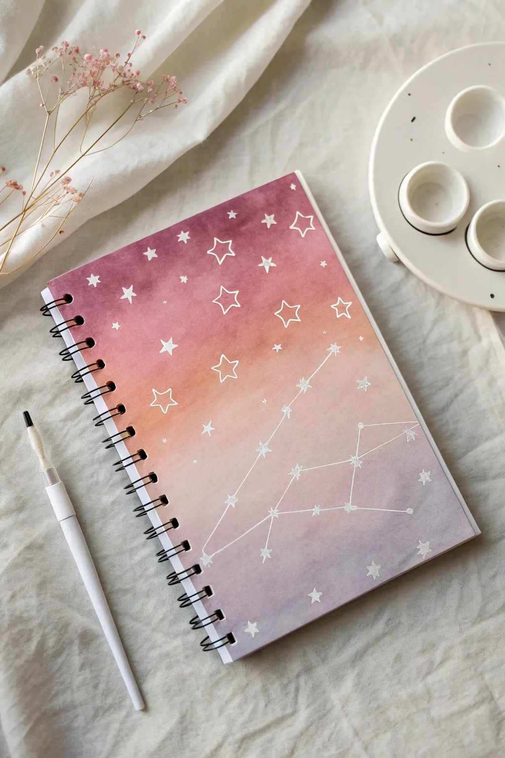
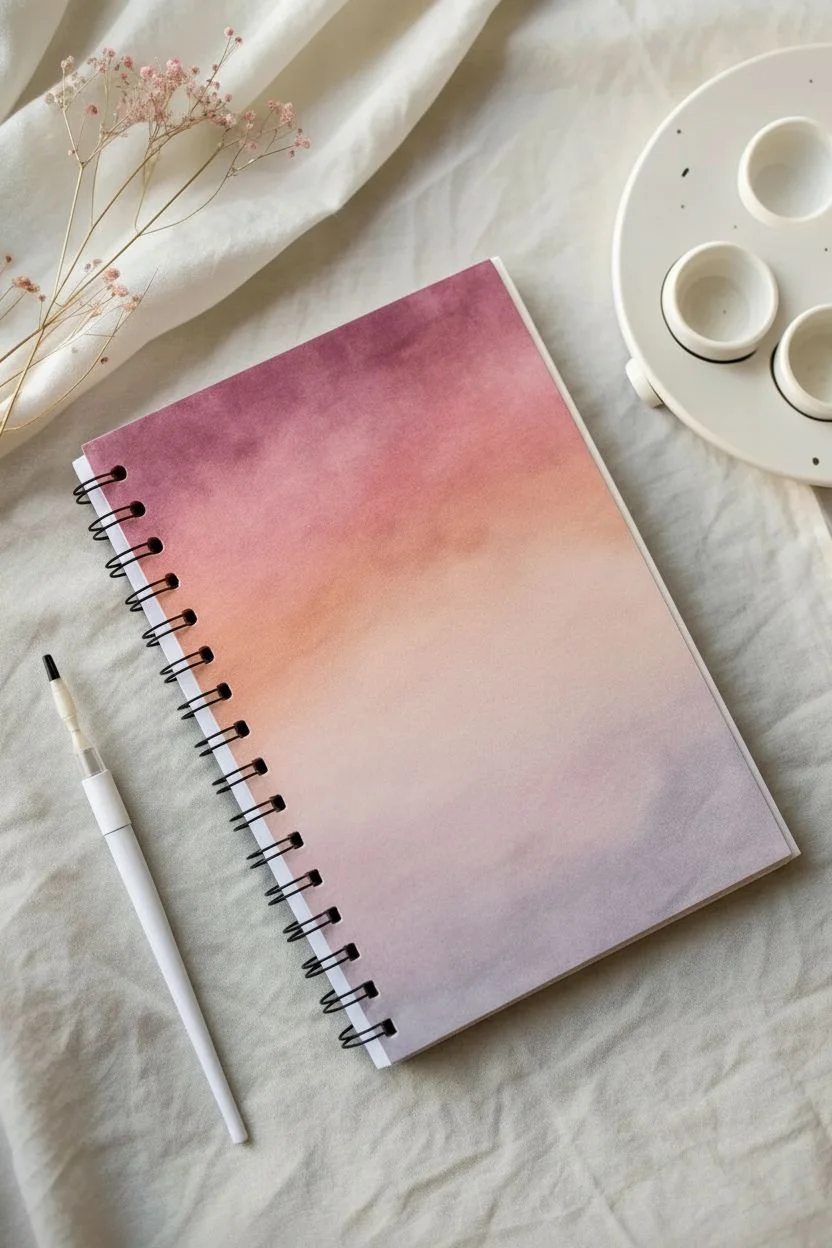
Transform a plain sketchbook into a dreamy night sky with this soft gradient wash technique. The blend of dusty rose, peach, and lavender creates a perfect backdrop for delicate white ink constellations and scattered stars.
Step-by-Step Tutorial
Materials
- Spiral-bound sketchbook with watercolor-friendly paper cover (or watercolor paper cut to size)
- Watercolor paints (Deep Purple/Burgundy, Coral/Peach, Lavender)
- Flat wash brush (large)
- Round brush (medium)
- White gel pen (e.g., Sakura Gelly Roll) or fine-tip white paint marker
- Ruler
- Pencil and eraser
- Paper towel
- Clean water jar
- Masking tape (optional)
Step 1: Creating the Sunset Gradient
-
Prepare the Surface:
If you are painting directly on a sketchbook cover, insure it can handle water. If not, cut a piece of watercolor paper to the exact size of your notebook cover. You can tape down the edges to prevent warping. -
Mix Your Palette:
prepare three distinct puddles of paint: a deep burgundy-purple, a warm coral or peach tone, and a softer, lighter lavender-grey. Keep them quite watery for a smooth wash. -
Start the Top Gradient:
Using your large flat brush, load up the deep burgundy-purple. Apply horizontal strokes starting at the very top edge of the cover. -
Transition to Warmth:
While the purple is still wet, rinse your brush slightly and pick up the coral/peach color. Paint below the purple, allowing the wet edges to touch and bleed into each other naturally. -
Complete the Wash:
Continue down the page, rinsing your brush again and switching to the lavender-grey for the bottom third. Blend this upward slightly into the peach section for a seamless transition. -
Refine the Blend:
If I notice any harsh lines, I like to use a clean, slightly damp brush to gently sweep across the transition zones to soften them. -
Let it Dry Completely:
This is crucial. The paper must be bone dry before you add ink, or the lines will feather. You can use a hairdryer on a low setting to speed this up.
Uneven Blending?
If your gradient dries with hard edges, wet the entire paper with clean water first (wet-on-wet technique) next time. This helps colors flow together.
Step 2: Adding Celestial Details
-
Plan the Constellation:
Lightly sketch your main constellation design with a pencil. You can copy a real zodiac sign, like Leo or Cassiopeia, or invent your own geometric pattern. -
Draw the Main Stars:
Using your white gel pen or paint marker, draw small, solid five-pointed stars at the key ‘joints’ of your constellation lines. -
Connect the Dots:
Use a ruler and the white pen to draw straight, thin lines connecting your main constellation stars. Press lightly to keep the lines delicate. -
Add Open Stars:
Scatter larger, open-outline stars across the upper, darker section of the gradient. These ‘hollow’ stars create a nice contrast against the deep purple. -
Fill with Small Stars:
Draw smaller, solid white stars throughout the sky, varying their sizes to create depth. -
Create Distant Stardust:
Add tiny dots and specks of white ink in the empty spaces to represent distant stars. -
Draw Geometric Starbursts:
For a bit of sparkle, add a few cross-shaped stars or ‘glint’ symbols near the constellation lines. -
Final Erasure:
Wait at least 15-20 minutes for the white ink to fully set, then very gently erase any visible pencil marks. -
Assembly:
If you painted on separate watercolor paper, carefully punch holes to match the spiral binding or glue the paper onto the existing cover.
Add Some Shimmer
Mix a tiny amount of iridescent medium into your white ink or use a metallic silver pen for the constellation lines to catch the light.
Now you have a personalized galaxy to hold all your creative ideas
Simple Polka Dots With One Unexpected Accent Color
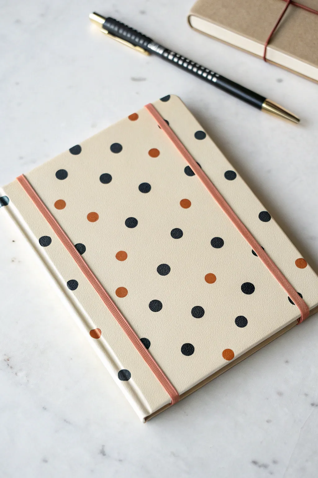
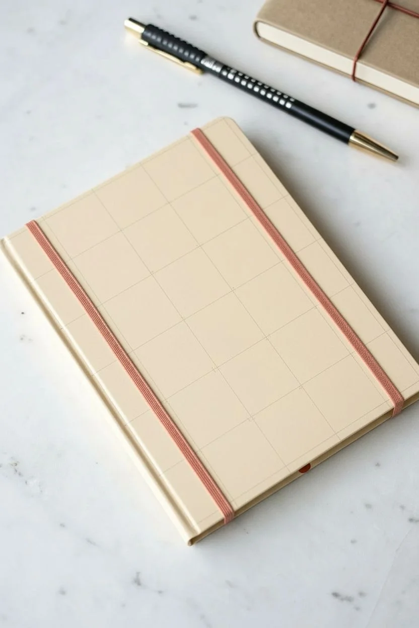
Transform a plain sketchbook into a chic, modern accessory with this simple polka dot design. Using a cream-colored base and two contrasting paint colors creates a look that is both playful and sophisticated.
Detailed Instructions
Materials
- Hardcover sketchbook (preferably with a smooth or faux-leather texture)
- Cream or oatmeal-colored acrylic paint (if base needs painting)
- Black acrylic paint or multi-surface paint marker
- Burnt orange or terracotta acrylic paint
- Small round foam pouncer or unused pencil eraser
- Ruler
- Pencil
- Matte sealant spray or Mod Podge (optional)
- Small flat brush (for base coat)
Step 1: Preparation & Base Coat
-
Clean surface:
Begin by wiping down the cover of your sketchbook with a slightly damp cloth to remove any dust or oils. Let it dry completely. -
Apply base color:
If your sketchbook isn’t already a cream color, mix a warm oatmeal shade using white with a tiny drop of brown or yellow ochre. Apply a thin, even layer over the entire cover using a flat brush. -
Let it dry:
Allow the first coat to dry fully. If the original cover color is showing through, apply a second coat for full opacity. -
Plan the grid:
To ensure your dots are evenly spaced, use a ruler and a pencil to lightly mark a grid of small dots or crosses where you want the pattern to sit. A diamond pattern (offset rows) works best for this look.
Stamp Sloppiness?
If paint bleeds under your stamp, your paint might be too thin. Let it sit on the palette for a few mins to thicken, or dab excess off on paper before stamping.
Step 2: Creating the Polka Dots
-
Prepare your tool:
For perfectly round dots, a small foam pouncer works wonders. Alternatively, the flat eraser end of a new pencil makes an excellent DIY stamp. -
Test spacing:
I like to practice stamping on a scrap piece of paper first to get a feel for how much paint is needed on the stamp to get a crisp circle without bleeding edges. -
Stamp the black dots:
Dip your stamp into black acrylic paint. Press it firmly onto your marked grid points, covering the majority of the spots but leaving random spaces open for your accent color. -
Clean or switch tools:
Clean your stamp thoroughly or grab a second clean stamp for the next color to avoid muddying the pigments. -
Add accent dots:
Dip your clean stamp into the burnt orange paint. Fill in the remaining empty spots on your grid. The ratio should be roughly 4 or 5 black dots to every 1 orange dot. -
Touch up edges:
If any dots look uneven or faint, carefully go back over them with a small detail brush or a paint marker in the same shade to crisp up the edges.
Make It 3D
Use puffy paint instead of acrylics for the dots to give your cover a fun, tactile texture that you can feel every time you open your book.
Step 3: Finishing Touches
-
Dry completely:
Let the polka dots dry for at least an hour. Acrylic paint can form a skin quickly but stays wet underneath, so patience is key here. -
Seal the design:
To protect your handywork from scratches in your bag, apply a clear matte sealant spray. Hold the can about 12 inches away and spray in light, sweeping motions. -
Clean the elastic:
If your sketchbook has an elastic band that got painted on by accident, gently scrape the dried paint off with a fingernail or wipe it with a damp cloth before the paint fully cures. -
Final inspection:
Check the spine and edges to ensure your base coat coverage is neat and consistent all around the book.
Now you have a custom sketchbook that looks store-bought and is ready to be filled with your creative ideas
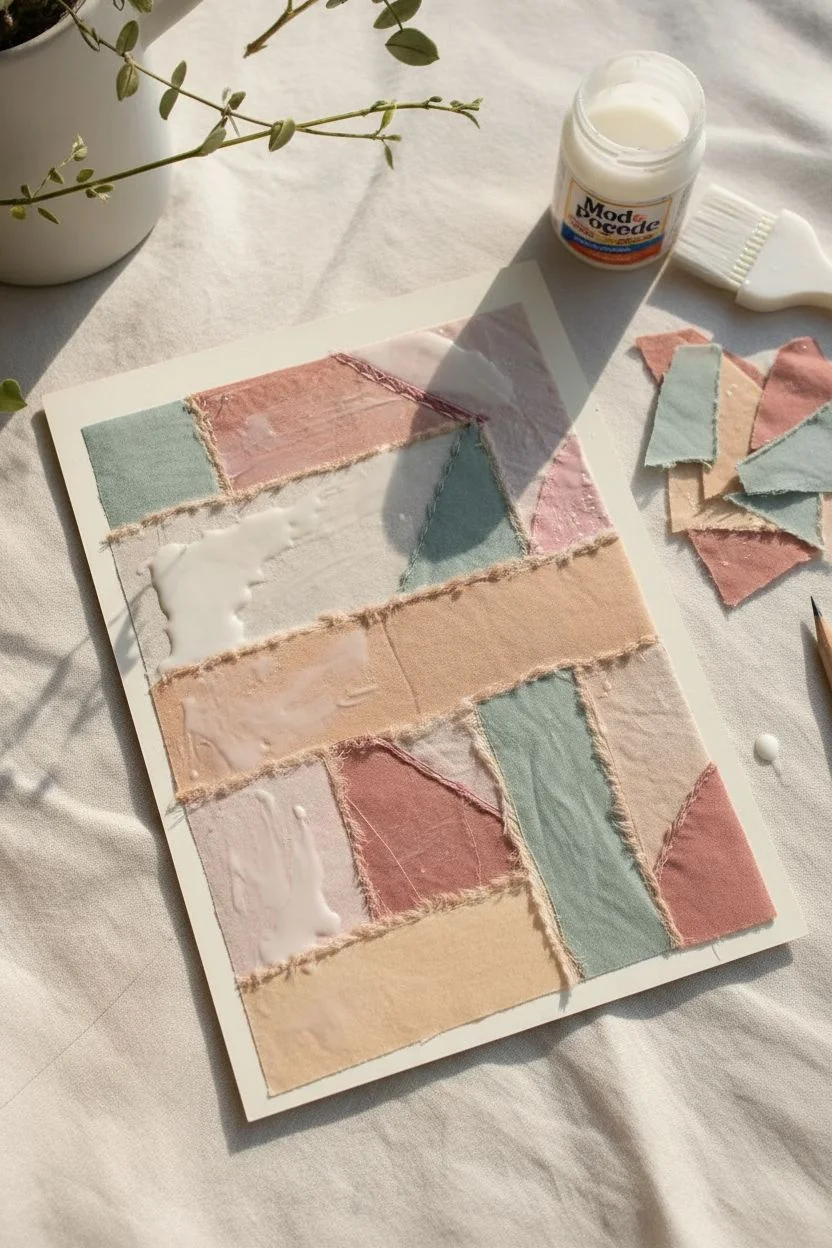
Cute Patchwork Collage With Ripped Paper Shapes
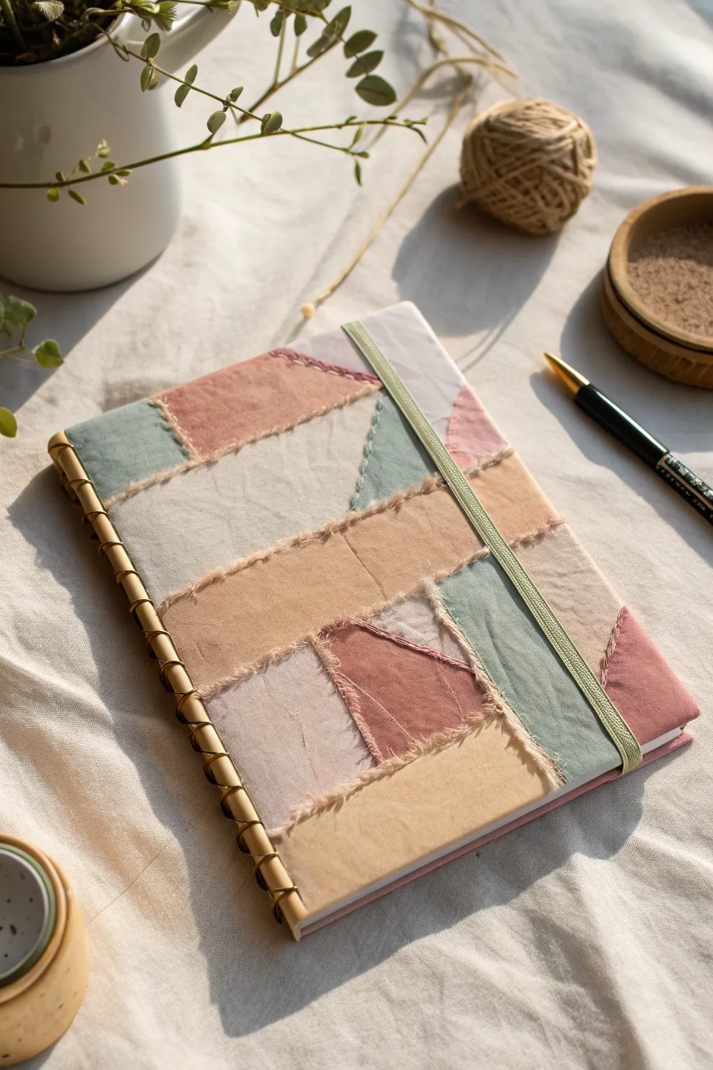
Transform a plain notebook into a tactile masterpiece using the cozy aesthetics of a vintage quilt. This project combines soft pastel fabric scraps with raw, frayed edges and decorative stitching to create a cover that feels as lovely as it looks.
Step-by-Step Guide
Materials
- Hardcover sketchbook (A5 size works well)
- Assorted fabric scraps (cotton or linen in pastel pink, peach, sage green, and cream)
- Mod Podge or white craft glue
- Foam brush or glue spreader
- Embroidery floss (cream or light beige)
- Embroidery needle
- Tailor’s chalk or pencil
- Scissors (for cutting fabric)
- Bone folder (optional)
- Gold or brass decorative spiral binding (if rebinding) or gold paint pen (for faux effect)
- Elastic band (sage green)
- Heavyweight cardstock (for backing)
Step 1: Preparing the Base Layer
-
Measure and cut backing:
Cut a piece of heavyweight cardstock that perfectly matches the dimensions of your sketchbook’s front cover. This will serve as the foundation for your patchwork so you aren’t gluing directly onto the book immediately. -
Plan your palette:
Gather your fabric scraps. Aim for a mix of textures—smooth cottons and slightly rougher linens work beautifully together. Stick to a soft, earthy palette of dusty rose, sage, cream, and apricot as seen in the example.
Step 2: Building the Collage
-
Create raw edges:
Instead of cutting straight lines, gently tear your fabric strips to create soft, frayed edges. This ‘ripped’ look is essential for the rustic charm of the cover. -
Arrange the layout:
Lay your torn fabric pieces onto the cardstock dry. Arrange them in a geometric, puzzle-like pattern, ensuring the pieces overlap slightly so no cardstock shows through. Mix larger rectangular blocks with smaller triangles for balance. -
Apply base glue:
Once you’re happy with the arrangement, lift one piece at a time and apply a thin, even layer of Mod Podge to the back. Press it firmly onto the cardstock. -
Smooth it out:
Use a bone folder or the edge of a credit card to smooth out any air bubbles as you glue. I find it helpful to work from the center outward to keep the fabric taut. -
Seal the edges:
Pay special attention to the frayed edges. Dab a tiny amount of glue under the loose threads to keep them laid flat, but don’t saturate them completely—you want them to retain some texture. -
Trim the overhang:
Once the entire cardstock panel is covered and the glue is dry, flip it over and trim any excess fabric that hangs off the edges for a clean perimeter.
Sticky Situation?
If the glue seeps through thin fabric, don’t wipe it! Let it dry completely clear. Wiping wet glue can smear the dye or cause the fabric to pill excessively.
Step 3: Stitching and Assembly
-
Mark stitching lines:
Using a pencil or tailor’s chalk, lightly mark where you want your decorative stitching. Focus on the seams where two different fabric colors meet. -
Pre-poke holes:
Since you are stitching through dried glue and cardstock, use a thumbtack or a sharp needle to pre-poke holes along your marked lines. This will save your fingers during the sewing process. -
Add embroidery details:
Thread your needle with cream embroidery floss. Use a simple running stitch or a whip stitch along the fabric seams. The stitches should look handmade and slightly imperfect. -
Attach the cover:
Apply a strong adhesive to the front of your actual sketchbook. Press your finished patchwork panel onto the book cover. Place a heavy book on top and let it set for at least an hour. -
Faux binding effect:
If your sketchbook has a standard wire binding, you can carefully paint the wire gold. If it’s a hardbound book, you can glue a decorative gold coil trim to the spine edge to mimic the look in the photo. -
Add the closure:
Measure a piece of sage green elastic band that fits snugly around the book. Glue the ends of the elastic to the inside back cover, or simply slide it over the finished book to keep your pages secure.
Pro Tip: Contrast
Iron your fabric scraps before tearing them. Crisp fabric tears more cleanly, giving you that perfect fuzzy edge without long, unmanageable strings getting in the way.
Now you have a unique, tactile journal that makes picking up a pen feel like a special occasion
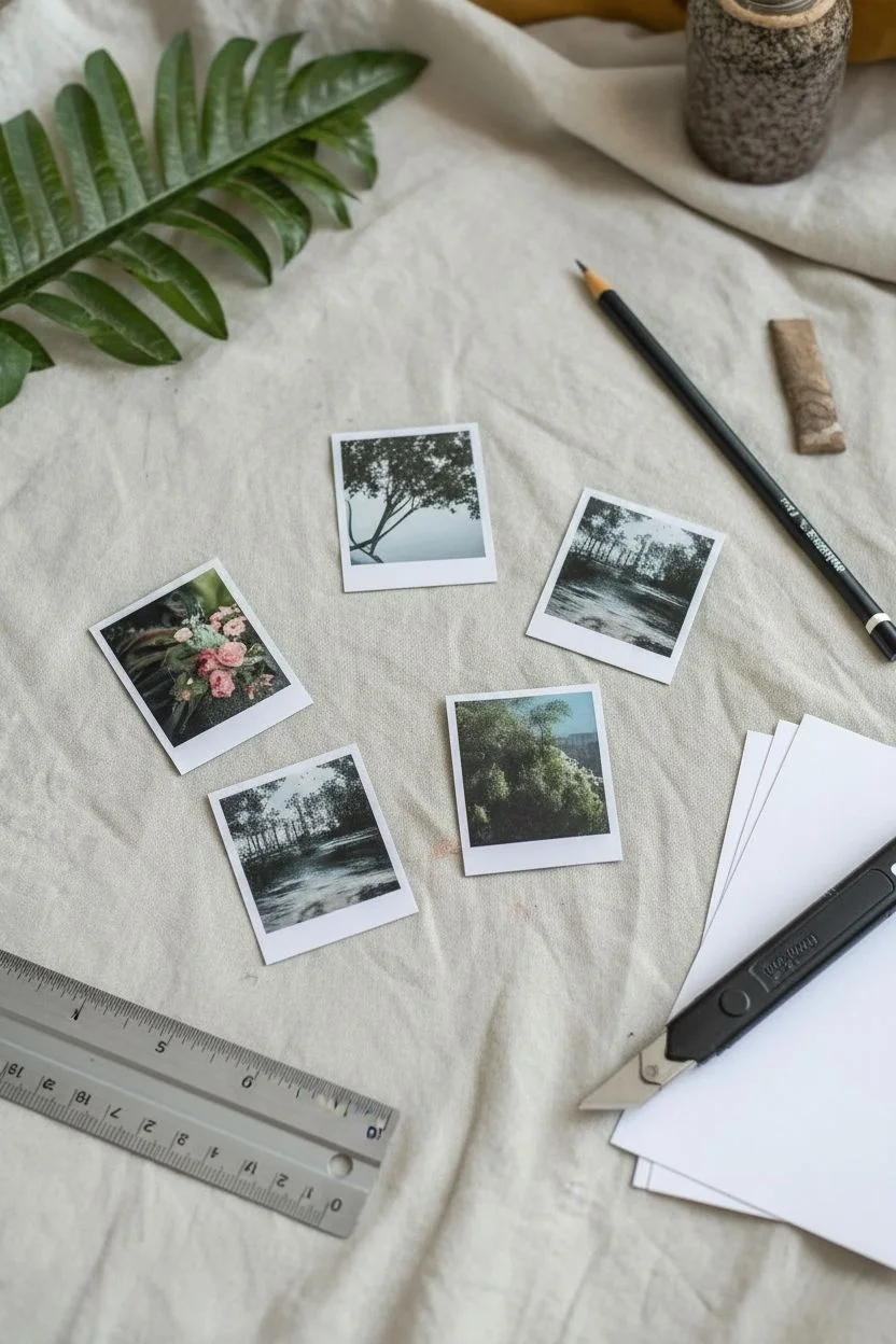
Mini Photo Prints and Handwritten Captions
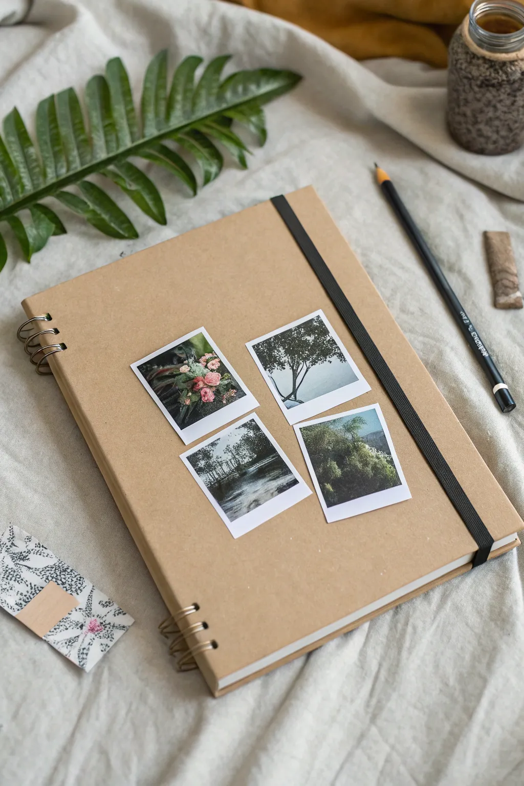
Transform a plain kraft sketchbook into a cherished keepsake with this simple yet effective photo collage layout. By using mini prints that mimic vintage Polaroids, you create an intimate, personalized cover that hints at the adventures waiting inside.
Step-by-Step Tutorial
Materials
- Kraft paper sketchbook (A5 size recommended)
- 4 mini square photos (digital prints or Instax)
- White cardstock (if creating faux Polaroids)
- Scissors or a craft knife
- Metal ruler
- Double-sided tape or photo-safe adhesive glue stick
- Ruler
- Pencil for light marking
- Computer and printer (optional for printing photos)
Step 1: Preparing the Photographs
-
Select your images:
Choose four cohesive images that represent a theme, like nature, a specific trip, or a color palette. In this example, we are using muted greens and soft pink florals. -
Resize the photos:
Using photo editing software or a simple word processor, resize your images to be small squares, approximately 2×2 inches (5×5 cm). -
Add white borders:
If you aren’t using real instant film, create a digital white border around each square image. Make the bottom border slightly thicker than the top and sides to mimic that classic Polaroid look. -
Print the sheet:
Print your images onto high-quality photo paper or bright white cardstock for better durability. -
Cut out the prints:
Carefully cut out each photo. I find using a craft knife and a metal ruler gives much cleaner, straighter edges than scissors.
Step 2: Planning the Layout
-
Clean the cover:
Briefly wipe down the front of your kraft sketchbook to ensure there is no dust or oil that might prevent the adhesive from sticking. -
Find the center:
Use a ruler to find the approximate horizontal and vertical center of the cover space. Remember to account for the elastic band if your notebook has one; you don’t want the band covering a face or important detail. -
Do a dry run:
Place your four cut-out photos onto the cover without glue. Arrange them in a 2×2 grid. -
Adjust the spacing:
Tweeze the photos until the gaps between them are even. A gap of about 0.5 inches (1-1.5 cm) usually looks balanced. Rotate images if necessary to distribute colors evenly.
Sticky Situation?
If using liquid glue creates wrinkles, switch to dry adhesives like runners or double-sided tape. Putting the cover under a heavy book overnight helps flatten any waves.
Step 3: Adhering the Photos
-
Mark the positions:
Once you are happy with the layout, lightly mark the corners of the top-left photo with a pencil. This will be your anchor. -
Apply adhesive:
Apply double-sided tape or a thin layer of glue to the back of the first photo. Be sure to get close to the corners so they don’t curl up later. -
Place the first photo:
Align the photo with your pencil marks and press down firmly. Smooth it out from the center to the edges. -
Align the second photo:
Place the second photo next to the first (top-right). Use a ruler to ensure the top edges are perfectly aligned with the first photo before pressing down. -
Place the bottom row:
Adhere the bottom two photos, checking alignment with the photos directly above them. The vertical gaps should match the horizontal gap. -
Erase guide marks:
Wait for any liquid glue to fully dry, then gently erase any visible pencil marks. -
Final press:
Open the sketchbook cover and place it face down on a clean, hard surface. Rub the back of the cover firmly to ensure the adhesive bonds well.
Pro Tip: Texture
Print on matte photo paper instead of glossy. The matte texture blends beautifully with the rough, organic feel of the kraft paper cover.
Now your sketchbook is ready to be filled with memories that match its personalized cover
Window Cutout Cover With a Hidden Pattern Underneath
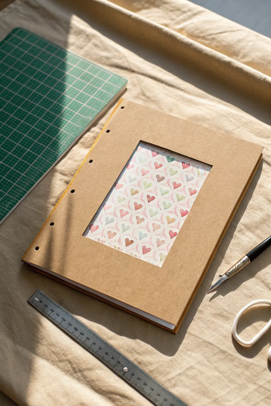
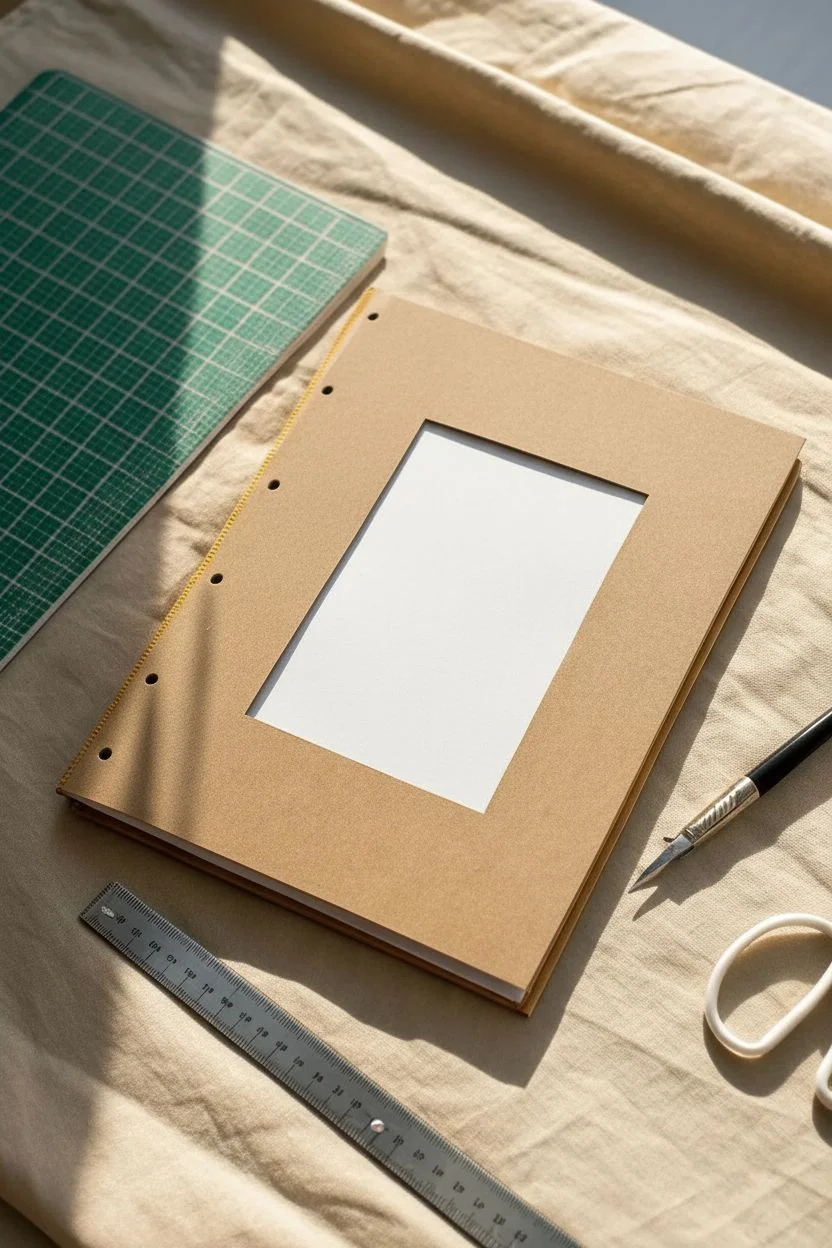
This charming project transforms a plain kraft sketchbook into a whimsical keepsake featuring a clever window cutout. The design reveals a hidden layer of patterned paper underneath, creating depth and a delightful surprise on the cover.
Step-by-Step
Materials
- A5 or similar size kraft sketchbook or notebook
- Heavyweight patterned scrapbook paper (heart motif shown)
- Pencil
- Metal ruler
- Craft knife or scalpel (X-Acto)
- Self-healing cutting mat
- Double-sided tape or gluestick
- Bone folder (optional)
- Awl or heavy needle (if re-binding)
- Yellow embroidery floss (if re-binding)
Step 1: Preparing the Cover
-
Measure the window:
Begin by deciding the size of your window. On the front cover of your kraft sketchbook, use your ruler to find the center point. Measure a rectangle that leaves a generous border of at least 1.5 to 2 inches on all sides to maintain structural integrity. -
Mark the cut lines:
Lightly draw the rectangle for your cutout using a pencil. Ensure the lines are perfectly parallel to the edges of the book so the window doesn’t look crooked. -
Protect the inside pages:
Open the front cover and place your self-healing cutting mat directly underneath it. This is crucial to prevent slicing through the first few pages of your actual sketchbook. -
Cut the window:
Align your metal ruler with one of the pencil lines. Press down firmly to keep it from slipping. Run your craft knife along the edge of the ruler with steady pressure. I find it better to make two or three light passes rather than forcing the blade through in one go. -
Check the corners:
Pay special attention to the corners of the rectangle. You may need to gently recut the very tips where the lines meet to ensure the center piece lifts out cleanly without tearing the kraft paper.
Step 2: Adding the Pattern Layer
-
Select your backing paper:
Choose a piece of patterned paper that is slightly larger than your window cutout but smaller than the overall cover. The heart pattern in the example adds a lovely vintage touch. -
Measure the insert:
Cut the patterned paper so it extends about 1 inch beyond the window opening on all sides. This overlap ensures the edges of the pattern paper won’t be visible when the book is closed. -
Apply adhesive:
Flip the front cover open. Apply a distinct frame of double-sided tape or a smooth layer of glue stick around the perimeter of the window opening on the *inside* face of the cover. -
Position the pattern:
Carefully place your patterned paper face down onto the adhesive. If your pattern has a specific direction (like hearts), double-check that it is right-side up before pressing it down. -
Secure the edges:
Once positioned, rub firmly over the glued area to secure the bond. If you have a bone folder, use it to burnish the paper down for a smooth finish without air bubbles. -
Cover the mechanics:
To hide the back of the patterned paper on the inside cover, cut a sheet of plain paper or light cardstock to the exact size of the cover page and glue it over the entire inside surface. This creates a clean ‘endpaper’ look.
Clean Cuts
If you have fuzzy edges in the corners of your window, use a fine grit sanding block or emery board to gently smooth the paper fibers for a pro finish.
Step 3: Optional Binding Detail
-
Assess the binding:
If you are making the book from scratch or want to add a decorative touch to an existing staple-bound book, you can add the yellow stitching shown on the spine. -
Mark hole positions:
Along the spine edge, mark five or six evenly spaced dots about half an inch from the edge. -
Punch the holes:
Using an awl and with the cutting mat underneath, punch clean holes through the cover and pages at your marked spots. -
Stitch the spine:
Thread a needle with bright yellow embroidery floss. Perform a simple running stitch or a Japanese stab binding technique through the holes to secure the pages and add a pop of color that contrasts with the kraft paper.
Shaker Cover
Turn this into a shaker cover! Glue a piece of acetate behind the window before adding your pattern, and fill the gap with sequins or confetti.
Now you have a personalized sketchbook that inspires creativity before you even open the first page
Monochrome Black-and-White Doodle Bomb for Clean Cute
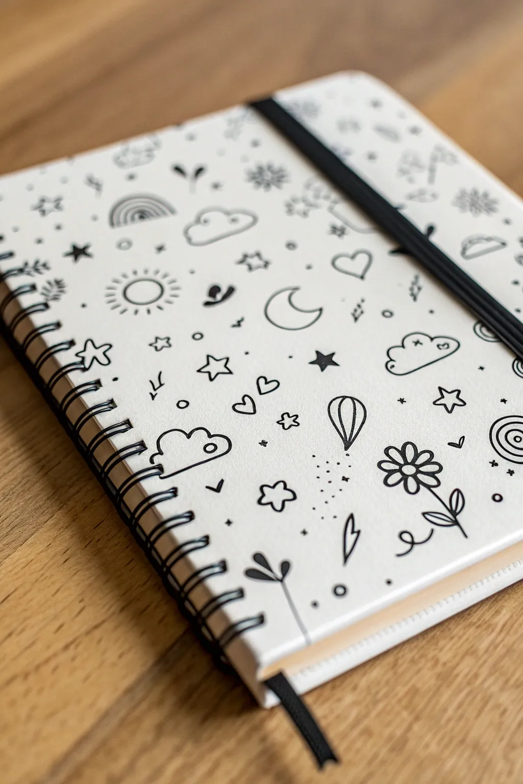
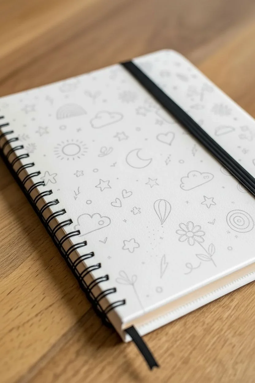
Transform a plain sketchbook into a personalized canvas of creativity with this charming monochrome doodle cover. By combining simple, everyday motifs like clouds, stars, and flowers into a scattered pattern, you can achieve a playful, cohesive look that feels both clean and undeniably cute.
How-To Guide
Materials
- White or light-colored plain sketchbook (spiral-bound works best)
- Black ink fine liner pen (0.3mm or 0.5mm)
- Black ink medium marker (0.8mm or 1.0mm) for thicker outlines
- Pencil (HB or lighter)
- Soft white eraser
- Scrap paper for practicing doodles
Step 1: Planning and Preparation
-
Surface Cleaning:
Before laying down any ink, gently wipe the cover of your sketchbook with a slightly dry cloth to remove any dust or oils from your hands. This ensures your ink will adhere smoothly without skipping. -
Doodle Brainstorming:
On your scrap paper, sketch out a few tiny motifs you want to feature. Focus on simple shapes: cloud puffs, five-point stars, crescent moons, basic daisies, and hearts. -
Establishing the Scale:
Decide on the size of your doodles now. Aim for icons that are roughly the size of a thumbprint (about 1-2 cm) to keep the pattern dense but readable.
Smudge Alert!
If you smear ink, turn it into a solid black shape (like a filled-in heart) or draw a larger cloud over it. Mistakes are just hidden opportunities.
Step 2: Drafting the Pattern
-
Initial Pencil Sketch:
Lightly sketch your main ‘anchor’ doodles onto the cover using your pencil. Don’t press too hard, or you’ll leave grooves in the cardstock. -
Placement Strategy:
Avoid placing similar items right next to each other. If you draw a sun in the top left, place your next sun drawing towards the bottom center to balance the composition. -
Adding Variety:
Intersperse your primary shapes with secondary motifs. Add a hot air balloon, a rainbow arc, or a planet with a ring to break up potential monotony. -
Leaving Breathing Room:
Ensure there is roughly equal white space between your main drawings. The ‘doodle bomb’ look relies on visual clutter, but too close and it becomes a scribble.
Level Up: Glossy Finish
After waiting 24 hours for ink to fully cure, seal your cover with a clear matte or satin spray varnish to protect your art from daily handling.
Step 3: Inking the Designs
-
First Pass Outlines:
Take your fine liner (0.5mm) and carefully trace over your pencil lines. Start from the top left (if you are right-handed) to avoid smudging fresh ink as your hand moves across the cover. -
Drawing the Cloud:
The fluffier clouds often feature a slightly thicker outline. Use your medium marker here on the bottom curve of the cloud to give it visual weight. -
The Flower Power:
For the daisy motif, draw a simple circle center, then add 5-6 loop petals. Add a curved stem and two simple leaves at the base. -
Celestial Shapes:
Ink the crescent moons and suns. For the sun, vary the length of the rays slightly for a hand-drawn, organic feel. -
Double-Line Details:
I particularly like adding a second, thinner line inside simple shapes like the heart or the hot air balloon. It adds immediate depth without shading.
Step 4: Filling the Gaps
-
The Micro-Details:
Look at the empty white spaces between your main drawings. Use your finest pen (0.3mm) to fill these gaps with tiny circles, single dots, sparkles, and little ‘x’ marks. -
Adding Motion:
Draw tiny squiggles or dashes near the hot air balloon or clouds to suggest movement or wind. -
Star Scatter:
Fill remaining awkward gaps with tiny 5-point stars or simple asterisks (*). These are perfect for tying the celestial theme together. -
Drying Time:
Let the ink sit for at least 15-20 minutes. Just because it looks dry doesn’t mean it won’t smear under an eraser. -
Clean Up:
Gently erase any visible pencil sketch lines. Hold the paper taut with one hand while erasing with the other to prevent crinkling the cover.
Now your sketchbook is ready to catch all your big ideas with a cover that inspires intricate creativity
Candy Stripe Background With a Hand-Lettered Quote
Transform a plain sketchbook into a soft, inviting art journal with this diagonal candy stripe design. The muted pastel palette and clean, modern lettering give it a sophisticated yet whimsical look that invites you to start creating.
Step-by-Step
Materials
- Hardcover sketchbook (plain white or primed)
- Wide masking tape or painter’s tape
- Acrylic paints (Soft Sage Green, Muted Peach/Terracotta, Dusty Pink, Cream/Off-White, Deep Teal)
- Flat paintbrush (medium width)
- Black fineliner pens (various sizes)
- Ruler
- Pencil
- Eraser
- Matte sealant spray or Mod Podge (optional)
Step 1: Preparation & Planning
-
Prepare your surface:
If your sketchbook isn’t already white, give the front cover a base coat of white acrylic paint or gesso. Let this dry completely to ensure your pastel colors pop true to tone. -
Plan the angles:
Take a ruler and lightly pencil a diagonal line across the cover to establish the angle of your stripes. I like to keep the angle around 45 degrees for that classic candy-stripe feel. -
Mark stripe widths:
Using your ruler, mark intervals along the edges of the book for where each stripe will begin and end. This design uses varying widths—some wide, some narrow—so play with spacing to keep it interesting.
Step 2: Painting the Stripes
-
Mask the first set:
Apply masking tape along the pencil lines for your first color. Remember that the tape covers the areas you want to *keep* the base color or paint later, so you are exposing the stripe you want to paint now. -
Seal the edges:
Run your fingernail or a credit card firmly along the edge of the tape to prevent paint from bleeding underneath. This is crucial for crisp lines. -
Mix your palette:
Prepare your colors. Mix a ‘Soft Sage Green’ by adding a touch of grey to green and white. Create a ‘Muted Peach’ with orange, white, and a tiny dot of brown. -
Paint the first stripes:
Apply your first color (e.g., the sage green) to the exposed area. Use a flat brush and stroke in the direction of the tape for the smoothest finish. Apply two thin coats rather than one thick one. -
Remove tape carefully:
While the paint is still slightly tacky (not fully wet, but not bone dry), peel the tape off slowly at a 45-degree angle away from the wet edge. -
Repeat the process:
Once the first stripes are totally dry, mask off the next sections. You can tape over the dried paint safely now. Paint your next color, perhaps the ‘Dusty Pink’ or ‘Deep Teal’. -
Fill the gaps:
Continue masking and painting until all stripes are filled. Don’t forget to save some stripes for a ‘Cream’ or ‘Off-White’ color to break up the darker tones, which adds that light, airy aesthetic. -
Clean up edges:
If any paint bled under the tape, use a very small brush with the background color (or white) to touch up the lines and make them razor-sharp.
Clean Lines Hack
Before painting your color, paint a thin layer of the *base* color (white) along the tape edge. This seals the tape, meaning any bleed is invisible white paint.
Step 3: Lettering & Finishing
-
Draft the text:
Find the visual center of your cover. Lightly pencil in the word ‘SKETCHBOOK’ (or your chosen quote) using a ruler to keep the baseline straight. Use a tall, thin sans-serif style to match the image. -
Trace with ink:
Go over your pencil letters with a fine-tip back pen. Keep your hand steady and maintain consistent line weight. For the thinner look shown here, a 0.3mm or 0.5mm pen works perfectly. -
Thicken slightly (Optional):
If your lines look too delicate against the bold stripes, carefully go over the vertical strokes of each letter one more time to add just a hint of weight. -
Erase guidelines:
Wait at least 15 minutes for the ink to fully set to avoid smudging. Then, gently erase any visible pencil marks from your lettering sketch. -
Seal the deal:
To protect your hard work from being scratched in a bag, apply a coat of clear matte spray sealant or a thin layer of matte Mod Podge over the entire cover.
Go Metallic
Replace one of the cream or white stripes with a gold leaf or metallic copper paint stripe to add a luxurious shimmer that catches the sunlight.
Now you have a personalized sketchbook that looks beautiful sitting on your desk
Tiny Character Illustration With a Simple Outfit Palette
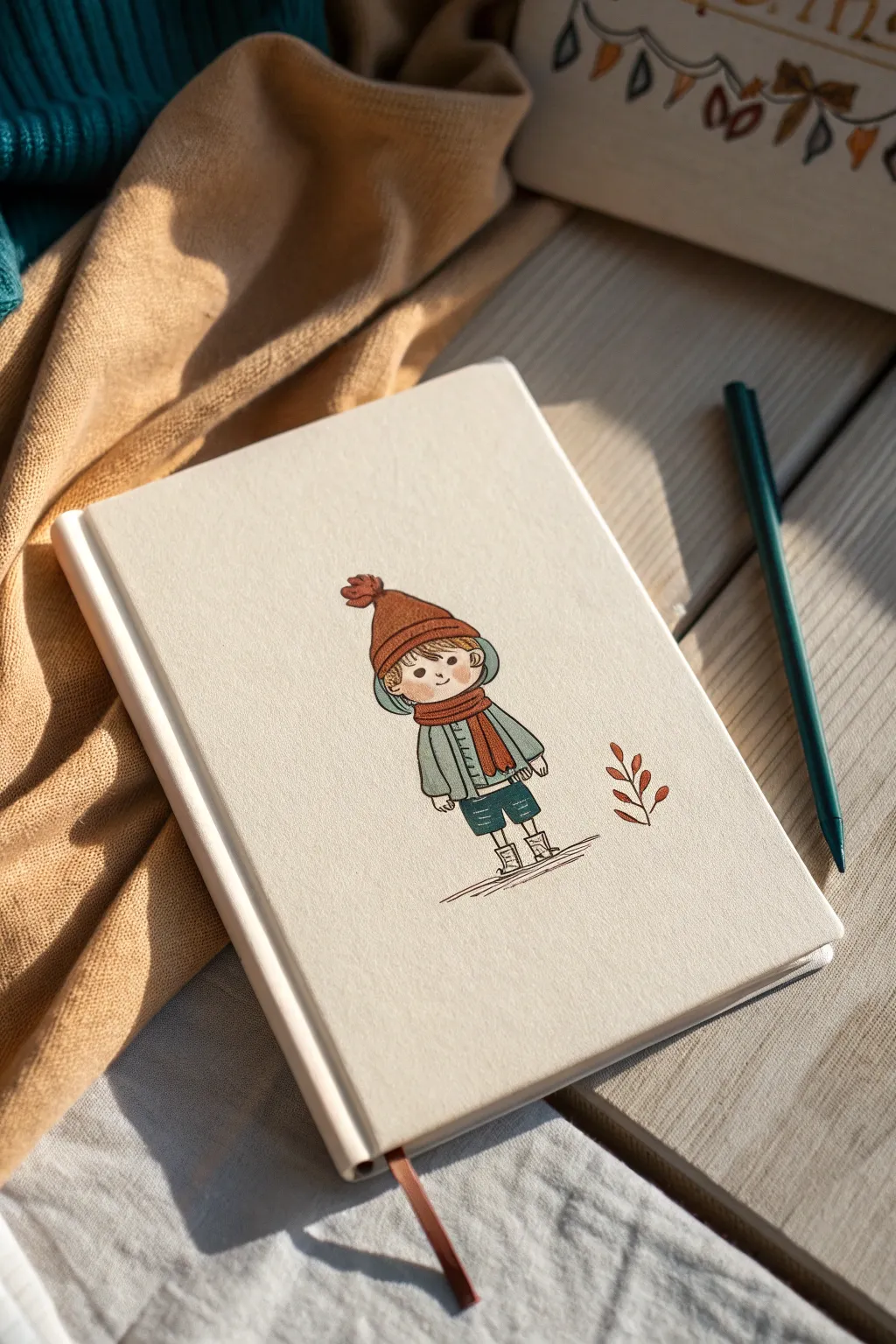
Transform a plain sketchbook into a seasonal keepsake with this adorable, hand-drawn character design. Using a warm, limited color palette gives the illustration a professional and cohesive look that feels perfect for fall.
How-To Guide
Materials
- Hardcover sketchbook with plain cream or canvas cover
- HB pencil and good quality eraser
- Fineliner pen (black or dark sepia, 0.1mm size)
- Alcohol markers or color pencils (burnt orange, teal/slate blue, deep green, blush pink)
- White gel pen (optional for highlights)
- Ruler
Step 1: Planning and Sketching
-
Find the center:
Begin by lightly marking the vertical center of your sketchbook cover with a pencil. You don’t need to measure perfectly, but a visual guide helps keep your character grounded in the middle of the lower half of the book. -
Sketch the head shape:
Draw a soft, rounded oval for the head. Keep the lines incredibly faint so they can be erased easily later. -
Add the beanie:
Sketch a triangular beanie shape sitting snugly on the head. Add a small circle at the very top for the pom-pom and a thick band across the forehead. -
Draft the body:
Draw a small, boxy shape for the jacket just below the head. Since this is a ‘tiny character’ style, the body should be roughly the same height as the head, keeping the proportions cute and compact. -
Wrap the scarf:
Loop a scarf around the neck area, adding one tail that hangs down the front of the jacket. This breaks up the shape of the body and adds movement. -
Adding limbs:
Sketch simple tube shapes for the sleeves. For the legs, draw thin lines extending from the shorts, finishing with chunky socks and small boots. -
Refine the face:
Place the eyes low on the face—just two small dots—and add a tiny curved smile between them. This low-set facial feature placement is key to the ‘kawaii’ look. -
Leaf detail:
To the right of the character, lightly sketch a single, simple stem with five or six small leaves pointing upward.
Ink Smearing?
If your fineliner smears when erased, switch to waterproof pigment liners (like Micron) and wait longer before erasing. Testing on the back page first is always wise.
Step 2: Inking the Outline
-
Trace clean lines:
Using your 0.1mm fineliner, carefully trace over your pencil lines. Ink the main shapes like the hat, face contour, and jacket first. -
Add texture marks:
While inking the beanie and scarf, add tiny internal lines to suggest knit ribbing. I find doing this with broken lines rather than solid ones keeps the drawing looking soft. -
Ground the figure:
Using a ruler or freehand, draw three or four horizontal scratchy lines beneath the feet to create a shadow and ground the character so they aren’t floating. -
Erase guidelines:
Wait at least 5-10 minutes for the ink to dry completely, then gently erase all visible pencil marks.
Make it yours
Customize the character’s outfit seasonally! Sway the scarf for wind, change the beanie to a sunhat for summer, or add a tiny pet alongside them.
Step 3: Coloring
-
Color the beanie:
Fill in the beanie hat with a burnt orange color. If using markers, apply the color quickly to avoid streaks. -
Matching accessories:
Use that same burnt orange on the scarf and the pom-pom to tie the outfit together visually. -
Jacket tones:
Color the jacket in a muted grey-blue or slate color. Leave tiny gaps of white near the lines if you want a more sketchy, artistic feel. -
Shorts and details:
Use a darker teal or deep green for the shorts. If you used colored pencils, press a bit harder here to get a solid, opaque look. -
Adding life to the face:
Gently apply a blush pink to the cheeks with a circular motion. Keep the rest of the skin tone the natural cream color of the sketchbook cover. -
Coloring the leaf:
Fill in the small leaf sprig next to the character with the same burnt orange used for the hat. -
Final touches:
If you have a white gel pen, add a single tiny dot to the hat or the eyes for a sparkle. Double-check that your ink lines are crisp, and you’re done.
Your sketchbook is now personalized with a sweet character that will make you smile every time you open it to draw
Cute “Open Mind” Collage With Floating Mini Icons
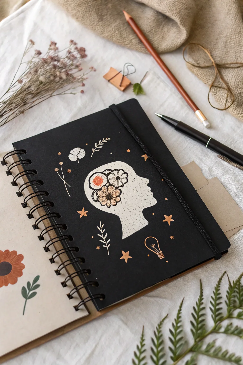
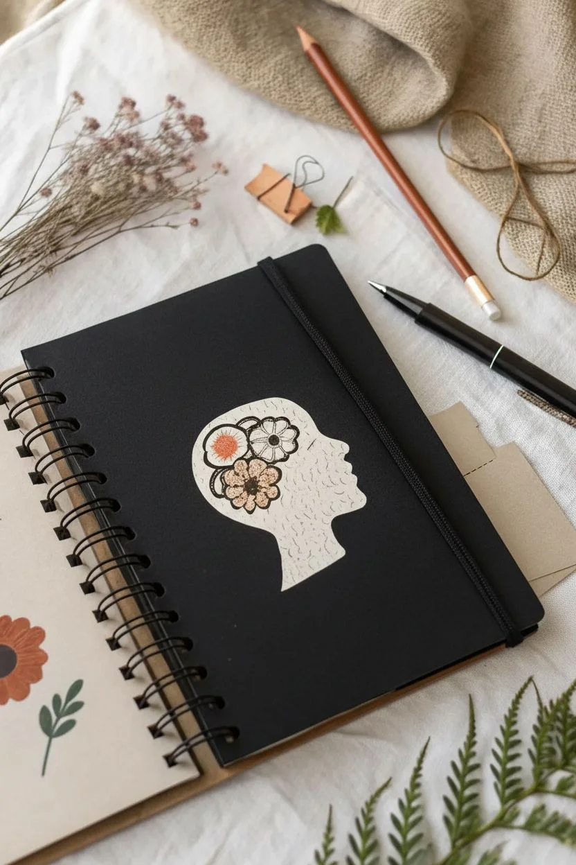
Transform a plain black sketchbook into a thoughtful piece of art with this high-contrast collage project. The striking combination of a textured paper silhouette, delicate floral ink illustrations, and metallic gold accents creates a cover that truly celebrates the creative mind.
Detailed Instructions
Materials
- Black sketchbook (preferably spiral bound)
- White or cream textured paper (heavyweight, like watercolor paper)
- Sharp detail scissors or craft knife
- Gold gel pen or metallic paint marker
- Fine liner pen (black, archival)
- Pencil and eraser
- Glue stick or double-sided tape
- Orange or gold colored pencil (optional for flower details)
- Small printed template of a head silhouette (side profile)
Step 1: Creating the Focal Point
-
Trace and cut the silhouette:
Begin by finding a simple side-profile silhouette of a human head. Trace this shape onto your textured white paper. Carefully cut it out using sharp detail scissors to keep the edges crisp. -
Sketch the internal flowers:
Lightly sketch three large, circular flower shapes inside the ‘brain’ area of your paper cutout using a pencil. Arrange them so they cluster together naturally. -
Ink the floral outlines:
Go over your pencil sketches with a black fine liner. Draw distinct petals—some rounded, some pointed—to create variety. Add small circles in the centers for pollen details. -
Add shading and texture:
Use stippling (small dots) or hatching lines with your fine liner to add depth to petal edges and centers. This makes the drawing look less flat against the white background. -
Introduce color:
Color selected petals or flower centers using an orange or gold colored pencil. I prefer keeping the color minimal to match the metallic accents we will add later. -
Texturize the silhouette:
To give the white paper silhouette more character, add very subtle, faint squiggly lines or speckles across the rest of the shape with a grey pen or light pencil, mimicking the texture of stone or recycled paper.
Use Textured Paper
Use cold-press watercolor paper for the silhouette. The bumpy texture grabs ink beautifully and adds a premium look compared to standard cardstock.
Step 2: Assembling the Cover
-
Position the centerpiece:
Place your finished cutout in the optical center of the black sketchbook cover. Don’t glue it just yet—make sure it feels balanced with space around the edges for doodles. -
Adhere the silhouette:
Once happy with the placement, apply a thin, even layer of glue or double-sided tape to the back of the cutout. Press it firmly onto the cover, smoothing from the center outward to prevent bubbles. -
Plan the metallic accents:
With your pencil, faintly mark where you want your floating icons to go. Think about scattering them like confetti around the head. -
Draw the celestial stars:
Using a gold gel pen or paint marker, draw several five-pointed stars around the silhouette. Vary their sizes, making some solid and others just outlines. -
Add botanical elements:
Draw simple sprigs of leaves or fern shapes in gold. Focus on placing these near the top and bottom of the head to frame it naturally. -
Sketch the lightbulb:
Near the ‘neck’ or bottom of the silhouette, draw a small lightbulb icon in gold to represent ideas. Use simple lines for the filament inside. -
Incorporate small details:
Fill in any awkward empty spaces with tiny gold dots or small clusters of three circles to bloom like dandelion puffs. -
Draw white accents:
Using a white gel pen, add one or two distinct botanical drawings directly onto the black background. A simple cotton flower or tall grass stem on the left side balances the gold well. -
Final touches:
Erase any visible pencil marks gently once the metallic ink is fully dry. Check the edges of your glued silhouette and press down any lifting corners.
Add Dimension
Make the silhouette pop by adhering it with foam mounting tape instead of glue. This creates a subtle shadow and a cool 3D effect on the cover.
Now you have a sketchbook cover that looks professionally designed and perfectly captures the flow of creative ideas
Textured Gesso Background With Soft Scribble Hearts
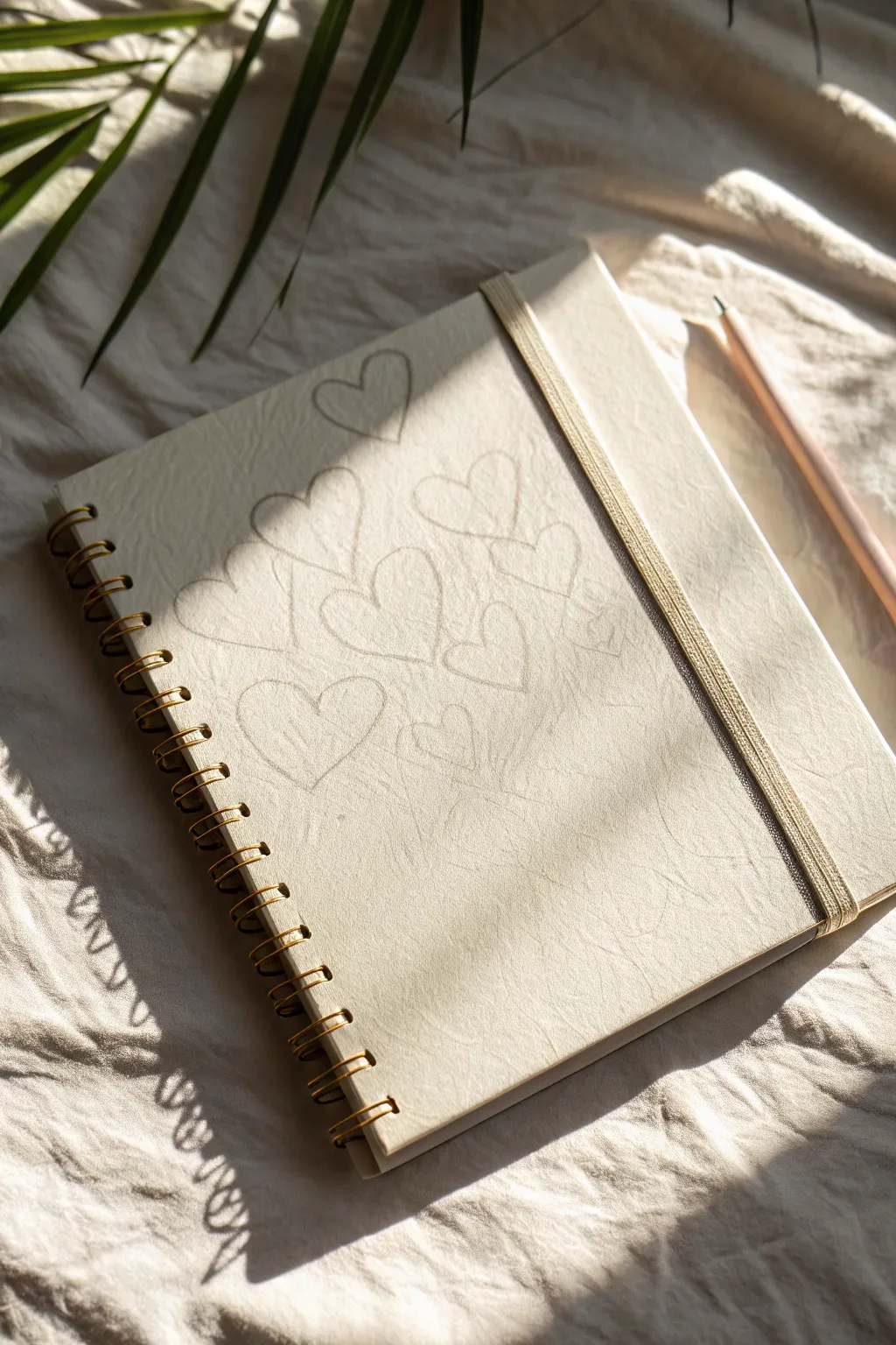
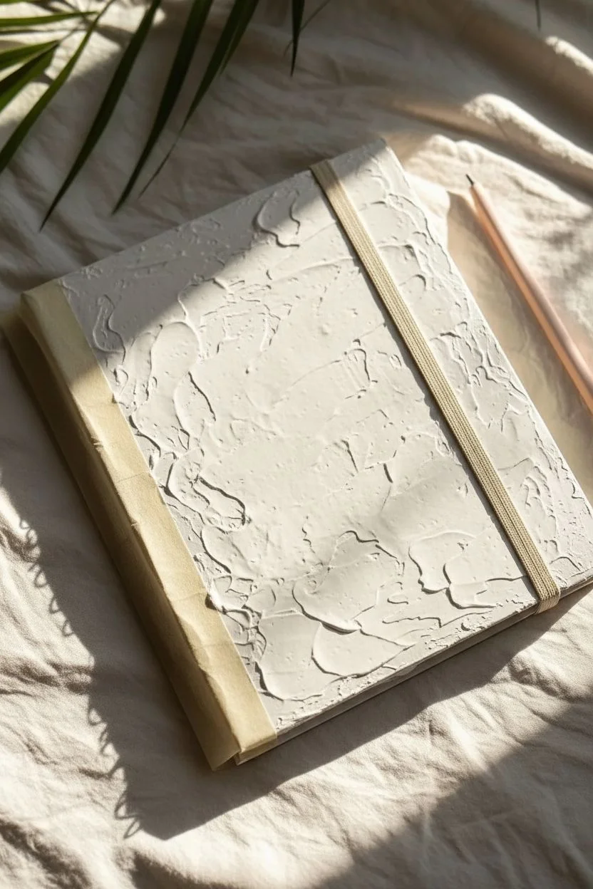
Transform a plain sketchbook cover into a tactile work of art using simple materials and a soft touch. This project combines the rough, gritty feel of gesso with delicate, dreamy heart doodles for a beautifully understated aesthetic.
Step-by-Step Tutorial
Materials
- Hardcover spiral-bound sketchbook (kraft or plain cover)
- White gesso primer
- Wide flat paintbrush
- Medium-grit sandpaper (optional)
- Soft graphite pencil (4B or 6B)
- Matte fixative spray
Step 1: Preparing the Surface
-
Protect the binding:
Before you begin painting, slide a piece of scrap paper under the front cover to protect the first page. If you’re worried about the spiral binding, you can run a strip of painter’s tape along the metal coil to keep it clean. -
First gesso layer:
Dip your wide flat brush into the white gesso. Apply a generous coat across the entire front cover. Don’t worry about being too neat here; the goal is to cover the original color of the sketchbook completely. -
Create texture:
While the first coat is still wet, use the bristles of your brush to stipple or cross-hatch the surface. This creates those lovely ridges and peaks that will catch the light later. I usually like to dab the brush up and down to create a rougher, more organic feel. -
Let it dry:
Allow the first layer to dry completely. Gesso dries relatively fast, but since we applied it thickly for texture, give it at least 30 to 45 minutes. It should feel chalky and dry to the touch, not cool or tacky. -
Second layer (optional):
If the original cover color is still peeking through, or if you want even more texture, apply a second coat. Repeat the stippling technique to build up the surface dimension. -
Refine the edges:
Once fully dry, check the edges of your cover. If there are sharp peaks of dried gesso that feel uncomfortable, lightly gently sand them down with medium-grit sandpaper just to soften the feel without removing the visual texture.
Step 2: Drawing the Hearts
-
Select your pencil:
Choose a soft graphite pencil, ideally a 4B or 6B. Harder pencils (like H or HB) might scratch through the gesso layer, while softer graphite glides over the texture and leaves a darker, richer mark. -
Planning the layout:
Visualize where your hearts will go. The charm of this design lies in its casual, overlapping arrangement. Aim for a central cluster that feels organic rather than a rigid grid. -
Draw the first heart:
Start near the upper center. Draw a heart shape with a loose, relaxed hand. Don’t try to make it perfect; a little asymmetry adds to the hand-drawn appeal. -
Scribble the outline:
Go over your outline two or three times. Let the lines separate slightly and overlap, creating a ‘scribbled’ or sketched look rather than a single hard line. This interacts beautifully with the bumpy gesso surface. -
Add floating hearts:
Continue adding hearts around the first one. Draw various sizes—some slightly larger, some smaller—to create visual interest. Let them float near each other without necessarily touching yet. -
Create overlap:
Draw a few hearts that appear ‘behind’ or intersecting with others. This depth makes the composition feel dynamic. The gesso texture will cause the pencil line to break in places, which is exactly the effect we want. -
Check the balance:
Take a step back and look at your composition. Fill in any large empty gaps with smaller hearts, or perhaps a tiny, faint scribble, but remember to leave some negative space around the edges.
Enhance the Texture
Mix a tiny pinch of baking soda into your gesso before applying it. This creates a grainy, stone-like surface that grabs graphite beautifully.
Step 3: Finishing Touches
-
Soften the lines:
If any pencil marks look too harsh, lightly pat them with a kneaded eraser. You aren’t trying to erase them, just lift a tiny bit of graphite to make the drawing look worn and soft. -
Clean up:
Remove the painter’s tape from the coil carefully. Use a damp cloth to wipe away any stray gesso that might have gotten onto the back cover or the metal spiral. -
Seal the work:
To prevent the soft graphite from smudging every time you open your book, take the sketchbook to a well-ventilated area. Spray a light, even coat of matte fixative over the cover. -
Final dry:
Let the fixative dry for about 15 minutes before handling. Your custom textured cover is now ready for use.
Fixing Smudges
If you accidentally smudge graphite on the white gesso, a standard white eraser usually works perfectly to clean it up without damaging the hard acrylic base.
Now you have a personalized sketchbook that invites you to create every time you pick it up
Fabric Swatch Panel for a Cozy Handmade Look
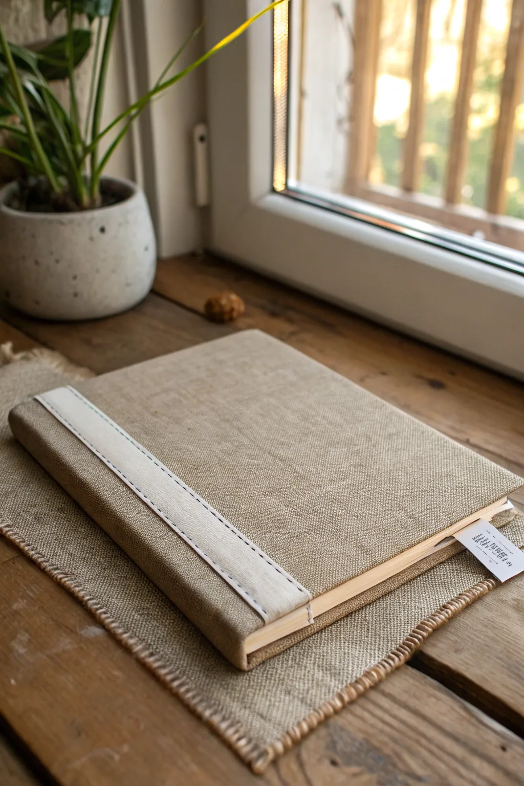
Transform a plain sketchbook into a textural delight with this cozy, rustic linen cover. The simple addition of a stitched spine band creates a tailored, handmade aesthetic that feels as good as it looks.
Step-by-Step Guide
Materials
- Hardbound sketchbook (A5 or similar size)
- Natural linen or heavy cotton fabric (beige/oatmeal color)
- Wide white cotton twill tape or heavy grosgrain ribbon (1.5 – 2 inches wide)
- Fabric glue (e.g., PVA or specific bookbinding glue)
- Scissors
- Sewing machine with white thread (or needle for hand sewing)
- Ruler
- Pencil or tailor’s chalk
- Bone folder (or a dull butter knife)
- Heavy books or weights
- Paintbrush (for glue application)
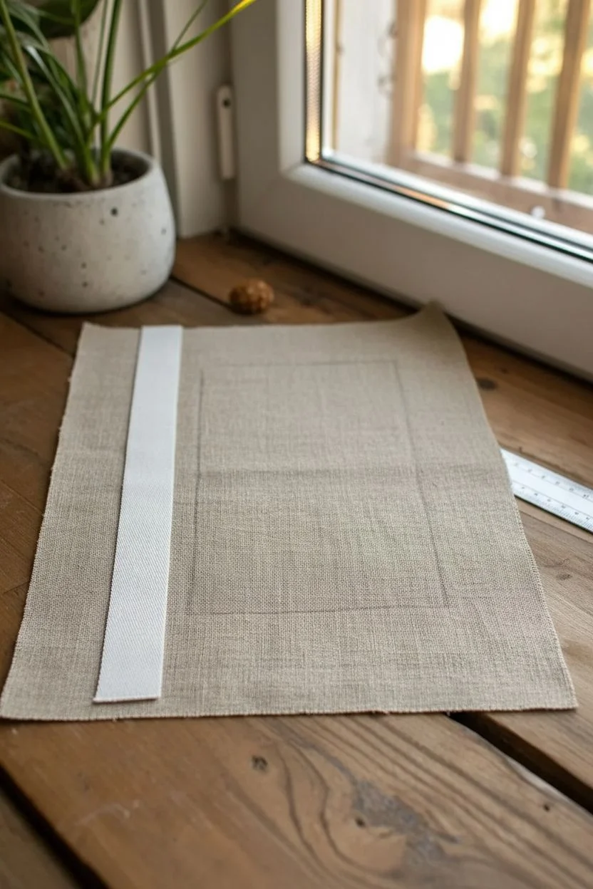
Step 1: Fabric Preparation
-
Measure the book:
Open your sketchbook flat and measure the total width from the edge of the back cover to the edge of the front cover, including the spine width. Add 2 inches to this measurement for the width. -
Determine height:
Measure the height of the sketchbook and add 2 inches to this measurement as well to allow for wrapping inside. -
Cut the main fabric:
Using these calculated dimensions, cut your piece of natural linen. Iron the fabric now to ensure it is perfectly crisp and free of wrinkles before gluing. -
Prepare the spine accent:
Cut a length of the white cotton twill tape that matches the exact height of your cut linen fabric piece. It should span from the very top raw edge to the bottom raw edge.
Glue Bleed-Through?
If using thin linen, glue might soak through. Apply a layer of double-sided adhesive sheet to the book cover instead of liquid glue for a mess-free bond.
Step 2: Stitching the Accent
-
Position the tape:
Lay your linen flat. Place the sketchbook roughly in the center to visualize where the spine falls. Mark the spine area lighter with chalk. -
Pin in place:
Position the white twill tape vertically so it covers the spine area and extends slightly onto the front cover, about 1-2 inches from what will be the spine fold. This creates that asymmetrical, modern look. -
Sew the edges:
Using a sewing machine, stitch a straight line down the left side of the white tape, about 1/8 inch from the edge. I like to use a slightly longer stitch length here to mimic a hand-sewn feel. -
Complete the stitching:
Sew a parallel line down the right side of the tape. Backstitch at both the start and end of your seams to secure the threads, then trim any excess thread tails.
Step 3: Attaching the Cover
-
Apply glue to the spine:
Brush a thin, even layer of fabric glue onto the spine of your hardbound sketchbook. Avoid using too much glue, as it can bleed through the fabric. -
Align the fabric:
Carefully place the sketchbook spine directly onto the center of the stitched white strip on the fabric’s wrong side. Press firmly to adhere. -
Glue the front cover:
Apply glue to the front hard cover of the book. specific attention to the edges. Smooth the linen over the front, using a bone folder to push out air bubbles and ensure a tight bond. -
Glue the back cover:
Repeat the process for the back cover, smoothing the fabric outward from the spine to the edges. -
Trim the corners:
Open the book. Cut the fabric at the four corners at a 45-degree angle, stopping about 1/8 inch away from the actual corner of the cardboard cover.
Add a Pocket
Before gluing the endpapers inside, sew a small scrap of the linen onto the cardstock to create a secret interior pocket for loose notes or stickers.
Step 4: Finishing Touches
-
Wrap the edges:
Apply glue to the 1-inch fabric overhangs at the top and bottom. Fold them tightly over the edge specifically into the inside cover. -
Fold the sides:
Glue and fold the side overhangs in, creating neat corners where the fabric overlaps. -
Conceal the raw edges:
Cut two pieces of heavy paper or cardstock slightly smaller than your inside cover dimensions. Glue these ‘endpapers’ on the inside of the front and back covers to hide the raw edges of the folded fabric. -
Press and dry:
Close the sketchbook and place it under a stack of heavy books for at least 4-6 hours to prevent the covers from warping while the glue dries.
Now you have a beautifully tactile sketchbook that invites you to fill its pages with creativity
Glow-Style Stars on a Dark Cover for Night-Sky Cute
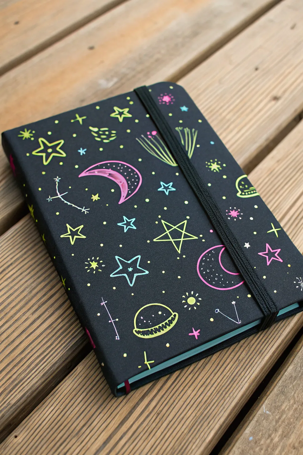

Transform a plain black sketchbook into a vibrant celestial scene using neon gel pens or paint markers. This project captures the magic of a glowing night sky with simple, playful doodles that pop beautifully against the dark background.
How-To Guide
Materials
- Hardcover sketchbook with black cover (or black paper/cardstock to cover one)
- Neon gel pens (pink, yellow, blue, green)
- Fine-tip Posca paint markers (neon or pastel set)
- Pencil (white or regular)
- Eraser
- Ruler (optional)
- Clear spray sealant (optional)
Step 1: Planning and Preparation
-
Clean the surface:
Begin by wiping down the cover of your sketchbook with a dry, lint-free cloth. Any oils or dust can prevent the ink from adhering smoothly. -
Sketch the layout:
Using a light hand and a pencil, map out the placement of your largest elements first. Roughly sketch where you want the main moon crescents and larger stars to sit so the design feels balanced. -
Draft the moon:
Sketch a large crescent moon shape. You can make it whimsical by giving it a slightly thicker middle and tapering sharply at the ends. -
Outline the planet:
Draw a small semi-circle with a ring around it near the bottom or side to represent a planet like Saturn. Keep the lines simple.
Step 2: Drawing the Main Elements
-
Outline the moon:
Using a neon pink gel pen or marker, trace over your moon sketch. For a ‘sketchy’ style like the reference, don’t worry about closing every line perfectly. -
Fill the moon details:
Add small dots or tiny crater circles inside the crescent shape. I like to use a contrasting color like white or silver for these inner details to add depth. -
Draw large stars:
Select a neon yellow or green pen. Draw several five-pointed stars scattered across the cover. These should be outlined stars, leaving the center black. -
Create the planet:
Trace your planet sketch in neon yellow. Add a jagged or zig-zag line across the planet’s body to give it texture and visual interest. -
Add shooting stars:
Draw a few ‘comets’ using a cluster of three to four lines trailing behind a small circle or star shape. Use blue or green ink for the tail lines to simulate movement.
Ink Flow Pro Tip
To keep neon gel ink flowing smoothly on a dark cover, scribble on a scrap piece of paper every few minutes. This prevents the rollerball from drying out mid-star.
Step 3: Adding Medium Details
-
Draw four-pointed stars:
Interspersed between the larger elements, draw four-pointed stars using a light blue marker. These look like simple crosses with tapered ends. -
Create constellations:
Draw small clusters of dots or tiny ‘x’ shapes connected by thin white or silver lines. These mimic constellations and break up the empty space. -
Add ‘burst’ elements:
Draw small sun-burst shapes—a small circle with short lines radiating outward. Neon yellow works best for these to make them look like glowing distant suns.
Level Up: Glow Effect
Use actual glow-in-the-dark puffy paint for the centers of the stars or the moon craters. Your cover will literally shine when the lights go out.
Step 4: Filling the Background
-
Sprinkle stardust:
Take a yellow or white pen and dot the remaining empty black spaces. Vary the pressure to create dots of different sizes, simulating a field of distant stars. -
Add tiny color accents:
Look for any gaps that feel too open. Add tiny solid pink or green stars, or small hearts if you want a cuter vibe. -
Review and refine:
Step back and look at the overall balance. If one area looks too dark, add a small cluster of blue dots or a tiny yellow star. -
Let it dry:
Gel pens on non-porous surfaces can smear easily. Let the sketchbook sit open and undisturbed for at least 15–20 minutes to ensure the ink is fully dry. -
Seal the deal (optional):
If you plan to carry this sketchbook in a bag, lightly mist it with a clear spray sealant to protect your doodle art from rubbing off.
Now you have a cosmic companion ready to hold all your brightest ideas
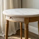

Have a question or want to share your own experience? I'd love to hear from you in the comments below!