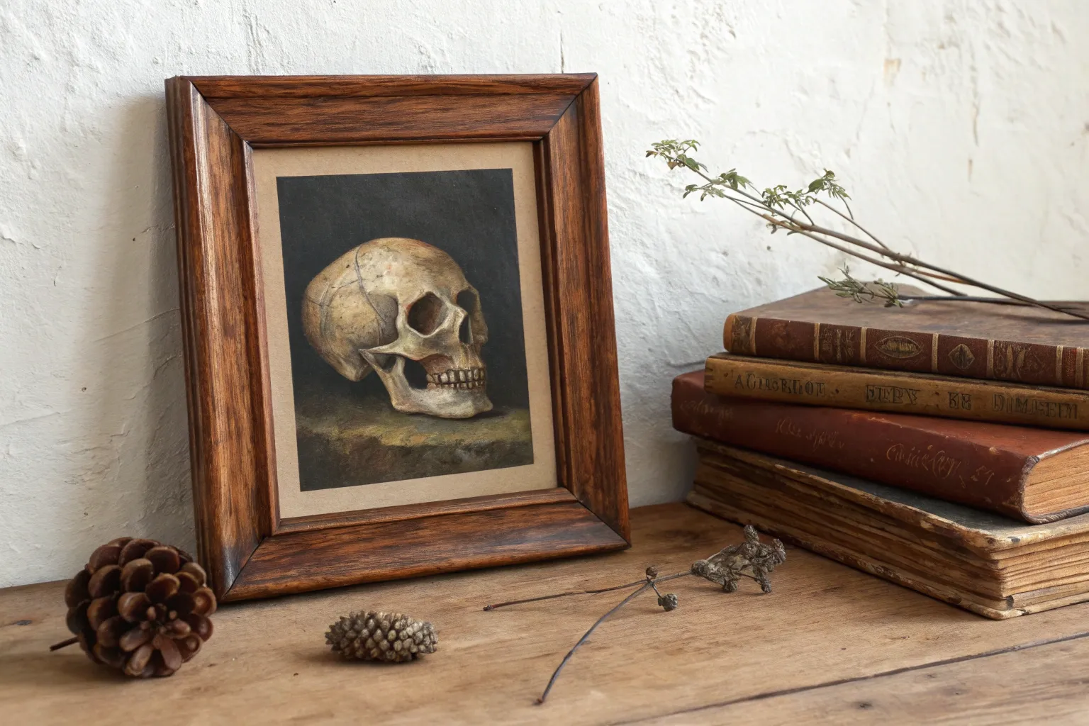
If you’re craving that dark academia mood—soft shadows, old stories, and a little mystery—these painting ideas are made for you. I pulled together classic scholarly motifs and a few unexpected twists so you can build a whole series that feels like secret knowledge on canvas.
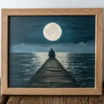
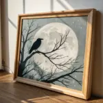
Gothic Window With Moonlit Dust
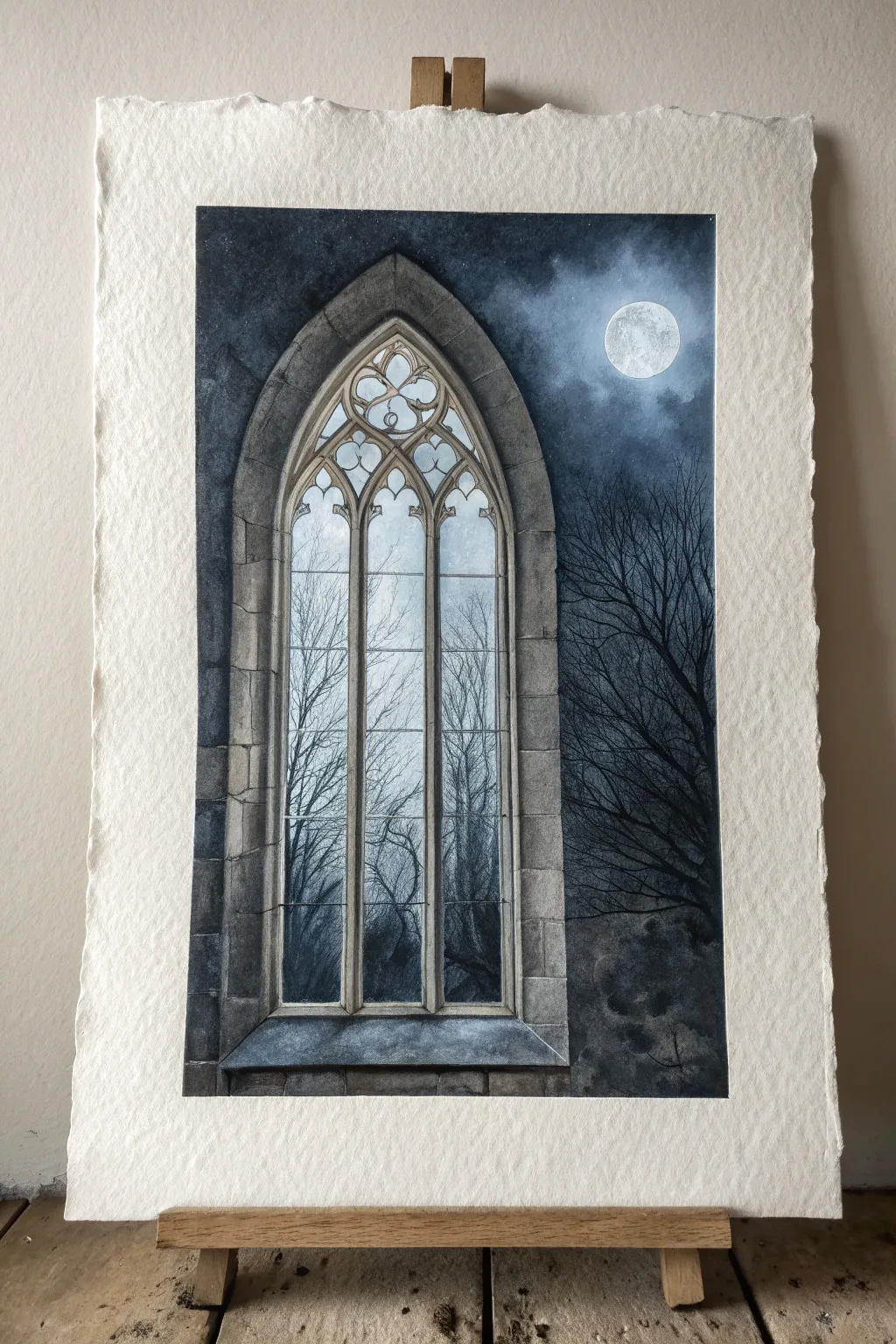
This atmospheric watercolor painting captures the eerie beauty of a stone window frame overlooking a moonlit forest. By layering dark, moody tones with crisp architectural details, you’ll create a piece that perfectly embodies the dark academia aesthetic.
Step-by-Step Tutorial
Materials
- Cold press watercolor paper (300 gsm or heavier)
- Pencil (HB) and kneaded eraser
- Watercolor paints (Payne’s Grey, Indigo, Sepia, Burnt Umber, Ivory Black, Titanium White/Gouache)
- Masking tape
- Ruler
- Round brushes (sizes 2, 6, and 10)
- Detail brush (size 0 or 00)
- White gel pen or white gouache
Step 1: Preparation and Sketching
-
Paper preparation:
Begin by taping down all four edges of your watercolor paper to a board. If you want that lovely deckled edge look shown in the reference, you might tear the paper edges first or paint freely without tape, but taping ensures the paper doesn’t buckle. -
Drafting the arch:
Using a ruler and pencil, lightly draw a vertical rectangle in the center of the paper to guide your window placement. Sketch the pointed Gothic arch shape at the top. Measuring symmetry here is crucial for the architectural feel. -
Architectural details:
Flesh out the stonework. Draw the thick outer frame, the inner mullions (the vertical bars), and the intricate tracery (the decorative shapes) at the top of the arch. Keep your pencil pressure light so graphite doesn’t smudge later. -
Stone layout:
Sketch the individual stone blocks that make up the wall and sill. Don’t make them perfectly uniform; slight irregularities add age and character to the masonry.
Pro Tip: Sharp Edges
For the crispest mullions (window bars), use liquid masking fluid to cover the stone areas before painting the dark sky. Rub it off only when the paper is 100% bone dry.
Step 2: The Moonlit Sky
-
Masking the window:
Carefully paint clear water only on the sky area outside the window frame and inside the glass panes, avoiding the stone bars. I find it helpful to work in sections if the paper dries too fast. -
Wet-on-wet wash:
Drop in a mix of Indigo and Payne’s Grey into the wet sky areas. Leave a circular area near the top right unpainted or very pale for the moon. Let the paint bleed and cloud naturally. -
Deepening the night:
While the paper is still damp, add concentrated Indigo and Black near the edges and corners to create a vignette effect, drawing the eye toward the light source. -
The moon:
Once the sky is damp but not soaking, lift out a perfect circle for the moon using a clean, thirsty brush, or paint around it carefully if you didn’t mask it. Add faint grey texture to the moon’s surface for craters.
Step 3: Painting the Stonework
-
Base stone layer:
Mix a watery wash of Sepia and Payne’s Grey to create a warm, dirty beige. Paint the entire window frame and surrounding wall. Let this layer dry completely. -
Shadows and form:
Using a size 6 brush, paint the shadows on the stones. Imagine the light coming from the moon on the right; shadows will fall heavily on the left interior sides of the arch and mullions. -
Stone texture:
Add texture to the masonry. Use a semi-dry brush to stipulate imperfections, cracks, and dirt accumulation in the corners of the window sill. -
Defining the blocks:
With a smaller brush and a dark mix of Burnt Umber and Black, outline the gaps between the stones. Vary the line thickness so it looks like old mortar rather than a cartoon outline.
Level Up: Stained Glass
Instead of clear glass, turn the top tracery details into subtle stained glass by tinting those specific shapes with diluted jewel tones like deep red or emerald green.
Step 4: Trees and Final Atmosphere
-
Background trees:
Mix a watery, pale grey-blue. Using your smallest brush, paint faint, thin tree branches seen through the glass. These should look distant and hazy. -
Foreground silhouette:
Switch to a saturated Black or deep Indigo. Paint the stark, bare branches on the right side of the composition, outside the window. Let some branches overlap the stone frame slightly to create depth. -
Deep shadows for contrast:
Reinforce the darkest shadows inside the window frame, particularly under the sill and in the top arch curves, to make the stone pop against the night sky. -
Highlighting:
Using white gouache or a white gel pen, add thin highlight lines on the right-facing edges of the stone mullions where the moonlight would hit. -
Mist and texture:
For a ‘dusty’ nocturnal feel, you can lightly glaze a very watered-down white gouache over the bottom corners of the window panes, suggesting condensation or fog.
Once dry, peel away your tape to reveal a hauntingly beautiful scene that invites the viewer to wonder what lies beyond the glass.
Library Aisle With Endless Shelves
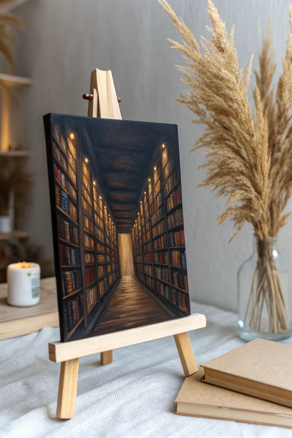
Capture the mysterious allure of dark academia with this moody painting of infinite bookshelves stretching toward a hidden light. Using deep shadows and warm highlights, perfect for a cozy study or reading nook.
Step-by-Step Tutorial
Materials
- Small stretched canvas (roughly 8×10 or 6×8 inches)
- Acrylic paints: Mars Black, Burnt Umber, Raw Sienna, Yellow Ochre, Titanium White, Alizarin Crimson, Ultramarine Blue
- Flat brushes (various sizes: 1 inch to 1/4 inch)
- Fine detail liner brush (size 0 or 00)
- Ruler or T-square
- Pencil for sketching
- Palette and water cup
- Paper towels
Step 1: Planning and Underpainting
-
Establish the vanishing point:
Begin by marking a single dot in the lower-middle third of your canvas; this will be your vanishing point for the one-point perspective. -
Map the corridor:
Use your ruler to draw diagonal lines radiating from that central dot to the top corners (for the ceiling line) and bottom corners (for the floor line) to create the aisle shape. -
Sketch the shelves:
Lightly sketch vertical lines along the walls to mark the sections of the bookcases. Then, draw diagonal lines from the vanishing point outward to mark the horizontal shelves, getting closer together as they recede into the distance. -
Base coat the darks:
Mix a deep, rich dark grey using Mars Black and a touch of Ultramarine Blue. Paint the entire ceiling area and the deeper recesses of the background, leaving the floor and shelf fronts unpainted for now.
Step 2: Painting the Structure
-
Lay the floor foundation:
Mix Burnt Umber with a little Mars Black. Paint the floor area, using horizontal strokes that get slightly lighter as you approach the bright doorway at the end. -
Block in the shelves:
Using a small flat brush and pure Burnt Umber, paint the vertical uprights and horizontal ledges of the bookshelves. Don’t worry about perfect straightness; slightly rough edges add character. -
Create the glowing end:
For the doorway at the end of the hall, mix Titanium White with Yellow Ochre and a tiny bit of Raw Sienna. Paint this rectangle smoothly, blending it slightly outward onto the floor to simulate light spilling forward. -
Deepen the shadows:
Return to your black mixture and darken the areas between the shelves deep inside the aisle, ensuring the contrast against the soon-to-be-painted books will be strong.
Perspective Panic?
If your shelves look warped, double-check that every single horizontal shelf line points directly back to your central vanishing point. Use a piece of string taped to the center to guide your brush.
Step 3: Filling the Shelves
-
Paint book spines – base layer:
Mix several muted tones: dark reds (Alizarin + Umber), deep blues, and greens. Using a small flat brush, tap in vertical blocks of color to represent groups of books. -
Vary sizes and lean:
Avoid making picket fences; paint some books thick, some thin, and lean a few sideways to make the library feel used and ancient. -
Add highlights to spines:
Mix tiny amounts of White with your book colors to create lighter tints. Use your smallest brush to paint thin vertical lines on the spines to suggest titles or gold leafing. -
Populate the upper shelves:
As you move higher up the canvas into the shadows, use less color and more dark greys and browns for the books, as details get lost in the darkness.
Pro Tip: Atmospheric Haze
To make the hallway look truly endless, mix a glaze of water and a tiny drop of grey paint. Lightly wash over the books furthest away to push them visually into the distance.
Step 4: Lighting and Atmosphere
-
Add shelf lights:
Mix Titanium White with bright Yellow Ochre. Using the tip of a detail brush or a dotting tool, place small distinct dots of light at regular intervals along the vertical shelf dividers. -
Create the glow effect:
Dry brush a very faint, translucent circle of Raw Sienna around each light dot to make them look like they are glowing against the wood. -
Refine the floor reflections:
I like to take a mix of Yellow Ochre and Burnt Umber and glaze horizontal streaks across the floor, mimicking the reflection of the doorway light on polished wood. -
Highlight the ceiling beams:
If your ceiling looks too flat, use a very dark grey-blue to faintly paint horizontal beams that get thinner as they recede, matching the perspective lines. -
Final touches:
Step back and assess the contrast. If the aisle feels too open, darken the corners with a black glaze to create a vignette effect, forcing the eye toward the center light.
Place your finished canvas on a mini easel to instantly add a touch of scholarly mystery to your desk

Herbarium Painting of Pressed Leaves
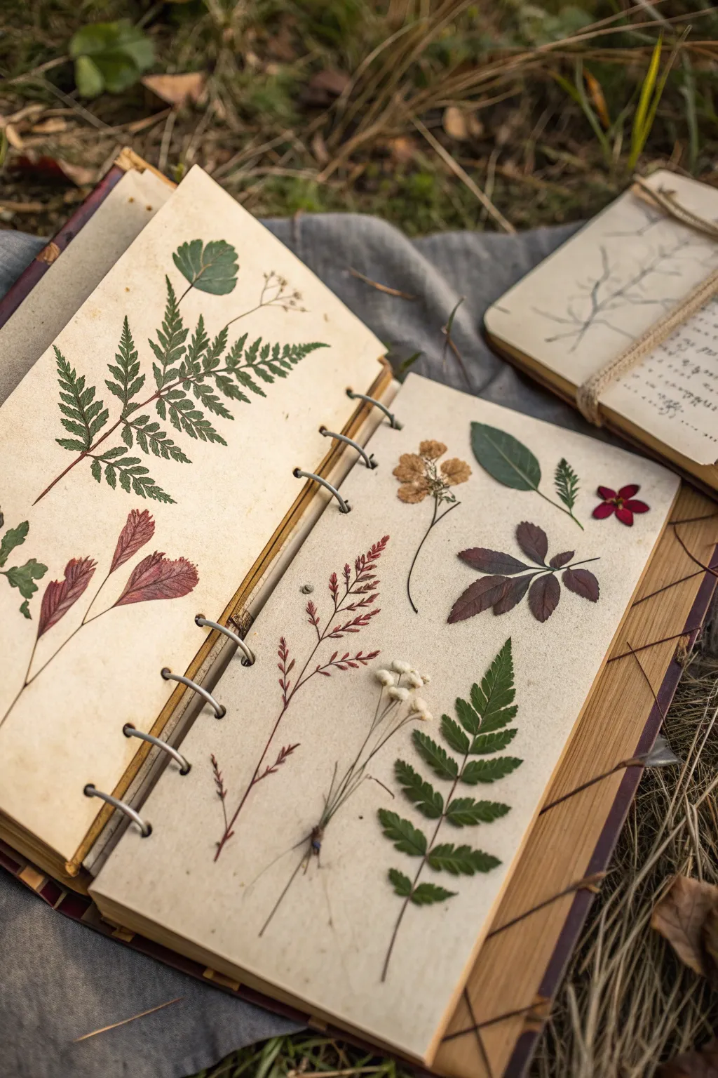
Capture the delicate beauty of a vintage botanist’s field journal with these realistic painted specimens. This project transforms a simple sketchbook into a curated collection of faux-pressed flora using watercolor and fine liner work.
Step-by-Step Guide
Materials
- Heavyweight mixed media or watercolor sketchbook (cream or toned paper preferred)
- Watercolor paints (Earth tones: Sap Green, Burnt Sienna, Yellow Ochre, Alizarin Crimson, Sepia)
- Fine detail brushes (Round sizes 0, 2, and 4)
- Micron pens or fine liners (Black and brown, sizes 01 and 005)
- Pencil (HB or 2H)
- Kneaded eraser
- Paper towels
- Water jar
- White gouache or white gel pen (optional for highlights)
Step 1: Planning the Page Layout
-
Prepare your surface:
Begin with a sketchbook that has slightly textured, heavyweight paper. If your paper is bright white, you might want to apply a very light wash of yellow ochre or tea to age it before starting, letting it dry completely to create that ‘old scientific journal’ aesthetic. -
Lightly sketch the composition:
Using an HB pencil, very faintly outline the placement of your specimens. Plan for variety: a large fern frond on one side, and a mix of a dried flower, a sprig of grass, and individual leaves on the facing page. Keep the lines barely visible so they don’t show through the paint later. -
Define the fern’s structure:
For the large fern, draw a central curved stem (rachis) first. Then, mark the positions of the pinnae (leaflets) extending outward. Don’t make them perfectly symmetrical; natural flaws add realism.
Muddy colors?
If your dried leaf colors turn to gray mush, stop mixing all three primaries. stick to mixing two complementary colors (like red and green) to get rich, natural browns.
Step 2: Painting the Greenery
-
Mix your fern green:
Create a natural, muted green by mixing Sap Green with a touch of Burnt Sienna or Sepia. You want the color to look slightly dried, not vibrant fresh green. -
Paint the leaflets:
Using a size 2 brush, paint the individual leaflets of the fern. Start from the stem and pull the brush outward to taper the tip. Paint every other leaflet first to prevent wet paint from bleeding together, then go back and fill in the gaps once dry. -
Add color variation:
While the paint is still damp on some leaves, drop in a tiny bit of Yellow Ochre or brown at the tips or edges to simulate drying and aging. This wet-on-wet technique creates soft, natural transitions. -
Paint the darker stemmed leaves:
For the solitary green leaves (like the ash or rose leaves), mix a deeper green using Sap Green and a touch of blue or Payne’s Grey. Paint the leaf shapes flatly first, leaving a hairline gap where the center vein would be.
Step 3: Painting Dried Elements
-
Create the dried flower tones:
For the dried flower specimen (top right), mix a watery wash of Yellow Ochre and a tiny dot of brown. Paint the petals loosely, keeping the edges slightly ragged to mimic brittle dried textures. -
Adding the red accent leaves:
On the left page, mix Alizarin Crimson with a bit of brown for the reddish leaves. Apply this color with a size 4 brush. I find that lifting a little pigment out of the center with a thirsty damp brush helps create a highlighted, 3D effect before it dries. -
Painting the delicate grasses:
Switch to your smallest brush (size 0) for the grassy sprig on the bottom right. Use a mix of diluted Sepia and Crimson. Use quick, confident flicks of the wrist to create the thin stems and tiny seed heads. -
Layering the deep purple leaves:
For the dark, star-shaped foliage, mix Alizarin Crimson with Payne’s Grey or Green to get a deep plum color. Paint these carefully, ensuring the edges are sharp.
Simulate Transparency
For a thin, pressed-flower look, add more water to your mix. Let the paper texture show through the paint to mimic the translucency of a dried petal.
Step 4: Details and Definition
-
Darken the stems:
Once the main leaf shapes are thoroughly dry, use a size 0 brush loaded with concentrated brown or Sepia paint to draw the main stems and connect the leaves to them. Keep lines thin and precise. -
Add veining detail:
For the large green leaves and the red ones, use a slightly darker version of the base color to paint thin veins. Alternatively, use a brown fine liner pen (size 005) for extremely crisp detail on the dried specimens. -
Create shadows:
To make the plants look like they are resting *on* the paper, paint a very faint, watery grey shadow on just one side of the stems and leaves (e.g., to the bottom right). This simulates depth. -
Enhance textures:
Use a brown micron pen to stipple tiny dots near the center of the dried flower or at the base of the grass stems to suggest texture and pollen.
Step 5: Splatters and Aging
-
Add organic speckles:
Load an old brush with watery brown paint. Hold it over the paper and tap the handle against another brush to splatter tiny droplets across the page. This mimics dirt, spores, or paper aging. -
Refine the fern stem:
Go back to the main fern stem with a brown pen or dark paint. Add tiny little hairs or bumps along the rachis for botanical accuracy. -
Final highlights:
If any leaves look too flat, use a white gel pen or a dot of white gouache to add a tiny highlight on the tips or ridges of the veins. -
Erase guidelines:
Ensure all paint is bone dry, then gently use the kneaded eraser to lift any remaining visible pencil marks from your initial sketch.
Close your sketchbook on these timeless botanical studies and admire your permanent collection of everlasting greenery
Cabinet of Curiosities Wall Gallery
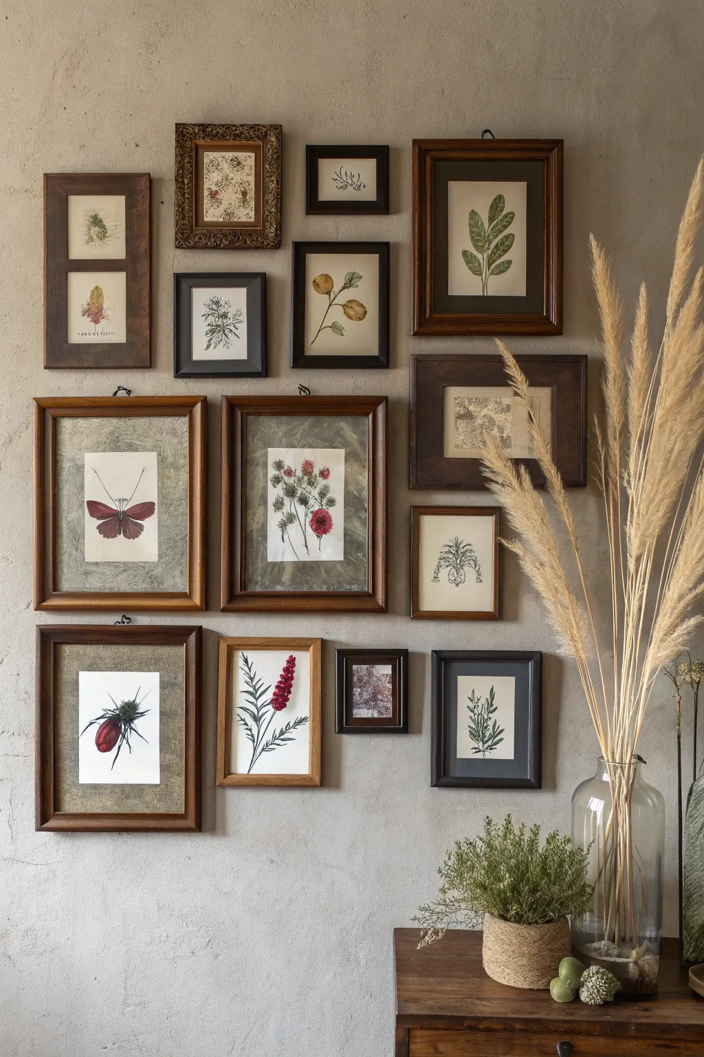
Transform a blank wall into a studious collection of botanical and entomological wonders evocative of a 19th-century naturalist’s study. This dark academia project focuses on sourcing vintage-style imagery and unifying mismatched frames for a cohesive, collected-over-time aesthetic.
Step-by-Step Tutorial
Materials
- Assorted wooden picture frames (thrifted/new)
- Botanical and insect art prints
- Heavyweight matte paper or cardstock
- Tea or coffee (for aging paper)
- Spray adhesive or glue stick
- Scissors and X-ACTO knife
- Cutting mat
- Hammer and nails
- Kraft paper (for layout planning)
- Painter’s tape
- Glass cleaner and microfiber cloth
Step 1: Curating the Collection
-
Gather your specimens:
Source a variety of digital botanical illustrations, focusing on medicinal herbs, pressed flower aesthetics, and insect diagrams. Look for public domain archives or vintage printable sets online. -
Select your frames:
Collect a mix of wooden frames in varying sizes and dark stains. Don’t worry about them matching perfectly; diversity in wood tones (walnut, mahogany, oak) adds to the authentic, accumulated look. -
Prepare the images:
Resize your chosen digital prints to fit your specific frame openings. If you are printing them at home, use a high-quality matte paper to mimic the texture of old book pages.
Adding Genuine Texture
For a truly authentic look, try mounting a dried, pressed flower or leaf directly onto the backing paper of one frame instead of using a print.
Step 2: Aging and Formatting
-
Age the paper:
To remove the stark brightness of modern white paper, lightly brush strong brewed tea or coffee over your prints. I like to dab excess liquid off quickly with a paper towel to avoid warping. -
Let it dry completely:
Allow the papers to air dry flat. If they curl, press them under a heavy stack of books overnight once they are fully dry to flatten them out again. -
Mount designs:
For frames that are too large for your print, cut a backing piece from textured cardstock or muted green/grey paper to serve as a mat. Center your botanical print and secure it with a light coat of spray adhesive. -
Clean the glass:
Thoroughly clean both sides of the frame glass with glass cleaner and a microfiber cloth to ensure no dust or fingerprints are trapped inside with your specimen.
Fixing Glare Problems
If your room is very bright, remove the glass completely from a few frames. This exposes the matte texture of the paper and eliminates reflections.
Step 3: Assembly and Hanging
-
Frame the artwork:
Insert your prepared prints into the frames. If the backing is loose, use small framing points or tape to secure the backboard significantly so the art doesn’t shift. -
Draft the layout:
Trace each frame onto kraft paper or newspaper and cut out the shapes. Label each template so you know which art piece it represents. -
Arrange on the wall:
Using painter’s tape, arrange your paper templates on the wall. Start with a central anchor piece and radiate outwards, keeping the spacing between frames relatively tight (about 2-3 inches) for a cozy, cluttered feel. -
Check for balance:
Step back often to check the visual balance. Ensure you haven’t clustered all the dark wood frames or similar-sized prints in one single area. -
Mark nail placement:
Measure the distance from the top of the frame to the hanging hardware on the back. Transfer this measurement to your paper template on the wall and mark the spot for the nail. -
Install the gallery:
Hammer nails directly through your marked spots on the paper templates. Tear away the paper gently, then hang your framed art. -
Final adjustment:
Use a level to ensure each frame hangs straight. Place small bits of mounting putty on the bottom corners of the frames to keep them from tilting over time.
Now you have a timeless wall display that invites curiosity and study
BRUSH GUIDE
The Right Brush for Every Stroke
From clean lines to bold texture — master brush choice, stroke control, and essential techniques.
Explore the Full Guide
Alchemy Diagram Over a Scholarly Still Life
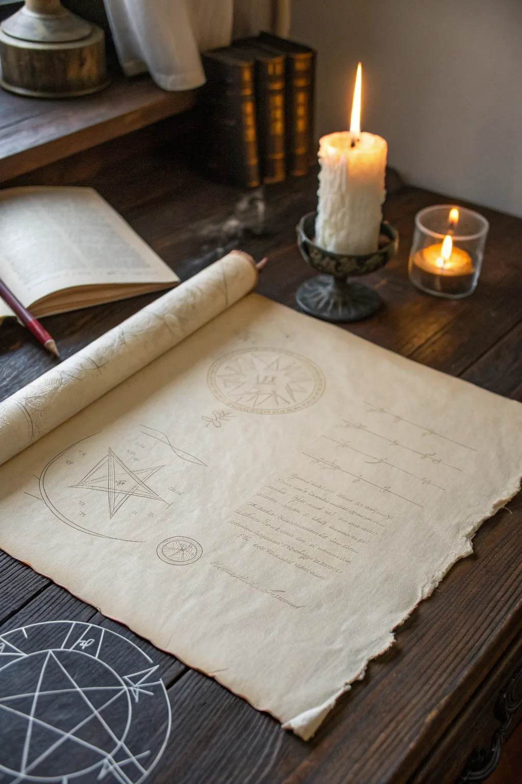
Capture the mystic atmosphere of a scholar’s desk with this detailed prop creation project. By intentionally aging paper and adding esoteric diagrams, you’ll create a convincing artifact that looks like it was just unrolled for a late-night study session.
Step-by-Step Tutorial
Materials
- Heavyweight drawing paper or mixed media paper (A3 or larger)
- Strong brewed coffee or black tea (cooled)
- Spray bottle
- Heat gun or hair dryer
- Pencils (HB and 2B)
- Fine liner pens (sepia or dark brown, 0.1mm and 0.3mm)
- Compass and ruler
- Soft eraser
- Paper towels
- Matte finish spray sealant
Step 1: Preparing the Ancient Vellum
-
Tear the edges:
Begin by gently tearing the straight edges off your paper to create an irregular, worn look. The tears should be uneven but not too deep; aim for a ‘deckled’ edge effect that mimics handmade paper. -
Initial staining:
Lay the paper on a waterproof surface. Fill a spray bottle with your strong coffee or tea solution and mist the paper generously. You want some areas to be wetter than others to create natural pooling. -
Adding texture:
While the paper is wet, sprinkle a few grains of instant coffee directly onto the surface for darker, concentrated speckles. Blot random sections gently with a crumpled paper towel to lift pigment and create diverse textures. -
Drying and curling:
Use a heat gun or hair dryer to dry the paper. As it dries, the edges will naturally begin to curl. I find that holding the dryer closer to the edges accentuates this warping, making the paper feel stiff and parchment-like. -
Reverse staining:
Flip the dry paper over and lightly spray the back side. It doesn’t need to be as textured as the front, but this ensures no bright white shows through if the corners lift.
Instant Ancient Age
Bake your wet, stained paper in an oven at 200°F (90°C) for 5-7 minutes. Watch closely—the heat browns the edges beautifully and creates a crispy texture.
Step 2: Drafting the Esoteric Diagrams
-
Planning the layout:
Using an HB pencil, lightly sketch the placement of your elements. Mark a large circular area at the top center, a geometric star diagram on the left, and lines for text on the right. -
Drawing the compass rose:
Use a compass to draw the perfect circle for the top diagram. Within it, sketch a rudimentary compass rose or starburst pattern. Keep your pencil pressure light so mistakes can be easily lifted. -
Constructing the geometric star:
On the left side, use your ruler to draw a pentagram or hexagram shape. Add concentric circles around it with the compass. I like to extend construction lines slightly past the shapes to make it look like a working diagram. -
Drafting text guidelines:
Lightly rule horizontal lines for the text block on the right. Vary the spacing slightly to mimic handwriting that isn’t perfectly machine-aligned.
Wax Seal Authenticity
Melt a bead of red or gold candle wax onto the bottom corner of the scroll and press a coin or button into it to simulate an official alchemist’s seal.
Step 3: Inking the Details
-
Inking the diagrams:
Switch to your 0.1mm sepia fine liner. Carefully trace over your geometric pencil lines. Don’t worry if the line weight wavers slightly; it adds to the hand-drawn authenticity. -
Adding diagram details:
Use the 0.3mm pen to add emphasis to key lines in the star diagram. Add tiny symbols, runes, or planetary signs at the points of the star and within the circles. -
Writing the script:
Fill the text block with cursive writing. You don’t need to write real words; scribbling illegible, looping cursive (asemic writing) creates the illusion of ancient knowledge without needing coherent Latin. -
Adding annotations:
Draw faint, loose lines connecting different parts of the diagrams to the text. Write tiny notes or numbers near these connection points using the finest 0.1mm pen.
Step 4: Final Weathering and Rolling
-
Erasing pencil marks:
Wait until the ink is completely dry—give it a good ten minutes to be safe. Then, gently erase the visible pencil guidelines using a soft eraser. -
Softening the ink:
If the ink looks too fresh, lightly dab a damp paper towel with a tiny amount of tea stain over the inked areas. This knocks back the contrast and integrates the writing into the paper. -
Rolling the scroll:
Tightly roll the top edge of the paper halfway down, then release it. Do the same for the bottom edge if desired. This trains the paper to hold the scrolled shape shown in the reference. -
Sealing the work:
Ideally, take the artwork outside and apply a light coat of matte spray sealant. This protects the water-based stains and ink from humidity and prevents fading.
Place your newly forged manuscript on a desk alongside a candle to admire the timeless scholarly vibe you’ve created

Have a question or want to share your own experience? I'd love to hear from you in the comments below!