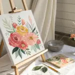
A blank canvas can feel a little intimidating at first, but DIY paint projects are where the magic happens—because you don’t need perfect drawing skills to make something you’ll actually want to hang up. Here are my favorite DIY paint canvas ideas that look polished, feel fun, and are totally doable at your kitchen table.
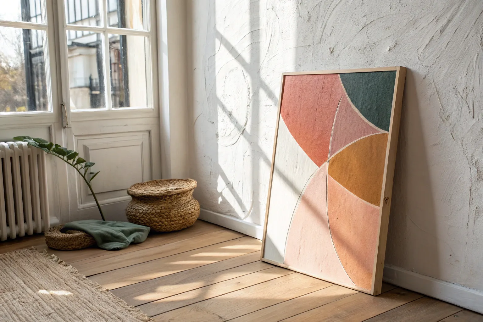
Tape-Resist Geometric Color Blocks
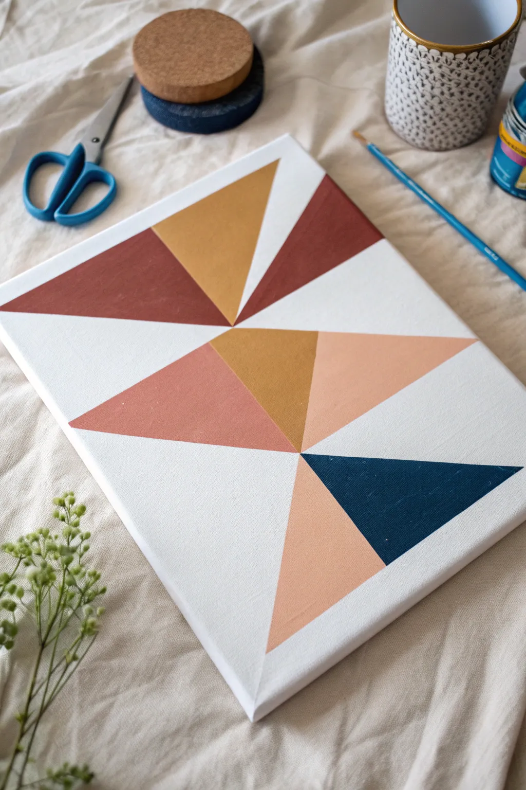
Achieve a high-end modern art look with nothing more than tape and acrylic paints. This geometric design uses crisp triangles and a sophisticated earth-tone palette to create a striking focal point for any wall.
Step-by-Step Tutorial
Materials
- Stretched white canvas (approx. 11×14 or similar)
- Painter’s tape (blue or green)
- Acrylic paints (rust red, mustard yellow, navy blue, dusty peach)
- Flat paintbrushes (various sizes)
- White acrylic paint (optional, for sealing)
- Palette or paper plate
- Pencil
- Ruler
Step 1: Planning the Layout
-
Establish the diagonal axis:
Begin by lightly marking a diagonal line with your pencil and ruler from the bottom left quadrant toward the top right. This doesn’t need to be corner-to-corner; an off-center angle creates more visual interest. -
Create major intersecting lines:
Draw two to three additional long lines that intersect your main diagonal. These will serve as the ‘spine’ of your geometric cluster. -
Form the triangles:
Connect your lines to form varied triangle shapes. Don’t fill the whole canvas; leave plenty of white space around the edges to give the design breathing room.
Crisp Line Secret
Brush paint AWAY from the tape edge, not toward it. Pushing paint under the tape causes bleeding, while brushing inward keeps lines sharp.
Step 2: Taping the Design
-
Apply the tape:
Place painter’s tape along the outside edges of the triangles you drew. The tape should cover the areas that will remain white. -
Check your corners:
Ensure the tape intersects cleanly at the points. You may need to use an X-Acto knife or scissors to trim the tape ends for sharp, precise corners. -
Seal the tape edges:
Press down firmly on all tape edges with your fingernail or a credit card to prevent paint from seeping underneath. -
The secret sealing step:
I like to paint a very thin layer of white paint (or clear matte medium) over the tape edges first. This seals the tape, meaning any bleed-through will be invisible white paint rather than color. -
Let the seal dry:
Wait about 10-15 minutes for your sealing layer to be completely dry to the touch before introducing color.
Add Metallic Flair
Swap out the mustard yellow or peach section for gold leaf or copper metallic paint to add a luxurious shimmer to the geometric design.
Step 3: Painting the Color Blocks
-
Mix your palette:
Prepare your colors. For this specific look, aim for a burnt orange (rust), a mustard yellow (ochre), a deep navy blue, and a soft peach tone. -
Start with the darkest tones:
Identify where you want your heaviest visual weight. Paint the navy blue triangle first, using a flat brush to get smooth, even coverage. -
Apply the warm tones:
Paint the rust and mustard yellow sections. Try to separate similar colors so they don’t touch directly if possible, or balance them on opposite sides of the design. -
Fill in the soft accents:
Use the peach color for the remaining triangles. This lighter shade bridges the gap between the bold colors and the white background. -
Apply a second coat:
Acrylics can be translucent. Once the first layer is dry, apply a second coat to each color block to ensure solid, opaque shapes without brushstrokes showing.
Step 4: The Reveal
-
Wait for partial drying:
Let the paint dry until it is tacky but not rock hard. If the paint is fully cured, it might peel up with the tape. -
Remove the tape:
Peel the tape away slowly at a 45-degree angle. This is the magic moment where your crisp lines are revealed. -
Touch up minor flaws:
If any paint bled through, dip a small detail brush in white paint and carefully clean up the edges. -
Erase guidelines:
Check for any visible pencil marks in the white spaces and gently erase them once the paint is 100% dry.
Hang your new masterpiece and enjoy the clean, modern vibe it brings to your space

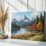
Ombre Sunset Gradient With Silhouette
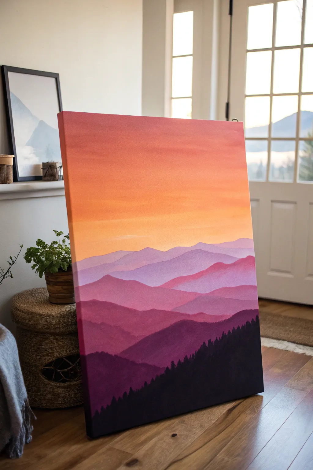
Capture the serenity of twilight with this striking landscape painting featuring a vibrant ombre sky and rolling mountain layers. The gradient transitions from warm oranges to cool purples, creating depth before finishing with a crisp, dark forest silhouette.
How-To Guide
Materials
- Large rectangular canvas (approx. 24×36 inches)
- Acrylic paints: Titanium White, Cadmium Yellow, Orange, Magenta, Dioxazine Purple, Black
- Wide flat brush (2-3 inch) for the sky
- Medium flat brush (1 inch) for mountains
- Small round or liner brush for trees
- Palette or paper plates for mixing
- Water cup and paper towels
- Easel or flat workspace
Step 1: Painting the Ombre Sky
-
Prepare your colors:
Squeeze out generous amounts of white, yellow, orange, and a touch of magenta onto your palette. You will need plenty of paint to create a smooth blend without the acrylics drying too fast. -
Start at the top:
Using your widest brush, apply a band of reddish-orange mix at the very top of the canvas. Use horizontal strokes that act as the darker ‘lid’ of the sky. -
Transition to orange:
Mix pure orange with a little yellow. Apply this directly below the reddish band, overlapping the wet edges slightly to encourage blending. -
Blend downward:
Continue cleaning your brush slightly and picking up lighter oranges and yellows as you move down the canvas. Use long, sweeping horizontal strokes to melt the colors into one another. -
Create the horizon glow:
For the lowest part of the sky (about halfway down the canvas), use a mix of yellow and plenty of white. This creates the bright, hazy glow where the sun has just set. -
Smooth the gradient:
While the paint is still tacky, use a clean, slightly damp wide brush to lightly sweep across the entire sky area horizontally. This helps eliminate harsh lines between color zones.
Unwanted brush strokes?
If the sky looks streaky, use a very soft, dry clean brush (like a makeup brush) to lightly feather over the wet transition areas creates a seamless airbrushed look.
Step 2: Layering the Mountains
-
Mix the furthest range color:
Mix a very light violet color using white, purple, and a tiny dot of the sky color (orange) to desaturate it slightly. This atmospheric perspective makes distant mountains look faded. -
Paint the first ridge:
With your medium flat brush, paint a wavy, organic line across the canvas just below the yellow sky glow. Fill in the area below this line with the light violet mix. -
Darken the mixture:
Add a bit more purple and a tiny touch of magenta to your previous mix. It should be slightly darker and more vibrant than the first layer. -
Paint the second ridge:
Create a new mountain shape below the first one, varying the peaks and valleys so they don’t look identical. I prefer to offset the highest peaks so the composition feels balanced. -
Continue layering downward:
Repeat this process, progressively adding more purple, magenta, and a hint of black to your mix for each subsequent lower layer of mountains. You want about 4-5 distinct mountain layers. -
Create the foreground range:
For the lowest mountain layer (before the trees), use a deep plum color made from purple, magenta, and a little black. Paint this shape significantly larger to show it is closer to the viewer.
Step 3: Adding the Silhouette
-
Mix the darkest tone:
Prepare a mixture of black with a small amount of purple. Pure black can look flat, so the purple undertone keeps it rich and cohesive with the rest of the painting. -
Block in the hill shape:
Paint a solid, dark hill shape at the very bottom right corner, sloping gently downward toward the left. This serves as the ground for your trees. -
Start the tree line:
Switch to your small round brush or liner brush. Along the top edge of your dark hill, begin dabbing small vertical lines to indicate tree trunks. -
Detail the tree tops:
Using the tip of the brush, stipple distinct pine tree shapes. Start with a pointy top and tap outward in a triangular fashion as you move down the trunk. -
Vary tree heights:
Make sure some trees are taller than others to create a natural-looking forest canopy. The trees on the far right should appear larger/closer than the ones fading off to the left. -
Fill the bottom:
Once the detailed tops are done, use your larger brush to fill in the solid dark mass at the bottom of the canvas, ensuring no canvas shows through.
Mist Effect
To add localized mist between mountain layers, wipe your brush almost dry and lightly scumble a bit of the lighter color at the valley bottoms before painting the next ridge.
Step back and admire how the colors glow against that stark, beautiful silhouette
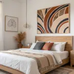
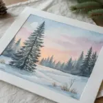
Easy Mountain Range Layers
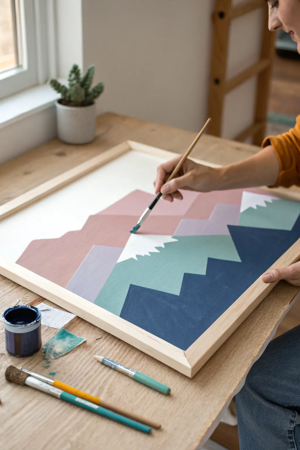
Create a calming, modern landscape using simple geometric shapes and a soothing color palette of dusty pinks, sage greens, and navy blues. This layered mountain range design relies on clean lines rather than complex shading, making it a perfect project for beginners looking for striking results.
Step-by-Step
Materials
- Large wooden framed canvas (approx. 18×24 inches or similar)
- Acrylic craft paints (Dusty pink, sage green, navy blue, white, light purple/grey)
- Flat paintbrushes (various sizes: 1-inch for filling, smaller angles for edges)
- Pencil and eraser
- Ruler or straight edge
- Painter’s tape (optional, for crisp lines)
- Palette or paper plate for mixing
- Water cup and paper towels
Step 1: Planning and Sketching
-
Prime your surface:
Ensure your canvas is clean and ready. If it’s raw canvas, you might want to apply a coat of gesso, though the image shows a smooth, bright white background which suggests a pre-primed surface. Let any base coats dry completely. -
Define the horizon:
Visualize three distinct layers of mountains. The top layer will be the furthest away, the middle layer sits centrally, and the bottom layer is the closest and darkest. -
Sketch the back peaks:
Using a pencil and a ruler, lightly draw the outlines of your furthest mountain range. Keep the peaks jagged but simple—think triangles without bottoms. This layer should take up the upper middle portion of the canvas. -
Sketch the middle range:
Draw the second layer of mountains below the first, overlapping them slightly. Vary the steepness and height of the peaks to create visual interest. -
Sketch the foreground:
Finally, sketch the largest, closest mountain shapes at the bottom. These should serve as the visual anchor for the piece and obscure the bottom parts of the layers behind them. -
Mark snow caps:
randomly select a few peaks on the middle and foreground layers to have ‘snow.’ Sketch a jagged, zig-zag line a few inches down from the peak tip to demarcate the white snow area.
Step 2: Painting the Layers
-
Mix the background color:
On your palette, mix a dusty rose color. You can achieve this by adding a touch of brown or grey to a standard pink, or mixing white into a deep maroon until soft. -
Paint the furthest range:
Using a flat brush, carefully fill in the shapes of your furthest mountain layer with the dusty pink. Use the flat edge of the brush to keep your top lines crisp against the white sky. -
Add variation:
Before the pink dries, I sometimes mix a slightly lighter purple-grey shade and paint a distinct section or smaller peak within that back range to add depth, as seen on the left side of the inspiration image. -
Mix the middle tone:
Prepare a sage or muted teal green. Mixing green with a little white and a tiny dot of black or grey will desist the color so it isn’t too neon. -
Paint the middle range:
Fill in the middle layer of mountains with your sage green. Be very careful where this layer meets the pink layer above it; steady hands are key here to maintain that sharp geometric look. -
Preserve the snow:
If you sketched snow caps on this green layer, paint around the triangle tips, leaving them white for now. It’s easier to fill them with pure white later than to paint white over green. -
Mix the shadow tone:
Create a deep navy blue for the foreground. This should be your darkest, strongest color to bring the foreground forward visually. -
Paint the foreground:
Fill the bottom mountain shapes with the navy blue. Use your largest flat brush to get smooth, even coverage across this larger area.
Wobbly Lines?
If steadying your hand is difficult, use painter’s tape or masking tape along the pencil lines for perfectly straight edges. Peel it off while paint is still wet.
Step 3: Finishing Details
-
Paint the snow caps:
Using a clean, smaller brush and pure white paint, carefully fill in the tips of the mountains you left blank earlier. Make the bottom edge of the snow jagged and irregular like a saw blade. -
Touch up edges:
Once the main colors are dry, inspect your lines. Use a small angled brush to straighten any wobbly edges where two colors meet. -
Check opacity:
If your paint looks streak, apply a second coat to any of the colored sections. The flat graphic style looks best when the color is opaque and solid. -
Clean up sketch lines:
Wait until the painting is 100% dry, then gently erase any visible pencil marks that might still be showing in the white sky area or between gaps.
Add Texture
Mix a texture medium or sand into your acrylic paint before applying. This adds a gritty, realistic stone feel to the mountain shapes.
Step back and admire your serene mountain range, ready to bring a touch of nature indoors
Loose Wildflower Meadow Dabs
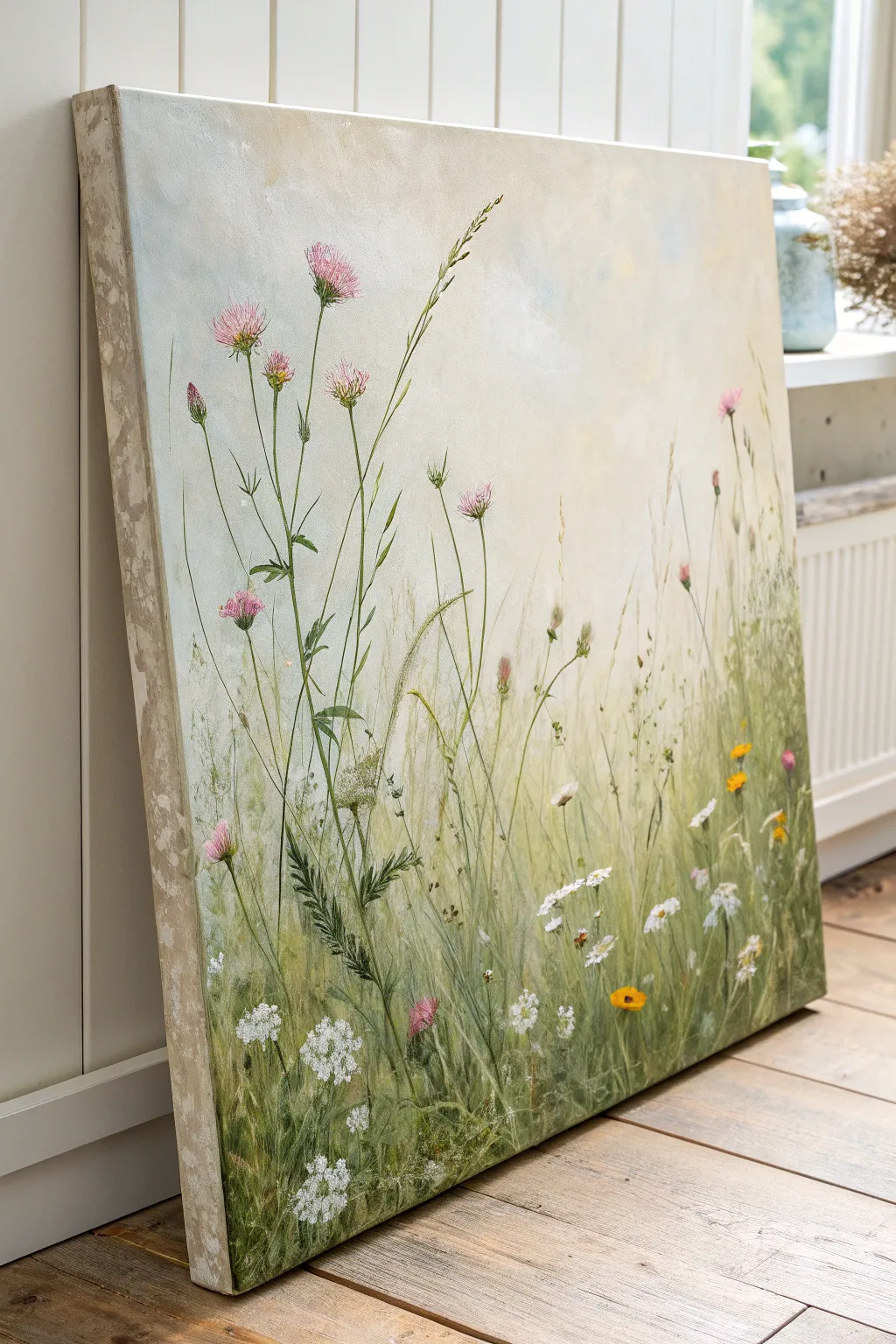
Capture the delicate beauty of a summer field with this airy, large-scale wildflower painting. By layering soft washes for the background with crisp, detailed botanicals in the foreground, you’ll create a piece that feels both tranquil and teeming with life.
Detailed Instructions
Materials
- Large stretched canvas (e.g., 24×36 or larger)
- Acrylic paints: Titanium White, Unbleached Titanium, Sap Green, Olive Green, Phthalo Blue, Alizarin Crimson, Yellow Ochre, Burnt Umber
- Gesso (white)
- Glazing medium or water for thinning
- Large flat wash brush (2-3 inch)
- Medium filbert brush
- Small round brushes (size 0, 2, and 4)
- Fine liner brush or rigger brush
- Palette knife (optional for texture)
- Paper towels and water cup
Step 1: Setting the Atmosphere
-
Prime the Surface:
Even if your canvas is pre-primed, apply a fresh coat of white gesso to ensure a smooth, receptive surface. Let it dry completely. -
Mix the Sky Gradient:
Create a very pale, milky blue by mixing a large amount of Titanium White with a tiny dot of Phthalo Blue and a touch of Unbleached Titanium to warm it up. -
Apply the Sky Wash:
Using your large wash brush, cover the top two-thirds of the canvas with this pale blue mixture. Use horizontal, sweeping strokes, adding more white as you move down to create a hazy, faded horizon. -
Establish the Backdrop:
While the sky is still slightly tacky, mix a very pale, muted green using White, a little Sap Green, and a hint of Yellow Ochre. Blend this loosely into the bottom third of the canvas, letting it fade upward into the sky to suggest distant fields.
Step 2: Building the Grassy Foundation
-
Block in Base Grasses:
Switch to a medium filbert brush. Mix a mid-tone green using Olive Green and White. Paint vertical, upward strokes starting from the bottom edge, varying the height to create a natural, uneven grass line that reaches about halfway up the canvas. -
Add Depth with Shadows:
Darken your green mix with a touch of Burnt Umber or Phthalo Blue. Add concentrated clusters of darker grass blades near the bottom corners and lower edge to anchor the composition. -
Layer in Lighter Greens:
Mix a fresh, warm green using Sap Green and Yellow Ochre. Paint thinner, taller blades of grass that overlap the previous layers. I like to flick my wrist quickly at the end of the stroke to get that tapered, natural tip. -
Create Soft Texture:
Use a dry brush technique with very pale yellow-green to scumble (lightly scrub) some hazy areas in the middle ground, suggesting dense foliage without defining every single leaf.
Stiff Stems?
If your plant stems look too straight and unnatural, try holding your brush at the very end of the handle. This reduces control slightly and creates more organic, wandering lines.
Step 3: Painting the Wildflowers
-
Paint Thistle Stems:
Using a size 2 round brush and a fluid mix of Sap Green and White, paint long, wandering stems that reach high into the sky portion. Keep them spindly and slightly curved, not rigid like sticks. -
Add Pink Flower Heads:
Mix Alizarin Crimson with White to get a soft pink. Use a small round brush to dab loose, oval shapes at the tops of your tallest stems. These don’t need to be detailed yet, just soft blobs of color. -
Detail the Thistles:
Once the pink bases are dry, use your fine liner brush with a slightly darker pink to flick tiny lines outward from the center of the flower heads, mimicking the spiky texture of thistles. -
Paint White Umbels:
For the Queen Anne’s Lace or cow parsley, use pure Titanium White. Create clusters of tiny dots in umbrella shapes. Group these closer to the bottom left and spread casually across the lower section. -
Insert Yellow Accents:
Using pure Yellow Ochre or a bright yellow mix, paint small, simple button-like flowers or buttercups low in the grass to add pops of warmth. -
Leaf details:
Add small, jagged leaves to the thistle stems using a darker green mix. Keeps these sparse to maintain the airy feel of the painting.
Pro Tip: Depth of Field
Make background flowers blurrier by mixing glazing medium into your paint. Keep foreground flowers opaque and crisp. This mimics a camera’s focus and adds instant depth.
Step 4: Fine Tuning and Finishing
-
Add Whispy Grasses:
With a liner brush and thinned pale yellow-white paint, add very fine, long lines that arch gracefully over the other plants. These represent dry summer grasses catching the light. -
Refine the Foreground:
Look at the bottom edge. If it looks too uniform, add distinct, detailed leaves or a few more distinct white flower clusters to bring focus to the front. -
Paint Flying Seeds:
Add tiny, random specks of white or pale grey drifting in the upper air to suggest pollen or seeds carried by the breeze. -
Final Assessment:
Step back from the canvas. If the background feels too flat, glaze a tiny bit of watered-down yellow ochre in the empty spaces between stems to warm up the light.
Hang your finished canvas in a well-lit room to bring that eternal summer calmness into your home
BRUSH GUIDE
The Right Brush for Every Stroke
From clean lines to bold texture — master brush choice, stroke control, and essential techniques.
Explore the Full Guide
Birch Trees on a Moody Background
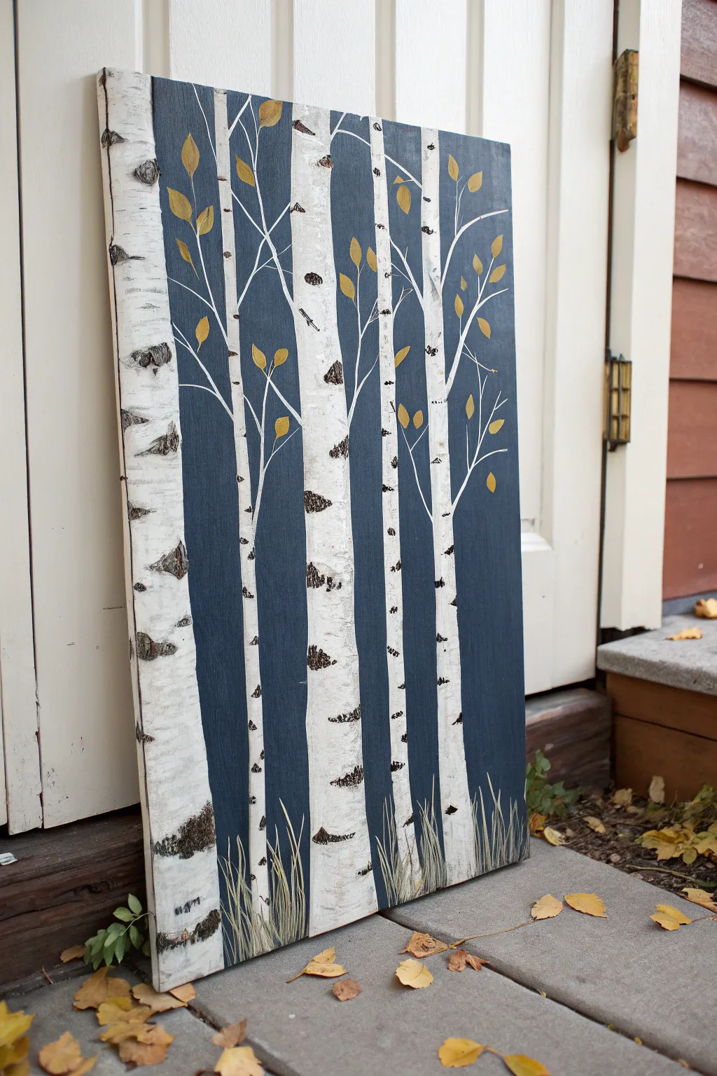
Capture the serene beauty of an autumn forest with this striking birch tree painting. The contrast between the crisp white bark and the deep, moody blue background makes the golden leaves pop, creating a sophisticated piece of seasonal decor.
Step-by-Step
Materials
- Large stretched canvas (e.g., 18×24 or larger)
- Acrylic paints: Navy blue, black, titanium white, burnt umber (brown), metallic gold, yellow ochre, sap green
- Wide flat brush (2-inch)
- Medium flat brush (1/2-inch)
- Small round detail brush
- Palette knife or old credit card
- Painter’s tape or masking tape
- Palette
- Cup of water and paper towels
Step 1: Preparing the Background
-
Mix the background color:
Start by mixing a deep navy blue. If your blue is too bright, add a touch of black or burnt umber to deepen it into a moody, twilight shade. -
Paint the base layer:
Using your wide flat brush, cover the entire canvas with your navy mixture. Ensure you paint the sides of the canvas as well for a polished, gallery-wrapped look. -
Let it dry completely:
Allow the background to dry fully before moving on. Since we are painting white over dark blue, a wet background will turn your trees muddy gray.
Step 2: Blocking in the Trees
-
Plan your composition:
Visualize where your trees will go. In this piece, notice how the main tree on the left is thickest and partially cut off by the edge, creating a sense of closeness. Vary the spacing between trunks so they don’t look like fence posts. -
Tape the trunks:
Apply vertical strips of painter’s tape to the canvas to mask out your tree trunks. Press the edges down firmly to prevent paint bleed. -
Paint the trunks white:
Using the medium flat brush, fill the space between the tape strips with titanium white paint. You may need two coats to fully cover the dark blue background. -
Remove the tape:
Carefully peel off the tape while the paint is still slightly tacky to reveal crisp, straight lines. -
Add secondary trees:
Use a steady hand and a smaller flat brush to paint narrower trees in the background areas without tape, varying their thickness to create depth. -
Soften the edges:
Birch bark isn’t perfectly straight steel pipes. Take a small brush with white paint and gently wobble it along the edges of your trunks to make them look organic and textured.
The Scraping Secret
Don’t overthink the palette knife scrapes! Rapid, confident lateral movements create the most realistic bark texture. If it looks too messy, wait for it to dry and dry-brush a little white over it.
Step 3: Adding Texture and Details
-
Create the bark texture:
Mix a small amount of black with a tiny dot of brown. Using the edge of a palette knife (or an old credit card), dip it lightly into the dark paint. -
Scrape the markings:
Hold the palette knife horizontally and scrape it across the white trunks. Apply uneven pressure to create the characteristic horizontal lenticels (black markings) of birch bark. I like to concentrate darker, heavier markings near the bottom and at ‘knots’ on the trunk. -
Add the knots:
Use the small round brush to paint almond-shaped knots on the trunks where branches will eventually emerge. Fill them with the black-brown mix. -
Paint the branches:
Switch to your finest detail brush. Mix white with a drop of water to make it flow like ink. Paint thin, spindly branches reaching upward and outward from the trunks, letting them overlap the blue background.
Metallic Magic
Once the painting is fully dry, dry-brush a tiny amount of pure metallic gold on the edges of the thickest tree trunk to make it shimmer subtly in the light.
Step 4: Golden Leaves and Grassy Base
-
Mix the leaf color:
Combine yellow ochre with a touch of metallic gold paint. The metallic element catches the light beautifully. -
Paint the leaves:
Dab small, teardrop shapes along the thin branches. Keep them sparse; this represents late autumn where many leaves have already fallen. -
Mix the grass color:
Create a muted green by mixing sap green with a little white and a tiny bit of your background blue to harmonize the colors. -
Paint the grass blades:
Using the small round brush or a fan brush turned sideways, flick paint upward from the bottom edge of the canvas. Vary the height and overlap them over the base of the white trees to ‘plant’ them in the ground. -
Add highlights:
Mix a lighter shade of green or yellow-green and add a few final grass blades on top for dimension.
Hang your new masterpiece in a hallway or living room to bring a touch of woodland tranquility to your home
Minimalist Line Art Over Color Wash
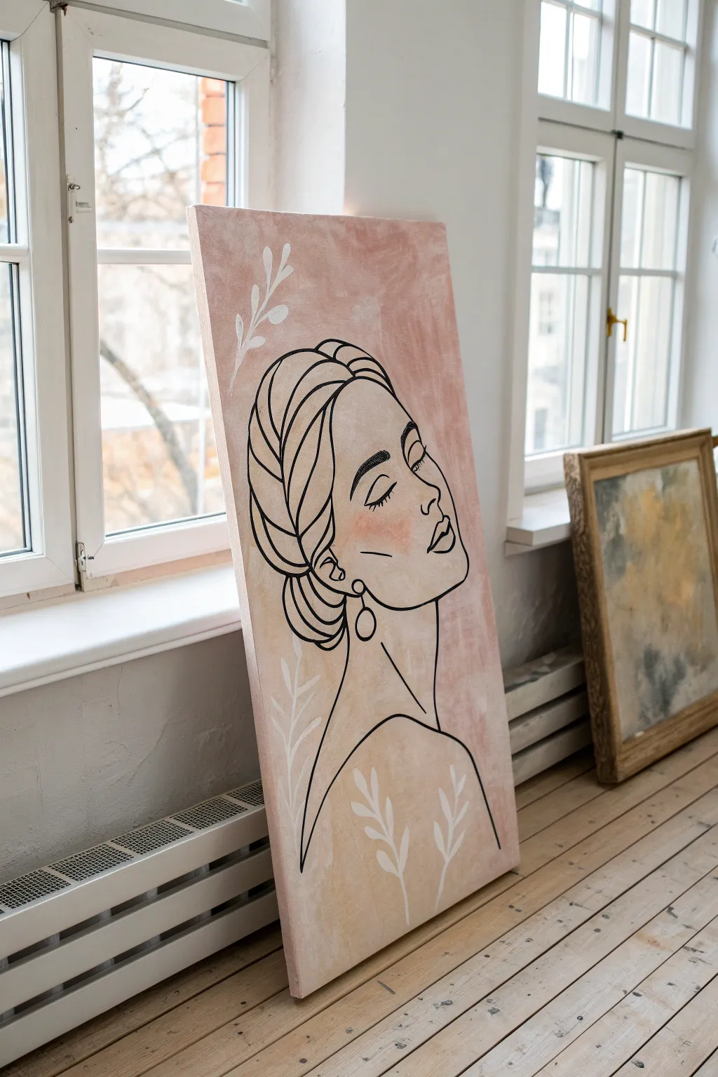
Embrace the elegance of minimalism with this sophisticated wall art, featuring a delicate profile line drawing over a soft, textured background. This project combines loose acrylic washes with precise marker work to create a piece that feels both organic and modern.
Step-by-Step Guide
Materials
- Large rectangular stretched canvas (24×36 or similar)
- Acrylic paint (Light Pink/Blush, Cream/Beige, White)
- Small cup of water for washes
- Large flat paintbrush or sponge brush
- Black oil-based paint marker (medium to thick tip)
- White paint marker or small liner brush
- Pencil and eraser
- Carbon transfer paper (optional)
- Paper towels
Step 1: Creating the Textured Wash
-
Prepare the workspace:
Lay down drop cloths or old newspapers to protect your floor or table, as creating liquid washes can sometimes get a little messy. -
Mix your base colors:
On a palette or paper plate, squeeze out generous amounts of your blush pink and cream acrylic paints. Keep a separate blob of white for tinting. -
Create a liquid consistency:
Dip your large brush into water and mix it into the pink paint until it reaches a milky, translucent consistency. Do the same for the cream color in a separate spot. -
Apply the pink wash:
Start at the top of the canvas, applying the watery pink paint in random, sweeping strokes. Don’t aim for perfect coverage; let the brushstrokes show for texture. -
Blend in the cream tones:
While the pink is still slightly damp, introduce the cream wash towards the bottom and middle sections. Use cross-hatching motions to blend the edges where the two colors meet. -
Add highlights:
I like to take a bit of undiluted white paint on a dry brush and scuff it lightly over a few areas to create depth and a ‘plaster’ effect. -
Let it dry completely:
Wait for the background to fully cure. This is crucial because drawing over damp paint will ruin your marker tip. A hair dryer can speed this up.
Paint Marker Pro Tip
Test your marker on paper before touching the canvas. If the paint flow draws too fast, blog it on a paper towel so you don’t get accidental puddles on your art.
Step 2: Sketching the Figure
-
Plan the composition:
Visualize where the face will sit. The profile should take up about two-thirds of the vertical space, leaving room at the top and bottom for floral accents. -
Draft the outline:
Lightly sketch the profile using a pencil. Start with the forehead, curving down for the nose, lips, and chin. Keep the pressure very light so mistakes are easy to erase. -
Detail the hair and features:
Sketch the large sweeping curves for the braided hair bun and the neck. Add the simple closed eyelid and eyebrow. -
Transfer method (alternative):
If you aren’t confident drawing freehand, print a line art template to size, place carbon paper underneath it, and trace the design directly onto the canvas.
Textural Level Up
Mix a small amount of baking soda or plaster into your base coat paint. This creates a grainy, stone-like texture that makes the line art pop.
Step 3: Inking and Details
-
Trace the main lines:
Shake your black oil-based paint marker well. Begin tracing over your pencil lines, starting from the top so your hand doesn’t smudge the fresh ink. -
Vary the line weight:
For a more artistic look, go over the outer contour lines (like the back of the neck and the bun) a second time to thicken them, while keeps facial features delicate. -
Add facial definition:
Carefully draw the eyelashes and the small earring detail. Make sure the earring loop is distinct and clear. -
Add the blush:
Dilute a tiny drop of pink paint with a lot of water. Using your finger or a soft brush, gently dab a faint circle of ‘blush’ onto the figure’s cheek. -
Paint the white foliage:
Using a white paint marker or a thin brush with white acrylic, draw the simple stemmed leaves in the empty corners. Keep these shapes loose and organic. -
Clean up:
Once the marker ink is fully dry, gently erase any visible pencil marks that strayed from the black lines. -
Seal the artwork:
Apply a clear matte spray varnish to protect the surface and even out the sheen of the different paints.
Step back and admire how a few simple lines can convey so much emotion and grace

PENCIL GUIDE
Understanding Pencil Grades from H to B
From first sketch to finished drawing — learn pencil grades, line control, and shading techniques.
Explore the Full Guide
Polka Dots and Drippy Paint Party
Bring a touch of organic warmth to your walls with this minimalist polka dot canvas featuring a palette of terracotta, beige, and charcoal tones. The clean repetition combined with soft, natural colors creates a modern yet calming statement piece perfect for any room.
Step-by-Step
Materials
- One medium-to-large stretched white canvas (e.g., 20×24 inches or similar)
- Acrylic paints in earthy tones: burnt sienna, rust orange, raw umber, beige/cream, and black or charcoal
- Circle sponge pouncers (approx. 2-3 inches in diameter)
- Small flat paintbrush (for touch-ups)
- Paper plate or painting palette
- Ruler
- Pencil
- Paper towel
Step 1: Preparation & Planning
-
Assess your canvas:
Before adding any color, examine your blank canvas for any loose threads or dust, wiping it clean with a dry cloth to ensure a smooth surface. -
Plan your color palette:
Squeeze out quarter-sized dollops of your chosen acrylic colors onto your palette. You’ll need about 5-6 distinct shades: a rust, a deep brown, a beige, a charcoal, and a lighter terracotta. Feel free to mix white into your browns to create custom milky coffee shades. -
Determine the grid:
Decide on the spacing for your polka dots. For the look in the photo, the dots are fairly close together but don’t touch. A spacing of about 1 to 1.5 inches between circles works well. -
Mark vertical guides:
Using a ruler and a pencil, lightly mark small ticks along the top edge of the canvas to designate where the center of each column of dots should fall. -
Mark horizontal guides:
Repeat this process along the side edge to mark the horizontal rows. This creates an invisible grid to help you keep your pouncer placement straight without drawing heavy lines across the whole canvas.
Uneven Circles?
If your sponge stamps look patchy, don’t panic. Let the first layer dry completely, then simply re-align the sponge and stamp a second coat for full opacity.
Step 2: Painting the Dots
-
Load the sponge pouncer:
Select your first color, perhaps the lightest beige. Press the sponge pouncer firmly into the paint, twisting slightly to ensure the entire foam surface is coated evenly. -
Blot excess paint:
Dab the loaded sponge onto a clean section of your palette or a paper towel once. This removes globs of excess paint that could cause dripping or squishing outside the circle shape. -
Stamp the first dots:
Press the pouncer straight down onto the canvas at random intersections of your mental grid. Apply firm, even pressure, give a tiny twist, and lift straight up. -
Clean or switch tools:
If you are using a single pouncer, rinse and squeeze it dry thoroughly between colors. I often prefer using a separate pouncer for dark vs. light colors to keep the beige tones crisp. -
Apply the second color:
Move to a mid-tone like terracotta or rust. Stamp these dots into the grid, trying to disperse them so no two identical colors sit directly next to each other. -
Add the darkest accents:
Load up a pouncer with your charcoal or black paint. Add these darker dots sparingly as high-contrast accents to balance the warmer earth tones. -
Fill the gaps:
Continue filling in the remaining empty spots on your grid with your remaining shades of brown and tan until the canvas pattern is complete. -
Handle the edges:
For rows that end near the edge of the canvas, let the pouncer stamp partially off the edge. This makes the pattern feel continuous, like fabric cut from a bolt.
Add Some Texture
Mix a small amount of baking soda or texture paste into your acrylics before stamping. This gives the dots a raised, tactile feel akin to velvet flocking.
Step 3: Refinement
-
Inspect the coverage:
Looking closely at the stamped circles, you may see tiny white specks of canvas showing through the paint texture. This is normal for sponge painting. -
Touch up edges:
Use a small flat paintbrush to carefully smooth out the circumference of any circles that look ragged or uneven. -
Fill centers if needed:
If the sponge left the center of the dots too sheer, dab a little extra paint into the middle with your brush to make the color opaque and solid. -
Erase guide marks:
Once the paint is completely dry, gently erase any visible pencil tick marks on the edges of the canvas. -
Double check the sides:
Ensure any dots that went off the edge wrap neatly around the side of the canvas frame for a professional, finished gallery look. -
Final drying time:
Lay the canvas flat in a safe area to dry for at least 24 hours to ensure thicker areas of paint adhere fully.
Prop your new masterpiece against a wall or hang it up to add instant warmth to your space
Galaxy Night Sky With Splatter Stars
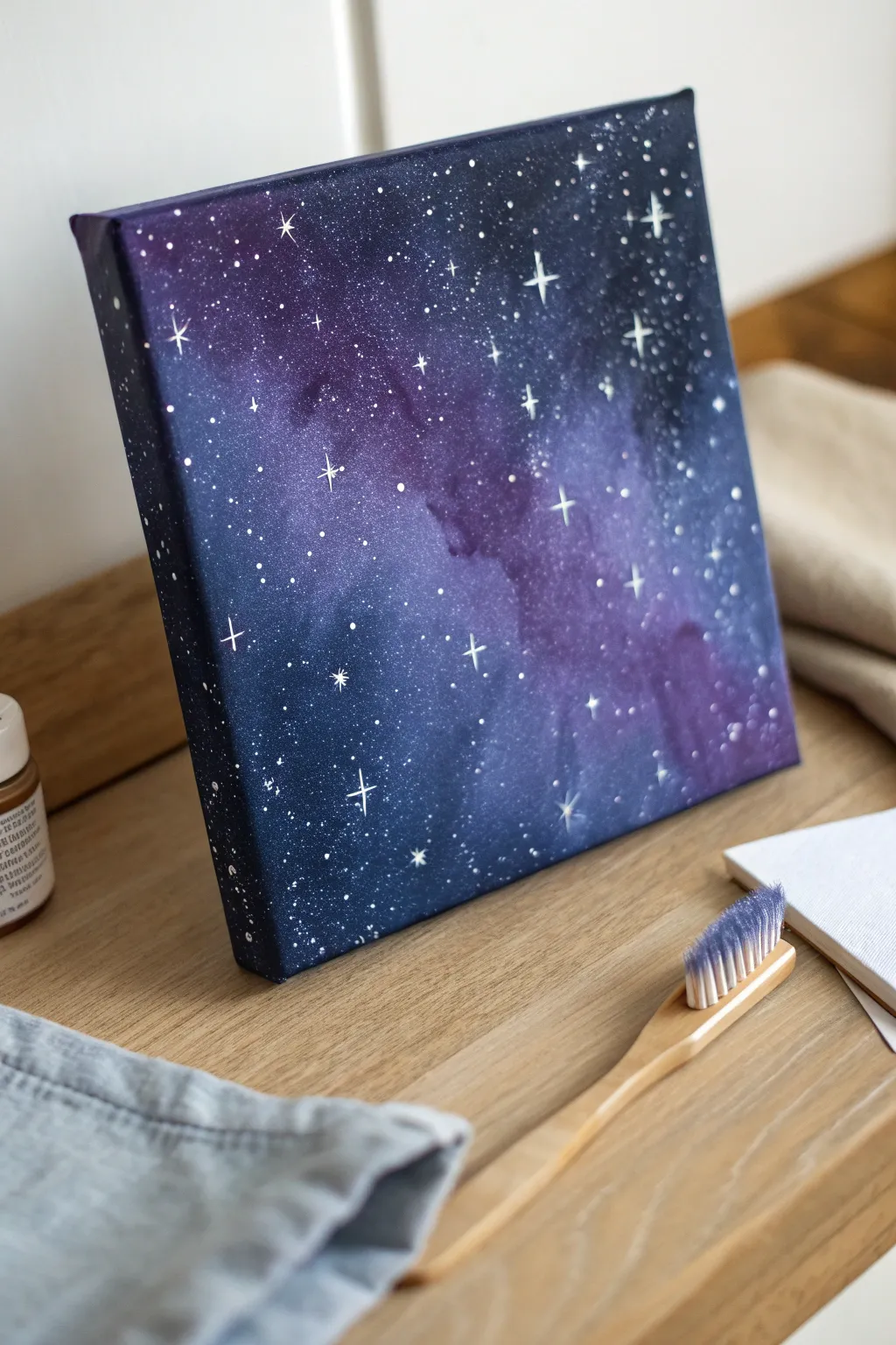
Transform a plain white canvas into a window on the cosmos with this beginner-friendly galaxy painting technique. Using simple tools like sponges and a toothbrush, you can create a stunning, deep space effect filled with shimmering stars that looks incredibly complex but is surprisingly easy to achieve.
Step-by-Step Tutorial
Materials
- Small square canvas (e.g., 8×8 or 10×10)
- Acrylic paints: Black, Navy Blue, Purple (Violet), White, Magenta
- Kitchen sponge or cosmetic wedge sponge
- Small detail paintbrush (liner brush)
- Old toothbrush
- Water cup
- Paper plate or palette
- Paper towels
Step 1: Setting the Background
-
Prep your palette:
Squeeze out small amounts of black, navy blue, and purple onto your palette or paper plate. Leave the white paint for later. -
Start with the darkest corners:
Cut your sponge into a manageable size. Dip it lightly into the black paint and dab it onto the four corners of the canvas, pushing the color toward the center but leaving the middle empty. -
Paint the edges:
While you have black on your sponge, dab along the side edges of the canvas too. Wrapping the design around the sides gives the piece a professional, finished look without needing a frame. -
Introduce the navy blue:
Using a clean section of the sponge (or a new wedge), pick up the navy blue paint. Dab this color right next to the black areas, slightly overlapping them to blend the transition. -
Create the nebula cloud:
Load your sponge with purple paint. Dab this diagonally across the center of the canvas where the white space is, blending it outward into the navy blue areas to create a soft, glowing cloud effect. -
Add depth with magenta:
Mix a tiny dot of magenta into your purple. Lightly sponge this brighter hue into the very center of your purple nebula cloud to create a glowing core. -
Blend the transitions:
If the lines between colors look too harsh, tap over the meeting points with a clean, slightly damp sponge to soften the edges until the gradient looks smooth. -
Let the base dry:
Allow the background layer to dry completely. This is crucial so your stars stay crisp white and don’t turn into gray mud.
Step 2: Creating the Stars
-
Prepare the star paint:
Mix a small amount of white paint with a few drops of water on your palette. You want a consistency similar to heavy cream or melted ice cream—fluid, but opaque. -
Load the toothbrush:
Dip the bristles of your old toothbrush into the watered-down white paint. Tap off any excess on a paper towel to avoid huge blobs. -
Test the splatter:
I always test the splatter on a piece of scrap paper first to ensure the droplets are fine and misty rather than large and clumpy. -
Create the star field:
Hold the toothbrush over the canvas, bristles facing down. Run your thumb across the bristles to flick a fine mist of white paint across the entire surface. -
Vary the density:
Concentrate more splatter along the diagonal purple nebula cloud to make the ‘Milky Way’ shape pop against the darker background. -
Add distant stars:
Dip the handle end of a paintbrush into the white paint and gently dot it onto the canvas to create distinctive, round stars that are slightly larger than the mist. -
Paint the major stars:
Switch to your fine liner brush. Identify 4 or 5 spots where you want bright, hero stars. Paint a small central dot of pure white. -
Add starburst rays:
Using the very tip of the liner brush, carefully drag thin lines outward from the center of your major stars: one vertical line and one horizontal line to make a cross shape. -
Refine the glimmer:
For the largest stars, you can add two smaller diagonal lines between the main cross lines to create an eight-point sparkle effect. -
Final touches:
Step back and look at the composition. If any area looks too empty, add a few tiny dots with your liner brush to balance the galaxy.
Star Blobs?
If a splatter lands as a big blob, don’t panic. Use a wet Q-tip to lift it while wet, or wait for it to dry and sponge a bit of the background color over it to hide the mistake.
Make it Shimmer
Mix a bit of silver metallic paint or iridescent medium into your white star paint. The stars will catch the light and twinkle when you walk past the canvas.
Now you have a breathtaking piece of the universe ready to display on your shelf or desk


Abstract Heart in Two Colors
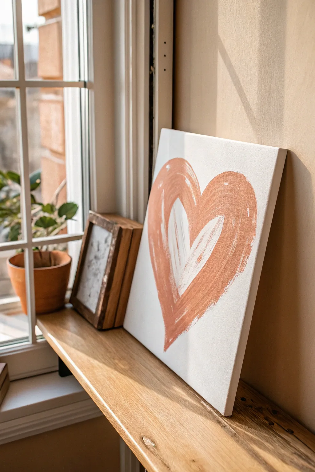
Embrace the warmth of earthy tones with this simple yet striking abstract heart painting. Featuring sweeping, visible brushstrokes and a cozy terracotta palette, this piece adds a modern, organic touch to any windowsill or shelf.
How-To Guide
Materials
- Square stretched canvas (approx. 12×12 inches)
- Acrylic paint: Terracotta or Burnt Sienna
- Acrylic paint: Titanium White
- Flat paint brush (1-inch width)
- Small round brush (for initial sketching)
- Palette or paper plate
- Cup of water
- Paper towels
Step 1: Preparation & Sketching
-
Prepare your workspace:
Lay down a drop cloth or newspaper to protect your surface. Set out your canvas and squeeze a generous amount of Terracotta and White paint onto your palette, keeping them separate for now. -
Sketch the heart shape:
Dip your small round brush into a very watery mix of the Terracotta paint. Lightly sketch a large heart shape on the canvas to serve as your guide. Don’t worry about perfection; this line will be covered later. -
Mix a soft base tone:
On your palette, mix a small amount of White into the Terracotta to create a slightly lighter, milky orange. This will add depth behind the main strokes.
Brushstroke Pro-Tip
Keep your wrist loose and stand back while painting. Painting from the elbow rather than the wrist creates smoother, more confident curves.
Step 2: Painting the Outer Heart
-
Load the flat brush:
Switch to your 1-inch flat brush. Load it generously with the pure Terracotta paint. You want enough paint so the bristles glide, but not so much that it drips. -
Create the left curve:
Starting from the top left arch of the heart, pull the brush down in one continuous, sweeping motion toward the bottom point. Allow the bristles to streak slightly at the edges for texture. -
Create the right curve:
Repeat the motion on the right side. Start at the top right arch and sweep down to meet the first stroke at the bottom tip. It’s okay if they overlap messily at the bottom; that’s part of the charm. -
Thicken the strokes:
Go back over the main arches to widen the heart shape. Use quick, confident strokes rather than dabbing, ensuring the brush marks remain visible and follow the curve of the heart. -
Add abstract edges:
With a slightly drier brush (wipe it lightly on a paper towel), feather out the top edges of the heart arches so they don’t look too stiff or geometric.
Level Up: Texture
Mix a teaspoon of baking soda or modeling paste into your white acrylic paint before applying the center heart for a raised, sculptural 3D effect.
Step 3: Layering the Inner Heart
-
Clean the brush:
Rinse your flat brush thoroughly and dry it well. Wet bristles can make the next layer too transparent. -
Apply the white layer:
Load the clean flat brush with pure Titanium White. Paint a smaller, inner heart shape directly over the wet or tacky Terracotta layer. Start from the top inside arch and pull down to the center. -
Blend wet-on-wet:
I like to do this while the orange is still tacky so the colors interact. As you brush the white down, let it pick up some of the orange underneath, creating natural streaks of peach and light rust. -
Define the inner V:
Use the edge of the flat brush to sharpen the deep ‘V’ at the top center of the heart, letting the white paint cut into the orange background slightly. -
Add highlight strokes:
Dip the brush back into the white (don’t clean it yet) and add one or two bold, bright strokes on top of the inner heart to bring back the pure white contrast.
Step 4: Finishing Touches
-
Softening the blend:
If the transition between the orange outer ring and white center feels too harsh, lightly sweep a dry brush between the two zones to marry them together. -
Review the bottom point:
Check the bottom tip of the heart. If it blunted during blending, add a tiny touch of Terracotta to the tip of your brush and re-define the sharp point. -
Final texture check:
Look for areas that seem too flat. You can dry-brush a little extra Terracotta over the white, or white over the Terracotta, to enhance the rough, painterly look. -
Let it dry:
Allow the painting to dry completely for at least an hour. Because the paint is applied thickly in areas to show texture, it may take longer than a standard coat.
Place your warm, abstract creation in a spot where the sunlight can highlight the beautiful brush textures you’ve created
Colorful Planet Dots on a Dark Sky
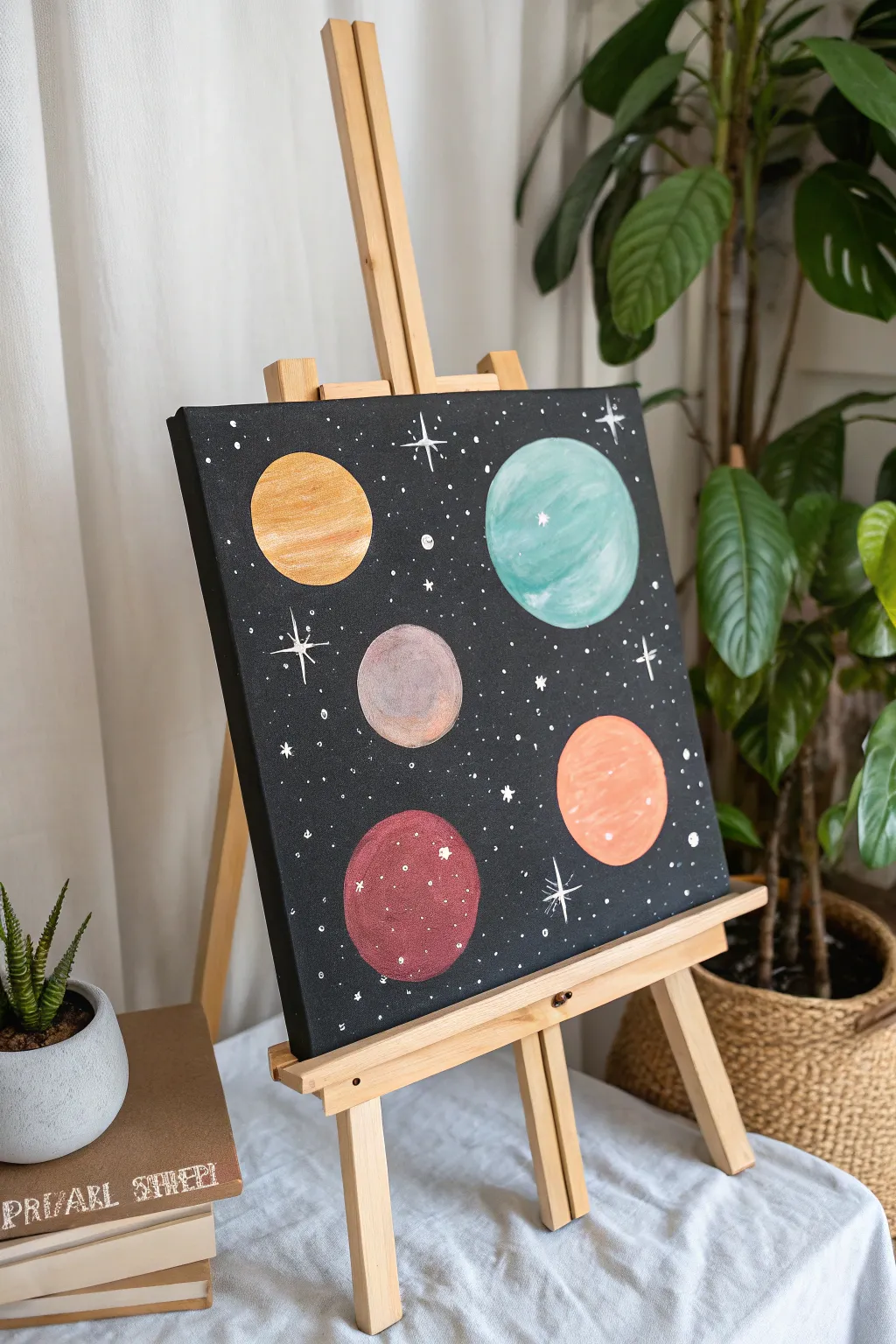
Transform a plain canvas into a whimsical view of deep space with this approachable acrylic painting project. Using simple circular forms and a splattered starfield, you’ll create a charming galactic scene that balances bold planets against a deep, dark sky.
Step-by-Step Tutorial
Materials
- Square stretched canvas (e.g., 12×12 or 16×16 inches)
- Black acrylic paint (heavy body preferred)
- Acrylic paints: gold/ochre, teal, pastel pink, greyish-purple, maroon
- Titanium white acrylic paint
- Large flat brush (for background)
- Medium round brush (for planets)
- Fine liner brush (for stars)
- Old toothbrush (optional, for star splatter)
- Circular objects to trace (cups, lids, rolls of tape) or a compass
- Pencil for sketching
- Palette or paper plate
- Cup of water and paper towels
Step 1: Setting the Stage
-
Prime the Void:
Begin by coating your entire canvas with black acrylic paint. Use a large flat brush to ensure distinct, even coverage. Don’t forget to paint the edges of the canvas for a finished look. -
Double Coat:
Acrylic black can sometimes streak. If you see white canvas peeking through after the first coat dries, apply a second layer to ensure a solid, opaque void. Let this dry completely before moving on. -
Map the Universe:
Gather your circular objects of varying sizes. Arrange them on the dry canvas to plan your composition. Move them around until the balance feels right—try placing larger planets near the corners and smaller ones toward the center. -
Trace the Orbits:
Lightly trace around your chosen objects with a pencil. You don’t need a heavy hand; just a faint guide line is enough to keep your painting neat.
Step 2: Bringing Planets to Life
-
Paint the Gold Planet:
Start with your top-left circle. Mix a yellow ochre with a touch of metallic gold or white to get a soft, shimmering effect. Fill in the circle using your medium round brush, following the curve of the pencil line. -
Add Texture:
While the gold paint is still wet, add a tiny bit of white to your brush and streak it horizontally across the planet to create a subtle banded texture. -
The Teal Giant:
For the largest planet on the top right, use a teal or seafoam green color. Paint in circular motions to mimic the spherical shape. If the black shows through, let the first layer dry and add a second. -
The Pastel Worlds:
Move to the central, smaller planet. Paint this a muted greyish-purple or mauve. Then, tackle the bottom-right planet using a soft salmon or pastel orange shade. -
The Red Planet:
Finally, paint the bottom-left circle a deep maroon or earthy red. I like to dab the brush slightly here to give it a rockier, textured appearance compared to the smooth gas giants. -
Define the Edges:
Once your base colors are down, use a smaller brush to tidy up the edges of your circles. Sharp, clean edges will make the planets pop against the black background.
Uneven Circles?
If your hand-painted edges look wobbly, use a white paint pen or a metallic silver marker to outline the planets. This hides uneven lines and adds a cool, graphical “sticker” effect.
Step 3: Starry Details
-
Mix Your Starlight:
Water down a small amount of titanium white paint on your palette until it has the consistency of heavy cream or ink. This helps it flow better for fine details. -
Create Distant Galaxies:
Dip an old toothbrush or a stiff bristle brush into the watered-down white paint. Hold it over the canvas and use your thumb to flick the bristles, spraying a fine mist of tiny stars across the black areas. Avoid spraying too heavily over the planets. -
Paint Major Stars:
Switch to your fine liner brush. Dip it in pure white paint and hand-paint larger ‘twinkle’ stars. Draw a simple cross shape—a long vertical line intersected by a shorter horizontal one—and add a tiny dot in the center. -
Add Shine:
Place a few small white dots or tiny crosses directly onto the planets themselves to act as highlights or surface reflections, making them look spherical rather than flat. -
Final Constellations:
Look for empty black spaces that feel too heavy. Use the tip of your liner brush (or a toothpick) to dot individual stars in clusters of three or four to balance the composition. -
Review and Dry:
Step back and check your work. If any accidental white splatters landed on your planets where you didn’t want them, touch them up with the original planet color. Allow the entire piece to dry for at least an hour.
Dimensional Tip
To make planets look rounder, mix a slightly darker shade of your base color. Paint a crescent shape along the bottom curve of the planet for shadow, blending it upward while wet.
Hang your cosmic creation on the wall and enjoy your own personal view of the stars
Painted Checkerboard With Wavy Edges
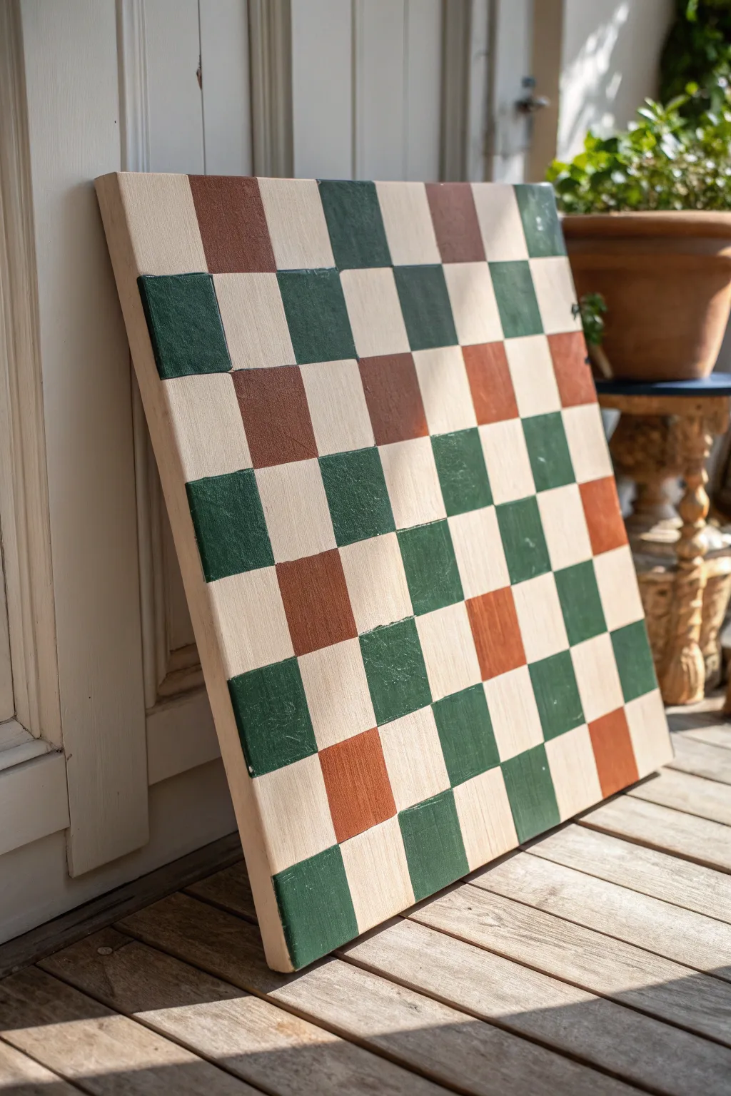
Embrace the charm of imperfection with this tricolor checkerboard project that swaps rigid geometry for a hand-painted, organic feel. The combination of forest green, warm terracotta, and cream creates a sophisticated palette that warms up any corner of your patio or living room.
How-To Guide
Materials
- Large square canvas or prepared wooden art board
- Acrylic craft paint (Forest Green)
- Acrylic craft paint (Terracotta/Burnt Sienna)
- Acrylic craft paint (Cream/Off-White)
- Flat shader brush (approx. 1 inch width)
- Smaller flat brush for touch-ups
- Ruler or straight edge
- Pencil
- Painter’s palette or paper plate
- Cup of water and paper towels
Step 1: Preparation and Base Coat
-
Clean surface:
Begin by ensuring your canvas or wooden board is completely free of dust and lint. If you are using a wooden board like the one in the photo, give it a quick sanding if any rough spots are present. -
Apply base color:
Squeeze a generous amount of your cream or off-white acrylic paint onto the palette. Using your larger flat brush, cover the entire surface of the board. -
Establish opacity:
Let the first coat dry completely. Depending on the quality of your paint, apply a second or even third coat to ensure a solid, opaque background without streaks. -
Dry time:
Allow the base to cure fully before moving on to pencil marks. This prevents the graphite from digging into soft paint.
Steady Hand Trick
For straighter freehand lines, rest your pinky finger on a dry section of the canvas to anchor your hand while you drag the brush.
Step 2: Grid Layout
-
Measure the board:
Measure the total width of your canvas. Divide this number by 8 to determine the size of your squares, as a standard checkerboard is an 8×8 grid. -
Mark vertical intervals:
Using your ruler, make small tick marks along the top and bottom edges of the canvas at your calculated intervals. -
Draw vertical lines:
Lightly connect the top and bottom tick marks with a pencil and ruler. Keep the pressure very light so the lines don’t show through the lighter squares later. -
Mark horizontal intervals:
Repeat the measuring process on the left and right sides of the canvas. -
Complete the grid:
Connect the side tick marks to form your horizontal lines. You should now have a grid of 64 squares.
Paint Bleeding?
If you chose to use tape and it bled underneath, clean it up by painting a thin, straight line of the background color over the mistake.
Step 3: Painting the Pattern
-
Plan the color steps:
To avoid confusion, lightly mark which squares will be green and which will be terracotta. In this specific design, the colors alternate with the cream background, creating a diagonal flow. -
Start with green:
Load your flat brush with the forest green paint. I find it easiest to work row by row or diagonally to keep track of the pattern. -
Paint green squares:
Fill in the designated green squares. Don’t worry about using painter’s tape; using the flat edge of the brush to follow your pencil lines creates that lovely, slightly organic hand-painted look seen in the photo. -
Refine green edges:
Go back over the green squares if the coverage looks thin. Ensure the edges are crisp enough to define the square but soft enough to look handmade. -
Switch to terracotta:
Wash your brush thoroughly or switch to a fresh brush. Load it with the terracotta paint. -
Paint terracotta squares:
Fill in the remaining alternating squares with the reddish-brown tone. Be careful where corners touch the wet green paint to avoid muddying the colors. -
Double check pattern:
Step back and view the board from a distance to ensure you haven’t missed a square or used the wrong color in a specific spot.
Step 4: Finishing Touches
-
Touch up cream areas:
If you accidentally drifted outside the lines with your colors, use a small brush and your original cream base paint to tidy up the edges once the dark colors are dry. -
Erase visible lines:
Once the paint is bone dry, gently erase any pencil grid lines that remain visible in the unpainted cream sections. -
Seal the art:
If you plan to lean this outside on a porch like the inspiration image, apply a coat of matte or satin polycrylic sealer to protect it from moisture.
Prop your finished checkerboard on a mantle or patio floor to add an instant artistic touch to your space
Textured Canvas Using Raised Paste Shapes
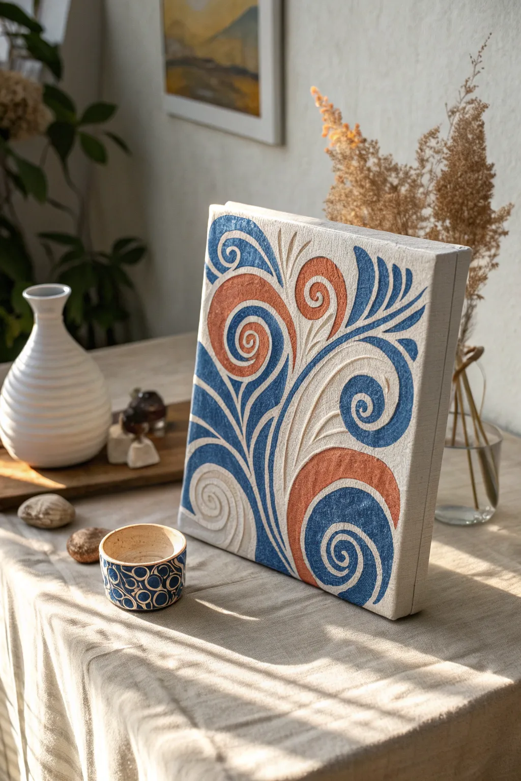
Bring sophisticated dimension to your walls with this textured canvas project that mimics the look of high-end plaster art. By combining raised relief paste with bold, organic swirls of navy and terracotta, you’ll create a piece that begs to be touched.
Detailed Instructions
Materials
- Square stretched canvas (e.g., 12×12 or 16×16 inches)
- Texture paste or molding paste (heavy body)
- Piping bag or squeeze bottle with fine tip
- Pencil
- Acrylic paints: Navy Blue, Terracotta/Rust, and Cream/Off-White
- Small flat synthetic brushes
- Fine detail brush
- Palette knife
- Sandpaper (fine grit)
- Matte varnish spray
Step 1: Preparation & Design
-
Prime the Surface:
Ensure your canvas is taut. Apply a base coat of cream or off-white acrylic paint over the entire surface, including the edges. This provides a uniform background tone and seals the weave. -
Sketch the Flow:
Using a pencil, lightly draw your swirling design. Start from the bottom left corner and extend curved lines upward and outward to the right. -
Refine the Spirals:
Add the spiral details at the ends of your curved lines. Focus on creating a balanced composition where large swirls interact with smaller accent curves. -
Mark Color Zones:
Lightly mark which sections will be blue, which will be terracotta, and which will remain the background color to avoid confusion later.
Consistent Piping
Practice piping your paste on a scrap piece of cardboard first. Getting the flow speed right is key to smooth curves.
Step 2: Creating Texture
-
Fill the Piping Bag:
Scoop your heavy texture paste into a piping bag or squeeze bottle. Ensure there are no air bubbles, as these can cause the line work to sputter. -
Outline the Shapes:
Beginning with the largest spirals, carefully pipe the paste along your pencil lines. Keep a steady pressure to maintain a consistent line width. -
Fill the Interiors:
For the wider sections of the swirls, pipe additional lines or use a small palette knife to fill in the shape with paste, creating a raised, flat plateau. -
Sharpen Edges:
While the paste is still wet, use a slightly damp brush or a palette knife to clean up any jagged edges or mistakes in your piping. -
Let it Cure:
Allow the texture paste to dry completely. This is crucial; thick applications may need overnight drying to become rock hard.
Step 3: Adding Color
-
Sanding Down:
Once fully dry, lightly run fine-grit sandpaper over the tops of the raised texture to knock down any sharp peaks, creating a smoother surface for the paint. -
Painting the Blue:
Load a flat brush with navy blue acrylic. Carefully paint the specific raised swirls designated for this color, coating both the top and the sides of the relief. -
Applying Terracotta:
Switch to a clean brush and apply the rust orange paint to the opposing spirals. I find it helps to rotate the canvas to reach tricky angles without smudging. -
Detailing the White:
Use a fresh coat of cream or off-white paint on the remaining raised sections to make them pop against the background, ensuring the relief effect is maximized. -
Clean Up Lines:
Use a fine detail brush and your background color to touch up the canvas surface where any paint might have slipped off the raised edges. -
Final Varnish:
Once all paint is dry, take the canvas to a ventilated area and apply a light coat of matte varnish spray to protect the texture and unify the sheen.
Metallic Accent
Mix a tiny amount of gold mica powder into your varnish for a subtle shimmer on the raised edges that catches the light.
Hang your new textured masterpiece near a window where natural light can play across the raised surfaces
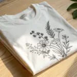
Negative Space Botanical With Stenciled Leaves
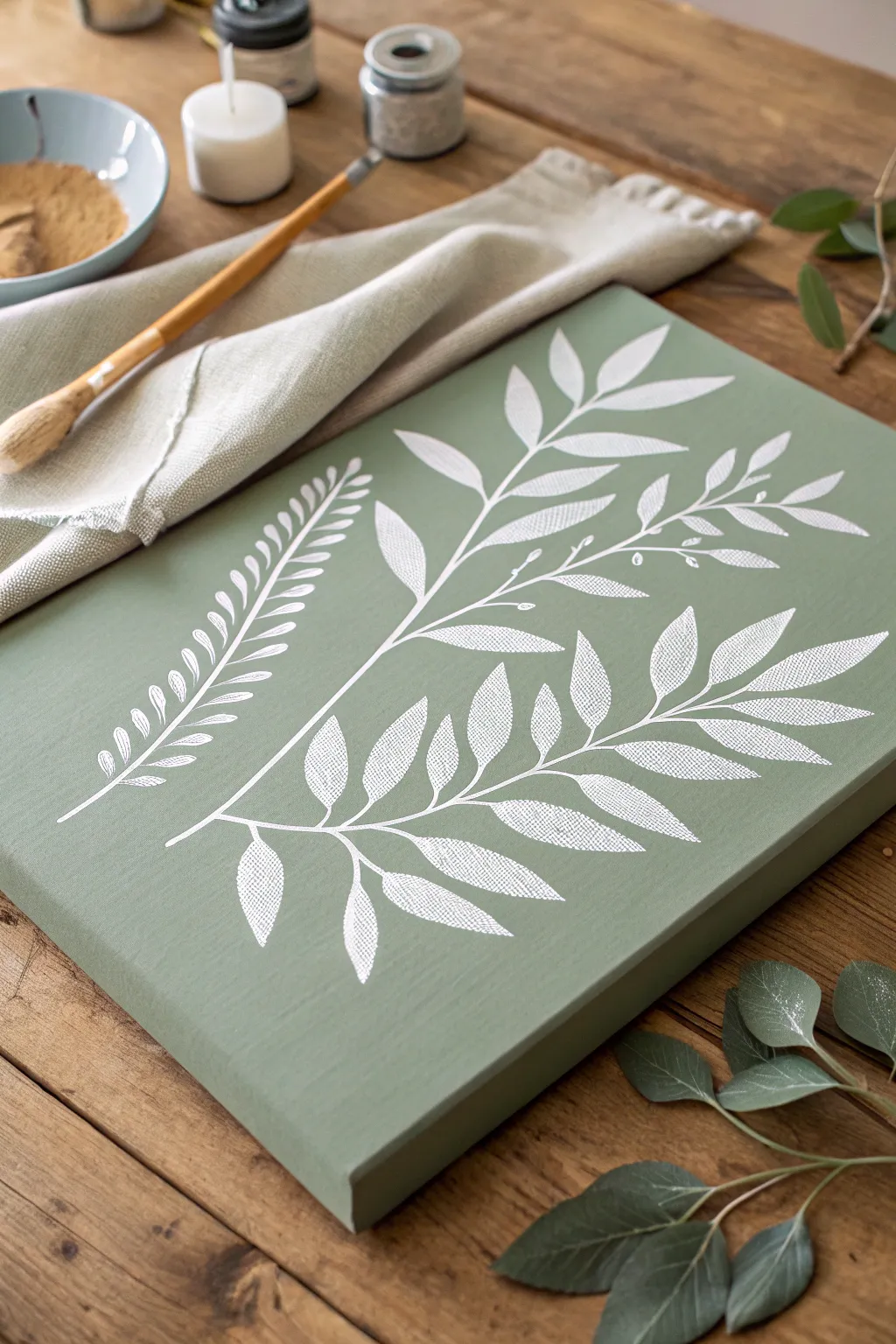
Bring the calming influence of nature into your home with this muted sage green canvas featuring crisp white botanical silhouettes. This project uses a negative space technique with stencils to create a textured, organic look that feels both modern and timeless.
Step-by-Step
Materials
- Rectangular stretched canvas (around 16×20 inches)
- Sage green acrylic paint (matte finish)
- White acrylic paint
- Adhesive stencil film or cardstock
- Craft knife and cutting mat (or die-cutting machine)
- Dense foam stencil brush or pouncer
- High-density foam roller (small)
- Painters tape
- Pencil
- Fine grit sandpaper (optional)
Step 1: Preparing the Base
-
Prep the canvas:
Before laying down any color, ensure your canvas is taut and clean. If the weave is very rough, give it a light sanding with fine-grit sandpaper to create a smoother surface for stenciling. -
Apply the base coat:
Pour your sage green acrylic paint into a tray. Using the foam roller, apply a smooth, even layer over the entire front and sides of the canvas. This ensures the background color is solid and consistent. -
Let it dry completely:
Allow the first coat to dry for at least 30 minutes. If the white canvas is still showing through, apply a second coat of sage green and let it dry overnight. A fully cured base is crucial for preventing stencil bleed.
Bleeding Lines?
If paint bleeds under the stencil, your brush was too wet. For the fix, wait for it to dry totally, then paint over the bleed with the background sage color using a tiny brush.
Step 2: Creating the Stencils
-
Design your botanicals:
Sketch or print out outlines of fern fronds and leafy branches. You want three distinct shapes: a long fern, a branching stem with pointed leaves, and a fuller leafy branch. -
Transfer to stencil material:
If using adhesive stencil film (which I highly recommend for crisp lines), trace your designs onto the backing. If using cardstock, draw directly on the paper. -
Cut the stencils:
Carefully cut out the leaf shapes using a sharp craft knife on a cutting mat. Remember, you are creating a ‘positive’ stencil where the leaf shape is the hole you will paint through. -
Plan the layout:
Lay the cut stencils dry on the canvas to find a pleasing arrangement. Angle the stems slightly inward from the bottom to mimic how plants naturally grow.
Add Dimension
Mix a tiny drop of light grey into your white paint for the lower leaves on the stem. This subtle shadow effect creates depth, making the top white leaves pop.
Step 3: Painting the Botanicals
-
Secure the first stencil:
Starting with the largest leafy branch, peel the backing off your adhesive stencil (or tape down your cardstock firmly). Press down specifically along the intricate edges of the leaves to seal them against the canvas. -
Load the stencil brush:
Dip your foam stencil brush into the white acrylic paint, then offload most of the paint onto a paper towel. The brush should feel almost dry to the touch. -
Stipple the paint:
Using a straight up-and-down pouncing motion, dab the white paint through the stencil openings. Do not brush side-to-side, as this forces paint under the edges. -
Build opaque layers:
Apply a second light layer of stippling immediately. The texture of the canvas combined with the dry brush technique will give the leaves a lovely, fabric-like visual texture. -
Remove stencil:
While the paint is still slightly tacky, carefully peel back the stencil. Pull it low and slow to avoid lifting any paint or tearing the edges. -
Repeat for the fern:
Clean your stencil or grab your second design (the fern). Position it according to your layout plan and repeat the dry-brush stippling process. -
Add the final branch:
Place the third botanical element. Ensure the stems converge near the bottom center without overlapping excessively, creating a sense of a gathered bouquet.
Step 4: Refining
-
Touch up edges:
Inspect your work for any small bleeds. Use a tiny detail brush with the sage green base color to ‘erase’ any white mistakes by painting over them. -
Connect the stems:
If the stencil bridges left gaps in the main stems, use a fine liner brush and white paint to connect the lines smoothly so the branches look continuous. -
Final drying time:
Allow the white paint to dry completely for a few hours. Because acrylic dries quickly, this won’t take long, but full curing ensures durability.
Hang your serene botanical artwork in a well-lit spot to enjoy the subtle texture and calming colors
Have a question or want to share your own experience? I'd love to hear from you in the comments below!