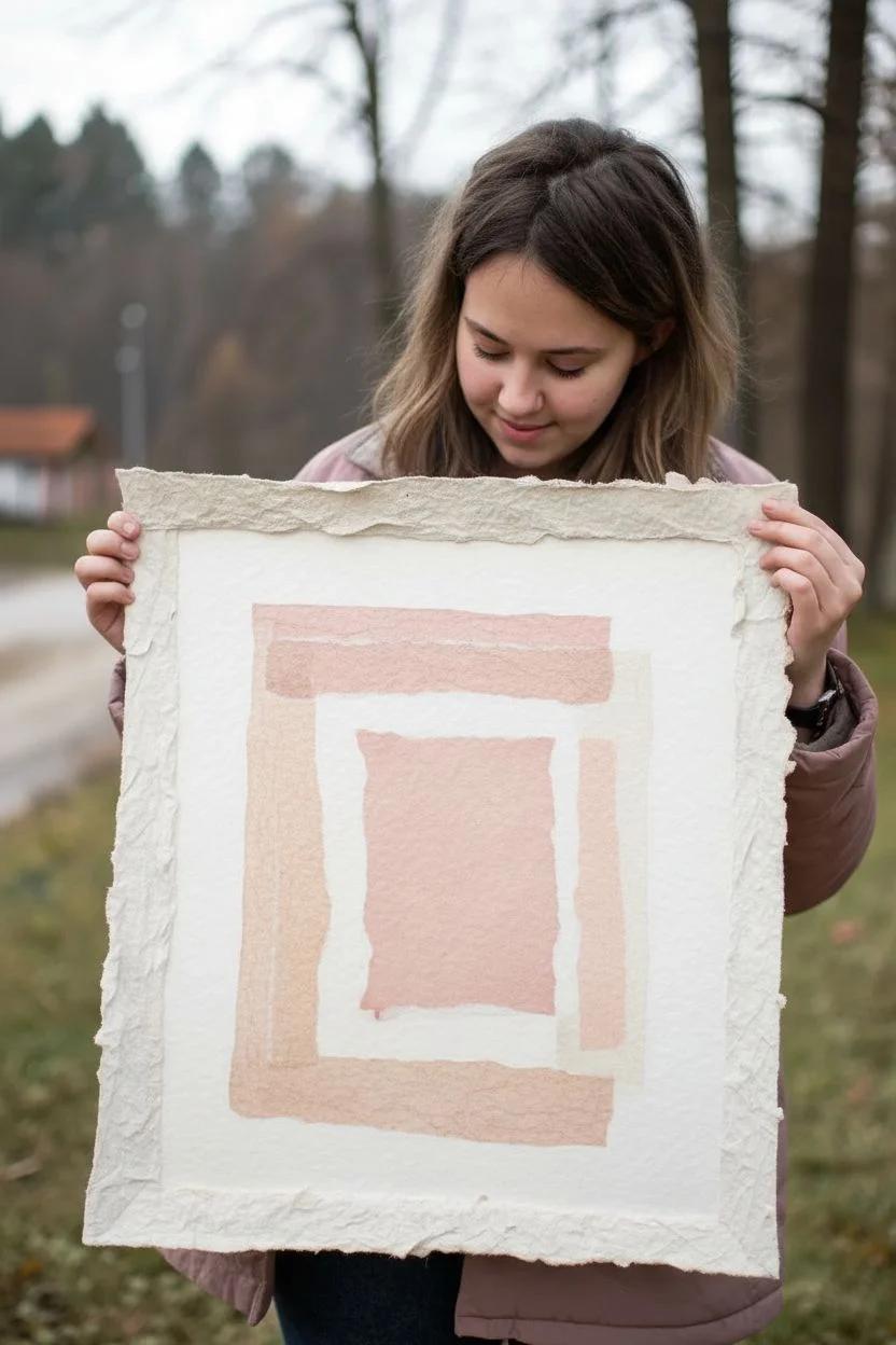
If you love the crisp control of drawing but crave the texture and surprise of paper layers, drawing collages are the best of both worlds. I’m sharing a mix of classic go-to ideas and a few wilder twists to get your hands cutting, gluing, and sketching without overthinking it.
Torn Paper Portrait With Drawn Features
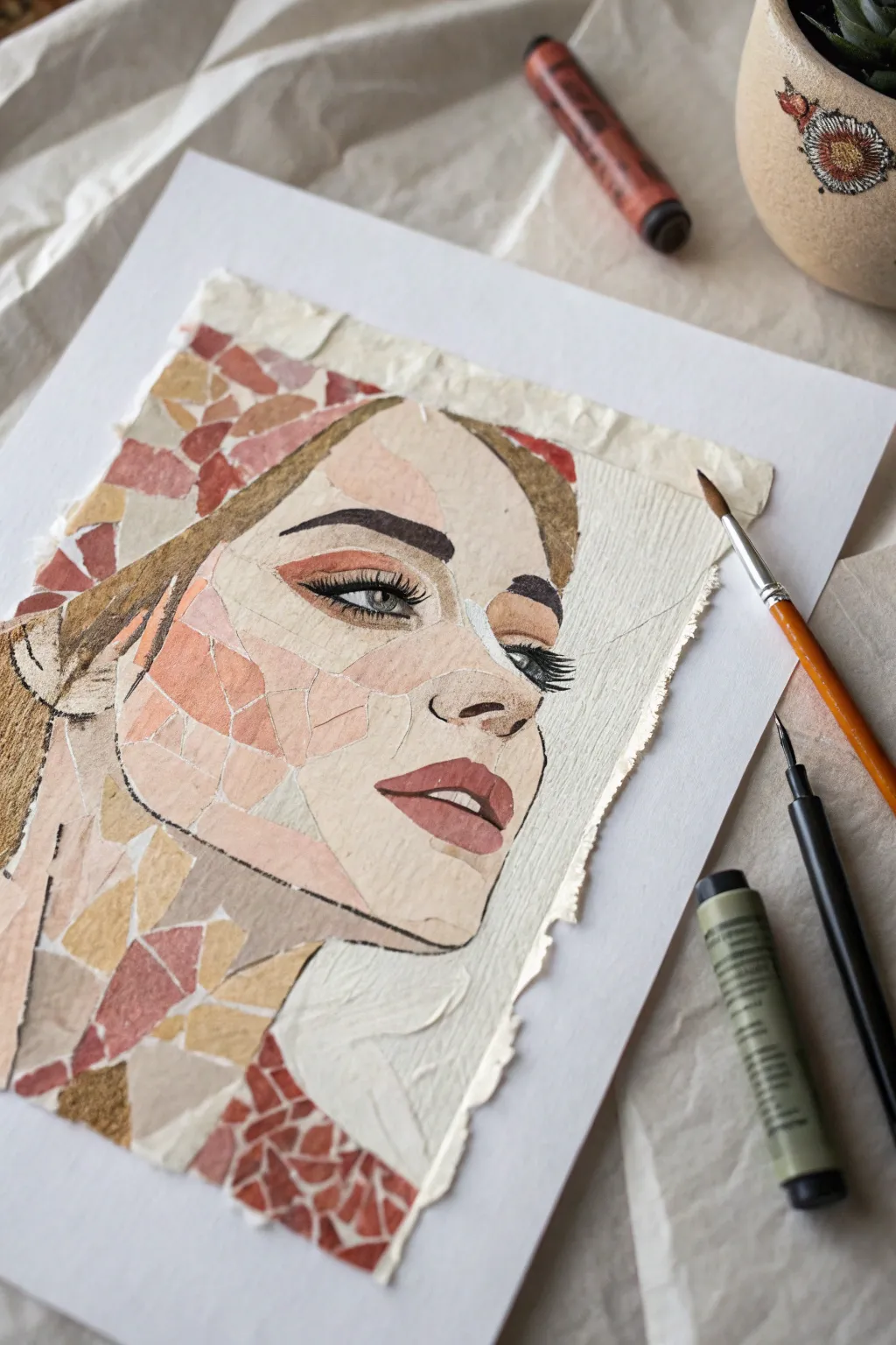
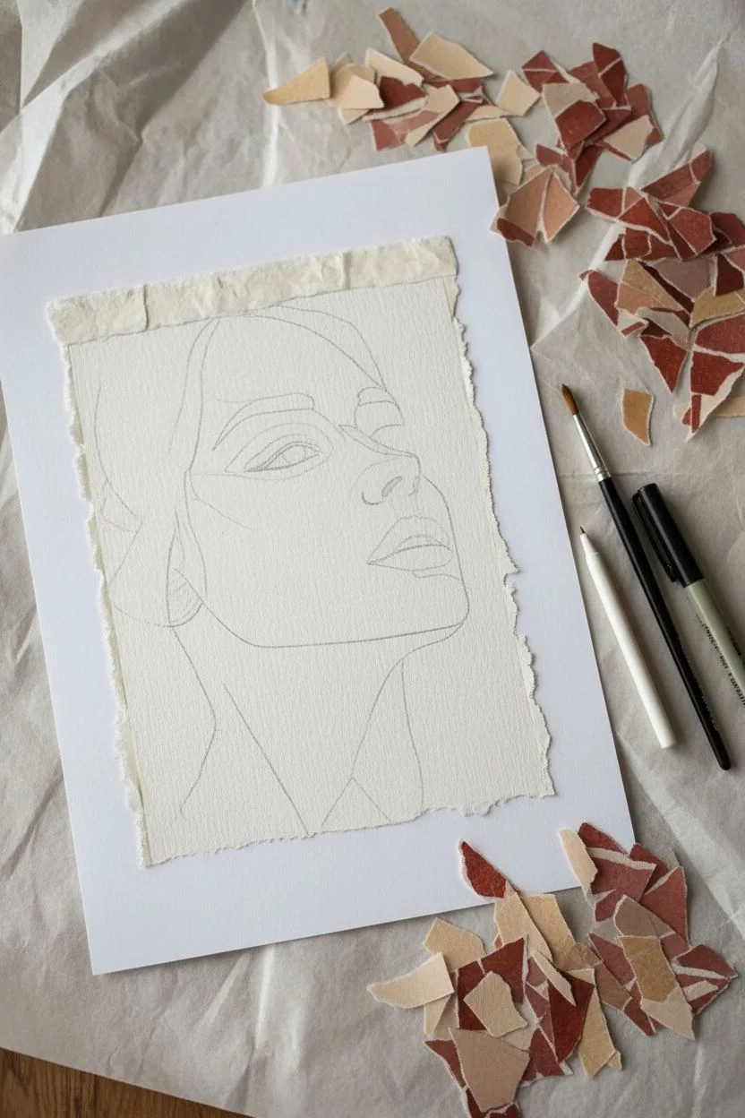
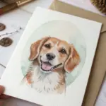
This striking mixed-media project combines the tactile texture of torn paper with precise illustration to build a captivating, fragmented portrait. By layering scraps of paper to form the skin tones and hair, you create a mosaic base before defining the features with bold ink and paint.
Step-by-Step Tutorial
Materials
- Heavyweight mixed media or watercolor paper (for the base)
- Variety of colored craft papers or old magazines (skin tones, browns, reds)
- PVA glue or matte medium
- Paintbrush (small round size)
- Pencil for sketching
- Fine liner pen (black, 0.5mm or similar)
- White gel pen or white acrylic paint (fine detail)
- Reddish-brown pastel or colored pencil (optional for shading)
- Scissors (for prep work)
Step 1: Preparation & Sketching
-
Prepare your base:
Start with a sturdy sheet of mixed media paper. If you want the jagged edge effect seen in the example, you can tear the edges of a smaller sheet of paper and mount it onto a larger clean white background sheet first. -
Sketch the outline:
Lightly sketch the contour of a face using a pencil. Focus on large shapes: the jawline, the hairline, and the general placement of eyes, nose, and mouth. Don’t worry about tiny details yet; this is just a map for your paper placement. -
Sort your palette:
Gather your colored papers. You’ll need a range of beige, cream, and peach tones for the skin, and darker browns or russet colors for hair and background accents. Tear them into small, irregular shapes—some triangular, some jagged.
Glue Control
Use a brush to apply glue onto the paper scraps, not the base. This prevents glue globs from drying in the empty spaces (the ‘grout’ lines) where you might want to draw later.
Step 2: Layering the Collage
-
Start with the skin tones:
Apply a thin layer of glue to a small section of the face, starting near the cheek or forehead. Place your lighter beige paper scraps here. Leave tiny gaps between the pieces to create that mosaic ‘grout’ look, or overlap them slightly for a smoother texture. -
Build the shadows:
Switch to slightly darker peach or tan paper scraps for areas that naturally have shadow, like under the cheekbone, the side of the nose, and under the jawline. This creates dimension before you even pick up a pen. -
Fill the hair:
Use your browns and darker earth tones to fill in the hair sections. You can use longer strips here to mimic the flow of hair strands, contrasting with the smaller, more geometric pieces used for the skin. -
Add background accents:
Scatter some reddish or patterned paper pieces around the edges of the portrait or in the background to frame the face. In my own work, I find this helps the subject pop against the white space. -
Let it dry completely:
This is crucial. Wait until the glue is fully dry and the paper is flat. If you draw on damp paper, the ink will bleed and ruin the crisp lines.
Step 3: Defining Features
-
Refine the outline:
Using your black fine liner, carefully trace the major contours of the face. Let the line break occasionally where the paper texture changes to keep it organic. -
Draw the eyes:
This is the focal point. Use the pen to outline the almond shape of the eye. Draw the iris and pupil clearly. Add distinctive eyelashes with quick, curved flicks of the pen. -
Add eyebrows:
Draw the eyebrows with short, hair-like strokes rather than a solid block. Follow the direction of hair growth, starting thicker near the nose and tapering out. -
Define the nose and lips:
Keep the nose minimal—often just a nostril and a hint of the bridge is enough. For the lips, outline the shape clearly. You can fill the lips with a reddish paper scrap earlier, or paint them in now with diluted acrylic or watercolor.
Vintage Vibe
Use text-heavy pages from old books or yellowed newspapers for the skin tones instead of solid colors. The printed words add an incredible texture and history to the face.
Step 4: Finishing Touches
-
Add highlights:
Grab your white paint or gel pen. Add a tiny dot of white to the pupil of the eye to bring it to life. You can also add subtle highlights to the tip of the nose or the lower lip. -
Enhance shading:
If the paper collage feels too flat, lightly shade over the darker paper areas with a reddish-brown pastel or colored pencil to deepen the contrast. -
Final assessment:
Step back and look at the composition. If any paper edges are lifting, dab a little extra glue underneath and press down firmly.
Once the final ink line is dry, you’ll have a beautifully fragmented portrait that balances chaos and control


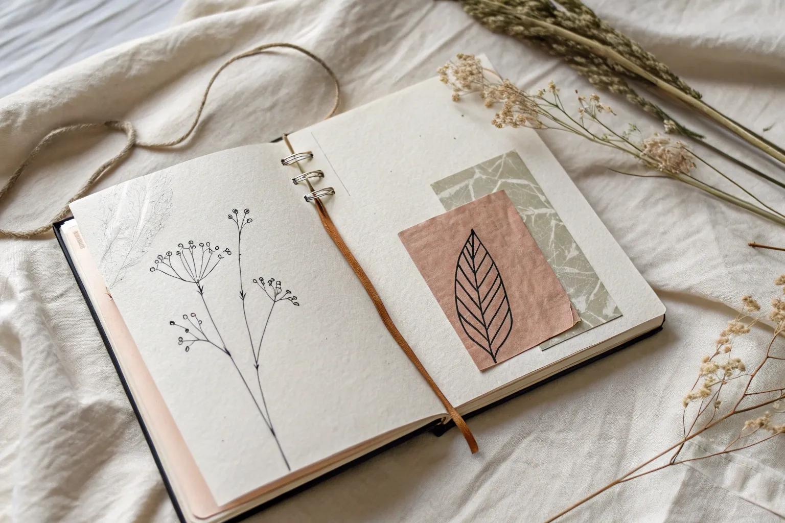
Botanical Collage With Hand-Drawn Labels
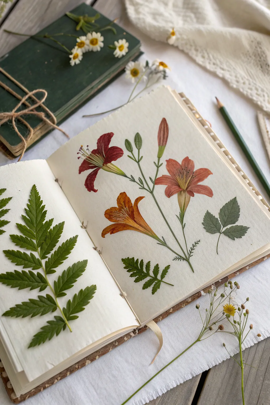
Create a stunning juxtaposition of real nature and artistic interpretation in your sketchbook. This project combines the delicate texture of pressed fern fronds with a vibrant, colored pencil botanical illustration of lilies, capturing the essence of a Victorian field guide.
Step-by-Step
Materials
- Acid-free sketchbook or watercolor journal (heavyweight paper is best)
- Pressed fern fronds (dry and flattened)
- Colored pencils (wax or oil-based for blending)
- Fine liner pen (0.1mm, brown or archival black)
- PVA glue or matte medium
- Small paintbrush for glue
- Graphite pencil (HB) and eraser
- Reference photo of lilies (or the provided image)
- Wax paper (optional protection)
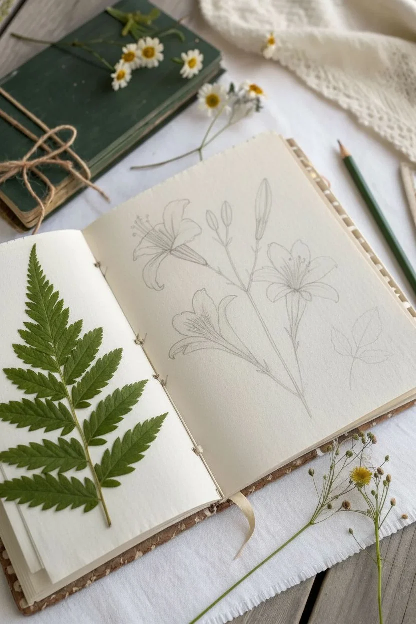
Step 1: Preparation & Composition
-
Select your specimens:
Choose a fern frond that fits nicely on the left-hand page of your open journal. Ensure it is fully pressed and dry before starting to prevent moisture damage to pages. -
Plan the layout:
Place the fern loosely on the left page to visualize spacing. On the right page, lightly sketch the main stems of your lily illustration using an HB pencil. Aim for a flowing composition where the stems originate near existing foliage.
Drawing Pro Tip
Keep your pencil strokes directional. Always color in the direction the petal grows (from center to tip) to create convincing texture naturally.
Step 2: The Pressed Fern Page
-
Apply adhesive:
Turn your pressed fern over on a scrap piece of paper. With a small brush, gently dab small dots of PVA glue or matte medium along the main spine and the larger leaflets. -
Mount the specimen:
Carefully flip the fern and press it onto the center of the left page. Use a clean piece of paper or tissue over the top to press down firmly without transferring oils from your hands. -
Secure the edges:
Check for any loose tips. Apply tiny amounts of glue with a toothpick under any leaf edges that are curling up.
Level Up: Scientific Labels
Use a fine-tip dip pen and sepia ink to write the Latin names of the plants next to them in a small, cursive hand for an authentic vintage feel.
Step 3: Drawing the Botanical Illustration
-
Sketch the flower forms:
On the right page, refine your pencil sketch. Draw three main lily blooms: one facing left (deep red), one facing right (salmon/orange), and one central lower bloom (golden orange). Add a bud at the top. -
Outline delicate details:
Go over your pencil lines very lightly with a fine liner pen if you want a crisp look, or stick to colored pencil for a softer effect. Erase heavy graphite marks. -
Base layer coloring:
Start with the lightest colors. Use a pale yellow pencil to lay down a base on all the flower petals. This adds a warm ‘glow’ underneath the darker reds and oranges. -
Layering the deep red lily:
For the left-facing flower, layer a deep crimson red over the petals. Press harder at the petal tips and closer to the center, leaving the mid-sections slightly lighter for volume. -
The salmon lily gradient:
Color the right-hand flower using a mix of salmon pink and terracotta. Focus on the texture of the petals by using directional strokes that follow the curve of the flower. -
Golden orange details:
For the lower central flower, use bright orange and yellow ochre. Add distinct striations or lines on the petals to mimic the veining found in lilies. -
Stems and greenery:
Color the stems with a sap green or olive pencil. I like to add a touch of brown to the stems near the base to make them look woody and realistic. -
Adding stamens:
Draw the stamens extending from the center of the lilies. Use a dark brown for the anthers (tips) and a pale green or cream for the filaments. -
Shadows and depth:
Use a dark violet or cool grey pencil very lightly in the deepest creases where petals overlap. This pushes those areas back and makes the flowers pop.
Step 4: Final Touches & Integration
-
Draw accompanying leaves:
Sketch and color a few scattered green leaves around the flowers. To mirror the real fern on the left, draw a small fern-like leaf on the bottom of the right page. -
Pressed leaf addition (Optional):
If you have smaller pressed leaves (like the rose leaf shape shown on the right), glue one directly onto the drawing page to blur the line between illustration and reality. -
Protect the spread:
Place a sheet of wax paper between the pages before closing the book to prevent the pencil pigment from transferring onto the pressed fern.
Now you have a beautiful botanical spread that perfectly captures a moment in nature study


Translucent Layers With Floating Ink Details
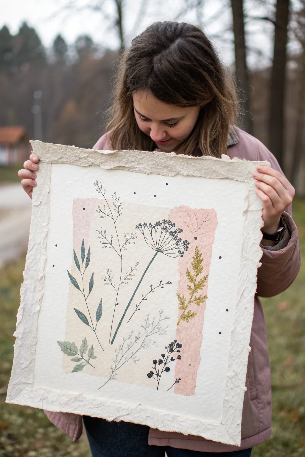
Create a delicate, airy composition by combining the textures of torn paper collage with the precision of fine-line botanical illustration. This project layers translucent washes of color with crisp ink drawings on a dramatic deckle-edge surface for a modern, organic look.
Step-by-Step
Materials
- Large sheet of heavy handmade cotton rag paper (deckle edge)
- Tissue paper or mulberry paper in soft peach, blush, and cream tones
- Matte gel medium or diluted PVA glue
- Flat synthetic brush (1 inch)
- Fine-liner archival ink pens (sizes 0.1, 0.3, and 0.5)
- Graphite pencil (2H or HB)
- Kneaded eraser
- Tracing paper (optional)
- Reference images of wildflowers and grasses
Step 1: Preparing the Base Layer
-
Clean the surface:
Begin by laying your large cotton rag paper on a clean, flat surface. Gently brush away any loose fibers or dust to ensure your collage materials adhere smoothly. -
Select your collage papers:
Gather your tissue or mulberry papers. Stick to a limited palette of soft earth tones like dusty pink, sand, and cream to replicate the subtle background seen in the example. -
Tear the edges:
Instead of cutting, carefully tear the colored papers into large, varying rectangular strips. The ragged edges are essential for blending softly into the base paper. -
Arrangement check:
Lay the torn strips onto the center of your rag paper without glue first. Aim for an overlapping, central composition that leaves a wide, empty border of the white base paper exposed. -
Apply the first strip:
Using your flat brush, apply a very thin layer of matte gel medium to the back of your largest colored strip. Position it on the paper and smooth it down gently from the center outward. -
Layering transparency:
Apply the next strip, allowing it to slightly overlap the first. The transparency of the tissue paper will create a beautiful third color where the pieces intersect. This is where I like to verify that no air bubbles are trapped. -
Seal the background:
Once your color block is arranged, brush a thin, even coat of matte medium over the entire collaged area to seal the fibers. Let this dry completely—it must be bone dry before you draw.
Ink Bleeding?
If ink feathers on the porous tissue paper, your sealant layer was too thin. Apply another coat of matte medium and let dry thoroughly before redrawing.
Step 2: Drawing the Botanicals
-
Sketch the composition:
With a hard pencil (2H), very lightly map out the stems of your flowers directly over the dry collage. Plan for a mix of tall grasses, leafy stems, and seed heads. -
Start with the main focal point:
Select a 0.5 fineliner for the boldest element, like the large seed head layout in the center. Draw the main stem with a confident, single stroke. -
Detailing the seed head:
Switch to a 0.3 pen to add the radiating spokes of the flower. At the end of each spoke, use a stippling motion to create small clusters representing seeds or petals. -
Add leafy volume:
Using a 0.3 pen, draw the broad leaves on the left side. Focus on the veins; outlines can be broken or varied in thickness to suggest caught light. -
Create airy grasses:
For the delicate, fern-like plant on the right, switch to your finest 0.1 pen. Use quick, feathery strokes that mimic the texture of dried moss or foliage. -
Intersecting elements:
Don’t be afraid to let your ink drawings cross over the boundaries of the colored collage paper. Drawing onto the white border helps integrate the background with the foreground. -
Adding dark contrast:
Identify a few specific leaves or seed pods to fill in completely with black ink. These dark anchors give the piece visual weight and balance the airy lines. -
Floating details:
Scatter small, stray details around the plants—tiny dots or floating petals. This adds movement and makes the scene feel less static. -
Erase guidelines:
Wait at least 15 minutes for the ink to cure fully. Gently dab—don’t rub—with a kneaded eraser to lift any remaining pencil marks without damaging the paper surface.
Go 3D
Sew through the paper with embroidery floss in earthy greens or browns to add tactile texture to some of the thicker plant stems.
Display your botanical collage in a floating frame to show off those beautiful deckle edges

Stitch, Paper, and Pen Drawing Collage
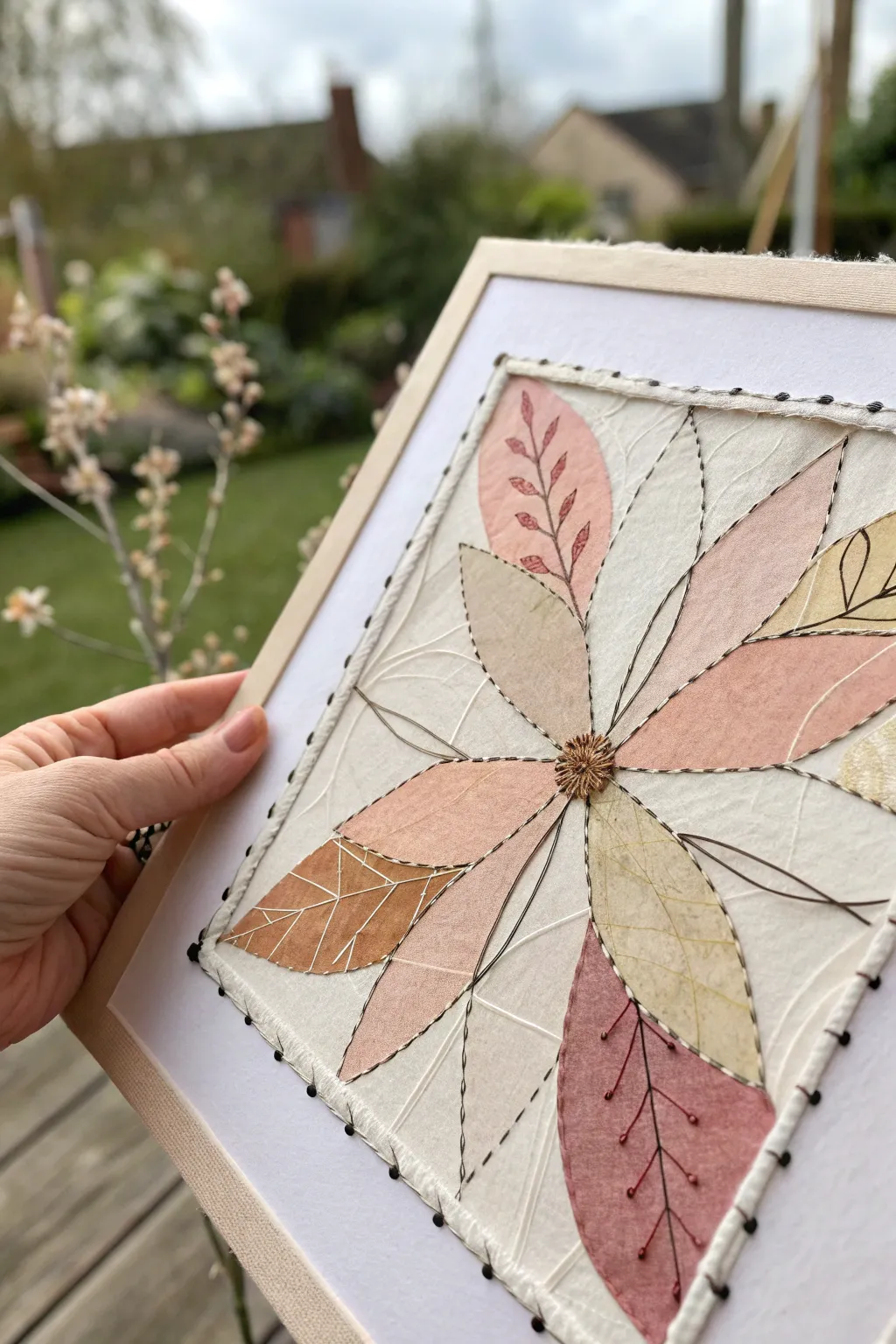
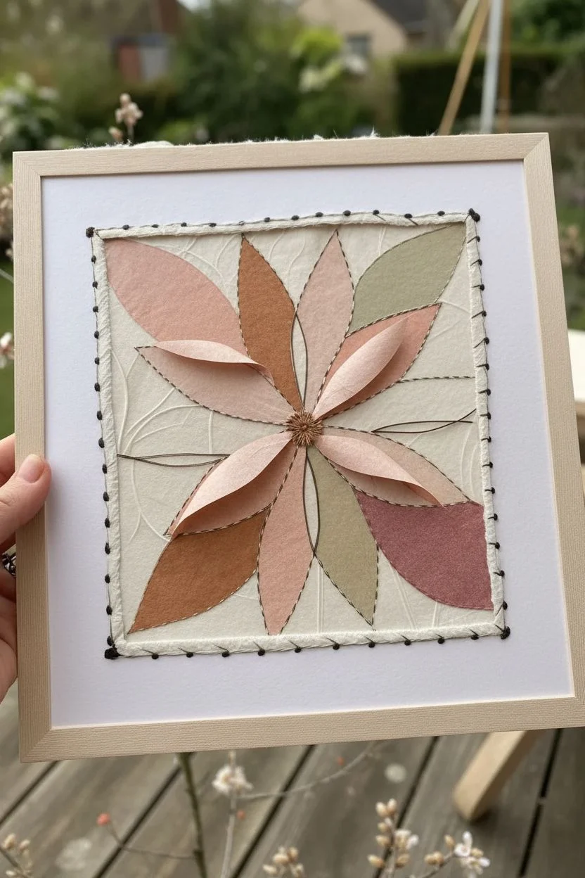
This mixed-media project combines the delicate textures of handmade paper with the bold lines of embroidery and ink. By layering leaf shapes and connecting them with stitches, you’ll create a floral-inspired starburst that feels organic and handcrafted.
Detailed Instructions
Materials
- Textured handmade paper (cream, blush pink, rusty orange, sage green)
- White cardstock or heavy watercolor paper (base)
- Embroidery floss (dark brown or black)
- Metallic copper or gold embroidery thread
- Embroidery needle
- Fine-liner pen (black, 0.3mm or 0.5mm)
- Craft glue or glue stick
- Scissors
- Wooden frame or stretcher bars
- Thumb tacks or staple gun (for mounting)
- Awl or push pin (optional)
Step 1: Planning and Cutting
-
Prepare the base:
Cut your white heavy cardstock into a square slightly smaller than your frame. This will be the robust foundation for your stitching. -
Design the background:
Cut a slightly smaller square of thin, crinkled, or handmade cream paper. This layer adds that beautiful, wrinkled texture visible in the background. -
Mount the background:
Lightly glue the textured paper onto the cardstock base. Don’t worry about smoothing it perfectly; the wrinkles add character. -
Cut leaf shapes:
Using your colored handmade papers (pinks, rusts, greens), cut out approximately 8-10 elongated leaf or petal shapes. Vary the sizes slightly for a natural look. -
Arrange the composition:
Lay the leaves out in a radial starburst pattern, with points meeting near the center but not overlapping entirely. Adjust until the balance feels right.
Paper Choice Matters
Use ‘Mulberry’ or rice paper for the leaves. The fibers are visible and tear beautifully, creating soft, organic edges that contrast well with the sharp ink lines.
Step 2: Collage and Drawing
-
Adhere the leaves:
Once satisfied with the placement, use a glue stick to secure each leaf. Apply glue only to the center of the leaf shapes, leaving the edges free for now to maintain dimension. -
Draw botanical details:
With your fine-liner pen, draw veins on the leaves. Use different patterns: simple center lines for some, branching veins for others, and small leaf motifs inside the larger shapes. -
Add floating lines:
Extend your ink lines beyond the paper shapes onto the background. Create loose, flowing lines that mimic stems or wind movements connecting the petals. -
Sketch the border:
Lightly draw a square border around the composition using a pencil or very faint pen line, roughly a half-inch from the edge of your paper stack.
Paper Tearing?
If stitching tears the paper, your needle is too thick or you are pulling too tight. Use a thinner needle and reinforce the back of stitch points with masking tape.
Step 3: Stitching and Assembly
-
Pre-pierce holes:
To avoid bending the paper while sewing, place the artwork on a piece of scrap foam or cardboard. Use an awl or needle to pre-poke holes along your planned stitching lines. -
Stitch the veins:
Thread your needle with dark embroidery floss. Use a backstitch to go over some of your drawn pen lines, adding texture and literally stitching the paper layers together. -
Create the center:
Using metallic copper or gold thread, create a dense cluster of stitches in the very center where the leaves meet. A spider-web rose stitch or a cluster of French knots works beautifully here. -
Stitch the loose stems:
Add long straight stitches using dark thread to emphasize the ‘floating’ lines you drew earlier, connecting the leaves to the empty space. -
Sew the border:
Using a simple running stitch and dark thread, sew along the square border you marked earlier. This frames the composition and secures the paper layers permanently. -
Add decorative beads (optional):
If you want extra detail, thread tiny seed beads onto the ends of the thread when finishing a stitch, or make small knots (French knots) at the tips of the leaf veins. -
Mount to frame:
Center your artwork on the wooden frame. You can wrap the excess base paper around the wood and secure it with tacks or staples on the back side. -
Final touches:
check for any loose thread ends on the front and tuck them to the back. Gently fluff up the unglued edges of the leaves for a 3D effect.
Hang your textured botanical collage in a spot with good natural light to highlight the delicate shadows of the paper layers
BRUSH GUIDE
The Right Brush for Every Stroke
From clean lines to bold texture — master brush choice, stroke control, and essential techniques.
Explore the Full Guide
Mood Map Collage With Handwritten Sketch Notes
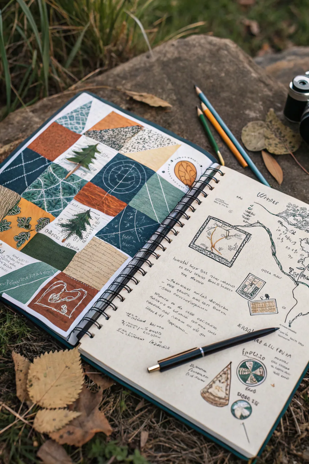
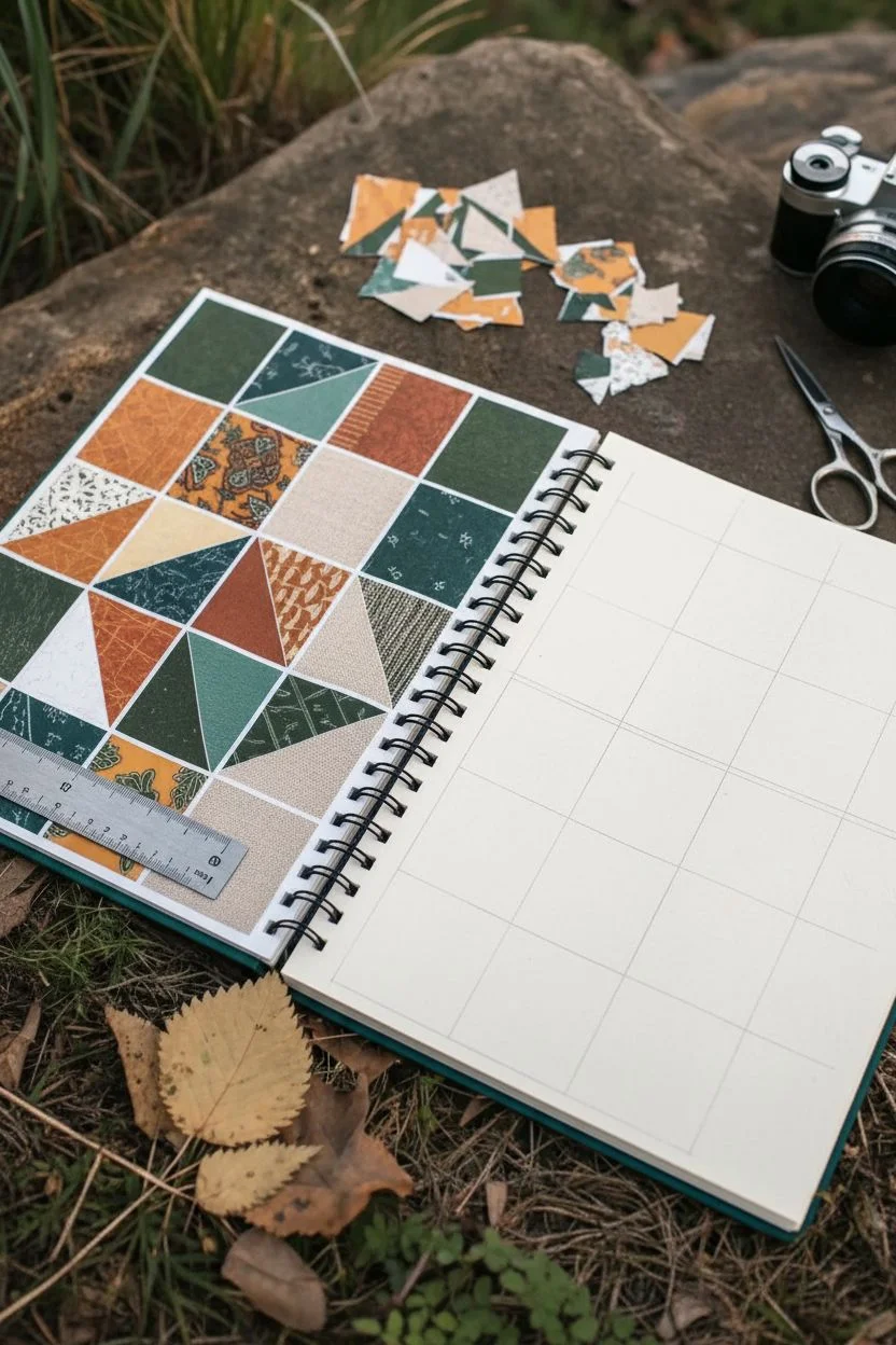
This project combines the structured beauty of a quilt-style grid collage with freeform field notes and sketches. It captures the essence of an outdoor adventure using earthy tones and mixed media textures for a truly tactile journal entry.
How-To Guide
Materials
- Spiral-bound sketchbook with heavyweight paper
- Patterned scrapbook paper (earth tones)
- Fabric scraps (linen or cotton in greens/rust)
- Watercolor paints or gouache
- Fine-liner pens (black, 0.3mm and 0.5mm)
- Pencils (HB and colored pencils for shading)
- Scissors and X-Acto knife
- Glue stick or double-sided tape
- White gel pen
- Ruler
Step 1: Planning the Grid Collage
-
Establish the layout:
On the left page of your open sketchbook, use a pencil and ruler to lightly mark out a grid. A 4×4 or 3×4 layout works well, creating squares that are roughly 2-3 inches wide depending on your page size. -
Select your palette:
Gather your papers and fabric scraps. Look for a cohesive mix of deep forest greens, rust oranges, warm browns, and creamy beiges to mimic the natural setting shown in the reference. -
Cut the base shapes:
Cut your materials into squares that match your grid dimensions. For added visual interest, cut some of these squares in half diagonally to create triangles, allowing you to piece two different textures together in a single grid block.
Step 2: Assembling the Left Page
-
Create painted swatches:
Not every square needs to be paper. Paint a few squares directly onto the page using watercolors or gouache in solid, earthy colors. Let these dry completely before moving on. -
Glue the materials:
Adhere your paper and fabric squares into the grid pattern. I like to alternate between busy patterns and solid colors to keep the composition balanced. -
Add detail layers:
Using a fine-liner pen, draw simple nature motifs on top of the lighter squares. Sketch a small pine tree, a leaf, or a topographic-style pattern directly onto the paper or fabric. -
Apply white accents:
Take your white gel pen and add geometric patterns over the darker squares. Try drawing simple stitching lines, grid marks, or concentric circles to mimic embroidery. -
Integrate text snippets:
Cut out tiny rectangles of grid paper or old book text. Glue these onto a few squares and write short captions or botanical names like ‘Pinus’ or ‘Fern’ in a loose script.
Wrinkled Pages?
If using watercolor makes the page buckle, place a piece of wax paper over it once dry, shut the book, and weigh it down with heavy books overnight to flatten it out.
Step 3: Creating the Field Notes Page
-
Sketch the focal map:
On the right page, draw a loose, organic line curving down the right side to represent a trail or river. Add small topographic details or tree outlines along this path. -
Draw the central frame:
In the upper center, draw a square frame with a double border. Inside, sketch a close-up detail, such as a branch structure or a specific leaf vein pattern. -
Add floating elements:
Scatter a few smaller sketches around the page. Draw a small stamp-like rectangle with a leaf inside, or a circular compass-style diagram near the bottom. -
Write the observations:
Fill the negative space with ‘dummy text’ or actual observations. Use a very small, cramped handwriting style to mimic rapid field notes. Keep the lines uneven and varied in length. -
Detail with color:
Use your colored pencils to add very faint touches of green and brown to the sketches on the right page. Keep it minimal; the focus should remain on the line work. -
Connect the elements:
Draw small arrows or dotted lines connecting your text blocks to the specific sketches they describe. This creates a scientific, analytical look.
Add Real Nature
Press actual leaves or flat flowers and glue them into one of the grid squares on the left page instead of drawing them for an authentic botanical touch.
Step 4: Finishing Touches
-
Shadowing:
Use a grey marker or soft pencil to add drop shadows under the taped-in elements on the left page. This creates a realistic 3D collage effect. -
Pen placement:
For the final aesthetic touch in your photo (if you plan to share one), rest your pen diagonally across the right page to suggest you’ve just finished writing.
Now you have a beautifully curated spread that documents your journey in texture and ink


Have a question or want to share your own experience? I'd love to hear from you in the comments below!