
If you’re planning a drawing contest (or entering one), the theme is everything—it sets the vibe and instantly sparks ideas. Here are my favorite drawing contest ideas you can use as prompts, categories, or full-on challenges, from classic crowd-pleasers to the delightfully weird.
Portrait Challenge: A Face With a Story
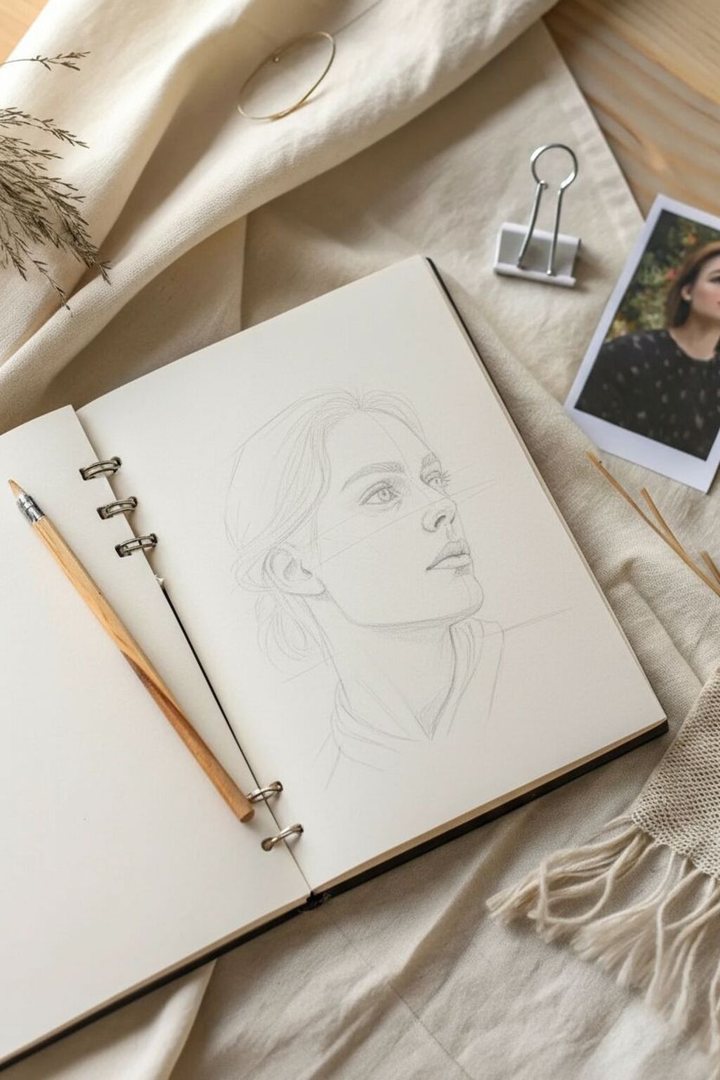
This project teaches you how to map out and shade a stunning, realistic portrait of a woman gazing upward, capturing a sense of longing or deep thought. Using simple graphite pencils, you will achieve smooth skin textures and detailed hair flow on the pages of your favorite sketchbook.
Step-by-Step
Materials
- Spiral-bound sketchbook (heavyweight drawing paper recommended)
- Graphite pencils (range: HB, 2B, 4B, 6B)
- Mechanical pencil (0.5mm HB for fine details)
- Kneaded eraser
- Blending stump or torture
- Tissue or soft paintbrush for smoothing
- Pencil sharpener
Step 1: Basic Structure & Proportions
-
Establish the Head Shape:
Start by lightly sketching an oval for the main part of the cranium and a jawline extending downward. The head is tilted slightly back, so position the jawline at an upward angle. -
Mark the Guidelines:
Draw loose, intersecting lines to map the face. A vertical line should curve down the center of the face (remember the three-quarter turn), and horizontal lines will mark the eyes, nose base, and mouth. -
Place the Features:
Using an HB pencil, lightly outline the almond shape of the eyes, the bridge and tip of the nose, and the lips. The nose should be prominent due to the angle, and the far eye will be partially obscured by the bridge of the nose.
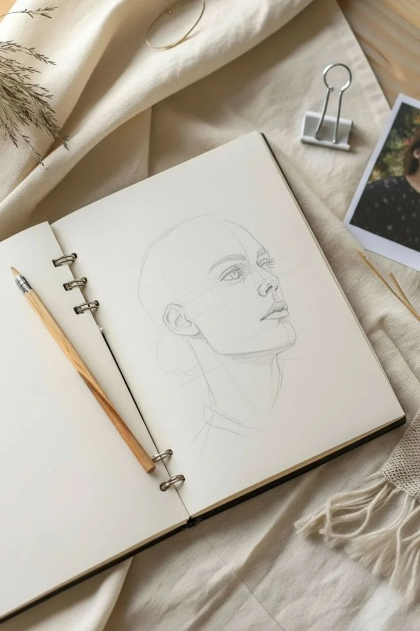
Step 2: Defining the Features
-
Refine the Eyes:
Darken the upper lash line and draw the iris. Leave a tiny white circle for the highlight in the pupil to bring the eyes to life immediately. I like to define the tear duct area now to anchor the gaze. -
Sculpt the Nose:
Instead of drawing hard lines for the nose, use light shading to suggest the bridge and the nostril shape. The nostril itself should be dark, but the sides of the nose rely on shadow, not outline. -
Shape the Mouth:
Outline the lips, focusing on the dark line where the lips meet. Since she is looking up, the upper lip might appear slightly thinner; shade the bottom lip to show volume. -
Ear Placement:
Sketch the ear, ensuring the top aligns roughly with the eye line and the bottom with the nose line. Detail the inner folds, as the hair is pulled back, exposing the ear.
Keep it Clean
Place a scrap piece of paper under your drawing hand. This prevents skin oils and friction from smudging your work as you move across the sketchbook page.
Step 3: Shading & Tone
-
Base Skin Tone:
Using a 2B pencil held sideways, lay down a very light, even layer of graphite over the skin areas. Use a tissue to rub this gently for a smooth, skin-like base. -
Deepening Shadows:
Switch to a 4B pencil to deepen the shadows under the jawline, beneath the nose, and in the eye sockets. Observe how the neck muscle (sternocleidomastoid) creates a distinct shadow channel. -
Contouring the Cheeks:
Add subtle shading under the cheekbone to define structure. Keep your strokes directional, following the curve of the face. -
Defining the Neck:
Pay attention to the neck anatomy. Shade heavily under the chin and along the collar of the shirt to create depth and separation between head and body.
Trouble with Symmetry?
If the eyes look uneven, look at your drawing in a mirror. The reversed reflection instantly reveals proportion errors that your brain has filtered out.
Step 4: Hair & Final Details
-
Blocking the Hair:
Draw the general shape of the hair mass, noting how it is swept back into a low bun. Don’t draw individual strands yet; focus on the major clumps. -
Adding Hair Texture:
Use a sharp mechanical pencil or 4B to draw long, flowing strokes following the direction of hair growth. Create darker values near the roots and behind the ear. -
Loose Strands:
Add stray hairs (flyaways) around the temples, ear, and bun for realism. These should be quick, confident strokes that break the perfect outline. -
Clothing Texture:
Sketch the collar of the shirt. Use cross-hatching or smudge shading to indicate folds in the fabric, keeping it looser than the face to maintain focus on the portrait. -
Final Highlights:
Take your kneaded eraser and lift pigment from the high points of the face: the tip of the nose, the brow bone, the cheekbone, and the center of the lower lip.
Now step back and admire how simple lines have transformed into a person with a story to tell


Still Life Showdown: Everyday Objects, Great Composition


This project transforms a humble grid notebook into an artist’s sketchbook by capturing the organic beauty of a pear with precise, delicate line work. The juxtaposition of the structured grid paper with the flowing contours of the fruit creates a charming, minimalist aesthetic perfect for practice.
Step-by-Step Tutorial
Materials
- Grid-lined notebook or journal (cream paper preferred)
- Fine liner pen (0.3mm or 0.5mm, black)
- Pencil (HB or H for light sketching)
- Eraser (kneaded)
- Real pear (or detailed reference photo) for observation
Step 1: Conceptual Sketch
-
Observe and orient:
Begin by placing your reference pear in a pleasing position. Observe how the stem connects to the body and note the heavy, rounded bottom versus the tapering neck. On your grid paper, visualize where the drawing will sit; aim for the lower left quadrant of the left-hand page for this specific composition. -
Establish the main shape:
Using your pencil very lightly, draw a simple oval for the bottom of the pear and a smaller circle for the top section. Connect these shapes with sloping lines to form the distinctive pear silhouette. -
Sketch the stem:
Draw the stem curving slightly to the left. It shouldn’t be a simple stick; give it thickness and a slightly rough texture even in this sketch phase. -
Add foliage:
Draft two primary leaves extending from the base of the stem or the branch connection. One leaf should angle downward to the left, and the other should angle downwards to the right. -
Refine the outline:
Go over your sketch to tighten the shape. Pears are rarely perfect spheres; add little bumps or asymmetries to make it look organic. Ensure the leaves have pointed tips and jagged edges consistent with pear foliage.
Ink Smearing?
Use a piece of scrap paper under your drawing hand. This acts as a shield, preventing oils from your skin from warping the paper and stopping your palm from smudging fresh ink.
Step 2: Inking the Contours
-
Trace the stem:
Switch to your fine liner pen. Start by inking the stem. Use short, disjointed strokes rather than one solid line to mimic a woody texture. -
Outline the fruit body:
Carefully ink the outer shape of the pear. Keep your hand loose. If the line wobbles slightly, it adds character. Don’t close the shape entirely at the very top; let it merge naturally into the stem. -
Ink the leaf edges:
Outline the leaves. Instead of a smooth curve, use small, zig-zag motions to capture the serrated margin of the leaf. -
Add leaf veins:
Draw a central vein (midrib) down the center of each leaf. From there, branch off smaller veins. Keep these lines very thin and light; lift your pen at the end of the stroke to taper it. -
Erase pencil marks:
Wait at least five minutes for the ink to fully dry. Gently run your kneaded eraser over the entire drawing to remove the graphite guidelines, revealing the crisp black ink.
Add a Wash
Once the ink is waterproof-dry, use a water brush to add a very pale wash of diluted green or ochre watercolor. Keep it messy and loose, letting the color bleed slightly outside the lines.
Step 3: Detailing and shading
-
Contour hatching:
To give the pear volume, add curved hatching lines. Start at the bottom left curve of the fruit. Draw thin, curved lines that follow the roundness of the pear’s form. -
Build shadow depth:
Concentrate your hatching lines closer together on the left side and bottom of the pear to indicate shadow. As you move toward the center, space the lines further apart or stop them completely to represent the highlight. -
Detail the leaves:
Add subtle texture to the leaves by drawing tiny lines between the veins. Do not overwork this area; open space is crucial for the illustration to feel light. -
Ground the object:
Add a few very faint, broken horizontal lines underneath the pear and the lowest leaf. This cast shadow ‘grounds’ the drawing so the fruit doesn’t appear to be floating in space. -
Final assessment:
Step back and look at your composition. If the darks aren’t dark enough, add a second layer of cross-hatching to the deepest shadow areas on the bottom left. -
Date and sign:
In the bottom right corner of the page, write the date or a small note in your best handwriting. This personalizes the sketchbook entry and marks your progress.
Enjoy the quiet satisfaction of seeing a simple fruit come to life on the page through your lines


Nature Sketch-Off: Plants, Landscapes, and Wildlife
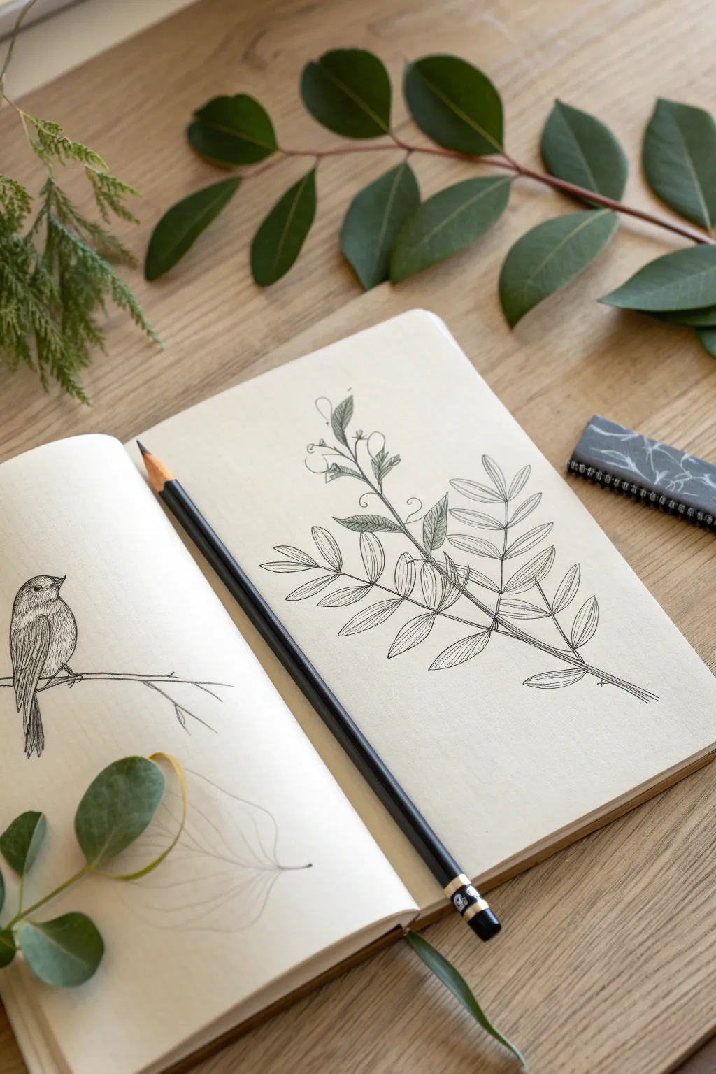

Capture the delicate beauty of nature with this quiet study of a leafy branch and a perched songbird. Using simple graphite techniques, you’ll create a serene composition that emphasizes clean lines and subtle shading.
Step-by-Step
Materials
- Sketchbook with cream or off-white paper (heavyweight)
- Graphite pencils (HB for sketching, 2B and 4B for shading)
- Kneaded eraser
- Pencil sharpener
- Reference photo or real branch
Step 1: Drafting the Branch Structure
-
Establish the curve:
Begin on the right-hand page. Using your HB pencil, draw a single, gentle, sweeping line diagonally across the page to represent the main stem of the branch. -
Mark leaf placement:
Lightly dash small reference lines branching off the main stem where the individual leaflets will attach. Keep the spacing fairly even but staggered for a natural look. -
Outline the leaflets:
Sketch the oval shapes of the leaves. Start with the larger leaves at the base and make them slightly smaller as you move toward the tip of the branch. -
Add secondary shoots:
Near the top of the stem, sketch a thinner, more whimsical shoot twisting upward, adding tiny curl details for tendrils or buds.
Step 2: Defining the Leaves
-
Refine the edges:
Go over your light oval sketches with a more confident line, sharpening the tips of the leaves to give them a distinct botanical shape. -
Draw center veins:
place a single line down the center of each leaf. Let this line curve slightly with the shape of the leaf to show dimension. -
Add texture lines:
Instead of full shading, use fine, closely spaced parallel lines (hatching) to indicate texture and shadow on one side of each leaf. -
Darken the stem:
Thicken the main stem line, particularly at the connection points where leaves branch off, to give the branch weight and stability.
Smudge Control
Place a scrap piece of paper under your hand while drawing. This prevents your palm from smearing the graphite across the cream paper as you work.
Step 3: Sketching the Songbird
-
Position the bird:
On the left-hand page, roughly opposite the branch, lightly draw a slanted line for the bird’s perch. -
Block in the body:
Draw an oval for the bird’s body and a smaller circle for the head, connecting them with a smooth neck line. Keep the posture upright and alert. -
Detail the features:
Add a small, sharp triangle for the beak and a small circle for the eye. Sketch the wing shape folded against the side of the body. -
Add tail feathers:
Extend long, narrow rectangles downward from the body to form the tail feathers, varying their lengths slightly.
Watercolor Wash
After the graphite is set, add a very pale, transparent wash of green watercolor over the leaves for a vintage botanical illustration vibe.
Step 4: Final Details & Texture
-
Feather texture:
Switch to a 2B pencil. Use short, quick strokes on the bird’s chest and wing to mimic soft feathers, leaving some areas white for highlights. -
Deepen the eye:
Darken the bird’s eye completely, leaving just a tiny speck of white paper to represent the reflection of light. -
Emphasize key lines:
Review the branch drawing. Use a 4B pencil to selectively darken the undersides of leaves and the deepest crevices of the stem. -
Clean up:
Use your kneaded eraser to lift away any stray graphite prompts or initial construction lines that distract from the clean finish. -
Connect the scene:
Extend the bird’s perch slightly towards the right page, visually connecting the two drawings without making them touch.
Now you have a serene nature study ready to inspire your next outdoor adventure


My Dream House Contest: Architecture From Your Imagination

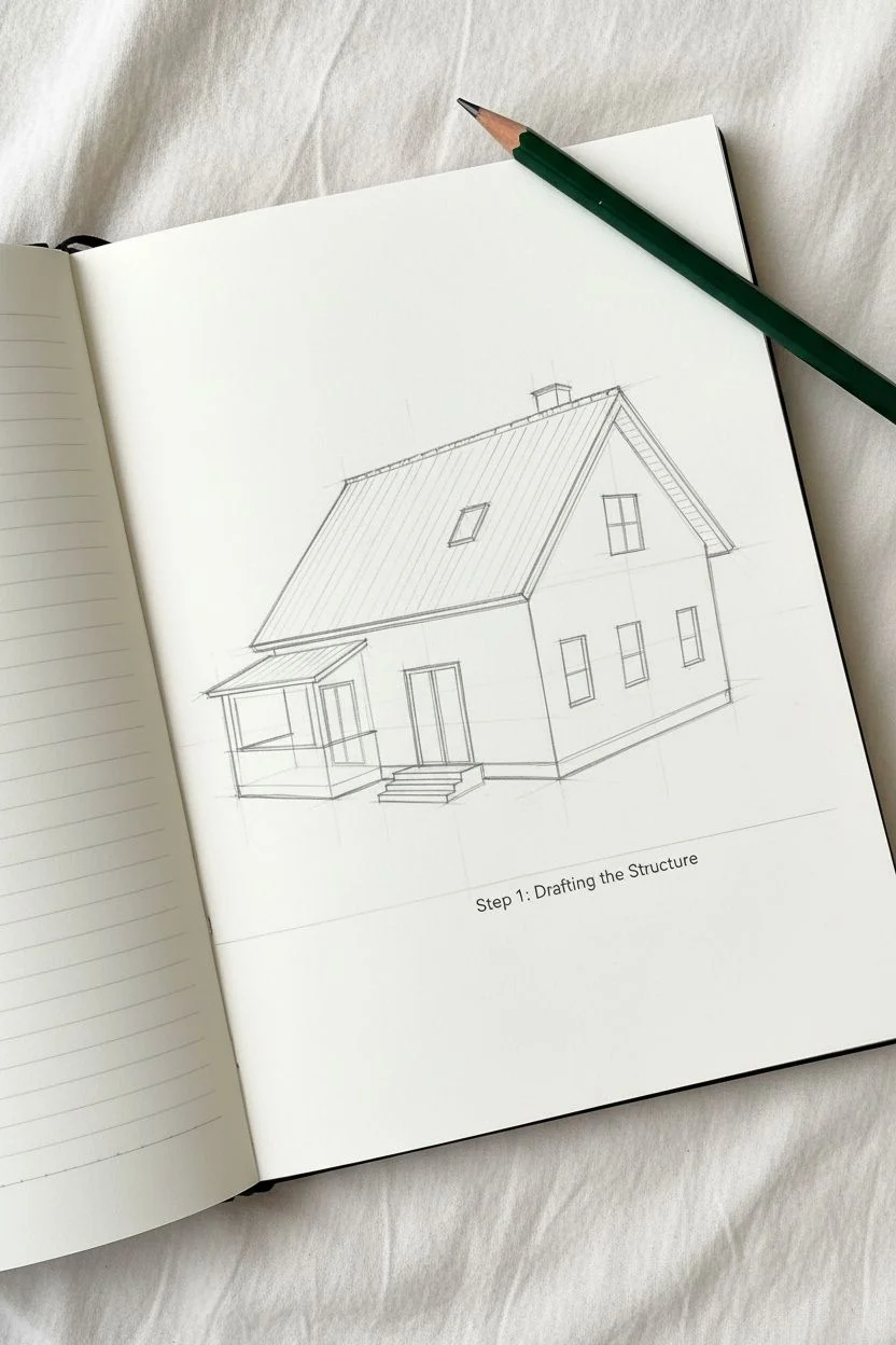
Capture the charm of storybook architecture with this cozy, illustrated sketchbook spread featuring a rustic cottage. Using a mix of crisp ink lines and soft, colored pencil shading, you’ll bring a dreamy blue-green and terracotta home to life.
Step-by-Step Tutorial
Materials
- Sketchbook with smooth, off-white paper (A5 size recommended)
- HB graphite pencil
- Eraser
- Fine-liner pen (0.3mm or 0.5mm, black)
- Colored pencils (teal/sage green, terracotta orange, warm yellow)
- Green pencil for foliage accents
- Ruler (optional)
Step 1: Drafting the Structure
-
Establish the horizon:
Begin on the right-hand page. Draw a faint pencil line near the bottom third of the page to establish where the house will sit on the ground. -
Block in the main shapes:
Lightly sketch the main body of the house as a rectangular prism viewed from a 3/4 angle. Add a steep, triangular roof shape on top, extending it slightly past the walls for eaves. -
Add architectural extensions:
Sketch a smaller rectangular section jetting out from the left side of the house for the porch/balcony area. This adds that lovely depth and complexity to the silhouette. -
Define the roofline:
Draw the parallel lines for the roof tiles and add the chimney stack on the right slope. Sketch a dormer window (that little pop-out window) on the main roof slope. -
Placement of windows and stairs:
Pencil in the four rectangular windows on the front facade and the large double doors on the balcony. Rough in the staircase leading up to the entrance on the left.
Wobbly Lines?
Don’t stress! In architectural sketching, imperfect lines add rustic charm. If a line goes astray, thicken it slightly to make it look intentional.
Step 2: Inking the Details
-
Outline the main structure:
Switch to your fine-liner pen. Carefully trace over your main structural lines—the walls, the roof peaks, and the foundation line. Don’t worry if the lines are slightly wobbly; it adds character. -
Detail the roof tiles:
Draw horizontal lines across the roof sections. Then, add small vertical tick marks, staggering them row by row to create the look of individual shingles or tiles. -
Window frames and shutters:
Ink the window frames, dividing the panes into smaller grids (like a 4-pane layout). Draw the shutters on the sides of the lower windows. -
Refining the porch:
Draw the railing details on the balcony and the stair banister. Use vertical strokes for the spindles and ensure the perspective matches the house angle. -
Adding texture to the ground:
Use short, grassy strokes along the base of the house and near the stairs to ground the building. Add a few small rocks or pebbles for variety. -
Erase pencil guides:
Once the ink is completely dry—give it a good minute!—gently erase all the underlying graphite sketch marks to leave a clean drawing.
Step 3: Adding Color & Atmosphere
-
Color the roof:
Using a terracotta or burnt orange pencil, fill in the roof. Apply uneven pressure—darker near the edges and under the dormer, lighter in the center—to suggest weathering and depth. -
Paint the walls:
Use a teal or sage green pencil to color the house siding. Keep your strokes vertical to mimic wood or siding texture. Leave the window frames white for contrast. -
Illuminate the windows:
Fill the window panes with a warm yellow. I like to leave a tiny sliver of white paper uncolored in the corner of each pane to look like a reflection of glass. -
Secondary sketches (optional):
On the left page, create a simpler, loose line drawing of a barn or shed using just your pen. Keep this uncolored to let the main house on the right be the star. -
Atmospheric elements:
Draw a few simple cloud shapes and birds in the sky on both pages using your fine-liner. Add tiny orange ‘leaves’ falling around the house to tie the color palette together. -
Final foliage touches:
Add a few scribbles of green pencil near the grassy base lines you inked earlier to suggest weeds or small bushes growing against the foundation.
Creative Customization
Change the season by swapping colors! Use browns and greys for a moody winter cabin, or bright pinks and greens for a spring garden cottage.
Now step back and admire your charming architectural creation.
BRUSH GUIDE
The Right Brush for Every Stroke
From clean lines to bold texture — master brush choice, stroke control, and essential techniques.
Explore the Full Guide
Fantasy Creature Creation: Build a New Species
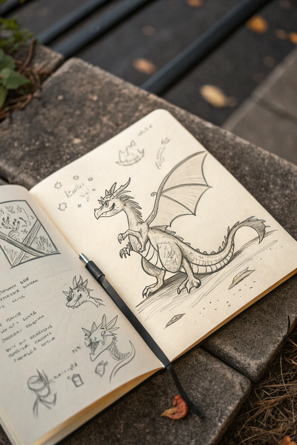
Capture the charm of fantasy with this detailed dragon sketch, featuring expressive character design and intricate scale textures. This project combines classic pencil drawing techniques with imaginative creature features to create a lively beast straight out of a field guide.
Step-by-Step
Materials
- Cream-colored sketchbook (A5 or similar)
- Graphite pencils (HB for sketching, 2B or 4B for shading)
- Fine liner pen (black, 0.3mm or 0.5mm)
- Kneaded eraser
- Paper blending stump (tortillon)
Step 1: Conceptualizing the Pose
-
Basic Shapes:
Start with a light HB pencil to block out the dragon’s posture. Draw a large oval for the body and a smaller circle for the head, connecting them with a curved line for the neck. -
Defining the Limbs:
Add stick-figure guides for the legs and arms. The rear legs should be thick and powerful like a dinosaur’s, while the front arms are smaller, resembling a T-Rex. Sketch a long, sweeping curve for the tail. -
Mapping the Wings:
Draw the primary structure of the wing extending from the shoulder blade. Use a long, jointed line that bends upward and then outward, forming the ‘arm’ of the wing.
Wobbly Lines?
Don’t stress over perfect straight lines. A slightly shaky hand actually helps create organic scale textures and natural-looking wrinkles. Embrace the imperfections.
Step 2: Fleshing Out the Form
-
Head Detailing:
Refine the head shape, giving it a snout. Add a large, expressive eye and a small nostril. Sketch jagged lines on top of the head for horns or spikes. -
Body Contours:
Connect your initial shapes with smooth lines to create the neck and belly. I like to draw the belly line slightly segmented to suggest the underbelly scales early on. -
Leg Structure:
Thicken the legs, adding defined thighs and calves. Sketch large, three-toed feet with sharp claws at the ends, ensuring they look planted on the ground. -
Wing Membranes:
From the wing’s joint, draw curved lines extending down toward the dragon’s back. Connect these ‘fingers’ with concave curves to create the bat-like membrane of the wing.
Step 3: Refining and Inking
-
Inking the Outline:
Once happy with the pencil sketch, take your fine liner and carefully trace the main outlines. Use varied line weight—thicker for the main body and thinner for internal details. -
Adding Spines:
Draw a row of triangular spines running from the back of the neck all the way down the tail. These don’t need to be identical; varying their size adds realism. -
Facial Character:
Darken the pupil, leaving a small white highlight for life. Define the mouth with a slight smirk to give the dragon a friendly or mischievous personality. -
Erasing Guides:
Once the ink is completely dry, gently run your kneaded eraser over the page to lift away the initial graphite guide lines.
Age the Paper
Before drawing, lightly stain your paper with cold coffee or tea and let it dry. This gives the page an ancient, discovered artifact feel ideal for fantasy sketches.
Step 4: Texturing and Shading
-
Scale Textures:
Using a 2B pencil or the fine liner, add small ‘U’ shapes or hatched patches on the thigh, shoulder, and back to imply scales without drawing every single one. -
Belly Segments:
Draw horizontal curved lines across the neck and underbelly to create the ribbed texture of the softer under-scales. -
Shadowing the Form:
Apply shading using hatched lines under the chin, beneath the wing, and on the rear leg. This grounds the figure and gives it volume. -
Ground Shadows:
Sketch quick, horizontal hatched lines underneath the feet to create a cast shadow, placing the dragon in an environment rather than floating in space. -
Margin Notes:
For that authentic ‘field study’ look, sketch a few smaller detail studies of the head or claws in the empty space around the main drawing.
Now you have a fantastic creature ready to populate your own imaginary world
Underwater World Theme: Life Beneath the Surface
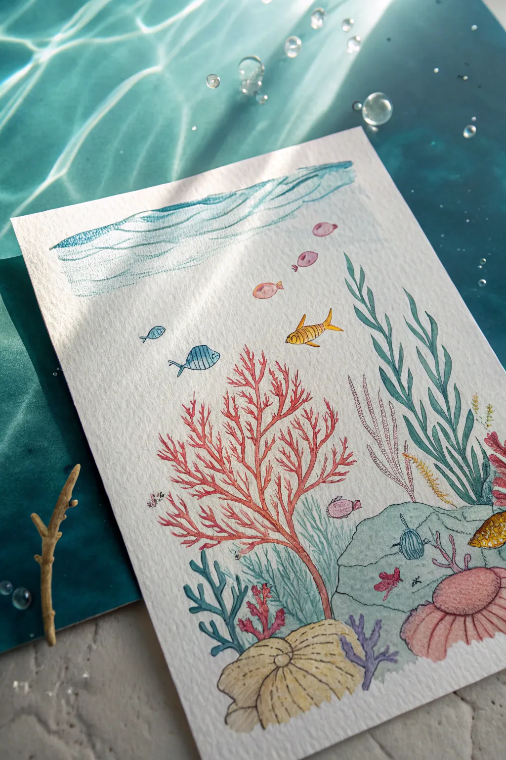
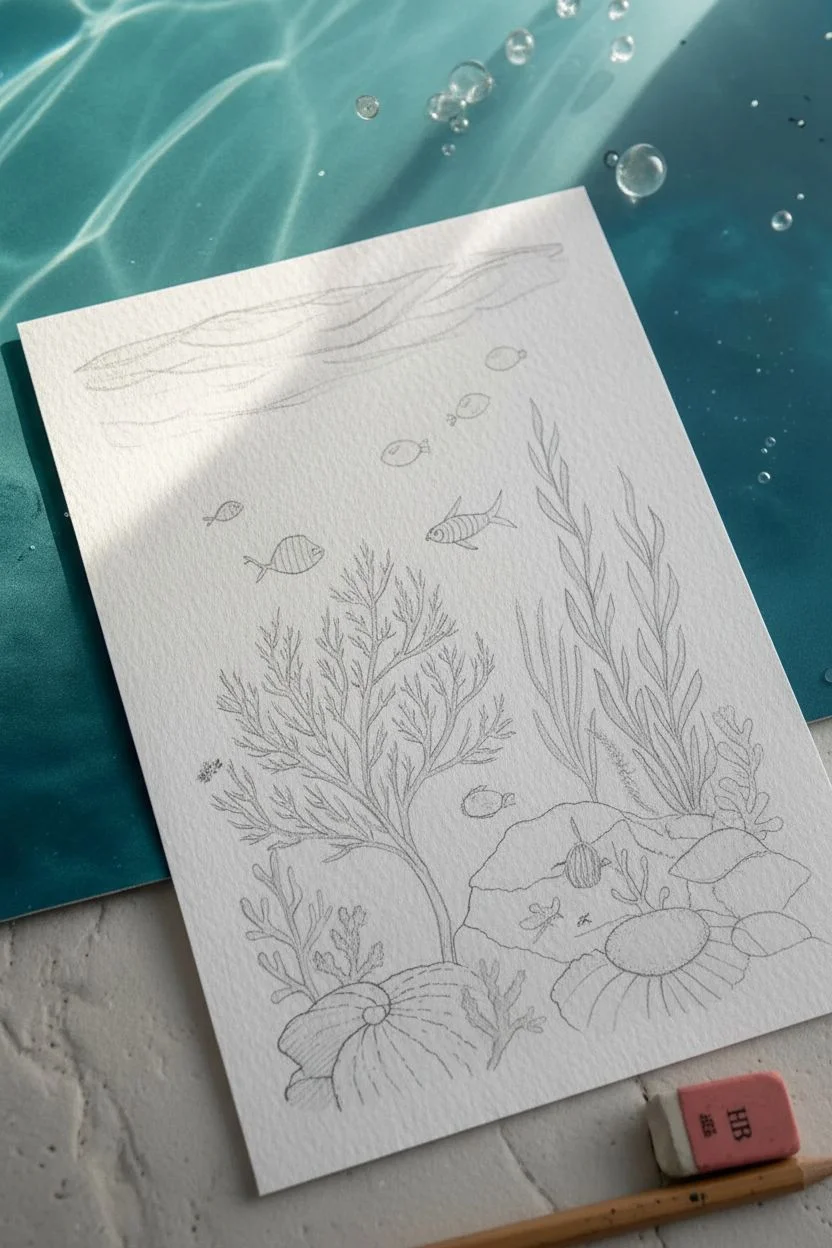
Capture the serene beauty of marine life with this delicate illustration that combines fine line work with soft watercolor washes. This project creates a stunning 3D effect by playing with light and shadow, evoking the feeling of sunlight filtering through surface water.
Step-by-Step Tutorial
Materials
- Cold press watercolor paper (300 gsm)
- Fine liner pens (black, 0.1mm and 0.3mm)
- Watercolor paint set or watercolor pencils
- Soft round brushes (sizes 2 and 4)
- Pencil (HB) and eraser
- White gel pen or gouache
- Water cups and paper towels
Step 1: Sketching the Layout
-
Establish the horizon:
Start by lightly penciling a wavy, horizontal band near the top of your paper. This will represent the surface water ripples. -
Anchor with rocks:
In the bottom right corner, sketch a large, rounded rock shape. Overlap it slightly with a large, spiraled seashell shape at the bottom center to create depth. -
Grow the coral:
Draw the main focal point: a large, branching coral tree rising from the bottom center, extending upwards and slightly to the left. Keep the branches organic and uneven. -
Add vegetation:
Sketch tall, wavy seaweed blades on the right side, reaching towards the surface. Add smaller coral clusters and sponges around the base of the rock and shell. -
Populate with fish:
Scatter small fish throughout the open water. Draw a school of tiny pink fish near the top right, a couple of blue fish on the left, and a larger yellow fish swimming through the center.
Ink Smearing?
If your black lines bleed when painting, ensure your pen is explicitly labeled ‘waterproof’ or ‘archival.’ If not, do the painting first and the inking last.
Step 2: Inking the Details
-
Outline the main elements:
Using a 0.1mm fineliner, carefully trace over your pencil sketches. Use broken or lighter lines for the water ripples at the top to keep them airy. -
Texture the coral:
For the large red coral, add tiny dots or short lines along the branches to mimic its rough texture. -
detail the sea floor:
Add ridges to the seashell and small stippling dots on the rock to give it a porous, stony look. -
Refine the fish:
Draw vertical stripes on the blue and yellow fish using your fine liner. Give them tiny eyes and fins. -
Clean up:
Wait for the ink to dry completely, then gently erase all remaining pencil marks to prepare for painting.
Sunlight Effect
To create the dappled light effect shown in the photo, place a colander or patterned grate between your light source and the artwork before photographing it.
Step 3: Bringing Color to Life
-
Paint the surface water:
Dilute a turquoise blue significantly with water. Paint the top wavy band, layering darker strokes within the waves to create movement. -
Wash the coral:
Use a vibrant coral pink or light red for the central tree. I prefer to keep the color slightly transparent so the ink lines show through comfortably. -
Color the seaweed:
Paint the tall seaweed strands in a deep teal or sea green. Use a lighter yellow-green for the smaller grassy patches. -
Fill the sea floor objects:
Wash the large rock in a cool grey-blue. Paint the bottom shell in a sandy beige, adding darker brown to the shadow areas between the ridges. -
Brighten the fish:
Use concentrated yellow for the center fish and a soft blue for the left-side fish. The tiny school at the top can be a very faint pink. -
Add subtle shadows:
Once the base colors are dry, mix a very watery grey-purple. Glaze this gently under the fish and behind the overlapping coral branches to push them visually backward.
Step 4: Final Flourishes
-
Create bubbles:
With a very fine brush or dotting tool, paint tiny circles using diluted blue or grey rising from the plants. -
Highlighting:
Use a white gel pen to add tiny specular highlights to the fish eyes and the tops of the bubbles for a wet look.
Now you have a tranquil underwater scene ready to display or enter into a competition

PENCIL GUIDE
Understanding Pencil Grades from H to B
From first sketch to finished drawing — learn pencil grades, line control, and shading techniques.
Explore the Full Guide
Space Adventures Prompt: Rockets, Aliens, and New Planets
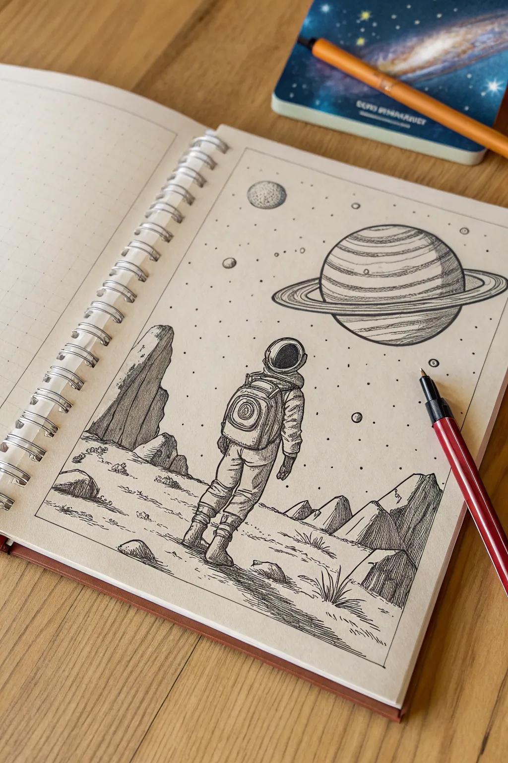
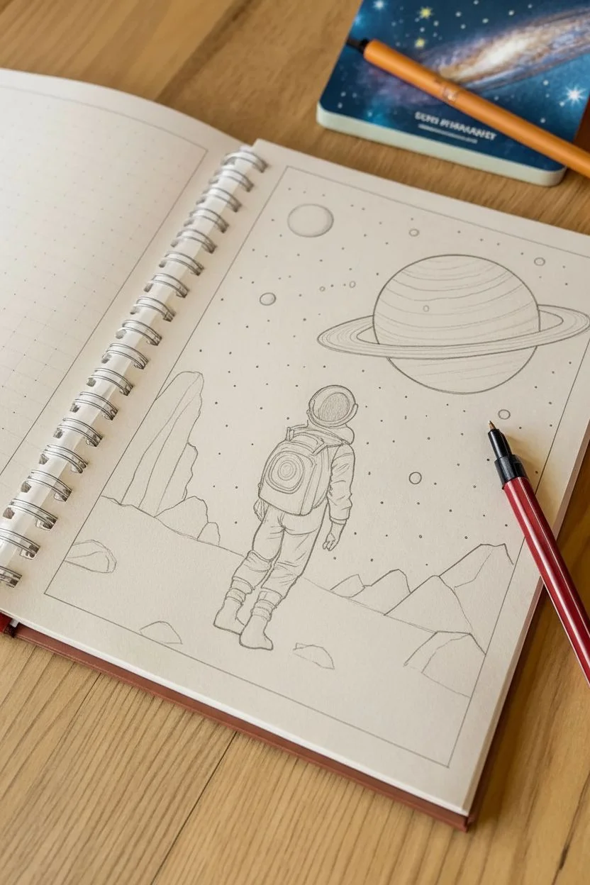
Capture the solitude and wonder of space exploration with this detailed pen and ink illustration. Using classic shading techniques like hatching and stippling, you’ll create a textured lunar landscape and a majestic gas giant rising in the distance.
How-To Guide
Materials
- Dot grid notebook or sketchbook
- Pencil (HB or H for light sketching)
- Eraser
- Fine liner pen (0.1mm) for details
- Fine liner pen (0.3mm or 0.5mm) for outlines
- Ruler (optional, for horizon lines)
Step 1: Planning the Composition
-
Frame the Scene:
Start by drawing a rectangular border around your page, leaving a generous margin. This frame will contain your entire drawing. -
Sketch the Horizon:
Using your pencil lightly, draw a low horizon line about one-third of the way up from the bottom of the frame. This establishes the ground where your astronaut will stand. -
Position the Astronaut:
Draft the basic shape of the astronaut in the center foreground. Focus on simple geometric forms first: a rounded helmet, a rectangular backpack, and cylindrical limbs. They should be lifting one foot as if walking. -
Place Celestial Bodies:
In the upper right quadrant, sketch a large circle for the gas giant planet. Add an elliptical ring system around it. Then, add a smaller circle in the upper left for a moon.
Uneven Circles?
If freehanding the planet and moon is difficult, trace a small coin or bottle cap. This ensures perfectly round celestial bodies without needing a compass.
Step 2: Creating the Landscape
-
Drafting Rocks and Mountains:
Lightly sketch angular, jagged rock formations on the left and right sides of the horizon. These should look like alien crags. -
Inking the Foreground Rocks:
Switch to your 0.3mm pen. Ink the outlines of the rocks. Use vertical hatching lines to shade the shadowed sides of the rocks, giving them a heavy, solid appearance. -
Detailing the Ground:
Draw small, flattened oval shapes scattered on the ground for loose stones. Use short, horizontal dashes to suggest the uneven, dusty surface of the terrain. -
Adding Grass-like Textures:
Even though it’s space, adding alien vegetation or spiky mineral growth adds interest. Draw clusters of short, upward spikes near the bottom right corner.
Galaxy Background
Use a white gel pen to add stars over a black brush-marker background, or use watercolors to create a colorful nebula wash behind your inked drawing.
Step 3: Inking the Astronaut
-
Outline the Suit:
Go over your pencil sketch of the astronaut with the 0.3mm pen. Define the folds in the suit, especially around the knees and elbows, to show the bulkiness of the material. -
Detail the Backpack:
Draw the life-support backpack. Add a concentric circle design on the back panel to suggest mechanical details or a vent. -
Shade the Figure:
Using the 0.1mm pen, add fine hatching to the right side of the astronaut’s suit (legs, arm, and pack) to indicate a light source coming from the left. -
Darken the Helmet:
Fill in the visor area completely black or use very dense hatching, leaving a tiny white rim to show the thickness of the helmet glass.
Step 4: The Sky and Distance
-
Inking the Planet:
Outline the large gas giant and its rings. Carefully draw curved lines across the face of the planet to simulate atmospheric bands. -
Shading the Planet:
Use horizontal hatching on the darker bands of the planet. I prefer to keep the hatching denser on the lower right side to maintain consistent lighting. -
Drawing the Small Moon:
Ink the smaller moon in the upper left. Use stippling (tiny dots) to give it a cratered, textured rocky look. -
Adding Stars:
Randomly place small dots and tiny circles throughout the sky. Vary the sizes slightly to create a sense of depth in the starfield. -
Final Clean Up:
Wait for the ink to dry completely to avoid smudging. Then, gently erase all your underlying pencil sketches to reveal the crisp ink work.
Now you have a timeless piece depicting the quiet adventure of space travel
Technology vs Nature Concept: The Clash (or Harmony)
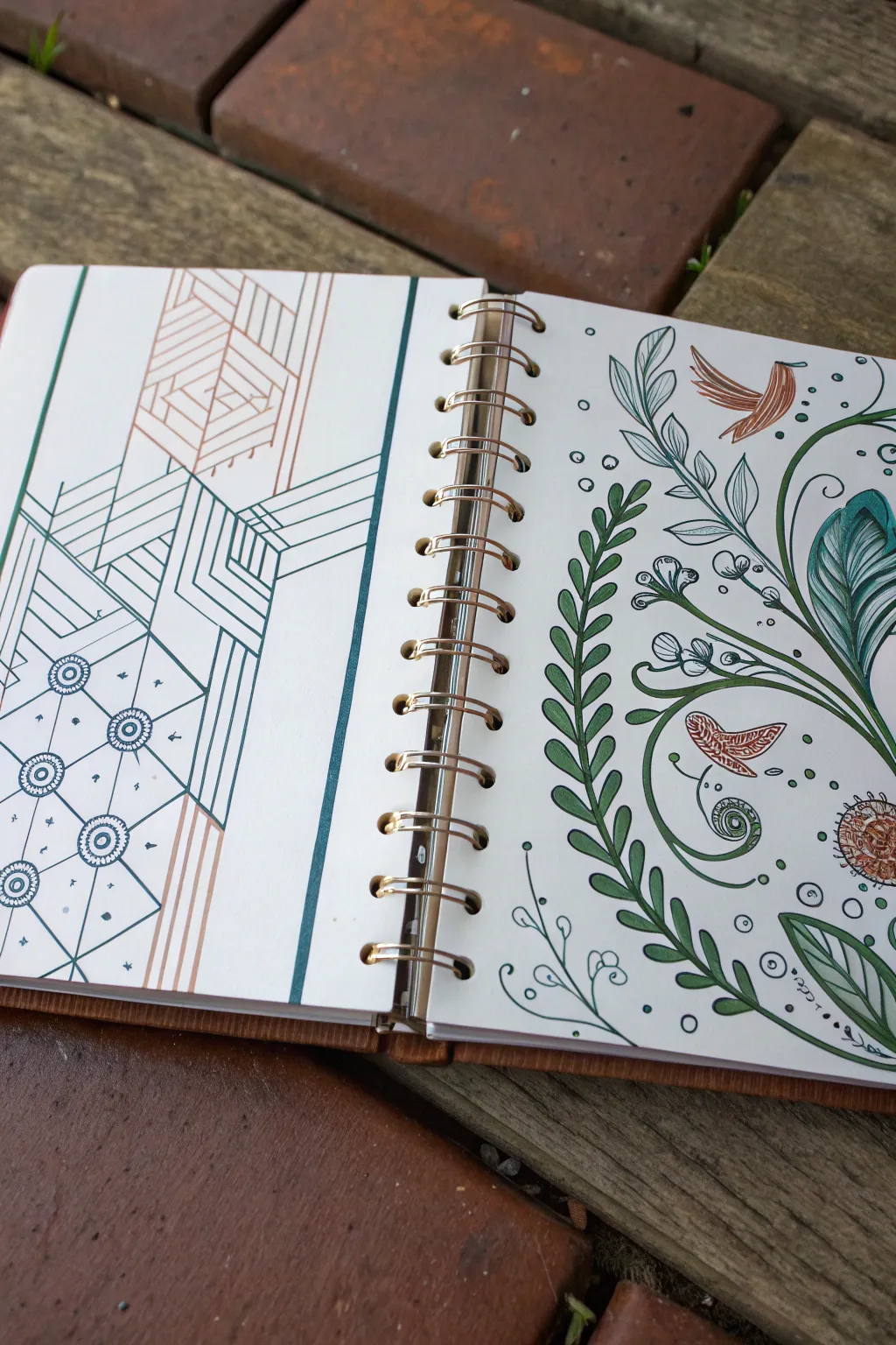
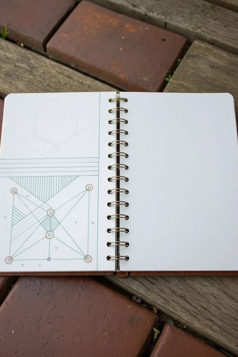
This intricate double-page spread explores the contrast between rigid, man-made structures and flowing, organic life. By dedicating one page to precise geometric drafting and the other to loose botanical illustration, you’ll create a striking visual dialogue between technology and nature.
How-To Guide
Materials
- Spiral-bound sketchbook (smooth, heavyweight paper recommended)
- Fine-liner pens (0.3mm and 0.5mm) in teal/dark green
- Fine-liner pens (0.3mm and 0.5mm) in copper/rust orange
- Ruler or straight edge
- Compass or circle template
- Pencil (HB or 2H)
- Eraser
Step 1: Drafting the Technology Page (Left)
-
Establish the Boundaries:
Begin on the left page. Use your ruler and a pencil to lightly mark out a vertical border about an inch from the spiral binding, leaving a clean margin. -
Create the Grid Structure:
Using a teal fine-liner and ruler, draw a series of parallel lines near the spine. Then, draw a prominent vertical line to act as a separator. -
Draft the Hexagonal Base:
Sketch a large, fragmented hexagonal shape near the top center using your pencil. This will serve as the anchor for your geometric patterns. -
Ink the Geometric Lines:
Switching between teal and copper pens, ink over your pencil guides. Create nested Vs and parallel chevrons that mimic circuitry or architectural blueprints. -
Add Techno-Details:
On the lower half of the page, use a compass or circle template to draw specific circular nodes. Connect these with fine, straight lines to form a triangular network. -
Fill Patterns:
Inside your larger geometric shapes, use the ruler to add dense hatching. Vary the direction of the lines—vertical in one section, horizontal in the next—to create depth. -
Finalize Tech Accents:
Add small floating elements like tiny ‘plus’ signs, dots, and arrows around the geometric border to enhance the schematic feel.
Clean Lines Pro-Tip
When inking the geometric side, wipe the edge of your ruler with a tissue after every few lines. This prevents ink buildup that can smudge underneath and ruin your crisp edges.
Step 2: Illustrating the Nature Page (Right)
-
Sketch the Main Stems:
On the right page, lightly pencil a large, sweeping S-curve starting from the bottom right corner and flowing upward toward the top left. -
Ink the Fern Fronds:
Using the dark green fine-liner, draw a long, central stem following your S-curve. Add small, tear-drop shaped leaves along both sides of the stem, keeping the lines smooth and organic. -
Add Secondary Vines:
Draw thinner, swirling vines branching off the main stem. Let them curl into spirals at the ends, mimicking fiddlehead ferns. -
Incorporate Birds:
In the open spaces (top right and middle left), sketch simple, stylized bird silhouettes. Ink them with the copper pen, using hatched lines for the wings to match the texture on the opposing page. -
Draw Broad Leaves:
Near the right edge, draw large, broad leaves with prominent veins. I find adding heavy shading near the base of these leaves gives them a nice lush volume. -
Detail the Flowers:
Add small clusters of circular blooms or berries using the copper pen. Sketch a spiky, sun-like flower in the bottom right corner for balance. -
Connect the Theme:
Look at the left page’s circles. Replicate that size in the nature drawing by adding small bubbles or spores floating around the leaves, integrating the two styles slightly.
Wobbly Circles?
If your freehand organic curves look shaky, don’t worry. Thicken the line weight slightly on the outer curves to smooth out imperfections and add confident dimension.
Step 3: Finishing Touches
-
Erase Guidelines:
Wait at least 15 minutes for all ink to dry completely to avoid smudging. Gently erase all visible pencil marks from both pages. -
Evaluate Contrast:
Check the visual weight of both pages. If the geometric side feels too light, thicken the main structural lines with a 0.5mm pen. -
Binding Emphasis:
As a final subtle detail, you can draw tiny lines or dots near the spiral holes on the paper itself to frame the mechanical binding that holds your two worlds together.
Close your sketchbook knowing you’ve successfully blended the precision of engineering with the wild beauty of botany


Optical Illusion Challenge: Trick the Eye
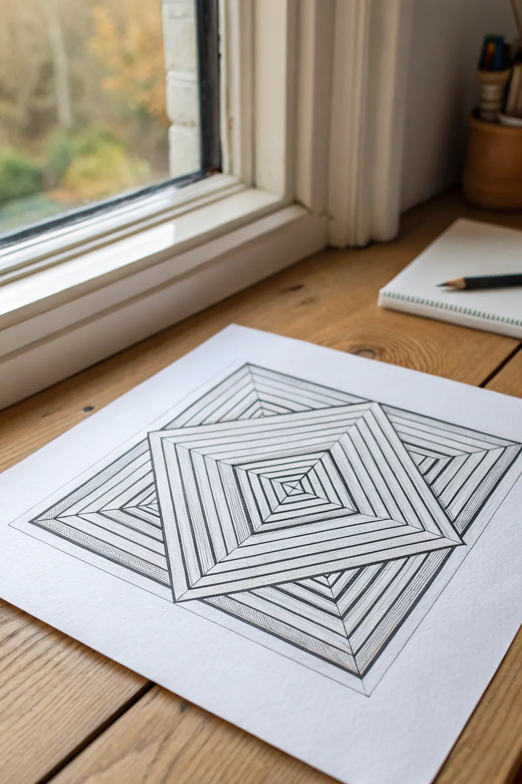
Create a mesmerizing optical illusion with nothing but a ruler and pen. This ‘Op Art’ style drawing uses simple straight lines to build complex depth, making two overlapping pyramids appear to rise from the page.
Step-by-Step Tutorial
Materials
- High-quality white drawing paper (heavyweight preferred)
- Pencil (HB or 2H for light drafting)
- Fine liner pen (0.5mm, black)
- Thicker marker or pen (0.8mm or 1.0mm, black)
- Long clear ruler
- Eraser
Step 1: Drafting the Framework
-
Draw the background square:
Start by using your pencil and ruler to draw a large, perfect square tilted on its corner (like a diamond shape). This will become the underlying shape, so keep your lines very light and easy to erase later. -
Add the foreground square:
Draw a second, identical square slightly offset from the first one. Position it so it appears to be ‘in front’ of the first square, overlapping it significantly. The center of this new square should be slightly lower and to the right. -
Erase overlapping lines:
Carefully erase the lines of the first (background) square where they are covered by the second (foreground) square. This establishes the solid layering effect immediately. -
Mark the center points:
Lightly mark the exact center point of both squares. You can find this easily by lightly sketching an ‘X’ from corner to corner, then erasing the arms of the X, leaving only the center dot.
Wobbly Lines?
If your ruler slips, don’t panic. Thicken the line slightly to hide the wobble, or turn the mistake into a pattern change by thickening all similar directional lines for a bold graphic look.
Step 2: Creating the Pyramids
-
Draw the diagonals:
For the foreground square, draw straight lines connecting the center dot to each of the four corners. This divides the square into four triangular sections. -
Repeat for the background:
Do the same for the background square, connecting its center to its visible corners. Remember to stop your lines where they hit the edge of the foreground square blocking the view. -
Start the concentric squares:
Beginning in the foreground square, draw a smaller square inside the main outline. Keep the distance between the lines consistent. This internal square should parallel the outer edges perfectly. -
Correct corner interactions:
When drawing these internal squares, make sure the lines ‘break’ or change direction exactly where they hit the diagonal X lines you drew earlier. This is what creates the 3D tent shape. -
Continue inward:
Continue drawing progressively smaller squares toward the center point. Try to keep the spacing between rings consistent, or let them get slightly tighter toward the middle to exaggerate the depth. -
Fill the background shape:
Repeat the concentric square process for the background shape. Be extremely careful to stop your lines cleanly when they touch the edge of the foreground pyramid.
Add Color
Instead of black hatching for shadows, use a colored pencil in a cool tone like blue or violet. It adds unexpected depth without overpowering the stark geometric linework.
Step 3: Inking and Detailing
-
Outline the main shapes:
Switch to your thicker (0.8mm) black pen. Trace over the main perimeter outlines of both squares and the diagonal X lines that divide the sections. This separates the shapes from each other. -
Ink the structural lines:
Switch to the finer (0.5mm) pen. Carefully trace over all your penciled concentric square lines. I prefer to rotate the paper as I work to keep my hand from smudging the wet ink. -
Clean up:
Once the ink is completely dry, use your eraser to remove any remaining pencil guides. Be thorough, as stray graphite can ruin the crisp contrast needed for this illusion. -
Add shading texture:
To enhance the 3D effect, pick one side of the ‘pyromid’ (like the bottom-left triangle) and add shading. Instead of solid black, use closely spaced, thin diagonal hatch lines within the bands. -
Repeat shading pattern:
Apply this same hatching texture to the corresponding side of all concentric bands in that specific triangular section. This makes that ‘face’ of the pyramid look shadowed. -
Cast a shadow:
For the final touch, add a very subtle hatched shadow on the background pyramid right where the foreground pyramid overlaps it. This visually pushes the back shape further away.
Step back and watch your flat drawing pop into three dimensions
Limited Tools Contest: One Pencil (or One Color) Only
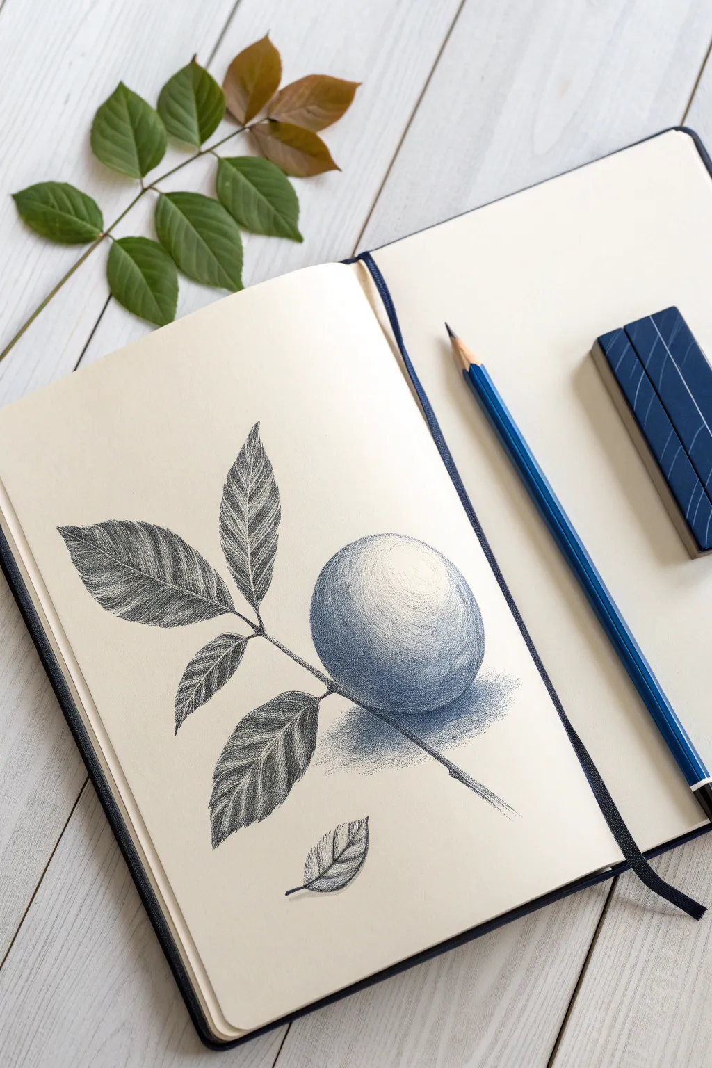
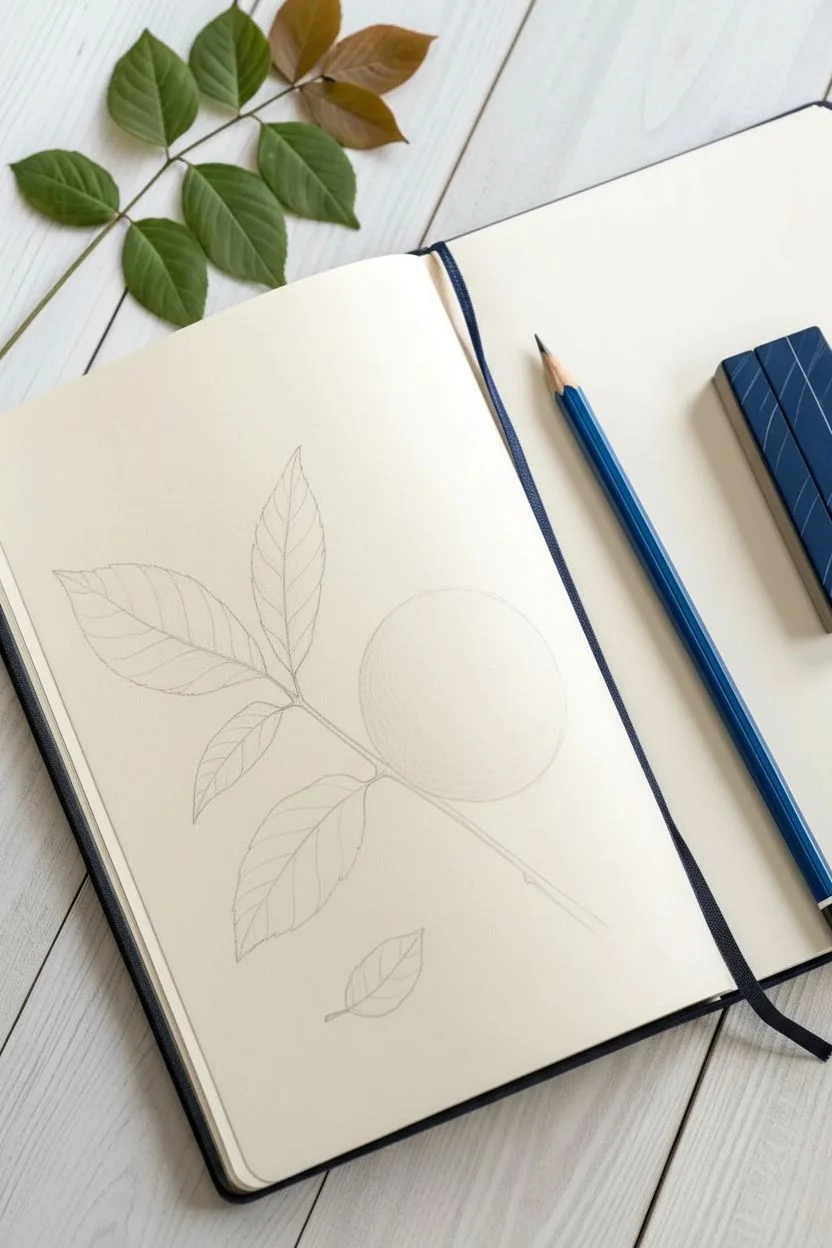
Embrace the challenge of shading with a single hue in this elegant botanical illustration. Using just one blue pencil, you will create striking volume and texture through careful tonal layering and cross-hatching.
Step-by-Step
Materials
- High-quality sketchbook (smooth or vellum surface)
- Blue colored pencil (indigo or prussian blue)
- Pencil sharpener
- Eraser (kneaded or plastic)
- Ruler (optional for layout)
- Scrap paper for testing pressure
Step 1: Initial Sketch & Layout
-
Establish the sphere:
Begin by lightly sketching a perfect circle in the lower right quadrant of your page. Keep your pressure extremely light so you can erase stray marks without damaging the paper tooth. -
Draw the stem:
Add a diagonal line crossing behind the sphere, extending from the top left towards the bottom right. Thicken this line slightly to give the woody stem some weight. -
Block in the leaves:
Sketch the outline of three main leaves attached to the upper left part of the stem. Make them elongated ovals with pointed tips. Add a small, detached leaf floating near the bottom of the page for balance. -
Define the veins:
Draw the central vein down the middle of each leaf. Lightly indicate the diagonal side veins branching out from the center line.
Step 2: Shading the Fruit
-
Map the highlights:
Identify the light source coming from the upper right. Lightly circle a highlight area on the top right of the fruit that will remain pure white paper. -
Base layer shading:
Apply a very faint, even layer of blue over the rest of the fruit, avoiding that highlight zone. Use the side of your pencil lead for a soft texture. -
Build the core shadow:
Start darkening the bottom left side of the sphere. Use curved hatching strokes that follow the round contour of the fruit to enhance its three-dimensionality. -
Deepen contrast:
Press harder to create a dark, saturated blue on the underside of the fruit, furthest from the light. I like to switch directions with my hatching here to create a dense, rich weave of color. -
Cast shadow:
Draw a cast shadow on the surface below the fruit. Keep the edges soft and diffused, fading out as the shadow moves away from the object.
Pressure Control
A single pencil offers infinite values. Practice a gradient scale on scrap paper first—from barely-there scratching to heavy, burnished color—to know your range.
Step 3: rendering the Leaves
-
Leaf texture:
For the leaves, use short, tight hatching lines. Drawing these lines diagonally away from the central vein mimics the natural texture of leaf ribs. -
Varying values:
Make one half of each leaf slightly darker than the other to suggest they are folded or catching the light differently. This separation happens naturally at the central vein. -
Darkest accents:
Go back in with a freshly sharpened tip to define the very edges of the leaves and the darkest crevices where the leaves meet the stem. -
The detached leaf:
Render the small floating leaf at the bottom using the same technique: light pressure for the illuminated side, heavy pressure for the shadowed side. -
Stem texture:
Shade the stem using long, linear strokes. Make the bottom edge of the branch darker to give it cylindrical form.
Uneven Shading?
If your pencil strokes look too scratchy, dull the tip slightly on scrap paper. A slightly blunted tip covers better and creates smoother, softer transitions.
Step 4: Final Refinements
-
Sharp edges:
Check your outer contours. If any edges look fuzzy, crisp them up with a sharp point, especially around the silhouette of the fruit. -
Gradient check:
Smoothen the transition between the dark shadow and the mid-tones on the fruit. You can do this by lightly glazing over the transition area with very gentle pressure. -
Clean up:
Use your eraser to lift away any graphite sketch lines that might still be visible or any smudges on the white background.
Step back and admire how a single color can create such a convincing illusion of depth and life


Have a question or want to share your own experience? I'd love to hear from you in the comments below!