If you’re craving fresh character drawing ideas, you don’t need a perfect concept—just a few fun prompts that get your pencil moving. I’m sharing my favorite ways to sketch characters that feel expressive, distinct, and totally yours.
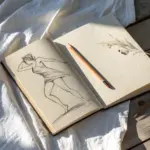
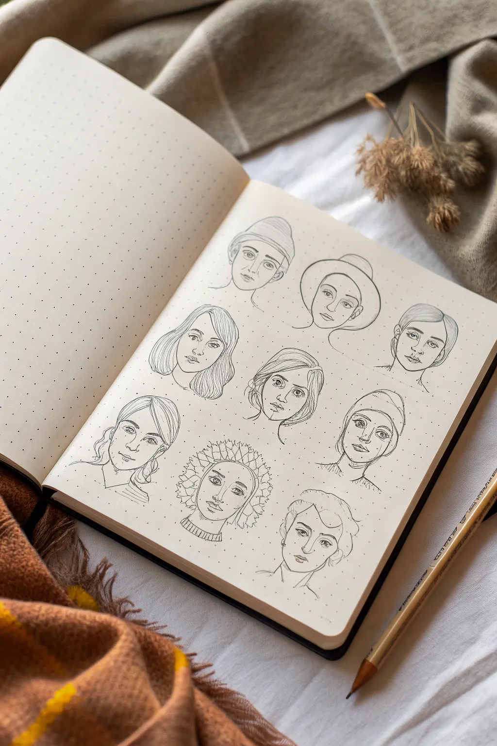
Expression Headshot Grid
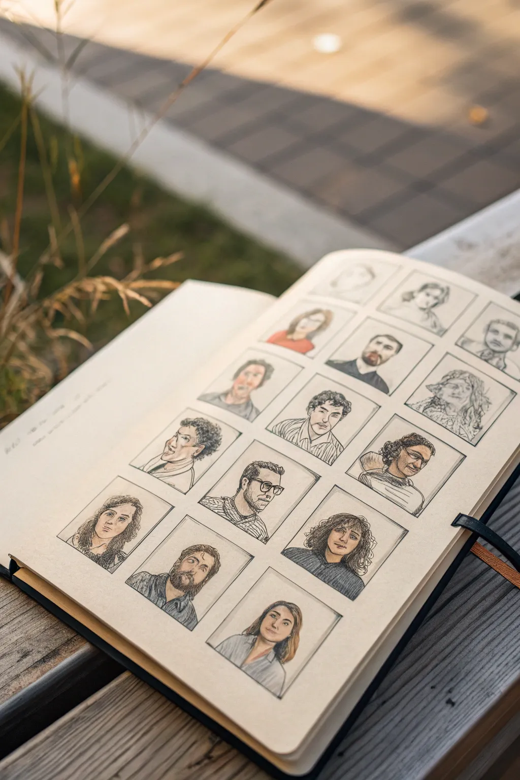
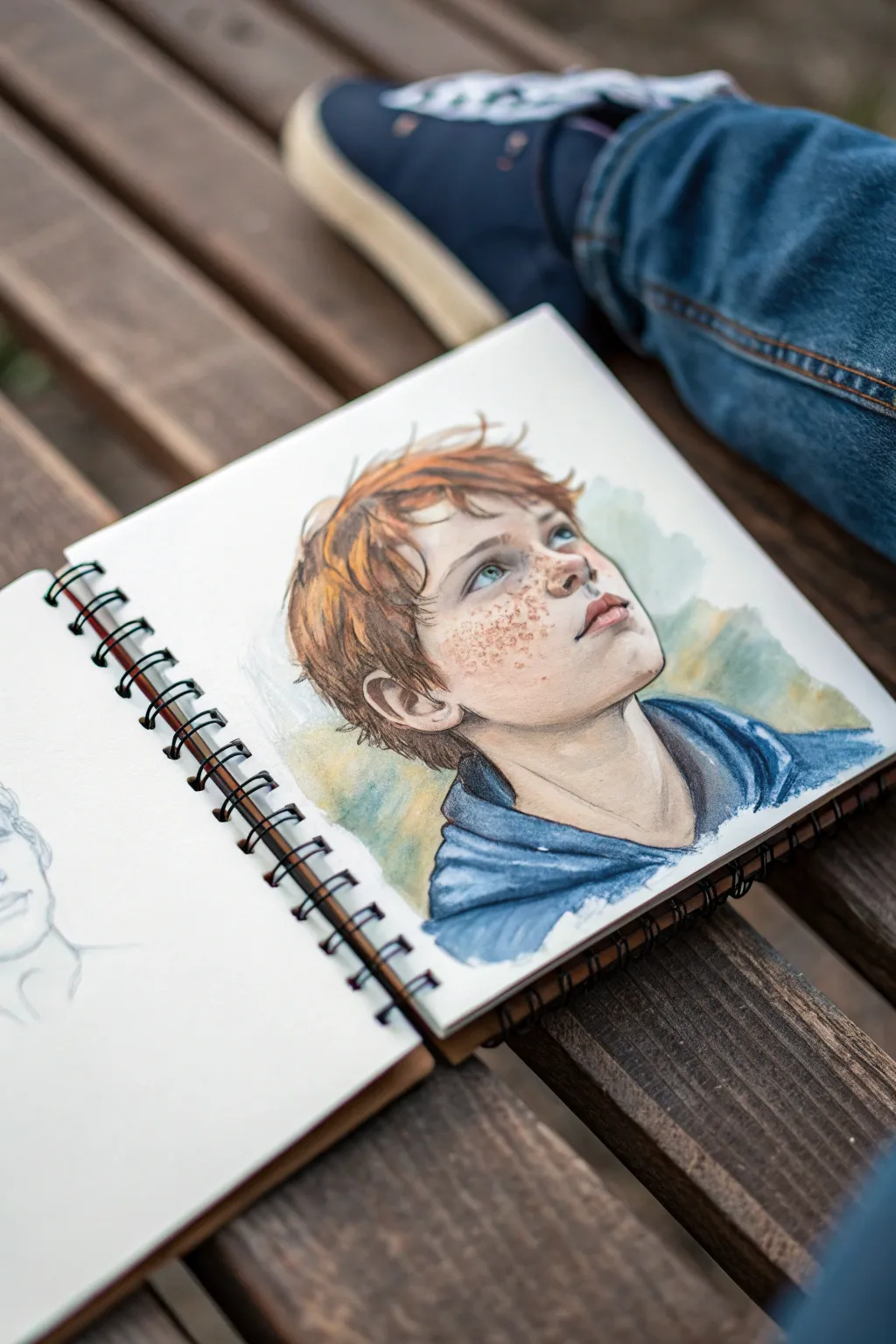
Capture the nuanced personalities of a dozen different characters in this structured yet organic sketchbook challenge. This project combines strict geometric layout with loose, expressive facial studies, creating a satisfying gallery of diverse people and emotions.
How-To Guide
Materials
- Sketchbook (heavyweight paper preferred)
- Ruler
- HB Graphite Pencil (for initial layout)
- 2B or 4B Graphite Pencil (for shading)
- Fine-liner pen (0.1mm or 0.3mm, black or sepia)
- Colored pencils or subtle watercolor washes
- Kneaded eraser
Step 1: Setting the Stage
-
Measure the Page:
Begin by measuring the meaningful area of your sketchbook page. Decide on a margin width (about 0.5 inches works well) to frame the entire composition. -
Calculate the Grid:
Plan a grid of 3 columns by 4 rows (or 4×4 if your page is square). Divide your available space by the number of columns to determne the width of each portrait box. -
Draw the Framework:
Using your ruler and the HB pencil, lightly draw the grid. Press very gently so these lines can be erased or integrated later. Ensure the boxes are identical in size to create a cohesive look. -
Frame the Boxes:
Go over your pencil grid with a slightly darker line or a very thin fine-liner to create permanent borders for each portrait box. This separation is key to the gallery effect.
Pro Tip: United Palette
Limit your color palette to just 3 or 4 colors for the clothing across the entire grid. Repeating a specific blue or red in different boxes ties the whole page together visually.
Step 2: Drafting the Faces
-
Establish Head Shapes:
Inside each box, sketch varying head shapes lightly. Don’t make them all ovals—try squares, inverted triangles, and heavy jawlines to distinguish characters early on. -
Vary the Angles:
Avoid drawing every face straight-on. Turn some heads slightly to the left, some to the right, and tilt a few chins up or down to add dynamic interest to the grid. -
Mark Feature Lines:
Lightly sketch the horizontal eye lines and vertical center lines on your head shapes to guide where the features will sit. -
Draft Facial Features:
Pencil in the distinct features for each character. Give one thick glasses, another curly hair, and another a beard. Focus on diversity in age, gender, and style. -
Refine Expressions:
Before committing to ink or dark pencil, tweak the eyebrows and mouth corners. A slight arch or a downturned lip changes the entire narrative of the face.
Troubleshooting: Smuding
If your graphite spreads while you work across the grid, place a scrap piece of paper under your drawing hand. This acts as a shield to keep your palm from dragging pencil dust.
Step 3: Inking and Definition
-
Outline the Characters:
Using your fine-liner or a sharpened 2B pencil, trace over your refined sketches. Use broken or varied line weights for hair to keep it looking soft rather than wiry. -
Add Textural Details:
Sketch in details like stubble, worry lines, or clothing patterns. Keep the clothing simple (collars, turtlenecks) so it doesn’t distract from the faces. -
Erase Construction Lines:
Once your main lines are set (and ink is dry if you used it), gently erase the underlying HB construction lines and guides with the kneaded eraser.
Step 4: Shading and Color
-
Apply Graphite Shading:
Use the side of your 2B or 4B pencil to shade mostly the hair and darker clothing items. Leave the skin relatively light to create contrast. -
Cross-hatch Shadows:
For facial depth, use light hatching under the chin, nose, and brow ridge. I find diagonal strokes work best to keep the style uniform across all boxes. -
Introduce Color:
Select muted colored pencils or watery paint mixes. Focus on skin tones first. Apply a very light, uneven wash or scribble to the faces—don’t try to make it perfectly solid. -
Tint the Clothing:
Choose 2-3 accent colors (like the red and blue seen in the reference) and apply them sporadically to shirts across the grid to balance the composition. -
Final Touches:
Check the grid one last time. If a face feels too flat, add a touch more dark graphite to the deepest shadows, like the pupils and corners of the mouth.
Close your sketchbook knowing you’ve built a whole community of characters on a single page


Three-Angle Character Turnaround
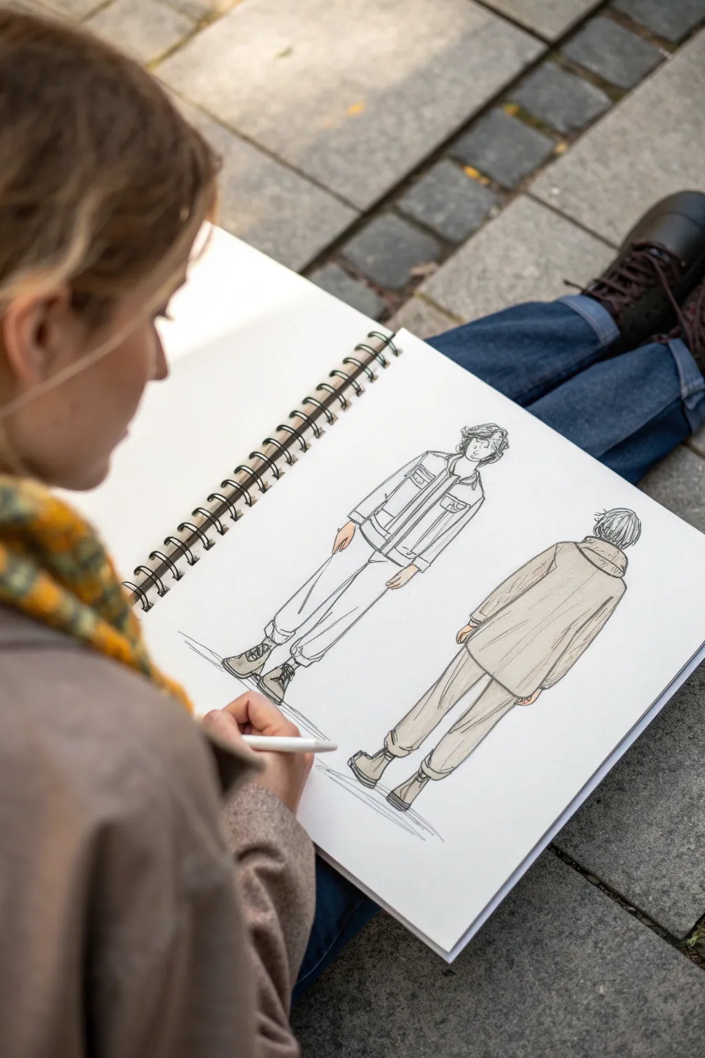
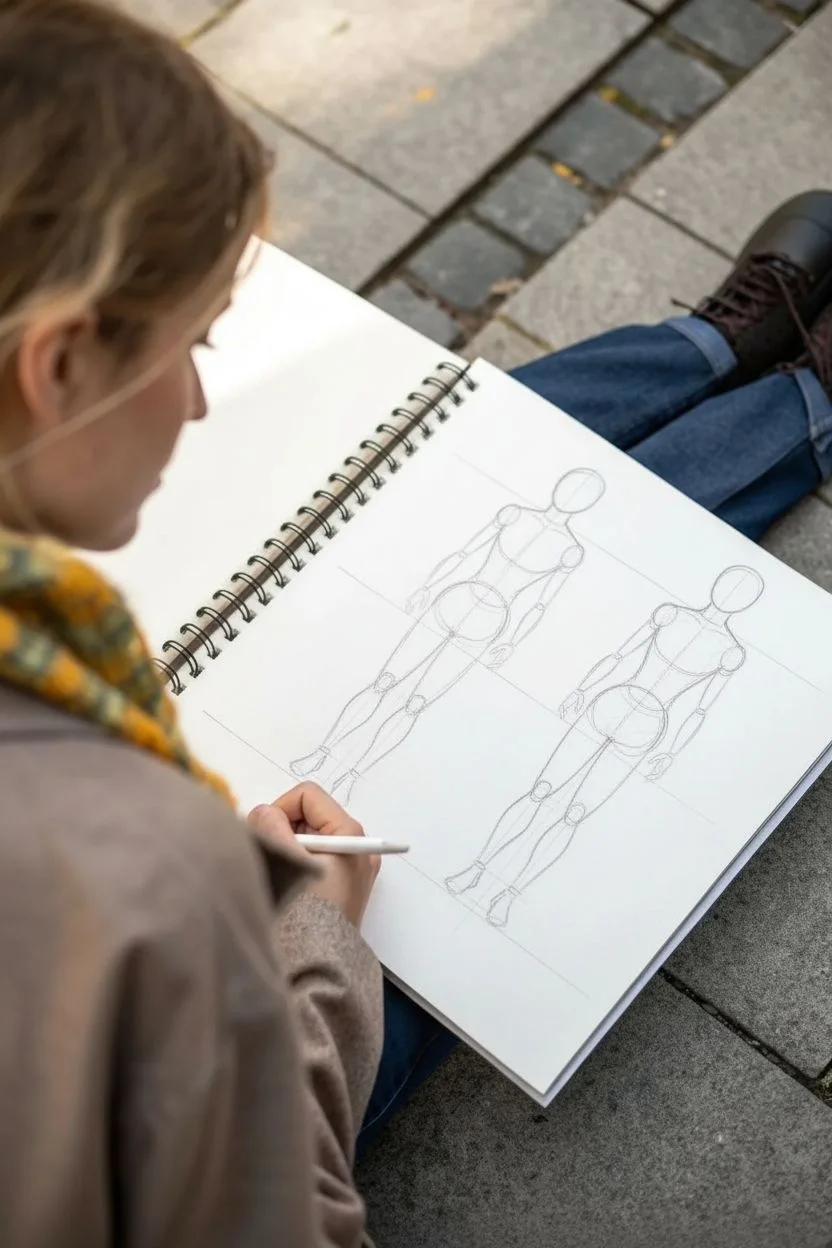
Master the art of visualizing your character from multiple angles with this clean line art and marker study. This project focuses on capturing the drape of fabric and consistent proportions between front and back views, creating a professional-looking design sheet perfect for fashion illustration or character concept art.
Step-by-Step Guide
Materials
- Spiral-bound sketchbook (smooth mixed media paper)
- HB or 2H graphite pencil for underdrawing
- Kneadable eraser
- Fine liner pens (0.1mm and 0.3mm, black)
- Alcohol-based markers or light watercolor wash (warm beige/grey tones)
- White gel pen (optional for highlights)
Step 1: Drafting the Structure
-
Establish the ground plane:
Begin by lightly drawing a horizontal guideline near the bottom of your page to represent the ground. This ensures both figures stand at the same level. -
Mark height guidelines:
Decide on the height of your character. lightly sketch a top line for the head and key horizontal lines for the shoulders, waist, and knees. Extend these lines across the page so both the front and back views align perfectly. -
Construct the front mannequin:
Sketch a simple stick figure or gestural wireframe for the front view on the left. Focus on a relaxed stance with weight slightly shifted to one leg. Keep the head oval loose and the shoulders relaxed. -
Construct the back mannequin:
To the right, draw the back view wireframe. Ensure the spine follows the same curve as the front view’s posture but reversed. The head should be positioned to show the back of the neck. -
Flesh out the forms:
Build cylindrical shapes over your wireframes to define the limbs and torso. Keep the anatomy simplified since it will be covered by loose clothing.
Step 2: Designing the Clothing
-
Outline the jacket front:
Draft the boxy shape of the denim-style jacket on the front figure. Sketch the collar, the button placket down the center, and the slightly oversized sleeves ending at the wrists. -
Add front trousers:
Draw the trousers, keeping them loose and tapered. Add folds around the ankles where the fabric bunches above the boots. I find it helpful to sketch the ‘cuff’ roll at the bottom first to anchor the shape. -
Detail the back view jacket:
On the right figure, draw the back of the jacket. Pay attention to the seam across the upper back (the yoke) and how the collar turns down. The hem should hit at the exact same height as the front view. -
Complete the back trousers:
Sketch the back of the trousers, showing the seat of the pants and the pockets. Ensure the leg width matches the front view perfectly. -
Add footwear details:
Refine the boots on both figures. For the front, show the laces and toe box. For the back, focus on the heel cup and the sole tread.
Wobbly Lines?
If your ink lines feel shaky, try drawing from your shoulder rather than your wrist. Faster strokes are often smoother than slow, careful ones.
Step 3: Inking and Coloring
-
Ink the main contours:
Using a 0.3mm fine liner, carefully trace over your pencil lines. Use confident, slightly broken strokes for the clothing to suggest fabric texture rather than rigid wire. -
Add fine details:
Switch to a 0.1mm pen for delicate details like the jacket stitching, pockets, shoe laces, and hair strands. Add small fold lines at the elbows and knees. -
Erase pencil marks:
Wait until the ink is completely dry to prevent smudging, then gently erase all graphite guidelines with a kneadable eraser. -
Apply base color:
Using a warm beige or light grey alcohol marker, fill in the clothing on the back view figure entirely to distinguish it, or apply color selectively. Use long, even strokes to avoid streaks. -
Shade the front view:
For the front figure, leave the clothing mostly white but use the marker to add simple shadows under the collar, inside the sleeve cuffs, and along the inseam of the pants. -
Color skin tones:
Use a pale peach or appropriate skin tone marker for the hands and face. Keep it simple—flat color works well for this loose style. -
Final touches:
Add a ground shadow beneath the boots using a cool grey marker or hatched ink lines to ground the figures. This prevents them from looking like they are floating.
Pro Tip: Height Consistency
Use a ruler to lightly draw lines connecting the key points (shoulders, waist, hem, ankles) from the front view to the back view to ensure perfect scale.
Your character reference sheet is now ready to serve as a blueprint for future illustrations


Simple Full-Body Pose Practice
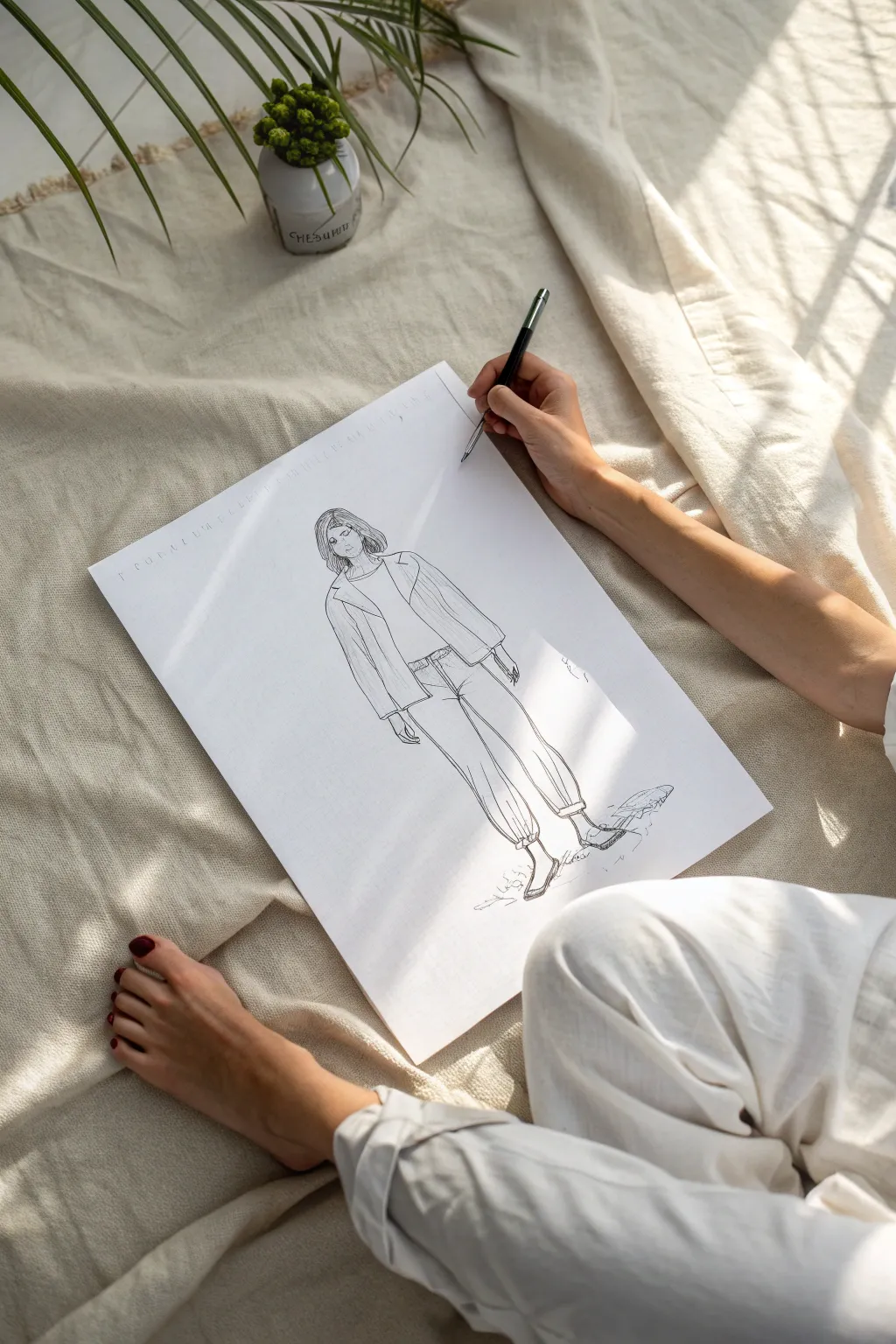
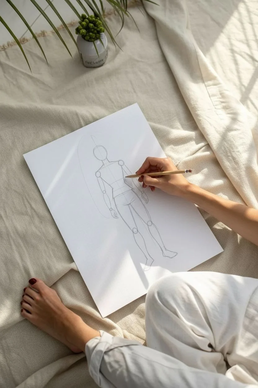
Master the art of simple character illustration with this relaxed, full-body fashion sketch. Using clean lines and minimal shading, you’ll capture a natural standing posture that serves as an excellent foundation for character design.
Step-by-Step Tutorial
Materials
- Large sheet of smooth drawing paper (A3 or similar size)
- H pencil (for initial gesture lines)
- Fineliner pen (0.3mm or 0.5mm, black)
- Kneaded eraser
- Ruler (optional for proportion checking)
Step 1: Establishing the Structure
-
Draw the line of action:
Start by lightly sketching a vertical line down the center of your page to establish the character’s balance. This doesn’t need to be perfectly straight; a slight curve adds a natural feel to the posture. -
Block in major masses:
Using your pencil very lightly, draw an oval for the head near the top. Below that, sketch a rough trapezoid for the torso and a wider shape for the pelvis area, leaving a small gap for the neck. -
Map the limbs:
Sketch stick-figure lines for the arms and legs. For this specific pose, keep the legs relatively straight but relaxed, and position the arms so they hang naturally by the sides. -
Refine the joints:
Mark small circles where the shoulders, elbows, knees, and ankles will be. This helps ensure your anatomy stays consistent before you add clothing.
Step 2: Drafting the Outfit
-
Outline the jacket:
Draw the open jacket shape over the torso and arms. Create loose, draping lines for the sleeves, letting them come down to the wrist area. Keep the lapels simple and triangular. -
Add the t-shirt:
Sketch a simple scoop neckline inside the jacket opening. Draw the hem of the shirt tucked slightly or resting at the waistline. -
Sketch the pants:
Draw the trousers with a loose, comfortable fit. The lines should flair out slightly from the hips and taper back in toward the ankles. Add a few wrinkle lines around the knees and crotch area to suggest fabric movement. -
Define the shoes:
Sketch simple flat shoes or loafers at the bottom. Keep the detail minimal here, focusing just on the silhouette of the foot. -
Draft the facial features:
Lightly place the eyes, nose, and mouth. The character in the example has a subtle expression, looking slightly to the side. Frame the face with a shoulder-length bob haircut.
Use Negative Space
Check the empty shapes between the arms and torso. If those ‘negative spaces’ look right, the anatomy usually is too.
Step 3: Inking and Refining
-
Begin inking the head:
Switch to your fineliner pen. Carefully trace your pencil lines for the hair, using confident strokes to suggest strands. Go over the facial features with a delicate touch. -
Ink the upper body:
Outline the jacket and t-shirt. I find it helpful to vary the line weight slightly—press a bit harder on the outer edges and lighter on interior folds like the lapels. -
Detail the hands:
Draw the hands emerging from the jacket sleeves. You don’t need to draw every finger perfectly; a suggested shape often works better for this sketch style. -
Ink the lower body:
Trace the pants and shoes. Add small, quick hatching lines (vertical shading lines) on the sides of the jacket and pants to indicate shadow and depth. -
Add texture and folds:
Draw thin vertical lines on the jacket to suggest a ribbed texture or pinstripe pattern if desired. Add crease lines near the ankles where the pants gather. -
Ground the figure:
Create a shadow beneath the feet using loose, scribbled horizontal lines. This prevents the character from looking like they are floating in space. -
Erase pencil marks:
Wait for the ink to dry completely to avoid smudging. Then, gently use your kneaded eraser to lift all the underlying graphite sketch lines, leaving only the crisp ink drawing.
Add a Wash
Use a diluted grey watercolor or marker to add soft shadows on one side of the figure for instant 3D volume.
Now you have a stylish character sketch ready to be added to your portfolio or developed into a full illustration
Character Hands and Props Study


Capture the casual energy of a coffee shop sketch with this double-spread character study. By focusing on how characters interact with everyday props like coffee cups and plants, you’ll practice anatomy and storytelling simultaneously.
Detailed Instructions
Materials
- Hardbound sketchbook (A4 or similar size)
- Fine liner pens (0.3mm and 0.5mm)
- Graphite pencil (HB or 2B) for underdrawing
- Kneaded eraser
- Teal or dark green colored pencil (for the right page sketch)
- Reference photo or mirror
Step 1: Planning the Spread
-
Establishing the left figure:
Begin on the left page. Using your graphite pencil lightly, sketch a basic stick figure or gestural line to map out a person in profile. They should be looking towards the right, occupying the bottom two-thirds of the page. -
Blocking in the right figure:
On the facing page, sketch a second figure positioned slightly higher up. This figure should be looking forward or slightly angled, perhaps interacting with an object like a plant. Keep the lines loose and faint. -
Refining the poses:
Flesh out the stick figures with simple geometrical shapes—cylinders for arms and ovals for heads. Pay special attention to the hands; on the left, block in a ‘holding’ shape for the cup.
Step 2: Inking the Profile Character
-
Outlining the head:
Switch to your 0.5mm fine liner. Start with the hair, using quick, jagged strokes to suggest a messy bun. Outline the profile of the face, keeping the nose and chin distinct but simple. -
Adding the glasses:
Draw the frames of the glasses sitting on the nose bridge. This is a great detail for character personality. Ensure the ear piece tucks behind the ear. -
Drawing the hands and cup:
This is crucial for the ‘prop study’. Draw the fingers wrapping around a takeaway coffee cup. Use overlapping lines to show the fingers in front of the cup body. Add the lid detail on top. -
Clothing folds:
Outline the sweater or hoodie. Use gathered, bunched lines at the elbow and wrist to show the weight of the fabric. I find that adding a few wrinkles near the armpit really helps sell the volume. -
Backpack details:
Sketch the backpack straps over the shoulder. Add vertical hatching lines on the backpack body to suggest texture and shadow.
Wonky Hands?
Hands are tough. Break them down into a square for the palm, cylinders for fingers, and a triangle for the thumb base. Draw the prop first, then wrap the fingers around it.
Step 3: Inking the Portrait Character
-
Switching tools:
For the right page, switch to a darker teal or green colored pencil (or a different colored ink) to create visual variety in your sketchbook spread. -
Defining the face:
Draw the eyes, nose, and lips. Since this is a looser style, you don’t need photorealism—stylized, large eyes work well here. Frame the face with long, flowing hair lines. -
Adding the prop:
Draw the character interacting with a plant. Sketch the leaves overlapping the shoulder or hand. The organic shapes of the leaves contrast nicely with the character’s lines. -
Floating elements:
To fill the negative space on the right page, add a separate study of a coffee cup below the main figure. Draw the ellipse of the cup opening and the handle to practice perspective.
Pro Tip: Line Weight
Make the outline of your character slightly thicker than the interior details (like clothing folds). This ‘holds’ the drawing together and makes the figure pop off the white page.
Step 4: Finishing Touches
-
Adding heavy blacks:
Go back to the left page with a thicker pen or by doubling up your lines. Darken areas like the hair tie, the backpack shadows, and deep folds in the clothing to add contrast. -
Hatching and shading:
Use parallel hatching lines on the sweater and the side of the coffee cup to suggest form and light source. Keep the hatching directional. -
Cleanup:
Once the ink is completely dry, gently erase all the graphite underdrawing. This leaves a crisp, professional-looking sketch. -
Signature:
Sign your work near the bottom of the sketch in a small, unobtrusive spot to mark the page as complete.
Now you have a dynamic double-spread that captures a slice of daily life

PENCIL GUIDE
Understanding Pencil Grades from H to B
From first sketch to finished drawing — learn pencil grades, line control, and shading techniques.
Explore the Full Guide
Age-Up and Age-Down Sheet
Capture the thoughtful expression of youth with this warm, mixed-media sketchbook portrait. By combining the precision of pencil with soft washes of color, you’ll create a lifelike character study that feels both nostalgic and immediate.
Step-by-Step
Materials
- Spiral-bound sketchbook (heavyweight paper)
- Graphite pencil (HB or 2B)
- Kneaded eraser
- Watercolor paints or gouache
- Small round paintbrush (sz 2-4)
- Colored pencils (burnt sienna, ochre, peach, blue)
- White gel pen or gouache for highlights
- Paper towel
- Water cup
Step 1: Initial Sketch
-
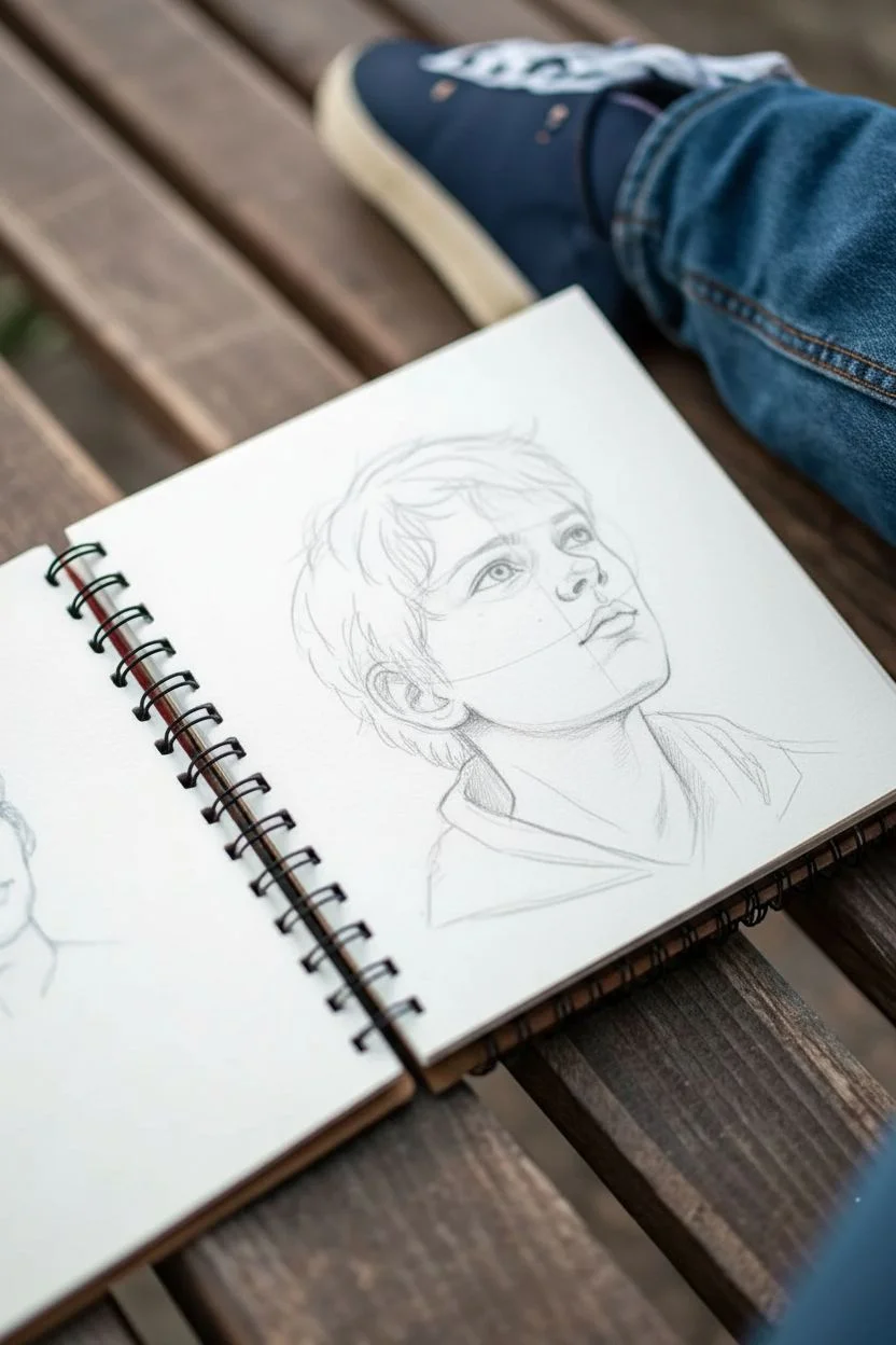
Head structure:
Begin with a light graphite circle for the cranium. Draw a curved center line to indicate the upward tilt of the head, and extend the jawline down softly, keeping the chin slightly rounded to maintain a youthful look. -
Feature placement:
Sketch horizontal guidelines for the eyes, nose, and mouth. Since the subject is looking up, curve these lines upward significantly. Place the eyes wide apart and position the nose closer to the eyes than the mouth to reflect a child’s facial proportions. -
Refining the face:
Lightly draw the irises looking upward. Outline the nostrils (which become more visible at this angle) and the soft parting of the lips. Sketch the ear, aligning the top of it with the eyebrow line. -
Hair and clothing:
Map out the hair with loose, sweeping strokes that flow away from the forehead. I find it helpful to group hair into large clumps rather than individual strands. Sketch the collar of a hoodie or jacket loosely around the neck.
Freckle Trick
Don’t tap the pencil straight down for freckles. Instead, use a tiny circular motion or a slight flick. This prevents perfectly round dots and creates irregular, organic shapes.
Step 2: Applying Color Washes
-
Skin base tone:
Mix a very watery wash of peach or light ochre. Apply this over the face and neck, avoiding the whites of the eyes. Let the watercolor pool slightly around the eyes and nose for natural shadows. -
Adding warmth:
While the base is still slightly damp, drop a touch of diluted reddish-pink onto the cheeks, nose tip, and the outer rim of the ear to give him a flushed, healthy glow. -
Hair underpainting:
Apply a wash of burnt sienna or rusty orange to the hair area. Don’t worry about staying perfectly in the lines; loose edges add to the sketchbook aesthetic. -
Clothing blocking:
Paint the hoodie with a cool blue tone. Use a slightly saturated mix for the shadows in the fabric folds and a watery mix for the illuminated areas. -
Background mood:
Add faint, abstract washes of green and yellow behind the head to suggest an outdoor setting without defining specific details.
Step 3: Defining with Pencils
-
Enhancing features:
Once the paint is completely dry, use a sharpened graphite pencil or dark brown colored pencil to re-outline the eyes. Add pupils and darken the lash line. -
Building hair texture:
Take a rust-colored pencil and draw quick, flicking strokes in the direction of hair growth. Add deeper shadows near the roots and behind the ear with a dark brown pencil. -
Creating freckles:
Using a reddish-brown pencil, dot freckles across the nose and cheeks. Vary the pressure and size of the dots so they look natural and random, not like a pattern. -
Contouring the face:
Use a light brown pencil to gently shade under the jawline, inside the ear, and beneath the bottom lip. Smudge slightly with your finger if the lines look too harsh. -
Clothing details:
Strengthen the shadows in the blue hoodie using a dark blue or indigo pencil. Hatch over the painted area to add texture to the fabric. -
Final highlights:
Use a white gel pen or a tiny dot of white gouache to add a ‘catchlight’ to the pupils. This brings the character to life instantly.
Level Up: Lighting
Add a secondary light source by lightly shading one side of the face with a cool blue pencil. This ‘rim light’ separates the character from the background.
Close your sketchbook knowing you’ve captured a fleeting moment of childhood wonder
Build a Character From Accessories
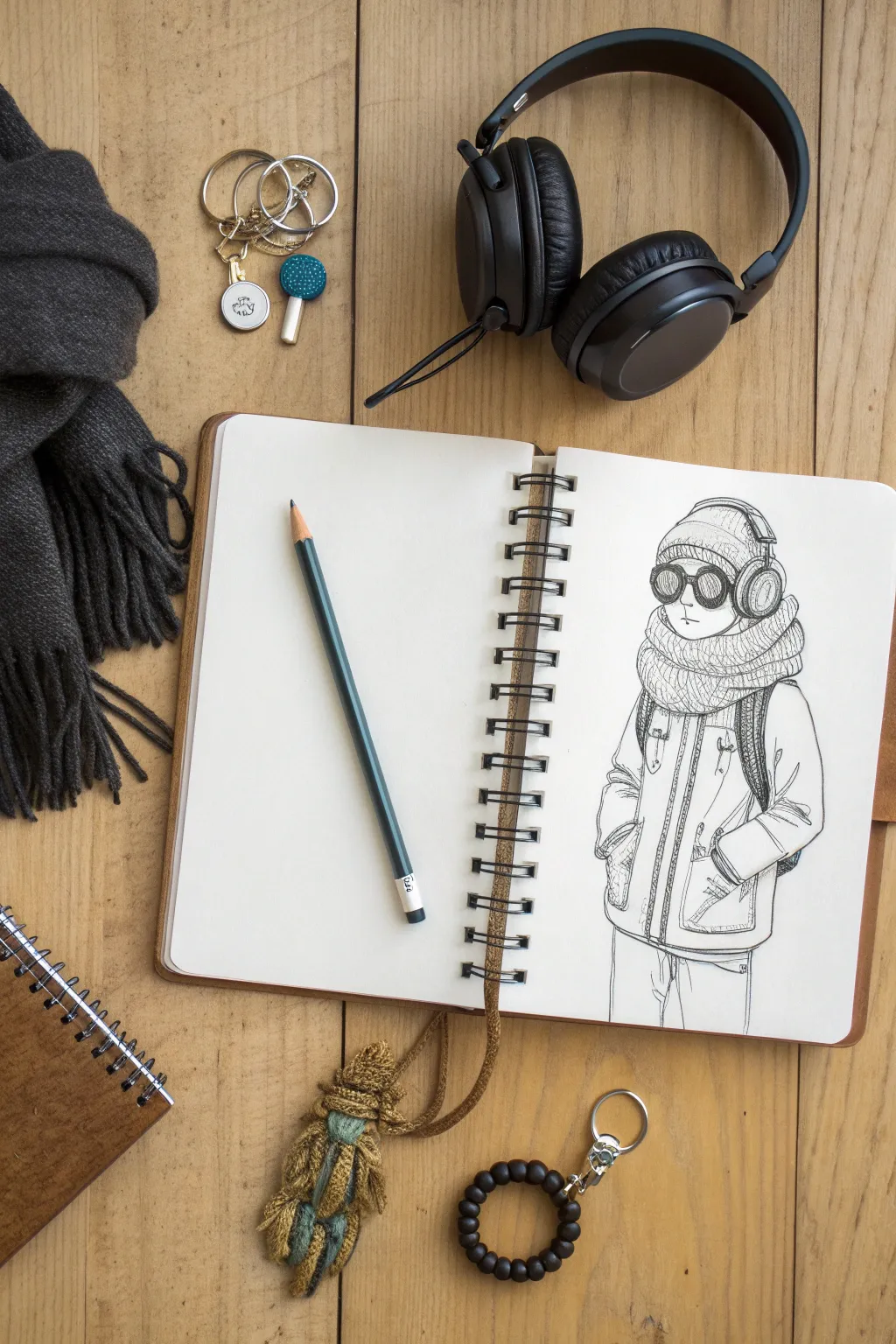
Transform a collection of winter accessories into a stylish character illustration using simple pencil techniques. This project focuses on sketching textures like knitwear and puffy fabric to bring a cozy, cold-weather personality to life.
Detailed Instructions
Materials
- Spiral-bound sketchbook with smooth or slightly textured paper
- HB graphite pencil for initial sketching
- 2B or 4B graphite pencil for shading and dark lines
- Kneadable eraser
- Reference objects (scarf, headphones, goggles – optional but helpful)
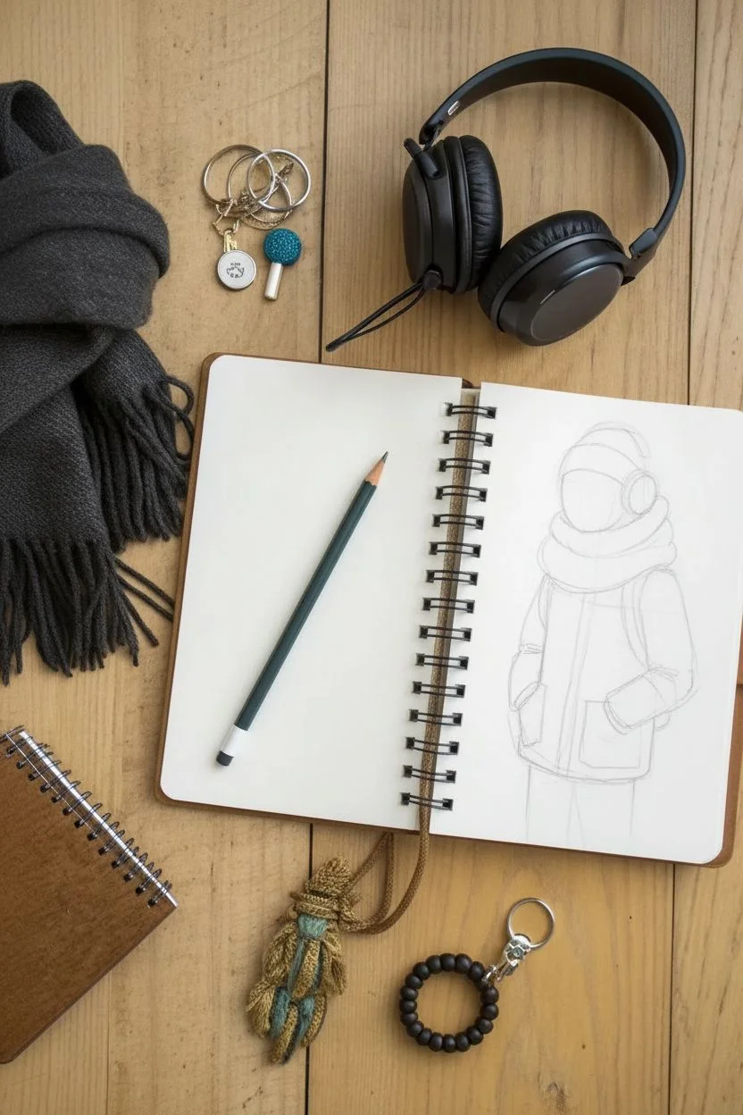
Step 1: Basic Structure
-
Establish the pose:
Start by lightly drawing a vertical line to mark the center of your figure. Sketch a simple oval for the head and move downwards to block in the torso. Keep your lines very faint so they can be erased later. -
Block in the outerwear:
Around the torso, sketch a large, boxy rectangle to represent the winter coat. It should feel slightly oversized. Add rough tubular shapes for the arms, positioning them close to the body as if the hands are tucked away. -
Position the accessories:
Sketch a large circle around the neck area for the thick scarf. On top of the head oval, add a dome shape for the beanie and two circles on the sides for headphones.
Fabric Weight
To fix floating clothes, make your bottom lines heavier. Thick, dark lines at the bottom of the scarf and coat hem visually weigh the fabric down.
Step 2: Adding Details
-
Draw the goggles:
In the middle of the face, draw two large, round circles for the goggles. Connect them with a small bridge over the nose area. The face below is minimal, just a small suggestion of a nose and mouth. -
Refine the headphones:
Flesh out the headphones by drawing the band curving over the beanie. Make the ear cups thick and cushioned looking, overlapping the beanie slightly. -
Detail the scarf:
Draw the scarf with chunky, wrapping lines. Instead of a smooth donut shape, create folds and overlaps to show it’s wrapped tightly around the neck. I like to add little distinct curves at the edges to suggest volume. -
Shape the coat:
Define the jacket’s opening with a double line down the center for the zipper flap. Add large patch pockets near the hips where the hands are resting. -
Add the backpack straps:
Sketch curved straps coming from the shoulders and disappearing under the arms to suggest a backpack is being worn. Give them a little thickness.
Step 3: Texture and Shading
-
Create the knit texture:
Switch to your darker pencil (2B or 4B). For the beanie and scarf, draw short, vertical hatching lines that follow the curve of the fabric. This mimics a ribbed knit texture. -
Darken the goggles:
Fill in the lenses of the goggles with a dark, solid tone, leaving a small white sliver on one side to represent a reflection. This contrast makes them look shiny. -
Texture the headphones:
Add small diagonal hatch marks on the headphone cups to suggest padding or mesh. Darken the undersides where they meet the beanie for depth. -
Define the coat seams:
Go over the main lines of the coat with confident, darker strokes. Add stitching details—small dashed lines—along the zipper flap and pockets to make it look like sewn heavy fabric. -
Add folds and wrinkles:
Add crease lines near the elbows and around the pockets where the fabric bunches up. Winter coats are stiff but do fold, so use jagged, angular lines rather than soft curves here. -
Shade the depths:
Add shading under the scarf where it casts a shadow on the coat, and inside the pocket openings. This gives the drawing a three-dimensional feel. -
Final clean up:
Use your eraser to remove any remaining construction lines from the first phase. Strengthen the outer contour lines of the character to make them pop off the page.
Seasonal Switch
Swap the winter gear for summer accessories: replace the beanie with a cap, the scarf with a necklace, and the puffy coat with a t-shirt to create a summer version.
Flip through your sketchbook to find your new character ready for the cold weather
BRUSH GUIDE
The Right Brush for Every Stroke
From clean lines to bold texture — master brush choice, stroke control, and essential techniques.
Explore the Full Guide
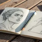
Facial Feature Mix-and-Match
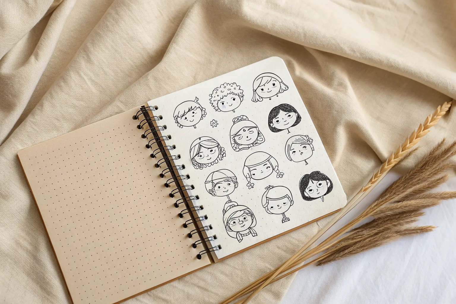
This minimalist sketchbook spread showcases a grid of twelve unique character portraits, each with its own distinct hairstyle and personality. Using light, delicate line work on dot grid paper creates a clean and organized study that is perfect for practicing facial features and expressions.
Step-by-Step
Materials
- A5 Dot Grid Notebook (cream paper recommended)
- Mechanical Pencil (0.5mm, HB or B lead)
- Fine Liner Pen (0.1mm or 0.05mm, black)
- Kneaded Eraser
- Ruler (optional, for spacing)
Step 1: Planning the Layout
-
Visualize the Grid:
Open your dot grid notebook to a fresh spread. We will be working primarily on the right-hand page. Visualize a 3×3 or 3×4 grid structure. In the reference image, the artist has arranged the heads in roughly three columns and three main rows, though they aren’t perfectly aligned in boxes, giving it a more organic feel. -
Mark Center Points:
Using your mechanical pencil very lightly, mark a small ‘x’ or dot where the center of each face will go. Aim for roughly 9 distinct spots. Leave about 1.5 inches of breathing room between each center point to accommodate hair and hats without overlapping.
Keep It Loose
Hold your pen further back on the barrel when drawing hair. This forces your hand to make sweeping, energetic strokes rather than stiff, jagged lines.
Step 2: Drafting the Head Shapes
-
Basic Oval Construction:
At each of your marked center points, lightly sketch a basic oval shape. These don’t need to be identical; vary the jawlines slightly—some pointier, some square, some rounder—to create character variety right from the start. -
Guideline Crosses:
Draw faint vertical and horizontal lines through each oval. The horizontal line is for the eyes (about halfway down the head), and the vertical line defines the direction the face is looking (mostly 3/4 view or straight on). -
Neck Placement:
Add two small lines extending downward from the bottom of the ovals to indicate necks. Keep them slender and elegant to match the style shown.
Uneven Eyes?
If one eye looks wonky, don’t erase the ink. Instead, thicken the upper lash line of the smaller eye or add bangs/hair strands to verify cover the asymmetry.
Step 3: Adding Facial Features
-
Eye Positioning:
On your eye-lines, sketch almond shapes. Keep the eyelids somewhat heavy or defined. Notice in the reference that the eyes are quite large relative to the face, giving them an expressive look. -
Nose Construction:
Draw the noses. For this style, less is more. Sometimes just a small ‘L’ shape for the tip and a dot for a nostril is enough. Vary the shapes: button noses, straight bridges, etc. -
Mouths and Expressions:
Sketch the lips about halfway between the nose and chin. Use a slightly darker line for the separation between the lips and a lighter touch for the bottom lip outline. -
Refining Contours:
Go back over the jawlines. I like to soften the connection where the jaw meets the ear area. Ensure the ears are placed roughly between the eye line and nose line.
Step 4: Hairstyles and Accessories
-
Top Row Styles:
For the top row, try adding headwear. Sketch a beanie on one (curving lines wrapping around the skull) and a wide-brimmed hat on another. Remember that hats sit *on top* of the skull volume, not flush with the scalp line. -
Middle Row Movement:
Create flowy hair for the middle characters. Draw a long bob with a side part for one, and perhaps a messy bun or tied-back look for another. Use long, sweeping pencil strokes to indicate hair direction rather than drawing every single strand. -
Bottom Row Textures:
Experiment with texture here. Try a character with a textured hood or a ruffled collar (like the bottom center figure). For the character on the bottom right, try a short, wavy pixie cut. -
Shoulder Hints:
Extend a few simple lines from the necks to suggest shoulders or collars. Don’t draw full torsos; let lines fade out or end abruptly to maintain the ‘sketchbook study’ aesthetic.
Step 5: Inking and Finishing
-
Initial Inking:
Does your pencil draft look balanced? Great. Now take your 0.1mm fine liner. Trace over your best pencil lines. Use confident, continuous strokes for the face outlines. -
Detail Work:
Switch to an even finer pen if you have it (0.05mm) for the eyes and lip details. This prevents the features from looking too heavy or cartoonish. -
Adding Texture:
Add minimal hatching for shadows under the chin or the brim of a hat. Use broken lines for hair strands to suggest shine and volume without cluttering the drawing. -
Erase and Assess:
Wait at least 5-10 minutes for the ink to fully dry (smudges are heartbreaking at this stage!). Gently erase all underlying pencil marks with your kneaded eraser. -
Final Touches:
Look at the spread as a whole. If any character feels too ‘light’, add a slightly thicker line to the jaw or hair on the shadow side to weigh it down visually.
Now you have a charming collection of faces ready to be colored or left as elegant line art.
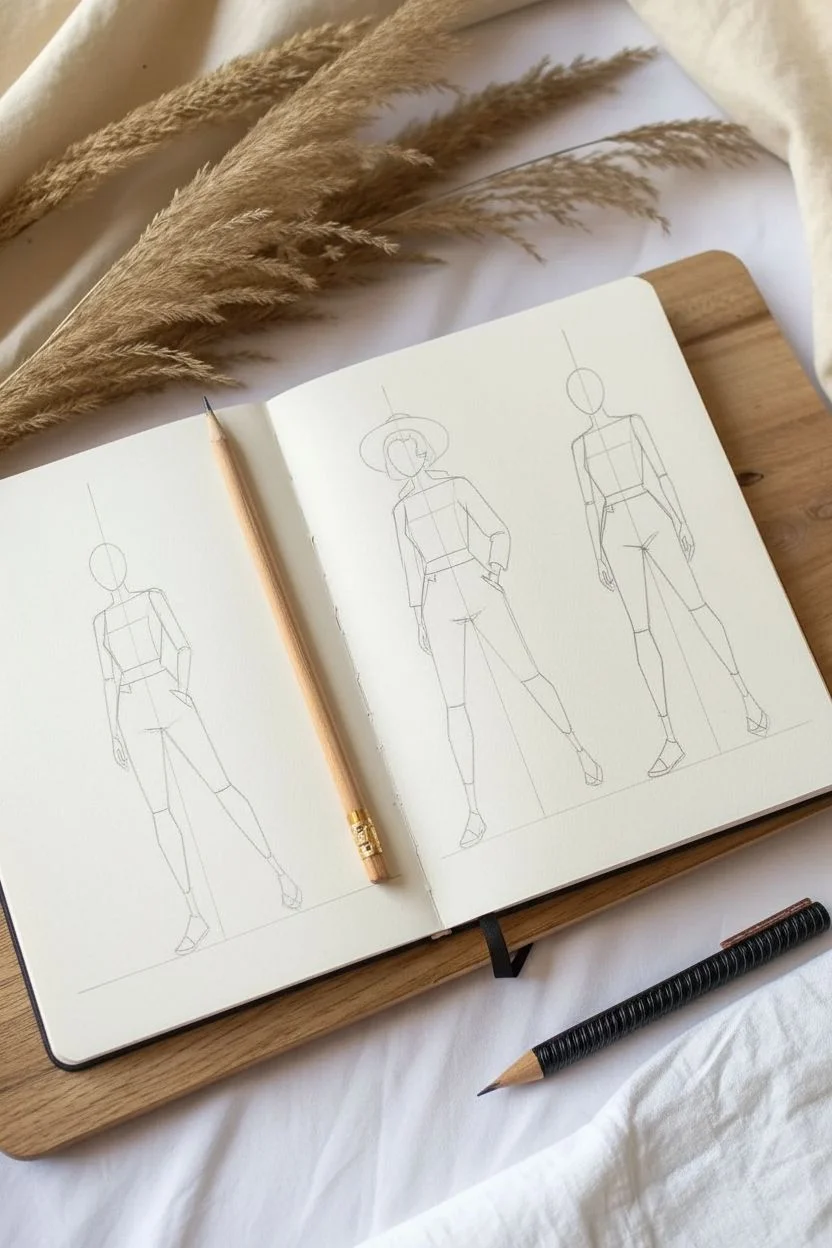
Emotion Through Body Language
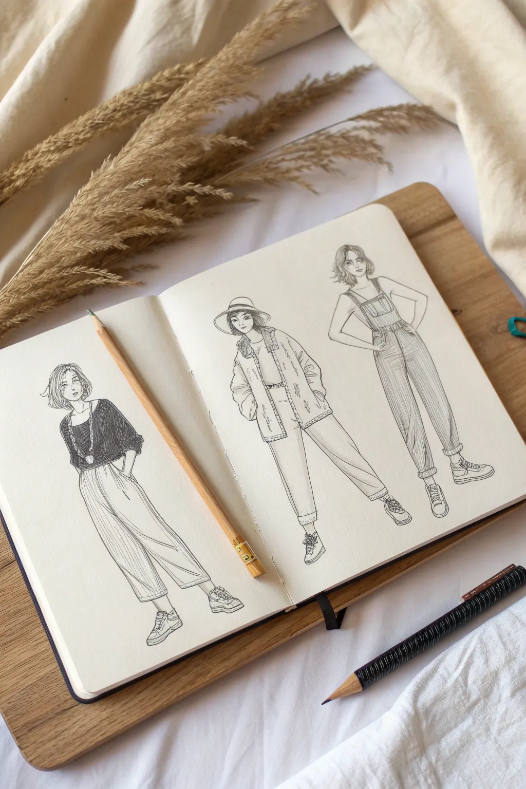
Capture the effortless vibe of street fashion with this three-figure character study in your sketchbook. You’ll practice conveying attitude through posture while rendering different fabric textures like denim, cotton, and wool using simple hatching techniques.
Step-by-Step Guide
Materials
- Sketchbook (heavyweight paper preferred)
- Hard graphite pencil (H or 2H) for underlying structure
- Soft graphite pencil (HB or 2B) for detailing
- Fine liner pen (0.1mm or 0.3mm black)
- Kneaded eraser
- Pencil sharpener
Step 1: Base Construction
-
Establish the horizon:
Imagine a faint ground line across both pages to keep your figures grounded. Position the first figure on the far left page, and the other two spaced evenly on the right page. -
Gesture lines:
Using your H pencil with a very light hand, draw a vertical line of action for each figure. Curve the left figure’s line slightly to suggest a relaxed lean, keep the middle one straighter for a confident stride, and angle the right one for a hand-on-hip pose. -
Head and torso blocking:
Sketch oval shapes for heads and simplified trapezoids for the torsos. Pay attention to the shoulder angles; tilting them slightly adds personality and prevents the drawing from looking stiff. -
Limb wireframes:
Draw stick-figure lines for arms and legs to establish length and joint positions. Sketch small triangles for feet and circles for hands.
Fabric Weight Tip
Draw heavy fabrics (denim) with angular folds and straight lines. Draw light fabrics (cotton) with curvy, draping lines to show weight differences.
Step 2: Roughing the Forms
-
Flesh out the bodies:
Add volume to your stick figures using cylinders and ovals. Keep the anatomy fairly slender and stylized to match the fashion illustration aesthetic. -
Drafting the left figure:
Sketch a boat-neck top and wide-leg trousers on the first character. Draw the pants billowing out from the waist and tapering slightly at the ankle. -
Drafting the middle figure:
Outline a shirt tucked into high-waisted pants for the center character. Add an oversized jacket draped over the shoulders and a wide-brimmed hat. -
Drafting the right figure:
Draw classic overalls for the final character. Include the straps over the shoulders and the bib pocket on the chest. -
Refine facial features:
Lightly mark eye lines and center lines on the faces. Sketch simple, expressive features—large eyes and small noses work well for this style.
Step 3: detailing & Inking
-
Start the ink work:
Switch to your fine liner. Begin outlining the hair on all three figures, using quick, flicking strokes to suggest layers and movement. -
Left figure details:
Ink the loose clothing of the first girl. Use long, vertical lines on the trousers to simulate pleats and flow. Darken the top completely with tight hatching to create contrast. -
Middle figure textures:
For the jacket, use broken, jagged lines to suggest a thicker material like denim or wool. Add seam details and pockets. -
Right figure denim:
On the overalls, use vertical hatching lines running down the legs to mimic the texture of denim fabric. Keep the strokes close together. -
Shoes and accessories:
Detail the sneakers on all figures with laces and sole definition. Add the necklace on the first figure and define the hat brim on the second. -
Final facial details:
Carefully ink the eyes and lips. I find that leaving a tiny gap in the outline of the jaw can make the face look softer.
Inking Confidence
If your hand shakes while inking long lines (like trouser legs), try exhaling steadily as you draw the stroke to stabilize your movement.
Step 4: Finishing Touches
-
Erase pencil guides:
Wait until the ink is completely dry to avoid smudging, then gently erase all your initial graphite construction lines with the kneaded eraser. -
Reinforce shadows:
Go back in with your pen or a softer B pencil to deepen shadows under the chins, inside the jackets, and at the hemlines. -
Grounding shadows:
Add a few quick scribbles beneath the sneakers to ground the figures so they don’t look like they are floating.
Take a moment to admire how your simple lines have come together to create three distinct personalities on the page


Dynamic Action Snapshot
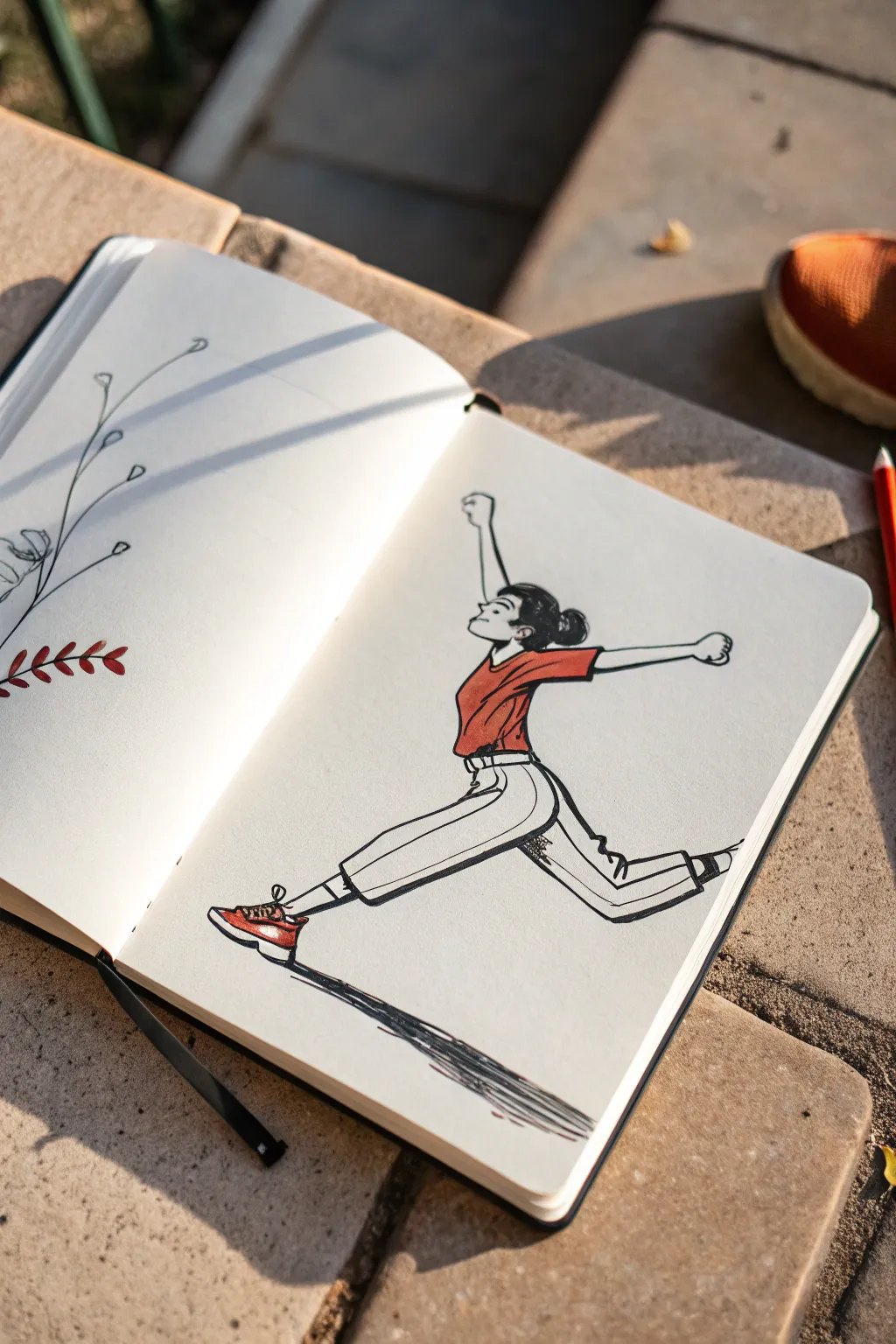
Capture the energy of a runner mid-stride with this dynamic character sketch. Using fluid ink lines and a pop of marker color, you’ll create a lively illustration that feels like a snapshot of movement right in your sketchbook.
Step-by-Step Tutorial
Materials
- Sketchbook (smooth, heavyweight paper preferred)
- Graphite pencil (HB or 2B)
- Eraser (kneaded or vinyl)
- Black fineliner pens (0.3mm and 0.5mm)
- Red-orange alcohol marker or brush pen
- Burnt orange or dark red marker (for shading)
- Reference photo of a runner/dancer (optional)
Step 1: Gesture & Skeleton
-
Establish the Line of Action:
Start with a light pencil swoosh that defines the main flow of movement. For this leaping pose, visualize a curve stretching from the back foot all the way up through the spine to the raised arm. -
Map the Torso and Hips:
Sketch a simple oval for the ribcage and a tilted box shape for the pelvis. Because she is leaning back slightly, tilt the ribcage oval upward. -
Position the Limbs:
Use stick lines to place the legs. Extend the front leg forward with a slight bend at the knee, and kick the back leg out behind. Position the arms to counterbalance—one reaching forward/up, the other back.
Stiff Pose Syndrome?
If the figure looks frozen, exaggerate the ‘line of action’ curve more than seems natural. Bending the spine and limbs further creates a sense of speed and force visual flow.
Step 2: Fleshing Out the Form
-
Define the Legs and Pants:
Draw the volume of the wide-legged pants around your stick-figure legs. Keep the lines near the ankles wider to suggest loose fabric catching the air. -
Add Shoes:
Sketch the sneakers. The front foot should be angled upward (dorsiflexed) while the back foot is pointed, emphasizing the push-off energy. -
Draft the Upper Body:
Outline the T-shirt. Add fold lines where the fabric bunches at the waist and stretches across the chest. Sketch the head profile, keeping the chin lifted. -
Refine the Hair:
Draw the hair pulled back into a simple bun. Add a few loose strands near the forehead to show movement against the wind.
Add Motion Lines
Enhance the speed by adding thin, swift ‘woosh’ lines behind the feet or hands. Keep them minimal and parallel to the direction of movement for a comic-book effect.
Step 3: Inking the Lines
-
Outline the Body:
Switch to your 0.5mm fineliner. Trace your pencil lines with confident, quick strokes. Speed helps keep the lines looking energetic rather than shaky. -
Add Fabric Details:
Use the thinner 0.3mm pen for clothing folds, the seam of the pants, and facial features. Scribble a bit of texture on the back leg’s knee area to suggest dirt or shadow. -
Ground the Figure:
Beneath the feet, sketch a series of loose, horizontal scribbles to represent a shadow. This is crucial—it visually lifts the character off the ground. -
Erase Guidelines:
Wait a moment for the ink to set, then gently erase all visible pencil marks to clean up the page.
Step 4: Adding Color & Depth
-
Base Color for the Shirt:
Take your red-orange marker and fill in the t-shirt completely. Work wet-on-wet to avoid streaky lines. -
Shadowing the Shirt:
While the base layer is fresh, use your darker red marker to add shadows under the armpit and along the side of the torso. -
Coloring the Shoes:
Apply the same red-orange color to the main body of the sneakers, leaving the soles and laces white for contrast. -
Hair and Details:
Fill in the hair and the bun with quick black strokes using your thicker pen or a brush pen/marker. Leave a tiny white sliver near the top for a highlight. -
Final Shadow Touches:
Use the black pen to thicken the ground shadow. I like to add a second pass of scribbles right at the center of the shadow for extra depth.
Now flip to the next page and draw the next frame of her movement
Character Reaction Prompt
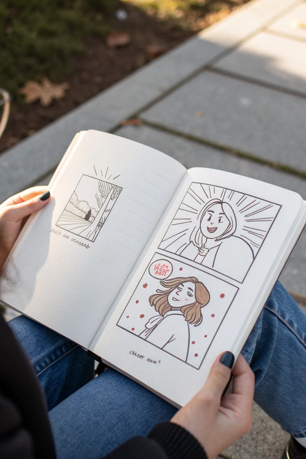
This sketchbook exercise focuses on capturing different emotional states in a comic strip format, contrasting a bold, expressive close-up with a softer, introspective moment. It’s a fantastic way to practice character acting on paper using simple ink line work and subtle coloring.
Step-by-Step
Materials
- A5 Sketchbook or heavy mixed media paper
- Pencil (HB or H for sketching)
- Eraser
- Fine liner pens (Black, 0.1mm, 0.3mm, and 0.5mm)
- Ruler
- Alcohol-based markers (pale skin tone, light brown, pink)
- White gel pen (optional for highlights)
Step 1: Setting the Stage
-
Layout lines:
Begin by lightly sketching your panel borders with a pencil and ruler. On the right page, draw a large rectangle and divide it horizontally into two equal squares. On the left page, mark out a smaller, single square centered near the top. -
Ink the frames:
Using your 0.5mm pen and ruler, ink over the pencil lines to create crisp, solid borders for your comic panels. Keep the corners sharp and clean.
Keep it Clean
Place a scrap piece of paper under your hand while drawing. This prevents graphites smudges and oils from your skin transferring to the clean white page.
Step 2: Drawing the ‘Shock’ Panel
-
Sketch the face:
In the top right panel, lightly sketch a character facing forward with an expression of surprise or delight. Draw wide, oval eyes, raised eyebrows, and an open, smiling mouth. -
Add impact lines:
Radiate straight lines outward from the character’s head towards the panel edges to create a classic ‘shock’ or realization effect. These don’t need to be perfectly straight; hand-drawn lines add energy. -
Inking outlines:
Go over your character sketch with the 0.3mm pen. Use confident, continuous strokes for the hair and jawline. Thicken the upper lash line slightly to frame the eyes. -
Inking background lines:
Use a thinner 0.1mm or 0.2mm pen for the radiating background lines so they don’t compete with the main character portrait.
Fixing Smears
If you accidentally smear wet ink, turn it into a stylistic choice! Add speed lines or wind effects over the smudge to disguise it as part of the motion.
Step 3: Drawing the ‘Bliss’ Panel
-
Draft the pose:
In the bottom panel, sketch the same character in a side profile or 3/4 view, looking upward. Tilt the head back slightly to convey relaxation or daydreaming. -
Hair flow:
Sketch the hair showing movement, as if a gentle breeze is blowing it back. This contrasts with the static energy of the top panel. -
Add dialogue bubble:
Draw a small, oddly shaped speech bubble near the top left of this panel. Inside, sketch some abstract shapes or foreign text to represent internal thought or mumbling. -
Refining ink:
Ink this panel with the 0.3mm pen. Keep the lines for the closed eyes very simple—just gentle curves. Ink the speech bubble with a slightly heavier line weight. -
Atmosphere elements:
Draw small floating circles or ‘bubbles’ around the character to enhance the dreamy atmosphere.
Step 4: The Scenic Insert
-
Landscape sketch:
On the left page, inside your small frame, sketch a simple outdoor scene. Draw a horizon line, a suggestion of trees, and perhaps a fence or path leading away. -
Minimalist inking:
Ink the landscape sparsely. Use short, broken lines for grass and jagged shapes for tree foliage. Keep it looser than the character portraits. -
Radiant lines:
Add a few small lines radiating from the top of the frame to suggest sunlight or a flash of memory.
Step 5: Color and Final Details
-
Skin tones:
Wait for the ink to be completely dry. Gently apply a pale skin tone marker to the faces. I like to do a quick swatch on a scrap paper first to ensure the color isn’t too dark. -
Hair shading:
Color the hair with a light brown marker. Leave a small gap or ‘halo’ of white near the crown of the head to represent shine. -
Blush effect:
Use a pink marker or colored pencil to add small oval blush marks on the cheeks in the bottom panel. -
Bubble accents:
Color the floating circles in the bottom panel with solid red or pink to make them pop against the white background. -
Adding text:
Underneath the landscape box and the bottom character panel, write a small caption in cursive or small caps to tie the narrative together. -
Clean up:
Once all ink and marker is dry, gently erase any visible pencil sketch lines to leave your comic crisp and clean.
You now have a charming character study that balances high energy with peaceful introspection
Opposite Personality Redesign
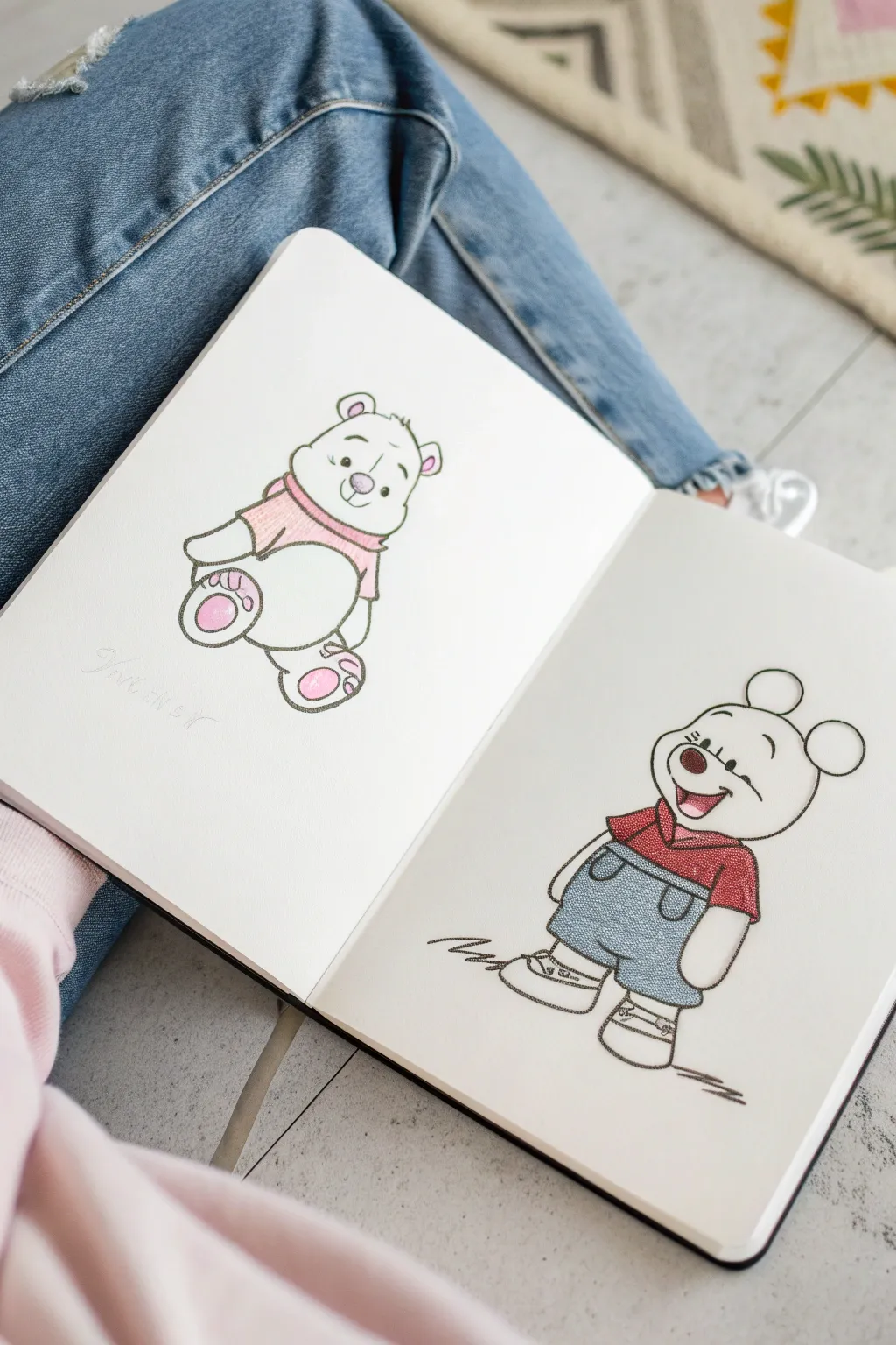
This creative exercise explores character design by reimagining a classic bear in two distinct styles across a sketchbook spread. The left page features a soft, pastel-toned sitting pose, while the right showcases a bolder, outfit-wearing standing variation.
How-To Guide
Materials
- Sketchbook (heavyweight paper recommended)
- H or HB pencil for initial sketching
- Fine liner pen (0.3mm or 0.5mm, black)
- Colored pencils (soft pink, deeper pink, red, denim blue)
- Kneaded eraser
- Pencil sharpener
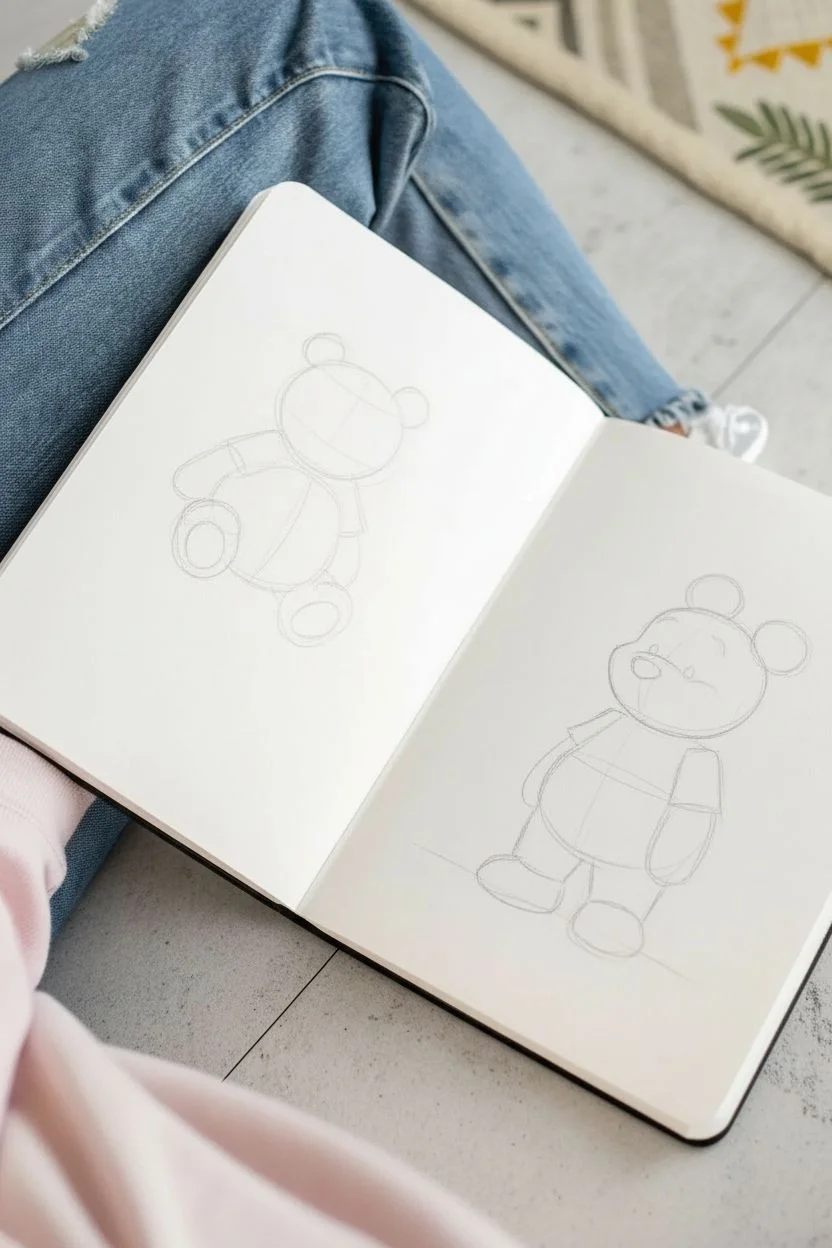
Step 1: Planning and Sketching
-
Position the page spread:
Open your sketchbook to a fresh two-page spread. To capture the casual vibe of the reference photo, you might want to work with the book resting on your lap, though a flat desk ensures steadier lines. -
Construct the left character:
On the left page, lightly sketch a rounded pear shape for the body and a circle for the head to form the sitting bear. Keep your pencil pressure very light so these guidelines can be erased later. -
Add sitting limbs:
Draw two rounded ovals near the bottom of the body for feet, facing outward. Add two smaller curves near the top of the body for arms resting on the belly. -
Construct the right character:
On the right page, sketch a similar head shape but place it higher up. Draw a more rectangular body shape to indicate a standing posture. -
Draft the standing pose:
For the standing figure, add legs extending downward with simple blocky shoes. Draw one arm hanging relaxed by the side and the other slightly bent.
Smudged Ink?
If your fine liner smears when erasing, you’re moving too fast. Test your pen on a scrap piece of paper first; water-based inks need longer to dry than alcohol-based ones.
Step 2: Refining Details
-
Define the faces:
Return to the sitting bear. Sketch a curved snout line and small, wide-set eyes. Add medium-sized, round ears on top of the head. -
Add ‘Opposite’ features:
On the right-hand character, change the expression. I like to give this one a wide, open-mouthed grin to contrast with the gentle smile on the left. Add distinctive round mouse-like ears instead of bear ears to emphasize the redesign. -
Clothing roughs:
Sketch a simple scarf or collar around the sitting bear’s neck. For the standing figure, outline a t-shirt and a pair of dungarees or overalls with straps.
Step 3: Inking
-
Outline the sitting bear:
Using your fine liner, carefully trace over your pencil lines for the left character. Use a broken or slightly jittery line style to give it a hand-drawn, fuzzy texture rather than a perfect geometric stroke. -
Outline the standing character:
Ink the right character with confident, smoother lines. Pay close attention to the details on the overalls, adding small circles for buttons and stitching lines on the pockets. -
Add ground shadows:
Beneath the standing figure’s shoes, draw a quick, scribbled zig-zag shadow to ground the character. -
Erase guidelines:
Wait at least five minutes for the ink to fully set, then gently remove all pencil marks with your kneaded eraser.
Style Swap
Try swapping the textures! Use the scribbly ‘denim’ texture on the left bear’s body to make him look like a stuffed toy, and keep the right character smooth.
Step 4: Coloring
-
Soft pink accents:
On the left bear, use a soft pink pencil to color the sweater collar. Press lightly to keep the texture airy. -
Paw details:
Use a slightly deeper pink or magenta to fill in the pads of the feet and the inner ears of the sitting bear. -
Bold red shirt:
Move to the standing character. Color the t-shirt with a saturated red pencil. You can build up opacity by layering the color in small circular motions. -
Denim texture:
For the overalls, use a denim blue pencil. Instead of coloring solidly, use a cross-hatching or stippling technique to mimic the texture of fabric. -
Final touches:
Add a tiny spot of pink to the tongue of the standing character and the nose of the sitting bear to tie the two designs together.
Enjoy your contrasting character study and consider adding a date or signature to mark your progress
Fantasy Class Character Concept
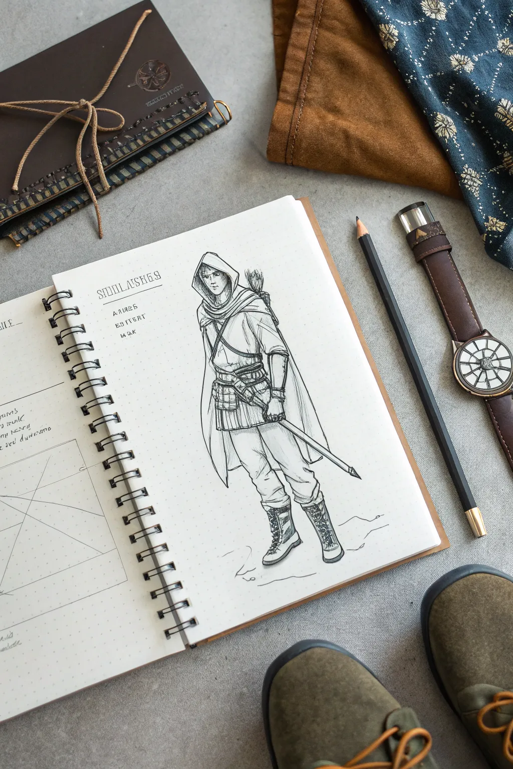
Bring a classic fantasy archetype to life with this detailed character sketch of a hooded ranger. The drawing focuses on capturing texture—from the heavy drape of the cloak to the structured leather of the boots—using clean lines and careful hatching.
Step-by-Step
Materials
- Spiral-bound sketchbook (dot grid or plain paper)
- H or HB pencil for initial sketching
- Fine liner pens (0.1, 0.3, and 0.5mm)
- Kneaded eraser
- Ruler (optional for layout lines)
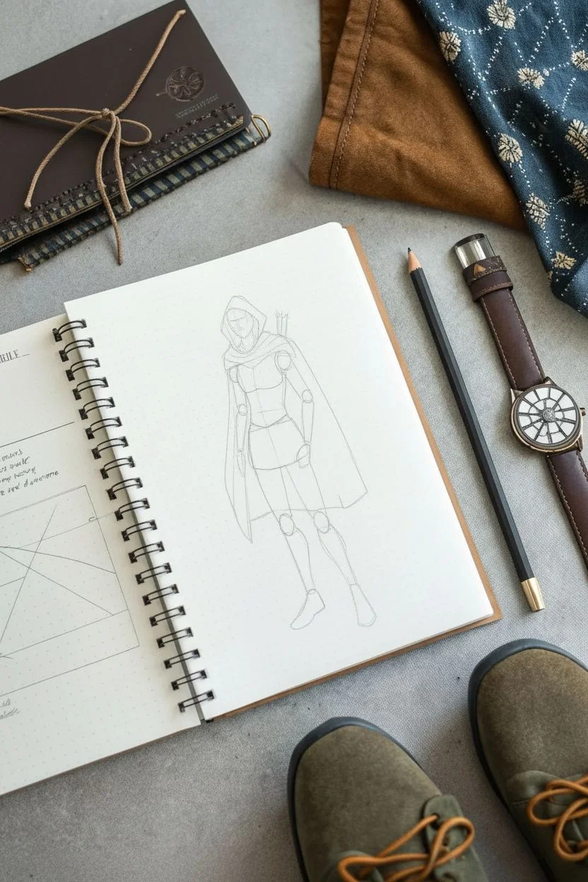
Step 1: Laying the Foundation
-
Establish the pose:
Start with a light H pencil to draw a simple stick figure or gesture line to set the stance. The figure is standing with their weight slightly shifted to the left leg, creating a relaxed but ready posture. -
Build the anatomy:
Flesh out the stick figure with basic geometric shapes. Use ovals for the chest and hips, and cylinders for the arms and legs. Keep the head oval slightly tilted down to accommodate the hood later. -
Draft the clothing silhouette:
Lightly sketch the outline of the outfit over the body forms. Focus on the triangular shape of the cloak hanging from the shoulders and the tunic ending mid-thigh.
Step 2: Designing the Costume
-
Draw the hood:
Sketch the hood draped over the head. Instead of a perfect triangle, let the fabric fold inward around the face opening to show thickness and weight. -
Create the tunic layers:
Define the tunic. It should look like layered fabric/armor. Add a belt cinched at the waist, pulling the fabric slightly to create localized wrinkles. -
Add gear details:
Draw the cross-body strap for the quiver. Sketch the quiver itself peeking over the right shoulder with fletching visible. Add the sword sheath hanging from the waist belt on the left side. -
Detail the boots:
Outline sturdy, calf-high boots. Indicate laces crisscrossing up the front and add thick soles to ground the character.
Uneven Ink Lines?
If your long lines for the cloak look shaky, try drawing from your shoulder rather than your wrist. This creates smoother, more confident strokes for flowing fabric.
Step 3: Inking the Character
-
Outline the face:
Switch to a 0.1mm fine liner. Carefully ink the face within the hood. Keep the features simple—eyes, a straight nose, and a neutral mouth—since the hood casts a shadow. -
Ink the cloak and tunic:
Use a 0.3mm pen for the main clothing lines. When inking the cloak, make long, fluid strokes. Break the lines slightly where fabric folds to keep the look organic rather than stiff. -
Define the belts and straps:
Go over the belts and straps with firm lines. Add small rectangles for buckles and clasps to give them a manufactured look distinct from the soft cloth. -
Texture the pants and boots:
Ink the pants with slightly jagged lines to suggest rougher material. For the boots, outline the sole firmly and draw the intricate lacing details carefully. -
Finalize the weapon:
Use a ruler or steady hand to ink the straight line of the sword sheath or staff held in the hand. Ensure the hand gripping it looks natural, with fingers wrapping around the handle.
Add an Environment
Give your ranger a home by sketching a faint background behind them—perhaps a few pine trees or a rocky outcrop—fading out at the edges.
Step 4: Shading and Finishing
-
Erase pencil guides:
Wait for the ink to dry completely to avoid smudging, then gently erase all the underlying pencil construction lines with a kneaded eraser. -
Hatch the shadows:
Using a 0.05mm or 0.1mm pen, add diagonal hatching lines to the shadowed areas: under the hood, beneath the cloak, and on the inner legs. -
Add fabric texture:
Add varied, short strokes on the tunic and pants to suggest the weave of the fabric. I find that less is more here—just a few lines can suggest a lot of detail. -
Ground the figure:
Sketch a few jagged, horizontal lines around the boots to represent the ground or terrain, giving the character a place to stand. -
Letter formatting:
To mimic the sketchbook style, add a title in a stylized, blocky font towards the top left. Add small ‘stat’ lines below it with scribbled text to simulate notes.
With your character complete, you now have a fantastic base for designing an entire adventuring party
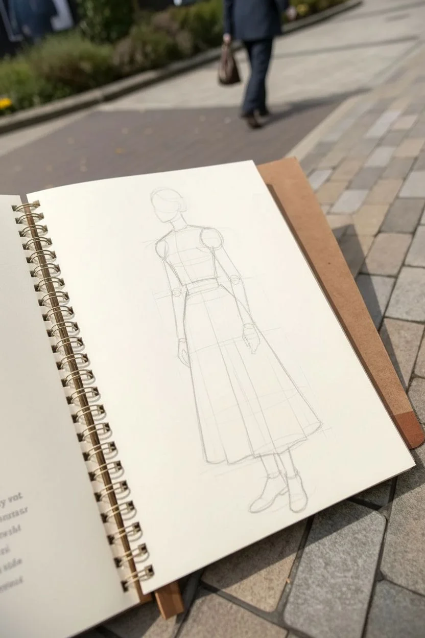
Historical-Inspired Character Outfit Study
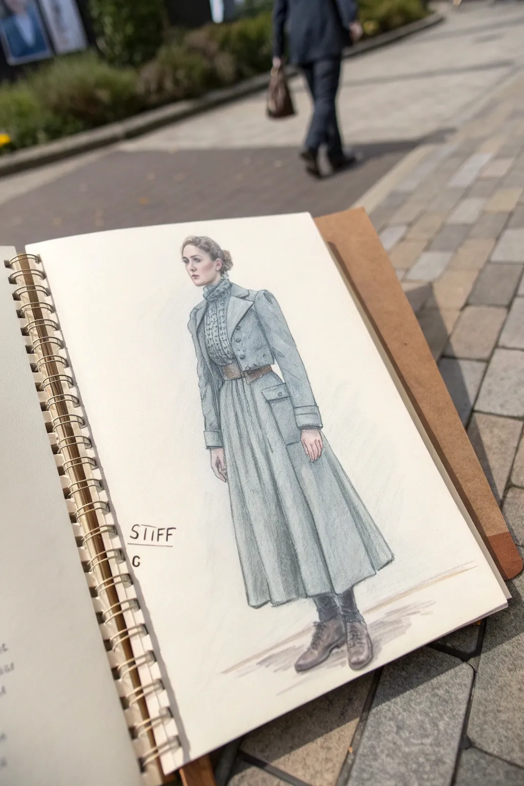
Capture the structured beauty of historical fashion with this detailed character study. This mixed-media sketch combines the precision of graphite with the softness of colored pencil to create a textured, atmospheric costume design.
Step-by-Step Tutorial
Materials
- Spiral-bound sketchbook (heavyweight paper suitable for mixed media)
- H or HB pencil for initial sketching
- Soft graphite pencil (2B or 4B) for shading
- Colored pencils (cool greys, slate blue, brownish-grey)
- Fine liner pen (0.1mm, optional for details)
- Kneadable eraser
- Reference image of Edwardian or Victorian walking suits
Step 1: Constructing the Figure
-
Establish the pose:
Begin with a very light stick figure to capture the gesture. The figure is standing in a three-quarter view, looking to the left. Mark the head, the slope of the shoulders, and the long vertical line of the spine down to the feet. -
Block in major shapes:
Flesh out the figure using simple geometric forms. Draw an oval for the head and a rectangular block for the torso. Sketch a long, flared cone shape for the skirt to establish the silhouette of the coat. -
Refine the anatomy:
Before adding clothes, lightly define the position of the arms hanging naturally by the sides and the orientation of the face. Ensure the head is proportional to the body height (approx. 1:7.5 ratio).
Fabric looking flat?
Focus on the folds. Fabric gathers where it is cinched (the belt) and flares where it hangs loose. Darken the ‘valleys’ of the pleats significantly more than the ‘peaks’ to create 3D depth.
Step 2: Drafting the Costume
-
Outline the bodice:
Draw the high collar of the blouse first. Then, sketch the structured jacket over it, noting the lapels and the button placements. The jacket should fit snugly at the waist. -
Add the belt and skirt:
Draw a distinct belt line at the natural waist. From there, extend the long skirt downwards. Add vertical fold lines to suggest pleats and the weight of the fabric draping toward the ankles. -
Detail the sleeves:
Sketch the sleeves, ensuring they have small gathers or ‘puffs’ at the shoulder cap, characteristic of the era. Add the distinct cuffs at the wrists. -
Draw the shoes:
At the bottom, sketch simple, laced ankle boots. They should look grounded, with the feet angled slightly outward to match the stance.
Step 3: Shading and Texture
-
Clean up the linework:
Use your kneadable eraser to lift away the construction lines, leaving only the clean outline of the character and outfit. -
Base layer of color:
Using a slate-blue or cool grey colored pencil, apply a very light, even layer of color over the coat and skirt. Keep your pencil strokes vertical to mimic the flow of the fabric. -
Deepen the shadows:
Pressing slightly harder with the same blue-grey pencil, darken the areas under the arms, beneath the belt, and in the deep folds of the skirt. This creates volume. -
Add pattern texture:
For the blouse front, use a sharpened pencil to create tiny stippling or small cross-hatch marks, suggesting a lace or textural pattern different from the smooth coat. -
Define the belt and boots:
Switch to a brown or warm grey pencil for the belt and boots. I find layering a bit of the skirt color over the boots helps tie the palette together nicely. -
Enhance the face:
Carefully draw the facial features with a sharp graphite pencil. Focus on the eye socket shadows and the jawline. Add a touch of pink or warm brown to the cheeks and hair for life.
Pro Tip: Paper Tone
Use off-white or cream paper instead of bright white. This instantly gives historical sketches a vintage, aged feel and makes cool-toned greys and blues appear richer.
Step 4: Final Touches
-
Cast shadow:
Ground the figure by sketching a rough, horizontal shadow under the boots using a broad graphite stroke. Smudge it slightly for a softer look. -
Intensify outlines:
Go back over key outlines—like the lapels, pockets, and hem—with a sharper, darker pencil stroke to make the drawing pop off the page. -
Add annotations:
If you wish to mimic the reference style, hand-letter a small label or name next to the figure (like ‘STIFF’) using simple, capital letters.
Now you have a timeless fashion study that beautifully captures the mood of a bygone era
Character in a One-Color Mood
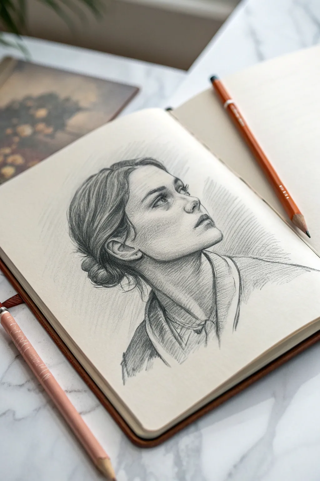
Capture the delicate strength of a profile view with this monochromatic character study. Using simple shading techniques and directional strokes, you will create an expressive portrait that feels both classic and energetic.
How-To Guide
Materials
- Sketchbook with smooth, off-white paper
- HB graphite pencil (for initial layout)
- 2B graphite pencil (for general shading)
- 4B or 6B graphite pencil (for deepest shadows/hair)
- Kneaded eraser
- Blending stump (optional)
- Mechanical pencil (optional for fine details)
Step 1: Structural Foundation
-
Establish the head tilt:
Begin with a very light HB pencil. Draw a loose oval for the cranium and a curved line extending down for the jawline. The key here is the tilt; angle the head upward to the right to create that looking-away gaze. -
Map the features:
Lightly sketch a curved vertical center line to act as the axis for the face. Mark horizontal guidelines for the eyes, bottom of the nose, and mouth. Notice that because the head is tilted up, these lines should curve slightly upward. -
Refine the profile outline:
Using short, searching lines, define the silhouette of the forehead, the bridge of the nose, and the chin. Keep the pencil pressure extremely light so you can erase easily if the proportions feel off. -
Place the ear and neck:
Locate the ear low on the side of the head, roughly aligned between the eye and nose lines due to the perspective. Sketch the thick column of the neck, extending down to suggest the collarbone area.
Loose Grip, Better Flow
Hold your pencil further back, away from the tip, especially when shading hair or background. This forces you to use your shoulder, creating smoother, more sweeping curves.
Step 2: Defining Features
-
Draw the eyes and brows:
Sketch the almond shape of the visible eye. Since we are looking up at her, the upper lid will be prominent. Indicate the eyebrow with soft, feathered strokes following the brow bone. -
Sculpt the nose:
Focus on the nostril shape and the under-plane of the nose. Don’t draw a hard outline for the bridge; instead, slight shading later will define it. The nostril should be a small, dark comma shape. -
Shape the lips:
Draw the mouth slightly open or relaxed. The upper lip is usually in shadow, intersecting with the lower lip. Ensure the corner of the mouth aligns correctly with the pupil of the eye above it. -
Block in the hair mass:
Outline the general shape of the hair, pulling it back into a low bun. Don’t draw individual strands yet; just map out the large shapes where the hair sweeps back from the forehead.
Step 3: Shading and Texture
-
Establish core shadows:
Switch to your 2B pencil. Apply flat, light shading to the side of the face away from the light source (under the chin, the cheek hollow, and the eye socket). Keep your pencil strokes uniform. -
Detail the ear:
Darken the inner folds of the ear. The complex cartilage shapes need crisp shadows to look realistic. Leave the outer rim (the helix) lighter to show it catching the light. -
Render the hair flow:
Using the 4B pencil, start adding directional strokes to the hair. Press harder at the roots and where the hair tucks into the bun. I like to lift the pencil at the end of each stroke to taper the line, simulating fine strands. -
Add hair wisps:
At the nape of the neck and in front of the ear, sketch loose, stray hairs. These shouldn’t be perfect; make them curve organically to add movement and realism to the style. -
Deepen the facial contrast:
Return to the face with the 2B or 4B pencil. Darken the pupil, the lash line, and the line between the lips to create focal points. Gently shade the neck to push it behind the jawline.
Smudged Graphite?
If your hand smears the drawing, place a scrap piece of paper under your palm as you work. This acts as a shield, keeping your skin oils off the paper and the graphite crisp.
Step 4: Clothing and Atmosphere
-
Sketch the collar:
Draw the collar and shoulder area loosely. Use quick, confident lines to suggest fabric folds without over-detailing them. The focus should remain on the face. -
Add cross-hatching:
On the neck and clothing shadows, apply loose cross-hatching (diagonal lines crossing each other). This sketching technique adds a nice artistic texture that contrasts with the smoother skin shading. -
Create the background mood:
Using the side of your pencil lead, add broad, diagonal shading strokes behind the head. This negative space shading makes the sunlit profile pop forward. -
Final highlights:
Use your kneaded eraser to tap or wipe away graphite on the high points of the face: the tip of the nose, the cheekbone, the forehead, and the sheen on the hair. -
Clean up edges:
Sharpen any muddied outlines, particularly around the chin and nose, but leave the hair and clothing edges slightly rough to maintain that fresh sketchbook aesthetic.
Now you have a dynamic character sketch that captures a quiet moment of observation.
Character Design Sheet With Variations
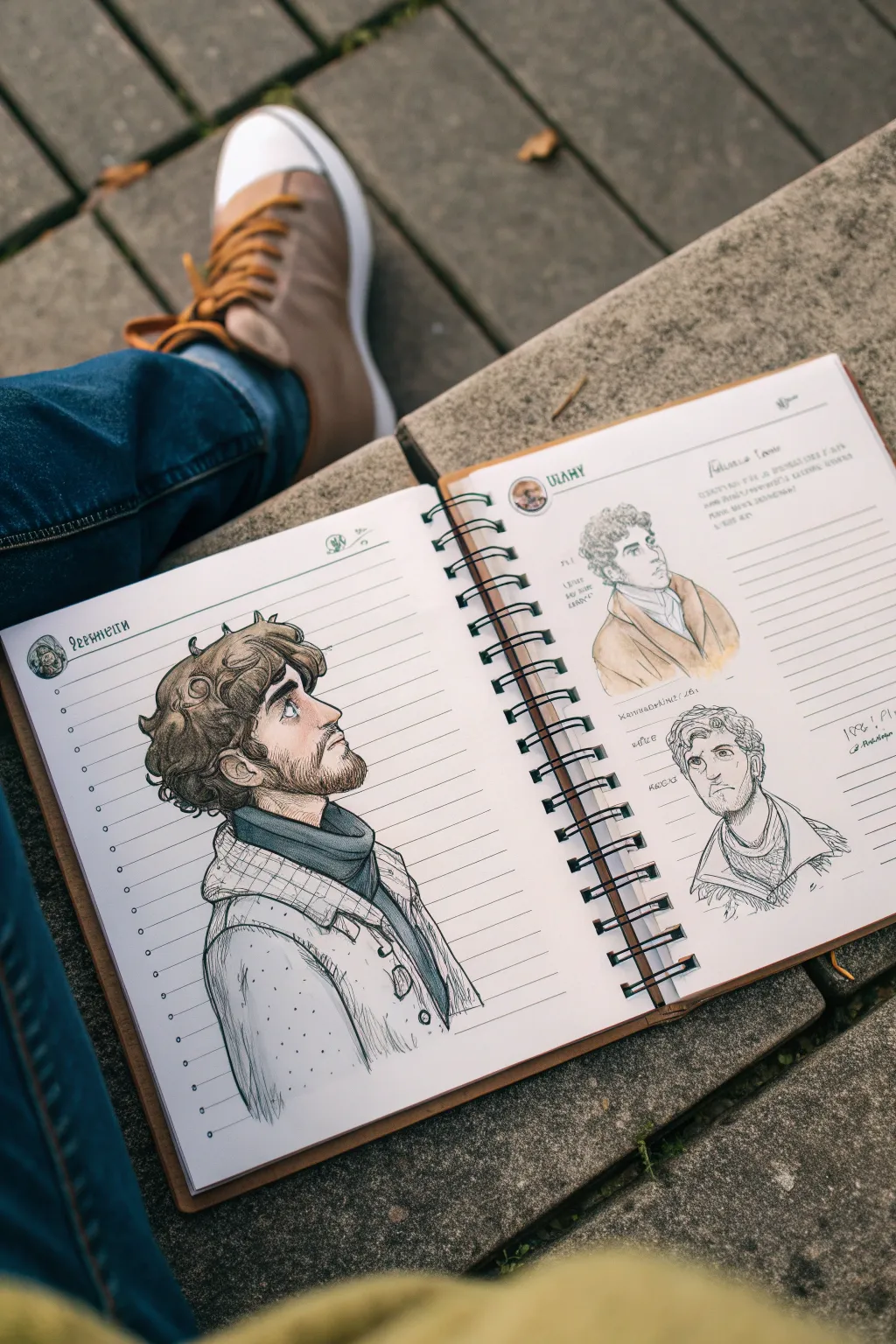
Capture the essence of a rugged character with this traditional media sketchbook spread. This project focuses on drawing the same character from multiple angles—profile, three-quarter, and front—combining loose pencil work with subtle marker coloring for a classic field-study aesthetic.
Step-by-Step Tutorial
Materials
- Spiral-bound sketchbook (heavyweight mixed-media paper recommended)
- H or HB graphite pencil for underdrawing
- Micro-pigment fineliners (0.1, 0.3, and 0.5 sizes, black or dark sepia)
- Alcohol-based markers (Skin tones: fair/pale; Hair: cool browns; Clothing: cool grey, slate blue)
- White gel pen for highlights
- Kneaded eraser
Step 1: Planning the Spread Layout
-
Establish the focal point:
Begin on the left page. Block out a large area for the main profile portrait. This should take up about two-thirds of the vertical space to allow for detailed coloring. -
Mark secondary sketches:
On the right page, lightly indicate positions for two smaller studies. Place one near the top right and another near the bottom center to create a balanced composition across the spread. -
Pencil in the profile structure:
Start the main drawing on the left. Sketch a circle for the cranium and a jawline extending down. Add the center line for the face profile, ensuring the nose bridge and brow ridge are prominent.
Keeping the Ink Fresh
Vary your line weight intentionally. Use thicker outline strokes for the ‘shadow side’ of the form (e.g., under the chin) and thinner lines for parts facing the light source.
Step 2: Drafting the Character Features
-
Define the profile features:
Refine the nose, lips, and chin on the profile view. Give him a slightly worried or contemplative expression by tilting the eyebrow upward near the center. -
Add hair and beard volume:
Sketch curly, tousled hair sitting high on the head. Draw the beard shape, keeping it rugged but trimmed along the jawline. Don’t draw individual hairs yet; just focus on the mass shapes. -
Draft the clothing:
Draw the collar of a turtleneck or scarf, followed by the lapels of a heavy coat. Focus on the folds around the neck to suggest the fabric’s weight. -
Sketch the secondary angles:
Move to the right page. For the top sketch, draw a three-quarter view looking slightly away. For the bottom sketch, outline a front-facing bust. Keep these drawings looser and smaller than the main portrait.
Step 3: Inking the Lines
-
Outline the main profile:
Using a 0.3 fineliner, firmly ink the main profile. Use broken lines for the hair to keep it looking soft, and thicker lines for the coat collar to show depth. -
Add facial details:
Switch to a 0.1 fineliner for delicate features like the eyes, nostrils, and ear details. Add small hatching lines under the jaw and in the ear for shadow. -
Ink the clothing texture:
On the coat, use sketchy vertical lines to suggest a wool or tweed texture. I find that not connecting every single line makes the fabric look more natural and worn. -
Ink the secondary sketches:
Ink the drawings on the right page. Leave the top one fairly open with minimal hatching, but add heavier hatching to the bottom sketch to give it a ‘study’ feel. Erase all pencil marks once the ink is totally dry.
Marker Bleed Issues?
If using standard notebook paper, place a loose sheet of cardstock underneath your current page. This catches bleed-through and protects the next clean sheet in your book.
Step 4: Coloring and Shading
-
Apply skin base tones:
Using a pale skin-tone alcohol marker, block in the face on the main profile. Leave the paper white for the eye highlight and bridge of the nose. -
add facial shading:
Layer a slightly darker skin tone under the brow, nose, and chin to create dimension. Add a touch of pink or red to the nose tip and ear for life. -
Color the hair:
Use a cool brown marker for the hair and beard. Leave the top curves of the curls uncolored or very light to simulate sheen. Go over the shadowed areas (behind the ear, nape of neck) with a second pass of the same brown. -
Color the coat:
Fill the scarf area with a dark charcoal or blue-grey marker. For the coat, use a very light cool grey, allowing the paper texture to show through slightly. -
Tint the secondary sketches:
On the right page, add only minimal color to the top sketch—just touches of skin tone and hair color. Leave the bottom sketch purely black and white ink for visual variety.
Step 5: Final Touches
-
Add highlights:
Use a white gel pen to add small dots to the eyes and a few strands in the hair on the main portrait. This makes the character pop off the page. -
Add notebook aesthetics:
To mimic an RPG or explorer’s journal, write tiny notes or stats next to the smaller sketches using a very fine pen. Add a header name or title at the top of the page in a stylized font.
Now you have a dynamic character reference sheet ready for your next story.
Have a question or want to share your own experience? I'd love to hear from you in the comments below!