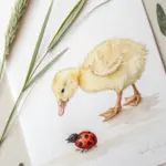
When you want drawing ideas easy, the best place to start is with simple shapes, bold lines, and subjects that look cute even if your lines wobble a little. I pulled together a mix of quick doodles, cozy mini-scenes, and beginner-friendly prompts that you can finish fast and feel proud of.
Cute Cat Face Doodle
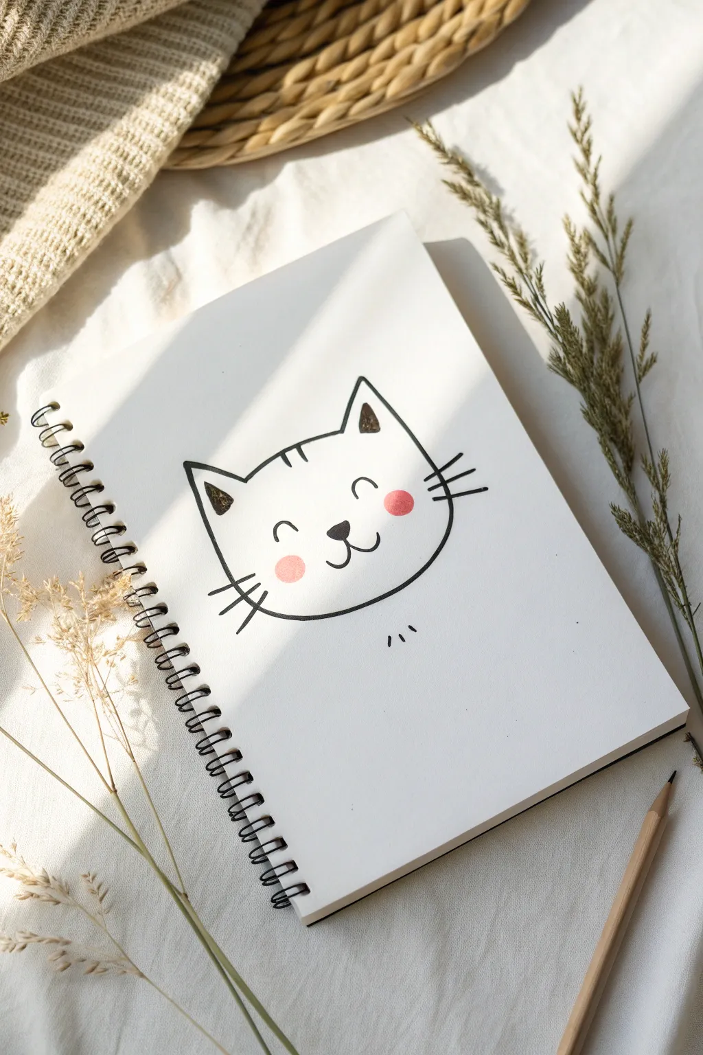
Capture the charm of a sweet feline friend with this minimalist line art doodle. Using smooth, confident strokes and a pop of rosy color, this sketch is perfect for greeting cards or filling the margins of your sketchbook.
Detailed Instructions
Materials
- Sketchbook or white drawing paper
- Black drawing pen (fine liner or medium nib)
- Pencil (optional for initial sketch)
- Eraser
- Pink colored pencil or pastel
Step 1: Shaping the Head
-
Start the ears:
Begin near the top of your page by drawing two triangles for the ears. The tips should be slightly rounded rather than sharp points, and leave a wide gap between them for the forehead. -
Connect the forehead:
Draw a gently curved line connecting the inner base of the left ear to the inner base of the right ear. This top line should dip very slightly in the middle. -
Draw the left cheek:
Starting from the outer base of the left ear, draw a long, curving line downwards. Let it bow out to create a chubby cheek shape before curving inward towards the chin area. -
Draw the right cheek:
Repeat the process on the right side. Start from the outer base of the right ear and curve down and out, mirroring your first line. -
Close the shape:
Connect the two cheek lines at the bottom with a smooth, continuous curve to form the chin. The overall shape should look somewhat like a soft, rounded shield.
Wobbly Lines?
Don’t stress if your face shape isn’t perfectly symmetrical. Cats are fluid creatures, and slightly uneven cheeks often make the drawing look cuter and more organic.
Step 2: Adding the Features
-
Place the nose:
Find the center point of the face, slightly below the middle. Draw a small, inverted triangle with rounded corners for the nose and fill it in completely with your black pen. -
Draw the mouth anchor:
Draw a tiny vertical line extending straight down from the bottom point of the nose. -
Create the smile:
From the bottom of that vertical line, draw two small curves—one hooking to the left and one to the right—to create the classic ‘w’ cat mouth. -
Add the eyes:
Position the eyes halfway between the nose and the ears. Instead of circles, draw two small, upside-down ‘u’ arcs. This creates a happy, sleeping expression. -
Ear details:
Go back to the ears. Inside the left ear triangle, draw a smaller triangle shape. Scribble inside it roughly to create a shadowed texture. -
Right ear shadow:
Do the same for the right ear, drawing a smaller inner triangle and filling it with scribbled texture. I find this loose fill adds a lot of character compared to a solid block. -
Forehead stripes:
At the top center of the forehead, draw three small, short vertical dashes. Make the middle one slightly longer than the outer two.
Make It Yours
Customize your kitty by changing the markings! Try adding patches over one eye, tiger stripes on the cheeks, or coloring the fur entirely orange or gray.
Step 3: Final Touches
-
Left whiskers:
On the left cheek, draw three straight lines fanning outward. The top whisker should angle up, the middle straight out, and the bottom one angled down. -
Right whiskers:
Mirror the whiskers on the right cheek, ensuring they start from roughly the same height as the left side. -
Rosy cheeks:
Take your pink colored pencil or pastel. Gently adhere two circular spots of color right under the eyes, overlapping slightly with the whiskers. -
Floating fur:
Just underneath the chin, drawn detached from the main head, add three tiny vertical dashes to suggest a neck or chest fluff. -
Clean up:
If you started with a pencil sketch underneath, wait for your ink to be totally dry, then gently erase any stray graphite lines.
Now you have a charming little feline face ready to brighten up your page


Simple Dog With Floppy Ears
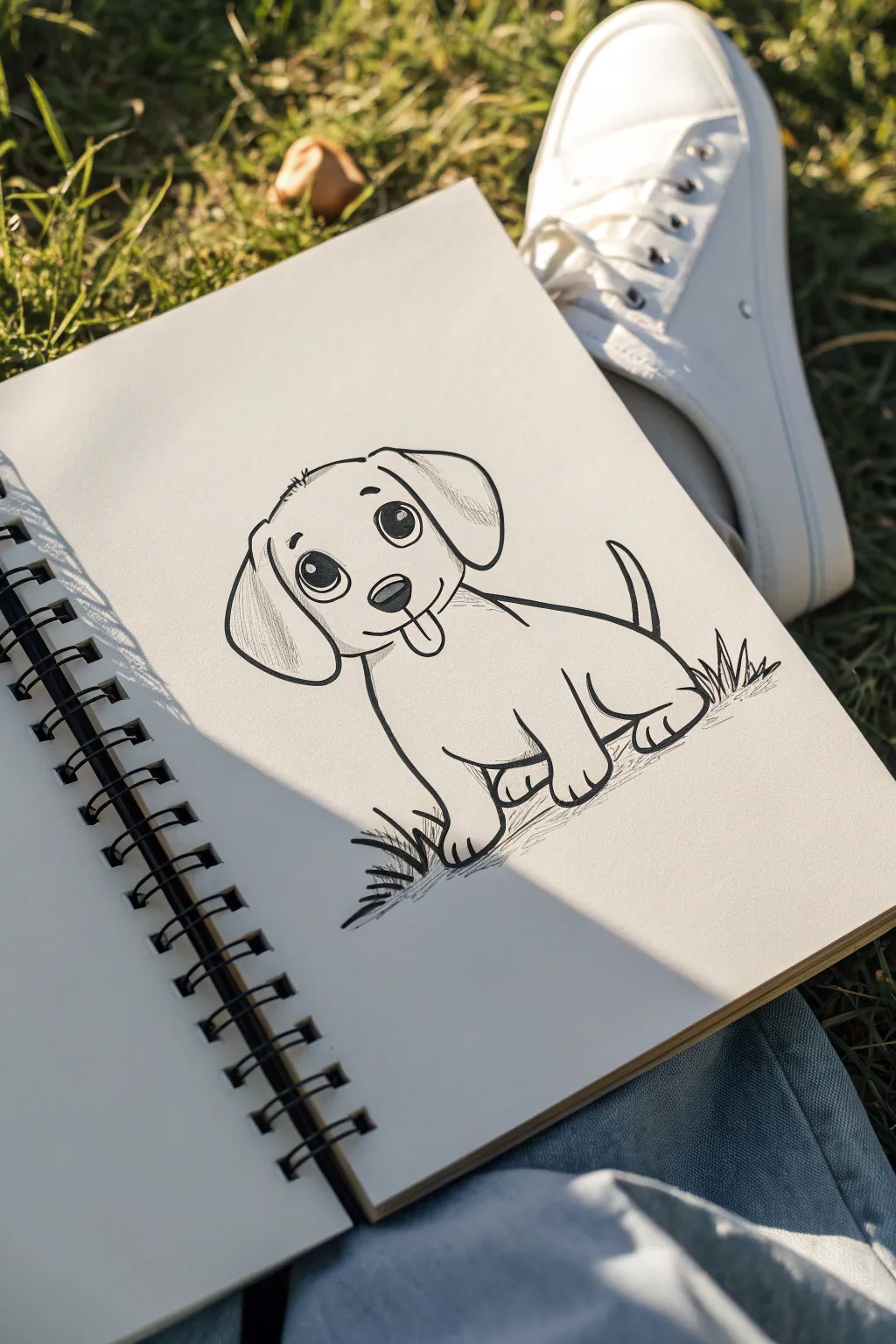
Capture the charm of man’s best friend with this adorable cartoon-style puppy drawing. Using simple linework and gentle shading, you’ll create a lively character that seems ready to jump right off the page.
Step-by-Step
Materials
- Sketchbook with smooth paper
- HB or 2B pencil for sketching
- Kneaded eraser
- Fine liner pen (0.5mm size suggested)
- Thicker marker or brush pen for bold lines
Step 1: Basic Sketching
-
Start with the head:
Begin by lightly sketching a rounded, slightly organic oval shape for the puppy’s head. Keep your pencil pressure very light so these lines are easy to erase later. -
Add the body shape:
Attached to the lower right side of the head, sketch a curved, bean-like shape for the body. The back should slope downward slightly. -
Map out the floppy ears:
Draw two large, teardrop shapes hanging from the sides of the head. The left ear should cover part of the cheek, while the right ear sits slightly higher to show perspective. -
Position the legs:
Sketch simple cylindrical shapes for the front paws extending straight down. For the back leg, draw a curved line suggesting the haunch tucked under the body. -
Include the tail:
Add a cheerful, upward-curving tail at the back of the body, tapering it to a point.
Add Personality
Change the eyebrow position to alter the expression. Raised eyebrows look surprised, while slanted ones look determined.
Step 2: Adding Details
-
Draw the face features:
Place two large circles for eyes in the middle of the head. Add a small rounded triangle for the nose and a curved line for the mouth. -
Add the tongue:
Draw a small U-shape hanging from the mouth for a playful tongue sticking out. -
Refine the paws:
Add small curved lines at the bottom of the leg shapes to indicate individual toes on the paws. -
Suggest grass:
Sketch jagged, spiky lines around the base of the paws to ground the puppy in a grassy setting.
Step 3: Inking & Shading
-
Outline the main shapes:
Switch to your fine liner pen. Go over your pencil lines with confident strokes. I find it helps to pull the pen toward you for smoother curves. -
Fill in the eyes:
Color in the pupils with black ink, leaving small white circles as ‘catchlights’ to make the eyes look shiny and alive. -
Add the nose shine:
Ink the nose black, but leave a thin strip of white near the top for a highlight. -
Erase pencil marks:
Once the ink is completely dry—give it a minute or two—carefully erase the underlying pencil structure. -
Add texture to the ears:
Use thin, quick hatching lines on the lower parts of the ears to suggest fur texture and shadow. -
Shade the body:
Add subtle hatching lines under the chin and on the belly to give the drawing some volume and roundness. -
Deepen the grass:
Use thicker strokes or go over lines twice at the base of the grass clumps to make the ground feel solid.
Wobbly Lines?
If your ink lines are shaky, try drawing faster. Slow hand movements often cause more jitters than quick, confident strokes.
Now you have a lovable cartoon puppy ready to greet anyone who opens your sketchbook


Easy Flower With Five Petals
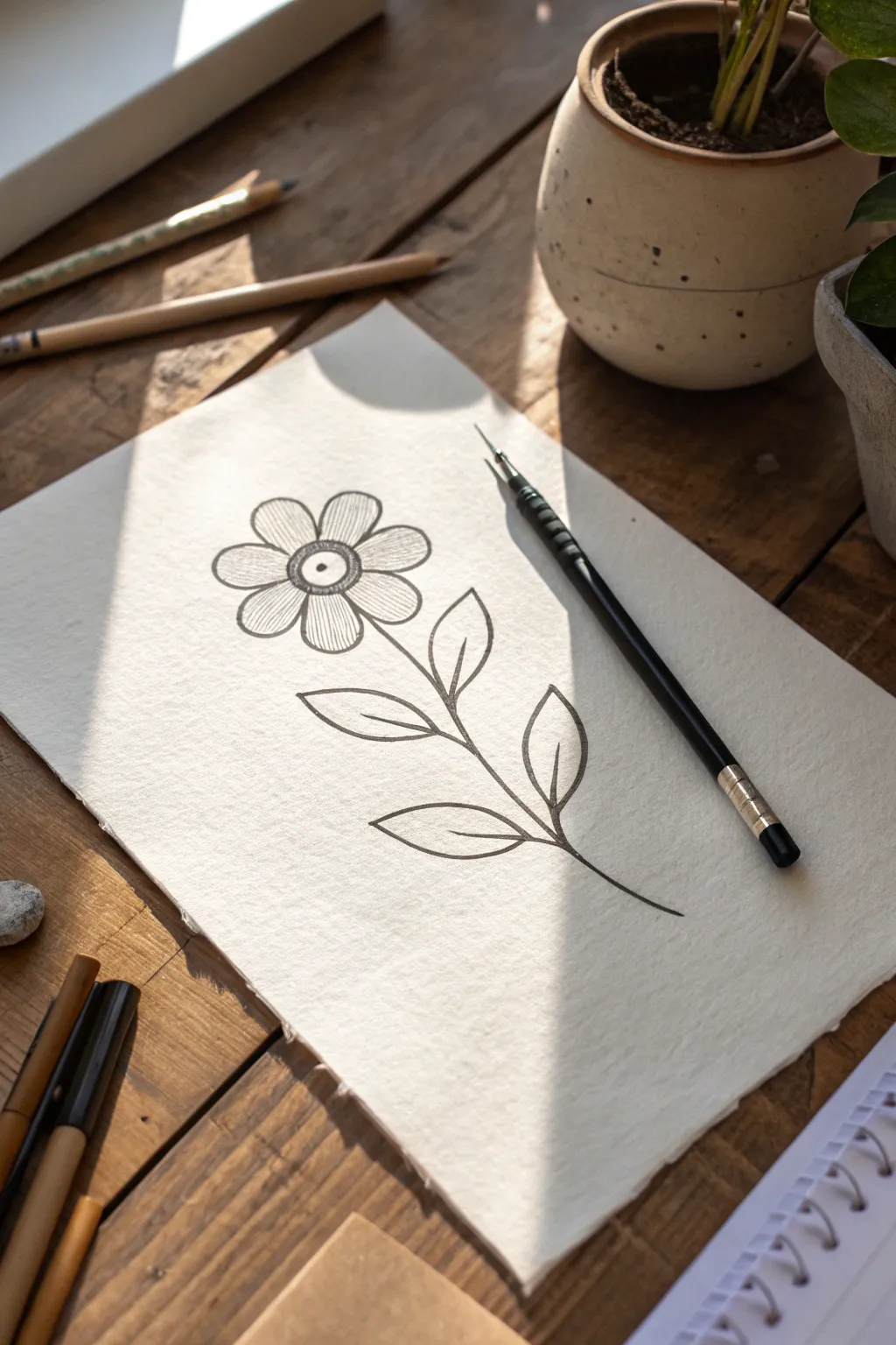
This charming, minimalist flower drawing captures the beauty of nature with clean lines and simple shapes. Using a fine liner on textured paper, you’ll create a lovely botanical illustration that proves you don’t need complex shading to make art that pops.
Step-by-Step Guide
Materials
- Textured heavy-weight paper (mixed media or watercolor paper)
- Black drawing pen (fine liner, size 0.5 or 0.8)
- Pencil (HB for sketching)
- Eraser
- Ruler (optional)
Step 1: Sketching the Framework
-
Outline the center:
Start by lightly sketching a small circle near the top third of your paper using your pencil. This will be the heart of your flower. -
Add the pupil:
Draw a tiny dot right in the middle of your circle, giving the flower almost an eye-like appearance. -
Draft the petals:
Sketch five rounded, U-shaped petals radiating outward from the center circle. Try to keep them roughly the same size, but don’t worry if they aren’t perfectly symmetrical; nature rarely is. -
Sketch the stem:
From the bottom gap between two petals, draw a long, slightly curved line extending downward. Curve it gently to the right as it nears the bottom of the page. -
Position the leaves:
Along the stem, sketch four leaf shapes—two on the left, two on the right. Make the lower leaves slightly larger than the upper ones, angling them upwards.
Keep it Clean
Place a scrap piece of paper under your hand while you draw. This prevents skin oils from smudging the pencil sketch or wet ink as you work across the page.
Step 2: Inking the Bloom
-
Ink the center circle:
Switch to your black ink pen. Carefully trace over your pencil line for the center circle. Go over the line twice if you want it slightly bolder. -
Fill the center dot:
Color in the tiny pupil dot completely with black ink so it stands out solidly against the paper. -
Detail the center ring:
Draw very short, tight lines radiating from the pupil towards the edge of the center circle. Stop halfway, leaving a white ring around the pupil for a detailed iris effect. -
Outline the petals:
Trace the five petal shapes with steady, confident strokes. If your hand shakes slightly, embrace it—it adds organic character to the petals. -
Add petal texture:
Inside each petal, draw faint, straight lines radiating from the center outward. Keep these lines creating a subtle shadow near the flower’s heart, but stop them about a quarter or halfway up the petal.
Step 3: Stem and Finishing Touches
-
Trace the stem:
Draw over your pencil line for the stem. Since it’s a single line, try to do this in one or two long, smooth motions rather than short, scratchy strokes. -
Ink the leaf outlines:
Outline the four leaves. Give them pointed tips and rounded bases where they meet the stem. -
Add leaf veins:
Draw a central vein line down the middle of each leaf. It doesn’t need to connect perfectly to the stem or the tip; floating slightly inside looks very artistic. -
Erase pencil marks:
Wait at least 5 to 10 minutes to ensure the ink is completely dry. Then, gently erase all underlying pencil sketches to clean up the drawing. -
Final assessment:
Look over your drawing. If any lines look too thin or broken, re-trace them carefully to solidify the black ink.
Add a Wash
After the waterproof ink dries, use a wet brush and a tiny drop of watercolor to add a soft, pastel wash over just the petals for a splash of color.
Now you have a crisp, botanical drawing perfect for framing or scanning for greeting cards

Tiny Mountain And Sun Scene

This charming, minimalist doodle captures the essence of a sunny day in the mountains using simple lines and geometric shapes. Its clean, hand-drawn aesthetic looks wonderful on dot grid paper, making it a perfect quick addition to any journal spread.
Step-by-Step Guide
Materials
- Dot grid notebook or journal
- Fine liner pen (preferably black, size 0.3mm to 0.5mm)
- Pencil (optional for sketching)
- Eraser
Step 1: Setting the Scene
-
Establish the horizon:
Begin near the bottom third of your page. Instead of drawing a straight line, sketch a jagged, zig-zagging line that suggests rough grass or rocky terrain. This will serve as the base for your mountains. -
Draw the central peak:
Starting from your grassy base, draw a large triangle shape for the tallest mountain. The lines don’t need to be perfectly straight; a little wobble adds character. Let the peak reach up about 5-6 grid dots high. -
Add side mountains:
Draw two slightly smaller triangles on either side of the main peak. Position them so they appear to be nestled behind or alongside the central mountain, creating depth. -
Create snow caps:
Near the top of each triangle, draw a wavy, jagged line across the peak. This simple detail instantly transforms your triangles into snow-capped mountains.
Step 2: Sky Elements
-
Position the sun:
Move to the upper left quadrant of your page. Draw a small circle to represent the sun’s core. Inside the circle, lightly sketch a tiny rectangle or imperfect shape to give it a whimsical, hand-drawn feel. -
Add sun rays:
Draw short, straight lines radiating outward from the sun circle. Vary the lengths slightly—alternating between shorter and longer strokes—to make the sun look dynamic and shining. -
Outline the first cloud:
Below the sun and slightly to the right, draw your first cloud. shape. Use a series of connected, rounded humps—a flat bottom line connects the arches together. -
Add a second cloud:
Draw a similar, slightly larger cloud to the right of the first one. I like to space them out so they balance the composition against the mountains below. -
Review contrast:
Take a moment to look at your line weights. If any lines look too thin or faint, go over them once more to ensure bold, clear visibility against the dot grid. -
Clean up:
Once the ink is completely dry, gently erase any pencil guidelines you might have sketched beforehand to leave the page looking crisp and clean.
Grid Guide
Use the dots on your paper to keep spacing symmetrical. Count 3 dots for the base of small mountains and 5 for the large one.
Add Shadow
Use a light grey marker or a pencil to gently shade one side of the mountains and clouds. This adds immediate 3D depth to the dangle.
Enjoy the peaceful simplicity of your new mountain scene.
BRUSH GUIDE
The Right Brush for Every Stroke
From clean lines to bold texture — master brush choice, stroke control, and essential techniques.
Explore the Full Guide
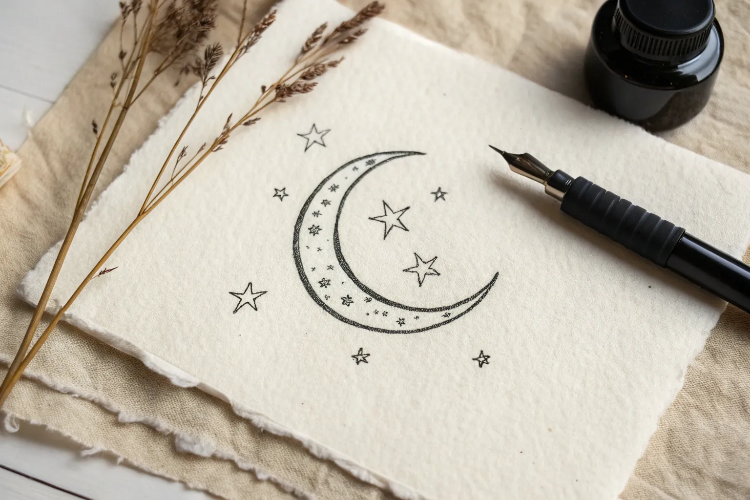
Easy Moon And Stars Doodle
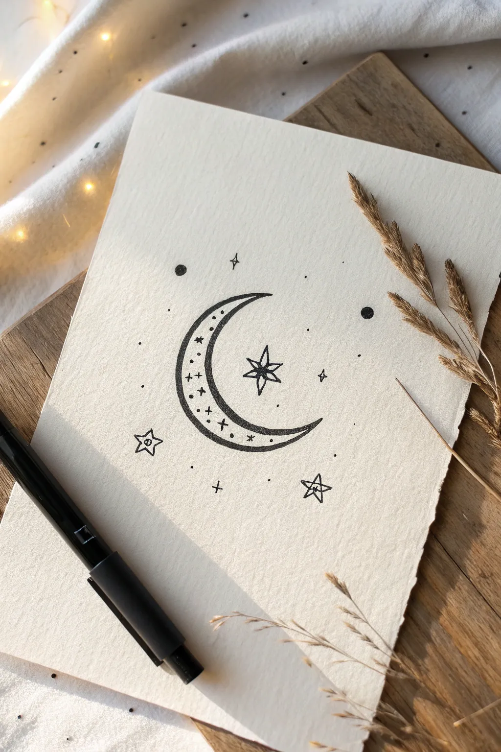
This charming pen-and-ink illustration features a stylized crescent moon surrounded by a constellation of playful stars. The simple line work and dotted details give it a dreamy, celestial vibe that is perfect for bullet journals or greeting cards.
How-To Guide
Materials
- High-quality textured paper (cream or off-white)
- Black fine liner pen (size 05 or 08)
- Thinner black fine liner pen (size 01 or 02)
- Pencil (HB or 2B)
- Eraser
- Ruler (optional)
Step 1: Sketching the Foundations
-
Outline the crescent shape:
Start by lightly sketching a large ‘C’ shape with your pencil. Draw a smaller, inner curve parallel to the first one to create the crescent moon body, tapering the ends to sharp points. -
Position the central star:
Find the visual center of the crescent’s inner curve. Sketch a four-pointed star here, ensuring the vertical and horizontal points are longer than the diagonal ones. -
Add surrounding elements:
Lightly mark the positions for two smaller five-pointed stars below the moon. Then, place tiny pencil dots where you plan to draw the decorative sparkles and solid circles later.
Steady Hands
Rest your wrist heavily on a scrap piece of paper while drawing. This prevents hand oils from getting on the art paper and stabilizes your stroke for smoother curves.
Step 2: Inking the Moon
-
Ink the outer contour:
Using your thicker fine liner (05 or 08), carefully trace the outer edge of the crescent moon. Use a steady, continuous stroke to keep the line smooth. -
Ink the inner contour:
Switch to the thinner pen (01 or 02) for the inner curve of the moon. This subtle difference in line weight adds depth to the illustration. -
Draw the moons decorative line:
Inside the crescent shape, draw a third curve using the thin pen, running parallel to the inner edge. This creates a dedicated border space for the internal details. -
Fill the moon’s details:
Within the narrow border you just created inside the moon, draw tiny varying shapes: simple crosses, small dots, and little asterisks. Space them out irregularly for an organic look.
Step 3: Creating the Constellation
-
Outline the main star:
Using the thicker pen, trace the four main points of the central star. To give it dimension, draw a small inner diamond shape in the center. -
Connect the star center:
Draw straight lines connecting the corners of that inner diamond to the tips of the star’s outer points. This creates a faceted, gem-like appearance. -
Draw the lower stars:
Ink the two five-pointed stars near the bottom. Like the central star, draw a small shape in their centers—a tiny circle or pentagon—and connect the corners to the outer tips. -
Add floating sparkles:
Scatter a few four-pointed ‘sparkle’ shapes around the moon. Keep these quite small and simple compared to the main stars.
Metallic Magic
Once the black ink is dry, use a gold or silver gel pen to fill inside the faceted stars or to add highlights on the crescent moon for a shimmering effect.
Step 4: Final Details and Cleanup
-
Add solid planets:
Draw three small, solid black circles around the composition—one to the upper left, one to the right, and perhaps one near the bottom. These act as heavy contrast points or distant planets. -
Stipple the background:
Using your finest pen, gently tap the paper to create a field of stars. Vary the density, keeping some areas sparse and others slightly clustered. -
Incorporate tiny crosses:
Draw very small ‘plus’ signs (+) in empty negative spaces to balance the composition. I find that grouping these in twos or threes looks best. -
Let the ink settle:
Wait at least 5-10 minutes for the ink to dry completely. This is crucial to prevent smudging. -
Erase pencil guides:
Gently glide your eraser over the entire drawing to remove the initial sketch lines, leaving only the crisp inkwork.
You now have a beautiful celestial doodle ready to frame or gift to a stargazer.
Heart With Simple Banner
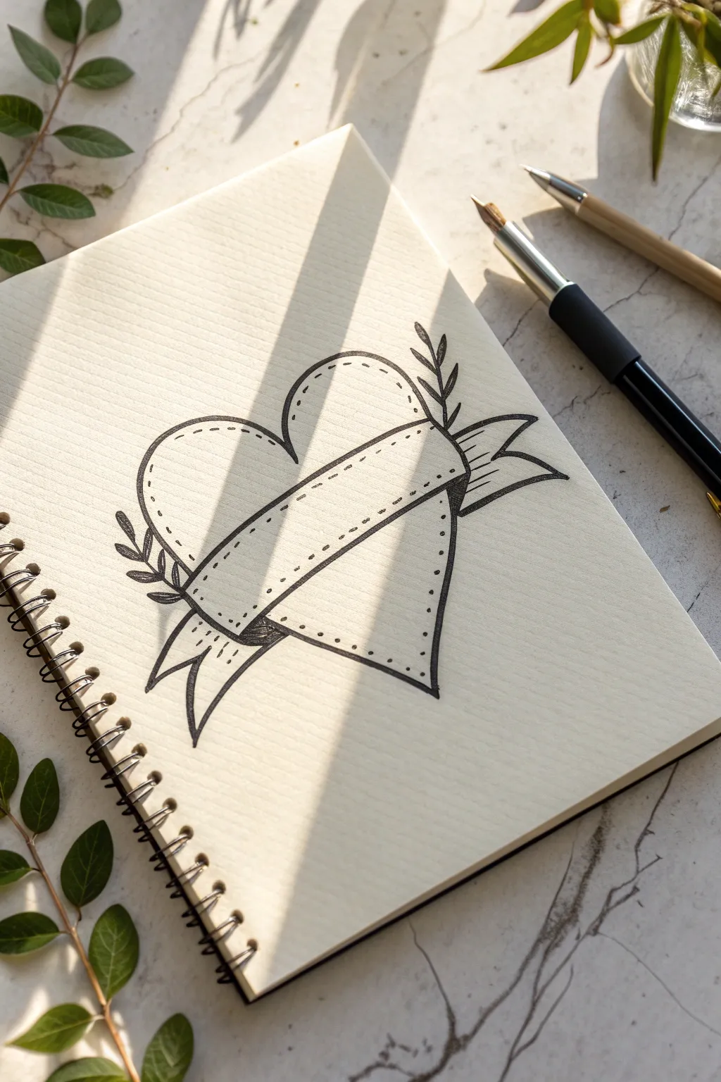
This charming doodle combines a classic heart shape with a dimensional ribbon banner, accented by delicate leaf sprigs and playful stitching details. The clean lines and dotted textures give it a lovely hand-sketched feel perfect for journals or cards.
Detailed Instructions
Materials
- Blank paper or sketchbook (spiral bound shown)
- Pencil (HB or 2B)
- Eraser
- Fine liner pen (black, 0.3mm or 0.5mm)
- Thicker marker or brush pen (optional for filling)
Step 1: Sketching the Banner
-
Draw the central ribbon curves:
Start by drawing two parallel, gently curving lines across the center of your page. These should curve slightly upward in the middle, resembling a gentle smile. -
Close the ends:
Connect these two lines at both ends with short, vertical lines. This creates the main rectangular face of your banner where text could eventually go. -
Add the ribbon folds:
Inside the main rectangle, near the left and right edges, draw a short vertical line slightly indented from the edge. This marks where the ribbon folds back behind the heart. -
Sketch the ribbon tails:
From the bottom corners of the main rectangle, draw curved lines flowing downwards and outwards to create the tails. Finish each tail with a ‘V’ notch for a classic ribbon look.
Wobbly Lines?
Keep your wrist loose and draw from your elbow, not your fingers. Don’t worry about perfect symmetry; slight wobbles add character to the hand-drawn style.
Step 2: Drawing the Heart & Leaves
-
Draw the upper heart lobes:
Above the banner, draw the two rounded tops of the heart. The dip between them should align with the center of your banner. Visualize the lines continuing behind the ribbon. -
Draw the lower point:
Below the banner, sketch the bottom point of the heart. Make sure the side lines angle inward evenly so they would meet the upper lobes if the banner weren’t there. -
Add foliage sprigs:
Sketch a simple curved line extending from the left side of the heart and another on the right. Add small, pointed oval leaves along these stems.
Step 3: Inking
-
Outline the banner first:
Using your fine liner, trace over the pencil lines for the banner. The banner sits on top of everything else, so its lines should be uninterrupted. -
Outline the heart:
Ink the heart shape, stopping your pen whenever you hit a banner line. This creates the illusion that the ribbon is wrapped around the heart. -
Ink the leaves:
Trace the leaf sprigs carefully. For sharper tips, I like to flick the pen quickly at the end of each leaf stroke. -
Erase pencil sketch:
Once the ink is fully dry, gently erase the underlying pencil structure to reveal clean black lines.
Placement Trick
Draw the banner first! It’s much easier to draw the heart ‘behind’ the banner than to draw a heart and try to fit a ribbon over it later.
Step 4: Detailing & Texture
-
Add dashed stitching:
Inside the perimeter of both the heart and the banner, draw a dashed line. Keep the spacing consistent and follow the outer curve closely to create a ‘stitched’ patch look. -
Create depth with shading:
Use small, dense hatch marks (close parallel lines) on the ribbon tails right where they tuck behind the main banner. This adds instant dimension. -
Shadow the overlap:
Add a tiny bit of hatching on the heart shape right where the banner edges cast a shadow onto it. -
Thicken the outline (optional):
Go over the outermost perimeter lines of the entire drawing one more time to make the shape pop off the page.
Now you have a sweet, customizable design ready to be filled with names or a special date

PENCIL GUIDE
Understanding Pencil Grades from H to B
From first sketch to finished drawing — learn pencil grades, line control, and shading techniques.
Explore the Full Guide
Cloud With Raindrops Pattern

Capture a cozy rainy day vibe with this minimal line drawing, featuring a fluffy cloud and neatly arranged raindrops. The simple blue ink on cream paper creates a calming, aesthetic look perfect for bullet journals or sketchbooks.
Step-by-Step Tutorial
Materials
- Cream or off-white sketchbook paper
- Blue felt-tip pen or fine liner (medium thickness)
- Pencil (optional for sketching)
- Eraser (optional)
Step 1: Drawing the Cloud & Sun
-
Start the cloud base:
Begin with the cloud shape. Draw a gently curving line for the bottom edge, keeping it relatively flat but with a slight upward curve at the ends to give it softness. -
Add the first hump:
From the left end of your base line, draw a small, rounded hump curving upward. -
Create the middle:
Continue the line to create a second, slightly taller hump in the middle. This gives the cloud its characteristic fluffy volume. -
Finish the cloud shape:
Draw the final, largest hump on the right side, bringing the line down to meet the right end of your bottom base line. Close the shape completely. -
Position the sun:
Identify the ‘valley’ between the middle hump and the right-side hump on top of your cloud. This is where the sun will peek out. -
Draw the sun’s arc:
Draw a clean semi-circle rising from behind that valley. I like to make sure the arc is smooth and consistent to contrast with the bumpy cloud. -
Add sun rays:
Place five or six small dots around the perimeter of the sun’s arc. Space them evenly to represent stylized rays of light.
Step 2: Adding the Falling Rain
-
Start the first row:
Below the cloud, you will draw the first row of raindrops. Start with three drops. -
Shape the drops:
Draw the drops as hollow teardrop shapes—narrow at the top and rounded at the bottom. Tilt the outer two slightly outward for a dynamic look. -
Begin the second row:
Move down slightly for the next row. These drops should be staggered, positioning them in the spaces between the drops above. -
Draw four drops:
Draw four drops in this second row. Keep the teardrop size consistent with the first row. -
Create the third row:
Move down again for the third row. Draw three drops here, once again staggering them so they fall beneath the gaps of the second row. -
Finish the bottom row:
For the final touch, add two drops at the very bottom, centered beneath the middle gaps of the row above. -
Review the pattern:
Check the spacing of your rain. Ideally, they form an inverted triangle shape overall, narrowing as the rain falls. -
Erase guidelines:
If you started with a pencil sketch, wait until the blue ink is completely dry, then gently erase any visible graphite marks to leave a crisp finish.
Wobbly Lines?
If your lines feel shaky, try drawing from your shoulder rather than just your wrist. Faster, confident strokes often result in smoother curves than slow, careful ones.
Add Pop of Color
Use a light yellow highlighter or colored pencil to gently fill in the sun, and a very pale grey marker to add a shadow line along the bottom of the cloud.
Now you have a charming weather doodle to brighten up your notebook pages
Easy Butterfly Symmetry
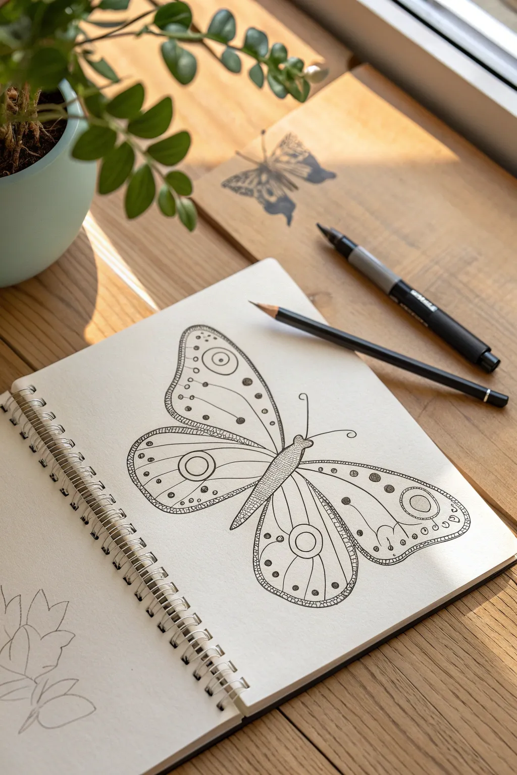
This charming ink drawing explores symmetry and pattern through the delicate wings of a stylized butterfly. By starting with a simple pencil sketch and layering intricate ink details, you’ll create a striking black-and-white illustration that pops off the page.
Step-by-Step
Materials
- Spiral-bound sketchbook (heavyweight paper preferred)
- HB or 2B graphite pencil
- Fine-liner pen (0.3mm or 0.5mm, black)
- Thicker marker or brush pen (black)
- A clean eraser
Step 1: Sketching the Framework
-
Draw the central body:
Begin by sketching the butterfly’s body in the center of your page. Draw a long, slender oval for the abdomen that tapers to a point at the bottom, and a smaller, slightly rounded shape for the thorax (upper body) and head. -
Map out the upper wings:
Lightly sketch the upper wings. Start from the thorax and curve upwards and outwards, creating a large, rounded triangular shape. The top edge should be gently curved, while the outer edge dips in slightly before joining the lower wing. -
Adding the lower wings:
Draw the lower wings, starting just below the upper ones. These should be more rounded, almost like teardrops, extending downwards past the abdomen. Aim for symmetry, but don’t stress if they aren’t perfect mirror images. -
Define the wing sections:
Within each wing, sketch a secondary line parallel to the outer edge, creating a border about a centimeter wide. This will separate the outer pattern area from the inner decorative zones. -
Sketch the antennae:
Add two long, slender lines curving out from the head, finishing each with a small swirl or loop at the very end.
Symmetry Hack
Draw one wing first, then trace it onto tracing paper. Flip the tracing paper over to transfer the exact mirror image to the other side for perfect symmetry.
Step 2: Inking the Outlines
-
Outline the main shapes:
Switch to your fine-liner pen. Carefully trace over your pencil lines for the wings and body. For the body sections, use slightly broken or textured lines to suggest fuzziness rather than a hard, smooth edge. -
Thicken the outer borders:
Go over the outer edges of the wings again to create a bolder, double-line effect. This frames the butterfly and gives it visual weight. -
Create the wing veins:
Inside the inner section of the wings (not the border), draw long, curved lines radiating from the body toward the outer edges. These act as the ‘veins’ and divide portions of the wing for patterning.
Step 3: Adding Intricate Details
-
Fill the body pattern:
Using your fine pen, fill the abdomen with a tight cross-hatching or stippling texture to make it look dark and solid compared to the airy wings. -
Draw the eye-spots:
In the largest open area of each upper and lower wing, draw a circle. Add a smaller concentric circle inside it to create an ‘eye’ pattern, which is a classic butterfly feature. -
Decorate the borders:
Inside that border strip you created earlier, draw a row of small, evenly spaced circles. Alternate them with tiny dots for variety. -
Detail the wing veins:
Add smaller dots or tiny circles along the vein lines you drew. I find that varying the size of these dots—larger near the center, smaller near the edges—adds a nice sense of depth. -
Add floating accents:
In the empty spaces between veins, add a few floating circles or distinct black dots to balance the composition. Ensure you do roughly the same design on the left and right wings. -
Refine the perimeter:
To give the wings a finished look, add a very fine, scalloped or hatched pattern along the absolute outer rim of the wings. -
Erase guidelines:
Once the ink is completely dry—wait at least five minutes to be safe—gently erase all the underlying pencil sketches. -
Final contrast check:
Look at the drawing as a whole. Use your thicker marker to darken the centers of the ‘eye’ spots or specific dots. High contrast black areas will make the delicate line work stand out.
Make it Pop
Use watercolor pencils to lightly shade inside the wing segments. A touch of pale teal or violet will complement the black ink without overpowering it.
Enjoy the relaxing process of filling in the patterns and watching your symmetrical insect come to life


Simple Bird Side View
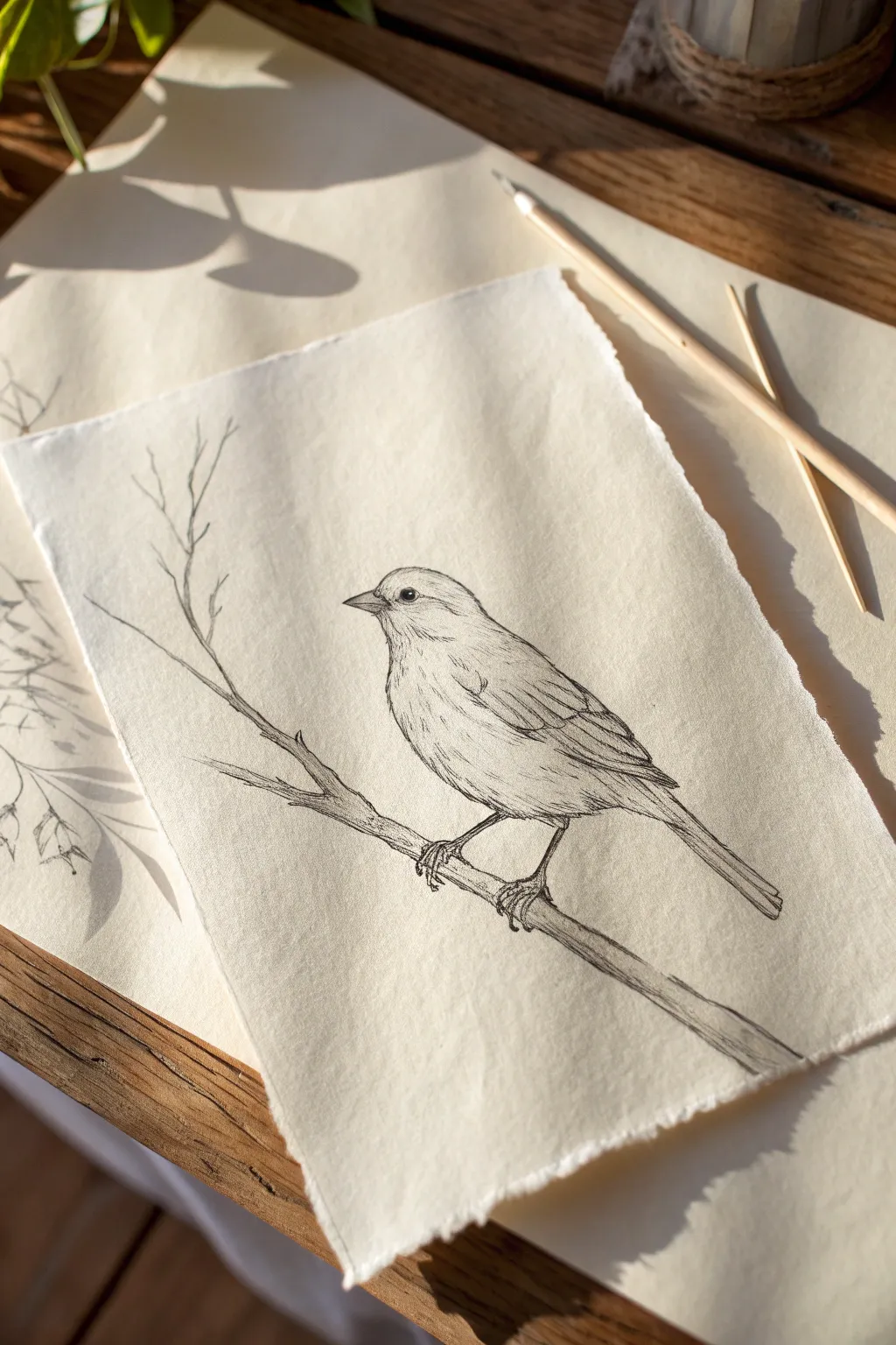
Capture the delicate beauty of a perched bird with this simple yet elegant line drawing tutorial. Using fine ink pens on textured paper, you’ll create a charming, rustic illustration perfect for framing or gifting.
Step-by-Step Guide
Materials
- Textured paper with deckled edges (e.g., Khadi paper or heavy watercolor paper)
- Pencil (HB or 2B)
- Kneadable eraser
- Fine liner pens (sizes 0.05, 0.1, and 0.3)
- Ruler (optional, for checking angles)
Step 1: Laying the Foundations
-
Map out the body composition:
Begin with a light pencil sketch to establish the basic shapes. Draw an oval for the bird’s body, slightly tilted upwards. Add a smaller circle for the head, overlapping the top front of the oval. -
Add the wing shape:
Sketch a teardrop shape starting from the bird’s shoulder area and extending back, ending in a point just past the body’s rear curve. This marks where the primary feathers will be. -
Position the tail and beak:
Draw the tail extending straight back and slightly down from beneath the wing tip. Keep it relatively narrow. Then, add a small, triangular beak on the face, ensuring the top line curves slightly downward. -
Sketch the branch:
Draw a diagonal line representing the branch passing under the bird’s belly. Make it slightly uneven and add a smaller twig branching off upwards to the left to create a natural composition. -
Place the legs and eye:
Mark the position of the legs gripping the branch. The legs should look thin and delicate, with claws wrapping around the wood. Place a small dot for the eye, aligned horizontally with the beak.
Step 2: Inking the Outline
-
Outline the head and back:
Using your 0.1 fine liner, carefully trace the top outline of the head and back. Use broken, short strokes rather than a single continuous line to suggest feathers. -
Define the face details:
Ink the eye, leaving a tiny white highlight at the top to give it life. Fill the rest of the eye in black. Carefully outline the beak, adding a small line for the mouth opening. -
Draw the breast and belly:
Continue with the 0.1 pen down the front of the bird. Use very light, fluffy strokes here to show the softness of the downy feathers on the chest. -
Define the wings:
Switch to a slightly thicker 0.3 pen if available, or press slightly harder with the 0.1. Draw the layers of wing feathers. Start with shorter, rounded feathers near the shoulder and transition to longer, straighter lines for the flight feathers. -
Ink the tail feathers:
Draw the long tail feathers with straight, parallel lines. Add a few internal lines to show the separation between individual feathers. -
Detail the branch:
Ink the branch using shaky, organic lines to mimic bark texture. Add small bumps or knots, especially where the twig branches off to the left. -
Finalize the feet:
Carefully ink the thin legs and toes. Ensure the claws look like they are gripping the surface by curving them around the branch form.
Keep it Loose
Don’t connect every single line perfectly. Leaving small gaps in the outline, especially on the chest, makes the bird look fluffier and lighter.
Step 3: Shading and Texture
-
Erase pencil marks:
Wait until the ink is completely dry, then gently use your kneadable eraser to lift away the initial pencil guidelines. -
Add facial texture:
Using your finest pen (0.05), add tiny dots and short dashes around the eye and beak area. This stippling effect creates depth without making the face look too heavy. -
Texture the wing feathers:
Add fine lines inside the wing feathers. Follow the direction of the feather growth. I like to keep these lines very thin to avoid overpowering the main outline. -
Shade the underbelly:
Add light hatching (parallel diagonal lines) to the lower belly and under the tail. This suggests shadow and gives the bird volume. -
Enhance the branch:
Add linear texture to the branch to simulate wood grain. Use darker, denser lines on the bottom of the branch to ground the drawing with shadow.
Color Wash
Once the ink is waterproof, lightly brush a diluted coffee stain or watercolor wash over the bird to give it a vintage, sepia-toned look.
Now you have a timeless nature study that looks like it jumped right out of a naturalist’s field journal
Bumblebee With Stripes
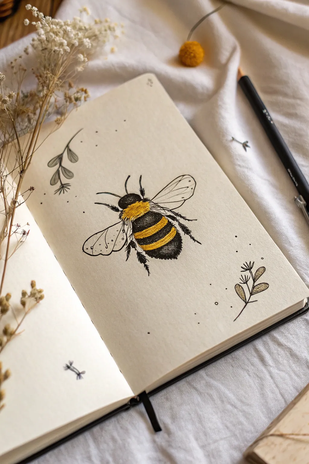
Capture the charm of nature with this detailed yet accessible bumblebee illustration that leaps off the page. Using simple stippling and bold yellow coloring, you’ll create a fuzzy, buzzing friend surrounded by delicate botanical doodles.
How-To Guide
Materials
- Sketchbook or quality drawing paper
- HB Graphite pencil
- Eraser
- Black fineliner pens (0.1mm for details, 0.3mm or 0.5mm for outlines)
- Yellow colored pencil or pastel pencil (mustard or golden yellow)
Step 1: Basic Shape Structure
-
Draw the head and thorax:
Start lightly with your pencil. Near the center of your page, draw a small, rounded oval for the head. Just behind it, lightly sketch a larger, fuzzy oval shape for the fuzzy thorax (the upper body). -
Add the abdomen:
Behind the thorax, draw a larger, elongated oval for the abdomen. This should be the biggest section of the bee, tapering slightly at the end but keeping a rounded point. -
Map out the stripes:
Roughly mark where the stripes will go on the abdomen. Draw two curving bands across the abdomen to indicate where the yellow stripes will sit. -
Place the wings:
Sketch two large teardrop shapes extending from the upper thorax. The front wing should be larger and sit on top, while the rear wing peeks out from underneath. -
Add legs and antennae:
Draw thin lines for the antennae curving forward from the head. Sketch the six legs—two small ones near the front, two in the middle, and two larger, dragging legs at the back.
Uneven Texture?
If your stippling looks uneven or patchy, try bunching dots closer together only in the shadow areas (the bottom/belly of the bee) to create depth.
Step 2: Inking the Details
-
Outline the head:
Switch to your 0.3mm fineliner. Ink the head shape, using short, dashed strokes instead of a solid line to imply a furry texture. -
Ink the black thorax:
Fill in the pure black areas on the head and the section just behind the head. Instead of coloring flat black, use dense stippling (lots of tiny dots) or very tight scribbles to maintain that fuzzy look. -
Create the furry texture:
For the rest of the body outline, continue using short, jagged strokes. Avoid smooth lines; the messier the edges, the fluffier the bee will look. -
Detail the wings:
Switch to a delicate 0.1mm pen. Trace the wing outlines with a smooth, continuous line. Draw the internal veins of the wings very lightly, branching out like a leaf. -
Thicken the legs:
Go over your pencil leg sketches. Add tiny jagged spikes or hairs along the legs, especially the back ones, to give them texture. -
Stipple the black stripes:
In the black bands of the abdomen, use your pen to create density. I like to bunch the dots closer together at the bottom of the bee to create a shadow, making it look 3D.
Step 3: Color and Surroundings
-
Fill the yellow accents:
Take your yellow colored pencil. Color in the thorax band and the abdomen stripe heavily. Press harder at the center and lighter near the edges to create a sense of roundness. -
Add texture to the color:
Go back over your yellow areas with the black fineliner. Add sparse, tiny dots or flicks over the yellow to integrate the ‘fur’ so the color doesn’t look like a separate sticker on top. -
Erase pencil guides:
Once the ink is completely dry, gently erase all your underlying graphite marks to clean up the drawing. -
Sketch botanical elements:
Around the bee, lightly sketch simple leaf sprigs or flower buds. Keep these minimal so they don’t distract from the main subject. -
Ink the botanicals:
Trace over your botanical doodles with the fineliner. Keep the shapes simple—ovals for leaves and small bursts for flowers. -
Add floating dots:
Finish by placing random dots of different sizes around the bee and plants. This ‘dust’ effect adds movement and fills negative space beautifully.
Metallic Shine
For a magical touch, trace over thewing veins with a gold gel pen or paint the wings with a very sheer layer of pearlescent watercolor.
Now you have a charming little pollinator preserved in your sketchbook
Cupcake With Cute Face
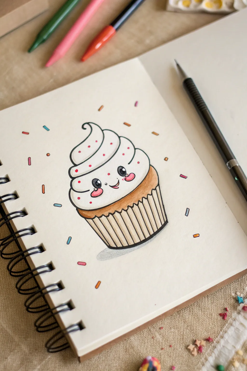
Capture the sweetness of dessert art with this adorable kawaii cupcake drawing. Featuring a swirl of frosting, a happy little face, and colorful sprinkles, this sketch is perfect for brightening up your sketchbook pages.
Step-by-Step
Materials
- Sketchbook with smooth paper (mixed media or bristol)
- Pencil (HB or 2B)
- Eraser
- Black fineliner pen (0.3mm or 0.5mm)
- Alcohol markers or brush pens (light tan, darker brown, pink, blue, orange)
- White gel pen (optional for highlights)
Step 1: Sketching the Outline
-
Base shape:
Start by drawing the cupcake liner lightly with your pencil. Draw a wide U-shape for the bottom, flattening the base slightly so it sits stable. -
The frosting cloud:
Directly on top involved the liner, sketch a large, puffy cloud shape. This will be the bottom layer of frosting. Make it wider than the cup itself so it looks like it’s spilling over. -
Building the swirl:
Add a second tier of frosting above the first, making it slightly smaller. Add a third, pointy dollop on the very top, curling the tip like a soft serve ice cream cone. -
Liner details:
Go back to the cupcake liner base. Draw vertical lines inside it, slightly angled toward the center bottom, to create the pleated paper wrapper effect. Connect these lines at the top with a wavy line. -
Face placement:
In the middle of the largest bottom frosting layer, lightly mark out two large circles for eyes and a small U-shape between them for a smile.
Step 2: Inking the Lines
-
Initial outline:
Take your black fineliner and carefully trace over your pencil lines. Use a confident, steady hand for the frosting curves to keep them looking soft. -
Wrapper details:
Ink the pleated lines of the wrapper. You can make the outer edges of the wrapper slightly thicker to give the drawing some weight. -
Kawaii eyes:
Ink the eye circles carefully. Inside each eye, draw two smaller circles (one medium, one tiny) for the highlights, then fill in the rest of the eye with solid black ink. This gives that classic sparkling look. -
Cheeks and mouth:
Draw the small smile. Right under the eyes, add small oval shapes for rosy cheeks. -
Sprinkles:
Draw tiny rectangles and small dots floating around the cupcake in the background to create a confetti effect. Don’t ink the sprinkles on the frosting yet; we’ll add those directly with color later. -
Erase:
Wait a moment for the ink to fully set, then gently erase all your pencil guides to leave a clean black-and-white drawing.
Uneven Ink Lines?
If your hand shakes while inking the long frosting curves, thicken the line slightly in those spots. Varied line weight actually makes the drawing look more dynamic.
Step 3: Adding Color
-
Golden cake:
Use a light tan or golden-brown marker to color the small rim of cake visible between the wrapper and the frosting. -
Wrapper base:
Color the wrapper with a light beige or cream color. I usually color the whole area lightly first. -
Wrapper shading:
This is where the magic happens: take a slightly darker brown marker and color every other stripe on the wrapper. This creates a realistic shadow effect for the folded paper. -
Rosy cheeks:
Use a bright pink marker to fill in the oval cheek shapes on the face. -
Frosting sprinkles:
Using a fine-tip pink marker or pen, add tiny dots directly onto the white frosting for subtle sprinkles. -
Background confetti:
Color the floating sprinkles in the background using a mix of orange, blue, pink, and yellow markers. Vary the colors so no two identical colors are right next to each other. -
Ground shadow:
Use a light grey marker to draw a small, horizontal oval shadow directly underneath the cupcake to ground it.
Add a Cherry
Pop a bright red cherry with a stem on top of the swirl instead of the pointy tip. Add a small white gel pen dot to the cherry for a glossy, shiny finish.
Enjoy your sweet creation and try drawing a whole bakery of different expressions
Fruit Trio: Apple, Banana, Cherry
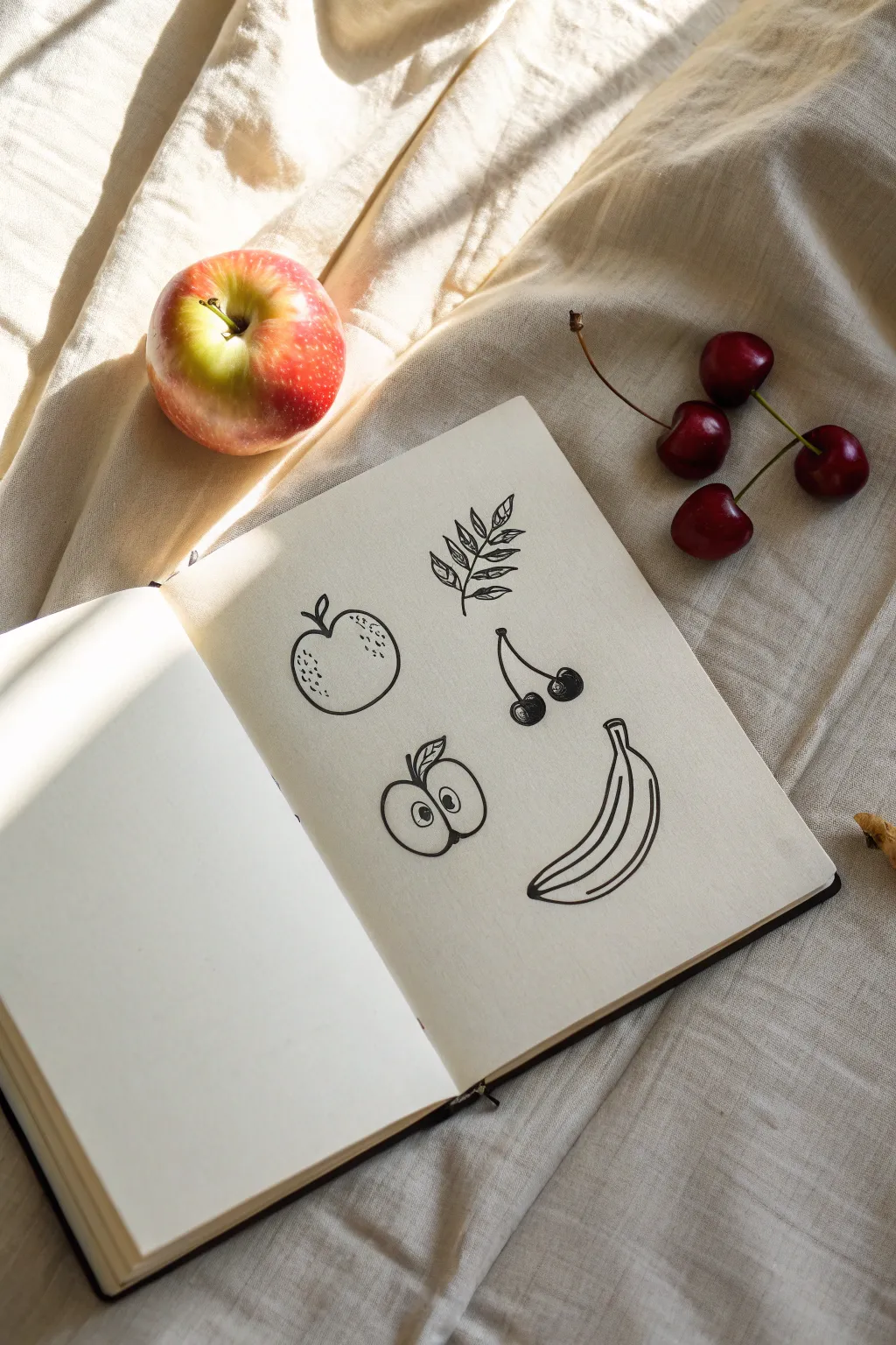
Capture the essence of fresh fruit with this minimalistic, playful doodle spread. Using clean, purposeful lines, you’ll create a charming collection featuring an apple, cherries, and a banana that looks effortless yet artistic.
Step-by-Step Guide
Materials
- Sketchbook or drawing paper (smooth texture preferred)
- Black fineliner (0.5mm or 0.8mm)
- Pencil (HB for preliminary sketches)
- Eraser
Step 1: Planning and Preliminaries
-
Observe the layout:
Notice how the elements are spaced on the page. You want to leave ample white space between each fruit so they don’t look crowded. The original drawing places the apple top-left, the leaves top-right, cherries in the center, apple slice bottom-left, and banana bottom-right. -
Light pencil mapping:
Using your HB pencil, very lightly sketch rough circles and curves to mark the position of each fruit. This doesn’t need to be detailed; just placeholders to ensure balanced composition.
Step 2: Drawing the Apple
-
Create the apple’s outline:
Switch to your black fineliner. Start at the top indentation where the stem will go. Draw a smooth, round curve down the left side, slightly flattening the bottom, and curve back up the right side to meet the start. -
Add the stem and leaf:
From the top center dip, draw a short, curved line sticking up for the stem. Add a small, pointed oval shape attached to it for a single leaf. -
Texture details:
To give the apple dimension without shading, add stippling. Dot the pen repeatedly on the upper left and right curves of the apple skin, concentrating the dots near the edges and fading them out as you move inward.
Loose Lines
Don’t connect every line perfectly. Leaving small gaps in the outlines gives the drawing a relaxed, sketchy aesthetic.
Step 3: The Leafy Branch
-
Draw the central vein:
To the right of the apple, draw a slightly curved line for the main stem of the branch. -
Add paired leaves:
Starting from the bottom, draw small, pointed oval leaves coming off the stem in pairs. Angle them upward. -
Detail the veins:
Inside each small leaf, draw a quick, sketchy line down the center. Keep it loose; perfect symmetry isn’t necessary here.
Add Pop
Use a white gel pen to add tiny highlights on the black cherries or the banana peel for extra dimension.
Step 4: Sketching the Cherries
-
Draw the stems first:
In the middle of the page, draw an upside-down ‘V’ shape for the connected stems. At the point where they join, widen the line slightly or add a tiny nub. -
Add the fruit bodies:
At the bottom of each stem, draw a small circle. Interrupt the top of the circle slightly where the stem enters the fruit. -
Fill the cherries:
Instead of coloring them solid black, use scribble shading or tight hatching to darken the cherries, leaving a small white spot on the upper side of each for a highlight.
Step 5: The Apple Half
-
Outline the shape:
Below the whole apple, draw a heart-like shape with a rounded bottom. This represents the cross-section of the apple. -
The core:
In the center, draw two small seed shapes—teardrops pointing inward towards the center axis. -
Section lines:
Draw faint curved brackets around the seed area to suggest the core’s separation from the flesh. Add a stem and leaf at the top similar to your first apple.
Step 6: Drawing the Banana
-
Upper curve:
For the banana at the bottom right, start with a long, sweeping curve for the top edge. At the top end, create the square-ish stem. -
Bottom curve:
Draw a parallel curve below the first one, tapering it to meet the top line at a point on the left side. -
Ridge details:
Draw a line running through the center of the banana shape to indicate the ridges of the peel. Let this line follow the curve of the fruit.
Step 7: Final Touches
-
Reinforce lines:
Go over any lines that look too thin. Varying line weight slightly—making some outer edges thicker—can make the doodle pop. -
Erase pencil marks:
Wait until the ink is completely dry to avoid smudging. Then, gently erase all your initial pencil mapping lines.
Now you have a sketchbook page filled with fresh, artistic fruit doodles ready for display
Mushroom With Spots
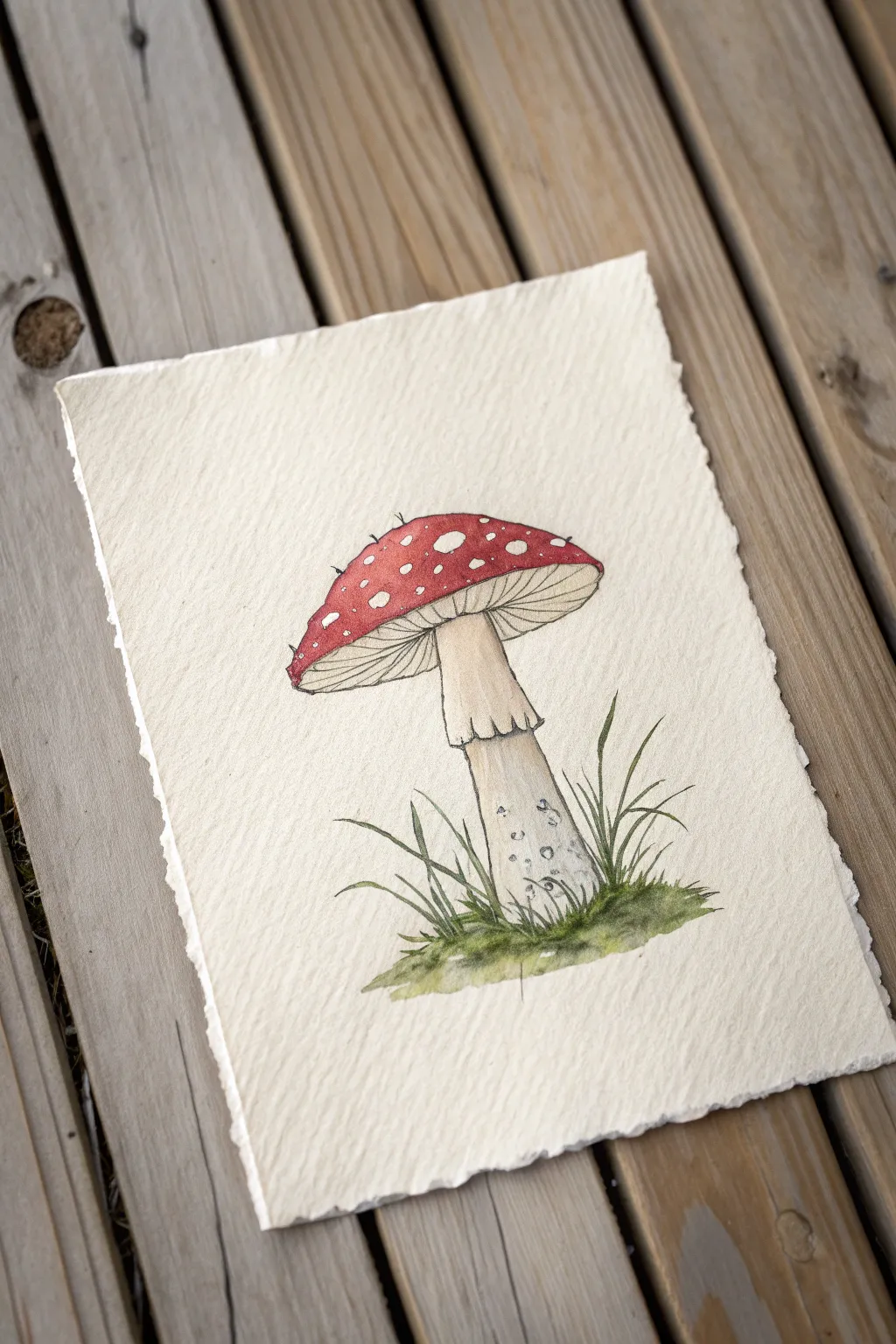
This classic red-capped mushroom is the quintessential fairytale fungus, and its bright colors make it a joy to illustrate. Using ink and watercolor on textured paper gives it a charming, vintage scientific illustration feel.
Step-by-Step
Materials
- Cold press watercolor paper (deckled edge optional)
- Pencil (HB or H)
- Kneaded eraser
- Fine liner pen (black, waterproof, size 0.1 or 0.3)
- Watercolor paints (Alizarin Crimson, Sap Green, Yellow Ochre, Burnt Umber)
- Small round brush (size 2 or 4)
- Jar of water
- Paper towel
Step 1: Sketching the Structure
-
Outline the Cap:
Start by drawing a large, slightly flattened semi-circle for the mushroom cap. The top curve should be smooth, while the bottom line connects the two ends with a gentle upward curve. -
Add the Stem:
Draw the stem descending from the center of the cap’s underside. It should be relatively thick and widen slightly at the base where it meets the ground. -
Draw the Skirt:
About a third of the way down the stem, add the ‘skirt’ or annulus. This is a ragged ring of tissue; draw it with wavy, uneven lines so it looks like it’s draping over the stem. -
Sketch the Spots:
Lightly sketch irregular circles and ovals all over the top of the cap. Make them different sizes and allow some near the edges to look like half-circles to show perspective.
Uneven Color?
If your red paint dries with hard edges or ‘blooms’, try wetting the paper slightly with clean water before applying paint. This wet-on-wet method helps color spread smoothly.
Step 2: Inking the Lines
-
Ink the Outline:
Go over your pencil lines with a waterproof fine liner pen. Use a confident hand, but don’t worry if the lines are slightly shaky; nature is rarely perfectly straight. -
Detail the Gills:
Underneath the cap, draw fine lines radiating from the stem outward toward the rim of the cap to create the gills. These lines should curve slightly with the shape of the mushroom. -
Add Texture to the Stem:
Draw small, vertical tick marks and tiny stippling dots near the base of the stem to give it a fibrous, earthy texture. -
Ink the Grass:
Surround the base of the stem with quick, upward flicking strokes to represent grass blades. Vary their lengths and directions for a natural look. -
Erase Pencils:
Wait a moment for the ink to fully dry, then gently erase all visible pencil marks with your kneaded eraser.
Step 3: Adding Watercolor
-
Paint the Cap Red:
Mix a vibrant red like Alizarin Crimson. carefully paint around the white spots on the cap. I find it easiest to outline the spots with the tip of the brush first, then fill in the rest. -
Deepen the Shadow:
While the red is still damp, drop a tiny bit of darker red or mixed brown along the bottom edge of the cap to create a sense of rounded volume. -
Wash the Stem:
Dilute some Yellow Ochre or Burnt Umber with lots of water to make a very pale wash. Lightly paint the stem, leaving the skirt mostly white for contrast. -
Shade the Gills:
Using that same very pale brownish wash, add a light glaze over the gills area. Don’t cover it completely; let the white paper show through near the edges. -
Paint the Grass:
Mix Sap Green with a touch of brown for an earthy moss color. Paint the base and the grass blades using quick, loose strokes. -
Grounding Shadow:
Add a slightly darker green wash right underneath the mushroom base to ground it, so it doesn’t look like it’s floating.
Deckle Those Edges
To get the torn edge look from the photo, fold your heavy watercolor paper back and forth several times along a crease, then wet the fold with a brush before carefully tearing it.
Once the paint is fully dry, you will have a beautiful botanical study ready to display
Fish In A Simple Bowl
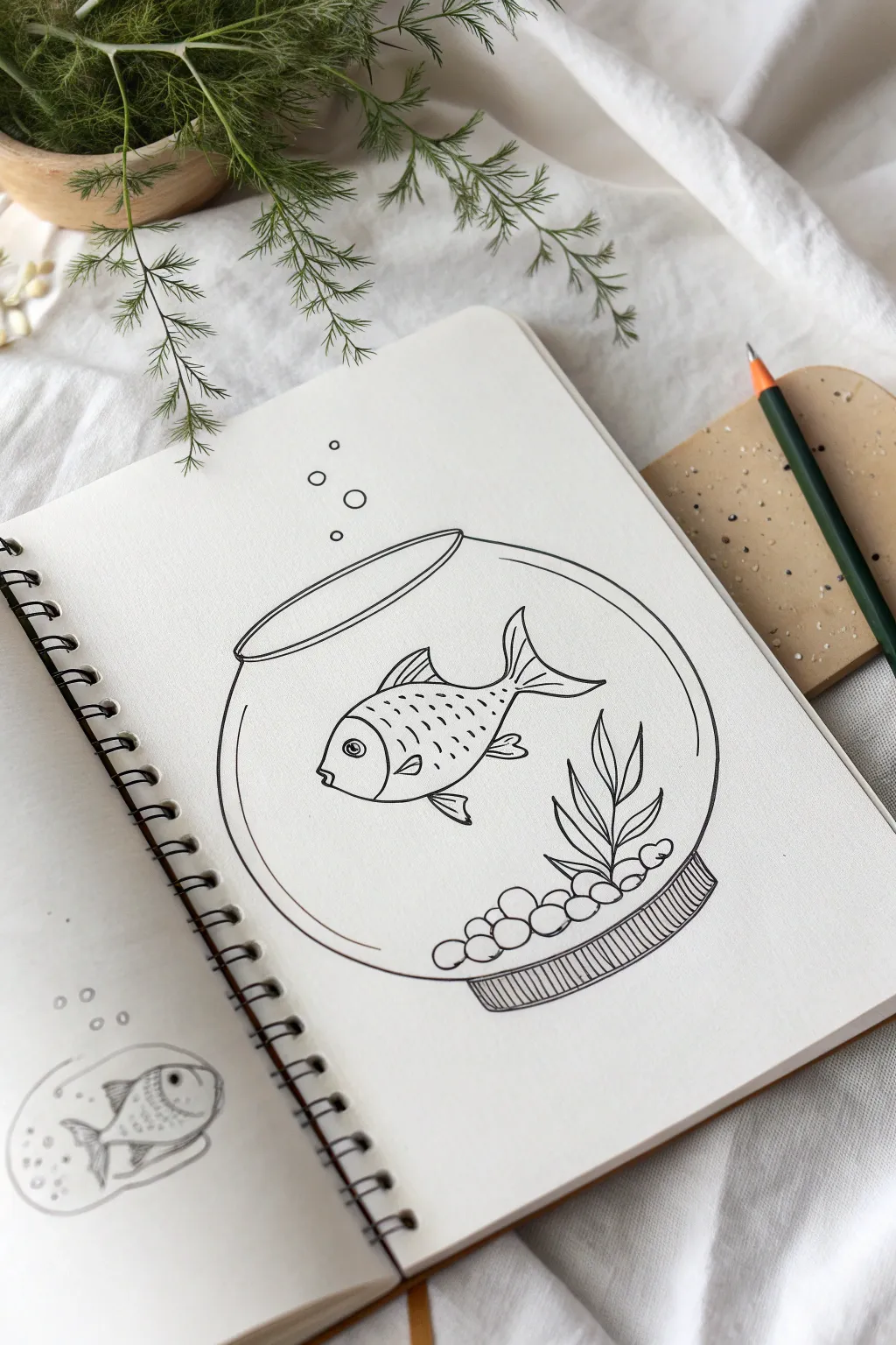
This simple yet charming illustration captures a goldfish in its home using clean, bold lines and minimal shading. It’s a perfect practice piece for mastering basic shapes and confident ink work.
Detailed Instructions
Materials
- Spiral-bound sketchbook with smooth white paper
- Pencil (HB or 2B) for sketching
- Eraser
- Fine liner pen (black, 0.4mm or 0.5mm tip)
Step 1: Sketching the Bowl Structure
-
Draw the main circle:
Start by lightly sketching a large circle in the center of your page with your pencil. It doesn’t need to be perfect, but try to keep it relatively symmetrical. -
Add the opening:
At the top of your circle, intersect the round shape with a narrow, horizontal oval. This represents the rim or opening of the fishbowl. -
Create the base:
At the very bottom of the circle, draw a smaller, flattened oval shape to act as the stand or base of the bowl. -
Refine the glass shape:
Connect the top oval to the main circle body with short, curved lines. Then, add an inner rim line inside the top oval to show the thickness of the glass.
Step 2: Outlining the Fish and Interior
-
Outline the fish body:
In the center of the bowl, sketch an almond shape for the fish’s body, slightly tilted downwards to the left. -
Add the tail fin:
Draw the tail extending from the right side of the body. Make it flowy with two distinct points, looking a bit like a sideways ‘V’ with curved edges. -
Sketch the fins:
Add a triangular dorsal fin on the top of the fish’s back and two smaller fins on the bottom belly area. -
Draw the face details:
Draw a curved line near the front for the gill cover. Add a small circle with a dot inside for the eye, and a tiny ‘v’ notch for the mouth. -
Create the pebbles:
Along the inside bottom curve of the bowl, sketch a cluster of small, irregular circles and ovals to represent the gravel or stones. -
Add the plant life:
Draw simple, leaf-like shapes rising from the right side of the pebble pile. Use curved, pointed ovals to make them look like aquarium plants.
Wobbly Circles?
If drawing a perfect circle is hard, use a circular object like a roll of tape or a small cup to trace your initial pencil guide for a perfect bowl shape.
Step 3: Inking and Final Details
-
Ink the bowl:
Switch to your fine liner pen. Trace over your pencil lines for the bowl, keeping your hand steady for a smooth finish. Stop your line where the plant leaves overlap the glass. -
Ink the fish:
Trace the outline of the fish. Add the scales by drawing short, dashed lines in rows along the upper half of the fish’s body. -
Detail the fins:
Draw thin lines inside the tail and fins to give them texture and structure. -
Define the scenery:
Ink the pebbles and the plant leaves. Make sure the plant stems appear to be tucked behind the stones. -
Add the bubbles:
Draw three or four small circles rising from the top of the bowl towards the top of the page to suggest air bubbles. -
Detail the base:
Fill the bottom base of the bowl with vertical hatching lines (straight lines close together) to create a shadowed, sturdy look. -
Review and erase:
Once the ink is completely dry, gently erase all the underlying pencil sketches to reveal your clean line art.
Pro Tip: Line Weight
Use a slightly thicker pen for the main outline of the bowl and a thinner pen for the delicate details like fish scales and plant veins to add depth.
Now you have a serene aquatic scene captured beautifully in your sketchbook
Easy Turtle From Ovals
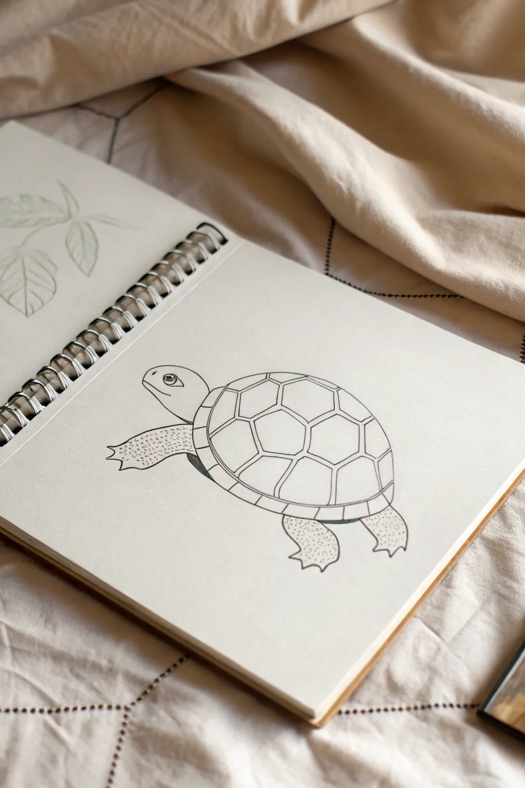
This charming turtle illustration builds a complex-looking character from simple, manageable shapes. By focusing on clean outlines and subtle textures, you’ll create a friendly reptile that looks perfect in any sketchbook journal.
Step-by-Step Tutorial
Materials
- Sketchbook or quality drawing paper
- Pencil (HB or 2B for sketching)
- Fine liner pen (black, 0.3mm or 0.5mm)
- Eraser
Step 1: The Basic Shapes
-
Draw the main body:
Start lightly with your pencil. Draw a large, slightly flattened oval in the center of your page. This will be the main part of the turtle’s shell. -
Add the head:
To the left of the shell, draw a smaller, rounded shape that connects to the main oval. Think of it as a smooth, elongated gumdrop shape for the neck and head. -
Sketch the flippers:
Lightly pencil in the placement for the legs. Draw two front flippers extending forward and two back ones peeking out from the rear. They should look like rounded, triangular wedges.
Uneven Shell Pattern?
Don’t stress about perfect geometry. If your hexagons are wonky, it actually looks more organic. Real turtle shells are rarely mathematically perfect.
Step 2: Inking the Outline
-
Define the head:
Switch to your fine liner pen. Trace over your pencil sketch for the head, keeping the line smooth. Add a small curve for the mouth – giving it a slight upward turn creates a smile. -
Draw the eye:
Place a large circular eye on the side of the head. Draw a pupil inside, leaving a tiny white circle as a highlight to make the turtle look alive. -
Outline the shell:
Ink the large oval of the shell. As you trace the bottom edge, curve the line slightly inward at the front and back where the legs emerge to show where the shell opens. -
Create the shell rim:
Draw a second curved line running parallel to the bottom of the shell. Connect this to the main shell with small vertical tick marks to create the segmented rim.
Add Depth with Line Weight
Go over the outermost bottom lines of the shell and flippers a second time to thicken them. This ‘weighted line’ technique instantly adds physical weight.
Step 3: Shell Pattern Details
-
Center the pattern:
Draw a hexagon (a six-sided shape) right in the middle of the shell’s curve. This acts as the anchor for the rest for the pattern. -
Expand the pattern:
Draw lines radiating out from the points of your center hexagon towards the edge of the shell. -
Connect the scutes:
Connect these radiating lines with slightly curved lines to form the surrounding plates (scutes). They should look like a honeycomb pattern conforming to the roundness of the shell.
Step 4: Texture and Finishing Touches
-
Refine the flippers:
Ink the outlines of the flippers. Add little jagged points at the ends to suggest claws or toes effortlessly. -
Add skin texture:
This is my favorite part for adding character—dotting the skin. Use your pen to gently tap small stippled dots all over the flippers and neck area. -
Vary dot density:
Keep the dots denser near the shell and edges of the flippers, and lighter in the center. This gradation gives the limbs a sense of roundness and volume. -
Shadowing the underside:
Add a few very closely spaced chaotic lines or dark scribbles underneath the rim of the shell where the legs attach. This creates a deep shadow. -
Clean up:
Once the ink is completely dry (wait at least two minutes to avoid smudges), gently erase all your underlying pencil guide lines.
Now you have a delightful turtle swimming across your page, ready for color or perfect as a standalone ink drawing
House With Balloons Mini Scene
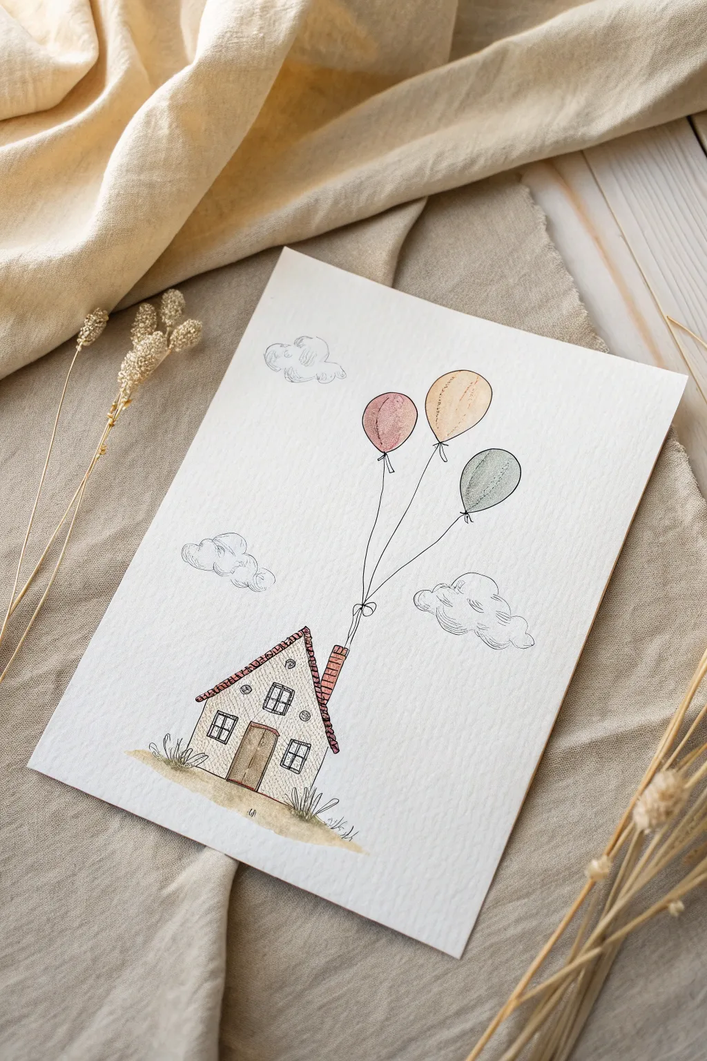
This charming pen and wash drawing captures the dreamlike quality of a tiny cottage being lifted away by balloons. Using delicate ink lines and soft watercolor washes, you’ll create a light, airy scene perfect for a greeting card or wall art.
Detailed Instructions
Materials
- Cold press watercolor paper (A5 size recommended)
- Fine liner pens (0.1mm and 0.3mm, waterproof ink)
- Watercolor paint set
- Small round brushes (size 2 and 4)
- Pencil (HB)
- Eraser
- Ruler
Step 1: Planning the Scene
-
Sketch the House Base:
Begin by lightly sketching the outline of the house near the bottom center of your paper. Draw the main rectangular structure and the triangular roof line, keeping the shapes simple and quirky. -
Add Architectural Details:
Sketch a central door, two small square windows on either side, and a tiny attic window in the gable. Don’t forget the chimney stack tilting slightly on the right side of the roof. -
Draft the Balloons:
Draw three oval balloon shapes high above the house. Position them at slightly different heights to create a natural, drifting look. Connect them with long, wavy lines leading down to the chimney.
Step 2: Inking the Details
-
Outline the House:
Using your 0.3mm fineliner, go over the main lines of the house. Use a slightly shaky or broken line rather than a perfect ruler line to give it that rustic, hand-drawn character. -
Texture the Roof:
With the 0.1mm pen, draw rows of small “U” shapes or squiggles across the roof to simulate shingles. Add vertical brick lines to the chimney. -
Detail Windows and Door:
Ink the window panes. For the door, add vertical wood grain lines and a tiny doorknob. Create a sense of depth by darkening the inner frames slightly. -
Ink the Balloons and Strings:
Outline the three balloons. Draw the strings carefully, ensuring they converge at the chimney. I like to add a tiny bow where the strings meet the chimney for a cute detail. -
Add Environmental Elements:
Sketch fluffy, cloud-like shapes around the balloons and the house. Below the house, draw jagged grass tufts and a rough ground line to anchor the building. -
Erase Guide Lines:
Wait for the ink to be completely dry to the touch, then gently erase all your initial pencil markings to clean up the page.
Keep it wobbly
Don’t stress about straight lines! A shaky hand actually makes this style look better. Deliberately wiggle your pen slightly to create charming, imperfect contours.
Step 3: Adding Color Washes
-
Paint the Balloons:
Mix very watery washes of soft pink, pale ochre, and muted teal. Paint each balloon, leaving a small sliver of white paper on the upper left side of each for a highlight. -
Tint the Roof and Chimney:
Use a diluted terracotta or reddish-brown paint for the roof shingles and chimney bricks. Keep the color transparent so the ink texture shows through clearly. -
Color the Door:
Apply a light brown wash to the wooden door. You can dab a tiny bit of darker brown at the bottom while it’s wet to create a shadow gradient. -
Ground the Scene:
Paint a loose, organic wash of sandy beige underneath the house for the ground. While wet, drop in tiny hints of green near the tufts of grass. -
Shadow the Clouds:
Mix a very faint grey-blue wash. Apply this only to the bottom curves of your clouds to give them volume without filling them in completely.
Ink bleeding?
If your black lines smudge when you paint, your pen isn’t fully waterproof. Test your pen on a scrap paper with water first, or wait at least 30 minutes before painting.
Step 4: Final Touches
-
Enhance Textures:
Look closely at the house walls. Using your 0.1mm pen again, add tiny stippling dots or faint hatching to suggest a stucco texture on the walls. -
Reinforce Key Lines:
If any main outlines look too washed out, gently re-trace over them with the thicker pen to make the drawing pop again.
Now you have a sweet, airy illustration that looks like it’s ready to float off the page
Head Silhouette With Stars Inside
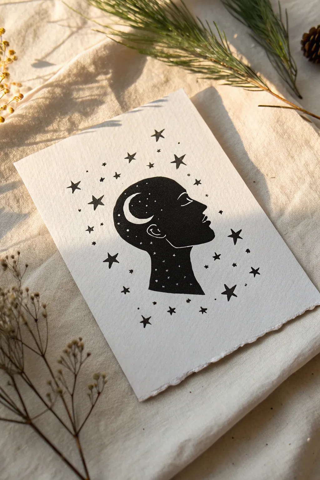
This striking black and white illustration combines a serene profile silhouette with a galaxy of stars. The contrast between the deep black ink and the stark white paper creates a magical, dreamy effect that looks beautiful when framed.
Step-by-Step
Materials
- Heavyweight drawing paper or mixed media paper (smooth texture works best)
- Pencil (HB or 2H)
- Eraser
- Black fineliner pens (0.1mm and 0.5mm)
- Thick black marker or brush pen
- White gel pen (optional, for corrections or adding stars later)
- Ruler (optional)
Step 1: Sketching the Silhouette
-
Lightly outline the profile:
Start by drawing the profile of a face in the center of your paper using an HB pencil. Keep your lines extremely light so they are easy to erase later. Focus on the curve of the forehead, the bridge of the nose, the lips, and the chin. I find it helpful to look at a reference photo to get the proportions just right. -
Define the neck and back of head:
Continue the line from the chin down to create the neck. Then, draw the back of the head, curving down to meet the neck. You don’t need to draw hair details; just a smooth, rounded shape for the skull is perfect for this celestial design. -
Refine the shape:
Step back and look at your outline. Smooth out any jagged lines. The beauty of a silhouette lies in its clean, continuous contour, so take a moment to ensure your curves flow nicely. -
Sketch internal details:
Inside the head shape, lightly sketch a crescent moon near the forehead area. You can also lightly mark where the ear would be with a simple curved line, though this will eventually be outlined in white against the black. -
Plan the internal stars:
Still using your pencil, mark tiny circles or dots inside the head silhouette where you want the white ‘stars’ to remain uncolored. This acts as a map so you don’t accidentally color over them.
Clean Lines Trick
If your markers bleed, lay down a strip of masking tape along the neck’s bottom edge before coloring. This creates a deeply satisfying, crisp termination line.
Step 2: Inking the Design
-
Outline the main shape:
Switch to your 0.5mm fineliner. Carefully trace over your pencil outline of the entire head profile. Be confident with your strokes to avoid shaky lines. -
Outline internal elements:
carefully outline the crescent moon and the small ear detail inside the head. Remember, you want to preserve the white paper inside the moon, so draw the outline precisely. -
Fill the silhouette:
Using a thick black marker or brush pen, begin filling in the head shape. This is the most satisfying part! Working slowly near the edges is key to keeping the silhouette sharp. Be very careful to go *around* the crescent moon and the tiny star spots you marked earlier. -
Refine the edges:
Once the main area is filled, switch back to a finer pen to clean up the edges and get into tight corners, like around the lips or the points of the crescent moon. -
Verify the density:
Check for any streaks in your black ink. If the coverage looks patchy, let the first layer dry completely and then apply a second layer for a deep, solid black.
Cosmic Splash
Instead of drawing black stars outside, gently splatter black watercolor paint around the silhouette for a more chaotic, energetic galaxy effect.
Step 3: Creating the Galaxy
-
Draw large external stars:
Now move to the white space surrounding the head. Use your 0.5mm pen to draw five-pointed stars. Scatter them randomly around the silhouette, varying their rotation so they don’t look uniform. -
Add medium stars:
Fill in the gaps with slightly smaller stars. I like to group some together and leave other areas more sparse to create a natural, organic feeling. -
Sprinkle in dots:
Use your finest decorative pen (0.1mm) to add tiny dots and specks between the stars. These represent distant stars and add texture to the background. -
Enhance the internal cosmos:
If you accidentally colored over some internal stars, use a white gel pen to add them back in now. Dot small white specks inside the black silhouette to make the ‘galaxy’ inside the mind look dense and magical. -
Add the eye detail:
Carefully draw a simple closed eye using a thin white line (or leave a thin white line uncolored if you are very precise). A white gel pen makes this step much easier if you’ve already filled the area with black. -
Clean up:
Wait for all the ink to be completely dry—give it a few minutes to be safe. Then, gently erase any visible pencil marks from your initial sketch.
Now you have a poetic piece of art that beautifully captures the feeling of having a universe inside your mind.
Circle Frame Landscape Doodle

This serene ink drawing captures the quiet beauty of a forest landscape using simple geometric shapes and clean lines. It combines a circle-framed forest scene with stylized triangular mountains, making it a perfect project for beginners looking to practice precision and composition.
Detailed Instructions
Materials
- Dotted or blank sketchbook
- Fine liner pen (black, size 0.3mm or 0.5mm)
- Pencil (HB or 2B)
- Eraser
- Compass or a circular object to trace (approx. 3-4 inches diameter)
- Straightedge or ruler
Step 1: Setting the Scene
-
Position your circle:
Open your sketchbook to a fresh spread. On the right-hand page, use a compass or trace a circular object to draw a light pencil circle in the upper half of the page. Leave enough space below it for the mountain illustrations. -
Draw the horizon line:
Inside the circle, draw a straight horizontal chord near the bottom third. This line will separate the sky and trees from the ground. -
Draft the trees:
Lightly sketch four vertical lines rising from the horizon line inside the circle. Vary their heights—make the two on the right taller and the two on the left shorter to create visual interest.
Step 2: Inking the Circle Frame
-
Outline the circle:
Carefully trace over your pencil circle with your black fine liner. Move your hand steadily to keep the line smooth. I find rotating the notebook as I draw the curve helps maintain a consistent arc. -
Ink the horizon:
Draw the horizontal line across the bottom section of the circle. This creates the solid ground for your trees. -
Add detail to the ground:
Below the horizon line within the circle, add three or four short, horizontal dashes. These minimal lines suggest texture or ripples in water without overcrowding the space.
Use Dots for Guides
If you’re using a dot-grid journal, use the dots to count spaces and ensure your mountain triangles are perfectly symmetrical before drawing.
Step 3: Drawing the Forest
-
Draw the tree trunks:
Go over your vertical pencil lines with ink. These will be the trunks of your pine trees. -
Add the branches:
Starting from the top of each trunk, draw downward-sloping branches. Use a simple zigzag motion or individual strokes that get slightly wider as you move down the trunk. Leave a gap between the lowest branches and the horizon line for a cleaner look. -
Refine the tree spacing:
Ensure the branches of adjacent trees don’t overlap too heavily; a little negative space keeps the design airy and minimalist.
Add Gold Accents
Use a metallic gold gel pen to fill in the crescent moon or to add a thin outline just inside the circle frame for a touch of elegance.
Step 4: creating the Geometric Mountains
-
Establish the base line:
Below the circle, use your ruler to draw a straight horizontal line that spans nearly the width of the page. This anchors your mountains. -
Draft the mountain triangles:
Draw two triangles sitting on the base line. Make the left one slightly shorter and wider, and the right one taller and narrower. They should not touch each other. -
Detail the left mountain:
Inside the left triangle, draw a jagged, irregular line horizontally across the middle to mark the snow line. Fill the bottom section with stippling (lots of tiny dots) or small, dense scribbles to create a dark, rocky texture, leaving the peak white. -
Detail the right mountain:
For the right triangle, fill the entire shape with diagonal hatching. Draw parallel diagonal lines from top-left to bottom-right across the whole mountain. -
Add opposing stripes:
To make the right mountain more graphic, maintain the triangle outline but change the direction of the lines in the bottom half if you want a patterned effect, or simply stick to clean, consistent hatching. -
Add floating dots:
Place about five or six small dots randomly in the space between the circle and the mountains. These act as stars or magical dust to connect the two elements.
Step 5: Finishing Touches
-
The moon motif:
On the bottom left page (opposite your main drawing), draw a simple crescent moon outline. -
The star accent:
Next to the crescent moon, draw a small five-point star. Fill it in black for contrast against the open moon. -
Erase pencil marks:
Wait at least a minute for the ink to dry completely to avoid smudging. Then, gently erase all underlying pencil sketches.
Now you have a tranquil, geometric landscape that brings a breath of fresh air to your sketchbook pages
Easy Pattern Tile: Waves And Triangles
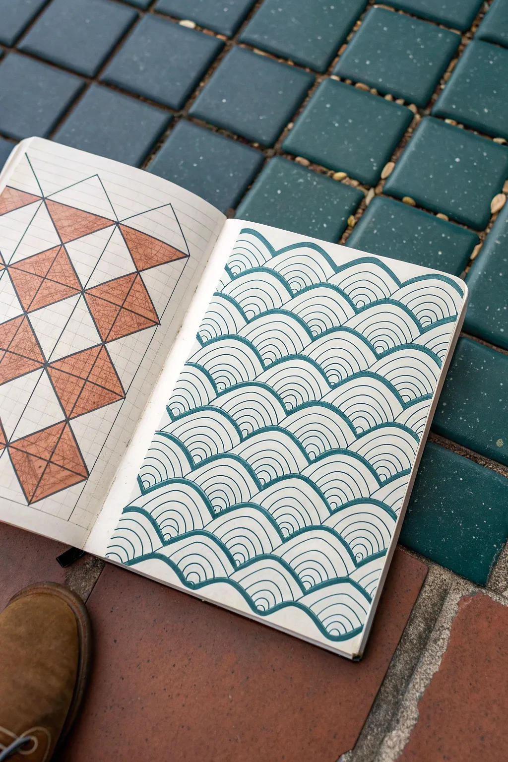
Create a calming spread in your sketchbook featuring two classic yet contrasting patterns side-by-side. The left side showcases a structured geometric triangle design with warm tones, while the right features the flowing, rhythmic lines of traditional Japanese Seigaiha waves.
How-To Guide
Materials
- Grid notebook or sketchbook with graph paper
- Pencil and eraser
- Ruler
- Orange colored pencil or marker
- Ballpoint pen or fine liner (dark teal or blue)
- Black fine liner pen (optional)
Step 1: Left Page: Triangular Geometry
-
Establish the grid:
Begin by counting the squares in your grid notebook to determine the size of your larger squares. For this pattern, mark out a series of large squares (e.g., 4×4 or 6×6 grid units) using faint pencil marks to serve as your foundational structure. -
Draw the diagonals:
Using a ruler, draw a diagonal line through each large square block, connecting opposite corners. Alternate the direction of the diagonal for adjacent blocks to create a dynamic ‘X’ effect across the page. -
Mark the centers:
Draw the second diagonal in each square so that an ‘X’ is formed in every block. You should now have a grid composed of four triangles meeting at a central point within each larger square. -
Plan the color pattern:
Lightly mark which triangles will be filled with color. The pattern alternates: in one column, the top and bottom triangles of a square are colored; in the adjacent column, the left and right triangles are colored. -
Apply color:
Use your orange colored pencil to fill in the designated triangles. Apply consistent pressure to get an even, warm texture, leaving the alternating triangles the white of the paper. -
Define the outlines:
Go over your main structural pencil lines with a slightly darker stroke or a fine liner pen. This crisp outline makes the orange triangles pop against the white grid layout.
Uneven Arches?
If your waves look lopsided, try tracing the rim of a coin or a small bottle cap for the initial outer arch of each wave, then freehand the inner lines for a uniform look.
Step 2: Right Page: Seigaiha Waves
-
Draw guidance lines:
Since this page doesn’t rely on the grid lines as strictly, lightly penciling horizontal guidelines across the page can help keep your waves level. -
Start the first row:
Begin at the bottom of the page. Using your teal or blue pen, draw a series of side-by-side semicircles (arches) along your bottom guideline. -
Layer the rings:
Inside each base semicircle, draw about 3 to 4 smaller concentric arches. Try to keep the spacing between lines roughly equal, though slight handmade variations add charm. -
Offset the second row:
Start the second row of waves directly above the first. Positioning is key: the center of each new wave should sit directly above the point where the two waves below it meet. -
Draw the top arches:
Sketch the outermost arch for this second row first to establish the size, ensuring it touches the tops of the waves below. -
Fill the interior lines:
Just like the first row, fill the interior of your new arches with concentric semicircles. I find it easiest to work from the outside in to control the spacing. -
Climb the page:
Continue this alternating process row by row, working your way up the page. It’s helpful to pause occasionally and check that your rows aren’t drifting crookedly. -
Manage the edges:
When you reach the left or right edge of the paper, draw only the portion of the wave that fits, creating the illusion that the pattern continues off the page. -
Clean up guidelines:
Once the ink is completely dry, use an eraser to gently remove any horizontal pencil guidelines you sketched earlier.
Level Up: Gradient Fade
Make the wave pattern dynamic by changing pen thickness. Use a thick marker for bottom rows and switch to thinner pens as you move up, creating an atmospheric fade.
Now you have a stunning double-page spread contrasting rigid geometry with organic flow


Have a question or want to share your own experience? I'd love to hear from you in the comments below!