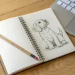
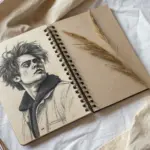
If you’re itching for drawing prompts that actually push you, you’re in the right headspace—think photorealism, value control, and details that demand patience. These ideas are the kind I give my advanced students when they’re ready to level up their texture rendering and composition without playing it safe.
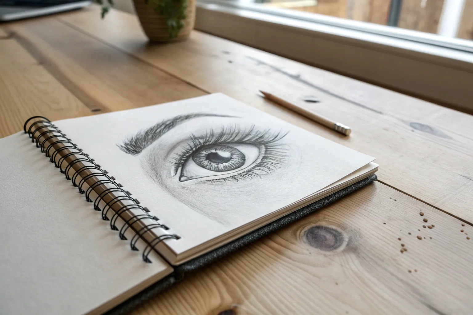
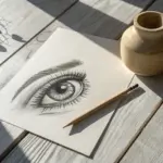
1. Hyper-Realistic Eye Close-Up
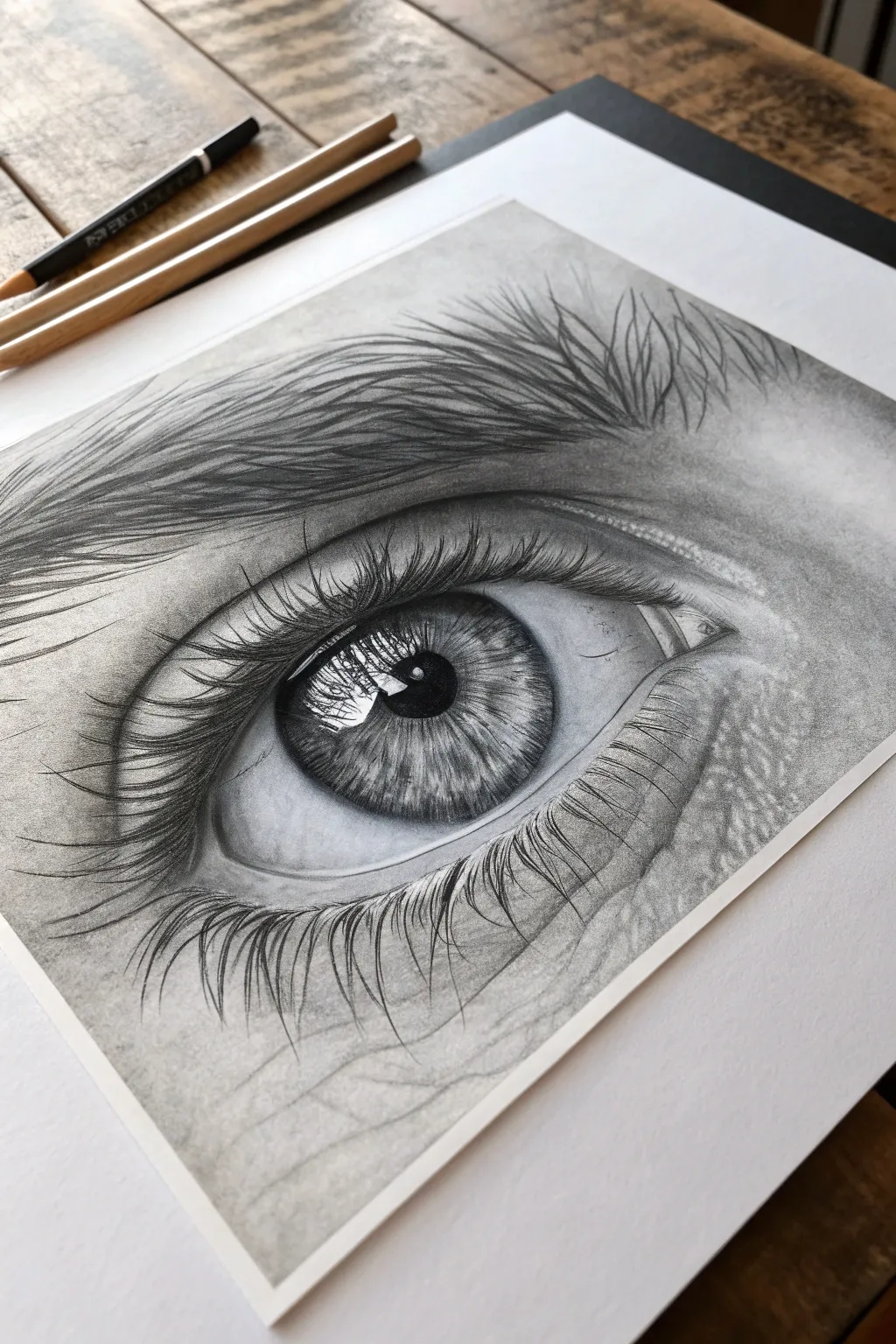
Master the art of extreme detail with this striking monochrome study of the human eye. By focusing on texture mapping and dramatic contrast, you’ll transform graphite dust into a lifelike reflection of the soul.
Step-by-Step Tutorial
Materials
- High-quality smooth drawing paper (Bristol or hot-press watercolor paper)
- Graphite pencils (ranging from 4H to 8B)
- Charcoal pencil (soft) for deepest blacks
- Mechanical pencil (0.3mm or 0.5mm, 2B lead)
- Blending stumps (tortillons)
- Kneaded eraser
- Precision eraser (mono zero or similar)
- Soft brush (for sweeping away eraser crumbs)
- White gel pen or gouache (optional for extreme highlights)
Step 1: Structural Foundation
-
Light Outline:
Begin with a hard pencil (H or 2B) to lightly sketch the almond shape of the eye, the circular iris, and the pupil. Don’t press hard; indents in the paper will show up later. -
Mapping the Iris:
Within the iris, lightly draw the irregular shapes of the catchlight (reflection) near the pupil. This white space is crucial for realism, so mark it off early to preserve the paper’s white. -
Establishing Shadows:
Lightly shade the surrounding skin area, sketching the path of the eyebrow and the crease of the eyelid. This ensures your composition is balanced before committing to dark values.
Uneven Graphite Shine?
Heavy pencil layers can create a distracting metallic shine (graphite glare). To fix this, spray the finished drawing with a matte fixative, which dulls the sheen and protects the artwork.
Step 2: The Iris and Pupil
-
Deepest Darks:
Using a soft graphite (6B) or charcoal pencil, fill in the pupil. Be extremely careful to leave the reflection area pristine white. Press firmly for a solid, void-like black. -
Iris Starburst:
With a sharp mechanical pencil, draw lines radiating from the pupil outward to the limbal ring (the outer edge of the iris). Vary the length and pressure to create a jagged, starburst texture. -
Layering Tone:
Shade over the radiating lines with a mid-tone pencil (2B). Blend gently with a stump to soften the texture, making it look fibrous rather than scratchy. -
Adding Depth:
Return with a 4B pencil to darken the upper third of the iris where the eyelid casts a shadow. This gradient gives the eye its spherical dimension. -
Detailed Reflections:
Look closely at the catchlight. If there are trees or windows reflected (as in the reference), delicately sketch those faint shapes inside the white zone using a sharp HB pencil.
Pro Tip: The Waterline
For a wet look, keep the bottom rim of the eyelid (the waterline) very light, framed by a dark shadow underneath the lashes. This contrast mimics moisture catching the light.
Step 3: Skin and Texture
-
Sclera Shading:
Shade the ‘white’ of the eye (sclera). It is spherical, so shade the corners grey, fading to white near the iris. Add faint blood vessels with a 4H pencil for subtle realism. -
Eyelid Creases:
Using a blending stump loaded with graphite, lay down a base tone for the skin. Then, use a sharp 2B to draw the fine wrinkles and creases of the eyelid skin. -
Pores and Texture:
Stipple tiny dots and small, irregular shapes around the tearduct and under-eye area to simulate pores. Lift out tiny highlights within these pores using your kneaded eraser. -
Eyebrow Foundation:
Lay down a soft grey wash where the eyebrow sits. This prevents the hairs from looking like they are floating on white paper.
Step 4: Lashes and Finishing
-
Hair Direction:
For the eyebrow, use quick, flicking strokes with a sharp 4B pencil. Follow the natural growth pattern: hairs grow upward near the nose and sweep outward toward the temple. -
Upper Lashes:
Draw the upper eyelashes in curved, swooping motions. They should clump together slightly at the tips. Start the stroke at the root (lid line) and lift pressure as you flick outward. -
Reflecting Lashes:
Notice how the lashes reflect in the highlight of the eye? I always suggest adding faint, curved lines cutting through the iris reflection to mimic this mirrored effect. -
Lower Lashes:
Add the lower lashes. These are generally thinner, shorter, and more sparse than the upper set. Ensure they grow from the outer edge of the water-line, not the eyeball itself. -
Final Contrast Check:
Step back. Darken the pupil and the crease of the eye one last time to maximize contrast. Use a precision eraser to pick out the brightest highlights on the wet lower lid (waterline).
Take a moment to appreciate the depth you’ve created, noting how the tiny imperfections in the skin texture bring the drawing to life
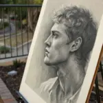
4. Foreshortened Figure From a Low Angle
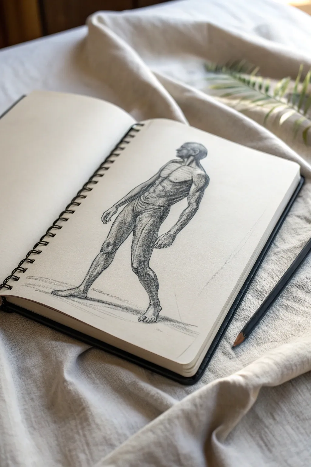
Mastering foreshortening is a milestone for any artist, and this study captures the drama of a looming figure viewed from below. The drawing emphasizes structural anatomy and careful tonal shading to create volume and weight on the page.
Detailed Instructions
Materials
- Sketchbook with cream or off-white paper (smooth or light tooth)
- Graphite pencils (HB for layout, 2B and 4B for shading)
- Black charcoal pencil (optional, for deepest accents)
- Kneaded eraser
- Blending stump or tortillon
Step 1: Establishing the Foreshortened Gesture
-
Visualize the Perspective:
Before marking the paper, imagine the figure inside a tall box. Since we are looking up, the feet will be firmly planted at eye level or below, while the head will appear smaller and further away at the top. -
Line of Action:
Lightly sketch a sweeping curve with an HB pencil to represent the spine and the overall lean of the body. The figure is leaning slightly back, so this line should have a gentle backward arch. -
Blocking the Masses:
Draw ovals for the pelvis and ribcage. Crucially, overlap the ribcage slightly *behind* the pelvis to indicate the upward angle. The pelvis should look larger than usual due to its proximity to the viewer. -
Locating the Limbs:
Sketch cylinders for the legs. The thighs will appear longer and thicker than the shins in this specific low-angle view. Place the feet wide for stability.
Step 2: Anatomical Construction
-
Refining the Torso:
Define the abdominal muscles. Instead of flat rectangles, draw them as wrapping around the cylindrical form of the torso. The lower abs should appear larger than the upper abs due to the perspective. -
Shoulders and Neck:
Draw the deltoids as rounded caps. Because we are looking up, the trapezius muscles will largely obscure the neck, making the head appear to sit lower between the shoulders. -
Head Placement:
Sketch the head in profile. Keep the chin prominent; you should see the underside of the jaw clearly. The facial features will be compressed toward the top of the skull. -
Arm Structure:
Flesh out the arms. The arm closer to the viewer (the figure’s left) should show the bicep wrapping into the forearm. Let the hands rest naturally, fingers slightly curled.
Scaling Looks Wrong?
If the figure looks top-heavy, your head is likely too big. In a low-angle view, the head is furthest away. Reduce the head size by 10-15% to exaggerate the towering effect.
Step 3: Rendering and Tone
-
Core Shadows:
Identify your light source coming from the upper left. Switch to a 2B pencil and lightly map out the core shadows on the right side of the torso and inner legs. -
Building Value on the Legs:
Start shading the legs, which are closest to us. Use hatching lines that follow the curvature of the muscles (contour hatching) to reinforce the roundness of the thighs. -
Defining the Torso musculature:
Deepen the shadows between the pectoral muscles and the ribcage. I find that accentuating the bottom plane of the pectorals really helps sell the low-angle illusion. -
Contour Variation:
Go back over your outlines. Where a muscle bulges or carries weight, thicken the line. On the illuminated side (the back and top of the shoulder), keep the line thin or even broken. -
Deepest Darks:
Use a 4B pencil or charcoal pencil to punch in the darkest values: the groin area, the deep crease of the underarm, and the shadow cast by the jaw. -
Grounding the Figure:
Add a localized cast shadow underneath the feet. This anchors the drawing and prevents the figure from looking like it’s floating in space. -
Subtle Texturing:
Use a blending stump (or your finger, sparingly) to soften the transitions in the mid-tones, but keep the edges of the cast shadows crisp to maintain clarity.
Dramatic Lighting
Increase the contrast significantly. Make the background paper slightly gray with graphite dust so you can erase out bright white highlights on the upper planes of the muscles.
This perspective exercise sharpens your understanding of volume and helps you see the body as a three-dimensional object in space


6. Fur, Feathers, and Whiskers Challenge
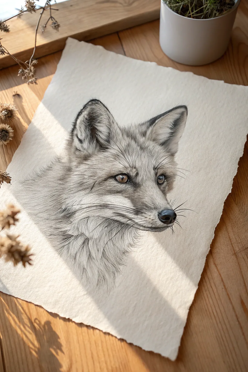
Capture the intricate beauty of wildlife with this hyper-realistic pencil study of a fox, focusing heavily on directional fur growth and delicate whisker details. The result is a soft, soulful portrait resting on textured paper that emphasizes the organic feel of the subject.
Step-by-Step Guide
Materials
- High-quality textured paper (e.g., cold press watercolor paper or heavyweight drawing paper with tooth)
- Graphite pencils (range from 4H to 6B)
- Mechanical pencil (0.3mm usually with HB or 2B lead)
- Kneaded eraser
- Precision eraser (mono zero or similar)
- Blending stump or tortillon
- Soft brush (for sweeping away eraser dust)
Step 1: Structural Foundation
-
Outline the basic shapes:
Start with a very faint H or 2H pencil to map out the overall head shape. Focus on the triangular wedge of the muzzle and the large, alert ears. Keep these lines barely visible, as you don’t want hard outlines in the final piece. -
Map the features:
Place the eyes carefully—they are the soul of the drawing. Notice the tear duct area and the almond shape. Mark the position of the nose nose and the center line of the muzzle to ensure symmetry. -
Indicate fur direction:
Before shading, use light, directional strokes to map out how the fur flows. It radiates outward from the muzzle, sweeps back over the ears, and flows down the neck. This map is crucial for realism later.
Fur looking flat?
Avoid drawing individual hairs parallel to each other like a comb. Overlap your strokes in slightly varying angles to create dense, realistic layering.
Step 2: The Soulful Eyes
-
Darken the pupil:
Using a 4B or 6B pencil, fill in the pupil. It needs to be the darkest point on the paper to create depth. -
Add iris details:
Work on the iris with a B or 2B pencil. Leave a tiny, crisp white shape for the catchlight reflection—this brings the fox to life. Use radial strokes from the pupil outward to mimic the texture of the iris. -
Detail the eye rim:
The skin around the eye (the eyeliner) should be dark and velvety. Use a sharp 4B pencil here, blending slightly into the tear duct area.
Step 3: Layering the Fur
-
Start with the undercoat:
Using an H pencil, lay down a base tone of soft shading in the direction of hair growth. This prevents the white of the paper from showing through too aggressively between hairs later. -
Build short muzzle hairs:
Switch to a mechanical pencil for precision. The fur on the bridge of the nose is incredibly short and dense. Use tiny, stippled strokes or very short dashes. -
Lengthen the strokes:
As you move from the nose to the cheeks, gradually lengthen your pencil strokes. Follow your initial directional map closely. I prefer to lift the pencil at the end of each stroke to create a tapered hair tip. -
Darken the ear tips:
The ears have high contrast. Use a 4B to darken the recess of the inner ear and the tips, but keep the strokes loose and fluffy to suggest the softest fur. -
Refine the cheek fluff:
The white fur on the lower cheeks and neck needs to be defined by shadow, not outline. Shade the negative space under clumps of fur to make the white hairs pop forward.
Add Winter Atmosphere
For a ‘snowy’ effect, gently spatter a tiny amount of white gouache or acrylic ink over the finished fur using a toothbrush for falling snow.
Step 4: Defining Texture
-
Deepen the shadows:
Go back in with a 2B or 4B pencil to add depth where fur clumps overlap, particularly under the chin and around the base of the ears. -
Create a nose texture:
Stipple the nose pad with a B pencil to create a leathery, wet look. Leave the top edge slightly lighter to indicate a highlight. -
Blend selectively:
Use a tortillon to soften the undercoat in the shadow areas, but be careful not to over-blend the detailed top hairs. You want to maintain that crisp texture.
Step 5: Final Details
-
Lift out highlights:
Take your precision eraser (cut it to a sharp edge if needed) and lift out thin lines of white fur on the cheeks and inside the ears to regain brightness. -
Add the whiskers:
This requires confidence. You can either indent the paper beforehand with a stylus or carefully draw the whiskers now with long, swift strokes using a sharp HB. Don’t make them too dark; they should look translucent. -
Clean up edges:
Ensure the transition from the drawing to the white paper is organic. Add a few loose, stray hairs on the outer edges so the fox doesn’t look like a cutout sticker.
Take a moment to admire the life-like gaze you have created on the page

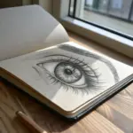
14. Interior Perspective With Natural Light
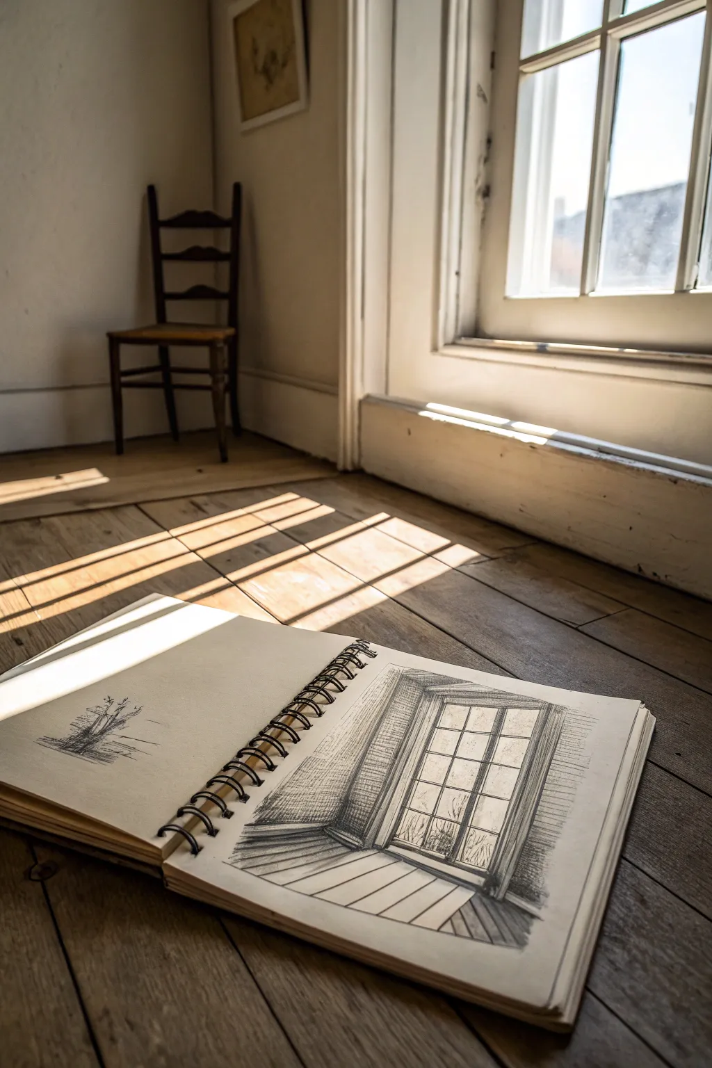
Capture the serene interplay of light and shadow with this architectural interior study, focusing on sharp perspective and atmospheric contrast. This project explores how to render the geometric forms of a traditional window while softening the edges with natural illumination.
How-To Guide
Materials
- Wire-bound sketchbook (medium tooth paper)
- Graphite pencils (HB, 2B, 4B)
- Charcoal pencil (optional, for deepest shadows)
- Kneaded eraser
- Ruler or straight edge
- Blending stump (tortillon)
Step 1: Establishing Perspectives
-
Rough framing:
Begin by lightly sketching a large rectangle on the right-hand page of your sketchbook to establish the outer frame of the window. Keep your lines very faint using an HB pencil so they can be easily adjusted. -
Inner depth:
Draw a second, slightly smaller rectangle inside the first one to create the thickness of the window frame. Offset it slightly to the left to suggest an angled perspective view. -
Floor and wall lines:
Extend diagonal lines downward from the bottom corners of the window frame to map out where the floor meets the wall. These perspective lines should angle outward slightly to create depth. -
Grid structure:
Divide the window pane area gently. Draw a central vertical line for the mullion, then add three horizontal lines to create the eight distinct panes typical of sash windows. -
Adding dimension:
Give volume to these dividing lines by turning them into narrow rectangles rather than single strokes. This small detail is crucial for making the window structure look solid rather than flat.
Fixing Smudges
If your hand drags graphite across the white paper, place a clean sheet of scrap paper under your drawing hand. This acts as a shield to keep your bright whites crisp.
Step 2: Defining Light and Texture
-
Tracing the shadows:
Switch to a 2B pencil and lightly outline the shapes of the cast shadows on the floor. I like to look at how the light hits the real floor to understand the angle, then replicate those elongated geometric shapes. -
Wall hatching:
Start shading the wall surrounding the window. Use uniform, diagonal hatching strokes. Keep the area immediately next to the window frame slightly lighter to create a glowing contrast. -
Deepening the recess:
Darken the interior thickness of the window frame (the reveal) on the left side. This area is usually in shadow and defines the depth of the wall. -
Window pane details:
Sketch faint, scribbled suggestions of foliage or outdoor scenery in the bottom panes. Keep this very abstract; we want the focus to remain on the interior structure. -
Dark accents:
Use a 4B pencil or charcoal to firmly outline the window panes and the right side of the frame. These dark, confident lines will make the structure pop against the lighter glass.
Level Up: Warmth
Try toning the paper first with a very light wash of tea or coffee before drawing. The warm undertone will make the white highlights (added with white charcoal) pop dramatically.
Step 3: Atmosphere and Finish
-
Floorboards:
Draw faint diagonal lines on the floor area to represent wooden planks. Ensure these lines follow the same perspective angle as your initial floor-to-wall lines. -
Cast shadow shading:
Fill in the shadow shapes on the floor using a medium pressure. The shadows should be darker closer to the window and can fade slightly as they stretch outward. -
Controlling the contrast:
Use your kneaded eraser to lift graphite from the window glass area, ensuring it remains the brightest part of the drawing. This ‘negative drawing’ technique simulates bright light pouring in. -
Softening edges:
Take a blending stump and gently smudge the hatching on the walls to create a smoother texture, distinct from the sharper lines of the woodwork. -
Final touches:
Review your darks and lights. Add a final layer of 4B shading to the shadowed corners of the windowsill to anchor the drawing. -
Opposite page thumbnail:
For a complete sketchbook look, quickly sketch a small, loose thumbnail of a tree or exterior element on the opposing left page to balance the composition.
Close your sketchbook knowing you’ve preserved a fleeting moment of beautiful stillness

PENCIL GUIDE
Understanding Pencil Grades from H to B
From first sketch to finished drawing — learn pencil grades, line control, and shading techniques.
Explore the Full Guide
18. Mechanical Object With Exploded Detail View
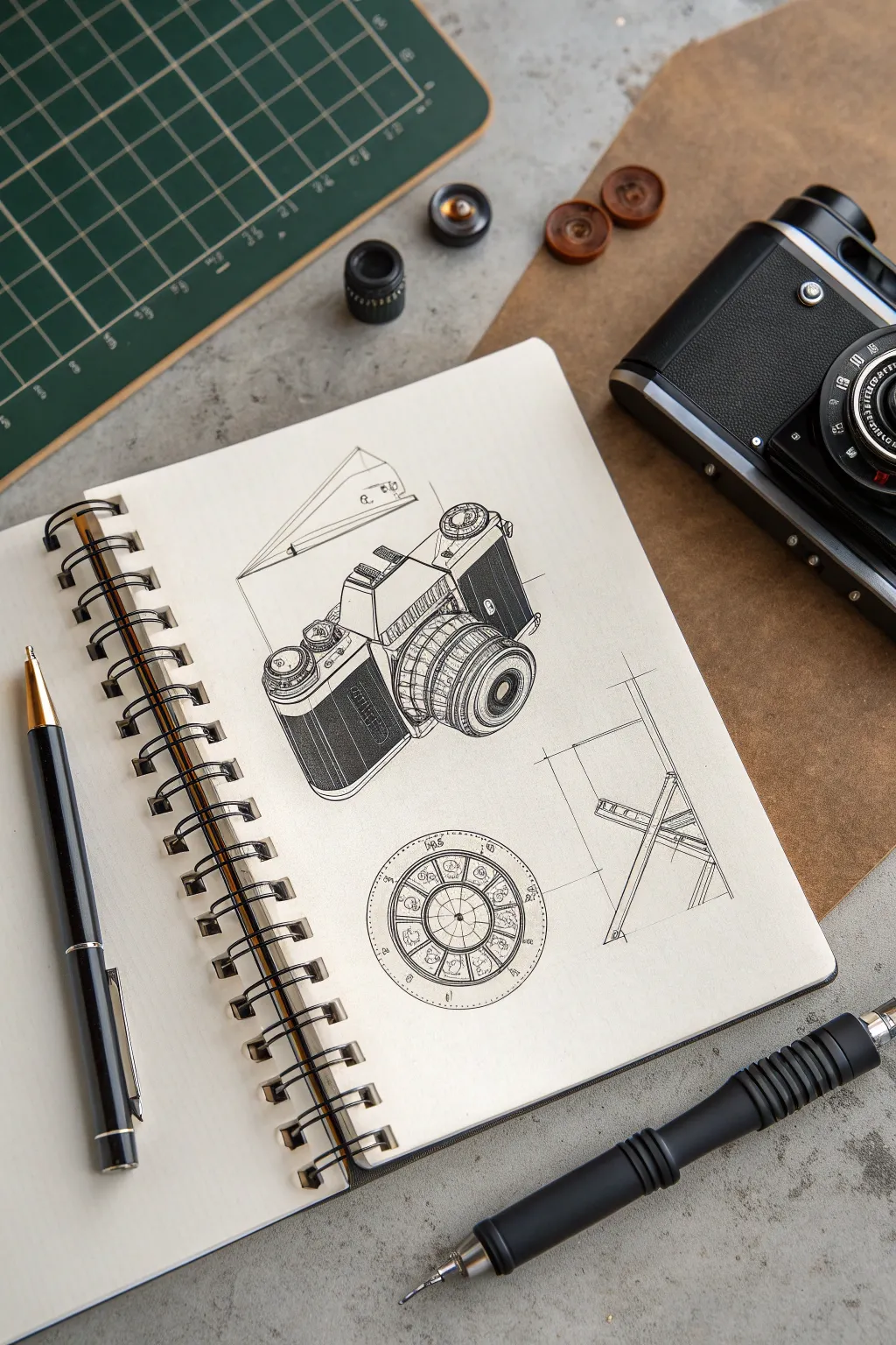
This tutorial guides you through creating a technical yet artistic illustration of a classic SLR camera, focusing on precise line work and exploded details. The finished piece combines the structured beauty of mechanical drafting with the loose, expressive quality of hand-drawn ink sketches, perfect for exploring industrial design aesthetics.
Step-by-Step Tutorial
Materials
- Spiral-bound sketchbook (heavyweight mixed media or Bristol paper)
- Mechanical pencil (0.5mm, HB lead)
- Fine liner pens (sizes 0.05, 0.1, 0.3, and 0.5mm)
- Ruler or straight edge
- Circle template or compass
- Kneaded eraser
- Reference photo of a vintage SLR camera
Step 1: Structural Layout
-
Establish the horizon line:
Begin by lightly sketching a faint horizon line across the upper third of your page to determine your perspective angle. Since we are looking down at the camera slightly, this line helps keep your verticals true. -
Block in the main body:
Using your mechanical pencil, draw a rectangular prism for the camera body. Keep the lines extremely light. Pay attention to the perspective; the lines receding to the left should converge slightly. -
Position the prism housing:
Add the triangular prism shape on top of the main body where the viewfinder lives. This distinctive ‘hump’ is crucial for the SLR silhouette. -
Construct the lens cylinder:
Draw a central axis line protruding from the front of the camera body. Sketch a series of ellipses along this axis to define the lens barrel. I find it helpful to draw through the form as if it were transparent to ensure the ellipses align correctly. -
Draft the supplementary diagrams:
below the main camera sketch, lightly pencil in a circle for the detailed dial view and a simple angular framework to the right side to represent a simplified profile or stand view.
Wobbly Ellipses?
If your lens circles look uneven, don’t erase. Instead, ‘restate’ the line by going over it lightly again to correct the shape. The multiple lines add energy and correct the form visually.
Step 2: Defining the Details
-
Refine the camera contours:
Go back over your blocky shapes and add the ergonomic chamfers, rounded corners, and specific protrusions like the shutter button and film advance lever. -
Detail the lens rings:
Divide the lens barrel into distinct sections for the focus and aperture rings. Sketch gripping tecture guidelines—small, evenly spaced vertical ticks—along the focus ring. -
Draft the circular detail:
Inside your lower circle, use a compass or template to draw concentric rings. Divide the inner ring into segments like a pie chart to mimic specific camera settings or an aperture blade mechanism. -
Sketch the geometric breakdown:
For the diagram on the right, use your ruler to create a schematic stand or tripod leg view. Keep these lines purposeful but sparse, suggesting a blue-print style analysis.
Step 3: Inking the Drawing
-
Outline main forms:
Switch to a 0.3mm fine liner. confidentially trace the outer silhouette of the camera. Allow for slight line weight variation—thicker on the shadowed side (bottom and right), thinner on the top surfaces. -
Ink the lens barrel:
Carefully ink the ellipses of the lens. Break the line occasionally to suggest highlights on the glass or metal rim. -
Add texture to the grip:
Using a 0.05mm or 0.1mm pen, draw the knurling texture on the lens rings. Create short, rhythmic hatch marks that follow the curve of the ellipse. -
Hatch the body panels:
For the leatherette texture on the camera body, use tight, vertical hatching with a 0.1mm pen. Don’t fill it solid black; the spacing between lines creates a mid-tone grey value. -
Define the prism details:
Add parallel hatching lines on the side of the prism housing to suggest the vertical ridges often found on vintage models.
Level Up: Blueprint Mode
Try drawing this on toned tan or blue paper using white gel pens for the highlights and outlines. This reverses the contrast and mimics the look of an actual vintage blueprint.
Step 4: Technical Annotations & Final Polish
-
Ink the secondary diagrams:
Ink the lower circle and the right-side schematic with a very fine 0.05mm pen. Keep these lines uniform and precise, mimicking an engineering print. -
Add projection lines:
Use a ruler and your thinnest pen to draw straight projection lines extending from key points of the camera to the diagrams or empty space. These ‘construction lines’ enhance the technical drawing aesthetic. -
Intensify shadows:
With a 0.5mm pen, darken the deepest crevices—inside the lens glass, under the shutter dial, and the base of the camera—to make the drawing pop off the page. -
Erase pencil guidelines:
Wait until the ink is completely dry (give it at least 5-10 minutes to be safe), then gently erase all remaining graphite marks with the kneaded eraser. -
Add tiny imperfections:
To stop it looking like a CAD rendering, add a few loose dots or a intentionally broken line near corners to give it that hand-sketched character.
Step back and admire your technical drafting skills, noting how the mix of precise geometry and loose hatching brings the mechanical object to life.
19. Stippling or Hatching-Only Realism
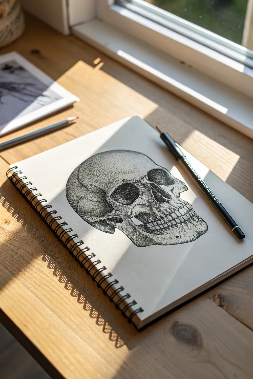
This project challenges your patience and precision by building a realistic human skull entirely out of thousands of tiny ink dots. The result is a striking, textured illustration that captures volume and shadow through density rather than lines.
Step-by-Step Guide
Materials
- Spiral-bound sketchbook (smooth or bristol paper preferred)
- HB Graphite pencil
- Kneaded eraser
- Fine liner pens (sizes 0.05, 0.1, and 0.3mm)
- Reference photo of a skull in 3/4 view
Step 1: Pencil Underdrawing
-
Establish basic shapes:
Begin lightly with your HB pencil. Sketch a large circle for the cranium and a squared-off shape below it for the jaw area. Don’t press hard; these lines need to disappear later. -
Define the eye sockets:
Draw the orbital cavities (eye sockets). Notice in the reference that they aren’t perfect circles; they are somewhat irregular and sit deep within the face structure. -
Refine the nasal cavity:
Sketch the upside-down heart shape of the nasal cavity. Pay attention to the center bone ridge inside it, as this adds crucial depth. -
Outline the zygomatic arch:
Map out the cheekbone (zygomatic arch) sweeping back from the eye socket towards the ear area. This structure defines the side plane of the skull. -
Draft the teeth and jaw:
Lightly indicate the spacing for the teeth. Don’t draw individual teeth yet; just mark the curve of the maxilla and mandible. Outline the heavy jawbone shape below. -
Detail the teeth:
Now refine the teeth shapes. Remember that the roots of the teeth create slight ridges in the bone above and below them. Sketch these subtle bumps lightly.
Hold It Right
Keep your pen perpendicular to the paper. Angling the pen creates comma-shaped marks instead of round dots, which spoils the clean texture of stippling.
Step 2: Stippling Process
-
Start the darkest shadows:
Switch to your 0.3mm fine liner. Begin placing dots in the absolutest darkest areas: deep inside the eye sockets, the nasal cavity, and the gap between the jaw and cheekbone. -
Build density slowly:
Keep your pen vertical. Create value by bunching the dots closely together until the paper is almost black in these deep recesses. Do not color it in; maintain the dot texture. -
Transition to mid-tones:
Switch to a 0.1mm pen. Work outward from your dark shadows. As you move toward the light, space your dots further apart to create a gradient effect. -
Form the cranium volume:
On the large rounded forehead, use the 0.05mm pen. Stipple very lightly and sparsely on the side facing the light source, and increase density as the form curves away into shadow. -
Texture the bone surface:
Bones aren’t perfectly smooth. I like to add tiny clusters of dots across the ‘white’ areas to simulate pitting and weathering on the skull’s surface. -
Define the cheekbones:
Use concentrated stippling under the cheekbone to make it pop forward. The contrast between the dark shadow underneath and the light top edge is key. -
Detail the teeth roots:
Use your finest pen (0.05mm) to stipple the gums and the roots of the teeth. Stipple the spaces *between* the teeth heavily to separate them without using hard outlines. -
Enhance the sutures:
Stipple along the jagged squiggly lines (sutures) on the side of the skull. These should look like cracks, so crowd the dots together to make a dark, irregular line.
Step 3: Final Touches
-
Deepen the contrast:
Step back and squint at your drawing. Go back in with the 0.3mm pen and add more dots to the darkest shadows to increase the contrast range. -
Clean up:
Once the ink is completely dry—give it a few minutes to be safe—gently erase your pencil underdrawing with a kneaded eraser. -
Final smooth gradients:
Look for any ‘jumpy’ transitions where shadow turns to light. Add a few intermediate dots with the 0.05mm pen to smooth these gradients out.
Dynamic Lighting
Make the lighting dramatic by leaving the paper completely white in the highest highlights. This ‘lost edge’ technique makes the bone look shiny and hard.
Now you have a stunning piece of anatomical art that proves simple dots can build complex forms
Have a question or want to share your own experience? I'd love to hear from you in the comments below!