When you’re a teen and you want your art to feel more you (and less like little-kid doodles), the right prompt can flip a blank page into a whole vibe. Here are my favorite drawing ideas for teens that mix skill-building with self-expression, so you can make work that looks cool and feels honest.
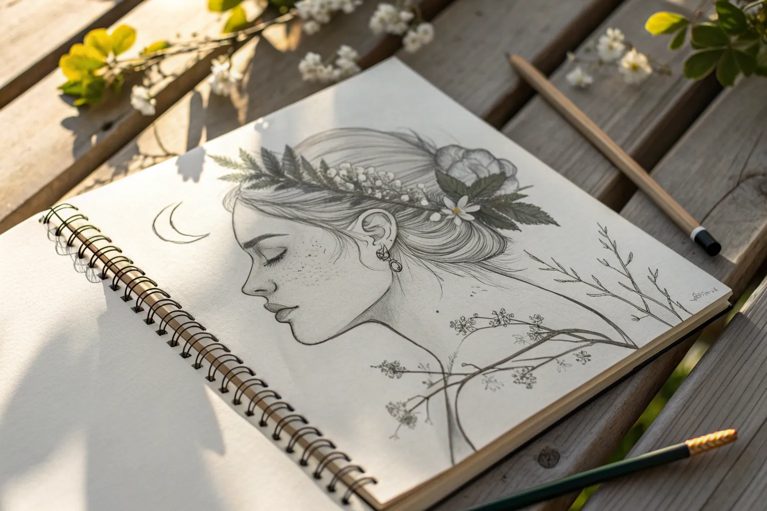
Mirror Self-Portrait Study
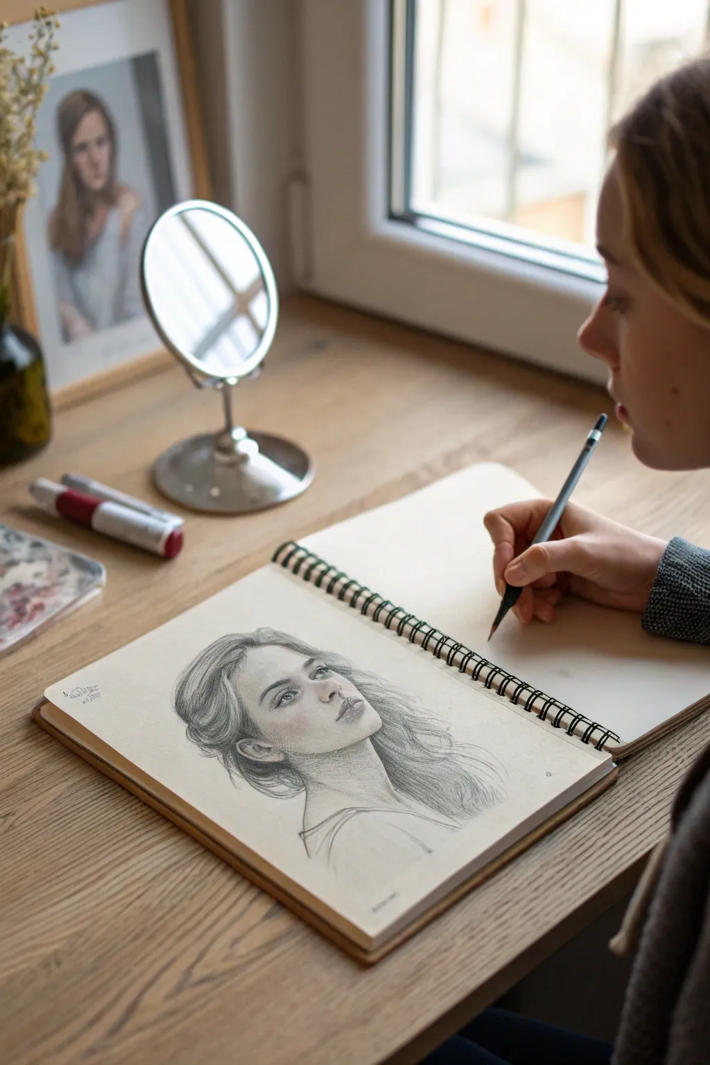
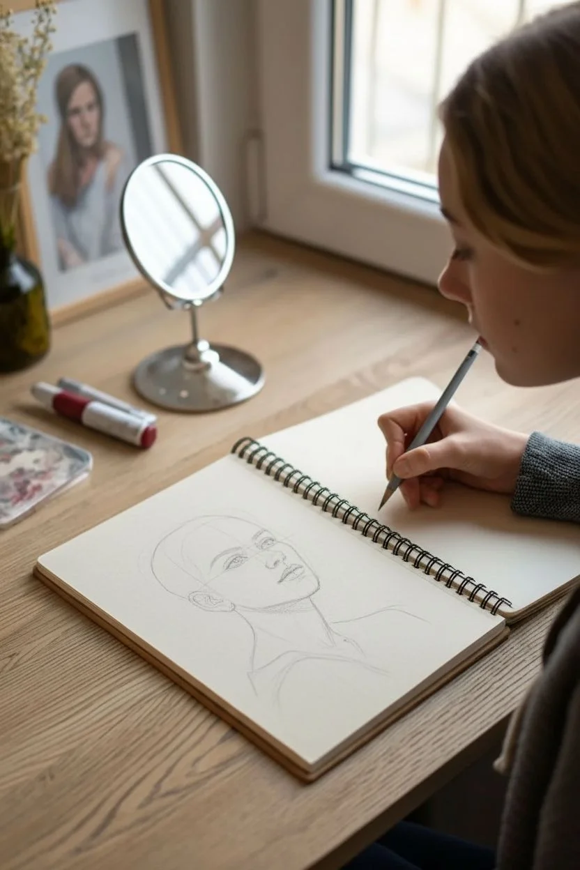
Capture the subtle nuances of expression with this delicate pencil portrait study. This project focuses on rendering soft facial features and flowing hair textures using simple graphite tools for a sophisticated, sketchbook-ready result.
Step-by-Step Tutorial
Materials
- Sketchbook with smooth, off-white paper (approx. A4)
- Graphite pencils (HB, 2B, 4B)
- Mechanical pencil (0.5mm, HB) for fine details
- Kneaded eraser
- Small blending stump or tortillon
- Reference photo or small standing mirror
Step 1: Structural Foundation
-
Establish the Head Shape:
Begin lightly with your HB pencil, drawing an oval shape to represent the cranium and jawline. Keep the jaw somewhat angular but soft, turning slightly to the right. -
Map Facial Guidelines:
Draw faint crosshairs to divide the face. The vertical line should curve with the turn of the head, and the horizontal eye line should sit roughly halfway down the oval. -
Place Feature Markers:
Mark small dashes indicating the width of the nose and the corners of the mouth. Ensure the mouth aligns with the center of the eyes for accurate proportions. -
Outline the Neck and Shoulders:
Sketch long, sweeping lines extending down from the jaw and back of the head to form the neck. Suggest the collarbone and shoulders with loose, gestural strokes to ground the portrait.
Clean Edges Pro-Tip
Place a scrap piece of paper under your drawing hand while you work. This prevents your palm from smudging your graphite shading and keeps the skin tones looking fresh.
Step 2: Defining the Features
-
Sketch the Eyes:
Using the mechanical pencil, carefully outline the almond shape of the eyes. The subject is looking up and away, so position the irises in the upper corners, leaving the bottom of the iris visible. -
Nose and Mouth Construction:
Define the nostrils and the tip of the nose with soft curves rather than hard lines. Sketch the lips, emphasizing the shadow under the bottom lip and the bow of the upper lip. -
Initial Shading:
Switch to a 2B pencil. Lightly hatch the shadowed side of the face (the left side in this setup) to start building volume. Shade under the chin and along the neck. -
Refine the Irises:
Fill in the pupils with a 4B pencil for deep darkness. Shade the irises, leaving a tiny spot of white paper for the catchlight to bring the eyes to life.
Step 3: Hair and Texture
-
Map Hair Flow:
Draw large, loose shapes to verify where the hair masses will sit. The hair is pulled back loosely, so indicate volume at the temples and crown. -
Strand Direction:
With the HB pencil, draw long, continuous strokes following the wave of the hair. Avoid drawing individual hairs immediately; think in ribbons or clumps first. -
Darkening the Roots:
Use the 4B pencil to darken the areas behind the ears and at the nape of the neck. This contrast makes the face pop forward. -
Adding Flyaways:
I like to take the mechanical pencil and add very faint, erratic wisps around the hairline and loose ends. This breaks the silhouette and adds realism.
Level Up: Color Accent
Use a single colored pencil, like a dusty rose or light blue, to faintly color the eyes or lips. This subtle mixed-media touch adds an ethereal quality to the sketch.
Step 4: Refinement and Depth
-
Softening Skin Tones:
Take your blending stump and very gently smooth out the graphite shading on the cheekbones and nose. Be careful not to over-blend; you want to keep some texture. -
Deepening Shadows:
Revisit the lash line, nostrils, and corners of the mouth with the 4B pencil. Sharpen the pencil first to get a precise, dark accent. -
Detailing the Ear:
Define the folds of the visible ear. Keep the shading slightly looser here than on the eyes, so it doesn’t distract from the focal point. -
Clothing Suggestion:
Sketch the strap or neckline of the top with very minimal lines. Let these fade out at the bottom of the page to keep the focus on the face. -
Final Highlights:
Use the kneaded eraser to lift pigment from the tip of the nose, the forehead, and the highest point of the cheekbone for a glowing effect.
Sign your sketch near the shoulder and enjoy the classic elegance of your drawing


Stylized Portrait of a Friend
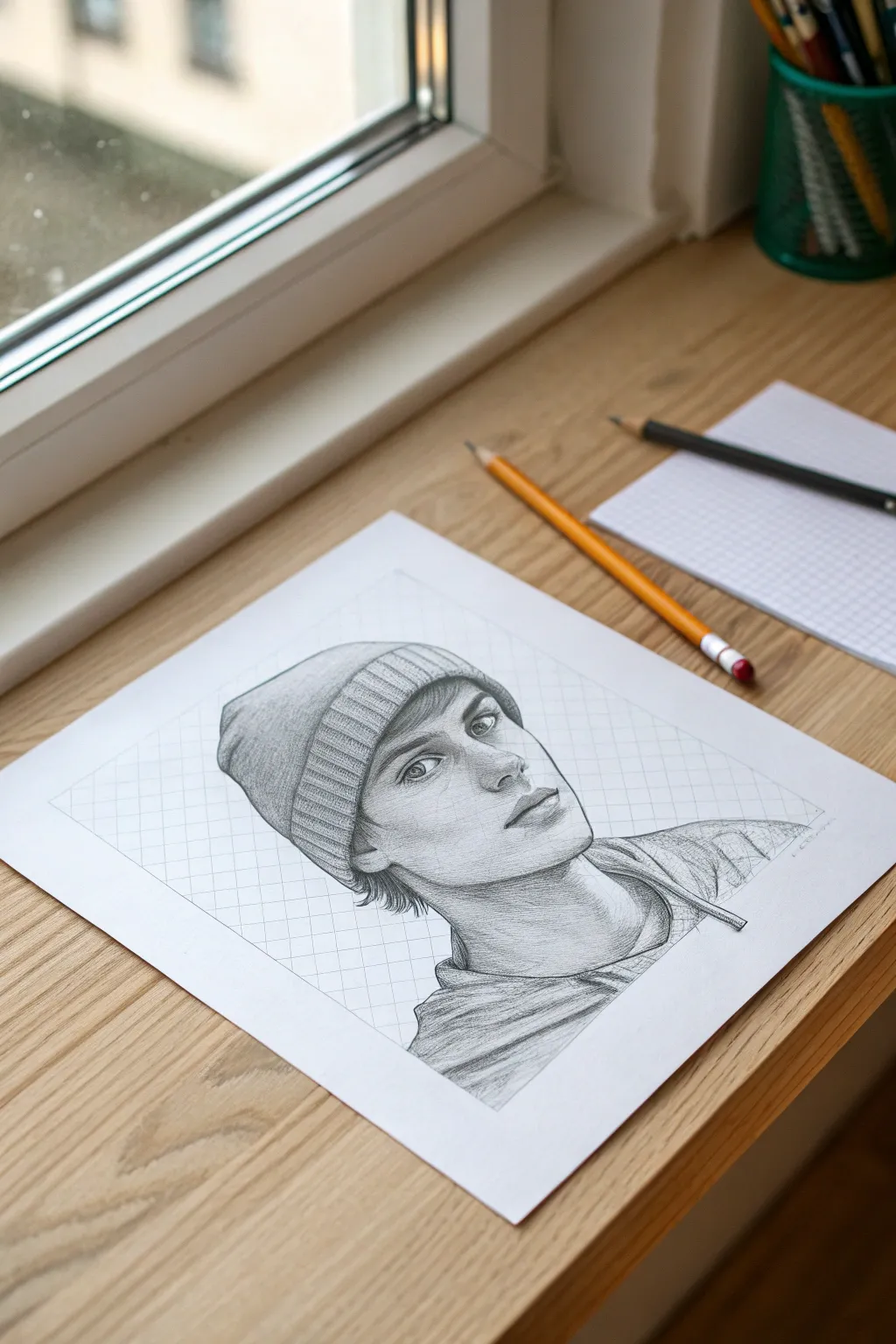
Capture the personality of a friend with this sharp, stylized graphite drawing technique that focuses on clean lines and defined facial planes. The distinctive diamond-grid background adds a modern, graphic design touch that makes the portrait pop off the page.
How-To Guide
Materials
- High-quality drawing paper (smooth bristol or hot press)
- Graphite pencils (HB, 2B, 4B)
- Mechanical pencil (0.5mm HB for details)
- Ruler
- Kneaded eraser
- Blending stump (tortillon)
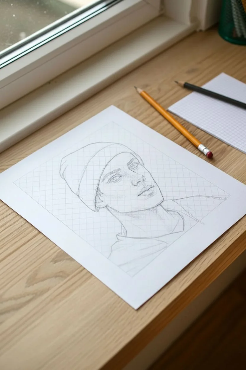
Step 1: Structural Layout
-
Establish the frame:
Begin by drawing a large rectangle in the center of your paper using a ruler. This won’t hold the entire drawing, but it creates the boundary for the background grid pattern. -
Sketch the basic head shape:
Lightly sketch the oval shape for the head, tilting it slightly to the side for a dynamic pose. Position the head so the shoulders extend beyond the rectangular frame you just drew, creating a sense of depth. -
Map facial features:
Draw faint guidelines for the eyes, nose, and mouth. For this stylized look, emphasize the angle of the jawline and the cheekbones, keeping the lines slightly more angular than in a hyper-realistic portrait. -
Create the background grid:
Using your ruler, lightly draw diagonal lines across the background rectangle in one direction. Then, draw diagonal lines in the opposite direction to create a diamond lattice pattern. Keep your pencil pressure very light so these lines remain subtle.
Keep it Clean
Place a scrap piece of paper under your drawing hand while you work. This prevents oils from your skin transferring to the paper and stops you from smudging your hard work.
Step 2: Developing the Portrait
-
Outline the beanie:
Define the shape of the beanie cap. Focus on the ribbed rim, drawing vertical curved lines that wrap around the forehead form to show volume. -
detail the eyes:
Switch to a sharp mechanical pencil or HB pencil. Draw the eyes carefully, adding the iris and pupil. Leave a small white highlight in each eye to bring the subject to life. Add simple, sweeping lines for the eyelashes. -
Refine the nose and mouth:
Shade the bottom of the nose rather than outling it completely. For the lips, define the center line clearly and shade the upper lip slightly darker than the lower lip. -
Add hair strands:
Draw short, flicking strokes where the hair pokes out from under the beanie. Group the strands into small triangles rather than drawing every single hair. -
Define the clothing:
Sketch the folds of the hoodie or shirt around the neck. Use loose, confident strokes to suggest the fabric gathering and draping over the shoulders.
Pop of Color
Instead of graphite, use a colored pencil for just the beanie or the eyes. A single bright color like red or electric blue against the grey pencil sketch creates a striking focal point.
Step 3: Shading and Finishing
-
Shade the skin:
Using a 2B pencil, apply light shading to the side of the face, under the chin, and around the eye sockets. I find that cross-hatching works well here to maintain the stylized texture, but you can also use smooth gradients. -
Deepen the beanie texture:
Go back to the beanie rim. Shade between the ribbed lines to create depth. Shade the main body of the hat, keeping the top lighter to suggest a light source from above. -
Darken the shadows:
Switch to a 4B pencil to punch up the darkest areas: the pupils, the nostrils, the shadow under the chin, and the deepest folds in the clothing. -
Clean up the grid:
Re-trace your background grid lines with a ruler to make them crisp. Use a kneaded eraser to lift up any graphite smudges from the white space within the diamonds. -
Final outlines:
Strengthen the main contour lines of the face and jaw. A slightly thicker outline on the shadow side of the face can add stylized weight to the drawing. -
Erase overlapping lines:
Carefully erase any grid lines that pass through the face or hat. The portrait should appear to be sitting ‘in front’ of the patterned background.
Now step back and admire how the geometric background contrasts with the organic flow of the portrait


Eyes With Different Moods
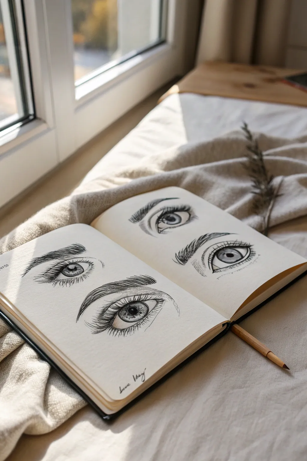
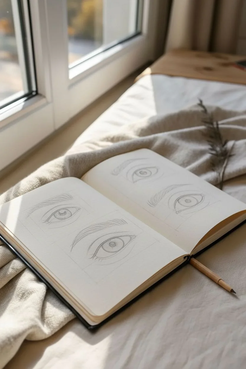
Capture the subtle power of expression by sketching four distinct eye studies across a sketchbook spread. This project focuses on how slight adjustments to the eyebrow arch, eyelid crease, and iris placement can completely shift the emotion from intense focus to soft serenity.
Step-by-Step Tutorial
Materials
- Sketchbook (heavyweight paper preferred)
- Graphite pencils (HB for sketching, 2B/4B for shading)
- Fine liner pens (0.1mm, 0.3mm, 0.5mm)
- Kneaded eraser
- Blending stump or tortilla
- Ruler (optional for alignment)
Step 1: Layout & Basic Structures
-
Prepare the spread:
Open your sketchbook to a fresh two-page spread. Visualize placement for four eyes: two stacked on the left page and two stacked on the right. Leave ample white space around each one to keep the layout clean. -
Sketch the upper outlines:
Using an HB pencil with a very light hand, draw the upper lash line curve for all four eyes. Vary the shapes slightly—make the top left eye more almond-shaped and open, while the bottom right eye can be slightly more relaxed. -
Add lower waterlines:
Sketch the lower eyelid curves. I recommend drawing a double line here to indicate the thickness of the waterline, which adds immediate realism. -
Position the irises:
Draw the circles for the irises. Experiment with placement: place one perfectly centered for an intense look, and perhaps tuck another slightly under the upper lid for a more relaxed gaze. -
Map the eyebrows:
Lightly sketch the shape of the eyebrows above each eye. The distance is key—closer to the eye suggests intensity or anger, while a higher arch suggests surprise or calm.
Uneven Eyes?
If one eye looks skewed, check your tear duct placement. The inner corner (tear duct) should usually dip slightly lower than the outer corner for a natural slant.
Step 2: Inking the Details
-
Outline the main shapes:
Switch to a 0.3mm fine liner. Carefully trace your pencil lines for the upper lid and iris. Use a broken or thinner line for the lower lid to keep it looking soft. -
add the pupils and highlights:
Draw the pupil in the center of each iris. Before filling it in solid black, mark out a small white rectangle or circle for the reflection (catchlight). This spark of life is crucial. -
Texture the iris:
Using a 0.1mm pen, draw tiny lines radiating from the pupil outward towards the iris edge, and shorter lines from the outer ring inward. This creates that fibrous muscle texture. -
Draw the eyelashes:
With the 0.3mm pen, add lashes. Start from the lash line and flick your wrist outward. The lashes should curve, not stick straight up. Group them into small clumps rather than spacing them perfectly evenly. -
Fill the eyebrows:
Using short, quick strokes that mimic hair growth, fill in the brow shapes. Start near the nose with upward strokes, gradually angling them sideways as you move toward the temple.
Step 3: Shading & Depth
-
Deepen the crease:
Switch back to your 2B pencil or use a technique called stippling (dots) with your pen to add shadow in the crease of the upper eyelid. -
Shade the eyeball:
The white of the eye isn’t flat white. Lightly shade the corners and right under the upper lid to make the eyeball look spherical. -
Add skin texture:
Draw very faint, tiny lines beneath the lower lash line and around the corners to hint at skin folds. This adds maturity and realism to the drawing. -
Darken the pupil:
Go back in with your 0.5mm pen or a 4B pencil to make the pupil pitch black, ensuring the contrast against the highlight is sharp. -
Refine the brows:
Add a few stray hairs outside the main brow shape using your finest pen. This messiness makes the hair look natural rather than pasted on. -
Final clean up:
Once the ink is completely dry, use your kneaded eraser to lift away all the underlying graphite sketch lines, leaving only your crisp ink work.
Add a Pop of Color
Use a single watercolor wash or colored pencil in just the irises (blue, hazel, or green) to make the drawings leap off the monochrome page.
Step back and admire how a few simple lines can capture four distinct personalities on a single spread


Hands Forming a Heart
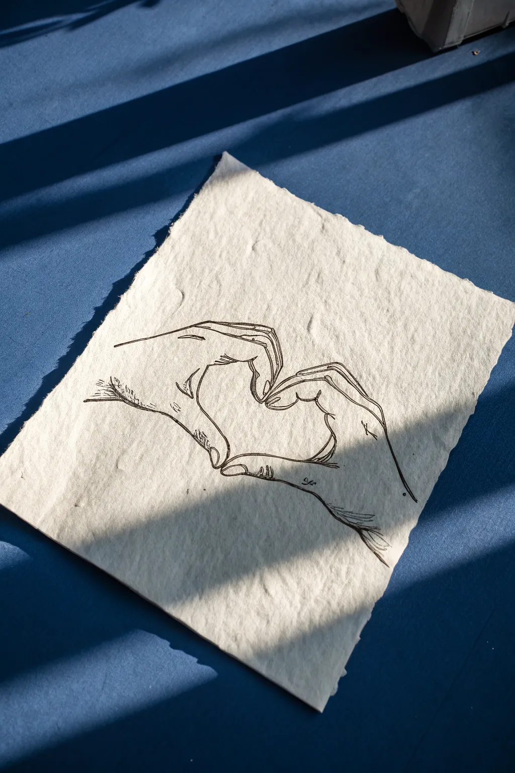
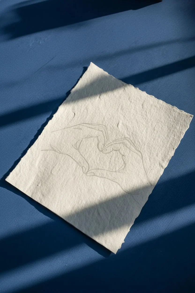
Capture a tender gesture without saying a word through this elegant line drawing. Using rough, handmade paper adds a beautiful tactile quality that contrasts perfectly with the delicate ink lines of the hands.
Step-by-Step Guide
Materials
- Sheet of handmade watercolour or rag paper (deckle edge recommended)
- Pencil (HB or 2B)
- Kneadable eraser
- Fine liner pen (black, 0.3mm or 0.5mm)
- Smooth surface or clipboard
Step 1: Planning and Sketching
-
Prepare your paper:
Since handmade paper can be quite textured and uneven, place it on a hard, smooth surface. If the texture is very deep on one side, flip it to find the smoother side for easier drawing. -
Mark the center point:
Lightly mark the center of your page with your pencil. This will be the negative space inside the heart. -
Outline the thumbs:
Start by sketching the two thumbs pointing downwards. They should meet at the bottom tips to form the lower point of the heart shape. Keep your pencil pressure very light so lines can be erased later. -
Shape the index fingers:
Sketch the index fingers curling downwards to meet the thumbs. The curve of the index fingers creates the rounded top arches of the heart. -
Add the remaining fingers:
Draw the middle, ring, and pinky fingers grouped together behind the index fingers. On the left hand, they stack neatly; on the right hand, they curve slightly more to mirror the shape. -
Sketch the wrists:
Extend lines outward from the base of the hands to suggest wrists. Don’t close these lines off; let them trail off towards the edge of the paper for a floaty aesthetic. -
Refine the anatomy:
Go back over your sketch to add small details like knuckles and fingernails. Focus on the creases where fingers bend to make the hands look realistic rather than like cartoons.
Choosing Pens
Avoid water-based markers on rag paper as they will bleed instantly. Stick to pigment liners or archival ink pens for crisp, clean lines.
Step 2: Inking and Detailing
-
Test your pen flow:
Before touching the final paper, test your fine liner on a scrap piece. Handmade paper absorbs ink quickly, so you need a pen that flows smoothly without bleeding too much. -
Ink the main outline:
Begin tracing your pencil lines with the fine liner. Use confident, single strokes rather than sketching back and forth. I find it helps to pull the pen towards you rather than pushing it away. -
Vary the line weight:
As you ink, press slightly harder on the outer edges of the hands to create a thicker line. Use a lighter touch for interior details like fingernails and skin creases. -
Add texture marks:
Add tiny hatching lines near the wrists and in the shadows of the fingers. This stippling effect gives volume to the hands and complements the rustic paper texture. -
Accentuate the knuckles:
Draw small, curved lines at the knuckle joints. Don’t connect these lines fully; broken lines suggest form without making the hands look aged or wrinkled. -
Let the ink settle:
Allow the ink to dry completely. Wait at least 15 minutes, as ink can get trapped in the fibers of rag paper and smear if you erase too soon. -
Erase sketch lines:
Gently dab—don’t rub—with your kneadable eraser to lift the graphite. Rubbing too hard might damage the surface fibers of the delicate paper. -
Final inspection:
Look for any lines that need strengthening. If the paper’s texture caused a skip in your ink line, carefully fill it in now to ensure the silhouette is continuous.
Add Golden Highlights
Once the black ink is dry, use a gold gel pen or a tiny brush with gold paint to trace just the inner outline of the heart shape for a pop of elegance.
Now you have a timeless piece of art that celebrates connection and simplicity

PENCIL GUIDE
Understanding Pencil Grades from H to B
From first sketch to finished drawing — learn pencil grades, line control, and shading techniques.
Explore the Full Guide
Pet Portrait With Personality
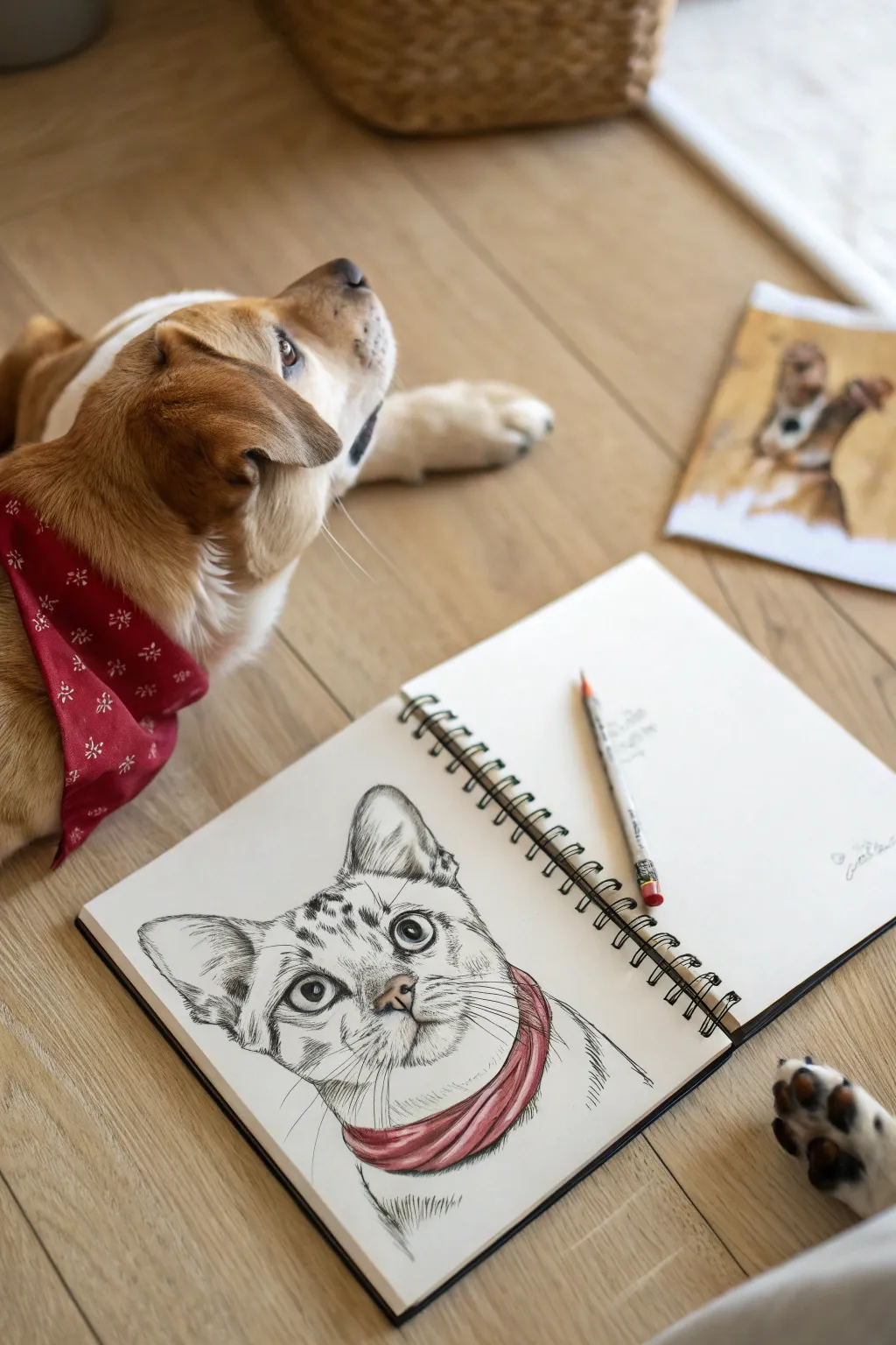
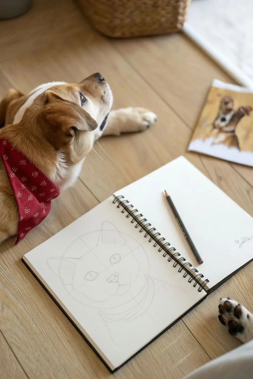
Capture the charm of your furry friend with this expressive drawing technique that combines detailed cross-hatching with a single focal point of color. This style keeps the focus on the animal’s eyes and fur texture while adding a playful element with the bright bandana.
Detailed Instructions
Materials
- Spiral-bound sketchbook or drawing paper
- HB and 2B graphite pencils
- Fine liner pen (black, 0.3mm or 0.5mm)
- Red colored pencil or marker
- Kneadable eraser
- Reference photo of a pet
Step 1: Sketching the Framework
-
Envision the basic shapes:
Start lightly with your HB pencil. Look at your pet’s head and break it down into simple geometry—a large circle for the head and triangular shapes for the ears. -
Place the features:
Draw faint guidelines vertically down the center and horizontally across where the eyes will sit. Sketch ovals for the eyes, ensuring they are spaced correctly. -
Refine the snout and mouth:
Add a small triangle for the nose below the eye line. Draw the muzzle shape and the mouth line extending downwards, keeping your strokes very light so they can be erased later. -
Outline the bandana:
Loosely sketch the collar or bandana around the neck area. Focus on the folds and how the fabric bunches up, rather than perfecting the outline just yet.
Ink Smearing?
If your hand drags ink across the paper, place a clean sheet of scrap paper under your drawing hand. This acts as a shield, protecting your work while you add details.
Step 2: Developing the Details
-
Define the eyes:
Switch to your 2B pencil or press slightly harder. Carefully outline the eyes, adding the pupils. Leave a small, crucial white circle in each pupil for the reflection highlight. -
Add fur texture outlines:
Instead of drawing a solid line for the head shape, use short, quick strokes to mimic fur tufts, especially around the cheeks and ears. -
Markings and patterns:
Lightly specific where the darker fur patterns are, like the stripes on the forehead or markings around the eyes.
Step 3: Inking and Texture
-
Introduction to ink:
Using your fine liner pen, begin tracing over your key pencil lines. Start with the eyes to rigorous precision, darkening the pupils completely except for the highlight. -
Hatching the dark spots:
For the darker markings on the forehead and ears, use ‘hatching’—closely spaced parallel lines. The closer the lines, the darker the value will appear. -
Creating volume detailing:
Use curved hatching lines on the muzzle to show roundness. Keep the pen strokes light and feathery where the fur is white or light gray. -
Refining the ears:
Add longer, sweeping strokes inside the ears to represent the longer hairs found there. Darken the deep creases of the ear to add depth. -
Adding whiskers:
With a confident, quick motion, flick your pen outward from the muzzle to create whiskers. Hesitating here creates shaky lines, so speed is your friend. -
Erase pencil guides:
Once the ink is completely dry (wait at least 5 minutes to prevent smudging), gently erase all the underlying graphite sketch lines.
Go Digital
Scan your finished black and white drawing. Open it in a painting app and color the bandana digitially for a clean, graphic design look.
Step 4: The Pop of Color
-
Base layer for the bandana:
Take your red colored pencil. Lightly shade the entire bandana area to establish a base tone. -
Adding shadows to fabric:
Press harder with the red pencil in the creases and folds of the fabric you sketched earlier. This contrast makes the bandana look three-dimensional. -
Deepening the contrast:
Go over the deepest shadow areas of the red bandana one more time, or use a slightly darker red marker if you have one, to make the accessory really pop against the monochrome fur. -
Final touches:
Review the drawing. If the eyes need more definition, thicken the upper lash line with your black pen to make them stand out.
Now you have a charming portrait that captures personality through simplicity
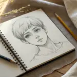
Manga-Inspired Face Practice
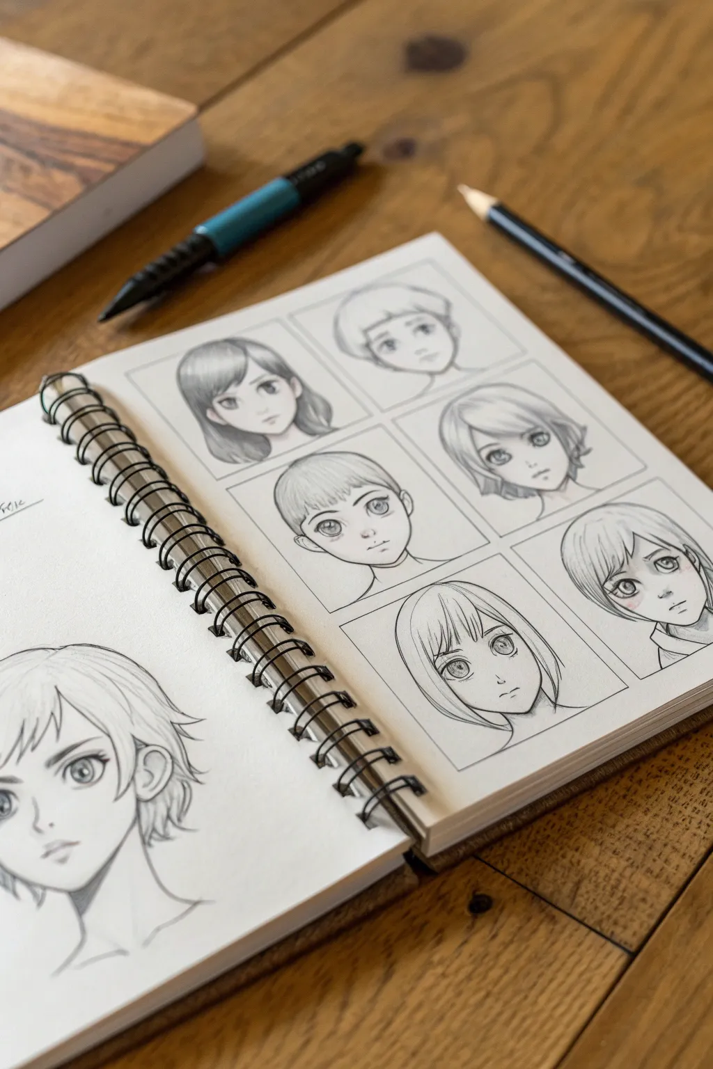
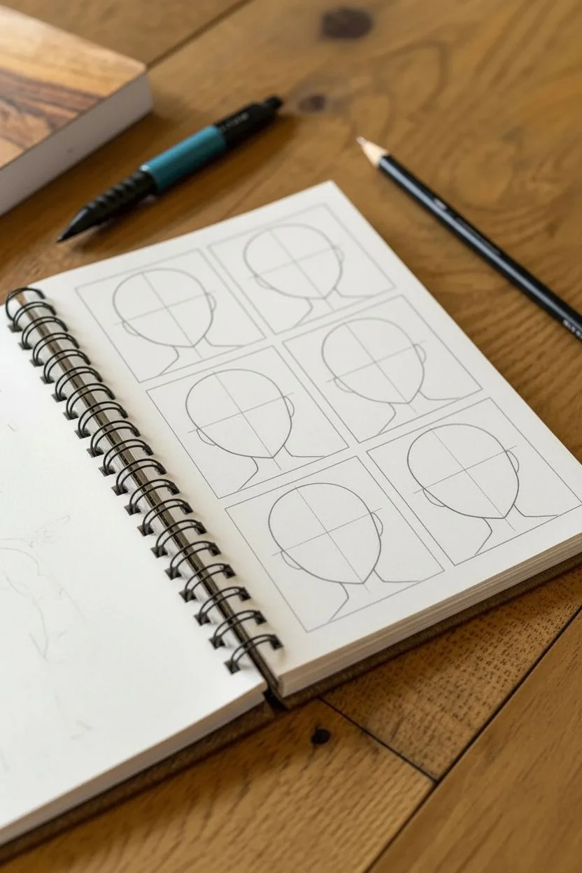
Using a simple grid layout, this project lets you explore a variety of manga-inspired hairstyles and facial features in a structured way. It is a fantastic exercise for developing character consistency and practicing delicate shading techniques.
Step-by-Step Guide
Materials
- Spiral-bound sketchbook (smooth or vellum surface)
- Mechanical pencil (0.5mm or 0.7mm lead)
- Graphite drawing pencil (HB or 2B for shading)
- Fine-tipped black pigment liner (optional, for grid)
- Ruler
- Kneaded eraser
Step 1: Setting clear boundaries
-
Plan the layout:
Begin on the right-hand page of your sketchbook. Use a ruler to lightly visualize a 2×3 grid. You want two columns and three rows to fit six portraits comfortably. -
Draw the frames:
Draw the six boxes using your ruler and a mechanical pencil. Keep the lines crisp and geometric. If you want a more finished look later, you can ink these grid lines, but keep them graphite for now. -
Establish the head shapes:
Inside each box, sketch a basic circle for the cranium and a jawline extending downwards. Try to keep these base shapes consistent in size so the characters look like part of a matching set. -
Mark guidlines:
Lightly draw a vertical center line and horizontal eye line across each face. Varying the vertical line slightly will make some faces look slightly left or right, adding variety.
Pro-Tip: Eye Alignment
To ensure eyes look symmetrical, flip your sketchbook upside down occasionally. This trick reveals crooked alignment errors that your brain ignores when looking at the drawing right-side up.
Step 2: Designing the characters
-
Draft the eyes:
Start placing large, expressive eyes on the horizontal guideline. Experiment with different shapes: rounder eyes for a younger look (like the bottom right) or sharper almonds for a serious tone. -
Add nose and mouth:
Keep noses minimal—often just a small dot or a tiny shadow. Place mouths relatively close to the nose to maintain that specific anime aesthetic seen in the reference. -
Sketch the hairstyles:
This is where you differentiate the characters. Sketch outlines for different cuts: a bob, a pixie cut, long waves, or short crops. Remember that hair sits *above* the skull circle you drew earlier. -
Refine the line art:
Go over your rough sketches with firmer pencil strokes. Clean up the jawlines and define the strands of hair, focusing on the tips and the roots.
Troubleshooting: Smudged Graphite
If your hand keeps smudging your pencil lines as you work across the grid, place a scrap piece of paper under your drawing hand to act as a barrier and keep your artwork clean.
Step 3: Shading and Details
-
Apply iris details:
Darken the top half of the irises and leave a small white circle for the highlight. This brings the eyes to life instantly. -
Soft shading on the skin:
Using the side of your HB or B pencil, add very subtle shading under the chin and the hair bangs. I usually smudge this slightly for a barely-there shadow. -
Hair texturing:
Add linear hatching to the hair to suggest flow and gloss. Concentrate your pencil strokes where the hair parts or tucks behind an ear. -
Spot blushing:
For the bottom-right character, add soft hatch marks on the cheeks to simulate a blush. This adds a unique personality trait to just one square.
Step 4: The larger portrait
-
Switch to the left page:
On the opposite page, sketch a single, larger portrait that fills the bottom left corner. This allows you to practice the same style at a larger scale. -
Detail the ear:
Since this drawing is larger, pay extra attention to the ear structure. Draw the helix and lobe clearly, as they are more visible here than in the small boxes. -
Final shading pass:
Deepen the darks in the pupils and the deepest shadows of the hair on all drawings to make the pencil work pop off the white paper.
Now you have a dynamic reference sheet demonstrating a range of character emotions and styles
BRUSH GUIDE
The Right Brush for Every Stroke
From clean lines to bold texture — master brush choice, stroke control, and essential techniques.
Explore the Full Guide
Four-Panel Mini Comic
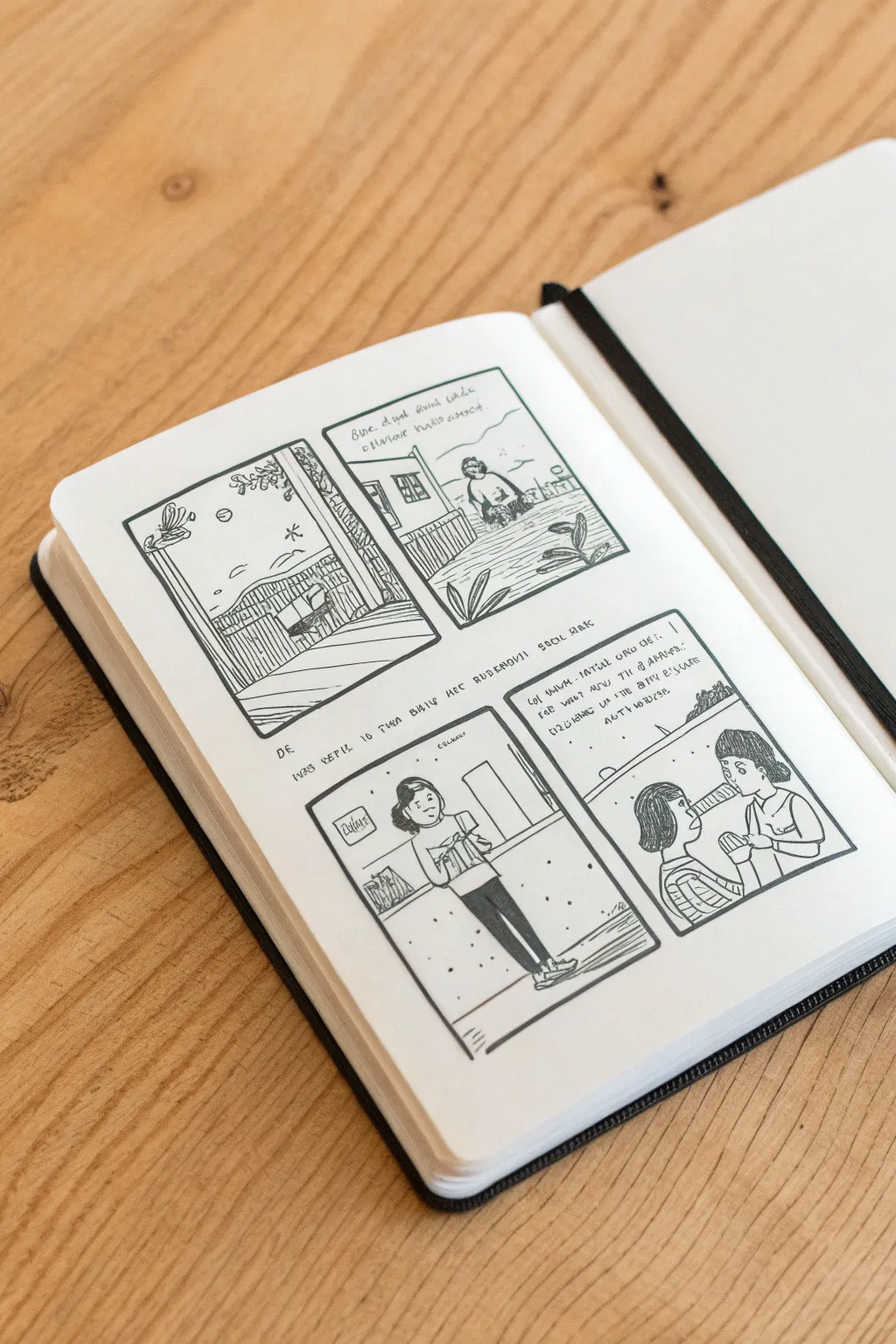
Capture a fleeting everyday moment by breaking it down into a simple four-panel story in your sketchbook. This project focuses on clean lines, basic character design, and creating a cohesive narrative layout without needing complex artistic skills.
Step-by-Step Tutorial
Materials
- Sketchbook (white paper)
- Pencil (HB or H for sketching)
- Eraser
- Fine-liner pen (0.3mm or 0.5mm, black)
- Ruler
Step 1: Setting the Stage
-
Define the grid:
Start by drawing a large rectangle that fills most of your page, leaving a comfortable white margin around the edges. Divide this rectangle into four equal smaller rectangles—two on top, two on the bottom—using your ruler to keep the lines straight. -
Outline the panels:
Go over your pencil grid with the fine-liner pen to create the ‘gutters’ (the borders) of your comic. Drawing these freely by hand, rather than strictly using a ruler for the ink, gives it a charming, organic comic book feel. -
Sketch the first scene:
In the top-left panel, lightly sketch a simple room corner or doorway looking out. Add a few small details like a plant or a lamp to set the mood, keeping the shapes geometric and simple. -
Establish the setting:
For the top-right panel, draw an exterior view or a wider shot of your character sitting. Use simple horizon lines and minimal background details like a house corner or distant hills to show where the character is.
Step 2: Developing the Characters
-
Draft the protagonist:
In the bottom-left panel, move to a closer view of your main character. Sketch them standing or walking. Use a simple oval for the head and basic block shapes for the torso and legs. Don’t worry about perfect anatomy; focus on the posture. -
Add interactions:
In the final bottom-right panel, introduce a second character for interaction. Sketch two head-and-shoulder profiles facing each other to suggest conversation. Keep facial features purely schematic—dots for eyes and small curves for mouths work perfectly. -
Refine the figures:
Go back over your character sketches and add clothing details like sleeves, collars, or pant legs. Ground your standing character in panel three by darkening the legs or adding shoes.
Panel Pacing
Vary your ‘camera angles’ for interest. Try a wide shot for the setting, a full-body shot for action, and a close-up for emotions or dialogue.
Step 3: Inking and Details
-
Inking the lines:
Once your pencil sketch tells the story you want, begin inking. Start with the characters in the foreground, using confident, continuous strokes. I find it helpful to pull the pen toward me for smoother lines. -
Adding texture:
Use small hatching lines (short parallel strokes) to add texture to the background elements, like the wooden floorboards in the first panel or the grass in the second panel. -
Lettering placeholders:
Instead of writing actual dialogue, use squiggly lines or abstract symbols in the speech bubbles or descriptive boxes. This ‘greeking’ technique simulates text without you needing to write a script. -
Drawing speech bubbles:
Draw the speech bubble outlines around your fake text in the final panel. Make sure the tails of the bubbles point clearly toward the character speaking. -
Final clean-up:
Wait at least five minutes for the ink to dry completely to avoid smearing. Then, gently erase all the underlying pencil sketch lines to reveal the crisp black-and-white art.
Make it a Series
Don’t stop at one page. Use the facing page to continue the story, or start a daily journal where you summarize your day in just four simple panels.
You’ve now created a stylish, minimalist comic page that captures a moment in time
Doodle Page About You

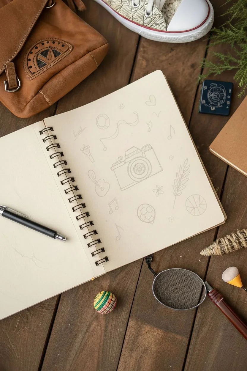
Capture your favorite hobbies and personality traits in this fun, minimalist doodle spread. Using simple black ink lines on high-quality paper, this project creates a clean, aesthetic collection of symbols that represent who you are.
Step-by-Step Guide
Materials
- Spiral-bound sketchbook (cream or off-white paper preferred)
- Black fineliner pens (0.3mm and 0.5mm sizes)
- Pencil (HB or H)
- Eraser
- Ruler (optional)
Step 1: Planning and Layout
-
Brainstorm your icons:
Before touching pen to paper, think of 5-7 distinct objects that represent your interests. In this example, we focus on photography, music, sports, and nature. -
Sketch the central camera:
Using your pencil lightly, draw a rectangle in the center of the page for the camera body. Add a circle in the middle for the lens and a smaller rectangle on top for the viewfinder. -
Outline surrounding elements:
Lightly sketch the remaining larger icons around the camera. Place the soccer ball near the bottom right and the guitar shape to the left. Keep the spacing loose and organic; don’t crowd the drawings.
Step 2: Inking the Main Subjects
-
Define the camera lens:
Switch to your 0.5mm black fineliner. Draw the main circle for the lens, then add two smaller concentric circles inside it. Draw small radiating lines in the innermost circle to create the shutter detail. -
Complete the camera body:
Ink the rectangular outline of the camera. Add texture to the grip area on the left side by drawing small, dense stippling dots or tiny cross-hatching marks to simulate a leather texture. -
Draw the soccer ball:
Go to the bottom right and ink your circle. Draw curved lines intersecting across the surface to form the panels, but don’t fill them in yet—keep it strictly line art for a clean look. -
Inking the guitar:
On the left side, outline the curvy body of the acoustic guitar. Instead of drawing the whole neck, just draw the base where it meets the body, giving it a stylized, floating appearance. -
Create the feather motif:
On the right side, draw a long, curved central line for a stem. Add teardrop-shaped leaves extending outward on both sides to create a fern or feather design. Fill these shapes in with solid black ink for contrast.
Ink Confidence
Jitters? Use a bolder line weight (0.8mm) for the main outlines and a thinner one for details. Thick lines hide wobbly hands better.
Step 3: Adding Details and Filler
-
Add musical atmosphere:
Scatter musical notes around the empty spaces. Draw a mix of single eighth notes and beamed notes. I like to let the stems curve slightly to give them a sense of movement. -
Draw the floating ribbon:
Above the camera, draw a long, wavy line that loops back on itself. This adds a nice horizontal flow to balance the vertical elements. -
Insert the football:
Near the bottom center, draw a classic soccer ball shape with pentagons. Fill in the pentagons with solid black ink to make it pop against the cream paper. -
Small decorative accents:
Fill the remaining gaps with tiny doodles: a solid black heart, a small flower with five petals, and a simple ring or donut shape. -
Final touches:
Add tiny dots or small circles in the widest empty spaces to balance the composition. These ‘confetti’ marks help tie the whole page together. -
Erase guidelines:
Wait at least 5-10 minutes to ensure the ink is completely dry. Gently erase all your pencil sketches to reveal the crisp black lines.
Make It Yours
Swap the central camera for a paintbrush, game controller, or book stack to reflect your main passion while keeping the doodle style.
Enjoy your personalized doodle page as a snapshot of your current favorite things


Dotwork Globe Landscape
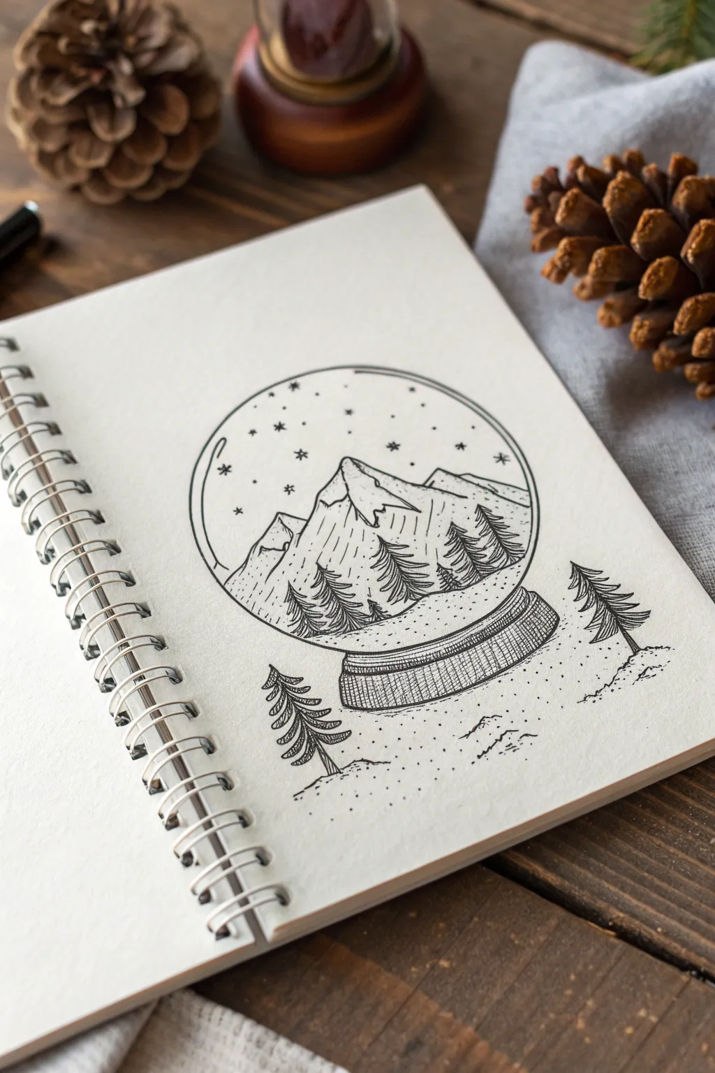
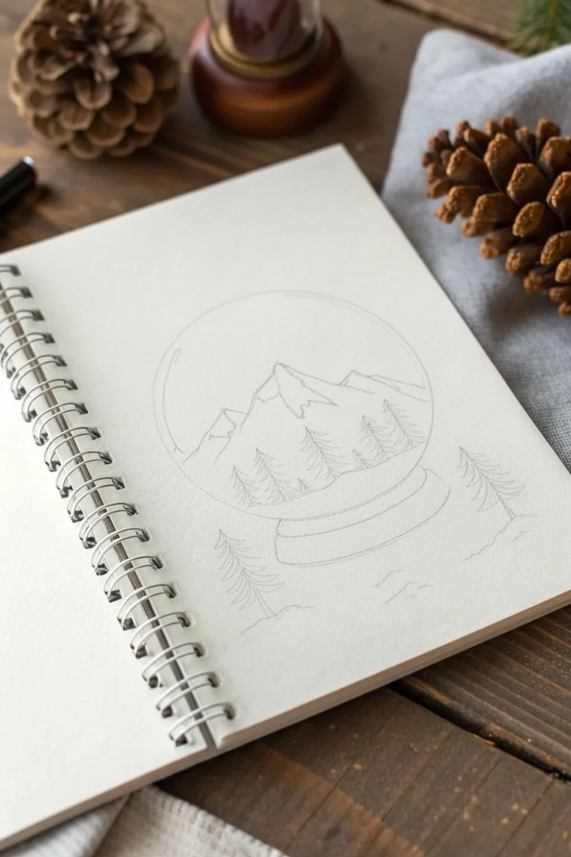
Capture the stillness of a snowy mountain range inside a classic snow globe using the art of stippling. This ink drawing blends clean line work with texture-rich dots to create a cozy, monochromatic winter scene.
Step-by-Step
Materials
- Spiral-bound sketchbook or heavy drawing paper
- Pencil (HB or 2B)
- Eraser (kneaded preferred)
- Fine liner pens (sizes 0.1, 0.3, and 0.5)
- Circle template, compass, or a round object to trace
Step 1: Drafting the Composition
-
Create the circle:
Start by lightly sketching a perfect circle in the center of your page using a compass or by tracing a round object like a jar lid. This will be the glass of your globe. -
Add the base:
Draw a flattened oval shape directly beneath the circle, slightly wider than the bottom of the globe. Connect the edges of this oval to the circle with short, curved lines to form the globe’s wooden stand. -
Outline the mountains:
Inside the circle, sketch the jagged peaks of a mountain range. Place the highest peak slightly off-center and let the slopes descend towards the edges of the glass. -
Sketch the trees:
Lightly draw triangular shapes to represent pine trees. place three or four inside the globe near the base of the mountains, and add two separate trees sitting outside the globe on the imaginary ground.
Don’t Rush the Dots
Stippling takes patience. If your hand gets tired, your dots will turn into tiny dashes. Take breaks to keep your dots crisp and round.
Step 2: Inking the Outlines
-
Trace the globe:
Using a 0.5 pen, carefully ink the main circle and the heavy outline of the wooden base. Keep your hand steady to ensure a smooth, continuous curve. -
Define the mountains:
Switch to a 0.3 pen to outline the mountain peaks. Use a slightly shaky or jagged line quality here to mimic rough rock textures rather than perfectly smooth slopes. -
Ink the trees:
Go over your pine tree sketches with the 0.3 pen. Instead of straight triangles, use downward-slanting, jagged strokes to create the look of layered pine branches. -
Erase pencil lines:
Wait for the ink to dry completely to avoid smudging, then gently erase all your initial pencil guidelines.
Step 3: Shading and Stippling
-
Texture the mountains:
Using your 0.1 fine liner, draw vertical, broken lines down the shadowed sides of the mountains. I prefer to keep one side of each peak bright white to suggest a strong light source. -
Detail the trees:
Darken the trees inside the globe using dense hatching lines. For the trees outside the globe, use horizontal hatching on the branches to give them volume. -
Shade the base:
Use cross-hatching (intersecting sets of parallel lines) on the wooden stand. Make the lines denser at the bottom and sides to create a rounded, 3D effect. -
Begin the stippling:
Take your 0.1 pen and start adding dots to the sky area inside the globe. Place dots closer together near the top horizon line to create a gradient, and scatter them loosely elsewhere to look like falling snow. -
Ground the scene:
Add stippling dots underneath the globe and around the outside trees. Concentrate the dots heavily directly under objects to form cast shadows, fading them out as you move away. -
Add floating stars:
Draw tiny asterisks (*) or four-pointed stars in the upper part of the globe’s sky to mix with the stippled snow. -
Final reflection:
Add a small, curved line inside the top left of the glass circle to suggest a reflection on the surface, leaving a small gap in your stippling right there.
Make it Metallic
Use a silver or gold gel pen for the stars and snowflakes inside the globe to make the winter magic truly sparkle against the black ink.
Now you have a serene winter landscape encapsulated in your sketchbook, ready for the season

Have a question or want to share your own experience? I'd love to hear from you in the comments below!