Breaking out of your comfort zone is the only way to truly master technical proficiency and refine your artistic eye. These challenging subjects are curated to test your patience with light, texture, and anatomy, pushing your skills to a professional level.
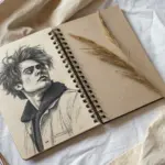
The Ultimate Nemesis: Realistic Hands
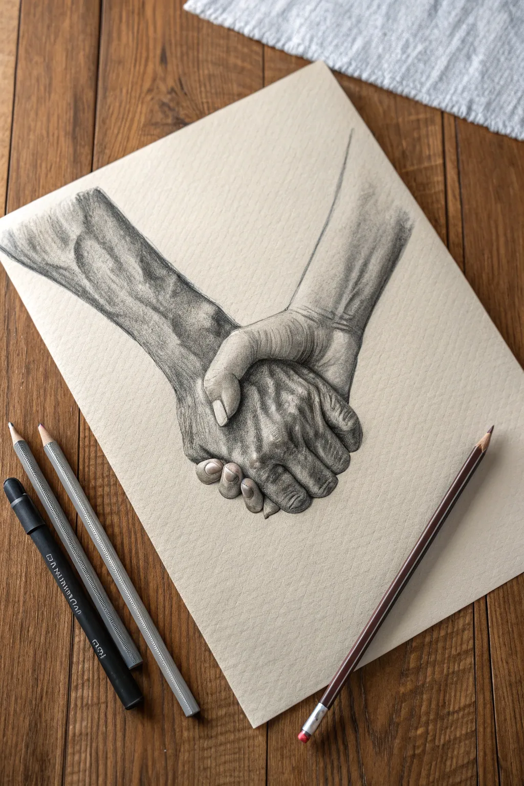
Capture the emotive power of human connection with this study of interlocking hands on toned paper. You will learn to render distinct skin textures, from the smooth muscles of the gripping arm to the weathered, veined details of the supporting hand.
Detailed Instructions
Materials
- Toned sketch paper (tan or grey)
- Graphite pencils (HB, 2B, 4B)
- Black charcoal pencil or 6B graphite
- Paper blending stump (tortillon)
- Kneaded eraser
- Precision eraser (or eraser pencil)
Step 1: Anatomy & Structure
-
Gesture lines:
Begin with two faint diagonal lines crossing in the lower center of the page to establish the varying angles of the forearms. -
Blocking shapes:
Lightly sketch a rectangular block for the back of the bottom hand, and a curved shape specifically for the palm of the top hand wrapping over it. -
Finger cylinders:
Draw the fingers as simple cylinder segments first, paying close attention to the foreshortening on the fingers that are curling away from the viewer. -
Refining the contour:
Go over your geometric shapes to create a fluid outline, emphasizing the ‘bunching’ of skin where the thumb presses into the back of the hand. -
Clean up:
Use your kneaded eraser to dab away the internal construction lines, leaving only a faint, clean ghost of the final outline.
Smudge Guard
Place a loose sheet of scrap paper under your drawing hand while you work. This prevents natural oils from transferring and protects your shading from accidental smears.
Step 2: Shading & Volume
-
Establishing the core shadow:
Using a 2B pencil, shade the darkest crevice where the two hands meet; this contact point anchors the drawing. -
Base tone application:
Apply a light, even layer of graphite over both arms, leaving the knuckles and high points of the tendons the color of the paper. -
Sculpting the top arm:
Shade the right forearm with long, vertical strokes to suggest muscle length, darkening the edges to make the arm look round and cylindrical. -
The gripping fingers:
Add shading to the sides of the fingers on the top hand, creating a gradient that gets lighter toward the center of each phalanx. -
Weathering the left arm:
On the left forearm, I prefer to use a slightly duller 4B pencil to draw the map of the veins, shading the areas around them to make the veins appear raised. -
Deepening the veins:
Add a crisp, dark shadow line to the bottom edge of each vein, then fade that shadow downward to create realistic dimension.
Step 3: Texture & Definition
-
Knuckle details:
Draw the small, horizontal wrinkles on the knuckles of the top hand using a sharp HB pencil for precision. -
Fingernail rendering:
Outline the fingernail on the thumb carefully, shading the cuticle area and leaving a tiny strip of bare paper for the nail’s natural shine. -
Bottom hand texture:
For the hand being held, use cross-hatching to create a rougher, older skin texture compared to the smoothness of the top arm. -
Contrast punch:
Switch to your darkest pencil or charcoal to restate the deepest blacks between the fingers and under the wrist, maximizing the contrast. -
Softening transitions:
Use a blending stump to gently smudge the graphite on the forearms, smoothing out pencil strokes while keeping the finger details crisp. -
Highlight recovery:
Take a precision eraser or the sharp edge of a kneaded eraser and lift out bright highlights on the veins, knuckles, and fingernails to make them pop.
Flat Looking Hands?
If the hands look 2D, check your contact shadows. The area where the fingers press against the skin should be the absolute darkest point of the drawing.
Step back and admire the powerful tension and texture you have captured in this study.


Perspective Masterclass: Radical Foreshortening
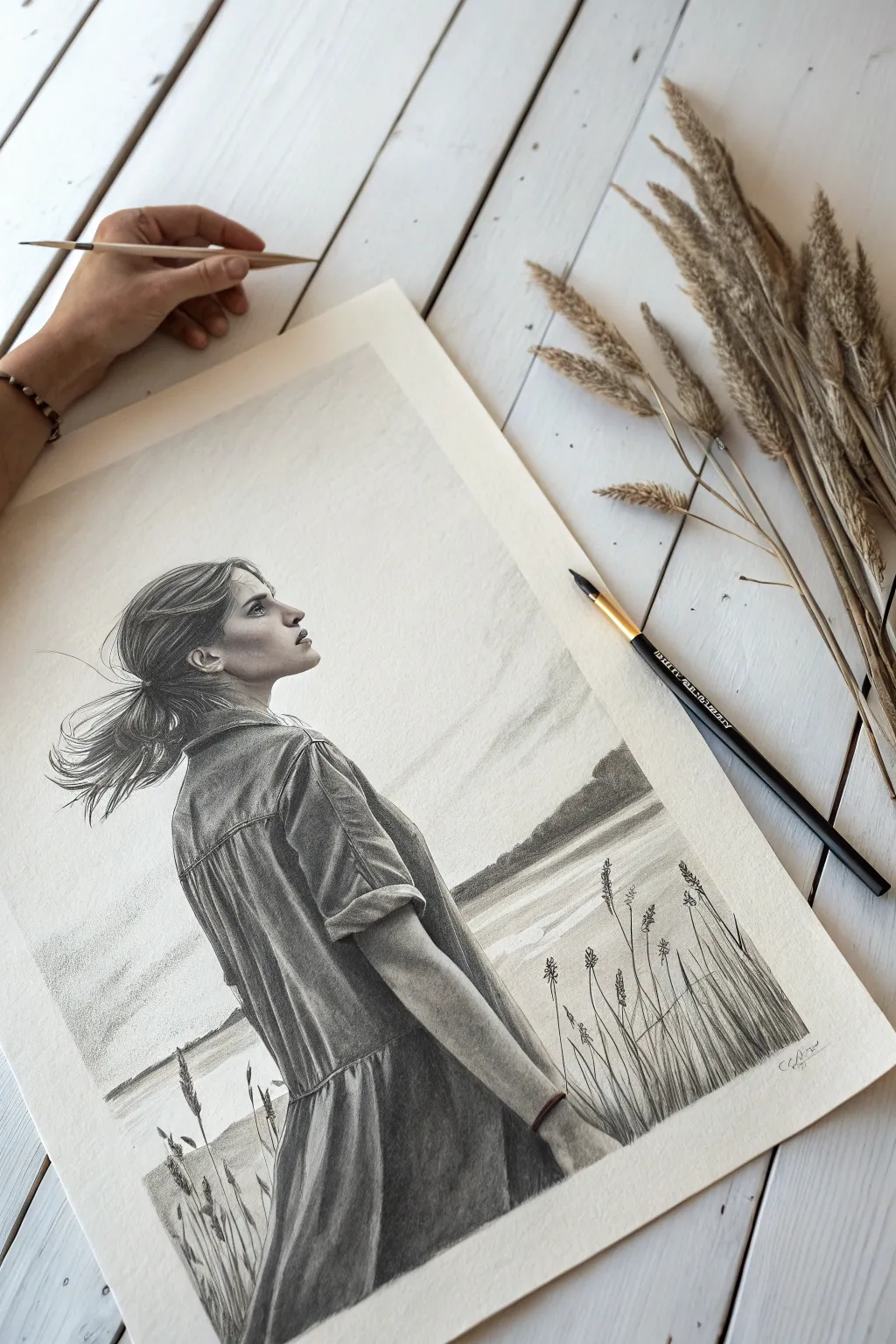
Capture the serene intensity of a woman looking skyward in this realistic graphite drawing. You will focus on rendering textures like heavy denim and windswept hair against a heavily textured paper that adds atmospheric depth to your finished piece.
Detailed Instructions
Materials
- High-quality drawing paper (Cold Press or heavy grain)
- Graphite pencils (Range: 2H, HB, 2B, 4B, 8B)
- Kneaded eraser
- Precision eraser (Mono Zero or similar stick eraser)
- Paper blending stumps
- Soft synthetic brush (for sweeping dust)
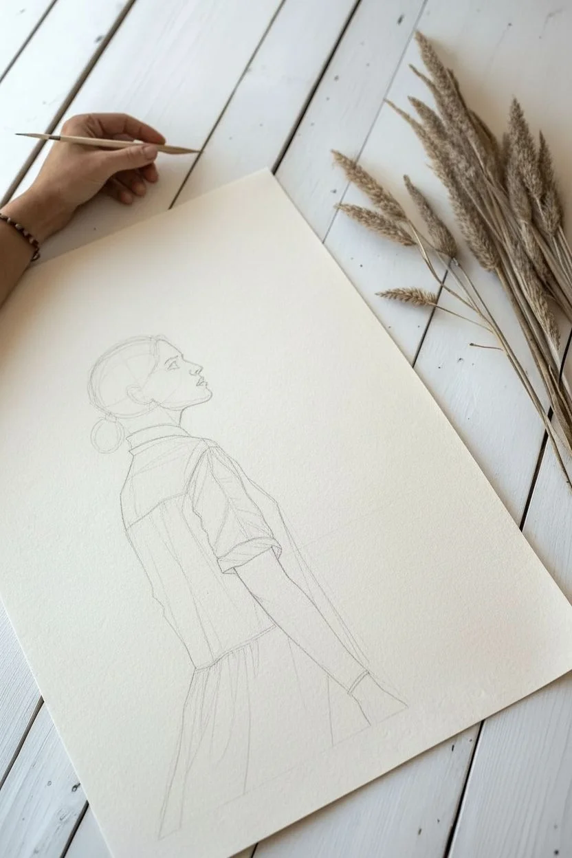
Step 1: Structural Layout
-
Establish the curve:
Begin with a faint gesture line using a 2H pencil to capture the arch of the back and the upward tilt of the neck. This ‘C’ shape acts as the anchor for the pose. -
Map the proportions:
Lightly sketch a circle for the cranium and a jawline extending upward. Block in the triangular shape of the torso and the angle of the arm reaching forward. -
Refine the profile:
Carefully draw the silhouette of the face. Pay close attention to the negative space under the chin and the specific angle of the nose as she looks upward.
Step 2: Facial Features & Hair
-
Shade the skin:
Using an HB pencil, apply soft graphite to the face. Smoothen the shading on the cheek and neck with a blending stump, leaving the bridge of the nose and forehead lighter. -
Define facial details:
Switch to a 2B pencil to darken the nostril, the corner of the mouth, and the eyelashes. Keep the eye looking upward and establish the shadow under the jawline to define the neck muscles. -
Block in hair mass:
Use a 4B pencil to fill in the dark shape of the hair bun, following the direction the hair is pulled. Don’t worry about individual strands yet; focus on volume. -
Create hair flow:
With a sharpened 4B or 6B, draw long, sweeping strokes from the forehead back toward the bun. Vary your pressure to create depth between the locks. -
Lift the flyaways:
I prefer to use a precision eraser here to ‘draw’ white lines back into the dark graphite, creating those realistic stray hairs catching the wind behind the head.
Fixing “Flat” Fabrics
If the denim looks flat, you likely lack mid-tones. Use a blending stump to pull graphite from your dark shadow lines into the lighter areas to create a rounded, volumetric form.
Step 3: Texturing the Denim
-
Outline the folds:
Map out the deep creases in the denim shirt using an HB pencil. Note how the fabric bunches at the elbow and pulls taut across the back. -
Establish deep shadows:
Use an 8B pencil to commit to the darkest crevices of the fabric folds. The high contrast is essential for making the material look heavy and stiff like real denim. -
Render the fabric grain:
Shade the mid-tones of the dress using the side of a 2B pencil. Allow the paper’s natural texture to show through, which perfectly mimics the weave of denim fabric. -
Shade the arm:
Render the visible arm with smooth gradients, ensuring distinct separation between the skin texture and the rougher shirt cuff.
Pro Tip: Eraser Drawing
Cut a standard eraser with a knife to get a sharp edge, or use a Mono Zero. Use this sharp edge to lift thin, clean highlights on the nose and wind-blown hair strands for realism.
Step 4: Atmosphere & Composition
-
Draw the horizon:
Lightly sketch a low horizon line to suggest a body of water or distant land. Shade the sky area very faintly with a 2H pencil, blending it out to almost nothing. -
Draft foreground grass:
Using sharp, confident upward strokes with a 4B pencil, draw the tall grass blades in the bottom right corner. Vary the thickness and height to keep it organic. -
Add floral details:
Add small, textured buds or seeds to the tips of the grass stalks. These dark silhouette details help push the figure slightly further back in space. -
Final contrast check:
Step back and assess the values. Darken the deepest shadows in the hair and the dress folds one last time to make the figure pop against the pale background.
Sign your name near the grass blades and enjoy the peaceful movement of your new portrait


Soft Texture Challenge: Animal Fur
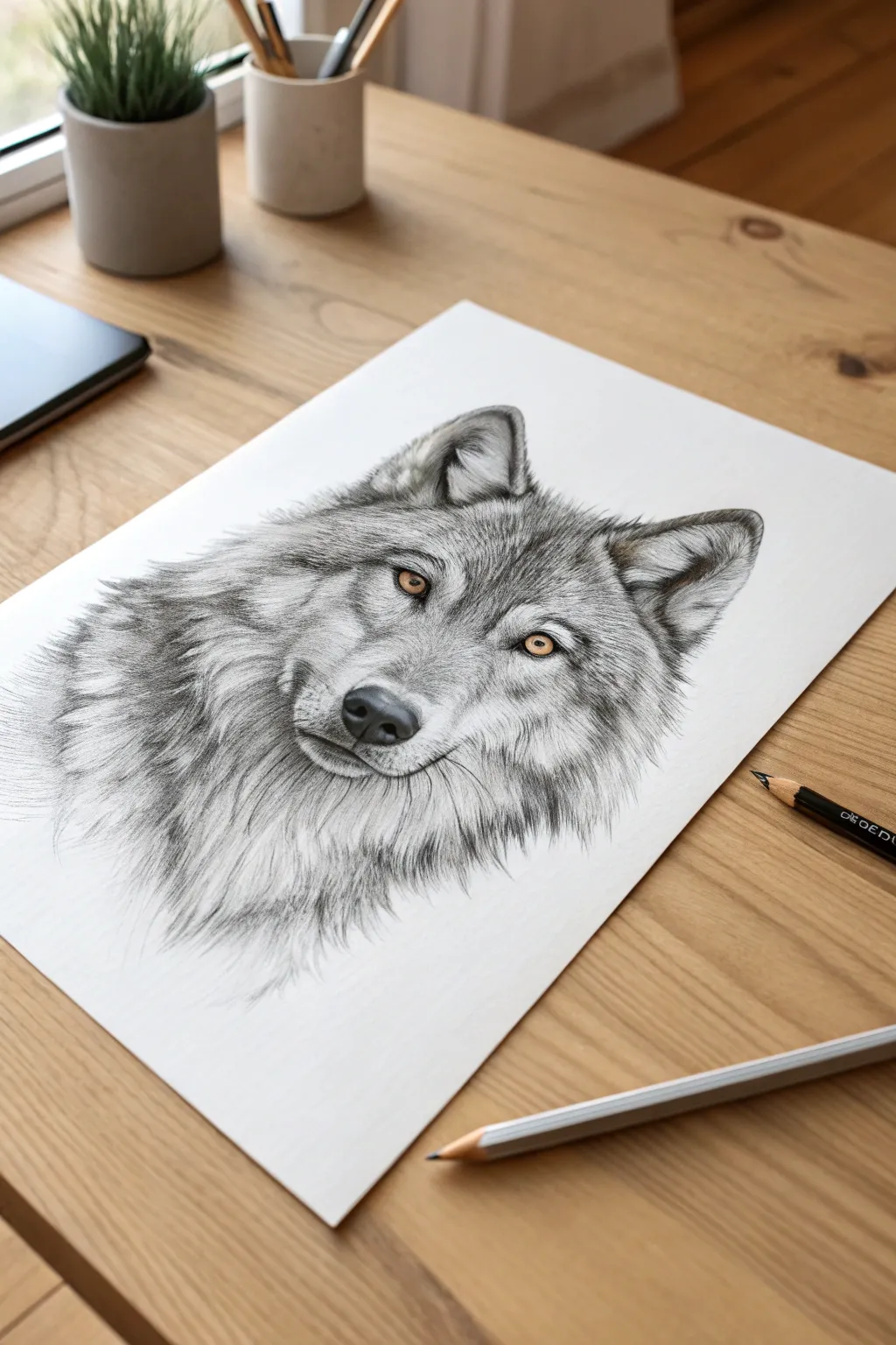
Master the art of rendering soft, multi-layered animal fur while creating a striking focal point with a pop of color. This project combines precise graphite techniques with subtle colored pencil work to bring a realistic wolf to life.
Step-by-Step
Materials
- Smooth bristol or drawing paper
- Graphite pencils (H, HB, 2B, 4B, 6B)
- Colored pencils (Yellow Ochre, Burnt Sienna)
- Kneaded eraser
- Precision mechanical pencil (0.5mm)
- Tombow Mono Zero eraser (optional for whiskers)
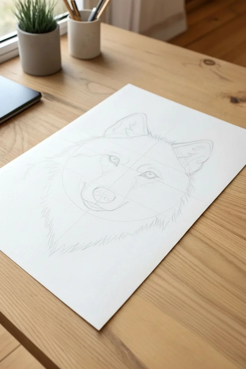
Step 1: Structural Foundation
-
Basic Geometry:
Begin with a light H pencil to sketch a large circle for the head and a smaller oval attached to the lower left for the muzzle. -
Placement Lines:
Draw faint vertical and horizontal guides to ensure symmetry using the three-quarter angle shown in the reference. -
Feature Mapping:
Sketch the triangular shapes of the ears and mark the almond shapes of the eyes, ensuring they align with the muzzle’s angle. -
Contour Refinement:
Go over your perimeter lines, replacing the smooth geometric shapes with short, jagged strokes to suggest the jagged silhouette of fur right from the start.
Fur looking flat?
Contrast is key. Don’t barely sketch individual hairs; instead, focus on drawing the dark shadows *between* the clumps of fur. This negative space compels the eye to see the white paper as raised hair.
Step 2: The Amber Gaze
-
Iris Base:
Switch to your yellow ochre colored pencil. Fill in the irises smoothly, leaving a tiny white circle in each for the reflection highlight. -
Eye Detail:
Layer a burnt sienna or light brown colored pencil near the top of the iris to create a shadow from the eyelid, blending it down into the yellow. -
Pupil and Outline:
Use a sharp 4B pencil to overlappingly fill the pupil black and outline the eye rim, being careful not to smudge the graphite into the colored wax. -
Tear Duct Definition:
Darken the inner corners of the eyes (tear ducts) to anchor them into the face, adding depth immediately.
Step 3: Fur Texture and Direction
-
Nose Texture:
Fill the nose using a 6B pencil, pressing firmly for the nostrils but using a stippling motion on the top to mimic the leathery texture. -
Muzzle Fur:
Using a mechanical pencil or sharp HB, draw very short, flicking strokes moving away from the nose bridge. I find rotating the paper helps keep the stroke direction natural. -
The Mask:
Create the darker patterns around the eyes using a 2B pencil. Use denser, overlapping strokes to build up value rather than pressing harder. -
Forehead Strokes:
Move up to the forehead. The fur here is shorter and fans upward between the ears; use an H pencil for the lighter hairs and a 2B for the shadows between clumps. -
Ear Detailing:
Fill the outer ears with short, velvety shading. For the inner ear fluff, use long, curved strokes, leaving plenty of white paper showing to represent light hairs.
Level Up: Hyper-Realism
Use a white gel pen or white gouache on a fine brush to add the absolute brightest highlights in the eyes and single floating hairs on the muzzle for a 3D effect.
Step 4: The Mane and Final Touches
-
Neck Ruff:
Switch to a 4B pencil for the thick neck fur. Use long, sweeping strokes that flow downward and outward, mimicking gravity’s effect on the coat. -
Layering Depth:
Go back into the neck fur with a 6B pencil to darken the deepest crevices where the fur separates. This high contrast creates the illusion of volume. -
Cheek Fluff:
Connect the face to the mane with medium-length strokes on the cheeks, ensuring the transition is seamless and not a harsh line. -
Whisker Spots:
Add the faint rows of dots on the muzzle where the whiskers originate. -
Highlights:
Take your kneaded eraser, shape it into a sharp wedge, and ‘lift’ graphite out in the direction of the fur to create bright, soft highlights on the muzzle and brow. -
Whiskers:
Finish with confident, quick strokes using a sharp HB pencil for the whiskers, or use a precision eraser to carve white whiskers out of the dark muzzle shading.
Step back and admire the soulful expression you’ve captured through careful layering.

Emotional Nuance: Expressive Portraits
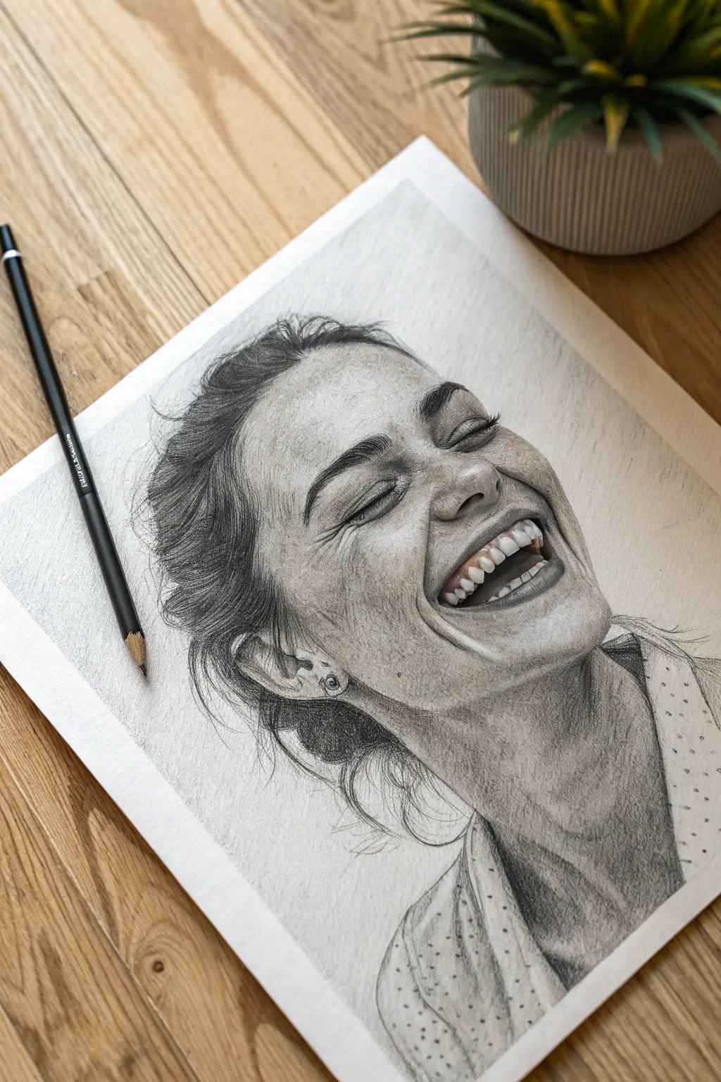
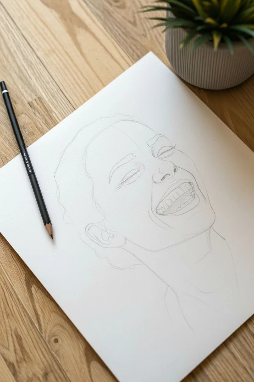
Capture the fleeting beauty of a genuine laugh with this advanced graphite study. You will focus on render-heavy techniques to achieve lifelike skin texture, dynamic hair movement, and the subtle crinkles that convey pure emotion.
Detailed Instructions
Materials
- High-quality drawing paper (Bristol vellum or heavy sketch)
- Graphite pencils (Range: 4H, 2H, HB, 2B, 4B, 6B)
- Mechanical pencil (0.5mm HB)
- Kneaded eraser
- Tombow Mono Zero eraser (or precision eraser)
- Blending stumps (tortillions)
- Soft tissue or chamois
Step 1: The Foundation
-
Establish the angle:
Begin with a light HB sketch of the head’s oval shape. Note that the head is tilted back, so the chin is prominent and the forehead appears slightly foreshortened. -
Map the features:
Draw the curving centerline of the face. Place the eyes as closed, upward-curving crescents. Mark the bottom of the nose higher than usual due to the angle, and sketch the wide, open shape of the laughing mouth. -
Refine the structures:
Lightly outline the nostrils and the dental arch. Don’t draw individual teeth yet; just block in the shape of the gums and the upper row of teeth.
Smudge Guard
Place a glossy photo or a piece of tracing paper under your drawing hand. This protects the skin texture work from your palm’s natural oils and graphite smears.
Step 2: Facial Features & Emotion
-
Render the eyes:
Using a sharp 2B, darken the lash line. Add thick, sweeping lashes that point downward and outward. Crucially, sketch the ‘crow’s feet’ wrinkles at the outer corners; these lines are essential for showing the authenticity of the laugh. -
Sculpt the nose:
Shade the nostrils with a 4B for depth. Shade the underside of the nose and the bridge, leaving a small highlight on the tip to indicate a light source coming from above. -
Detail the mouth:
Define the lips, keeping the corners deep and shadowed. For the teeth, use an H pencil to shade lightly near the gum line. Avoid outlining each tooth individually; instead, shade the small negative spaces between them to suggest separation. -
Add the ear:
Sketch the visible ear, paying attention to the folds of the cartilage. Add the small stud earring, leaving it paper-white for a metallic shine.
Teeth Troubleshooting
If teeth look like a skeleton, you’ve likely outlined them too harshly. Erase the hard lines and define them only by the shadows on the gums above and the darkness of the mouth interior below.
Step 3: Skin Texture & Shading
-
Base shading:
Apply a base layer of graphite using an H pencil across the shadowed side of the face (the left side in the reference). Gently blend this with a tissue for a smooth complexion. -
Deepen the shadows:
Switch to a 2B and 4B to darken the neck area heavily. Creating a high contrast between the jawline and the neck is what pushes the face forward in space. -
Create skin texture:
This project relies on texture. Using a dull HB pencil, use a ‘stippling’ or tiny circular motion to create pores and freckles across the nose and cheeks. Vary the pressure to make the freckles look natural, not like polka dots. -
Highlighting:
Take your kneaded eraser and lift out pigment on the high points: the cheekbones, the bridge of the nose, and the forehead wrinkles created by the raised eyebrows.
Step 4: Hair & Wardrobe
-
Map hair direction:
identify the growth pattern. The hair is pulled back, so use long strokes starting from the hairline moving toward the back of the head. -
Build hair volume:
Layer 4B and 6B strokes for the dark roots and shadowed areas of the hair. I like to keep my pencil very sharp here to define individual strands within the dark masses. -
Wisps and flyaways:
Use the mechanical pencil to draw loose, messy strands escaping the bun near the ear and nape of the neck. These chaotic lines add energy to the drawing. -
Clothing outline:
Sketch the collar of the shirt. Keep the lines loose and fluid to suggest soft fabric. -
Pattern and fold:
Shade the folds of the shirt loosely. Add the small polka dots, ensuring they follow the curvature of the fabric folds rather than sitting flat. -
Final contrast adjustment:
Step back and assess your values. Use your 6B or 8B to push the darkest areas—specifically the pupils, nostrils, and deep neck shadow—to their maximum limit.
Sign your name near the shoulder and admire the captured moment of joy you’ve created.

PENCIL GUIDE
Understanding Pencil Grades from H to B
From first sketch to finished drawing — learn pencil grades, line control, and shading techniques.
Explore the Full Guide
Botanical Precision: Complex Flower Petals
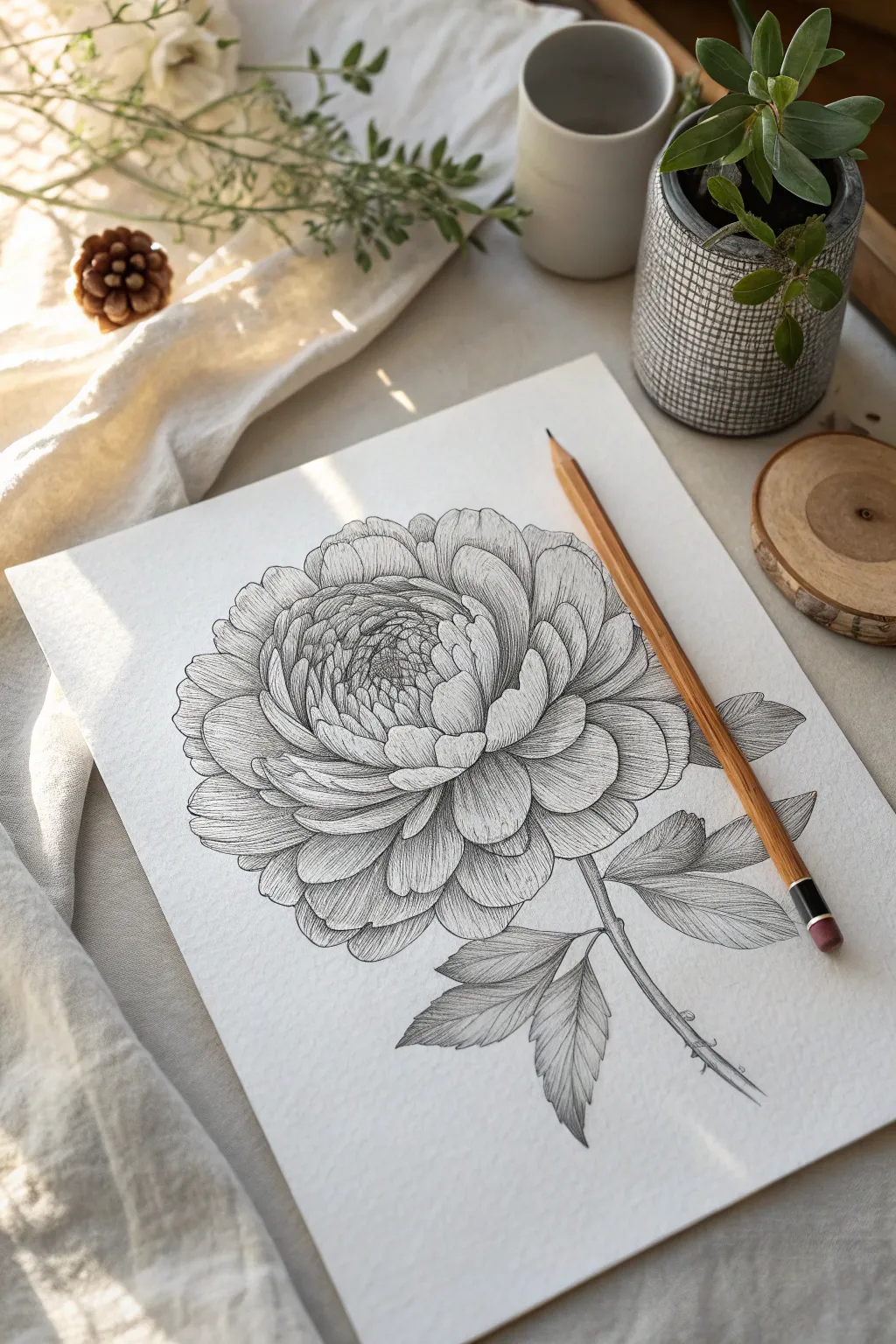
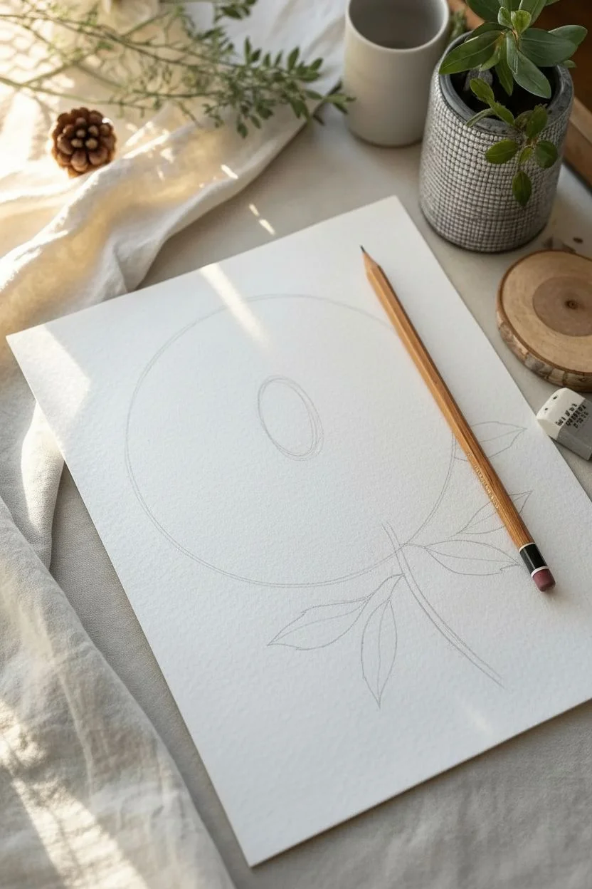
Master the art of intricate botanical illustration with this detailed study of a complex double-bloom flower. By focusing on directional hatching and layering, you will transform simple graphite lines into a dimensional, organic masterpiece that looks like a vintage etching.
How-To Guide
Materials
- High-quality hot press watercolor paper or smooth Bristol board
- Graphite pencils (2H for sketching, HB and 2B for shading)
- Fine-point mechanical pencil (0.3mm or 0.5mm) for details
- Kneaded eraser
- Precision pencil sharpener
Step 1: Structural Layout
-
Establish the envelope:
Using a 2H pencil and a very light touch, draw a large, uneven circle to define the overall size of the flower head. It shouldn’t be perfect; organic shapes are slightly irregular. -
Mark the center:
Place a smaller oval slightly off-center within your main circle. This will act as the tightly packed ‘eye’ of the peony or ranunculus where the petals are dense. -
Stem trajectory:
Draw a single curved line extending from the bottom right of the flower head to indicate the stem, adding rough skeletal lines for the leaves.
Flatness Fix
If petals look flat, your shading lines might be too straight. Curve your hatch lines significantly to mimic the cup-shape of the petal surface.
Step 2: Defining the Petals
-
Sketch the center grouping:
Inside your small central oval, begin sketching small, tightly cupped petal shapes that curl inward, resembling a closed rosebud. -
Expand outward:
layering larger petals around the center. Draw them overlapping like shingles, ensuring the edges are jagged and organic rather than perfectly smooth arcs. -
Create the outer skirt:
Sketch the largest, fully unfurled petals at the perimeter. Let these petals flop slightly, showing their undersides or curled edges to create volume. -
Refine the foliage:
Flesh out the leaves on the stem. Give them serrated, toothed edges and draw a clear central vein running through each leaf segment.
Ink Finish
After sketching, go over your lines with a 0.05mm archival ink pen for a permanent botanical illustration look, then erase the graphite completely.
Step 3: Detailed Linear Shading
-
Erase guidelines:
Gently roll your kneaded eraser over the drawing to lift the darkest construction lines, leaving only a faint guide for your final work. -
Outline with precision:
Switch to a sharp HB pencil or mechanical pencil. Go over your petal outlines with a confident, dark line, varying the pressure to make the line thicker where petals overlap. -
Start the center texture:
Begin shading the innermost petals. Instead of smudging, use fine, parallel hatch lines that follow the curve of the petal. This ‘form-following’ stroke is essential for the realism. -
Deepen the recesses:
I find it helps to identify the darkest gaps between the tight center petals first. Fill these crevices with dense cross-hatching to push them into the background. -
Mid-layer texturing:
Move to the middle ring of petals. Draw long, sweeping hatch lines starting from the base of each petal and flicking outward. Lift your pencil at the end of the stroke to taper the line. -
Outer petal contouring:
For the large outer petals, use widely spaced contour lines that wrap around the shape. Imagine you are wrapping a string around the petal; draw lines to match that curve.
Step 4: Contrast and Foliage
-
Enhance separation:
Using a 2B pencil, darken the shadow areas where one petal casts a shadow onto another. This separation is what creates the 3D ‘pop’. -
Shade the leaves:
Texture the leaves using short, directional strokes that angle from the center vein toward the serrated edges. Keep the veins lighter than the leaf body. -
Stem detail:
Add cylindrical shading to the stem, keeping one side darker to indicate a light source coming from the top left. -
Final crisping:
Check the outer edges of the entire flower. If any lines have become fuzzy from your hand resting on the paper, carefully sharpen them up with your hardest pencil.
Step back and admire how your patience with those hundreds of tiny lines has bloomed into a strikingly realistic botanical drawing.
Mapping Time: Wrinkles and Elderly Skin
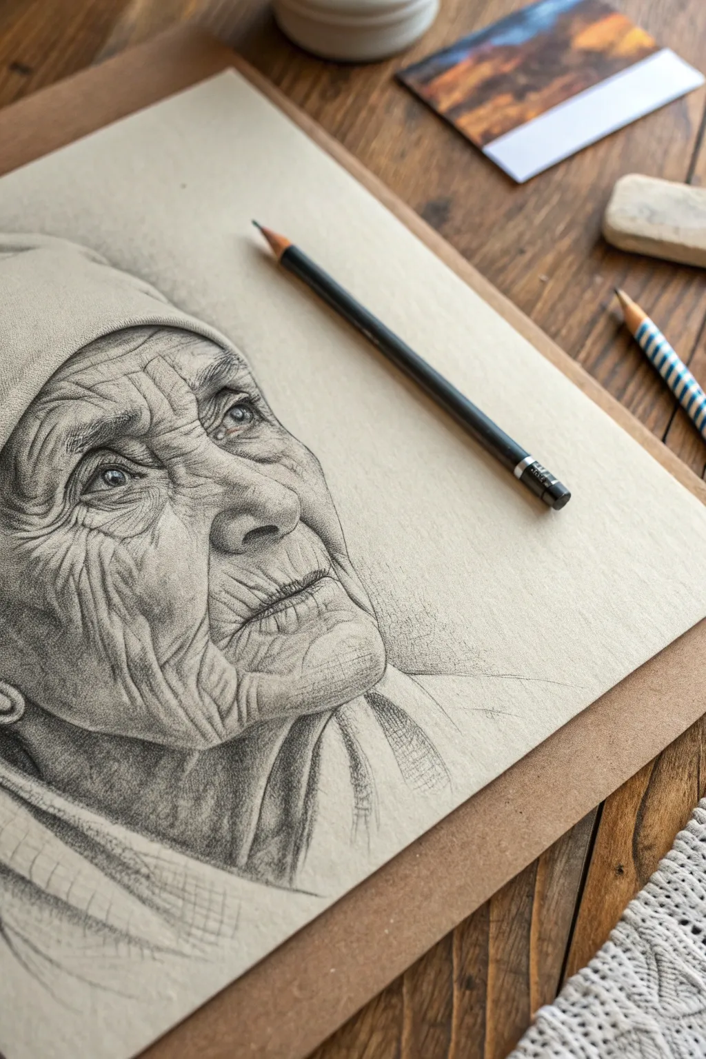
Master the art of rendering realistic skin texture and emotion with this advanced graphite study. You will learn to map the geography of an elderly face, turning deep lines and shadows into a portrait full of character and life.
Detailed Instructions
Materials
- Graphite pencils (range: HB, 2B, 4B, 6B)
- Smooth bristol or fine-tooth drawing paper (cream tones work best)
- Kneaded eraser
- Precision eraser (mechanical or pencil style)
- Blending stump (tortillon)
- Tissue or chamois cloth
Step 1: Structural Mapping
-
Establish the head shape:
Begin with a loose, light oval using an HB pencil to define the angle of the head, which is tilted slightly upward and back. -
Mark specific features:
Lightly sketch horizontal guidelines for the eyes, nose, and mouth, noting that age often places the mouth slightly lower due to gravity. -
Block in the shapes:
Outline the eyes, the bulbous shape of the nose, and the thin line of the lips, ensuring the proportions capture the subject’s distinct look.
Wrinkle Volume
Don’t draw wrinkles as single lines. Treat them as 3D valleys: dark at the bottom, shading to grey on the wall, and bright white on the ridge.
Step 2: The Windows to the Soul
-
Detail the eyes:
Switch to a 2B pencil to define the pupil and iris. Leave a tiny, crisp shape of white paper for the catchlight reflection; this spark of life is crucial. -
Shade the orbital area:
Apply soft shading around the eyelids and the deep sockets. Older skin is thinner here, so use gentle, layered shading to suggest depth without harsh outlines. -
Define the lashes:
Add sparse eyelashes. Keep them light and irregular, as elderly lashes are often thinner and less uniform.
Step 3: Mapping the Terrain
-
Plan the major creases:
Using your HB pencil, lightly map out the main ‘valleys’ of the face: the deep nasolabial folds running from nose to mouth and the forehead lines. -
Render forehead wrinkles:
Start shading the forehead. Remember, a wrinkle isn’t a line; it’s a cylinder. Shade the bottom edge of the crease darkly, fading up toward the ridge of the skin. -
Cheek texture:
Lightly shade the cheek area. Use a cross-hatching technique that follows the contour of the cheekbone to imply volume before adding skin details. -
Deepen the folds:
Switch to a 4B pencil to darken the deepest parts of the creases around the mouth and nose. This high contrast creates the illusion of deep skin folds.
White Charcoal Pop
If working on grey or tan paper, use a white charcoal pencil for the final highlights on the skin ridges and eye reflections for incredible depth.
Step 4: Texturing and Defining
-
The logic of light:
Ensure the light source is consistent (coming from the upper right in this reference). The top ridges of wrinkles catch light, while the troughs are in shadow. -
Micro-details:
I prefer to use a mechanical pencil here to draw tiny, intersecting lines on the cheeks and chin to simulate the cross-grain texture of aging skin. -
The lips and mouth:
Shade the lips with vertical strokes to mimic the vertical cracks common in elderly lips. Keep the upper lip slightly darker than the bottom lip. -
Lifting highlights:
Take your kneaded eraser, pinch it into a fine point, and tap it along the top ridges of the major wrinkles to lift graphite and create bright skin highlights. -
Shade the nose:
Apply darker values to the underside of the nose and the nostril, softening the transition upward into the bridge using a smudge of graphite on a tissue.
Step 5: Clothing and Final Touches
-
Suggest the headwear:
Sketch the cap or headscarf with broader, smoother strokes. Use less detail here so the texture doesn’t compete with the face. -
Neck details:
Render the loose skin on the neck with softer, wider shadows compared to the crisp lines on the face. -
Clothing sketch:
Rough in the collar and shoulders with loose, gestural hatching. This ‘unfinished’ look at the bottom directs focus back to the detailed face. -
Boost the blacks:
Do a final pass with a 6B pencil, strictly darkening the pupils, nostrils, and the very deepest wrinkle crevices to maximize the dynamic range.
Step back and admire the profound story and emotion you have successfully captured through simple light and shadow.
BRUSH GUIDE
The Right Brush for Every Stroke
From clean lines to bold texture — master brush choice, stroke control, and essential techniques.
Explore the Full Guide
Bare Structure: The Human Skull
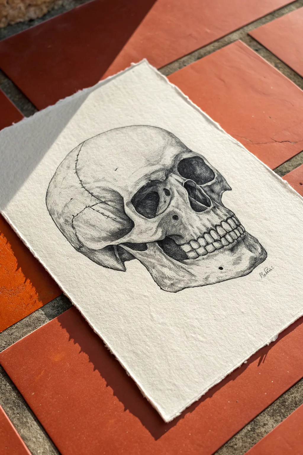
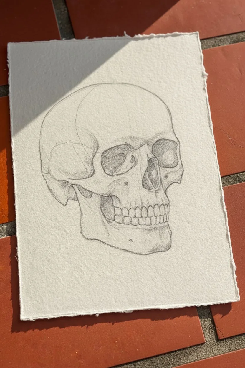
Master the art of scientific illustration with this detailed pen-and-ink skull study. Using stippling and fine hatching on textured handmade paper creates an authentic, vintage medical drawing aesthetic.
Step-by-Step Guide
Materials
- Handmade cotton rag paper (deckled edge)
- Graphite pencil (HB or 2B)
- Kneaded eraser
- Fine liner pens (sizes 0.05mm, 0.1mm, and 0.5mm)
- Ruler (optional for proportions)
Step 1: Structural Sketching
-
Cranial foundation:
Begin with a light pencil sketch. Draw a large sphere for the cranium (brain case) and extend a U-shaped block downwards to represent the jaw area. -
Face mapping:
Sketch a vertical center line and a horizontal line for the eyes. The skull is in a three-quarter view, so shift the vertical line slightly to the left side of the sphere. -
Feature placement:
Block in the large orbital cavities (eye sockets) looking somewhat like aviator sunglasses. Place the triangular nasal cavity right below the center point between the eyes. -
Jaw and cheekbones:
Refine the zygomatic arches (cheekbones) protruding below the eyes and connecting to the side of the head. Sketch the mandible (jawbone) shape, ensuring the chin juts out slightly. -
Dental arch:
Lightly mark the curve where the upper and lower teeth meet. Sketch the individual teeth shapes, remembering they get smaller as they recede into the back of the mouth.
Smudge Patrol
Hand oils and wet ink are enemies of pristine paper. Place a scrap piece of paper under your drawing hand to act as a guard while you work, preventing accidental smudges.
Step 2: Inking the Outline
-
Main contours:
Switch to a 0.1mm fine liner. Trace the outer silhouette of the skull. I like to keep the line slightly broken or wavy in places to simulate the organic texture of bone. -
Cavity definition:
Outline the eye sockets and nasal cavity. Make these lines slightly thicker to indicate the sharp drop-off of the bone edge. -
Teeth precision:
Ink the teeth carefully. Instead of drawing every single gap as a hard line, focus on the gum line and the bottom edges. This prevents them from looking like a cartoon zipper. -
Clean sweep:
Once the ink is completely dry, gently erase the pencil sketch with a kneaded eraser to reveal your clean line work.
Antique Aesthetic
For an even older look, lightly stain your paper with strong coffee or tea and let it dry completely before starting your sketch. This gives the drawing a centuries-old medical journal vibe.
Step 3: Shading and Texture
-
Darkest depths:
Use a 0.5mm pen to fill in the deepest shadows inside the eye sockets and nasal cavity. Don’t make it solid black; leave small specks of white or use dense cross-hatching to show depth. -
Initial stippling:
Switch to your finest 0.05mm pen. Begin stippling (drawing many small dots) under the cheekbone and at the temple. The closer the dots, the darker the shadow. -
Cranial gradient:
Create a gradient on the round part of the skull. Concentrate dots on the curved side away from the light source and fade them out as you move toward the center. -
Jaw definition:
Add shading to the lower jaw and the divot just below the teeth. Use a mix of stippling and very short, directional hatch marks to sculpt the form. -
Suture lines:
Draw the cranial sutures using a jagged, erratic line. These are the wiggly cracks where skull plates fuse. Keep your hand loose to minimize rigidity here. -
Refining values:
Step back and assess contrast. Add more dots to the transition areas between light and dark to smooth out the volume of the bone. -
Final weathering:
Add tiny scratches, pits, or extra texture dots randomly across the surface to give the bone an aged, realistic feel.
Now you have a striking anatomical study that captures the raw beauty of human structure.
Geometric Endurance: Reptile Scales
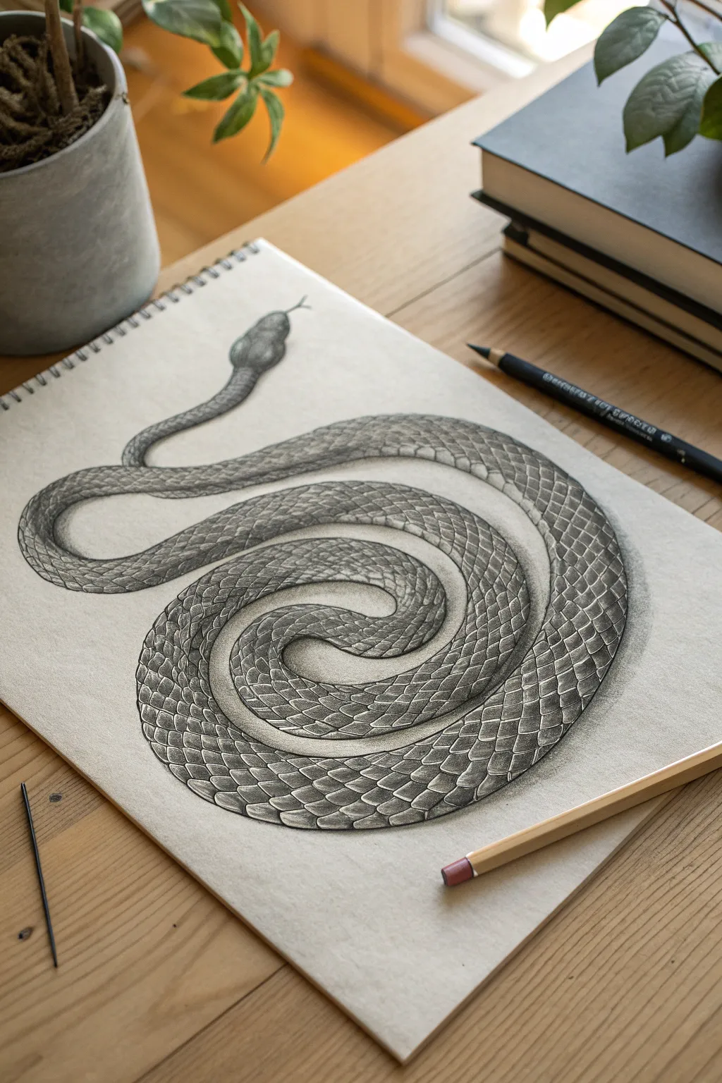
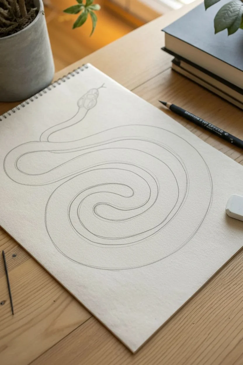
Master the art of geometric endurance with this intricate graphite study of a coiled snake. You will practice perspective and patience as you render hundreds of interlocking scales to create a realistic, three-dimensional effect.
Step-by-Step Tutorial
Materials
- Heavyweight drawing paper (smooth surface)
- Graphite pencils (H or HB for outlining, 2B and 4B for shading)
- Kneaded eraser
- Precision stick eraser (optional)
- Blending stump
Step 1: Constructing the Form
-
Gesture the spiral:
Using an HB pencil with a light hand, sketch a loose spiral shape to define the flow of the snake’s body. Don’t worry about perfection yet; focus on the rhythm of the coil. -
Define the volume:
Draw the edges of the snake’s body around your spiral line, creating a long, continuous tube. Keep the thickness relatively consistent, tapering naturally near the head and the center tail. -
Shape the head:
At the top end of the spiral, sketch a diamond-shaped oval for the head. Add the thin, forked tongue extending outward. -
Establish overlap:
Clarify where the body loops over itself. Erase the guidelines of the lower coils where they pass beneath the upper coils to solidify the illusion of depth.
Keep it Sharp
For realistic scales, a sharp pencil is non-negotiable. Rotate your pencil every few strokes to maintain a fine point, or keep a sandpaper block nearby.
Step 2: Mapping the Texture
-
Draw the spine line:
Lightly trace a centerline running down the ‘back’ of the snake. Since the body twists, this line should curve gently to follow the perspective of the form. -
Create a mesh:
Sketch diagonal cross-hatching lines across the body to create a diamond grid. The diamonds should look compressed near the edges of the tube and wider in the center, mimicking 3D curvature. -
Draft the scales:
Using your grid as a guide, draw the individual scales. Give them rounded bottom edges. Remember, scales get smaller as they recede toward the sides of the snake’s body. -
Detail the belly:
In areas where the underbelly is exposed (usually on the inner curves), draw wider, horizontal distinct plates (scutes) instead of diamond scales.
Step 3: Shading and Depth
-
Apply base shadows:
Switch to a 2B pencil. Lightly shade the sides of the ‘tube’ to make the snake look round, leaving the center of the back lighter for the highlight. -
Deepen the overlaps:
Use a 4B pencil to darken the areas where one coil casts a shadow onto the coil beneath it. This separation is crucial for realism. -
Render individual scales:
I like to start from the left and work right to avoid smudging. Shade the top corner of each scale darker, fading to white at the bottom edge to make them look lifted. -
Enhance scale contrast:
Add a tiny, dark drop shadow immediately underneath each scale tip. This makes every scale pop off the one below it. -
Refine the head:
Shade the head with smooth gradients. Darken the eye sockets and nostrils, and ensure the transition from the neck scales to the smooth head plates is gradual. -
Final highlights:
Use a kneaded eraser or precision stick eraser to tap the center of the scales along the spine, reclaiming bright white highlights for a glossy texture. -
Grounding shadow:
Add a soft cast shadow on the paper directly beneath the bottom edges of the snake coils to ground the entire object.
Flat Scales?
If the snake looks flat, your grid lines might be too straight. Curve your guidelines aggressively around the ‘tube’ form to prove it’s a cylinder.
Step back and admire the rhythmic complexity of your finished serpentine drawing.


Fluid Motion: Rushing Water and Waves
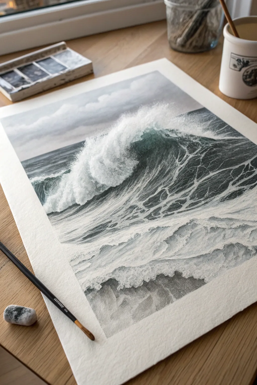
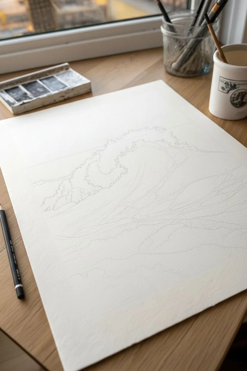
Capture the raw power of the ocean by combining the deep, moody tones of charcoal with the crisp brightness of white gouache. This project focuses on texture and contrast to create a hyper-realistic crashing wave.
Step-by-Step
Materials
- Heavyweight cold-press watercolor paper
- Graphite pencils (HB, 2B, 4B)
- Compressed charcoal or black pastel pencil
- White gouache or opaque white ink
- Small round paintbrush (size 0 or 2)
- Kneaded eraser
- Masking tape
Step 1: Setting the Scene
-
Secure the borders:
Tape down all four edges of your paper to a flat surface. This creates the crisp white border seen in the reference and prevents the paper from buckling if we add wet media. -
Establish the horizon:
Lightly sketch the horizon line with an HB pencil about one-third of the way down from the top of the page. -
Outline the swell:
Sketch the primary shape of the wave coming from the right, curving inward. Mark out the jagged area where the crest breaks into foam.
Flat Water?
If the foam looks like it’s floating rather than sitting on the water, add a thin line of diluted charcoal shadow directly underneath the white foam strands.
Step 2: Atmosphere and Depth
-
Shade the sky:
Using a 2B pencil and a light touch, shade the sky area. Keep the strokes horizontal and smooth. -
Create soft clouds:
Use a tissue or chamois to blend the sky graphite into a soft gray. I like to lift out cloud shapes with a kneaded eraser to give the background a misty look. -
Darken the horizon:
Go over the distant water line with a 4B pencil or charcoal. The water furthest away should be dark and level to create depth. -
Block in the wave shadow:
Fill the concave face of the wave—the area under the curling lip—with your darkest charcoal. This deep shadow is crucial for contrast.
Step 3: Water Texture
-
Draw the water surface:
For the water behind the main wave, use horizontal strokes that follow the curve of the swell. Let the paper texture show through to mimic ripples. -
Detail the wave face:
On the dark face of the wave, switch to lighter graphite strokes. Follow the upward curve of the water to show movement before it crashes.
Pro Tip
Don’t over-blend the dark water areas. Allowing the rough texture of the cold-press paper to remain visible naturally mimics the choppy, uneven surface of the ocean.
Step 4: The Crash and Foam
-
Mix your white:
Prepare your white gouache. It should be creamy—thick enough to be opaque, but fluid enough to flow from a fine brush. -
Paint the main crest:
Using the brush, stipple white paint along the top edge of the wave. Use a dabbing motion to replicate the chaotic spray of the breaking lip. -
Create the foam web:
This is the most intricate part. Paint thin, interconnecting white veins dragging across the dark face of the wave. These lines should stretch and distort with the water’s curve. -
Soft spray:
Dry off your brush until it has almost no paint, then lightly scumble (rub) it over the area where the wave hits the bottom to create a mist effect.
Step 5: Foreground Fluids
-
Sketch foreground ripples:
In the bottom third of the paper, lightly sketch large, rolling foam shapes that have already crashed. -
Shade the wash:
Shade between these foam shapes with graphite. Keep the values lighter here than in the main wave to show the water is shallower and aerated. -
Highlight the wash:
Add white gouache highlights to the top ridges of the foreground ripples. Keep the edges slightly softer here than on the main wave. -
Final heavy shadows:
Revisit your darkest darks. Add compressed charcoal to the deepest crevices in the water to ensure the white foam really pops. -
Reveal the artwork:
Wait for all gouache to dry completely, then carefully peel away the masking tape at a 45-degree angle.
Step back and admire the dynamic movement you have captured in your seascape
Intricate Architecture: Urban Pointillism
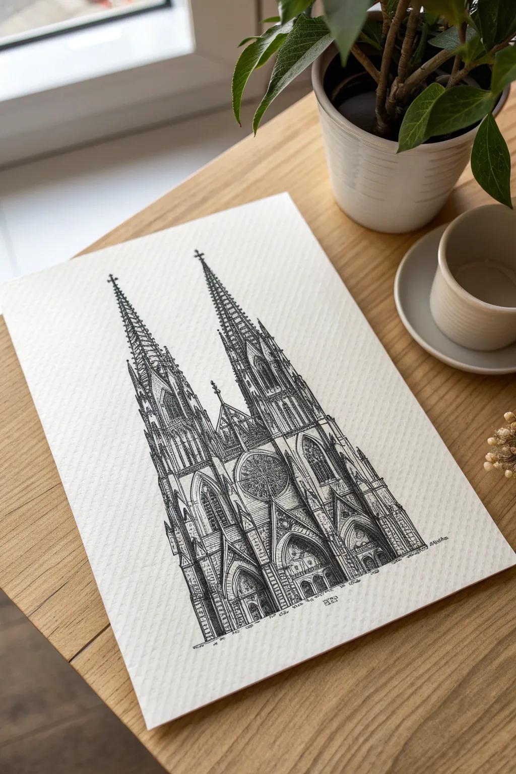
Capture the soaring heights of classic architecture with this intricate ink study of a twin-spired cathedral. By combining precise line work with delicate shading techniques, you will build a masterpiece that feels both ancient and vividly present on the page.
How-To Guide
Materials
- Textured heavyweight drawing paper or cold-press watercolor paper
- HB pencil
- Kneaded eraser
- Set of fine liner pens (0.05mm, 0.1mm, 0.3mm, 0.5mm)
- Ruler
Step 1: The Pencil Framework
-
Vertical Guidelines:
Using your ruler, draw a central vertical axis and two parallel lines on either side to define the width of the twin towers, ensuring the structure stands straight. -
Blocking Shapes:
Lightly sketch the main rectangular bodies for the towers and tall, narrow triangles for the spires, maintaining symmetry across the center line. -
Portal Placement:
Mark the positions of the three ground-level arched doorways at the base, making the central portal slightly larger and taller than the side ones. -
Window Mapping:
Sketch a circle for the central rose window and elongated arches for the lancet windows on the towers to guide your ink placement later.
Step 2: Defining the Skeleton
-
Main Pillars:
Switch to a 0.3mm pen to carefully outline the strong vertical buttresses that frame the towers, keeping your hand steady but allowing for slight natural variation. -
The Spires:
Ink the outer edges of the spires, breaking the line occasionally to leave room for the decorative crockets (small projecting ornaments) you’ll add later. -
Defining Arches:
Use a 0.1mm pen to trace the varying curves of the portal arches and window frames, emphasizing the pointed Gothic style. -
Gable Details:
Outline the triangular gables above the doors and the peaked roof sections situated between the two main towers.
Smudge Guard
Place a clean sheet of scrap paper under your drawing hand. This prevents skin oils from transferring to the textured paper and protects your wet ink lines from accidental smudges.
Step 3: Intricate Tracery
-
Rose Window:
With your 0.05mm pen, draw the delicate spokes and geometric patterns inside the central circular window, working from the center outward. -
Lancet Windows:
Fill the tall, thin windows on the towers with vertical dividers and tiny arches at the top to create the look of stone tracery. -
Surface Texture:
I look for areas of flat stone and add broken or slightly wobbly vertical lines to suggest independent stone blocks and age. -
Decorative Pinnacles:
Add small, spike-like details along the edges of the main spires and buttresses to create that characteristic “lacy” Gothic silhouette.
Atmospheric Drift
Instead of finishing the bottom of the building with a hard line, let the vertical lines fade out gradually. This vignette effect gives the drawing a dreamy, architectural study feel.
Step 4: Shading & Atmosphere
-
Deep Shadows:
Use a 0.5mm pen to fill in the deepest recesses of the doorways and unlit window panes with solid black ink or very dense hatching. -
Mid-tone Hatching:
Create volume on the towers by adding diagonal hatching lines on the shadowed sides of the buttresses to simulate a directional light source. -
Stippling Effects:
To embrace the pointillism style, use the 0.1mm pen to apply clusters of dots in corners and under arches for soft, gradual transitions. -
Grounding:
Add a few loose, sketchy lines and text annotations at the base of the cathedral to suggest the ground without drawing a harsh horizon line. -
Final Contrast:
Scan the drawing for areas that need more visual weight and deepen the blacks where the shadows would naturally be darkest. -
Clean Up:
Once the ink is completely dry—give it a good few minutes—gently erase all underlying pencil marks to reveal the crisp, high-contrast architecture.
Now you have a stunning piece of architectural art that captures the grandeur of the past.


Have a question or want to share your own experience? I'd love to hear from you in the comments below!