There is something incredibly soothing about sketching the symbol of love, whether you are filling a sketchbook with quick doodles or planning a complex canvas piece. In this collection, we will explore a variety of artistic interpretations that transform simple shapes into stunning masterpieces and meaningful designs.
The Continuous Line Heart
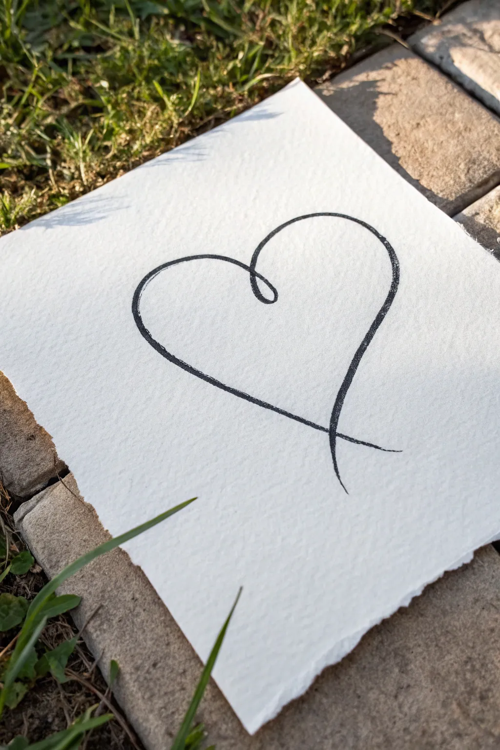
Capture the elegance of minimalism with this fluid continuous line drawing. The charm of this piece lies in the textured paper and the confident, imperfect flow of a single unbroken stroke.
Detailed Instructions
Materials
- Heavyweight cold-press watercolor paper (rough texture is essential)
- Black fineliner or drawing pen (0.5mm or 0.8mm)
- Ruler (for tearing paper)
- Scrap paper for practice
Step 1: Preparing Your Canvas
-
Size the paper:
Begin by selecting a piece of heavy watercolor paper. A square format works best for this centered design. -
Create deckled edges:
Instead of cutting with scissors, place a ruler flat against the paper and tear the edges upward against it. This creates the soft, fibrous ‘deckled’ look seen in the photo. -
Check the texture:
Identify the roughest side of your paper. We want the deeper grain facing up to break up the ink line slightly, giving it that rustic, hand-drawn character.
Drawing Flow Tip
Draw somewhat quickly! Moving too slowly can cause the line to shake or puddle. A confident, faster speed smooths out the curve.
Step 2: Mastering the Motion
-
Warm up your arm:
On a piece of scrap paper, draw large loops and figure-eights. Keep your wrist locked and move from your shoulder to ensure smooth curves. -
Analyze the path:
Study the heart’s path before drawing: start at the bottom right tail, go up the left side, loop in the center, go up the right side, and cross back over at the bottom. -
Practice the center loop:
The small loop at the top cleft is the trickiest part. Practice drawing a ‘v’ shape that twists into a small loop at the bottom point of the ‘v’ to connect the two sides seamlessly. -
Visualize the sizing:
Hover your hand over the final paper without touching it. Trace the shape in the air to gauge how large you want the heart to be relative to the paper borders.
Level Up
Use gold watercolor paint to gently splatter small droplets around the heart for a festive, elegant touch.
Step 3: Drawing the Heart
-
Start the stroke:
Place your pen tip on the paper near the bottom center, slightly to the right. This will be the start of the ‘tail’. -
Sweep upward:
Draw a diagonal line curving upwards towards the left to create the bottom section of the left side. -
Form the left lobe:
Continue the line up and over, rounding out the top left arch of the heart. -
Dip to the center:
Bring the pen down towards the center cleft of the heart. -
Execute the loop:
Without lifting the pen, make a small, swift loop-the-loop motion. Twist the line upwards to the right to transition into the next side. -
Rise to the right:
Flow out of the loop and curve upward to form the right-hand arch, aiming to match the height of the left side. -
Curve downward:
Bring the line down the right side of the heart, curving gently inward as you approach the bottom. -
Aim for the cross:
Look at your starting line. You want to cross over it near the bottom point. -
Cross over:
Draw the line across your initial stroke, creating an ‘X’ shape at the bottom tip. -
Finish with a flick:
Extend the line slightly to the left past the intersection. Lift your pen while the hand is still moving to create a naturally tapered end. -
Dry completely:
Let the ink settle into the paper fibers for a minute before handling to prevent any accidental smudging.
Frame your textured masterpiece in a floating glass frame to show off those beautiful rough edges.


Botanical Floral Wreath
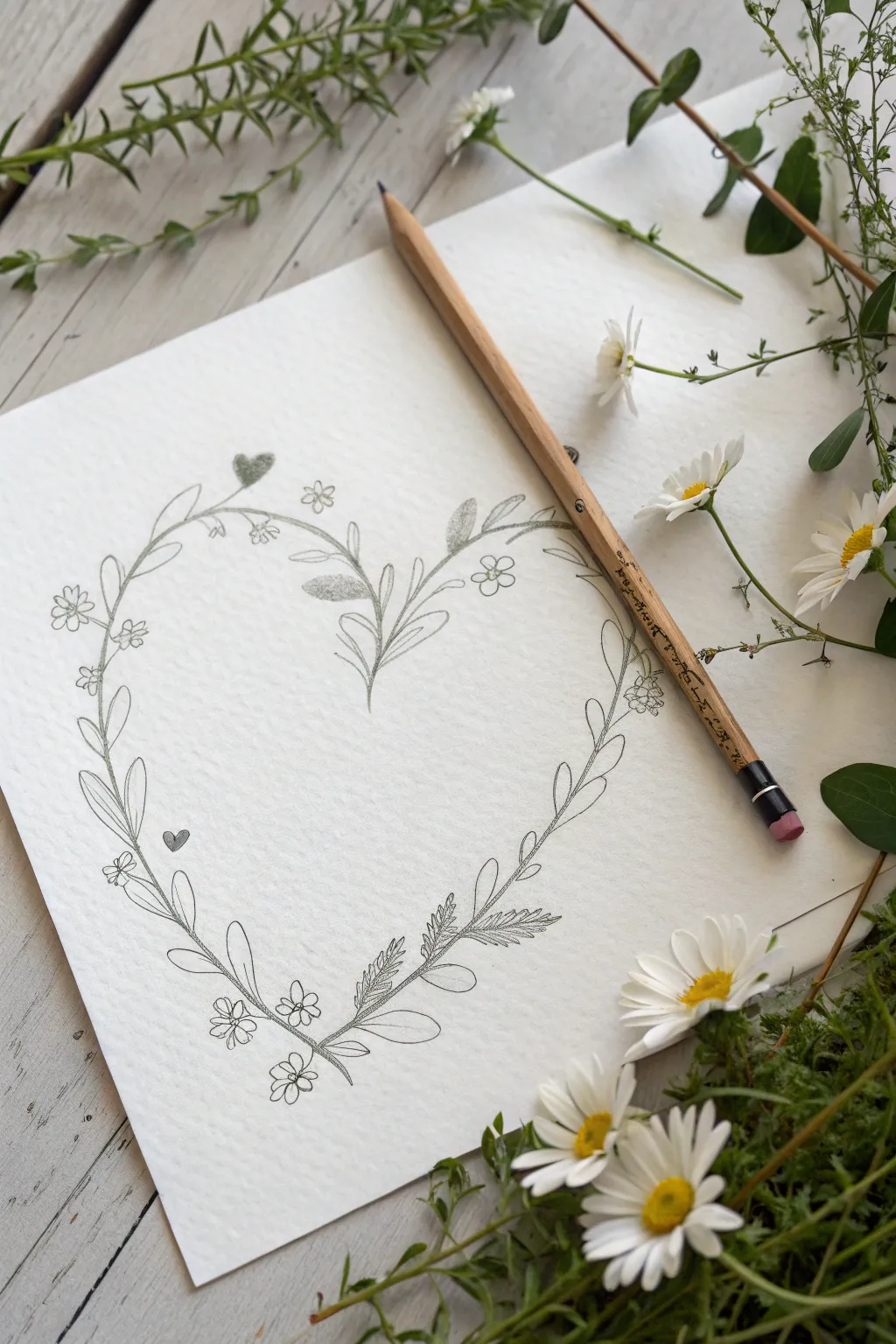
Capture the delicate beauty of nature with this hand-drawn botanical heart wreath. Using simple graphite techniques, you will build a romantic composition of wildflowers, vines, and leaves arranged in a lovely open-heart shape.
Step-by-Step Guide
Materials
- Cold press watercolor paper (or textured sketch paper)
- HB graphite pencil (for initial lines)
- 2B graphite pencil (for shading)
- Kneaded eraser
- Pencil sharpener
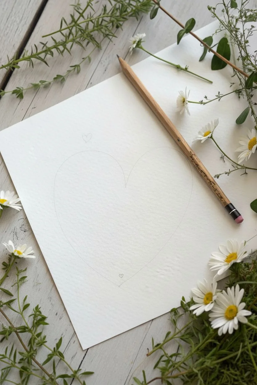
Step 1: Establishing the Shape
-
Mark the boundaries:
Begin by lightly marking a small dot at the very bottom center of your page where the heart point will be, and two points at the top where the arches will peak. -
Sketch the ghost line:
Using your HB pencil with very light pressure, sketch a faint, continuous heart shape connecting your dots. This is just a guideline to help you place the vines, so keep it barely visible.
Uneven is Better
Don’t fret if your heart shape isn’t perfectly symmetrical. In botanical art, slight wobbles in the vines make the plants look more organic and realistic.
Step 2: Drawing the Left Vine
-
Draft the main stem:
Start from the bottom point and draw a darker, slightly waving line following the left side of your heart guideline, stopping just before the top center cleavage. -
Add lower leaves:
Near the bottom of the stem, draw pairs of simple, elongated oval leaves. Make sure they flow upwards in the direction of the vine’s growth. -
Introduce flowers:
About halfway up the left curve, sketch small clusters of five-petal wildflowers branching off the main stem. Keep the petals loose and rounded. -
Curve the top:
At the top of the left arch, draw the stem curling inward dramatically. Add a cluster of leaves at the very tip of this curl to soften the end.
Step 3: Drawing the Right Vine
-
Draft the right stem:
Draw the right-side stem starting from the bottom, mirroring the left side but intentionally keeping the curves slightly different to maintain an organic, natural feel. -
Create asymmetry:
Place leaves on the right stem at slightly different intervals than the left. I like to leave a little more empty space on this side to keep the composition breathable. -
Add upper foliage:
Near the top right curve, draw smaller, single leaves attached directly to the stem rather than in clusters. -
Inner branch detail:
Draw a secondary branch splitting off from the top right arch, pointing down into the center of the heart. Add three distinct leaves to this inner sprig.
Pro Tip: Pencil Grip
Hold your pencil further back toward the eraser when drawing the long vine curves. This limits your control slightly, resulting in smoother, more natural flow.
Step 4: The Center Junction
-
Cross the stems:
Return to the bottom point of the heart. Extend the two main stems so they cross over each other slightly, creating a delicate ‘X’ at the base. -
Add fern texture:
Draw feathery, fern-like leaves extending from the crossed stems at the bottom. Use quick, short strokes to mimic the texture of pine needles or fern fronds. -
Refine the connection:
Add two broad, rounded leaves at the very base to anchor the weight of the wreath visually.
Step 5: Details and Shading
-
Scattered blooms:
Draw three or four tiny, solitary flowers floating near the vines on the bottom left and top right to expand the wreath’s width. -
Tiny hearts:
Draw two miniature solid hearts—one near the top left curve and one near the bottom left vine. These add a whimsical touch to the botanical theme. -
Graphite shading:
Switch to your 2B pencil. Gently shade inside the tiny floating hearts and select leaves (specifically the fern-like ones and the top-right cluster) to create contrast. -
Vein details:
Draw simple center lines through the larger oval leaves. Do not outline the veins; just a single swift line through the middle is sufficient. -
Final Cleanup:
Take your kneaded eraser and carefully lift away the initial heart guideline you drew in phase one, leaving only your botanical artwork. -
Vary line weight:
Go over the main stem lines one last time with the 2B pencil, adding pressure on the underside of curves to create depth and dimension.
Now you have a charming botanical illustration perfect for a handmade card or wall art


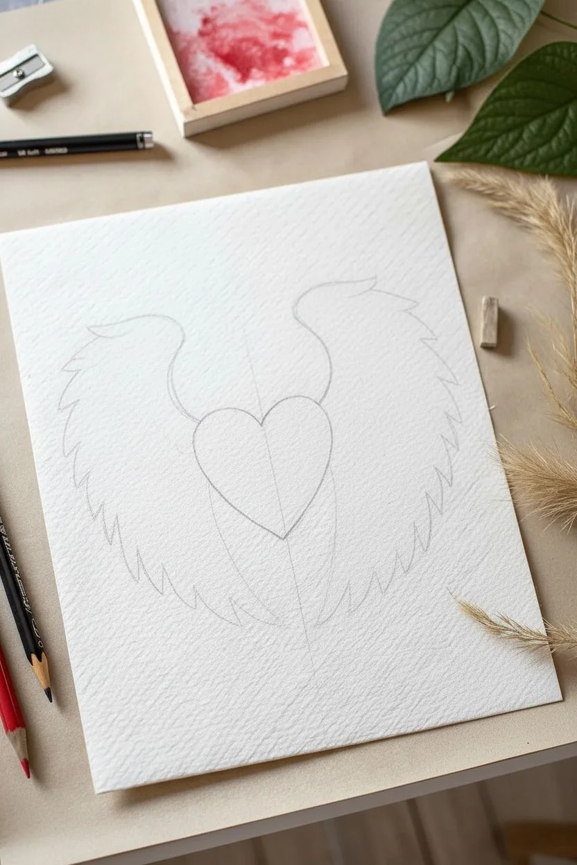
Classic Heart with Angel Wings
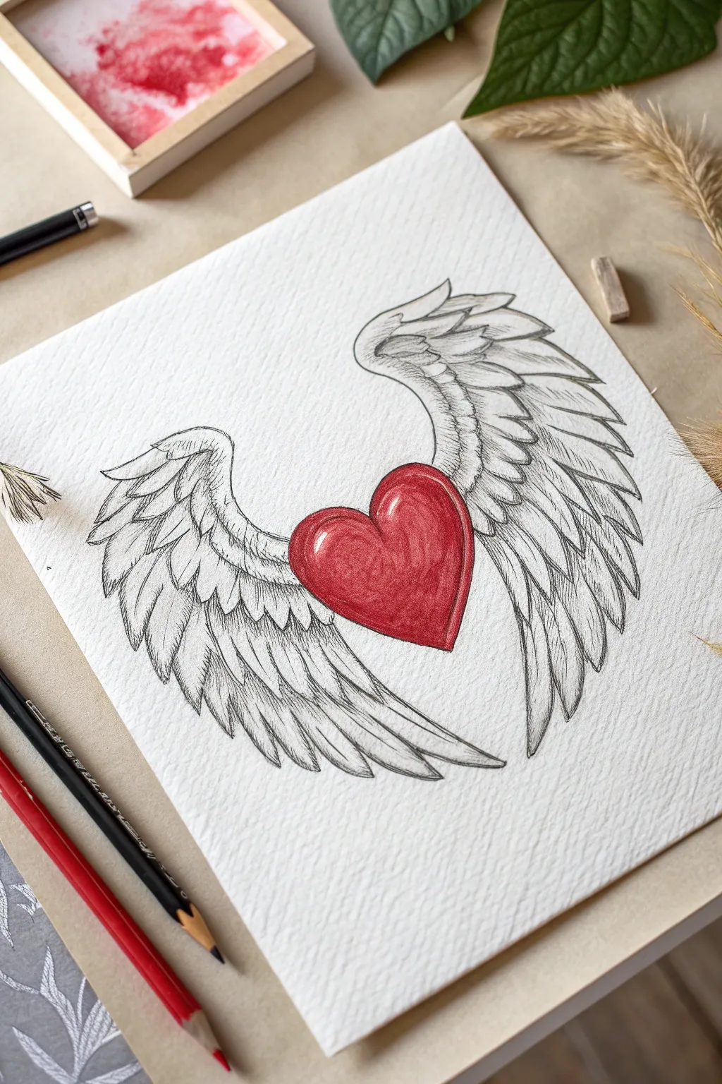
Capture the timeless symbol of love and freedom with this detailed heart and wings drawing. Using simple shading techniques and vibrant color contrast, you’ll create a piece that pops beautifully off textured paper.
Step-by-Step Tutorial
Materials
- Textured heavyweight drawing paper (cold press)
- HB graphite pencil (for sketching)
- Black colored pencil or fine charcoal pencil
- Red colored pencils (crimson and bright red)
- Eraser
- Pencil sharpener
Step 1: Establishing the Framework
-
Center line:
Begin by drawing a very faint vertical line down the center of your paper to help maintain symmetry. -
Heart shape:
Sketch a plump, rounded heart right in the middle of your guide line; tilt it slightly if you prefer a dynamic look, or keep it perfectly straight. -
Wing arches:
Draw two curved lines extending upward and outward from the top indent of the heart to form the top ‘arms’ of the wings. -
Wingspan guide:
Lightly mark where the tips of the longest feathers should end to ensure both wings will fit on the page.
Step 2: Feather Formation
-
Top feathers:
Starting at the top curve of the wing, draw small, U-shaped scallops to represent the short covert feathers. -
Middle layer:
Add a second row of feathers below the first utilizing slightly longer, elongated oval shapes. -
Flight feathers:
Draw the long primary feathers extending downward; make them curve outward at the tips to create a sense of movement. -
Mirroring:
Repeat these feather layers on the opposite wing, checking your symmetry as you go. -
Refining outlines:
Once happy with the sketch, carefuly go over the feather outlines with your black colored pencil or charcoal for a crisp look.
Tip: Keep it Sharp
Keep your black pencil tip extremely fine. Crisp, thin lines are the secret to separating the individual feathers without the texture looking “muddy.”
Step 3: Shading and Texture
-
Depth shading:
Using the black pencil lightly, shade underneath each feather layer to show that they are overlapping each other. -
Feather details:
Draw fine, flicking lines inside each individual feather to mimic the texture of the barbs and central shaft. -
Junction shadows:
Darken the shading significantly where the wings tuck behind the heart to push them into the background. -
Lifting highlights:
I like to use a sharp edge of my eraser to lift tiny areas of graphite on the upper curves of the feathers for brightness.
Level Up: Extra Shine
Use a white gel pen to make the highlight on the heart opaque and super glossy, or add tiny white dots to the feather tips for a magical effect.
Step 4: The Glossy Heart
-
Outline:
Clean up the heart outline with your deep red pencil, making the edge sharp. -
Highlight mapping:
Lightly sketch a kidney-bean or oval shape on the upper left curve of the heart—this area must remain completely white. -
Base color:
Fill the rest of the heart with a bright red, applying even pressure but avoiding the highlight zone. -
Volume shading:
Layer a darker crimson or a touch of black along the bottom and right edges to create a rounded, 3D effect. -
Burnishing:
Press down hard with the bright red pencil over the colored areas to blend the grain and create a smooth, glossy finish. -
Final clean:
erasure any visible guide lines or smudges around the outside of the drawing.
Take a moment to admire the depth you’ve created, resulting in a romantic piece perfect for framing or gifting.


Paw Print Integration

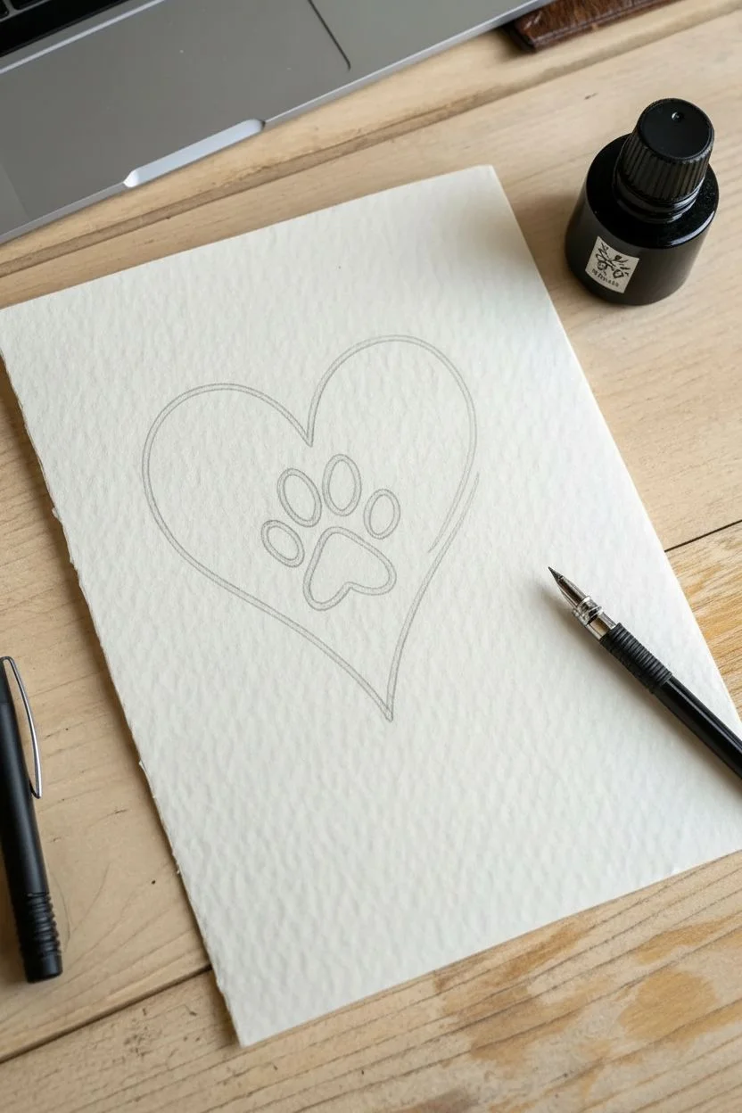
Capture the bond with your furry friend through this charming ink illustration. By combining a loose, sketchy heart outline with a textured, cross-hatched paw print, you’ll create a piece that feels organic and full of character.
Step-by-Step
Materials
- Textured drawing paper (cold press watercolor or mixed media paper)
- H or HB pencil
- Kneaded eraser
- Black drawing pen (size 0.3 or 0.5)
- Black fountain pen or thicker marker (optional for outlines)
Step 1: Sketching the Foundation
-
Prepare your paper:
Select a piece of paper with some tooth or texture to it; this texture helps achieve the rustic look of the final ink lines. -
Draft the heart shape:
Using your pencil lightly, sketch a large, open heart in the center of the page. Don’t worry about perfect symmetry yet. -
Position the paw pad:
In the center of the heart, lightly sketch a rounded, inverted triangle shape for the main metacarpal pad. -
Add the toes:
Sketch four small ovals above the main pad, arching them slightly to mimic the natural curve of a paw. -
Review proportionality:
Step back to ensure the paw print feels balanced within the whitespace of the heart before you commit to ink.
Step 2: Detailing the Paw Print
-
Outline the main pad:
Switch to your black pen. Carefully trace the outline of the large bottom pad using a slightly wobbly, organic stroke. -
Outline the toes:
Ink the outlines of the four toe pads. I like to make these lines slightly thinner than the main pad if possible. -
Start the first hatching layer:
Inside the main pad, draw diagonal parallel lines spaced closely together. Keep your hand loose. -
Cross-hatch for texture:
Draw a second set of diagonal lines perpendicular to the first set, creating a grid-like mesh pattern inside the pad. -
Fill the toes:
Repeat the cross-hatching technique for each of the four toe pads, ensuring they look solid but textured.
Embrace the Wobble
Don’t try to make straight lines perfect. A slightly shaky hand actually adds warmth and organic charm to this specific style of illustration.
Step 3: Framing with Love
-
Trace the left curve:
Starting from the top center dip, draw the left side of the heart downward. Allow the pen to skip slightly over the paper’s texture. -
Trace the right curve:
Draw the right side of the heart, bringing it down to meet the left side at a sharp point at the bottom. -
Create the double-line effect:
Add a second ink line just inside the first one on the left curve, but don’t make it perfectly parallel—let it taper and merge. -
Mirror the double line:
Repeat this on the right side, adding a sketchy second line that emphasizes the curve and connects near the bottom point. -
Add interior accents:
Draw short, curved floating lines inside the top lobes of the heart to suggest a glossy reflection or dimension.
Ink Smudging?
If you are left-handed or using slow-drying ink, place a clean scrap piece of paper under your hand to act as a shield while you work.
Step 4: Finishing Touches
-
Wait for ink to set:
Give the drawing several minutes to ensure the ink is bone dry, especially where the hatching is dense. -
Erase guidelines:
Gently rub your kneaded eraser over the entire image to lift the pencil sketch without damaging the paper surface. -
Reinforce shadows:
If the paw print looks too light, go back and add a third layer of diagonal hatching in the deepest shadow areas. -
Final assessment:
Check the heart outline; if any gaps feel too wide, add a tiny connecting stroke to maintain the flow.
Now you have a heartfelt tribute to your pet ready to be framed or gifted.
BRUSH GUIDE
The Right Brush for Every Stroke
From clean lines to bold texture — master brush choice, stroke control, and essential techniques.
Explore the Full Guide
Vintage Padlock and Key
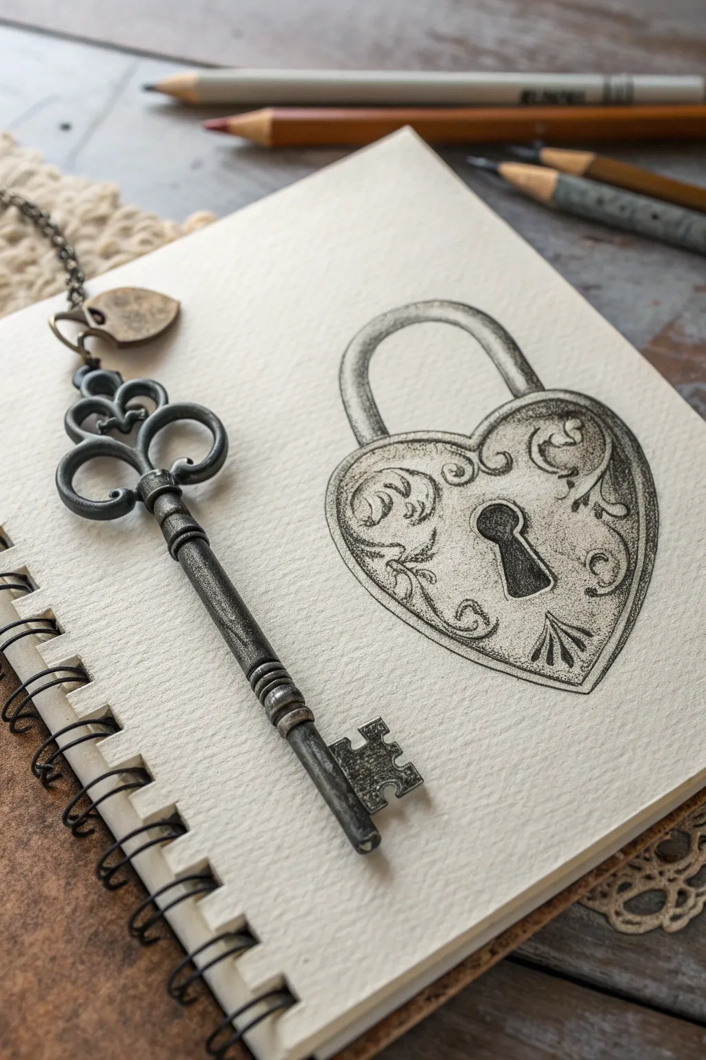
Capture the romance of a bygone era with this intricate drawing of an ornate heart-shaped padlock. Using simple graphite techniques, you will render beautiful metallic textures and scrollwork to create a piece that feels heavy and historic.
Step-by-Step Guide
Materials
- Textured sketch paper (white or cream)
- Graphite pencils (ranges HB, 2B, and 4B)
- Kneaded eraser
- Precision eraser or eraser pen
- Pencil sharpener
Step 1: Drafting the Structure
-
Establish the center:
Begin by lightly drawing a vertical line down the center of your page to ensure symmetry. -
Outline the heart:
Sketch a classic heart shape around your center line, making the top lobes full and round, tapering down to a gentle point. -
Add the shackle:
Draw an arched ‘U’ shape extending from the top of the heart lobes to create the locking bar. -
Thicken the lines:
Add a second inner line to the shackle to give it thickness, and duplicate the heart connection points where the shackle enters the lock. -
Define the face:
Sketch a smaller heart shape inside the main outline to create a border or rim around the edge of the lock.
Step 2: Adding Ornate Details
-
Place the keyhole:
draw a traditional keyhole shape—a small circle atop a triangle—directly on the center line, slightly below the midway point. -
Sketch left filigree:
Inside the left lobe of the heart face, lightly sketch swirling, vine-like shapes that curve inward toward the keyhole. -
Sketch right filigree:
Mirror these swirling designs on the right side, maintaining balance without needing perfect symmetry. -
Add base details:
Draw three small, fan-like teardrops at the very bottom point of the inner heart face. -
Refine the border:
Add small circles or rivets within the decorative border you created earlier, spacing them evenly.
Uneven Shape?
If your heart looks lopsided, draw a grid on your paper first, or trace a paper cutout lightly to get the base symmetry perfect before adding details.
Step 3: Shading and Texture
-
Darken the keyhole:
Using your 4B pencil, fill in the keyhole completely to create a deep, contrasting black void. -
Shade the shackle:
Shade the sides of the shackle loop, leaving a vertical strip of white in the center to represent a metallic highlight. -
Outline contours:
Go over your pencil sketches of the vines and scrollwork with a sharp 2B pencil to define them clearly. -
Create depth:
Add shadows immediately underneath the raised scrollwork details to make them look embossed and three-dimensional. -
Texture the metal:
I like to use a stippling technique here; tap your pencil point repeatedly to create tiny dots over the flat surfaces, giving the metal a cast-iron texture. -
Shade the curved face:
Darken the outer edges of the inner heart face, fading the graphite into a lighter gray as you move toward the center. -
Enhance highlights:
Use a kneaded eraser to lift pigment from the highest points of the scrolls and the center of the lock face. -
Final polish:
Sharpen your darkest pencil and refine the outermost outline of the entire lock to make it pop off the paper.
Agers & Ruts
To make the lock look properly ancient, sketch tiny random scratches and little cracks in the darker shaded areas to simulate worn metal.
Your sketchbook now holds a key to the past with this beautifully rendered vintage piece.
Geometric Crystal Heart
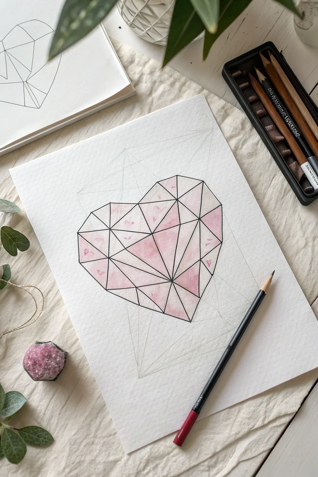
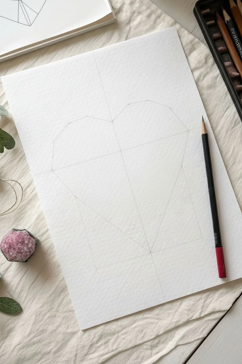
Combine the precision of geometry with the organic softness of water-soluble media in this stunning project. This low-poly style heart resembles a cut gemstone, featuring crisp angular lines and beautiful, mottled wash textures.
Detailed Instructions
Materials
- Cold-press watercolor paper (textured)
- HB Graphite pencil
- Ruler or straight edge
- Pink water-soluble colored pencil (or watercolor paint)
- Small round paintbrush
- Water cup
- Black fine-liner pen (archival/waterproof)
- Eraser
Step 1: Constructing the Framework
-
Establish the axis:
Begin by placing your ruler vertically in the center of your page. Draw a very light vertical line to act as your symmetry guide. -
Create the boundary box:
Draw a light horizontal line across the upper third of your vertical axis to mark the widest part of the heart. -
Form the diamond guide:
Mark the bottom tip of the heart on the vertical axis. Connect the ends of your horizontal line to this bottom point, creating a ‘V’ shape. Then connect the top points upward to form a rough diamond shape, just like the faint pencil lines seen in the reference image.
Smudged Ink?
If your black lines bleed into the pink, stop immediately. Ensure the watercolor layer is 100% dry before inking, or switch to a waterproof archival pen.
Step 2: Sketching the Facets
-
Define the outline:
Inside your guide lines, draw the actual outline of the heart using straight ruler lines only. Instead of curves, use three or four short straight segments to create an angular top arch. -
Locate the focal point:
Mark a central point on the vertical axis, slightly closer to the top cleft than the bottom tip. This will be the center of your ‘starburst’ pattern. -
Draw primary dividers:
Use your ruler to draw a straight line from the top cleft down to your central point. Then, draw a line from the central point down to the bottom tip. -
Radiate outwards:
Draw straight lines from that central point connecting to the various corners on the heart’s perimeter. This divides the heart into large geometric chunks. -
Subdivide the shape:
Break up larger triangles by drawing lines across them. I find that connecting irregular mid-points on the existing lines creates the most convincing ‘cracked crystal’ look. -
Clean up:
Once you are happy with the geometric grid, lightly dab the drawing with a kneaded eraser to lift excess graphite, leaving just faint guides.
Step 3: Adding Texture and Color
-
Apply pigment:
Take your pink water-soluble pencil and lightly shade inside the facets. Do not color them solidly; scribble loosely to deposit pigment unevenly. -
Vary the pressure:
Press harder in some corners of the triangles and leave other areas nearly white. This variation is crucial for the 3D gemstone effect. -
Activate with water:
Dip your brush in water and gently paint over the pencil marks. The water will dissolve the lines into a wash. -
Create blooms:
Dab a little extra water into the center of a few wet facets. This pushes the pigment to the edges, creating those beautiful textures seen in the photo. -
Let it dry:
Wait for the paper to become completely bone-dry. The next step involves ink, which will bleed if the paper is damp.
Glimmering Edges
Swap the black marker for a metallic gold or silver gel pen to outline the facets. This gives the heart a luxury jewelry feel perfect for greeting cards.
Step 4: Inking and Definition
-
Trace with ink:
Place your ruler back over your pencil lines. Use the black fine-liner to trace every geometric segment. -
Mind the intersections:
Be precise where lines meet at the central points to keep the drawing looking sharp and structural. -
Final erase:
Once the ink is fully set, erase the original outer ‘diamond’ construction lines to leave the heart floating freely on the page.
Now you have a beautifully structured, gem-like artwork ready to display or gift.

PENCIL GUIDE
Understanding Pencil Grades from H to B
From first sketch to finished drawing — learn pencil grades, line control, and shading techniques.
Explore the Full Guide
Cosmic Planet Ring

Capture the magic of the universe within a simple shape using this pen and ink drawing tutorial. You will create a stylized heart framing a detailed ringed planet, surrounded by a whimsical galaxy of stars and stardust.
Step-by-Step Tutorial
Materials
- Smooth heavyweight drawing paper or cardstock
- HB pencil
- Kneaded eraser
- Fine liner pens (sizes 0.1, 0.3, and 0.5)
- Dip pen and black ink (optional, can use brush pen)
- Ruler (optional)
Step 1: Sketching the Composition
-
Outline the heart:
Begin by lightly sketching a large, symmetrical heart shape in the center of your paper using your HB pencil. -
Position the planet:
Inside the heart, slightly off-center, sketch a perfect circle for the body of the planet. -
Draft the rings:
Draw a long, narrow oval diagonal to the planet to form the rings. Ensure the back part of the ring disappears behind the planet’s sphere. -
Map out celestial objects:
Lightly mark positions for the larger four-pointed stars, the crescent moon, and the small floating heart surrounding the main design.
Stippling Success
When shading with dots, keep your pen vertical. Angled strokes create tiny dashes instead of round dots, which changes the texture.
Step 2: Inking the Centerpiece
-
Ink the main border:
Using a thicker pen (0.5 or a dip pen), trace over your main heart pencil line. I like to vary the pressure here to create a line that is thicker on the curves and thinner at the points. -
Define the planet:
Switch to a 0.3 pen to outline the planet’s sphere and the outer edges of the rings. -
Detail the rings:
Draw the inner lines of the rings carefully. Remember to leave a gap where the ring passes behind the planet body to create depth. -
Add surface bands:
Draw slightly curved lines across the face of the planet to create the look of atmospheric bands. -
Stipple drawings:
Using your 0.1 pen, add texture to the planet bands by creating clusters of tiny dots (stippling). Make the dots denser on the left side to suggest shadow.
Step 3: Creating the Galaxy
-
Draw the large stars:
Ink the four-pointed stars surrounding the heart. Draw a cross first, then connect the tips with curved lines to create the concave diamond shape. -
Ink the moon and shapes:
Fill in the solid black crescent moon and the tiny black heart located to the left of the main design. -
Add hollow stars:
Draw small, uneven diamond shapes and tiny open stars scattered around the main elements. -
Scatter stardust inside:
Place random dots of ink inside the large heart, keeping them away from the planet to let it breathe.
Make it Shine
Use a metallic gold gel pen or gold watercolor paint to fill in the rings of the planet for a striking mixed-media effect.
Step 4: Final Refinements
-
Expand the galaxy:
Add a generous scattering of ink dots radiating outward from the heart to fill the negative space on the page. -
Erase guidelines:
Wait until the ink is completely dry—this is crucial to avoid smudges—and then gently remove all pencil marks with your kneaded eraser. -
Review contrast:
Check your blacks. If the crescent moon or filled hearts look uneven, apply a second layer of ink for a solid, opaque finish. -
Strengthen the outline:
If the main heart outline feels too thin compared to the busy center, go over it one last time to thicken the line weight.
Now you have a stunning piece of cosmic art ready to frame or gift to a stargazer.
Bandaged and Mended Heart


This poignant and minimalist drawing combines clean line art with textured details to symbolize healing. With just a few simple pens, you can create a meaningful piece that looks beautiful in any sketchbook.
Step-by-Step Guide
Materials
- Spiral-bound sketchbook or drawing paper
- HB pencil
- Soft eraser
- Black fineliner (0.3mm or 0.5mm)
- Brown fineliner or gel pen
Step 1: Pencil Framework
-
Visualize the center:
Start by lightly marking the center of your page to ensure your heart is positioned well. -
Sketch the left arch:
Draw a smooth curve starting from the top center, looping out and down toward the bottom point. -
Complete the shape:
Mirror that curve on the right side, bringing the two lines together at a sharp point at the bottom. -
Place the bandage:
In the center of the heart, lightly sketch a tilted cross shape. Make the strips fairly wide, like classic fabric bandages. -
Mark the fracture:
On the bottom right side of the heart outline, sketch a small gap where the line breaks, adding a faint jagged line extending outward.
Smooth Curves Tip
Rotate your sketchbook as you draw the curves of the heart. Pulling the pen toward your hand usually creates smoother, more confident arcs than pushing the pen away from you.
Step 2: Inking the Outlines
-
Trace the left side:
Using your black fineliner, carefully trace over your pencil line for the entire left side of the heart. -
Trace the right side:
Outline the right arch, but stop abruptly just before you reach the fracture mark you sketched earlier. -
Close the bottom:
Pick up the line again below the fracture and connect it to the bottom tip of the heart. -
Outline the bandage:
Trace the outer perimeter of your cross shape with the black pen. -
Create the overlap:
Decide which bandage strip is ‘on top’ and draw the intersecting lines so one strip appears to sit over the other.
Step 3: Texture and Details
-
Switch to brown:
Pick up your brown fineliner to fill in the bandage. If you don’t have brown, a thinner black pen works too. -
Scribble the fill:
Instead of coloring solidly, use a loose, scribbly hatch motion to fill the bandages. This mimics the woven texture of fabric. -
Directional strokes:
I prefer to change the direction of my scribbles slightly for the overlapping area to define the two separate strips. -
Draw the crack:
Switch back to the black fineliner. Draw a thin, jagged line connecting the gap in the heart outline to the bandage. -
Extend the fracture:
Allow the jagged line to extend outside the heart, adding tiny forks like a tree branch or lightning bolt. -
Add the stitches:
Draw three or four tiny perpendicular lines across the crack on the heart’s outline, resembling surgical stitches.
Ink Smudge Check
If you are left-handed, place a scrap piece of paper under your hand as you cross-hatch the bandage. This prevents the heel of your hand from dragging wet ink across the clean white paper.
Step 4: Finishing Touches
-
Let it set:
Wait a minute or two to ensure the ink is completely bonded to the paper fibers. -
Erase guidelines:
Gently rub your eraser over the whole drawing to remove the initial graphite sketch. -
Adding weight:
If the heart outline feels too thin compared to the bandage, carefully go over the black line one more time to thicken it slightly.
Now you have a beautifully simple illustration that speaks to resilience and recovery.


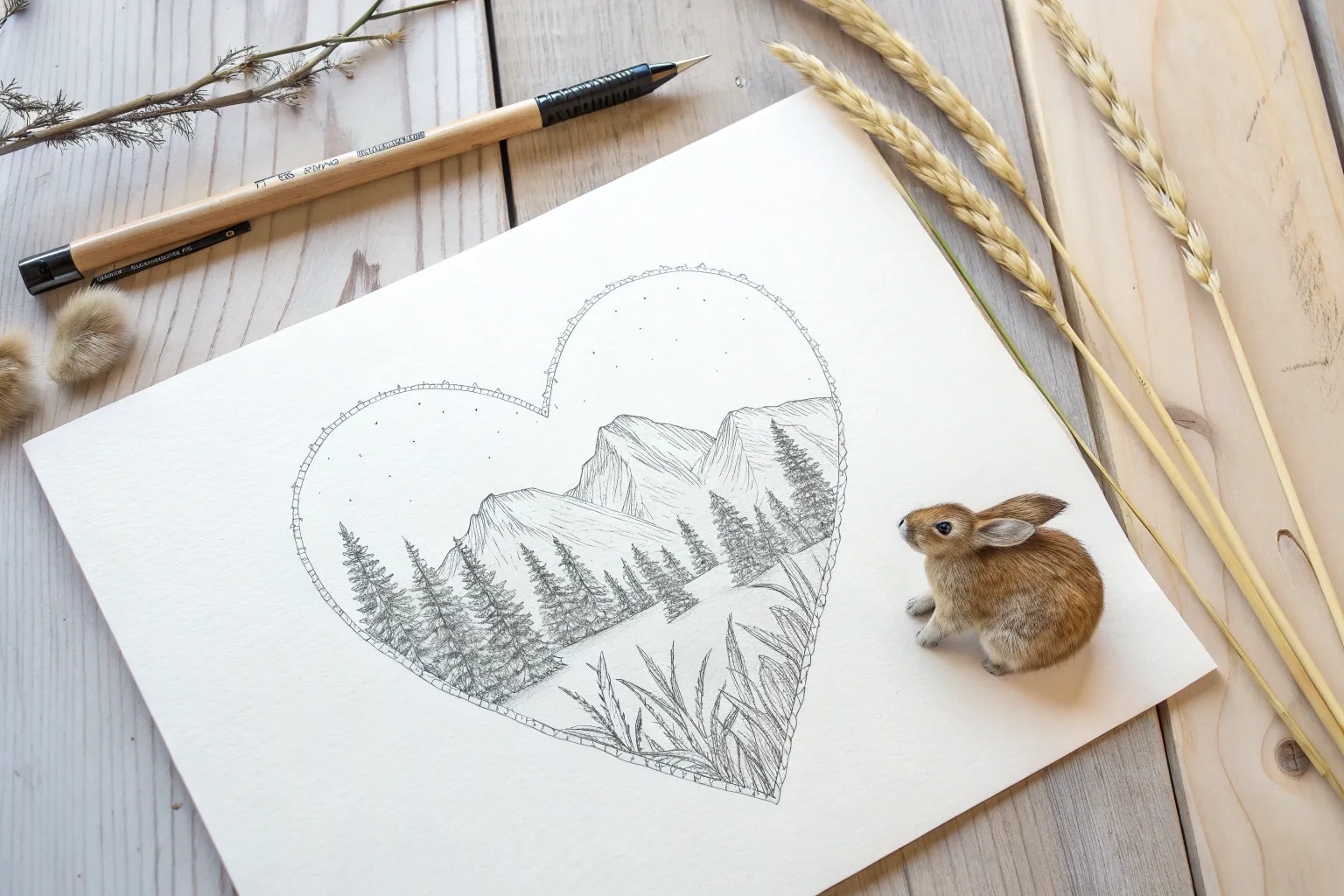
Starry Night Window
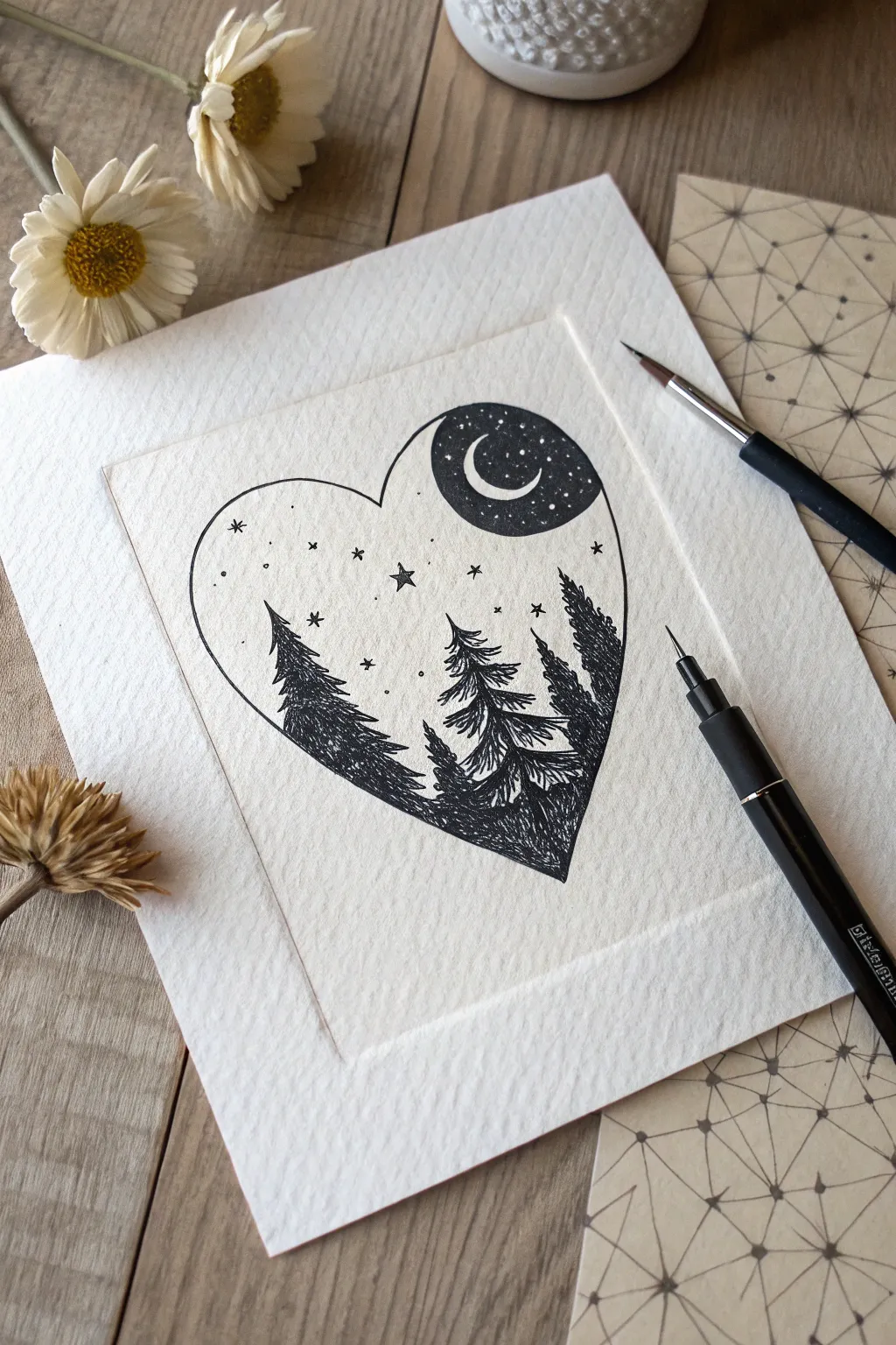
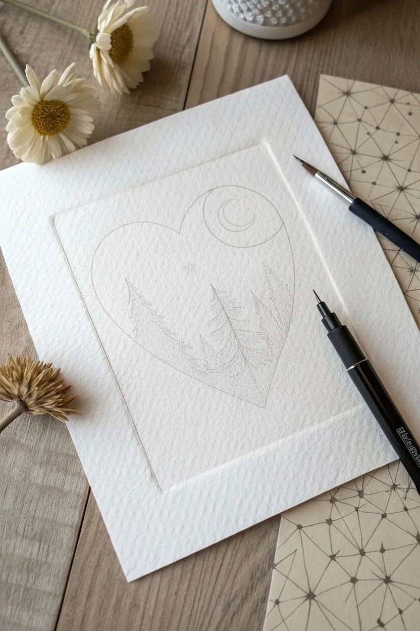
Capture the serenity of a mountain night within a simple heart silhouette using fine liner pens. The contrast between heavy ink textures and the white paper creates a striking window into a starry pine forest.
Step-by-Step
Materials
- Heavyweight textured paper (watercolor or printmaking paper)
- HB Pencil and kneadable eraser
- Black fine liner pens (sizes 0.05, 0.1, and 0.5)
- Black brush pen or thick marker
- Compass or small circular object (like a coin)
Step 1: Planning the Composition
-
Outline the heart:
Begin by lightly sketching a large, symmetrical heart shape in the center of your textured paper using your HB pencil. -
Sketch the forest:
Draw the rough outlines of three or four pine trees rising from the bottom point of the heart. Vary their heights, placing the tallest tree slightly off-center for a balanced look. -
Position the moon:
In the upper right lobe of the heart, trace a perfect circle using a compass or by tracing a small circular object. -
Moon details:
Inside that circle, sketch a thin crescent moon shape on the left side. Mark a few tiny dots where you want stars to remain white.
Step 2: Inking the Scene
-
Main outline:
Using a 0.5 fine liner, go over the main heart outline with a steady hand. I find it helps to rotate the paper so you are always pulling the pen line toward you. -
Tree silhouettes:
Switch to a 0.1 pen to outline the jagged edges of the pine trees. Use short, zig-zag scribbles to mimic the look of pine needles. -
Building tree texture:
Fill the body of the trees with directional hatching—lines that follow the downward slope of the branches. -
Deepening shadows:
Use a brush pen or thicker marker to fill in the deepest parts of the trees near the bottom, merging them into a solid shadow while keeping the upper branches airy and detailed. -
Moon preparation:
With your 0.05 fine liner, carefully trace the outline of the crescent moon and the tiny star dots inside the circle area so you don’t accidentally color over them. -
Filling the night sky:
Use a 0.5 pen or brush pen to fill the rest of the circular moon shape with solid black ink, leaving your crescent and star dots purely white.
Keeping it Clean
Place a scrap piece of paper under your drawing hand. This prevents natural oils or smudged ink from transferring onto that beautiful white scenery.
Step 3: Atmospheric Details
-
Drawing large stars:
In the open space of the heart, draw a few five-pointed stars or asterisks using your finest pen. Scatter them randomly but keep them sparse. -
Adding stardust:
Dot the pen tip gently around the larger stars to create distant specks of light. Focus these slightly more around the trees for a magical atmosphere. -
Clean up:
Wait at least 15 minutes for the ink to fully cure, then gently erase all visible pencil lines with a kneadable eraser. -
Final contrast check:
Step back and look at your drawing. If the trees look too grey, go back in with your thickest pen and add more solid black near the base to anchor the image.
Level Up: Galactic Glow
For a magical touch, use a metallic silver or gold gel pen to draw the stars and crescent moon instead of leaving the paper white.
Now you have a tranquil night scene perfect for a greeting card or framed wall art.
Blooming Anatomical Heart
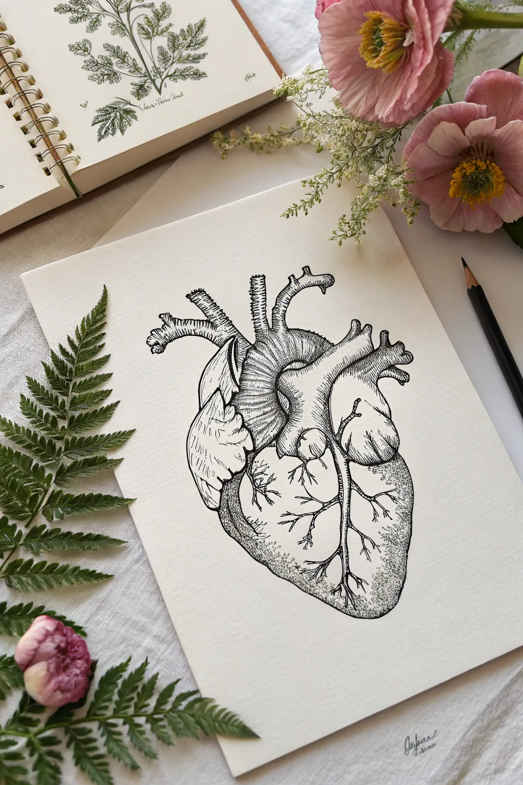
Capture the intricate beauty of biology with this scientific illustration style drawing. By combining precise line work with stippling techniques, you will create a textured, vintage-inspired anatomical heart that looks like it belongs in a Victorian medical journal.
Detailed Instructions
Materials
- High-quality mixed media or hot press watercolor paper
- HB or 2H graphite pencil
- Kneaded eraser
- Black archival fineliner pens (sizes 0.05, 0.1, and 0.5)
- Reference image of heart anatomy
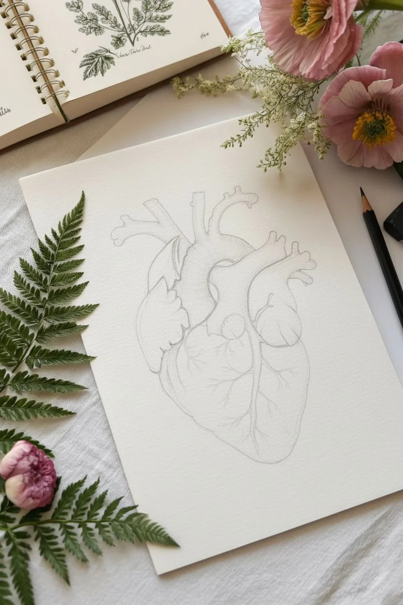
Step 1: Structural Sketching
-
Establish the curve:
Begin with a light pencil sketch of a large, tilted mango shape to form the main body of the heart, angling the bottom point slightly to the right. -
Divide the chambers:
Lightly sketch a curved line separating the left and right ventricles, roughly following the natural indentation where the major coronary artery sits. -
Add the vessels:
Sketch the major vessels at the top, drawing the large arch of the aorta curling over the center and the pulmonary artery emerging from underneath it. -
Detail the entry points:
Add the superior vena cava on the upper left (viewer’s left) and the pulmonary circular veins on the right, keeping the edges organic and slightly uneven.
Dot Control
Hold your pen completely vertical when stippling. This creates perfectly round dots rather than dashes, keeping the texture clean and preventing the ink tip from wearing down unevenly.
Step 2: Defining Outlines
-
Ink the perimeter:
Using your 0.5 pen, trace the heavy outer contour of the heart’s main body. I prefer to use a slightly broken line here rather than a solid one to suggest tissue texture. -
Outline the vessels:
Switch to a 0.1 pen to outline the delicate arteries and veins at the top, ensuring the tubes look cylindrical by slightly curving the lines at the open ends. -
Map the surface veins:
Draw the branching coronary arteries across the front of the heart, making them taper from thick to thin as they stretch downward like tree roots. -
Erase guidelines:
Once the ink is fully dry, gently remove the graphite sketch with a kneaded eraser to reveal a clean framework.
Step 3: Texture and Shading
-
Texture the aorta:
With the 0.05 pen, draw closely spaced, curved horizontal lines across the arch of the aorta to mimic the ridged texture of the prominent vessel. -
Shade the muscle fibers:
Use fine hatching lines on the main ventricles, following the curvature of the form to show the direction of the muscle fibers. -
Deepen the crevices:
Use cross-hatching (overlapping lines) in the deepest indentations where the vessels overlap the heart to push those areas into shadow. -
Start stippling:
Begin adding dots (stippling) with your 0.1 pen at the very bottom curve of the heart to create a gradient shadow. -
Build density:
Increase the density of dots on the right side of the heart and underneath the main diagonal artery to add three-dimensional volume. -
Highlight the veins:
Add tiny clusters of dots along the undersides of the branching surface veins, leaving the tops of them white to make them look raised and rounded. -
Refine the top vessels:
Add light vertical hatching strokes to the vena cava and smaller upper vessels, keeping the center of each tube clear for a highlight. -
Balance the contrast:
Step back and check your work; darken the darkest shadows with the 0.5 pen using tight stippling to ensure high contrast against the paper.
Make it Bloom
To truly match the ‘blooming’ theme, try drawing wildflowers or ferns sprouting directly from the superior vena cava or aorta openings instead of just arranging them around the paper.
Now you have a striking piece of anatomical art perfect for framing or gifting.
Brick Wall Foundation
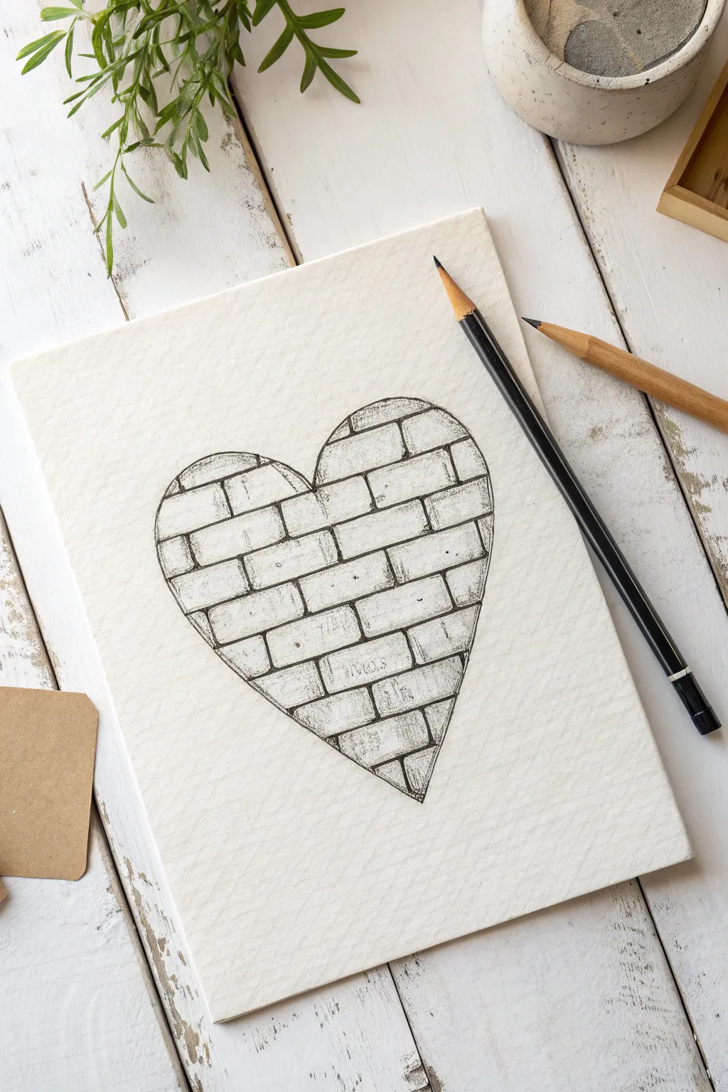
Draw a sturdy, textured symbol of affection with this brick-filled heart project. Using simple graphite shading techniques on textured paper, you will turn a flat outline into a dimensional masonry masterpiece.
Step-by-Step Tutorial
Materials
- Cold press watercolor paper or textured sketch paper
- HB graphite pencil (for sketching)
- 2B or 4B graphite pencil (for shading)
- Vinyl eraser
- Pencil sharpener
Step 1: Drafting the Structure
-
Outline the heart:
Begin by lightly sketching a large, symmetrical heart shape in the center of your paper using your HB pencil. -
Create horizontal guides:
Draw horizontal lines across the entire heart width. -
Add volume:
Curve these horizontal lines slightly downward in the middle to give the heart a sense of roundness and volume, rather than looking perfectly flat. -
Space the rows:
Ensure the spacing between the horizontal lines mimics the height of standard bricks. -
Mark vertical joints:
Sketch short vertical lines between the rows to define individual bricks. -
Stagger the pattern:
Offset these vertical lines on every alternating row to create a classic ‘running bond’ masonry pattern. -
Adjust edge bricks:
Where the bricks meet the curved edge of the heart, allow the lines to cut off naturally, as if the wall was built into this shape.
Flat Appearance?
If the bricks look too flat, deepen the shadows specifically on the bottom edge of each brick. This implies an overhead light source and instantly adds 3D weight.
Step 2: Defining the Stones
-
Round the corners:
Switch to your 2B pencil and retrace the individual brick shapes, slightly rounding the sharp corners to make them look like aged stone. -
Create separation:
Leave a small gap between neighbor bricks to represent the mortar or grout lines. -
Wobbly lines:
Avoid using a ruler for this stage; a naturally shaky hand makes the texture look more organic and weathered. -
Darken the mortar:
Fill in the gaps between the bricks with firm, dark pressure to push the grout lines into the background. -
Refine the perimeter:
Go over the main heart outline with a bold, dark stroke to cleanly frame the brickwork.
Step 3: Shading and Texture
-
Base shading:
Use the side of your pencil lead to lightly shade the face of every brick, letting the grain of the textured paper show through. -
Add dimension:
Apply slightly more pressure to the bottom and right edges of each individual brick to create a cast shadow effect. -
Stipple details:
Dot the pencil point randomly (stippling) on various bricks to mimic pores and pitting in the clay. -
Create imperfections:
Draw tiny cracks or chips on a few random bricks to break up the uniformity. -
Lift highlights:
I like to take my eraser and dab the center of a few bricks to create a ‘sun-bleached’ highlight for extra contrast. -
Final contrast check:
Deepen the darkest shadows in the grout lines one last time to ensure the bricks pop forward.
Carved in Stone
Personalize the drawing by sketching faint initials or a date onto a central brick before shading. Shade carefully around the letters to make them look engraved.
Now you have a solid, beautifully textured artwork that speaks to strong foundations
The Twisted Tree of Life
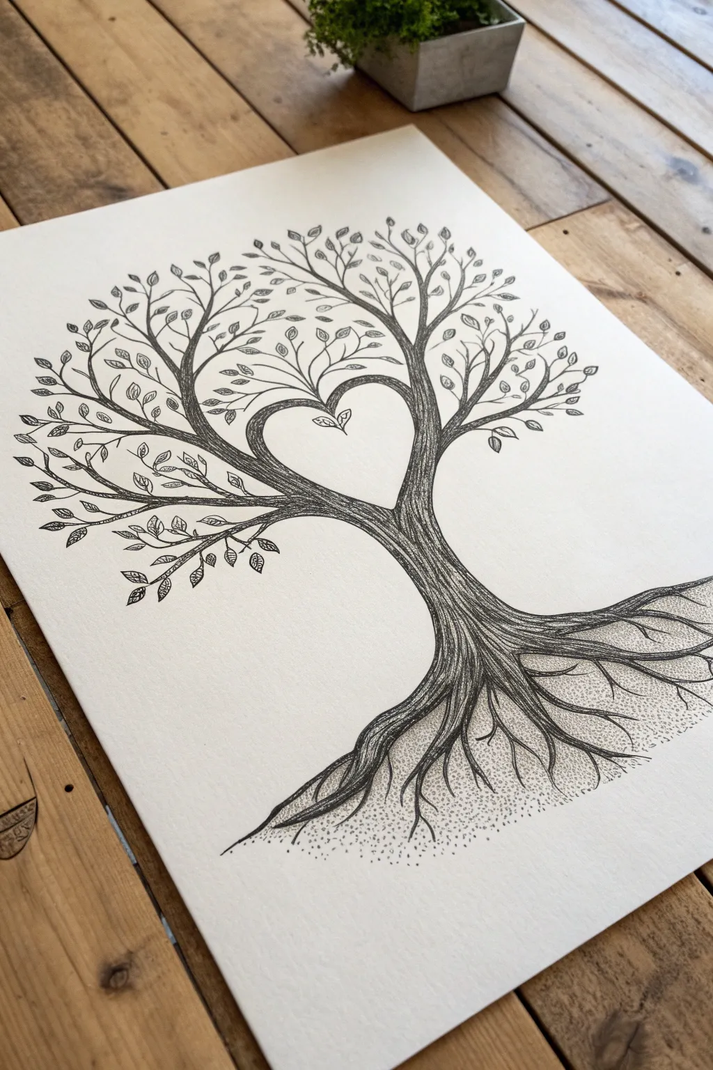
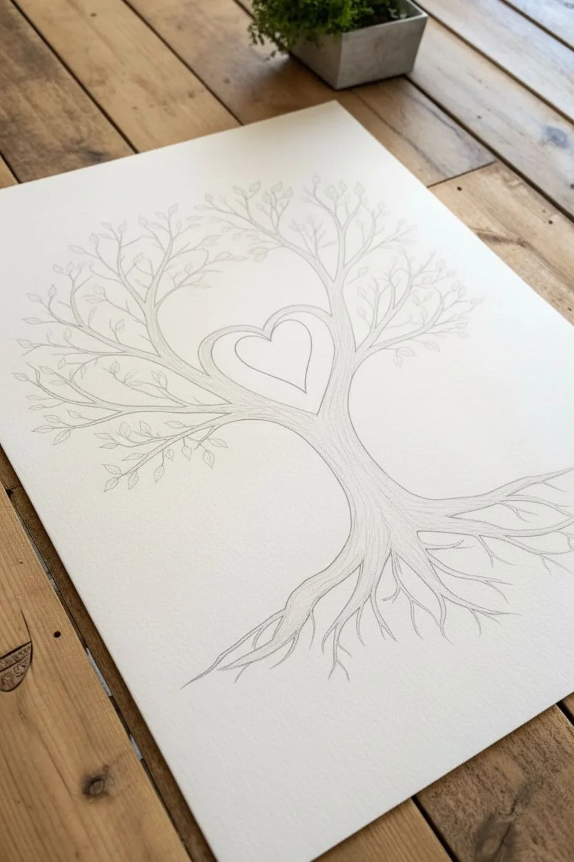
This romantic ink illustration features a gnarled tree trunk that divides to form a perfect negative-space heart in the center of its canopy. Using standard fine liners and texturing techniques, you will build up organic bark patterns and delicate roots.
How-To Guide
Materials
- Heavyweight drawing paper or Bristol board
- HB Pencil
- Kneaded eraser
- Black fine liner pens (0.1, 0.3, and 0.5 mm tips)
Step 1: Sketching the Skeleton
-
Define the centerpiece:
Start with your pencil by lightly drawing a symmetrical heart shape in the upper center of your paper. This will serve as the negative space, so keep the inside empty. -
Draft the trunk:
Draw two main trunk lines rising from the bottom, widening at the base and narrowing as they reach the bottom of your pencil heart. -
Form the heart branches:
Split the trunk into two primary branches that follow the outer curve of your pencil heart, wrapping around it to define the shape. -
Add twisting branches:
Sketch secondary branches extending outward from the main heart curves, letting them flick upwards and outwards organically. -
Ground the tree:
At the base, sketch thick, gnarled roots that spread wide and taper into the imaginary ground line.
Step 2: Inking the Structure
-
Outline the trunk:
Switch to a 0.5 mm pen. Carefully trace the outer edges of the trunk and the main heart-shaped boughs, using a slightly shaky hand to simulate natural bark texture. -
Ink the roots:
Continue the 0.5 mm line work down into the roots, letting the lines overlap slightly where roots cross over one another. -
Extend the branches:
Trace the smaller outer branches. As you get further from the center, lift your pen pressure to make the tips taper off to a point. -
Create bark texture:
Using a 0.3 mm pen, draw long, flowing vertical lines running up the trunk. I like to let these lines weave and bump into each other like flowing water to mimic grain. -
Shade the curves:
Add extra vertical hatching lines on the undersides of the heart-branches and the sides of the trunk to create a rounded, 3D cylindrical look.
Flow with the Grain
When drawing bark texture, avoid perfectly straight lines. Let your pen follow the curve of the branch; if the branch bends left, your bark lines should curve left too.
Step 3: Foliage and Atmosphere
-
Draw the leaves:
Switch to the 0.3 mm pen. along the outer branches, draw small, simple almond shapes for leaves. Vary their angles so they don’t look too uniform. -
Detail the leaves:
With your finest 0.1 mm pen, draw a tiny center vein in each leaf and add subtle shading to the leaves that are tucked behind branches. -
Clean up:
Once the main ink is thoroughly dry, gently erase all your initial pencil guidelines, including the heart outline, leaving only the ink. -
Add a center accent:
Draw two tiny leaves floating in the center of the open heart space, or hanging from the point where the boughs meet, to create a focal point. -
Stipple the ground:
Use the 0.3 mm pen to create dots (stippling) between the roots. Cluster dots densely near the wood and spread them out as you move away to fade into the white paper.
Carve Your Initials
Personalize the artwork by subtly incorporating your initials or a significant date into the bark pattern on the main trunk, just like a classic tree carving.
Step 4: Final Details
-
Deepen the contrast:
Go back with the 0.1 mm pen and add very fine sketching lines in the deepest crevices of the roots and bark to increase the contrast. -
Refine branch connections:
Check where small branches meet the big boughs; add small curved lines at the joints to make them look seamlessly connected rather than stuck on. -
Final nuances:
Add a few stray dots or tiny floating leaves around the outer canopy to give the piece a sense of movement.
Display your finished drawing in a natural wood frame to emphasize the organic theme


Have a question or want to share your own experience? I'd love to hear from you in the comments below!