There is something utterly grounding about picking up a pencil and capturing the raw beauty of the world around us, turning a blank page into a serene escape. Whether you are looking to practice your shading techniques or simply need a spark of inspiration for your next sketchbook spread, these nature-inspired prompts are designed to help you relax and create.
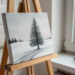
The Classic Pine Tree Silhouette
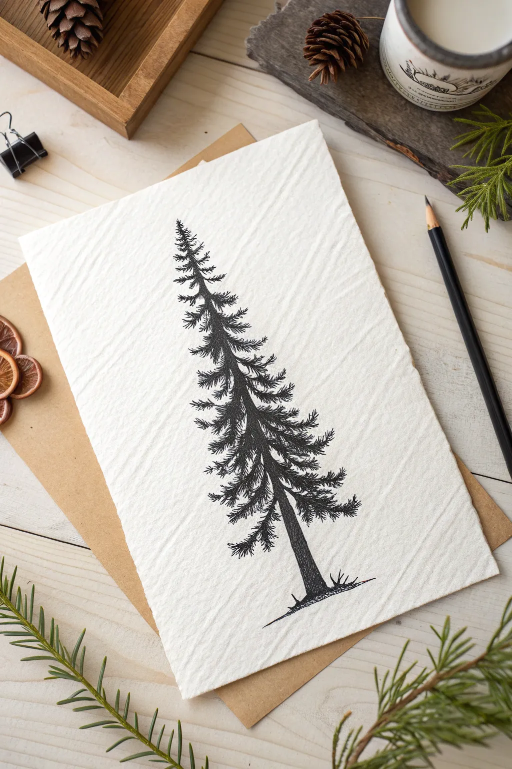
Capture the stoic beauty of an evergreen with this high-contrast pen and ink drawing. Using simple stippling and hatching techniques on textured paper creates a rustic, organic feel perfect for cards or wall art.
How-To Guide
Materials
- Cold press watercolor paper or handmade cotton paper
- Fine liner pens (sizes 0.1, 0.3, and 0.5)
- HB Drawing pencil
- Kneadable eraser
- Ruler
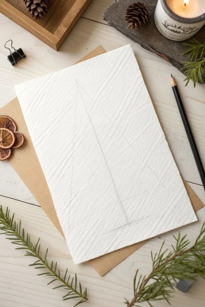
Step 1: Structural Sketch
-
Establish the centerline:
Using your ruler and pencil, lightly draw a vertical line down the center of your paper to act as the trunk guide. -
Mark boundaries:
Determine the total height of the tree by marking a top point and a bottom baseline, leaving plenty of white space at the margins. -
Define the width:
Lightly sketch a very narrow, tall triangle connecting the top point to the bottom width. This prevents your tree from becoming too wide as you work down. -
Sketch the trunk base:
At the very bottom, sketch a thick trunk section and a few horizontal scribbles to represent the ground.
Step 2: Inking the Canopy
-
Start at the apex:
Switch to your 0.1 fine liner. Begin at the very top point with small, vertical flicking strokes to create the tip of the tree. -
Form the upper branches:
Moving slightly down, create short, jagged horizontal zig-zags. These shouldn’t be straight lines, but rather irregular scribbles that mimic needle clusters. -
Angle the growth:
As you move down the first inch, angle your strokes slightly upward to suggest new growth reaching for the sun. -
Create distinct layers:
Leave tiny gaps of white space between these upper clusters. I prefer to keep these gaps random to avoid a ‘ladder’ effect. -
Widen the stroke:
As the tree widens, extend your jagged strokes further out from the center line, keeping the tips uneven and feathery.
Blob Control
If your tree looks too heavy or solid, you aren’t leaving enough white space. Don’t outline the branches first; build them purely through texture and separate scribbles.
Step 3: Building Density
-
Thicken the core:
Switch to a 0.3 pen. Go back over the central spine of the tree, adding denser scribbles close to the imaginary trunk line to create depth. -
Downward sweep:
As you move past the halfway point, start angling the main branches slightly downward, as mature pine boughs tend to droop. -
Varied texture:
Use a mix of tight dots and loose scratches. Detailed texture in the center implies shadow, while lighter strokes on the edges imply light. -
Break the symmetry:
Intentionally make some branches longer than others. If one side looks too perfect, add a rogue branch sticking out. -
Manage the gaps:
Continue to leave horizontal slivers of white paper between the heavy branch masses so the tree doesn’t look like a solid black triangle.
Snowy Scene
To add a winter touch, use a white gel pen after the black ink is dry. Add small dabs of white on the tops of the widest branches to mimic resting snow.
Step 4: Trunk and Grounding
-
Draw the trunk:
Switch to the 0.5 pen for the exposed trunk at the base. Outline the sides, tapering slightly as it goes up into the needles. -
Texture the bark:
Fill the trunk with vertical, slightly wavy lines. Pack them closely on the right side to suggest a shadow source. -
Ground the subject:
Use quick, scratchy horizontal strokes at the base of the trunk to create the forest floor, extending just past the tree’s width. -
Add grassy details:
Add a few tiny, upward V-shaped ticks on the ground line to represent stray grasses or dropped needles. -
Final cleanup:
Wait at least 15 minutes for the ink to fully cure, then gently roll your kneadable eraser over the paper to lift the pencil guides.
Now you have a timeless botanical illustration ready to be framed or gifted.

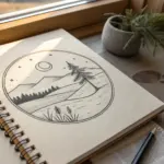
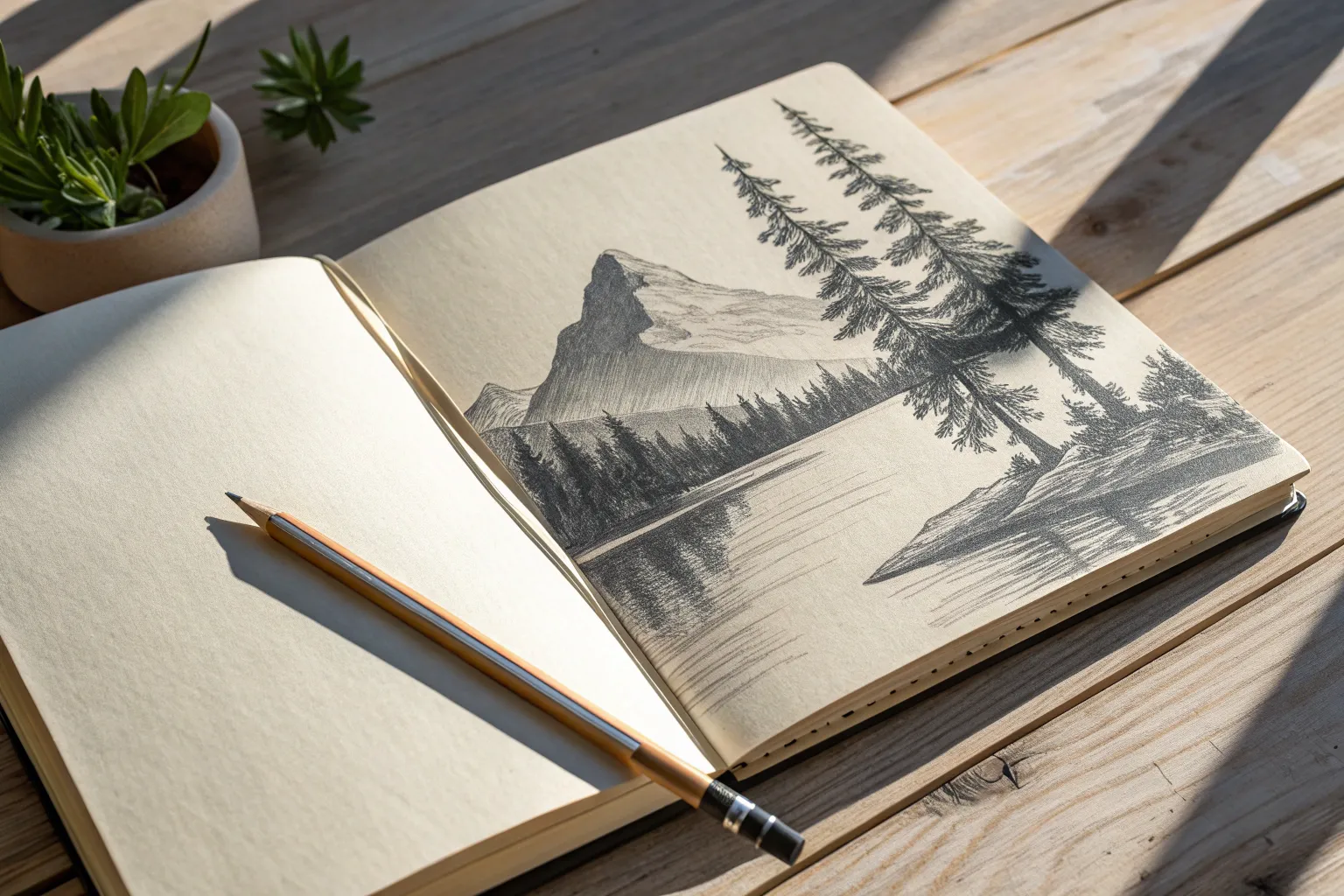
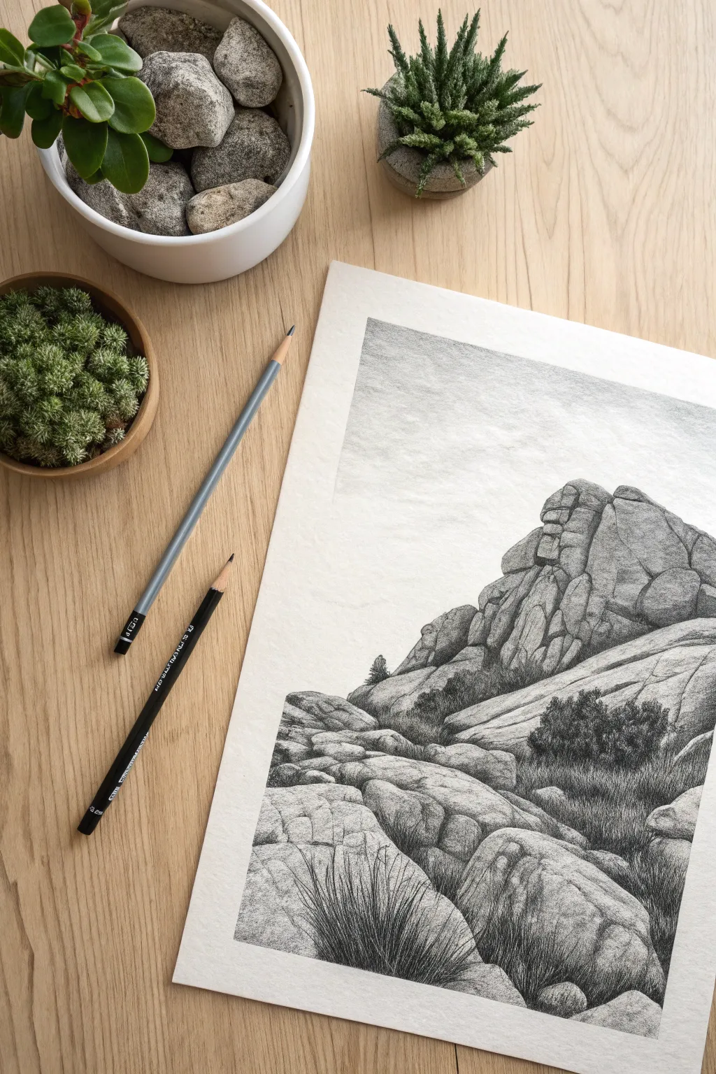
Serene Mountain Valleys
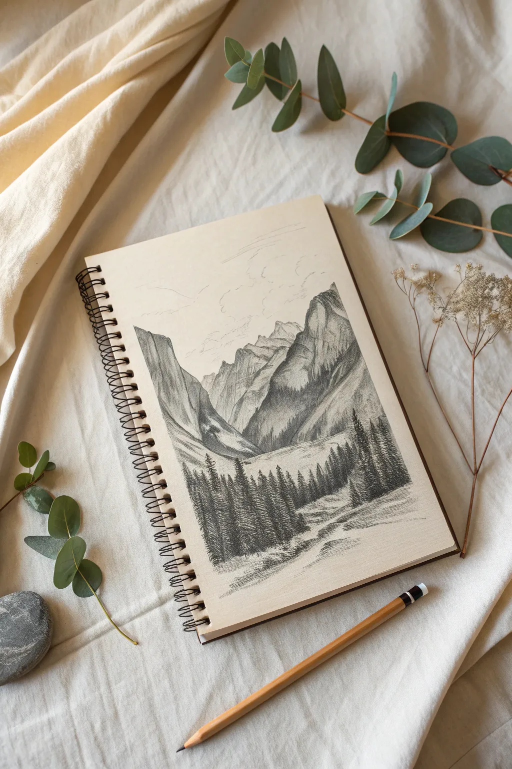
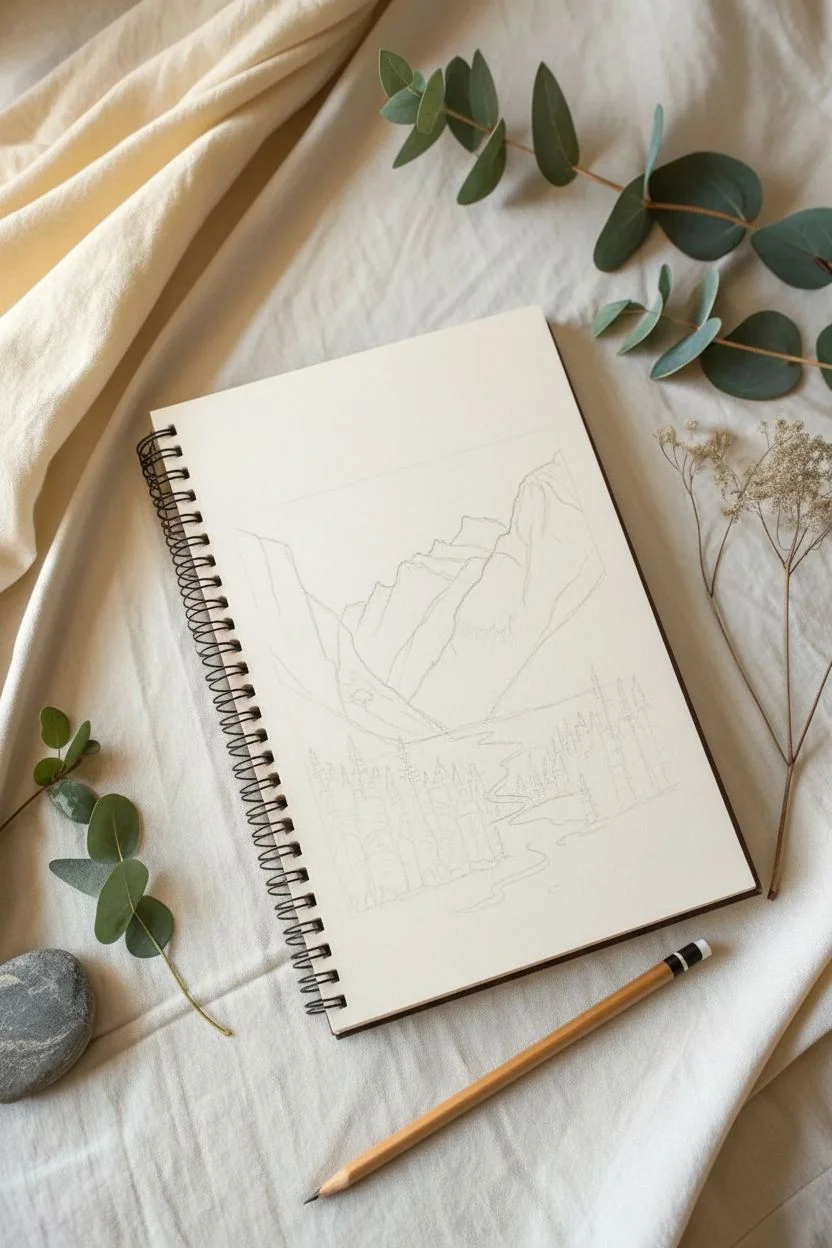
Capture the stillness of high-altitude wilderness with this monochromatic landscape sketch. By focusing on value contrast between the rugged mountains and the dark, dense pine forest, you will create a sense of immense depth and tranquility.
Step-by-Step Tutorial
Materials
- Sketchbook (cream or off-white paper recommended)
- Graphite pencils (HB, 2B, 4B, and 6B)
- Kneaded eraser
- Pencil sharpener
- Scrap paper (to rest your hand on)
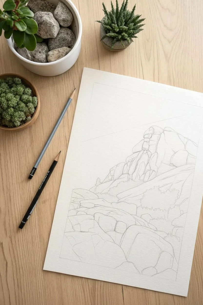
Step 1: Laying the Composition
-
Establish the horizon:
Using your HB pencil with very light pressure, draw a faint line roughly one-third up from the bottom of the page to mark where the valley floor meets the mountains. -
Outline the peaks:
Sketch the jagged silhouette of the mountains in the background. Create a large, steep peak on the right side and a smaller, receding range on the left. -
Block in the foreground:
Lightly outline the mass of the pine forest at the bottom of the page, dipping in the center to suggest a valley clearing or riverbed. -
Define the water flow:
Draw faint, winding lines through the center clearing to indicate the path of a stream flowing from the mountains toward the viewer.
Smudge Alert
Graphite smears easily. Place a piece of scrap paper under your drawing hand to protect the finished areas while you work on the rest.
Step 2: Sculpting the Mountains
-
Map the shadows:
Decide on a light source (coming from the left in this example). Use the HB pencil to lightly outline the shadow shapes on the right facets of the mountain peaks. -
Initial shading:
Switch to a 2B pencil and fill in the shadow areas of the mountains with diagonal hatching. Keep the strokes distinct to mimic the texture of rock. -
Add rocky texture:
Draw jagged, vertical fissures and cracks down the face of the mountains using the sharp tip of the 2B pencil. This gives the stone its rugged, weathered look. -
Deepen the crevices:
With a 4B pencil, darken the deepest crevices and the areas where the mountains overlap. This separates the peaks from one another. -
Refine the edges:
Go back over the ridges of the mountains with a firm line to make the peaks stand out explicitly against the sky.
Step 3: Creating the Pine Forest
-
Start the treeline:
Begin on the left side of the foreground. Draw vertical lines to act as the trunks for the tallest pine trees. -
Add foliage texture:
Using a 4B pencil, use a scribbling or zig-zag motion starting narrow at the top of the trunk and getting wider towards the bottom to create pine branches. -
Build density:
Fill in the gaps between distinct trees with dark shading to simulate a dense forest. I like to keep the tops of the trees detailed while letting the bottoms merge into shadow. -
Foreground contrast:
Switch to your 6B pencil for the trees closest to the viewer. Press firmly to create rich, dark blacks. This high contrast pushes the grey mountains into the distance. -
Right-side forest:
Repeat the pine tree process on the right side of the paper, generally making these trees slightly taller to frame the composition.
Level Up
Use a white gel pen to add tiny dots of snow on the mountain peaks or sparkling highlights on the water for an extra pop of realism.
Step 4: Atmosphere and Details
-
Shade the valley floor:
Use the HB pencil to add soft, horizontal strokes across the clearing. This suggests flat ground or grass without drawing too much attention. -
Detail the stream:
Darken the banks of the stream slightly. Add horizontal ripple lines in the water area, leaving plenty of white paper showing for reflections. -
Draw clouds:
With a blunt HB pencil, lightly sketch wispy, cumulus cloud shapes in the sky above the peaks. Keep the lines broken and airy. -
Final assessment:
Stand back and look at your contrast. If the mountains look too pale, add a light layer of shading over their shadowed sides to solidify them. -
Clean up:
Use the kneaded eraser to pick up any stray graphite dust from the sky area and sharpen the edges of the white highlights in the stream.
Close your sketchbook knowing you have captured a breath of fresh mountain air on the page.


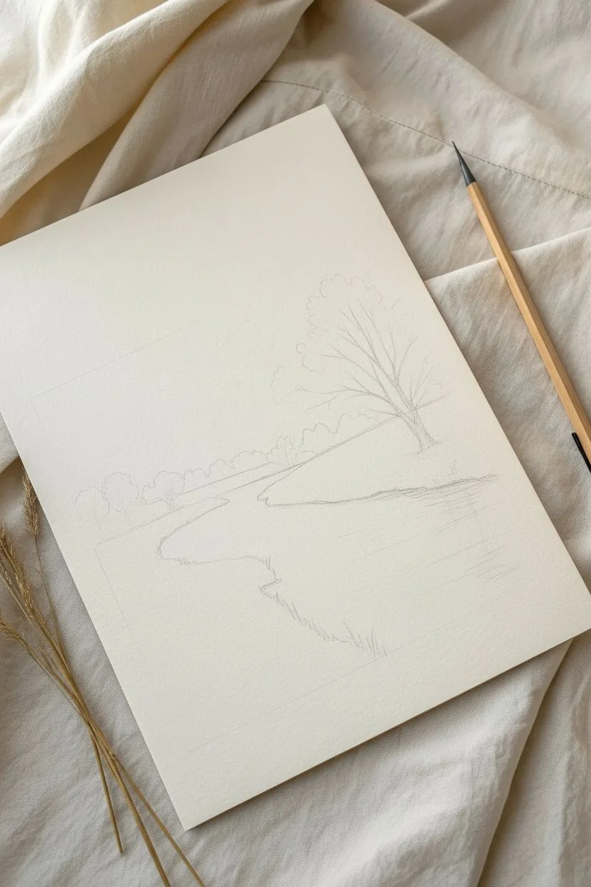
Riverside Banks and Reflections
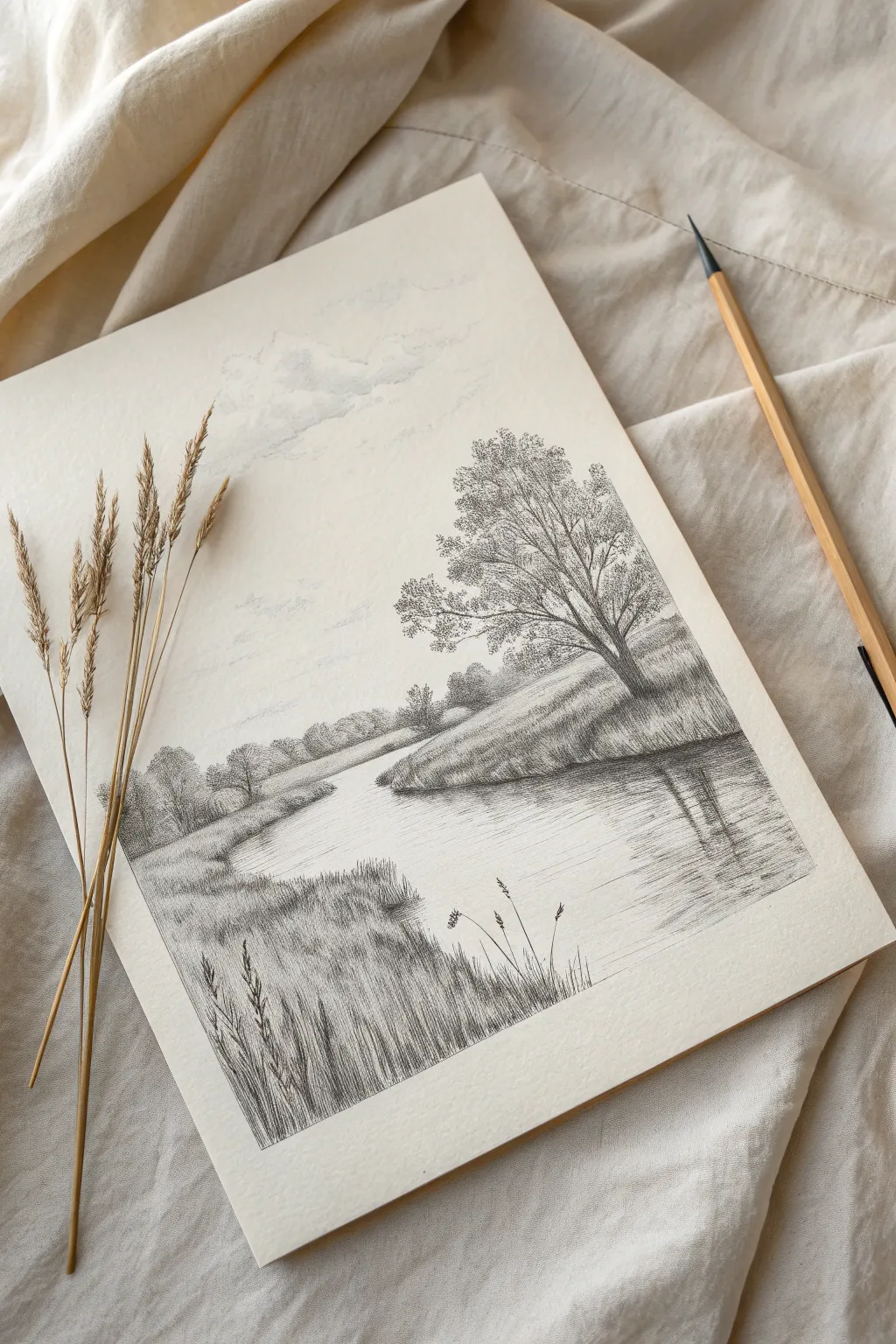
Capture the quiet beauty of a winding river landscape using traditional graphite shading techniques. This project focuses on atmospheric perspective, realistic foliage textures, and the delicate art of drawing water reflections.
How-To Guide
Materials
- Heavyweight drawing paper or sketchbook
- Graphite pencils (HB, 2B, 4B)
- Kneaded eraser
- Precision eraser or eraser shield
- Pencil sharpener
Step 1: Laying the Landscape
-
Establish the horizon:
Lightly sketch a horizontal line roughly one-third of the way up the page using an HB pencil. This keeps the composition grounded. -
Map the river’s path:
Draw the banks of the river with sweeping, natural curves. Start from the wide foreground and narrow the river as it winds toward the horizon line to create perspective. -
Place the trees:
Sketch the skeleton of the main tree on the right bank, focusing on the trunk’s angle and main branches. Lightly outline the shapes of the distant tree clusters in the background.
Step 2: Sky and Distance
-
Cloud formation:
Using the side of your HB pencil, lightly scumble organic shapes in the sky. Leave patches of white paper showing through to represent the fluffy tops of the clouds. -
Background foliage:
Fill in the distant tree line near the horizon. Keep these values light and soft, avoiding hard outlines to push them into the distance. -
Distant details:
Add faint horizontal strokes on the water surface near the horizon line to suggest the river continuing into the distance.
Atmospheric Depth
Fade values as you go back. Foreground should be dark and crisp (4B), while the background trees should be misty and light (HB) to create depth.
Step 3: The Hero Tree
-
Darken the trunk:
Switch to a 2B pencil to define the tree trunk on the right bank. Add texture to the bark with vertical hatching marks. -
Create leaf clusters:
Use a stippling or small circular scribbling motion to create the foliage canopy. Group these marks into cloud-like clusters rather than drawing individual leaves. -
Shadows and depth:
I like to switch to a 4B pencil here to deepen the shadows on the underside of the foliage clumps, giving the tree volume and form. -
Bank texture:
Shade the grassy bank sloping down to the water. Use diagonal hatching strokes that follow the curvature of the land to show the slope.
Reflection Trouble?
If the water looks like a cliff, add more horizontal lines. These cut across the vertical reflections and tell the eye the surface is flat liquid.
Step 4: Water Reflections
-
Vertical reflection lines:
Directly under the main tree and bank, draw vertical strokes downward into the water. These strokes should mirror the darkness of the object being reflected. -
Blurring the edges:
Keep the edges of your reflection strokes slightly softer than the actual tree to show movement in the water. -
Surface tension:
Cut across your vertical reflection lines with occasional thin, horizontal strokes to suggest ripples on the water’s surface.
Step 5: Foreground Focus
-
Foreground bank:
On the bottom left, shade the closest section of the riverbank significantly darker than the background. High contrast here brings this area forward. -
Grassy texture:
Use upward, flicking strokes to create the look of dense, unkempt grass along the nearest edge. -
Tall reeds:
Draw several prominent, tall grass stalks or reeds rising from the bottom left corner. Press firmly at the base of the stroke and lift quickly for a tapered tip. -
Reed heads:
Add small, textured seeds or heads to the tops of the tallest grasses using tiny dots or dashes. -
Final contrast check:
Use your darkest pencil to deepen the darkest shadows in the foreground grass and the base of the main tree trunk to finalize the range of values.
Sign your name in the corner and admire a peaceful scene created entirely with graphite lines.


Minimalist Infinite Horizons
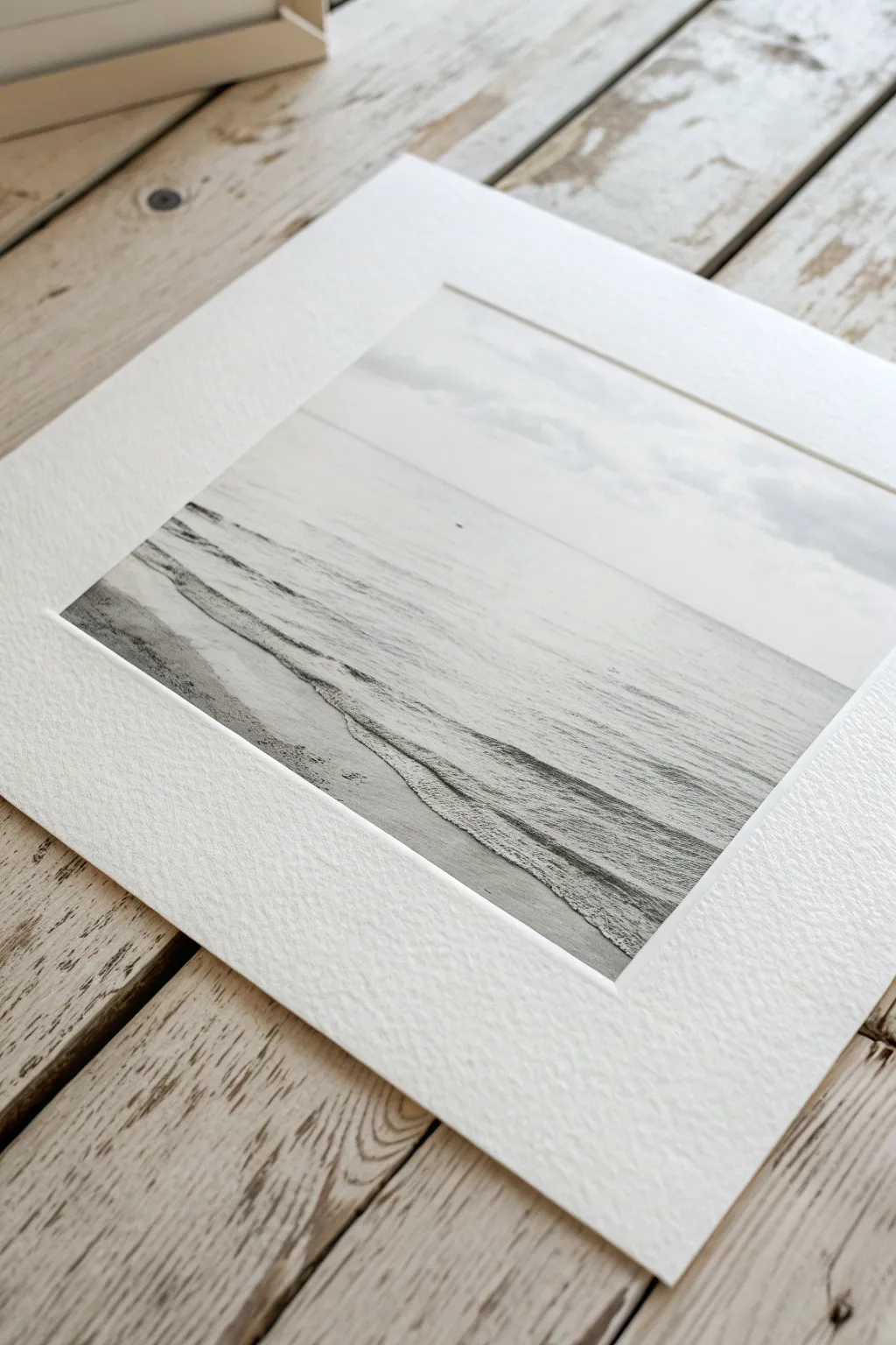
Capture the stillness of a quiet shoreline with this minimalist graphite drawing technique. This project relies on subtle gradation and texture to create a photorealistic seascape that looks incredibly high-end when matted.
Step-by-Step Guide
Materials
- Heavyweight drawing paper (medium tooth)
- Graphite pencils (4H, HB, 2B, 4B)
- Kneaded eraser
- Precision stick eraser (Mono Zero)
- Blending stumps or soft tissue
- Ruler
- Low-tack masking tape
- White mat board (for framing)
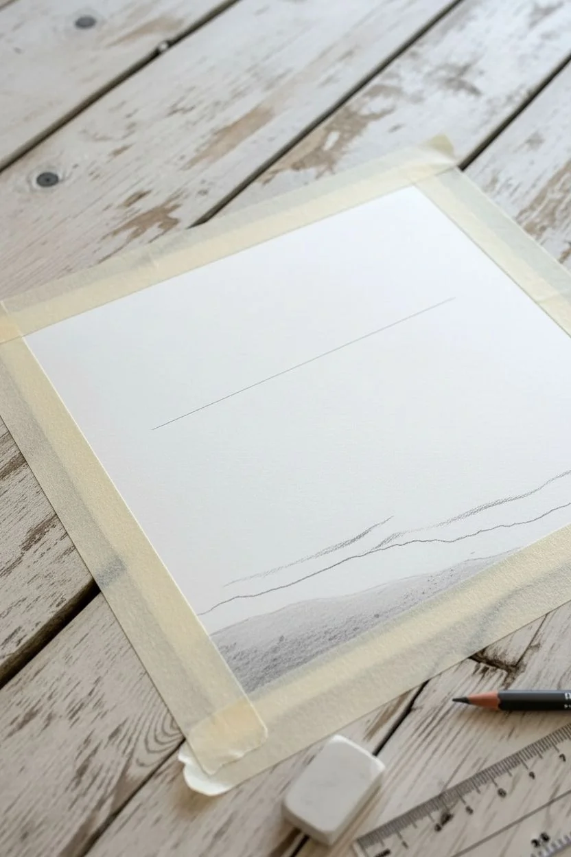
Step 1: Setting the Scene
-
Secure the borders:
Begin by taping the edges of your paper to your drawing board using low-tack masking tape. This secures the sheet and creates the crisp, clean white border seen in the final image. -
Establish the horizon:
Using a ruler and your 4H pencil, draw a perfectly straight horizontal line across the paper. Place this line about one-third of the way down from the top edge to balance the sky and sea. -
Map the shoreline:
Lightly sketch two or three gentle, diagonal curves in the bottom half of the paper to indicate where the water meets the sand. These lines shouldn’t be straight; imply the natural irregularity of water.
Step 2: The Atmosphere
-
Shade the sky base:
Turn your 4H pencil on its side and lightly shade the sky area vertically. Keep the pressure extremely light to maintain that high-key, airy heavy atmosphere. -
Blend for softness:
Take a soft tissue and blend the sky graphite using circular motions. The goal is a seamless grey fog with no visible pencil strokes. -
Lift out clouds:
Form your kneaded eraser into a wedge and gently dab or drag it across the blended sky to lift subtle white highlights, creating faint, distant cloud formations.
Smudge Prevention
Graphite travels easily. Always keep a clean sheet of scrap paper under your drawing hand. This acts as a shield, preventing skin oils from hitting the paper and stopping your palm from smearing your hard work.
Step 3: The Water
-
Define the horizon edge:
Switch to an HB pencil. Just below the horizon line, add a horizontal band of shading. This should be slightly darker than the sky to separate water from air. -
Create distance:
Use strictly horizontal strokes to shade down from the horizon towards your wave lines. I find that lifting the pencil at the end of each stroke prevents heavy spots. -
Fade the water:
As you move closer to the foreground wave lines, decrease your pressure. The water should transition from a mid-grey at the horizon to nearly white at the shore. -
Blend the ocean:
Smooth out the water area with a blending stump. Drag the graphite horizontally to mimic the movement of currents, fading it out before you reach the sketched wave lines.
Pro Tip: Eraser Stamps
For realistic sea foam, press a sticky kneaded eraser firmly onto a rough surface (like sandpaper) then dab it onto your drawing. It stamps a perfect, messy organic texture that looks just like bubbles.
Step 4: The Shoreline Details
-
Establish wet sand:
Below the wave lines, use a 2B pencil to shade the sand. Wet sand reflects the sky, so it should be a medium grey, slightly smoother than dry sand. -
Create the foam edge:
This step requires precision. Use the 2B pencil to darken the sand immediately *underneath* the wave line. This shadow makes the white paper above it look like raised sea foam. -
Texture the foam:
Use the stippling technique (tiny dots) with a dull HB pencil just inside the white wave area to simulate bubbles and spray. Keep this sparse; let the white paper do the work. -
Detail the wash:
Draw faint, irregular lines trailing back from the main wave into the ocean area. These suggest previous waves retreating. -
Add sand texture:
In the very bottom foreground, use the side of a 4B pencil to loosely drag texture over the paper. The paper’s tooth will catch the graphite, creating a grainy sand effect.
Step 5: Final Polish
-
Sparkle effects:
Take your precision eraser (or a sliced chunk of a standard eraser) and lift out tiny crisp white dots in the wet sand area to mimic sunlight hitting wet pebbles or bubbles. -
Deepen contrast:
Revisit the shadow line under the main wave with your 4B pencil. Making this thin line quite dark adds the necessary pop to make the image 3D. -
Reveal the border:
Slowly peel away the masking tape, pulling it away from the drawing area to prevent tearing. This reveals the crisp edge. -
Presentation:
Place a clean white mat over the drawing. The wide white border of the mat extends the feeling of the infinite horizon.
Now you have a stunning, peaceful window to the sea ready to be framed!
BRUSH GUIDE
The Right Brush for Every Stroke
From clean lines to bold texture — master brush choice, stroke control, and essential techniques.
Explore the Full Guide
Solitary Wooden Cabin
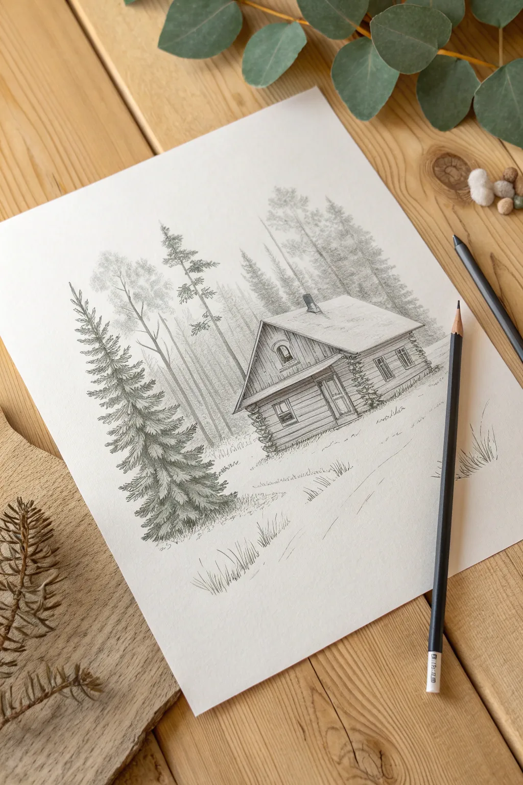
Capture the serenity of the wilderness with this detailed graphite pencil drawing. You will learn to render texture, handle perspective, and create depth between the foreground pine and the rustic cabin.
Detailed Instructions
Materials
- High-quality drawing paper
- Graphite pencils (HB, 2B, and 4B)
- Kneaded eraser
- Pencil sharpener
- Ruler (optional)
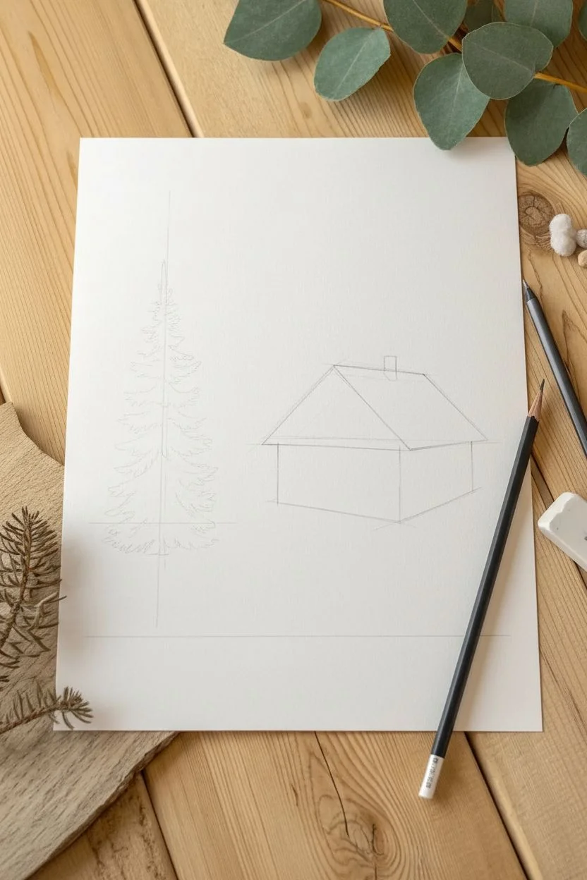
Step 1: Structuring the Composition
-
Establish the horizon:
Begin with your HB pencil using very light pressure. Draw a horizontal line roughly one-third up from the bottom of the page to represent the ground level. -
Block in the cabin:
Draw a cube shape slightly to the right of the center. Angle the front wall so the left corner is closest to you, creating a two-point perspective. -
Add the roof:
Sketch a triangular prism on top of your cube. Extend the eaves slightly past the walls to create an overhang, which will add realism later. -
Outline the tree:
On the left side of the paper, sketch a tall vertical line for the trunk of the large foreground spruce tree, marking the top and bottom width.
Step 2: Architectural Details
-
Define the logs:
Draw horizontal pairs of lines across the walls to represent logs. At the corners, extend alternating logs slightly outward to show the interlocking joinery. -
Add windows and door:
Sketch the rectangular door on the front face and windows on the side. I like to double up the lines here to create the thickness of the frames. -
Detail the planks:
Inside the triangular gable of the roof (the attic space), draw vertical lines to represent vertical siding, contrasting with the horizontal logs below. -
Chimney and roof:
Add a small rectangular chimney on the roof slope. Keep the roof largely white to suggest snow or light hitting it, but add a few faint lines for texture.
Depth Perception
Use atmospheric perspective: draw the background trees with a hard pencil (H/HB) and light pressure, while using the softest pencil (4B) for the foreground tree to make it pop forward.
Step 3: Creating Texture and Depth
-
Shade the cabin:
Switch to a 2B pencil. Fill in the windows with a dark tone, leaving tiny white spots for reflections. Add shading under the eaves to ground the roof. -
Render wood grains:
Add short, slightly wavy horizontal strokes along the logs to simulate wood grain. Shade the right side of the cabin darker to indicate the light source is coming from the left. -
Background forest:
Using your sharpest HB pencil, lightly sketch vertical trunks behind the cabin. Draw them thin and delicate, like birch trees, to push them into the distance. -
Foliage clusters:
Scribble very light, circular motions at the top of the background trees to suggest distant leaves without drawing individual details.
Smudge Prevention
Graphite can focus easily. Place a clean sheet of scrap paper under your drawing hand while you work on the details to prevent smearing your previous work.
Step 4: The Foreground Spruce
-
Branch structure:
Return to the large tree on the left. Draw downward-sloping branches extending from the trunk, getting wider towards the bottom. -
Adding needles:
Switch to a 4B pencil for high contrast. Use short, rapid flicking strokes to draw the pine needles, clustering them heavily on the undersides of the branches. -
Building volume:
Layer the needle strokes to create density. I prefer to leave the tops of the branches lighter to look like snow or sunlight hitting the tips. -
Trunk texture:
Darken the visible parts of the trunk with vertical, jagged lines to mimic rough bark.
Step 5: Final Atmosphere
-
Ground details:
Using the HB pencil, add tufts of grass in the foreground with quick upward flicks. Keep them sporadic to avoid a cluttered look. -
Cast shadows:
Add soft shading on the ground to the right of the cabin and the tree to anchor them to the earth. -
Final assessment:
Step back and check your contrast. If the background trees compete with the cabin, lighten them with your kneaded eraser to push them back.
Now you have a tranquil woodland scene perfect for hanging in a cozy corner.
Palm Trees Against the Sky
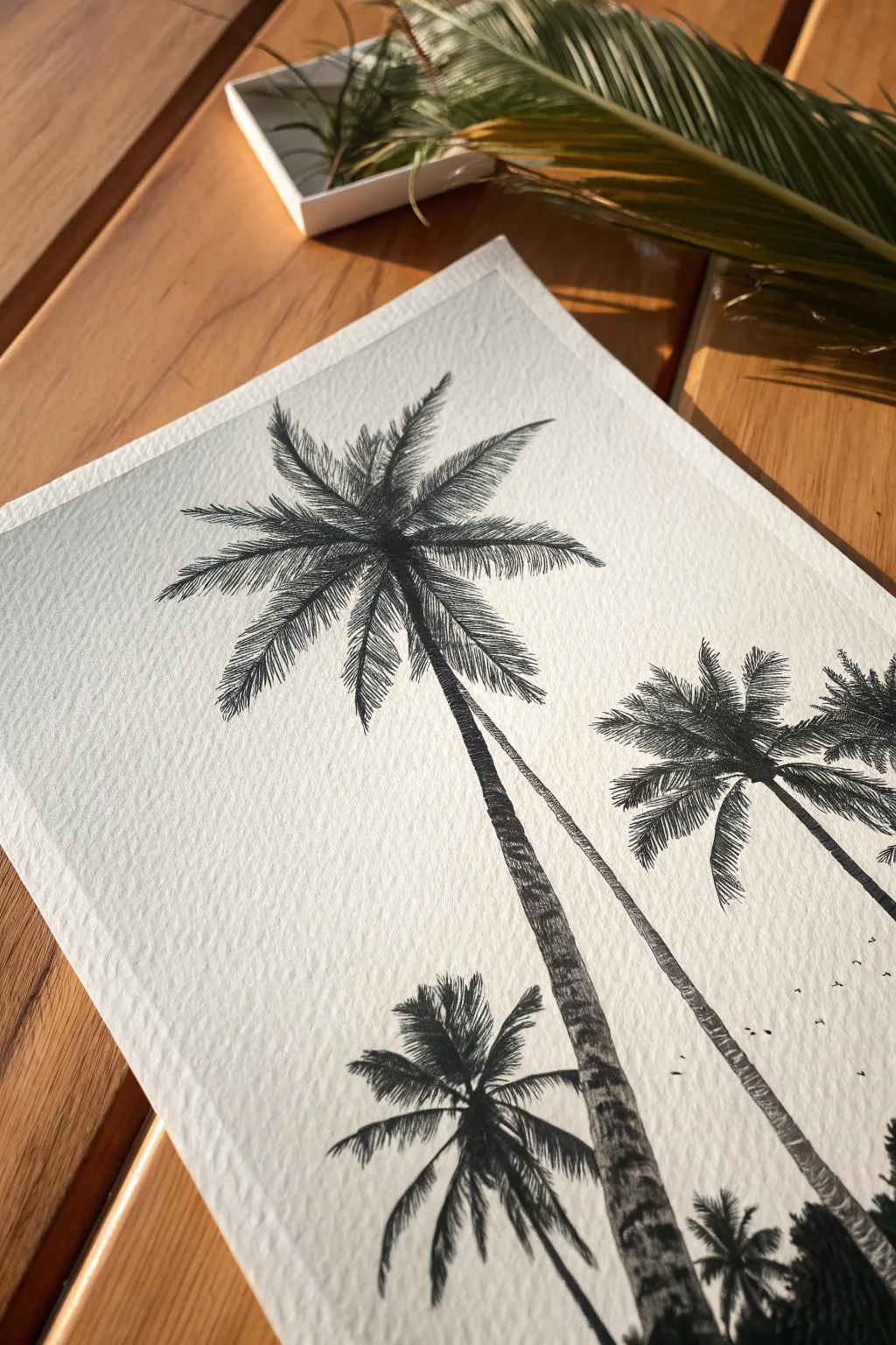
Capture the breezy elegance of palm trees towering overhead with this high-contrast ink drawing. By using heavily textured paper and precise hatching techniques, you will create a striking perspective that draws the viewer’s eye upward toward the sky.
Step-by-Step Guide
Materials
- Cold-press watercolor paper (heavy grain)
- Black pigment liners (sizes 0.05, 0.1, and 0.5)
- H or HB pencil
- Kneaded eraser
- Masking tape
- Drawing board or flat surface
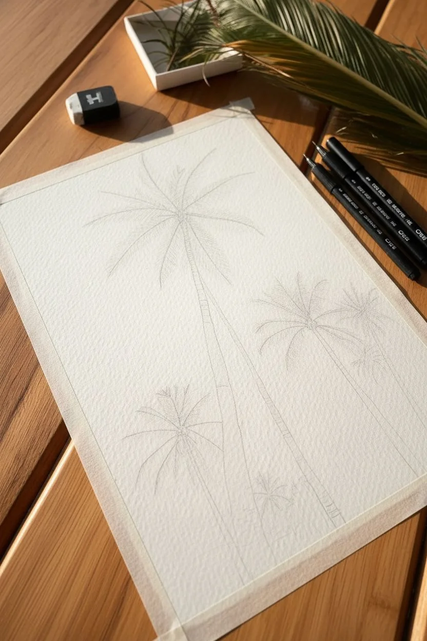
Step 1: Composition and Sketching
-
Secure the paper:
Tape your watercolor paper down to a board or table on all four sides. This creates a clean white border similar to the reference photo and keeps the paper flat while you work. -
Establish the curve:
Using your H pencil with very light pressure, draw two long, curving lines for the main palm trunks. Remember perspective: the trunks should be wider at the bottom and taper significantly as they reach upward. -
Position the crowns:
Mark the center point for the palm crowns. Place the largest one prominently in the upper left-center, a secondary one to the right, and a smaller partial crown near the bottom. -
Map the fronds:
Lightly sketch the spines of the palm fronds radiating outward from the center points like the specialized spokes of a wheel. Curve them naturally; some should bow upward, while lower ones droop heavily.
Step 2: Inking the Foliage
-
Start the spines:
Switch to your 0.1 fine liner. Carefully trace the central spines of the fronds on the main tree, but avoid solid continuous lines—break them slightly to simulate light hitting the leaves. -
Create the leaflets:
Using quick, flicking stokes, draw the needle-like leaflets extending from the spines. Start the stroke at the spine and flick outward to get a sharp, tapered end. -
Build density:
Go over the inner sections of the fronds (closest to the tree center) with more strokes to create a dense, dark silhouette, leaving the tips wispy and separated. -
Vary the direction:
Ensure the leaflets on the ‘bottom’ side of a frond hang differently than the top. Gravity pulls them down, so use downward curves for the lower bristles and upright strokes for the top ones. -
Repeat for secondary trees:
Move to the right-hand tree and the bottom tree. Treat them similarly, but make the details slightly smaller and less distinct on the right tree to push it further into the background.
Use the Tooth
Don’t press too hard with your pens. Let the ‘tooth’ (bumpiness) of the cold-press paper break your lines naturally. This creates instant, realistic texture for the bark and leaves.
Step 3: Texturing the Trunks
-
Outline the bark:
Outline the edges of the trunks with the 0.5 pen. I like to use a slightly shaky hand here to mimic the uneven, organic edge of palm bark rather than a perfect ruler-straight line. -
Horizontal hatching:
Fill the trunks using horizontal, curved hatching strokes. These lines should curve upward slightly to emphasize the cylindrical height of the tree. -
Create light and shadow:
Concentrate your hatching strokes heavily on the right side of the trunk to create a shadow side, leaving the left side with fewer lines to suggest a light source hitting the bark. -
Utilize the paper grain:
As you shade, allow your pen to skip over the textured surface of the watercolor paper. This natural ‘noise’ perfectly mimics the rough texture of a palm tree trunk without you having to draw every detail.
Golden Hour Glow
To level up, apply a very pale wash of yellow and orange watercolor to the paper and let it dry completely *before* you start drawing to create a sunset background.
Step 4: Atmosphere and Finish
-
Add scale:
Using the 0.05 ultra-fine pen, draw tiny ‘v’ or ‘m’ shapes in the distance between the trees to represent birds. Keep them very small to exaggerate the height of the trees. -
Deepen the contrast:
Look at the overall balance. Use the 0.5 pen to darken the very center of the palm crowns where the fronds meet, grounding the foliage. -
Clean up:
Wait at least 15 minutes for the ink to fully cure, then gently erase your pencil guidelines with the kneaded eraser so you don’t damage the paper surface. -
Reveal the border:
Slowly peel away the masking tape at a 45-degree angle to reveal the crisp white edge that frames your composition.
Now you have a stunning, high-contrast botanical drawing that brings a permanent vacation vibe to your space.

PENCIL GUIDE
Understanding Pencil Grades from H to B
From first sketch to finished drawing — learn pencil grades, line control, and shading techniques.
Explore the Full Guide
Circular Landscape Vignettes
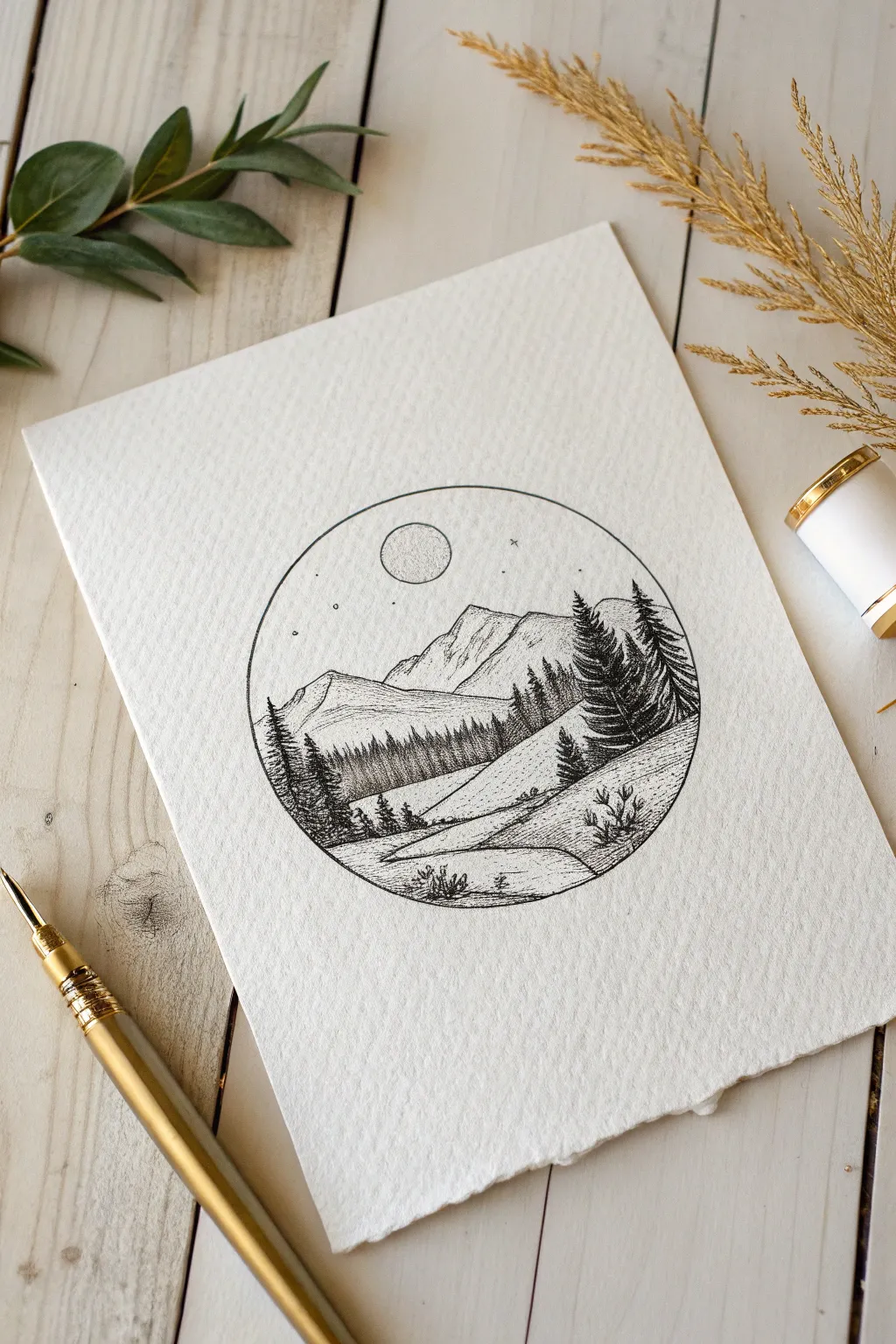
Capture the serenity of a quiet night in the wilderness with this circular pen and ink drawing. Using simple stippling and hatching techniques, you will create a detailed window into a peaceful alpine landscape.
Step-by-Step Guide
Materials
- Textured drawing paper or cold-press watercolor paper
- Compass
- HB Pencil
- Kneaded eraser
- Fine liner pens (sizes 005, 01, and 03) or a dip pen with black ink
- Ruler
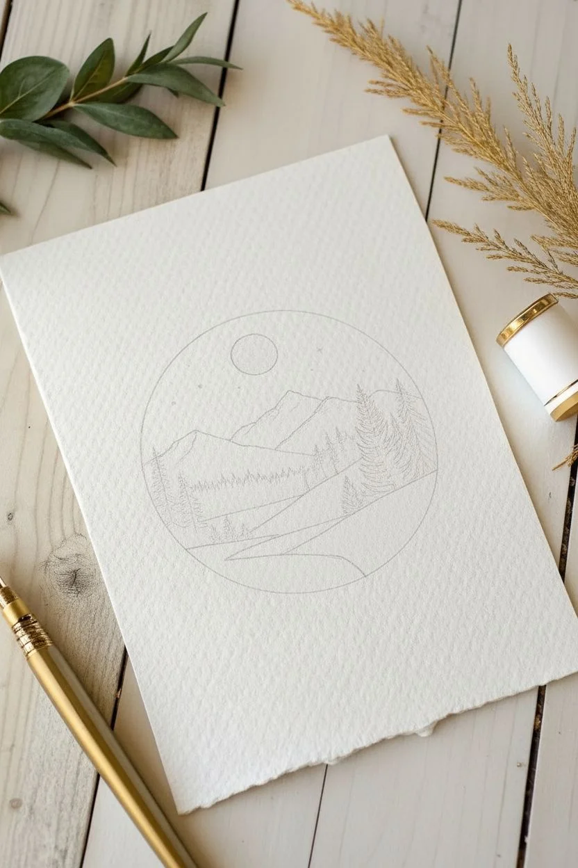
Step 1: Planning the Composition
-
Set boundaries:
Begin by using a compass to draw a perfect circle in the center of your textured paper; a 4-inch diameter works well for this level of detail. -
Sketch the mountains:
Lightly sketch the jagged outlines of the mountain peaks in the upper third of the circle, letting them overlap slightly to show depth. -
Place the moon:
Draw a small circle floating centrally above the highest mountain peak to represent the full moon. -
Map the foreground:
Sketch sloping curved lines in the lower half to define the rolling hills and a winding path, then mark vertical lines where the prominent pine trees will stand on the right and left sides.
Ink Control Tip
Use different pen sizes for depth. A super fine 005 is best for distant mountains, while a thicker 03 makes the foreground trees pop forward.
Step 2: Inking the Background
-
Define the frame:
Carefully trace over your main circle boundary with an 03 pen or a steady hand on your dip pen to create a crisp border. -
Outline mountains:
Switch to a finer 01 pen to ink the mountain ridges, using slightly shaky, broken lines to mimic natural rock textures. -
Shade the peaks:
Use the 005 pen to add diagonal hatching to the shadowed sides of the mountains, keeping the lines light and spaced out. -
Texture the moon:
Outline the moon with the 01 pen, then fill the interior with tiny stippled dots, concentrating them at the bottom left to create a sense of cratered curvature. -
Starry sky:
Dot the sky area sparsely with the tip of your pen and add a few tiny ‘x’ shapes to represent twinkling stars.
Step 3: The Forest Layer
-
Distant treeline:
Below the mountains, draw a dense band of tiny vertical lines to create a distant forest; vary the heights slightly to look organic. -
Darken the base:
Go back over the bottom of that distant tree band with more ink to ground the forest and separate it from the hills below. -
Ink the hills:
Trace the rolling hill lines from your sketch with the 01 pen, keeping the lines smooth and flowing.
Level Up
Once the waterproof ink is totally dry, apply a very diluted watercolor wash of Indigo or Payne’s Gray to the sky for a moody night vibe.
Step 4: Foreground Detail
-
Major pine trees:
Using an 03 pen, ink the large pine trees on the right side; start at the top and use quick, downward zigzag motions to create fluffy, dense branches. -
Deepen tree shadows:
Go back into the center of the pine trees and add more ink to the trunk areas, ensuring the foliage looks thick and impenetrable. -
Secondary trees:
Repeat the zigzag technique for the smaller group of pine trees on the lower left side, keeping them slightly less detailed than the main group. -
Ground texture:
I like to use stippling (dots) along the curves of the hills and path to suggest grassy texture without drawing individual blades. -
Vegetation details:
Add small, flicking strokes in the immediate foreground to represent tufts of grass and small shrubs near the circle’s edge. -
Cleanup:
Wait at least 15 minutes for the ink to fully cure, then gently erase all remaining pencil marks with a kneaded eraser. -
Final assessment:
Look for any areas that feel empty; add a few more dots to the ground or stars to the sky to balance the composition.
Enjoy the calm result of your detailed stippling work.
The Lonely Wooden Rowboat
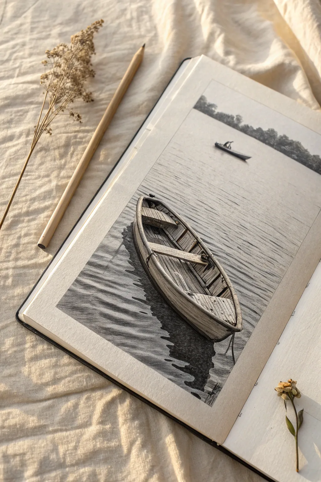
Capture the serene silence of a lake offering a quiet escape with this detailed pencil drawing. This project focuses on rendering realistic wood textures and soft, rhythmic water ripples to create a monochromatic masterpiece.
Step-by-Step Guide
Materials
- High-quality drawing paper (smooth or fine grain)
- Graphite pencils (2H, HB, 2B, 4B, 6B)
- Mechanical pencil (0.5mm HB)
- Kneaded eraser
- Vinyl eraser
- Ruler
- Blending stump or tissue
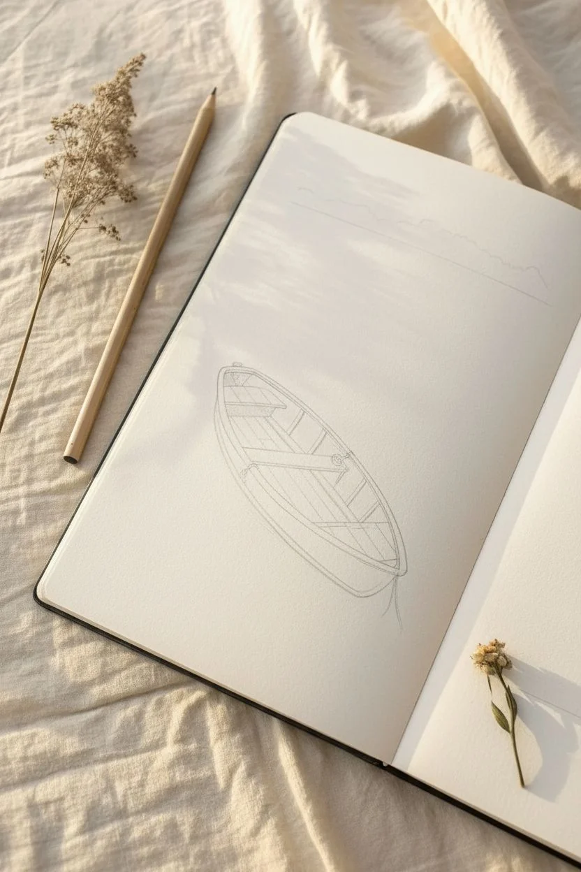
Step 1: Laying the Framework
-
Establish the Horizon:
Use your ruler to draw a faint horizon line roughly one-quarter of the way down from the top of the paper, keeping your pencil pressure very light. -
Outline the Boat Shape:
In the lower half of the page, sketch a long, narrow almond shape angled slightly diagonally to the right. This forms the gunwale (top edge) of the boat. -
Define the Hull:
Draw a curved line beneath your almond shape to create the depth of the hull, tapering it to meet the points at the bow and stern. -
Add Interior Details:
Lightly sketch the internal structures, including the horizontal bench seats, the diagonal oar resting across the top, and the subtle curve of the floorboards.
Step 2: Texturing the Wood
-
Draw the Planking:
Using a mechanical pencil for precision, draw the lines separating the distinct wooden planks (strakes) on the exterior hull, following the curve of the boat. -
Sketch the Ribs:
Inside the boat, sketch the vertical ribs along the inner walls and the longitudinal lines for the floorboards. -
Shade the Deepest Shadows:
With a 4B pencil, darken the deep crevices between the floorboards and under the seats to establish high contrast early on. -
Render Wood Grain:
Switch to an HB pencil to draw fine, slightly wavy lines along the seats and planks to mimic wood grain. I like to vary my stroke length here to keep it looking organic. -
Build Hull Form:
Shade the exterior hull using a 2B pencil. Apply a gradient that gets darker towards the bottom to show the curvature of the boat. -
Detail the Oar:
Add shading to the oar, keeping the top edge lighter to suggest sunlight hitting the rounded wood.
Fixing Smudges
Graphite smudges easily. If your hand drags across the paper, place a clean scrap sheet under your drawing hand to protect your work while you shade.
Step 3: Water and Atmosphere
-
Cast the Reflection:
Use a 6B pencil to block in the dark, jagged reflection directly beneath the boat. Press firmly to create the darkest value in your drawing. -
Create Ripples:
Draw horizontal, slightly wavy lines radiating from the boat. Keep lines closer together in the background and slightly further apart in the foreground. -
Soften the Water:
Lightly blend the water lines with a stump or tissue, then use a kneaded eraser to lift out thin horizontal highlights on the crests of the ripples. -
Draw the Background:
Sketch the distant tree line above the horizon using small, circular scumbling motions with a 4B pencil to create the texture of foliage. -
Add the Distant Boat:
Draw the small silhouette of the distant rower. Keep this shape simple and dark, as details are lost at this distance. -
Final Contrast Check:
Review the drawing and deepen the shadows inside the boat and under the hull to ensure the wood looks solid and weathered.
Pro Tip: Sharp Edges
Keep your pencil extremely sharp when drawing the wood grain and cracks. Sharp lines defined against soft shading are what make the texture look realistic.
Step back and admire the peaceful atmosphere you’ve created with just a few pencils.


Sun Peeking Behind Mountains
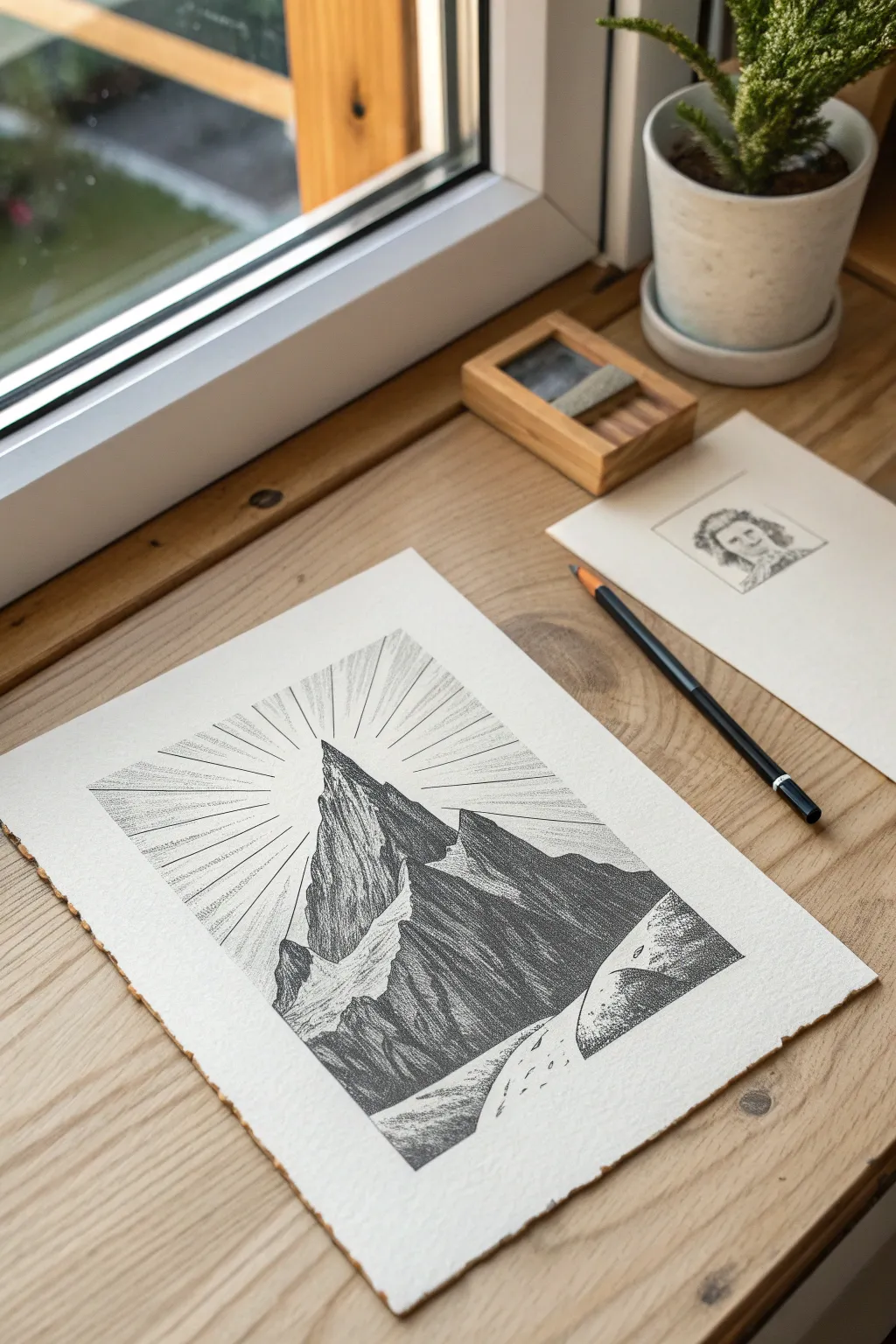
Capture the dramatic contrast of a sunburst behind a jagged mountain peak using fine liner pens. This project focuses on controlling light and shadow through hatching and stippling techniques on textured paper.
Step-by-Step
Materials
- Heavyweight textured paper (cold press or mixed media)
- Fine liner pens (sizes 0.05, 0.1, and 0.5mm)
- HB graphite pencil
- Kneaded eraser
- Clear ruler
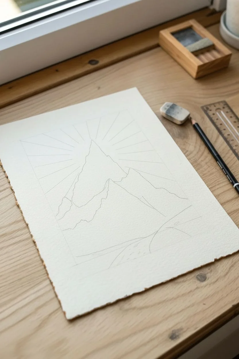
Step 1: Sketching the Composition
-
Establish the horizon:
Lightly sketch a low horizon line about one-quarter of the way up the page to leave ample room for the sky. -
Outline the main peak:
Draw a large, jagged triangle slightly off-center for the primary mountain, giving it erratic, sharp edges to mimic rock formations. -
Add supporting ridges:
Sketch smaller peaks flanking the main mountain and a sloping foreground in front to create depth. -
Mark the light source:
Place a small dot at the very tip of the highest peak; this is where your sunburst rays will originate. -
Draft the rays:
Using your ruler and pencil, draw faint guide lines radiating outward from that tip, extending toward the edges of the paper.
Smudge Prevention
Ink on textured paper takes longer to dry than you might expect. Place a scrap piece of paper under your hand while drawing to prevent oils or smears from ruining the pristine white sky.
Step 2: Inking the Landscape
-
Define the silhouette:
Use the 0.5mm pen to trace the outer edges of the mountains, making the lines shaky and organic rather than perfectly straight. -
Block in deep shadows:
Identify the shadowed sides of the rock faces (away from the light) and fill the darkest crevices with solid black ink. -
Create rock texture:
With a 0.1mm pen, draw vertical, broken lines flowing down the mountain faces to simulate striations in the stone. -
Add cross-hatching:
Layer diagonal lines over the vertical ones in the shadowed areas to build up a mid-tone grey value. -
Suggest snow caps:
I like to leave the tops of ridges and the left-facing slopes mostly white, using only tiny dots (stippling) to define the edge of the snow. -
Detail the foreground:
Use looser, sweeping lines for the bottom hills to differentiate the softer terrain from the sharp rocks above.
Vintage Aesthetic
To match the reference photo, carefully hand-tear the edges of your finished paper against a ruler for a deckled look. You can also mount it on a slightly larger beige backing sheet.
Step 3: The Sunburst and Finish
-
Ink the main rays:
Switch to your finest 0.05mm pen. Place your pen on a pencil guideline and flick it outward quickly to create a tapered line. -
Vary line lengths:
Don’t make every ray touch the edge of the paper; let some fade out sooner to create a natural, glowing effect. -
Create the halo:
Leave a tiny gap of negative space immediately around the mountain tip so the sun looks intensely bright right at the source. -
Add intermediate rays:
Draw shorter, fainter lines between the main rays to fill the sky without making it look too cluttered. -
Erase guidelines:
Wait until the ink is completely dry, then gently roll the kneaded eraser over the paper to lift the graphite. -
Refine contrast:
Step back and assess your values; add more black specifically to the mountain base to ground the image.
Display your monochrome masterpiece in a simple wooden frame to complement the natural theme.
Tropical Thatched Huts
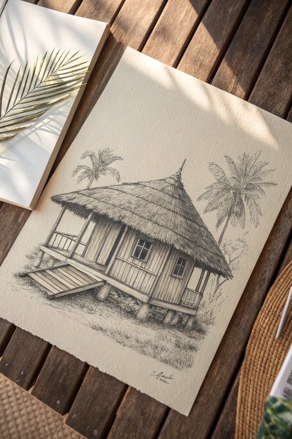
Transport yourself to a serene island getaway by sketching this detailed stilt hut nestled among palms. Using fine ink lines to build rich textures, you will create a rustic architectural study that feels warm and inviting.
Detailed Instructions
Materials
- Heavyweight cream drawing paper (cold press or vellum finish)
- Graphite pencil (HB or 2B)
- Kneaded eraser
- Set of black fineliner pens (sizes 0.05, 0.1, 0.3, 0.5)
- Ruler
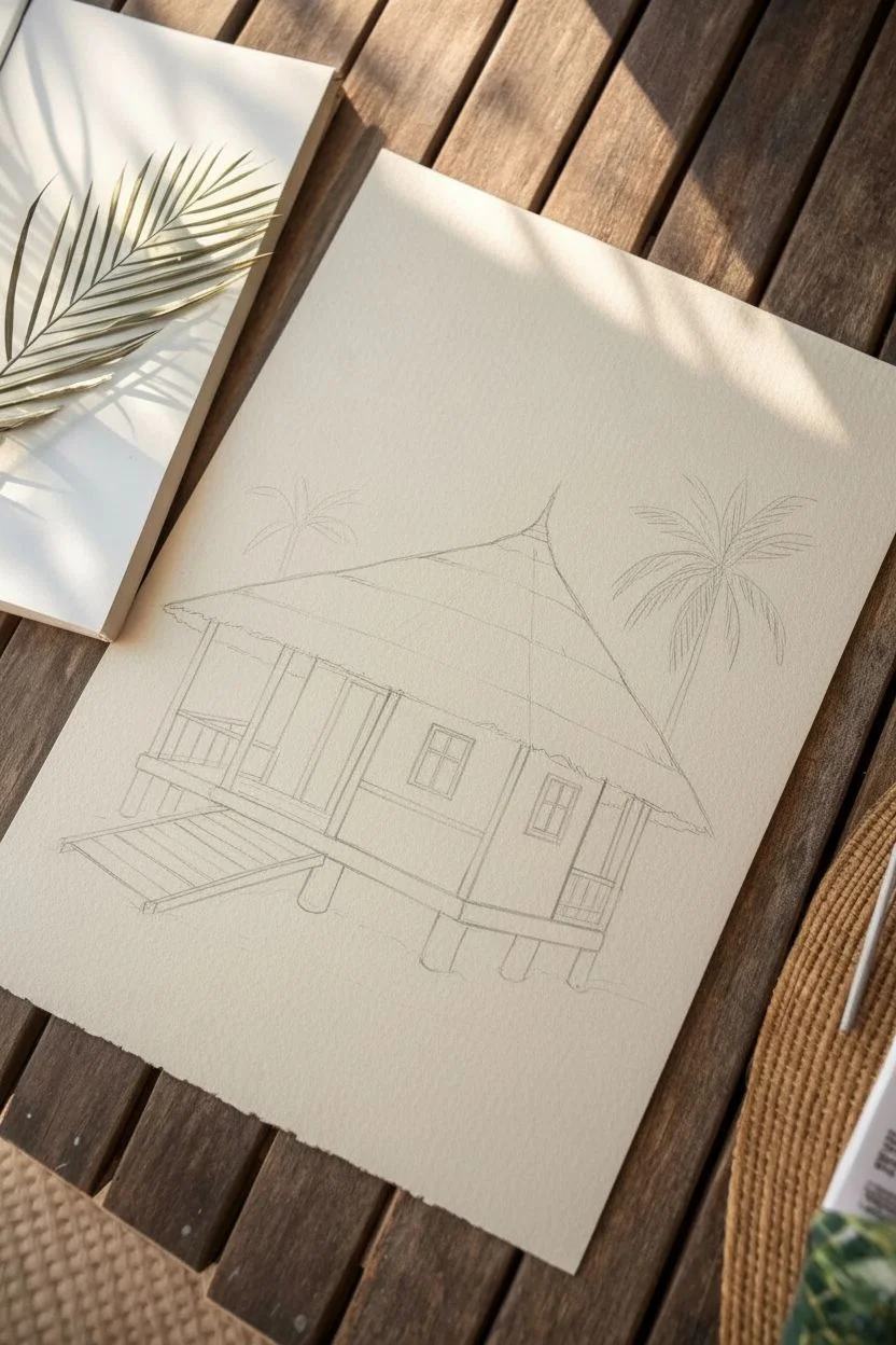
Step 1: Structural Sketch
-
Basic Shapes:
Start with a light pencil sketch. Draw a cube for the main room, floating slightly above the ground, and place a large, wide cone shape on top for the roof. -
Foundation details:
Sketch the vertical stilts extending from the bottom of the cube into the ground. Add the diagonal lines for the entrance ramp on the left side. -
Refining the form:
Define the porch area with a railing and sketch the placement of windows and the door. Lightly mark the positions of the palm trees in the background.
Ink Direction Matters
When drawing thatched roofs, always pull your pen strokes downward in the direction gravity pulls the straw. This makes the flow look natural.
Step 2: Inking the Thatch
-
Roof outline:
Switch to a 0.3mm pen. Draw the bottom edge of the roof with a jagged, uneven line to imitate hanging straw bundles. -
Layering texture:
Using a 0.1mm pen, fill the roof with rows of short, quick vertical strokes. Start from the bottom edge and work your way up in overlapping bands. -
Shadows and depth:
I like to add denser, darker hatching lines under the eaves and near the peak of the roof to give the thatch volume and curvature. -
The Spire:
Detail the decorative spire at the very top with the 0.3mm pen, ensuring it sits centrally on your textured roof cone.
Step 3: Wood and Walls
-
Wall planks:
Draw vertical lines across the walls to represent wooden planks. Allow some lines to break or wobble slightly to suggest a weathered, rustic surface. -
Windows:
Outline the window frames with a 0.5mm pen for contrast. Fill the glass panes with tight cross-hatching to make them appear dark and recessed. -
Ramp and Railing:
Ink the entrance ramp with horizontal lines for the steps. Draw the porch railings carefully, keeping the posts distinct from the wall texture behind them. -
Sturdy Stilts:
Outline the support stilts with thick lines. Add vertical wood grain texture inside them, and darken the side furthest from the light source.
Vintage Vibe
Before drawing, lightly stain your paper with watered-down coffee or tea and let it dry. This gives the sketch an antique, explorer’s journal aesthetic.
Step 4: Atmosphere and Foliage
-
Palm fronds:
For the trees, use a 0.05mm pen. Draw the curved central spine of each leaf first, then flick quick, wispy strokes outward to spur the needles. -
Tree trunks:
Sketch the palm trunks with rough horizontal rings, making them narrower as they reach the leaves. -
Ground cover:
Use stippling (lots of small dots) and short scribbles to create a grassy, sandy texture at the base of the stilts. -
Deep shadows:
Add heavy hatching directly underneath the hut and ramp to anchor the structure to the ground. -
Final clean-up:
Once the ink is fully dry, erase the pencil guidelines to reveal your high-contrast architectural drawing.
Frame your tropical creation in a simple wood frame to complement those diverse textures.
Cascading Waterfall Texture
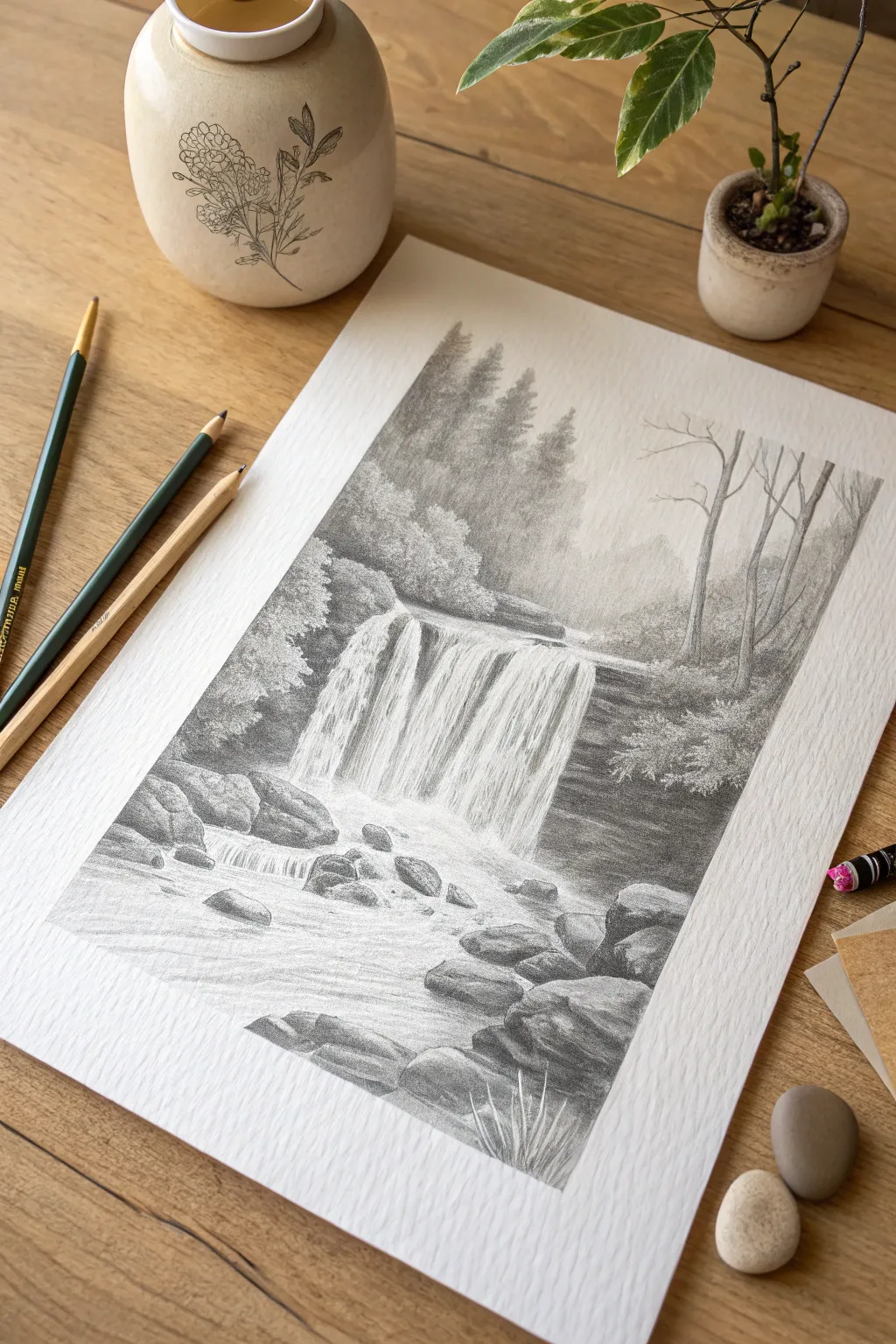
Capture the raw power and serenity of nature with this detailed graphite drawing of a forest waterfall. By combining textured paper with meticulous shading techniques, you will create a realistic scene featuring rushing water, weathered rocks, and atmospheric trees.
Step-by-Step Tutorial
Materials
- Textured drawing paper (cold press watercolor or heavy sketch paper)
- Graphite pencils (2H, HB, 2B, 4B, 6B)
- Mechanical pencil (0.5mm HB)
- Kneaded eraser
- Blending stump or tissue
- Pencil sharpener
Step 1: Sketching the Composition
-
Basic outlines:
Using a sharp HB pencil and very light pressure, sketch the horizon line about two-thirds up the page to establish eye level. -
Mapping the falls:
Outline the main shape of the waterfall ledge in the center, drawing vertical guidelines to indicate the direction of the water flow. -
Rock placement:
Sketch the rough, blocky shapes of the boulders at the base of the falls and in the immediate foreground. -
Tree placement:
Lightly indicate the positions of the distant pine trees in the background and the bare, spindly trees on the right bank.
Smudge Control
Place a clean sheet of scrap paper under your drawing hand. This prevents natural hand oils from transferring to the paper and keeps you from smearing your finished graphite work.
Step 2: Developing the Background
-
Distant pines:
With a 2H pencil, shade the distant forest area above the falls using vertical hatching; keep this pale to create atmospheric depth. -
Mid-ground foliage:
Switch to a 2B pencil to draw the bushy trees on the left bank, using small circular scumbling motions to simulate leafy textures. -
Bare branches:
Use your mechanical pencil to draw the intricate, thin branches of the trees on the right; keep lines jagged and organic rather than perfectly straight. -
Softening edges:
Gently rub the distant background trees with a tissue to blur them slightly, pushing them further back visually.
Pro Tip: Texture
To create the look of water spray or foam, tap a clean kneaded eraser repeatedly over shaded areas. This lifts small, irregular pockets of graphite for a realistic misty effect.
Step 3: Creating the Waterfall
-
Deepest shadows:
Using a 4B or 6B pencil, shade the dark rocky recesses behind and beside the waterfall darker values make the white water pop. -
Water flow:
With an HB pencil, draw vertical lines following the water’s path, lifting pressure at the bottom to suggest mist. -
Whites of the water:
I like to leave gaps of pure white paper between these pencil strokes to represent the brightest highlights of the cascading water. -
The splash zone:
At the bottom of the falls, use a blending stump in a swirling motion to create a soft, misty look where the water hits the pool.
Step 4: Foreground and Details
-
Mid-stream rocks:
Shade the rocks sitting in the middle of the stream using faceted planes; shade the sides facing away from the light source with a 4B pencil. -
Foreground stream:
Draw horizontal, slightly wavy lines in the foreground water to show the current moving toward the viewer, weaving around the rocks. -
Large boulders:
Texture the large foreground rocks with cross-hatching and stippling dots to mimic stone surface and moss. -
Grassy details:
Add sharp, upward flicks of the mechanical pencil at the very bottom edge to create tufts of grass. -
Lifting highlights:
Shape your kneaded eraser into a wedge and tap it across the running water to reclaim bright white highlights and add sparkle.
Sign your name in the corner and frame your drawing to bring a peaceful nature vibe to your room
Cliff Edge Drama
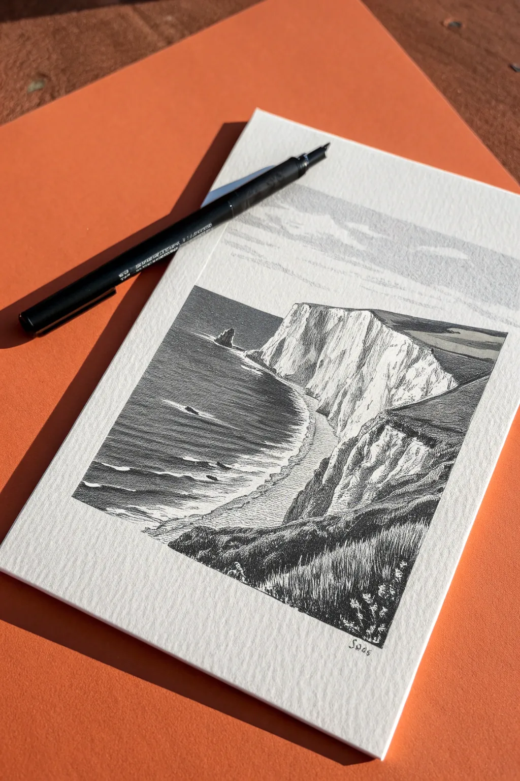
Capture the raw beauty of a coastal precipice using high-contrast pen and ink techniques. This project focuses on dramatic textures, utilizing the stark white of the paper against deep black shadows to sculpt rugged cliffs and a restless sea.
How-To Guide
Materials
- Textured heavyweight paper (cold press watercolor or mixed media)
- Black brush pen (hard tip) or fine liner set (0.05, 0.3, 0.5mm)
- Hard pencil (H or 2H)
- Kneaded eraser
- Ruler (optional)
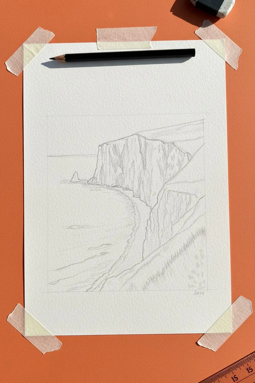
Step 1: Sketching the Composition
-
Secure the page:
Tape your paper to a smooth surface to prevent it from shifting while you draw. -
Establish the horizon:
Using an H pencil, lightly sketch a straight horizon line about a quarter of the way down from the top of the page. -
Outline the bay:
Draw a sweeping ‘S’ curve starting from the distant horizon and coming toward the bottom left to define the waterline. -
Draft the cliffs:
Sketch the jagged, vertical profile of the white cliffs rising from the waterline, varying heights to create interest. -
Block the foreground:
Mark out a large triangular slope in the bottom right corner; this will become the dark, grassy foreground framing the view. -
Add distant details:
Pencil in the small, pointy rock formation sticking out of the sea near the horizon.
Pro Tip: Line Weight
Use the flexibility of the brush pen tip. Press harder for the dark foreground grasses and use the very tip for the delicate distant ocean waves.
Step 2: Inking the Sea
-
Trace the horizon:
With a steady hand and your pen, draw a crisp, solid line over your pencil horizon mark. -
Start the ocean texture:
Begin adding horizontal strokes directly under the horizon, keeping them extremely thin and close together to suggest distance. -
Create wave movement:
As you move down the page, space lines slightly further apart and vary their lengths to mimic rolling swells. -
Preserve the foam:
Stop your horizontal lines short of the cliff base, leaving an irregular white gap to represent foam crashing against the rocks. -
Deepen the water:
Go back and thicken some lines in the deeper parts of the bay to add weight to the water.
Step 3: Sculpting the Cliffs
-
Define the cliff edge:
Outline the grassy top edge of the cliffs with a slightly broken, organic line. -
Shade the cliff tops:
Fill the flat top surfaces of the distant headland with dark horizontal hatching to show vegetation. -
Draw vertical striations:
On the white cliff faces, draw thin vertical lines that break and taper to mimic chalk textures and erosion. -
Enhance the shadows:
Group these vertical lines in the ‘folds’ of the cliff face to create shadows, leaving protruding areas stark white.
Level Up: Atmospheric Sky
To exactly match the photo, use a light grey alcohol marker or a very diluted ink wash to create a subtle grey band across the sky area.
Step 4: Foreground & Final Touches
-
Ink the foreground hill:
Switch to bolder strokes for the bottom right hill to bring it forward visually. -
Texture the grass:
Use quick, upward flicking motions to create the look of tall wild grasses blowing in the wind. -
Build contrast:
Layer these grass strokes densely, filling the gaps with solid black to create a heavy silhouette against the bright cliffs. -
Add detail blades:
Let a few individual grass blades extend upward into the white space of the cliff background for realistic layering. -
Clean up:
I like to wait a full ten minutes to ensure the ink is totally dry before erasing the pencil sketch.
Now you have a striking coastal scene that celebrates the interplay of light and shadow.
Misty Treeline Gradients
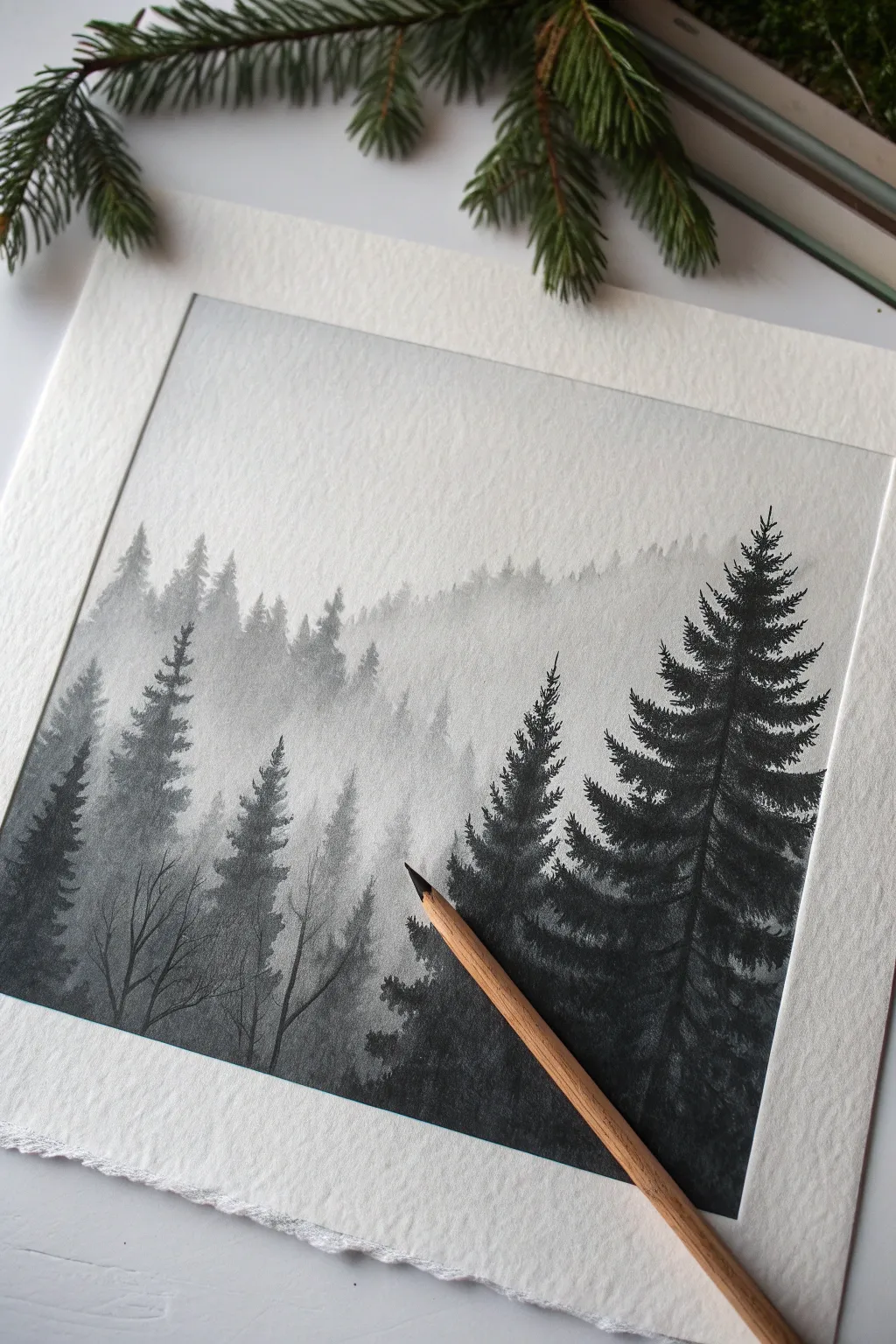
This atmospheric drawing exercise teaches you to master values and depth using simple graphite tools. You will create a stunning sense of distance by layering faded, misty treelines behind sharp, dark foreground pines.
Step-by-Step Guide
Materials
- High-quality heavy drawing paper or cold-press watercolor paper
- Graphite drawing pencils (Set ranging from 4H to 6B)
- Masking tape or artist tape
- Ruler
- Kneaded eraser
- Blending stump or tissue
- Pencil sharpener
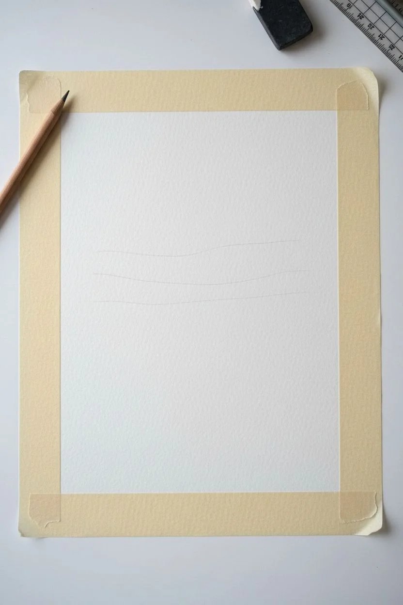
Step 1: Preparation and Zoning
-
Tape the border:
To achieve the crisp rectangle shown in the reference, measure an even margin on your paper and apply masking tape firmly. This acts as a frame for your drawing. -
Establish the horizon lines:
Using your hardest pencil (like a 4H), very lightly sketch three or four wavy horizontal lines across the page. These will mark the tops of your different tree ridges.
Step 2: The Distant Background
-
Base layer shading:
Start at the top-most ridge line. Using a harder pencil (2H or H), shade the area lightly using vertical strokes. -
Create the distant trees:
Add tiny, vertical dashes along the top edge of this ridge to suggest faraway tree spikes. Keep these very faint and uniform. -
Blend the mist:
As you shade downwards from this ridge, gradually decrease your pencil pressure until the graphite fades into the white of the paper. This creates the ‘mist’ effect. -
Soften the texture:
If the pencil strokes look too rough, gently rub the area with a tissue or blending stump to create a smooth, foggy appearance.
Muddy Mist?
If your foggy gradients look dirty rather than misty, use a kneaded eraser to dab (not rub) the paper. This lifts excess graphite dust without ruining the paper’s tooth.
Step 3: The Mid-Ground Layers
-
Define the second ridge:
Move down to your next sketched line. Switch to a medium pencil like an HB. -
Draw distinct shapes:
Sketch small Christmas-tree shapes along this ridge. Make them slightly larger and darker than the previous layer. -
Create the gradient:
Shade the bodies of these trees, but just like the background, let the bottom third of this ridge fade out into white nothingness. -
Layering the mist:
Ensure the white ‘mist’ at the bottom of this layer contrasts against the top of the next ridge you will draw. This contrast is what creates the illusion of depth. -
Adding texture:
Use light stippling or scribble motions with your HB pencil to give these mid-ground trees a bit of leafy texture, avoiding hard outlines.
Level Up
Try using charcoal pencils for the foreground trees only. The matte, deep black of charcoal creates an even stronger contrast against the shiny grey graphite background.
Step 4: The Dark Foreground
-
Select dark pencils:
For the nearest trees, switch to your softest pencils (4B or 6B). You want deep, rich blacks here. -
Draw the main trunks:
Draw a few strong vertical lines for the trunks of the large foreground pines on the right and left sides. I like to keep my pencil quite sharp here to get crisp details. -
Add pine branches:
Starting from the top of the trunk, use short, zig-zagging directional strokes that angle slightly downward to mimic heavy pine boughs. -
Build density:
Layer your strokes aggressively in the center of the tree to create a solid dark mass, leaving the outer tips slightly more detailed and jagged. -
The left side details:
On the left side of the drawing, add a few leafless, spindly deciduous trees using fine lines. These thin branches add variety to the texture. -
Grounding the scene:
Darken the very bottom of the drawing significantly to anchor the foreground trees, merging their bases into deep shadow.
Step 5: Final Touches
-
Boost contrast:
Look at the whole image. If the background trees faded too much, lightly re-define their tops. Make sure the foreground is strictly black against the grey background. -
Reveal the border:
Carefully peel away the masking tape at a 45-degree angle to reveal the clean, sharp edges of your artwork.
Sign your name in the corner and enjoy the depth of your new forest landscape.
Detailed Rock Formations
Capture the rugged beauty of weathered stone with this detailed graphite study. Focusing on harsh textures and dramatic lighting, you will build layers of shading to turn a flat sheet of paper into a dimensional, sun-baked landscape.
Step-by-Step Tutorial
Materials
- Heavyweight drawing paper (smooth or vellum finish)
- Graphite pencils (grades 2H, HB, 2B, 4B, 6B)
- Kneaded eraser
- Precision eraser pen (mono zero)
- Blending stump
- Pencil sharpener
Step 1: Blocking the Composition
-
Establish the horizon:
Lightly sketch a sloping line roughly one-third of the way up the page to separate the foreground from the background peak. -
Outline the peak:
Using an HB pencil, draw the silhouette of the main rock formation, focusing on the jagged, irregular steps of the peak. -
Map foreground boulders:
Sketch the large, rounded shapes of the foreground rocks, treating them like stacked ovals and rectangles. -
Indicate fissures:
Draw faint lines to mark the major cracks, vertical splits, and separation lines between the massive stones.
Flatness Fix
If the rocks look 2D, your values might be too similar. Don’t be afraid to press hard with the 6B in crevices; deep blacks make the white paper look brighter by contrast.
Step 2: Shading and Form
-
Identify light source:
Determine that the light is coming from the upper right, meaning all left-facing surfaces will be in shadow. -
Apply base shadows:
Use a 2B pencil to gently shade the shadowed side of the rocks, using smooth, consistent pressure. -
Reserve highlights:
Keep the tops and right-facing sides of the boulders strictly white to represent harsh sunlight hitting the granite. -
Deepen the crevices:
Switch to a 4B pencil to darken the deepest cracks and the areas where rocks touch the ground. -
Create roundness:
Add gradients to the rounded boulders, fading your shading from the dark edges toward the bright centers.
Make it Ancient
Add characteristic lichen spots to the rocks by drawing tiny, irregular ring shapes with a 2H pencil and shading lightly around them, leaving the centers bright white.
Step 3: Texture and Details
-
Stipple the stone:
Use a sharp HB pencil to add tiny dots and ‘scumbling’ (small scribbles) to the rock surfaces to mimic coarse granite grain. -
Weather the rocks:
Draw distinct vertical lines and cracks down the face of the background peak to show age and weathering. -
Soft blending:
Use a blending stump to gently smudge the mid-tones, creating a smooth transition between light and dark while leaving texture visible. -
Lift highlights:
I like to take a kneaded eraser and dab the shaded areas to lift out tiny, irregular patches, creating a pitted rock texture. -
Atmospheric sky:
Very lightly hatch the sky area with a 2H pencil, fading it out as you approach the horizon.
Step 4: Vegetation and Contrast
-
Map grass areas:
Lightly sketch the outline of grass tufts nestled in the crevices and at the base of the rocks. -
Draw dark blades:
Use short, sharp upward flicks with a 6B pencil to create the dense, shadowed base of the grass clumps. -
Add detailing blades:
Fill in the rest of the grass with an HB pencil, using varied stroke lengths to make it look natural and wild. -
Refine edges:
Use a precision eraser to clean up the edges of the rocks where they meet the sky for a crisp look. -
Final contrast check:
Reinforce the darkest shadows one last time with your 6B pencil to make the white highlights pop against the stone.
Step back and admire how simple pencil strokes have built a mountain that looks solid enough to climb.
Clouds Meeting the Ocean
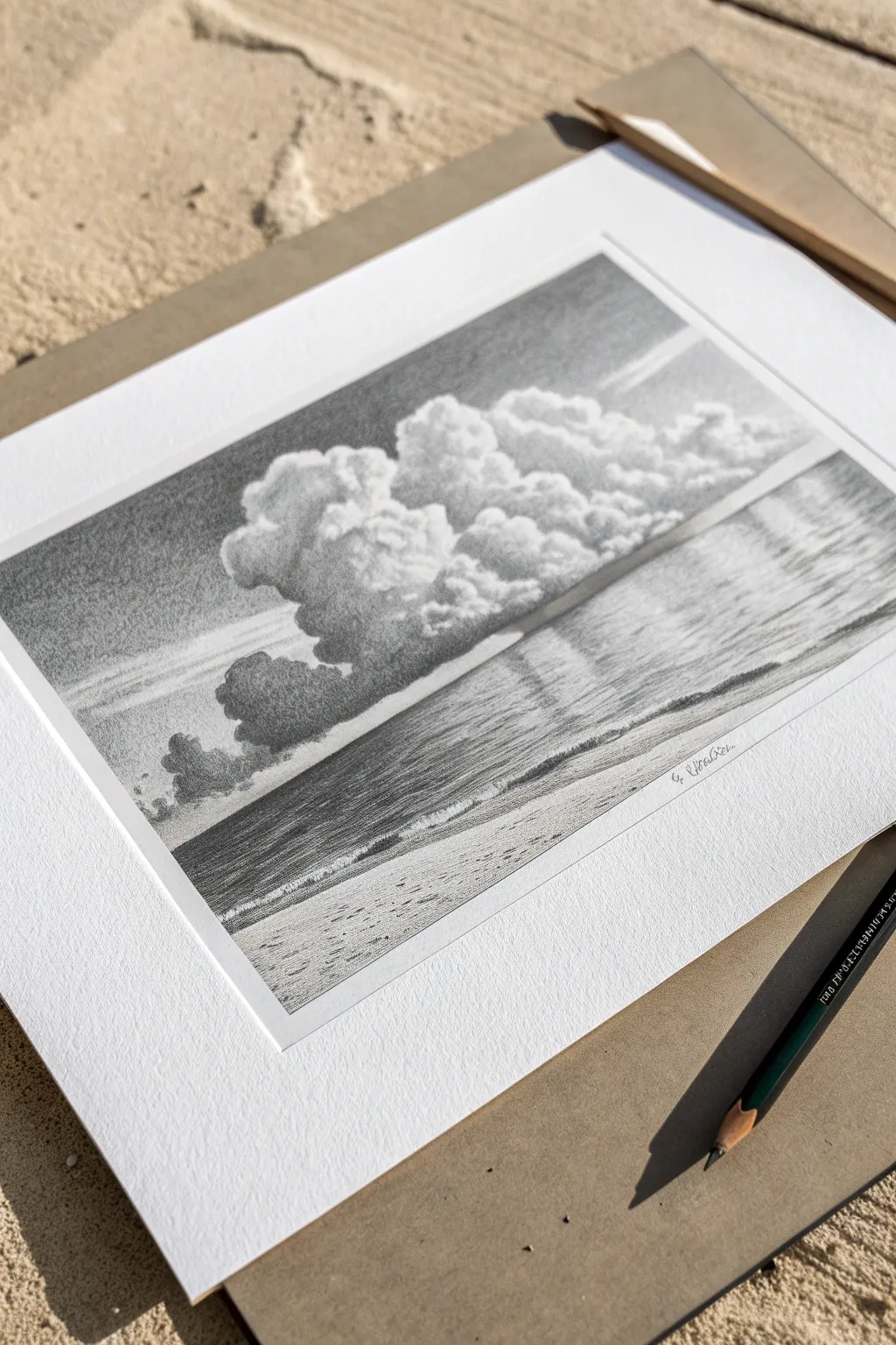
Capture the majestic contrast of billowing clouds over a calm ocean using simple graphite pencils. This project focuses on value control and texture to create a realistic, serene monochromatic drawing that looks stunning when framed.
Detailed Instructions
Materials
- High-quality drawing paper (smooth or fine tooth)
- Graphite pencils (ranging 2H to 6B)
- Kneaded eraser
- Ruler
- Paper stump or tissue for blending
- Pencil sharpener
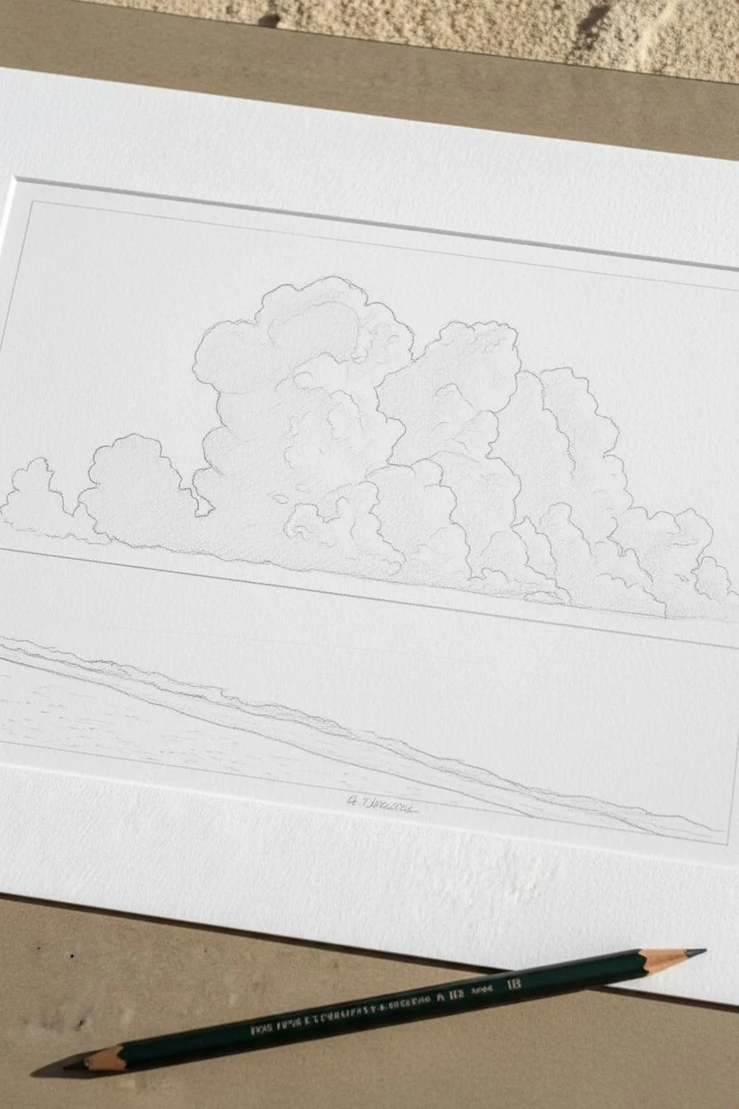
Step 1: Laying the Foundations
-
Establish the horizon:
Using your ruler and a light H pencil, draw a perfectly straight horizontal line across the paper, positioning it roughly one-third of the way up from the bottom edge. -
Outline the cloud formations:
Lightly sketch the large, cauliflower-shaped outlines of the cumulus clouds. Let them dominate the upper two-thirds of the page, varying the sizes of the ‘bubbles’ for realism. -
Map the shoreline:
Sketch a gentle, slightly diagonal line near the bottom to indicate where the water meets the sand, and add a faint guideline for the breaking wave.
Step 2: The Sky and Clouds
-
Shade the background sky:
With a 2H or HB pencil, shade the sky behind the clouds. Start darker at the very top corners and fade gentler as you approach the horizon, creating a smooth gradient. -
Define cloud shadows:
Identify your light source (coming from the top right here). Using a B or 2B pencil, lightly shade the bottom left areas of each cloud puff to establish volume. -
Deepen the contrast:
Switch to a 4B pencil to add intense darks to the deepest crevices between the cloud formations. I assume a confident hand here to make the white tops really pop. -
Soften the textures:
Use small, circular pencil motions (scumbling) to create the soft, cotton-like texture of the clouds, blending the dark shadows into the lighter mid-tones. -
Erase for highlights:
Use a kneaded eraser to lift off graphite on the rounded tops of the clouds, ensuring the paper remains pure white for the brightest highlights.
Smudge Prevention
Place a clean sheet of scrap paper under your drawing hand. This acts as a barrier, preventing your palm from smearing the graphite or transferring oils to your beautifully shaded sky.
Step 3: The Ocean
-
Darken the horizon line:
With a sharp 4B pencil, draw a crisp, dark line at the horizon. The water is usually darkest right where it meets the sky. -
Create water reflections:
Use long, horizontal back-and-forth strokes to shade the water. Press firmer under the dark cloud areas to mimic their reflection on the ocean surface. -
Fade to the shore:
As you move down from the horizon toward the shore, lighten your pressure to simulate the transparency of shallower water.
Framing for Impact
To exactly recreate the look in the photo, cut a custom window mount (mat board) from white cardstock. The white border instantly elevates the drawing from a sketch to a finished art piece.
Step 4: The Shoreline & Details
-
Form the breaking wave:
Draw the cylindrical shape of the small rolling wave. Shade the face of the wave darker, but leave the top edge ragged and white to represent foam. -
Texture the foam:
Add tiny, irregular scribbles just below the wave to look like sea foam rushing up the sand. -
Render the sand:
Use an HB pencil held at a low angle to shade the foreground. Use a stippling technique (tapping the pencil) or rough texture to mimic grainy sand. -
Add foreground variation:
Add a few darker divots or irregular patches in the sand to suggest footprints or uneven terrain. -
Final value check:
Step back and assess your contrast. Darken the deepest cloud shadows and the horizon line one last time to balance the image. -
Clean up:
Use your eraser to clean up the borders, creating a sharp rectangular edge that looks professional, ready for a mat board.
Now that you have captured the mood of the coast, you have a timeless piece of art ready to display.


Have a question or want to share your own experience? I'd love to hear from you in the comments below!