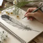
When I’ve only got a pencil and a blank page, I like to lean on simple subjects that still feel impressive once you add pencil shading and a little patience. Here are my go-to drawing ideas with pencil—starting with the classics you’ll actually want to sketch, then moving into more playful, imaginative twists.
Eye Close-Up With a Catchlight
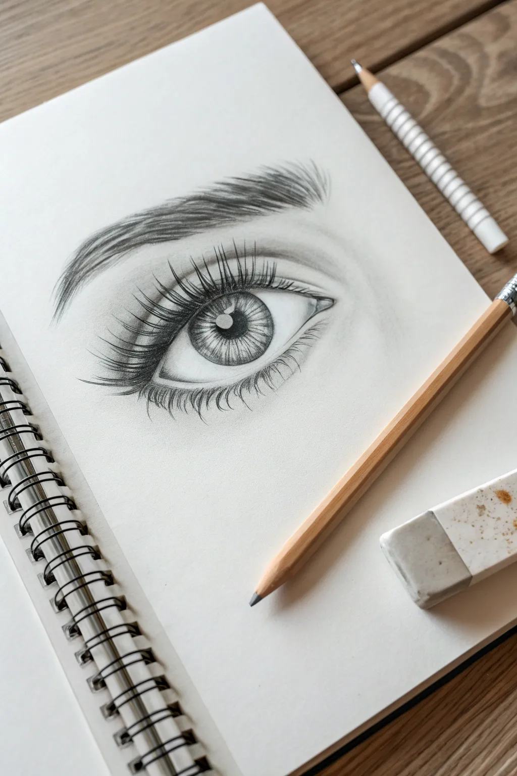
This detailed graphite drawing captures the soulful depth of a human eye, complete with striking lashes and a lifelike catchlight. By focusing on tonal values and texture, you’ll learn to render the moisture and curvature that makes an eye look real.
Step-by-Step
Materials
- Smooth bristol paper or drawing sketchbook
- Set of graphite pencils (HB, 2B, 4B, 6B)
- Mechanical pencil (0.5mm HB or 2B)
- High-polymer eraser
- Precision eraser pencil (optional but recommended)
- Blending stump or tortillon
- Soft tissue
Step 1: Basic Structure and Outline
-
Outline the eye shape:
Begin with a very light HB pencil to sketch the almond shape of the eye. Notice how the upper lid curve is steeper than the lower lid. -
Position the iris and pupil:
Draw a perfect circle for the iris, partially covered by the upper eyelid. inside that, place a smaller circle for the pupil, ensuring it is centered. -
Mark the catchlight:
Before shading anything, draw a small, crisp rectangle or organic shape overlapping the pupil and iris. This is the catchlight—the reflection of the light source—and must remain perfectly white. -
Add skin folds:
Lightly sketch the crease of the upper eyelid, mirroring the curve of the lash line but slightly higher up. Add a subtle indication of the lower lid’s thickness (the waterline) and a faint line for the eyebrow shape above.
Preserve Your White
The catchlight is the most important part! Never shade over it intending to erase later; graphite creates a grey stain. Draw around it to keep the paper pristine white.
Step 2: Shading the Iris and Pupil
-
Darken the pupil:
Using a 4B or 6B pencil, fill in the pupil with a deep, solid black, being extremely careful not to cross into the catchlight area. -
Outline the iris rim:
Darken the outer edge of the iris circle. The line should be slightly fuzzy, not razor-sharp, to look natural. -
Add radial texture:
With a sharp 2B pencil or mechanical pencil, draw fine lines radiating from the pupil outward toward the rim, like bicycle spokes. Vary their lengths and darkness. -
Create depth in the iris:
Shade the upper part of the iris (under the eyelid) darker using a 4B pencil. This shadow cast by the upper lid is crucial for realism. I find blending this slightly downwards helps integrate the texture. -
Blend the iris:
Use a tortillon to gently smudge the radial lines, softening the texture while keeping the highlights lighter near the bottom of the iris.
Uneven Shading?
If your shading looks scratchy, use small circular motions with a duller pencil tip rather than back-and-forth strokes. A tissue or tortillon can smooth out the grain.
Step 3: Rendering the Sclera and Skin
-
Shade the eyeball (sclera):
The white of the eye isn’t actually pure white. Use an HB pencil to lightly shade the corners and the area directly under the upper lid, leaving the center brightest to show the roundness. -
Define the waterline:
Draw the lower rim of the eye (waterline). Keep the top edge of this rim light (wetness highlight) and shade beneath it where the lashes will grow. -
Shade the eyelid crease:
Deepen the upper eyelid crease with a 2B or 4B pencil. Blend the shadow upwards toward the brow bone to create a soft transition. -
Add tear duct details:
Detail the inner corner (tear duct) with soft, irregular organic shapes and shading, highlighting the moist fleshy area.
Step 4: Lashes and Eyebrows
-
Draft the eyebrow hairs:
Using a sharp HB pencil, sketch individual brow hairs following the natural growth direction—upward at the start, flattening out towards the tail. -
Thicken the brows:
Layer 2B strokes over your initial draft to build density. Make the bottom of the brow slightly darker and cleaner, while the top remains feathery. -
Plot lash direction:
Lightly mark the direction of the eyelashes. Remember they curve; they don’t stick straight out like sticks. -
Draw upper lashes:
With a 4B pencil or sharp mechanical pencil, draw the upper lashes starting from the eyelid root, pressing hard, and flicking the pencil up for a tapered tip. Group them in small clumps for a natural look. -
Draw lower lashes:
Add the lower lashes. These should be shorter, thinner, and more sparse than the top lashes, originating from the outer edge of the waterline. -
Refine the reflection:
Specifically for the catchlight, you can add a tiny reflection of the eyelashes inside the white highlight if you want extreme detail. -
Final contrast check:
Deepen the darkest Blacks (pupil, upper lash line) with a 6B pencil and use a precision eraser to pick out tiny highlights on the lower waterline or skin texture.
Step back and admire the piercing realism of your graphite eye study


Rose Bloom From Simple Shapes
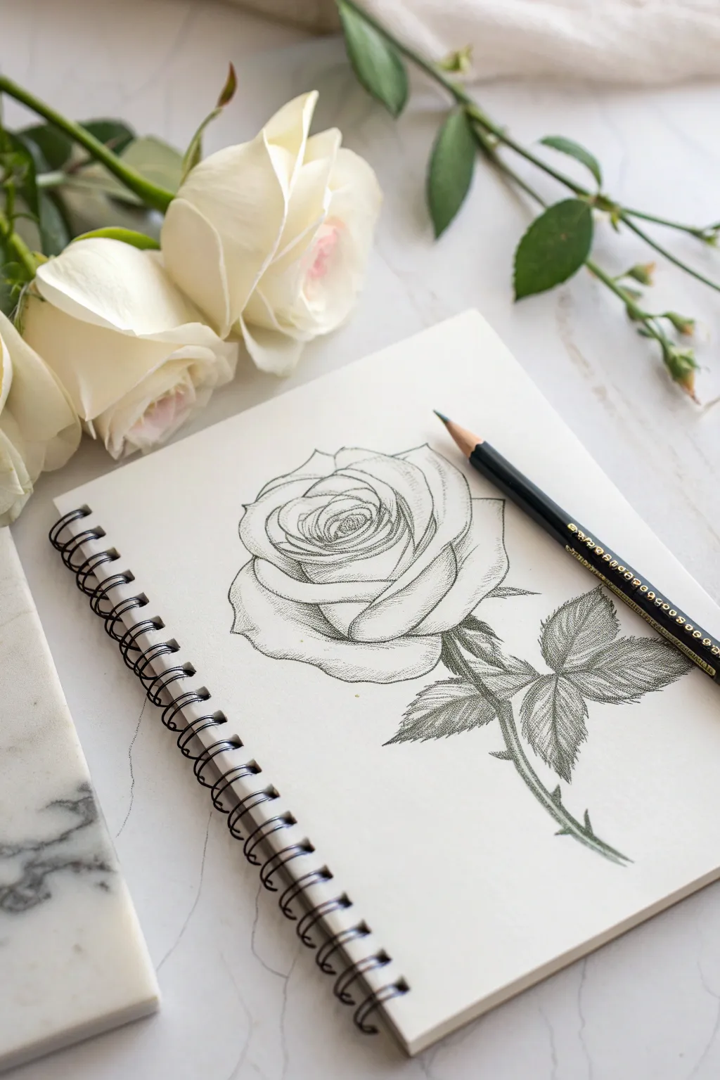
Capture the delicate unfolding of a rose bloom using nothing more than a simple graphite pencil. This tutorial guides you through building organic shapes into a structured, realistic flower with elegant shading and crisp details.
Detailed Instructions
Materials
- Sketchbook with smooth, heavy paper
- F or H graphite pencil (for light sketching)
- 2B or 4B graphite pencil (for shading)
- Fine liner or sharp HB pencil (optional for final outlines)
- Kneaded eraser
- Standard eraser
Step 1: Shaping the Bloom
-
Establish the core:
Begin by lightly sketching a small, tight oval in the upper center of your page. This will represent the tightly packed inner petals of the rose bud. Keep your pressure extremely light, as these lines are just guides. -
spiral outward:
Around that central oval, draw a loose spiral shape that expands slightly. Imagine the petals wrapping around one another. Don’t worry about petal edges yet, just focus on the flow of the center. -
Define the first petals:
Sketch irregular, U-shaped curves interlocking around your spiral. These are the first individual petals starting to unfurl. Give the top edges a slight dip or wave to make them look organic rather than perfectly round. -
Expand the bowl:
Draw larger, bowl-shaped petals cradling the bottom of the center. These should be wider and looser. Let the lines overlap slightly where petals would sit in front of or behind others. -
Add the outer guard petals:
Sketch the largest, outermost petals. Draw three or four big, sweeping curves that encompass the whole flower head. Make the edges curl slightly outward or fold over to suggest the weight of the bloom.
Stippling Secret
For a velvety texture, try stippling (lots of tiny dots) instead of hatching on the darkest curves of the petals. It softens the shading beautifully.
Step 2: Adding Structure
-
Draw the stem:
From the base of the lowest petal, extend a double line downwards for the stem. Keep it fairly straight but with a subtle, natural curve. Don’t make the lines perfectly parallel; stems often have little bumps and nodes. -
Position the leaves:
Draw a thin branch extending from the main stem to the right. Add outlines for three serrated leaves attached to this branch—one terminal leaf at the tip and two side leaves. Keep the leaf shapes generally oval with pointed tips. -
Refine the outline:
Switch to a slightly sharper or darker pencil. Go over your light sketch, carefully defining the final edges of the petals. Add little notches or tears to the petal rims for realism. Erase any confusing construction lines inside the shapes now. -
Add thorns:
Along the main stem, draw small, sharp triangular shapes curving slightly downwards. Placement is key here; putting one near the leaf junction often looks natural.
Step 3: Shading and Texture
-
Start the center shading:
Using a sharp pencil, begin shading the deepest recesses of the rose center. Use small, dense hatching strokes. The darkest areas should be where the petals disappear into the spiral. -
Contour the petals:
Shade the curved surfaces of the petals using sweeping lines that follow the form of the petal. If a petal curves downward, your pencil strokes should curve downward too. This directional shading creates volume. -
Create separation:
Darken the areas where one petal casts a shadow onto another. This contact shadow is crucial for distinguishing the layers. I find that deepening these crevices instantly makes the flower pop off the page. -
Detail the leaves:
Draw a central vein down the middle of each leaf. From there, sketch smaller veins branching out towards the serrated edges. Shade the leaves by darkening one side of the central vein more than the other to imply a folded shape. -
Texture the stem:
Add linear shading along one side of the stem to make it look cylindrical. Use short, cross-hatching marks near the thorns and leaf joints to suggest roughness. -
Final touches:
Review the entire drawing. Deepen the darkest blacks in the very center of the bloom and under the leaves to increase contrast. Use a kneaded eraser to lift off graphite on the petal rims, creating bright highlights.
Level Up: Dew Drops
Add realism by drawing tiny circles on a petal. Shade the top inside of the circle and add a bright white highlight at the bottom to create a water droplet.
Now you have a permanent bloom that captures the elegance of nature in grayscale


Coffee Mug and Soft Cast Shadow
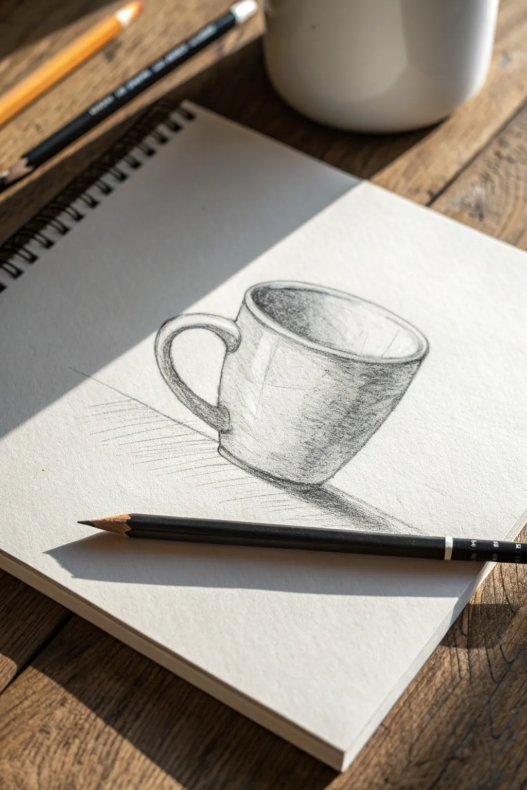
Capture the cozy essence of a morning ritual with this realistic pencil study of a classic coffee mug. You will learn to render cylindrical forms, rounded handles, and the interplay of light and shadow for a dimensional effect.
Step-by-Step Guide
Materials
- Spiral-bound sketchbook (medium tooth paper)
- Graphite pencils (HB, 2B, 4B)
- Black colored pencil (optional for deepest darks)
- Kneaded eraser
- Pencil sharpener
Step 1: Constructing the Form
-
Establish the central axis:
Start by drawing a very faint vertical line in the center of your page to act as an anchor for the mug’s symmetry. -
Draw the top ellipse:
Visualize the opening of the mug. Draw a flattened oval (ellipse) centered on your veritcal line. Keep the edges rounded, not pointed like a football. -
Define the sides:
Drop two vertical lines down from the widest points of your ellipse. These should taper slightly inward as they go down, just like a standard ceramic mug often does. -
Base curvature:
Connect the bottom of the two vertical lines with a curve that mirrors the bottom curve of your top ellipse. This ensures the mug looks round at the bottom, not flat. -
Add the rim thickness:
Draw a second, slightly smaller ellipse inside the first one to give the mug a thick, ceramic rim. -
Rough in the handle:
Sketch a ‘C’ or ear shape on the left side. Notice how the top of the handle usually attaches near the rim and loops down to the lower body. Draw both the outer and inner curves to give it volume.
Wobbly Ellipses?
If your mug opening looks lopsided, turn your sketchbook upside down. Viewing it from a new angle makes asymmetry jump out, making it easier to correct the curves.
Step 2: Shading and Definition
-
Clean up your lines:
Use your kneaded eraser to lightly lift away the central axis line and any messy construction marks, leaving only the clean outline. -
Establish the light source:
Decide where your light is coming from. In this reference, the light hits the front/left, creating a strong shadow on the right side of the exterior and the left side of the interior. -
Interior shading:
Using an HB pencil, shade the inside of the mug on the left side. Use curved hatching strokes that follow the roundness of the cup, fading to white on the right interior wall. -
Exterior core shadow:
Switch to a 2B pencil. Apply shading to the right side of the mug’s exterior. The darkest part (core shadow) shouldn’t be right on the edge; leave a tiny sliver of ‘reflected light’ on the far right edge. -
Mid-tones and blending:
Extend the shading across the front of the mug but keep it much lighter. I usually use light, diagonal hatch marks here to suggest the ceramic texture without making it too dark. -
Handle dimension:
Shade the underside of the handle and the area where it connects to the mug. Keep the top surface of the handle bright to show it catching the light.
Steam Rising
Add atmosphere by gently erasing squiggly, vertical lines above the mug to suggest steam. This subtle negative space technique makes the coffee look hot and fresh.
Step 3: Contrast and Shadows
-
Deepen the contact points:
Use a 4B pencil or black colored pencil to darken the very bottom edge of the mug and the sharp crease under the handle. -
Cast shadow placement:
Sketch the shape of the shadow cast on the table. It should stretch out to the right, starting from the base of the mug. -
Filling the cast shadow:
Fill in this shadow shape firmly. It should be darkest right near the mug and can get slightly softer or lighter as it moves away. -
Surface lines:
Add faint, directional lines on the table surface (horizontal or slight diagonal hatching) around the shadow to ground the object so it doesn’t look like it’s floating. -
Rim highlights:
Ensure the top rim remains crisp white. You can use an eraser to clean up this edge if your pencil smudged into it. -
Final texture check:
Add a few scratchy, loose marks within your shaded areas to give the drawing that artistic, sketchy feel rather than perfectly smooth blending.
Enjoy the quiet satisfaction of seeing a simple object come to life on your paper


Songbird on a Branch
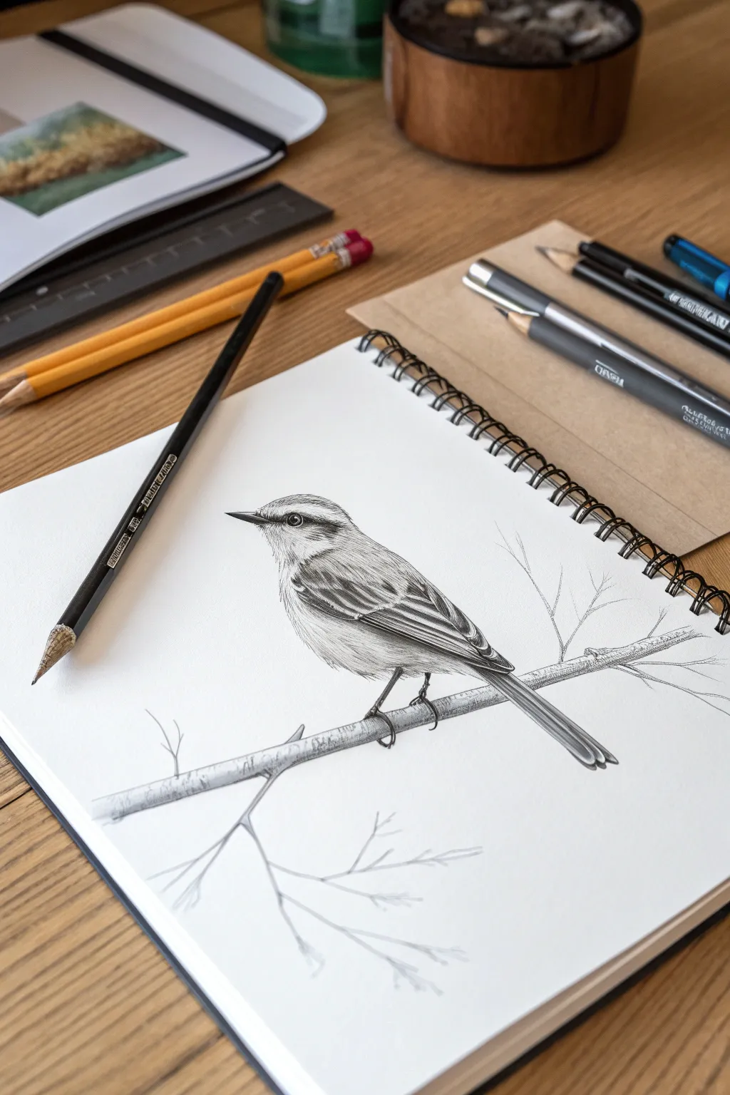
Capture the delicate beauty of nature with this detailed pencil study of a small songbird perching on a twig. Using simple graphite tools, you will build up layers of texture to create realistic feathers and lifelike depth.
Step-by-Step Guide
Materials
- H or HB pencil (for sketching)
- 2B pencil (for mid-tones)
- 4B or 6B pencil (for deep shadows)
- Smooth heavyweight drawing paper or sketchbook
- Kneaded eraser
- Pencil sharpener
Step 1: Drafting the Basic Form
-
Establish the posture:
Begin lightly with an HB pencil. Draw a slanted oval for the bird’s body and a smaller circle slightly overlapping the top left for the head. Connect these shapes with gentle, curving lines to form the neck. -
Add guide lines:
Sketch a diagonal line passing underneath the bird’s feet—this will become the main branch. Add a thin triangle shape extending from the back for the tail feathers. -
Define the features:
Draw a small, sharp triangle for the beak on the left side of the head. Place a small circle for the eye, aligned just behind the beak line. Sketch the basic stick legs extending down to grip the branch line.
Fixing Flatness
If the bird looks flat, darken the shadows under the wing and belly. Stronger contrast between light and dark creates roundness.
Step 2: Developing the Eye and Beak
-
Detail the eye:
Switch to a 4B pencil. Fill in the pupil with a dark, solid black, but leave a tiny, crisp white circle (highlight) near the top edge to simulate wetness and life. -
Refine the beak:
Define the beak’s shape with a sharper line. Shade the upper beak darker than the lower one, leaving a thin highlight along the top ridge. -
Create the facial mask:
Using a 2B pencil, draw the distinct dark stripe running through the eye—this is characteristic of many warblers. Feather the edges slightly so it doesn’t look like a solid cutout.
Step 3: Feather Texturing
-
Map the wing feathers:
Along the bird’s back and folded wing, verify your outline. Draw long, layered U-shapes to represent the primary feathers stacking on top of one another. -
Start the head tones:
Using extremely short, flicking strokes with the HB pencil, create the look of downy feathers on the crown of the head. Follow the curvature of the skull. -
Darken the wings:
Use the 2B and 4B pencils to shade the wing feathers. I prefer to press harder at the base of each feather and lift pressure toward the tip, creating a gradient that separates the layers. -
Add wing bars:
Leave two distinct bands of lighter paper across the dark wing feathers. These ‘wing bars’ add immediate realism and contrast. -
Shade the belly:
Switch back to the HB pencil. Using very light pressure, shade the underside of the bird. Keep the center of the chest mostly white, shading only the sides to create rounded volume.
Add Winter Flare
Draw tiny berries on the branch tips or add a few falling snowflakes for a cozy, seasonal winter scene.
Step 4: Branch and Finishes
-
Detail the branch:
Thicken your initial branch line. Add knots and small irregularities to the bark using short horizontal hatches and wobbly outlines. -
Ground the bird:
Draw the toes wrapping clearly around the branch. Use the 4B pencil to add a drop shadow underneath the tail and belly onto the branch itself to plant the bird firmly in space. -
Add secondary twigs:
Sketch thin, wispy twigs branching off the main perch. Keep these very light and loose compared to the bird to ensure they stay in the background. -
Define the tail:
Darken the tail feathers with long, linear strokes. Ensure the edges are sharp and clean against the white paper. -
Final contrast check:
Step back and look at the drawing. Use your darkest pencil to deepen the eye, the gap between wing feathers, and the shadow under the legs. -
Clean up:
Use the kneaded eraser to pick up any stray graphite smudges on the white background, keeping the negative space pristine.
Enjoy the quiet satisfaction of seeing your realistic bird take flight on the page

PENCIL GUIDE
Understanding Pencil Grades from H to B
From first sketch to finished drawing — learn pencil grades, line control, and shading techniques.
Explore the Full Guide
Hand Study Holding an Object
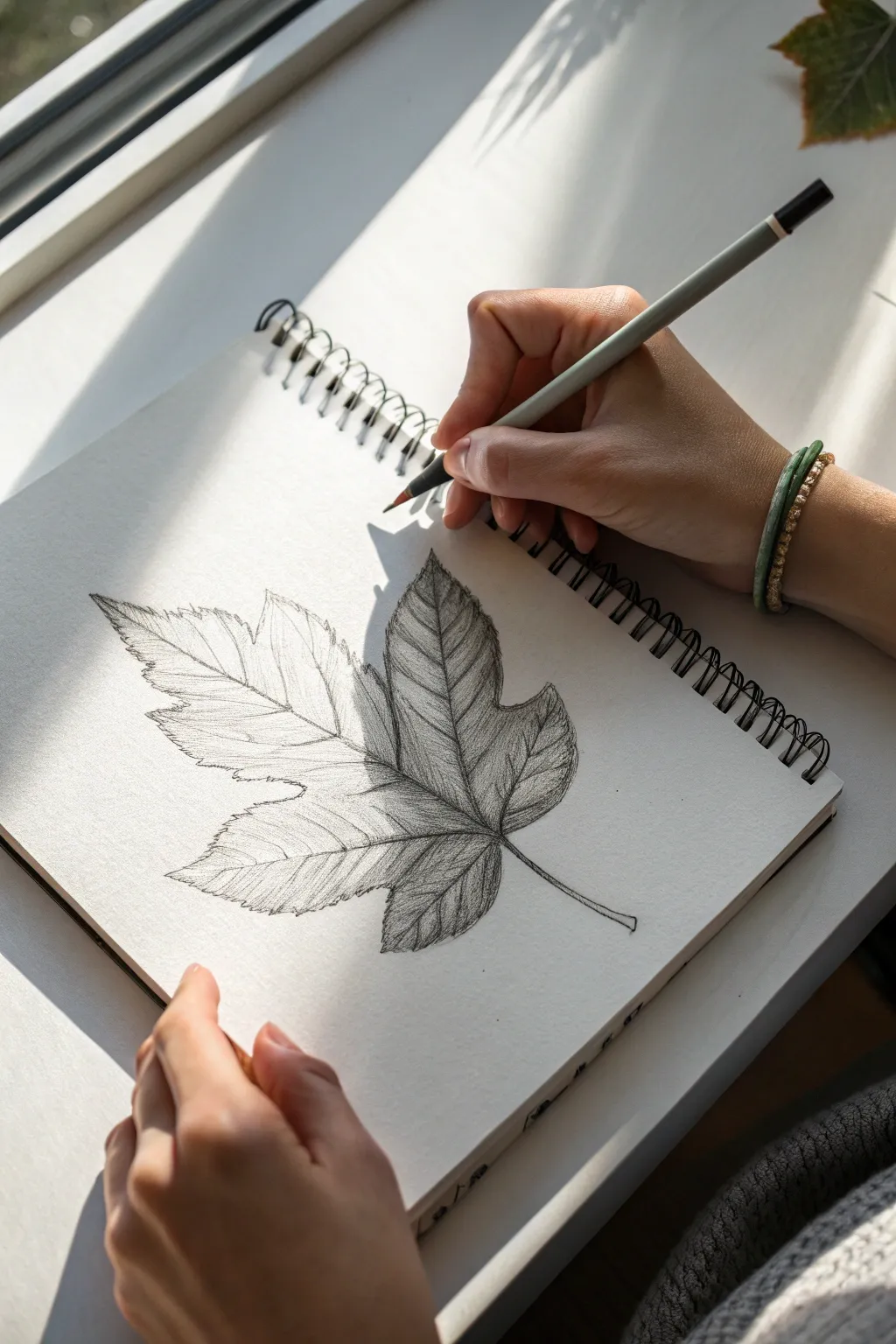
This tutorial guides you through creating a detailed graphite pencil drawing of a maple leaf, focusing on delicate vein structures and realistic shading. The result is a crisp, nature-inspired study that captures the organic flow and texture of a dried autumn leaf.
How-To Guide
Materials
- Spiral-bound sketchbook (medium tooth paper)
- Graphite pencils (HB, 2B, 4B)
- Mechanical pencil (0.5mm HB) for fine details
- Kneaded eraser
- Blending stump or tortillon
- Real maple leaf or reference photo
Step 1: Laying the Foundation
-
Establish the axis:
Begin by lightly sketching a central curved line with your HB pencil. This will serve as the petiole (stem) and the main midrib of the leaf, determining the overall gesture and tilt. -
Mark the vertices:
Identify where the main veins branch out from the base of the leaf blade. Draw five primary lines radiating outward from this central point to map the main lobes of the maple leaf. -
Outline the lobes:
Lightly sketch the jagged perimeter of the leaf. Don’t worry about perfect jagged edges yet; focus on getting the general geometric shape of the five distinct lobes correct relative to your vein lines. -
Refine the serrations:
Go back over your perimeter outline and add the characteristic sharp teeth of the maple leaf. Vary the size of these points to make them look organic rather than mechanically uniform.
Step 2: Defining Structure
-
Thicken main veins:
Using a slightly sharper HB or mechanical pencil, define the five main veins. Instead of a single line, draw two very thin parallel lines that taper to a single point at the leaf tips to give the veins thickness. -
Add secondary veins:
Branching off the main veins, sketch the secondary network. These should angle upward and outward toward the leaf edges in a ‘V’ pattern. -
Clean up guidelines:
Take your kneaded eraser and gently dab away the initial construction lines and any heavy outlining. You want the structure to remain visible but faint enough not to interfere with shading.
Smudge Prevention
Place a scrap piece of paper under your drawing hand. This acts as a shield, preventing your skin oils and movement from dragging graphite across your clean paper.
Step 3: Shading and Texture
-
Start shading the right side:
Switch to a 2B pencil. Begin applying tone to the lobes on the right side of the leaf first. Use short, hatched strokes that follow the direction of the secondary veins. -
Build contrast near veins:
Darken the areas immediately adjacent to the main veins. This negative shading technique makes the pale veins appear to pop forward compared to the leaf tissue. -
Blend for smoothness:
Use a blending stump to gently soften the graphite strokes on the right side. Be careful not to smudge over the bright white highlights of the veins you preserved. -
Shade the left side:
Move to the left side of the leaf. Apply a lighter touch here if you want to mimic the lighting in the reference, keeping the tones closer to a mid-grey rather than deep black. -
Create surface undulation:
To make the leaf look crinkled rather than flat, darken the ‘valleys’ between the veins and leave the centers of the leaf sections lighter. This mimics how light hits a structured surface.
Vein Technique
Instead of drawing veins as dark lines, try drawing the shadows *around* them. Leaving the paper white for the vein creates a much more realistic, raised effect.
Step 4: Final Details
-
Deepen the shadows:
Use a 4B pencil to add your darkest values. Concentrate these deep darks in the crevices where the lobes meet and at the very base where the stem connects. -
Detail the stem:
Shade the stem (petiole) with a gradient, keeping one side darker to show its cylindrical form. Ensure the connection point to the leaf blade is seamless. -
Enhance edges:
Sharpen your mechanical pencil and crisp up the serrated edges of the leaf. A few specific sharp points help define the silhouette clearly against the white paper. -
Lift highlights:
Mold your kneaded eraser into a fine point. Gently tap or stroke the paper to lift graphite from the highest points of the leaf tissue and clean up any smudged veins.
Now you have a timeless botanical sketch ready to be preserved in your sketchbook
Mountains With Atmospheric Perspective
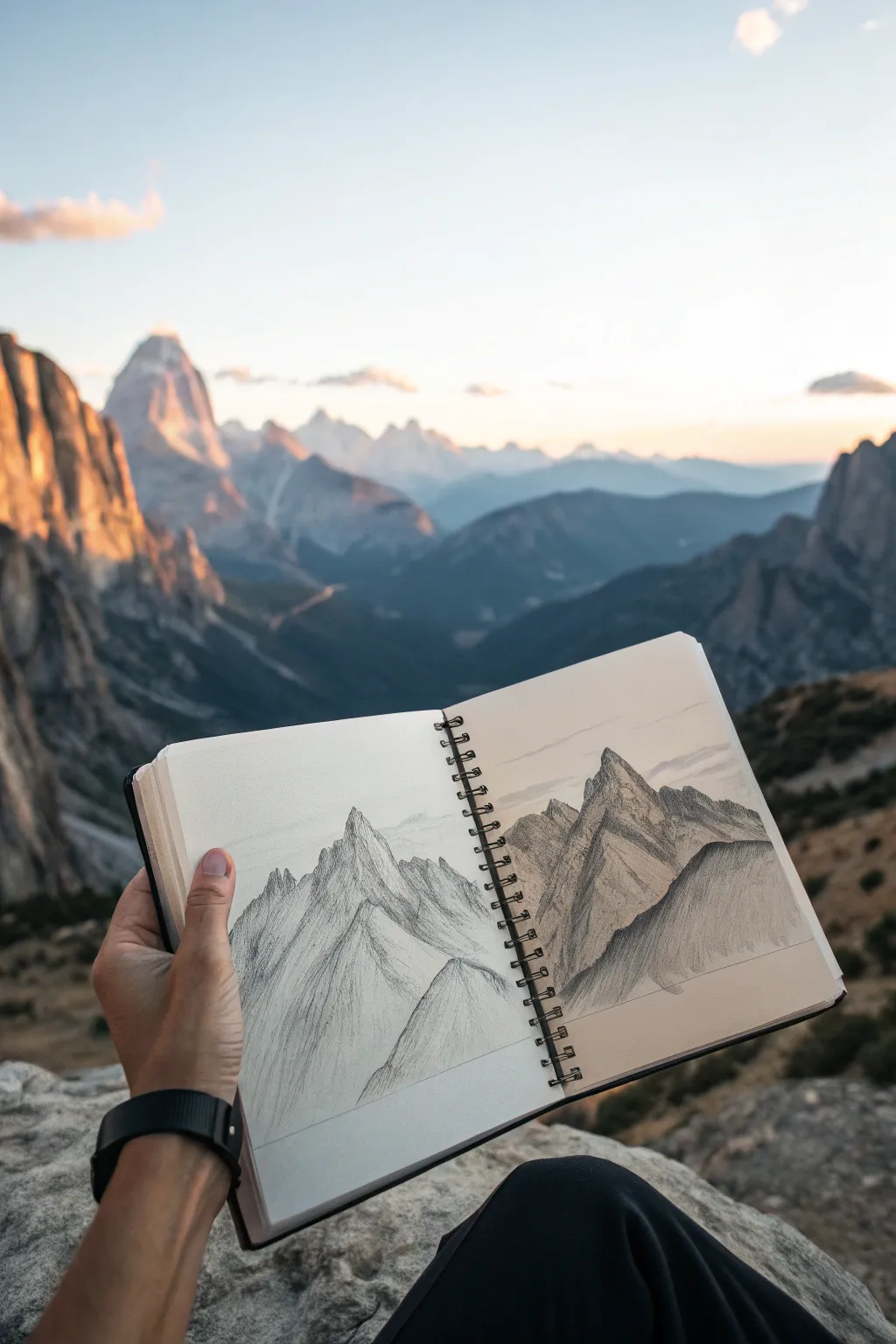
Capture the grandeur of a mountain range with this atmospheric pencil study. By layering values from light to dark, you will create a stunning sense of depth that makes the peaks feel miles away.
Step-by-Step Guide
Materials
- Spiral-bound sketchbook (medium weight paper)
- Graphite pencils (HB, 2B, 4B)
- Kneaded eraser
- Pencil sharpener
- Blending stump or tissue
- Reference photo of mountains (or a real view)
Step 1: Drafting the Composition
-
Establish the Horizon:
Begin by lightly sketching a faint horizon line about one-third up from the bottom of your page using an HB pencil. This anchors your mountains and prevents them from floating. -
Outline the Foreground Peak:
Draw the jagged outline of the largest, closest mountain peak on the right side of the spread. Make this outline distinct and sharp, as it is the nearest element to the viewer. -
Map the Middle Ground:
Sketch the outlines of the central peaks slightly behind the first one. Let these lines overlap behind the foreground mountain to immediately suggest spatial depth. -
Sketch Distant Ranges:
Lightly draw the faint, rolling silhouettes of the furthest mountains in the background. Keep these lines very delicate and less detailed than the foreground shapes.
Muddy Shadows?
If your mountains look like grey blobs, your pencil might be too dull. Sharpen frequently for crisp rock textures, and use a piece of paper under your hand to prevent smudging your work.
Step 2: Shading and Texture
-
Shade the Darkest Shadows:
Switch to a 4B pencil to block in the deepest shadows on the foreground mountain. Focus on the steep, right-facing slopes that would be hidden from the light source. -
Add Rock Texture:
Using a 2B pencil, add directional hatching lines to the sunlit sides of the foreground peak. Mimic the vertical flow of rock strata; don’t just color it in, but follow the form of the stone. -
Create Middle Values:
Move to the middle-ground mountains using an HB pencil. Shade these with a more uniform, lighter grey tone. I prefer to keep the contrast lower here to simulate atmospheric haze. -
Enhance the Ridge Lines:
Sharpen your 2B pencil and re-trace the ridge lines of the main peaks. Break the line occasionally to suggest snow or uneven rock rather than a perfect wire outline. -
Soften the Background:
For the furthest mountains, use the side of your HB pencil to create a very pale, soft wash of grey. You can smudge this slightly with a tissue to make it look out of focus.
Add a Human Element
To show the immense scale of the landscape, draw a tiny silhouette of a hiker or a small cabin at the very bottom edge of the page. This instantly makes the mountains look massive.
Step 3: Refining Details
-
Define Cracks and Crevices:
Use your sharpest 4B pencil to draw thin, jagged cracks within the shadowed areas of the foreground mountain. This adds tactile realism to the rocky surface. -
Lift Highlights:
Take your kneaded eraser and pinch it into a wedge shape. Gently tap or lift graphite off the tips of the peaks and the sun-facing ridges to create bright snow highlights. -
Add Subtle Scree:
At the base of the mountains, add tiny dots and short dashes to represent fallen rocks and scree slopes. Keep these marks loose and random. -
Balance the Sky:
Lightly sketch a few horizontal, wispy cloud lines interacting with the peaks. Keep the sky largely empty to emphasize the height of the mountains. -
Final Contrast Check:
Step back and assess your values. Darken the nearest shadows one last time to ensure the foreground pops against the hazy background triangles.
With your peaks defined and shadows deep, you have a rugged landscape ready to explore from the comfort of your notebook
BRUSH GUIDE
The Right Brush for Every Stroke
From clean lines to bold texture — master brush choice, stroke control, and essential techniques.
Explore the Full Guide
Seashell Spiral With Smooth Values
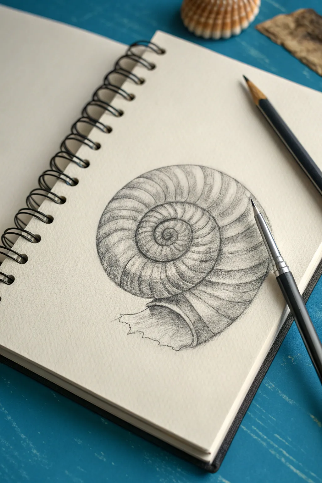
Capture the timeless beauty of an ammonite fossil or seashell using simple graphite shading techniques. This project focuses on building a precise spiral structure and adding smooth, graduated values to create a realistic, three-dimensional effect.
Step-by-Step
Materials
- Spiral sketchbook (smooth or medium tooth paper)
- HB pencil (for initial sketching)
- 2B and 4B graphite pencils (for shading)
- Mechanical pencil (optional, for fine details)
- Kneaded eraser
- Blending stump or tortillon (optional)
Step 1: Constructing the Spiral
-
Mark the center:
Begin by placing a small dot in the center of your page to act as the anchor for your spiral. -
Draw the inner curve:
Lightly sketch a small, tight circle around your center dot. As you complete the circle, don’t close it; instead, let the line continue outward to start the spiral path. -
Expand the whorls:
Continue drawing the line outward, gradually increasing the distance from the previous loop. Imagine the shell getting wider as it grows. Keep your pressure extremely light so you can erase corrections easily. -
Define the outer edge:
Draw approximately three to four full rotations, finishing with a large, sweeping curve that defines the opening of the shell. -
Sketch the opening:
At the end of your spiral, draw an irregular, slightly jagged lip shape to represent the broken or weathered opening of the fossil.
Step 2: Adding Texture and Structure
-
Add radial ribs:
Starting from the center, lightly draw curved lines that radiate outward across the width of the spiral. These lines represent the ridges or ‘ribs’ of the shell. -
Creating the flow:
Ensure these rib lines curve gently following the direction of the spiral. They should look like parentheses wrapping around a tube. -
Detailing the ridges:
Go over your rib lines with a slightly darker stroke. Make the lines thicker near the outer edge of each whorl and thinner towards the inner seam. -
Refining the outline:
Trace over your main spiral outline with a firmer hand to lock in the shape, cleaning up any messy stray lines with your kneaded eraser.
Reference Trick
If the spiral shape is tricky, lightly draw a ‘Golden Ratio’ rectangle grid first. This guides the expansion of your curves so they don’t look lopsided.
Step 3: Shading and Form
-
Base shading:
Using a 2B pencil, apply a light layer of graphite along the bottom edge of each spiral tier. This establishes the basic cylindrical volume. -
Deepening the shadows:
Switch to a 4B pencil to darken the crevices where the spiral loops touch each other. This deep recess needs the strongest contrast to separate the layers. -
Shading the ribs:
Add shading on the side of each individual rib line. Imagine light coming from the top left, casting tiny shadows behind each ridge to make them pop. -
Smooth the gradients:
I like to gently smudge these transitions with a blending stump or just a light touch of the pencil to soften the texture, giving it that worn, fossilized look. -
Highlighting:
Use your kneaded eraser to lift off graphite on the highest points of the shell (the center of the tube shape) to create a dull shine. -
Finishing the opening:
Darken the inside of the shell opening significantly to show depth. Texture the jagged edge with small, scratchy marks to mimic broken calcium. -
Final touches:
Review your values. Deepen the blackest shadows one last time to ensure the shell looks heavy and solid on the page.
Try Colored Paper
Draw this on tan or grey toned paper. You can then use a white charcoal pencil for the highlights, making the fossil look incredibly 3D and tangible.
Now you have a beautifully constructed shell study that captures both mathematical precision and organic texture
Old Key and Keyhole Mini Composition
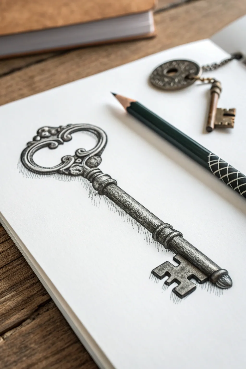
Capture the charm of a bygone era with this realistic graphite drawing of an ornate skeleton key. This project focuses on metallic textures, dramatic shading, and intricate scrollwork to create a vintage illustration that pops off the page.
Step-by-Step Tutorial
Materials
- High-quality bright white sketchbook paper (smooth or vellum finish)
- Set of graphite pencils (HB, 2B, 4B, 6B)
- Standard eraser
- Fine-point mechanical pencil (0.5mm) for detail
- Blending stump or tortillon
- Ruler (optional)
Step 1: Drafting the Structure
-
Establish the central axis:
Begin by lightly drawing a diagonal line across your page to serve as the spine of the key. This ensures your key remains straight and symmetrical as you build the details around the shaft. -
Mapping the shapes:
Using an HB pencil with a very light hand, sketch a large oval at the top left for the bow (handle) and a rectangular block at the bottom right for the bit (the part that turns in the lock). -
Defining the shaft:
Draw parallel lines on either side of your central axis to create the cylinder of the key’s shaft. Don’t make it perfectly straight; add slightly wider sections near the handle and just above the bit to suggest decorative collars.
Step 2: Designing the Ornate Bow
-
Sketching the scrolls:
Inside the top oval, lightly map out the intricate scrollwork. The drawing features heart-shaped curves that meet in the center. Think of these as fluid, ribbon-like shapes rather than rigid metal yet. -
Refining the top loop:
Thicken the outline of the bow, adding small decorative bumps or ‘beads’ along the outer rim. Keep your lines loose; we will sharpen them later. -
Connecting to the shaft:
Draw the transition where the decorative handle meets the straight shaft. This area often has a flared, cup-like shape with small engraved details.
Fixing Flatness
If the key looks flat, your highlights aren’t bright enough. Use a distinct white eraser to scrub a clean line down the center of the shaft to force the 3D illusion.
Step 3: Building the Bit and Shaft
-
Detailing the teeth:
Move to the bottom rectangle. Carve out the ‘teeth’ of the key. This specific key has an ‘E’ or comb-like shape with distinct notches. Ensure the edges look squared off and mechanical. -
Creating the collars:
Along the shaft, define the ring-like ridges (collars). These act as decorative stops on the metal rod. Give them a slight curve to emphasize the cylindrical 3D form. -
Cleaning the linework:
Take your eraser and gently remove the initial axis line and any stray construction marks. Go over your main outline with a slightly firmer stroke to finalize the silhouette.
Aged Patina
To make the key look more antique, lightly tap a kneading eraser over the shaded areas to create patchy, uneven spots that resemble rust or tarnish.
Step 4: Shading and Texture
-
Base tone application:
Using a 2B pencil, apply a light, even layer of shading to the entire key, leaving reserved white strips on the top edge of the shaft and the high points of the handle to act as highlights. -
Defining the cylinder:
Darken the bottom edge of the shaft significantly using a 4B pencil. The gradient should go from dark at the bottom to the white highlight at the top, creating a round, metallic look. -
Shading the scrollwork:
Add shadows to the inner crevices of the handle design. The deepest recesses where the metal curves under should be nearly black. I like to switch to a 6B here for maximum contrast. -
Adding texture to the metal:
Instead of perfectly smooth shading, use small, erratic vertical tick marks or stifling on the shaft. This mimics the pitted, aged surface of cast iron or antique brass. -
Sharpening the bit:
Shade the flat faces of the key’s teeth. Create strong contrast between the front face (lighter) and the side thickness (darker) to make it look three-dimensional. -
Blending for realism:
Use a tortillon or blending stump to smudge your graphite gently. Don’t over-blend; you want to keep some of that pencil texture visible to retain the ‘sketch’ aesthetic.
Step 5: Final Touches
-
Deepening high-contrast areas:
Re-evaluate the darkest blacks. Use your 6B or a charcoal pencil to punch up the cast shadows inside the bow loops and under the collars. -
Adding the drop shadow:
Using the side of a soft pencil (4B), create a diffused shadow beneath the key. Notice how the shadow mimics the shape of the key but is softer and breaks apart into hatch marks at the edges. -
Hatching the shadow edge:
To match the reference style, extend the drop shadow with fine, vertical hatch lines that fade out. This stylistic choice gives the drawing an artistic, etched appearance. -
Restoring highlights:
Take a clean edge of your eraser and lift out bright highlights on the rounded top of the collars and the rim of the bow. Sharp highlights are crucial for convincing metal textures.
Your vintage key is now complete, ready to unlock a whole sketchbook of antique studies


Simple Street Corner in One-Point Perspective
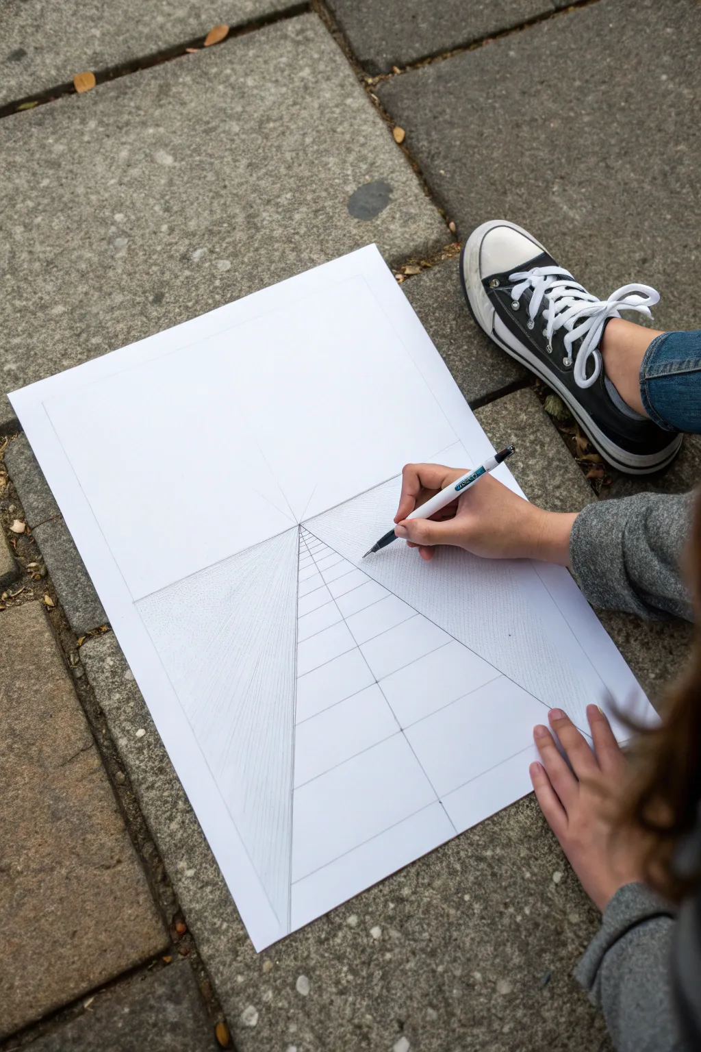
Learn the fundamental technique of one-point perspective by constructing a clean, precise street grid. This foundational exercise creates the illusion of depth using a single vanishing point, perfect for beginners looking to draw architectural scenes or cityscapes.
Detailed Instructions
Materials
- Large white drawing paper (A3 or similar)
- Mechanical pencil or fine-point pen
- Long ruler (30cm or 60cm)
- Eraser
- Flat surface or drawing board
Step 1: Setting the Horizon
-
Paper Preparation:
Start by finding a comfortable, flat surface, like a patio or large desk, where you can lay your paper flat. Ensure your paper is orientated vertically (portrait mode) to give you plenty of depth for the street. -
Establish the Horizon Line:
Using your ruler, draw a faint horizontal line across the middle of your paper. This is your ‘Horizon Line’ or eye level. Keep it light, as parts of it may be erased later. -
Mark the Vanishing Point:
Place a small but distinct dot exactly in the center of your horizon line. This is your ‘Vanishing Point’ (VP), where all parallel lines in your drawing will appear to converge.
Spacing Hack
To get realistic recession, make each subsequent horizontal gap roughly 2/3 the size of the previous one below it.
Step 2: Constructing the Street
-
Draw the Road Edges:
Place your ruler on the vanishing point and angle it downwards towards the bottom left corner of the paper. Draw a straight line from the VP to the bottom edge. Repeat this on the right side to create a wide triangle shape. -
Add Sidewalk Lines:
To create sidewalks, draw two more lines originating from the vanishing point. Place them slightly inside the first two diagonal lines you drew, narrowing the central road section. -
Add Vertical Grid Lines:
Now, draw a vertical line straight down from the vanishing point to the bottom edge of the paper. This center line acts as a guide for symmetry. -
Subdivide the Path:
Draw additional radiating lines from the vanishing point within the road and sidewalk areas. I find spacing them evenly creates a nice tiled effect later.
Step 3: Creating Depth with Transversals
-
First Horizontal Line:
Draw a horizontal line across the road section near the bottom of your paper. This represents the nearest crack or tile edge in your street. -
Apply the Receding Rule:
Draw the next horizontal line slightly above the first one. The key to perspective is spacing: as these horizontal lines get closer to the horizon line, the distance between them must get smaller. -
Continue the Grid:
Keep adding horizontal lines moving upward toward the VP. Each new gap should be visibly smaller than the previous one to create the illusion of distance. -
Check Ruler Alignment:
Ensure your ruler is perfectly parallel to the horizon line for every horizontal stroke. Even a slight tilt can ruin the illusion of flatness.
City Builder
Turn this grid into a city by adding vertical rectangles on the sides. Connect their tops to the VP to create 3D buildings.
Step 4: Adding Texture and Detail
-
Sidewalk Hatching:
For the areas flanking the central road (the sidewalks), use a fine-point pen or pencil to create tight, vertical hatching marks. -
Varying Line Density:
Make these hatching lines denser as they approach the vanishing point. This change in value reinforces the atmospheric perspective. -
Define the Curb:
Darken the lines that separate the sidewalk from the street to create a distinct ‘curb’ edge. -
Clean Up:
Erase any stray pencil marks that extend beyond your main triangle shape or mess up the crispness of the horizon line.
You now have a mathematically accurate street base ready for creative details
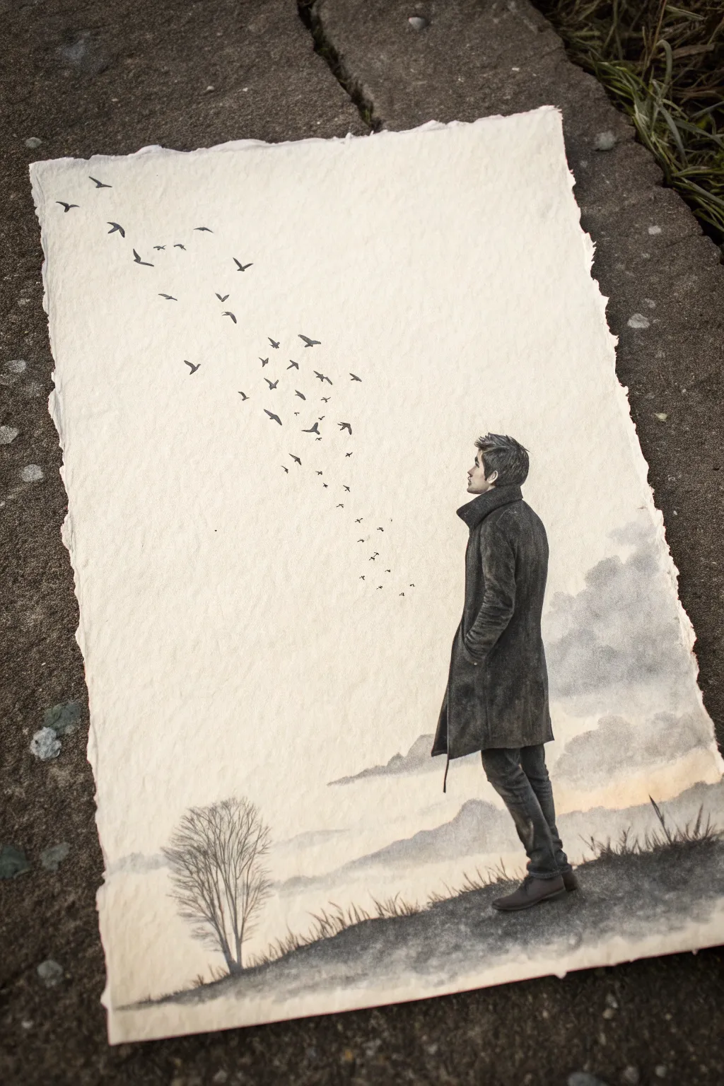
Figure Silhouette Turning Into Birds

This evocative project combines precise figure drawing with atmospheric landscape elements on textured paper. You will learn to create a moody sense of depth using pencil shading and ink, capturing a moment of quiet contemplation as a flock of birds takes flight.
Step-by-Step Guide
Materials
- Heavyweight textured paper with deckle edges (cotton rag or handmade paper works best)
- Graphite pencils (HB, 2B, 4B, 6B)
- Fine liner pens (black, 0.1mm and 0.3mm)
- Charcoal stick or soft pastel (grey/black)
- Blending stumps or tortillons
- Kneadable eraser
- Reference photo of a figure in profile
- Soft tissue or cotton ball
Step 1: Setting the Scene
-
Prepare the paper:
Begin by selecting a piece of heavy, textured paper. If your paper doesn’t have a deckle edge, you can gently tear the edges against a ruler to create that organic, handmade look. Place it on a smooth drawing board. -
Lightly sketch the horizon:
Using an HB pencil, very faintly mark out the horizon line in the lower third of the paper. Keep this uneven to suggest rolling hills or distant mountains. -
Draw the tree structure:
In the bottom left corner, lightly sketch a bare tree. Focus on the main trunk first, then branch out into finer twigs. The tree should look somewhat sparse to match the wintery mood.
Uneven Shading?
If your pencil shading looks scratchy, lay a piece of scrap paper over your drawing and rub firmly with a blending stump. The scrap paper protects the texture while smoothing the graphite underneath.
Step 2: Drawing the Figure
-
Outline the silhouette:
On the right side of the paper, sketch the outline of your figure using the HB pencil. Focus on the profile of the face, the collar of the coat, and the stance of the legs. The figure should be looking upward and to the left. -
Define the clothing folds:
Switch to a 2B pencil to add details to the coat. Pay attention to where the fabric bunches at the elbows and knees. These creases are essential for making the figure feel weighted and real. -
Shade the figure:
Using a 4B or 6B pencil, begin shading the coat. I like to layer the graphite here to get a deep, dark tone. Use light pressure at first and build up to the darkest blacks in the shadows of the folds. -
Refine facial features:
Use a sharp 2B pencil for the face and hair. Keep the details here delicate; you want a realistic profile but not an overly busy portrait. Add texture to the hair with short, directional strokes. -
Blend for texture:
Use a blending stump to smooth out the shading on the coat, creating a felt-like or wool texture. Keep the edges relatively crisp against the background.
Step 3: Creating Atmosphere
-
Add the distant mountains:
Using a piece of charcoal or a very soft pencil turned on its side, gently rub in the shapes of the distant hills. You want these to be blurry and soft, suggesting fog or distance. -
Smudge the clouds:
Above the mountains, use a dirty tortillon or a tissue with a little graphite dust to swirl in some faint cloud shapes. These should be very subtle, just enough to break up the empty space. -
Ground the figure:
Add a dark patch of ground beneath the figure’s feet using the 6B pencil. Scribble in some rough grass textures to connect the figure to the landscape.
Pro Tip: Depth of Field
Make the birds at the top left slightly blurry by gently tapping them with a clean finger. This mimics camera focus, making the birds near the figure feel sharper and closer.
Step 4: The Flight of Birds
-
Plan the flight path:
Visualize an arc stretching from the figure’s gaze towards the top left corner. Lightly dot this path if you need a guide. -
Draw the nearest birds:
Using a fine liner pen (0.3mm) or a very sharp dark pencil, draw the birds closest to the figure. These act as the transition point; some can look like loose specks, others like tiny wings. -
Add larger birds:
As you move up and left, draw distinct bird silhouettes. Vary the wing positions—some gliding flat, others with wings raised or dipped—to create a sense of dynamic movement. -
Fade into the distance:
For the birds at the very top left, make them smaller and fainter. You can switch back to a harder pencil (HB) here so they look further away in the atmospheric perspective.
Step 5: Final Touches
-
Deepen the blacks:
Review the figure’s coat and boots. If the graphite has developed a shine or looks too grey, go over the darkest shadows one last time with a 6B pencil or charcoal to ensure high contrast. -
Clean up highlights:
Use your kneadable eraser to lift off any smudges from the sky area, keeping the negative space clean. You can also tap the eraser on the clouds to create brighter white highlights. -
Soften the tree:
Ensure the tree at the bottom left isn’t too stark. Gently dab it with a tissue if it needs to look receded into the mist.
Place your finished drawing on a contrasting surface to photograph it and admire the moody depth you have created


Have a question or want to share your own experience? I'd love to hear from you in the comments below!