There is something incredibly satisfying about transforming a static sketch into a fluid masterpiece that looks like it is melting right off the page. I love how adding simple drip effects can instantly give your artwork that edgy, street-art vibe while being surprisingly relaxing to draw.
Classic Glossy Lips
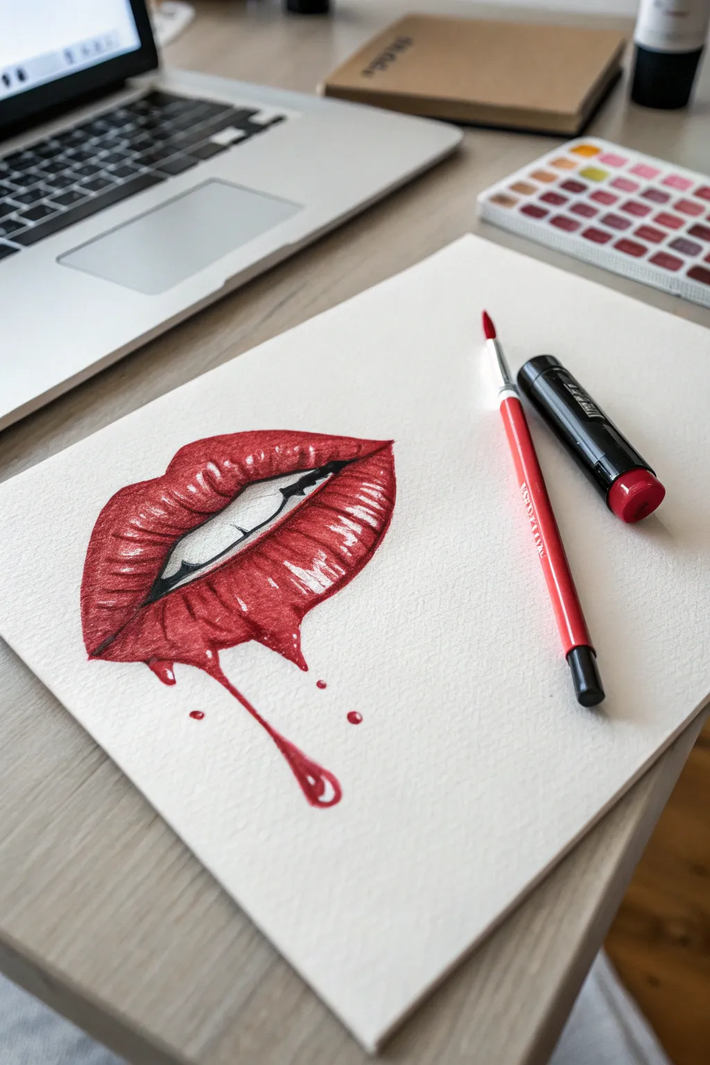
Master the art of texture and shine with this striking watercolor illustration featuring hyper-realistic glossy lips and a surreal drip effect. This project focuses on building distinct layers of red to create volume while utilizing negative space for those brilliant, wet-look highlights.
Step-by-Step Guide
Materials
- Cold-press watercolor paper (300gsm)
- Red watercolor paint (Alizarin Crimson or similar)
- Black watercolor or India ink
- Round synthetic brushes (Size 2 and 6)
- White gel pen or white gouache
- HB Pencil and kneaded eraser
- Paper towel
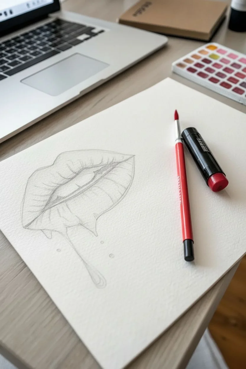
Step 1: Sketching the Contours
-
Outline the shape:
Begin by lightly sketching the outline of the lips with an HB pencil. Focus on a pronounced Cupid’s bow for the top lip. -
Open the mouth:
Draw the inner separation of the lips, creating a slight opening. Sketch a faint horizontal line to indicate the bottom edge of the top teeth. -
Add the drip:
On the bottom lip, choose a point slightly off-center and sketch a fluid line dripping downward, ending in a tear-drop shape. Add a few small disconnected droplets near the main drip. -
Map the highlights:
This is crucial for the glossy look: lightly outline the shapes of the brightest reflections on the bottom lip and the top of the Cupid’s bow. You will avoid painting these areas.
Fixing Bleeds
If your red paint accidentally bleeds into the teeth area, don’t wipe it! Blot it vertically with a clean paper towel immediately, then wait for it to dry before lifting the stain with a damp clean brush.
Step 2: Base Layers & Depth
-
Darken the interior:
Mix a very dark red or use black to fill in the empty space inside the mouth corners and strictly below the teeth line. This creates immediate depth. -
First color wash:
Using a diluted red and your size 6 brush, apply a light wash over the lips and the drip. -
Preserve the white:
Be very careful to paint around your mapped highlight areas, leaving the raw white paper showing through. -
Shadow the teeth:
Mix a very watery, pale gray and apply a tiny amount of shading to the top of the teeth where the upper lip casts a shadow. This prevents them from looking flat.
Step 3: Building Volume
-
Deepen the red:
Once the first layer is dry, load your brush with more saturated red. Apply this to the outer edges of the lips and the areas touching the mouth opening. -
Create texture lines:
Switch to a smaller brush. Using a sweeping motion, paint curved vertical lines on the bottom lip that follow the roundness of the mouth. -
Enhance the drip:
Paint the right side and bottom of the drip drop with a darker red, leaving a lighter center to give it a 3D glass-like appearance. -
Form the ridges:
On the top lip, paint darker red strokes moving downward from the ridge toward the mouth opening, emphasizing the vertical wrinkles natural to lips.
Pro Tip: Ultra Gloss
For the absolute brightest shine, use white gouache instead of a gel pen for the final highlights. It sits on top of the paper more opaquely, creating a starker contrast against the deep red.
Step 4: High Contrast Finish
-
Intensify shadows:
Mix a touch of black into your red. Apply this darkest hue strictly to the corners of the mouth and the very bottom edge of the lower lip. -
Refine the drip connection:
Darken the area where the drip physically connects to the lip so it looks like it is flowing out, rather than just pasted on. -
Pop the highlights:
Using a white gel pen or opaque white gouache, go over the preserved white areas to make them crisp. I prefer adding clean, hard edges here to mimic a wet surface. -
Micro-details:
Add tiny white specular dots on the drip itself and a few thin white lines on the lip ridges to exaggerate the glossiness. -
Final splash:
Add a tiny drop of shadow under the floating droplets so they appear to be falling in front of the paper surface.
Now step back and admire how contrast creates that stunning wet look.


Melting Ice Cream Cones
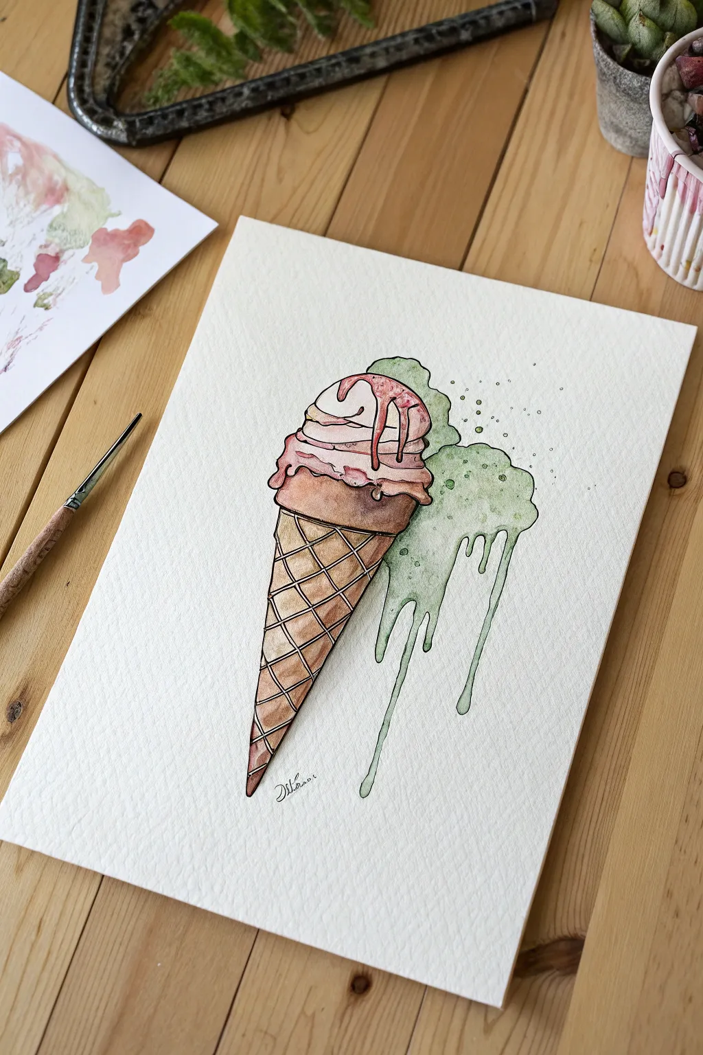
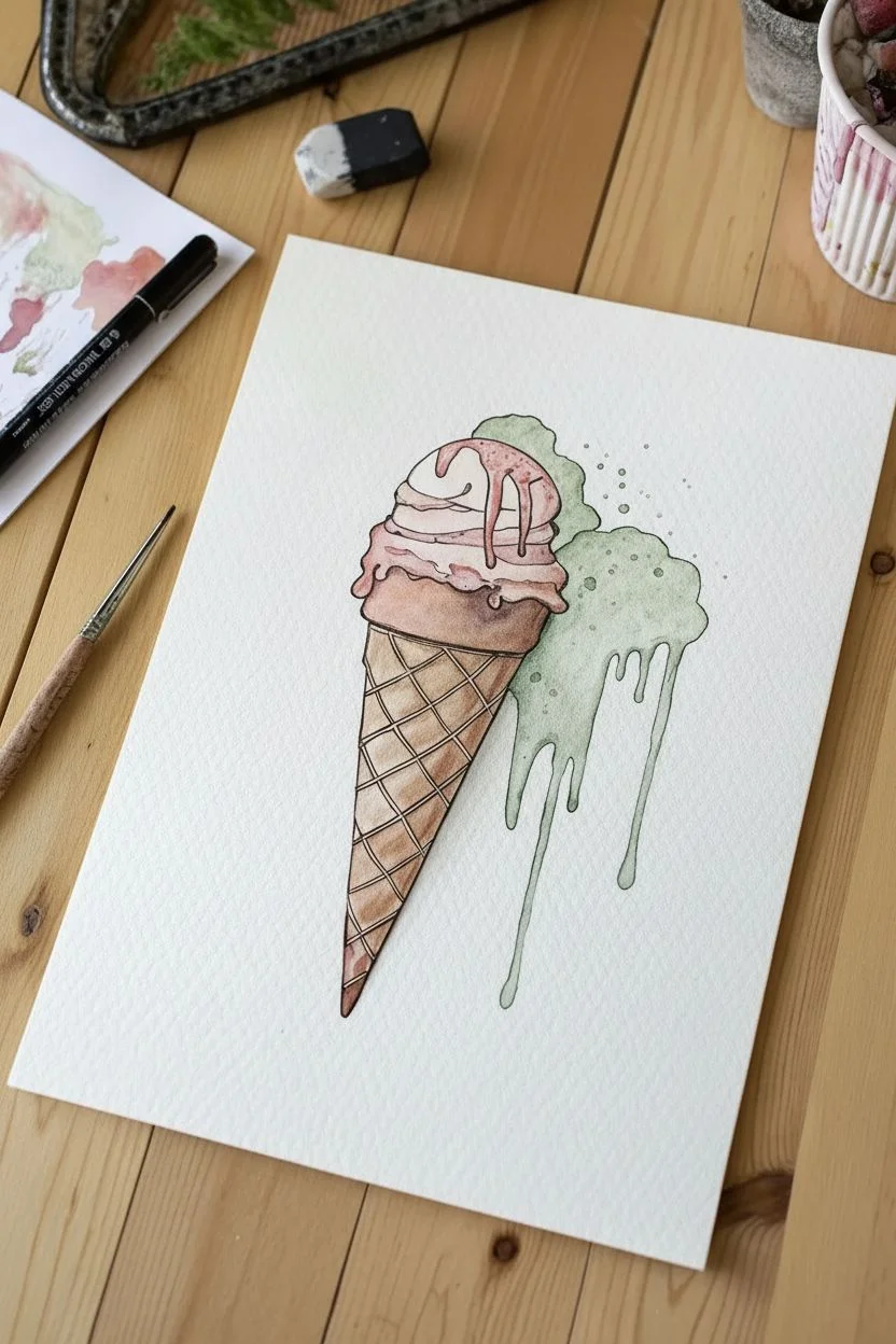
Capture the whimsical movement of melting ice cream with this illustrative watercolor and ink project. You will create a crisp waffle cone contrasted against fluid, dripping splashes of green and pink for a refreshing artistic treat.
Step-by-Step
Materials
- Cold press watercolor paper (300 gsm)
- HB graphite pencil
- Kneaded eraser
- Waterproof black fineliner (0.3mm or 0.5mm)
- Watercolors (Burnt Sienna, Yellow Ochre, Rose Madder, Sap Green)
- Round watercolor brushes (size 4 and size 2)
- Paper towel
- Jar of clean water
Step 1: Sketching the Structure
-
Outline the cone:
Start by drawing a long, narrow inverted triangle for your cone. Tilt it slightly to the left to give the composition a dynamic angle rather than standing perfectly straight. -
Add the scoops:
At the top of the cone, sketch a rounded dome shape for the top scoop. Below it, add a wider, ruffled edge that looks like a skirt overlapping the top of the cone. -
Draw the melt:
To the right of the main scoops, sketch a large, abstract splash shape. Draw two long, wandering drip lines extending down past the middle of the cone, making the ends rounded like heavy liquid. -
Create the heavy syrup:
On the very top pink scoop, draw thick, viscous lines dripping down from the apex, suggesting a heavy strawberry syrup topping. -
Grid the waffle:
Draw diagonal lines crisscrossing the cone body to create the classic waffle grid pattern. Keep the lines curved slightly to follow the round form of the cone.
Step 2: Inking the Lines
-
Trace the silhouette:
Using your waterproof fineliner, carefully trace the outer contours of your pencil sketch. Use a confident, continuous stroke for the long straight edges of the cone. -
Ink the drips:
When outlining the melting parts and syrup, vary your line pressure slightly to give the liquid a more organic feel. -
Define the waffle grid:
Ink the diagonal grid lines on the cone. I find it helpful to rotate the paper so my hand can pull the pen naturally towards me for straighter lines. -
Erase guidelines:
Wait about five minutes to ensure the ink is bone dry, then gently erase all visible graphite marks with a kneaded eraser.
Pro Tip: Waffle Texture
When painting the brown waffle diamonds, intentionally leave a tiny hairline of white paper untouched on the upper left side of each diamond. This acts as a highlight and instantly makes the cone look 3D.
Step 3: Painting the Cone
-
Base cone wash:
Mix a watery wash of Yellow Ochre and a touch of Burnt Sienna. Paint each individual little diamond shape within your waffle grid. -
Add cone depth:
While the first layer is still slightly damp, drop a more concentrated Burnt Sienna into the bottom-right corner of each waffle diamond. This creates a shadow that makes the texture pop. -
Shadow the rim:
Paint a darker strip of brown just under the ice cream rim where it overhangs the cone to ground the scoops.
Troubleshooting: Smudged Ink
If your black lines smear when painting, your pen isn’t fully waterproof. Test your pen on a scrap paper first by drawing a line and painting over it immediately to ensure it holds up to water.
Step 4: Coloring the Ice Cream
-
Pink scoop base:
Dilute Rose Madder to a very pale pink and paint the main body of the top scoops. Leave a few tiny spots white near the left side for highlights. -
Intensify the syrup:
Using a stronger concentration of the pink paint, carefully fill in the syrup drips on top. Let some of this color bleed slightly into the paler wash for a soft gradient. -
Green splash base:
Mix a watery Sap Green wash. Fill in the entire melting splash area on the right, including the long drips. Keep the wash uneven to create natural texture. -
Define the green volume:
Once the green area is dry, glaze a slightly darker green mixture along the bottom edges of the ‘clouds’ of melt and down the right side of the long drip lines to give them roundness.
Step 5: Final Details
-
Add splatters:
Load your brush with the green paint mix and tap the handle against your finger over the right side of the paper to create small droplets floating near the melt. -
Ink the bubbles:
Use your fineliner to draw tiny hollow circles around the green splatters to make them look like fizzy bubbles.
Allow the artwork to dry completely before displaying your delicious creation


Neon Slime Borders
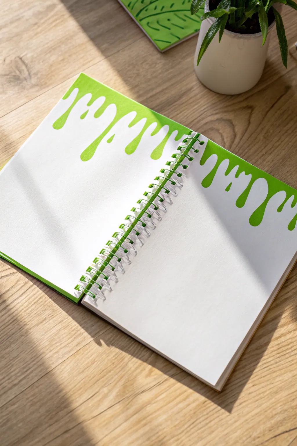
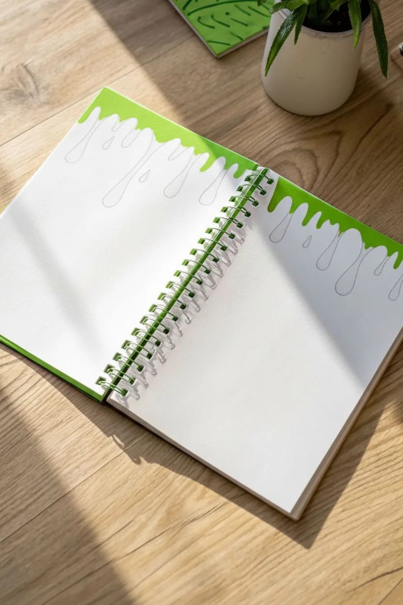
Transform a plain sketchbook into a vibrant art piece with these fun, dripping slime borders. This high-contrast neon green design adds a playful, gooey aesthetic to the top of your pages, perfect for framing your notes or doodles.
Detailed Instructions
Materials
- Spiral-bound sketchbook or notebook
- HB Pencil
- Soft vinyl eraser
- Neon green acrylic paint marker (medium tip)
- Scraps of paper (for testing marker flow)
Step 1: Sketching the Drips
-
Open flat:
Lay your sketchbook open on a flat surface so both pages are completely accessible. -
Initial pencil sketch:
Using your HB pencil, lightly draw a wavy line near the top edge of the left page to map out where the slime begins. -
Define the lengths:
Draw faint vertical lines extending down from the top edge to indicate where you want your drips to fall; make some short and some long for variety. -
Round the bottoms:
At the end of each vertical line, sketch a rounded, bulbous shape to create the heavy ‘drip’ effect. -
Connect the drips:
Draw curved, U-shaped lines connecting the top of one drip to the next, mimicking the way thick liquid hangs. -
Refine the shapes:
Go back over your pencil lines to ensure the transitions between the vertical drips and the connecting curves are smooth and fluid. -
Navigate the spiral:
When you reach the spiral binding in the center, sketch carefully around the punched holes so the paint won’t clog them later. -
Repeat on the right:
Mirror the process on the right page, but vary the drip pattern slightly so it doesn’t look like an exact copy.
Step 2: Inking and Filling
-
Prime the marker:
Shake your neon green acrylic marker well and press the tip onto a scrap piece of paper until the paint flows smoothly. -
Trace the outline:
Starting on the left page, carefully trace over your pencil sketch with the marker to define the slime boundary. -
Create a barrier:
I like to thicken the outline slightly towards the inside; this creates a safety buffer before you start coloring the large areas. -
Fill the drips:
Fill in the rounded bottom sections of the drips with solid strokes, moving in one direction to minimize streak marks. -
Fill the top section:
Color in the remaining space between the drips and the top edge of the paper. -
Detail around the spiral:
Use the very tip of the marker to carefully fill the small spaces between the spiral binding coils without getting paint on the metal wire. -
Switch pages:
Move to the right page and repeat the outlining and filling process, keeping your hand raised to avoid smudging the wet left page. -
Check opacity:
If the green looks a bit transparent or streaky, wait a few minutes for the first layer to dry and apply a second coat.
Bleed-Through Blues?
If your sketchbook paper is thin, place a sheet of wax paper or cardstock underneath the page you are painting to protect the clean sheet below from marker bleed.
Step 3: Finishing Touches
-
Let it cure:
Allow the notebook to sit open for at least 10-15 minutes to ensure the paint is completely dry to the touch. -
Erase guidelines:
Gently run your eraser over the edges of the green paint to remove any visible graphite pencil marks. -
Clean spirals:
If any paint accidentally got onto the spiral wire, quickly scratch it off with a fingernail or a damp cloth.
Pro Tip: Gravity Check
To make the slime look realistic, ensure your drips hang perfectly vertical. If you sketched them at a slant, correct the angle with your marker during the outlining phase.
Now you have a bold, custom page spread ready for your next journal entry or drawing session.


Dripping Honeycomb Cells
Capture the sweetness of nature with this warm, textured watercolor piece features dripping honey cells. The project explores a beautiful range of amber and ochre tones, using simple geometric shapes to create an organic, flowing composition.
How-To Guide
Materials
- Cold pres watercolor paper (300 gsm)
- Watercolor paints (Yellow Ochre, Burnt Sienna, Lemon Yellow, Lamp Black)
- Round brushes (size 6 for filling, size 0 or 1 for details)
- HB Pencil and eraser
- Ruler
- Jar of water and paper towels
Step 1: Sketching the Structure
-
Map the grid:
Start by lightly sketching a grid of hexagons in the center of your paper. You don’t need to be mathematically perfect; freehand imperfections add charm, though you can use a stencil or ruler if you prefer strict symmetry. -
Plan the drips:
For the bottom row of hexagons, lightly sketch narrow paths extending downward where the honey will eventually ‘drip’ off the comb. -
Add the visitor:
On the far right edge, roughly halfway up the honeycomb cluster, sketch a small oval shape for the bee’s body and delicate loops for wings.
Step 2: Painting the Honeycomb
-
Mix your palette:
Prepare three distinct puddles of paint: a light buttery yellow (lots of water), a medium golden ochre, and a deep caramelized brown/umber. -
Paint the light cells:
Using your size 6 brush, fill in scattered hexagons with your lightest yellow mix. To keep edges crisp, I like to skip every other cell so wet paint doesn’t touch adjacent wet areas. -
Add medium tones:
While the first batch dries, fill in another set of hexagons with the golden ochre, focusing on the center and upper sections of the cluster. -
Deepen the contrast:
Fill the remaining solid cells with the darkest brown mix. This variance in color creates the illusion of depth and light hitting the honey. -
Create the spiral cells:
For the three unique cells on the bottom left, switch to a fine detail brush. Instead of filling them solid, paint concentric hexagonal rings, leaving thin lines of white paper showing between the strokes.
Natural gradients
While a cell is still wet, drop a tiny dot of darker brown into one corner. It will naturally bloom and create a beautiful 3D shadow effect.
Step 3: Creating the Drips
-
Start the flow:
Return to the bottom row of cells. Rewet a cell with fresh paint, then immediately drag the brush tip downward along your pencil guideline. -
Shape the drop:
Press the brush down slightly at the end of the line to create a teardrop shape, mimicking the weight of gathering honey. -
Vary opacity:
For some drips, dilute your paint with more water so the trail fades out as it travels down the page, making it look translucent. -
Add the long drip:
For the longest drip on the right, keep your hand steady and pull a continuous line of golden ochre all the way to the bottom third of the paper.
Bleeding edges?
If colors bleed across the lines, your paint is too wet. Wait for neighbor cells to fully dry before painting the one right next to it.
Step 4: The Bee & Details
-
Stripe the body:
Paint the bee’s body with alternating stripes of yellow ochre and black. Use a fairly dry brush to prevent the black from bleeding into the yellow. -
Detail the wings:
Mix a very watery black or grey and delicately outline the wings, keeping the inside of the wings mostly transparent. -
Final touches:
Once the paint is completely bone-dry, gently erase any visible pencil marks, specifically around the drip lines and the edges of the grid.
Now you have a sweet, golden masterpiece that looks good enough to eat.
BRUSH GUIDE
The Right Brush for Every Stroke
From clean lines to bold texture — master brush choice, stroke control, and essential techniques.
Explore the Full Guide
Graffiti-Style Lettering
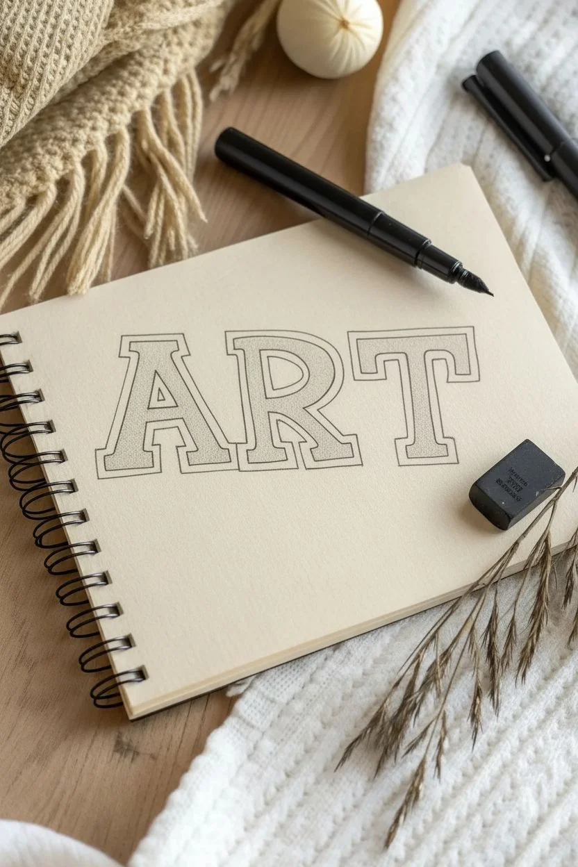
Combine classic serif typography with an edgy graffiti aesthetic using stippling techniques on toned paper. This project teaches you how to create depth and texture using only dots and ink lines.
Step-by-Step Tutorial
Materials
- Tan or Kraft paper sketchbook
- HB Pencil
- Kneaded eraser
- Black fineliner (size 05 or 08)
- Fine-point drawing pen (size 01 or 02)
Step 1: The Blueprint
-
Establish the baseline:
Using your pencil, draw a light horizontal line across the page to ensure your letters sit straight. -
Skeleton sketch:
Lightly sketch the skeleton of the word ‘ART’ (or your chosen word), spacing the letters evenly. -
Build the block:
Flesh out the skeleton lines to create thick block letters. Keep the width of the bars relatively consistent. -
Add the serifs:
Draw rectangular slabs at the ends of the strokes to create a bold serif style. -
Define the frame:
Draw a secondary outline around each letter, leaving a small, consistent gap between the letter body and this new border.
Flat looking drips?
If your drips look 2D, you likely filled them in completely. Ensure you leave a stark, empty white spot in the bulb of the drip to mimic light reflection.
Step 2: Adding the Liquid Element
-
Sketch the drips:
Along the bottom edges of the letters and the serifs, sketch varying lengths of teardoup shapes to mimic melting paint. -
Add gravity:
Extend a few drips further down than others to create an uneven, natural flow. -
Mark highlights:
Inside each drip shape, lightly sketch a small oval or crescent near the bottom or side. You will avoid inking this area later to make the liquid look shiny.
Make it Pop
Use a white gel pen to add a thin highlight line on the upper left edge of each letter block. This enhances the 3D effect against the tan paper.
Step 3: Inking the Outline
-
Trace the borders:
Switch to your thicker black fineliner (05 or 08). Carefully trace the outer border of the letters. -
Refine the shape:
Trace the inner letter shapes. When you reach the bottom, connect the letter lines seamlessly into your pencil-sketched drips. -
Secure the highlights:
Ink the outline of the drips carefully, ensuring you do not color inside your highlight ovals yet. -
Clean up:
Once the ink is completely dry, gently erase all underlying pencil marks with a kneaded eraser so the paper looks clean.
Step 4: Shading with Stippling
-
Begin the texture:
Switch to your finer drawing pen (01 or 02). I usually start at the very bottom of the drips. -
Fill the drips:
Fill the drip shapes with dense dots (stippling). Pack the dots so close they look nearly solid black, but avoid purely coloring it in so the texture remains. -
Create the heavy shadow:
Concentrate a high density of dots at the bottom horizontal bars of the letters and inside the serifs. -
Start the gradient:
As you move upward into the middle of the letters, begin spacing your dots further apart. -
Fade to light:
Continue reducing the density of dots as you reach the top of the letters. The top third should have very few dots, letting the paper color show through. -
Deepen the contrast:
Go back to the bottom areas and add more dots if needed. The transition from the dark bottom to the light top should be smooth, not a hard line.
Step 5: Final Details
-
Splatter effect:
Draw tiny, random circles or specks floating near the drips and below the letters to simulate paint splatter. -
Final assessment:
Check your outlines. If the stippling washed out the border, re-trace the outer lines with the thicker pen to make the word pop.
Enjoy the satisfaction of seeing your texture build up dot by dot into a bold piece of art.
Juicy Fruit Slices
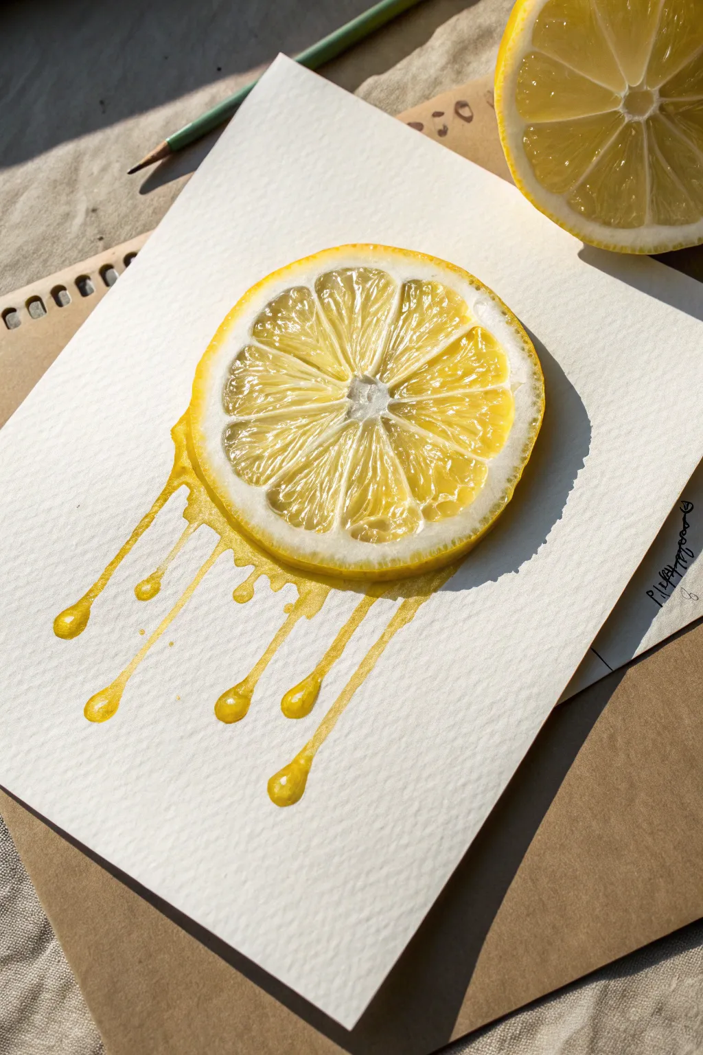
Capture the freshness of citrus with a surreal twist in this vibrant watercolor study. This project combines hyper-realistic fruit textures with stylized, melting drips for a piece that looks good enough to drink.
Step-by-Step Tutorial
Materials
- Cold-press watercolor paper (300gsm)
- Watercolor paints (Lemon Yellow, Cadmium Yellow, Yellow Ochre, Payne’s Grey)
- Round brushes (scale 4 for washes, size 0 or 00 for details)
- White gouache paint or opaque white gel pen
- HB Pencil and kneaded eraser
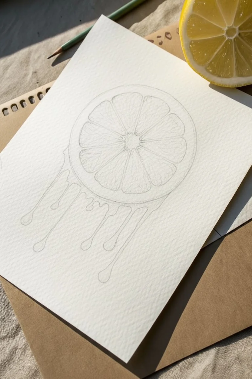
Step 1: The Framework
-
Outline the shape:
Lightly draw a circle roughly 3-4 inches in diameter. You can trace a lid or tape roll to get a perfect shape, but keep your pencil lines extremely faint so they don’t show later. -
Define the rind:
Draw a slightly smaller circle inside the first one to create the thickness of the pith and rind. -
Sketch the segments:
Mark the center point and sketch the radiating triangular segments. Keep the dividing lines (membranes) organic and slightly wavy rather than perfectly straight ruler lines. -
Add the melt:
Erase the bottom section of the rind and extend the drawing downward into long, tear-shaped drips. Vary the lengths, making some drip all the way down and others stop midway.
Muddy colors?
If your white highlights turn yellow, the base paint wasn’t dry enough. Wait for it to fully dry, then re-apply a thick dot of white gouache to cover the mistake.
Step 2: Juicy Base Layers
-
First wash:
Dilute Lemon Yellow with plenty of water. Paint a translucent wash over the fruit segments and the drip areas, carefully avoiding the thin white strips between the segments. -
Rind coloration:
Paint the outer rim with a more saturated mixture of Cadmium Yellow. I like to dab in a tiny touch of Yellow Ochre while it’s still wet to create that textured citrus skin look. -
Drip gradients:
While the drip shapes are damp, drop slightly darker yellow pigment at the very bottom of each droplet. This gravity effect gives them weight and volume. -
Let it dry:
Allow these base layers to dry completely. The paper must be bone-dry before we start the fine texture work.
Step 3: Pulp & Texture
-
Painting juice sacs:
Switch to your smallest brush (size 0 or 00). Using a mix of Lemon and Cadmium Yellow, paint tiny, curved shapes inside each segment to mimic juice sacs. -
Creating depth:
Darken your yellow mix slightly. Paint tiny wedge shadows in the corners where the segments meet the rind. This makes the fruit look convex and plump. -
Rind texture:
Stipple tiny dots of yellow-orange on the outer rind to simulate the porous texture of lemon skin. -
Defining the pith:
The white pith isn’t purely white. Add a very watery, pale grey or cream wash to parts of the pith to give it shadow and dimension, keeping the brightest parts white.
Citrus Splash
Customize this by changing the palette! Swap yellows for vibrant oranges or translucent lime greens using the exact same texturing technique.
Step 4: Lighting & Realism
-
Cast shadow:
Mix a transparent dark grey (Payne’s Grey heavily diluted). Paint a shadow along the right side of the slice and the right side of each drip to ground the object. -
Highlight preparation:
Ensure all yellow paint is perfectly dry. If the paint is wet, your highlights will turn into a milky mess. -
Specular highlights:
Using white gouache or a gel pen, add crisp white dots and lines on the juice sacs. Add slightly larger glossy reflections on the bulbous bottoms of the drips. -
Final crisp edges:
Use the white medium to clean up the membranes between segments if any yellow paint crossed over the lines, making them sharp and distinct.
Step 5: Finishing Touches
-
Deepen contrast:
Assess the drawing. If it looks flat, glaze a tiny bit of orange-yellow over the shadowed areas of the pulp for extra vibrancy.
Step back and admire your brilliantly fresh, melting masterpiece.

PENCIL GUIDE
Understanding Pencil Grades from H to B
From first sketch to finished drawing — learn pencil grades, line control, and shading techniques.
Explore the Full Guide
Psychedelic Mushroom Melt
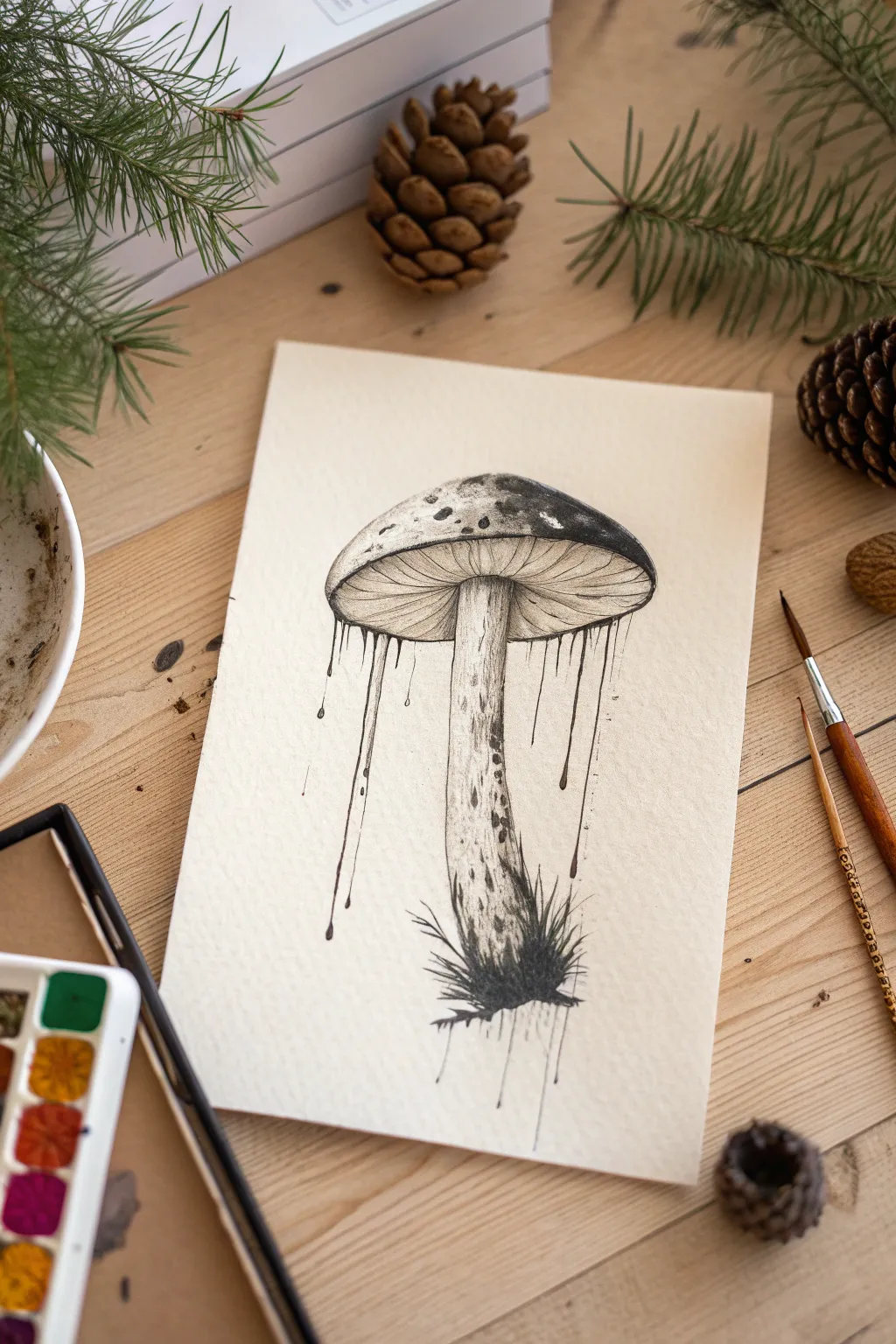
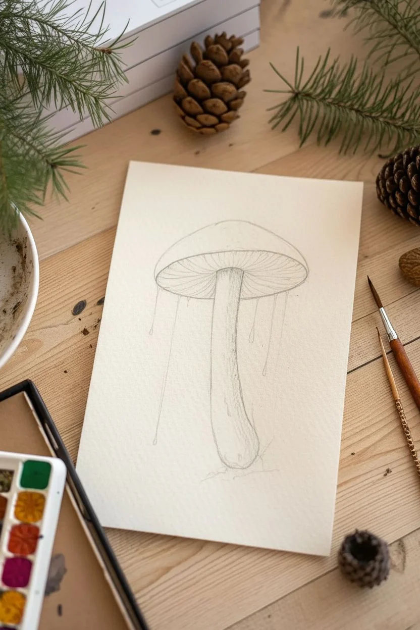
Capture the surreal beauty of nature with this ink illustration featuring a textured mushroom dissolving into abstract drips. This project combines precise stippling techniques with free-flowing lines to create a moody, organic piece of art on cream paper.
Step-by-Step Guide
Materials
- Cream or off-white cold press watercolor paper
- Fine liner pens (sizes 005, 01, 03, and 05)
- HB Drawing pencil
- Kneaded eraser
- Ruler (optional)
- Small brush pen (black) or thick marker
Step 1: Sketching the Structure
-
Establish the stem:
Begin by lightly sketching a slightly curved vertical column in the center of your page to represent the mushroom’s stem (stipe). -
Shape the cap:
Draw a large, doomed semi-circle sitting on top of the stem, extending well past the stem’s width on both sides. -
Define the underside:
Connect the outer edges of the cap back to the stem with a flatter curve to create the area where the gills will reside. -
Map the drips:
Lightly sketch vertical guidelines dropping down from the rim of the cap, vary their lengths so they don’t look uniform.
Gravity Guide
When drawing drips, vary the line weight. Press down harder at the top (the pool) and lift your pen as you move down to create a natural, tapered liquid look.
Step 2: Inking the Details
-
Outline the cap:
Using an 03 pen, trace the top curve of the cap, purposely making the line a bit shaky to suggest an organic texture. -
Add spots and texture:
Draw irregular blotches on the top of the cap with an 05 pen, filling some in completely black and stippling (dotting) others for a gradient effect. -
Draw the gills:
Switch to your finest 005 pen. Draw very thin lines radiating from the top of the stem out to the cap’s rim, curving them slightly to follow the mushroom’s volume. -
Texture the stem:
Outline the stem with the 01 pen, then add vertical striations and tiny dots to create a fibrous, woody look. -
Ground the base:
At the bottom of the stem, use messy, upward flicking strokes with an 05 or brush pen to simulate moss and grass, creating a dark anchor for the drawing.
Level Up: Wash Effect
Before the ink dries completely, run a slightly damp paintbrush over the shadowed areas of the stem. This will bleed the ink slightly, creating a smoky, watercolor-style grey wash.
Step 3: Creating the Drip Effect
-
Start the flow:
Where you sketched the guidelines on the cap’s rim, use an 03 pen to draw long, vertical lines extending downward. -
Thicken the origin:
Make the lines slightly thicker where they connect to the cap, as if the ink is pooling before gravity pulls it down. -
Shape the droplets:
At the end of shorter lines, draw a small teardrop shape filled with black. For longer lines, taper them off into a fine point. -
Add floating drops:
Draw a few isolated droplets falling mid-air below the shorter drips to enhance the illusion of liquid movement. -
Stipple the drips:
I like to add a few tiny dots around the main drip lines to simulate splashing or mist.
Step 4: Shading and Final Polish
-
Deepen the contrast:
Use the 05 pen to darken the area immediately under the cap where the stem connects, adding depth to the gills. -
Refine the shadows:
Add more stippling (dots) to the left side of the stem and the underside of the cap spots to suggest a light source. -
Clean up:
Wait at least 15 minutes to ensure the ink is bone dry, then gently erase your pencil guidelines with the kneaded eraser. -
Final assessment:
Stand back and darken any drip lines that feel too thin; the contrast between the black ink and cream paper should be sharp.
Now you have a striking, surreal ink illustration perfect for framing or scanning.
Edgy Melting Skulls
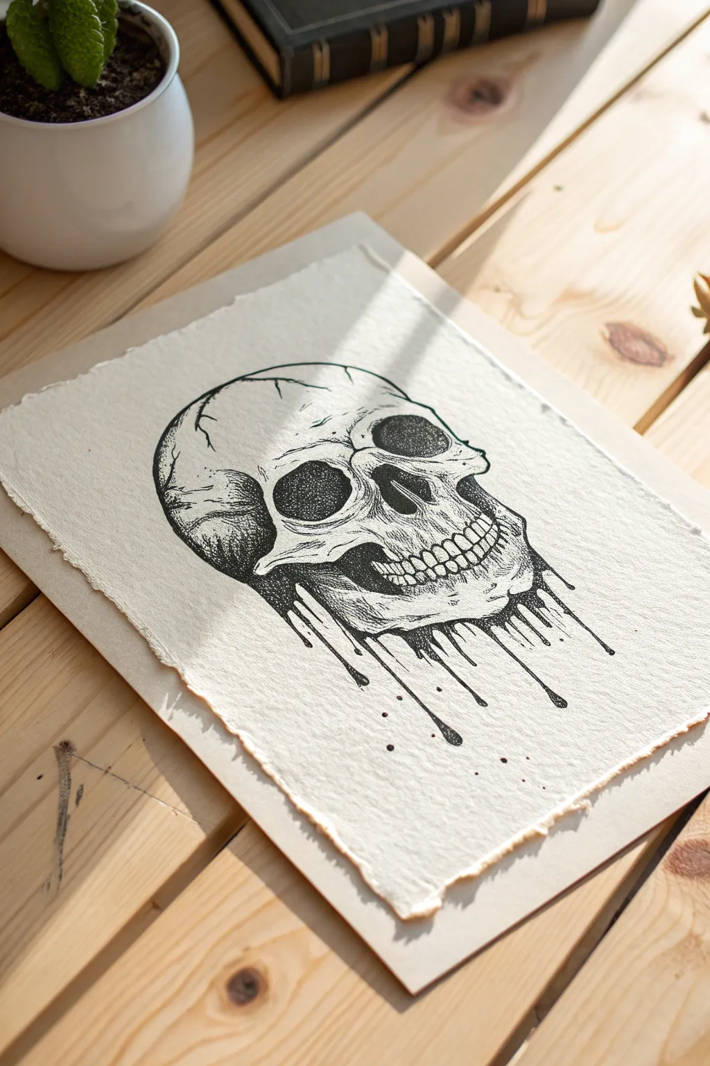
Combine the rigid anatomy of a skull with the fluid chaos of dripping ink in this striking art project. Using stippling techniques on textured paper, you will create a high-contrast piece where bone creates a surreal transition into liquid.
How-To Guide
Materials
- Heavyweight textured paper (300gsm, cold press)
- Black fine liner pens (sizes 005, 01, 03, 05, 08)
- HB Pencil
- Kneaded eraser
- Ruler (optional)
Step 1: Preparing the Foundation
-
Create the deckled edge:
Before drawing, tear the edges of your paper manually. Place a ruler down and pull the paper upward against it to create a rough, raw edge that mimics the vintage look of the reference. -
Sketch the cranium:
Using your HB pencil loosely, draw a large circle in the upper center of the page to represent the main skull shape. -
Define the facial structure:
Draw vertical guidelines to bisect the circle, then sketch the cheekbones (zygomatic arches) protruding slightly just below the circle’s midpoint. -
Map the features:
Lightly sketch two large, irregular shapes for the eye sockets and an inverted heart shape for the nasal cavity. -
Sketch the upper jaw:
Outline the maxilla (upper jaw) and lightly mark vertical dashes where the teeth will go. Do not sketch a lower jawbone. -
Plan the melt:
Instead of a mandible, sketch wavy, vertical lines dripping down from the cheekbones and upper teeth area. Vary the lengths so some drips define the outline while others float below.
Patience Pays Off
Stippling can be tedious. If your hand cramps or you start rushing, take a break. Rushed dots turn into dashes, which ruins the texture. Keep the pen vertical.
Step 2: Inking the Structure
-
Outline the bone:
Switch to an 05 fine liner. Trace the outer contour of the skull, breaking the line slightly in areas like the temples to simulate cracks or sutures. -
Detailed fractures:
Add the jagged cranial sutures on the forehead and side of the skull using an 01 pen for a finer, more delicate line. -
Ink the teeth:
Carefully outline the teeth with the 01 pen. I prefer to make the gum line slightly imperfect to show age and weathering. -
Fill the voids:
Use an 08 or brush pen to fill the eye sockets and nose cavity completely black. Leave tiny white rugged islands inside the nose for texture. -
Outline the drips:
Using the 03 pen, ink the melting lines. Make the tops of the drips wider where they connect to the bone, tapering them as they flow downward.
Step 3: Shading and Stippling
-
Start the gradients:
Take your 005 pen—the smallest size—for the stippling process. Begin placing dots densely around the edges of the dark eye sockets to create a gradient fading outward. -
Sculpt the cheekbones:
Concentrate dots heavily under the cheekbone ridge. As you move upward onto the bone, space the dots further apart to create a highlight. -
Texture the cranium:
Add patches of light stippling on the forehead and the side of the head to suggest a rounded, dimensional surface rather than a flat circle. -
Detail the teeth:
Add very subtle vertical hatching lines near the gum roots of each tooth to give them depth and curvature. -
Shadow the melt:
On one side of each drip (preferably the right, to match the skull’s lighting), add a line of dense dots. This gives the liquid volume and makes it look cylindrical.
Level Up: Golden Touch
Once the black ink is dry, apply liquid gold leaf to just the dripping sections. The metallic shine against the matte black stippling creates an incredible focal point.
Step 4: Final Details
-
Disconnect the drips:
Draw several isolated teardrop shapes floating freely below the main attached drips to enhance the feeling of motion. -
Add splatter spots:
Randomly place tiny black dots around the bottom of the drawing to mimic splashed ink. -
Deepen the contrast:
Go back with an 01 pen and cross-hatch over the darkest stippled areas (like the temples and behind the jaw) to push the values deeper. -
Erase and clean:
Wait until the ink is completely dry, then gently remove all pencil guidelines with the kneaded eraser.
Now you have a beautifully macabre piece that perfectly captures the balance between structure and decay.


Liquid Galaxy Orbs
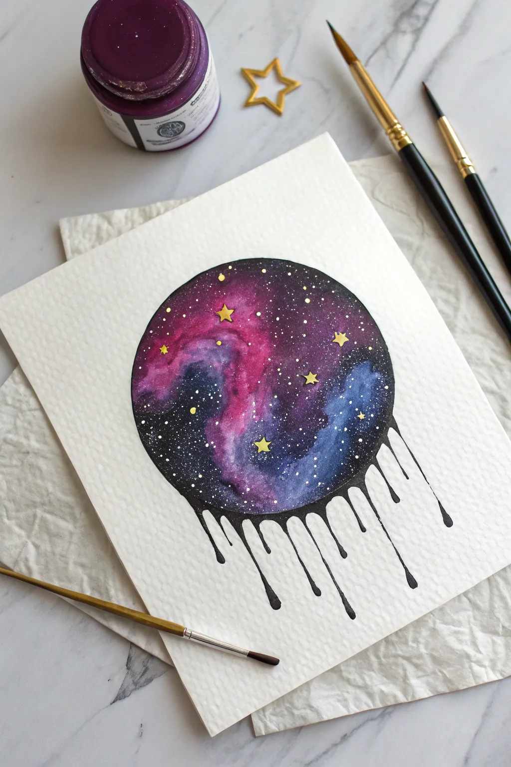
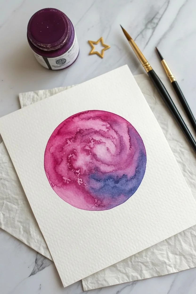
Capture the magic of the cosmos in a surreal, dripping design that blends vibrant nebula colors with stark, inky contrast. This project explores wet-on-wet watercolor techniques contained within a geometric shape that defies gravity.
Step-by-Step Guide
Materials
- Cold press watercolor paper (300 gsm texture)
- Watercolors (Magenta, Purple, Indigo)
- Black India ink or black gouache
- Opaque white gouache or white gel pen
- Metallic gold paint
- Round watercolor brushes (size 2 and 6)
- Pencil and compass (or masking tape roll to trace)
- Water jar and paper towels
Step 1: Shaping the Nebula
-
Outline the orb:
Use a compass or trace a circular object, like a roll of masking tape, to lightly draw a perfect circle in the center of your paper. -
Wet the surface:
Dip your medium round brush in clean water and damper the inside of the circle evenly. The paper should glisten but not hold standing puddles. -
Infuse the core colors:
Load your brush with vibrant magenta. Touch the wet paper in curving, cloud-like motions near the left-center, allowing the pigment to bloom naturally. -
Deepen the spectrum:
While the paper is still damp, drop in purple and indigo paints around the pink clouds. Let the colors bleed into each other to create soft, galactic transitions. -
Create texture:
Dab a clean, slightly thirsty brush into the wet paint occasionally to lift pigment, creating lighter misty areas within the nebula. -
Dry completely:
Allow the colorful nebula layer to dry thoroughly. The paper must be bone dry before you apply the sharp black overlay.
Bleeding Ink?
If the black ink bleeds into the nebula, your first layer wasn’t dry enough. Use a hairdryer to ensure the paper is totally dry before applying the black layer.
Step 2: The Ink Pour
-
Define the void:
Switch to black ink or gouache for maximum opacity. Carefully paint the negative space inside the circle, carving out the organic shapes of your colorful nebula clouds. -
Clean up the edge:
Use a smaller brush to paint the crisp outer edge of the circle on the top half. I like to rotate the paper as I go to keep the curve smooth. -
Start the drips:
At the bottom of the circle, instead of following the curve, pull the black paint downwards in vertical lines of varying lengths. -
Shape the droplets:
Thicken the bottom of each vertical line into a rounded teardrop shape to mimic the weight of dripping liquid. -
Vary the flow:
Ensure some drips are long and slender while others are short or slightly thicker to create a natural, organic rhythm. -
Refine connections:
Smooth out the points where the drips meet the main circle so they appear to flow seamlessly from the dark galaxy background.
Step 3: Stellar Details
-
Create distant stars:
Dilute a small amount of white gouache with water. Load a brush and gently tap it against another brush handle over the painting to spray fine white specks. -
Paint prominent stars:
Use a fine-tip brush or white gel pen to place specific, slightly larger white dots in the darker open spaces of the nebula. -
Add golden highlights:
Using metallic gold paint and your smallest brush, carefully paint small five-pointed stars scattered throughout the purple and black areas. -
Final touches:
Review your gold stars; if you want more dimension, you can gently layer a second coat of gold once the first dries for extra shine.
Level Up
Instead of gold paint, try using gold leaf adhesive and small bits of gold foil for the stars. The real metal reflection makes the galaxy pop.
Now you have a cosmic masterpiece that looks like the universe is melting right off your page
The Weeping Eye
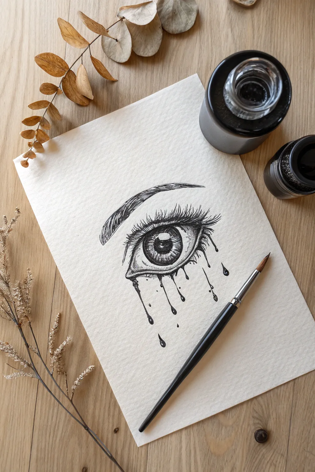
This striking illustration combines realistic anatomical detailing with surreal, stylized ink drips to create an emotive piece. By balancing precise cross-hatching with bold, fluid lines, you will produce an eye that seems to melt right off the textured paper.
How-To Guide
Materials
- Textured drawing paper or cold-press watercolor paper
- HB or 2B graphite pencil
- Kneaded eraser
- Fine liner pens (sizes 0.05, 0.1, and 0.5)
- Black India ink (optional for darker fills)
- Small round brush (size 0 or 2)
- White gel pen (optional)
Step 1: Sketching the Anatomy
-
Establish the shape:
Begin with a light pencil sketch of an almond shape for the eye. Note that the inner corner (tear duct) should dip slightly lower than the outer corner. -
Place the iris:
Draw a large circle for the iris, partially tucked under the upper eyelid so the full circle isn’t visible. Inside this, mark the center pupil. -
Mark the highlights:
Before adding any shading, sketch a small rectangle or organic shape crossing the pupil and iris to serve as the reflection or ‘catchlight.’ This must remain white. -
Define the surroundings:
Sketch the fold of the upper eyelid paralleling the eye shape, and lightly outline the arched brow shape above. -
Plan the drips:
Lightly draw varying lengths of vertical lines extending down from the lower waterline, ending in small teardrop bulb shapes.
Reflection Rescue
If you accidentally fill in the highlight of the eye with black ink, don’t panic. Wait for it to dry, then use a white gel pen or a dot of white gouache to add the sparkle back in.
Step 2: Inking the Eye
-
Fill the pupil:
Using your 0.5 pen or a brush with ink, fill in the pupil completely solid black, being extremely careful to preserve the white highlight area you sketched earlier. -
Texture the iris:
With a 0.05 or 0.1 pen, draw fine lines radiating outward from the pupil like bicycle spokes. I find drawing these lines quickly helps keep them straight and natural. -
Deepen the iris:
Darken the outer ring of the iris and the area directly under the upper eyelid with more ink lines to create shadow and depth. -
Shade the whites:
Use very subtle stippling (dots) or light hatching in the corners of the sclera (the white of the eye) to make the eyeball look spherical. -
Contour the skin:
Use cross-hatching techniques to add shadow to the crease of the upper eyelid and the skin just beneath the eyebrow.
Step 3: Lashes and Brows
-
Draw the eyebrow:
Using the 0.1 pen, draw the eyebrow hairs with quick, upward flicking motions. Ensure they follow the natural growth direction, turning outward toward the tail of the brow. -
Add upper lashes:
Switch to a thicker 0.5 pen for the upper lashes. Draw them curved and long, clumping a few together at the tips for a realistic look. -
Add lower lashes:
Draw the lower lashes much shorter and sparser than the top ones. Keep them spaced out to leave room for the ink drips.
Level Up: Gravity Test
For a more organic look, actually drip liquid India ink onto the paper from the lower lash line and tilt the page, letting gravity create the paths instead of drawing them.
Step 4: The Drip Effect
-
Outline the tears:
Go over your pencil sketches for the drips. Make the transition from the lower eyelid into the drip feel fluid, like thick liquid overflowing. -
Fill the droplets:
Fill the long drip lines and the bottom droplets with solid black ink. Leave small white specks inside the bottom bulbs to simulate light reflecting off liquid. -
Add stray details:
Add a few tiny, unattached droplets floating near the main streams to create a sense of movement and splatter. -
Final Cleanup:
Once the ink is completely dry, gently erase all underlying pencil marks to reveal the sharp contrast of the drawing.
Frame this moody piece or use it as a striking cover page for your sketchbook.
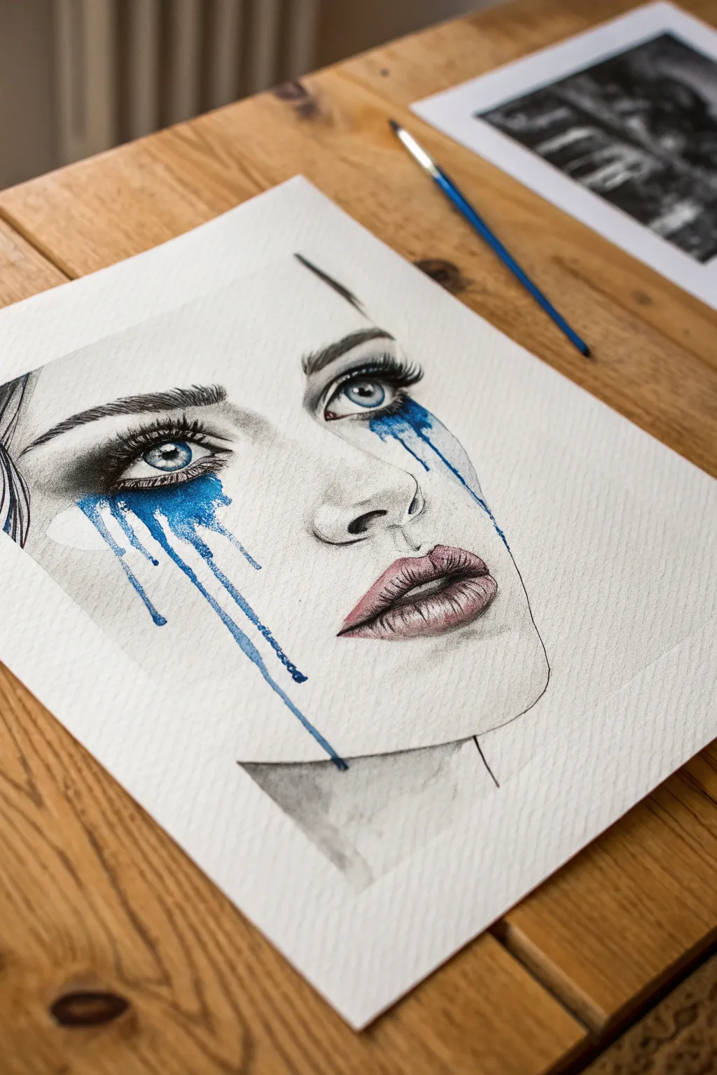
Surreal Portrait Deconstruction

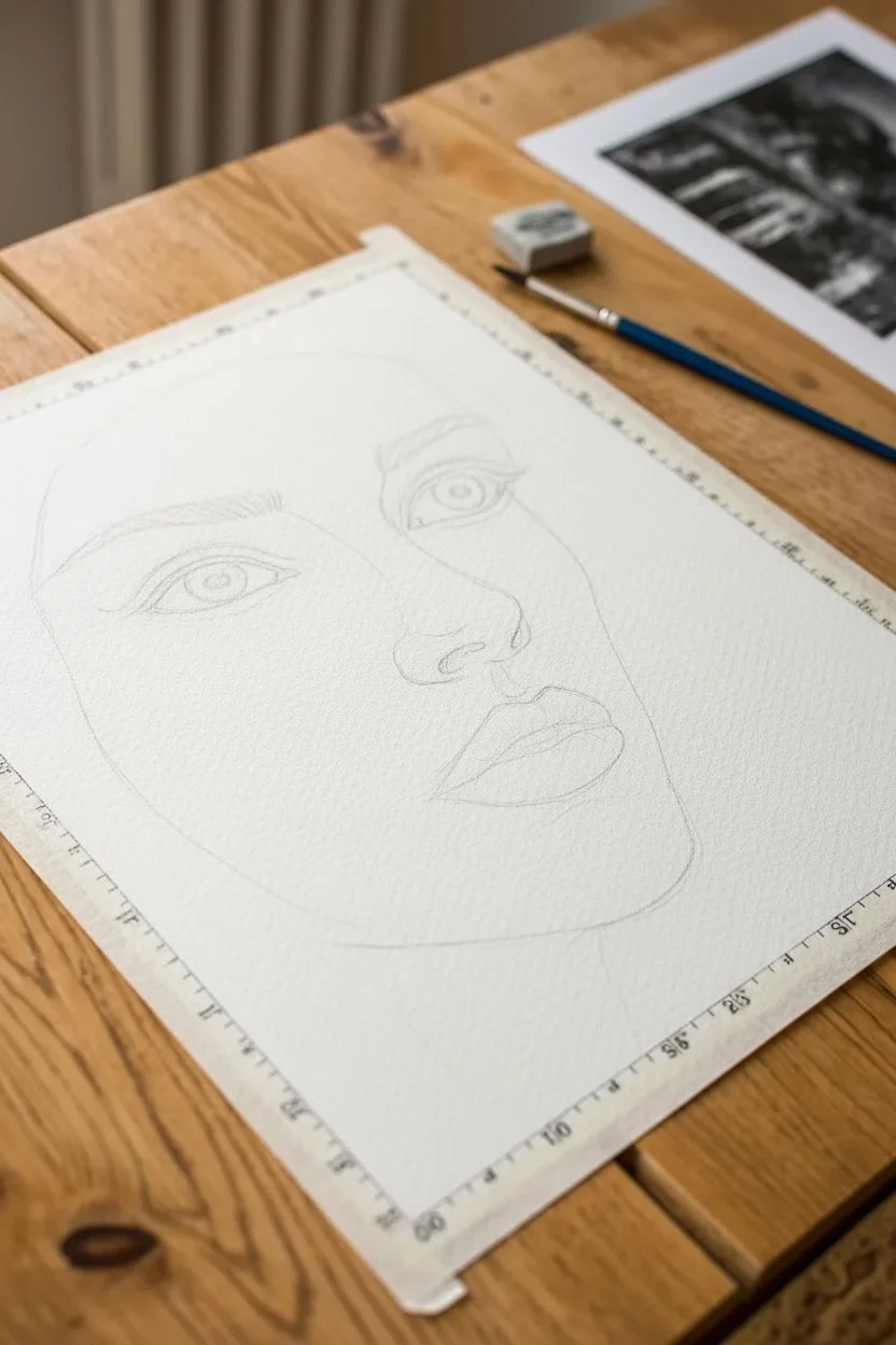
Combine the precision of graphite realism with the unpredictable beauty of watercolor in this striking mixed-media piece. The contrast between the detailed monochrome face and the vibrant, uncontrolled blue tears creates a deeply emotional and surreal effect.
Step-by-Step Guide
Materials
- Cold press watercolor paper (300 gsm)
- Graphite pencils (HB, 2B, 4B, 6B)
- Liquid watercolor or fluid acrylic ink (Cyan or Phthalo Blue)
- Round paintbrush (size 4 or 6)
- Blending stumps (tortillons)
- Kneaded eraser
- Soft pink watercolor or pastel pencil
- Masking tape
Step 1: Structural Sketching
-
Prepare the canvas:
Tape your watercolor paper down to a flat board or table surface to prevent buckling when we add the liquid later. -
Outline the proportion:
Using an HB pencil, lightly sketch the oval shape of the face and the neck. This image features a three-quarter view, so position the centerline slightly to one side. -
Map facial features:
Draw faint guidelines for the eyes, nose, and mouth. Ensure the eyes are large and expressive, as they are the focal point of the drop effect. -
Refine the outlines:
Sketch the specific shapes of the eyelids, iris, nostrils, and lips. Keep your lines light so they can be easily erased or shaded over.
Drips not running?
If the paint refuses to drip down naturally, your paper might be too dry or flat. Lightly dampen the path you want the tear to take with clean water first, then apply the pigment.
Step 2: Graphite Realism
-
Detail the eyes:
Switch to a 4B pencil to darken the pupils and the upper lash line. Leave a small white circle in each pupil to represent the reflection of light. -
Shade the iris:
Use a 2B pencil to draw radiating lines inside the iris, but keep the shading light enough that we can layer blue over it later. -
Brow texture:
Create the eyebrows using short, flicking strokes with a sharp 4B pencil to mimic individual hairs. Follow the natural growth direction of the brow. -
Contour the nose:
Use a 2B pencil to lightly shade the side of the nose and the nostril area. Relies heavily on blending rather than harsh lines here. -
Define the lips:
Outline the lips and fill them with vertical texture lines to show the natural creases. Shade the corners of the mouth darker for depth. -
Soft skin blending:
Use a blending stump (tortillon) to smooth out your graphite shading on the cheeks, forehead, and neck. I like to drag the graphite from the darker areas into the light to create a seamless gradient. -
Deepen contrast:
Go back in with a 6B pencil to reinforce the darkest shadows around the eyes and under the chin to make the face pop.
Step 3: The Blue Release
-
Tint the lips:
Very strictly apply a wash of soft pink watercolor or pastel to the lips, keeping it translucent so the graphite texture shows through. -
Color the eyes:
Paint the irises with your bright blue watercolor. Carefully work around the white highlight you reserved earlier. -
Load the brush:
Mix a generous amount of blue pigment with water. You want the mixture to be fluid but vibrant, not too pale. -
Initiate the drip:
Press your loaded brush against the lower waterline of the eye. Allow a pool of water to form there, naturally overflowing onto the cheek. -
Guide the flow:
Tilt your board upright to let gravity pull the paint down. If the drip stalls, add a tiny drop of clear water to the head of the stream to get it moving again. -
Create variation:
Make some drips long and others short. You can create the ‘splatter’ effect on the side by tapping your wet brush against a finger over the paper.
Gilded Tears
For a stunning ‘level up’, wait for the blue watercolor to dry completely, then paint a thin line of liquid gold leaf or metallic paint inside the center of the longest drip.
Step 4: Final Definition
-
Enhance the lashes:
Once the blue paint is completely dry, use your darkest pencil or a black charcoal pencil to draw thick, dramatic eyelashes over the blue areas. -
Clean highlights:
Use the kneaded eraser to lift off any smudges from the cheeks or nose tip, ensuring the highlights are crisp white. -
Hair suggestion:
Sketch a few loose strands of hair on the left side to frame the face without drawing every single hair.
Step back and admire how the chaotic splashes breathe life and emotion into your structured drawing.
Have a question or want to share your own experience? I'd love to hear from you in the comments below!