
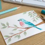
If you’ve been craving easy DIY painting ideas that look way fancier than they actually are, you’re in the right mindset. These are my go-to, low-pressure projects that let you make real DIY wall art (and cute little painted things) without needing perfect drawing skills.
Abstract Color-Block Canvas
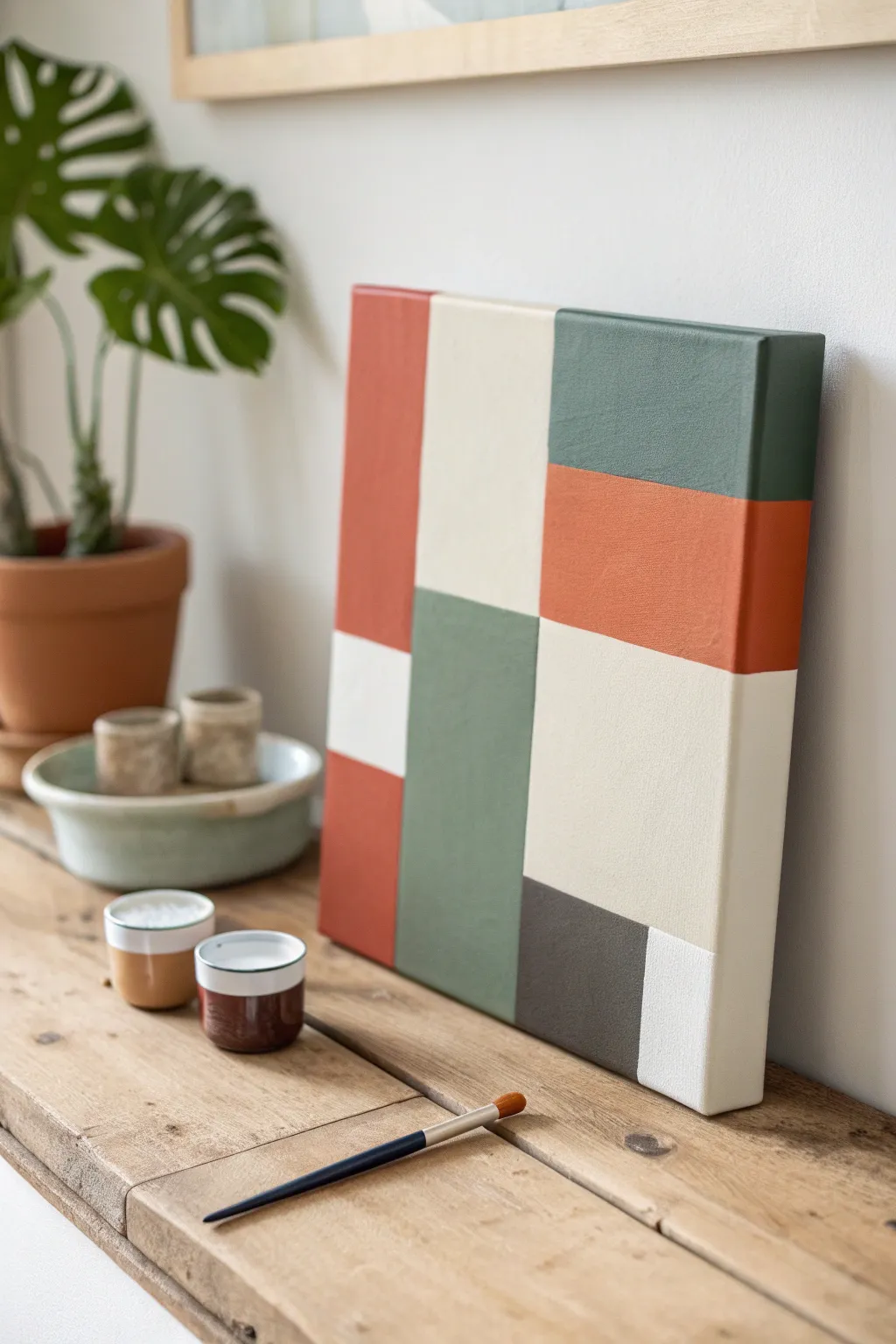
Bring modern, clean lines into your home with this abstract color-block canvas art. Featuring soothing earth tones like terracotta, sage green, and cream, this beginner-friendly project adds a sophisticated designer touch to any shelf or wall.
Step-by-Step
Materials
- Stretched cotton canvas (square, e.g., 12×12 or 16×16 inches)
- Acrylic paints (Terracotta/Burnt Sienna, Sage Green, Dark Moss Green, Cream/Off-White, Charcoal Grey)
- Painter’s tape or masking tape (1 inch wide)
- Flat shader brushes (medium and large sizes)
- Ruler or T-square
- Pencil
- Palette or paper plate
- Cup of water and paper towels
Step 1: Planning the Layout
-
Analyze the Composition:
Before putting paint to canvas, look closely at the design. It’s a grid-based composition consisting of several rectangles and squares of varying sizes that interlock. -
Mark the Vertical Lines:
Using your ruler and pencil, lightly draw two vertical lines to divide the canvas width. The first section on the left should be roughly one-third of the width, the middle section slightly wider, and the right section another third. -
Extend to Edges:
Make sure your pencil marks extend slightly over the sides of the canvas, as the design wraps around the deep edges of the frame for a professional gallery look. -
Draft Horizontal Breaks:
Now, sketch the horizontal dividing lines. These don’t go all the way across; they vary per column. For example, the left column has a break near the bottom, while the right column has a break near the top.
Step 2: Taping for Crisp Lines
-
Apply First Tape Lines:
Apply painter’s tape along the pencil lines for your first set of distinct color blocks. You can’t paint touching blocks simultaneously, so plan to work in non-adjacent sections first. -
Seal the Edges:
Firmly press down the edges of the tape with your fingernail or the back of a spoon. This is crucial to prevent paint from bleeding underneath and ruining your sharp edges. -
Optional Base Coat Trick:
If you want ultra-crisp lines, I prefer to quickly brush a thin layer of white paint or matte medium over the tape seam first to seal it completely.
Clean Lines Secret
Peel the painter’s tape while the acrylic paint is still slightly tacky, not totally dry. This prevents the dried paint ‘skin’ from lifting up with the tape.
Step 3: Painting the First Layer
-
Mix the Terracotta:
Squeeze out your burnt sienna and mix in a tiny touch of white or yellow oxide to get that warm, earthy terracotta hue seen in the tall left block. -
Paint the Vertical Block:
Fill in the large vertical rectangle on the left side with the terracotta mix. Use long, smooth strokes with a flat brush. -
Apply the Sage Green:
Moving to a non-touching section, likely the top right block, mix a muted sage green and apply an even coat. -
Paint the Cream Sections:
Fill in the large central upper block with your cream or off-white paint. It might need two coats since lighter colors tend to be more transparent. -
Wrap the Sides:
Don’t stop at the front face! Continue painting the color over the side edge of the canvas to match the front design. -
Let Dry Completely:
Allow these sections to dry fully. Acrylics dry fast, but wait at least 20-30 minutes to ensure the tape won’t peel up wet paint.
Add Texture
Mix baking soda or molding paste into your acrylics before painting. This creates a grainy, stone-like texture that mimics the matte finish of ceramic tiles.
Step 4: Painting the Second Layer
-
Remove and Re-Tape:
Carefully peel off the tape. Once the paint is bone-dry, apply new tape over the painted edges to shield them while you work on the remaining empty blocks. -
Mix the Dark Moss:
Create a deeper green tone for the central lower block. You can achieve this by adding a drop of black or brown to your sage green mixture. -
Fill the Lower Center:
Paint the bottom center rectangle with the dark moss green. Ensure the coverage is solid and opaque. -
Add the Charcoal Accent:
Paint the small square at the bottom right with a dark charcoal grey. This dark value anchors the artwork visually. -
Detail the Sides:
Again, ensure every new color block wraps neatly around the depth of the canvas frame.
Step 5: Finishing Touches
-
Final Tape Removal:
Peel away the final piece of tape slowly at a 45-degree angle to reveal your clean grid. -
Touch Up Imperfections:
If any paint bled through, use a very small detail brush with the correct color to neatly correct the line. -
Check the Corners:
inspect the corners of the canvas to make sure no white spots were missed where the sides meet.
Let your canvas cure for a day before styled on a rustic wooden shelf alongside your favorite ceramics
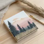
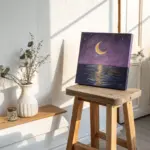
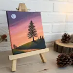
Ombre Sunset Sky Blend
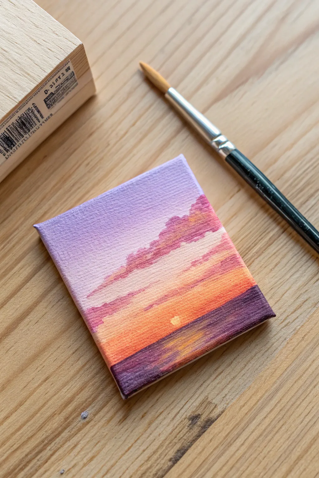
Capture the serene beauty of dusk on a tiny canvas with this soothing gradient project. You’ll layer soft purples, vibrant oranges, and deep indigo to create a glowing horizon that fits in the palm of your hand.
Step-by-Step Guide
Materials
- Small square canvas (e.g., 3×3 or 4×4 inches)
- Acrylic paints: Titanium White, Lavender (or Light Purple), Magenta, Orange, Deep Violet/Indigo
- Soft synthetic flat brush (size 4 or 6)
- Small fine liner brush (size 0 or 1)
- Palette or paper plate
- Cup of water and paper towels
Step 1: Creating the Ombre Sky
-
Prime the top section:
Start by mixing a small amount of Lavender paint with plenty of Titanium White to get a very pale, pastel purple. Apply this to the top third of your canvas using the flat brush, using horizontal strokes to ensure even coverage. -
Introduce the pinks:
While the top layer is still slightly wet, pick up a small amount of Magenta on your dirty brush. Blend this into the bottom edge of the purple section, moving downward. Allow the colors to mix naturally on the canvas for a soft transition. -
Paint the golden horizon:
Rinse your brush thoroughly. Load it with pure Orange paint and apply a horizontal strip right below the pink area. Blend the top edge of the orange upward into the pink to create a warm, glowing peach tone where they meet. -
Brighten the sun area:
While the orange paint is wet, dab a tiny spot of White right in the center of the orange band. Gently blend it outwards in a small circle to create the intense brightness of the setting sun. -
Add the water line:
Switch to Deep Violet or Indigo. Paint the bottom third of the canvas solid dark purple to represent the sea. Make sure the horizon line where the water meets the orange sky is relatively straight, though it doesn’t need to be perfect.
Muddy Colors?
If your orange and purple mix into a brown mess, let the purple sky layer dry completely before adding the orange horizon line. Acrylics blend best when wet, but sometimes distinct layers are safer.
Step 2: Clouds and Reflections
-
Mix a cloud color:
Create a muted mauve color by mixing your Magenta with a touch of the Deep Violet. It should be darker than the sky but lighter than the sea colour. -
Dab the upper clouds:
Using the corner of your flat brush or a small round brush, gently dab irregular cloud shapes into the upper purple and pink sky area. Keep the edges fluffy and soft rather than hard lines. -
Layering cloud highlights:
I like to add dimension here by mixing a bit of Orange into that mauve cloud color. Dab this lighter mix onto the *bottom* edges of your clouds, mimicking the light catching them from below. -
Form the lower clouds:
Paint thinner, more streaky clouds closer to the horizon line using the original mauve mix. These should look like flattened strips floating just above the sun. -
Create water reflections:
Clean your brush and pick up some Orange paint again. In the dark purple water area, directly under the sun, paint short, horizontal dashes that get wider as they move toward the bottom edge. -
Add shimmer to the water:
Mix a tiny bit of White into your Orange. Add a few very thin, short highlights right in the center of the orange reflection path to show the most intense sparkle on the waves. -
Final sun details:
Using your smallest brush, paint a crisp semi-circle or small circle of pure White (or very pale yellow) right at the horizon line where the sun is dipping down. -
Dry and assess:
Let the painting sit for about 10 minutes. If the dark water looks patchy, apply a second coat of Deep Violet around the orange reflection to make it opaque and rich.
Add Texture
Mix a small amount of modeling paste into your white paint for the sun and the cloud highlights. This adds a slight 3D relief to the canvas, making the light source literally pop off the surface.
Place your mini masterpiece on a tiny easel or hang it in a group for a gallery wall effect
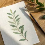
Easy Loose Watercolor Florals
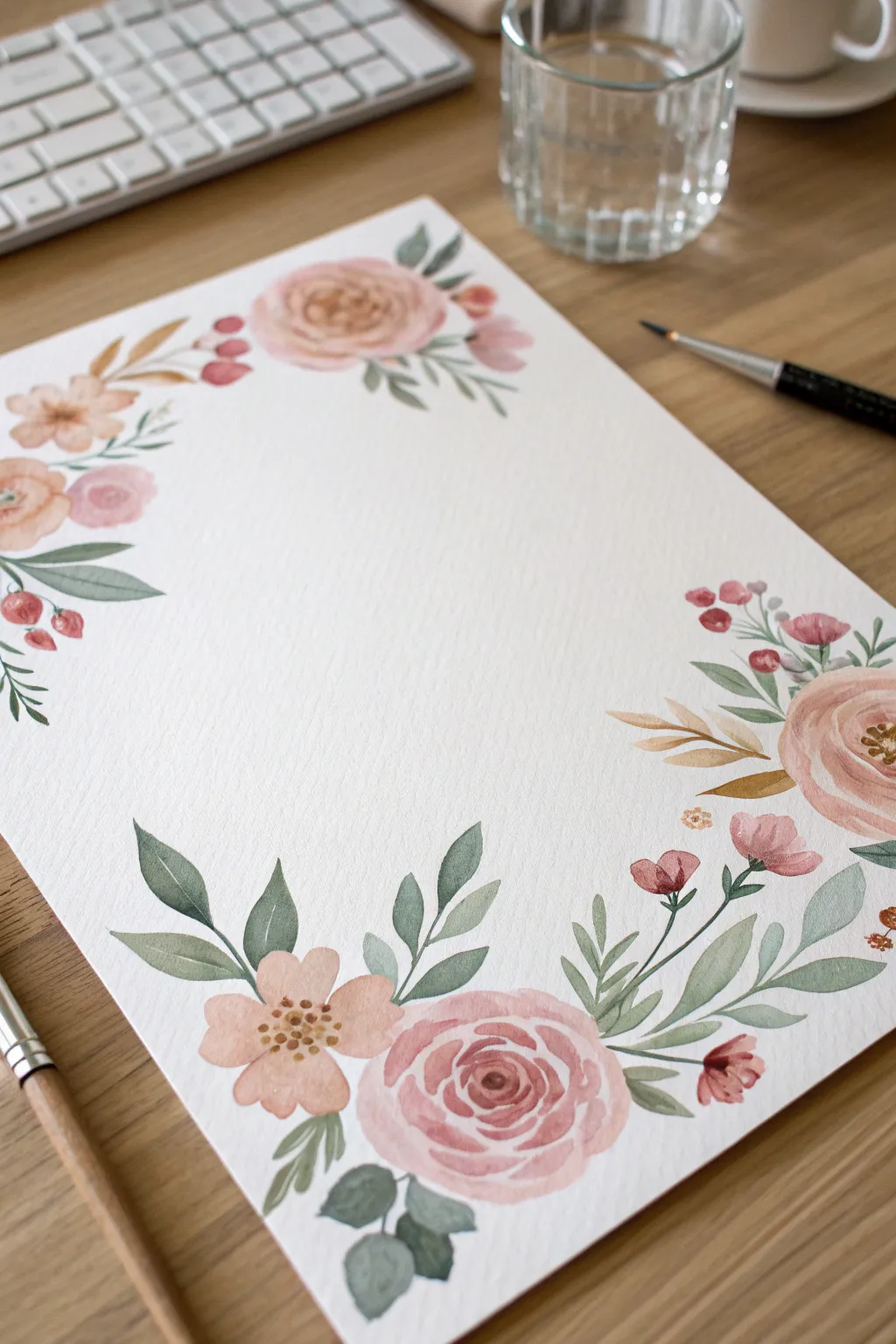
Create a romantic, stationary-worthy floral border with soft washes and delicate details. This project focuses on loose, expressive brushstrokes to build clusters of roses and greenery that frame the page beautifully.
How-To Guide
Materials
- Cold press watercolor paper (A4 or letter size)
- Round watercolor brushes (size 6 and size 2)
- Watercolor paints (Alizarin Crimson, Yellow Ochre, Sap Green, Burnt Sienna, Payne’s Grey)
- Clean water jar
- Paper towels
- Painter’s tape or washi tape
- Pencil (optional)
Step 1: Planning and First Roses
-
Secure Your Paper:
Begin by taping down your watercolor paper to a hard board or your table surface. This prevents buckling and keeps the paper steady while you work. -
Map Out the Border:
You can lightly sketch ovals where you want your main flower clusters to sit—focus on opposite corners (top left and bottom right) for a balanced look. Keep pencil lines extremely faint so they disappear under the paint. -
Mix Your Rose Color:
Create a soft, dusty pink by mixing Alizarin Crimson with plenty of water and a tiny touch of Yellow Ochre or Burnt Sienna to warm it up. The mixture should be very milky and dilute. -
Paint the Rose Center:
Using your size 6 brush, paint delicate ‘C’ shaped strokes tightly together in the center of your first rose location. Keep these strokes fairly pigmented. -
Expand the Petals:
Rinse your brush slightly and paint larger, looser ‘C’ shapes around the center. Allow the wet brush to touch the edge of the previous strokes so the color bleeds outward, creating a gradient. -
Finish the Main Roses:
Continue this process for the large roses in your main corner clusters. Leave bits of white paper showing between strokes to create the illusion of petals catching the light.
Wet-on-Wet Magic
Work quickly while the rose petals are still damp. Touching a green leaf to a wet pink petal allows the colors to bleed slightly, creating a soft, cohesive look.
Step 2: Adding Variety
-
Paint Smaller Blooms:
Mix a slightly peachier tone by adding more Yellow Ochre. Paint simple five-petal flowers near the roses. These are essentially just dabs of the brush pressed flat against the paper. -
Add Berry Clusters:
With a reddish-pink mix, paint small round berries on delicate stems extending away from the main clusters. Group them in threes or odd numbers for a natural look. -
Create Depth:
Before the roses are fully bone-dry, drop a slightly darker, more concentrated pink mix into the very center of the blooms. I find this creates instant dimension without overworking the piece.
Step 3: Painting Greenery
-
Mix Your Greens:
Prepare two shades of green: a warm olive (Sap Green + Yellow Ochre) and a cool, muted eucalyptus tone (Sap Green + Payne’s Grey + lots of water). -
Paint Large Leaves:
Using the size 6 brush, paint broad, singular leaves tucking under the roses. Press down hard on the belly of the brush and lift as you drag to create a pointed tip. -
Add Vine Details:
Switch to your size 2 brush. With the darker green mixture, paint thin, meandering stems flowing out from the flower clusters along the paper’s edge. -
Attaching Small Leaves:
Attach small, teardrop-shaped leaves to these stems using the tip of your brush. Vary the pressure to make some leaves look folded or turned. -
Incorporate Whispy Foliage:
Using a very dilute brownish-yellow mix, add subtle, fern-like fronds peaking out behind the main flowers to add texture without heaviness.
Gold Accents
Once fully dry, use metallic gold watercolor or a gold pen to add tiny dots to flower centers or trace fine veins on a few leaves for elegant shimmer.
Step 4: Final Touches
-
Add Flower Centers:
Once the smaller peach flowers are dry, use a concentrated brown or ochre mix to dot tiny stamen details in their centers with your smallest brush. -
Balance the Composition:
Step back and look at your border. If a gap feels too empty, add a single floating leaf or a tiny bud to bridge the space. -
Let it Dry:
Allow the painting to dry completely before carefully peeling off the tape at a 45-degree angle to reveal your clean edges.
Now you have a stunning custom border ready for calligraphy or a heartfelt note to a friend
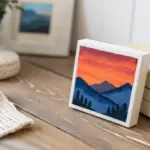
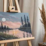
Layered Mountain Landscape
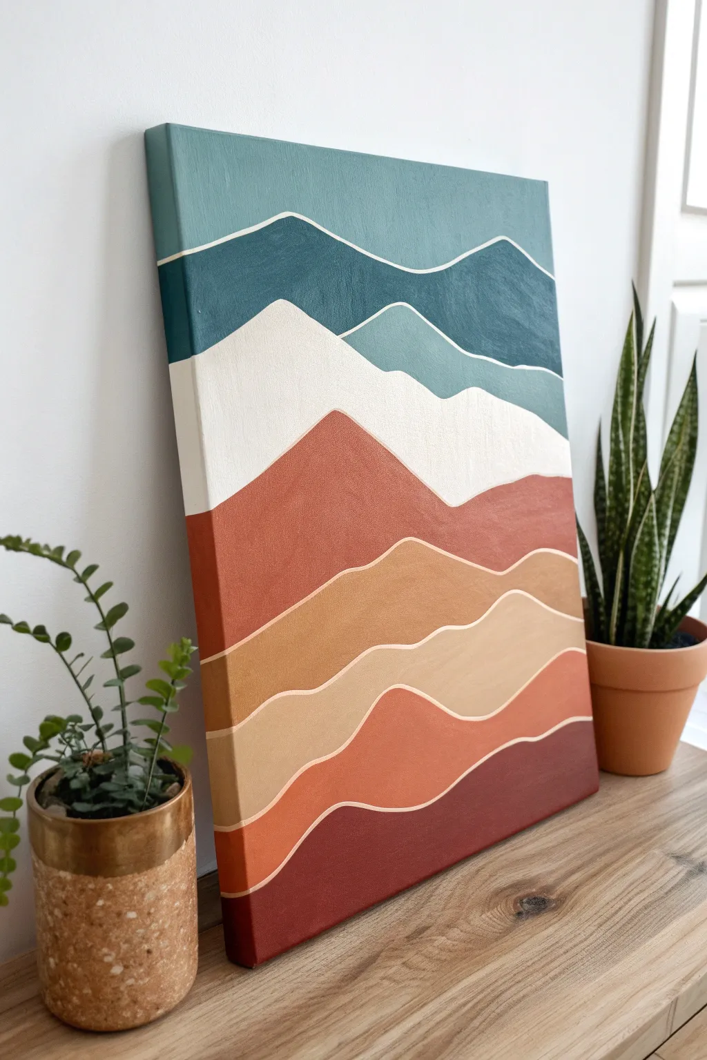
Bring the calming influence of the outdoors inside with this modern, minimalist mountain landscape. Using clean lines and a gradient of warm and cool tones, you will create a sense of depth that feels professional yet is incredibly simple to execute.
Detailed Instructions
Materials
- Stretched canvas (e.g., 16×20 inches)
- Acrylic paints (Teal, Navy Blue, White, Burnt Sienna, Yellow Ochre, Deep Burgundy)
- Flat paintbrushes (large 1-inch and medium 1/2-inch)
- Small round detail brush (size 2 or 3)
- Pencil
- Palette or paper plate
- Cup of water and paper towels
Step 1: Sketching the Layout
-
Prime the background:
If your canvas isn’t pre-primed, apply a coat of white gesso or white acrylic paint to create a smooth surface. Let this dry completely before starting. -
Draw the mountain outlines:
Using a light pencil, sketch wavy, organic lines across the canvas. Start near the top and work your way down. These lines represent the ridges of the mountains. -
Vary the line shapes:
Create about 7-8 distinct sections. Ensure the lines aren’t perfectly straight; give them gentle peaks and valleys to mimic natural terrain. Some lines should dip lower than others to create visual interest.
Steady Hand Trick
Rest your pinky finger on a dry part of the canvas to stabilize your hand while painting the thin white lines between the mountains.
Step 2: Painting the Cool Tones
-
Mix the sky color:
On your palette, mix a muted teal with a touch of white to soften it. This will be your topmost section. -
Paint the top layer:
Use your large flat brush to fill in the top section above your first pencil line. Don’t worry about being perfectly precise near the line yet; we will refine the edges later. -
Create a darker blue:
For the second layer down, mix a deeper navy blue with a small amount of teal to coordinate it with the sky. Paint this section below the teal, leaving a very tiny gap between the colors if possible. -
Add a misty layer:
For the third layer, I like to create a lighter, grayish-blue color by mixing white, teal, and a tiny dot of grey or black. Paint this section, which acts as a transition into the lighter middle.
Metallic Magic
Swap the white separation lines for gold leaf or metallic gold paint paint to add a luxurious, shimmering finish to the artwork.
Step 3: Painting the Warm Tones
-
Bridge the gap with white:
The fourth layer is the ‘snow cap’ area. Paint this section pure white or an extremely pale off-white. This sudden brightness creates a focal point. -
Mix a rust color:
For the fifth layer (the large mountain peak), use Burnt Sienna mixed with a little red or orange to get a rich rust tone. Paint this prominent shape, ensuring it contrasts heavily with the white above it. -
Transition to sandy gold:
Mix Yellow Ochre with some white and a touch of the rust mix to create a sandy, golden tan color. Apply this to the section below the rust mountain. -
Paint the lower slopes:
Create a soft beige or light clay color by adding more white to your previous tan mixture. Fill in the next narrow band. -
Add deep warmth:
For the second-to-last layer, use a muted terracotta orange. It should be darker than the beige but lighter than the bottom-most color. -
Anchor with burgundy:
Paint the final bottom section with a deep burgundy or dark reddish-brown to visually anchor the painting.
Step 4: Defining the Ridges
-
Prepare the detail brush:
Once all paint layers are dry to the touch, load your small round detail brush with slightly watered-down white acrylic paint. The thinner consistency helps the paint flow smoothly. -
Paint the separation lines:
Carefully trace over the pencil lines between each color block. Use a steady hand to create a consistent, thin white line that separates each mountain layer. -
Clean up edges:
If your white lines get too thick or wobbly, let them dry, then gently touch up the colored paint next to them to ‘erase’ the mistake. -
Paint the canvas sides:
Extend the colors from the front around the sides of the canvas for a polished, gallery-wrapped look. -
Seal the artwork:
Optionally, apply a coat of clear matte varnish once the painting is fully cured to protect the colors from dust and fading.
Hang your new landscape on a prominent wall and enjoy the peaceful view you created
BRUSH GUIDE
The Right Brush for Every Stroke
From clean lines to bold texture — master brush choice, stroke control, and essential techniques.
Explore the Full Guide
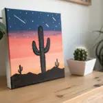
Silhouette Over a Gradient Sky
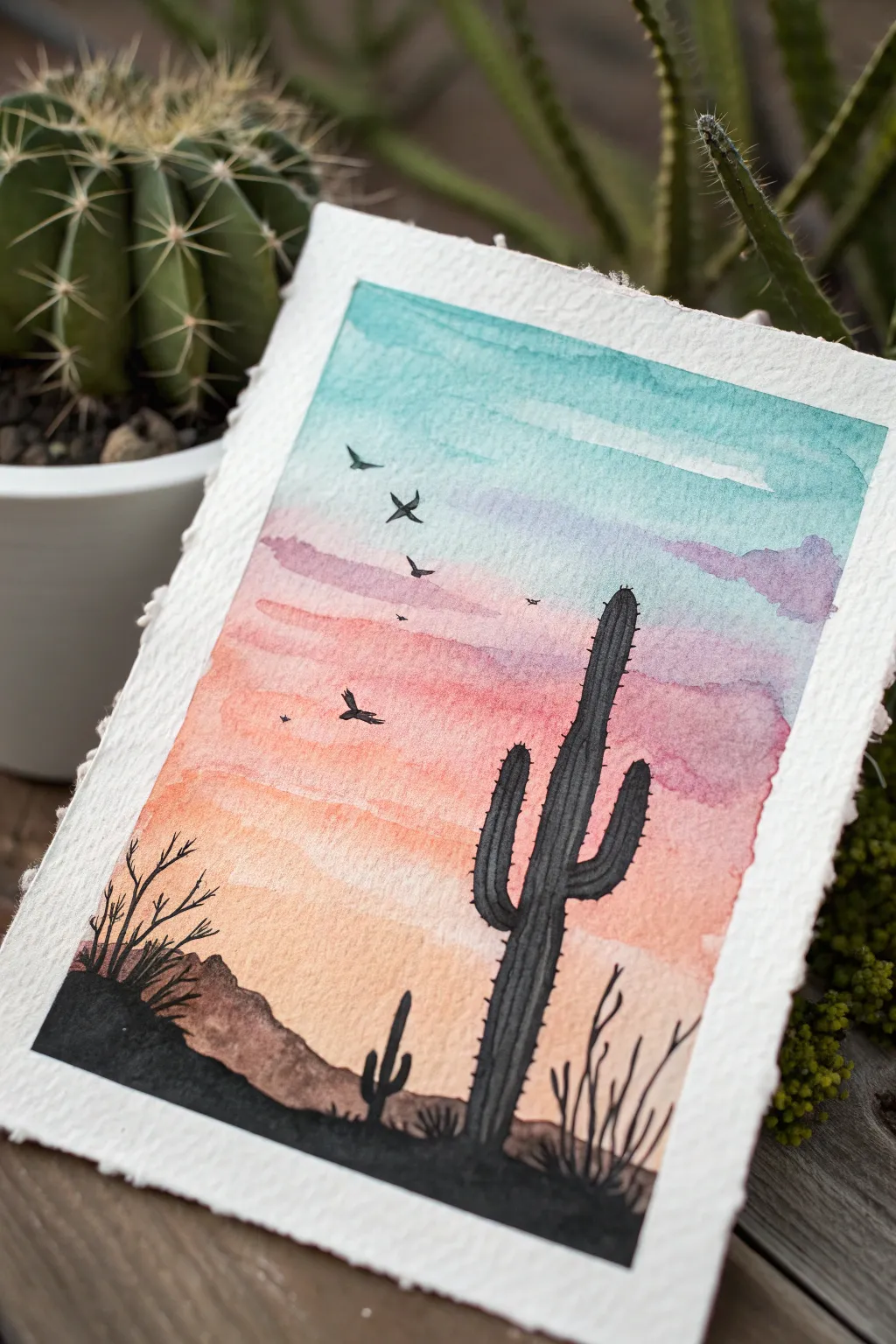
Capture the serene beauty of a desert sunset with this vibrant watercolor project. By layering a warm gradient sky behind crisp black silhouettes, you’ll create a stunning contrast that makes the scene pop right off the textured paper.
Step-by-Step Guide
Materials
- Cold press watercolor paper (deckled edge optional)
- Watercolor paints (Turquoise, Purple, Pink, Orange, Yellow)
- Black ink or black gouache
- Flat wash brush (3/4 inch)
- Round detail brushes (size 2 and 0)
- Masking tape
- Paper towel
- pencil
Step 1: Painting the Gradient Sky
-
Prepare your paper:
Begin by taping down your watercolor paper to a flat board. Alternatively, if you are using heavy deckle-edged paper like the example, you can tape underneath or just be very careful with water control. -
Establish the horizon:
Lightly sketch a very faint horizon line about one-third of the way up the paper. This will guide where your sky ends and the land begins. -
Start with the sky:
Mix a watery turquoise blue. Brush this across the top third of your paper using horizontal strokes. -
Blend downward:
While the blue is still wet, clean your brush and pick up a soft purple. Apply this directly below the blue, letting the edges touch and bleed together slightly for a seamless transition. -
Add warmth:
Moving lower, introduce a dusty pink or rose color beneath the purple. Keep your strokes horizontal and fluid. -
Finish the sunset:
Transition the pink into a warm orange, and finally into a soft yellow as you reach your pencil horizon line. I like to let the colors fade out naturally near the bottom. -
Create texture:
While the wash is still damp, you can drop in tiny amounts of concentrated purple or darker pink into the upper sky area to suggest soft clouds. -
Let it dry completely:
This is crucial. The paper must be bone dry before adding the silhouettes, or the black ink will bleed into your beautiful sky.
Step 2: Adding the Silhouettes
-
Outline the saguaro:
Using a pencil, very lightly sketch the main saguaro cactus on the right side. Draw a tall central column with two arms—one pointing up on the left, and a smaller one on the right. -
Draft the landscape:
Sketch rolling hills along the bottom. Make the hill on the left slightly higher to create balance with the tall cactus on the right. -
Fill the foreground:
Load your round brush with opaque black ink or gouache. Fill in the rolling hills at the bottom completely solid black. -
Paint the main cactus:
Carefully fill in your saguaro shape. Use the tip of the brush to create small bumps along the edges to mimic the texture of spines. -
Add ribs:
Once the main black shape is dry, you can mix a slightly lighter charcoal grey (or diluted black) to paint vertical lines down the cactus body, suggesting ribs. -
Paint smaller cacti:
Add a tiny silhouette of a smaller cactus in the mid-ground on the left side to create a sense of depth and scale. -
Detail the scrub brush:
Using your smallest size 0 detail brush, flick quick, thin lines upward from the black ground to create dry desert bushes and leafless branches. -
Add the birds:
Paint V-shapes in the sky for birds. Vary their sizes—larger ones lower down and tiny specs higher up—to simulate distance.
Bleeding edges?
If your black ink creates ‘spiderwebs’ into the sky, your background wasn’t dry enough. Let it dry longer, or use a hair dryer on low heat to speed it up.
Add some sparkle
Once the painting is totally dry, use a white gel pen to add tiny stars in the turquoise section of the sky or highlight the cactus spines.
Frame your desert masterpiece or gift it to a friend who loves the sudo-western aesthetic
Geometric Masking Tape Art
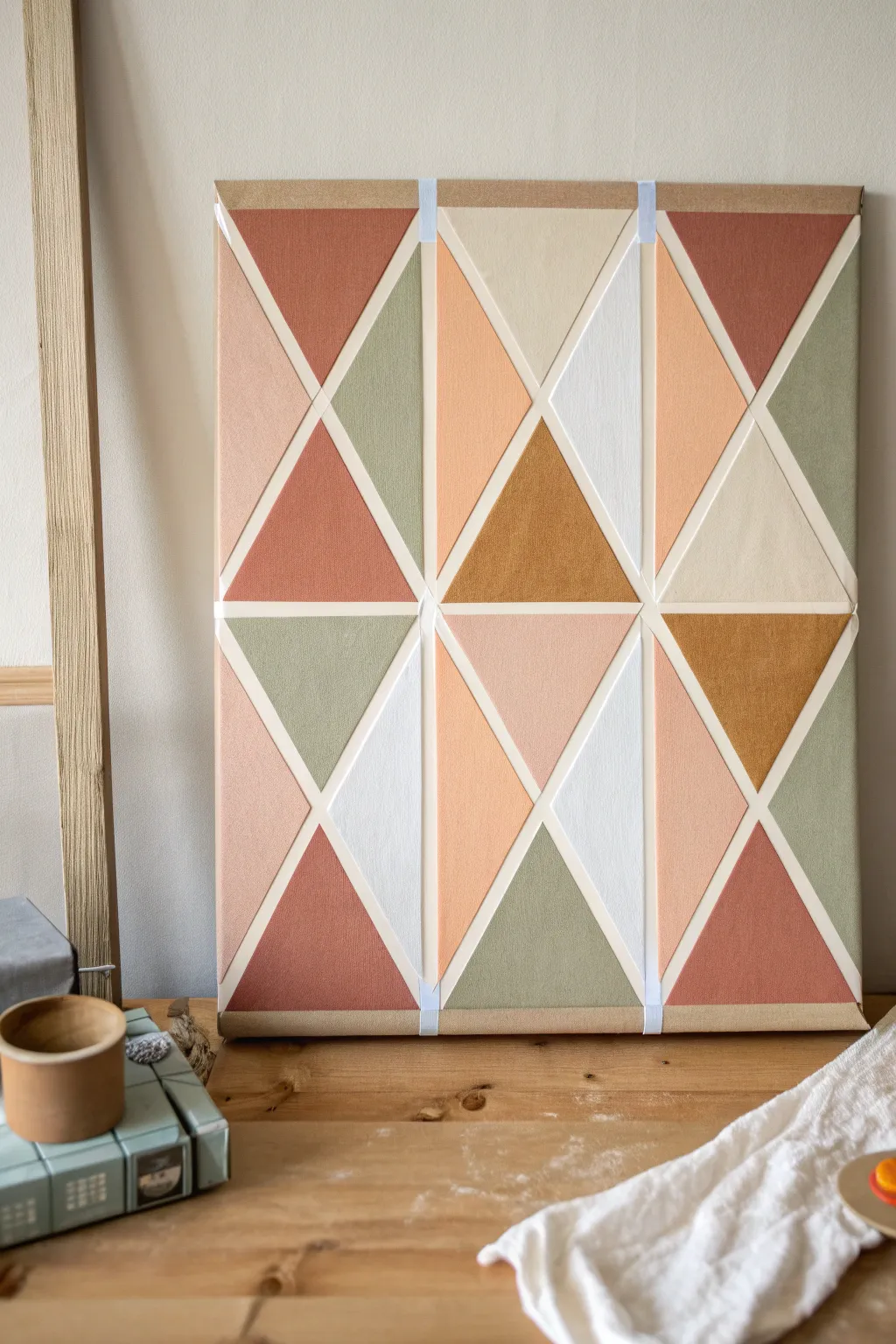
Create a stunning piece of modern wall decor using nothing more than masking tape and a palette of earthy, muted tones. This beginner-friendly project relies on simple triangle patterns to achieve a professional, gallery-worthy look perfect for any contemporary space.
How-To Guide
Materials
- Stretched canvas (rectangular or square)
- Painter’s tape or masking tape (1/4 inch width works best)
- Acrylic paints in: terracotta, sage green, blush pink, mustard ochre, beige, and white
- Flat paintbrushes (medium and small)
- Palette or paper plate
- Ruler or straight edge
- Pencil
- Newsprint or drop cloth
Step 1: Planning the Layout
-
Prepare your canvas:
Lay your canvas on a flat, protected surface. Wipe it down gently with a dry cloth to ensure there’s no dust that might interfere with tape adhesion. -
Mark vertical guides:
Using a ruler, lightly mark the vertical center line of your canvas with a pencil. Then, divide the remaining space to create three or four vertical columns, depending on your canvas width. -
Apply vertical tape lines:
Run strips of masking tape vertically down the canvas along your pencil marks. Press these down firmly to create the main structural columns for your design. -
Create diagonal sections:
Now, use tape to create large ‘X’ shapes within the columns. Start from the top left corner of a column and tape diagonally down to a lower point on the opposite vertical line. Repeat in a zigzag fashion. -
Complete the geometric grid:
Add opposing diagonal tape lines to form a series of triangles and diamonds. Don’t worry about perfect symmetry; a slightly organic arrangement adds to the charm. -
Seal the tape edges:
Run your finger or a clean cloth firmly over all tape edges. This is crucial to prevent paint from bleeding under the tape and ensures crisp, clean lines later. -
Protect the borders:
Apply a strip of tape along the outer edges of the canvas to create a clean, unpainted border if desired, or prepare to paint the sides as you go.
Bleeding Lines?
If paint seeps under the tape, wait for it to dry completely. Then, place a ruler over the line and use a white paint pen to re-draw the crisp edge.
Step 2: Painting the Triangles
-
Plan your color palette:
Squeeze out your paint colors: terracotta, sage green, blush pink, mustard, beige, and white. I like to arrange them on the palette to see how the colors interact before applying them. -
Start with the darkest tones:
Begin painting selected triangles with your terracotta or rust color. Choose spots randomly across the canvas, ensuring no two adjacent triangles share the same color. -
Apply the greens:
move on to the sage green. Fill in several triangles, balancing them out visually against the terracotta sections you just painted. -
Fill in warm neutrals:
Next, use the blush pink and mustard ochre. These warm tones bridge the gap between the darker accents and the lighter neutrals. -
Add lightness:
Use the beige and white paints for the remaining empty triangles. These lighter sections will help the pattern ‘breathe’ and prevent the design from feeling too heavy. -
Watch your brush strokes:
When painting near the tape, brush away from the tape edge rather than into it. This technique helps minimize paint seepage under the adhesive. -
Check for coverage:
Acrylics can be translucent. If the canvas texture shows through too much, let the first coat dry for about 10-15 minutes and apply a second coat for solid, opaque color. -
Let it dry partially:
Allow the paint to set until it is tacky but not fully hardened. This is the sweet spot for tape removal.
Pro Tip: Seal It first
Paint a layer of white (or your base color) over the tape edges BEFORE adding color. This seals the tape, so any bleed is invisible!
Step 3: The Reveal
-
Remove the tape slowly:
Gently peel back the tape at a 45-degree angle. Pull slowly and steadily to avoid ripping the paint film that has formed. -
Detailing:
Once all tape is removed, inspect your white lines. If any paint bled through, use a tiny brush and white gesso or heavy body white paint to touch up the edges carefully. -
Final cure:
Let the entire canvas dry completely overnight before hanging or framing.
Hang your new geometric masterpiece and enjoy the modern warmth it adds to your room

PENCIL GUIDE
Understanding Pencil Grades from H to B
From first sketch to finished drawing — learn pencil grades, line control, and shading techniques.
Explore the Full Guide
Sponge-Stamped Blossom Tree
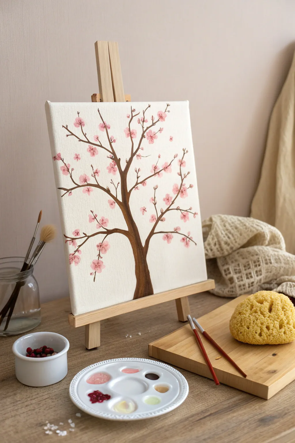
Capture the delicate beauty of spring with this beginner-friendly painting project that relies on a clever sponge technique for perfect petals. The contrast between the dark, slender branches and the soft pink blooms creates a lovely, Japan-inspired aesthetic for any wall.
Step-by-Step Guide
Materials
- Small stretched canvas (e.g., 8×10 or 9×12 inches)
- Acrylic paints: Dark brown, white, light pink, dark pink/magenta
- Round brush (size 4 or 6) for the trunk
- Fine liner brush (size 0 or 1) for small twigs
- Natural sea sponge (or a synthetic sponge with large pores)
- Palette or paper plate
- Cup of water and paper towels
Step 1: Painting the Tree Structure
-
Establish the Trunk Base:
Start by mixing a dark brown acrylic paint. Using your medium round brush, paint the base of the tree trunk at the bottom center of the canvas. Make it wider at the bottom and gradually taper it as you move upward to about the middle of the canvas. -
Create the Main Branches:
From the top of your trunk, split the line into two or three main branches extending outward in a ‘Y’ shape. Keep these lines fluid and slightly uneven to mimic natural wood growth. -
Extend Secondary Branches:
Switch to a smaller brush if needed. Paint smaller branches shooting off from your main limbs. Let them curve gently towards the corners of the canvas, filling the empty white space without overcrowding it. -
Add Fine Twigs:
Using your fine liner brush and slightly watered-down brown paint, add very thin, wispy twigs to the ends of your branches. These delicate lines will hold your future blossoms. -
Let the Structure Dry:
Allow the brown paint to dry completely before moving on. I find that waiting about 10–15 minutes prevents the pink flowers from turning muddy if they accidentally touch wet brown paint.
Muddy colors?
If your pinks are turning brown where they touch the branches, the trunk wasn’t fully dry. Let it dry longer, or dab the paint thicker so it sits on top rather than mixing.
Step 2: Stamping the Blossoms
-
Prepare the Sponge:
Take your sea sponge and tear off a small piece, about the size of a large marble or a grape. You want a rough, organic surface, not a flat edge. -
Mix Your Pink Shades:
On your palette, squeeze out white, light pink, and a touch of magenta. Do not mix them into one uniform color; instead, swirl them lightly so you have a marbled effect. -
Load the Sponge:
Dip your small sponge piece into the marbled paint. Dab the excess off onto a paper towel—too much paint will create blobs rather than textured petals. -
Stamp the First Clusters:
Gently press the sponge onto the ends of your twigs. Use a light dabbing motion. Group the stamps in clusters of three or four to simulate flower bunches. -
Vary the Pressure:
Rotate the sponge in your hand as you move to different branches. This ensures that every flower cluster looks unique and not like a repeated stamp pattern. -
Add Depth with Darker Pinks:
Once the first layer is down, dip just the edge of your sponge into the darker magenta/pink. Add one or two small dabs near the center of your existing flower clusters to create shadow and depth. -
Highlight with White:
Clean your sponge or grab a fresh corner. Dip it into pure white paint and lightly dab the very tops of the flower clusters, suggesting sunlight hitting the petals. -
Fill the Gaps:
Step back and look at the composition. If any area looks too sparse, add a few floating petals or small buds directly on the branches using the tip of the sponge.
Level Up: Falling Petals
Create a sense of movement by stamping a few single, faint petals near the bottom of the canvas, as if they are gently falling from the tree to the ground.
Step 3: Final Details
-
Refine the Centers:
Once the sponge work is dry, use your fine liner brush with a tiny dot of dark brown or deep red to paint minuscule dots in the center of the largest blossom clusters. -
Connect Floating Blooms:
If you stamped flowers that look like they are floating in mid-air, use the liner brush to paint a hair-thin twig connecting them back to a main branch. -
Seal the Artwork:
Allow the painting to cure for at least 24 hours. You can then apply a light coat of matte or satin varnish to protect the colors from fading.
Now you have a serene piece of botanical art ready to brighten up your space
Simple Paint-By-Shape Still Life
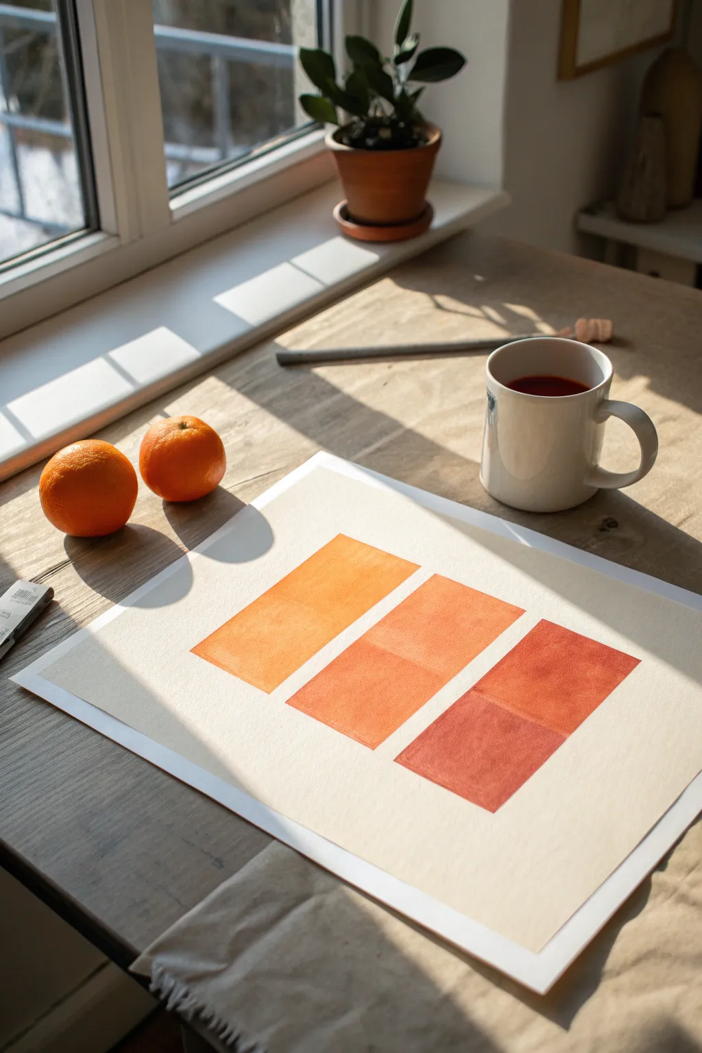
Capture the warmth of a sunny morning with this minimalist study in orange gradients. This project uses simple geometric blocks to explore color temperature and saturation, resulting in a piece that feels both modern and organic.
How-To Guide
Materials
- Heavyweight watercolor paper (300gsm cold press recomended)
- Watercolor or gouache paints (Yellow Ochre, Cadmium Orange, Burnt Sienna)
- 1-inch flat wash brush
- Painter’s tape or masking tape
- Ruler
- Pencil
- Palette for mixing
- Two jars of water
- Paper towels
Step 1: Preparation & Layout
-
Secure the paper:
Tape your watercolor paper down to a flat work surface. Taping the edges not only keeps the paper from buckling when wet but also creates that crisp, professional white border seen in the final piece. -
Mark the layout:
Using a ruler and a pencil, lightly mark out three rectangular shapes. They should be arranged in a staggered, diagonal composition descending from the top left to the bottom right. -
Define the rectangles:
Draw the full outlines of your three rectangles. Aim for blocks that are roughly 3 inches wide by 5 inches tall, leaving about an inch of white space between each one to let the shapes breathe. -
Clean up lines:
Lighten your pencil lines with a kneaded eraser so they are barely visible. Since we are using semi-transparent paint, dark graphite lines might show through the final color.
Step 2: Painting the Gradient
-
Mix the first tone:
On your palette, mix a generous amount of a sunny yellow-orange. Start with Yellow Ochre and add just a touch of Cadmium Orange. You want this first color to be bright and warm, like the skin of a tangerine. -
Paint the top rectangle:
Load your flat brush and carefully fill in the top-left rectangle. Use long, horizontal strokes to ensure an even wash. I like to keep the edges crisp by angling the brush chisel-tip along the pencil line. -
Mix the middle tone:
Do not clean your palette yet. Into your existing puddle of yellow-orange, mix more Cadmium Orange and a tiny dot of red. You are looking for a true, vibrant orange that is visibly deeper than your first block. -
Paint the center rectangle:
Fill in the middle rectangle with this new mixture. If the paint feels too dry or streaky, dip just the corner of your brush in water to help it flow across the paper texture. -
Create the deepest tone:
For the third color, add a small amount of Burnt Sienna or a reddish-brown to your orange mix. This should be a rich, rusty terracotta shade that anchors the composition. -
Paint the final rectangle:
Apply this deepest shade to the bottom-right rectangle. Be careful where the blocks are closest to each other; sharp edges are key to the geometric look of this piece. -
Refine the edges:
While the paint is still damp, check your edges. If any lines look wobbly, use the very tip of your flat brush with a slightly thicker paint mixture to straighten them out.
Uneven Color Fix
If your paint dries with “blooms” or watermarks, your brush was too wet. Let it dry completely, then apply a second, slightly thicker layer of paint over the entire rectangle to smooth it out.
Step 3: Finishing Touches
-
Let it dry completely:
Allow the painting to dry undisturbed for at least 30 minutes. If the paper feels cool to the touch, it is still wet deep in the fibers. -
Erase guidelines:
Once you are absolutely certain the paint is bone dry, gently erase any remaining visible pencil marks from around the edges of your colored blocks. -
Remove the tape:
Peel the painter’s tape away from the paper slowly. Pull the tape away from the center of the artwork at a 45-degree angle to prevent tearing the paper surface.
Crisp Edge Secret
For perfectly straight sides without a steady hand, use painter’s tape to mask off the rectangle boundaries. Seal the tape edge with a little water before painting to prevent bleeding.
Place your finished piece near a window to let the natural light enhance those warm citrus tones


Modern Brushstroke Wall Art
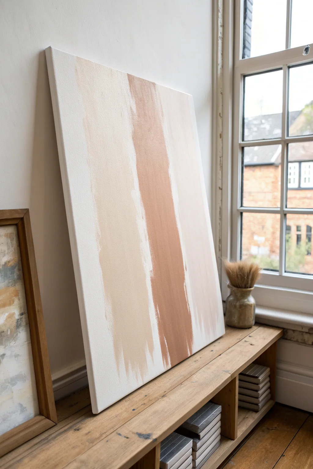
Bring the calming warmth of natural earth tones into your space with this minimal, abstract wall art that requires absolutely no prior painting experience. Using large, sweeping gestures and a simple palette, this project creates a serene focal point that mimics high-end gallery pieces.
Detailed Instructions
Materials
- Large stretched canvas (24×36 or similar)
- Acrylic paints (White, Raw Sienna, Burnt Sienna/Terracotta, Beige)
- Wide flat paintbrush (2-3 inch)
- Small mixing cups or a palette
- Drop cloth or newspapers
- Water cup
- Paper towels
Step 1: Preparation and Base
-
Prepare your workspace:
Lay down your drop cloth or old newspapers to protect your flooring or table. Since this canvas is quite large, I find it easiest to work on the floor or lean the canvas against a sturdy wall covered in plastic. -
Prime the canvas:
Even if your canvas came pre-primed, apply a fresh coat of white acrylic paint across the entire surface. This ensures a clean, uniform starting point and helps the subsequent colors glide more smoothly. -
Mix your colors:
Squeeze out your paints into separate cups. You’ll need a pure white, a soft beige (mix white with a tiny dot of Raw Sienna), and a deeper terracotta tone (Burnt Sienna). Keep a separate blob of white available for blending. -
Let the base dry:
Allow that initial white base coat to dry completely. It should be dry to the touch so your colored strokes don’t turn muddy immediately.
Dry Brush Technique
To get those scratchy, textured edges, wipe most of the paint off your brush onto a paper towel before dragging it. Less paint = more texture.
Step 2: Painting the Strokes
-
Load the brush for the center stroke:
Start with your darkest color, the terracotta. Load your wide brush generously with paint, ensuring the bristles are fully coated but not dripping. -
Create the central stripe:
Starting near the top edge (or slightly below it for a floating look), pull the brush straight down toward the bottom. Don’t worry about perfect straightness; organic movement looks better here. -
Refine the central edge:
Reload the brush and go over the stroke if needed to make it opaque, but allow the edges to be rough and ‘dry brushed’ where the canvas texture shows through. -
Clean the brush:
Thoroughly rinse your wide brush in water and pat it dry on a paper towel. You want it damp but not soaking wet for the next color. -
Apply the left stripe:
Pick up your beige or sandy mixture. Apply this stroke to the left of the terracotta line, leaving a small gap of white space between them. -
Feather the bottom:
As you reach the bottom of the canvas, lift pressure on the brush to let the stroke fade out naturally, creating a jagged, artistic edge. -
Add the right stripe:
Using a very light blush or pale white-beige, create the third stripe on the far right. This should be the subtlest of the three, almost blending into the background.
Step 3: Finishing Touches
-
Blend the transitions:
While the paint is still slightly tacky, use a clean, slightly damp brush to gently touch the edges where the strokes meet the white background. This softens the look if any lines feel too harsh. -
Add texture highlights:
Dip just the tips of your dry brush into pure white paint. Lightly drag it over parts of the colored stripes to mimic the look of fabric or weathered plaster. -
Check for balance:
Step back about five feet to view your composition. If one stripe feels too heavy, you can layer a bit of the lighter beige over it to tone it down. -
Dry completely:
Let the canvas sit undisturbed for at least 2-4 hours. Acrylics dry fast, but thick ridges of paint need extra time. -
Seal (Optional):
If you plan to hang this in a sunny spot, apply a matte varnish spray to protect the colors from fading over time.
Fixing “Mistakes”
If a stroke goes crooked, don’t panic. Wait for it to dry, paint over it with white, and try again. Acrylic is very forgiving with layering!
Hang your new masterpiece near a window to let natural light highlight the subtle textures you’ve created
Easy Painted Rock Art
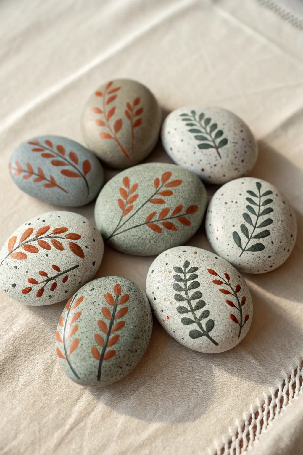
Transform smooth river stones into earthy accent pieces with these simple leaf designs. This project combines muted rust and sage tones with speckled faux-stone textures for a modern, organic look.
How-To Guide
Materials
- Smooth river rocks (flat, oval shapes work best)
- Acrylic paints (matte finish): Rust orange/terra cotta, sage green, dark forest green, off-white/beige, dark grey/black
- Fine detail brushes (size 0 and 00)
- Medium flat brush (for base coats)
- Old toothbrush (for speckling)
- Water cup and palette
- Matte spray varnish or sealer
Step 1: Preparing the Canvas
-
Clean the stones:
Before starting, scrub your found rocks with warm soapy water to remove any dirt or grease. Let them dry completely, as moisture trapped inside can ruin the paint later. -
Mix base colors:
For the light-colored stones, mix a creamy off-white using white with a tiny drop of brown or beige. For the green stones, create a muted sage by mixing green, white, and a touch of grey. -
Apply base coats:
Paint the entire surface of your selected rocks. You may need two to three thin coats for full opacity, allowing about 15 minutes of drying time between layers. -
Leave some natural:
If you have rocks with a naturally pleasing grey or tan color, skip the base coat on a few to add variety to your collection. -
Create the speckled effect:
Dip an old toothbrush into slightly watered-down dark grey or black paint. Test it on paper first, then run your thumb across the bristles to flick tiny specks onto the dry painted rocks. -
Dry partially:
Let the speckles dry for at least 20 minutes. If you want multi-colored speckles, repeat the process with a rust or white color on the darker rocks.
Step 2: Painting the Foliage
-
Sketch lightly (optional):
If you aren’t confident freehanding, use a very light pencil to mark the central stem line. Keep the curve gentle and organic. -
Draft the stems:
Using your finest detail brush and dark grey or black paint, draw a thin, curved line from the bottom of the rock toward the top. Taper it slightly at the end. -
Plan leaf placement:
Visualize where the leaves will go. They should alternate sides (left, right, left) as they move up the stem, getting slightly smaller near the tip. -
Paint rust leaves – The Stroke:
Dip your clean detail brush into the rust/terra cotta paint. Place the tip of the brush near the stem, press down slightly to widen the stroke, and lift as you pull away to create a pointed leaf shape. -
Complete rust stems:
Continue adding rust leaves up the stem. For variety, paint double stems on wider rocks, having them curve away from each other. -
Paint green leaves:
Switch to your dark forest green paint. On the lighter speckled rocks, use this color for high contrast. Utilize the same ‘press and lift’ brush stroke technique. -
Mix leaf styles:
Vary your designs. On some rocks, paint rounded, oval leaves; on others, make them long and slender like willow leaves. -
Add floating leaves:
On rounder rocks, try painting two distinct stems that don’t touch, or add a few loose leaf ‘petals’ near the edges to fill negative space. -
Refine connections:
Go back with your stem color (dark grey/black) and ensure each leaf is connected to the main branch with a tiny, hair-thin line.
Oops, blobby leaves?
If your leaf shapes look messy, wait for them to dry completely. Then, use the background/base color to carefully ‘cut in’ and reshape the edges.
Step 3: Finishing Touches
-
Check for opacity:
Once the leaves are dry, check if the base color is showing through. Rust colors can be transparent, so I often dab a second coat just on the leaves for richness. -
Final cure time:
Allow the finished designs to dry for at least 24 hours to ensure the paint has fully cured and hardened. -
Seal the art:
In a well-ventilated area, spray a light coat of matte varnish over the rocks. This protects the paint from chipping without making the stones look plasticky or shiny.
Natural Texture
Mix a pinch of baking soda into your base coat paint. This creates a gritty, realistic stone texture that looks amazing under the smooth leaf designs.
Arranged together in a bowl or scattered on a shelf, these botanical stones bring a calming touch of nature to your home
Bubble Wrap Print Painting
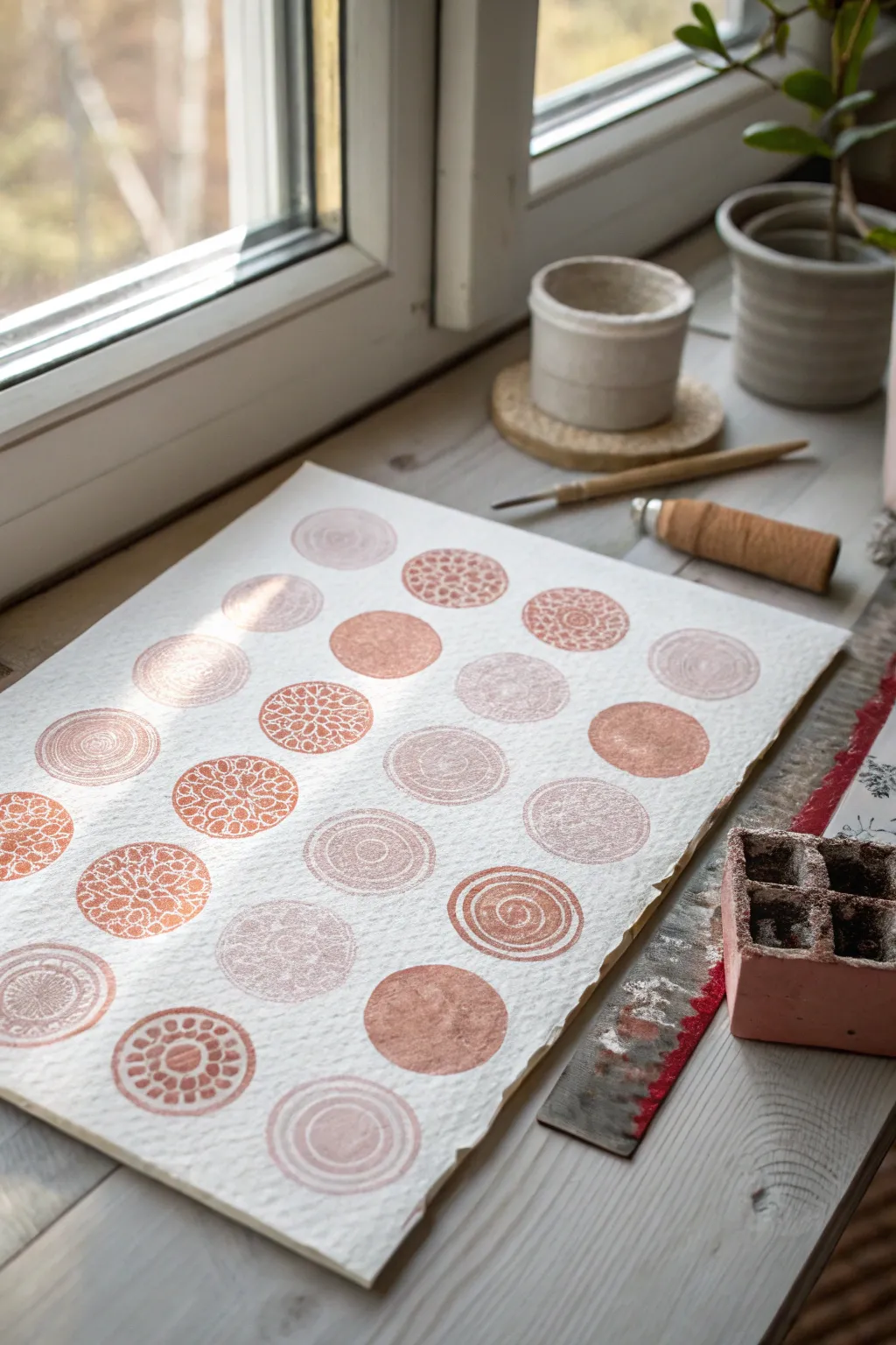
Create a stunningly simple piece of modern art using found objects and warm, earthy tones. By combining different circular textures like bubble wrap and concentric carvings, you can achieve a sophisticated gallery wall look with minimal effort.
Step-by-Step Guide
Materials
- High-quality watercolor paper or textured printmaking paper (A3 size)
- Acrylic paints (terracotta, coral, pale pink, white)
- Small round wooden blocks or stamp mounts
- Bubble wrap (small bubbles)
- Linoleum carving tool or sharp craft knife
- Adhesive foam sheets or rubber carving block
- Palette for mixing colors
- Sponge dabbers or small foam roller
Step 1: Preparing the Stamps
-
Gather your bases:
Find about 4-5 circular objects to serve as your stamp bases. Wooden thread spool ends, bottle caps, or small circular wood slices work perfectly for this uniform size. -
Create the swirl pattern:
For the concentric spiral look, you can carve a spiral into a small rubber block cut to the size of your base. Alternatively, coil a piece of thick string or twine onto a wood block and glue it in place. -
Make the bubble wrap stamp:
Cut a small circle of bubble wrap that fits exactly onto one of your stamp bases. Glue it down with the bubbles facing outward to create that classic dotted texture. -
Carve intricate details:
To mimic the floral or mandala-like circles, use a linoleum cutter on a soft rubber carving block. Carve away small triangles in a radial pattern, leaving the raised areas to catch the paint. -
Leave one solid:
Keep one stamp surface flat and smooth. This will act as a ‘reset’ for the eye, providing a solid circle of color amidst the textured patterns.
Stamp Tip
Use household items for unique textures! The end of a cork, a button glued to a block, or even the rim of a small jar can create amazing circular patterns without any carving.
Step 2: Mixing the Palette
-
Squeeze out base colors:
On your palette, place dollops of terracotta, burnt orange, and a deep coral acrylic paint. -
Create tints:
Mix white into small portions of each base color. You want a gradient ranging from deep, rich clay tones to very pale, dusty pinks. -
Test the consistency:
The paint should be creamy but not too watery. If it’s too thin, the intricate details of your stamps will get muddy; too thick, and the texture won’t transfer.
Level Up
Add a touch of luxury by mixing a small amount of metallic bronze or gold paint into one of your terracotta shades for a subtle shimmer.
Step 3: Printing the Grid
-
Secure the paper:
Tape your textured paper down to a flat surface using masking tape on the back or corners to prevent it from shifting while you work. -
Plan the layout:
Lightly mark a grid with a pencil if you need guidance, or trust your eye for a more organic feel. The example image uses a 4×5 or 5×5 arrangement. -
Ink the first stamp:
Using a sponge dabber, lightly pat paint onto your detailed mandala stamp. I prefer dabbing over dipping because it prevents paint from clogging the carved grooves. -
Press and lift:
Press the stamp firmly onto the paper. Apply even pressure without rocking the stamp, then lift it straight up to reveal a crisp impression. -
Switch textures:
Move to the next spot in your imaginary grid. Switch to the spiral or bubble wrap stamp. Use a slightly different shade of pink or orange to create visual interest. -
Vary opacity:
Don’t re-ink perfectly every time. Allowing a ‘ghost print’ (stamping a second time without adding more paint) creates a lovely faded, vintage effect. -
Add solid circles:
Intersperse the solid color circles sparingly. These anchor the composition and provide a nice weight against the airy, detailed patterns. -
Complete the grid:
Continue until your grid is full. Don’t worry about perfect alignment; slight irregularities add to the handmade charm.
Step 4: Finishing Touches
-
Let it dry:
Allow the paint to dry completely. Acrylics dry fast, but thick spots might need 20-30 minutes. -
Erase pencil marks:
If you used guide marks for your grid, gently erase them now, being careful not to smudge any paint. -
Flatten the paper:
If the paper buckled slightly from the moisture, place the dry artwork under a heavy book overnight to flatten it out perfectly.
Now you have a beautifully textured piece of art that brings a warm, geometric calm to your space
Watercolor Resist With Bold Shapes
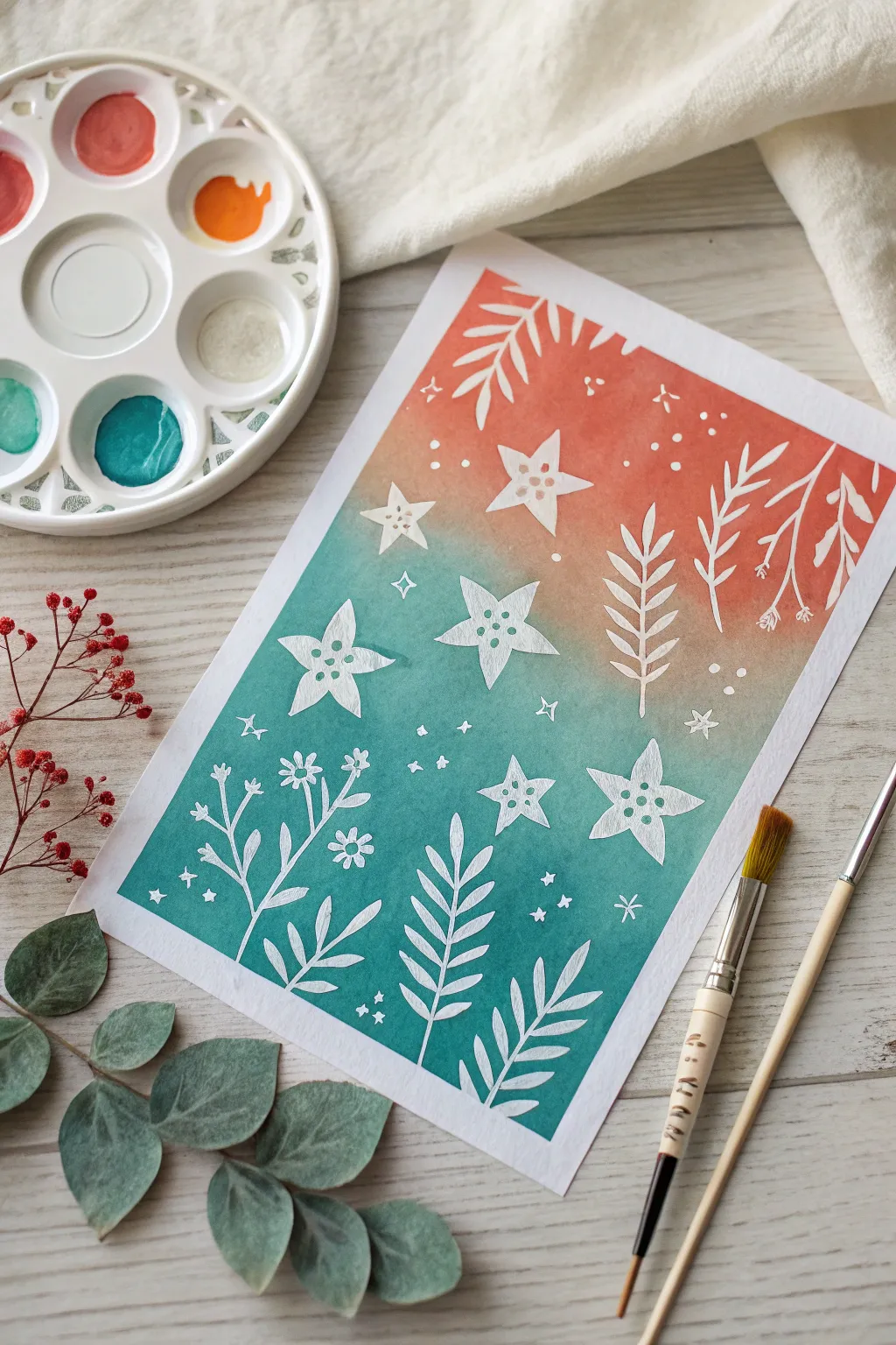
Capture the magic of a twilight sky meeting a blooming garden with this vibrant watercolor resist project. Using masking fluid creates crisp, stunning white silhouettes against a dreamy, blended gradient background of teal and coral.
How-To Guide
Materials
- Watercolor paper (cold press, at least 140lb)
- Masking fluid (drawing gum)
- Fine liner brush or masking fluid applicator
- Watercolor paints (Coral/Red-Orange and Teal/Turquoise)
- Large flat or round watercolor brush
- Jar of clean water
- Paper towels
- Rubber cement pickup tool (optional)
Step 1: Applying the Mask
-
Plan your composition:
Visualize your design before applying fluid. The image features a mix of five-pointed stars with internal dots, fern-like leaves, simple stems with small flowers, and scattered dots for texture. -
Design the stars:
Dip a fine liner brush into masking fluid. Paint several five-pointed stars scattered across the middle and lower sections of the paper. Add a small dot of masking fluid in the center of each star arm. -
Add foliage elements:
Paint leafy fern fronds rising from the bottom edge and descending from the top corners. Keep the strokes fluid and organic, varying the size of the leaves. -
Include floral details:
Draw thin stems with small, clustered flower shapes. In the example, there are simple three-petal flowers and some tiny buds on thin branches. -
Fill the gaps:
Use the tip of your brush to dot tiny stars (simple crosses) and varied speckles throughout the empty spaces to create a magical, starry atmosphere. -
Let it cure fully:
Allow the masking fluid to dry completely. It must be dry to the touch and usually turns slightly yellow or transparent when ready. Patience is key here to avoid smudging.
Sticky Situation?
If the masking fluid tears the paper when you peel it, the paper was likely still damp or the fluid was left on for several days. Always remove within 24 hours.
Step 2: Painting the Gradient
-
Prepare your colors:
Activate your watercolor pans or squeeze out tube paint. You need a vibrant coral or red-orange for the top and a deep teal or turquoise for the bottom. -
Start with the top color:
Load a large brush with the coral paint. Start painting a strip at the very top of your paper, applying the color generously. -
Fade the upper section:
Dip your brush in clean water to slightly dilute the coral paint as you move down stopping just before the halfway point of the paper. -
Apply the bottom color:
Clean your brush thoroughly, then load it with the teal paint. Start from the very bottom edge of the paper and work your way upward. -
Create the blend:
As you approach the middle where the coral fades, allow the teal to meet the coral. Let them touch and mingle while wet; I like to tilt the paper slightly to help them merge naturally without creating a muddy brown line. -
Intensify contrast:
While the paper is still damp, you can drop in more concentrated teal at the bottom corners and more coral at the top to deepen the saturation. -
Dry the painting:
Let the paint dry completely. The paper should feel varying temperatures; cool means it is still damp. Wait until it is room temperature to the touch.
Step 3: The Reveal
-
Remove the mask:
Once you are certain the paint is bone dry, gently rub the masking fluid with your finger or a rubber cement pickup tool to peel it away. -
Clean up edges:
Continue rubbing until all the rubbery residue is removed, revealing the crisp white paper underneath. -
Final assessment:
Brush away any loose rubber bits and admire the stark contrast between your geometric shapes and the fluid background.
Add Some Sparkle
For an extra magical touch, mix a little iridescent medium or metallic watercolor into your teal paint to give the night sky area a subtle shimmer.
You now have a high-contrast piece of art that looks professionally printed yet retains the handmade charm of watercolor

Have a question or want to share your own experience? I'd love to hear from you in the comments below!