I believe that picking up a pen should feel like a relaxing escape rather than a pressure-filled chore. These accessible prompts focus on simple shapes and forgiving lines to help you build confidence without worrying about perfect anatomy.
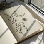
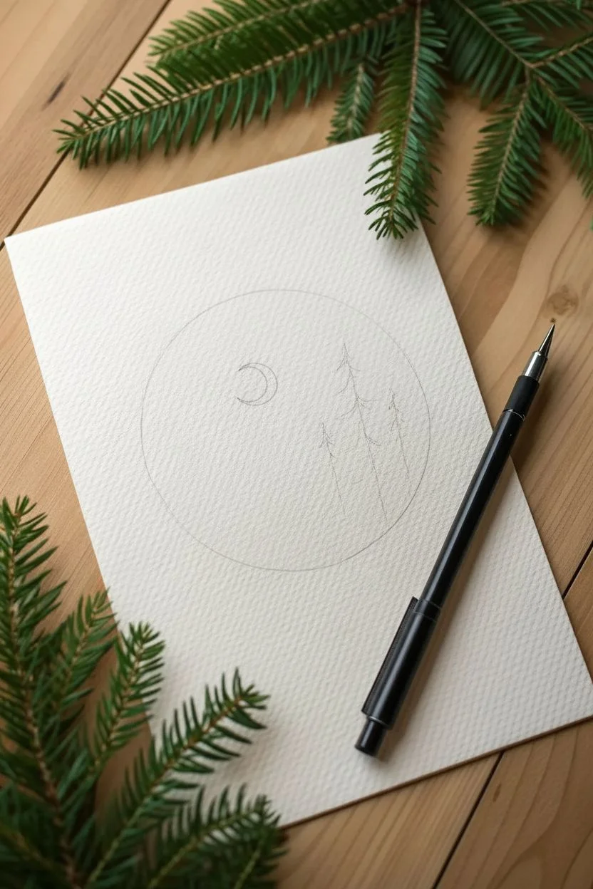
Celestial Sun and Moon
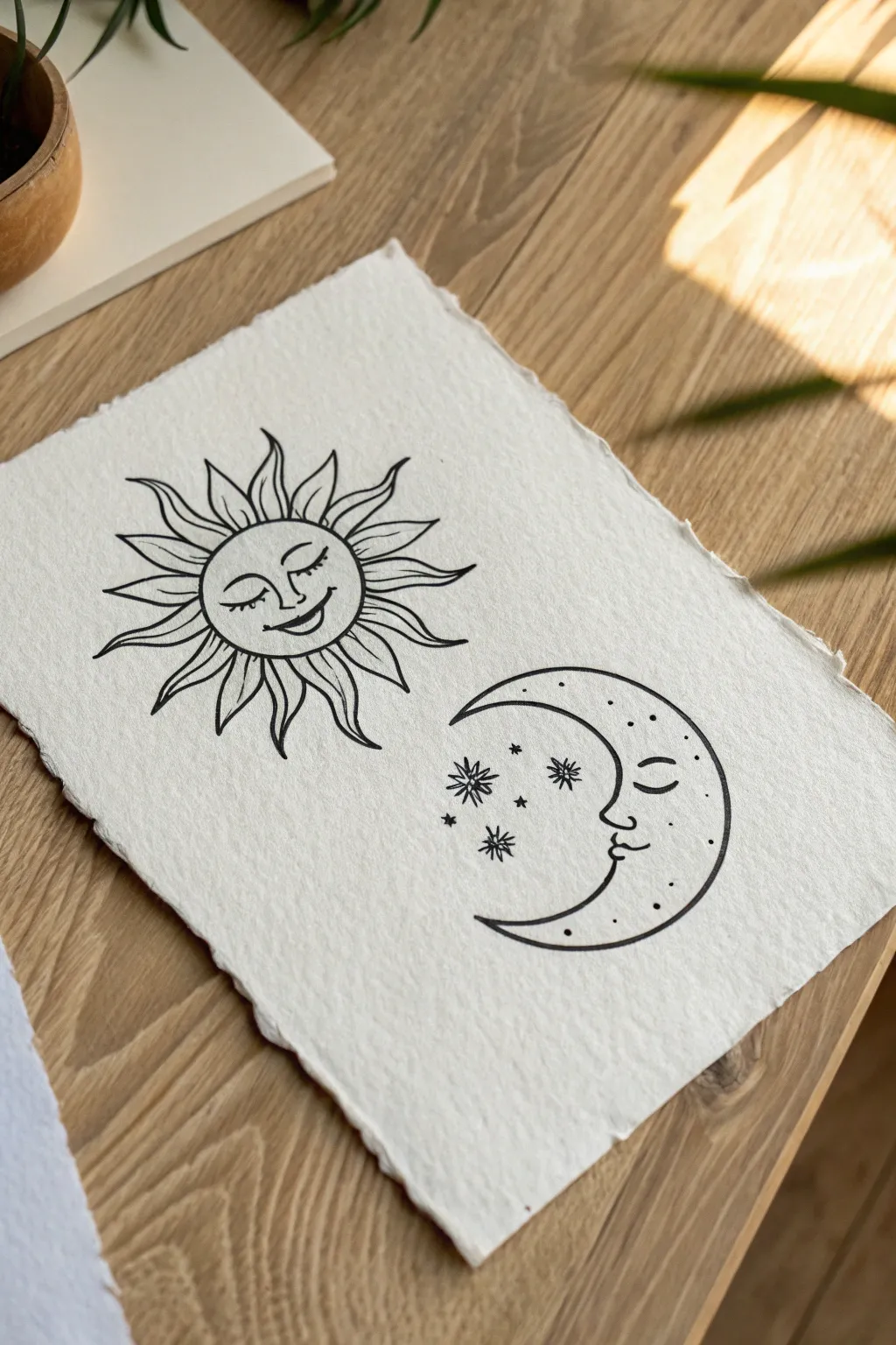
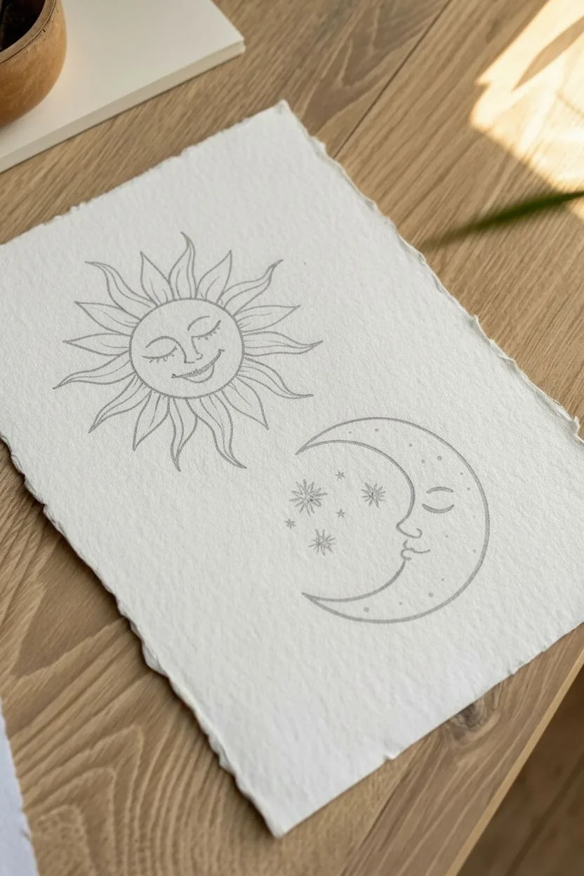
Capture the magic of the cosmos with this charming celestial drawing on textured paper. This project uses simple line work to create a serene sun and moon duo that looks beautiful framed or as a greeting card.
How-To Guide
Materials
- Heavyweight textured paper (deckle-edge or cold press watercolor)
- HB pencil
- Kneaded eraser
- Black fine liner pens (sizes 01 and 03)
- Ruler (optional)
Step 1: Sketching the Composition
-
Establish placement:
Place your textured paper on a flat surface. Visually divide the page in half; you will want the sun on the left and the moon on the right. -
Sun outline:
Using your HB pencil with very light pressure, draw a circle on the left side. It doesn’t need to be mathematically perfect, as a slight organic shape suits this style. -
Moon outline:
On the right side, lightly sketch a ‘C’ shape facing the sun. Ensure the curve of the moon complements the curve of the sun. -
Sun features:
Inside the sun circle, lightly sketch a softly smiling face. Draw two curved lines for closed eyelids, a simple nose line, and a gentle upward curve for the mouth. -
Drafting rays:
Sketch the wavy rays around the sun. Aim for a flame-like pattern where the rays curve slightly rather than pointing straight out. -
Moon profile:
Refine the inner curve of the moon to include a profile. Sketch a forehead, a closed eyelid, a nose, and slight lips distinct from the outer crescent curve. -
Star placement:
Mark spots between the sun and moon for the decorative stars. Sketch a mix of small dots and larger 8-point sparks.
Smudge Patrol
Textured paper holds ink longer than smooth paper. To test dryness, lightly touch a non-inked area; if the paper feels cool, the ink might still be wet.
Step 2: Inking and Details
-
Trace the Sun:
Switch to your 03 fine liner. Carefully trace the main circle of the sun’s face, keeping your hand relaxed for a smooth line. -
Ink the features:
Using the finer 01 pen, ink the facial features of the sun. Add tiny vertical ticks to the eyelids to represent eyelashes. -
Ink the rays:
Go back to the 03 pen for the sun’s rays. I like to rotate the paper as I work around the circle to keep my hand position comfortable and consistent. -
Add ray details:
Inside the rays, add a few extra curved lines with the 01 pen to give them movement and depth. -
Outline the Moon:
Trace the outer curve of the moon with the 03 pen. Creating this long curve in one confident stroke helps avoid shaky lines. -
Moon profile details:
Carefully ink the moon’s facial profile. Add eyelashes and a small beauty mark or cheek dimple if desired. -
Draw the stars:
Ink the star clusters in the center. For the larger stars, draw a vertical line intersected by a horizontal line, then add smaller diagonal lines in between. -
Stippling texture:
Using the 01 pen, add small dots (stippling) inside the moon’s crescent, concentrating them near the outer edge to create a shading effect. -
Final decorative dots:
Scatter a few tiny black ink dots around the star cluster to imitate distant stardust. -
Dry and erase:
Wait at least 15 minutes to ensure the ink is bone-dry. Gently run your kneaded eraser over the entire drawing to lift all pencil marks.
Paper Choice Matters
To get the exact look in the photo, use handmade cotton rag paper with deckle edges. The rough texture breaks up the ink lines, adding vintage charm.
Now you have a timeless piece of celestial art ready to display in your favorite space


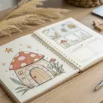
Whimsical Mushroom Cluster
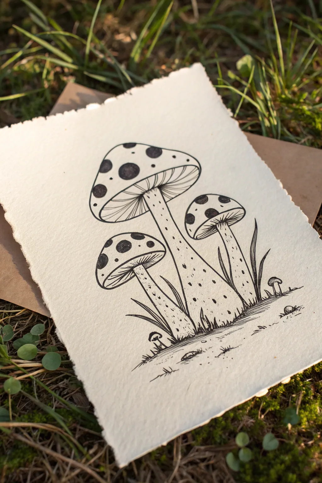
Capture the charm of the forest floor with this detailed pen and ink illustration of dotted mushrooms. Using fine liners on textured paper creates a rustic, timeless look that feels like a page torn from a botanist’s field journal.
Step-by-Step Guide
Materials
- Heavyweight watercolor paper (300gsm) or cotton rag paper
- Fine liner pens (sizes 0.1, 0.3, and 0.5)
- HB graphite pencil
- Kneaded eraser
- Ruler (optional)
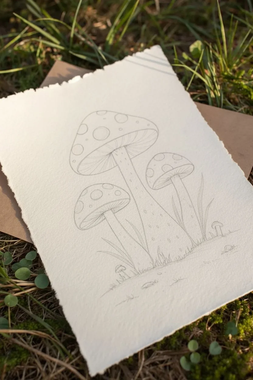
Step 1: Sketching the Composition
-
Prepare the paper:
If your paper doesn’t have a deckle edge, create a rustic look by moistening the edges with a wet paintbrush and gently tearing the paper against a ruler to create a soft, fibrous border. -
Position the main cap:
Using your HB pencil with very light pressure, draw a large, rounded triangle shape near the top center of the page. Curve the bottom edge upwards to form the umbrella-like cap of the main mushroom. -
Add companion mushrooms:
Sketch a smaller, slightly flatter cap to the right of the main one, and an even smaller, more rounded cap tucked slightly behind on the left. -
Draw the stems:
Extend stems downwards from the center of each cap. The central stem should be the longest and thickest, flaring out slightly at the base where it meets the ground. -
Map the details:
Lightly sketch irregular circles and ovals on the caps for the spots. Add the “skirts” (anulus) on the stems just below the cap line.
Perspective Trick
When drawing spots near the edges of the mushroom caps, flatten them into narrow ovals instead of circles. This mimics the curvature of the cap and adds instant 3D dimension.
Step 2: Inking the Mushrooms
-
Outline the caps:
Switch to a 0.3 fine liner. Trace your pencil texturing for the caps, intentionally letting your hand wobble slightly to create an organic, natural outline rather than a perfect geometric curve. -
Fill the spots:
Outline the circular spots on the caps. Use a 0.5 pen to fill them in solid black, leaving the rest of the cap white for high contrast. -
Create the gills:
Switch to your finest 0.1 pen. Draw thin, curved lines radiating from the top of the stem to the outer rim of the cap underneath each mushroom head. -
Ink the stems:
Go back to the 0.3 pen to outline the stems and the ruffled skirts. Keep the lines near the bottom of the stems slightly broken to suggest they are sitting in grass. -
Add stem texture:
I like to add small stippling dots and tiny dashes down the length of the stems using the 0.1 pen to mimic fibrous texture and shading.
Level Up: Antique Look
Before drawing, soak your paper in strong black tea and let it dry flat. This stains the paper a warm parchment color that complements the black ink perfectly.
Step 3: Ground & Environment
-
Draw the grass:
Using quick, upward flicking motions with the 0.3 pen, draw blades of grass overlapping the base of the stems. vary the height and angle of the blades. -
Add tiny mushrooms:
Draw two tiny button mushrooms sprouting from the ground line—one on the far left and one on the far right—using simple geometric shapes. -
Ground texture:
Add a few horizontal dashes and small pebble shapes near the base to suggest the forest floor, defining a ground plane without drawing a solid line. -
Deepen the contrast:
Add extra hatching lines right under the mushroom caps and where the grass blades cluster together to create depth and shadows. -
Erase and refine:
Wait for the ink to dry completely. Gently use the kneaded eraser to lift all visible pencil marks. -
Final weight check:
Use your 0.5 pen to re-trace the outermost edges of the main mushroom caps essentially thickening the line weight to make the main subjects pop off the paper.
Display your woodland sketch in a floating frame to show off those beautiful deckled edges.
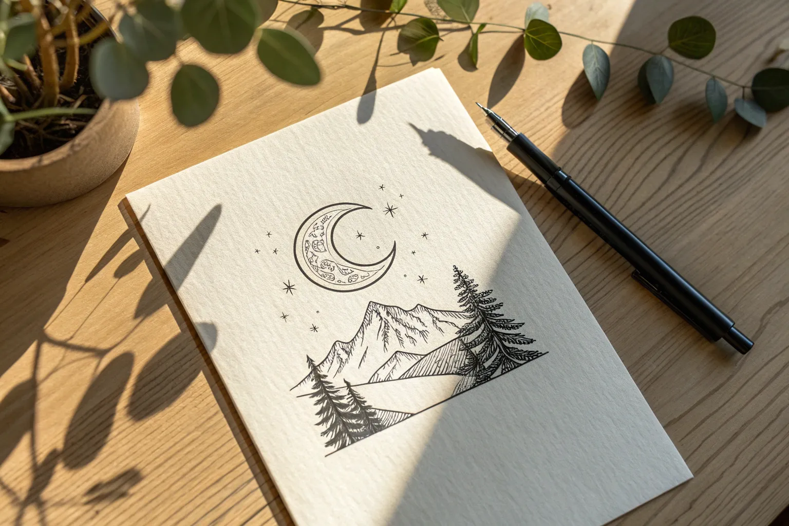
Geometric Mountain Range
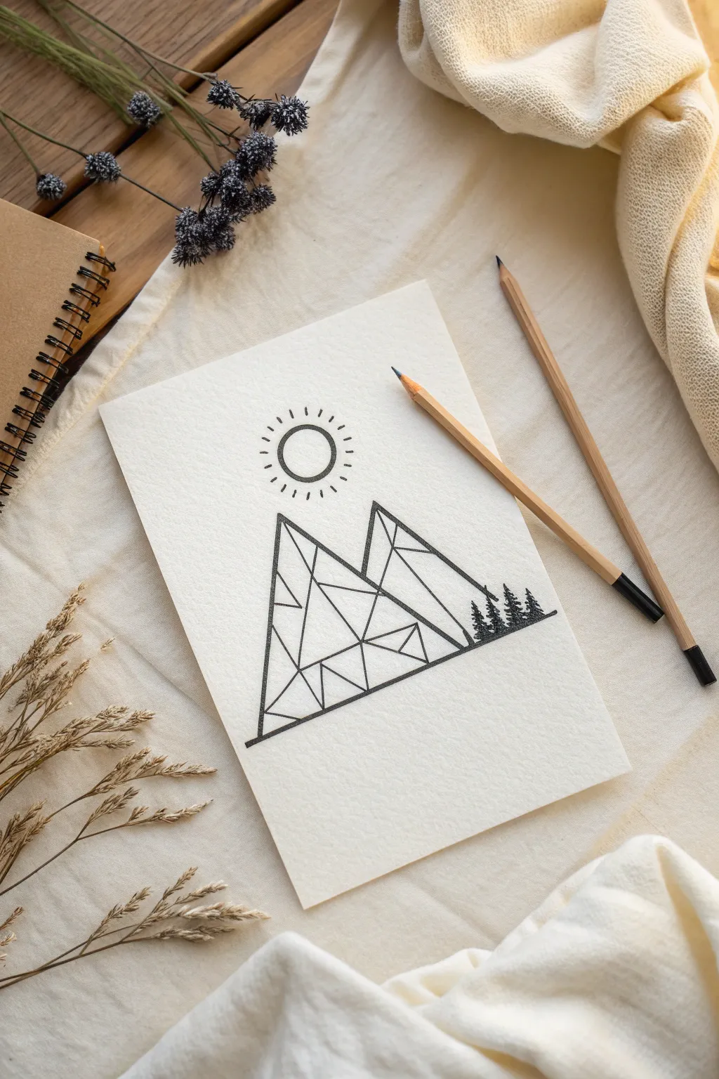
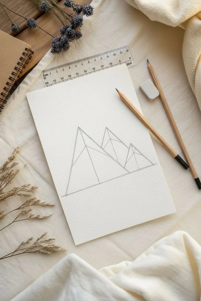
Capture the serenity of the outdoors with this modern geometric line drawing. The project combines crisp architectural lines with organic motifs to create a stunning faceted mountain range.
Step-by-Step
Materials
- Heavyweight textured drawing paper
- HB Pencil
- Ruler (clear plastic recommended)
- Eraser
- Black fine liner pen (0.5mm)
- Black fine liner pen (0.8mm or 1.0mm)
- Small circular object (like a glue stick cap)
Step 1: Structuring the Peaks
-
Lay the foundation:
Place your paper on a flat surface and use your ruler to draw a straight horizontal line across the lower third of the page. -
Draft the main peak:
Draw a large triangle starting from the baseline; position the top vertex slightly to the left of the center to serve as the primary mountain. -
Add the secondary peak:
Sketch a smaller, wider triangle overlapping the right side of your first mountain, ensuring its base also rests on the horizon line. -
Define the ridges:
Draw a vertical line dropping straight down from the tip of the tall mountain to the base to create a central ridge. -
Establish the second ridge:
Add a similar vertical or slightly angled line descending from the peak of the smaller right mountain.
Clean Edge Tip
Wipe the edge of your ruler with a tissue after every few lines. Ink tends to build up on the plastic edge and can easily drag across your paper, ruining the clean white space.
Step 2: Creating Facets & Scenery
-
Subdivide the faces:
Using your ruler, draw diagonal lines connecting the central ridges to the outer edges of the triangles. -
Shatter the shapes:
Divide these larger sections further by drawing connecting lines between random points on your existing lines, creating a ‘shattered glass’ or low-poly effect. -
Position the sun:
Place a small circular object directly above the taller peak and trace around it lightly with your pencil. -
Add solar rays:
Sketch short, evenly spaced dashes radiating outward from the sun’s circumference, keeping them detached from the main circle. -
Plant the forest:
On the far right slope of the mountains, sketch the rough outlines of three small pine trees of varying heights.
Metallic Touch
Fill one or two random facets of the mountain with metallic gold or silver paint. This subtle detail contrasts beautifully with the matte black ink.
Step 3: Inking the Design
-
Outline the heavy lines:
Switch to your thicker (0.8mm) black pen and retrace the main outer triangle shapes and the distinct horizon line. -
Ink the geometry:
Carefully trace over your internal geometric lines using the ruler; I find holding the pen vertical helps keep the line weight consistent. -
Define the sun:
Trace the circle slowly to keep it round, then go over each radiating dash mark with a single confident stroke. -
Fill the silhouette:
Use the pen to fill in the small pine trees completely solid black, giving them a jagged edge to simulate branches. -
Dry and clean:
Allow the ink to dry for at least five minutes to prevent smearing. -
Final erase:
Gently erase all remaining pencil marks, holding the paper taut so it doesn’t crinkle.
Now you have a sharp, minimalist piece of art ready to display.
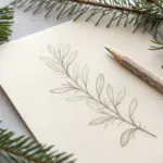
Minimalist Botanical Vines
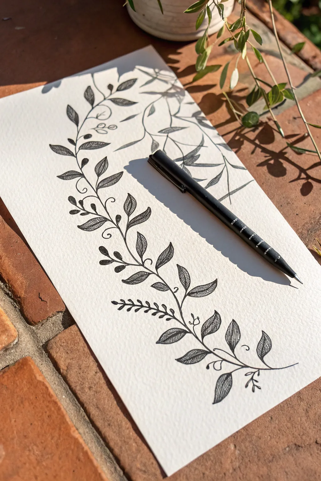
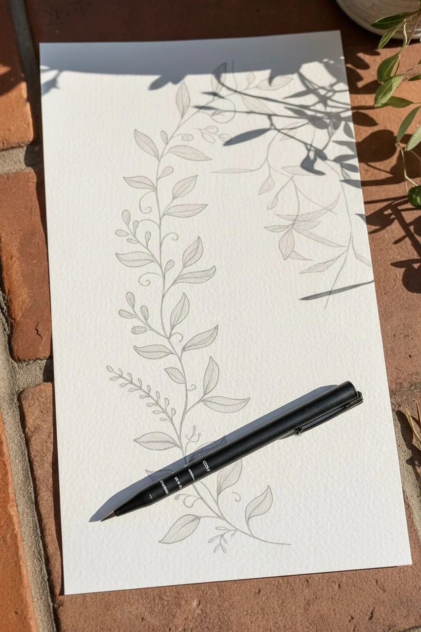
Capture the delicate beauty of nature with this minimalist ink drawing on textured paper. By combining flowing lines with intricate hatching details, you’ll create a sophisticated vine that looks lovely framed or in a journal.
Step-by-Step Tutorial
Materials
- Cold-press watercolor paper or textured fine art paper
- Fine liner pen (0.3mm or 0.5mm size)
- HB Pencil
- Kneaded eraser
Step 1: Sketching the Framework
-
Establish the curve:
Using your pencil with very light pressure, draw a long, gentle ‘S’ curve starting from the bottom right and flowing toward the top left of your paper to act as the main spine. -
Place the branches:
Sketch short, curved lines extending outward from both sides of the main spine, spacing them evenly in an alternating pattern. -
Outline the leaves:
At the end of each branch, draw almond-shaped leaf outlines. Make the leaves at the bottom slightly larger than those near the top tip. -
Add accent details:
Lightly sketch small circles for berry clusters near the leaf joints and draw loose, curly loops for tendrils to fill empty spaces.
Step 2: Inking the Structure
-
Trace the main stem:
Switch to your fine liner pen. carefully trace the main spine curve, using a confident, continuous stroke to avoid shaky lines. -
Ink the branches:
Go over your pencil lines for the side branches. I like to thicken the line slightly right where the branch connects to the main stem for a more organic look. -
Define the leaves:
Trace the almond shapes of the leaves. You can give the edges a microscopic wave as you draw to mimic natural leaf irregularity, rather than a perfect geometric oval. -
Draw the center veins:
Draw a single, thin line down the center of each leaf, stopping just short of the leaf tip. -
Detail the berries:
Ink the small berry circles. Add a tiny dot or distinct stem connection to each one to anchor them to the vine. -
Solidify the tendrils:
Trace the curly tendrils with a quick, fluid motion so the line remains smooth and doesn’t look jagged.
Flow State
When drawing the long stem or tendrils, lock your wrist and move your entire arm from the elbow. This creates smoother, more graceful curves than moving just your fingers.
Step 3: Shading and Finishing
-
Start the texture:
This style relies on ‘hatching’ for texture. Inside a bottom leaf, draw fine, diagonal straight lines closely spaced together on one side of the center vein. -
Vary the leaf patterns:
For visual interest, fill some leaf halves completely with diagonal hash marks, while leaving the other half white or just lightly textured. -
Consistent angles:
Keep your hatching lines running roughly parallel to each other within each specific leaf section to maintain a neat appearance. -
Darken the tips:
On the smaller leaves near the top, place your hatching lines closer together near the base of the leaf to create a gradient effect, fading out toward the tip. -
Review line weight:
Look at the main stem again. Add a second very thin line alongside the bottom-most curve of the stem and fill the gap to make the base visually heavier. -
Let the ink cure:
Wait at least 5-10 minutes for the ink to dry completely, especially if using a glossy ink on textured paper. -
Erase guidelines:
Gently gently roll your kneaded eraser over the drawing to lift the pencil sketch without roughing up the paper surface. -
Final check:
Look for any gaps in your lines or places where the stem looks too thin, and perform minimal touch-ups to unify the piece.
Go Green
Instead of black ink, try using a deep olive or sap green fine liner. You can even use a water brush to bleed the ink slightly for a softer watercolor effect.
Now you have a stunning botanical illustration ready to be displayed.
BRUSH GUIDE
The Right Brush for Every Stroke
From clean lines to bold texture — master brush choice, stroke control, and essential techniques.
Explore the Full Guide
Doodle Solar System
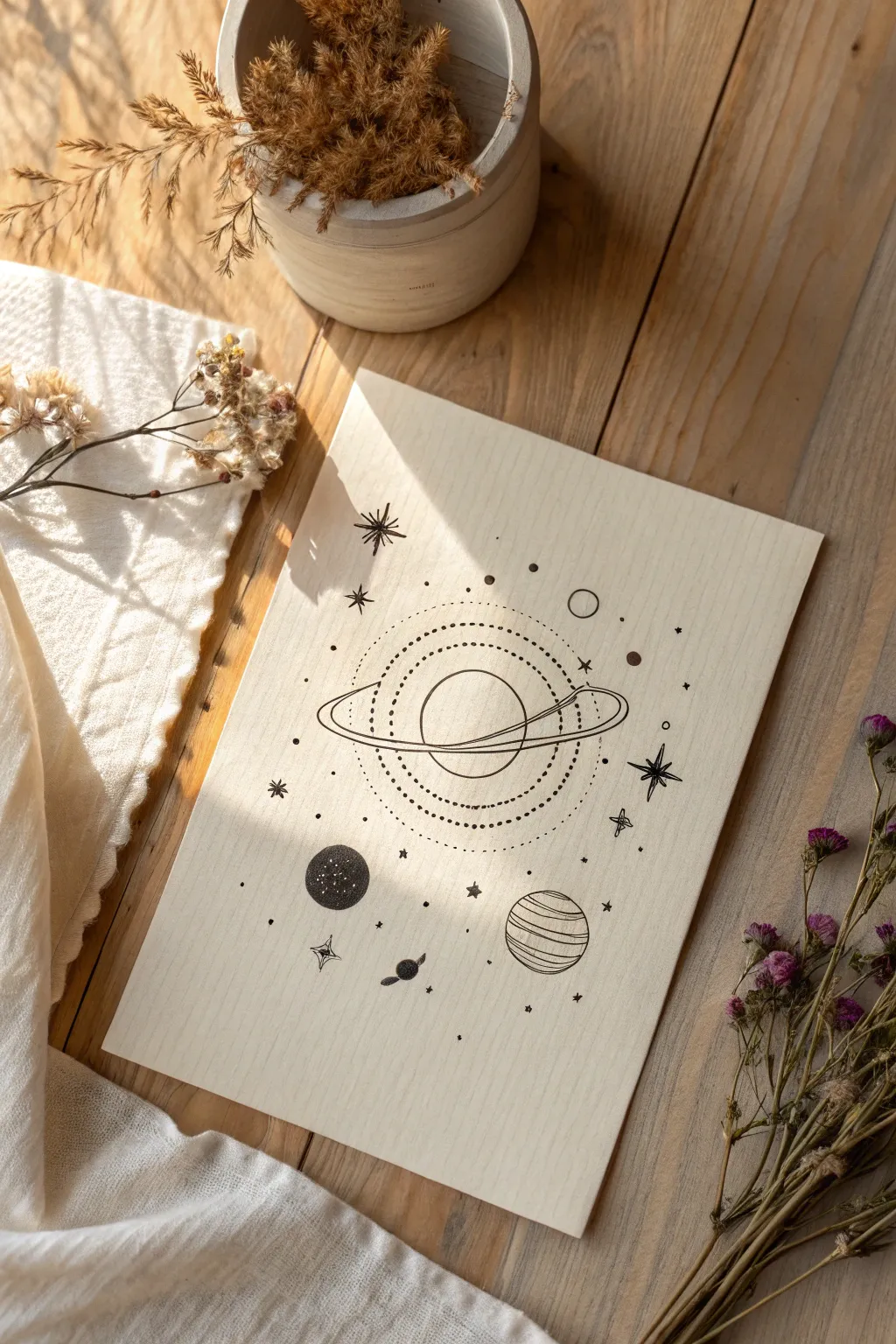
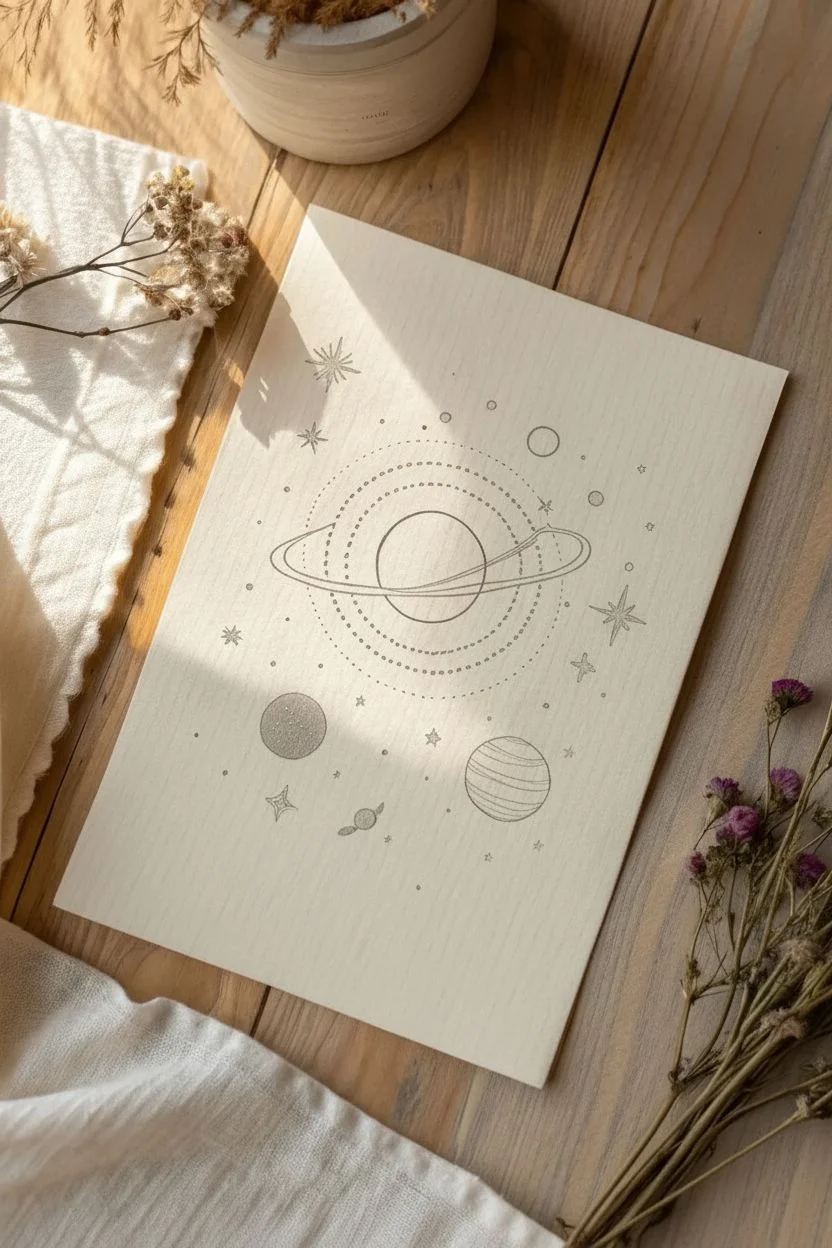
Capture the mystique of the cosmos with this clean, aesthetic line drawing. Using simple geometric shapes and varied pen textures, you will build a stylized solar system that balances negative space with intricate stippling.
Step-by-Step Guide
Materials
- Heavyweight cream or off-white cardstock
- Fine liner pens (sizes 01, 03, and 05)
- Pencil (HB)
- Kneaded eraser
- Compass or circle template
- Ruler
Step 1: Mapping the cosmos
-
Plot the center:
Start by finding the vertical center of your paper. Using your compass, lightly sketch a circle about 2 inches wide in the upper middle section for the main planet. -
Sketch the rings:
Draw a long, narrow oval superimposed over the center of the main planet to represent the rings. Tilt the oval slightly diagonally so the left side is lower than the right. -
Outline orbit paths:
Using the same center point as your main planet, lightly sketch three large concentric circles around it. These will become your dotted orbit lines later. -
Place satellite planets:
Sketch a small circle in the bottom left, a slightly larger one in the bottom right, and a tiny oval-shaped planet floating just below the bottom-left sphere. -
Mark major stars:
Mark the positions of the three largest stars with small crosses: one to the right of the main planet, one on the far left, and one floating above the rings.
Pro Tip
When drawing the long orbit lines, don’t plant your wrist on the paper. Move your entire arm from the shoulder to create smoother, more confident curves.
Step 2: Inking the centerpiece
-
Ink the main sphere:
Switch to an 03 fine liner. trace the top and bottom curves of the central planet, carefully stopping where the ring intersects so you don’t draw through it. -
Define the rings:
Draw the outer edge of the ring oval. Add a second inner line parallel to it to give the ring width. Remember to draw the line covering the planet in the front, but ‘hiding’ behind the planet in the back. -
Create dotted orbits:
Using an 01 pen, ink the concentric orbit circles you sketched earlier. Instead of solid lines, use small, tightly spaced dots for the innermost and outermost circles. -
Add dash details:
For the middle concentric circle, use a pattern of small dashes. I find rotating the paper as I go helps keep the dashed line smooth and consistent. -
Stipple the core:
Use your finest pen (01 or 005) to add very light, sparse stippling (dots) on the lower half of the central planet to suggest shadow and dimension.
Level Up
Add a touch of magic by using a metallic gold gel pen for the ‘stardust’ dots or to trace the rings of the central planet. Detailed gold on cream paper looks stunning.
Step 3: Planetary details
-
Texture the dark planet:
For the bottom-left planet, outline it with the 03 pen. Fill the interior with dense stippling or solid black, leaving tiny specks of white paper showing through to look like texture. -
Stripe the gas giant:
Move to the bottom-right planet. Draw horizontal, slightly curved bands across it using the 01 pen. Vary the spacing to mimic the look of Jupiter’s surface. -
Ink the minor elements:
Outline the tiny Saturn-like planet near the bottom and the small empty circle floating near the top right. Give the tiny planet a solid black ring for contrast.
Step 4: Stardust and finishing
-
Draw the North Stars:
For the major stars, draw a long vertical line and a long horizontal line crossing at the center. Add shorter diagonal lines in the corners to create an 8-point starburst. -
Add four-point stars:
Scatter several simple 4-point stars (cross shapes with tapered ends) throughout the empty spaces using the 03 pen. -
Draw standard stars:
Fill smaller gaps with simple asterisk shapes and tiny 5-point stars. Keep these loose and hand-drawn rather than geometric. -
Sprinkle the dust:
This is the most meditative part: take the 01 pen and randomly dot the empty spaces. Create clusters of dots near the planets and let them fade out into the open space. -
Clean up:
Wait at least 15 minutes to ensure the ink is bone dry. Gently erase all pencil sketches with the kneaded eraser to reveal the crisp black lines.
Frame your new celestial map in a floating glass frame to highlight the beautiful texture of the paper.
Potted Cactus Trio
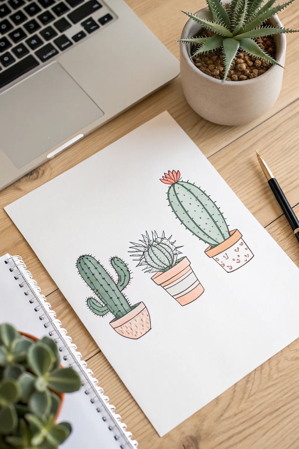
Create a charming minimalist illustration features three distinct cactus personalities in decorative pots. Using simple geometric shapes and soft pastel colors, you’ll produce a clean, modern piece of art perfect for a journal or greeting card.
Detailed Instructions
Materials
- Heavyweight drawing paper or cardstock
- HB Pencil
- Eraser
- Fine liner pen (Black, 0.1 or 0.3mm)
- Alcohol markers or color pencils (Sage Green, Peach, Coral, Terracotta)
Step 1: Sketching the Foundations
-
Position the pots:
Start by lightly sketching three evenly spaced horizontal ovals near the bottom of your page to mark the pot openings. -
Form the pot bodies:
Draw the sides of the pots tapering slightly downward from your ovals. Make the left pot rounded, the middle one angular, and the right one a standard bucket shape. -
Draft the left cactus:
Sketch a tall, finger-like oval rising from the first pot. Add two smaller curved arms branching out on opposite sides to create a classic Saguaro shape. -
Draft the middle cactus:
Draw a round, slightly squat sphere sitting in the center pot. It shouldn’t be a perfect circle; keep it a bit organic. -
Draft the right cactus:
Sketch a tall, elongated oval for the final cactus. This one should be taller than the middle one but slightly shorter or equal to the left one.
Ink Confidence
Don’t worry about wobbles! In illustrative drawing, slightly shaky or imperfect lines add ‘organic’ character and charm compared to ruler-straight lines.
Step 2: Inking and Detailing
-
Outline the pots:
Using your fine liner, trace over your pot sketches. I like to draw the rims as distinct narrow bands to give them dimension. -
Ink the Saguaro:
Outline the left cactus. Inside the shape, draw vertical dashed lines running from top to bottom to create the ribs. -
Add Saguaro spines:
Along the outer edges and the internal dashed lines, make tiny horizontal ticks to represent spines. -
Ink the Barrel cactus:
For the middle plant, draw the outline using jagged, zigzag lines instead of a smooth curve to show a spiky texture. Draw a starburst pattern of spikes near the top center. -
Texture the Barrel cactus:
Add curved vertical lines down the body of the middle cactus to give it volume. -
Ink the Column cactus:
Outline the final tall cactus on the right with a smooth line. Add a small, multi-petaled flower shape sitting right on top. -
Detail the Column cactus:
Draw vertical lines down the length of this cactus, but break them up with small dots or stippling between the lines for a varied texture.
Level Up: Grounding
To make the trio feel placed in a real space, add a very pale gray oval shadow underneath each pot, or draw a simple horizontal line behind them to suggest a table.
Step 3: Pattern and Color
-
Decorate the pots:
Draw small scribbles or dashes on the left pot, diagonal broad stripes on the middle pot, and small organic ‘leopard’ spots on the right pot. -
Clean up:
Once the ink is completely dry to the touch, gently erase all your underlying pencil sketches. -
Color the greenery:
Use a sage or muted green marker to fill in the cacti. For a stylized look, you don’t need to shade heavily; a flat wash works beautifully here. -
Color the flower:
Fill in the flower on the right cactus with a pop of bright coral or pink. -
Color the pots:
Use your peach and terracotta tones for the pots. I prefer alternating the colors (like using the darker tone for the stripes and the lighter tone for the base) to keep them visually interesting.
Now you have a delightful desert trio that needs zero watering and looks great on any page

PENCIL GUIDE
Understanding Pencil Grades from H to B
From first sketch to finished drawing — learn pencil grades, line control, and shading techniques.
Explore the Full Guide
Floating Line Art Jellyfish
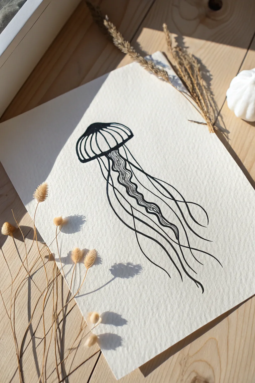
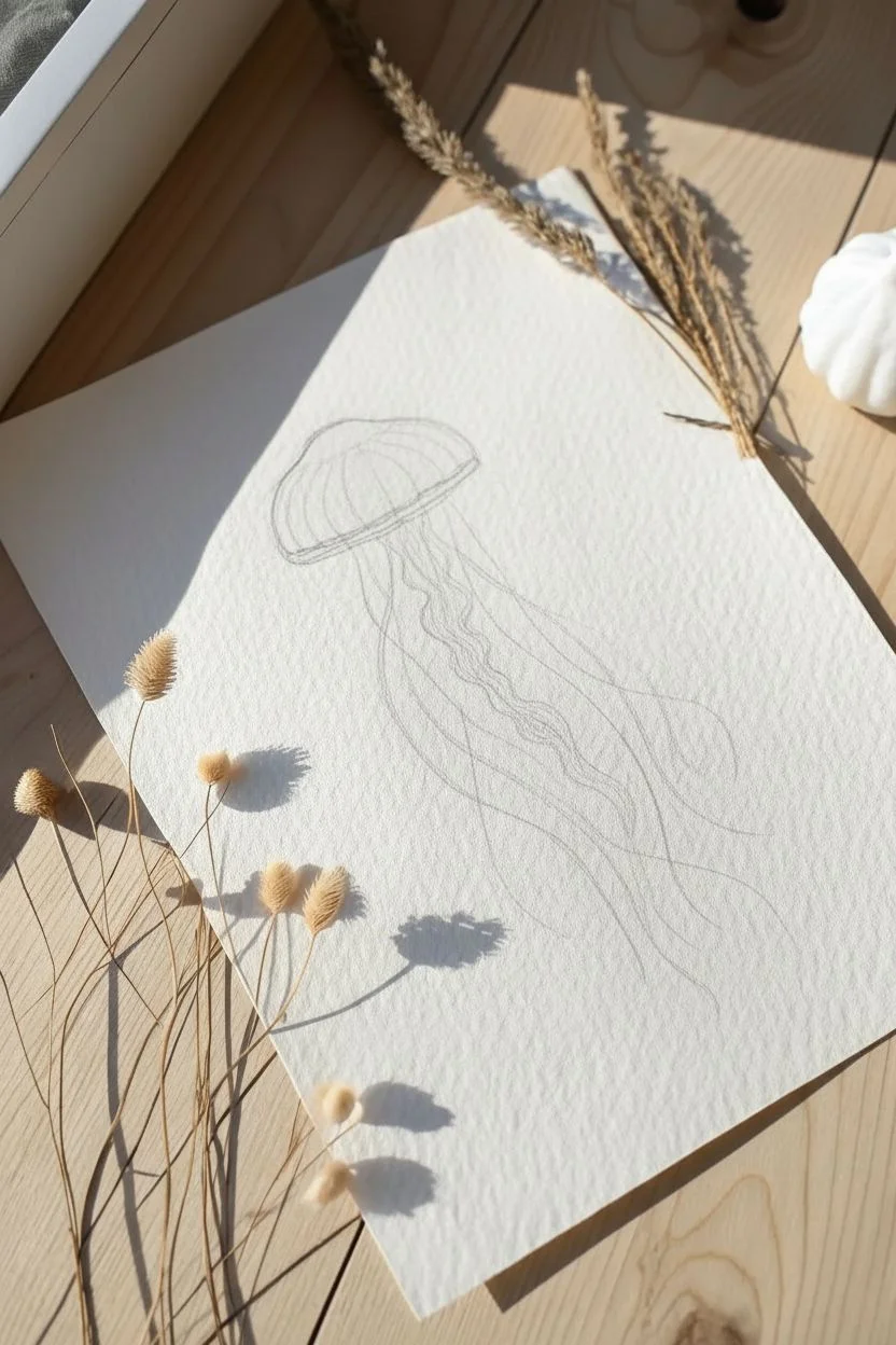
Capture the elegance of deep-sea life with this striking high-contrast drawing. The rough texture of the paper adds an organic feel to the crisp black lines, making the jellyfish appear as if it is drifting effortlessly through a current.
Step-by-Step Tutorial
Materials
- Cold-press watercolor paper (300 gsm preferred)
- HB Pencil
- Kneadable eraser
- Black fine liner pen (size 05 or 08)
- Black fine liner pen (size 01 or 005)
- Black brush pen (optional for line weight variation)
Step 1: Drafting the Form
-
Position the paper:
Place your sheet of cold-press watercolor paper on a flat surface, ensuring the textured side is facing up. -
Sketch the bell:
Using your HB pencil, lightly sketch a mushroom-cap or semi-circle shape in the upper third of the page to form the jellyfish bell. -
Define the rim:
Draw a gently curved line connecting the bottom corners of the cap, then add a second parallel curve just slightly above it to create the rim’s thickness. -
Guide the flow:
Sketch faint, sweeping lines extending downward from the center of the bell to map out where the tentacles will flow.
Shaky Lines?
If you struggle with smooth long curves, try moving your entire arm from the shoulder rather than just moving your wrist. This creates steadier, more fluid strokes.
Step 2: Inking the Bell
-
Outline the silhouette:
Switch to your thicker fine liner (size 05). Carefully trace the outer dome and the bottom rim of the bell. -
Create the segments:
Draw curved lines vertically from the top center of the bell down to the rim, following the rounded form of the dome. -
Add dimension:
Go back over these vertical stripes again, thickening them slightly to make the black lines stand out against the white paper. -
Darken the rim:
Fill in the small gap between the two bottom curves of the bell rim to create a solid, weighty base for the head.
Step 3: Drawing the Tentacles
-
Start the oral arms:
In the center directly under the bell, draw a wavy, ribbon-like shape that descends about halfway down the page. -
Texture the center:
Switch to the thinner pen (size 01). Fill this central ribbon with squiggly, organic lines that mimic ruffled fabric or coral texture. -
Draw primary tentacles:
Using the thicker pen (presumably the 05), draw long, continuous lines sweeping from the bell’s edge down to the bottom of the page. -
Vary line weight:
I like to press a bit harder at the start of the stroke and lift the pen gently at the end to create a tapered, elegant tail. -
Add crossover lines:
Draw a few more thick tentacles that cross behind or in front of the first set to create depth and movement. -
Incorporate fine details:
Switch back to the 01 fine pen and sketch very delicate, hair-like trails floating between the thicker tentacles. -
Enhance flow:
Ensure the ends of your lines curl slightly upward or outward to mimic the resistance of water.
Texture Is Key
The ‘tooth’ (bumpiness) of cold-press watercolor paper is vital here. It breaks up the ink lines slightly, giving the drawing that distinct, raw illustrative look.
Step 4: Finishing Touches
-
Let it set:
Allow the ink to dry completely for at least 15 minutes, as ink can take longer to settle into the grooves of textured paper. -
Erase guides:
Gently roll a kneadable eraser over the drawing to lift the initial pencil sketches without damaging the paper surface. -
Refine contrast:
Inspect the drawing for any breaks in the black ink caused by the paper texture and fill them in for a solid, opaque look.
Frame this serene piece of ocean art to add a touch of calm movement to your walls.
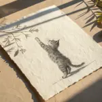
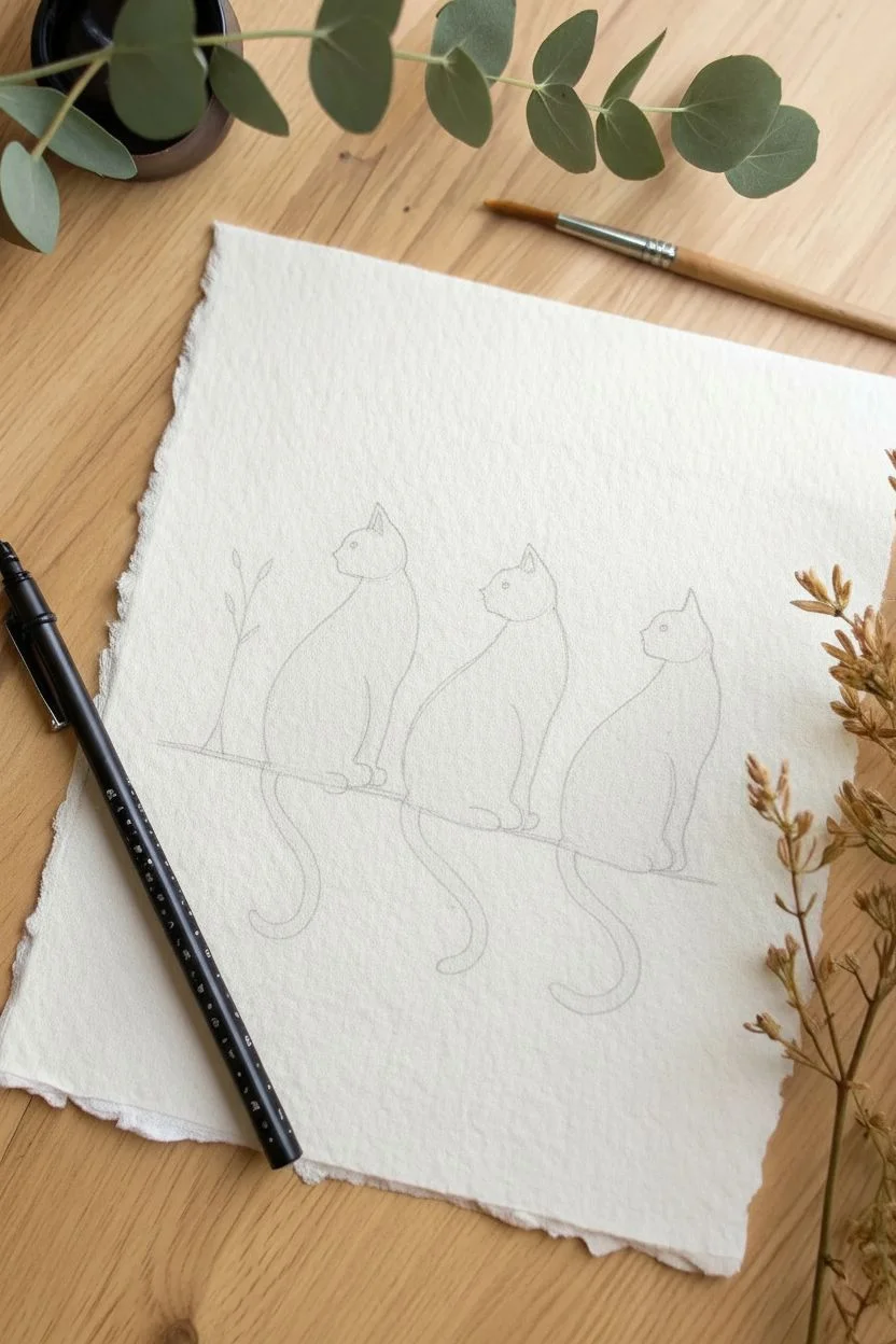
Silhouette Cat Backs
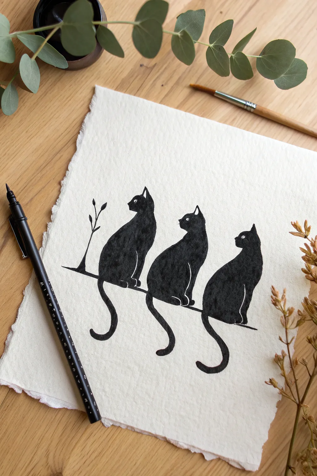
Capture the elegant mystery of felines with this high-contrast ink project on textured paper. Using negative space effectively allows you to define distinct features like legs and ears without drawing a single internal line.
Detailed Instructions
Materials
- Heavyweight textured watercolor paper (300gsm)
- Black India ink or black gouache
- Fine liner pen (size 01 or 03)
- Small round paintbrush (size 2 or 4)
- HB Pencil
- Kneaded eraser
Step 1: Sketching the Shapes
-
Prepare the line:
Lightly sketch a horizontal line across the lower third of your paper using your pencil. This mimics a wire or branch for the cats to sit on. -
Position the bodies:
Draw three oval shapes sitting on the line to represent the torsos. Space them relatively evenly, but vary the angles slightly to create interest. -
Add the heads:
Sketch a smaller circle on top of each oval. Place the left cat’s head higher, the middle one slightly lower and tucked in, and the right one perked up. -
Refine the profiles:
Connect the heads to the bodies with sloping neck lines. Sketch triangular ears on top, ensuring the cats are facing towards the left. -
Sketch the tails:
Draw long, sinuous tails hanging down from the line. Give each one a different curve—curling left, right, or forming a gentle ‘S’ shape. -
Mark negative space:
This is crucial: lightly mark the thin lines that separate the front legs from the back legs, and the inner ear details. You will NOT ink these lines; they must remain paper-white. -
Add the eyes:
Draw tiny circles for the eyes. Like the leg lines, these will remain unpainted to distinctively pop against the black fur. -
Draw the flora:
Sketch a simple vertical twig with a few leaves rising up on the far left side, slightly behind the first cat.
Oops! Filled a gap?
If you accidentally paint over a white leg line or eye, don’t panic. Wait for the black ink to dry fully, then use a white gel pen or a fine brush with white gouache to draw the missing detail back on top.
Step 2: Inking and Filling
-
Outline the details:
Switch to your fine liner pen. Carefully outline the tiny circles of the eyes and the specific lines defining the leg separation and ear interiors. -
Protect the white:
Remember, you are outlining the areas that stay white. I usually double-check my pencil marks here to ensure I don’t accidentally fill a gap I meant to keep open. -
Outline the silhouettes:
Use the fine liner to trace the outer perimeter of each cat, including the ears, back curves, and tail shapes. -
Thicken the edge:
Go over the outer contour again to thicken the line slightly, creating a barrier that will make painting the fill easier. -
Trace the perch:
Ink the main horizontal line and the decorative twig on the left. Keep the twig lines thin and delicate. -
Prepare your brush:
Dip your round brush into the black ink or gouache. Ensure the brush is fully loaded but not dripping. -
Fill the bodies:
Paint the inside of the cat shapes solid black. Work slowly near the negative space lines (legs and ears) and around the eyes to preserve the white paper. -
Smooth the tails:
Use the tip of the brush to fill the tails, using long, continuous strokes to maintain a fluid look. -
Final drying:
Allow the ink to dry completely. India ink can smudge if touched too soon, so give it ample time. -
Clean up:
Once the ink is bone dry, gently erase any visible pencil sketches, particularly around the white negative spaces.
Metallic Magic
For a mystical touch, use gold metallic paint for the eyes instead of leaving them white, or add a gold moon silhouette in the background behind the middle cat.
Now you have a striking minimalist artwork ready to display or gift to a cat lover


Cozy To-Go Coffee Cup

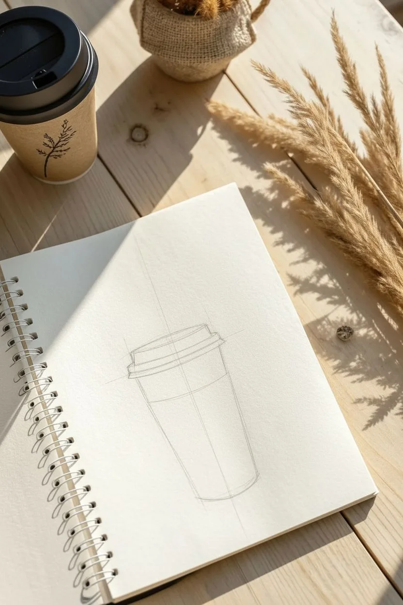
Capture the essence of a warm morning brew with this simple yet stylish line art project. You will create a stylized to-go cup featuring a cozy corrugated sleeve and elegant steam swirls, perfect for practicing clean drawing techniques and basic forms.
Step-by-Step Tutorial
Materials
- Sketchbook or drawing paper
- HB Pencil
- Eraser
- Black fine liner pen (0.3mm or 0.5mm)
- Ruler (optional)
Step 1: Drafting the Structure
-
Draw a guide line:
Start by drawing a faint vertical line in the center of your page to help keep the cup symmetrical. -
Sketch the top oval:
Near the top of your guide line, lightly sketch a flattened horizontal oval. This represents the top opening of the cup. -
Mark the base:
Measure a few inches down and sketch a smaller, slightly more curved line for the bottom of the cup. -
Connect the sides:
Draw two straight diagonal lines connecting the edges of the top oval to the edges of the bottom curve. The cup should taper inward slightly as it goes down. -
Outline the lid:
Now, add a larger, flattened trapezoid shape on top of the original oval to form the thick plastic lid. -
Define the rim:
Sketch a parallel line just below the bottom edge of the lid shape to create the rim that overhangs the cup.
Steady Hand Tip
Rotate your paper or sketchbook as you draw the vertical sleeve lines. Pulling the pen toward you is often steadier than pushing it away.
Step 2: Adding Details
-
Position the sleeve:
Mark off the middle section of the cup body with two curved lines parallel to the cup’s bottom. This defines the cardboard heat sleeve. -
Create the logo shape:
In the center of the sleeve band, lightly sketch a circle. I usually sketch this loosely at first until the placement feels right. -
Sketch the leaf design:
Inside the circle, draw a simple three-leaf sprig. Start with a central vertical leaf, then add a smaller curved leaf on each side. -
Add steam:
Above the lid, sketch three fluid, wavy flame-like shapes rising upward to represent hot steam.
Step 3: Inking and Finishing
-
Ink the lid:
Switch to your black fine liner. Carefully trace the outline of the lid and the rim, making the lines confident and smooth. -
Ink the sleeve outline:
Draw the top and bottom curves of the cardboard sleeve. Let the lines extend slightly past the cup’s side edges to show the sleeve’s thickness. -
Draw sleeve texture:
Fill the sleeve area with closely spaced vertical lines to mimic corrugated cardboard. Be sure to skip over the circle logo area so it stays clear. -
Ink the logo:
Trace the circle and the leaf design inside. You can thicken the leaf outlines slightly for better contrast. -
Complete the cup body:
Ink the visible side lines of the cup below the sleeve and trace the bottom curve. -
Define the steam:
Go over your pencil steam lines with fluid strokes. Try to tapers the ends to points for a wispy look. -
Add a shadow:
Draw horizontal hatching lines to the left of the cup’s base to ground the object. Start with longer lines near the cup and shorter ones further away. -
The final cleanup:
Wait a moment for the ink to dry completely, then gently erase all your initial pencil guide lines to reveal the clean illustration.
Go Digital
Scan your finished line art and use digital editing software to place it on a photo of a wooden table for a realistic mixed-media look.
Now you have a charming coffee illustration that looks great on greeting cards or journal covers
Geometric Crystal Shards
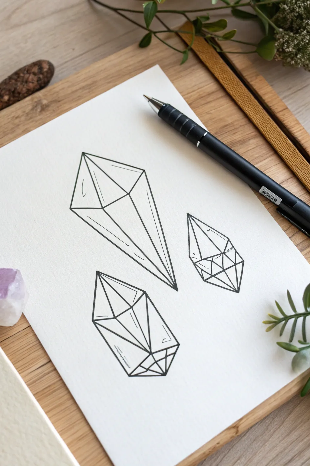
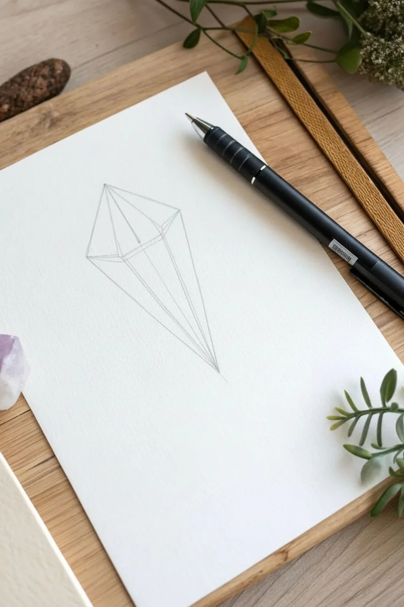
Master the art of clean lines and perspective with this study of three distinct crystal shapes. This project focuses on seeing through objects to create a transparent, wireframe aesthetic that looks modern and crisp.
Step-by-Step
Materials
- Smooth white drawing paper or cardstock
- HB Pencil
- High-quality eraser
- Black fine liner pen (0.5mm or 0.7mm)
- Clear ruler (optional)
Step 1: Drafting the Long Shard
-
Top facet:
Begin near the upper left of your page. Draw a flattened diamond shape (rhombus) to establish the top face of the tallest crystal. -
Central spine:
From the bottom point of that diamond, lightly sketch a long, straight line extending downward and slightly to the right to determine the crystal’s length. -
Outer edges:
Draw two long lines from the side corners of your top diamond, angling them inward to meet the end of your central spine, forming a sharp point. -
Internal depth:
To create the transparent 3D effect, draw a vertical line dropping straight down from the very top point of the diamond, stopping halfway inside the body. -
Connecting translucent lines:
Connect the end of that internal line to the outer corners of the crystal. This simple step instantly adds volume and transparency.
Clear Vision
Using a clear plastic ruler allows you to see the lines you’ve already drawn underneath, ensuring your angles join perfectly at the heavy intersection points.
Step 2: Drafting the Stout Crystal
-
Base shape:
Move to the bottom center drawn area. Sketch a wide hexagonal cap; think of it as a flattened tent shape with a pointed top. -
Vertical walls:
Drop straight vertical lines down from the widest points of your cap. Keep these lines relatively short to give the crystal a sturdy look. -
Bottom termination:
Draw angled lines from the base of your vertical walls meeting at a central bottom point, mirroring the top but slightly inverted. -
Faceting:
Connect the top tip to the bottom tip with a straight line through the center. Add diagonal lines connecting the corners of your hexagon to create the front faces.
Cosmic Splash
Once the ink is totally waterproof, paint a loose wash of diluted purple watercolor over the shapes. Let the color bleed outside the lines for a dreamy effect.
Step 3: Drafting the Side Cluster
-
Outline:
On the right side, lightly sketch a smaller, compact diamond silhouette that tilts slightly upward to balance the composition. -
Horizontal divide:
Draw a horizontal line across the middle of the shape to separate the upper facets from the lower base. -
Complex angles:
Draw a triangle inside the top half, and cross the bottom half with an X shape. I find this creates the look of a complex, multi-sided geometric solid.
Step 4: Inking and Refining
-
Outer tracing:
Switch to your black fine liner. Confidently trace the outer perimeter of each crystal first to define the silhouettes. -
Inner tracing:
Trace the internal geometric lines. Be careful not to hesitate; smooth, quick strokes result in straighter lines than slow ones. -
Detailing:
Add small, parallel tick marks inside a few facets (like on the left side of the long crystal) to represent light hitting the glass surface. -
Broken lines:
For the bottom crystal, leave small gaps in the ink lines on the lower left face to suggest a glossy, highly reflective texture. -
Clean up:
Wait at least two full minutes for the ink to settle, then gently erase all remaining pencil marks to reveal your stark, geometric art.
Now you have a striking set of geometric studies that look great in a sketchbook or framed as modern decor.
Mason Jar Terrarium
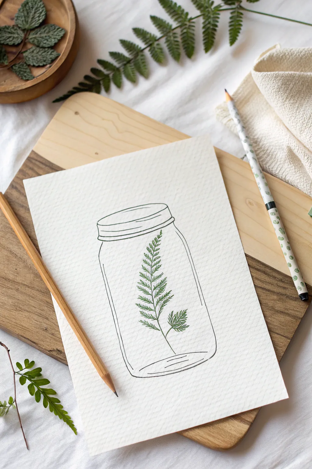
This minimalist sketch captures the delicate beauty of a fern preserved in glass using clean lines and botanical textures. It is a perfect exercise for practicing steady linework on textured paper.
Step-by-Step Tutorial
Materials
- Textured drawing paper or cold-press watercolor paper
- HB graphite pencil
- Kneaded eraser
- 0.3mm Black fine liner pen
- 0.1mm or 0.3mm Green fine liner pen
- Ruler (optional)
Step 1: Sketching the Vessel
-
Establish the opening:
Begin with a flattened oval near the top center of your paper to represent the mouth of the jar. -
Form the neck:
Draw two short, vertical lines dropping down from the extreme left and right sides of the oval. -
Add the threads:
Connect the neck lines with two slightly curved horizontal lines, stacked close together, to create the threaded rim of the jar. -
Shape the shoulders:
From the bottom of the rim, extend two curved lines outward and downward to form the rounded shoulders of the glass. -
Draw the body:
Pull two long, nearly straight vertical lines down from the shoulders to define the height of the jar. -
Close the form:
Connect the bottom of the vertical lines with a curve that mirrors the top oval to create the base. -
Indicate thickness:
Sketch a second, smaller curve just inside the bottom base line to suggest the thick glass bottom often found in these jars.
Glass Effect Pro Tip
Don’t connect every single line on the jar. Breaking the line briefly on the long vertical sides or the bottom curve instantly makes the object look like reflective glass rather than a solid object.
Step 2: Growing the Fern
-
Stem placement:
Draw a single, gently curving line lightly in pencil through the center of the jar to act as the fern’s spine. -
Side shoot:
Add a smaller, shorter line branching off near the bottom right to create a second frond. -
Switch to color:
Pick up your green fine liner. Starting at the top of the main spine, begin drawing tiny, paired leaflets. -
Leaf details:
Shape each leaflet like a small zigzag or subtle triangle, keeping them very small at the tip and slightly wider as they descend. -
Fill the frond:
Continue down the main stem with these green ink strokes, spacing them evenly to mimic a fern’s ladder structure. -
The small branch:
Repeat the leaf technique on the smaller side branch, making these leaves slightly more compact.
Step 3: Inking and Finishing
-
Ink the rim:
Using the black fine liner, trace over the pencil lines for the jar’s mouth and threaded neck, keeping the lines solid. -
Ink the glass body:
Trace the outer walls and bottom of the jar. I prefer to leave tiny gaps in the lines occasionally to simulate light hitting the glass. -
Interior details:
Ink the inner curve at the bottom and add two very faint vertical lines inside the jar’s sides to emphasize the cylindrical shape. -
Erase:
Once you are absolutely certain the ink is dry, gently rub the kneaded eraser over the entire drawing to remove the graphite guide lines.
Level Up
Add a few tiny dots or stippling with the green pen near the base of the fern leaves. This adds depth and makes the botanical element pop against the simple line art of the jar.
Now you have a serene piece of botanical art ready to frame.
Looping Paper Plane

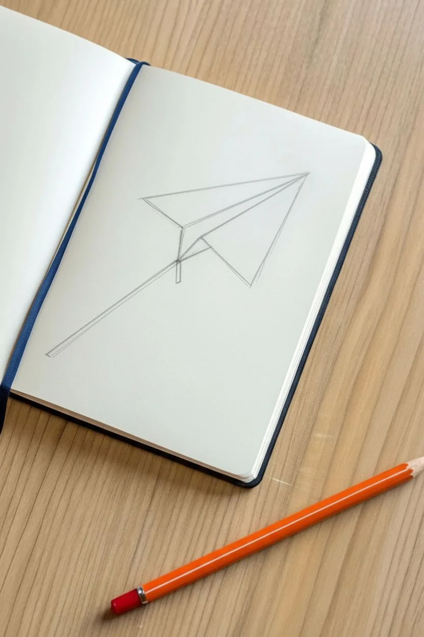
Capture the nostalgia of classroom doodles with this crisp, blue-ink sketch of a paper airplane mid-flight. The dynamic angle, shading details, and dashed trail give it a wonderful sense of movement across the page.
Step-by-Step Guide
Materials
- Blank notebook or sketchbook (cream paper adds warmth)
- Blue fineliner pen (0.5mm or 0.7mm)
- HB Pencil
- Eraser
- Ruler (optional)
Step 1: Sketching the Structure
-
Establish the spine:
Using a pencil, lightly draw a long, straight diagonal line pointing upwards to the right. This will be the central spine. -
Form the nose:
From the top right end of your spine (the nose), draw a shorter line angling downwards and back to create the bottom edge of the fuselage. -
Outline the near wing:
Start again at the nose and draw a long line angling upwards to create the top edge of the closest wing. -
Close the wing shape:
Connect the end of that top wing line back to the rear of the spine with a straight, angled line. -
Add the far wing:
Draw a smaller triangle shape peeking out from behind the main spine to represent the wing on the other side. -
Define the fuselage back:
Draw a short vertical line connecting the back of the spine to the bottom fuselage line.
Straight Line Struggles?
If your hand is shaky, don’t hesitate to use a ruler for the long diagonal lines. It keeps that sharp, aerodynamic look pristine.
Step 2: Inking the Outline
-
Trace the spine:
Switch to your blue fineliner. Confidently trace the central spine line, making it crisp and dark. -
Ink the main wing:
Trace the outline of the large near wing, ensuring the corner points are sharp. -
Ink the fuselage:
Go over the triangular shape below the spine that forms the body of the plane. -
Ink the far wing:
Carefully trace the visible lines of the furthest wing, stopping where it meets the main body so lines don’t overlap. -
Erase pencil guides:
Once the ink is completely dry—I usually wait about a minute—gently erase all your graphite sketch lines.
Pro Tip: Line Weight
Go over the outer perimeter lines a second time to thicken them slightly. This separates the object from the background.
Step 3: Shading and Motion
-
Hatch the fuselage:
On the lower triangular body section, draw closely spaced diagonal lines. Keep them parallel to the back edge of the triangle. -
Detail the wing fold:
Draw a line inside the near wing, running parallel to the central spine, to indicate a fold. -
Shade the wing:
In the area between your new fold line and the spine, add diagonal hatching similar to the fuselage to create depth. -
Add wing texture:
On the rear part of the main wing, draw a few longer, thinner lines parallel to the trailing edge to simulate paper texture. -
Start the trail:
Position your pen a short distance behind the tail of the plane. -
Draw motion dashes:
Draw a series of small, evenly spaced dashes extending downwards and to the left in a straight line. -
Fade the trail:
Make the last few dashes slightly shorter or further apart to suggest the trail is fading into the distance.
Now you have a dynamic little doodle that looks like it’s ready to fly right off the page.
Comfy Beanie Hat
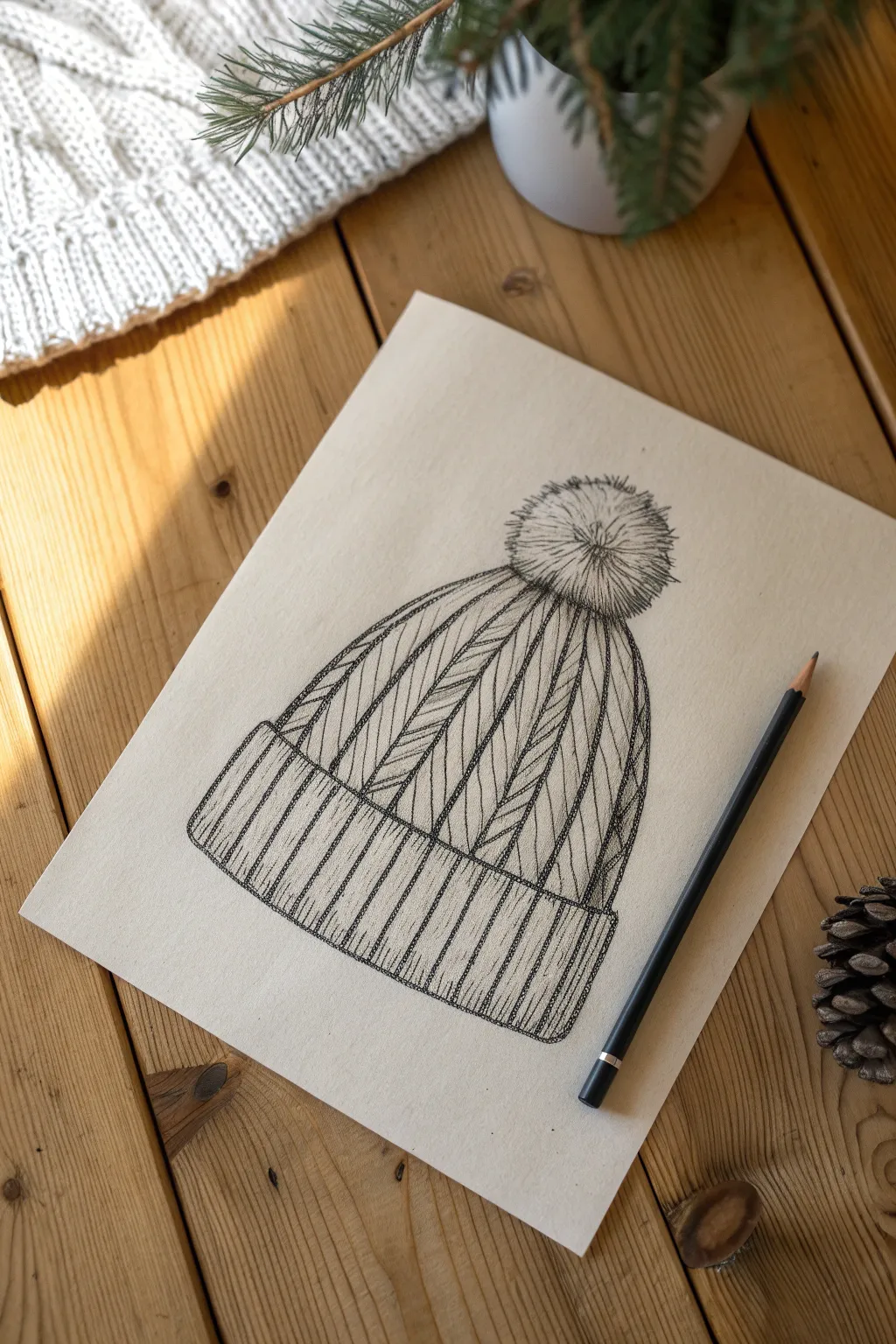
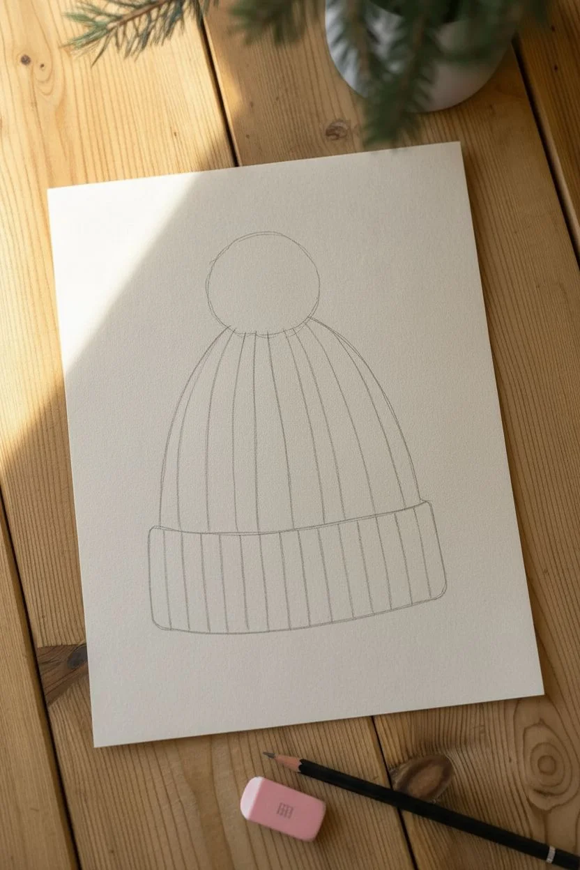
Capture the warmth of winter with this detailed line drawing of a ribbed beanie hat. This project focuses on using precise, repetitive hatching lines to simulate the soft, thick texture of knitted wool, creating a crisp illustrative style.
Detailed Instructions
Materials
- HB or 2B Graphite Pencil
- Fine Liner Pen (Black, 0.3mm or 0.5mm)
- Smooth Drawing Paper or Cardstock
- Soft Eraser
- Ruler (optional)
Step 1: Sketching the Form
-
Base cuff shape:
Start with a pencil. Draw a wide, horizontal rectangle near the bottom of your paper. Give the bottom line a gentle downward curve to show the hat is round and volume-filled. -
Forming the dome:
From the top corners of your rectangle, sketch a large arch shape. This should be slightly taller than a semi-circle to allow room for the pattern to converge. -
Pom-pom placement:
Lightly sketch a circle resting on the very peak of the dome. Don’t press too hard, as this guide will be erased later. -
Vertical guidelines:
Draw vertical lines across the cuff to divide it into even ribs. Space them about a finger-width apart. -
Converging lines:
Continue those vertical lines up into the main dome of the hat. As they go up, curve them inward so they all meet at the base of the pom-pom.
Step 2: Inking the Texture
-
Pom-pom texture:
Switch to your fine liner. Starting from the center of your pom-pom circle, flick short, quick lines outward toward the edges. -
Building fluff:
Continue flicking strokes all around the sphere. I like to make the outer strokes slightly irregular and jagged to mimic loose yarn ends. -
Ribbed cuff outlines:
Trace the main vertical lines of the cuff. At the bottom of each section, round the corners slightly to show the thickness of the folded fold. -
Detailing the cuff:
Inside each rib of the cuff, draw 3-4 distinct vertical lines. These should be parallel but sketched freely to look like organic fabric threads. -
Main body segments:
Trace the curved vertical guides on the main part of the hat. These divide the beanie into ‘slices’ or columns of knitting.
Ink Flow Tip
Keep your wrist loose when hatching the knit pattern. Imperfect, slightly wavy lines look more like soft yarn than perfectly straight ruler lines do.
Step 3: Weaving the Pattern
-
Herringbone start:
Focus on the first vertical column on the left. Fill it with short diagonal hatch marks slanted upward to the right. -
Alternating direction:
In the neighboring column, fill it with diagonal hatch marks slanted the opposite way (upward to the left). This creates a chevron or herringbone knit effect. -
Continuing the rhythm:
Repeat this pattern across the hat, alternating the slant direction for each column. Keep your pen pressure consistent. -
Adding depth:
Add a second layer of hatching right at the bottom of the dome, just above the cuff. This shadow suggests the cuff is folded over the main body. -
Pom-pom density:
Add more ink strokes near the center of the pom-pom to make the core look dense and dark compared to the airy tips.
Troubleshooting Shape
If the hat looks flat, curve the bottom hem line more deeply. A clearer curve creates the 3D illusion that the hat is wrapping around a head.
Step 4: Final Definition
-
Outer contour:
Go over the very outer silhouette of the entire hat (sides and cuff) with a slightly heavier line or a second pass of the pen to make it pop. -
Fold accents:
Add tiny ticking lines or dots where the cuff meets the body to simulate the tension in the yarn. -
Clean up:
Wait a full minute to ensure the ink is totally dry, then gently erase all your pencil guidelines.
Now you have a charming winter illustration perfect for holiday cards or bullet journal themes
Mini Polaroid Landscape
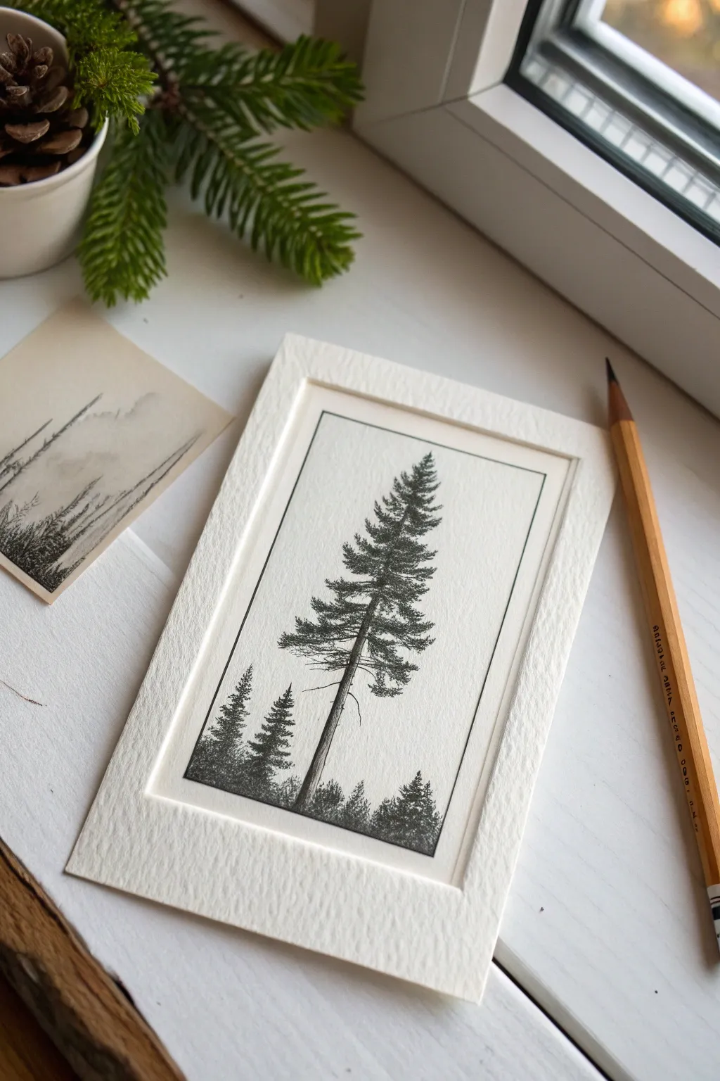
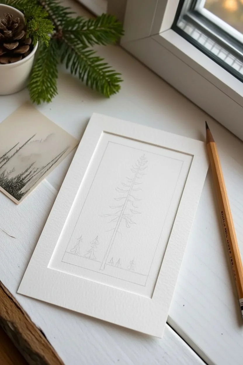
Capture the serene beauty of a lone evergreen with this detailed, miniature ink drawing. Framed within a clean border to mimic a Polaroid or window mount, this project focuses on texture, negative space, and handling high contrast in a small format.
How-To Guide
Materials
- Heavyweight drawing paper or hot-press watercolor paper
- Fine liner pens (sizes 0.05, 0.1, and 0.3mm)
- HB graphite pencil
- Kneaded eraser
- Ruler
- Paper mat/mount or thick cardstock for framing
Step 1: Composition & Sketching
-
Define the boundaries:
Using a ruler and pencil, lightly draw a vertical rectangle in the center of your paper. This will act as the frame for your landscape, roughly 3 by 5 inches. -
Mark the horizon:
Draw a faint horizontal line near the bottom quarter of the rectangle to establish where the ground meets the sky. -
Establish the spine:
Draw a straight, vertical line right up the center, stopping just short of the top border. Curving it ever so slightly adds more character than a perfect ruler line. -
Sketch the canopy shape:
Lightly sketch a cone shape around the spine to guide how wide the branches will extend. I suggest making the tree slightly asymmetrical for a natural look. -
Place the companions:
Pencil in two or three smaller triangles at the base of the main tree to represent the distant background pines.
Don’t Overwork It
Pine trees are defined by their airiness. If you feel you’ve added enough branches, stop immediately. It is better to have too much white space than to accidentally color the whole tree black.
Step 2: Inking the Details
-
Begin at the apex:
Switch to your finest pen (0.05mm). Start at the very top of the tree, creating tiny, vertical dashes to form the pointed tip. -
Form the upper branches:
Work your way down using short, quick zig-zag motions. Keep the branches tight and pointing slightly upward near the top. -
Expand the mid-section:
As you move down, allow the branches to get longer and droop slightly under their own weight. Switch to a 0.1mm pen to add a bit more weight to these lines. -
Mind the gap:
Leave deliberate white spaces between branch layers. This negative space is crucial; without it, the tree will look like a solid dark blob. -
Detail the trunk:
Draw the visible parts of the trunk between the branches. Use vertical hatching lines to suggest bark texture, keeping one side slightly darker to indicate a shadow source. -
Create the lower canopy:
The lowest branches should be the widest and heaviest. Use slightly messier, jagged strokes here to mimic rough pine needles.
Step 3: Foreground & Contrast
-
Ink the small trees:
Fill in the smaller background trees using dense stippling (dots) or tight hatching. These should be silhouetted and darker than the detailed main tree to show depth. -
Ground the scene:
Use irregular scribbles and dots along the horizon line to create the look of undergrowth and forest floor debris. -
Deepen the shadows:
Take your 0.3mm pen and darken the undersides of the main branches and the core of the trunk. High contrast makes the drawing pop. -
Define the frame:
Use the ruler and a 0.1mm pen to ink the rectangular border line. Go slowly to ensure the corners meet perfectly crisp. -
Clean up:
Wait at least ten minutes for the ink to fully cure. Gently erase all underlying pencil marks with the kneaded eraser to reveal the clean high-contrast image. -
Mount the artwork:
Place a pre-cut paper mat over the drawing, or glue the drawing onto a larger piece of textured cardstock to achieve the ‘Polaroid’ effect shown in the example.
Vintage Level Up
To replicate the look of the small sketch on the left, lightly stain your paper with watered-down coffee or tea and let it dry completely before starting your ink drawing.
Place your finished miniature landscape on a windowsill or desk to enjoy a tiny window into the forest
Cute Sheet Ghosts
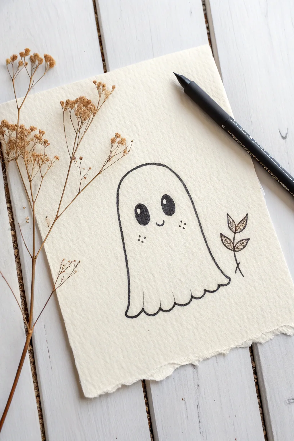
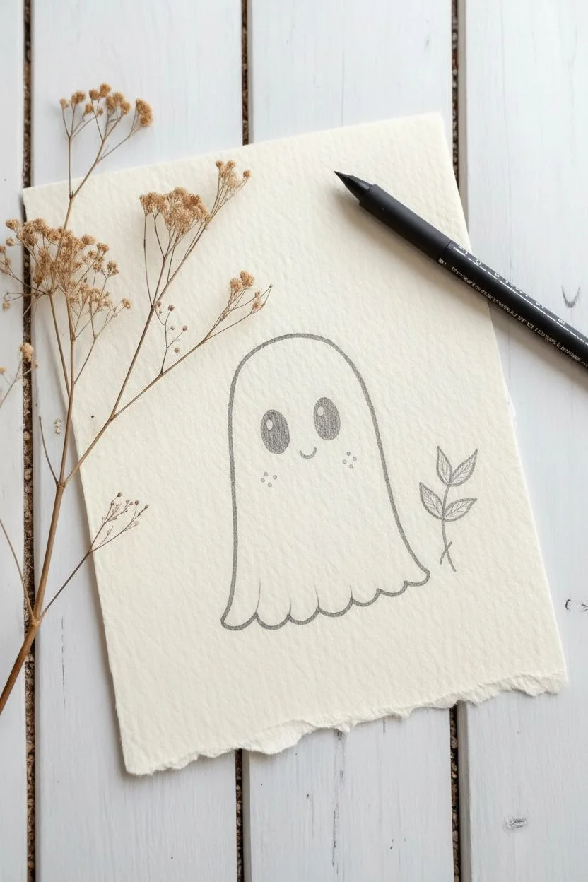
Capture the charm of the spookiest season with this adorable minimalist ghost drawing. Using textured paper adds a lovely vintage feel to the crisp black lines of this friendly character.
Step-by-Step Guide
Materials
- Textured cream paper (deckle edge recommended)
- Pencil (HB)
- Soft eraser
- Black fineliner (size 05 or 08)
- Black brush pen (optional for filling)
Step 1: Sketching the Shape
-
Paper setup:
Position your sheet of textured paper vertically. I like to tape the corners down lightly if the paper is particularly thick or prone to curling. -
Head arch:
Start with your pencil by drawing a tall, rounded inverted ‘U’ shape in the center of the page. -
Body lines:
Extend the vertical lines downwards, letting them flare out just slightly near the bottom to create volume. -
Wavy hem:
Connect the two bottom endpoints with a gentle wavy line to mimic the look of a floating sheet. -
Refining folds:
Adjust the waves so they vary slightly in width, making the fabric look soft and natural rather than rigid. -
Eye placement:
Draw two large ovals in the upper third of the ghost’s face, tilting the tops slightly inward toward each other. -
Highlights:
Sketch a small circle inside the top section of each oval to reserve space for the white glint in the eyes. -
Smile:
Place a tiny, shallow ‘u’ shape directly between the eyes, aligning it with the bottom of the ovals. -
Blush marks:
Lightly mark three small points in a triangle formation on each cheek, just below the outer edges of the eyes. -
Botanical accent:
Sketch a simple curved stem to the right of the ghost with four small, veined leaves sprouting from it.
Step 2: Inking & Refining
-
Outline:
Switch to your black fineliner. Carefully trace the main outer dome of the ghost using long, confident strokes. -
Bottom edge:
Ink over the wavy bottom line, ensuring the corners connect seamlessly with the side lines. -
Eye contours:
Trace the outline of the eye ovals first, keeping your hand steady to maintain the rounded shape. -
Filling eyes:
Fill in the pupils solid black, being extremely careful to leave the highlight circles completely paper-white. -
Face details:
Ink the small smile with a single smooth motion, then gently dab the pen tip to create the cheek dots. -
Leaf details:
Trace the stem and leaf outlines next to the ghost. I prefer to add a single central line in each leaf for texture. -
Line weight:
If your main outline feels too thin, go over the outer body line once more to thicken it slightly, making the ghost pop. -
Drying time:
Allow the ink to sit for at least 5-10 minutes. Textured paper can hold wet ink in its crevices longer than smooth paper. -
Clean up:
Gently erase the pencil sketch underneath. Hold said paper taut with one hand so the eraser doesn’t crinkle the sheet. -
Final check:
Brush away eraser crumbs and check if any black areas need a small touch-up to be fully opaque.
Bleed Check
Test your pen on a scrap of the same paper first. If the ink feathers into the fibers, switch to a pigment liner rather than a liquid ink rollerball.
Pro Tip
Rotate your paper physically while inking curves. It is much easier to pull the pen toward your body for a smooth arc than to push it away.
Now you have a charming little ghost companion ready to haunt your sketchbook or greet a friend on a card
Night Forest Circle Scenery
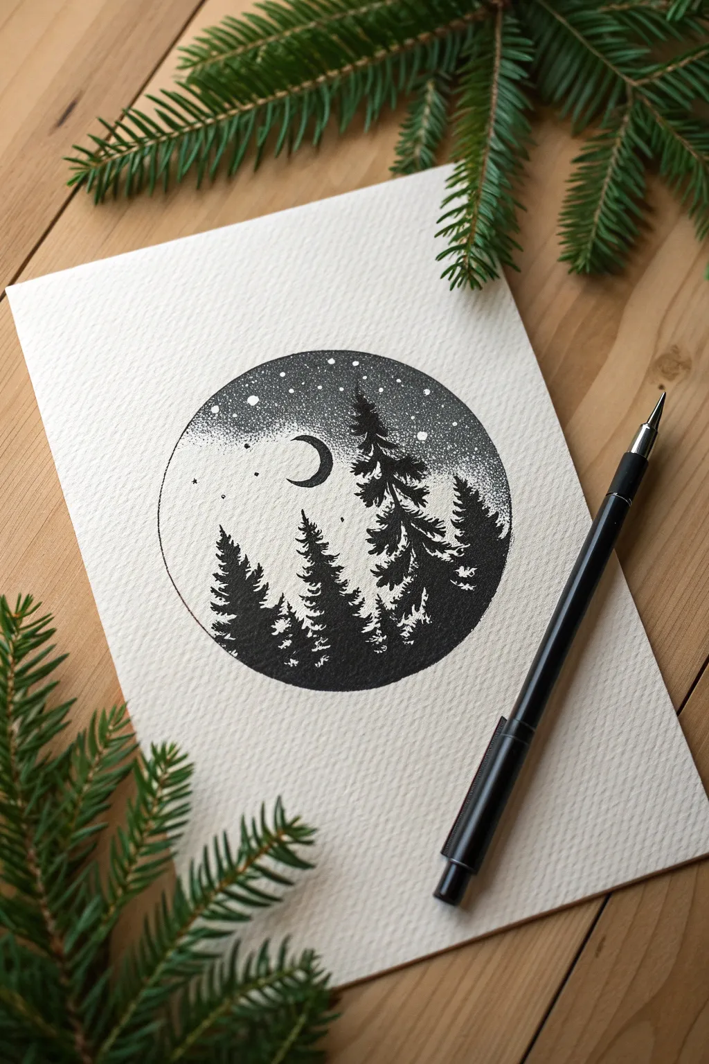
Capture the serenity of a moonlit night with this circular ink drawing. By combining patient stippling for the sky with bold, jagged strokes for the pines, you will create a high-contrast scene that acts like a porthole into a quiet wilderness.
Step-by-Step Tutorial
Materials
- High-quality drawing paper (textured or cold-press)
- Black fineliner pens (sizes 0.1 for dots, 0.5 for trees)
- Pencil (HB)
- Eraser
- Compass or a round object to trace (approx. 3-4 inches)
Step 1: Setting the Scene
-
Trace the boundary:
Place your circular object or compass in the center of the paper and lightly trace a perfect circle with your pencil. -
Position the moon:
Sketch a small ‘C’ shape for the crescent moon in the upper-left quadrant of the circle. Keep it fairly small to make the trees look grander. -
Map the forest:
Lightly sketch three or four vertical lines to indicate where the peaks of the pine trees will stand. Vary their heights, placing the tallest one on the right side.
Pro Tip: Random Rotation
Rotate your paper frequently while doing the sky. This prevents your hand from created unintentional grid patterns and keeps the dots looking naturally random and organic.
Step 2: Stippling the Sky
-
Outline the moon:
Switch to your 0.1 fineliner pen. Carefully ink the outline of the crescent moon, ensuring the lines are crisp and connect cleanly at the points. -
Start the darkness:
Begin stippling (making dots) at the very top arc of the circle. Pack the dots densely so the top edge appears nearly solid black. -
Create the fade:
Work your way down from the top, gradually increasing the distance between the dots. This creates a gradient from the dark night sky into a lighter, misty horizon. -
Define the glow:
As you get closer to the moon and the tops of the trees, make the dots very sparse. This negative space simulates the moonlight glowing through the atmosphere. -
Add stars:
While stippling the darker upper section, occasionally leave tiny white circular gaps or draw slightly larger dots to represent distant stars. -
Border definition:
Go over the top half of the pencil circle line with your pen to create a sharp boundary for your sky.
Troubleshooting: Comet Dots
If your dots look like tiny dashes or comets, you are moving the pen too fast horizontally. Lift the pen straight up and down completely for each dot to keep them round.
Step 3: Drawing the Trees
-
Start the tall pine:
Switch to a thicker pen (like a 0.5) for bold contrast. start at the peak of the rightmost tree guideline. -
Form the branches:
Work downwards using jagged, zig-zag motions. I like to flick the pen outward slightly to create the look of uneven pine needles. -
Build the texture:
As the tree gets wider towards the bottom, leave small white gaps within the black mass. These highlights suggest snow or moonlight hitting the branches. -
Draw the secondary trees:
Move to the left side and draw the smaller trees using the same zig-zag technique. Make these slightly shorter to create a balanced composition. -
Fill the ground:
Merge the bases of all the trees into a solid black mass at the bottom of the circle. -
Create depth:
Where trees overlap, ensure the tree in ‘front’ has more defined branch details, while the trees behind are slightly darker and solid to push them into the background.
Step 4: Final Details
-
Complete the circle:
Ink the bottom half of the circle’s border, connecting it seamlessly with the solid black base of the forest. -
Refine the gradient:
Step back and look at your sky. If the transition from dark to light looks abrupt, add a few more dots in the middle area to smooth it out. -
Clean up:
Allow the ink to dry completely for at least 5 minutes to prevent smearing. -
Erase guidelines:
Gently erase the visible pencil lines, leaving only your crisp ink work behind.
Now you have a peaceful miniature world captured perfectly in ink.
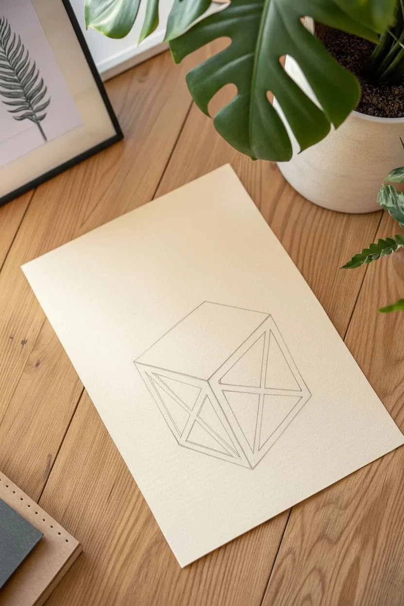
Surreal Melting Clock
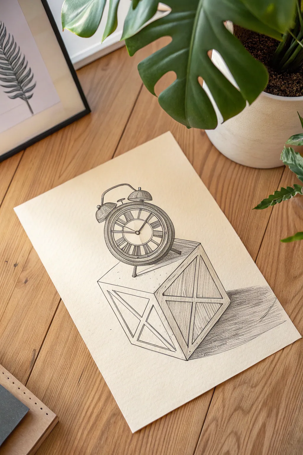
Create a mind-bending optical illusion with this tutorial on drawing a classic alarm clock that appears to pop right off the page. Using simple perspective tricks and precise cross-hatching, you will transform a flat sheet of paper into a surreal, dimensional scene.
Step-by-Step Guide
Materials
- Cream or off-white drawing paper
- HB Graphite pencil
- Quality eraser
- Fine liner pens (sizes 0.05, 0.1, and 0.5)
- Ruler or straight edge
Step 1: Constructing the Crate
-
Establish the angle:
Rotate your paper slightly. Using your pencil and ruler, lightly sketch a skewed diamond shape near the bottom center of the page to form the top surface of the crate. -
Drop the vertical lines:
Draw three vertical lines downwards from the three visible corners of your diamond. Make the central line slightly longer than the side lines to cheat the perspective. -
Connect the base:
Connect the bottom of these vertical lines to form the base of the cube. The shape should look like a 3D box viewed from above. -
Add the bracing details:
Inside the two visible side panels of the box, lightly sketch an ‘X’ shape from corner to corner to mimic wooden crate bracing. -
Refine the wood beams:
thicken the lines of your ‘X’ sketches and the frame edges to imply the width of the wooden beams.
Clean Lines only
Keep a piece of scrap paper under your drawing hand. This prevents natural hand oils from smudging your pencil work or smearing fresh ink as you move across the page.
Step 2: Drafting the Timepiece
-
Position the main distinct shape:
Sketch a large circle resting directly on the top surface of the crate. It should obscure the back corner of the box slightly. -
Create the bezel layers:
Draw two smaller concentric circles inside the main one to create the rim and the face of the clock. -
Add the hardware:
Sketch two semi-circles on top for the bells, a small curved handle connecting them, and a tiny hammer mechanism in the center. -
Ground the object:
Draw two small, peg-like legs at the bottom of the clock. I like to make sure the front leg overlaps the box edge slightly to enhance the 3D effect. -
Draft the face details:
Lightly mark positions for the hours. Sketch Roman numerals (I through XII) and the clock hands pointing to your chosen time.
Step 3: Inking and Measurement
-
Outline the crate:
Switch to your 0.5 pen. Go over the main structural lines of the wooden box, using the ruler to keep them crisp. -
Texture the wood:
With a thinner 0.1 pen, draw vertical hatched lines on the side panels of the box to create shading and wood grain texture. Leave the top of the box lighter. -
Ink the clock body:
Carefully trace the circular body and bells with the 0.5 pen. Use steady, continuous strokes for the curves. -
Detail the dial:
Use the 0.05 ultra-fine pen to ink the Roman numerals and the intricate ticks between them. This contrast in line weight makes the drawing look professional. -
Shade the metal:
Add curved hatching lines to the sides of the clock and the bells. These lines should follow the curve of the object to suggest a rounded, metallic volume.
Level Up: Cut it out!
For a true 3D effect, carefully cut off the top half of the paper, tracing exactly along the upper outline of the clock bells. This makes the drawing look like it’s standing up.
Step 4: Shadows and Final Illusion
-
Map the cast shadow:
Using your pencil, lightly outline a long, stretched shadow extending to the right of the box. Imagine a light source coming from the upper left. -
Ink the shadow:
Fill the shadow area with long, horizontal hatching lines using the 0.1 pen. Keep these lines very straight and parallel. -
Deepen the contrast:
Go back over the shadow area closest to the box with a second layer of hatching to make it darker. This anchors the object to the ‘ground’. -
Clean up:
Wait for the ink to fully dry—give it a good five minutes to be safe. Then, gently erase all your underlying pencil sketches to reveal the clean illusion.
Step back and view your drawing from an angle to see your clock magically rise from the desk.
Head in the Clouds Silhouette
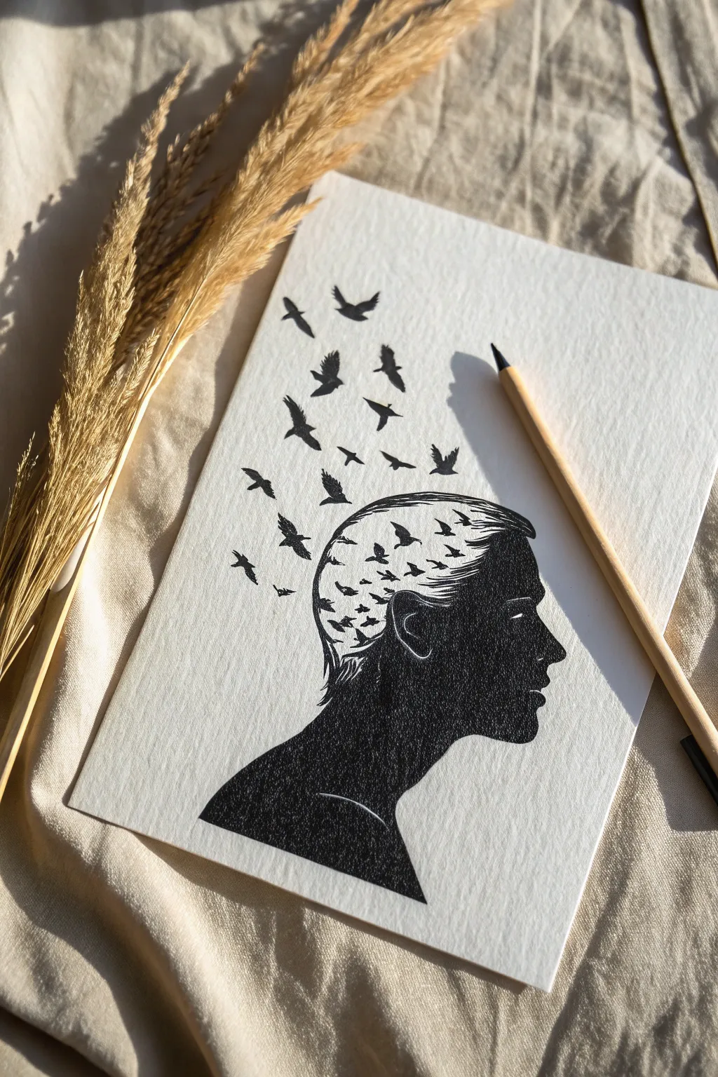
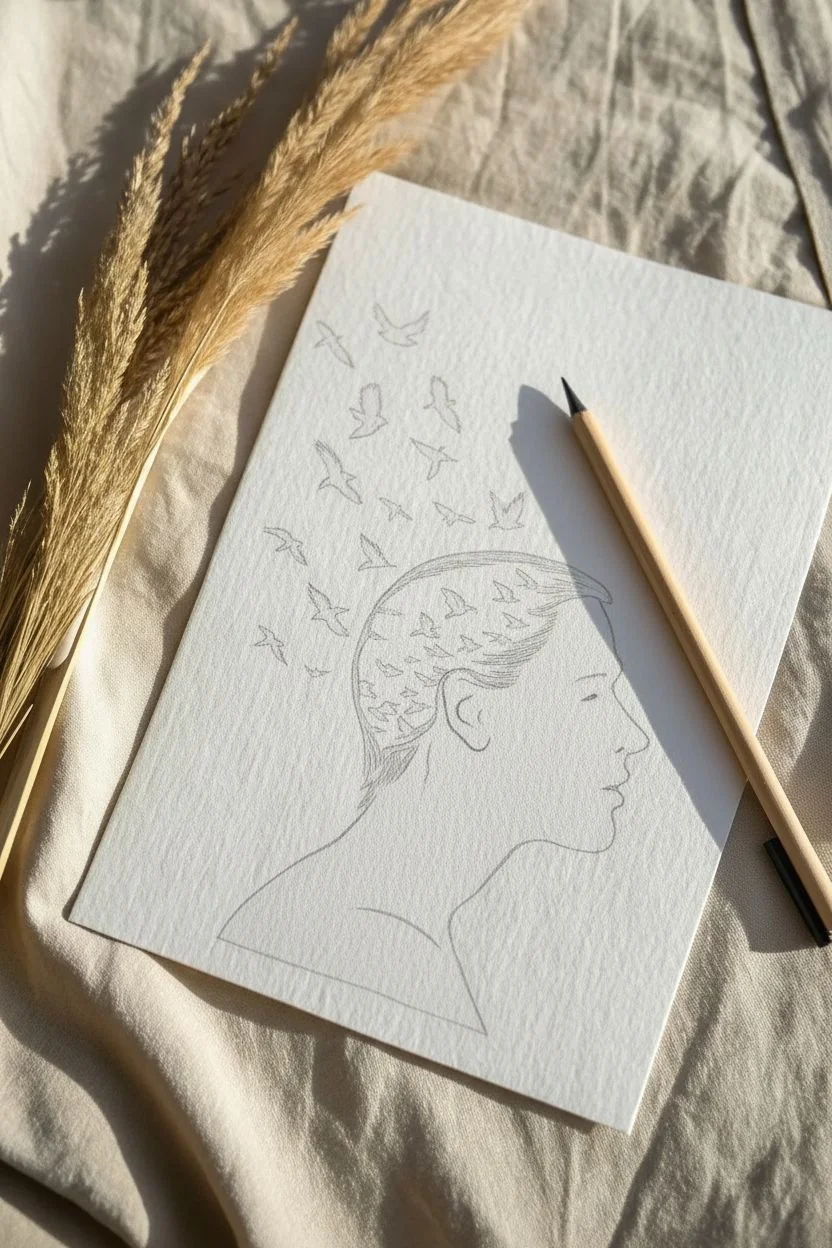
This surrealist drawing captures the feeling of imagination taking flight, merging a classic portrait profile with a dynamic flock of birds. The high-contrast black ink against textured paper creates a striking visual that looks complicated but relies on simple negative space techniques.
Step-by-Step Tutorial
Materials
- Heavyweight textured drawing paper (approx. 200gsm)
- HB graphite pencil
- Kneaded eraser
- Fine liner pens (sizes 0.1, 0.3, and 0.5)
- Black brush pen or broad marker
- Reference photo of a side profile
Step 1: Sketching the Foundation
-
Profile placement:
Begin by lightly sketching the outline of a human profile in the lower center of your page. Focus on the forehead, nose, lips, and chin. -
Neck and shoulder:
Extend the line down from the chin to form the neck, then curve outward to create the slope of the shoulder. -
Ear mapping:
Draw the ear shape. Since this will be a silhouette, you only need to sketch the main curves of the cartilage that will remain white (negative space). -
Hairline boundary:
Lightly mark where the hair begins on the forehead and temple, sweeping back towards the ear. -
Dissolving line:
Instead of drawing the back of the skull, sketch a jagged, irregular line starting top-center of the head and curving down behind the ear effectively ‘cutting off’ the back of the head. -
Bird placement:
Lightly map out the flow of the birds. Draw small circles or triangles to indicate where each bird will go, creating a stream rising from the open head section towards the top left corner.
Shape Struggle?
If facial proportions are tricky, print a profile photo, tape it to a sunny window under your paper, and lightly trace the main facial features to get the anatomy perfect.
Step 2: Inking the Silhouette
-
Fine details first:
Using your 0.1 fine liner, carefully trace the facial features (forehead, nose, lips). Keep your hand steady for crisp lines. -
Defining the ear:
Outline the ear shape, but be careful not to fill it in yet. You want to preserve thin channels of white paper to define the inner ear structure. -
Hair texture:
With the 0.1 pen, draw fine, sweeping lines near the temple and forehead to mimic hair strands. I like to flick the pen quickly to taper these lines. -
Filling the face:
Switch to a 0.5 pen or brush pen. Fill in the face area solid black, working carefully around the delicate white lines you preserved for the ear. -
Shoulder mass:
Use your broadest marker or brush pen to fill in the large neck and shoulder area. Ensure the coverage is solid and opaque. -
Creating the break:
Where the solid head meets the open space, use a stippling technique (lots of tiny dots) with the 0.3 pen to create a crumbling, textured transition rather than a hard line.
Level Up
Instead of black ink for the birds, use watercolor paints. Start with dark hues near the head and transition into lighter blues or purples as the birds fly further away.
Step 3: Releasing the Flock
-
emerging birds:
Draw the birds closest to the head first. These should be densely packed and slightly abstract, looking almost like shards of the skull breaking away. -
Mid-stream flight:
Move to the middle section of the flock. Draw distinct bird silhouettes with wings in various positions (up, down, gliding) to create movement. -
Distant birds:
Ink the birds furthest away at the top. These should be slightly smaller and spaced further apart to suggest they are flying into the distance. -
Wing refining:
Go back over your bird silhouettes with the 0.1 pen to sharpen the wing tips and tail feathers, ensuring no edges look blobs. -
Clean up:
Once the ink is completely dry—give it a few minutes to avoid smudging—gently erase all underlying pencil sketches with the kneaded eraser.
Frame your thought-provoking silhouette to remind yourself to let your creativity soar freely.


Have a question or want to share your own experience? I'd love to hear from you in the comments below!