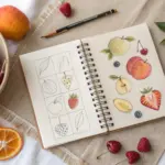
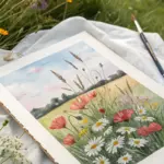
Fruit is my favorite subject when I want something cute, colorful, and actually doable in one sitting. These easy fruit painting ideas keep the shapes simple and the colors juicy, so you can relax and just enjoy the process.
Watercolor Citrus Slice Circles
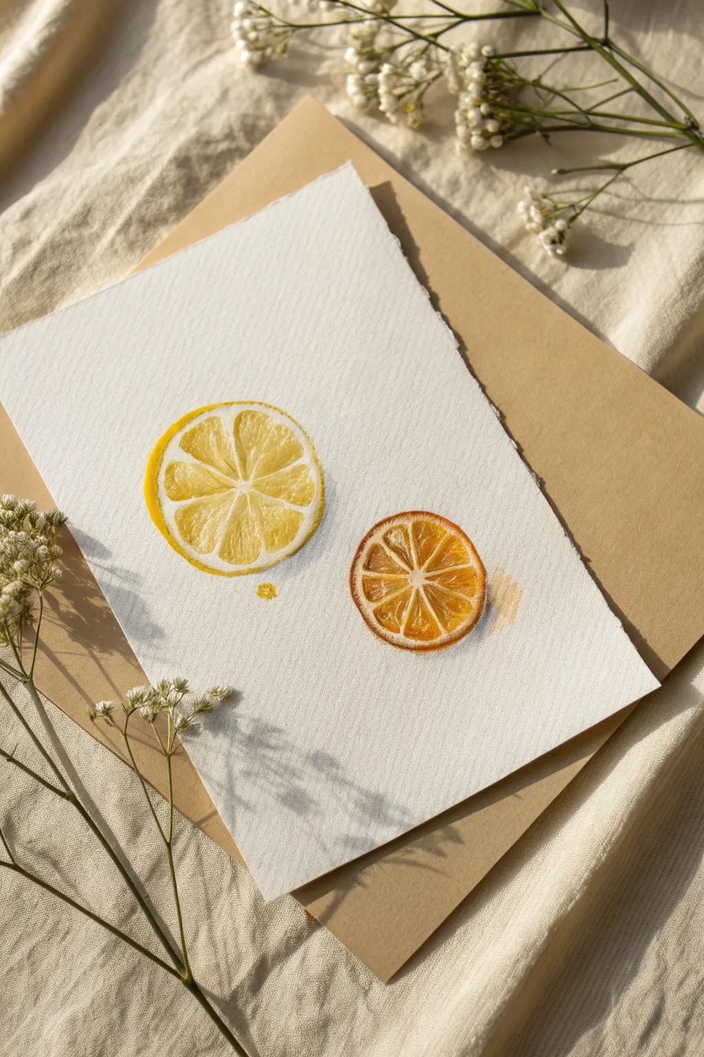
Capture the translucent beauty of fresh fruit with this simple yet elegant watercolor study. These lemon and orange slices focus on light layers and white space to create a realistic, juicy effect that pops off the page.
Step-by-Step
Materials
- Cold press watercolor paper (textured)
- Watercolor paints (Lemon Yellow, Cadmium Yellow, Orange, Burnt Sienna)
- Round watercolor brushes (mixed sizes used: 2, 6, and 8)
- Pencil (HB or lighter) and eraser
- Clean water jar
- Paper towel or cloth
- Compass or round object to trace (optional)
Step 1: Sketching the Foundations
-
Outline the circles:
Start by lightly drawing two circles on your paper: a larger one on the left for the lemon and a slightly smaller one on the right for the orange. You can trace a small glass or use a compass for perfect shapes, but sketching freehand adds organic charm. -
Define the pith:
Inside each circle, draw a second, concentric circle very close to the outer edge. This narrow gap will represent the white pith (the rind layer) – preserving this white space is crucial for realism later on. -
Map the segments:
Lightly sketch the triangular fruit segments radiating from the center. Aim for about 8-10 segments per slice. Keep your lines faint so they don’t show through the transparent watercolor. -
Soften the lines:
Use a kneaded eraser to gently lift the graphite until the sketch is barely visible. We want the paint to define the shape, not the pencil lines.
Keep it White
The most important part of citrus art is the white paper. If you accidentally paint over the pith or segment walls, use white gouache or a gel pen to reclaim them once dry.
Step 2: Painting the Lemon Slice
-
First wash of yellow:
Mix a watery, pale Lemon Yellow. Using a size 6 brush, fill in the segments of the left circle. Be very careful to leave the thin lines between segments completely unpainted – this white paper creates the segment walls. -
Deepening the color:
While the first layer is still slightly damp, drop a more concentrated Cadmium Yellow into the outer corners of each triangular segment. Let the pigment bloom naturally toward the center for a soft gradient. -
Painting the rind:
Switch to a smaller brush. Load it with a saturated yellow mix and carefully paint the outermost ring (the zest). Keep the line inconsistent—thicker in some spots, thinner in others—to mimic natural texture. -
Adding texture details:
Once the segments are dry, use the tip of a small brush to add tiny dots or dashed lines inside the segments with a darker yellow-ochre mix. This simulates the juice sacs inside the fruit pulp. -
Final lemon touches:
Add a tiny, stray drop of yellow paint near the bottom of the slice to suggest a drip of juice.
Blooms & Backruns
If you get ‘cauliflower’ blooms where water pushes pigment away, don’t fix it! This texture looks exactly like the natural crystallization found inside citrus pulp.
Step 3: Painting the Orange Slice
-
Base layer for the orange:
Move to the second circle. Mix a watery Orange hue and fill in the segments, again preserving the white channels between them and the white ring for the pith. -
Creating depth:
While the orange wash is wet, touch a bit of Burnt Sienna or a darker red-orange to the inner points of the segments (near the center of the fruit). This adds shadows and richness. -
Defining the peel:
Paint the outer skin using a vibrant, saturated orange. I like to let this color bleed slightly into the pith area in just one or two tiny spots to create a ‘fresh cut’ look, but mostly keep the pith white. -
Enhancing the pulp:
When the base layer is dry, mix a glazing consistency of orange. Paint delicate, radiating lines within each segment to mimic the fibrous texture of the fruit flesh. -
Adding texture shadows:
Use a diluted greyish-orange (mix a tiny touch of blue into your orange) to add very subtle shadows on the white pith between segments, giving the slice dimension. -
Optional splatter:
Load a brush with watery orange paint and tap it against your finger to create a faint splatter effect to the right of the orange slice, simulating juice spray.
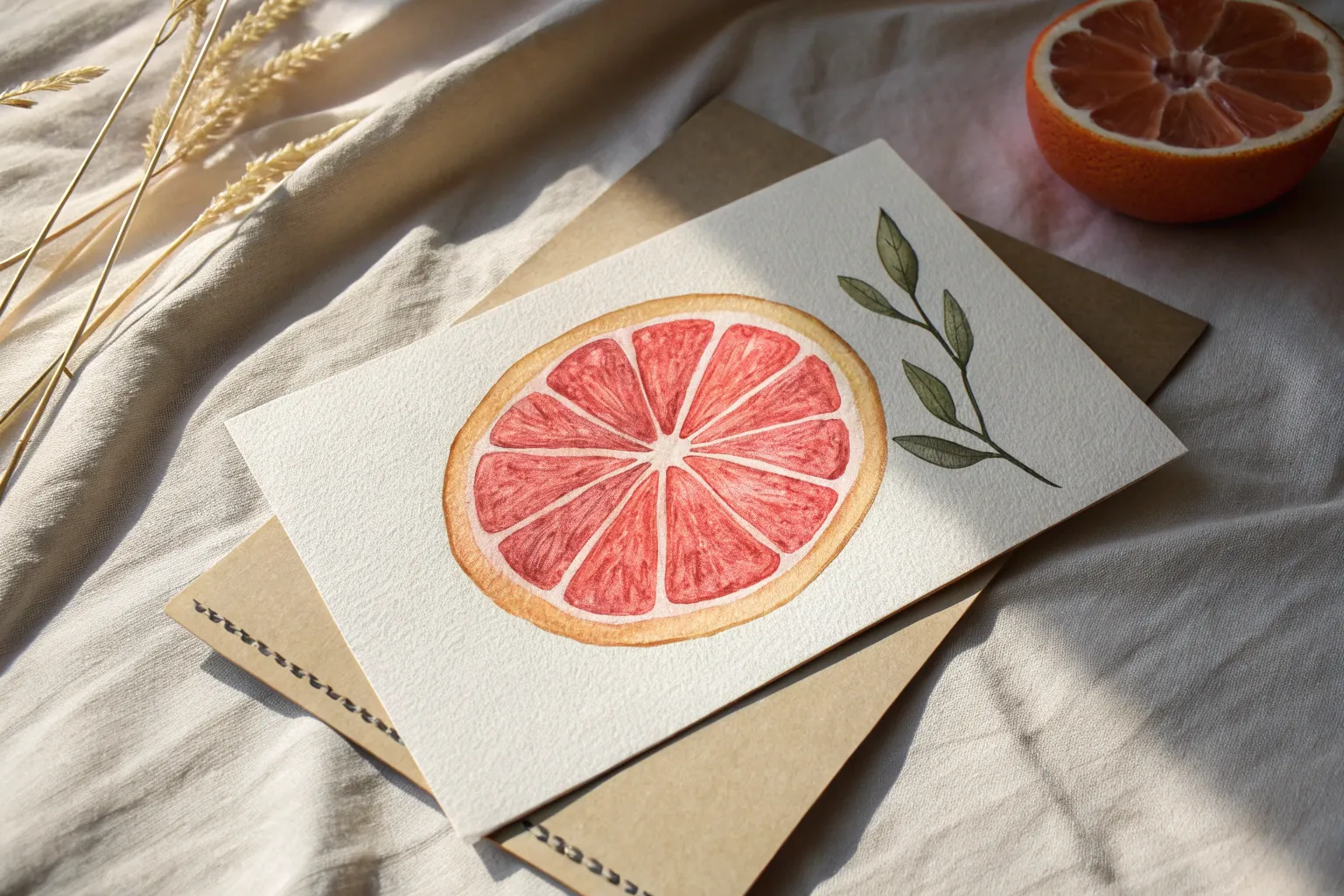
Now you have a fresh and zesty pair of fruits that look good enough to squeeze into your next drink


Pear From a Teardrop Shape
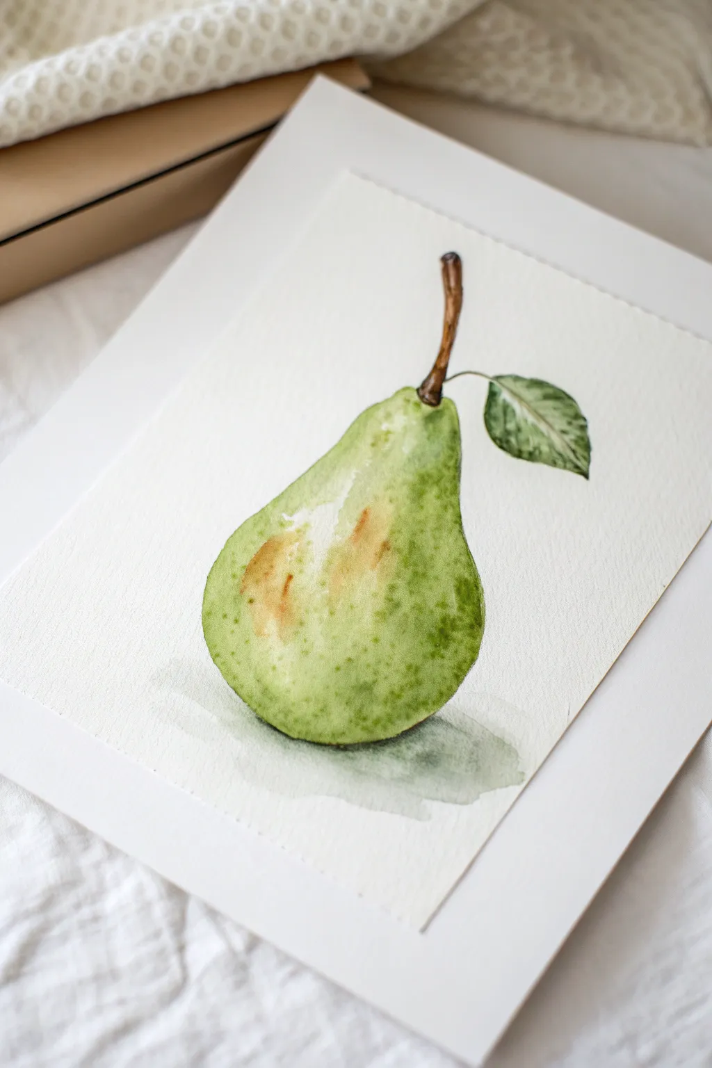
This charming tutorial guides you through painting a realistic green pear using a simple teardrop foundation. The result is a fresh, textured botanical illustration with subtle blushes and a delicate shadow that looks impressive but connects easily with beginners.
Step-by-Step
Materials
- Cold press watercolor paper (300 gsm)
- Round watercolor brushes (Size 4 and 8)
- Detail brush (Size 0 or 1)
- Watercolor paints (Sap Green, Yellow Ochre, Burnt Sienna, Burnt Umber, Payne’s Grey)
- Pencil (HB or H)
- Kneadable eraser
- Two jars of water
- Paper towel
Step 1: Sketching and Base Layer
-
Draft the teardrop:
Begin by lightly sketching a simple teardrop shape on your watercolor paper with an HB pencil. Make the bottom wide and round, tapering gently upward into a narrower neck. -
Refine the contour:
Pears aren’t perfect circles, so add some character to your outline. Flatten the bottom slightly and add a small dimple at the top where the stem will emerge. Sketch the stem curbing slightly to the right. -
Add the leaf:
Draw a single, almond-shaped leaf attached to the stem. Add a center vein line, but keep the details light so the pencil graphite doesn’t smudge into your paint later. -
Clean the sketch:
Use your kneadable eraser to dab the drawing, lifting excess graphite until only a faint ghost of the outline remains. This ensures clean, transparent colors. -
First wash:
Load a size 8 brush with a very watery mix of Sap Green. Paint the entire body of the pear, but carefully leave a small, irregular patch of white paper near the upper left shoulder for a highlight. This preserves the brightness.
Highlight Pro-Tip
If you accidentally painted over your highlight, use a small, stiff brush scrubbed in clean water to lift the pigment back out, or add a dot of white gouache at the end.
Step 2: Building Form and Color
-
Wet-in-wet blushing:
While the first green layer is still wet, drop in a small amount of Yellow Ochre or diluted Burnt Sienna on the left side of the pear’s body. Let the colors bleed naturally into the green to create a ripening ‘blush’ effect. -
Deepening the shadows:
Mix a thicker, more pigment-heavy Sap Green. Apply this along the bottom curve and the right side of the pear to create volume. Soften the edge of this darker green with a clean, damp brush so it blends smoothly toward the center. -
Painting the leaf:
Using a size 4 brush, paint the leaf with a mix of Sap Green and a tiny touch of Payne’s Grey for a darker foliage tone. Leave the center vein unpainted (white) initially, or lift the color out with a thirsty brush. -
Adding the stem:
Use the detail brush and a mix of Burnt Sienna and Burnt Umber to paint the stem. Make the color darker near the base where it connects to the fruit and at the very top tip. -
Let it dry completely:
Allow the paper to dry fully. If you rush to the next step while the paper is damp, your textured details will blur and disappear.
Step 3: Texture and Details
-
Creating the speckled skin:
Mix a watery puddle of dark green. Pick up the paint on your brush and tap the handle against your finger to splatter tiny droplets onto the dry pear. Focus these speckles near the bottom and shadowed sides. -
Refining the blemishes:
Use a damp detail brush to soften some of the larger splatters so they look like skin texture rather than just paint spots. I like to add a few deliberate brown freckles using Burnt Sienna for realism. -
Leaf detailing:
Darken one half of the leaf or add tiny veins using the tip of your smallest brush. This creates contrast against the lighter green of the pear. -
Grounding the subject:
Mix a very diluted wash of Payne’s Grey and a touch of Green. Paint a freeform, watery shape underneath the pear to act as a cast shadow. -
Softening the shadow:
While the shadow paint is wet, soften the outer edges with clear water so it fades into the white paper nicely, avoiding harsh lines.
Level Up: Background
Instead of leaving the background white, paint a very faint, watery rectangle around the pear in a contrasting color like pale lavender to make the green pop.
Now step back and admire the organic, fresh look of your watercolor fruit study
Blueberries as Loose Circles
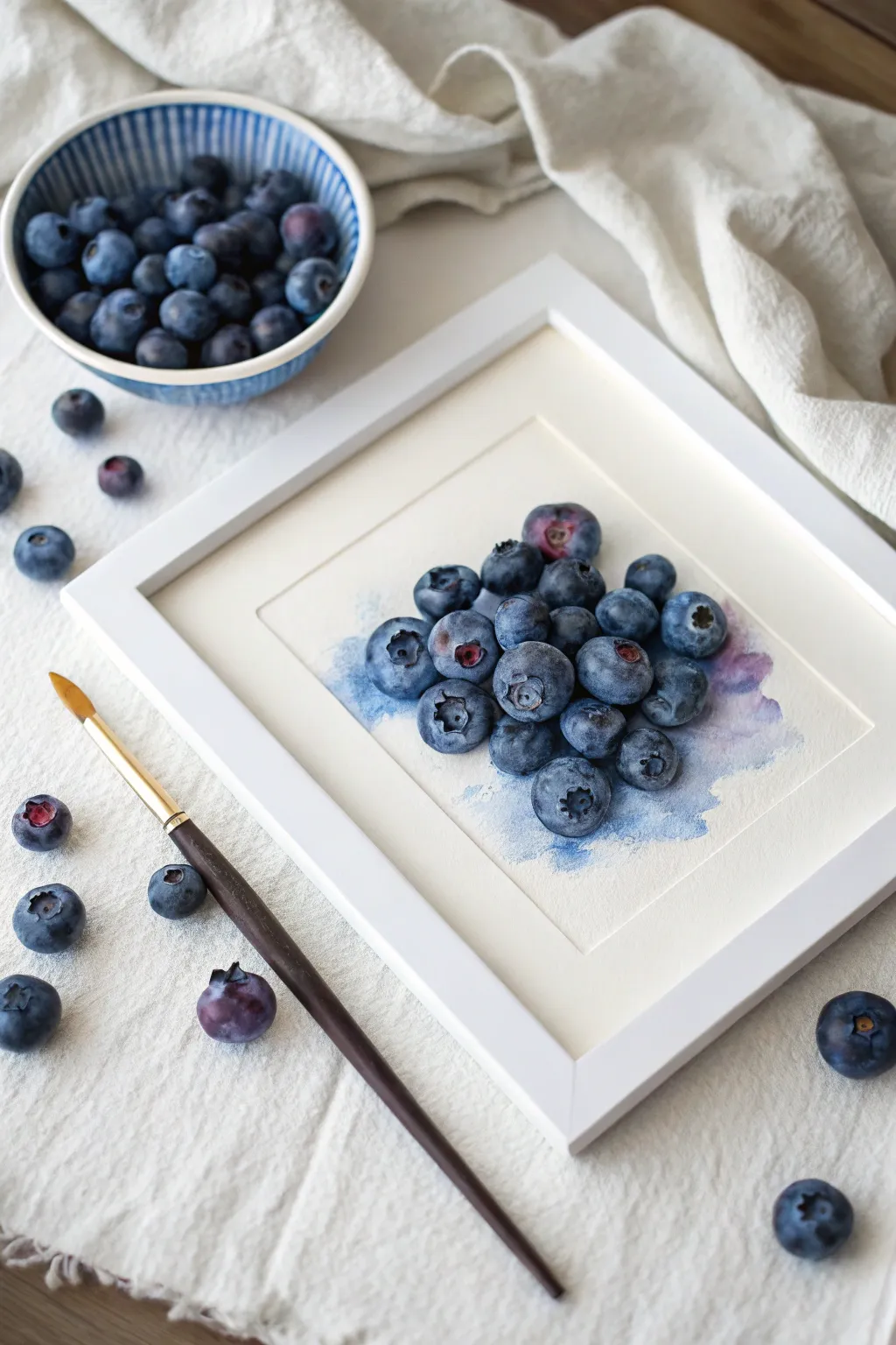
Capture the fresh, dusty charm of blueberries with this loose watercolor study. By layering washes of indigo and violet, you’ll create a realistic yet artistic cluster of berries that pop against a soft, textured background.
Step-by-Step
Materials
- Cold press watercolor paper (cut to 8×10 or similar)
- Watercolor paints: Indigo, Ultramarine Blue, Alizarin Crimson, Payne’s Gray
- Round watercolor brushes (size 4 and 8)
- Pencil (HB or H)
- Kneaded eraser
- Two jars of water
- Paper towels
- White gel pen or gouache (optional for highlights)
Step 1: Sketching & Base Wash
-
Outline the Composition:
Lightly sketch a cluster of about 20-25 circles in the center of your paper. Make sure they overlap and vary slightly in size and shape; blueberries aren’t perfect spheres. -
Add Detail Marks:
Draw small, star-shaped openings (the calyx) on a few of the outward-facing berries to indicate orientation. -
Prepare the Background Wash:
Mix a very watery puddle of Ultra Blue with a touch of purple. You want this to be faint and atmospheric. -
Apply the Initial Wash:
Using a larger brush, wet the area just behind and underneath your sketched cluster. Drop in your watery blue mix, letting it bleed outward slightly to create a soft, abstract shadow base. -
Let it Dry:
Allow this background layer to dry completely before touching the berries to prevent unwanted bleeding.
Step 2: Painting the Berries
-
Mix Your Blues:
Prepare three distinct puddles: a pure Indigo, a purple-leaning mix (Ultramarine + Crimson), and a grayish-blue (Indigo + Payne’s Gray). -
Paint First Berry Layer:
Start with a central berry. Wet the circle with clean water first, leaving a small dry spot for a highlight. -
Drop in Color:
Touch your loaded brush to the wet paper. I like to drop Indigo on one side for shadow and the purple mix on the other, letting them blend naturally on the paper. -
Work Non-Adjacent:
Move to a berry that isn’t touching the wet one you just painted. This ‘hopscotch’ method keeps the shapes distinct and prevents them from merging into a blob. -
Vary the Tones:
As you fill in the circles, make some berries darker (mostly Indigo) and others more violet or reddish to mimic ripeness variations. -
Paint the Calyxes:
For berries showing the star-shaped opening, paint the center much darker with concentrated Indigo or Payne’s Gray, leaving the rim of the opening lighter. -
Build the Cluster:
Continue until all berries have their first layer of color. Let this stage dry completely.
Muddy colors?
If your berries look brown or dull, you may be overworking the wet paint. Place your colors once and let the water do the mixing for you on the page.
Step 3: Deepening & Details
-
Add Core Shadows:
Mix a concentrated dark blue-black. Paint the crevices where berries touch each other to create depth and separate the forms. -
Enhance the Bloom:
To mimic the dusty ‘bloom’ on blueberry skin, glaze a very watery, pale blue over the top third of a few dried berries. -
Refine Edges:
Use a damp, clean brush to soften any harsh paint lines within the berries, keeping the outer edges crisp. -
Strengthen the Ground Shadow:
Revisit the ground beneath the pile. Add a streak of purple-blue directly under the bottom berries to anchor them to the surface. -
Final Highlights:
If you lost your preserved white paper highlights, use a white gel pen or a dot of gouache to add a tiny sparkle to the glossiest part of each berry.
Level Up
Sprinkle a tiny pinch of table salt onto a few wet berries while painting. As it dries, the salt pushes the pigment away, creating a perfect textured ‘frosty’ skin effect.
Frame your finished piece with a wide mat to give the vibrant blues plenty of room to breathe
Grapes Made of Bubble Shapes
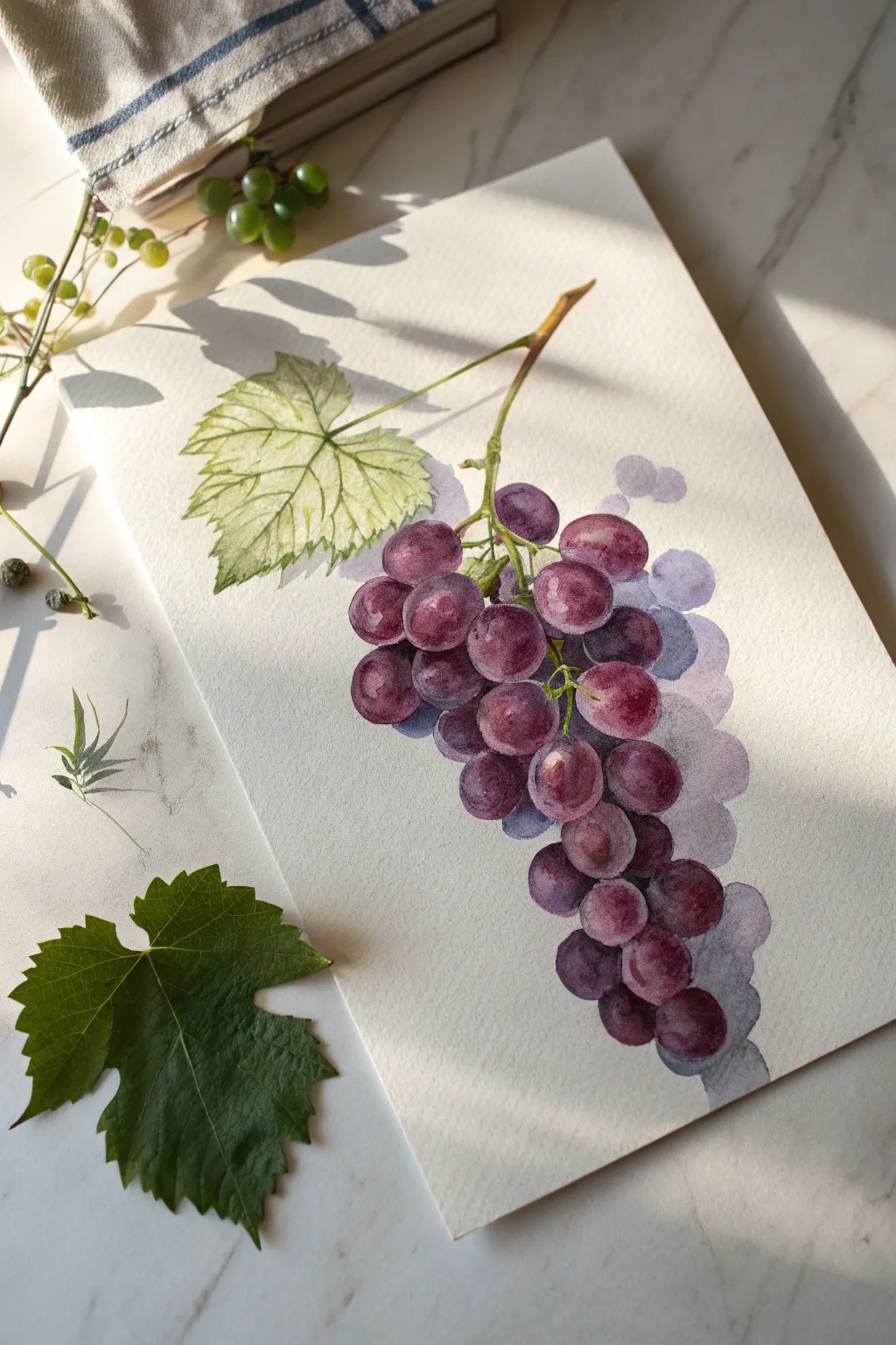
Capture the luscious depth of purple grapes using simple circular forms and clever layering. This watercolor study focuses on building dimension through translucent washes, creating a realistic yet soft botanical illustration.
How-To Guide
Materials
- Cold-pressed watercolor paper (300 gsm)
- Watercolor paints (Purple, Red, Blue, Sap Green, Burnt Umber)
- Round brushes (sizes 4 and 8)
- Detailed liner brush (size 0 or 1)
- Pencil (HB or H)
- Clean water and paper towels
- Mixing palette
Step 1: Sketching Boundaries
-
Outline the Composition:
Begin by lightly sketching the main stem entering from the top right corner. Draw a diagonal line for the leaf stem branching to the left. -
Map the Grapes:
Instead of drawing every single detail, lightly sketch overlapping circles and ovals to establish where the grape cluster will hang. Vary the sizes slightly to avoid a rigid pattern. -
Leaf Structure:
Sketch the jagged outline of the vine leaf attached to the left branch, noting the main veins radiating from the center.
Fixing Bleeds
If two wet grapes accidentally touch and bleed together, dry your brush on a paper towel and ‘lift’ the excess paint out of the bleeding area to separate them again.
Step 2: Painting the Grapes
-
Base Color Mix:
Mix a vibrant purple on your palette. For variety, prepare a second puddle with a bit more red (for warmth) and a third with a touch of blue (for shadows). -
First Bubbles:
Starting near the top of the cluster, paint the first few grapes using the ‘wet-on-dry’ technique. Leave tiny slivers of white paper unpainted to act as high-contrast highlights. -
Varying Tone:
While the paint is still wet, drop in a slightly darker purple on one side of a grape to create instant roundness. I like to do this immediately so the colors bleed softly. -
Building the Cluster:
Continue painting individual grapes, working your way down. Ensure adjacent wet grapes don’t touch yet to prevent them from merging into one big blob. -
The Shadow Layer:
Paint a very faint, watery wash of purple-grey behind the main cluster to represent grapes receding into the background. These should have soft, undefined edges. -
Deepening Shadows:
Once the first layer is dry, mix a concentrated dark purple. Paint the small triangular gaps between the grapes to push the bottom layers backward. -
Lower Grapes:
Paint the trailing grapes at the bottom of the bunch, making them slightly darker and cooler in tone to suggest they are further from the light source.
Pro Tip: Bubble Lift
To make grapes look rounder, use a clean, damp brush to lift a small circle of pigment from the center of a drying grape. This creates a soft, secondary reflected light.
Step 3: Leaf and Stem Details
-
Stem Base:
Mix Sap Green with a touch of Burnt Umber. Paint the main woody stem, tapering it as it reaches the grapes. -
Connecting the Fruit:
Use your liner brush to draw thin, delicate stems connecting the top grapes to the main branch. -
Leaf Wash:
Apply a pale, watery wash of yellow-green over the leaf sketch. Let this dry completely. -
Leaf Veins:
Using a darker green mix, paint negative space around the veins, or carefully paint the veins themselves with a fine liner brush. -
Woody Texture:
Add touches of brown to the stem where the light wouldn’t hit, giving it a cylindrical form.
Step 4: Final Touches
-
Cast Shadows:
Mix a cool, transparent grey-purple. Glaze this color over parts of the background grapes to push them further back. -
Enhancing Highlights:
If you lost any highlights, you can gently lift color with a damp brush or use a tiny dot of white gouache. -
Refining Edges:
Check the edges of your front-most grapes. If they look too soft, redefine the outline with a crisp, dark line of purple on the shadow side.
Now you have a refreshing cluster of grapes that looks ready to be plucked from the page
BRUSH GUIDE
The Right Brush for Every Stroke
From clean lines to bold texture — master brush choice, stroke control, and essential techniques.
Explore the Full Guide
Peach With Blushy Color Bleeds
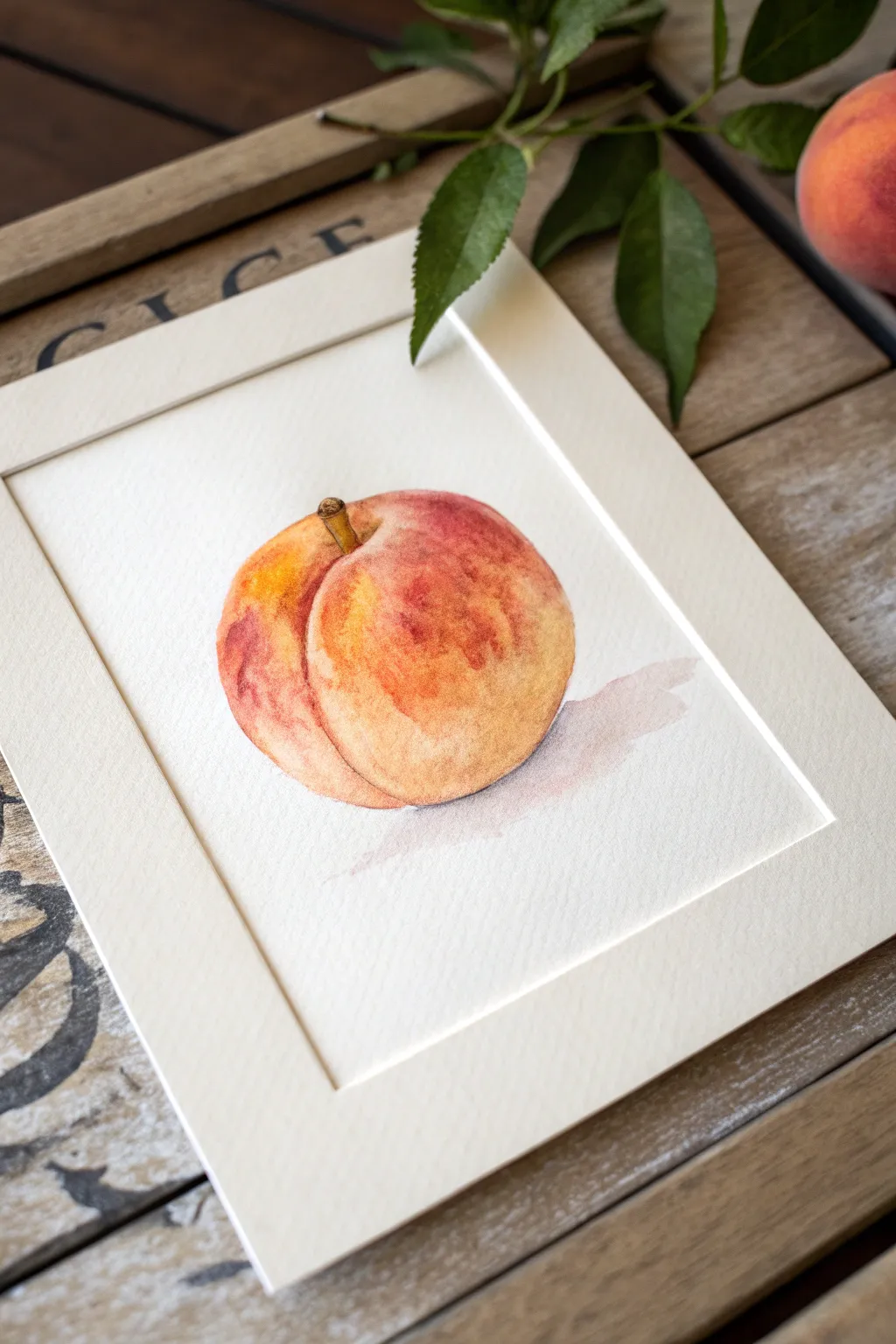
Capture the fuzzy softness and warm glow of a ripe peach with this beginner-friendly watercolor tutorial. Using wet-on-wet techniques allows the reds and yellows to blend organically, creating that beautiful, characteristic blush without harsh lines.
Detailed Instructions
Materials
- Cold press watercolor paper (300 gsm)
- Watercolor paints (Cadmium Yellow, Alizarin Crimson, Burnt Sienna, Yellow Ochre)
- Round watercolor brushes (Size 4 and Size 8)
- Pencil (HB or H)
- Kneaded eraser
- Clean water jar
- Paper towels
- Palette for mixing
- White mat board (optional, for framing)
Step 1: Sketching the Shape
-
Draw the basic outline:
Start by lightly sketching a round shape, but don’t make it a perfect circle; peaches have a slightly heart-shaped or indented top where the stem connects. -
Add the cleft:
Sketch the signature cleft line that runs down the side of the peach. This should be a curved line, making the fruit look plump and dimensional rather than flat. -
Position the stem:
Draw a small, slightly leaning stem emerging from the depression at the top. Keep this quite short and woody. -
Lighten the lines:
Gently roll a kneaded eraser over your sketch. You want the graphite to be barely visible so it doesn’t show through the transparent watercolor layers later.
Unwanted Blooms?
If you get ‘cauliflower’ blooms where water pushes pigment away, don’t panic. For a peach, this texture actually mimics the fuzzy skin perfectly. Embrace the accident!
Step 2: The First Wash
-
Prepare your colors:
Mix a generous puddle of Cadmium Yellow with a touch of Yellow Ochre for the base, and have a separate mix of watered-down Alizarin Crimson ready. -
Wet the paper:
Dip your clean Size 8 brush in water and fill in the entire peach shape with clear water. It should glisten evenly but not have standing puddles. -
Apply the yellow base:
While the paper is wet, drop your yellow mix into the center and right side of the peach. Let the pigment spread naturally toward the edges. -
Introduce the blush:
While the yellow is still wet, touch your brush loaded with the red mix to the left side and the bottom curve. Watch the colors bleed into the yellow.
Step 3: Building Form and Texture
-
Deepen the cleft:
Using a slightly stronger mix of Alizarin Crimson and Burnt Sienna, carefully paint along the cleft line you sketched earlier. -
Softening the edge:
Immediately rinse your brush, dry it slightly on a towel, and run this clean, damp brush along the edge of the cleft line to soften it into the surrounding fruit skin. -
Intensify shadows:
Add a bit more saturated red/orange to the shadowed side (usually the left/bottom in this composition) to create roundness. I find adding a tiny dot of blue to the red creates a nice shadow tone. -
Create texture:
While the paint is damp (not soaking wet), tap in very small, concentrated dots of red on the blushy side to suggest the fuzzy texture of the skin. -
Paint the stem:
Switch to your Size 4 brush. Mix Burnt Sienna with a tiny bit of Yellow Ochre and carefully paint the stem. Make one side slightly darker to show dimension. -
Let it dry completely:
Allow the fruit to dry fully before moving on to the shadow. If the paper feels cool to the touch, it’s still wet.
Go for Granite
Add a tiny splatter of watered-down white gouache or acrylic ink over the dried painting. This creates a hyper-realistic ‘fuzzy’ peach skin effect.
Step 4: Grounding Shadow
-
Mix a shadow color:
Mix a very watery, purplish-grey using your red, a touch of blue, and a lot of water. It needs to be very transparent. -
Paint the cast shadow:
Apply this wash directly underneath the peach, extending slightly to the right side. -
Fade it out:
Use a clean, damp brush to feather the edges of the shadow outward so it disappears into the white of the paper without a hard line.
Step 5: Finishing Touches
-
Assess contrast:
Once everything is bone dry, stand back. If the peach looks too pale, you can add a very light glaze of color over the top, but be careful not to lift the underlying layers. -
Mat the artwork:
Place a white mat board over your painting to give it that professional, finished gallery look shown in the example.
Enjoy the calm simplicity of your fresh fruit study.
Pineapple With Easy Scale Pattern
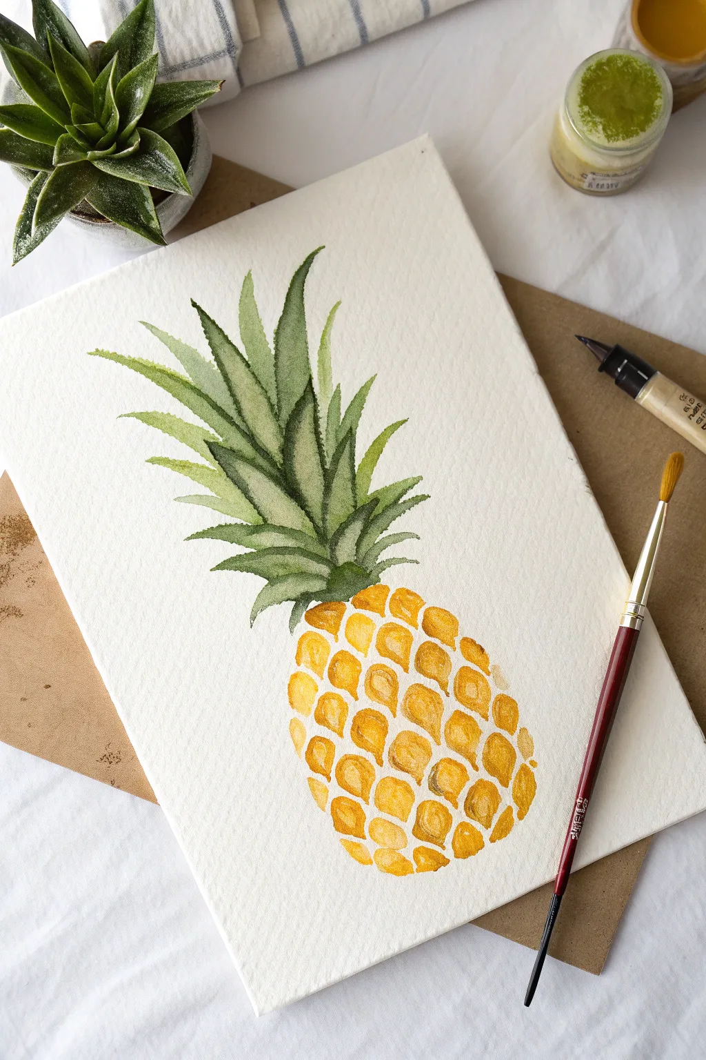
Capture the essence of summer with this loose, vibrant watercolor pineapple painting. The design focuses on building up the fruit’s texture through simple geometric shapes and layering translucent greens for lively fronds.
Detailed Instructions
Materials
- Cold press watercolor paper (A4 or A5 size)
- Watercolor paints (Sap Green, Hooker’s Green, Cadmium Yellow, Yellow Ochre, Burnt Sienna)
- Round watercolor brush (size 6 or 8)
- Fine liner brush (size 0 or 2, optional for details)
- Pencil (HB or 2B) and eraser
- Jar of clean water
- Palette or mixing plate
- Paper towels
Step 1: Sketching the Framework
-
Outline the body:
Begin by lightly sketching an elongated oval shape for the main body of the pineapple. Keep the bottom slightly flatter than the top to give it weight. -
Draw the crown:
Sketch the spiky leaves extending from the top of the oval. Make the central leaves the tallest and sketch shorter, curved leaves cascading down the sides of the crown. -
Map the scales:
Very lightly sketch a grid of diagonal lines crisscrossing the body of the fruit to guide where your scales will go. You don’t need to draw every scale perfectly, just create a general map.
Keep it Loose
Don’t try to make every scale identical. Irregular shapes and slight size variations make the pineapple look more organic and less like a geometric pattern.
Step 2: Painting the Crown
-
Mix your greens:
Prepare two shades of green on your palette: a lighter, yellowish Sap Green and a deeper, cooler Hooker’s Green. -
First wash of leaves:
Using the lighter green, paint long, sweeping strokes for the larger leaves. Start from the base near the fruit and flick your wrist upward to get a tapered point. -
Add depth immediately:
While the first strokes are still slightly damp, drop some of the darker Hooker’s Green into the base of the leaves where they meet the fruit. This creates a natural shadow without harsh lines. -
Layering the foliage:
Once the initial layer creates a silhouette, paint the smaller, outer leaves. Use a mix of both greens to ensure variety, making sure some leaves overlap others for dimension. -
Refining edges:
Use the tip of your brush to add serrated details or “spikes” along the edges of a few prominent leaves. This tiny detail adds a lot of realism.
Step 3: Creating the Textured Body
-
Mix the golden hues:
Create a sunny gradient on your palette. You’ll need a bright Cadmium Yellow and a mix of Yellow Ochre with a touch of Burnt Sienna for the darker, toasted look. -
Paint individual scales:
Starting from the top near the leaves, paint small, varying shapes that resemble rounded hexagons or rough diamonds. Leave tiny white gaps between them to let the paper ‘breathe’. -
Vary the color temperature:
As you move down the fruit, alternate your paint loading. Paint some scales pure yellow, and others with the ochre mix. I prefer to keep the center of the fruit lighter to suggest a highlight. -
Build the bottom weight:
Towards the bottom of the pineapple, use more of the Burnt Sienna and Ochre mix. This darker tone grounds the subject and suggests shadow. -
Adding the ‘eyes’:
While the scales are drying but not bone dry, drop a tiny dot of darker brown or concentrated ochre into the bottom corner of each scale. This mimics the prickly ‘eye’ of the fruit skin. -
Softening transitions:
If any scales look too rigid, take a clean, damp brush and gently soften one edge of the shape, blending it slightly into the white gap.
Add a Splatter
For a fun modern look, load your brush with watery yellow paint and tap it against a pencil to create a light splatter effect around the fruit.
Step 4: Final Touches
-
Evaluate the contrast:
Step back and look at the connection point between the leaves and the fruit. If it looks disconnected, add a few small, dark green strokes tucked right into the top of the yellow scales. -
Erase pencil lines:
Once the painting is completely dry—give it a good 15 minutes—gently erase any visible pencil marks from your initial sketch.
Now you have a refreshing piece of tropical art ready to frame or turn into a greeting card

PENCIL GUIDE
Understanding Pencil Grades from H to B
From first sketch to finished drawing — learn pencil grades, line control, and shading techniques.
Explore the Full Guide
Avocado Half With Big Pit
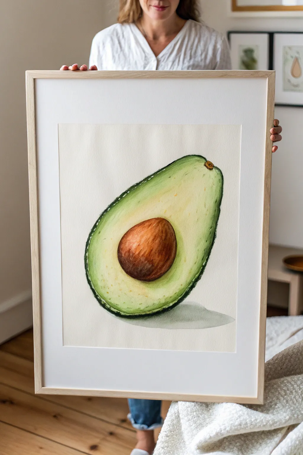
This refreshing painting captures the creamy texture of a ripe avocado half with its rich brown pit and vibrant green gradient. Using simple watercolor techniques like wet-on-wet, you’ll create a soft, realistic fruit illustration that looks good enough to eat but is simple enough for beginners.
How-To Guide
Materials
- Cold press watercolor paper (minimum 300 gsm)
- Watercolor paints (Sap Green, Hooker’s Green, Lemon Yellow, Burnt Sienna, Burnt Umber)
- Round watercolor brushes (Size 4, Size 8)
- Fine detail brush (Size 0 or 2)
- Pencil (HB) and kneadable eraser
- Two jars of water
- Paper towels
- Masking tape
Step 1: Sketching and Preparation
-
Lightly sketch the outline:
Start by lightly drawing the basic pear shape of the avocado. Keep the top slightly narrower and the bottom wider. Aim for a faint line so graphite doesn’t smudge into your yellow paint later. -
Define the skin edge:
Draw an inner line parallel to your outer shape, creating a thin border for the bumpy skin. This shouldn’t be a perfect line; a tiny bit of wobble adds realism. -
Place the pit:
Sketch a large, slightly oval circle in the lower-middle section for the seed. It should sit comfortably in the widest part of the avocado. -
Clean up the sketch:
Use your kneadable eraser to lift up excess graphite. You want the lines to be barely visible guides, just enough for you to see.
Pro Tip: Keep it creamy
To keep the avocado looking fresh, ensure your yellow center stays very pale. If it gets too dark, lift color out with a clean paper towel while wet.
Step 2: Painting the Flesh
-
Mix your base yellow:
Dilute Lemon Yellow with plenty of water to create a very pale, transparent wash. -
Wet-on-dry base layer:
Apply this pale yellow wash to the entire flesh area, carefully painting around the pit. Keep this layer very light, as it represents the creamy center. -
Introduce the green gradient:
While the yellow layer is still damp, load your Size 8 brush with a watery mix of Sap Green. Gently touch the outer edges of the flesh, letting the green bleed inward toward the yellow center. -
Soften the blend:
If the green stops too abruptly, rinse your brush, dry it slightly on a paper towel, and use the damp bristles to feather the edge where the green meets the yellow. -
Deepen the edges:
Mix a stronger Sap Green. While the paper is still slightly moist, add this concentrated color right along the very edge of the flesh (next to the skin line) to build dimension. -
Add texture spots:
Wait for the flesh to be semi-dry. Splatter or dab tiny, faint specks of diluted yellow-green near the bottom curve using the tip of your brush to mimic the natural texture of the fruit.
Step 3: Painting the Pit
-
Base coat for the seed:
Mix Burnt Sienna with a touch of Lemon Yellow for a warm, light brown. Paint the entire pit area with this solid wash. -
Building shadow on the pit:
While the base is wet, drop in Burnt Umber along the bottom and right side of the pit to create a curved shadow, giving the seed its round volume. -
Texturing the seed:
Once the pit is damp (not soaking), use a drier brush with concentrated Burnt Umber to make thin, curved strokes following the shape of the seed. This mimics the woody texture. -
Refining the center:
Lift a small highlight from the upper left of the pit using a clean, damp brush, or leave this area lighter to show where the light hits.
Troubleshooting: Bloom marks
If you get cauliflower-edged ‘blooms’ in your green gradient, it means you added water to drying paint. Wait for layers to fully dry before correcting.
Step 4: The Skin and Shadow
-
Paint the outer skin:
Mix a dark, rich green using Hooker’s Green and a tiny bit of Burnt Umber. Using your fine detail brush, paint the thin skin border. Make the line thicker in some spots and broken in others for a natural look. -
Add skin texture:
Stipple (dot) the dark green paint along the outer edge while wet to give the impression of the avocado’s bumpy surface. -
Create the cast shadow:
Mix a very watery grey using all your leftover dirty paint (greens and browns). Paint a loose, horizontal oval shape underneath the avocado. -
Soften the shadow edge:
I prefer to immediately run a clean, damp brush along the outer edge of the shadow paint to fade it out into the white paper seamlessly. -
The stem scar:
Finally, add a tiny dab of yellow-brown at the very top tip of the avocado for the stem scar.
Frame your painting with a wide white mat to emphasize the delicate colors of your fresh fruit art
Floating Fruit With Simple Shadows
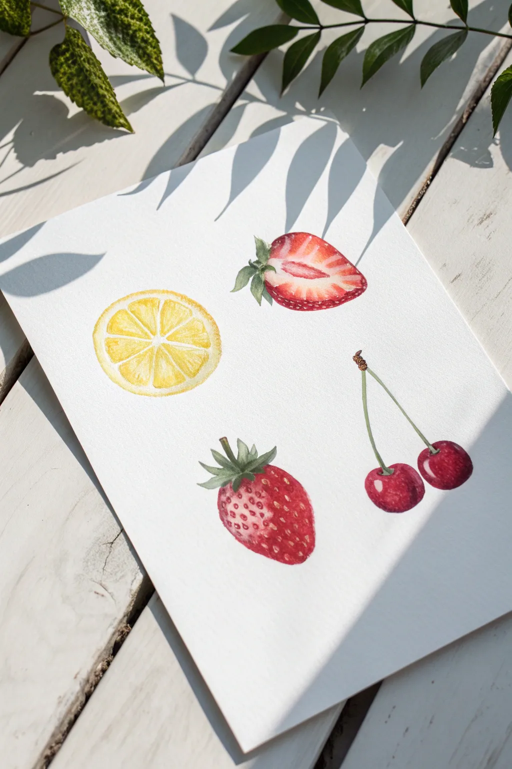
Capture the freshness of summer with this delicate watercolor study featuring a lemon slice, strawberries, and cherries. The white background allows the vibrant reds and yellows to pop, creating a clean and modern botanical illustration.
Step-by-Step Tutorial
Materials
- Cold press watercolor paper (300 gsm)
- Watercolor paints: Lemon Yellow, Alizarin Crimson, Sap Green, Burnt Sienna
- Round watercolor brushes (sizes 2, 4, and 6)
- Pencil (HB or H)
- Kneaded eraser
- Jar of clean water
- Paper towel
- Palette for mixing
Step 1: Planning and Sketching
-
Prepare your composition:
Visualize where your four fruit elements will sit on the page. You want a balanced arrangement: a lemon slice on the left, a cut strawberry top right, a whole strawberry bottom center, and cherries on the right. -
Sketch the lemon slice:
Using your HB pencil, lightly draw a perfect circle for the lemon slice. Mark a small center point and draw radiating lines for the segments, leaving a thin gap between them for the pith. -
Outline the strawberries:
Sketch the outline of the cut strawberry, including the leafy green top. Below it, draw the teardrop shape of the whole strawberry, adding the jagged leaves at the crown. -
Draw the cherries:
Sketch two round cherry shapes slightly overlapping or near each other. Draw two long, thin stems that join at the top with a small woody nub. -
Refine the lines:
Use a kneaded eraser to gently lift the graphite so the lines are barely visible. Heavy pencil marks can show through watercolor and are hard to erase later.
Muddy colors?
Wait for each layer to dry completely before adding details on top. If the paper is cool to the touch, it’s still wet. Patience prevents colors from bleeding into brown messes.
Step 2: Painting the Lemon Slice
-
First wash of yellow:
Load a size 4 brush with diluted Lemon Yellow. Fill in the fruit segments, being careful to leave the thin white lines between them (the pith) completely unpainted. -
Deepen the segments:
While the first wash is still damp, drop slightly more concentrated yellow into the corners of each segment to create volume and juiciness. -
Paint the rind:
Use a pale wash of yellow to paint the outer ring of the lemon. I prefer to leave a tiny sliver of white paper between the segments and this outer ring to represent the inner white pith.
Step 3: Painting the Strawberries
-
Base layer for the cut strawberry:
Mix a watery Alizarin Crimson. Paint the outer edge of the cut strawberry, fading the color inward with water so the center remains white or very pale pink. -
Add the red details:
Once the base is dry, use a size 2 brush with concentrated crimson to paint the radiating veins and darker flesh near the skin, leaving the core white. -
Base layer for the whole strawberry:
Paint the whole strawberry shape with a medium wash of red. While wet, lift a small highlight on the upper left side using a clean, damp brush to show roundness. -
Leaves and stems:
Mix Sap Green with a touch of red to dull it slightly. Carefully paint the leafy tops (calyx) of both strawberries using the tip of your size 2 brush. -
Strawberry seeds:
Once the red body is completely dry, use a tiny brush and a dark brownish-red mix to dot small indentations for seeds on the whole strawberry.
Preserve the white
For the crispest highlights on the cherries and lemon pith, use masking fluid before you start painting. Rub it off only when the paper is 100% dry.
Step 4: Painting the Cherries
-
Cherry base wash:
Paint the cherry circles with Alizarin Crimson. To make them look glossy, leave a small, stark white oval of paper unpainted on the upper left of each cherry for a highlight. -
Building depth:
While the paint is wet, drop in a thicker, darker red mix (crimson + a tiny bit of green or brown) along the bottom right curve to create a shadow. -
Stems:
Use a light Sap Green for the stems. Use one long, confident stroke for each stem to avoid shakiness. Paint the little woody nub at the join with Burnt Sienna. -
Final touches:
Assess your painting. If the lemon needs more punch, glaze a thin layer of yellow over the dried segments. Ensure the strawberry leaves have defined edges.
Allow your beautiful fruit study to dry completely before framing or displaying it


Repeat Fruit Pattern Tiles
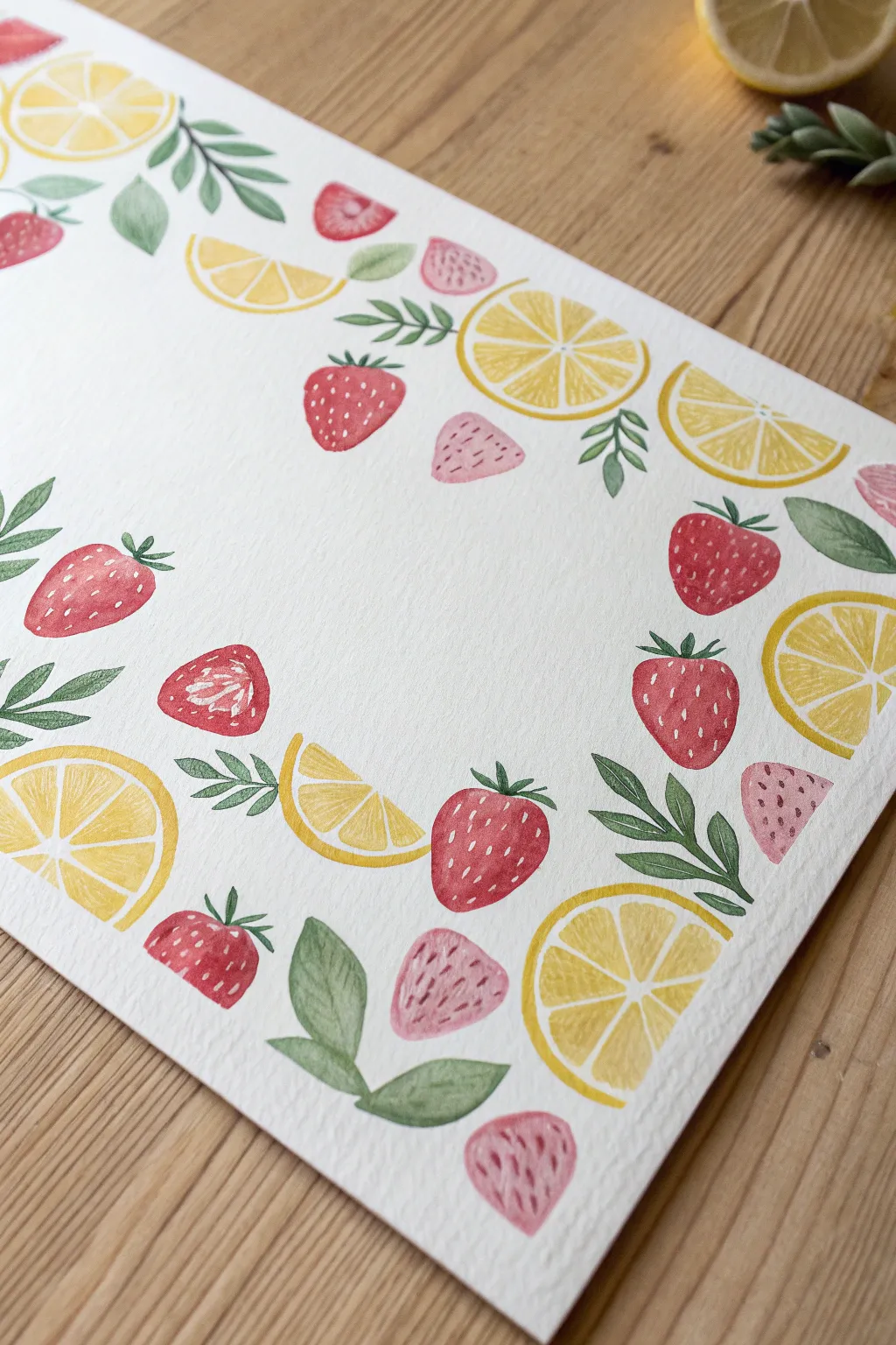
Brighten up your sketchbook with this refreshing watercolor border that combines juicy strawberries and zesty lemon slices. This repeating pattern relies on simplified shapes and loose brushwork, making it a perfect exercise for practicing composition and color control without the pressure of realism.
Detailed Instructions
Materials
- Cold press watercolor paper (300gsm is ideal)
- Watercolor paints (Cadmium Red, Alizarin Crimson, Lemon Yellow, Cadmium Yellow, Sap Green, Hooker’s Green)
- Round watercolor brushes (sizes 2, 4, and 6)
- White gouache or white gel pen
- Pencil (HB or H)
- Kneaded eraser
- Water cups and paper towels
Step 1: Planning the Pattern
-
Visualize the layout:
Before putting brush to paper, look at your blank page. You are creating a border frame, leaving the center empty for text or another illustration. Imagine an invisible rectangular margin about two inches wide around the edge of the paper. -
Sketch the anchor fruits:
Using an H pencil, lightly sketch the largest elements first: the full lemon wheels. Place one near each corner and a few along the long edges to anchor your composition. Keep the circles loose and don’t press too hard. -
Add strawberry shapes:
In the gaps between the lemons, sketch rounded triangular shapes for the whole strawberries. Vary their angles so they look like they are tumbling; some should point up, some down, and some sideways. -
Fill gaps with slices:
Now, add the smaller elements. Draw half-circles for lemon wedges and smaller, simpler triangles for sliced strawberries to fill the remaining negative space. -
Place the leaves:
Sketch small clusters of leaves tucking in and around the fruit. Focus on flow—let the stems curve naturally to help lead the eye around the border. -
Lighten the sketch:
Take your kneaded eraser and gently roll it over the entire page. You want to lift up most of the graphite so you seek only the faintest ghost of your plan, preventing the pencil lines from showing through the transparent watercolor.
Bleeding Colors?
If you accidentally touch wet green paint to wet yellow fruit, quickly dab the unexpected blend with a clean, dry paper towel to lift the color before it stains.
Step 2: Painting the Lemons
-
Base yellow wash:
Mix a watery Lemon Yellow. Paint the circular shapes of the lemons, but leave small white gaps between the triangular segments of the fruit flesh to represent the pith. This is much easier than trying to paint white lines later. -
Outer rind:
While the segments are still slightly damp, take a size 4 brush with a slightly thicker mix of Cadmium Yellow and paint the outer ring (the rind). Let the color bleed slightly into the segments for a soft look. -
Painting wedges:
Repeat this process for the lemon wedges (half-circles). Remember to leave those tiny channels of white paper to separate the rind from the flesh.
Step 3: Painting the Strawberries
-
Whole strawberry base:
Mix a vibrant Cadmium Red. Paint the rounded triangle shapes for the whole strawberries. I like to drop in a tiny touch of Alizarin Crimson on the shadowed side while it’s wet to give them volume. -
Sliced strawberry interior:
For the sliced strawberries, dilute your red heavily with water to make a soft pink. Paint the main shape with this pale wash. -
Sliced strawberry rind:
While the pink wash is wet, outline the very edge with your concentrated Cadmium Red to show the darker skin of the berry. -
Dry thoroughly:
Wait until all the fruit shapes are completely bone dry. If you paint the leaves now while the fruit is wet, the green will bleed into the yellow and red, creating muddy brown spots.
Make It a Menu
After the border dries, use a fine liner pen to write a weekly dinner menu or a favorite summer cocktail recipe in the empty white center space.
Step 4: Leaves and Details
-
Painting the greenery:
Mix Sap Green with a touch of Hooker’s Green for variety. Using your size 2 brush, paint the strawberry hulls (the little caps on top) and the scattered leaves. Press down for the belly of the leaf and lift up for a sharp point. -
Lemon details:
Once the yellow paint is fully dry, use a very watery, pale orange-yellow to paint faint lines inside the lemon segments, mimicking the texture of the juice sacs. -
Strawberry seeds and cores:
For the cut strawberries, use a darker red to paint a small, irregular ‘core’ shape in the center and faint radiating lines. -
Adding texture to whole berries:
Using opaque white gouache or a gel pen, add tiny dashes or dots to the red strawberries to represent seeds. Follow the curve of the berry rather than placing them in straight rows to enhance the 3D effect. -
Final assessment:
Step back and look for any large, awkward gaps. If you find a space that feels too empty, paint a small, stray green leaf or a tiny pink petal shape to balance the composition.
Now you have a vibrant, summery frame ready to surround your favorite quote or hold a central illustration
Bold Pop-Color Fruit Silhouettes
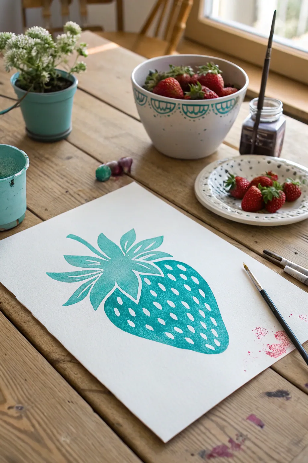
Step away from traditional reds and explore the graphic punch of a single-color fruit silhouette. This beginner-friendly project uses negative space to create texture, resulting in a modern, pop-art inspired strawberry that looks striking on crisp white paper.
Step-by-Step Tutorial
Materials
- Cold press watercolor paper (A4 or similar size)
- Teal or Turquoise gouache or watercolor paint
- Pointed round brush (size 6 or 8)
- Small detail brush (size 2 or 3)
- Pencil (HB or lighter)
- Eraser
- Water jar
- Paper towels for blotting
Step 1: Sketching the Shape
-
Outline the body:
Begin by lightly sketching the main body of the strawberry on your paper. Aim for a classic heart-like shape with a slightly flattened top and a rounded point at the bottom. -
Add the leafy crown:
Draw the sepals—the leafy greens—at the top. Create a central stem point and fan out individual leaves. Keep them stylized and spiky, varying the lengths so some curve left and others right for dynamic movement. -
Map the seeds:
Sketch small, teardrop-shaped seeds scattered across the body of the fruit. Instead of trying to be perfectly random, arranging them in slight diagonal rows can help the form look rounded. -
Lighten sketches:
Take a kneaded eraser or standard eraser and gently dab—don’t rub—your sketch to lift up the excess graphite. You want the lines to be barely visible guides so the pencil won’t show through the transparency of the paint.
Step 2: Painting the Greens
-
Mix your color:
Dilute your teal or turquoise paint with a moderate amount of water. You want a consistency that flows easily but holds its vibrancy, similar to heavy cream. -
Start with the leaves:
Using your pointed round brush, fill in the leaf shapes first. Start from the center stem and pull the brush outward toward the tips to get sharp, clean points. -
Define the separation:
Leave tiny hairline gaps of white paper between some of the overlapping leaves. This small detail prevents the crown from becoming a single blob and adds dimension without needing shading.
Seed Spacing Trick
Make seeds smaller and closer together near the edges of the fruit. This visual trick mimics curvature, making your 2D shape look 3D.
Step 3: Filling the Fruit Body
-
Outline the perimeter:
Switch to your smaller detail brush if needed. Carefully paint the outer edge of the strawberry body to establish a crisp silhouette. -
Work around the seeds:
This is the most meditative part: use the tip of your brush to paint the negative space around your pencil-sketched seeds. Outline a seed, then fill the color around it. -
Maintain wet edges:
Try to work somewhat quickly or in sections to keep a ‘wet edge.’ If the paint dries mid-section, you might get hard lines where new paint meets old. -
Fill the gaps:
Once the seeds are outlined, fill in the larger areas of teal between them. Let the color vary slightly in opacity; a little unevenness adds that charming hand-painted watercolor texture. -
Refine the connection:
Bring the teal paint right up to the bottom of the leaves. I like to leave a minuscule sliver of white space between the red body and the green leaves to keep the elements distinct.
Go Polychromatic
Try this same technique but create a mesmerizing triptych: paint one strawberry in teal, one in magenta, and one in mustard yellow side-by-side.
Step 4: Finishing Touches
-
Check density:
Look over the large painted areas. If the color looks too washed out in spots, you can glaze a second, watery layer of teal over the dry paint to deepen the saturation. -
Clean up edges:
If any edges look rough, smooth them out with the very tip of your smallest brush using slightly thicker paint. -
Erase final marks:
Allow the painting to dry completely—give it at least 20 minutes. Once bone dry, gently erase any remaining visible pencil marks inside the white seeds. -
Add clear water splatter (optional):
For a bit of texture, you can flick a toothbrush with clean water over the drying paint to create tiny blooms, though a solid flat color works perfectly for a graphic look too.
Frame your bold, monochromatic fruit study and enjoy the fresh pop of color it brings to your space


Have a question or want to share your own experience? I'd love to hear from you in the comments below!