Whenever I’m stuck on what to draw, I default to a simple heart shape—it’s quick, satisfying, and endlessly customizable. Here are my favorite easy heart drawing ideas that start with the classic heart and level up with tiny twists you can totally pull off.
Classic Heart Outline with Guidelines

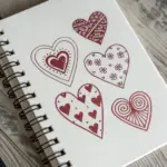
This methodical approach uses a simple grid system to help you draw five uniform, perfectly balanced hearts in a neat column. It is an excellent warm-up exercise for refining your linework and practicing consistency in your shapes.
How-To Guide
Materials
- Spiral-bound sketchbook or drawing paper
- Lead pencil (HB or 2B)
- Ruler or straight edge
- Eraser
Step 1: Setting Up the Grid
-
Establish the vertical axis:
Begin by using your ruler to draw a long, straight vertical line down the center of your page. This doesn’t need to be heavy; keep your touch light so it can be erased later if desired. -
Mark the width:
Decide on the width of your column. Draw two vertical lines on either side of your center axis, creating a tall, rectangular channel. Aim for about 2-3 inches of total width. -
Divide into rows:
Starting near the top, mark off five equal vertical sections. Use your ruler to draw horizontal lines across the channel at these marks, creating five stacked boxes of equal size. -
Verify the proportions:
Check that your boxes look roughly square or slightly rectangular. I find that slightly taller boxes give the hearts a more elegant, elongated look.
Grid Master Tip
Keep your grid lines extremely faint. Use a harder pencil (like a 2H) for the grid and a softer one (HB or B) for the hearts to make cleanup easier.
Step 2: Drawing the Base Shapes
-
Mark the dips:
In the top box, make a small dot on the top horizontal line exactly where the center vertical line intersects it. This will be the dip of the heart. -
Mark the points:
Make another dot on the bottom horizontal line of that same box, again at the center intersection. This is the heart’s bottom point. -
Sketch the upper curves:
Starting from the top center dot, sketch two arches that reach up and out towards the corners of the box. Imagine you are drawing the tops of a rounded ‘M’ shape. -
Connect the sides:
Continue the curve from the widest part of the arch down toward the bottom center dot. Try to keep the curve smooth and continuous rather than jagged.
Gradient Effect
Make the column dynamic by drawing the top heart very small and gradually increasing the size of each subsequent heart until the bottom one fills the box.
Step 3: Repeating and Refining
-
Start the second heart:
Move to the second box down. Repeat the process of marking the top center dip and bottom point. -
Draw the next outline:
Sketch the curves for this second heart, trying to match the width and roundness of the first one above it. -
Complete the column:
Continue this process for the remaining three boxes. The grid lines act as guardrails, ensuring each heart stays within the same boundaries. -
Assess consistency:
Take a step back and look at the column as a whole. If one heart looks too wide or too narrow, lightly erase and adjust the curve to match its neighbors. -
Darken the final lines:
Once you are happy with the shape of all five hearts, go over the heart outlines with a slightly firmer pressure to make them stand out. -
Clean up (optional):
You can leave the grid lines visible for a technical, architectural look, or gently erase the straight lines to leave the hearts floating in a perfect column.
You now have a beautifully aligned column of hearts ready for coloring or shading


Easy One-Line Continuous Heart
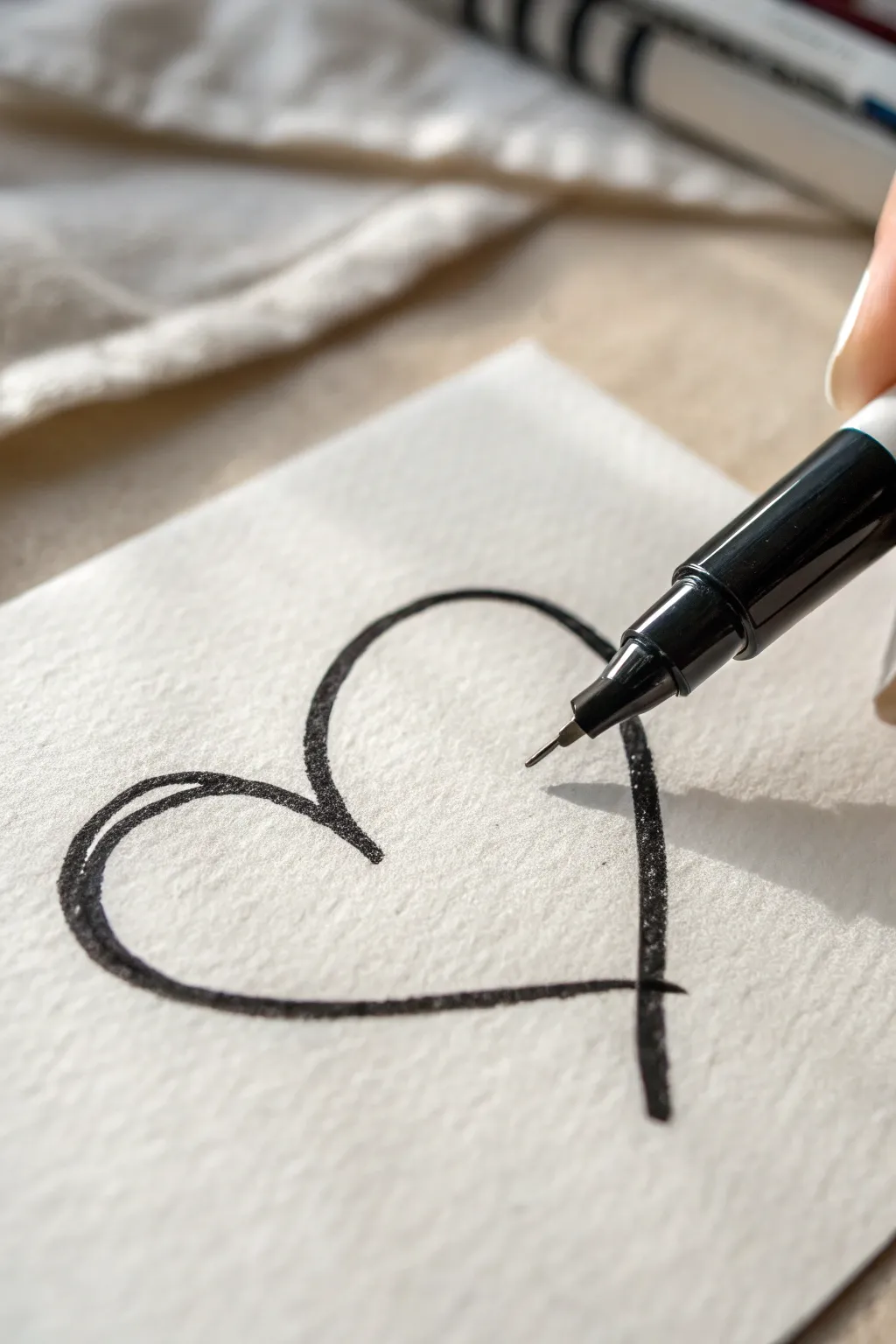
This charming, imperfect heart drawing embraces a relaxed and artistic vibe with its offset lines and visible texture. By deliberately overlapping strokes and avoiding perfect symmetry, you create a design that feels personal and handwritten rather than computer-generated.
Step-by-Step Tutorial
Materials
- Textured watercolor paper or heavy cardstock
- Fine-liner pen (black, 0.5mm or 0.8mm)
- Black brush pen or slightly thicker marker (optional for variation)
- Pencil (hard lead like 2H)
- Kneaded eraser
Step 1: Setting the Composition
-
Prepare your surface:
Place your textured paper on a flat, hard surface. The texture is key here, so ensure the paper has a bit of ‘tooth’ or grain visible to catch the ink. -
Determine the angle:
Decide on the orientation of your heart. For this specific look, the heart sits slightly tilted, favoring a wider curve on the left side. -
Lightly map the points:
Using your hard pencil, very faintly mark three points: the bottom tip, the center dip (the cleavage of the heart), and the outer width constraints. -
Sketch the skeleton:
Connect your points with a ghost-light sketch. Focus on an asymmetrical shape where the left lobe is slightly larger and rounder than the right.
Step 2: Drawing the Base Line
-
Position the pen:
Take your black fine-liner and hold it at a slight angle. Start at the top center dip of the heart. -
Draw the left curve:
With a confident, moderate speed, sweep the pen up and around to form the left lobe. Let the texture of the paper break the line slightly if it happens naturally. -
Descend to the tip:
Continue that single stroke down towards the bottom point. Instead of stopping exactly at the tip, let the line extend slightly past where the tip would naturally end. -
Form the right lobe:
Lift your pen and return to the top center dip. Draw the right curve, bringing it down to cross over the first line near the bottom tip, creating a small ‘tail’ or intersection. -
Assess the shape:
Look at your single-line base. It should look airy and light. Don’t worry if the curves aren’t perfectly smooth.
Ink Bleeding?
If your fine-liner is feathering or bleeding into the paper fibers, switch to a smoother cardstock or use a pigment-based liner, which tends to sit on top of the surface better.
Step 3: Adding the Offset Weight
-
Start the second pass:
Identify the left side of the heart. You want to thicken this area to create a shadow effect. Place your pen slightly inside the original left line. -
Draw parallel lines:
Trace a second line closely parallel to the first one on the left curve. Allow a tiny sliver of white space to show between the ink lines occasionally. -
Merge the strokes:
As you reach the bottom of the curve, let this second line merge seamlessly into the original line to create a tapered, thick effect. -
Repeat on the right:
Move to the bottom right section of the heart. Add an extra line stroke on the *outside* or *inside* of the original line to add weight near the crossed tip. -
Create the ‘sketchy’ look:
In the top left corner, add a third very short, quick stroke that doesn’t quite connect to anything. This mimics a quick sketching gesture. -
Refine the crossover:
Where the lines cross at the bottom tip, darken the intersection slightly to emphasize that crucial overlapping detail.
Vary Your Speed
Draw fast for smoother curves, but slow down intentionally on the second pass. This contrast in speed creates the jagged, textured look on the thicker lines.
Step 4: Finishing Touches
-
Check line consistency:
Scan the drawing for areas that look too thin. Gently touch up the black ink, making sure not to fill in every bit of paper texture. -
Enhance texture:
If the paper grain absorbed too much ink in one spot, leave it. That speckled look adds to the authentic, hand-drawn aesthetic shown in the photo. -
Review contrast:
Ensure the darkest parts of the line are truly black against the white paper. Go over the thickest curves one last time if the ink looks grey. -
Erase guidelines:
Once the ink is completely dry—I usually give it at least five minutes to be safe—gently dab the kneaded eraser over the drawing to lift any remaining pencil marks. -
Final inspection:
Hold the paper at arm’s length. The heart should look fluid and dynamic, capturing the feeling of a continuous motion frozen in time.
Enjoy the effortless elegance of your new hand-sketched heart design


Puffy Cartoon Heart

Create a charming, bubbly heart doodle that jumps off the page with just a few simple strokes. This project uses deliberate highlighting and a cute inner shape to give a standard heart symbol a soft, three-dimensional balloon effect.
Detailed Instructions
Materials
- Spiral-bound sketchbook with smooth, off-white paper
- Soft graphite pencil (2B or 4B recommended)
- Blending stump (optional)
- Clean eraser
Step 1: Drawing the Base Shape
-
Start the left curve:
Begin near the center of your page and draw a rounded arch curving upwards and to the left. Bring the line down in a smooth, gentle slope, stopping before you reach the bottom point. -
Start the right curve:
Return to your starting point at the top center. Draw a matching arch to the right, trying to keep it roughly symmetrical to the first one, though cartoon styles forgive imperfections easily. -
Join the bottom point:
Extend the line from the left slope downwards, curving slightly inward. Do the same on the right side until the two lines meet in a sharp, slightly curved point at the bottom. -
Check the symmetry:
Look at your outline. The charm of this style is a slightly squat, wide shape, so don’t worry if it looks a bit wider than a traditional heart. -
Darken the outline:
Go over your outline again with firm pressure. I like to make the line slightly thicker in random spots to give it a hand-drawn, organic feel.
Step 2: Adding Depth and Detail
-
Draw the inner heart:
In the direct center of your large heart, draw a tiny, floating heart. Keep it simple and relatively small, leaving plenty of white space around it. -
Add the left highlight:
On the upper left lobe of the big heart, draw a short, curved line following the contour of the top arch. This acts as a reflection mark. -
Add a second highlight mark:
Just below that curved line on the left, add a tiny dash or dot. These two marks together create the illusion of a shiny, puffy surface. -
Add the right highlight:
Move to the upper right lobe. Draw a similar curved line here, but perhaps slightly shorter or thinner than the left one to keep the lighting consistent. -
Emphasize the inner heart:
Go back to the tiny center heart and darken its outline just like you did for the main shape. Ensure the pencil lines are crisp and distinct. -
Clean up stray marks:
Take your eraser and gently remove any faint sketch lines or smudges around the outside of the heart, keeping the paper surface pristine. -
Review contrast:
Make sure your pencil strokes are dark enough to stand out against the cream-colored paper. If the graphite looks too shiny or grey, layer another pass of pencil over the lines.
Uneven Curvature?
If one side looks lopsided, thicken the outline on the narrower side instead of erasing. This adds character and hides asymmetry.
Soften the Look
Use a duller pencil tip for the highlights. A sharp point makes harsh lines, while a dull tip creates soft, rounded ‘puffy’ reflections.
You now have a wonderfully simple, stylized heart that looks like a floating balloon on the page


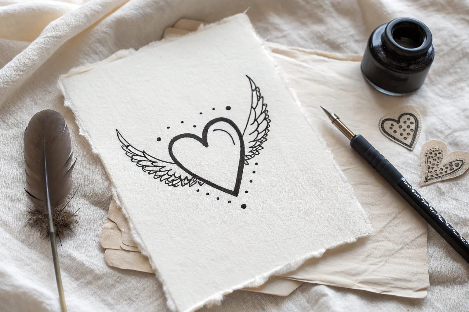
Heart with Simple Wings
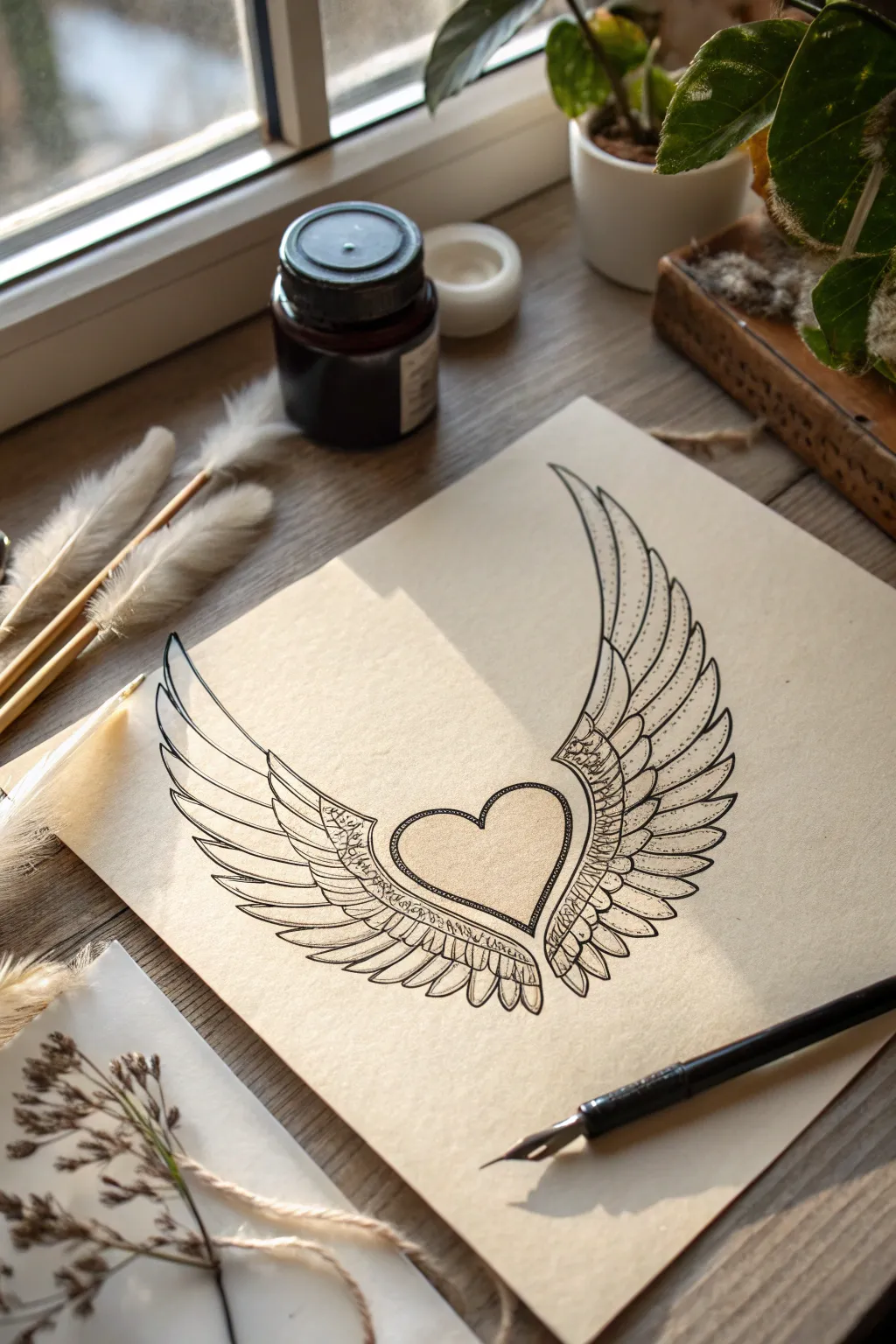
Create a classic, tattoo-inspired illustration featuring a central heart embraced by elegant, feathered wings. This project uses fine linework and stippling techniques on tinted paper to achieve a timeless, romantic aesthetic.
Step-by-Step Tutorial
Materials
- Heavyweight cream or tan drawing paper
- Pencil (HB or H)
- Kneaded eraser
- Fine liner pens (0.1mm, 0.3mm, 0.5mm) or dip pen with black ink
- Ruler (optional for symmetry)
Step 1: Planning and Sketching
-
Center the heart:
Begin by lightly sketching a simple heart shape in the relative center of your paper. Keep the bottom point sharp and the top curves soft. Don’t press too hard with your pencil, as you’ll want to erase these lines later. -
Establish the wing curvature:
Draw two long, sweeping curves extending upwards from the top edges of the heart. These will form the upper ‘arm’ or bone structure of the wings. Aim for symmetry, making sure both curves reach roughly the same height. -
Sketch the primary feathers:
From the outer tips of those upper curves, sketch long, pointed feather shapes cascading downward. These longest feathers should curve slightly inward at the bottom. -
Add secondary wing layers:
Fill in the gap between the long outer feathers and the heart with shorter, tiered rows of feathers. These should look like overlapping scales or petals, getting smaller as they get closer to the top of the wing structure.
Step 2: Inking the Outlines
-
Outline the heart:
Using a slightly thicker pen (like a 0.5mm), carefully trace over your pencil sketch of the heart. For a vintage look, I like to double this line slightly or make it thicker on the shadowed side. -
Define the wing structure:
Ink the top curved ‘arm’ of the wings. Create a distinct separation between this bone structure and the feathers below. -
Ink the feathers:
Trace the individual feathers with a finer pen (0.3mm). Ensure the tips are sharp. Where feathers overlap, stop your line just short of the feather above it to create depth. -
Erase pencil guides:
Once the ink is completely dry—give it a few minutes to be safe—gently sweep your kneaded eraser over the entire drawing to remove the graphite sketch.
Ink Confidence
Pull your pen strokes toward you rather than pushing them away. This gives you more control over the tapering of the feather tips.
Step 3: Detailing and Shading
-
Add the central spine:
Draw a thin line down the center of each large primary feather to represent the quill or rachis. -
Detail the upper wing:
On the top ‘arm’ of the wing, draw tiny, intricate swirling patterns or small circles to simulate texture or decorative filigree. -
Shade with lines:
Using your finest pen (0.1mm), add small hatch marks at the base of each feather where it tucks under the layer above. This creates a shadow effect. -
Stipple the heart:
Instead of coloring the heart solid, use stippling (tiny dots). Concentrate the dots heavily around the inner edges of the heart outline and let them fade out toward the center. -
Add wing texture:
Add very fine, hairline strokes along the edges of the long feathers to mimic the barbs of the feather. Keep these strokes light and directional. -
Deepen the contrast:
Go back with your 0.5mm pen and thicken the outer silhouette of the entire drawing. This makes the artwork pop against the background. -
Final inspection:
Look for any areas that feel too flat. Add a few more dots or hatch lines in the deepest crevices between feathers to increase the contrast.
Add a Color Wash
Once the ink is fully waterproof-dry, lightly paint a diluted coffee or tea wash over the heart area to give it a warm, antique glow.
Now you have a stunning piece of winged heart art, perfect for framing or gifting to someone special
BRUSH GUIDE
The Right Brush for Every Stroke
From clean lines to bold texture — master brush choice, stroke control, and essential techniques.
Explore the Full Guide
Simple 3D Heart with Quick Shading

This charming project captures the essence of a simple doodle with a surprisingly dimensional twist. By drawing a heart within a heart and adding radiating shading lines, you create a soft 3D effect that looks cozy and handcrafted.
How-To Guide
Materials
- Sketchbook or drawing paper (medium texture)
- Graphite pencil (HB or 2B recommended)
- Pencil sharpener
- Soft eraser
Step 1: Drawing the Base Outline
-
Start the left curve:
Begin your heart by drawing the left hump. Start from the top center dip and arch upwards and outwards, bringing the line down in a gentle curve that will eventually lead to the bottom point. Keep your hand loose; sketch lines are meant to be a bit rough. -
Complete the outline:
Mirror that motion on the right side. Start from the same center dip and arch up and over to the right. Bring this line down to meet the first one at the bottom point. Don’t worry if it’s slightly asymmetrical—that adds character. -
Reinforce the shape:
Go over your outline a second or third time with light, sketchy strokes. This builds up the line weight and gives it that textured, artistic feel seen in the example.
Tip: Keep it Loose
Hold your pencil further back on the barrel, away from the tip. This forces you to draw with your shoulder rather than your wrist, resulting in those relaxed, fluid sketch lines.
Step 2: Creating the Inner Heart
-
Position the inner heart:
Locate the visual center of your larger heart. You are going to draw a smaller, identical heart shape right in the middle. -
Draw the left inner curve:
Just like before, start at the top center dip of this smaller heart. Draw a small arch for the left side. -
Draw the right inner curve:
Complete the small heart by drawing the right arch. Connect the two sides at a sharp little point at the bottom. -
Define the dip:
Extend the center dip of the small heart downward slightly more than usual, creating a deeper ‘V’ shape. This emphasizes the curvature. -
Darken the inner lines:
Retrace the small heart with a bit more pressure on your pencil to make it stand out clearly against the negative space.
Level Up: Ruby Red
After sketching with graphite, lightly shade over the radiating lines with a red colored pencil. The graphite will interact with the color to create a moody, deep crimson tone.
Step 3: Adding Shading and Texture
-
Start the radiating lines:
You will now connect the space between the inner heart and outer heart with shading lines. Start near the bottom point of the inner heart. -
Draw outward strokes:
Draw straight, quick lines that radiate outward from the contour of the small heart toward the outline of the large heart. -
Control line length:
Don’t let these shading lines touch the outer border. Stop them about halfway or three-quarters of the way to the edge. -
Work around the shape:
Continue adding these radiating lines all around the inner heart. imagine the inner heart is the sun and these are the rays. -
Vary the pressure:
I find that varying pencil pressure helps here. Press harder near the inner heart outline and lift your pencil as you flick outward to create a tapering effect. -
Focus on the dip:
Pay special attention to the top center ‘V’ dip. Add a few vertical lines rising up from the cleavage of the heart to emphasize depth. -
Review density:
Look at your shading. Add more lines in between existing ones if gaps look too wide, creating a dense, textured look near the center.
Step 4: Final Touches
-
Clean up edges (optional):
If any stray marks went wildly outside the main shape, gently dab them with your eraser. -
Deepen contrast:
Give the outermost outline one final pass with firm pressure to frame your drawing perfectly.
Now you have a wonderfully textured heart illustration ready to decorate your journal page
Botanical Heart with Leaf Sprig
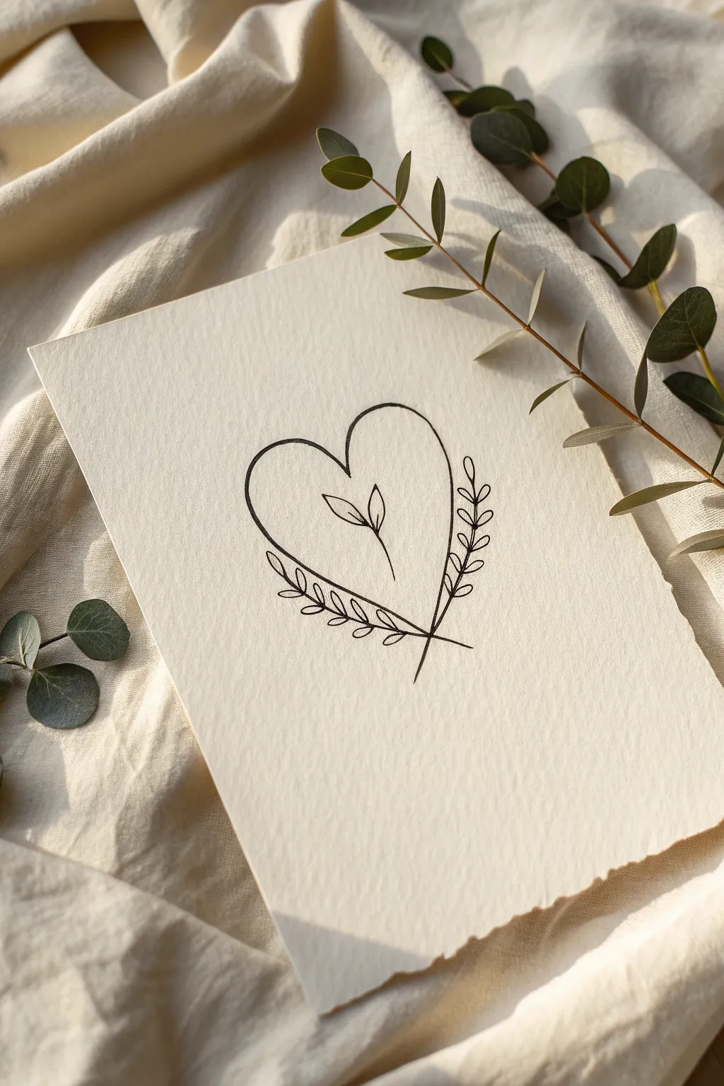
This elegant design combines the universal symbol of love with the organic beauty of nature, featuring a simple line-art heart cradling a delicate sprout. The crossing laurel branches at the base add a graceful finish, making this perfect for minimalist greeting cards or wedding stationery.
Detailed Instructions
Materials
- Textured off-white cardstock or cold-press watercolor paper
- Fine liner pen (size 03 or 05, black)
- Pencil (HB or 2H for light sketching)
- Kneaded eraser
- Ruler (optional)
Step 1: Planning the Shapes
-
Mark the center:
Begin by finding the visual center of your paper. If you want perfect symmetry, sketch a very faint vertical line down the middle using your pencil and ruler. -
Sketch the heart shape:
Lightly sketch a standard heart shape. Focus on keeping the top arches rounded and full, while bringing the bottom point down quite sharply. Don’t worry about perfection yet; this is just a guide. -
Outline the inner sprout:
In the center of the heart, sketch a small, vertical stem. Add two simple leaves sprouting from the top—one leaning slightly left, one right. Keep this element floating freely in the middle space. -
Plot the outer branches:
Sketch two curved lines that start from the bottom tip of the heart and extend upwards, following the outer curve of the heart shape. Imagine them hugging the heart’s outline but leaving a small gap.
Keep it Steady
Rest the heel of your hand on a separate clean sheet of paper while drawing. This prevents hand oils from transferring to the nice cardstock and keeps your hand sliding smoothly.
Step 2: Inking the Heart
-
Test your pen:
Before touching the final paper, scribble on a scrap piece to ensure ink flow is smooth and consistent. -
Ink the main heart outline:
Using your fine liner, carefully trace the heart shape. I prefer to do this in two strokes, starting from the top center dip and moving down to the point for each side. -
Draw the central sprout:
Ink the small stem in the middle. Draw the two leaves using simple, teardrop shapes with a single center vein line in each if desired, or keep them open. -
Create the branch stems:
Draw the main stems for the laurel branches. Start your line slightly below the heart’s bottom point, crossing them over each other in an ‘X’ shape, and curve them upwards along your pencil guides.
Step 3: Adding Botanical Details
-
Add leaves to the left branch:
Starting from the bottom of the left stem, draw small, oval-shaped leaves in pairs. Angle them upwards as if they are reaching for the sun. -
Add leaves to the right branch:
Repeat the process on the right side. Try to stagger the leaves slightly so they aren’t perfectly symmetrical with the left side; this makes it look more natural. -
Detail the leaf veins:
Draw a tiny central line down the middle of each small leaf on the outer branches. Keep your touch very light here so the ink doesn’t bleed. -
Check the intersection:
At the bottom point where the heart and the two branches meet, ensure the lines cross cleanly. You might need to extend the heart’s tip slightly so it nests perfectly within the ‘V’ of the crossed branches.
Add a Splash
Once the ink is waterproof-dry, use a small brush to add a very pale wash of green watercolor inside the leaves, or a soft pink blush inside the heart for a pop of color.
Step 4: Finishing Touches
-
Let the ink dry completely:
Give your drawing at least 5-10 minutes to dry. Textured paper can hold ink longer than smooth paper, and smudging at this stage is heartbreaking. -
Erase pencil guidelines:
Gently roll your kneaded eraser over the drawing to lift the pencil marks. Avoid rubbing vigorously, which can damage the paper’s texture. -
Assess line weight:
Look at your drawing from a distance. If the heart outline feels too thin compared to the leaves, go over it one more time to thicken the line slightly for emphasis.
Now you have a charming piece of botanical art ready to be framed or gifted to someone special

PENCIL GUIDE
Understanding Pencil Grades from H to B
From first sketch to finished drawing — learn pencil grades, line control, and shading techniques.
Explore the Full Guide
Flower Growing from a Heart
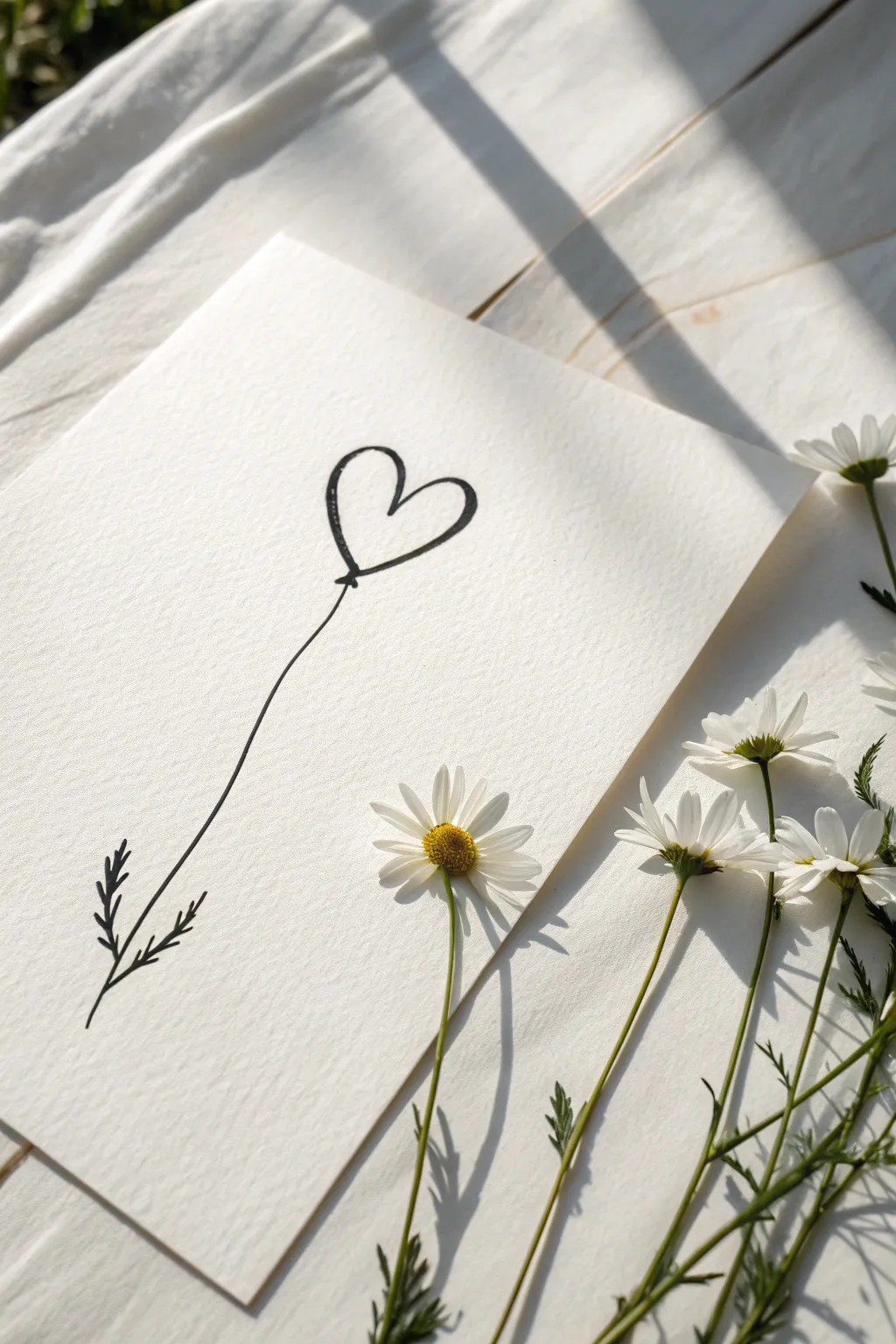
This minimalist ink drawing combines the sweetness of a heart with the organic flow of a wildflower, creating a charming piece of art. The clean lines on textured paper give it a sophisticated yet handmade feel that is perfect for a greeting card or framed wall art.
Step-by-Step Tutorial
Materials
- Cold press watercolor paper or textured cardstock (white)
- Fine liner pen (black, size 05 or 08)
- Pencil (HB or 2H)
- Eraser
- Ruler (optional)
- Fresh daisies (for staging/inspiration)
Step 1: Preparation and Heart Shape
-
Paper selection:
Choose a high-quality paper with visible texture, like cold press watercolor paper. The texture adds depth to the simple line work and enhances the minimalist aesthetic. -
Positioning the drawing:
Ideally, you want your drawing centered horizontally but slightly higher than the vertical center. Visualize where the top heart will sit to leave ample room for a long, elegant stem. -
Sketch the heart form:
Lightly sketch a floating heart shape with your pencil. Make the left lobe slightly higher or larger than the right to give it a hand-drawn, organic look rather than a perfect digital symmetry. -
Refining the heart:
Once you are happy with the faint pencil lines, prepare to ink. I like to start at the bottom point of the heart and sweep upwards to form the curves. -
Inking the heart outline:
Using your black fine liner, often a size 08 for bold visibility, trace over your pencil heart. Don’t worry if the line has slight variations in thickness; this adds character. Leave the very bottom point slightly open or connected with a tiny loop.
Step 2: Drawing the Stem and Leaves
-
The connection point:
At the base of the heart, draw a tiny, filled-in knot or a small loop. This mimics the base of a balloon or the calyx of a flower, anchoring the heart to the stem. -
Sketching the stem path:
Lightly pencil a long, gently curving line extending downwards from the heart base. A slight ‘S’ curve or a gentle arc prevents the drawing from looking stiff. -
Inking the stem:
With a steady hand, trace the stem line in ink. drawing the pen toward your body often helps maintain a smoother line than pushing it away. -
Adding the first leaf branch:
Near the bottom of the stem, about an inch or two from the end, draw a short line branching out to the left at a 45-degree angle. -
Detailing the left leaves:
On this left branch, add small, fern-like dashes or tiny distinct leaves. Keep them messy and energetic rather than perfectly botanical. -
Adding the second leaf branch:
Slightly below the first branch, draw a similar short line branching out to the right side of the main stem. -
Detailing the right leaves:
Add the same fern-like details to the right branch. Ensure the leaves taper off in size as they get further from the main stem. -
Final stem touches:
Extend the main stem just slightly past these leaf junctions so it fades out naturally at the bottom.
Use Rapid Strokes
For the stem, move your arm rather than just your wrist. A quicker, confident stroke creates a smoother line than a slow, shaky one.
Step 3: Finishing Touches
-
Drying time:
Let the ink sit for at least 5-10 minutes. If you erase too soon, the fresh ink might smudge across the textured paper. -
Erasing guidelines:
Gently erase your initial pencil sketches. Use a kneading eraser if you have one, as it lifts graphite without damaging the paper surface. -
Reviewing line weight:
Step back and look at your drawing. If the stem feels too thin compared to the heart, carefully go over it once more to thicken the line slightly. -
Styling the piece:
To recreate the photo’s vibe, place your finished drawing on a white wrinkled cloth near a window with strong directional light. -
Adding natural elements:
Scatter a few fresh daisies or similar small white flowers around the bottom right corner of the paper to complement the drawn flora.
Add a Splash of Color
Use watercolor paint to add a faint wash of pink or red inside the heart, letting it purposefully bleed outside the lines for an artsy look.
Place your lovely new artwork in a simple frame or gift it to someone special to brighten their day
Rose Made from Heart Lines
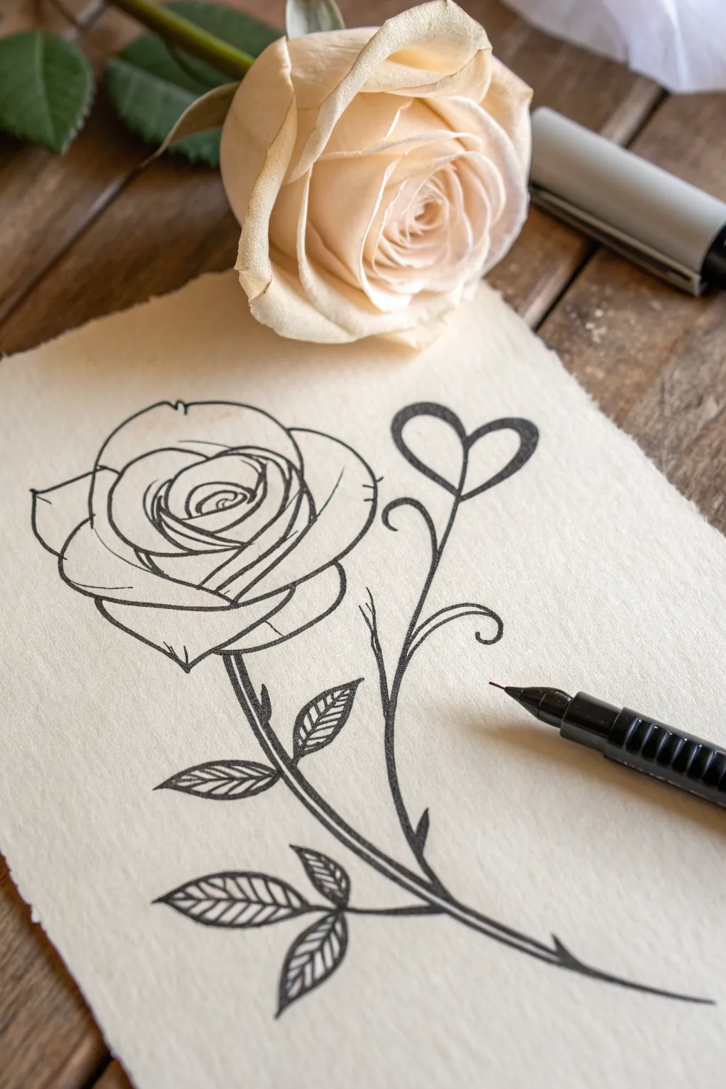
This elegant drawing combines the soft curves of a rose with a whimsical, heart-shaped flourish, all connected by a single flowing stem. Using simple black ink on textured paper creates a timeless, romantic look perfect for greeting cards or framed art.
Detailed Instructions
Materials
- Textured cream or beige paper (deckle edge preferred)
- Black technical drawing pen or fine liner (0.3mm or 0.5mm)
- Pencil (HB or 2H for sketching)
- Soft eraser
- Ruler (optional)
Step 1: Planning the Layout
-
Establish the main flow:
Begin by lightly sketching a long, curved ‘S’ shape with your pencil. This line will serve as the main stem connecting your rose at the top left to the root at the bottom right. -
Position the main elements:
At the top end of your curve, draw a loose circle to mark where the rose head will go. To the right of the stem’s midpoint, sketch a floating heart shape. -
Connect the heart:
Draw a secondary stem line branching off the main stalk and curving upward to meet the bottom point of your heart shape. This makes the heart look like a budding flower.
Ink Smudges?
If you accidentally smudge wet ink, don’t wipe it. Turn it into a shadow by adding stippling dots or extra hatching lines around the smudge to camouflage it.
Step 2: Drawing the Rose Head
-
Create the center eye:
Switch to your black ink pen now if you are confident, or refine with pencil first. Start in the middle of your circle with a tight spiral that looks like a compressed letter ‘e’. -
Add inner petals:
Draw small, curved lines hugging the center spiral. Think of these as overlapping parentheses that get slightly larger as they move outward. -
Expand the bloom:
Continue adding larger, wider petal shapes around the core. Ensure the lines overlap slightly to create depth, making the rose look like it’s unfolding. -
Define the outer shape:
Draw the largest, outermost petals with slightly jagged or wavy edges to mimic natural rose petals. The bottom of the flower should cup downwards to meet the stem.
Vintage Paper Hack
If you don’t have handmade paper, lightly stain regular watercolor paper with diluted tea or coffee and let it dry before drawing for that antique look.
Step 3: Stems and Leaves
-
Ink the main stem:
Go over your initial ‘S’ curve with the black pen. I find it helpful to thicken this line slightly at the base and taper it as it reaches the flower head. -
Grow the heart stem:
Trace the branch leading to the heart. Add a small curlicue or spiral flourish on the opposite side of the stem for balance. -
Outline the heart:
Define the heart shape with a clean, confident line. Make the top arches nice and full. -
Add leave structures:
Draw three leaf shapes attaching to the lower part of the main stem. Give them pointed tips and a central vein line.
Step 4: Details & Shading
-
Hatch the leaves:
Instead of coloring the leaves solid, use diagonal hatching lines. Fill one half of each leaf with closely spaced diagonal lines to suggest shadow and texture. -
Connect the leaves:
Add small, short stems connecting each leaf firmly to the main stalk. -
Add thorns:
Draw tiny, triangular thorns along the stem. Keep them subtle and facing slightly downward. -
Thicken key lines:
Go back over the outer edges of the heart and the main stem to increase line weight. This makes the drawing pop against the paper. -
Final erase:
Once the ink is completely dry—wait at least five minutes to be safe—gently erase all your underlying pencil sketches.
Now you have a delicate botanical ink drawing ready to be gifted or framed


Heart with Initials and Date
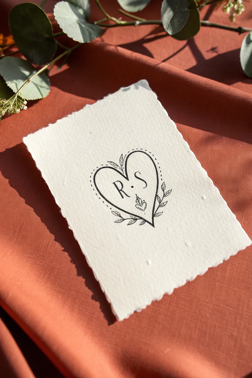
Capture a romantic, vintage aesthetic with this delicate ink drawing on textured paper. The combination of simple line work, leafy flourishes, and handmade paper creates a timeless keepsake perfect for weddings or anniversaries.
How-To Guide
Materials
- Heavyweight handmade paper with deckled edges (cotton or rag paper)
- Fine liner pen (black, 0.3mm or 0.5mm tip)
- Pencil (HB or lighter)
- Kneaded eraser
- Ruler (optional, if you want precise centering)
Step 1: Preparation & Sketching
-
Prepare the paper:
Select a piece of cream or off-white handmade paper. If your paper feels too rough or fibrous, gently brush away any loose surface fibers with a soft cloth to prevent your pen from catching later. -
Find the center:
Lightly mark the center of your paper with a pencil. This helps ensure your heart is balanced, though a slight asymmetry adds to the hand-drawn charm. -
Sketch the heart shape:
Using very light pencil strokes, draw a standard heart shape in the middle of the paper. Keep the lobes rounded and the bottom point sharp. -
Add the inner guideline:
Sketch a second heart slightly inside the first one. This will serve as the guide for your dotted border later, but don’t worry about being perfectly parallel. -
Place the initials:
Inside the heart, lightly pencil in your chosen initials. In this example, ‘R’ is on the left and ‘S’ on the right. Leave a small gap between them for a separator dot.
Ink Bleeding Issue?
If ink feathers on the porous paper, switch to a pigment micron pen or apply a thin layer of matte spray fixative before drawing.
Step 2: Inking the Design
-
Outline the main heart:
Take your fine liner pen and carefully trace the outer heart shape. Use a confident, continuous stroke where possible, but if you need to lift the pen, try to do so at corners or intersections. -
Create the dotted border:
following your inner pencil guideline, create a pattern of small dots or dashes running parallel to the main outline. Keep the spacing consistent for a tidy look. -
Ink the initials:
Go over your penciled letters with the pen. Add a tiny serif (a small foot or tick) to the ends of the letters to mimic a classic serif font style. -
Add the center dot:
Place a solid, bold dot between the two letters to visual anchor them together. -
Draw the bottom design:
At the very bottom tip inside the heart, draw a tiny, stylized heart shape or a small three-leaf motif pointing upwards.
Add a Pop of Color
Use watercolor to gently paint the leaves sage green or the heart a pale blush pink for a soft, romantic wash effect.
Step 3: Adding Flourishes
-
Start the left vine:
Starting from the bottom tip of the heart, draw a curved line extending upwards along the outside left edge. It should hug the curve of the heart about a third of the way up. -
Start the right vine:
Repeat this process on the right side, mirroring the curve so it frames the bottom section of the heart symmetrically. -
Add leaves to the vines:
Draw small, simple leaf shapes attached to your vine lines. Alternate the direction of the leaves or place them in pairs. Keep them small so they don’t overpower the central heart. -
Draw the top flourish:
At the ‘dip’ of the heart at the top, add two tiny leaves or a small sprig sticking straight up to balance the bottom weight. -
Detail the leaves:
Add a simple center line to each leaf for a bit of texture and realism.
Step 4: Finishing Touches
-
Let the ink dry:
Wait at least 5-10 minutes. Handmade paper is absorbent and holds ink longer than standard paper; erasing too soon will smear your hard work. -
Erase pencil marks:
Gently dab and roll the kneaded eraser over the design to lift the graphite guidelines. Avoid scrubbing, as this can damage the paper’s delicate surface. -
Final assessment:
Look at your lines. If any parts of the main heart outline look too thin, go over them once more to thicken the line weight slightly for better contrast.
This charming hand-drawn card is now ready to be gifted or framed as a lovely piece of personal art
“LOVE” Bubble Letters with a Heart
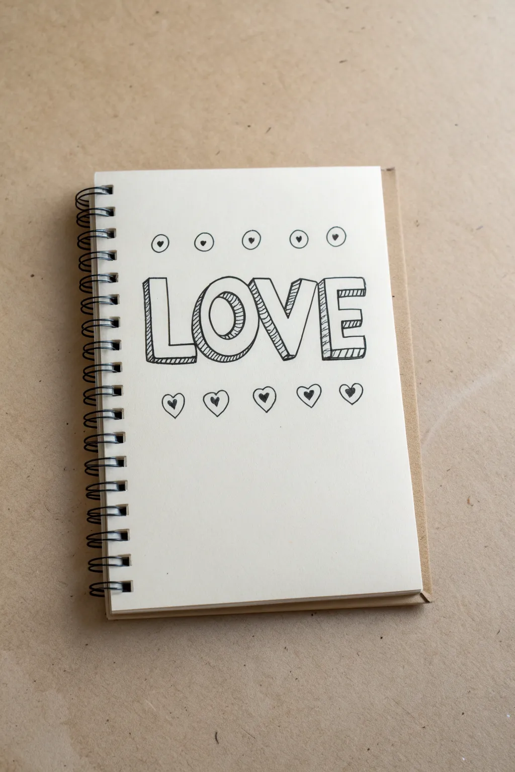
Create a charming notebook dedication with this bold, block-lettering design featuring simple heart accents. The 3D effect gives the letters a fun pop, while the surrounding hearts add a sweet, decorative touch perfect for any journal or card.
Detailed Instructions
Materials
- Sketchbook or blank paper
- Pencil (for initial sketching)
- Eraser
- Fine liner or black ink pen (e.g., Micron 05 or 08)
- Ruler (optional)
Step 1: Drafting the Layout
-
Center layout:
Begin by finding the approximate center of your page. Lightly pencil in a horizontal guideline where the bottom of your letters will sit to keep everything straight. -
Sketch the letters:
Using a pencil, lightly sketch the word ‘LOVE’ in simple blocky capital letters. Aim for equal width on each letter, leaving a little space between them. -
Refine the shapes:
Go back over your pencil letters and thicken the strokes to turn them into bold block letters. Ensure the ‘O’ is nice and round and the ‘E’ has even horizontal bars.
Straight Lines Secret
Use the edge of a clean piece of paper as a guide for your hatching lines. It’s faster than a ruler and prevents smudging wet ink.
Step 2: Creating the 3D Effect
-
Add depth lines:
To make the letters pop, draw short diagonal lines extending downwards and to the left from each corner of your block letters. Keep these lines consistent in length and angle. -
Connect the depth lines:
Connect the ends of your diagonal lines with straight lines that run parallel to the original letter edges. You should now see the 3D block shape forming. -
Inking the outline:
Take your black fine liner and carefully trace over the main outline of the front-facing letters. Use a steady hand for crisp, clean lines. -
Inking the depth:
Continue inking the back, 3D portions of the letters. It’s okay if the lines aren’t mechanically perfect; a little wobble adds to the hand-drawn charm.
Step 3: Adding Texture and Detail
-
Hatching the shadows:
Fill in the 3D side sections (the depth areas you just created) with closely spaced diagonal hatching lines. This shading distinguishes the front of the letter from the side. -
Top decorative row:
Above the word ‘LOVE’, pencil in five small, evenly spaced circles. They should span roughly the same width as the text below. -
Adding top hearts:
Draw a tiny heart inside each of the five circles. Once sketched, ink the circles and fill the tiny hearts in with solid black ink. -
Bottom decorative row:
Below the word ‘LOVE’, sketch five slightly larger hearts in a row. Try to line these up generally with the gaps or centers of the letters above. -
Heart details:
Draw an outline around each of the bottom hearts to create a double-border effect. Ink the outer heart shape. -
Filling bottom hearts:
Inside the inner heart shape on the bottom row, fill it with solid black, leaving a white gap between the solid center and the outer outline.
Make It Pop
Color the front face of the letters with red or pink markers, or add glitter glue to the small hearts for a textured sparkle.
Step 4: Final Touches
-
Erase guidelines:
Once the ink is completely dry—I usually give it a full minute just to be safe—gently erase all the underlying pencil marks and guidelines. -
Review and refine:
Check your lines for any gaps. If the hatching looks too light in some areas, add a few more strokes to deepen the shadow effect.
Now you have a bold, graphic page that spreads a little love
Heart Padlock and Key
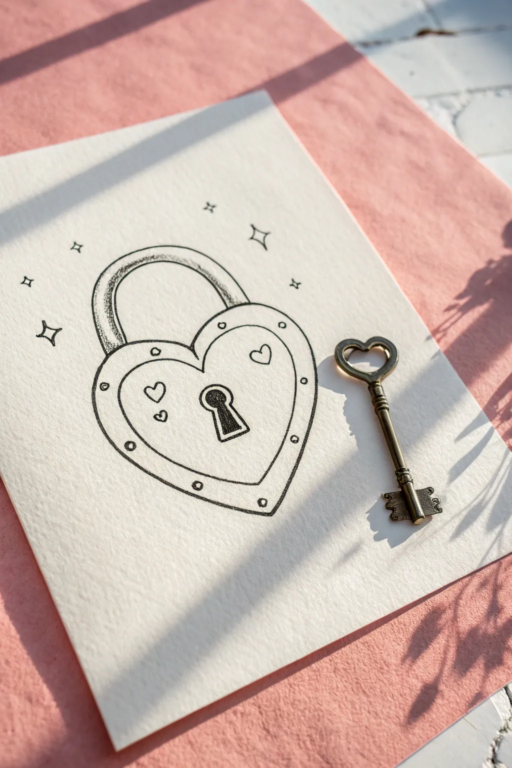
Draw a charming vintage-style heart padlock that feels like a secret kept safe. This simple ink drawing features a sturdy heart-shaped lock adorned with rivets and whimsical sparkles, paired perfectly with a real or drawn skeleton key.
How-To Guide
Materials
- Textured drawing paper (cold press watercolor or mixed media paper)
- Pencil (HB or 2B)
- Eraser
- Fine liner pen (black, size 03 or 05)
- Thicker marker or brush pen (black)
- Small vintage key prop (optional)
Step 1: Sketching the Structure
-
Outline the main heart:
Start by lightly sketching a wide, symmetrical heart shape in the center of your paper. Make the bottom point slightly rounded rather than sharp for a weighty, metallic feel. -
Add the inner border:
Draw a second, slightly smaller heart inside the first one. Leave a consistent gap of about a quarter-inch between the two lines to create a thick frame for the rivets. -
Position the shackle:
Above the heart’s cleft, sketch an arched semi-circle for the lock’s shackle (the U-shaped bar). Double this line to give the shackle thickness, ensuring the ends disappear behind the top curves of the heart. -
Place the keyhole:
In the lower center of the inner heart, sketch a classic keyhole shape—a small circle with a trapezoid flaring out beneath it.
Step 2: Inking the Details
-
Trace the outlines:
Switch to your fine liner pen. Carefully trace over your pencil lines for the outer heart, inner heart, and shackle. Use a confident hand for smooth curves. -
Add the rivets:
In the space between the outer and inner heart lines, draw small circles spaced apart evenly. These represent the metal rivets or studs holding the lock together. -
Detail the keyhole:
Outline the keyhole shape firmly. I like to double up the outline on the right side to give it a slight 3D beveled look. -
Decorate the face:
Draw two tiny hearts floating near the top corners of the inner face, and two more tiny hearts floating near the left side for asymmetrical charm. -
Add magical sparkles:
Around the outside of the lock, draw several four-pointed stars or diamond shapes to give the object a twinkling, magical effect.
Wobbly Lines?
Don’t panic if your curves aren’t perfect. Go over the line again to thicken it intentionally. A sketched, uneven look adds to the vintage doodle aesthetic.
Step 3: Shading and Finishing
-
Fill the keyhole:
Use your thicker marker or brush pen to fill the inside of the keyhole completely black. This creates depth and makes it the focal point. -
Shade the shackle:
Using the fine liner, add hatch marks or stippling on the left side of the shackle arch to suggest rounded metal catching the light. -
Erase pencil guides:
Once the ink is fully dry—wait at least one minute to be safe—gently erase all the underlying pencil sketches. -
Add texture:
If your paper has texture, lightly rub a dull pencil over the lock’s body to pick up the grain, giving it a weathered, vintage appearance. -
Final touches:
Check your line weights. You might want to thicken the outermost line of the heart slightly to make the drawing pop off the page.
Make it Shine
Use a white gel pen to add tiny highlight dots on the rivets and the top curve of the shackle. It makes the ‘metal’ look polished and reflective.
Place a real vintage key next to your drawing for the perfect photo finish
Checkerboard Pattern Heart
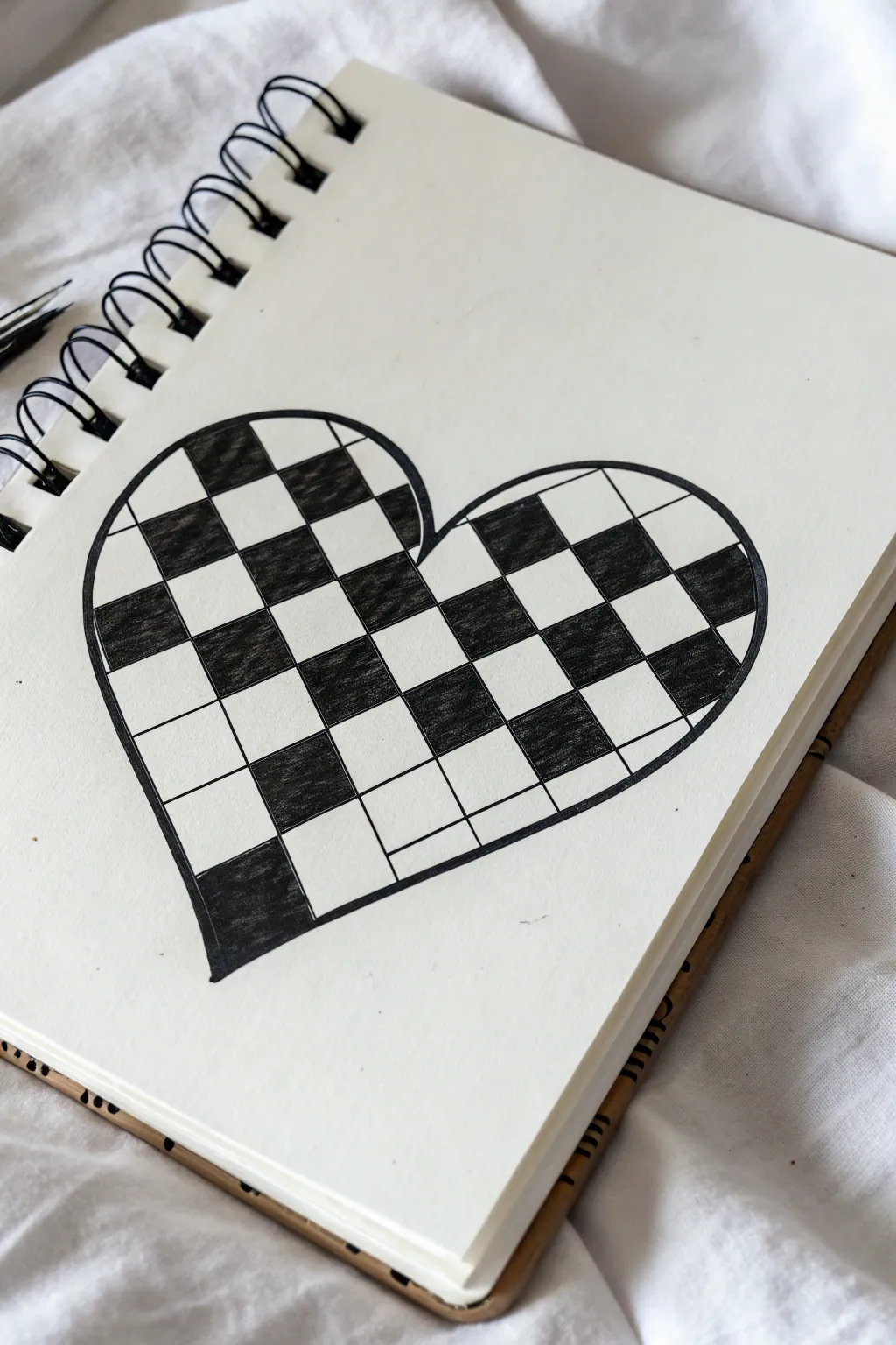
This striking black and white design turns a simple heart outline into an optical illusion-style piece using a classic checkerboard pattern. The contrast between filled and empty spaces creates a bold, geometric look that pops right off the page.
Step-by-Step Tutorial
Materials
- Spiral sketchbook or drawing paper
- Pencil (HB or 2B)
- Eraser
- Ruler
- Black fine liner pen (0.5mm or 0.8mm)
- Black brush pen or thick marker (for filling)
Step 1: Drafting the Outline
-
Draw the heart shape:
Start by lightly sketching a large heart shape in the center of your page with a pencil. Make sure it’s symmetrical and large enough to accommodate the pattern inside. -
Refine the curves:
Go over your sketch to ensure the curves at the top are smooth and meet neatly at the bottom point. Keep your pencil pressure light so you can erase mistakes easily. -
Ink the outline:
Once you are happy with the shape, trace over the pencil line carefully with your black fine liner pen. Let the ink dry for a moment, then erase the graphite marks.
Clean Lines
When filling squares near the edge, use a thinner pen tip first. This prevents the ink from bleeding outside the heart outline.
Step 2: Creating the Grid
-
Determine grid angle:
Decide on the angle for your grid. For this look, tilt your ruler slightly so the lines aren’t perfectly vertical or horizontal, giving it a dynamic feel. -
Draw the first set of parallel lines:
Using your ruler and pencil, draw a series of parallel lines across the entire heart. Space them evenly, about 1-2 cm apart depending on the size of your heart. -
Draw the perpendicular lines:
Rotate your ruler 90 degrees to the first set of lines. Draw a second set of parallel lines to create a grid of squares or diamonds inside the heart shape. -
Review the grid:
Check your grid for consistency. If some squares look too rectangular or uneven, make small adjustments with your pencil now before committing to ink. -
Ink the grid lines:
Trace over all the internal grid lines with your fine liner. Be precise where the lines meet the outer heart outline—don’t let them spill over the edge.
Make It Warp
Make the grid lines curve slightly instead of using a ruler. This creates a spherical 3D effect, making the heart look puffy.
Step 3: Filling the Pattern
-
Mark squares to fill:
To avoid mistakes, lightly place a small dot or ‘x’ with a pencil in every other square that needs to be colored black. This creates the alternating checkerboard map. -
Outline the fill areas:
Before filling the entire square, use your fine liner to trace just inside the lines of the squares you intend to color. This creates a barrier and keeps edges sharp. -
Start filling with marker:
Switch to a thicker black marker or brush pen to fill in the marked squares. I find it easiest to work from the top left to bottom right so my hand doesn’t smudge the fresh ink. -
Focus on the edges:
Pay special attention to the partial squares along the curved edge of the heart. Fill these carefully to maintain the crisp silhouette of the heart shape. -
Check for gaps:
Look closely at your filled squares. Go back over any white specks or uneven streaks with your marker to ensure a solid, deep black coverage. -
Clean up:
Wait until the heavy black ink is completely dry—give it a few extra minutes just to be safe. Then, gently erase any remaining pencil guide marks or dots.
Now you have a bold, geometric heart drawing that looks great on its own or as part of a larger doodle page
Cosmic Heart Planet with Ring and Stars
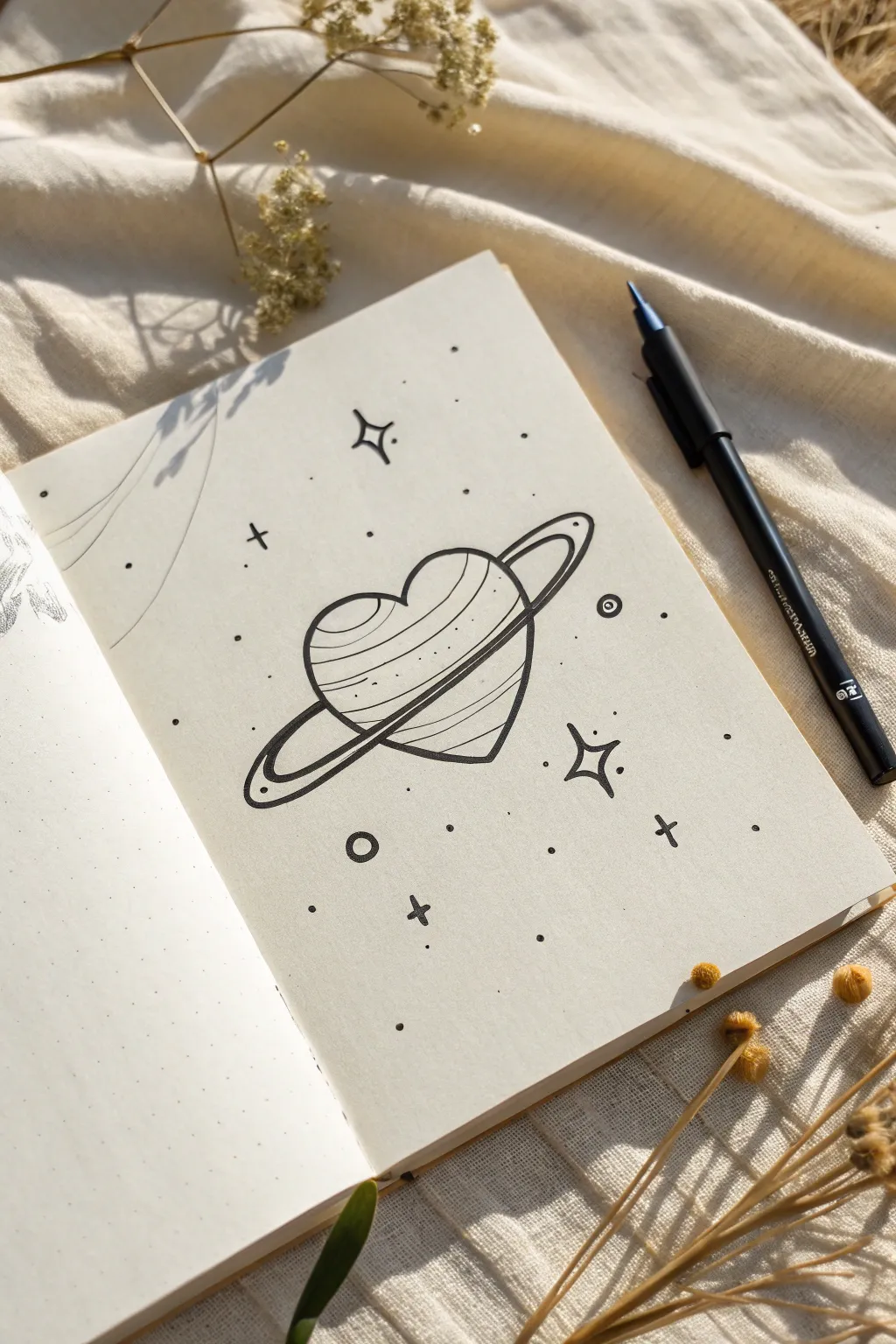
This whimsical doodle transforms a classic heart shape into a celestial body, complete with Saturn-like rings and surrounding stardust. It’s a perfect, simple sketch for bullet journals or notebook margins that looks complex but breaks down into easy shapes.
Detailed Instructions
Materials
- Dotted or blank journal notebook
- Fine liner pen (black, size 0.3mm or 0.5mm)
- Pencil (HB)
- Eraser
- Ruler (optional, but helpful for star alignment)
- White gel pen (optional for highlights)
Step 1: Drafting the Basics
-
Sketch the heart:
Start by lightly sketching a standard heart shape in pencil. Keep it centered on your page. The heart should be plump and simplified, not too narrow at the bottom. -
Draw the ring guide:
Lightly sketch a long, thin oval that cuts diagonally across the heart. Imagine the heart is a planet and this oval is the path of the ring orbiting it. The oval should extend well past the sides of the heart. -
Refine the rings:
Still using your pencil, thicken the ring by drawing a second oval line parallel to the first one. Notice how the ring goes *behind* the top right lobe of the heart and comes *forward* across the bottom left front.
Wobbly Rings?
If your ring ovals look shaky, try drawing the motion with your whole arm, not just your wrist. Draw ‘ghost’ loops in the air first to practice the smooth elliptical motion.
Step 2: Inking the Outline
-
Outline the heart shape:
Grab your black fine liner. Carefully trace the top lobes of the heart. Stop your line exactly where it meets the top edge of the ring. -
Draw the front ring section:
Draw the front section of the ring—the part that crosses over the face of the heart. This creates a clear sense of depth, showing the ring is in the foreground. -
Complete the heart outline:
Continue the bottom outline of the heart, starting from under the ring and tapering down to the point. Trace the other side, skipping over where the back of the ring passes behind. -
Finish the ring loop:
Ink the outer edges of the ring where it loops around the back. Be careful to stop your line when it hits the heart’s edge, reinforcing that it’s behind the planetary body. -
Add ring details:
Inside the main ring outline, draw a thin parallel line to give the ring structure and detail. You can add a tiny circle or ‘dot’ on the far left curve of the ring for a stylized mechanical look.
Step 3: Adding Texture & Atmosphere
-
Draw planetary bands:
Create the texture of the planet’s surface by drawing slightly curved lines across the face of the heart. These should follow the curvature of the ring but remain inside the heart shape. -
Vary the bands:
I like to make some bands continuous lines and others just dashed or broken lines to keep the texture interesting and not too heavy. -
Add main stars:
Draw a few four-pointed stars around the planet. To do this, draw a curved diamond shape—imagine a plus sign (+) but with concave, curved sides. -
Outline secondary stars:
Add one or two open circles with a dot in the center to look like distant planets or moons. -
Scatter small details:
Fill in the empty negative space with simple crosses (+) and tiny solid dots. This creates the ‘stardust’ effect. -
Erase pencil marks:
Wait at least a full minute to ensure the ink is completely dry, then gently erase all your initial pencil sketches. -
Final touches:
Review your drawing. If you want more contrast, slightly thicken the outer contour of the heart to make it pop against the delicate stars.
Make It Glow
Use a white gel pen to add tiny highlights on the upper right curve of the heart and the stars. It makes the ‘planet’ look shiny and dimensional.
Now you have a charming cosmic doodle ready to orbit the pages of your journal


Have a question or want to share your own experience? I'd love to hear from you in the comments below!