If you’re craving a painting session that actually feels doable, I’ve got you. These easy painting ideas focus on simple shapes, bold color, and quick little techniques that make your work look finished fast.
Sunset Gradient With a Simple Silhouette
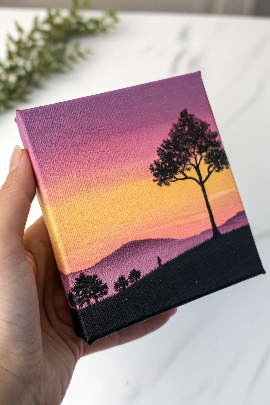
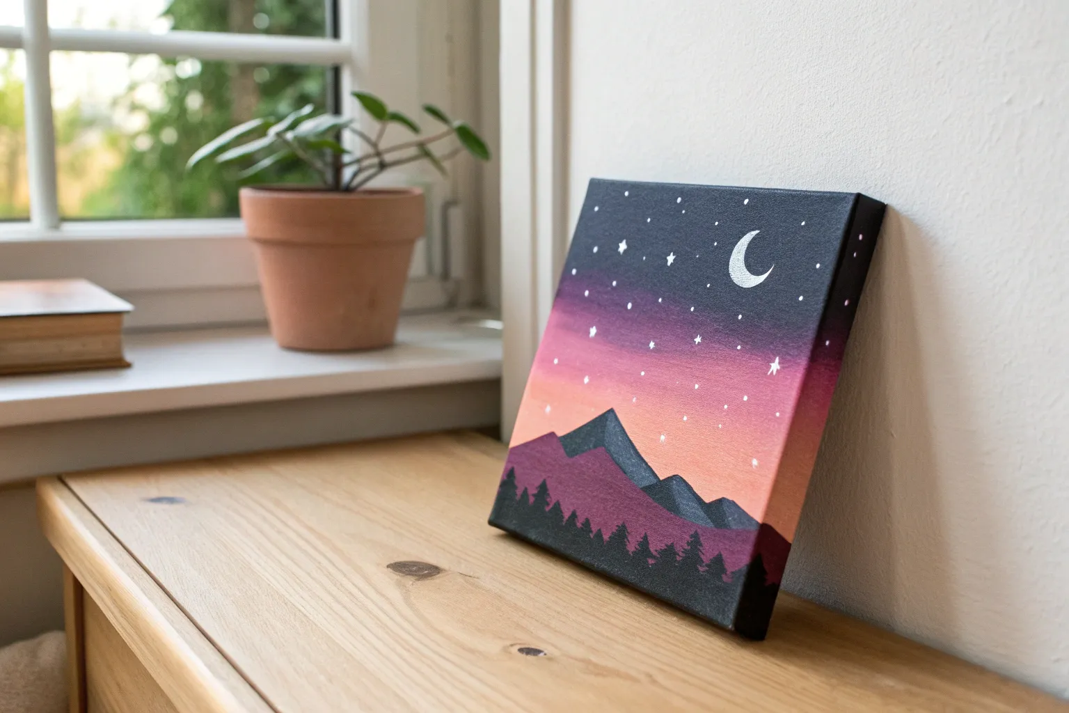
Capture the serene beauty of dusk with this vibrant miniature canvas painting. The artwork features a glowing gradient sky transitioning from deep purple to warm gold, framed by striking black silhouettes of trees and rolling hills.
How-To Guide
Materials
- Small square canvas (approx. 4×4 or 5×5 inches)
- Acrylic paints: Deep Violet, Magenta, Titanium White, Cadmium Yellow, Orange, and Mars Black
- Flat shader brush (medium size for blending)
- Small round detail brush (size 0 or 00)
- Cup of water and paper towels
- Palette or mixing plate
Step 1: Painting the Gradient Sky
-
Prepare your colors:
Squeeze out your violet, magenta, orange, yellow, and white paints onto your palette. Having them ready is crucial for successful wet-on-wet blending. -
Start with the top band:
Using your flat brush, apply a horizontal strip of Deep Violet across the very top of the canvas. Don’t forget to wrap the color around the top and side edges for a finished look. -
Add the middle tones:
Immediately below the violet, paint a strip of Magenta. Clean your brush slightly, then blend where the two colors meet while the paint is still wet to create a smooth transition. -
Introduce the warmth:
Paint a band of Orange below the pink, blending it upwards into the Magenta. The key to a good gradient is working while the acrylics are damp. -
Paint the horizon glow:
Mix a little Titanium White with your Cadmium Yellow to make it opaque and bright. Apply this to the bottom third of the sky area, blending it up into the orange layer. -
Refine the blend:
Use a clean, slightly damp brush to lightly sweep back and forth horizontally across the transition lines to smooth out any harsh stripes. Let the sky dry completely.
Step 2: Adding the Mid-Ground Mountains
-
Mix a hazy purple:
Create a muted purple color by mixing your Deep Violet with a touch of White and the tiniest speck of Black. It should look like mountains in the distance. -
Paint the mountain shapes:
Paint rolling hill shapes across the bottom third of the canvas, covering the bottom of your yellow sky. Ensure the top edge is slightly uneven to look natural. -
Create atmospheric perspective:
While the mountain paint is wet, you can lighten the bottom edge slightly with a bit more white to suggest mist, or keep it solid for a simpler look. Let this layer dry fully.
Choppy Blending?
If your acrylics are drying too fast to blend smooth gradients, mix a retarder medium into your paints or keep a misting bottle handy to lightly spray the canvas.
Step 3: Creating the Silhouettes
-
Block in the foreground:
Switch to Mars Black. Paint a solid, sloping hill that starts higher on the right and slopes down towards the left, covering the bottom portion of your distant purple mountains. -
Start the main tree:
Using your fine detail brush and thinned black paint (add a drop of water for better flow), paint a thin vertical line for the trunk on the right side of the hill. -
Thicken slightly:
Go back over the trunk, making it slightly thicker at the base and tapering as it goes up. -
Add main branches:
Paint 3-4 main branches extending outward from the trunk. Keep your hand loose and let the branches wiggle slightly so they don’t look like straight sticks. -
Stipple the leaves:
Load the tip of your small brush with black paint. Gently tap or ‘stipple’ clusters of dots at the ends of the branches to create the look of dense foliage. -
Add distant trees:
On the left side of the hill, paint smaller, simpler tree shapes. These should just be small blobs or tiny textured clusters to show they are further away. -
Include tiny details:
If you are feeling steady, add a tiny silhouette of a person or small animal walking up the hill near the center for a sense of scale. -
Paint the sides:
Continue the black hill shape onto the bottom and side edges of the canvas so the painting looks professional from all angles. -
Final touches:
Check for any pinholes of light showing through your black silhouettes and fill them in. I usually do a second coat of black on the bottom area to make it completely opaque.
Make It Starry
Wait for the sky to dry completely, then dip an old toothbrush in watered-down white paint. Use your thumb to flick tiny specks onto the purple section for stars.
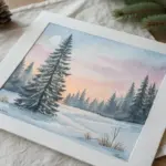
Now you have a peaceful sunset scene that fits right in the palm of your hand


Big Moon Night Sky With Star Splatter
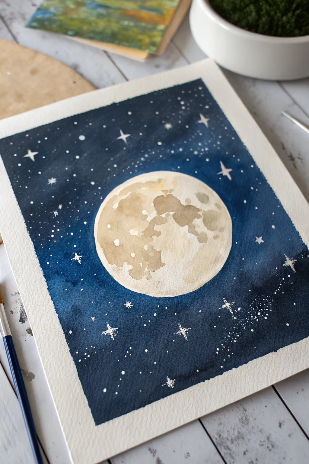
Capture the magic of a clear midnight sky with this striking watercolor composition featuring a luminous full moon. By using simple masking techniques and layering, you creates a deep, contrasting background that makes the moon truly pop off the paper.
Detailed Instructions
Materials
- Cold press watercolor paper (approx. 300 gsm)
- Painter’s tape or masking tape
- Pencil and a circular object (like a roll of tape or a jar lid)
- Masking fluid (drawing gum) and an old brush/applicator
- Watercolor paints: Indigo, Prussian Blue, Paynes Gray, and a touch of Yellow Ochre/Raw Umber
- White gel pen or white gouache
- Large round brush (size 10-12) and a liner brush (size 0-2)
- Two jars of water and paper towels
Step 1: Preparation & Masking
-
Tape the edges:
Secure your watercolor paper to a board or table by applying masking tape along all four edges. This creates a clean white border and prevents the paper from buckling when wet. -
Trace the moon:
Place your circular object near the center of the paper. Lightly trace around it with a pencil to define the moon’s shape. -
Protect the moon:
Using masking fluid and an old brush (one you don’t care about, as masking fluid ruins bristles), carefully fill in the entire circle of the moon. This reserves the white of the paper so you can paint the dark sky freely without worrying about the edges. -
Let it cure:
Allow the masking fluid to dry completely. It should feel rubbery and not tacky to the touch before you proceed to painting.
Save Your Brush
Coat your brush bristles with bar soap before dipping it into masking fluid. The soap creates a barrier that makes cleaning the rubbery fluid off the bristles much easier later.
Step 2: Creating the Night Sky
-
Pre-wet the sky:
Brush clean water over the entire background area around the masked moon. You want the paper to be glisten with a sheen but not hold puddles. -
Apply the first wash:
Mix a watery wash of Prussian Blue or a medium blue. Drop this color onto the wet paper, letting it flow casually. It doesn’t need to be perfectly even. -
Deepen the darkness:
While the first layer is still damp, mix a concentrated amount of Indigo and Paynes Gray. Apply this dark mixture heavily around the edges of the paper and the corners, creating a vignette effect. -
Blend inwards:
Gently gently blend the darker edges toward the center, but leave the area immediately surrounding the moon slightly lighter to create a glow effect. -
Dry thoroughly:
Wait for the paint to dry completely. The paper should be flat and warm to the touch. This step is crucial before removing the mask.
Add a Glow
Before the blue sky dries, lift a little paint right around the moon’s edge with a clean, thirsty brush. This creates a subtle atmospheric halo effect.
Step 3: Painting the Moon
-
Reveal the moon:
Gently rub your finger or a rubber cement pick over the masked moon to peel away the coating, revealing the stark white circle underneath. -
Base shadow layer:
Dilute a tiny amount of Yellow Ochre or a very light brownish-grey. Paint varied, organic blotches on the moon’s surface to represent the ‘seas’ or maria. Keep these shapes loose and irregular. -
Add crater depth:
While the first moon layer is still slightly damp, drop in stronger pigment (a mix of grey and brown) into the shadow areas. I like to concentrate these darker spots on the right side of the moon to suggest dimensionality. -
Soften edges:
Use a clean, damp brush to gently soften any harsh lines inside the moon, blending the craters so they look natural rather than stamped on.
Step 4: Stars & Details
-
Prepare the stars:
Once your sky is bone dry, load a brush with thick white gouache or undiluted white watercolor. You need a creamy consistency that is opaque. -
Splatter texture:
Hold the brush over the painting and tap the handle against another brush or your finger. This creates a galaxy of fine mist and small dots. Focus heavier splatters in the corners. -
Draw larger stars:
Using a fine liner brush and white paint or a white gel pen, hand-paint specific larger stars. Add cross-shapes or four-pointed sparkles randomly throughout the dark blue sky. -
Final touches:
Assess the composition. If any splatters landed on the dark parts of the moon where you want shadows, you can carefully lift them with a damp brush or paint over them lightly. -
Remove tape:
Peel the border tape away slowly at a 45-degree angle to reveal your crisp white edges and frame your celestial artwork.
Enjoy the peaceful atmosphere of your finished moon painting in your creative space


Layered Mountains in a Limited Palette
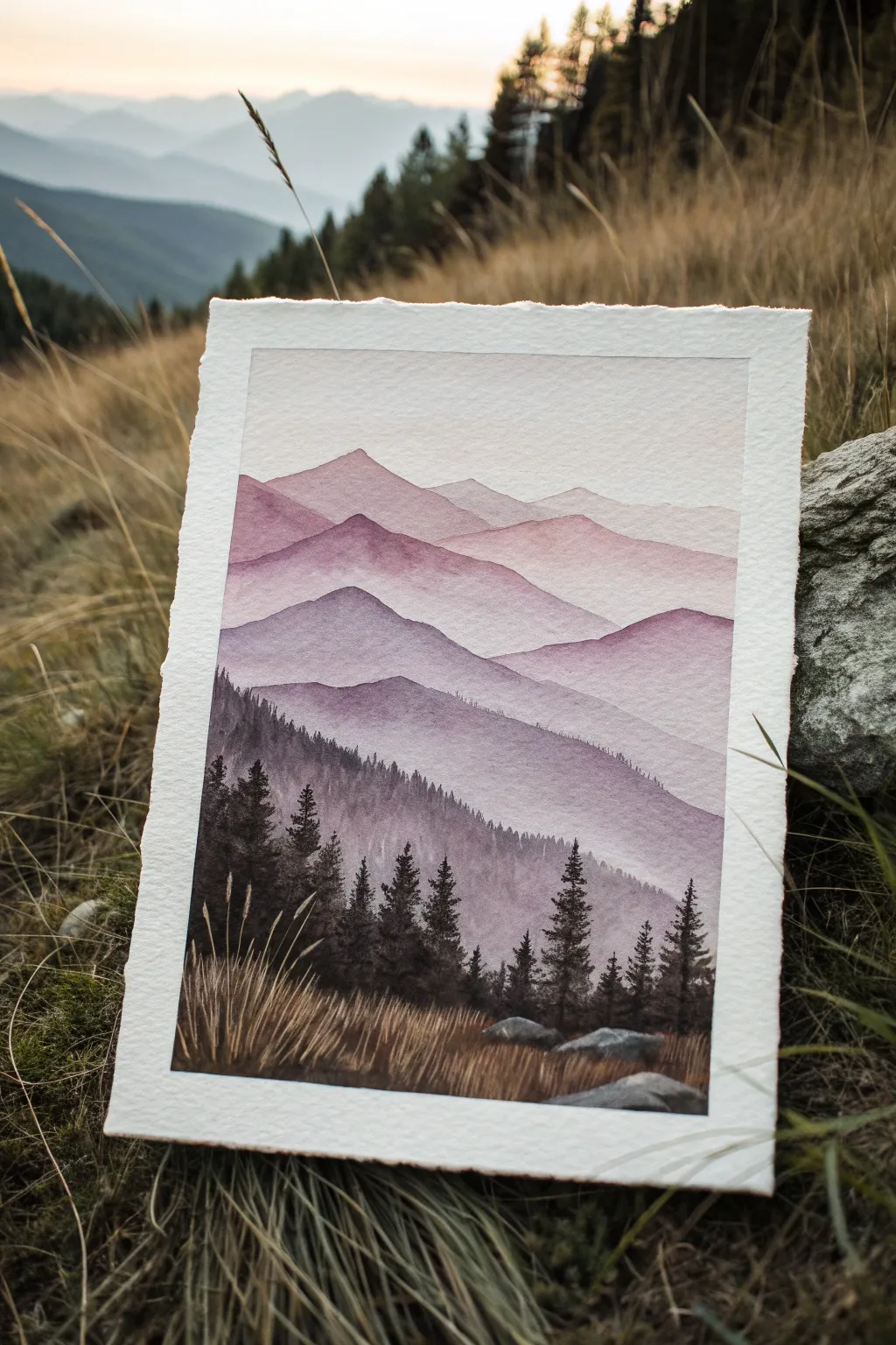
Capture the serene beauty of a mountain range fading into the distance with this atmospheric watercolor project. Using a limited palette of purples and grays, you’ll master the art of layering to create stunning depth and misty effects.
Step-by-Step
Materials
- Cold Press Watercolor Paper (300 gsm or heavier)
- Watercolor Paints: Violet/Purple, Indigo, Burnt Umber, White Gouache (optional)
- Flat Wash Brush (3/4 inch)
- Round Detail Brush (Size 2 or 4)
- Painter’s Tape (or masking tape)
- Two jars of water
- Paper towels
- Mixing Palette
Step 1: Setting the Sky and Distant Peaks
-
Prepare your paper:
Begin by taping down all four edges of your watercolor paper to a rigid board. This creates the crisp white border seen in the final piece and prevents the paper from buckling when wet. -
Mix your lightest wash:
Create a very watery, pale violet mixture on your palette. It should be about 90% water and 10% pigment. You want a barely-there whisper of color. -
Paint the sky:
Using your flat wash brush, lay down a smooth wash across the top third of the paper. Let the color fade out completely as you move downward, keeping the very top edge slightly more saturated. -
First mountain layer:
Once the sky is completely dry, mix a slightly darker version of your violet. Use your round brush to paint the silhouette of the furthest mountain peaks. Keep the edges soft and undulating. -
Fade the bottom:
While the paint for this first mountain is still wet, rinse your brush and drag clean water along the bottom edge of the shape. This fades the color into the white paper below, creating a misty effect.
Step 2: Building the Middle Ground
-
Deepen the color mix:
For the next layer, add a tiny touch of indigo to your violet mix. You want each subsequent mountain range to be slightly darker and cooler deeply than the one before it. -
Paint the second range:
Paint a new mountain ridge slightly overlapping the previous one. Ensure the previous layer is 100% bone dry before painting this one, or you’ll lose the crisp edge. -
Repeat the fade:
Just like before, pull the paint downward with a clean, damp brush to fade the bottom of these mountains into nothingness. -
The transition layer:
Mix a darker violet-grey. Paint the third major ridge. This one should start showing a bit more texture on the ridgeline—perhaps slightly jagged peaks—but stay relatively smooth. -
Adding texture:
While this third layer is drying, you can gently drop in slightly darker pigment near the top ridge to suggest shadows, but keep it subtle.
Muddy colors?
If your mountains are blending into one big blob, you aren’t waiting long enough between layers. The paper must be bone dry before you paint an overlapping shape.
Step 3: The Foreground and Details
-
Create the heavy darks:
Mix your darkest color yet: equal parts violet, indigo, and a touch of burnt umber to desaturate it. This should be a rich, deep shadow color. -
Paint the forest line:
Paint the closest mountain slope. While the wash is still wet, use the tip of your round brush to pull pigment upward along the ridge, creating tiny vertical spikes that resemble distant pine trees. -
Detail the trees:
Load your smallest brush with the thickest, darkest paint mixture (creamy consistency). Paint distinct pine trees in the foreground area on the left and right, making them taller and more detailed than the distant ones. -
Add foreground rocks:
Using a grey mix, paint a few simple rock shapes at the very bottom. Keep the tops lighter to suggest sunlight hitting them. -
Paint the grass:
With a ‘dry brush’ technique (very little water on the brush), flick quick, upward strokes using a brownish-grey mix to create the textured grasses at the base of the painting. -
Final highlights:
I like to use a tiny bit of white gouache or a gel pen to add a few bright stalks of grass in the immediate foreground to make them pop against the dark trees. -
The reveal:
Once the painting is absolutely dry to the touch, slowly peel away the painter’s tape at a 45-degree angle to reveal your crisp white borders.
Level Up: Birds
Add 2-3 tiny ‘V’ shapes in the sky using a fine liner pen or your smallest brush. Place them near the lightest peak to add scale and life to the landscape.
Step back and admire how simple distinct layers can create such a profound sense of distance and atmosphere


Calm Ocean Horizon in Two Colors
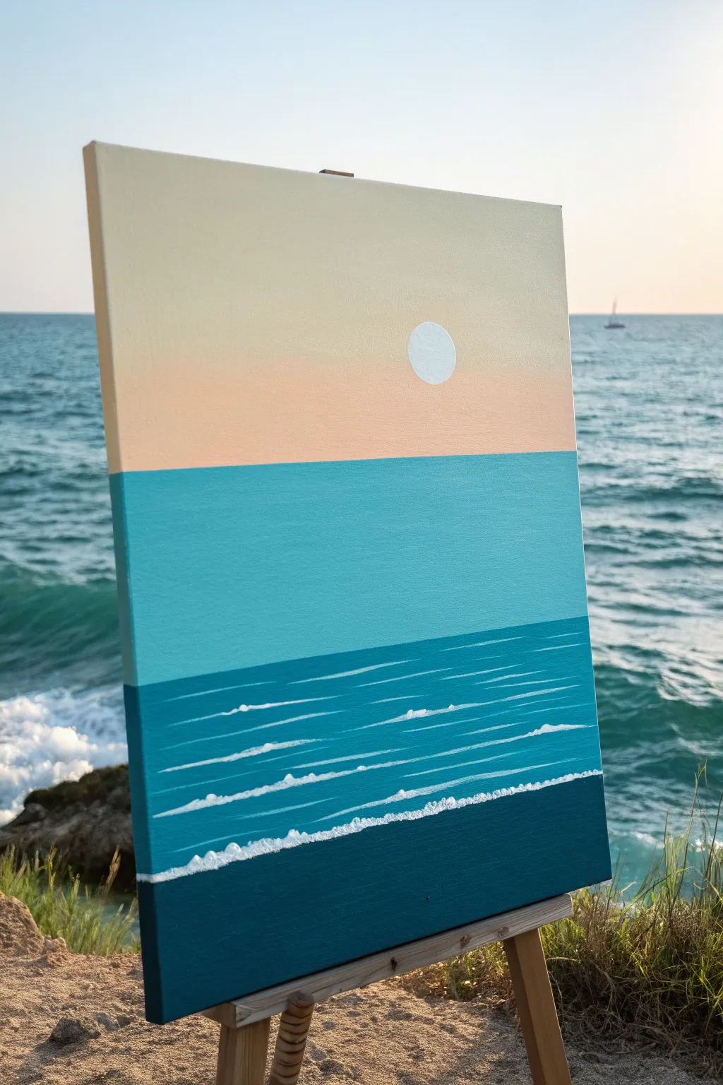
Capture the stillness of a calm day at the beach with this crisp, color-blocked acrylic painting. Using distinct bands of color and simple brushwork, you will create a modern seascape that feels expansive and peaceful.
Detailed Instructions
Materials
- Stretched canvas (16×20 inches or similar)
- Acrylic paints: Titanium White, Cream or Unbleached Titanium, Peach or Light Pink, Teal or Turquoise, Phthalo Blue (or similar deep blue), Navy Blue
- Flat paintbrushes (1-inch and 2-inch)
- Small round detail brush
- Drafting compass or a circular object to trace (like a lid)
- Painter’s tape or masking tape
- Palette knife (optional, for mixing)
- Ruler
- Pencil
Step 1: Setting the Horizon
-
Divide the canvas:
Start by deciding where your horizon lines will be. This painting relies on horizontal bands, so use a ruler and pencil to lightly mark three horizontal sections. The top sky section should take up about 40% of the canvas. -
Mark the water zones:
Below the sky line, create a middle band for the lighter teal water, taking up another 30%. The remaining bottom section will be the deep, darker ocean. -
Tape the first line:
To get that perfectly crisp horizon line between the sky and water, apply a strip of painter’s tape just below your pencil line for the sky. seal the edge firmly with your fingernail.
Bleeding Lines?
If paint bleeds under your tape, wait for it to dry completely. Then, use a small flat brush and the original background color to carefully touch up the edge for a razor-sharp line.
Step 2: Painting the Sky
-
Mix the sky gradient:
Prepare a large amount of cream or unbleached titanium white. On your palette, also mix a soft peach tone. You want a subtle transition, almost like a haze. -
Apply the top sky color:
Using your large flat brush, paint the upper portion of the sky section with the cream color. work in long, horizontal strokes to minimize texture. -
Blend the lower sky:
While the cream paint is still wet, introduce the peach color into the lower part of the sky section, right above the tape. Blend it upwards into the cream so there is a soft, barely-there gradient. -
Position the sun:
Once the sky is touch-dry, place your circular object or compass in the lower right quadrant of the sky area. Lightly trace a perfect circle with your pencil. -
Paint the sun:
Use a small brush to carefully fill in the circle with pure Titanium White. You may need two coats to make it completely opaque against the background.
Step 3: Blocking in the Ocean
-
Reveal the horizon:
Carefully peel off the painter’s tape to reveal your sharp sky line. Let the paint cure fully before taping over it again. -
Tape for the teal band:
Place a fresh strip of tape along the bottom edge of the finished sky (protecting it) and another strip at the bottom of the middle section to separate it from the deep sea area. -
Paint the middle water:
Mix a vibrant teal color with a little white to brighten it. Fill this entire middle band with solid, opaque color. I like to use a wide brush here for smooth, consistent coverage. -
Form the deep water base:
Remove the lower tape strip. Mix a deeper blue—combining Phthalo Blue with a touch of Teal—and paint the upper portion of the bottom section. This creates the mid-depth water. -
Add the darkest depths:
For the very bottom strip of the canvas (the foreground), mix Navy Blue with a tiny dot of black or dark green. Paint this area solidly, blending it slightly into the mid-depth blue above it if you prefer a softer transition, or keeping it distinct.
Make It Golden
Swap the white sun for a metallic gold leaf circle or metallic gold paint. It adds a luxurious, shimmering focal point that catches the light beautifully.
Step 4: Adding Waves and Details
-
Load the detail brush:
Mix Titanium White with a very small amount of water to improve flow. You want the paint to be fluid but not drippy. -
Create distant ripples:
In the mid-depth blue section, use your fine liner brush to paint very thin, horizontal lines. Keep these lines straight and somewhat broken; they don’t need to stretch across the whole canvas. -
Thicken the foreground waves:
As you move lower into the darkest blue section, make the white wave lines slightly thicker and more textured. Allow the brush to skip slightly to create a foamy look. -
Paint the main wave line:
Paint a distinct, slightly jagged white line separating the deep blue foreground from the mid-blue section. Use a stippling motion (tapping the brush tip) to mimic the texture of sea foam cresting. -
Final touches:
Add a few tiny dots or smaller broken lines underneath your main waves to suggest movement and foam residue. Step back to ensure the balance feels right.
Now you have a serene, modern seascape ready to bring a breath of fresh air to your wall
BRUSH GUIDE
The Right Brush for Every Stroke
From clean lines to bold texture — master brush choice, stroke control, and essential techniques.
Explore the Full Guide
Easy Watercolor Flowers With Loose Petals
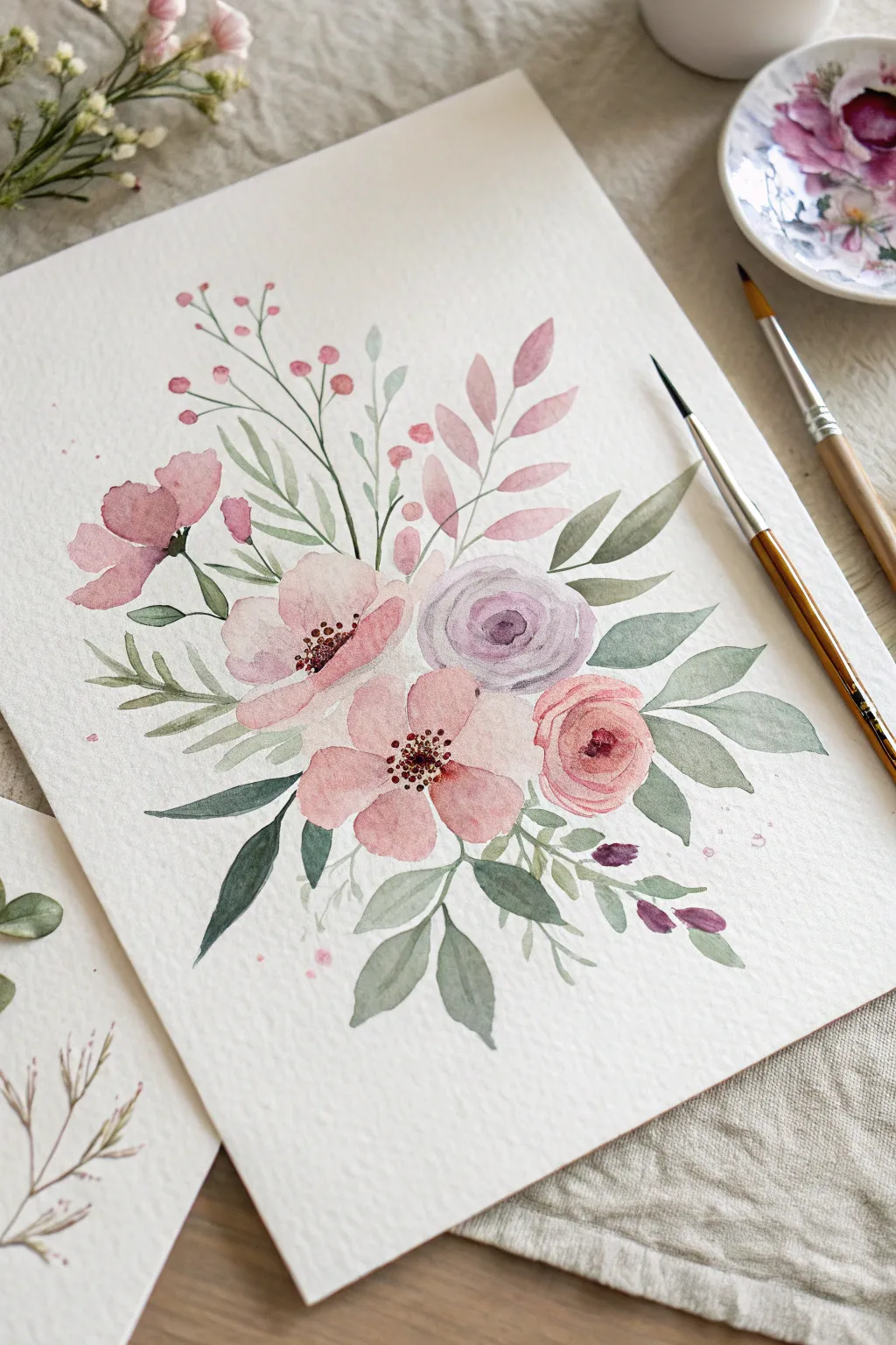
Embrace the delicate beauty of spring with this soft, airy floral composition that focuses on wet-on-wet techniques and gentle layering. The loose style allows for beautiful imperfections, creating a dreamy bouquet of pinks, mauves, and muted greens.
Step-by-Step
Materials
- Cold press watercolor paper (300 gsm)
- Round watercolor brushes (sizes 2, 4, and 6)
- Watercolor paints: Rose Madder, Purple Lake, Sap Green, Olive Green, Burnt Umber, and a pale pink shade
- Two jars of water (one for rinsing, one for clean water)
- Paper towels for blotting
- Palette for mixing colors
Step 1: Painting the Main Blooms
-
Mix your palette:
Prepare watered-down puddles of your main flower colors: a soft peachy-pink, a slightly deeper rose, and a muted lavender-purple. Keep the paint fluid and transparent. -
Start with the center rose:
Using your medium brush (size 4), load it with the lavender mix. Paint a tight, C-shaped swirl in the center of the paper to form the heart of the rose. -
Expand the rose petals:
Rinse your brush slightly so it’s clean but damp. Pull the pigment from the center swirl outward, painting curved strokes that get wider as you move away from the center to create soft, lavender petals. -
Paint the lower pink anemone:
Below the lavender rose, paint five rounded petal shapes using the peachy-pink mix. Leave a small gap of white space in the very center for the stamens later. -
Add the left-side bloom:
To the left of the center, create another open flower with side-facing petals using a mix of rose and peach. Imagine the flower is tilting away from you, so the petals on top are shorter. -
Create the top buds:
Using a slightly more saturated pink, paint a few smaller, unformed bud shapes near the upper left, keeping the edges soft and watery. -
Add the smaller ranunculus:
On the right side, paint a tighter, circular flower using a coral-pink shade. Create concentric rings of color, getting lighter toward the outer edges.
Step 2: Adding Foliage and Stems
-
Mix your greens:
Create two green mixtures: one warm olive tone and one cooler, bluish-green shade. Varying the greens adds depth to the bouquet. -
Paint the main leaves:
Switch to a size 6 brush. Load it with the cool green mix and paint broad, teardrop-shaped leaves extending outward from the main flowers. Press the belly of the brush down and lift up to create a pointed tip. -
Add wispy sprigs:
Using the tip of your size 2 brush and the olive green, paint thin, curving stems that shoot upwards from the bouquet structure. -
Create detailed leaves:
Attached to these thin stems, dab small, elongated oval shapes to mimic ruscus or eucalyptus leaves. Keep these lighter and more translucent than the main leaves. -
Insert filler branches:
Paint a few branches with small, round pink berries or buds at the tips, using thin brown-green lines for the stems. -
Layering foliage:
I find that adding a few very pale, ghost-like leaves behind the main dark ones adds wonderful dimension. Dilute your green paint heavily with water and paint a few background leaves.
Muddy colors?
Wait for each layer to dry completely before painting adjacent shapes. If wet pink touches wet green, they will turn brown. Patience is key.
Step 3: Details and Finishing Touches
-
Define the flower centers:
Once the main pink flowers are completely dry, mix a dark maroon or brown. Use the very tip of your smallest brush to stipple tiny dots in the center of the open blooms. -
Add contrast to the rose:
Return to the lavender rose. If it dried too light, glaze a slightly darker purple mixture into the crevices between petals to define the shape. -
Darken leaf veins:
On a few of the larger leaves, paint a thin line down the center with a darker version of the green to suggest a central vein. -
Splatter effect:
Load a brush with watery pink paint and tap the handle against another brush over the paper to create tiny, spontaneous splatters around the bouquet. -
Final assessment:
Step back and look for any empty spaces. Add a tiny leaf or small bud to balance the composition if necessary.
Pro Tip: Soft Edges
To get that dreamy look, run a clean, damp brush along just one edge of a wet petal. This softens the line and makes the flower look like it’s fading into the paper.
Let your artwork dry flat completely before framing your lovely floral creation
Desert Ombre Sky With Cactus Shapes
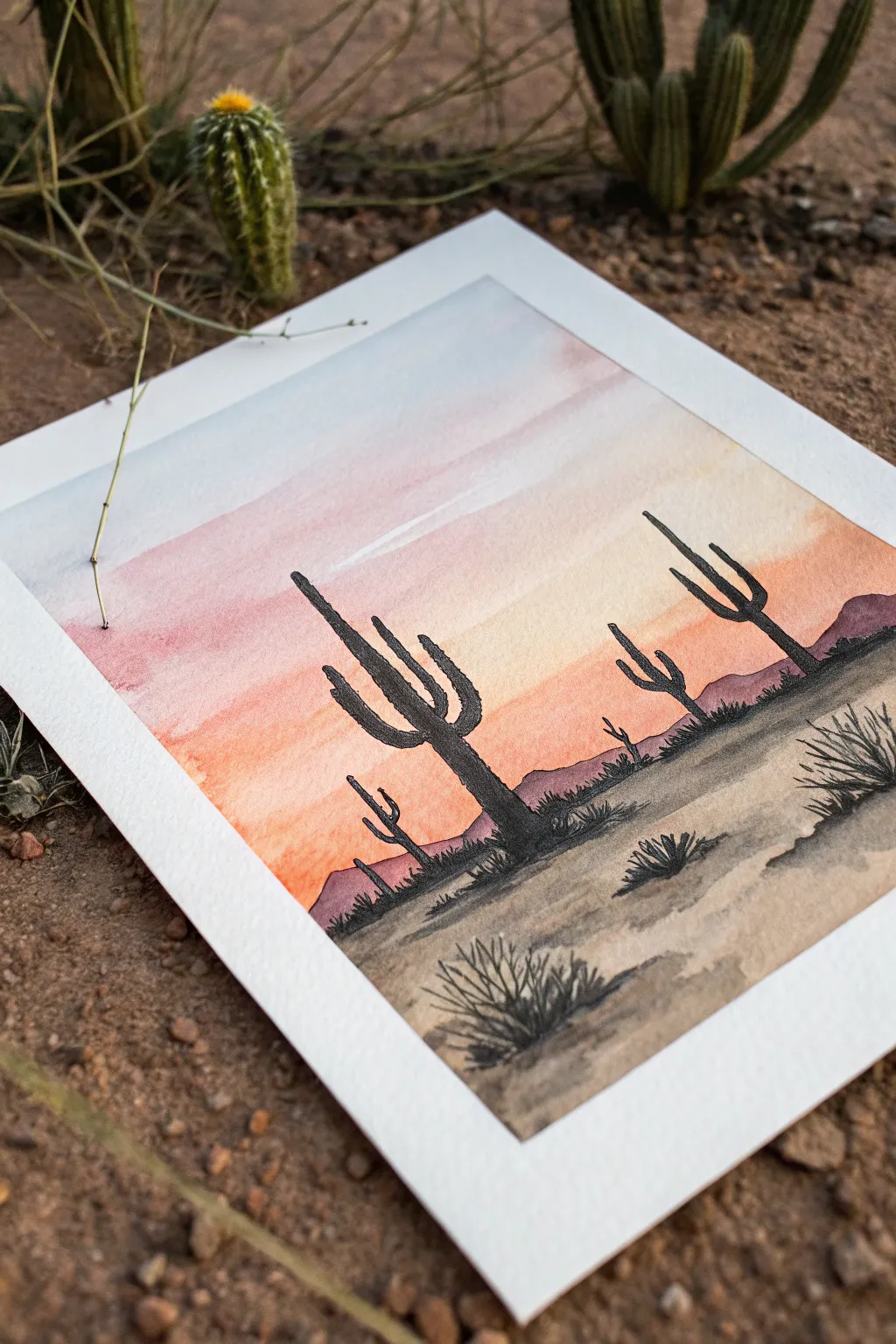
Capture the serene beauty of the American Southwest with this vibrant watercolor and ink project. You’ll create a stunning ombré sunset that fades seamlessly behind striking black cactus silhouettes.
Step-by-Step Tutorial
Materials
- Watercolor paper (cold press, 140lb/300gsm)
- Watercolor paints (Light blue, pink/rose, orange/ochre, raw sienna)
- Black drawing ink or permanent fine liner pens
- Soft round watercolor brush (size 8 or 10)
- Small round brush (size 2) or detail brush
- Painter’s tape or masking tape
- Drawing board or hard surface
- Water cups and paper towels
Step 1: Setting the Sky
-
Prepare your surface:
Begin by taping down all four edges of your watercolor paper to a hard board. This creates that crisp, clean white border you see in the photo and prevents the paper from buckling when it gets wet. -
Wet the sky area:
Using your large round brush and clean water, gently wet the top two-thirds of the paper. You want the paper to be glistening but not forming puddles. This ‘wet-on-wet’ technique is crucial for a smooth gradient. -
Apply the blue:
Load your brush with a very watered-down light blue. Paint a wide horizontal strip across the very top of the wet area, letting the color naturally bloom downwards slightly. -
introduce the pink:
Clean your brush and pick up a soft pink or rose color. Apply this right below the blue, overlapping slightly so the colors blend on the paper. Work quickly so the paper stays damp. -
Warm up the horizon:
Switch to a warm orange or golden ochre shade. Paint the area below the pink, bringing this color down to where your horizon line will be. Let the orange fade out towards the bottom edge of the wet area. -
Let the sky dry completely:
This is the most important patience test. Let the sky layer dry 100% before moving on. If you touch it and it feels cool, it’s still wet. You can use a hairdryer on a low setting to speed this up.
Clean Edges Pro Tip
Before peeling your tape, blast it quickly with a hairdryer. The heat softens the adhesive slightly so it lifts off without tearing your precious watercolor paper.
Step 2: Designing the Landscape
-
Paint the distant mountains:
Once the sky is bone-dry, mix a watered-down purple or brownish-red. Paint a low, uneven mountain range silhouette across the horizon line where your orange sky ends. Keep the edges soft or slightly jagged. -
Establish the ground:
Mix a raw sienna or sandy beige color. Paint the foreground area below the mountains. I like to leave some areas slightly lighter to suggest uneven, sun-baked terrain. Let this layer dry completely as well. -
Outline the main cactus:
Using black ink and a small detail brush (or a black permanent marker), draw the central, largest cactus. Start with a vertical trunk, getting slightly thicker at the base. -
Add cactus arms:
Draw the iconic curved arms on the main cactus. Add a couple branching upwards on either side. Ensure the connection points are curved, not sharp angles, to look organic. -
Fill in the silhouette:
Fill the entire shape with solid black. Make the edges slightly bumpy or textured rather than perfectly smooth to mimic the prickly surface. -
Create depth with scale:
Draw a second, slightly smaller cactus to the right, and a tiny third one further back on the left. Varying the sizes instantly creates a sense of distance in your desert scene.
Level Up: Texture
Sprinkle a tiny pinch of table salt onto the wet ground paint while it’s drying. Brush it off later for a gritty, sandy texture perfect for a desert floor.
Step 3: Final Details
-
Ground the cacti:
Use your black medium to darken the ground directly underneath each cactus. Use short, horizontal scratchy strokes to simulate shadows and rough earth. -
Add desert shrubs:
Draw small, spiky clumps of grass or tumbleweeds in the foreground using quick, upward flicking motions. Place a larger bush in the bottom right corner to frame the composition. -
Strengthen the shadows:
Dilute a tiny bit of black paint with water to make a grey wash. Paint cast shadows extending from the base of the cacti and shrubs slightly to the right, matching the light source. -
The reveal:
Once your ink is absolutely dry, slowly peel away the painter’s tape. Pull away from the painting at a 45-degree angle to ensure a perfect, crisp edge.
Frame your masterpiece in a simple wood frame to let those warm sunset colors really glow

PENCIL GUIDE
Understanding Pencil Grades from H to B
From first sketch to finished drawing — learn pencil grades, line control, and shading techniques.
Explore the Full Guide
Bold Abstract Color Blocks With Soft Edges
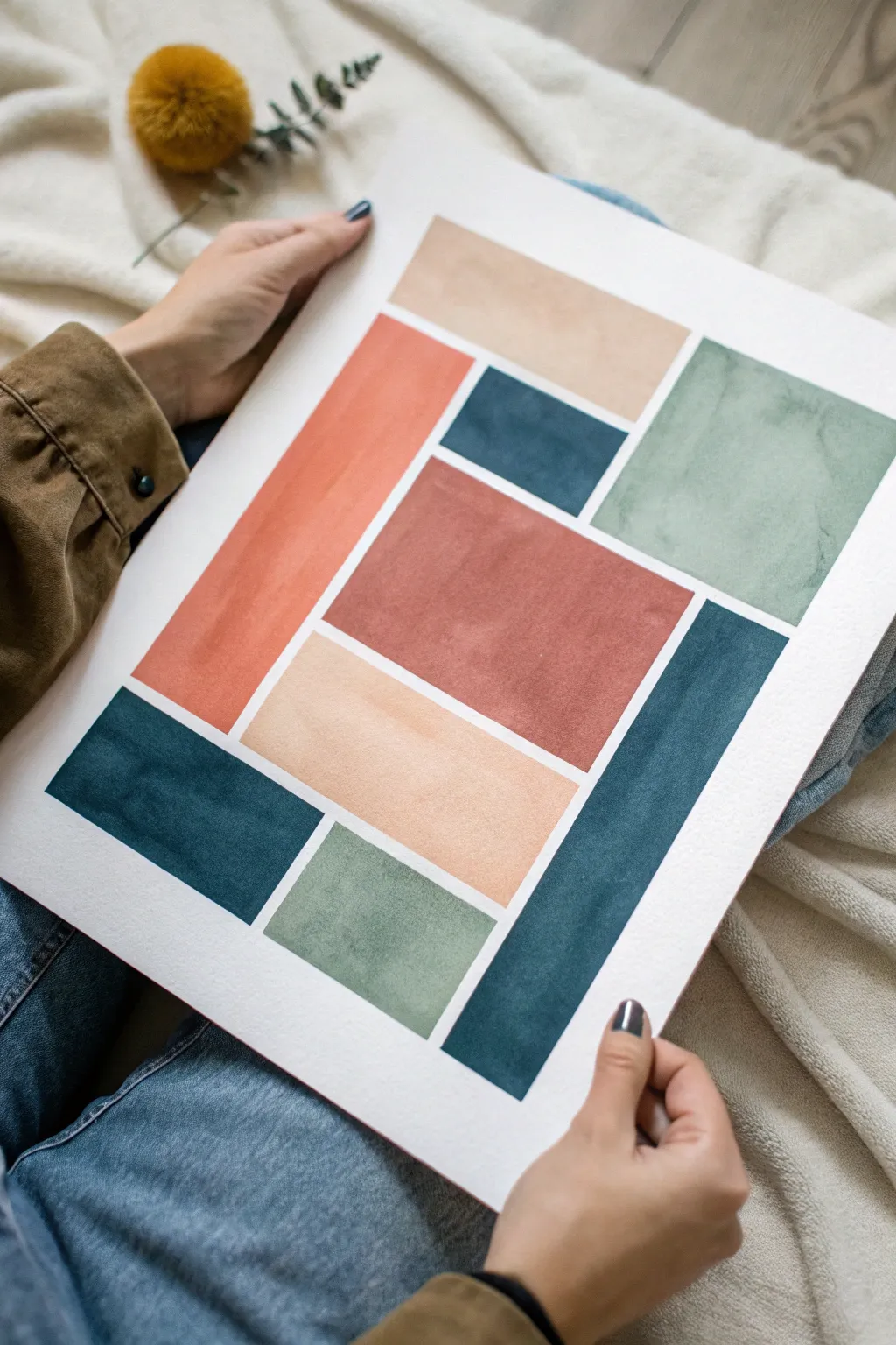
Embrace the soothing rhythm of geometric shapes with this abstract color block study. Using earthy tones and the natural transparency of watercolors, you’ll create a structured yet organic piece that balances warm terracotta hues with cool teals and sage.
Step-by-Step Tutorial
Materials
- Cold-pressed watercolor paper (140lb/300gsm)
- Watercolor paints (Terracotta, indigo/teal, sage green, beige/buff)
- Flat shader brush (approx. 3/4 inch)
- Painter’s tape or masking tape
- Ruler
- Light pencil (HB or H)
- Hard eraser
- Clean water jar
- Paper towels
Step 1: Planning the Layout
-
Prepare your paper:
Start by taping down your watercolor paper to a board or table surface. This keeps the paper flat while you work and, if you tape over the edges, creates a clean white border around the final piece. -
Draft the grid:
Using a ruler and a very light touch with your pencil, sketch out the major rectangular shapes. Don’t worry about perfect symmetry; look at the reference image to see how the shapes interlock rather than just sit in rows. -
Define the gaps:
The white space between the colors is crucial for this look. I like to draw a second line inside every rectangle I just sketched, leaving about a 1/4-inch gap between all the shapes. This creates the ‘grout’ lines. -
Clean up lines:
Erase the original outer grid lines so you are left only with the separated rectangles. This ensures you have clear boundaries for where your paint should stop.
Clean Edges Tip
For sharper lines without using tape, load your flat brush and press it down once to splay the bristles to the edge, then drag. Don’t ‘pet’ the stroke repeatedly.
Step 2: Painting the Warm Tones
-
Mix the terracotta:
Create a watery mix of terracotta or burnt sienna. You want enough pigment for color, but enough water to let the paper texture show through. -
Paint the central block:
Fill in the large central rectangle with your terracotta mix. Use your flat brush to pull the paint across, keeping the edges straight but allowing the paint to pool naturally in some areas for texture. -
Add the long side block:
Find the tall, vertical rectangle on the left side of your layout. Paint this using a slightly lighter variant of your terracotta mix—add just a drop more water to your palette. -
Wait for drying:
Let these red-toned sections dry completely. If you paint adjacent blocks too soon and accidentally touch a wet edge, the colors will bleed into the white gaps.
Step 3: Adding the Cool Tones
-
Mix the deep teal:
Combine indigo with a touch of viridian or use a pre-mixed dark teal. This needs to be your darkest, most saturated value to anchor the composition. -
Fill the bottom corners:
Paint the rectangle in the bottom left corner and the long vertical strip on the bottom right. Keep your brush strokes horizontal to maintain a calm, uniform texture. -
Paint the upper accent:
Locate the small horizontal rectangle above the central terracotta block. Fill this with the same deep teal mixture. -
Create the sage green:
Mix a soft sage green. If your green is too bright, dampen it with a tiny bit of red or brown. -
Apply the green blocks:
Paint the large square in the upper right. Then, paint the smaller rectangle nestled at the bottom center, between the teal and beige shapes.
Level Up: Texture
Sprinkle a tiny pinch of table salt onto one of the teal or terracotta blocks while it’s still wet. When dry, brush firmly to brush it off for a stunning speckled texture.
Step 4: Final Touches
-
Mix the sandy beige:
Create a very pale, warm beige wash. This should be the lightest value on the page, almost transparent. -
Fill remaining spaces:
Paint the top center horizontal strip and the central lower rectangle. Be very careful around the already painted edges. -
Check for bloom:
While the beige is drying, look for any ‘hard edges’ inside the colored blocks where water might have pooled. If you see a puddle, you can wick it up with a dry brush corner. -
Erase pencil marks:
Once the entire painting is bone dry—touch it with the back of your hand to be sure—gently erase any visible pencil lines in the white gaps.
Display your abstract masterpiece in a simple wood frame to complement the earthy color palette
Geometric Tape-Off Design in Two Tones
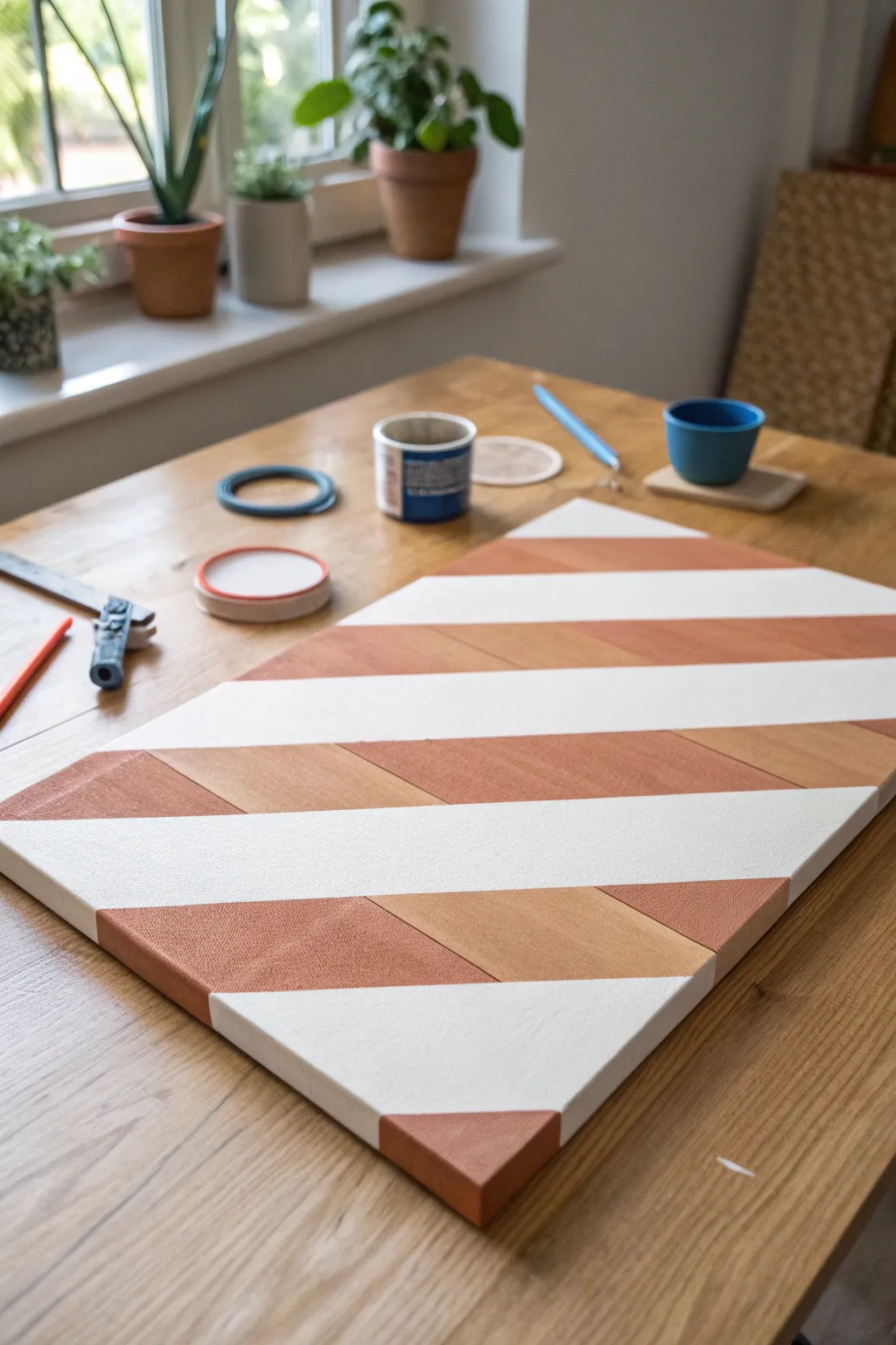
This minimal and modern project plays with the contrast between raw canvas texture, warm terracotta tones, and crisp white lines. The geometric pattern is deceptively simple to achieve using painter’s tape to create sharp, professional borders.
How-To Guide
Materials
- Rectangular canvas or smooth wooden panel
- Terracotta or warm burnt orange acrylic paint
- Bright white acrylic paint
- Painter’s tape or masking tape (1 inch width)
- Wide flat paintbrush (synthetic bristles)
- Ruler or straight edge
- Pencil
- Palette or small container for paint
- Matte varnish (optional)
Step 1: Preparation and Layout
-
Surface Prep:
Ensure your canvas or wooden panel is clean and free of dust. If you are using raw wood, you might want to give it a very light sanding with fine-grit sandpaper for a smoother finish. -
Plan the Diagonals:
Visualize the diagonal stripes. Using your ruler and pencil, mark light tick marks along the left and right edges of the canvas where you want your stripes to begin and end. -
Apply the Tape:
Stretch lengths of painter’s tape diagonally across the canvas connecting your tick marks. These taped areas will eventually become the white stripe sections. -
Seal the Edges:
Run your fingernail or a flat tool firmly along the edges of the tape to ensure a tight seal. This prevents paint from bleeding underneath. -
The White Seal Trick:
I like to paint a very thin layer of white paint over the edges of the tape first. This seals the tape line, so any bleed-through is white and invisible.
Bleeding edges?
If you get bleed-under, wait for it to dry fully. Then, scrape it gently with an exacto knife (if on wood) or paint over it with the base color using a tiny brush.
Step 2: Creating the Tone-on-Tone Effect
-
Mix Your Colors:
Prepare your terracotta paint. To achieve the subtle two-tone wood/paint look seen in the reference, you might want to slightly water down a portion of the paint to create a semi-transparent wash. -
Paint Section A:
On the exposed diagonal sections (the parts not covered by tape), paint alternating blocks. Use the opaque terracotta paint for some segments. -
Paint Section B:
For the adjacent segments within the same diagonal stripe, use the watered-down wash or a slightly lighter shade of orange to mimic the grain variation or a second tone. -
Apply Second Coat:
For the solid terracotta sections, apply a second coat once the first is dry to ensure rich, even coverage. -
Let it Dry:
Allow the paint to dry completely. This is crucial—if the paint is tacky, peeling the tape will be messy.
Add Metallic Flair
Replace one of the white stripes with gold leaf or metallic copper paint to add a sophisticated shimmer that catches the light.
Step 3: The White Stripes
-
Peel the Tape:
Carefully peel back the painter’s tape at a 45-degree angle. You should now see crisp borders between your painted sections and the raw canvas. -
Tape the Painted Areas:
Now, careful re-tape. This time, place the tape *over* the edges of the terracotta sections you just painted to protect them. -
Paint the White:
Fill in the raw diagonal strips (where the first tape was) with bright white acrylic paint. Use broad, smooth strokes. -
Opacity Check:
White paint can be translucent. Apply 2-3 coats as needed, letting each layer dry in between, until you can’t see the underlying surface. -
Final Reveal:
Once the white paint is dry to the touch, slowly peel off the second round of tape to reveal the full design.
Step 4: Finishing Touches
-
Clean Up Edges:
Check the sides of the canvas. You can choose to wrap the design around the sides for a gallery look, or paint the edges a solid color like white to frame it. -
Touch Ups:
If any paint bled through, use a very small detail brush and the appropriate color to tidy up the lines. -
Seal the Work:
Brush a layer of matte varnish over the entire piece to unify the sheen of the different paints and protect it from dust.
Hang your new geometric masterpiece in a spot with good natural light to highlight the crisp lines


One-Color Monochrome With Easy Highlights
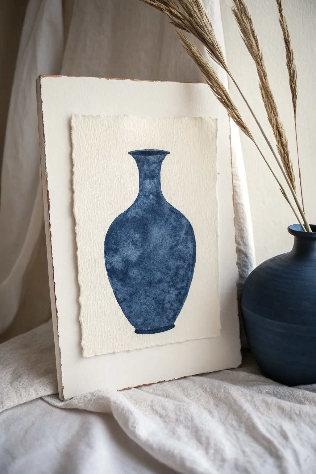
This elegant project proves that you only need a single color to create depth and dimension. By exploring the full tonal range of indigo blue, we’ll paint a textured vase silhouette on deckled paper, then mount it for a gallery-worthy rustic finish.
Step-by-Step
Materials
- Heavyweight watercolor paper (300gsm cold press)
- Indigo watercolor paint or blue India ink
- Round watercolor brush (size 6 or 8)
- Pencil and eraser
- Wooden panel or thick cardboard backing (roughly 8×10″)
- White acrylic gesso or chalk paint
- Sandpaper (medium grit)
- Glue stick or mounting adhesive
- Paper towels
- Water jar
Step 1: Preparing the Base
-
Size the Paper:
Begin by tearing your watercolor paper down to size rather than cutting it. You want a piece smaller than your wooden backing, leaving a visually pleasing border. -
Create Deckled Edges:
To enhance that rough, handmade look, dampen the edges of your torn paper slightly with a clean wet brush and gently pull away loose fibers with your fingers. -
Prep the Wooden Backing:
Paint your wooden panel or cardboard backing with a coat of white gesso or chalk paint. It doesn’t need to be perfect; visible brushstrokes add to the charm. -
Distress the Backing:
Once the white paint is fully dry, take your sandpaper and gently scuff the edges and corners to reveal the wood or brown cardboard underneath.
Salt Texture Hack
While the paint is wet, sprinkle a few grains of table salt onto the darkest areas. It absorbs pigment, creating unique starburst textures.
Step 2: Drafting the Vase
-
Center the Subject:
Find the rough center of your watercolor paper. Lightly mark the top and bottom bounds of where you want the vase to sit. -
Sketch the Neck:
Draw the opening of the vase first—a narrow, horizontally stretched oval. Add two curved vertical lines coming down to form the neck. -
Form the Body:
Extend your lines outward to create the bulbous body of the vase. Aim for symmetry, but don’t stress over imperfection, as the loose painting style is forgiving. -
Base and Cleanup:
Connect the bottom curves with a slightly rounded line for the base. Use your eraser to lighten the pencil lines until they are barely visible guides.
Try a Warm Tone
Switch the indigo for a burnt sienna or sepia ink to create a warm, terracotta-Pottery-inspired version of this project.
Step 3: Painting the Monochrome
-
Mix Your Washes:
Prepare three puddles of your indigo paint: one very watery and pale, one medium tone, and one concentrated, dark mixture. -
First Layer:
Fill the entire vase shape with the palest wash. This establishes the shape without locking in any hard details just yet. -
Wet-in-Wet Texture:
While the first layer is still damp (not soaking), drop touches of the medium mixture into the body of the vase. Watch the pigment bloom. -
Building Shadows:
I prefer to let the paper dry just a little bit at this stage to control the flow. Now, add the dark concentrated paint to the sides of the vase to create rounded volume. -
Texturing Technique:
Dab your brush gently to create a mottled, stone-like texture rather than smooth strokes. Leave the center of the vase lighter to act as a highlight. -
Refining Edges:
Use the tip of your brush with the darkest paint to crisply define the lip and the very bottom edge of the base. -
Dry and Assess:
Let the painting dry completely. If the contrast looks too low, add another layer of dark texture to the shadowed sides.
Step 4: Final Assembly
-
Flatten the Artwork:
Watercolor paper can buckle. If needed, press the dry painting under a heavy book for an hour to flatten it out. -
Mounting:
Apply adhesive to the back of your painting. Center it on your distressed white panel and press down firmly moving from the center outward. -
Final Touch:
Check the edges to ensure they are secure. Your rustic monochrome study is now ready to display.
Give your new artwork a prime spot on a shelf where its textures can catch the light
Clouds Made With a Sponge or Cotton Swab
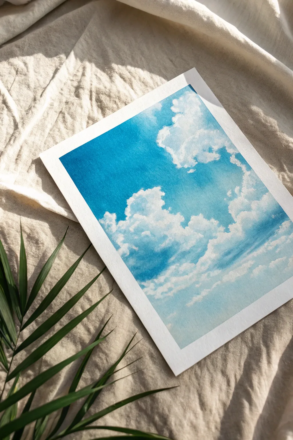
Capture the serene beauty of a bright blue sky using a surprisingly simple technique that yields professional-looking results. By layering acrylics with a sponge or cotton swabs, you’ll create fluffy, dimensional clouds that seem to float right off the paper.
Step-by-Step Guide
Materials
- Heavyweight watercolor or mixed media paper
- Masking tape or painter’s tape
- Acrylic paints (Titanium White, Phthalo Blue, Ultramarine Blue, hint of Cerulean)
- Small natural sea sponge (or cosmetic sponge)
- Cotton swabs (Q-tips)
- Flat synthetic brush (1 inch)
- Palette or paper plate
- Paper towels
- Water cup
Step 1: Setting the Scene
-
Tape the borders:
Begin by taping down all four edges of your paper to a flat work surface. This not only keeps the paper from buckling when wet but creates that crisp, clean white border visible in the final piece. -
Pre-mix your blues:
On your palette, prepare a gradient of blues. Mix a dark, rich blue using Phthalo and Ultramarine for the upper sky. Create a mid-tone blue by adding a touch of white, and a very pale, almost white-blue for the horizon line.
Sponge Technique
Don’t press hard with the sponge! A barely-there touch creates the best airy texture. If you press too hard, you’ll get solid blocks of white instead of fluffy mist.
Step 2: Creating the Atmosphere
-
Paint the top gradient:
Using your flat brush, apply the darkest blue mixture across the top third of the paper. Use horizontal strokes to ensure smooth coverage. -
Blend downward:
While the top paint is still wet, pick up your mid-tone blue. Brush it across the middle section, overlapping slightly with the dark blue above to create a seamless transition. -
Finish the background:
Apply the palest blue mixture to the bottom third of the paper. Blend it upward into the mid-tone blue so the sky looks naturally lighter near the horizon. -
Smoothing pass:
Take a clean, slightly damp brush and run it horizontally across the entire page once more to smooth out any harsh lines between the blue zones. Let this background layer dry completely before moving on.
Step 3: Building the Clouds
-
Prepare the sponge:
Dampen your sea sponge and wring it out thoroughly so it’s barely moist. Dip a small corner into pure Titanium White paint, blotting the excess onto a paper towel. You want a dry, textured imprint, not a wet blob. -
Map out main shapes:
Gently stamp the sponge onto the blue background to define the large cloud mass in the center-right. Use a light twisting motion to create organic, irregular edges rather than perfect circles. -
Establish the shadows:
While the white is fresh, mix a tiny drop of blue or grey into your white paint. Sponge this shadow color lightly near the bottom and left sides of your cloud clusters to give them volume. -
Layering fluffiness:
Reload your sponge with bright white. Dab over the top edges of your cloud shapes, letting the paint be thicker and more opaque here to represent sunlight hitting the peaks. -
Refine with cotton swabs:
For the smaller, wispy clouds floating apart from the main group, switch to a cotton swab. Dip it in white paint and use a rolling motion to create tiny, delicate cloud puffs. -
Soften the edges:
If any cloud edges look too sharp, use a clean, dry cotton swab to gently smudge the wet paint outward, creating a misty, semi-transparent effect. -
Add floating strays:
Scull in faint, stretched-out clouds near the bottom horizon using a very dry sponge and almost no paint. These should look like distant vapors. -
Final highlights:
I like to take a small round brush or a fresh cotton swab with thick white paint and add tiny, crisp highlight dots to the very top curves of the largest clouds for extra pop.
Sunset Variation
Swap the blue background gradient for a blend of pink, violet, and orange. Use the same sponge technique for clouds, but tint their undersides with lavender for a sunset glow.
Step 4: Finishing Touches
-
Dry check:
Step back and assess your values. If the clouds dried too transparent, gently sponge another layer of white over the brightest areas. -
The reveal:
Wait until the painting is 100% dry to the touch. Carefully peel away the masking tape at a 45-degree angle, pulling away from the painted area to reveal the clean border.
Now you have a refreshing piece of sky art that looks perfect framed on a wall or as a handmade card.
Paint-Scrape Stripes With Instant Texture
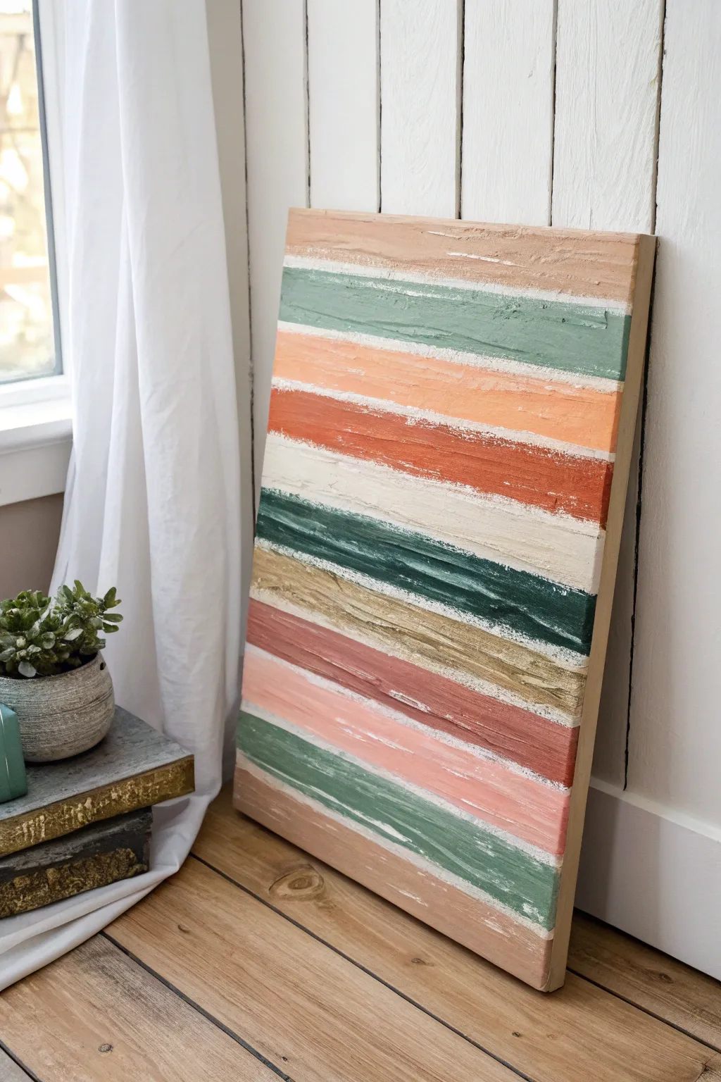
Embrace the imperfect beauty of texture with this simple yet striking canvas project. By dragging thick acrylic paint across the surface, you’ll create weathered, organic stripes that add a warm, earthy touch to any room.
How-To Guide
Materials
- Rectangular stretched canvas (e.g., 18×24 inches)
- Heavy body acrylic paints (sage green, terracotta, burnt orange, beige, cream, mustard yellow, dusty pink)
- Joint compound or modeling paste (optional, for extra texture)
- Palette knife
- Puttym knife or wide scraping tool
- Paper plate or palette
- Drop cloth or protective paper
Step 1: Preparing the Base
-
Set up your workspace:
Lay down a drop cloth or old newspaper to protect your work surface, as this scraping technique can get a little messy. -
Mix your texturizer:
If you are using standard acrylics, mix them 1:1 with modeling paste or a small amount of joint compound to thicken them up. This ensures the ridges hold their shape. -
Select your color palette:
Squeeze generous amounts of your chosen earthy tones—sage, terracotta, mustard, and cream—onto your palette. You want big dollops ready to go.
Use Cardboard Strips
Don’t have a wide scraper? Cut stiff cardboard into rectangles of different widths. They work perfectly for dragging paint and are disposable
Step 2: Creating the Stripes
-
Start at the top:
Using a palette knife, apply a thick horizontal line of your top color (like a soft beige or taupe) directly onto the canvas, roughly 2 inches down from the edge. -
The first scrape:
Take your wide putty knife or scraper tool and place it on the paint line. Apply firm, even pressure and drag the paint horizontally from left to right to flatten and spread it. -
Embrace the gaps:
As you drag, let the paint break and skip naturally over the canvas weave. Don’t try to fill every white spot; those gaps create the distressed look we want. -
Add the second color:
Clean your scraper or grab a fresh one. Apply a line of sage green paint just below your first stripe, leaving a small gap or slightly overlapping. -
Scrape the green:
Drag the green paint across just like the first layer. I like to vary my pressure slightly here to create different ridge heights. -
Continue the pattern:
Working your way down the canvas, alternate your colors. Introduce lighter bands like cream or pale peach to break up the darker, heavier tones. -
Layering colors:
For some stripes, try mixing two colors on the canvas. Place a dollop of burnt orange next to a dollop of rust and scrape them together for a marbled effect. -
Create the heavy dark stripe:
Towards the middle, apply a dark hunter green or charcoal stripe. Use a bit more paint here to make this band visually heavy and grounding.
Step 3: Refining and Finishing
-
Check the edges:
Wrap the paint slightly around the sides of the canvas for a finished, professional look, or leave the edges raw if you plan to frame it. -
Add highlights:
Once the main stripes are down, look for areas that feel too flat. Dab a tiny bit of white or cream on top of a colored stripe and gently scrape it to add dimension. -
Scrape away excess:
If a stripe feels too thick or gloopy, run a clean scraper over it lightly to remove excess paint and reveal the texture underneath. -
Let it dry completely:
Because the paint is applied thick, this will take longer to dry than a standard painting. Lay it flat in a safe area for at least 24 hours. -
Seal the artwork:
Texture can catch dust easily. Once fully dry, apply a spray-on matte varnish to protect the surface without adding unwanted gloss.
Paint Not Spreading?
If the paint drags too dry or streaks too much, spritz a tiny mist of water on the canvas before scraping or add a drop of flow improver
Hang your new textured masterpiece near a window where natural light can catch on the ridges and really make the colors pop
Drip-and-Tilt Ombre for Easy Movement
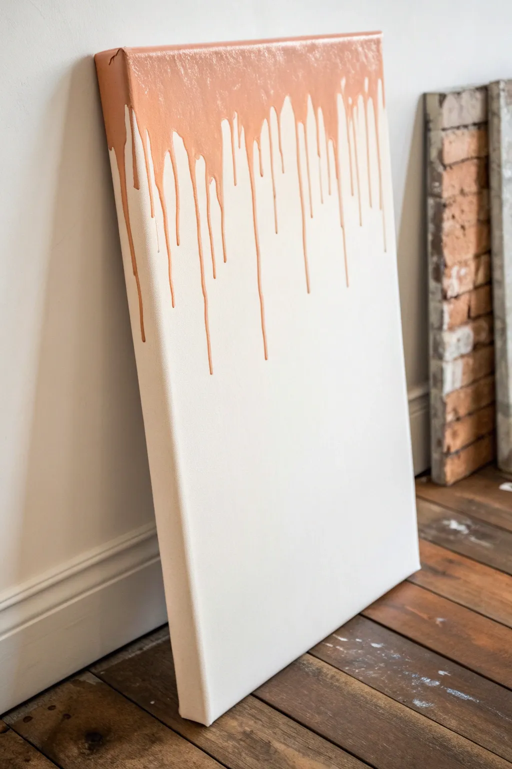
Embrace the beauty of gravity with this elegant, minimalist drip painting. By letting metallic copper paint cascade naturally down a stark white canvas, you create a striking piece of modern art that looks high-end but is incredibly simple to execute.
Step-by-Step Tutorial
Materials
- Large stretched canvas (white)
- Metallic copper or rose gold acrylic paint (high flow or fluid acrylics work best)
- Pouring medium (if using standard acrylics)
- Large flat brush or foam brush
- Plastic drop cloth or garbage bags
- Cups or jars for elevating the canvas
- Paper towels
- Water cup
Step 1: Preparation and Base
-
Prepare your workspace:
Lay down a generous plastic drop cloth or opened garbage bags on a flat surface. This process gets messy, and you want to catch the excess drippings without staining your floor. -
Inspect the canvas:
Check your white canvas for any dust or debris. If the canvas isn’t pre-primed bright white, or if you want a fresher look, apply a coat of white gesso and let it dry completely. -
Mix your paint medium:
If you are using standard metallic acrylic tube paint, you’ll need to thin it out. Mix the paint with a pouring medium in a cup at a ratio of about 2:1 (medium to paint) until it flows like warm honey. If using fluid acrylics, you can likely skip this step.
Flow Control Secret
Add a few drops of water or Flow Aid if your paint is too thick to run. The consistency should be like heavy cream—fluid enough to move but thick enough to hold color.
Step 2: The Pour and Drip
-
Position the canvas:
Stand the canvas upright, leaning it slightly against a wall protected by plastic. Alternatively, prop it upright on an easel. The vertical angle is crucial for gravity to do the work. -
Apply the top band:
Using your large brush, apply a thick, heavy band of the metallic copper paint all along the very top edge of the canvas face. -
Paint the top edge:
Don’t forget to paint the actual top rim (the thickness) of the canvas so the color looks seamless from all angles. -
Load the paint:
Dip your brush heavily into the paint mixture again. You want it dripping wet. -
Encourage the first drips:
Press the loaded brush against the top band you just painted, pushing slightly harder to release more paint. Let the excess naturally start to bead up and roll down. -
Vary the flow:
Move across the top edge, adding more paint in some sections and less in others. This irregularity creates diverse drip lengths, which is key to the organic look. -
Direct pour method (optional):
If the brush isn’t releasing enough paint for long drips, you can carefully pour a small stream of paint directly from your cup along specific spots on the top edge to force longer trails. -
Watch the movement:
Stand back and observe the flow. The paint will continue to move slowly. If a drip is stalling too high up, touch the top of that specific drip with a bit more wet paint to add weight. -
Control the length:
I prefer to let the paint find its own path, but if a drip is threatening to reach the floor and you want to stop it, lay the canvas flat on its back immediately to halt the downward flow.
Step 3: Finishing and Drying
-
Check the sides:
Look at the left and right edges of the canvas. You can choose to wrap the metallic paint around the corners or keep the sides clean white for a defined front-facing image. -
Clean up bottom pooling:
If paint has dripped all the way to the bottom edge, wipe underneath the canvas frame with a paper towel to prevent sticking. -
Initial drying phase:
Leave the canvas undisturbed. If you laid it flat to stop drips, keep it flat. If it’s standing, ensure it won’t slip. -
Patience is key:
Thick metallic paint takes longer to dry than standard acrylics. Allow at least 24 hours for the paint to cure completely. -
Final inspection:
Once fully dry, the metallic sheen will really pop. Check for any unwanted bumps or dust that might have settled and gently brush them away.
Multi-Tone Magic
Before the first layer dries, add a second color like silver or gold right on top of the copper. The colors will swirl together as they drip for a marbled effect.
Now you have a shimmering, modern statement piece ready to brighten up any room
Negative Space Silhouette With a Pop Background
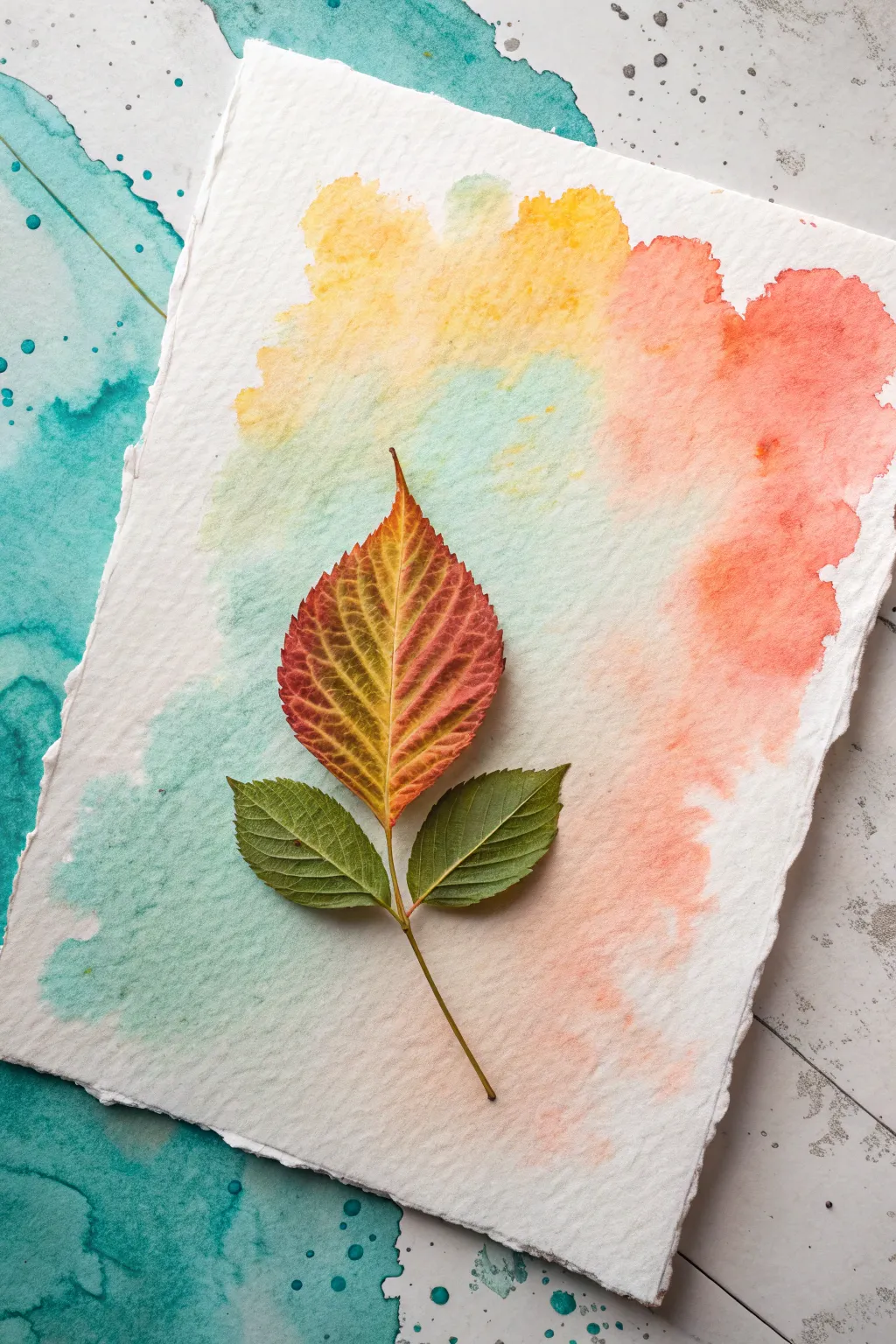
This project combines the delicate translucency of watercolors with the organic beauty of nature. By using a real leaf as a natural stencil, you’ll create a stunning negative space silhouette surrounded by a dreamy wash of teal, yellow, and coral.
Detailed Instructions
Materials
- Cold press watercolor paper (deckle edge optional)
- Fresh autumn leaves (diverse shapes)
- Watercolor paints (teal, yellow, coral/crane red)
- Round watercolor brush (size 6 or 8)
- Masking fluid or rubber cement
- Old brush or silicone applicator for masking fluid
- Clean water jar
- Paper towels
- Board and painter’s tape (to secure paper)
Step 1: Preparation & Masking
-
Select your leaf:
Choose a leaf that is relatively flat and has interesting jagged edges or clear veins. A leaf that is too crunchy or curled won’t lay flat enough to create a crisp silhouette. -
Secure the paper:
Tape your watercolor paper down to a board or hard surface. If you are using deckle-edged paper and want to preserve the rough look, tape it gently from the back or use very small pieces of tape on the corners. -
Position the leaf:
Place your leaf in the center of the paper to check the composition. Lightly trace the outline with a very faint pencil line if you need a guide, or simply hold it in place visually. -
Apply masking fluid:
Using an old brush or a silicone applicator, apply a layer of masking fluid or rubber cement exactly where the leaf shape should be. You can paint the fluid directly onto the paper in the shape of the leaf. -
Let it dry completely:
Wait until the masking fluid is entirely dry to the touch. It should feel rubbery and solid. Attempting to paint over wet masking fluid will ruin your brushes and smear the resist.
Sticky Situation?
If masking fluid tears your paper upon removal, the paper might be too soft or the fluid was left on too long. Try peeling it slowly at a sharp angle.
Step 2: Painting the Background
-
Wet the paper:
With a clean, large brush, apply a coat of clean water over the entire paper surface, going right over the dried masking fluid. This wet-on-wet technique allows colors to bloom softly. -
Start with yellow:
Load your brush with a sunny yellow watercolor. Drop this color near the top center of the page, letting it spread naturally into the wet paper. -
Add the coral:
Clean your brush and pick up a coral or salmon pink shade. Apply this to the right side of the paper, allowing it to touch the yellow so they blend slightly into a soft orange. -
Introduce teal:
Pick up a teal or turquoise color. Paint this onto the left side of the paper. Let it bleed toward the center but try to keep it somewhat separate from the coral to avoid making muddy brown colors. -
Deepen the contrast:
While the paper is still damp, drop slightly more saturated pigment of each color close to the masked leaf shape. This ensures the silhouette will pop clearly once the mask is removed. -
Create texture:
If you want a more organic look, sprinkle a tiny pinch of salt onto the wet paint or splatter clean water droplets to create blooms. -
Dry the painting:
Allow the paint to dry completely. The paper must be bone dry before you attempt the next step. I often use a hair dryer on a low, cool setting to speed this up.
Gilded Edges
For a luxe touch, outline the edge of the leaf silhouette with a gold paint pen or metallic watercolor before gluing down the real leaf.
Step 3: Reveal & Refine
-
Remove the mask:
Gently rub the dried masking fluid with your clean finger or a rubber cement pick-up tool. Peel it away to reveal the stark white paper underneath. -
Prepare the real leaf:
Take the actual leaf you used for inspiration. If you want to attach it permanently (as shown in the reference image), apply a small amount of craft glue or double-sided tape to the back of the leaf. -
Mount the leaf:
Carefully press the real leaf onto the white silhouette space. Line up the stem and edges as best as possible. -
Flatten it:
Place a heavy book over the leaf for an hour to ensure it adheres flat against the textured paper.
Display your botanical artwork in a floating frame to showcase those beautiful deckled edges


Have a question or want to share your own experience? I'd love to hear from you in the comments below!