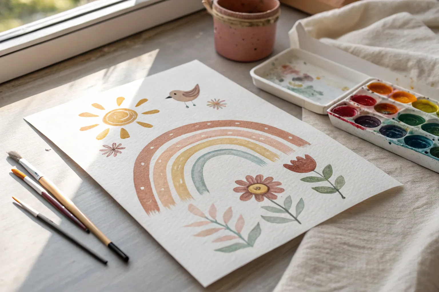
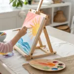
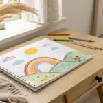
When I’m painting with kids, I always aim for quick wins—projects that look awesome even if brush control is still a work in progress. These easy painting ideas for kids are colorful, process-friendly, and set up to help young artists feel proud fast.
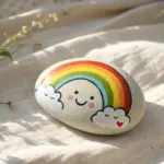
Handprint Rainbow Arc
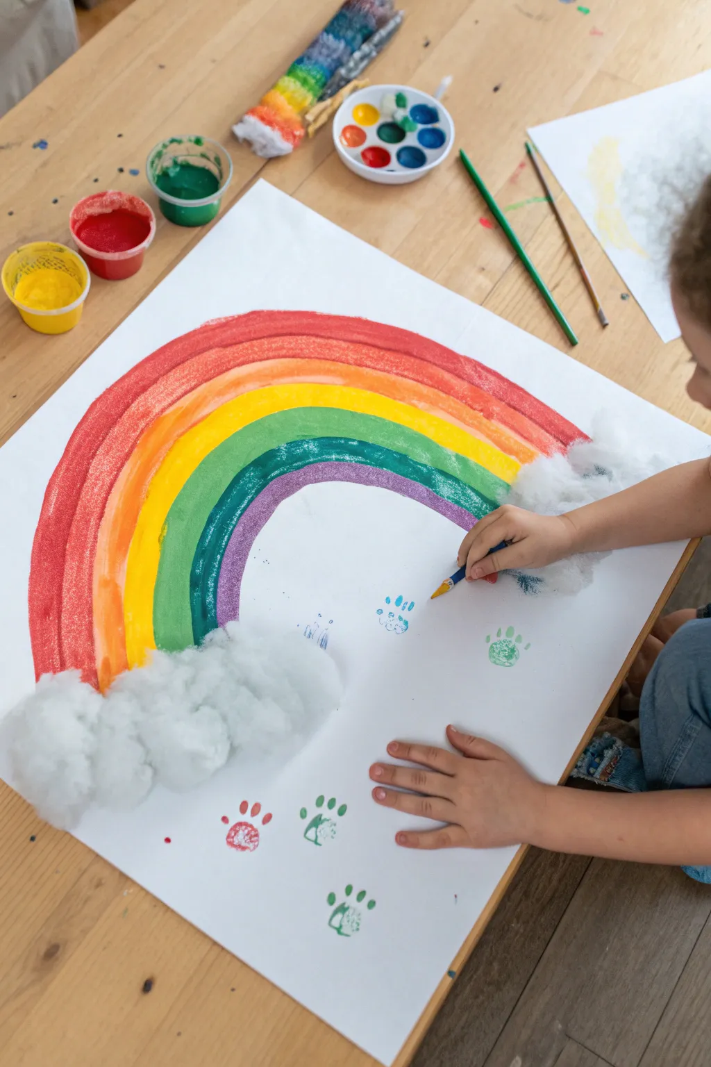
This cheerful project combines broad, colorful strokes with fun stamping techniques for a delightful mixed-media artwork. Large cotton ball clouds add fluffy texture at the ends of your vibrant rainbow, creating a 3D effect kids love.
Detailed Instructions
Materials
- Large sheet of white paper (A2 or easel paper)
- Tempera or poster paints (red, orange, yellow, green, blue, purple)
- Medium-width paintbrush
- Cotton balls
- Liquid school glue
- Small toy animal (for paw prints) or stamp
- Water cup and paper towels for cleaning
Step 1: Painting the Rainbow
-
Prepare the workspace:
Lay your large sheet of paper on a flat surface like a table or floor. It helps to tape the corners down slightly so the paper doesn’t shift while painting. -
Start with red:
Dip your medium brush into the red paint. Starting on the left side, paint a large, high arch that curves all the way to the right side of the paper. -
Add the orange band:
Wash your brush thoroughly. Paint a thick orange stripe directly underneath the red arch, following the same curve. -
Continue with yellow:
Clean the brush again and add the yellow band below the orange. Try to keep the bands touching so there are no white gaps between colors. -
Paint the green band:
Add the green stripe next. As the arc gets smaller, you might need to move your arm in a tighter motion to keep the curve smooth. -
Paint the blue band:
Paint the blue band beneath the green. If the colors bleed slightly where they touch, don’t worry—it adds a nice blended look to the rainbow. -
Finish with purple:
Complete the rainbow with a purple band on the inside. This will be the smallest arch. -
Let the paint dry:
Allow the rainbow to dry completely before moving on to the next steps to prevent smudging.
Cloud Anchor
Apply the glue in a ‘C’ shape around the rainbow ends rather than just a circle. This makes the clouds look like they are truly holding the rainbow up.
Step 2: Adding Texture and Details
-
Prepare the clouds:
Take a handful of cotton balls. You can gently pull them apart to make them fluffier and cover more surface area. -
Designate cloud areas:
Squeeze a generous amount of liquid glue at both bottom ends of the rainbow. -
Attach the cotton:
Press the cotton balls firmly into the glue patches. Pile them up slightly to create thick, puffy 3D clouds that anchor your rainbow. -
Select print colors:
Choose a few contrasting paint colors for the paw prints, like teal, light green, or red. -
Ink the stamp:
Dip a small toy animal’s foot or a stamp into a thin layer of paint. I find using a sponge to dab paint onto the stamp prevents blobs. -
Stamp the prints:
Press the stamp randomly in the empty white space below the rainbow arch. Vary the angles to make it look like an animal walked through the scene. -
Add variety:
Clean your stamp and switch to a different color to add more tracks in different shades. -
Final touches:
Use a small brush or the back of a paintbrush handle to add tiny dots or accents around the prints if desired. -
Dry flat:
Leave the project flat to dry overnight so the heavy glue under the cotton balls sets properly.
Glitter Magic
Before the paint on the rainbow dries completely, lightly sprinkle iridescent glitter over the wet paint for a magical, shimmering finish.
Hang this colorful masterpiece on the wall to brighten up the room immediately
Big Heart With Easy Color Blending
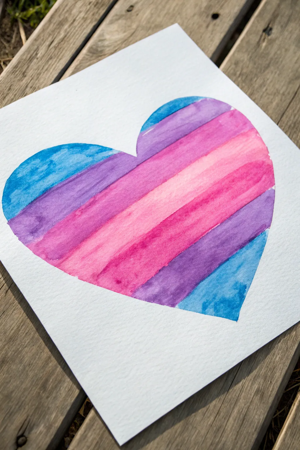
Create a vibrant, heartwarming piece of art with nothing but simple stripes and a little water. This project focuses on diagonals and subtle blending to give a classic heart shape a modern, colorful twist.
Step-by-Step Guide
Materials
- High-quality watercolor paper (cold press recommended)
- Watercolor paints (pan or tube)
- Flat shader brush (size 6 or 8)
- Pencil
- Eraser
- Clean water in a jar
- Paper towels
- Masking tape (optional)
Step 1: Preparation and Sketching
-
Prepare your workspace:
Set up your art station by placing the watercolor paper on a flat surface. If you want perfectly crisp edges on the paper itself, you can tape down the borders with masking tape, though looking at our example, leaving it loose works fine too. -
Analyze the shape:
Visualize a large, symmetrical heart that fills most of the page. You want to leave a generous margin of white space around the edges to frame the colorful center. -
Sketch the heart:
Using a pencil, lightly draw the outline of a large heart in the center of your paper. Keep your lines very faint so they won’t show through the translucent watercolor paint later. -
Refine the outline:
Step back and check symmetry. Use your eraser gently to correct any lopsided curves until you have a shape you are happy with.
Step 2: Painting the Gradient Stripes
-
Mix your first colors:
Prepare a puddle of blue and a puddle of purple on your palette. You want the paint to be fluid but pigmented, roughly the consistency of tea. -
Start the first stripe:
Using your flat brush loaded with blue, start at the top left curve of the heart. Paint a diagonal stroke downwards. Stay carefully inside your pencil line for the outer edge. -
Transition to purple:
Rinse your brush slightly and pick up the purple paint. Lay down a stripe directly next to the blue one while the blue is still slightly damp. This allows for a tiny bit of soft blending where they touch. -
Mix a pinky-purple:
Add a little red or pink to your purple mix to warm it up. Paint the next diagonal band, moving downward and across the heart shape. -
Create the central pink band:
Clean your brush thoroughly. Load it with a bright, watery pink. Paint a wide diagonal stripe across the middle (the widest part) of the heart. -
Introduce a deep magenta:
Mix a darker, more saturated pink or magenta. Apply this stripe right below the light pink one. The contrast between the light and dark pinks creates a lovely visual pop. -
Return to purple:
As you move toward the bottom point of the heart, transition back to purple. Paint a stripe that follows the same diagonal angle as the previous ones. -
Finish with blue:
For the very bottom tip of the heart, switch back to your blue paint. Fill in the remaining triangular space at the bottom right. -
Check the edges:
While the paint is drying, look at the outer edges of your heart. If any part looks jagged, you can carefully smooth the outline with a damp, clean brush, but be careful not to lift too much color.
Bleeding Control
If colors run together too much, your paint is too wet. Dab the excess water with a corner of a paper towel, then wait a minute for the previous stripe to dry slightly before adding the next.
Step 3: Finishing Touches
-
Let it dry completely:
Allow the painting to sit undisturbed until the paper is cool and dry to the touch. This prevents smudging. -
Erase pencil guides:
Once you are absolutely certain the paint is bone dry, gently erase any visible pencil marks from the perimeter of the heart to clean up the look.
Pro Tip
Work quickly! To get those smooth transitions without hard lines between stripes, paint the next color while the previous stripe is still slightly shiny and damp.
Now you have a stunning geometric heart ready to brighten up any room or serve as a heartfelt gift card

Q-Tip Dot Garden
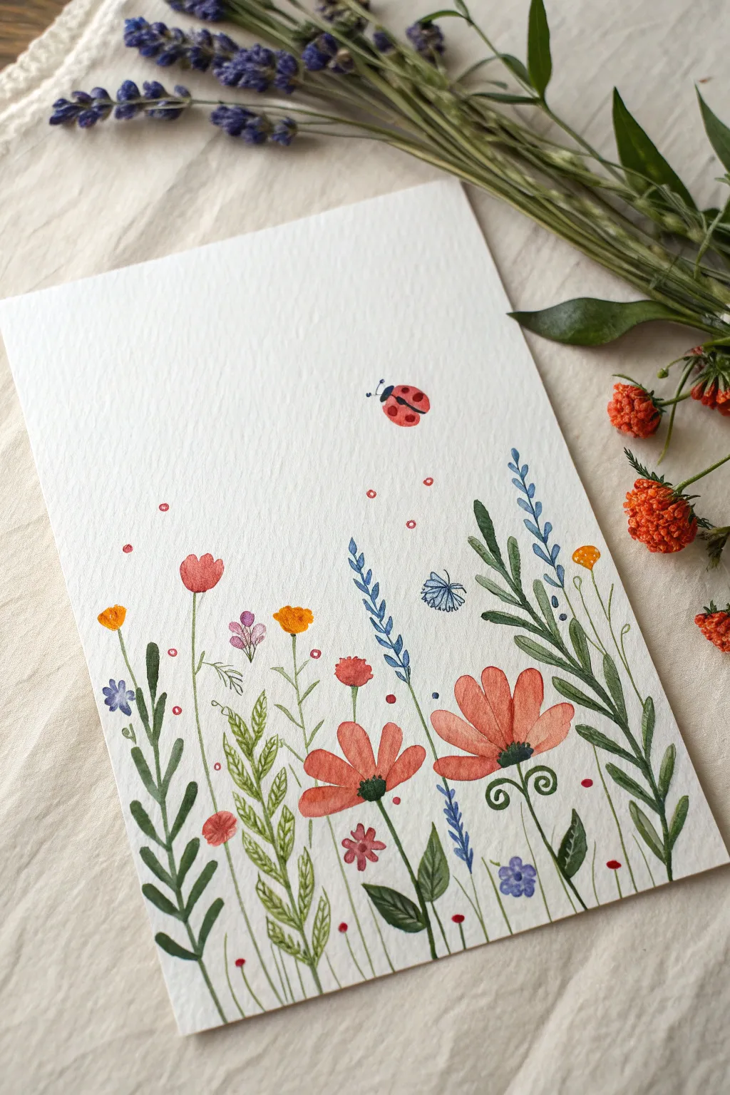
Transform a blank sheet of textured paper into a lively meadow bursting with colorful blooms and a friendly ladybug. This project combines simple brushstrokes with clever tool usage to create a breezy, effortless floral scene perfect for celebrating spring.
How-To Guide
Materials
- High-quality watercolor paper (cold press/textured)
- Watercolor paints (pan or tube)
- Round watercolor brushes (sizes 2, 4, and 6)
- Q-tips (cotton swabs)
- Two cups of water
- Paper towels
- Pencil (optional for light sketching)
Step 1: Setting the Scene with Greenery
-
Paint the tallest stalks:
Load a size 4 brush with a medium forest green. Starting about an inch from the bottom edge, paint long, slightly wavy lines reaching upwards to varying heights. These will serve as the backbone for your tallest flowers on the right side. -
Add leafy volume:
Switch to a darker olive green. On the far right stalk, press your brush down firmly and lift as you pull away to create elongated, tear-drop shaped leaves that hug the stem. -
Create fern-like textures:
Using a lighter, lime-green mix, paint a stem on the left side. Add small, quick dashes on either side of this stem, angling them upward to mimic the look of a fern or grains of wheat. -
Fill in the grassy base:
Use your smallest brush (size 2) with various shades of green to paint thin, short blades of grass at the very bottom. Let some crisscross naturally to create a dense, organic look. -
Paint winding stems:
Add several very thin, delicate stems in the center area. Give some of them a slight curve or hooked top, as if the flower heads are heavy.
Bleeding Colors?
If your flower petals are turning into blobs, your brush is too wet. Blot it on a paper towel before picking up paint, and let green stems dry fully before painting flowers on top.
Step 2: Adding the Blooms
-
Paint the large orange poppies:
Mix a watery, soft orange-red. Use the size 6 brush to paint loose petal shapes for the large flowers on the lower right. Leave a tiny gap of white space in the center of the petals to keep them airy. -
Detail the poppy centers:
While the orange petals are still slightly damp, dab a tiny spot of dark brown or black in the very center. Let the dark color bleed slightly into the orange for a natural effect. -
Create blue stalk flowers:
Take a blue-violet shade on your size 2 brush. Along one of your tall stems, paint pairs of small V-shapes or dashes working your way up to the tip, creating a lavender-style flower. -
Add bright accents:
Using a saturated yellow-orange, paint small, rounded buds on the tips of the thinner stems. Keep these simple—just small blobs of color work best. -
Dot the tiny red flowers:
Dip a Q-tip directly into red paint. Stamp it gently onto the paper to create perfectly round, small red flowers near the ground level or floating on thin stems. This is the ‘Q-Tip Dot’ technique!. -
Paint delicate accent blooms:
Add a few small, three-petaled purple flowers near the bottom. I like to keep these quite watery so they look soft and distant.
Make It 3D
Once the paint is dry, use a black fineliner pen to scribble loose outlines around some flowers or add tiny legs to the ladybug for a mixed-media illustrative look.
Step 3: The Ladybug & Finishing Touches
-
Paint the ladybug body:
In the upper right quadrant of the paper, paint a small, red oval. It should be slightly tilted, as if the ladybug is flying or landing. -
Add ladybug details:
Once the red oval is completely dry, use your smallest brush with black paint to add a small semi-circle for the head and delicate antennae. Paint a line down the center of the red oval and add three of four small black dots. -
Scatter magical pollen:
Dip the clean end of a Q-tip into pink or light red water. Gently tap it around the flower area to create disconnected floating dots, adding a sense of movement and whimsy to the air. -
Add final definition:
Look at your greenery. If it has dried too light, go back in with your smallest brush and a dark green to add thin veins to the larger leaves or darken the shadows where stems cross. -
Let it dry properly:
Allow the entire painting to sit flat until completely dry. If the paper buckles slightly, you can place it under a heavy book overnight once the paint is bone-dry.
Display your garden masterpiece in a simple frame or gift it as a cheerful greeting card to brighten someone’s day
Tape-Resist Geometric Rainbow
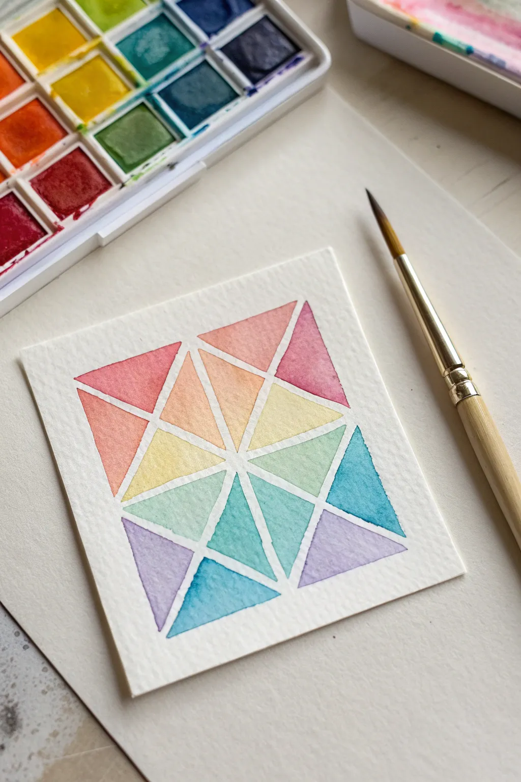
Create a stunning mosaic-style masterpiece that looks complex but is surprisingly simple to achieve. This project uses tape to reveal crisp white lines between vibrant, blended watercolor triangles, resulting in a clean and modern piece of art.
Step-by-Step Guide
Materials
- Thick watercolor paper (cold press is best)
- Painter’s tape or washi tape (1/4 inch width)
- Watercolor paint set
- Round watercolor brush (size 4 or 6)
- Cup of water
- Paper towels
- Scissors
- Ruler (optional)
Step 1: Preparing the Grid
-
Cut the paper:
Start by cutting your watercolor paper into a square. A 4×4 or 5×5 inch square is a manageable size for beginners and dries quickly. -
Create the border:
Since we want clean edges, place the paper on your work surface. If you want a white border like the photo, tape down all four edges of your square to the table. -
Apply the vertical tape:
Take a strip of your thin painter’s tape or washi tape and place it directly down the center of the paper vertically. -
Apply the horizontal tape:
Place a second strip horizontally across the middle, creating a simple cross that divides the paper into four equal quadrants. -
Add diagonal lines:
Now, place two long strips diagonally from corner to corner, forming a large ‘X’ across the entire paper. All the tape strips should intersect in the very center. -
Subdivide the spaces:
To get smaller triangles like in the example, add more tape strips that connect the midpoints of the outer edges to the center point, or simply bisect the larger triangles you just made. -
Seal the edges:
Run your fingernail or a spoon handle firmly over all the tape lines. This is crucial to prevent paint from bleeding underneath and spoiling those crisp white lines we want.
Bleeding Lines?
If paint seeped under the tape, wait for it to dry fully, then gently cover the mistake with a white gel pen or a tiny bit of white gouache paint.
Step 2: Painting the Gradient
-
Prepare your colors:
Activate your watercolors with a few drops of water. You will need a standard rainbow palette: red, orange, yellow, green, blue, and purple. -
Start with warm tones:
Begin at the top left section with a reddish-pink hue. Dip your wet brush into the paint and fill the first triangle. -
Transition to orange:
Move to the next adjacent triangle. Mix a little red with yellow to make orange, or use a pre-mixed orange, and fill in the shape. -
Yellow and light green:
Continue clockwise. Paint the next triangle a yellow-orange, then pure yellow. As you move down the right side, transition into a lime green. -
Cool colors:
For the bottom right triangles, create a teal or blue-green shade. I like to keep the paint quite watery here for a transparent, glassy effect. -
Deep blues and purples:
Fill the bottom triangles with darker blue and indigo. Ensure the paint pools slightly for texture but doesn’t overflow the tape. -
Complete the circle:
Finish the remaining triangles on the left side with varying shades of purple and violet, eventually meeting back up with your starting pink triangle. -
Let it dry completely:
This is the hardest part—waiting! Let the paint dry until the paper feels room temperature to the touch. If it feels cool, it’s still wet.
Step 3: The Reveal
-
Peel the tape slowly:
Once fully dry, start peeling the tape off. Pull it slowly at a sharp 45-degree angle away from the painted area to avoid tearing the paper. -
Remove border tape:
Last, remove the tape holding the paper to the table to reveal your clean outer edges.
Tape Tactics
Stick the tape to your clothes or a carpet first before applying it to the paper. This reduces the stickiness so it won’t rip your paper when removed.
Step back and admire your geometric kaleidoscope knowing you can make endless patterns just by changing the tape layout
BRUSH GUIDE
The Right Brush for Every Stroke
From clean lines to bold texture — master brush choice, stroke control, and essential techniques.
Explore the Full Guide
Bubble Wrap Texture Prints
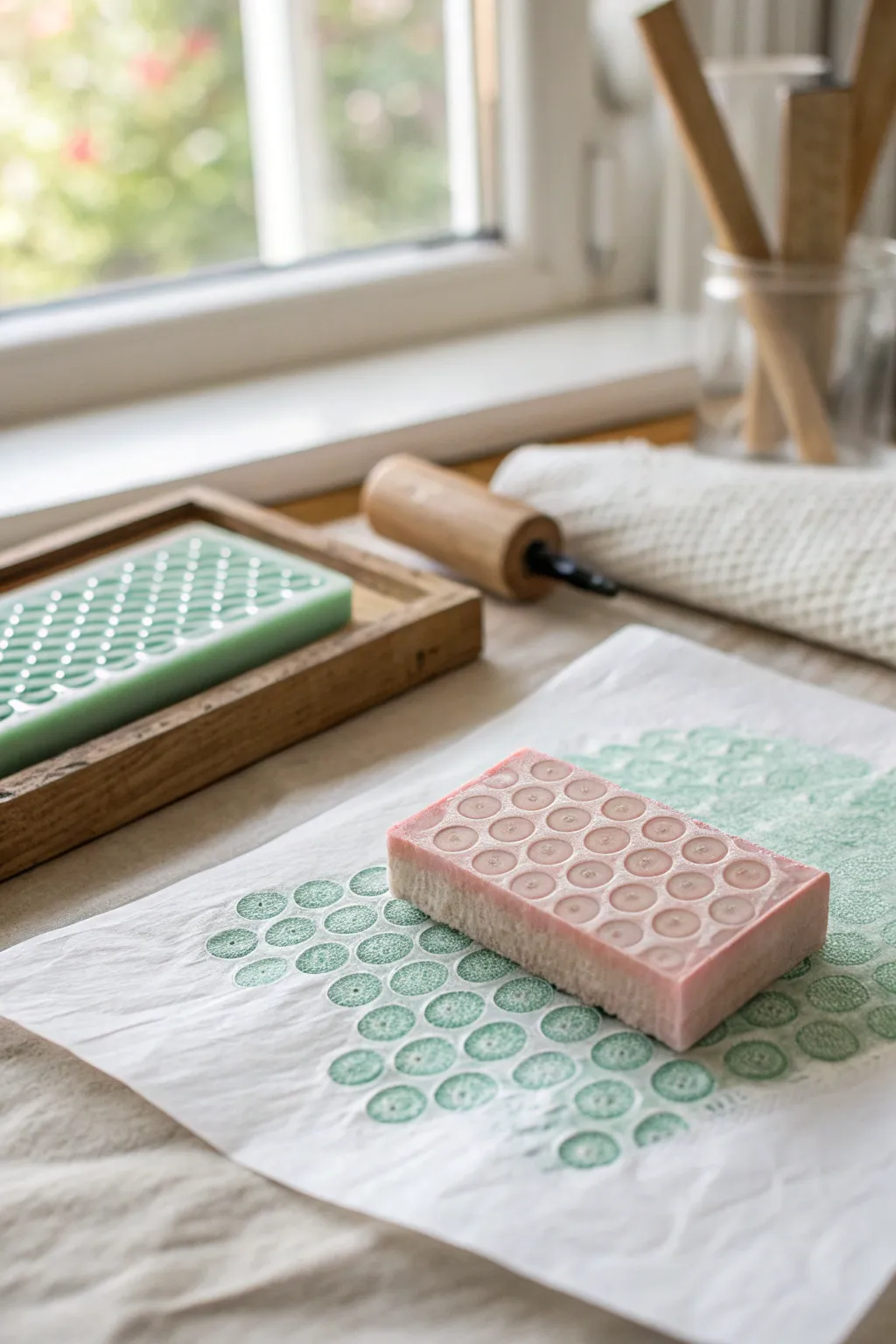
Create satisfying, repetitive dotted patterns using a clever stamp-making technique. By pressing a textured block into paper, you can achieve a soft, grid-like design that looks intricate but is surprisingly simple to master.
How-To Guide
Materials
- High-density foam block or large rectangular eraser (pink)
- Small carving tool or rounded sculpting loop
- Paper towels or a rag
- White art paper or cardstock
- Green acrylic paint or block printing ink
- Brayer (rubber roller) or shallow paint tray
- Pencil (optional for marking grid)
- Protective table covering
Step 1: Creating the Master Stamp
-
Prepare your block:
Start with a clean, rectangular block of high-density foam or a large eraser. Wipe surface dust away to ensure a clean carving. -
Plan the grid:
Visualize a grid of circles on the face of your block. If you want precision, lightly mark the center points of each circle with a pencil, but eyeing it works well for an organic look. -
Scoop the circles:
Using a small, rounded carving tool or sculpting loop, gently press into the foam at your first mark. -
Create depth:
Twist the tool slightly to scoop out a shallow, concave divot. You aren’t cutting all the way through; you just want a small crater. -
Repeat the pattern:
Continue scooping out circles in evenly spaced rows. Aim for consistent depth so the negative space remains flat. -
Clean the edges:
Check your scooped holes for any hanging bits of foam or eraser crumbs and brush them away so they don’t interfere with the print.
Clean Scoops
Can’t find a carving tool? A small metal piping tip (for frosting) pressed gently into foam also makes perfect circles.
Step 2: Preparing the Ink
-
Set up the palette:
Squeeze a small amount of green acrylic paint or block printing ink onto a flat surface or palette. -
Roll it out:
If using a brayer, roll the roller back and forth through the paint until it is evenly coated with a thin, tacky layer. -
Alternative method:
If you don’t have a brayer, create a very thin, even layer of paint in a shallow dish that acts as a stamp pad.
Step 3: Printing the Texture
-
Apply the color:
Roll your inked brayer over the flat surface of your carved block. The roller should touch the top surface but skip over the scooped-out holes. -
Check coverage:
Ensure the flat grid around the holes is fully green, while the inside of the circles remains pink and clean. -
Position the paper:
Lay your white paper flat on a hard, smooth surface. -
The first press:
Flip the block over and press it firmly onto the paper. Apply even pressure across the entire back of the block. -
Lift and reveal:
Carefully lift the block straight up to avoid smearing. You should see a green grid with white circles where the paper shows through. -
Reload and repeat:
Re-ink the block surface and stamp again right next to the first print. I like to overlap the edges slightly to create a continuous, honeycomb-like field. -
Dry completely:
Let the printed paper sit undisturbed until the paint or ink is fully dry to the touch.
Double Effect
Once the green texture is dry, paint inside the white circles with a contrasting color like yellow for a pop-art look.
Once dry, this unique textured paper makes excellent personalized wrapping paper or greeting cards
Sponge-Painted Ocean Creatures
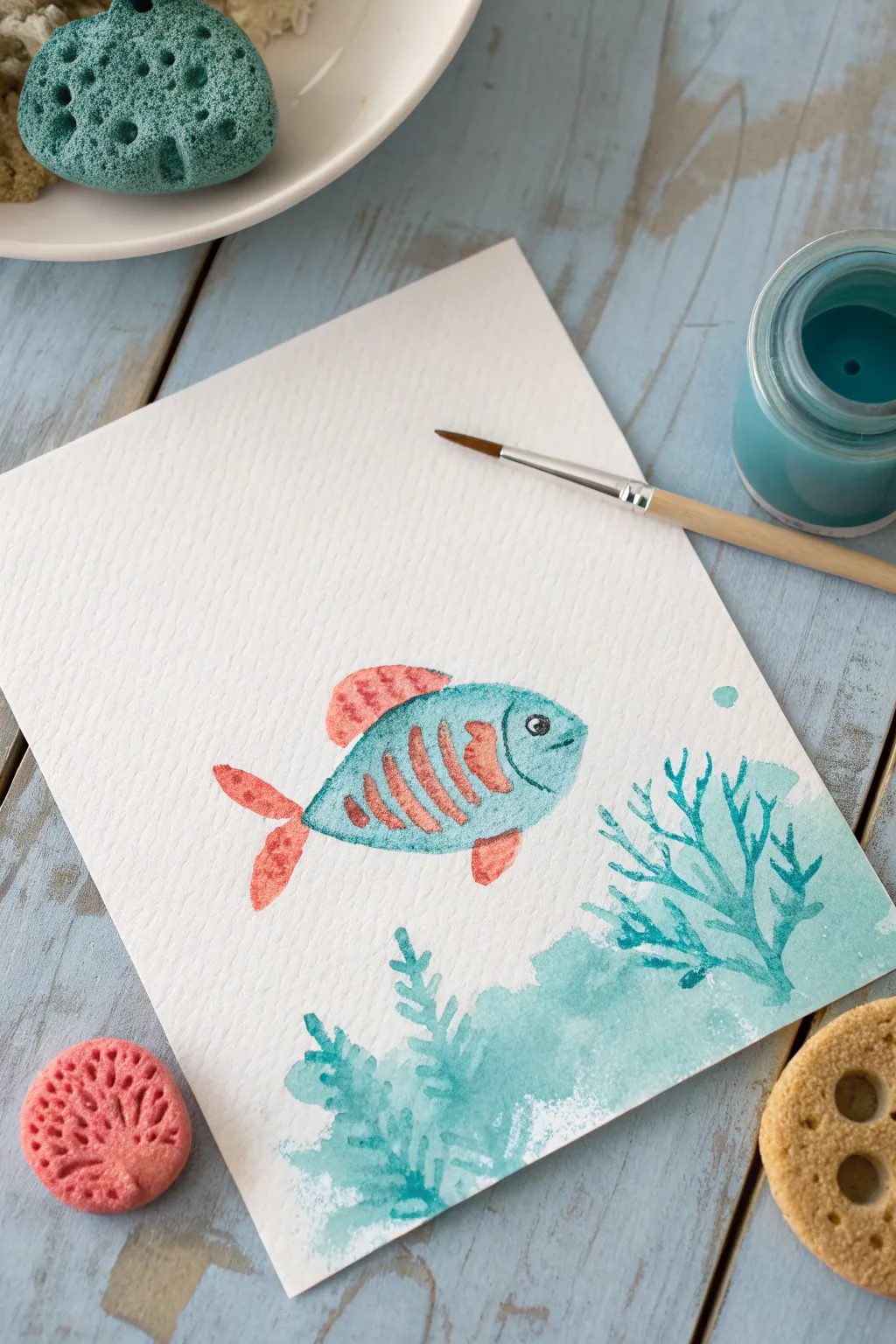
Dive into this underwater adventure by combining the soft textures of sponges with the precision of brushwork. This project creates a whimsical fish and coral scene that looks beautifully textured but is surprisingly simple to make.
Step-by-Step Tutorial
Materials
- Thick painting paper or watercolor paper
- Teal or turquoise acrylic paint (or gouache)
- Coral pink or orange acrylic paint
- Small round synthetic paintbrush
- Compressed sponges or cellulose sponges
- Scissors
- Paint palette or disposable plate
- Water cup
- Black fine-tip marker or black paint for details
Step 1: Creating the Stamps
-
Prepare the Sponges:
Start with a dry, clean sponge. The type with smaller holes works best for getting a nice shape without too much mess. -
Cut the Fish Body:
Cut an oval shape from the sponge, about 2 to 3 inches long. You can trim one end to be slightly narrower for the tail end of the fish. -
Cut the Fin Shapes:
From the sponge scraps, cut a small triangle for the side fin and a curved, semi-circle shape for the top dorsal fin. -
Cut the Tail Shape:
Cut a forked, V-shaped piece for the tail. It should be proportional to the body shape you just made. -
Make the Texture Stamp:
For the coral at the bottom, cut a rough, organic ‘cloud’ shape. This doesn’t need to be perfect; irregular edges make better coral textures.
Too Smudgy?
If your stamped shapes look like blobs rather than textured sponges, you are using too much paint. Blot the sponge on a paper towel between loading paint and stamping paper.
Step 2: Stamping the Scene
-
Load the Fish Body Paint:
Squeeze some teal paint onto your palette. Dab the oval sponge into the paint, ensuring the surface is covered but not dripping wet. -
Test the Print:
I like to stamp once on a scrap paper first to remove excess globby paint. This ensures the texture of the sponge shows through. -
Stamp the Body:
Press the teal oval firmly onto the center of your watercolor paper. Lift it straight up to avoid smearing the edges. -
Switch to Coral Pink:
Clean your hands if needed, then prepare a puddle of coral pink paint on your palette. -
Add the Fins:
Dip your fin and tail sponge shapes into the pink paint. Carefully stamp the top fin, the side fin, and the tail onto the paper, connecting them slightly to the teal body. -
Stamp the Ocean Floor:
Using your ‘cloud’ shaped sponge and the teal paint (or a lighter watery mix of it), stamp a textured area along the bottom right corner to serve as the coral reef base.
Make it Shimmer
Mix a tiny amount of glitter glue or metallic paint into your bubble dots or the fish scales to make the ocean scene sparkle in the light.
Step 3: Adding Details
-
Paint Coral Branches:
While the sponge base dries, use your small round brush and teal paint to draw squiggly, branching lines growing out of the stamped coral area. -
Add Seaweed:
To the left of the coral, paint some simpler, leafier seaweed shapes using the same teal color. Use quick, upward strokes. -
Create Fish Stripes:
Once the fish body is dry to the touch, use the small brush and the coral pink paint to add vertical, slightly curved stripes across the fish’s body. -
Outline the Gills:
Paint a curved teal line near the front of the fish to define the head and gill area. -
Add the Eye:
Using a tiny dot of black paint or a black marker, add an eye inside the head area. Leave a tiny white spec for a reflection to bring it to life. -
Paint the Mouth:
Add a small, curved smile line just below the eye area. -
Final Bubbles:
Dip the handle end of your paintbrush into the teal paint and dot a single bubble floating up from the coral.
Let your beautiful seascape dry completely before displaying your underwater masterpiece

PENCIL GUIDE
Understanding Pencil Grades from H to B
From first sketch to finished drawing — learn pencil grades, line control, and shading techniques.
Explore the Full Guide
Straw Blow Paint Fireworks
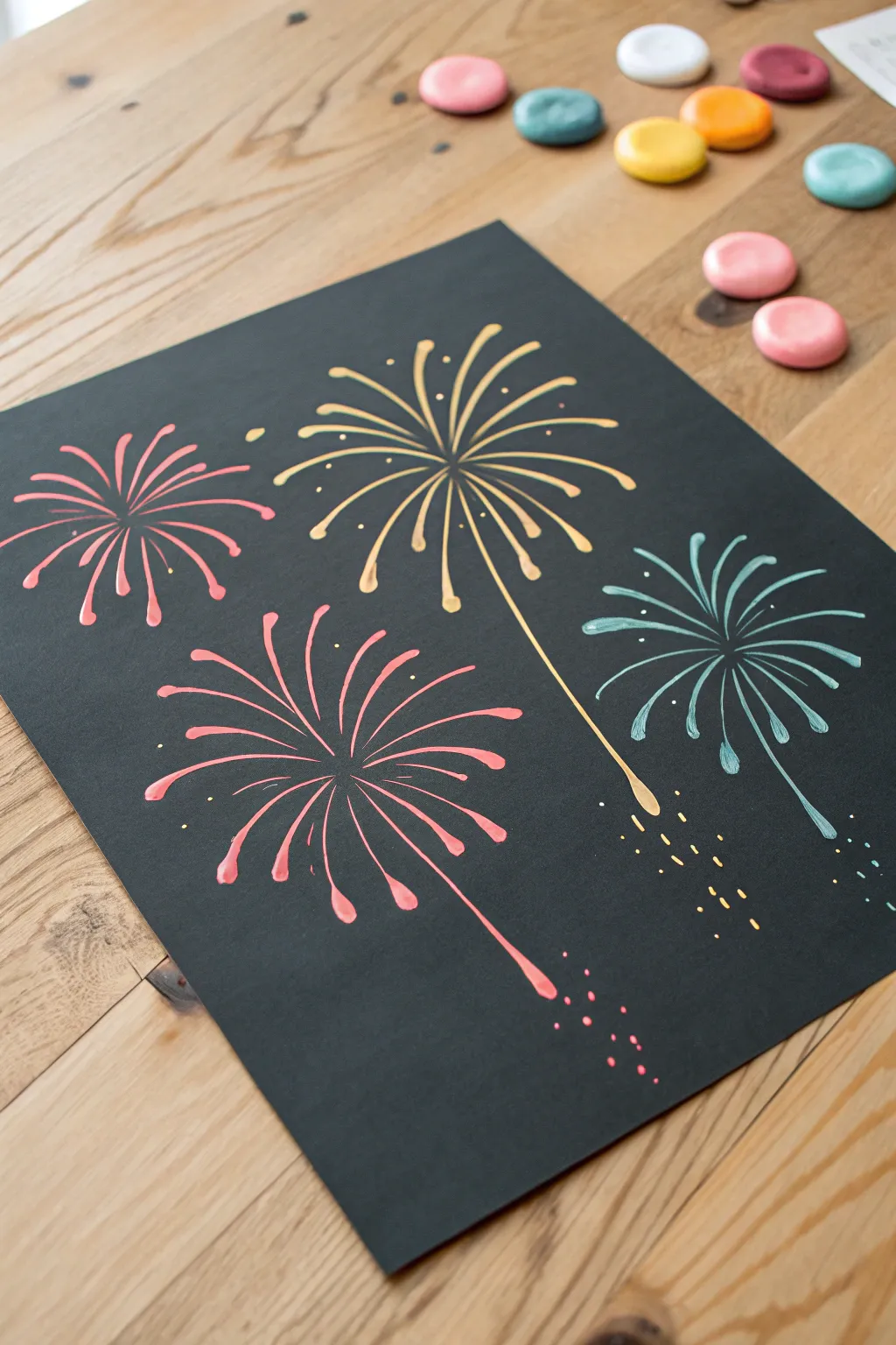
Capture the magic of a holiday celebration on paper with this vibrant, explosive art project. Using the simple force of your own breath, you can create dynamic, spiky firework blooms that pop beautifully against a dark night sky background.
Step-by-Step Guide
Materials
- Black construction paper or cardstock (heavyweight is best)
- Liquid tempera or acrylic paints (pink, golden yellow, teal)
- Small amount of water for thinning paint
- Drinking straws (one per color)
- Small cups or palette for mixing
- Paintbrush or dropper
- Newspaper or drop cloth (for messy spills)
Step 1: Preparation and Setup
-
Prepare the workspace:
Lay down newspaper or a protective cloth on your table. This technique involves moving liquid paint around, so it’s always safer to protect your surface from stray splatters. -
Select your paper:
Choose a smooth, high-quality piece of black cardstock. The smooth texture helps the paint glide more easily than rough construction paper. -
Mix your paint consistency:
Squeeze a dollop of each paint color into separate small cups. Add water gradually—just a few drops at a time—and mix until the paint is the consistency of heavy cream or liquid ink. It needs to be fluid enough to run, but not so watery that the color looks transparent.
Straw Technique Tip
Cut your straw in half creates a shorter tool. This brings your mouth closer to the paint for more control and stronger air pressure without getting dizzy.
Step 2: Creating the Fireworks
-
Start the golden burst:
Using a dropper or a loaded paintbrush, place a generous puddle of the golden yellow paint near the top center of your paper. Aim for a puddle about the size of a dime. -
Position the straw:
Hold your straw about an inch above the center of the paint puddle. Don’t touch the straw to the paper or the paint. -
Blow the primary rays:
Blow sharply and steadily directly down into the center of the puddle to spread the paint outward in all directions. Rotate your paper if needed to blow the paint into a full circular starburst shape. -
Refine the gold spikes:
If the lines are too short, add a tiny drop of wet paint to the end of a ray and blow specifically on that line to extend it further outward. -
Add the falling trail:
For the golden firework, blow one specific stream of paint much longer towards the bottom right to create the look of a rising or falling trail. -
Create the pink bloom:
Place a puddle of pink paint in the lower left quadrant. Repeat the blowing technique, aiming for a slightly more compact, rounder explosion shape compared to the gold one. -
Shape the pink petals:
Try blowing softer, shorter breaths to create the rounded, petal-like tips seen on the pink firework’s rays. -
Add the teal starburst:
Position your teal puddle on the right side of the paper. Blow forcefully to create thin, energetic spikes that contrast with the other shapes. -
Creating the smaller pink spark:
Add a smaller puddle of pink in the upper left corner. Blow this one out quickly for a sweet, smaller firework that fills the negative space.
Step 3: Adding Details
-
Detail the centers:
Once the main bursts are dry, you can dip a thin brush into the original un-thinned paint to touch up the centers if they look too empty. -
Add floating sparks:
Dip the very tip of a brush or a toothpick into your paint colors. Gently dot tiny specks around the outer edges of the fireworks to look like fading embers. -
Create falling debris:
Under the large golden firework, paint a few dashed yellow lines or dots trailing downward to simulate sparks falling from the sky. -
Dot the pink trail:
Similarly, add a cluster of tiny pink dots at the bottom of the long pink firework trail to suggest the rocket’s path fading away. -
Final drying time:
Lay the artwork completely flat in a safe area. Because the paint was applied thickly in puddles, it may take several hours or even overnight to dry fully.
Glitter Upgrade
While the paint is still wet, sprinkle a tiny pinch of matching fine glitter onto the center of each explosion for a shimmering, realistic firework effect.
Now you have a dazzling display of color that captures the excitement of a night sky celebration
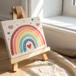
Mini Pour Painting Panels
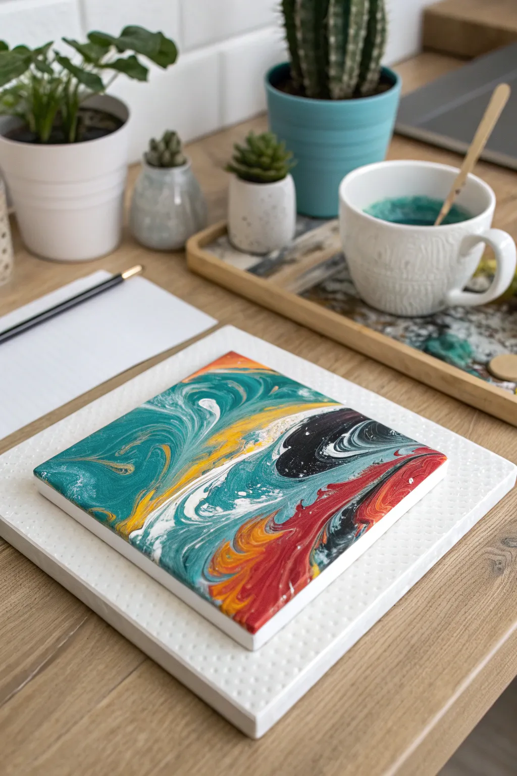
Create stunning, abstract designs on small canvases using the mesmerizing technique of acrylic pouring. This project results in a glossy, marble-like finish that looks professional but is surprisingly simple for kids to achieve.
How-To Guide
Materials
- Small square canvas panels (4×4 or 6×6 inches)
- Acrylic craft paints (teal, white, orange/yellow, red, black)
- Pouring medium
- Small plastic cups (one for each color)
- Small wooden craft sticks for stirring
- A clean, raised drying surface (like a polystyrene block or overturned cups)
- Protective table covering (plastic sheet or old newspaper)
- Gloves (optional but recommended for clean hands)
Step 1: Mixture Preparation
-
Prepare your workspace:
Cover your entire work area with plastic sheeting or newspaper. This process can get messy, and acrylic paint can be tough to remove once dry. -
Set up the drying station:
Place your raised drying surface in the center of your covered area. A piece of styrofoam or four upside-down cups works perfectly to keep the canvas edges off the table. -
Mix the teal paint:
In the first small cup, squeeze a generous amount of teal acrylic paint. Add an equal amount of pouring medium to the paint. -
Stir consistency:
Use a wooden craft stick to mix the teal paint and medium thoroughly. The consistency should resemble warm honey—fluid enough to run off the stick but not watery. -
Mix remaining colors:
Repeat the mixing process and ratio for the white, orange, red, and black paints in their own separate cups. Ensure no lumps remain.
Don’t Over-mix Colors
When pouring colors onto the canvas, don’t stir them together. Let the tilting motion do the mixing naturally to keep colors distinct and avoid muddy browns.
Step 2: The Pouring Technique
-
Position the canvas:
Place your small square canvas flat on top of your raised drying station. -
Pour the base:
Start by pouring a puddle of the teal mixture onto various parts of the canvas, but don’t cover it entirely yet. -
Add accent colors:
Pour small puddles or lines of orange and white directly into and next to the teal puddles. -
Introduce contrast:
Carefully drizzle a small amount of the black mixture into one corner or section. A little black goes a long way, so use it sparingly. -
Add the final pop:
Finish adding color by pouring ribbons of red near the orange and black sections to create warmth. -
Tilt the canvas:
Gently lift the canvas and slowly tilt it in different directions. Watch as the paint stretches and flows. -
Guide the flow:
Continue tilting until the paint runs over the edges, covering the corners. I like to let the paint drip off the sides completely for a wrapped look. -
Create swirls:
If you want more definition, gently drag a clean craft stick or toothpick through the wet paint to manipulate the shapes. -
Check the edges:
Use a gloved finger to touch up any bare spots on the sides of the canvas with the dripping paint.
Step 3: Drying and Finishing
-
Pop air bubbles:
Inspect the surface for tiny bubbles. You can pop these by blowing gently through a straw held close to the paint surface. -
Let it settle:
Place the canvas back on the raised station. Ensure it is perfectly level so the design doesn’t slide off while drying. -
Clean drips:
Wipe away any major drips hanging from the bottom edge of the canvas with a craft stick to prevent bumps. -
Allow to dry:
Leave the painting undisturbed for at least 24 to 48 hours. Acrylic pours are thick and take much longer to dry than standard painting.
Paint Cracking?
If the paint cracks while drying, it was likely too thick or the room was too cold. Try adding a tiny bit of water to thinning your next batch.
Once fully dry, you will have a unique, glossy piece of abstract art ready to display on a mini easel or mount on the wall


Scrape-and-Swipe Color Mixing
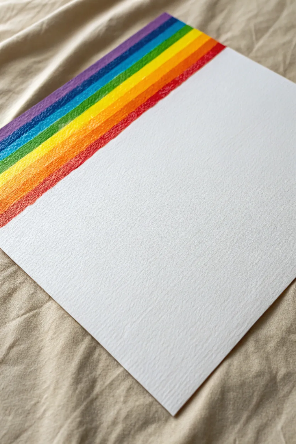
Create a vibrant rainbow accent on textured paper that adds a pop of color to an otherwise minimalist piece. This simple design highlights the beautiful grain of watercolor paper while practicing smooth color transitions.
Detailed Instructions
Materials
- High-quality cold press watercolor paper (heavyweight)
- Oil pastels or soft wax crayons (purple, blue, green, yellow, orange, red)
- Ruler or straight edge
- Painter’s tape or masking tape (optional)
- Paper towel or tissue for blending
Step 1: Preparation
-
Select your paper:
Choose a sheet of heavy cold press watercolor paper. The rougher the texture, the better the final effect will look as it catches the pigment. -
Establish the angle:
Decide on the diagonal angle for your rainbow. It should start from the top left corner. You can lightly mark the bottom edge of where the red stripe will end with a pencil if you need a guide. -
Secure the paper:
Place your paper on a flat, hard surface. Tape down the corners if it tends to curl, ensuring you have clear access to the top left area.
Step 2: Applying Color
-
Start with purple:
Begin at the very top edge. Take your purple oil pastel or crayon and draw a thick diagonal stripe. Press firmly to get deep saturation into the paper’s texture. -
Add the blue stripe:
Directly next to the purple, draw a blue stripe of equal width. Try to keep the line between colors relatively straight, but a little organic overlap is okay. -
Apply green:
Continue the pattern with a green stripe. I like to overlap the previous color just slightly to ensure there are no white gaps between the bands. -
Draw the yellow band:
Add a bright yellow stripe next. This color often needs a bit more pressure to show up vibrantly against the white paper. -
Add orange:
Draw your orange stripe next to the yellow. Keep your stroke direction consistent, following the diagonal angle of the rainbow. -
Finish with red:
Complete the rainbow with a red stripe at the bottom. This edge defines the boundary between the color and the blank white space, so take your time to make this line crisp.
Uneven Edges?
If you struggle with straight lines, apply a strip of painter’s tape diagonal across the paper before coloring. Peel it off slowly at the end for a perfect crisp edge.
Step 3: Refining the Finish
-
Fill in the gaps:
Look closely at your rainbow strips. If you see too much white paper showing through in the middle of the colors, go back over them with a second layer of pastel. -
Soft blending (optional):
If you want a smoother look, use your finger or a paper towel to gently rub the colors where they meet, softening the transition lines. -
Clean the edges:
Check the diagonal edge of the red stripe. If it looks uneven, use a clean edge of a ruler to gently scrape away any stray pastel marks. -
Dust off texture:
Oil pastels can leave little crumbs. Blow gently across the surface or tap the paper vertically to remove any loose pigment crumbs without smudging the white area. -
Seal the color:
To prevent smudging later, you can lightly spray the colored corner with a workable fixative or even a light mist of hairspray.
Add a Message
Use the large blank white space to write a quote in calligraphy or paint a simple black silhouette figure reaching up toward the rainbow.
Now you have a striking minimalist piece where the texture truly shines through the spectrum
Shaving Cream Marble Paper
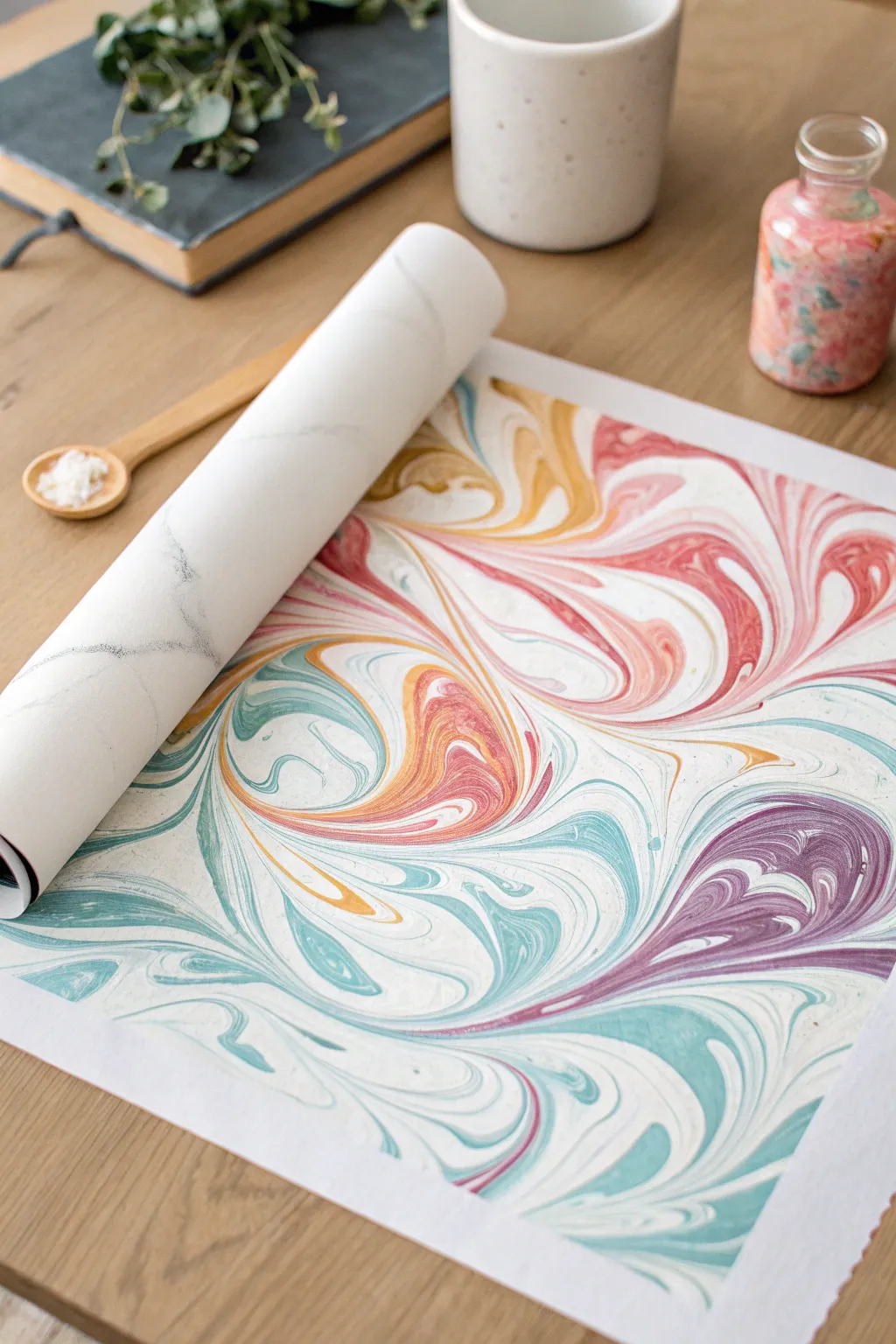
Capture the fluid beauty of marble stone on paper using nothing more than household shaving cream and acrylic paint. This sensory-rich process creates stunning, one-of-a-kind prints with vibrant swirls of teal, coral, ochre, and violet that look professionally made.
Detailed Instructions
Materials
- Shaving cream (white foam type, not gel)
- Baking sheet or shallow tray
- Liquid acrylic paints (teal, coral, purple, yellow/ochre)
- Heavyweight white cardstock or watercolor paper
- Spatula or ruler for scraping
- Bamboo skewer, toothpick, or back of a paintbrush
- Droppers or pipettes (optional but helpful)
- Paper towels
- Protective table cover
Step 1: Preparing the Base
-
Prepare your workspace:
Cover your table with newspaper or a plastic cloth, as this project can get messy. Set up a ‘scraping station’ with your spatula and paper towels nearby. -
Fill the tray:
Shake the shaving cream can vigorously. Spray a generous layer of foam into your baking sheet or shallow tray until the bottom is completely covered. -
Smooth the surface:
Use a spatula or a stiff ruler to spread the shaving cream out. You want a flat, relatively smooth surface like a fresh cake, rather than a mountain of foam.
Clean Swipes
Wipe your scraping tool completely clean with a paper towel after every single pass. Leftover foam on the scraper will smear the next print and ruin the crisp lines.
Step 2: Creating the Pattern
-
Apply the first color:
Take your teal acrylic paint. If it’s in a tube, you might want to mix it with a tiny drop of water to make it flow better. Drizzle or drop small blobs of paint randomly across the surface of the foam. -
Add warmer tones:
Repeat the process with your coral and ochre paints. Try to place some drops next to the teal, but leave some white space too. -
Finish with purple:
Add small accents of deep purple. I like to use less of the darkest color so it defines the pattern without overpowering the brighter hues. -
Begin the swirl:
Take your skewer or toothpick. Gently drag the tip through the dots of paint in S-curve motions. -
Marbling technique:
Cross through your previous lines in perpendicular directions to create complex loops. Don’t over-mix, or the colors will turn muddy brown; you want distinct ribbons of color.
Step 3: Printing and Revealing
-
Place the paper:
Take a sheet of heavy cardstock or watercolor paper. Gently lay it flat on top of the painted foam. -
Press down:
Lightly press the back of the paper with your hands to ensure the entire face of the paper makes contact with the paint. Don’t press so hard that you submerge it deeply. -
Lift the print:
Peel the paper off the shaving cream. It will look like a messy blob of foam and paint standing on top of the paper—don’t panic, this is correct. -
Let it sit briefly:
Place the foam-covered paper face up on your table for about 30 seconds to let the paint sink into the paper fibers. -
Position the scraper:
Hold your scraper or ruler firmly at the edge of the paper. -
The scrape:
In one smooth, confident motion, scrape the shaving cream off the paper. The foam comes off, but the swirled paint design stays permanently stained on the paper. -
Dry:
Wipe off any remaining residue with a dry paper towel and let print dry completely. It usually takes only a few minutes.
Muddy Colors?
If your prints look brown or gray, you are likely dragging the skewer too much. Stop swirling while the colors are still distinct ribbons, before they blend together.
Once dry, you can use these beautiful marbled papers for greeting cards, bookmarks, or framing as modern art
Pendulum Swing Splatter Art
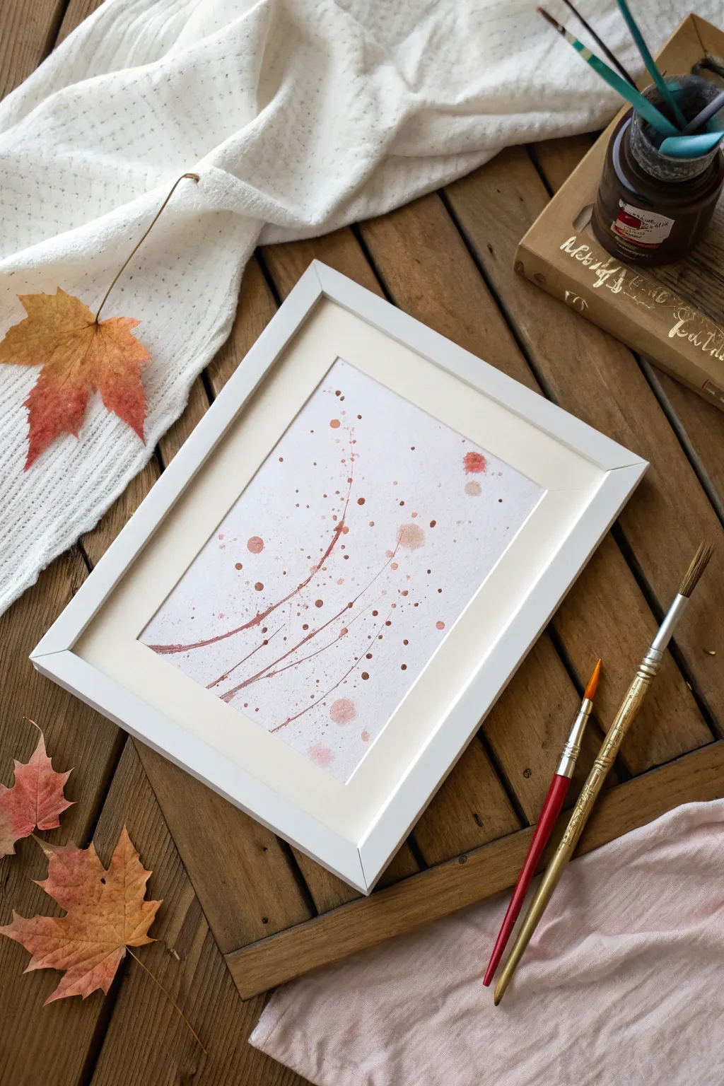
This project harnesses the power of gravity to create elegant, sweeping curves and delicate splatters. The result is a sophisticated-looking abstract piece that captures motion in warm, autumnal bronze and rust tones.
How-To Guide
Materials
- High-quality watercolor paper (cold press recommended)
- Liquid watercolor paints or diluted acrylic ink (rust, bronze, and copper tones)
- Small plastic cup or paper cup
- String or yarn (approx. 2 feet)
- Hole punch or sharp pencil
- Masking tape
- Two chairs and a broomstick (for the pendulum rig)
- Drop cloth or old newspapers
- Fine glitter (optional)
- White or light wood frame (as shown)
Step 1: Setting Up the Pendulum
-
Prepare the workspace:
This project can get a little messy, so start by covering a large floor area with a drop cloth or newspapers. You need plenty of space for the pendulum to swing freely. -
Build the rig:
Place two chairs back-to-back about three feet apart. Lay a broomstick or a long dowel across the top of the chair backs to create a sturdy crossbar. -
Prepare the pouring cup:
Take a small paper or plastic cup. Using a sharp pencil or a pin, poke a tiny hole in the direct center of the bottom. Cover this hole temporarily with a small piece of masking tape. -
Attach the string:
Punch two holes on opposite sides of the cup’s rim. Thread your string through these holes and tie it securely to create a handle, then tie the long end of the string to the center of your broomstick crossbar. -
Adjust the height:
Position your watercolor paper directly underneath the hanging cup. Adjust the string length so the bottom of the cup hovers about 2-3 inches above the paper.
Paint too thick?
If the paint comes out in droplets rather than a smooth line, it’s too thick. Add a teaspoon of water to the cup to thin the mixture for better flow.
Step 2: Painting the Swings
-
Mix your paint:
In a separate container, mix your paint. I find that liquid watercolors work best, but you can also dilute acrylic paint with water until it has the consistency of heavy cream–runny enough to flow, but thick enough to hold color. -
Select your color palette:
For the look in the photo, choose warm, earthy tones like burnt sienna, rust orange, and metallic bronze. -
Load the pendulum:
Pour a small amount of your bronze or rust-colored paint mixture into the hanging cup. Don’t overfill it; a few tablespoons is plenty to start. -
Release the paint:
Gently pull the cup back to start the swing. Just before you let go, peel the tape off the bottom hole. -
Let it swing:
Release the cup and watch it swing back and forth. The paint will drip out in a mesmerizing, elliptical pattern. -
Create variation:
As the orbit slows down, you can gently nudge the cup in a different direction to create intersecting lines, or stop it and move the paper slightly to create a fresh composition. -
Add manual splatters:
Once the main swing lines are done, take a regular paintbrush, dip it in the remaining paint, and gently tap the handle over the paper to add the random droplets and larger splashes seen in the corners of the example image. -
Incorporate metallics:
While the paint is still wet, you can lightly sprinkle a tiny pinch of gold or copper glitter into the wettest splatters for extra texture.
Step 3: Finishing Touches
-
Dry completely:
Let the artwork dry flat for several hours. Because there are pools of paint, this will take longer than a standard watercolor painting. -
Flatten the paper:
If the paper buckled slightly from the moisture, place it under a heavy book overnight once it is 100% dry. -
Matting the art:
The example uses a white mat board. Center your artwork behind the mat opening, securing it with artist’s tape on the back. -
Frame it:
Place the matted artwork into a simple white or light wood frame to complement the warm, airy tones of the painting.
Dual-Tone Swirls
Pour two colors into the cup simultaneously without mixing them. As the pendulum swings, the lines will naturally marble and shift between shades.
Hang your abstract masterpiece in a well-lit spot to let those warm bronze tones shine

Have a question or want to share your own experience? I'd love to hear from you in the comments below!