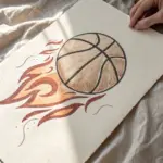
If you’re craving easy sports painting ideas that still look super satisfying, you’re in the right headspace. I love using bold shapes, simple lines, and a little color magic to turn classic sports imagery into art you can finish in one cozy session.
Football Laces and Stripes
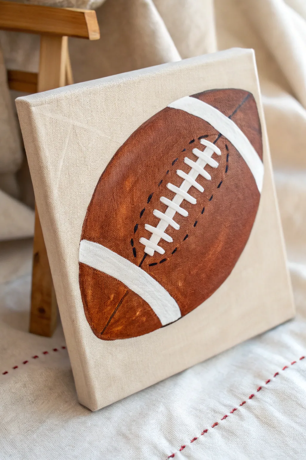
Capture the spirit of the game with this detailed yet approachable acrylic painting of a classic football. This project uses warm browns and crisp whites on a square canvas to create a sporty accent piece perfect for a fan’s room.
Step-by-Step
Materials
- Square stretched canvas (e.g., 8×8 or 10×10 inches)
- Pencil and eraser
- Acrylic paints: Burnt Sienna (medium brown), Burnt Umber (dark brown), Titanium White, Black
- Flat brush (medium size)
- Small round detail brush (size 0 or 1)
- Ruler
- Palette or paper plate
- Cup of water and paper towels
Step 1: Sketching the Outline
-
Establish the curve:
Begin by lightly sketching a large diagonal oval shape that fills most of the canvas. The football should be tilted, running from the bottom left toward the top right. -
Mark the stripes:
Draw two curved lines near each end of the football to indicate where the white stripes will go. These should follow the curvature of the ball’s ends. -
Draw the laces guide:
Sketch a central line for the laces in the middle of the ball. Add short horizontal dashes across this line to mark where the individual laces will sit later.
Uneven Stripes?
If you struggle with painting smooth curves for the white stripes, lay down two strips of painter’s tape or wash tape to mask off the area before painting the brown sections.
Step 2: Painting the Base Layer
-
Mix the main leather color:
On your palette, mix a generous amount of Burnt Sienna with a tiny touch of Burnt Umber to create a rich, rusty brown leather color. -
Paint the main body:
Using your flat brush, fill in the large central section of the football. Carefully paint around the stripe areas you marked; leave those blank canvas for now. -
Fill the ends:
Paint the two tips of the football using the same brown mixture, again ensuring you leave a clean gap for the white stripes. -
Add first shadows:
While the brown paint is still slightly wet, dip the corner of your brush into a little Burnt Umber. Gently blend this darker shade along the bottom curve of the football to create a sense of roundness and volume. -
Let it dry:
Allow this base layer to dry completely. Acrylics dry fast, but if you’re impatient like me, a hair dryer on a low setting speeds this up.
Step 3: Adding the Details
-
Paint the white stripes:
Clean your brush thoroughly. Use pure Titanium White to fill in the two curved bands you left unpainted. You may need two coats here to ensure the white is bright and opaque. -
Paint the laces foundation:
Switch to your small detail brush. Using white paint, carefully draw the long vertical line that runs beneath the laces first. -
Add the cross laces:
Paint the horizontal laces across the vertical line. Make them thick and distinct, slightly raised in the center to look realistic. -
Highlight the leather:
Mix a tiny amount of white into your main brown color. Dry brush this lighter shade very subtly on the upper middle part of the football to suggest a highlight where the light hits.
Level Up: Texture
Before the brown paint dries, dab it gently with a dry paper towel or sponge. This lifts tiny spots of pigment, creating a remarkably realistic pigskin leather texture.
Step 4: Finishing Touches
-
Outline the laces:
To make the laces pop, take a very diluted black or dark brown paint on your finest brush. Paint tiny shadow lines right next to where the white laces meet the brown leather -
Add texture stitching:
Using that same dark detail color, paint small, dashed ‘stitch’ marks along the seams near the laces. Keep these dashes small and somewhat irregular for a worn leather look. -
Deepen final shadows:
If the ball looks too flat, glaze a very thin layer of watered-down black or dark brown along the absolute bottom edge of the football. -
Clean up edges:
Check the background canvas. If any brown paint smeared onto the background, use a little white or cream paint to tidy up the negative space around the ball.
Now you have a striking piece of sports art ready to hang on the wall or give to your favorite MVP
Basketball Hoop From Below
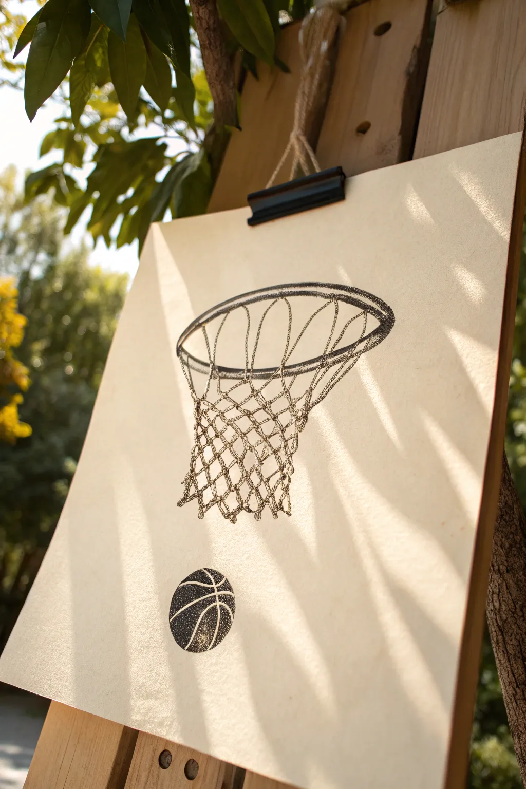
Capture the nostalgic feel of a driveway hoop using the technique of stippling on warm-toned paper. This project uses thousands of tiny ink dots to build form and shadow, resulting in a textured, vintage illustration style.
How-To Guide
Materials
- Cream or off-white textured drawing paper
- Fine-liner pens (sizes 0.1mm, 0.3mm, and 0.5mm)
- HB Pencil
- Kneaded eraser
- Circle template or compass
- Ruler
Step 1: Sketching the Layout
-
Establish the perspective:
Begin by envisioning the hoop from a low angle. Draw a large, flattened oval (ellipse) near the center of your page to represent the rim of the hoop. Tilt it slightly so you are looking up and through it. -
Add rim thickness:
Draw a second, slightly smaller ellipse inside the first one to give the metal rim distinct thickness. The gap should be narrow on the distant side and slightly wider on the side closest to you. -
Draft the net shape:
Lightly sketch the general cone shape of the net hanging down. It should curve inward as it descends, creating a draped fabric look rather than rigid straight lines. -
Grid the net pattern:
Using light pencil strokes, draw the diamond pattern of the net. Start with the vertical guiding lines that drape from the rim, then cross them with horizontal sagging lines to create the mesh intersections. -
Position the ball:
Below the net, draw a perfect circle for the basketball using a template or compass. Add the curved seam lines that wrap around the sphere to emphasize its roundness.
Step 2: Inking the Outline
-
Trace with dots:
Switch to your 0.3mm fine-liner. Instead of drawing solid lines, begin tracing your pencil sketch with a series of closely spaced dots. This sets the foundation for the stippling style. -
Define the rim:
Go over the ellipses of the rim with your dots. Places dots closer together on the underside of the rim to suggest a shadow, and further apart on the top edge where light would hit. -
Detail the rope texture:
For the net, use the dot technique to outline the individual ropes. Since rope is braided, keep your edges slightly bumpy and irregular rather than perfectly smooth. -
Erase pencil guides:
Once the basic ‘dotted outline’ allows you to see the full image clearly, gently lift away the graphite sketch with a kneaded eraser so the ink doesn’t smear.
Patience Pays Off
Don’t rush the dots! Rapid tapping often turns into tiny dashes or commas. Keep the pen vertical and lift straight up for perfectly round, clean stipples.
Step 3: Stippling and Shading
-
Build the rim shadows:
Using the 0.5mm pen, concentrate a high density of dots on the inner back curve of the rim and the bottom edge. This dark contrast makes the metal look solid and heavy. -
Shade the net knots:
Switch to the 0.1mm pen for finer control. Add clusters of dots where the net lines intersect to create the ‘knots.’ This small detail adds significant realism. -
Create depth in the mesh:
Apply dots alone the left and right sides of the net structure to make it look cylindrical. Leave the center of the net lighter, with fewer dots, to show that it is bulging forward. -
Texture the basketball:
Stippling is perfect for the pebbled texture of a basketball. Fill the dark segments of the ball with dense stippling using the 0.5mm pen. -
Define the ball’s volume:
For the lighter sections of the ball, start with a sparse layer of dots using the 0.1mm pen. gradually add more dots near the bottom and sides to create a spherical shadow, leaving a ‘highlight’ spot nearly empty on the upper curve. -
Refine the contrasts:
Step back and look at your drawing. I like to squint my eyes to blur the details; this helps identify areas that need to be darker. Add layers of dots to the darkest shadows. -
Final touches:
Check the connections where the net meets the rim. Ensure those attachment points are dark enough to look secure. Make any final dot adjustments to smooth out gradients.
Fixing Dark Blimp
If you accidentally make an area too dark with too many dots, you can’t erase ink. Instead, broaden the dark area slightly to blend it out, or turn it into a deep shadow fold.
Hang your finished piece in a simple frame or on a clipboard to enjoy the classic athletic vibe you’ve created
Running Track Lane Lines
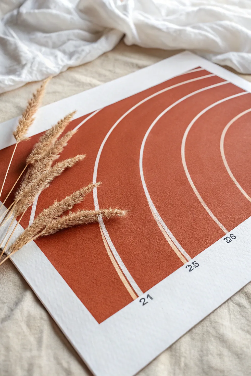
Capture the geometric beauty of a running track with this minimalist art piece featuring sweeping white lane lines against a warm, earthy background. The matte terracotta finish gives it a modern, sophisticated look that fits perfectly in any contemporary space.
How-To Guide
Materials
- Heavyweight watercolor paper or mixed media paper (A4 or A3 size)
- Masking tape or painter’s tape
- Pencil
- Large compass or string and a thumbtack
- Terracotta or burnt orange acrylic paint
- Wide flat brush or foam brush
- Fine liner brush (0 or 00 size)
- White acrylic paint or white gouache
- Black fineliner pen (0.3mm or 0.5mm)
- Ruler
- Eraser
Step 1: Preparation & Mapping
-
Tape the border:
Begin by taping down your paper to a flat surface using masking tape. This secures the paper and creates a clean white border around your artwork. Press the edges of the tape firmly to prevent paint seepage. -
Define the painting area:
Measure about 1.5 to 2 inches from the bottom edge and lightly draw a straight horizontal line. This will be the starting line for your track lanes and where the painted area begins. -
Set your anchor point:
Decide on a focal point for your curves. Since these are concentric circles, you’ll need a center point located off the paper to the right. Tape a scrap piece of paper to your table next to your artwork to serve as this anchor point. -
Sketch the inner curve:
Using a large compass (or a string tied to a pencil and pinned to your anchor point), draw the smallest, innermost curve starting from your bottom horizontal line and arching upwards toward the top left. -
Map the remaining lanes:
Adjust your compass or lengthen the string incrementally to draw four to five additional parallel curves. Keep the spacing consistent between each line to mimic actual running lanes. Draw these lightly so they don’t show through later.
Smooth Curves Tip
Use your entire arm, not just your wrist, when painting long curves. This ‘shoulder movement’ stabilizes your hand and creates much smoother, continuous lines.
Step 2: Painting the Background
-
Mix your color:
Prepare your terracotta paint. If you need to mix it, combine burnt sienna with a touch of red and a tiny bit of white to get that matte, earthy clay tone seen in the image. -
Apply the base coat:
Using a wide flat brush or foam brush, fill in the entire area defined by your curves. Paint carefully right over your pencil lines—we will re-establish them later, or simply paint around them if you have a very steady hand. I prefer painting the whole block of color for a uniform texture. -
Define the edges:
Ensure the edges of your painted shape—the bottom straight line and the top/side curves—are crisp. You might switch to a smaller flat brush to get really sharp edges where the paint meets the white paper. -
Let it cure:
Allow this base layer to dry completely. Acrylics dry fast, but give it at least 20-30 minutes so the surface is hard enough to paint fine lines on top without dragging up the base color. -
Second coat check:
Inspect the terracotta layer. If it looks patchy or streaky, apply a second coat for that solid, velvety finish. Let it dry thoroughly again.
Step 3: Details & Finishing
-
Redraw guide lines:
Once the paint is bone dry, lightly re-sketch your curved lane lines over the terracotta paint using the same center point as before. A white charcoal pencil is great here, but regular graphite works if you press lightly. -
Paint the lane lines:
Load a fine liner brush with opaque white paint or white gouache. The consistency should be ink-like—fluid enough to flow smoothly but thick enough to cover the dark background. -
Execute the curves:
Carefully paint over your sketched curves with steady, confident strokes. It helps to rotate the paper so you are pulling the brush towards you rather than pushing it away. -
Double up:
For lines that look thin or transparent, wait for them to dry and add a second pass. This ensures the white pops brilliantly against the deep orange. -
Add starting numbers:
At the bottom of the painted area, where the lanes begin, use a black fineliner pen to write lane numbers. In the reference, numbers like ’21’, ’25’, and ‘276’ are placed just below the painted edge on the white paper. -
Erase stray marks:
Check the white border area for any pencil smudges or charcoal dust. Gently erase them to keep the presentation gallery-clean. -
Reveal the border:
Slowly peel away the masking tape at a 45-degree angle. This is the most satisfying part and reveals those crisp, professional edges.
Customize It
Instead of random numbers, customize the lane numbers with a significant date, like a birthday (month, day, year) or a marathon race time for a personalized gift.
Now you have a striking piece of minimalist sport art ready to frame and display


Swimming Lanes in Watercolor Wash
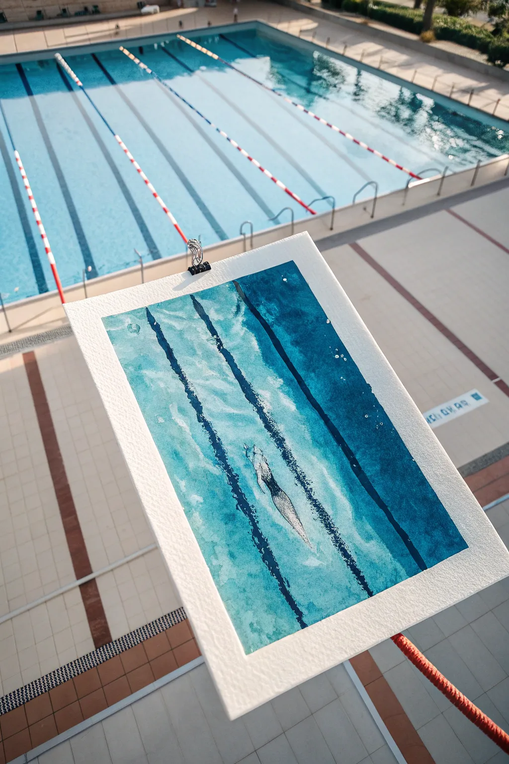
Capture the cool hues and fluid motion of a competitive swimmer with this refreshing watercolor project. By layering washes of cyan and indigo, you’ll create depth and perspective that mimics the distorted beauty of an underwater scene.
Step-by-Step Guide
Materials
- Cold Press watercolor paper (approx. 9×12 inches)
- Watercolor paints (Phthalo Blue, Prussian Blue, Turquoise, White Gouache)
- Masking fluid (optional)
- Flat wash brush (1 inch)
- Round brushes (sizing 4 and 8)
- Painter’s tape or clip board
- Pencil and eraser
- Clean water and paper towels
Step 1: Preparation and Sketching
-
Secure the paper:
Begin by taping down your cold press paper to a board or using a sturdy clip. This prevents the paper from buckling when we apply the heavy water washes later. -
Sketch the lanes:
Lightly sketch three diagonal lines running from the top right to bottom left. These don’t need to be perfectly straight; a little wobble adds to the underwater effect. -
Outline the swimmer:
In the center lane, lightly draw the silhouette of a swimmer. Focus on the streamline shape—arms extended forward, head tucked, and legs trailing behind. -
Protect the highlights:
If you are using masking fluid, apply a thin layer over the swimmer’s body and the small bubbles around them. If not, just remember to paint carefully around this area to keep the paper white.
Wet-on-Wet Magic
Work quickly during the first wash. If edges start drying before you’re done, you’ll get hard lines instead of a smooth, watery gradient.
Step 2: Creating the Water Base
-
Wet-on-wet technique:
Generously wet the entire paper surface with clean water, avoiding the swimmer if you didn’t use masking fluid. The paper should glisten but not have standing puddles. -
First wash layer:
Load your large flat brush with a diluted Turquoise or Aqua mix. Sweep it across the paper in broad strokes, allowing the color to bleed and soften on the wet surface. -
Varied tones:
While the paper is still damp, drop in hints of slightly darker Phthalo Blue in random patches to suggest ripples and depth variations in the water. -
Let it dry completely:
This is crucial. The paper must be bone dry before moving on, or your sharp lines will bleed into the background. You can use a hairdryer on a low setting to speed this up.
Salt Texture
While the first green-blue wash is still wet, sprinkle a pinch of table salt on it. As it dries, the salt pushes pigment away, creating amazing texture.
Step 3: Defining the Lanes
-
Mix the lane color:
Create a concentrated mix of Prussian Blue with a touch of Phthalo. You want a deep, rich indigo that stands out against the pale turquoise background. -
Paint the first stripes:
Using a round size 8 brush, paint the diagonal lane lines. Don’t make them solid black lines; lift your brush occasionally or vary the pressure to create a broken, shimmering effect. -
Add texture to lines:
While the lane lines are wet, drop in a tiny bit of clear water or darker pigment in spots. This creates blooms that mimic the way light refracting through water distorts straight lines. -
Deepen the deep water:
On the right side of the painting (the ‘deeper’ end or shadowed area), apply a glaze of the dark blue mix between the lane lines to create a gradient of depth.
Step 4: The Swimmer and Details
-
Remove masking fluid:
If you used masking fluid, gently rub it away with your finger or an eraser once the paint is fully dry to reveal the stark white paper underneath. -
Shadow the swimmer:
Using a very diluted grey-blue mix and a small round brush, paint simple shadows on the swimmer’s sides to give the form volume without over-detailing. -
Add bubbles:
Dip a small brush or a toothbrush into white gouache. Gently flick or dot small clusters of bubbles near the swimmer’s kick and hands for movement. -
Final highlights:
Use the white gouache to add a few sharp, thin highlights along the lane lines or water surface ripples to suggest sunlight hitting the pool.
Remove your tape carefully to reveal the crisp border that frames your underwater scene perfectly
BRUSH GUIDE
The Right Brush for Every Stroke
From clean lines to bold texture — master brush choice, stroke control, and essential techniques.
Explore the Full Guide
Trophy Silhouette with Bold Shadow
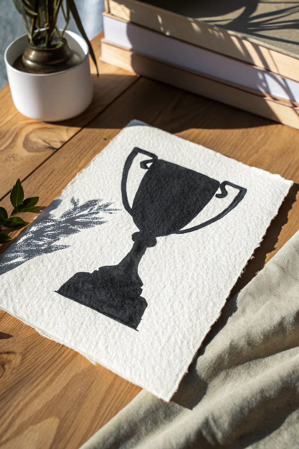
Capture the essence of victory with this strikingly simple high-contrast trophy painting. Using heavily textured deckle-edge paper and deep black ink, you will create a piece that feels both vintage and boldly modern.
How-To Guide
Materials
- Heavyweight textured watercolor paper (300gsm or higher, preferably handmade)
- Black India ink or high-flow black acrylic paint
- Flat shader brush (size 6 or 8)
- Small round detail brush (size 1 or 2)
- Pencil (HB or lighter)
- Ruler
- Paper plate or palette
- Paper towels
- Optional: Real or faux branch for staging shadows
Step 1: Preparation and Sketching
-
Prepare the paper:
Begin by tearing your paper to size if it isn’t already. To get those beautiful deckled edges shown in the photo, fold the paper deeply back and forth along a ruler’s edge, wet the crease slightly with a damp brush, and gently pull the paper apart to create a soft, fibrous edge. -
Center surface:
Find the general center of your paper. Since this design is symmetrical, I find it helpful to lightly mark a vertical centerline to ensure the trophy cup stands straight. -
Outline the base:
Start sketching the bottom of the trophy. Draw a wide, tiered pedestal shape. It should look heavy and stable, tapering upward into a thinner stem. -
Draft the cup:
Above the stem, draw a wide U-shape for the bowl of the trophy. Keep the lines loose; this style forgives imperfections. -
Add the handles:
Sketch two looping handles on either side. They should start near the top rim and curve inward to meet the lower third of the cup bowl. Add small decorative notches where the handle meets the cup. -
Review the silhouette:
Step back and look at your pencil outline. The drawing doesn’t need to be hyper-realistic, but the proportions should feel balanced.
Pro Tip: Texture Trick
For a ‘stamped’ look, blot your wet brush on a paper towel before painting. This ‘dry brush’ technique skips over low spots in the paper, creating instant texture.
Step 2: Painting the Silhouette
-
Load the brush:
Pour a small amount of India ink or fluid acrylic onto your palette. Dip your flat brush, but don’t overload it; you want the texture of the paper to show through slightly. -
Paint the rim:
Start at the very top rim of the cup. Use the edge of your flat brush to create a crisp horizontal line. -
Fill the body:
Using downward strokes, fill in the main bowl of the trophy. Allow the paint to soak into the paper’s texture. If you see white speckles form from the paper tooth, leave them—they add to the vintage stamped effect. -
Define the handles:
Switch to your smaller round brush for the handles. Carefully trace the outer curves first, then fill them in to ensure the loops look clean and solid. -
The stem connection:
Paint the narrow stem connecting the cup to the base. You might want to widen this area slightly just above the base to create a decorative node. -
Anchor the base:
Fill in the pedestal base with the larger brush. Ensure the bottom edge is relatively flat to ground the object.
Troubleshooting: Bleeding Edges
If the ink bleeds into the fibers, your paint is too watery. Switch to heavy body acrylics or let your ink sit on the palette for a few minutes to thicken slightly.
Step 3: Refining and Styling
-
Check for gaps:
Look for areas that look too patchy. You want a solid silhouette, but don’t overwork the paper or it might pill. -
Clean up edges:
If your hand slipped, you can use the small brush to careful square off any rounded corners or straighten the sides of the trophy. -
Dry completely:
Let the ink dry fully. This can take anywhere from 30 minutes to an hour depending on how absorbent your handmade paper is. -
Optional: Add shadow effects:
To mimic the artistic photo style, place the finished dry artwork in direct sunlight. Arrange a leafy branch so it casts a shadow across the left side of the paper.
Display your new trophy art on a wooden desk or frame it in a floating glass frame to show off those beautiful deckled edges
Jersey Number Block Painting
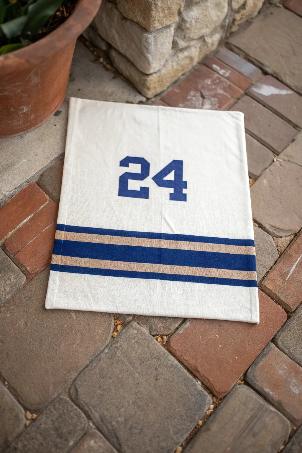
Capture team spirit with this clean and classic canvas banner painted to look like a vintage sports jersey. The bold block numbers and contrasting stripes create a simple yet striking piece of decor perfect for game days or a sports-themed bedroom.
Step-by-Step
Materials
- Heavyweight cotton canvas fabric (rectangular cut)
- Navy blue fabric paint or multi-surface acrylic paint
- Tan or athletic gold fabric paint
- Painter’s tape (1-inch and 2-inch widths)
- Stencil set (4-inch or 6-inch athletic block font)
- Stencil brush or foam pouncer
- Flat shader brush
- Ruler or measuring tape
- Iron and ironing board
- Cardboard or drop cloth
Step 1: Preparation and Layout
-
Prep the fabric:
Begin by ironing your canvas rectangle to remove any creases or wrinkles. A smooth surface is crucial for crisp paint lines. -
Protect your workspace:
Lay down a piece of cardboard or a drop cloth on your work surface. Place the canvas on top to prevent paint from bleeding through to your table. -
Plan the stripes:
Measure about 4 to 5 inches up from the bottom edge of the canvas. This is where your bottom stripe will begin. -
Tape the first stripe:
Apply a strip of painter’s tape horizontally across the fabric to mark the bottom edge of the lowest stripe. Use a ruler to ensure it is perfectly straight. -
Create the spacing:
Place a second strip of tape parallel to the first one, leaving a gap of approximately 1 inch. This gap will become your bottom navy blue stripe. -
Tape the middle section:
Apply another strip of tape above that gap to mask off the space where the tan stripe will go. This creates a separator between the two colors. -
Define the top stripe:
Place a final strip of tape to define the top edge of the tan stripe. You should now have two exposed horizontal channels of fabric separated by tape. -
Seal the edges:
Run your fingernail or a credit card firmly along all the tape edges. I find this step essential to prevent paint from seeping under the tape and ruining the crisp lines.
Bleed-Through Blues?
If paint bleeds under the tape, wait for it to dry completely. Then, use a small stiff brush and white acrylic paint or gesso to carefully touch up and ‘erase’ the mistake.
Step 2: Painting the Design
-
Paint the navy stripe:
Dip your flat brush into the navy blue paint. Fill in the bottom exposed channel, brushing from the tape onto the fabric to minimize bleeding. -
Paint the tan stripe:
Clean your brush or switch to a new one, then paint the upper exposed channel with the tan or gold paint. Apply a second coat if the canvas texture is showing through too much. -
Remove tape:
While the paint is still slightly tacky but not wet, carefully peel back the painter’s tape at a 45-degree angle to reveal your stripes. -
Position the number stencils:
Center your number stencils (in this case, ’24’) in the large open space above the stripes. Measure from the sides to ensure they are perfectly centered. -
Secure the stencils:
Tape the edges of the stencils down securely so they don’t shift while you are working. -
Load the pouncer:
Dip your stencil brush or foam pouncer into the navy paint, then dab most of it off onto a paper towel. You want a very dry brush to prevent blobs. -
Stipple the numbers:
Apply the paint over the stencil using an up-and-down dabbing motion (stippling). Do not brush side-to-side, as this pushes paint under the stencil edges. -
Repeat for opacity:
Let the first layer dry for a few minutes, then apply a second coat using the same dabbing technique until you achieve a solid, deep blue color. -
Reveal the numbers:
Gently lift the stencils straight up to avoid smudging the edges. If there are any small bridges from the stencil font (little gaps in the numbers), use a small detail brush to fill them in manually for a solid look.
Add Grommets
Install metal grommets in the top two corners. This allows you to easily hang the banner on a wall or flag stand using rope or leather cord for a rugged finish.
Allow the entire project to cure for 24 hours before hanging it up to show off your team pride

PENCIL GUIDE
Understanding Pencil Grades from H to B
From first sketch to finished drawing — learn pencil grades, line control, and shading techniques.
Explore the Full Guide
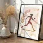
Athlete Action Silhouette at Sunset
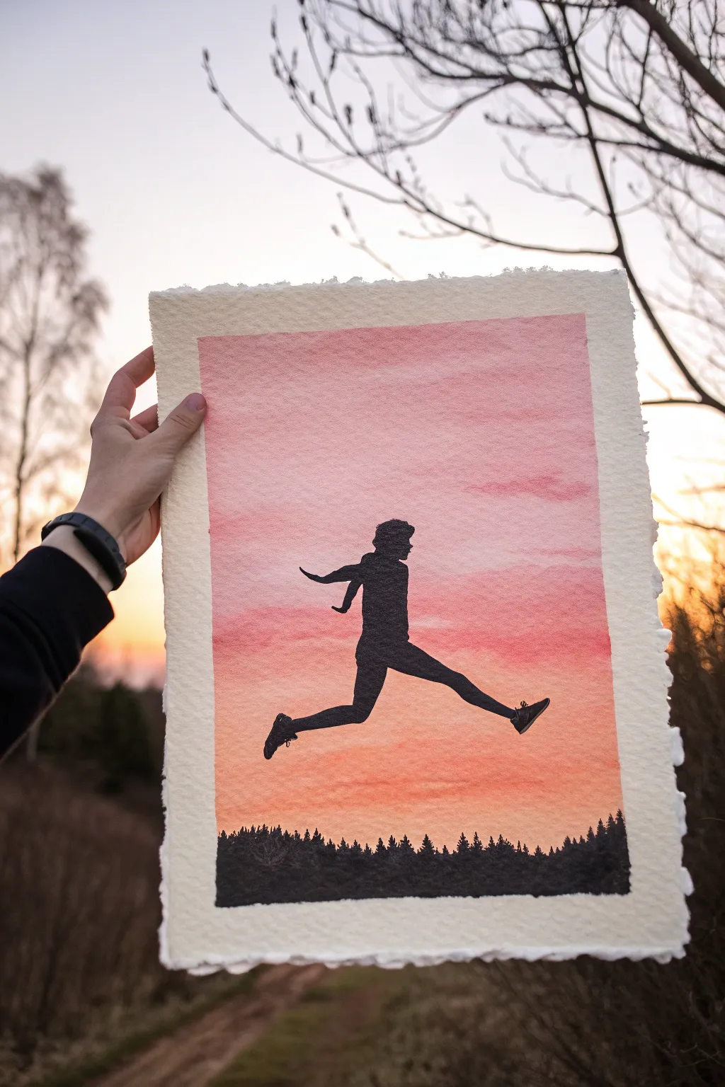
Capture the energy of movement against a stunning sky with this vibrant watercolor silhouette painting. Using a wet-on-wet gradient technique, you’ll create a glowing backdrop for a dynamic black figure mid-jump.
How-To Guide
Materials
- Cold press watercolor paper (deckled edge preferred)
- Masking tape
- Watercolor paints (Pink, Orange, Yellow)
- Black acrylic paint or India ink
- Flat wash brush (3/4 inch or larger)
- Round brush (size 4 or 6)
- Detail brush (size 0 or 00)
- Pencil and eraser
- Clean water and paper towels
- Reference photo of a runner/jumper
Step 1: Painting the Sky Gradient
-
Tape your paper:
Secure your watercolor paper to a flat, hard board using masking tape. Create a straight border on all four sides, leaving about an inch of white margin if you want the framed look shown in the example. -
Prepare the sky wash:
Mix a generous amount of watery pink, soft orange, and a touch of warm yellow on your palette. You want the colors properly diluted so they flow easily. -
Wet the paper:
With a clean flat brush, wet the entire rectangular area inside your tape. The paper should be glistening with a sheen of water, but not holding puddles. -
Apply the top color:
Start at the top of the rectangle with your pink mixture. Brush it horizontally across the wet paper, letting the color bleed downward naturally. -
Blend the middle tones:
Clean your brush quickly and pick up the orange. Apply this just below the pink, slightly overlapping so the two colors softy merge without creating a harsh line. -
Finish the bottom gradient:
Transition into your lightest yellow-orange tone near the bottom third of the sky. Keep your brush strokes horizontal to mimic atmospheric layers. -
Add cloud texture:
While the paint is still damp, dab a slightly thirsty, crumpled paper towel or a semi-dry brush into the sky to lift small patches of pigment, suggesting faint, wispy clouds. -
Let it dry completely:
This is crucial. The paper must be bone dry before adding the silhouette. If it feels cool to the touch, it’s still damp. I often use a hair dryer to speed this up.
Step 2: Adding the Silhouettes
-
Sketch the figure:
Using a light pencil, gently outline the jumping figure in the center of the sky. Focus on the dynamic pose—legs extended, arms back—rather than tiny details. -
Outline the treeline:
Lightly sketch an uneven, jagged line across the very bottom of the painted area to represent the tops of the pine trees. -
Paint the forest base:
Using black acrylic paint or ink (which is more opaque than watercolor), fill in the bottom strip. Use a round brush to stipple the tops, creating the pointy tips of pine trees. -
Fill the figure’s body:
Switch to your round brush loaded with black paint. Carefully fill in the torso and limbs of your runner. Keep the edges crisp and sharp. -
Refine the details:
Use your smallest detail brush for the trickier parts like the shoes, fingers, and nose profile. A steady hand is key here; try resting your wrist on a clean paper towel. -
Add motion elements:
Ensure the clothing details, like a fluttering shirt or jacket, shape correctly backwards to emphasize forward momentum. -
Check for opacity:
Once the first layer of black dries, hold it up to the light. If you see the sunset color peeking through the figure, apply a second coat of black for a solid silhouette. -
Reveal the border:
Once everything is perfectly dry, slowly peel away the masking tape at a 45-degree angle to reveal your clean, crisp edges.
Clean Lines
For the sharpest edges when painting the silhouette, use black gouache or acrylic instead of watercolor. It sits on top of the paper and won’t bleed into the sunset background.
Get Creative
Change the sport to match your passion! Swap the runner for a skateboarder mid-ollie, a dancer leaping, or a basketball player dunking to personalize the artwork.
Frame your energetic masterpiece or gift it to the athlete in your life as a celebration of movement
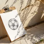
Splatter Background Ball Series
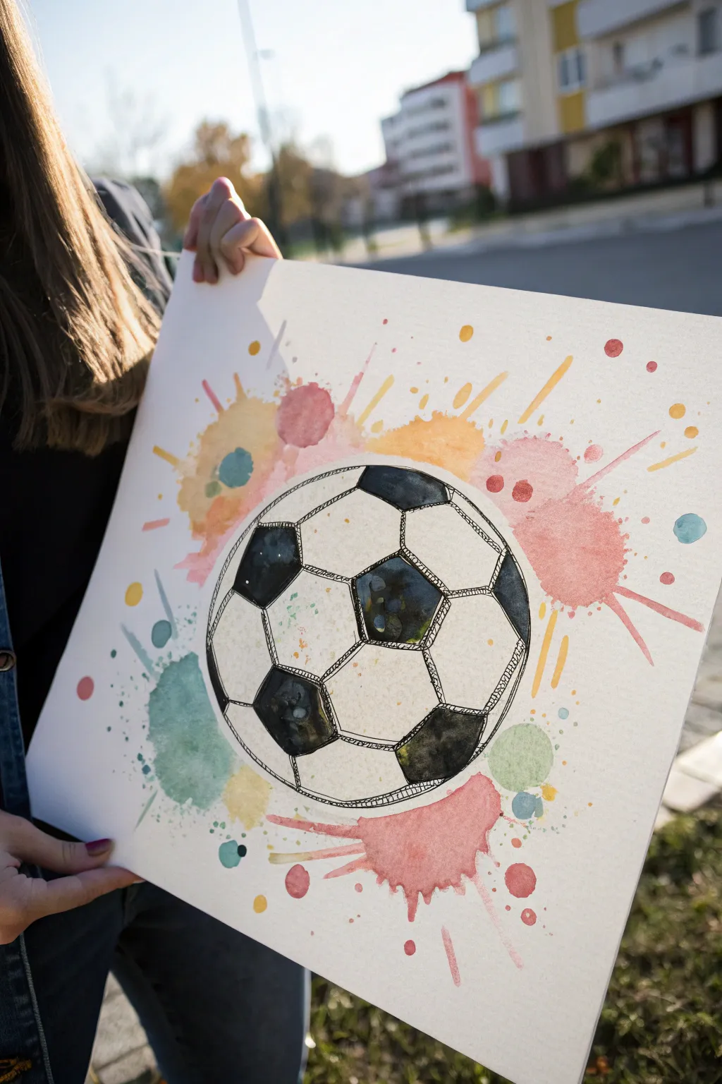
Capture the energy of the game with this dynamic mixed-media painting that combines precise line work with loose, expressive watercolor splashes. The contrast between the sketched soccer ball and the colorful, abstract background makes this piece pop off the page.
Step-by-Step Tutorial
Materials
- High-quality watercolor paper (white, A3 or similarly large size)
- Watercolor paint set (pan or tube)
- Round watercolor brushes (medium size)
- Black waterproof fine liner pen (0.5mm or 0.8mm)
- Pencil (HB)
- Eraser
- Compass or a large circular object to trace (like a bowl)
- Cup of water
- Paper towels
Step 1: Planning the Composition
-
Prepare your workspace:
Lay down your large sheet of watercolor paper on a flat surface. Tape the edges down if you want to prevent buckling, although for this loose style, a little waviness adds character. -
Draw the main circle:
Use a compass or trace around a circular object like a bowl to create a perfect circle in the center of your page. Keep this pencil line very light. -
Sketch the pentagon pattern:
Lightly sketch a pentagon (a five-sided shape) in the center of the ball. This doesn’t need to be mathematically perfect, but try to keep the sides roughly equal. -
Connect the hexagons:
From each point of the central pentagon, draw a line extending outward. At the end of these lines, sketch partially visible hexagons and pentagons that wrap around the curvature of the sphere. -
Refine the shapes:
Go over your inner pattern to make sure the iconic soccer ball grid looks correct. The black shapes are typically pentagons, surrounded by white hexagons.
Water Control Tip
Keep the interior of the soccer ball mostly dry while painting the background. This ensures the colorful splatters stay on the outside and don’t bleed into the white hexagons.
Step 2: Ink Detailing
-
Outline the ball:
Switch to your waterproof black fine liner. Carefully trace over the outer circle of the ball. To give it a hand-drawn feel, double up the line in some areas so it isn’t too mechanical. -
Ink the internal grid:
Go over your pencil lines for the internal pentagons and hexagons. Instead of a single straight line, use quick, short strokes or a double line to create a sketchy, artistic texture. -
Fill the dark patches:
Identify which shapes should be black (the pentagons). Don’t fill them in solid black; instead, use a scribbling technique or tight cross-hatching to fill them. -
Add highlights within blacks:
While scribbling in the black sections, deliberately leave small, irregular white patches inside the shapes. These act as highlights and suggest shine and texture. -
Add stitching details:
Draw tiny, short perpendicular marks across the lines separating the panels to simulate the stitching of the soccer ball. -
Erase pencil guides:
Wait a moment for the ink to dry completely, then gently erase all visible pencil marks to clean up the drawing.
Step 3: Watercolor Splatter Background
-
Mix your colors:
Prepare puddles of diluted watercolor paint on your palette. You’ll need pink, orange, yellow, and a teal or light blue. -
Apply the first wash:
Dip your brush in clean water and dampen the area immediately surrounding the ball, but don’t touch the ink lines yet. -
Drop in color:
Load your brush with orange or pink paint and touch it to the wet paper outside the ball. Let it bloom naturally. -
Create the splatters:
Load a brush with wet paint. Hold it over the paper and tap the handle against another brush or your finger to send fine speckles across the page. -
Add directional bursts:
Paint rapid, flicking strokes extending outward from the ball’s edge to mimic exploding energy or speed lines. -
Layer different hues:
While the first colors are still damp, introduce the yellow and teal splashes near the edges. Let them bleed slightly into the warmer colors for soft transitions. -
Add larger paint blobs:
create a few larger, distinct circles or puddles of color scattered further away from the ball to balance the composition. -
Paint inside the ball:
Very lightly wash a tiny bit of dirty water or extremely pale blue over a few of the white hexagon panels to give the ball volume, but keep it mostly white. -
Final drying stage:
Let the artwork sit flat until completely dry. If the paper has buckled, you can flatten it under heavy books once it is 100% moisture-free.
Team Spirit Twist
Swap the random background colors for your favorite team’s official colors. Use their primary color for the big splashes and the secondary color for the smaller speckles.
Now you have a vibrant piece of sports art that perfectly captures the motion of the game


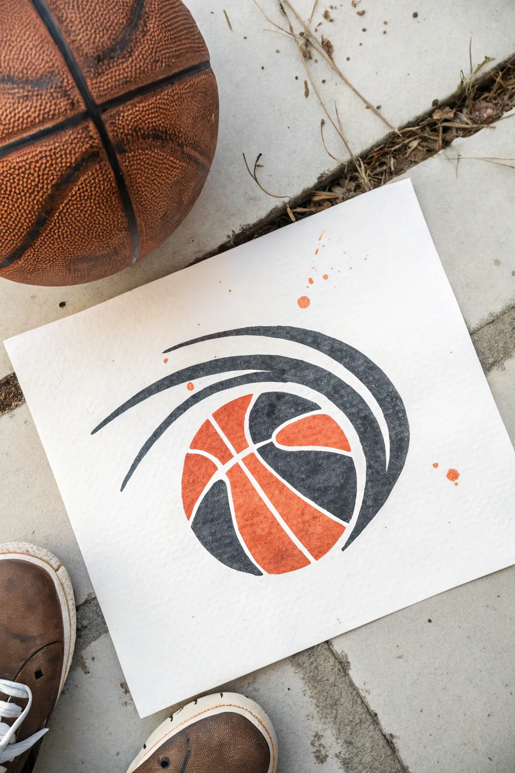
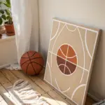
Abstract Motion Lines Around a Ball

Capture the dynamic energy of basketball with this stylish, graphic art piece that combines crisp stenciled shapes with organic watercolor textures. The result is a bold, modern illustration featuring motion lines swooping around a stylized ball, perfect for a sports-themed room.
Step-by-Step Guide
Materials
- Heavyweight watercolor paper (300 gsm or similar cold press)
- Pencil and eraser
- Compass or circle template
- Ruler or French curve
- Watercolor paints (Orange/Vermilion and Black/Payne’s Grey)
- Fine round paintbrush (size 2 or 4)
- Masking fluid (optional but recommended)
- Clean water and mixing palette
- Paper towels
Step 1: Drafting the Design
-
Establish the basketball boundary:
Start by lightly drawing a perfect circle in the lower center of your paper using a compass or tracing a round object. This will be the outer edge of your basketball. -
Sketch the seam lines:
Within the circle, draw the characteristic curved lines of a basketball. Picture two crossing curves intersecting with a central swooping line to create the panels. -
Create the motion swooshes:
Starting from the left side of the ball, draw three concentric, curved shapes that sweep up and over to the right. These should taper at the beginning (left) and widen as they wrap around the top right of the ball. -
Refine the gaps:
Carefully erase the pencil lines where the white ‘gaps’ will be. The design relies on negative space, so ensure there is a clear, consistent white gap between the ball panels and between the motion swooshes.
Step 2: Planning and Blocking
-
Define color zones:
Decide which sections will be orange and which will be black. In the reference, the central ‘face’ of the ball is orange, while the side panels and the motion swooshes are black. -
Masking the negative space (Optional):
If you struggle with unsteady hands, apply a thin line of masking fluid along the white gaps between sections. This acts as a barrier, keeping your white lines crisp. -
Prepare your palette:
Mix a vibrant, saturated orange. I like to add a tiny touch of red to make it pop like a real basketball. Separately, mix a deep black or dark grey, ensuring it’s not too watery so it stays opaque.
Bleeding Lines?
If your black paint runs into the white gaps, wait for it to dry completely, then use a white gel pen or opaque white gouache to tidy up the separation lines.
Step 3: Painting the Artwork
-
Paint the orange segments:
Using a fine round brush, carefully fill in the central panels of the basketball with your orange mix. -
Create texture:
While the orange paint is still wet, you can dab just a tiny bit of clean water or a slightly darker orange into the center to create a subtle, textured gradient effect. -
Allow first color to dry:
Wait for the orange sections to be completely dry to the touch. This prevents the black paint from bleeding into the orange if your hand slips. -
Paint the black panels:
Fill in the remaining side panels of the basketball with your black paint. Use the tip of the brush to get sharp edges against the white gaps. -
Fill the motion lines:
Carefully paint the long, swooping motion lines above the ball in black. Try to pull the brush in one continuous stroke for the smoothest edges.
Pro Design Tip
For the smoothest curves on the motion lines, use a French curve tool to guide your pencil sketch before you start painting.
Step 4: Finishing Touches
-
Clean up edges:
Once everything is dry (or after removing masking fluid), inspect the white gaps. If any pencil lines are still visible, gently erase them now. -
Add a splatter effect:
Load your brush with watery orange paint. Hold it over the paper and tap the handle against another brush or your finger. -
Control the splatter:
Aim for a few small droplets near the motion lines and the bottom right corner to mimic sweat or energetic movement. -
Final dry:
Let the entire piece sit undisturbed until the thickest parts of the paint and the splatter droplets are fully dry.
Now you have a dynamic piece of sports art that looks professional and full of movement

Have a question or want to share your own experience? I'd love to hear from you in the comments below!