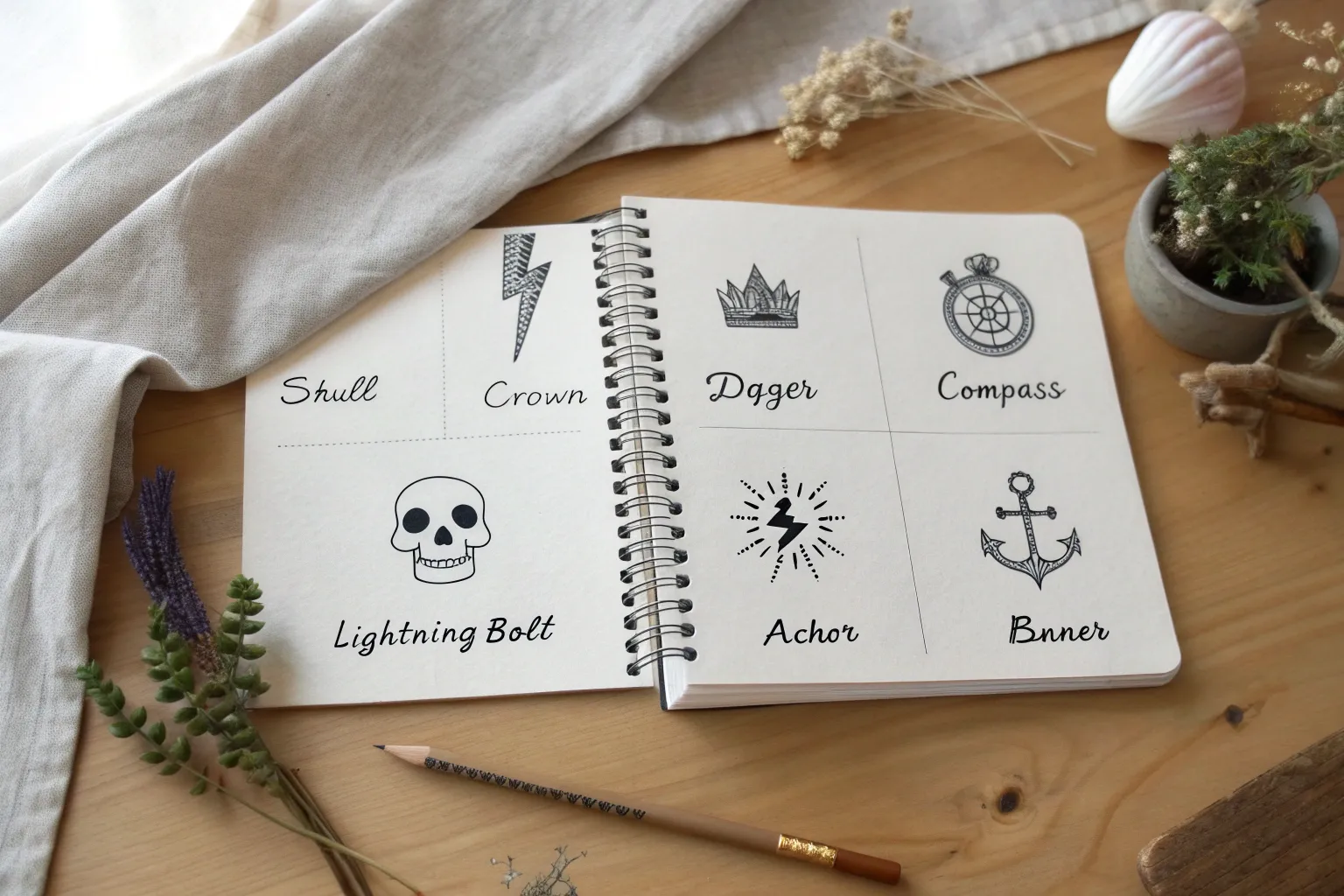
If you’re sketching easy tattoo designs that still feel bold, the trick is keeping the shapes simple and the lines confident. Here are my go-to tattoo drawing ideas for men, starting with the classics and drifting into more creative, flash-sheet-friendly twists.
Simple Cross Linework
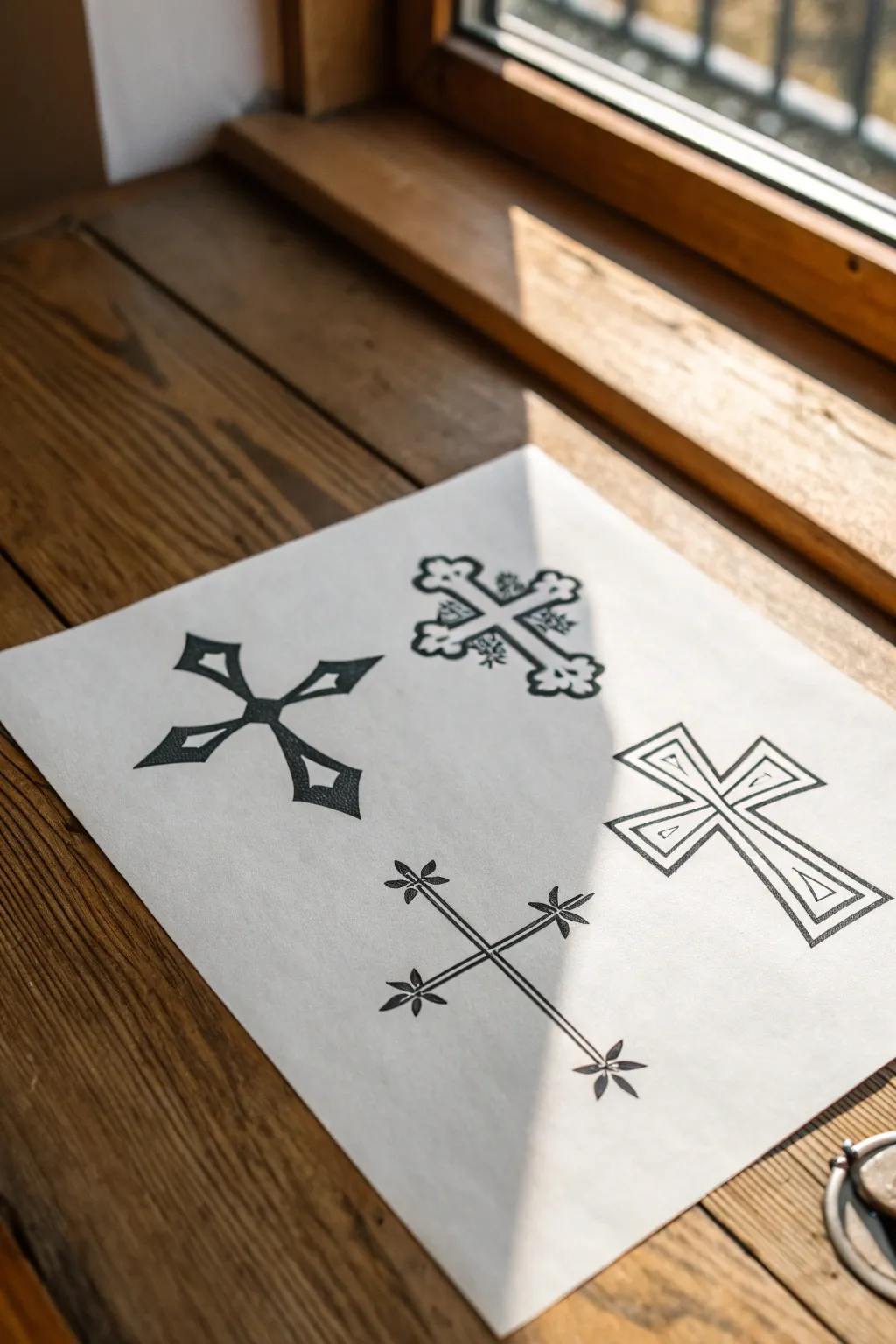
Master four distinct styles of cross line art, ranging from bold Gothic-inspired shapes to delicate floral linework. This practice sheet serves as excellent preparation for tattoo stencils or simply refining your geometric drawing skills.
Step-by-Step Guide
Materials
- High-quality white drawing paper or sketchbook
- Pencil (HB or H for sketching)
- Fine liner pens (0.3mm and 0.5mm)
- Black marker or brush pen (for filling)
- Ruler
- Eraser
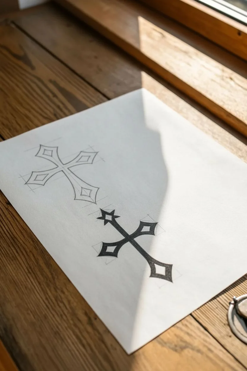
Step 1: Design 1: The Diamond-Point Cross
-
Establish the skeleton:
Start with your pencil and ruler. Draw a light vertical line and a shorter horizontal line to form a basic cross shape. These will serve as the center guides. -
Mark the points:
At the end of each arm, draw a small diamond shape. Connect the inner corners of these diamonds back toward the center intersection, but curve the lines inward to create a concave, sharp look. -
Add inner details:
Sketch a smaller, matching diamond shape inside each of the four arm ends. -
Inking:
Trace your outer lines with a 0.5mm pen. Use the broad marker to fill in the space between the outer edge and the inner diamond details, leaving the center white.
Wobbly Lines?
If your straight lines look shaky, don’t hesitate to use the ruler for the inking phase too. Just wipe the ruler edge frequently to avoid smudging wet ink across the paper.
Step 2: Design 2: The Ornate Budded Cross
-
Basic structure:
To the right of your first design, lightly pencil a thick, blocky cross. Instead of straight ends, sketch rounded, trefoil (three-lobed) shapes at the tip of each arm. -
Refining the edges:
Go over the outline with a wavy, slightly irregular line to give it an organic, ancient feel rather than a rigid geometric one. -
Internal decoration:
Draw fine, leafy scribbles or small chaotic lines inside the cross arms. I like to concentrate these details near the center intersection to create depth. -
Finalize:
Ink the outline boldly with your 0.5mm pen, making the budded tips prominent.
Step 3: Design 3: The Floral-Tip Cross
-
Draw the stems:
Below your first design, use a ruler to draw two very thin, parallel lines for the vertical axis and two for the horizontal axis. Keep them close together so the arms look like thin stems. -
Create the flowers:
At the very tip of each of the four arms, draw three small petals fanning outward. They should look like little leaves or petals exploding from the end. -
Center intersection:
Where the vertical and horizontal lines meet, draw slight curves to smooth out the connection, avoiding a harsh right angle. -
Inking:
Trace the entire design with your finest 0.3mm pen. Fill in the petals solid black for high contrast against the thin stem lines.
Add Dimension
Use stippling (tiny dots) instead of solid black fill on the ornate cross to give it a stone texture or vintage shading effect.
Step 4: Design 4: The Beveled Outline Cross
-
Base layer:
For the bottom-right design, draw a simple block cross using your ruler. Ensure the arms are of equal width. -
Creating the bevel:
Draw a smaller cross inside the first one. Then, draw diagonal lines connecting the outer corners to the inner corners at the tips of the arms. -
Inner triangles:
Inside the tips of the cross arms, draw small triangles pointing inward. This mimics the look of a carved or beveled surface. -
Clean up:
Ink all your pencil lines with a steady hand and the 0.5mm pen. Wait for the ink to dry completely, then erase all underlying pencil marks for a crisp finish.
Now you have a reference sheet of four distinct cross styles ready for your portfolio


Minimal Anchor Outline
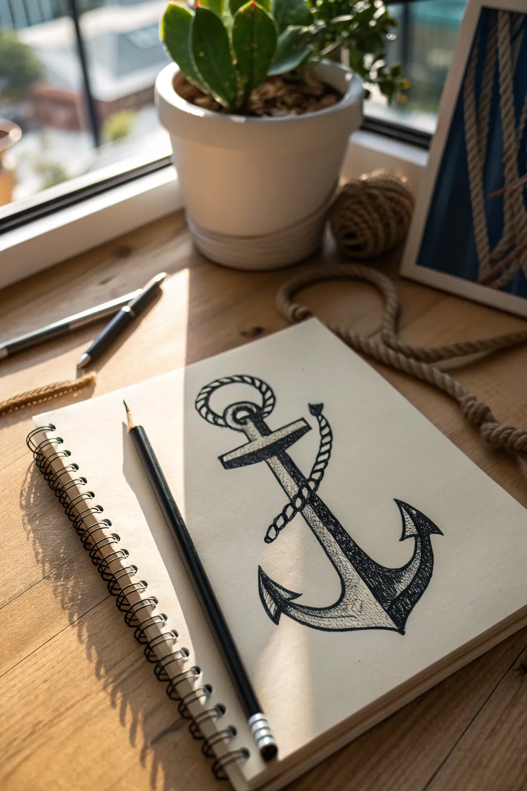
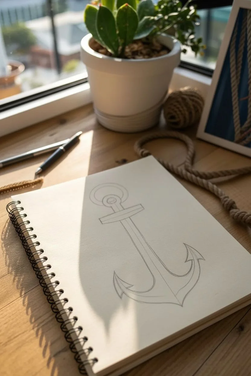
Capture the spirit of the sea with this classic anchor illustration, featuring bold outlines and subtle cross-hatching to create depth. The rope detail adds a dynamic touch of realism suitable for a timeless tattoo design or sketchbook study.
How-To Guide
Materials
- Sketchbook with cream or off-white paper
- HB Graphite pencil (for initial sketch)
- Eraser
- Fine liner pen (0.5mm or 0.8mm, black)
- Fine liner pen (0.1mm or 0.3mm for details)
Step 1: Basic Structure
-
Establish the centerline:
Start by lightly drawing a vertical line down the center of your page with your pencil. This will serve as the shank of the anchor and help keep the drawing symmetrical. -
Draw the crossbar:
Near the top third of your vertical line, sketch a horizontal bar (the stock). Make it slightly angled or straight depending on your preference, drawing it as a thin rectangle. -
Sketch the arms:
At the bottom of the vertical line, draw a wide ‘U’ shape for the arms of the anchor. The curve should be smooth and extend equally on both sides. -
Add the ring:
At the very top of the shank, draw a circle for the ring where the rope usually attaches. Draw a second, smaller circle inside it to give the ring thickness. -
Refine the flukes:
At the ends of your ‘U’ shape curve, draw the flukes (the pointed triangular tips). Make them sharp and arrow-like, pointing slightly outward.
Uneven Symmetry?
If one side looks wider than the other, use a ruler to measure the distance from the center line to the tips of the flukes before committing to ink.
Step 2: Adding the Rope
-
Plan the rope path:
Lightly sketch a winding line that starts at the top ring, loops around the crossbar, and twists down around the shank. This guide line determines the flow. -
Thicken the rope sketch:
Turn your single guide line into a tube shape. Don’t worry about the twisted texture yet; just establish the thickness of the rope overlapping the anchor. -
Detail the twists:
along the tube shape, draw diagonal curved lines to simulate the twisted strands of the rope. Erase the parts of the anchor that are hidden behind the rope.
Weathered Look
Add tiny cracks or chips to the flukes and crossbar using your finest pen. This gives the anchor a vintage, sea-worn story.
Step 3: Inking and Definition
-
Outline the anchor:
Switch to your thicker fine liner (0.5mm). Carefully trace over your pencil lines for the anchor’s body. I suggest keeping the lines confident and solid. -
Outline the rope:
Ink the rope carefully. Since the rope texture is bumpy, use short, curved strokes for the outline rather than a straight line to mimic the braided surface. -
Add shadow to the rope:
Using the thinner pen (around 0.1mm), add small hatching lines on the undersides of the rope twists to give it volume and roundness. -
Shade the shank:
Add vertical hatching lines along one side of the central shank. This creates a cylindrical look, suggesting light is hitting from the opposite side. -
Texture the crossbar:
Use stippling or very short dashes on the crossbar to differentiate its texture—perhaps it’s wood or rusted iron—from the smoother metal shank. -
Darken the flukes:
Fill in the shadowy parts of the arrow-shaped flukes. Use dense cross-hatching just inside the outline to make the tips look sharp and metallic.
Step 4: Final Touches
-
Deepen the blacks:
Go back over the darkest areas, like the inside of the top ring or where the rope casts a shadow on the metal, to increase the contrast. -
Clean up:
Once the ink is completely dry, gently erase all remaining pencil guidelines to reveal a clean, professional-looking illustration.
Your nautical sketch is now ready to anchor your portfolio


Easy Skull Icon
This classic skull icon strikes the perfect balance between edgy and minimalistic, making it an excellent starting point for tattoo-style illustration. Using straightforward outlining techniques and simple shading, you’ll create a bold design that pops right off the page.
Step-by-Step Tutorial
Materials
- Spiral-bound sketchbook (heavyweight paper preferred)
- Pencil (HB or 2B for sketching)
- Fine liner pen (0.5mm or 0.8mm, black)
- Thick marker or brush pen (black)
- Kneadable eraser
Step 1: Laying the Foundation
-
Cranium circle:
Begin with your pencil by drawing a large, slightly flattened circle for the top of the skull (the cranium). It doesn’t need to be geometrically perfect; a slightly organic shape feels more natural. -
Cheekbone guides:
From the sides of your circle, drop two short, angled lines downwards and slightly inwards to mark where the cheekbones will flare out. -
Jawline structure:
Connect the cheekbone lines with a U-shape at the bottom to form the jaw. Keep the jaw slightly squared off rather than perfectly round to give the skull a more masculine, defined look. -
Eye socket placement:
Sketch two large, somewhat irregular ovals where the eyes belong. Position them slightly lower than the center of the cranium circle to leave room for the forehead. -
Nose cavity:
Draw an upside-down heart shape or a triangular opening between and slightly below the eye sockets.
Socket Depth Tip
Don’t just color the eye sockets solid black. Leave tiny, irregular white spots inside the dark area to simulate the rough, porous texture of bone interior.
Step 2: Refining the Details
-
Defining the features:
Using your pencil, refine the outline. Indent the temples slightly where the cranium meets the cheekbones to create that classic skull hourglass shape. -
Brow ridge:
Add a subtle dip in the forehead line right between the eyes to simulate the brow ridge. -
Teeth guidelines:
Draw a horizontal curve across the jaw area where the teeth will sit. Add a second parallel curve just below it. -
Sketching the teeth:
Lightly sketch in the individual teeth. Start from the center two front teeth and work your way outwards, making them slightly smaller as they recede towards the back of the jaw.
Make It Yours
Turn this into a classic tattoo flash by adding a simple banner underneath with text, or draw roses blooming from one of the eye sockets.
Step 3: Inking the Design
-
The main outline:
Switch to your fine liner pen. Trace over your pencil lines for the outer shape of the skull. I find that using a confident, continuous stroke helps keep the drawing looking clean. -
Line variations:
Thicken the outer boundary line slightly, especially on the underside of the jaw and cheekbones, to give the drawing weight and dimension. -
Inking the teeth:
Carefully ink the teeth. Don’t close the shape fully at the gum line; instead, use small U-shapes or dashes to suggest where the root enters the bone. -
Cracks and texture:
Add tiny, broken lines around the temple, above the nose, or along the jawline to simulate cracks or sutures in the bone.
Step 4: Shading and Finishing
-
Filling the cavities:
Use your thicker marker or brush pen to fill in the eye sockets and the nose cavity completely black. -
Creating texture:
While the ink is wet or using a stippling technique, leave tiny flecks of white or less saturated black within the dark sockets to give them a gritty, textured depth. -
Clean up:
Wait at least five minutes for the ink to dry completely to avoid smudging. -
Erase guidelines:
Gently glide your kneadable eraser over the entire drawing to lift away the graphite, leaving only the crisp ink lines behind. -
Final touches:
Review your line weights. If the drawing feels flat, add a second pass of ink to the bottom-right edges of the skull to suggest a light source coming from the top-left.
You have now mastered a staple of tattoo imagery that looks great in any sketchbook.


Classic Dagger Sketch
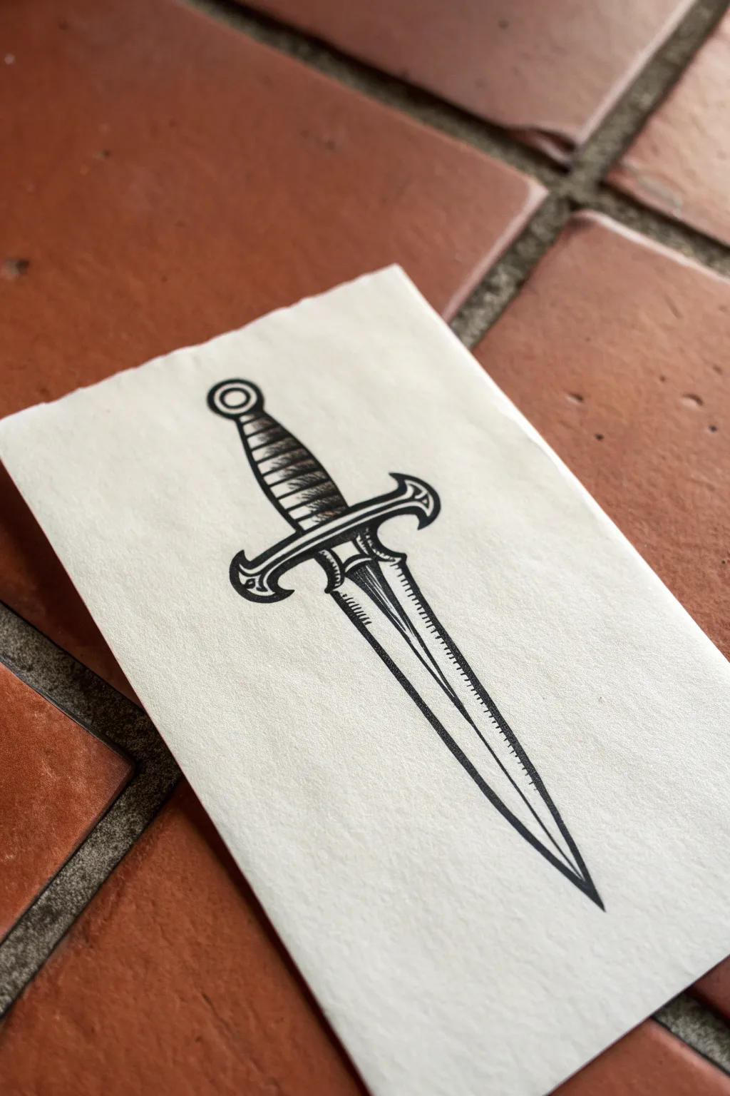
This project harks back to classic tattoo flash with bold lines and clean, etched shading. You’ll create a striking black-and-grey dagger design that rests on textured paper for an authentic, vintage feel.
Detailed Instructions
Materials
- Textured heavyweight paper (watercolor or mixed media)
- HB or 2H graphite pencil
- Fine liner pens (0.1mm, 0.3mm, 0.5mm)
- Ruler
- Kneaded eraser
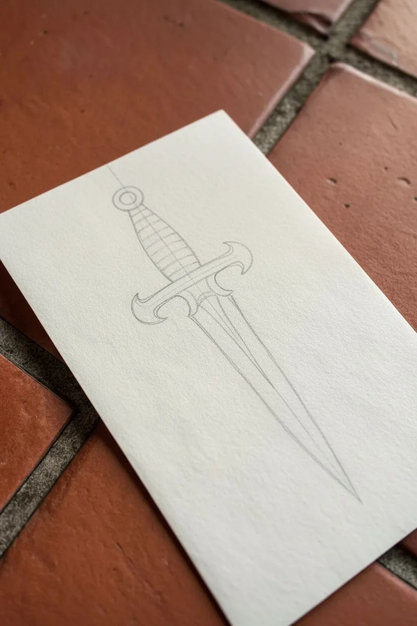
Step 1: Drafting the Structure
-
Establish the centerline:
Begin by lightly drawing a vertical centerline down the middle of your paper using a ruler. This line is crucial for symmetry and will guide the entire drawing. -
Mark the hilt and handle:
Near the top third of the centerline, sketch a small circle for the pommel. Below that, draw a slightly tapered cylinder for the grip, curving inwards toward the bottom. -
Sketch the guard structure:
Draw a horizontal line intersecting the centerline just below the grip. Sketch outward curves on either side to form the cross-guard, ending in distinct downward-curving tips. -
Define the blade shape:
From the center of the guard, draw two long, straight lines converging at a sharp point at the bottom. Ensure both sides taper evenly toward the centerline. -
Detail the blade ridge:
Draw a parallel line down the center of the blade, following your original centerline, to represent the raised ridge of the dagger. Leave a small gap near the guard for the ricasso.
Step 2: Inking the Outline
-
Outline the main shapes:
Switch to your 0.5mm pen. Carefully trace the outer perimeter of the pommel, handle, guard, and blade. Use confident, steady strokes to create clean, bold outlines appropriate for tattoo-style art. -
Refine the guard details:
Add the inner contour lines of the guard, creating a double-line effect that suggests thickness and dimension. Make sure the curves flow smoothly into the handle. -
Ink the blade ridge:
Draw the central ridge line with the 0.5mm pen. I find it helps to rotate the paper to pull this long stroke towards you comfortably. -
Erase pencil guides:
Wait for the ink to dry completely to avoid smudging. Gently remove all graphite guidelines with your kneaded eraser.
Pro Tip: Clean Lines
When inking long straight lines like the blade edge, lock your wrist and move your entire arm from the shoulder for a wobble-free stroke.
Step 3: Adding Texture and Shading
-
Wrap the handle:
Using a 0.3mm pen, draw curved horizontal bands across the handle grip. Space them evenly to mimic leather or wire wrapping. -
Shade the handle:
Add small, diagonal hatching lines on the left side of the handle wrapping to suggest a cylindrical form and shadow. -
Create the blade bevels:
On the blade, you need to differentiate the two facets. Use the 0.1mm pen to draw fine hatching lines along the left edge of the central ridge to create a shadow. -
Texture the blade edge:
Add tiny, perpendicular ticks along the outer right edge of the blade. This ‘stitched’ look adds that classic illustrative texture. -
Deepen the contrast:
Go back in with the 0.3mm pen and thicken the shadows directly under the cross-guard where it meets the blade. -
Refine the pommel:
Draw a smaller concentric circle inside the pommel. Add a tiny crescent of hatching on one side to give it a spherical appearance. -
Final line weight check:
Look over the entire drawing. Use the 0.5mm pen to re-trace the outermost silhouette one last time to make the image pop off the page.
Level Up: Vintage Feel
Stain your paper with coffee or tea before drawing and let it dry. This creates an aged, parchment look that suits traditional flash art perfectly.
Now you have a sharp, classic design ready to be framed or added to your portfolio
BRUSH GUIDE
The Right Brush for Every Stroke
From clean lines to bold texture — master brush choice, stroke control, and essential techniques.
Explore the Full Guide
Simplified Compass Rose

This classic navigation symbol makes for a striking yet manageable drawing project, perfect for tattoo inspiration or just sharpening your linework skills. The result is a crisp, clean compass rose with bold contrast and a touch of vintage flair.
Detailed Instructions
Materials
- Spiral-bound sketchbook or smooth drawing paper
- HB pencil for sketching
- Ruler
- Compass (geometry tool) or circle stencils
- Fine liner pens (sizes 0.1mm, 0.3mm, and 0.5mm)
- Kneadable eraser
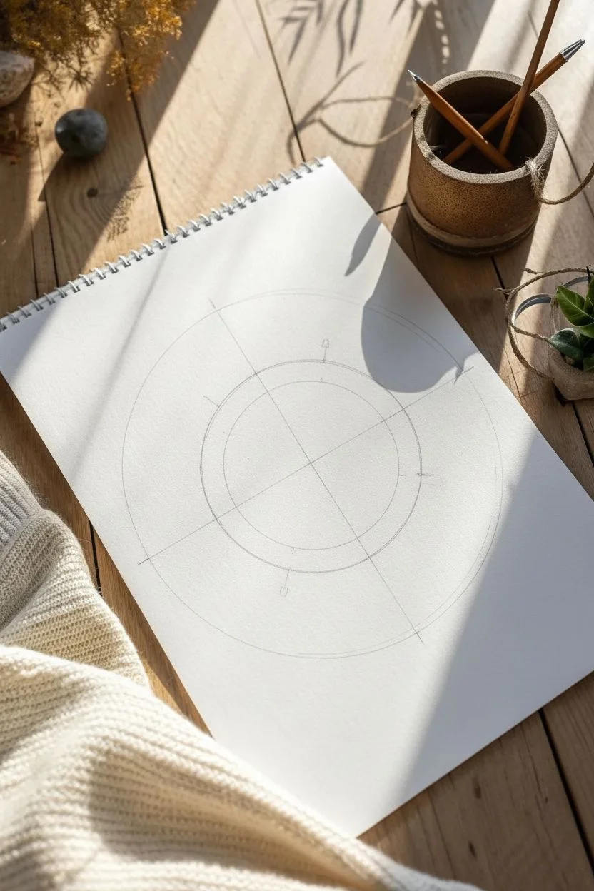
Step 1: Laying the Geometric Foundation
-
Find the center:
Begin by lightly marking the center of your page. Use your ruler to draw a vertical line and a horizontal line that intersect perfectly at this center point, creating a cross. -
Draw the primary circles:
Using your geometry compass, place the needle on the center intersection. Draw a small inner circle (about an inch diameter) and a larger outer circle (about 3 inches diameter) to define the boundaries of your design. -
Add diagonal guides:
Lightly sketch two diagonal lines through the center, bisecting the 90-degree angles of your cross. This creates an eight-slice ‘pizza’ layout. -
Define the star points:
On the vertical and horizontal lines, mark points just outside the large circle. On the diagonal lines, mark points about halfway between the center and the large circle’s edge. These will become the tips of your star.
Clean Lines
When inking long straight lines, lock your wrist and move your entire arm from the elbow. This reduces shakiness compared to moving just your fingers.
Step 2: Structuring the Star
-
Sketch the main points:
Connect the tip of the North point down to the center-line of the diagonal spokes on either side of it. Repeat this for East, South, and West to form the four primary kite shapes. -
Form the secondary points:
Now, draw lines from the tips of the diagonal (smaller) points back to the base of the main kite shapes. This interlocks the four large points with the four smaller points. -
Create the split effect:
Draw a straight line from the tip of every star point directly to the center of the design. This divides each ‘petal’ in half, which is crucial for the shading phase later. -
Draft the text:
Lightly sketch the letters N, E, S, and W at the tips of the main cardinal points. Use a serif font style to match the vintage aesthetic.
Aged Paper Look
Before drawing, lightly stain your paper with cool black tea and let it dry flat. The tan background makes the black ink pop and adds instant history.
Step 3: Inking and Detailing
-
Outline the star:
Switch to your 0.5mm fine liner. Carefully trace the outer edges of the eight-pointed star. Use a ruler here if you want razor-sharp precision, or freehand it for a more organic, sketched look. -
Add inner ring details:
Ink the two main circles you drew earlier. Inside the band created between the inner and outer circles, add small tick marks or random geometric scribbles to simulate an old map’s degree markings. -
Fill the contrast:
This is the most impactful step. On every star point, fill in the right-hand side with solid black ink. Leave the left side white. This creates a 3D bevelled effect. -
Stipple the shading:
I like to add depth by using the 0.1mm pen to add tiny dots (stippling) at the base of the white sections, fading out as you move toward the tips. -
Ink the letters:
Go over your N, E, S, W letters with the 0.3mm pen. Keep the lines relatively thin but distinct. -
Extend the guides:
Using a very light touch or a thinner pen, extend the main directional lines slightly past the outer ring and through the letters to anchor the design in space. -
Clean up:
Wait at least five minutes for the ink to fully cure. Taking your kneadable eraser, gently lift off all the remaining graphite pencil marks.
Now you have a timeless design ready for a portfolio or a frame
Nautical Star Black Fill
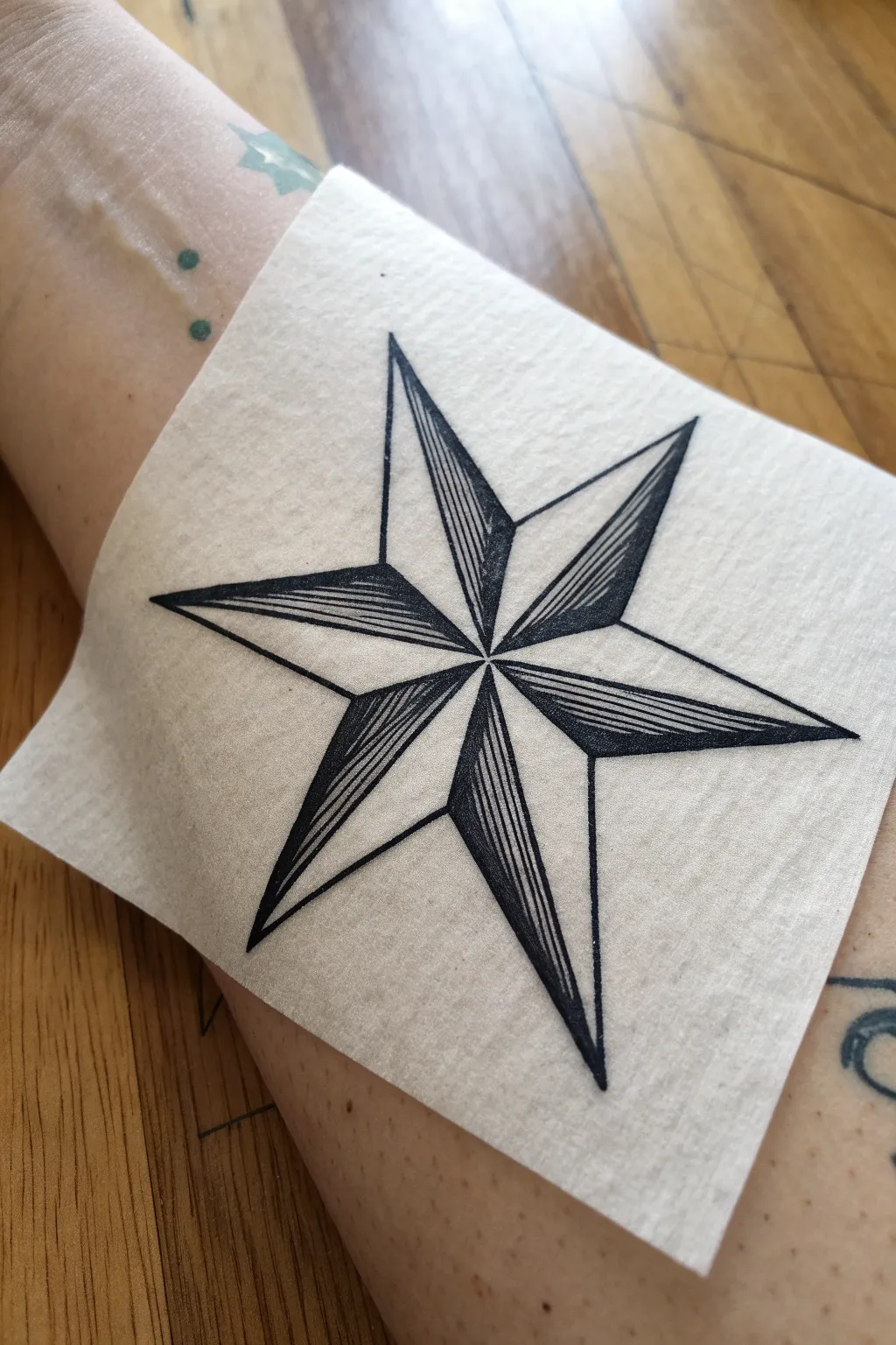
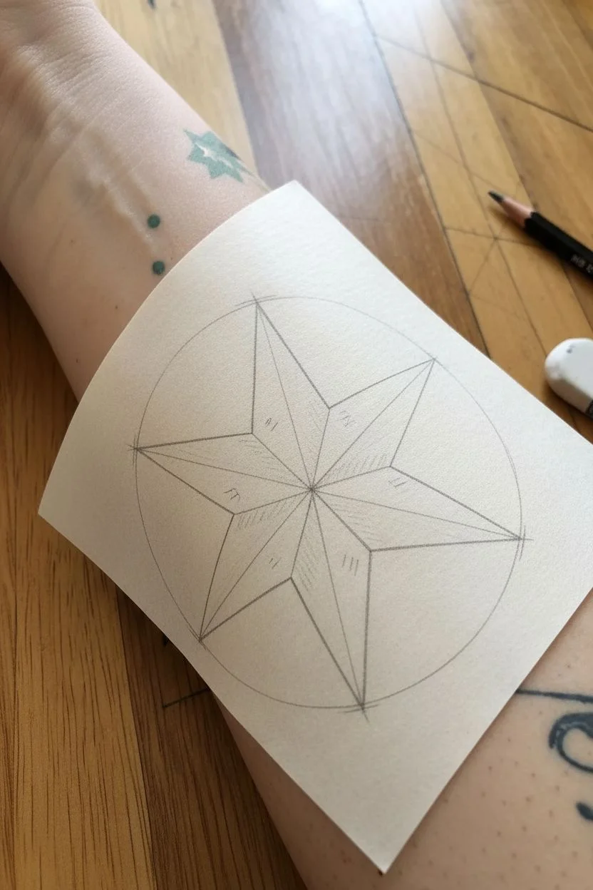
This classic nautical star design uses precise linework rather than solid shading to create depth and dimension. The result is a crisp, clean geometric tattoo flash that looks striking on skin or transfer paper.
Step-by-Step Tutorial
Materials
- High-quality drawing paper or stencil paper
- Pencil (HB or H for light sketching)
- Ruler or straight edge
- Compass (optional but recommended for symmetry)
- Fine liner pens (sizes 0.3mm and 0.5mm)
- Eraser
Step 1: Constructing the Framework
-
Establish the center:
Begin by marking a small dot in the absolute center of your paper. This will be the anchor point where all the star’s points converge. -
Draw the main circle:
Using a compass, draw a light circle around your center dot. The radius of this circle will determine the length of the star’s points. -
Mark the vertices:
Divide your circle into five equal sections. Mark five points evenly spaced along the circumference where the tips of the star will be. Visualize a clock face to help space them roughly at 12, 2:30, 5, 7, and 9:30. -
Create the inner points:
Mark five midway points between your outer vertices, but much closer to the center dot. These will form the ‘V’ shape between each long point. -
Connect the outline:
Use your ruler to connect an outer vertex to its neighboring inner points, repeating this all the way around until you have a basic five-pointed star shape.
Step 2: Adding Dimension
-
Bisect the points:
From the center dot, draw a straight line out to the very tip of each of the five star points. You now have ten triangular sections radiating from the center. -
Identify the shadow sides:
To create the 3D effect, you need to alternate which sides get filled. Mark every other triangle lightly with a pencil tick so you know which ones will receive the linear shading. -
Ink the main outline:
Switch to your 0.5mm pen. Carefully trace the entire outer perimeter of the star and the five internal lines bisecting the points. Ensure your ruler doesn’t smudge the wet ink.
Keep it Sharp
Wipe the edge of your ruler with a tissue after every few ink lines. Ink builds up on the plastic edge and can smear across your clean paper instantly.
Step 3: Linear Shading
-
Begin the fill pattern:
In your first selected ‘shadow’ triangle, switch to the thinner 0.3mm pen. You won’t be coloring it solid black; instead, you will draw tight parallel lines. -
Establish direction:
Start from the center and draw lines parallel to the *outer* edge of that triangle section. This directionality is crucial for the sharp, geometric look. -
Build density:
Keep your lines very close together but distinct. I find that leaving just a hair of white space between ink strokes keeps the drawing from looking muddy. -
Complete the shading:
Continue this process for all five alternating sections. Be patient here; rushing the lines will ruin the uniform texture. -
Clean up:
Once the ink is completely dry—give it a full five minutes to be safe—gently erase all your pencil guides, circles, and construction marks. -
Final touches:
Inspect your corners. If any lines didn’t quite meet the center or the tip, carefully connect them with the fine point pen to ensure a razor-sharp silhouette.
Troubleshooting Shading
If your parallel lines start bumping into each other, switch to an even finer pen tip (0.1mm) near the narrow center of the star to maintain separation.
You have constructed a timeless piece of nautical imagery ready for your portfolio

PENCIL GUIDE
Understanding Pencil Grades from H to B
From first sketch to finished drawing — learn pencil grades, line control, and shading techniques.
Explore the Full Guide
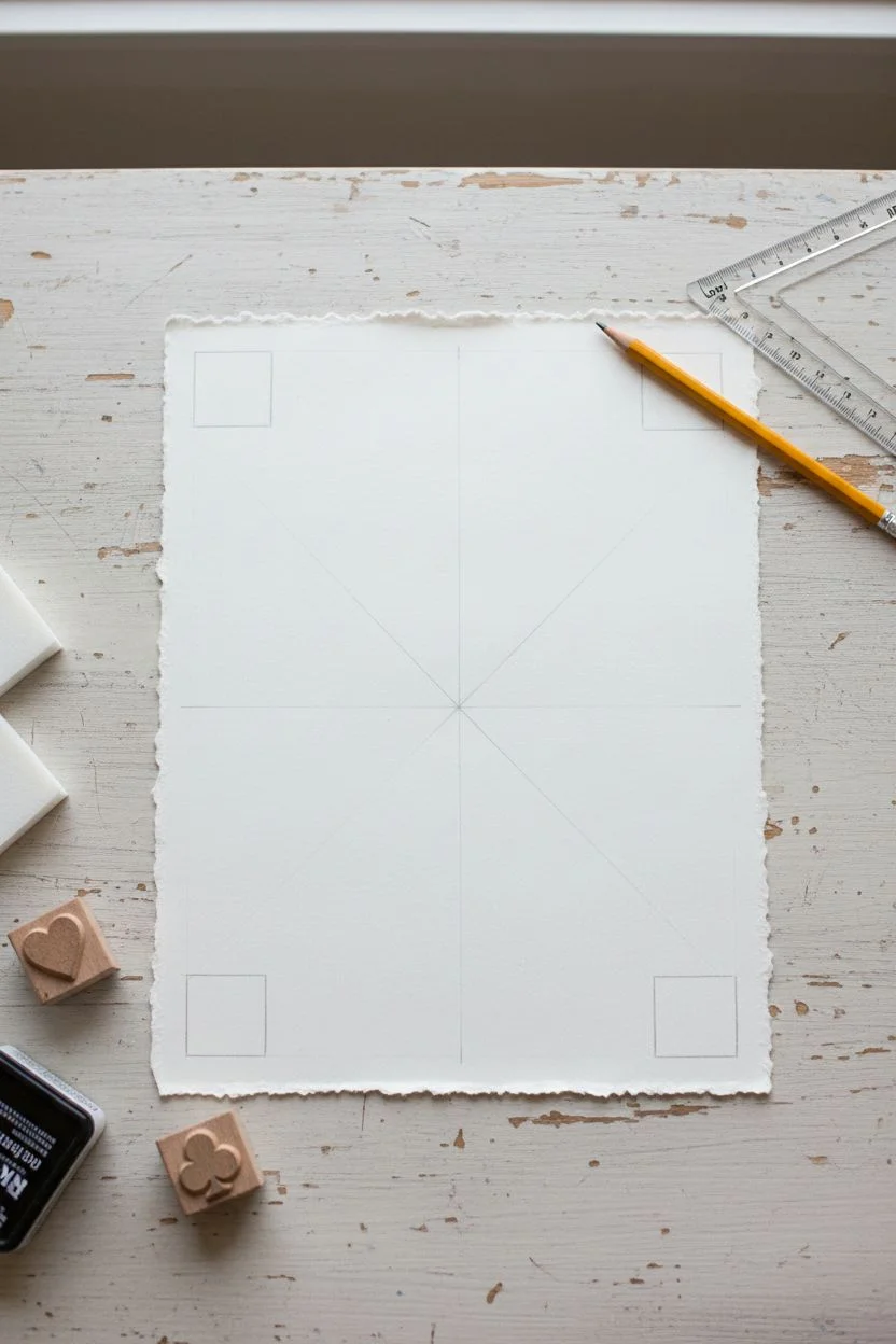
Playing Card Suit Set
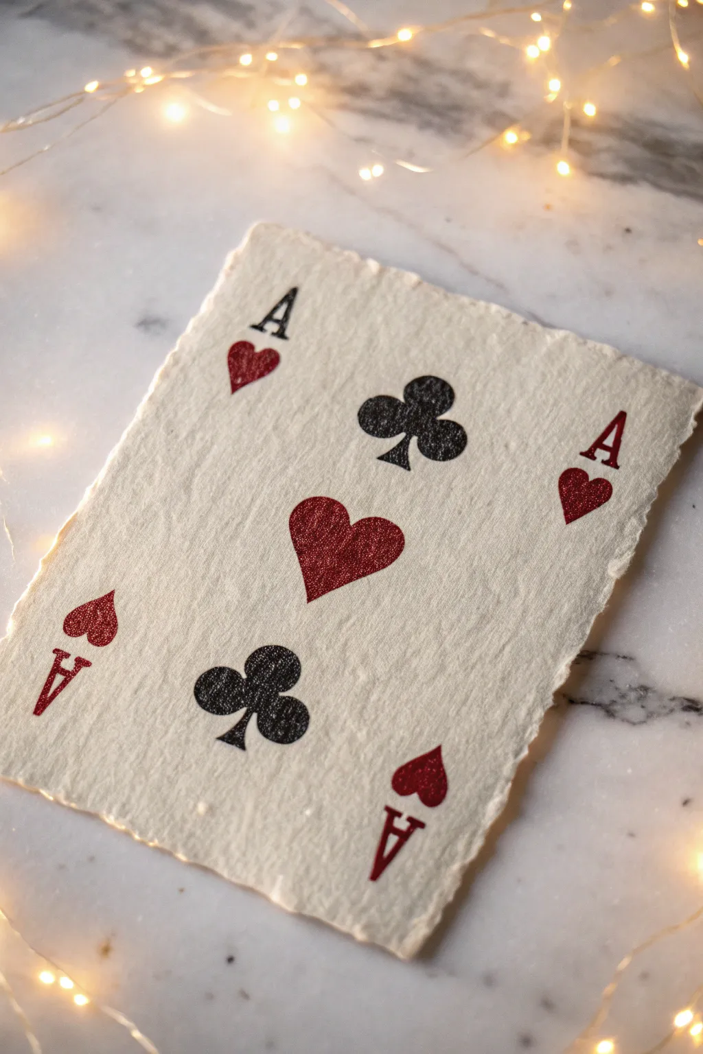
Capture the classic grit of playing card suits with this textured, hand-stamped art project. Using rough-edged paper and stencils or stamps, this piece creates a tactile, vintage aesthetic perfect for tattoo inspiration or wall decor.
Step-by-Step Guide
Materials
- Heavyweight handmade cotton paper (deckle edge)
- Black block printing ink or heavy body acrylic
- Deep red glitter paint or metallic textured acrylic
- High-density foam sheet or linoleum block
- Carving tool or precision craft knife
- Small brayer or sponge dauber
- Ruler
- Pencil
- Scrap paper
Step 1: Preparing the Paper and Layout
-
Select your canvas:
Choose a piece of handmade cotton rag paper with a distinct deckle edge. The rough texture is crucial for achieving that vintage, weathered look seen in the photo. -
Plan the composition:
Lightly mark the center of your paper with a pencil. You will be arranging four central suit symbols in a diamond or cross pattern. -
Corner guides:
Mark the four corners where the ‘A’ and miniature suit symbols will go. Keep them roughly 1 inch from the edges to allow the paper texture to frame the design.
Uneven Ink Fix
If the rough paper prevents a clear stamp, place a slightly soft surface, like a mousepad or magazine, *under* the paper while stamping to help it conform.
Step 2: Creating the Stamps
-
Draft the symbols:
On your foam sheet or linoleum block, draw the outline of a heart, a club, a capital serif ‘A’, and a smaller version of the heart and club. Keep the shapes simple and classic. -
Carve the main suits:
Carefully carve away the negative space around your large heart and club designs. If using foam, you can simply cut the distinct shapes out with scissors for a cleaner edge. -
Carve the details:
Create the smaller ‘A’ stamps. Since you need four distinct ‘A’s, you can carve one and reuse it, or carve four slightly different ones for organic variation. -
Test prints:
Press your stamps onto scrap paper first. I like to check if the edges are too clean; if so, nick the edges slightly with your knife to mimic a worn, vintage print.
Step 3: Inking and Printing
-
Prepare the red ink:
Mix your deep red acrylic with a touch of glitter medium or use a pre-mixed glitter paint. You want a thick consistency that will sit on top of the paper fibers. -
Stamp the hearts:
Load your heart stamp with the red mixture using a sponge dauber. Press the large heart firmly in the center-top and center-bottom positions (or arranged diagonally as per your preference). -
Add corner hearts:
Using the smaller heart stamp, add the red accents beneath the corner ‘A’ positions on the top-left and bottom-right diagonals. -
Switch to black:
Clean your tools or switch to a fresh dauber. Load the club stamp with black block printing ink. The ink should be tacky, not runny. -
Stamp the clubs:
Press the large club stamp into the remaining open spaces in your central arrangement. Apply even pressure to ensure the ink catches on the rough paper surface. -
Complete the corners:
Stamp the smaller black clubs in the remaining two corners. -
Lettering:
Finally, stamp the letter ‘A’ in all four corners. Orient them so the top ‘A’s face up and the bottom ‘A’s occupy the space upside down, mimicking a real playing card layout.
Add Burnt Edges
Carefully singe the very edges of the cotton paper with a lighter or candle to enhance the antique, pirate-map aesthetic and frame the card art.
Step 4: Finishing Touches
-
Check for gaps:
If the texture of the paper caused significant gaps in the ink, use a fine brush to dab in a little extra paint, but leave some ‘noise’ for authenticity. -
Distress (Optional):
Once fully dry, you can lightly sand the dried ink with high-grit sandpaper to weather the print further. -
Dry time:
Let the piece dry flat for at least 24 hours, especially if you used a thick layer of glitter paint.
Now you have a rugged piece of art that channels the timeless cool of traditional tattoo flash
Lucky Dice Pair
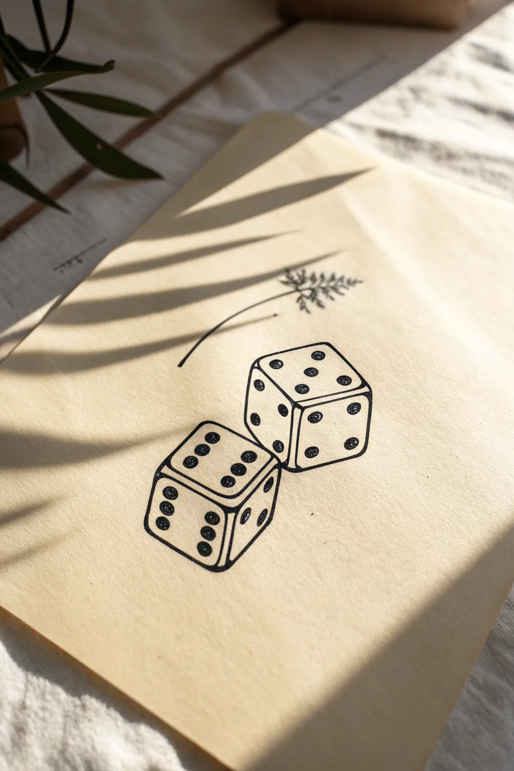
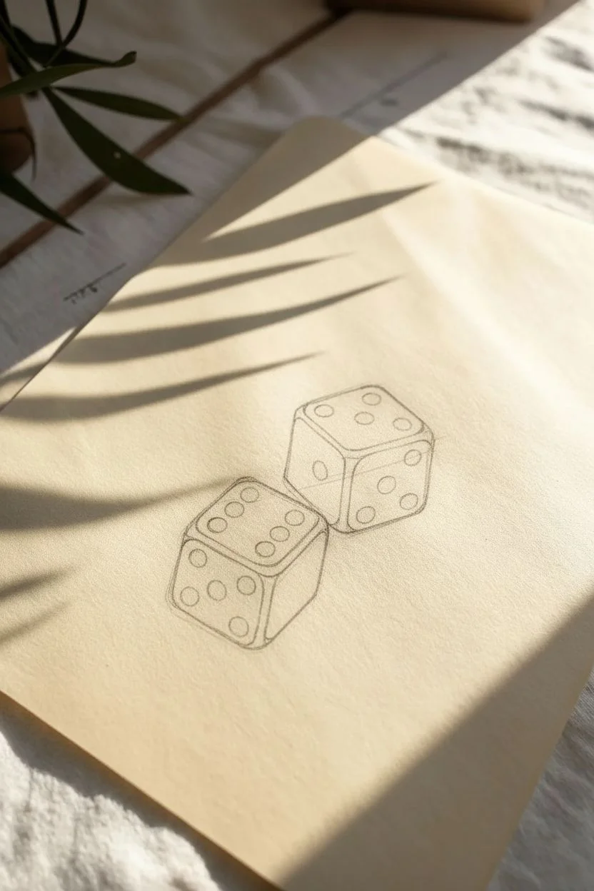
Capture the timeless cool of classic tattoo flash with this minimalist line art project featuring a pair of tumbling dice. This simple yet striking design uses clean lines and crisp contrast, making it perfect practice for steady hand control.
Detailed Instructions
Materials
- Light tan or cream-colored drawing paper
- HB pencil for sketching
- Fine liner pen (black, size 0.5 or 0.8)
- Fine liner pen (black, size 0.1 or 0.3)
- Eraser
- Ruler (optional)
Step 1: Sketching the Structure
-
Position the first die:
Start by drawing a slightly tilted square in the lower-left area of your paper. This will be the front face of the bottom die. Keep your pencil lines very light so they are easy to obscure later. -
Add dimension:
From the top two corners and the bottom right corner of your square, draw short diagonal lines extending upwards and to the right to create the depth of the cube. -
Complete the first cube:
Connect the ends of those diagonal lines to form the top and side faces of the cube. You should now have a transparent 3D box shape. -
Position the second die:
Draw a second square slightly higher and to the right of the first one. Angle it differently so the dice look like they are in motion—perhaps tilting the top right corner downward a bit. -
Form the second cube:
Repeat the process of adding diagonal lines and connecting them to finish the 3D shape of the second die. Ensure the perspective lines roughly match the direction of the first die for consistency. -
Round the edges:
Go back over your sharp corners and soften them slightly. Classic dice usually have rounded corners, which makes the drawing look more realistic and less like a math diagram.
Clean Circles Tip
Struggling to draw perfect circles? Don’t stress. For tattoo-style art, slightly organic, hand-drawn circles actually add character. Just focus on consistent sizing rather than perfect roundness.
Step 2: Adding Details
-
Map out the pips:
Lightly sketch small circles for the numbers (pips). On the bottom die, place a 6 on the top face, a 5 on the front face, and a 4 on the side face. I find it helps to draw a tiny ‘X’ lightly on the face first to find the center. -
Fill the second die:
For the top die, sketch a 5 on the top face, a 4 on the front face, and a 2 on the side face. Watch your spacing to keep the pips aligned evenly. -
Sketch the sprig:
Above the dice, draw a simple curved line for a stem. Add small, jagged pine or fern-like leaves extending from the top half of the stem.
Ink Smearing?
If your hand drags ink across the paper, place a separate scrap piece of paper under your drawing hand. It acts as a shield and keeps your oils and friction off the fresh lines.
Step 3: Inking and Refining
-
Outline the cubes:
Switch to your thicker fine liner (0.5 or 0.8). Trace over the main structural lines of the dice. Use confident, single strokes rather than feathery scratching motions to get that bold tattoo look. -
Vary line weight:
For a more dynamic look, you can thicken the outer perimeter lines of the dice slightly more than the interior lines that separate the faces. -
Ink the pips:
Carefully trace the small circles. Instead of filling them completely solid black, use a tight scribbling motion to fill them, leaving tiny specks of white or using a slightly rough texture to mimic the stippling often seen in tattoo art. -
Connect the pips:
Ensure the pips follow the perspective of the face they are on. For example, the circles on the top face should look slightly oval-shaped, flattened by the angle. -
Ink the sprig:
Use your thinner fine liner (0.1 or 0.3) for the plant element. Keep these lines delicate and slightly organic to contrast with the geometric dice. -
Erase guidelines:
Wait at least five minutes for the ink to dry completely. Gently erase all your pencil sketches underneath, being careful not to smudge the dark ink. -
Final touches:
Inspect your line work. If any corners feel too disconnected, strengthen them with a tiny dot of ink. This is a great time to clean up any rough edges on your pips as well.
Now you have a piece of classic flash art ready to frame or hang


Bold Crown Icon
This striking black crown design combines bold linework with delicate stippling shading for a classic tattoo-flash aesthetic. The translucent paper gives it an authentic studio feel, making it perfect practice for aspiring tattoo artists or ink enthusiasts.
How-To Guide
Materials
- Translucent tracing paper or drafting vellum
- Pencil (HB or 2H)
- Eraser
- Fine liner pens (sizes 0.1, 0.3, and 0.8 or 1.0)
- Black brush pen or broad marker
- Ruler (optional)
Step 1: Drafting the Structure
-
Establish the base:
Begin by lightly sketching a slightly curved horizontal oval near the bottom of your tracing paper. This will serve as the opening of the crown. -
Shape the rim:
Draw a parallel curved line just above the top of your oval to create the thick rim or band of the crown. Keep the lines smooth and flowing. -
Mark the points:
Lightly mark five vertical guidelines for the crown’s spikes. Place the tallest one in the exact center, two medium-height ones flanking it, and two shorter ones on the far outer edges. -
Define the spikes:
Connect the top of your rim to these guidelines, drawing curved, sweeping lines that swoop inward before flaring out to the tips. This creates the classic concave sides of the crown points. -
Add circular finials:
At the top of the outer four spikes, sketch small, imperfect circles. For the central spike, sketch a slightly larger circle. -
Detail the center star:
Transform the central circle into a bursting star shape or sunburst. Draw small triangular spikes radiating outward from the center circle.
Uneven Circles?
If your hand is shaky on the small circles, use a stencil or the hole of a button as a physical guide to trace perfect rounds before inking.
Step 2: Inking the Outlines
-
Trace the main lines:
Switch to your 0.8 or 1.0 fine liner. Carefully trace over your pencil sketch, solidifying the outer silhouette of the crown. Use confident, continuous strokes. -
Refine the rim:
Outline the band at the bottom. Inside this band, draw a series of circles—large ones in the center getting smaller toward the sides—to represent jewels or rivets. -
Add the secondary rim line:
Just above the jeweled band, draw a thin double line. Inside this narrow gap, place tiny dots or dashes for texture. -
Create the inner curve:
Ink the bottom curve of the initial oval to show the back of the crown’s opening. Leave the top curve of that oval open or very light, as it will be defined by shading later.
Stippling Rhythm
For better gradients, don’t tap randomly. Work in layers. Start with a uniform spread of dots, then add a second pass only in the darker areas.
Step 3: Solid Blacks and Shading
-
Fill the darks:
Using your brush pen or broad marker, fill in the main body of the crown spikes making sure to leave the negative space ‘jewels’ and decorative scallops white. Be careful not to color inside the circular finials yet. -
Shade the finials:
Take a 0.3 pen and fill in the circular finials on the tips, leaving a small white crescent or dot in each to simulate a reflective shine. -
Fill the band:
Use the brush pen to fill the background of the bottom rim black, carefully meticulously tracing around the circles you drew earlier so they remain stark white against the dark band. -
Start stippling:
Now for the texture. I like to use a 0.1 fine liner for this part. Add tiny dots (stippling) inside the main black areas where the light would hit, creating a gradient from solid black to speckled black. -
Gradient effect:
Concentrate your dots heavily near the bottom of the spikes and edges, spacing them out as you move toward the center or highlighting points to create volume. -
Rim shadows:
Add a little stippling inside the white ‘jewels’ on the band—just a few dots on one side—to give them spherical dimension. -
Final clean up:
Once the ink is completely dry, gently erase any visible pencil guidelines. Review your solid black areas and touch up any spots that look patchy.
Your regal design is now ready to be framed or used as a stencil for your next project
Geometric Wolf Head
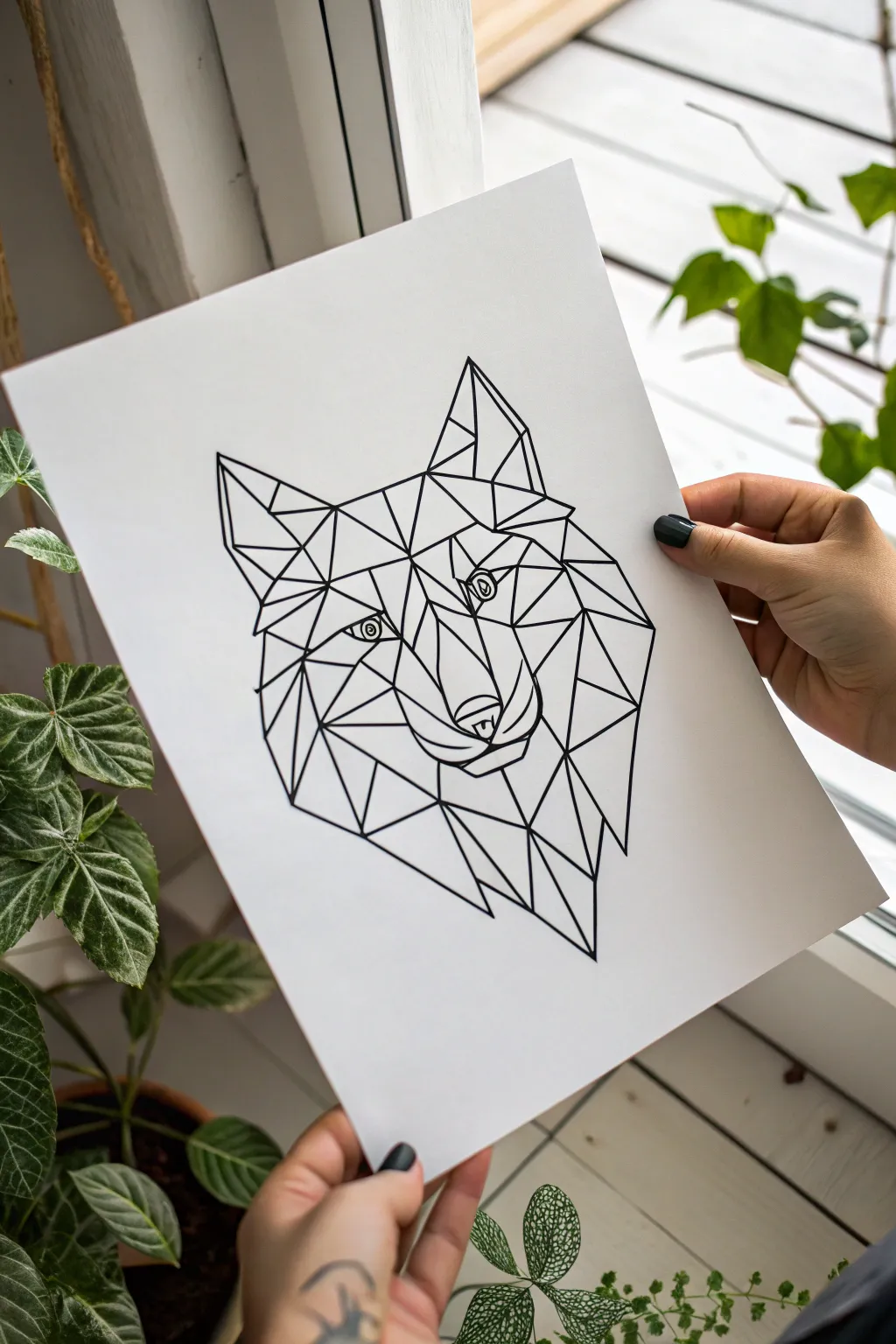
Master the art of geometric design with this striking low-poly wolf head illustration. Using crisp black lines and angular shapes, you’ll build a modern, tattoo-ready piece that looks complex but breaks down into manageable triangles and polygons.
Step-by-Step Guide
Materials
- High-quality white drawing paper (smooth bristol or cardstock)
- HB or 2H graphite pencil for sketching
- Fine liner pens (0.5mm and 0.8mm, black)
- Ruler or straight edge
- Quality eraser (kneaded or distinct white vinyl)
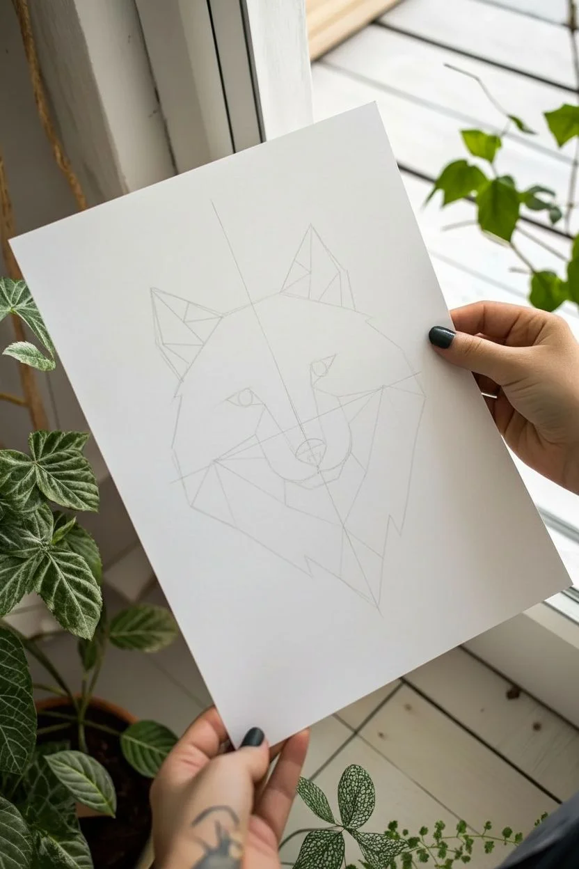
Step 1: Constructing the Framework
-
Establish the centerline:
Begin by lightly drawing a vertical line down the center of your paper with your pencil and ruler. This will act as your axis of symmetry to ensure the wolf looks balanced. -
Mark geometric boundaries:
Sketch a loose, uneven kite shape or diamond that will contain the entire head. Mark points for the ear tips at the top and the snout at the bottom to define the overall height. -
Outline the main features:
Lightly block in the two large triangles for the ears and a central diamond shape for the nose area. Keep your pencil pressure very light so these lines can be erased later. -
Define the eye line:
Draw a horizontal guide line roughly halfway down the head shape. Place two angled shapes for the eyes along this line, ensuring they are equidistant from the center axis.
Step 2: Building the Polygon Mesh
-
Segment the forehead:
Starting from the space between the ears, draw a series of connecting triangles downwards towards the eyes. I find it helpful to think of this as a puzzle where every piece must share a side with another. -
Shape the snout:
Create the bridge of the nose using long, vertical simplified shapes. Connect angles from the inner corners of the eyes down to the top of the nose tip. -
Detail the nose and mouth:
Draw the nose tip as a geometric polygon rather than a realistic curve. Add angled lines below it to suggest the mouth and chin, keeping every line straight and sharp. -
Fill in cheek volume:
Flesh out the sides of the face by drawing larger, irregular quadrilaterals and triangles radiating from the eyes and nose toward the outer jawline. -
Construct the fur texture:
Instead of drawing individual hairs, use jagged, zig-zagging geometric shapes along the outer edges of the cheeks and neck to mimic tufts of fur. -
Detail the ears:
Split the large ear triangles into smaller internal shapes. Add a line or two inside that parallels the outer edge to give the ears depth and dimension. -
Refine the eyes:
Inside your eye outlines, draw a small circle for the iris and a tiny dot for the pupil. These are the only curved lines in the entire piece, which makes them stand out.
Pro Tip: Line Weight
Use a thicker pen for the perimeter outline and a thinner pen for the internal geometric mesh. This hierarchy creates immediate visual depth.
Step 3: Inking and Finalizing
-
Trace main outlines:
Switch to your 0.8mm fine liner. Carefully trace over the main structural lines of the face—the outer silhouette, the ears, and the jawline. Use a ruler if your hand isn’t steady. -
Ink the internal mesh:
Using a slightly thinner 0.5mm pen, ink the internal webbing of triangles. This subtle difference in line weight adds depth, making the outer shape pop forward. -
Connect the nodes:
Pay special attention to where lines meet (the nodes). Ensure lines connect cleanly without overshooting or leaving gaps, as this crispy precision is key to the geometric style. -
Darken the eyes:
Fill in the pupils solidly with black, leaving the tiny highlight white. Carefully outline the iris ring. -
Wait and erase:
Allow the ink to dry completely for at least 5-10 minutes to prevent smearing. Once dry, gently erase all your pencil guides with a kneading eraser. -
Review and touch up:
Scan the drawing for any faint lines or connection points that need strengthening. I like to thicken the line under the chin just a bit to anchor the drawing.
Troubleshooting: Uneven Eyes
If the eyes look lopsided even with a ruler, trace a small coin or button for the iris circles before drawing the angled lids around them.
Enjoy your sharp new artwork and consider framing it for a modern wall accent
Minimal Snake Coil
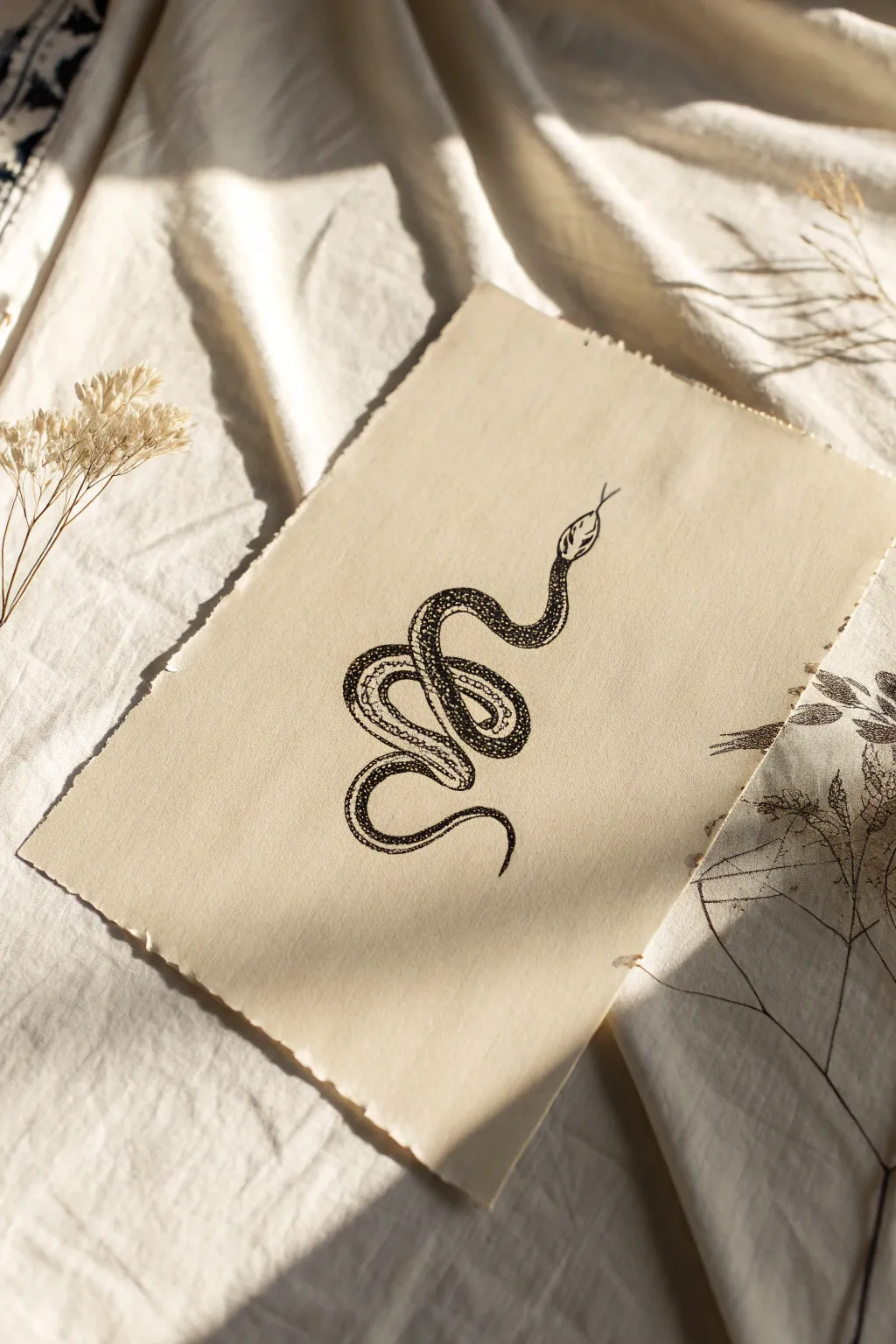
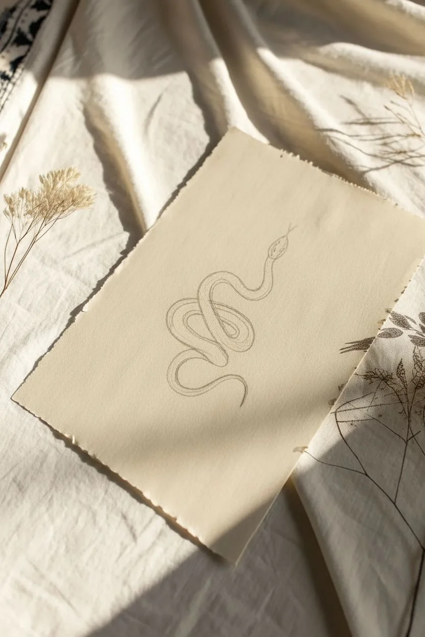
This elegant snake illustration combines crisp linework with delicate stippling to create a piece that feels both vintage and sharply modern. The striking contrast of black ink against textured, deckle-edged paper makes for a sophisticated tattoo design or standalone art print.
Step-by-Step Tutorial
Materials
- Heavyweight cream or beige paper (preferably with a textured surface)
- Fine liner pens (sizes 0.1, 0.3, and 0.5)
- Pencil (HB or H)
- Kneaded eraser
- Ruler (optional)
- Deckle edge ruler or straight edge for tearing paper (optional)
Step 1: Sketching the Form
-
Prepare the paper:
Begin by tearing your paper to the desired size. If you want that ragged, vintage look shown in the photo, hold a ruler firmly against the paper and tear the excess away slowly to create a soft, deckled edge on all four sides. -
Establish the S-curve:
Lightly sketch a loose ‘S’ shape in the center of your page with your pencil. This line will act as the spine of the snake, guiding the flow of the coils. -
Draw the head placement:
At the top of your S-curve, draw a small oval shape. This will become the snake’s head. Keep it angled slightly upward and to the right. -
Flesh out the body width:
Using your spine line as a guide, draw the contour lines of the snake’s body. Start wider near the middle coils and taper gradually as you move toward the tail tip. -
Define the coil overlap:
Sketch the loops where the body crosses over itself. Ensure the top line overlaps the bottom one cleanly to create depth. The snake should loop back on itself twice to create that tight, knotted appearance. -
Detail the head:
Refine the oval into a diamond-like head shape. Add a small slit for the mouth and a tiny, flickering tongue extending outward.
Step 2: inking the Outline
-
Trace the main contours:
Switch to your 0.5 pen. Carefully trace the outer edges of the snake’s body. Use smooth, confident strokes rather than short, scratchy ones to keep the tattoo-style aesthetic clean. -
Finalize the overlaps:
Pay close attention to where the body segments intersect. Stop your line abruptly where the body goes ‘under’ another segment to maintain the illusion of depth. -
Erase pencil guides:
Once the initial outline ink is completely dry (give it a solid minute or two), gently use your kneaded eraser to lift away the graphite sketch.
Mastering the Flow
Turn your paper as you draw tight curves. Moving the paper instead of contorting your wrist keeps your ink lines smoother and more continuous.
Step 3: Adding Texture and Pattern
-
Draw the dorsal strip:
With a thinner 0.3 pen, draw two parallel lines running down the center of the snake’s back. This ‘stripe’ helps define the orientation of the body as it twists. -
Mark the belly scales:
On the sections of the snake that show the underbelly, draw small, evenly spaced curved lines across the width of the body. -
Begin the stippling base:
Switch to your finest 0.1 pen. I like to start stippling on the shaded side of the snake’s body—usually the areas closest to the ground or shadowed by an overlapping coil. -
Build the gradient:
Create shading by clustering heavy dots near the outline edges and dispersing them as you move toward the center highlight. The dots should be dense black at the very edge. -
Fill the dorsal pattern:
Inside the central stripe you drew earlier, add a lighter stippling effect. Keep these dots slightly more spaced out than the dark shadows on the sides to distinct texture. -
Detail the head scales:
Add tiny, minimal details to the head. A few small dots around the eye area and jawline give it character without overcrowding the small space. -
Enhance contrast:
Go back with your 0.3 pen and darken any areas where coils overlap to create a drop shadow effect. This pops the top layer forward visually. -
Final assessment:
Step back and look at the overall balance. If any curve looks too flat, add a few more stipple dots to round out the form.
Ink Smearing?
If you’re left-handed, place a scrap piece of paper under your hand as a guard while you stipple to prevent oils or smudges on the textured paper.
Now you have a striking piece of serpentine art ready for a frame or your next tattoo consultation
Spider and Web Corner
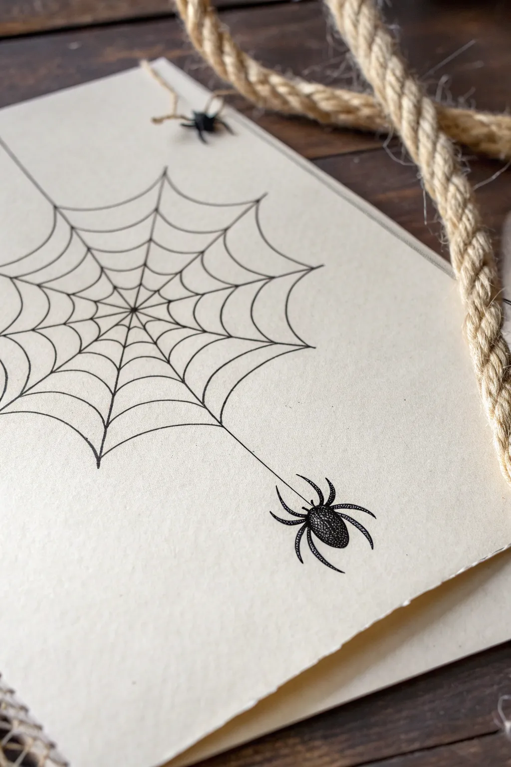
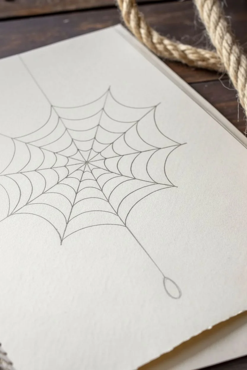
This classic tattoo motif combines geometric precision with a touch of gothic flair, perfect for practicing fine line work. We’ll sketch a symmetrical web anchored in a corner and suspend a detailed spider beneath it for a balanced, eye-catching composition.
How-To Guide
Materials
- High-quality off-white cardstock or sketching paper
- Pencil (HB or 2H)
- Ruler
- Fine liner pen (01 or 03 size)
- Thicker drawing pen (05 or 08 size)
- Eraser
Step 1: Constructing the Web Framework
-
Establish the anchor point:
Begin by deciding where your web will originate. In this design, the focal point is slightly off-center to the left, acting as the ‘hub’ of the web. I like to mark a tiny, faint dot here with my pencil to keep everything aligned. -
Draw the main spokes:
Using your ruler and pencil, lightly draw straight lines radiating outward from your hub. These are the structural threads of the web. Aim for about 9 to 11 spokes, spreading them out like fan blades. Make sure the angles between them are somewhat varied to keep it looking organic, not perfectly mathematical. -
Sketch the inner curve:
Starting near the center hub, draw small, scalloped curves connecting each spoke to its neighbor. These lines should sag inward towards the center, creating that classic U-shape of a spider silk strand. -
Expand the web outward:
Continue drawing concentric rings of these scalloped lines, moving further away from the center. Space them out slightly more as you get to the outer edges of the paper. Keep your pencil pressure very light so adjustments are easy. -
Extend the drop line:
Choose a point on the bottom-most curve of the web and use your ruler to draw a straight vertical line extending downward. This is the thread the spider will hang from.
Step 2: Detailed Inking and The Spider
-
Ink the main spokes:
Switch to your 01 or 03 fine liner. Carefully trace over your pencil spokes. You don’t need a ruler for this part; a slightly shaky hand actually adds to the natural, creepy vibe of a real web. -
Ink the connecting threads:
Trace the scalloped connecting lines. When the line hits a spoke, lift your pen slightly or thicken that junction point just a tiny bit to mimic how silk adheres. -
Sketch the spider’s body:
At the end of your drop line, pencil in two oval shapes. The top oval (cephalothorax) should be smaller than the bottom oval (abdomen). The abdomen needs to be plump and rounded. -
Add the legs:
Draw four legs on each side of the body. The front two pairs should curve forward and upward, while the back two pairs curve backward and downward. Give the legs distinct joints for realism. -
Ink the outline:
Use your fine liner to ink the outline of the spider. Refine the shape of the legs, tapering them to sharp points at the ends. -
Stipple shading mechanism:
To create the texture shown in the image, use a stippling technique. Take your finest pen and make tiny dots concentrated on the sides of the abdomen and the center of the head. Leave the very center of the abdomen lighter to simulate a highlight on its shiny back. -
Fill the legs:
Fill in the legs with solid black or dense stippling, leaving tiny slivers of white on the upper joints to suggest light hitting the exoskeleton. -
Thicken the drop line:
Go over the long vertical thread one more time to ensure it looks strong enough to hold the spider. -
Clean up:
Wait at least five minutes for the ink to dry completely. Gently erase all remaining pencil marks, being careful not to smudge your stippling work.
Ink Smearing?
If you are left-handed or working quickly, place a piece of scrap paper under your drawing hand. This acts as a shield, preventing your palm from dragging across fresh ink.
Make it Gothic
Add tiny droplets on the web strands using white gel pen to mimic morning dew, or add a small fly trapped in the upper corner for a storytelling element.
Now you have a sharp, tattoo-ready design that masters the balance of negative space and detail
Simple Flame Shapes
This tutorial guides you through creating a striking set of three stylized flame motifs on textured paper, perfect for visualizing potential tattoo placements. The design relies on bold, clean linework and negative space to create a modern tribal aesthetic that looks deceptively simple yet impactful.
Step-by-Step Guide
Materials
- High-quality textured paper (watercolor or handmade cotton paper)
- Fine liner pen (0.5mm or 0.8mm)
- Pencil (HB or 2H)
- Soft eraser
- Ruler for alignment
Step 1: Planning and Layout
-
Paper selection:
Choose a paper with a distinct tooth or texture, like cold-press watercolor paper or handmade cotton rag. The texture adds character to the simple black lines. -
Define the center axis:
Lightly trace a vertical line down the center of your paper using a pencil and ruler to ensure your three designs align perfectly. -
Mark positioning:
Make three small horizontal tick marks along your center line where the base of each flame will sit. Space them evenly, leaving generous room between each element.
Texture Navigation
When drawing on rough paper, pull the pen toward you rather than pushing it away. This prevents the nib from snagging on the paper fibers and creating splatter.
Step 2: Drafting the Top Flame
-
Top outer contour:
Starting at the top position, lightly sketch a teardrop shape that points upward. Make the bottom rounded and curve the top into a sharp point. -
Inner details:
Inside the teardrop, draw a smaller, matching shape. This creates a thick border. I typically leave the bottom of this inner shape open or connected to the outer line to form a continuous loop. -
Refine the curve:
Adjust the pencil lines so the flame pulls slightly to the right at the tip, giving it a sense of movement.
Step 3: Drafting the Middle Flame
-
Middle structure:
Move to your second tick mark. Sketch a slightly wider teardrop base here. -
Internal complexity:
Instead of a simple loop, draw a small heart-like or ‘v’ shape at the bottom center of the flame’s interior. -
Connecting lines:
Extend the sides of that inner ‘v’ shape upwards to meet at the top tip, following the curve of the outer boundary.
Digital Mockup
Scan your finished drawing and invert the colors strictly to black and white in an editing app. This creates a ‘stencil’ view helpful for tattoo artists.
Step 4: Drafting the Bottom Flame
-
Bottom foundation:
For the largest design at the bottom, sketch a generous, wide teardrop shape. -
Central seed:
Draw a distinct, standalone seed or small leaf shape floating in the center bottom of the main outline. -
Framing the center:
Sketch a second outline around that central seed, which then tapers up to join the main outer point of the flame.
Step 5: Inking and Finishing
-
Trace outer lines:
Take your fine liner pen. Carefully trace the outermost perimeter of the top flame first. Keep your hand steady to manage the paper’s texture. -
Thicken the strokes:
Go over the lines a second time to thicken them. The tribal style benefits from a bold, consistent line weight. -
Ink the middle design:
Trace the middle flame. Pay special attention to the sharp points where lines converge; ensure they don’t bleed into a blob. -
Ink the bottom design:
Trace the final bottom flame. Ensure the gap between the central ‘seed’ and the surrounding lines remains clear and white. -
Erase pencil marks:
Wait at least 15 minutes for the ink to fully cure. Gently erase the vertical guide line and sketch marks. -
Final clean up:
Check for any uneven edges in your black lines and carefully smooth them out with the pen for a crisp finish.
Now you have a clean, balanced reference sheet ready to bring to the studio or frame as minimal art
Mountain and Pine Silhouette
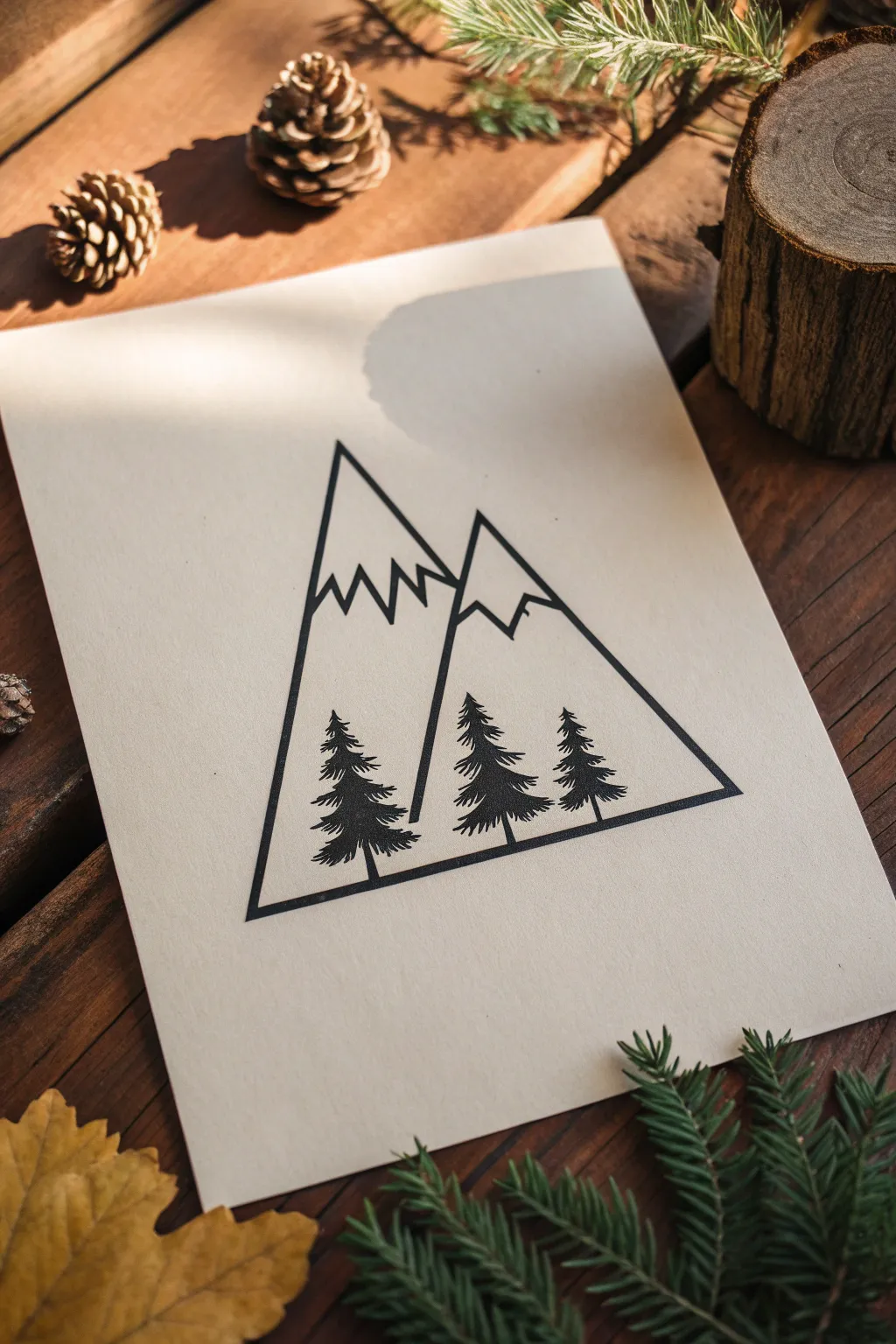
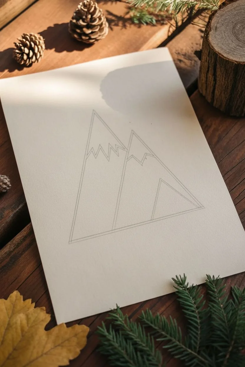
Capture the serene simplicity of nature with this geometric mountain and pine tree illustration, perfect for a tattoo concept or wall art. Using bold black ink against cream paper creates a striking, high-contrast look that feels both rustic and modern.
Step-by-Step Tutorial
Materials
- High-quality cream or off-white cardstock (A5 size)
- Pencil (HB for sketching)
- Eraser (kneaded preferred)
- Ruler
- Fine liner pen (01 or 03 size, black)
- Thick marker or brush pen (black, for filling)
- Compass or protractor (optional for angles)
Step 1: Drafting the Geometry
-
Establish the baseline:
Center your paper and use your ruler to draw a straight horizontal line near the bottom third of the page. This will serve as the ground for your trees and the base of your mountain frame. -
Construct the main peak:
From the left end of your baseline, draw a steep diagonal line upward towards the top left-center. This forms the left slope of the tallest mountain. -
Define the peak intersection:
Draw a downward diagonal line from the tip of your first peak, stopping about halfway down the page where it will naturally intersect with the second mountain. -
Outline the secondary peak:
Starting from that intersection point, draw a second, slightly lower peak to the right. Extend the right slope of this second peak all the way down to meet the right end of your baseline, completing the main triangular silhouette. -
Sketch the snow caps:
Lightly sketch zigzag lines near the top of both peaks to indicate snow. Make the zigzags irregular—some distinct sharp points and some shallower dips—to look more organic.
Step 2: Designing the Trees
-
Mark tree placements:
Along the bottom baseline, make three small tick marks to space out your trees. Place one on the far left, one in the middle, and one on the right, ensuring they aren’t perfectly equidistant for a more natural look. -
Draw the trunks:
Using your ruler, draw delicate vertical lines rising from your tick marks. The middle tree should be slightly taller than the flanking two to create visual balance. -
Form the tree branches:
Starting from the top of each trunk, sketch the branches using a scribbling motion. I usually start narrow at the top and flare out wider towards the bottom, resembling an arrowhead shape. -
Refine the foliage texture:
Go back over your branch sketches and add jagged, sawtooth details to the edges of the trees to mimic pine needles.
Sharp Lines Secret
When inking long straight lines with a ruler, tape a penny to the underside of the ruler. This lifts the edge off the paper, preventing ink from bleeding underneath and smudging.
Step 3: Inking and Finalizing
-
Trace the main outlines:
Switch to your fine liner pen. Carefully trace the straight lines of the mountain slopes and the bottom baseline. Use a ruler here if you want that ultra-sharp geometric tattoo aesthetic. -
Ink the snow lines:
Trace your jagged snow cap lines with the fine liner. Keep these lines crisp but allow corner variations to keep the rock-like feel. -
Fill the trees:
Use your thicker marker or brush pen to fill in the pine trees. Instead of coloring them solid instantly, use horizontal strokes that follow the branch angles to maintain a textured silhouette. -
Add weight to the frame:
Go over the external triangle mountain lines (the outer frame) a second time to thicken them slightly. This separates the ‘frame’ from the internal details. -
Erase pencil marks:
Wait at least 10 minutes for the ink to dry completely to avoid smudging. Then, gently erase all underlying pencil sketches. -
Clean up edges:
Inspect the corners where the mountains meet the baseline. If there are any gaps, carefully touch them up with the fine liner for perfect joinery.
Level Up: Stippling
For a more classic tattoo feel, add shading to one side of the mountain slopes using stippling (tiny dots) instead of leaving them blank. Concentrate dots near the peaks.
Once the ink is fully set, you have a crisp piece of art ready to frame or bring to your tattoo artist
Lightning Bolt Minimalism
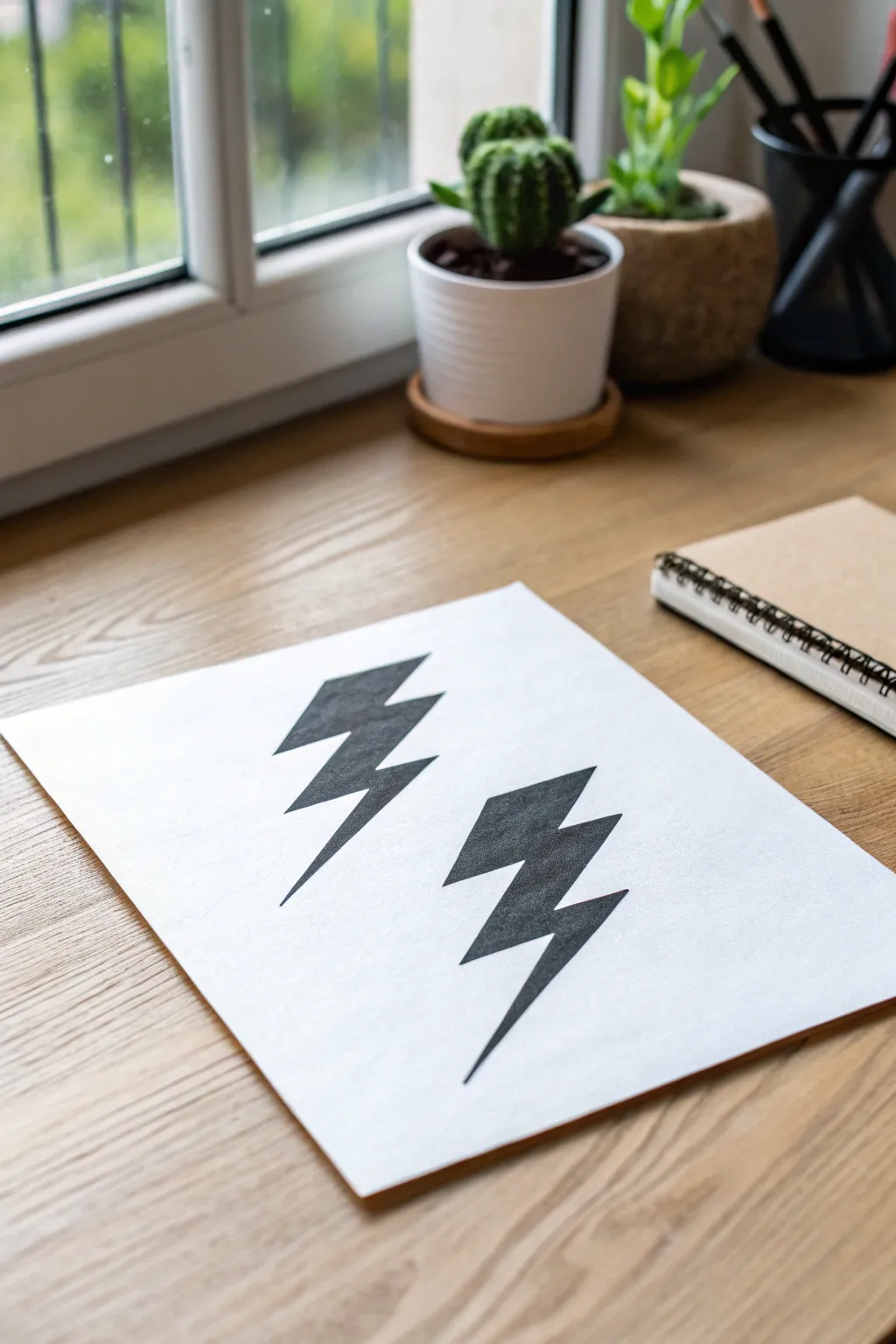
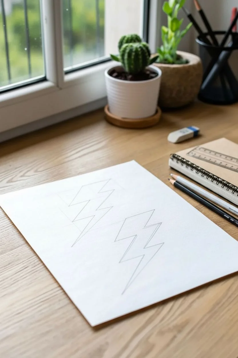
These twin lightning bolts capture a raw, jagged energy with their sharp angles and solid black fill. It is a perfect beginner project that emphasizes clean lines and bold contrast, ideal for visualizing a future tattoo placement.
Step-by-Step Tutorial
Materials
- High-quality white drawing paper or cardstock
- Pencil (HB or 2B)
- Ruler or straight edge
- Fine-point black fineliner
- Chisel-tip black permanent marker or India ink pen
- Eraser
Step 1: Drafting the Shapes
-
Establish the slant:
Begin by lightly drawing two parallel diagonal lines with your pencil and ruler. These will serve as the central axis for each bolt, ensuring they slant at the exact same angle. -
Mark the segments:
On your first guideline, mark three distinct sections. The top section should be the widest, the middle slightly shorter, and the bottom section the longest and thinnest to create that tapering tail. -
Sketch the top jagged edge:
Draw the top horizontal line of the left bolt. From the right end of that line, cut diagonally inward toward your center guide. From the left end, draw a parallel diagonal line downward. -
Create the middle zigzag:
From the bottom of your first segment, jut the line horizontally outward to the right. Then, cut sharply back in toward the center. Repeat this ‘out-and-in’ motion on the left side to mirror the structure. -
Form the tapering point:
For the final segment, draw two long lines converging into a needle-sharp point at the bottom. The inner line should be slightly shorter than the outer line to enhance the dynamic feel. -
Duplicate the design:
Using your second diagonal guideline, repeat the drafting process for the right bolt. Place it slightly lower on the page than the first one to create a staggered, impactful composition.
Crisp Corners Pro-Tip
When filling corners, adhere a piece of masking tape along the outside edge. You can color right up to the tape, peel it off, and get a razor-sharp line.
Step 2: Inking and Filling
-
Outline with fineliner:
Take your fine-point black pen and carefully trace over your final pencil lines. Use the ruler here if you want technically perfect straightness, or freehand it for a slightly more organic grit. -
Check the points:
Pay special attention to the corners where lines change direction. These zigzags need to be sharp vertices, not rounded curves, to maintain the aggressive look of the design. -
Initial erase:
Once the fineliner ink is completely dry, gently erase the graphite guidelines. This gives you a clean ‘ coloring book’ style outline to work with. -
Start the fill:
Switch to your chisel-tip marker or a thicker pen. Start filling in the shape from the center outward. I find this helps prevent accidentally pushing ink outside the delicate border lines. -
Refine the edges:
As you get close to the outline, slow down. Use the sharp edge of the chisel tip to carefully meet the fineliner boundary without bleeding over. -
Ensure solid coverage:
If your marker leaves streaks, let the first layer dry for a minute and then apply a second coat in a perpendicular direction to achieve a solid, matte black finish. -
Sharpen the tails:
Go back with your ultra-fine pen to touch up the very bottom tips of the bolts, ensuring they end in a crisp, dangerous point rather than a blunt nub.
Level Up: Distressed Look
Instead of a solid black fill, use a stippling technique (thousands of tiny dots) or dry-brush scratch marks to give the bolts a vintage, worn-out texture.
Now you have a bold, graphic reference sheet ready for your portfolio or next tattoo appointment
Roman Numeral Date
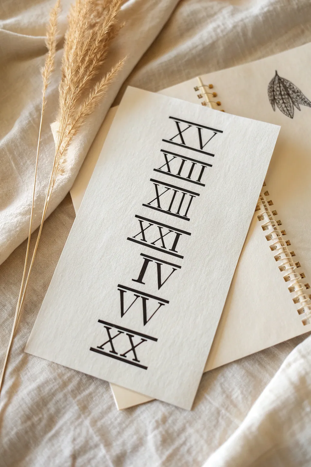
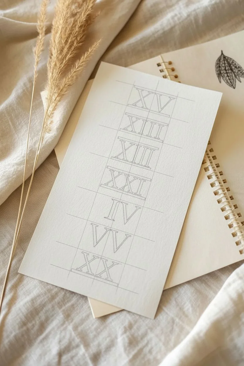
Create a sophisticated, minimalist art piece featuring significant dates or numbers using classic Roman numerals. This project captures the clean, precise look of traditional typography on textured paper, perfect for testing a tattoo concept before committing to ink.
Detailed Instructions
Materials
- Heavyweight textured cardstock or watercolor paper (cream or off-white)
- Black fineliner pens (0.3mm and 0.8mm)
- Ruler or straight edge
- Pencil (HB or H)
- Eraser (kneaded is best)
- Workable fixative spray (optional)
Step 1: Planning & Layout
-
Select your numbers:
Choose the sequence of numbers you want to immortalize. In the example, we see a vertical stack, so select 5-7 meaningful dates or figures (like birthdays or anniversaries) converted to Roman numerals. -
Establish guidelines:
Using your ruler and pencil, lightly draw a vertical centerline down the middle of your paper to ensure perfect alignment. -
Mark horizontal spacing:
Measure equal distances for each line of text. I find that leaving about 1.5 inches between the baselines gives the text plenty of room to breathe. -
Draw the serif bounds:
For each numeral, draw a top and bottom horizontal guideline about 1 inch apart. This defines the height of your letters and ensures they are uniform.
Step 2: Drafting the Typography
-
Sketch the letter skeletons:
Lightly sketch the basic stick ‘skeletons’ of your Roman numerals (I, V, X, etc.) centered on your vertical guideline. -
Add weight to the strokes:
Transform the stick figures into block letters. Typically, the downstrokes (vertical lines) should be thick, while the upstrokes or horizontal connectors are thinner. However, for this specific serif font style, aim for a fairly consistent medium thickness. -
Create the horizontal bars:
Draw distinct horizontal bars spanning the full width of each numeral group at the very top and very bottom. These aren’t just serifs; they are continuous lines that connect the tops and bottoms of the letters, grounding them together. -
Refine the shapes:
Go over your pencil sketch, sharpening the corners and ensuring the connecting bars are perfectly straight using your ruler.
Uneven Ink Coverage?
If the black looks patchy on the textured paper, do a second pass with the thick pen. Wait for the first layer to dry fully to avoid pilling the paper surface.
Step 3: Inking & Finishing
-
Outline the numerals:
Switch to your 0.3mm fineliner. Carefully trace the outer edges of your penciled letters. Use the ruler for the long straight lines to keep them crisp. -
Fill in the forms:
Use the thicker 0.8mm pen to fill in the letters solid black. Work slowly to avoid going outside your outlines. -
Sharpen the serifs:
Pay special attention to the corners where the vertical strokes meet the horizontal bars. These should be sharp 90-degree angles, not rounded. -
Let the ink cure:
Allow the ink to dry completely. This is crucial because textured paper can hold wet ink longer than smooth paper. -
Erase guidelines:
Gently erase your pencil lines. Hold the paper taut with one hand while erasing with the other to prevent crinkling the page. -
Final touches:
Inspect your edges. I often go back with the 0.3mm pen to sharpen any tiny corners that got rounded during the filling process.
Antique Effect
Before drawing, lightly stain your paper with cold coffee or black tea and let it dry. This adds a vintage, parchment-like quality that suits Roman numerals.
Now you have a striking typographic print ready to be framed or used as a reference for your next tattoo appointment
Initial Monogram Letters
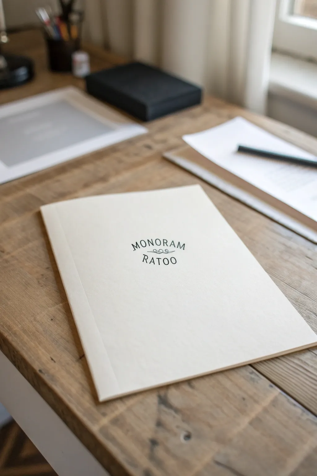
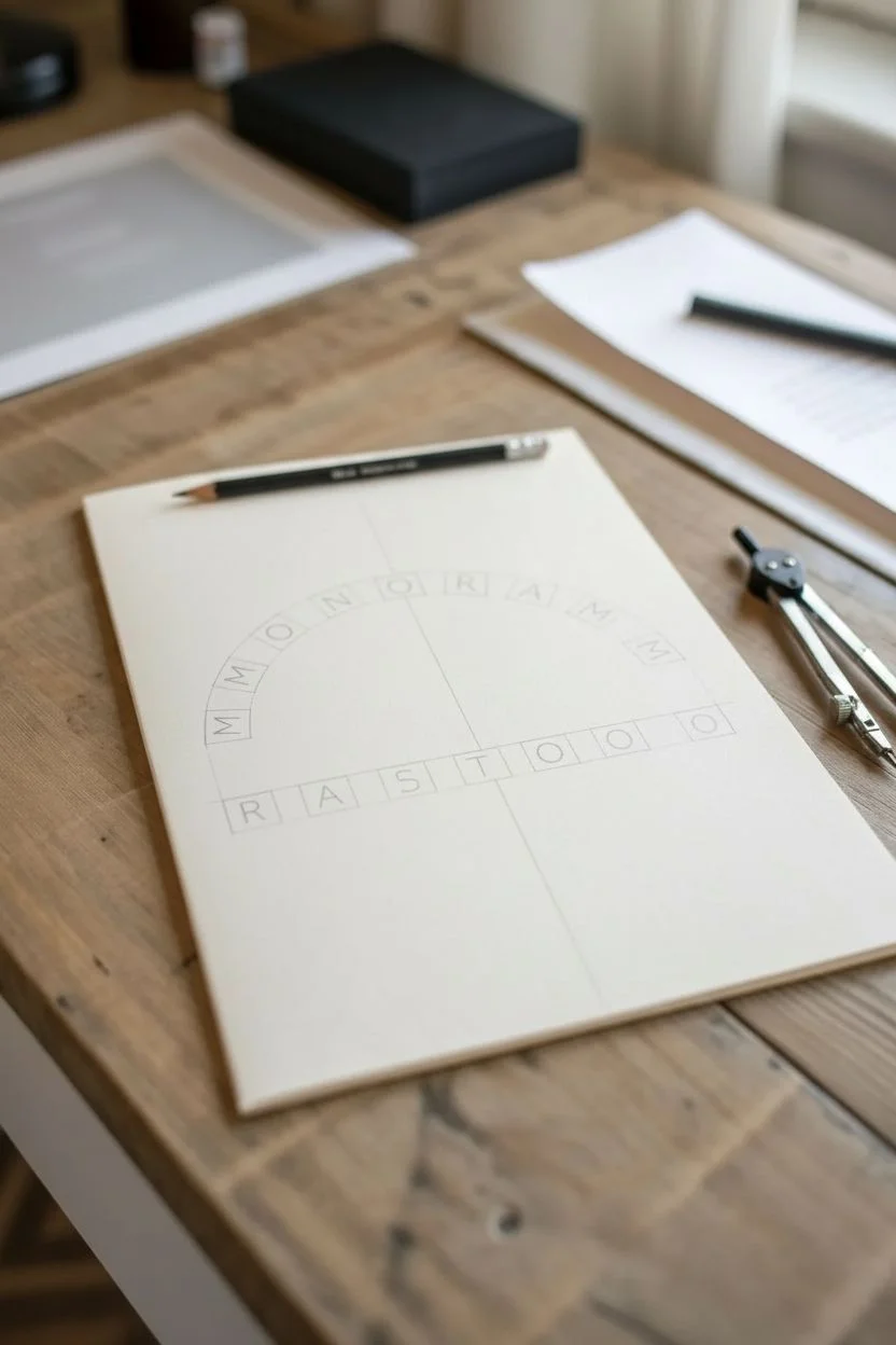
Create a classic, stamped-style typographical design that serves as a perfect template for a sophisticated tattoo or personal branding project. The combination of arched lettering and delicate flourishes captures a timeless, bespoke aesthetic on textured paper.
How-To Guide
Materials
- Cream or off-white sketchbook paper
- HB pencil for layout
- Ruler
- Compass or circular object (for the arch)
- Fine liner pens (0.3mm and 0.5mm, black)
- Eraser (kneaded preferred)
- Optional: Light box or tracing paper
Step 1: Setting the Structure
-
Find your center:
Begin by lightly marking a vertical centerline on your page with the HB pencil to keep the entire design symmetrical. -
Create the arch guide:
Using a compass or tracing a round object, draw a gentle upward curve across the centerline where the top word will sit. This shouldn’t be a full semi-circle, just a shallow arch. -
Mark the baseline:
Measure about an inch below the peak of your arch and draw a straight horizontal line for the bottom word. -
Space the letters:
Roughly sketch boxes for each letter of ‘MONORAM’ along the curve and ‘RATOO’ on the straight line, ensuring equal spacing from the center point outwards.
Perfect Arches Tip
When drawing curved text, draw lines from the center point of your invisible circle through the arch. These radial lines guide the angle of vertical letter strokes.
Step 2: Drafting the Typography
-
Sketch the upper text:
Lightly draw the letters ‘M-O-N-O-R-A-M’ following the curve. Keep the vertical strokes of each letter pointing toward the imaginary center of the circle to create a true radial arch. -
Refine the serif style:
Add small serifs—the little ‘feet’ at the ends of strokes—to give the font a classic, academic look. Keep the letter width consistent. -
Sketch the lower text:
Draw ‘R-A-T-O-O’ on the straight bottom line. These letters should match the height and serif style of the upper text but stand perfectly upright. -
Design the centerpiece:
In the gap between the two words, sketch a simple decorative flourish. Three small loops connected by a horizontal line creates a classic divider motif.
Step 3: Inking the Design
-
Outline with fineliners:
Switch to your 0.3mm fine liner. Carefully trace the outline of each letter, starting with the straight strokes to maintain stability. -
Ink the curves:
Trace the curved parts of the letters (like the O, R, and parts of the M). I find rotating the paper helps my hand follow the natural arc better. -
Thicken the strokes:
Use the 0.5mm pen to go over the main vertical strokes of the letters, adding just a hint of weight to create a bold, stamped effect. -
Detail the flourish:
Ink the central decorative squiggle with the 0.3mm pen. Keep the line weight lighter here so it doesn’t compete with the text dominance. -
Clean up intersections:
Check where the serifs meet the main stems and sharpen any rounded corners with the fine point of your pen.
Custom Variation
Try replacing the central loop decoration with a specific icon tailored to the person, like a tiny anchor, quill, or arrow, to personalize the tattoo concept.
Step 4: Final Touches
-
Let the ink cure:
Wait at least 5 to 10 minutes to ensure the ink is completely dry. This prevents smudging during the erasing phase. -
Erase guidelines:
Gently gently rub away the pencil guidelines with a kneaded eraser, dabbing first to lift graphite before rubbing. -
Assess the balance:
Look at the design from a distance. If any letters look too thin, carefully add a second pass of ink to the downstrokes only. -
Add texture (optional):
To mimic an aged stamp look, you can make tiny, random stipple dots inside the thickest parts of the letters.
You have now created a clean, balanced typographic design ready to be scanned or stenciled.
Topographic Line Band
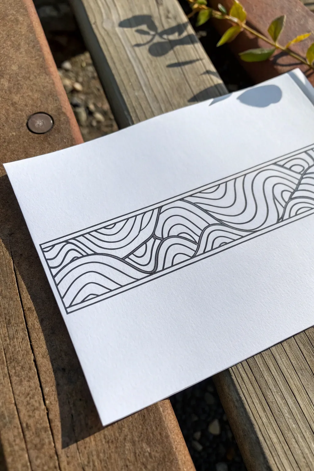
This minimalist project captures the fluid motion of topographic lines confined within a structured geometric band. The high-contrast black ink on crisp white paper creates a striking, modern aesthetic that works perfectly as a tattoo stencil or a standalone piece of graphic art.
Step-by-Step
Materials
- High-quality white cardstock or drawing paper
- Ruler or straight edge
- Fine-point black drawing pen (0.3mm or 0.5mm)
- Pencil (HB or 2H)
- Eraser
Step 1: Setting the Boundaries
-
Draw the parallel lines:
Begin by using your ruler to draw two long, horizontal parallel lines across the middle of your paper. Space them about 2 to 3 inches apart, depending on how thick you want the band to be. -
Close the shape:
Connect the ends of the parallel lines with vertical strokes to create a long, rectangular box. This will be the container for your design. -
Add the inner border:
Inside the main rectangle, draw a second, slightly smaller rectangle. Leave a consistent gap of about 2-3mm between the outer line and this inner line to create a framed effect.
Clean Lines
If your hand is shaky, try ‘ghosting’ the line—practice the motion in the air just above the paper a few times before actually lowering the pen to draw.
Step 2: Establishing the Flow
-
Identify focal points:
Visualize three or four ‘peak’ areas along the length of the band where the curves will be highest. You can lightly mark these with a pencil dot if helpful. -
Draw the primary waves:
Using your pencil sketch just the main, dominant wave lines first. These should stretch from the bottom of the inner border toward the top, swooping down and up again like rolling hills. -
Create distinct sections:
Intersect some of these primary waves to create distinct sections or ‘islands’ of flow. Notice how in the reference, the waves don’t all go the same direction; they collide and merge.
Step 3: Layering the Topography
-
Fill the first section:
Starting at the bottom left section, draw curves that mimic your primary wave line. Keep the spacing relatively consistent, but let lines get closer together at the steep parts of the curve. -
Build the peaks:
As you move upward into the peaks, continue drawing nested curves. Think of them like ripples in a pond or contour lines on a map. -
Handle the intersections:
Where two sections of waves meet, create a sharp boundary line. The lines inside one section should stop abruptly at this boundary, while the lines in the adjacent section flow alongside it. -
Check density:
Step back and look at your pencil sketch. Ensure the ‘white space’ between lines is fairly uniform so no area looks too dark or too empty. -
Refine the curves:
Smooth out any jagged pencil strokes. The goal is fluid, uninterrupted motion.
Wrap Around
Make the design seamless! Copy the pattern onto tracing paper and tape the ends together to form a loop. Adjust the design so the start and end lines connect perfectly.
Step 4: Inking and Finishing
-
Ink the borders:
Switch to your fine-point black pen. Carefully trace the straight outer borders first using your ruler to ensure crisp, sharp edges. -
Ink the major dividers:
Ink the main dividing lines that separate the different wave sections. I find that establishing these boundaries first makes filling in the details much less confusing. -
Trace the contours:
Work your way through the internal curves, tracing over your pencil lines. Keep your hand steady and try to execute each long curve in a single, confident stroke rather than short, sketchy marks. -
Maintain consistent line weight:
Keep the pressure on your pen consistent. Unlike calligraphy, this style relies on a uniform line thickness throughout the entire design. -
Let it dry:
Allow the ink to sit for at least 5-10 minutes. Smudging wet ink at this stage is heartbreaking. -
Erase guidelines:
Gently erase all underlying pencil marks. Hold the paper taut with one hand while erasing to prevent the paper from buckling.
Now you have a sleek, geometric design ready to be framed or brought to your tattoo artist

Have a question or want to share your own experience? I'd love to hear from you in the comments below!