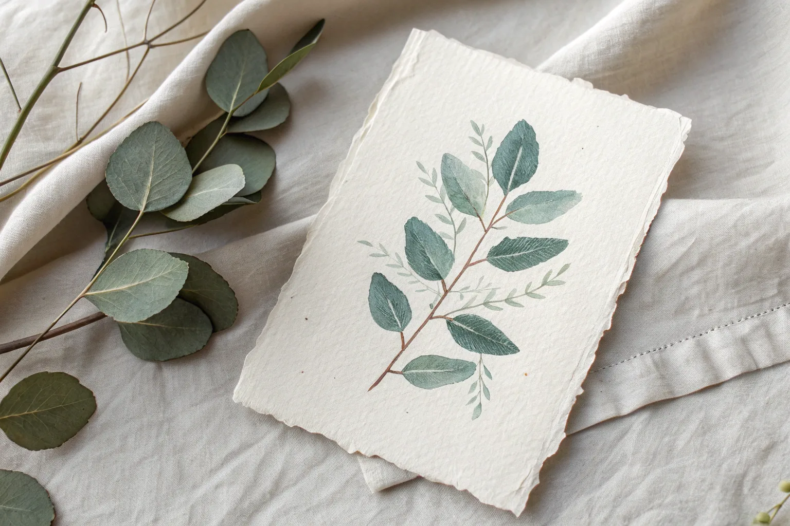
Sometimes you just want an easy watercolor win—something soothing to paint that still looks like you really know what you’re doing. These easy watercolor ideas are my go-to studio prompts when you want pretty results without stressing over perfect drawing.
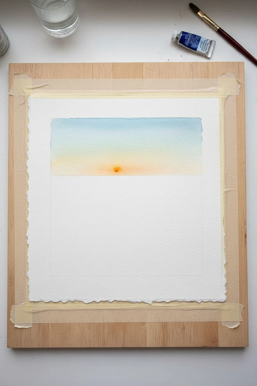
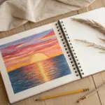
Simple Sunset Gradient Wash
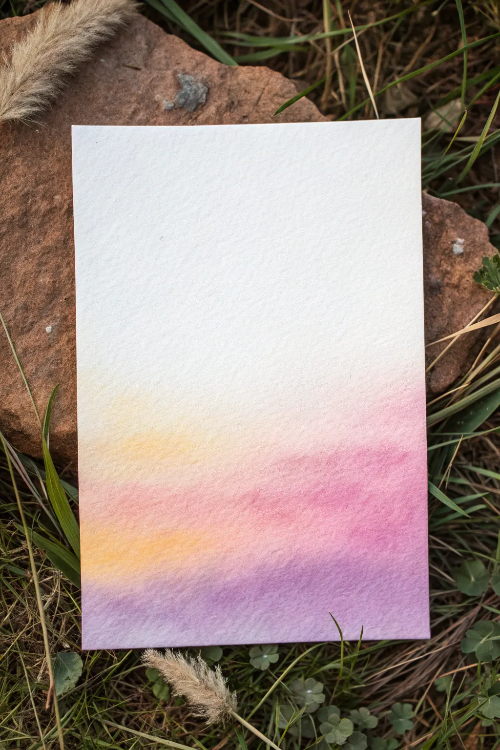
Capture the fleeting magic of twilight with this serene watercolor gradient. This project teaches you how to blend soft yellows, warm pinks, and calming purples into a seamless wash that looks just like a peaceful evening sky.
Step-by-Step Tutorial
Materials
- Cold press watercolor paper (cut to postcard size)
- Watercolor paints (Yellow Ochre, Rose or Alizarin Crimson, Purple or Dioxazine Violet)
- Large flat brush or hake brush for washes
- Jars of clean water
- Drying cloth or paper towel
- Masking tape and a hard board
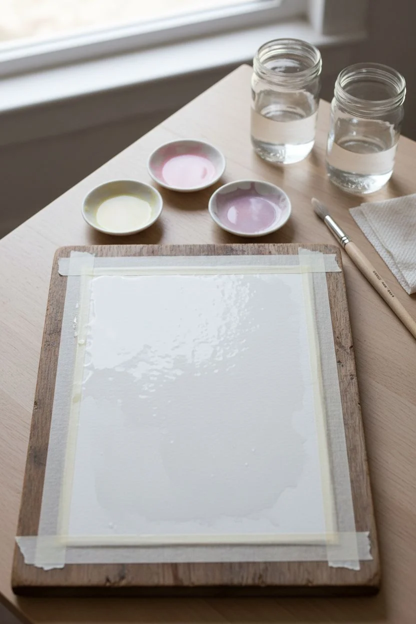
Step 1: Preparation & Wetting
-
Secure the paper:
Tape your watercolor paper down firmly onto a hard board. Ensure the tape edges are pressed down tight to prevent buckling and keep a clean border. -
Mix your palette:
Prepare three generous puddles of paint on your palette: a diluted pale yellow, a soft rose pink, and a muted purple. You want these to be quite watery and transparent. -
Pre-wet the paper:
Dip your large clean brush into water and apply a smooth, even coat of clear water across the entire paper surface. The paper should glisten but not have standing puddles.
Fixing “Cauliflowers”
If jagged bloom marks appear as it dries, your brush was too wet when blending. Let it dry fully, then lightly glaze over with a damp brush to smooth it out.
Step 2: Painting the Gradient
-
Start with white space:
Leave the top third of the paper completely unpainted. The wet surface will help soften the edges of the color you are about to apply. -
Introduce the yellow:
Load your brush with the pale yellow mix. Gently foster a horizontal stroke starting just below the halfway point of the paper. -
Soften the transition:
Rinse your brush slightly and use the damp bristles to pull the top edge of that yellow paint upward, letting it fade naturally into the wet white paper above. -
Add the pink layer:
While the yellow is still wet, pick up your rose pink. Apply this directly below the yellow band, allowing the two colors to touch and mingle slightly on the paper. -
Blend the junction:
I like to tilt the board slightly so gravity helps the yellow flow down into the pink, creating a soft, warm orange transition area. -
Introduce the purple:
Without waiting, load your brush with the purple mixture. Apply this across the very bottom section of the paper. -
Merge pink and purple:
Gently brush the top edge of the purple upward so it meets the pink layer. Let the wetness of the paper do the heavy lifting here—don’t overwork the brushstrokes. -
Check for consistency:
Look at your wash. If the colors seem too distinct, use a clean, slightly damp brush to very lightly run horizontal strokes across the transition zones to smooth them out. -
Tilt for flow:
Pick up the board and tilt it in different directions slightly to encourage the wet pigments to settle into the paper’s texture evenly.
Add Silhouette Details
Once fully dry, use black ink or thick paint to add a silhouette of trees, power lines, or mountains along the bottom edge for a complete landscape scene.
Step 3: Finishing Touches
-
Blot excess water:
If pools of water collect at the bottom edge or tape line, gently touch a corner of a paper towel to them to soak up the excess liquid. -
Let it dry naturally:
Allow the paper to dry completely while taped down. This ensures it dries flat. -
Remove the tape:
Once bone dry, peel the tape away slowly at a 45-degree angle, pulling away from the painting area to avoid tearing the surface.
You now have a beautifully blended sunset background ready for calligraphy or framing


Fluffy Clouds on a Wet Sky
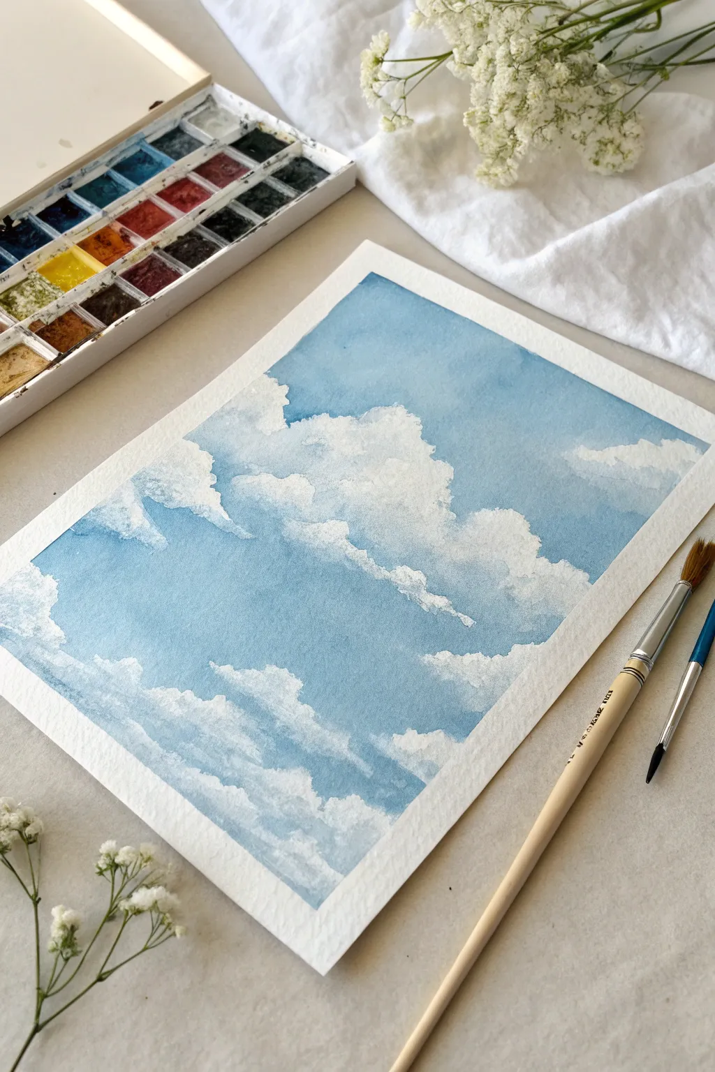
Capture the serenity of a perfect summer day with this simple watercolor study of cumulus clouds drifting across a blue expanse. By using negative space and soft edges, you’ll learn to sculpt fluffy white forms without needing opaque white paint.
Step-by-Step
Materials
- Cold press watercolor paper (300gsm/140lb)
- Masking tape
- Watercolor paints (Cerulean Blue, Cobalt Blue, or Phthalocyanine Blue)
- Round brush (size 8 or 10)
- Small detail brush (size 2 or 4)
- Paper towels or a clean cloth
- Two jars of water
- Mixing palette
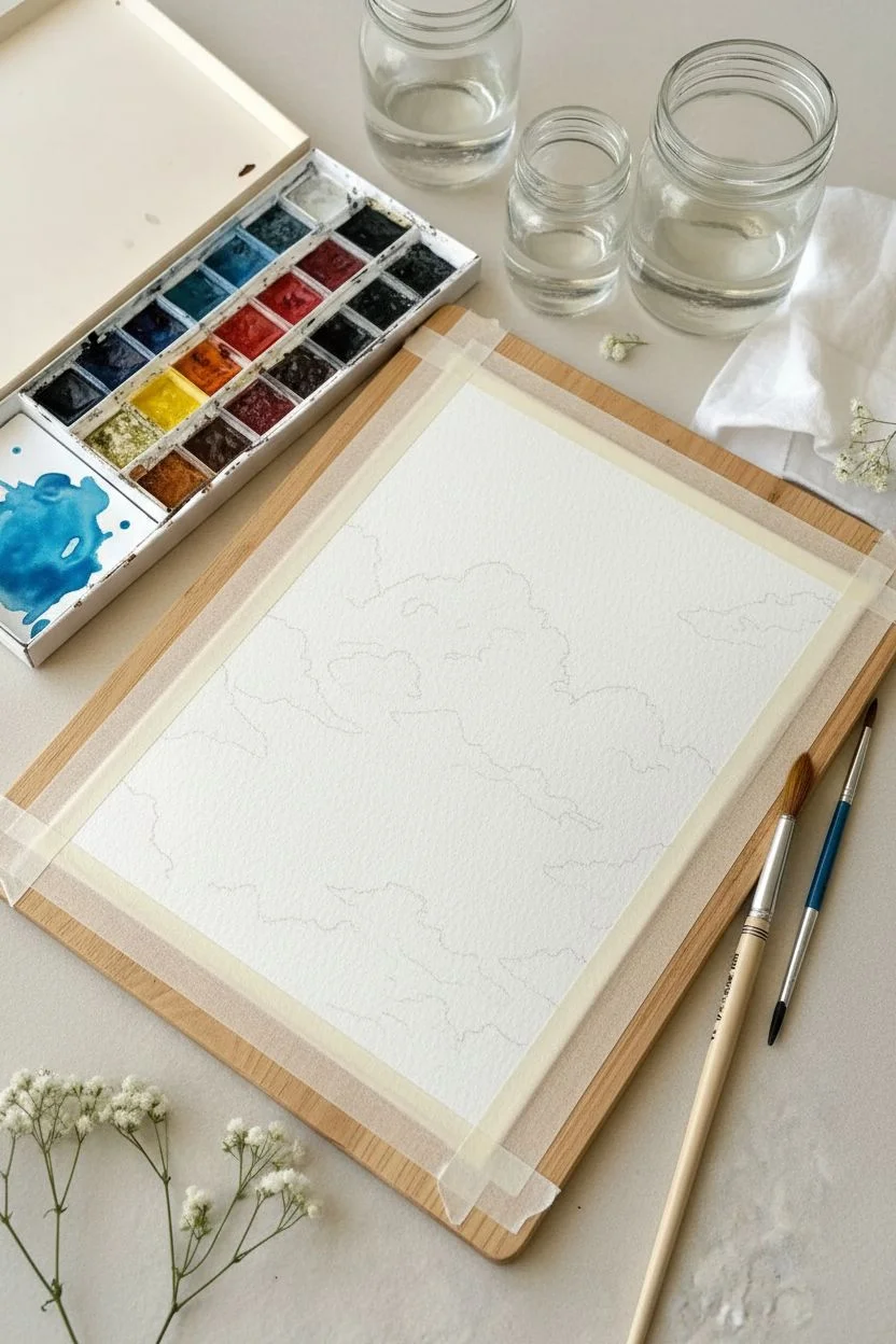
Step 1: Preparation & Planning
-
Secure the Paper:
Begin by taping your watercolor paper down to a board or table on all four sides. Press the tape edges firmly to ensure a crisp, clean border and prevent the paper from buckling when wet. -
Color Mixing:
Prepare a generous puddle of your sky color. I like to mix Cerulean Blue with a touch of Cobalt Blue for that perfect mid-day hue. Make sure you mix enough to cover the whole sheet so you don’t run out midway. -
Visualizing Forms:
Lightly sketch the outlines of your major cloud shapes if you need a guide, but keep the pencil marks extremely faint. Alternatively, plan to paint freely around the white ‘cloud’ areas.
Hard Edges?
If your paint dries with hard lines where you wanted soft fluff, re-wet the edge gently with a clean damp brush and blot with a tissue to soften the transition.
Step 2: Painting the Sky
-
Wet the Top Section:
Using a clean brush and clear water, wet the very top inch of your paper where the sky will be darkest. This pre-wetting helps create a smooth gradient. -
Apply the First Wash:
Load your large round brush with the blue mix. Start painting from the top edge, moving horizontally. Let the color flow into the damp paper for a soft, diffused look. -
Defining Upper Clouds:
As you move down the paper, start painting *around* the shapes of your clouds. Leave the paper completely white where you want the brightest, fluffiest tops of the clouds to be. -
Creating Soft Edges:
While the blue paint is still wet, rinse your brush, dry it slightly on a towel so it’s damp but not dripping, and gently tickle the edges of the paint where it meets the white cloud. This softens the boundary so it doesn’t look like a cutout. -
Varied Tones:
Add a slightly more concentrated blue pigment to the upper corners of the sky while wet. This natural vignette leads the eye toward the center.
Sunset Vibes
Swap the blue shadows on the cloud bottoms for a pale violet or peach tone to instantly change the time of day to a soft, early evening glow.
Step 3: Sculpting the Clouds
-
Bottom Shadows:
Clouds aren’t just white flat shapes; they have volume. Mix a very dilute, watery grey-blue (use your sky blue with a tiny dot of orange or Payne’s Grey). -
Painting Cloud Bellies:
Gently paint the bottom ‘shadow’ side of the white cloud masses. Keep these edges soft by blending them out with a damp brush into the white area above. -
Layering the Sky:
Continue painting the blue sky sections between the clouds. Ensure your blue wash gets slightly lighter and more watered down as you approach the bottom of the paper, mimicking atmospheric perspective.
Step 4: Refining & Texturing
-
Lifting Off:
If you accidentally painted over a cloud edge, use a clean, damp brush or the corner of a paper towel to lift the paint while it’s still wet, reclaiming the white paper. -
Adding Dimension:
Use your smaller brush to add tiny, fragmented blue shapes within the larger cloud masses. These represent breaks in the vapor or smaller clouds floating in front. -
Deepening Shadows:
Once the first shadow layer is dry, add a slightly darker grey-blue to the deepest crevices of the clouds for extra contrast and fluffiness.
Step 5: Finishing Touches
-
Final Assessment:
Step back and look at your painting. If any cloud edges feel too ‘hard,’ scrub them very gently with a damp brush to soften them. -
Drying Time:
Let the painting dry completely. Do not touch the surface while it feels cool to the touch. -
The Reveal:
Carefully peel away the masking tape at a 45-degree angle, pulling away from the artwork to avoid ripping the paper. Reveal those crisp, clean edges that frame your sky beautifully.
Enjoy the peaceful feeling of gazing at your own handmade patch of blue sky


Easy Daisy-Style Blooms From Simple Petal Strokes
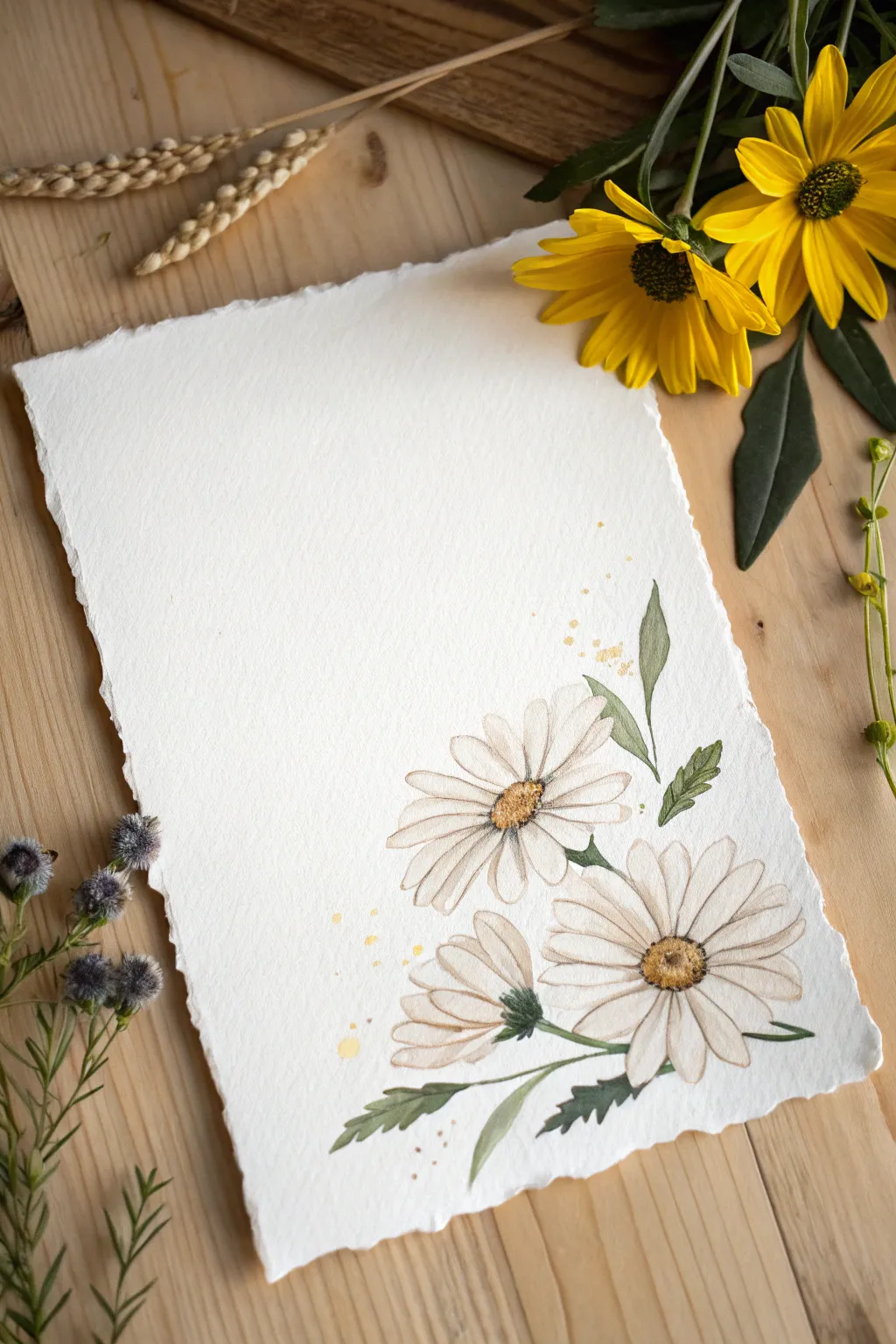
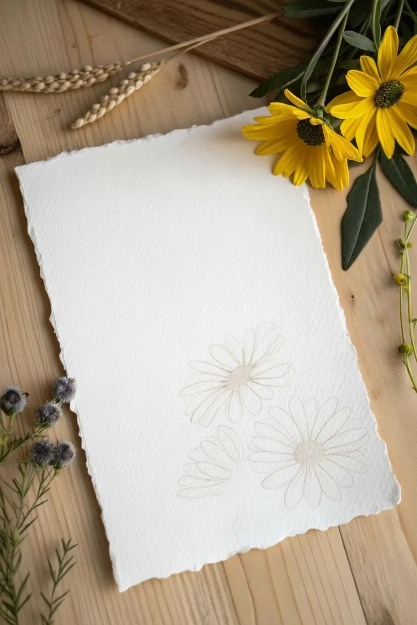
Capture the simple elegance of a meadow with this airy watercolor composition, featuring soft white blooms and golden centers. Using deckle-edge paper adds an instant rustic charm that makes even simple strokes look artisanal and refined.
Detailed Instructions
Materials
- Cold press watercolor paper with deckle edges (or tearing ruler)
- Round watercolor brushes (sizes 2, 4, and 6)
- Watercolor paints: Sepia or Light Brown, Yellow Ochre, warm Sap Green, and deeply diluted Paynes Grey
- Two jars of water
- Paper towel
- Pencil (optional for light sketching)
Step 1: Planning and First Petals
-
Composition strategy:
Visualize your layout in the bottom right corner of the paper. We are aiming for a cluster of three blooms: one large open flower at the bottom right, one slightly smaller flower angled upwards to its left, and a third partial bloom tucked underneath. -
Mixing a shadow tone:
Since we are painting white flowers on white paper, we need a very subtle shadow color to define the petals. Mix plenty of water with a tiny touch of Paynes Grey or Sepia to create a ‘dirty water’ tint. It should be barely visible. -
Painting the first bloom:
Start with the top-left flower. Using your size 4 brush and the pale mix, paint elongated oval shapes radiating from an imaginary center point. Leave the center of the flower empty. -
Creating separation:
As you paint adjacent petals, leave a microscopic hairline of white dry paper between them. This prevents the petals from merging into a single blob and helps define individual shapes.
Wet-on-Dry Texture
For the pollen texture in the center, ensure the paper is totally dry first. Use a relatively dry brush (not dripping) with thick paint to create distinct, fuzzy stipple marks.
Step 2: Adding the Main Cluster
-
The main focal flower:
Move down and to the right for the largest bloom. Paint longer petals here, making the ones facing the bottom right slightly shorter to suggest perspective. -
Tucking in the third bloom:
Paint only the top half of the third lowest flower, imagining it is peeking out from behind the others. The petals should be angled sharply upward. -
Adding definition:
While the first layer is still slightly damp but not soaking, drop a slightly darker concentration of your shadow mix at the very base of the petals (nearest the center). This adds depth instantly. -
Letting it dry completely:
Wait for the petals to be bone dry before moving to the next phase to avoid bleeding colors.
Step 3: Centers and Stems
-
Painting the flower centers:
Load a size 4 brush with thick Yellow Ochre. Dab this into the open centers of the top two flowers. The texture should be stippled (dotted), not a smooth wash. -
Adding texture to the centers:
While the ochre is wet, touch the bottom edge of the center circle with a tiny bit of Sepia or Dark Brown. Let it bleed upward slightly to create a shadowed curve. -
Connecting the stems:
Using a size 2 brush and Sap Green, draw thin, elegant lines stemming from the base of the flowers. I like to keep these lines slightly broken or varied in thickness for a natural look. -
Base of the bottom flower:
For the lowest partial flower, paint a green ‘cup’ (sepal) at the base where the petals gather, pulling the green slightly into the white petals for a seamless join.
Go Metallic
Swap the yellow ochre splatter for gold watercolor or metallic ink. The subtle shimmer adds a luxurious finish that pairs beautifully with the rustic paper.
Step 4: Leaves and Final Details
-
Painting main leaves:
Add slender leaves attached to the stems. Press down on the belly of the brush to widen the leaf, then lift as you pull away to create a sharp point. -
Adding jagged edges:
While the green leaf shapes are wet, use a clean, slightly damp brush to pull tiny spikes outward from the leaf edges, mimicking the serrated look of daisy foliage. -
Defining the petals:
Once everything is dry, use a very fine liner brush or a size 0 brush with diluted Sepia to outline a few petals loosely. Don’t outline everything—just a few broken lines to suggest edges. -
Adding splatter:
Load a brush with watery Yellow Ochre. Hold it over the painting and tap the handle against another brush to create a gentle spray of dots around the blooms. -
Final observation:
Step back and assess balance. If the whites look too flat, add a heavily diluted glaze of warm grey to the shadowed side of a few petals.
Allow the splatter to dry fully before framing this gentle botanical study
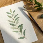

Blob-Style Autumn Tree Canopy
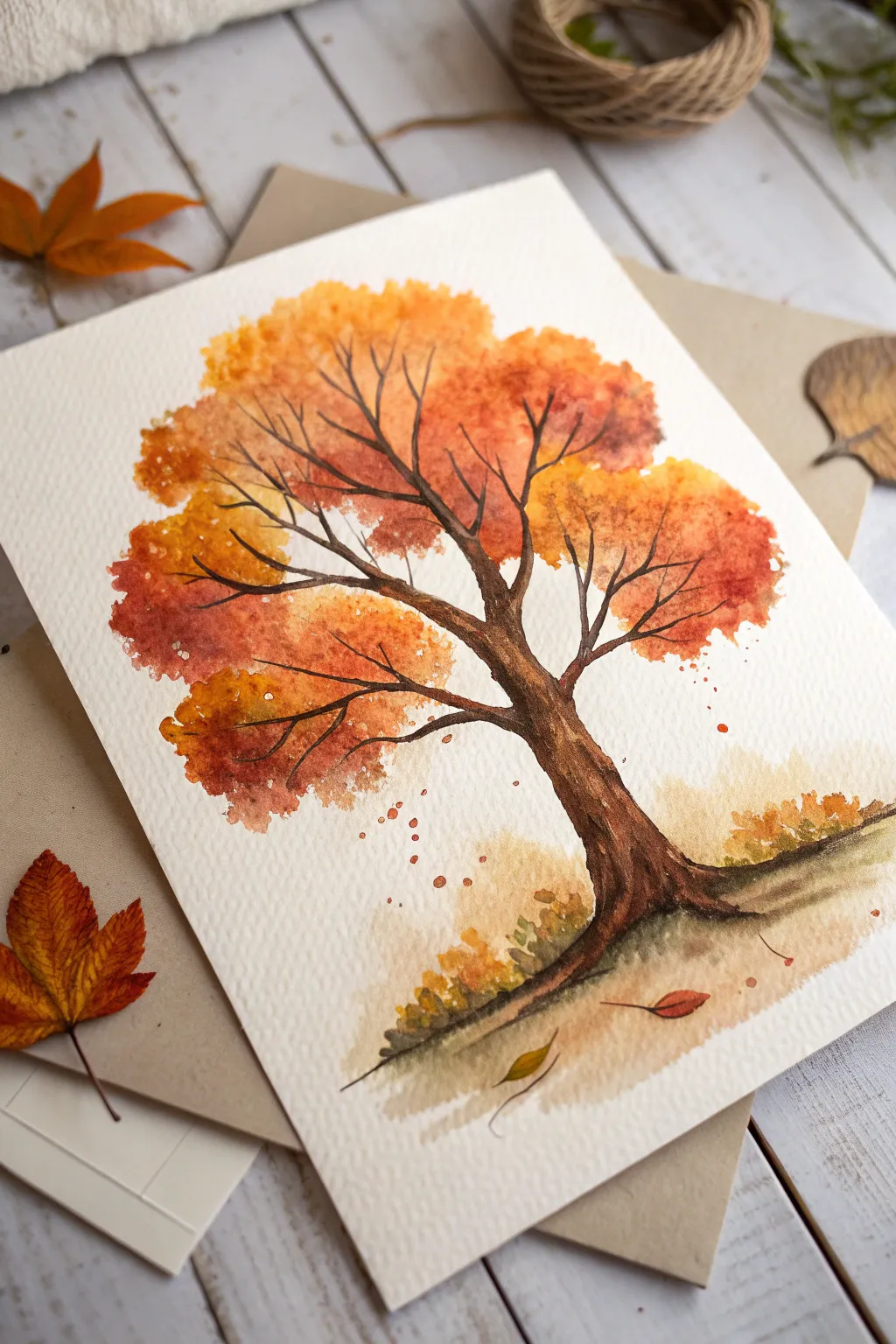
Embrace the glorious imperfections of watercolor with this loose, expressive autumn tree. By using wet-on-wet techniques, you’ll create a vibrant canopy of merging reds, oranges, and golds that mimics the natural chaos of falling leaves.
Detailed Instructions
Materials
- Cold-pressed watercolor paper (300gsm is ideal)
- Round watercolor brushes (sizes 8 and 2)
- Watercolor paints (Yellow Ochre, Burnt Sienna, Alizarin Crimson, Burnt Umber)
- Jar of clean water
- Paper towel
- Pencil (optional)
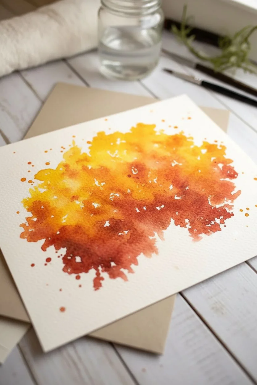
Step 1: Painting the Canopy
-
Dampen the Paper:
Visualize a rough, circular shape where the tree canopy will sit. With a clean, wet size 8 brush, lightly dampen this area on your paper with clear water, but keep the edges irregular rather than perfectly round. -
Drop in Yellow:
Load your brush with watery Yellow Ochre. Touch the wet paper in scattered spots, especially near the top and right side, letting the pigment bloom naturally into the damp surface. -
Add Orange Tones:
While the yellow is still wet, introduce Burnt Sienna into the mix. Dab it into the center areas and slightly towards the left, allowing it to bleed into the yellow to create soft, fuzzy transitions. -
Introduce Deep Reds:
While the paper is still damp but not puddling, drop concentrated Alizarin Crimson into the shadow areas—mostly the bottom left and lower right sections of the canopy blobs. -
Create Separation:
If the blob becomes one giant mass, use a thirsty (dry) brush to lift out tiny channels of paint, suggesting separation between different clusters of leaves. -
Splatter Effect:
To simulate falling leaves, load a brush with orange paint and tap the handle against your finger over the paper, creating tiny droplets around the main canopy. -
Let it Dry:
Allow the canopy to dry completely. This step is crucial because painting the branches into wet paint will cause them to fuzzy out too much.
Muddy Colors?
If your oranges and greens turn brown, let the first layer dry completely before adding a new color. Wet-on-wet is great, but overworking it creates mud.
Step 2: Adding Structure
-
Paint the Trunk Base:
Using Burnt Umber and a size 4 or 6 brush, start painting the trunk from the bottom up. Make the base wider and slightly curved to ground the tree. -
Extend the Trunk:
Continue the trunk upwards, tapering it as you reach the bottom of your foliage blob. I like to keep the edges slightly rough to mimic bark texture. -
Branching Out:
Switch to a size 2 brush or a rigger brush. Pull thin branches out from the main trunk, extending them directly into and through the dried foliage area. -
Vary Line Weight:
Ensure your branches aren’t uniform. Press down for thicker sections and lift up to the very tip of the bristles for whisper-thin twigs at the ends. -
Connect the Clumps:
Specifically target the gaps between your color blobs with your branches, making it look like the wood is supporting those heavy clusters of leaves. -
Deepen Shadows:
Mix a tiny bit of blue or black into your brown to create a darker value. Paint a thin line down the right side of the trunk and under major branches to create dimension.
Textured Bark
Use the dry-brush technique for the trunk. Blot your brush on a paper towel so it’s barely damp, then drag it quickly to create rough ‘bark’ gaps.
Step 3: Ground cover and Details
-
Suggest the Ground:
Wet the area immediately under the trunk. Drop in diluted Burnt Sienna and a touch of green or yellow to create a soft, out-of-focus ground line. -
Add Low Vegetation:
Dab small dots of concentrated yellow and orange near the base of the trunk to suggest fallen leaves or low bushes. -
Falling Leaves:
Using the tip of your small brush, paint two or three distinct leaf shapes falling through the air or resting on the ground for a narrative element. -
Final Contrast:
Once everything is dry, evaluate the contrast. If the trunk looks washed out, glaze a final layer of dark brown over the shadowed side to make it pop.
Frame your new seasonal artwork or turn it into a beautiful custom greeting card for a friend
BRUSH GUIDE
The Right Brush for Every Stroke
From clean lines to bold texture — master brush choice, stroke control, and essential techniques.
Explore the Full Guide
Layered Mountains Made From Simple Shapes
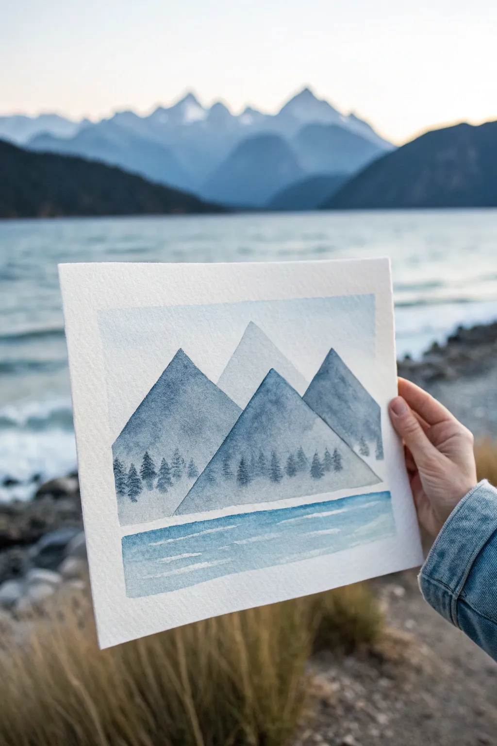
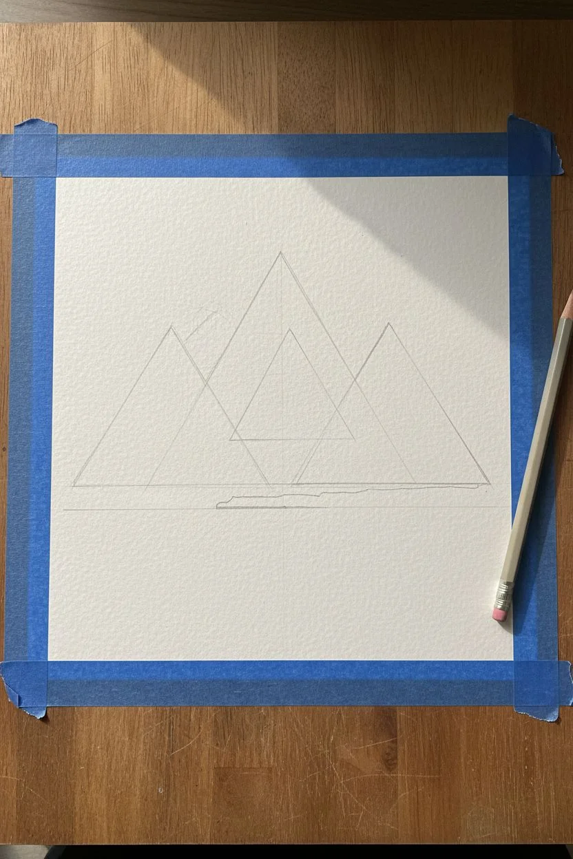
Create a serene, minimalist mountain landscape using simple geometric triangles and monochromatic shades of blue. This project relies on transparency and layering to build depth, turning basic shapes into a cohesive atmospheric scene.
How-To Guide
Materials
- Cold press watercolor paper (square format)
- Painter’s tape or masking tape
- Watercolor paints (Indigo, Payne’s Gray, or Prussian Blue)
- Flat shader brush (approx. 1/2 inch)
- Small round detail brush (size 2 or 4)
- Jar of clean water
- Paper towels
- Pencil and eraser
Step 1: Preparation and Sketching
-
Format the Paper:
Cut your watercolor paper into a square shape if it isn’t already. Tape down the edges to a hard board using painter’s tape to create a crisp white border and prevent buckling. -
Sketch the Peaks:
Lightly sketch three large, overlapping triangles for the main mountains. Add a smaller, centered triangle further back between them for the distant peak. Don’t worry about perfect points; slight irregularity looks more organic. -
Mark the Horizon:
Draw a straight horizontal line below the mountains to separate the land from the water section, leaving a small gap of white space if desired for an ice shelf effect.
Muddy Layers?
If your mountains are bleeding into each other, you aren’t waiting long enough between steps. Use a hairdryer on a low setting to speed up the drying process between triangular layers.
Step 2: Painting the Sky and Background
-
Wash the Sky:
Mix a very watery, pale blue wash. Using your flat brush, paint the sky area behind the mountains, fading it out to white as you move upward toward the top of the paper. -
Paint the Distant Peak:
While the sky is still slightly damp or just dry, paint the furthest, central mountain peak with a very light blue-gray wash. This should be the palest of your mountains to indicate atmospheric perspective.
Graded Wash Trick
For that perfect ‘misty bottom’ look on the mountains, keep a second brush loaded with just clean water nearby. Paint the color with one brush, and immediately blend down with the clean one.
Step 3: Layering the Foreground Mountains
-
First Foreground Peak:
Mix a slightly darker, mid-tone blue. Paint the large triangle on the left side. Ensure your brush strokes follow the angle of the mountain side for a clean edge. -
Create Texture:
While the paint is wet, you can drop in a tiny bit of clean water or darker pigment near the peak to create subtle granulation and texture. -
Fade the Base:
Before the paint dries at the bottom of the triangle, rinse your brush and use clean water to soften the bottom edge, fading the color out to white. This creates a mist or fog effect at the base. -
Second Foreground Peak:
Once the left mountain is fully dry, painting the right-side mountain using a similar mid-tone blue. Repeat the fading technique at the bottom edge. -
Central Foreground Mountain:
Wait for the side mountains to dry completely. Mix your darkest blue tone. Paint the central, front-most triangle. Because layers are transparent, this dark shape overlapping the others will create instant depth. -
Soften the Front Base:
Just like before, use a clean, damp brush to drag the pigment at the bottom of the central mountain down into a fade, leaving the very bottom edge almost white.
Step 4: Adding Details and Water
-
Painting Tiny Trees:
Switch to your small round detail brush. Using concentrated dark blue paint (little water), dab tiny vertical lines along the misty bottom edge of the mountains. -
Refine the Forest:
Gently tap the brush to create jagged foliage shapes on these vertical lines, suggesting a distant evergreen forest emerging from the mist. -
Start the Water:
Below the white gap you left earlier, use your flat brush to sweep horizontal strokes of mid-tone blue across the bottom section. -
Add Water Ripples:
While the water wash is wet, lift out pigment horizontally with a thirsty brush or leave thin strips of dry white paper to mimic light reflecting on gentle waves. -
Final White Gap:
If you painted over your ‘ice shelf’ separator line, you can carefully use thick white gouache or a white gel pen to re-establish that clean horizontal break between land and water. -
The Reveal:
Let the entire piece dry completely—if the paper is cool to the touch, it’s still wet. Once dry, carefully peel away the painter’s tape at a 45-degree angle to reveal the crisp border.
Step back and admire how simple shapes have transformed into a calm, misty landscape
Minimal Ocean Bands and a Crisp Horizon
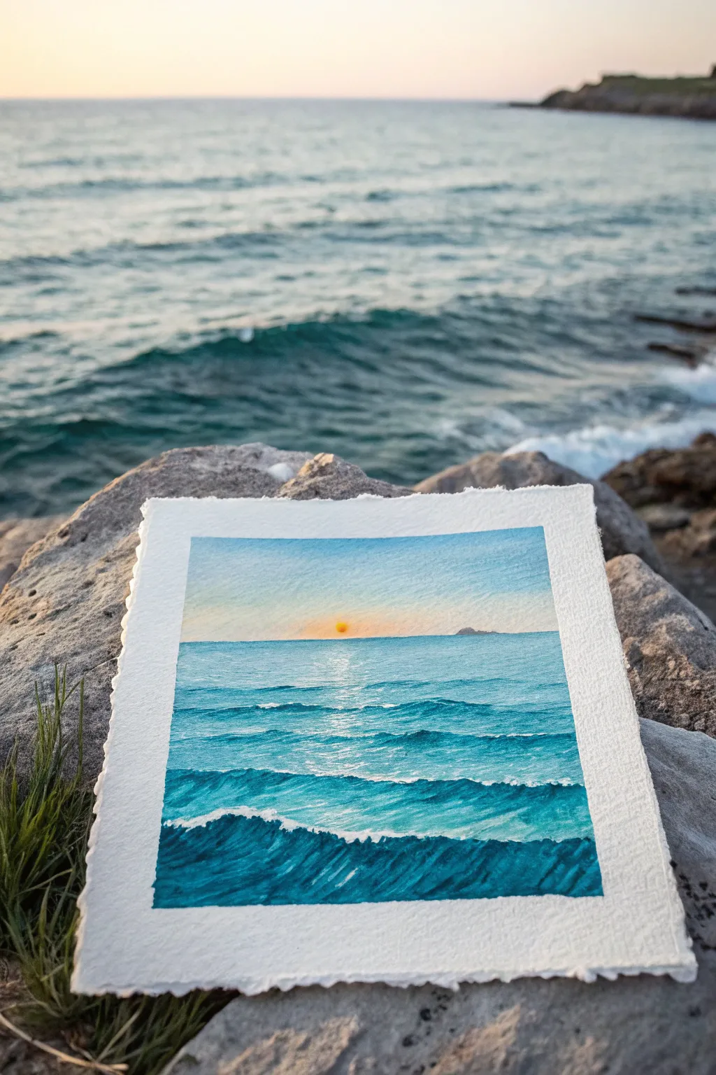
Capture the serenity of the ocean with this vibrant seascape tutorial, focusing on gentle gradients and rhythmic wave patterns. The charm of this piece lies in its interplay of warm sunset hues against cool teal waters, all framed by naturally torn paper edges for a rustic touch.
Detailed Instructions
Materials
- Cold press watercolor paper (300 gsm)
- Masking tape
- Flat brush (3/4 inch)
- Round brush (size 4 or 6)
- Small detail brush (size 0 or 1)
- Watercolor paints (Cerulean Blue, Prussian Blue, Phthalo Green, Yellow Ochre, Cadmium Orange)
- Clean water jar
- Paper towels
- Ruler (optional)
Step 1: Preparation and Sky
-
Prepare the edges:
Before you begin painting, carefully tear the edges of your watercolor paper instead of cutting them. This creates the soft, deckled look seen in the reference. You can fold the paper back and forth along a ruler to guide the tear. -
Tape it down:
Secure your paper to a board using masking tape. Create a square border, leaving about a half-inch margin of white paper around your painting area to frame the scene. -
Define the horizon:
Lightly sketch a horizontal line across the paper, positioned just slightly above the halfway point. This will separate your sky from the sea. Ensure this line is perfectly straight. -
Wet the sky:
Using your large flat brush, apply a coat of clean water to the sky area above the horizon line. You want the paper glistening but not swimming in puddles. -
Paint the upper sky:
Load the brush with a very diluted Cerulean Blue. Start at the top edge of the sky and brush downwards, lifting the brush as you approach the horizon to let the color fade out. -
add the warmth:
While the paper is still damp, pick up a tiny amount of Cadmium Orange or Yellow Ochre on a clean brush. Gently sweep it just above the horizon line, allowing it to softly blend upward into the fading blue without turning green. -
The setting sun:
While the area is still slightly damp, dab a small, slightly more concentrated spot of Orange right in the center of the horizon for the sun. Let this diffuse slightly, then let the entire sky section dry completely.
Bleeding Horizon?
If the sky bleeds into the sea, you didn’t wait for the sky to dry! Use a clean, damp brush to ‘drink’ up the mistake, let it dry fully, then sharpen the line again.
Step 2: Painting the Ocean
-
First ocean layer:
Mix a vibrant turquoise using Cerulean Blue and a touch of Phthalo Green. With your flat brush, paint a horizontal wash starting from the horizon line down to the bottom. Keep the color lightest near the horizon. -
Create distance:
Once the base layer is dry, switch to your round brush. Mix a slightly darker teal shade. Paint thin, straight horizontal lines just below the horizon to suggest distant, small waves. -
Mid-ground waves:
As you move down the page, dampen your brush slightly and paint slightly thicker, more irregular wavy lines. Leave gaps of the lighter under-layer showing through to represent light hitting the wave tops. -
Intensify the color:
Mix deeper Prussian Blue with your teal. Paint the shadows of the waves in the middle section. Use the tip of the brush to create the sharp top edge of a wave, and the belly of the brush to drag the color down softly. -
Sun reflection:
Recall where you placed your sun. In the water directly below it, carefully lift out some pigment with a damp, clean brush or leave the white paper more exposed to create a shimmering vertical reflection.
Sparkle Effect
Scrape a bit of dry pastel or use a white gel pen on the water’s surface directly under the sun to make the reflection pop with extra shimmer.
Step 3: Foreground and Details
-
The big wave:
For the closest wave at the bottom, mix your darkest color: Prussian Blue with a tiny dot of black or dark green. Paint a bold, rolling shape across the bottom third of the paper. -
Add wave texture:
While this dark foreground shape is drying, use a dry-brush technique (remove most water from the brush) to drag darker blue diagonally across the wave face. This mimics the rippled texture of moving water. -
Whitecaps:
If you have white gouache handy, use your smallest brush to add tiny dashes of white along the crests of the foreground waves. If not, scratching the paper gently with a blade can reveal the white underneath (though be careful!). -
Distant land:
Using a very pale grey-purple mix, paint a tiny, low silhouette of an island or landmass on the far right of the horizon line. Keep it subtle so it looks far away. -
The reveal:
Wait until the painting is bone dry. Slowly peel away the masking tape at a 45-degree angle to reveal your crisp white margins against the deckled edge.
Now you have a refreshing slice of the ocean that captures the magic of golden hour

PENCIL GUIDE
Understanding Pencil Grades from H to B
From first sketch to finished drawing — learn pencil grades, line control, and shading techniques.
Explore the Full Guide
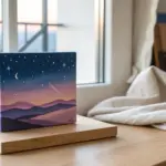
Silhouette Landscape Against a Colorful Sky
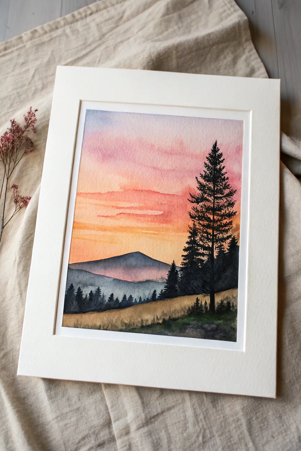
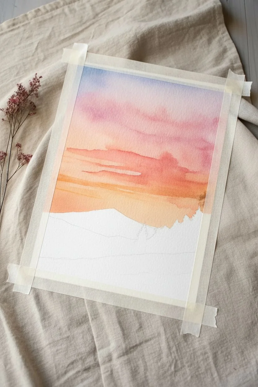
This project captures the quiet beauty of twilight with vibrant washes of pink and orange fading behind a stark mountain silhouette. Using simple wet-on-wet techniques, you will create a glowing sky that perfectly contrasts with the crisp, dark details of the foreground pines.
Step-by-Step
Materials
- Cold press watercolor paper (140 lb/300 gsm)
- Watercolor paints (Alizarin Crimson, Cadmium Red, Cadmium Orange, Ultramarine Blue, Burnt Umber, Payne’s Grey or Lamp Black)
- Large flat wash brush
- Medium round brush (size 6 or 8)
- Small detail brush (size 0 or 2)
- Masking tape
- Two jars of water
- Paper towels
- Pencil and eraser
Step 1: Preparation & Sky Wash
-
Tape boundaries:
Secure your watercolor paper to a board using masking tape on all four sides. This creates that clean white border shown in the image and prevents buckling. -
Sketch the horizon:
Very lightly sketch the outline of the mountains and the foreground hill about one-third up from the bottom. Keep lines faint so they don’t show through later. -
Wet the sky area:
Using your large flat brush, apply clean water to the entire sky area, stopping right at the mountain line. The paper should be glisten, but not form puddles. -
Apply the top clouds:
Load a round brush with a watered-down mix of Alizarin Crimson and a touch of Ultramarine Blue for a soft purple-pink. Dab this into the wet paper at the very top, letting it bloom downward naturally. -
Add warmth:
While the paper is still wet, introduce a band of pure pink (diluted Alizarin Crimson) below the purple clouds. -
Paint the horizon glow:
Switch to Cadmium Orange and paint horizontal strokes near the horizon line. Allow this orange to bleed slightly upward into the pink, creating a seamless transition. -
Intensify contrast:
Add a slightly stronger concentration of orange or red to create those distinct horizontal cloud streaks across the middle of the sky. Let the sky dry completely before moving on.
Bleeding Colors?
If your mountains are bleeding into your sky, you didn’t wait long enough! The sky must be bone dry. Use a hairdryer on a low, cool setting to speed this up safely.
Step 2: Mountains & Mid-ground
-
Mix shadow color:
Create a cool, muted purple-grey by mixing Ultramarine Blue with a little Burnt Umber and Alizarin Crimson. It should be transparent but darker than your sky. -
Paint the distant mountain:
Paint the large central mountain shape using this mix. Use a flat wash to ensure even coverage, but you can water it down slightly near the base to create a misty effect. -
Layer the second range:
Once the first mountain is dry, mix a slightly darker, bluer grey. Paint the lower mountain range just in front of it to establish depth. -
Add distant treeline:
While the second mountain layer is still damp, dab tiny dots of darker pigment along its bottom edge to suggest a distant forest texture.
Make it Sparkle
For a magical night vibe, wait until the sky is dry, then flick white gouache or acrylic ink off a toothbrush to create a starry effect over the darker upper sky.
Step 3: Foreground & Details
-
Define the grassy hill:
Mix a warm, earthy tone using Yellow Ochre and a touch of Burnt Umber. Paint the foreground slope, using quick, upward flicking strokes with a drier brush to mimic tall grass texture. -
Deepen the shadows:
While the grass layer is wet, drop in some dark green or grey (Payne’s Grey mixed with green) at the very bottom right corner to ground the scene. -
Prepare the darkest mix:
For the silhouette trees, you need a very dark, opaque value. Mix Payne’s Grey with a little Alizarin Crimson or use Lamp Black. -
Paint the main tree trunk:
Using your smallest detail brush, paint a straight vertical line on the right side of the paper for the main pine tree trunk. I find it helps to brace my hand on dry paper for stability. -
Add pine branches:
Starting from the top of the tree, use a stippling or dabbing motion to create the branches. Keep the top narrow and widen the branches as you move down, leaving gaps for the sky to peek through. -
Add secondary trees:
Paint smaller, less detailed pine tree shapes on the left side and behind the main tree using the same dark mixture. -
Final touches:
Use the tip of your detail brush to add tiny vertical lines along the ridge of the hill to represent distinct blades of grass or small saplings. -
Reveal the border:
Wait until the painting is 100% bone dry, then carefully peel away the masking tape at a 45-degree angle to reveal your crisp edges.
Now you have a serene landscape ready to be framed or gifted to a nature lover
Cute Mushroom Cluster With Simple Caps
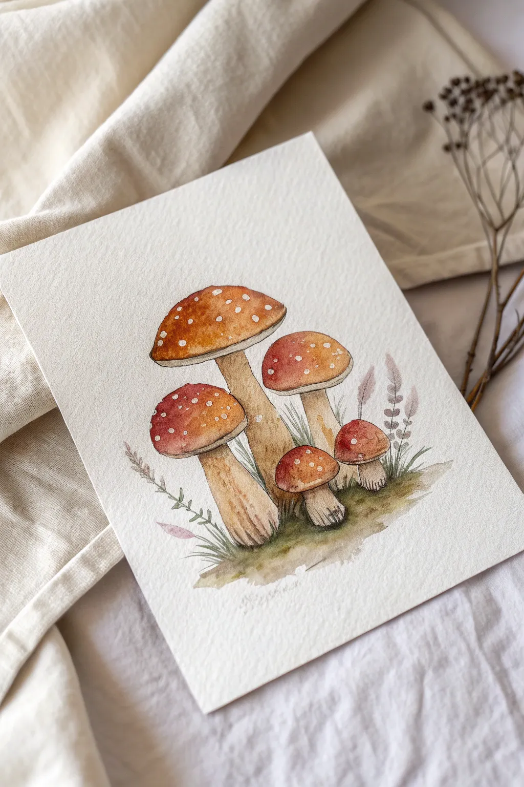
Capture the charm of the forest floor with this delightful mushroom study featuring earthy red caps and gentle textures. This beginner-friendly project focuses on building layers and creating soft, organic shapes perfect for a cozy afternoon of painting.
Step-by-Step
Materials
- Cold press watercolor paper (300gsm/140lb)
- Round watercolor brushes (sizes 2, 4, and 6)
- Watercolor paints (Burnt Sienna, Cadmium Red, Yellow Ochre, Sap Green, Burnt Umber, Indigo)
- Pencil (HB) and kneaded eraser
- White gouache or white gel pen
- Two jars of water
- Paper towel
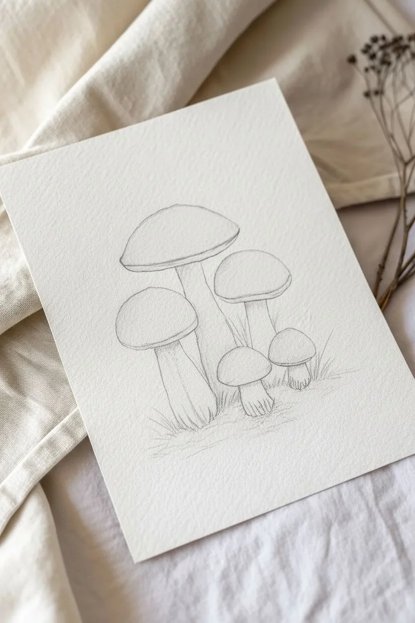
Step 1: Sketching the Composition
-
Outline the caps:
Begin by lightly sketching five mushroom caps in a cluster. Draw the largest, tallest one in the center-left. Add a medium one to its right, a smaller one below that, and two tiny ones near the base. Keep the shapes rounded but slightly irregular for a natural look. -
Add the stems:
Draw the stems connecting to the caps. Make the main stem thick and sturdy, slightly widening at the bottom. The smaller mushrooms should have shorter, stubbier stems. Add faint lines for the gills underneath the caps. -
Indicate ground cover:
Lightly sketch a rough, uneven line for the mossy mound at the base to ground your mushrooms, adding a few wispy lines for grass blades.
Step 2: Painting the Caps
-
Base wash:
Mix a warm, reddish-brown hue using Burnt Sienna and a touch of Cadmium Red. With your size 6 brush, paint the caps, leaving small, random white circles unpainted for the signature spots. If you accidentally paint over them, don’t worry—we can fix that later. -
Adding depth:
While the paint is still damp, drop a slightly darker mix (add a tiny bit of Burnt Umber) to the very top edges and usually one side of the caps to create a rounded, 3D effect. Let the color bloom naturally. -
Lifting highlights:
Rinse your brush and dab it on a paper towel until just damp. Gently lift some pigment from the center or top-left of the caps to create a soft highlight where the light hits.
Spot Technique
Use masking fluid for the white spots before painting the red wash. Rub it off when dry for crisp, pure white dots without using gouache.
Step 3: Stems and Gills
-
Stem base color:
Mix a very watery wash of Yellow Ochre with a tiny hint of Burnt Sienna. Paint the stems, keeping the wash very pale near the top where the stem meets the cap. -
Shadowing the stems:
Once the base layer is dry, mix a dilute Burnt Umber. Using a size 4 brush, add vertical strokes along the sides and bottom of the stems to suggest texture and cylindrical volume. -
Painting the gills:
Underneath the caps for the tilted mushrooms, use a dilute beige mix to paint fine lines radiating from the stem outward, suggesting the delicate gill structure.
Autumn vibe
Splatter tiny droplets of gold or burnt orange paint lightly over the finished piece to give it a magical, forest-floor atmosphere.
Step 4: Ground and Details
-
Mossy base:
Mix Sap Green with a little Burnt Umber for an earthy olive tone. Paint the uneven ground beneath the mushrooms using loose, dabbing motions to simulate moss. -
Softening the edge:
Dip your brush in clean water and soften the bottom edge of the ground paint so it fades out into the white of the paper rather than stopping abruptly. -
Adding grass blades:
Using your smallest brush (size 2) and the green mix, flick quick, upward strokes to create grass blades growing around the stems. -
Decorative foliage:
Mix a muted purple-grey using Indigo and Burnt Sienna. Paint delicate, fern-like sprigs rising from the moss on the right and left sides. Keep these very faint and watery so they don’t overpower the mushrooms.
Step 5: Final Touches
-
Sharpening details:
Take a slightly more concentrated brown and add definition to the bottom of the stems and the darkest shadow areas under the caps. -
Brightening the spots:
If your reserved white spots got muddy, or if you want them brighter, use white gouache or a white gel pen to dot opaque white spots onto the dry red caps. I like to vary the size of these dots for realism. -
Wait:
Allow the entire piece to dry completely before erasing any visible pencil lines very gently.
Frame your gentle woodland study or use it as a charming card front for a nature lover


Easy Whale Shape Using Wet-on-Wet Blending
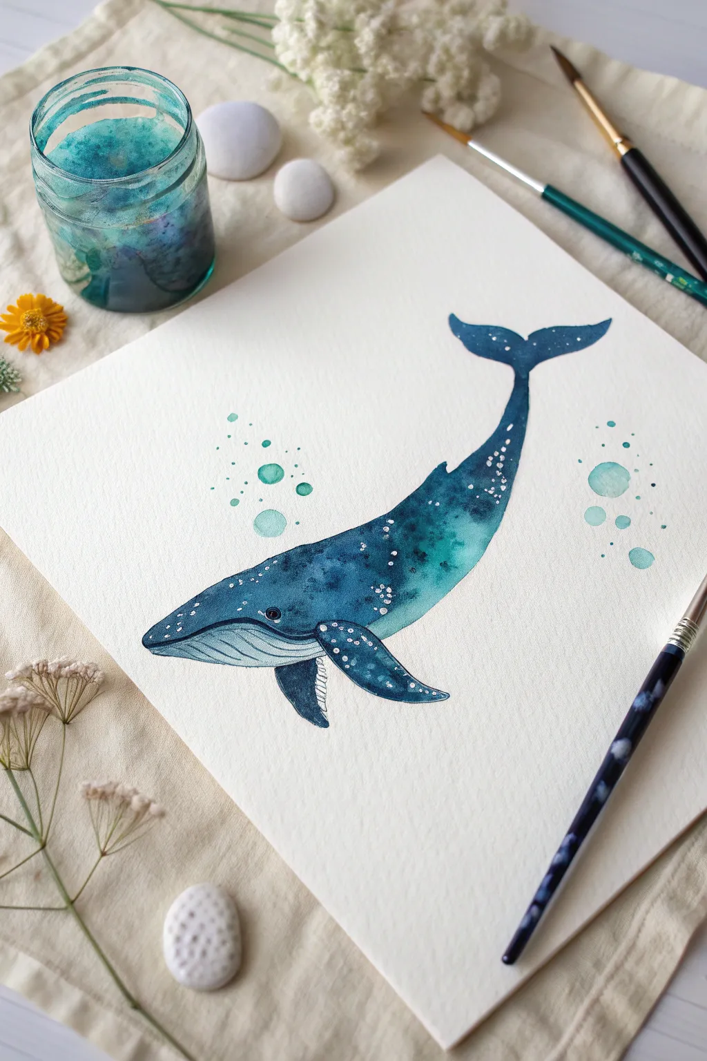
This joyful project captures the gentle movement of a whale swimming through the deep blue sea, perfect for practicing wet-on-wet blending. You will learn to create a gradient of oceanic teals and indigos, adding whimsical bubbles and white speckles to bring your marine friend to life.
How-To Guide
Materials
- Cold press watercolor paper (300 gsm)
- Watercolor paints (Indigo, Phthalo Blue, Turquoise, Viridian Green)
- Round brushes (Size 6 for body, Size 0 or 00 for details)
- White gouache or white gel pen
- Clean water jar
- Paper towels
- Pencil (HB or lighter)
- Eraser
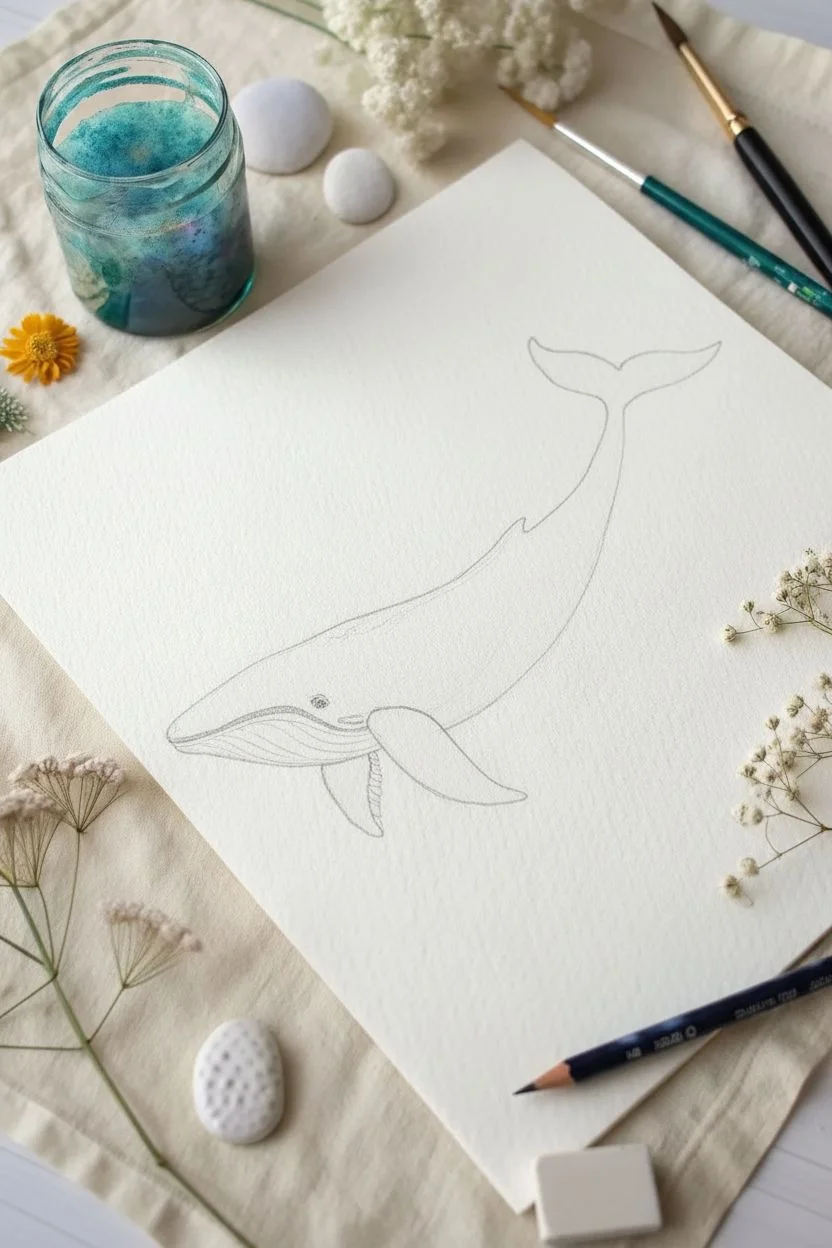
Step 1: Sketching the Outline
-
Draw the main curve:
Start by drawing a gentle, C-shaped curve for the whale’s spine. This establishes the graceful movement of the creature. Keep your pencil lines extremely faint so they don’t show through the transparent watercolor later. -
Form the body:
Connect the ends of your spine curve with a rounded belly line. The head should be blunt and rounded, tapering down into a thinner tail section before reaching the flukes. -
Add fins and flukes:
Sketch the tail flukes at the top end, looking like a wide, curved ‘Y’ shape. Add a large pectoral fin on the side of the body and a small dorsal fin on the back. -
Define the belly grooves:
Lightly sketch the striations underneath the jaw. These lines run from the chin halfway down the belly, curving slightly with the form of the whale.
Step 2: Painting the Gradient Body
-
Prepare your washes:
Mix three puddles of paint on your palette: a deep Indigo, a medium Phthalo Blue, and a bright Turquoise or Viridian Green. Make sure they are juicy and fluid. -
Wet the paper:
Using clean water and your size 6 brush, paint the interior of the whale’s body, *excluding* the belly area and the fins. The paper should be glisten evenly but not have standing puddles of water. -
Drop in the darks:
While the paper is wet, touch your brush loaded with Indigo to the top ridge of the whale and the tail area. Watch the pigment bloom and spread softly. -
Blend the mid-tones:
Rinse your brush slightly and pick up the Phthalo Blue. Apply this to the middle section of the body, allowing it to touch and bleed into the Indigo. -
Add the highlights:
Finally, load your brush with Turquoise or Viridian and drop it into the lower part of the main body (just above the belly line). This creates that beautiful glowing effect where light hits the water. -
Refine the edges:
Use a damp, clean brush to tidy up the edges of your shape if paint has strayed outside your sketch lines. Let this main body layer dry completely.
Bloom Control PRO Tip
If your wet-on-wet blend is spreading too fast, your paper is too wet. Wait 30 seconds for the sheen to dull to satin before dropping in more pigment.
Step 3: Painting Appendages & Details
-
Paint the fins:
Once the body is dry, paint the pectoral fin and tail flukes. Use a solid Indigo mix for these to make them stand out, perhaps blending a little Turquoise at the very tips for continuity. -
The belly detail:
For the grooved belly, use a very diluted wash of Indigo (lots of water). Fill the area, let it dry, and then use your size 0 brush to paint thin, dark lines to define the grooves. -
Paint the eye:
Using concentrated Indigo or black on your smallest brush, paint a small circle for the eye just above the corner of the mouth line. Leave a tiny speck of white paper for a highlight, or add it later with white gouache. -
Create the bubbles:
Mix a watery pool of Turquoise. Paint various sized circles floating around the whale. While the circles are still wet, dab a clean paper towel on one side of each circle to lift color, creating a transparent bubble effect.
Level Up: Salt Effects
While the body paint is still wet, sprinkle a few grains of table salt into the Indigo areas. When dry, brush it off for a stunning, natural rugged texture.
Step 4: Magical Final Touches
-
Add the stars:
Load your small brush with white gouache (or use a white gel pen). Dot tiny speckles across the darker, upper part of the whale’s back. I like to cluster them slightly to look like barnacles or magical star dust. -
Highlight the fins:
Add a thin white line along the leading edge of the pectoral fin and the top of the tail flukes to separate them visually from the body. -
Enhance the bubbles:
Add tiny white reflection dots to your floating bubbles to make them look spherical and shiny.
Let your beautiful ocean giant dry completely before erasing any visible pencil marks to avoid smudging
Simple Cat Faces in a Loose Watercolor Style
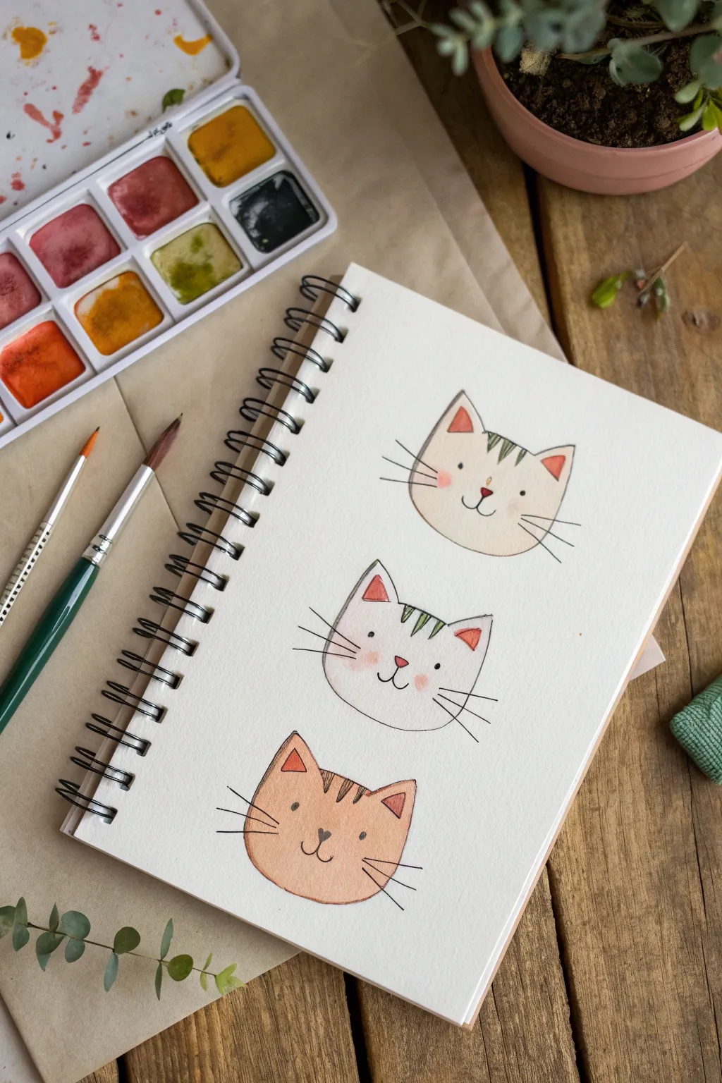
These three charming cat faces are perfect for beginners, combining simple shapes with delicate watercolor washes. The style is light and illustrative, using fine fineliner details to bring out their sweet expressions.
Step-by-Step
Materials
- Watercolor paper (cold press recommended)
- Small round watercolor brush (size 2 or 4)
- Watercolor paint set (ochre, pink/red, light brown, dark brown)
- Fine-tipped black fineliner pen (waterproof)
- Pencil for sketching
- Eraser
- Jar of water
- Paper towel
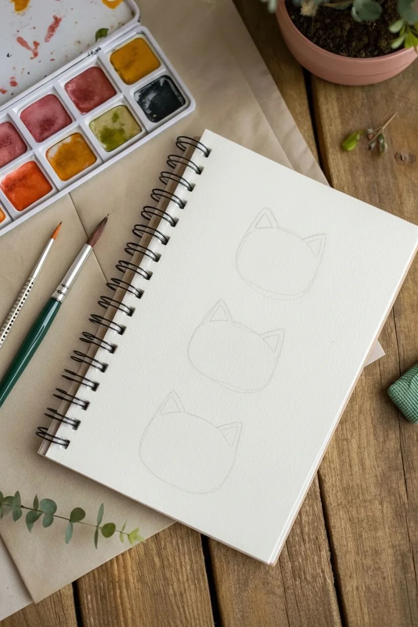
Step 1: Sketching the Base
-
Plan the placement:
Visualize three evenly spaced spots vertically on your spiral-bound sketchbook page. Lightly mark where the center of each face will be. -
Outline the head shapes:
Sketch a soft, wide U-shape for the bottom of each cat’s head. Close the top with a slightly curved line, leaving gaps for the ears. -
Add the ears:
Draw triangular ears on top of each head. Vary the angles slightly to give each cat a unique personality. -
Refine lines:
Go over your pencil lines to ensure they are smooth, but keep them extremely faint so they won’t show through the paint later.
Pro Tip: Cheek Bloom
For the softest blush effect, wet the cheek area specifically with clean water first, then touch the wet paper with a pink-loaded brush. The color will spread naturally without hard edges.
Step 2: Painting the Washes
-
Mix the first coat:
For the top cat, dilute a yellow ochre or cream color with plenty of water to create a very pale, transparent wash. -
Fill the shape:
Gently fill in the entire head shape of the top cat, staying within your pencil lines. Keep the wash even and light. -
Paint the middle cat:
The middle cat is white, so you actually won’t paint the main face area at all. Just leave the paper bare for now. -
Paint the bottom cat:
Mix a light terracotta or soft orange shade. Paint the entire head shape of the bottom cat, aiming for a smooth, flat wash. -
Add rosy cheeks:
While the paper is still slightly damp (or after creating a wet spot with clean water), dab a tiny amount of diluted pink paint onto the cheek areas of all three cats to create a soft, fuzzy bloom. -
Fill the ears:
Using a slightly more saturated pink or coral, paint small triangles inside the ears of each cat. -
Let it dry:
Allow the paint to dry completely. If the paper feels cool to the touch, it’s still wet.
Level Up: Accessories
Given the finished heads, try painting small accessories like a bowtie, a collar, or even tiny glasses on one of the cats to add extra character to your trio.
Step 3: Adding Details
-
Ink the outlines:
Once bone-dry, use your black fineliner to trace the outer shape of the heads. Keep the line thin and delicate. I find broken lines can add a nice loose feel, but solid lines work great too. -
Draw the faces:
Place two small dots for eyes wide apart on each face. Add a small nose (triangle or heart shape) and a ‘w’ shape for the mouth. -
Add whiskers:
Flick three quick lines outward from each cheek. Use a confident, quick motion to keep the lines tapered and energetic. -
Paint the stripes:
Switch back to your smallest brush. For the top cat, mix a grey-green and paint three small stripes between the ears. Do the same for the middle cat. -
Finish the tabby:
For the orange cat at the bottom, mix a darker brown and add three stripes on the forehead. -
Color the noses:
Carefully dab a tiny bit of red or pink paint onto the nose of the top and middle cats. The bottom cat looks cute with a simple black inked nose.
Now you have a trio of adorable feline friends brightening up your sketchbook page
Citrus Slices With Bright, Transparent Layers
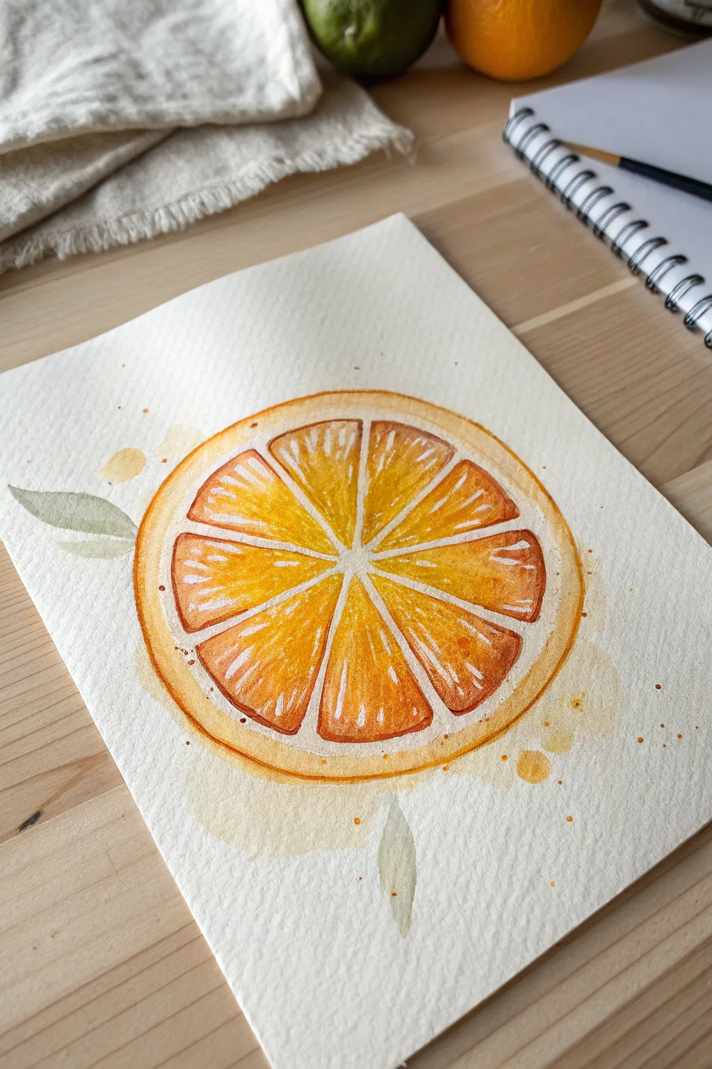
Capture the zest of summer with this vibrant watercolor orange slice, featuring radiating segments and delicate translucent layers. This project focuses on building juicy color saturation while preserving crisp white highlights for a fresh, realistic look.
Step-by-Step Guide
Materials
- Cold press watercolor paper (300 gsm)
- Watercolor paints (Cadmium Yellow, Cadmium Orange, Burnt Sienna)
- Round watercolor brushes (size 4 and 8)
- Pencil (HB or H)
- White gel pen or gouache (optional)
- Two jars of water
- Paper towels
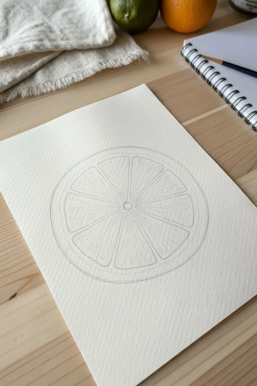
Step 1: Sketching the Structure
-
Draw the Outer Circle:
Begin by lightly sketching a large circle in the center of your paper. It doesn’t need to be geometrically perfect; a slightly organic shape feels more natural. -
Add the Rind and Pith:
Drawing inward from your main circle, sketch a slightly smaller circle to define the thickness of the peel (the rind and white pith). -
Define the Center Point:
Mark a small dot in the very center of your circle. This will be the anchor point where all your fruit segments meet. -
Sketch the Segments:
Draw 8 to 10 triangular wedge shapes radiating from the center. Keep a small gap between each segment to represent the white membrane that separates the juicy parts of the fruit.
Step 2: Painting the Fruit
-
First Layer of Yellow:
Using your size 8 brush, mix a watery wash of Cadmium Yellow. Paint every other segment, dropping the color in wet. Skip adjacent segments to prevent the wet paint from bleeding together. -
Complete the Underlayer:
Once the first set of segments is dry to the touch, paint the remaining wedges with the same yellow wash. This creates a glowing base for the orange. -
Introduce Orange Tones:
Load your brush with a vibrant Cadmium Orange. While looking at the segments, paint over the yellow layer, but leave small, irregular slivers of the yellow showing through to suggest pulp fibers. -
Deepen the Pulp details:
Switch to your smaller size 4 brush. Mix a tiny bit of Burnt Sienna into your orange to darken it. Add thin, radiating lines inside the wedges near the outer edges to show texture. -
Painting the Peel:
Wet the outer ring (the rind) with clean water. Drop in your Cadmium Orange, letting it bloom softly. Keep the inner edge of this ring lighter to suggest the white pith. -
Add Pith Texture:
While the peel is drying, use a very diluted, pale yellow-orange mix to add tiny, faint dots or splotches on the white membrane lines between segments, so they aren’t stark white.
Uneven Drying?
If your segments are drying with hard edges inside the fruit where you don’t want them, your paper might be too dry. Rewet the whole segment slightly before adding darker colors.
Step 3: Refining and Splattering
-
Enhance Contrast:
I like to go back in with my darkest orange mix and sharpen the corners of the fruit segments. This makes the pale membrane lines pop. -
Add White Highlights:
If you lost some of your white paper highlights during painting, use a white gel pen or opaque white gouache to add thin, scratchy lines inside the segments for that glistening, juicy look. -
Paint Subtle Leaves:
Mix a muted green using your yellow and a touch of blue or black. Paint two simple leaf shapes floating near the orange—one on the left, one below—keeping them very watery and transparent. -
Background Splatters:
Load a wet brush with diluted orange paint. Tap the handle against another brush over the paper to create loose, energetic splatters around the fruit. -
Create Water Stains:
Paint a few very faint, watery pools of pale yellow outside the main orange shape. Let these dry naturally to create organic ‘coffee stain’ edges that frame the fruit.
Try a Color Swap
Use this same technique with Alizarin Crimson and Ruby Red to create a ruby grapefruit, or switch to Sap Green and Lemon Yellow for a zesty lime slice.
Let your artwork dry completely before erasing any visible pencil lines for a clean, professional finish
Geometric Color Blocks for Instant “Modern Art”
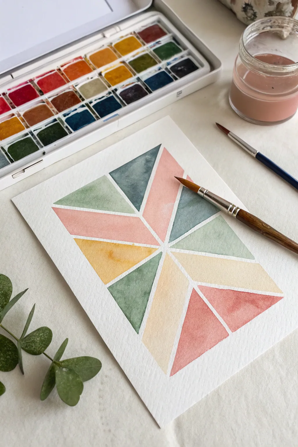
Create a striking piece of modern art using simple geometric shapes and a muted, sophisticated color palette. This project relies on masking fluid or tape to achieve crisp, clean white lines separating soft washes of watercolor.
Detailed Instructions
Materials
- Cold-pressed watercolor paper (300 gsm)
- Masking tape, washi tape, or masking fluid
- Watercolor paints (terracotta, sage green, slate blue, ochre yellow)
- Round watercolor brushes (size 4 and size 8)
- Pencil and ruler
- Jar of clean water
- Paper towels
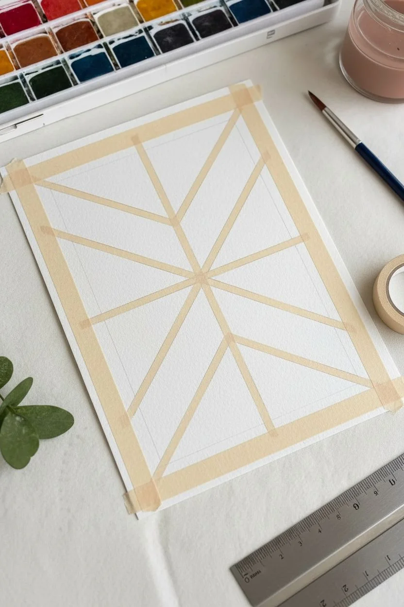
Step 1: Planning and Masking
-
Outline the perimeter:
Begin by lightly tracing a rectangle in the center of your watercolor paper using a ruler and pencil. This will define the boundaries of your geometric design. -
Sketch the internal geometry:
Using your ruler, divide the rectangle. Start by drawing a central vertical line, but don’t go all the way to the top or bottom edges yet. Draw diagonal lines radiating from a central focal point to create triangles and trapezoids, mimicking the symmetry seen in the reference image. -
Prepare the masking:
If you are using narrow artist’s tape or washi tape (1/8 inch or 3mm width is ideal), carefully place strips over every pencil line you just drew. Press down firmly on the edges to ensure paint doesn’t seep underneath. -
Alternative masking method:
If you don’t have thin tape, use drawing gum (masking fluid). Use an old or cheap brush to paint lines over your pencil sketches. I prefer to dip the brush in dish soap first to make cleaning the fluid off easier later. Let this dry completely before painting.
Bleeding Lines?
If paint seeps under your tape, try ‘sealing’ the tape edge next time by painting a thin line of clear water or white gouache over the tape edge before applying color.
Step 2: Painting the Shapes
-
Mix your palette:
Prepare your four main colors on your palette: a dusty rose or light terracotta, a muted sage green, a slate blue-grey, and a warm yellow ochre. Dilute them with enough water to create semi-transparent washes. -
Paint the first section:
Start with the top-right trapezoid area. Load your brush with the dusty rose color. apply an even wash within the taped (or masked) boundaries. Try to work quickly so the paint settles evenly. -
Balance the colors:
Move to a non-adjacent section, perhaps a triangle at the bottom left, and paint it with the sage green. Working on non-touching sections prevents bleeding if your masking isn’t perfectly sealed. -
Apply the slate blue:
Fill in the top-left section with your slate blue mix. Notice how the colors interact; keep the saturation similar across all shapes for a cohesive look. -
Add warmth with yellow:
Paint the middle-left triangle with the yellow ochre. This warm tone provides a nice contrast to the cooler greens and blues. -
Continue filling shapes:
Proceed to fill the remaining geometric spaces. Aim for a balanced distribution of color. For example, mirror the dusty rose on the bottom right to balance the top left. -
Create subtle texture:
While a section is still slightly damp, you can drop in a tiny bit of more concentrated pigment of the same color into one corner. This creates a gentle gradient or ‘bloom’ that adds traditional watercolor character. -
Let it dry completely:
This is the hardest part—patience. Allow the entire painting to dry until the paper feels room temperature to the touch. If it feels cool, it’s still damp.
Level Up: Metallic Pop
After the paint is fully dry, trace the thin white negative spaces with a gold paint pen or fine metallic watercolor for a luxurious, Art Deco-inspired finish.
Step 3: The Reveal
-
Remove vertical masking:
Once bone dry, begin peeling off your tape or rubbing away the masking fluid. Start with the vertical lines. Pull tape slowly at a 45-degree angle away from the painted area to avoid tearing the paper. -
Remove diagonal masking:
Carefully remove the remaining masking strips. If you used masking fluid, gently rub it away with a rubber cement pickup tool or your clean finger. -
Clean up edges:
Use a white eraser to gently remove any visible pencil marks that might still be showing within the white lines. -
Final assessment:
Check for any small rough edges. If paint bled slightly under the tape, you can touch it up with a distinct opaque white gouache or a white gel pen for a quick fix.
Frame your new geometric masterpiece to add a modern touch to any wall space
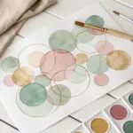
Overlapping Transparent Circles to Practice Glazing
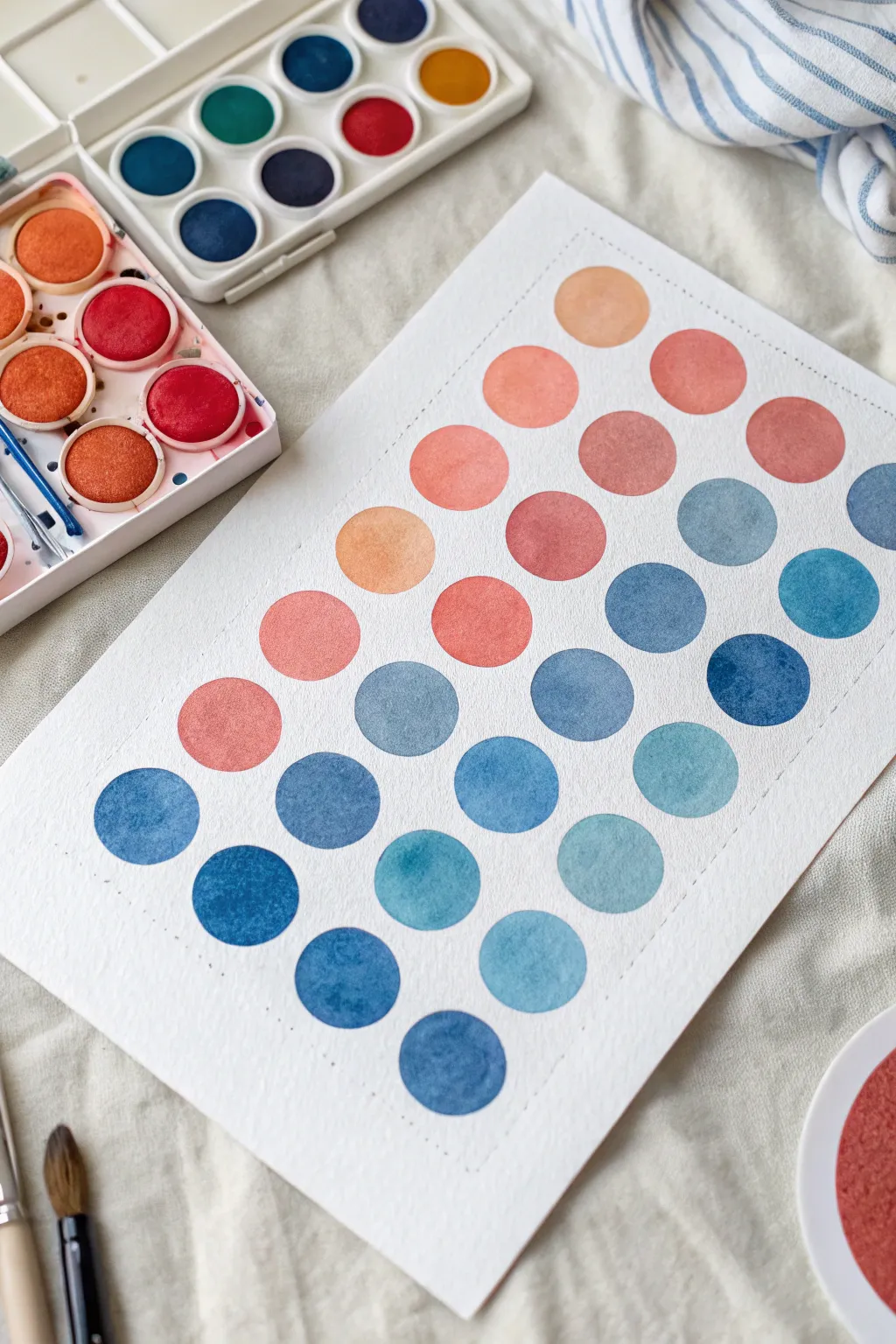
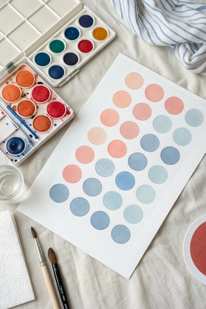
Master the art of color transitions with this satisfying grid of gradient dots. This project is a perfect way to explore how warm and cool tones interact while practicing brush control and water-to-paint ratios.
Step-by-Step
Materials
- Cold Press watercolor paper (300gsm/140lb)
- Watercolor palette (Warm Red/Peach, Cool Blue/Teal)
- Round watercolor brush (size 6 or 8)
- Pencil (HB or H)
- Ruler
- Jar of clean water
- Paper towels
Step 1: Preparation
-
Grid layout:
Begin by lightly drawing a rectangular border on your paper to frame the composition. Leave about an inch of margin on all sides to give the artwork breathing room. -
Marking dot positions:
Using your ruler, measure and mark light pencil dots in a staggered pattern. Think of a honeycomb structure: each row should be offset from the one above it so the circles nestle together without touching. -
Shape outlines:
Carefully sketch faint circles around your marked points. If you aren’t confident freehanding them, trace a small coin or bottle cap, but keep the pencil lines extremely light so they don’t show through the transparent paint later. -
Palette setup:
Prepare two main puddles of paint on your palette: a watery, soft peach-orange and a deeper, cool Prussian blue. Having pre-mixed pools ensures you won’t run out of color mid-circle.
Uneven Circles?
Don’t overwork the edges. Place your brush inside the line and push the paint outward to the rim. It’s better to have a slightly wobbly circle than a muddy, overworked one.
Step 2: Painting Warm Tones
-
Starting the gradient:
Start at the top right corner with your lightest peach color. Load your brush with plenty of water and pigment, filling in the first circle carefully. Let the brush belly do the work to get a smooth, rounded edge. -
Adding intensity:
As you move left across the top rows, add a tiny touch more red or orange to your mix. The goal is a subtle shift from pale peach to a richer salmon color. -
Working downwards:
Continue painting the upper third of the grid, focusing purely on the warm tones. Notice how the circles in the photo vary slightly in saturation; some look denser while others are more watery. This natural variation adds charm, so don’t stress about perfect uniformity. -
Transition zone:
As you reach the middle rows, begin mixing a tiny drop of your blue into the peach. This creates slightly muted, brownish-purple tones that act as a bridge between the hot and cold sections.
Step 3: Painting Cool Tones
-
Introducing blue:
Switch your focus to the blue pigment now. Start introducing clear, medium-toned blue circles in the middle-right section. Keep the paint wet enough that it pools slightly on the paper. -
Deepening values:
Move towards the bottom left corner, making your blue mixture progressively darker and more concentrated. Less water and more pigment will give you those deep, navy-like circles. -
Teal variations:
For variety, mix a little green or turquoise into a few of the bottom circles. This breaks up the monotony of a single blue shade and creates that lovely ocean-like depth seen in the lower rows. -
Filling the grid:
Complete the remaining circles at the bottom. I find it helpful to rotate the paper if my hand starts to smudge the wet upper rows.
Pro Tip: Bloom Effects
While a circle is still wet, drop a tiny splash of clean water or a different color into the center. This creates beautiful cauliflower blooms and texture as it dries.
Step 4: Refining
-
Drying time:
Allow the piece to dry completely flat. Watercolor often dries lighter than it looks when wet, so wait until the shine disappears from the paper surface. -
Layering texturing:
If some circles look too pale after drying, you can apply a second glaze of the same color over top. This creates the ‘hard edge’ watermarks seen in some of the circles in the reference image. -
Erase guidelines:
Once the paper is bone-dry (touch it with the back of your hand to check for coldness), gently erase the pencil grid lines that are visible between the circles.
Step back and admire your soothing grid of colors, a perfect exercise in patience and hue
Line and Wash: Ink Sketch With Loose Color
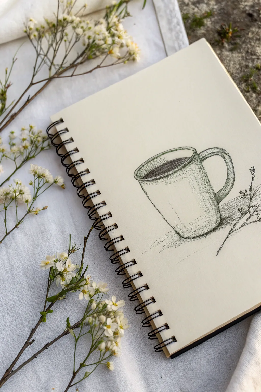
Before splashing on watercolor, a strong foundation starts with a confident sketch. This project focuses on drawing a classic coffee mug with clean lines and simple shading to prepare for a light wash or to stand beautifully on its own.
Step-by-Step Tutorial
Materials
- Spiral-bound sketchbook (mixed media paper preferred)
- Fine liner pen (0.3mm or 0.5mm, waterproof black ink)
- HB or 2B graphite pencil (optional for initial blocking)
- Small sprig of baby’s breath or similar tiny flower for reference
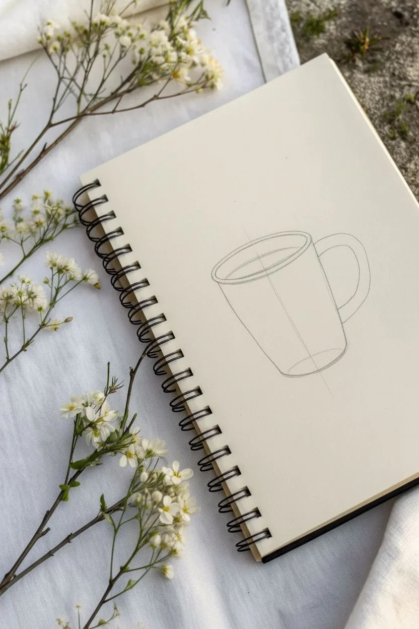
Step 1: Constructing the Basic Shape
-
Place the ellipse:
Start by lightly drawing the opening of the mug. Sketch a flattened oval (ellipse) slightly below the top of your page, tilting it just a bit to the right. -
Define the sides:
Drop two vertical lines down from the widest points of your ellipse. Taper them inward ever so slightly as they go down to give the mug a classic tapered shape. -
Close the bottom:
Draw a curved line connecting the bottom of the two vertical lines. This curve should mirror the curve of the bottom half of your top ellipse to ensure the perspective looks correct. -
Add structure to the rim:
Give the rim some thickness by drawing a second, slightly smaller ellipse inside the first one. This creates the lip of the mug where you will sip from.
Step 2: Adding the Handle and Details
-
Position the handle:
On the right side of the mug body, sketch a sweeping ‘C’ shape starting just below the rim and ending about halfway down the mug. -
Thicken the handle:
Draw an inner curve parallel to your first ‘C’ shape to give the handle width. Connect the ends back to the mug body with small curved lines. -
Add the liquid line:
Inside the rim ellipses, draw a curved line near the top to indicate the surface of the coffee or tea. A slight wobble here makes the liquid look more organic. -
Fill the coffee:
Using hatched lines—parallel diagonal strokes—shade the area between the liquid line and the back rim. Keep the strokes close together for a dark, rich coffee look.
Loose Lines
Don’t try to make single, perfect continuous lines. Use broken or multiple light strokes. This ‘sketchy’ style adds character and forgives small mistakes.
Step 3: Shading and Texture
-
Vertical hatching:
On the right side of the mug’s body, add vertical hatching lines. Start darker near the edge and let your pen pressure lighten as you move toward the center. -
Cross-hatching tension:
Enhance the shadow where the handle meets the body by adding a few diagonal lines over your vertical ones. This cross-hatching adds depth. -
Curved shading lines:
Add a few broken, curved horizontal lines near the bottom of the mug. These follow the rounded form and emphasize the cylindrical shape. -
Handle shadows:
Shade the underside and the inside curve of the handle with short, dense strokes to make it feel three-dimensional. -
Ground the object:
Sketch a small, rough shadow on the table surface to the right of the mug. Use scribbly, horizontal strokes that fade out as they move away from the base.
Add a Wash
Since this is waterproof ink, wait for it to fully dry, then glaze a wash of transparent watercolor over the shadow side for instant pop.
Step 4: Floral Accent
-
Sketch the stem:
To the right of the handle, draw a thin, angular line representing a flower stem laying on the surface. Keep the line weight light. -
Add tiny blooms:
At the ends of the stem branches, add clusters of tiny scribbles or loops to represent baby’s breath flowers. Don’t overthink the petals; keep them abstract. -
Connect the shadow:
Extend the shadow from the mug slightly so it interacts with the flower stem, tying the two objects together in the same space. -
Final assessment:
Look over your drawing. If you want more contrast, go back over the ‘darkest darks’—like the coffee surface and the bottom right corner—with one more pass of ink.
Now you have a charming, rustic sketch ready for a splash of color or perfect just as it is
Tape-Resist Abstract Stripes With Surprise Textures
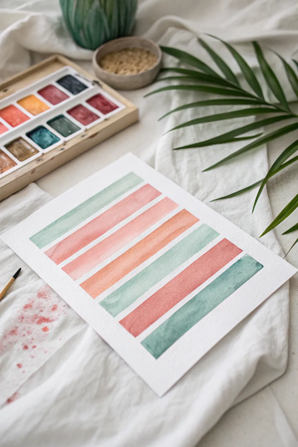
Create a soothing piece of abstract art using nothing but watercolor, masking tape, and a steady rhythm. This project results in a series of crisp, perfectly spaced rectangular bars in a soft, refreshing palette of mints, peaches, and rosy pinks.
How-To Guide
Materials
- Cold press watercolor paper (approx. 9×12 inches)
- Watercolor paints (pan set preferred)
- Flat shader brush (size 10 or 12)
- Painter’s tape or drafting tape (low tack)
- Ruler
- Pencil
- Clean water jar
- Paper towels
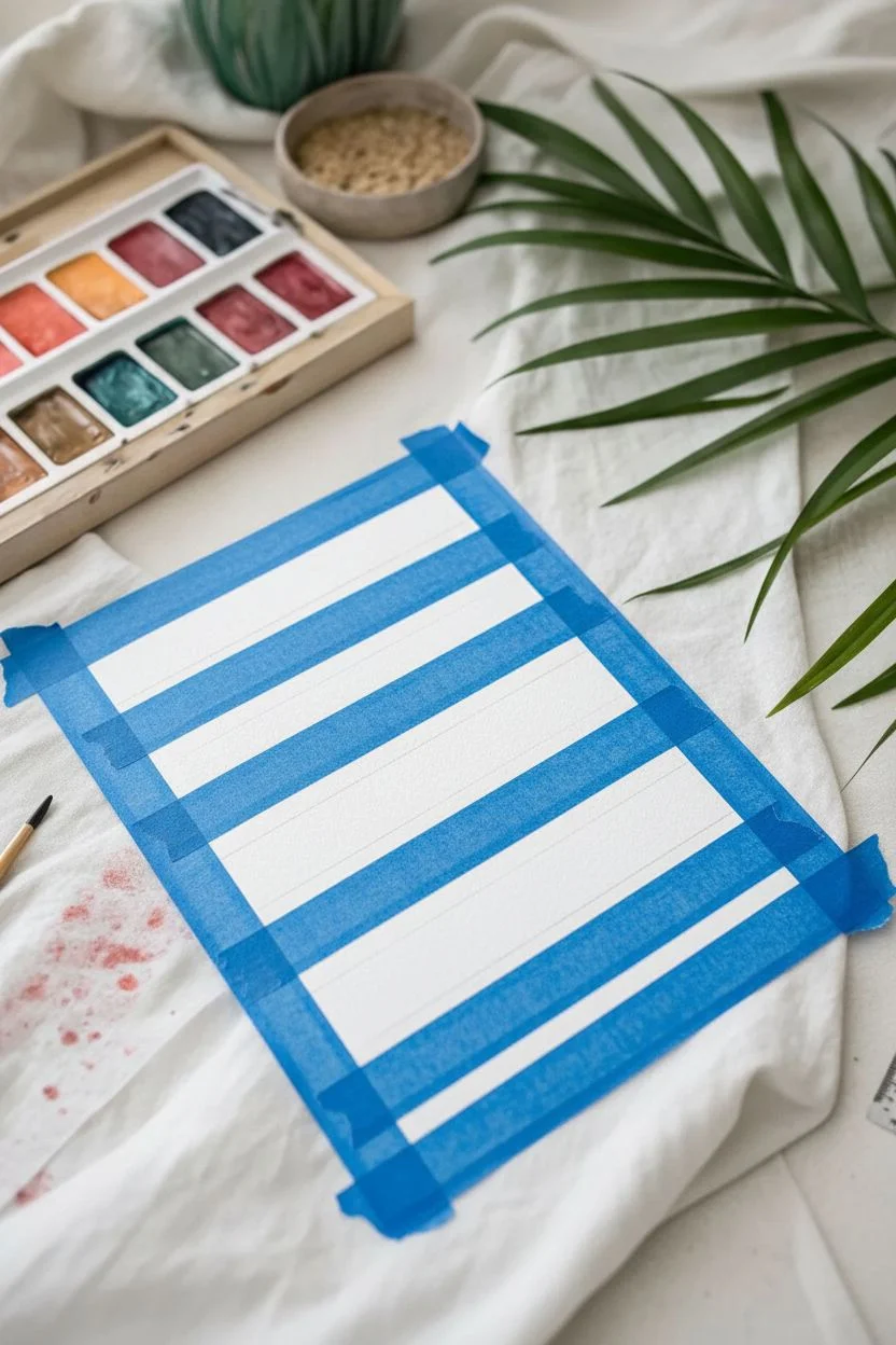
Step 1: Preparation & Masking
-
Secure the paper:
Tape down all four edges of your watercolor paper to your work surface. This creates a clean white border around the final piece and prevents the paper from buckling when wet. -
Measure the layout:
Using your ruler and a pencil, lightly mark horizontal guides for your stripes. We are aiming for about 7 stripes total. -
Apply the masking tape:
Place strips of painter’s tape across the paper horizontally to block out the white spaces between your future color bars. Press the edges of the tape down firmly with your fingernail to ensure paint doesn’t seep underneath. -
Check the spacing:
Step back and look at your tape lines. The exposed paper strips should be wider than the taped sections to match the reference image’s aesthetic.
Clean Lines Pro-Tip
For ultra-crisp edges, paint a thin layer of clear water or white gouache over the tape edges first to seal them before hitting them with color.
Step 2: Painting the Gradient
-
Mix a soft mint green:
In your palette, mix a diluted teal or viridian green with plenty of water to create a pale mint shade. This will be your first color. -
Paint the first stripe:
Using your flat brush, fill in the top exposed strip of paper with the mint wash. Keep the stroke even from left to right. -
Mix a dusty rose:
Clean your brush and mix a light red or alizarin crimson with a touch of brown or burnt sienna to get a dusty pink/rose color. -
Paint the second stripe:
Fill the second strip with your rose mixture. Allow the water to pool naturally slightly for texture, but don’t overwork it. -
Create a peach tone:
For the third stripe involves a peachy-orange. Mix orange with a tiny bit of your rose mix and plenty of water. -
Apply the peach layer:
Paint the third stripe. I like to let the brush run a little dry near the end of a stroke sometimes to create subtle variation. -
Paint the middle orange:
The fourth stripe is a slightly deeper, warmer orange. Add a little more pigment to your previous peach mix stripes and paint the central bar. -
Begin the reverse pattern:
Now, we start mirroring the colors back down. Paint the fifth stripe with a fresh mix of the mint green, perhaps making it slightly more saturated than the top one. -
Add the deep rose:
For the sixth stripe, go back to your red tones, but create a slightly deeper, brick-red version of the second stripe’s color. -
Finish with teal:
Paint the final bottom stripe with a darker, more pigmented teal or sea green to anchor the composition visually.
Step 3: The Reveal
-
Let it dry completely:
This is crucial—wait until the paper is bone dry and cool to the touch. If you peel too early, the paint will smudge or the paper will tear. -
Peel the tape:
Slowly peel away the masking tape strips. Pull the tape at a 45-degree angle away from the painted area to ensure crisp, sharp edges. -
Remove border tape:
Finally, remove the tape securing the paper to the table to reveal your clean white frame.
Troubleshooting Bleeds
If paint bled under the tape, don’t panic. Wait for it to dry, then gently use a stiff, damp brush to scrub the excess paint away for a cleaner line.
Step back and admire the simple harmony of your colorful stripes before hanging your new artwork
Have a question or want to share your own experience? I'd love to hear from you in the comments below!