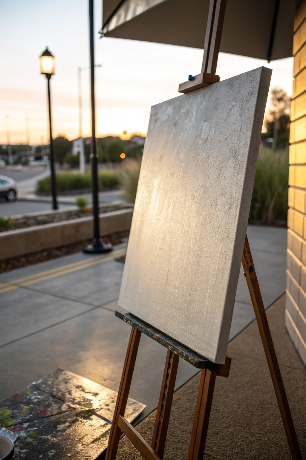
When you’re craving something a little louder than “pretty,” edgy painting ideas are the fastest way to push your style into bolder territory. I’m talking high-contrast, rebellious textures, and subjects that feel just a bit dangerous—in the best, artsy way.
High-Contrast Skull Study
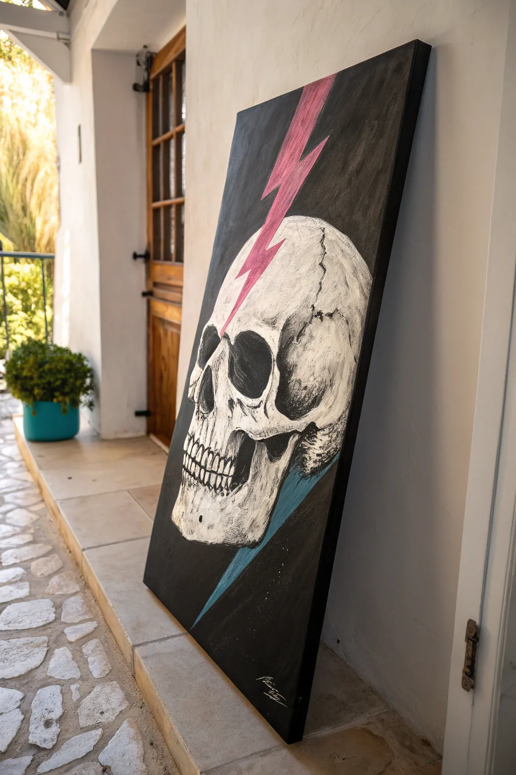
This striking piece combines classical anatomical study with a jolt of modern, graphic energy. Using stark black and white contrasts alongside vivid flashes of pink and blue, you’ll create a dramatic centerpiece that feels both edgy and sophisticated.
Step-by-Step Tutorial
Materials
- Large rectangular canvas (approx. 24×36 inches or larger)
- Acrylic paints: Carbon Black, Titanium White, Hot Pink (neon), Cyan or Turquoise
- gesso (optional, for priming)
- Wide flat brush (2-3 inch) for background
- Medium filbert brush for skull forms
- Fine liner brush for cracks and details
- Charcoal stick or chalk for sketching
- Palette and water container
- Masking tape (low tack)
Step 1: Preparation & Background
-
Prime the Surface:
Ensure your canvas is clean. If it’s raw canvas, apply a coat of gesso. For pre-primed canvases, you can jump straight to the base coat. -
Establish the Void:
Using your large flat brush and Carbon Black paint, cover the entire canvas. Apply two coats if necessary to achieve a deep, opaque matte black. Let this dry completely before moving on. -
Map the Composition:
Lightly sketch the outline of the skull using a stick of chalk or white charcoal. Position the skull in profile, angled slightly upward. Mark the entry point for the lightning on the forehead and the exit near the jaw.
Step 2: Blocking the Skull
-
Base White Layer:
Mix a small amount of black into your white to create a light grey. Use the filbert brush to fill in the main shape of the skull, avoiding the deep shadow areas like the eye socket and nasal cavity. -
Define the Hollows:
Paint the eye socket, nasal cavity, and the gap beneath the cheekbone with pure black. Ensure the edges are somewhat soft to suggest depth rather than a flat cutout. -
Sculpt the Form:
I like to mix a mid-tone grey here. Apply this to the back of the skull, the temple area, and under the cheekbone to create volume. The light source should feel like it’s coming from the front/top. -
Highlighting Bone:
Switch to pure Titanium White. Apply opaque highlights to the forehead, the bridge of the nose, the upper cheekbone, and the teeth. Use a dry-brush technique to give the bone a textured, weathered look.
Chalk It Up
Use white chalk for sketching on the black background. If you make a mistake, it wipes away easily with a damp cloth without ruining the black base coat.
Step 3: Graphic Elements
-
Tape the Bolt:
To get those sharp, graphic edges on the lightning bolt, use low-tack masking tape. Tape off the jagged shape of the pink bolt entering the forehead. -
Paint the Pink Strike:
Fill the taped area with a base of white first (to make the color pop), then apply your neon Hot Pink. Peel the tape while the paint is still slightly tacky for the cleanest edge. -
The Blue Exit:
Repeat the taping process for the blue bolt exiting the bottom of the skull. Paint this section with your Cyan or Turquoise. This bolt should look like it’s passing through and behind the jaw. -
Integration:
Where the pink bolt meets the bone, use a small brush to paint slight cracks radiating from the impact point, creating the illusion that the bolt is penetrating the skull.
Make It Glossy
For an ultra-modern finish, use a high-gloss varnish only on the lightning bolts and a matte varnish on the rest. The contrast in sheen adds huge visual impact.
Step 4: Detailing & Texture
-
Cracks and Sutures:
Dilute your black paint slightly with water to make it flow like ink. Using your finest liner brush, paint the cranial sutures (the squiggly lines connecting bone plates) and random stress fractures. -
Refining Teeth:
Use the liner brush to separate individual teeth with thin black lines. Add small dabs of white highlight on the enamel to make them glint. -
Enhancing Contrast:
Go back with pure black to neaten up the outer edges of the skull against the background. This clean-up step makes the silhouette incredibly sharp. -
Shadowing the Bolt:
Add a tiny, faint shadow on the skull right next to the lightning bolt edges. This subtle trick lifts the graphic element slightly off the bone surface. -
Final White Pops:
Add the brightest white highlights one last time on the most protruding areas—the brow ridge and the chin—to maximize the 3D effect. -
Seal the Work:
Once fully dry (give it 24 hours), apply a satin or matte varnish to protect the rich blacks and keep the colors vibrant.
Hang your electric masterpiece where it can command the room and spark conversation

Neon Portrait on a Dark Ground
The striking contrast of bright neon against a deep black background creates an undeniably edgy aesthetic in this moody portrait project. By building up grayscale values first and finishing with electric pops of color, you’ll capture a dramatic, modern look that commands attention.
How-To Guide
Materials
- Black stretched canvas (16×20 or larger)
- White charcoal pencil or white pastel pencil
- Titanium White acrylic paint (heavy body)
- Mars Black acrylic paint (for corrections)
- Neon Pink acrylic paint
- Neon Yellow/Green acrylic paint
- Set of filbert brushes (sizes 4, 8, and 12)
- Small round detail brush (size 0 or 1)
- Dry blending brush or stiff bristle brush
- Palette and water cup
- Paper towels
Step 1: Setting guidelines
-
Map the composition:
Begin with your black canvas on the easel. Using a white charcoal pencil, lightly sketch the profile of the face. Focus on placing the ear, the swoop of the jawline, and the nose’s silhouette. -
Refine the features:
Check your proportions carefully. The eye should be closed with prominent lashes, and the lips slightly parted. Keep your sketch lines faint; you want them to guide you but disappear under the paint later. -
Block in hair flow:
Sketch lose, sweeping lines to indicate the movement of the hair pulled back from the face. Don’t draw individual strands yet, just the general direction of the prominent clumps.
Dry Brush Mastery
For the smoky skin effect, test your brush on a scrap paper first. It should produce a scratchy, chalk-like mark, not a solid fluid stroke.
Step 2: Building the monochrome base
-
Establish the brightest lights:
Load a size 8 filbert brush with Titanium White. Identify the highest points of the face: the tip of the nose, the curve of the nostril, the center of the eyelid, and the fuller part of the bottom lip. -
Dry brush the mid-tones:
Wipe most of the paint off your brush onto a paper towel until it is nearly dry. Gently scumble white paint over the cheekbone, forehead, and chin. This technique lets the black canvas show through, creating instant gray mid-tones without mixing. -
Shape the ear:
Use a smaller brush to paint the cartilage of the ear. The rim needs a solid white highlight, while the inner folds should be a soft, dusty gray created by dry-brushing. -
Define the eye:
Switch to your small detail brush. Using opaque white, paint the curve of the eyelid and the dense lashes. Add a strong highlight on the brow bone to create depth. -
Sculpt the lips:
Paint the lips with care, keeping the corners dark to show the slight opening. Add a crisp white line on the lower lip’s edge to make it look moist and dimensional. -
Creating volume:
Step back and look at the cheek. If it looks too flat, use your dry brush to circular buff more white in the center of the cheek, fading it out toward the hairline. -
Correcting shadows:
If you added too much white in shadow areas like the neck or eye socket, use Mars Black to cut back into the shape. This ‘negative painting’ helps sharpen the profile.
Neon Not Popping?
If your neons look crucial against the black, paint a layer of pure white first, let it dry completely, then glaze the neon color over that white base.
Step 3: Electric accents
-
Prepare neon mixes:
Squeeze out your neon pink and neon yellow/green. These paints are often translucent, so here I prefer to mix a tiny dot of white into them to increase opacity without killing the vibrancy. -
Apply cheek splatter:
Load a stiff brush with pink paint. Dab it aggressively onto the cheekbone area to create a textured, almost spray-painted effect. Don’t blend this; let the texture sit on top of the gray skin tones. -
Hair highlights:
Identify a few sweeping strands of hair near the top of the head. Use the neon pink to trace these curves, lifting pressure at the end of the stroke for a tapered look. -
Add yellow streaks:
Using the neon yellow-green, paint bold diagonal slashes. Place one large stroke on the neck and a few smaller accents in the hair to balance the composition. -
Final jewelry details:
With the smallest detail brush, dot pure white paint on the earlobe to create a sparkling earring. Add a tiny touch of pink to the earring to reflect the neon on the cheek. -
Final assessment:
Stand back and check contrast. If the neons feel too isolated, add tiny flecks or dry-brush distinct spots of color elsewhere to harmonize the piece.
Allow the thickest white highlights to dry fully before hanging your modern masterpiece
Graffiti Typography Over Florals
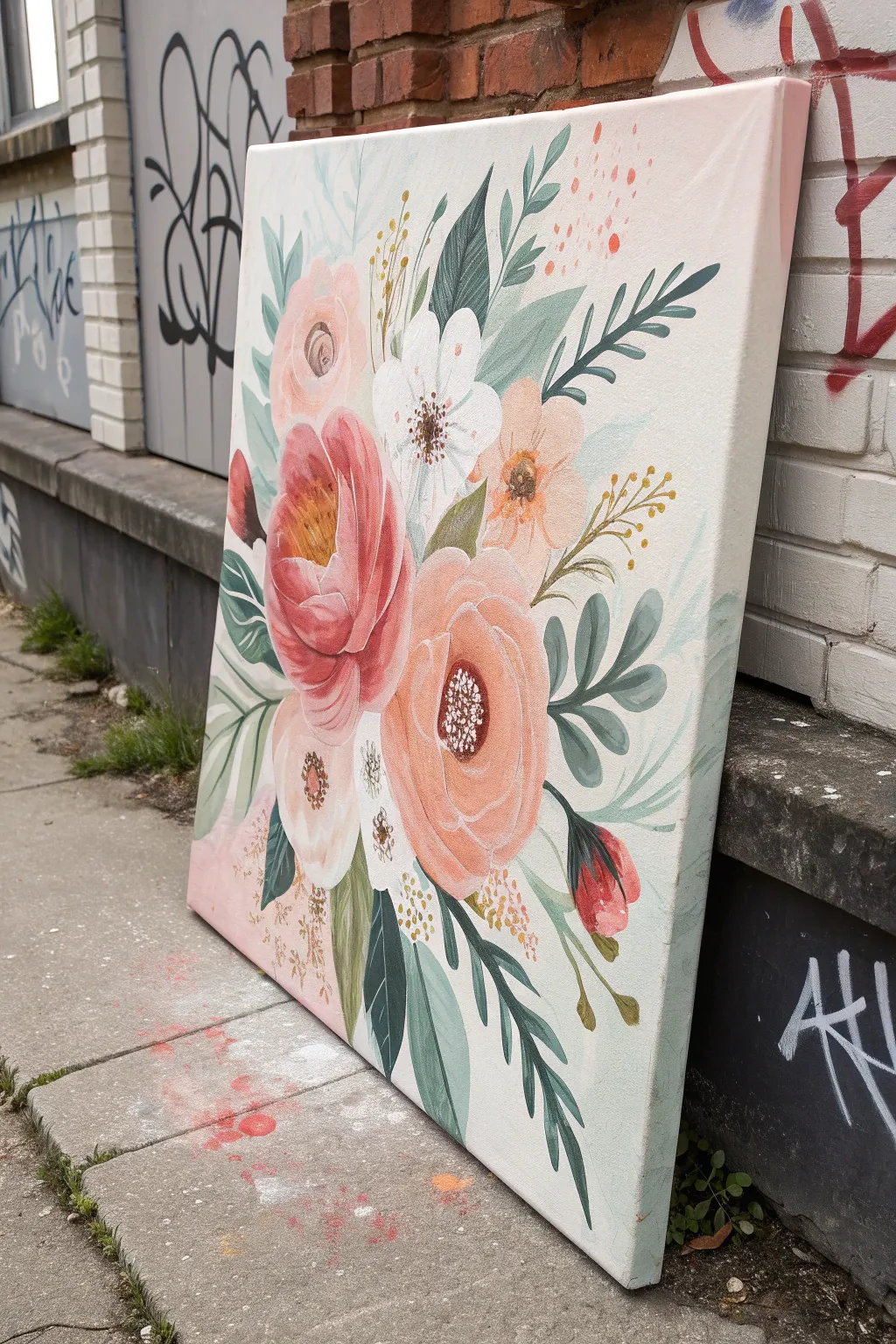
Contrast the grit of the city with the softness of nature in this beautiful bouquet painting, designed to act as a serene background for bolder typographic elements. Using gentle peaches, creams, and sage greens, you’ll build up a lush, illustrative composition that stands out against any urban setting.
Step-by-Step Tutorial
Materials
- Large square canvas (e.g., 24×24 or 30×30 inches)
- Acrylic paints (Titanium white, peach, coral pink, crimson, sage green, forest green, yellow ochre)
- Wide flat brush (for background)
- Assorted round brushes (#4, #8, #12)
- Fine liner brush (#0 or #1)
- Palette and water cup
- Paper towels
- Pencil for sketching
- Acrylic matte medium (optional)
Step 1: Setting the Atmosphere
-
Background wash:
Begin by creating a soft, misty background. Mix titanium white with a tiny drop of peach and sage green to get an off-white, atmospheric tone. Using your wide flat brush, cover the entire canvas. I like to keep the strokes visible but blended for texture. -
Soft gradient corners:
While the background is still slightly damp, mix a pale pink wash. Gently blend this into the bottom left and top right corners to add subtle warmth and framing. -
Rough layout:
Once the background is dry, lightly sketch the main shapes of your flowers with a pencil. Place the largest blooms first—the big peony in the center-left and the large rose below it—to anchor your composition.
Step 2: Blocking in Blooms
-
Base coat for main flowers:
Mix a medium coral-pink tone. Fill in the shape of the large central peony, focusing on the overall silhouette rather than individual petals at this stage. -
Secondary flower placement:
Using a soft peach shade, block in the lower rose and the smaller flower to the right. For the white anemone shape near the center, use a pure titanium white, perhaps with a touch of grey for shadow areas. -
Establishing greenery:
Switch to your medium round brush and sage green paint. Paint the largest leaf shapes first, letting them flow outward from the center of the bouquet. vary the pressure to create tapered leaf tips.
Paint drying too fast?
If your acrylics get tacky while blending petals, mix in a drop of slow-drying medium or retarder. This keeps the paint workable longer for smooth gradients.
Step 3: Layering and Detail
-
Deepening the peony:
Return to the coral peony. Mix a darker red-pink shade and paint the inner recesses of the petals to create depth and a cup-like shape. Use curved strokes that follow the form of the flower. -
Adding highlights:
Mix a very pale pink (almost white). Paint the outer edges of the peony petals and the rose petals to make them pop forward. Use short, confident strokes for a painterly look. -
Anemone center:
For the white flower, use dark brown or black to stipple a textured center. Add tiny dots of yellow ochre around the dark center for pollen. -
Contrasting foliage:
Mix a deep forest green. Paint darker, sharper leaves behind the lighter sage ones. This contrast is crucial for making the pastel flowers stand out. -
Ferns and fronds:
Using a thinner brush, paint delicate, fern-like stems extending towards the edges. Use a watery mix of grey-green for these to keep them looking soft and distant.
Make it Edgy
To match the article theme, wait for the florals to fully cure, then paint a bold graffiti tag or typography quote over the flowers in heavy black or metallic gold.
Step 4: Final Flourishes
-
Golden accents:
Mix yellow ochre with a little white. Add small sprigs of filler flowers or berries throughout the bouquet to introduce a warm accent color. -
Defining the petals:
With your fine liner brush and a mix of dark rose, carefully outline the separation between the tight inner petals of the main peony. -
Abstract speckles:
Dilute some coral or orange paint with water. Tap your brush over a finger to flick tiny speckles onto the upper right corner of the canvas, adding a bit of modern, abstract energy. -
Falling petals:
Paint a few loose petals or a small bud in the lower-left corner, seemingly falling away from the bouquet, to balance the composition. -
Crisp edges:
Check the edges of your main leaves. If they look too fuzzy, use the liner brush and your background color to cut back into them, or sharpen them with fresh green paint. -
Final assessment:
Step back five feet. Look for any areas that feel empty. Fill gaps with small ghost leaves (very pale green) or tiny clusters of dots to unify the piece.
Now your canvas is ready to bring a touch of botanical grace to any space, indoors or out
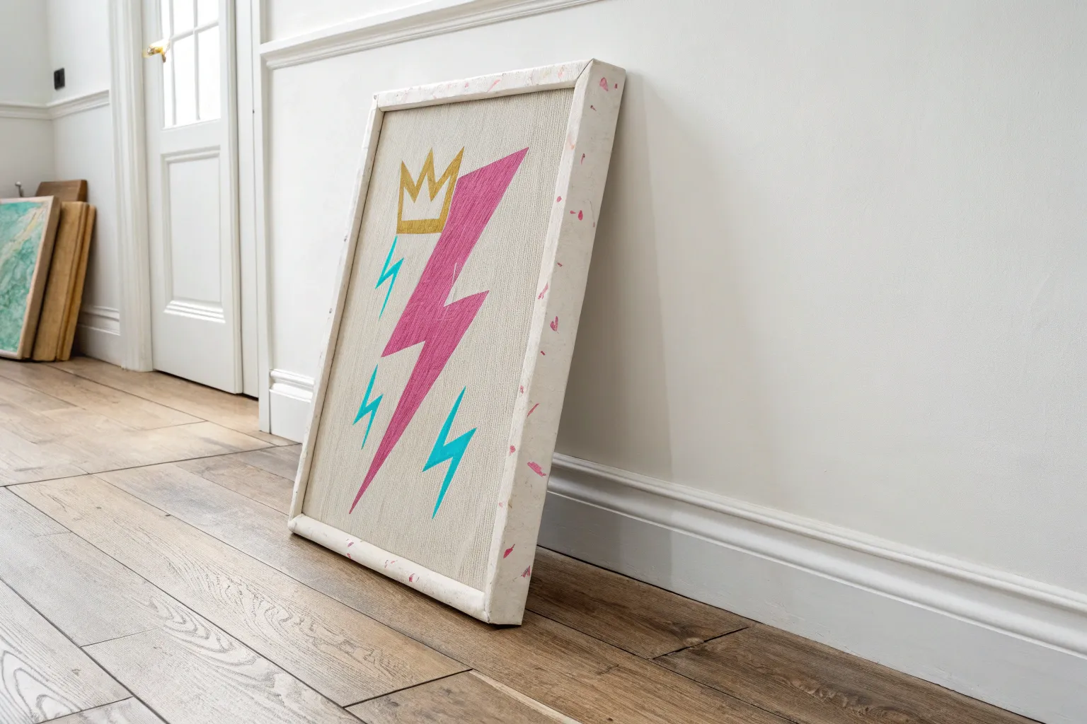
Drips That Break the Rules
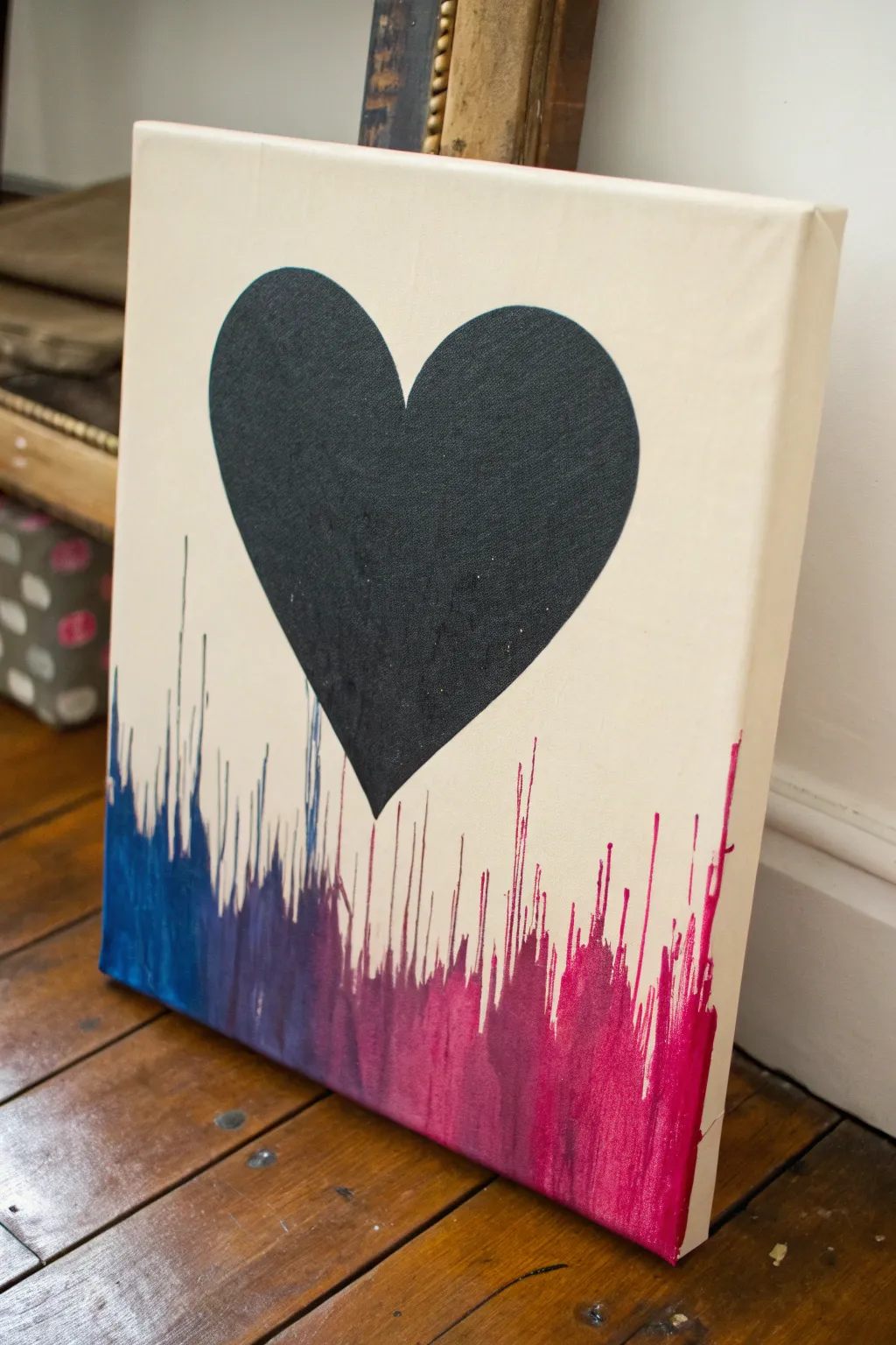
This striking canvas combines a bold, minimalist silhouette with an energetic splash of gradient color that appears to flow upward. By reversing the typical drip technique, you create an edgy, dynamic effect where the paint seems to defy gravity beneath a solid black heart.
Step-by-Step Guide
Materials
- Rectangular stretched canvas (e.g., 16×20 inches)
- Black acrylic paint
- Blue acrylic paint
- Purple acrylic paint
- Magenta or hot pink acrylic paint
- Wide painter’s tape or masking tape
- Pencil
- Heart stencil (optional) or printer paper to make one
- Medium flat paintbrush
- Small detail paintbrush
- Squeeze bottles or pipettes (optional but helpful)
- Water cup and paper towels
- Drop cloth or newspapers
Step 1: Preparation and Masking
-
Prepare your workspace:
Cover your working surface thoroughly with newspapers or a drop cloth because the drip phase can get messy. Lay your canvas flat on the surface. -
Create the heart template:
Draw a large, symmetrical heart on a piece of paper or cardstock that fits well within the upper two-thirds of your canvas. Cut it out to use as a stencil. -
Trace the heart:
Position the heart stencil in the center of the canvas, leaving ample space at the bottom for the drips. Lightly trace the outline with a pencil. -
Paint the background heart:
Using your medium flat brush and black acrylic paint, fill in the heart shape completely. Aim for opaque coverage; if the canvas texture shows through too much, let the first coat dry and apply a second one. -
Clean up the edges:
Switch to your small detail brush to crispen the edges of the heart, ensuring the curves are smooth and defined. Let the black paint dry completely—this is crucial so the colors don’t smudge into it later. -
Protect the heart:
Once fully dry, you may want to lightly cover the black heart with paper or masking tape if you are worried about splashing, although careful application usually makes this unnecessary.
Drips Too Thick?
If your paint is too thick and clumps rather than running, mist the applied bead of paint with a tiny spray of water from a bottle to encourage movement.
Step 2: Creating the Color Gradient
-
Prepare paint mixtures:
Mix your blue, purple, and magenta paints with a small amount of water. You want a consistency similar to heavy cream or melted ice cream—fluid enough to run, but thick enough to hold pigment. -
Flip the canvas:
Turn your canvas upside down so the top edge (where the heart points) is facing you and the bottom edge is at the top. This trick utilizes gravity to create the ‘upward’ drips. -
Apply the blue section:
Starting at the top-left corner (which is technically the bottom-right of the finished piece), apply a generous bead of diluted blue paint along the edge. -
Apply the middle purples:
Continue along the edge, transitioning into the purple paint mixture. I often blend the wet edges of the blue and purple slightly on the rim of the canvas for a smoother transition. -
Apply the magenta section:
Finish the line of paint on the remaining side with the magenta mixture, ensuring the entire ‘bottom’ edge (currently at the top) is covered in a thick bead of wet paint.
Pro Tip: Clean Lines
For ultra-crisp drips, you can place tape slightly overlapping the bottom edge before painting, then peel it off after the drips dry for a perfect border.
Step 3: The Drip Technique
-
Tilt the canvas:
Lift the edge where you applied the paint and tilt the canvas vertically. Let gravity pull the paint streams down toward the heart. -
Control the flow:
Watch the drips carefully. If they are moving too slow, add a touch more water to the edge. If they are moving too fast, lessen the angle of the tilt. -
Encourage variation:
Tap the canvas gently against the table to jar the paint loose if some sections aren’t dripping. You can also blow gently on the paint bead to encourage longer streaks. -
Stop the drips:
When the drips get close to the black heart—but generally before they touch it—lay the canvas flat immediately to stop the flow. The goal is a jagged, organic line that doesn’t quite overlap the main subject. -
Let it dry:
Leave the canvas flat to dry completely, preferably overnight. If you stand it up too soon, the paint might continue to creep and ruin the effect. -
Final orientation:
Once fully dry, flip the canvas back to its original orientation. The drips will now look like they are shooting upward from the bottom edge.
Hang your new masterpiece and enjoy the rush of color climbing up your wall
BRUSH GUIDE
The Right Brush for Every Stroke
From clean lines to bold texture — master brush choice, stroke control, and essential techniques.
Explore the Full Guide
Split-Light Self-Portrait
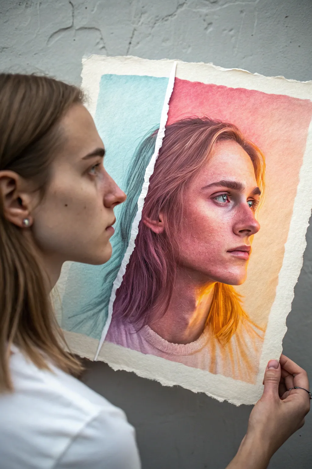
Experiment with duality in this unique self-portrait project that combines traditional realism with an abstract color twist. By fracturing the page and shifting the palette, you’ll create a striking visual narrative about different sides of the self.
Detailed Instructions
Materials
- High-quality watercolor paper (cold press, at least 140lb)
- Watercolor paints (tube or pan set)
- Large flat wash brush
- Medium round brush (size 6 or 8)
- Fine detail brush (size 0 or 1)
- Graphite pencil (HB) and kneaded eraser
- Masking tape
- Mixing palette
- Two cups of water
- Paper towels
Step 1: Preparation & Drawing
-
Paper Preparation:
Begin by tearing a sheet of watercolor paper vertically, slightly off-center. You want a rough, organic deckled edge rather than a clean cut, as this adds texture to the final piece. Tape the larger right-hand segment securely to your work surface. -
Sketch the Portrait:
Lightly sketch the self-portrait onto the right-hand paper segment. Focus on capturing accurate proportions of the eyes, nose, and lips, but keep your pencil lines faint so they don’t show through the transparent watercolor layers later. -
Align the Second Sheet:
Take the smaller, left-hand torn strip and align it perfectly with the right side. Continue your sketch onto this strip, ensuring the hairline and shoulders flow seamlessly across the tear. Secure this strip with tape once aligned.
Tear Technique
To control the tear, draw a line with water using a brush first. Let it soak for a minute, then pull the paper apart. The fibers will separate gently along the wet path.
Step 2: The Warm Side (Right)
-
Base Wash:
Remove the left strip for now. On the main portrait, mix a diluted wash of warm colors—think cadmium orange, alizarin crimson, and yellow ochre. Apply a wet-on-wet wash over the background and skin areas, letting the colors bleed naturally. -
Building Skin Tone Values:
Once the base is damp but not soaking, mix a slightly stronger concentration of burnt sienna and quinacridone rose. Paint the shadow shapes on the face, focusing on the eye sockets, under the nose, and the jawline. -
Adding Vibrancy:
While the paper is still workable, drop in pure pigment (like bright orange or pink) into the wettest areas of the hair and cheek highlights. This creates that glowing, ethereal quality. -
Deepening Shadows:
Let the layer dry completely. I prefer to use a smaller round brush here to glaze purple or deep crimson into the darkest creases of the ear, nostrils, and lips to build dimension without losing the warm glow. -
Hair Texture:
Use a rigger or fine brush with a mix of orange and burnt umber to flick in individual hair strands. Keep these loose and flowing, allowing the background wash to serve as the hair’s highlight.
Level Up: Gold Leaf
Apply jagged gold leaf along the torn edges of the paper. This creates a Kintsugi effect, celebrating the ‘break’ between the two colorful worlds.
Step 3: The Cool Side (Left)
-
Cool Base Layer:
Tape the left strip back down on a separate board. Mix a wash of phthalocyanine blue or teal with plenty of water. Apply this over the background area of the strip, keeping it distinct from the warm side you just finished. -
Shadow Mapping:
Using a cooler, desaturated blue-grey mix, paint the structural shadows of the hair and neck on this strip. The goal is to make this side feel atmospheric and slightly recessed compared to the vibrant right side. -
Connecting the Image:
Ensure the lines of the hair match up visually with the right side, even though the colors are drastically different. Use a detail brush to add darker teal strokes that mimic the flow of the hair on the warm side.
Step 4: Finishing Details
-
Enhancing the Eyes:
Return to the main portrait. Paint the irises carefully, perhaps introducing a tiny speck of the cool blue from the left side into the eye to tie the two halves together visually. -
Highlighting:
If you’ve lost any highlights, use a tiny amount of white gouache or a white gel pen to bring back the sparkle in the eyes and the tip of the nose. -
Final Assembly:
Remove all tape carefully. Arrange the two pieces so the torn edges almost touch but leave a hairline gap, emphasizing the fracture while maintaining the illusion of a single face.
Step back and admire how color temperature can completely change the emotional weight of a portrait
Urban Decay Texture Backgrounds
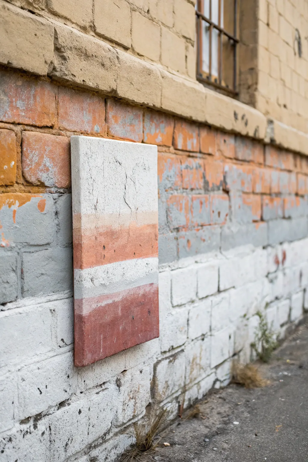
Embrace the raw beauty of city streets with this textured abstract painting that mimics the weathered layers of an old brick wall. Using heavy structure paste and a muted, earthy palette, you’ll create a piece that feels more like a slice of architecture than a traditional painting.
Step-by-Step Guide
Materials
- Stretched canvas or wood panel (rectangular)
- White coarse structure paste or modeling paste (sand texture)
- Acrylic paints: Titanium White, Burnt Sienna, Yellow Ochre, Raw Umber, Mars Black
- Palette knives (wide and narrow)
- Rough bristle brush
- Spray bottle with water
- Sandpaper (medium grit)
- Matte varnish spray
Step 1: Building the Foundation
-
Prepare the surface:
Lay your canvas or panel on a flat, protected surface. If using a canvas, slide a piece of cardboard underneath the frame to prevent sagging when you apply heavy pressure later. -
Apply the base texture:
Scoop out a generous amount of coarse structure paste. Using a wide palette knife, spread it across the entire canvas. Don’t try to be smooth; purposeful ridges and uneven spots mimic the imperfections of concrete. -
Create weather damage:
While the paste is still wet, use the edge of your knife or a stiff brush to create vertical fissures and cracks. Drag the tool downward to simulate gravity’s effect on aging walls. -
Initial drying:
Let this heavy base layer dry completely. This is crucial—if you paint too soon, you’ll lose the crispness of the texture. Depending on thickness, this might take 12-24 hours.
Step 2: Layering the Pigments
-
Mix the terra cotta tones:
Create a warm, brick-orange shade by mixing Burnt Sienna with a touch of Yellow Ochre and White. You want a color that looks like faded masonry, not vibrant fruit. -
Define the zones:
Visually divide your canvas into rough horizontal bands. I prefer to keep the top third white/grey, the middle band peach/terracotta, a thin white stripe below that, and a dark russet base. -
Apply the top wash:
Mix a watery greyish-white using Titanium White and a tiny dot of Raw Umber. Brush this over the top section, letting it settle into the deep texture pits. -
Paint the middle band:
Load a dry bristle brush with your terra cotta mix. Scumble it across the middle section. Use a light hand so the paint catches the raised texture but leaves the valleys pale. -
Create the fade:
Where the peach meets the white section, use a clean, slightly damp brush to blend the transition softly. It should look like sun-faded paint, not a hard line. -
Paint the base band:
Mix a darker, reddish-brown hue by adding a little Mars Black to your Burnt Sienna. Apply this heavily to the bottom fourth of the canvas for visual weight.
Pro Tip: Custom Grunt
Don’t have structure paste? Mix ordinary white acrylic paint with baking soda and a little craft glue. It creates a thick, gritty paste perfect for that urban concrete look.
Step 3: Distressing and Detailing
-
Dry brushing highlights:
Once the color bands are touch-dry, take pure Titanium White on a very dry brush. Lightly sweep it horizontally over the colored sections to simulate surface erosion. -
Adding grit:
Mix a small amount of black and brown paint with water to make a dirty wash. Flick this sparingly onto the canvas with an old toothbrush to create subtle speckling. -
Scraping back:
If any color feels too solid or new, take a piece of sandpaper and gently abrade the surface. This reveals the white texture paste underneath, instantly aging the piece. -
Enhancing cracks:
Locate the cracks you made in the paste earlier. Use a fine liner brush with watery black paint to deepen these crevices, giving them more dimension. -
Final wash:
To unify the colors, you can mist the entire canvas very lightly with water, then dab it with a paper towel. This softens any harsh brushstrokes. -
Sealing the work:
Once the painting is bone dry—give it another day just to be safe—finish with a coat of matte spray varnish. Gloss would ruin the illusion of raw stone.
Troubleshooting: Warping
If your canvas starts curling from the moisture of the heavy paste, paint a large ‘X’ on the back of the canvas with water or gesso. As it dries, it pulls the tension back to flat.
Hang your new textured masterpiece in a well-lit spot where the shadows can play across the rugged surface

PENCIL GUIDE
Understanding Pencil Grades from H to B
From first sketch to finished drawing — learn pencil grades, line control, and shading techniques.
Explore the Full Guide
Fragmented Figure Into Shards
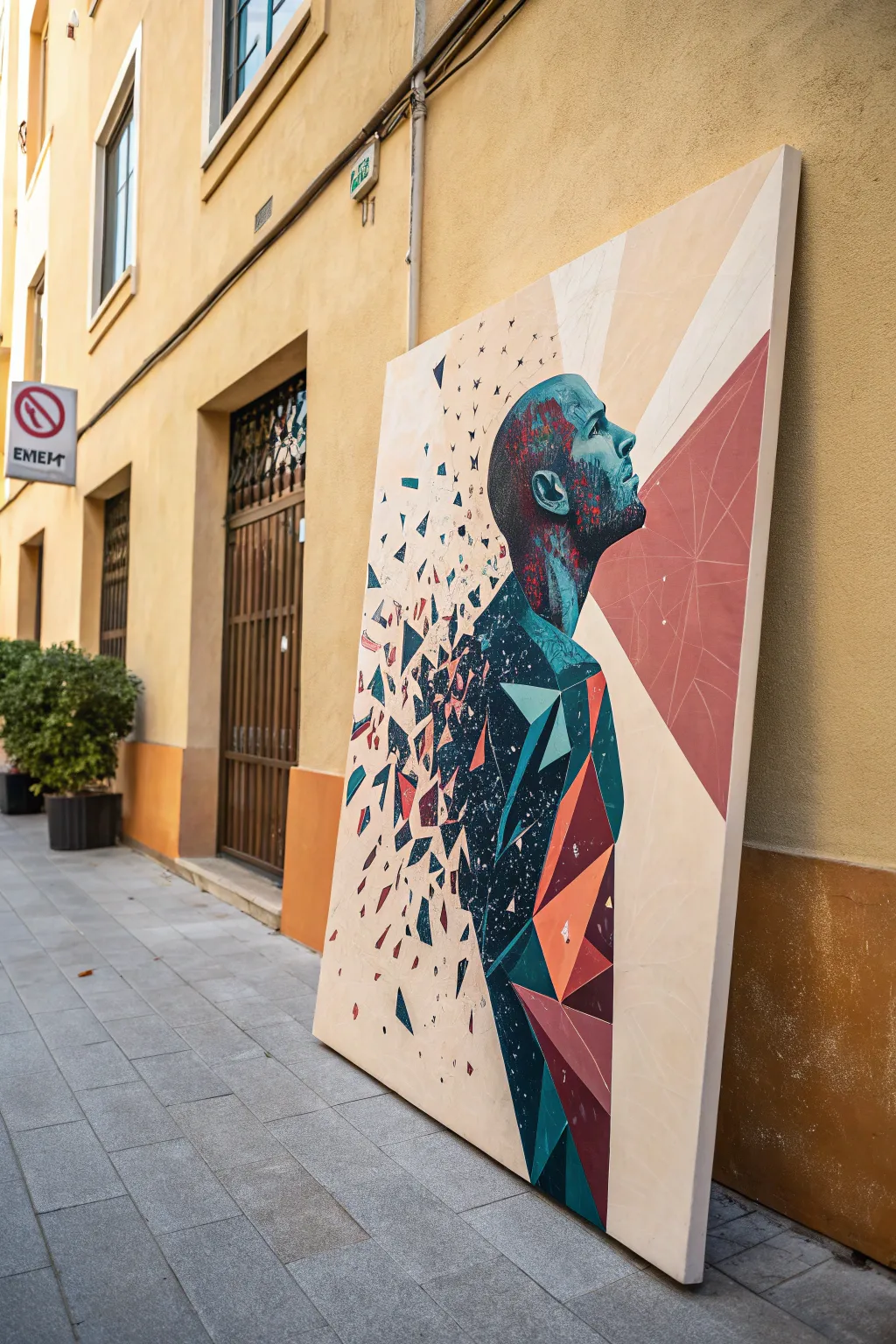
This striking large-scale acrylic painting combines realistic portraiture with abstract geometry, depicting a figure dissolving into sharp, colorful shards. The contrast between the organic human form and the hard-edged polygons creates a dynamic sense of motion and transformation.
How-To Guide
Materials
- Large stretched canvas (at least 36×48 inches)
- Acrylic paints (Teal, Navy Blue, Crimson, Orange, Cream/Off-White, Black)
- Gesso suitable for acrylics
- Pencil (HB or 2B)
- Painter’s tape or masking tape (various widths)
- Large flat brushes for background
- Medium filbert brushes for skin tones
- Fine detail brushes for shards
- Ruler or straight edge
- Palette knife (optional for texture)
- Reference photo of a profile (optional)
Step 1: Preparation and Sketching
-
Prime the Surface:
Begin by applying a generous coat of gesso to your large canvas if it isn’t pre-primed. Let it dry completely to ensure a smooth, workable surface for your acrylics. -
Outline the Profile:
Using a pencil, lightly sketch the profile of the man’s head and neck on the right-hand side of the canvas. Focus on capturing the tilt of the chin and the upward gaze. -
Draft the Geometry:
Instead of drawing a realistic torso, use your ruler to sketch large, interconnected triangles and polygons that form the shape of the upper body. These shapes should look like armor plates or facets. -
Create the Explosion:
Extend your sketch to the left side of the canvas by drawing progressively smaller shards floating away from the figure’s back. Randomize their rotation to mimic pieces shattering outward. -
Map the Background Rays:
Draw faint lines radiating from behind the figure’s chest area outward to the edges of the canvas. These will serve as guides for the segmented background colors later.
Use Tape for Crisp Lines
For the sharpest geometric shards, apply painter’s tape along the pencil lines of the triangles. Paint inside the shape, let it dry, then re-tape for the adjacent shape.
Step 2: Painting the Background
-
Block in Cream Tones:
Mix a warm cream or off-white color. Paint the majority of the background space, specifically the upper left and lower right sections, using a large flat brush for smooth coverage. -
Add the Red Segments:
Using your radiating guidelines, tape off the angular sections behind the figure’s head. Fill these with a muted red or rust color to create a hard-edged, graphic backdrop. -
Refine Edges:
Once the background paint is dry, careful remove any tape. Use a smaller brush to tidy up the lines where the cream and red sections meet, ensuring crisp, sharp intersections.
Step 3: The Figure and Shards
-
Base Coat the Head:
Mix a dark teal and navy blue. Apply a base coat to the head and neck area. Don’t worry about perfect blending yet; just establish the dark, cool values of the skin. -
Detail the Face:
Add highlights to the cheekbone, ear, and nose using lighter teal and touches of white. I define the stubble or hair texture by stippling darker blue and tiny dots of red near the jawline. -
Fill the Large Polygons:
Moving to the body, paint the large geometric shapes you sketched earlier. Use alternating colors—deep navy, bright teal, and burnt orange—to create depth and separation between the ‘shards’. -
Add Faceted Highlights:
To make the geometric body look three-dimensional, paint a lighter version of the base color on one side of each triangle and a darker shadow on the other side. -
Paint Flying Shards:
Work on the smaller floating fragments to the left. Paint these with the same palette (teal, red, navy) but keep them flat and sharp. Vary their sizes, making them smaller as they move further from the body. -
Create the Disintegration Effect:
Where the solid body meets the open air on the back, paint ‘partial’ shards that look like they are in the process of detaching. This bridges the gap between the solid figure and the floating debris.
Add Metallic Accents
Make the artwork gleam by painting a few specific shards with metallic copper or gold paint. Before varnishing, these will catch the light and add a futuristic feel.
Step 4: Final Touches
-
Enhance Contrast:
Go back with your darkest black-blue mix and deepen the shadows in the crevices between the body polygons. This high contrast makes the colorful shapes pop. -
Splatter Texture:
Load a stiff brush with watered-down dark blue paint and flick it gently near the figure’s back to create tiny specks. This adds a chaotic, dusty energy to the disintegration area. -
Clean Lines:
Examine the edges of your geometric shapes. If any look fuzzy, use a fine liner brush with the background cream color to cut back into the shape and sharpen the point. -
Varnish:
Allow the painting to cure for at least 24 hours. Apply a satin or matte varnish to protect the surface and unify the sheen of the different paint colors.
Step back and admire how the precise geometry interacts with the human form to tell a story of transformation
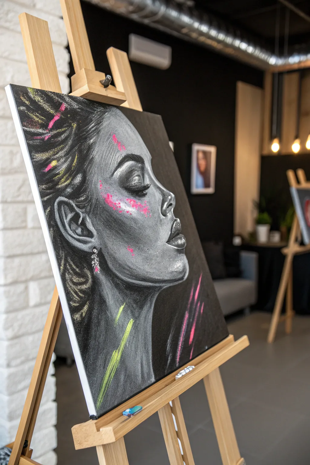
Monochrome Portrait With One Loud Color
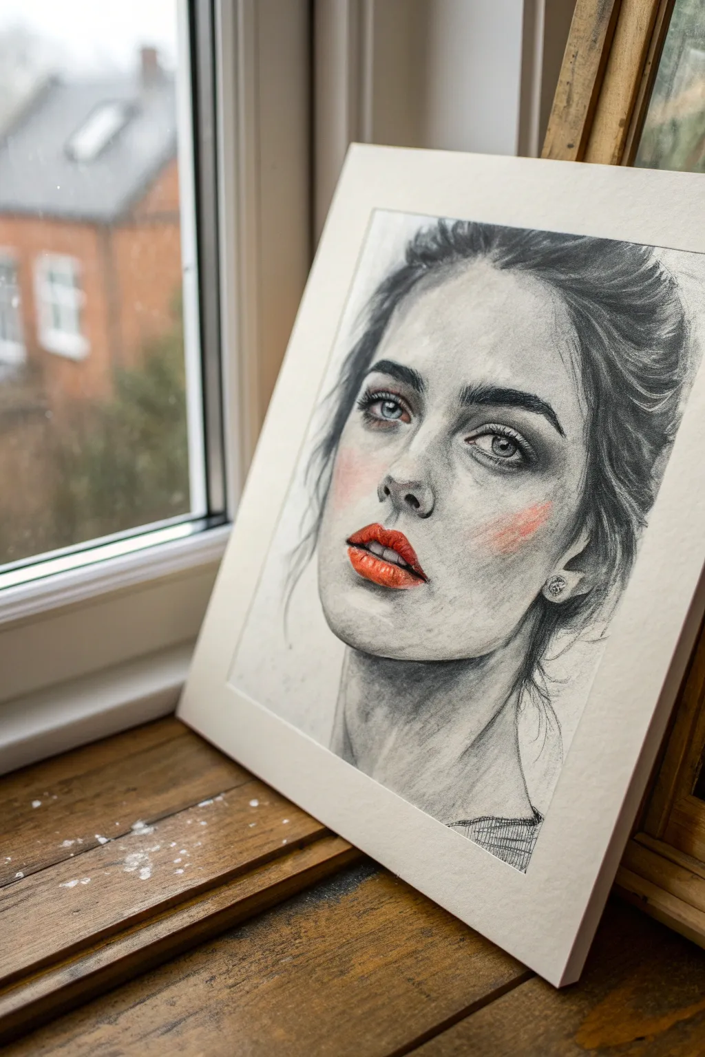
This striking mixed-media portrait captures a moody, realistic gaze rendered in soft graphite and charcoal, punctuated by a bold splash of red. It is a fantastic exercise in value control and focal point management, proving that sometimes less color truly means more impact.
Detailed Instructions
Materials
- High-quality Bristol board or mixed media heavy paper (A3 size)
- Graphite pencils (HB, 2B, 4B)
- Charcoal willow stick
- Soft charcoal pencil (6B or dark)
- Blending stumps (tortillons)
- Kneaded eraser
- Precision mechanical eraser
- Acrylic paint (Cadmium Red and Orange)
- Soft pastel (Red/Pink)
- Small round detail brush (size 0 or 1)
- Fixative spray
Step 1: Laying the Graphite Foundation
-
Basic outline:
Begin with a light HB pencil to sketch the proportions of the face. Focus on the tilt of the head and the placement of the eyes, nose, and mouth, keeping your lines very faint so they don’t show through later. -
Mapping shadows:
Using a 2B pencil, lightly hatch the areas where shadows fall—specifically under the brow bone, the side of the nose, and the hollow of the cheek. Avoid hard outlines; think in terms of shapes of shadow. -
Defining the eyes:
Switch to a 4B pencil to deepen the pupils and the upper lash line. Leave the white of the paper untouched for the highlights in the iris to give the eyes that piercing, wet look. -
Initial blending:
Take a blending stump and gently smudge your graphite shading to create smooth skin texture. I like to drag the graphite from the dark areas into the lighter areas to create a soft mid-tone without adding more pencil.
Step 2: Deepening Values with Charcoal
-
Darkest darks:
Introduce the charcoal pencil for the darkest elements: the nostrils, the corners of the mouth, and the deepest crevices of the hair. This high contrast is essential for the ‘edgy’ feel. -
Sculpting the hair volumes:
Use a willow charcoal stick to lay down broad strokes for the hair masses. Don’t draw every strand; instead, focus on the flow and the darker roots versus the lighter crown. -
Refining hair texture:
Go back in with the charcoal pencil to add specific stray hairs and define the hairline. Let some strands fall loosely over the face and ear for a natural, unposed appearance. -
Skin texture and highlights:
Use a kneaded eraser to lift pigment from the bridge of the nose, the forehead, and the cheekbones. This subtractive drawing technique creates the brightest highlights and adds dimension to the skin. -
The eyebrows:
Build the eyebrows using short, flicking strokes with a sharp 2B pencil, following the direction of hair growth. Layer them over the skin tone you established earlier so they don’t look pasted on. -
Neck and clothing:
Sketch the neck and collarbone with softer, looser strokes to keep the focus on the face. Keep the clothing sketch minimal, perhaps just a suggestion of a neckline with rough cross-hatching.
Smudge Patrol
If you accidentally smudge charcoal onto a clean highlight area, don’t rub it! Press a clean kneaded eraser straight down to lift the dust, rather than dragging it across the paper.
Step 3: The Pop of Color
-
Preparing the lips:
Ensure the lip area is clean of heavy graphite dust. You want the paper tooth slightly open to grip the paint. -
Base red layer:
Mix a small amount of Cadmium Red acrylic with a touch of orange. Using a fine round brush, carefully paint the lips, leaving small gaps for natural cracks or highlights. -
Lip volume:
While the red is still slightly wet, I often dab a tiny bit of darker crimson or even a speck of charcoal dust into the center line of the mouth to create depth and shadow. -
The highlight pop:
Once the red paint is strictly dry, use white acrylic or a white gel pen to add the glossy reflection on the lower lip. This small detail is crucial for realism. -
Soft blush:
Take a red or pink soft pastel and scribble it on a scrap piece of paper. Pick up the dust with a cotton ball or clean tissue and gently buff it onto the cheek to create the diffused, raw blush effect. -
Final assessment:
Step back and check your contrast. If the grey tones look washed out next to the bright red, deepen the charcoal shadows around the eyes and hair to balance the visual weight. -
Protecting the work:
Since charcoal smudges easily, spray the drawing with a workable fixative in a well-ventilated area. Apply lighter coats to avoid dissolving the pastel blush.
Eye Color Shift
Instead of leaving the eyes grey, try adding a translucent wash of pale blue or green watercolor to the irises. Keep it very subtle so it doesn’t compete with the bright red lips.
Mount your finished piece in a simple white mat to let the stark contrast really shine through.


Collage in the Paint Layer
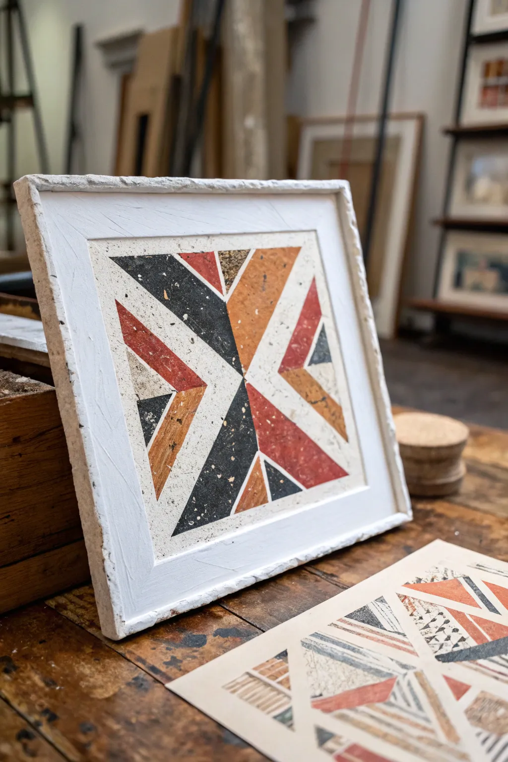
This striking project merges the raw, tactile appeal of stone with the bold precision of geometric art. By embedding collage elements directly into a textured base, you’ll create a dimensional piece that feels more like an architectural artifact than simple wall art.
Step-by-Step Tutorial
Materials
- Heavyweight watercolor paper or rigid art board (square)
- White texture paste or acrylic modeling paste
- Acrylic paints: Black, Terra Cotta, Ochre, White
- Palette knife
- Sandpaper (medium to fine grit)
- Painter’s tape or masking tape
- Old toothbrush (for speckling)
- Matte gel medium or decoupage glue
- Wooden panel or deep canvas (for the base)
- Ruler and pencil
- Scrap paper for masks
Step 1: Preparing the Textured Frame
-
Establish the Base:
Mount your square art board onto a slightly larger wooden panel or deep canvas using heavy-duty glue. This creates the structural foundation for your faux-frame edge. -
Applied Texture:
Using a palette knife, slather a thick layer of white texture paste around the outer rim of your board, building up a raised ‘frame’ border. Don’t smooth it out perfectly; keep the edges rough and organic to mimic chipped stone. -
Inner Field:
Apply a thinner coat of texture paste to the central square area where the design will go. This ensures the background has the same stony tooth as the colored sections later. Let this dry completely, preferably overnight.
Clean Corner Hack
When cutting your paper triangles, use a rotary cutter and a metal ruler instead of scissors. The pressure creates cleaner, sharper points that butt up perfectly against each other.
Step 2: Creating the Terrazzo Papers
-
Color Blocking:
While the base dries, grab three separate sheets of scrap heavy paper. Paint one solid black, one terra cotta red, and one yellow-ochre. -
Adding the Speckle:
Mix a little water into white paint until it’s fluid. Dip an old toothbrush into it and flick the bristles with your thumb to spray fine mist and larger droplets over your painted colored sheets. -
Cross-Speckling:
Repeat the splatter process using black paint on the colored sheets, and maybe some ochre on the black sheet. I find this layering creates that authentic recycled-stone look. -
Drying Time:
Allow these custom ‘stone’ papers to dry completely before attempting to cut them.
Step 3: Geometric Assembly
-
Drafting the Design:
Lightly sketch an ‘X’ shape on your dried, white textured center panel using a ruler. Divide the four resulting quadrants into smaller triangles, creating a radial geometric pattern. -
Cutting Shapes:
Cut your painted terrazzo papers into sharp triangles that match the dimensions of your sketch. Be precise here—sharp points make the design pop. -
Dry Fitting:
Arrange the cut pieces on the board without glue first. Play with the alternating colors (black against ochre, red against white space) to balance the visual weight. -
Adhering the Pieces:
Apply matte gel medium to the back of each triangle and press it firmly into the textured white background. Use a brayer or clean cloth to smooth them down, ensuring they conform to the rough surface underneath.
Stone Effect Level Up
Mix fine sand or actual grout powder into your acrylic paints for the colored papers. This adds physical grit that makes the faux-terrazzo look and feel incredibly realistic.
Step 4: Unifying and Finishing
-
Sealing the Edges:
Once the glue is dry, use a very small brush with white paint to touch up any gaps between the paper shapes and the white background, making the design look inlaid rather than just stuck on top. -
Overall Wash:
Technically, you could stop here, but to age the piece, mix a very watery wash of raw umber. Lightly brush it over the white frame area and immediately wipe it back with a rag to accentuate the texture crevices. -
Final Sanding:
Gently sand the surface of the paper collage elements. This scuffs the paint slightly, exposing the paper fibers and integrating the ‘stone’ layer with the background texture. -
Protective Coat:
Seal the entire artwork, including the chunky frame, with a spray matte varnish to protect the surface and eliminate any glossy spots from the glue.
Hang your new relief artwork in a space with good side-lighting to really show off those deep textures and geometric shadows
Classical Bust With a Modern Disruption
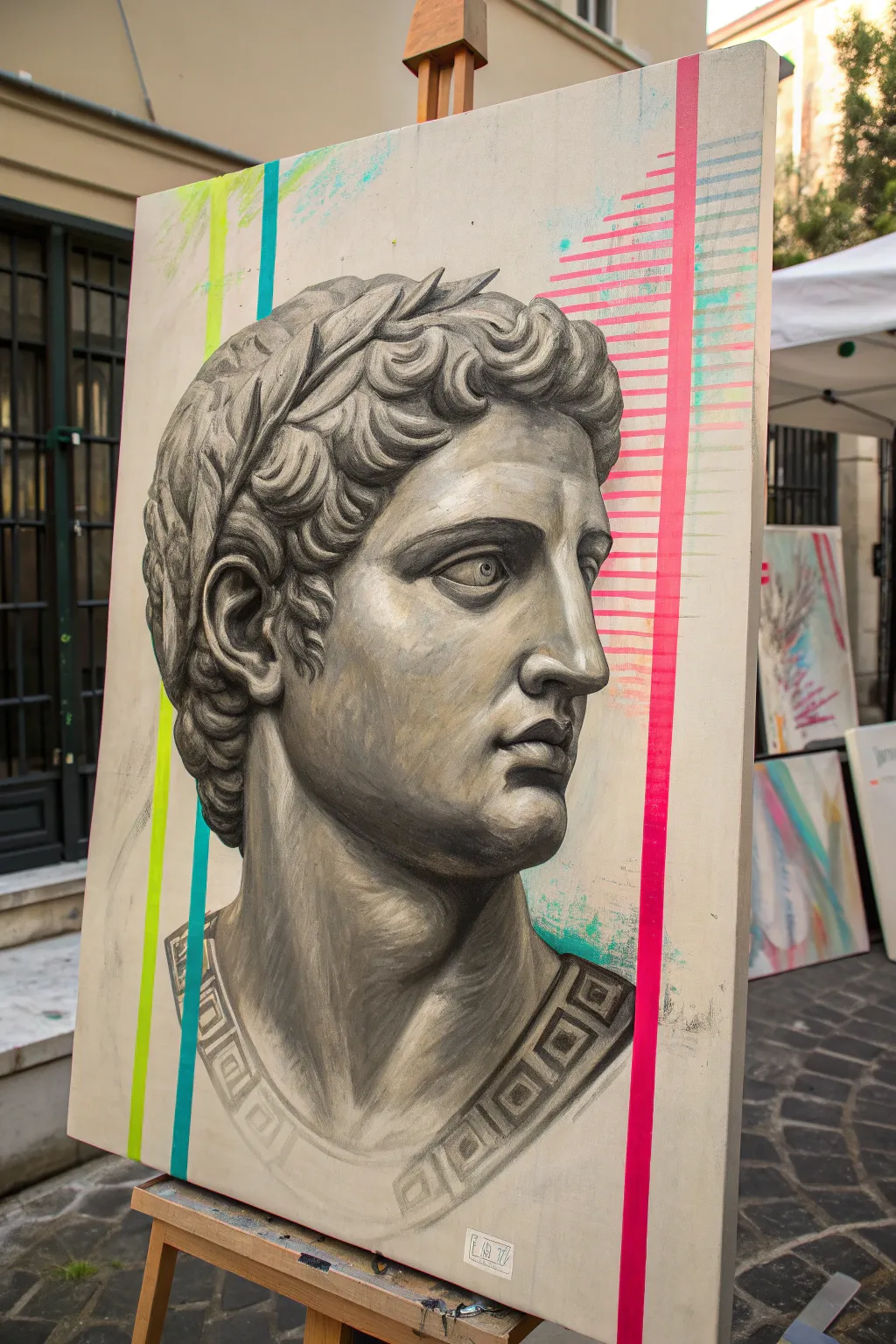
Fuse the timeless elegance of antiquity with the electric energy of street art in this striking canvas project. By rendering a hyper-realistic stone bust against raw canvas and disrupting it with vibrant neon geometry, you create a captivating tension between the old and the new.
Step-by-Step
Materials
- Large stretched canvas (primed)
- Acrylic paints: Heavy body Titanium White, Mars Black, Raw Umber
- Neon/Fluorescent acrylic paints: Lime Green, Cyan/Teal, Hot Pink
- Set of filbert and round synthethic brushes (sizes 2, 6, 10)
- Painter’s tape (low tack)
- Graphite pencil (HB or 2B)
- Reference photo of a classical bust (e.g., Caesar or Augustus)
- Ruler or straight edge
- Acrylic matte medium
- Easel
Step 1: Preparation and Sketching
-
Surface Prep:
Begin with a quality pre-primed canvas. If you want a smoother surface for the classical details, apply an extra coat of gesso and sand it lightly once dry to remove the weave texture. -
Grid or Projection:
To get the proportions of the face accurate, lightly draw a grid on your reference photo and a matching grid on your canvas. Alternatively, use a projector to cast the image onto the canvas. -
Underdrawing:
Sketch the outline of the bust using an HB pencil. Focus on the major landmarks: the brow line, the base of the nose, the lips, and the curls of the hair. Keep lines light so they don’t show through the paint.
Clean Lines Pro-Tip
Apply a thin layer of matte medium over the edge of your painter’s tape before painting the neon color. This seals the edge and ensures a razor-sharp line.
Step 2: Painting the Grisaille Bust
-
Mixing the Stone Palette:
Create a gradient of greys on your palette. Mix Mars Black and Titanium White to make five distinct values ranging from almost black to pure white. Add a tiny touch of Raw Umber to warm up the mid-tones, giving it an aged stone look. -
Blocking in Shadows:
Using a size 10 filbert brush, paint the darkest shadow areas first—usually under the chin, inside the ear, and in the deep folds of the hair. Thin the paint slightly with matte medium for better flow. -
Mid-tone Application:
Apply your medium grey tones to shape the face. Focus on the planes of the cheekbones, the neck muscles, and the forehead. Blend edges while the paint is wet to create the smooth transition typical of marble. -
Refining Features:
Switch to a smaller round brush (size 6) to refine the eyes and nose. Pay attention to the iris and pupil; keep the contrast high here to draw the viewer’s attention. -
Sculpting the Hair:
Hair on classical statues is stylized. Paint the general mass of the curls in a dark grey, then come back with lighter grey C-shapes to create the illusion of volume and texture. -
Adding Highlights:
Using your lightest grey and pure Titanium White, add the highlights where the light hits the ‘stone’—the bridge of the nose, the protruding brow, and the tops of the curls. Dry brushing works well here to mimic stone texture. -
Clothing Details:
If your bust includes a toga or garment at the base, paint the Greek key or geometric pattern along the neckline using a steady hand and a small liner brush. Keep the lines crisp to contrast with the organic forms of the face. -
Final Glaze:
Once dry, you might want to apply a very thin wash of watery Raw Umber over the entire bust to unify the tones and make it look like weathered marble.
Troubleshooting Translucency
If your neon paints look streaky or dull, don’t keep piling on layers. Let them dry completely, paint a solid white base layer, and then re-apply the neon.
Step 3: The Modern Disruption
-
Planning the Geometry:
Decide where your neon lines will go. The goal is to interrupt the classical image without obscuring the most critical features (like the eyes). Use a ruler to lightly mark the vertical paths. -
Taping Off:
Use low-tack painter’s tape to mask off the vertical stripes. Ensure the tape edges are pressed down firmly to prevent bleed-under, especially where the tape crosses the painted bust. -
Painting the Neon:
Apply the neon paints (Lime Green, Cyan, Hot Pink) into the taped areas. Neon pigments are often translucent, so I prefer to paint a layer of white first, let it dry, and then apply the neon color on top for maximum pop. -
Creating the Glitch:
For the pink section on the right, create a ‘glitch’ effect by painting horizontal dashes of varying lengths extending from the main vertical line. Use a flat brush width to keep the varying lengths consistent. -
Distressed Effects:
Before removing the tape, use a dry brush or a sponge to dab some of the surrounding background color (or raw canvas tone) over parts of the neon lines to make them look slightly worn or integrated. -
The Reveal:
Carefully peel away the tape while the paint is still slightly tacky to get clean lines. If any paint bled, touch it up with your grey stone mix. -
Background Splatter:
To finish, take a bit of watered-down neon teal or pink on an old toothbrush and flick a very subtle splatter around the edges of the geometric lines to loosen up the composition.
Step back and admire how the jarring contrast creates a piece of art that feels both ancient and futuristic at the same time
Acid-Color Night Alley Scene
Capture the moody atmosphere of a rain-slicked city street with this striking acrylic painting project. You’ll learn to contrast deep, shadowy stone textures against the vibrant electric glow of pink and cyan lights reflecting on wet pavement.
Step-by-Step Guide
Materials
- Canvas board or heavy mixed-media paper (11×14 inch)
- Acrylic paints (Phthalo Blue, Quinacridone Magenta, Carbon Black, Titanium White, Burnt Umber)
- Set of synthetic brushes (1-inch flat, medium filbert, fine liner)
- Water container and palette
- Painter’s tape or white gallery frame for finishing
- Paper towels
- Spray bottle for misting
Step 1: Blocking the Composition
-
Establish the perspective:
Begin by sketching a simple one-point perspective grid lightly in pencil. The vanishing point should be slightly off-center to the right, low on the canvas. Draw diagonal lines radiating out to corners to create the narrow alley walls. -
Outline the structures:
Sketch the vertical lines for the buildings on both sides. The left wall should be dominant, with suggestions of doorways and windows, while the right side can remain more abstract and shadowed. -
Lay the dark foundation:
Mix a large amount of Carbon Black with a touch of Phthalo Blue. Using your 1-inch flat brush, cover the majority of the canvas, leaving only the central alley floor and the areas where the brightest lights will be somewhat transparent or lighter.
Glow Like a Pro
For truly ‘acid’ colors, buy a tube of fluorescent magenta and blue acrylic. Use them only as top glazes over your white highlights to make the lights pop.
Step 2: Building the Atmospheric Glow
-
Create the cyan sky:
At the very top of the alley gap, paint a gradient using Titanium White mixed with a tiny drop of Phthalo Blue. Blend this downwards into the black surroundings to suggest a night sky peeking through. -
Apply the primary light source:
Mix a vibrant hot pink using Quinacridone Magenta and plenty of Titanium White. Apply this boldly to the middle section of the left wall where the imaginary street light hits. -
Extend the glow:
Using a dry brush technique, drag the pink paint outwards from the light source, letting it catch the ‘texture’ of the wall. This simulates light falling on rough brick or stone. -
Add secondary blue tones:
On the opposite right-hand wall and deeper shadows, dry brush pure Phthalo Blue to create a cool, ambient reflection that contrasts with the hot pink light.
Texture Trick
Crumple plastic wrap and press it into the wet paint on the pavement area. Peel it off after a minute to create instant, realistic water ripples.
Step 3: Painting the Wet Pavement
-
Base the street:
The ground needs to look wet. Mix a dark grey using Black and White, and paint the entire street floor with horizontal strokes to suggest the ground plane. -
Reflect the pink light:
While the grey is still slightly tacky, mix a fluid wash of your hot pink. Paint vertical, wavy strokes directly underneath the light source on the wall, dragging the color down towards the bottom of the canvas. -
Reflect the blue shadows:
Repeat the previous step with a watery Phthalo Blue on the right side of the street. I like to let these colors bleed slightly into the center for a realistic puddle effect. -
Intensify the highlights:
Add pure Titanium White to the center of your pink and blue reflections on the ground. Keep these strokes minimal and distinct to represent the brightest specular highlights on water.
Step 4: Refining Details and Framing
-
Detail the architecture:
Switch to your fine liner brush. Mix a mid-tone grey and outline specific brick shapes near the light source on the left wall to give the building structure and scale. -
Darken the foreground:
Glaze a thin layer of black wash over the very bottom edge of the painting. This vignette effect draws the viewer’s eye deeper into the illuminated alley. -
Enhance contrast points:
Add tiny dots of pure White where light might catch a door handle, a water droplet, or a sharp edge of a brick. -
Final assessment:
Step back and check your light balance. The pink should be the star of the show; if it looks dull, add a final glaze of pure magenta over the lit areas once they are dry. -
Clean borders:
Since this piece relies on a stark modern look, crisp edges are key. If you are painting on a board intended for floating, ensure the edges are painted solid white or clean them up. -
Mount and display:
Place your finished moody alleyway scene into a chunky white frame. The bright white border creates a visually stunning container for the dark, saturated artwork.
Hang your finished piece in a dimly lit corner to let those neon hues really shine
Glitchy Gradient Landscape
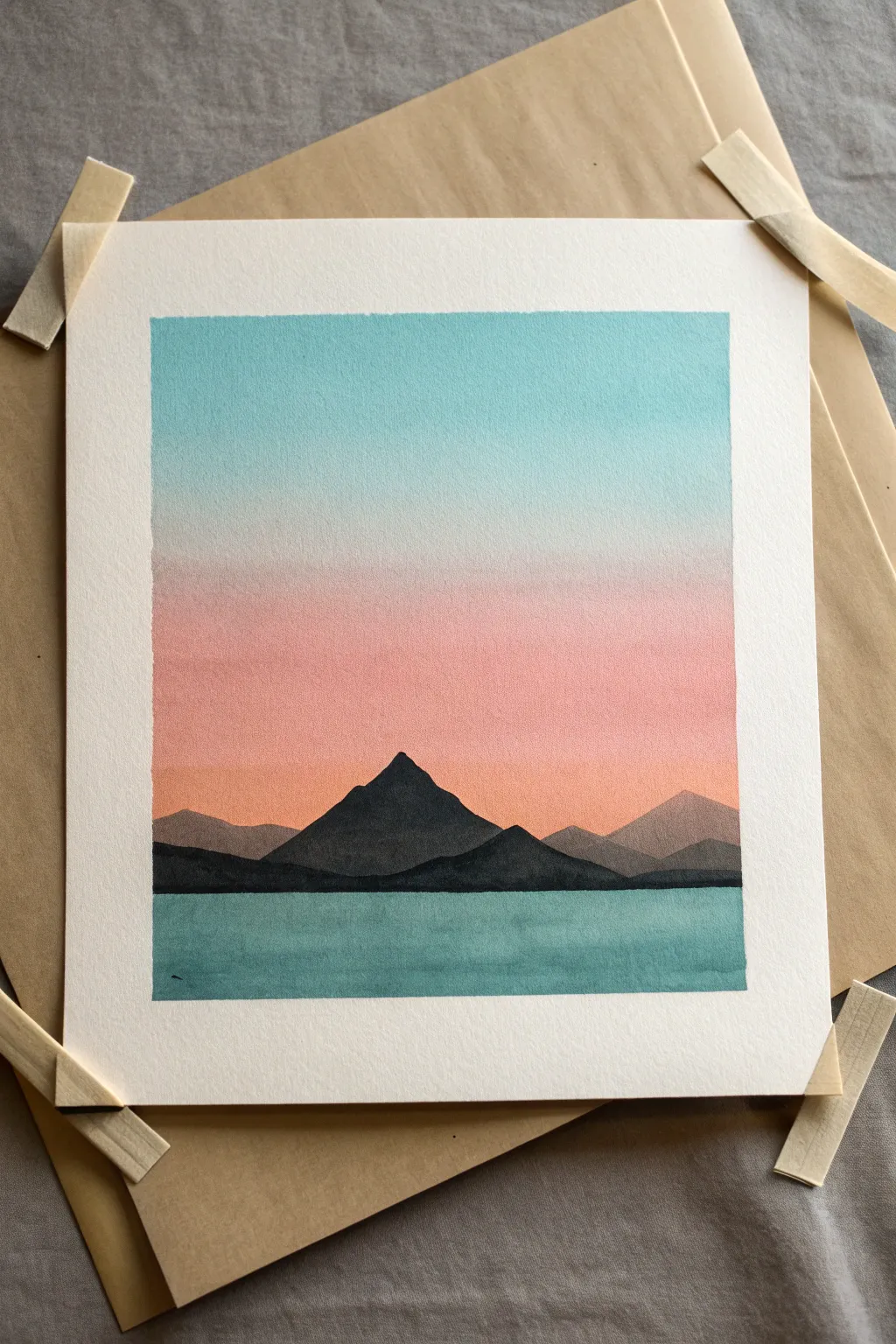
Capture the calm transition of a setting sun with this minimalist gouache landscape. By blending a soft, dusty sky against crisp, dark mountain silhouettes, you create a striking sense of depth and tranquility.
How-To Guide
Materials
- Cold press watercolor paper (300 gsm)
- Artist’s tape (washi style or masking tape)
- Gouache paints (Turquoise/Cyan, White, Peach/Salmon, Black, Dark Blue)
- Flat shader brush (3/4 inch or 1 inch)
- Small round detail brush (size 2 or 4)
- Mixing palette
- Two jars of water
- Pencil and eraser
Step 1: Setting the Stage
-
Tape the borders:
Secure your watercolor paper to a rigid board using artist’s tape. Create a distinct rectangular border; press the edges of the tape down firmly with a fingernail to ensure crisp, clean lines later. -
Plan the horizon:
Lightly sketch a horizontal line about one-third of the way up from the bottom of the paper. This will be your water line. Don’t press too hard, as graphite can sometimes smudge into lighter paint colors.
Uneven Gradient?
If your sky gradient dries with hard lines, re-wet the entire sky area lightly with a clean, damp brush and gently rework the transition while the paper is moist.
Step 2: The Sky Gradient
-
Mix the sky colors:
Prepare three piles of paint on your palette: a vibrant turquoise mixed with plenty of white, a pure white, and a soft peach or salmon tone also mixed with white. -
Start at the top:
Using your large flat brush, load up the pale turquoise mixture. Paint a generous horizontal band across the top third of the sky area. Use enough water so the paint flows, but keep it opaque. -
Blend the transition:
While the turquoise is still wet, rinse your brush slightly and pick up a bit of white. Apply this directly below the blue, brushing back and forth where they meet to create a soft fade. -
Add the sunset glow:
Immediately load the brush with the peach/salmon mixture. Apply this to the bottom third of the sky, right down to your horizon line. Work quickly upwards to blend it into the white transition zone. -
Smooth the gradient:
With a clean, slightly damp brush, run horizontal strokes back and forth across the entire sky to smooth out any streakiness. I find this final pass really unifies the look. -
Let it dry completely:
This is crucial. The sky must be bone dry before you paint anything over it, otherwise, the colors will bleed. Wait at least 15–20 minutes or use a hairdryer on low heat.
Step 3: The Water
-
Mix the water tone:
Create a teal color by mixing your turquoise with a tiny dot of black or dark blue to make it deeper than the sky. It should feel weightier. -
Paint the base layer:
Using a clean flat brush, fill in the water section below the horizon line. Keep the strokes horizontal to mimic the calm surface of a lake. -
Add texture variation:
While the paint is wet, drop in slightly darker teal streaks horizontally. This subtle variation suggests depth and ripples without needing high detail.
Level Up: Reflection
Mix a watery version of the mountain color and add faint, vertical downwards strokes into the water directly below the peaks to create a soft reflection.
Step 4: The Mountains
-
Sketch the peaks:
Once the sky layer is fully dry, lightly pencil in the outline of your central mountain peak and the smaller surrounding hills. -
Mix the mid-ground color:
Mix a medium grey-purple or desaturated blue. This is for the mountains that are further away in the distance. -
Paint distant peaks:
Using the round brush, carefully fill in the mountains on the far right and left edges. Their lighter value pushes them into the background. -
Mix the foreground darks:
Mix a very dark, near-black blue or charcoal. This needs to be the darkest value on your page to bring the central mountain forward. -
Paint the main mountain:
Fill in the large central peak. Ensure the edges are sharp against the sky gradient. Overlap the lighter distant mountains you just painted. -
Define the shoreline:
Use your dark mixture to create a crisp, straight line where the mountains meet the water. This straight edge is vital for the illusion of a flat water surface.
Step 5: Finishing Touches
-
Check for opacity:
If the black mountains look a bit streaky after drying, apply a second coat of paint to make them solid and silhouette-like. -
The reveal:
Once the painting is 100% dry, slowly peel away the tape. Pull away from the painting at a 45-degree angle to prevent tearing the paper.
Enjoy the satisfaction of those crisp edges and the peaceful atmosphere you’ve created.
Security-Cam Snapshot Painting
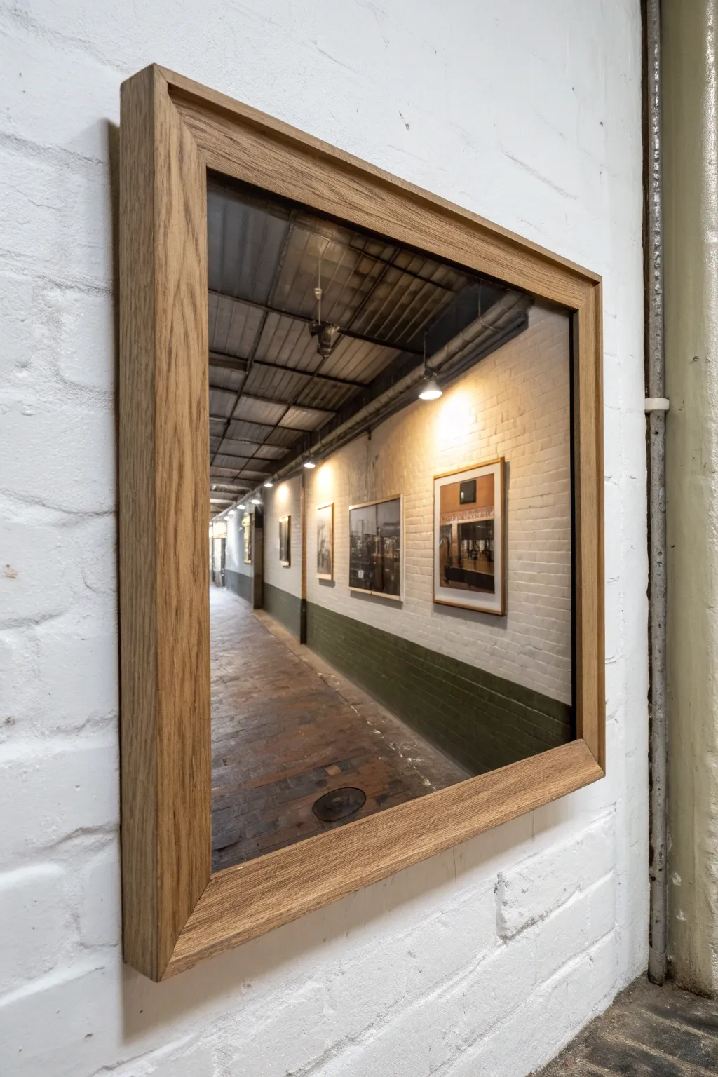
Transform a canvas into a mesmerizing, deep-perspective illusion that looks less like a painting and more like a window into another world. This project captures the gritty, industrial charm of a hallway using photorealistic acrylic techniques and precise linear perspective.
Step-by-Step Tutorial
Materials
- Large rectangular canvas (approx. 24×36 inches)
- Acrylic paints (Titanium White, Mars Black, Burnt Umber, Yellow Ochre, Raw Sienna, Sap Green)
- Large flat brush (1-2 inch)
- Medium filbert brush
- Fine liner brush (size 0 or 00)
- Drafting ruler or T-square
- Pencil (2H or H for light lines)
- Glazing medium
- Slow-drying medium (retarder)
- Solid oak floating frame (custom size to fit canvas)
- Masking tape
Step 1: Planning and Structure
-
Establish the vanishing point:
Begin by lightly marking a single vanishing point slightly left of the center on your horizon line. This is crucial for the deep hallway effect seen in the reference. -
Map the perspective grid:
Using your ruler, draw lines radiating from the vanishing point to the edges of the canvas. These will define the ceiling beams, the floor tiles, and the top and bottom of the wall on the right. -
Sketch the architectural elements:
Lightly sketch the vertical lines for the wall studs, the frames of the distant pictures, and the industrial ceiling pipes. Keep your pencil pressure very light so graphite doesn’t smudge into the paint later.
Straight Edge Secret
Use masking tape for the long perspective lines of the ceiling beams and floor edge. It guarantees razor-sharp architectural lines.
Step 2: Blocking in the Base Layers
-
Paint the ceiling base:
Mix Mars Black with a touch of Burnt Umber. Use the large flat brush to cover the ceiling area, keeping the strokes horizontal to suggest the corrugated metal texture. -
Establish the wall color:
Create a warm off-white using Titanium White and a tiny drop of Yellow Ochre. Block in the right-hand wall, ensuring ample coverage around the sketched frames. -
Lay the floor foundation:
Mix Burnt Umber, Raw Sienna, and a bit of Black. Paint the floor area, using horizontal strokes that get smaller and closer together as they approach the vanishing point to simulate distance. -
Define the wainscoting:
For the lower green section of the wall, mix Sap Green with Mars Black to create a deep, industrial hunter green. Paint this strip along the bottom right wall, following your perspective lines perfectly.
Step 3: Details and Light
-
Develop the brick floor texture:
Switch to a smaller flat brush. Mix lighter variations of your floor color and dab in rectangular brick shapes. I find it helpful to let the base layer show through as the ‘grout’ lines between bricks. -
Add ceiling highlights:
Mix a cool grey using White and Black. Use the fine liner brush to paint thin, straight lines across the dark ceiling to represent the metal beams and trusses catching the light. -
Paint the light sources:
Identify the spots where the ceiling lights hang. Paint small ellipses of pure Titanium White, then gently glaze a soft halo of yellow-white around them to create a glow effect. -
create the wall texture:
Using a dry-brush technique with very little paint, lightly drag a brush with varying off-white tones horizontally across the wall area. This mimics the texture of painted brick. -
Insert the ‘paintings within the painting’:
Fill the empty frames on the wall with abstract shapes or muted dark tones. You don’t need high detail here; just the suggestion of images is enough to sell the illusion.
Go Meta
Paint the ‘artworks’ on the wall in the painting to look like miniature versions of your own previous paintings for a hidden easter egg.
Step 4: Refining and Framing
-
Enhance the shadows:
Mix a glazing medium with black paint to create a transparent shadow tone. Glaze the areas of the floor and wall furthest from the light sources to deepen the hallway’s recession. -
Add reflection details:
For a polished look, add subtle vertical streaks of light on the green wainscoting and the floor directly beneath the ceiling lights to simulate a slightly glossy surface. -
Paint the floor drain:
Near the foreground, carefully paint the dark oval of the floor drain/manhole cover. Add a tiny highlight on its rim to give it metallic weight. -
Varnish the canvas:
Once fully dry (give it at least 24 hours), apply a satin varnish. This unifies the sheen of the different paint layers and protects the detailed work. -
Install the frame:
Place the canvas into the oak floating frame. Secure it from the back, ensuring there is an even ‘floating’ gap between the canvas edge and the wood frame for that high-end gallery finish.
Hang your new illusory hallway in a tight space to visually expand the room with depth and intrigue.
X-Ray Botanicals With Dark Humor
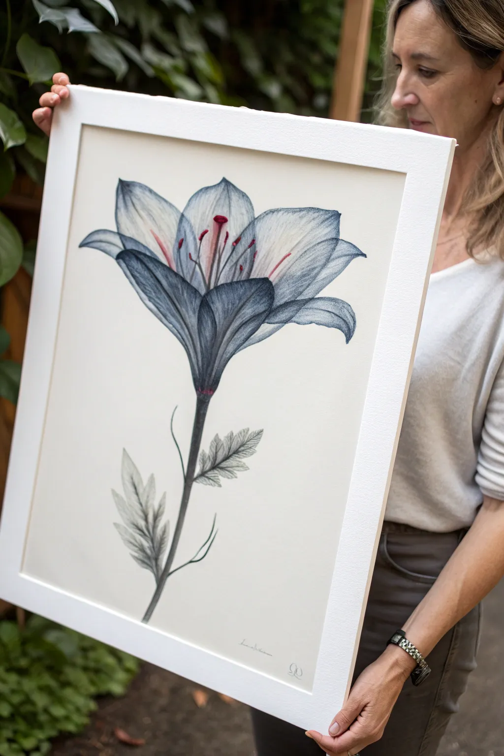
Capture the ghostly elegance of a lily using a blend of graphite and semi-transparent layers to achieve a unique x-ray effect. This project balances precise botanical illustration with moody, atmospheric shading for a striking piece of wall art.
How-To Guide
Materials
- Hot press watercolor paper (smooth finish)
- Graphite pencils (HB, 2B, 4B)
- Blue-grey watercolor pencil or diluted ink
- Soft blending stumps (tortillons)
- Fine liner pen (0.1mm, grey or sepia)
- Red colored pencil or watercolor
- Kneadable eraser
- White gel pen or gouache for highlights
- Ruler and basic sketching tools
Step 1: Structural Sketching
-
Establish the stem line:
Begin by lightly drawing a central vertical curve with an HB pencil to represent the stem. This will be the anchor for your flower’s posture. -
Map the bloom shape:
At the top of the stem, sketch a loose oval or trumpet shape to define the outer boundaries of the lily petals. Keep these lines faint so they don’t show later. -
Define the petals:
Draw the six distinct petals of the lily, curving them outward from the center. Make the front petals shorter and wider due to foreshortening, and the back petals slightly more elongated. -
Add leave placement:
Sketch two to three jagged, lance-shaped leaves near the bottom third of the stem. Ensure they angle upwards, following the natural growth pattern of a lily.
Smudge Control
Work from left to right if you are right-handed (or vice versa) to prevent your hand from smearing the graphite, or rest your hand on a clean scrap sheet.
Step 2: X-Ray Shading Technique
-
Initial graphite layer:
Using a sharp 2B pencil, lightly shade the petals. Instead of solid blocking, use directional strokes that follow the curve of the petal from base to tip to mimic veins. -
Deepen the shadows:
Switch to a 4B pencil to darken the base of the flower where the petals meet the stem. This is crucial for the x-ray look—the overlapping areas should be the darkest. -
Translucent layering:
Where the front petals overlap the back petals, lightly draw the outline of the back petal *through* the front one. Shade the overlapping section slightly darker to create a ghostly transparency. -
Tinting with blue-grey:
Take your blue-grey watercolor pencil and lightly shade over the graphite, focusing on the outer edges and the deep center. I find blending this out with a slightly damp brush creates a lovely ethereal wash. -
Refining the veins:
Once the wash is dry, use a sharp HB pencil to draw fine, crisp lines for the petal veins. Let these lines fade out as they reach the petal edges.
Step 3: Detailed Features
-
Drawing the stamens:
Draw the long, slender filaments extending from the center. Top them with oval-shaped anthers. -
Adding the color pop:
Use a red colored pencil or a tiny touch of watercolor to color the anthers and the very tips of the filaments. This sudden warmth contrasts beautifully with the cool x-ray palette. -
Leaf texture:
Return to the leaves on the stem. Shade them heavily with charcoal grey or 4B graphite, leaving the jagged edges crisp against the white paper. -
Stem definition:
Darken the stem, making it nearly black at the bottom and gradually lighter as it reaches the bloom.
See-Through Effect
To master the transparency, shade the ‘underneath’ petal normally first, then shade the ‘top’ petal over it, letting the bottom texture show through slightly.
Step 4: Final Highlights & Finish
-
Lift highlights:
Use a kneadable eraser to dab at the center of the petals, lifting away pigment to create glowing, white highlights that enhance the 3D form. -
Intensify edges:
Use a fine liner pen to very selectively outline the tips of the petals and leaves. Do not outline the entire shape; broken lines look more organic. -
White accents:
Apply tiny dots of white gouache or gel pen to the wettest looking parts of the stigma and the edges of the petals for a subtle sheen. -
Clean up:
Erase any stray construction lines or smudges from the background to ensure the stark, clinical look of a botanical specimen. -
Signature:
Sign your work small and unobtrusively near the bottom, maintaining the minimalist aesthetic.
Frame your botanical study in a simple white mat to let the delicate details shine
Painted Rips, Tears, and Tape Illusions
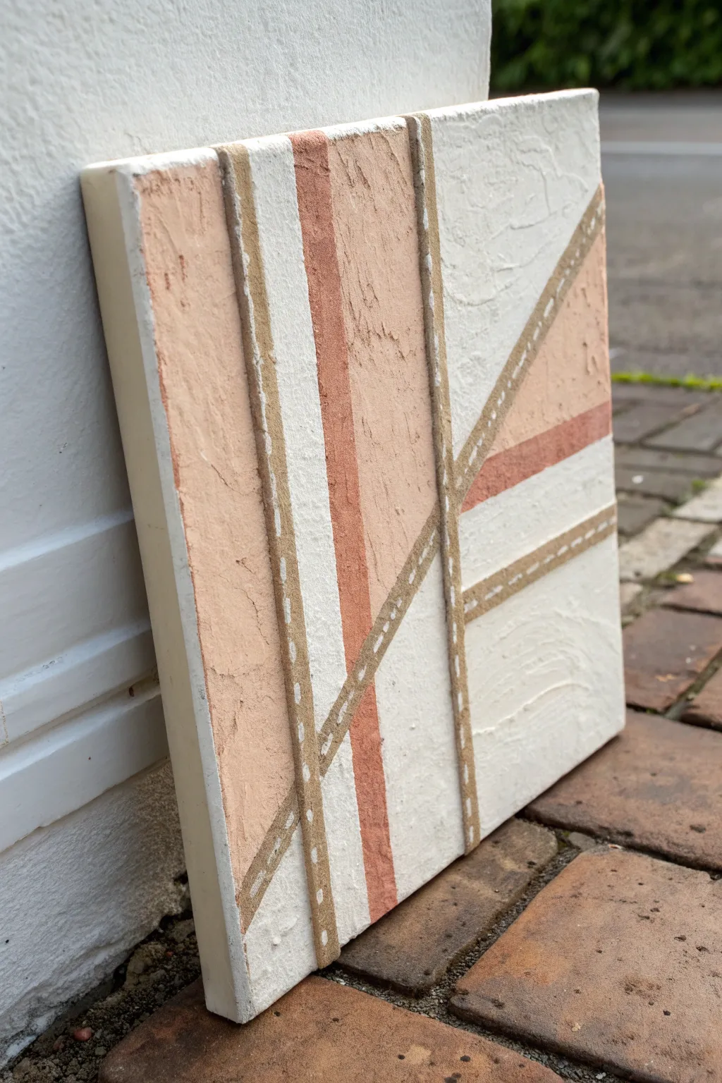
Create a modern, tactile masterpiece that plays with perception using just paint and clever layering. This project uses texture paste and warm, earthy tones to mimic the look of torn masking tape stripes over a plaster-like surface.
Detailed Instructions
Materials
- Square canvas (deep edge preferred)
- Modeling paste or heavy structure gel
- Palette knife
- Acrylic paints: White, Beige/Sand, Rust/Terra Cotta, Raw Umber
- Low-tack masking tape (painter’s tape)
- Small flat brush (1/4 inch)
- Fine liner brush (size 0 or 1)
- Hairdryer (optional, to speed drying)
Step 1: Base Texture and Mapping
-
Prep the canvas:
Start with a clean, dry canvas. If you want a smoother starting point, give it a quick coat of gesso, though it’s not strictly necessary since we are adding heavy texture. -
Map out the design:
Apply strips of low-tack masking tape directly onto the canvas in a geometric pattern. Create intersecting lines, triangles, and trapezoids. These tape lines will eventually become the ‘negative space’ or the faux-tape lines. -
Mix the texture:
Mix your modeling paste with white acrylic paint. You want a thick, frosting-like consistency. Divide a small portion into a second pile and mix in your rust/terra cotta color.
Step 2: Applying Texture
-
Fill the white sections:
Using a palette knife, spread the white texture paste mixture into the large open sections between your tape lines. Don’t smooth it out perfectly; keep it rough and organic. -
Add the colored accents:
Fill specific geometric sections with the rust-colored paste instead of white to create bold focal points. Apply the paste right up to and slightly over the edges of the tape. -
Create the beige tones:
For the remaining sections, mix a sandy beige color into the paste. I like to apply this a bit unevenly, maybe swirling a little white in, to give it a natural stone look. -
Let it cure:
Allow the texture paste to dry completely. This is crucial—it must be hard to the touch. This can take several hours depending on thickness, or use a hairdryer on a low setting.
Bleeding Lines?
If texture paste bled under your tape, don’t panic. Once dry, use a craft knife to gently scrape and straighten the edges before painting the faux-tape channels.
Step 3: The Reveal and Tape Effect
-
Remove the masking tape:
Carefully peel away your masking tape strips. You should now have deep channels of plain canvas separating your raised textured blocks. -
Base coat the channels:
Paint the exposed canvas channels (where the tape was) with a flat coat of beige/sand acrylic paint. This creates the base color for our faux tape. -
Define the edges:
Using a small flat brush and a slightly darker beige or diluted raw umber, paint a very thin line along one side of each ‘strip’ to create a drop shadow illusion. -
Add the stitch details:
This step sells the illusion. Dip a fine liner brush into white paint. Along the center of your beige painted strips, paint small, dashed lines. -
Refine the stitches:
Keep your dashes consistent in length and spacing to mimic machine stitching found on fabric or heavy-duty tape.
Go Glossy
To make the ‘tape’ strips look even more realistic against the matte texture paste, apply a thin layer of high-gloss varnish only over the painted beige strips.
Step 4: Finishing Touches
-
Dry brush texture:
Take a dry brush with a tiny amount of white paint and lightly drag it over the high points of your rust and beige textured sections. This highlights the crags and ridges. -
Paint the sides:
Finish the artwork by painting the sides of the canvas a solid cream or white for a gallery-ready look. -
Final inspection:
Check for any gaps in the texture or the painted channels and touch up as needed. Let everything cure for 24 hours before hanging.
Hang your textured abstract piece in a well-lit area to let the shadows play across the surface
Stencil-Style Poster Portrait
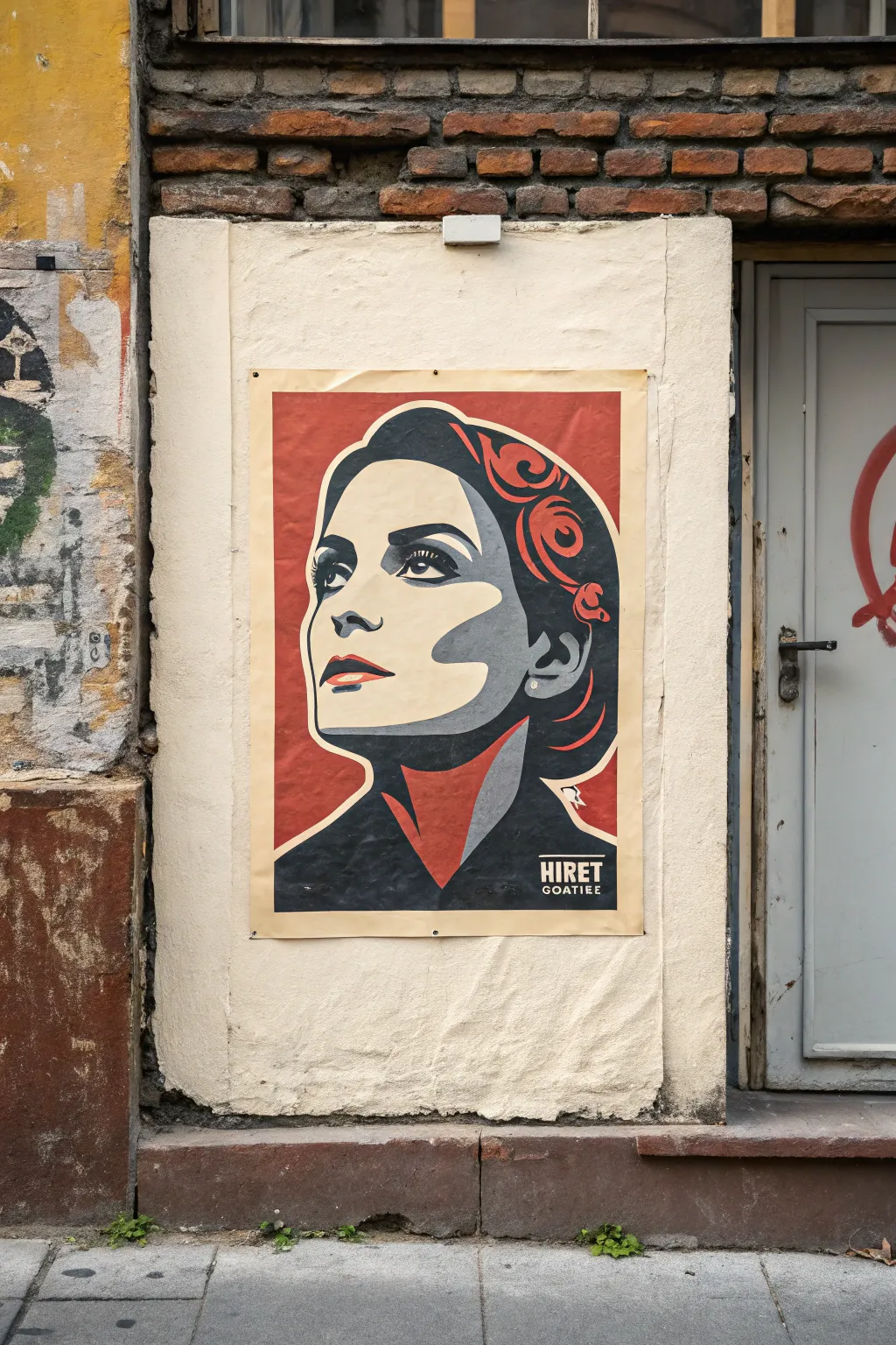
Channel the bold energy of street art propaganda with this striking three-color stencil portrait. Using high-contrast layering and a limited palette of deep red, cream, and black, you will create a graphic poster that commands attention.
How-To Guide
Materials
- Large format paper (18×24 or A2)
- Acrylic paints (Cadmium Red, Black, Cream/Off-White)
- Digital photo editing software (Photoshop or GIMP)
- Cardstock or Mylar sheets for stenciling
- X-Acto knife with fresh blades
- Cutting mat
- Spray adhesive (repositionable)
- High-density foam roller or stencil brushes
- Painter’s tape
Step 1: Design & Preparation
-
Choose your subject:
Select a high-resolution portrait with good lighting. Photos where the subject is looking upward or to the side often work best for this propaganda style. -
Posterize the image:
Import your photo into editing software. Convert it to grayscale, then increase the contrast significantly. Use a ‘Posterize’ or ‘Threshold’ filter to reduce the image to just three key distinct values: shadows (black), mid-tones (red), and highlights (cream). -
Refine the shapes:
Clean up any stray pixels or jagged edges in your digital file. You want smooth, flowing shapes for the hair and facial features that will be easy to cut out later. -
Print the layers:
Separate each color layer digitally. Print the outlines for each color layer onto your cardstock or Mylar. You may need to tile the printing across multiple sheets if your poster is large.
Clean Lines Only
Paint bleeding under the stencil? Ensure your adhesive is tacky and use a ‘Dry Brush’ technique. Too much paint on the roller acts like a squeegee, pushing liquid under the edges.
Step 2: Cutting the Stencils
-
Prepare the cutting area:
Place your cutting mat on a stable surface. Secure the printed cardstock so it doesn’t shift while you work. -
Cut the background layer:
Start with the layer that represents the red mid-tones. Use your X-Acto knife to carefully remove the negative space. Remember to leave ‘bridges’—small connecting strips of paper—so floating island shapes don’t fall out. -
Cut the detail layer:
Cut the stencil for the black shadow layer. This will likely be the most detailed stencil, containing the eyes, mouth, and hair definition. Take your time with the intricate curves. -
Create the text stencil:
If you want to include text like ‘HIRET GOATIEE’ shown in the example, cut a rectangular box stencil for the background and separate delicate stencils for the lettering.
Step 3: Painting the Layers
-
Base coat application:
Paint your entire large-format paper with the cream or off-white acrylic paint. I find a foam roller gives the smoothest, most poster-like finish here. Let this dry completely. -
Position the red layer:
Apply a light mist of repositionable spray adhesive to the back of your ‘Red’ stencil. Press it firmly onto the cream background, focusing on the edges to prevent bleed. -
Apply the mid-tone:
Load a foam roller with red paint, offloading the excess onto a paper towel until the roller is almost dry. Roll over the stencil gently. Multiple thin coats are better than one thick, wet coat. -
Remove and dry:
Carefully peel back the red stencil while the paint is still tacky to keep lines sharp. Allow this layer to dry fully before proceeding. -
Align the shadow layer:
Position the ‘Black’ stencil over the dried red and cream layers. Registration is key here—make sure features like the eyes and jawline align perfectly with the previous shapes. -
Paint the shadows:
Dab black paint vertically using a stencil brush or a fresh foam roller. Be extremely careful around the facial features to avoid forcing paint under the stencil edges. -
Add the text box:
Position your text box stencil in the lower corner. Paint the background rectangle in black. -
Lettering detail:
Once the black rectangle is dry, align your lettering stencil over it and dab in the cream color to make the text pop.
Level_Up
Distress your finished poster by lightly sanding the surface or crinkling the paper before mounting it, mimicking the weathered texture of an authentic street-art paste-up.
Hang your bold creation on the wall for an instant dose of urban rebellion
Hidden Message Under UV-Reactive Paint
Create a wall-worthy canvas that looks like minimalist textural art by day but reveals a glowing secret under blacklight. This project embraces the hidden side of creativity, turning a seemingly blank surface into a private conversation piece.
How-To Guide
Materials
- Stretched canvas (16×20 or similar)
- White Gesso
- Modeling paste or heavy texture gel
- Palette knife
- UV-reactive acrylic paint (clear or white drying)
- Wide flat paintbrush (2-inch)
- Small round detail brush (size 2 or 4)
- UV flashlight or blacklight bulb
- Pencil (optional for sketching)
- Matte varnish spray (UV resistant)
Step 1: Building the Foundation
-
Prepare your workspace:
Set up your easel in a well-ventilated area. Since you’ll be working with texture and potentially subtle whites, good lighting is essential—natural light from a window or working outdoors during the day is ideal to see the surface relief. -
Prime the canvas:
Apply a fresh coat of white gesso over the entire canvas using your wide flat brush. Even pre-primed canvases benefit from this layer to ensuring a consistent brightness and tooth for the texture paste. -
Mix your texture:
Scoop a generous amount of modeling paste onto a palette or paper plate. If you want the background to have a slight tint, you can mix in a tiny drop of grey or cream acrylic, but keeping it stark white maximizes the hidden contrast later. -
Apply base texture:
Using a palette knife, spread the modeling paste across the canvas. Avoid smoothing it out perfectly; instead, use erratic, sweeping motions to create ridges, peaks, and valleys. This ‘noise’ will help camouflage your hidden message. -
Refine the surface:
While the paste is still wet, use the clean edge of the palette knife to scrape back small sections or cross-hatch others. I sometimes like to press the flat side of the knife into the paste and pull up to create stippled peaks. -
Let it cure:
Allow the texture layer to dry completely. Modeling paste can take 12-24 hours to cure fully depending on thickness. It must be bone dry before you apply the hidden layer to prevent muddying the effect.
Ghosting Issues?
If you can still see faint outlines of your letters in daylight due to texture differences, gently stipple a very thin layer of watered-down white gesso over the letters to mask them.
Step 2: Hiding the Secret
-
Plan your message:
Decide on the text or image you want to hide. Since you can’t erase easily, it helps to sketch your design on a scrap piece of paper first to get the spacing right. -
Work in the dark:
This step requires a shift in lighting. Turn off your main lights and switch on your UV flashlight or blacklight. This is the only way to see exactly what you are painting with the invisible medium. -
Load the detail brush:
Dip your small round brush into the clear UV-reactive paint. You want enough paint to flow smoothly over the bumpy texture, but not so much that it drips. -
Paint the hidden layer:
Carefully paint your message or design directly over the textured white surface. The texture will make straight lines tricky, so embrace a slightly organic, hand-painted look. -
Check density:
Under the blacklight, check your brushstrokes. If the glow looks streak, apply a second coat immediately to ensure solid, bright lines when the light hits it. -
Camouflage the gloss:
Sometimes clear UV paint dries slightly glossier than the matte texture paste. If you notice ‘ghost’ letters in normal light, dab a tiny bit of fresh matte white paint or matte medium over the glossy spots to dull them down without covering the UV pigment entirely.
Step 3: Finishing Touches
-
Final drying phase:
Let the UV paint dry completely. This usually takes less time than the paste, about 1-2 hours. -
Seal the work:
Take the canvas back to a well-ventilated area. Spray a light, even coat of matte varnish over the entire piece. -
Unified finish:
The varnish is crucial because it unifies the sheen of the texture paste and the UV paint, making your hidden message truly invisible in standard daylight. -
Test the reveal:
Do one final check with your blacklight to ensure the varnish hasn’t successfully blocked the UV reaction. The glow should shine through the clear coat perfectly.
Make It Pop
Use different colors of invisible UV paint (like blue, red, or yellow) to create a multi-colored secret image that looks monotone white until the party lights turn on.
Hang your piece in a room that transitions from day to night to fully enjoy the dual nature of your artwork

Have a question or want to share your own experience? I'd love to hear from you in the comments below!