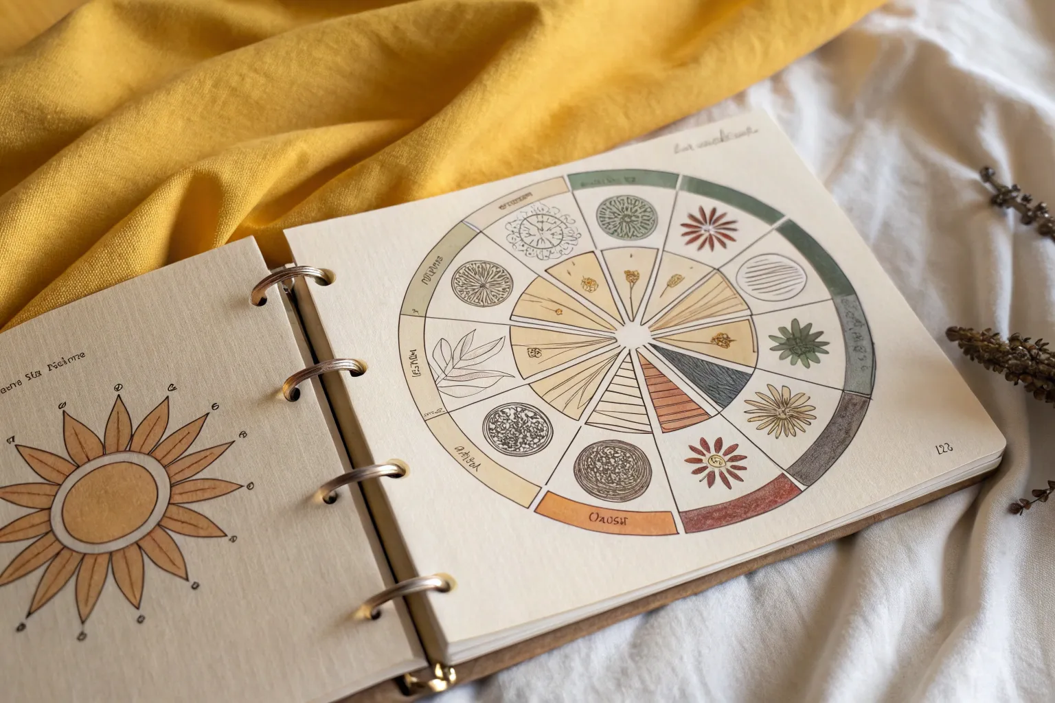
When you’re hunting for elements of art drawing ideas, the most satisfying projects are the ones where line, shape, form, color, value, texture, and space all get their own moment—and still feel like one finished piece. Here are my favorite layouts and prompts that turn those fundamentals into drawings you’ll actually want to hang onto (and maybe teach from, too).
Positive and Negative Space Poster
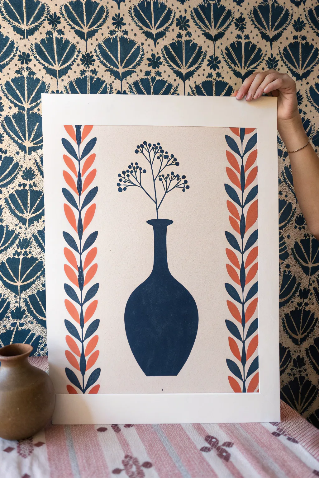
This striking botanical art piece plays with positive space and symmetry, featuring a bold silhouette vase flanked by patterned leaf borders. Using a limited palette of deep navy and burnt orange against a cream background creates a timeless, folk-inspired look that mimics traditional block printing.
Detailed Instructions
Materials
- Heavyweight cream or off-white art paper (A3 or similar size)
- Deep navy blue acrylic paint or gouache
- Burnt orange or terracotta acrylic paint or gouache
- Pencil and eraser
- Ruler
- Fine liner brush (size 0 or 00)
- Small flat brush or round brush (size 2-4)
- Palette or mixing plate
- Masking tape (optional)
Step 1: Planning and Sketching
-
Prepare your paper:
Start with a clean sheet of heavyweight cream paper. If you want a crisp white border around the edge as shown in the photo, measure about 1.5 inches in from each side and lightly mark this boundary, or tape it off with low-tack masking tape. -
Mark the vertical columns:
Using a ruler, lightly draw two vertical lines on the left and two on the right to define the columns where the leaf borders will go. These columns should be about 1.5 to 2 inches wide. -
Sketch the central guideline:
Find the exact center of the paper between your two border columns. Draw a very faint vertical line down the middle to help keep your vase symmetrical. -
Outline the vase:
Sketch the silhouette of the bottle vase in the bottom center. Start with a narrow neck that flares out into a rounded, bulbous body. I find it helpful to draw one side first, then measure key points to the centerline to mirror the other side accurately. -
Draw the stems:
From the mouth of the vase, sketch thin, branching lines extending upward. Create a loose, airy structure with three main branches. -
Add the botanical details:
At the ends of the branches, lightly sketch small clusters of berries or buds. Keep them simple—just small circles. -
Map out the leaf borders:
In your side columns, draw a central vertical stem line. Then, mark the positions for the leaves. You want them paired or alternating in a ‘v’ distinct pattern. Don’t draw every leaf detail perfect yet, just the spacing.
Step 2: Painting the Borders
-
Paint the central stems:
Load your fine liner brush with the deep navy paint. Carefully paint the thin vertical line running up the center of both border columns. -
Paint the blue leaves:
Still using the navy paint, fill in every other pair of leaves (or the alternating pattern shown). Use a small round brush, pressing down at the base of the leaf and lifting as you reach the tip to create a tapered shape. -
Paint the orange leaves:
Clean your brush thoroughly. Switch to the burnt orange paint and fill in the remaining leaves in the border. The contrast between the warm orange and cool navy is key to this design. -
Refine the edges:
Go back with your fine liner brush to sharpen the tips of the leaves or smooth out any curves where the paint might have wobbled.
Clean Lines Trick
To get super sharp leaf tips without a steady hand, place a small piece of masking tape at the tip of the sketched leaf. Paint over the tape edge, then peel it off when wet.
Step 3: Painting the Centerpiece
-
Fill the vase silhouette:
Using the deep navy paint and a larger brush, fill in the sketched vase shape. Paint carefully along the edges first to get a crisp outline, then fill the center. Ensure the paint is opaque; you may need a second coat after the first dries. -
Paint the delicate branches:
Switch back to your smallest liner brush. With a steady hand, paint over your pencil lines for the stems coming out of the vase. Keep the paint fluid (add a tiny drop of water if needed) so the lines flow smoothly. -
Add the berries:
Dip the tip of a brush handle or use your small round brush to dab the navy dots at the ends of the branches. Group them in small clusters of 3 to 5 for a natural look. -
Erase guidelines:
Allow the painting to dry completely—give it at least an hour. Once dry, gently erase any visible pencil lines, being careful not to rub the painted areas. -
Clean up borders:
If you used masking tape for the outer edge, peel it away slowly at a 45-degree angle to reveal your crisp, clean border.
Texture variation
Mix a tiny bit of chalk powder or cornstarch into your acrylic paint. This gives the finished piece a matte, velvety texture that looks just like traditional screen printing ink.
Frame this piece in a simple wood frame to let the bold shapes and colors truly stand out on your wall


Shattered Object Element Mosaic
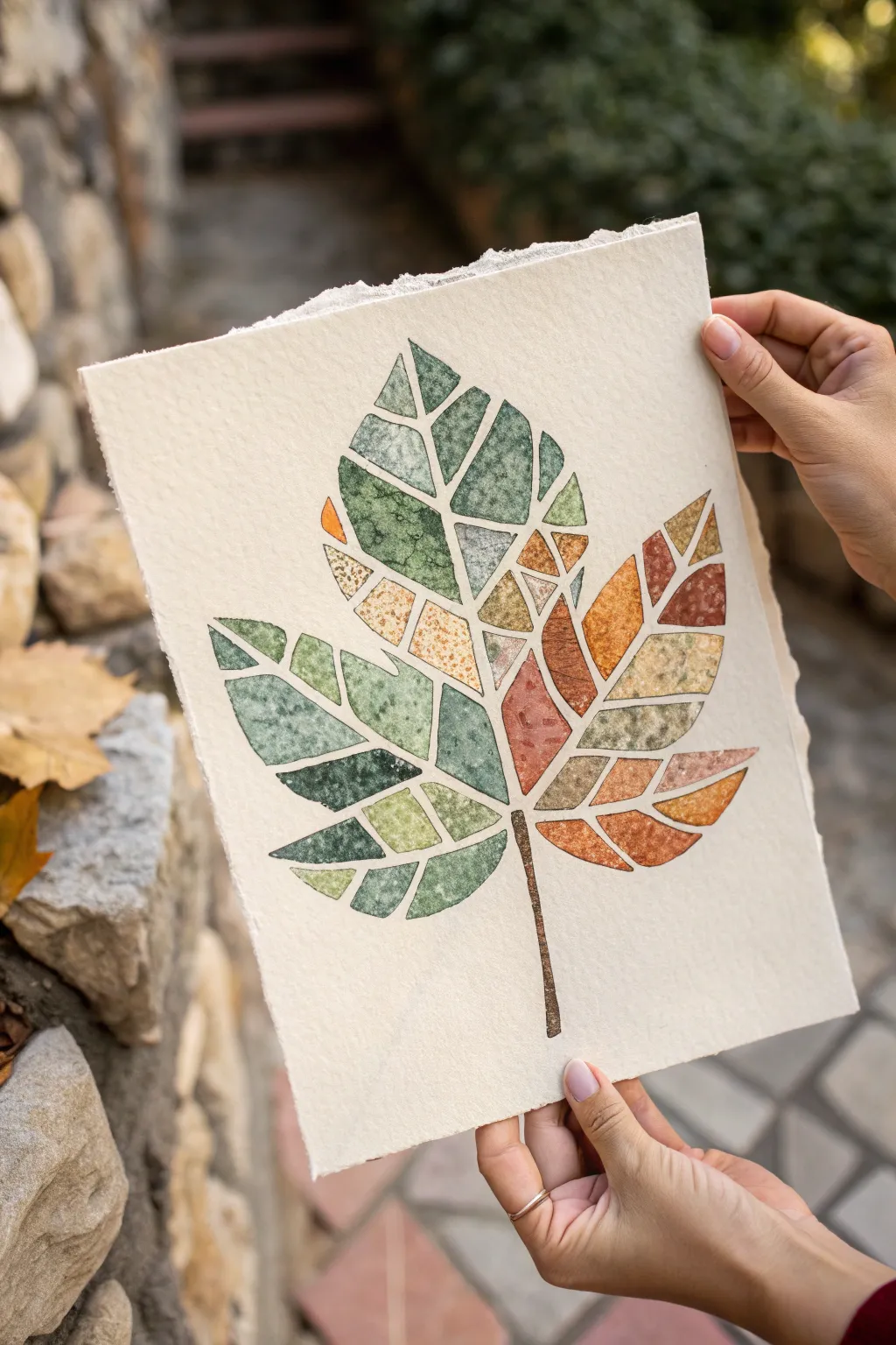
This project transforms a simple natural form into a stunning geometric study of color and negative space. By breaking a leaf shape into “shattered” segments, you’ll explore gradient blending and precise edge control using watercolors on textured paper.
Step-by-Step
Materials
- Cold press watercolor paper (300 gsm or heavier)
- Pencil (HB or H)
- Ruler
- Kneaded eraser
- Watercolor paints (tube or pan)
- Synthetic round brushes (sizes 2 and 4)
- Artist tape or masking fluid (optional)
- Painters tape (for securing paper)
- Palette for mixing
- Two jars of water
Step 1: Preparation and Sketching
-
Secure the paper:
Begin by taping your watercolor paper to a board or table. This prevents warping when the paper gets wet. If you want those lovely deckled edges shown in the photo, you can carefully tear the paper edges against a ruler before starting. -
Outline the leaf:
Lightly sketch the outer perimeter of a large maple or sycamore leaf. Focus on getting the five main points and the stem shape correct, but keep the lines faint so they don’t show through the paint later. -
Draw the veins:
Sketch the primary veins radiating from the stem to the leaf tips. These will serve as the first major dividing lines for your mosaic pattern. -
Create the segments:
Using your ruler, draw straight geometric lines across the leaf to fracture the organic shape. Connect the veins to the outer edges with triangles and trapezoids. Aim for a mix of large and small shapes. -
Refine the gaps:
Go back over your lines and thicken them slightly to create channels. You need a dedicated gap—about 1-2mm wide—between every single segment. These channels will remain unpainted. -
Clean up sketch:
Use a kneaded eraser to roll over the sketch, lifting up excess graphite. You want the lines barely visible, just enough to guide your brush without dirtying the yellow and green pigments.
Bleeding Lines?
If paint bleeds into the white gaps, wait for it to dry completely. Then, use a small stiff brush with clean water to ‘scrub’ the mistake and blot it up with a paper towel.
Step 2: Painting the Mosaic
-
Mix your palette:
Prepare two main color families. On one side, mix sap green, hooker’s green, and a touch of blue for cool tones. On the other, mix burnt sienna, yellow ochre, and cadmium orange. -
Start with the green side:
Begin painting the segments on the left side of the leaf. Wet a single geometric shape with clean water first (wet-on-wet technique), then drop in your green pigment. -
Add texture:
While a segment is still wet, drop in a tiny amount of a darker green or even a pinch of salt to create that speckled, organic texture seen in the reference. Let the pigment bloom naturally. -
Respect the boundaries:
Carefully paint up to your pencil lines, leaving the white channels completely dry. This negative space is crucial for the mosaic effect. -
Transitioning colors:
As you move toward the center of the leaf, start mixing small amounts of yellow ochre into your green. This creates the bridge between the summer and autumn sides of the leaf. -
Painting the warm side:
For the right side segments, switch to your warm palette. Paint individual shards with varying intensities of orange and rust. I like to make some segments very saturated and others more diluted and watery for contrast. -
Detailing the stem:
Paint the stem using a dark brown, like burnt umber. Keep the edges crisp. You can add a darker value on one side of the stem to give it cylindrical volume. -
Adding gradients:
For a few select segments, try a two-color gradient. Load one side of the shape with yellow and the other with orange, letting them meet and mix in the middle of the shape.
Level Up: Gold Leaf
For a glamorous twist, fill the empty white channels with gold ink or apply gold leaf size and foil after the paint dries to create a ‘kintsugi’ effect.
Step 3: Final Touches
-
Dry completely:
Let the painting sit until it is bone dry. If the paper feels cool to the touch, it’s still damp inside. -
Erase guidelines:
Once you are 100% sure the paint is dry, gently erase any visible pencil marks remaining in the white channels to make the mosaic pop. -
Flatten the artwork:
If the paper has buckled slightly from the water, place the finished piece under a heavy book overnight to flatten it out.
Step back and admire how distinct geometric shapes come together to form a cohesive, organic whole.


Nine-Panel Elements Variation Study
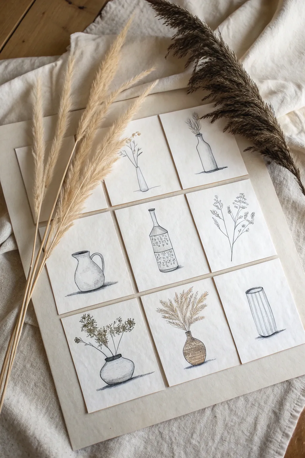
This elegant multi-panel artwork explores the subtle variations of form and texture through a unified botanical theme. By creating nine distinct yet cohesive miniature compositions, you’ll practice balance and negative space while building a stunning gallery-style piece.
How-To Guide
Materials
- High-quality watercolor paper or heavy mixed-media cardstock
- Large backing board (mat board or heavy poster board in cream/off-white)
- Fine liner pens (black, varying widths like 0.1, 0.3, and 0.5mm)
- Graphite pencil (HB or 2B) for sketching
- Kneaded eraser
- Ruler or T-square
- Paper cutter or X-Acto knife
- Double-sided tape or acid-free glue dots
- Colored pencils (optional, for subtle tints)
Step 1: Preparation and Layout
-
Cut the miniature panels:
Begin by measuring and cutting nine identical squares from your high-quality paper. A size of 3×3 inches or 4×4 inches works perfectly for this scale suitable for framing. -
Plan the grid:
Lay out your large backing board. Lightly mark the positions where your nine squares will sit to ensure even spacing. Aim for a grid pattern with equal margins between each square. -
Conceptualize the compositions:
Before drawing on the final paper, sketch rough ideas on scrap paper. You want a mix of subjects: some focused on vases, some on plant stems, and others combining both.
Grid Symmetry Tip
Cut a ‘spacer’ piece of cardboard to the exact width you want between tiles. Use this spacer between rows and columns while gluing to guarantee perfect, even gaps without measuring every time.
Step 2: Drawing the Linear Elements
-
Lightly sketch the outlines:
Using your HB pencil, lightly draft a different composition onto each of the nine squares. Keep your pressure very light so these lines can be erased later. -
Design Panel 1 & 3: Minimal Verticals:
For the top corners, focus on height. Sketch slender, tall vases with single or double stems reaching upward to emphasize vertical lines. -
Design Panel 5: Pattern and Texture:
For the center panel, draw a bottle shape and fill the bottom half with a stippling or small floral pattern to create visual weight in the middle of your grid. -
Design Panel 7 & 9: Grounding Shapes:
For the bottom corners, sketch shorter, rounder vessels. This helps ‘anchor’ the entire artwork visually at the bottom. -
Fill remaining panels:
Populate the remaining squares with variations—perhaps just a branch in one, or a pitcher handle in another to add curved lines.
Step 3: Inking and Detailing
-
Outline the main forms:
Switch to a 0.5mm fine liner. confident strokes, ink the main outlines of your vases and stems. Don’t worry if the lines aren’t perfectly straight; a slight organic wobble adds character. -
Add texture with finer pens:
Using a 0.1mm pen, add delicate details like the veins in leaves, the texture of dried grasses, or cross-hatching shadows on the ceramic pots. -
Create shadows:
Ground each object by adding a small pool of shadow underneath the vases using horizontal hatching lines. I find this simple addition instantly prevents the objects from looking like they are floating. -
Incorporate subtle color:
If desired, use colored pencils to add very faint touches of beige or brown to the dried grasses or vessel textures, keeping the overall look monochromatic and minimal. -
Erase guidelines:
Once the ink is completely dry, gently run your kneaded eraser over all tiles to remove the graphite sketches.
Organic Texture
Swap smooth cardstock for cold-press watercolor paper. The slight tooth of the paper will break up your ink lines naturally, giving the drawing an antique, rustic feel.
Step 4: Final Assembly
-
Position the tiles:
Place your finished drawings back onto the backing board according to your initial grid plan. -
Adhere the artwork:
Apply double-sided tape or glue dots to the back of each center. Press them firmly onto the board, using your ruler to double-check alignment one last time.
Now step back and admire how a collection of simple sketches transforms into a sophisticated gallery display


Mini Comics Explaining the Seven Elements
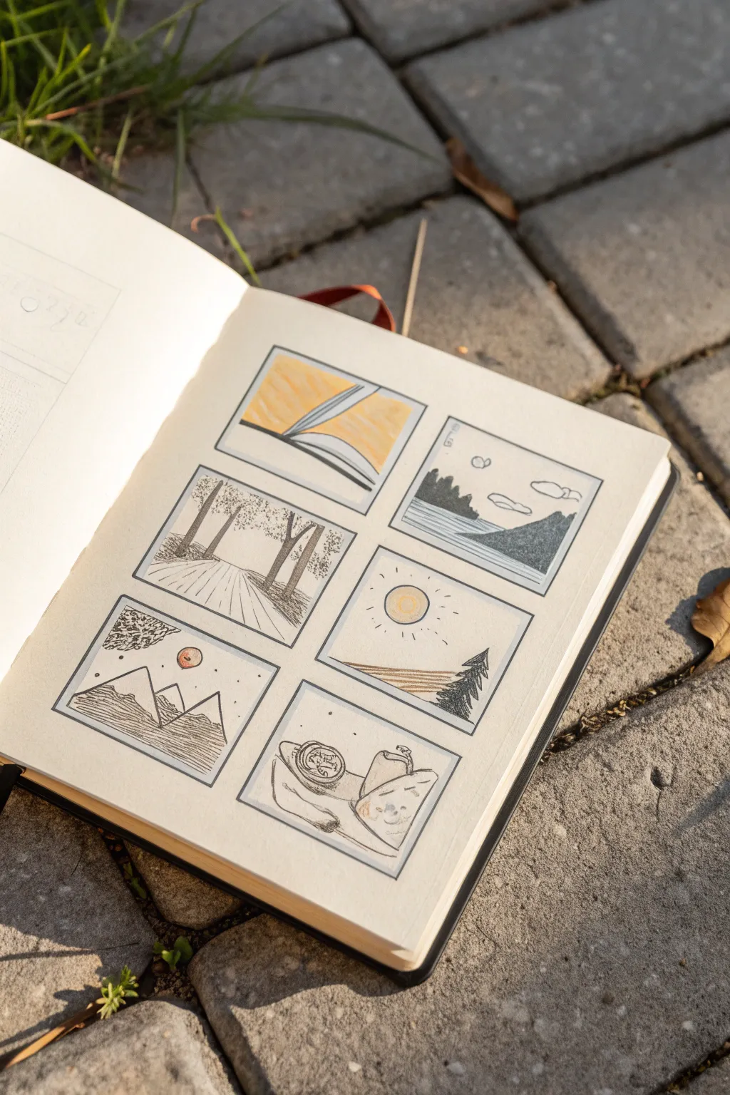
This sketchbook exercise breaks down fundamental artistic concepts into six approachable, Polaroid-style vignettes. Using simple fine-line ink and touches of colored pencil, you will create a charming grid of landscapes that explores the core building blocks of visual art.
How-To Guide
Materials
- Sketchbook (heavyweight paper preferred)
- Fine liner pen (01 or 03 size, black waterproof ink)
- Pencil (HB or H for layout)
- Eraser
- Ruler
- Colored pencils (Yellow, Orange, Green, Brown)
- Blending stump (optional)
Step 1: Setting the Stage
-
Measure the grid:
Begin by measuring out six identical squares on your sketchbook page. A 2×3 grid works best here. Leave about a half-inch of breathing room between each box to create that clean, comic-strip aesthetic. -
Draft the frames:
Using your pencil and ruler, lightly draw the outlines of your six boxes. Don’t press too hard, as you’ll want these graphite lines to disappear completely later on. -
Ink the borders:
Trace over your pencil squares with a fine liner pen. I find that freehanding these final lines—even if they’re slightly wobbly—gives the page a more organic, hand-drawn character than using a ruler again.
Step 2: Row One: Form and Space
-
Sketch the book scene:
In the top-left box, draw an open book lying flat. Focus on the curve of the pages to represent ‘Form.’ Simple, sweeping arcs work best here. -
Add color definition:
Use a yellow colored pencil to fill the background behind the book, and outline the book’s cover in black ink. Leave the pages white to make them pop. -
Create the landscape:
In the top-right box, sketch a simple landscape with distant mountains, a mid-ground tree line, and foreground water. This represents ‘Space’ or depth. -
Detail with texture:
Use stippling (small dots) for the distant mountain and small vertical lines for the trees. Keep the water mostly clear with just a few horizontal motion lines.
Use Waterproof Ink
Ensure your fineliner is waterproof before adding colored pencil or wash. This prevents the black lines from smudging or bleeding into your colors.
Step 3: Row Two: Texture and Line
-
Draw the forest path:
In the middle-left box, draw a path vanishing into a forest. Use vertical lines for tree trunks and loose scribbles for the canopy leaves to emphasize ‘Texture.’ -
Define the ground:
Draw lines radiating from the path’s vanishing point to simulate the perspective of wooden planks or a dirt road. -
Outline the sunny scene:
In the middle-right box, draw a circle for the sun and a simple horizon line with a single evergreen tree. This panel focuses on ‘Line.’ -
Apply sun details:
Color the sun yellow. Use short, dashed lines radiating outward to mimic shining light, and use parallel diagonal lines to shade the ground.
Try Monochromatic
Instead of yellow and brown, try using a single color of watercolor paint for all the accents. A light blue wash can give the page a unified, dreamy vibe.
Step 4: Row Three: Value and Shape
-
Draw geometric mountains:
In the bottom-left box, draw three distinct triangle shapes for mountains. Add a small circle for a sun or moon. Typically, this panel explores ‘Value’ or ‘Shape.’ -
Add shading:
Use horizontal hatching lines on the mountains. Make the lines denser at the bottom and lighter at the top to create a gradient effect. -
Sketch the still life:
In the final bottom-right box, arrange a few overlapping objects like a jar, a pear, and a draped cloth. This is a classic study of composition. -
Finalize ink details:
Go over all your pencil sketches with the fine liner, adding small details like grain on the wood or ripples in the water. -
Erase and clean:
Once the ink is fully dry, gently erase all remaining pencil guidelines to leave a crisp, clean finish.
You now have a beautiful visual reference guide to the elements of art


Have a question or want to share your own experience? I'd love to hear from you in the comments below!