
February always feels like a little creative bridge—part cozy winter, part hopeful spring, with Valentine’s Day energy sprinkled all over. Here are my favorite February painting ideas you can pull off with simple shapes, feel-good colors, and just enough sparkle to make it special.
Easy Valentine Heart Bouquet
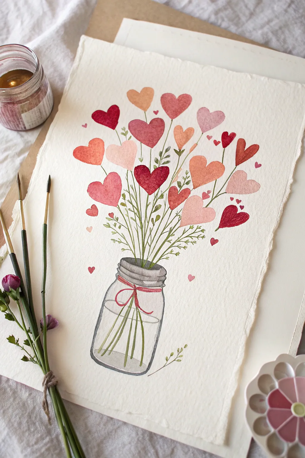
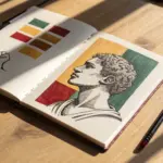
Celebrate the season of love with this charming watercolor illustration featuring a mason jar overflowing with heart-shaped blooms. Soft pinks, vibrant reds, and rusty oranges come together in a delicate, hand-painted style perfect for a Valentine’s card or framed art.
Step-by-Step
Materials
- Cold press watercolor paper (300 gsm)
- Watercolor paints (Alizarin Crimson, Cadmium Red, Yellow Ochre, Sap Green, Payne’s Grey)
- Round watercolor brushes (sizes 2, 4, and 6)
- Pencil (HB or H) and eraser
- Jar of water
- Paper towels
- Palette for mixing
Step 1: Sketching the Base
-
Outline the jar:
Begin by lightly sketching the outline of a mason jar near the bottom center of your paper. Draw an oval for the rim, a slightly wider neck, and curved lines for the body. Keep the pencil pressure extremely light so the graphite doesn’t show through the transparent paint later. -
Draw the water line:
About halfway up the jar’s body, sketch an ellipse to indicate the water level. This will help you know where to distort the stems later. -
Map out the heart blooms:
Above the jar, lightly draw scattered heart shapes in various sizes. Aim for an organic, random arrangement—some clustering together, some floating higher up. Vary the angles so they look like natural flowers swaying.
Clean Edges
To get the rough, textured border shown in the photo, use deckle-edged paper or tear your watercolor paper against a ruler before you start painting.
Step 2: Painting the Jar
-
Wash the jar glass:
Mix a very watery, pale grey using Payne’s Grey and plenty of water. Fill in the jar shape with this translucent wash, leaving the very center of the jar mostly white to represent a highlight on the glass. -
Define the rim:
While the first wash is still damp, use a slightly darker, more concentrated grey mixture to paint the threads of the jar rim. Use a size 2 brush for these fine lines. -
Add the red ribbon:
Once the jar neck is dry, paint a thin red ribbon wrapped around it. Use a vibrant red like Alizarin Crimson. Paint a simple bow knot in the front with two tails hanging down. -
Paint the water level:
Define the water surface by carefully painting the ellipse you sketched earlier with a slightly darker grey line. Soften the bottom edge of this line with a clean, damp brush.
Make it Sparkle
Once the paint is fully dry, dilute a little metallic gold paint and splatter it gently over the bouquet for a festive, shimmering effect.
Step 3: Creating the Bouquet
-
Mix your palette:
Prepare puddles of your heart colors on your palette. You’ll want a range: soft blush pink, deep crimson, terra cotta orange, and a classic bright red. I like to keep my colors distinctly separate to avoid muddying the vibrancy. -
Paint the main hearts:
Using a size 6 brush, fill in your larger sketched hearts. Use the wet-on-dry technique (wet paint on dry paper) to get crisp edges. Alternate colors so two red hearts aren’t right next to each other. -
Add tonal variation:
While a heart is still wet, drop a tiny dot of a darker shade or water into one side. This creates a subtle gradient and makes the hearts look less flat. -
Paint the smaller hearts:
Switch to a size 4 brush for the medium and small hearts. For the tiniest floating hearts at the edges, you can use just the tip of the brush. -
Let the hearts dry:
Before moving on to the stems, ensure all the heart blooms are completely dry to prevent the green stem paint from bleeding into the red petals.
Step 4: Adding Stems and Greenery
-
Draw the main stems:
Load your size 2 brush with Sap Green. Paint thin lines connecting each large heart down into the jar. When the line hits the ‘water’ inside the jar, slightly offset the angle to mimic the refraction of glass. -
Add leafy sprigs:
Paint fine, branching stems that don’t have heart flowers attached. Add tiny, teardrop-shaped leaves along these branches to fill in the gaps between the hearts. -
Connect the floating hearts:
Draw very delicate, wispy stems for the smaller hearts. Not every single heart needs a stem; leaving a few ‘floating’ adds a whimsical, magical feel. -
Detail the jar stems:
Inside the jar, paint the stems slightly lighter or blurrier than the ones outside. This reinforces the look of them being underwater. -
Final touches:
Examine your composition. If there are large empty spaces, add a tiny extra floating heart or a small green leaf to balance the bouquet.
Allow your painting to dry completely before erasing any visible pencil marks, revealing your lovely bouquet of hearts


Pink-to-Purple Love Sky Gradient
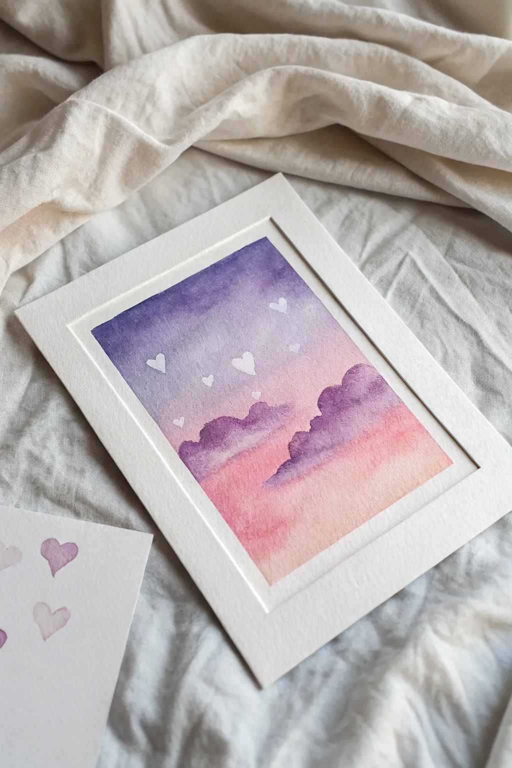
Capture the romance of a February evening with this soft gradient sky painting. Featuring a seamless transition from deep violet to blush pink and dotted with whimsical white hearts, this piece is perfect for Valentine’s Day decor or a heartfelt gift.
Step-by-Step Guide
Materials
- Cold press watercolor paper (cut to 5×7 inches or desired size)
- Watercolor paints (Deep Violet, Magenta/Rose, Peach/Coral)
- White gouache or white gel pen
- Painter’s tape or masking tape
- Soft round paintbrush (size 8 or 10 for wash)
- Smaller round paintbrush (size 4 or for details)
- Clean water and paper towels
- Mixing palette
- Pencil and eraser (optional)
Step 1: Setting the Sky Gradient
-
Prepare your workspace:
Begin by taping down all four edges of your watercolor paper to a hard board or your table. This creates that crisp white border seen in the photo and prevents the paper from buckling during the wet wash. -
Mix your palette:
Pre-mix three distinct puddles of paint: a deep, saturated violet for the top, a medium magenta-purple for the middle, and a soft peachy-pink for the bottom horizon. -
Wet the paper:
Using your large clean brush, apply a layer of clear water across the entire sky area. You want the paper to be glistening and damp, but not holding standing pools of water. -
Apply the violet:
Load your brush with the deep violet mix. Start at the very top edge and paint a horizontal strip, letting the wet paper help diffuse the bottom edge of the stroke. -
Transition to magenta:
Rinse your brush slightly and pick up the magenta shade. Paint just below the violet, slightly overlapping the two colors so they bleed together softly. -
Finish with peach:
Clean your brush well and load it with the peach/coral color. Paint the bottom third of the paper, blending it upwards into the magenta to complete the gradient. -
Smooth the blend:
If I notice any harsh lines, I like to use a clean, slightly damp brush to gently sweep horizontally across the transition zones while everything is still wet. -
Let it dry completely:
This is crucial. The paper must be bone dry before you add the clouds, or they will blur into the background. Use a hairdryer on low heat to speed this up if you’re impatient.
Wet-on-Wet Magic
Work quickly during the gradient phase! If the paper starts to dry mid-gradient, you’ll get ‘blooms’ or hard edges. Keep the surface uniformly shiny but not puddling.
Step 2: Painting the Clouds
-
Mix a cloud color:
Create a concentrated mix of your violet and magenta paints. You want this color to be darker and more opaque than your sky background to stand out. -
Start the first cloud bank:
Using the medium brush, paint a fluffy, scalloped shape rising from the left side of the horizon. Keep the top edges rounded and soft. -
Add the second cloud bank:
Paint a similar, slightly larger cloud formation on the right side. Vary the height of the ‘bumps’ to make the clouds look organic and natural. -
Soften the bottoms:
While the cloud paint is still wet, rinse your brush and blot it dry. Gently drag the bottom edge of the clouds downward to fade them into the pink horizon slightly. -
Build density:
Drop a tiny bit of darker purple pigment into the wet tops of the clouds to give them volume and shadow, creating that fluffy dimensional look. -
Dry again:
Allow the cloud layer to dry completely before moving to the final details.
Step 3: Adding the Hearts
-
Prepare the white pigment:
Squeeze out a small amount of white gouache. Gouache is more opaque than watercolor and will sit brightly on top of the darker purple sky. -
Paint the first heart:
Using your smallest detail brush, paint a tiny white heart in the upper purple section of the sky. -
Scatter the hearts:
Continue painting small hearts randomly across the sky. Vary their angles slightly so they look like they are floating or drifting in the wind. -
Scale and distance:
Make some hearts slightly smaller than others to create a sense of depth and distance in your sky scene. -
The final reveal:
Once the white paint is fully dry, carefully peel away the painter’s tape at a 45-degree angle to reveal your crisp white borders.
Glittery Upgrade
Mix a tiny pinch of iridescent watercolor medium or shimmer powder into your white gouache for the hearts. They will catch the light beautifully when framed.
Place your finished piece in a clean white mat to enhance the delicate colors even further


Moonlit Couple Silhouette
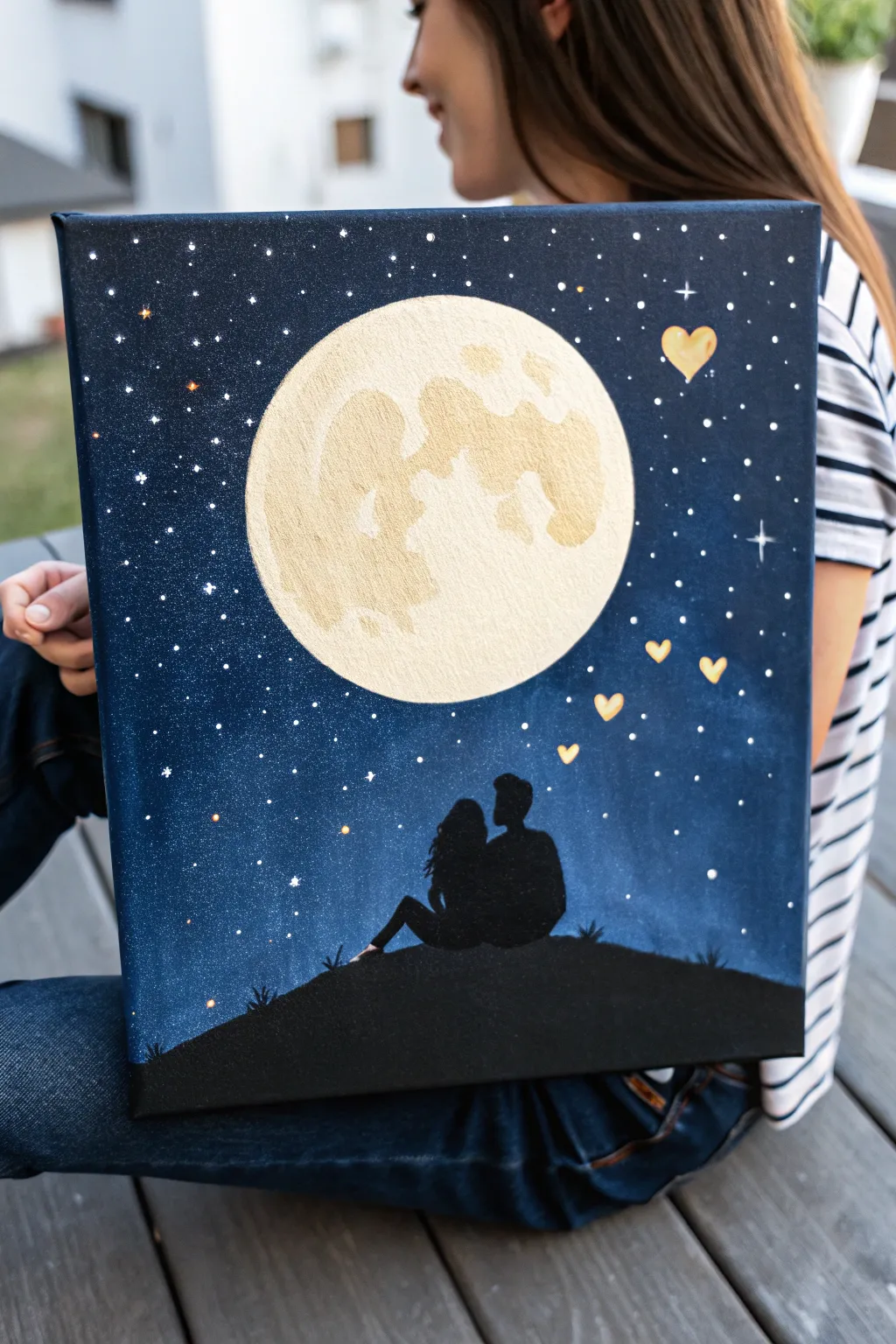
Capture a romantic moment under the stars with this enchanting acrylic painting featuring a couple silhouetted against a luminous full moon. The blend of deep indigo skies, shimmering gold accents, and a tender silhouette creates a dreamy atmosphere perfect for a heartfelt gift or bedroom decor.
How-To Guide
Materials
- Stretched canvas (e.g., 16×20 inches)
- Acrylic paints: Navy Blue, Phthalo Blue (or similar bright dark blue), Black, Titanium White, Gold
- Flat shader brushes (large and medium)
- Small round detail brush (size 0 or 1)
- Round sponge applicator or a circular object for tracing
- Pencil
- Palette for mixing
- Cup of water and paper towels
- Old toothbrush (optional for stars)
Step 1: Setting the Scene
-
Trace the moon:
Begin by placing your circular object or sponge slightly above the center of the canvas. Lightly trace a circle with a pencil to mark the moon’s position, ensuring it’s large enough to be the focal point. -
Outline the hill:
Sketch a gentle, sloping curve near the bottom of the canvas to represent the hilltop where the figures will sit. Keep the line organic, not perfectly smooth. -
Draft the silhouette:
Lightly sketch the outline of the couple sitting on the hill. Focus on the overall shapes—heads, shoulders, and legs—rather than facial features, as this will be filled in completely with black.
Uneven Moon Edge?
If your moon’s edge looks messy after painting the sky, wait for the background to dry fully. Then, trace your circle template again and repaint the moon’s edge with fresh white for a crisp line.
Step 2: Painting the Night Sky
-
Base coat the sky:
Using a large flat brush, start painting the corners and top edges of the canvas with black acrylic paint to create depth. -
Blend downward:
While the black is still wet, mix in your Navy Blue and continue painting inward toward the moon. Use long, horizontal strokes or crisscross motions to blend the black into the blue seamlessly. -
Add the brightest blue:
Transition to your lighter Phthalo Blue as you get closer to the horizon line and the moon circle. This creates a glowing effect from the bottom up. -
Refine the edges:
Carefully paint around your traced moon circle and the hill outline. I find using a smaller flat brush here helps keep the edges clean without accidentally painting inside your sketch lines. -
Let it dry:
Allow the background sky to dry completely before moving on to the stars. This prevents the white speckles from turning muddy.
Add Dimension
Mix a tiny bit of silver or pearl medium into the blue sky paint near the moon. This subtle shimmer will make the moonlight appear to glow more intensely against the dark night.
Step 3: Creating the Heavens
-
Splatter stars:
Water down a small amount of Titanium White paint. Dip a stiff brush (or toothbrush) into it and flick the bristles with your thumb to create a spray of tiny stars across the blue sky. -
Paint larger stars:
Use your smallest round brush to dot specific, larger stars throughout the sky. Add cross-shapes to a few of them to create a twinkling effect. -
Paint the moon base:
Fill in the moon circle with a base coat of Titanium White mixed with a tiny drop of yellow or gold to warm it up. -
Add moon texture:
Once the base is tacky, sponge on patches of pure Gold or a light tan color to create the craters and texture of the moon. Dab gently to build up an organic, uneven surface.
Step 4: The Final Details
-
Fill the silhouette:
Using black paint and a medium brush, fill in the hill at the bottom. Ensure the curve is solid and opaque. -
Paint the couple:
Switch to your detail brush to carefully fill in the sketched figures of the couple. Take your time with the hair and profiles to ensure the shapes are recognizable. -
Add grass details:
Use the tip of your smallest brush to flick tiny, upward strokes along the top edge of the hill while the black paint is wet, mimicking blades of grass. -
Paint floating hearts:
With your gold paint, add a few small hearts floating up from the couple into the sky. Vary their sizes slightly for a whimsical look. -
Highlight the stars:
If you want extra sparkle, add tiny dots of gold to the centers of your largest white stars.
Hang your masterpiece in a cozy corner to enjoy the romantic ambiance you’ve created
Couple Under a Red Umbrella
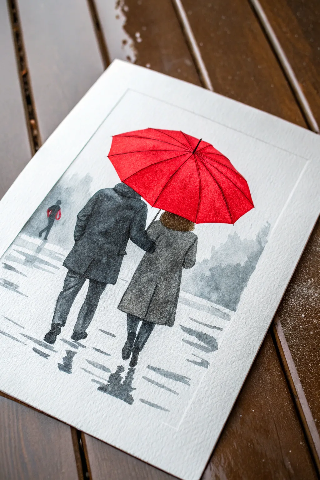
Capture the romance of a rainy day with this striking watercolor project featuring a vibrant red umbrella against a moody, monochromatic background. The contrast between the bright pop of red and the soft grey tones creates a captivating focal point that draws the eye immediately.
Detailed Instructions
Materials
- Cold press watercolor paper (300 gsm)
- Watercolor paints (Cadmium Red, Payne’s Grey, Black, Burnt Umber)
- Round brushes (size 4, size 8, and a small detail brush like size 0)
- Pencil (HB or 2H)
- Kneaded eraser
- Masking fluid (optional)
- Painter’s tape
- Jar of clean water
- Paper towels
Step 1: Sketching and Preparation
-
Secure your paper:
Tape down all four edges of your watercolor paper to a board using painter’s tape. This prevents the paper from buckling when wet and creates a crisp white border around the finished piece. -
Outline the figures:
Lightly sketch the two figures walking away from the viewer. Focus on the main shapes: the slant of the shoulders and the length of the coats. Don’t worry about tiny details yet, just get the proportions right. -
Sketch the umbrella:
Draw the large, dominate umbrella shape hovering above them. Ensure the central point (the ferrule) is slightly off-center to show perspective, and sketch the curved ribs radiating outward to the scalloped edges. -
Plan the reflections:
Lightly mark where the reflections on the wet ground will fall directly beneath the figures’ feet. These should mirror the general shape of their legs but appear wobbly and indistinct.
Clean Lines Pro-Tip
To keep the red umbrella vibrant, let it dry 100% before painting the grey background near it. Bleeding grey into the red will muddy the focal point instantly.
Step 2: The Vibrant Red Umbrella
-
Base wash:
Mix a clean, bright puddle of Cadmium Red. Paint the entire umbrella shape, carefully working around the ribs if you want them lighter, or painting over them to define later. Keep the wash even and wet. -
Adding dimension:
While the red is still slightly damp, drop a tiny bit of darker red (or red mixed with a touch of brown) into the sections closest to the center point to create depth where the fabric dips. -
Define the ribs:
Once the red layer is completely dry, use a fine liner brush and a darker mix of red or very thin black to paint the thin lines of the umbrella ribs. This crisp detail makes the umbrella pop.
Level Up: Texture
Make the rain feel real by lightly sprinkling a pinch of table salt onto the wet grey areas of the background. Brush it off when dry for a speckled, drizzly texture.
Step 3: Painting the Figures
-
Mix your greys:
Prepare a range of grey tones using Payne’s Grey. Dilute it heavily with water for a light wash, and keep a concentrated puddle for the dark shadows. -
The man’s coat:
Paint the man’s coat using a dark, saturated Payne’s Grey or Black. Use vertical strokes to suggest the fabric hanging down. Leave tiny slivers of white paper occasionally to suggest highlights or folds in the heavy material. -
The woman’s coat:
For the woman’s coat, use a lighter, more textured grey. You can achieve this by blotting the wet paint slightly with a paper towel or using a ‘dry brush’ technique to let the paper’s texture show through. -
Adding the hair:
Use a mix of Burnt Umber and a touch of black for the woman’s hair. Dab the color in with a small brush to suggest curls or texture. -
Legs and movement:
Paint the trousers and boots. Notice the man’s leg is mid-stride; ensure the angle of the calves reflects a walking motion.
Step 4: Atmosphere and Background
-
Distant figures:
In the background to the left, paint a very small, faint silhouette of another person. Use a watery grey wash so they look distant and foggy, pushing them into the background. -
Misty trees:
Create soft, blurry tree shapes in the distance using a very wet, light grey wash. Let the edges bleed out into the white paper to simulate fog and rain. -
Wet ground reflections:
Beneath the couple’s feet, paint zigzagging, horizontal strokes using a medium grey. These strokes should be loose and broken to mimic reflections on wet pavement. -
Creating puddles:
Darken the reflections directly under the boots. I like to soften the edges of these reflections with a clean, damp brush so they don’t look like solid objects. -
Rain texture:
Use a dry brush with very faint grey paint to drag quick, horizontal streaks across the foreground ground area. This enhances the feeling of a slick, wet surface.
Peel off your tape to reveal a crisp border and admire your moody, romantic masterpiece
BRUSH GUIDE
The Right Brush for Every Stroke
From clean lines to bold texture — master brush choice, stroke control, and essential techniques.
Explore the Full Guide
Cherry Blossoms Against Late-Winter Blues
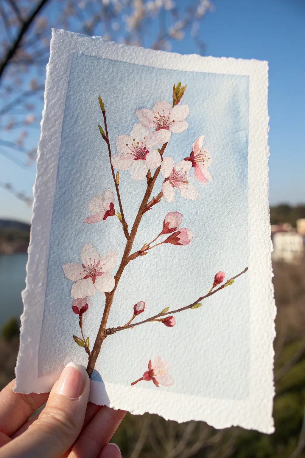
Capture the tentative beauty of early spring with this gentle watercolor study of cherry blossoms reaching across a pale sky. The soft pink petals and crisp brown branches pop beautifully against the light blue wash, creating a serene piece that brings hope during late winter.
Step-by-Step
Materials
- Cold press watercolor paper (300 gsm), preferably with deckled edges
- Watercolor paints: Rose Madder or Alizarin Crimson, Sap Green, Burnt Umber, Cerulean Blue, Lemon Yellow
- Round watercolor brushes: sizes 6, 2, and 00 for fine details
- Painter’s tape or a board for fixing the paper (optional)
- Clean water jar
- Paper towels
- HB pencil for light sketching
Step 1: Preparation & Sketching
-
Paper selection:
Choose a rectangle of textured cold-press paper. If you have a sheet with deckled edges, preserve them for that lovely handmade feel. If not, you can gently tear the edges against a ruler for a similar effect. -
Basic composition:
Using your HB pencil, lightly sketch the main diagonal line of the branch starting from the lower left corner and reaching upward to the right. Keep the line slightly jagged to mimic natural growth. -
Adding flower placement:
Draw circles or ovals where the main bloom clusters will sit. Sketch in the smaller side branch extending to the right. Don’t press hard; you want the pencil lines to barely be visible under the paint.
Bleeding Colors?
If pink bleeds into the blue background, your sky wasn’t fully dry. Let it dry completely, then gently lift the mistake with a clean, damp brush before repainting the petal.
Step 2: The Background Wash
-
Mixing the sky color:
Create a very dilute wash of Cerulean Blue with plenty of water. You want a barely-there tint rather than a solid opaque blue. -
Painting the negative space:
Carefully paint around your penciled flower and branch shapes. Fill the rest of the rectangle with the pale blue wash. Leave a rough, uneven white border around the very edges of the paper to frame the scene. -
Drying time:
Wait for this background layer to bone dry completely. If the paper feels cool to the touch, it’s still damp.
Step 3: Painting the Branch
-
Base branch color:
Mix Burnt Umber with a tiny touch of Sap Green to create a natural, woody brown. Using your size 2 brush, paint the main branch structure following your sketch. -
Texturing the wood:
While the brown paint is still slightly damp, drop in a more concentrated Burnt Umber on the shadowed side (usually the bottom) of the branch to create roundness and volume. -
Connecting the buds:
Extend very thin, delicate lines from the main branch to where your flower buds will be. These stems should be fine and graceful. -
Adding bud casings:
Paint the small, reddish-brown casings (calyxes) at the base of each flower and bud using a mix of Rose Madder and Burnt Umber.
Gild the Lily
For a magical touch, use metallic gold watercolor for the pollen dots in the center of the flowers. It catches the light beautifully when displayed.
Step 4: The Blossoms
-
Petal wash:
Dilute your Rose Madder until it’s a whisper-soft pink. Paint the petal shapes for the open flowers, leaving tiny slivers of white paper between petals to define them without outlining. -
Painting the buds:
For the unopened buds, use a slightly more saturated pink mixture. Paint them as small teardrop shapes near the branch tips. -
Softening edges:
If a petal edge looks too hard, use a clean, damp brush to gently soften it while the paint is wet, creating that misty, delicate flower texture. -
Layering depth:
Once the first petal layer is dry, add a second, slightly darker glaze of pink near the center of the flowers to create a cup shape.
Step 5: Fine Details
-
Flower centers:
Using your smallest 00 brush and a concentrated mix of Rose Madder, paint fine, radiating lines from the center of each open bloom. -
Adding stamens:
Dot the ends of these radiating lines with tiny specks of Lemon Yellow or ochre to represent the pollen-filled anthers. -
Green accents:
Mix Sap Green with a little yellow for a spring-green hue. Paint tiny, emerging leaves near the reddish tips of the branches. Keep them small and fresh-looking. -
The falling petal:
Don’t forget the single fallen blossom at the bottom. Paint it just like the others but unattached, perhaps angled differently to suggest it’s tumbling through the air. -
Final assessment:
Step back and check the balance. If the branch looks flat, dry brush a little dark brown texture onto the thickest parts of the wood.
Enjoy the calm accomplishment of preserving spring on paper
Lovebirds on a Frosty Branch
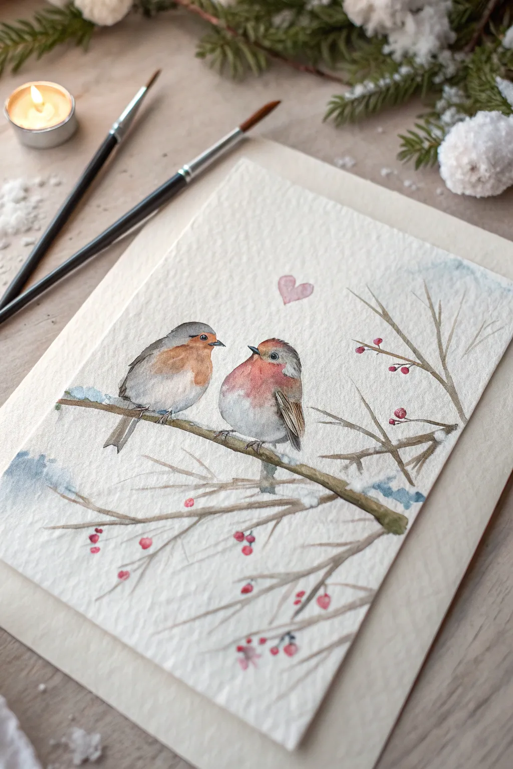
Capture the sweetness of affection with this charming watercolor piece featuring two rotund robins nestled together on a winter branch. The gentle textures and soft color palette make this a perfect project for a cozy February afternoon.
How-To Guide
Materials
- Cold-pressed watercolor paper (300 gsm)
- Watercolor paints (Payne’s Grey, Burnt Sienna, Scarlet Red, Yellow Ochre, Sap Green)
- Small round brushes (size 0 and 2)
- Pencil (HB or H for light sketching)
- Kneaded eraser
- jar of clean water
- White gouache or white gel pen
- Paper towels
Step 1: Sketching the Scene
-
Outline the birds:
Begin by lightly sketching two circular shapes touching in the center of your paper. The bird on the left should be slightly more oval, facing right, while the bird on the right is rounder, facing left. -
Add features:
Draw small triangles for beaks and round eyes. Sketch the wings tucked against their sides—simple curved lines will do. -
Map the branch:
Draw a thick, diagonal branch underneath the birds to support them. Extend thinner twigs branching out to the right and bottom. -
Detail the berries:
Add small circles sporadically along the thinner twigs to represent winter berries. -
Lighten the lines:
Use your kneaded eraser to lift most of the graphite, leaving only a faint guide for your painting.
Natural Texture
Sprinkle a tiny pinch of salt onto the wet paint of the birds’ chests. Once dry, brush it off to create a unique, fluffy feather texture.
Step 2: Painting the Birds
-
Base wash for chests:
Mix a watery Scarlet Red with a touch of Burnt Sienna. Apply this wash to the chest area of both birds, keeping the edges soft. -
Painting the bodies:
While the red is still slightly damp, drop in a very diluted Payne’s Grey or cool brown for the wings and back. Let the colors bleed slightly where they meet the red chest for a soft, feathery transition. -
Deepening the wings:
Once the first layer is dry, use a stronger mix of brown and grey to paint definitive strokes on the wings to suggest feathers. -
Facial details:
Using your smallest brush (size 0) and concentrated dark grey or black, carefully paint the eyes, leaving a tiny speck of white paper for a highlight. Paint the beaks dark grey. -
Adding the heart:
Mix a watery rose or diluted red and paint a small, floating heart centered above the space between their heads.
Add Sparkle
Mix a tiny amount of iridescent medium or fine glitter into your white gouache for the snow details to make the frost truly shimmer.
Step 3: The Winter Branch
-
Painting the main branch:
Mix Burnt Sienna with a touch of Sap Green for an earthy brown. Paint the main branch, varying the pressure to create a natural, organic shape. -
Adding twigs:
Use the tip of your size 2 brush to pull out thinner, wispy branches extending from the main bough. Keep these lines loose and irregular. -
Coloring the berries:
Fill in the small berry circles with bright Scarlet Red. Don’t worry if the color varies in intensity; it adds realism. -
Shadows and depth:
Add a slightly darker brown mix to the bottom edge of the main branch to give it volume and roundness.
Step 4: Frosty Finishes
-
Snow on the branch:
Using thick white gouache, dab ‘snow’ onto the tops of the branches and twigs. Let it sit thick on the paper for texture. -
Highlighting features:
I like to add tiny touches of white gouache to the birds’ feathers and the tops of the berries to make them glisten. -
Background atmosphere:
Create a very dilute wash of blue-grey and apply it loosely around the twig edges to suggest cold winter air. -
Softening edges:
Use a clean, damp brush to soften the edges of the background wash so it fades into the white paper invisibly.
Allow your painting to dry completely before framing this sweet symbol of winter companionship

PENCIL GUIDE
Understanding Pencil Grades from H to B
From first sketch to finished drawing — learn pencil grades, line control, and shading techniques.
Explore the Full Guide
Penguins Holding Paper Hearts
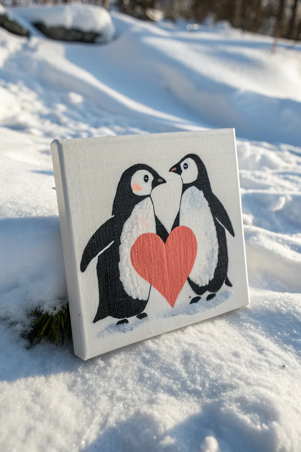
Capture the sweetness of the season with this adorable canvas painting featuring two penguins sharing a giant red heart. The minimalist background focuses all attention on the charming subjects, making it a perfect gift or winter decoration.
Detailed Instructions
Materials
- Small square canvas (e.g., 6×6 or 8×8 inches)
- Acrylic paints: Titanium White, Mars Black, Cadmium Red (or a warm pink/coral), Light Pink
- Paintbrushes: Flat shader brush, small round detail brush (size 0 or 1)
- Pencil for sketching
- Palette or paper plate
- Cup of water and paper towels
Step 1: Sketching the Composition
-
Prepping the canvas:
If your canvas isn’t already primed white, give it a solid coat of Titanium White paint to ensure a smooth, bright surface. Let this base layer dry completely before sketching. -
Outline the bodies:
Using a pencil, lightly sketch two large oval shapes side-by-side to form the main bodies of the penguins. They should be slightly tilted toward each other to create a cozy interaction. -
Define the heads and flippers:
Refine the ovals by rounding out the heads at the top. Add triangular shapes on the outer sides for flippers, keeping them tucked close to the body but slightly extended. -
Add the heart:
Draw a large heart shape directly in the center, overlapping the inner bottom section of both penguins. The heart should look like it’s being held between their bellies.
Step 2: Applying the Base Colors
-
Paint the white bellies:
Start with the light areas first. Use Titanium White to fill in the large oval bellies of the penguins. Even though the canvas is white, this adds texture and corrects any pencil smudges. -
Fill the black bodies:
Using your black paint and a small round brush, carefully outline the penguin shapes. Then, switch to a slightly larger brush to fill in the heads, backs, and flippers, leaving the white belly patches clean. -
Refine the edges:
Go back with your small brush to sharpen the line where the black feathers meet the white belly. A smooth, curved line here gives them that classic tuxedo look. -
Paint the heart:
Fill in the central heart shape with a warm red or coral pink acrylic. I find that applying two thin coats rather than one thick coat prevents brushstrokes from showing.
Don’t Rush the Eyes
Use the handle end of your paintbrush dipped in paint to create perfectly round dots for the eyes. It’s much easier than using bristles.
Step 3: Adding Faces and Details
-
Create the beaks:
Mix a tiny touch of white into your black or use a dark grey to paint small triangular beaks. The left penguin’s beak should point right, and the right penguin’s beak should point left. -
Paint the eyes:
Using the tip of your smallest detail brush, press gently to create the white of the eye on the black part of the head. Once dry, add a tiny black dot for the pupil. -
Add rosy cheeks:
Dip a dry brush into a very small amount of light pink paint. Dab it onto a paper towel until almost no paint remains, then gently stipple a rosy cheek onto the left penguin’s face. -
Detail the feet:
Paint small black feet at the bottom of the penguins. Keep them simple—just little rounded shapes peeking out from under their bodies.
Trouble with Transparency?
If your red paint looks streaky or transparent over the white canvas, let the first coat dry 100% before adding a second layer to build opacity.
Step 4: Finishing Touches
-
Add the ground connection:
Mix a very watery light grey (mostly water and a dot of black/white paint). Paint a subtle shadow beneath their feet to ground them so they don’t look like they are floating in space. -
Connect the flippers to the heart:
Ensure the black flippers overlap the red heart slightly, making it look like they are physically holding it. -
Texture the bellies:
If you want a fluffier look, stipple a little extra Titanium White onto the edges of the bellies with a dry brush to simulate fur texture. -
Clean up:
Check the white background for any accidental paint splatters and cover them with fresh white paint for a crisp finish.
Now you have a heartwarming piece of winter art ready to display or give to someone special
Zentangle Heart Fill Patterns
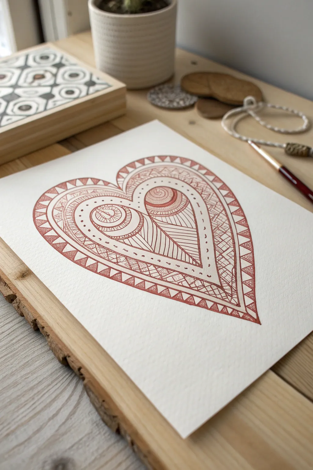
Capture the warmth of early spring with this intricate zentangle heart, drawn in a rich terracotta ink. The design features layers of repetitive patterns, from triangular borders to swirling inner details, creating a mesmerizing piece that feels both structured and organic.
Step-by-Step Guide
Materials
- High-quality watercolor paper or heavy cardstock (textured)
- Pencil (HB or 2H)
- Eraser
- Fine liner pen (0.3mm or 0.5mm) in sepia, rust, or terracotta
- Ruler (optional, intended for guidelines)
- Compass (optional)
Step 1: Framework & Outline
-
Initial sketch:
Begin by lightly sketching a large, symmetrical heart shape in the center of your paper using a pencil. Aim for a wide, open heart shape to leave plenty of room for the intricate patterns inside. -
Define the sections:
Inside your main heart outline, draw a second, slightly smaller heart to create a border about 1cm wide. Then, sketch two large ‘teardrop’ or paisley shapes inside the heart lobes that mirror the outer curve. -
Central division:
Sketch a vertical line dividing the heart down the center, but allow the inner paisley shapes to overlap or curve towards this center line naturally. This structure will separate your different pattern zones. -
Ink the main lines:
Using your terracotta fine liner, carefully trace over your main structural pencil lines. Keep your hand steady and maintain an even pressure; I find rotating the paper helps me follow the curves more smoothly.
Smudge Alert
Work from top-left to bottom-right (if right-handed) to avoid smearing fresh ink. If you must work in a different order, place a scrap piece of paper under your hand.
Step 2: The Outer Border
-
Create the triangles:
In the gap between your two outer heart outlines, begin drawing a zigzag line that creates a series of triangles. Try to keep the spacing consistent as you work your way around the curve. -
Fill the pattern:
Inside every other triangle (the ones pointing inward), draw a smaller inner triangle or simply fill it with a series of parallel lines (hatching) to add weight and contrast to the border. -
Detailing:
Add small dots or tiny circles in the empty white spaces of the border triangles to make the design feel denser and more complete.
Add Gold Accents
For a stunning level-up, use a gold gel pen or metallic watercolor to fill in specific triangles or the center ‘eyes’ of the heart patterns.
Step 3: Inner Patterns
-
The paisley swirls:
Focus on the two large inner paisley/teardrop shapes. At the rounded top of each, draw a series of concentric circles that look like the top of a snail shell or a rose. Leave small gaps between the lines. -
Hatching texturing:
Fill the rings of these concentric circles with very fine, short hatching lines perpendicular to the curves. This gives the ‘eyes’ of the heart a shaded, dimensional look. -
Flowing lines:
From the bottom of these circular shapes, draw long, sweeping lines that flow downward into the point of the heart. On the left lobe, curve them inward; on the right, keep them straighter or angled diagonally. -
Cross-hatching accents:
Select a specific band or section within the main body of the heart to fill with a cross-hatch or diamond grid pattern. In the reference, this appears on the outer edge of the right lobe’s interior. -
Dotted dividers:
Between the major sections—like the border of the inner teardrops—add a row of simple dots or dashes. This negative space breathing room prevents the design from looking too cluttered.
Step 4: Finishing Touches
-
Line weight variation:
Go back over the primary structural lines (the main heart outline and major section dividers) and thicken them slightly. This separates the ‘container’ from the delicate fill patterns. -
Review and refine:
Scan the drawing for any uneven gaps. Fill small awkward spaces with tiny circles, triangles, or additional lines to maintain visual balance. -
Erase guidelines:
Wait at least 10-15 minutes to ensure the ink is bone dry. Then, gently erase all visible pencil marks, being careful not to buckle the paper.
Frame your intricate heart as a lovely handmade gift for Valentine’s Day or simply as a warm piece of seasonal decor


Pointillism Valentine Heart
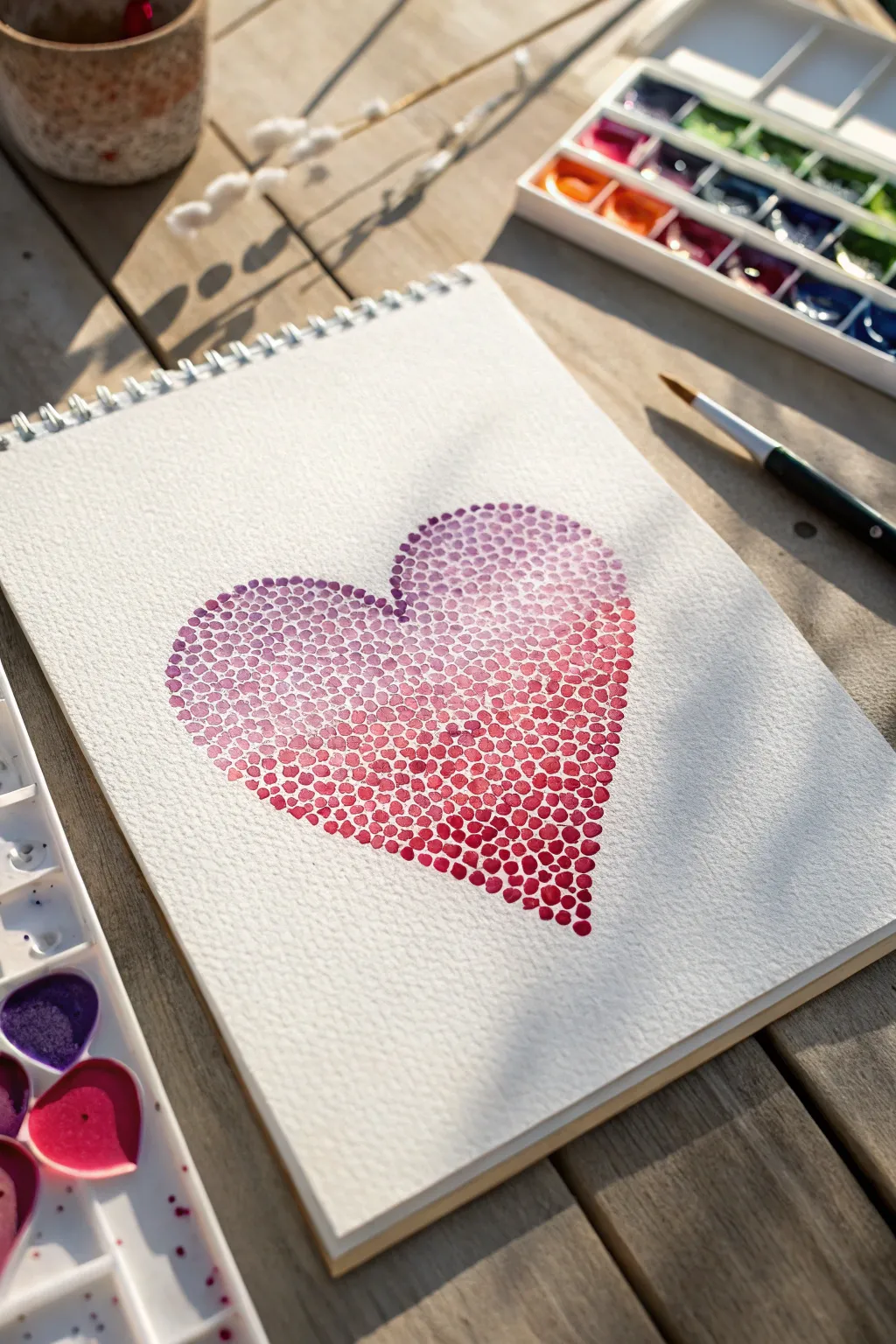
Capture the essence of love with this therapeutic pointillism project, where careful dots build up to create a lush, textured heart. The result is a stunning gradient of color, shifting softly from cool purples to warm reds, perfect for a handmade Valentine.
How-To Guide
Materials
- Cold-pressed watercolor paper sketchbook (spiral bound suggested)
- Watercolor paints (pans or tubes in purple, magenta, and red)
- Round watercolor brush (size 4 or 6)
- Pencil (HB or lighter)
- Kneaded eraser
- Jar of clean water
- Paper towel or mixing palette
Step 1: Preparation & Sketching
-
Outline the shape:
Begin by lightly sketching a simple heart shape in the center of your page. Keep your pencil lines extremely faint, as you want them to disappear or be easily erased later. -
Refine the curve:
Check the symmetry of your heart. It doesn’t need to be mathematically perfect, but the curves should feel balanced. Use a kneaded eraser to lift up any lines that became too dark. -
Prepare your palette:
Activate your watercolor paints. For this gradient, you will need three distinct puddles: a cool violet or purple, a bright magenta, and a deep primary red.
Bleeding Dots?
If your dots are merging into puddles, your brush is too wet. Blot the bristles on a paper towel after dipping in paint to control the water flow.
Step 2: Painting the Gradient
-
Load the brush (Purple):
Start with your purple mixture. Load your round brush so it is saturated but not dripping excessive water. -
Start at the top left:
Begin placing small dots along the upper left curve of the heart outline. Press the tip of the brush gently onto the paper and lift straight up to create round marks. -
Fill the upper section:
Continue dotting the upper lobes of the heart with the purple shade. Keep the dots close together but try not to let them touch while wet, or they will bleed into blobs. -
Introduce Magenta:
As you move down towards the middle section of the heart, dip your brush into the magenta paint without washing out all the purple. This creates a natural transition shade. -
Blend through dotting:
Fill the middle third of the heart with this transitioning color. Vary the pressure slightly to create dots of slightly different sizes for organic texture. -
Switch to Red:
Rinse your brush slightly and load it with the pure red paint. Begin filling the pointy bottom section of the heart. -
Deepen the saturation:
For the very bottom tip, use paint with less water to make the red richer and more opaque. This helps the heart feel grounded. -
Check the edges:
I like to go back around the perimeter and ensure the outer dots create a clearly defined heart shape. Add tiny half-dots if needed to smooth the curve.
Make it Sparkle
Mix a tiny amount of iridescent medium or metallic gold watercolor into your red paint for the final bottom layer to give the heart a subtle shimmer.
Step 3: Finishing Touches
-
Let it dry completely:
Allow the first layer of dots to dry fully. This is crucial for the texture effect. -
Add a second layer:
Once dry, look for large white gaps. Mix a slightly translucent wash of your corresponding colors and add fresh dots in these empty spaces to increase density. -
Enhance the gradient:
If the transition from purple to red feels too abrupt, add a few purple dots into the red zone and vice versa to visually blend the sections. -
Erase guidelines:
Once the painting is bone-dry (touch it carefully to check), gently use your kneaded eraser to lift any remaining visible pencil marks from the perimeter.
Step back and admire how hundreds of tiny imperfections come together to create a perfect shape
Have a question or want to share your own experience? I'd love to hear from you in the comments below!