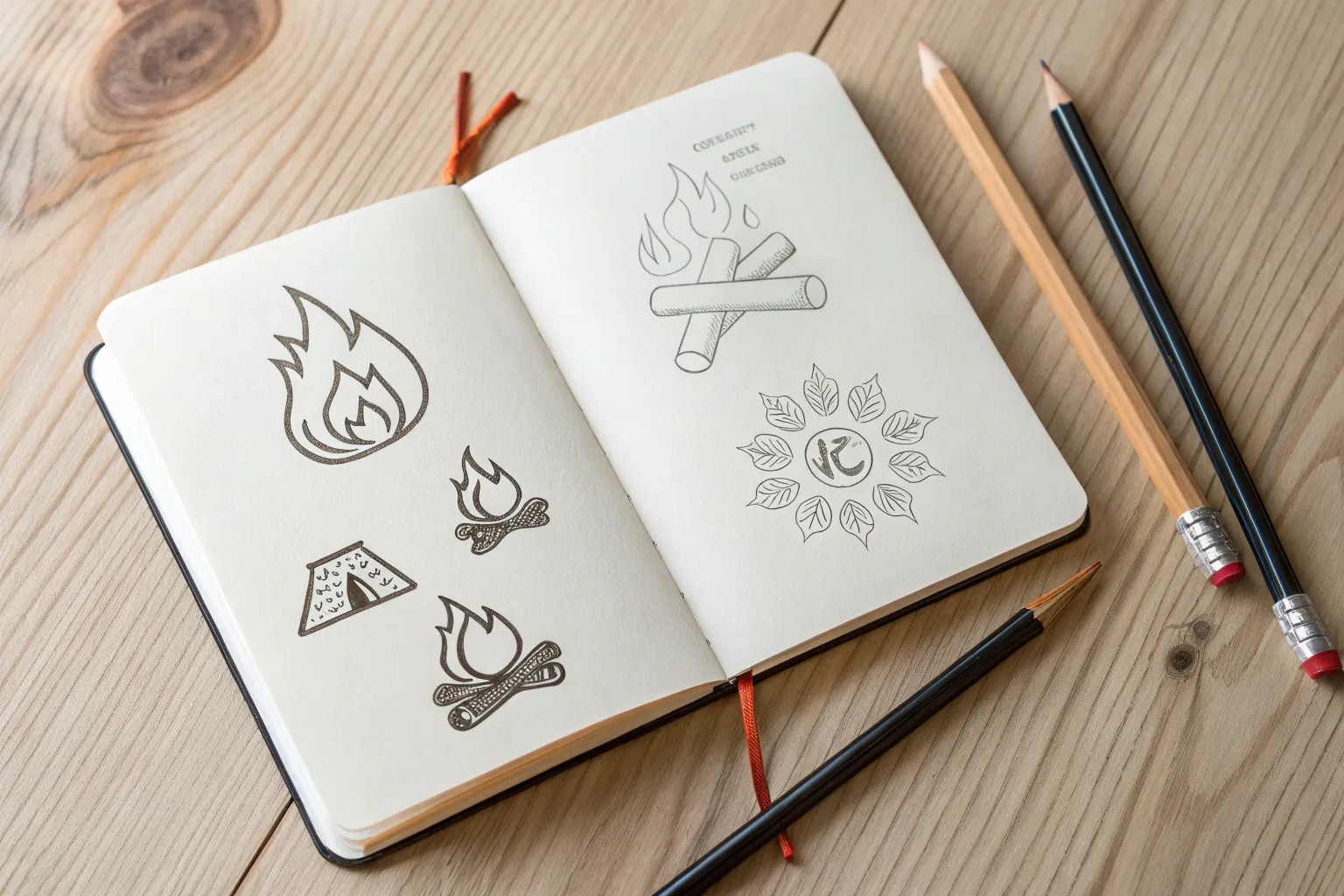
Whenever I’m stuck on what to draw, I reach for fire because it instantly adds motion, mood, and drama to a sketch. Here are my favorite fire drawing ideas—starting with the classic flame basics and drifting into the more stylized, make-it-your-own stuff.
Simple Cartoon Flame Icon
Capture the essence of fire with this clean, stylized flame illustration. Using bold, flowing lines and a minimalist aesthetic, this project perfects the art of creating iconic imagery with just a simple black marker.
Step-by-Step
Materials
- Cream or off-white textured cardstock (A5 size)
- Pencil (HB or H)
- Soft eraser
- Fine liner pen (0.5mm) for initial strokes
- Thick black marker or brush pen (for bold outline)
- Ruler (optional for centering)
Step 1: Conceptual Sketch
-
Center constraints:
Begin by lightly marking the center of your cardstock. You want the flame to sit comfortably in the middle, leaving plenty of negative space around the edges to emphasize the clean design. -
Base structure:
Sketch a simplified teardrop shape or oval at the bottom center. This will serve as the heavy ‘belly’ of the fire from which the tongues will rise. -
Map the points:
Draw three main upward curves extending from your base. The central lick of the flame should be the tallest, curving slightly to the left, while the side flicks act as framing elements. -
Inner details:
Inside the main outline, sketch a smaller, inverted teardrop shape near the bottom. This represents the hottest, inner core of the fire.
Smooth Operator
Draw lines using your whole arm, not just your wrist. This prevents shaky, jagged curves and creates that smooth, tattoo-style flow essential for this look.
Step 2: Refining the Shape
-
Create the flow:
Using your pencil, refine the lines to look more fluid. Connect the base to the tips with S-curves rather than straight lines to mimic the flickering movement of fire. -
Define the layers:
Separate the main flame into distinct sections. You should have a large outer silhouette that splits into a tall left peak and a slightly shorter right peak. -
Add floating accents:
Sketch tiny, detached lines or ‘sparks’ near the tips of the flames. These little floating strokes add energy and motion to the static image. -
Finalize the sketch:
Go over your pencil lines one last time to ensure curves are smooth. Erase any confusing intersecting lines so your path for the ink is clear.
Add Some Color
Use watercolor to add a loose, splashy wash of orange and yellow behind the black lines. Keep the paint outside the lines for an abstract art vibe.
Step 3: Inking and Bold Lines
-
Initial trace:
Take your 0.5mm fine liner and carefully trace over your final pencil sketches. Keep your hand steady to maintain a consistent line quality. -
Thickening the outer edge:
Switch to your thicker black marker or brush pen. Go over the main outer silhouette of the flame again. I find that pulling the pen toward you helps maintain control on these longer curves. -
Varying line weight:
Make the lines thickest at the bottom curves and slightly tapered as they reach the sharp tips of the flame. This variation gives the drawing weight and elegance. -
Inking the core:
Ink the inner ‘core’ teardrop. Keep this line slightly thinner than the massive outer outline to create visual depth, making it look like it’s glowing inside. -
Motion lines:
Ink the floating accent lines near the top. Use a quick flick of the wrist here; these lines should be tapered on both ends like commas.
Step 4: Finishing Touches
-
Erase guidelines:
Wait at least five minutes for the ink to dry completely. Gently run your soft eraser over the entire drawing to remove the graphite layout. -
Check density:
Inspect your black lines. If the paper texture shows through too much, go over the lines a second time to ensure a solid, opaque black. -
Clean up:
Brush away any eraser crumbs and ensure the cardstock is crisp and clean.
Now you have a striking, minimalist piece of art ready to display or gift
Layered Teardrop Flame Stack
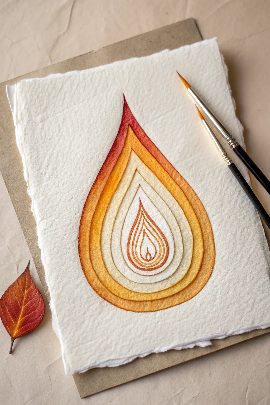
This meditative project creates a striking optical illusion of depth using nested teardrop shapes and a warm, glowing color gradient. By combining watercolor techniques with precise line work on textured paper, you’ll build a flame that appears to recede into the page like a topographical map.
Step-by-Step Guide
Materials
- Heavyweight cold-press watercolor paper (300gsm or higher for texture)
- Watercolor paints (Alizarin Crimson, Cadmium Orange, Yellow Ochre, Burnt Sienna)
- Two round watercolor brushes (sizes 2 and 6)
- HB pencil
- Kneaded eraser
- Fine-liner pen (sepia or brown, optional)
- Drafting compass or circular templates (optional)
- Water cups and paper towels
- Clean board or mat for backing
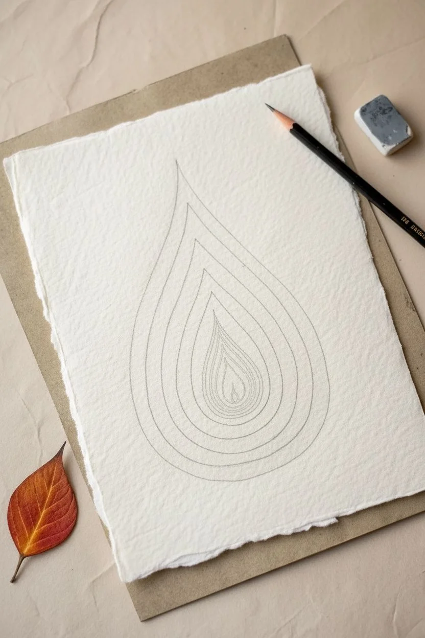
Step 1: Planning the Geometry
-
Prepare the paper:
Begin by tearing the edges of your watercolor paper to create a deckled edge look. This adds a rustic, handmade feel that complements the organic subject matter. -
Centerpoint marking:
Find the general center of your paper and make a tiny, faint mark. This will be the focal point for the smallest, innermost flame. -
Draw the central flame:
Lightly sketch a small, classic teardrop shape in the center, about the size of a thumbprint. Keep your pencil pressure very light so lines can be erased later. -
Sketch the expanding layers:
Draw a slightly larger teardrop shape around the first one, maintaining an even gap of about 3-5mm between the lines. The gap doesn’t need to be mathematically perfect; slight variations add character. -
Continue the concentric pattern:
Repeat this process, drawing 5 to 7 more concentric teardrop shapes. As you move outward, allow the shapes to become slightly more elongated at the top tip, enhancing the ‘rising flame’ effect. -
Finalize the outer boundary:
Draw the largest, final teardrop shape. This will be the darkest and most saturated layer, defining the overall silhouette of the flame stack.
Wet-on-Dry Precision
Work ‘wet-on-dry’ for this project. Let each ring dry completely before starting the next one. This prevents colors from bleeding across the white gaps and ruining the stacked effect.
Step 2: Painting the Gradient
-
Mix your palette:
Prepare puddles of your paint colors: a deep reddish-orange, a pure bright orange, a golden yellow, and a pale cream wash. Keep them distinctly separate on your palette. -
Start with the innermost flame:
Using your size 2 brush, paint the very center teardrop. I like to keep this extremely pale, almost the color of the paper itself, using just a tint of yellow ochre to suggest intense heat. -
Painting the first ring:
Move to the next immediate ring outward. Paint this band with a diluted yellow-orange mixture. The goal is to keep the center feeling light and airy. -
Creating the outline illusion:
Here is the key trick: as you paint each band, leave a tiny sliver of unpainted white paper between the wet paint and your pencil line. This ‘negative space’ creates the separated, layered look. -
Mid-tone layers:
Switch to your size 6 brush as the shapes get larger. For the middle 2-3 rings, use your pure Cadmium Orange. Ensure the paint application is fairly flat and consistent within each ring. -
Transition to red:
For the next outer rings, mix Alizarin Crimson into your orange to create a warm rust color. Apply this carefully, maintaining that critical white gap between the previous yellow-orange layer. -
The outermost layer:
Paint the final, largest teardrop shape with your darkest red-orange or Burnt Sienna mix. Concentrate the pigment at the very top tip to give it visual weight. -
Adding the inner core detail:
Go back to the very center. Paint a tiny ‘wick’ or inner flame shape using a fine brush and your dark orange paint. This anchors the center of the design.
Step 3: Finishing Details
-
Clean up edges:
Once the main washes are dry, use a slightly damp, clean brush to gently crisp up any ragged paint edges, being careful not to disturbing the white gaps. -
Enhance the separation:
If your white gaps aren’t distinct enough, use a very sharp colored pencil in a light orange shade to carefully re-define the boundaries between the rings. -
Add subtle texture:
On the outer, darker rings, you can stipple in a tiny bit of darker pigment while the paint is roughly 90% dry to create a granular texture that mimics the paper’s surface. -
Final shadow work:
To make the layers pop, mix a watery purple-grey. Paint a thin shadow line on just one side (e.g., the right side) of each ring’s inner edge. This creates immediate 3D depth. -
Erase guidelines:
Wait until the painting is bone dry—warm to the touch. Gently erase any visible graphite pencil marks from the white gap areas.
Metallic Level Up
Swap the yellow ochre in the center rings for gold watercolor or metallic ink. When the light hits the artwork, the core of your flame will literally shimmer and glow.
Mount your finished flame study on a contrasting mat board to emphasize those lovely deckled edges


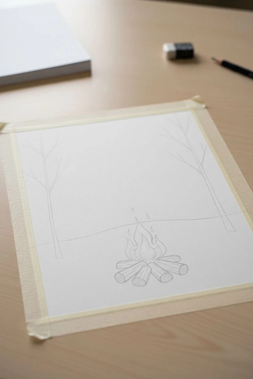
Classic Campfire With Logs
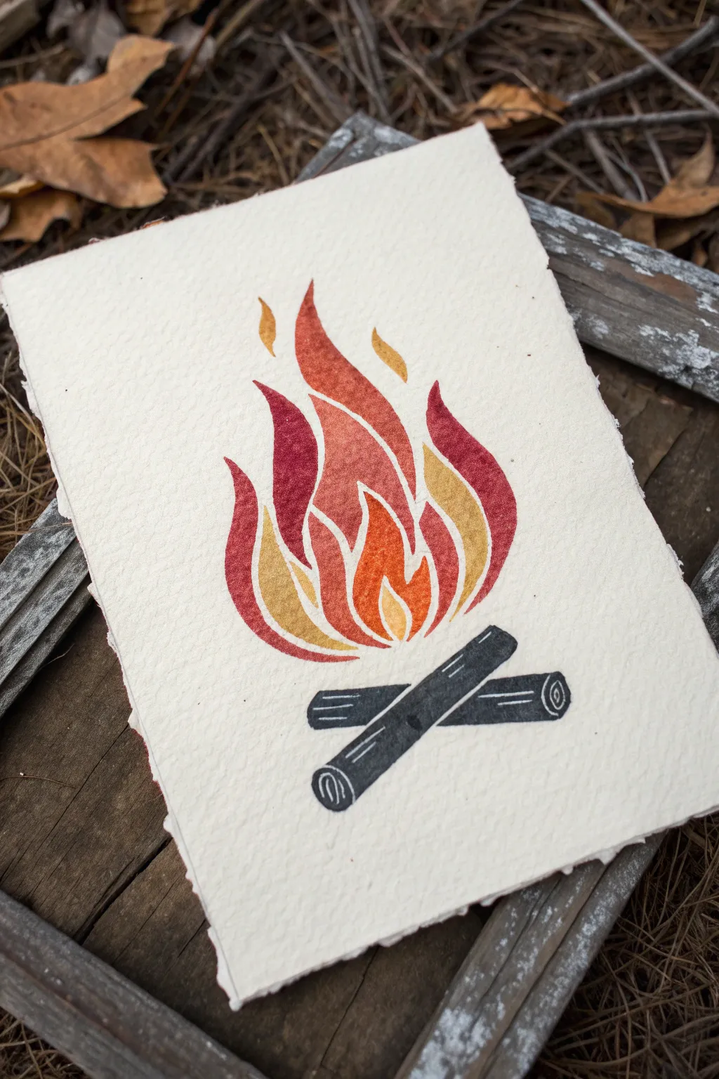
This project captures the cozy warmth of a campfire using a bold, graphic style that mimics relief printing. The textured flames and clean lines create a striking contrast against the rustic, deckle-edged paper.
Detailed Instructions
Materials
- Heavyweight watercolor paper or printmaking paper with deckled edges
- Watercolor paints or gouache (red, orange, yellow, dark grey/black)
- Small round paintbrush (size 2 or 4)
- Fine liner brush (size 0 or 00)
- Pencil for sketching
- Eraser
- Palette for mixing
- Water cup and paper towels
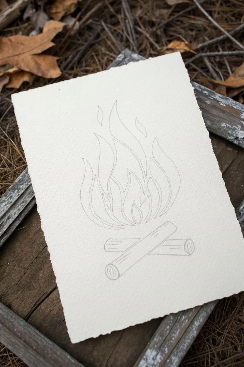
Step 1: Sketching the Layout
-
Outline the logs:
Begin by lightly sketching two intersecting logs at the bottom center of your paper. Draw them as simple rectangular shapes with rounded ends, crossing in a slight ‘X’ formation. -
Map out the flame shapes:
Above the logs, sketch the flames. Instead of drawing one big fire mass, break it down into individual, curving tear-drop shapes and ribbons that fit together like a puzzle. Leave small gaps between each flame section to mimic a lino-cut style. -
Refine the composition:
Ensure your flames vary in size, with larger shapes in the center and smaller licks of fire near the top and sides. The entire fire composition should be roughly tear-drop shaped overall.
Clean Gaps
If your painted shapes accidentally touch, don’t panic. Wait for them to dry, then use a white gel pen to redraw the separation line between the colors.
Step 2: Painting the Flames
-
Prepare your palette:
Mix three distinct warm tones: a deep crimson red, a vibrant orange, and a golden yellow. Gouache works beautifully here for matte opacity, but watercolors can be built up for a similar effect. -
Paint the red sections:
Select a few specific flame segments to be your darkest red. Using your round brush, carefully fill in these shapes, keeping the edges crisp. I find it helpful to rotate the paper to maintain a steady hand on the curves. -
Add the orange tones:
While the red is drying, rinse your brush and pick up the orange paint. Fill in the central flame shapes, ensuring they don’t touch the wet red sections to maintain that clean, separated look. -
Fill in the yellow highlights:
Use the golden yellow for the outermost flame tips and the smallest interior shapes. This creates a sense of glowing light and dimension within the fire. -
Let the flames set:
Allow the warm colors to dry completely. This step is crucial so you don’t accidentally smudge the bright colors while working on the logs.
Step 3: Creating the Logs
-
Mix a charcoal grey:
Mix a dark grey or soft black paint. Avoid pure black if possible; mixing a touch of blue or brown into black makes it feel more organic. -
Paint the log silhouettes:
Fill in the main body of the logs with your dark mixture. Paint right up to your pencil lines, keeping the edges sharp and deliberate. -
Add wood grain details:
While the paint is wet or just damp, you can lift out tiny lines for texture, or wait until it’s dry and use a white gel pen or very opaque light grey paint to add the rings on the log ends and a few linear grain marks. -
Define the log ends:
On the circular ends of the logs, carefully paint a spiral or concentric rings to represent the cut wood. If you sketched this earlier, simply trace over your lines with a fine liner brush.
Stamp Effect
To make it look even more like a print, dab your wet paint with a dry paper towel to create a subtle, mottled texture.
Step 4: Final Touches
-
Erase guidelines:
Once you are absolutely certain all paint is bone dry, gently erase any visible pencil marks from the gaps between the shapes. -
Create the deckle edge:
If your paper doesn’t already have a rough edge, you can create one. Place a ruler on the paper edge, wet the paper along the ruler with a brush, wait a moment, and gently tear the paper strip away. -
Clean up edges:
Inspect your painted shapes. If any edges look ragged, use your fine liner brush with a tiny amount of paint to smooth out the curves.
Now you have a stunning piece of campfire art that warms up any room it’s displayed in
Sparks and Embers Scatter
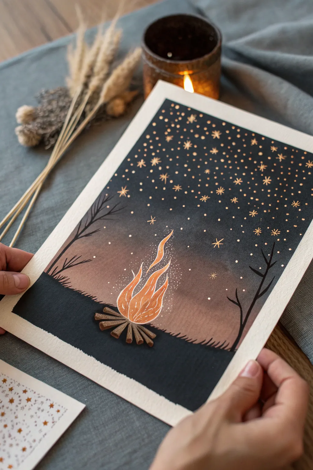
Capture the magic of a cozy night under the stars with this mixed-media illustration. By combining soft watercolor gradients with crisp metallic ink, you’ll create a glowing campfire scene that pops against a deep midnight background.
Step-by-Step Guide
Materials
- Cold press watercolor paper (approx. 300gsm)
- Masking tape
- Watercolor paints (burnt orange, black, indigo)
- White or gold gel pen (or metallic copper ink)
- Fine liner pen (black)
- Round watercolor brushes (size 4 and 8)
- Pencil and eraser
- Paper towels
Step 1: Setting the Scene
-
Tape the Edges:
Before sketching, secure your paper to a flat surface using masking tape on all four sides. This creates that clean, professional white border seen in the final piece and prevents the paper from buckling under heavy washes. -
Draft the Fire:
Lightly sketch the outline of your campfire in the lower center of the page. Draw a simple cluster of logs at the bottom and flowing, tear-drop shapes for flames rising upward. Keep your pencil lines faint so they don’t show through later. -
Outline the Horizon:
Sketch a gentle, uneven horizon line just behind the fire to establish the ground. Add faint guidelines for where your two silhouette trees will stand on the left and right sides.
Step 2: Painting the Glowing Background
-
Wet the Sky Area:
Using clean water and your larger brush, wet the entire sky area above the horizon line. Avoid the flame shapes you sketched; keep the paper inside the flames dry for now. -
Apply the Warm Glow:
Load your brush with a watered-down burnt orange or terracotta color. Paint around the immediate area of the flames and the lower sky, letting the color bleed softly upwards into the wet paper. -
Blend into Darkness:
While the orange is still wet, introduce a dark indigo or black paint at the very top of the sky. Paint downwards, allowing it to mix with the orange in the middle to create a seamless transition from warm glow to night sky. -
Deepen the Night:
Add a second layer of concentrated black or prominent indigo to the top third of the sky to make it opaque and rich. Let this gradient layer dry completely before moving on. -
Paint the Foreground:
Switch to a solid black paint for the ground area below the horizon. Carefully paint around the logs, filling the rest of the bottom section with flat, dark color.
Clean Edges Setup
Run your fingernail or a bone folder firmly along the inner edge of the masking tape before painting. This seals the tape to the paper and prevents paint from bleeding under.
Step 3: Bringing the Fire to Life
-
Base Color for Flames:
Fill in the flame shapes with a bright, solid orange. You can vary the intensity, using lighter yellow-orange at the center and darker orange near the tips. -
Detailing the Logs:
Paint the logs using a medium brown. Once the base coat is dry, add texture lines along the length of the wood using a darker brown or a fine liner pen to simulate bark. -
Defining the Flames:
Once the orange paint is dry, use a white or metallic gel pen to outline the flames. Add internal curving lines to suggest movement and heat within the fire. -
Adding Silhouette Trees:
Using a fine brush and black paint (or a black marker), draw the bare branches of the trees on the left and right. Ensure the branches taper off into thin points as they reach into the sky.
Level Up: Metallic Pop
Instead of a gold gel pen, use liquid gold leaf or metallic watercolor paint for the stars. It reflects light much better and gives the piece a magical shimmer when tilted.
Step 4: Sparks and Starlight details
-
Create the Embers:
Using your white or gold pen, stipple a cluster of tiny dots rising directly from the fire. Concentrate them heavily near the flames and let them thin out as they float higher. -
Draw the Stars:
Switch to a gold metallic pen for the stars. Dot the entire black section of the sky with small points of light. Vary the spacing so it doesn’t look too uniform. -
Add Iconic Star Shapes:
Intersperse a few larger, drawn star shapes (asterisks or 5-point stars) among the dots to make the constellation pop. -
Highlight the Horizon:
Add tiny vertical tick marks along the horizon line using a black pen to simulate grass blades silhouetted against the glow. -
The Final Reveal:
Wait until every drop of ink and paint is bone dry. Then, slowly peel away the masking tape at a 45-degree angle to reveal your crisp, clean borders.
Frame your mini masterpiece or gift it to a fellow stargazer to share the warmth

PENCIL GUIDE
Understanding Pencil Grades from H to B
From first sketch to finished drawing — learn pencil grades, line control, and shading techniques.
Explore the Full Guide
Flame Color Gradient Practice
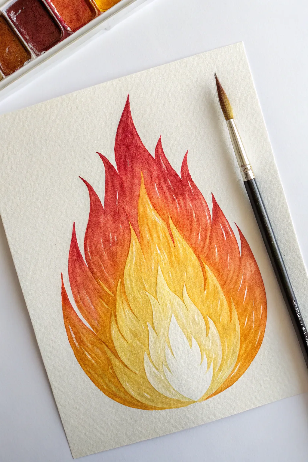
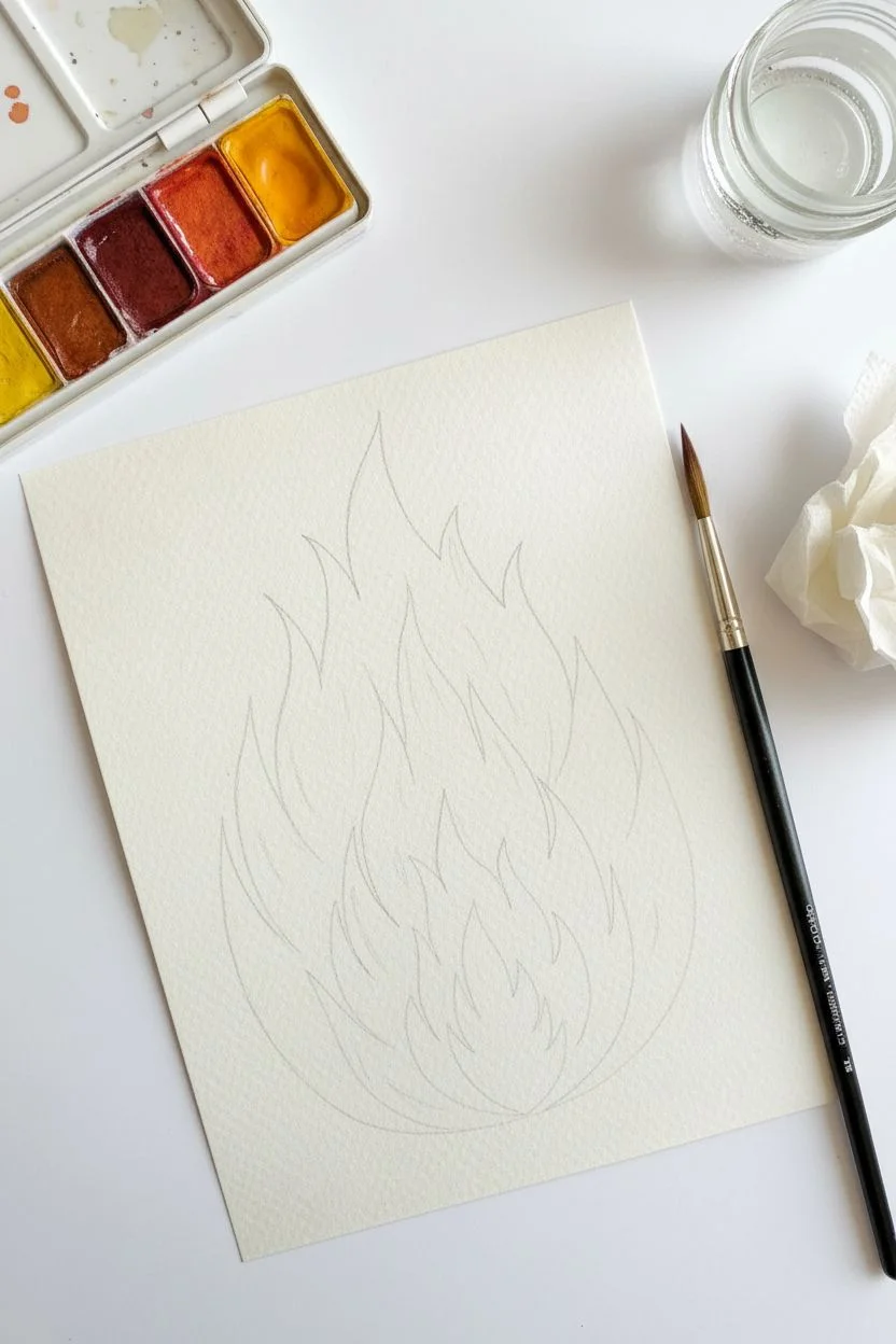
Master the art of heat and light with this stylized watercolor flame study. You will build layers from the hottest white center to the cooling red tips to achieve a vibrant, glowing gradient effect.
Step-by-Step Tutorial
Materials
- Cold press watercolor paper (300 gsm recommended for texture)
- Watercolor paint set (specifically Lemon Yellow, Cadmium Orange, Alizarin Crimson, and a deep reddish-brown)
- Round watercolor brush (size 6 or 8)
- Pencil (HB or H for light lines)
- Kneaded eraser
- Jar of clean water
- Paper towel or cloth
- Mixing palette
Step 1: Preparation and Sketching
-
Outline the flame shape:
Start by lightly sketching a teardrop shape that tapers upward. This will be the general boundary of your fire. -
Define the layers:
Inside the main shape, draw a series of concentric, jagged flame shapes. Think of them like steps: a small inner core, a middle section, and the outer tips. -
Detail the tips:
Refine the top edges of your flames into sharp, curving points. Notice how the flame pictured curves slightly to the left and right for movement. -
Lighten the guides:
Roll your kneaded eraser gently over the entire sketch. You want the graphite lines to be barely visible so they don’t show through the transparent watercolor.
Pro Tip: Hard Edges
To get those crisp white lines between color layers, let each section dry completely before painting the neighbor. This prevents the colors from bleeding together.
Step 2: Painting the Core and Inner Layers
-
Reserve the hottest white:
Leave the very center flame shape completely unpainted. This white paper reserved space represents the most intense heat of the fire. -
Mix a pale yellow:
Create a very watery mix of Lemon Yellow on your palette. It should be almost transparent. -
Paint the first colored tier:
Apply this pale yellow to the flame shape immediately surrounding the white core. Paint carefully up to the pencil line, keeping a hard edge. -
Deepen the yellow:
While that layer dries, mix a slightly stronger, more saturated yellow. Paint the next tier outward, ensuring the wet paint doesn’t touch the previous layer yet if you want distinct separation. -
Transition to yellow-orange:
Mix a small amount of orange into your yellow paint. Apply this golden hue to the next ring of flame shapes, extending the points upward.
Level Up: Metallic Pop
Once the watercolor is dry, outline the separation lines between colors with a fine-tip gold gel pen or metallic watercolor for a stylized, magical finish.
Step 3: Building the Outer Heat
-
Introduce pure orange:
Load your brush with Cadmium Orange. Paint the next section, which starts to form the main body of the fire’s width. -
Create a red-orange mix:
Mix your orange with a touch of Alizarin Crimson. This reddish-orange color is for the large, sweeping curves near the top and sides. -
Paint the outer tips:
Using the tip of your round brush, carefully paint the sharp points of the flames using your red-orange mix. Use a confident, flicking motion for sharp tips. -
Add the deepest red:
Mix Alizarin Crimson with a tiny bit of brown or deep red. Apply this to the outermost edges and the very top tips of the flame for maximum contrast. -
Refine the edges:
Go back with a damp, clean brush if any edges look too rough, but maintain the distinct ‘cutout’ look between color zones.
Step 4: Final Details and Texture
-
Dry completely:
Ensure the entire painting is bone dry before proceeding to the final texture steps to avoid bleeding. -
Add subtle striations:
Using a slightly more concentrated version of each section’s color, paint tiny, thin vertical lines inside the shapes. This mimics use of sparks and movement. -
Enhance the white core:
If you accidentally painted over the white center, you can reclaim it slightly with a small amount of opaque white gouache, though preserving the paper is best. -
Final assessment:
Check your gradient. The progression should move smoothly from white to yellow, orange, and finally deep red, even with the hard edges.
Step back and admire how the distinct layers of color create a glowing illusion of heat on your page.
Firelight on Hands
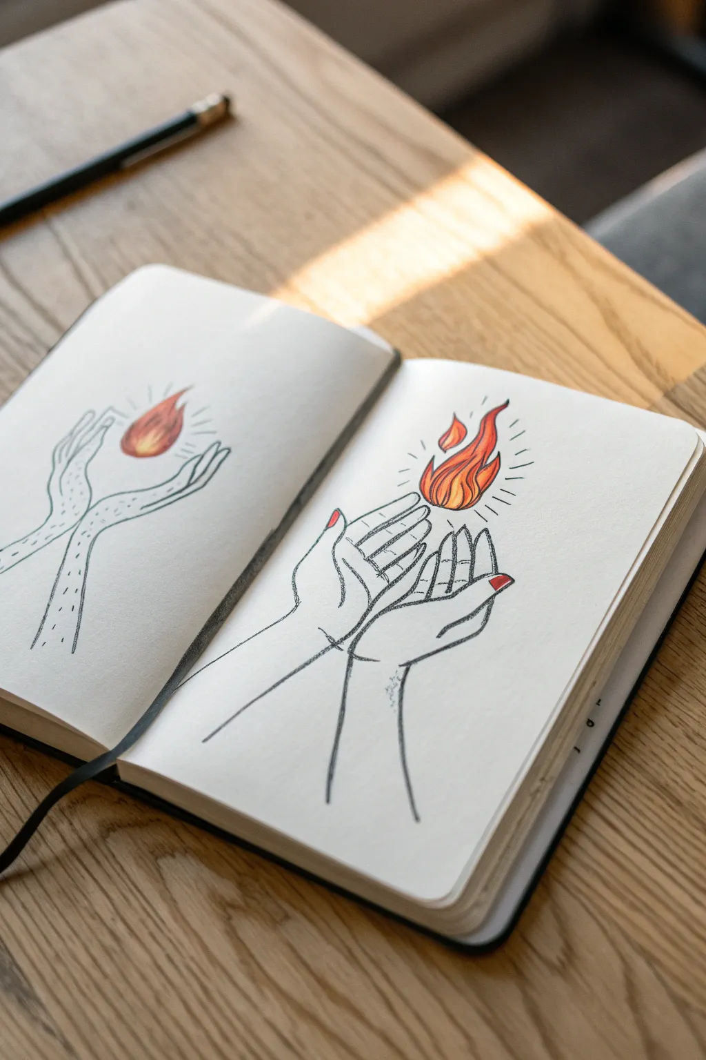
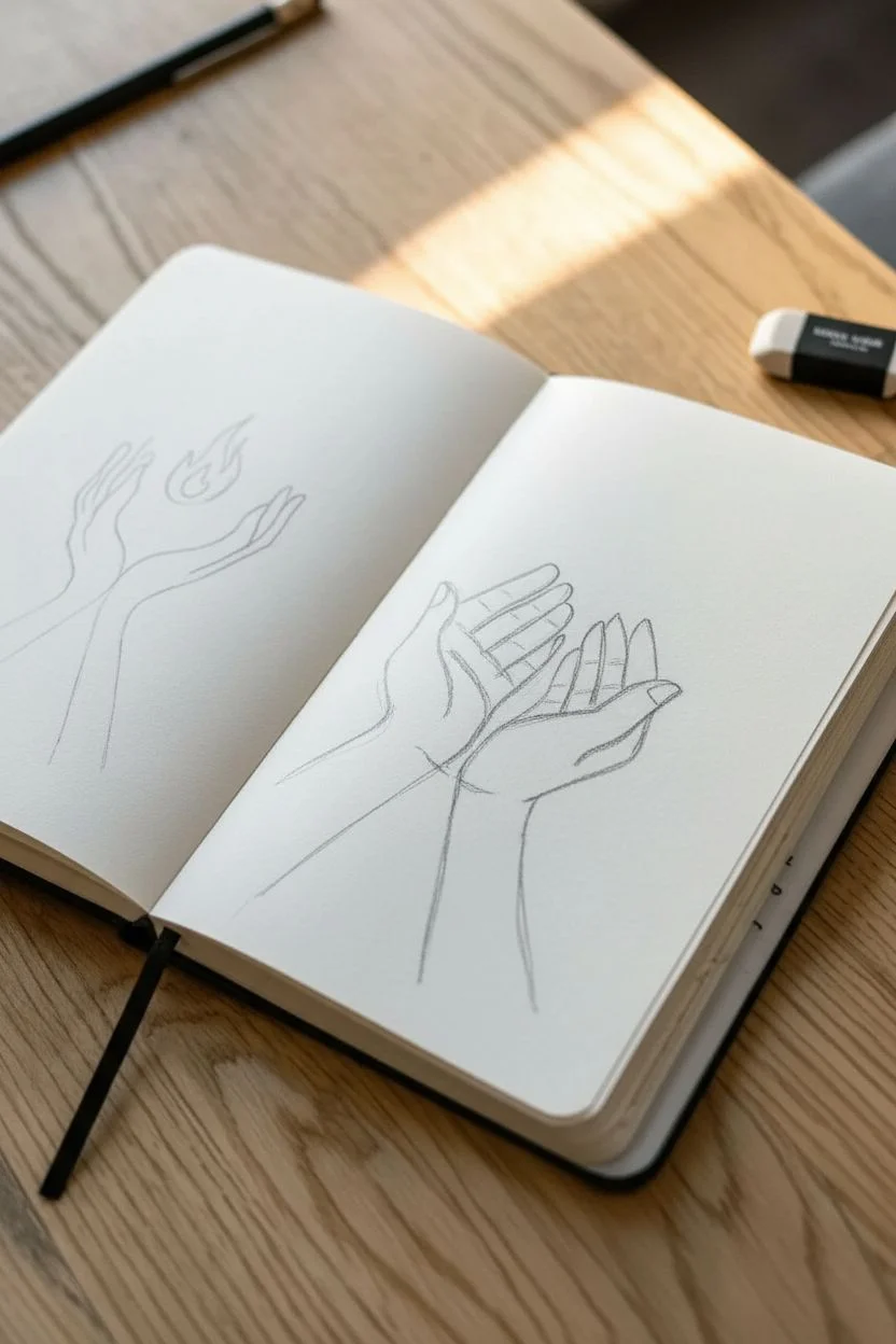
Capture the delicate warmth of holding a flame with this deceptively simple ink and marker illustration. By balancing bold outlines with vibrant pops of color, you’ll create a striking piece that feels both minimalist and powerful.
Step-by-Step
Materials
- Sketchbook or drawing paper (heavyweight preferred)
- HB pencil
- Eraser
- Fine liner pen (0.3mm or 0.5mm, black)
- Alcohol-based markers (yellow, orange, red)
- Fine red pen or marker (for nails)
Step 1: Drafting the Hands
-
Position the wrists:
Start lightly with your pencil. Near the bottom center of your page, draw two vertical lines tapering slightly inward to represent the wrists coming up from the bottom edge. -
Map the palms:
Visualize the palms as two mirrored shapes widening from the wrists. The left hand should be slightly behind the right, creating a layered effect. -
Sketch the right hand fingers:
Draw the fingers of the right hand first. The pinky and ring fingers should be slightly curled inward, while the middle and index fingers extend upward but curve gently toward the center. -
Sketch the left hand fingers:
Draw the left hand’s fingers peeking out from behind the right hand. Focus on getting the curve of the fingertips to align, creating a bowl shape. -
Add thumb details:
Place the thumbs on the outer edges, extending slightly away from the palms to frame the composition. -
Refine the anatomy:
Add small crease lines where the fingers bend and at the base of the palms to give the hands a natural, not rigid, appearance.
Loose Lines
Don’t try to make single, perfect continuous lines. Letting your pen lines overlap or break slightly adds a raw, sketchy charm that suits this style perfectly.
Step 2: Igniting the Flame
-
Outline the fire base:
Hovering just above the fingertips, lightly sketch a teardrop shape that is wider at the bottom and tapers up. -
Create dividing tongues:
Split that main teardrop shape into three or four distinct tongues of fire. Make them curvy and fluid, like they are dancing. -
Add the floating spark:
Draw a small, detached teardrop shape on the left side of the main flame to add movement and dynamism. -
Ink the outlines:
Using your fine liner, go over your pencil lines. The lines for the hands can be slightly looser, perhaps sketching over a line twice for an artistic, raw feel. -
Erase guidelines:
Wait a moment for the ink to set completely, then gently erase all visible graphite.
Level Up: Magical Flame
Swap the traditional fire colors for cool blues, teals, and purples to create a mystical, ghostly flame effect instead of a natural fire.
Step 3: Bringing in Color
-
Color the flame core:
Take your yellow marker and fill the very bottom center of the flame. I like to keep this area brightest to show the heat intensity. -
Blend the mid-tones:
Use the orange marker to surround the yellow core and fill the middle section of the flame tongues. Blend the transition while the ink is still wet. -
Add the red tips:
Finish the flame tips with your red marker. Allow the red to bleed slightly into the orange for a seamless gradient. -
Paint the nails:
Carefully color the fingernails on both hands with a bright red fine marker. This small detail ties the hands visually to the fire. -
Radiate the light:
Using the fine liner again, draw short, straight dashed lines radiating outward from the flame to represent the glow. -
Final shading touches:
Add very subtle stippling (dots) or a quick gray marker wash on the wrists to suggest shadow, but keep it minimal to maintain the clean aesthetic.
Now you have a warm, illuminated sketch to brighten up your art journal page
BRUSH GUIDE
The Right Brush for Every Stroke
From clean lines to bold texture — master brush choice, stroke control, and essential techniques.
Explore the Full Guide
Dragon Breath Fire Burst
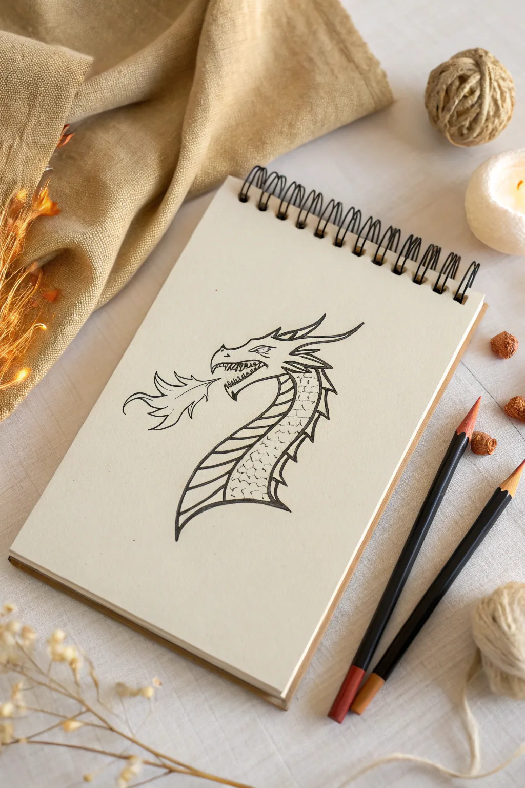
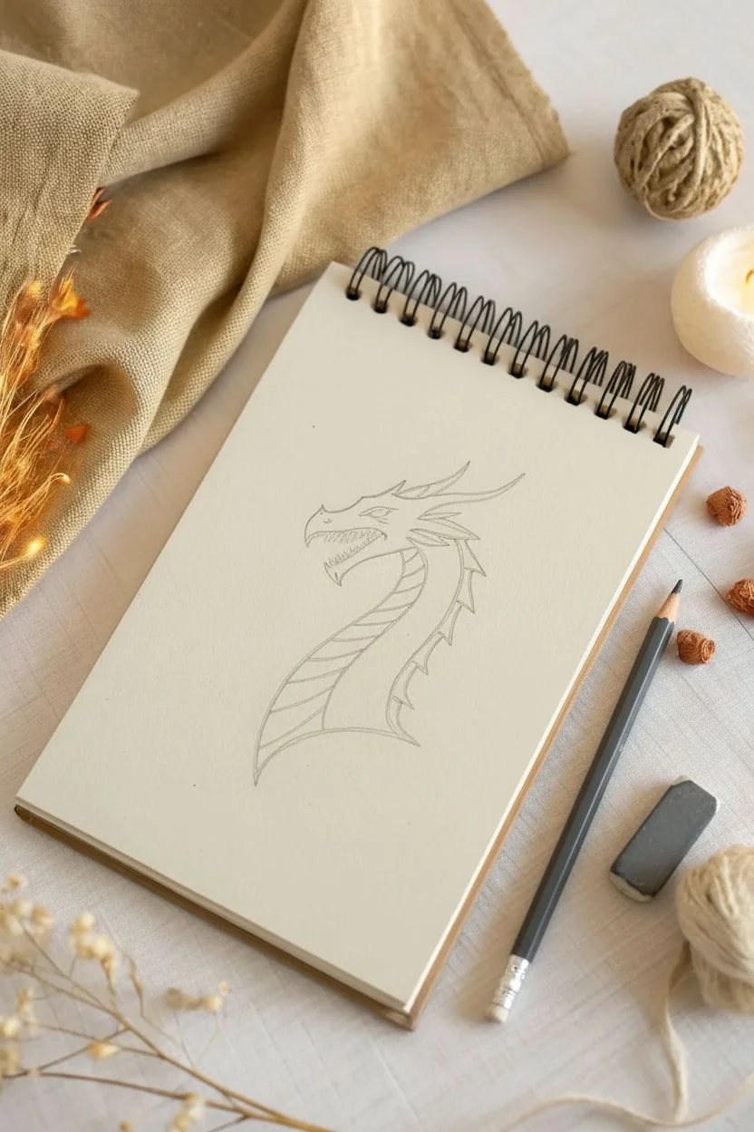
This sketch captures the classic fantasy moment of a dragon releasing a burst of flame. The style focuses on clean ink lines, detailed scales, and a stylized, geometric representation of fire that contrasts beautifully with the dragon’s organic forms.
Step-by-Step Guide
Materials
- Sketchbook with cream or off-white paper
- HB or 2B pencil for sketching
- Fine liner pen (black, approx. 0.3mm or 0.5mm)
- Eraser
- Reference image (this photo)
Step 1: Drafting the Basic Shapes
-
Start with the snout:
Begin by lightly sketching the dragon’s snout. Draw a rough, elongated U-shape pointing towards the left side of the page. This will be the foundation for the mouth and nose. -
Outline the head structure:
Above the snout, sketch the brow ridge and the top of the head. Extend a line backwards and slightly down to define the back of the skull. Add the lower jaw, keeping it open slightly to accommodate the fire. -
Sketch the neck curve:
Draw the neck sweeping downwards and to the right. Create a thick, curved shape that gets wider at the base. One line depicts the front of the throat, and another parallel curve defines the back of the neck. -
Indicate the horns:
Lightly mark placement lines for the horns extending from the back of the head. You’ll want one main horn sweeping backward and a few smaller spikes along the spine.
Step 2: Inking the Dragon
-
Define the eye and snout:
Switch to your fine liner pen. Draw the eye first—a sharp, angular shape with a slit pupil. Add small creases around it for expression. Then, ink the top of the snout, adding a small nostril curve. -
Draw the teeth:
Inside the open mouth, carefully draw zigzag lines for sharp teeth on both the upper and lower jaws. Keep them uneven to make the dragon look more ferocious. -
Ink the main horns:
Go over your sketch lines for the horns. Make the longest horn curve elegantly backward, tapering to a sharp point. Add a second, slightly smaller horn just below it for depth. -
Detail the head spines:
Along the back of the head and upper neck, draw a series of sharp, triangular spines. These should follow the flow of the main horn. -
Outline the neck:
Ink the sweeping curves of the neck. Ensure the transition from the jawline to the neck is smooth. Add the back line of the neck, incorporating the bases of the spines.
Clean Lines Pro-Tip
When inking long curves like the neck, move your entire arm from the shoulder, not just your wrist. This creates smoother, more confident lines.
Step 3: Adding Texture and Fire
-
Create the belly scales:
The dragon’s underbelly has distinct plate-like armor. Draw curved horizontal lines across the front section of the neck, stacking them like steps down to the base. -
Texture the neck skin:
For the side of the neck, draw a pattern of small, U-shaped scales. They don’t need to be perfect; irregular sizing adds realism. I find it helpful to vary the pressure here, keeping some scales lighter than others. -
Sketch the fire shape:
Moving to the mouth, draw the outline of the fire burst. Instead of realistic flames, use sharp, stylized curves that culminate in points, almost like leaves blowing in the wind. -
Detail the flames:
Add inner lines within the main fire shape to suggest movement and heat. These internal strokes should follow the flow of the fire coming out of the mouth. -
Add final touches to the head:
Add some small scratch marks or texture lines near the eye and on the snout to suggest rough skin. -
Erase pencil lines:
Wait for the ink to dry completely. Gently erase all visible pencil marks to clean up the drawing.
Wobbly Horns?
If your horns look crooked, try rotating your sketchbook. Drawing curves ‘away’ from your hand is often easier than pulling them toward you.
Now you have a fierce dragon sketch ready to guard your notebook
Phoenix Made of Flames
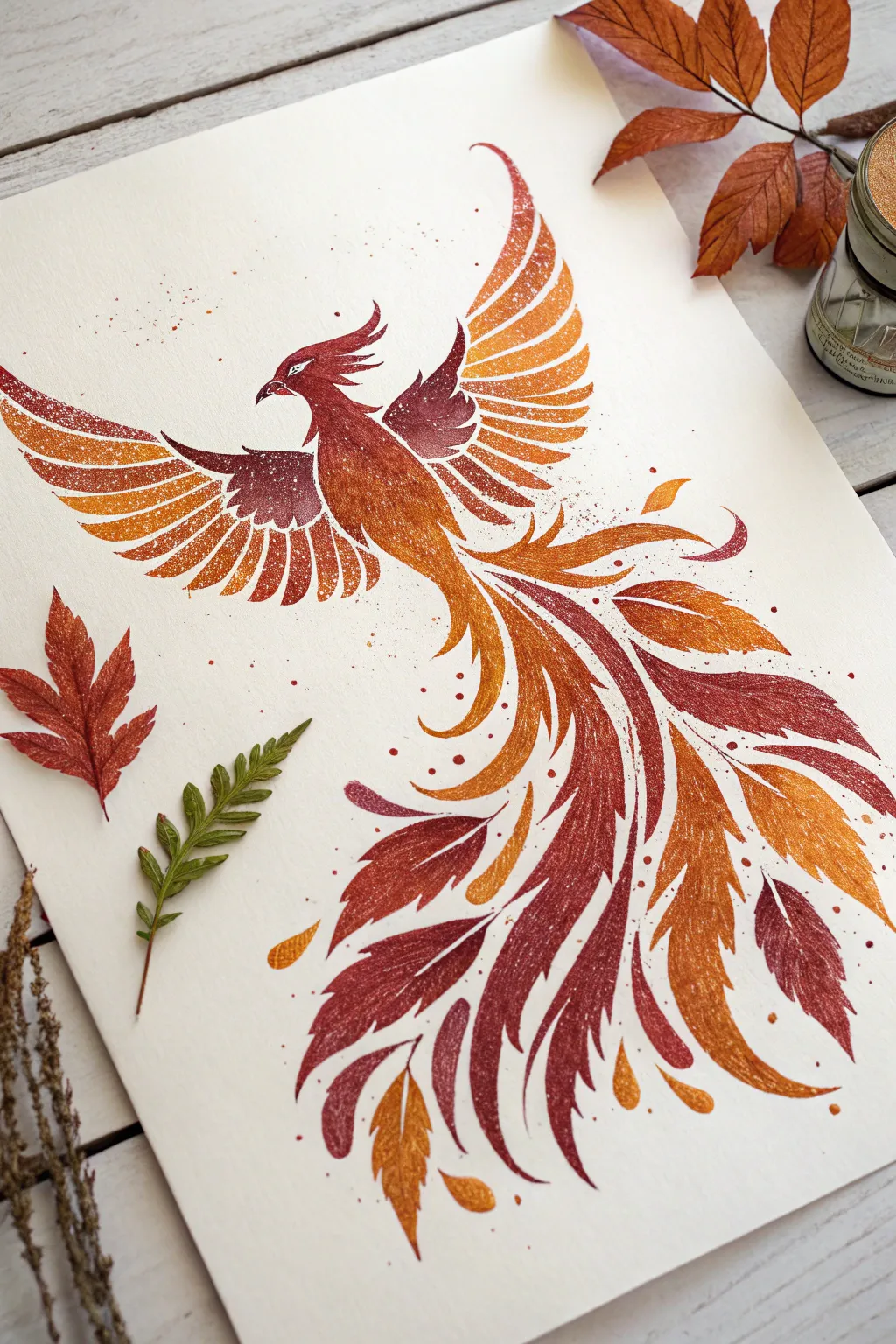
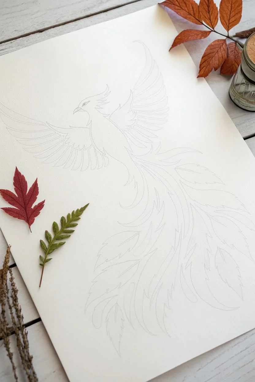
Capture the mythical elegance of a phoenix with this vibrant watercolor illustration that blends fiery gradients with delicate, leafy feather details. The finished piece features a striking transition from deep crimson to golden amber, enhanced by a unique stippled texture that mimics sparks rising from the flames.
Step-by-Step Tutorial
Materials
- Hot press watercolor paper (smooth texture)
- Watercolor paints (Alizarin Crimson, Cadmium Red, Cadmium Orange, Indian Yellow)
- Round watercolor brushes (Size 2, 4, and 6)
- White gouache or white gel pen
- Pencil (HB or H)
- Kneadable eraser
- Mixing palette
- Two jars of water
- Paper towels
- Old toothbrush or stiff bristle brush (optional)
Step 1: Sketching the Form
-
Map the S-curve:
Begin by lightly drawing a large, flowing S-curve down the center of your paper. This will serve as the spine of the bird, guiding the movement from the head down through the long, trailing tail feathers. -
Outline the body:
Sketch a small, sleek head at the top of the curve with a pointed beak. Extend the neck into a teardrop-shaped chest that tapers slightly as it meets the tail section. -
Draft the wings:
Draw two large arcs extending outward from the upper back. Instead of detailed feathers yet, just block in the overall span of the wings, keeping the upper edges smooth and the lower edges jagged to suggest feather tips. -
Define the tail plumes:
sketch long, leaf-like shapes flowing from the base of the body. vary their sizes, drawing some thick and curved like flames and others thinner and more delicate. Let them fan out towards the bottom right of the page. -
Refine and lighten:
Add the crest on the head and specific feather divisions on the wings. Once satisfied, use your kneadable eraser to lift most of the graphite, leaving only a faint ghost image to paint over.
Muddy Gradients?
If your red and yellow turn brown where they meet, rinse your brush more often. Always merge neighboring colors while they are both wet for a clean, seamless transition.
Step 2: Painting the Body and Wings
-
Mix your gradients:
Prepare puddles of your paint on the palette: a deep crimson, a bright red-orange, and a golden yellow. Ensure they are wet enough to flow but pigmented enough to be vibrant. -
Paint the head and neck:
Using a size 4 brush, start at the beak with the crimson paint. As you move down the neck, rinse your brush slightly and pick up orange, letting the colors bleed into each other wet-on-wet. -
Work on the wings (inner):
For the inner wing sections (closest to the body), use the deep crimson mixed with a touch of purple or brown for contrast. Paint the individual feather shapes, leaving tiny slivers of white paper between them to define the segments. -
Work on the wings (outer):
Switch to your orange and yellow mixes for the outer flight feathers. Paint each feather strip individually, starting with orange at the base and blending to yellow at the tips. -
Add texture while wet:
If you look closely at the reference, there’s a speckled texture. While the paint is still damp—but not soaking wet—splatter tiny droplets of clean water or lifting fluid onto the wings to create small blooms.
Use Salt for Sparkle
Make the feathers look magical by sprinkling a pinch of table salt onto the wet tail paint. Brush it off once totally dry to reveal starburst textures.
Step 3: Creating the Fiery Tail
-
Start the main plumes:
Using your size 6 brush, load it with the orange mix. Paint the large, central tail feathers using long, sweeping strokes that follow your S-curve guide. -
Introduce deep reds:
While the orange shapes are still wet, drop crimson paint into the shadowed areas or the centers of the ‘leaf’ feathers to create depth. -
Add floating embers:
Paint small, detached teardrop shapes around the main tail feathers to represent floating sparks or loose feathers. Use pure yellow or light orange for these to make them look hot. -
Vary feather density:
I find it helpful to alternate between solid, dark red feathers and lighter, more transparent yellow ones to create a sense of layering and volume in the tail. -
Dry completely:
Let the entire piece dry completely. If the paper feels cool to the touch, it is still damp. Wait until it is room temperature.
Step 4: Details & Highlights
-
Define the eye:
Use a small size 2 brush with very dark red or black to carefully paint the pupil and the outline of the eye, leaving a tiny white highlight. -
Stipple texture:
Dip a toothbrush or stiff brush into white gouache (consistency of heavy cream). Run your thumb over the bristles to spray a fine mist of white dots over the wing tips and tail edges for a magical effect. -
Enhance edges:
If any feather edges look too soft, use a slightly darker version of the local color (e.g., burnt orange on an orange feather) to sharpen the outline. -
Add white veins:
Using a white gel pen or a very fine brush with gouache, draw delicate central veins on the darker red tail feathers to mimic the structure of leaves or flames. -
Final speckles:
Add a few intentional larger dots of red and orange paint in the negative space around the bird to balance the composition.
Step back and admire your fiery creation as the colors settle into their vibrant final hues.


Abstract Flame Mandala Pattern
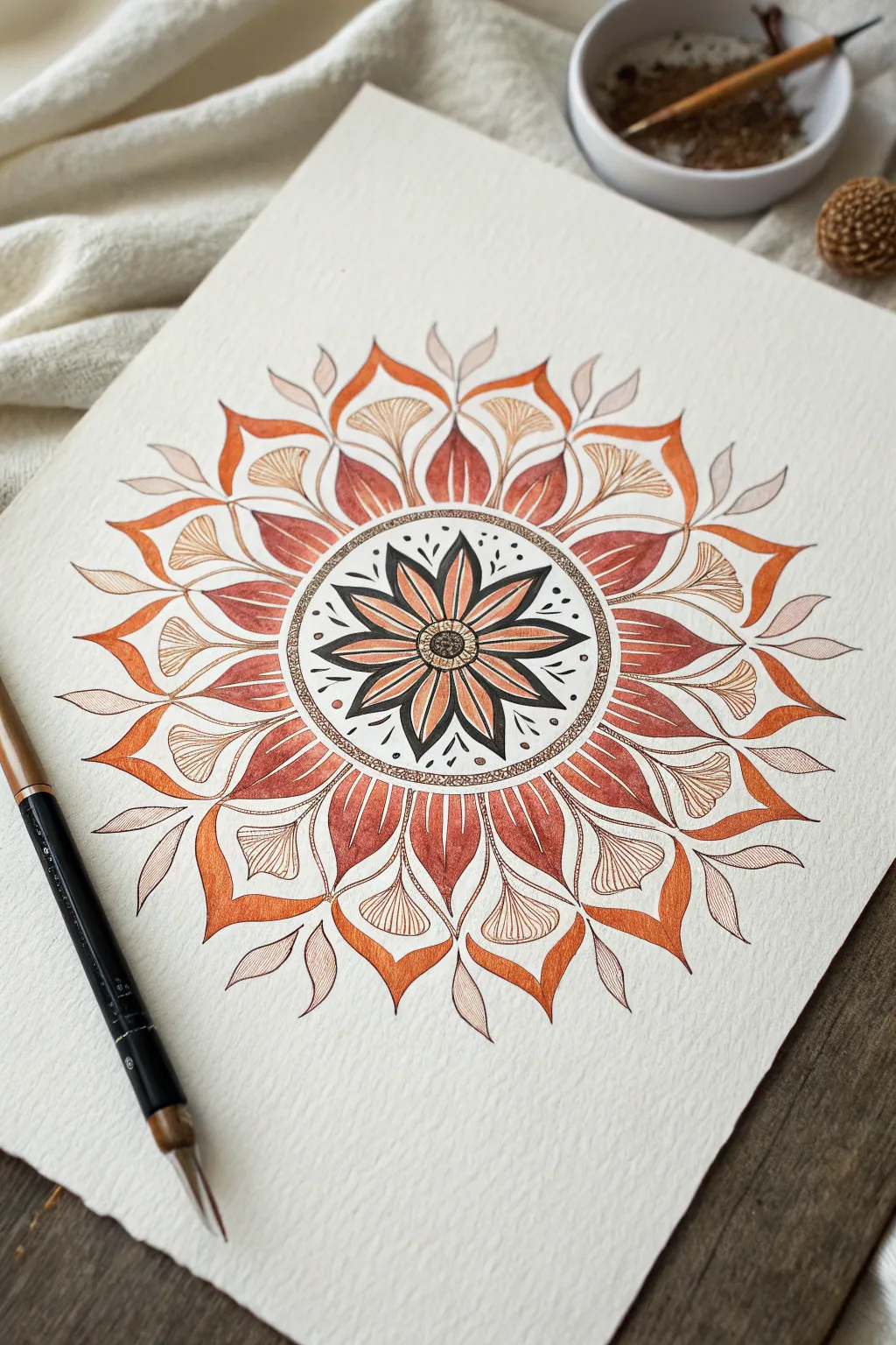
Capture the warmth and energy of a controlled fire with this intricate, symmetrical mandala illustration. Using a palette of earth tones, russet reds, and burnt oranges, this design combines petal-like shapes with flame motifs to create a soothing yet dynamic piece of structured art.
Step-by-Step
Materials
- Heavyweight cold-press watercolor paper (300 gsm)
- Fine liner pens (black, sizes 0.1mm and 0.5mm)
- Watercolor paints (burnt sienna, orange ochre, crimson red, deep brown)
- Small round watercolor brush (size 2 or 4)
- Compass
- Protractor
- Pencil (HB) and eraser
Step 1: Planning and Structure
-
Establish the center:
Begin by marking the absolute center of your paper. Using your compass, draw a small circle about 1 inch in diameter, followed by a second concentric circle roughly 2 inches in diameter. -
Define the outer rings:
Continuing from the center point, draw two more larger concentric circles to guide the outer petal layers. Lightly trace these guidelines so they can be easily erased later. -
Section the circle:
Use a protractor to divide your circle into equal segments. For this eight-pointed design, mark every 45 degrees lightly with your pencil, drawing lines from the center out to the edge of your largest circle.
Stealing Symmetry
Rotate your paper constantly as you draw. Seeing the design from different angles helps you spot asymmetry in your petals much faster than keeping the paper static.
Step 2: Drawing the Core
-
Draft the central flower:
Inside the innermost circle, sketch an eight-petaled flower shape. The tips of the petals should just touch the 1-inch circle line. -
Outline the core:
Using a 0.5mm black fine liner, carefully ink the central flower. Draw a small textured center circle, then outline each petal. Add a second, inner outline to each petal to create a border for coloring. -
Fill the center details:
With a 0.1mm pen, fill the space between the petals with solid black ink to make the flower pop. Add tiny stippling dots inside the very center circle for texture.
Ink Bleeding?
If your black ink lines bleed when painting, you likely didn’t use waterproof pens. Switch to pigment liners or micron pens, which are archival and waterproof once dry.
Step 3: Building the Layers
-
Create the texture ring:
Between your 1-inch and 2-inch pencil circles, draw two ink circles to create a band. Fill this band with dense, tiny stippling dots using the 0.1mm pen. -
Sketch the flame leaves:
In the next layer outward, pencil in eight broad, leaf-like shapes that curve slightly at the tip, resembling candle flames. These should align with the gaps of the central flower. -
Add the stylized fans:
Between each ‘flame leaf,’ draw a smaller, fan-shaped wedge that connects the stippled ring to the outer boundary of this layer. These resemble ginkgo leaves. -
Draft the outer crown:
Finally, sketch the largest, outermost layer of petal points. These should curve outward briskly, creating a spiky, sun-ray effect at the mandala’s edge. -
Inking the pattern:
Go over your pencil sketches with the 0.5mm pen. Be deliberate with your lines. For the ‘ginkgo’ fans, use the 0.1mm pen to draw fine, vertical lines inside the shape for texture.
Step 4: Adding Color and Depth
-
Base layer for the center:
Mix a watery wash of burnt orange. Paint the inner sections of the central flower petals, leaving the tips slightly lighter. -
Painting the flame leaves:
Using a crimson red or deep rust color, paint the ‘flame leaves’ in the middle ring. I find that layering the color so it’s darker at the bottom and lighter at the tip gives it a glowing effect. -
Coloring the outer crown:
For the large, spiky outer petals, switch to a bright orange ochre. Paint these sections carefully, keeping the edges crisp. -
Adding delicate foliage:
With a very pale brown or diluted ink, sketch and fill simplistic, floating leaves between the outer orange points to soften the edge of the mandala. -
Deepening contrast:
Once the first layer of paint is dry, go back with a slightly more saturated mix of the same colors. Add shading to the base of each petal where it meets the center to create dimension. -
Final touches:
Erase any remaining pencil lines gently. If needed, re-darken any black ink lines that were dulled by the watercolor wash.
Step back and admire the rhythmic flow of your fiery creation

Have a question or want to share your own experience? I'd love to hear from you in the comments below!