A good flag drawing is really just a fabric study in disguise—once you nail the folds and ripples, everything else gets way easier. Here are my favorite flag drawing ideas to help you capture that windy, in-motion look without overthinking it.
Classic Waving Flag on a Pole
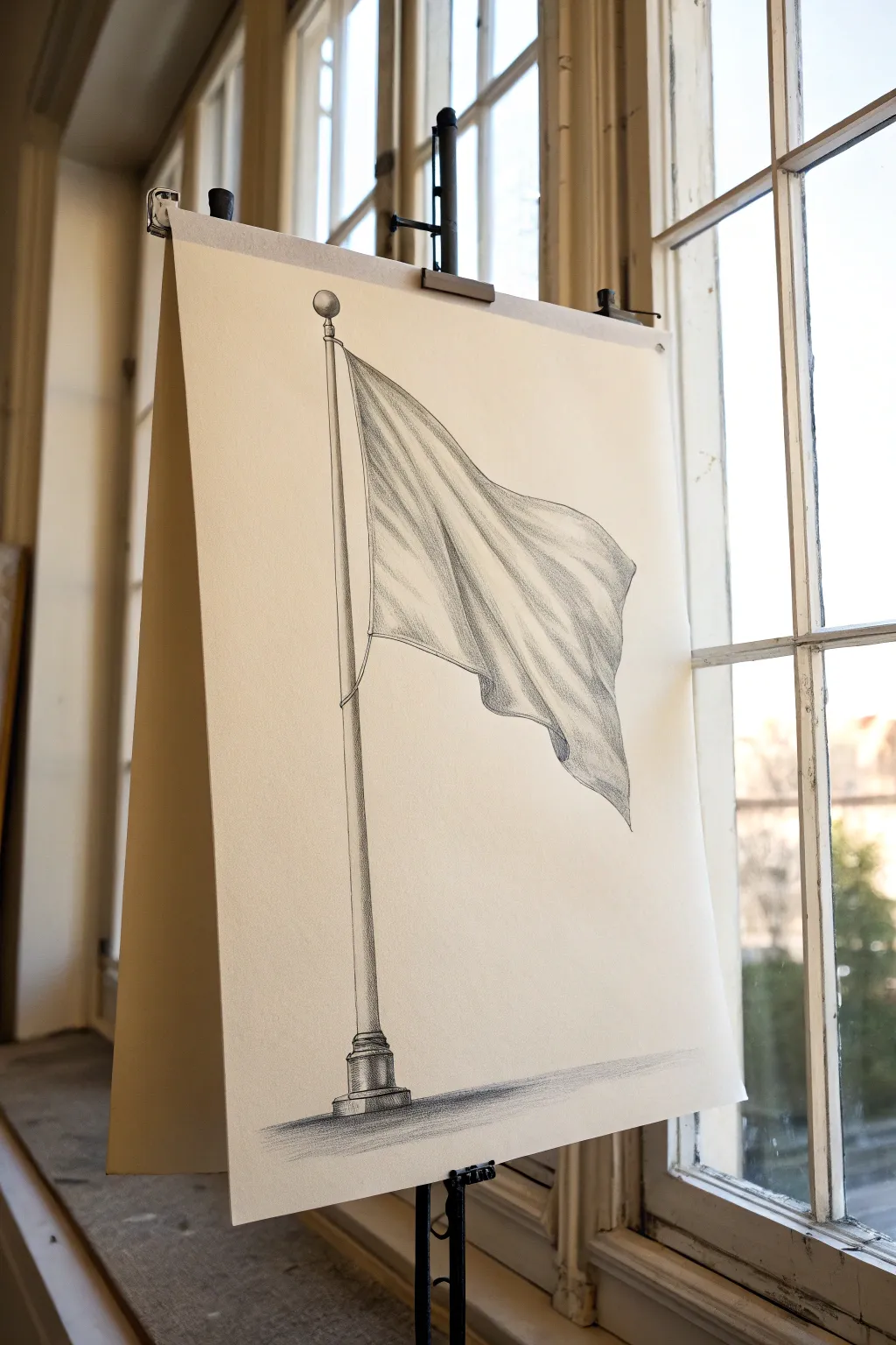
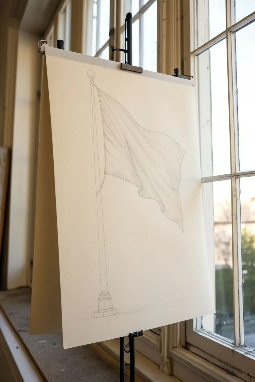
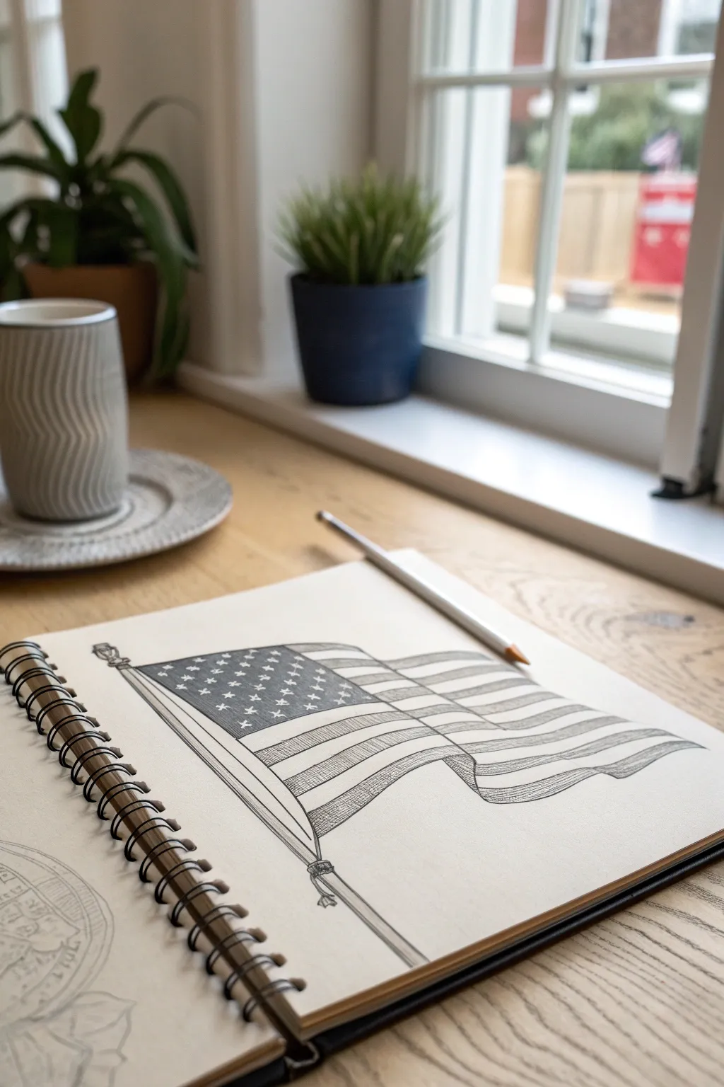
This project captures the quiet dignity of a waving flag using nothing but graphite and paper. You will learn to render the soft, flowing folds of fabric and contrast them against the rigid, cylindrical structure of a flagpole.
Step-by-Step Guide
Materials
- High-quality drawing paper (smooth or vellum finish, approx. 18×24 inches)
- Graphite pencils (ranges: 2H, HB, 2B, 4B, 6B)
- Kneaded eraser
- Vinyl eraser
- Blending stump or tortillon
- Ruler or straight edge
- Pencil sharpener or sandpaper block
Step 1: Constructing the Framework
-
Establish the pole:
Begin by using a ruler and a light 2H pencil to draw the vertical lines of the flagpole. Position it slightly to the left of center to leave room for the flag. Don’t press hard; these are just guide lines. -
Add the finial and base:
At the very top of your pole lines, sketch a simple sphere for the decorative finial. At the bottom, sketch a rectangular base with a few tiered levels to suggest a sturdy mount. -
Outline the flag shape:
Draw the general perimeter of the flag. Start near the top of the pole and sweep a line diagonally downward and to the right. Create a wavy bottom edge that mimics the top curve but hangs lower. -
Sketch the primary folds:
Inside your flag outline, draw long, flowing S-curves starting from the pole and radiating outward towards the flying end. These lines define where the fabric ripples in the wind.
Flat Looking Fabric?
If folds look flat, your mid-tones are likely too dominant. Use a kneaded eraser to aggressively lift highlights on the ‘mountains’ and re-darken the ‘valleys’ with 6B lead.
Step 2: Rendering the Pole
-
Define the cylindrical form:
Switch to an HB pencil. To make the pole look round, shade the sides darker than the center. Imagine light hitting the middle, creating a vertical highlight strip. -
Detail the base:
Draw the specific moldings of the base. Use horizontal curved lines (smiling lines) to reinforce the perspective that you are looking slightly up at the object. -
Shade the base metal:
Use a 2B pencil to darken the edges of the base tiers. Leave crisp, white highlights on the upper ridges of the molding to make the metal look polished. -
Deepen the pole shadows:
With a 4B pencil, darken the shadow side of the pole (the side away from your light source). This high contrast is crucial for a 3D effect.
Step 3: Shading the Fabric
-
Map out the shadows:
Look at where your fold lines are. The ‘valleys’ between folds need to be dark. Lightly fill these areas with a 2B pencil, following the direction of the fabric. -
Create the mid-tones:
Using an HB pencil, shade the transition areas between the deep valleys and the high peaks of the folds. I prefer to use hatching lines that curve with the fabric’s surface here. -
Blend for softness:
Take your blending stump and gently smudge the graphite on the flag. This eliminates harsh pencil strokes and creates the smooth texture of cloth. -
Deepen the crevices:
Re-establish the darkest shadows with a 6B pencil, particularly closer to the pole where the fabric bunches up tighter. Don’t blend these lines too much; keep them defined. -
Refine the edges:
Check the flying edge of the flag (the right side). Make sure the line work is delicate and uneven to suggest movement, rather than a stiff cardboard coutout.
Texture Play
Place a textured paper or coin under your drawing paper when shading the flag area. Rubbing over it creates an instant fabric weave pattern.
Step 4: Grounding and Final Touches
-
Cast the ground shadow:
At the very bottom, draw horizontal shading under the base. This ground shadow anchors the object so it doesn’t look like it’s floating. -
Add the rope detail:
Draw a thin line for the halyard (rope) hanging loosely alongside the pole. Give it a slight wiggle so it doesn’t look like a rigid wire. -
Lift highlights:
Use your slightly dirty kneaded eraser to tap or drag along the ‘peaks’ of the fabric folds. This lifts off graphite to create bright, clean highlights. -
Final assessment:
Step back and look at your contrast range. If the pole feels too gray, add more 6B to the darkest side. Ensure the finial sphere has a distinct highlight point.
Once you’ve cleared away your eraser crumbs, you’ll have a striking, classic study of motion and form.

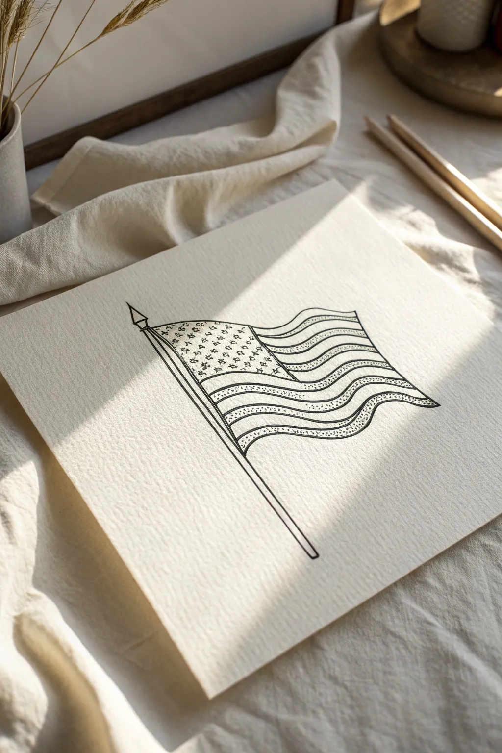
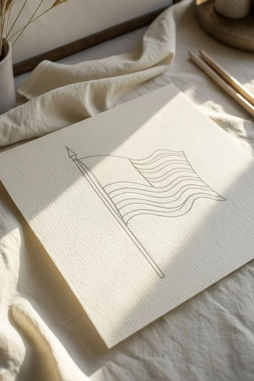
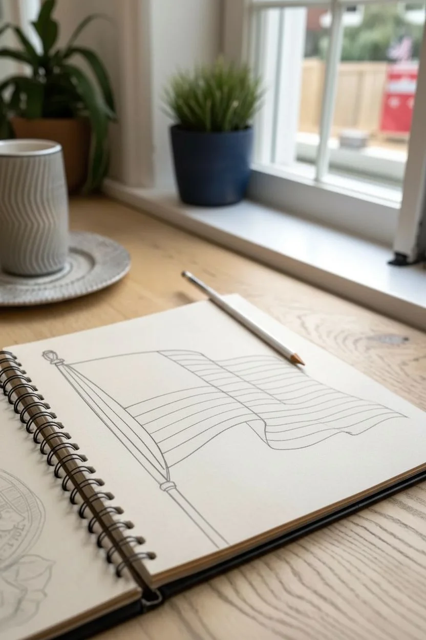
Simple Ripple Outline Template
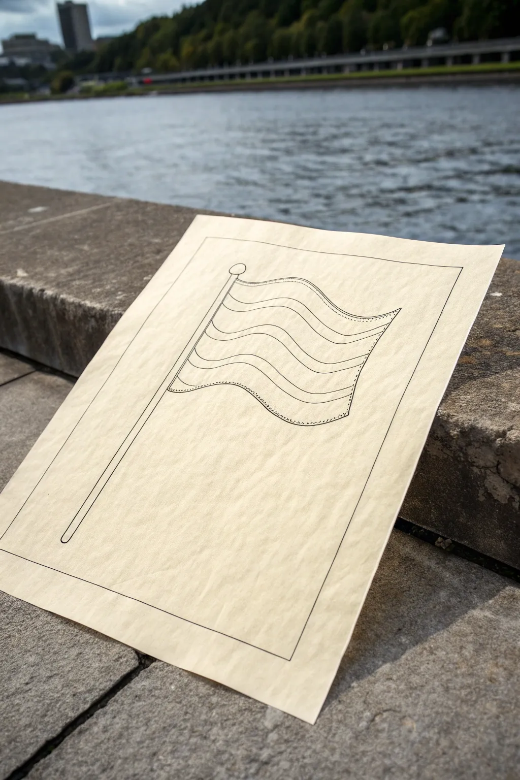
This project creates a crisp, clean line drawing of a waving flag, perfect for use as a coloring page or a base for watercolor. The simplicity of the rippling lines captures movement without needing complex shading, making it an excellent exercise in perspective and flow.
Step-by-Step
Materials
- Cream or off-white drawing paper (medium weight)
- Pencil (HB or 2H for sketching)
- Fine-point black drawing pen (0.5mm or 0.8mm)
- Ruler or straight edge
- Eraser (kneaded preferred)
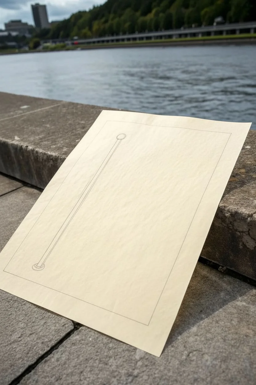
Step 1: Setting the Structure
-
Rough Layout:
Begin by lightly marking the boundaries of your drawing area with a pencil. Draw a large rectangle centered on your paper to serve as a frame, leaving a generous margin on all sides. -
The Pole Axis:
Using your ruler, draw a long, straight diagonal line leaning slightly to the right. This will be the core of your flagpole. It should start near the bottom left corner of your frame and extend about two-thirds of the way up. -
Pole Thickness:
Draw a second parallel line very close to the first one to create the thickness of the pole. Connect the bottom ends with a small curve. -
Finial Detail:
At the very top of the pole, sketch a small circle for the finial (the ball at the top). Add a tiny horizontal ring just below the circle where it meets the pole.
Wobbly Waves?
If your stripes don’t look parallel, lightly sketch vertical guides at the peaks and troughs of the waves before drawing the horizontal lines.
Step 2: Drafting the Flag
-
Top Wave:
Starting from the top of the pole, draw a flowing, wavy line extending to the right. It should curve up slightly, then dip down, then flare up again at the end, mimicking fabric caught in a breeze. -
Bottom Wave:
Draw the bottom edge of the flag. This line must mirror the rhythm of your top line almost exactly but should be shifted downwards. This parallelism is crucial for the flag to look convincing. -
Connecting the Sides:
Connect the right end of the top wave to the right end of the bottom wave with a vertical line that curves slightly inward. This edge should not be perfectly straight; a slight wave suggests the fabric is fluttering. -
Connect to Pole:
Draw the short vertical line attaching the left side of the flag to the flagpole. -
Internal Stripes:
Lightly sketch three internal wavy lines running horizontally across the flag. These divide the flag into four equal stripes. Ensure these lines follow exactly the same wave pattern as your top and bottom edges.
Add Depth
Thicken the line weight slightly on the underside of the waves (where the flag dips down) to create an instant illusion of shadow and volume.
Step 3: Inking and Refining
-
Main Outline:
Switch to your black ink pen. Carefully trace over the outer frame first to establish your borders. Use the ruler here if you want a machine-perfect look, or freehand it for a more organic feel. -
Inking the Pole:
Trace the flagpole and the finial circle with a steady hand. Make sure the lines are solid and continuous. -
Clean Flag Lines:
Ink the top and bottom edges of the flag. I find that pulling the pen towards me in one smooth motion helps keep curves from looking jittery. -
Stitch Details:
For the vertical edge on the right and the attachment edge on the left, try using a slightly broken or dotted line style, or add tiny hash marks inside the main line to suggest hem stitching. -
Inking Stripes:
Go over the internal stripe lines. Keep these lines slightly thinner or lighter than the outer contour if possible, to give the drawing visual hierarchy. -
Final Erasure:
Wait at least 5-10 minutes for the ink to dry completely. Gently erase all underlying pencil marks, being careful not to buckle the paper.
You now have a clean, classic flag outline ready for coloring or display

Contour Lines for Flowing Stripes
This project captures the classic American flag with a sense of motion using clean contour lines and delicate pointillism. The result is a minimalist, refined illustration that balances bold structure with soft, textured shading.
Step-by-Step Guide
Materials
- High-quality textured art paper (watercolor or mixed media paper works well)
- Fine liner pens (sizes 01, 03, and 05)
- Pencil (HB or 2B)
- Eraser
- Ruler (optional, for the pole)
Step 1: Establishing the Structure
-
Sketch the flagpole:
Begin by lightly sketching a long, straight diagonal line for the flagpole using your pencil. Add a small triangle or spearhead shape at the very top for the finial. -
Outline the flag shape:
Draw the top and bottom edges of the flag extending from the pole. Instead of straight lines, use gentle ‘S’ curves to mimic the fabric waving in the wind. The flag should look like it is billowing outward. -
Define the canton:
Mark off the rectangular area for the stars (the canton) in the top left corner, adjacent to the pole. Ensure the bottom line of this rectangle follows the same wavy curve as the flag’s stripes.
Step 2: Creating the Flowing Stripes
-
Pencil in the stripes:
Lightly sketch the horizontal stripes. Remember that these lines must run parallel to the top and bottom curves you drew earlier. If the flag dips, the stripe line dips with it. -
Ink the main contours:
Switch to your 05 fine liner. Carefully go over the main outline of the flag, the flagpole, and the flowing lines of the stripes. Keep your hand steady to create smooth, confident strokes. -
Detail the flagpole:
Add a second parallel line to the flagpole to give it thickness, and close the shape at the bottom. Ink the finial at the top.
Pro Tip: Dot Variation
Don’t just tap vertically. Slightly angling your pen or varying the pressure while stippling creates different dot sizes, adding organic texture that looks more like fabric than a mechanical pattern.
Step 3: Adding the Stars
-
Position the stars:
In the canton area, lightly pencil in small star shapes. Because the flag is waving, the stars shouldn’t be perfect grid-like rows; allow them to curve slightly with the fabric’s movement. -
Ink the stars:
Use a finer 01 pen to outline the stars. They don’t need to be geometrically perfect; a slightly loose, hand-drawn look fits the aesthetic of this piece. -
Fill the background:
Instead of coloring the blue field solid black, we will use stippling. Using the 03 pen, place varied dots around the stars to darken the background while leaving the stars white.
Troubleshooting: Smudged Ink
If you smudge ink while erasing, wait longer next time. To fix it, try turning the smudge into a shadow by adding more stippling over the area, blending the mistake into the artwork’s shading.
Step 4: Shading with Texture
-
Identify red stripes:
Every other stripe represents the red sections. Mark these lightly so you don’t lose track of which ones to texture. -
Start stippling the stripes:
Using your 01 or 03 pen, begin adding dots to the ‘red’ stripes. I prefer to start near the fold or shadow areas where the fabric curves inward. -
Build depth with density:
Concentrate more dots in the dips and curves of the wave to create a shadow effect. This implies three-dimensional form without needing heavy solid black lines. -
Fade out the texture:
As the stripe curves upward into the ‘light,’ space your dots further apart. This gradient from dense dots to sparse dots simulates the sheen of the fabric. -
Refine the edges:
Add a few tiny dots along the very edges of the white stripes just to separate them visually, but keep them largely empty for contrast.
Step 5: Final Touches
-
Erase pencil marks:
Once the ink is completely dry—give it a few minutes to be safe—gently erase the underlying graphite sketch. -
Reinforce shadows:
Look at the overall drawing. If the waves don’t look deep enough, add another layer of stippling to the darkest valleys of the fabric folds. -
Check line weight:
If the outer border of the flag feels weak compared to the texture, go over the perimeter one last time with the 05 pen to make it pop.
Now you have a beautifully textured flag illustration that captures movement through simple lines and dots


Big-to-Small Fabric Fold Mapping
Learn to capture the dynamic movement of cloth with this detailed pencil study of a waving flag. By breaking down the large, structural curves first and adding smaller surface tension lines later, you’ll create a realistic sense of weight and motion.
How-To Guide
Materials
- Sketchbook or drawing paper (smooth surface preferred)
- HB or 2B graphite pencil (for initial layout)
- 4B or 6B graphite pencil (for shading and emphasis)
- Ruler or straight edge
- Kneaded eraser
- Pencil sharpener
Step 1: Establishing the Structure
-
Draw the Flagpole:
Begin by using your ruler to draw a straight, diagonal line for the flagpole. Add a small rounded finial at the top and a double line to give the pole thickness. -
Map the Upper Edge:
Sketch a fluid, wavy line extending rightward from the top of the pole. Imagine a gentle ‘S’ curve—rising slightly, dipping, and rising again—to establish the top edge of the fabric. -
Define the Lower Edge:
Replicate that same ‘S’ curve motion lower down on the page. Keep the distance between the top and bottom lines relatively consistent, but allow the bottom edge to lag slightly behind the top curve to suggest perspective. -
Connect the vertical edges:
Draw the vertical line attached to the pole. For the flying end (the right side), connect the top and bottom curves with a slightly angled vertical line that follows the wave’s direction.
Keeping the Rhythm
Draw your stripes in one continuous, flowing motion rather than short, scratchy strokes. This helps maintain the fluid ‘fabric’ look.
Step 2: Mapping the Folds
-
Divide the Canton:
Mark a square area in the upper left corner attached to the pole for the canton (the star field). Ensure the bottom line of this box curves parallel to your top wave. -
Place the Star:
Lightly sketch a five-pointed star in the center of the canton. Keep the lines faint at first so you can adjust the perspective if it looks too flat against the waving fabric. -
Draw Major Wave Lines:
Identify the ‘valleys’ and ‘peaks’ of your flag. Sketch light vertical guidelines where the fabric curves inward and outward to help you align stripes later. -
Stripe Guidelines:
Using your 2B pencil, lightly sketch the horizontal lines for the stripes. These must follow the master ‘S’ curve of the top edge perfectly. If they are straight, the illusion of waving breaks.
Step 3: Refining and Shading
-
Darken the Stripes:
Go over your alternating stripe lines with a slightly firmer pressure. I generally prefer to outline the ‘colored’ stripes lightly so I know which ones to shade later. -
Add Contour Shadings:
Shade the ‘valleys’ of the waves using vertical hatching strokes. These strokes should curve slightly to wrap around the form of the fabric. -
Deepen the Folds:
Switch to your softer 4B or 6B pencil. Add darker graphite to the deepest parts of the folds and right adjacent to where the flag meets the pole to create depth. -
Texturizing the Stripes:
Fill in the darker stripes with light, consistent hatching. As the stripe goes into a shadow fold, make the hatching denser; where it hits a highlight peak, space the lines out. -
Refine the Edges:
Check the outer perimeter of the flag. Where the fabric turns away from the viewer, the line can be softer; where it is close, make the line crisp and dark. -
Final Cleanup:
Use your kneaded eraser to lift off any stray guidelines from the initial mapping phase, leaving only the clean structural lines. -
Pole Detailing:
Add linear shading to the flagpole, keeping one side lighter to indicate a metallic or wooden cylinder reflecting light.
Add Weathering
Fray the flying end of the flag slightly with broken, uneven lines to suggest an older flag that has been whipping in the wind.
Now you have a dynamic flag study that demonstrates weight and movement through careful line variation
BRUSH GUIDE
The Right Brush for Every Stroke
From clean lines to bold texture — master brush choice, stroke control, and essential techniques.
Explore the Full Guide
Three-Value Shading for Instant Depth
This project focuses on capturing the dynamic movement of a flag using a simplified shading technique. By sticking to three distinct values—white paper, light hatching, and dark cross-hatching—you can create a sense of volume and depth that makes the fabric ripple off the page.
Step-by-Step
Materials
- Wire-bound sketchbook (medium tooth paper)
- HB graphite pencil (for initial layout)
- 2B or 4B graphite pencil (for shading)
- Fine-point mechanical pencil (0.5mm, purely optional for stars)
- Kneaded eraser
- Ruler (for the flagpole and straight edges)
Step 1: Drafting the Structure
-
Establish the flagpole:
Begin by drawing a straight diagonal line from the bottom left to the upper left of your page. Add a second parallel line very close to it to create the thickness of the pole. Top it with a small finial shape. -
Map the flowing shape:
Visualize the flag like a gently rolling landscape. Draw the top edge as a distinct wave: curving up from the pole, dipping down, and rising again at the fly end. Mirror this wave for the bottom edge. -
Define the canton (star field):
Mark out the rectangular area for the stars in the upper-left corner of the flag fabric. Remember to follow the wave of the flag; the vertical line defining the right side of this box should curve slightly with the fabric’s fold. -
Sketch the stripes:
Use light, sweeping strokes to divide the remaining space into horizontal stripes. As the fabric ripples, the stripes should get thinner where the flag folds away from you and wider where it faces you directly.
Step 2: Applying Fundamental Values
-
Outline the darker stripes:
Before shading, lightly mark which stripes represent the red (darker) ones. I find a tiny dot in each ‘red’ stripe helps prevent confusion later. -
Hatch the red stripes:
Using your 2B pencil, fill in the darker stripes with diagonal hatching lines. Keep your spacing consistent but allow lines to break slightly over the ‘hills’ of the wave to emphasize form. -
Darken the canton:
Fill the star field area with a dense, dark tone. You can use cross-hatching (lines going in opposing directions) here to make it the darkest value on the page, distinguishing blue from red. -
Add the stars:
Since we haven’t masked them, use your kneaded eraser to lift out small star shapes from the dark graphite field. Alternatively, if you haven’t shaded heavily yet, draw around small star shapes, leaving the paper white.
Hatching Direction Pro-Tip
Don’t just hatch straight across! Curve your hatching lines slightly to follow the ‘cylinder’ shape of each wave. This wraps the lines around the form and boosts the 3D effect instantly.
Step 3: Developing Depth and Texture
-
Identify shadow zones:
Look at where the fabric dips inwards (the troughs of the waves). These areas need to be darker to recede into the page. -
Deepen the shadows:
Go over the hatching in the shadow valleys again with slightly more pressure. This creates a gradient from the light peaks to the dark valleys. -
Add vertical weave lines:
To give the flag a woven texture, add faint vertical lines that follow the contour of the wave. These should be subtle and spaced apart. -
Refine the pole:
Shade one side of the flagpole to make it look cylindrical. Add a darker accent near the grommets where the flag attaches to suggest tension. -
Clean up edges:
Go over the main outline of the flag with a firm, confident line to separate the object from the background. -
Enhance the folds:
Where the flag folds over on the right right side, emphasize the overlap with a darker line underneath the fold to create a small cast shadow.
Level Up: Vintage Feel
To give the drawing an old-school engraving look, confine your shading to pure lines without smudging. Use a fine-liner ink pen over your pencil work for a crisp, permanent finish.
Now you have a dynamic flag that looks like it’s truly fluttering on the paper
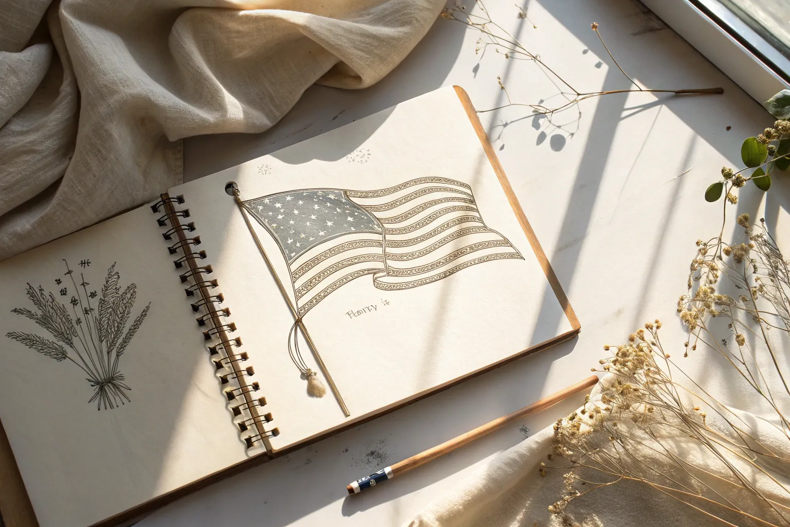
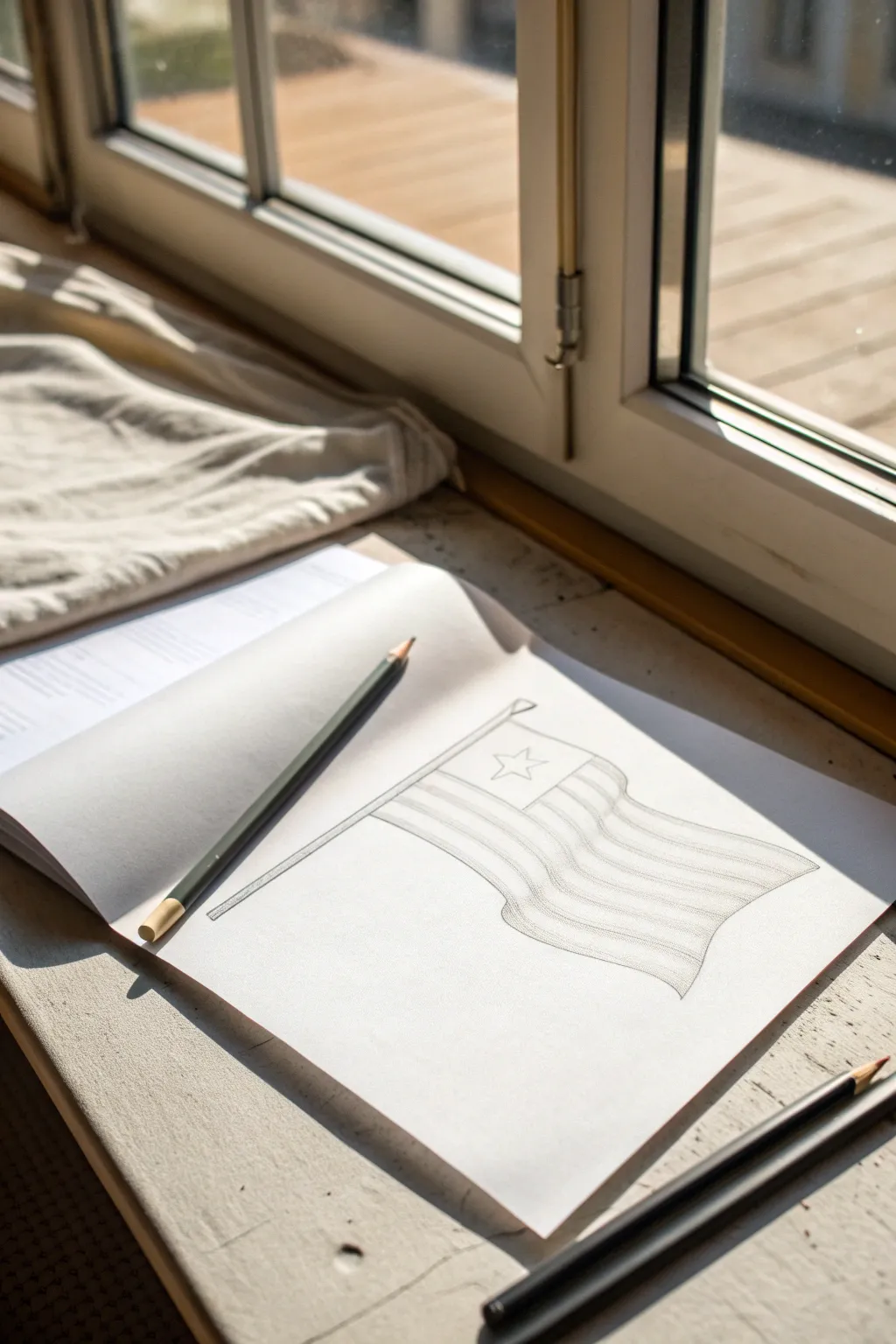
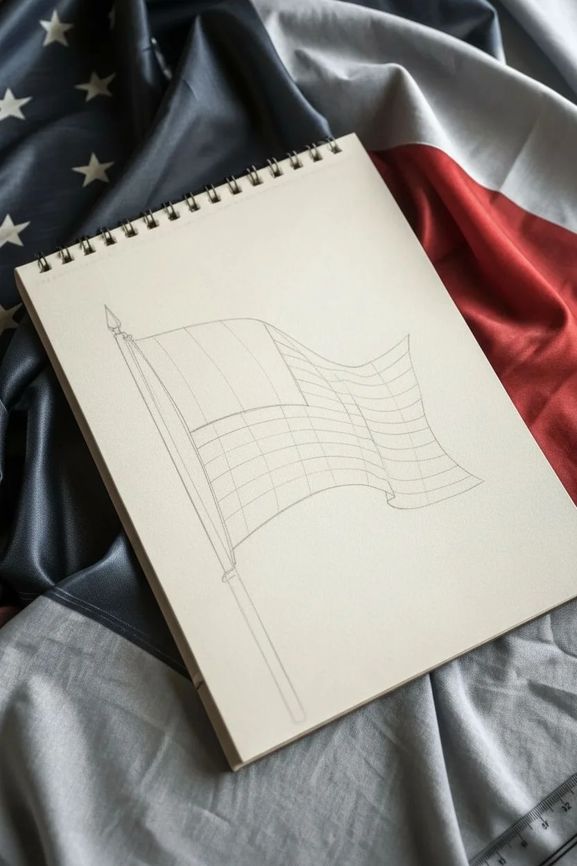
Soft Graphite Blend Realism Study
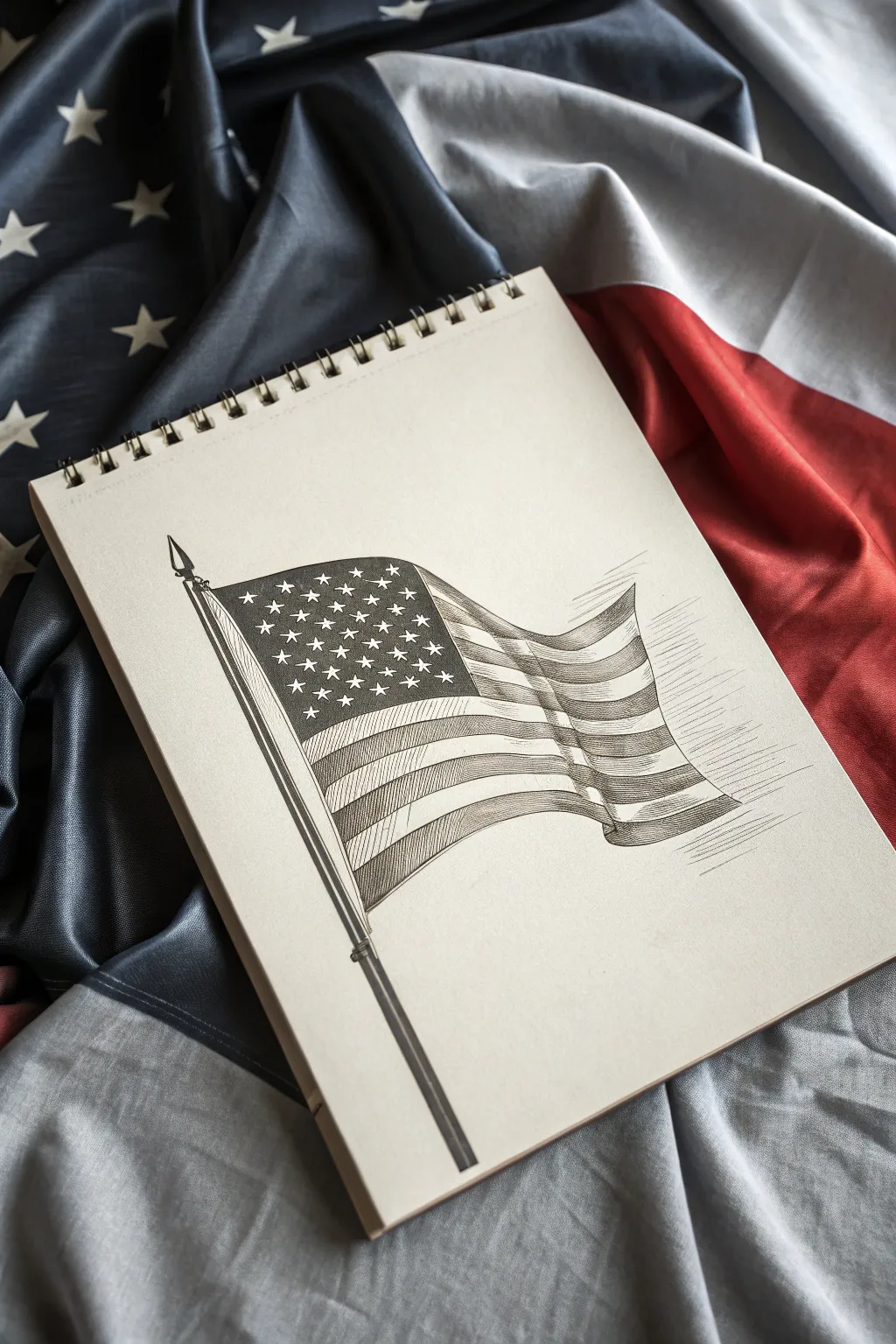
Capture the movement and dignity of the Stars and Stripes with this detailed graphite realism study. This project focuses on mastering fabric folds and precision shading to create a striking monochromatic illustration on cream paper.
Detailed Instructions
Materials
- Spiral-bound sketchbook (cream or off-white paper preferred)
- H pencil (for initial layout)
- 2B and 4B graphite pencils
- Fine liner ink pen (0.3mm or 0.5mm, black)
- Ruler
- Kneaded eraser
- Blending stump (tortillon)
Step 1: Structural Framework
-
Set the pole angle:
Begin with your H pencil and a ruler to draw the flagpole. Angle it diagonally from the bottom-left toward the upper-left, but don’t make it perfectly vertical—a slight tilt adds dynamic energy. Draw the ball finial at the very top. -
Draft the flag shape:
Sketch the outer boundary of the flag. Instead of a stiff rectangle, draw curved top and bottom lines that mimic a gentle wave. Ensure the flag narrows slightly as it extends away from the pole to account for foreshortening. -
Map the waves:
Lightly draw vertical, curving S-lines across the flag’s body. These lines will dictate where the fabric ripples and folds. Imagine the wind is catching the fabric, creating peaks and valleys.
Fabric Flow Tip
Don’t draw straight lines for stripes! Always curve them slightly parallel to the top and bottom flag edges. Straight lines will kill the illusion of wind.
Step 2: Pencil Detailing
-
Define the canton:
Mark out the rectangular canton (the star field area) in the upper left corner. Remember to curve its bottom and right edges to follow the wave lines you established in the previous phase. -
Stripe guidelines:
Using your curving wave lines as a guide, lightly sketch the thirteen stripes. It’s crucial that these lines flow parallel to the top and bottom edges of the flag, bending upward and downward with the fabric’s movement. -
Star placement:
Lightly grid out the star positions within the canton. You don’t need to draw perfect stars yet; just mark small ‘x’s or dots where the center of each star should sit.
Step 3: Inking and Definition
-
Outline the pole:
Switch to your fine liner pen. Carefully ink the flagpole, using the ruler for the straight sections but adding slight curvature to the finial and connector details to give them volume. -
Ink the stripes:
Trace over your pencil stripe lines with the pen. Use a confident, consistent stroke. When the line goes into a ‘valley’ of a fold, you might thicken it slightly to suggest shadow depth. -
Draw the stars:
Carefullyink the five-pointed stars. Since they are small, keep the points sharp. Leave the blue field around them blank for now; we will create the contrast with negative shading later. -
Erase guidelines:
Once the ink is completely dry (give it a few minutes to prevent smudging), gently erase all underlying H pencil lines with your kneaded eraser.
Vintage Vibe
Wash the finished drawing with a very diluted layer of brewed black tea or coffee. It tints the paper and gives the sketch an antique, historical document feel.
Step 4: Shading and Texture
-
Darken the canton:
Use your 2B pencil or the ink pen (hatching technique) to fill in the background of the canton around the stars. If using graphite, press firmly to achieve a dark grey, making the white paper stars pop. -
Stripe hatching:
For the red stripes, use vertical hatching lines. Keep the lines close together. I find that varying the pressure—pressing harder in the fold valleys and lighter on the peaks—creates an excellent illusion of dimensional fabric. -
Cross-hatching shadows:
Return to the darker ‘red’ stripes and add diagonal cross-hatching only in the deepest folds. This deepens the contrast and emphasizes the wave. -
White stripe volume:
Even the white stripes need dimension. Use a very sharp H pencil to add extremely faint, sparse hatching lines just in the shadowed curves of the white stripes. -
Motion lines:
To give the effect of wind, draw a few thin, horizontal speed lines extending from the trailing (right) edge of the flag. -
Pole shading:
Use the 2B pencil to shade one side of the flagpole to make it look cylindrical. A tight gradient from dark to light works best here. -
Final blending:
Optional: Use a blending stump to soften the graphite shading on the folds, smoothing out the transition between the highlighted peaks and shadowed valleys.
Now you have a timeless, patriotic illustration that practically flutters off the page

PENCIL GUIDE
Understanding Pencil Grades from H to B
From first sketch to finished drawing — learn pencil grades, line control, and shading techniques.
Explore the Full Guide
Crosshatching for Textured Fabric Shadows
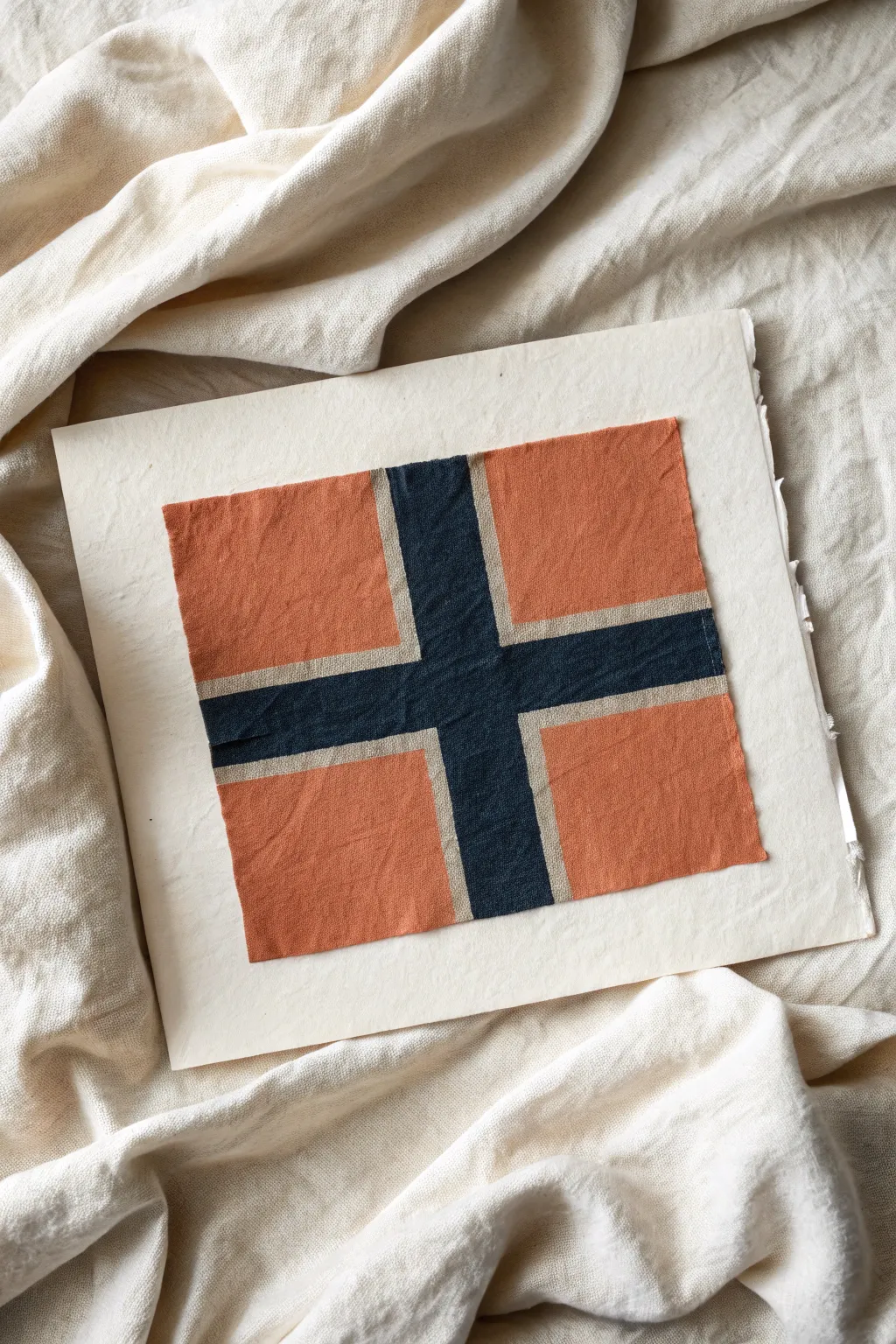
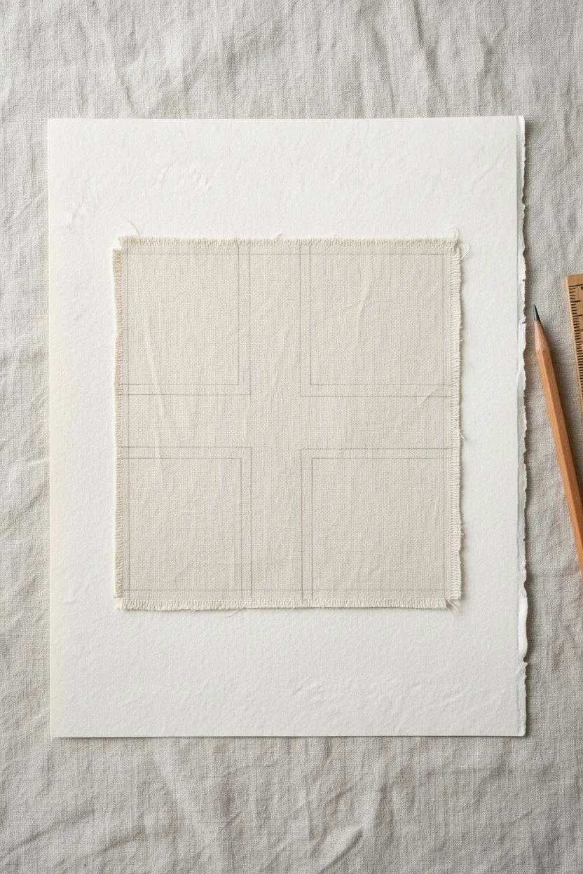
Recreate the cozy feel of vintage textiles with this simple mixed-media collage project. By combining painted canvas strips on textured paper, you’ll achieve a rustic, hand-crafted look inspired by the Norwegian flag’s Nordic cross design.
Step-by-Step Tutorial
Materials
- Heavyweight textured watercolor paper (rough press) or handmade rag paper
- Unprimed canvas fabric or linen scrap (approx. 6×6 inches)
- Acrylic paints (Burnt Orange/Terracotta, Navy Blue/Indigo, Warm White/Beige)
- Matte gel medium or fabric glue
- Flat paint brushes (small and medium sizes)
- Pencil and ruler
- Scissors or rotary cutter
- Fabric stiffener (optional)
Step 1: Preparing the Base
-
Cut the fabric:
Begin by cutting a square of your unprimed canvas or linen. Aim for a size around 5×5 inches, though you can adjust this to fit your paper. Don’t worry if the edges fray slightly; this adds to the rustic charm. -
Stiffen the fabric (optional):
If your fabric feels too flimsy, I find that brushing a light coat of fabric stiffener or watered-down matte medium over it helps it hold its shape. Let this dry completely before painting. -
Measure the cross:
Use a pencil and ruler to lightly sketch the Nordic cross design directly onto the fabric. The vertical bar should be shifted towards the left side (hoist side), typical of Scandinavian flags. -
Define the stripes:
Mark the width of the central cross and the thinner border (fimbriation) that separates the cross from the background rectangles. Precision helps here, but a little hand-drawn wobble is okay.
Textured Shadows
To mimic fabric weave, try dry-brushing a slightly darker shade over the dried paint in a crosshatch pattern. It creates instant depth.
Step 2: Painting the Design
-
Mix the background color:
Create a warm, earthy terracotta shade by mixing burnt orange with a tiny touch of brown or white to soften it. You want it to look like aged dye. -
Paint the quadrants:
Carefully paint the four rectangular quadrants of the flag with your terracotta mix. Use a small flat brush to get clean lines along your pencil marks, leaving the cross area blank for now. -
Mix the cross color:
Mix a deep, rich navy blue. A touch of black or charcoal can deepen standard blue acrylic to match the moody tone of the reference image. -
Paint the center cross:
Fill in the central cross area with the dark blue paint. Be very careful not to let the blue bleed into the spaces reserve for the white stripes. -
Create the pale stripes:
Mix a warm white or beige tone. Pure white might look too stark, so warm it up with a drop of yellow oxide or brown. Paint the thin borders separating the blue cross from the red background. -
Dry and refine:
Allow the paint to fully dry. If the canvas texture absorbed too much paint, apply a second thin coat to make the colors solid and opaque.
Step 3: Assembly
-
Prepare the paper support:
Cut or tear your textured watercolor paper to a size larger than your fabric square, leaving a generous margin. A deckled or torn edge looks wonderful here. -
Apply adhesive:
Brush a layer of matte gel medium onto the back of your painted fabric square. Ensure you get coverage all the way to the edges. -
Mount the artwork:
Center the fabric onto the paper and press down firmty. Smooth it out gently from the center to the edges to remove air bubbles, being careful not to stretch the fabric. -
Weight it down:
Place a sheet of clean wax paper over the artwork, then place a heavy book on top. Leave it for at least an hour to ensure a flat, secure bond while the glue sets. -
Final inspection:
Once dry, check the edges. If any fabric is lifting, apply a tiny bit more gel medium with a toothpick and press down again.
Frayed Finish
Use a needle to gently pull out a few threads from the canvas edges after mounting. This enhances the vintage textile aesthetic.
This charming fabric collage makes a beautiful standalone piece or part of a gallery wall celebrating texture and color
Clean Line Art Flag for Coloring
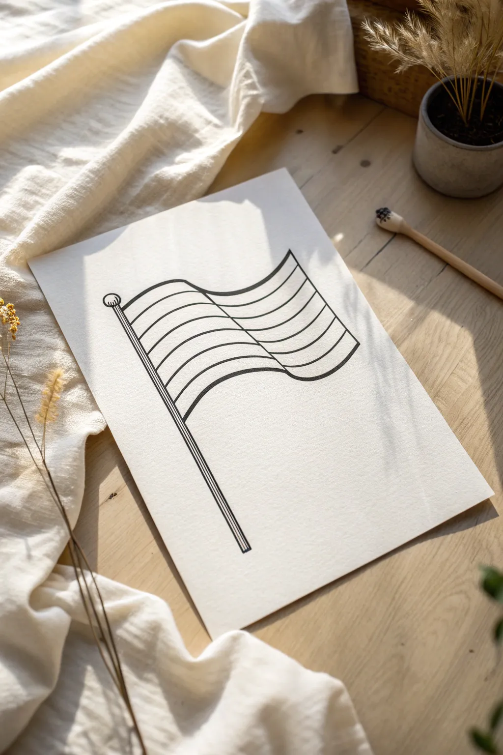
This project creates a crisp, clean flag illustration perfect for custom coloring or leaving as a stark graphic statement. Using bold, consistent line weights brings a modern feel to this classic waving flag design.
Detailed Instructions
Materials
- High-quality white paper or cardstock (A4 or Letter size)
- Pencil (HB or 2B)
- Eraser
- Ruler
- Thick black drawing pen (0.8mm or 1.0mm) or fine-tip marker
- Thinner black pen (0.3mm or 0.5mm) for details
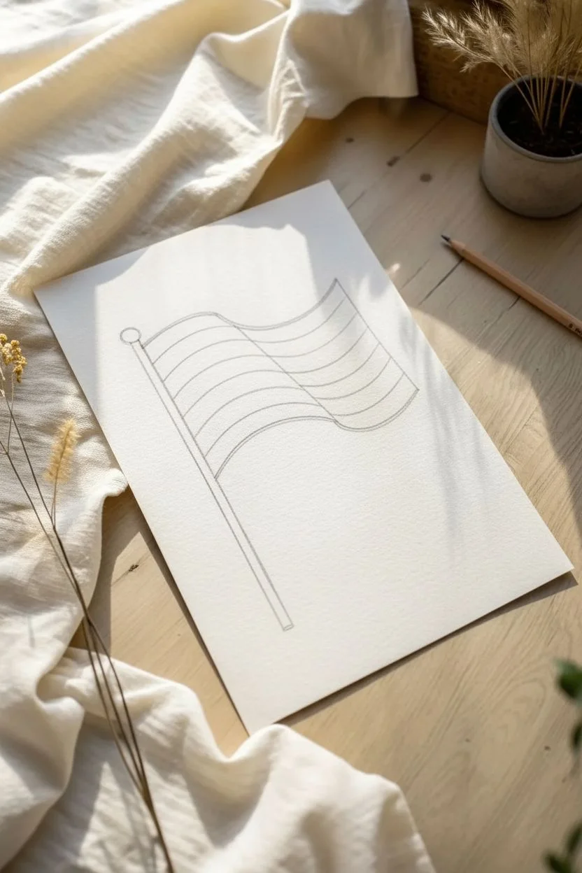
Step 1: Drafting the Structure
-
Draw the pole guide:
Start by drawing a long, straight vertical line near the left side of your paper using your ruler. This will be the center of your flagpole. -
Sketch the flag’s spine:
Lightly sketch a vertical line parallel to your first one, about a centimeter to the right. This defines the thickness of the pole. -
Define the wave shape:
Draw the top edge of the flag starting from the top of the pole. Create a gentle ‘S’ curve: dip down slightly first, then curve upward, and finally flatter at the end. -
Mirror the bottom edge:
Move down the pole about 4-5 inches (depending on how large you want the flag). Replicate that same ‘S’ curve for the bottom edge of the flag. -
Connect the sides:
Draw a vertical line on the right side connecting the ends of your two curves. This line should be slightly curved or angled to match the flow of the waving fabric. -
Divide the stripes:
Inside the flag shape, sketch five evenly spaced curves that follow the exact same ‘S’ motion as your top and bottom edges. This creates six distinct stripes.
Step 2: Ideally Inking the Lines
-
Ink the flagpole:
Switch to your thicker marker or pen. Trace the vertical lines of the pole. At the top, draw a small circle for the finial (the ball on top). -
Detail the pole:
Add two tiny horizontal lines just below the ball finial to create a decorative neck. At the bottom of the pole, close the shape with a straight horizontal line. -
Outline the flag perimeter:
Carefully trace the top, bottom, and right side edges of the flag with your thick marker. Try to keep your hand steady for a smooth, continuous line. -
Ink the dividing stripes:
Using the same thick marker, trace over your five internal stripe guides. I find it helpful to rotate the paper here so I’m pulling the pen toward me for better control. -
Thicken the separation line:
To give the drawing dimension, draw a very thin second line right next to the pole where the fabric meets the metal. This suggests a hem or overlap. -
Refine line weights:
Go back over the main outer perimeter lines once more if needed to make them slightly bolder than the internal stripe lines. This subtle difference makes the drawing pop.
Smooth Curves
Draw curves using your whole arm, not just your wrist. Pivot from your elbow to get that graceful, confident ‘S’ shape without jagged wobbles.
Step 3: Finishing Touches
-
Vertical pole texture:
Use your thinner pen (0.3mm) to draw two or three long, straight vertical lines inside the flagpole. These act as shading lines to make the pole look round. -
Erase pencil marks:
Wait at least 5-10 minutes for the ink to dry completely. Gently erase all your underlying pencil sketches, being careful not to crumple the paper. -
Clean up edges:
Inspect your lines. If there are any gaps where lines connect, carefully touch them up with the fine tip of your pen.
Make it Yours
Use this template for specific pride flags by adjusting the number of stripes. For a classic US flag vibe, add a square canton in the top left corner.
Now you have a bold, graphic flag ready for your favorite colors or simply to display as modern art


Watercolor Wash for a Windy, Airy Flag
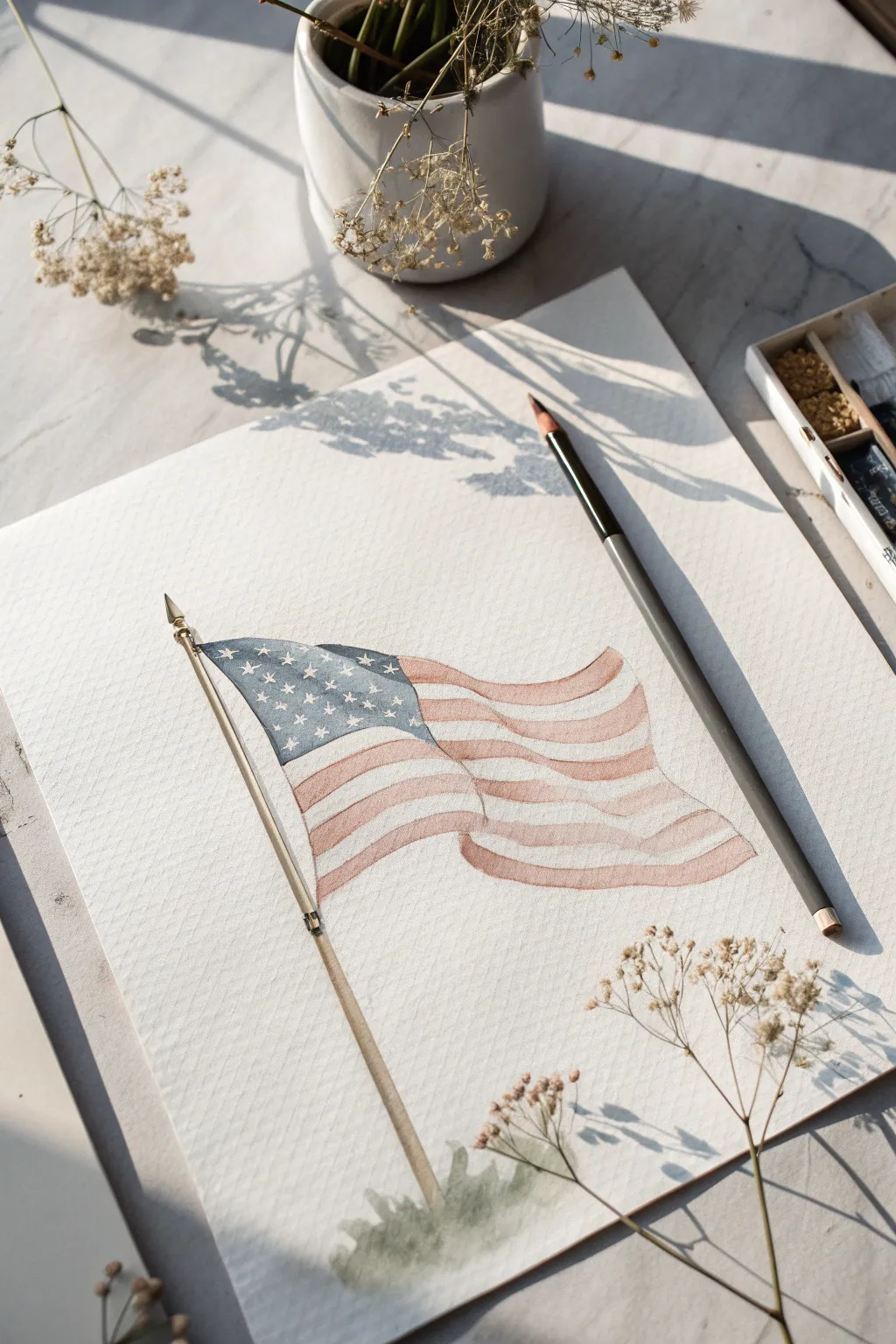
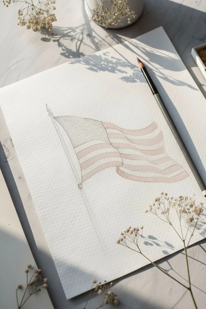
Capture the gentle movement of patriotism with this delicate watercolor project. The soft washes and muted tones create a vintage, airy feel that perfectly evokes a flag rippling in a summer breeze.
Step-by-Step Tutorial
Materials
- Cold-press watercolor paper (300 gsm)
- Pencil (HB or 2H)
- Kneaded eraser
- Watercolor paints (Indigo Blue, Burnt Sienna, Cadmium Red, Yellow Ochre)
- Round watercolor brushes (sizes 2, 4, and 6)
- Gold or metallic paint (optional for finial)
- Two jars of water
- Paper towels
- Drawing board or tape
Step 1: Sketching the Foundation
-
Establish the flagpole:
Begin by drawing a long, slender diagonal line on the left side of your paper using an HB pencil. Angle it slightly to the right to suggest the flag is being held or planted. Keep this line light. -
Define the pole details:
Thicken the line slightly to create the wooden dowel shape. Add a small, pointed spear shape (finial) at the very top. Toward the middle, add a small bracket where the flag fabric will attach. -
Outline the flag shape:
Sketch the top edge of the flag with a distinctive wave—start it high near the pole, dip down, and rise again. Mirror this wavelike motion for the bottom edge to create the sensation of fluttering fabric. -
Mark the union:
Draw the rectangular canton (the blue field) in the upper left corner. Ensure the bottom line of this rectangle follows the same gentle wave distortion as the flag’s stripes. -
Draw the stripes:
Lightly sketch the horizontal stripes. Remember that these lines aren’t straight; they must follow the undulating curve of the flag. Don’t worry about being mathematically perfect; irregularity adds to the wind-blown effect. -
Add the stars:
Inside the canton, sketch small, faint stars. You don’t need all 50; a suggestion of scattered stars works beautifully for this loose style. -
Refine the lines:
Use a kneaded eraser to gently lift the darkest graphite marks, leaving only a faint guide for your paint.
Preserve the Stars
Use masking fluid to cover the tiny stars before painting the blue field. This lets you paint freely without worrying about preserving the white paper manually.
Step 2: Applying the Watercolor
-
Mix the vintage blue:
Create a muted blue for the union by mixing Indigo Blue with a tiny touch of Burnt Sienna or black to desaturate it. Add plenty of water for transparency. -
Paint the union:
Using a size 4 brush, fill in the canton area with your blue mix. Carefully paint around the tiny star shapes to leave them the white of the paper. This negative painting technique looks cleaner than painting white on top later. -
Mix the faded red:
Prepare a soft red wash. Mix Cadmium Red with a hint of Burnt Sienna to take away the brightness, aiming for an old-glory red. Dilute it heavily. -
Start the stripes:
With a size 6 brush, paint the red stripes. Start from the pole and pull the brush outward, letting the pigment pool slightly in the “valleys” of the waves to create natural shadows. -
Control the edges:
Be careful not to let the wet red paint touch the wet blue union. If the blue acts up, wait a moment for it to dry before painting the red stripe immediately below it. -
Soften the white stripes:
While the red stripes dry, take a clean, slightly damp brush and run it gently along the white stripes. I like to pick up microscopic amounts of dirty water or dilute blue to give the white stripes a shadow tone, preventing them from looking too stark. -
Paint the pole:
Mix Yellow Ochre with a bit of Burnt Sienna to get a light wood color. Paint the flagpole, keeping the left side slightly lighter to suggest a light source. -
Add definition to the wood:
Once the pole’s base layer is damp-dry, add a thin line of darker brown along the right edge using a size 2 brush to create roundness and volume. -
Detail the finial:
Use a stronger concentration of Yellow Ochre or a metallic gold paint for the spear tip and the bracket details on the pole.
Step 3: Finishing Touches
-
Deepen the shadows:
Mix a very dilute grey-purple wash. Glaze this gently over the dips and folds of the flag (both red and white stripes) to enhance the three-dimensional rippling effect. -
Ground the image:
Create an abstract grassy base. Mix green with grey and dab it loosely at the bottom of the pole using a wet, sloppy brush stroke. Let it bleed out into nothingness. -
Optional splatter:
For a truly artistic finish, you might lightly tap a brush loaded with clean water or very faint paint over the dried flag to create subtle texture blooms.
Add a Setting
Paint simple silhouette outlines of birds in the distance or faint cloud shapes in the background to place the flag in a wide-open sky context.
Allow the painting to dry completely on a flat surface to prevent warping before you frame your patriotic artwork
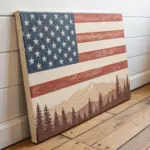
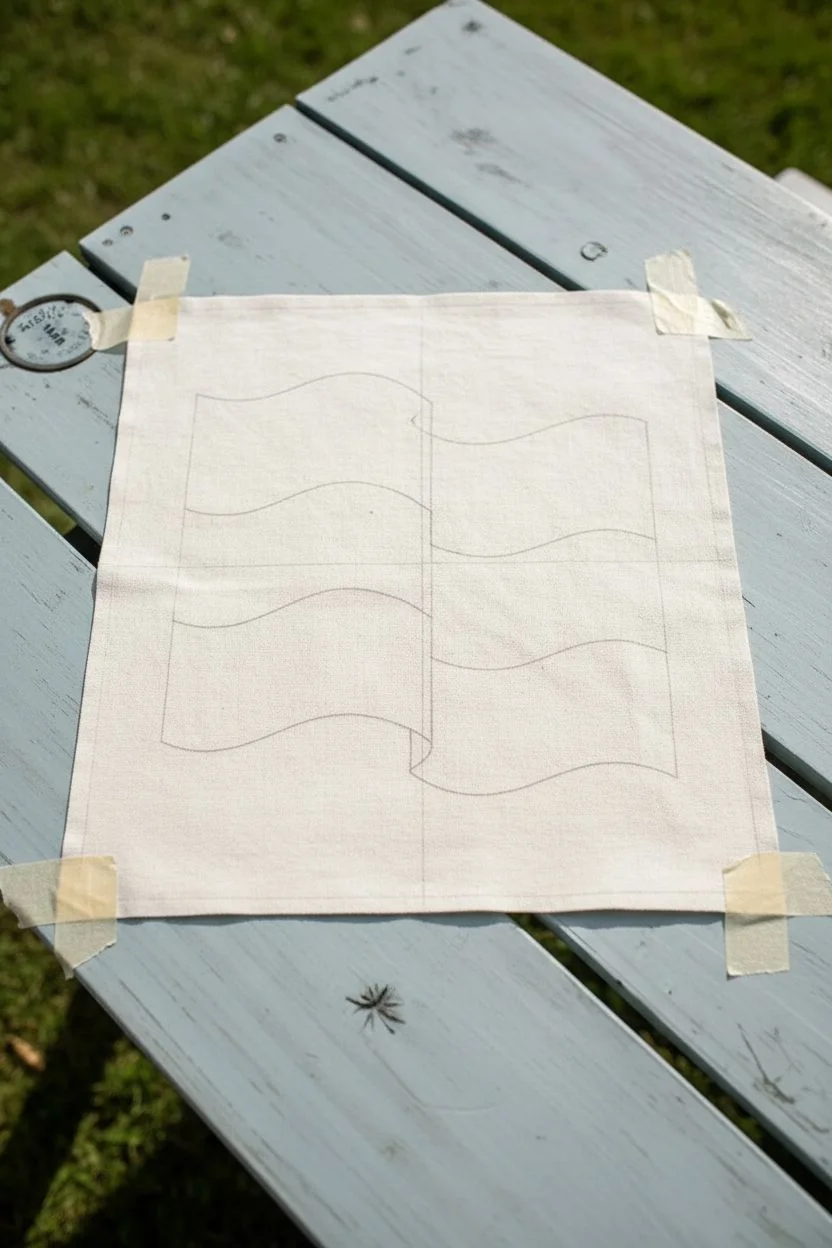
Bold Flat Color With Simple Shadow Glaze
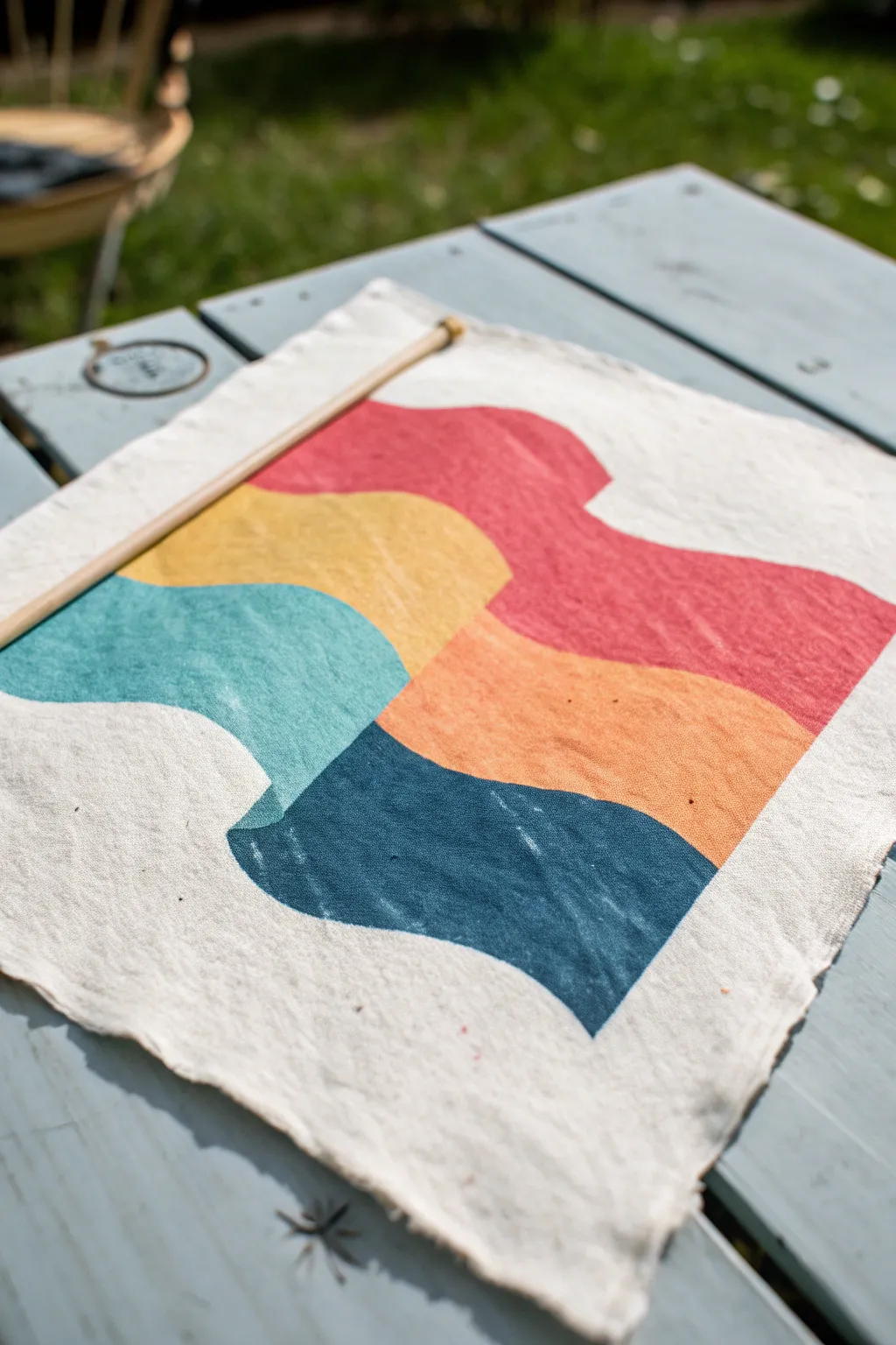
This tutorial guides you through creating a stunning, modern fabric flag featuring bold waves of color and subtle texture. The design uses flat blocks of red, mustard, teal, and navy to create a dynamic, flowing movement that looks great hanging on any wall.
Detailed Instructions
Materials
- Square piece of natural calico or canvas fabric (hemmed or raw edge)
- Fabric paints (Red, Mustard Yellow, Teal, Navy Blue, Orange)
- Flat shader brushes (medium and large)
- Pencil or disappearing fabric marker
- Paper for sketching the design
- Masking tape or painter’s tape
- Wooden dowel for hanging
- Iron (for heat setting)
Step 1: Preparation and Sketching
-
Prepare the fabric:
Begin by pressing your square of fabric with an iron to remove any creases. A flat surface is crucial for crisp painting lines. -
Draft the design:
On a piece of scrap paper roughly the same size as your fabric, sketch out the wavy grid pattern. The design consists of a central flow where colors shift as they move across a vertical divide. -
Transfer the guide lines:
Lightly transfer your sketch onto the fabric using a pencil or disappearing ink pen. Draw a vertical line down the center first to act as your anchor, then sketch the horizontal wavy lines that intersect it. -
Secure the fabric:
Tape the corners of your fabric to your work surface. This prevents the cloth from shifting while you paint and ensures your lines remain steady.
Bleeding Lines?
If paint bleeds into the fabric weave, use less water on your brush. Fabric paint should be the consistency of heavy cream. A dry brush technique keeps lines crisp.
Step 2: Painting the Design
-
Start with the red wave:
Load a flat brush with red fabric paint. Fill in the top-right section of the wave. Keep your edges sharp, but don’t worry about perfect solidity; a little texture adds character. -
Paint the yellow section:
Using a clean brush, paint the top-left section in mustard yellow. Let this section touch the red section at that central vertical line you drew earlier. -
Add the teal wave:
Moving downwards on the left side, paint the middle wave using teal paint. Follow the curve carefully to maintain the flow of the design. -
Fill the middle right:
Paint the section directly to the right of the teal heavily with orange paint. I find that slightly overlapping the central line ensures no white fabric peeks through the gap. -
Apply the navy base:
Paint the bottom-right section with your navy blue paint. This anchors the design with a deep, contrasting value. -
Complete the bottom left:
Finish the painting phase by filling the final bottom-left section with navy blue as well, connecting the visual flow across the bottom of the flag. -
Refine the edges:
Go back over any uneven edges with a smaller brush. You want the curves to feel continuous even though the colors change. -
Create the glaze effect:
To mimic the subtle shadow glaze seen in the image, mix a tiny drop of black or dark blue into glazing medium or water to create a very sheer wash. Lightly brush this over the curves where the ‘fabric’ of the design folds to add dimension.
Step 3: Finishing Touches
-
Dry thoroughly:
Allow the paint to dry completely. This usually takes several hours, but check your specific paint bottle for instructions. -
Heat set the design:
Once dry, place a pressing cloth over your artwork and iron it on a medium-high setting to set the fabric paint permanently. -
Create the casing:
Fold the top edge of the fabric over the back to create a channel wide enough for your dowel. Use fabric glue or a simple running stitch to secure it. -
Insert the dowel:
Slide your wooden dowel through the channel you just created. Ensure the dowel extends slightly past the fabric on both sides. -
Add the distressed edge:
For that rustic look, gently pull a few threads loose from the sides and bottom of the fabric square to create a soft, frayed fringe.
Block Print Style
Instead of painting freehand, cut the wave shapes out of linoleum or craft foam and stamp them onto the fabric for a true textured, block-printed finish.
Hang your new geometric art piece in a sunny spot to let those bold colors really shine
Two Overlapping Flags in Different Winds
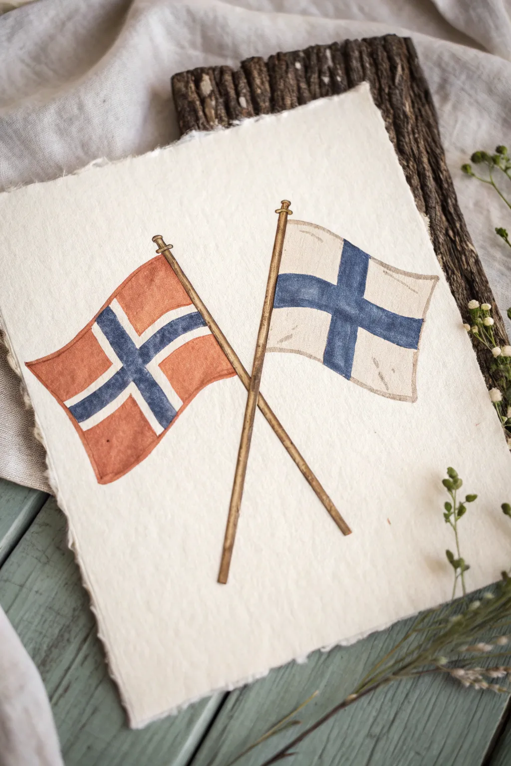
This charming watercolor project captures the crossed flags of Norway and Finland on beautiful, handmade-style paper. The slight transparency of the colors and the visible paper texture give the artwork a timeless, vintage illustration feel.
How-To Guide
Materials
- Heavyweight cold-press watercolor paper (300gsm or higher) with deckled edges
- Watercolor paints (Cadmium Red, Ultramarine Blue, Burnt Umber/Sepia)
- Pencil (HB) and eraser
- Fine liner pen (brown or sepia archival ink, 0.1mm – 0.3mm)
- Round watercolor brushes (size 4 for fills, size 0 or 2 for details)
- Ruler
- Jar of clean water
- Paper towel
Step 1: Planning the Composition
-
Center constraints:
Begin by finding the visual center of your paper. Lightly mark a small ‘X’ where the two flagpoles will intersect; placing this slightly below the true center of the page often looks more balanced. -
Drafting the poles:
Using a ruler and a very light pencil touch, draw the two flagpoles crossing at your mark. Aim for a 60-degree angle between them for a classic crossed-flag look. Add small knobs (finials) to the top of each pole. -
Sketching the flags:
Sketch the wavy outlines of the flags. The left flag (Norway) should appear to be blowing slightly towards the left, and the right flag (Finland) towards the right. Keep the fabric edges curvy to suggest movement. -
Mapping the crosses:
Draw the Nordic cross pattern on both flags. Remember that fabric folds warp straight lines, so curve the cross bars to match the waves of the flag’s outline. This is crucial for a realistic draped effect.
Step 2: Inking the Outline
-
Tracing lines:
Go over your pencil sketches with a sepia or brown fine liner. A black pen can look too harsh for this vintage style, so brown is softer. Keep your hand relaxed to allow for slightly organic lines rather than darker mechanical ones. -
Adding texture details:
Add a few tiny, broken lines inside the flag shapes to suggest wrinkles or folds in the fabric. Don’t overdo it; just two or three small marks per flag usually suffice. -
Clean up:
Once you are absolutely certain the ink is dry (wait at least 5 minutes), gently erase the underlying pencil structure.
Wobbly Lines?
If your hand shakes while inking the long flagpoles, don’t worry. A slightly uneven line actually enhances the hand-drawn, rustic aesthetic of this specific style.
Step 3: Painting the Flags
-
Mixing the red:
Mix a muted red for the Norwegian flag. Plain Cadmium Red can be too bright, so I like to add a tiny dot of brown to tone it down. Paint the red sections, carefully working around the cross. -
The blue cross:
Mix a deep blue for the cross on the Norwegian flag. Using your smallest brush, paint the blue cross. Leave a thin strip of white paper between the red and blue sections to represent the white border of the Norwegian design. -
Painting Finland:
For the Finnish flag on the right, repaint the blue cross area. Create a wash that is slightly uneven—letting water pool in some areas—to give the impression of fabric texture. -
White fabric shading:
Even white flags have shadow. Dilute a tiny amount of brown or grey paint until it is barely visible. Paint this very faint wash along the bottom edges and folds of the white sections on the Finnish flag to give it volume.
Level Up: Aged Paper
Before painting, lightly stain your paper with tea or very dilute coffee. Let it dry completely under a heavy book to flatten it. This creates an authentic antique look.
Step 4: Final Details
-
Painting the poles:
Mix a warm wood tone using Burnt Umber and a touch of yellow ochre if you have it. Paint the full length of the flagpoles carefully. -
Adding wood depth:
While the wood paint is still slightly damp, drop a slightly darker brown concentrated on the left side of each pole to create a cylindrical shadow effect. -
Refining edges:
Check the edges of your paint. If color bled where it shouldn’t have, use a clean, damp stiff brush to gently scrub and life the mistake. Once dry, these flags are ready to be displayed.
Display your finished flag study in a floating frame to show off those beautiful paper edges
Weathered, Frayed Flag Texture Practice
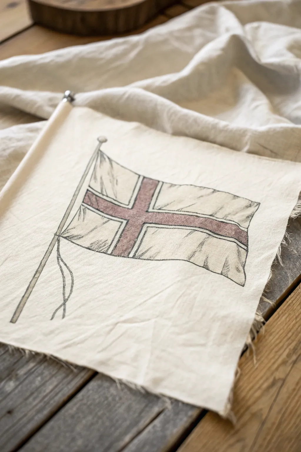
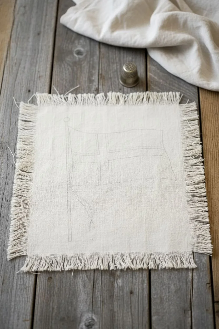
Capture the charm of vintage textiles with this sketched fabric flag project. By combining simple ink illustration techniques with frayed muslin, you can create a piece that feels both historical and handmade.
Step-by-Step Guide
Materials
- Unbleached cotton muslin or linen scrap (approx. 8×10 inches)
- Pencil (HB or similar)
- Fine-point permanent pigment liner (0.1mm and 0.5mm, like Micron)
- Fabric markers or watered-down acrylic paint (rust/brownish-red)
- Ruler
- Small round paintbrush (size 2 or 4)
- Scissors
Step 1: Preparing the Fabric Canvas
-
Cut the fabric:
Cut your piece of unbleached muslin or linen into a rectangle approximately 8 by 10 inches. The sizes don’t need to be perfectly exact as the charm lies in the irregularity. -
Create frayed edges:
Gently pull loose horizontal and vertical threads from all four edges of the fabric. continue removing threads until you have a soft fringe about 1/4 inch deep on all sides. -
Flatten the surface:
Iron the fabric flat on a low setting. This provides a smooth surface for your pen nibs, which can otherwise snag on wrinkled textile fibers.
Preventing Bleed
Fabric acts like a wick. To stop ink from spreading, place the fabric on freezer paper and iron it down shiny-side up before drawing.
Step 2: Drafting the Design
-
Sketch the flagpole:
Using a pencil, lightly draw a slanted vertical line on the left side for the flagpole. Add a small circle at the top for the finial. -
Outline the flag shape:
Draw the basic rectangle of the flag attached to the pole. Instead of perfect straight lines, add gentle waves to the top and bottom edges to simulate the fabric rippling in the wind. -
Divide the cross:
Sketch the Nordic cross design. Draw the vertical bar slightly off-center to the left, and the horizontal bar centered. Ensure the bars have a consistent thickness. -
Add dimension lines:
Lightly sketch diagonal folds coming from the flagpole corners toward the center of the flag to suggest tension and movement in the cloth.
Step 3: Inking the Illustration
-
Outline the main structure:
Using the 0.5mm pigment liner, trace over your main pencil lines. Use a broken, sketchy line weight rather than a single solid stroke to mimic an etching style. -
Add the cross details:
Switch to the finer 0.1mm pen to outline the inner cross shape. This visual hierarchy keeps the outer flag shape dominant. -
Texturize the flag:
Use short, quick hatching marks near the flagpole and along the ripples you sketched earlier. These clusters of lines create shadows and volume. -
Detail the pole and ropes:
Draw the halyard lines (ropes) hanging loosely from the bottom corner of the flag near the pole. Keep these lines fluid and organic. -
Erase guidelines:
Wait at least 15 minutes for the ink to fully set into the fibers. Gently erase visible pencil marks, being careful not to stretch the fabric weave.
Fixing Heavy Ink
If a line comes out too thick or dark, dab it immediately with a clean paper towel to lift excess ink, then hatch white acrylic over it when dry.
Step 4: Adding Color and Finish
-
Prepare the color:
If using acrylics, mix a burnt sienna or rust color with a significant amount of water until it reaches an ink-wash consistency. If using fabric markers, test the color on a scrap first. -
Apply the wash:
Paint the cross section using your small brush or marker. I like to apply the color somewhat unevenly, leaving tiny specks of white fabric showing through for a weathered look. -
Feather the edges:
While the paint is still slightly damp, use a clean, barely damp brush to gently feather the edges of the color so it doesn’t look like a solid block. -
Add shadow accents:
Once the red wash is dry, use your 0.1mm pen to add a second layer of very fine hatching over the darkest parts of the red cross to deepen the shadows. -
Final weathering:
Crumple the fabric in your hand tightly and then smooth it back out. This breaks the stiffness of the paint and integrates the drawing into the cloth.
This charming fabric illustration is now ready to be pinned to a mood board or framed in a shadow box
Have a question or want to share your own experience? I'd love to hear from you in the comments below!