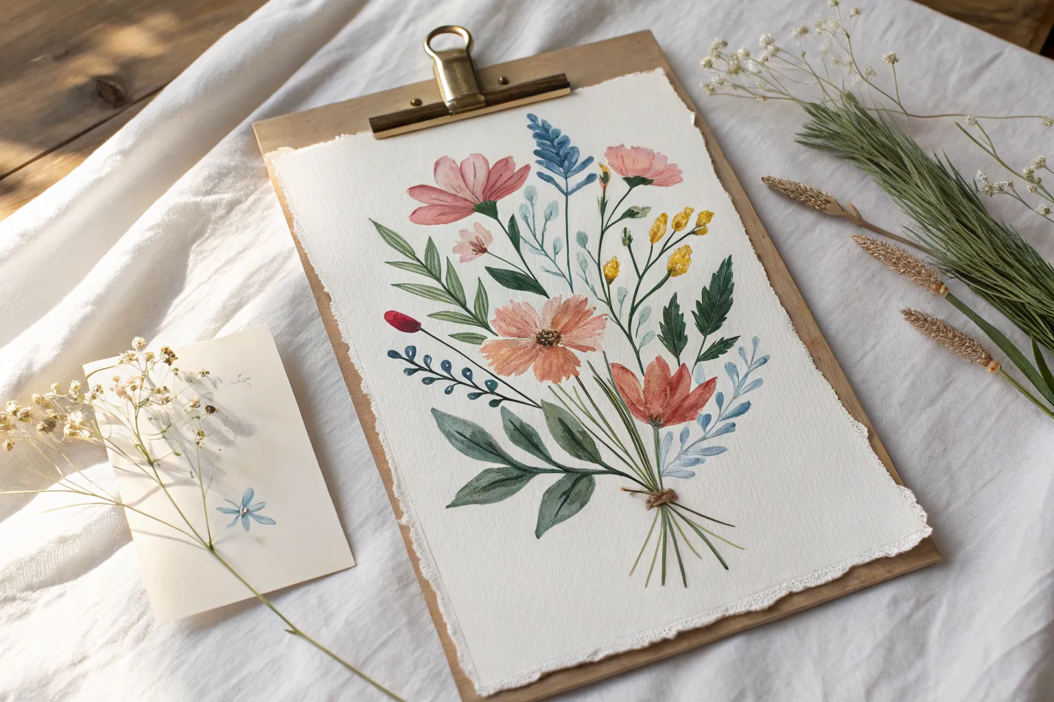
Flowers are basically the perfect art subject: they’re forgiving, colorful, and you can make them look amazing with just a few simple shapes. Here are some flower art ideas I love teaching in my studio—starting classic and easy, then drifting into more playful, unexpected takes.
Simple Watercolor Wildflower Sprigs
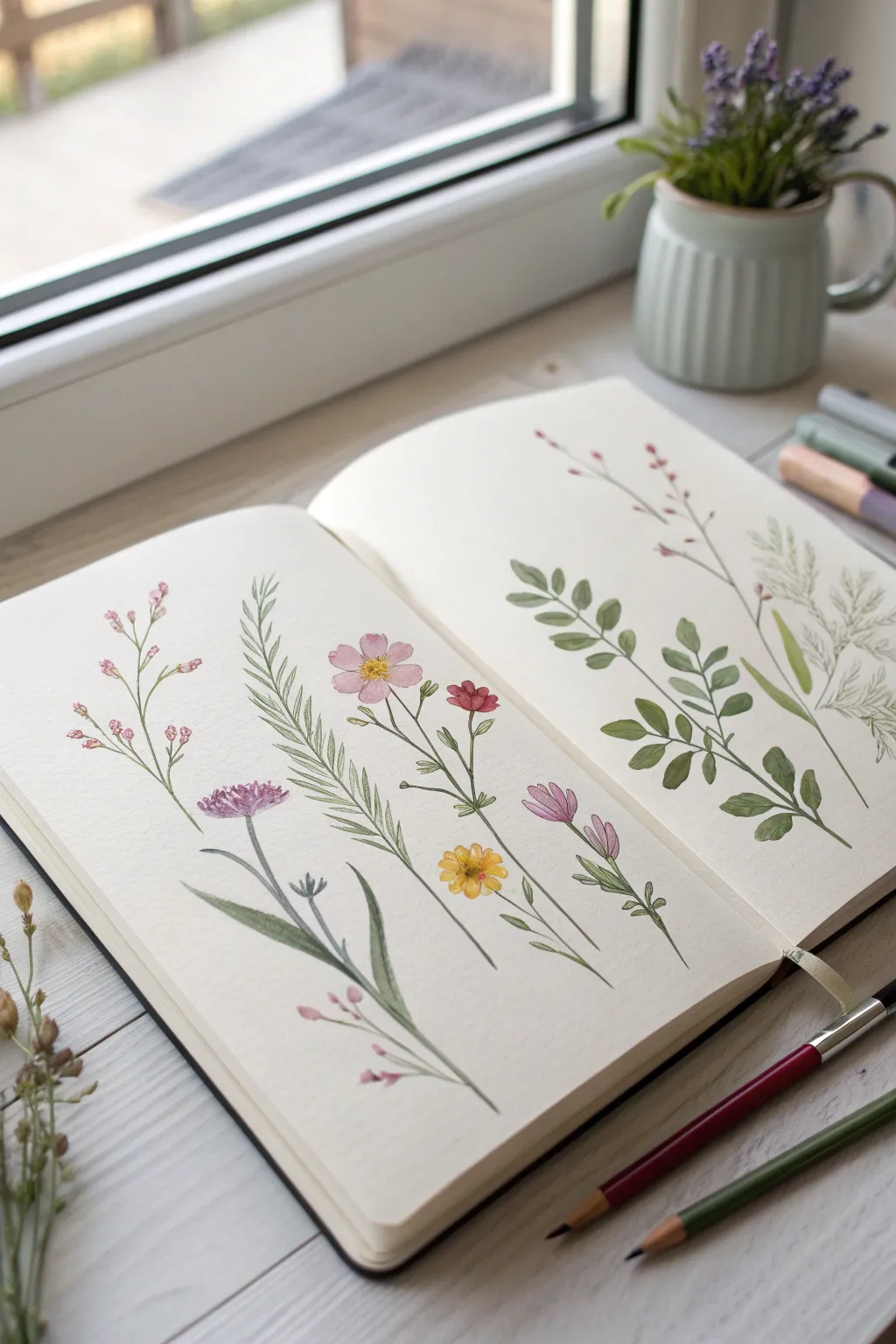
Capture the delicate beauty of a summer meadow with these airy, botanical-style wildflower sprigs. This project focuses on fine lines and translucent washes to create a sketchbook spread that feels fresh and organic.
How-To Guide
Materials
- Watercolor paper sketchbook (cold press, medium texture)
- Watercolor paints (shades of pink, purple, yellow, and various greens)
- Fine round brushes (sizes 0, 1, and 2)
- Pencil (HB or H)
- Kneaded eraser
- Jar of water
- Paper towel
- Optional: Fine liner pen (sepia or light grey)
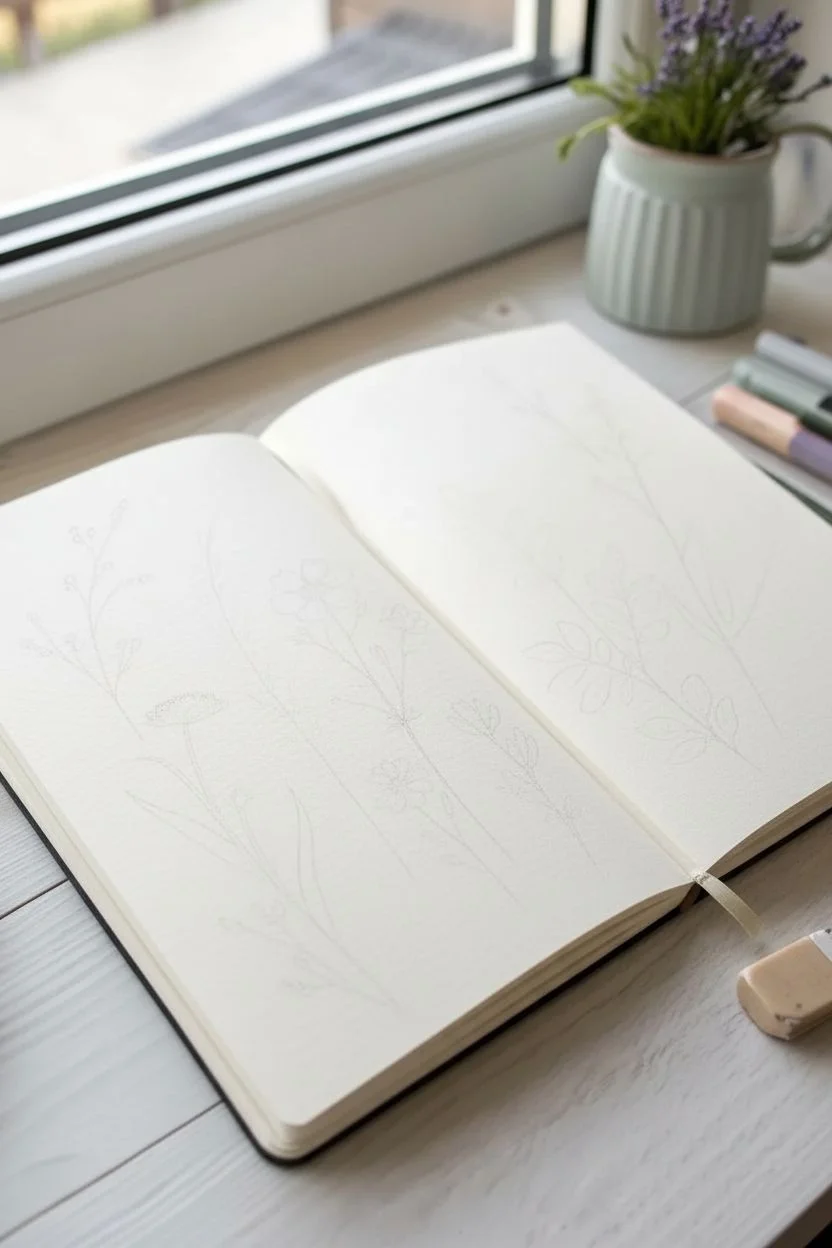
Step 1: Sketching the Layout
-
Plan your stems:
Begin by lightly sketching the main stems for five to six different plants across your spread. Aim for gentle, sweeping curves rather than straight lines to mimic natural growth. -
Map flower placements:
Mark small circles or ovals where the flower heads will go. On the left page, plan a mix of small clusters and single larger blooms; on the right, focus on leafy branches. -
Refine the shapes:
Lightly detail the leaf shapes. For the fern-like plant, draw a central spine with tiny tick marks. For the leafy branch on the right, sketch opposing pairs of oval leaves. -
Lighten lines:
Roll your kneaded eraser over the entire sketch. You want the graphite to be barely visible so it doesn’t dirty your watercolor washes later.
Muddy Colors?
If your greens look dull, mix your own using yellow and blue rather than using tube greens directly. This creates more natural, varied botanical shades.
Step 2: Painting the Left Page: Blooms
-
Tiny pink buds:
Using your smallest brush (size 0), mix a watery pale pink. Paint small, irregular dots at the tips of the leftmost sprig, leaving negative space for highlights. -
Connecting stems:
While the pink is drying, mix a sap green. With a very steady hand and just the tip of the brush, draw thin lines connecting the pink buds to the main stem. -
The central cosmos:
For the prominent pink flower, paint five loose petals using a rose madder or quinacridone rose. Keep the paint wet and drop a tiny touch of darker pink at the base of the petals for depth. -
Adding the center:
Once the pink petals are semi-dry, dab a yellow-ochre mix into the center of the cosmos. If it bleeds slightly into the pink, that adds a lovely soft effect. -
Purple thistle texture:
Mix a muted purple. Use a dry-brush technique (remove most water from the brush) to tap in the texture of the thistle-like flower head, creating a fuzzy appearance. -
Yellow buttercups:
Paint the small yellow flowers near the bottom. Use a warm yellow and keep the shapes simple and cupped. -
Fern foliage:
For the tall, grass-like stalk in the middle, use a size 1 brush. Paint quick, confident strokes outward from the stem to create thin, needle-like leaves.
Add Ink Details
Once fully dry, use a waterproof micron pen (005 size) to loosely outline just a few petals or leaves. Broken lines look more artistic than full outlines.
Step 3: Painting the Right Page: Greenery
-
Leaf gradient:
Mix two shades of green: a light yellow-green and a darker olive. Start painting the large leafy branch on the right side. -
Wet-on-wet leaves:
Paint a leaf shape with distinct water first, then drop the light green on one side and the olive on the other, letting them blend naturally on the paper. -
Delicate red accents:
For the tall, thin twig on the far right, switch to a reddish-brown iron oxide color. Paint the tiny buds along the stem with quick, precise dabs. -
Soft grasses:
Mix a very pale, watery grey-green. Paint the feathery grass textures in the background behind the main leaves. This should look almost transparent to suggest depth.
Step 4: Final Details
-
Deepening shadows:
I usually wait until everything is bone dry, then mix a darker version of your green. Add tiny shadows where the leaves meet the stems. -
Defining flower centers:
Use a fine liner or a very dry brush with dark brown paint to add tiny stamen details to the yellow and pink flowers. -
Connect the base:
Ensure all stems travel convincingly off the bottom of the page or taper off gently.
Close your sketchbook gently once completely dry to preserve your own personal field guide.

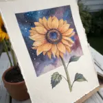
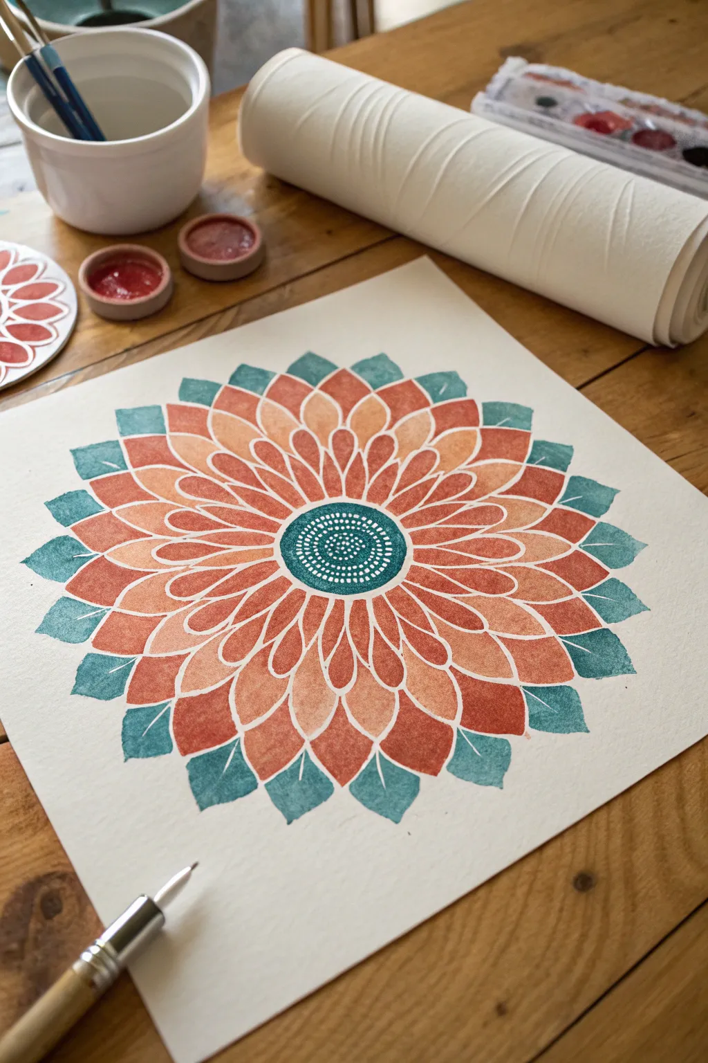
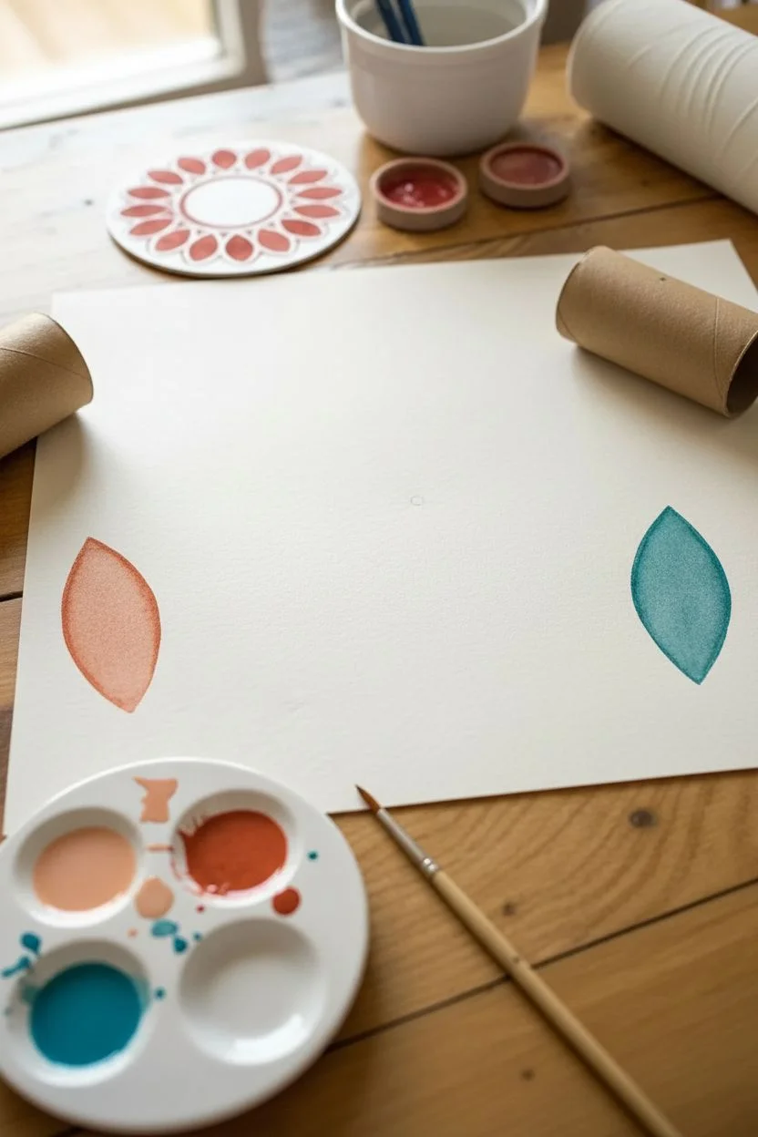
Bold Sunflower With a Textured Center
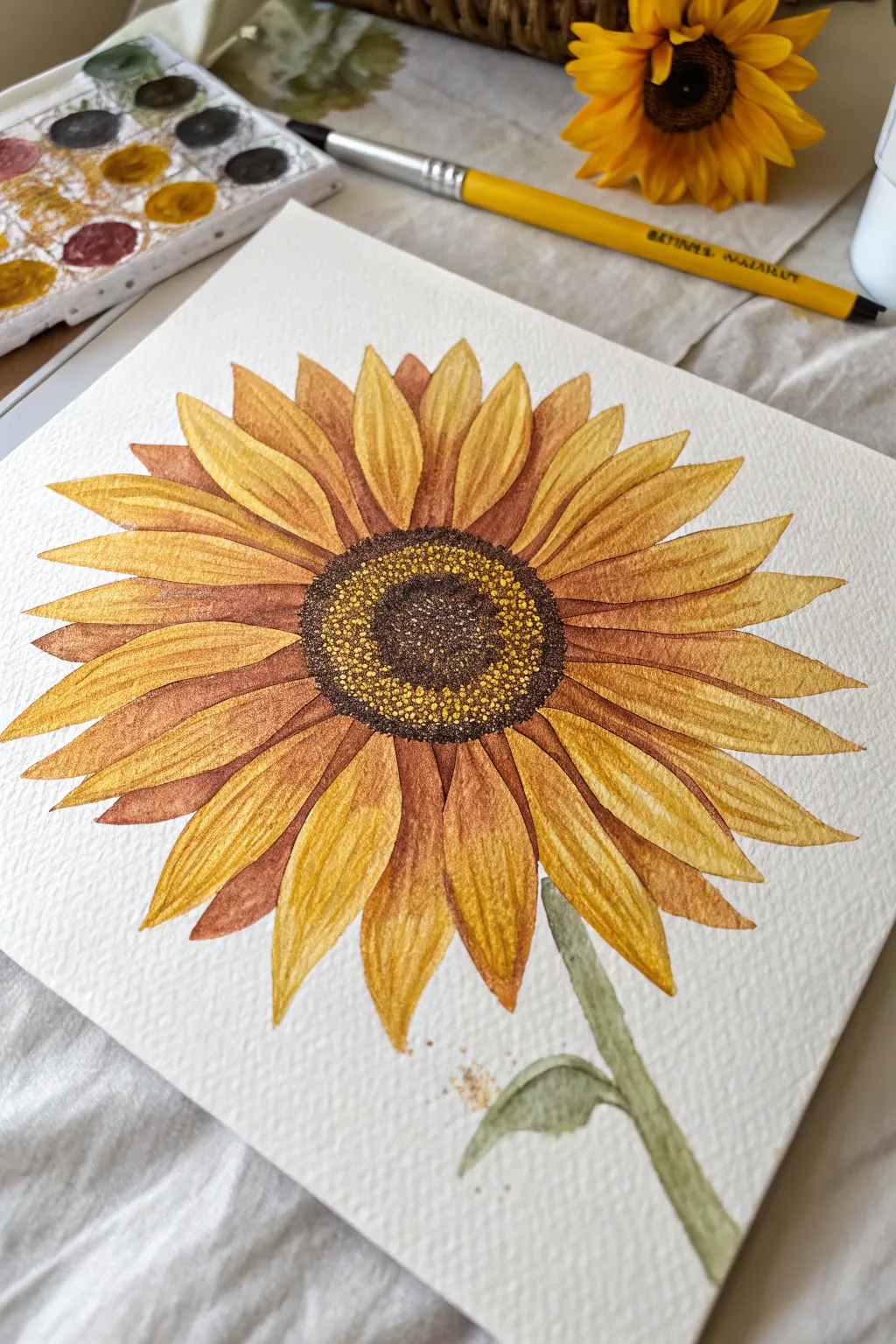
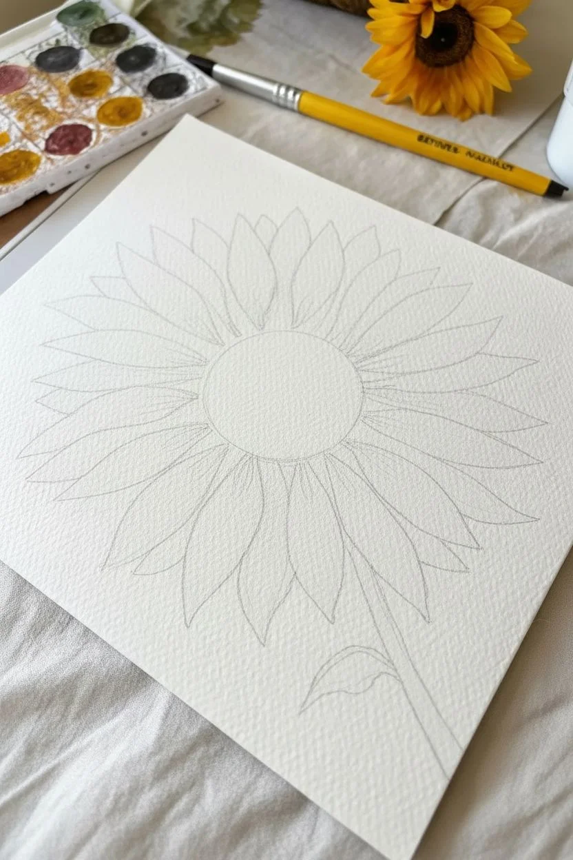
Capture the warmth of late summer with this vibrant watercolor sunflower, characterized by its layered petals and intricately textured center. By building up washes of gold and rust tones, you’ll create a piece that feels both delicate and boldly dimensional.
Detailed Instructions
Materials
- Cold press watercolor paper (A5 or similar square format)
- Watercolor paints (Yellow Ochre, Gamboge, Burnt Sienna, Burnt Umber, Sepia, Sap Green)
- Round brushes (sizes 2, 4, and 6)
- Pencil (HB) and kneaded eraser
- Jar of clean water
- Paper towel or cloth
- Palette for mixing
Step 1: Sketching the Structure
-
Mark the center:
Begin by lightly sketching a medium-sized circle in the center of your paper. This doesn’t need to be perfectly round, as sunflowers have natural irregularities. -
Inner petal layer:
Draw the first layer of petals radiating immediately from the center circle. These should be shorter and slightly overlapping, pointing outward like a starburst. -
Outer petal layer:
Sketch a second, larger row of petals behind the first layer. Make these petals longer and slightly wider, filling in the gaps between the front petals. -
Stem and leaves:
Add a slightly curved stem descending from the bottom right side of the flower, along with a small leaf peeking out near the base. -
Lighten lines:
Gently roll a kneaded eraser over your sketch to lift up excess graphite, leaving only faint guidelines that won’t show through the transparent paint.
Step 2: Painting the Petals
-
First wash:
Mix a watery wash of Yellow Ochre and apply it to all the petals. Keep this layer light and airy, allowing the paper white to shine through for luminosity. -
Adding warmth:
While the first layer is still slightly damp (but not soaking), drop stronger Gamboge yellow into the base of the petals near the center to create a soft gradient. -
Defining the back layer:
Once the first layer is bone dry, mix Burnt Sienna with a touch of orange. Use your size 4 brush to paint the petals in the *back* row, focusing the pigment near the center and fading it out toward the tips. -
Layering the front:
For the front petals, glaze a second layer of Yellow Ochre mixed with a tiny bit of red to deepen the golden tone. Leave the very tips lighter for contrast. -
Creating separation:
Use a darker rust mix (Burnt Sienna and a dot of Burnt Umber) to paint thin shadow lines where the petals overlap. This separates the layers visually. -
Petal texture:
Switch to a size 2 brush. Using a deeper amber color, carefully paint fine, curved veins running from the base of each petal toward the tip to give them that characteristic ridged texture.
Preserve Luminosity
Don’t overwork the yellow petals. If you layer too many times, the color can become muddy. Let the white of the paper act as your brightest highlight.
Step 3: The Center & Finishing Touches
-
Initial center wash:
Fill the center circle with a medium wash of Burnt Umber. While wet, drop in tiny spots of dark Sepia around the very middle to start building depth. -
Base stippling:
Once the center is dry, take a thick mixture of Dark Brown or Sepia on a small brush. Hold the brush vertically and stipple (dot) the outer ring of the center. -
Inner texture:
Continue stippling toward the middle, but switch to a slightly lighter brown mix in the very center to create a domed, 3D effect. -
Adding pollen dots:
I like to take opaque yellow gouache or very thick yellow watercolor and dot it over the dry brown stippling to mimic tiny pollen grains caught in the light. -
Painting the stem:
Mix Sap Green with a little brown to get an earthy olive tone. Paint the stem with a single confident stroke. -
Stem shadowing:
While the stem is wet, drop a darker green along one side to suggest cylindrical volume. -
Final leaf detail:
Paint the small leaf at the base using the same olive mix, letting it fade softly into the background paper. -
Spatter effect:
Load a brush with watery gold paint and tap it against another brush handle over the bottom of the paper for a few artistic splatters.
Add Metallic Flair
Mix a tiny bit of metallic gold watercolor into your yellow oxide for the petal tips. It adds a subtle shimmer that catches the light beautifully.
Step back and admire the warm, organic glow of your finished botanical study


Easy Tulip Bouquet in a Vase
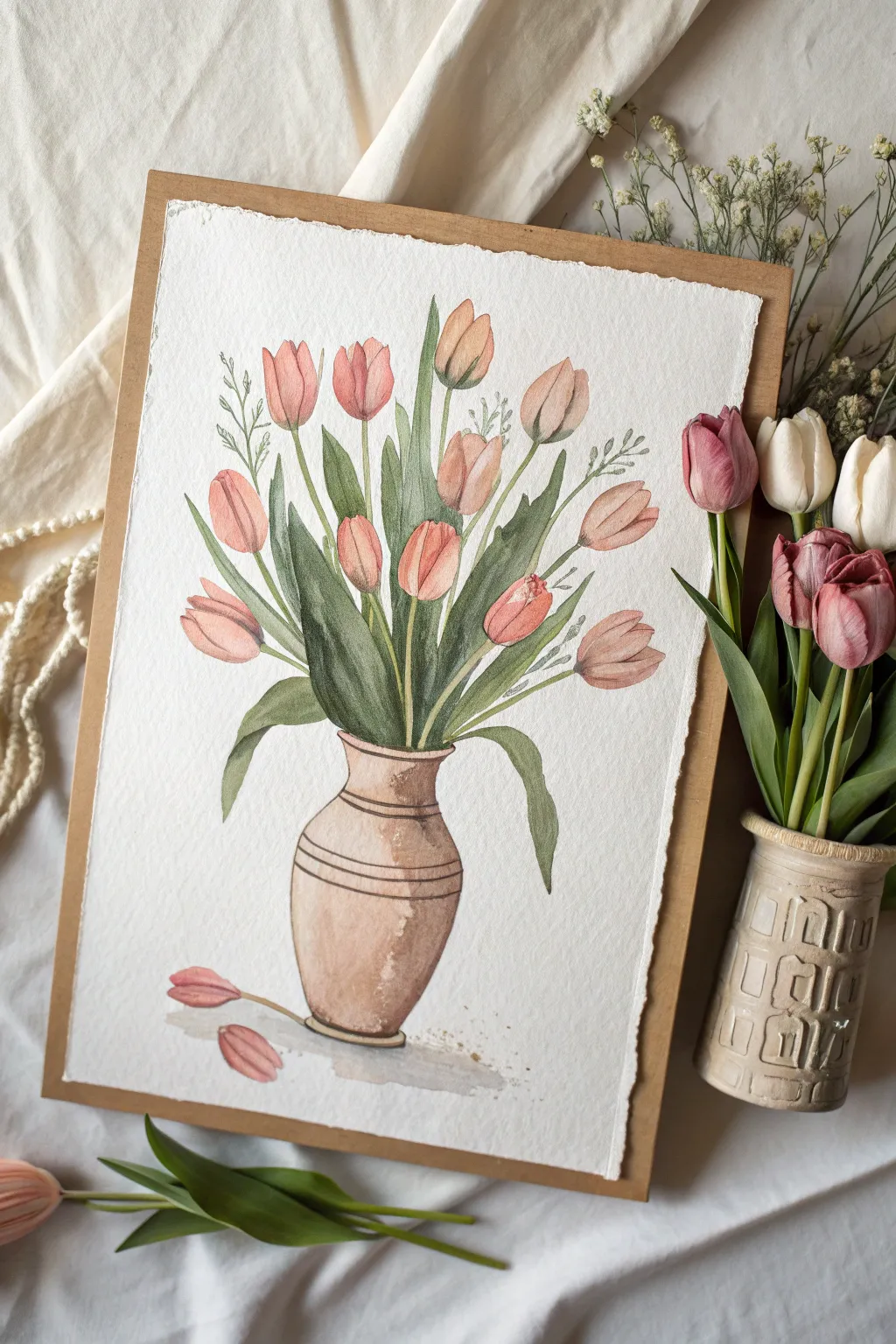
Capture the delicate beauty of spring with this watercolor study of peach-toned tulips in a rustic vase. The painting features soft washes and gentle layering to create petals that look translucent and leaves with natural depth.
How-To Guide
Materials
- Cold-pressed watercolor paper (140lb/300gsm), approx 9×12 inches
- Watercolor paints (Peach, Salmon Pink, Sap Green, Burnt Umber, Yellow Ochre, Indigo)
- Round brushes (sizes 2, 6, and 8)
- Pencil (HB or H for light sketching)
- Kneaded eraser
- Two jars of water
- Paper towels
- Painter’s tape or a drawing board
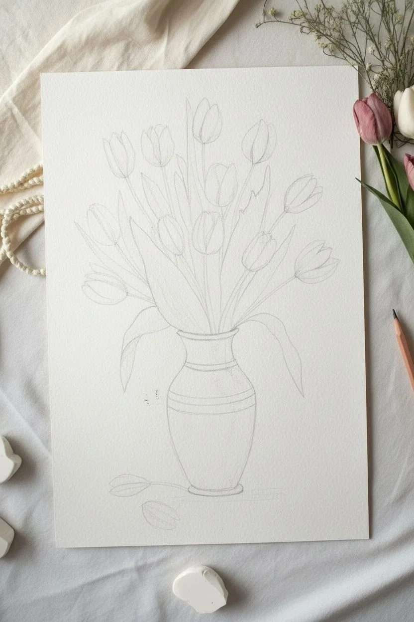
Step 1: Sketching the Composition
-
Outline the Vase:
Start by lightly sketching the vase shape in the lower center of your paper. Draw an oval for the opening, a slightly narrower neck, and a bulbous body that tapers at the base. Add two horizontal bands around the neck for detail. -
Position the Blooms:
Sketch oval shapes for the tulip heads floating above the vase. Arrange them at different heights—some clustered together, some leaning outward. Aim for about 10-12 blooms, mixing closed buds with fuller, cup-shaped flowers. -
Connect with Stems:
Draw long, slender stems connecting each flower head down into the vase neck. Don’t make them perfectly straight; a slight curve adds natural movement. -
Add Foliage:
Sketch broad, lance-shaped leaves emerging from the vase. Ensure some leaves overlap the stems and droop slightly over the vase rim on the left and right sides to break the symmetry. -
Fallen Petals:
Draw two loose petals resting on the surface near the bottom left of the vase to ground the composition. Once satisfied, gently roll a kneaded eraser over the sketch to lift excess graphite until lines are faint.
Muddy Greens?
To fix dull leaves, glazing a thin layer of transparent yellow over dry green leaves can instantly brighten them back up without lifting the paint.
Step 2: Painting the Flowers
-
Base Wash for Petals:
Mix a watery wash of Peach and a touch of Yellow Ochre. Using a size 6 brush, fill in the tulip shapes. Leave tiny Slivers of white paper untouched near the tips or edges to represent highlights. -
Building Color Intensity:
While the first layer is still slightly damp but not soaking wet, drop in a more concentrated Salmon Pink at the base of each bloom where the petals meet the stem. Let the color bleed naturally upward. -
Defining Petals:
Once the initial wash is completely dry, use a size 4 brush with a slightly darker pink mix to paint the overlapping petal shapes. Define the separation between petals by painting the shadowed areas between them. -
Enhancing Depth:
Mix a small amount of purple or cool red into your pink. Apply this deeper shadow tone to the bottom curves of the tulips and inside the cups of the more open flowers to give them a 3D volume.
Step 3: Leaves and Greenery
-
Initial Green Wash:
Prepare a mix of Sap Green with a little Yellow Ochre for a fresh spring green. Paint the stems first using a size 2 brush, keeping the lines fluid and steady. -
Painting Leaves:
Switch to a size 8 brush for the broad leaves. Load the brush with the green mix and paint the leaves with confident strokes, pressing down to widen the stroke and lifting up for the tip. -
Adding Leaf Shadows:
I like to wait for the first green layer to dry before mixing Indigo into the Sap Green. Use this darker, cooler green to paint the shadowed sides of the leaves and areas where leaves overlap behind the stems. -
Filler Greens:
With a fine detail brush, add delicate sprigs of smaller greenery or filler foliage between the main tulip stems using a very pale, watery green.
Pro Tip: Soft Edges
For the softest gradations on petals, wet the paper within the petal outline first with clean water, then touch the wet surface with your paint-loaded brush.
Step 4: The Vase & Final Details
-
Base Vase Color:
Mix Burnt Umber with a lot of water for a light tan color. Wash over the entire vase area, avoiding the decorative bands if you want to keep them distinct, or paint right over them for a simpler look. -
Vase Shadows:
While the vase is damp, drop darker brown (Burnt Umber + touch of Indigo) along the right side and bottom curve to create form shadow. Soften the edge with a clean, damp brush. -
Decorative Bands:
Use a rigger or fine liner brush with concentrated dark brown to carefully paint the two horizontal lines around the vase neck and the rim. -
Grounding Shadow:
Mix a very watery grey-purple. Paint a quick, loose shadow shape underneath the vase and the fallen petals to anchor the objects so they don’t look like they are floating. -
Final White Touches:
If you lost your highlights, you can use a tiny amount of white gouache or a white gel pen to add crisp highlights to the top edges of the tulips or the shiny part of the vase neck.
Allow the entire piece to dry fully before framing it or gifting it to a flower lover
Loose Acrylic Floral Shapes on a Color Block Background
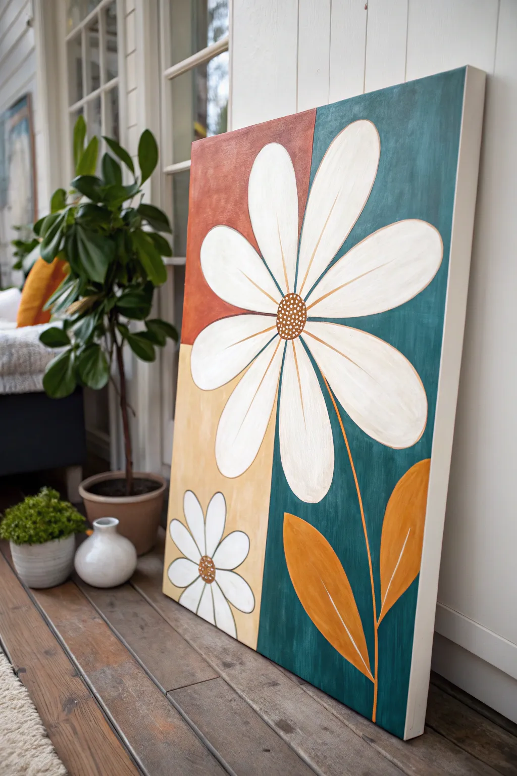
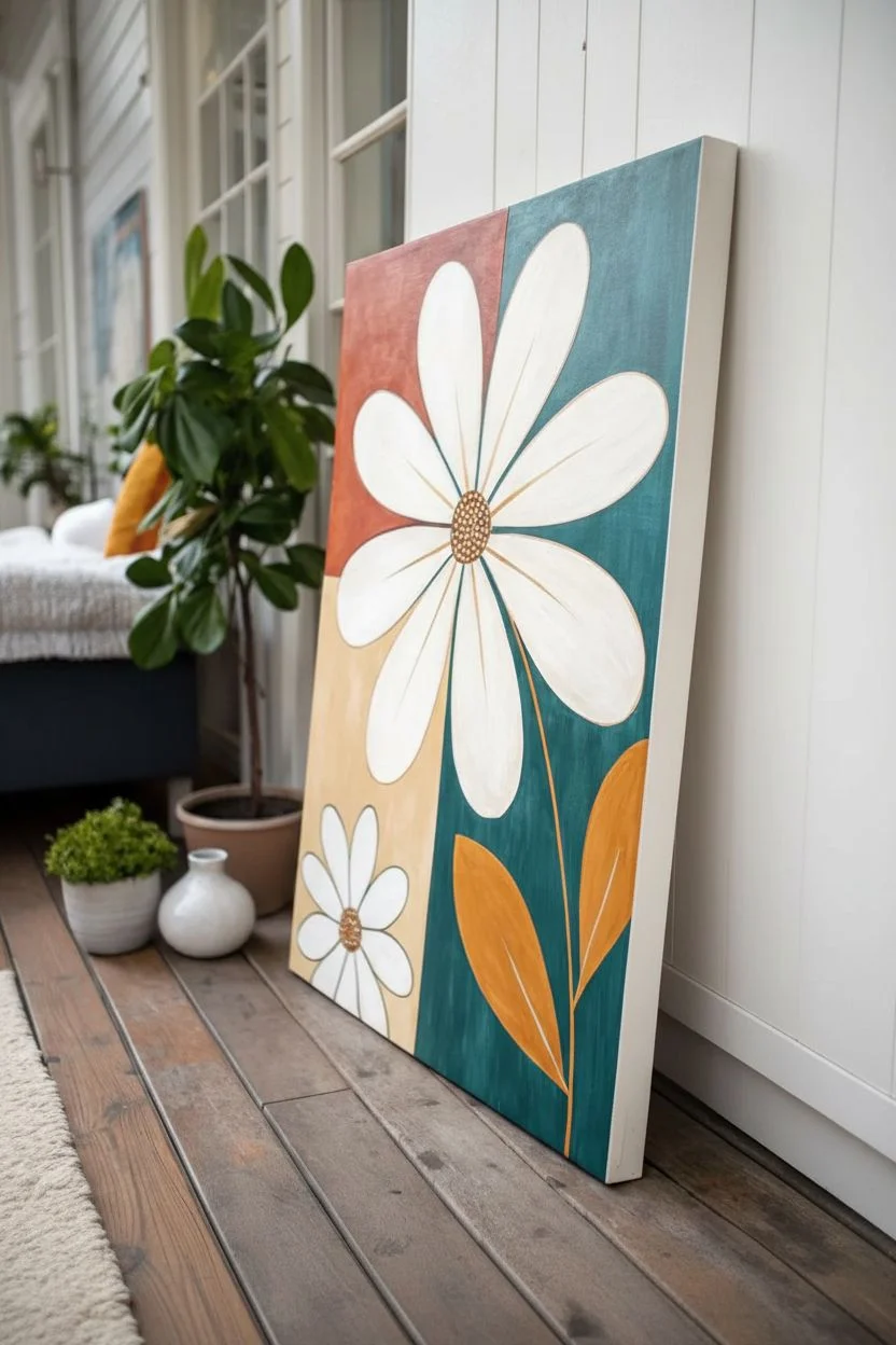
This modern acrylic painting combines bold geometric color blocking with the organic, flowing shapes of oversized daisies. The striking contrast between the teal, terracotta, and ochre background makes the crisp white petals pop, creating a cheerful statement piece for any room.
Step-by-Step
Materials
- Large stretched canvas (e.g., 24×36 inches)
- Acrylic paints: Teal/Deep Peacock Green, Terracotta/Burnt Sienna, Yellow Ochre/Mustard, Titanium White, Raw Umber
- Large flat brush (2-inch) for background
- Medium round brush (size 8 or 10) for petals
- Small liner or detail brush (size 2) for outlines and centers
- Painter’s tape (1-inch width)
- Pencil and eraser
- Ruler or straight edge
- Palette and water cup
- Paper towels
Step 1: Setting the Background
-
Plan the composition:
Begin by deciding where your color blocks will meet. Looking at the reference, there’s a vertical division roughly two-thirds across the canvas to the right, and a horizontal division on the left side, slightly above the middle. -
Mark the lines:
Use your ruler and pencil to lightly draw these dividing lines directly onto the canvas. Don’t press too hard, as you want these lines to be easily covered by paint. -
Tape the first edge:
Apply painter’s tape along the vertical line throughout the entire height of the canvas. Press the edges of the tape down firmly to prevent paint from bleeding underneath. -
Paint the teal section:
Using your large flat brush, paint the entire right-hand section in a deep teal or peacock green. Use long, smooth strokes for an even finish. You might need two coats for full opacity. -
Remove tape and dry:
Carefully peel back the tape while the paint is still slightly wet to get a crisp edge. Allow this section to dry completely before moving on. -
Tape the horizontal line:
Once the teal paint is dry, mask off the horizontal line on the left side. Also, carefully place a strip of tape vertically along the dry teal edge to protect it. -
Fill the terracotta block:
Paint the top-left rectangle with your terracotta or burnt sienna shade. I like to blend a tiny touch of white into this color to soften it slightly if it feels too dark. -
Complete the background:
Paint the remaining bottom-left rectangle with yellow ochre or a mustard shade. Remove all tape carefully and let the entire canvas dry completely.
Crisp Lines Secret
Apply a thin layer of clear matte medium or white paint over your tape edge before adding color. This seals the tape and ensures zero bleed-through.
Step 2: Drafting the Flowers
-
Sketch the main flower:
Lightly sketch the large daisy shape with a pencil. Place the center of the flower near the intersection of your color blocks on the upper half. Extend the petals so they overlap all three colors. -
Add the secondary flower:
Draw a smaller daisy-like flower in the bottom left corner, sitting entirely within the yellow ochre section. Keep the shape simple with rounded petal tips. -
Outline leaves and stems:
Sketch a long, slightly curved stem coming down from the main flower into the teal section. Add two large, leaf shapes near the bottom right—one slightly higher than the other.
Step 3: Painting the Florals
-
Base coat the petals:
Using the medium round brush, fill in all the flower petals with Titanium White. You will likely need 2-3 coats to ensure the background colors don’t show through. -
Paint the leaves:
Fill in the two large leaf shapes and the stem using the yellow ochre paint. Because you’re painting lighter yellow over dark teal, apply multiple thin layers for solid coverage. -
Add the flower centers:
Mix a small amount of raw umber with a dot of terracotta. Paint the round center of both flowers with this earthy brown mix. -
Create the outlines:
Using your smallest detail brush or liner brush, thin down some of the raw umber/terracotta mix with water until it’s ink-like. Carefully outline each white petal to define them. -
Refine the leaves:
Use a white paint mix (thinned slightly) to add the central vein lines to your yellow leaves, giving them a graphic, illustrative look. -
Detail the center:
Dip the handle end of a small brush into white paint and dot it over the brown flower centers to create texture and stylized seeds. -
Final touches:
Step back and check your edges. If the white petals look a bit transparent, add one final quick coat to the brightest areas to maximize the contrast.
Add Texture
Mix a little modeling paste into your white acrylic for the petals. This creates raised, impasto brushstrokes that add physical depth to the artwork.
Hang your new canvas in a bright spot where the bold colors can truly shine
BRUSH GUIDE
The Right Brush for Every Stroke
From clean lines to bold texture — master brush choice, stroke control, and essential techniques.
Explore the Full Guide
Daisy Chain Line Drawing With Simple Shading
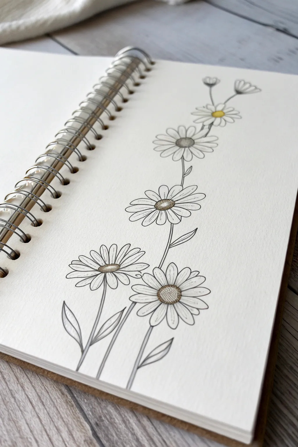
Capture the simple beauty of a wildflower meadow with this elegant daisy chain illustration. This project combines crisp fine-liner work with soft graphite shading to create depth, featuring a rising composition that draws the eye upward.
Detailed Instructions
Materials
- Spiro-bound sketchbook (heavyweight paper preferred)
- Fine-liner pen (0.1mm or 0.2mm, black)
- Graphite pencil (HB or 2B)
- Blending stump (tortillon) or cotton swab
- Yellow colored pencil or marker
- Eraser
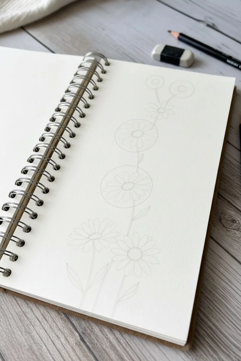
Step 1: Drafting the Composition
-
Mark the stem line:
Begin by lightly sketching a faint, curved vertical line that starts near the bottom left and reaches towards the top right. This will act as the ‘spine’ for your flower placement. -
Place the flower centers:
Along this guide line, lightly draw five small ovals to mark where the center of each daisy head will sit. Space them somewhat evenly, but keep it organic—nature isn’t perfectly symmetrical. -
Sketch petal guidelines:
Around each oval, lightly sketch a larger circle to define the outer limit of the petals. Make the bottom two flowers larger and the top ones progressively smaller to create perspective.
Uneven Petals?
Don’t worry if petals vary in size! Real daisies are imperfect. If a gap looks too wide, just tuck a partial ‘background petal’ behind the others to fill the space.
Step 2: Inking the Flowers
-
Outline the centers:
Switch to your fine-liner pen. Draw the textured centers of the daisies using tiny stippling dots or small, tight scribbles to mimic the dense seeds. -
Draw the bottom petals:
Starting with the two largest flowers at the bottom, draw the petals. Make them long and slender, with slightly rounded or notched tips. Let some petals overlap slightly for a realistic look. -
Ink the middle flowers:
Move up to the central two flowers. Draw their petals slightly shorter than the bottom ones. Ensure the petals radiate naturally from the center oval. -
Detail the top buds:
For the very top flower and the tiny buds near it, keep the petals smaller. The uppermost bud might only show a few petals peeking out from a side view. -
Connect the stems:
Draw the main stems connecting the flower heads. Use smooth, continuous strokes. Notice how the stems originate from behind the flower heads or connect to the main stalk. -
Add leaves:
Sketch simple, lance-shaped leaves emerging from the base of the stems. Keep the veins minimal—just a center line is often enough. -
Erase pencil guides:
Once the ink is completely dry (give it a minute or two so it doesn’t smear), gently erase all your initial pencil sketches.
Step 3: Shading and Accents
-
Shade the centers:
Take your graphite pencil and add shading to the bottom-left edge of each flower center. This gives them a domed, 3D appearance. -
Shade the petals:
Add very light pencil strokes at the base of the petals where they meet the center. I find this connects the petals visually to the core of the flower. -
Define overlapping areas:
Identify where petals overlap. Add a tiny bit of shadow on the petal that is ‘underneath’ to separate them clearly. -
Blend the graphite:
Use a blending stump to soften your pencil marks. Drag the graphite slightly outward from the center into the petals for a soft, gradient fade. -
Add stem shadows:
Run a thin line of graphite along one side of the stems and blend it to make them look cylindrical rather than flat. -
Apply the yellow accent:
Choose just one flower—the second one from the top works well as a focal point—and color its center with the yellow pencil. Leave the others monochrome for artistic contrast.
Add Texture
Use a white gel pen to add tiny highlight dots on top of the dark textured centers, or add very fine parallel lines on the petals for texture.
Now you have a serene botanical sketch that balances clean lines with soft realism
Cherry Blossom Branch With Pink Washes
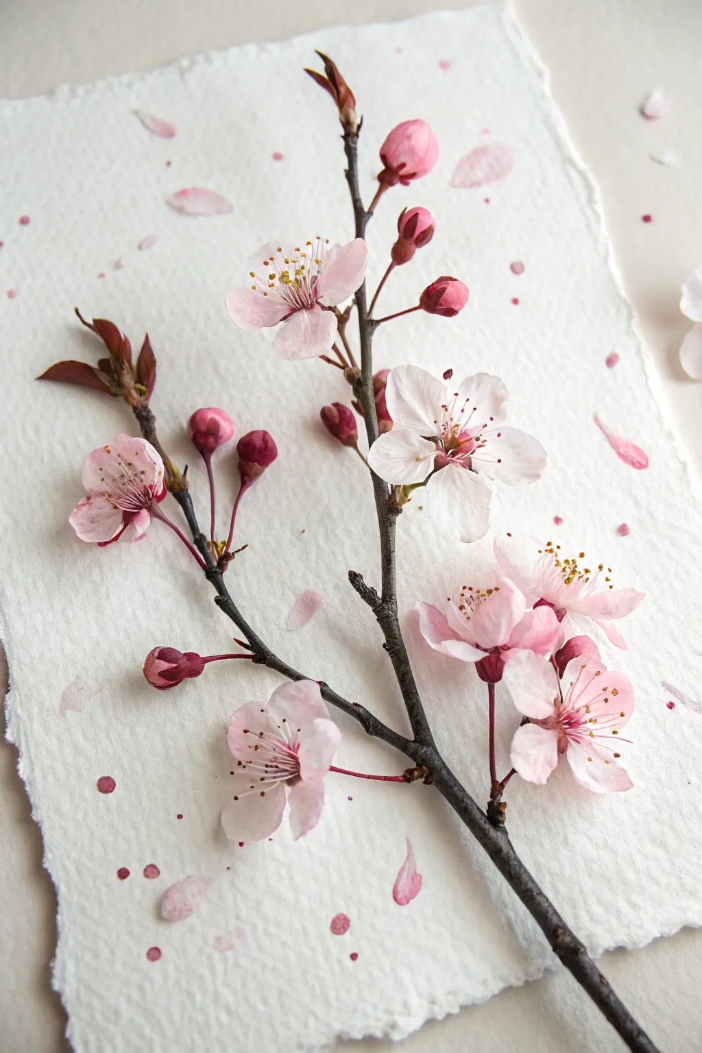
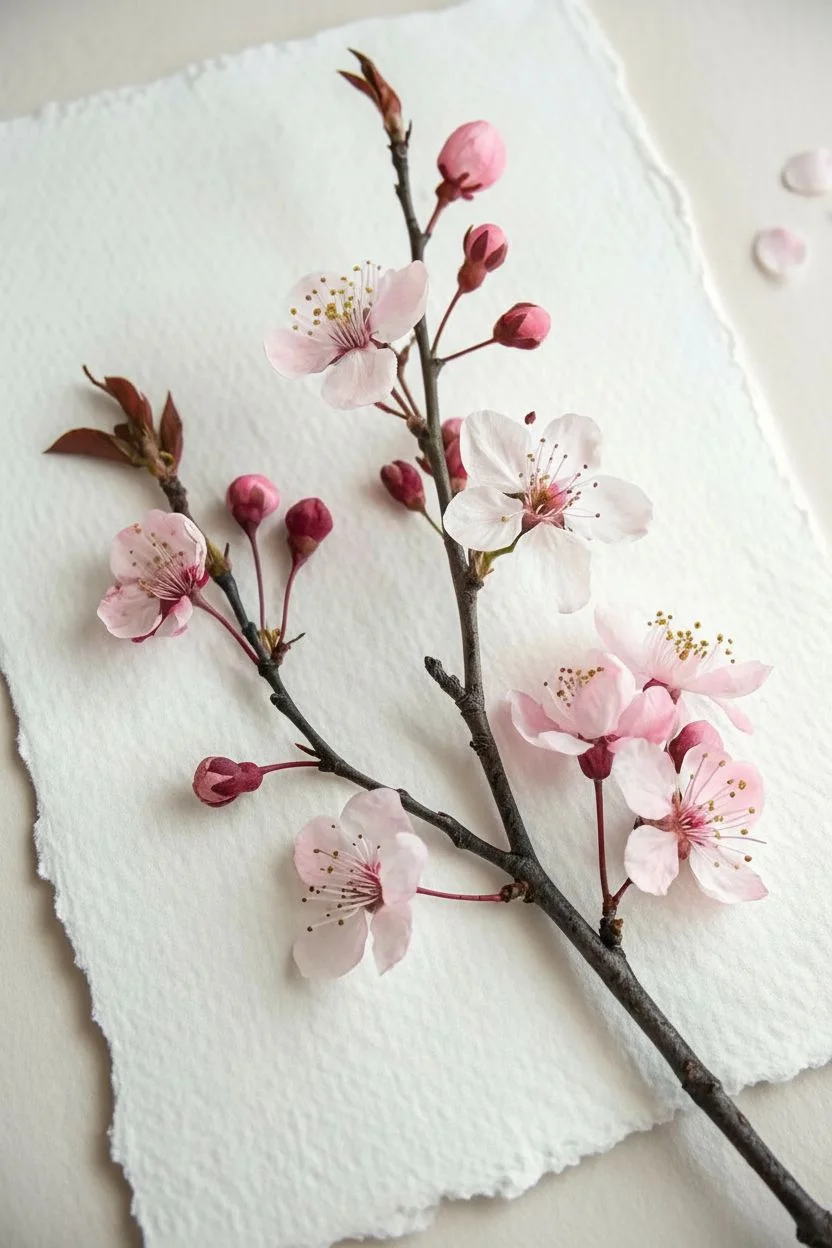
This project combines the tactile beauty of real botanical elements with subtle painted enhancements to create a trompe-l’oeil masterpiece. By positioning a natural cherry blossom branch on textured paper and adding painted details like scattered petals and splatter, you blur the line between nature and art.
Step-by-Step Tutorial
Materials
- Fresh or high-quality faux cherry blossom branch
- Thick, handmade watercolor paper with deckled edges (cotton rag works best)
- Watercolor paints (Alizarin Crimson, Sap Green, Burnt Umber)
- Fine detail brush (size 0 or 1)
- Medium round brush (size 4 or 6)
- Pencil for light sketching
- Paper towels
- Palette for mixing
- Clear matte adhesive or floral tape (optional)
- Small spray bottle or stiff brush for splattering
Step 1: Preparation & Composition
-
Select your canvas:
Begin with a sheet of heavy, handmade paper. The rough texture and deckled edges are crucial for mimicking the organic feel of the reference image. -
Prepare the branch:
Choose a cherry blossom branch that has a nice mix of full blooms, half-opened buds, and tight buds. If using a fresh branch, trim away any leaves that clutter the silhouette. Prune specifically so the branch lies relatively flat. -
Dry positioning:
Lay the branch diagonally across your paper to find the most pleasing composition. The main stem should ideally enter from the bottom right corner, reaching upwards towards the top left. -
Secure the specimen:
Once happy with the placement, you can lightly secure the branch if needed. A very small dab of matte heavy gel medium hidden under the thickest part of the stem, or even careful sewing with invisible thread, will keep it in place.
Step 2: Painting the Illusion
-
Mix your petal wash:
Create a very dilute wash of Alizarin Crimson. You want a pale, barely-there pink that matches the lightest part of the real petals. -
Add fallen petals:
Using your medium round brush, paint loose, organic petal shapes scattered around the branch. Observe the reference—some petals are single, some are small clusters. Keep the edges soft. -
Layering color:
While the petal shapes are still damp, drop in a slightly more saturated pink (less water, more pigment) near the edges or centers to create depth and dimension. -
Shadows for realism:
To ground the fallen petals, mix a tiny amount of Burnt Umber with your pink. Paint very thin, subtle shadows underneath one side of your painted petals to simulate them resting on the texture of the paper.
Paint Bead Control
If your splatters are too watery and soak in instantly, your paint is too thin. Add more pigment. If they sit on top like beads, let them dry naturally for a darker edge.
Step 3: The Splatter Effect
-
Prepare the splatter mix:
Mix a watery solution of pink paint. It should be fluid enough to fly off bristles but pigmented enough to show up on the textured paper. -
Protect the blooms:
I like to loosely cover the main flowers on the branch with a piece of scrap paper or paper towel to prevent them from getting stained by the paint splatter. -
Apply the splatter:
Load a stiff brush or an old toothbrush with your paint mix. Run your thumb across the bristles to flick tiny droplets onto the paper. Aim for the empty negative spaces around the branch. -
Vary the size:
Create variety by tapping a loaded round brush against a stick to release larger droplets. Focus a few larger drops near the bottom of the composition.
Natural Glue Substitute
For a temporary display, use a dab of honey to stick fallen petals to the paper. It’s sticky enough to hold light items but won’t damage the paper permanently.
Step 4: Finishing Details
-
Assess the branch:
Look closely at your real branch. If any buds have fallen off during handling, you can glue them directly onto the paper in empty spots to add to the ‘fallen’ effect. -
Enhance the stem:
If the cut end of your branch looks unnatural or raw, use a touch of Burnt Umber and Sap Green watercolor to darken the exposed wood, blending it visually with the bark. -
Final drying:
Allow all paint and adhesive to dry completely. The textured paper may take longer to dry than standard paper, so be patient before moving the artwork. -
Display considerations:
Because this is a 3D mixed media piece, it is best displayed in a shadow box frame to protect the delicate petals while allowing the branch its natural depth.
Once the paint is dry and the branch settled, you have captured a fleeting moment of spring that will last all year round

PENCIL GUIDE
Understanding Pencil Grades from H to B
From first sketch to finished drawing — learn pencil grades, line control, and shading techniques.
Explore the Full Guide
Lavender Stems Made With Dot Painting
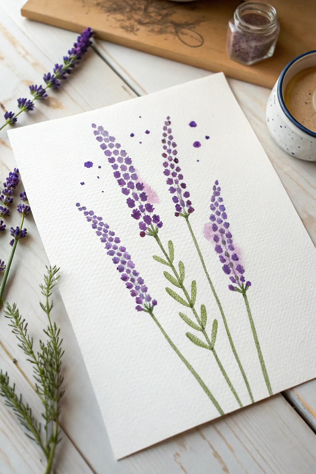
Capture the delicate, airy essence of lavender with this simple watercolor project that relies on stippling rather than complex brushwork. By building up layers of tiny dots, you’ll create textured flower spikes that look lovely enough to smell.
How-To Guide
Materials
- Cold-press watercolor paper (300 gsm)
- Watercolor paints (Purple, Ultramarine Blue, Sap Green, Burnt Umber)
- Round brush (size 2 or 4 for stems)
- Small detail brush or cotton swabs (for dots)
- Pencil and eraser
- Jar of clean water
- Paper towels
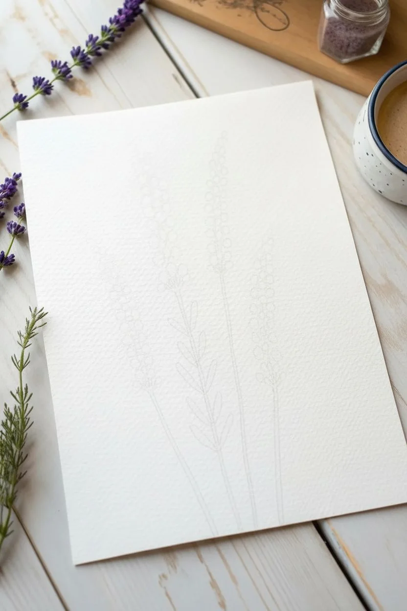
Step 1: Sketching the Layout
-
Plan the composition:
Lightly visualize where your four stems will go on the paper. Arrange them so they fan out slightly, with varying heights to create a natural, organic look. -
Draw the stem lines:
Using a hard pencil (like an H or HB) and very light pressure, draw four faint, slightly curved lines to serve as the central guides for your lavender stalks. Don’t press too hard, as you want these lines to disappear under the paint later. -
Mark the flower heads:
Lightly sketch elongated oval shapes around the top third of each stem line to indicate where the clusters of flowers will sit. These are just rough boundaries to keep your painting contained.
Step 2: painting the Stems and Leaves
-
Mix your green:
Create a natural olive green by mixing Sap Green with a tiny touch of Burnt Umber or Purple to desaturate it. You don’t want a bright, artificial grass green. -
Paint the main stalks:
Using your size 4 round brush, paint along your pencil guidelines from the bottom up. Keep the lines thin and elegant, lifting pressure as you reach the flower area. -
Add first leaves:
On the central stem, paint small, paired leaves. Press the belly of the brush down and lift quickly to create a tapered leaf shape. These should sprout from the stem in an alternating pattern. -
Add secondary leaves:
For the other stems, add just a few sparse leaves near the base or halfway up. Keeping some stems bare adds visual variety to the composition. -
Let it dry completely:
Wait until the green paint is bone dry before moving on to the purple section to prevent the colors from bleeding into a muddy brown.
Muddy colors?
If your purple dots turn brown when touching the green stems, your green layer wasn’t fully dry. Let the stems dry completely, or leave a tiny white gap between stem and flower.
Step 3: Creating the Flower Spikes
-
Prepare the base purple:
Mix a watery wash of Purple. This first layer will be light and transparent to create depth. -
Start the first layer of dots:
Using the tip of your small brush, dab clusters of dots along the top of the stems. Keep the dots somewhat loose and separated, following the long, tapered shape of a lavender flower. -
Vary the density:
Cluster the dots more tightly near the stem line and let them spread out comfortably towards the edges of the flower spike. -
Mix a darker purple:
While the first layer dries, mix a more concentrated purple by adding a little Ultramarine Blue for a cooler, deeper tone. -
Apply the mid-tones:
Dot this darker color over the previous layer. Focus these dots centrally along the spine of the flower head to create a sense of rounded volume. -
Add deep contrast:
Mix your darkest purple (almost indigo). Using the very tip of your brush, add tiny, precise dots in the gaps between the lighter clusters. This contrast makes the flowers pop. -
Connect the flowers:
I like to take a tiny bit of my green mix and paint very thin, short stems connecting the bottom-most flower clusters to the main stalk.
Scented Art
For a multi-sensory experience, mix a single drop of high-quality lavender essential oil into your purple rinse water. The painting will carry a faint scent when dry.
Step 4: Finishing Touches
-
Add loose splatter:
Load your brush with watery purple paint. Hold it over the paper and tap the handle gently to splatter a few stray droplets around the flowers for a whimsical effect. -
Soften edges if needed:
If the flower spikes look too stiff, add a few faint, watery dots at the very tips to fade them gently into the white paper. -
Review contrast:
Step back and look at your piece. If the stems look too flat, add a thin line of darker green along one side to suggest a shadow.
Now you have a charming botanical study that brings a sense of calm to any room
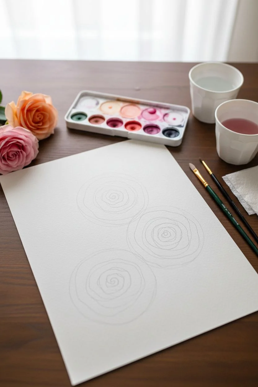
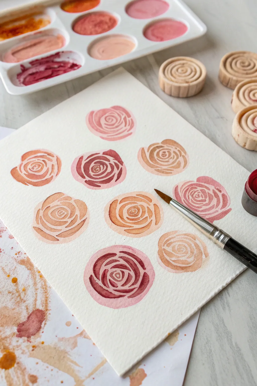
Rose Petals Using Spiral Brushstrokes
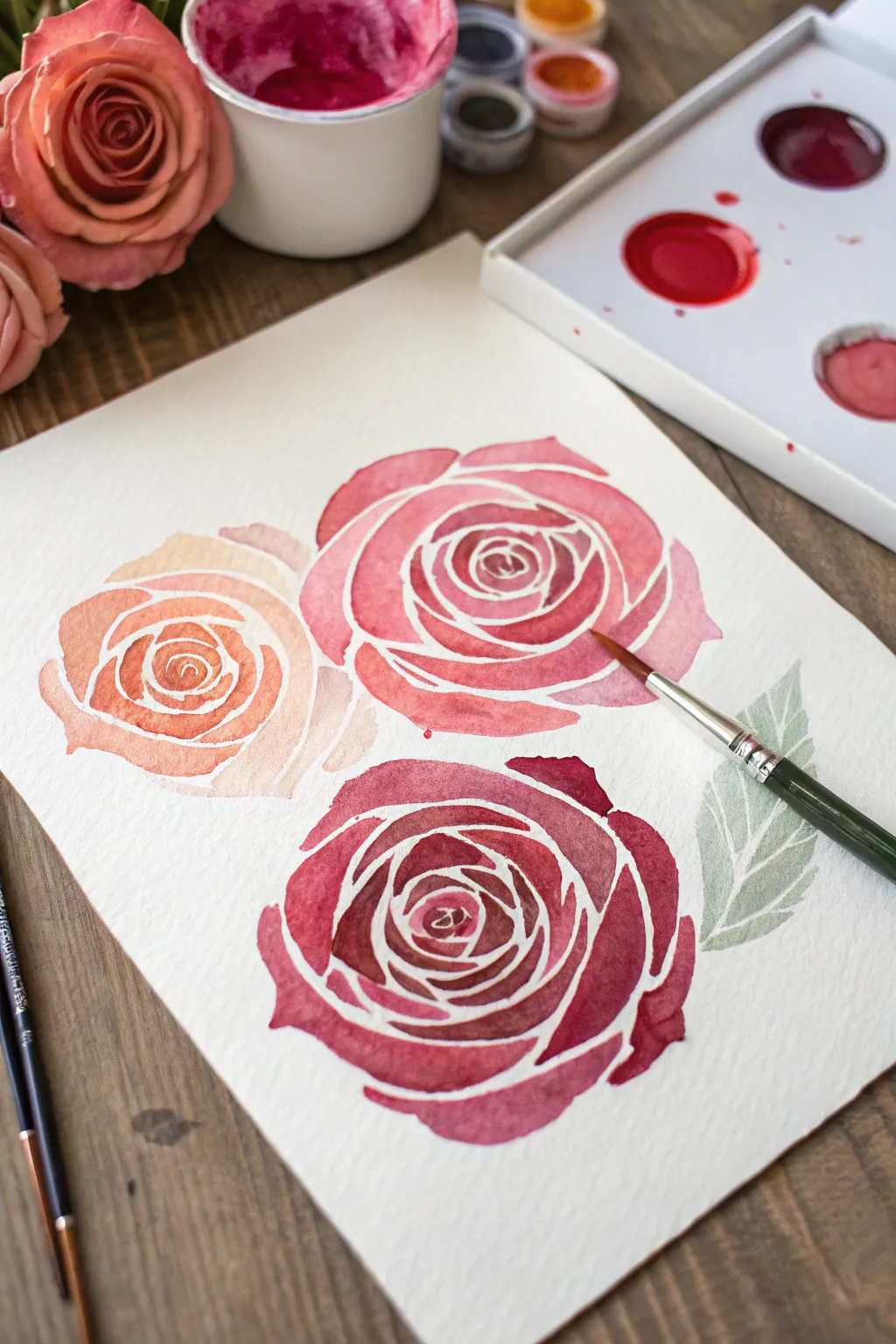
Learn to paint stylized, modern floral art by utilizing negative space to define delicate rose petals. This project creates a stunning trio of blooms ranging from soft peach to deep crimson, perfect for framing or handmade cards.
Detailed Instructions
Materials
- Cold press watercolor paper (fine grain texture)
- Round watercolor brush (size 6 or 8)
- Small detail brush (size 2)
- Watercolor paints (Peach/Coral, Rose Pink, Deep Crimson, Sage Green)
- Palette for mixing
- Water cups
- Paper towel
- Faint pencil (HB or H)
Step 1: Preparation & Sketching
-
Prepare your workspace:
Set up your watercolor paper on a flat surface. Tape down the edges if you prefer a bordered look, though this piece works well floating in the center. Ensure your paints are activated with a drop of water. -
Map out placement:
Lightly sketch three distinct circles to determine where your roses will sit. Place one slightly lower on the left and two overlapping slightly on the right, forming a balanced triangular composition. -
Sketch petal guidelines:
Very faintly draw the spiral pattern of the roses inside your circles. Start from a small center shape and ripple outward. The key here isn’t detail, but creating ‘channels’ of white space between petal shapes that you will leave unpainted.
Paint Bleeding?
If paint bridges the white gaps, wait for it to dry completely. Then, use a small, stiff brush dipped in clean water to gently scrub and lift the unwanted paint, blotting with a tissue.
Step 2: Painting the Peach Rose
-
Mix your peach tone:
Combine a light orange with a touch of pink and plenty of water to create a soft, translucent peach-coral shade. -
Paint the center:
Using the tip of your round brush, fill in the tiny central shapes of the leftmost rose. Be incredibly careful to leave the thin white gaps between the wet paint. -
Work outward:
Continue painting the surrounding petal shapes, following the spiral curve. As you move to the outer petals, you can dilute the paint slightly more to make the edges feel softer and lighter.
Step 3: Painting the Pink Rose
-
Mix a vibrant pink:
For the upper middle rose, mix a cleaner, brighter rose pink. It should be slightly more saturated than your peach mixture. -
Define the spiral:
Start at the tight center again. I like to rotate the paper physically as I work outward to keep my hand angle comfortable while maintaining those crucial white negative space lines. -
Broaden the strokes:
As you reach the outer petals, press down harder on the belly of the brush to create wider shapes, tapering them off at the ends to mimic the curve of a real petal.
Add Depth
Once fully dry, add a second layer of glazing to the inner curve of each petal (closest to the center) using a slightly darker version of the same color to create instant 3D volume.
Step 4: The Crimson Rose & Leaves
-
Mix deep red:
Create a rich crimson color by mixing red with a tiny touch of brown or violet to deepen it. -
Paint the bottom bloom:
Apply this darker color to the bottom rose. Because the pigment is darker, your white lines need to be crisp and clean to provide enough contrast. -
Add variance:
Drop a tiny bit of plain water into a few wet petals to create ‘blooms’ or texture as they dry, giving the rose a natural, organic feel. -
Create a leaf:
Mix a muted sage green. To the right of the roses, paint a single leaf shape. Start with the stem and press down to widen the leaf body. -
Add leaf veins:
Unlike the roses where you painted *around* the white space, for the leaf, paint the entire shape solid first. While it’s still wet, you can lift color with a dry brush or wait for it to dry and paint veins with darker green. -
Refine edges:
Once the main roses are dry, check your edges. If any petals look too jagged, you can smooth the outer perimeter slightly with a damp brush, but keep the internal white lines sharp. -
Final drying:
Let the entire piece dry completely flat to prevent buckling before erasing any visible pencil lines.
You now have a beautiful botanical study that balances bold color with delicate negative space


Monochrome Floral Studies in Ink and Wash
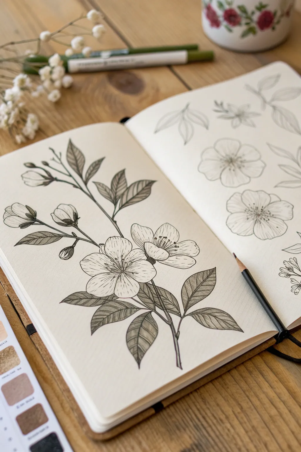
Capture the delicate beauty of a flowering branch with this detailed botanical illustration. Using fine liners for structure and soft pencil shading for depth, you will create a stunning monochrome piece that balances strong outlines with subtle textures.
Step-by-Step Guide
Materials
- Smooth heavyweight sketchbook paper (hot press watercolor or bristol board)
- HB or 2H graphite pencil for sketching
- Kneaded eraser
- Fine liner pens (sizes 005, 01, and 03, black archival ink)
- Soft graphite pencils (2B and 4B) or warm grey markers for shading
- Blending stump (tortillon)
Step 1: Drafting the Composition
-
Establish the main line:
Begin with a very light pencil sketch using your HB pencil. Draw a gentle, curving line diagonally across the page, starting from the bottom right and reaching toward the upper left corner. This will be your main branch. -
Branch off:
Add smaller, shorter lines branching off the main stem to indicate where leaves and buds will sit. Keep these lines somewhat jagged and organic, rather than perfectly straight. -
Place the main blooms:
Draw loose circles or ovals to position the two large open flowers near the center-right of the composition. Don’t worry about petals yet; just establish their size and placement. -
Sketch buds and leaves:
Add tear-drop shapes for the unbloomed buds on the upper left branch. Sketch pointed oval shapes for the leaves, clustering them around the stem and below the flowers.
Ink Smearing?
If your eraser drags ink across the page, the ink wasn’t dry. Test dryness by lightly pressing a clean tissue on a heavy line; if no transfer occurs, it is safe to erase.
Step 2: Define the Petals and Leaves
-
Refine flower shapes:
Inside your guide circles, sketch the five petals for each open flower. Give the petal edges a slightly wavy, uneven line to make them look natural and soft. -
detail the centers:
Draw tiny circles in the center of the flowers for the stamens, adding thin filaments radiating outward from the middle. -
Detail the leaves:
Refine the leaf outlines, adding a serrated or saw-tooth edge to each one. Draw a central vein line down the middle of every leaf. -
Finalize buds:
Tighten the drawing of the buds, showing where the sepals (the green protective leaves) cup the bottom of the white petals.
Pro Tip: Line Weight
Vary your pressure. Press slightly harder on the bottom curves of leaves and petals (‘shadow side’) and lighter on top edges to create instant dimension without shading.
Step 3: Inking the Outlines
-
Outline the main shapes:
Switch to your 03 fine liner. Carefully trace over the main branch and the outer edges of the leaves. Use confident, broken strokes for the wood texture on the branch. -
Ink the petals:
Use a finer 01 pen for the flower petals. Keep your hand light; the line can break slightly at the tips to suggest fragility. -
Detail the stamens:
Switch to the ultra-fine 005 pen. Draw the delicate filaments and tiny anthers in the center of the blooms. These need to be very crisp and thin. -
Erase pencil guides:
Wait at least five minutes for the ink to dry completely. Gently use the kneaded eraser to lift away all initial graphite marks, leaving a clean ink drawing.
Step 4: Adding Texture and Shading
-
Texture the petals:
With the 005 pen, draw very short, flicking lines radiating from the center of the flower outward. These striations give the petals curve and texture. -
Create leaf veins:
Using the 01 pen, draw the secondary veins on the leaves. Instead of straight lines, curve them slightly toward the leaf tip to show volume. -
Start shading leaves:
Here I prefer to use a 2B pencil or a warm grey marker. Fill in the leaf shapes, pressing harder near the center vein and lightening visually toward the edges. -
Deepen leaf contrast:
Go back over the darker areas of the leaves (especially near the stem) with a 4B pencil or a second layer of marker. Use a cross-hatching technique with fine ink lines on top if you want a more graphical look. -
Shade the branch:
Add shadow to the underside of the main branch using vertical hatching lines with your 01 pen. This grounds the drawing and gives the branch a cylindrical 3D form. -
Final darkening:
Check your contrast. Darken the very center of the flowers and the areas where leaves overlap to make the white petals pop forward.
Step back and admire the stark contrast between your dark leaves and the delicate white blooms
Pressed Flower Collage in a Minimal Layout
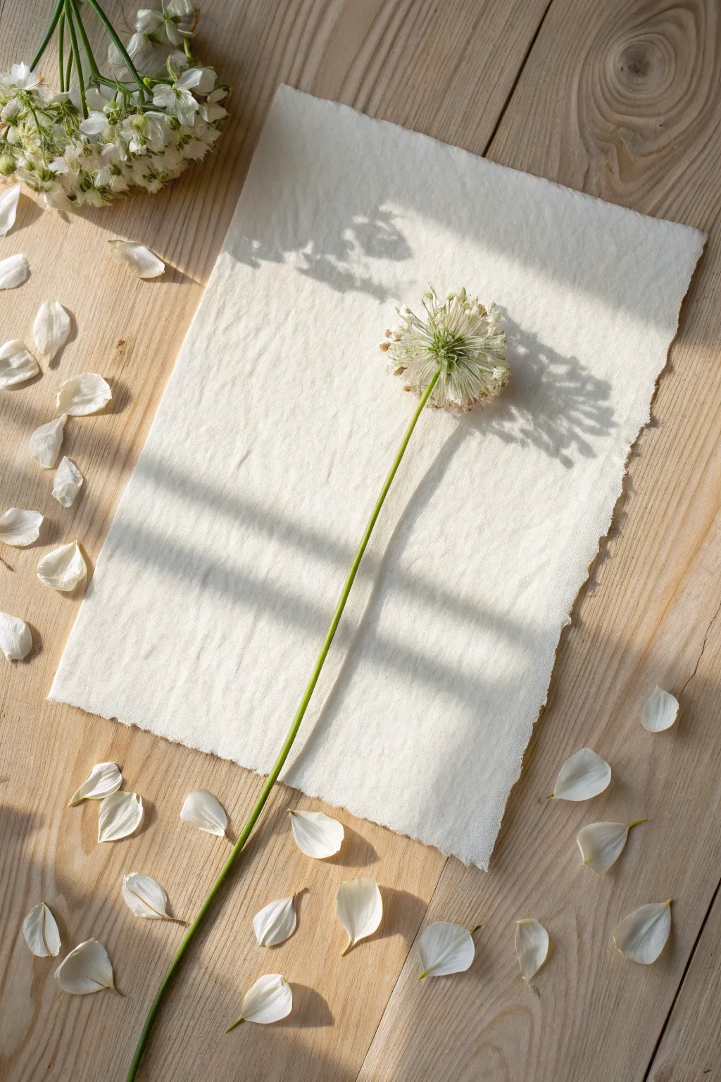
Embrace the beauty of simplicity with this understated floral arrangement, featuring a single, sculptural allium stem against textured handmade paper. This project relies on negative space and the natural silhouette of the flower to create a serene, focal piece of botanical art.
How-To Guide
Materials
- One fresh allium flower (white) with a long, straight stem
- Handmade cotton rag paper with deckle edges (cream or off-white)
- Two heavy wooden boards or a flower press
- Absorbent blotting paper or sheets of cardboard
- Parchment paper
- Tweezers
- Acid-free craft glue or botanical adhesive
- Toothpick or fine brush
- Small weight (like a clean eraser or stone)
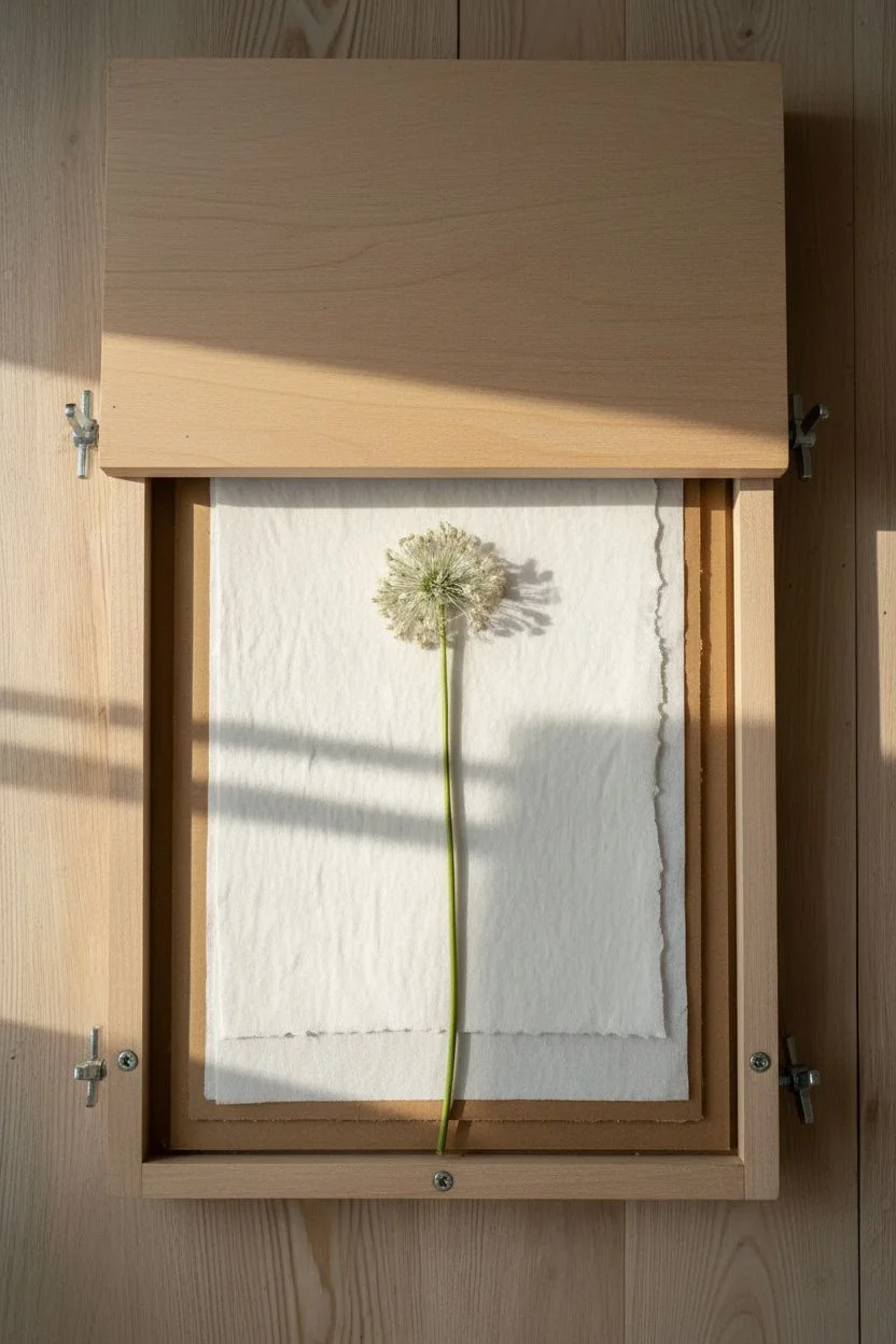
Step 1: Pressing the Specimen
-
Select the flower:
Choose an allium that hasn’t fully gone to seed yet, but is firm. Ensure the stem is as straight as possible, as kinks will be permanent once dried. -
Prepare the press:
Open your flower press or lay down your bottom wooden board. Place a sheet of cardboard, followed by a sheet of blotting paper. -
Position the flower:
Lay the allium onto the blotting paper. Because the head is spherical, you will need to gently press it flat with your palm first to fan out the florets naturally before closing the press. -
Cover and close:
Place another sheet of blotting paper on top, followed by cardboard and the top board. Tighten your press straps or place heavy books on top. -
Wait for drying:
Allow the flower to dry for at least 2-3 weeks. Check it halfway through; if the paper feels damp, carefully switch it out for fresh blotting paper to prevent mold. -
Check for flatness:
Once fully dry, the stem should be rigid and the flower head completely flat and papery to the touch.
Reduce Bulk
For thick flower heads like allium, I carefully snip away the back half of the florets with small scissors before pressing. This creates a flatter profile without ruining the front view.
Step 2: Arranging and Composition
-
Prepare the substrate:
Lay your sheet of handmade deckle-edge paper on a flat, clean surface. The texture is key here, so ensure no dust or eraser crumbs are trapped in the fibers. -
Mock placement:
Gently place the dried allium onto the paper. Orient it diagonally, running from the bottom left toward the top right, allowing the flower head to rest in the upper third of the page. -
Adjust shadows:
I always take a moment to look at the composition in natural light. Adjust the angle until the negative space around the stem feels balanced. -
Mark the position:
Using a very light pencil or just visual cues, note where the base of the stem and the center of the flower head should sit.
Step 3: Mounting the Flower
-
Apply glue to the stem:
Flip the flower over carefully. Using a toothpick, apply tiny dots of acid-free glue along the length of the stem. You don’t need a continuous line, just enough to tack it down. -
Apply glue to the head:
Dab small amounts of glue on the back of the thickest parts of the flower head (the center where the florets meet the stem). -
Place the flower:
Hover the flower over your paper to align it with your earlier plan, then gently lower it down. Press along the stem lightly with your finger. -
Secure the head:
Place a small scrap of parchment paper over the flower head, then rest a small weight (like a clean stone) on top to hold it flat while the glue sets. -
Clean up stray glue:
If any glue oozed out, use the tip of a clean toothpick to lift it away before it dries clear and shiny. -
Dry and display:
Let the adhesive cure for at least an hour. Once secure, you can display the paper on a flat surface or mount it in a floating frame to show off the deckle edges.
Stem Curving?
If the stem curves while drying, use straight pins to gently hold it in place on the blotting paper inside the press. The pins act as a guide to keep it perfectly linear as it dehydrates.
Now you have a serene piece of botanical art that captures the delicate structure of nature forever
Coffee Filter Flowers Turned Into Wall Art
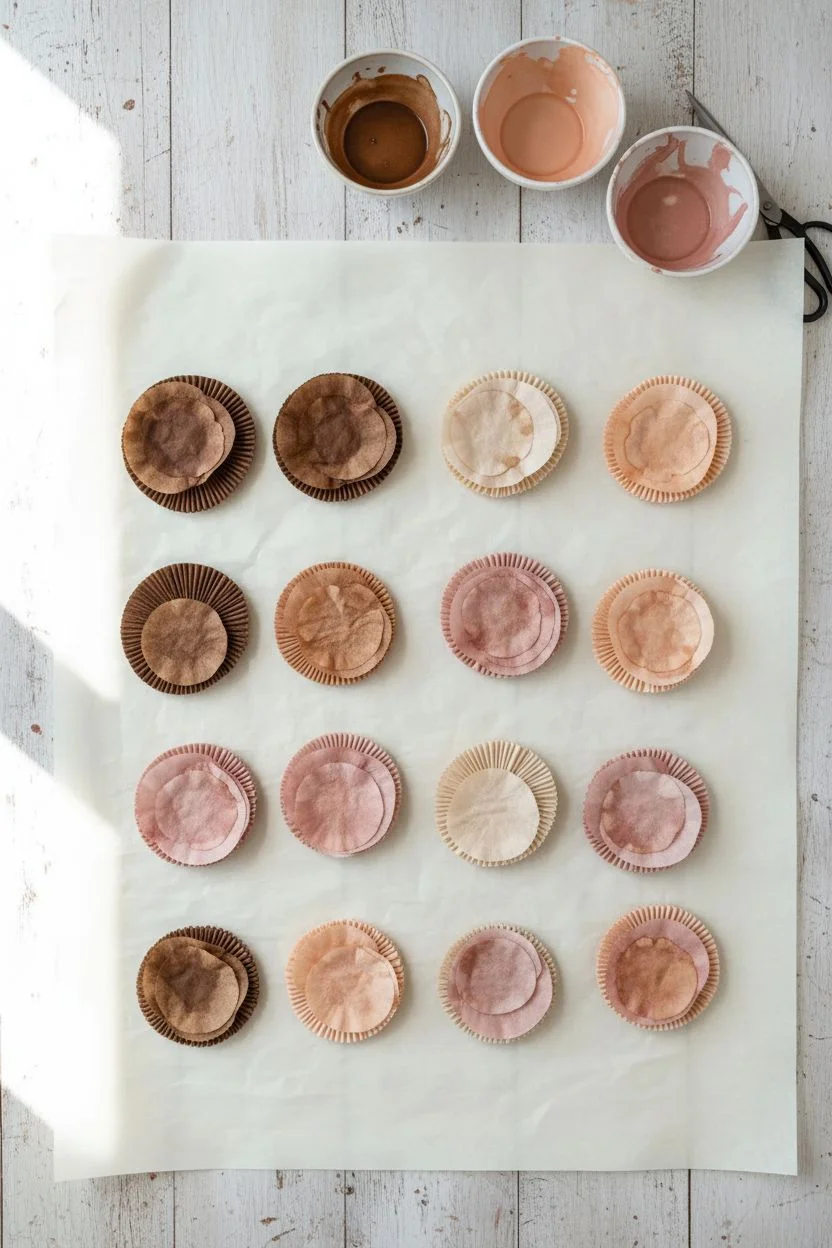
Transform humble kitchen staples into an elegant, everlasting bouquet that adds a soft, vintage touch to your wall. These lifelike blooms, dyed in shades of coffee, peach, and blush, capture the delicate texture of real petals without the need for water.
Step-by-Step Tutorial
Materials
- White coffee filters (basket style)
- Watercolor paints or acrylics diluted with water (brown, peach, dusty rose)
- Floral wire (18-gauge for stems)
- Floral tape (green and brown)
- Hot glue gun and glue sticks
- Scissors
- Green crepe paper or cardstock for leaves
- Shallow bowls for dyeing
- Drying rack or parchment paper
- Ribbon or twine for binding
Step 1: Dyeing the Paper
-
Prepare the dye baths:
Mix your paints with water in shallow bowls to create variety. Aim for a gradient of colors: a deep espresso brown, a classic latte beige, a soft peach, and a dusty pink. Test the color intensity on a scrap filter first; the color will dry lighter. -
Soak the filters:
Separate your coffee filters into stacks of 4-5. Dip them into the dye baths, ensuring they are fully saturated. For a variegated look, dip the centers in a darker tone and the edges in a lighter one. -
Dry the paper:
Squeeze out excess liquid gently without tearing the paper. Separate the layers and lay them flat on parchment paper or a drying rack. Let them dry completely, which usually takes a few hours or overnight.
Step 2: Forming the Blooms
-
Cut petal shapes:
Once dry, fold the filters into quarters or eighths. Cut wavy, scalloped edges along the top curve to mimic petal shapes. Vary the depth of your cuts; some flowers need deep, separated petals, while others, like the roses, need broader, connected scallops. -
Create the center bud:
Take a scrap piece of dyed filter or a small strip of tissue paper and ball it up at the end of a floral wire. Secure it with hot glue to form the flower’s core. -
Attach the first layer:
Take your first petal layer and wrap it tightly around the center bud, securing it with a dot of hot glue at the base. Pinch and twist the paper slightly at the bottom to give the flower volume. -
Build the bloom:
Continue adding layers of filters, rotating the flower as you go to ensure even coverage. Use 4-6 filters per flower depending on how full you want the bloom to be. I like to ruffle the edges of the outer layers with my fingers to create a realistic, open look. -
Create variety:
Make different types of flowers for the bouquet. For the darker brown flowers, cut thinner, fringed petals. For the rose style, use wider, rounded petals and curl the edges outward using a toothpick.
Floppy Petals?
If your petals are too soft and don’t hold their shape, lightly mist the finished dry flower with hairspray or spray starch to add stiffness.
Step 3: Adding Greenery and Assembly
-
Cut the leaves:
Cut leaf shapes from green crepe paper or cardstock. If you want the textured look shown in the image, you can also dye coffee filters green and cut leaves from those. -
Wire the leaves:
Glue a thin piece of floral wire down the center spine of each leaf. This allows you to bend and shape the leaves naturally. -
Wrap the stems:
Starting at the base of the flower head, wrap the wire stem with floral tape. Stretch the tape as you wrap to activate the adhesive. As you move down the stem, incorporate one or two leaves into the wrapping. -
Arrange the bouquet:
Gather your finished flowers into a bunch, mixing the colors and textures. Place larger blooms in the center and smaller buds toward the outside. Adjust the height of the stems so the arrangement looks rounded and full. -
Bind and finish:
Wrap the entire bundle of stems tightly with floral tape, then cover the tape with a decorative ribbon or a strip of fabric to create a clean handle. -
Mount (Optional):
To display as wall art, you can mount the bouquet onto a framed board using wire or adhesive, or simply hang the bouquet upside down or upright using a small hook.
Add Scent
Add a few drops of essential oil like rose or sandalwood to the center of the paper blooms so the bouquet smells as good as it looks.
Enjoy the timeless beauty of your handcrafted paper bouquet as it brightens up your space
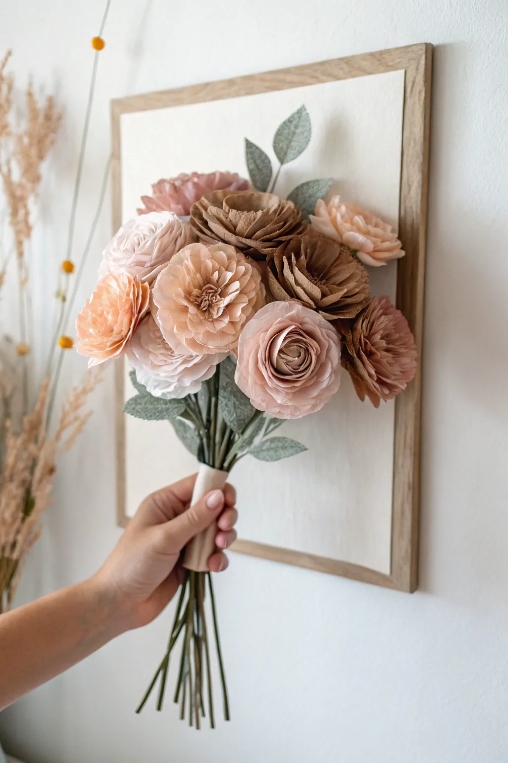
Paper Cutout Flower Bouquet With Overlapping Shapes
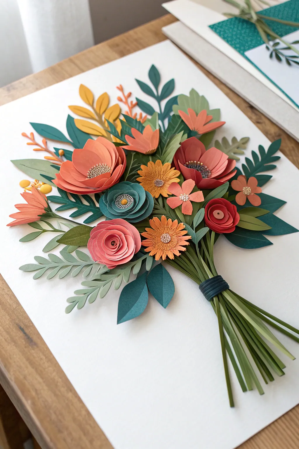
This stunning paper art project features a lush bouquet composed of intricately cut and layered blooms, ranging from rolled roses to wide-petaled anemones. Grounded by a spectrum of green foliage and deep coral accents, the final piece offers a beautiful sense of depth and realism through careful paper shaping.
How-To Guide
Materials
- Cardstock paper (heavier weight, 65lb-80lb) in shades of coral, deep red, mustard yellow, and teal
- Cardstock paper in 4-5 shades of green (from pale sage to deep forest)
- White or cream backing board (heavyweight)
- Detail scissors (small, sharp tip)
- Craft knife and self-healing mat
- Paper curling tool or bone folder (a wooden skewer also works)
- Craft glue with a fine-tip nozzle
- Tweezers
- Foam adhesive dots (optional for extra height)
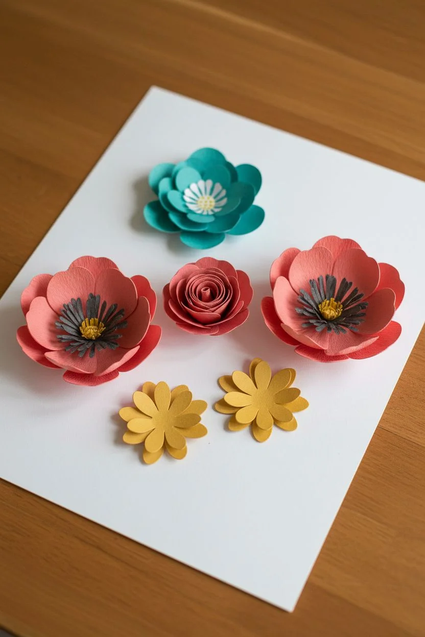
Step 1: Creating the Focal Flowers
-
Cut the anemone bases:
Start by cutting large, teardrop-shaped petals from coral and deep red cardstock for the wide, open flowers. You’ll need about 6-8 petals per flower. Gently curl the edges inward using your bone folder to give them a cupped shape. -
Assemble the open blooms:
Glue the petals in a circular overlapping pattern onto a small circle base. For the center, cut a small contrasting circle (like mustard or dark grey), fringe the edges with tiny snips, and glue it in the middle. -
Create the rolled rose:
For the pinkish-coral rose, cut a spiral shape out of a 3-inch circle. Starting from the outside tail, tightly roll the paper inward until you reach the center tab. Release the tension slightly to let the ‘petals’ bloom, then glue the bottom of the roll to the center tab. -
Craft the teal rosette:
Using teal paper, cut three circles of decreasing size. Cut wavy edges on each. Stack them from largest to smallest with a foam dot or dab of glue in between each layer. Add a detailed center by layering a tiny white circle and a yellow dot on top. -
Make the daisies:
Cut two daisy shapes from mustard yellow paper—one slightly smaller than the other. Use your shaping tool to score a line down the center of each petal for texture. Stack the layers, offsetting the petals so they fill the gaps, and finish with a textured center dot.
Sticky Situation
If glue smears on cardstock, let it dry completely and use a rubber cement eraser to gently rub it away. Wiping wet glue usually smears it worse.
Step 2: Preparing the Foliage
-
Cut fern fronds:
From your lightest sage green paper, cut long, slender stems with tiny, alternating oval leaves attached. These delicate pieces add airiness to the arrangement. -
Create structure leaves:
Using medium and dark green cardstock, cut larger, lance-shaped leaves. Fold them gently in half lengthwise to create a central vein crease, which adds immediate dimension. -
Add detail sprigs:
Cut diverse filler pieces, like the small three-leaf clusters in dark teal and the branchy sprigs in orange. Variety in shape is key to a realistic look. -
Prepare the stems:
Slice about 15-20 thin, long strips of olive green paper for the bouquet’s stems. Keep them roughly the same width but vary the lengths slightly.
Step 3: Arrangement & Assembly
-
Anchor the stems:
On your white backing board, glue the bundle to stems first. Gather them at the bottom right, fanning them out slightly towards the center. Secure them with a ‘tie’ made from a strip of dark teal paper wrapped horizontally around the bundle. -
Lay the background foliage:
Begin glueing your largest, darkest leaves near the top of the stem bundle. These form the background layer. I like to only glue the base of the leaf, leaving the tip free to lift off the page. -
Position the main blooms:
Place your large coral anemones and the rolled rose towards the center of the bouquet area. Adhere them securely, perhaps using foam tape on one or two to make them pop forward. -
Fill with secondary flowers:
Tuck the teal rosette and mustard daisies around the main blooms. Try to distribute the colors so no two identical colors are touching directly. -
Insert delicate fillers:
Using tweezers, slide the fern fronds and orange sprigs underneath the larger petals and leaves. This simulates the way real florists tuck filler greens into gaps. -
Final adjustments:
Look for visible gaps showing the white paper background within the bouquet mass. Cover these with small single leaves or tiny flower buds made from remaining scraps.
Petal Pizazz
Add realistic detail to your smooth cardstock by using colored pencils or chalk pastels to shade the very centers of your flowers before assembly.
Hang your dimensional paper garden in a shadow box frame to protect the delicate layers while displaying your handiwork
Stamped Tulips Using a Fork-Like Tool
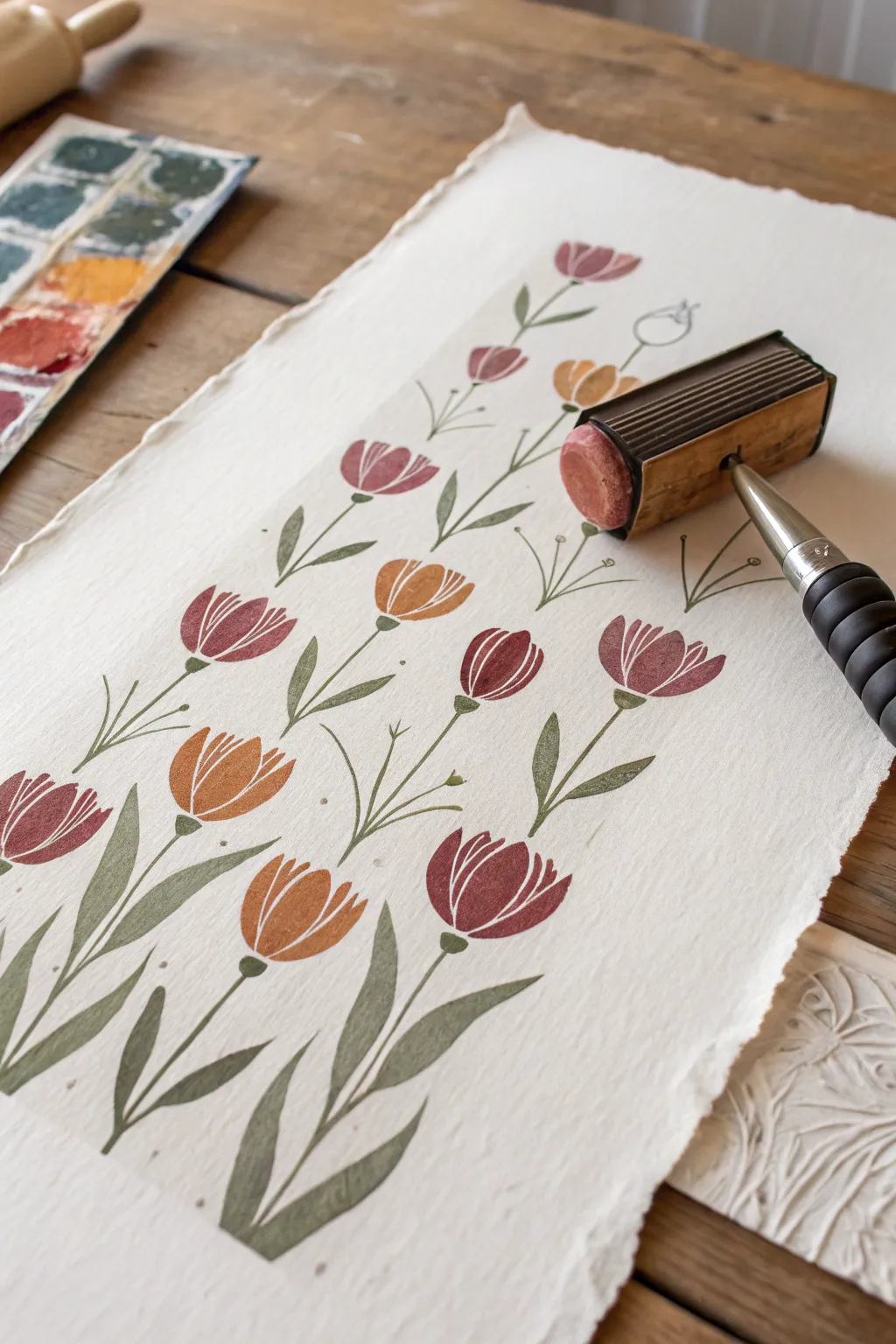
Create a charming, vintage-inspired botanical print using a unique rolling stamp technique on textured paper. This project combines the structured beauty of block printing with the softness of watercolor-style pigments for a lovely, repetitive floral design.
Detailed Instructions
Materials
- High-quality handmade or cold-press watercolor paper (deckle edge recommended)
- Pattern roller tool (specifically with a tulip head design) or a custom linocut stamp mounted on a roller handle
- Water-soluble block printing inks or heavy body acrylics
- Colors: Deep maroon/burgundy, burnt orange, muted red, sage green
- Fine liner brush (size 0 or 1)
- Small flat brush or sponge applicator
- Palette or glass slab for ink mixing
- Scrap paper for testing
Step 1: Preparation and Planning
-
Prepare your paper:
Select a sheet of thick, textured paper. If you want that rustic look shown in the image, gently tear the edges against a ruler to create a soft, deckled border rather than a sharp cut. -
Mix your colors:
On your palette, prepare your tulip head colors. You’ll want a warm palette: a deep burgundy, a rusty orange, and a dusty rose. Keep the paints relatively thick so they hold the stamp texture without bleeding. -
Prepare the green:
Mix a muted sage green for the stems and leaves. This needs to be fluid enough to paint smooth lines but opaque enough to show up clearly on the textured paper.
Stamp Smudged?
If a stamp smears, turn it into a deliberate choice. Use a damp brush to soften the edges further, transforming the mistake into a looser, watercolor-style bloom.
Step 2: Stamping the Blooms
-
Load the roller tool:
If you are using a dedicated pattern roller, load the sponge or rubber surface with your first color (e.g., the deep burgundy). Ensure the pigment is evenly distributed but not dripping. -
Test the impression:
Roll a test strip on scrap paper to check the pressure needed. You want the lines of the tulip petals to be crisp, with some of the paper’s white texture showing through for a vintage feel. -
Stamp the first row:
Starting near the bottom right, gently roll or press your tool to create the first tulip head. Lift straight up to avoid smearing. -
Continue the pattern:
Move upwards and slightly to the left to place the next bloom. Alternate the spacing so the flowers aren’t perfectly aligned in a grid, which gives a more organic, garden-like appearance. -
Switch colors:
Clean your tool thoroughly or switch to a second roller head. Load it with the rusty orange ink. -
Fill the gaps:
Stamp orange tulips in the spaces between the burgundy ones. I tend to group colors loosely rather than strictly alternating them, as it creates a nice visual flow. -
Add the final blooms:
Repeat the process with your third color (dusty rose), filling in any remaining upper sections. Leave plenty of white space between the heads for the stems and leaves we will add next. -
Let the blooms dry:
Allow the stamped flower heads to dry completely. Since the ink is thicker, this might take 20-30 minutes.
Step 3: Painting the Foliage
-
Start the main stems:
Using your fine liner brush and the sage green paint, draw a thin, straight line down from the center of each tulip head. Vary the lengths slightly so they look natural. -
Add primary leaves:
Paint long, slender leaves emerging from the base of the stems. Use a ‘push and lift’ stroke: press down to widen the leaf, then lift the brush as you pull away to create a sharp, tapered point. -
Create secondary stems:
For visual interest, paint thinner, branching stems curving out from the main stalks. Some of these can remain empty or end in tiny buds. -
Add detail foliage:
Draw small, V-shaped grassy shoots near the bottom of the composition to anchor the plants visually. -
Incorporate buds:
If you have empty space near the top, use your liner brush to draw simple outline shapes of un-opened tulip buds. -
Review and refine:
Step back and look at the composition. If a certain area looks too sparse, add an extra leaf or a small splashing dot of green to balance it out. -
Final drying:
Let the green paint dry completely before handling or framing the artwork.
Pro Tip: Depth of Color
Don’t clean the roller perfectly between color switches. A little residue from the previous color (e.g., red mixing into orange) creates beautiful, variegated shading on the petals.
Once dry, your handmade botanical print is ready to be framed as a sophisticated piece of wall art
Vegetable-Style Rose Stamps for Quick Florals
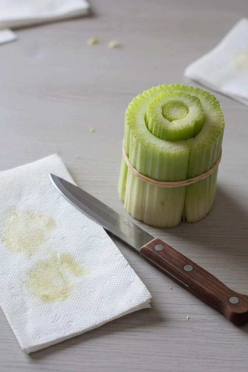
Transform everyday kitchen scraps into elegant floral art with this surprisingly simple stamping technique. Using the base of a celery bunch, you can create perfectly imperfect rose shapes that look like intricate watercolor paintings.
How-To Guide
Materials
- A bunch of celery (or bok choy)
- Sharp kitchen knife
- Watercolor paints or fluid acrylics
- Palette tray
- Cold press watercolor paper
- Medium round paintbrush
- Paper towels
- Water cup
Step 1: Preparing Your Veggie Stamps
-
Cutting the Stalks:
Take your bunch of celery and slice off the base about 2-3 inches from the bottom. You want a flat, even surface on the cut side of these stalks, as this will be your primary stamp. -
Drying the Surface:
Press the cut end of the celery onto a paper towel. It is crucial to remove excess vegetable moisture so the paint adheres properly and doesn’t get too watery. -
Shaping the Stamp:
Inspect the layers of the celery. If the outer stalks are flaring out too much, you can gently trim them or secure them with a rubber band to create a tighter, more bud-like rose shape.
Blobby Prints?
If your stamp is a blurry blob, your paint is too watery or the vegetable is too wet. Blot the celery on a paper towel again and use thicker, cream-like paint.
Step 2: Mixing and Loading Paint
-
Color Selection:
Prepare a palette with shades of dusty rose, terracotta, ochre, and deep maroon. Aim for a mix of warm earth tones to match the vintage botanical aesthetic. -
Paint Consistency:
Mix your watercolors with a small amount of water. You want a consistency slightly thicker than milk—fluid enough to transfer, but opaque enough to show the distinct lines. -
Loading the Brush:
Instead of dipping the celery directly into paint, use your round brush to paint the pigment onto the cut surface of the celery. This gives you control over coverage and prevents blobs. -
Creating Color Variation:
I like to dab a darker shade (like maroon) in the center of the celery pattern and a lighter shade (like pale pink) on the outer rings for a realistic depth effect.
Step 3: Stamping the Design
-
First Impression:
Firmly press the painted celery end onto the center of your watercolor paper. Apply even pressure without wiggling the stamp to keep the lines crisp. -
Lifting the Stamp:
Lift the celery straight up. You should see a beautiful, rose-like spiral pattern left behind with natural gaps. -
Reloading:
Re-apply paint to your veggie stamp for the next flower. Try switching colors, perhaps moving to a terracotta or ochre shade for variety. -
Composition:
Stamp additional roses around the first one, leaving comfortable white space between them. Creating a grid or a loose scatter pattern both look lovely. -
Testing Pressure:
Experiment with pressure on a scrap piece of paper first. A lighter touch yields a vintage, faded look, while heavy pressure creates bold, defined petals.
Add Leaves
Cut a single celery stalk into a pointed oval shape. Paint it green and stamp it next to your roses to add simple, matching foliage.
Step 4: Refining and Finishing
-
Touch-Ups:
Once the stamped images are slightly dry, you can take a damp brush and gently soften some of the harsh edges if desired, pulling varying color saturation into the white spaces. -
Adding Details:
Use a fine-tip brush with darker paint to enhance the very center spirals if the stamp didn’t transfer clearly in the middle. -
Color Splashes:
For a looser, artistic feel, lightly tap your loaded brush over the paper to add tiny splatters of paint around the roses. -
Final Drying:
Allow the entire piece to dry completely flat. The watercolor paper may buckle slightly if it got very wet, so pressing it under a heavy book after drying can help flatten it.
This technique offers a delightful way to repurpose kitchen scraps into beautiful, organic stationery or wall art
Thumbprint and Fingerprint Flower Field
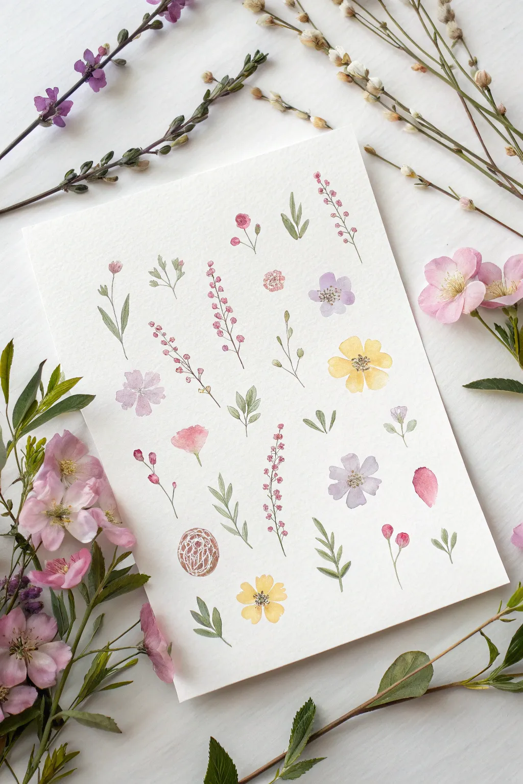
Create your own botanical study with this airy and whimsical floral sampler, capturing the fragile beauty of wildflowers. Using fine brushwork and soft watercolor washes, you will fill a textured page with an assortment of blooms, stems, and leaves that feel as if they were just plucked from a summer meadow.
Step-by-Step Tutorial
Materials
- Cold-press watercolor paper (300gsm for texture)
- Watercolor paints (shades of pink, violet, yellow, sap green, and olive green)
- Fine detail brushes (sizes 0, 1, and 2 round)
- Pencil (HB or H for light sketching)
- Kneaded eraser
- Jar of clean water
- Paper towels
- Optional: White gouache for highlights
Step 1: Preparation and Layout
-
Paper selection:
Begin by selecting a high-quality sheet of cold-press watercolor paper. The rough texture is crucial for achieving the organic, vintage look seen in the reference image. -
Visualizing the grid:
Mentally divide your paper into an informal grid. You want the flowers to be spaced evenly but not rigidly. You can lightly tap a few pencil dots where you plan to place your main focal flowers to ensure balance. -
Color mixing:
Prepare your palette by mixing watery puddles of paint. You’ll need a pale dusty pink, a soft lavender, a sunny yellow, and two greens—one fresh and bright, one dustier and more olive-toned.
Fixing heavy stems
If a stem line gets too thick, quickly dab it with a clean, dry paper towel to lift the paint, then try again with a drier brush once the paper is barely damp.
Step 2: Painting the Blooms
-
The yellow buttercups:
Start with the yellow flowers to establish brightness. Using a size 2 brush, paint four or five loose, rounded petals that meet in the center. Keep the paint watery so it pools slightly at the edges. -
Adding lavender accents:
Switch to your violet mix. Paint small, five-petal flowers similar to the yellow ones but slightly more irregular in shape. Allow the petals to touch while wet if you want a softer, bled look. -
Creating the pink tall stems:
For the tall, vertical pink flowers (like heather or foxglove), gently dab small dots of pink paint in a vertical line. Make the dots smaller at the top and slightly larger near the bottom base. -
Detailing the rose buds:
Paint small, tight circles for the rosebuds using a slightly more concentrated pink mix. Leave a tiny sliver of white paper in the center to suggest the swirl of petals. -
Single petal study:
Don’t forget the lone pink petal on the right side. Paint a simple teardrop shape, darker at the bottom and fading to almost clear water at the top tip.
Keeping it airy
Leaves look best when they don’t touch the stem perfectly. Leave a microscopic gap between leaf and stem to add lightness and prevent colors from bleeding.
Step 3: Greenery and Stems
-
Connecting the stems:
Using your finest size 0 brush and the olive green mix, draw incredibly thin lines connecting your floral heads to the imaginary ground. Keep your hand loose; a slightly shaky line looks more organic. -
Variety in leaves:
Paint a mix of leaf shapes. Some stems should have alternating small oval leaves, while others should have long, grassy blades. -
The fern-like sprig:
Near the center, paint a standalone green sprig. Use the tip of your brush to press down and lift up quickly, creating small, pointed leaves that radiate from a central stem. -
Adding base leaves:
Anchor the larger yellow and purple flowers by painting small, jagged sepals directly under the petals where they meet the stem.
Step 4: Fine Details
-
Defining centers:
Once the flower petals are completely dry, use a concentrated brown or dark orange mix to dot the centers. For the yellow flowers, tiny stippled dots work best to mimic pollen. -
Texturing the seed pod:
For the round brownish element near the bottom left, paint a wash of brown, let it dry, and then use white gouache (or a white gel pen) to draw fine, scribbly lines on top for texture. -
Final assessment:
Step back and look for empty spaces. Fill any awkward gaps with tiny floating leaves or small pink buds to balance the composition.
Now you have a charming botanical collection that captures the gentle essence of a wild garden
Toilet Paper Roll Petal Stamps for Big Blooms
Transform humble cardboard tubes into a sophisticated floral mandala with this clever stamping technique. The resulting artwork features layers of warm, translucent petals radiating from a detailed teal center, creating a harmonious design that looks far more complex than it actually is.
How-To Guide
Materials
- Heavyweight watercolor paper or mixed media paper (square format recommended)
- 2-3 Empty toilet paper rolls or paper towel tubes
- Liquid watercolor paints or diluted acrylics (Teal, Burnt Orange, Peach/Coral)
- Small plastic palette or shallow dishes for paint
- Fine detail paintbrush (size 0 or 1)
- White gel pen or fine opaque white paint marker
- Scissors
Step 1: Preparation and Stamp Making
-
Prepare the paper:
Begin by securing your watercolor paper to a flat surface. Since this design relies on symmetry, you might want to lightly mark the absolute center point with a pencil to guide your first placement. -
Shape the petal stamp:
Take your first toilet paper roll and pinch one end firmly to create a pointed oval or ‘almond’ shape. This will be your primary petal stamp. Flatten the crease well so it holds its shape. -
Shape the leaf stamp:
Take a second roll and pinch it more sharply at both ends to create a narrower, distinct marquise shape. This will serve as the outer teal leaves. -
Prepare the palette:
Pour your paints into shallow dishes. You want a puddle deep enough to coat the edge of the cardboard roll but not so deep that it drips everywhere. I like to mix a gradient of oranges—one deeper burnt orange and one lighter peach shade.
Uneven Stamp Impression?
Work on a magazine or a stack of paper rather than a hard table. The slight ‘give’ helps the cardboard rim make full contact with your watercolor paper for a solid line.
Step 2: Stamping the Layers
-
Stamp the inner ring:
Dip the ‘petal’ stamp into the lighter peach/coral paint. Blot it once on scrap paper to remove excess blobs. -
Create the first circle:
Press the stamp down firmly around your center mark. Stamp 10-12 petals in a tight circle, with the pointed ends facing inward. Let the petal tips almost touch in the middle. -
Stamp the second layer:
Switch to your deeper burnt orange paint. Stamp a second ring of petals nestled in the gaps between the first layer’s petals. Position them slightly further out to expand the radius. -
Add the third layer:
Using the same burnt orange (or a slightly darker mix), stamp a third, larger ring. These petals should sit just behind the second layer, filling out the bloom’s volume. -
Fill the petals:
While the outlines are drying, use a soft brush to fill inside the stamped shapes. Use a very watery wash of the same colors to keep that translucent, watercolor look. Leave a tiny sliver of white space near the outlines for breathing room. -
Stamp the outer leaves:
Clean your workstation and switch to the teal paint. Using your sharper ‘leaf’ stamp, press a ring of shapes around the outermost orange petals. Aim for the V-shaped gaps between the orange petals. -
Fill the leaves:
Fill these teal shapes with a semi-opaque wash of teal paint. This provides a cool-toned contrast to the warm flower center.
Step 3: The Centerpiece
-
Paint the core:
Using your teal paint (undiluted for stronger color), paint a solid circle in the very center of the flower, covering the area where the inner petal tips meet. -
Let it dry completely:
This is crucial—wait until the center teal circle is bone dry. If it’s damp, your white details will bleed. -
Add the dotwork:
With a white gel pen or fine paint marker, start drawing concentric circles of tiny dots inside the teal core. -
Detailing the seeds:
Start with a larger dot in the absolute center, then work your way out with rings of smaller stippled dots until the entire teal circle is filled with intricate white texture. -
Final touches:
Erase any visible pencil guide marks and check for any petals that need a little extra color definition.
Level Up: Ombré Petals
When filling the petals with color, drop wet paint at the base and use a clean, damp brush to pull the color toward the tip. This creates a beautiful fade from dark to light within each petal.
Step back and admire the geometric harmony of your hand-stamped bloom
Pencil Shaving Flower Mandala
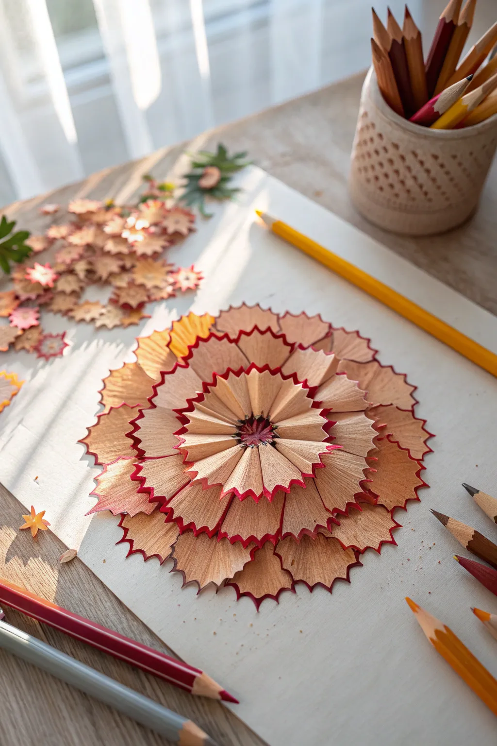
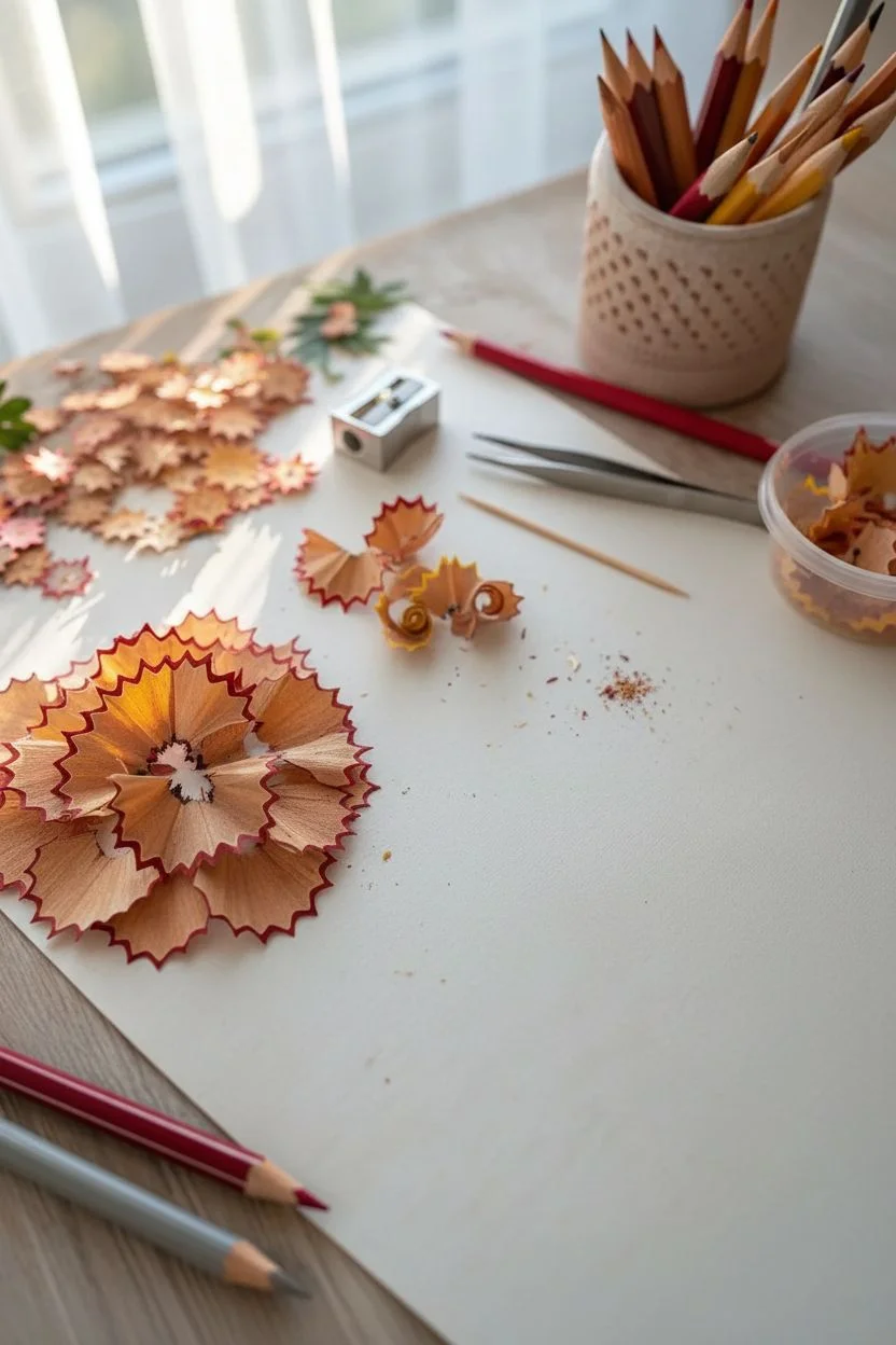
Transform ordinary pencil sharpening scraps into a stunning, multi-layered floral mandala that mimics the delicate petals of a peony or carnation. This eco-friendly art project uses the natural scalloped edges of pencil shavings to create texture and depth in a warm, blooming gradient.
Step-by-Step Tutorial
Materials
- Red-cased colored pencils (or pencils with red lacquered barrels)
- Yellow or orange colored pencils (optional for variation)
- High-quality manual pencil sharpener (metal blade preferred)
- Heavyweight white drawing paper or cardstock
- Craft glue or clear-drying liquid adhesive
- Tweezers
- Toothpick (for applying glue)
- Small container for collecting shavings
Step 1: Preparation
-
Gather Shavings:
Begin by sharpening your red-cased pencils. You are aiming for full, mesmerizing semi-circles or fan shapes. Keep steady, even pressure on the pencil while twisting it in the sharpener to prevent the wood from breaking into tiny chips. -
Sort by Shape:
As you sharpen, gently empty your sharpener frequently. Sort the shavings into piles based on their size and integrity. You’ll need larger, flatter pieces for the outer petals and tighter, crimped pieces for the center. -
Plan the Center:
Lightly mark a small dot in the very center of your paper using a pencil. This will serve as your anchor point to keep the mandala symmetrical as you build outward.
Sharpener Secrets
A dual-hole sharpener is key. The larger hole often produces wider, flatter shavings ideal for outer petals, while the standard hole makes tighter curls for the center.
Step 2: Building the Outer Layers
-
The Foundation Layer:
Select your largest, widest shavings. Apply a thin line of glue along the straight bottom edge of a shaving (not the scalloped edge). -
Place First Petal:
Place this first shaving about 2 inches from your enter center dot, with the scalloped red edge facing outward. Press gently to secure. -
Complete the Ring:
Continue gluing large shavings in a circle around the center point, creating the outermost ring. Overlap the edges of the shavings slightly—about 2-3mm—so there are no gaps of white paper showing between them. -
Second Ring:
Move inward closer to the center. Select slightly smaller shavings for this layer. Glue them down so they overlap the bottom, unnattractive straight edges of the first ring. -
Staggering Petals:
I prefer to place these second-layer petals in the ‘valleys’ between the petals of the first layer. This staggering effect creates a more realistic, organic flower look.
Step 3: Creating the Inner Bloom
-
Third Layer:
Continue moving inward with a third concentric circle. As the circle gets tighter, you may need to gently snip or break the sides of the shavings to make them fit the curve without buckling. -
Add Depth:
If you have some shavings with more yellow or orange tones, mix a few into this middle layer to simulate light hitting the flower. -
Tighten the Circle:
For the fourth layer, use shavings that curled tightly when they came off the sharpener. These naturally have a more vertical lift, adding 3D volume to the flower. -
Glue Management:
Use a toothpick to apply tiny dots of glue for these inner layers to avoid a messy buildup that could warp the paper.
Stem & Leaves
Use green stray shavings to create scattered leaves around the bloom, or actually draw a stem and leaves with colored pencils for a mixed-media botanical effect.
Step 4: The Centerpiece
-
Select Center Petals:
Find 6-8 perfect, small, fan-shaped shavings that are roughly identical in size. These will form the starburst center. -
Arrange the Star:
Dry-fit these pieces first (without glue) in a tight circle right around your center mark. Their straight edges should all meet in the middle, radiating outward like sun rays. -
Glue the Center:
Once satisfied with the arrangement, glue them down one by one. Use tweezers here for precision placement, as fingers can easily crush the delicate wood. -
Finishing Touches:
Inspect the flower for any white gaps. If you spot one, tuck a small fragment of a shaving underneath an existing layer to fill the hole. -
Clean Up:
Gently blow away any loose graphite dust or wood crumbs. Let the artwork dry completely on a flat surface for at least an hour.
Now you have a permanent bloom that captures the beauty of your artistic tools
Flower Pounding Prints From Fresh Petals
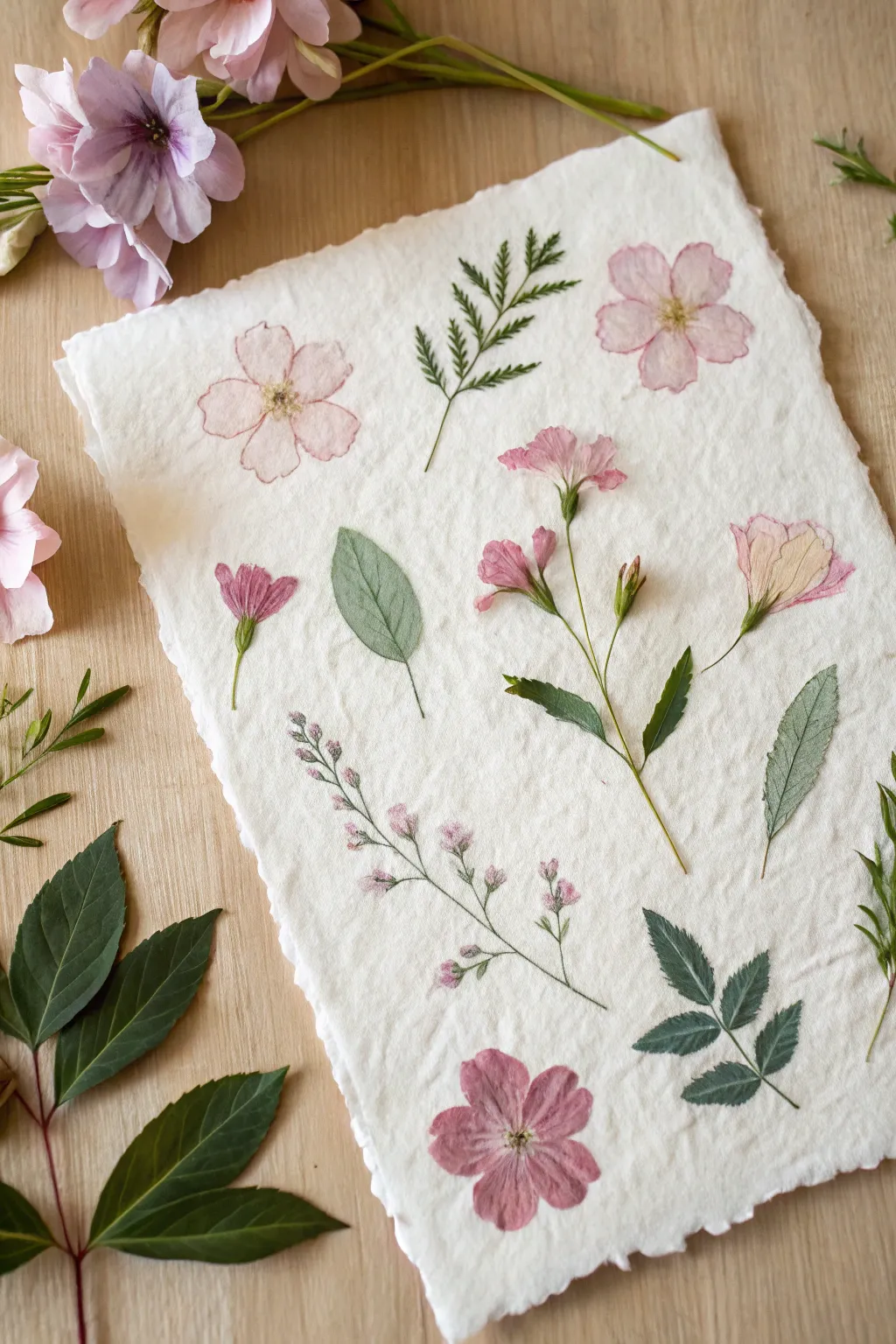
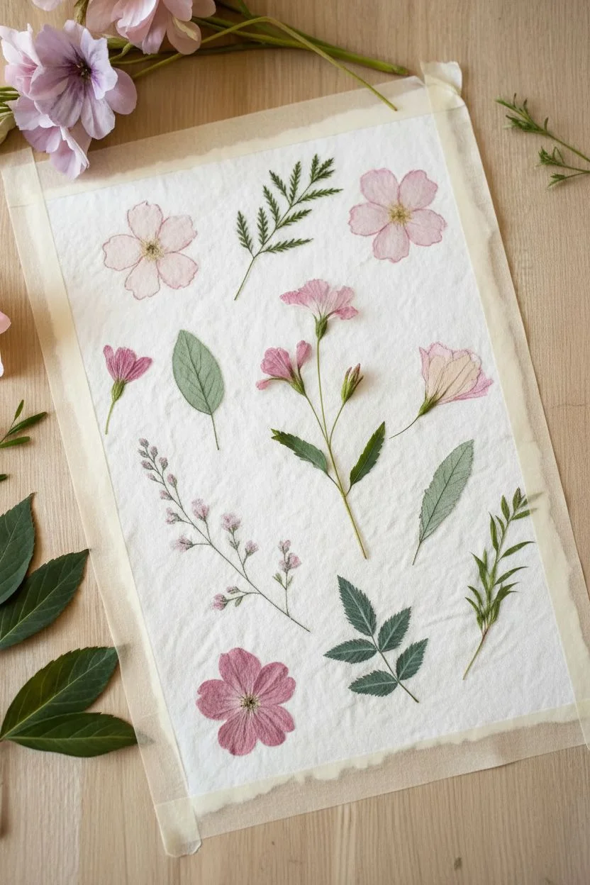
Capture the fleeting beauty of fresh blooms with this delicate flower pounding technique, also known as tatakizome. By hammering pigment directly onto handmade paper, you create a soft, watercolor-like botanical composition that preserves nature’s details.
Step-by-Step Guide
Materials
- Thick, textured handmade cotton paper or watercolor paper
- Fresh flowers with thin petals (pansies, cosmos, wild roses, or geraniums)
- Fresh green leaves (ferns, rose leaves, or slender herbs)
- Hammer or rubber mallet
- Masking tape or painter’s tape
- Paper towels or blotting paper
- Hard, smooth working surface (like a cutting board)
- Scissors or floral snips
- Tweezers (optional)
Step 1: Preparation and Arrangement
-
Select your blooms:
Choose flowers that are fresh but not too bulky. The pink and rose-colored blooms in the image work beautifully because they release pigment easily without holding too much moisture. -
Prepare the stems:
Trim the stems off your flowers completely so the flower head can lie flat. If using multi-stemmed sprays like the delicate pink buds shown, you can leave thin stems attached. -
Deconstruct larger flowers:
For flowers that have hard, thick centers (like the wild rose shown top right), I find it best to carefully pull the petals off and arrange them manually into a flower shape, discarding the bulky center. -
Secure the paper:
Tape the corners of your textured handmade paper to your hard working surface. This prevents the paper from shifting while you are hammering. -
Arrange the composition:
Place your fresh plant material face down on the paper. Create a balanced layout with a mix of single blooms, fern-like leaves, and small sprays of buds. -
Mix textures:
Intersperse the floral elements with greenery. Use different leaf shapes—some serrated, some smooth ovals—to replicate the variety seen in the example.
Step 2: The Pounding Process
-
Cover the arrangement:
Gently place a sheet of paper towel or non-textured blotting paper over the entire arrangement. Be careful not to shift the delicate petals underneath. -
Anchor the cover:
Tape down the edges of the top paper towel layer securely. This sandwich ensures the plants stay exactly where you want them during the impact. -
Test your strength:
Start hammering gently on a ‘test’ area or a leaf first. You need enough force to crush the cells but not so much that you tear the textured paper underneath. -
Hammer the outlines:
Using the flat head of your hammer, work methodically around the outline of each flower and leaf first. This defines the shape crisp edges. -
Fill in the centers:
Once the outlines are done, hammer the centers of the petals and leaves. You should see the pigment starting to bleed through the paper towel slightly. -
Check progress:
Carefully lift one corner of the paper towel to peek. If the dye transfer looks patchy or faint, lay it back down and hammer that specific spot again.
Vivid Color Tip
Remove yellow stamens before pounding! They contain lots of pollen which can smear into an indistinct brown smudge rather than a crisp print.
Step 3: Finishing Touches
-
Remove the cover:
Once satisfied with the transfer, completely remove the top paper towel layer. -
Peel the plant matter:
The crushed petals and leaves will likely be stuck to the paper. Use tweezers or your fingernail to very gently peel them away. -
Clean the surface:
If any sticky residue or plant pulp remains on the print, wait for it to dry completely, then gently brush it off with a soft, clean paintbrush. -
Dry the paper:
The paper will be slightly damp from the plant juices. Let it air dry flat for at least an hour before framing or moving it. -
Preserve the color:
To help the colors last longer, keep the artwork out of direct sunlight, which fades natural dyes quickly.
Enhance with Pen
Once the prints are fully dry, use a fine-tip archival ink pen to lightly trace veins or stem outlines to add definition back into softer prints.
Now you have a stunning, organic piece of art that perfectly captures the garden season
Abstract Floral Silhouettes With Neon-Like Color Layers
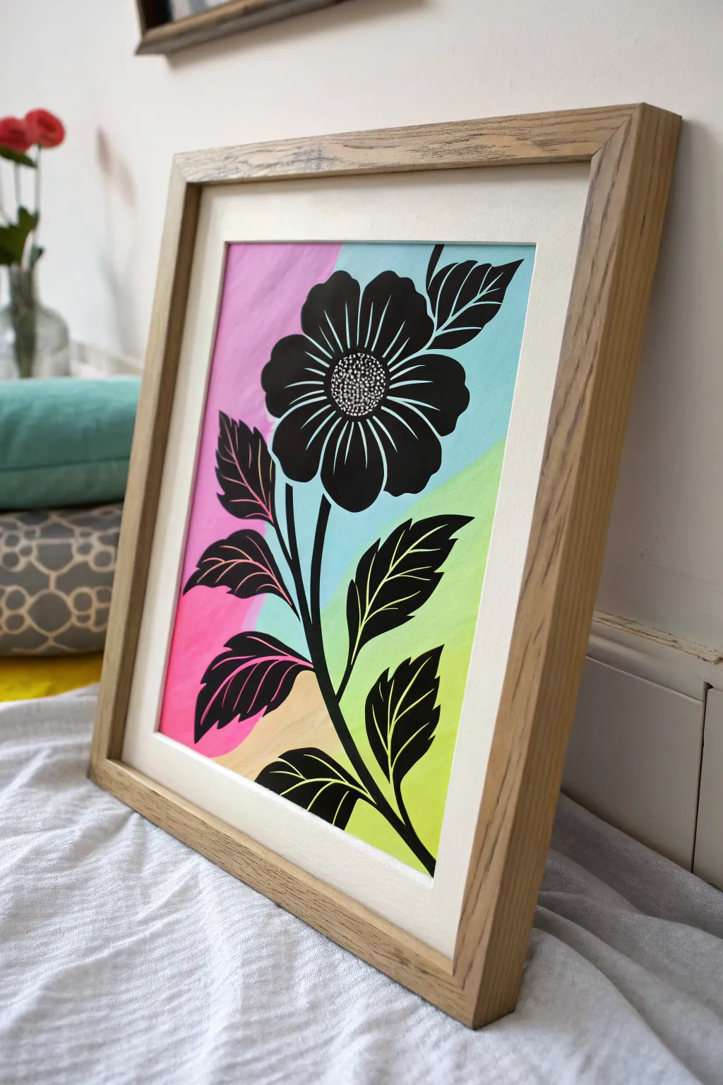
This striking project combines the softness of pastel color blocking with the crisp drama of a silhouette. By layering a bold black floral design over distinct zones of neon-bright paint, you create a modern, graphic piece that instantly energizes any wall.
Step-by-Step Tutorial
Materials
- Heavyweight mixed-media or watercolor paper (A3 or A4)
- Acrylic paints: Hot Pink, Sky Blue, Lime Green, Peach/Sand, and Carbon Black
- Painter’s tape or low-tack masking tape
- Flat shader brush (medium size for background)
- Fine liner brush (size 0 or 1 for details)
- Round brush (size 4 for filling petals)
- Pencil and eraser
- Ruler
- Palette or mixing plate
- Jar of water and paper towels
Step 1: Planning the Color Blocks
-
Map the zones:
Visualize your paper divided into four irregular quadrants using diagonal lines. Lightly sketch two intersecting diagonal lines with a pencil to define where your colors will meet. They don’t need to be perfectly symmetrical; an offset intersection adds visual interest. -
Tape the first section:
Using painter’s tape, mask off the boundaries for your first color section—let’s start with the top left. Press the tape edges down firmly to prevent paint bleed. -
Apply the pink:
Paint the masked section with Hot Pink acrylic. Use a flat shader brush for even strokes. If the coverage looks streaky, let it dry completely and apply a second coat for opacity. -
Tape and paint the blue:
Once the pink is bone dry, carefully remove the tape. Now, mask off the adjacent top-right section. Fill this area with Sky Blue paint, ensuring you get a crisp edge where it meets the pink. -
Complete the bottom sections:
Repeat the masking and painting process for the bottom right (Lime Green) and bottom left (Peach/Sand). Ensure each section is fully dry before taping over it to avoid peeling up fresh paint.
Clean Lines Only
If paint bleeds under your tape, don’t panic. Wait for it to dry, then use a stiff, damp brush to gently scrub the excess away, or paint over it with the mix.
Step 2: Sketching the Silhouette
-
Draft the stem line:
With the background fully dry, lightly sketch a curved central stem line rising from the bottom center towards the middle of the page. -
Position the flower head:
Draw a rough circle near the top center where the main flower head will sit. It should overlap the pink and blue sections. -
Outline the petals:
Sketch long, oval-shaped petals radiating from the center circle. Don’t worry about perfection; organic shapes look better. -
Add leaf placements:
Sketch the outlines of leaves branching off the main stem. Give them serrated or pointed edges to match the aesthetic in the reference image.
Go Digital
For a hyper-modern look, paint the background on paper, scan it, and add the black silhouette digitally in an app like Procreate before printing.
Step 3: Painting the Black Floral
-
Outline layer:
Load your fine liner brush with Carbon Black paint. I like to thin the paint slightly with a drop of water for smoother flow. Carefully trace over your pencil outlines. -
Fill the stem:
Thicken the central stem line, making it wider at the base and tapering as it reaches the flower head. -
Block in the petals:
Switch to your size 4 round brush. Fill in the petal shapes with solid black paint. Work carefully near the edges to keep the silhouette sharp. -
Detail the petal interiors:
Notice the white lines inside the petals in the example? You can either leave thin negative space lines unpainted, or paint the petals solid black first and add white lines on top later. Painting solid black is easier for beginners. -
Fill the leaves:
Paint the leaves solid black. Like the petals, use the fine brush to create the detailed serrated edges and the round brush to fill the bulk of the shape.
Step 4: Refining and Framing
-
Create the flower center:
Paint the circular center black. Once dry, use a very fine brush or a white gel pen to stipple tiny dots in the center for texture. -
Add definition lines:
If you painted the petals solid black, now take a fine brush with white paint (or a white Posca pen) and draw thin, sweeping lines inside the petals and leaves to define the veins. -
Clean up edges:
Check the edges of your color blocks. If any paint bled, touch it up carefully with the appropriate background color. -
Erase pencil marks:
Wait until the black paint is cured—acrylics can feel dry but stay soft for hours. Once truly hard, gently erase any visible pencil sketch lines. -
Frame it:
Place your artwork behind a clean white mat board and a light wood frame to let the colors pop without distraction.
Now you have a vibrant, modern botanical piece that perfectly balances color and contrast
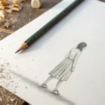
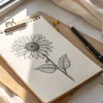
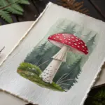
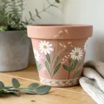
Have a question or want to share your own experience? I'd love to hear from you in the comments below!