Capturing the organic shapes and delicate textures of nature is one of the most relaxing ways to cultivate your artistic skills. Whether you are looking for a quick, mindful sketching session or a detailed project to challenge your observation, these inspirations will help you fill your pages with vibrant life.
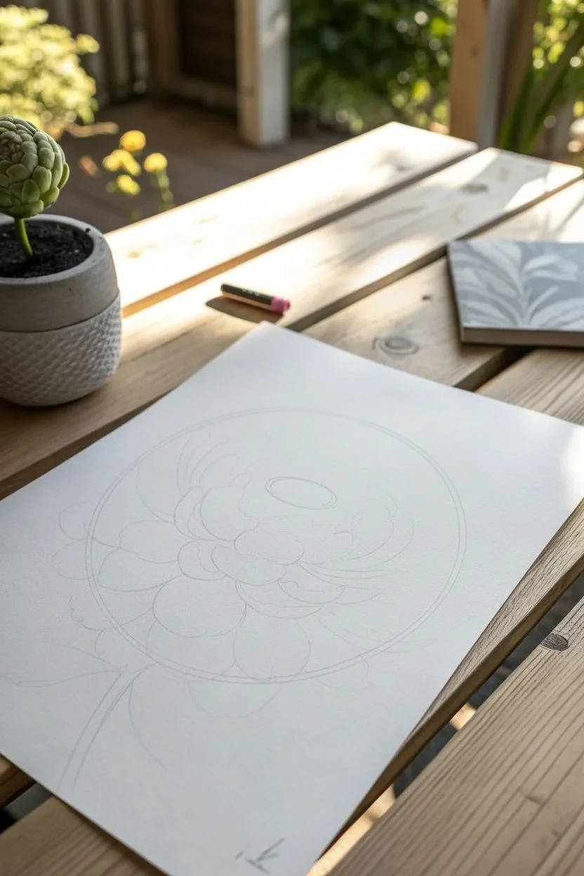
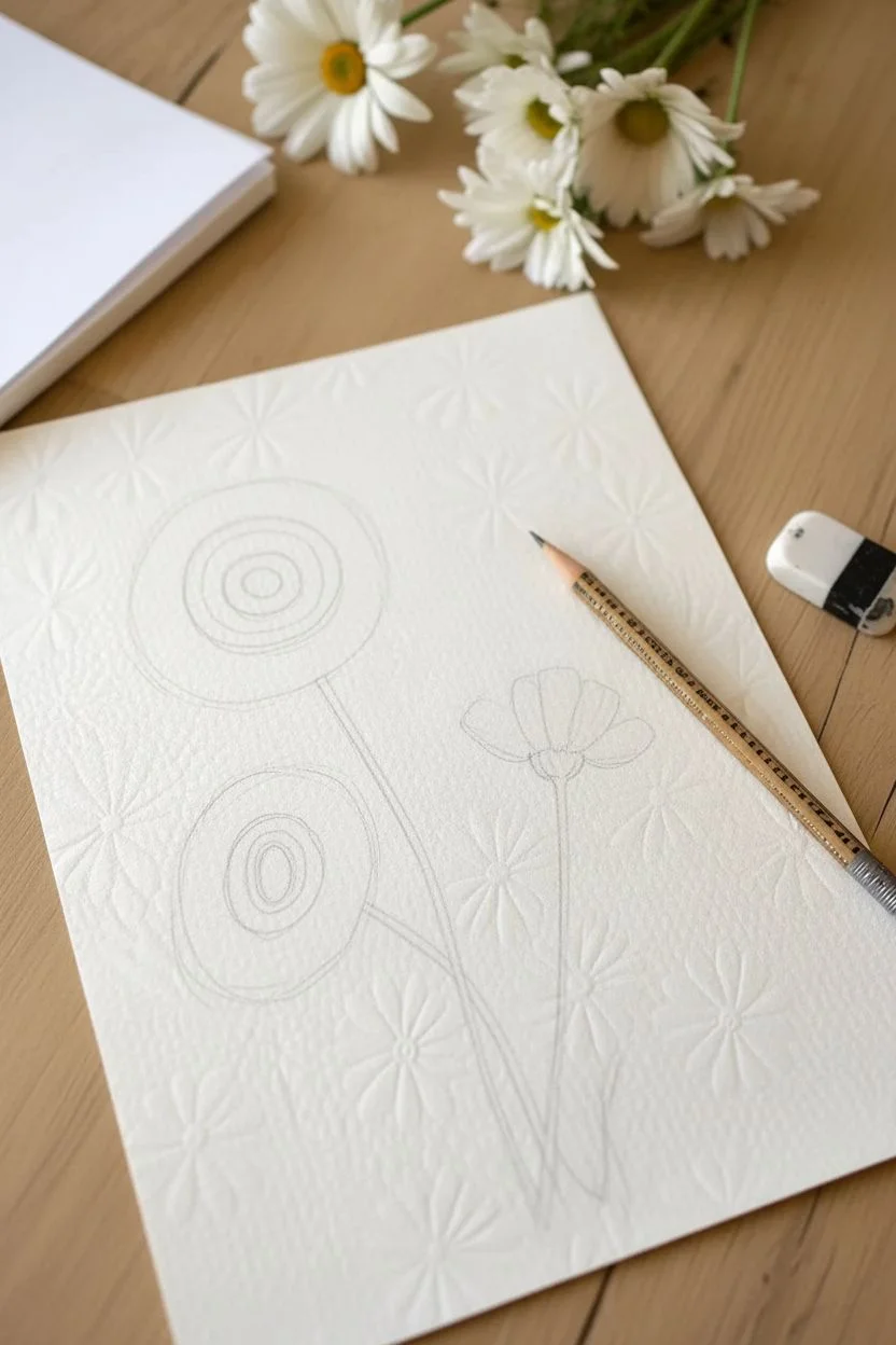
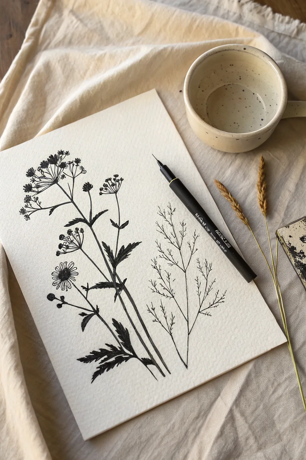
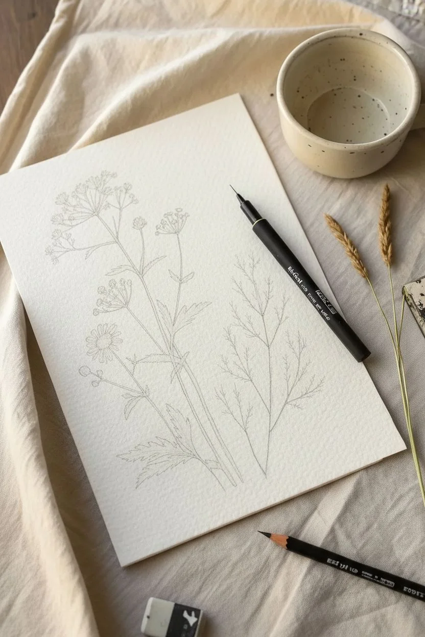
Simple Single-Line Wildflowers
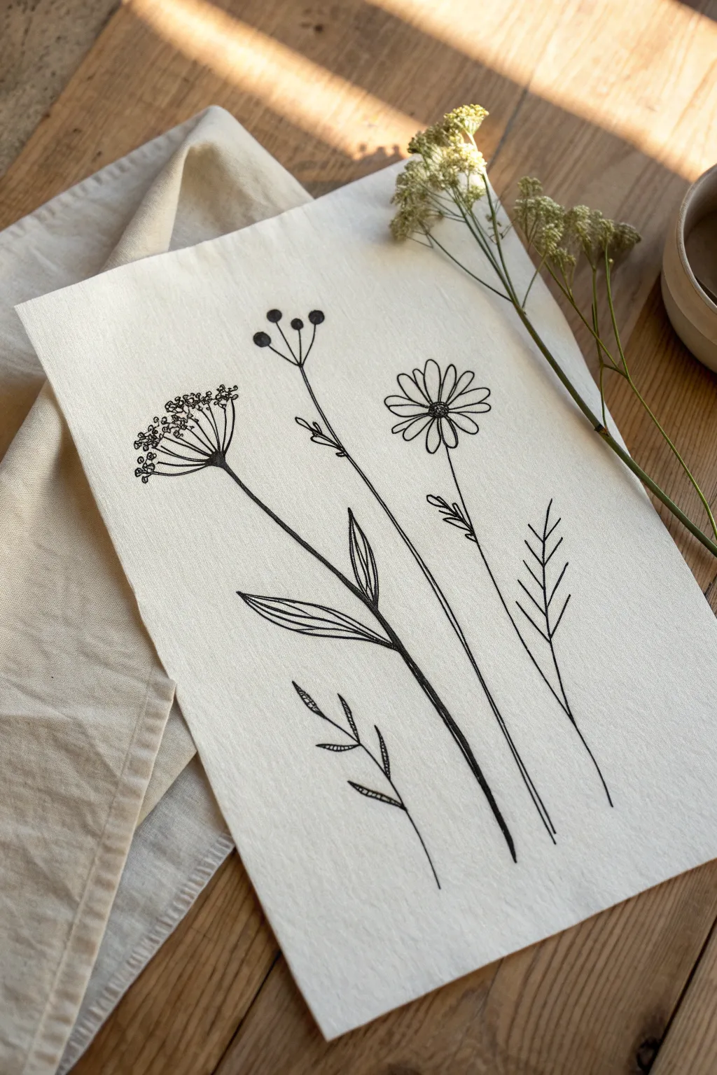
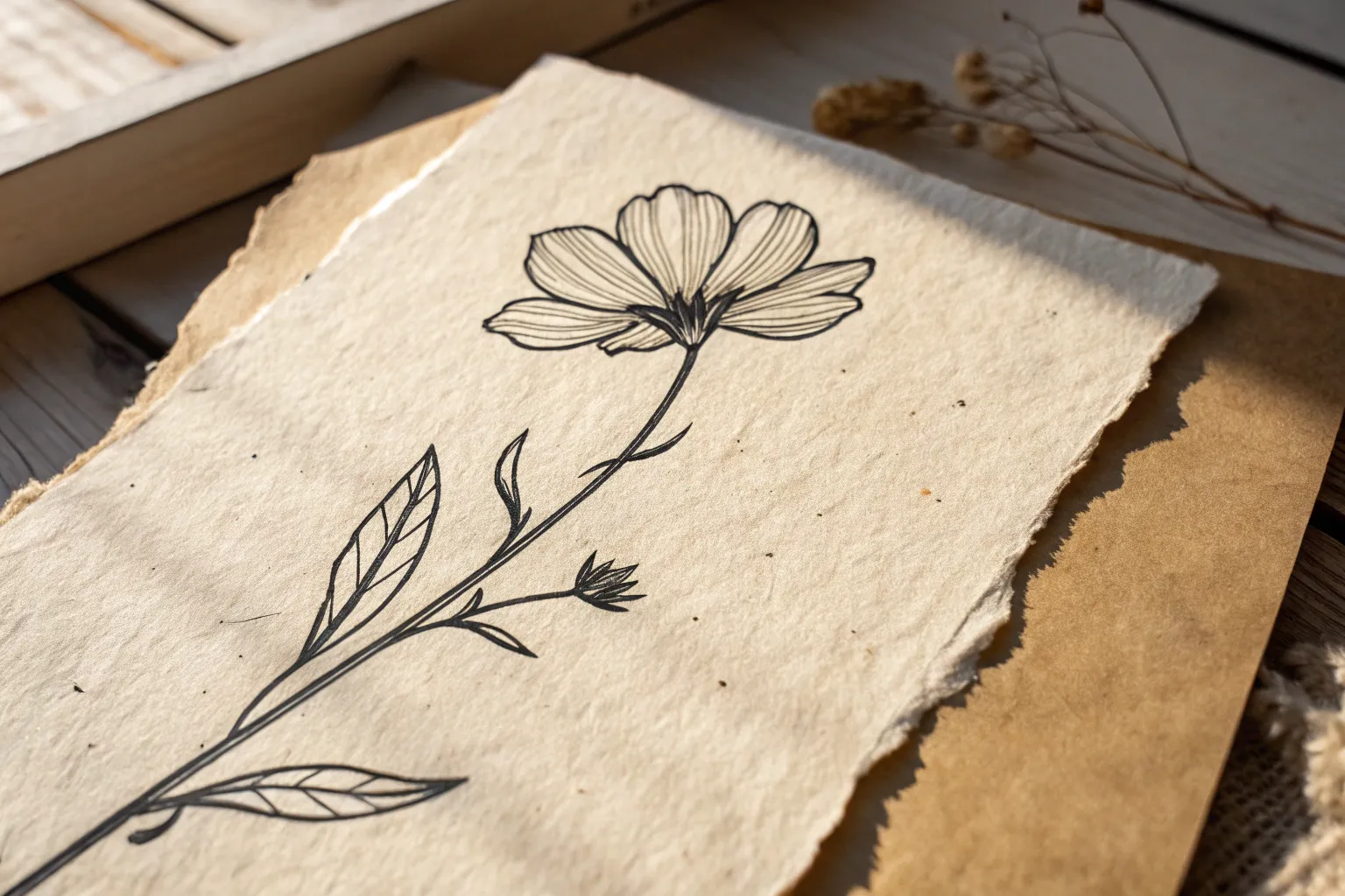
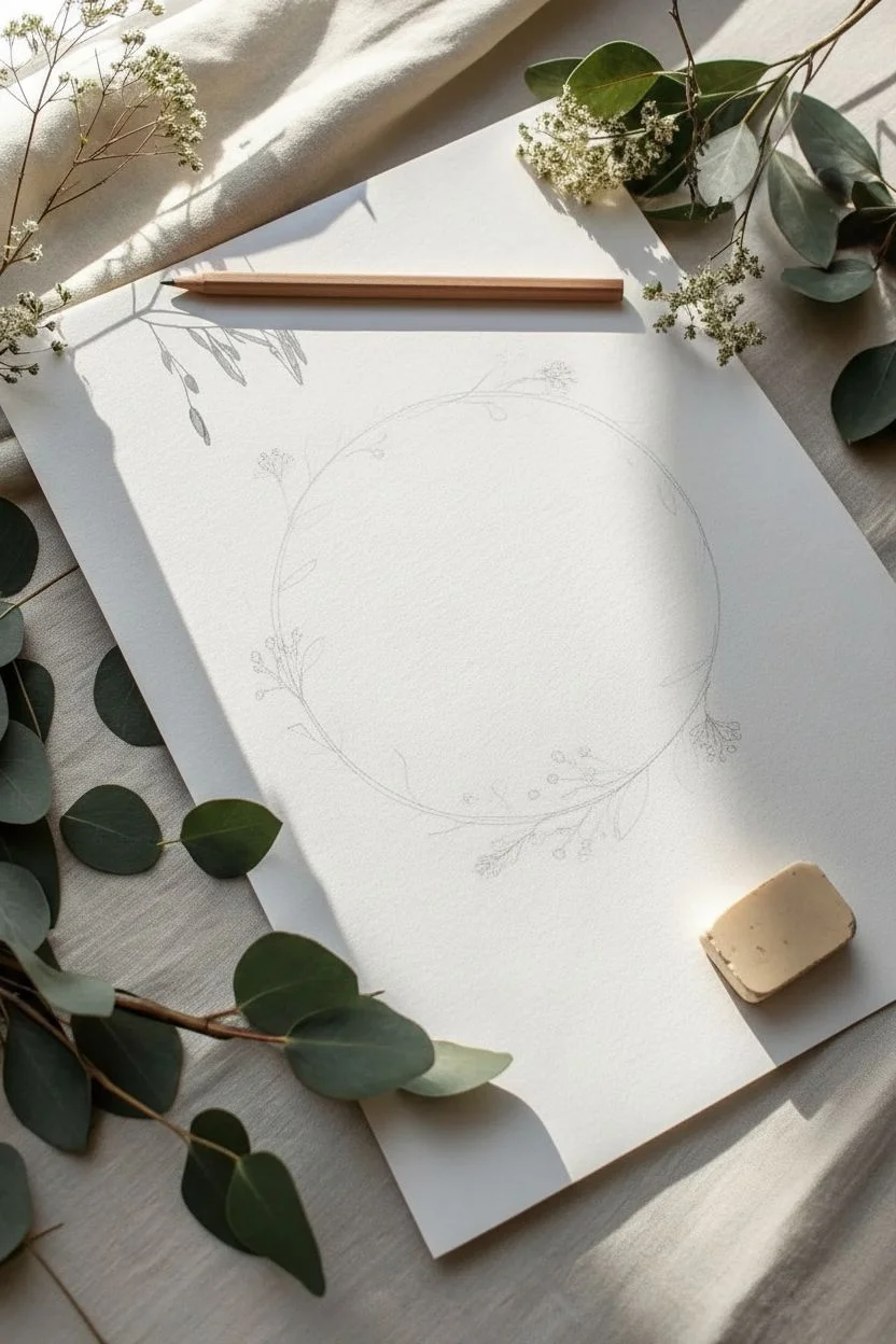
Capture the delicate beauty of dried botanicals with this elegant line drawing tutorial. Using simple fine liners on textured paper creates a vintage, organic look that is perfect for framing.
Step-by-Step Tutorial
Materials
- Cold-press watercolor paper (A4 size)
- Black fine liner pens (sizes 0.1, 0.3, and 0.5)
- HB Pencil
- Kneaded eraser
- Ruler (optional)
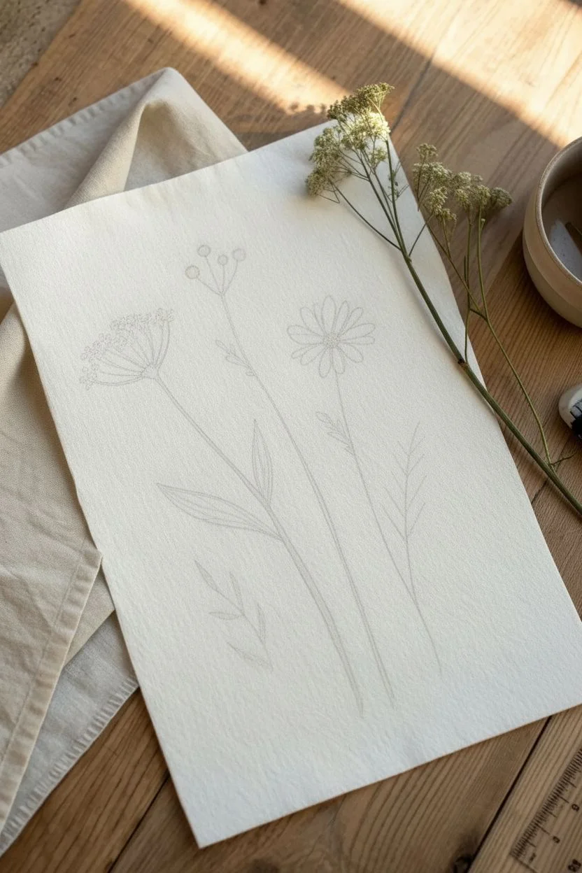
Step 1: Planning the Composition
-
Prepare the canvas:
Place your textured paper on a flat surface. The cold-press texture is key here, as it gives the ink lines a slightly rough, stamped look. -
Map the stems:
Using your pencil lightly, draw five faint vertical lines to mark the placement of the stems. vary their heights and curves so they fan out naturally like a bouquet. -
Sketch the flower heads:
Lightly sketch a circle for the daisy (center right), a triangle shape for the umbel flower (far left), and small dots for the berry stems.
Wobbly Lines?
Don’t stress if your hand shakes! In botanical illustration, a slightly wavering line mimics the natural texture of dried stems better than a ruler-straight one does. Embrace the imperfections.
Step 2: Drawing the Daisy & Berries
-
Ink the daisy center:
Switch to a 0.3 pen. Draw a small oval for the daisy center, filling it with tiny, tight scribbles or stippling to create a textured, pollen-like look. -
Add daisy petals:
Draw long, slender petals radiating from the center. Keep the tips slightly rounded and allow some petals to overlap for realism. -
Draw the berry stems:
Moving to the stem on the left of the daisy, draw a long thin line that splits into three shorter branches at the top. -
Fill the berries:
At the tip of these branches, draw small circles. Fill them in completely with black ink so they stand out as solid, heavy accents against the delicate lines.
Step 3: Creating the Queen Anne’s Lace
-
Structure the umbel:
For the large slightly curved flower on the far left, draw several straight lines radiating upward from a single point on the main stem, like the ribs of an umbrella. -
Add the florets:
At the end of each ‘rib,’ draw tiny clusters of open circles and dots. Keep these loose and bunch them together to mimic a lace-like texture. -
Thicken the base:
I like to thicken the main stem right where the ribs join, creating a small triangular junction. -
Draw heavy leaves:
Lower down on this stem, draw two pointed, lance-shaped leaves. Use swift, parallel hatching lines inside the leaves to give them weight and shading.
Pro Tip: Pen Sizes
Use different pen nib sizes to create depth. Use a thick 0.5mm for the main stems and leaves, and a tiny 0.1mm for the delicate flower petals and the lace-like details on the left bloom.
Step 4: The Grasses and Ferns
-
Sketch the geometric grass:
For the stem on the far right, draw a straight vertical line. Add pairs of upward-angled lines along the top half, resembling a chevron or wheat pattern. -
Add the small fern:
At the bottom center, draw a small, floating sprig. Give it a curved central stem with tiny, alternating almond-shaped leaves. -
Detail the fern leaves:
Add a single line down the center of each tiny fern leaf, or shade one half of each leaf for a bit of dimension.
Step 5: Final Inking & Polishing
-
Trace the main stems:
Go over your long stem lines with a 0.5 pen. Don’t worry if the line wavers slightly; organic imperfections make it look more natural. -
Add stem buds:
Draw tiny leaf buds or thorns randomly along the long stems of the daisy and berry plant to break up the straight lines. -
Vary line weight:
Revisit the bottom few inches of the main stems and thicken the lines slightly, tapering them as they go up. This grounds the drawing. -
Clean up:
Once the ink is completely dry (wait at least 10 minutes to avoid smears), gently erase all visible pencil marks.
Frame your new botanical study in a simple wood frame to complement the organic vibe.


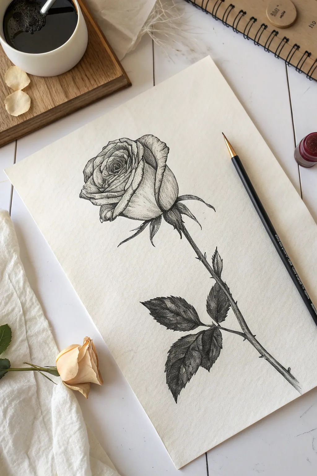
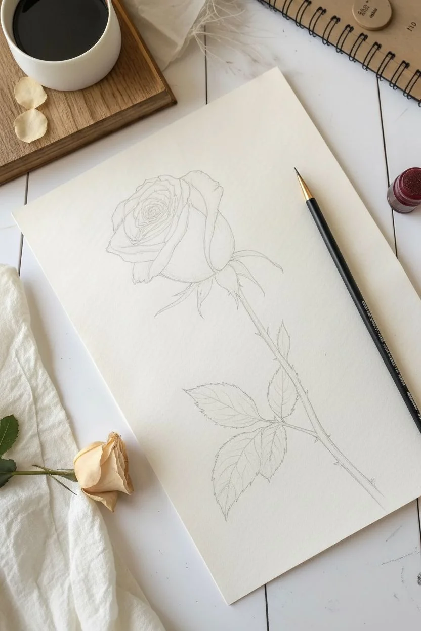
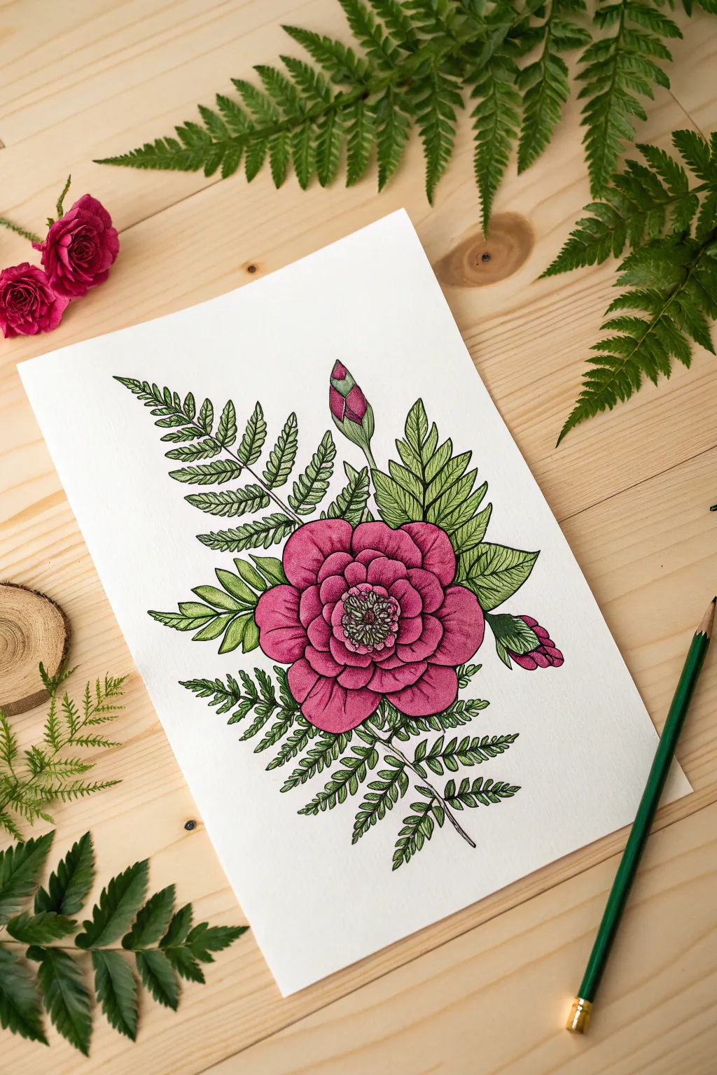
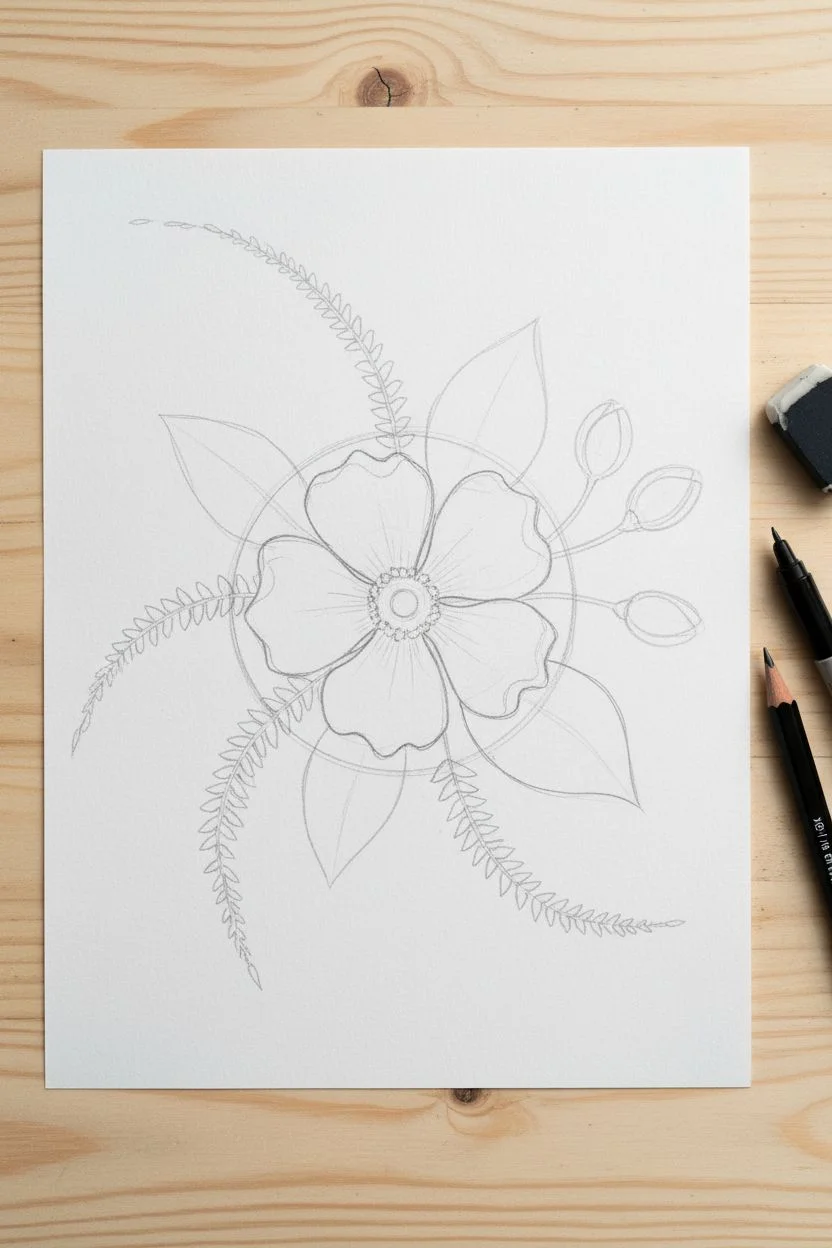
The Classic Layered Rose
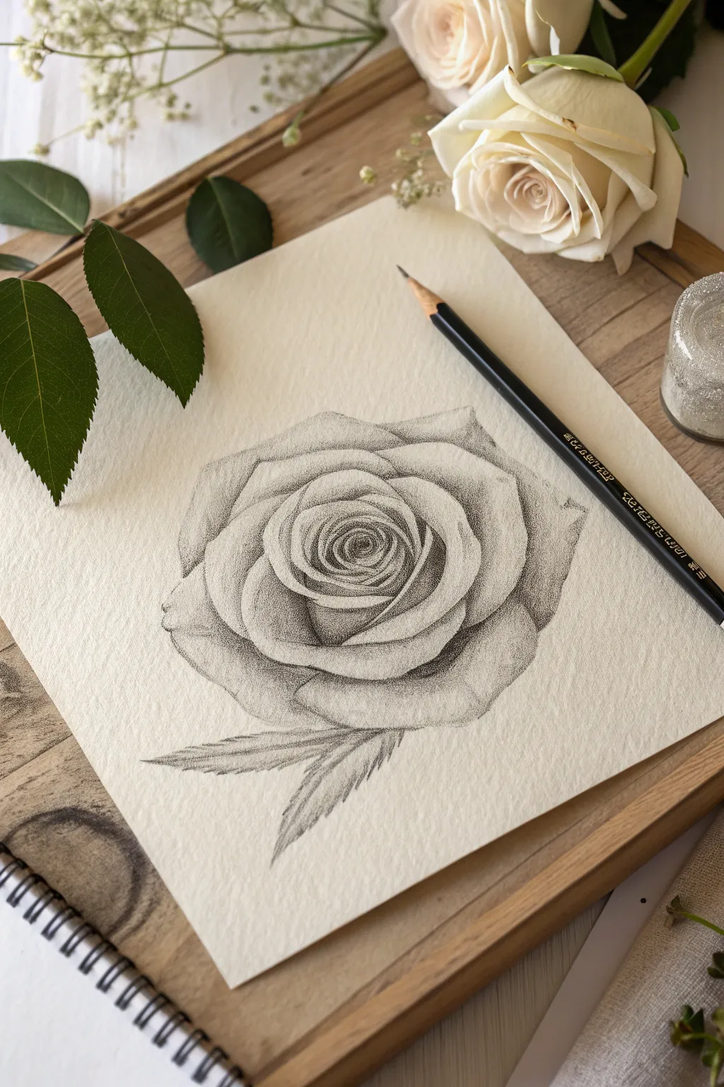
Capture the delicate beauty of a blooming rose using graphite on textured paper to create a grainy, vintage aesthetic. This project relies on soft shading and paper tooth to render realistic depth and velvety petal surfaces.
Step-by-Step
Materials
- Textured drawing paper (cold-press watercolor paper works well)
- Graphite pencils (ranges HB, 2B, 4B)
- Black charcoal pencil (optional for deepest blacks)
- Kneaded eraser
- Pencil sharpener
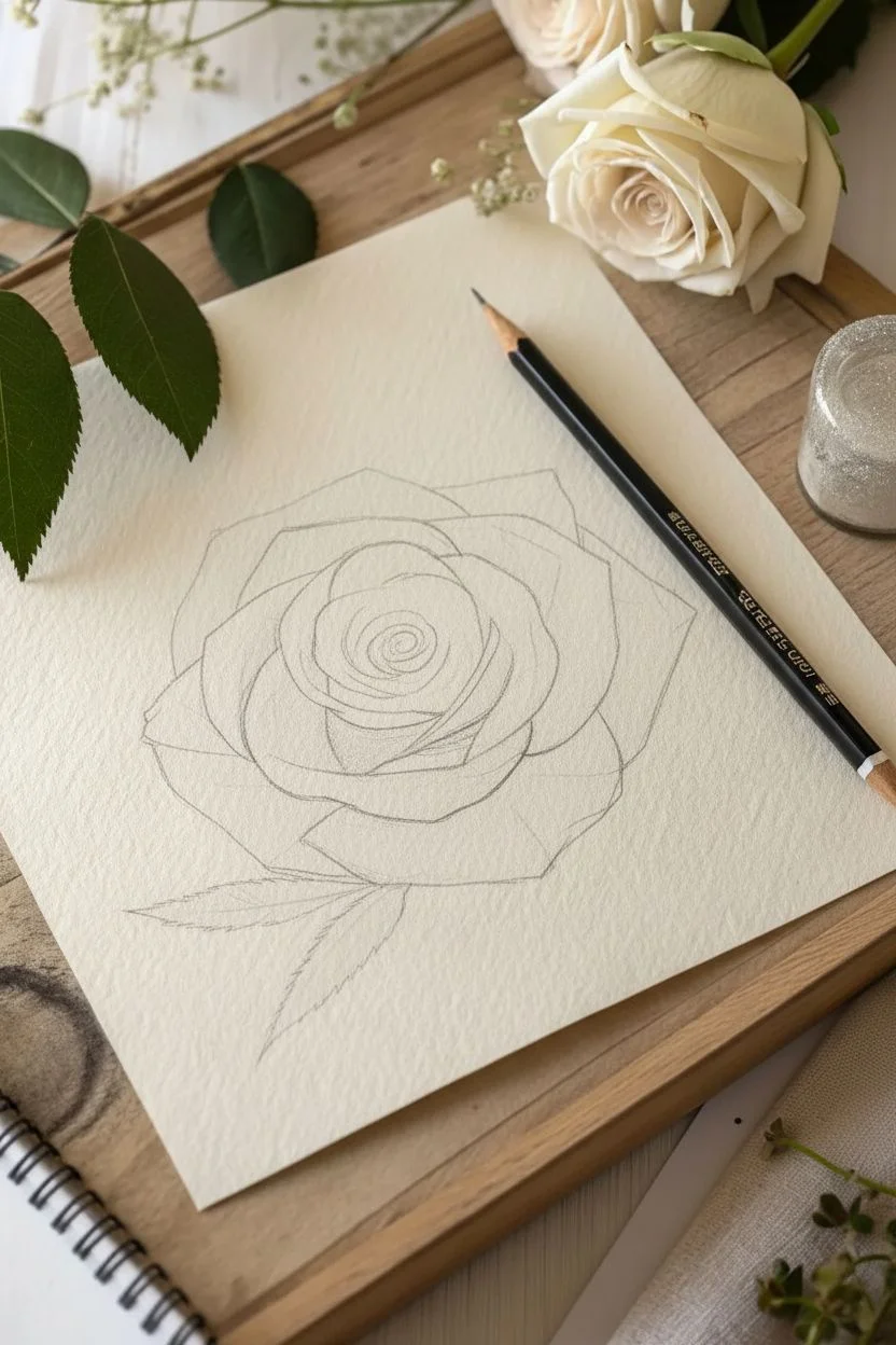
Step 1: Structural Sketch
-
Define the boundary:
Start with your HB pencil and lightly sketch a jagged, rough circle to define the overall size of the rose head on your textured paper. -
Map the core:
Draw a smaller, tilted oval shape in the upper-center of your circle to represent the tight bud of the rose. -
Spiral movement:
Sketch a spiral line inside that inner oval, guiding where the petals will tightly unfurl from the center. -
Petal placement:
Loosely sketch the larger, triangular shapes of the outer petals wrapping around the core, ensuring they overlap naturally. -
Add leaves:
Draw two elongated tear-drop shapes extending from the bottom of the flower to form the leaves.
Pro Tip: Paper Grain
Don’t smudge with your finger! Reliably keeping the shading ‘dry’ allows the textured paper bumps to catch the graphite, creating that beautiful dotted shading style automatically.
Step 2: The Inner Depths
-
Darkest point:
Switch to a 4B pencil or charcoal. Identify the very center point of the spiral and fill it in with solid, dark shading to create depth immediately. -
Core gradients:
Shade the tight petals surrounding the dark center. Press firmly at the base of each petal and lift your pressure as you move up towards the rim. -
Utilize texture:
Use a small, circular scribbling motion (scumbling) rather than straight lines. This works with the paper’s texture to create a grainy, pollen-like look. -
Define separation:
Ensure there is a crisp, dark line separating the petals in the bud stage so they don’t blur together.
Step 3: Expanding the Bloom
-
Shadowing underneath:
Move to the mid-layer petals. Shade the areas where an upper petal casts a shadow onto the one below it using your 2B pencil. -
Rolled edges:
Leave the very edges of the petals white or extremely light to suggest the highlight where the petal curls over. -
Building volume:
Fill in the body of the outer petals using light, side-of-the-pencil shading. Let the paper’s rough grain show through for that stippled effect. -
Deepen contrast:
Go back with your darkest pencil and re-darken the deepest crevices between the large outer petals. -
Refining shape:
Trace the outer perimeter of the rose with a confident line, adding small notches and irregularities to mimic organic nature.
Level Up: Dew Drops
Use a white gel pen to add tiny dots or small crescents on the darker parts of the petals to simulate fresh morning dew drops resting on the bloom.
Step 4: Foliage and Finish
-
Leaf outlines:
Refine the two leaves at the bottom, adding jagged, serrated teeth along the edges. -
Vein structure:
Lightly draw a central line down each leaf. -
Leaf shading:
Shade one half of each leaf darker than the other to imply light direction. I usually shade firmly near the stem and fade outward. -
Texture matching:
Apply the same scumbling or grainy shading technique to the leaves so they match the flower’s style. -
Final highlights:
Take your kneaded eraser and dab (don’t rub) the tops of the petals and the center of the leaves to lift graphite and restore bright highlights. -
Clean up:
Erase any initial construction lines that are still visible around the outer edges to leave a crisp silhouette.
Step back and admire how simple pencil strokes on the right paper can create such a lush, dimensional flower.
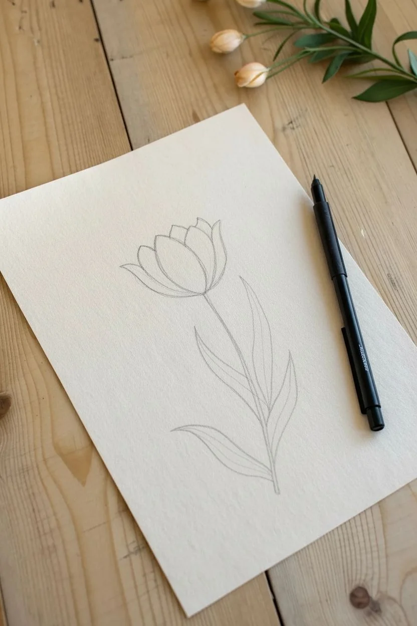
Minimalist Tulip Silhouettes
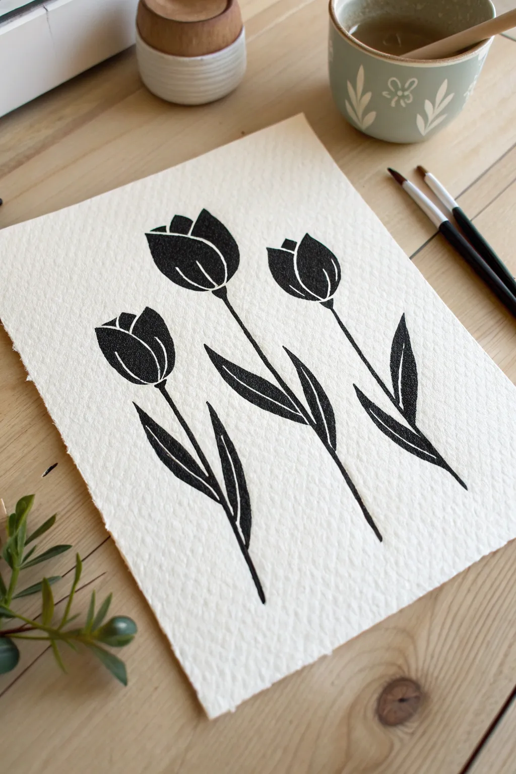
Contrast is the key to this striking artwork, using deep black ink to create a bold graphic look against textured paper. The beauty lies in the negative space; you will define the delicate petal shapes by what you don’t paint rather than what you do.
Detailed Instructions
Materials
- Cold-press watercolor paper (300gsm)
- Black India ink or opaque black gouache
- Round paintbrush (size 4 or 6)
- Small detail brush (size 0 or 1)
- HB pencil
- Kneaded eraser
- Water jar
- Paper towel
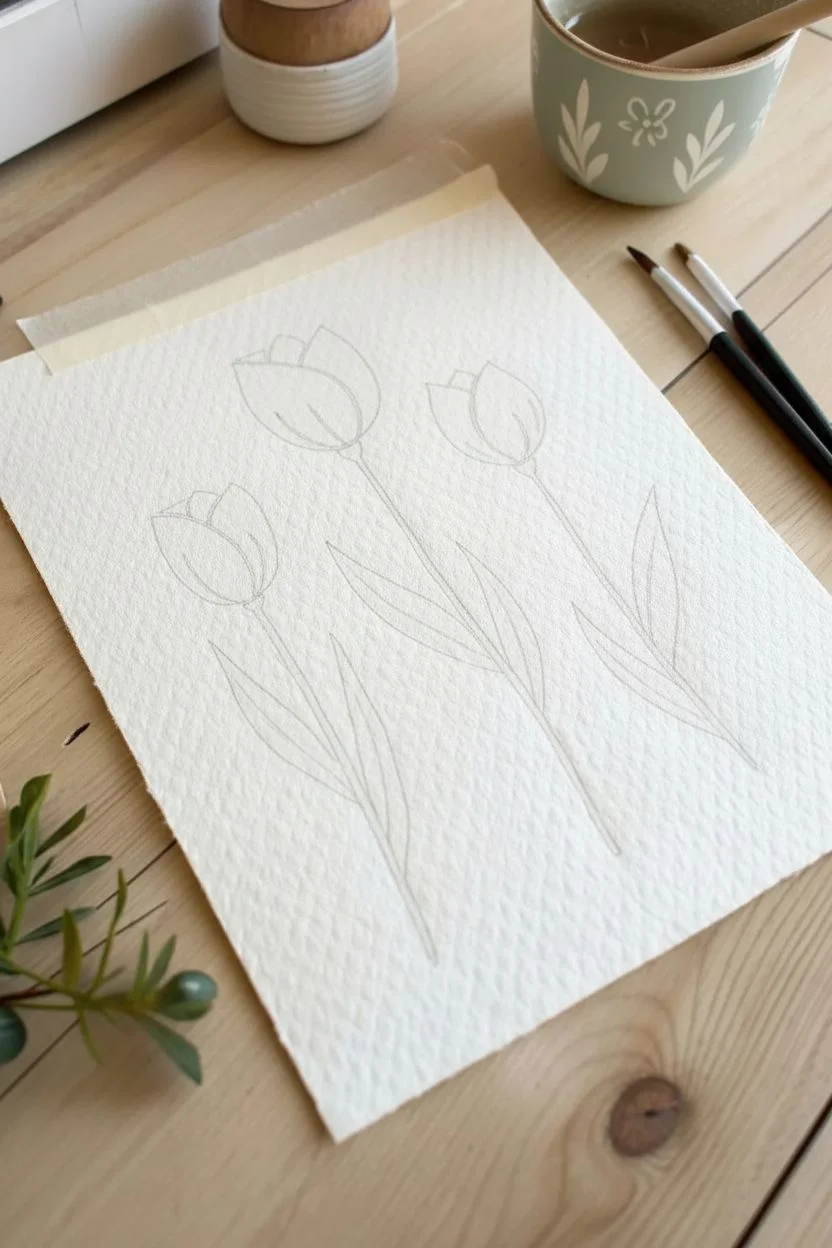
Step 1: Sketching the Layout
-
Prepare the paper:
Secure your textured watercolor paper to a flat surface. The cold-press texture adds character to the ink, so ensure your paper is heavy enough to handle the wet medium. -
Establish the curve:
Lightly sketch three vertical curved lines for the stems. Position the center stem highest, the left stem lowest, and the right stem at a medium height to create a balanced asymmetry. -
Outline the blooms:
At the top of each stem, sketch a simple U-shape or cup shape. Keep your pencil pressure extremely light so the graphite won’t show through the finished ink. -
Define the petals:
Inside each cup shape, draw the separating lines for the petals. These lines are crucial as they will remain unpainted to create the white detailing. -
Add leaf placement:
Sketch long, lance-shaped leaves near the base of the stems. Draw a line down the center of each leaf to indicate the central vein, which will also be left unpainted.
Step 2: Inking the Blooms
-
Mix your medium:
Prepare your India ink or mix black gouache with a little water. I like to aim for the consistency of heavy cream to ensure it is opaque but flows smoothly. -
Start the center flower:
Dip your round brush into the ink. Begin with the central tulip, carefully outlining the outer edge of the left petal shape. -
Mind the gap:
Paint the solid black interior of the petal, stopping precisely at your pencil marks to leave a thin sliver of white paper between this petal and the next. -
Complete the flower head:
Fill in the remaining segments of the center tulip. The contrast between the solid black shapes and thin white channels creates the 3D form. -
Paint the side blooms:
Repeat this process for the left and right tulips. Rotate your paper if necessary to keep your hand from smudging the wet ink on the center flower.
Lost Your Lines?
If your hand slips and you accidentally paint over a white gap, don’t panic. Let the black ink dry completely, then use a white gel pen or opaque white gouache to redraw the separation line.
Step 3: Stems and Leaves
-
Switch brushes:
For the stems, switch to your smaller detail brush regarding better control over the thin lines. -
Connect the stems:
Place the brush tip at the base of a flower head and pull the stroke decisively downward along your pencil guide. A confident, moderately fast stroke creates a smoother line than a slow, shaky one. -
Begin the leaves:
Switch back to the larger round brush for the leaves. Start at the base of a leaf, applying light pressure. -
Create the leaf shape:
Press down harder as you move up the leaf to widen the stroke, then lift gradually to taper off to a sharp point at the tip. -
Detail the veins:
Just like the flowers, paint the leaves in two longitudinal halves. Leave a thin stripe of unpainted white paper down the center to represent the vein. -
Final touches:
Check for any uneven edges or spots where the black isn’t fully opaque and touch them up carefully. -
Erase guidelines:
Allow the artwork to dry completely—wait at least 30 minutes. Once bone dry, gently use a kneaded eraser to lift any visible pencil lines from the white gaps.
Texture Twist
For a vintage botanical look, try using deep sepia or indigo ink instead of black. The slightly softer color pairs beautifully with the textured grain of the cold-press paper.
Now you have a sophisticated, minimalist botanical piece ready to be framed!

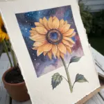
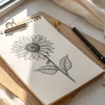
Sunflowers in Perspective
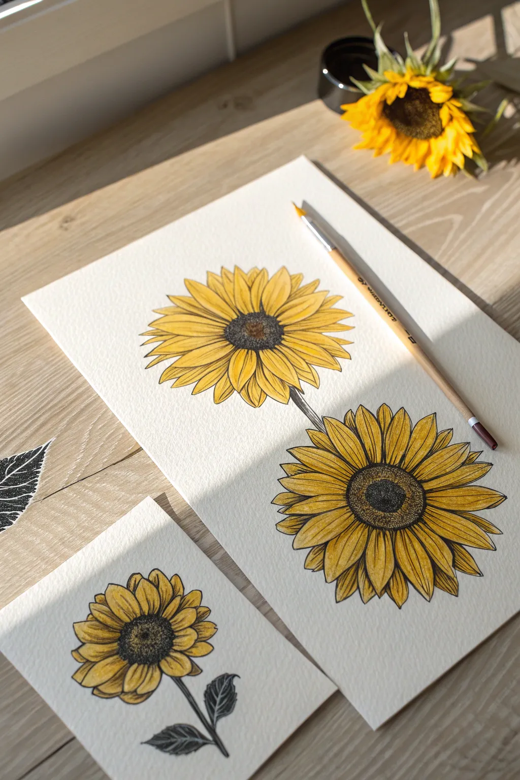
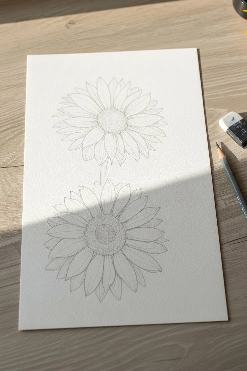
Capture the golden warmth of summer with this detailed botanical illustration project. By combining precise fine liner detailing with loose watercolor washes, you will create a stunning piece that highlights the rugged texture of sunflower centers against delicate yellow petals.
Step-by-Step Guide
Materials
- Cold press watercolor paper (300 gsm)
- Waterproof fine liner pens (sizes 0.1 and 0.5)
- Watercolors (Cadmium Yellow, Yellow Ochre, Burnt Umber, Lamp Black)
- Round watercolor brush (size 6)
- HB Pencil
- Kneaded eraser
Step 1: Pencil Structure
-
Placement:
Begin by lightly sketching two large circles on your paper to represent the flower heads. Place one slightly higher and off-center, and the second lower down, allowing room for a stem connecting them. -
Center discs:
Draw smaller concentric circles inside your main shapes to define the seed heads. For a sense of perspective, make slightly oval adjustments if you want the flower tilting away from the viewer. -
Petal mapping:
Sketch the petals radiating outward from the center. Sunflowers have layers, so draw a front row of full petals and a back row peeking through the gaps. -
Character details:
Add a few slight twists or folds to the petal tips to make them look organic rather than perfectly symmetrical.
Step 2: Inking the Details
-
Seed texture:
Using the 0.5 fine liner, start stippling (making small dots) tightly in the very center of the seed disc. I find this meditative process builds the best density for the dark center. -
Outer seeds:
Switch to small, tight circles as you move toward the outer edge of the seed disc to differentiate the texture, keeping the ink lighter near the petals. -
Petal outlines:
Outline your pencil petal sketches with the 0.1 pen. Use a shaky, confident hand; natural lines look better than ruler-straight ones here. -
Veins and creases:
Draw fine lines running from the center of the petal outward to mimic veins. Limit these to two or three lines per petal to avoid overcrowding. -
Stem work:
Draw the connecting stem with slightly thicker lines, adding rough texture to suggest the hairy surface of a sunflower stalk. -
Clean up:
Wait for the ink to dry completely, then gently erase all underlying pencil marks to prepare for painting.
Texture Tip
Use cold press paper! The bumpy texture naturally breaks up your brushstrokes, giving the flower centers a realistic, organic roughness without extra effort.
Step 3: Watercolor Application
-
First wash:
Dilute Cadmium Yellow with plenty of water. Apply a light, transparent wash over all the petals, ignoring the shadows for now. -
Adding depth:
While the first layer is still slightly damp, drop concentrated Yellow Ochre at the base of the petals where they meet the center to create a natural shadow. -
Center underpainting:
Paint the seed disc with a wash of Burnt Umber. Let the black ink texture show through the translucent paint. -
Darkening the core:
Drop small amounts of Lamp Black or concentrated dark brown into the very center of the wet seed disc to enhance the tunnel-like depth. -
Stem shadows:
Paint the stem with a mix of green and a touch of brown, keeping one side darker to imply a light source coming from the top left. -
Final crisp edges:
Once perfectly dry, if any petal edges look too soft, re-define them carefully with your finest pen to pop the shape.
Level Up: Matching Set
Use a scrap of the same paper to paint a single, smaller sunflower head with two dark leaves. This creates a charming coordinating mini-print or gift tag.
Display your botanical illustration in a spot with natural light to let those yellow hues truly shine.
BRUSH GUIDE
The Right Brush for Every Stroke
From clean lines to bold texture — master brush choice, stroke control, and essential techniques.
Explore the Full Guide
Delicate Lavender Texture
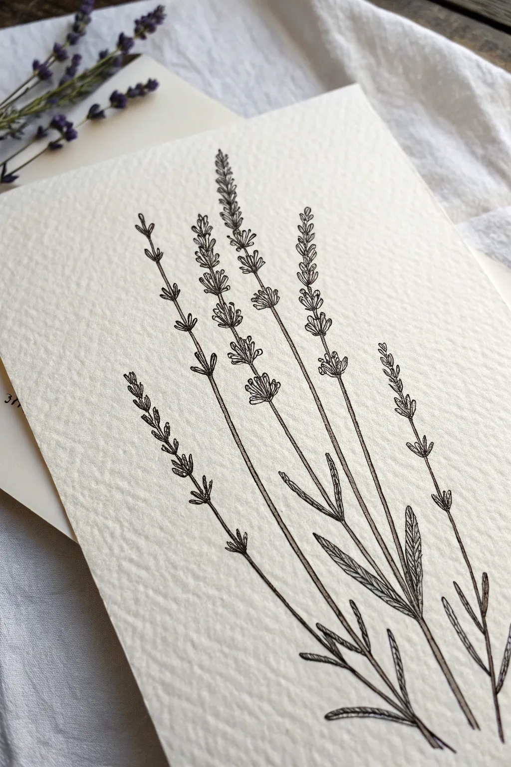
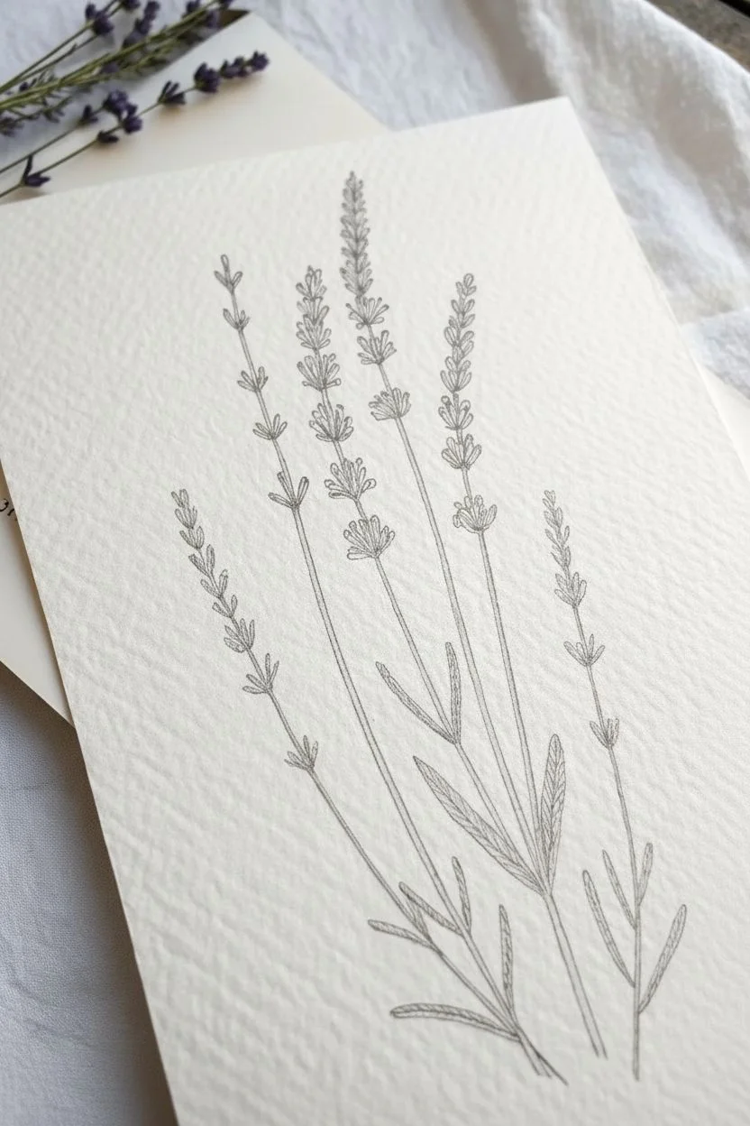
Capture the quiet elegance of lavender using fine ink lines on heavily textured paper. This project relies on the contrast between precision drawing and the rustic feel of cold-press surface to create a vintage botanical look.
How-To Guide
Materials
- Cold-press watercolor paper (heavy texture)
- HB graphite pencil
- Kneadable eraser
- Fine liner pens (sizes 0.05mm and 0.1mm)
- Ruler (optional)
Step 1: Sketching the Skeleton
-
Establish the Arrangement:
Begin by lightly drawing five sweeping vertical lines with your pencil to represent the main stems. Vary their heights, placing the tallest stem slightly off-center and fanning the others gently outward. -
Marking Leaf Zones:
On the lower third of your lines, sketch light dashes where the leaves will sprout. Lavender leaves grow in pairs on opposite sides of the stem. -
Planning the Blooms:
For the upper sections, mark out the segments for the flower clusters. Draw small gaps between these segments, as lavender flowers grow in separated ‘whorls’ or tiers up the stem.
Step 2: Inking the Foliage
-
Base Stem Outline:
Switch to your 0.1mm pen. Trace your stem lines, starting from the bottom. I usually like to make the very bottom of the stem a double line to show thickness, merging into a single line as I go up. -
Leaf Shape:
Draw the leaves using long, narrow lance shapes. Keep the tips pointed and the base slightly tapered where it meets the stem. -
Adding Veins:
Draw a single, slightly broken line down the center of each leaf. Don’t press too hard; let the texture of the paper break the line naturally for an organic feel. -
Leaf Shading:
Use the 0.05mm pen to add tiny diagonal hatch marks on just one side of the central vein. This adds dimension and suggests a light source without overwhelming the drawing.
Embrace the Bump
Don’t fight the paper’s texture. If your pen skips over a bump, leave it! These broken lines mimic the airy, dry nature of lavender and add artistic character.
Step 3: Creating the Flowers
-
The First Cluster:
Start with the bottom-most flower cluster on the main stem. Draw small, upward-pointing tear shapes or tiny ovals packed closely together. -
Building Upward:
Move up to the next marked segment. Draw another cluster of tiny buds, slightly smaller than the one below it. Ensure you leave a bare stem section visible between these distinct groups. -
Varying Angles:
As you draw the buds, angle the outer ones slightly away from the stem to simulate volume. The buds in the middle should point straight up. -
Top Tips:
Finish the top of each stem with a smaller, tighter cluster of buds that tapers to a point. -
Detailing the Texture:
Go back into the flower clusters with your 0.05mm pen and add tiny dots or ‘stippling’ at the base of the individual buds to create shadow.
Uneven Ink Flow?
Rough paper can sometimes clog delicate nibs with paper fibers. If your line fades, wipe the pen tip gently on a scrap piece of smooth paper to clear it.
Step 4: Refinement
-
Enhancing Connections:
Where the leaves and flower stems join the main branch, add a very small triangle of dark ink to mimic the joint or node. -
Line Weight Check:
Review your drawing. If any main stem lines look too faint against the rough paper, carefully re-trace them with the 0.1mm pen to darken, but avoid making them look clunky. -
Drying Time:
Wait at least ten minutes for the ink to settle into the paper fibers. Textured paper can hold wet ink in its crevices longer than smooth paper. -
Clean Up:
Gently roll your kneadable eraser over the drawing to lift the graphite guidelines without distressing the paper surface.
Now you have a timeless botanical study that highlights the beauty of simple lines and texture
Voluminous Peony Studies
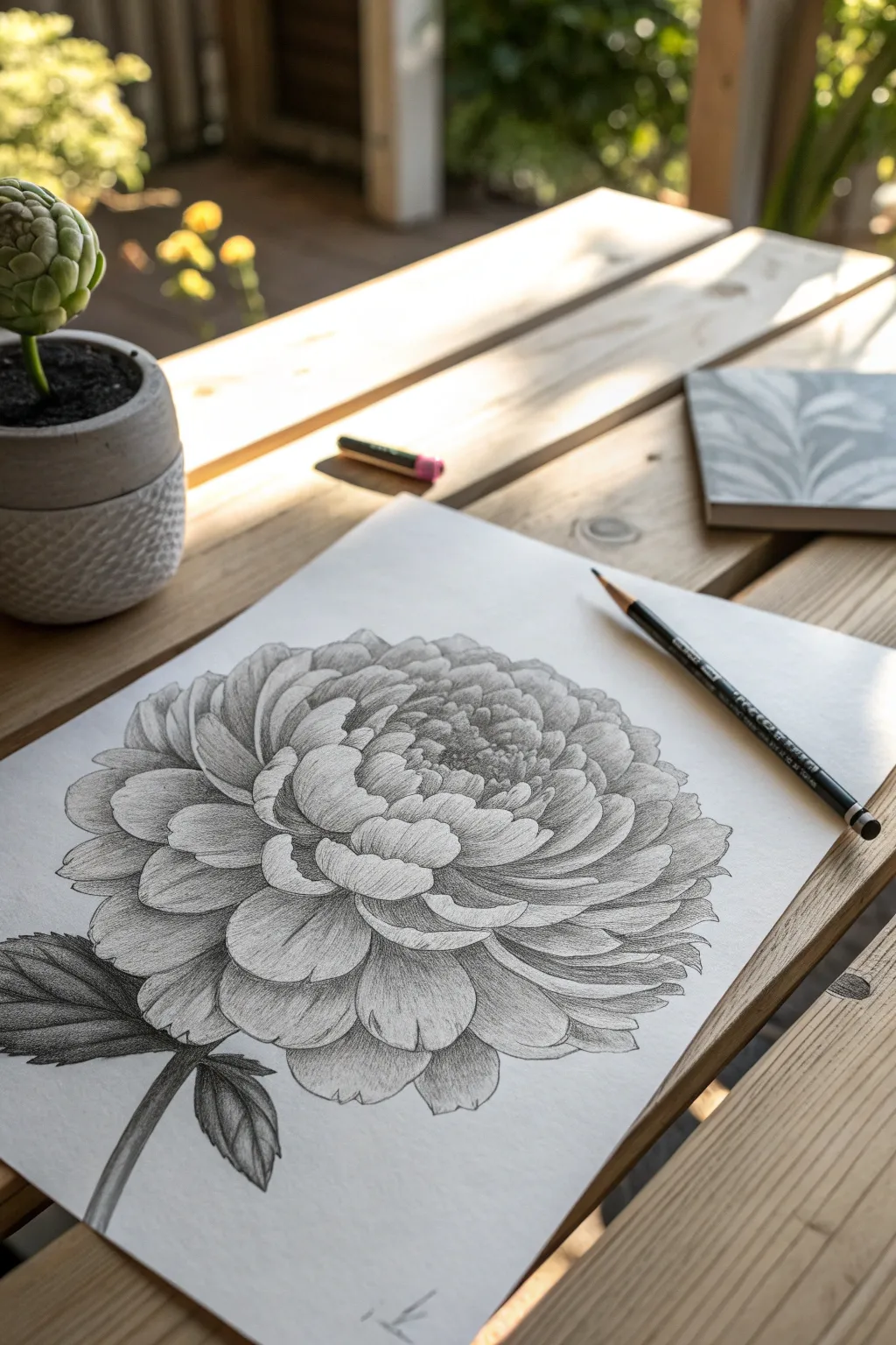
This detailed pencil study captures the lush, heavy feel of a blooming peony. You will focus on building dimension through layering and controlled graphite shading techniques to bring the flower to life.
Step-by-Step
Materials
- Smooth drawing paper (A4)
- Graphite pencils (HB, 2B, 4B)
- Kneaded eraser
- Pencil sharpener
Step 1: Structural Foundation
-
Outline the boundary:
Lightly draw a large, irregular circle on your paper to define the total width of the flower head. -
Mark the core:
Sketch a smaller flattened oval slightly above the center of your circle to guide where the tightest petals will sit. -
Add the stem:
Draw a sweeping curved line extending from the bottom of the flower shape to establish the stem’s direction.
Step 2: Sketching the Petals
-
Draw the center bud:
Begin inside the central oval, drawing small, tight, cup-shaped curves that hug each other closely. -
Add intermediate layers:
Move slightly outward, adding rows of medium-sized petals that cup around the center, ensuring they overlap cleanly. -
Form the outer petals:
Draw the large, expansive outer petals, allowing the edges to scallop, wave, and fold over naturally. -
Check for density:
Ensure the petals overlap significantly; avoid leaving gaps between them to maintain the look of a dense, luxurious bloom. -
Sketch the leaves:
Add thickness to the stem line and sketch two large leaves near the base, giving them jagged, serrated edges.
Looking Flat?
If the flower lacks volume, push your contrast. The dark shadow cast by one petal onto the one beneath it is what creates the 3D effect.
Step 3: Shading and Texture
-
Clean the lines:
Gently dab your drawing with a kneaded eraser to lighten the outlines until they are just faint guides. -
Establish core depth:
With a 2B pencil, darken the deepest crevices in the very center to immediately create a sense of depth. -
Shade inner petals:
Shade the base of each inner petal where it emerges from the cluster, gradually fading your pressure to white at the tip. -
Apply contour hatching:
Use curved hatching lines on the mid-layer petals. I like to follow the physical curve of the petal with my strokes to suggest roundness. -
Define layer separation:
Deepen the cast shadows under the large outer petals using a 4B pencil to visually separate the layers. -
Add texture:
Draw delicate veins on the larger petals using a sharp HB pencil, letting the lines flow from the base toward the outer edge. -
Highlight the edges:
Keep the tips of the petals and any curled-over edges the lightest white to indicate the light source hitting them.
Pro Tip
Keep your pencil extremely sharp. A fine point allows you to draw delicate veins and clean petal edges without the texture looking muddy.
Step 4: Leaves and Final Details
-
Shade the stem:
Fill in the stem, shading the right side darker to make the form look cylindrical and sturdy. -
Darken the leaves:
Fill in the leaves with a dark value, pressing firmly with a 4B pencil to contrast against the lighter flower. -
Define leaf veins:
Leave thin negative spaces for the leaf veins or lift them out gently with a sharp corner of your eraser. -
Punch up the contrast:
Do a final pass over the whole drawing, reinforcing the darkest shadow areas to make the white paper pop. -
Clean the background:
Erase any smudges or graphite dust around the artwork for a crisp, professional finish.
Now you have a beautifully voluminous peony study ready to be framed or added to your sketchbook.

PENCIL GUIDE
Understanding Pencil Grades from H to B
From first sketch to finished drawing — learn pencil grades, line control, and shading techniques.
Explore the Full Guide
Cherry Blossoms on a Branch
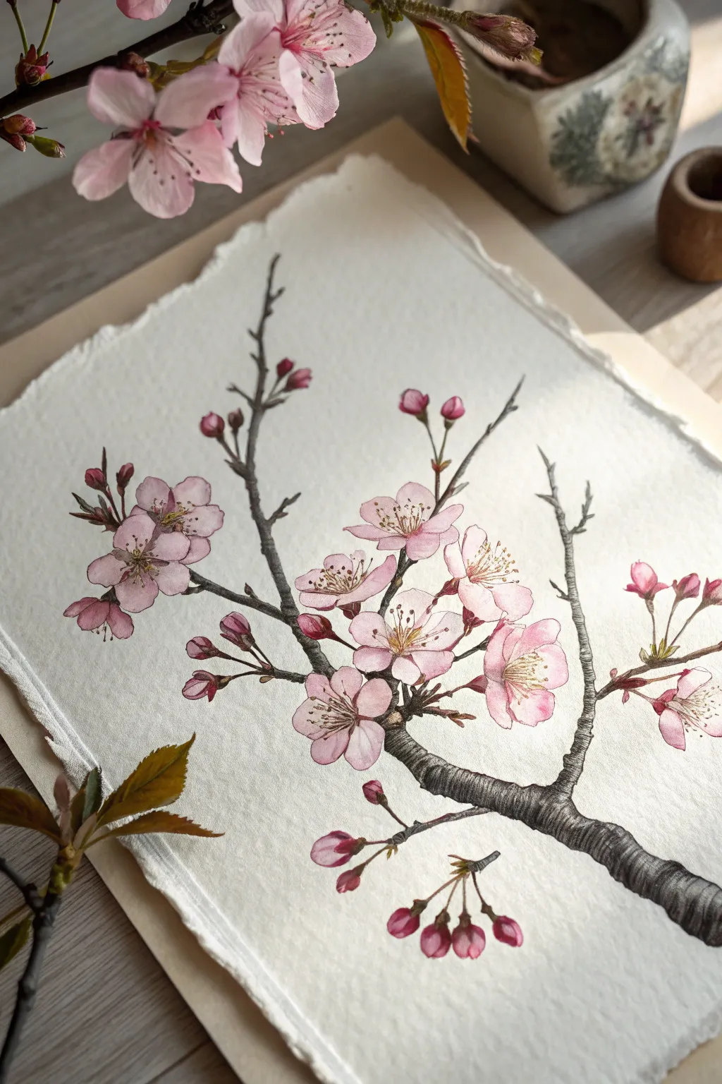
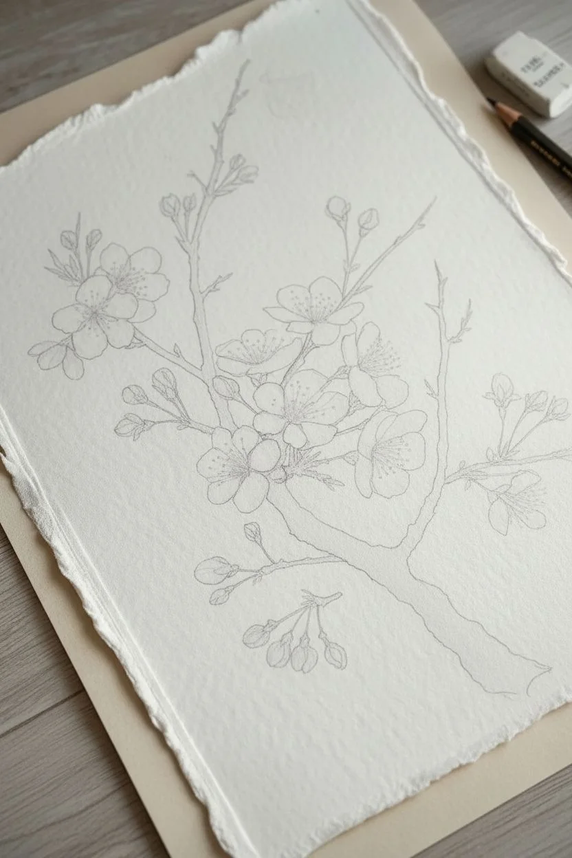
Capture the fragile beauty of spring with this botanical illustration style that combines precise ink lines with soft watercolor washes. This project utilizes textured paper to give the artwork a rustic, vintage scientific study feel.
Step-by-Step Guide
Materials
- Cold-press watercolor paper (300gsm) with deckled edges
- Waterproof fine liner pens (sizes 005, 01, and 03)
- H or HB pencil
- Kneaded eraser
- Watercolor paints (Rose Madder, Burnt Umber, Sap Green, Yellow Ochre)
- Round watercolor brushes (size 2 and 4)
- Paper towel
Step 1: Sketching the Composition
-
Map the branch:
Begin by lightly sketching the main branch entering from the bottom right corner, extending diagonally upward towards the left. -
Add offshoots:
Draw smaller twigs branching off the main stem, keeping lines angular and slightly jagged to mimic real wood growth patterns. -
Place the flowers:
Sketch rough circles where your main open blossoms will sit, grouping them in clusters of two or three for a natural look. -
Refine flower shapes:
Inside your guide circles, draw five heart-shaped petals for each bloom, varying the perspective so some face forward while others are tilted side-on. -
Add buds:
Sketch small teardrop shapes at the tips of the thinner twigs to represent unopen buds and half-bloomed flowers.
Paper Texture Tip
Can’t find deckled paper? Use a metal ruler and tear your watercolor paper against the edge slowly. This manually creates that rustic, torn look shown in the photo.
Step 2: Inking the Details
-
Outline the bark:
Using a size 03 waterproof pen, trace over your branch lines with a shaky, organic hand to simulate rough bark texture. -
Ink the petals:
Switch to a delicate 005 pen for the flower petals, using very thin, broken lines to keep them looking soft and airy. -
Draw the centers:
In the center of the open blooms, draw fine filaments radiating outward, topping each with a tiny dot for the anther. -
Detail the sepals:
Use a size 01 pen to draw the small, leafy sepals at the base of the buds and flowers where they connect to the stems. -
Add bark texture:
Return to the thick branch with your 01 pen and add hatching lines (short, parallel strokes) along the curves to create shadow and cylindrical volume. -
Clean up:
Once the ink is completely dry, gently gently erase all pencil marks with a kneaded eraser to leave a clean black-and-white foundation.
Level Up: Highlight Pop
Once the paint is bone dry, use a white gel pen or a tiny dot of white gouache on the tips of the stamens to make them stand out against the pink petals.
Step 3: Watercolor Application
-
Prepare the pinks:
Dilute Rose Madder with plenty of water to create a very pale, transparent pink wash. -
Base petal layer:
Apply this pale wash to the petals, being careful to paint slightly outside the ink lines in some spots and inside on others for a loose, artistic feel. -
Deepen the buds:
While the first layer is still damp, drop slightly more concentrated pink into the buds and the centers of the open flowers. -
Paint the branch:
Mix Burnt Umber with a touch of blue or black to get a cool dark brown, painting the main branch while leaving tiny slivers of white paper for highlights. -
Shadowing the wood:
I like to wait for the brown to dry, then glaze a second, darker layer on the underside of the branch to enhance the 3D effect. -
Green accents:
Mix Sap Green with a little brown to get an olive tone, and carefully paint the small stems connecting the buds to the branch. -
Final centers:
Dab a tiny amount of Yellow Ochre into the very center of the open flowers, blending it slightly with the dried pink.
Frame your delicate botanical study in a floating glass frame to show off those beautiful rough edges.
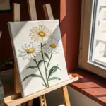
Daisies: Top and Side Views
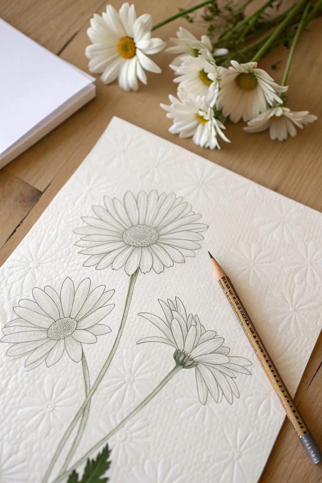
Capture the delicate charm of field daisies by mastering three distinct angles: full face, angled, and side profile. This graphite and colored pencil study focuses on clean lines and subtle shading to bring a botanical feel to your textured paper.
Step-by-Step Tutorial
Materials
- Textured drawing paper (cold press watercolor or laid finish)
- HB graphite pencil (for initial sketching)
- 2B graphite pencil (for shading)
- Olive green colored pencil
- Kneaded eraser
- Precision pencil sharpener
Step 1: Structural Layout
-
Map the composition:
Begin by lightly marking the positions of the three flower heads with your HB pencil. Place a circle near the top center, a slightly flattened oval to the lower left, and a cone shape to the lower right. -
Gesture the stems:
Draw faint, sweeping lines extending downward from each head shape to establish the flow of the stems, ensuring they cross elegantly near the bottom third of the page. -
Establish the centers:
For the top flower, draw a smaller inner circle for the disk. For the left (angled) flower, draw a small ellipse. For the right (side) flower, sketch a small U-shape for the green base (receptacle).
Petals look stiff?
Avoid making every petal perfectly straight. Introduce slight curves, bends, or varying widths to mimic the organic imperfection of real wildflowers.
Step 2: The Top Blossom
-
Mark cardinal petals:
To keep the flower symmetrical, lightly sketch four petals at the top, bottom, left, and right positions like a compass. -
Fill the gaps:
Sketch the remaining petals in the spaces between your guide petals. Keep them long and vary the tips—some rounded, some slightly toothed. -
Refine the outline:
Go over your petal shapes with a cleaner line, allowing some petals to overlap others slightly for a natural, layered look. -
Texture the disk:
Fill the center circle with tiny, tight loops or stippling to mimic the texture of the yellow tubular florets.
Level Up: Paper Choice
Use paper with a pre-embossed pattern or heavy grain (like the background in the image). The pencil will skim the surface, creating instant texture without extra work.
Step 3: The Angled & Profile Blooms
-
Draft angled petals:
Move to the left flower. Draw the petals facing you longer and the petals on the far side significantly shorter to create a foreshortened perspective. -
Sketch the side profile:
On the right flower, draw petals fanning out from the U-shaped base. Instead of a full circle, these should fan upward and outward, like a shuttlecock. -
Add sepals:
At the base of the side-view flower, sketch small, leaf-like bracts (sepals) cupping the bottom of the petals where they meet the stem. -
Refine perspectives:
Erase your initial construction shapes and darken the final petal lines on these two secondary blossoms.
Step 4: Details and Color
-
Add petal veins:
Using a very sharp pencil point, draw two or three faint lines running lengthwise down the center of each petal to suggest ridges. -
Apply shading:
Switch to your 2B pencil. Add gentle hatching at the base of the petals where they meet the center to create depth and shadow. -
Define the stems:
Thicken your initial stem lines, making them slightly wider near the flower heads and tapering very subtly as they descend. -
Apply base green:
Take your olive green colored pencil and lightly trace over the stem outlines and the sepals on the side-view flower. -
Layer the color:
I find it helps to add a second, harder layer of green on just one side of the stem to verify the light source and round out the form. -
Final touches:
Add a few jagged leaves at the very bottom left corner using the green pencil, keeping the shading dense to anchor the composition.
Now you have a timeless botanical sketch ready for framing or gifting.


Dramatic Ink Poppies
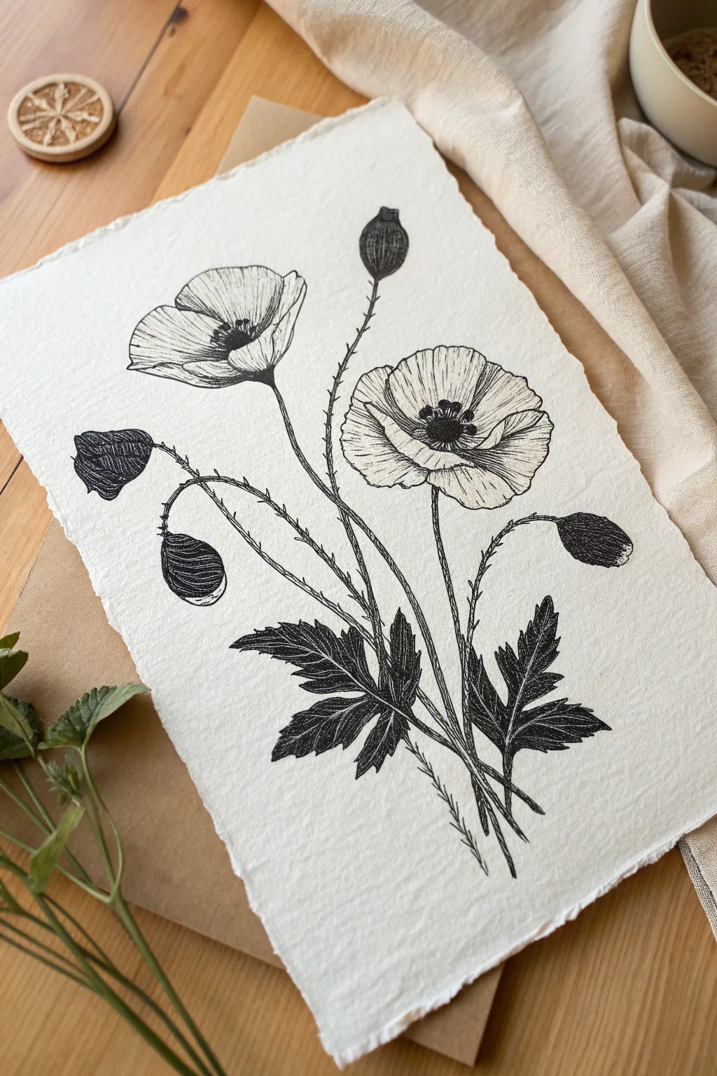
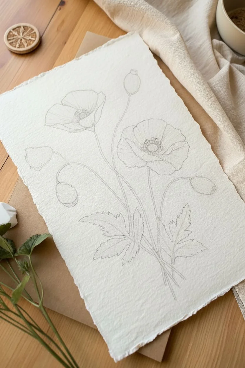
Capture the elegance of botanical illustrations with this high-contrast black ink drawing on textured paper. The combination of delicate hatching on the petals and bold, dark leaves creates a striking vintage aesthetic.
How-To Guide
Materials
- Handmade cotton rag paper (A4 or A5)
- Pencil (HB or 2H)
- Kneaded eraser
- Fine liner pens (sizes 0.05, 0.1, and 0.5)
- Ruler (optional for centering)
Step 1: Structural Sketching
-
Map the stems:
Using your pencil with very light pressure, draw a sweeping, curved line starting from the bottom center leaning towards the right for the main flower. -
Place the blooms:
Sketch a large oval at the top of your main stem for the open poppy, and a sideways cup shape to the left for the profile view flower. -
Position the buds:
Draw three smaller stems branching out—one distinctively tall and straight, and two curved ones drooping downwards—tipping them with small teardrop shapes for the buds. -
Block in foliage:
At the base where the stems converge, sketch the rough, jagged outlines of the poppy leaves, ensuring they fan out to anchor the composition.
Ink Control Pro Tip
Keep a scrap piece of the same paper nearby to test your pens. Textured handwriting paper can bleed differently than smooth cardstock, so testing flow prevents accidents.
Step 2: Inking the Blooms
-
Outline the petals:
Switch to a 0.1 pen to trace the petal shapes. Use a slightly shaky or wavy hand to mimic the delicate, crinkled texture of poppy petals. -
Define the centers:
For the open flower, draw a small ring in the center. Fill the area around it with tiny, dense black dots (stippling) and small lines to represent the anthers. -
Petal shading:
To shade the petals, use your finest 0.05 pen. Draw fine lines radiating from the flower center outward, lifting the pen at the end of each stroke to taper the line. -
Deepen the contrast:
Add a second layer of hatching lines securely in the areas where petals fold over or overlap to create depth. -
Ink the profile flower:
Repeat the outlining and shading process for the side-view flower, focusing the darkest ink near the base where the petals meet the stem.
Step 3: Stems and Buds
-
Texture the buds:
Outline the bud shapes with the 0.1 pen. Fill them with closely spaced vertical contour lines that follow the roundness of the pod. -
Draw the main stems:
Trace over your pencil stem lines. I prefer using a single, confident stroke here rather than sketching short dashed lines. -
Add the fuzz:
Poppies have hairy stems. Using the 0.05 pen, draw tiny, short horizontal flicks all along the sides of the stems to create this texture.
Level Up: Antique Look
For an old-world botanical feel, lightly stain your paper with strong black tea and let it dry completely (and flatten it) before you start your pencil sketch.
Step 4: Foliage and Finish
-
Outline the leaves:
Go over the jagged leaf edges with your 0.5 pen. Poppy leaves are deeply lobed, so make these cuts deep and sharp. -
Reserve the veins:
Draw the central veins of the leaves, but leave them as thin, empty white channels. Do not ink over these lines. -
Darken the leaves:
Fill the leaf areas around the white veins with very dense, dark hatching or solid black ink using the 0.5 pen. This dense black anchors the drawing visually. -
Clean up:
Wait at least 10 minutes for the ink to fully cure, then gently erase all underlying pencil marks with the kneaded eraser. -
Final assessment:
Step back and look for balance. If the flowers look too light compared to the dark leaves, add a few more hatching strokes to the petal shadows.
Frame your botanical illustration in a floating glass frame to show off those beautiful deckled paper edges.
Complex Orchid Structures
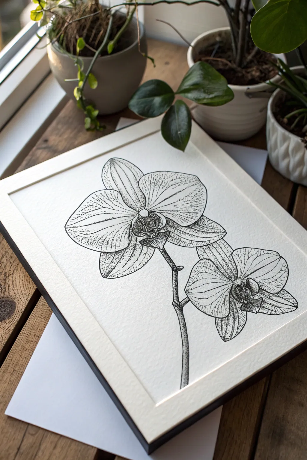
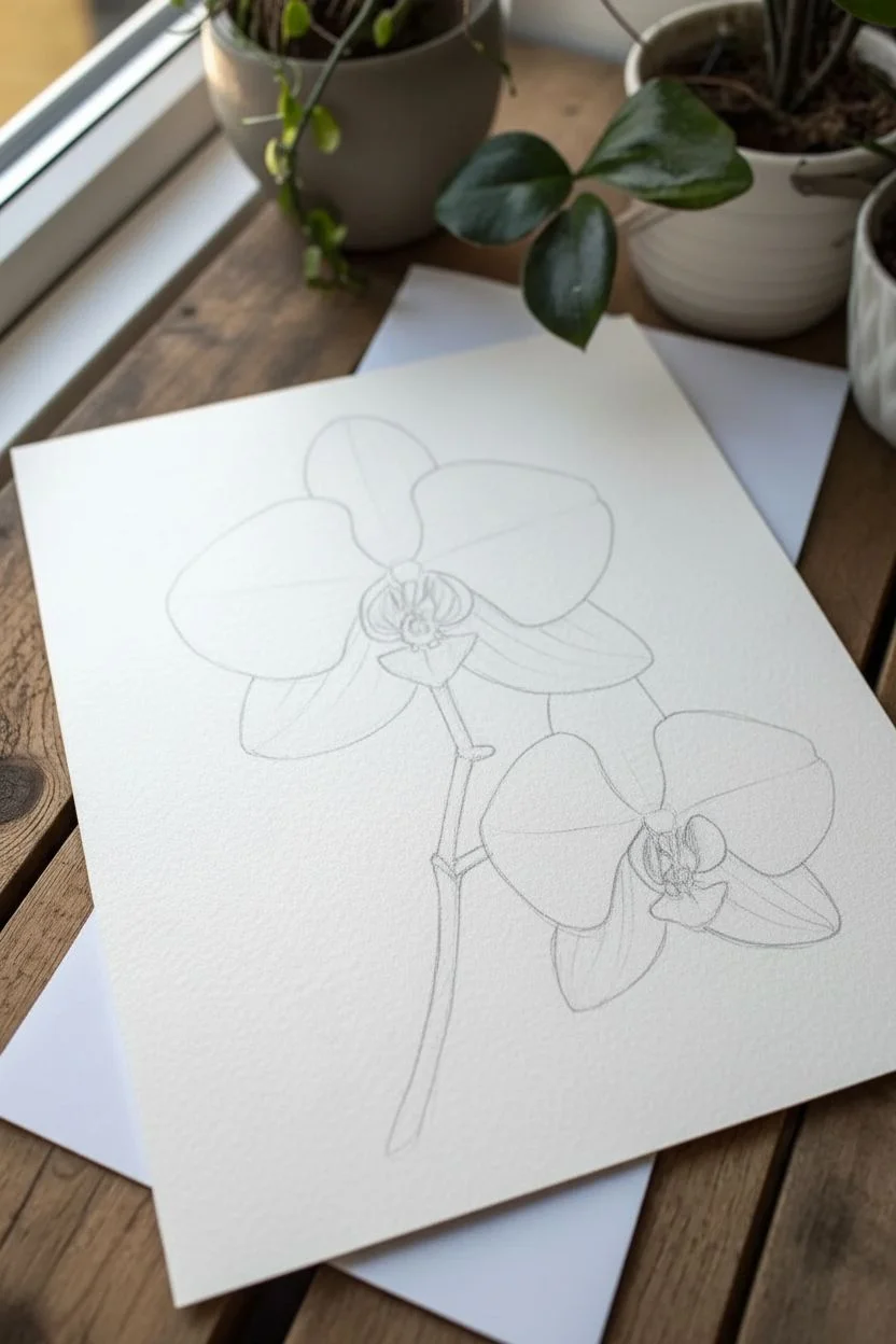
Capture the delicate beauty of moth orchids with this classic botanical illustration project. Using fine liner pens and stippling techniques, you will create a high-contrast, textured artwork that looks professional and timeless.
Detailed Instructions
Materials
- High-quality textured paper (cold press or heavy sketch paper)
- Fine liner pens (sizes 0.05, 0.1, and 0.5)
- HB Drawing pencil
- Kneaded eraser
- Ruler
Step 1: Planning the Composition
-
Establish the axis:
Lightly draw a gentle, curved diagonal line across your page to represent the main stem. This will guide the flow of the blooms. -
Block in flower positions:
Sketch two large oval shapes along the axis line where the blossoms will sit. Place the upper flower slightly to the left and the lower one tilting to the right for balance. -
Define the centers:
Inside each oval, draw a small, complex shape resembling a tiny moth or bird in flight. This is the column and lip of the orchid, serving as the focal point for each bloom. -
Sketch the petals:
Draw the two large, rounded lateral petals spreading outward from the center. Keep the edges soft and organic rather than perfectly circular. -
Add the sepals:
Sketch the three narrower sepals behind the main petals—one pointing straight up (the dorsal sepal) and two curving downward on either side. -
Refine the stem:
Thicken your initial stem line, adding small distinct bumps (nodes) where the flower stalks branch off from the main stem.
Dot Control
Hold the pen perfectly vertical when stippling. Slanted angles create tiny dashes instead of clean dots, which can ruin the texture illusion.
Step 2: Inking the Outline
-
Trace major lines:
Using a 0.5 pen, carefully ink the outer contours of the petals and sepals. Use confident, smooth strokes, lifting your hand as you near the center to keep lines clean. -
Detail the center:
Switch to a 0.1 pen for the intricate center parts (the lip and column). These shapes are more geometric and jagged, so use shorter, precise marks. -
Ink the stem:
Outline the stem with the 0.5 pen. I like to make the side of the stem that would be in shadow slightly thicker to suggest weight. -
Clean up the sketch:
Wait for the ink to dry completely, then gently erase all underlying pencil marks with a kneaded eraser to reveal a clean line drawing.
Step 3: Texturing and Shading
-
Map the veins:
With the 0.05 pen, draw very faint, broken lines radiating from the center of the petals outward to the edges to mimic the orchid’s natural veins. -
Start stippling the center:
Using the 0.1 pen, begin placing dots (stippling) heavily in the very center of the flower. The dots should be dense to create a dark, recessed look. -
Create gradients:
Continue stippling outward from the center onto the petals. Space the dots further apart as you move toward the petal tips to create a fade from shadow to light. -
Shadow the overlaps:
Add concentrated dots where the petals overlap each other. This cast shadow separates the layers and adds three-dimensional depth. -
Enhance the veins:
Go back over your vein lines with the 0.05 pen, adding tiny dots along them rather than solid lines. This integrates the veins softly into the texture. -
Shade the stem:
Stipple the right side of the stem heavily to create a cylindrical volume, fading to white on the left side to represent a highlight. -
Final contrast check:
Step back and look at the drawing. Add more dots to the darkest crevices in the center to ensure the drawing has enough punch and contrast.
Level It Up
Once fully dry, apply a very dilute wash of watercolor in pale pink or green over specific petals for a mixed-media botanical look.
Frame your sophisticated floral study and enjoy the timeless elegance it brings to your space.
Hydrangea Texture Clusters
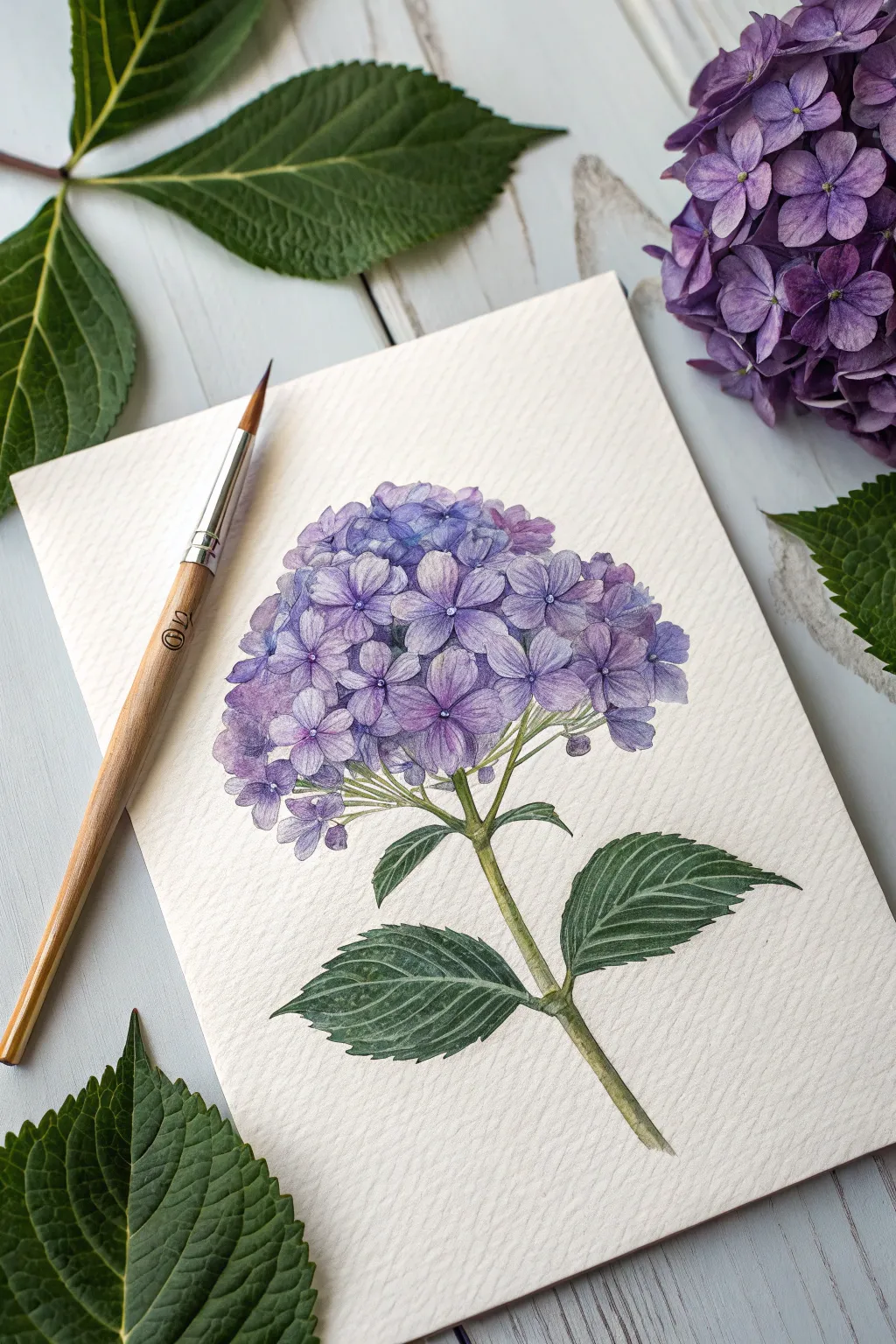
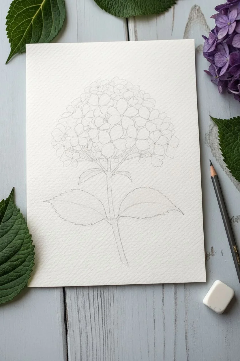
Capture the delicate complexity of a hydrangea bloom without getting lost in the details. This project uses translucent watercolor styling to build up the iconic clusters of florets, balancing soft washes with precise botanical details.
How-To Guide
Materials
- Cold or rough press watercolor paper (300 gsm)
- Watercolor paints (Ultramarine Blue, Quinacridone Magenta, Sap Green, Burnt Umber)
- Round brushes (size 6 for washes, size 0 or 1 for details)
- HB pencil and kneadable eraser
- Palette for mixing
- Two jars of water
Step 1: Sketching the Structure
-
Map the shape:
Begin by lightly drawing a large circle in the center of your page to define the hydrangea’s overall size. Add a slightly curved line extending downward for the stem. -
Leaf placement:
Sketch two large, oval-shaped leaves branching off the lower part of the stem, positioning them opposite each other. Add the serrated (toothed) edges characteristic of hydrangea leaves. -
Defining florets:
Inside your main circle, start drawing the individual florets. Draw small four-petaled flowers, starting from the center of the sphere and working outward. Don’t try to fill every gap; just map out the main distinct flowers.
Step 2: Painting the Blooms
-
Mixing the base color:
Mix a watery, pale violet using your blue and magenta. High water content is key here for transparency. -
First petal wash:
Using the size 6 brush, paint the petals of the individual florets you sketched. I prefer to paint every other petal first to prevent them from merging into a puddle, letting them touch only slightly. -
Varying the hue:
While the petals are still damp, drop in tiny hints of pure blue on some and pink on others. This wet-on-wet technique mimics the natural variation found in these acidic-soil lovers. -
Painting the background petals:
Once the main florets are semi-dry, fill in the gaps between them with a lighter, watered-down wash of the same purple. This creates the illusion of petals further back in the cluster. -
Building depth:
Mix a much darker, saturated purple. Paint the tiny negative spaces (the diamond-shaped gaps) between the florets. This contrast is essential to make the flower look spherical rather than flat.
Muddy Colors?
If the purple florets blur into a blob, you likely didn’t let neighboring petals dry enough. Wait for adjacent wet areas to dry before painting next to them to keep crisp edges.
Step 3: Greenery and Stem
-
Stem base layer:
Mix Sap Green with a touch of Burnt Umber for an earthy olive tone. Paint the main stem and the smaller stems connecting to the flower head. -
Leaf wash:
Paint the leaves with a medium-strength green wash. Leave thin white lines unpainted where the main veins will be, or lift the paint out with a thirsty brush while wet. -
Darkening the leaves:
Once the first layer is dry, glaze a darker green (mixed with a little blue) over the sections between the veins to make the venation pop.
Level Up: White Gel Pen
Use a white gel pen or gouache to add tiny stamens in the center of the florets or to restore highlight lines on the leaf veins if you accidentally painted over them.
Step 4: Fine Details
-
Petal veins:
Switch to your size 0 brush. Mix a semi-transparent purple and paint very faint, fine lines radiating from the center of each floret petal. -
Floret centers:
Add a tiny dot of dark indigo or violet in the absolute center of each four-petaled floret to anchor them. -
Leaf texture:
Enhance the serrated edges of the leaves by darkening the tips of the ‘teeth’ with your deepest green mix. -
Shadow accents:
Add a final glazed shadow where the stem meets the flower head and underneath the florets at the bottom of the sphere to weigh it down. -
Final assessment:
Erase any visible pencil lines gently with the kneadable eraser once the paper is completely bone dry.
Now frame your beautiful botanical study and enjoy the everlasting bloom.
Vintage Botanical Illustration
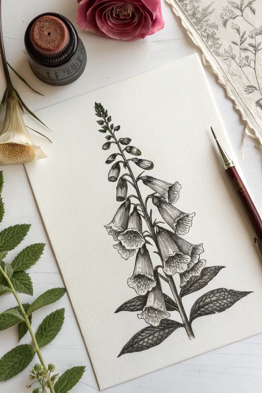
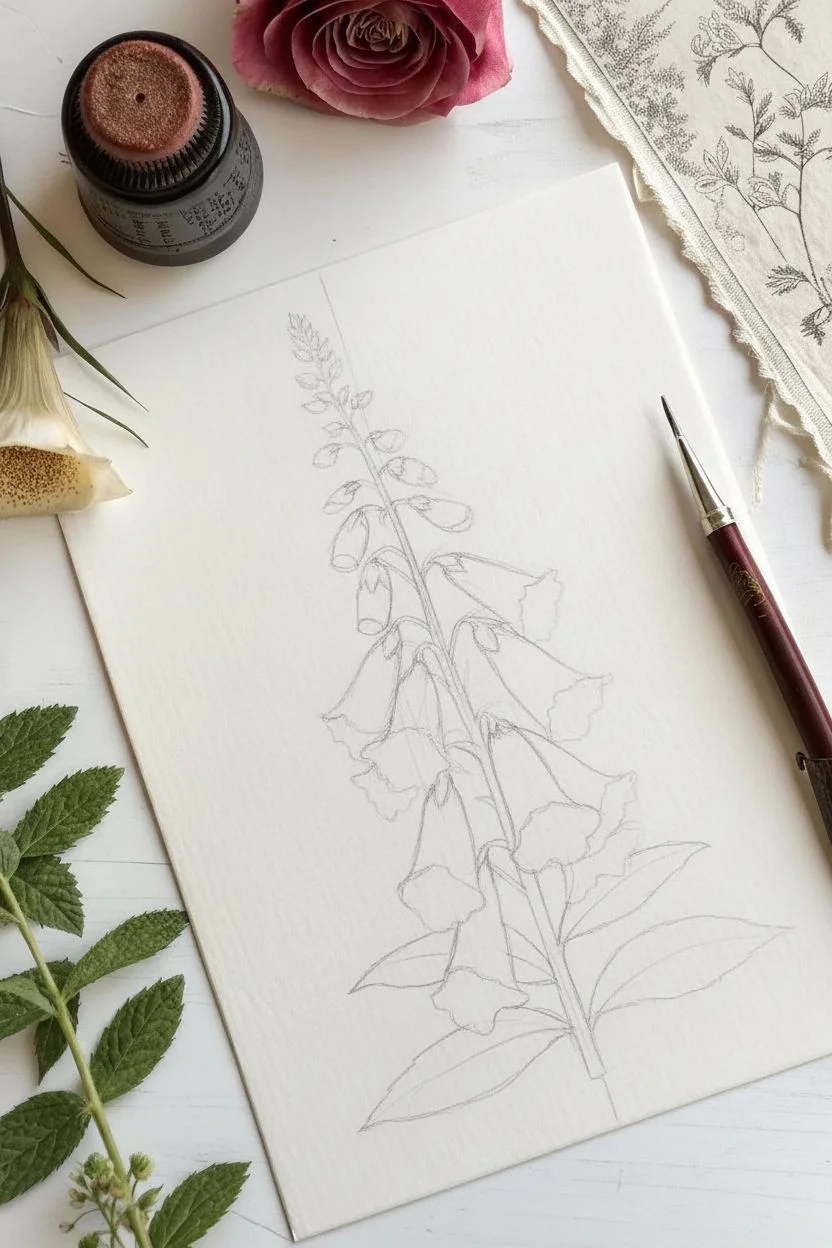
Capture the scientific elegance of classic botanical illustrations with this detailed pen-and-ink study of a foxglove. By combining precise contour lines with stippling and cross-hatching, you will build rich textures and realistic depth.
Step-by-Step
Materials
- Hot press watercolor paper or smooth Bristol board
- HB graphite pencil
- Kneaded eraser
- Fine liner pens (sizes 0.05, 0.1, and 0.3)
- Ruler
Step 1: Structural Sketching
-
Establish the axis:
Using your ruler and HB pencil, draw a faint vertical line down the center of your paper to act as the main stem guide. -
Mark vertical spacing:
Divide the line into three sections: the bottom quarter for leaves, the middle half for the open bell flowers, and the top quarter for the tight buds. -
Block in leaf shapes:
Sketch two large, lance-shaped ovals at the base extending outward, ensuring they are slightly staggered rather than perfectly symmetrical. -
Map the flowers:
Draw simple cone shapes pointing slightly downward along the middle section of the stem, alternating left and right. -
Add apical buds:
At the very top, sketch smaller, tighter teardrop shapes that get progressively smaller as they reach the tip.
Smudge Prevention
Place a clean scrap of paper under your drawing hand while you work. This prevents oils from your skin transferring to the paper and ensures you don’t accidentally smear wet ink across the white space.
Step 2: Refining Contours
-
Define flower bells:
Refine the cone shapes into bell flowers by adding a ruffled lip at the opening and narrowing the base where it connects to the stem. -
Detail the leaves:
Add serrated (toothed) edges to your leaf ovals and lightly sketch a central vein line for each. -
Connect the stem:
Thicken the central stem line, adding small connecting stems (pedicels) that curvaceously link each flower bell to the main stalk. -
Initial inking:
Using a 0.1 fine liner, carefully trace your pencil outlines. I like to use a slightly broken or varying line weight here to keep the organic feel. -
Clean up:
Allow the ink to dry completely for at least five minutes, then gently erase all graphite guidelines with the kneaded eraser.
Step 3: Shading and Texture
-
Shade leaf veins:
With the 0.05 pen, draw thin, closely spaced lines radiating from the central vein toward the leaf edges to establish the texture. -
Deepen leaf shadows:
Switch to the 0.3 pen to add cross-hatching (overlapping perpendicular lines) in the deepest shadow areas where the leaves overlap or tuck under. -
Contour the bells:
Use the 0.05 pen to draw curved hatching lines along the sides of the flower bells; these lines should follow the roundness of the flower form. -
Stipple the markings:
This is the signature foxglove detail: use the 0.1 pen to create clusters of tiny dots (stippling) inside the throat of the lower bells. -
Refine the throat:
Make the dots denser deep inside the flower to suggest a cavernous shadow, spreading them out as they move toward the speckled lip. -
Texture the buds:
Add small, hairy texture marks to the top buds and the main stem using short, quick flicks of the 0.05 pen. -
Final contrast:
Review your drawing and use the 0.3 pen to darken the nooks where the flower stems join the main stalk to pop the illustration off the page.
Tea-Stained Paper
To achieve the true antique look shown in the inspiration photo, lightly brush your paper with strong brewed black tea or coffee and let it dry completely flat before you start your pencil sketch.
Now you have a stunning botanical study worthy of a vintage science textbook.
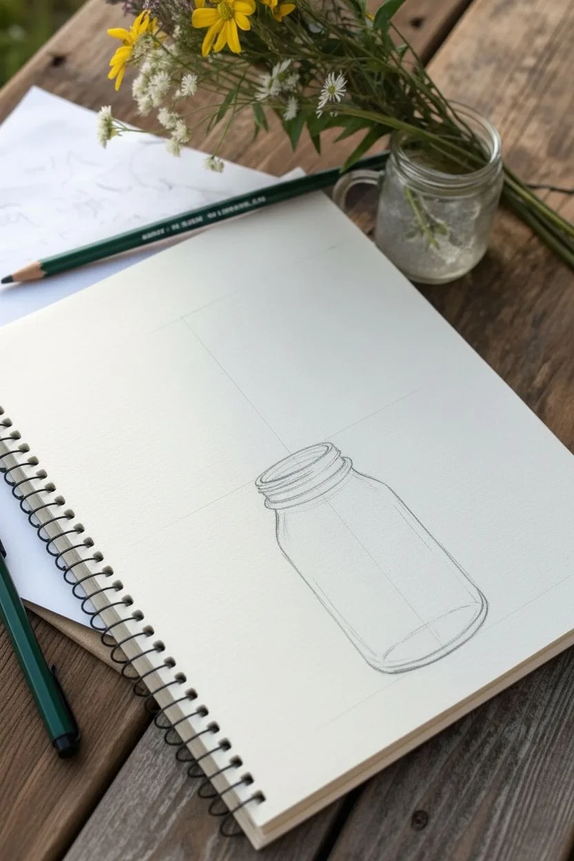
Bouquet in a Mason Jar
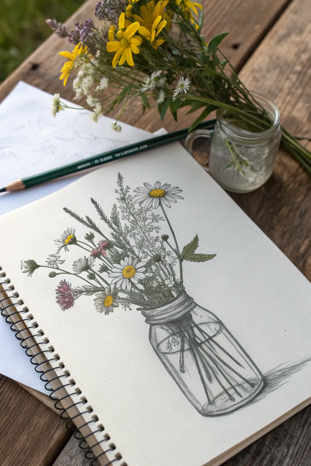
Capture the delicate beauty of a hand-picked bouquet resting in a classic mason jar with this mixed-media sketching project. You will combine precise pencil shading with subtle touches of color to create an illustration that feels both organic and nostalgic.
Detailed Instructions
Materials
- Heavyweight sketch paper
- Graphite pencils (HB, 2B, 4B)
- Fine liner pen (0.1mm, black)
- Colored pencils (Yellow, Olive Green, Muted Purple)
- Kneaded eraser
- Ruler (optional)
Step 1: Constructing the Jar
-
Establish the axis:
Begin by lightly drawing a vertical line down the center of your page to ensure symmetry. Mark the top and bottom clear boundaries of where your jar will sit. -
Sketch the rim:
Draw a narrow horizontal oval (ellipse) at the top mark to represent the opening of the jar. -
Define the neck:
Just below the rim, draw a slightly wider set of curved lines to indicate the threaded neck where a lid would screw on. -
Shape the body:
Sketch the sides of the jar coming down from the neck, curving gently inward at the shoulders and straightening out, before rounding off the bottom corners connects the base.
Glass Transparency
To make the jar look like glass, don’t outline the bottom edge too heavily. Instead, use shading and highlights to define the edge, which keeps the glass looking transparent rather than solid.
Step 2: Arranging the Bouquet
-
Map flower positions:
Draw loose circles and ovals floating above the jar to indicate where the main flower heads—like the daisies and thistles—will sit. -
Draw the stems:
Connect your flower heads to the jar with long, slender lines. Let them cross over each other inside the jar to create a realistic, tangled look. -
Add foliage:
Fill in the gaps between the main stems with wispy lines for grasses and small, jagged shapes for leaves. -
Refine the daisies:
Inside your main circles, draw the textured center buttons, then sketch long, narrow petals radiating outward. -
Detail the filler flowers:
For the smaller wildflowers, use quick, clustered stippling or short dashes to suggest texture without drawing every single petal.
Step 3: Inking and Coloring
-
Outline with ink:
Use your fine liner to carefully trace the flower petals, leaves, and the main lines of the jar. Keep your hand loose to maintain a sketch-like quality. -
Erase guidelines:
Once the ink is fully dry, firmly erase your initial graphite structural lines and the central axis. -
Add color accents:
Take your yellow colored pencil and fill in the daisy centers. Use the purple for the thistle-like flowers, keeping the pressure light for a pastel effect. -
Tint the stems:
Lightly trace over the stems inside and outside the jar with olive green, blending it slightly with the graphite already there.
Level Up: Highlights
Use a white gel pen or opaque white gouache to add tiny sharp reflection points on the curve of the jar and the water line. This instantly adds high-gloss realism.
Step 4: Shading and Depth
-
Indicate water:
Draw a faint ellipse inside the jar, about halfway up, to show the water line. Add small disjointed lines where stems enter the water to suggest refraction. -
Shape the glass:
Use a 2B pencil to add vertical hatching along the sides of the jar. I find leaving the center of the glass white helps convince the eye it is round and reflective. -
Deepen shadows:
Switch to a 4B pencil to darken the areas where stems overlap inside the jar and under the flower heads. -
Enhance threads:
Add darker shading under the rings of the jar’s neck to give them three-dimensional pop. -
Ground the subject:
Sketch a horizontal cast shadow extending to the right of the jar base to firmly place the object on a surface.
Now you have a timeless botanical sketch that perfectly captures the simple charm of gathered wildflowers.
Continuous Line Florals
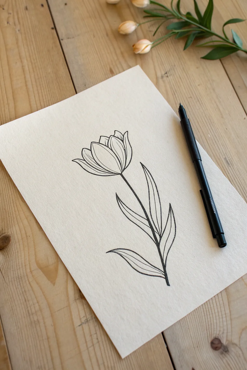
Capture the essence of spring with this sophisticated line drawing that mimics a continuous-line aesthetic. By focusing on confident strokes and organic shapes, you will create a piece that feels both modern and timeless.
Step-by-Step Guide
Materials
- Heavyweight textured paper (cream or off-white)
- HB graphite pencil
- Kneaded eraser
- Black fine-tip pen (0.5mm or 0.8mm)
Step 1: The Pencil Framework
-
Establish the axis:
Lightly draw a long, slightly curved vertical line in the center of your paper to serve as the main stem guide. -
Block the blossom:
At the top of the axis, sketch a rough oval shape to define the overall size of the tulip head. -
Sketch the center petal:
Inside your oval, draw a large teardrop or U-shape that sits in the front center; this is the main petal facing you. -
Add side petals:
Draw two curved lines hugging the center petal on the left and right, creating the appearance of overlapped petals. -
Detail the back petals:
Sketch small peaked shapes at the very top of the oval to represent the petals located at the back of the flower. -
Position the leaves:
Along the stem line, sketch three long, lance-like leaf shapes: one low on the right, one in the middle on the left, and one higher up on the right. -
Add motion to leaves:
Refine the leaf shapes so they curve upwards elegantly, mimicking the natural growth of a tulip.
Step 2: Inking the Design
-
Start the pen work:
Using your black fineliner, begin outlining the central front petal with a smooth, continuous stroke. -
Define the layers:
Ink the left and right side petals, stopping your line precisely where they touch the central petal to create depth. -
Finish the flower head:
Outline the upper back petals, keeping the lines crisp to maintain that clean illustration style. -
Draw the stem:
Draw the stem line downwards from the flower base. I prefer to lift my pen where a leaf crosses the stem to keep the illustration clean. -
Ink the lower leaf:
Trace the outline of the bottom-right leaf, letting the line taper off gently at the tip. -
Detail the vein:
Draw a single, simple curve down the center of the leaf to represent the vein, stopping short of the tip. -
Ink the middle leaf:
Outline the distinct curve of the middle-left leaf, ensuring it connects naturally to the stem area. -
Ink the top leaf:
Trace the final upper-right leaf, giving it a slight varied curve to make the composition feel organic. -
Add remaining veins:
Add the central vein lines to the remaining two leaves, following the curvature of the outer edges. -
Erase and reveal:
Allow the ink to dry completely for at least two minutes, then gently erase all pencil marks to reveal the sharp contrast.
Wobbly Lines?
If your long lines look shaky, try drawing faster rather than slower. Momentum helps smooth out the stroke much better than a slow, tense hand.
Add a Little Luxury
Trace over just the inner vein lines of the leaves with a gold metallic gel pen to add a subtle, elegant shimmer to the finished piece.
Now you have a stunningly simple floral illustration ready to frame or gift.
Geometric Lotus Designs
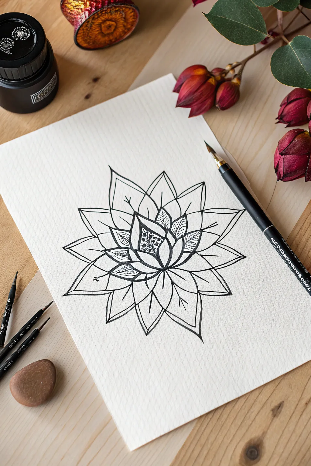
This project creates a striking stylized lotus using sharp, clean lines and contrasting textures. The high-contrast black ink on textured paper gives the final piece a classic, tattoo-style aesthetic.
Step-by-Step Tutorial
Materials
- Cold press watercolor paper or textured sketch paper
- HB graphite pencil
- Kneaded eraser
- Dip pen and black India ink (or black fine liners sizes 0.5 and 0.1)
- Ruler (optional)
Step 1: Structural Sketch
-
Find the center:
Locate the center of your paper and lightly mark a small vertical line to serve as the anchor for the flower’s core. -
Draw the core bud:
Sketch a pointed teardrop shape in the center, flanked by two curving lines that meet at the top point, creating a closed bud shape. -
Add first petal layer:
Draw three to four small, triangular petals surrounding the central bud. Keep the lines geometric and slightly sharp rather than perfectly round. -
Expand the middle layer:
Sketch a second ring of petals that peek out from behind the first layer. Make these slightly wider and taller, ensuring the tips point outward symmetrically. -
Create the outer bloom:
Draw the final, largest layer of petals. These should be broad shapes that extend significantly outward, giving the flower its full, iconic star-like silhouette. -
Mark the spines:
Lightly sketch a central spine line down the middle of each large outer petal to indicate the fold.
Step 2: Inking the Outline
-
Prepare your ink:
Dip your pen nib into the black ink (or uncap your 0.5mm fine liner). Test the flow on a scrap piece of paper first. -
Outline the center:
Carefully trace over your pencil lines for the central bud. Use confident, steady strokes to keep the lines crisp. -
Ink the outer layers:
Work your way outward to the larger petals. I like to rotate the paper as I draw to keep my hand position comfortable and consistent. -
Sharpen the tips:
Pay special attention to the points of the petals. Ensure the lines meet cleanly at a sharp angle without crossing over each other. -
Draw the petal spines:
Add the single straight line down the center of the large outer petals. These lines should start from the base and stop just short of the petal tip.
Smudge Alert
Wait until the ink loses its wet sheen before erasing. Textured paper holds ink longer, so patience prevents ruining your crisp lines.
Step 3: Intricate Detailing
-
Switch tools:
If using fine liners, switch to a 0.1mm pen. If using a dip pen, use a lighter touch or a finer nib for delicate details. -
Stipple the core:
Add tiny dots (stippling) inside the very center of the bud to represent pollen or seeds, clustering them densely at the bottom and fading out towards the top. -
Pattern the inner petals:
On the petals immediately surrounding the core, draw faint, organic vein lines or small squiggles to create a textured contrast against the clean outer petals. -
Let it dry completely:
Allow the ink to sit for several minutes. If you used a dip pen with heavy ink flow, give it extra time to avoid smearing. -
Clean up:
Gently erase all underlying pencil sketch lines with a kneaded eraser, revealing the stark black ink design.
Level Up
Use gold metallic ink for the stippled dots in the center to add a luxurious, shimmering focal point to the monochrome design.
Now you have a beautifully crisp geometric floral piece ready to be framed or gifted.
Withered and Dried Plants
Capture the delicate beauty of a drying rose using classic pen-and-ink techniques that emphasize texture and contrast. By combining fine lines with stippling dots, you will create a vintage-style botanical illustration that feels both organic and permanent.
Detailed Instructions
Materials
- Smooth cream or off-white drawing paper
- HB pencil
- Kneaded eraser
- Fine liner pens (sizes 0.05, 0.1, and 0.5)
- Ruler (optional for checking proportions)
Step 1: Sketching the Skeleton
-
Basic Shapes:
Start with your HB pencil using very light pressure. Draw a slightly tilted oval for the flower head and a long, gently curved line extending downward for the stem. -
The Rose Core:
Inside the oval, sketch a tight spiral to represent the center of the rose where the petals are still bunching together. -
Unfolding Petals:
Draft the larger petals surrounding the core. Since this is a drying rose, give the petal edges slightly angular, crinkled shapes rather than perfect curves to suggest drooping. -
Adding Sepals:
Draw the sepals—the leaf-like green structures—hanging down from the base of the flower head. Make them curl slightly at the tips. -
Leaf Placement:
Sketch two main leaf clusters on the lower half of the stem. Draw a central line for each leaf to mark the midrib. -
Jagged Edges:
Refine the leaf shapes by adding serrated (saw-tooth) edges and small triangles along the stem to represent thorns.
Smudge Prevention
Place a scrap piece of paper under your drawing hand while you work. This prevents natural skin oils from transferring to the paper and keeps you from smudging wet ink.
Step 2: Inking the Outline
-
Initial Trace:
Switch to your 0.1 size pen. Carefully trace over your pencil lines, but use broken lines occasionally on the petal edges to keep the look organic. -
Line Weight Variation:
Go over the shadowed areas (like where petals overlap or under the leaves) a second time to thicken the line slightly, adding depth before we even start shading. -
Clean Up:
Once the ink is completely dry—I usually give it a full five minutes to be safe—gently erase all underlying pencil marks with the kneaded eraser.
Step 3: Shading and Texture
-
The Core Technique:
We will use ‘stippling’ (dots) for deep shadows and fine hatching (lines) for texture. Start with the 0.05 pen in the absolute center of the rose. -
Deepening the Center:
Apply dense dots deep inside the spiral of the rose. The closer the dots, the darker the shadow. -
Petal Veins:
On the petals, draw very fine, closely spaced lines that follow the curve of the petal. Leave the tops of the petals mostly white to show where the light hits. -
Outer Petal Texture:
Use the 0.05 pen to add tiny scratches and dots near the base of the outer petals. This mimics the paper-like texture of a drying flower. -
Shading the Sepals:
Use the 0.1 pen to darken the underside of the sepals using vertical hatching lines, leaving the tips lighter. -
Thorn Detail:
Outline the thorns firmly. Fill smoothly with ink on one side of the thorn, fading into dots on the other side to create a 3D cone effect. -
Leaf Darkening:
The leaves in this style are darker than the bloom. Use the 0.1 pen to fill the leaves with dense stippling or tight cross-hatching, keeping the veins clear and white for contrast. -
Stem Woodiness:
Add texture to the stem using short, vertical dashed lines. Concentrate these marks on the right side of the stem to indicate a shadow source from the left. -
Final Contrast:
Switch to your 0.5 pen for the ‘blackest blacks.’ selectively touch up the deepest crevices between the petals and the very bottom of the leaves to make the drawing pop off the page.
Comet Dots?
If your stippling dots look like tiny dashes or comets, you are dragging the pen while lifting it. Ensure you lift the pen tip straight up vertically after every dot.
Now you have a beautifully preserved floral illustration that captures the elegance of nature.
Negative Space Gardens
Capture the stark, organic beauty of wild flora using high-contrast ink techniques. This project focuses on balancing heavy, solid black leaves with delicate, skeletal branches on textured paper.
Step-by-Step Guide
Materials
- Cold-press watercolor paper (300 gsm)
- Black fine liner pens (sizes 01, 005, and 05)
- HB Pencil
- Kneaded eraser
- Ruler (optional)
Step 1: Planning the Composition
-
Map the stems:
Using your HB pencil, lightly sketch two vertical lines. Curve the left line slightly to the right to create the main ‘cow parsley’ stem, and draw a finer, more angular line on the right for the dried grass element. -
Position the umbels:
At the top of the left stem, fan out five to seven straight lines like spokes on a bicycle wheel. Add smaller oval shapes at the end of each spoke to represent the flower clusters. -
Sketch leaf placement:
Mark the locations for the leaves along the lower half of the main stem. Draw rough triangular shapes pointing outward; we will refine the jagged edges later. -
Add secondary flora:
Sketch a small daisy-like flower head halfway down the left side, tucking it behind the main stem. Add a few branching arms to the right-hand grass stem.
Nib Preservation
Textured watercolor paper can eat up felt tips. Hold your pen vertically upright rather than at an angle. This reduces friction and keeps your lines crisp without fraying the nib.
Step 2: Inking the Structural Elements
-
Outline the main stem:
Switch to your 01 size fine liner. Trace the main stem, making it slightly thicker at the joints (nodes) where branches split off to give it a realistic, organic weight. -
Define the flower spokes:
Draw the ‘spokes’ of the top flower. Keep these lines fairly straight but allow for slight natural wobbles. -
Create the flower heads:
Instead of drawing circles, use clusters of tiny loops and dots at the end of each spoke. This mimics the texture of tiny buds found on apiaceae plants. -
Ink the daisy:
Outline the petals of the small lower flower. Keep the center oval-shaped and fill it with tight stippling (dots) to create a pollen texture.
Smudge Alert
Ink takes longer to dry on cold-press paper than on smooth cardstock. If you erase your pencil lines too soon, the black ink will smear gray. Wait at least 15 minutes before erasing.
Step 3: Contrast and Detail
-
Detail the leaves:
Go back to your pencil leaf guides. With the 01 pen, draw the edges using sharp, jagged, saw-tooth motions to create the fern-like silhouette. -
Fill the blacks:
I like to switch to a thicker 05 pen here to speed things up. Fill in the leaf shapes completely with solid black ink. This high contrast is the signature of this style. -
Refine the stems:
Return to the main stems. If they look too thin compared to the heavy black leaves, thicken the lines slightly on the shadow side (the right side of the stem). -
Ink the skeletal grass:
Use your finest pen (005) for the right-hand plant. Draw extremely thin, branching lines that mimic dried brittle grass. Make these lines disjointed or broken in places for texture. -
Add stem texture:
On the main thick stem, add tiny vertical hatch marks or dots near the intersections using the 005 pen to suggest a fibrous surface. -
Review contrast:
Step back and check the balance. If the top flowers look too light, add a few solid black buds mixed in with the open loops. -
Erase guidelines:
Wait until the ink is completely dry to the touch, then gently roll the kneaded eraser over the page to lift the pencil sketching.
Now you have a striking botanical study that celebrates the beauty of natural imperfections.
Framing with Floral Wreaths
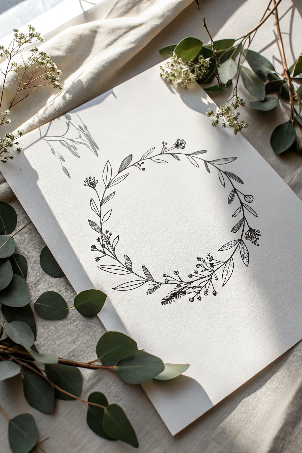
This project focuses on creating a sophisticated, minimalist botanical design using fine line drawing techniques. The result is a delicate wreath composed of leaves, sprigs, and berries that looks beautiful on heavy cardstock or texturized paper.
Step-by-Step
Materials
- Smooth white heavyweight paper or cardstock
- HB pencil
- Kneaded eraser
- Black archival fineliner pens (sizes 0.1, 0.3, and 0.5)
- Circular object to trace (like a bowl) or a compass
Step 1: Setting the Guideline
-
Trace the foundation:
Place your circular object in the center of the paper and lightly trace around it with your HB pencil to establish the wreath’s shape. -
Sketch the main stems:
Draw a loose, flowing line following your penciled circle to act as the primary vine, allowing it to curve naturally rather than looking stiff. -
Determine focal points:
Mark three or four spots around the circle where you want the foliage to be densest to create a balanced composition.
Smudge Prevention
Even quickly drying ink can smear if the eraser is dragged too forcefully. Always dab the eraser first to lift graphite, then rub gently only after the ink has sat for 10-15 minutes.
Step 2: Penciling the Foliage
-
Draft the primary leaves:
Sketch lance-shaped leaves branching off the main stem, alternating directions as you move around the circle. -
Add variety with secondary shapes:
In the gaps between the main leaves, sketch smaller sprigs and rounded leaf clusters to add variety. -
Incorporate berry clusters:
Draw thin, branching lines tipped with small circles to represent berries or flower buds, placing them near the leaf bases. -
Sketch textured elements:
I like to add a few pine-needle or fern-like sprigs at the bottom curve to give the wreath a more organic, wild texture. -
Review the balance:
Step back and look at your pencil sketch to ensure the elements are evenly distributed and the wreath doesn’t feel lopsided.
Step 3: Inking the Design
-
Outline the main stems:
Using a 0.5 pen, trace the main vine and the thicker branches, using confident, sweeping strokes to avoid shaky lines. -
Ink the leaf outlines:
Switch to a 0.3 pen to outline the leaves, ensuring the tips are sharp and the connections to the stem are clean. -
Detail the fern elements:
Use short, quick flicks of the pen to ink the pine or fern textures, mimicking the direction of natural growth. -
Ink the berries:
Carefully draw the small circles for the berries, keeping the lines crisp and unconnected to the interior shading for now.
Pro Tip: Paper Rotation
Rotate the physical paper as you work your way around the circle. This keeps your hand in a natural, ergonomic position and ensures your curves remain consistent.
Step 4: Adding Texture and Depth
-
Draw leaf veins:
Switch to your finest 0.1 pen and draw a central vein in the larger leaves, stopping just short of the leaf tip. -
Apply hatching technique:
On selected leaves, use the 0.1 pen to draw closely spaced diagonal lines on one half of the leaf to create shadow and visual interest. -
Stipple the centers:
Add tiny dots (stippling) inside the berry shapes or at the base of the leaves to add subtle depth without heavy outlines. -
Refine the connections:
Check where stems meet the main vine and thicken those intersections slightly to verify the structure looks solid.
Step 5: Final Polish
-
Let the ink cure:
Wait fully for the ink to dry, as erasing too soon is the most common way to ruin a line drawing. -
Erase guidelines:
Gently gently rub the kneaded eraser over the entire design to lift the graphite circle and initial sketches. -
Check for gaps:
Scan the wreath for any broken lines or uneven areas and touch them up with your 0.1 pen for a polished finish.
Frame your botanical artwork or scan it to use as a digital border for your stationery designs
Whimsical Fantasy Hybrids
Capture the elegance of nature by combining a bold, multi-layered bloom with delicate, symmetric fern fronds in this illustration. You will build this piece from a simple pencil sketch to a vibrant, inked finish using fine liners and markers.
Step-by-Step Tutorial
Materials
- Hot press watercolor paper or smooth Bristol board
- HB graphite pencil
- Kneaded eraser
- Black fine liner pens (sizes 0.05, 0.1, and 0.3mm)
- Alcohol-based art markers (Rose, Magenta, Light Green, Forest Green)
- Colored pencils (optional, for shading)
Step 1: Drafting the Composition
-
Establish the center:
Lightly sketch a small circle in the middle of your page to represent the flower’s center. Around this, draw a larger, rough circle to define the total width of the bloom. -
Sketch the petals:
Inside your larger circle, draw two rows of petals. Start with small, cupped shapes near the center, then draw larger, wider petals radiating outward. Don’t worry about perfection; wavy edges add realism. -
Map the foliage lines:
Draw three long, curved guidelines extending from behind the flower—one going up and left, one down and left, and one down and right. These will become the fern stems. -
Add leave shapes and buds:
Sketch two teardrop shapes on stems for the flower buds on the right side. Then, draw broad leaf shapes (ovals with pointed tips) tucked behind the main flower head. -
Detail the fern structure:
Along your long curved guidelines, sketch rows of small, narrow triangles to represent the fern fronds. They should get smaller as they reach the tip of the stem.
Rotate Your Canvas
When drawing the repetitive fern leaves, turn your paper so your hand pulls the pen stroke naturally toward you. This keeps the fern shapes consistent and reduces hand fatigue.
Step 2: Inking the Outlines
-
Texture the center:
Using your 0.05mm pen, draw tiny circles and stippled dots in the very center of the flower to create the pollen texture. -
Outline the petals:
Switch to a 0.1mm pen to ink the petals. Use confident, sweeping strokes, allowing the lines to break slightly for a whimsical feel. Add a few small lines at the base of each petal for texture. -
Ink the broader leaves:
Outline the broad, pointed leaves and the flower buds. Add a central vein to each broad leaf, drawing small diagonal veins branching off it. -
Define the fermions:
For the ferns, draw the central stem first with a 0.3mm pen for stability. Then carefully outline each small leaflet, giving them slightly jagged edges to mimic nature. -
Clean up:
Wait at least five minutes to ensure the ink is completely dry, then gently erase all visible graphite pencil lines with your kneaded eraser.
Step 3: Adding Vibrant Color
-
Base layer for the bloom:
Using a light Rose marker, fill in the petals. I like to leave tiny slivers of white paper showing near the tips for natural highlights. -
Deepen the floral shadows:
Take a darker Magenta marker and color the base of each petal where it meets the center. Blend slightly outward to create depth. -
Color the center:
Use a yellow or light green fine point marker to carefully dab color into the textured center circles you drew earlier. -
Greenery base coat:
Color the ferns and the stems of the buds with a Light Green marker. Ensure the color is even and flat. -
Shade the broad leaves:
Use a Forest Green marker for the broader leaves and the sepals (the leafy part) of the buds. This contrast helps separate them from the lighter ferns. -
Refine with pencil:
If you want smoother gradients, use a dark pink colored pencil to lightly shade the inner edges of the petals, smoothing out the marker transition. -
Final detail work:
Go back in with your 0.05mm pen to re-darken any lines that got washed out by the markers, specifically the veins on the dark green leaves.
Bleeding Lines?
If your markers are bleeding outside the intricate ink lines, switch to coloring first and inking second. Alternatively, use higher GSM paper meant specifically for marker work.
Display your botanical illustration in a simple frame or use it as a stunning cover for a handmade greeting card


Have a question or want to share your own experience? I'd love to hear from you in the comments below!