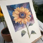
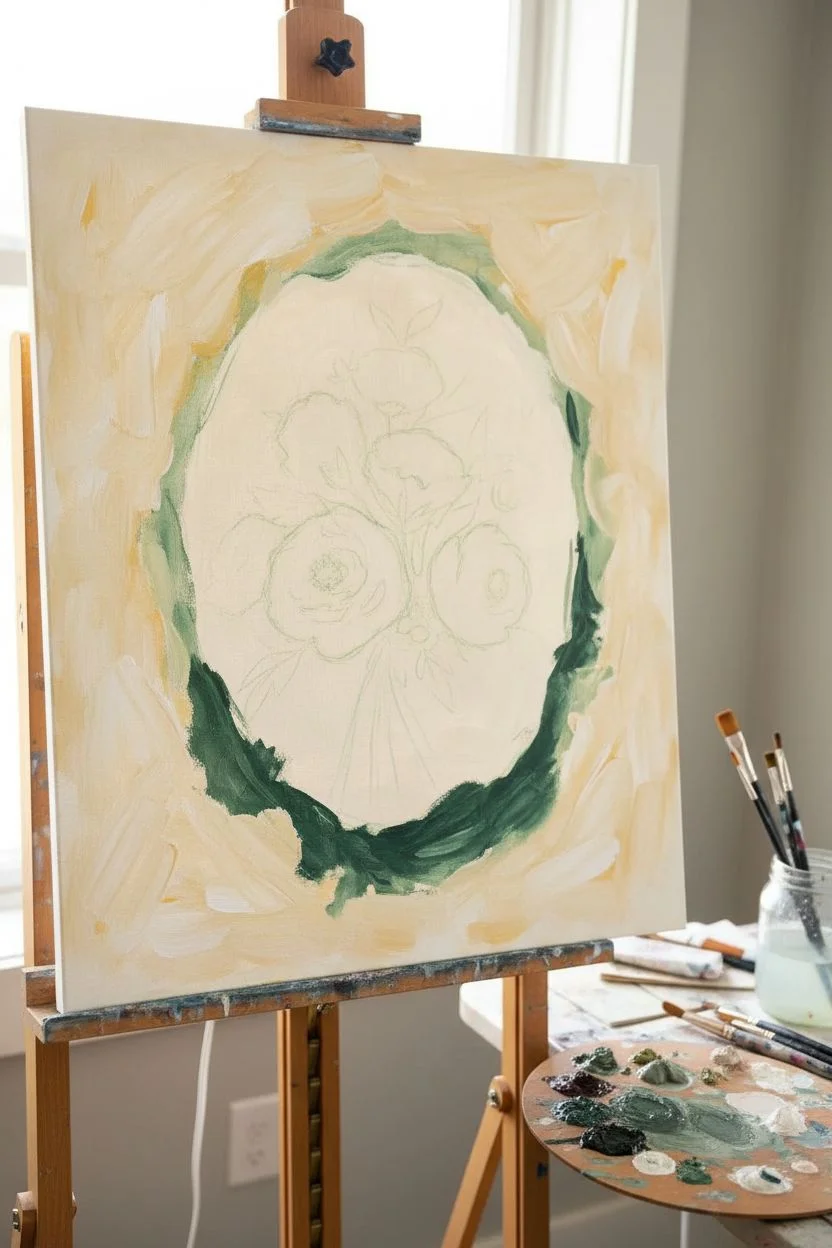
Whenever I’m not sure what to paint, I reach for flowers—they’re endlessly forgiving, and you can make them as simple or as detailed as you want. Here are my favorite flower painting ideas that feel doable right away, with plenty of room to make them totally yours.
Simple Daisies Using a One-Stroke Petal Trick
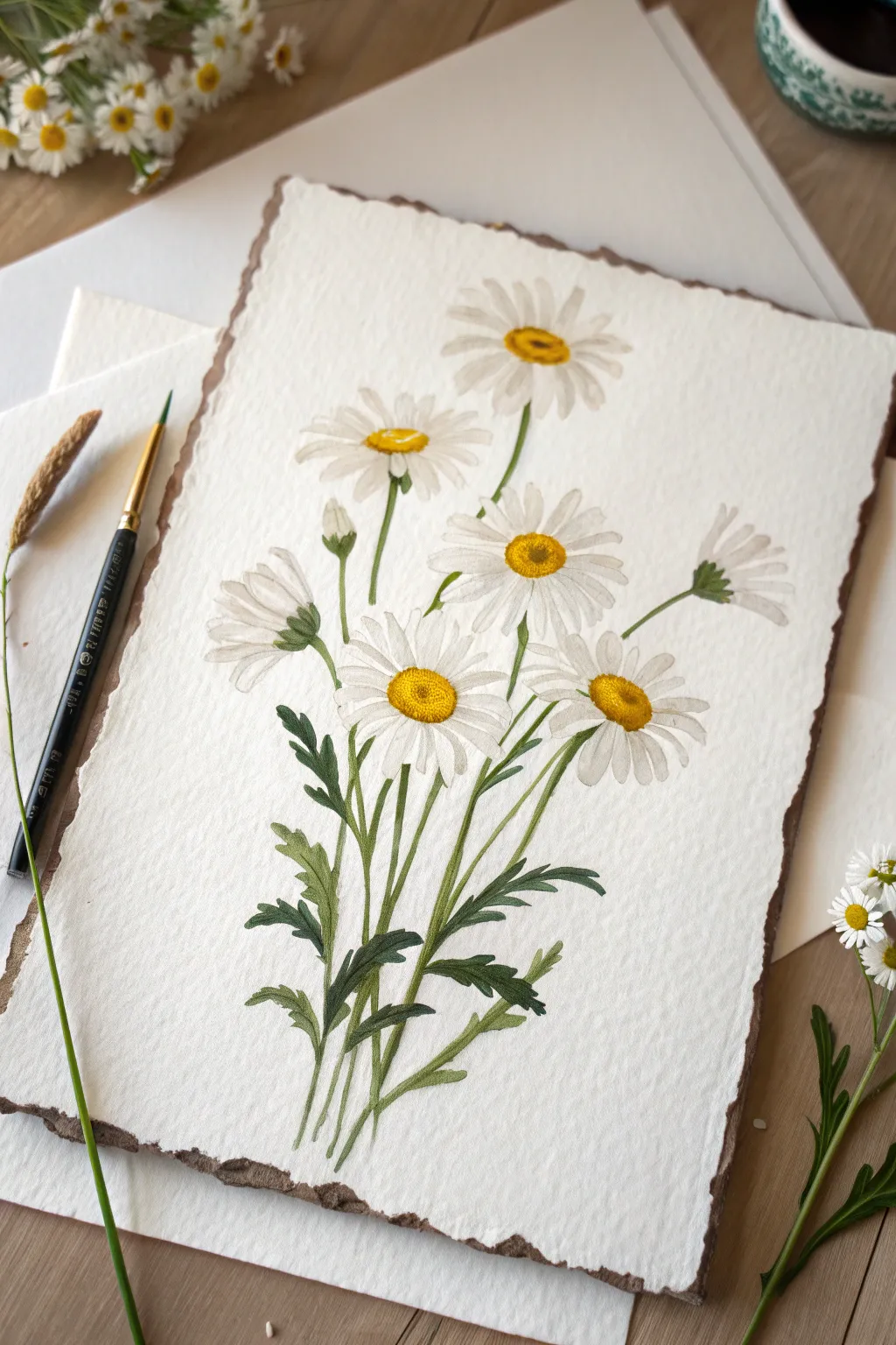
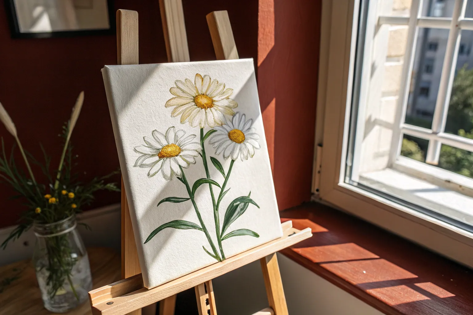
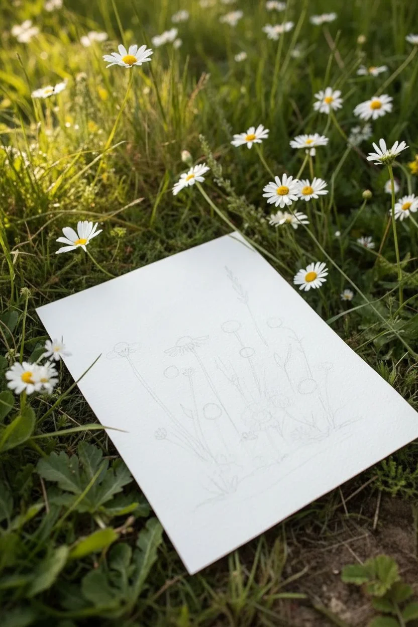
Capture the simple elegance of a meadow with this airy daisy composition painted on textured paper. The translucent petals and rich green foliage create a beautiful contrast that feels both modern and timeless.
Step-by-Step Guide
Materials
- High-quality watercolor paper with deckled edges (cold press, roughly 300gsm)
- Round watercolor brushes (sizes 2, 4, and 6)
- White gouache or white watercolor paint (opaque white is best for petals)
- Watercolor paints: Lemon Yellow, Cadmium Yellow Deep, Sap Green, Olive Green, Burnt Umber
- HB pencil and kneaded eraser
- Paper towel
- Clean water jar
- Palette for mixing
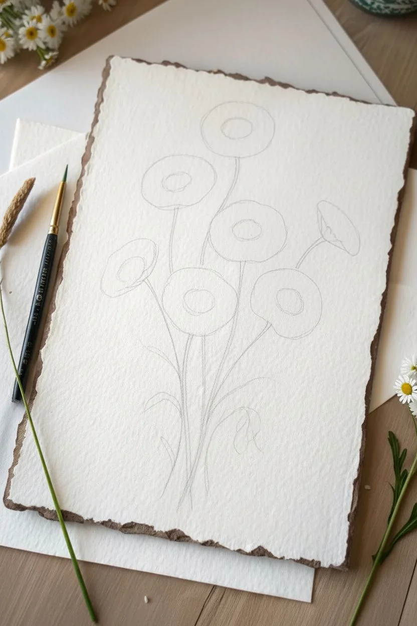
Step 1: Planning and Sketching
-
Plan the Composition:
Observe the reference image to imagine the flow. The stems should curve gently upward from the bottom center, fanning out slightly. Notice how the flowers sit at different heights to create a natural, unforced arrangement. -
Lightly Sketch the Flowers:
Using your HB pencil, draw very faint ovals to mark the position of each flower head. Don’t press hard; you want these lines to disappear later. Place about seven main flower heads, varying their angles—some facing forward, some turning away. -
Add Stem Lines:
Draw single, loose lines connecting your flower heads to the base of the paper. Keep these lines fluid and slightly curved rather than ruler-straight to mimic organic growth.
Petals disappeared?
If your white watercolor dries too transparent and vanishes, wait for it to dry completely and paint a second layer of white gouache directly on top for better opacity.
Step 2: Painting the Petals
-
Prepare Your White Paint:
Mix your white gouache or watercolor with a small amount of water. You want a consistency like heavy cream—opaque enough to show up against the paper, but fluid enough to glide. -
Practice the One-Stroke Trick:
On a scrap piece of paper, practice the petal stroke. Press the belly of a size 4 or 6 brush down to create the wide part of the petal, then lift as you pull inward toward the center to create a tapered point. -
Paint the Forward-Facing Daisies:
Start with the main open flowers. Paint petals radiating outward from the center of your sketched ovals. Leave a small empty circle in the very middle for the pollen center later. -
Layering Petals:
Daisies have many petals. Once your first layer is semi-dry, add a second layer of strokes in between the first ones to create density. I find that slightly varying the white opacity here adds lovely depth. -
Paint Angled Flowers:
For the flowers that are turning away or are buds, paint shorter, more clustered petals. The shape should look like a cup or a fan rather than a full circle. -
Refine Edges:
Use a smaller size 2 brush to neaten the tips of any petals that look too ragged, keeping the overall look soft and airy.
Step 3: Adding Colors and Details
-
Base for Centers:
Mix Lemon Yellow with a touch of Cadmium Yellow. Paint the round centers of the open daisies. The paint should be moist but not puddling. -
Texture the Centers:
While the yellow is still slightly damp, dab in tiny dots of Burnt Umber mixed with yellow on the shadowed side (usually the bottom) of the center disk. This stippling effect creates a fuzzy 3D look. -
Painting Stems:
Load your size 4 brush with a mix of Sap Green and a little Olive Green. Following your pencil lines, paint the stems with a confident, continuous stroke from flower to base. -
Adding Sepals:
For the flowers shown from the side or back, paint the small green cup (sepal) that holds the petals. Use a darker green mix here to anchor the white petals to the stem. -
Leaf Structure:
Daisy leaves are jagged and deeply lobed. Using the tip of your brush, paint slender leaves branching off the lower stems. Wiggle the brush slightly as you pull it to create irregular edges. -
Deepening Values:
Mix a darker green using Olive Green and a touch of Burnt Umber. Add a second layer of shadows to the undersides of leaves and where stems overlap, which adds dimension to the bouquet. -
Final Highlights:
Use a tiny amount of pure white gouache to add a highlight dot to the sunniest part of the yellow centers. This tiny detail brings the flower to life immediately. -
Clean Up:
Once the painting is completely dry, gently erase any visible pencil lines, being careful not to scrub over the painted areas.
Try a toned background
For a vintage illustrative look, apply a very pale wash of tea or watered-down ochre over the paper before starting. The white petals will pop beautifully against the tint.
Enjoy the calm simplicity of your everlasting floral arrangement.


Tulips in a Minimal Three-Shape Approach
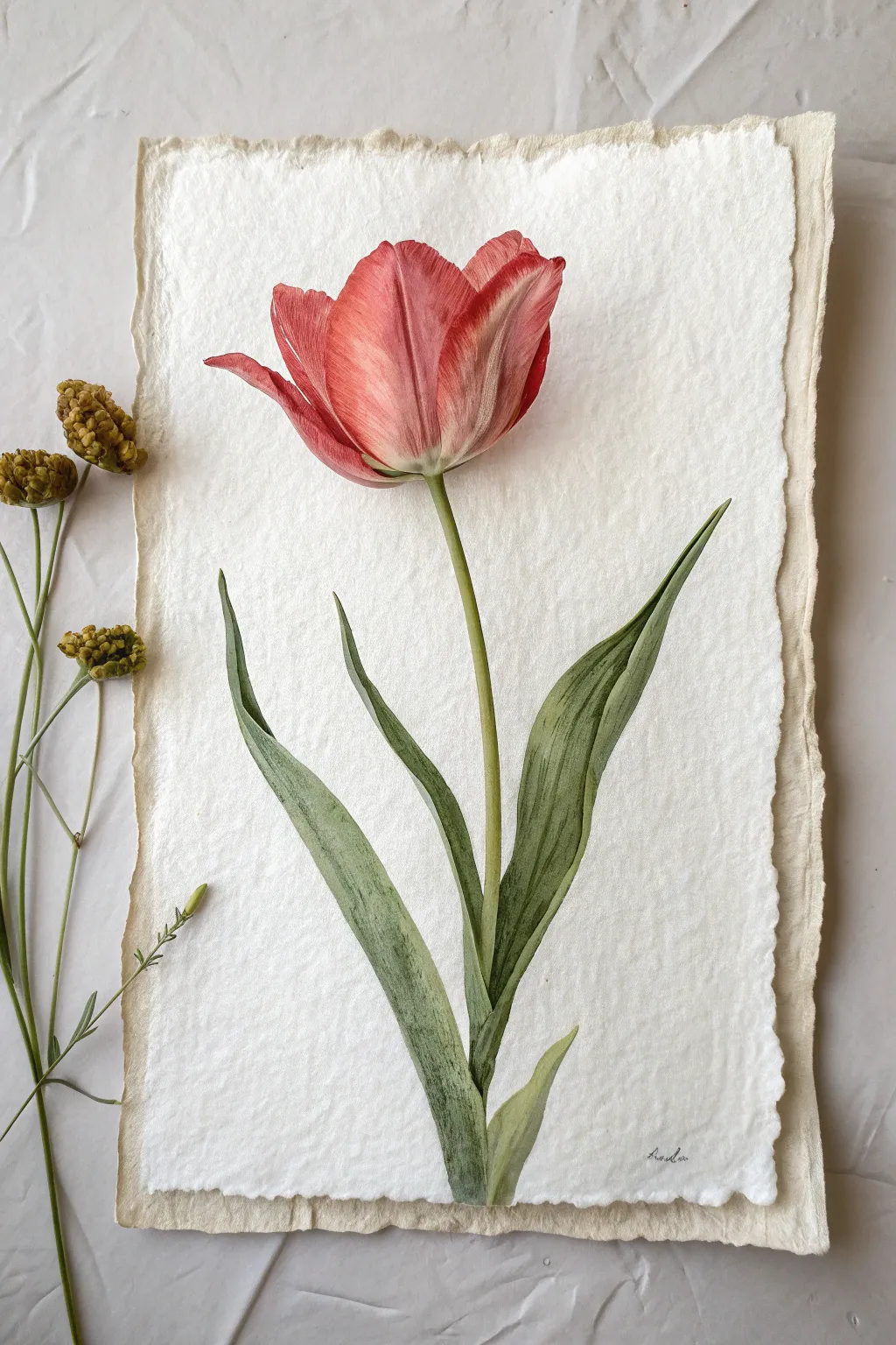
Capture the delicate translucency of a spring tulip with this realistic watercolor project. You will learn to use layering and glazing techniques to build depth on beautiful, deckle-edged paper.
How-To Guide
Materials
- Cold press watercolor paper (deckle-edge preferred, 300gsm)
- Watercolor paints (Alizarin Crimson, Sap Green, Burnt Umber, Lemon Yellow)
- Round watercolor brushes (Size 2, 4, and 6)
- Pencil (HB or H)
- Kneaded eraser
- Two jars of water
- Paper towels
- Mixing palette
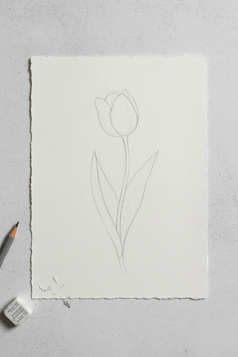
Step 1: Sketching and Preparation
-
Outline the flower head:
Begin by lightly sketching the cup shape of the tulip head in the upper center of your paper. Break this main shape into three distinct petals: a large central petal and two side petals slightly unfurling. -
Add stem and leaves:
Draw a long, slender stem curving gently downwards from the base of the flower. Add two long, lance-shaped leaves that originating near the bottom of the stem and reaching upwards, embracing the stem. -
Refine the edges:
carefully refine your sketch lines to be faint and clean. Use a kneaded eraser to lift up any heavy graphite, as pencil marks are permanent once painted over.
Make It Look Organic
Don’t make your stem perfectly straight. A slight ‘S’ curve gives the flower movement and prevents it from looking stiff or artificial.
Step 2: Painting the Flower Head
-
First wash of red:
Mix a watery wash of Alizarin Crimson. Using your size 6 brush, apply this pale pink to the main body of the petals, leaving the very tips and edges white to create highlights. -
Deepening the color:
While the first layer is still slightly damp, drop in a more concentrated crimson mix at the base of the petals and in the creases where the petals overlap. This wet-on-wet technique creates soft gradients. -
Adding texture lines:
Once the previous layers are dry, switch to a size 2 brush. Mix a thicker red consistency and paint fine, vertical veins running from the base of the petal upwards, mimicking the natural texture of the tulip. -
Defining the shadow:
Mix a tiny touch of Green or Burnt Umber into your red to create a muted shadow tone. Glaze this over the areas where the side petals curve away from the light to add dimension. -
Base of the bloom:
The bottom of the tulip head often has a greenish-white tint. Gently blend a very pale Sap Green wash into the bottom of the red petals where they meet the stem.
Step 3: Stems and Foliage
-
Base leaf layer:
Mix Sap Green with a touch of Lemon Yellow for a fresh spring green. Paint the entire stem and leaves with a light, even wash. -
Building leaf form:
Once dry, use a size 4 brush to apply a second layer of green, leaving the center of the leaves lighter to suggest a midrib or highlight. -
Adding depth to the stem:
Paint a darker green strip along one side of the stem to make it look cylindrical rather than flat. I find this simple step instantly makes the flower look sturdy. -
Leaf details:
With the size 2 brush and a darker green mix (add a bit of red to neutralize it), paint fine vertical striations on the leaves, following their upward curve. -
Shadows at intersections:
Deepen the color significantly where the leaves tuck behind the stem or overlap each other. High contrast here is key for realism.
Handling “Cauliflower” Blooms
If water back-runs create unwanted blooms on your petals, let it dry completely. Then, gently scrub the edge with a damp, stiff brush to soften it.
Step 4: Final Touches
-
Refining highlights:
If you lost your white petal edges, you can reclaim them slightly with a tiny bit of white gouache or by gently lifting paint with a damp, clean brush. -
Final assessment:
Step back and look at the balance. If the flower head feels too light compared to the leaves, add one more thin glaze of red to boost the vibrancy. -
Sign your work:
Use a fine liner or your smallest brush with diluted paint to sign your name near the bottom edge.
Now you have a timeless botanical study ready to frame or gift

Lavender Stems Built With Easy Dot-and-Dab Marks
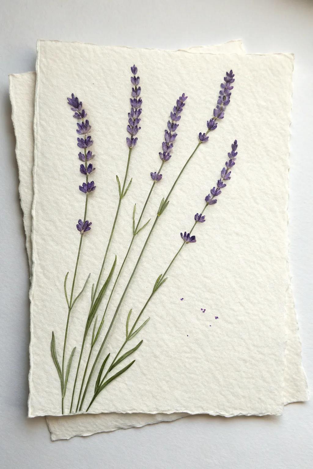
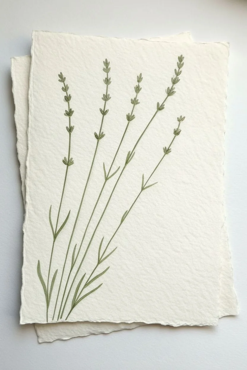
Capture the gentle elegance of lavender with this simple yet effective painting technique that relies on building texture through small marks. By layering tiny dabs of purple and violet, you’ll create realistic flower spikes that seem to dance on the page.
Detailed Instructions
Materials
- Cold press watercolor paper (deckle edge optional)
- Small round watercolor brush (size 2 or 4)
- Very fine liner brush (size 0 or 00)
- Watercolor paints: Violet, Ultramarine Blue, Sap Green, Olive Green
- Paper towel
- Jar of water
- Palette for mixing
Step 1: Painting the Stems and Leaves
-
Mix your greens:
Start by mixing a natural, slightly muted green. Combine Sap Green with a tiny touch of Olive Green to ground it. If the green looks too bright, neutralize it with a speck of your red or violet paint. -
Map the stems:
Using your fine liner brush, paint five long, slender stems. Curve them slightly as they rise from the bottom left corner, radiating outward like a fan. Keep the lines very thin and delicate; they don’t need to be perfectly straight. -
Vary stem height:
Ensure your stems end at different heights to create a natural composition. The central stem can be tallest, with the outer ones slightly shorter. -
Add basal leaves:
At the very bottom where the stems cluster, paint slender, lance-shaped leaves. Use a ‘press and lift’ motion: touch the tip of the brush to the paper, press down slightly to widen the stroke, and lift as you pull upward to create a sharp point. -
Add upper leaves:
Paint tinier, thinner leaves branching off higher up the stem. These should be sparse—just a pair here and there—and much smaller than the base leaves. Keep them pointing upwards at a sharp angle.
Keep It Airy
Don’t overwork the purple clusters; leaving tiny specks of white paper showing between the dabs adds sparkle and prevents the flowers from looking like heavy blobs.
Step 2: Creating the Flower Spikes
-
Prepare your purples:
Create two distinct purple mixtures on your palette. One should be a lighter, watery violet (more water, less pigment). The second should be a deeper, darker blue-violet (mix Ultramarine with Violet and keep it concentrated). -
Start the flower base:
Switch to your small round brush. Starting about two-thirds up a stem, begin dabbing small spots of the lighter violet mix. Apply these directly onto the stem line, leaving small gaps of white space between clusters. -
Shape the clusters:
lavender flowers grow in whorls or tiers. Paint small pairs of oval dabs opposite each other up the stem. As you reach the very top, make the dabs smaller and closer together to form a tapered tip. -
Build the texture:
Let this first light layer dry for just a moment—not completely, but enough so it’s not a puddle. This creates a soft underlayer for the petals. -
Add definition:
Load your brush tip with the darker, concentrated blue-violet mix. Gently touch the tip to the base of your lighter purple dabs. I like to let the paint bleed slightly, creating a natural shadow effect. -
Detail the buds:
For the individual flower buds, use the very tip of the brush to make tiny ‘tear drop’ shapes. The round part of the drop should touch the stem, with the point facing outward and upward. -
Create distinct florets:
To mimic the specific look of lavender, ensure some of the dark dabs at the top of the cluster look like tiny, opening mouths or ‘V’ shapes. This suggests individual florets opening.
Scented Stationery
Once your painting is fully dry, dilute a drop of real lavender essential oil in water and lightly mist the back of the paper for a multi-sensory art piece.
Step 3: Final Details
-
Refine the connection:
Once the purple flowers are dry, take your green liner brush again. Very carefully paint tiny, thin lines connecting the flower clusters to the main stem if any look like they are floating too far away. -
Add stray buds:
Paint a solitary bud or two slightly lower down the stem, separated from the main flower spike. This irregularity makes the botanical illustration feel more organic. -
Scatter fallen petals:
To add a touch of whimsy, paint three or four tiny, stray purple dots on the paper to the right of the stems, as if a few dried lavender buds have fallen off the plant.
Frame your botanical study or use it as a lovely handmade card for a friend
Anemone Flowers With Inky Centers and Soft Petals
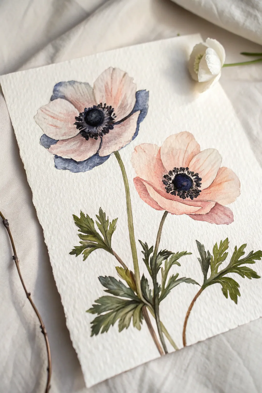
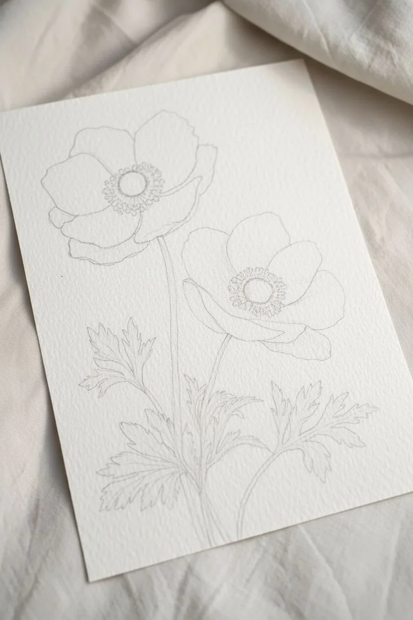
Capture the delicate drama of anemones with this botanical watercolor project featuring soft, blushing petals contrasting against striking, dark-blue centers. This beginner-friendly study focuses on controlling water to achieved veiled, transparent layers on heavyweight textured paper.
Detailed Instructions
Materials
- Cold press watercolor paper (300gsm/140lb)
- Watercolor paints (Alizarin Crimson, Burnt Sienna, Payne’s Grey, Indigo, Sap Green, Olive Green)
- Round brushes (flats sizes 4 and 8, detail brush size 0 or 1)
- Two jars of water (clean and dirty)
- Paper towels
- HB pencil for sketching
- Kneaded eraser
Step 1: Sketching and Preparation
-
Light Outline:
Begin by sketching the basic shapes of two anemones using a hard pencil like an HB. Place one flower slightly higher and to the left, and the other lower and to the right to create a balanced composition. Keep your pressure extremely light so the graphite doesn’t show through the pale petals later. -
Defining Petals:
Refine the circle shapes into individual petals. Anemone petals are rarely perfect; draw them slightly jagged or overlapping to look natural. Add the stems curving gracefully downward and sketch the jagged, parsley-like leaves at the base. -
Lifting Graphite:
Before painting, roll your kneaded eraser gently over the entire sketch. You want the lines to be barely visible—just ghost images to guide your brush without dirtying the watercolor pigment.
Wet Edge Control
To avoid ‘cauliflower’ blooms in your petals, don’t add water back into a drying wash. Wait for it to dry 100% before adding a second layer or glaze.
Step 2: Painting the Petals
-
First Wash – Left Flower:
Mix a very dilute wash of Alizarin Crimson with a touch of Payne’s Grey to get a dusty mauve-pink. Using your size 8 brush, wet one petal with clean water first, then drop the pigment into the wet area (wet-on-wet technique). Leave some white paper showing at the edges for highlights. -
Adding Shadow:
While the first petal is still damp, drop a slightly more concentrated mix of the same color at the base of the petal towards the center. This creates depth naturally as the paint spreads. -
Painting the Right Flower:
For the lower right flower, mix Alizarin Crimson with a tiny bit of Burnt Sienna for a warmer, peachier pink. Paint these petals using the same wet-on-wet method, ensuring each petal is distinct. If two wet petals touch, they will bleed together, so work on non-adjacent petals while others dry. -
Drying Time:
Allow the first layer of petals to dry completely. If you are impatient, you can use a hairdryer on a low, cool setting. -
Second Layer Glazing:
Once dry, mix a slightly stronger version of your mauve and peach colors. Use a size 4 brush to add definition to the petals that are underneath or behind the main petals. This ‘glazing’ technique makes the flowers look translucent and three-dimensional. -
Adding Blue Tints:
For the top left flower, introduce a very watery wash of Indigo or Payne’s Grey to the tips of the back petals. This cool tone contrasts beautifully with the warm pinks and suggests shadow.
Step 3: The Dramatic Centers
-
The Dark Core:
Mix a thick, creamy consistency of Indigo and Payne’s Grey. With your size 4 brush, paint the round center of the flower. Leave a tiny sliver of white highlight in the middle to make it look prominent and domed. -
Bleeding the Edge:
While the center is still wet, touch the very edge with a clean, slightly damp brush to soften the rim just a tiny bit where it meets the petals. -
Stamen Detail:
Switch to your size 0 or 1 detail brush. Using the same dark Indigo mix, paint tiny dots in a ring around the main dark center. These represent the anthers. -
Connecting Filaments:
Connect these dots to the center with incredibly fine, hair-like lines. I find it helps to hold the brush almost vertically to get the finest possible line.
Make it Sparkle
Mix a tiny amount of iridescent medium or pearl watercolor into the dark indigo centers. It gives the stamens a subtle, velvet-like shimmer when the light hits.
Step 4: Foliage and Stems
-
Mixing Greens:
Create an earthy green by mixing Sap Green with a touch of Burnt Sienna or Olive Green. You want a botanical, muted green rather than a bright, artificial one. -
Stem Work:
Using the size 4 brush, paint the stems with a confident, single stroke if possible. Vary the pressure on the brush to make the stem slightly thicker in some areas and thinner in others. -
Leaf Structure:
Paint the serrated leaves at the bottom. Start from the stem and stroke outward towards the leaf tips. Use a darker, more concentrated green mix near the base of the leaves where shadows would naturally fall. -
Final Touches:
Look over the composition. If the leaves look too flat, wait for them to dry and glaze a little Indigo over the shadowed areas to deepen the contrast.
Now step back and admire how the dark centers anchor the airy lightness of your petals
BRUSH GUIDE
The Right Brush for Every Stroke
From clean lines to bold texture — master brush choice, stroke control, and essential techniques.
Explore the Full Guide
Hydrangea Mophead Made From Layered Petal Clusters
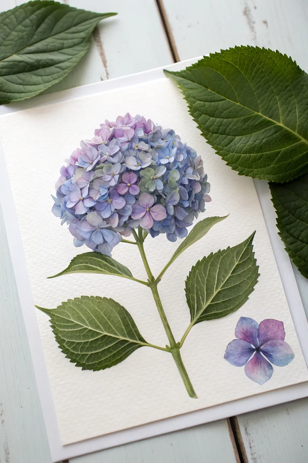
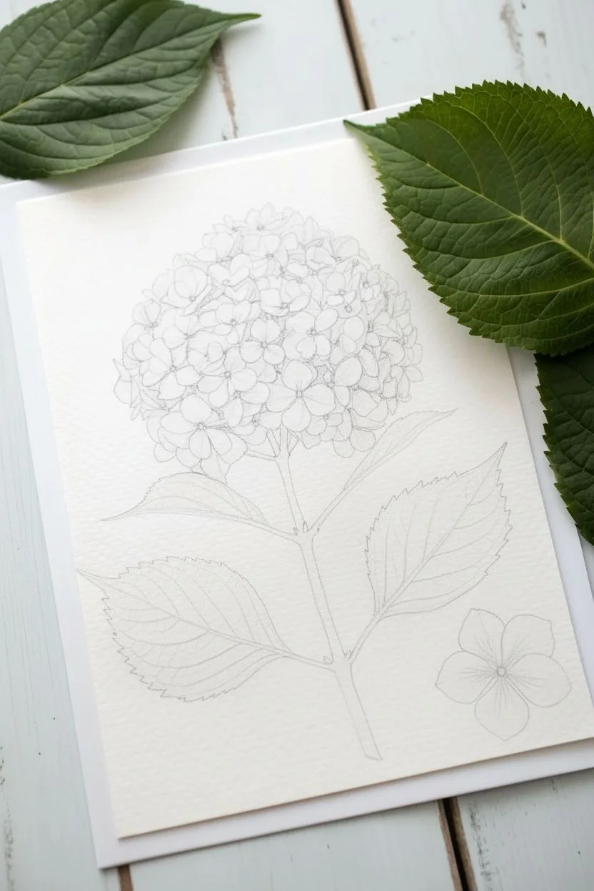
Capture the delicate complexity of a mophead hydrangea with this detailed watercolor tutorial. By building up layers of individual florets in soft blues and purples, you’ll create a dimensional bloom that pops against clean, structured greenery.
Step-by-Step
Materials
- Cold press watercolor paper (300gsm/140lb)
- Watercolor paints: Ultramarine Blue, Cobalt Blue, Quinacridone Magenta, Sap Green, Hooker’s Green
- Pencil (HB or H) for light sketching
- Round watercolor brushes (sizes 2, 4, and 6)
- Clean water jar
- Paper towel or rag
- Palette for mixing
Step 1: Planning and Sketching
-
Map the spherical shape:
Begin by lightly tracing a large circle roughly in the upper center of your paper to define the overall flower head size. Keep your pencil pressure extremely light so the graphite won’t show through the translucent petals later. -
Sketch the stem structure:
Draw a central stem line curving gently downward from the flower head. Add smaller branching lines for where the leaves will attach. -
Outline the florets:
Instead of drawing every single petal perfectly, sketch small four-petaled shapes loosely within your main circle. Ensure they overlap and vary slightly in size, leaving some gaps for shadows. -
Add leaf outlines:
Sketch two pairs of serrated leaves attached to the stem. The leaves should have pointed tips and a clear central vein.
Natural Variation Pro-Tip
Don’t clean your brush completely between blue and purple dips. Letting the pigments mix slightly on the bristles creates the most realistic hydrangea variation.
Step 2: Painting the Flower Head
-
Mix your base washes:
Prepare three watery puddles on your palette: a soft blue (Ultramarine), a violet (Ultramarine + Magenta), and a pale pinkish-purple. Keep these mixes very diluted to start. -
Paint the background layer:
With a size 6 brush, apply a very pale, wet wash of blue and violet unevenly across the circular flower area. Don’t worry about staying perfectly inside the lines; this creates the illusion of depth behind the front petals. -
Define the first florets:
Switch to your size 4 brush. Using a creamy mix of blue, paint the four petals of a few individual florets. Leave tiny white gaps between the petals to represent the flower center. -
Add color variation:
While the blue is still slightly damp on some petals, touch in a tiny drop of purple or pink to let the colors bleed naturally. I usually work in clusters, doing three or four florets at a time. -
Build the density:
Continue painting individual florets across the sphere. As you move toward the edges of the flower head, ensure the petals face outward to maintain the round perspective. -
Deepen the shadows:
Mix a darker, more concentrated indigo or violet. Paint the negative spaces—the small gaps between the florets—to push the bottom layers back and make the top petals pop forward. -
Add center details:
Once the petals are fully dry, use the tip of your smallest brush (size 2) to place tiny dots of yellow or pale green in the center of each floret. -
Paint the single fallen floret:
Near the bottom right corner, paint one isolated four-petal bloom using the same purple-to-blue gradient technique to balance the composition.
Too Much Blobbing?
If your florets are turning into indistinct blobs, your paper is too wet. Let the layer dry completely, then paint defined petal shapes on top with a thicker paint mix.
Step 3: Stems and Foliage
-
Stem foundation:
Mix Sap Green with a touch of yellow for a fresh, light green. Paint the main stem and leaf stems, keeping the stroke relatively thin and even. -
Leaf base coat:
Fill in the leaf shapes with a light wash of Hooker’s Green. While wet, lift out the center vein line with a thirsty brush or paper towel to keep it lighter than the rest. -
Adding leaf texture and veins:
Once the green base is dry, use a darker mix of green (Hooker’s Green + a touch of blue) to paint the segments between the veins. -
Refine the serrated edges:
Use the tip of your size 2 brush to carefully define the jagged, saw-tooth edges of the leaves with your darker green mix. -
Final shading:
Add a final glaze of dark green where the leaves meet the stem and on the underside of the leaves to create dimension.
Step back and admire the vibrant volume of your floral creation
Wildflower Meadow Using Simple Repeating Flower Shapes
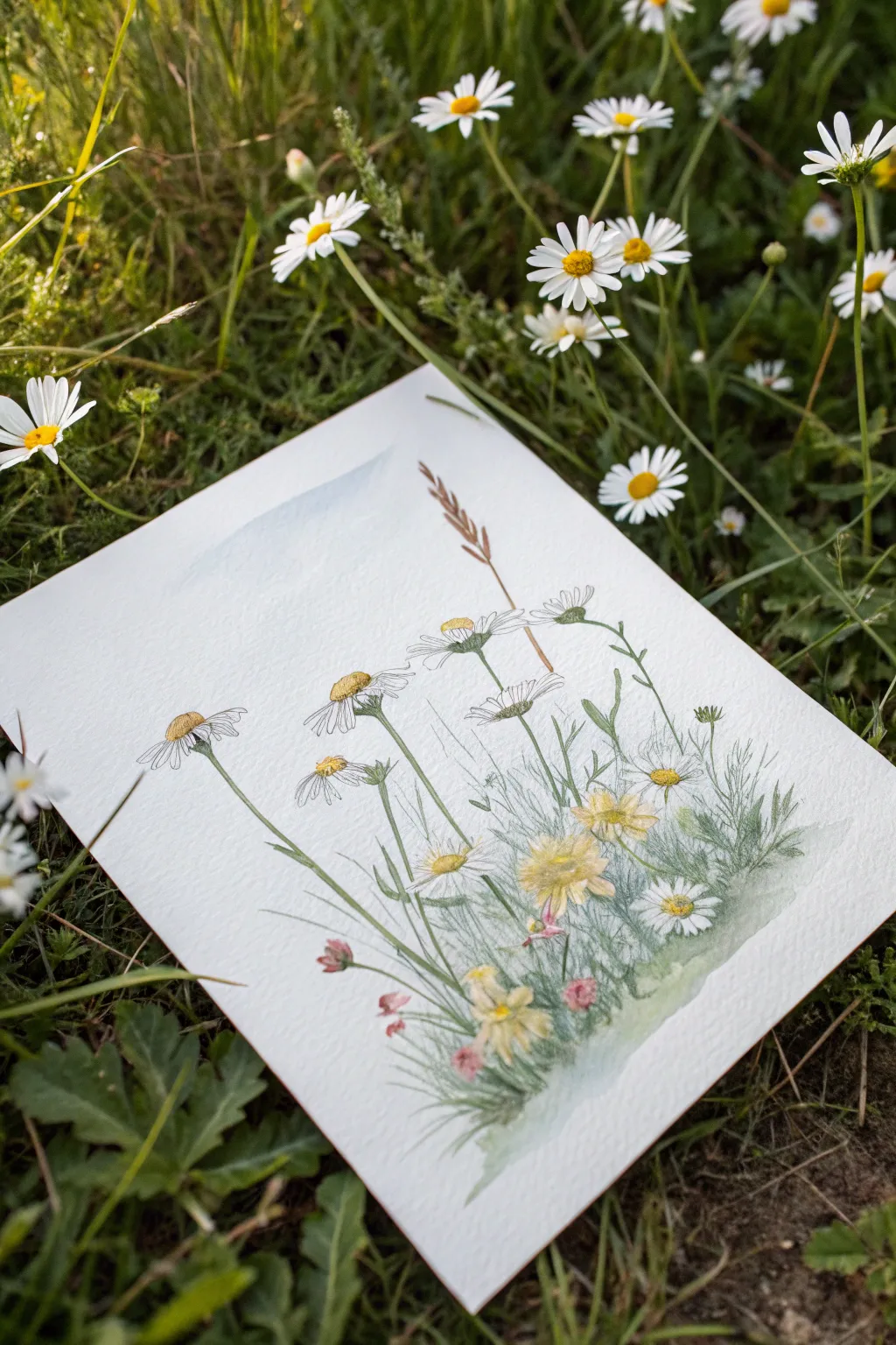
Capture the delicate charm of a summer field with this mixed-media wildflower study. Combining fine ink lines with loose, airy watercolor washes creates a beautiful contrast that feels both illustrative and effortlessly organic.
Step-by-Step Guide
Materials
- Cold press watercolor paper (approx. 5×7 or A5)
- Fine liner pen (waterproof, 0.1mm or 0.3mm, black or sepia)
- Watercolor paints (pans or tubes)
- Round watercolor brushes (size 2 and 4)
- Pencil (HB) and kneaded eraser
- Jar of water
- Paper towel
Step 1: Planning and Sketching
-
Light Blocking:
Begin with a very faint pencil sketch to map out the composition. Draw a gentle diagonal slope for the ground line near the bottom third of the paper. -
Stem Placement:
Sketch vertical lines of varying heights for your flower stems. Keep them loose and slightly curved rather than ruler-straight to mimic natural growth. -
Rough Flower Heads:
Lightly draw ovals and circles at the top of your stems to indicate where the main daisy-like flowers and smaller buds will sit. Don’t worry about petals yet.
Step 2: Ink Work
-
Drawing the Daisies:
Using your waterproof fine liner, start detailing the main daisy blooms. Draw small, textured domes for the centers, then add thin, elongated loops for petals radiating outward. -
Perspective Tricks:
For flowers facing sideways, draw the petals on the near side shorter and flatter, while the petals on the far side fan out more visibly. -
Adding Stems:
Trace over your pencil stem lines with ink. Add small leafy offshoots and junctions where stems branch out, keeping the line weight delicate. -
Detailing Foliage:
Fill the lower section with short, grassy strokes and feathery textures to represent the dense undergrowth. Use quick, upward flicks of the pen. -
Background Elements:
Sketch a single tall grass stalk or wheat-like stem rising above the flowers in the background for height variation. -
Clean Up:
Wait for the ink to be completely dry to the touch, then gently erase all visible pencil marks with your kneaded eraser.
Keep it Loose
Don’t color perfectly inside the lines. Letting the watercolor spill slightly outside the ink drawing adds energy and prevents the art from looking stiff.
Step 3: Watercolor Washes
-
First Green Layer:
Mix a watery sap green. Using a size 4 brush, paint a loose, uneven wash across the bottom grassy area, letting the white of the paper show through in spots. -
Daisy Centers:
Dip a size 2 brush into a warm yellow ochre or cadmium yellow. Carefully dab color into the centers of the ink-drawn daisies. -
Adding Shadows:
While the yellow centers are still slightly damp, touch a tiny bit of brown or burnt sienna to the bottom edge of the centers to create a 3D dome effect. -
Painting Petals:
Use a very diluted cool gray or light blue wash to add shadow to just the undersides of the white petals. Leave the tops of the petals absolute white. -
Yellow Blooms:
For the fuller yellow flowers lower in the cluster, apply a wash of lemon yellow, layering a slightly darker gold in the center once the first layer dries. -
Floral Accents:
Mix a soft pink or muted red. Paint small dabs for the tiny buds near the ground and scattered throughout the greenery. -
Defining the Grass:
Mix a darker, cooler green (perhaps varying it with a touch of blue). Paint thin, grass-like strokes into the still-damp green base to create soft, fuzzy edges. -
Background Sky:
Prepare a very transparent wash of cerulean blue. Paint a faint mountain shape or sky hint in the upper left corner, fading it out cleanly with water as it moves down.
Collage It
Cut your finished painting out and glue it onto the front of a folded cardstock base for a beautiful, handmade greeting card.
Step 4: Final Touches
-
Sharpening Details:
Once all paint is 100% dry, you can go back with your pen to re-state any lines that got lost under the paint, or add tiny dots for texture in the flower centers. -
Splatter Texture:
I like to load a small brush with green paint and tap it against my finger to flick tiny speckles onto the grassy area for extra organic texture.
Place your finished piece near a window or frame it to bring a permanent slice of summer nature indoors

PENCIL GUIDE
Understanding Pencil Grades from H to B
From first sketch to finished drawing — learn pencil grades, line control, and shading techniques.
Explore the Full Guide
Black Background Florals for Instant Contrast
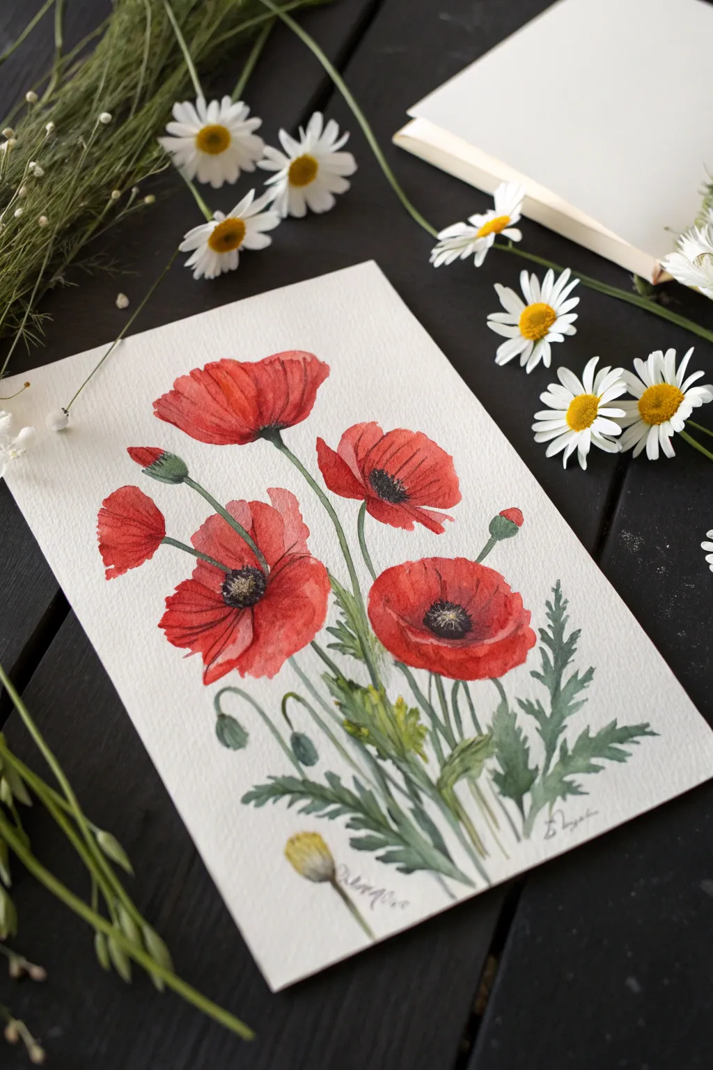
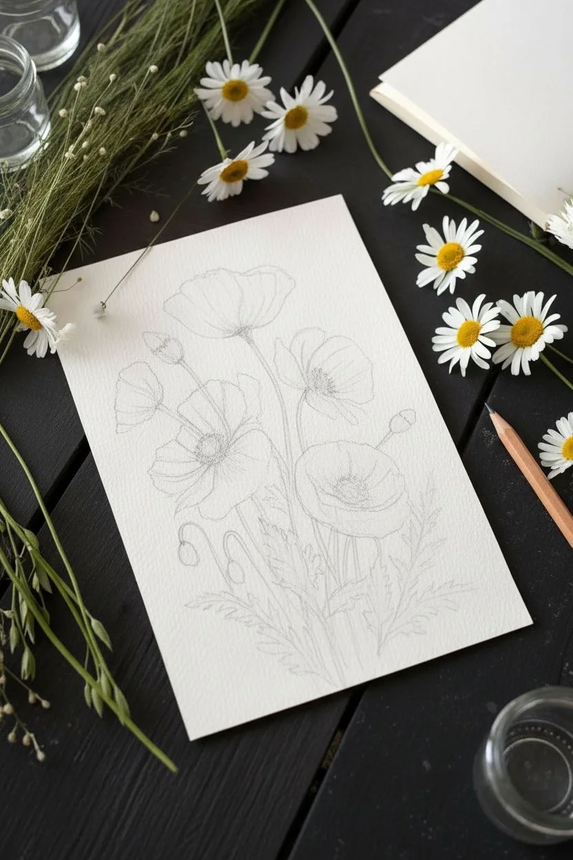
Capture the delicate flutter of poppy petals with this vibrant watercolor study that plays with translucency and bold reds against crisp white paper. The naturalistic composition of stems and buds creates a lovely sense of movement, perfect for framing against a dark background.
Step-by-Step Tutorial
Materials
- Cold press watercolor paper (300 gsm)
- Watercolor paints (Cadmium Red, Alizarin Crimson, Sap Green, Olive Green, Payne’s Gray, Yellow Ochre)
- Round brushes (sizes 2, 6, and 8)
- Pencil (HB or 2H for light sketching)
- Kneaded eraser
- Two jars of water
- Paper towels
- Masking tape (optional)
Step 1: Sketching the Composition
-
Plan the layout:
Observe the reference image. Notice how the flowers lean slightly to the right, creating a natural flow. Lightly mark the position of the three main open blooms: one top-left, one low-center, and one mid-right. -
Outline the petals:
Using a very light touch with your pencil, sketch the outline of the poppy petals. Don’t worry about perfect circles; poppy petals are crinkled and irregular. Keep the lines faint so they disappear under the paint later. -
Add stems and buds:
Draw the main stems, letting them curve gently. Add the droopy, unopened buds characteristic of poppies, as well as the distinctive serrated leaves at the base.
Don’t Overwork It
Poppies have delicate petals. To keep that translucent look, avoid layering the red paint too many times or the flower will look heavy and muddy.
Step 2: Painting the Blooms
-
First wash of red:
Mix a watery wash of Cadmium Red. Start with the top flower. Paint the petals, leaving tiny slivers of white paper between petals to define their separation. -
Wet-on-wet technique:
While the first wash is still damp, drop in a slightly more concentrated mix of Alizarin Crimson near the center of the bloom and into the shadowed folds of the petals. Let the colors bleed naturally. -
Repeat for all flowers:
Move to the other two open flowers, using the same technique. Vary the intensity of red to show depth; petals in the foreground can be more saturated. -
Lifting highlights:
If a petal looks too flat, use a clean, damp brush to gently lift some pigment away from the edges, creating a soft highlight that mimics the papery texture of poppies. -
Painting the buds:
For the closed poppy heads, use a mix of Sap Green and a touch of red for a brownish-green tone. Paint the bursting pod, perhaps letting a tiny peek of red show through the seam.
Step 3: Stems and Foliage
-
Base green layer:
Mix Sap Green with a little Yellow Ochre for a fresh, grassy hue. With your size 6 brush, paint the stems using long, fluid strokes. Try to do this in one go to keep the lines clean. -
Adding texture to leaves:
For the fern-like leaves at the bottom, use the tip of your brush to flick outward, mimicking the jagged edges. Vary your pressure to create thick and thin shapes. -
Deepening the greens:
While the greens are still slightly damp, mix Olive Green with a tiny bit of Payne’s Gray. Touch this darker color to the bottoms of the stems and the undersides of the leaves for shadow.
Blooms Bleeding Together?
If your red petals are merging into a blob, let the first petal dry completely before painting the adjacent one. This ‘glazing’ method creates crisp edges.
Step 4: Final Details
-
The dark centers:
Ensure the red petals are completely dry. Mix a very dark, near-black color using Payne’s Gray and Alizarin Crimson. Paint the center ovary and the surrounding ring of stamens. -
Stamen details:
Switch to your smallest brush (size 2). Pull tiny, fine lines outward from the black center into the red petals to represent the filaments. -
Dot work:
Add tiny dots at the ends of those filaments for the pollen. If you want them to pop, you can use a touch of gouache or white gel pen later, but dark dots work well for a natural look. -
Bottom accent:
Paint the small, yellowish seed pod or withered bloom at the very bottom using a wash of Yellow Ochre and a brown stem, adding a nice color balance to the piece. -
Signature:
Once everything is fully dry, sign your name near the bottom stem cluster using a fine brush or a waterproof archival pen.
Allow your beautiful poppy study to dry flat before framing it to brighten up any room
Loose Impressionistic Florals With Big Brushy Color Blocks
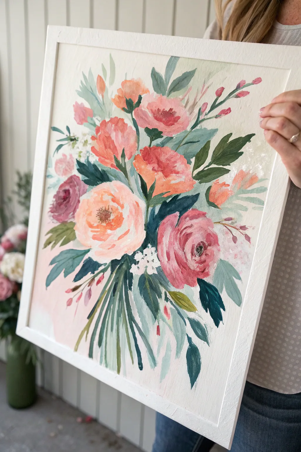
Capture the effortless charm of a garden-picked bouquet with this loose, impressionistic painting project. Using bold strokes and layers of coral, pink, and deep green, you’ll create a lively floral arrangement that prioritizes movement over perfection.
Step-by-Step Guide
Materials
- Canvas board or heavy mixed media paper (16×20 inches recommended)
- Wide flat brush (1 inch)
- Medium filbert brush
- Small round brush for details
- Acrylic paints: Titanium White, Cadmium Red, Alizarin Crimson, Yellow Ochre, Sap Green, Phthalo Green, Burnt Umber
- Palette or wax paper
- Cup of water and paper towels
- White or natural wood frame (optional)
Step 1: Setting the Stage
-
Prepare the background:
Mix a large amount of Titanium White with a tiny dot of Yellow Ochre and a hint of Cadmium Red to create a warm, creamy off-white. Using your largest flat brush, cover the entire canvas with broad, sweeping strokes. Don’t worry about complete smoothness; visible texture adds character. -
Map the composition:
With a diluted mix of Sap Green and water on your small round brush, lightly sketch the general oval shape of the bouquet in the center. Mark the positions for three main focal flowers to anchor your arrangement. -
Block in base shadows:
Mix Phthalo Green with a touch of Alizarin Crimson to make a deep, shadowy green. Using the medium filbert brush, paint loose, abstract shapes where the darkest leaves and stems will be, particularly gathering them near the center and lower section of the bouquet.
Muddy Colors?
If your flower colors are getting turning brown or gray, let the green foliage layers dry completely before painting pink or red petals on top of them.
Step 2: Layering the Blooms
-
Paint the main peony:
For the large central flower, mix Titanium White with a small amount of Cadmium Red and Yellow Ochre for a soft peach. Use the filbert brush to create curved, C-shaped strokes that radiate outward from a center point, leaving gaps for darker layers later. -
Add coral companions:
Mix Cadmium Red with White to create a vibrant coral. Paint two or three medium-sized blooms above the peach flower. Keep the edges ragged and uneven; think of them as bursts of color rather than perfect circles. -
Create the deep rose:
To the right of the center, paint a large rose using Alizarin Crimson mixed with a touch of White. Use varying pressure on your brush to make the petals look folded and dimensional. I find that twisting the brush slightly at the end of a stroke helps create that natural petal curve. -
Insert filler flowers:
Using a loose mix of purple (Alizarin Crimson + Phthalo Blue if available, or just Crimson + White + touch of Green), dab in a smaller, darker bloom on the left side to balance the composition. -
Establish the stems:
Switch to your medium brush and mix Sap Green with White for a sage tone. Paint long, sweeping lines dragging downward from the flowers to the bottom edge. Let the lines cross and overlap to mimic a gathered bunch.
Texture Boost
Mix a little modeling paste into your acrylic paint for the main flower petals. This adds physical texture that catches the light beautifully.
Step 3: Defining Impressions
-
Highlight the leaves:
Mix Sap Green with Yellow Ochre. Add lighter, yellower leaves around the perimeter of the bouquet. Press the belly of the brush down and lift up quickly to create tapered leaf shapes. -
Detail the flower centers:
For the peach peony, mix Burnt Umber with Red. surrounding a center area. Use the small round brush to stipple small dots in the middle, then add a few strokes of pure bright yellow or orange for pollen. -
Deepen the shadows:
Go back in with your darkest green mixture (almost black). Add small, sharp wedges of dark color between the flower heads and deep inside the foliage to make the bright colors pop. -
Add white accents:
Load a small brush with pure Titanium White. Paint a cluster of tiny white filler flowers (like baby’s breath) near the center. Just use simple dabs; don’t overthink the shape. -
Refine the rose:
Mix a very pale pink. Add highlights to the upper edges of the deep rose petals to show where the light hits them. -
Float the stems:
Wash a very watered-down bit of pink over the bottom background area, behind the stems, to soften the transition between the bouquet and the empty space.
Step 4: Final Touches
-
Add movement:
Take your small round brush with a mix of light green. Add a few wispy, stray stems or leaves sticking out at odd angles. This prevents the bouquet from looking too stiff or arranged. -
Whimsical buds:
Paint tiny buds on the ends of the wispy stems using pink or coral. Just a single teardrop shape is enough to suggest a bud ready to open. -
Check balance:
Step back from your painting. If any area looks too empty, add a floating leaf or a hint of a petal. If an edge looks too hard, soften it with a clean, damp brush. -
Varnish and frame:
Once fully dry (give it at least 24 hours), apply a satin varnish to unify the sheen. Place it in a simple white or light wood frame to let the colors truly shine.
Hang your new masterpiece in a bright entryway to greet guests with a permanent splash of spring


Monochrome Flower Painting Focused on Value, Not Color
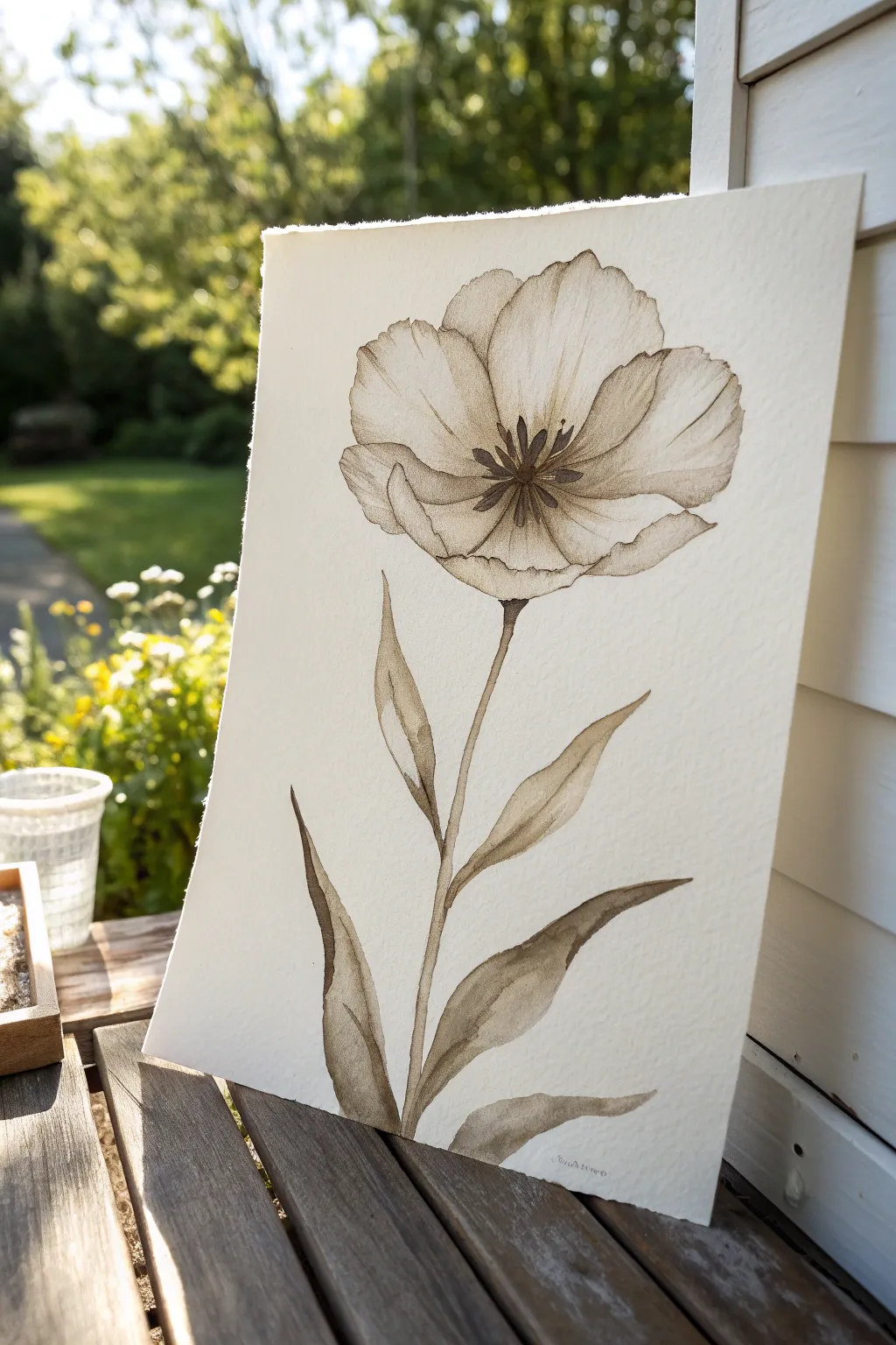
This project explores the delicate beauty of a single flower using only one color, focusing entirely on value and transparency to create depth. By stripping away bright hues, you learn to control water-to-paint ratios to build up soft petals and crisp stems.
Detailed Instructions
Materials
- Cold press watercolor paper (minimum 140lb/300gsm)
- Single dark watercolor paint (Sepia, Van Dyke Brown, or Burnt Umber)
- Round watercolor brushes (size 6 and size 2)
- HB pencil for light sketching
- Kneaded eraser
- Two jars of water
- Paper towels
- A smooth wooden board or table surface
Step 1: Preparation & Sketching
-
Paper placement:
Begin by securing your paper. While taping it down works, you can also rest a loose sheet against a backing board if the paper weight is heavy enough not to buckle immediately. -
Stem curvature:
Using your HB pencil, lightly draw a long, slightly curved vertical line for the stem. It shouldn’t be perfectly straight; a slight S-curve adds organic life. -
Petal framework:
Sketch a large, open oval shape at the top of the stem. Divide this into 4-5 large, overlapping petal shapes. Keep the lines incredibly faint so they don’t show through the transparent paint later. -
Leaf placement:
Add three long, lance-shaped leaves climbing up the stem. Place one low on the left, one slightly higher on the right, and a smaller one near the base of the flower head. -
Refining the sketch:
Softly erase your pencil lines with a kneaded eraser until they are barely visible ghosts. This ensures the graphite won’t muddy your single-color wash.
Step 2: Painting the Petals
-
Mixing the master wash:
Create a puddle of your chosen brown paint on your palette. Add plenty of water to create a very pale, tea-colored consistency for your first layer. -
First petal wash:
Using the size 6 brush, paint the entire shape of the flower head with this pale wash. Work wet-on-dry to get clean edges around the perimeter. -
Adding gradients:
While the first wash is still damp, drop slightly more concentrated paint at the base of the petals (where they meet the stem). Let the pigment naturally bleed upward. -
Defining overlaps:
Once the base layer is completely dry, mix a medium-value tone. Paint the shadows where petals overlap, defining the individual shapes. -
Detailing petal edges:
Use the tip of your brush to add slightly darker, jagged lines along the outer rim of the petals to suggest a delicate, papery texture. -
Painting the center:
Mix a dark, concentrated amount of paint with very little water. Paint small, radiating lines from the center of the flower for the stamens.
Fixing “Cauliflowers”
Bloom marks happen if you add water to drying paint. Fix it by waiting until fully dry, then gently lifting the pigment with a damp stiff brush to smooth it out.
Step 3: Stem and Leaves
-
Stem foundation:
Switch to your size 2 brush. Load it with medium-strength paint and trace the stem line. Use a steady hand, varying the pressure slightly to create thick and thin sections. -
Leaf base layers:
Fill in the leaf shapes with a medium wash. Paint quickly so the wash remains even and doesn’t create unwanted hard edges mid-leaf. -
Creating leaf dimension:
While the leaves are wet, I often drop darker pigment along one side or near the base of the leaf. This suggests a central vein without painting a literal line. -
Leaf folding shadows:
If a leaf twists or folds, wait for the first layer to dry, then glaze a darker value over the section that would be in shadow (usually the underside).
Antique Effect
Brew strong black tea and use it as your water source instead of clear water. It tints the paper slightly cream and unifies the sepia tones warmly.
Step 4: Final Touches
-
Deepening contrast:
Assess the painting from a distance. If the center feels flat, add tiny dots of almost black-brown paint to punch up the contrast. -
Connecting elements:
Ensure the connection points where the leaves meet the stem are reinforced with a slightly darker value, grounding them to the plant structure. -
Deckle edges:
If your paper didn’t come with deckle edges, you can manually tear the edges against a ruler for that rough, organic look shown in the reference.
Allow the painting to dry thoroughly before framing or displaying it on a shelf
Negative Space Flowers Painted Around the Petals
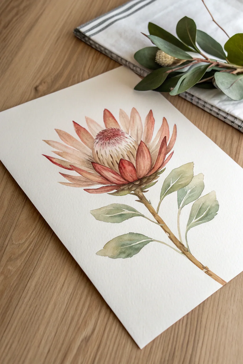
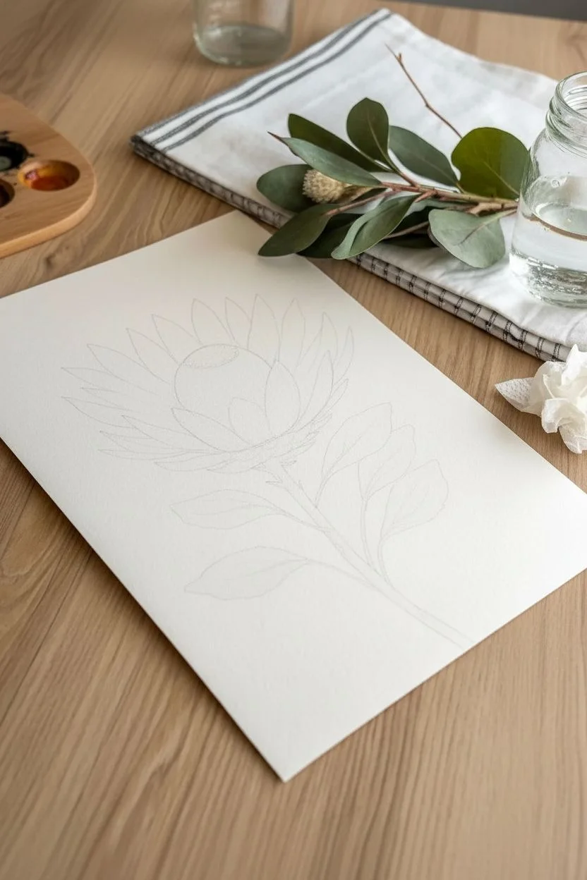
Capture the elegance of a blooming Protea with this delicate watercolor study. The soft gradient of dusty pinks and the structured yet loose approach to the petals creates a stunning botanical piece that feels both modern and timeless.
Step-by-Step Guide
Materials
- Cold-pressed watercolor paper (300 gsm)
- Watercolor paints (Alizarin Crimson, Burnt Sienna, Yellow Ochre, Sap Green, Indigo)
- Round brushes (size 4, size 8, and a fine liner size 0)
- HB pencil for sketching
- Kneadable eraser
- Palette for mixing
- Two jars of water
- Paper towels
Step 1: Planning the Form
-
Lightly sketch the stem:
Begin by drawing a gentle, diagonal line upwards from the bottom right corner to establish the stem’s direction. This doesn’t need to be perfectly straight; a slight curve adds organic movement. -
Map out the flower head:
At the top of your stem, lightly sketch a large oval shape. This will serve as the boundary for the bulbous flower head. -
Draft the petals:
Sketch the individual spiky petals radiating outward from the center oval. Make the bottom petals wider and shorter, gradually becoming longer and more pointed as they move toward the top. -
Refine the center:
Inside the oval, draw a smaller, dome-like shape for the fluffy center cone of the Protea. Keep your pencil lines extremely light so they won’t show through the transparent watercolor later. -
Add leaves:
Sketch three to four elongated leaves attached to the stem. Position two on the right side and two on the left, curving them slightly to look natural. -
Lift excess graphite:
Gently roll a kneadable eraser over your entire sketch. You want the lines to be barely visible guideposts, not hard outlines.
Clean Edges
For sharp tips on the petals, wait for adjacent petals to dry completely before painting the next one. This prevents wet paint from merging into one big blob.
Step 2: Painting the Bloom
-
Mix your petal wash:
Create a watery mix of Alizarin Crimson with a tiny touch of Burnt Sienna to get a dusty, terracotta pink. It should be very diluted for the first layer. -
Base layer for petals:
Using a size 8 brush, paint the petals with clear water first, then drop in your pale pink mix at the base of each petal, letting it bleed upward toward the tip. -
Add depth to the tips:
While the petals are still damp, drop a slightly more concentrated mix of the pink onto the very tips of the outer petals to create a soft gradient. -
Paint the center cone:
Mix a very pale wash of Yellow Ochre and apply it to the domed center. While wet, dab in tiny dots of the pink mixture near the top edge to suggest texture. -
Define the shadows:
Once the first layer is dry, mix a darker version of your pink (add a tiny bit of Indigo). Use a size 4 brush to paint the shadows where the petals overlap, specifically at the base of the flower.
Muddy Centers?
If the center texture looks like a dark blob, your background wash was too wet. Let the base layer bone-dry before adding the fine hair-like details on top.
Step 3: Leaves and Stem
-
Mix leaf greens:
Combine Sap Green with a little Burnt Sienna and Indigo to create a muted, olive-toned green. Avoid bright, artificial greens. -
Paint the leaves:
Use the size 8 brush to paint the leaves. Start with a light wash, then while wet, drop darker pigment near the central vein and the base of the leaf. -
Create leaf veins:
I like to use the ‘lifting’ technique here. While the leaf paint is damp but not soaking, use a clean, thirsty brush to lift out a thin line of paint down the center to create a subtle highlight vein. -
Paint the stem:
Use a mix of Burnt Sienna and yellow ochre for the stem. Paint it in sections, leaving tiny gaps where leaves attach to keep the painting airy. -
Add stem texture:
Once the stem base is dry, use a size 0 liner brush with a dark brown mix to add small knots, darker edges, and texture lines along the wood.
Step 4: Final Details
-
Detail the center cone:
Use the fine liner brush and a dark pink/brown mix to draw tiny, hair-like strokes on the center dome, suggesting the fuzzy texture of the Protea. -
Enhance petal edges:
Selectively outline a few petal edges with a very thin line of dark pink to separate them, but don’t outline the entire flower or it will look stiff. -
Final assessment:
Step back and look at your contrast. If the painting looks too flat, add one final glaze of dark pink in the deepest crevices between the bottom petals.
Allow your painting to dry completely before erasing any remaining pencil marks gently
Have a question or want to share your own experience? I'd love to hear from you in the comments below!