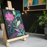
When I’m craving that magical moment where paint starts moving on its own, I reach for fluid art—because every tilt, swipe, and blow can turn into a surprise worth keeping. Below are my favorite fluid art ideas to try, from classic acrylic pouring looks to more “how did you do that?” effects.
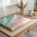
Flip Cup Surprise Reveal
This fluid art technique combines the suspense of a dirty pour with the dramatic reveal of a flip cup. By layering contrasting colors like teal, pink, and gold, you create mesmerizing, marble-like cells and swirls that are revealed only when the cup is lifted.
Step-by-Step
Materials
- Small square canvas (e.g., 8×8 or 10×10 inches)
- Acrylic fluid paints (teal, turquoise, magenta/pink, white, gold)
- Pouring medium
- Plastic cups (one for mixing each color, one for the flip)
- Stir sticks
- Silicone oil (optional, for cells)
- Plastic drop cloth or garbage bags
- Gloves
Step 1: Preparation
-
Set up your workspace:
Cover your entire work surface with a plastic drop cloth or opened garbage bag to catch drips. Ensure the surface is perfectly level so your paint doesn’t slide off the canvas unevenly. -
Mix your paints:
In separate cups, mix each acrylic paint color with pouring medium. Aim for a consistency similar to warm honey or heavy cream—it should flow smoothly off the stick but not be watery. -
Add additives (optional):
If you want to create the distinct ‘cells’ often seen in fluid art, add 1-2 drops of silicone oil to your teal and pink mixtures, stirring them in just slightly.
Step 2: Layering the Cup
-
Start your dirty pour cup:
Take a clean, empty plastic cup. Pour a small amount of white paint into the bottom to create a base. -
Layer the colors:
Gently pour small amounts of your other colors (teal, turquoise, gold, pink) one by one into the cup. Do not stir. -
Create contrast:
Alternate between light and dark colors as you layer. I find that placing gold between the teal and pink prevents them from mixing into a muddy purple. -
Repeat layers:
Continue layering until the cup is about half to three-quarters full, depending on the size of your canvas.
Muddy Colors?
If your colors turn brown or grey, you likely over-tilted or layered complementary colors (like red and green) directly next to each other in the cup. Use white or gold as a buffer layer.
Step 3: The Flip and Reveal
-
Position the cup:
Place your canvas face-down on top of the filled cup. Hold the cup and canvas tightly together. -
Flip!:
In one quick motion, flip the canvas and cup over so the canvas is right-side up with the cup upside down in the center. -
Wait briefly:
Let the cup sit upside down on the canvas for about 30 seconds. This allows the paint to settle and flow down to the canvas surface. -
Lift and release:
Gently lift the cup straight up. The paint will rush out in a puddle. -
Add extra paint:
If the center puddle doesn’t look like enough to cover the canvas, you can pour a little extra paint (like the teal shown in the image) directly into the center or around the edges of the existing puddle.
Add Negative Space
For a cleaner look, pour white paint all over the canvas background first. Then flip your color cup in the center. The colors will float over the white for a soft, island-like effect.
Step 4: Targeting and Tilting
-
Tilt the canvas:
Gently tilt the canvas in a circular motion to spread the paint toward the corners. Watch how the colors stretch and interact. -
Cover the corners:
Ensure the paint flows over all four edges. You can use your finger to tap paint onto any dry corners. -
Add corner details:
If you want a specific detail like the gold corner seen in the example, apply a small amount of gold paint directly to the canvas corner and let the main pour meet it. -
Check composition:
Stop tilting once you are happy with the composition. Over-tilting can distort the beautiful cells you’ve created. -
Pop bubbles:
If you see air bubbles, you can lightly pass a torch or lighter over the surface (quickly!) to pop them and encourage more cells to rise. -
Let it dry:
Place the canvas on cups or a rack to dry for at least 24-48 hours. Keep it level and away from dust.
Now you have a stunning, one-of-a-kind abstract piece ready to brighten up your wall
Swipe for Bold Cells
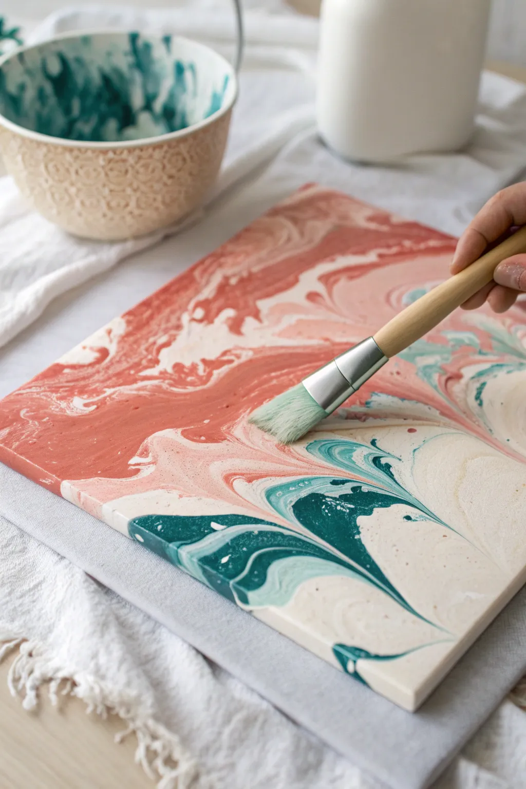
Create a stunning marble-effect canvas featuring swirls of terracotta pink, deep teal, and soft cream using a simple swipe technique. This approach uses a wide hake brush to gently drag colors across a base, forming organic cells and fluid transitions without the need for complex pouring mediums.
How-To Guide
Materials
- Small stretched canvas (e.g., 8×10 or 9×12 inch)
- Acrylic paints (Terracotta/Coral, Deep Teal, Cream/Off-White)
- Pouring medium (or Floetrol)
- Silicone oil (optional, for extra cells)
- Wide hake brush or soft flat brush (2-3 inches wide)
- Plastic cups and stirring sticks
- Drop cloth or plastic sheet
- Paper towels
Step 1: Mixture Preparation
-
Protect your workspace:
Fluid art gets messy, so begin by covering your table with a drop cloth. Elevate your canvas on four upside-down cups to let paint drip freely off the edges. -
Mix the colors:
In separate cups, mix your acrylic paints with pouring medium. The ratio is typically 1 part paint to 2 parts medium, but follow your specific medium’s instructions. You want a consistency similar to warm honey. -
Adjust consistency:
Stir thoroughly to remove lumps. If the mixture is too thick, add a few drops of water at a time. It should flow off your stick in a continuous stream before breaking. -
Add cell creator:
If you want distinct cells like those seen in swiped art, add 1-2 drops of silicone oil to your teal and terracotta mixtures. Stir these only briefly—over-mixing can break the oil down too much.
Muddy Colors?
If your colors turn gray or brown, you likely pressed too hard with the brush or swiped over the same area twice. Keep the touch incredibly light and commit to one pass.
Step 2: Pouring the Base
-
Apply the white base:
Pour a generous amount of your cream or off-white mixture onto the center of the canvas. This acts as a ‘cushion’ for the other colors to glide on. -
Spread the foundation:
Tilt the canvas gently or use a palette knife to spread the cream paint to the edges, ensuring the entire surface is wet but not swimming in paint. -
Add ribbons of color:
Pour your terracotta pink across the top half of the canvas in a wavy, organic band. Don’t worry about being neat; irregular shapes look better. -
Introduce contrast:
Pour the deep teal mixture near the bottom or in alternating bands with the pink. Leave some negative space where the cream base shows through.
Step 3: The Brush Swipe
-
Prepare the brush:
Dampen your wide hake brush slightly so the bristles are flexible, but dry it well with a paper towel so it doesn’t drip water. -
Position the brush:
Start at the top edge of your color bands. Hold the brush at a low angle, almost parallel to the canvas surface. -
Execute the swipe:
With a feather-light touch, drag the brush downwards through the paint. You are skimming the surface, not scrubbing the canvas. I find checking my pressure on a scrap paper first helps me get the feel right. -
Clean in between:
Wipe your brush bristles off on a paper towel after every single pass. A dirty brush will turn your beautiful colors into mud. -
Overlap gently:
Make adjacent swipes, slightly overlapping the previous path to blend the boundaries while maintaining directional flow. -
Create curves:
Instead of just straight lines, try gently turning your wrist to create the flowing, marbled curves seen in the teal sections.
Cell Magic
To get more cells without heat, lightly dampen your swipe brush with a tiny bit of silicone oil before dragging it across the paint.
Step 4: Finishing Touches
-
Tilt to stretch:
Once swiped, gently tilt the canvas very slowly to stretch out the cells and soften any harsh brush marks. Do not tilt too much or you will lose your composition. -
Check the edges:
Use your finger to dab matching paint onto any corners or sides that might have been missed during the process. -
Pop air bubbles:
Inspect the surface for tiny bubbles. You can pop them with a toothpick or a quick pass of a culinary torch held 6 inches away. -
Level for drying:
Ensure the canvas creates a perfectly level surface for drying. If it isn’t level, the paint will slide off one side as it cures over the next 24-48 hours.
Allow the piece to cure fully in a dust-free area before adding a varnish coat for shine

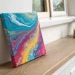
Dutch Pour With Air-Blown Blooms
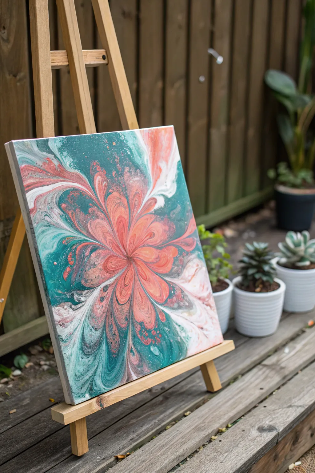
Capture the elegance of a blooming flower using the power of air and fluid dynamics. This Dutch Pour project features a stunning central burst of coral and salmon hues surrounded by deep teal negative space, creating a mesmerizing organic floral effect.
Detailed Instructions
Materials
- Square canvas (12×12 or similar)
- Acrylic paints (Teal/Turquoise, Dark Green, Coral, Salmon Pink, White, Metallic Gold)
- Pouring medium (Floetrol or similar)
- Water (for consistency adjustment)
- Hairdryer with a concentrator nozzle
- Mixing cups and stir sticks
- Plastic drop cloth
- Painter’s tape (for canvas back)
- Push pins (to elevate canvas)
- Straw (for detailed blowing)
- Kitchen torch (optional, for popping bubbles)
Step 1: Mixture Preparation
-
Mix your paints:
Prepare each paint color in separate cups using a 1:2 ratio of paint to pouring medium (like Floetrol). Stir thoroughly until the mixture is uniform and smooth. -
Adjust the consistency:
Add water slowly, drop by drop, to each cup until the paint flows like warm honey or melted ice cream. It should create a small mound when drizzled off the stick that disappears within one second. -
Prepare the base coat:
Mix a larger quantity of your background color. For this piece, combine the Teal and Dark Green to create a rich, deep teal base. Make sure this mixture is slightly thinner than your colored paints to help them glide.
Air Control Secret
Attach a directional nozzle to your hairdryer. This focuses the airflow, giving you much sharper petals and preventing the ‘muddy’ look of mixed paints.
Step 2: Base Application
-
Protect your workspace:
Lay down your plastic drop cloth. Tape the back of your canvas and insert push pins into the corners to keep it elevated off the surface. -
Flood the canvas:
Pour the dark teal base mixture generously over the entire canvas. You want a thick, even layer. -
Smooth the foundation:
Use a palette knife or tilt the canvas gently to ensure every edge and corner is covered. The paint needs to be wet and movable for the bloom to work. -
Remove air bubbles:
Quickly pass a kitchen torch over the surface to pop any air bubbles trapped in the base coat. Don’t linger too long in one spot to avoid scorching the paint.
Glitter Finish
Once fully dry, apply a coat of resin mixed with a pinch of iridescent glitter powder. This mimics morning dew on the petals.
Step 3: Creating the Bloom
-
Layer the colors:
Pour a small puddle of Coral in the center of the canvas. Follow this by pouring the Salmon Pink directly on top of the Coral, then a smaller amount of Metallic Gold, and finally a dot of White. -
Add a halo:
Pour a ring of the dark teal base coat around your center puddle. This ‘halo’ helps push the colors inward before blowing them out. -
Blow over the center:
Using your hairdryer on the cool and low setting, gently blow the surrounding teal base paint *over* your color puddle just slightly, covering the edges of the colors. -
Blow outwards:
Now, position the hairdryer directly above the center (close to the canvas but not touching) and blow the paint outward in radial directions towards the corners and edges, like petals unfolding. -
Form the petals:
Move around the canvas, blowing the paint out from the center to create varying lengths of petals. Aim for asymmetry to make the flower look organic.
Step 4: Refining the Details
-
Define the center:
Use a drinking straw to blow gently into the very center of the bloom. This exposes the layers of color underneath and creates intricate, lacy cells. -
Fix shape issues:
If any petals look too blocky, use the straw to blow softly at the edges to feather them out into the negative space. -
Check for composition:
Look at the overall balance. If you have too much negative space, you can gently tilt the canvas to stretch the flower slightly, but be careful not to distort the cells. -
Torch for cells:
Give the colorful areas one final, quick pass with the torch. This heat often brings up tiny ‘cells’ of color, revealing the metallic gold and white specs. -
Let it cure:
Place the painting in a dust-free area to dry. Fluid art takes time—allow at least 24 to 48 hours for the surface to cure completely before handling or sealing.
Once dry, this vibrant floral abstraction will bring a permanent burst of spring energy to your wall


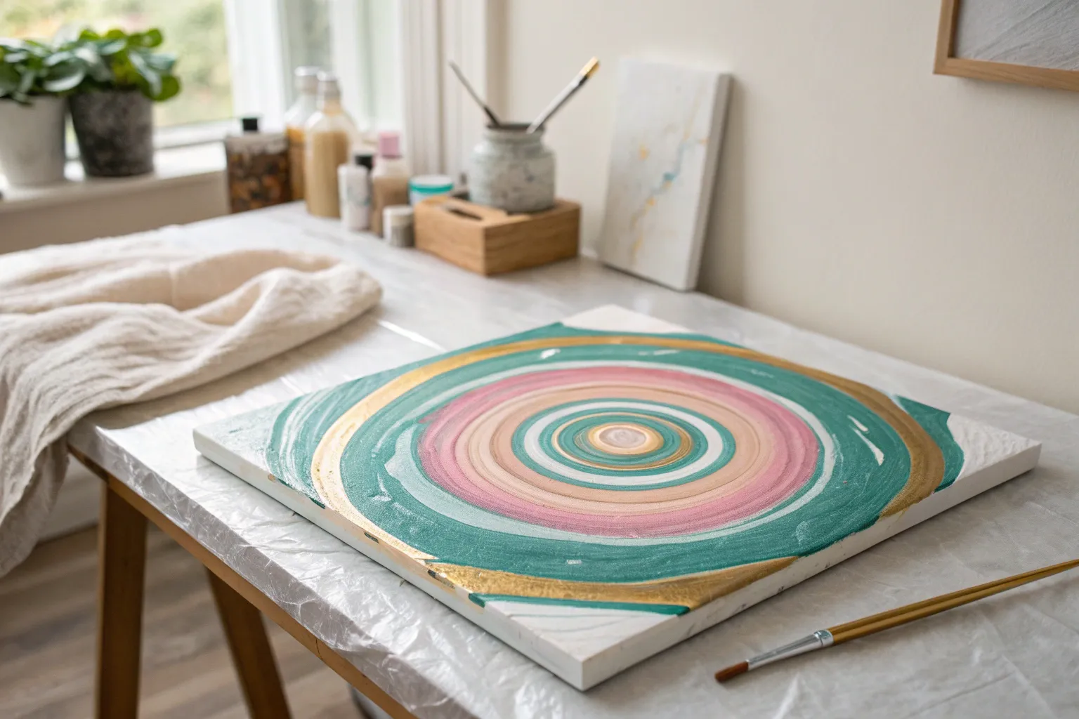
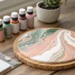
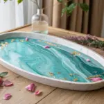
Tree-Ring Pour in Earthy Tones
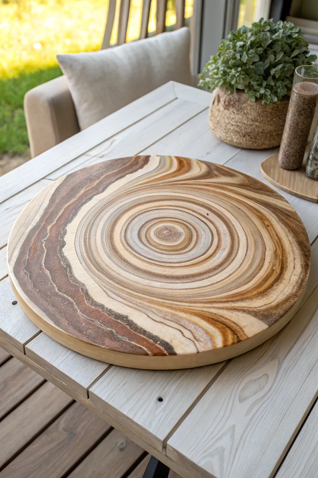
Mimic the timeless beauty of nature with this sophisticated fluid art technique that creates realistic tree rings on a round base. Using a muted palette of earthy browns, creams, and sandstone hues, you will learn to pour concentric circles that settle into an organic, wood-like pattern perfect for a serving tray or wall art.
How-To Guide
Materials
- Large round wooden board or canvas (12-16 inches)
- Acrylic pouring paints (Titanium White, Unbleached Titanium/Beige, Raw Sienna, Burnt Umber, Van Dyke Brown)
- Pouring medium (Floetrol or similar brand)
- Silicone oil (optional, use sparingly for tiny cells)
- Plastic cups (one per color)
- Stir sticks
- Lazy Susan turntable (highly recommended for spinning)
- Cardboard or plastic drop cloth
- Gloves
- Heat gun or kitchen torch
- Clear varnish or food-safe epoxy resin (for finish)
Step 1: Preparation & Color Mixing
-
Prepare the workspace:
Cover your table with a drop cloth or large cardboard sheet. Place your round board on top of the Lazy Susan to allow for easy rotation later, or raise it on overturned cups if you don’t have a turntable. -
Seal the wood:
If you are using a raw wooden board, apply a thin coat of white acrylic paint or Gesso to seal the pores. Let this base coat dry completely to prevent air bubbles from rising through your pour later. -
Mix your paints:
In separate cups, mix each acrylic paint color with your pouring medium. A standard ratio is 1 part paint to 2 parts medium, but adjust until the consistency resembles warm honey. The paint should flow continuously off the stick without breaking too quickly. -
Add water if needed:
If the mixture feels too thick, add water a few drops at a time. For this tree ring technique, having slightly thicker paint helps the rings hold their shape better without muddling together.
Step 2: The Tree Ring Pour
-
Layer the dirty pour cup:
Take a larger clean cup. Slowly layer your colors one by one down the side of the cup. Start with your darkest brown (Van Dyke), followed by a mid-tone (Raw Sienna), then a light cream (Unbleached Titanium), and finally white. -
Repeat the layers:
Repeat this layering sequence 4-5 times until the cup is full. Pouring down the side prevents the colors from mixing prematurely in the cup. -
Begin the pour:
Position your layered cup directly over the dead center of the board. Begin pouring a thin, steady stream onto the board while making tiny circular motions with your wrist. -
Create the rings:
As the puddle expands, stick to that tight circular motion rather than just pouring straight down. This movement encourages the distinctive fine lines that look like growth rings. -
Empty the cup:
Continue pouring until the cup is empty. You should have a large bullseye pattern in the center of your board with clearly defined bands of color.
Muddy Colors?
If your rings are blending into a brown mush, your paint was likely too thin or you tilted too aggressively. Use thicker paint next time and tilt slower.
Step 3: Tilting & Shaping
-
Initial slow tilt:
Lift the board gently and tilt it very slightly in a circular motion. The goal is to expand the central ring pattern outward toward the edges without distorting the circles too much. -
Create organic variance:
To make it look like real wood, disrupt the perfection slightly. Tilt a bit more aggressively to one side to elongate the rings, creating the oval shapes often seen in cut timber. -
Cover the edges:
Continue tilting until the paint flows over the edges. If paint is struggling to reach a corner, use your finger to dab some dripped paint onto the dry edge to help pull the flow over. -
Spin technique (optional):
If you are using a Lazy Susan, give it a gentle spin now. Centrifugal force pushes the paint out evenly, keeping the rings tight and parallel, which really sells the tree-ring effect. -
Pop air bubbles:
Once you are happy with the composition, quickly run a heat gun or torch over the surface. Keep it moving constantly to pop trapped air bubbles without drying the paint film.
Add Gold Veins
Mix a small amount of metallic gold powder into your white paint layer. It adds a subtle shimmer that mimics mineral deposits in aged wood.
Step 4: Finishing Touches
-
Check the drip accumulation:
Run a craft stick or your gloved finger under the rim of the board to catch drips. I generally do this every 10 minutes for the first half-hour to prevent bumps from forming on the edge. -
Allow to cure:
Let the board dry in a dust-free area for at least 72 hours. Acrylic pours dry from the top down, so be patient to ensure all moisture has evaporated. -
Seal for durability:
For a functional serving tray, apply a coat of food-safe epoxy resin once the paint is fully cured. If it’s art, a high-gloss varnish will deepen the contrast of the earthy browns.
Now you have a stunning faux-wood centerpiece that brings organic warmth to any table setting
BRUSH GUIDE
The Right Brush for Every Stroke
From clean lines to bold texture — master brush choice, stroke control, and essential techniques.
Explore the Full Guide
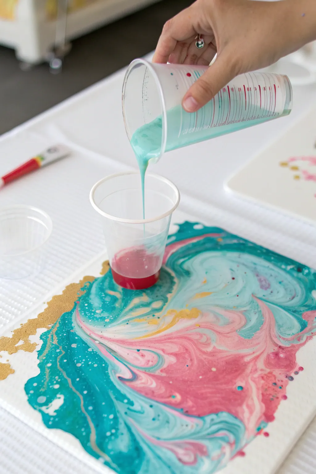
String Pull Floral Bursts
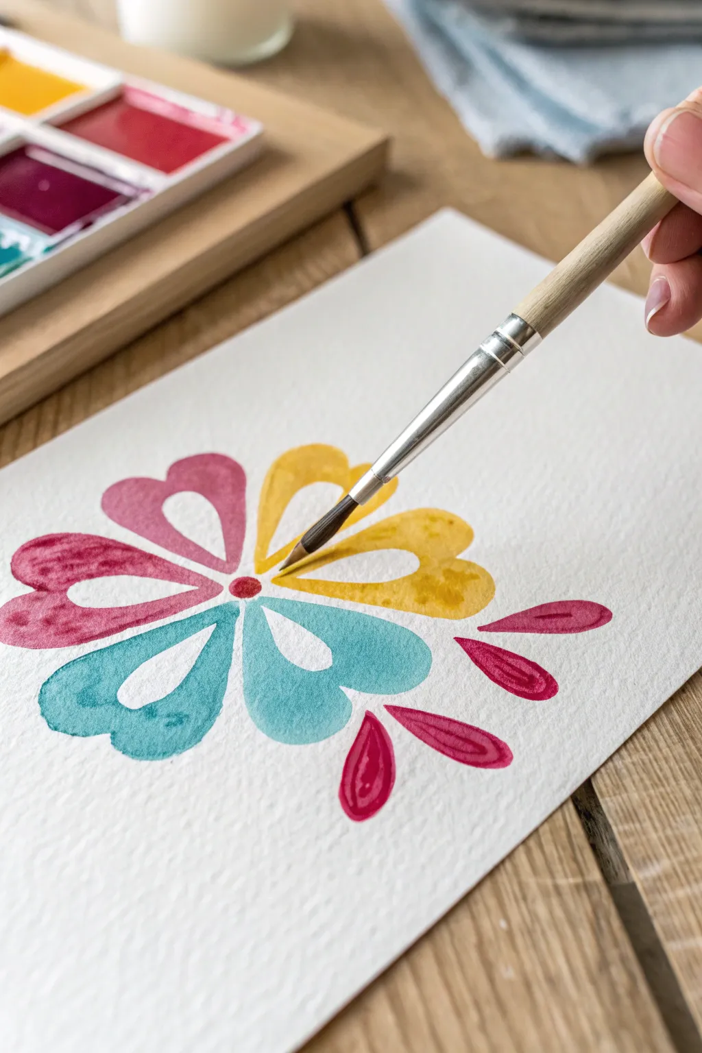
Embrace the delicate translucence of watercolor with this stylized floral design, featuring negative space petals that create an airy, modern feel. The combination of teal, magenta, and sunny ochre brings a cheerful energy to the page, perfect for greeting cards or framed wall art.
Step-by-Step Tutorial
Materials
- Cold press watercolor paper (300 gsm)
- Round watercolor brush (size 4 or 6)
- Watercolor paints (Teal, Magenta, Yellow Ochre)
- Clean water jar
- Paper towels
- Pencil (HB or lighter)
- Eraser
Step 1: Planning the Symmetries
-
Find the center:
Begin by lightly marking a small dot in the center of your watercolor paper with a pencil to serve as the anchor for your flower. -
Sketch the guides:
very lightly sketch six lines radiating outward from the center dot, spacing them as evenly as possible to guide your petal placement. -
Outline the petals:
Sketch the petal shapes lightly. Instead of traditional ovals, draw heart shapes where the bottom point aims toward the center dot but doesn’t quite touch it. -
Define the negative space:
Inside each heart petal, lightly draw a smaller, similar shape. This inner area will remain unpainted to create the white negative space detail.
Wet Edge Control
If you struggle with shaky edges, try exhaling slowly as you paint curves. This steadies your hand.
Step 2: Applying Color
-
Prepare the teal:
Load your round brush with water and pick up a generous amount of teal pigment. You want a fluid consistency that flows easily but holds its color saturation. -
Paint the first petals:
Select two adjacent petals to paint teal. Carefully fill in the space between your outer pencil line and the inner negative space shape. -
Smooth the edges:
Use the tip of the brush to refine the outer curved edges of the hearts while the paint is still wet to ensure a crisp line. -
Switch to magenta:
Rinse your brush thoroughly. Load it with magenta paint and fill in the next two petals, moving clockwise around the flower. -
Add texture:
While the magenta is wet, you can drop in a tiny bit more concentrated pigment at the outer tips to create a subtle gradient effect. -
Complete the bloom:
Rinse again and pick up your yellow ochre or deep yellow. Paint the final two remaining petals, carefully avoiding touching the wet paint of the neighboring colors. -
Anchor the center:
Using a small tip of the brush dipped in magenta, paint a small, solid circle over your original center guide dot to connect the flower visually.
Level Up: Metallic Pop
Once the paint is totally dry, outline the white negative spaces with a fine gold pen for a luxury finish.
Step 3: Final Flourishes
-
Add floating accents:
To the right of the flower, lightly pencil three teardrop shapes floating outward, mimicking leaves or a deconstructed petal. -
Paint the accents:
Fill these teardrops with magenta using the same negative-space technique: paint the perimeter but leave a small white teardrop shape in the center. -
Erase guides:
Allow the painting to dry completely—wait at least 15 minutes. Once dry to the touch, gently erase any visible pencil marks from the white negative spaces.
Now your colorful watercolor bloom is ready to brighten up any space
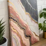
High-Contrast Black-and-White Pour
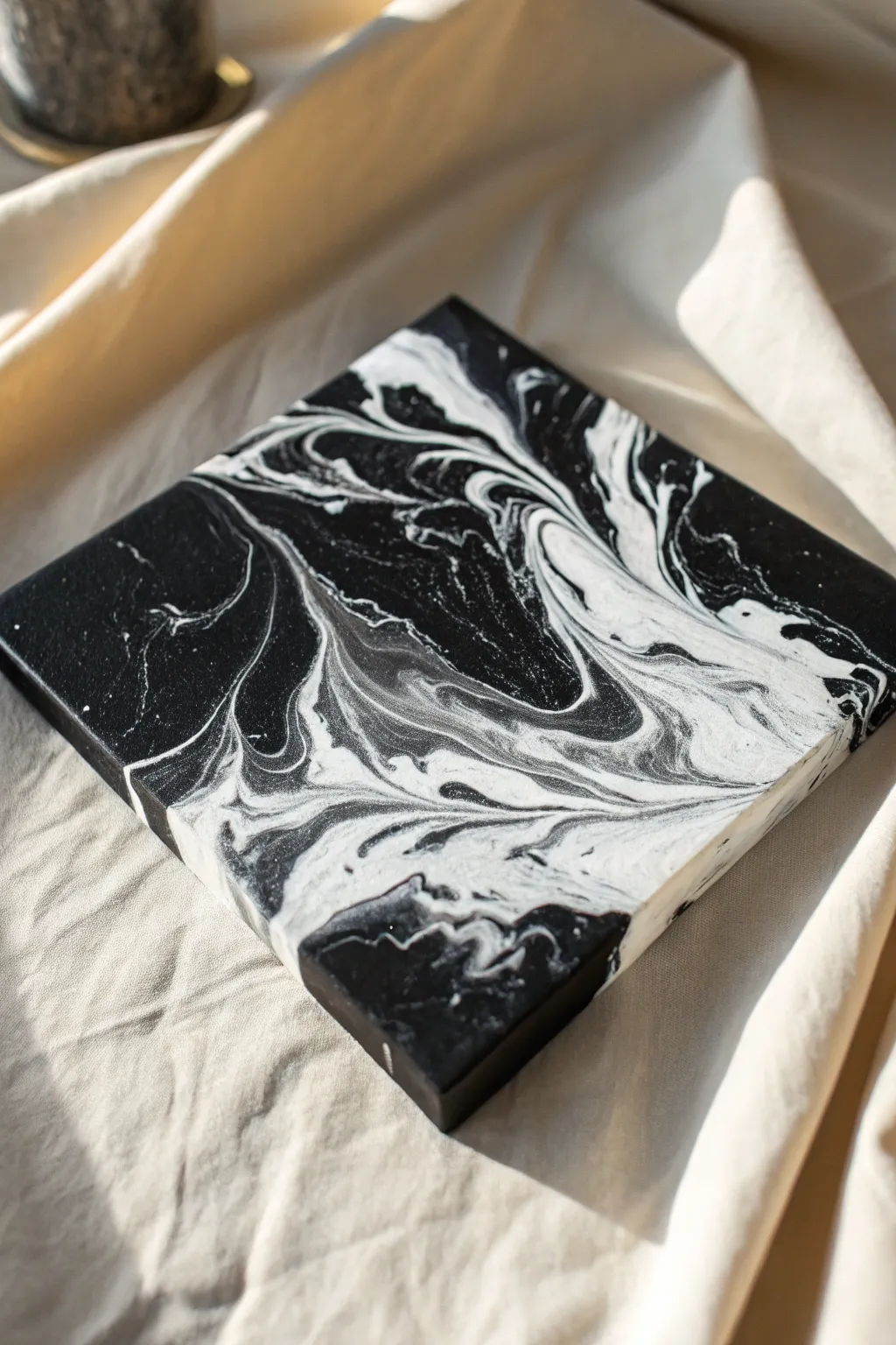
Capture the timeless elegance of marble with this striking high-contrast fluid art project. Using only black and white, you will create dramatic swirls and organic cells that mimic natural stone on a sleek, gallery-wrapped canvas.
How-To Guide
Materials
- Square stretched canvas (e.g., 10×10 or 12×12 inches)
- Black acrylic paint (heavy body preferred)
- Titanium white acrylic paint (heavy body preferred)
- Pouring medium (Floetrol or Liquitex)
- Silicone treadmill oil or creative fluid art oil
- 4 disposable mixing cups
- Wooden stir sticks
- Cardboard box or drop cloth (for mess containment)
- Varnish (gloss finish)
Step 1: Preparation and Mixing
-
Set up your workspace:
Cover your table with a drop cloth or place a large cardboard box to catch runoff. Elevate your canvas by placing it on four inverted plastic cups to ensure the sides can drip freely. -
Prepare the black base:
In the first cup, mix 2 parts black paint with 1 part pouring medium. Stir slowly to avoid creating too many air bubbles. The consistency should be like warm honey. -
Prepare the white mix:
In a second cup, mix 2 parts titanium white paint with 1 part pouring medium. Match the consistency to the black paint exactly; if one is thinner, it will sink below the other. -
Prepare the accent black:
In a third small cup, create a secondary black mixture. Add 2 drops of silicone oil to this cup and stir just two or three times. This will help create the small cells visible in the final piece. -
Prepare the accent white:
Repeat the previous step with a small amount of white paint in a fourth cup, adding 2 drops of silicone. I like to barely mix this one so the oil stays active.
Muddy Grey Prevention
To keep sharp contrast, avoid over-tilting. The more you move the paint back and forth, the more black and white mix into grey. Tilt with purpose and stop early.
Step 2: The Pouring Process
-
Layer the dirty cup:
Take a fresh, empty cup. Pour a generous layer of your base black (no silicone) into the bottom. -
Add the white layer:
Gently pour the silicone-free white into the center of the black pool in your cup. -
Alternate colors:
Now, alternate pouring small amounts of the silicone-infused black and white mixtures. Do not stir. Let them sit on top of each other. -
Top off the cup:
Finish with a final layer of the base black paint to ensure the first color that hits the canvas is dark. -
The flip cup technique:
Place your canvas upside down on top of the cup. Hold both tightly together and quickly flip them over so the cup is now resting upside down on the canvas. -
Release the paint:
Wait 30 seconds for the paint to settle, then gently lift the cup straight up. The paint will flow out in a puddle.
Paint Consistency Check
Test your mix on a stick. It should flow off in a continuous stream but form a small mound on the surface that disappears within 1-2 seconds. Too thin = messy.
Step 3: Tilting and Finishing
-
Initial tilt:
Gently tilt the canvas in a circular motion. The goal is to stretch the puddle toward the corners without losing the beautiful marbling happening in the center. -
Cover the corners:
Guide the paint over each corner. If the paint is moving too slowly, you can pour a little extra plain black paint on the corners to help ‘grease’ the path for the marble pattern. -
Refine the composition:
Look at your pattern. Tilt the canvas back towards the center to re-center the composition if the weight feels unbalanced. -
Check the sides:
Use your finger to touch up any bare spots on the sides of the canvas with the drip-off paint from the table. -
Remove bubbles:
If you see tiny pinholes (air bubbles), you can gently pass a kitchen torch quickly over the surface to pop them, which may also bring up a few more small cells. -
Drying setup:
Leave the painting to dry undisturbed in a dust-free area for at least 24-48 hours. Ensure the surface is perfectly level so the design doesn’t shift. -
Clean and protect:
Once fully cured (about 2 weeks), wipe the surface with a paper towel and a drop of dish soap to remove residual silicone oil. -
Varnish:
Apply two thin coats of gloss varnish to deepen the black tones and protect the white from yellowing over time.
Hang your sophisticated monochrome artwork and enjoy the modern edge it brings to your space

Have a question or want to share your own experience? I'd love to hear from you in the comments below!