If your drawing ever feels “busy” and your eye doesn’t know where to land, it usually means the focal point isn’t doing its job yet. Here are some of my favorite focal point drawing ideas that make the main subject pop on purpose—without overworking the whole page.
One-Point Perspective With a Clear Vanishing Point
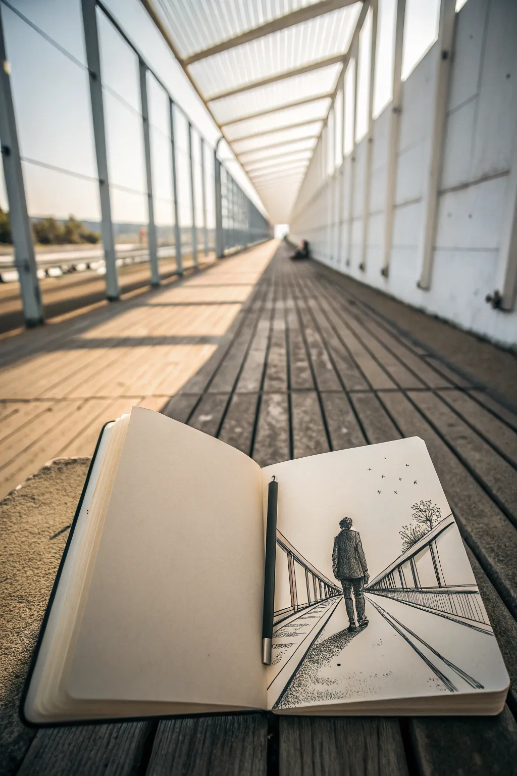
This captivating pen-and-ink sketch captures the solitary feeling of a figure walking into the distance using classic one-point perspective. The high contrast between the stark white paper and the bold black ink lines creates a dramatic tunnel effect that draws the viewer’s eye straight to the vanishing point.
Step-by-Step Tutorial
Materials
- Sketchbook with smooth, heavy paper
- Fine liner pens (0.1mm, 0.3mm, 0.5mm)
- Pencil (HB or 2H)
- Eraser
- Ruler or straight edge
Step 1: Planning the Perspective
-
Find the horizon line:
Start by lightly drawing a horizontal line across the middle of your page with your pencil. This represents your eye level and the horizon. -
Place the vanishing point:
Mark a single small dot right in the center of your horizon line. Everything in this drawing will converge to this specific point. -
Establish the walkway width:
At the very bottom edge of your paper, make two marks to define how wide the walkway will be in the foreground. Connect these marks to your vanishing point using a ruler. -
Draft the railings:
To create the side walls or railings, draw two more lines originating from the vanishing point, slightly higher and wider than your walkway lines. These will form the top edges of the railings.
Step 2: Adding the Figure
-
Position the walker:
Sketch a simple oval for the head and a rectangular shape for the torso in the lower third of the walkway. The figure should be centered, walking away from you. -
Refine the pose:
Add legs in a walking stride. One foot should be slightly lifted or further back to suggest movement. Keep the details loose; we are focusing on the silhouette and folds. -
Draft the clothing folds:
Lightly pencil in wrinkles on the back of the jacket and trousers. These folds are crucial for giving the figure volume later when we ink.
Wobbly Lines?
Don’t panic if your perspective lines aren’t perfectly straight. A slight wobble adds hand-drawn character. If a line is too crooked, simply thicken it slightly to correct the visual path.
Step 3: Inking the Structure
-
Ink the main perspective lines:
Switch to your 0.5mm pen. Trace over your pencil lines for the walkway edges and the top of the railings. I like to keep these lines confident and straight. -
Add vertical posts:
Along the railings, draw vertical lines for the posts. Remember that as they get closer to the vanishing point, they should appear closer together and shorter. -
Thicken the foreground lines:
Go over the lines closest to the bottom of the page a second time to add line weight. This subtle trick helps push the depth even further. -
Texture the path:
Using a 0.1mm pen, add sporadic, broken parallel lines along the ground plane. Don’t fill it completely; leave plenty of white space to imply a smooth surface catching light.
Depth Perception
Make lines thicker and darker in the foreground (bottom of page) and thinner/lighter near the vanishing point. This ‘atmospheric perspective’ instantly boosts the 3D effect.
Step 4: Shading and Details
-
Outline the figure:
Carefully outline your figure with the 0.3mm pen. Make the outline slightly bumpy to suggest fabric texture rather than a rigid cutout. -
Stipple and hatch the clothes:
Use vertical hatching lines on the jacket to create a dark value. Cross-hatch the darkest areas, typically under the arms and along the inseam of the pants. -
Create the cast shadow:
Draw a shadow shape stretching from the figure’s feet towards the right side of the page. Use dense stippling (dots) or tight hatching to make this shadow dark and grounding. -
Add nature elements:
On the right side, just behind the railing, sketch a small, bushy tree or shrub using scribbly, organic loops. This breaks up the geometric rigidity of the bridge. -
Ink the birds:
In the upper right sky area, add a few tiny ‘v’ shapes or specks to represent distant birds. Keep them minimal. -
Final cleanup:
Once the ink is completely dry—give it a few minutes—gently erase all remaining pencil guidelines to reveal the high-contrast drawing.
Enjoy seeing your flat sheet of paper transform into a deep, unending pathway

Sharp Detail Against Soft, Lost Edges
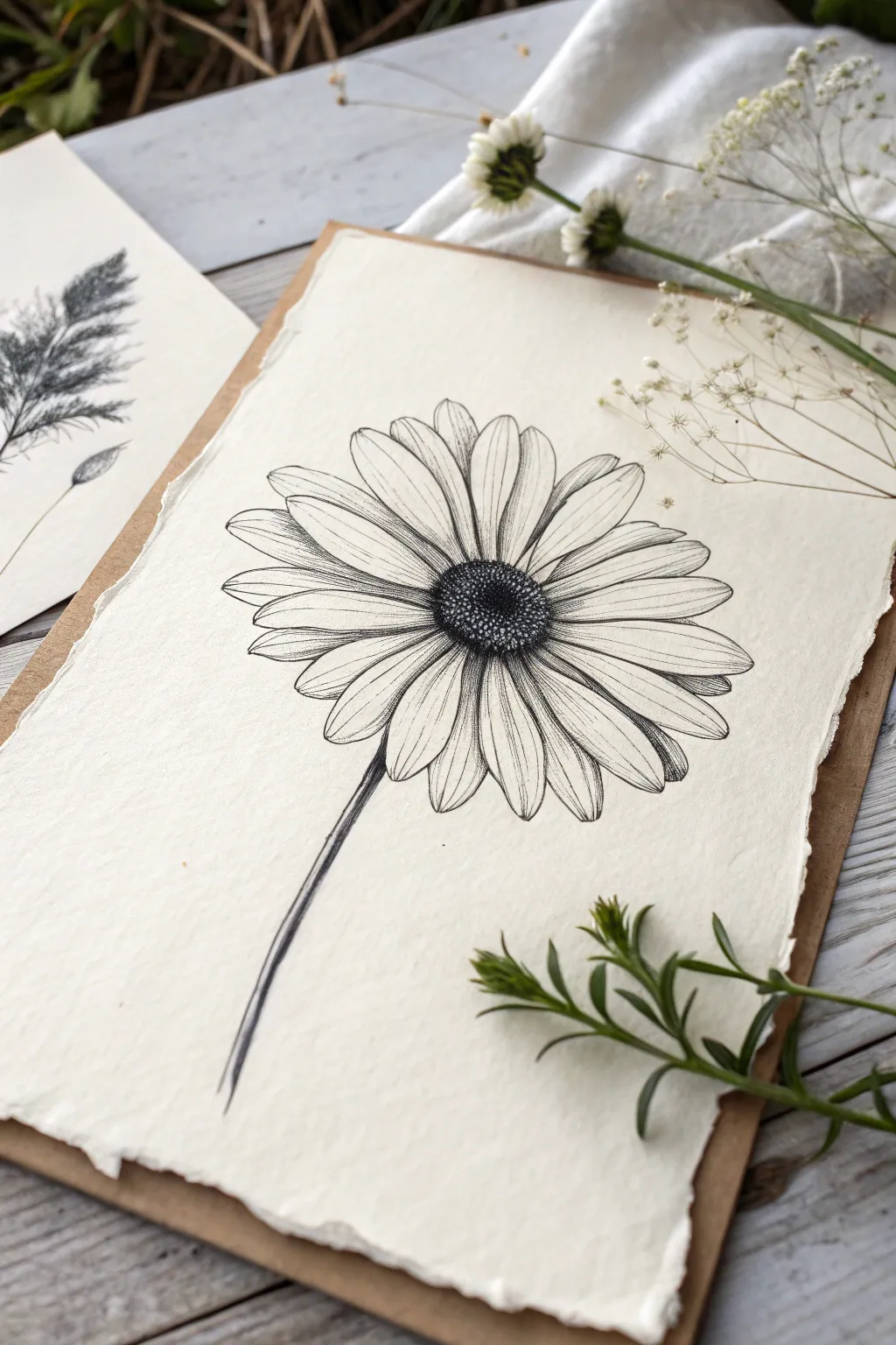
Capture the fragile beauty of a daisy using precise pen strokes on textured paper. This project balances the stark contrast of ink stippling with the organic, soft feel of handmade deckle-edge paper, perfect for botanical art lovers.
Step-by-Step Guide
Materials
- Handmade cotton rag paper (deckle edge, off-white)
- Fine liner pens (sizes 005, 01, and 03)
- Graphite pencil (HB or H)
- Kneaded eraser
- Ruler (optional)
- Smooth work surface
Step 1: Planning and Sketching
-
Center placement:
Begin by lightly marking the center of your paper with your HB pencil. This will determine where the flower’s disc (the dark center) will sit. -
Disc shape:
Sketch a small, slightly flattened oval for the center disc. Since the flower is angled slightly upward, it shouldn’t be a perfect circle. -
Petal guidelines:
Draw faint lines radiating outward from the disc to indicate the general direction and length of the petals. Keep these loose and light. -
Drafting petals:
Sketch the individual petals using the guidelines. Notice how some overlap others and how the tips vary—some are rounded, others slightly jagged. Don’t press hard; textured paper is unforgiving with erasers. -
Stem placement:
Draw a slender, slightly curved line extending downward from the flower head for the stem. Make it taper gently as it goes down.
Bleeding Lines?
Handmade paper is absorbent. If lines bleed or feather, switch to a pigment liner designed for porous surfaces, or work faster with lighter pressure.
Step 2: Inking the Center
-
Outline the disc:
Switch to your 01 pen. Carefully trace the outline of the central disc, using small, broken lines rather than a solid stroke to suggest texture. -
Stippling foundation:
Start stippling (making small dots) inside the disc. Concentrate the dots heavily around the bottom edge and the center to create depth and shadow. -
Creating volume:
Gradually reduce the density of dots as you move toward the top right of the disc. This creates a highlight effect, making the center look spherical rather than flat. -
Darkest accents:
Use the 03 pen to add a few larger, darker dots in the deepest shadow areas of the center for contrast.
Pro Tip: Lost Edges
Don’t connect every single line. Leave gaps in the petal outlines near the highlights. These ‘lost edges’ let the eye fill in the rest, creating a softer look.
Step 3: Inking the Petals
-
Outline petals:
Using the 005 or 01 pen, outline the petals. Keep your hand relaxed to allow for slight wobbles, which mimic organic nature. -
Vein lines:
Draw fine, sweeping lines from the base of each petal outward toward the tip. These should follow the curve of the petal. -
Shadowing overlaps:
With the 005 pen, add hatching (closely spaced parallel lines) where petals overlap. This separates the layers and adds dimension. -
Base shading:
Add denser lines at the very base of the petals where they meet the center disc. This pushes the center forward visually. -
Refining edges:
Check the tips of the petals. I find that breaking the line slightly at the very tip keeps the drawing from looking too rigid or cartoonish.
Step 4: Finishing Touches
-
Inking the stem:
Go over the stem sketch with your 01 pen. Use long, confident strokes, perhaps doubling the line on the shadowed side. -
Stem texture:
Add very fine vertical lines inside the stem shape to suggest fibrous texture, keeping the lighter side mostly empty. -
Erase guidelines:
Once the ink is completely dry (wait at least 15 minutes to be safe), gently roll the kneaded eraser over the page to lift the pencil marks without damaging the paper surface. -
Final assessment:
Step back and look at the contrast. If the center doesn’t pop enough, add another layer of stippling with your fines pen.
Now you have a timeless botanical study ready to be framed or gifted


Radiating Lines That Point Inward
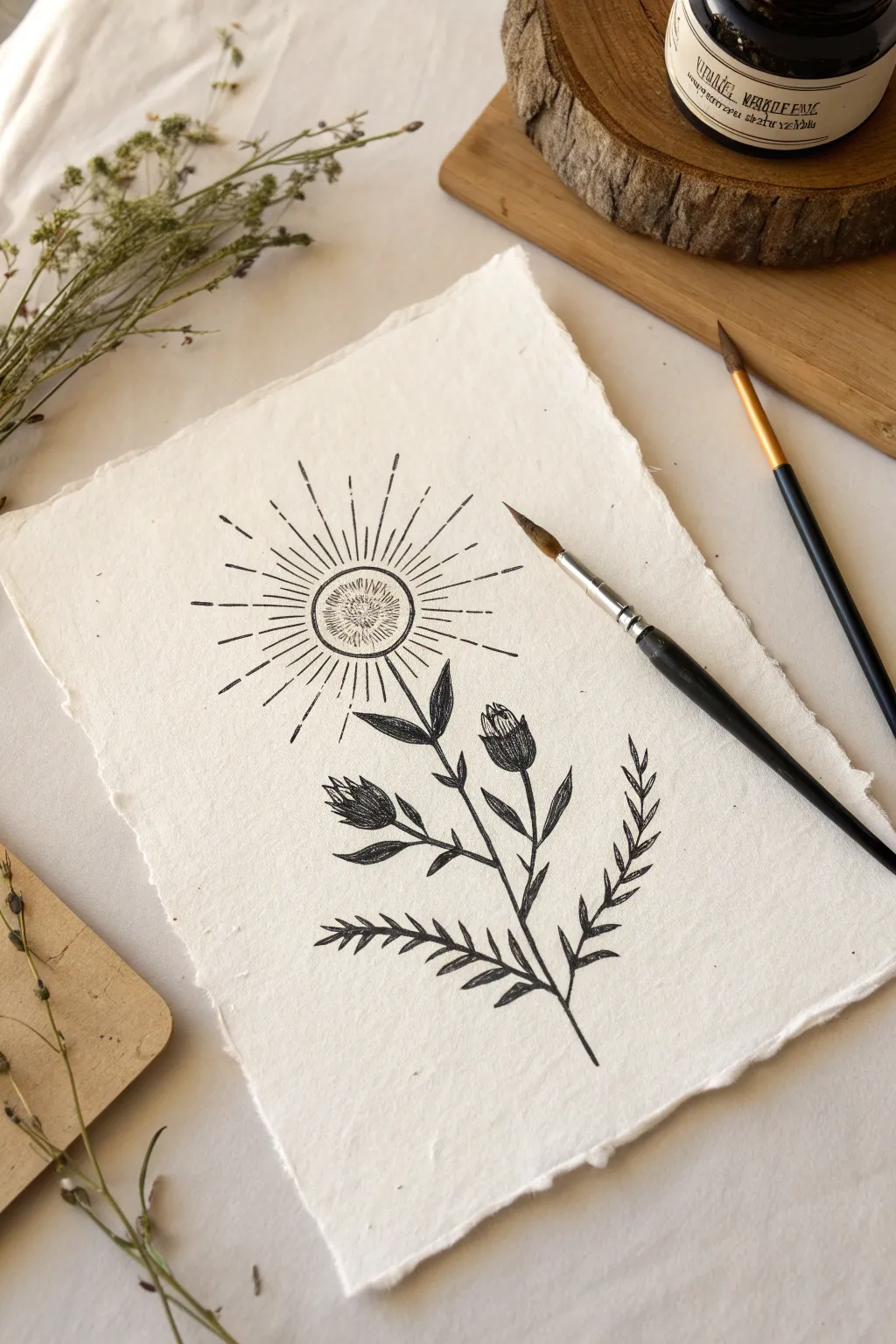
This striking illustration merges the organic flow of botanical art with the geometric precision of a sunburst, creating a unique focal point that draws the eye inward. Using high-contrast black ink on handmade paper adds a rustic, timeless quality to the finished piece.
Step-by-Step
Materials
- Handmade cotton rag paper (deckle edge, roughly A5 size)
- Black waterproof fine liner pen (size 05 or 08)
- Black brush pen or small round paintbrush with India ink
- Pencil (HB or 2H)
- Kneadable eraser
- Ruler
Step 1: Drafting the Initial Structure
-
Map the center:
Begin by lightly marking the vertical center of your paper with your pencil to guide the stem’s placement. This helps maintain balance without needing perfect symmetry. -
Sketch the sun circle:
About two-thirds of the way up the page, use a compass or a small round object (like a bottle cap) to trace a perfect circle. This will form the core of your sun-flower. -
Outline the stem:
Draw a gently curving vertical line extending downward from the bottom of your circle. Let it have a slight natural wobble rather than being ruler-straight, mimicking a real plant stem. -
Add leaf guides:
Sketch light stick-figure lines branching off the main stem to indicate where your leaves and buds will go. Place two branches higher up for the buds and two lower down for the fern-like leaves. -
Flesh out the shapes:
Use your pencil to lightly draw the teardrop shapes for the flower buds and the elongated, jagged shapes for the lower fern leaves. Keep the pressure very light so these lines are easy to erase later.
Step 2: Inking the Sunburst
-
Ink the central circle:
Switch to your fine liner pen. Trace over your pencil circle carefully. To add texture, draw a second, slightly smaller circle inside the first one. -
Fill the core:
Inside that inner circle, draw tiny, dense stippling or short radiating ticks that point toward the very center. This creates a textured ‘eye’ for your sun. -
Draw the primary rays:
Using a ruler and your fine liner, draw long, straight lines radiating outward from the circle’s edge. Space them evenly around the circumference, imagining the hours on a clock face. -
Add secondary rays:
Between each long ray, draw a slightly shorter line. This variation creates a dynamic, sparkling effect. -
Detail the rays:
Add small floating dashes just beyond the tips of the longest rays. This simple addition makes the light feel like it’s expanding further into the negative space.
Ruling The Rays
Don’t connect your ruler directly to the circle edge for every ray. Start some lines a millimeter away from the circle to keep the center feeling open and airy.
Step 3: Detailed Botanical Work
-
Ink the main stem:
Go over your stem sketch with the brush pen or a thicker fine liner. Vary your pressure slightly as you go—press harder at the base of branches for a thicker line and lift up for tapered ends. -
Draw the buds:
Outline the two flower buds below the sun. Use the fine liner to add vertical hatching lines inside the buds, darkening the bottom heavily to give them volume and roundness. -
Add the upper leaves:
Draw the solid black leaves attached to the stem near the buds. Fill these in completely with your brush pen or ink for a bold silhouette look. -
Create the lower fern leaves:
Ink the lower branches. Instead of solid shapes, draw these as individual, jagged leaflets extending from the branch, resembling a fern frond. -
Refine the texture:
On the fern leaves, add a central vein line but keep the edges sharp and solid. I find that leaving small white slivers near the stem connection adds a nice sense of dimension.
Bleeding Lines?
Handmade paper is absorbent. If your lines feather or fuzzy out, switch to a smaller nib size and move your hand faster. Slow strokes soak in more ink.
Step 4: Final Touches
-
Let the ink cure:
Wait at least 10–15 minutes specifically for the ink to dry completely. India ink and brush pens can pool slightly on textured handmade paper. -
Erase pencil guides:
Gently roll your kneadable eraser over the entire drawing to lift the graphite sketches. A dabbing motion works best on textured paper to avoid tearing the fibers. -
Check contrast:
Step back and assess your blacks. If the stem or filled leaves look patchy, add a second layer of ink to ensure a deep, opaque black.
Now you have a piece that balances cosmic geometry with earthly beauty, ready to display or frame


Worm’s-Eye View With Sky Gap Focus

This tutorial guides you through creating a dramatic, upward-looking perspective drawing of urban skyscrapers directly in your sketchbook. Using simple fineliners and a grid background, you’ll capture the towering height of the city with clean lines and classic hatching techniques.
Step-by-Step Tutorial
Materials
- A5 grid paper notebook or sketchbook
- Pencil (HB or H for light sketching)
- Black fineliner pen (0.3mm or 0.5mm)
- Black fineliner pen (0.1mm for details)
- Eraser
- Ruler (optional, but helpful for long verticals)
Step 1: Setting the Scene
-
Establish the horizon:
Visualize a vanishing point high above the page, well off the top edge. This creates the ‘worm’s-eye’ effect where parallel vertical lines seem to converge as they go up. Since we are looking up, you don’t need to draw a literal horizon line, but keep this convergence in mind. -
Draft the central tower:
Using your pencil lightly, sketch the main skyscraper in the center. Start wide at the base and taper slightly as you go up. This central building resembles the Empire State Building, so create a tiered structure: a wide base, a thinner middle section, and a spire on top. -
Place the flanking buildings:
Sketch a shorter, blocky building on the left side, angled slightly inward. Then, draft a taller, rectangular building on the right side. Ensure the vertical lines of these outer buildings tilt slightly toward the center top of the page to exaggerate the height. -
Refine the shapes:
Go back over your pencil sketch to define the tiers and rooflines. Add the antenna spire to the central building and triangular roof details to the right-hand building.
Wobbly Lines?
If your long vertical lines are shaky, try moving your entire arm from the shoulder rather than just your wrist. Faster strokes are often straighter than slow ones.
Step 2: Inking the Structures
-
Outline the main forms:
Switch to your 0.3mm or 0.5mm fineliner. Carefully trace the main structural outlines of all three buildings. Keep your hand steady, but don’t worry if the lines aren’t ruler-perfect; a little wiggle adds character to a sketch. -
Add vertical definition:
Draw long, vertical lines running up the height of the central tower to represent the window columns. These should follow the perspective you established in the pencil phase. -
Detail the left building:
For the building on the left, draw horizontal bands to separate floors, then add vertical dashes to suggest windows. This creates a grid-like texture on the facade. -
Detail the right building:
On the right-hand building, draw rows of small rectangles or squares for windows. Focus on the perspective; the windows should appear slightly squashed as they get higher up the building.
Add Depth
Use a grey brush marker to add a quick wash of shadow on the side of the buildings away from the sun. This instantly makes the sketch feel more three-dimensional.
Step 3: Shading and texture
-
Hatching the central tower:
Use the 0.1mm fineliner for shading. Add vertical hatching lines to the sides of the central tower to give it cylindrical volume. I like to keep these lines closer together on the edges to show shadow. -
Shadowing the side buildings:
Identify a light source (e.g., from the top left). Add diagonal hatching or cross-hatching to the right sides of the flanking buildings to cast them in shadow, giving the scene depth. -
Darken the windows:
Go back to the left building and darken the window panes with small scribbles or solid fills, leaving the structural grid white for contrast. -
Enhance the details:
Add tiny horizontal lines on the tiered setbacks of the central skyscraper to show ledges or architectural details. Strengthen the line weight on the bottom of the buildings to ground them.
Step 4: Atmosphere and Finish
-
Sketch the clouds:
Using a very light touch with the 0.1mm pen or a broken line, draw a few fluffy clouds floating behind the central tower. Don’t close the shapes entirely; leave them airy. -
Add cloud texture:
Add a few tiny dots or very short dashes inside the cloud outlines to give them a bit of volume without making them look heavy. -
Erase pencil marks:
Ensure the ink is completely dry—give it a full minute just to be safe. Gently erase all visible pencil guidelines to reveal the crisp ink drawing. -
Final contrast check:
Step back and look at the drawing. If the buildings feel too flat, add a second layer of hatching to the deepest shadow areas to increase the contrast.
Close your sketchbook knowing you’ve captured the grandeur of the city in pocket size

PENCIL GUIDE
Understanding Pencil Grades from H to B
From first sketch to finished drawing — learn pencil grades, line control, and shading techniques.
Explore the Full Guide
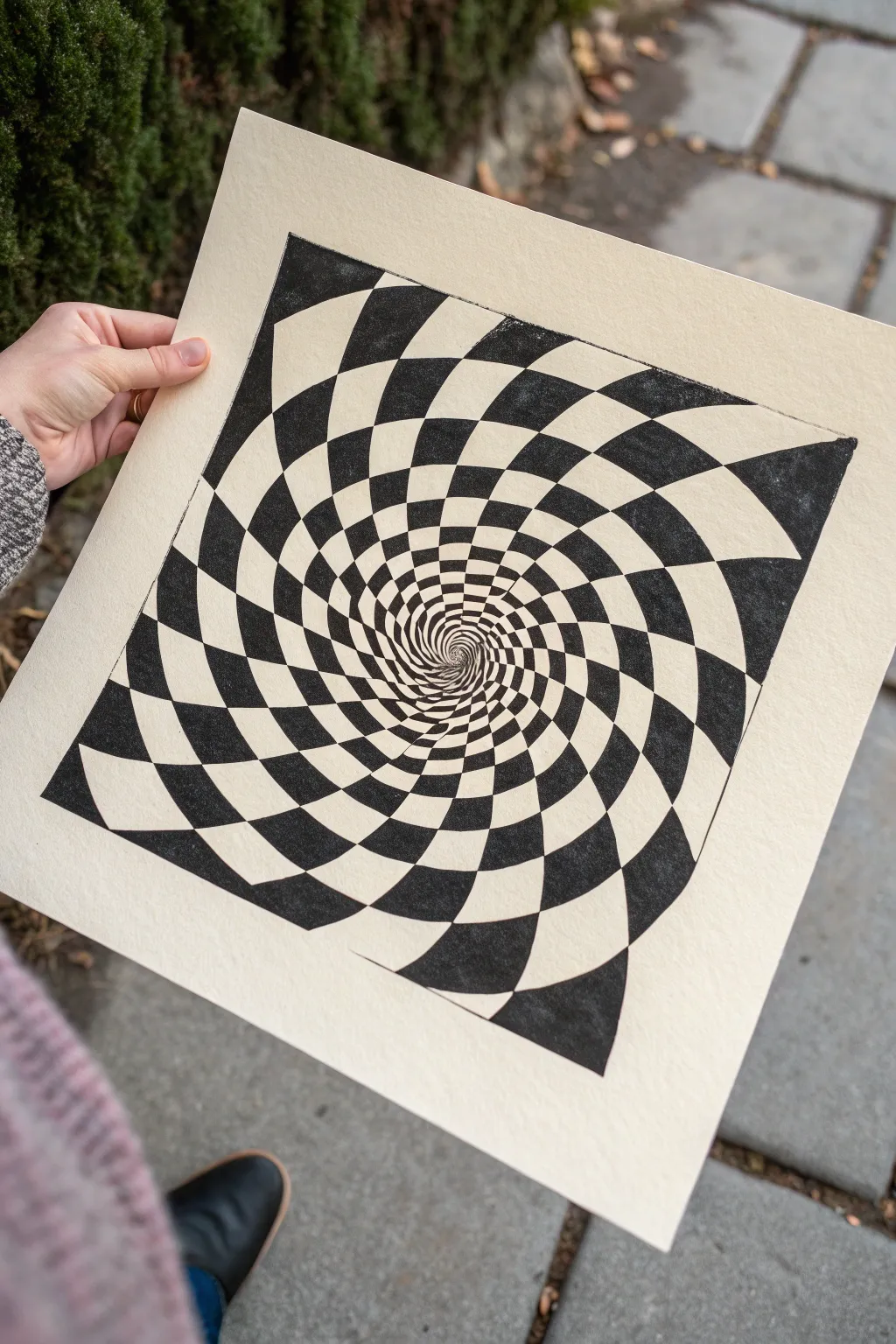
Optical Illusion Tunnel to a Center Point

Dive into the mesmerizing world of op art with this striking optical illusion tunnel. By meticulously warping a standard checkerboard grid, you’ll create a powerful sense of depth that seems to pull the viewer right into the center of the page.
Step-by-Step
Materials
- Heavyweight drawing paper or cardstock (cream/off-white recommended)
- Pencil (HB or 2H)
- Fine-point black drawing pen or marker (0.5mm)
- Thicker black marker (for filling)
- Ruler
- Compass
- Eraser
- Protractor (optional)
Step 1: Planning the Spiral Grid
-
Find the center:
Begin by marking the precise center of your square paper. Since this illusion relies on radial symmetry, accurate centering is crucial for the final effect. -
Draw concentric circles:
Using your compass, draw a series of light concentric circles starting from the center point. Space them out so the distance between rings grows slightly larger as you move outward toward the edge, creating a natural perspective shift. -
Create radial spokes:
Draw curved lines radiating from the center to the outer edges. Instead of straight spokes, curve each line gently in the same direction—like a pinwheel—to establish the twisting, spiral motion. -
Refine the grid:
You should now have a spiderweb-like grid formed by the intersection of your circles and curved spokes. Check that the ‘squares’ created near the center are tiny and get progressively larger as they spiral out.
Lost in the Spiral?
If your center gets too cluttered to draw clearly, stop the checkerboard pattern just before the absolute center and fill the tiny remaining hole with solid black for an ‘infinite depth’ look
Step 2: Inking the Outlines
-
Outline the pattern:
Switch to your fine-point pen. Carefully trace over the pencil grid lines that define your alternating checkerboard pattern. -
Mark the black zones:
Before filling anything in, lightly place a tiny dot or ‘x’ in every other segment of the grid. This simple step saves you from the headache of accidentally coloring two adjacent squares the same color. -
Define the edges:
Go over the outermost edges of your square design with a slightly bolder line to create a crisp, finished frame for your illusion.
Color Pop
Swap the plain white background for a neon highlighter fluid or metallic gold ink in the alternating squares. The high contrast against the black creates a vibrating, psychedelic effect
Step 3: Filling the Void
-
Start from the center:
Using your fine-point pen, begin filling in the marked segments nearest the center point. I find that starting here prevents me from smudging ink as the drawing expands outward. -
Switch to thicker markers:
As the shapes get larger towards the perimeter, swap to your thicker black marker. This speeds up the process and ensures a solid, opaque black coverage without visible stroke marks. -
Mind the corners:
Use the fine nib again for the sharp corners of the larger outer shapes. Clean, sharp corners are essential for maintaining the crisp, digital look of this analog drawing. -
Rotate your paper:
Turn the paper frequently as you work around the spiral. This keeps your hand in a comfortable position and helps you maintain consistent stroke direction. -
Check density:
Hold the proper up to the light to check for any pinholes or light patches in your black areas. Go back and touch up these spots to ensure high contrast.
Step 4: Final Touches
-
Erase guidelines:
Once the ink is completely dry—give it a good 10 minutes to be safe—gently erase all visible pencil lines. Be careful near the center where the paper might have been stressed by the compass point. -
Clean up edges:
If any ink bled slightly or edges look rough, you can use a white gel pen to touch up the white squares or sharpen the boundary lines. -
Flatten the paper:
If heavy ink application caused the paper to buckle slightly, place the finished piece under a heavy book overnight to restore its flatness.
Step back and enjoy the dizzying depth of your new handmade optical illusion


Have a question or want to share your own experience? I'd love to hear from you in the comments below!