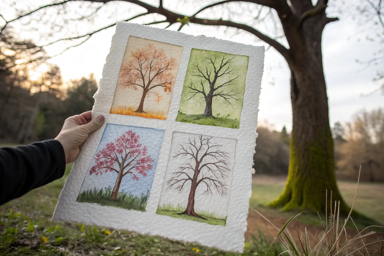
There’s something so satisfying about capturing spring, summer, autumn, and winter all in one piece—like you’re painting time itself. Here are my favorite four seasons painting ideas that make the seasonal changes crystal clear while still leaving room for your personal style.
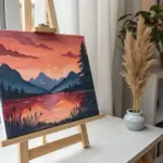
The Classic Four Seasons Tree
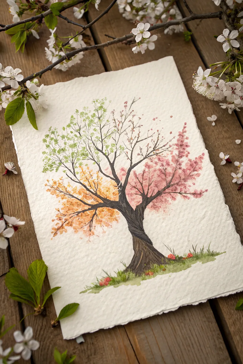
Capture the fleeting beauty of a whole year in a single painting with this charming four-seasons tree. Using delicate stippling and textured paper, you will illustrate the transition from spring blossoms to winter calm, united by a sturdy, twisting trunk.
Step-by-Step Tutorial
Materials
- Cold press watercolor paper (deckled edge preferred)
- Watercolor paints (Sap Green, Lemon Yellow, Burnt Umber, Alizarin Crimson, Burnt Sienna, Payne’s Grey, White gouache)
- Round brushes (sizes 2, 6, and 8)
- Detail liner brush (size 0 or 00)
- Pencil (HB or 2H)
- Kneaded eraser
- Two jars of water
- Paper towels
Step 1: Sketching the Skeleton
-
Center Your Subject:
Begin by lightly sketching the trunk in the center of your paper. Give it a gentle twist or curve to add character, rather than drawing it stick-straight. -
Map the Quadrants:
Imagine an ‘X’ crossing through the center of the tree’s canopy area. Sketch major branches reaching into four distinct quadrants: top-left (spring), top-right (winter transition), bottom-right (summer bloom), and bottom-left (autumn). -
Refine the Branches:
Add smaller, reaching twigs to the ends of your main branches. Keep the lines very faint so they won’t show through the translucent leaves later. -
Clean Up:
Use your kneaded eraser to lift almost all the graphite off the paper, leaving only a ghost of an image to guide your brush.
Pro Tip: Edges Matter
For the authentic look shown in the photo, use heavyweight paper with deckled edges. If you don’t have it, you can carefully tear the edges of standard watercolor paper against a ruler.
Step 2: Painting the Trunk
-
Base Layer:
Mix a light wash of Burnt Umber and Payne’s Grey. Paint the entire trunk silhouette, keeping the wash wet and even. -
Adding Texture:
While the base is still slightly damp, drop in darker concentrated Brown and Grey along the shadowed side (usually the right) and into the crevices where the trunk twists. -
Creating the Twist:
Use the tip of your size 2 brush with darker pigment to paint diagonal, sweeping lines up the trunk. This mimics the twisting bark shown in the reference. -
Branch Definition:
Extend the dark brown color up into the main branches, tapering them into fine points as they reach outward. Switch to your liner brush for the thinnest twigs.
Step 3: The Four Seasons Foliage
-
Spring (Top Left):
Mix a fresh Sap Green with a touch of Lemon Yellow. Using the tip of a size 6 brush, stipple small, airy clusters of leaves. Keep them sparse near the branch tips to suggest new growth. -
Late Summer/Pink Bloom (Bottom Right):
I personally love this section the most—mix Alizarin Crimson with plenty of water to get a soft pink. Dab larger, denser clusters here to represent full blooms, overlapping the branches slightly. -
Autumn (Bottom Left):
Combine Lemon Yellow and Burnt Sienna to create a warm gold. Stipple these leaves loosely, allowing some ‘falling’ leaves to drift slightly away from the branches. -
Winter Transition (Top Right):
Leave most branches here bare. Add tiny, sparse dots of reddish-brown buds or perhaps a few lingering dried leaves, emphasizing the skeletal structure of the tree. -
Grounding the Tree:
Mix a grassy green wash for the ground. Paint a loose, uneven patch at the base of the trunk, flicking the brush upward to suggest grass blades. -
Fallen Details:
Once the grass is damp but not soaking, drop in tiny specks of the pink and orange colors from the canopy to represent fallen petals and leaves resting on the lawn.
Troubleshooting: Muddy Colors?
If your foliage colors are bleeding into the brown branches and turning muddy, ensure the trunk is 100% bone dry before stippling leaves over it. Use a hairdryer to speed this up.
Step 4: Final Touches
-
Deepening Shadows:
Return to the trunk once entirely dry. Use your darkest brown-black mix to reinforce the deepest cracks in the bark and the underside of the main branches for contrast. -
Connective Twigs:
Use the liner brush to paint very fine, dark lines connecting any floating leaf clusters back to the main branches. -
Highlights:
If you want the bark to pop, use a tiny amount of white gouache or a gel pen to add subtle highlights on the sunlit side of the twisted trunk.
Now step back and admire how you’ve captured the cycle of nature on a single sheet of paper.


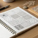
Simple 2×2 Quadrant Landscape
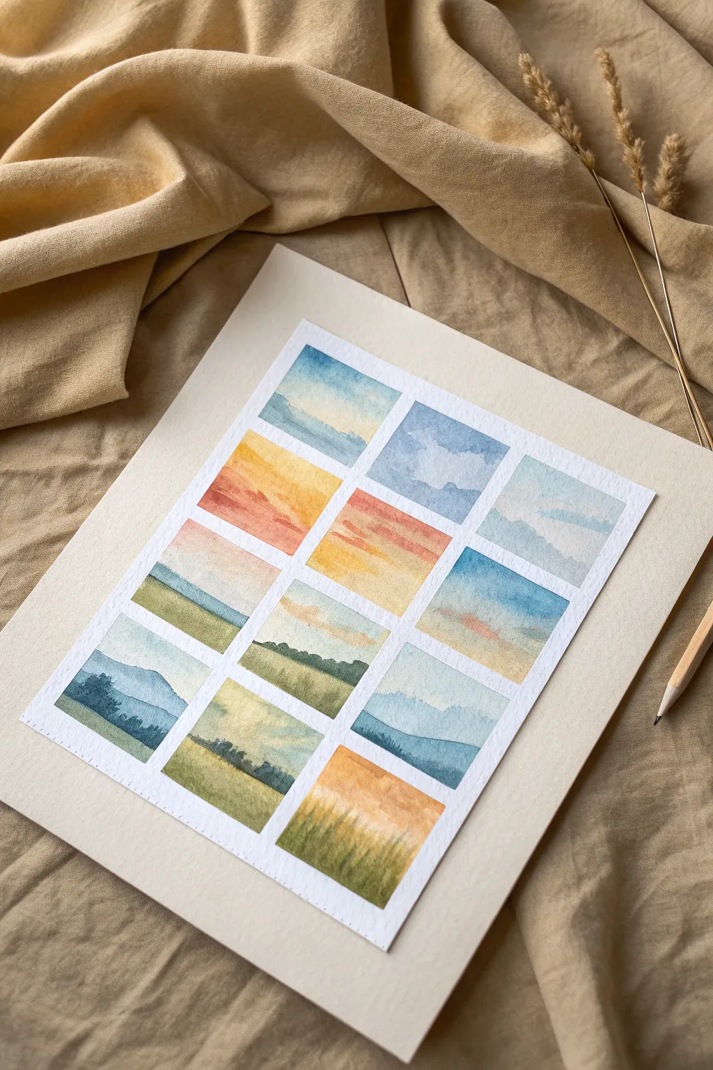
This project transforms a single sheet of watercolor paper into a gallery of tiny, atmospheric landscapes using a grid layout. Each rectangular vignette captures a different mood of the sky and land, ranging from soft blue mornings to warm sunset fields.
Step-by-Step Guide
Materials
- Cold press watercolor paper (300 gsm recommended)
- Painter’s tape or washi tape
- Ruler and pencil
- Watercolor paints (pan or tube)
- Round brushes (sizes 2, 4, and 6)
- Opaque white gouache (optional)
- Palettes for mixing
- Two jars of water
- Paper towels
Step 1: Setting the Grid
-
Measure the layout:
Begin by measuring your paper to center your workspace. You want a 3×4 grid structure. Using a ruler and a light pencil touch, mark out twelve equal rectangles with roughly 1/2 inch of space between them. -
Tape the borders:
Apply painter’s tape along the pencil lines to mask off the spaces between the rectangles. Press the tape edges down firmly with your thumbnail or a spoon to prevent paint from bleeding underneath.
Clean Lines Pro-Tip
To ensure razor-sharp edges, paint a thin layer of clear water or white gouache over the tape edges first. This seals the gap so color won’t bleed under.
Step 2: Planning the Seasons
-
Identify color palettes:
Group your twelve squares mentally. The top row focuses on cool blues and soft whites, the middle transitions into warm oranges and yellows for sunset vibes, and the bottom incorporates deeper greens and blue-greys for dusk. -
Pre-mix washes:
Prepare watery puddles of your primary sky colors: cerulean blue, yellow ochre, cadmium red light, and a touch of payne’s grey. Having these ready prevents hard edges from forming while you mix during the process.
Step 3: Painting the Skies
-
Top row: Clouds and blue:
Wet the sky area of the top squares with clean water. Drop in diluted blue at the top, fading it down towards the horizon line. while wet, lift out pigment with a thirsty brush to create soft cloud shapes. -
Middle row: Sunset gradients:
For the middle section, start with a yellow wash near the horizon. While it’s still damp, add streaks of orange or light red near the top, letting gravity blend them naturally into a sunset gradient. -
Bottom row: Moody transitions:
Use cooler, muter tones here. Paint soft blue-grey gradients that mimic the low light of early evening or an overcast day. -
Connective elements:
Notice how some squares share a horizon line or color palette; allow similar colors to appear in adjacent squares to create visual harmony across the grid.
Bleeding Between Squares?
If paint runs under the tape, don’t panic. Wait for it to dry completely, then use a stiff, damp brush to gently ‘scrub’ and lift the excess pigment.
Step 4: Adding the Landscape
-
First layer of land:
Once the skies are bone dry, paint the base layer of the ground. Use diverse greens—sap green for bright fields, olive for dry grass, and blue-green for distant hills. -
Distant mountains:
For squares with mountain ranges, mix a very watery blue-purple. Paint the silhouette against the dried sky. The transparency pushes the mountains into the distance. -
Mid-ground texture:
Add variance to the fields by dropping darker green pigment into the wet landscape wash. This wet-on-wet technique suggests uneven terrain without sharp details.
Step 5: Final Details
-
Foreground grasses:
Using your smallest brush (size 2), paint tiny upward strokes in the foregrounds using a concentrated, less watery green mixture. This mimics tall grass close to the viewer. -
Tree silhouettes:
Mix a dark, neutral green (almost black). In the squares representing dusk or distance, tap the brush tip along the horizon line to suggest distant tree lines or shrubbery. -
Enhancing atmosphere:
If you want misty effects, dab a clean, damp tissue gently onto the wet paint at the base of the mountains. -
The reveal:
Wait until the entire sheet is completely cool to the touch (indicating it’s dry). Peel the tape away slowly at a 45-degree angle to reveal the crisp white borders between your miniature worlds.
Step back and admire how a collection of simple washes creates a complex and beautiful seasonal narrative

Continuous Horizon That Morphs
This project transforms a single large sheet of watercolor paper into a quartet of atmospheric landscapes, each capturing a different mood of the same meadow. The unique challenge here is maintaining a harmonious color palette while shifting light and season across four distinct but connected panels.
Step-by-Step Tutorial
Materials
- Large sheet of cold press watercolor paper (approx. 18×24 inches or A2)
- Soft pastels (range of blues, greens, ochres, reds, and whites)
- Pastel pencils for details
- Spectrafix spray fixative
- Artist’s tape (low tack)
- Ruler and T-square
- Glassine paper (for hand rest)
- Blending stumps or soft foam applicators
Step 1: Preparation and Grid Layout
-
Secure the paper:
Tape your watercolor paper down firmly to a drawing board or table. This prevents buckling and keeps the paper steady while you work. -
Measure the grid:
Using a ruler and T-square, lightly mark a cross in the center of the paper to divide it into four equal quadrants. Leave a generous border around the outside edges. -
Define the panels:
Apply strips of artist’s tape along your pencil lines to create clean white margins between the four painting areas. Press the edges of the tape down firmly to ensure crisp borders later. -
Established the horizon:
Lightly sketch a horizon line across all four panels. While they don’t need to align perfectly, keeping them at roughly the same height (about a third of the way up) creates a cohesive panoramic feel.
Clean Colors Pro Tip
Keep a dry microfiber cloth or paper towel nearby. Wipe your fingers or blending tools completely clean between switching from the sky colors to the earthy ground tones to prevent muddying.
Step 2: Sky and Atmosphere
-
Upper left sky base:
Start with the top-left panel. Apply broad strokes of light blue pastel at the top, fading into a soft peach and warm pink near the horizon line to suggest a sunset. -
Blend the gradient:
Use your fingers or a soft foam tool to blend the sky colors together smoothly. The transition from blue to pink should be seamless without hard lines. -
Add cloud texture:
Scumble a bit of white and light grey pastel over the blue area to suggest wispy clouds. Keep these strokes loose and diagonal to imply wind movement. -
Top right sky variation:
Move to the top-right panel. Use similar blues but introduce more ochre and soft violet tones, creating a hazy, late-afternoon atmosphere.
Step 3: Ground Layers and Texture
-
Golden hour meadow:
In the top-right panel, fill the ground area with rich golden ochres and burnt siennas. Use vertical strokes to mimic the direction of tall dry grass. -
Green spring meadow:
For the top-left panel, switch to fresh sap greens and olive tones. Establish the base color of the field, making it darker near the bottom foreground and lighter as it recedes toward the horizon. -
Create depth:
In both top panels, lightly smudge the distant tree line using dark green and grey pastels. These should be soft and out of focus to push them into the background. -
Work foreground to background:
I prefer to layer the bottom two panels now. For the bottom-left, lay down a chaotic mix of deep greens and earthy browns to serve as a backdrop for wildflowers. -
Winter tones:
In the bottom-right panel, use cool greys, muted browns, and pale blues for the ground. This panel represents a colder, perhaps dormant season.
Troubleshooting Smudges
If you accidentally smear pastel into the white border, don’t wipe it with your hand. Use a kneaded eraser to lift the pigment straight up, or dedicated hard eraser with a sharp edge.
Step 4: Botanical Details and Finish
-
Detailing wildflowers:
Return to the bottom-left panel. Use red and white pastel pencils or sharp pastel edges to create distinct poppy and wildflower heads in the immediate foreground. -
Adding stems:
Use a sharp green pastel pencil to draw thin, crisp stems connecting your flowers. intertwine them to make the growth look natural and dense. -
dry grass details:
In the bottom-right panel, draw sparse, thin stalks of dead grass using a dark brown or charcoal pencil. Let them curve naturally against the pale sky. -
Final highlights:
Add tiny touches of white gouache or very bright white pastel to the tips of the grasses in all panels where the light would catch them. -
The reveal:
Carefully peel away the masking tape, pulling it away from the painting area at a 45-degree angle to reveal the crisp white borders.
Step back and admire how the four distinct atmospheres come together to tell a single story of a changing landscape.


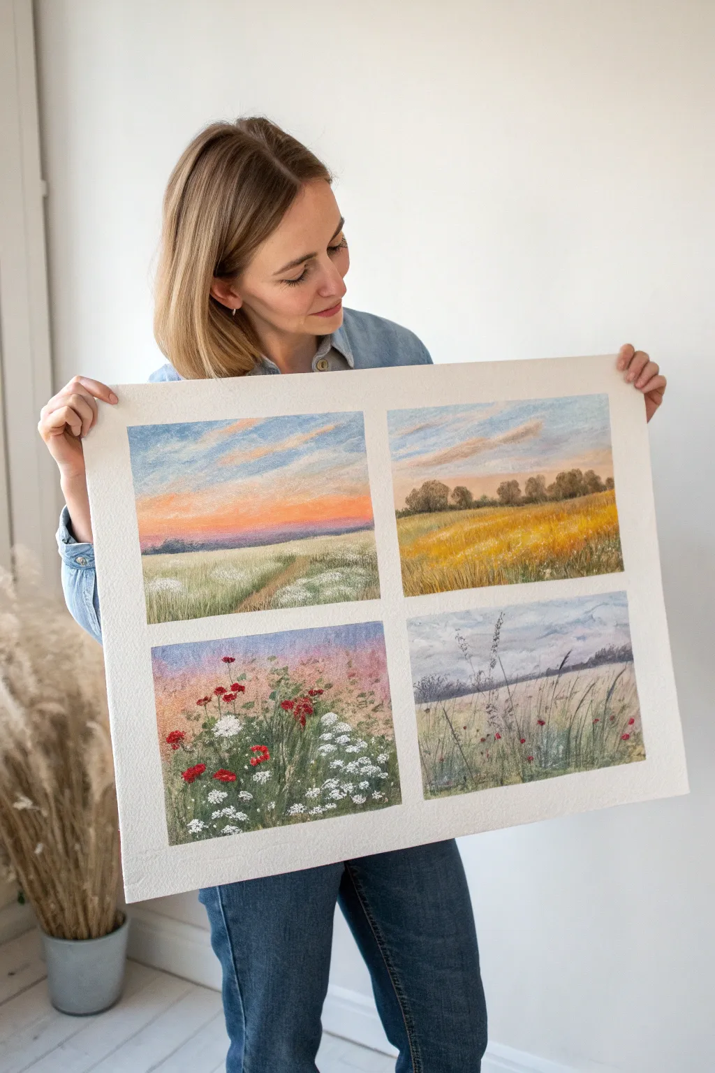
Same Bouquet, Season-by-Season Swap
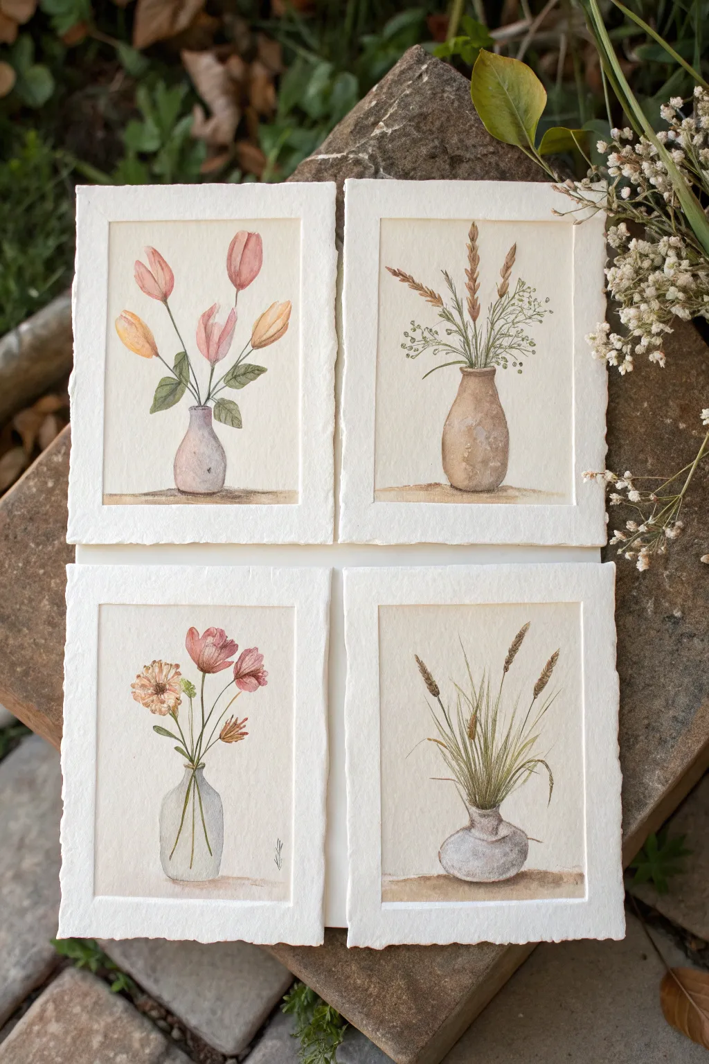
Capture the subtle shifts of the year with this charming set of four miniature watercolor studies. Using thick, deckle-edged paper adds a rustic, vintage feel that perfectly complements the delicate vases and natural botanical subjects.
Step-by-Step Tutorial
Materials
- 4 sheets of heavy-weight cotton watercolor paper (300gsm/140lb) with deckle edges (approx. 4×6 inches)
- Watercolor paints (Earth tones: Ochre, Burnt Sienna, Sepia; Florals: Sap Green, Alizarin Crimson, Orange, Yellow)
- Round watercolor brushes (Size 2 for details, Size 6 for washes)
- Pencil (HB or H) and kneadable eraser
- Jar of water
- Paper towels
- Masking tape (optional, if paper needs securing)
Step 1: Preparation & Sketching
-
Prepare the paper:
Lay out your four sheets of deckled paper. Establish a consistent rectangular border on each sheet by lightly marking corners about half an inch from the rough edge. This creates the ‘framed’ look within the artwork. -
Sketch the vases:
Lightly sketch a central vase on each page. Keep the shapes simple but varied: a small round bud vase, a taller rustic jug, a clear glass bottle, and a squat pottery jar. Ensure the bottoms align with an imaginary horizon line. -
Map out the stems:
Draw the main stems rising from each vase. For the tulips, create singular sweeping curves that droop slightly. For grasses or wheat, use straighter, vertical lines that fan out gently at the top. -
Define the blooms and seeds:
Add the specific botanical shapes: tulip bulbs for spring, dried wheat heads for autumn, feathery grass tips for winter, and open-faced cosmos or poppies for summer. Keep pencil lines very faint so they don’t show through the paint.
Natural Edges
Don’t tape down the deckle edges themselves when securing paper. Tape only the back or just the corners to preserve the rough texture that frames the art.
Step 2: Painting Vases & Ground
-
Paint the ceramic vases:
For the opaque pottery vases, mix Burnt Sienna with a touch of white or buff titanium if available, creating a creamy beige. Apply a base wash, leaving a small sliver of white paper on the curve for a highlight. -
Add dimension to ceramics:
While the base wash is still damp, drop in a slightly darker mix (add a tiny bit of Sepia) to the shadow side (usually the right) and the bottom edge to give the vase roundness. -
Paint the glass vase:
For the clear bottle, use very watered-down Payne’s Grey or a cool blue. outline the rim and sides delicately. Paint the stems *inside* the vase first using a pale green, then wash the faint glass color over them once dry. -
Ground the subjects:
Mix a watery brown-grey wash. Paint a horizontal strip beneath each vase to represent a table or shelf. Soften the edges with clean water so the horizon line doesn’t look too rigid. -
Cast shadows:
Add a stronger concentration of the ground color directly under the base of each vase to anchor it firmly to the surface.
Step 3: Bringing the Flowers to Life
-
Start the foliage:
Mix Sap Green with a little Ochre for a natural, warm green. Using the tip of your size 2 brush, paint the thin stems. Vary the pressure to make the lines organic rather than perfectly straight. -
Layering the tulips:
For the tulip study, wash the flower heads with a translucent pink on one side and a soft orange on the other. Let the colors bleed into each other slightly on the paper for a soft transition. -
Detailing the wheat:
For the dried grasses and wheat, stick to a palette of Yellow Ochre and Sepia. Use short, stippling strokes to create the texture of the grain heads. I often tap the brush repeatedly to build up that fuzzy texture. -
Painting wildflowers:
For the summer bouquet, use diluted Alizarin Crimson for petals. Keep the centers light or yellow. Use loose, expressive dabs for filler flowers like baby’s breath, leaving plenty of white space. -
Winter grasses texture:
For the winter grass study, use long, swift upward strokes with a semi-dry brush to mimic fine blades of grass. Use a cool, desaturated green-grey mix here.
Muddy Water?
If your clear glass vase looks muddy, you likely overworked the paint layers. Let it dry completely, then lift excess pigment gently with a clean, damp brush.
Step 4: Finishing Touches
-
Reinforce shadows:
Once the initial layers are bone dry, mix a darker version of your foliage color. Paint thin shadow lines on the undersides of leaves or where stems cross over one another. -
Add vase texture:
If a ceramic vase looks too flat, use a nearly dry brush with dark brown paint to distress it slightly, adding tiny specks or scratches for an aged pottery look. -
Final highlights:
Check the glass vase. If the highlights were lost, use a tiny dot of white gouache or white gel pen to bring back the shine on the glass shoulder.
Display your four miniature masterpieces together to celebrate the changing beauty of nature year-round
BRUSH GUIDE
The Right Brush for Every Stroke
From clean lines to bold texture — master brush choice, stroke control, and essential techniques.
Explore the Full Guide
Color Palette Challenge: Four Season Swatches
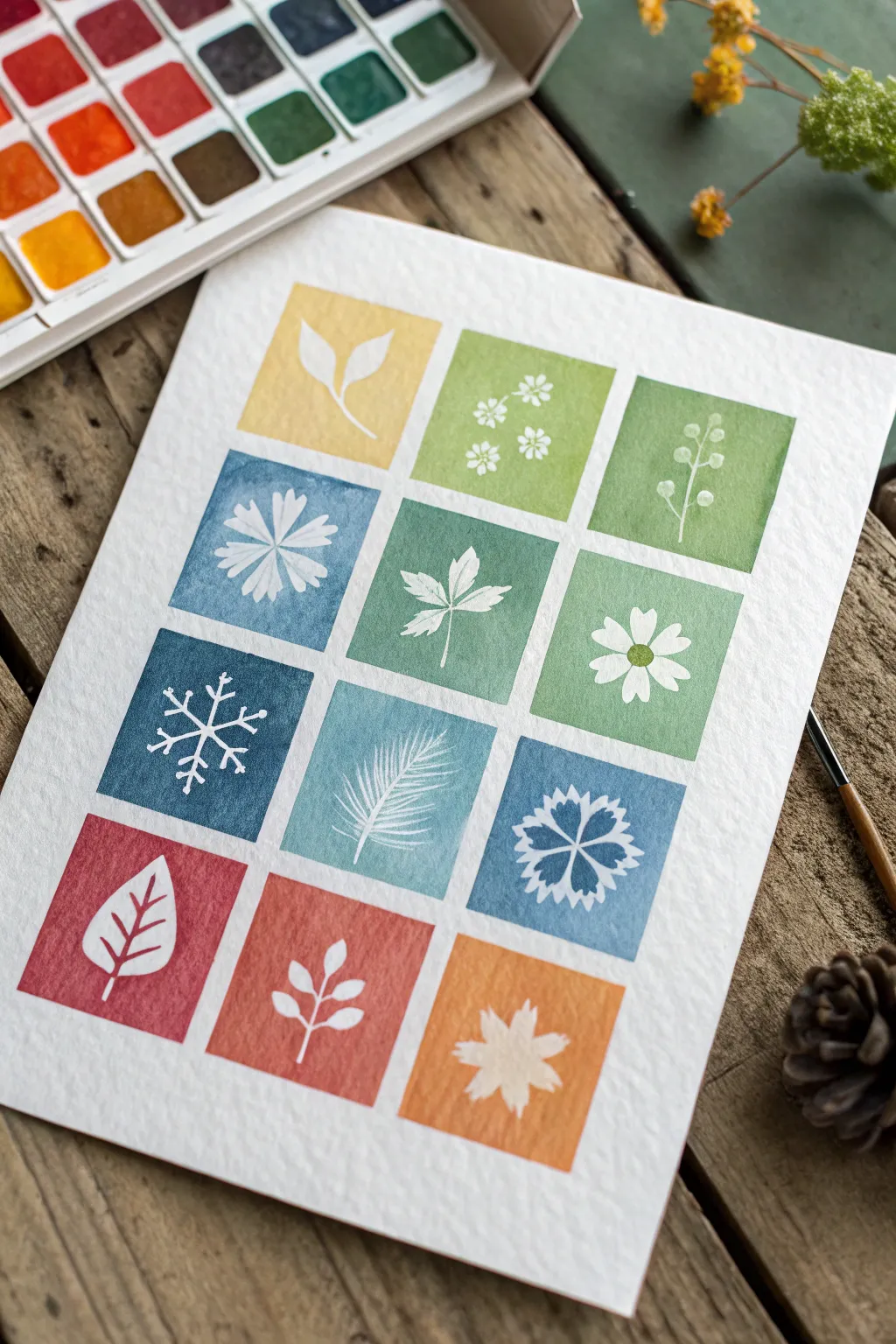
Capture the essence of the entire year with this clean, botanical-inspired grid that uses negative space to reveal delicate motifs. This project is a fantastic exercise in color mixing and masking techniques, resulting in a cohesive piece that celebrates the changing seasons through simple iconography.
Detailed Instructions
Materials
- Cold press watercolor paper (300 gsm)
- Watercolor paint set
- Masking fluid (drawing gum)
- Small round synthetic brush (size 2 or 4)
- Old or dedicated brush for masking
- Pencil and ruler
- Palette for mixing
- Paper towel
- Jar of water
Step 1: Grid & Sketch Preparation
-
Map the layout:
Start by lightly measuring out a 3×4 grid on your cold press paper. You will need three columns and four rows. Leave a consistent white border—about 1/4 inch—between each square to let the design breathe. -
Draft the motifs:
Inside each square, lightly sketch a simple seasonal botanical or icon. Think about the progression: the top row for Spring (sprouts, small flowers), the second for Summer (full blooms, bold leaves), the third for Winter (snowflakes, pine needles), and the bottom for Autumn (falling leaves). -
Apply masking fluid:
Using an old brush or a silicone applicator, carefully fill in your pencil sketches with masking fluid. This fluid will preserve the white of the paper. Be precise with your edges, as the paint will go right up to this barrier. -
Wait for the cure:
Allow the masking fluid to dry completely. It should feel rubbery and not tacky to the touch. Start mixing your colors while you wait.
Save Your Brushes
Never use your good watercolor brushes for masking fluid! The latex gum ruins bristles instantly. Use a cheap plastic brush or coat the bristles in bar soap first to protect them.
Step 2: Painting the Seasons
-
Mix the spring palette:
For the top row, mix fresh, light colors. Create a warm buttery yellow, a sap green, and a fresh leafy green. Keep the washes relatively transparent. -
Paint the first row:
Fill in the three top squares with your spring colors. Paint right over the masked shapes, ensuring the colored wash corners are crisp and square. -
Mix the winter cool tones:
For the second and third rows (which seem to blend winter and cool summer themes), mix a progression of blues and teals. Aim for a dusty blue, a seafoam green, and a minty hue. -
Apply cool mid-tones:
Paint the middle rows. Notice how the colors in the example transition from warm greens into cooler teals and finally deep indigo blues. Let the water texture the paint naturally. -
Deepen the winter row:
For the snowflake and pine needle row, use your most saturated, coldest blues—think Prussian blue or Indigo mixed with a touch of Payne’s Gray. -
Create the autumn warmth:
For the final bottom row, mix earthy, warm tones. You’ll want a muted crimson or berry red, a terracotta rust, and a warm ochre or burnt orange. -
Finish the painting phase:
Fill in the bottom three squares. Ensure that your paint consistency is even so you get flat, graphic shapes without too much pooling. -
Complete drying time:
Let the entire page dry thoroughly. If the paper is cool to the touch, it is still damp. Patience is key here to avoid tearing the paper in the next step.
Step 3: The Reveal
-
Remove the mask:
Once bone dry, gently rub your finger or a rubber cement pickup tool over the masked areas. The gum will ball up and peel away, revealing the crisp white paper underneath. -
Fix edges:
If any masking fluid pulled up a jagged edge, you can use a very slightly damp brush to smooth the paint line, but be careful not to reactivate the surrounding color too much. -
Erase guidelines:
Take a clean eraser and gently remove any visible pencil lines from your initial grid, rubbing in one direction to avoid crinkling the paper. -
Flatten the work:
If your paper has buckled slightly from the water, place the finished painting under a heavy book overnight to crisp it back up.
Add Detail
Once dry, use a fine tip geometric pen to outline the white shapes or add delicate veins to the leaves for a more illustrative, doodle-style look.
You now have a beautifully organized seasonal study that looks clean enough to frame


Have a question or want to share your own experience? I'd love to hear from you in the comments below!